Blog: Henri Matisse

Matisse Workshop – Class Begins Today!

My new online workshop Artful Adventures with Henri Matisse begins TODAY, September 29 with the first technique lesson. (It’s also the LAST DAY of the $39 Early Bird Sale* price).

Would you like to go on a little Artful Adventure with inspiring project ideas, art journaling, mixed media techniques and beyond? My Artful Adventure workshops explore how we can draw inspiration and technique ideas from master artists and this time we’re looking at a favorite artist of mine, Henri Matisse. We will touch on pattern, color, shape, and more, all based on the art of Matisse, but in a way that YOU can adapt to YOUR style of making art.

Learn more and Sign Up HERE

Get a sneak peek at what the workshop covers:

See you in the classroom!

*Early Bird ends September 29, 2022 at 11:59pm EDT (NYC time).

Leave a comment

Ready for an Artful Adventure?

My Artful Adventures with Henri Matisse online workshop begins next week and we are excited to invite you to the class! We’ll be looking at one of my all time favorite artists for inspiration this time – the amazing Henri Matisse. His use of color, his love of combining different patterns, his unique paper cut outs, and more will all be explored.

Are YOU ready for an Artful Adventure? Learn more here.

Still wondering if an Artful Adventure is right for you? Here are what some students have said in the past about some of my other Artful Adventures:

If this sounds like what you’ve been looking for, join us and learn how to take some Matisse inspired techniques and style into your own artwork too. Right now we have an Early Bird sale for just $39 through September 29, when the workshop begins! Learn more and sign up.

Leave a comment

NEW Online Workshop: Artful Adventures with Henri Matisse

Today my newest online workshop Artful Adventures with Henri Matisse goes on sale on my website!

Get ready to go on an Artful Adventure with us. Explore shape, collage, pattern, color and MORE, seeking inspiration from one of my all time favorite artists: Henri Matisse! From the get go, we’ll learn about Matisse’s artwork and life, and then we’ll dive right in to 4 technique lessons with creative ways to translate his signature style into your own unique art journaling and artwork.

Sign up NOW to enjoy great pricing: Early Bird* is just $39 – now through Thursday, September 29 when the technique lessons begin.

Check out the promo video to get a sneak peek at this Artful Adventure:

In addition to investigating Matisse’s style, we’ll also play with the unique paper cut out artform, explore color palettes, learn how to create with a monoprint painting technique, and much much more. Let the Artful Adventures begin!

Learn more about the workshop HERE and be sure to sign up by September 29 to take advantage of the Early Bird*.

*Early Bird ends September 29, 2022 at 11:59pm EDT (NYC time).

Leave a comment

Art Stroll: Matisse Red Studio, MoMA

Two weeks ago I had a lovely day in the city and it was the perfect day to visit the new Matisse Red Studio exhibition at MoMA. What a treat!!! The exhibition is small-ish – which is good – and has kind of two big rooms. We decided to keep the one with the main treasure namely the Red Studio for last and that was a perfect decision.

“Studio under the Eaves” 1903 – Matisse painted his studio and parts of it several times and that makes so much sense given that an artist studio is also an artist’s world. In this work the studio looks a little sad – while the look out of the window provides a look at a much more vibrant and fun world. Maybe this is in part because Matisse in his early career had soem personal and financial troubles and as we see…the artist world def. improved to a more vivid space later.

“Still Life with Geraniums” 1910 – in this painting we see some of the paintings – in his studio – but just peaks of it.

“The Blue Window” 1913 is actually a view out of his bedroom window onto his studio.

Nasturtiums with the Painting “Dance” I , 1912 – The flowers in the vase are the same as in the Painting of Red Studio – the leg of the table on which the vase stands seem to be connected with his painting in the background.

“Studio, Quai Saint-Michel” 1916

So brilliant ..the depiction of the model in his studio…as a painting.

“Large Red Interior” 1948

This connects to the Red Studio – the star of this exhibition to which we go next- from 1911 . This painting is actually his last finished oil painting.

OK- moving to the main star(s)

“The Red Studio” 1911

Matisse is said to have made his studio subject of his paintings whenever he wanted to explore about where he was in that particular moment of time with his art and life. The red studio didn’t start out as a red studio. The floor was pink, the wall was blue and the furniture was yellow. But after a month he made the decision and coated the surface excluding his artwork and objects of inspiration with Venetian Red. He said about his painting that he likes it but that he doesn’t understand his painting.

Gathered in the room are the artworks as far as they could be retrieved that are in the painting.

“Le Luxe II” 1907 –

I loved this painting which hasn’t been on display since the 60s.

“Upright Nude with Arched Back,” 1906-1907

“Female Nude” 1907 – Matisse worked for a year with a ceramicist and he loved the work. He was very interested in decorative art.

“Young Sailor II” 1906 –

“Nude with White Scarf” 1909

“Corsica, The Old Mill” 1898 – This painting was made when he was first married and he and his wife spend about six months in Corsica. Matisse would talk about the time in Corsica as being really transformative.

One painting that couldn’t be borrowed for the exhibition was the Large Nude because Matisse had asked that it would be destroyed after his death. Why we do not know. This is one of several studies of the painting.

It was a wonderful exhibition – what a beautiful idea to gather all those works, to also show other works with his studio as the subject – it was a great glimpse into his world. Makes me want to paint my studio as well :) Hope you liked this art stroll. If you have a chance to see this exhibition in person- go!!!

Leave a comment

Art Stroll: Matisse and American Art at MAM

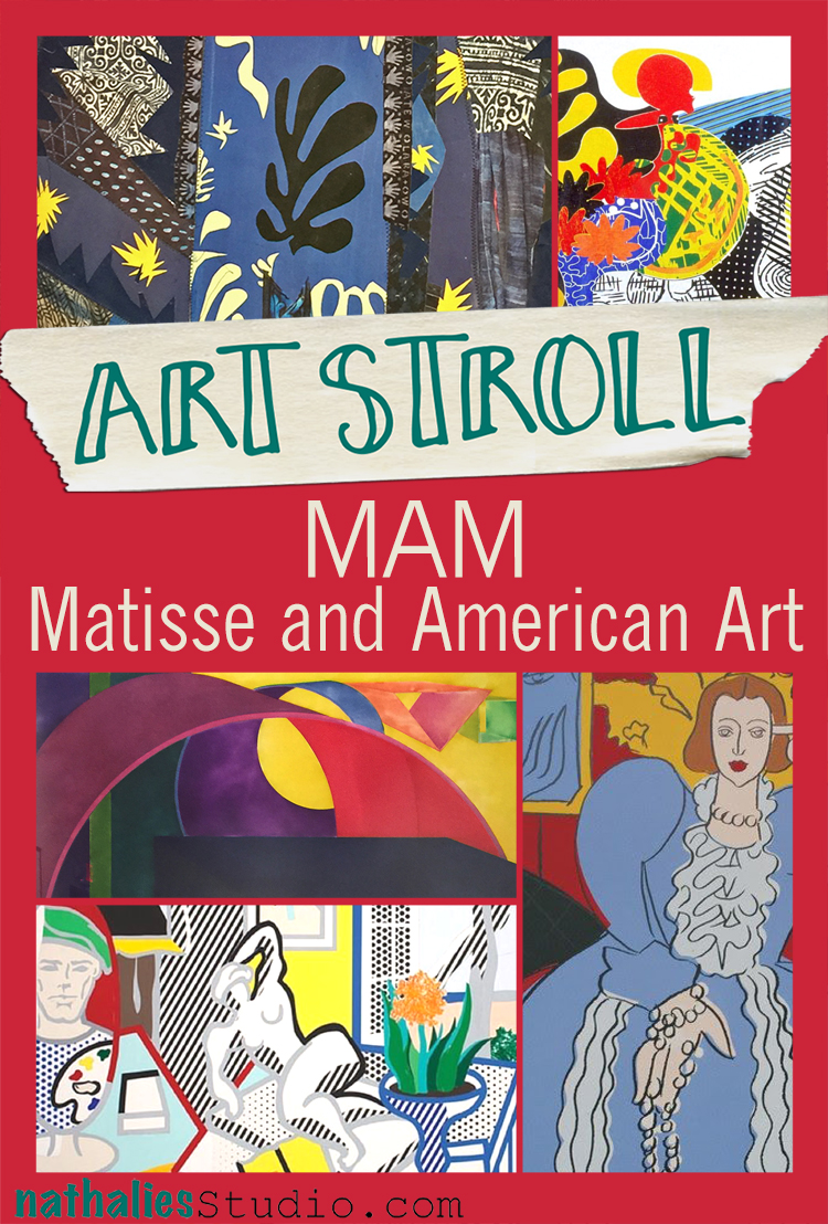
A couple weeks ago my friend Heather pinged me on a Sunday morning and said “Hey, I need to see art today – let’s go to a museum”. I had seen a news report on the exhibition “Matisse and American Art” at the Montclair Art Museum and since I use Matisse as an inspiration for my classes sometimes, I convinced her to go there with me. It was soooo worth it!

The exhibition strives to explore Henri Matisse’s influence on American Artists from 1905 to the present. The list of profilic artists inspired and influenced by his work is immense and the exhibition showed in an interesting way how some artists explored some of his work  for a while and some of them took it even further and let it immerse into their own style.

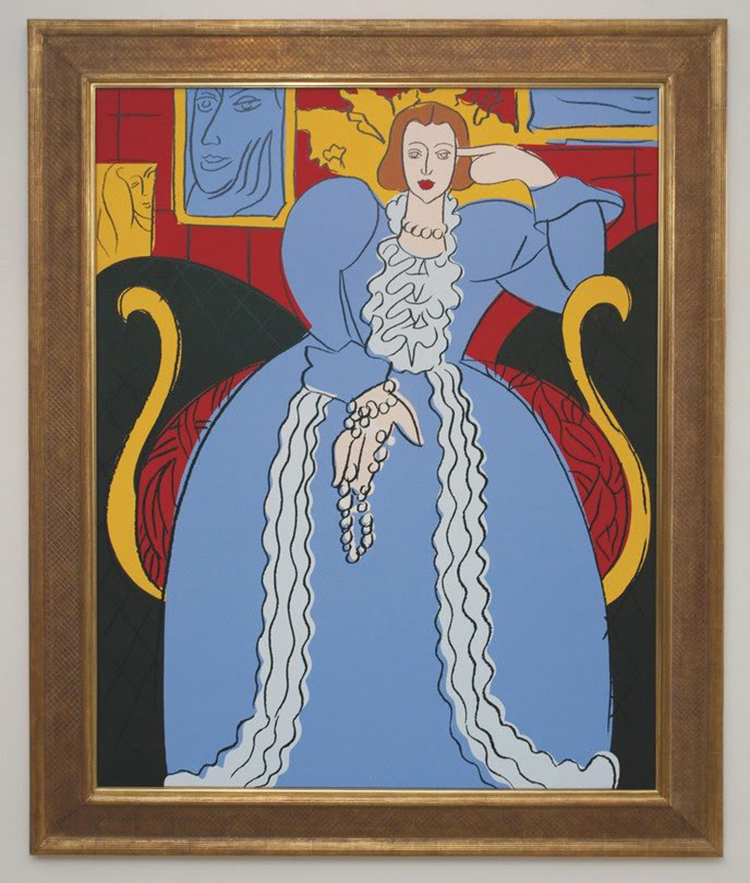
Andy Warhol – Woman in Blue (After Matisse), 1985, synthetic polymer paint and silkscreen inks on canvas.

This painting by Warhol was directly inspired by the Woman in Blue by Matisse from 1937 and even though it is pretty much copied from Matisse down to the colors red, yellow, blue, black, and white, you can see the flatness of the painting so typical for Warhols techniques and the hand holding the necklace says Warhol to me.

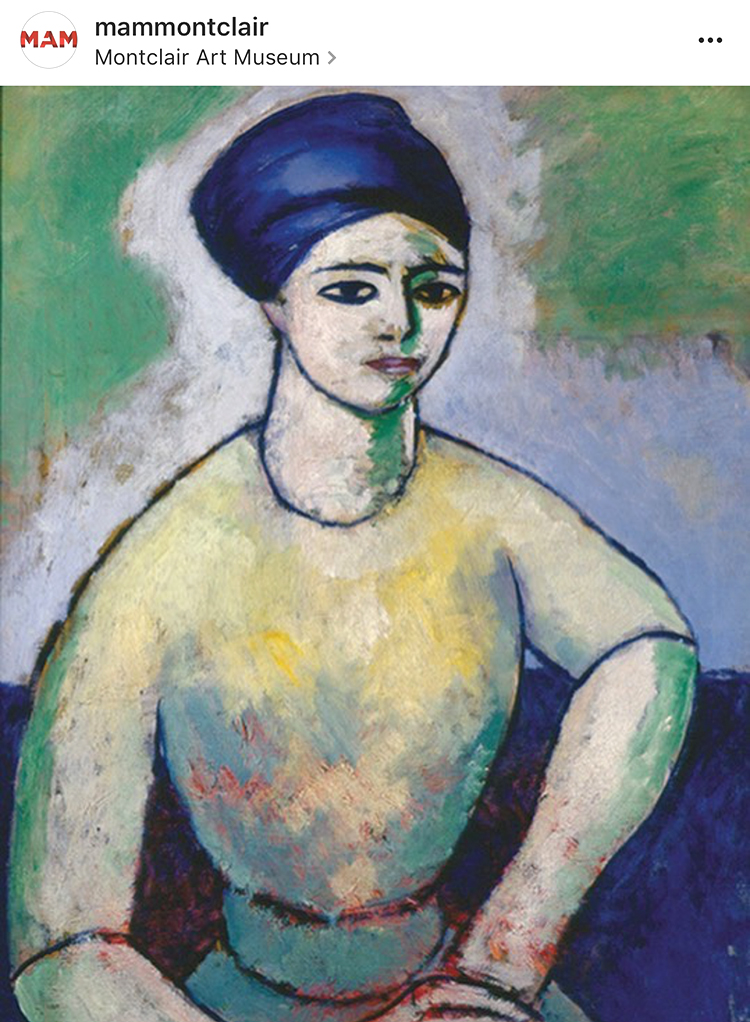
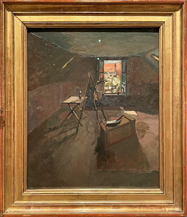
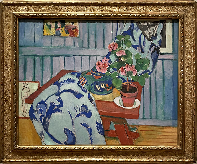
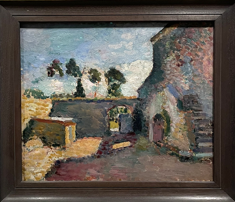
Morton Livingston Schamberg- Studio of a Girl, ca. 1912 – Oil on Canvas

Schamberg traveled extensively in Europe and he must have seen many Matisse paintings during his time there. The paining reminds of Matisse’s painting Painting of Madame Matisse. The Green Line.

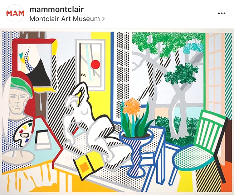
Roy Lichtenstein – Bellagio Hotel Mural: Still Life with Reclining Nude (Study), 1997 cut -and pasted, painted and printed paper on board.

Roy Lichtenstein had a longtime interest in Matisse and Picasso and many references to their artwork can be seen in his work like the simplification of form or direct references of elements in Matisse’s paintings. In this painting parts of his studio, the open window, the patterns.

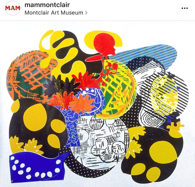
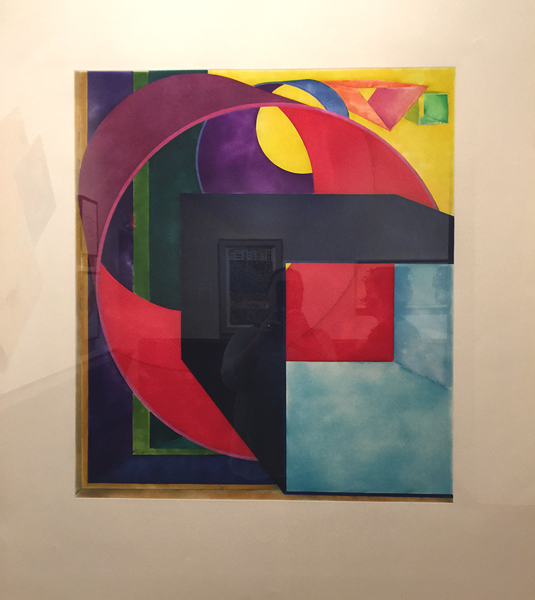
Judy Pfaff – Six of One-Melone, 1987 – Color Woodcut

In her installations, prints and sculpture, Pfaff translates Al Held and Henri Matisse’s theories of color into her own visual language. Pfaff says that Matisse gave her “courage” and has been ” the source of how to teach and how to see”.

On a little side note: Heather and I saw this woodcut different than in the image above. It was hung upside down from what you see here and we remember this so well because Heather actually had a very strong reaction of dislike to the artwork and we stood in front of it discussing why. When we later talked about the exhibition and this piece with our friends we opened the exhibition catalogue to discover that it was displayed as above, and further research had me find it is also displayed differently on the artist website as well as on the MAM instagram account (I used their image above) . Heather like different display in the catalogue also way better than how we actually saw it.  So this haunted me for days and finally I wrote MAM and asked if there is a reason for hanging it the other way (artist instruction that it can be hung any way) or if this was an overseen mistake by the technical staff who hung the artwork. And here is their answer:

“Thank you for writing to the Montclair Art Museum. We had been in conversation with the artist about this issue since the exhibition installation, and have just now heard back. The image used in the catalogue and online was provided by and checked by Crown Point Press; when unpacked the artist’s signature placement indicated that it instead by installed as you saw it. Judy Pfaff has now confirmed that the way the artwork is hung is correct, and you’ll find that all publicity and use of the image going forward will be corrected.”

And so apparently the way we saw it as below – is the right way (btw- it is now changed on the Artist website as well) :)

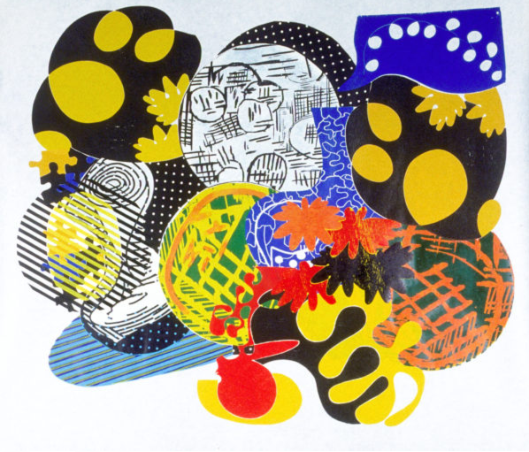
Now which way does speak more to you? I actually liked it the “wrong” way in the catalogue and instagram page better than the way it is hung and apparently now supposed to be hung. the shapes feel more organically and right – and the forms are more balanced for me in the top version. But hey ….who argues with the artist. But I thought this was interesting.


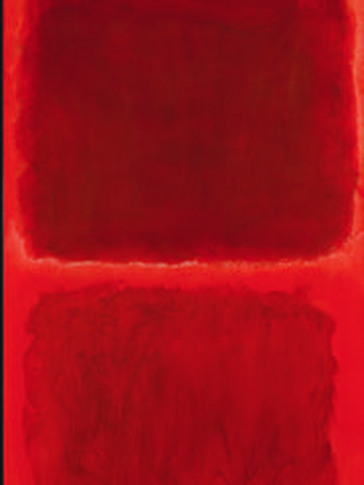
Mark Rothko, No. 44 (Two Darks in Red), 1955 – Oil on Canvas

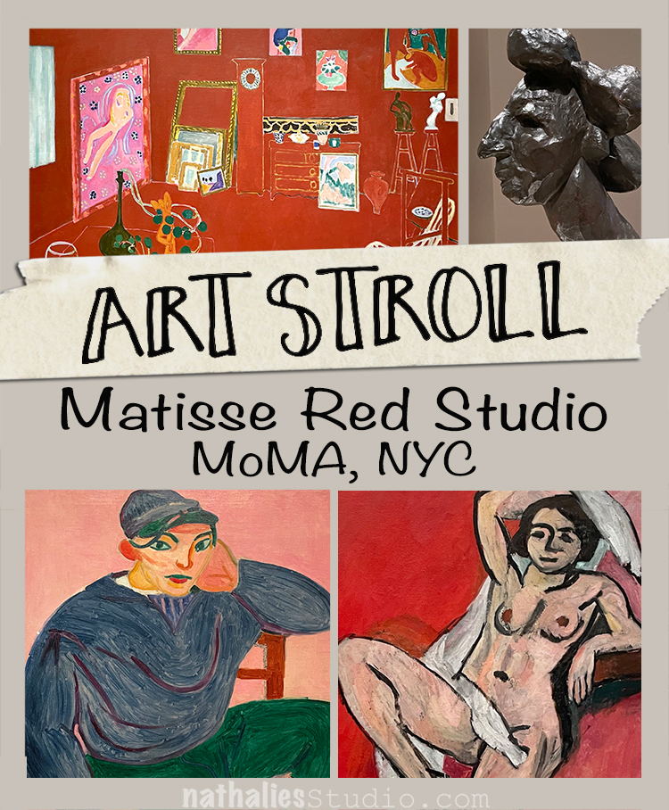
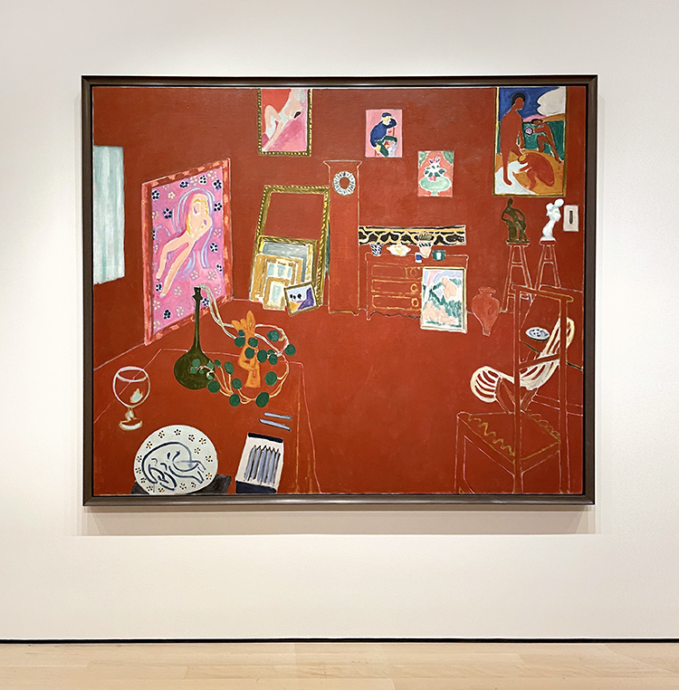
Mark Rothko called Matisse “the greatest revolutionary in modern art”. Rothko studied Matisse’s The Red Studio (1911) after MoMA had acquired it in 1949. He went to the museum and every day for several months just to stand in front of the picture. While viewing the painting he said ” You became that color, you became totally saturated with it as if it were music” .

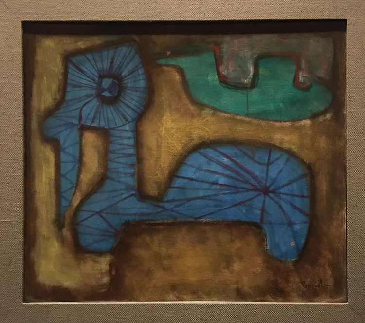
William Baziotes, Toy Animal – 1947 – Oil on Canvas.

Baziotes was so inspired by his visit to the Matisse retrospective at MoMA in 1931 that he resolved to move to New York to study art. Baziotes’ basic shapes and luminous color recall many of the plant and human forms that populate Matisse’s work.

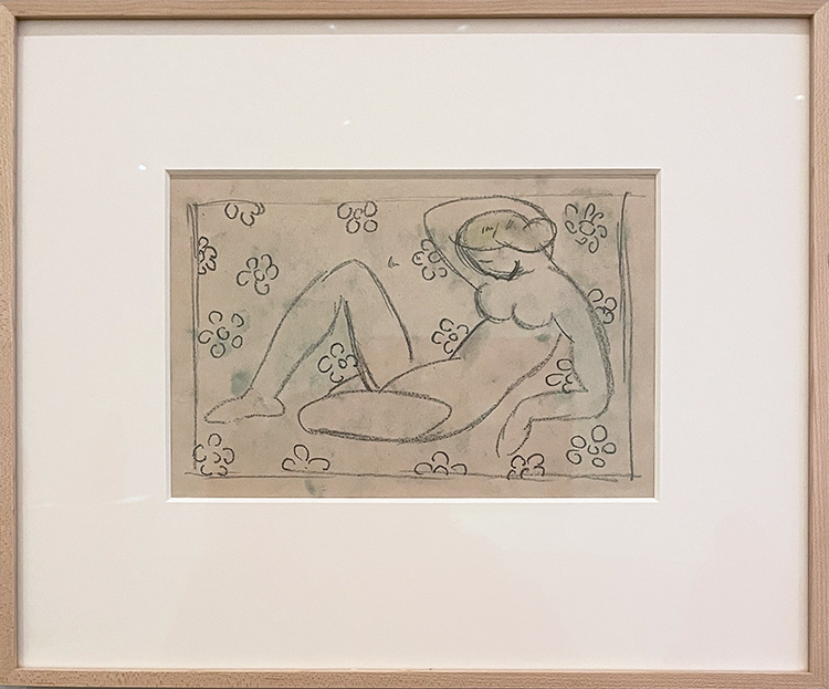
Al Held – The Space between the Two – 1992 – print

Al Held studied and used Matisse’s ideas about color, form, structure and scale.

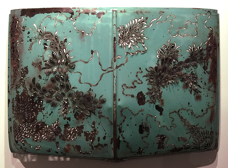
Denice Bizot, Urban Flora, 2014 – 1960s Chevrolet truck hood cut with plasma torch

Bizot’s organic shapes are reminscent of Matisse’s paper collage cut- outs of the late 1940s and early 1950s.

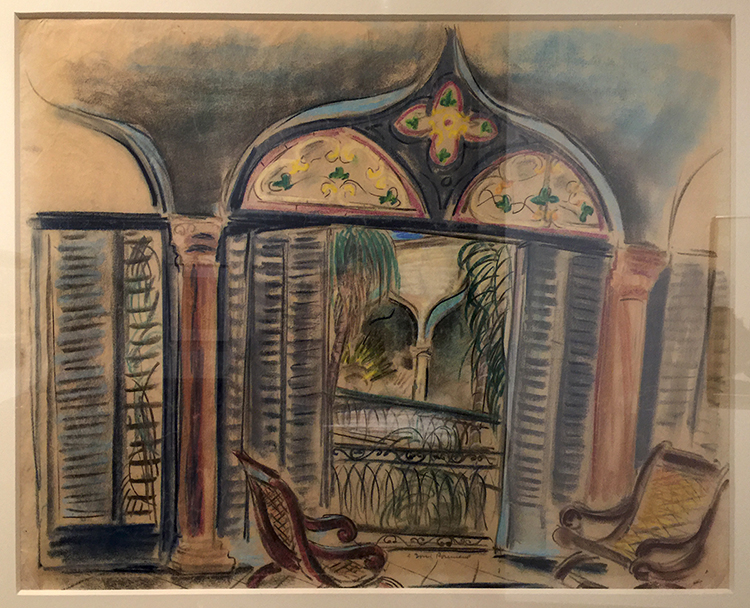
Doris rosenthal, Gran Terrazo, ca. 1920-1922 -Pastel on Paper

This painting shows Rosenthal embracing Matisse’s vibrant color and idyllic subject matter. Matisse often used windows as a vehicle for exploration into color, light and interior versus exterior space.

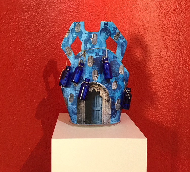
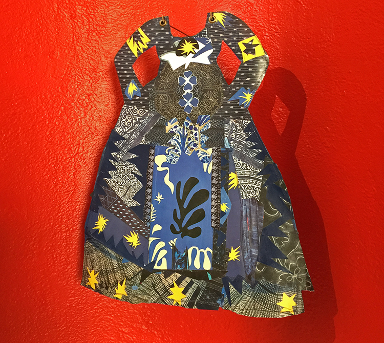
Janet Taylor Pickett, Indigo Bottle Dress – Charms and Inspirations – Acrylic, digital photograph, glass bottles with written messages and twine on shaped Arches Paper.

Picket’s creative conversation with Matisse spans her entire  career.

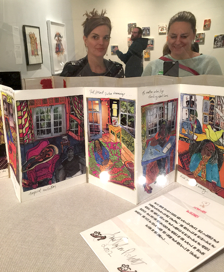
Janet Taylor Picket, Dressing in Context 2, 2015  – Collage of various papers, thread and acrylic on Arches paper with grommets.

Janet Taylor Pickett, Me & Matisse, 2003 -04 – Handmade book

In this book, Taylor Pickett’s aspirations to become an artist are combined with her travels abroad to France and her longing for home, which she characterizes as “a metaphor, an idea for finding my voice as an artist”.

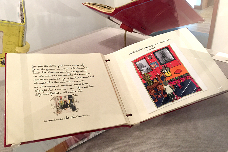
As you might imagine the books made me swoon and I want to do something like this !

It was an amazing and inspiring exhibition. I loved seeing all the different ways how other artists were inspired- and still are inspired by Matisse . I came home from the exhibition totally recharged and explored different – Matisse-inspired- things in my studio for several days.  It made me yet again so aware of our differences and our connections – magical! I was also surprised what a wonderful Museum this is and what a huge amount of artwork from even more than the shown well known artists (couldn’t show all) like Stuart Davis, Milton Avery, Richard Diebenkorn, Helen Frankenthaler, Hans Hoffman, Robert Motherwell and many more the museum was able to show for this exhibition. I for sure have this museum on my list and if you are in the New Jersey area- check out this exhibition which is still on view until June 18, 2017.

I hope you enjoyed this little Art Stroll and found some inspiration in it!

Comments (6)

  • Sue Clarke

    |

    Indigo bottle dress is super cool and I would love to have it in my bedroom.
    As to Judy Pfaff’s – Six of One-Melone I do not like it hung the “correct” way…seems off to me.
    Funny how that works.
    I always enjoy strolling with you Nat.

    Reply

    • nathalie-kalbach

      |

      I loved that dress too, Sue …I actually also want the red little alcove in my bedroom :) I agree with you on Six of One Melone! Have a gorgeous weekend!

      Reply

  • Jean Goza

    |

    Always enjoy your Art Strolls. Invariably I find new artists that inspire me. And Matisse has always been a favorite of mine so I enjoyed seeing other artist’s inspiration from his work. Regarding your question on Judy Pfaff’s Six of One Melone piece, I definitely like the “upside down” version better. The balance of the “correct” version feels off to me. It feels as if the larger components of the piece want to “collapse” into the small red and yellow area at the bottom. As you said, you can’t argue with the artist. It’s always fascinating to me the different emotional responses people will have to a piece of art.

    Reply

    • nathalie-kalbach

      |

      thank you Jean! Yes- I agree on the composition and how it feels better the “wrong” way. I am also fascinated that people have different emotional responses to art – sometimes certain artists use symbols or subject matters that resonate differently depending if you have the same cultural background as the artist which I find very interesting to discover with friends when going into museums.

      Reply

  • Bea

    |

    Really interesting…thanks…

    Reply

Leave a comment

Artist Quote of the Week – Henri Matisse

MatisseQuote_NatKalbach

Comments (1)

  • Barb

    |

    All artists quotes mean more to those are really and truly have great talent like you and can understand the meaning of the quotes.
    Sending you this. I enjoy him so much. Amazing talent.

    Thanks for sharing

    Reply

Leave a comment