Mixed Media

My Favorite Mixed Media Essentials: 1. Acrylic Paints

Hands down my all time Mixed Media Essential is Acrylic Paint.

I had a very intense acrylic paint phase a couple of years ago and then I guess I needed a break and neglected those beauties for spray paints for a while. But I am so glad I came back to them!

What I love about Acrylic Paints is:

  • they are fast drying
  • generally cheap – or at least long-lasting even if it is a bit more pricey
  • they have a plastic like surface (due to the plastic polymer emulsion)
  • they can be thinned with water and that could make them almost look like water-color in some cases
  • they are permanent once dried
  • they cover surfaces if opaque
  • you can use other paint media on top of acrylic paints
  • you can use some fun media with them for amazing backgrounds and textures
  • you can create amazing backgrounds and texture with solely acrylic paints

Here are some examples:

beautiful easy background – that can be also used for a scrapbooking layout:

background and texture with acrylic paints:

background and texture using other media and cheap supplies:

texture creating on a scrapbooking layout:
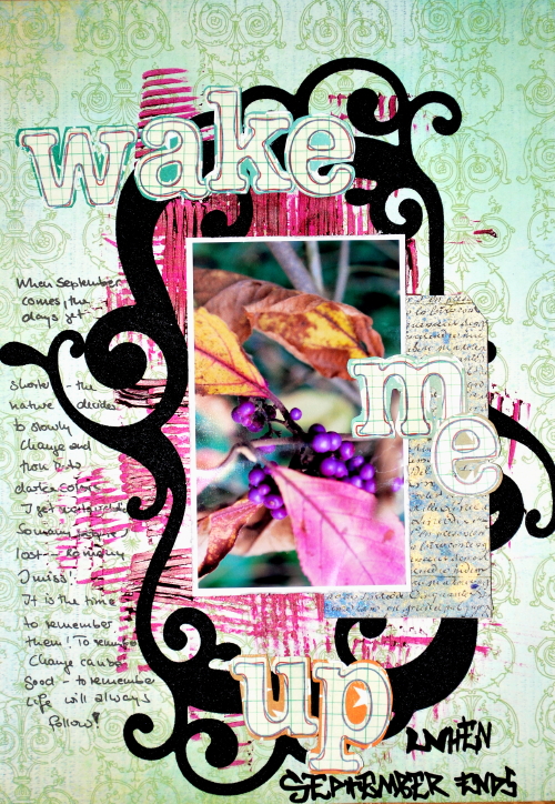
creating some fun handmade embellishments and use it for some accents on a layout:
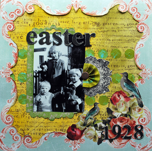
using them with other acrylic media
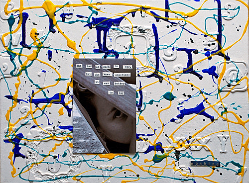
using it on difficult surface – like acrylic pages of a minialbum

using acrylic paint to make embellishments your own
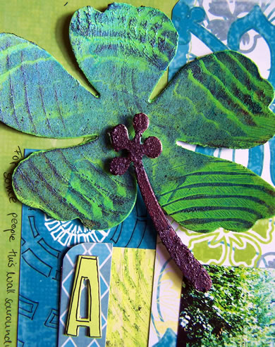
Pretty amazing what you can do with acrylic paints, isn’t it? And there is way more!!! So yes – just because of it’s versatility it knocks me off my socks and is my all time favorite essential :)

Which acrylic paints I use:

Here comes a saying that I learned when studying law : “It depends” – LOL. Nice one, huh?

Well, I used a lot of acrylic paints. And over the last couple years I learned what I like and what I do not like.What I like, doesn’t have to be necessary what you like.  so just take it as my thoughts and my preferences, ok?

  • So first of all let’s state that I like good quality artist paints. Because I learned over the years that especially when working in an art journal for example that they aren’t that tacky as a lot of the cheaper non artist ones.
  • I also love good quality artist paints because the color shift between wet and dry is not that high. I love to see how my work might look like when it is dry while I’m still working with my paints. I had many disappointments in the past where I was thinking a nice bright red was rocking my socks and then it was dry and a dark bloody mess as the paint shifted a lot when it dried.
  • Highly pigmented colors go a longer way and they are usually also more beautiful. They also can be buffed for a great glossy finish- which for me also is mostly true for more expensive artist paints.
  • I love texture and I love to create texture with paints – so I prefer thicker colors – I can also just thin them down if I want – and so I am a big Lover of Liquitex Heavy Body Acrylic Paints. I also like Winsor & Newton especially when it comes to their translucent acrylic paints. A good bargain and a very good quality are alos the Liquitex Basic Acrylic Paints.

nSupplies

I hope you liked this post- let me know what you think. Next up is Gesso.

huge hugs

Nat

——————————————————————————–

If you want to learn more about acrylic paints- check out my Über*Media Acrylic Paint Online Workshop

Comments (4)

  • scrappegal

    |

    Lovely inspiration projects you are showing! Thanks for sharing!

    Reply

  • Sue Clarke

    |

    Easter 1928 is such an elegant LO Nat.
    Thanks for the paint info. I believe that you were the first to inspire me to even try using paint on a LO. Tons of fun and extra special in my art journal. I love the Liquitex tubes since they come in small sizes which are good for travel.

    Reply

  • Jessica Sporn

    |

    I used to favor watercolor over everything else but have fallen in love with acrylic paint — especially since discovering Golden Fluid acrylics. xo

    Reply

  • mjmarmo

    |

    Love the many ways you use the paint!

    Reply

Leave a comment

I want to bathe in…or My Favorite Mixed Media Essentials

I often get emails asking me about my favorite tools or supplies and I actually love those emails because they make me think of why I tend to use some things all the time.

Is it laziness? What is it about these items that make me grab for them whenever I create a Mixed Media Project?

One of the answers that came up for almost all of them is “I use them because of their versatility of usage” . That is an easy guess for an answer- LOL- since I named my favorite Online Workshop series Über*Media playing on the fact that you can use some items so MANY different ways.

But let me take you the next couple weeks on a little journey on my favorite Mixed Media essentials and explain why I could bathe in them and show you where I used them. I hope you will enjoy my new little series starting tomorrow :)

Wishing you a creative monday !

Nat


Comments (8)

  • Cecilia

    |

    I think it will be very interesting. I already want to bathe in them!

    Reply

  • Angelika Westermann

    |

    Hi Nathalie, I just watched the introduction video of your überMedia class for acrylics and was fascinated by the music. Could you please tell me what it is? And moreover – can I book these classes yet? Thanks in advance, Angelika

    Reply

    • nathalie-kalbach

      |

      HI Angelika, the music is part of my iMovie Programme- I am actually not sure what it is but it is played by the London Sinfonie Orchestra I think. And yes – you can book the class already- it is life and you can start full force if you want. The sign up information and sign up button are on this page http://nathaliesstudio.com/online-workshops/ubermedia/acrylic-paint-english-3/ There is a short small version of the class and a long version. I would love to have you :) Have a gorgeous day Nat

      Reply

  • Sue Clarke

    |

    Ready to take the journey!

    Reply

  • mjmarmo

    |

    Sounds fun!

    Reply

  • TeedeJee

    |

    I really would love to know all about your favourit materials. Count me in on your journey! XXX

    Reply

  • MiaKL

    |

    Of course I will join you tomorrow!

    Reply

  • scrappegal

    |

    Can’t wait!! :) Love your style and projects!

    Reply

Leave a comment

9 …or how to combine psychedelic circles with romantic paper

9 ….years it is that my husband and I are married. 9 years ago in Hamburg, Germany surrounded by a semi-small group of family members and friends. Well…semi small because we were actually planning on maybe 10 peeps and then a bigger wedding the next years in the States. It ended kind of semi big…because nobody wanted to be left out although a lot of them were coming to the States for the wedding there anyway ;) And it was AWESOME both times !!! :)


We celebrated this year at the harbor here in the city…we were in a posh place for some cocktails…the view was paying off the snobby semi-friendly peeps working there and then we went for a wonderful dinner and nice little walk back home. Perfect!


So, why you might ask, do I have to throw psychedelic circles onto this beautiful, romantic music paper? Because I can….LOL-

NOOOOO – just kidding ;) Because hubs studied music and loves to spent his free time playing and composing music and I love to spent my free time playing with paint. So …there you go ;)

I created the circles with Liquitex Pouring Medium- so much fun! I teach this technique in the Über*Media Acrylic Paint Online Workshop and these were some of the samples I made and I finally wanted to use :)


Supplies: Heidi Swapp Vintage Chick Beautiful Songs paper, Liquitex Acrylic Paints, Liquitex Acrylic Inks, Liquitex Pouring Medium, Manila Shipping Tags, Scrapbook Adhesives by 3L Crafty Power Tape and MyStik Permanent


Which two elements/embellishments or media on a project could reflect you and your loved one? 


Nat

Comments (2)

  • Sue Clarke

    |

    Happy Wedding Anniversary Nat and Hubby!
    Interesting LO and question:
    cycles for motorcycles (hubby) and squares for books (me and really both of us).

    Reply

  • Riikka

    |

    Layout wise it could be something rather similar – sheet of music or notes and paint splashes, but if anything goes – we do videos together. I film a project and he does the music. :D

    Reply

Leave a comment

Second Floor Challenge #8: Use 3 different stamps

Are you ready to take the second floor this time? If you have no clue what I am talking about- read all about it here :) The Second Floor Challenge

So today is our 8th Second Floor Challenge: Use 3 different stamps

Click here to see what Julie did

Whatever that means to you or however it inspires you.  The prompt is simply meant to get you started.  The level of challenge you aim for is entirely internal and up to you.

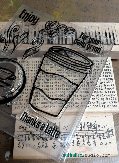
Ha – I was looking forward to this challenge to use 3 different stamps- not because I thought I would be really challenged, but because I had just bought a couple stamps in July that I haven’t used yet. Time to get those out.

I decided to take it to the second floor by using different ways using those stamps. so first I stamped on paper colored with an Derwent Inktense Block.

Then I stamped on grey tissue paper which I later applied to the above background with gel medium.

I stamped the coffee mug on top of a piece of Scrapbooking paper, colored it in with Liquitex Inks and Derwent Artbars.

Then I cut out the cup of coffee, and created a heart on the background paper, which I cut out and created this Scrapbooking layout.

It was a quick layout but I had fun using some techniques with it – it felt of like art journaling but instead of painting on a piece of paper it was creating a layout.

Supplies: Pink Paislee Paper, Watercolor Paper, Tissue Paper, myStampBox Stamps created by Karen Ellis, Stampers Anonymous Stamps, Liquitex Gel Medium, Derwent Inktense Block, Derwent Inktense Pencil, Liquitex Acrylic Inks, Derwent Artbars, Ranger’s Archival Inks, Posca black marker, Scrapbook Adhesives by 3L MyStik and 3D Foam Pads

What I learned from this challenge:

1. Sometimes when I create for a manufacturer it bothers me that I have to be triggered by the product for an idea for a project. But as I had bought those stamps because I surely loved them when I saw them, it felt totally ok to be triggered for an idea by the coffee mug created by Karen Ellis for myStampBox.

2. I usually use white tissue paper for the infusing technique when I stamp – I really like the grey tissue paper for this technique I learned- it tones the colors down but of course…it just makes it a shade – nice one- with some texture.

3. You really need to mix the Liquitex inks– otherwise you get an smudge image- which is not really bothering me here on the coffee mug- but I need to keep that in mind. Why be so lazy with a tiny bit of shaking (gosh..I ‘m so lazy sometimes- LOL)

4. I forced myself using unusual colors for me and I liked it. I need to get more out of my color box  again – I used to do it … why did I stop? :)

5. Stamps always give an handmade feel to a layout, even if you use them in small amounts- I love that. I need to use stamps more on my work- and not solely for backgrounds ;)

If you’d like to leave a link showing off what you did in response to this challenge, here’s the linky list:

hugs

Nat

Comments (9)

  • Jessica

    |

    Really fun challenge. Just linked up!

    Reply

  • Lisa Flaherty

    |

    Very cute “me” (well, you.. :P) layout! I love that layered heart so much! I will have to try stamping on tissue paper–such a cool, translucent effect!

    Reply

  • Sue Clarke

    |

    I really like the LO and now I need that set of stamps. It would be awesome for card making (which I seldom do). tee hee

    Reply

  • Karen Ellis

    |

    Hey that’s my Coffee Cup! LOL
    Love it Nat! I’ll have to take up the challenge too! Have fun <3

    Reply

  • Jessica

    |

    Great challenge and looking forward to trying it. I love your layout.

    Reply

  • Clare

    |

    there is nothing nicer than inking up new stamps! fab layout. x

    Reply

  • Anne

    |

    I love your stamps! I find it so difficult to buy stamps – to make the decision which one to take! It’s good not to have a shop around where they sell them, otherwise…. So I think I’ll go and take the challenge. I’ll cut a stamp I have in mind for quite a while. See you.

    Reply

  • Jean Marmo

    |

    Great challenge and I love the layout! Will have to try this!

    Reply

Leave a comment

It took them a while…

“It took them a while, but finally they realized it was time to enjoy the flowers they had planted”.

I love this photo that I also found at a flea market and if you read my recent post about my auntie, I am sure you get the message ;)


For this canvas I tried out my new Liquitex Professional Spray Pain which were just released in Germany. You know I love love love spray paints…and acrylic paints.


I have been on the look out for acrylic paint sprays that you can use inside and that are of a nice quality- so when I got my little paws on those I had to try them right away…inside my studio…huge plus for spray paints in my opinion, as those are odorless :) It took me a couple attempts to get used to them…because they react a bit different from Graffiti Spray Paints I had used before or from other water based spray paints- but it was worth the tries. I love the colors- they are so vibrant- it makes my heart sing and the way how you can use them and mix them with Acrylic Paints and other media.


supplies: Liquitex Professional Spray Paints, Liquitex Gel Medium, Liquitex Acrylic Inks, Utee, Scrapbook Adhesives by 3L Photocorners, Ribbon and Canvas Fabric

Liquitex was so nice to give me five mini sprays for a giveaway in Germany, Switzerland and Austria – sorry my other friends- this time it is for those peeps only :) but you could still check in on the REVitup Postcard set – so leave me a message there .

So the following shortly in German:

Hinterlasst mir einfach einen Kommentar bis Freitag und lass mich wissen, dass Ihr in Deutschland, der Schweiz oder in Österreich wohnt und erzählt mir was Ihr mit diesen Sprays ausprobieren würdet :) Das Los entscheidet.

Are you enjoying the flowers you have planted?

huge hugs

Nat


Comments (16)

  • Eniko Farkas DeLisle

    |

    Another fabulous piece! So excited to have spray paints available that can be used indoors! Thanks for sharing! Hugs, Eniko

    Reply

  • Conny

    |

    Hi Nathalie,

    also indem ich nach wie vor die wohnung renoviere – ich würd sie beinhart in der wohnung anwenden *sie wissen wien ist anders* – mittlerweile bin ich draufgekommen die crafters schablonen sind super auch für wände – acryl und wohnfarbe kein problem – aufpassen muss man mit glimmer glam aber das geht schon ;-)

    GlG aus Wien
    Conny

    Reply

  • Gwen

    |

    I could use them in my art journal and I am sure my son (who will start a Kunst AG in Dortmund shortly) will love them too. Take care

    Reply

  • ahewe

    |

    Hi Nathalie, This would be a cool idea to try in my art journal, especially in combination with those stencils of Julie Fei-fan Balzer I just received. Therefore I would really love to win those – thanks for the opportunity!
    Angelika

    Reply

  • Maria Schmidt

    |

    Hallo Nat! Ich hab schon auf deinen Bericht über die Farben gewartet! :-) Hab sie bei uns in Österreich auch schon entdeckt und bin noch nicht sicher, ob ich sie kaufen soll….. Aber ich tendiere eher zu ja, wenn ich sehe, was für geniale Sachen du damit machst! :-)) Ich würde ein MiniBook damit gestalten. Mit Schablonen und einfach rumprobieren :-)))
    xo maria

    Reply

  • Jean Marmo

    |

    Every day I look forward to seeing what you have done. Wish I had talent like you!

    Reply

    • nathalie-kalbach

      |

      ahhh Jean- you are such a sweetheart- thank you so much!!! I am happy that you come and visit me!!! Have a gorgeous day! nat

      Reply

  • Petra

    |

    Hallo Natalie
    Ich würde gerne eine Holz-Schaukasten für mein Wohnzimmer damit Gestalten.
    Da ich verschiedene Materialien wie Metallfolie, Dekopaste, Folie sowie verschiedene Techniken darauf anwenden möchte, wäre das eine tolle Gelegenheit die Produkte ausgiebig zu Testen
    VIele Grüße

    Reply

  • Gabriele Pawlitzek

    |

    Hi Nathalie, ich wohne in Deutschland und würde die Spray Paints für ein Hochzeitsbuch verwenden, daß ich meinem Bruder als Hochzeitsgeschenk mache. Freue mich schon auf Deine Workshops in München bei Scrappies, Gaby

    Reply

  • Anne

    |

    Endlich mal Farben, die nicht in dicken Flecken aufsprühen. Ich würde sie super gerne in meinem Art Journal und auf Leinwand benutzen um Schablonen mit ganz kleinem Muster zu sprühen. Ich hoffe, es funktioniert.

    Reply

  • Sue Clarke

    |

    My son says “let’s buy the paint”!
    Sweet…spray paint that you can use inside.
    No smell, really?

    Reply

    • nathalie-kalbach

      |

      Just a tiny tiny smell- but not unpleasant or making you cough. Of course you should still have a well ventilated working area – as it says so also on the can :) LOL- you son is fun :)

      Reply

  • Daniela

    |

    Hi Nat,
    Ich liebe Sprays, mich nerven aber die wasserlöslichen, denn mit jeder weiteren Schicht zerstört man die druntere und deswegen suche ich schon lange wasserfeste. Habe auch schon mit den normalen Spraydosen rumexperimentiert, auch wenn man das ja nicht drinnen machen soll. Aber mit denen von Liquitex ist das ok? Muss ich haben! Meine vielen Crafters-Schablonen warten auf neue Einsatzmöglichkeiten.
    Liebe Grüße aus München
    Daniela

    Reply

    • nathalie-kalbach

      |

      Hi Daniela,

      ja die Farben werden beim Trocknen permanent, da sie ja Acrylfarben sind :) Es gibt außerdem auch deckende und transparente Farben- traumhaft :)
      Liebe Grüße aus dem verregneten Hamburg :)
      Nat

      Reply

  • Monika

    |

    Hi Nathalie, ich würde natürlich eines meiner Mixed Media Projekte (vielleicht sogar mal eine Leinwand?) mit diesen tollen Farben ausprobieren! Und wäre gespannt, was sich daraus Neues ergibt… Lg Monika

    Reply

  • scrappegal

    |

    Hi Nat :)

    Ooooh! Cooool product!!!! :)
    Wanna get my hands on those for sure!! Just have to check where we can get them! :)

    And I LOOOVE your painting!!!!! :D :D :D
    I am sure I’m not the only one to say that I would LOVE to get a little tut on how you did the texture !!! :) :) :)

    Hugs from Norway!

    Reply

Leave a comment

Second Floor Challenge #7: Use Five Supplies

Are you ready to take the second floor this time? If you have no clue what I am talking about- read all about it here :) The Second Floor Challenge

So today is our 7th Second Floor Challenge: Use Five Supplies

Click here to see what Julie did

Whatever that means to you or however it inspires you.  The prompt is simply meant to get you started.  The level of challenge you aim for is entirely internal and up to you.

You might have noticed that Julie and I didn’t post a Second Floor Challenge in July. We were simply out of breath with assignments and CHA stuff…and sometimes the challenge is to let go of a challenge ;) So we decided to just leave July out- and I am sure that is fine ;)

So – Use Five Supplies…this was fun…it was for me a constant mixture between: “ha, piece of a cake” and “oh brother, really?” LOL

So starting with the task I picked these five supplies in the beginning:

Heidi Swapp – Vintage Chic Bookkeeping Paper

Washi Tape

Crafter’s Workshop Templates Deco Doily Stencil

Liquitex Spray Paint

MyStik Permanent by Scrapbook Adhesives by 3L

So first I added some Washi Tape to the Paper.

I placed the stencil over the washi tape and started spraying using the Liquitex Spray Paint- love it- it is acrylic based and it is brand new on the German market. I will post more about it later and I also have some give-aways coming up ;)

When I lifted the stencils up- I realized that the page looked a bit unbalanced with just a big focus on the right bottom corner- so I decided to use up the additional paint on the stencil and flipped it over to make a small mark on the upper left corner of the page.

I also layered some more Washi Tape over the spray painted areas.

Then I decided I needed another supply, so I decided to mount the photo with the washi tape (which will probably not hold forever like the MyStik though) and exchange the MyStik for a brush.

I sprayed some of the Liquitex spray in a puddle and then used the brush to handwrite my title on the page. I would say that was my take to step up the second floor :)

Actually our sweet friend Julie Fei Fan Balzer is missing on that photo- cause she belongs in it too!!!

Here is a close up of the photo and text underneath

What I learned from this challenge:

  1. six is the new five. I actually used a photo too- one could argue that using that…or using photoshop to add the journaling is another supply. So there…six is the new five ;)
  2. I was done in 10 minutes, which felt weird…I do really enjoy the process of a layout- for me it is not the outcome and it feels if something is not done yet.
  3. I like the outcome though and I like the style- I might go more into this – it still feels like me but needs more diving into..with more supplies- LOL
  4. It was good to just use five supplies, it made me think more how you could utilize the products more- something I always like to do. For example not only using the spray paints as spray paints but also for writing the title.
  5. I have a huge to do list, limiting myself to five supplies made it easy for me to spent some time in the studio without feeling I leave my other stuff undone. Spending 10 minutes in the studio is doable- it doesn’t always have to be a huge task and hours to make you happy and get inky being creative ;)

If you’d like to leave a link showing off what you did in response to this challenge, here’s the linky list:

have a wonderful day

hugs

Nat

Comments (10)

  • Carrie

    |

    Way cool! Such fun, vibrant colors. I think it’s okay to use the one extra thing, the photo or if you’d rather count photoshop :)

    Reply

  • Mag&scrap

    |

    Good idea : limiter stuff = limites time
    And the result is amazing !

    Reply

  • Sue Clarke

    |

    Liquitex spray paint…can’t wait!
    Love this idea and what you came up with using just 5 (or 6) supplies Nat.

    Reply

  • Tineke

    |

    I find this challenge very interesting. You and Julie both felt very limited having only 5 choices but after that you both were surprised and very glad with the result! So does that mean that less is more??? Have a great day and thank you for sharing! Hug XXX

    Reply

  • jane w.

    |

    FABULOUS! love the look

    Reply

  • Darlene Propp

    |

    Gotta try this myself!

    Reply

  • Kathy Gielow

    |

    Love love love this! Going to try it today!

    Reply

  • Jean Marmo

    |

    Love this challenge and LOVE the layout!!!!! That stencil is amazing!

    Reply

  • donna russ

    |

    that wa a cool layout, thanks for sharing….

    Reply

  • Kirsti

    |

    Wow….I absolutely LOVE that layout!!!!

    Reply

Leave a comment

Friends in Colors or…New Prima Collection Rosarian

But wait…there is more…Prima CHA Projects that is ;) This canas was created with Prima’s new Rosarian Collection.

I love this picture of my aunt Margot on the right with her best friend Marga from school. They did everything together and even dressed a lot twin like until Marga died in 1944.

Prima Products:

  • Rosarian Collection Alba #844585
  • Rosarian Collection Chambord #844578
  • Rosarian Collection Felicity #844561
  • Rosarian Collection Garden #844516
  • Rosarian Collection Wood Tickets/Clocks #559229
  • Rosarian Collection Alba #844585
  • Rosarian Collection Wood Bottons #559298
  • Rosarian Collection Say It in Crystals #560348
  • Rosarian Collection Paper Leaves #562625

Other Products:

  • Canvas
  • Liquitex Gel Medium
  • Liquitex White Gesso
  • Liquitex Acrylic Ink
  • Liquitex Acrylic Paints
  • Maya Road Mists
  • Scrapbook Adhesives by 3L 3D Foam Tape White
  • Scrapbook Adhesives by 3L Crafty Power Tape

Call a friend today :)

huge hugs

Nat


Comments (5)

  • Lisa Flaherty

    |

    What a great picture of your auntie and her bestie! That Prima collection, and the Nathalie flair you gave it, really sets it off nicely! Tragic that Marga was taken so young, and I really take to heart your advice to call a friend TODAY! Thank you for that!

    Reply

  • Carrie

    |

    I love what you’ve done here! The colors are so lively, and your aunt and her friend look like really fun people. Love the leaves and buttons as accents.

    I’m so behind in keeping up with blogs, but I noticed in your last CHA post the vellum – I love vellum but I’ve always found it hard to work with!

    Reply

  • Sue Clarke

    |

    These colors are fabulous and romantic and loving.
    Love this LO Nat and any one that has your Aunt in it!
    I called two friends today just to say hello:-)

    Reply

  • Clare

    |

    fabulous colours, love the buttons embedded into the page. might try that myself, thanks for sharing. x

    Reply

Leave a comment

Oozing with Ideas or..Eureka- new Prima Craftsman Collection

I had so much fun creating this canvas for the Prima Booth at CHA Summer 2012 with the brand new Craftsman Collection. I also instantly fell in love with those lightbulbs- ohhhhhhh swoon!

EUREKA

I did a transfer of the Craftman papers to the background, and then tinted them with some Liquitex Acrylic Inks.

For the awesome new Prima Stencil I used some Liquitex Super Heavy Body Acrylic Paint.

I used some altered the industrial lamp with a white Posca Marker and stamped with the Craftsman Clear Stamps images on the Craftmans Paper to cut out.

Oh and those Craftmans Collection Paperflowers- BEAUTIFUL. The collection is so versatile- I see any option using it and there will be for sure some future Prima Workshops coming up where I will use the collection ;)

Prima Marketing Products:

  • Craftsman Collection Tools of Trade #844752
  • Craftsman Collection Engineer #844776
  • Craftsman Collection Gear Up #844813
  • Craftsman Collection Draftsman #844820
  • Craftsman Collection Widgets #844783
  • Craftsman Collection Architect #844790
  • Craftsman Collection Clear Stamps #559397
  • Craftsman Collection Paper Flowers #562243
  • Craftsman Collection Canvas Stickers #559113
  • Stencil #560911
  • Junkyard Findings 50mm Bulbs #891534
  • Junkyard Findings Industrial Lamps #891572

Other Supplies:

  • 12 inch x 16 inch Canvas
  • Liquitex Gel Medium
  • Liquitex White Gesso
  • Liquitex Acrylic Inks
  • Scrapbook Adhesives by 3L Crafty Power Tape
  • Rangers Archival Ink
  • Rangers Inkssential
  • Rangers Crackle Paint
  • Posca markers

Have a wonderful day

nat

Comments (4)

  • Marjie Kemper

    |

    Wow this is fabulous, Nat! Loving the way you’ve stenciled and those light bulbs are too flipping cute!

    Reply

  • Sue Clarke

    |

    The flowers I think of as Prima. The other stuff is a nice surprise. The craftsmen line looks like product I would use a bunch. Love the stencil.

    Reply

  • Carrie

    |

    Hallo, it’s me, Carrie, who sat next to you in Michelle Ward’s workshop on Saturday! I like what you’ve done here. Very cool, and very fun bright colors :) My favorite part though is the Super Heavy Body Acrylic – I just love the texture you got with that! Might need to find some for myself… :)

    Reply

  • The Rock Chic

    |

    I am not really a Prima Fan but what you are showing here is fabulous. LOVE that layout and I adore the stencil and light bulbs. I think this may be the only line I am going to invest in

    Reply

Leave a comment

Typisch Norddeutsch…or featuring Janna Werner

A couple weeks ago Janna asked me if I would like to work on a project with her and I was thrilled- I love her work :) Her style is pretty cool. Since we are both in Northern Germany and there are quite some things said about us Northern Germans (Fishheads is one of the them ;) ) we agreed on creating something towards this theme and sharing each others creations on our blogs.

Here is Janna’s AMAZING! project – I did not translate her writing word by word, there will be too much getting lost in translation. Essentially she says we Northern Germans are pretty direct, we love to drink either tea or coffee and talk things through, even though we do not talk too much – LOL- we like it short. But once we like you – we love to chat with you ;) And Janna loves that the country is wide and the water is close – she could not imagine living without those attributes.

“Typisch Norddeutsch

 
Nathalie und ich wohnen beide in Norddeutschland, gar nicht mal so weit voneinander entfernt. Als wir überlegten, welches Thema unser gemeinsames Projekt haben könnte, lag es ja eigentlich direkt auf der Hand: Typisch norddeutsch!
Bekannte Vorurteile sind wohl Laaaangsamkeit, Wortkargheit und eine gewisse Unfreundlichkeit/Reserviertheit. Naja… und eben Teetrinken ;-) Aber ist das auch so? Was ist für mich typisch norddeutsch? Ich habe mich entschieden, all diese Gedanken in meinem Art Journal festzuhalten. Ich glaube fast, dass ich zu diesem Thema ein ganzes Buch füllen könnte… 
 
Ich gestehe, dass ich (bis auf Ausnahmefälle) der eher mundfaulen norddeutschen Gattung angehöre. Ob das nun charakterlich bedingt ist oder eben doch durch die geografische Lage sei dahingestellt. Ein einfaches “Jo” als Zeichen der Zustimmung reicht hier oben völlig aus, es muss nicht alles in zehn Sätzen bestätigt werden. Eine gewisse Reserviertheit würde ich den Norddeutschen schon zusprechen. Erstmal abwarten (ja, und auch Tee trinken!), was der andere so sagt und macht. Aber wenn wir erstmal mit jemandem warm werden, gibt es kein Halten mehr. Da wird beim Kaffee getratscht und konspiriert :-) Tee ist hier oben immer noch ein Hauptnahrungsmittel, wird aber gern durch Kaffee und kaffeeartige Getränke ergänzt… ich habe eine Vorliebe für Latte Macchiatto mit viiiiiel Zucker entwickelt. Wie man sieht, sind wir Norddeutschen also auch anpassungsfähig ;-)
Was mich hier oben sehr geprägt hat sind die Weite und das Wasser – ohne beides könnte ich nicht leben. Ein bekanntes Erkennungsmerkmal hier oben ist wohl das Moin-Sagen. Von Ortsfremden oft als “Morgen” interpretiert, was zu akuten Verwirrtheitszuständen führt, wenn am Abend noch gemoint wird. Tatsächlich stammt das Wort Moin aber von moien ab, was so viel wie “gut” heißt. Naja, und was ich wirklich toll finde, ist unser breeeeiter Dialekt. Ich liebe Norddeutschland, hier bin ich zu Hause! “
Thank you Janna for your beautiful project and this fun idea. If you want to see what I created hop on over to her blog– here is a peak.
I will show a video on how I played on this page later this week.
Have an amazing day!
Huge hugs
Nat

Comments (2)

  • Sue Clarke

    |

    I love the scarf “you” are wearing Nat.

    Reply

  • Riikka

    |

    I just love Janna’s work! The sneak looks really gorgeous as the whole creation! <3

    Reply

Leave a comment