Creative Squad

Creative Squad: Jumping with Jordan Hill CJS21

Hello from my Creative Squad! Today we are jumping with Jordan Hill, who is using my Love Story foam stamp and Art Deco Empire stencil to tell a story in her art journal. This month’s theme is: Storyteller – This month we’re playing along with Creative JumpStart 2021 and the theme Storyteller. We’re using our artwork, our color and material choices, and our personal style to tell a Love Story.


Hello everyone, I’m super excited to be back with my project for this month’s theme of storyteller!

For this particular prompt, I did quite a lot of reflection before I actually got to work. The word ‘storyteller’ is so incredibly complex and can mean so many different things, I wanted to make sure I was accurately portraying what it means to me. When I think of the word ‘storyteller’, the main theme that comes to mind is the idea of a journey.

My work is a collection of a variety of things that are important and have meaning to me, many of which I have collected over my own journey as a creative person. This collection of ideas is a representation of my story as an artist, and that’s what I wanted to try to express in this month’s project. Let’s get into it!

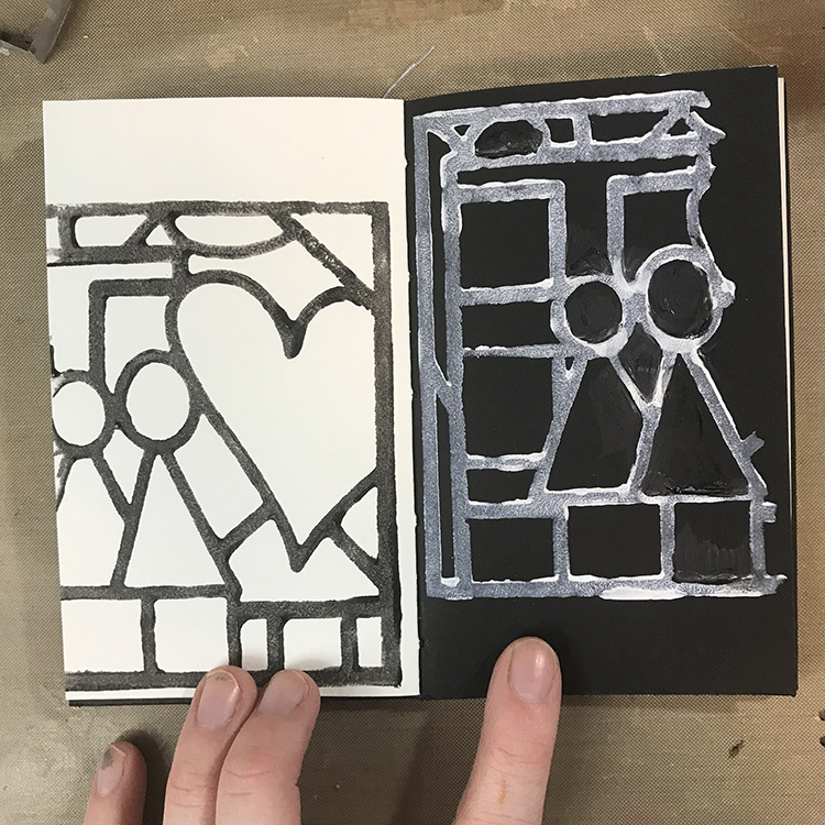
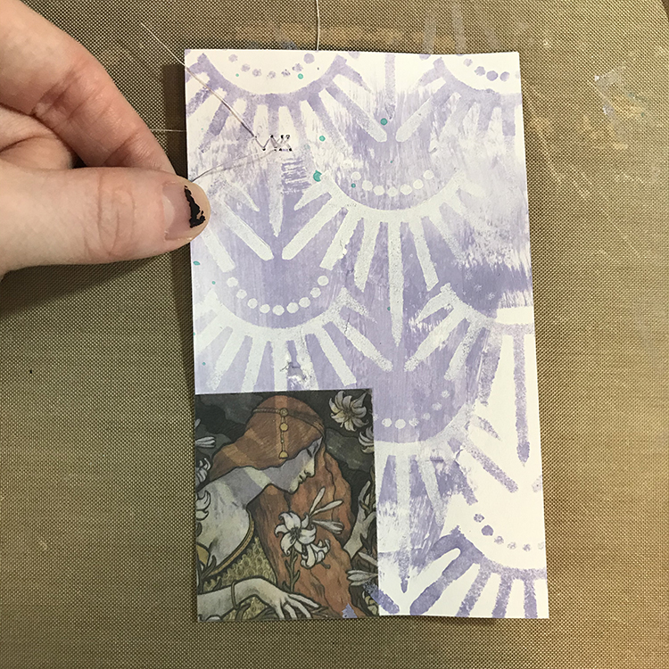
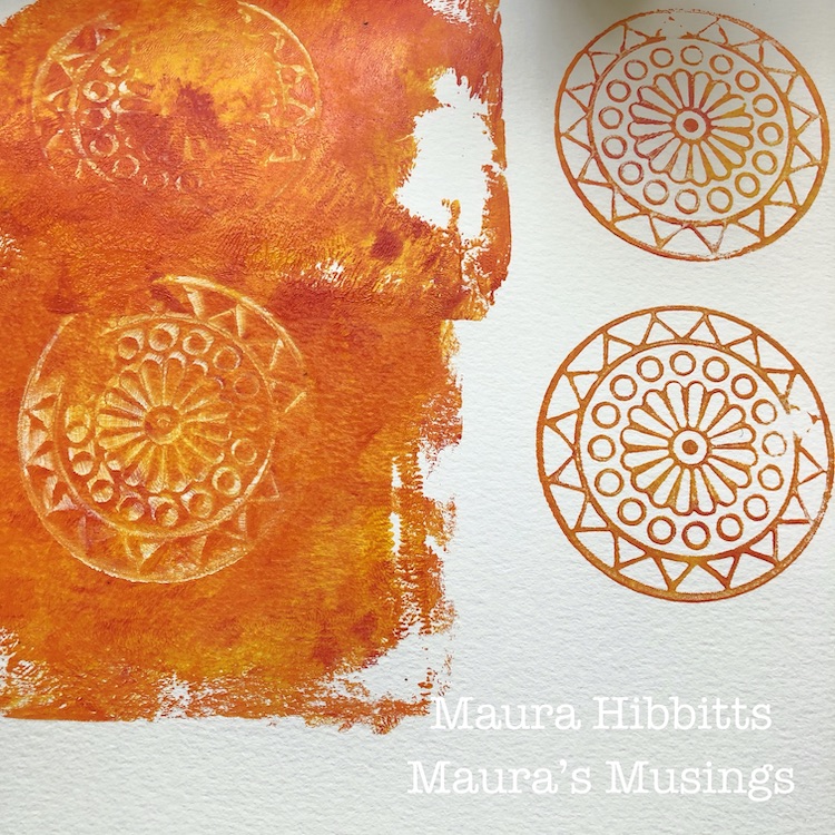
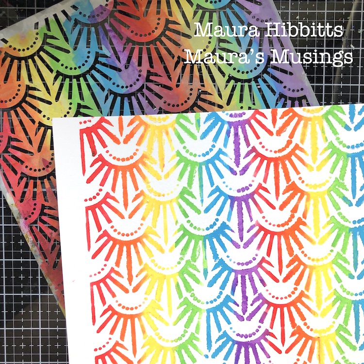
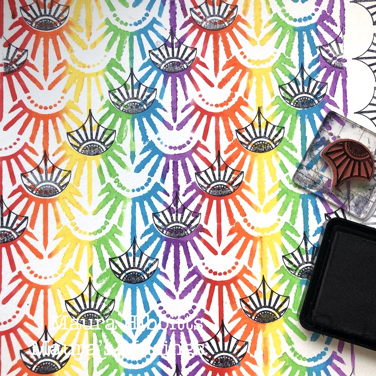
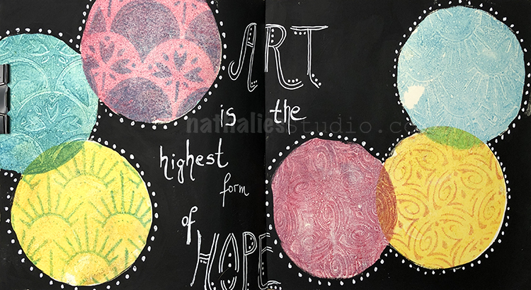
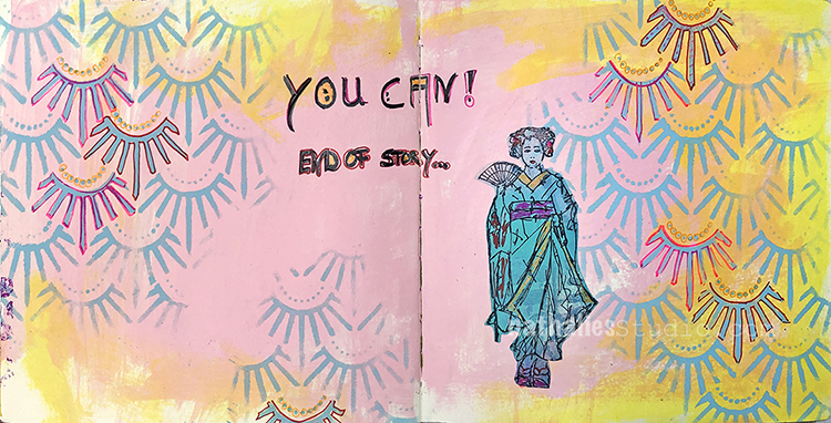
The first thing I did in order to get this page started was pick out a fresh spread in one of my art journals (I chose the journal I created for last month’s project – one of the many parts of my creative journey). Then, using Nathalie’s “Love Story” Foam Stamp, I stamped the design twice, once on each page. On the white page, I used black acrylic paint, and on the black page I used white. This gave me a fun starting point!

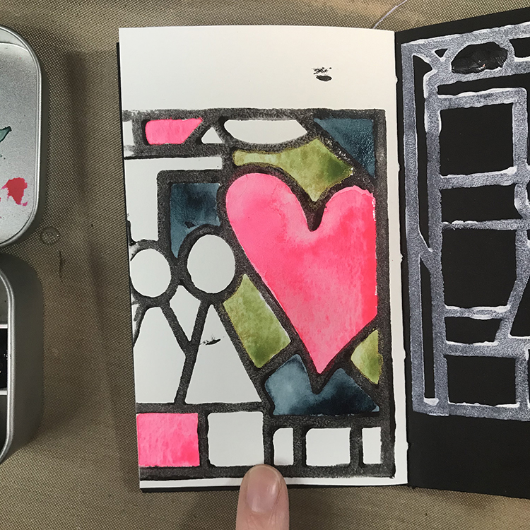
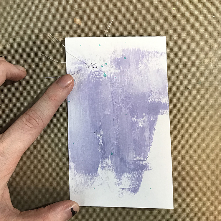
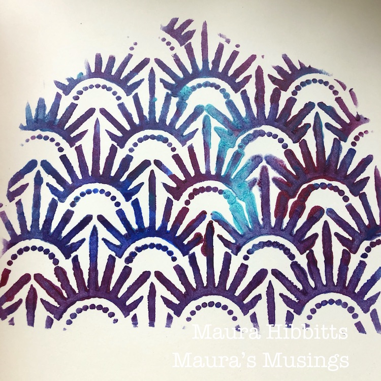
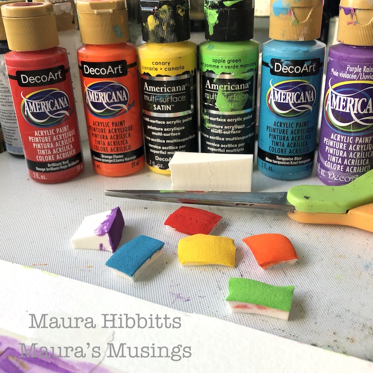
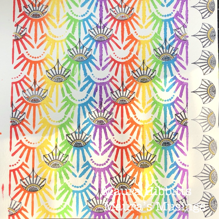
Next up, I knew that I wanted to fill in some of the different spaces with watercolor. The colors I used for this spread were primarily handmade watercolors that I made myself, which is another step in my story that I wanted to document.

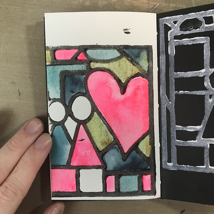
I didn’t fill in all of the sections, since I knew I was going to add a piece of collage on top. As I was filling in the spaces, I tried to incorporate the same colors in several different areas in order to keep everything cohesive and lead your eye around the page.

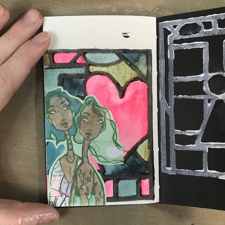
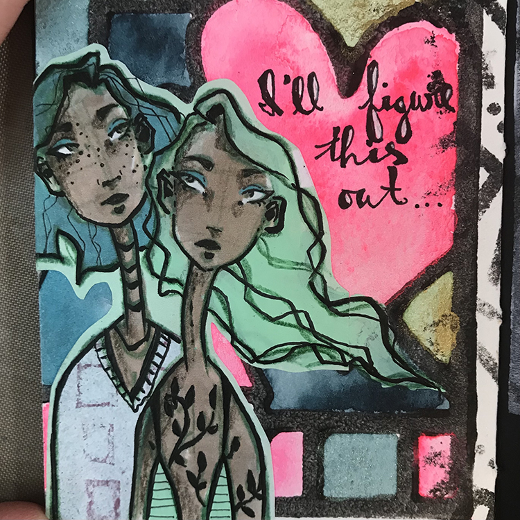
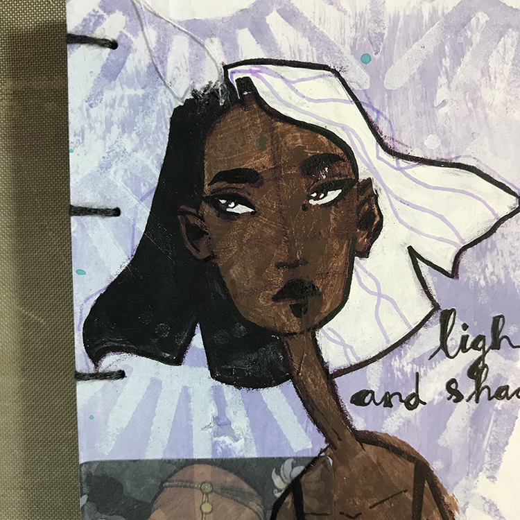
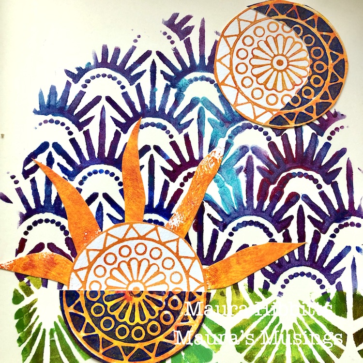
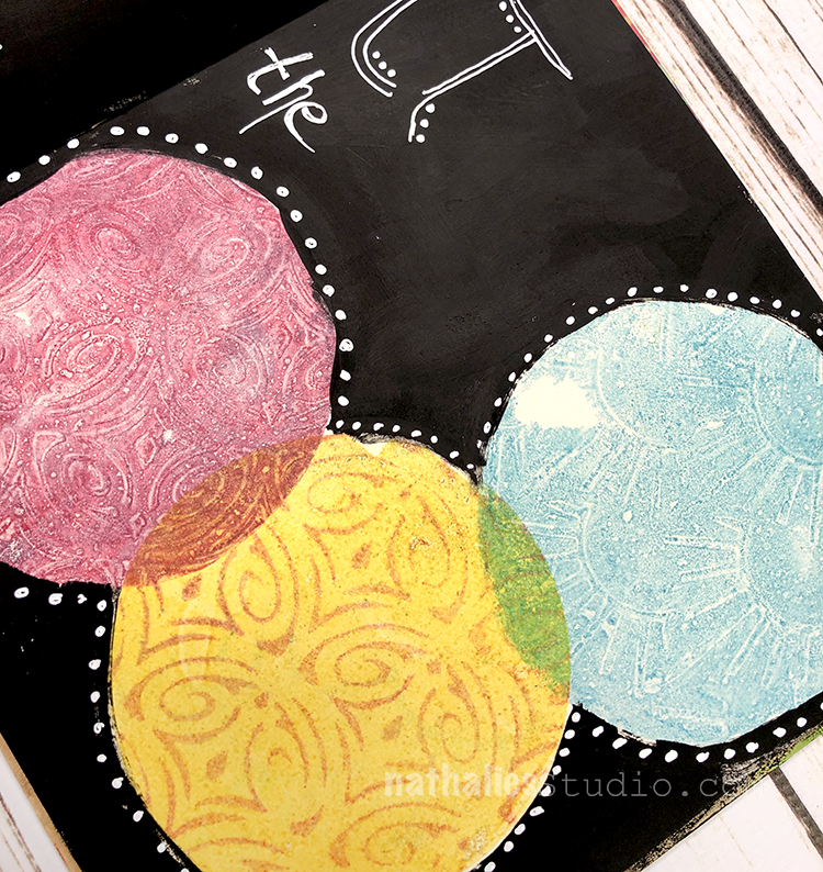
After the watercolor was completely dry, I glued down a piece of collage that was yet another part of my story. This particular image was a previous mixed media piece that I scanned in and printed out to reuse in future work.

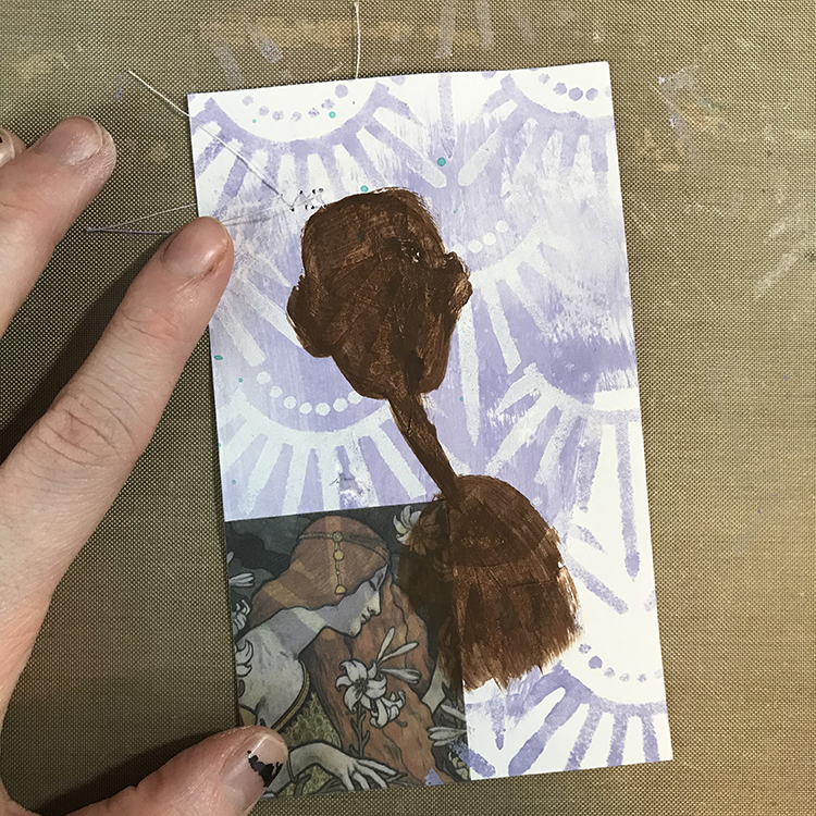
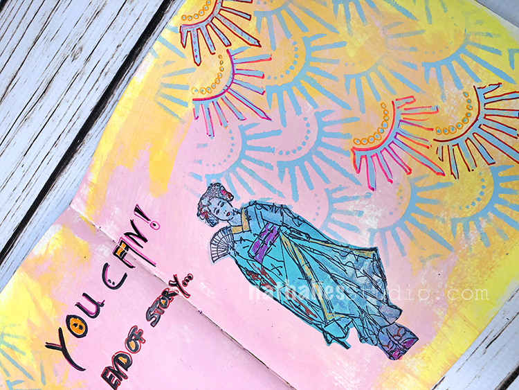
Once the collage piece was glued down, I wanted to incorporate it a bit better into the page. The first thing I did in order to achieve this was extend the shape of the hair. When I was cutting out my image, the figure on the right had hair that ended in a straight line. Using the same color of acrylic paint, I extended the lines of the girl’s hair. I also added some of the same acrylic paint to that girl’s shirt. I then used a colored pencil to redefine some of the lines that I had lost through adding paint.

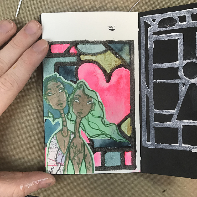
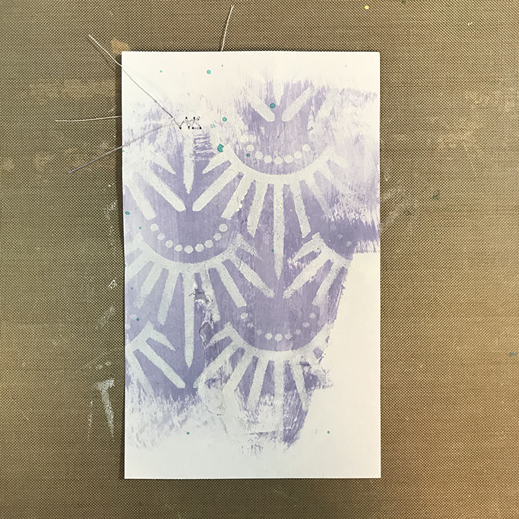
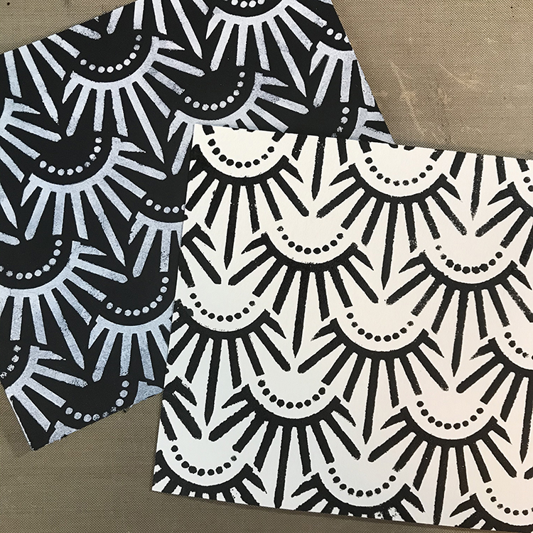
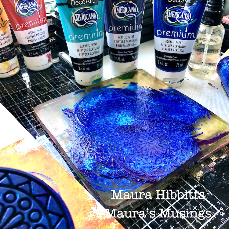
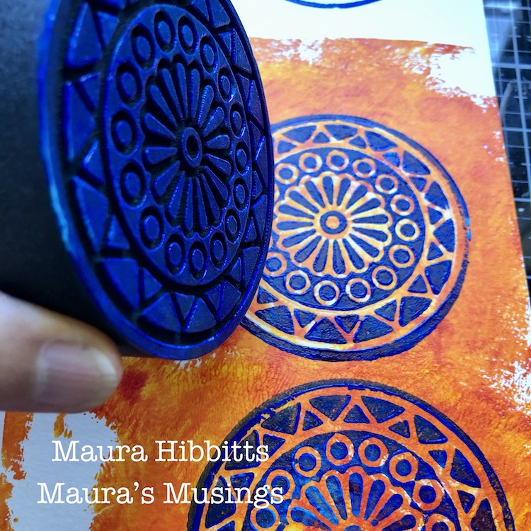
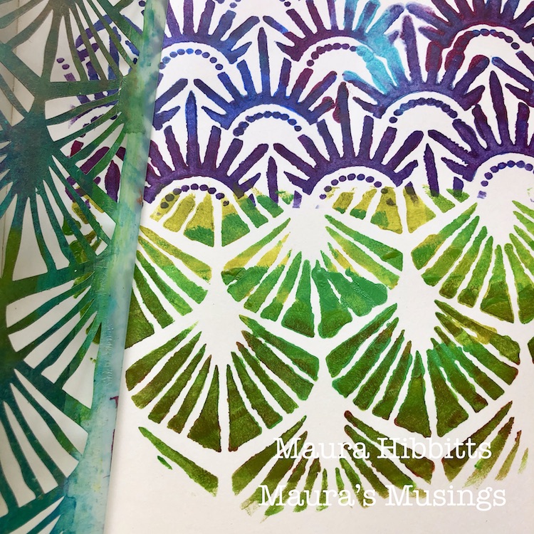
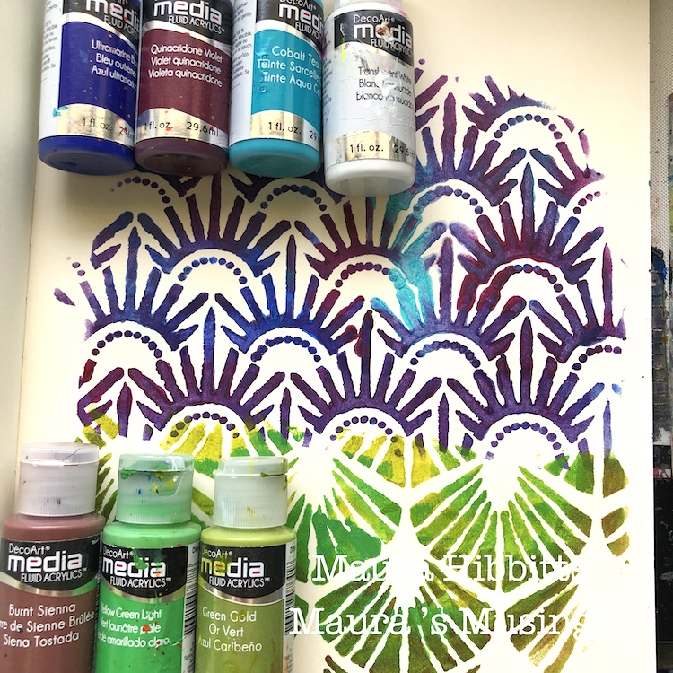
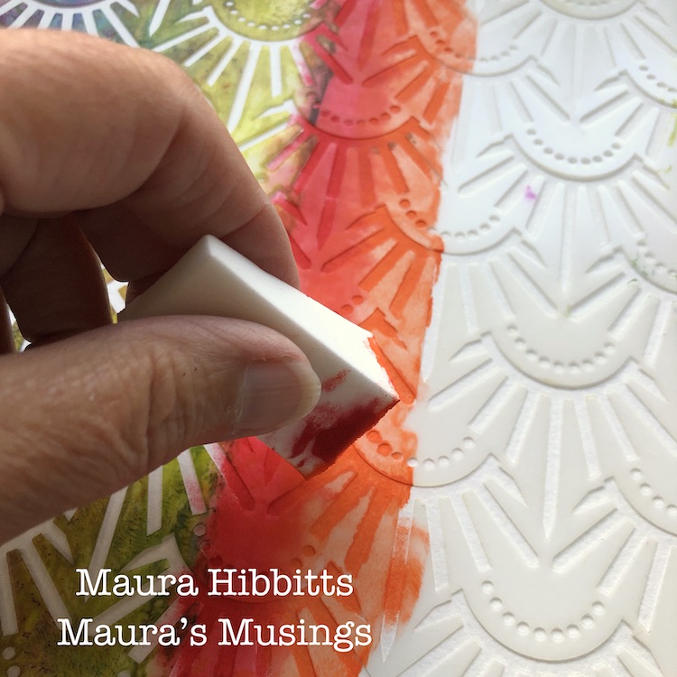
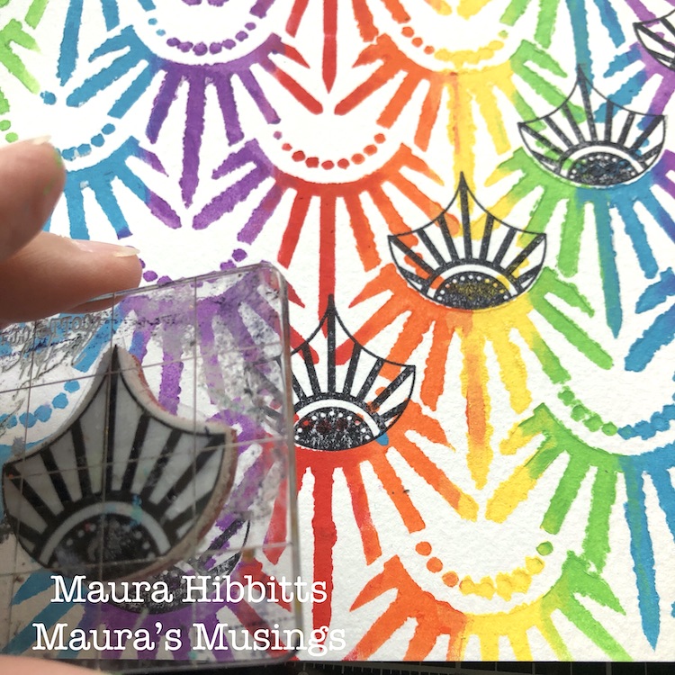
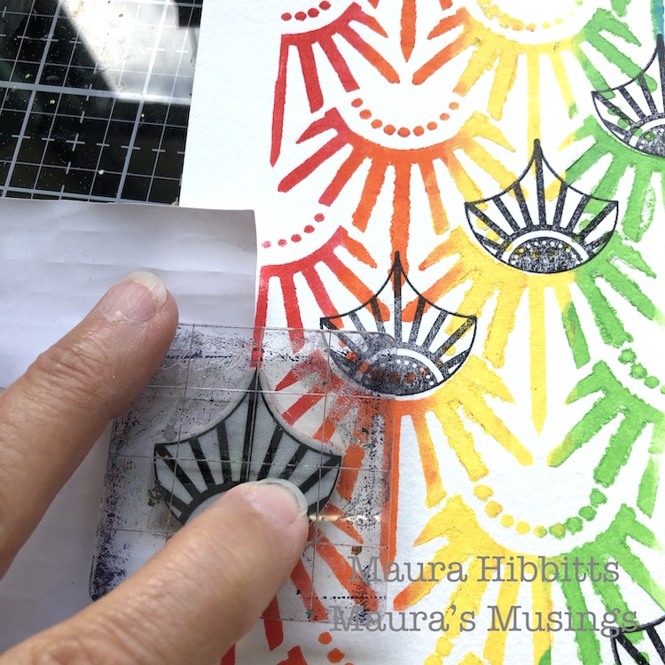
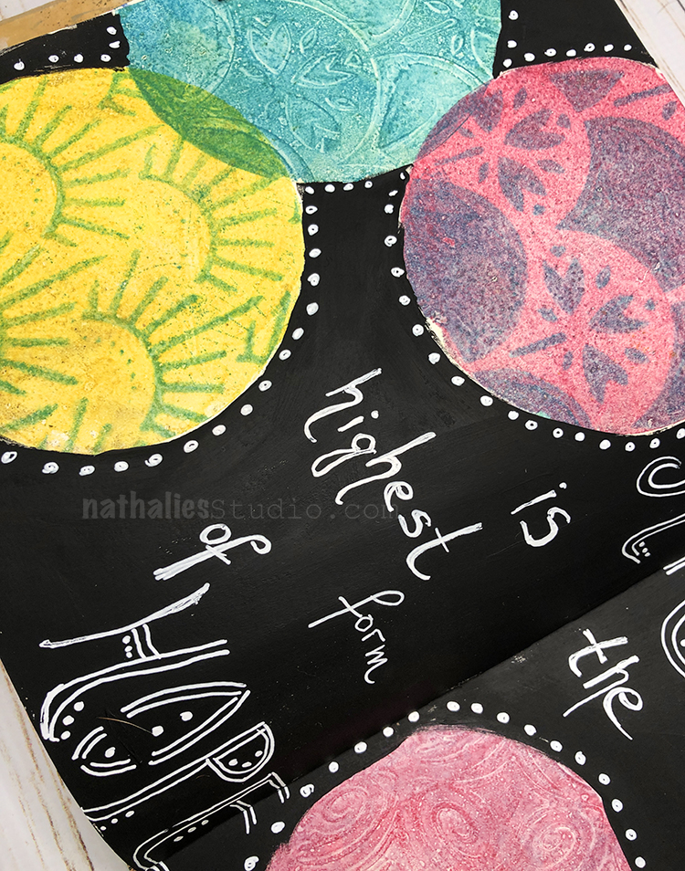
Once I was happy with the hair, I then got to work on the details. First, I used Nathalie’s “Art Deco Empire” stencil to add some additional interest to the areas of the background (primarily the top and side) that hadn’t received a lot of love yet. I really like the way this stencil ended up looking like an extension of the original stamped image.

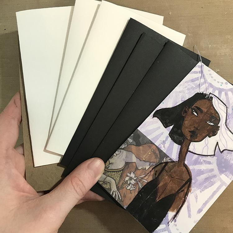
Next, I cut a piece of gelli printed paper to use for the shirt for the girl on the left. The map piece I had used for the original illustration wasn’t working for me anymore and I felt this choice was a lot more neutral. Then, using an ink pen, I started adding details. I traced over almost all of the original line work I had done in pencil and added some stripes and a collar to the shirts. I also gave the girl on the left freckles where she didn’t have them before.

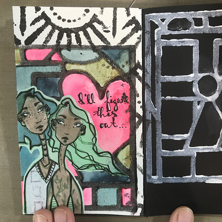
This is also the stage where I added words; these ones are words I pulled from a journal where I simply dump my thoughts. As I wanted to continue the idea of the “storyteller” theme, I scanned through and latched onto this particular group of words. It just felt fitting.

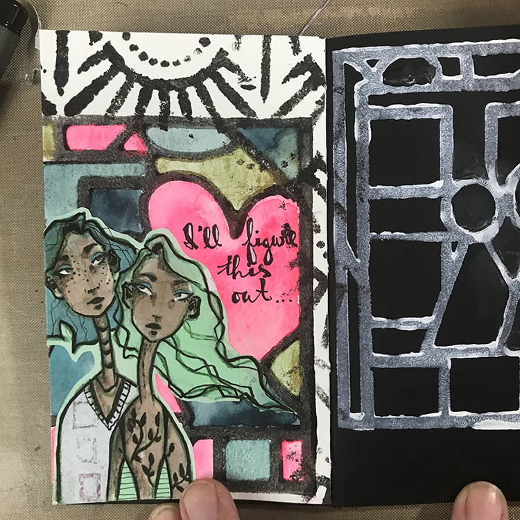
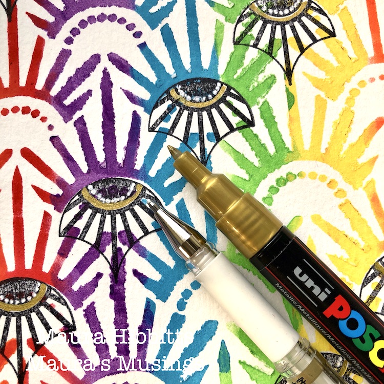
For the final details, I added some colored pencil to the shadowed areas of the faces and traced over the (originally green) vine tattoos of the figure on the right with an ink pen. This gave the figures the final amount of depth I felt they needed in order to call them done!

In the end, I think that the combination of the stamped image and the watercolors as a background is very interesting and it reminds me of stained glass, which I like. I hope you enjoyed my project for this month and consider giving it a try yourself!


Thank you Jordan – love the combination of the bold stamped background with your detailed collage element figures!

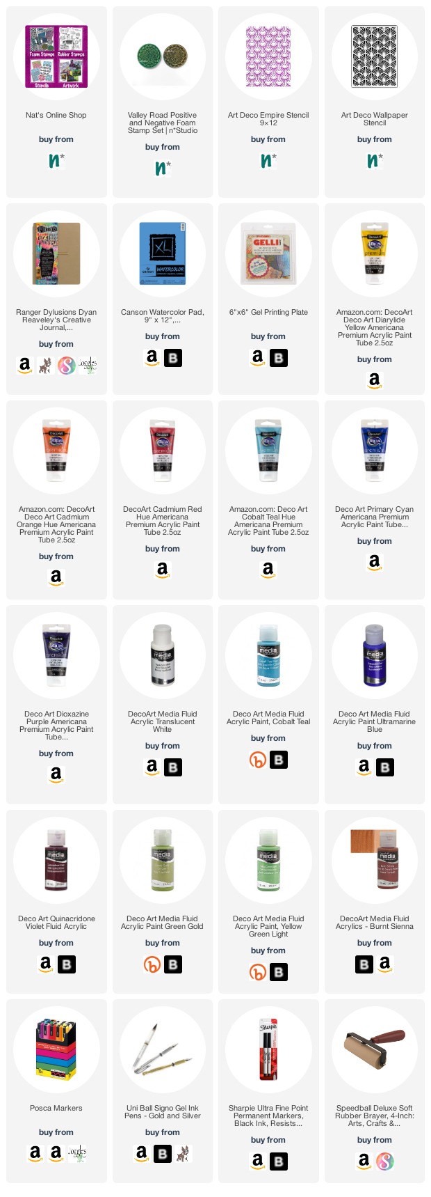
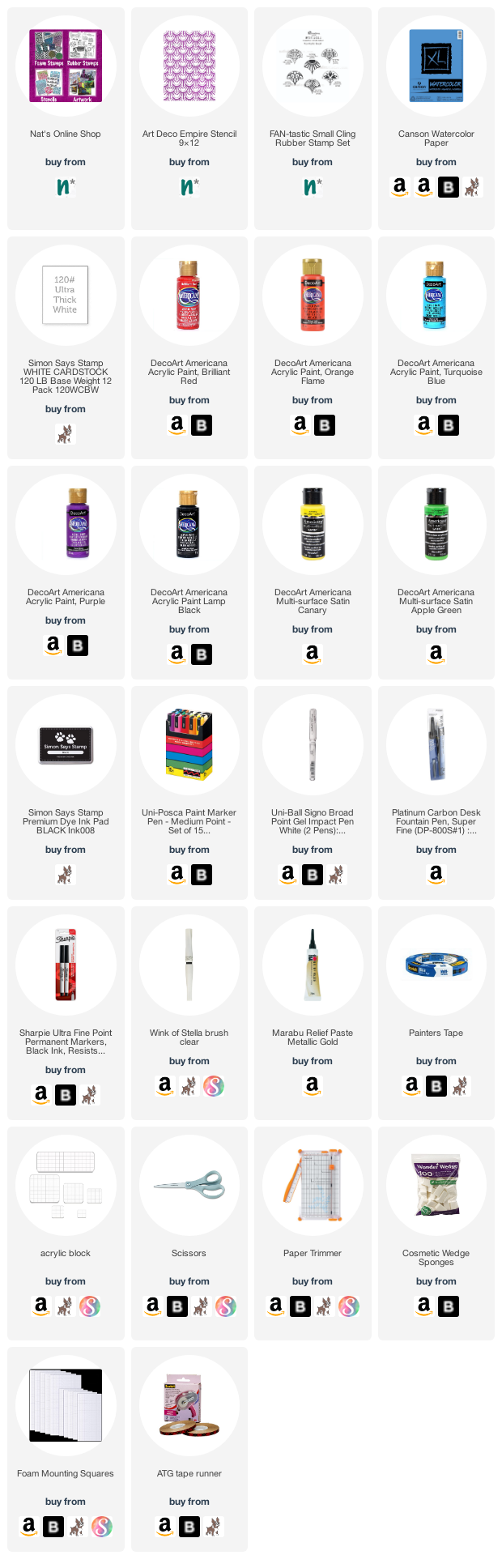
Give it a try: you can find all my Foam Stamps and Stencils in my Online Shop and in addition to her collage element, here are some of the supplies Jordan used:

Don’t forget to check out Nat’s Creative Squad on Instagram too: Each week we post projects, ideas, and inspiration for mixed media art.

Comments (1)

  • Robin seiz

    |

    Jordon, thanks for sharing your post and your story. I love how you used the collage element with Nat’s stamp. The figures have so much personality with the detail you added!

    Reply

Leave a comment

Creative Squad: Light & Shadow – Jordan Hill

Hello from the Creative Squad! Today we have Jordan Hill sharing with us a nice little book that she’s made using my Art Deco Empire stencil and this month’s theme: Light & Shadow – In art and maybe also in life, the balance between light and shadow is an important consideration. Play with this equilibrium in your art and show us how the two sides work together.


Hello, everyone! As a person who is quite fond of the concept of duality and contrasts, I really enjoyed creating this month’s project using the theme “Light and Shadow”! I decided to bind a little book this month, and the actual pages also play off of the prompt. Let’s get into it!

To start things off, I chose a 3″x5″ index card as my surface. I love working on index cards because they are extremely low pressure. This particular card was one I had leftover from an instance where I cleaned off one of my brushes that still had paint on it. It also ended up with a few specks of blue paint and a small section of machine stitching from where I was testing my sewing machine, which added some fun details!

Next up, I used a makeup sponge, white paint and Nathalie’s Art Deco Empire stencil to add some interest to the purple area of the card.

Using the same stencil and the purple paint I had used as a base, I then stenciled over the white areas of the card. This played into the idea of “light and shadow”. I then selected a small piece of ephemera to glue to the lower left hand corner of the card.

At this point, I was comfortable calling this background done enough to add a face! As is the case with most of the figures that I draw, I blocked in her face roughly in acrylic paint first, then sketched and drew on top of that base. To further emphasize the idea of “light and shadow”, I decided to make her hair two-toned; black and white!

Once I was happy with my painting, I cut down two pieces of chipboard to the size of the card and glued the completed index card to one of them. I then selected some paper to use as the pages. I decided to use Canson watercolor paper for the white pages and some basic black cardstock for the black pages. 

Before I actually bound the book, I decided to pull out the Art Deco Empire stencil again! Using the same stencil I did for the cover, I used white paint to stencil on a sheet of the black cardstock and white paint to stencil on a sheet of the watercolor paper. 

Using the stenciled pages as cover sheets, I then bound my book using a coptic stitch and black embroidery floss before calling it done! The fun thing about using both black and white pages is that throughout the book there is an interesting contrast effect that I think will be incredibly enjoyable to create on!

I hope you had fun creating this little book with me and I hope you are inspired to create something of your own!


Thank you Jordan – love the bold graphic quality of this little book’s cover!

Give it a try: you can find all my Stencils in my Online Shop and in addition to a small piece of ephemera, here are some of the other supplies Jordan used:

Don’t forget to check out Nat’s Creative Squad on Instagram too: Each week we post projects, ideas, and inspiration for mixed media art.

Leave a comment

A New Day – Maura Hibbitts

Hello from our Creative Squad! Today we are kicking a new monthly theme off with a project from Maura Hibbitts. Maura is creating an uplifting celestial inspired art journal page using my Valley Road foam stamps and my Art Deco Wallpaper and Art Deco Empire stencils. And bonus: you get a little science lesson too :) Our theme is: A New Day – Let’s try something new today :) Although these are tumultuous times and we never know what each new day will bring, it also seems like the perfect time to throw caution to the wind and just jump into something new with both feet. Try a new material or technique or approach. Why not? Today is a new day… and tomorrow is too!


I find myself rather fascinated with the cycles of the sun and moon…must be my Earth Science background. So, when I thought about a new day, the setting of the sun and rising of the moon came to mind. We’ve had some glorious sunsets over the summer, so I wanted to pull in that gorgeous orange with my sun, and carry a bit of it into the moon.  Since the moon rises 50 minutes later every day, sometimes the moon is rising as the sun is setting, and other days the moon is visible during the day. Just like the sun and moon, we each have the opportunity to make changes with each new day.

I decided to use my large art journal for more impact. I mixed orange, yellow and red on the gel plate and stamped out the Valley Road Positive ArtFoamie on watercolor paper. I stamped several, and also pressed the paper onto the gel plate for a different image. Sometimes when I work, I have an idea of where I am headed, but it’s fluid.

I repeated the first step with a mix of blues and purple with the Valley Road Negative Art Foamie. I stamped several images onto the watercolor paper, and also over the image on the orange print.

I wanted to create sky and earth with the stencils. I began with the sky and the Art Deco Empire stencil. I sponged in a mix of the blues, purple and a touch of white, with fluid acrylics and a cosmetic sponge.

To create the earth, I used a mix of greens and a touch of brown in fluid acrylics. I used the Art Deco Wallpaper stencil to represent the earth portion. I curved the sky and earth because after all the Earth is round, no matter what those “flat earthers” want to tell you, lol.

Next, I cut out some of the images and free cut some sun rays to assemble the sun and moon. I started out with the moon as just a crescent, but once I tried it on top of the full image, I liked that better.

Final step is to do some pen work. I hand lettered “Rising and Setting” in black, then outlined the words with Posca paint pens. I also added some silver to the moon, and gold to the sun with pens.

To illustrate the idea of the sun setting below the horizon, I had the sun’s rays extending up into the “sky”, and added a half circle of the blue and orange image for the portion below the surface to show the sun sinking below the horizon.

My moon shows a waxing crescent, meaning it is on the path towards the full moon. The moon is always there, even though we only see a portion of it illuminated by the sun. I wanted to show that by placing the crescent over the circle.

Hmm, I guess you just got a bit of a science lesson today with the art. That is the way I often taught my classes, mixing in art and science, as well as a few other subjects. When you stop and think about it, you can see all the connections, like the sun and moon being connected to a new day. My wish for you is that each new day is a better one, filled with love, hope, health and joy. – Maura


Thank you Maura! Love this colorful page but also getting the science lesson too – we forget some of that stuff as time goes on!

Give it a try: you can find all my Foam Stamps and Stencils in my Online Shop and here are some of the other supplies Maura used:

Feel inspired? Working on something yourself that you’d like to share?  I love to see how you interpret our monthly themes. Email me how you used my stencils and stamps with the theme and email me an image – I would love to share your projects in my next  “n*Spiration From Around the Globe“.

Comments (2)

  • Diane

    |

    Loved this post! Particularly loved the description of the thinking behind the process. Thank you.

    Reply

Leave a comment

Wild and Free – Maura Hibbitts

Hello from my Creative Squad! Today we have some super colorful and happy cards from Maura Hibbitts that are sure to lift anyone’s mood. She is using my Art Deco Empire stencil and my Fan-tastic Small rubber stamps for this project and our theme: Wild and Free – After so many months of careful living, it’s time to go Wild and Free… In our Art Journals! Go a little crazy in there and live it up with bright colors, exuberant mark making, bold colors – however you want to go a bit bananas. It’s time to let loose! 


There is something liberating in keeping your choices simple, and just letting your creative muse go wild and free. I was drawn to the colors of the rainbow, a symbol of hope for many of us, and decided to make a set of cards that I can mail out. 

I’ve definitely had my wild and free moments in the wilderness, and some youthful follies. I can remember a rafting adventure on the Salmon River in New York in February, and no, I was not wearing a wetsuit. Crazy right, when I think about how cold that water was, and the thick ice lining the shoreline. Oh, I could share a lot more!  Heck, I still have a few of those moments even now that I am much older, and apparently not much wiser.

So, back to the project…I started by taping the Art Deco Empire stencil down over my watercolor paper. I don’t usually do this, but because I was adding multiple colors, I didn’t want it to move.

To create a rainbow effect with the stencil, I used a cosmetic sponge with a light amount of paint. I started with the red, and dabbed two columns down the paper leaving space in-between for all the other colors. Repeat this with orange, yellow, green, blue and violet. Here’s a thrifty tip for you: when changing colors, don’t use a new sponge, instead just cut off the top layer. I managed to use one sponge for all six colors this way.

Next, stamp diagonal rows into the stenciled design using Nat’s small Broadway Fan stamp and black ink. Along the edges, place a piece of paper as a mask for the partial images before you stamp.

Add some detail to the stamped images with white and gold pens. I love adding a bit of gold in to colorful projects. Cut the large stenciled sheet into four smaller pieces (4.25×5.5”) and cut the white card stock for the card base.

Add more detail with gold relief paste and some sparkle with Wink of Stella. Cut out a few fans and pop them up on some of the bases.

Finally, using black paint and a cosmetic sponge, edge the stenciled card bases. Let dry, then adhere these to the card front. Hand letter greetings like Hugs, Hello, and some doodling with a black pen. I wanted to make each card unique for some variety, so you may notice some have the designs going up and others going down. I’ve also left some without words so I can add them in as needed. You could also stamp a greeting.

Four bright and colorful cards are ready to mail out and bring cheer to someone who needs it. I am definitely a fan of bright colors, so it was fun pulling in all the colors of the rainbow into my project. You could use any palette for your own cards…I think an ombre effect would look awesome too! Have a creative August, Maura


Thank you Maura! Wow that Art Deco Empire stencil in rainbow looks just amazing! Some lucky people are going to be so happy when they open their mailboxes :)

Give it a try: you can find all my Stencils and Rubber Stamps in my Online Shop and here are some of the other supplies Maura used:

Feel inspired? Working on something yourself that you’d like to share?  I love to see how you interpret our monthly themes. Email me how you used my stencils and stamps with the theme and email me an image – I would love to share your projects in my next  “n*Spiration From Around the Globe“.

Leave a comment

Art is Hope – Art Journal

“Art is the highest form of hope.” – Gerhard Richter

I used a round Gelli plate and versafine ink pads. I stenciled on top with my Art Nouveau Wallpaper, Art Deco Fairview, and Art Deco Empire stencils, used deli paper on top, then printed onto my art journal. For some like the yellow ones for example I then added a solid yellow layer to the plate and then pressed the still wet surface of the before printed deli paper back on top and got then the pattern into the yellow – kind of going back and forth a bit.

I painted black gesso around it and used a white signo pen for the journaling.

Here are some of the supplies I used:

Leave a comment

End of Story – Art Journal

“You can! End of story…” – one of those things that is always helpful to remind ourselves :)

I made a background with Holbein Goauche and Holbein ink and my new Art Deco Empire stencil.

Then I used Graphik Line Painters from from Derwent to color my Actually I Can stamp in and add some stuff to the journaling, and stencil.

Here are some of the supplies I used:

Leave a comment