Creative Squad

Creative Squad: Favorite Art – My Way – Maura Hibbitts

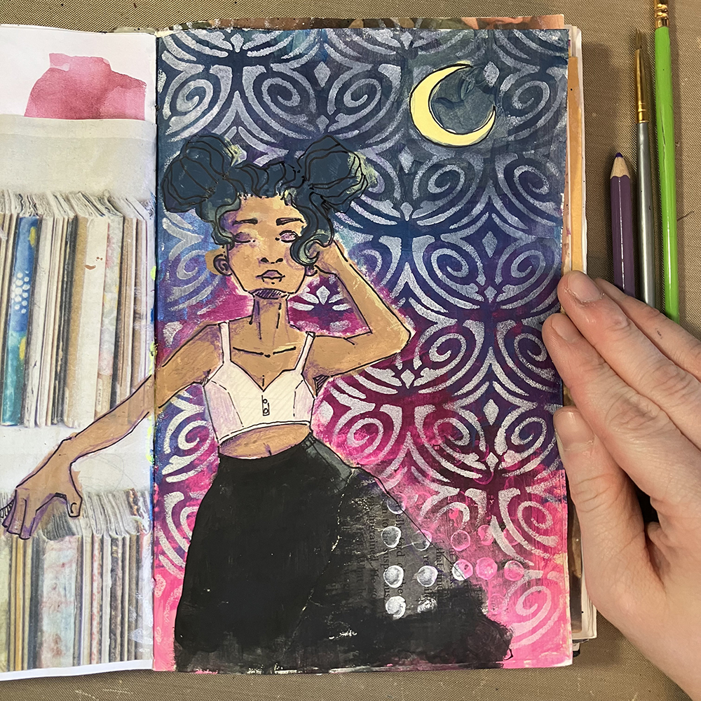
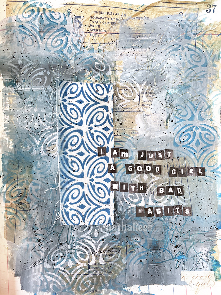
Hello from my Creative Squad! Today we have a mysterious and serene art journal spread from Maura Hibbitts using my Art Deco Fairview, Batik, and Tokyo stencils and my Fairview Fan rubber stamp for our new theme: Favorite Art – My Way – Look at a favorite work of art and create something inspired by it, drawing from the colors, shapes, subject matter, feeling etc. that strikes you most when you look at it.


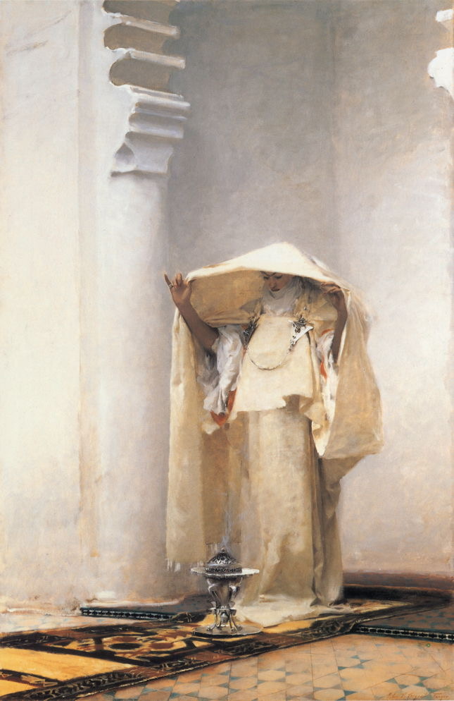
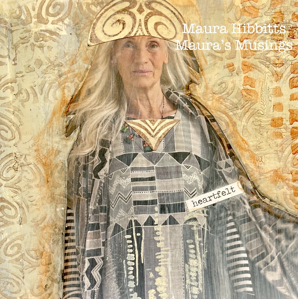
For reasons I don’t completely understand, I’ve been drawn to “Smoke of Ambergris” by John Singer Sargent, since I first saw this painting in a museum. Usually, bright colors call to me, but this painting is soaked in neutrals. Maybe it’s the hints of far off lands seen in the echo of architecture and floor tile. Maybe it’s the feeling of serenity as the woman lifts her veil over the brazier. There is a mystery here that is both simple and complex, an insight into another time and place, that intrigues me.

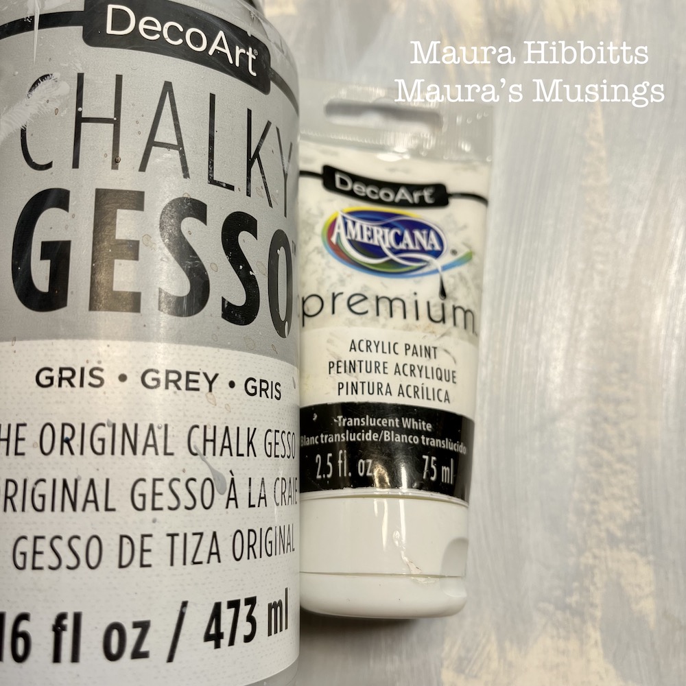
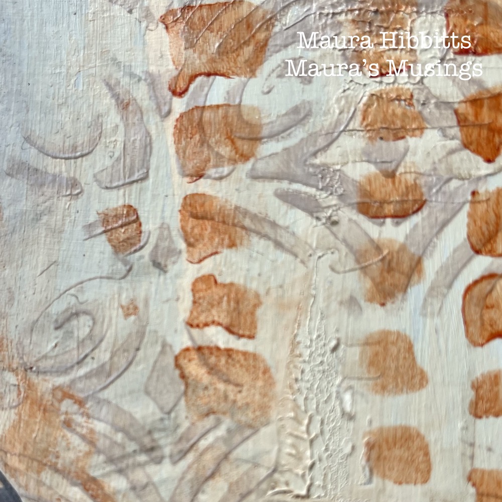
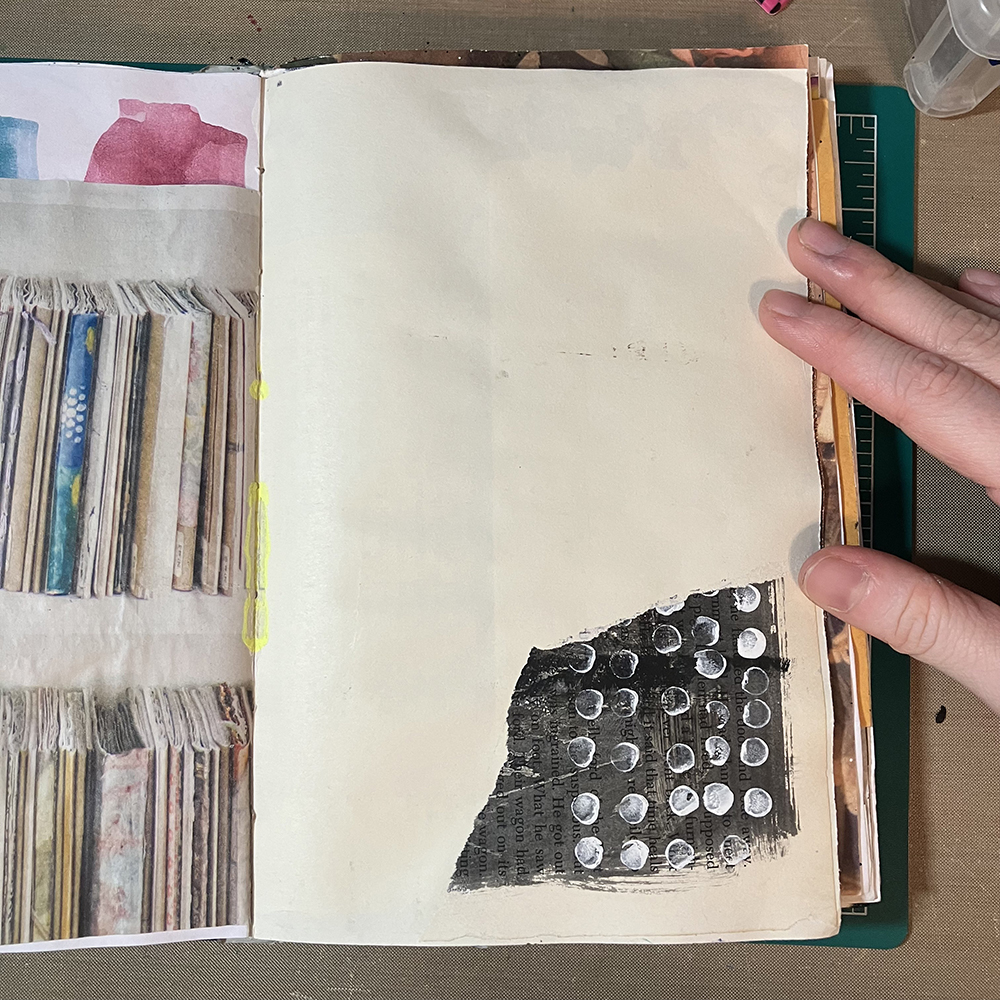
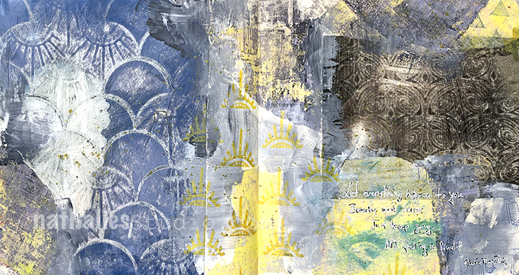
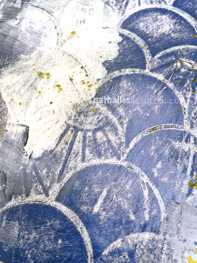
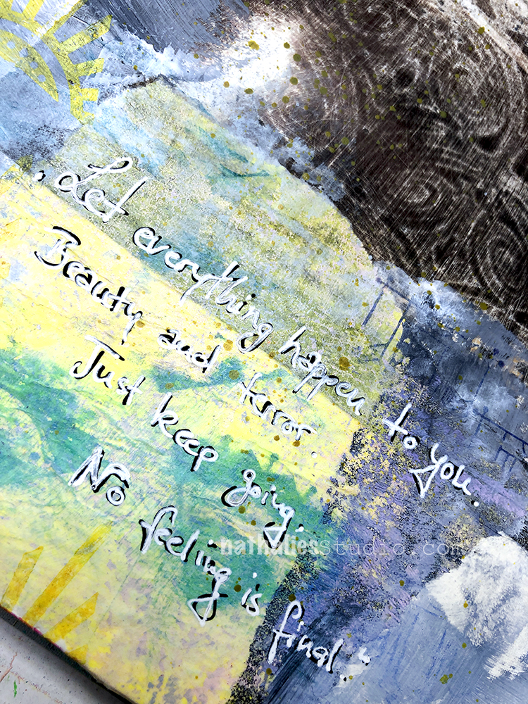
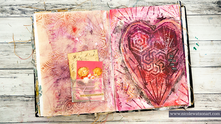
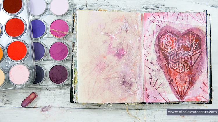
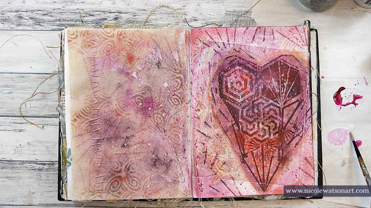
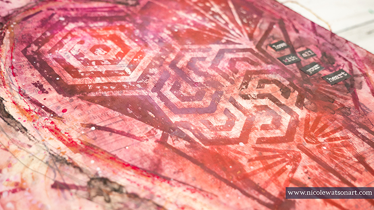
I began by brushing chalky grey gesso up and down my art journal pages, leaving some open areas. Next, I added a layer of translucent white paint, again using vertical strokes, to mimic the vertical lines in the painting. I also felt like this created the hint of shadows.

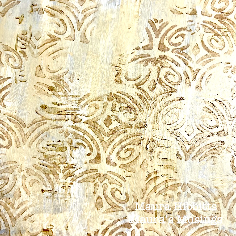
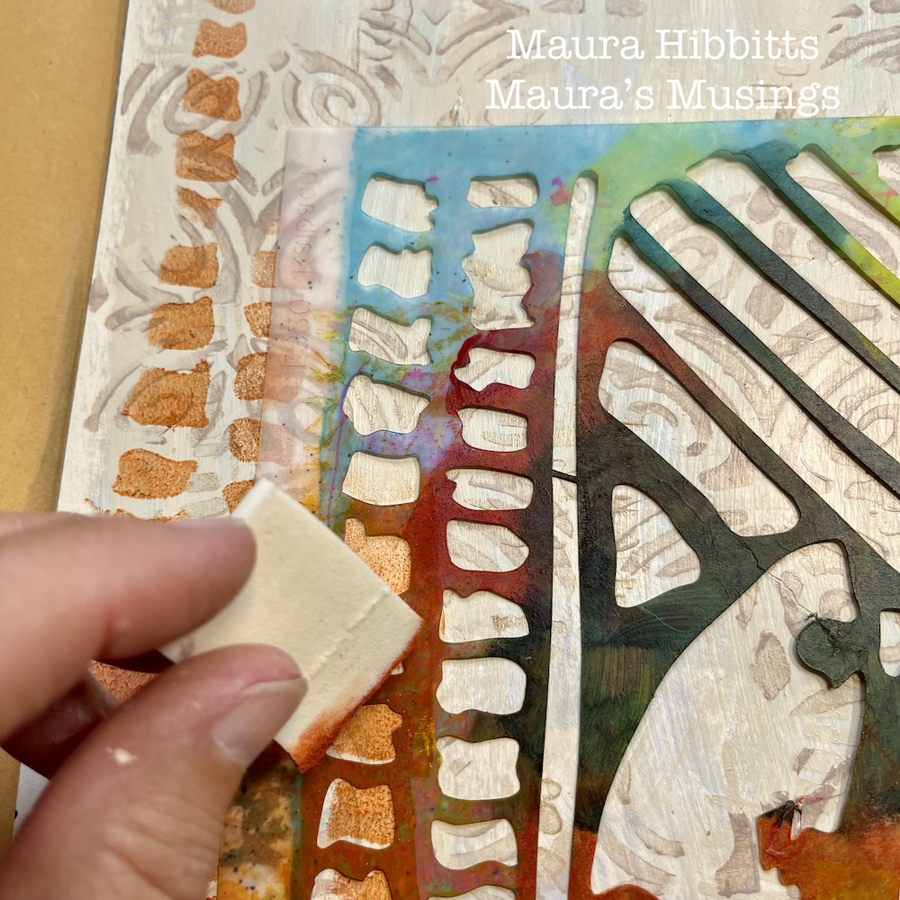
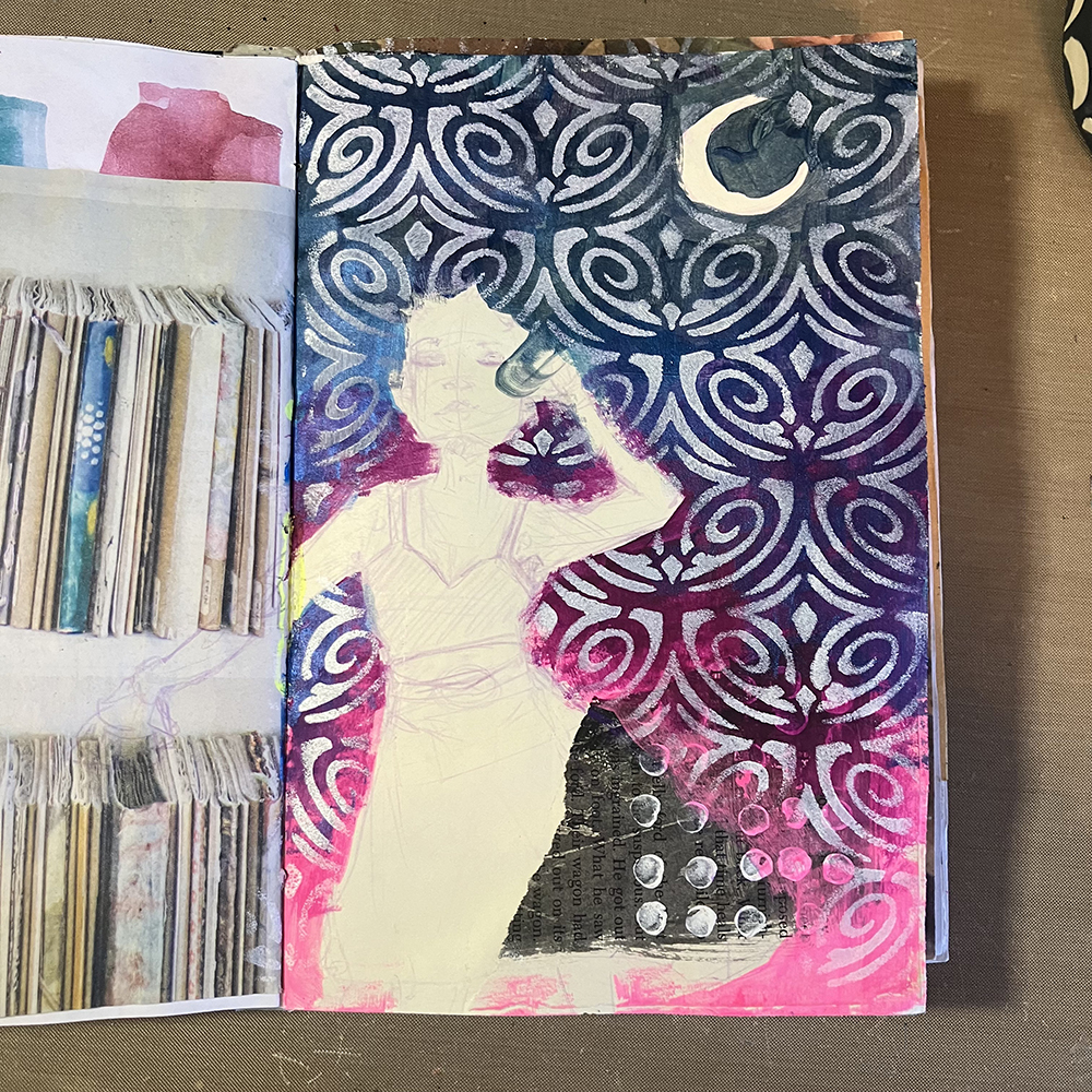
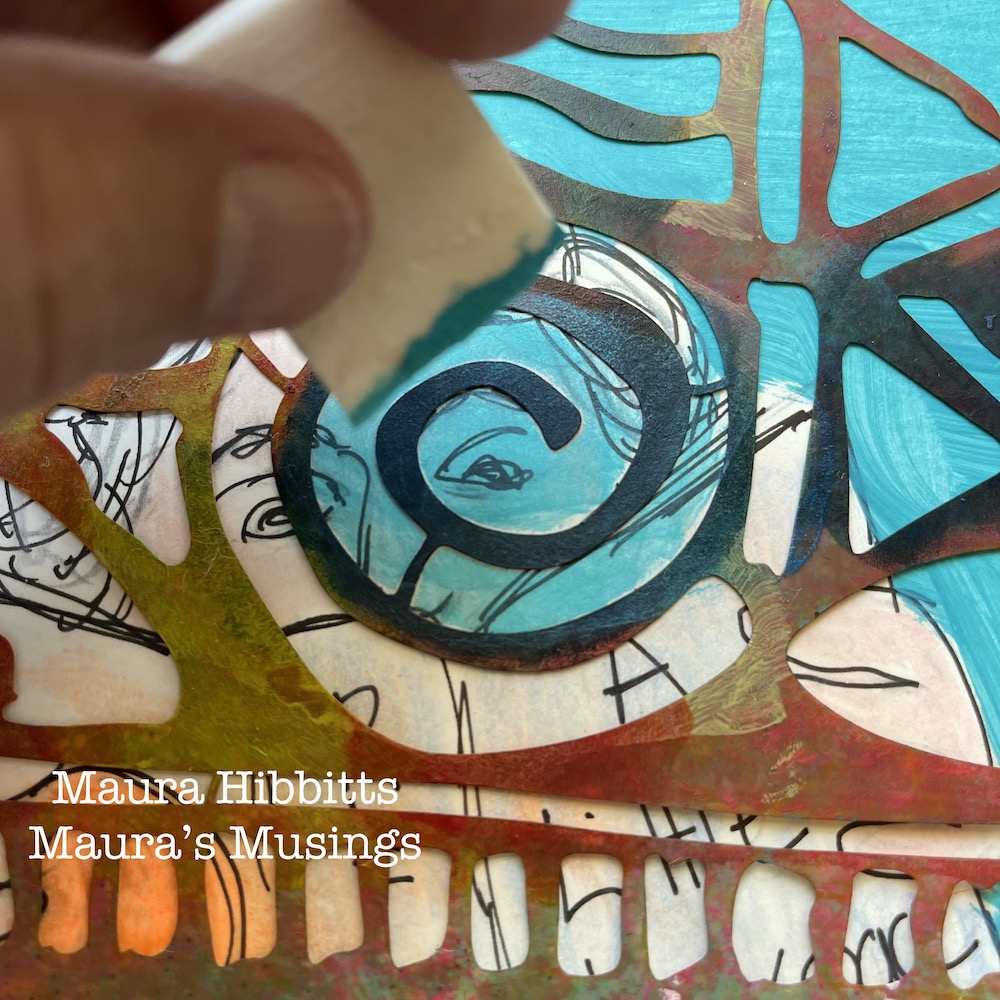
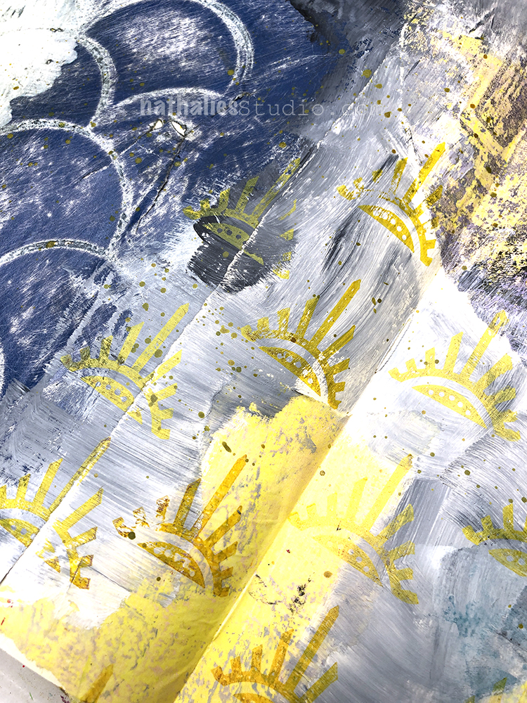
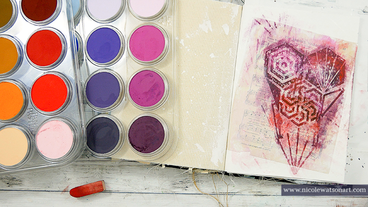
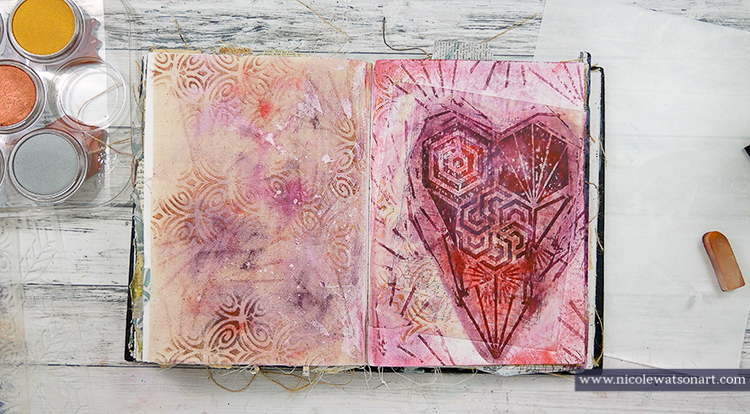
I added a stenciled layer to the dry background using Nat’s Tokyo stencil and pale gold paint.  I like to use a cosmetic sponge for this step, and you always want to use a light touch with the paint to keep the design crisp.

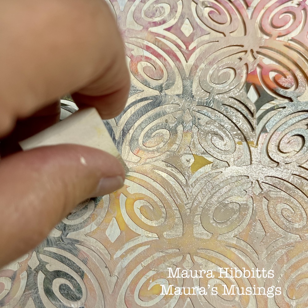
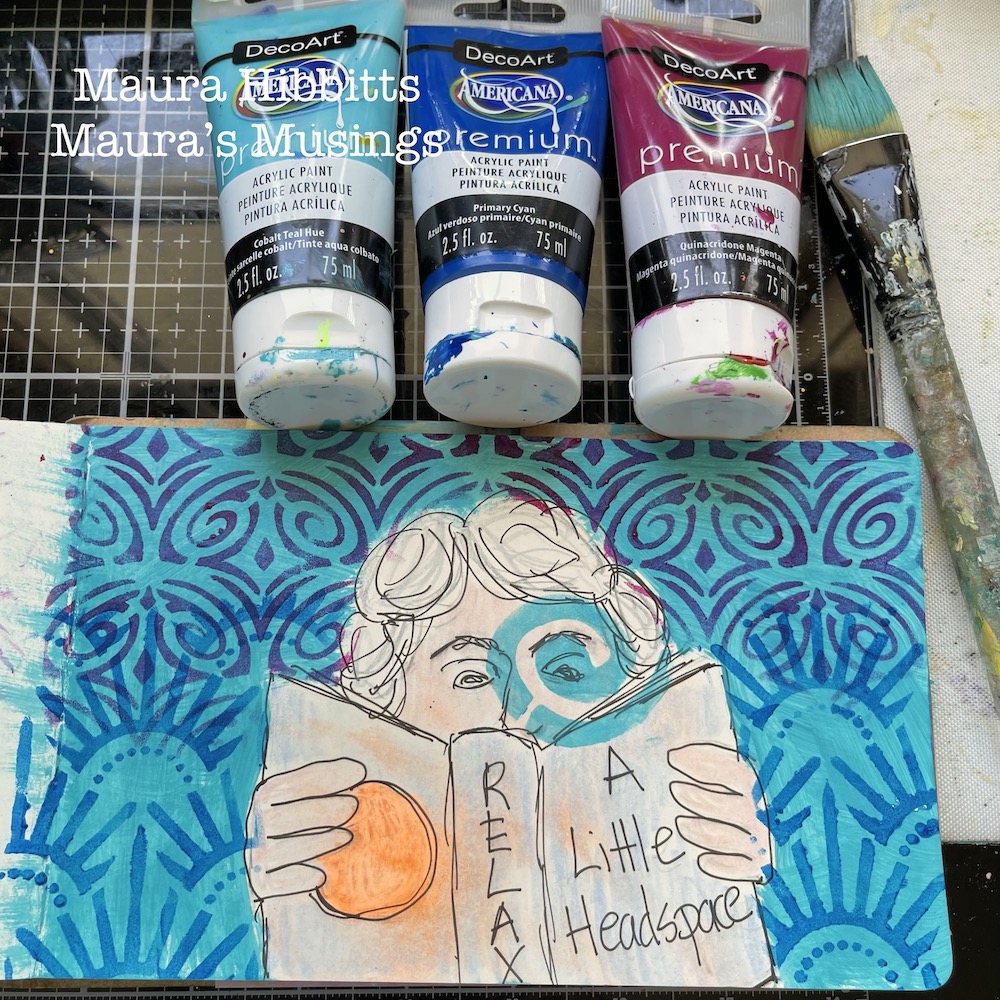
Next up, another stenciled layer. This time, I used Nat’s Art Deco Fairview stencil and a blend of titan buff and burnt umber paints. The layers are building…

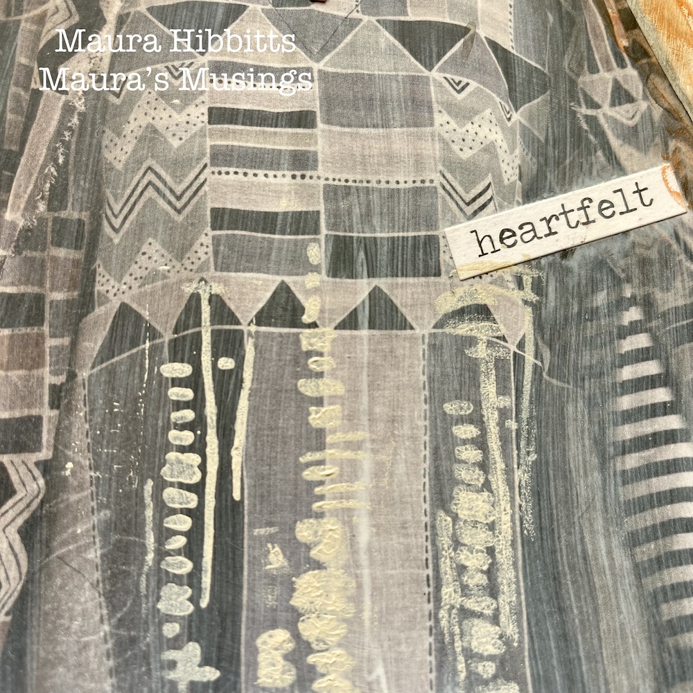
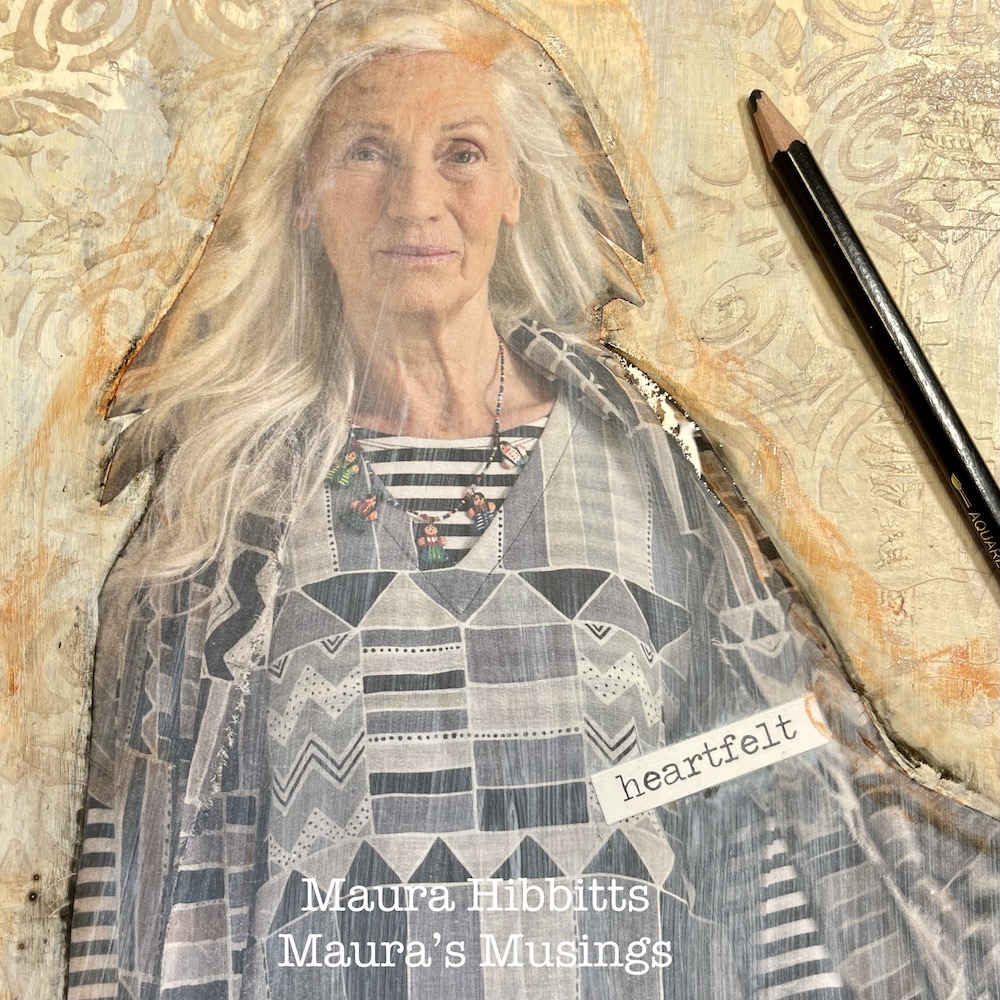
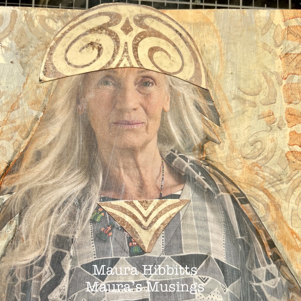
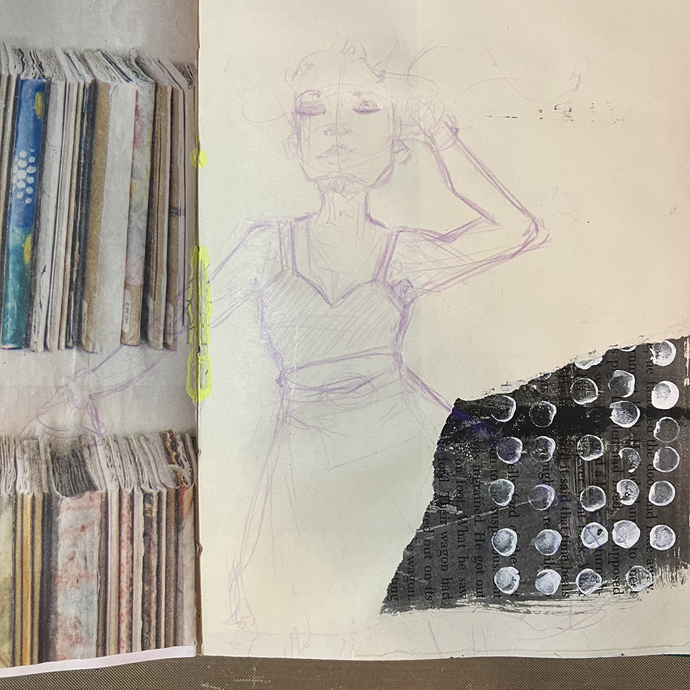
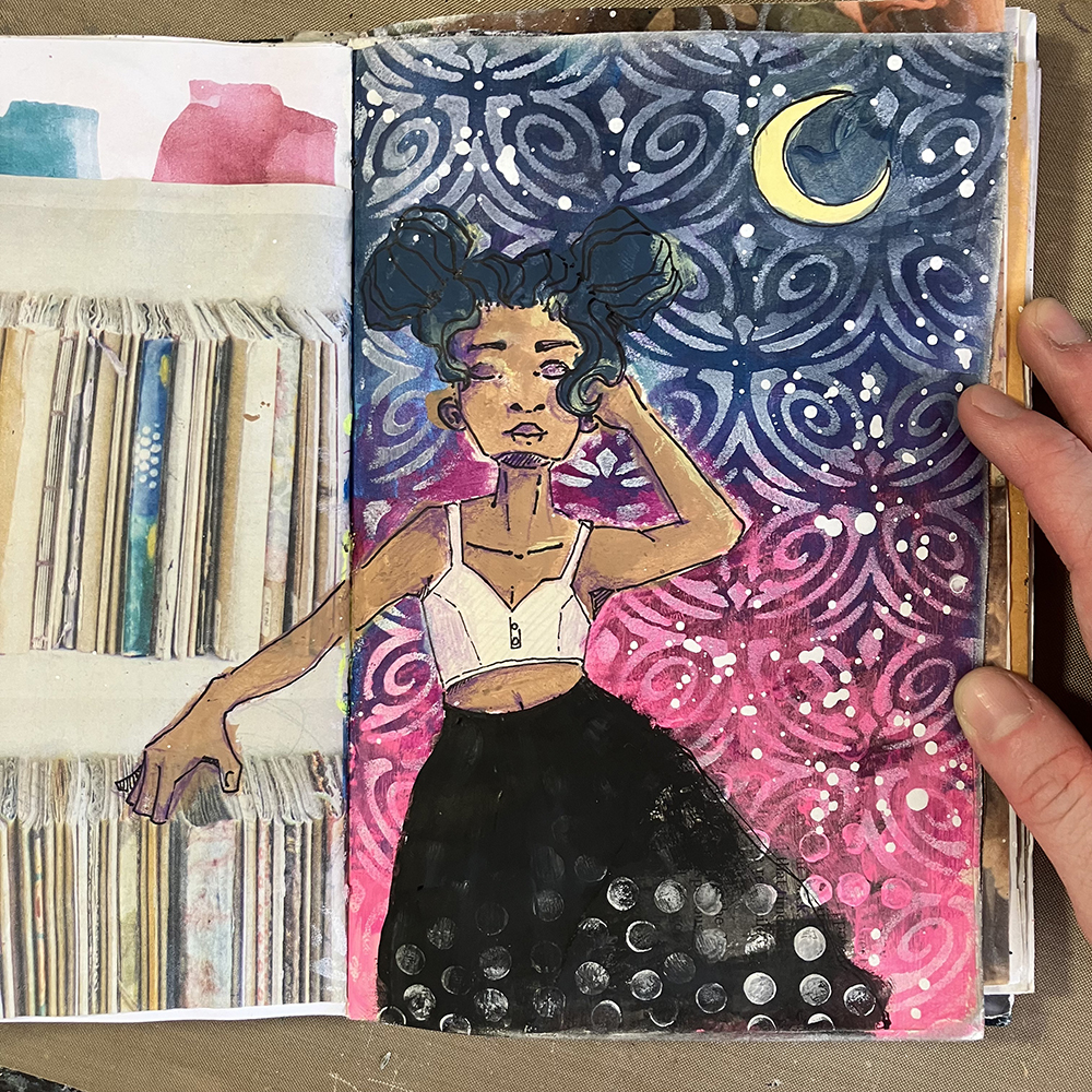
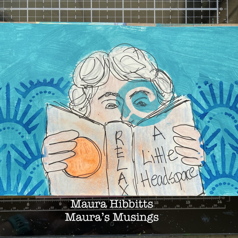
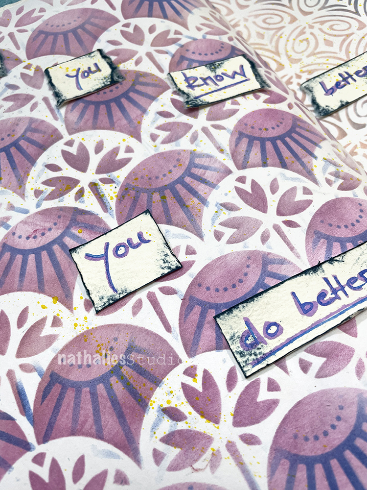
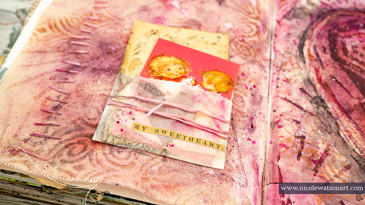
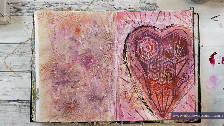
Cut a figure out of a magazine or catalog and adhere to the page using collage medium. I added a word sticker over a label on the clothing. I chose this particular figure for the neutral clothing.

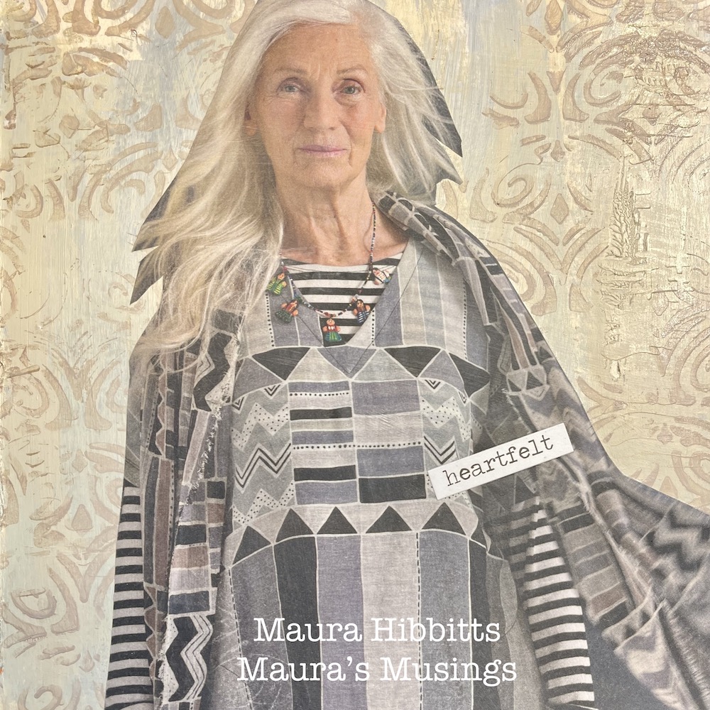
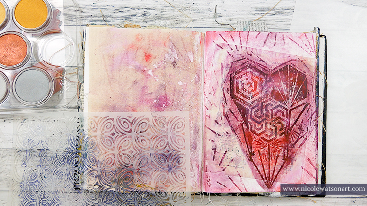
I added a bit of stenciling to the dress using Nat’s Tokyo stencil and titan buff paint.

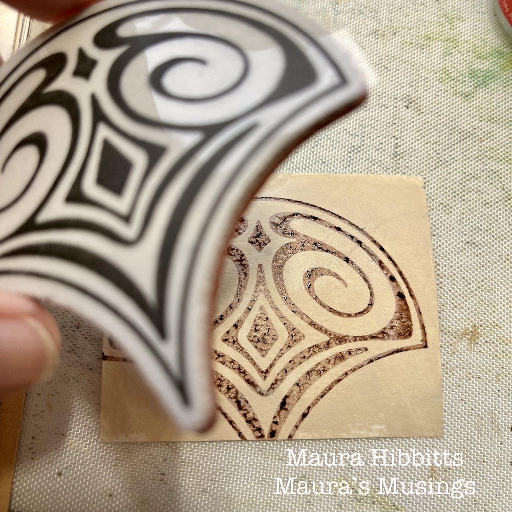
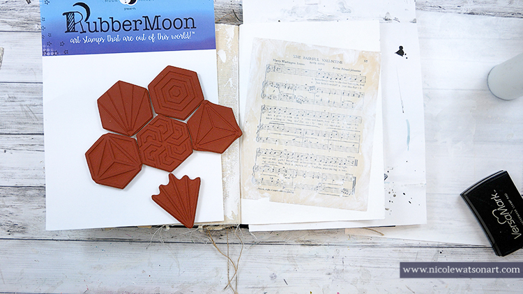
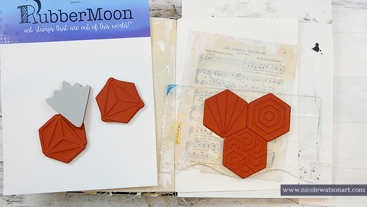
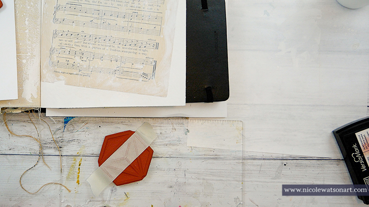
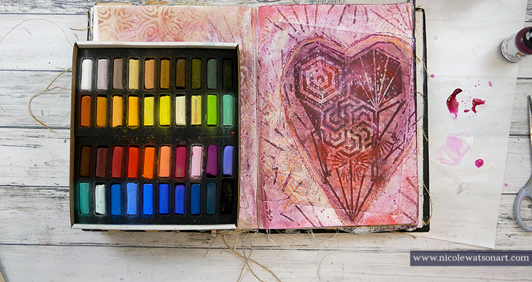
On a piece of watercolor paper, paint it with titan buff and let dry. Next, stamp Nat’s Fairview Fan stamp onto it, using ground espresso distress ink (or any brown ink).

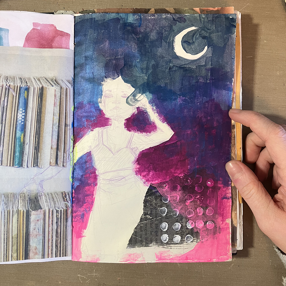
Smudge quinacridone gold paint around the figure and let dry. Edge the figure with a graphite pencil, then use a water brush to create a shadow.

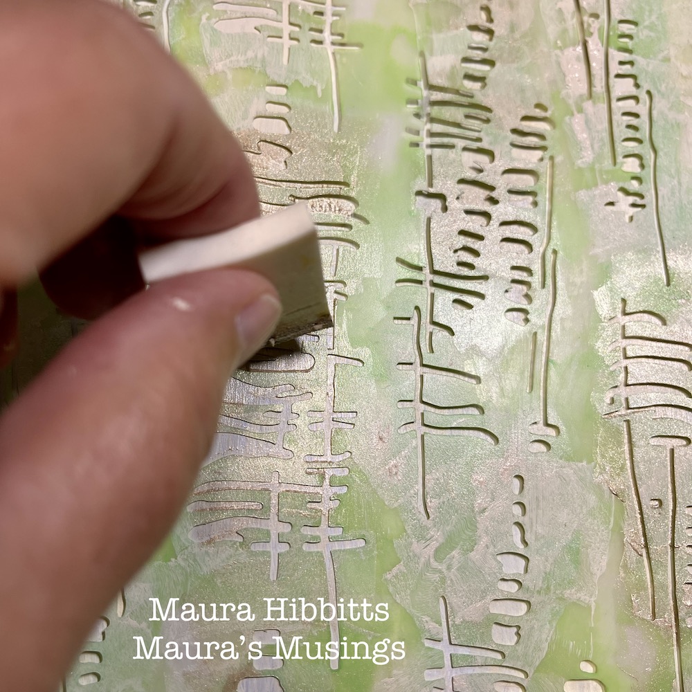
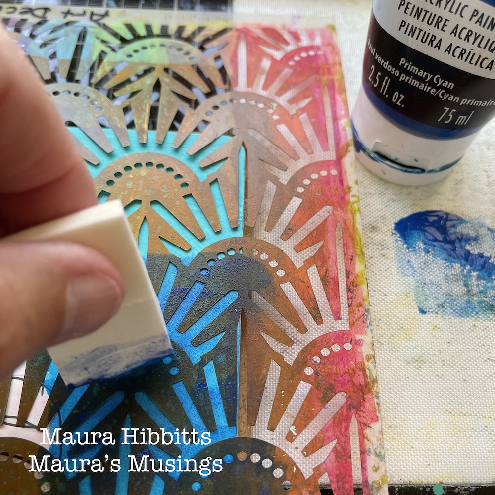
Add three vertical stripes on the opposing corners of the pages with Nat’s Batik stencil and quinacridone gold paint.

Cut the stamped image into a hat to represent the veil in the painting. Also add a portion to the dress.

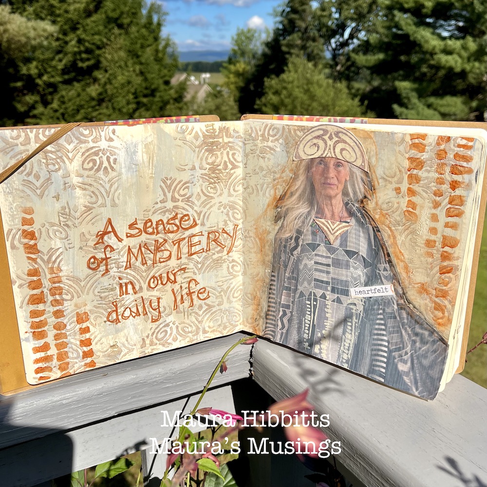
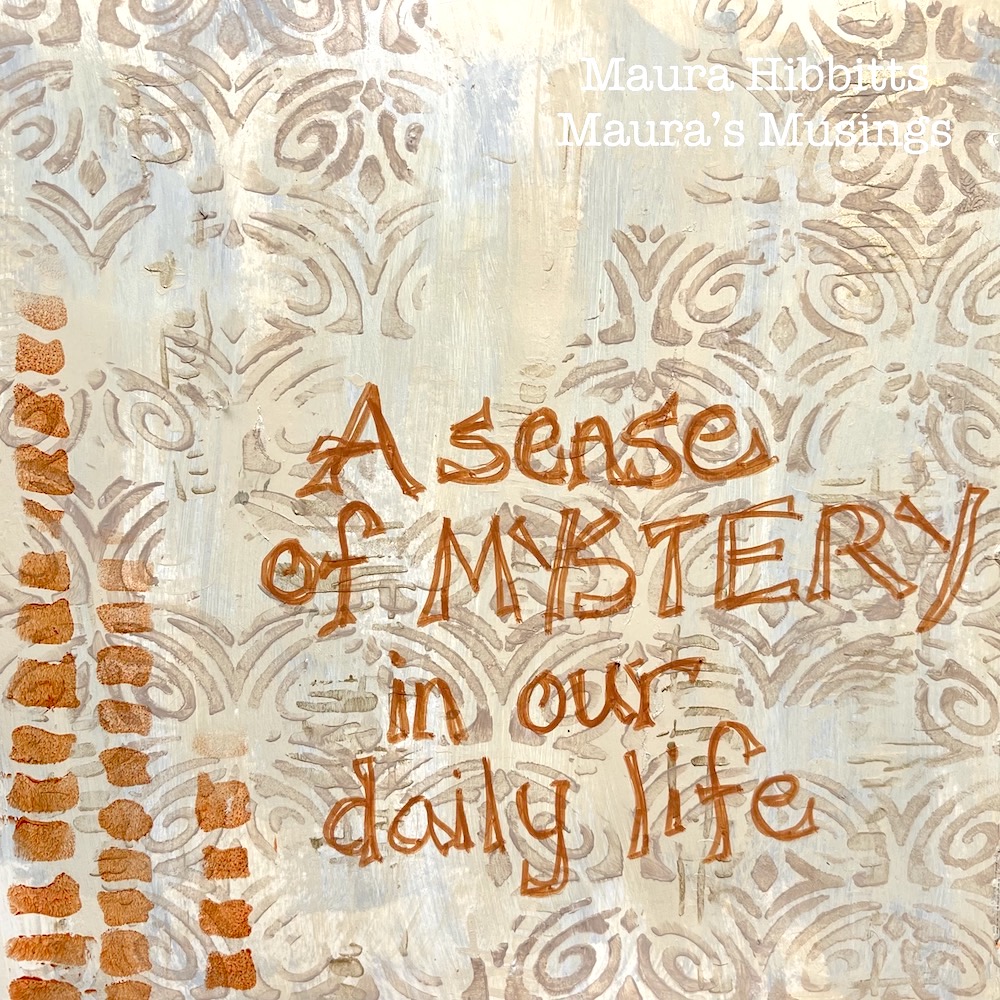
Hand letter some words to the open page with a brown Posca pen. I chose the words “A sense of mystery in our daily life.” I feel the mystery in the painting “Smoke of Ambergris”, but also sense this is a ritual for the woman in the painting. I wanted to echo the neutral tones of the painting and vertical lines, as well as bringing in a hint of the east into my art journal. Get inspired by a favorite piece of art and create! Maura


Thank you Maura! I love that painting too and how you interpreted the color palette and elements is very pleasing to the eye :)

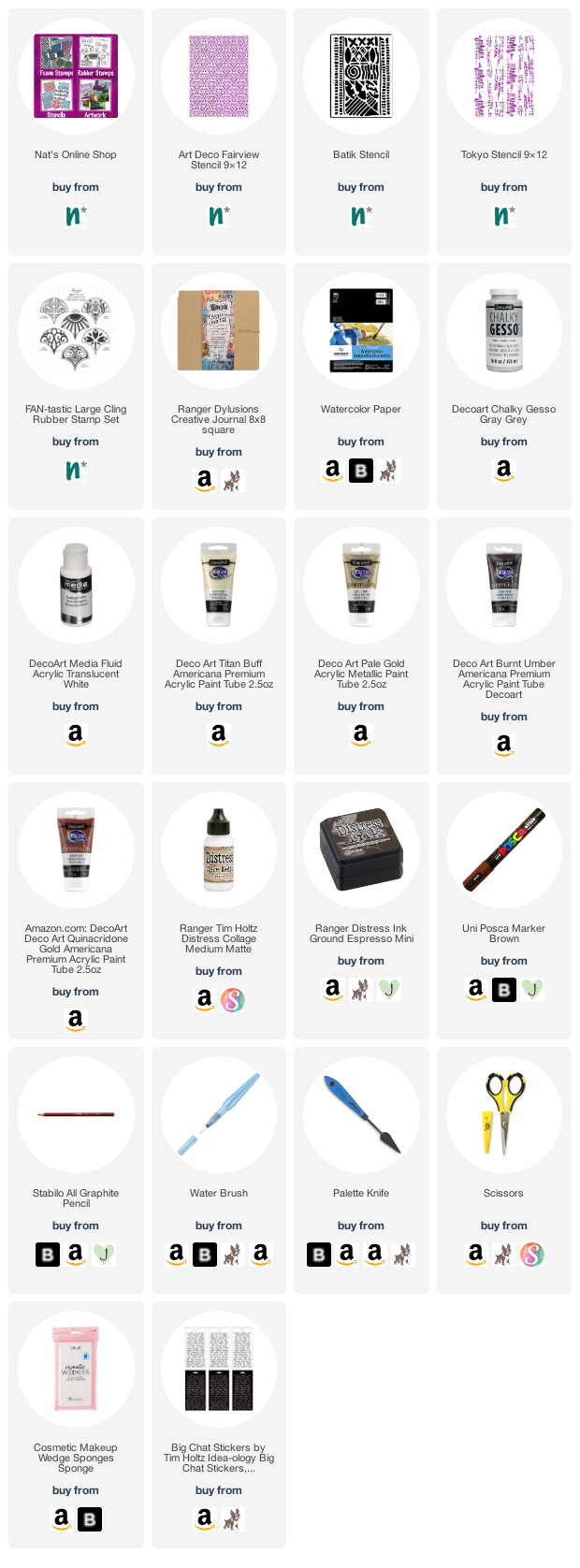
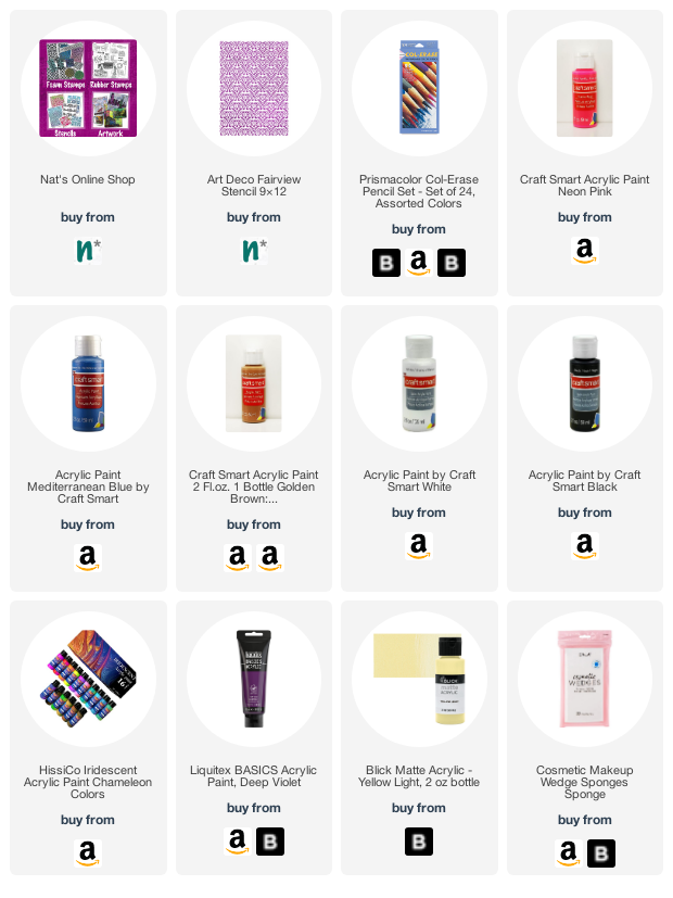
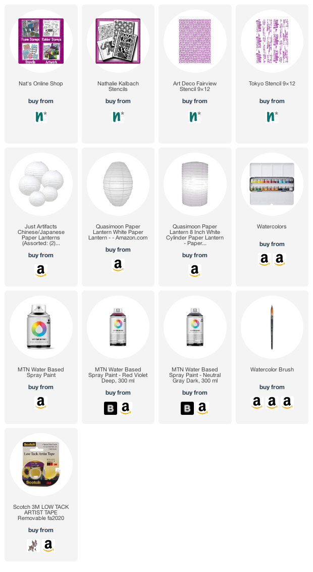
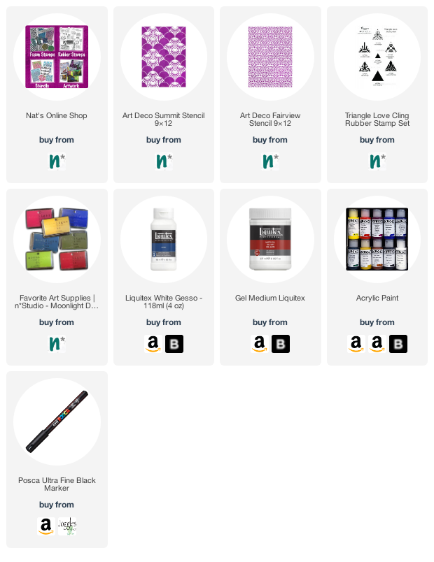
Give it a try: you can find all my Stencils and Rubber Stamps in my Online Shop and in addition to her magazine image, here are some of the supplies Maura used:

Looking for more projects? Follow the Creative Squad on Instagram here.

Comments (2)

  • Sue Clarke

    |

    Love love love this Maura!
    The original is peaceful and you’ve captured the feeling perfectly and made it modern.
    This gives me some ideas.

    Reply

    • Maura

      |

      Thanks so much Sue! I am so glad you enjoyed this, and it gave you some creative ideas. Have fun creating! Maura

      Reply

Leave a comment

Creative Squad: Goodnight Art Journal – Jordan Hill

Hello from my Creative Squad! Today we have a post from Jordan Hill who is sharing an art journal page with a beautiful night sky and one of her illustrated figures too. She is using my Art Deco Fairview stencil and our theme: Goodnight, Art Journal – Think about the colors, sounds, rituals of night – any aspect of it – and use that as your catalyst to create! 


Hello everyone, I’m very happy to be back with you all again for the month of August. I was very excited to hear that this month’s theme was ‘Goodnight, Art Journal’ because galaxies and night skies are some of my favorite things to incorporate into my work. Let’s jump into this month’s spread!

First things first, I needed to choose a page to work on top of. I knew that I wanted a white (or off white) page for the idea I had, so I selected this one that had a small scrap of black and white paper already adhered to it. I felt as though it already fit this month’s theme of ‘Goodnight, Art Journal’, since it vaguely reminded me of a night sky.

Typically I would work on the background next, but this month I wanted to experiment with sketching my focal point first. I used a Lavender Col-Erase pencil to sketch this figure directly onto my page. If you don’t feel like drawing your focal point, collaging an image down will have a similar effect.

I then wanted to add in the background. Using a variety of different paints in pinks, purples and blues (with a hint of black), I created a gradient. I added the paints directly to the page and blended the colors together as I worked.

Next, I used Nathalie’s Art Deco Fairview Stencil and a makeup sponge to apply some white acrylic paint over the entirety of the background. I was trying to create an effect reminiscent of a night sky, with stars and galaxies swirling together.

It was then time to add color to the figure. I used a variety of acrylic paints to do this, and used my Lavender Col-Erase pencil to shade the skin. I added some highlights in the same yellow color I used for the moon to create some additional interest. Somewhere in between the sketch and finished render, this figure also ended up looking in a completely different direction. I guess that’s what happens when you cover your sketch with acrylic paint.

To add the finishing touches to this page, I toned down the brightness of the stenciling ever so slightly by applying washes of the same gradient colors over the top. I splattered some white paint over the background, added a few more dots along the bottom hem of the skirt with the tip of my finger, and I was ready to call it complete!

I hope you enjoyed following along with this month’s art journal page!


Thank you Jordan! I love how your sketch turned out and that gorgeous celestial background!

Give it a try: you can find all my Stencils in my Online Shop and in addition to collage material, here are some of the supplies Jordan used:

Looking for more projects? Follow the Creative Squad on Instagram here.

Leave a comment

Creative Squad: Goodnight Art Journal – Maura Hibbitts

Hello from my Creative Squad! Today we have an art journal spread from Maura Hibbitts sharing her bedtime routine with us. She’s using my Batik, Art Deco Empire, and Art Deco Fairview stencils and our new monthly theme: Goodnight, Art Journal – Create an art journal page inspired by nighttime. Think about the colors, sounds, rituals of night – any aspect of it – and use that as your catalyst to create! 


So, I immediately thought of the book “Good Night Moon” when I saw this month’s theme, and books are part of my art journal spread too. Do you have certain routines you follow to help you get to sleep at night? I like to wind down by listening to Headspace focus music (usually jazz) and reading a book. Nowadays, my books are on my Kindle so I can enlarge the print to read it, but I love to read, no matter the format.

I began my project by sketching the image of myself reading with pencil.

Next, I went over my sketch with an archival black pen, let it dry, then erased the pencil lines. I was thinking about all the mediums I could use, and decided on colored pencils, since I haven’t used these for awhile. It’s always good to pull out an old art supply to play with.

I painted a layer of cobalt teal around my image on the page. To add to my theme, I took Nathalie’s Batik stencil (a favorite of mine) and added a swirl of cobalt teal paint over one eye to emphasize my focus on reading and music as I unwind for sleep. I have to say, if I get too far off my nighttime routine for awhile, I get kind of grumpy.

Now, it’s time for more stencil play. I chose Nathalie’s Art Deco Empire stencil for the lower portion of the page. I like to use cosmetic sponges to blend the paint into the stencil with a light touch, and here I used primary cyan. I decided to lay the used stencil on the opposite page and wipe the paint off onto the page with a baby wipe. It’s almost like getting a ghost image.

For the upper portion of the page, repeat the process using Nathalie’s Art Deco Fairview stencil and quinacridone magenta paint. Again, wipe the stencil off onto the opposite page.

Final step is to add some journaling. I used a Posca paint pen and hand lettered my words over the page where I wiped off the stencils. I like that bit of pattern in the background.

Music and reading relax me as I unwind for sleep. What are some of your favorite ways of winding down? I hope you have a good night!


Thank you Maura! Love your cute drawing and how the stenciled background came together!

Give it a try: you can find all my Stencils in my Online Shop and here are some of the supplies Maura used:

Looking for more projects? Follow the Creative Squad on Instagram here.

Comments (1)

  • Sue Clarke

    |

    What a fun play on Goodnight Moon!
    Nice creation Maura.

    Reply

Leave a comment

Victorian Inspired Paper Lanterns – Play Date

While I was researching some of the previous owners of my home, I came across an image of a place where they would go in the summers for a type of retreat from the city. Each summer the whole family would head out to their cabin in Mount Tabor NJ, and they participated in the tradition of hanging painted paper lanterns along the front porch to celebrate “Children’s Day”.

I have since seen examples of these Victorian age paper lanterns in antique stores and thought it would be an excellent Play Date for Kim and I for the summer. Although you could choose to paint or stamp them using a variety of media, we decided to do watercolor washes and then stencil them with water based spray paint.

For the version that we did, you’ll need paper lanterns, watercolor paint and large watercolor brushes, water based spray paint, stencils, and maybe low tack tape.

The paper lanterns come in a variety of shapes and sizes and arrive flat. Ours included simple instructions on how to expand them.

We applied watercolor in large patches but left some blank spots too. Be careful not to work the surface too much or apply too much water – these are made of very thin paper.

We kept this application free and loose and allowed drips and areas of less and more color.

They were already looking great at this point. Our next step was stenciling but from here you could also paint freehand designs on them.

We used a matte finish water based spray paint. You may want to use low tack tape to hold the stencil in place but we also found that holding it with one hand and spraying with the other worked well too.

I decided to use my Tokyo stencil and a gray paint. The scale and pattern worked well on the size of the lanterns.

With the spray paint we found that less is more on these curved surfaces – short light bursts of spray gave the best results.

We did not cover the entire surface with stenciling or watercolor, leaving white areas to balance out areas of pattern and color. Here Kim is using a raspberry pink spray paint and my Art Deco Fairview stencil.

I love the abstract results of these and I think it’s an interesting modern interpretation of an old tradition.

Overspray, drips, and lighter applications of the pattern all look great and add to the character of these decorations.

Depending on your lanterns, you may be able to hang them on cafe lights or add an LED light within to complete the magic.

You can also go with whatever colors and patterns make sense for your decor or maybe a special holiday that you would like to celebrate.

I would love to see these strung up outside for an event and with the lanterns being fairly affordable, it wouldn’t be tough to do a bunch for a real impact. I hope you enjoyed and maybe will give it a try too.

Here are some of the supplies we used:

Leave a comment

Good Girl – Art Journal

“I am just a good girl with bad habits”

My background was made with a sewing pattern which I adhered with acrylic paint and Liquitex matte medium to the ledger page. I layered up the paper, which gets a bit translucent when adhered on top of paint layers, and I also partly covered it up and scratched into the still wet paint with a pencil to create some marks. Then I used the same acrylic paint colors to stencil in different areas with my Art Deco Fairview stencil to tie it all together.

The piece of fabric is sun-printed (cyano type) and is from Birgit, Marsha and my workshop called Beyond the Paper where, in addition to tons of ideas for using substrates other than paper, I showed how to sun-print using stamps and stencils.

I had found an old letter in my collage drawer which contained the words “a good girl” – in the main image you can see it in the bottom right – which inspired me to create this page. The letters are from an old self adhesive letter sheet.

To finish it off I added some black splattering as the black backgrounds of the letters were a bit harsh and contrasting, and it needed a bit of repeating and visual weight throughout the page.

Here are some of the supplies I used:

Comments (2)

  • Sue Clarke

    |

    Love the colors and the quote. This came together nicely Nat!

    Reply

  • Robin seiz

    |

    I love everything about this page!!!! Such beautiful texture!

    Reply

Leave a comment

Do Better – Art Journal

“When you know better you do better.” – Maya Angelou

My background is from papers where I had used my Art Deco Fairview, Art Nouveau Wallpaper , and Art Deco Empire stencils and Moonlight duo ink pads with a blending tool. I attached them with double sided tape and then GASP when I reorganized my studio I cut up a painting – just the part I liked and added it to the art journal – can you believe it?!?

The quote was written with acrylics marker on watercolor paper which I cut out and then adhered. 

Here are some of the supplies I used:

Leave a comment

No Feeling Final – Art Journal

“Let everything happen to you. Beauty and terror. Just keep going. No feeling is final.” – Rainer Maria Rilke. This quote really lifted me up the other day when I needed some lifting.

I used some collage paper in this one – deli paper and magazine paper which I layed over my Art Deco Summit and Art Deco Fairview stencils and then rubbed with sanding paper to reveal texture and pattern.

Along with acrylic paint, gesso, the collage paper, and gel medium, for my background I also stamped with my Triangle Love rubber stamps.

I added the quote in black and white to help give it some dimension.

Here are some of the supplies I used:


Join me today, May 1st, at 12noon EST for a Kaffeeklatsch LIVE chat from my studio. Tune in to my Facebook page for the broadcast and say Hello. I would love to hear what is going on with you these days :) See you soon!

Leave a comment

Whole Lotta Love – Nicole Watson

Hello from my Creative Squad! Today we have a lovely post and video from Nicole Watson, who brings us back to those early school days and the Valentine’s Day tradition of exchanging small paper cards. She is using my Hex Large rubber stamps and my Art Deco Fairview stencil and this month’s theme: Whole Lotta Love – Who or what sets your heart aflutter this time of year? Let’s pay tribute this month to those warm fuzzy feelings of love and create something that celebrates that universal emotion.


When I thought about this month’s theme along with Valentine’s day and love, I remembered back to elementary school and how much I loved (for lack of better word!) our classroom Valentine’s Day celebrations. I think most of my classmates liked that day for the candy, who wouldn’t?? However, my favorite part was opening all the envelopes in anticipation of the paper card that was inside. This must have been a hint of my future love for ephemera!

I wasn’t exactly sure where I wanted to go with that on my journal pages, until I ran across some old Valentines in a package of vintage cards I had in a drawer. With one of those in hand, I decided to pay homage to that memory on my pages.

Check out my video to see how it came together and read on below for a complete step out.

I played around with Nat’s Large Hex stamps hoping I could make a heart out of them. I stamped the hex shapes with versamark onto my journal page that I had already gessoed and layered with a page from a song book that just happened to be about a valentine! This process was a little tricky as I masked some of the stamps with tape to make some of the smaller areas of the heart. I also stamped some outside the heart on the page and also the canvas page to the left. I didn’t know if it would work on the canvas at the time. (spoiler: it did!)

To add color to the page, I grabbed my pan pastels and layered different reds and purples over the heard area. The versamark grabs the pastels and makes that area darker than the others, allowing the heart to pop off the page. I sponged the pan pastel all over both pages. At this point I realized I needed some more versamark lines and designs in the heart and could also use some outside of it, so I experimented by stamping additional versamark and going over it again with pan pastel. Thankfully, this worked!

When I was happy with the pastel and versamark, I sprayed my pages twice with fixative. I felt the pages need a little bit more, so I grabbed Nat’s Art Deco Fairview stencil and sponged some bronze pastel through it in several places. I also added some of the bronze around the edge of the heart. When I was finished, I sprayed another coat of fixative.

While it was drying, I played with the valentine ephemera and happened to see some pink embroidery floss on my desk, so I stitched the floss onto the canvas page for some more texture. After this, I added some spatters of fuchsia acrylic paint around the heart and on the canvas page along with some gesso and tinted gesso.

At this point, I felt like the heart still needed some definition, so I grabbed my hard-pastel sticks to trace around the heart along with my stabilo pencils. I used the stabilo to create some shadowing.

Finally, it was time to add my little valentine bundle to the canvas page and some word stickers. After these were added, I spattered some stabilo and paint on them so they would feel a little more cohesive to the rest of the pages.


Wow! Thank you Nicole – so many gorgeous layers and what a thoughtful reminder when it comes to love too :)

Want to give Nicole’s project a try? You can find all my Stencils and Rubber Stamps in my Online Shop and in addition to book page/ephemera, here are some of the other supplies Nicole used:

Feel inspired? Working on something yourself that you’d like to share?  I love to see how you interpret our monthly themes. Email me how you used my stencils and stamps with the theme and email me an image – I would love to share your projects in my next  “n*Spiration From Around the Globe“.

Comments (1)

  • Debbie Gaetz

    |

    Your journal art is totally inspiring!

    Reply

Leave a comment

Art is Hope – Art Journal

“Art is the highest form of hope.” – Gerhard Richter

I used a round Gelli plate and versafine ink pads. I stenciled on top with my Art Nouveau Wallpaper, Art Deco Fairview, and Art Deco Empire stencils, used deli paper on top, then printed onto my art journal. For some like the yellow ones for example I then added a solid yellow layer to the plate and then pressed the still wet surface of the before printed deli paper back on top and got then the pattern into the yellow – kind of going back and forth a bit.

I painted black gesso around it and used a white signo pen for the journaling.

Here are some of the supplies I used:

Leave a comment