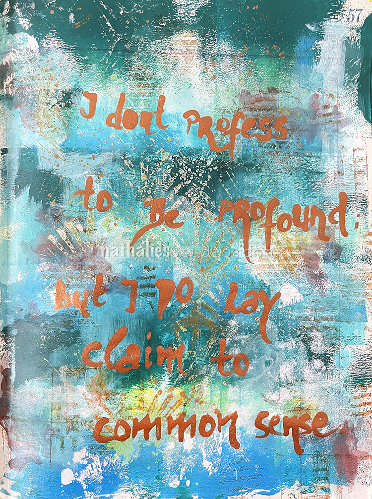
“I don’t profess to be profound; but I do lay claim to common sense.” — Emily Dickinson
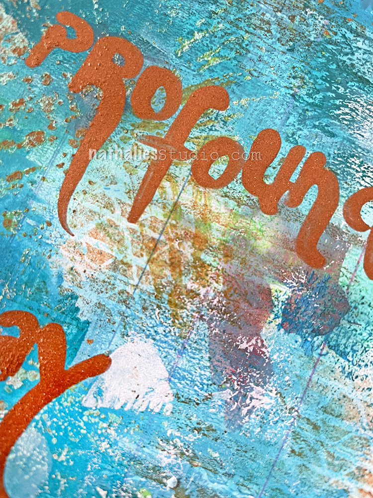
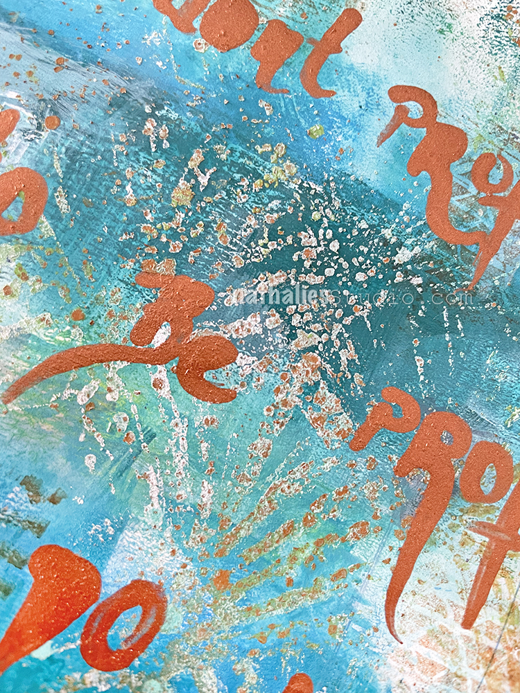
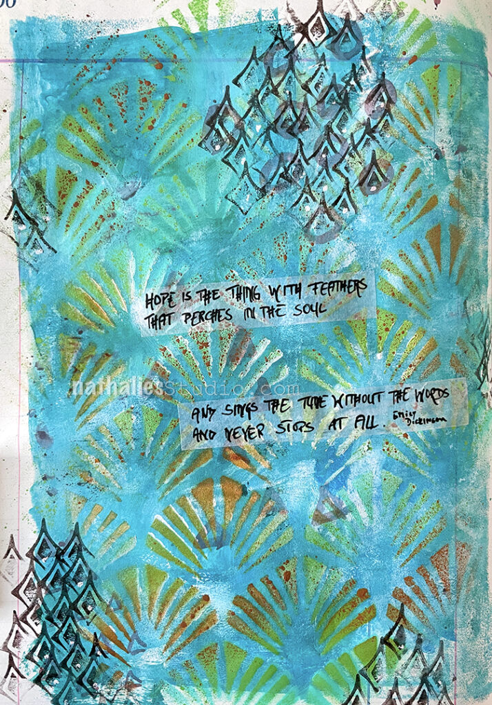
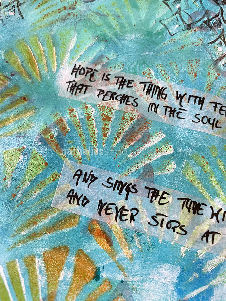
For this one I used the same colors and the negative print of the Art Deco Wallpaper stencil from the Hope art journal page – I just didn’t mix the colors for the background when I brayered them on.
Then I stamped on top with some of my Cardboard rubber stamps and Ranger Archival Sepia ink.
Using a bamboo sketching pen I wrote the Emily Dickinson quote with copper Liquitex acrylic ink – the metallic inks have a lot of particles in them which makes the journaling slightly raised.
“Hope” is the thing with feathers – That perches in the soul – And sings the tune without the words – And never stops – at all –
-Emily Dickinson
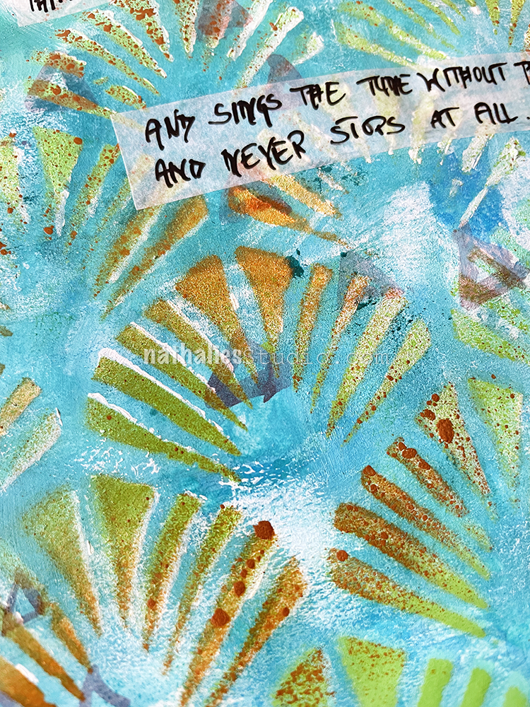
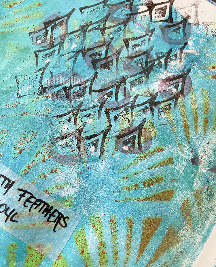
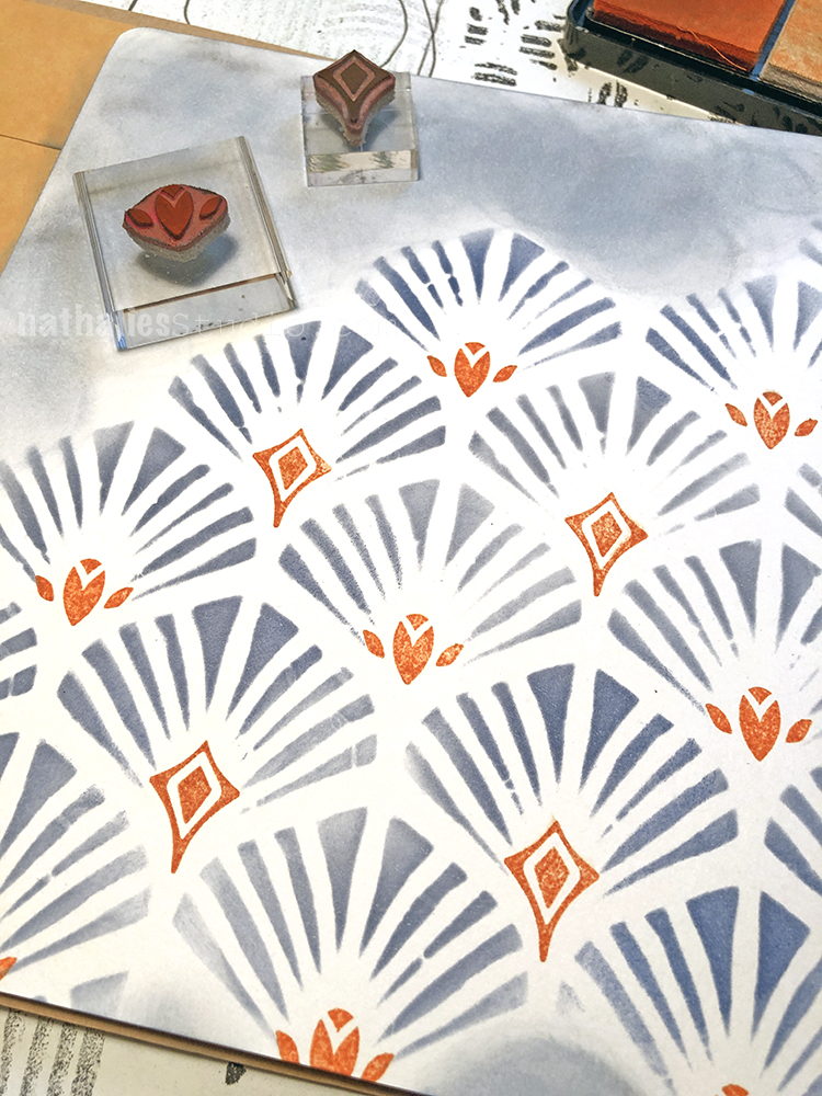
I painted the background with acrylic paint and a big flat brush. Then I layered the Art Deco Wallpaper stencil on top and sprayed with MTN Acrylic spray paints – using lime green, brown and white colors.
I added some marks with a thin brush and sepia acrylic ink and then used one of my Fan-fare stamps and brown Versafine ink to add some more marks. I layered the stamp up without going for a full image each time and I really like how it looks. I’m definitely using this stamp again for mark making.
It was simple to put together but I like it – simple is ok – not every page has to take ages 🙂
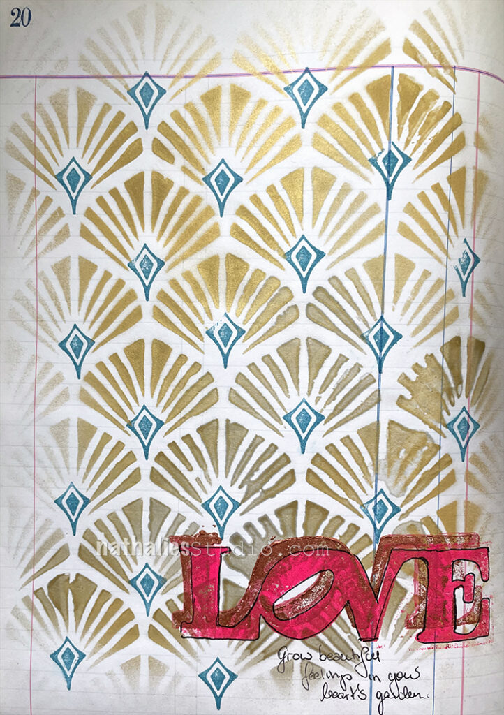
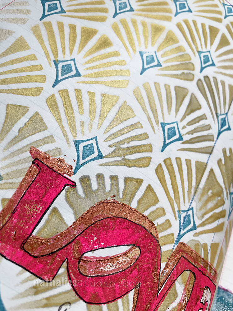
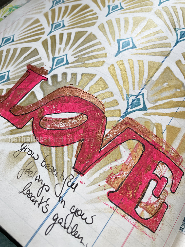
I used my Art Deco Wallpaper Stencil with golden Mtn spray paint and then a Versafine ink pad with one of the Fanfare stamps. I stamped my LOVE foam stamp with copper acrylic paint and then created an offset print with pink acrylic paint.
Finally I used a Sharpie ballpoint pen for outlining and journaling. Simple but love doesn’t need to be complex ;)
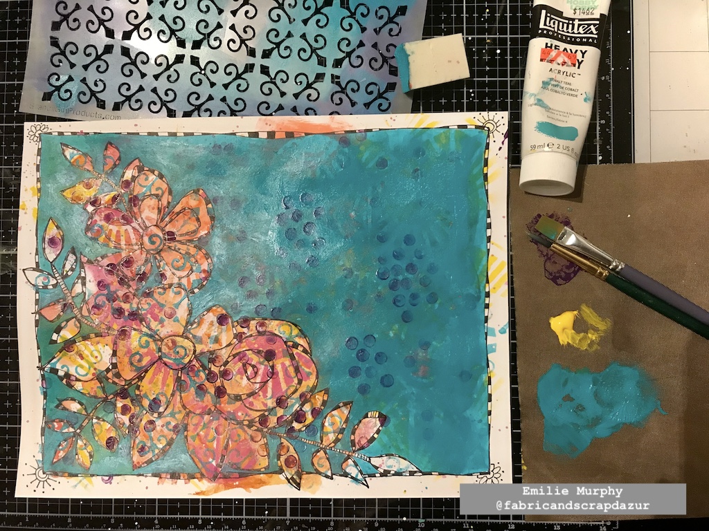
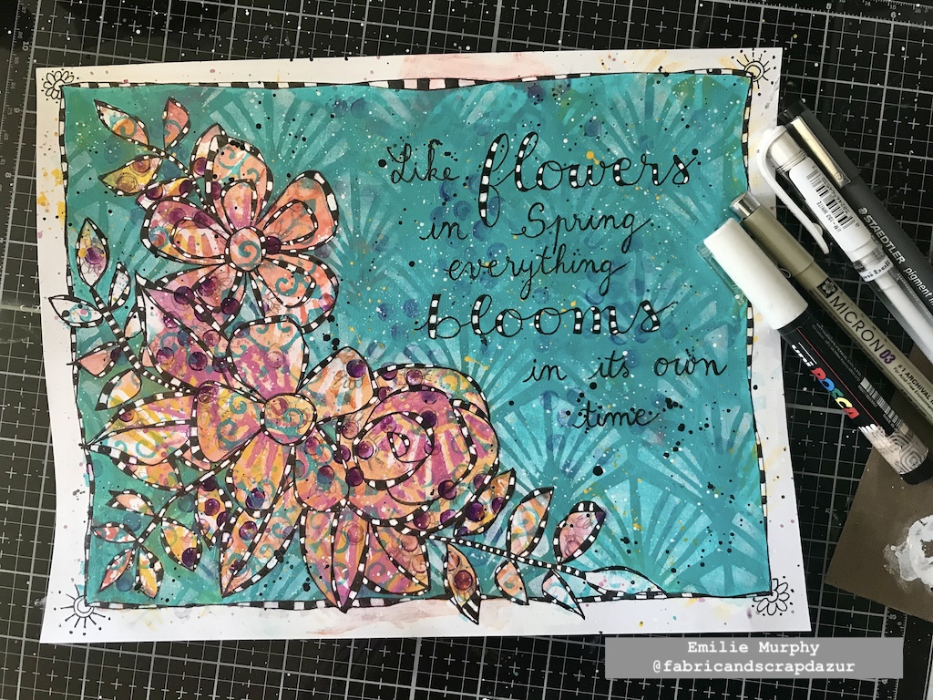
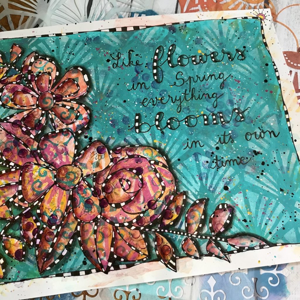
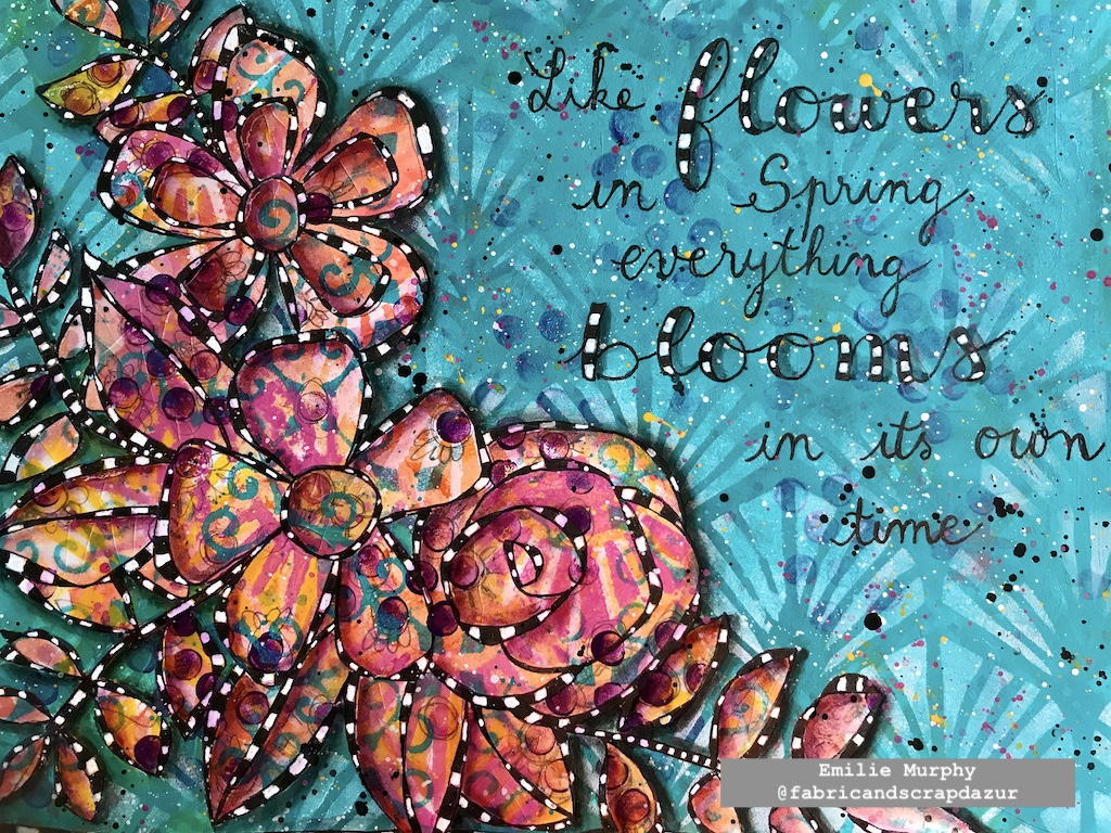
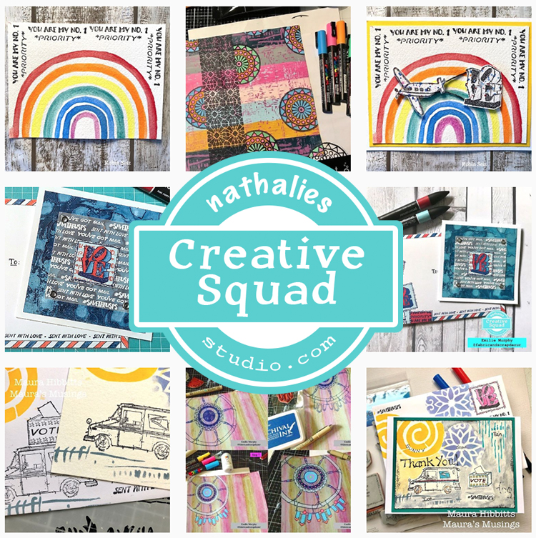
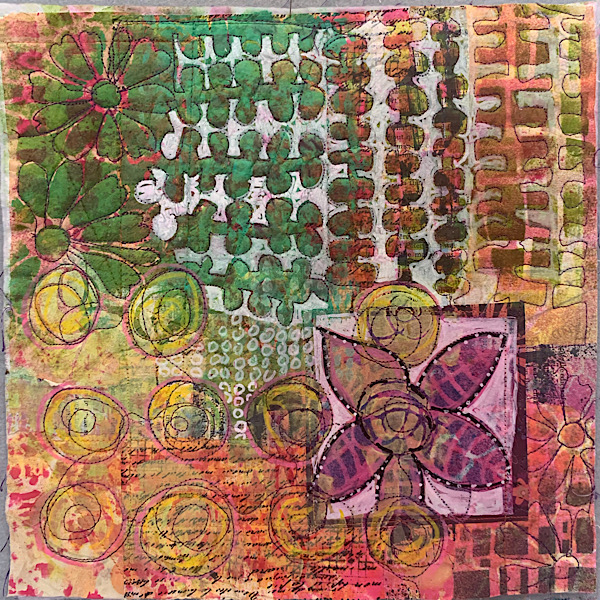
Hello from my Creative Squad! Today we have a beautiful final post from Emilie Murphy who will be moving on from the Squad at the end of March. We have loved having her on and sharing her gorgeous style and talent for illustration with you. This month Emilie is using my Art Deco Summit, Art Deco Wallpaper and New Orleans stencils and our theme: Life in Bloom – It’s been a long winter where we are and I’m dreaming of flowers and gardens and spring. Indulge us all in a project that focuses on one of Mother Nature’s most exuberant symbols of life: flowers flowers flowers!
Hi there!
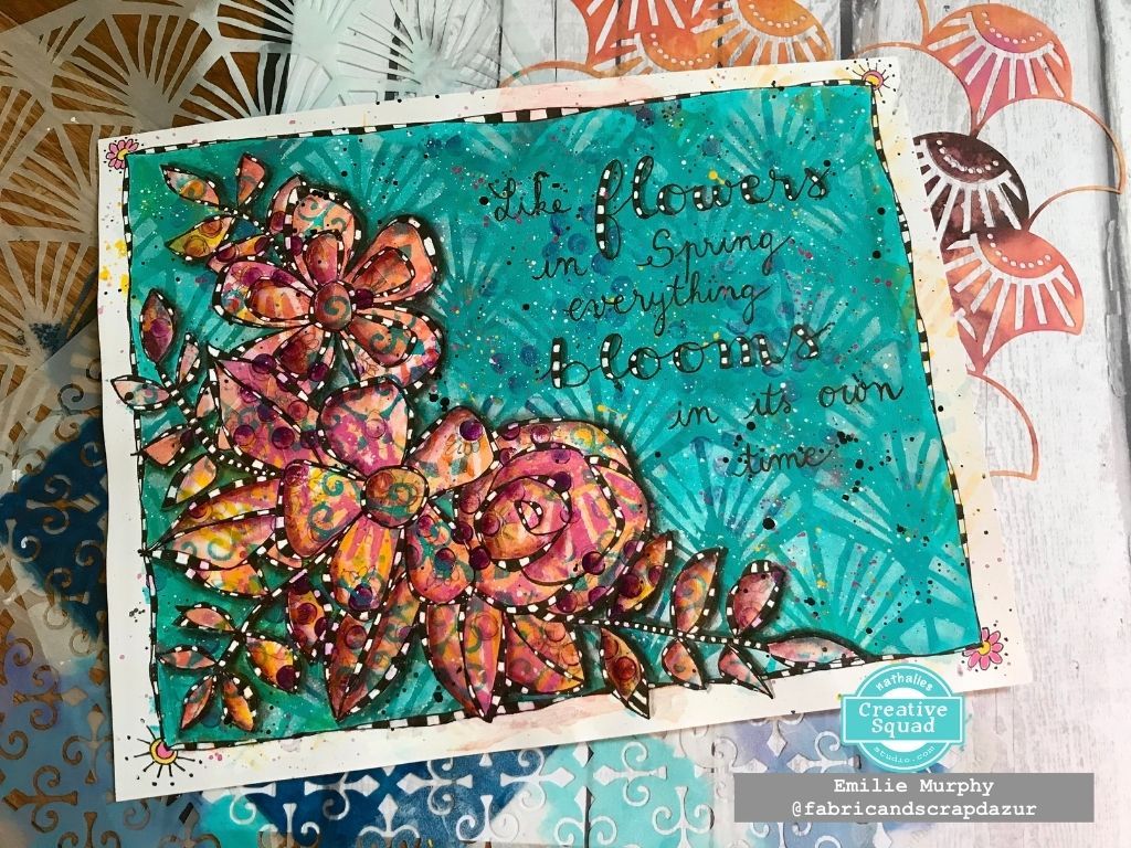
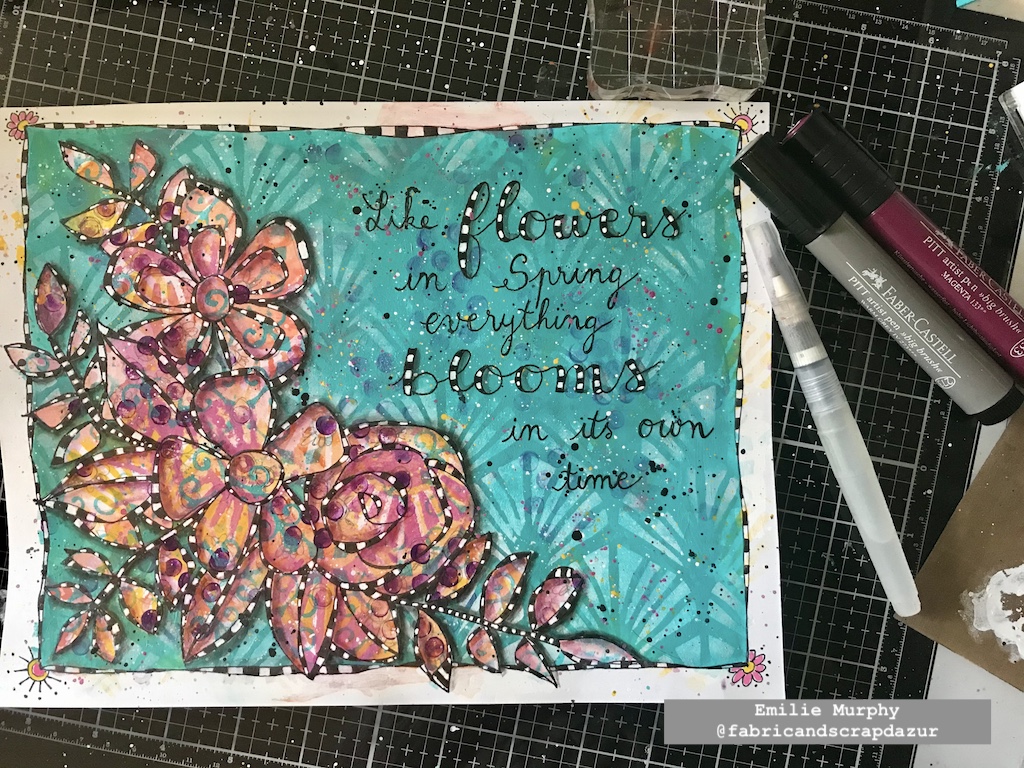
Can’t believe that we are already in March. Time flies, for sure, despite the long and pretty cold winter we had this year. I can’t wait to see the first flowers blooming. Let me show you, today, how I made my art journal page to illustrate the “Life in bloom” theme of this month.
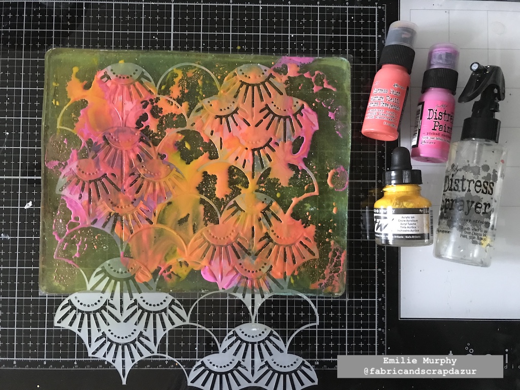
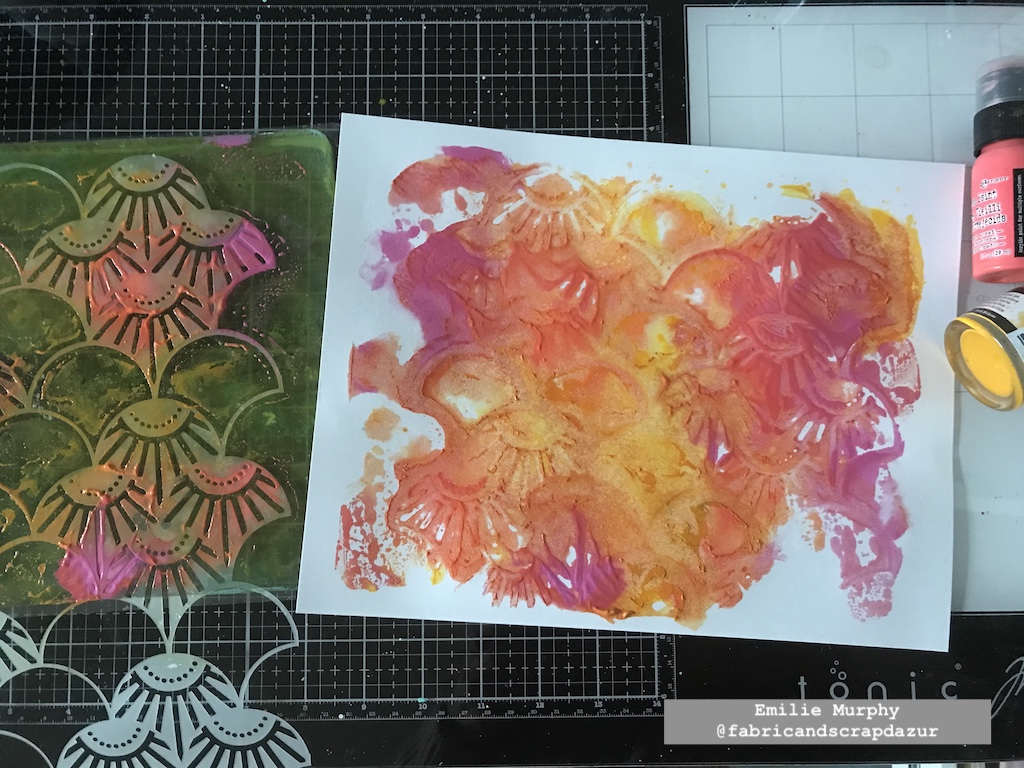
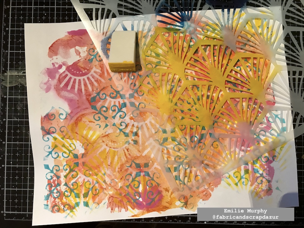
To start my project, I used my Gelli plate with my favorite warm colors using a sheet of 8.5×11 white cardstock. I first applied the paints by mixing them a little bit with each other, I then laid down the Art Deco Summit stencil and pulled the print. I mixed acrylic paint and ink to get a kind of washy look.
Next, I started to build my background by applying white paint through the Art Deco Summit stencil again.
I kept adding layers with my warm colors, alternating between the pattern stencils.
I added some dots with the rubber tip of my pencil.
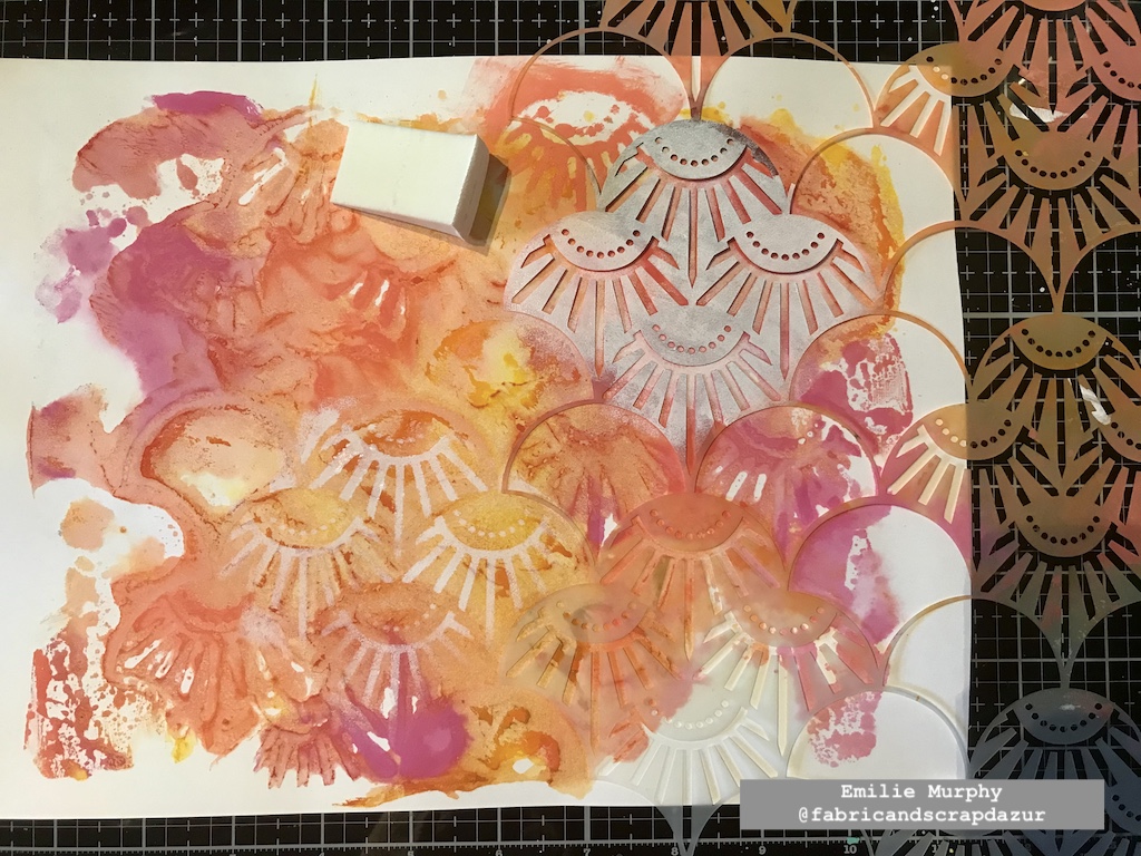
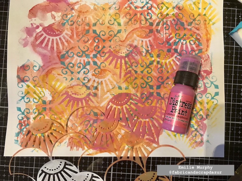
Once I was happy with the look of my background, I doodled some flowers and foliage.
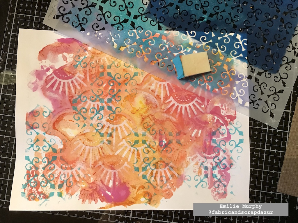
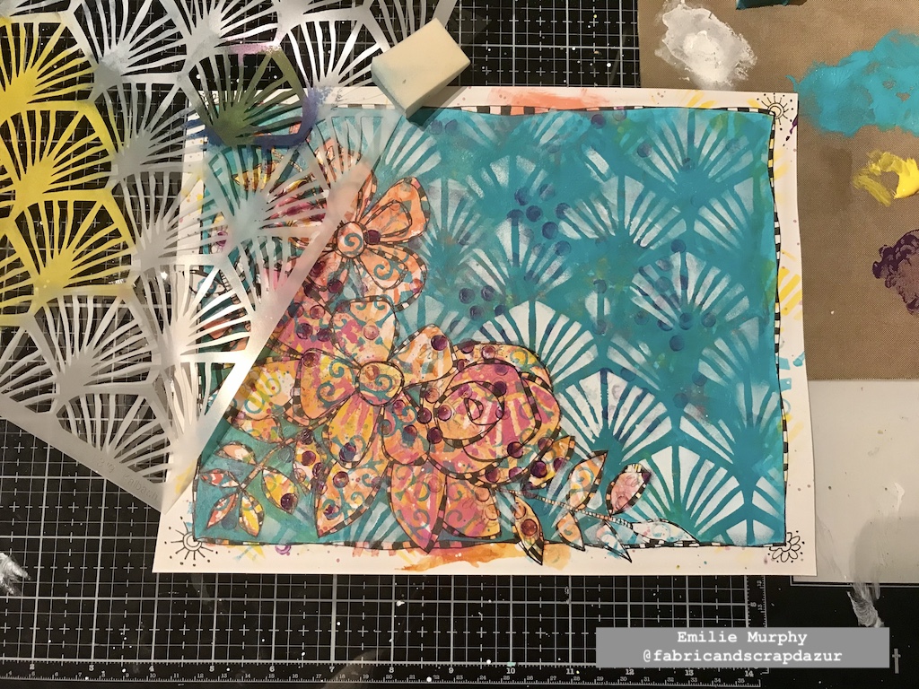
I covered all my background except the floral pattern with a cool color to make it pop out. I absolutely love this technique. It allows seeing through the different layers of the background, making it more interesting.
I once again used the Art Deco Wallpaper stencil and applied some white paint through it in order to add some texture to this plain background. I just love this pattern.
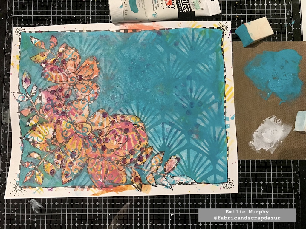
I toned down a little the white paint to embed the pattern to the background.
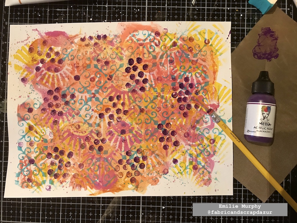
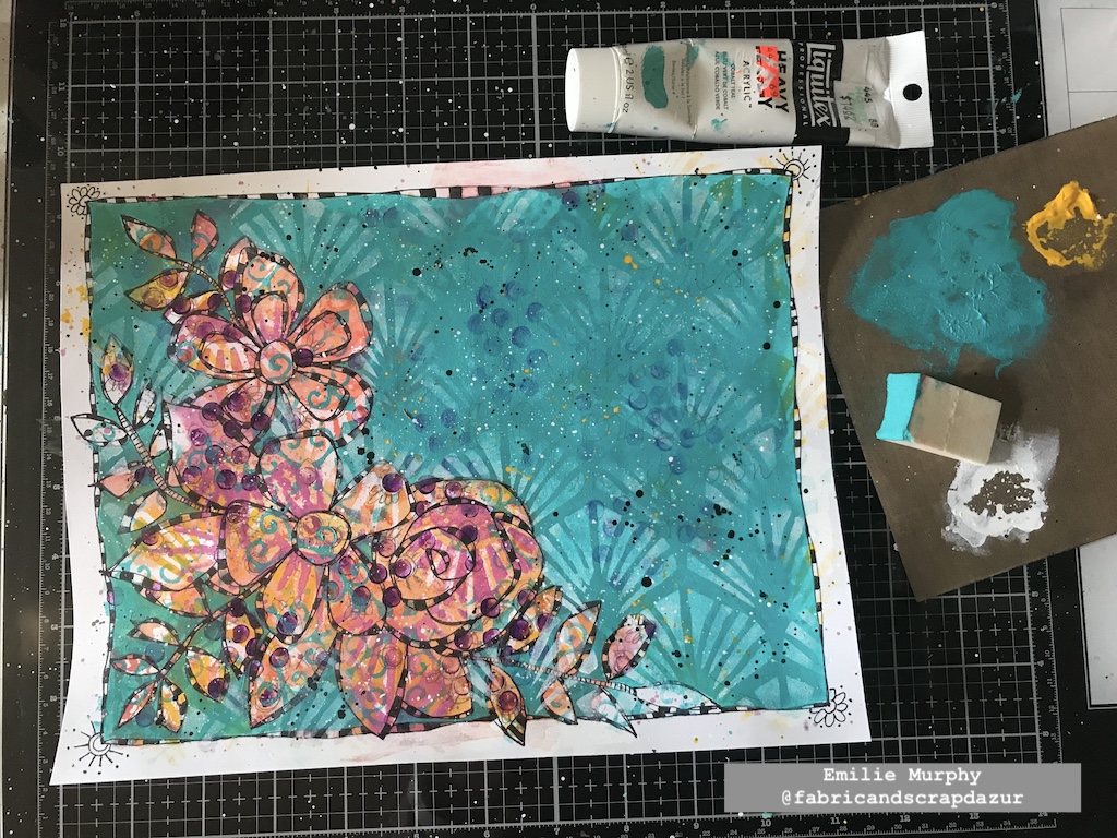
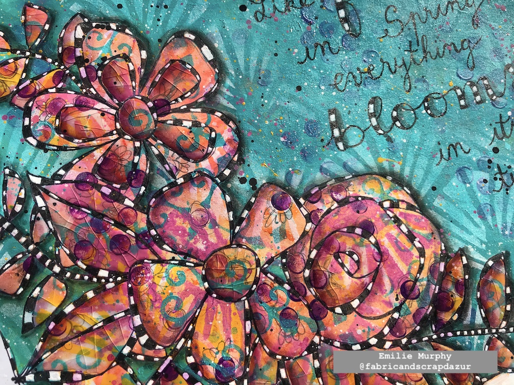
I added some splatters with yellow, black, and white paints. It’s not really visible on the picture but I also traced my quote with a pencil.
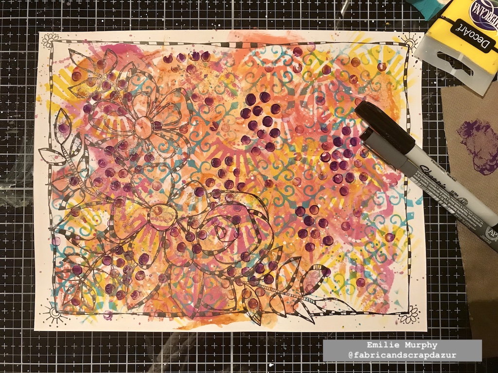
I outlined my quote with a permanent black pen and I finished coloring the checkerboard pattern with white gel pen. I reinforced the whites with a white posca pen when the white was not opaque enough.
I added some depth and shadow to my floral pattern and to the letters of my quote with a PITT pen marker. I also added some extra pink splatters.
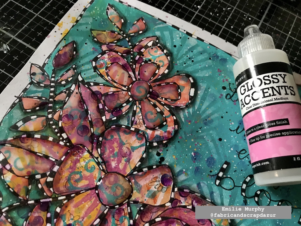
I could have stopped there but I found my art journal page too flat, so I decided to use some Glossy accent to give some dimension to my floral design. I didn’t put it everywhere. I just applied some on the center and inside petals of one of my flowers and on the leaves. I let the glossy accent dry completely.
I finally finished my art journal page by bending and folding the paper in different directions, where I applied the glossy accent in order to create some cracks. Isn’t it cool? I think it gives an interesting look. Be sure to apply a generous layer of glossy accent to get some nice cracks.
Hope you enjoyed this project, which ends my collaboration as a Creative Squad member. I just can’t thank Nathalie enough for giving me this opportunity to be a part of her team. It has been such a wonderful and pleasant experience in my creative journey. I really enjoyed working on every project I made using Nathalie’s wonderful products. The possibilities playing with them are endless. Of course, I will still be around on social media for the next coming of team member’s projects. Hope you will do, too!
Have a good rest of the week!
Thank you Emilie for this beautiful reminder to be a bit more patient! And, thank you for all your posts over the past year. We have loved seeing you style and learning more about you as an artist :)
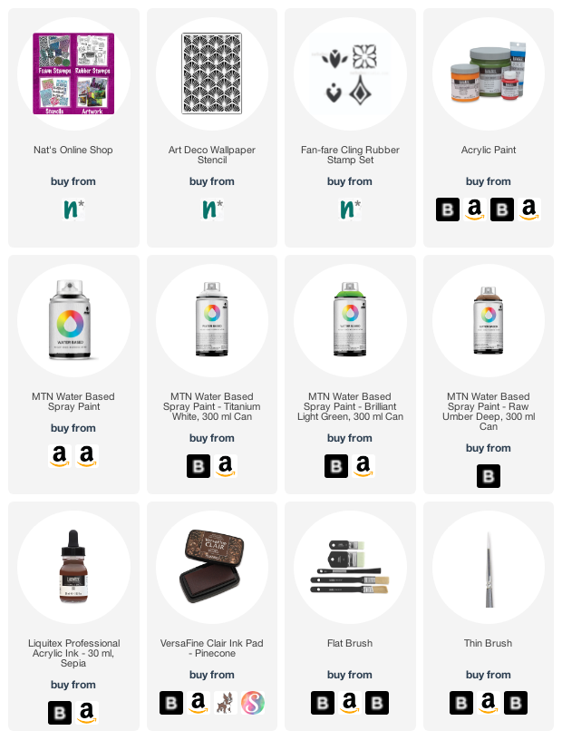
Give it a try: you can find all my Stencils in my Online Shop and here are some of the supplies Emilie used:
Follow Nat’s Creative Squad on Instagram too: Each week we post projects, ideas, and inspiration for mixed media art.
Emilie. Another gorgeous spread! I love all the layers you used in this project. We are sorry to see you go, but we’ll stay connected through social media for sure.
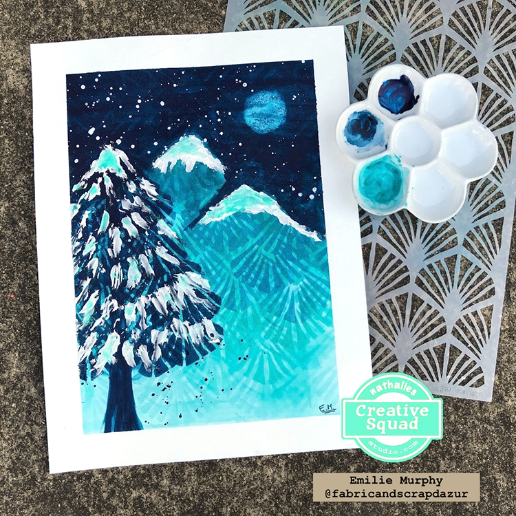
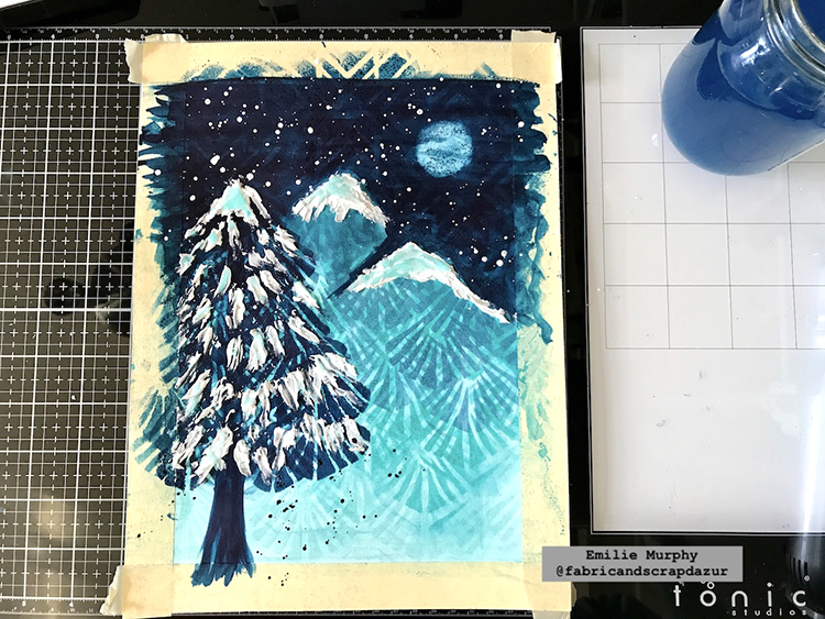
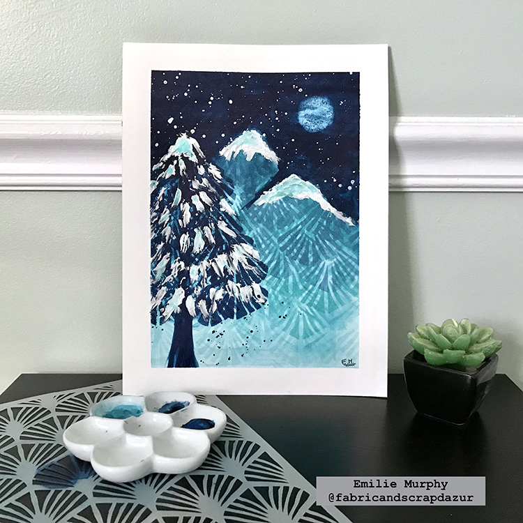
Hello from my Creative Squad! Today we have a magical nighttime winter scene from Emilie Murphy to share with you. Emilie is using my Art Deco Wallpaper and Toledo 4×4 stencils for this one and our theme: Light & Shadow – In art and maybe also in life, the balance between light and shadow is an important consideration. Play with this equilibrium in your art and show us how the two sides work together.
Hi there! Hope you are doing well.
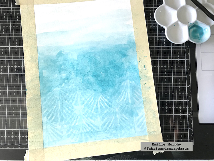
As the theme of the month is “Light and Shadow”, it made me think right away of a winter scene during a snowy night in the forest, where we can see the shadows of trees and some light coming from the moon.
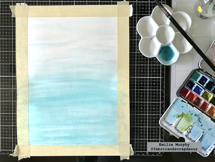
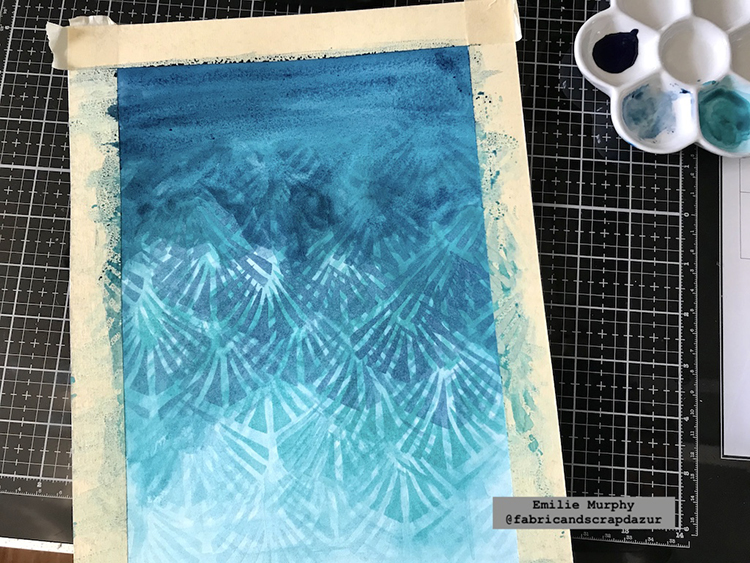
I started with a light wash of “Turquoise green” watercolors from bottom to top.
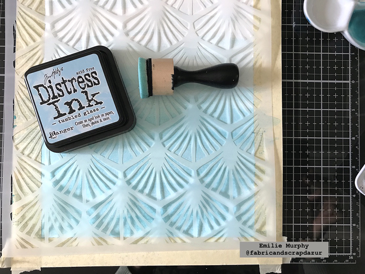
I laid down my “Art Deco Wallpaper” and applied some “Tumbled Glass” distress ink to keep a tone-on-tone effect.
I added more watercolors slightly darker than the first layer. As a result, I mixed some “Turquoise green” with a little bit of “Phthalocyanine Turquoise”.
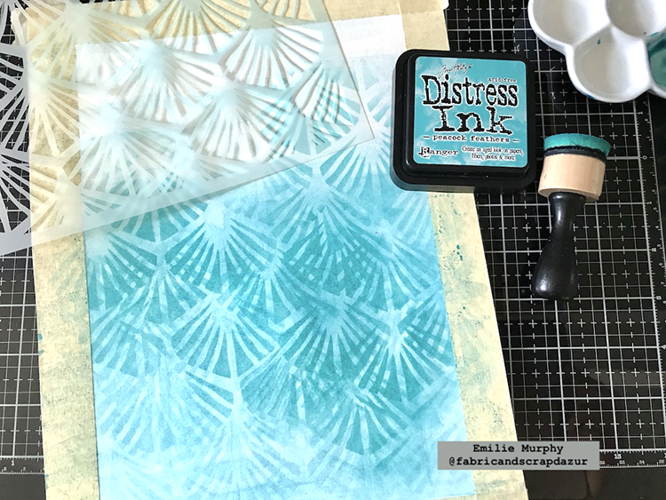
Again, I laid down my stencil and applied some “Peacock Feathers” distress Ink.
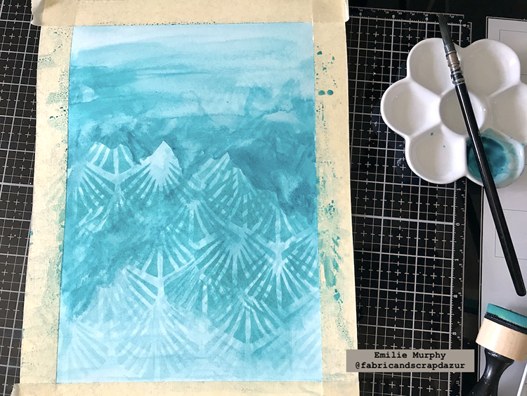
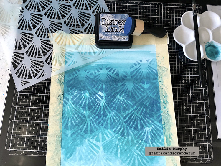
Working in layers, I repeated the previous two steps at the top again, but this time by darkening my watercolors using only “Phthaocyanine Turquoise” and “Stormy Sky” distress ink.
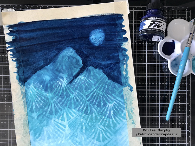
I started to apply on the top some “Indigo” watercolor to make the sky visible finishing my bluish gradient from bottom to top.
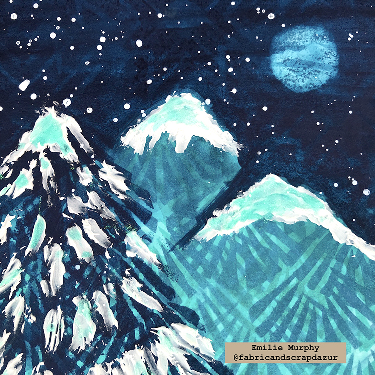
Then, I darkened the sky with some “Prussian Blue” acrylic ink and created some mountains. Next, I wiped off some paint with a rag just before it dried to make it appear as a full moon.
To finish the background I laid down the “Toledo 4×4” stencil and applied some “Prussian Blue” acrylic ink only on the sky part. It gives a subtle glow effect.
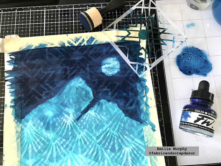
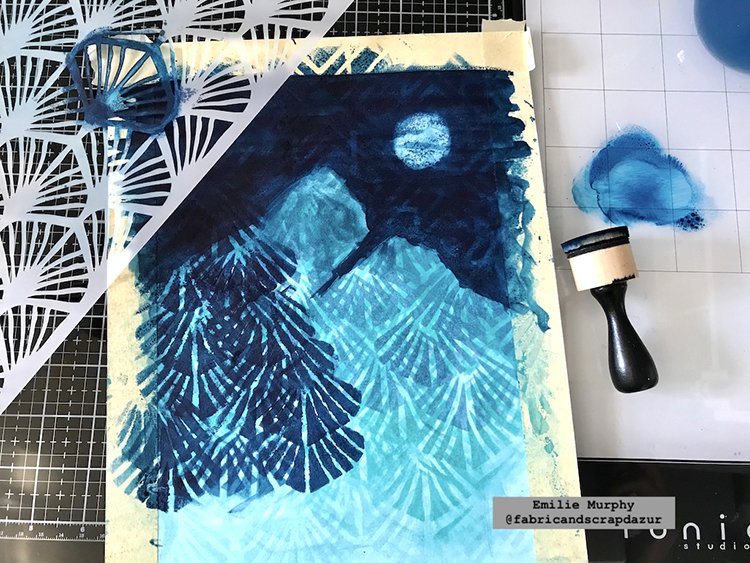
I applied again some “Prussian Blue” acrylic ink through the “Art Deco Wallpaper” stencil to make a tree in the foreground.
To finish up my painting, I applied some modeling paste on the summit of the mountains and on the tree with a plastic knife. I also applied some glitter glue on top and some splatters to get more interest.
Hope it gets you inspired. I always try to use my stencils in different ways. I think this is a very simple painting project that gives a WOW look. You can leave it like it is or frame it and hang it out on your wall. Have fun!
Thank you Emilie! Love how you used the stencil to create the mountains and tree!
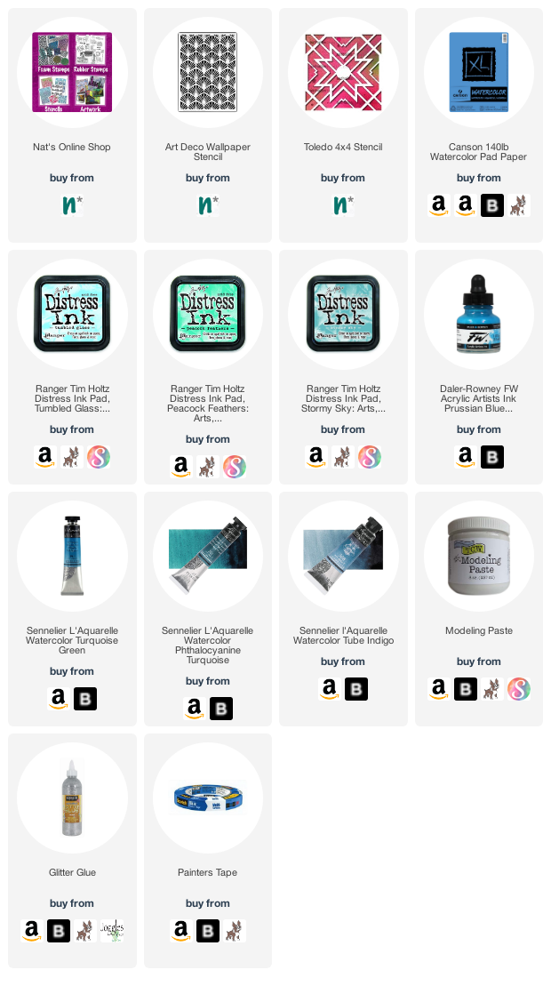
Give it a try: you can find all my Stencils in my Online Shop and here are some of the other supplies Emilie used:
Don’t forget to check out Nat’s Creative Squad on Instagram too: Each week we post projects, ideas, and inspiration for mixed media art.
It’s time to get to know an artist with… Nice to Meet You! Today I’d like to introduce you to the inspiring art and story of Priscilla Read!
From time to time I learn about some amazing artists out there who are working with my stamps and stencils and are creating some fun and exciting projects. It’s always inspiring to see what others do with my designs. Sometimes they even introduce me to a new way of seeing the pattern or a new technique to try on my own. That’s why today I’d like to share with you Priscilla Read:
Please introduce yourself to our readers and tell us where you live:
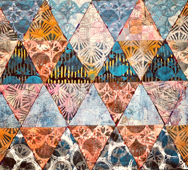
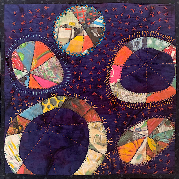
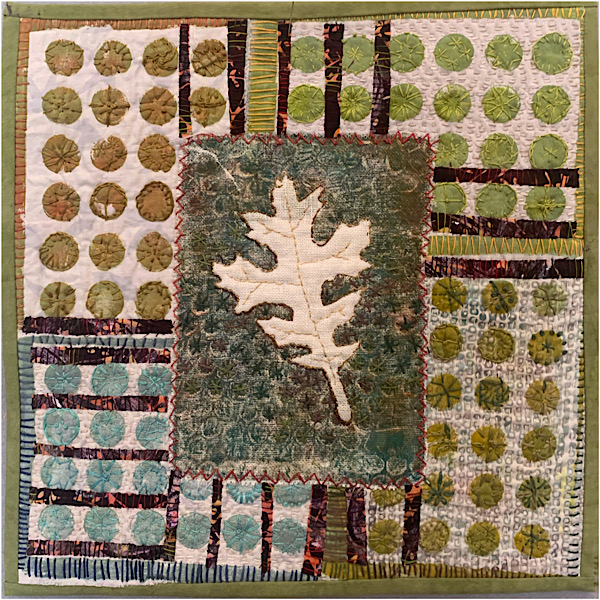
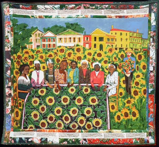
I am a mixed media artist living in San Ramon, California. I want to do it all. I love working in all kinds of media, but especially love using fabric and quilt making techniques in my artwork. I continue to learn by taking classes and was lucky to find Nathalie’s online classes through Sketchbook Skool and her recent Time Traveler class.
How do you make time to be creative?
I make it a priority to do something creative, even just for a few minutes every day. People say, “you’re so creative”, but I believe that creativity is a practice that anyone can learn and become more creative. Classes like Nathalie’s help to open our minds and hearts to our own creativity.
What are some of your favorite n*Studio stamps / stencils? How do you love to use them?
I only have a few of her art deco stencils so far, but plan to get some of her foam stamps. I used the stencils to gelli print fabric for my Deco Wallpaper quilt and for the cover and pages of the journal I made in the Time Travel book. I also used some in fabrics printed to add to my stash for future projects.
Fabric! So many possibilities from surface design techniques like dyeing and printing to sewing and quilting.
What inspires you to be creative?
I connect with others through my art. I belong to a couple local quilt guilds and Studio Art Quilts Association (saqa.com) which connects me with like minded artists and exposes me to new ideas and opportunities.
Do you have a favorite artist?
Faith Ringgold. I first learned about her through my interest in quilting and wanted to learn more when I saw her story quilts. I am inspired by her originality and fearless depiction of social justice issues.
I was drawn to the crafts and making things from childhood when I learned to knit and sew. I didn’t really know much about art until high school when I took a humanities class in my junior year and an art class in my senior year. I wanted to become an artist, but the only other person who thought it was a good idea was my art teacher. I continued making art and taking classes whenever possible.
In three words, how does art-making make you feel?
Connected. Grateful. Joyful.
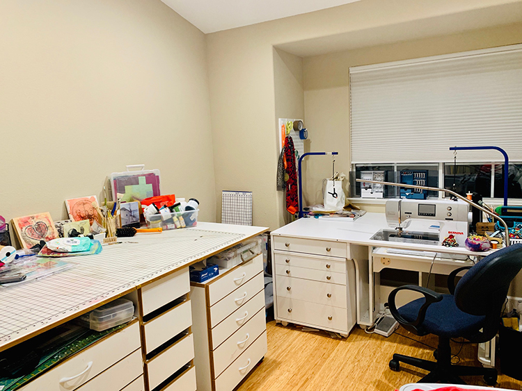
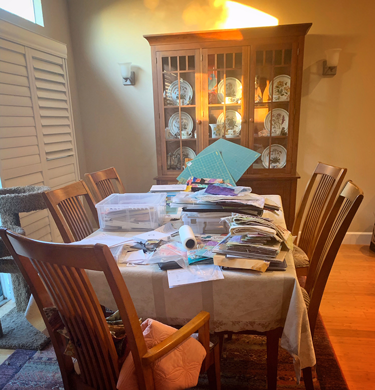
Thank you for sharing your inspiring artwork and perspective Priscilla! Love to see my stencils used in your gorgeous fiber art and a peek into your personal workspace is always so fun to see.
Be sure to check out all our Nice to Meet You! posts to learn about all the inspiring artists we’ve featured.
Hello from our Creative Squad! Today we are kicking a new monthly theme off with a project from Maura Hibbitts. Maura is creating an uplifting celestial inspired art journal page using my Valley Road foam stamps and my Art Deco Wallpaper and Art Deco Empire stencils. And bonus: you get a little science lesson too :) Our theme is: A New Day – Let’s try something new today :) Although these are tumultuous times and we never know what each new day will bring, it also seems like the perfect time to throw caution to the wind and just jump into something new with both feet. Try a new material or technique or approach. Why not? Today is a new day… and tomorrow is too!
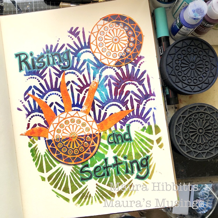
I find myself rather fascinated with the cycles of the sun and moon…must be my Earth Science background. So, when I thought about a new day, the setting of the sun and rising of the moon came to mind. We’ve had some glorious sunsets over the summer, so I wanted to pull in that gorgeous orange with my sun, and carry a bit of it into the moon. Since the moon rises 50 minutes later every day, sometimes the moon is rising as the sun is setting, and other days the moon is visible during the day. Just like the sun and moon, we each have the opportunity to make changes with each new day.
I decided to use my large art journal for more impact. I mixed orange, yellow and red on the gel plate and stamped out the Valley Road Positive ArtFoamie on watercolor paper. I stamped several, and also pressed the paper onto the gel plate for a different image. Sometimes when I work, I have an idea of where I am headed, but it’s fluid.
I repeated the first step with a mix of blues and purple with the Valley Road Negative Art Foamie. I stamped several images onto the watercolor paper, and also over the image on the orange print.
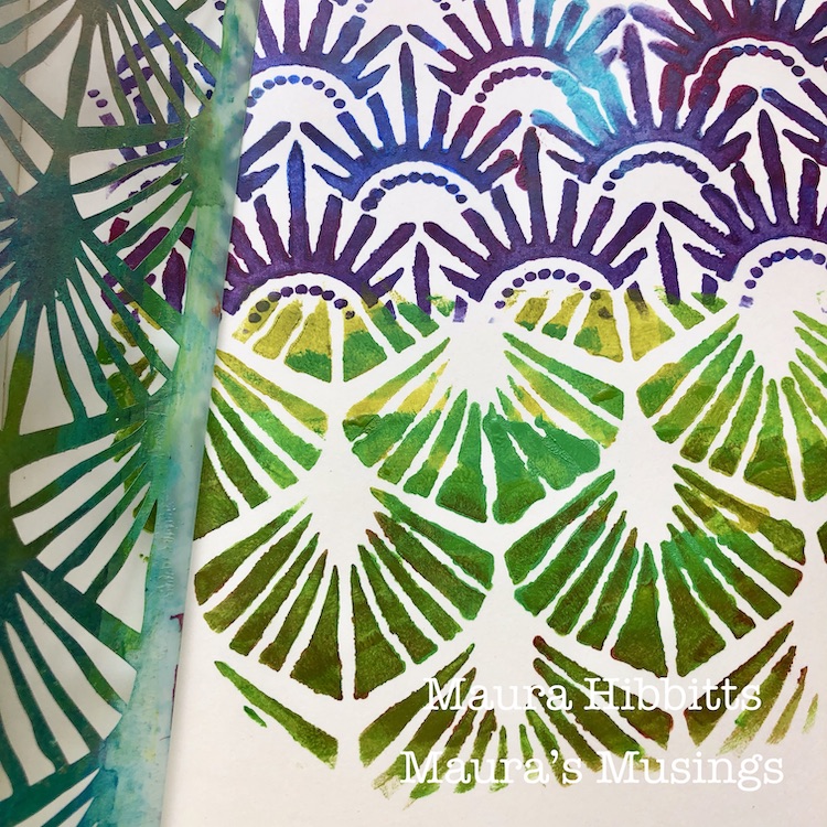
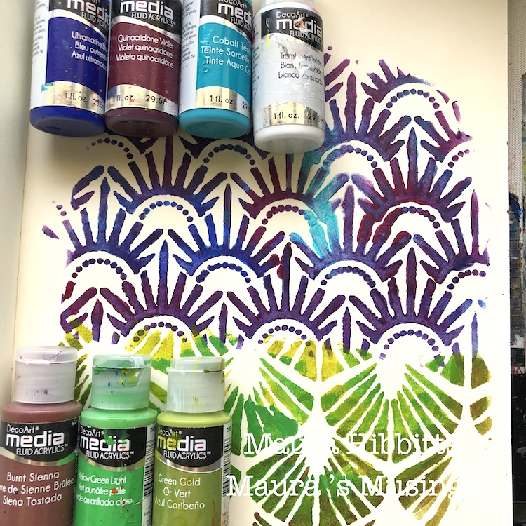
I wanted to create sky and earth with the stencils. I began with the sky and the Art Deco Empire stencil. I sponged in a mix of the blues, purple and a touch of white, with fluid acrylics and a cosmetic sponge.
To create the earth, I used a mix of greens and a touch of brown in fluid acrylics. I used the Art Deco Wallpaper stencil to represent the earth portion. I curved the sky and earth because after all the Earth is round, no matter what those “flat earthers” want to tell you, lol.
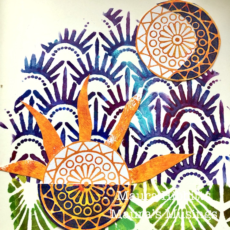
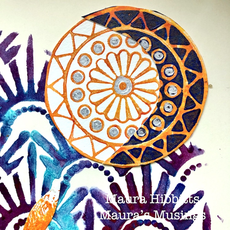
Next, I cut out some of the images and free cut some sun rays to assemble the sun and moon. I started out with the moon as just a crescent, but once I tried it on top of the full image, I liked that better.
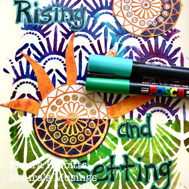
Final step is to do some pen work. I hand lettered “Rising and Setting” in black, then outlined the words with Posca paint pens. I also added some silver to the moon, and gold to the sun with pens.
To illustrate the idea of the sun setting below the horizon, I had the sun’s rays extending up into the “sky”, and added a half circle of the blue and orange image for the portion below the surface to show the sun sinking below the horizon.
My moon shows a waxing crescent, meaning it is on the path towards the full moon. The moon is always there, even though we only see a portion of it illuminated by the sun. I wanted to show that by placing the crescent over the circle.
Hmm, I guess you just got a bit of a science lesson today with the art. That is the way I often taught my classes, mixing in art and science, as well as a few other subjects. When you stop and think about it, you can see all the connections, like the sun and moon being connected to a new day. My wish for you is that each new day is a better one, filled with love, hope, health and joy. – Maura
Thank you Maura! Love this colorful page but also getting the science lesson too – we forget some of that stuff as time goes on!
Give it a try: you can find all my Foam Stamps and Stencils in my Online Shop and here are some of the other supplies Maura used:
Feel inspired? Working on something yourself that you’d like to share? I love to see how you interpret our monthly themes. Email me how you used my stencils and stamps with the theme and email me an image – I would love to share your projects in my next “n*Spiration From Around the Globe“.
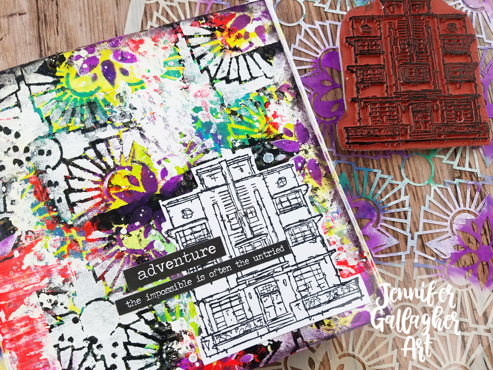
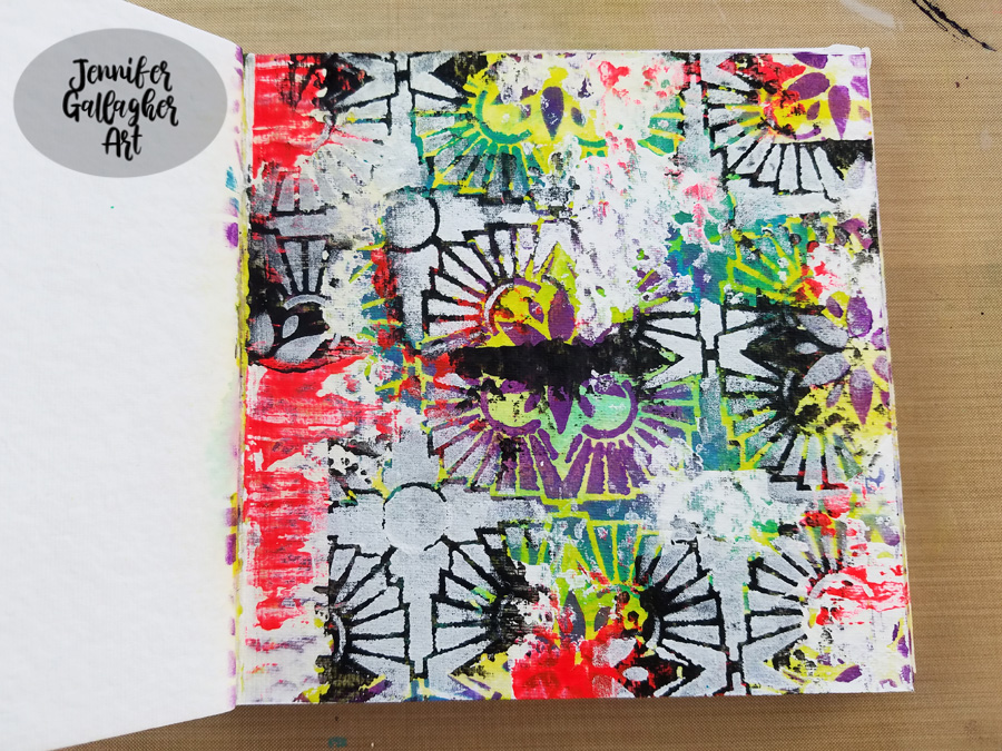
Hello from my Creative Squad! Today we are starting a new theme for the Squad for August and we have Jennifer Gallagher kicking it off in her art journal with my Hamilton Stencil and my Art Deco stamp. This month’s theme is: WildandFree – After so many months of careful living, it’s time to go WildandFree… In our Art Journals! Go a little crazy in there and live it up with bright colors, exuberant mark making, bold colors – however you want to go a bit bananas. It’s time to let loose!
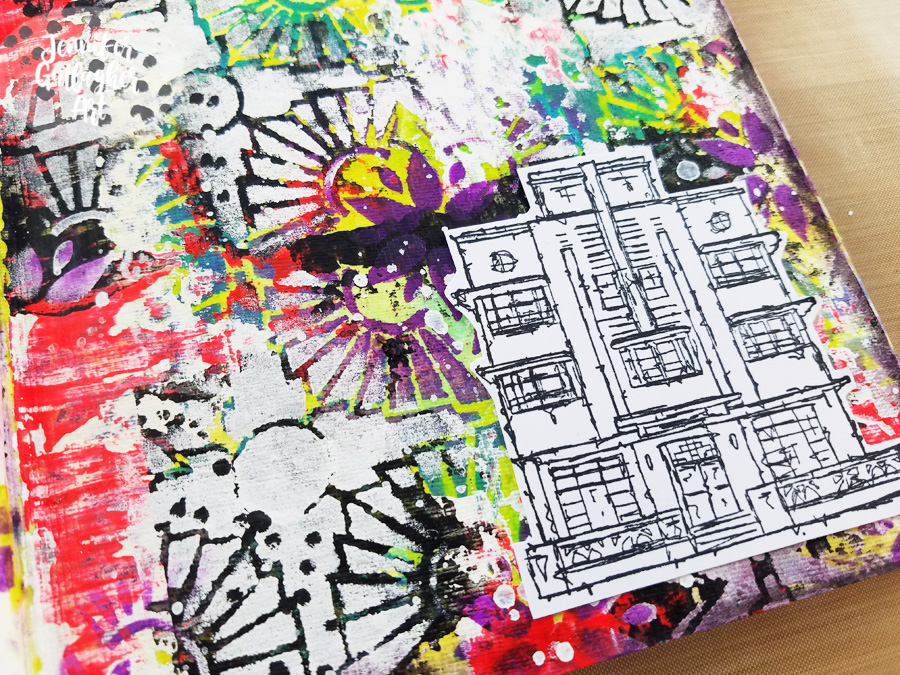
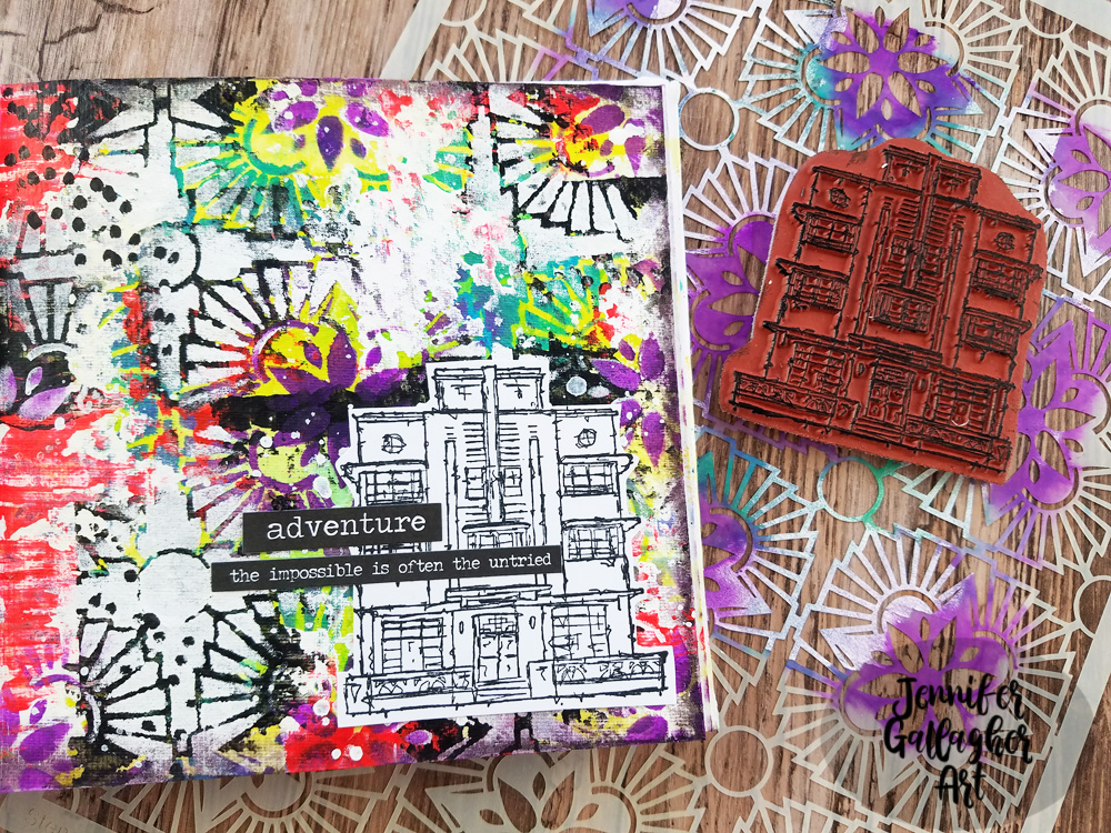
This month we are going wild in our art journals using some of our favorite n*Studio products. I threw caution to the wind and layered lots of bold color and pattern along with mark making and a fun stamped focal image. It’s super easy so let’s get started.
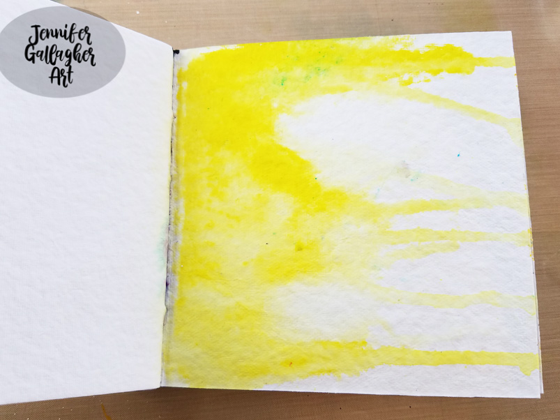
I started by applying a layer of clear gesso onto a page in my square Dina Wakley Media journal. I applied a little Distress Stain in Mustard Seed on the left hand side of the page and then spritzed some water over it. I held the journal up so the color would run down the page.
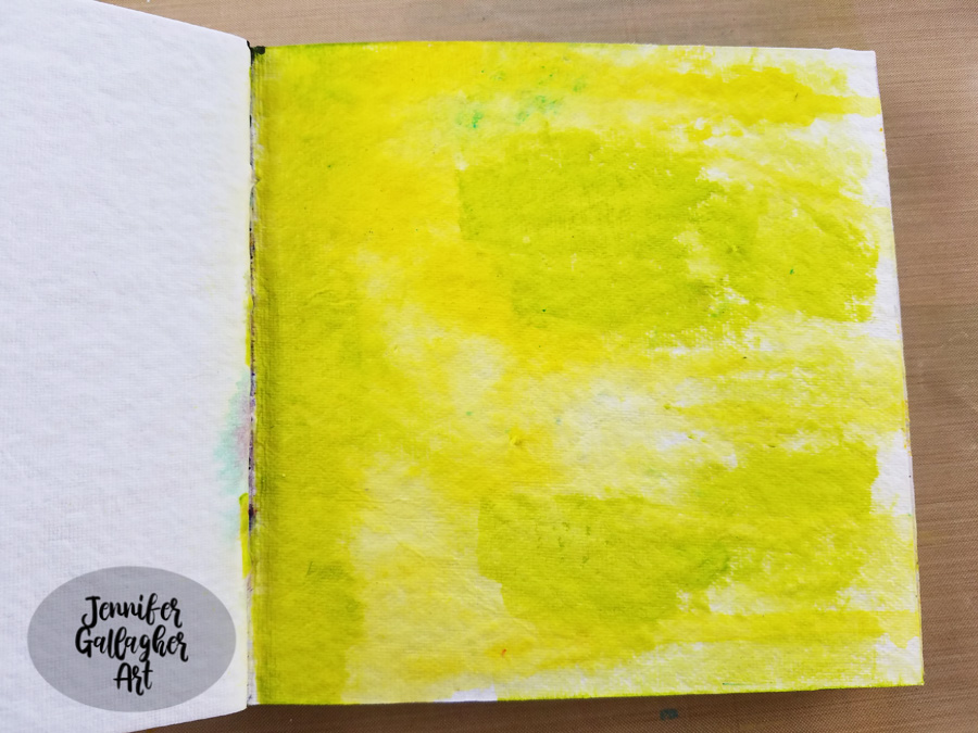
After that dried,I applied some olive green acrylic paint in some of the open spaces with a cosmetic sponge.
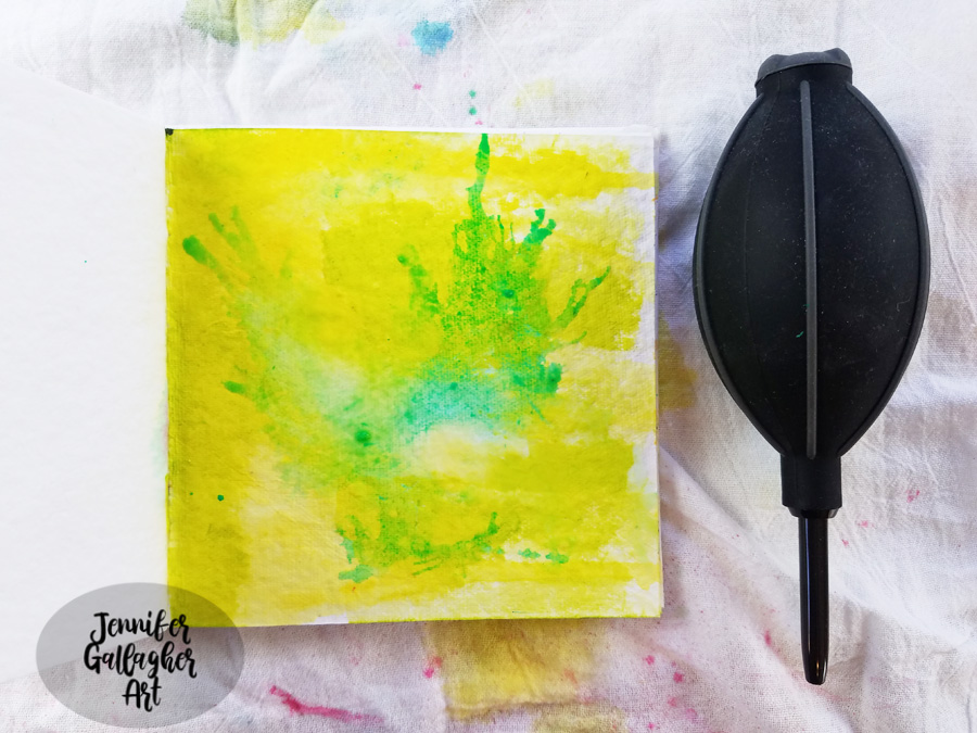
Next, I spritzed on some Aquamarine Marabu Art Spray and added a small spritz of water. I blew the color around with an air puffer.
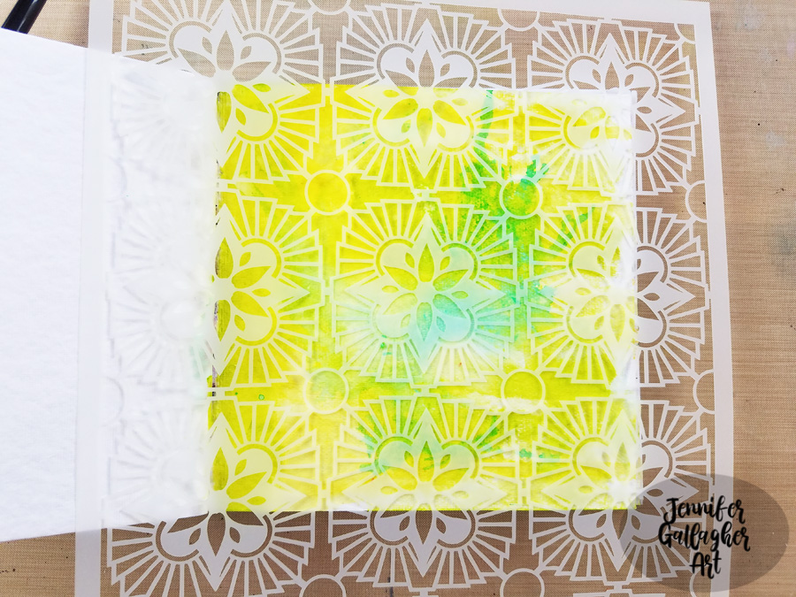
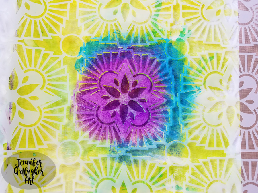
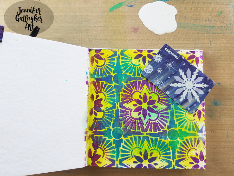
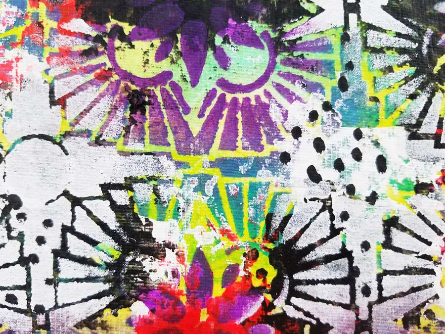
I chose Nat’s Hamilton Stencil and placed it down on the page, working to center the design from the inside of the page. Then I applied Blackberry, Cobalt Teal Hue, and Emerald Green acrylic paint with cosmetic sponges.
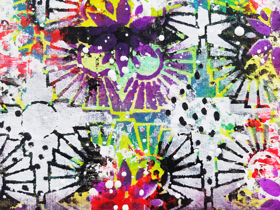
Using an old gift card and some white acrylic paint, I scraped white in various areas of the page.
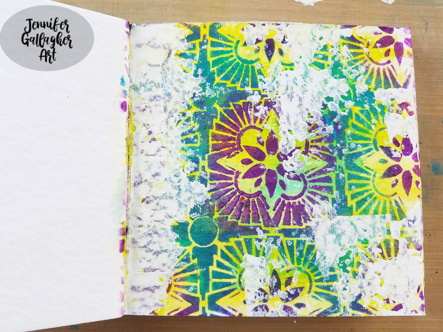
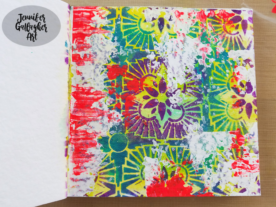
I repeated the process with fluorescent pink and black.
To bring back some of the design, I laid the stencil back over the page, exactly where it was before. Any place that had black paint was painted white through the stencil.
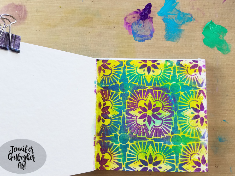
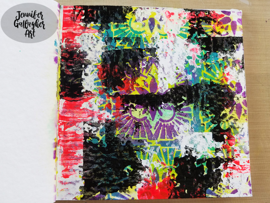
Using a black posca pen, I added some dots in a few of the white areas.
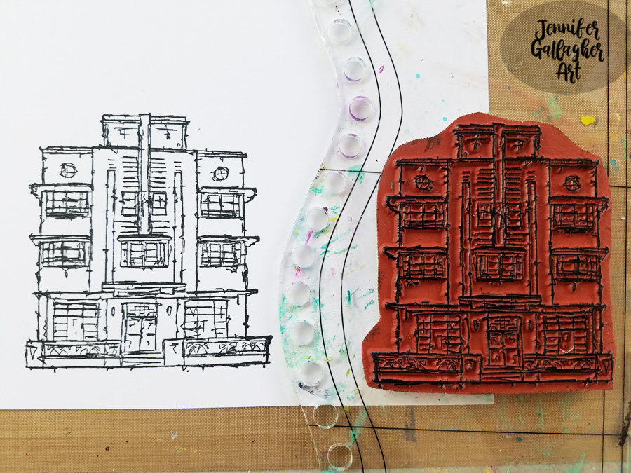
Using the Art Deco stamp from Nat’s Stroll Around the Block Set, I stamped a focal image onto multifarious card with Versafine Clair ink ink Nocturne. Before applying the image, I splattered some Distress Spray in Picket Fence around the page. Once dry, I fussy cut the image out and applied it to my page with 1/8 inch scor-tape.
The final touch was to add a few stickers from Tim Holtz idea-ology Big Chat and Small Talk sticker sets. I hope you have enjoyed this art journal page. I really went wild with the layers, colors, and pattern. Be sure to play along with us this month and create something bold in your art journal.
Thank you Jennifer! Loved watching this wild background come together with all those yummy layers :)
Give it a try: you can find all my Stencils and Rubber Stamps in my Online Shop and here are some of the other supplies Jennifer used:
Feel inspired? Working on something yourself that you’d like to share? I love to see how you interpret our monthly themes. Email me how you used my stencils and stamps with the theme and email me an image – I would love to share your projects in my next “n*Spiration From Around the Globe“.


Emilie. Another gorgeous spread! I love all the layers you used in this project. We are sorry to see you go, but we’ll stay connected through social media for sure.
Reply