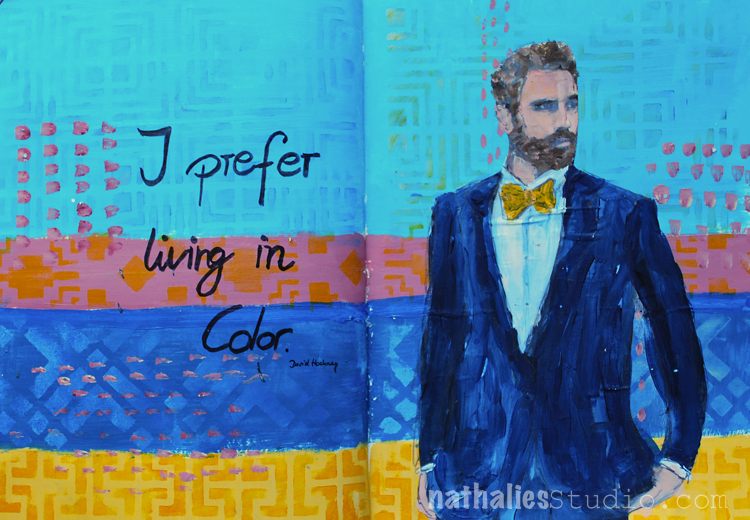
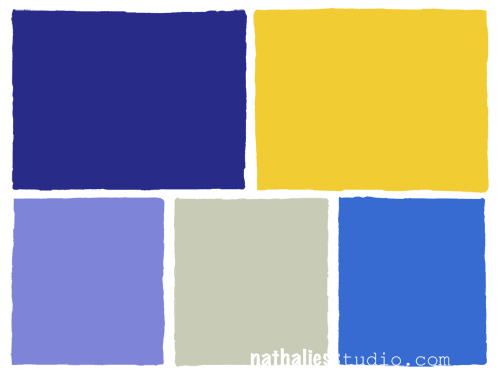
An unusual color combination for me but inspired by David Hockney – a very straightforward but fun page with some stencil play.
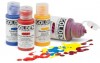
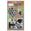
Here are the supplies I used:


I think I want to discover this color combination a bit more. Do you like it?
Nat

An unusual color combination for me but inspired by David Hockney – a very straightforward but fun page with some stencil play.
Here are the supplies I used:
I think I want to discover this color combination a bit more. Do you like it?
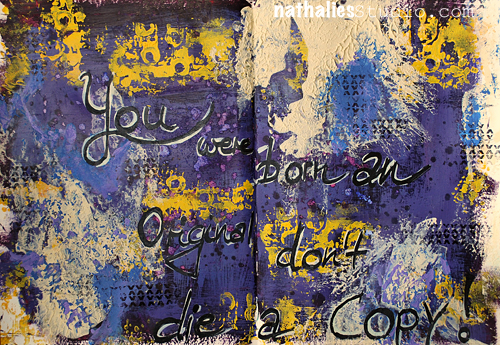
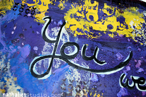
You were born an original, don’t die a copy!
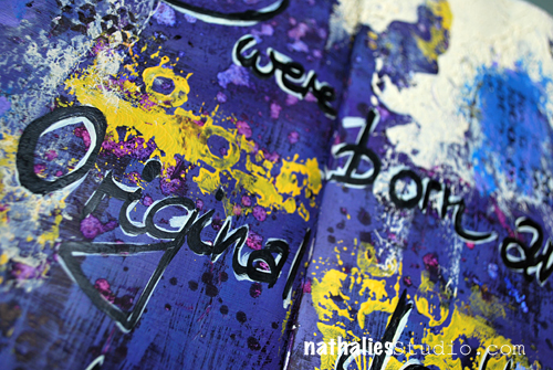
Love this! For this art journal spread I was trying out a new color combination –
which I know I will use again – again- it was good just playing and finding things I would usually not work with :)
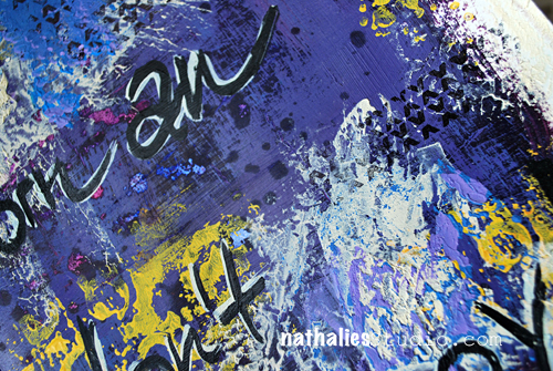
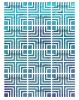
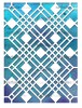
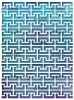
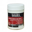
I added some texture by mixing in soft body acrylic paints with Liquitex Flexible Modeling Paste – and also used several of my stamps- including the new Mark Maker Set.
Here is a list of the supply :

How do you like the color combination? Does it speak to you?
This was a great color combination. The yellow is the perfect pop of color.
I like these colors. But my faves are from yesterday
Great color combo…and you are definitely an original!!
That is a very calming colour palette? Fab page!!
Awesome color combo, Nat!! Really caught my eye!
Love those colors Nat! Your spread is gorgeous with a great sentiment! “)

Comments (2)
Sue Clarke
| #
Since you asked Nat, I must say that I’m not wild about that color combo but I enjoy seeing any thing that you’ve created.
Reply
nathalie-kalbach
| #
Ha- I understand it is a “weird” combo :) Have a wonderful week Sue!
Reply