Stroll Through The Hood

Stroll Through The Hood – March 2018

Time for a Stroll Through the Hood . Strolls through my hood get me out of my studio, they help me unstuck and often I get inspired by what I see and to get new ideas to create something. It is part of my philosophy about Artful Adventures in Mixed Media – which is the subject of my book. Here are some photos that I gathered in the last couple weeks.
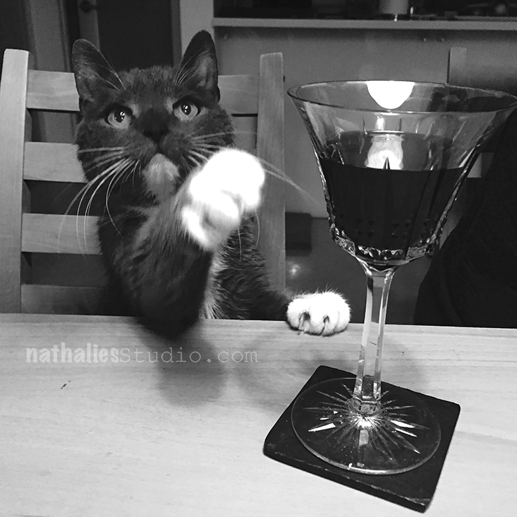
This is a photo my friend Heather took of our cat Niles when she was over for dinner. We laughed so much about it – how would you caption the photo? I was thinking “Eh, excuse me, but I think I ordered the Chardonnay!”
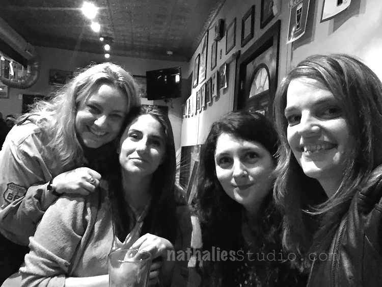
A night out with my girlfriends is always inspiring – love those ladies :)
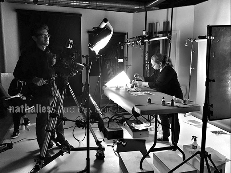
I was working on a “secret” task which I will tell you all about very soon – it was a lot of work and included some work out of the box for me- and that for sure was inspiring – doing something different, hanging out with other creative people can be so revitalizing for your creative process.
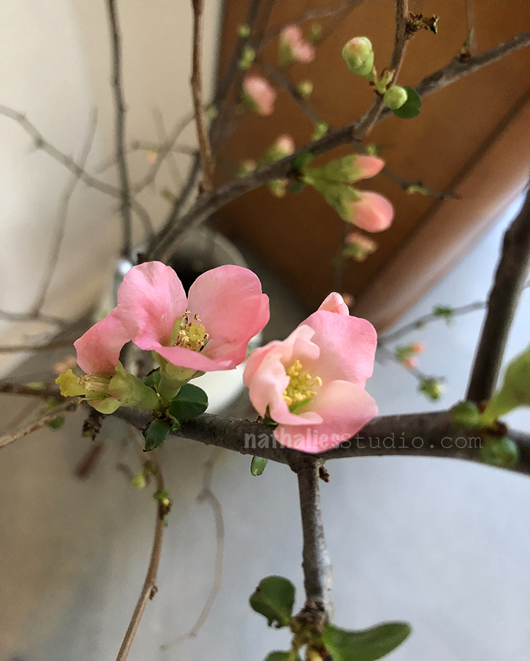
Some flowers on those branches- Kim and I were wondering if those are dogwood? I have no clue since dogwood is not something native to Germany- so I wouldn’t know – but maybe you do? In any event – tiny pink flowers on a branch – absolutely inspiring :)
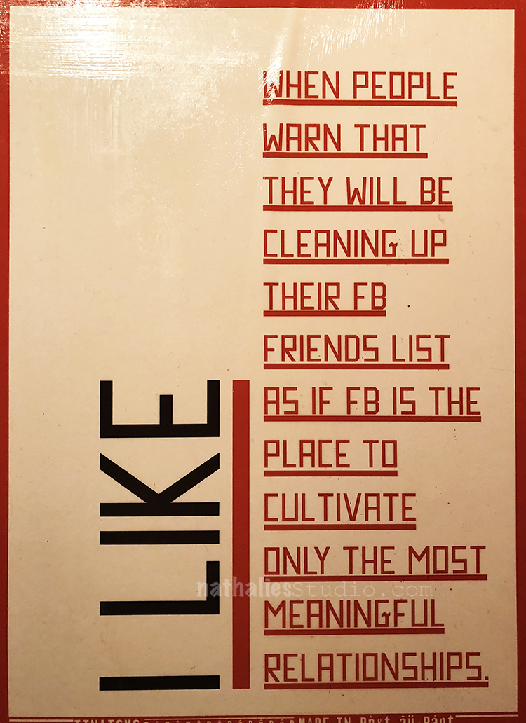
This made me laugh at a pub’s restroom. I actually also love the way the text is displayed – I might keep this in mind for an art journal spread.
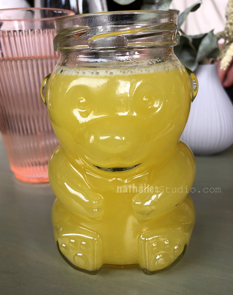
The award for the cutest drinking container at a restaurant goes to this honey bear filled with orange juice. Love the idea for recycling !
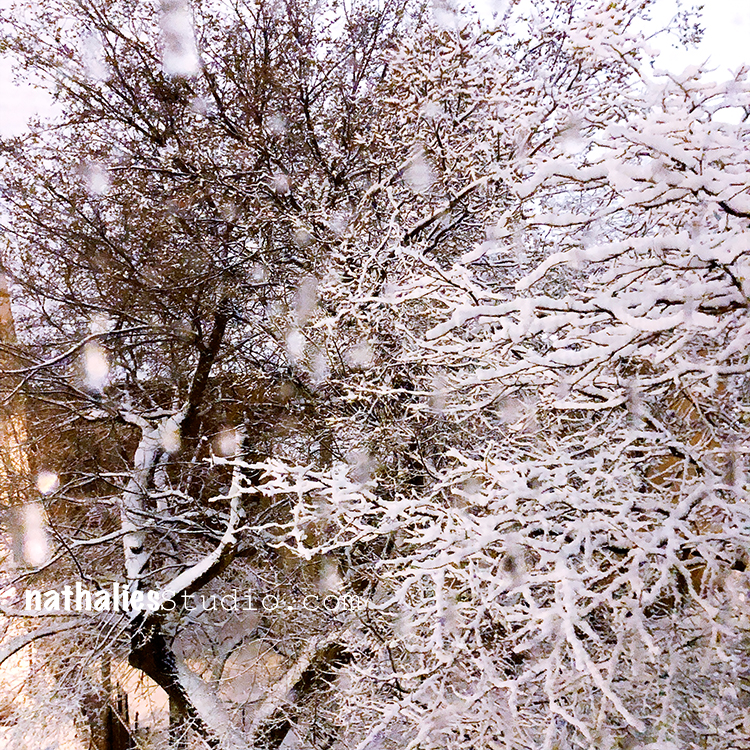

And the snow storm here last week lead to this pretty evening view out of our window. That would be actually really cool turned into visual texture on a canvas, don’t you think?

Hope you enjoyed my little stroll through the hood this month – let’s see what the next month will bring :)

Comments (8)

  • Janene

    |

    Oh, and the kitty is asking for a glass of Purr-lot.

    Reply

  • Caroline

    |

    Your cat is sooo funny – I think the quote should be “C’mon, fill it up properly!” I think the flowers are probably cherry or apple (trees and shrubs are my job)

    Reply

  • Janene

    |

    The pink flower is a Flowering Quince. It, along with the yellow-flowered Forsythia, is a harbinger of spring.

    Reply

    • nathalie-kalbach

      |

      oh cool- thank you Janene- When I googled Flowering Quince that is exactly what came up as to what this looks like. Cool!!! I like it

      Reply

  • Karen Bearse

    |

    Nice. Hehee kitty is so cute. That quote fits great!

    Reply

    • nathalie-kalbach

      |

      Thank you Karen- he knows he is cute- LOL. He is a little spoiled kitty.

      Reply

Leave a comment

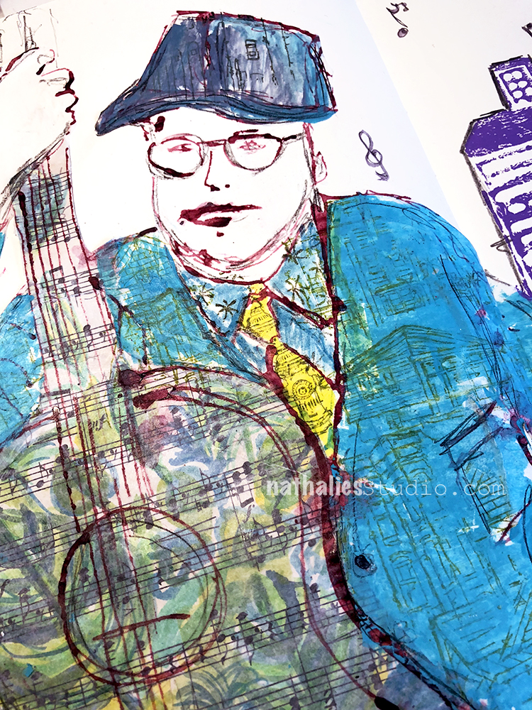
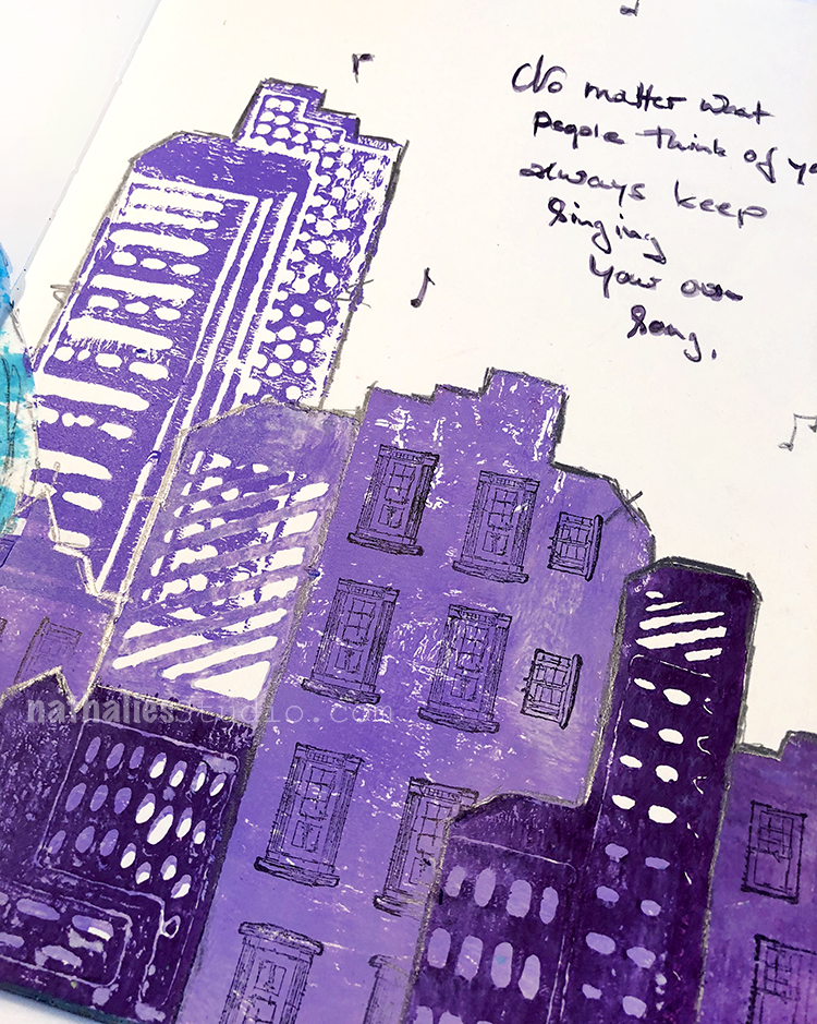
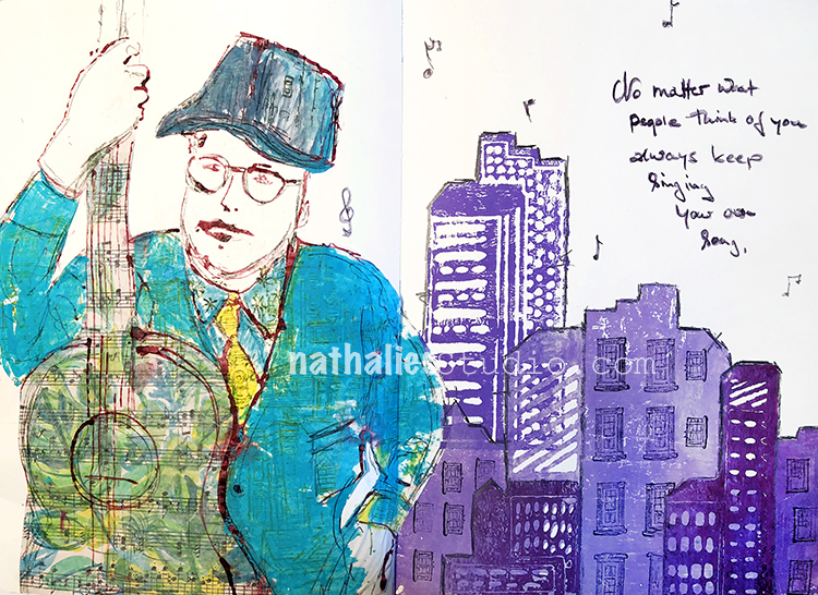
Keep singing your own song! Art Journal

“No matter what people think of you, alway keep singing your own song.”

I used ink to sketch the dude …bad lip job but oh well ;)

I used some music sheet color painted with watercolors for the background of the guitar and stamped on top of the clothing with my building rubber stamps from various sets. For the skyline I used the patterned and solid side of my Midtown Foam Stamp Set and stamped the windows and doors on top.

This was a fun spread to create – here are some of the supplies I used:


Comments (2)

  • Sue Clarke

    |

    I absolutely love how you’ve been using the building stamps to make clothing patterns.
    I never would have thought of doing that and it makes for such an interesting look.
    Thanks for your continued inspiration Nat!

    Reply

    • nathalie-kalbach

      |

      thank you Sue! I am so obsessed with doing those building clothes- cannot stoppppp :)

      Reply

Leave a comment

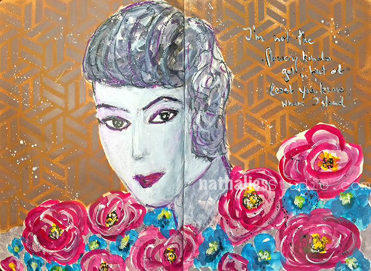
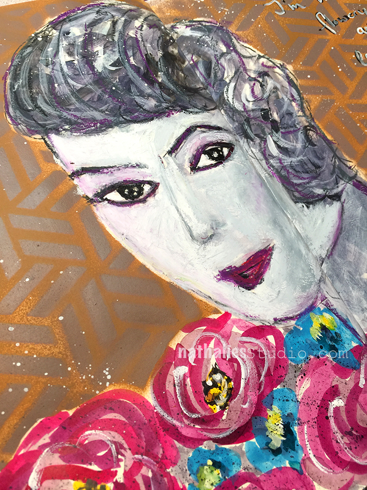
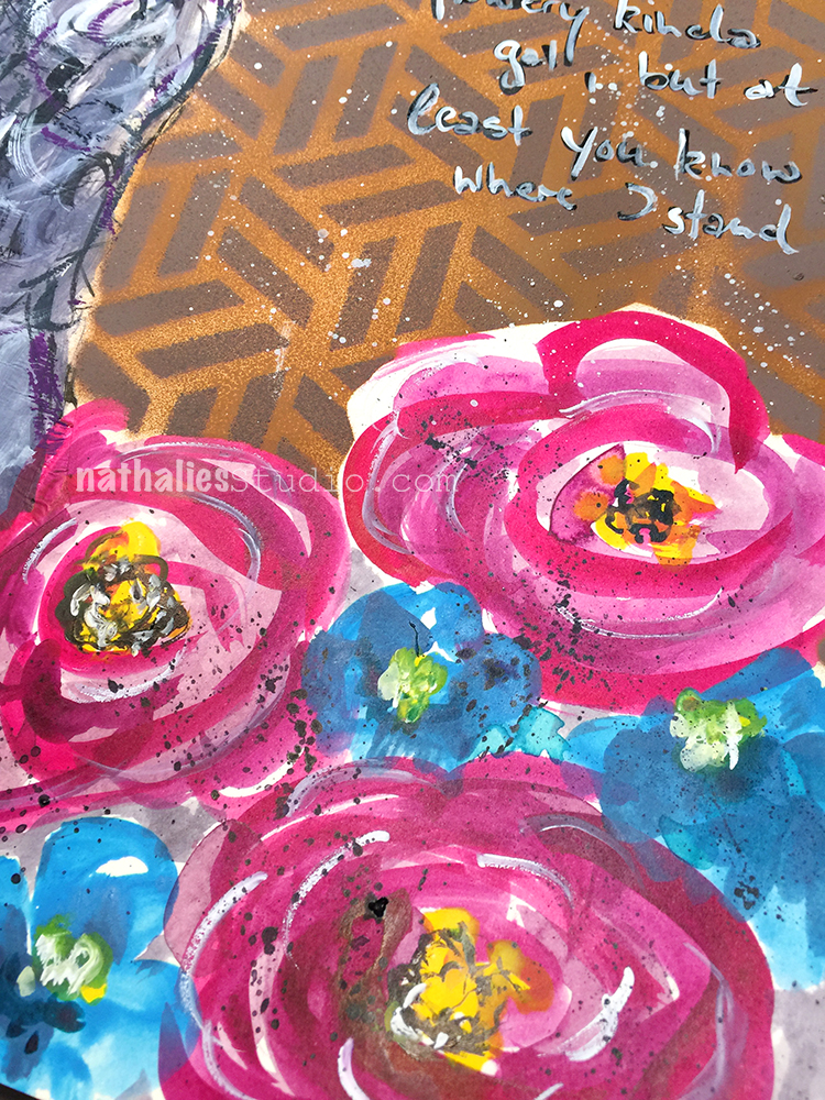
Not Flowery – Art Journal

For not being a flowery girl, I did an awful lot of flowery stuff lately, huh? LOL.

This spread was inspired by a mural I saw in Birmingham, UK last year- can you spot which one in the post about it?

The background was spray painted over my Kassel stencil, and the flowers are painted with acrylic paints and gouache. For the face I used neopastels.

I like how all the different paint mediums look together and play with them.


Leave a comment

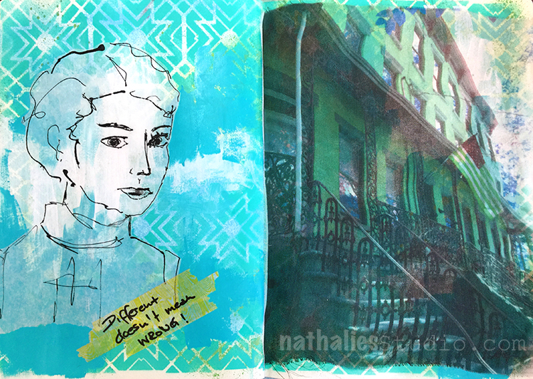
Different doesn’t Mean Wrong!

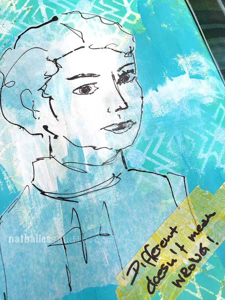
Different doesn’t mean WRONG!

Good reminder as I am doing a lot of things different in my art journal lately ;)

I liked the sketch so much that I didn’t wanna change it up with color or stamping, so I left it as is. I adhered some some washi tape with Gel Medium and added the Journaling on top.

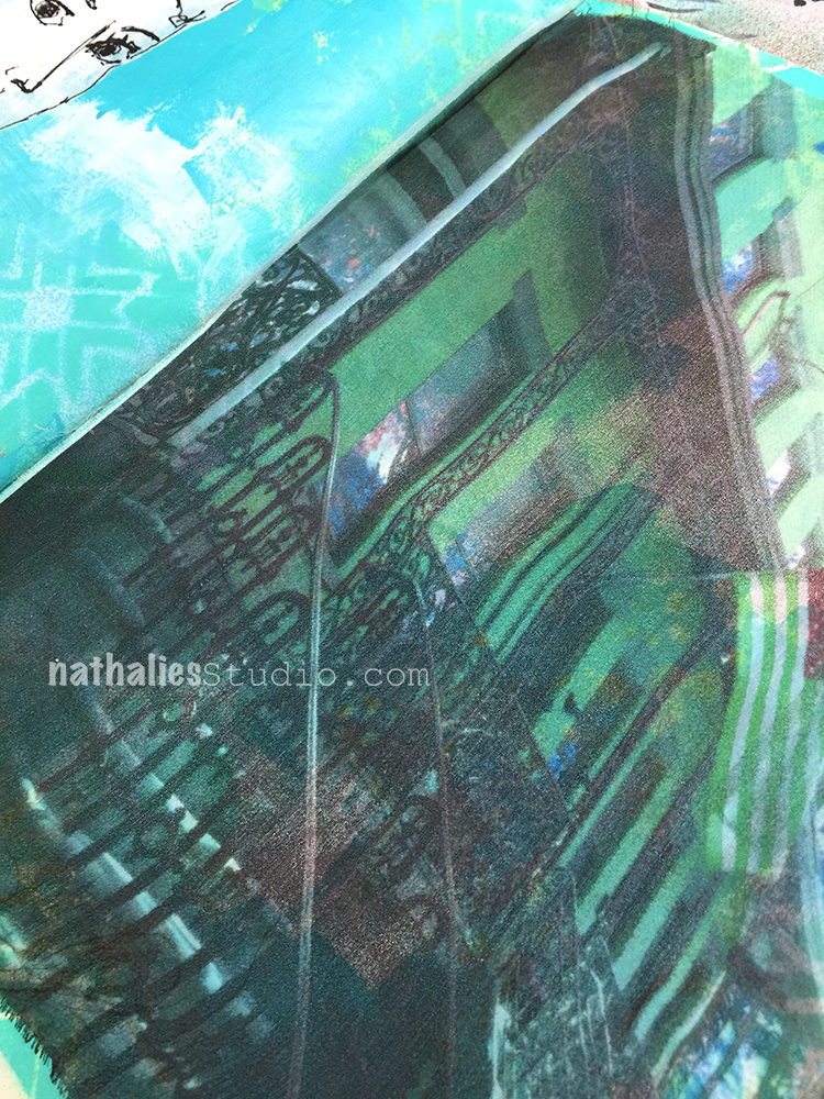
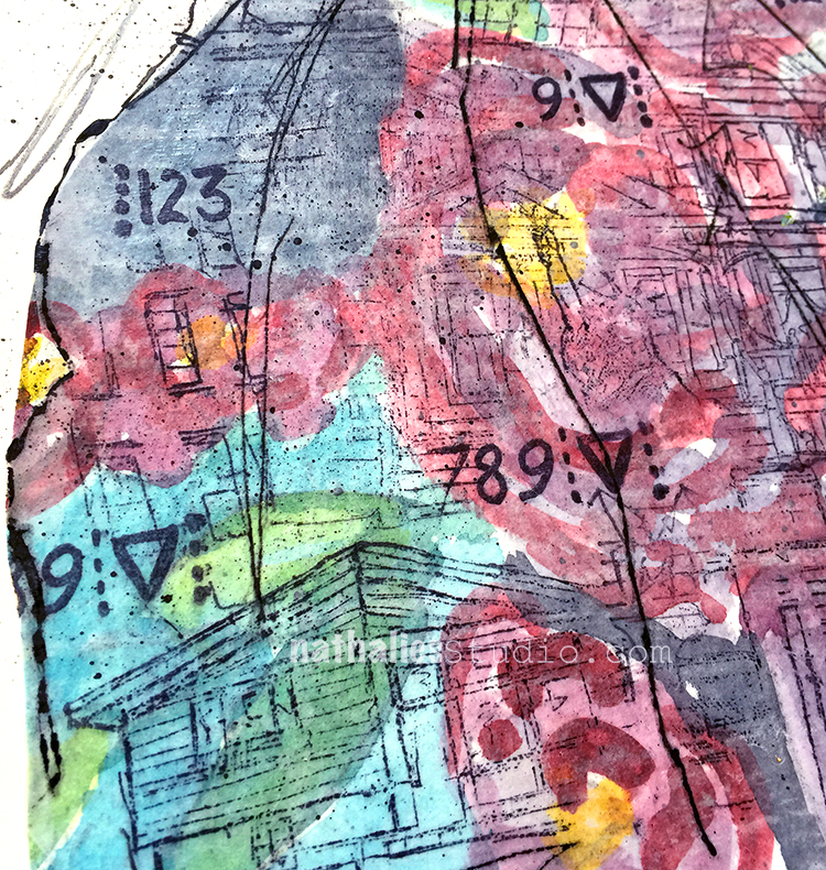
The building is a printout on gauze. I manipulated the image which was taken in the neighbor hood in an amazing class a couple years several years ago with Natalya Aikens and I hoarded this piece of fabric. I decided it was time to just use it up :)


Leave a comment

Be Silly – Art Journal

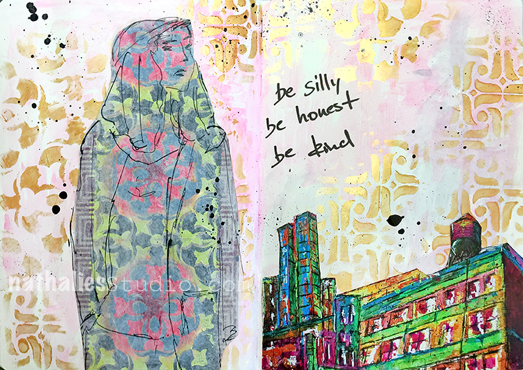
Be Silly, be honest, be kind!

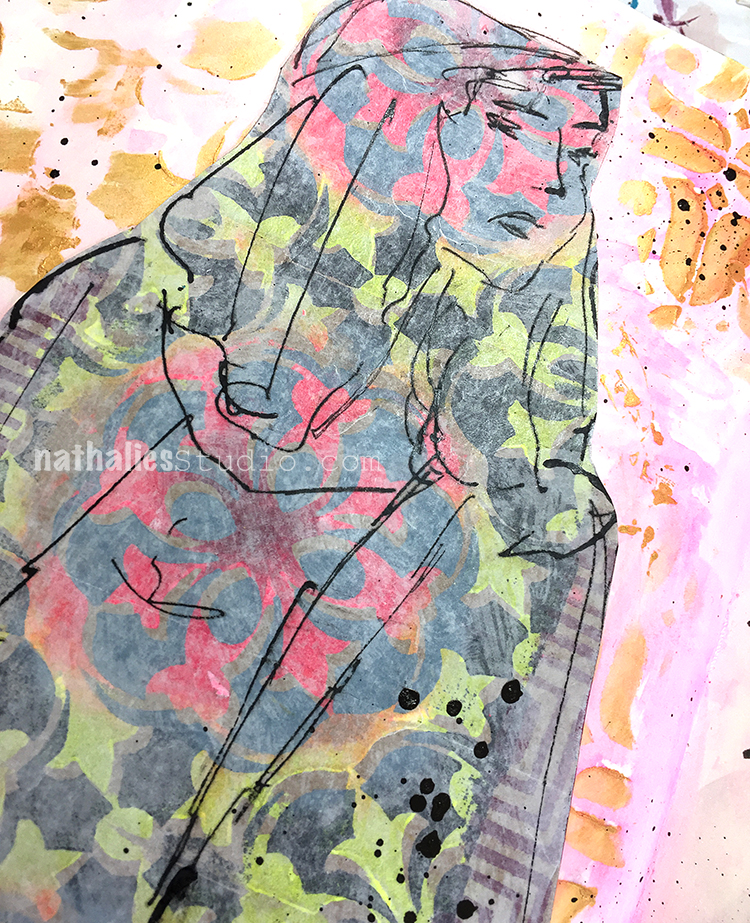
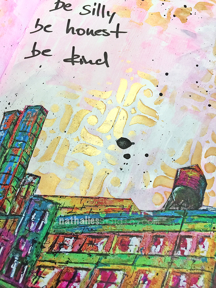
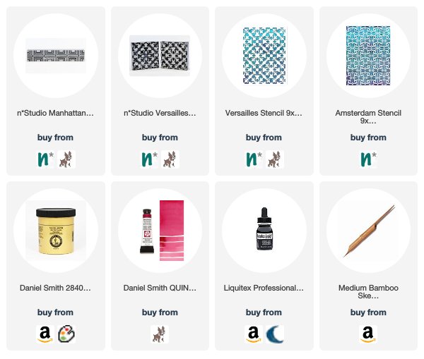
Fun using up a tag I made a while ago with my Versailles Stamp set and the Manhattan border stamp. For the background I stenciled some gold gesso through my Amsterdam and Versailles Stencil and colored the space in between with watercolor paint.

The building is a cut out from an old calendar print of my Highline painting. This was a fun and fast spread to do :)


Leave a comment

A Long Way – Art Journal

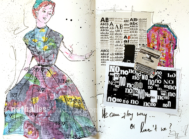
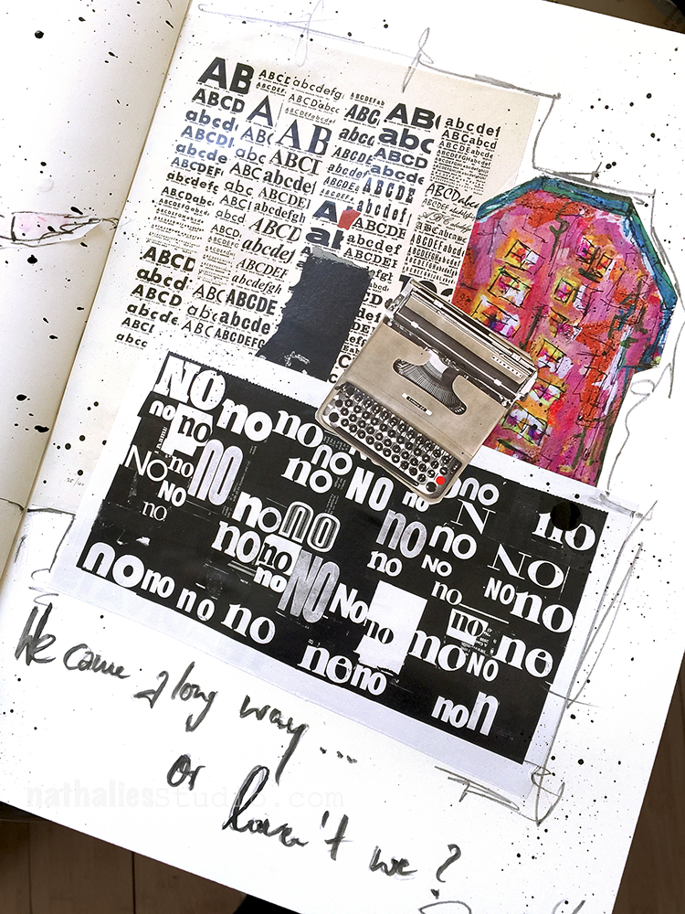
Little collage play in my art journal. I am enjoying using a lot of scraps and paper I collected and trying some different things :)

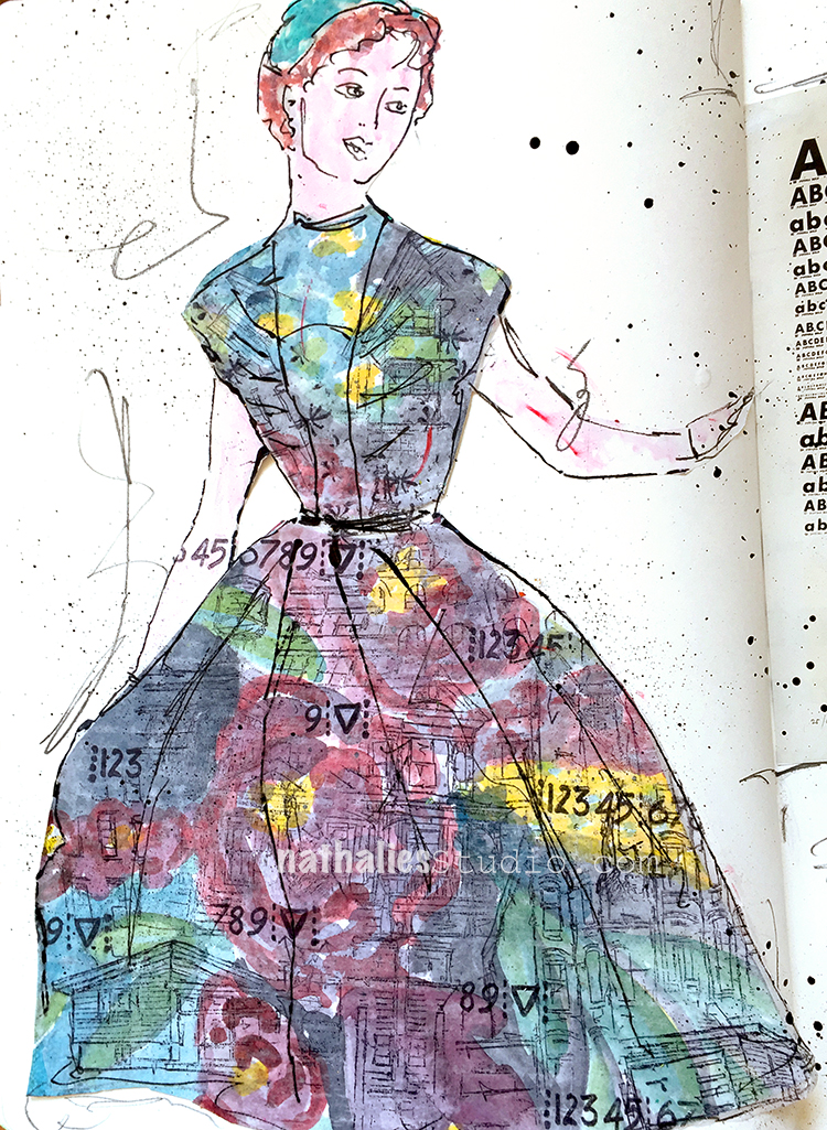
I sketched the 50s girl on deli paper and then pasted it on a flower painting in watercolor. I used several of my urban stamps to create a grungy look.

I love combining the romantic look with some grungy me – just my style ;)

I cut out some artwork from an old MoMA desk calendar as well as a part of one of my own old calendars which had some of my building paintings included. I like incorporating my own paintings on different scale into my art journal.

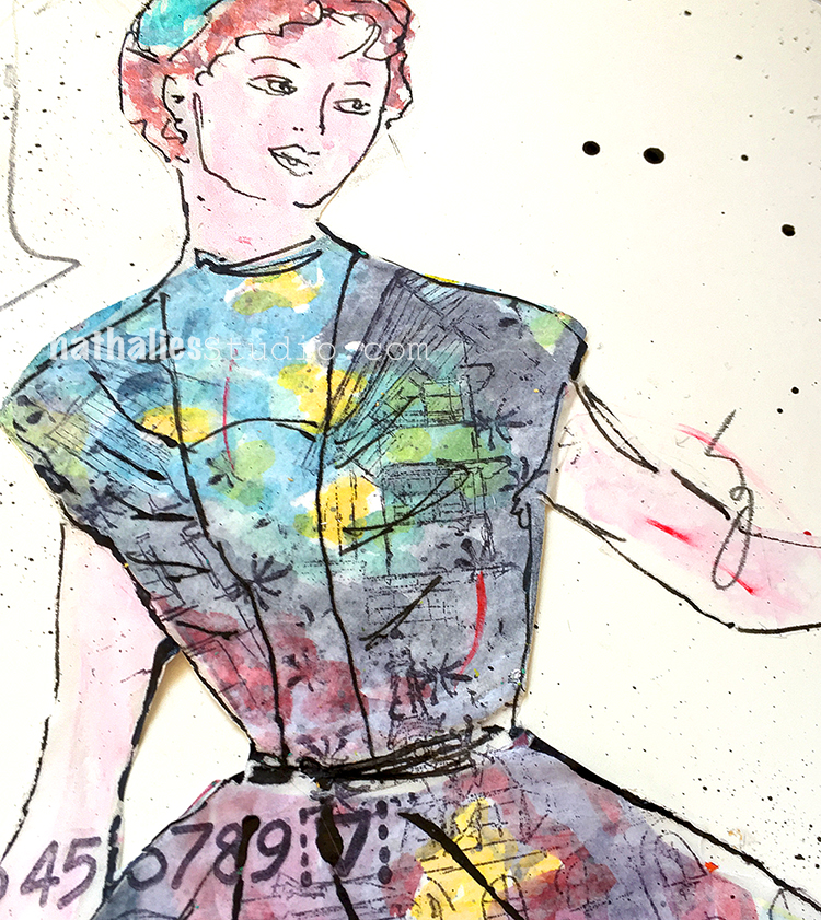
Here is a close up of the dress. I am having so much fun with this :)

Here are some of the supplies I used:


Comments (2)

  • Sue Clarke

    |

    What a delightful spread. I can picture you wearing this dress!

    Reply

    • nathalie-kalbach

      |

      Thank you Sue! Oh yeah- I would love to have that dress too :)

      Reply

Leave a comment

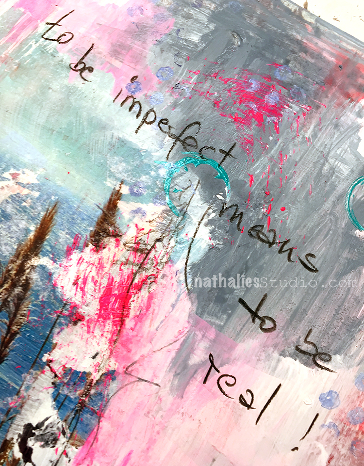
To Be Imperfect Means To Be Real

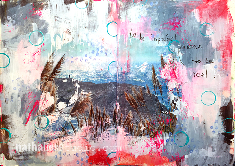
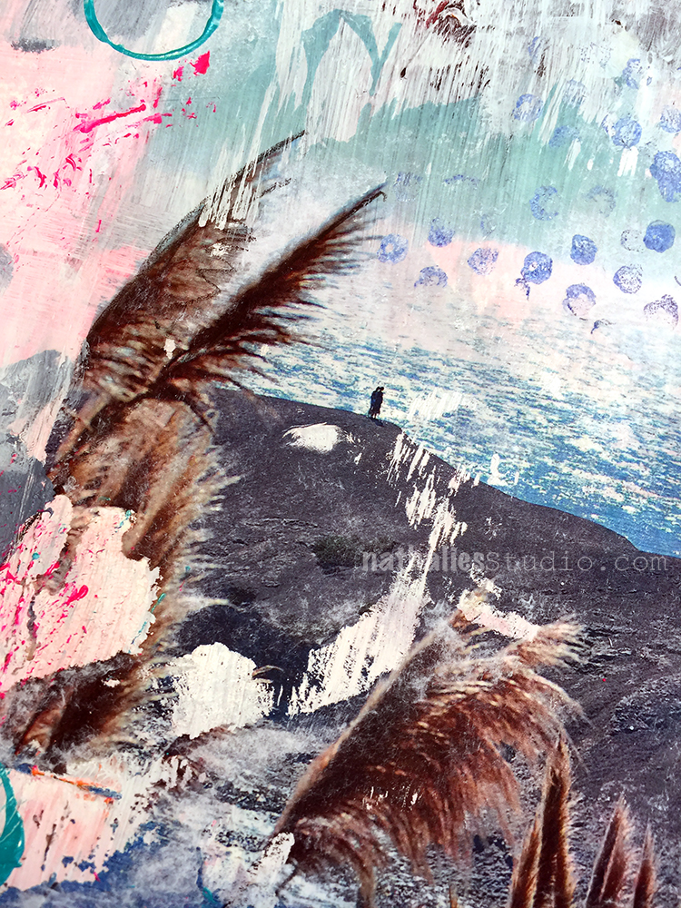
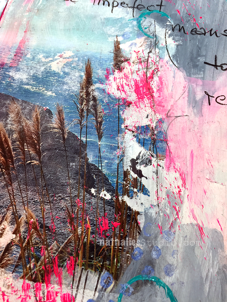
“To be imperfect means to be real” – I thought it was a perfect quote for a spread featuring an image transfer :)

I love how imperfect image transfers look and how they can lead to a grungy and interesting page. I wrote the journaling with a soft pencil as I felt that would fit best with the overall look.

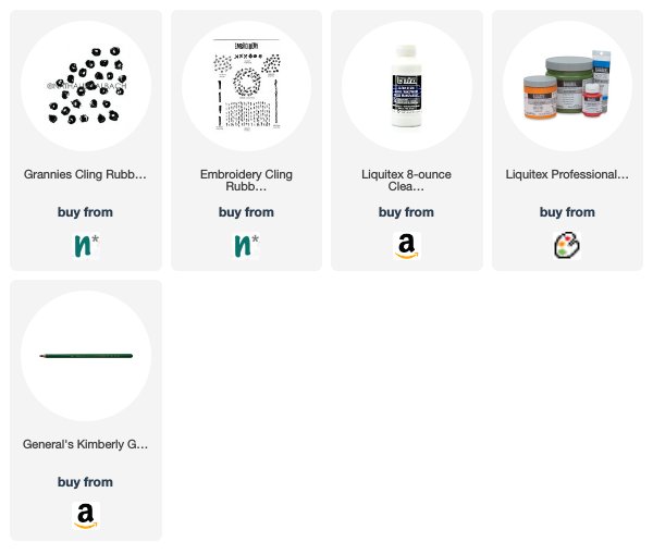
I added some stamping with my Grannies stamp and also stamped some circles with a lid and made some marks with a stiff brush.

Here are some of the supplies I used for this spread


Comments (2)

Leave a comment