Art Stroll

Art Stroll: Modern Art at the Met, NYC

Loved strolling a bit around to see some of the Modern Art displayed at the Met a couple weeks ago while I was there. I just recently saw a documentary about one of my favorite illustrators Christoph Niemann – follow his instagram feed, it is brilliant and makes me laugh! – and he said that “experiencing art is the gateway drug”. I agree – and here is some of fine substance ;)
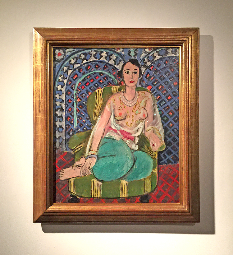
Henri Matisse, Seated Odalisque, 1926

I have said so much about my love for Matisse’s pattern play …there …once again …swoon
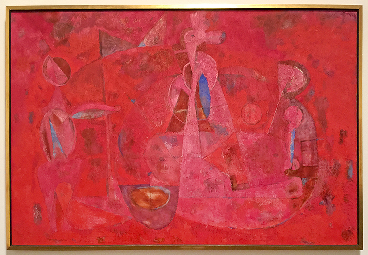
Rufino Tamayo, Children’s Games, 1959

Love looking at this and discovering the shapes and scene.
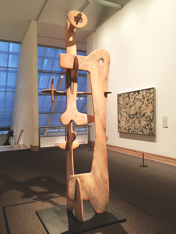
Kouros, Isamu Noguchi, 1945 – Marble
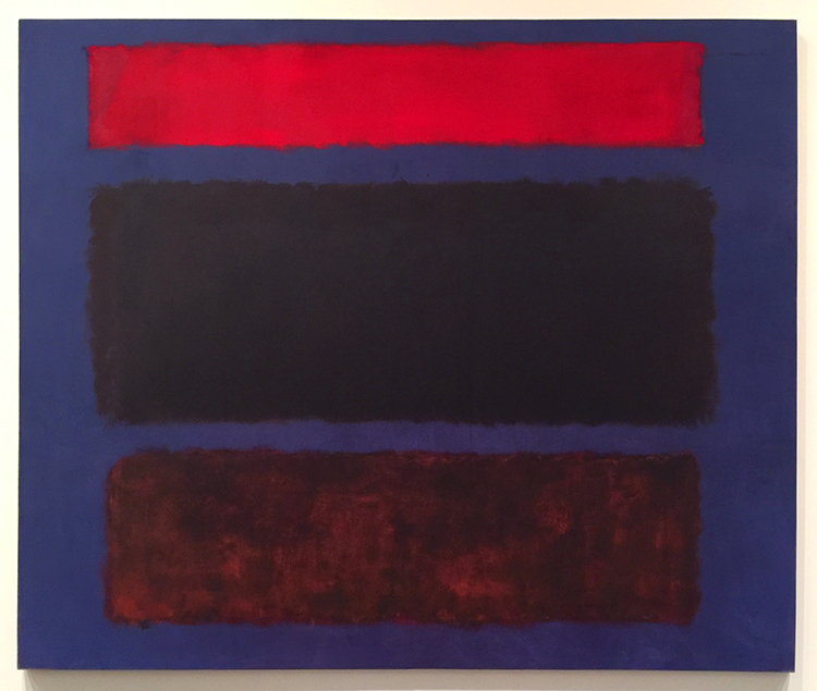
Marc Rothko, No 16, 1960

Color inspiration anyone? Love it!
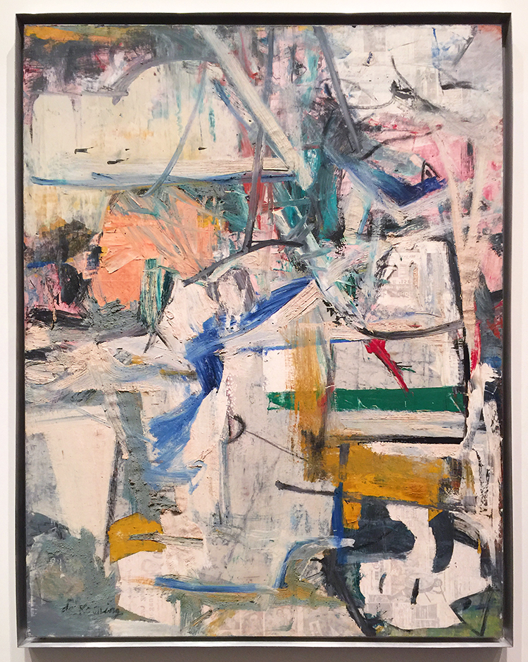
Willem de Kooning, Easter Monday, 1955-56
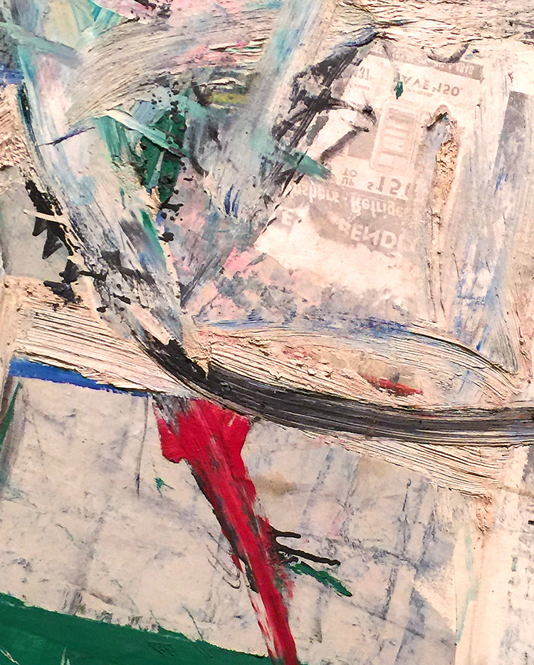
Texture Galore and collage elements – swoon
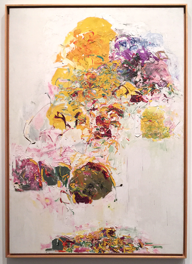
Joan Mitchell, Sunflower, 1969
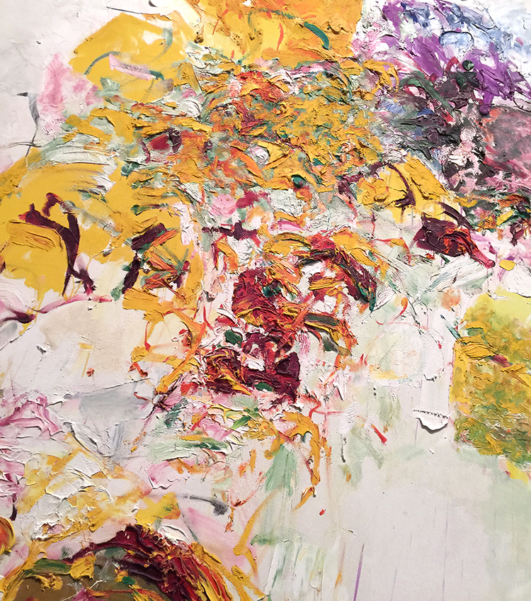
I love the texture rich and voluminous flower painting – so gorgeous!
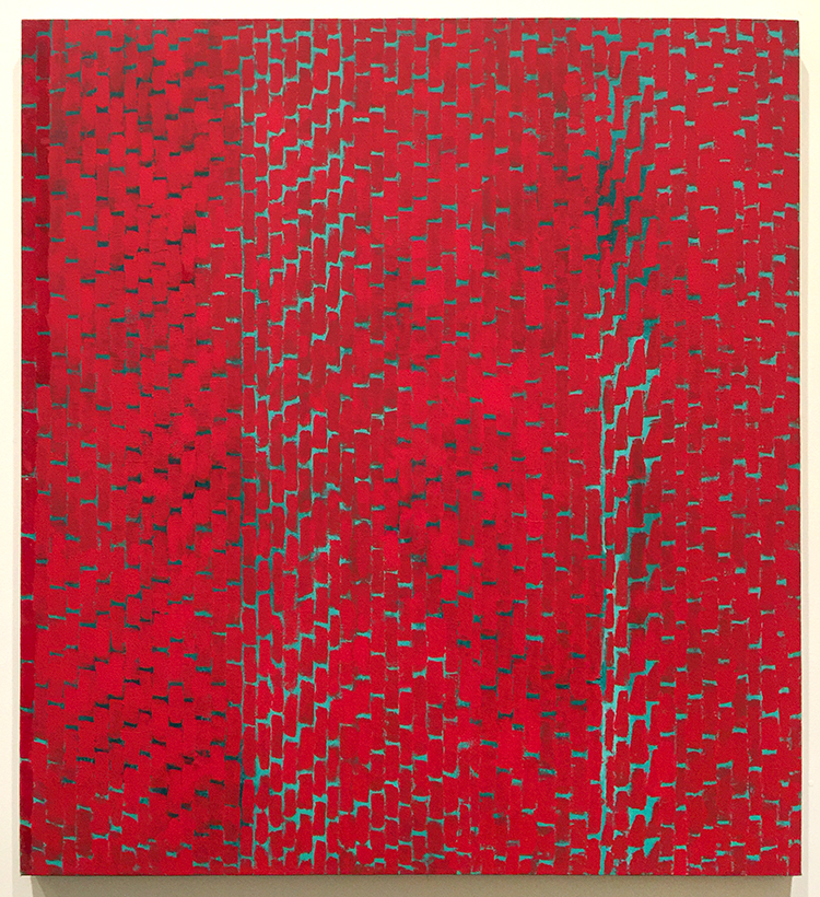
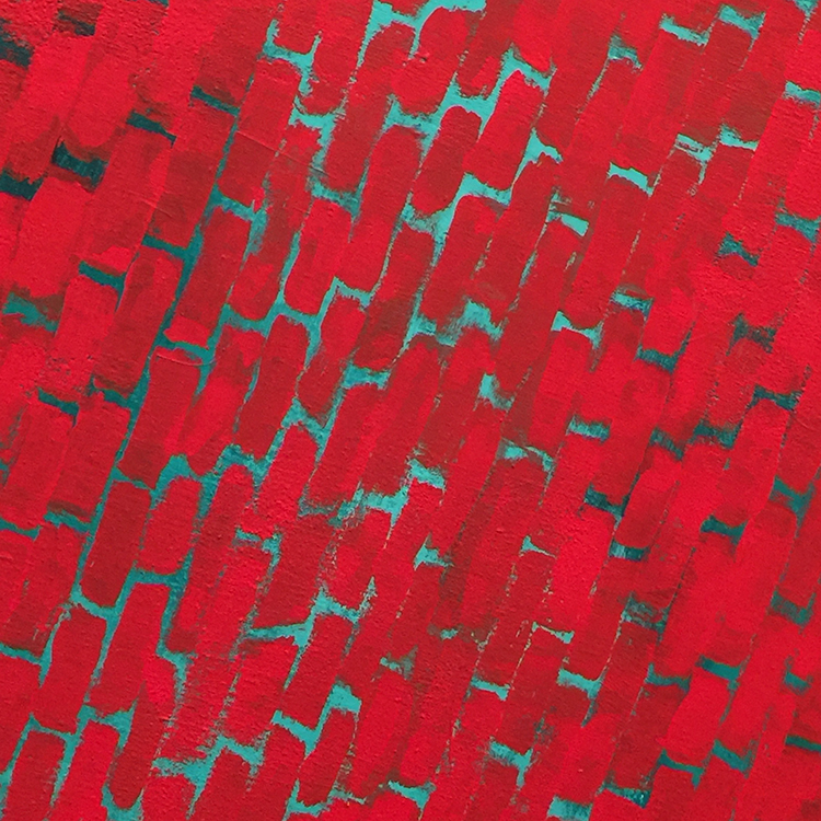
Alma Thomas, Red Roses Sonata, 1972 – Acrylic on canvas

This was so intriguing ! Speaking of making colors sing!
Creative art is for all time and is therefore independent of time. It is of all ages, of every land, and if by this we mean the creative spirit in man which produces a picture or a statue is common to the whole civilized world, independent of age, race and nationality; the statement may stand unchallenged.
-Alma Thomas, 1970

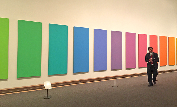
Spectrum V, Ellsworth Kelly, 1969
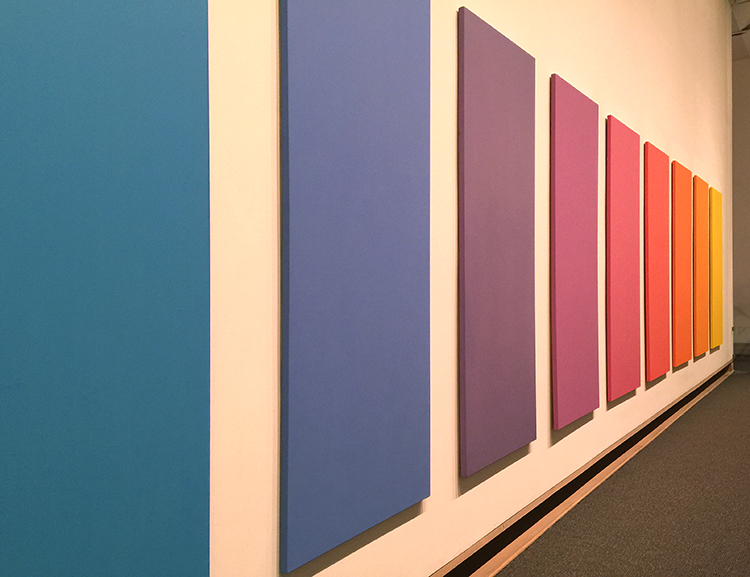
LOVE!
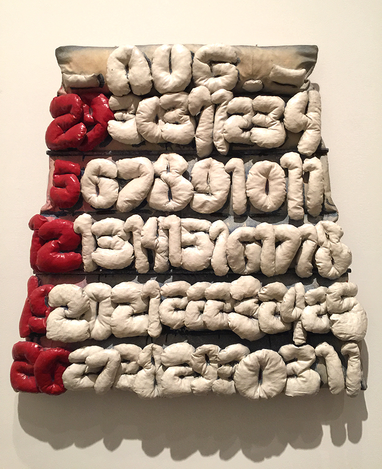
Claes Oldenburg, Soft Calendar for the Month of August, 1962

Canvas filled with shredded foam rubber, painted with Liquitex and enamel – I thought that was interesting – painted with “Liquitex” . But then I remembered that Liquitex was the first water-based acrylic paint created in 1955 – the name deriving from liquid texture hence the name of the company later. I have never seen a painting stating the material instead of acrylic paint with Liquitex – I guess having worked with them made me stumble upon this.
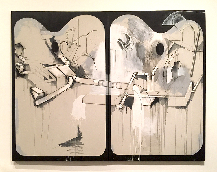
Jim Dine, Two Palettes, 1963

Oil, acrylic, enamel and charcoal on primed canvas
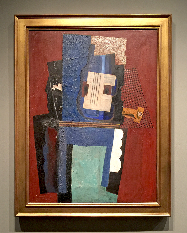
Pablo Picasso, Guitar and Clarinet on a Mantelpiece, 1915

It was especially great to see this painting as I was reading Matisse and Picasso: The Story of their Rivalry and Friendship and this painting plays a little “story” in the book. The book is interesting btw but not extremely great.

I love the Met but it is just such a hike to get there and it is always so crowded. Strolling through the Modern Art Galleries at the end fo the visit was a wonderful way to catch some breath after an insanely crowded stroll through the Hockney and Cornell exhibition. The next art stroll will probably come from a Museum in Japan …we will see ;) I hope you will join me!

Leave a comment

Art-On-The-Go Kit

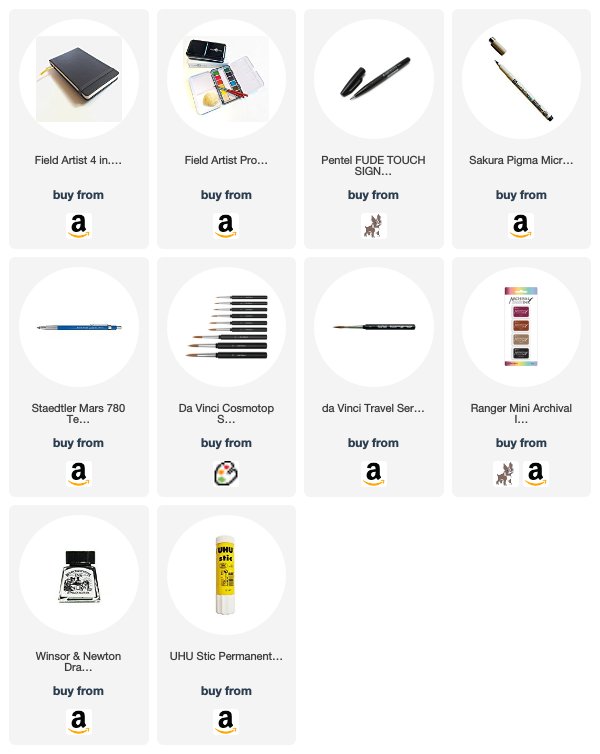
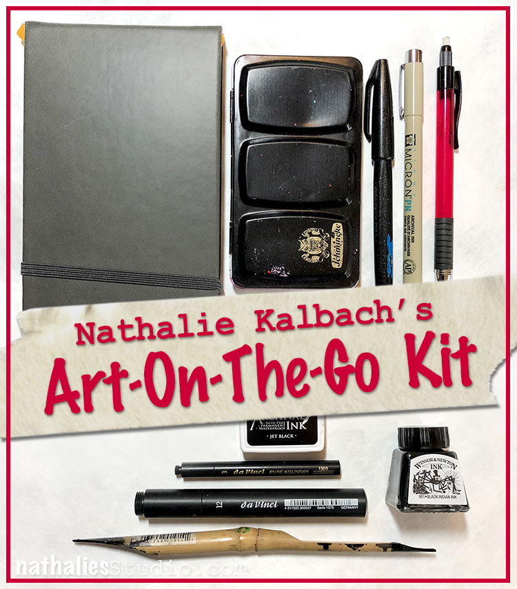
I am so excited, because I am going to Japan and I thought I would bring a little Art-On-The-Go Kit and I hope I will be doing a lot of sketching, and that I will also write a bit about my adventures. We will see how much I used it when I am back ;) But I thought I would share with you what I packed.

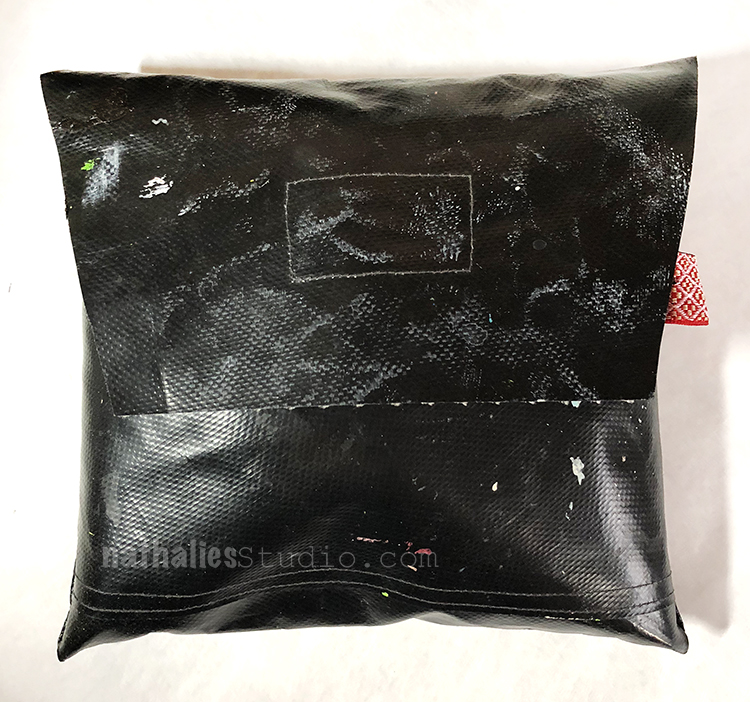
The bag was a gift from a friend many years ago and I use it a lot- some of you might have seen it in as part of my bags I bring supplies with me to workshops. The bag is waterproof and is made from one of those old maps the used to used in school – anyone remember those being carried in with a stand by the teacher? Here is what it is packed with

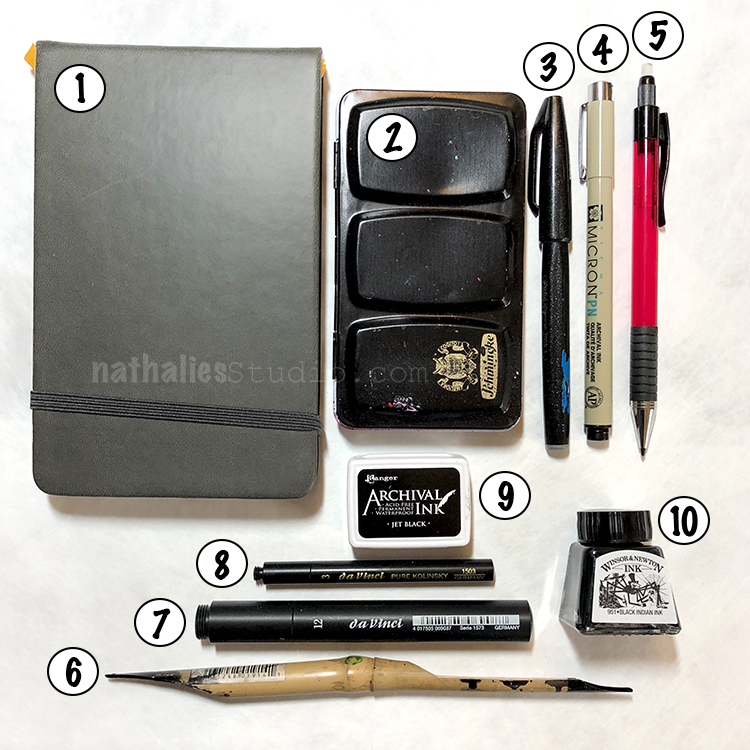
  1. 1. small 4×6.5 inch Sketchbook – it is the right format for me to do sketches and at some days just take it by itself with a pencil to fit in a small handbag but still big enough to also do some travel journaling in it.
  2. 2. a Travel watercolor box -this one is actually filled with colors I love to use but I just love the format of this old box I bought a long time ago in Germany. They are a wild variety of different company’s colors.
  3. 3. a Fude pen – I love to sketch with it but I also love writing with it. I am actually hoping to buy a lot more of those in Japan :)
  4. 4. a Micron fine pen for sketching
  5. 5. a technical pencil that also has a small eraster
  6. 6. my Bamboo Sketching Pen – I don’t usually bring it but I am so into it right now and somehow I feel there might be a lot of inspiration on sketching with it in Japan
  7. 7. a bigger Travel Watercolor Brush and
  8. 8. a small Watercolor Brush . I used to only bring a brush with a water tank but I love those little brushes and also bring a small 1oz cup with a lid which I can easily use with water or the ink if I need to.
  9. 9. a Stamp Pad – there is so much that can be turned into stamps, but I also heard that a lot of temples and train stations in Japan have their own stamps called Eki and that it is a good idea to have an ink pad with you as those at the location might be dried out. I hope to fill some beautiful stamp images to go along with my sketches and journaling.
  10. 10. a small container with ink. I like that this one is super small and it will go well with my Bamboo Sketching Pen.
  11. 11. not pictured a small piece of a rag and a glue stick

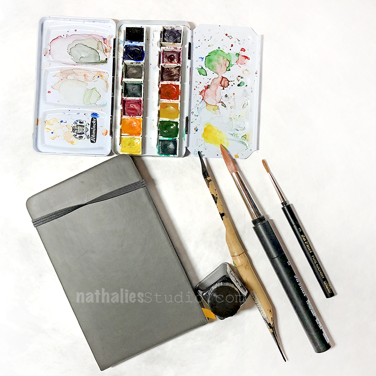
Here is a little glimpse at my colors in my watercolor set and the travel brushes being screwed together. Now cross your fingers I am a good girl and use all items while traveling ;) I will share of course share with you


Comments (4)

  • stephanie

    |

    Lucky you! Have a great time. Can’t wait to see your posts.

    Reply

  • Sue Clarke

    |

    Have fun in Japan.
    I’ve never seen travel brushes…super compact.
    I love FUDE pens and order them in bulk on Amazon.

    Reply

Leave a comment

Unfinished Thoughts – Art Journal

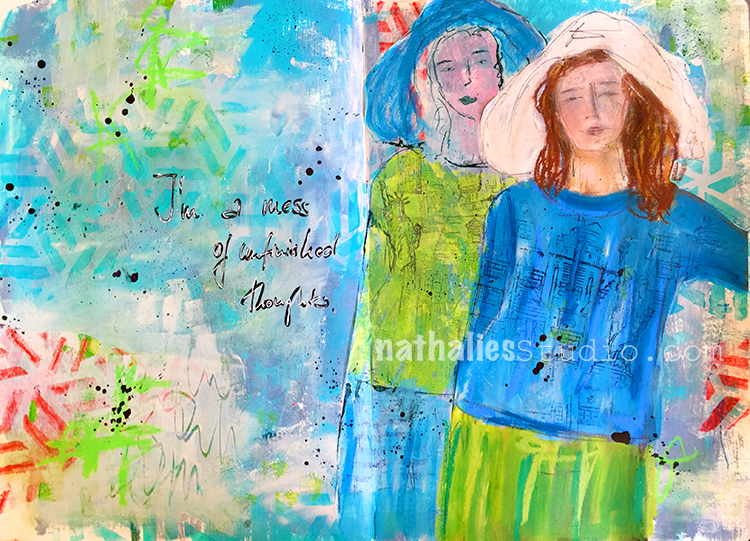
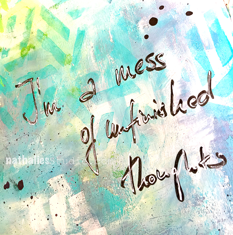
I am a mess of unfinished thoughts -oh so true ;)

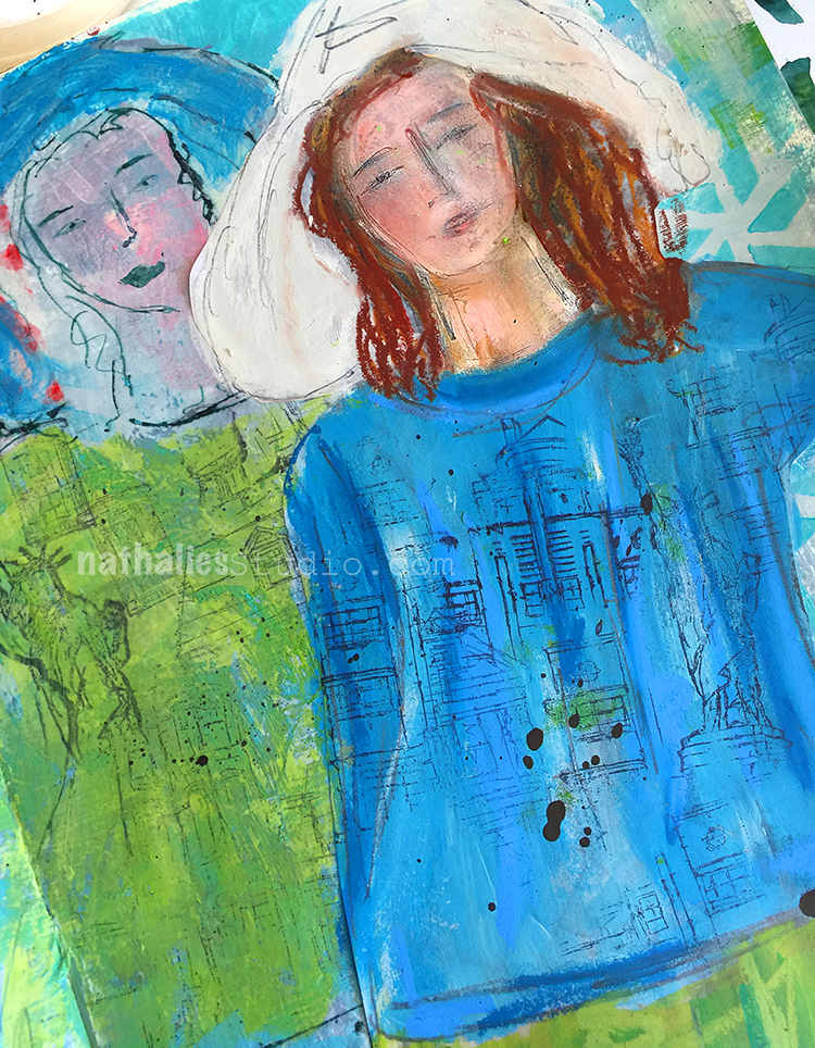
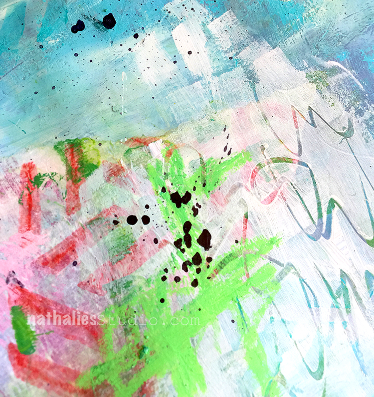
The back girl is sketched out on deli paper and painted with acrylic paint, while the front one is cut out from a magazine and I just painted with Neopastels on top of it.

I used my Kassel stencil directly on the background but also used some deli paper where the stencil appeared after I had used it with my gel plate to do monoprints.

To tie the deli paper a bit more together with the background I painted partly over it and the background and then scratched some marks into the wet paint. I like the grungy feel of this.

Here are some of the supplies that I used besides various acrylic paints and inks:


Leave a comment

Well Behaved Women – Art Journal

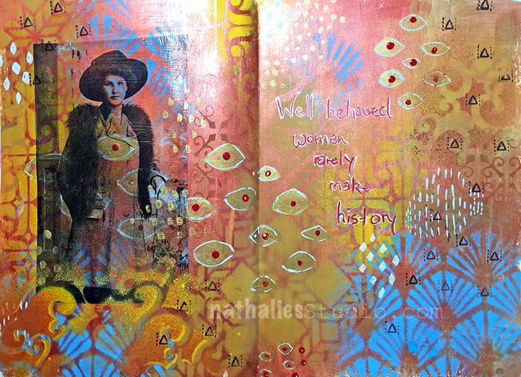
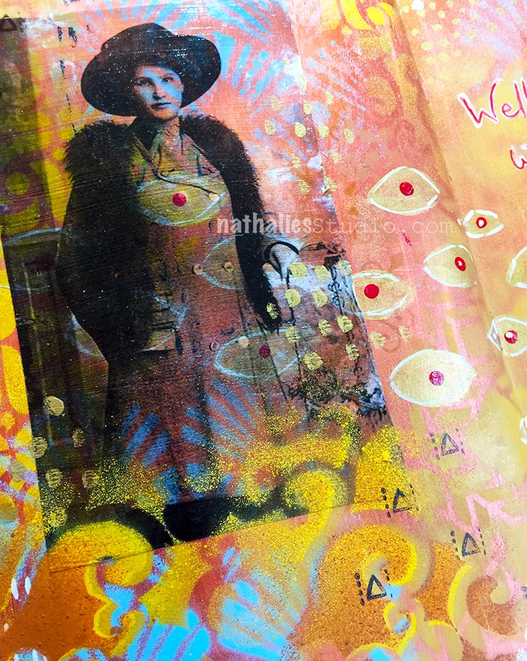
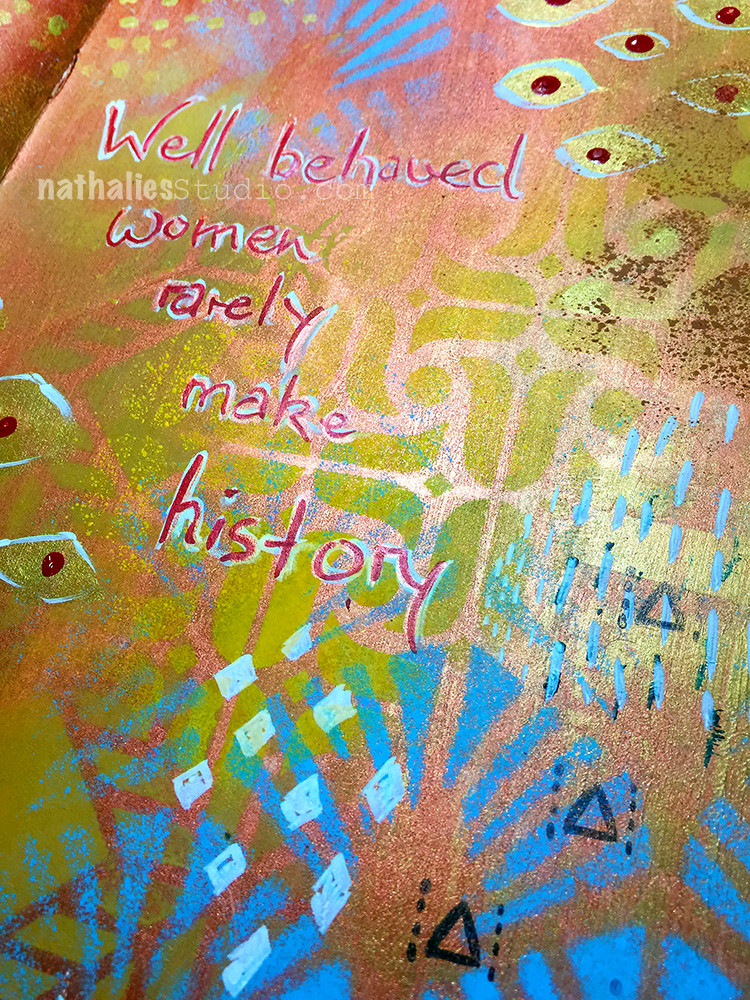
This is another Art Journal spread using my great grandmother’s photo as an indirect image transfer. I love how the transparency of the image let’s the background come through.

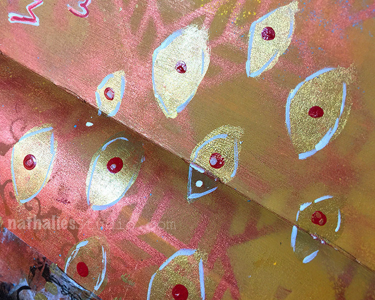
Inspired by Klimt I added hand painted and also stenciled patterns with acrylic paint and acrylic spray paint. I also inked up just part of my Numerals stamp as I thought the triangle would make a great pattern stamp

I love how this came out and I wonder if my great grandmother actually liked Klimt – she for sure liked fashion – I have a nice stash of photos of her and she always liked to dress up.

I will post soon how I do indirect image transfers – they are fun and especially work with photos that have bigger areas of white so you have a clear area that works well with the background.

Here are some of the supplies I used for this spread


Comments (2)

  • Sue Clarke

    |

    Love LOVE Love this…colors, photos and quote!
    Reply

Leave a comment

Art Stroll: Joseph Cornell at the Met, NYC

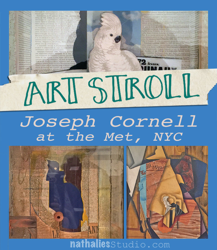
A couple weeks ago I went to the Met and one of the exhibitions I enjoyed in this art mecca was a small exhibition “Birds of Feather” Joseph Cornell’s Homage to Juan Gris. I loved this exhibition because it is about an Art Stroll – which was inspirational and turned into some beautiful art!
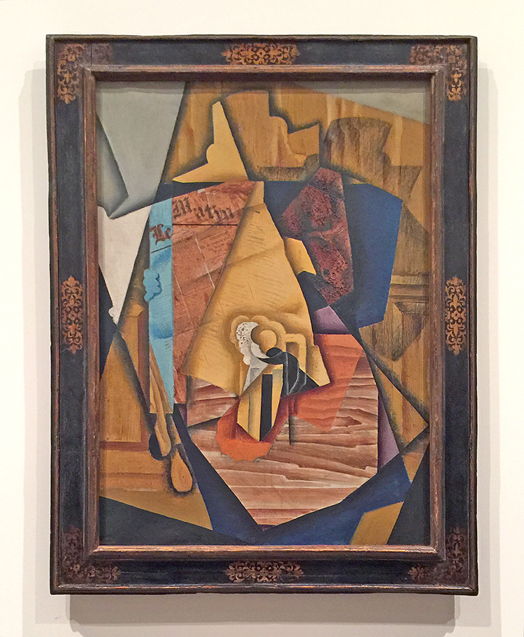
In 1953 Joseph Cornell saw Juan Gris’s painting below at an exhibition

“The Man at the Cafe” , 1914 by Juan Gris – oil on canvas with newspaper collage.

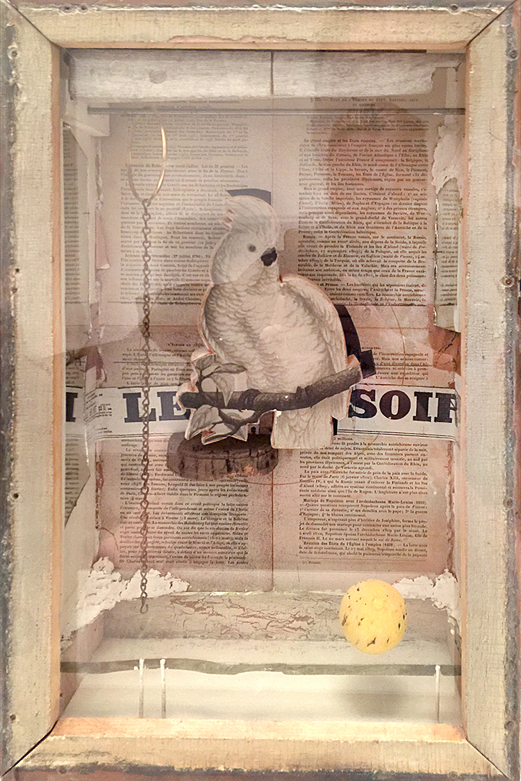
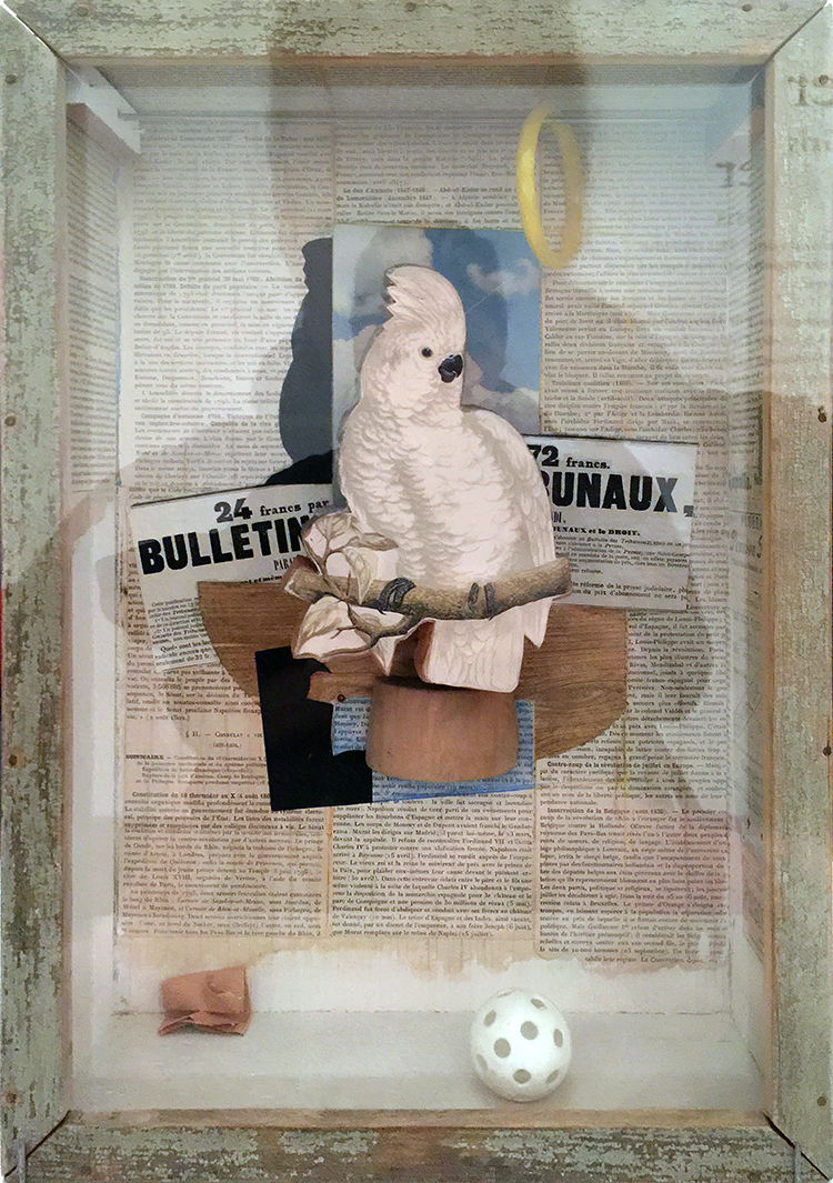
This painting captured Cornell’s imagination and he created 18 glass fronted boxes, two collages and one sand tray over the following thirteen years in homage to Gris. Here are just a few of the boxes:


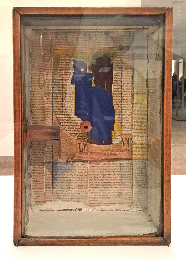
“Josette; Juan Gris #5” ca. 1959-60

This ox is named for Josette Herpin, Gris’s companion. In 1959 Cornell dreamed of a blue cockatoo and explained in his diary that “Josette came to life” . Cornell knew of her two portraits by Gris, where she sits in a black armchair the contour of which mimic the projected shadows of Cornell’s first cockatoos. He was likely inspired by the blue hues of her bust-length portrait. for the colored silhouette in this box.

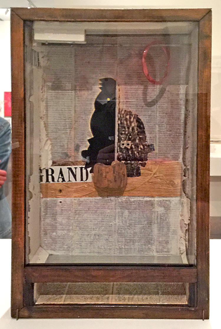
Untitled (Juan Gris Series, Black Cockatoo Silhuette) ca. 1959-60

Cornell’s interest in cut-and-pasted paper was a direct response to Gris’s collages.

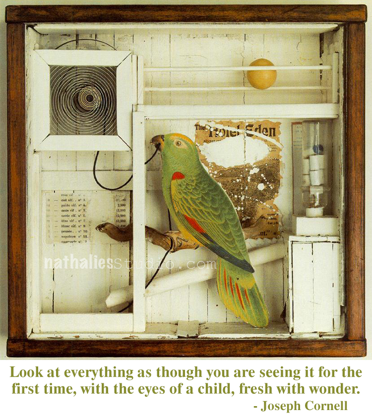
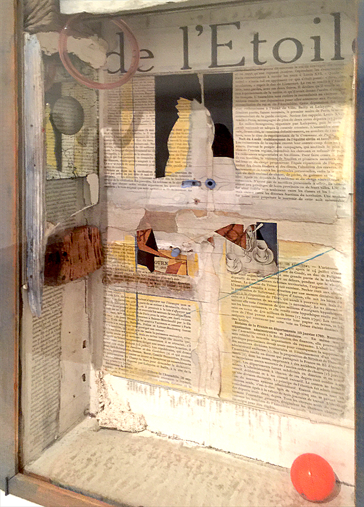
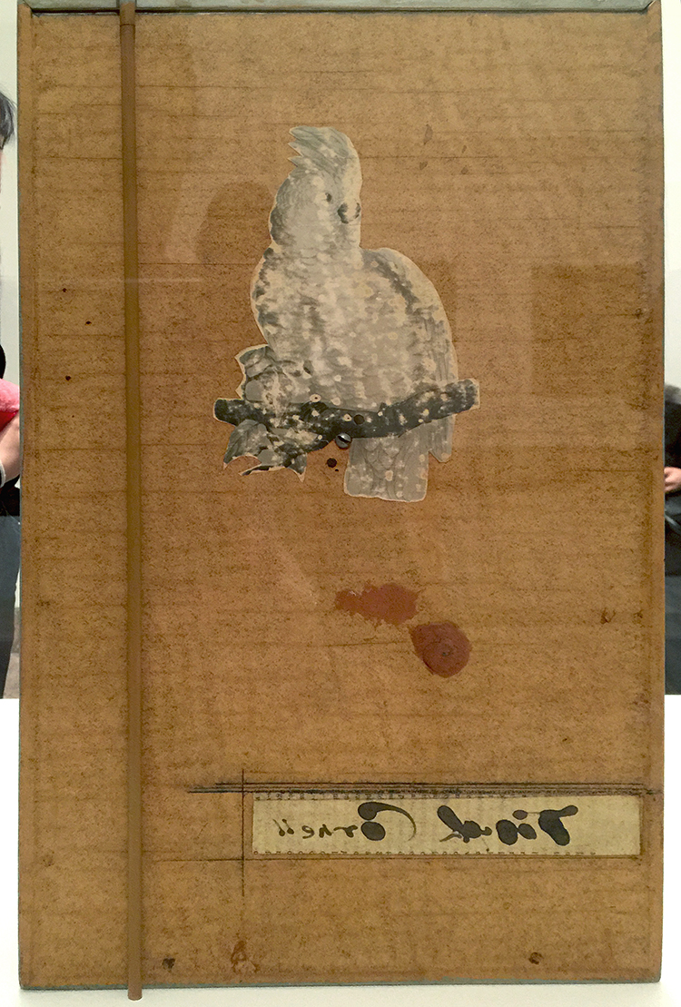
The artist lined his cockatoo boxes with pages from 19th century French texts, which he found in Manhattan book stalls. The photo below is actually the back of one of the boxes -I love this!


Other elements that characterize the Gris boxes are fragments of floral wallpaper, marbleized paper, and commercial labels.


I love Cornell’s boxes- makes me really want to do more assemblage again. I also loved seeing the original inspiration and then so many different versions on how he spun the inspiration. The first box shown here still has some traces of the inspiration  – but only if you know about the piece by Gris – but you would not know with the other ones without knowing about the story. Fascinating, don’t you think?

Hope you enjoyed this art stroll- see you soon for another one :)


Comments (2)

  • Sue Clarke

    |

    Pretty cool that Cornell was so inspired after seeing Gris’ art.
    I can see that they would be fun to view, but I have to say that it makes me ask the question:
    Why is that in a museum more than anything else that has been created?
    Interesting what is determined to be “worthy of a museum” art versus anything that someone around me might create.
    Just saying.
    I tend to enjoy art that makes me question it and evaluate just what the artist was trying to get across.
    Just my thoughts.
    Enjoy your weekend and thanks for sharing Nat.

    Reply

    • nathalie-kalbach

      |

      It is a good question- love it. I think you always have to see art also in context of art history. Joseph Cornell was a pioneer in using found objects to create 3D art and create assemblage pieces. Taking what once was used and beautiful and then regarded as garbage to create something new was still a pretty new concept and he was taking it a step further from Collage. He inspired many influential artists with his work like Robert Rauschenberg and Andy Warhol. What you see other artists doing today is what sprung from those roots. I think it is easy to forget how new and shocking some things were at certain times. But he who was a pioneer and inspired so many people after him, was also inspired of course by other artists- in this case by Gris who was part of the Cubism movement which again was CRAZY back then (and sometimes even for some people today) That is what fascinates me. I also think that those photos cannot convey the magic of his boxes – they are little wonder boxes. I love that you asked this question – I wonder myself with other art pieces a lot – but the greatest task is trying to find the answer or try to understand – wether it will be satisfying or not – it opens the world and makes us receptive to learn so much about so many things. That is what makes those Art Strolls besides the instant inspiration through color, texture, subject etc. so valuable for me.

      Reply

Leave a comment

Don’t Judge – Art Journal

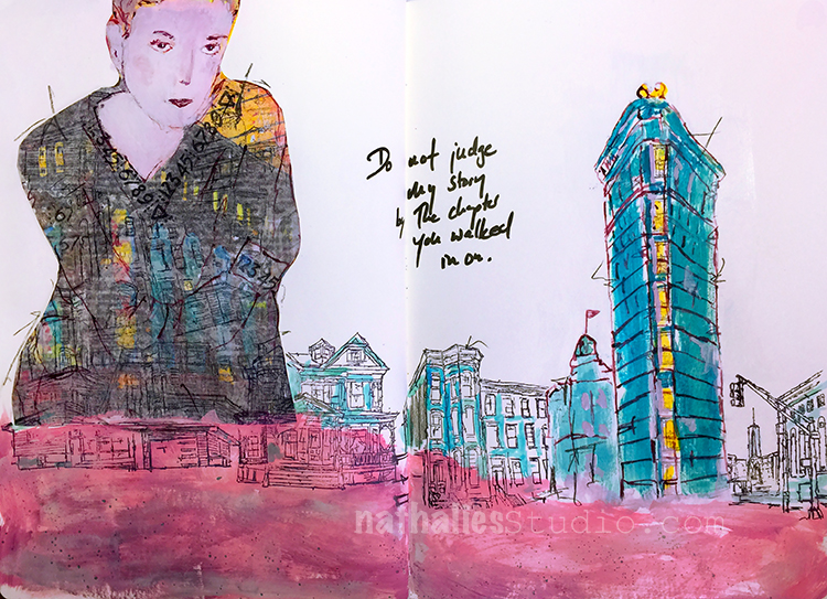
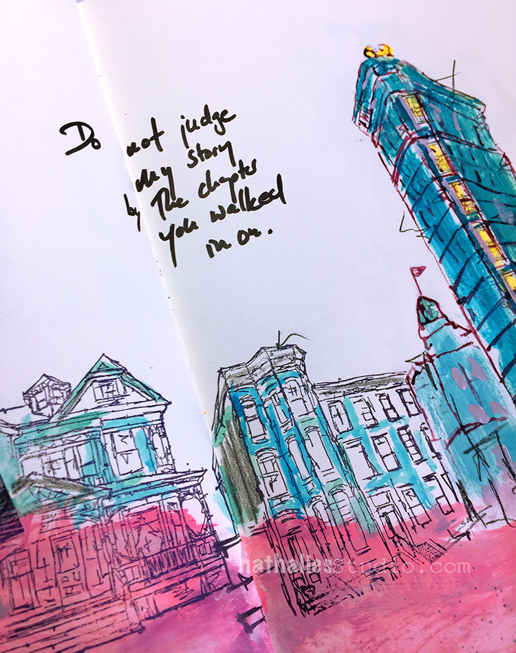
“Do not judge my story by the chapter you walked in on ”

Love the quote. So true!

For this art journal spread I combined a sketch of the flat iron building with some of my urban building stamps. I painted parts of them in the same color to make them look more cohesive.

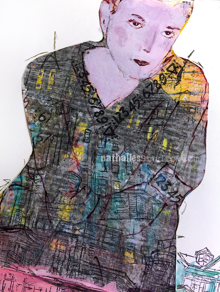
For the collaged woman, I used a print of one of my paintings -unfortunately I chose a too dark print and the lines of my sketch get a bit lost here. I stamped on top of deli paper and mounted it on the print. I like the look. but again – I need to use light ink on dark backgrounds in order to make this work :)

Here are some of the supplies I used for this spread:


Leave a comment

Ready for Spring Sneakers – DIY

I am telling you, I am longing for spring!

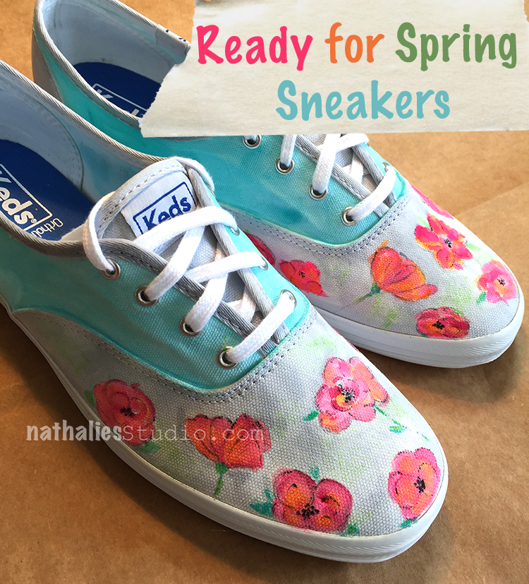
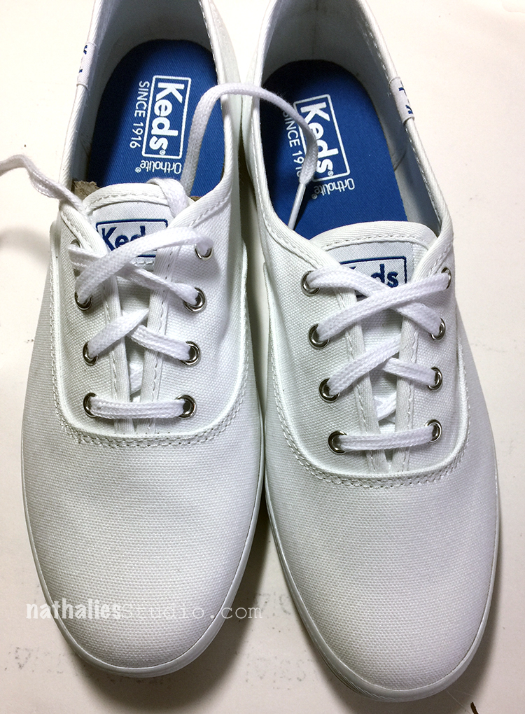
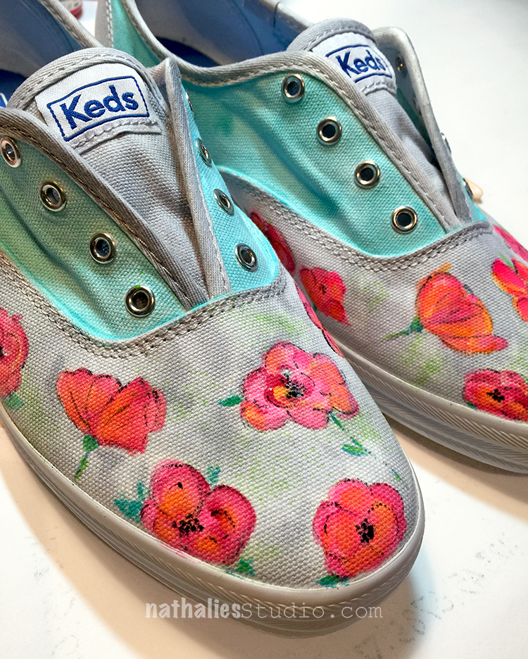
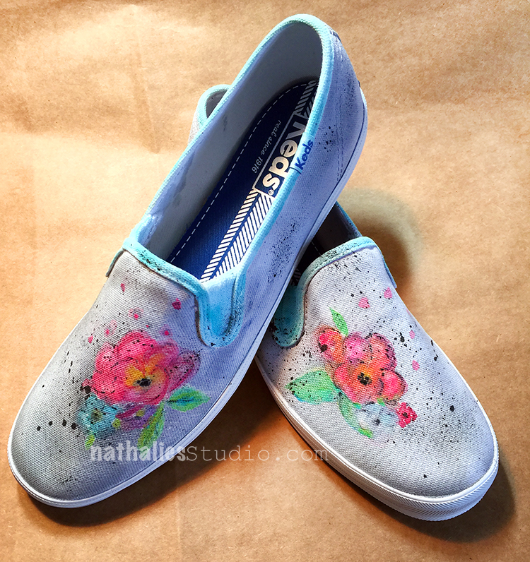
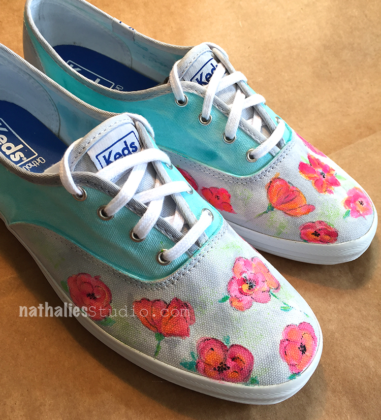
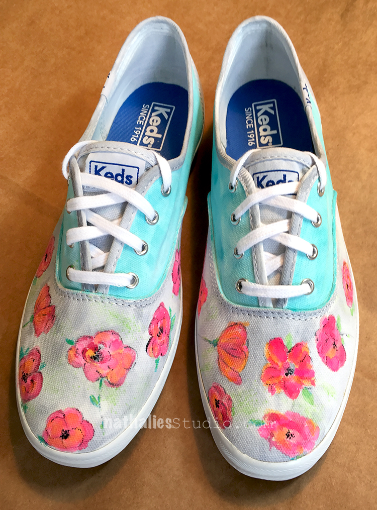
I painted two pairs of plain white sneakers a couple weeks ago with basically the same colors but different designs.

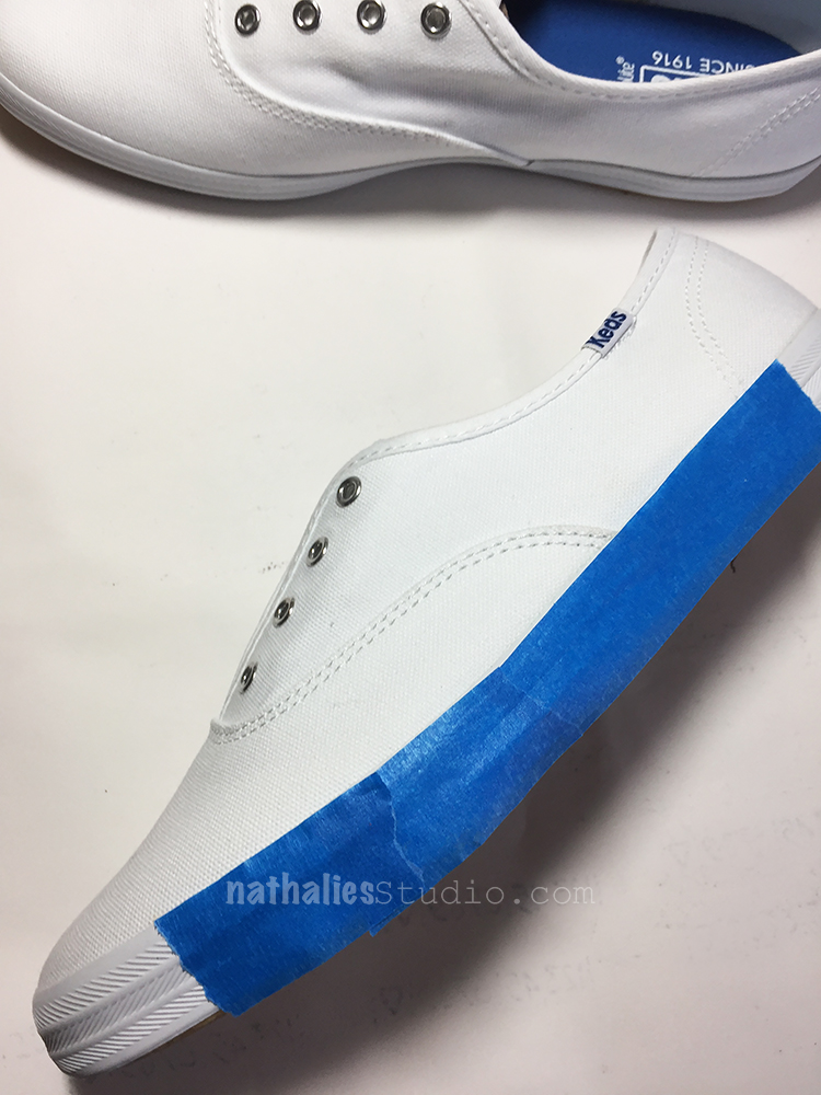
I removed the shoe laces and taped off the rims of the soles and then started painting. I used acrylic paint and ink and I dipped the brush instead of into water into Flow Aid between every paint application.

The Flow Aid serves two purposes, it makes the acrylic paints react more like watercolor and it also keeps the canvas of the shoes soft.

Since the are painted with acrylic paint, the paint is permanent, so there is no further step for setting the paint needed. It was easy to paint on the shoes- and I have to say the Keds fabric was also nice because the paint didn’t bleed crazily and I felt I was in control (and no I am not affiliated with Keds nor did they sponsor this post :) )

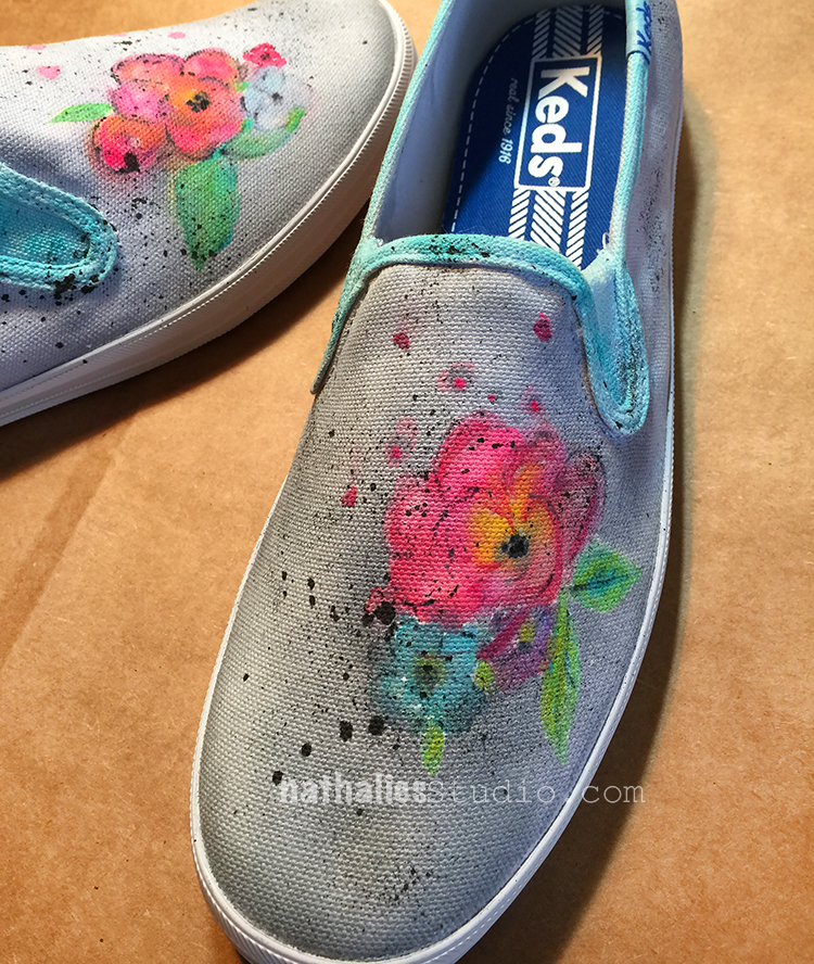
For the second pair I used the same colors but since they are a different design, I chose a different flower design as well.

I personally like the second pair better, while Kim likes the first pair better, and so those shall be hers when I get them back (they were for an assignement) :)

It was actually less difficult when I thought it would be – I was a bit intimidated starting to paint on those pristine white sneakers but then I just kept on going. I figured worse case scenario I will paint them over with a really dark color and stencil white on them- LOL. Which pair of spring sneakers do you like better, the first one or the second one?

Spring can come now – I am ready :)

Here is what I used to paint those sneakers:


Comments (2)

  • Sue Clarke

    |

    The first pair yell SPRING at me but the second pair are more my style to actually wear.
    Looks like fun and yes, worse case you go dark (purple perhaps) and then add some white.

    Reply

    • nathalie-kalbach

      |

      Oh I like the idea of dark purple and white! Great idea!

      Reply

Leave a comment