Blog: Liquitex Professional Spray Paints

Not Flowery – Art Journal

For not being a flowery girl, I did an awful lot of flowery stuff lately, huh? LOL.

This spread was inspired by a mural I saw in Birmingham, UK last year- can you spot which one in the post about it?

The background was spray painted over my Kassel stencil, and the flowers are painted with acrylic paints and gouache. For the face I used neopastels.

I like how all the different paint mediums look together and play with them.


Leave a comment

Well Behaved Women – Art Journal

This is another Art Journal spread using my great grandmother’s photo as an indirect image transfer. I love how the transparency of the image let’s the background come through.

Inspired by Klimt I added hand painted and also stenciled patterns with acrylic paint and acrylic spray paint. I also inked up just part of my Numerals stamp as I thought the triangle would make a great pattern stamp

I love how this came out and I wonder if my great grandmother actually liked Klimt – she for sure liked fashion – I have a nice stash of photos of her and she always liked to dress up.

I will post soon how I do indirect image transfers – they are fun and especially work with photos that have bigger areas of white so you have a clear area that works well with the background.

Here are some of the supplies I used for this spread


Comments (2)

  • Sue Clarke

    |

    Love LOVE Love this…colors, photos and quote!

    Reply

Leave a comment

Game Changer- Art Journal

She remembered who she was and the game changed.

I spray painted the background in red, then spray painted orange on top and while the orange was still wet I laid down my Beacon Stencil and then lifted it right up. Love the texture and bright color.

I cut out some painted deli paper and made some marks and  circles in blue and green colors and then added the journaling.

It was a quick and easy page to make but I do love the outcome a lot.

Here are some of the supplies I used:


Leave a comment

If it Scares You or … In My Art Journal Today

NatKalbach_GoodThing01

If it scares you, it might be a good thing to try!

I believe that is true – almost every time, I thought of something I would love to do or achieve and it sounded scary it was a good decision …like quitting my paralegal job to become an artist…or moving to the U.S. … So time for me to encounter another thing that scares me – we shall see ;)

NatKalbach_GoodThing02

This was a quick page in the morning – I had painted the background a couple weeks ago and had experimented with glazes. It got a bit dark in the process, so I added a huge field of white gesso scratched on with an old hotel key card. Later I spray painted using my StencilGirl Products Lilly Stencil and two different colors of Liquitex Spray Paint. Sometimes Art Journaling doesn’t have to be a long process- remember – you are the boss apple sauce ;)

nSupplies


Leave a comment

The Real Weird Magical Person … Or In My Art Journal Today

NatKalbach_justbeyourself01

Just be yourself! Let people see the real, imperfect, flawed, quirky, weird, beautiful, magical person that you are!

YES!

NatKalbach_justbeyourself02

I used some smaller stenciling and paints in the background – leaving a lot of white space. Then I took the building stencil I made and used in my Art Journal spread last week again – this time playing with the negative and positive usage. I brushed some magenta acrylic ink over the spray painted areas as this always sets it off so nice.

NatKalbach_justbeyourself03

For the journaling I use a fine line pen and filled it with white acrylic ink.

Very grungy spread but also happy- and I might fall more and more in love with the building stencil :)

nSupplies


Comments (2)

  • Joi@RR

    |

    Easier said than done! Great message and what a SUPER journal page Nat. Love the “architecture” in the background – looks so good with the colors you chose. The quirky person in the front is perfect. Really special creation…. soooo inspiring. j.

    Reply

    • nathalie-kalbach

      |

      True – it is easier said than done- but hey…we keep trying ;) Thank you!

      Reply

Leave a comment

On My Way Home or… In My Art Journal Today

NatKalbach_OnMyWayHome01

I was born very far from where I’m supposed to be, so I guess, I ‘m on my way home!

NatKalbach_OnMyWayHome02

For this art journal spread I had created a grungy background with acrylic paints – using different shades and tints of purple and some accents of green and yellow. I had created a building stencil out of a sheet of Grafix Dura-Lar and sprayed first with white and then a bit offset with black spray paint through it to create a little white border and some dimension.

NatKalbach_OnMyWayHome03

I then changed the top of the page picking up the green and yellow and adding some more grunge to it. I like how it turned out – I think I might be obsessed again with building stencils ;) For the journaling I used a Liquitex Marker and then traced it with a white Signo pen.

nSupplies


Comments (2)

  • Joi@RR

    |

    Your building artwork has always been my favorites Nat. You are the only person I have ever seen that can make a building look incredible – colorful, interesting, alluring, even mysterious. LOVE LOVE LOVE this… the colors are incredible and WOW – the building is totally FABULOUS. j.

    Reply

Leave a comment

I am the Boss of Me …or In My Art Journal Today

NatKalbach_NotTheBoss01

Attn: You are not the boss of me…I am the boss of me and my art

Hach …isn’t art journal an awesome way to get stuff out? I just told someone in an interview that art made me a calmer person and part of this is because I can let out a lot of things through my art :)


NatKalbach_NotTheBoss02

This page is actually a page that was a demo page in tow different classes and then I finished it up at home.


NatKalbach_NotTheBoss03

I so love the Liquitex Cadmium Orange Hue 2 – so vibrant. I scratched through some blots of spray paints with the bamboo sketching pen, which I had also used with black acrylic ink to outline the woman on the page. I also used a needle point canvas star with the spray paint- fun – love the pattern this creates – also when you flip the stencil later over.

Here is a supply list:

nSupplies


Hope you have fun creating today!!!

Comments (2)

  • Joi@RR

    |

    Ahhh – orange is my fav. Would you believe I have always loved it. Forty-three years ago it was orange gingham for bridesmaid dresses – hehehehe!!! Have to get some of your hue 2 orange Nat! Great colors in this project. Your sentiment is so true. Seems I always have someone telling me how to see what I see – which is not what I see at all!!!!!!!!!!!!!! Great work. Have a super fine weekend. j.

    Reply

Leave a comment

Fiesta Girl Canvas

NatKalbachFiesta01

I created this canvas board with my new Stampendous Fiesta Stamp Set for the CHA Booth.


NatKalbachFiesta02

I first painted the background with different green shades. Then I stamped the background with different acrylic colors and the Fiesta stamps. Next, I masked off the background with the woman silhouette and used Parchment and a light mist of Black Liquitex Spray Paint over it.

NatKalbachFiesta03

I took some paint at some areas off again and then used Titanium White Spray Paint and an alphabet stencil moving over the whole canvas with the lady still masked off. The letters were applied in the end with Gel Medium.

Here are the supplies I used:

nSupplies


have a wonderful day and do something creative!

Comments (16)

  • Jacquelene L

    |

    This canvas is my favourite piece from cha. When I saw it, I went to the stampendous website to try and figure out what stencil you used. I love the women stencil and the stamps. Thank you for sharing your inspiring techniques for this canvas. In the future this stencil and stamps will be used in my art journals and cards. Thank you for sharing your creativity with all of us.
    Jacquelene L
    Canada

    Reply

  • D.AnnC

    |

    Really love the colors in this! The more I see of this set, the higher it climbs on my wishlist!!

    Reply

  • jo-murray-art

    |

    LOVE the under printing in the silhouette.

    Reply

  • Stampendous Stamps

    |

    This canvas just has the most soothing color palette with such an exciting design idea. Love the use of type as an element as well. Always eye-catching. Another masterpiece, Nathalie!! Thanks so much for sharing!

    Reply

  • tesa

    |

    Beautiful!!

    Reply

  • andrene

    |

    Really beautiful! I love the colors you’ve used and the stamped images were the perfect choice for that silhouette.

    Reply

  • yankeegirl

    |

    This is really awesome, Nat! Love the greens and blues on the grey, and the numbers really set the shape off!

    Reply

  • Jackie P Neal

    |

    Gorgeous canvas Nat! Love those stamps as well as the colors you chose!

    Reply

  • Joi@RR

    |

    She is so unique… love the florals inside and the numbers outside… so many thought provoking meanings come to mind. Beautiful.

    Reply

  • smokeysmom

    |

    I love this Nat! Is the female portrait one of your masks? Where can I buy it? This piece really speaks to me, it’s just perfect:)

    Reply

  • Seth

    |

    Great piece Nat. Thanks for taking the time to share the process as well!

    Reply

  • Nurse-Ratchet

    |

    Love it!! Just picked up my Fiesta Stamp set yesterday ….. It is more amazing in person!!

    Reply

Leave a comment

Layered Art Journal Page Tutorial

NathalieKalbach_Remember01

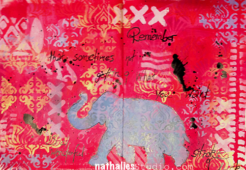
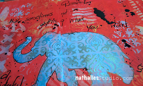
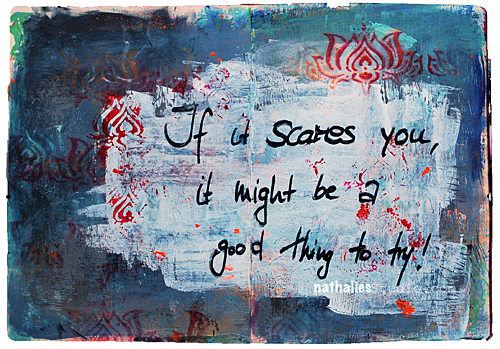
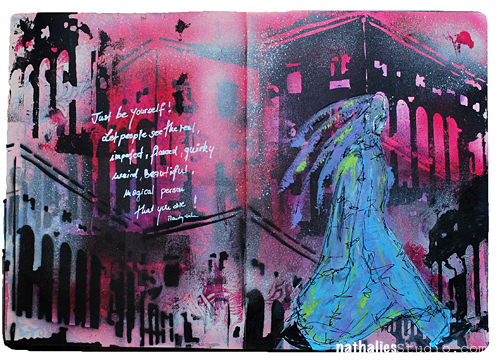
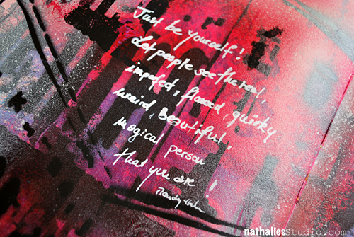
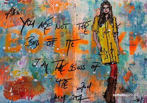
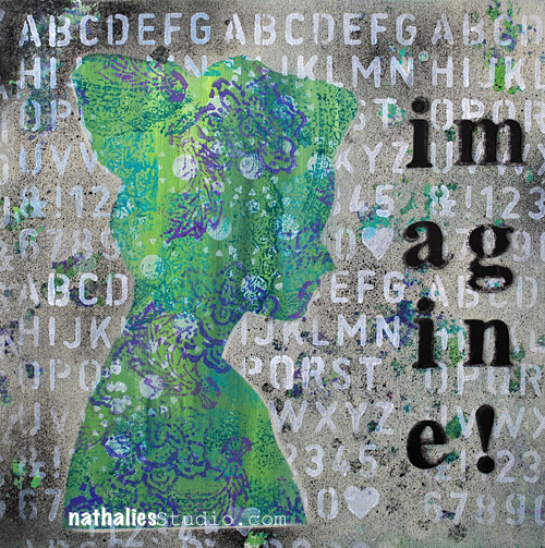
“Remember that sometimes not getting what you want is a stroke of luck” – Dalai Lama

And sometimes you won”t find out about that until much later… ;) For this spread I wanted a layered look to go with this quote. Let me share with you how I worked on this art journal page

Nathalie_Kalbach_Elephant_Stencil_01

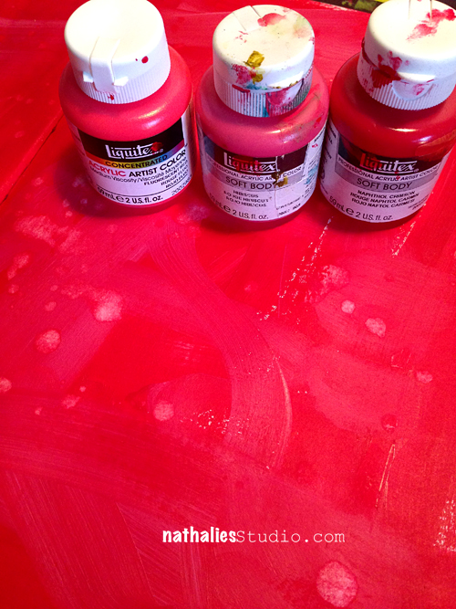
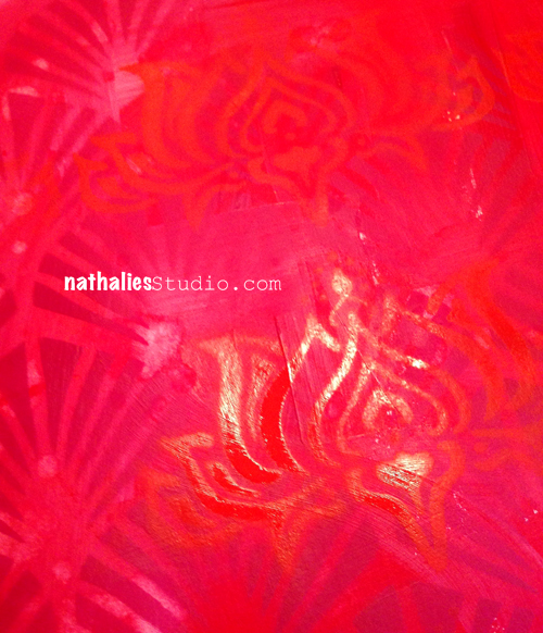
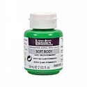
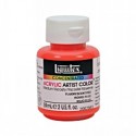
I chose three vibrant but close red /pinkish Liquitex Soft Body Paints: Naphthol Crimson, Fluorescent Red and Hibiscus and dry brushed and blended them together on the blank page.

Nathalie_Kalbach_Elephant_Stencil_02

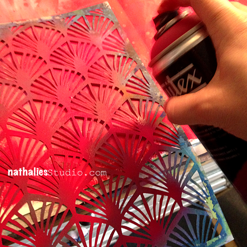
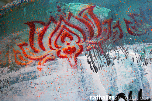
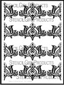
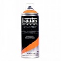
Using the Art Deco Wallpaper Stencil I designed for StencilGirl Designs I spray painted here and there a second layer with Cadmium Red Deep Hue 5 onto the spread.

Nathalie_Kalbach_Elephant_Stencil_03

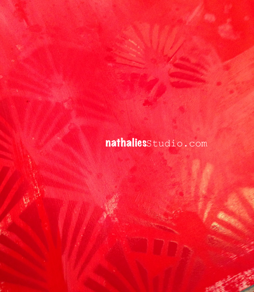
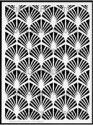
The result was very subtle as  I used the same color scheme as for the background but exactly that gives it so much dimension and depth. So I grabbed my Lilly Wall Decor Stencil and sprayed over it with Cadmium Red Light Hue.

Nathalie_Kalbach_Elephant_Stencil_04

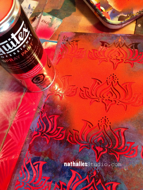
I just love the crisp stenciling effects with those spray paints!

Nathalie_Kalbach_Elephant_Stencil_05

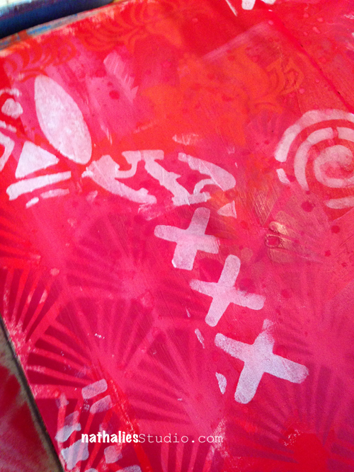
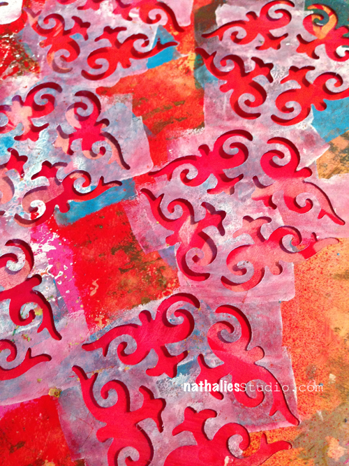
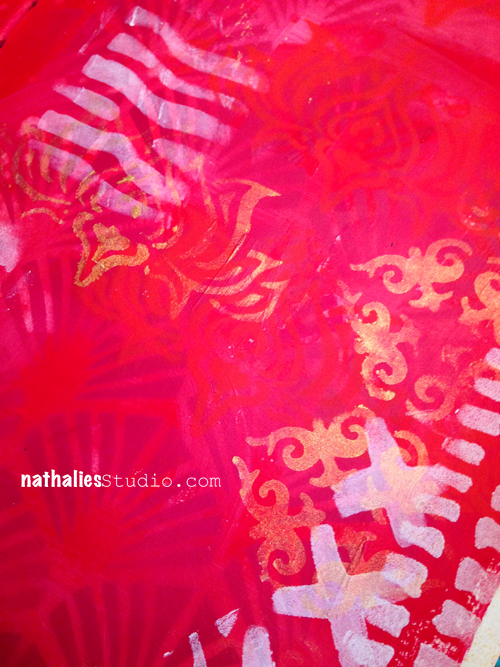
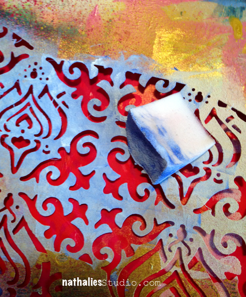
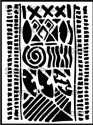
For my next layer I wanted to tone down the brightness a bit and was going for a white. But I also didn’t want a shiny white to not pick up on the brightness of my background and so I chose Gesso instead of Acrylic white paint to use with my Batik Stencil.

Nathalie_Kalbach_Elephant_Stencil_06

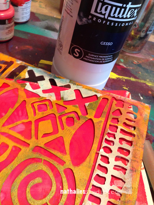
I used only parts and bits of the Batik Stencil here and there.

Nathalie_Kalbach_Elephant_Stencil_07

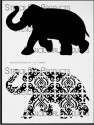
For my next layer I picked up the Lilly Stencil again – Repetition of Patterns is also a good way to layer and I had already used the Lilly Stencil AND I knew I was going to use my Elephant Stencil that has the Lilly in a smaller form as a pattern too :)

Nathalie_Kalbach_Elephant_Stencil_08

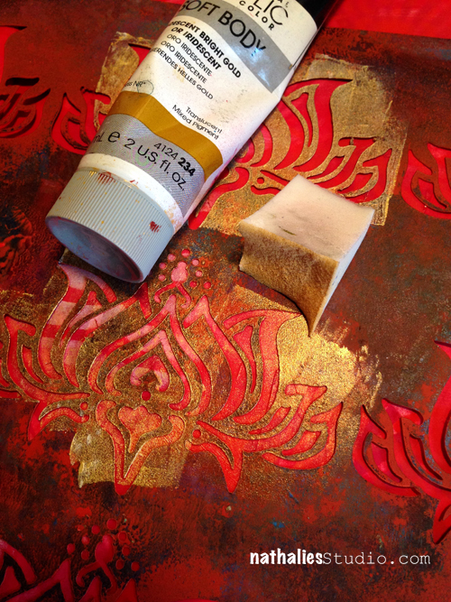
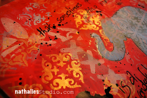
I used Iridescent Bright Gold and used a cosmetic sponge to stencil through. BTW the sad looking foamy thing on the right is the cosmetic sponge. It looks like this because I use it several times cutting off the tip for new colors to make the most of it.

Nathalie_Kalbach_Elephant_Stencil_09

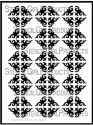
And since I was talking about repetition : As the Elephant Parade Stencil also has small parts of my ornament stencil included, I pulled out the Ornament Wallpaper Stencil and stenciled with gold here and there.

Nathalie_Kalbach_Elephant_Stencil_10

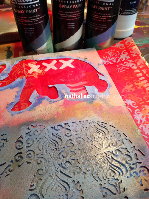
I wish the photos could do the gorgeous golden color justice…but you just have to take my word for it…it is amazing in real life! Then it was time to get the big guns…eh Elephants out. My Elephant Parade Stencil.

Nathalie_Kalbach_Elephant_Stencil_11

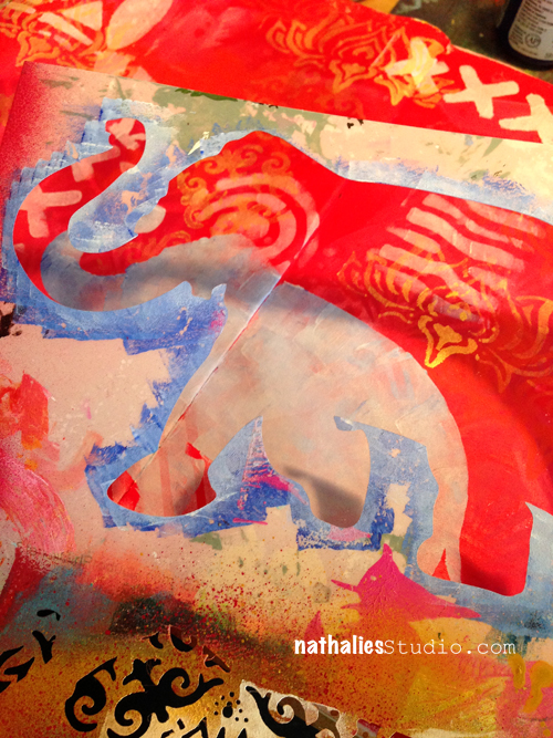
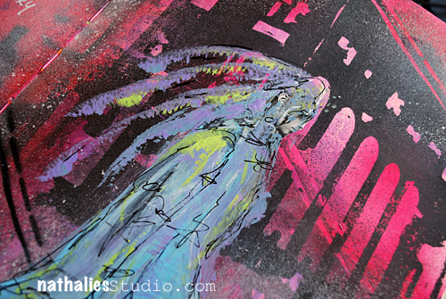
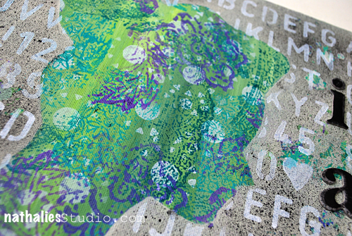
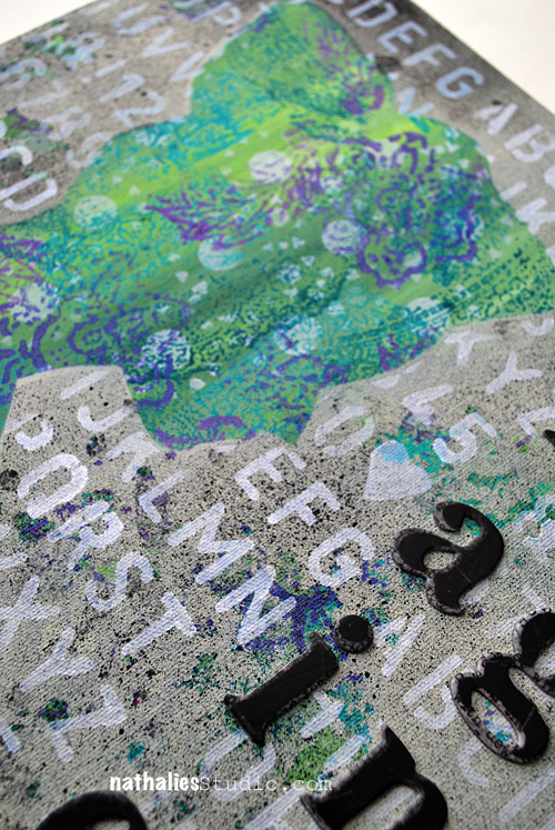
I mixed some gesso with a drop of Ultramarine Blue and stenciled through the Elephant Silhouette part.

Nathalie_Kalbach_Elephant_Stencil_12

I may repeat myself…but remember …I was talking about repetition? Using the patterned Elephant part of the stencil showing parts of the Ornament and Lilly Stencil I used the leftover paint and stenciled some of the images here and there onto my art journal page.

Nathalie_Kalbach_Elephant_Stencil_13

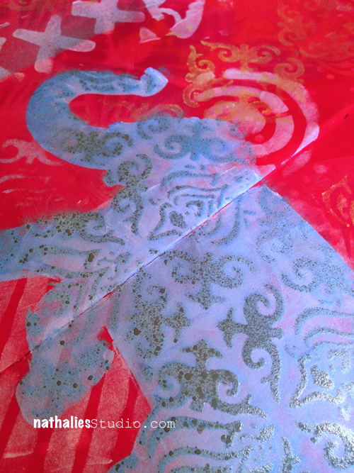
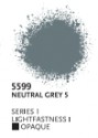
Then I layered the patterned elephant stencil part over the area where I created the elephant silhouette and sprayed over with three different spray paints  – variating the pressure and areas to get color graduation and more dimension. I used: Parchment, Phthalo Blue and Neutral Grey.

Nathalie_Kalbach_Elephant_Stencil_14

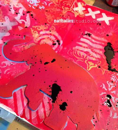
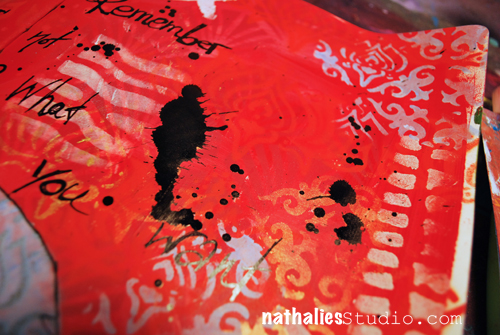
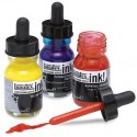
To get a bit contrast in I knew I needed some black in the page and since I do love to make a mess…I grabbed my Splatter tool and some black acrylic ink. To make sure that I was not getting any splatters into my elephant, I shielded it off with the elephant mask that is also part of the Elephant Parade Stencil. YES…three in one : Mask, Silhouette and Stencil – pretty pretty cool- if I dare to say so ;)

Nathalie_Kalbach_Elephant_Stencil_15

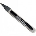
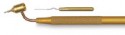
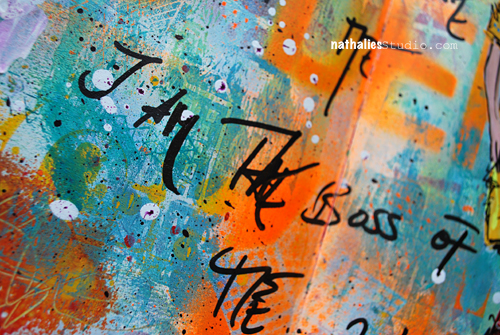
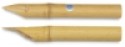
And then I used my new found Love… I had tested the Derwent Graphik Line Painter already in spring at NAMTA and I couldn’t wait for it to finally be available. LOOOOOVEEEE – I am a nerd for a really good black journaling pen and this one writes beautifully and without any problems on dried (!) acrylic backgrounds and it is permanent once dried. Awesome journaling and sketching pen – the black is one numbered #18.

Nathalie_Kalbach_Elephant_Stencil_16

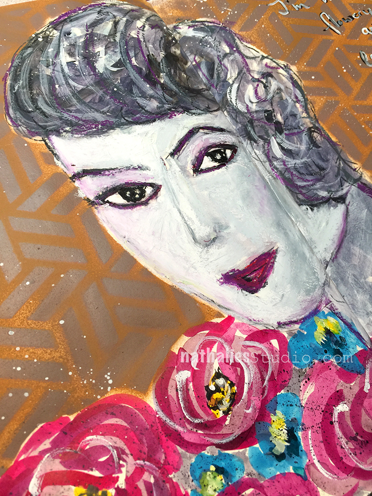
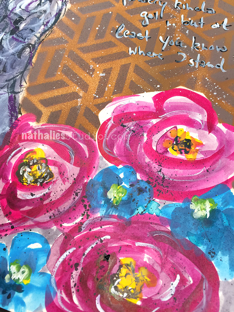
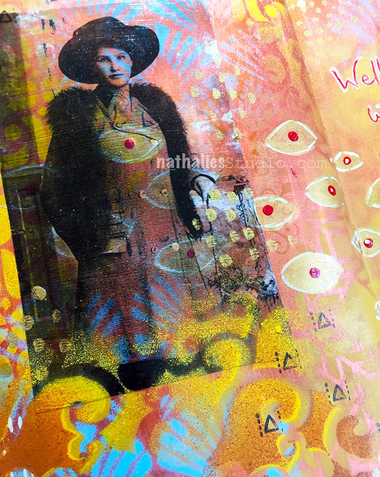
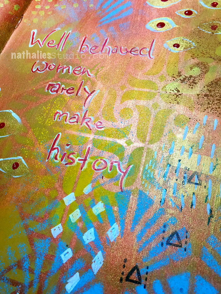
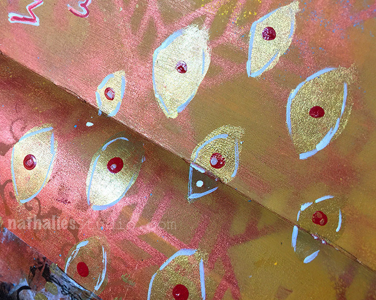
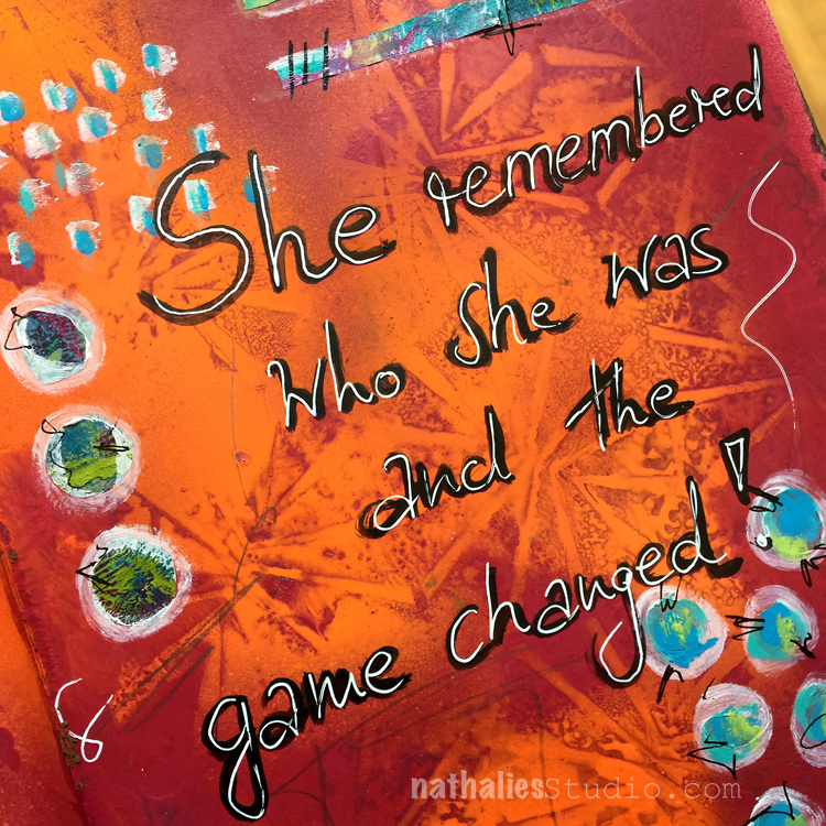
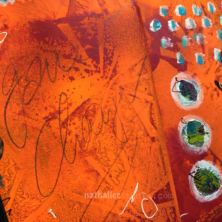
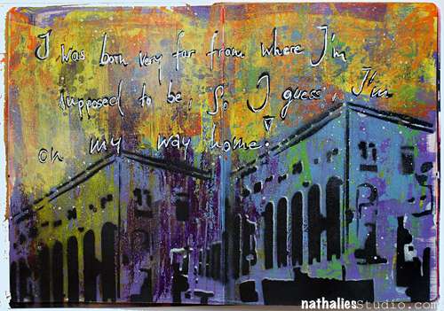
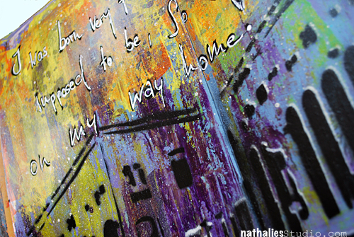
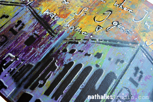
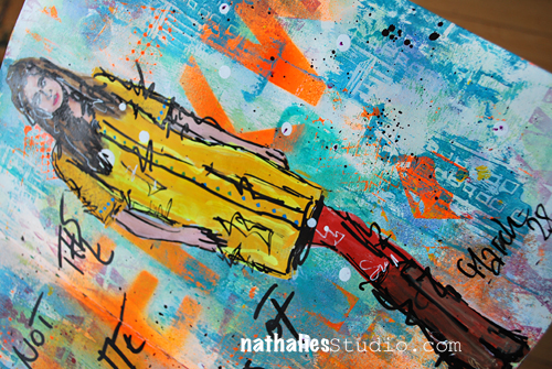
Here are some details of the finished page

NatKalbach_RememberLuck02

NatKalbach_RememberLuck03

NatKalbach_RememberLuck04

Hope you liked the little layering tutorial – I won’t lie – it takes some time and usually …I would even go for more layering before adding the final focal points on my spread :)

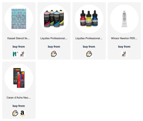
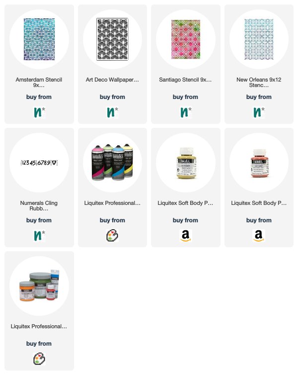
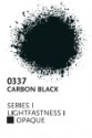
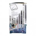
Here is a list of all the supplies and colors I used

nSupplies


Have a gorgeous day:)

Comments (1)

  • Sue Clarke

    |

    Nice layers and I’ll have to try working with multiple shades of the same color for a change. I must search for that new black pen as well.

    Reply

Leave a comment