Art Stroll

Art Stroll: New York Botanical Garden

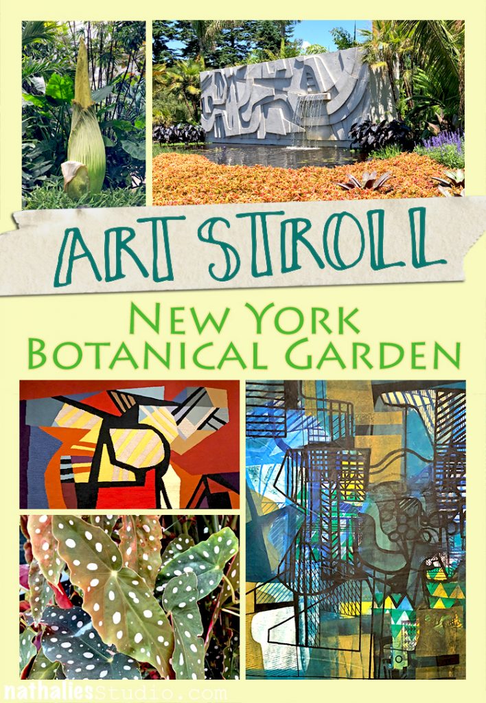
A couple weeks ago Kim and I decided to take a little trip to the Botanical Garden in New York City to see the Roberto Burle Marx Exhibition. It was such a treat – even though going that far uptown is quite a hike.

One thing that the visit reminded me instantly of is what an amazing artist nature is and how inspirational it is to go to a Botanical Garden.

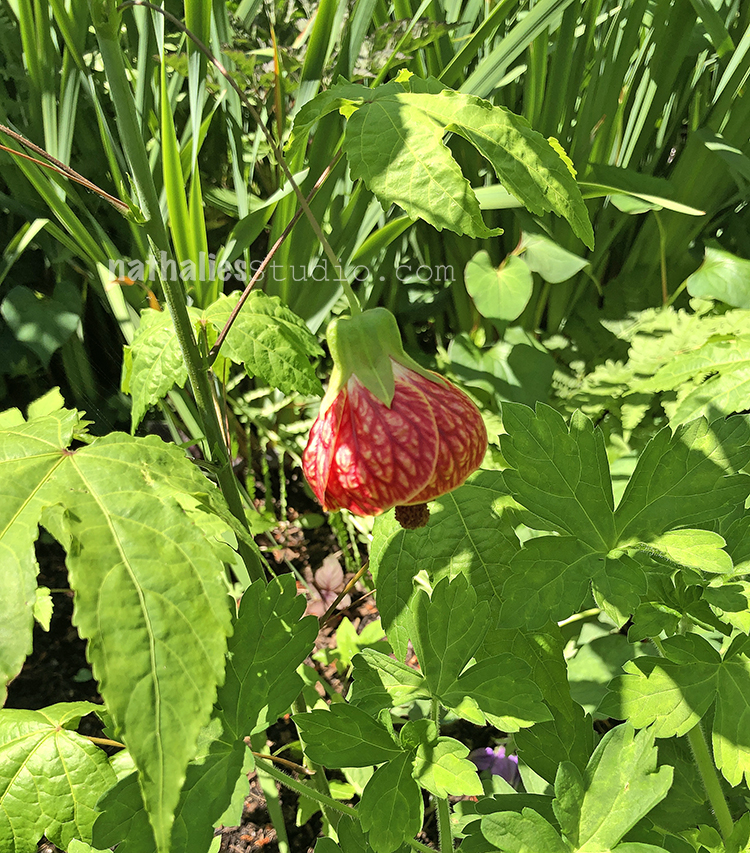
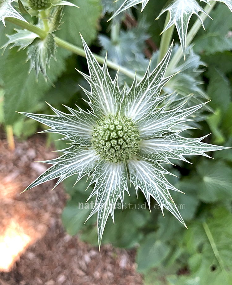
From Flowers that look like something from a fairy tale

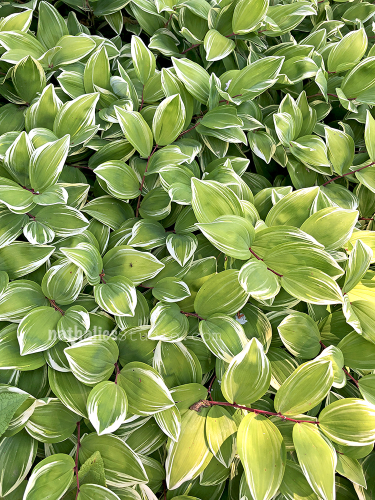
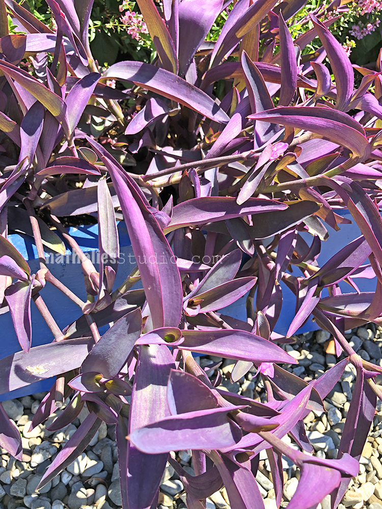
To plants with leaves that look as if they were painted on.

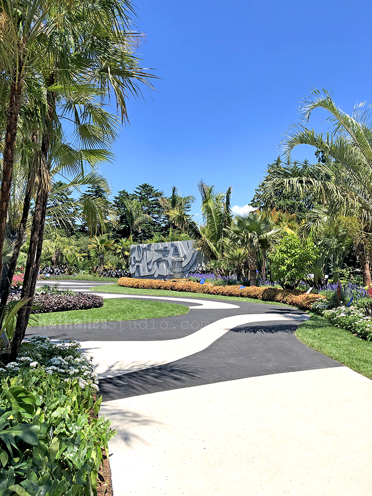
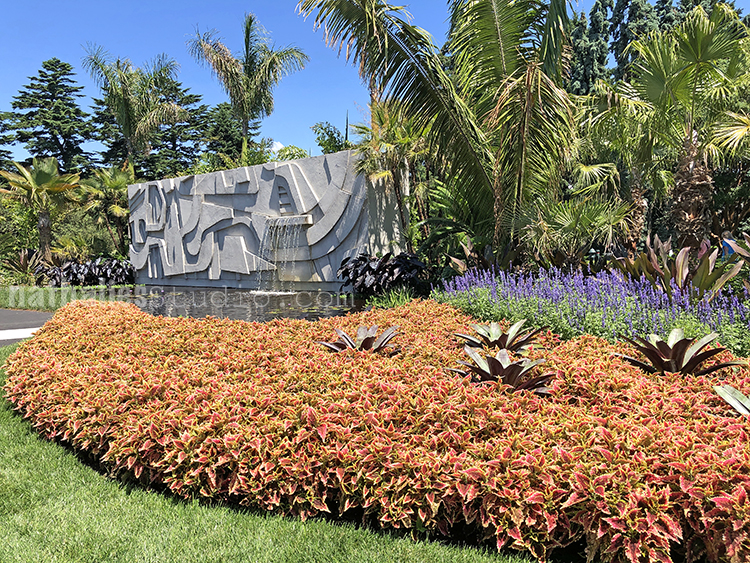
We loved the Garden part of the Roberto Burle Marx exhibition a lot – gorgeous pattern on the pavement- beautiful plants with tons of patterns, texture and lines. As he said: “A garden is a complex of aesthetic and plastic intentions; and the plant is, to a landscape artist, not only a plant – rare, unusual, ordinary or doomed to disappearance – but it is also a color, a shape, a volume or an arabesque in itself”

Made me appreciate plants that I usually do not really think of wanting to have

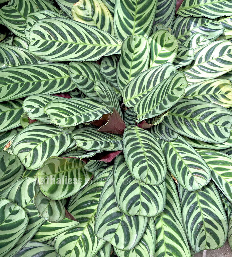
Another amazing plant with awesome leaves! “One might think of a plant as a brush stroke, as a single stitch of embroidery; but one must never forget that it is a living thing. ” Roberto Burle Marx in a 1962 lecture.

Looking into the water in front of the fountain.

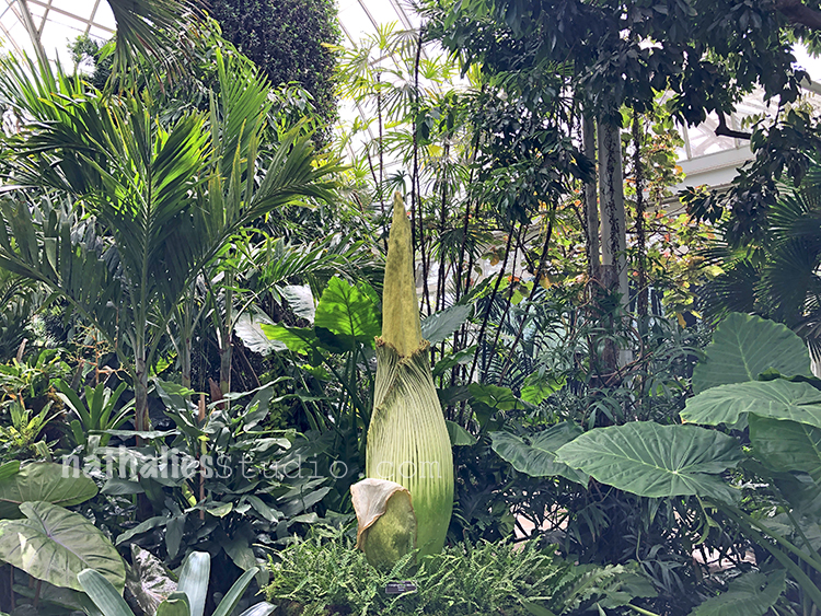
We also happened to come a day too early to see the “Corpse Plant” open.It rareley blooms and only for about 1-2 days. It was a coincidence that we went right when it was going to bloom as we had planned the trip for quite some while but it was cool to see this amazing plant right before it opened. We were spared of the insane smell it releases when it opens (hence the name) but fear not …the ride home at 94 F on the NYC subway probably was worse when the Corpse Flower smell hahahah ;)

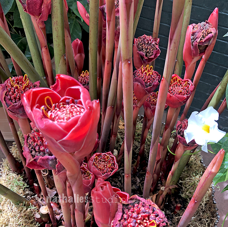
This is some kind of ginger – isn’t this insanly cool? I love ginger and this makes me love it even more .

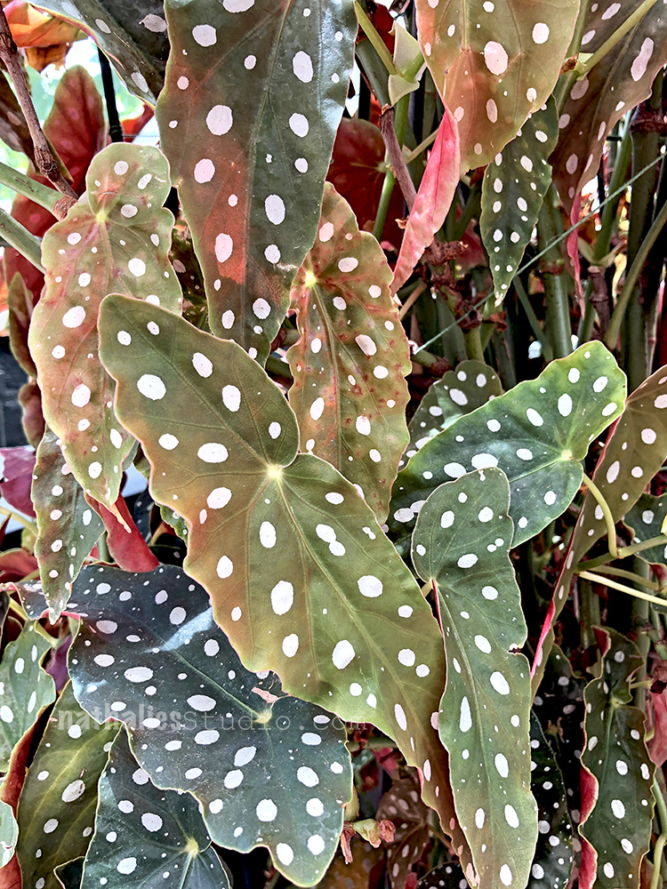
Let me sneak in another awesome plant …and nope we did not go into the Botanical Garden with a white paint brush LOL –

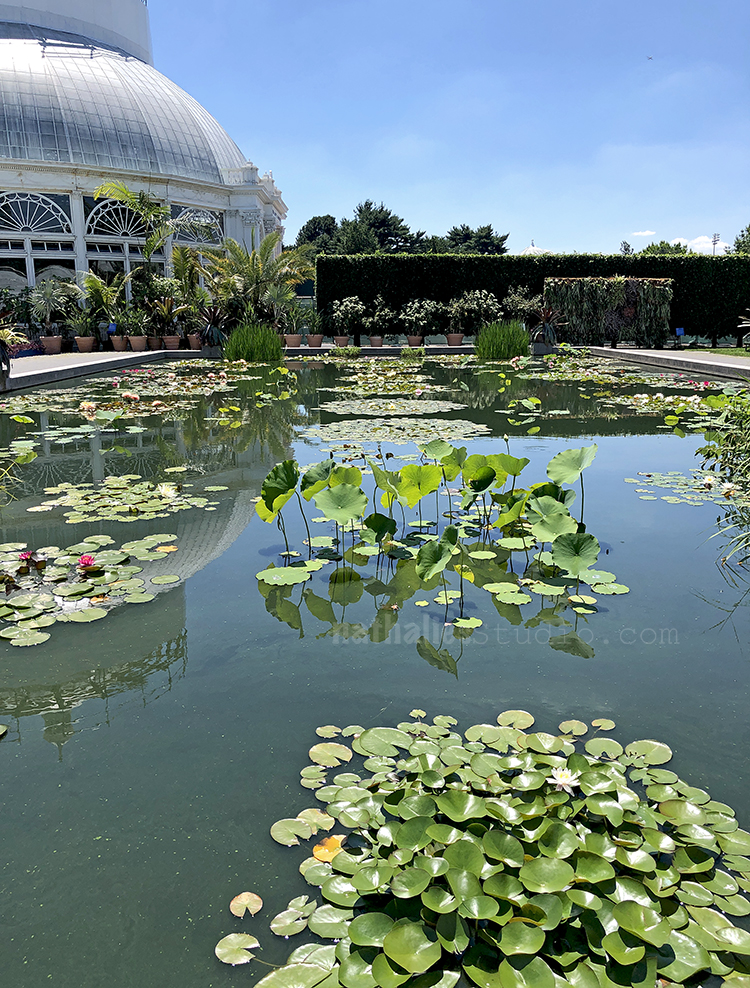
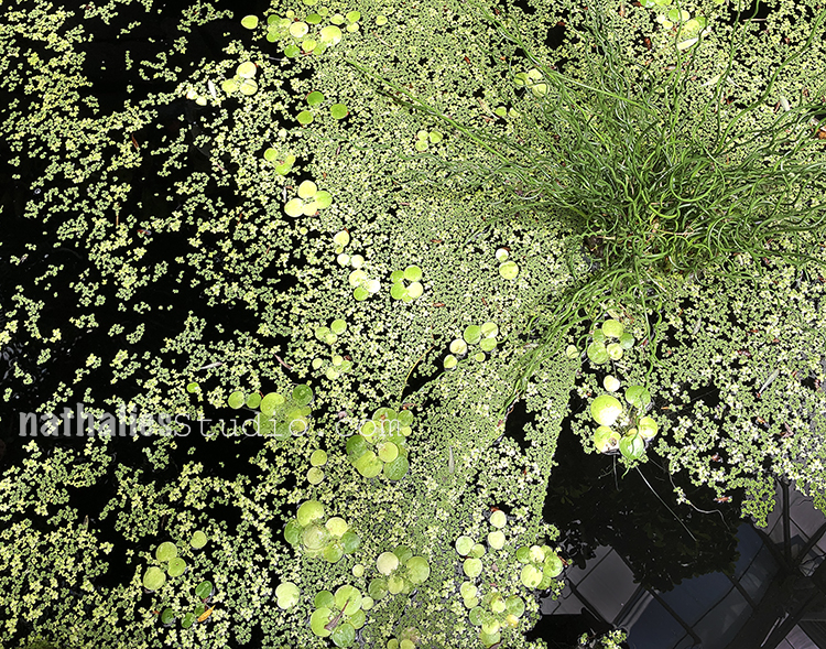
Water plants- where is the frog. I am always fascinated by water plants must be all the stories and fairy tales too.

Look at the color !!!

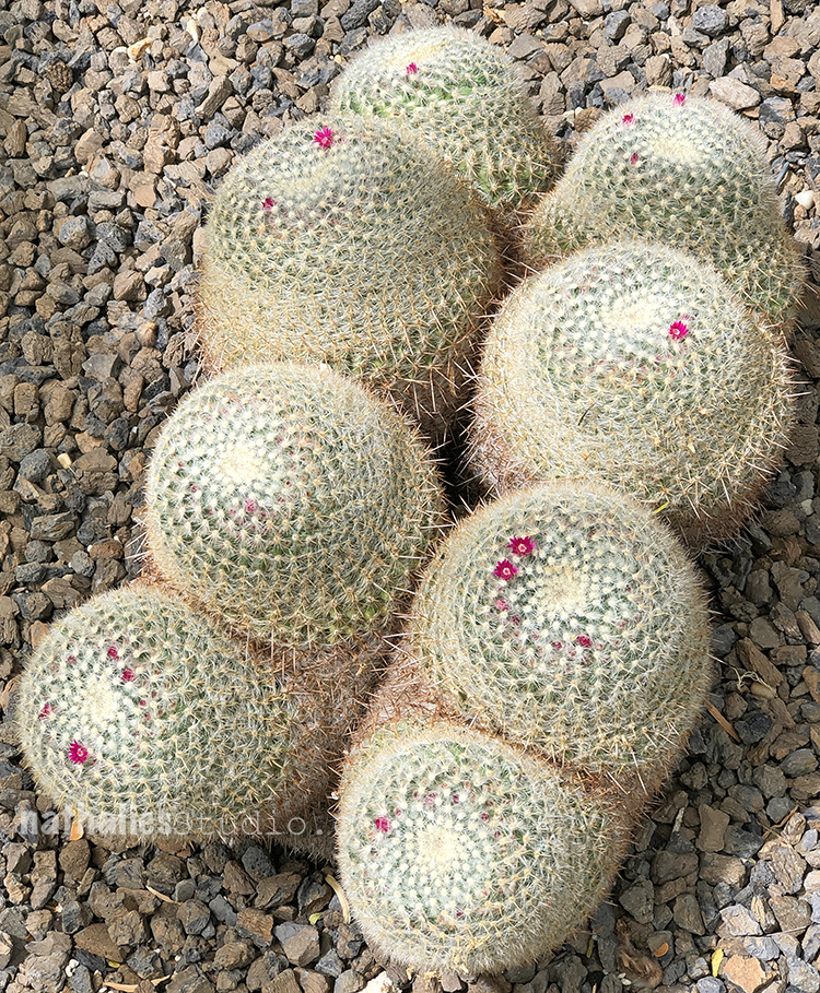
And these cacti – it is so funny to me that these delicate flowers are blooming out of this really prickly sturdy thing.

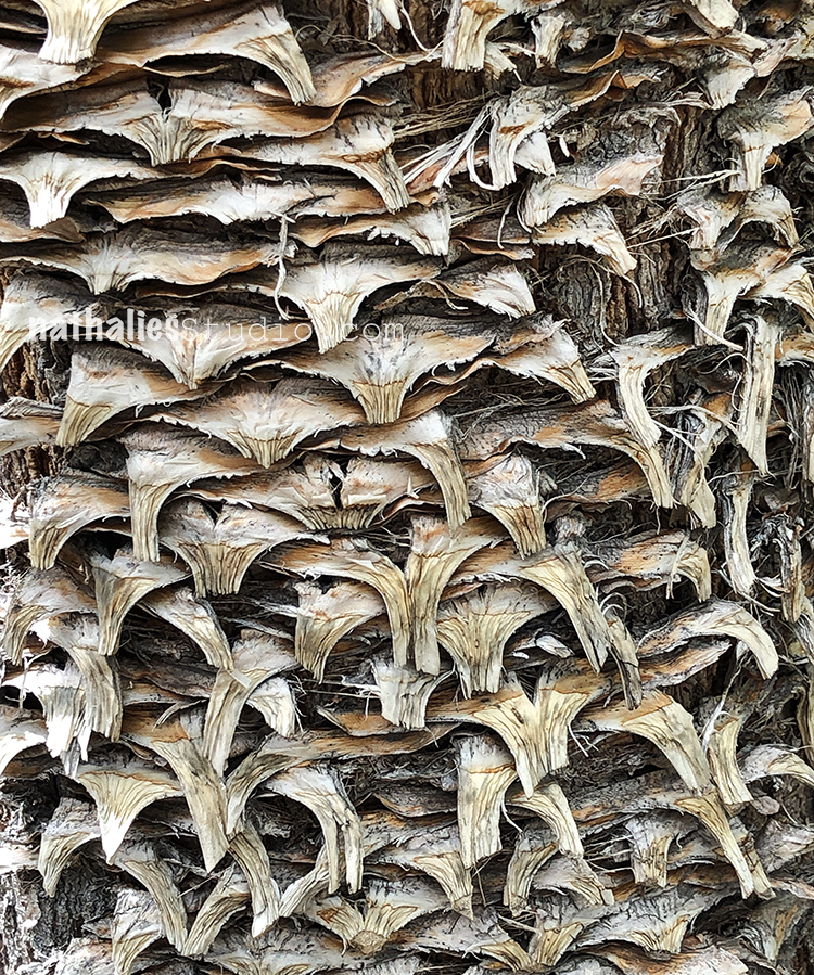
Palm tree pattern and texture

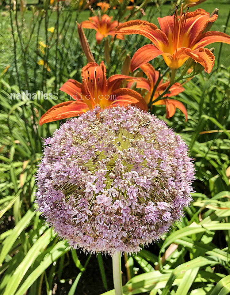
And a giant allium – I need one of those for our garden .

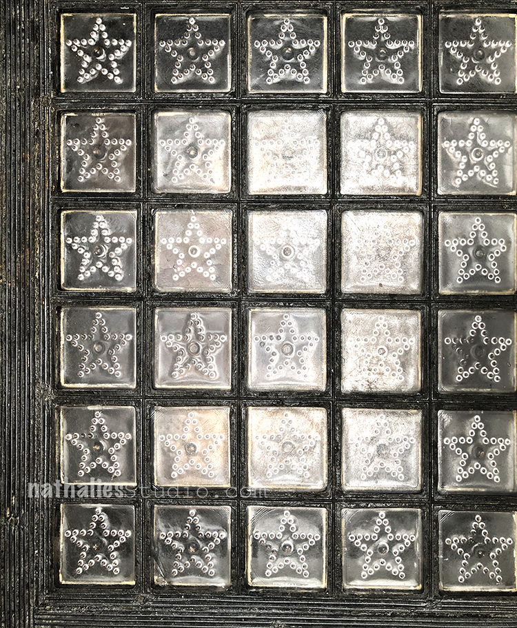
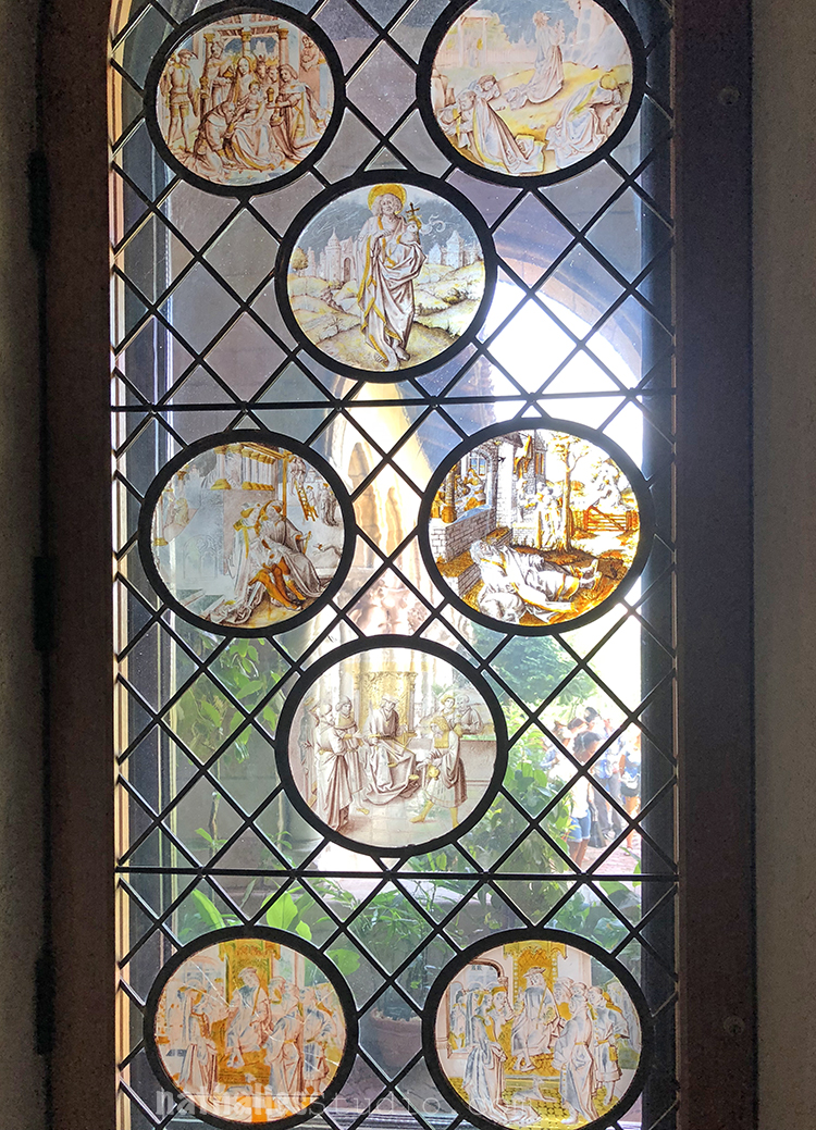
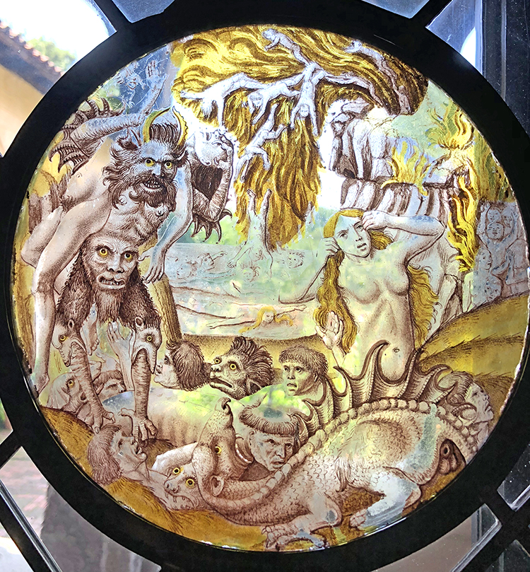
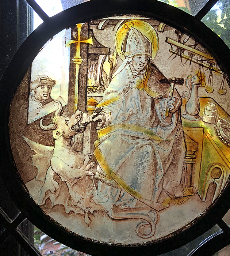
Inside the Library we found this beautiful glass on the floor

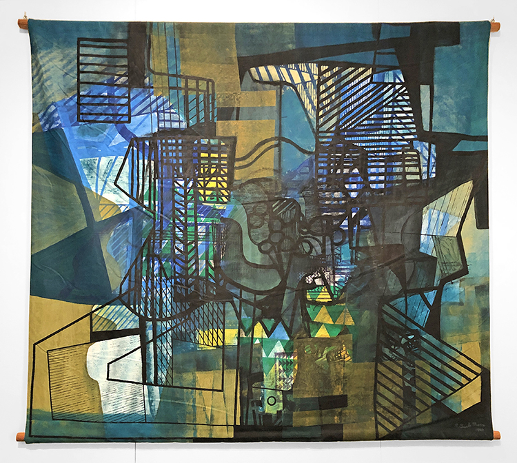
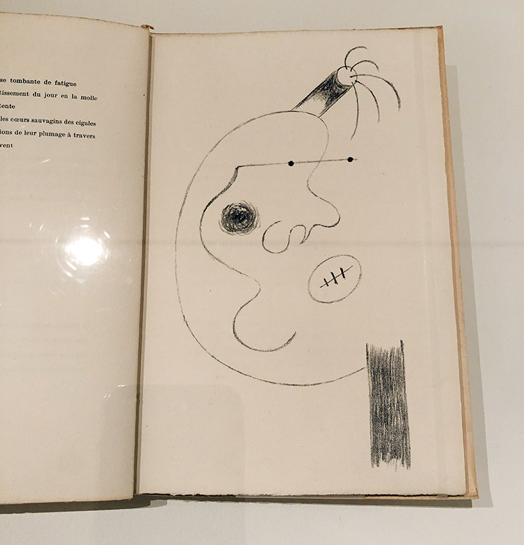
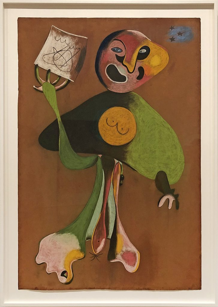
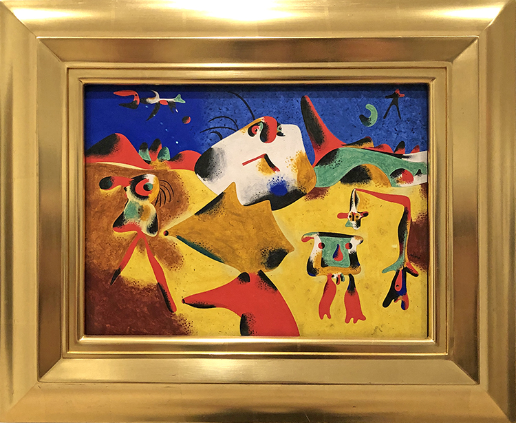
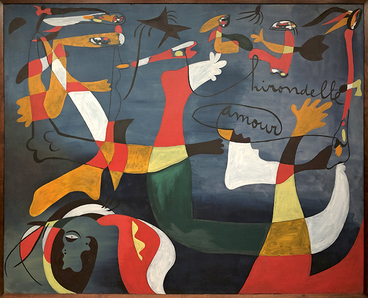
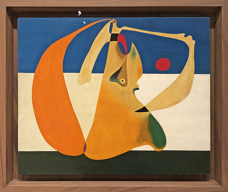
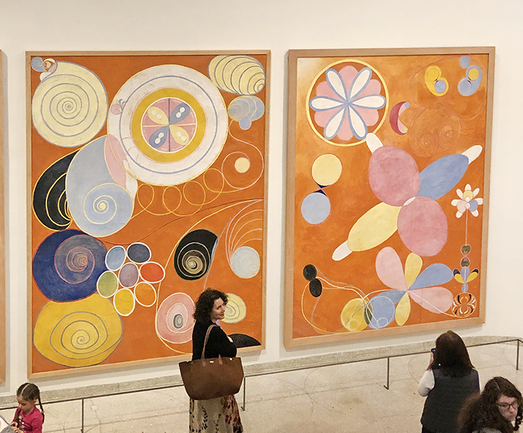
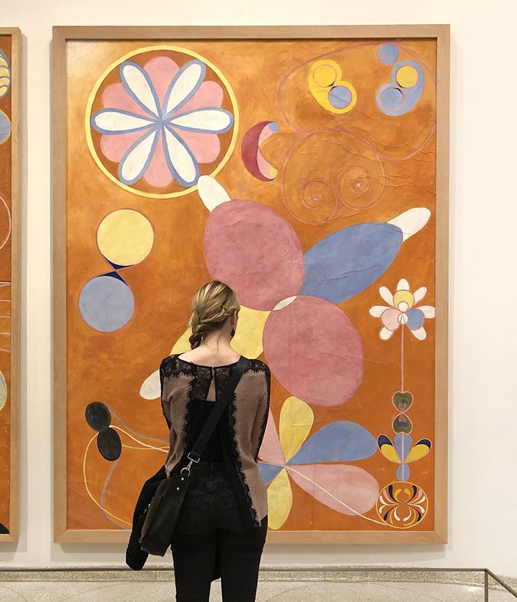
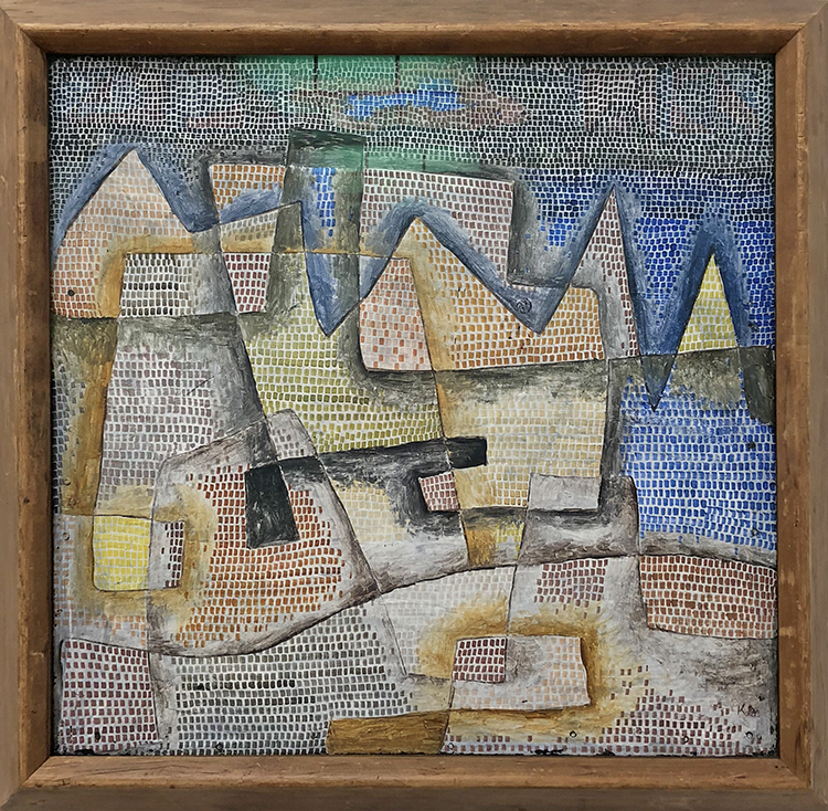
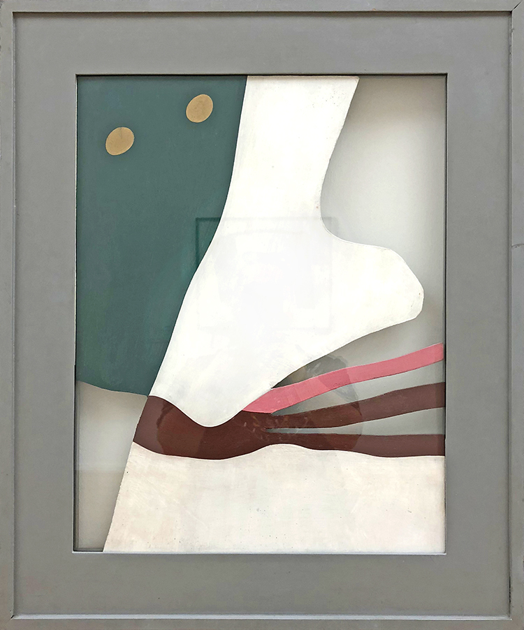
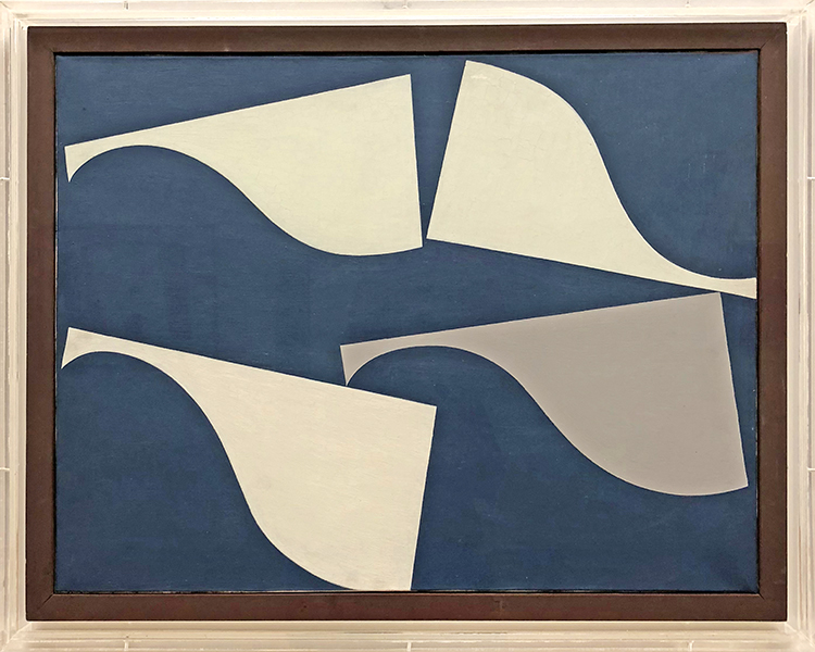
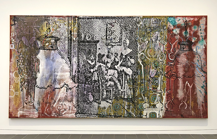
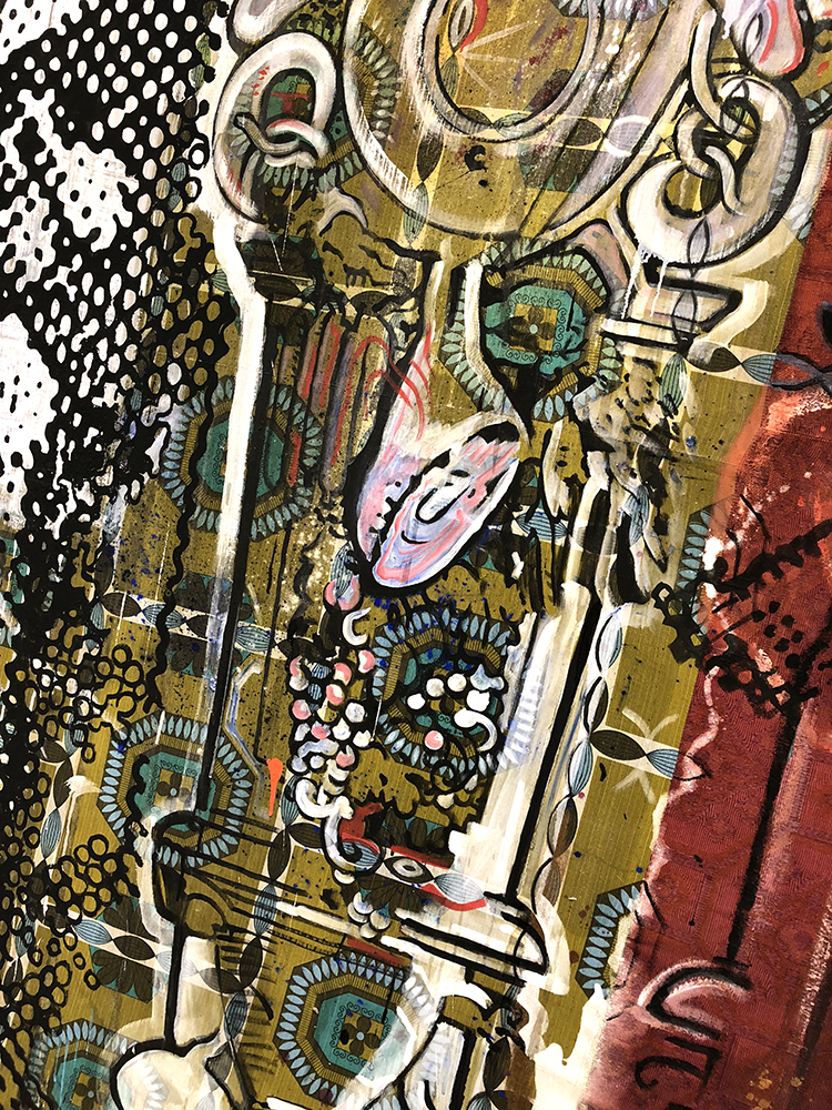
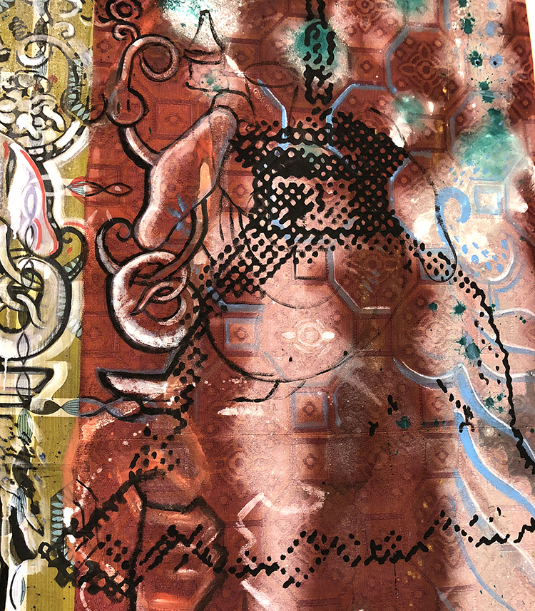
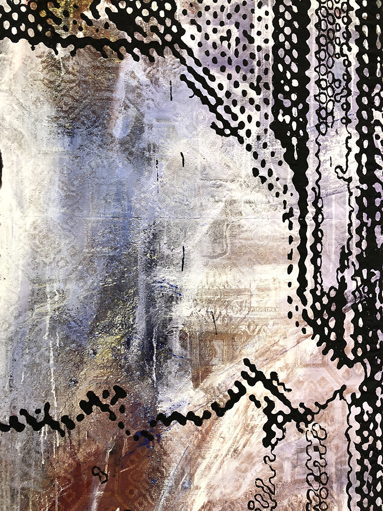
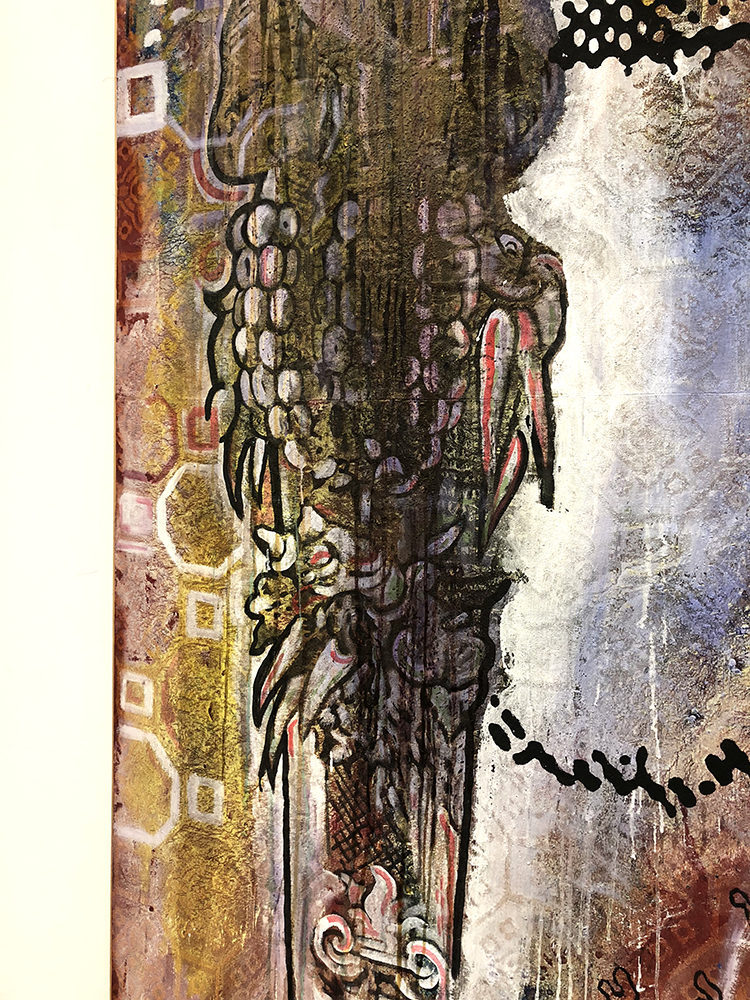
And then enjoyed some gorgeous paintings – the one above on fabric by Roberto Burle Marx.

I found it fascinating to look at his paintings after walking through the garden and seeing pictures of his gardens.

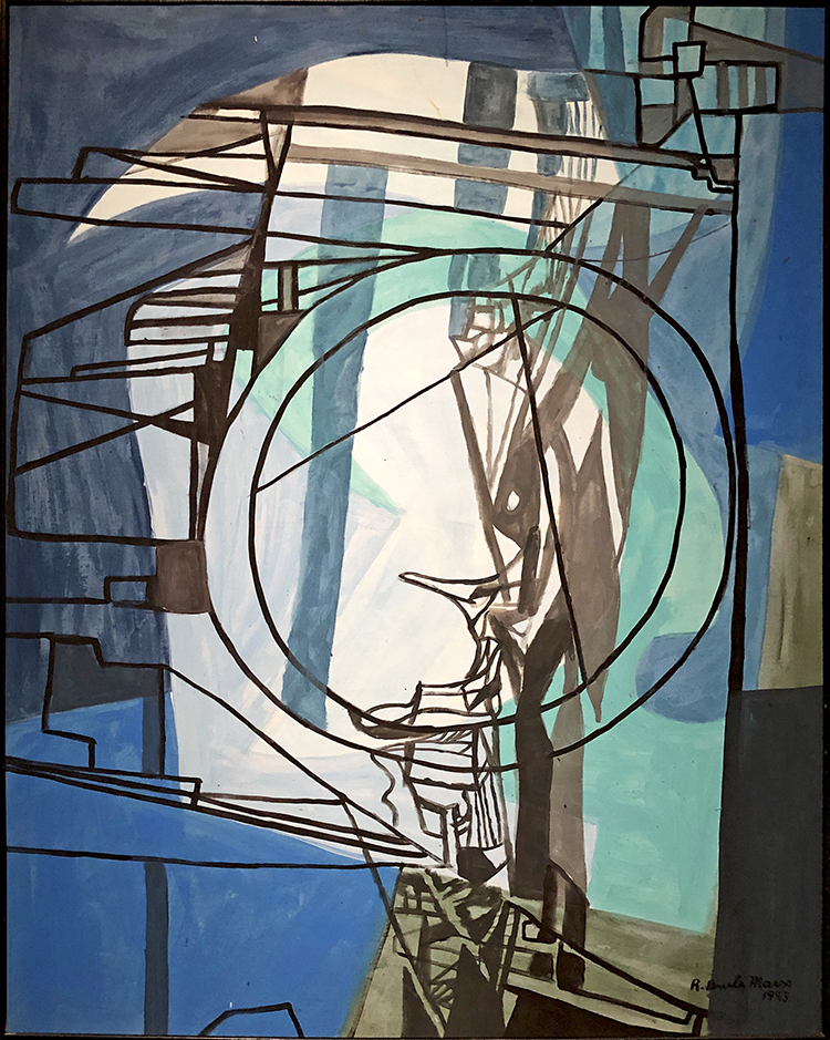
“If I do gardens, I don’t want to paint; if I do paintings I don’t want to do woodcuts; if I do prints from woodcuts, I don’t want to do lithography. Each specialty calls for its own technique and medium of expression…I will not do a painting that is a garden. Without a doubt painting and and all sorts of artistic issues have influenced my whole concept of art. I have always sought to avoid being restricted by formulas…” Roberto Burle Marx 1973

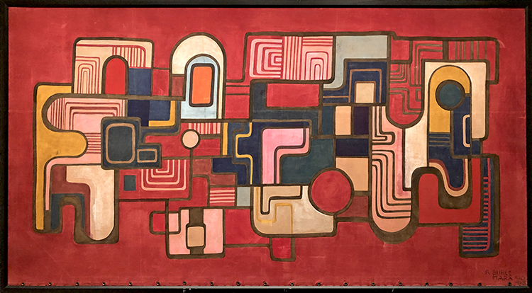
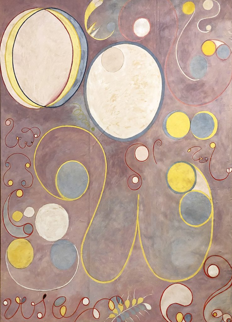
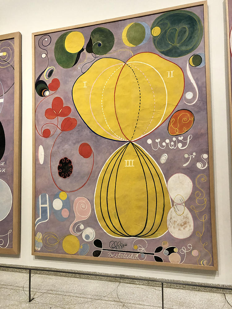
I love the shapes and colors and some of them look like gardens or landscape to me

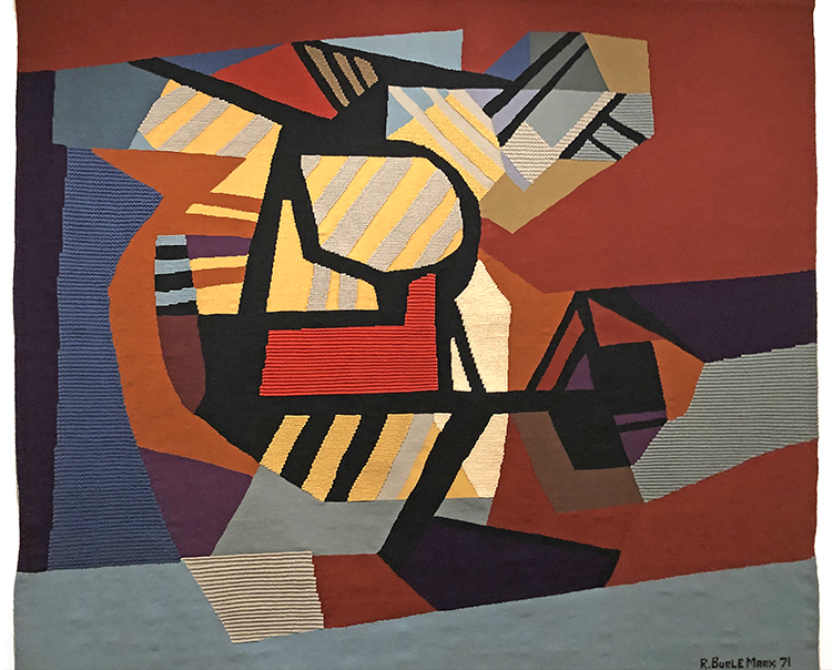
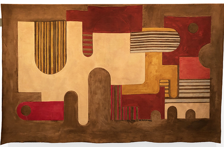
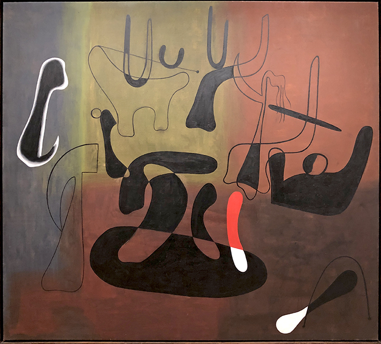
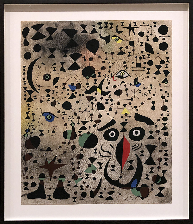
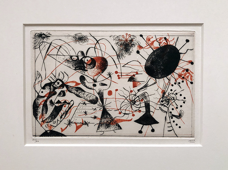
Here is a tapestry by him – also pretty amazing.

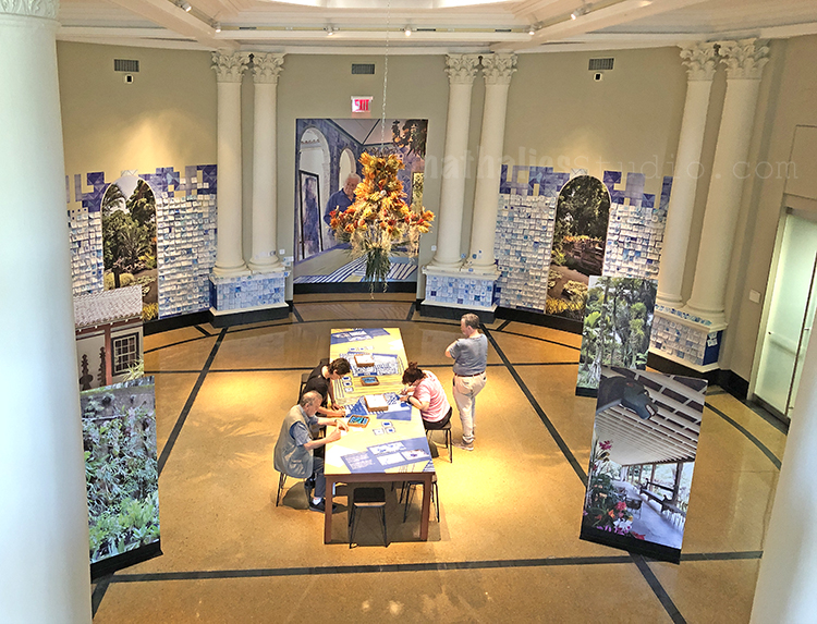
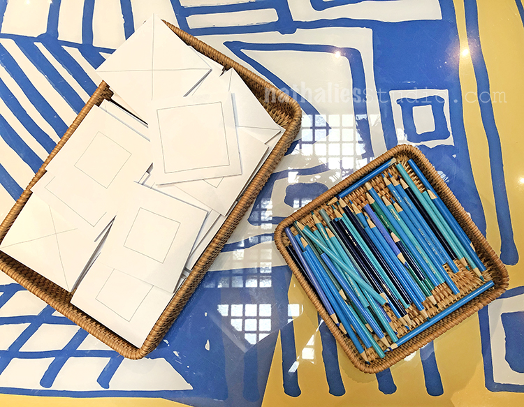
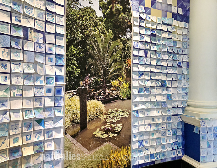
Another favorite part of the exhibition was the interactive tile making – based on Marx’ tiles some tile post-its were provided along with different blue colored pencils.

After painting the visitors were encouraged to place them on the wall – it was so beautiful – and fun to see this post-it tile wall.

A wonderful exhibition with an awesome mixture of nature and art. If you have a chance to go – it was so worth the trip!

Comments (3)

  • theresa

    |

    thanks Nat for the refreshing walk through the gardens…isn’t nature soo inspiring…the patterns…colours…textures…love it all…

    Reply

  • Sue Clarke

    |

    Nat, I totally enjoyed this post this morning! Thanks.

    Reply

  • Jeanine Robb

    |

    These are gorgeous photos…beautiful exhibition! Thanks you.

    Reply

Leave a comment

Art Stroll: Joan Miró at MoMA, NYC

A couple weeks Kim and I went to the city to see the Joan Miró exhibition at MoMA.

It was a real treat – and left me in a very good mood. It started out with these interesting still lifes from 1922-23

The one above is a still life with lamp, sliced tomato and an iron stand. I just love the way he painted the tomato – yes I am a weirdo LOL.

One of the striking things in the early work for me was seeing the colors but also the similarities to some work that I recently saw at the af Klint exhibition. Amazing!

The Hunter (Catalan Landscape) 1923

I always loved Miró’s quirky little shapes and pictographs – do you see the fish sticking it’s tongue to catch the mosquito?

This painting called Dutch Interior I from 1928 is based on this 17th century painting depicting a lute player in a domestic interior.

Miró had bought this postcard reproduction of the work by Hendrick Martensz Sorgh at the Rijksmuseum in Amsterdam and then mapped out his version below.

It makes me itch doing something fun like this as well :)

In a way some of his paintings are like painted collages.

“Birth of the World” 1925

Joan Miró said that The Birth of the World depicts “a sort of genesis”—the amorphous beginnings of life. To make this work, Miró poured, brushed, and flung paint on an unevenly primed canvas so that the paint soaked in some areas and rested on top in others. Atop this relatively uncontrolled application of paint, he added lines and shapes he had previously planned in studies. The bird or kite, shooting star, balloon, and figure with white head may all seem somehow familiar, yet their association is illogical.

Describing his method, Miró said, “Rather than setting out to paint something I began painting and as I paint the picture begins to assert itself, or suggest itself under my brush.… The first stage is free, unconscious. But, he continued, “The second stage is carefully calculated.”  The Birth of the World reflects this blend of spontaneity and deliberation.

This painting was way ahead of it’s time and received more love in the 50s when artists like Pollock and Frankenthaler would fling paint and wash raw canvases.

Relief Construction – 1930. Oil on wood, nails, staples, and metal on wood panel. In the summer of 1930 Miró moved away from painting to explore the possibilities of relief sculpture. Made from pieces of wood and metal that could easily have been found at a carpentry shop Relief Construction combines organic shapes. Miró identified the vertical metal spike as the neck and the head of the curved white toros like form. The red disk covered with sharp nails, he said was the sun.

how fun are those? I loved especially Miró’s book illustrations

Woman – Opera Singer- 1934 – Pastel and Pencil on flocked paper

“Painting” 1933 – do you see the cat?

Eyes – looking at you out of his paintings ….

and this and the next and actually EYES everywhere!

I love this one so much!!!

So striking with the red and black !

Interesting assemblage using rope.

Still life with a shoe – 1937 was kind of a shocker- I mean doesn’t that looks like something ultra modern and not from that time with the colors used?


And this sculpture- I mean seriously LOVE

It fascinated me how he very lightly used color – like a wash on the background and then painted so bold and with black and bold colors on the top.

Mirò said once in an interview: “I always have my feet on the ground and my eyes on the stars”

Another gorgeous sculpture.

Portrait of a Man in a Late Nineteenth-Century – Frame – 1950 – Oil on canvas – is one of my favorite paintings in MoMA’s permanent collection. According to Miró his childhood friend Joan Prats came upon an ostentatiously framed, pompous portrait by an unknown painter and sent it to him as a joke. The sitter’s pose and costume, his upturned gaze of inspiration, the devotional medal and ribbon on his table, and the rose garden outside his window typify the bourgeois taste and assuredness of the late 19th century. Within this orderly, rational and humorless world, Miró mischievously inserted his own creatures and signs. As if tot suggest the man’s puzzlement at this unexpected interruption , he punctuated his forehead with a small swirling form.

Hope you enjoyed this little Art Stroll. Kim and I did for sure and I cannot wait to head out to a museum soon again :)

Comments (2)

  • joan

    |

    Thank you for sharing, awesome work. I like the Hunter and the one that has what i think looks like a tiger face.

    Reply

  • Pam Hansen

    |

    Thanks for sharing, I really enjoyed this.

    Reply

Leave a comment

Art Stroll: Hilma af Klint at Guggenheim, NYC

Last week Kim and I went to the Guggenheim to see the Hilma af Klint (1862-1944) “Paintings for the Future” exhibition. I had been excited to see the exhibition for a couple months now and I wasn’t disappointed.

Klint radically started creating abstract paintings years before Kandinsky, Mondrian or other that are called the pioneers of abstraction would change their own artwork from representational content to abstract paintings.

The size and colors of her early paintings are just mesmerizing and such a happy delight to see – instant feel good right in front of those.

It also struck me how immensely feminine those paintings are.

The color schemes are still muted colors but light and the forms are round and free.

These ten earliest huge paintings of Klint go through the lifespan of humans from birth to old age.

Interestingly enough Klint kept most of her groundbreaking paintings private, because she was convinced that the world was not ready yet to understand her work. In her will she stipulated that a lot of her work was not be shown for twenty years following her death. Ultimately her abstract paintings remained all but unseen until 1986 – 80 years after she painted some of her most prolific abstract paintings in 1906.

The painting above is a sample of what would be seen mostly of her work. It is just so mind blowing. Given that abstract male painters several years later caused insane outrage about their work, she was probably right that as a female artist on top, people would have not understand her art at all.

It makes you rethink art history though – it messes with our perception of the timeline of abstract art and of the mainly male key figures of this movement as well.

In 1896 Klint held regular séances with four other women. She had begun attending séances as a teenager, using them as a way to contact her younger sister, who had died young. Spiritualism was a big thing back then and the group wanted to obtain a direct access to a higher order of knowledge.

Klint worked earlier as a biological illustrator and her scientifically styled diagrams and her esoteric experiences mixed in her paintings.

The swan represents the ethereal in many mythologies and religions and stands for completion in the alchemical tradition.

Klint often incorporated insights gleaned from color theory in her paintings. For Klint certain colors represented certain significances. Blue for example represents the female, yellow stands for male, green for the unity of the two.

In 1906 an otherworldly spiritual guide commissioned Klint to prepare a message to human kind and so she painted about 193 paintings containing the spirit of the world. Those paintings are known as the “Paintings for the Temple”

Not all of Klints work were kept secret by her. The Blue Books were a tool that Klint created to show trusted viewers her paintings. They contain black and white photos and next to them carefully rendered watercolor reproductions.

At the time she made those works, the art world was generally dismissive of work made by women and on top many critics did not take abstraction seriously.

“…in 1920, she made a series of small works that begins with a single circle, half black and half white, called “Starting Picture”—the world as a balanced duality, physical and material, dark and light.

Subsequent entries in the series offer similar circles, differently divided up between black and white: one divided into four alternating slices; one with black crescents framing a white center; etc. The titles suggest they are supposed to represent different graphs of the great spiritual traditions: “The Current Standpoint of the Mahatmas,” “The Jewish Standpoint at the Birth of Jesus,” “Buddha’s Standpoint in Worldly Life,” and so on.”

Klint made sketches for a spiraled building that would show her work ascending the spiral case to the heaven ….! “In many ways, the Guggenheim retrospective fulfills the artist’s long-buried dream.”

This was an uplifiting and thought provoking exhibition. Did I decipher her work? Nope …but …I was content and happy just looking at it and make me feel good. Nothing wrong with that …and hey …maybe that was the message all along ;)

Comments (4)

  • Sue Clarke

    |

    It is amazing to me how intense her colors are and yet they are light pastels in many paintings.
    I totally felt the different ages of the first grouping (even before you pointed it out).
    I want to look for a book about her life. Kline sounds like quite the woman and painter!
    Thanks Nat.

    Reply

    • nathalie-kalbach

      |

      Thanks Sue for joining! Yeah I am also very intrigued about her life!

      Reply

  • ARHuelsenbeck

    |

    Nathalie, thank you for this fabulous article. You’ve educated me about an artist I didn’t know.

    Reply

Leave a comment

Art Stroll: Andy Warhol at the Whitney, NYC

Last week Kim and I took a day off and for our annual Christmas Party at the n*Studio we decided to go into the city to visit the Andy Warhol Exhibition at the Whitney and have a nice lunch afterwards. It was a wonderful day!

Warhol began his series of Flower paintings in 1964. He used an image of four hibiscus flowers from a magazine and, with the help of assistants, silkscreened it across more than five hundred individual canvases, methodically producing paintings in different sizes and seemingly endless color combinations.

“In the mid-1960s Warhol employed carpenters to construct numerous plywood boxes identical in size and shape to supermarket cartons. The finished sculptures were virtually indistinguishable from their cardboard supermarket counterparts. Warhol first exhibited these at the Stable Gallery in 1964, cramming the space with stacked boxes that recalled a cramped grocery warehouse. He invited collectors to buy them by the stack, and, though they did not sell well, the boxes caused controversy. In reference to his boxes, Warhol later said that he “wanted something ordinary,” and it was this mundane, commercial subject matter that infuriated the critics. The perfectly blank “machine-made” look of Warhol’s boxes contrasted sharply with the gestural brushstrokes of abstract expressionist paintings.”

Would you buy one? (if money was no obstacle)

Sorry- it was so crowded it was hard to take any pictures LOL – but this was too iconic to let it just go …

Loved seeing his gold leafed shoes – the detail are actually quite fascinating on those

Love his sketches the most

The early stages of his work and concepts.

I love seeing the early work that shows where things were going -stencils, marks, people, lines …

In embracing the image of the Coca-Cola bottle as fine art, Warhol opened up the possibility of linking the worlds of commercial and fine art.

Death and Desaster- depicting magazine and newspaper headlines in oversized images.

“Warhol’s depiction of Superman is based on a drawing by Kurt Schaffenberger from the comic Superman’s Girl Friend Lois Lane (April 1961). Warhol’s decision to use Superman as a subject may offer a biting commentary on the heroic machismo associated with Abstract Expressionist “action” painting, or a queer reading of the Man of Steel, or both. Warhol displayed Superman and four other paintings shortly after they were made in a window display at the Bonwit Teller department store (below), where he and many other artists produced window displays.”

“Warhol based this composition on a small advertisement for a plastic surgeon that ran in the National Enquirer in early April 1961, which he had enlarged and projected in order to trace it onto the surface of the canvas-a precursor to the silkscreen technique he pioneered the following year. The work was first exhibited in the window of Bonwit Teller, the Fifth-Avenue department store, in early April 1961 as part of a display that included five other early paintings by the artist.”


Loved this – I had just used this very same image in a class for image transfers and seeing this silk printed with a similar effect in a big size was quite cool.

Well – another iconic one

“Warhol was as captivated by the lives of the ordinary as he was the rich and famous. This work was created from the Newsweek article, “Two Tuna Sandwiches,” about two Detroit mothers, neighbors who ate tuna sandwiches while they watched their children play and, two days later, the women died. The two housewives died via poisoning from tainted tuna. It shows how harmless consumerism can lead to accidental death. Warhol explored the brief and tragic fame bestowed on people after violent and unexpected termination of life.”

“Warhol chose the image of Mao—then the Chairman of the Chinese Communist Party—after reading news coverage of President Richard Nixon’s trip to the People’s Republic of China in February 1972. An unprecedented act of Cold War diplomacy, Nixon’s trip marked the first visit by a sitting American president to the nation, which at the time was considered an enemy of the state.”

When I went to the Andy Warhol museum in Pittsburgh I was fascinated by the collaborative works Warhol made with Jean-Michel Basquiat. “According to Basquiat, Warhol would begin the paintings with “something very concrete, like a newspaper headline or product logo, and then I would sort of deface it.” Depending on the work, this process could continue for two or three rounds, until a balance was reached between Warhol’s hand-painted images and Basquiat’s abstract gestures, text, numbers, and pictographs. ”

“Unlike in his other portraits, Warhol did not name the subjects of this series. They were not, however, truly anonymous. Marsha P. Johnson (bottom right), for example, had been a key player in the Stonewall rebellion that sparked the struggle for LGBTQ rights and, like Wilhelmina Ross, was a member of the performance group the Hot Peaches. In recent years, research into the other sitters’ identities has allowed their names to be instated. Warhol’s portrait of Marsha P. Johnson captures the confidence, warmth, and charm that made her a beloved member of New York’s queer community. Johnson was a pioneering trans-rights activist: she participated in the 1969 Stonewall uprising and later, with her friend and fellow trans activist Sylvia Rivera, founded Street Transvestite Action Revolutionaries (STAR), a political organization that advocated for the rights of queer and trans people and sex workers, particularly those who were homeless or incarcerated.”

What are the symbols of a country? Thought provoking? Was he political?


“For a series of still lifes begun in 1975, Warhol worked with assistants to make theatrically lit studio photographs of a variety of objects, such as a skull or a hammer and sickle, positioning them to cast shadows so dramatic that they took on identities of their own. In the years that followed, he created a number of paintings based on these photographs. It was through these investigations into photography—a medium most commonly associated with accurate representation—that Warhol was able to make works that read more overtly as abstraction. Beginning in 1978, he made a radical shift and did away with the objects entirely, producing an expansive series of more than one hundred paintings focused only on shadows, which he titled just that: Shadows. In these works Warhol freed himself from his Pop subjects by experimenting with something close to pure abstraction. Yet he never completely divorced himself from his sources, maintaining his connection to the everyday world while still playing with the problem of how images generate meaning.”


I love what someone said that there is no “supreme court of art and he experimented with the boundaries of art is” It is a great exhibition – I would def. go again but in the new year and during the week again as it the museum was stuffed even early at 10am when we went.

I hope you enjoyed the is little Art Stroll! Hope to take you on another one soon :)

Comments (2)

  • linda-faber

    |

    I loved the Warhol stroll (sounds like a new dance step). A story to share: In the 70’s, I was a docent at the UM campus museum (The Lowe) in Miami and we showed a fabulous Warhol exhibit of his portrait series with some of the advertising pieces as well. The gift shop had a small # of verified signed tomato soup cans. My friend was the director’s assistant and she got first crack at buying one to add to her beautiful art collection. It sat on top of her refrigerator for years…..until one day she noticed that it was leaking!! Sigh. Impermanent art because the acid in the tomato soup rusted the bottom of the can. Shoulda bought the catalog instead.

    Reply

    • nathalie-kalbach

      |

      Linda, what a fun story ! LOL – I wonder if she kept it emptied out? hahah- shoulda bought the catalog instead made me really laugh. Thank you for sharing !

      Reply

Leave a comment

Art Stroll: Kunsthalle Hamburg, Part 3

Here is part 3 of my long visit of the Kunsthalle Hamburg when I visited Germany last month.

Sonia Delaunay-Terk, Portrait of Tchouiko, 1908 – Oil on Canvas – I love the background the colors but especially how she painted the hands.


Adolf Erbslöh, Spring 1909 – oil on canvas

Love how the sky and the trees are mostly created with small little brush marks while the buildings and ground is differently painted.

Lyonel Feininger, Spring – 1936 – oil on canvas

Loved seeing this and Erbslöh painting close to each other since they had the same title – and depict houses but yet so different.

Lyonel Feininger, East Choir of Halle Cathedral, 1931- oil on Canvas

I love love love this earlier Feininger – it still has a feel of collage and architectural drawing to it which I like better than the more advanced cubist painting before.

Robert Delaunay, The Towers of Laon, 1912 – oil on canvas


Max Beckmann, The Bearing of the Cross, 1911 – Oil on Canvas

I am a huge Max Beckmann fan – and seeing a bigger collection of his work was a treat – see how different this work is to the next ones

Max Beckmann, Portrait of a Rumanian Woman – 1922 – oil on canvas

Max Beckmann, Large Still Live with Fish – 1927 – Oil on Canvas

Max Beckmann, Adam and Eve, 1936 – Coated Plaster

I love this …it is so symbolic to me especially right now with all the stuff going on in this country.

Max Beckmann, Girl with Yellow Cat (on grey), 1937 – oil on canvas

this makes me laugh – the cat is hilarious – the cat is also not yellow …love it :)

Max Beckmann, Prometheus (The Man Left Hanging), 1942 – oil on canvas

the title alone makes me laugh- poor Prometheus

Max Beckmann, Before the Ball (Two Women with a Cat) , 1949 – Oil on canvas

Def. didn’t improve on the cat…hahahah – I love it!

Edvard Munch – Girls on the Bridge – 1901 – oil on canvas

they were def. doing better when some of his other subjects on this bridge ;)

And that was it from the Kunsthalle- and btw- isn’t that a pretty cool bannister! Hope you enjoyed my Kunsthalle Art Stroll . You can find all the Art Strolls from around the world right here if you want to take a little Museum’s trip :)

Comments (2)

  • Sue Clarke

    |

    Such a variety of art work by Max Beckmann!
    I always like seeing the work you post/present after a museum visit Nat.
    I wondered about the women and cats myself…thanks Janene.
    East Choir of Halle Cathedral is my favorite by far. It just begs me to look at it again and again.

    Reply

  • Janene

    |

    They’re all fabulous in their own way, but I particularly liked Max Beckmann, Portrait of a Rumanian Woman and Adolf Erbslöh, Spring 1909.

    And what was up with Max Beckmann’s fascination with women and cats?? I had to know, so through the magic of the Inter-web, I found an article on the website “The Great Cat”: https://www.thegreatcat.org/the-cat-in-art-and-photos-2/cats-in-art-20th-century/max-beckmann-1843-1950-german/ Apparently Max thought women were similar to cats in promiscuity and domesticity. Meow!!

    =^._.^=

    Reply

Leave a comment

Art Stroll: Kunsthalle Hamburg Part 2

Last month while going to Germany to teach a workshop I spent a day at the Hamburger Kunsthalle. I loved revisiting the Permanent Collection and see some of my favorites again :)

Max Ernst, Menschliche Figur (Human Figure)  1930 – oil on canvas

I love this painting the shapes the shadows and that you can see the human figure – it is funny and I often smile when I see Max Ernst work.

Max Ernst, Grätenblumen (fishbone flowers) – 1928 – oil on canvas

This is one of my favorite paintings ….like Ever :) Because I remember how excited I was the first time I saw it – the dimensions, the structure, the visual and actual texture and how I couldn’t wait to go home and replicate the look. It was early on in my adventures as a self taught artist and to this day I feel this painting is like a old friend sparking something in me. Yes …I never said I am not a weirdo – hahaha

Paul Klee, Der Goldfisch (The Goldfish), 1925 – Oil and watercolor on paper on cardboard

Another painting that excited me early on – the sgraffito the colors …when I walked into the gallery I almost yelled out “hey fishy” ..but then …the reserved Hamburgers are a bit more suspicious of people bursting out when maybe New Yorkers are – LOL

Paul Klee, Felsige Küste (Rocky Coast) – 1931 – oil on plywood

Love the usage of plywood and the little rectangles – actually it makes me want to do something with the same small pattern but different colors coming together to form a landscape …

btw – the glimpse out of the galleries into the main hall always is a treat :)

Hans Arp, Augen-Nase-Schnurrbart (Eyes, Nose and Moustache) after 1928 – oil on cardboard- artist’s frame

I love the cut shapes and the colors – and reading the title makes me laugh – another outburst tehehehe

Sophie Taeuber-Arp, Wehende Formen (Floating Forms) 1935 – Oil on canvas – artist’s canvas

Oskar Schlemmer, Treppenszene (Stairway scene) 1932 – Oil on fabric on plywood – artist’s frame

This painting makes me want to see the Bauhaus Stairway Painting of his from the same year hanging at MoMA in NYC together with this. Apparently- and I didn’t know this before writing this post – there is some controversy as to how the painting got to be at MoMA.

Ernst Ludwig Kirchner – Das Paar vor den Menschen (Two Against The World), 1924 – oil on canvas

I am always fascinated by Kirchner’s paintings- they glow , they are radiant and encapsulate you when you stand in front of them  it is a physical experience.

Ernst Ludwig Kirchner – Das Wohnzimmer (The Living Room) – 1923 – Oil on canvas, artist’s frame

Ernst Ludwig Kirchner, Gut Staberhof (Staberhof Countryseat), 1913  oil on canvas

Love this so much the colors, the shapes …swoon

Emil Nolde, Das Meer VI (The Sea VI), 1915 – oil on canvas

Emil Nolde, Schlepper auf der Elbe (Tugboat on the Elbe) – 1910 – oil on canvas

Max Pechstein, Am Seeufer (On the Banks fo the Lake), 1910

All those paintings make me want to use crazy acidic colors …maybe my love for those colors comes from those artists which I remember being fascinated by in art lessons in school.

Ernst Ludwig Kirchner, Maler und Modell (Painter and Model) – 1910- oil on canvas

Karl Schmidt-Rottluff, Das blaue Haus (The Blue House) . 1907 – Oil on canvas – artist’s frame

A gorgeous vibrant painting – with such a beautiful frame. The photo really doesn’t do this beautifully textured impasto painting justice but nonetheless I wanted to show it.

Lyonel Feininger, alte Lokomotive (Old American Locomotive), 1910-1924 – oil on canvas

Loving those figures and the background!

If you think I went home after this …Nope – I couldn’t say bye to Kunsthalle (probably the reason why after 5 years living in the U.S. I am still a member there- LOL.

Another part of this Art Stroll is coming soon- I hope you enjoyed this one.

Comments (2)

  • Sue Clarke

    |

    I just love Rocky Coast and would be happy to hang it in my living room if the museum no longer has room for it.

    Reply

    • nathalie-kalbach

      |

      LOL- me too! Actually I will take any of those if they have no longer room for them hahahaha

      Reply

Leave a comment

ArtStroll: Kunsthalle Hamburg Part 1

A couple weeks ago I was in Germany to teach workshops and I was lucky enough to spend a couple days in Hamburg, my old home.

I made an effort to spend a day at the Kunsthalle, which I used to visit regularly when I lived there.

Sigmar Polke – Häuserfront (Front of the Housing Block), 1967

I love Sigmar Polke’s early Raster dot works. He always questioned what he saw- in newspapers etc. and after vastly enlarging the image with a projector, exposing the individual halftone dots of the reproduction, the artist transferred each dot onto his paper by dipping the eraser of a pencil into paint. This always makes the image seem to move- things are in flux – are changing.

Neo Rauch, Die Fuge (The Gap) , 2007 – oil on canvas – two parts

Gerhard Richter – Juist – 2001 – oil on canvas

I love Gerhard Richters oil paintings that look like blurry photographs

Gerhard Richter – Abstraktes Bild

Such a treat to look at those paintings by some of my favorite Artists.

Gerhard Richter, Abstract Painting

Gerhard Richter, Grey

Gerhard Richter, Oswald 1964 – oil on canvas

you can still see the raster on the canvas that Richter used to transfer the photo as a painting

Gerhard Richter, Familie Schmidt, 1964 Oil on canvas

Georg Baselitz – Thing with Arm, 1993

Sigmar Polke, This is all that remains of the original Statue, 1974

Sigmar Polke art always makes me stand in awe and I cannot stop looking at all the details and materials he used.

sigmar Polke, Zweite niederländische Reise (Second Dutch Journey), 1985 – Dispersion, paint, mixed technique on decorative fabric

Look at this- It makes me itch and wanna run to my studio right away and play with collage, fabric and stencils

I also loved those little straw sculptures by Haegue Yang

Beautiful shapes and way to work with straw.

Vajiko Chachkhiani, The Missing Landscape , 2014 – Burned Tree Trunks

this made me sad

Georg Baselitz, Bilddreißg (Paintingthirty), 1994 oil on canvas

It was a great Art Stroll and I actually spend many more hours in the Museum but I will share more in a different blogpost :)

Hope you enjoyed this little stroll and found some inspiration

Leave a comment

Art Stroll: The Met Cloisters, NYC

For my birthday my husband and I took the day off and went to The Cloisters in NYC. I am so glad we did this.

Hard to believe you are still in the city and with the magnificent Fort Tryon Park right at the Hudson River you could almost think you are somewhere in Europe. At parts I could imagine being at the River Rhine.

The Cloisters are a museum (part of the MET) built from 4 different European cloistered, acquired by an American fellow, then sold to Rockefeller. Between 1934 and 1939 they were dissembled over stone by stone and built up again here in a way of a nice Frankenstein Cloister. At times you feel you are not in the States anymore – everything feels real- and yet then upon turning another corner you realize something is off …it is weird and fun.

An incredible amount of medieval art is hosted in the museum as well. A lot of art in this time period of course was made for the church.

above piece was tiny!


The three heads on the wood carved altar are relics made around 1500 in Germany and contain each a skull of a saint.


Church bench….mhhhhh ….

When I entered the Unicorn Room with it’s tapestry I gasped- it was magical. In 1922, John D. Rockefeller, Jr. purchased the 7 pieces for for one million US dollar and donated them in 1938 to the Met.

The tapestries tell the story of the Unicorn from the hunt to its captivity. They were made probably in Belgium and woven in wool, metallic threads, and silk and incredible vibrant.  The initials “A” and “E” can be seen hidden in each tapestry several times.  The “E” is backwards and one example can be seen in the tree between two hunters, others are found in the bottom corners

Detail of another tapestry – I will call it “Grumpy guy on tapestry .”..

Throughout the cloisters gorgeous windows from all over Europe.

And four wonderful gardens inviting to rest.

The exhibition “Heavenly Bodies: Fashion and the Catholic Imagination” is running until October 2018. Here a 1967 wedding ensemble from the House of Balenciaga

Stunning wooden cross.

Details of the pillar.

Two Valentino pieces – I found the inspiration for the capes interesting.

Clear reference to stained glass window.

This wooden panel was amazing. Loved how the figures were drawn  and the colors – you could almost think it was a piece from the 60s  but nope – made in Spain, 13th Century

Maria Grazia Chiuri and Pierpaolo Piccioli for Valentino, Spring 2014. Now this one was stunning! The embroidery was breathtaking!

A medieval herb garden in one of the cloisters.

Wherever you turn artwork collected and put in here- again – it was kind of odd- yes I know it is a museum but it also felt so right and then also so misplaced.

A 14-century work, probably created for a convent in Nuremberg, depicting St. Clare receiving a palm from the Bishop of Assisi.

These dresses are in a section inspired by Hieronymous Bosch’s triptych The Garden of Earthly Delights.

I loved those windows – cruel scenes in some of them:

Souls Tormented in Hell – 1500-1510

Not sure why he is feeding the dragon but beware of your neighbor ;)

Monkey business I guess :)

Fountain – fun!

Unicorn water vessel – gosh so gorgeous!

I loved it. It is well worth the trip – if you are longer in NYC and want to see something that a bit off the beaten path … check it out. When you get there with the subway and get out at 190th St Station you will also have to enter the elevator still rund by an elevator attendant. It is a pretty cool station.

Hope you enjoyed the Art Stroll through The Cloisters and will join me soon for a different one.

Comments (4)

  • ARHuelsenbeck

    |

    Nathalie, The Cloisters is one of my favorite places on earth! In fact, the opening of the YA novel I’m writing is set in The Cloisters. She’s looking at one of the tapestries you pictured (The Unicorn in Captivity), and the unicorn talks to her, and a docent tells her she’s the chosen one who will save the unicorn…

    Reply

    • nathalie-kalbach

      |

      Oh how cool- that sounds so fun! I hope she will save the unicorn!

      Reply

  • Sue Clarke

    |

    The church bench is very comical.
    Souls Tormented in Hell I would very much like to avoid!
    I love the window at the end of the post. I really should have been born long ago to live in a castle.
    Thanks for sharing your art stroll Nat.

    Reply

    • nathalie-kalbach

      |

      Thanks for joining me Sue! Yeah- no sitting on that church bench LOL

      Reply

Leave a comment

Art Stroll: 1600 – 1700 Rijksmuseum, Amsterdam

Last month I was lucky enough to go to Amsterdam for a couple days and here is a second Art Stroll from the visit of the Rijksmuseum – this time about the Art from 1600 – 1700

I find a lot of humor in some of the artwork – almost worth making up some memes :)


Militia Company of District II under the Command of Captain Frans Banninck Cocq, Known as the ‘Night Watch’, Rembrandt van Rijn, 1642
The only way to take a photo without plugging through other visitors or being obnoxious with a camera. I always try to be very quick and the least distracting for other visitors in a museum when I take a photo after taking the artwork in.

Now- I have no idea why this the triptych below hung in the hall of 1600-1700 – as it is actually an earlier piece- but ..I will show it since it is stunning


It is the end of the world. The dead emerge from their tombs and are judged by Christ, seated on a rainbow in the sky. He consigns the wicked to hell (right), where perpetual fire and terrifying demons await them. The righteous souls may go to heaven (left): a place of color and light. Peter and Paul, the patron saints of Leiden, are set before a grand imaginary landscape on the outer wings of this altarpiece.Triptych with the Last Judgement outer wings: Saints Peter and Paul, Lucas van Leyden, 1526 – 1527

Beautiful window in the hall


Portrait of a Couple, Probably Isaac Abrahamsz Massa and Beatrix van der Laen, Frans Hals, c. 1622

This happy, smiling pair sits comfortably close to each other. Posing a couple together in this way was highly unusual at the time. It may have been prompted by the sitters’ friendship with the painter and the occasion for the commission – their marriage in April 1622. The painting thus contains references to love and devotion, such as the garden of love at right, and at left an eryngium thistle, known in Dutch as ‘mannentrouw’, or male fidelity.I love the expressions on their faces – you see the painter clearly loved them.

Children Teaching a Cat to Dance, Known as “The Dancing Lesson” Jan Havicksz Steen, 1660-1679, oil on panel

Aweee- poor kitty – I do really hope there was no long posing involved for the poor cat

The Feast of St. Nicholas, Jan Havicksz Steen, 1665-1668, oil on canvas

well …guess the boy on the left wasn’t that lucky for St. Nicolas. You usually get a piece of coal and dry twigs if you weren’t good of a kid  …guess why I know ? ;)

The Drunken Couple, Jan Havicksz Steen, 1655-1665

Of course the cat is just watching the thieves taking their belongings ….LOL

A Mother Delousing her Child’s Hair, Known as “A Mother’s Duty”, Pieter de Hooch, c. 1658-1660, oil on canvas

Oh the joy of being a mother …;)

The Threatened Swan, Jan Asselijn, ca. 1650 – oil on canvas

a swan fiercely defends its nest against a dog. In later centuries this scuffle was interpreted as a political allegory; the white swan was thought to symbolize the Dutch statesman Johan de Witt (assassinated in 1672) protecting the country from its enemies. This was the meaning attached to the painting when it became the very fist acquisition the Nationale Kunstgalerij (the forerunner of the Rijksmuseum) in 1880

The Windmill at Wijk bij Duurstede, Jacon Isaacksz van Ruisdael, c. 1660 – 1670, oil on canvas

Self-Portrait, Ferdinand Bol , 1653, oil on canvas

Ferdinand Bol was a scholar of Rembrandt. Ever thought about the urge of artists of taking a selfie throughout the centuries? I find it funny that people are so upset that people take selfies with a camera – it is not new, just the tools are different and who actually is capable of doing it.


Comments (4)

  • Laura Weed

    |

    I was blessed to visit the Rijksmuseum in the 1980’s (while the rest of my tour did Anne Frank’s House which was just too much for me) and I was absolutely blown away at the size of some of those paintings I had only ever seen in books before. What an immersive experience. Rembrandt is one of my favorites, and I love looking at the expressions on the faces of the people in the backgrounds. So glad you’re sharing this amazing place!

    Reply

    • nathalie-kalbach

      |

      It is a gorgeous museum and I am glad we went back again – there is just so much to see :)

      Reply

  • Sue Clarke

    |

    Portrait of a Couple is just delightful and so unusual for that time period.
    I don’t believe for a minute that you got coal. LOL
    The frame around the Swan is gorgeous.

    Reply

Leave a comment