Creative Squad

In My Dreams – Jennifer Gallagher

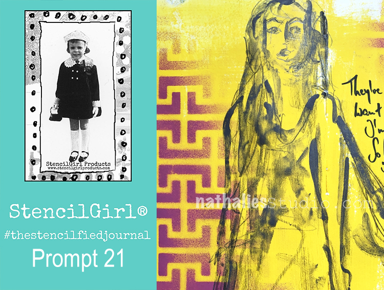
Hello from my Creative Squad! Today we have one last project and post from the amazing Jennifer Gallagher. We have loved having Jennifer on the Squad now for 2 years and have always enjoyed her colorful and fresh style. This month Jennifer says goodbye with an art journal page that is both personal and powerful. She is using my Hamburg stencil, my Mini Motifs rubber stamps, and my Wabi Sabi rubber stamps along with our new theme for this month: In My Dreams – A lot of folks are having crazy dreams these days. What visions do you see at night? Are you sleeping at all? Let us get a peek into your nocturnal adventures through your art.


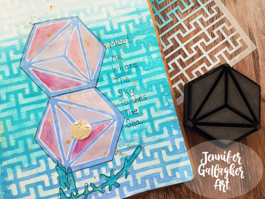
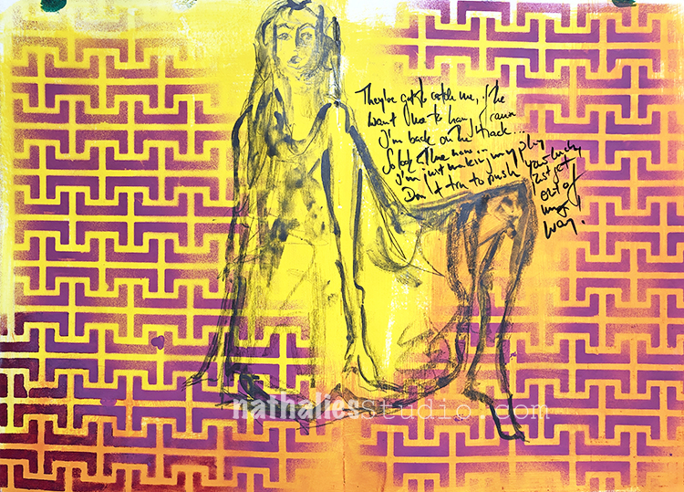
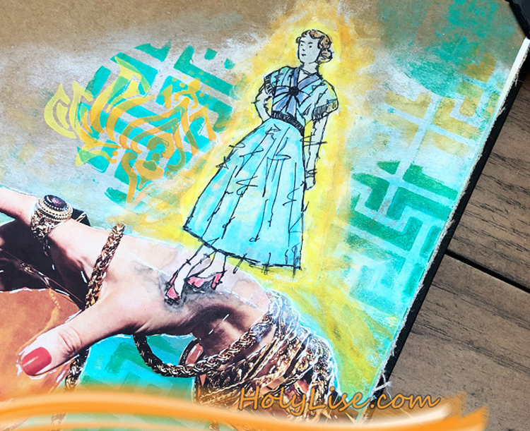
This month the Creative Squad is talking about dreams. With all the stress of the last several months, my dreams aren’t memorable so much for their content, but the way I wake up feeling – and that is tense. So, I’ve created this art journal spread to express that tension and chaos.

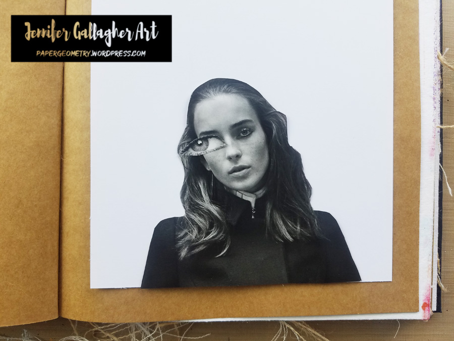
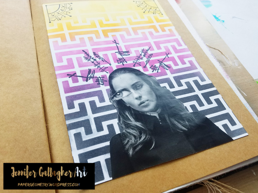
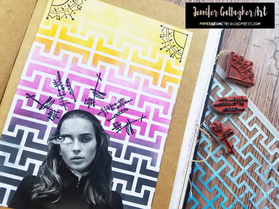
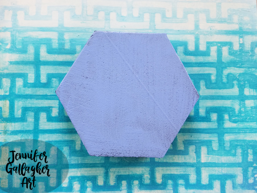
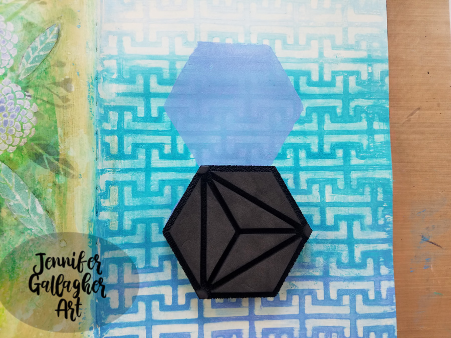
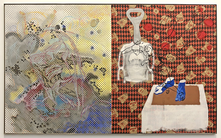
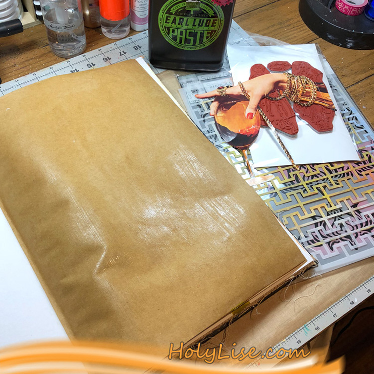
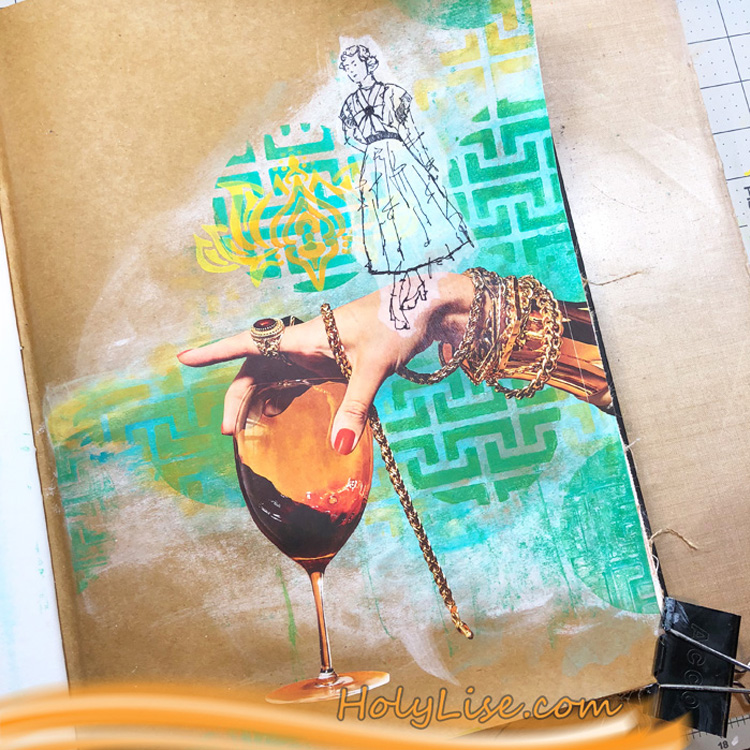
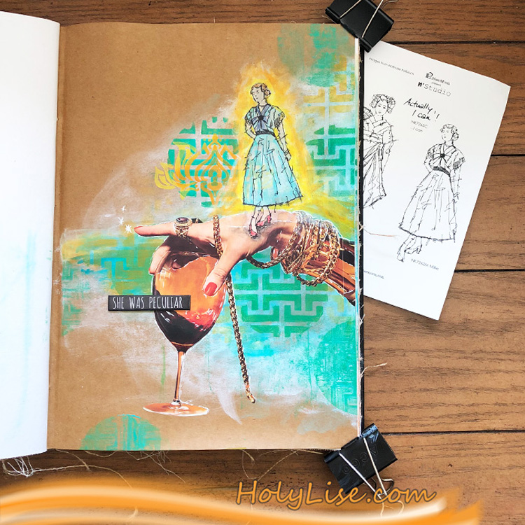
I decided I would attach a piece of A5 cardstock to my kraft page in a Dina Wakley Media journal. I will create my design on the cardstock and then attach it once it is complete.

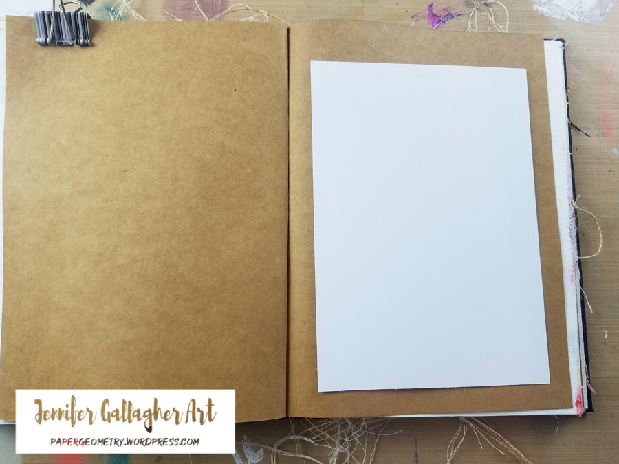
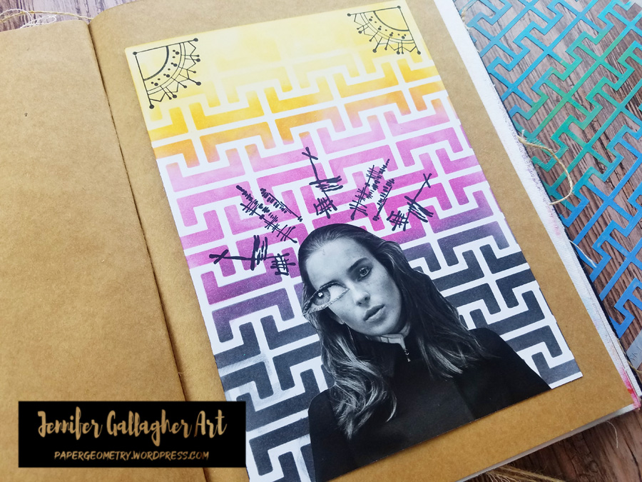
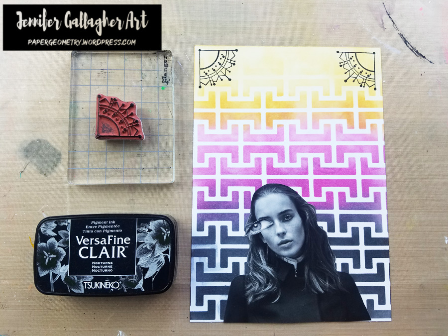
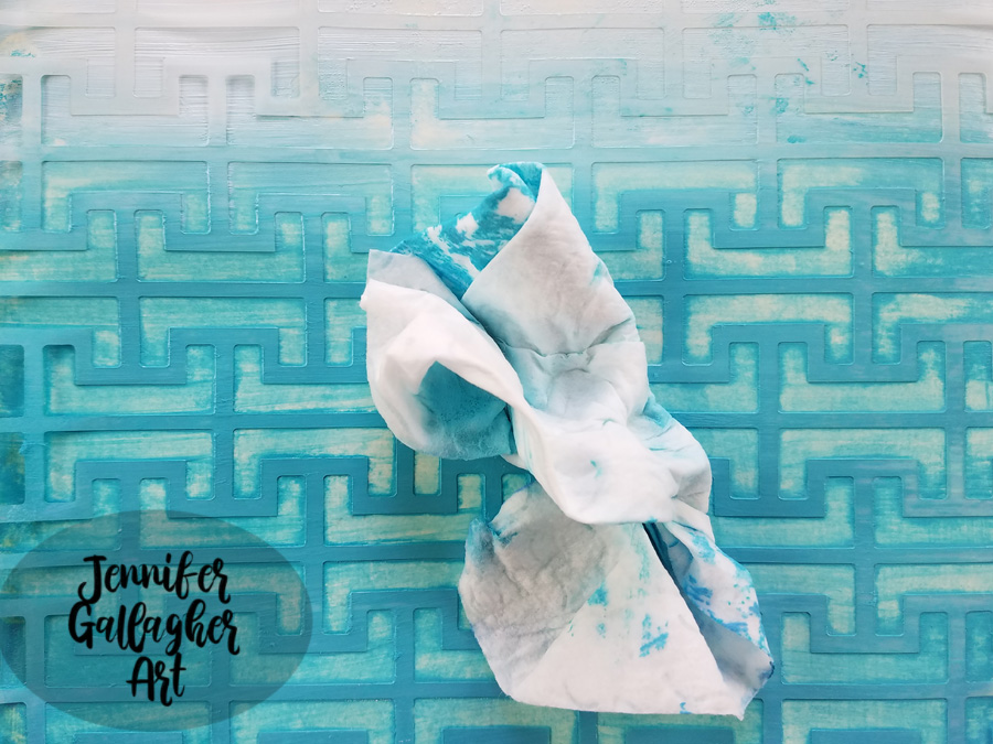
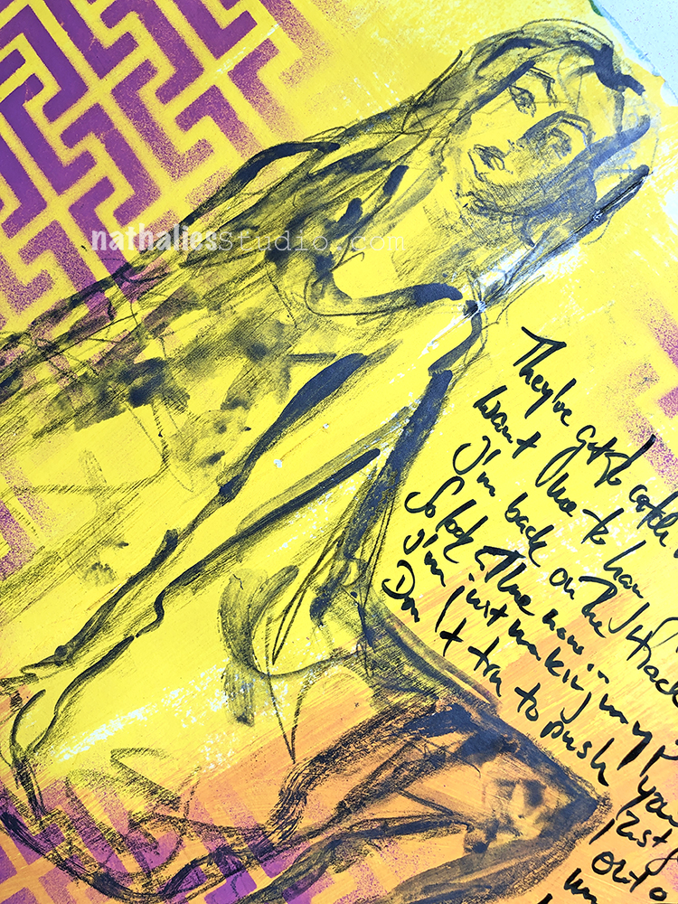
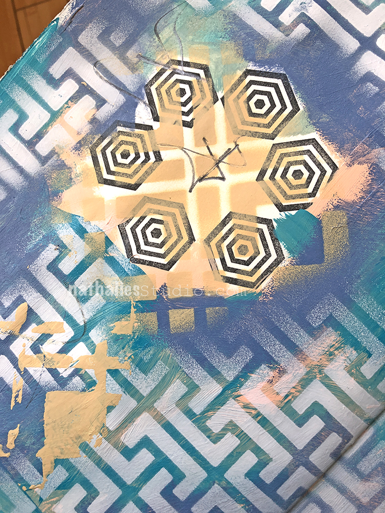
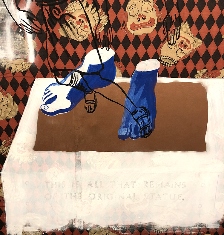
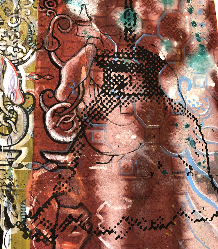
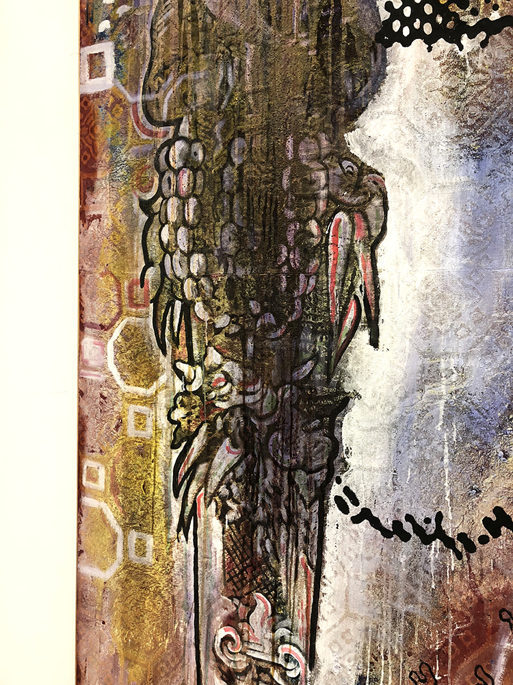
I have cut a face and an eye (larger than the eyes originally on the face) out of a magazine and picked a spot where it will go. I’m not attaching it yet so I can stencil the background.

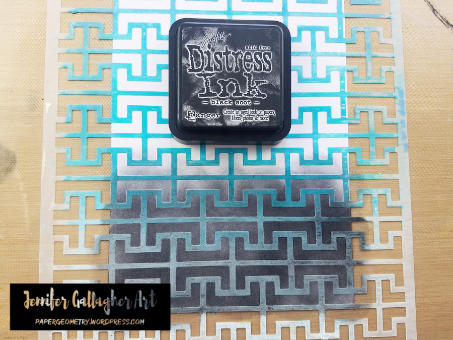
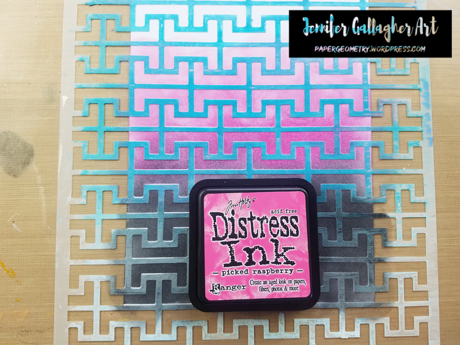
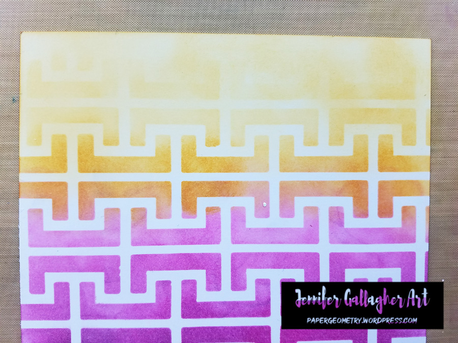
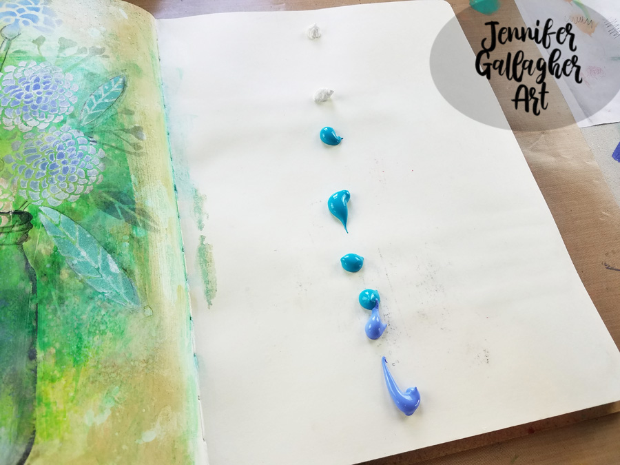
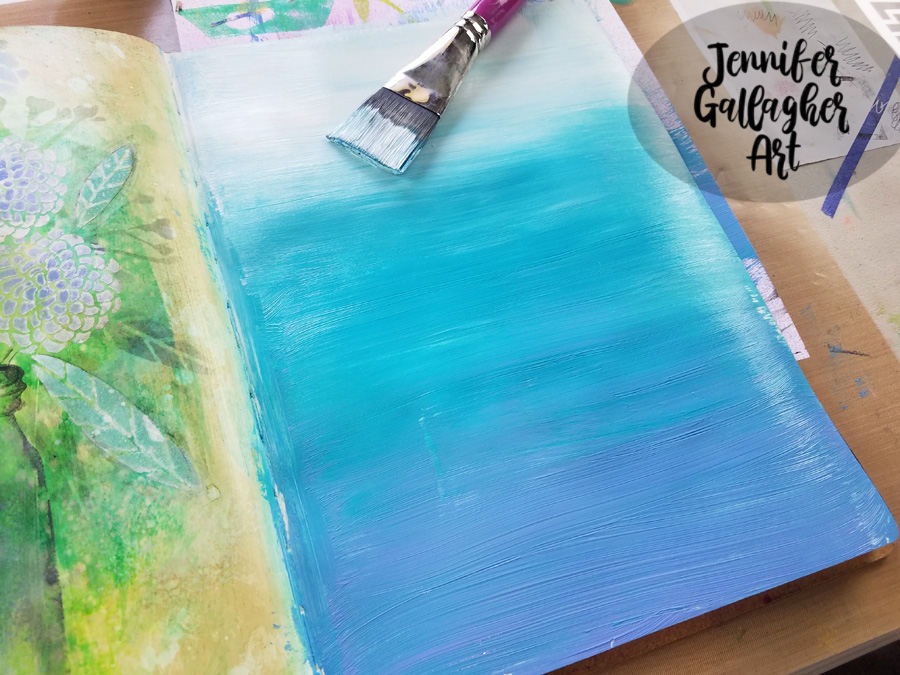
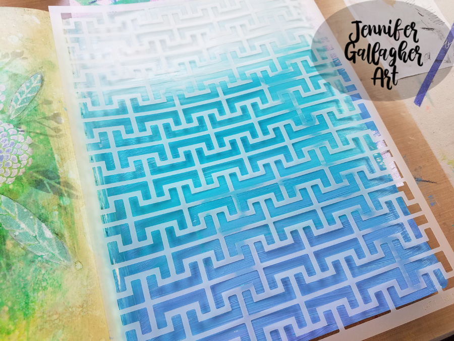
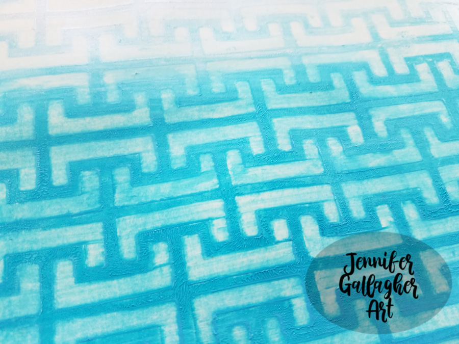
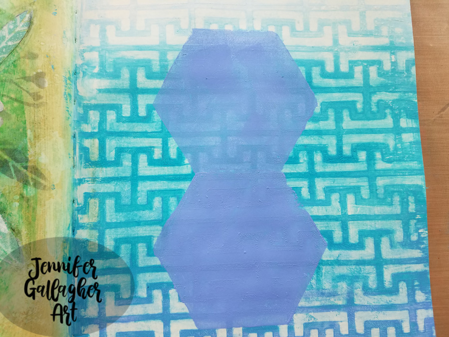
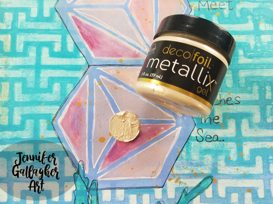
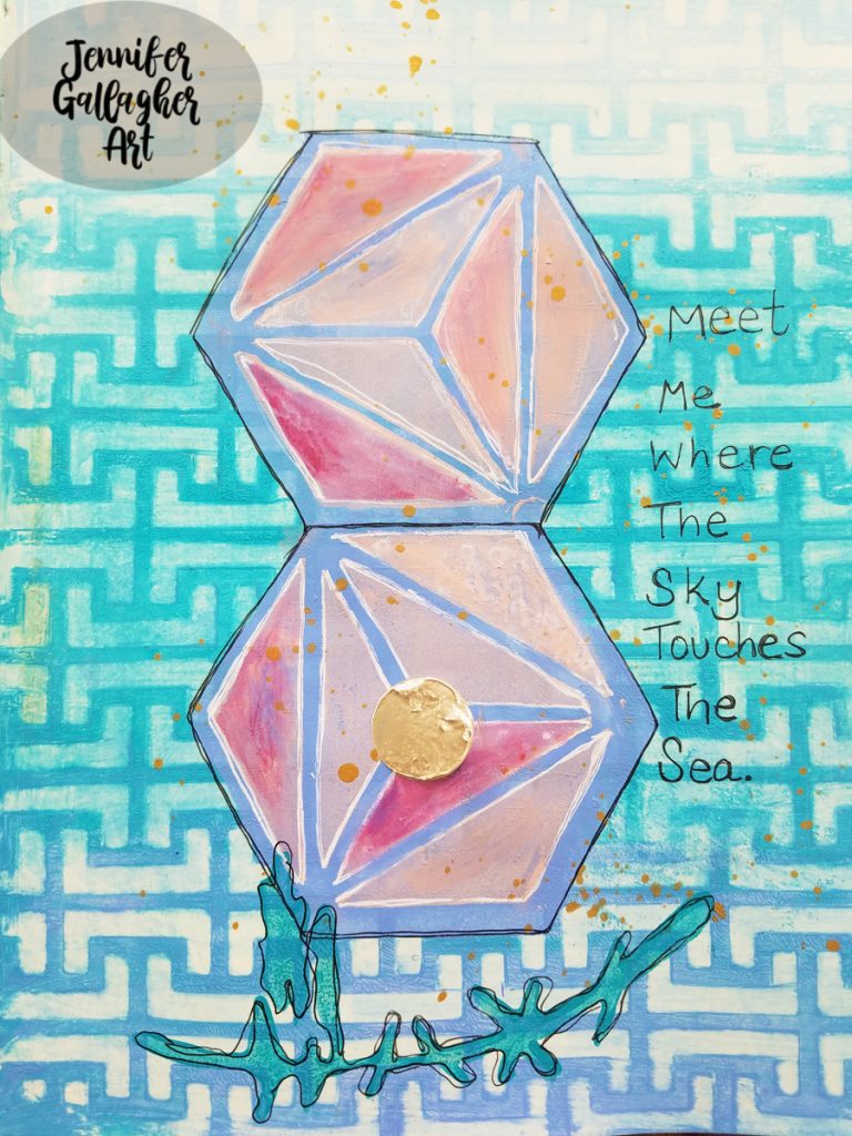
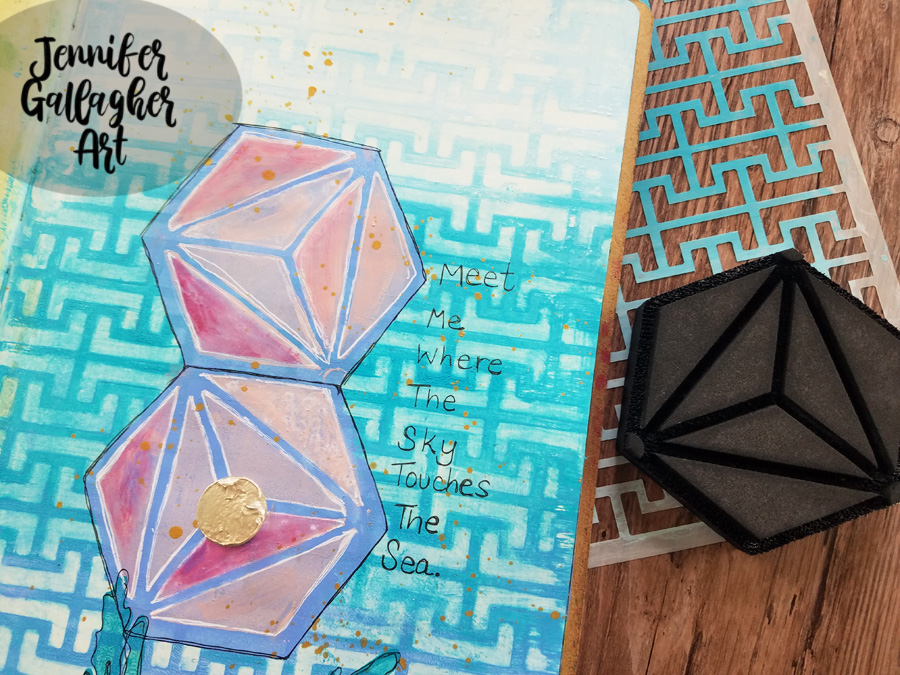
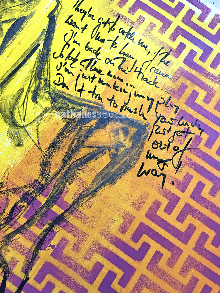
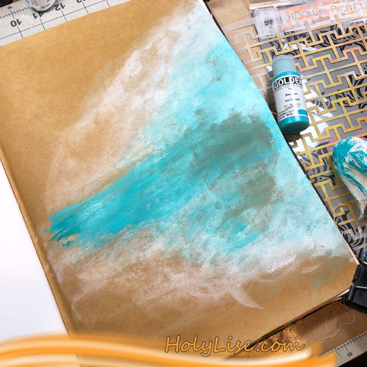
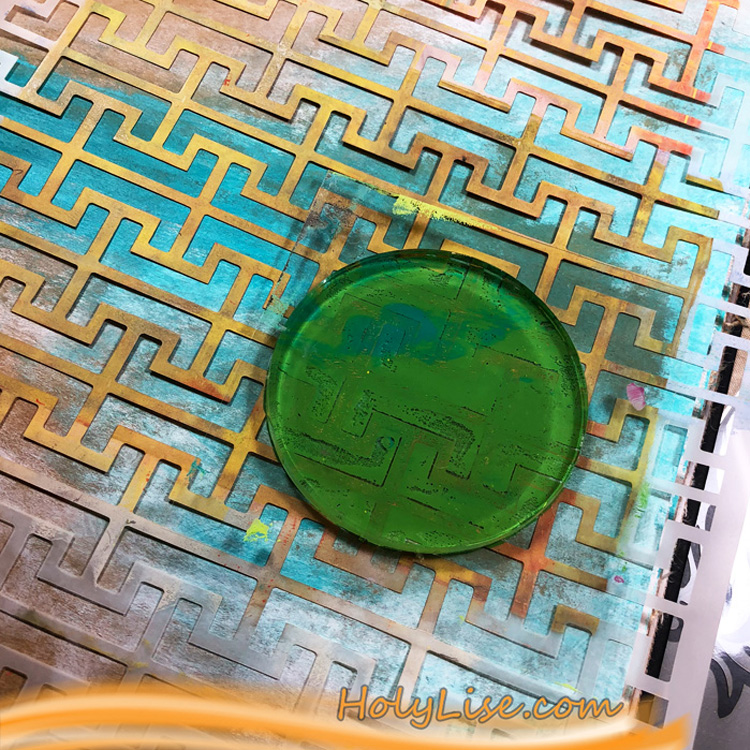
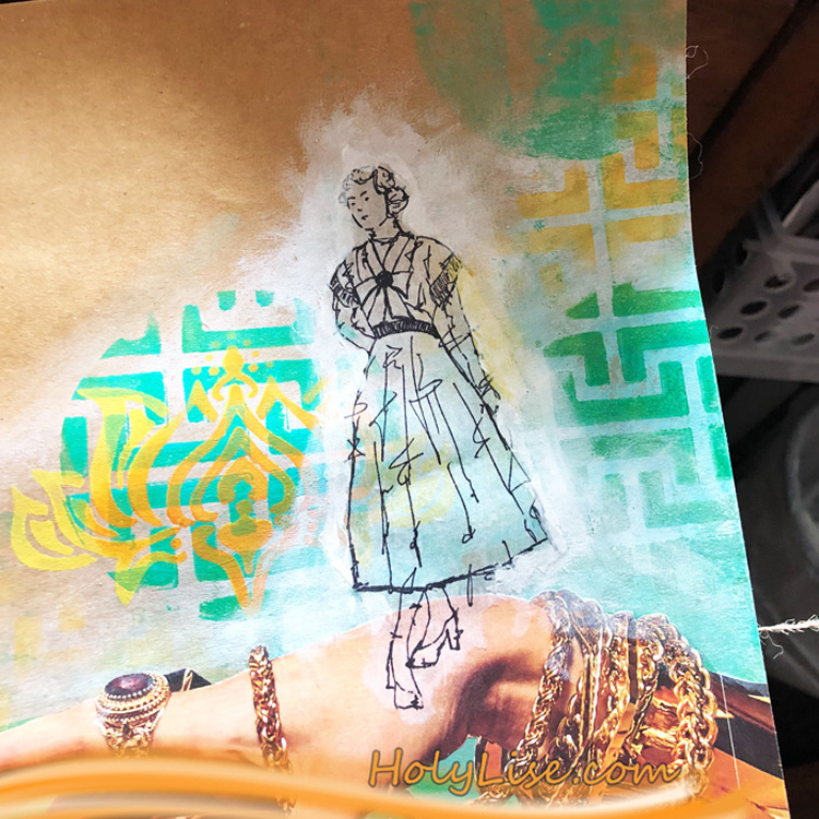
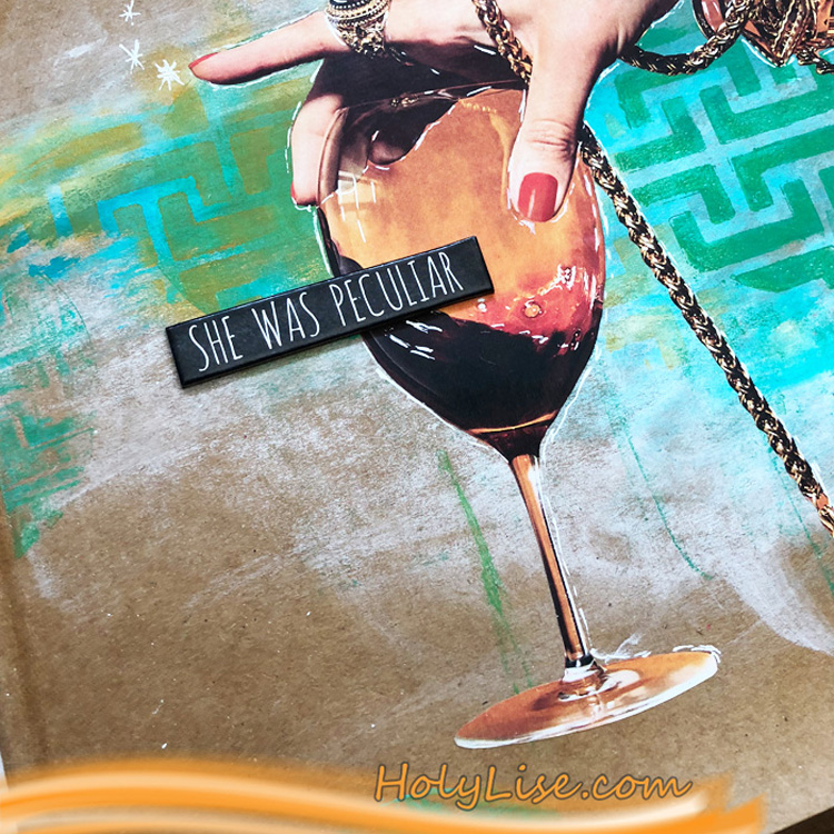
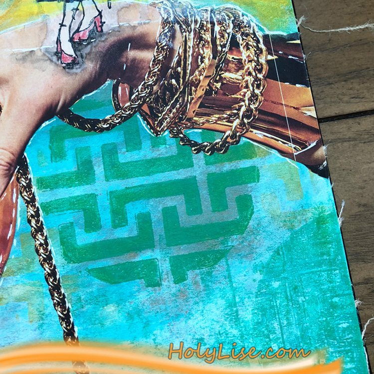
I laid Nat’s Hamburg stencil over the A5 piece of cardstock and starting at the bottom applied three colors of Distress Ink. First, I placed Black Soot, then Raspberry Preserves, and finally Wild Honey. Notice that at the top I blended a little wild honey over the white space to give a different look.

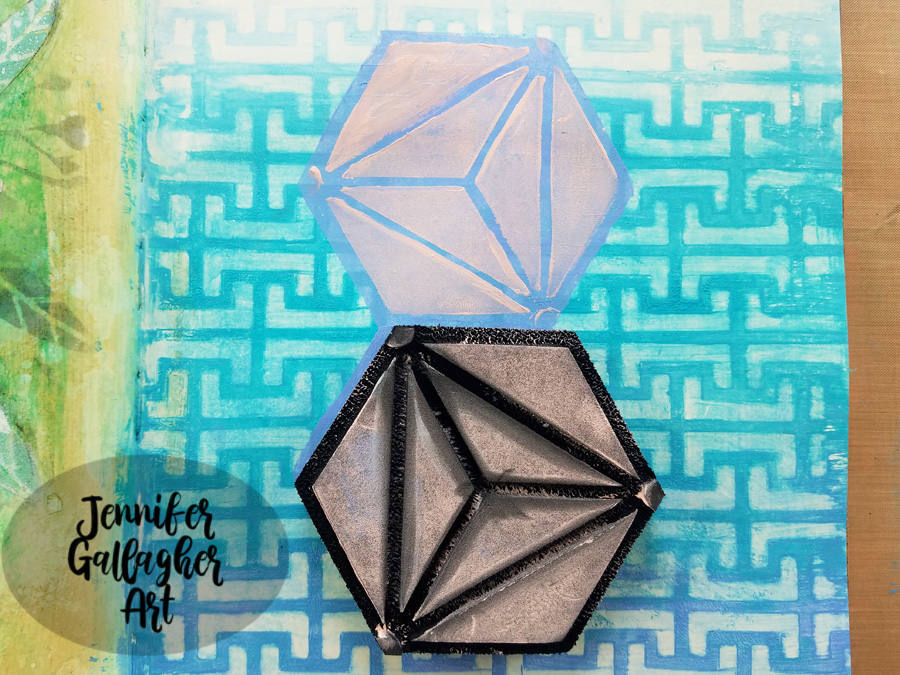
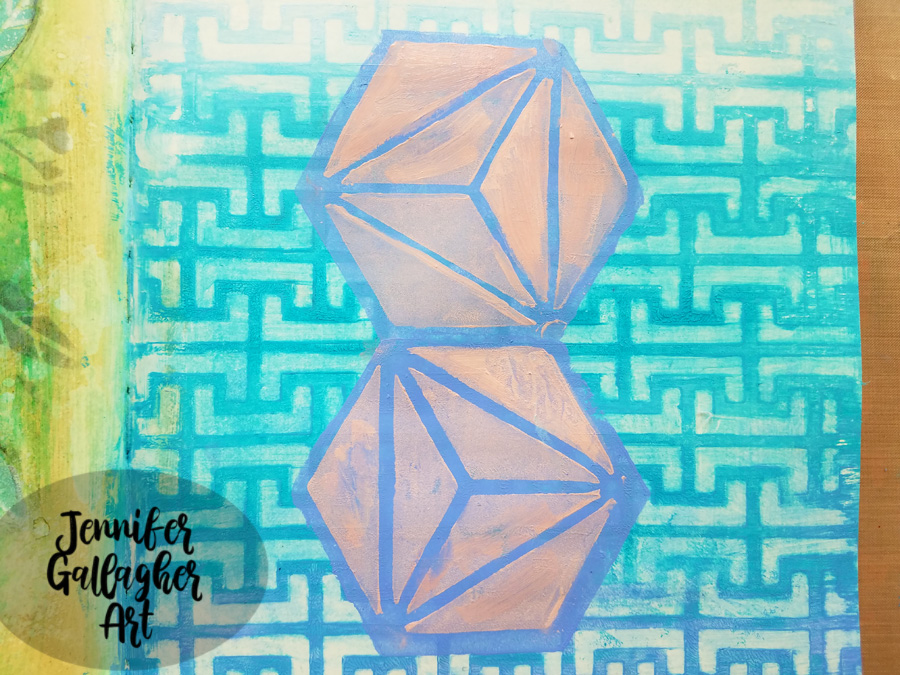
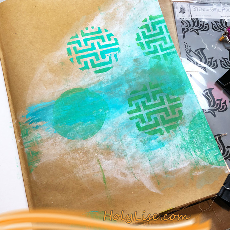
Next, I stamped Nat’s Jugendstil Motif stamp onto the top two corners using Versafine Clair in Nocturne.

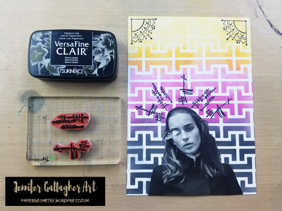
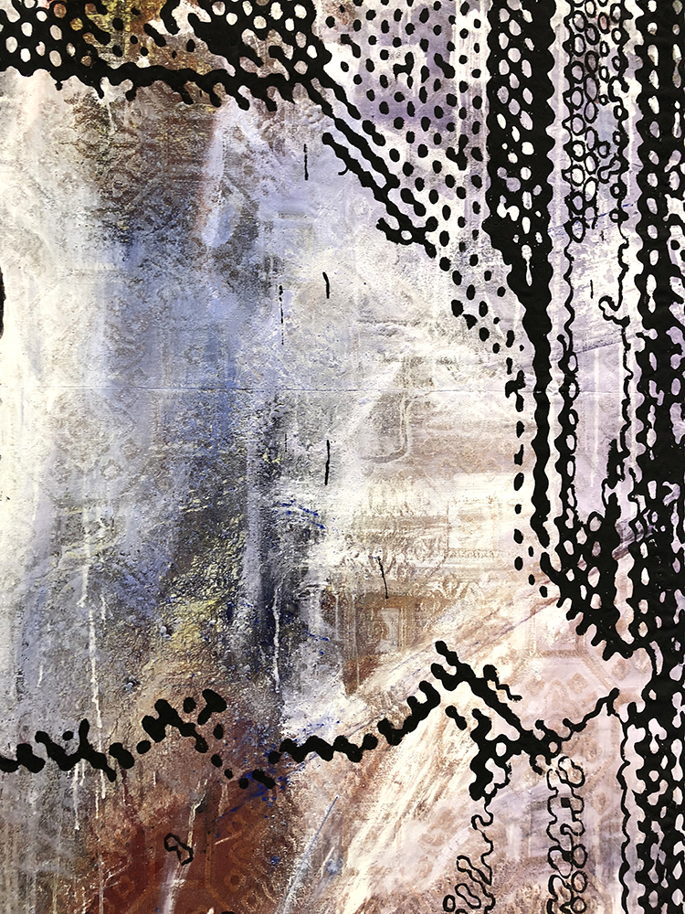
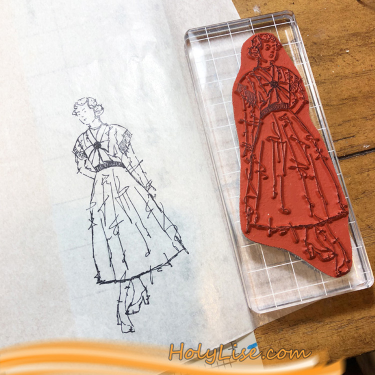
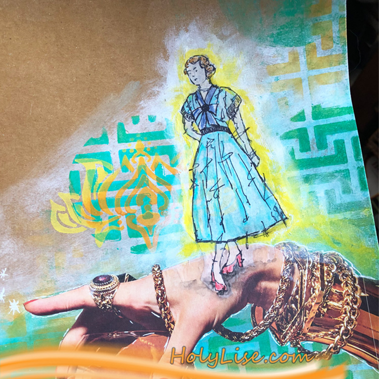
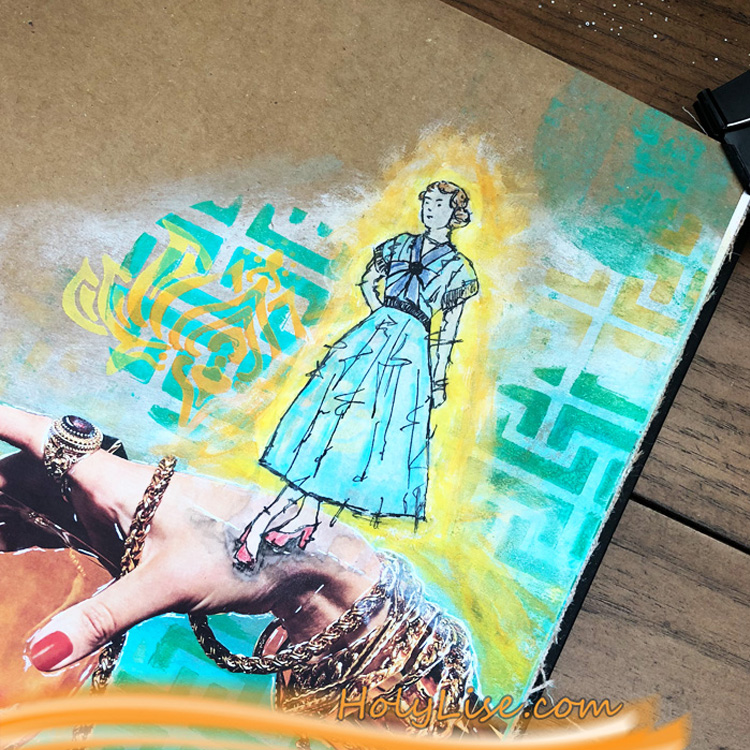
I stamped Nat’s Jazzed and Funky stamps above the figure to represent tension and chaotic thoughts. These were also stamped in Versafine Clair in Nocturne.

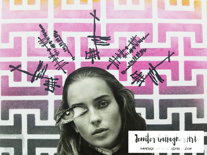
I used a generic glue stick to attach the face and eye to the cardstock. Then I applied scor-tape to the back of the A5 sheet and attached it to a kraft page in my Dina Wakley Media journal.

I hope you have enjoyed this tutorial. I really loved creating this page. Also, this is my last tutorial as a member of Nat’s Creative Squad. I have loved sharing my art and creative projects with you these last two years. Happy Creating! xoxo – Jennifer


Thank you Jennifer! We will definitely be sad to see you go!!! But we of course will continue to follow you online to see what other creative magic you are up to :)

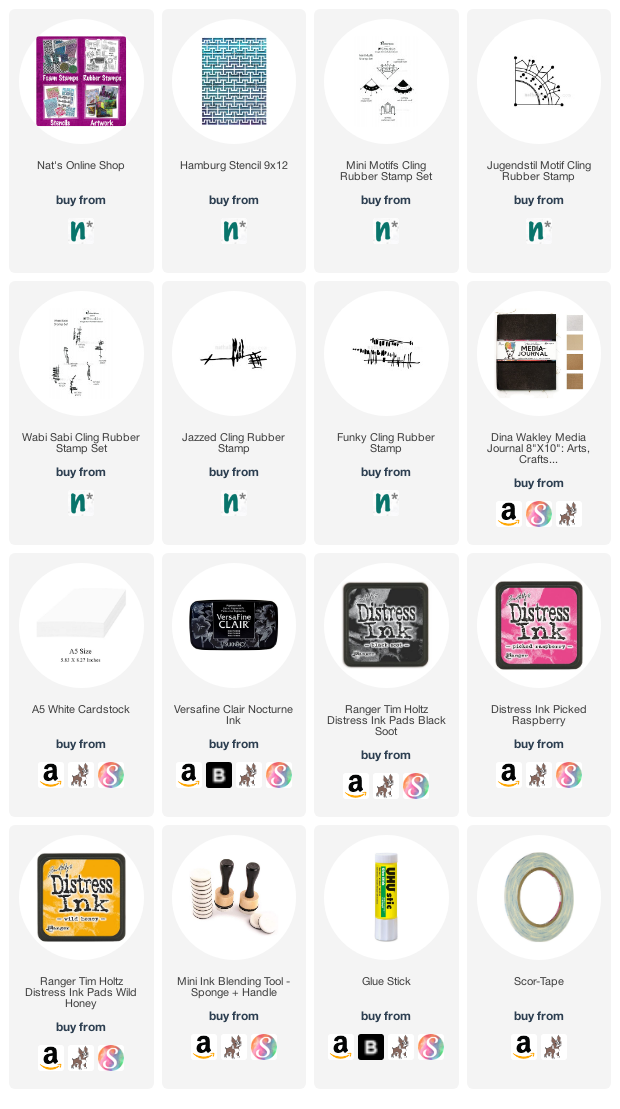
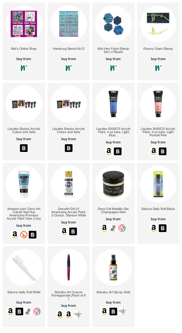
Give it a try: you can find all my Stencils and Rubber Stamps in my Online Shop and here are some of the other supplies Jennifer used:

Feel inspired? Working on something yourself that you’d like to share?  I love to see how you interpret our monthly themes. Email me how you used my stencils and stamps with the theme and email me an image – I would love to share your projects in my next  “n*Spiration From Around the Globe“.

Leave a comment

Under the Sea – Jennifer Gallagher

Hello from my Creative Squad! Today we are kicking off a new theme with a geometric homage to the sea from Jennifer Gallagher. Jennifer is using my Hamburg stencil, one of my Hex foam stamps, and my Groovy foam stamp, along with our theme: Under the Sea – There is something so fascinating about water. We love being in it, floating on it, relaxing next to it, and it remains one of the last frontiers here on the planet. Create something that is an ode to the sea.


This month the creative squad is inspired by everything under the sea. The ocean is a beautiful and peaceful place. I love the heat of the sun, the cool breeze flowing off the water, and the serenity of the waves lapping against the shore. I was inspired to bring you the feel of the ocean in my favorite geometric style. I’ve created a really pretty art journal page for you so let’s get started.

First, I prepped a page in my Dylusions journal with a coat of clear gesso. Then, I started the page by laying down a background in a gradient using Nat’s Hamburg stencil to give the impression of geometric waves. I laid down dots of acrylic paint down the center of the page to create a gradient of color. I used titanium white, cobalt teal hue, and light blue violet. Using a large brush I swiped back and forth across the page starting with the white and working my way down.

Next, I laid down Nat’s Hamburg stencil over the paint. You want to move quickly with this process as acrylic paint can dry rather quickly. While the paint was wet I removed paint through the stencil with a baby wipe.

My focal image is a clam with a pearl inside. So, first I applied light blue violet paint to the back side of Nat’s Diamond Hex artfoamie. I then pressed it onto the page as the top piece of my open clam shell. I then repeated the process, connecting the bottom of the shell to the top.

After the shell pieces have thoroughly dried, I applied Portrait Pink acrylic paint for the right side of the artfoamie and pressed the design onto the top and bottom of my clam shell.

I added a spritz of Marabu Art Spray in gold for a little sparkle. I also used Nat’s Groovy artfoamie with cobalt teal hue acrylic paint for a little touch of seaweed.

Next, I added some simple touches to pump up the visual volume. I added a little Marabu Art Crayon in pomegranate with a wet brush so the pink wouldn’t look so flat. I also doodled around with a black and white gelly roll pen.

The final touches include a quote about the sea and a pretty pearl to sit inside our clam shell. Using a gelly roll pen, I wrote a nice sentiment in my own handwriting. Don’t be afraid to write in your own handwriting! Next, I applied some Champagne Mist Decofoil Metallix Gel in a circle inside the bottom shell.

I really love how you can use the backs of your artfoamies as a base for color to build your design off of. I hope you have enjoyed this tutorial. Be sure to play along with our theme each month.


Thank you Jennifer – love the idea of a geometric seascape – it’s so in keeping with your style!

Give it a try: you can find all my Stencils and Foam Stamps in my Online Shop and here are some of the other supplies Jennifer used:

Feel inspired? Working on something yourself that you’d like to share?  I love to see how you interpret our monthly themes. Email me how you used my stencils and stamps with the theme and email me an image – I would love to share your projects in my next  “n*Spiration From Around the Globe“.

Leave a comment

The Stencilfied Journal – Prompt 21

My wonderful friend Tina Walker is at it again – she invited several people to join her Stencilfied Prompts. The prompts are music related and each week she is posting a song. You can be inspired by the lyrics, the video, the album cover or anything related and the only restriction is that you have to use StencilGirl Product Stencils. Here is my take on Prompt 21

This week’s prompt was Back in Black by AC/DC – a real rock n roll standard. I thought I would sketch a bit of a dangerous looking girl and use a fiery color palette.

I used my Hamburg stencil for the background with acrylic paint and spray paint.

I sketched the girl using Art Graf Kneaded Graphite – a water soluble putty-like stuff that you can draw with and then reactivate with water. It’s an interesting material to work with that I’m digging right now.

Here are some of the supplies I used:


Leave a comment

The Stencilfied Journal – Prompt 14

My wonderful friend Tina Walker is at it again – she invited several people to join her Stencilfied Prompts. The prompts are music related and each week she is posting a song. You can be inspired by the lyrics, the video, the album cover or anything related and the only restriction is that you have to use StencilGirl Product Stencils. Here is my take on Prompt 14

This week’s prompt was Landslide by Fleetwood Mac – a song I definitely like, especially if I’m ever in a melancholy mood.

I thought it would be interesting to represent the lyrics with a bit of layered pattern, that comes and goes. I used my Hamburg stencil for the main background, along with my Chicago stencil and also stamped my Space Oddity rubber stamp from the Small Hex set.

I went a bit introspective with this one, thinking about people coming and going at different points in your life, and the impact they leave on you.

Here are the supplies I used:


Leave a comment

Art Stroll: Kunsthalle Hamburg, Part 3

Here is part 3 of my long visit of the Kunsthalle Hamburg when I visited Germany last month.

Sonia Delaunay-Terk, Portrait of Tchouiko, 1908 – Oil on Canvas – I love the background the colors but especially how she painted the hands.


Adolf Erbslöh, Spring 1909 – oil on canvas

Love how the sky and the trees are mostly created with small little brush marks while the buildings and ground is differently painted.

Lyonel Feininger, Spring – 1936 – oil on canvas

Loved seeing this and Erbslöh painting close to each other since they had the same title – and depict houses but yet so different.

Lyonel Feininger, East Choir of Halle Cathedral, 1931- oil on Canvas

I love love love this earlier Feininger – it still has a feel of collage and architectural drawing to it which I like better than the more advanced cubist painting before.

Robert Delaunay, The Towers of Laon, 1912 – oil on canvas


Max Beckmann, The Bearing of the Cross, 1911 – Oil on Canvas

I am a huge Max Beckmann fan – and seeing a bigger collection of his work was a treat – see how different this work is to the next ones

Max Beckmann, Portrait of a Rumanian Woman – 1922 – oil on canvas

Max Beckmann, Large Still Live with Fish – 1927 – Oil on Canvas

Max Beckmann, Adam and Eve, 1936 – Coated Plaster

I love this …it is so symbolic to me especially right now with all the stuff going on in this country.

Max Beckmann, Girl with Yellow Cat (on grey), 1937 – oil on canvas

this makes me laugh – the cat is hilarious – the cat is also not yellow …love it :)

Max Beckmann, Prometheus (The Man Left Hanging), 1942 – oil on canvas

the title alone makes me laugh- poor Prometheus

Max Beckmann, Before the Ball (Two Women with a Cat) , 1949 – Oil on canvas

Def. didn’t improve on the cat…hahahah – I love it!

Edvard Munch – Girls on the Bridge – 1901 – oil on canvas

they were def. doing better when some of his other subjects on this bridge ;)

And that was it from the Kunsthalle- and btw- isn’t that a pretty cool bannister! Hope you enjoyed my Kunsthalle Art Stroll . You can find all the Art Strolls from around the world right here if you want to take a little Museum’s trip :)

Comments (2)

  • Sue Clarke

    |

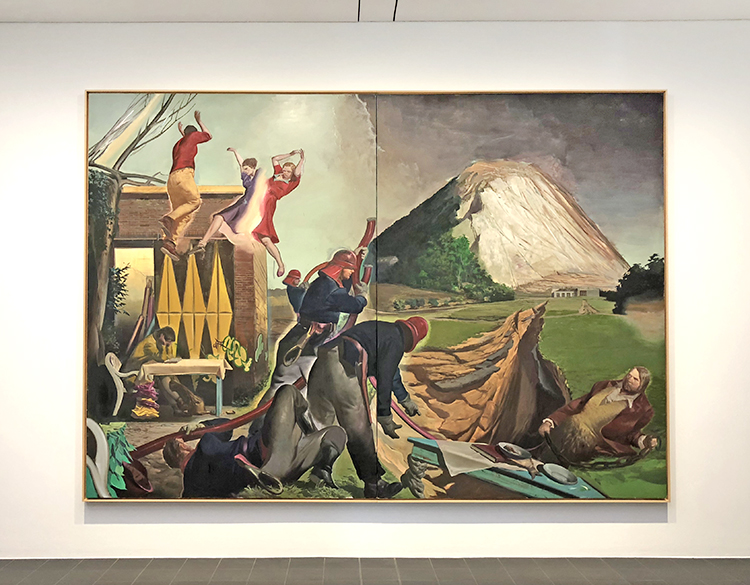
    Such a variety of art work by Max Beckmann!
    I always like seeing the work you post/present after a museum visit Nat.
    I wondered about the women and cats myself…thanks Janene.
    East Choir of Halle Cathedral is my favorite by far. It just begs me to look at it again and again.

    Reply

  • Janene

    |

    They’re all fabulous in their own way, but I particularly liked Max Beckmann, Portrait of a Rumanian Woman and Adolf Erbslöh, Spring 1909.

    And what was up with Max Beckmann’s fascination with women and cats?? I had to know, so through the magic of the Inter-web, I found an article on the website “The Great Cat”: https://www.thegreatcat.org/the-cat-in-art-and-photos-2/cats-in-art-20th-century/max-beckmann-1843-1950-german/ Apparently Max thought women were similar to cats in promiscuity and domesticity. Meow!!

    =^._.^=

    Reply

Leave a comment

Art Stroll: Kunsthalle Hamburg Part 2

Last month while going to Germany to teach a workshop I spent a day at the Hamburger Kunsthalle. I loved revisiting the Permanent Collection and see some of my favorites again :)

Max Ernst, Menschliche Figur (Human Figure)  1930 – oil on canvas

I love this painting the shapes the shadows and that you can see the human figure – it is funny and I often smile when I see Max Ernst work.

Max Ernst, Grätenblumen (fishbone flowers) – 1928 – oil on canvas

This is one of my favorite paintings ….like Ever :) Because I remember how excited I was the first time I saw it – the dimensions, the structure, the visual and actual texture and how I couldn’t wait to go home and replicate the look. It was early on in my adventures as a self taught artist and to this day I feel this painting is like a old friend sparking something in me. Yes …I never said I am not a weirdo – hahaha

Paul Klee, Der Goldfisch (The Goldfish), 1925 – Oil and watercolor on paper on cardboard

Another painting that excited me early on – the sgraffito the colors …when I walked into the gallery I almost yelled out “hey fishy” ..but then …the reserved Hamburgers are a bit more suspicious of people bursting out when maybe New Yorkers are – LOL

Paul Klee, Felsige Küste (Rocky Coast) – 1931 – oil on plywood

Love the usage of plywood and the little rectangles – actually it makes me want to do something with the same small pattern but different colors coming together to form a landscape …

btw – the glimpse out of the galleries into the main hall always is a treat :)

Hans Arp, Augen-Nase-Schnurrbart (Eyes, Nose and Moustache) after 1928 – oil on cardboard- artist’s frame

I love the cut shapes and the colors – and reading the title makes me laugh – another outburst tehehehe

Sophie Taeuber-Arp, Wehende Formen (Floating Forms) 1935 – Oil on canvas – artist’s canvas

Oskar Schlemmer, Treppenszene (Stairway scene) 1932 – Oil on fabric on plywood – artist’s frame

This painting makes me want to see the Bauhaus Stairway Painting of his from the same year hanging at MoMA in NYC together with this. Apparently- and I didn’t know this before writing this post – there is some controversy as to how the painting got to be at MoMA.

Ernst Ludwig Kirchner – Das Paar vor den Menschen (Two Against The World), 1924 – oil on canvas

I am always fascinated by Kirchner’s paintings- they glow , they are radiant and encapsulate you when you stand in front of them  it is a physical experience.

Ernst Ludwig Kirchner – Das Wohnzimmer (The Living Room) – 1923 – Oil on canvas, artist’s frame

Ernst Ludwig Kirchner, Gut Staberhof (Staberhof Countryseat), 1913  oil on canvas

Love this so much the colors, the shapes …swoon

Emil Nolde, Das Meer VI (The Sea VI), 1915 – oil on canvas

Emil Nolde, Schlepper auf der Elbe (Tugboat on the Elbe) – 1910 – oil on canvas

Max Pechstein, Am Seeufer (On the Banks fo the Lake), 1910

All those paintings make me want to use crazy acidic colors …maybe my love for those colors comes from those artists which I remember being fascinated by in art lessons in school.

Ernst Ludwig Kirchner, Maler und Modell (Painter and Model) – 1910- oil on canvas

Karl Schmidt-Rottluff, Das blaue Haus (The Blue House) . 1907 – Oil on canvas – artist’s frame

A gorgeous vibrant painting – with such a beautiful frame. The photo really doesn’t do this beautifully textured impasto painting justice but nonetheless I wanted to show it.

Lyonel Feininger, alte Lokomotive (Old American Locomotive), 1910-1924 – oil on canvas

Loving those figures and the background!

If you think I went home after this …Nope – I couldn’t say bye to Kunsthalle (probably the reason why after 5 years living in the U.S. I am still a member there- LOL.

Another part of this Art Stroll is coming soon- I hope you enjoyed this one.

Comments (2)

  • Sue Clarke

    |

    I just love Rocky Coast and would be happy to hang it in my living room if the museum no longer has room for it.

    Reply

    • nathalie-kalbach

      |

      LOL- me too! Actually I will take any of those if they have no longer room for them hahahaha

      Reply

Leave a comment

Hamburg Harbor – Painting

“Hamburg Harbor” was inspired by many bike rides around the harbor in Hamburg, Germany, my former home before moving to the US. This cityscape includes the addition of the huge ships that would come into the harbor – floating buildings that would add to an ever-changing skyline.

“Hamburg Harbor”  measures 9″ x 12″ – acrylic paint, acrylic ink, and spray paint on canvas and is available for sale.

Leave a comment

ArtStroll: Kunsthalle Hamburg Part 1

A couple weeks ago I was in Germany to teach workshops and I was lucky enough to spend a couple days in Hamburg, my old home.

I made an effort to spend a day at the Kunsthalle, which I used to visit regularly when I lived there.

Sigmar Polke – Häuserfront (Front of the Housing Block), 1967

I love Sigmar Polke’s early Raster dot works. He always questioned what he saw- in newspapers etc. and after vastly enlarging the image with a projector, exposing the individual halftone dots of the reproduction, the artist transferred each dot onto his paper by dipping the eraser of a pencil into paint. This always makes the image seem to move- things are in flux – are changing.

Neo Rauch, Die Fuge (The Gap) , 2007 – oil on canvas – two parts

Gerhard Richter – Juist – 2001 – oil on canvas

I love Gerhard Richters oil paintings that look like blurry photographs

Gerhard Richter – Abstraktes Bild

Such a treat to look at those paintings by some of my favorite Artists.

Gerhard Richter, Abstract Painting

Gerhard Richter, Grey

Gerhard Richter, Oswald 1964 – oil on canvas

you can still see the raster on the canvas that Richter used to transfer the photo as a painting

Gerhard Richter, Familie Schmidt, 1964 Oil on canvas

Georg Baselitz – Thing with Arm, 1993

Sigmar Polke, This is all that remains of the original Statue, 1974

Sigmar Polke art always makes me stand in awe and I cannot stop looking at all the details and materials he used.

sigmar Polke, Zweite niederländische Reise (Second Dutch Journey), 1985 – Dispersion, paint, mixed technique on decorative fabric

Look at this- It makes me itch and wanna run to my studio right away and play with collage, fabric and stencils

I also loved those little straw sculptures by Haegue Yang

Beautiful shapes and way to work with straw.

Vajiko Chachkhiani, The Missing Landscape , 2014 – Burned Tree Trunks

this made me sad

Georg Baselitz, Bilddreißg (Paintingthirty), 1994 oil on canvas

It was a great Art Stroll and I actually spend many more hours in the Museum but I will share more in a different blogpost :)

Hope you enjoyed this little stroll and found some inspiration

Leave a comment

Never Stop Dreaming – Josefine Fouarge


Today we have a post from my Creative Squad. Squad member Josefine Fouarge is sharing with us a fun art journal page that really shows off my new Millie rubber stamp, and my Hamburg and Lily Wallpaper stencils. Josefine was inspired by this month’s theme: Never Stop Dreaming – This month we’re sending a message of confidence and empowerment to all those in the world (near and far and maybe even you!) who have been told “You can’t”, “That’s not possible”, or “Not you”. Actually we can and we will! And we’ll never stop dreaming either :)


For me, creating is all about expressing myself and experiencing with new mediums, styles, etc. I love to sit down and come up with several ideas of how to use a specific stamp or stencil – sometimes I see a finished project, sometimes I just see the beginning – and then just start creating.

For this page, I decided to use Nathalie’s Hamburg and Lily Wallpaper stencil as well as the new Actually, I Can stamp set. I knew that my image would end up being rather long, so I grabbed my large Dina Wakley journal and primed one of the craft card stock pages.

I didn’t want to cover the entire page in paint, so I applied a very thin layer of white gesso to create a fog like coverage. This allowed the blue tones that I added on top to shine nicely.

To keep the page light, I added a few accents. I made these by mono printing different green and blue shades through the Hamburg stencil using a round Gel Press.

To clean up my Gel Press, I applied the leftover paint to the page, creating round shapes with the impressions from the stencil in them. To add a little more interest to the circles, I stenciled one lily from the Lily Wallpaper stencil into one of the circles.

I stamped one of the girls from the “Actually, I Can” stamps onto a piece of collage paper. This allowed me to adhere a crisp image of her to the page.

First, I adhered the hand with gel medium, then the girl. I overlapped them a little, so it looks like she’s standing on the hand.

Unfortunately, the collage paper didn’t merge with the background entirely, so I “fixed” it by applying a thin layer of gesso all around her.

This felt like an aura to me, so I decided to embrace that fact. I applied layers of yellow and orange all around her till it looked like she’s on fire. I also lightly colored her using Liquitex paint markers.

Now, she really felt magical to me. As a final touch, I added a few outlines around the hand and some finishing touches around her. She definitely can, no matter what anyone says :)

Everything came alive and played so well with each other – the elegant hand, the girl on fire – so it just needed a little sentiment, which btw, I interpret as something very positive.

It’s exciting to see all these layers melt into each other and shine through.

I hope you enjoyed my magical page with the girl that could and feel encouraged to let your dreaming girl out.

Thanks for stopping by and don’t forget to come back every Tuesday for more inspiration from the Creative Squad.


Thanks Josefine! Love how you layered the Hamburg and Lily Wallpaper stencils together! You can find my new Millie rubber stamp here in my online shop as well as all of my stencil designs. Here are some of the other products that Josefine used in her post:


Feel inspired? Working on something yourself that you’d like to share?  I love to see how you interpret our monthly themes. Email me how you used my stencils and stamps with the theme and email me an image – I would love to share your projects in my next  “n*Spiration From Around the Globe“.

Comments (1)

  • Sue Clarke

    |

    I love how this came out Josefine! I also like mixing magazine elements with other images/stamps…very fun page.

    Reply

Leave a comment