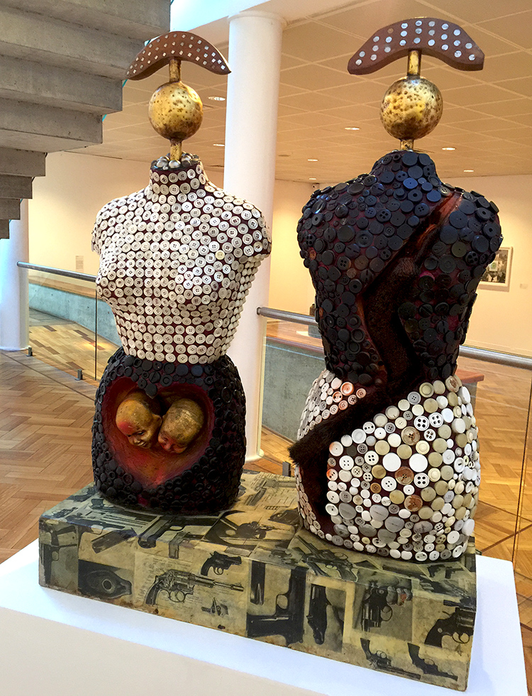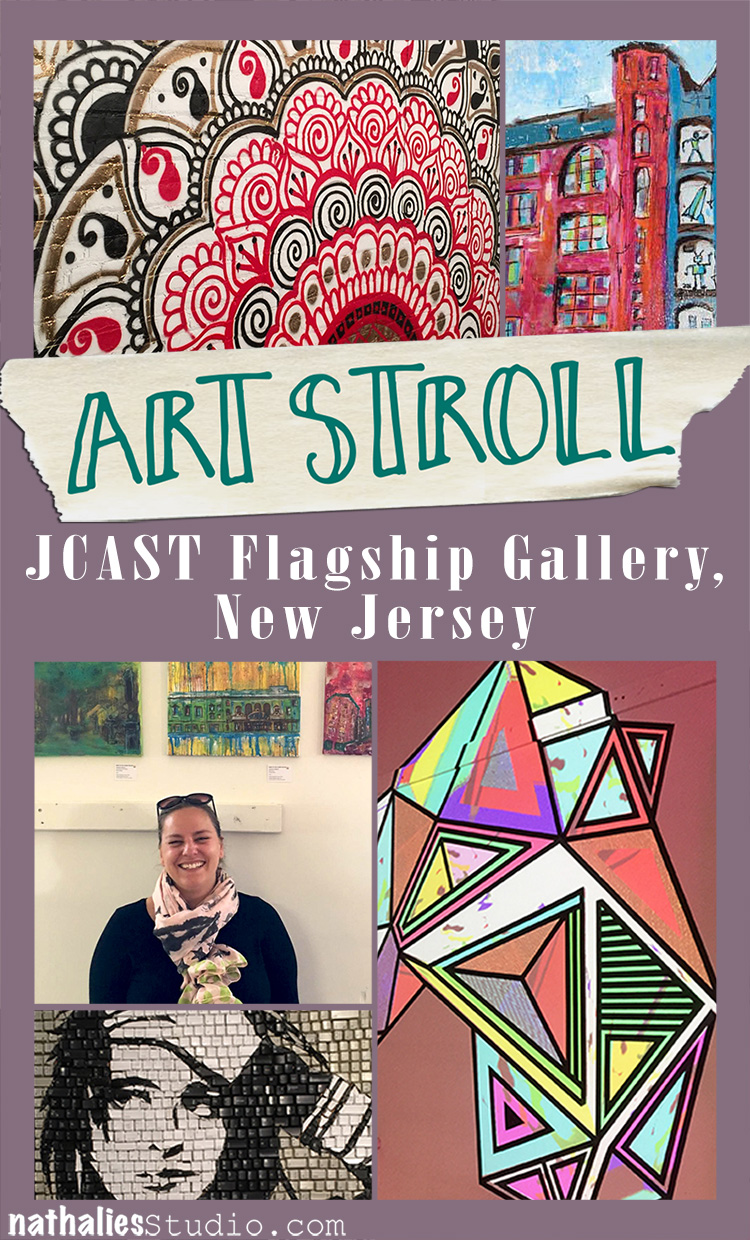
Art Stroll

Art Stroll: Rauschenberg Among Friends Part 1

Last week Natalya Aikens, who is a wonderful artist, and I met at MoMA to see the Rauschenberg exhibition in the early hours. I have been looking forward to this exhibition for a couple months now since I am a huge admirer of Robert Rauschenberg’s work. That is also noticeable when you read my book Artful Adventures in Mixed Media as I have used some of his work in on of the chapters.
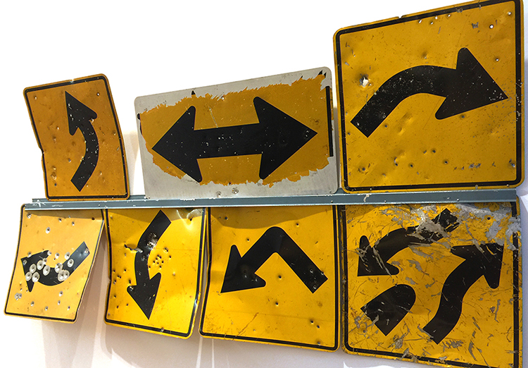
“Grand Black Tie Sperm Glut” (1987)

What I loved particularly about this exhibition was that it reflected the fact that Rauschenberg was a very social person and many of the people he met, artists, friends, lovers shaped his work and he fed off their company.
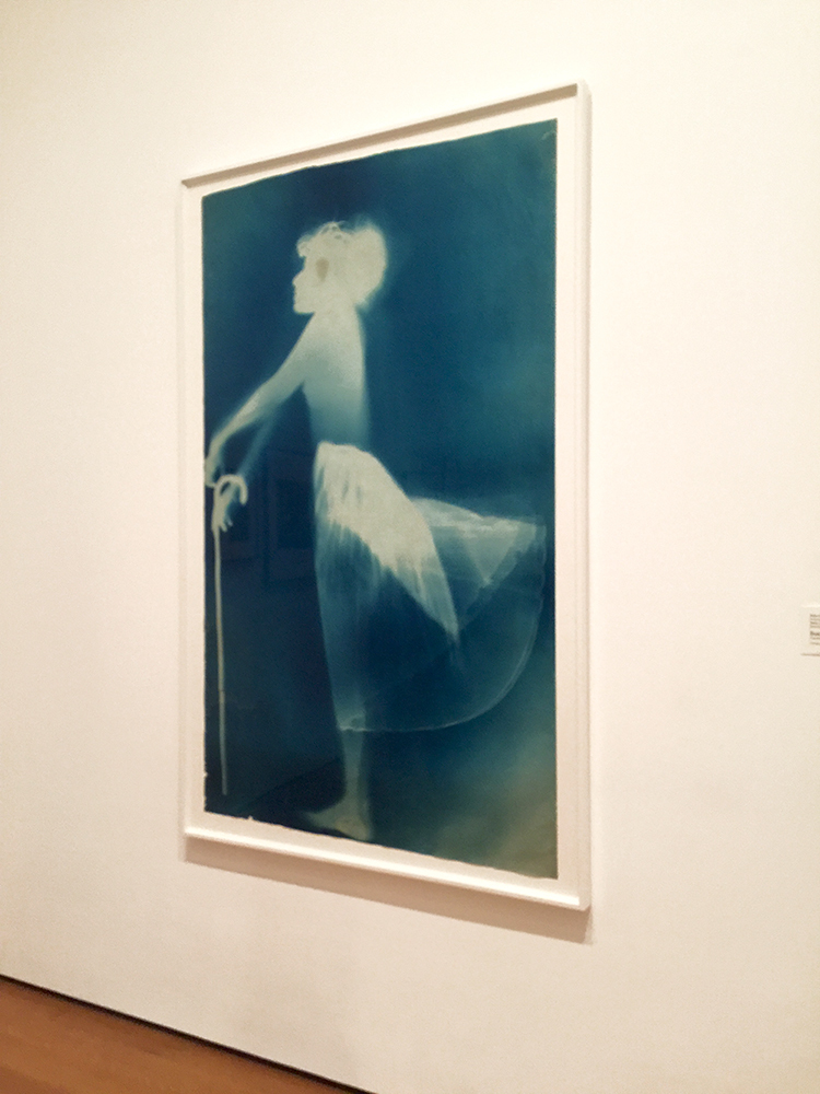
“Sue” (c. 1950), Exposed blueprint paper

The exhibition starts with blueprints created by and with artist Sue Weil, who was for a short while Robert Rauschenberg’s wife. One of them would lie down on a sheet of photo-sensitive paper and the other one would hold the bright lamp for a while to expose the image on the paper.
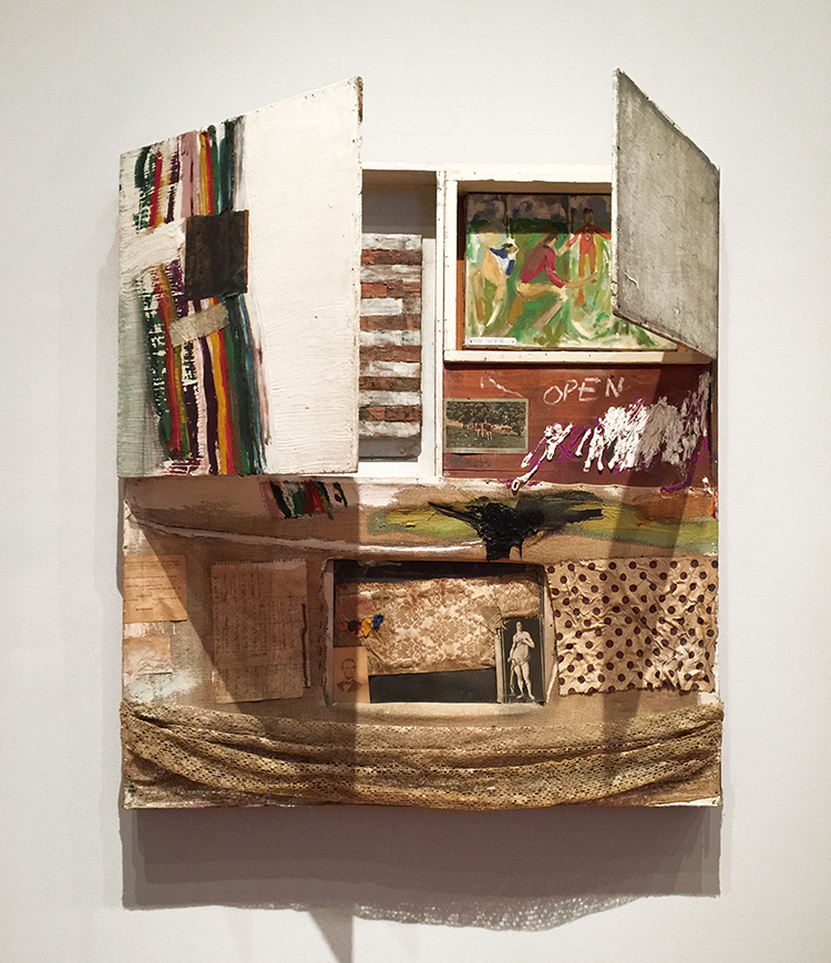
“Short Circuit” (1955), Combine: oil, fabric and paper on wood supports and cabinet with two hinged doors containing a painting by Susan Weil and a reproduction of a Jasper Johns Flag painting by Elaine Sturtevant

Rauschenberg was highly influenced by his teacher Josef Albers and the Bauhaus mentality to consider and focus on readily accessible and ordinary materials and to combine them.
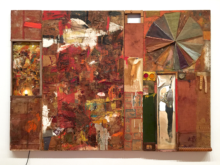
“Charlene”(1954), Combine: oil, charcoal, paper, fabric, newspaper, wood, plastic, mirror, and metal on four Homasote panels, mounted on wood with electric light

Rauschenberg called those readily materials “real objects” – he included a letter from his mother and a man’s undershirt.
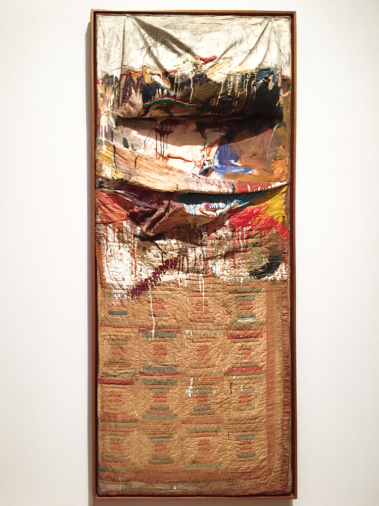
“Bed” (1955), Combine: oil and pencil on pillow, toothpaste, fingernail polish, quilt, and sheet, mounted on wood support
Rauschenberg recalled once that he could not afford to buy a canvas and so he decided to make a painting on a patchwork quilt given to him by the artist Dorothea Rockburne (she btw once said that when she was doing laundry she realized her quilt was missing and saw it later on again in this Piece :) ) . The pencil strokes on top of the pillow are very likely by Cy Twombly. Rauschenberg and Twombly were in a relationship and traveled together, making art.
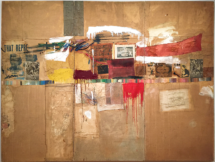
“Rebus” (1955), Combine: oil, synthetic polymer paint, pencil, crayon, pastel, cut-and-pasted printed and painted papers, including a drawing by Cy Twombly, and fabric on canvas mounted and stapled to fabric
Rauschenberg gathered many of the materials in Rebus from and near his studio in Lower Manhattan. He used commercial paint samples, included a piece of a painting by Cy Twombly
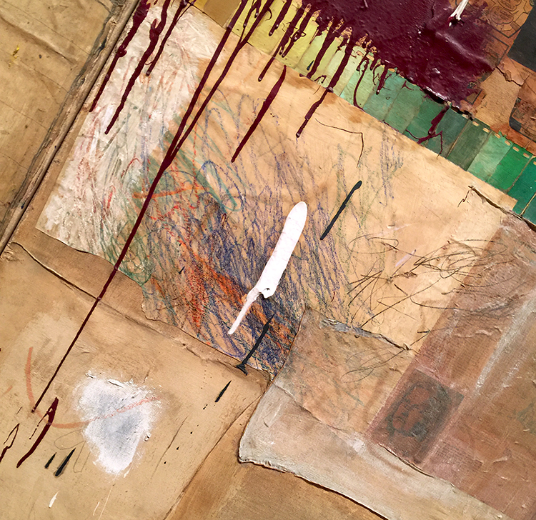
and three of the drawings this series were also included in the exhibition
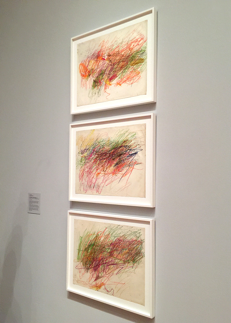
Cy Twombly

I loved seeing all the different materials and you really get a sense of a highly humorous person in Rauschenberg
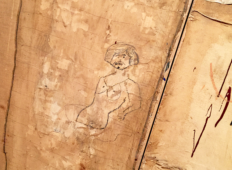
a person who doesn’t take himself too serious- what a wonderful streak.
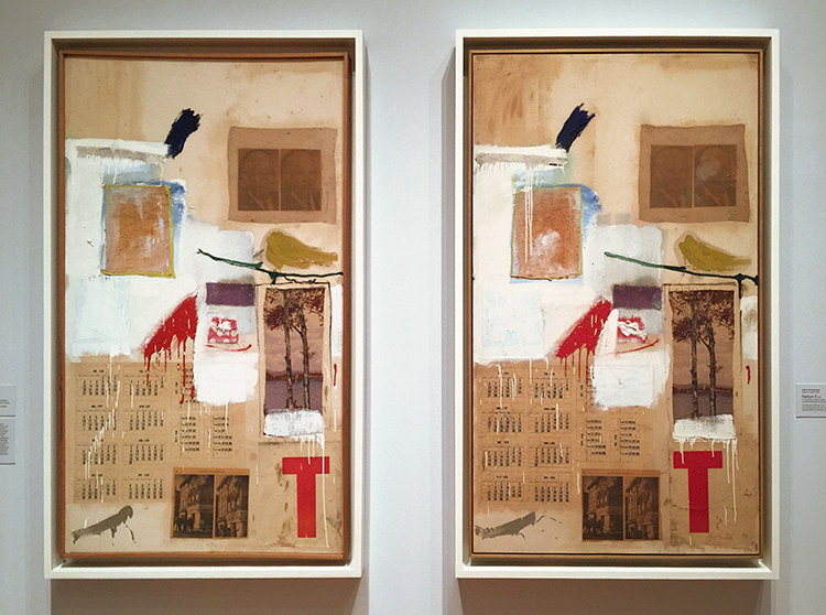
“Factum I ”  and “Factum II” 1957, Combine: oil, ink, pencil, crayon, paper, fabric, newspaper, printed reproductions, and printed paper on canvas
Rauschenberg created these two paintings, repeating the same falsely spontaneous brush strokes in both. Rauschenberg wanted to show that neither impulsive painting or planned painting alone make an artwork, but that it rather is a mix of intention and chance, impulsive gestures and thought.
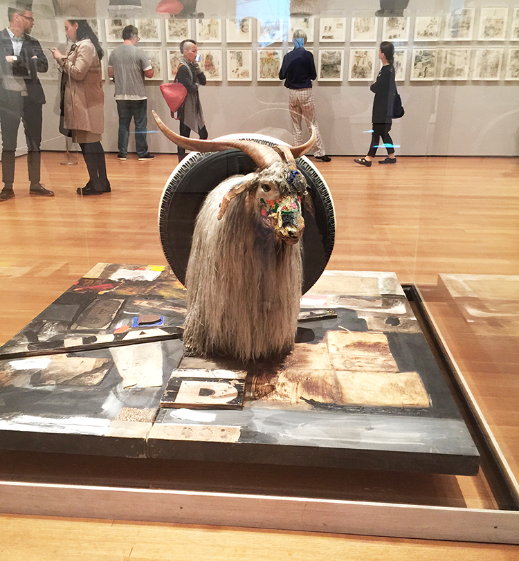
“Monogram” (1957-59), Combine: oil, paper, fabric, printed paper, printed reproductions, metal, wood, rubber shoe heel, and tennis ball on canvas with oil and rubber tire on Angora goat on wood platform mounted on four casters
This mixture of a painting, sculpture and assemblage is probably one of the best known works by Rauschenberg, seeing it in person was definitely a treat as a picture is not really capturing it.
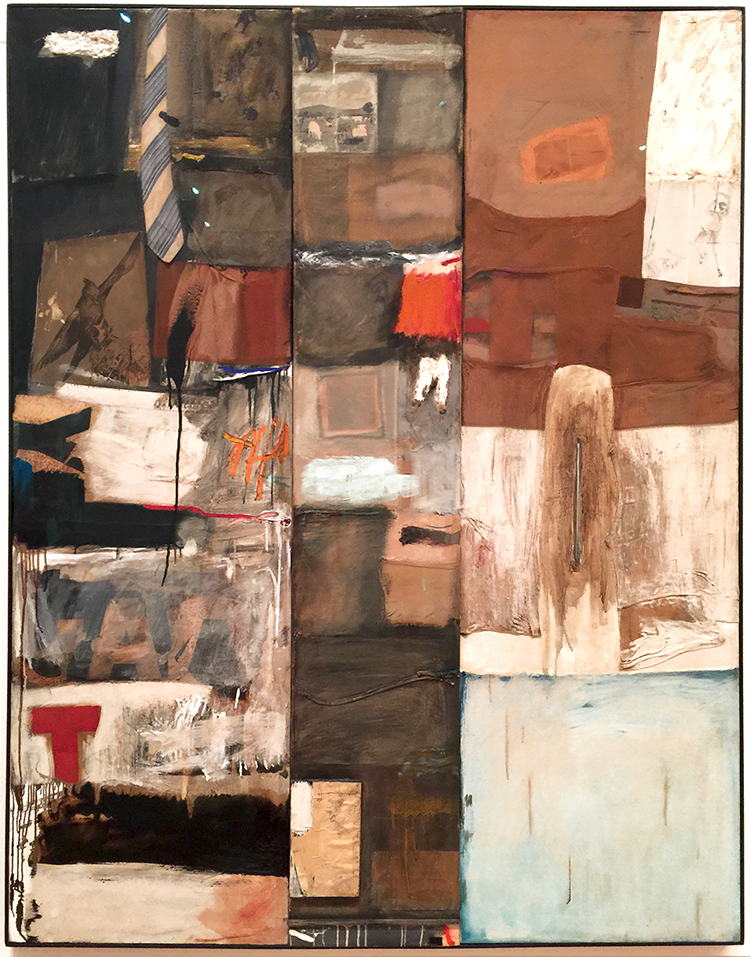
“Summerstorm” (1959) Combine: oil, graphite, paper, printed reproductions, wood, fabric, necktie, and metal zipper on canvas
I loved going to this exhibition with Natalya as she uses a lot of plastic and fabric in her artwork she was looking at all pieces in different ways then I did – and pointed out that the tie was not attached, she wondered if it was meant to be to flap in the wind – and once we saw a tie in this Combine – we saw ties in Rauschenberg’s work everywhere :)
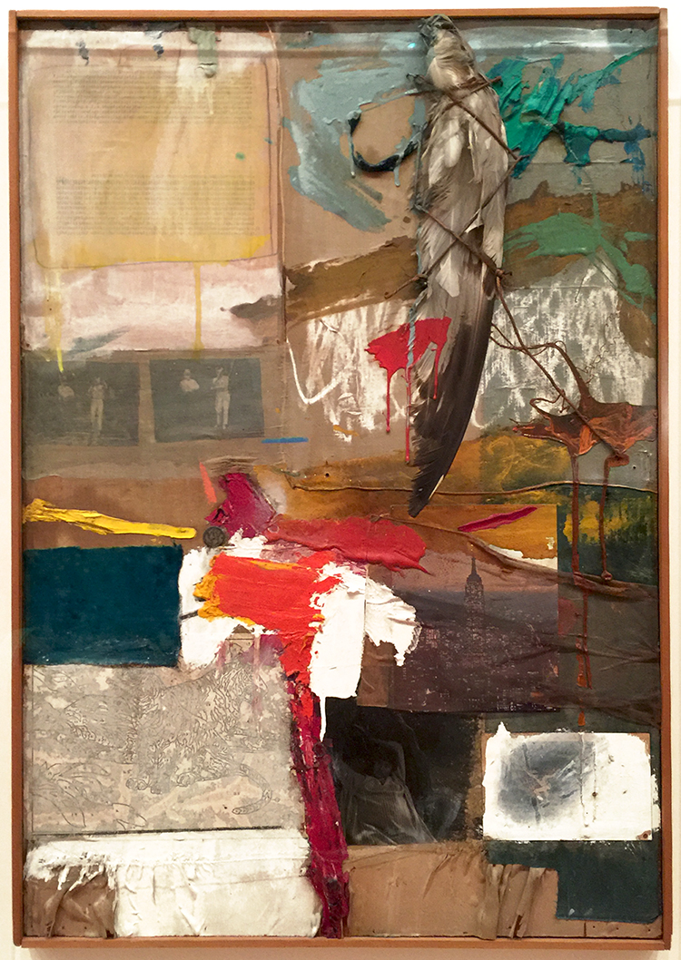
“Painting with Grey Wing” (1959), Combine: oil, printed reproductions, unpainted paint-by-number board, typed print on paper, photographs, fabric, stuffed bird wing, and dime on canvas
This was one of my favorite pieces in the exhibition.
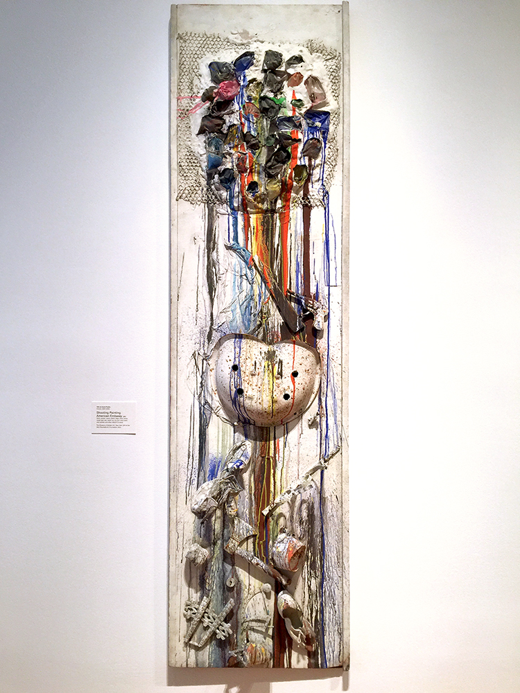
Niki de Saint Phalle “Shooting Painting American Embassy” 1961, Paint plaster, wood, plastic bags, shoe, twine, metal seat, axe, metal can, toy gun, wire mesh, shot pellets and other objects on wood.

“Each of the colours appears to have dripped down the canvas from a hole, which exposes a dark surface beneath the white. Saint Phalle made this work by shooting with a gun at bags of paint that were placed on the canvas. Before the shooting began, the surface was covered with white plaster and pigment to resemble a blank canvas. As the shooting commenced, the bags would be punctured and the coloured paints released to flow and splash.” The piece is part of a series and in which artist would shoot at the pieces as a performance. Robert Rauschenberg as well as Jasper Johns took aim at this painting.
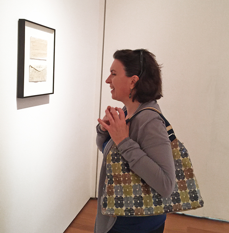
And what is Natalya laughing about here? At a framed letter and the work is called “This Is a Portrait of Iris Clert if I Say So” (1961) Telegram

This telegram was Rauschenberg’s submission to a show of portraits of the Parisian gallerist Iris Clert in 1961. Rauschenberg realized about two works before the show, that he forgot to make the work. And so…he made a conceptual portrait via telegram sending it to Iris Clert, one whose maker shifts depending on the “I” who reads it. – CLEVER guy- LOL. I guess he got away with it ;)

Now there was so much more in the Art Stroll and since I am such a big fan of Rauschenberg I decided to show it in two parts- so another one on this is coming in a week. Hope you enjoyed the Art Stroll so far. If you are anywhere close to NYC go and see this exhibition – seriously! It is open until September 17, 2017.

Comments (2)

  • Sue Clarke

    |

    I of course like “Sue” and have used that paper for flowers and shells but not people (too small).
    I love the story of the quilt. LOL

    Reply

    • nathalie-kalbach

      |

      LOL- of course Sue ;) Oh how cool you used it before- I want to – I need to get this. Yeah the story of the quilt was hilarious – there were several of those stories that made me really laugh -he must have been such a funny- also the good kind of prankster :)

      Reply

Leave a comment

Art Stroll: Whitney Biennal 2017

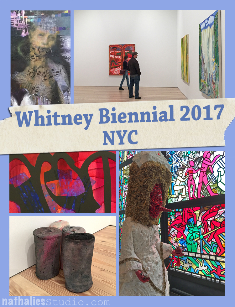
The 2017 Whitney Biennal, the 28th installment of a survey of American art, features sixty-three individuals and collectives with various art styles. This Biennal has been highly controversial and after much consideration I decided to not show any of the most controversial pieces …simply because I haven’t made up my mind about them myself and it is really complicated. All I can say is that the work in question in the article I linked up to made me sick to the stomach. So I keep this Art Stroll more on the inspirational and fluffy side.

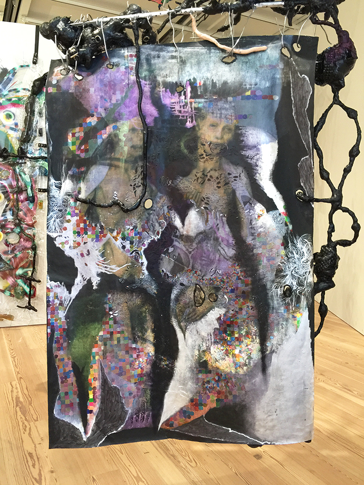
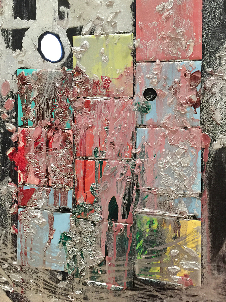
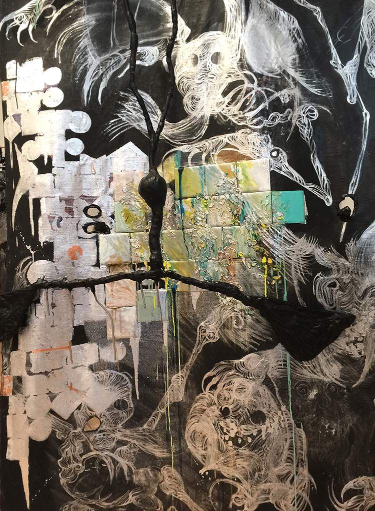
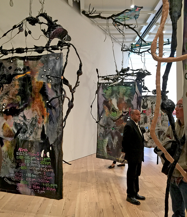
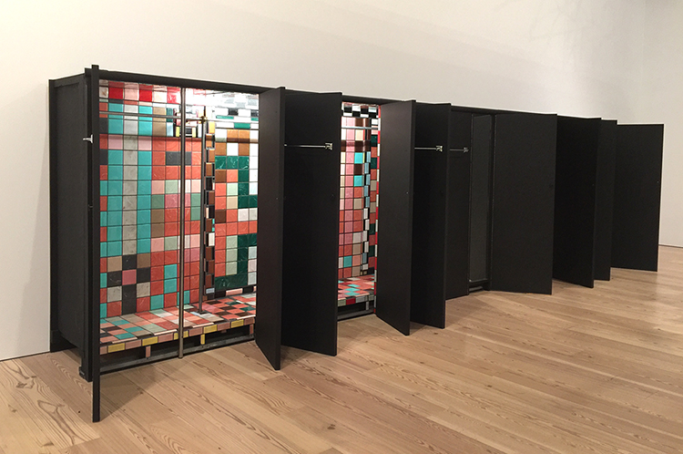
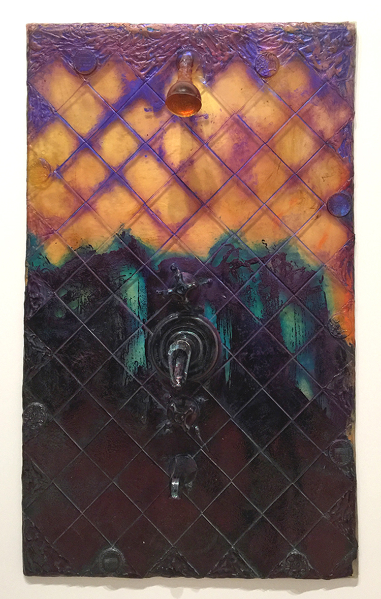
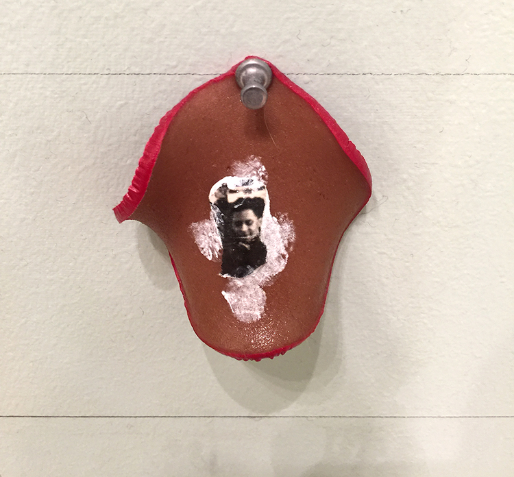
These wall hangings and sculptures by collaborative duo KAYA, painter Kerstin Brätsch and sculptor Debo Eilers are made of of melted plastic, leather straps, oversized grommets, paint and stainless-steel towel bars.

I liked the connection of sculptural and painterly work and the mix of materials.

I found them intriguing even if some people called those wall hangings a hot mess.

The cabinet above was also by them – it reminds me of lockers in a gym as well as a swimming pool at the same time. Also the piece below- which I assume is made with resin .


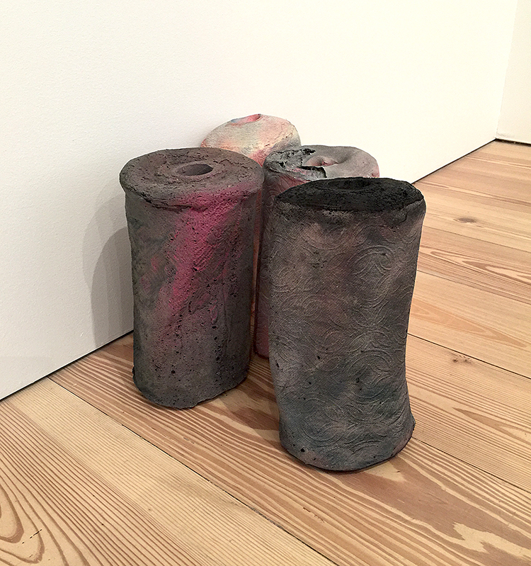
Kaari Upson …yep these are paper roll towels. Kaari turns stained paper towel rolls and upholstered furniture with the help of urethane, pigment and aluminum into lush sculptures.

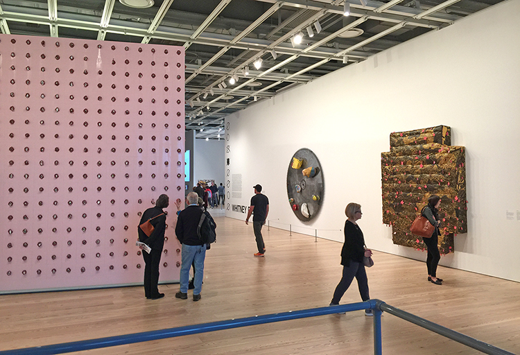
OK- I lied- not all inspirational – LOL- this one on the left was just weird and gross and I don’t care if that makes me an idiot. This installation by Pope.L’s with 2,755 slices of bologna with a photo pinned to its walls – I didn’t get the whole thing – the explanation with the artwork revealed at the same time as being done using “made up data”. What’s the point?

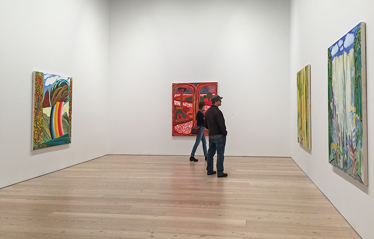
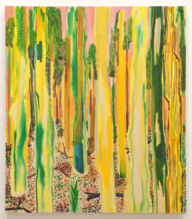
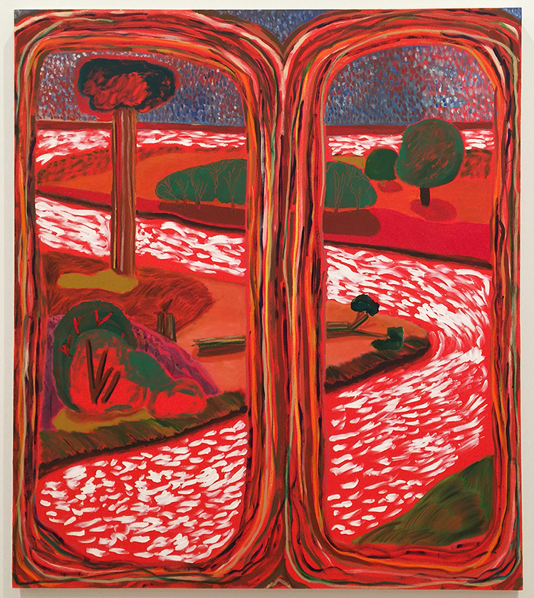
OK- now …back to inspiration …The paintings in the gallery below are by Sarah Hughes.

Most of the paintings are done with oil, acrylics, enamel and dye. I love the vibrant colors!

The next group of paintings are by Carrie Moyer.

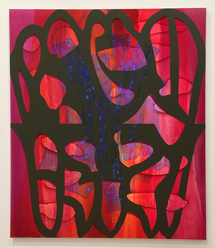
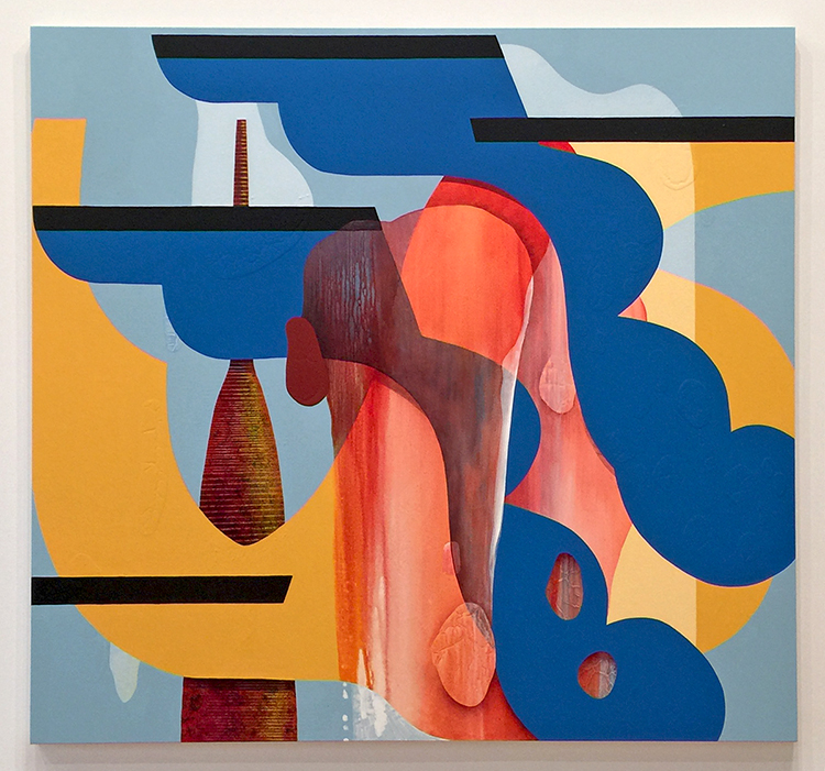
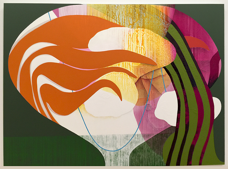
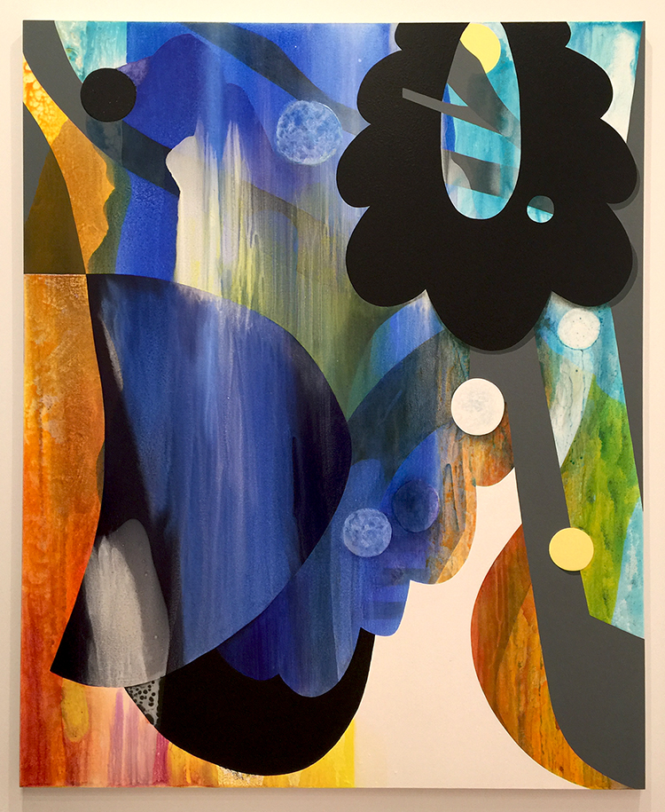
She begins a painting often by creating small collages from cut paper, pours acrylic  and then mixes in glitter.

I loved the texture and colors and shapes

Definitely one of my favorite artworks of the show.

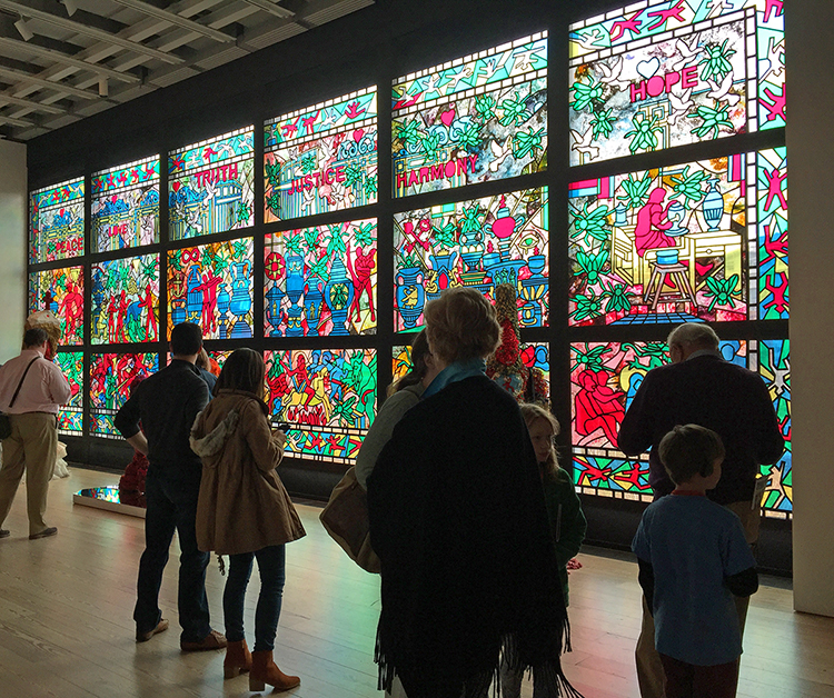
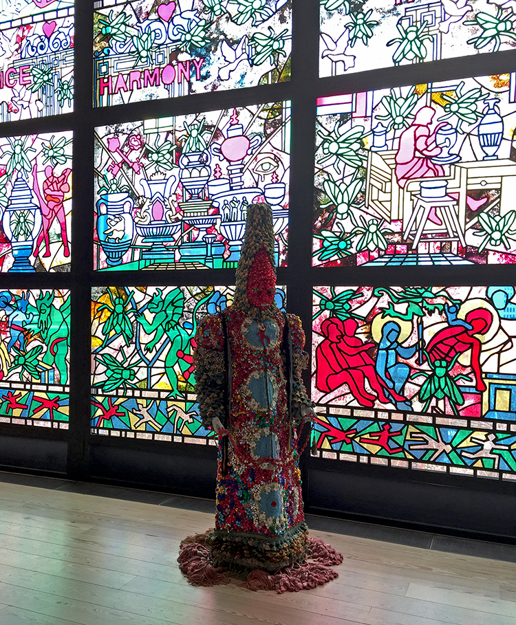
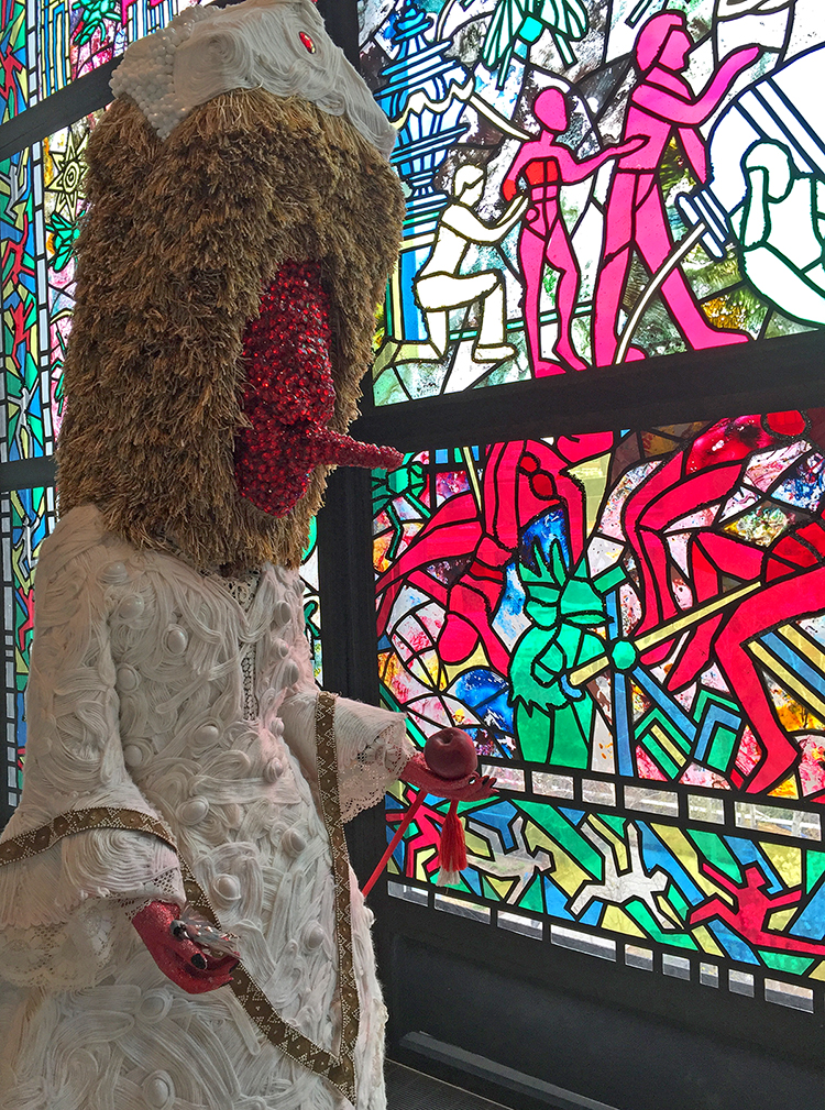
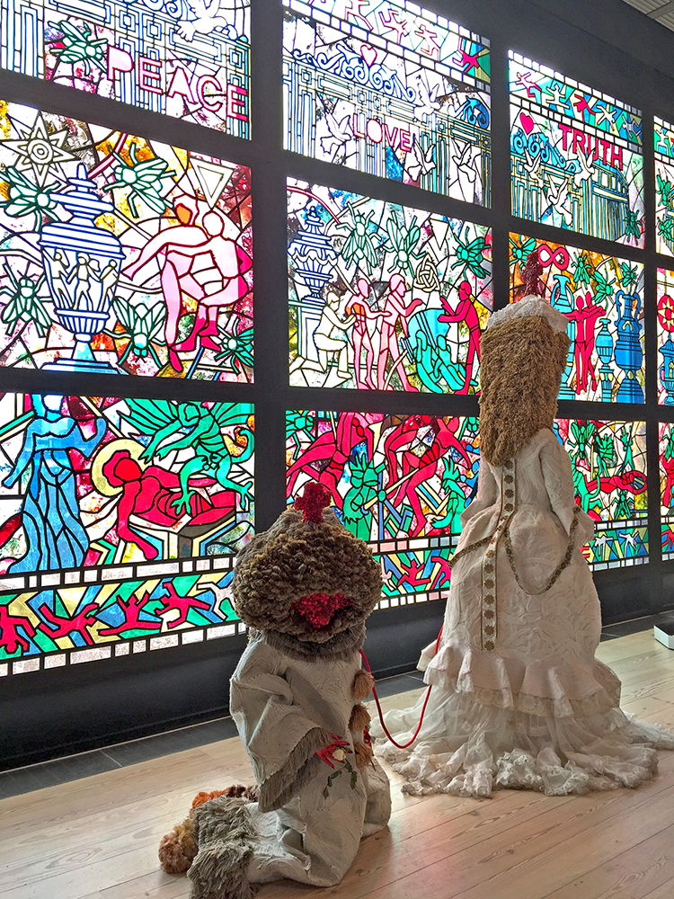
The window and sculptures in this room are by Raul de Nieves

For this site-specific wok de Nievies covered the windows with “stained glass” panels which he created using paper, wood, glue tape beads and acetate sheets.

The sculptures are based on shoes …and amazingly beaded and and put together.

It was weird and beautiful.

That was it …. a very soft art stroll of an exhibition that was filled with controversial discussions and artwork which I did not show here. If you are going…you will be seeing a lot of different things and if you went, I would love to hear your thoughts.

Comments (2)

  • Sue Clarke

    |

    As I look at some of those wall hangings it occurs to me that I tend to look more deeply at art that disturbs me (that I’m not drawn to since it’s pretty and in “my” color schemes). These photos fit the bill. Disturbing art brings about some great discussions. TFS Nat.

    Reply

    • nathalie-kalbach

      |

      Sue, I agree, that art that is unusual or disturbing invites for a longer dialogue with the viewer. Unless it is smelly bologna slices …then that is just gross and makes you run- LOL.

      Reply

Leave a comment

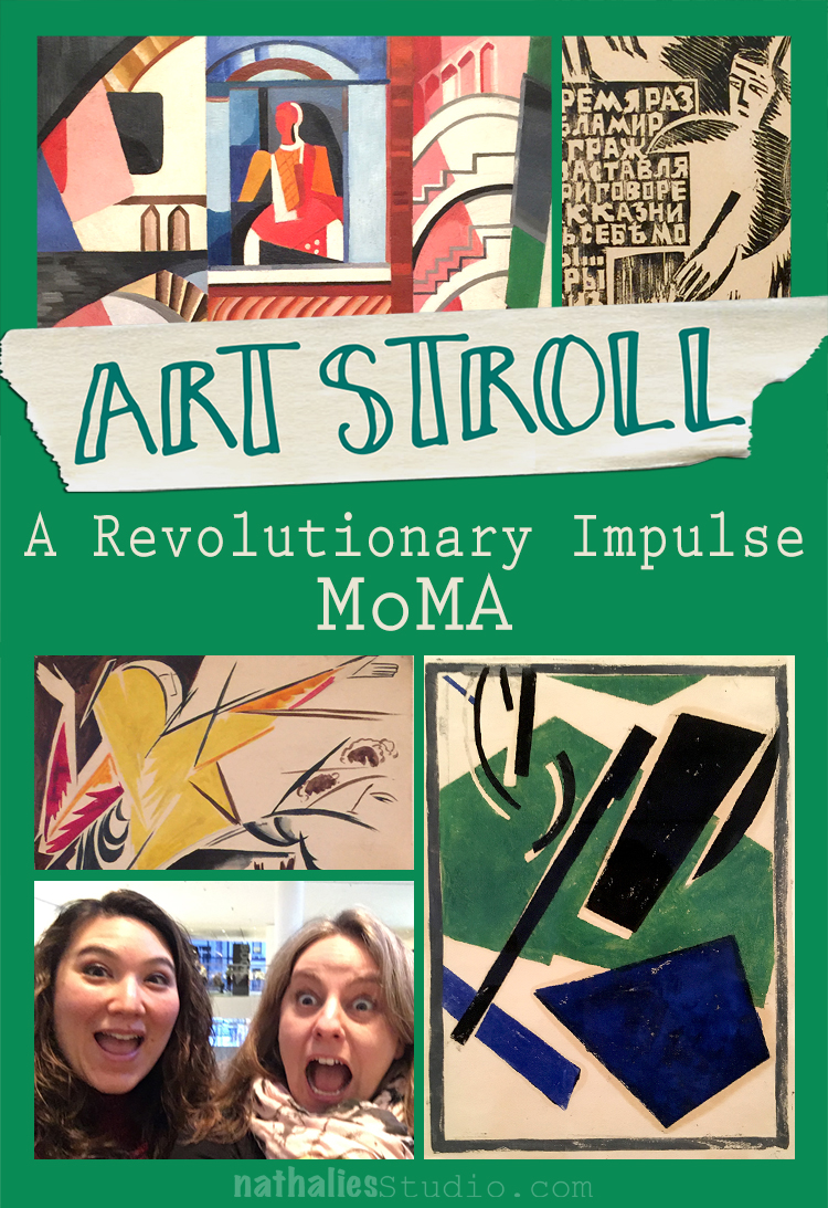
Art Stroll: A Revolutionary Impulse – MoMA

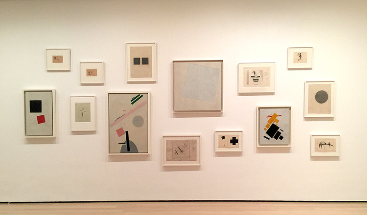
A couple weeks ago my friend Julie Fei -Fan Balzer was in town and we had an awesome day filled with good food, chats, laughter and of course…Art. We went to MoMA to see A Revolutionary Impulse – The Rise of the Russian Avant-Garde – a title that couldn’t make it in it’s entirety into my blog title- LOL.

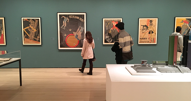
“During the early 1910’s under the tsarist autocracy (in Russia) that had ruled for three centuries, avant-garde artists sought to overthrow entrenched academic conventions by experimenting with complex ideas that would transform the course of modernist visual culture. In 1915 as World War I raged, an abstract mode of painting called Suprematism abandoned all concrete pictorial references….With the October Revolution of 1917, Lenin’s party took command. Avant-Garde artists put individual expression aside and developed a structured abstract language called Constructivism which they hoped could be embraced by the masses. Constructivists rejected easel painting in favor of practical objects like ceramics, posters and logos. …By the late 1920s, the government, now headed by Stalin, had placed restrictions on all aspects of life, including the arts, and was commissioning artists to produce propagandistic books, posters and magazines touting Soviet achievement….This exhibition spans the years 1912 to 1935…Conceived in response to changing socio-political and artistic conditions, these works probe the many ways and object can be revolutionary.” From MoMA’s wall text about the exhibition

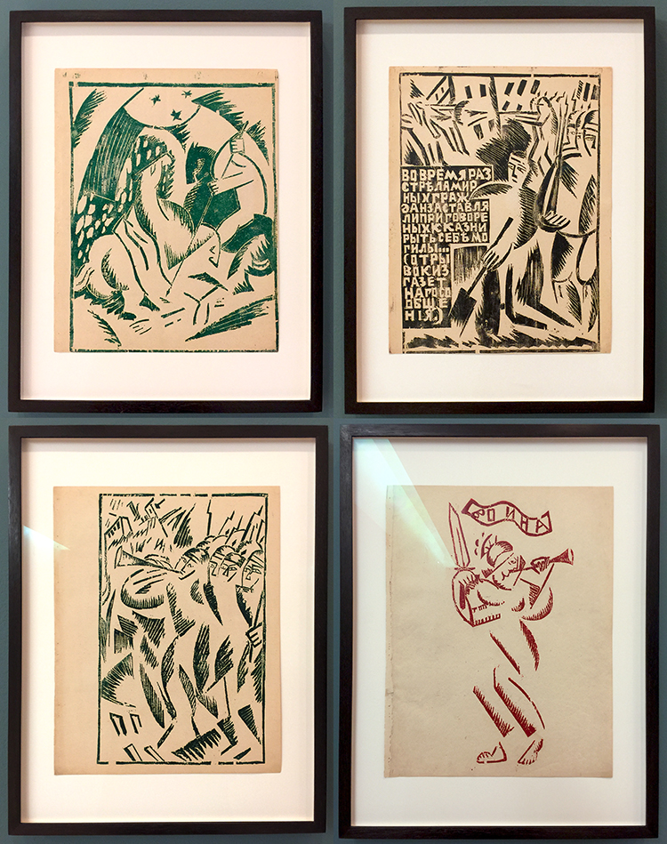
Olga Rozanova, War, 1916 – Linoleum cut illustrations out of a a book with ten illustrations.

The imagery for those lino-cuts is influenced by the abstracted forms of Cubism and Futurism but also by traditional Russian motifs. I was intrigued by the very simplistic way she created figures with crosshatching and just some hints of form here and there which your eye completes yourself as a person or else.

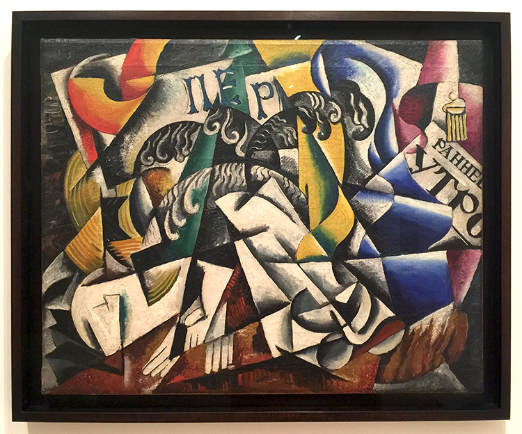
Lyubov Popova, 1914, Subject from a Dyer’s Shop – Oil on Canvas.

Note that Lyubov is another woman …

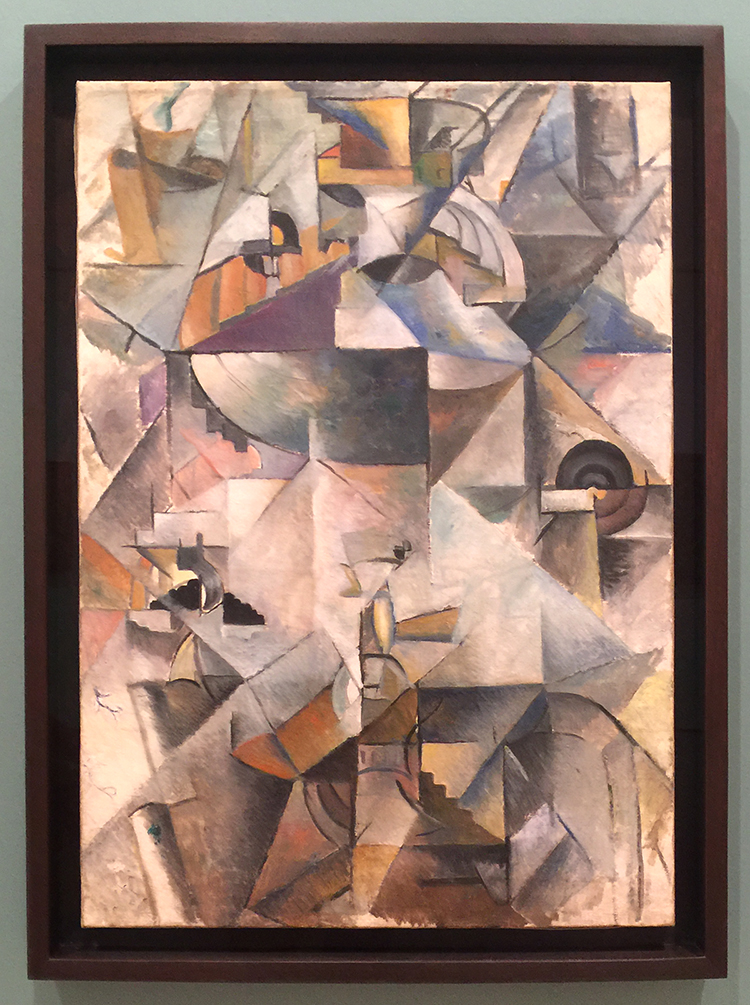
Kazimir Malevich, Samovar, 1913, Oil on Canvas. “A year later Malevich was painting cubes and lines and circles and balancing them in ways that had no relation to anything but geometry and the will to make something new. Malevich called his art “Suprematist,” hoping that it would have supremacy over forms found in nature.”

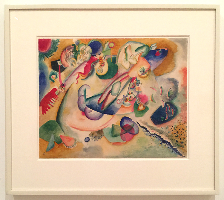
Vasily Kandinsky, Improvisation, c. 1915 – Watercolor and pencil on paper

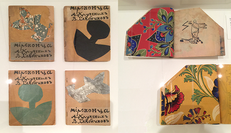
Various artist: Natalia Goncharova, Mikhail Larionov, Nikolai Rogovin, Vladimir Tatlin -Mirskontsa (Worldbackwards)-1912

These books were made with wall paper and I really love the shapes  too.

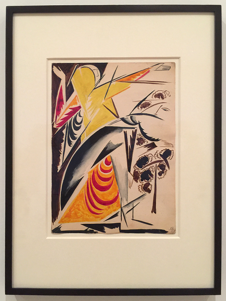
Natalia Goncharova Spanish Dancer –(c. 1914) . Isn’t this beautiful?

And then things changed…


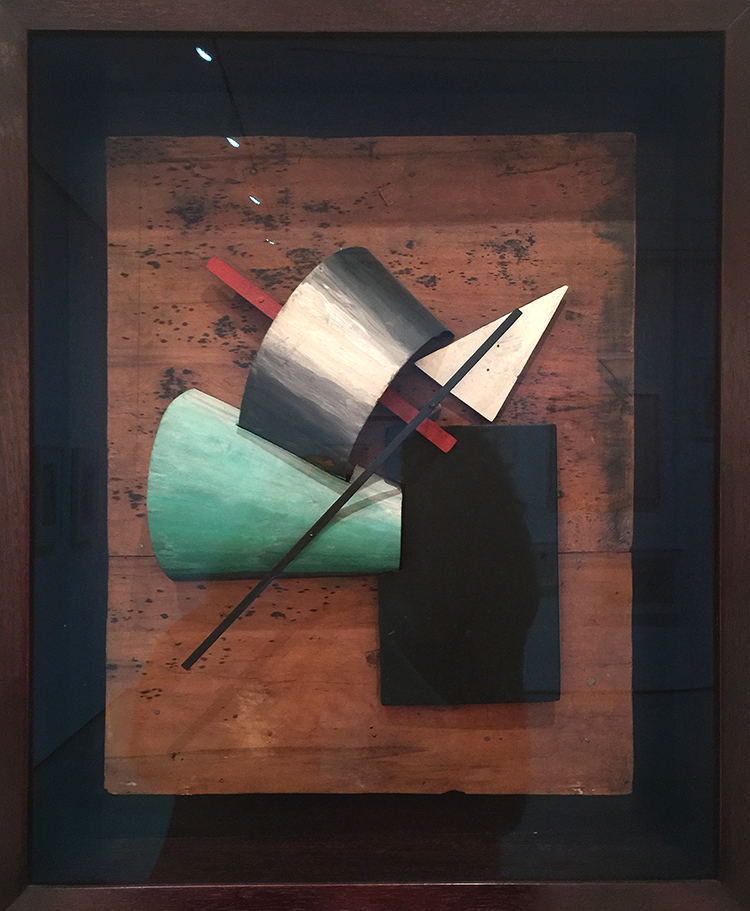
Jean Pougny, Suprematist Relief-Sculptures, 1920s – Painted wood, metal and cardboard, mounted on wood panel. I did love this one – I wish it wasn’t behind a glass

Lyubov Popova, Six Prints ca. 1917-19 – linoleum cuts with watercolor and gouache additions

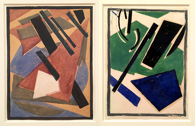
A pioneer of the avant-garde, Popova developed a style in the late 1910s that combined floating forms inspired by Cubist collage and by Suprematism. She called this print series – there are four more- “painterly architectonics” . She wanted to depict layered shapes, so that they seem to be continually shifting and rotating.

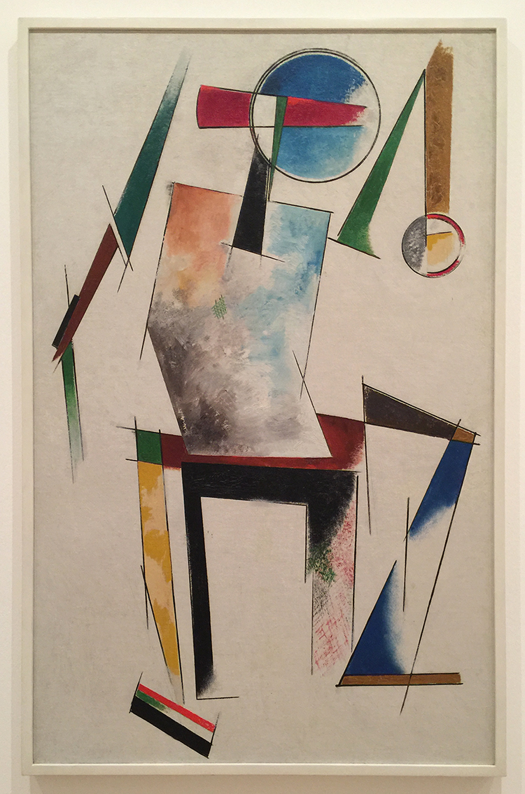
Varvara Stepanova, Figure, 1921 – This is in MoMA’s permanent collection and I always loved this one. BTW …another woman :)

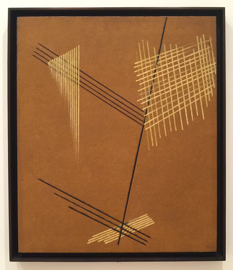
Aleksandr Rodchenko, Non-Objective-Painting 1919, Oil on Canvas


I love the crosshatching and the expanding lines.

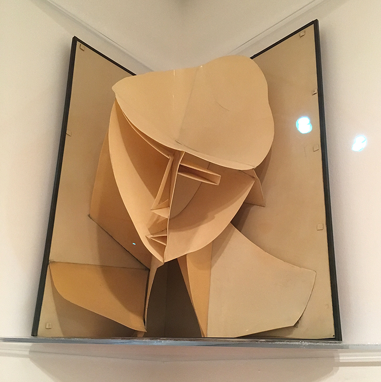
Naum Gabo, Head of a Woman, 1917-20 – Celluloid and Metal

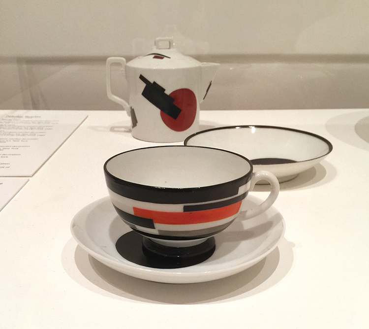
Nikolai Suetin – 1923

In 1917 the Bolsheviks seized control of the government and took over the State Porcelain Factory which used to manufacture porcelain for tsars in Petrograd (now St. Petersburg). Suetin a Suprematist artist was invited to make decorative designs for existing porcelain found in the factory. These ceramics, once meant for imperial tables, were now reimagined for the proletariat.

I would totally wanna have this set and use it – and I find it so interesting how the forms and shapes painted on canvas speak so much more to me on this tea set.

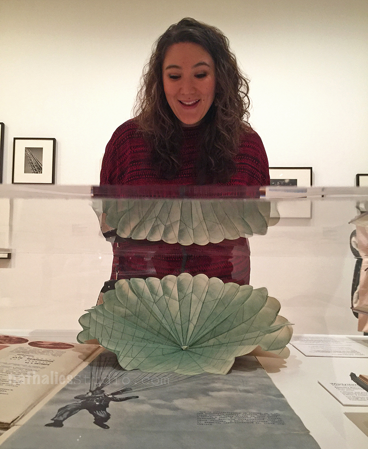
How cool is this pop-up parachute ? The reflection of it is also a bit funny – guess I made Julie a new outfit ;)

I enjoyed this exhibition. The most eye catching fact for me was just how many women were in this exhibition since modern women artists are very underrepresented at MoMA. I regret that the exhibition is coming to an end, as I feel there is so much about this that I didn’t quite grasp and I more or less just floated around in this exhibition with a semi knowledge of the political time the art was created in Russia and a lacking mind for the ideas behind Suprematism and Constructivism. But you know what…I will be ok …I was still inspired ;)

Comments (2)

  • Sue Clarke

    |

    That tea set is great and Julie’s new outfit is interesting. Glad to see that you two had fun with art again!

    Reply

Leave a comment

Art Stroll: Matisse and American Art at MAM

A couple weeks ago my friend Heather pinged me on a Sunday morning and said “Hey, I need to see art today – let’s go to a museum”. I had seen a news report on the exhibition “Matisse and American Art” at the Montclair Art Museum and since I use Matisse as an inspiration for my classes sometimes, I convinced her to go there with me. It was soooo worth it!

The exhibition strives to explore Henri Matisse’s influence on American Artists from 1905 to the present. The list of profilic artists inspired and influenced by his work is immense and the exhibition showed in an interesting way how some artists explored some of his work  for a while and some of them took it even further and let it immerse into their own style.

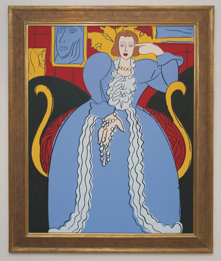
Andy Warhol – Woman in Blue (After Matisse), 1985, synthetic polymer paint and silkscreen inks on canvas.

This painting by Warhol was directly inspired by the Woman in Blue by Matisse from 1937 and even though it is pretty much copied from Matisse down to the colors red, yellow, blue, black, and white, you can see the flatness of the painting so typical for Warhols techniques and the hand holding the necklace says Warhol to me.

Morton Livingston Schamberg- Studio of a Girl, ca. 1912 – Oil on Canvas

Schamberg traveled extensively in Europe and he must have seen many Matisse paintings during his time there. The paining reminds of Matisse’s painting Painting of Madame Matisse. The Green Line.

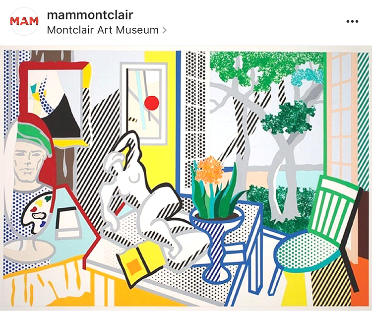
Roy Lichtenstein – Bellagio Hotel Mural: Still Life with Reclining Nude (Study), 1997 cut -and pasted, painted and printed paper on board.

Roy Lichtenstein had a longtime interest in Matisse and Picasso and many references to their artwork can be seen in his work like the simplification of form or direct references of elements in Matisse’s paintings. In this painting parts of his studio, the open window, the patterns.

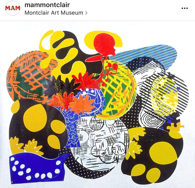
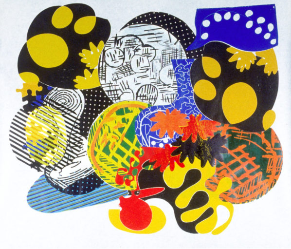
Judy Pfaff – Six of One-Melone, 1987 – Color Woodcut

In her installations, prints and sculpture, Pfaff translates Al Held and Henri Matisse’s theories of color into her own visual language. Pfaff says that Matisse gave her “courage” and has been ” the source of how to teach and how to see”.

On a little side note: Heather and I saw this woodcut different than in the image above. It was hung upside down from what you see here and we remember this so well because Heather actually had a very strong reaction of dislike to the artwork and we stood in front of it discussing why. When we later talked about the exhibition and this piece with our friends we opened the exhibition catalogue to discover that it was displayed as above, and further research had me find it is also displayed differently on the artist website as well as on the MAM instagram account (I used their image above) . Heather like different display in the catalogue also way better than how we actually saw it.  So this haunted me for days and finally I wrote MAM and asked if there is a reason for hanging it the other way (artist instruction that it can be hung any way) or if this was an overseen mistake by the technical staff who hung the artwork. And here is their answer:

“Thank you for writing to the Montclair Art Museum. We had been in conversation with the artist about this issue since the exhibition installation, and have just now heard back. The image used in the catalogue and online was provided by and checked by Crown Point Press; when unpacked the artist’s signature placement indicated that it instead by installed as you saw it. Judy Pfaff has now confirmed that the way the artwork is hung is correct, and you’ll find that all publicity and use of the image going forward will be corrected.”

And so apparently the way we saw it as below – is the right way (btw- it is now changed on the Artist website as well) :)

Now which way does speak more to you? I actually liked it the “wrong” way in the catalogue and instagram page better than the way it is hung and apparently now supposed to be hung. the shapes feel more organically and right – and the forms are more balanced for me in the top version. But hey ….who argues with the artist. But I thought this was interesting.


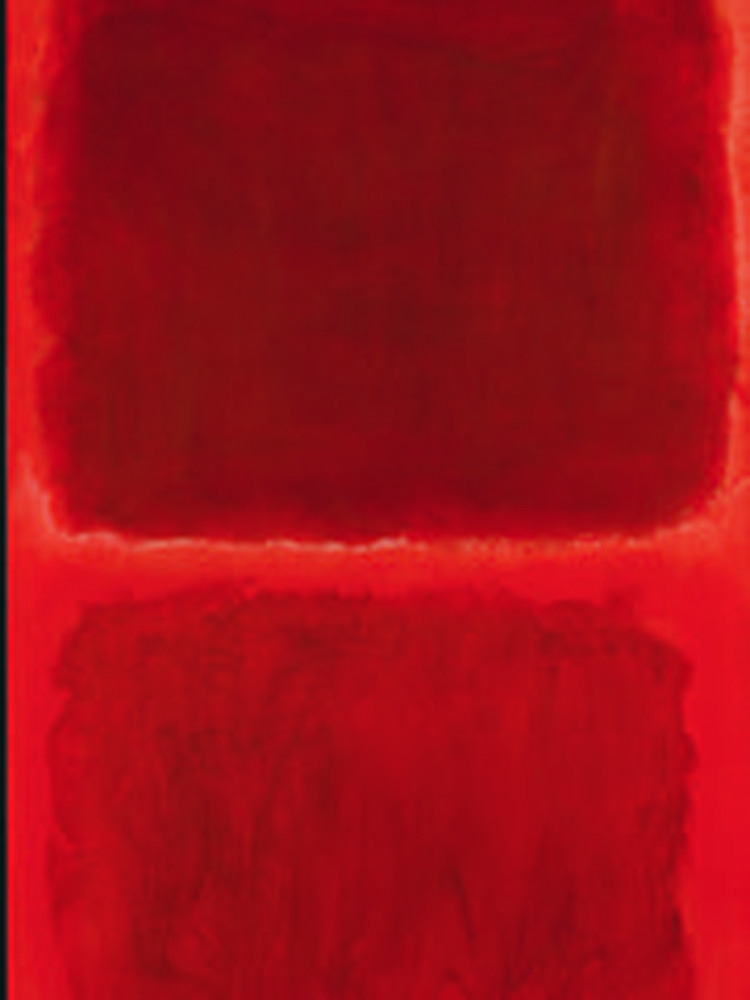
Mark Rothko, No. 44 (Two Darks in Red), 1955 – Oil on Canvas

Mark Rothko called Matisse “the greatest revolutionary in modern art”. Rothko studied Matisse’s The Red Studio (1911) after MoMA had acquired it in 1949. He went to the museum and every day for several months just to stand in front of the picture. While viewing the painting he said ” You became that color, you became totally saturated with it as if it were music” .

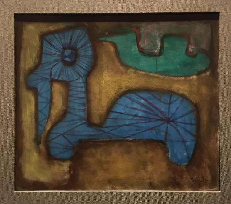
William Baziotes, Toy Animal – 1947 – Oil on Canvas.

Baziotes was so inspired by his visit to the Matisse retrospective at MoMA in 1931 that he resolved to move to New York to study art. Baziotes’ basic shapes and luminous color recall many of the plant and human forms that populate Matisse’s work.

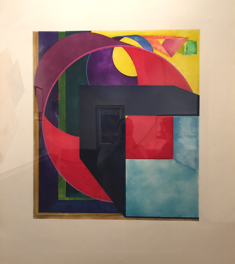
Al Held – The Space between the Two – 1992 – print

Al Held studied and used Matisse’s ideas about color, form, structure and scale.

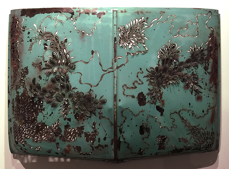
Denice Bizot, Urban Flora, 2014 – 1960s Chevrolet truck hood cut with plasma torch

Bizot’s organic shapes are reminscent of Matisse’s paper collage cut- outs of the late 1940s and early 1950s.

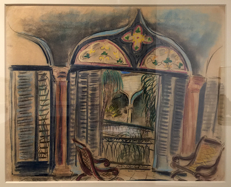
Doris rosenthal, Gran Terrazo, ca. 1920-1922 -Pastel on Paper

This painting shows Rosenthal embracing Matisse’s vibrant color and idyllic subject matter. Matisse often used windows as a vehicle for exploration into color, light and interior versus exterior space.

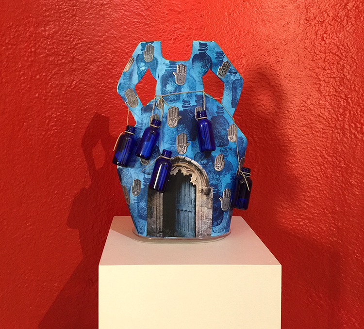
Janet Taylor Pickett, Indigo Bottle Dress – Charms and Inspirations – Acrylic, digital photograph, glass bottles with written messages and twine on shaped Arches Paper.

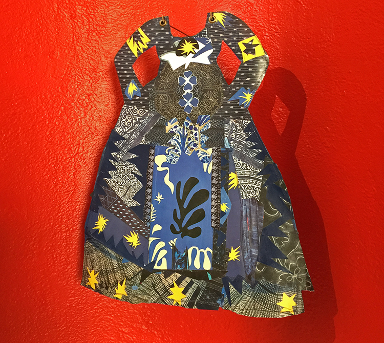
Picket’s creative conversation with Matisse spans her entire  career.

Janet Taylor Picket, Dressing in Context 2, 2015  – Collage of various papers, thread and acrylic on Arches paper with grommets.

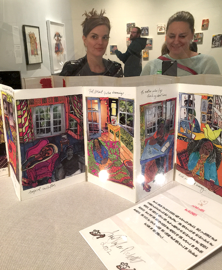
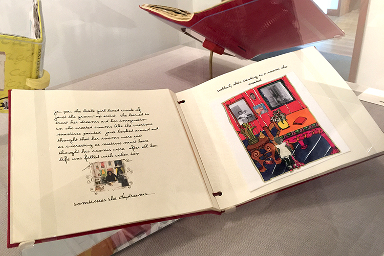
Janet Taylor Pickett, Me & Matisse, 2003 -04 – Handmade book

In this book, Taylor Pickett’s aspirations to become an artist are combined with her travels abroad to France and her longing for home, which she characterizes as “a metaphor, an idea for finding my voice as an artist”.

As you might imagine the books made me swoon and I want to do something like this !

It was an amazing and inspiring exhibition. I loved seeing all the different ways how other artists were inspired- and still are inspired by Matisse . I came home from the exhibition totally recharged and explored different – Matisse-inspired- things in my studio for several days.  It made me yet again so aware of our differences and our connections – magical! I was also surprised what a wonderful Museum this is and what a huge amount of artwork from even more than the shown well known artists (couldn’t show all) like Stuart Davis, Milton Avery, Richard Diebenkorn, Helen Frankenthaler, Hans Hoffman, Robert Motherwell and many more the museum was able to show for this exhibition. I for sure have this museum on my list and if you are in the New Jersey area- check out this exhibition which is still on view until June 18, 2017.
I hope you enjoyed this little Art Stroll and found some inspiration in it!

Comments (6)

  • Sue Clarke

    |

    Indigo bottle dress is super cool and I would love to have it in my bedroom.
    As to Judy Pfaff’s – Six of One-Melone I do not like it hung the “correct” way…seems off to me.
    Funny how that works.
    I always enjoy strolling with you Nat.

    Reply

    • nathalie-kalbach

      |

      I loved that dress too, Sue …I actually also want the red little alcove in my bedroom :) I agree with you on Six of One Melone! Have a gorgeous weekend!

      Reply

  • Jean Goza

    |

    Always enjoy your Art Strolls. Invariably I find new artists that inspire me. And Matisse has always been a favorite of mine so I enjoyed seeing other artist’s inspiration from his work. Regarding your question on Judy Pfaff’s Six of One Melone piece, I definitely like the “upside down” version better. The balance of the “correct” version feels off to me. It feels as if the larger components of the piece want to “collapse” into the small red and yellow area at the bottom. As you said, you can’t argue with the artist. It’s always fascinating to me the different emotional responses people will have to a piece of art.

    Reply

    • nathalie-kalbach

      |

      thank you Jean! Yes- I agree on the composition and how it feels better the “wrong” way. I am also fascinated that people have different emotional responses to art – sometimes certain artists use symbols or subject matters that resonate differently depending if you have the same cultural background as the artist which I find very interesting to discover with friends when going into museums.

      Reply

  • Bea

    |

    Really interesting…thanks…

    Reply

Leave a comment

Art Stroll: Francis Picabia at MoMA

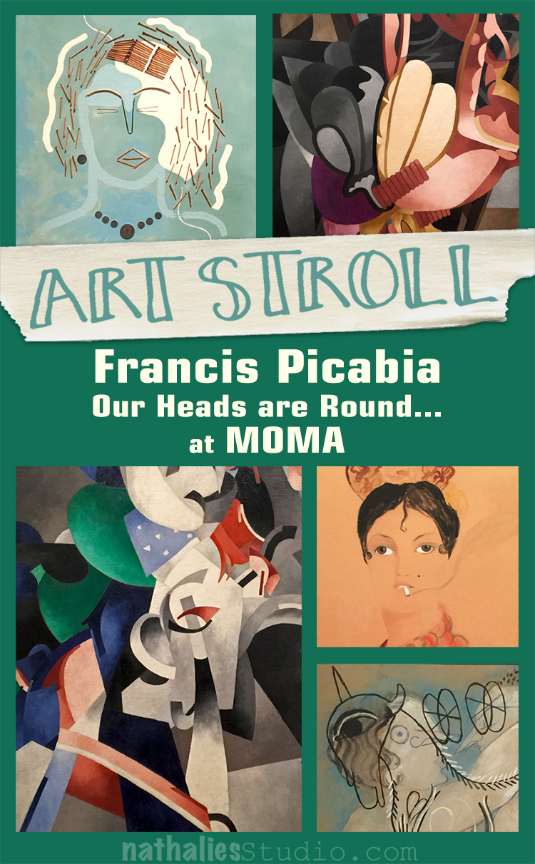
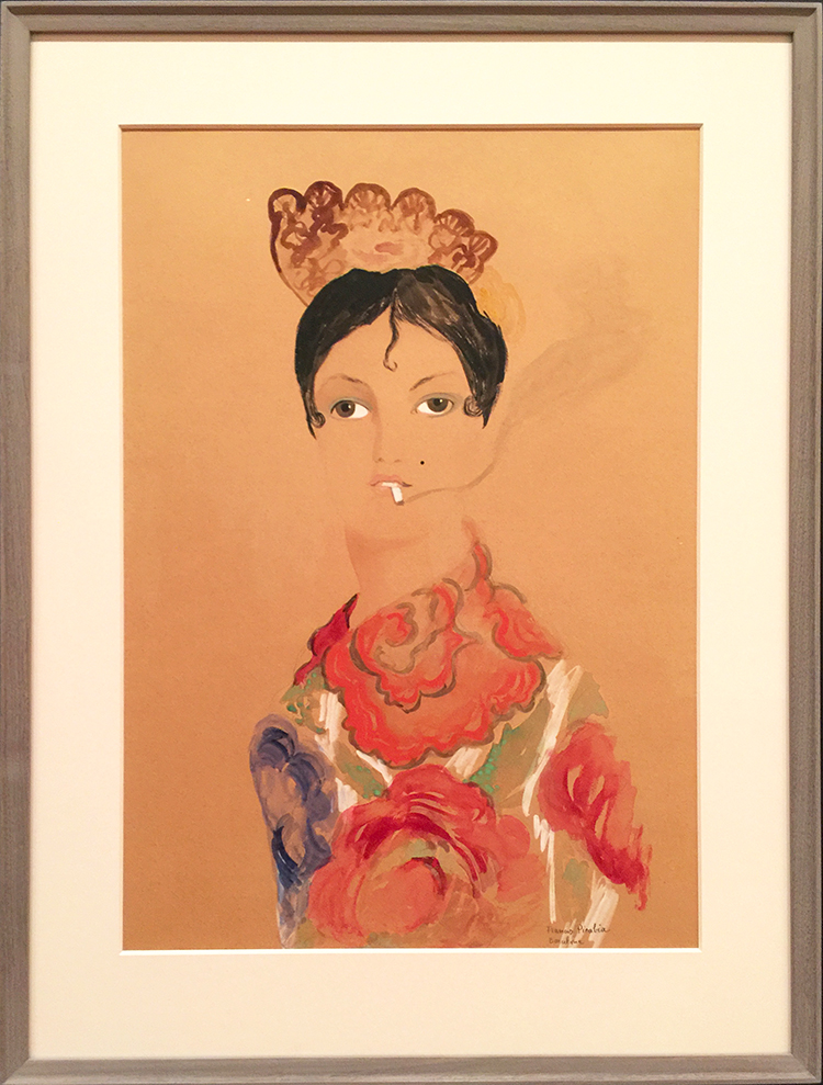
Last month I went with some of my friends to the opening of Francis Picabia “Our Heads Are Round so Our Thoughts Can Change Direction” at MoMA

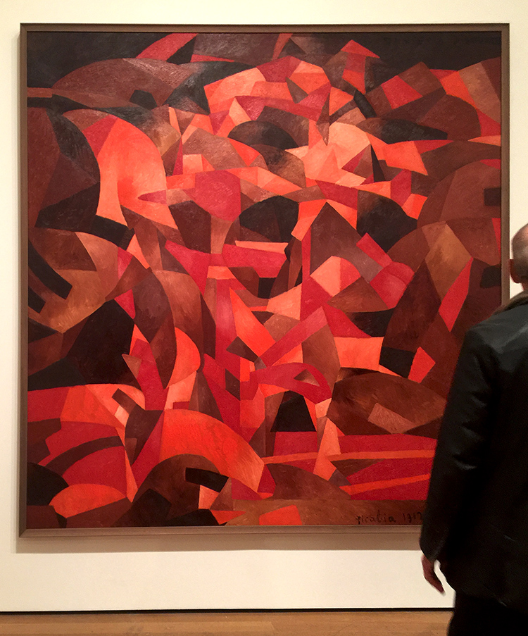
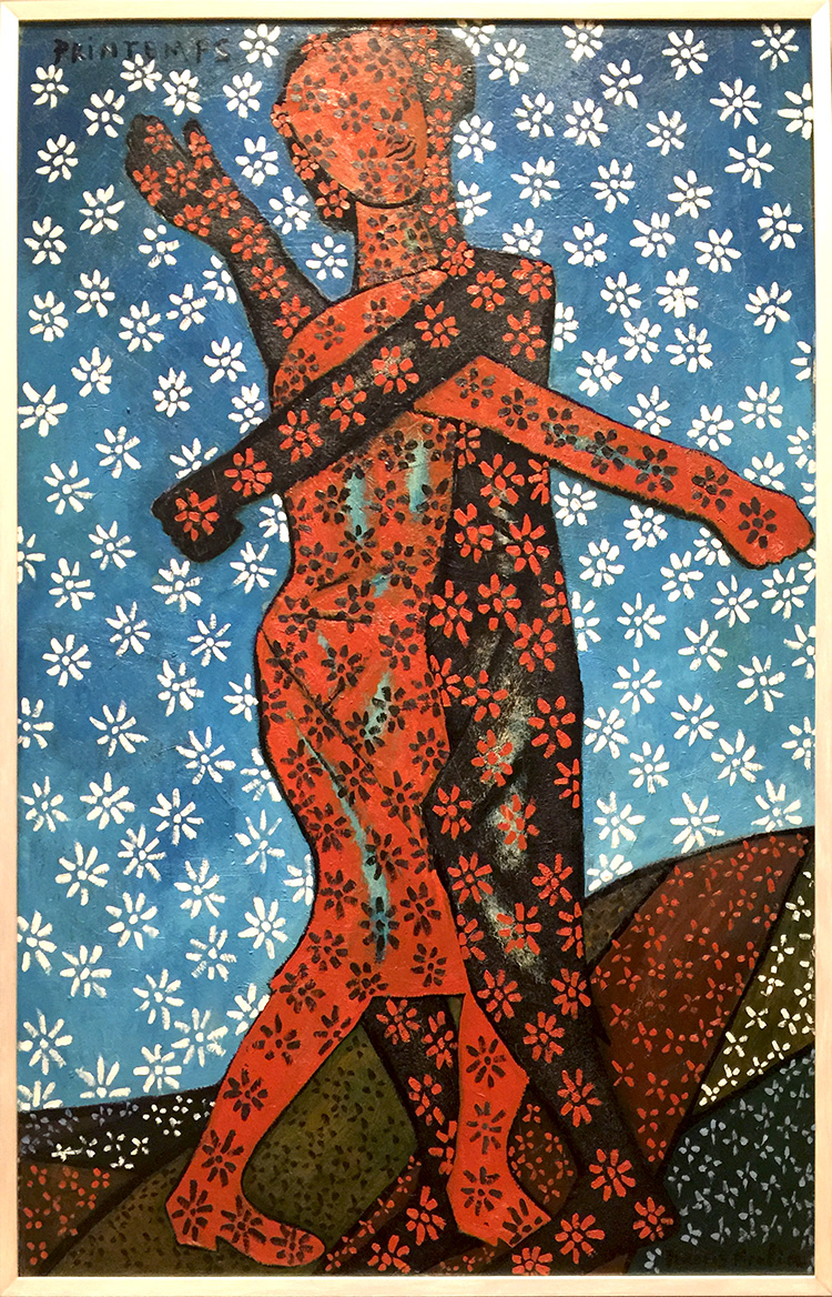
Dances at the Spring II

I had seen a couple of Picabia’s paintings before and love them a lot but to be honest, I didn’t know much of him. My friend Adam, was totally excited because he is a huge Picabia fan and told us, he was waiting for this exhibition for a long time.

I was pleasantly surprised and loved loved loved the exhibition. Every single one of the rooms in the exhibition offered something different in style and was often challenging.

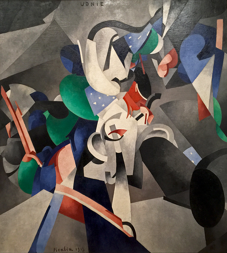
Francis Picabia, 1913, Udnie (Young American Girl, The Dance), oil on canvas

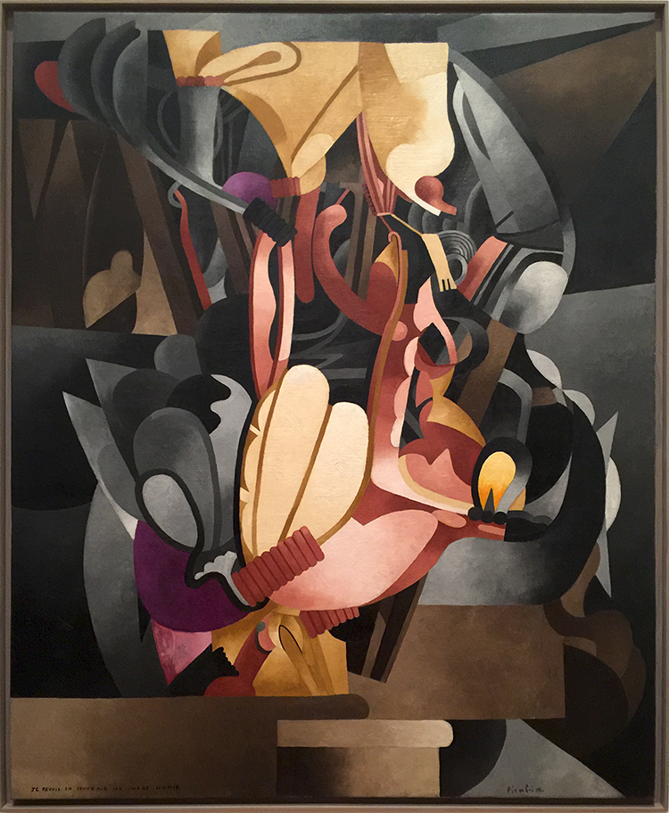
The exhibition covered Picabia’s entire career. He was born to wealth in 1879 and apparently all he did was painting…and partying. He had a lot of humor and was by many, including himself called a Prankster.

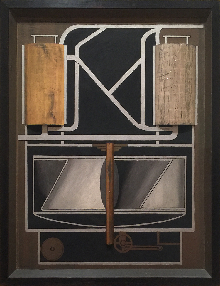
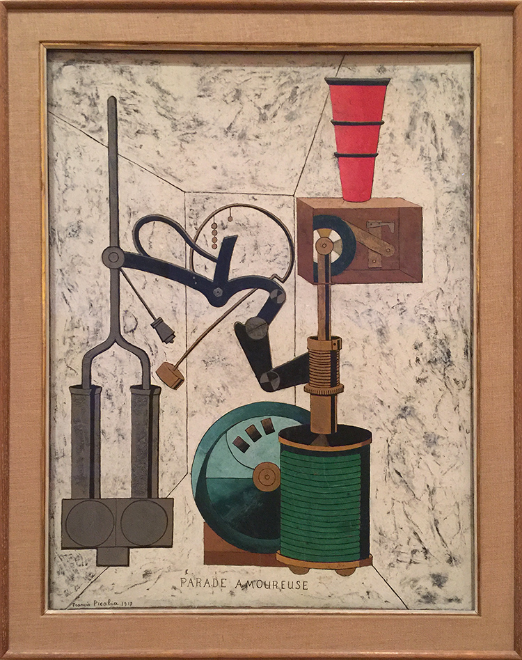
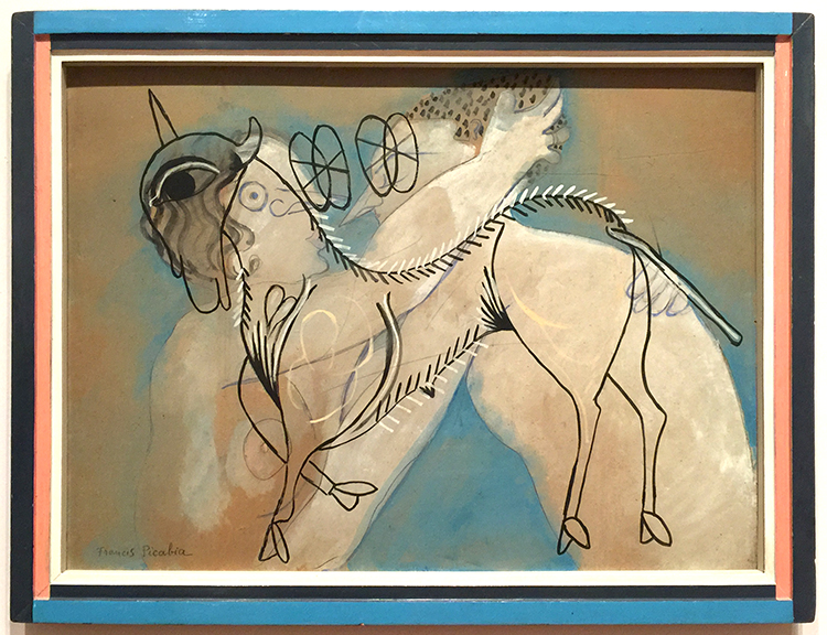
Arriving in the next room all the artwork became very industrial, mechanical and added different materials to the flat canvas. He was also a big part of the Dada-Movement.

Très rare tableau sur la terre (Very Rare Picture on the Earth) (1915) Oil and metallic paint on board, and silver and gold leaf on wood, including artist’s painted frame

Amorous Parade, Francis Picabia, 1917- Oil, gesso, metallic pigment, ink, gold leaf, pencil and crayon on board.

And then just as you got used to it …everything changes once again

and again

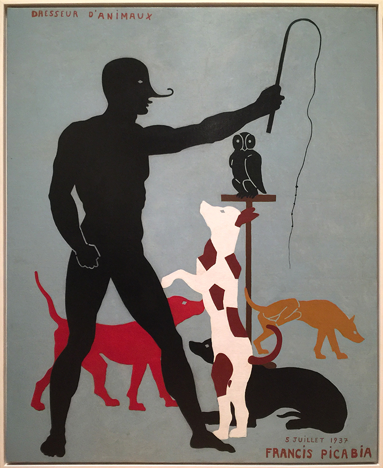
Animal Trainer, Francis Picabia

The above painting is seen as one of Picabia’s typical jokes and mocking fine craftsman ship. The hand of the figure shows prominently bridges – a typical sign of using stencils – and the dogs as well are created with the use of stencils. This was frowned upon on when he painted this – which was in 1923 and not as he also placed as a joke onto the canvas in 1937. Also check out what the yellow dog is doing in the background.
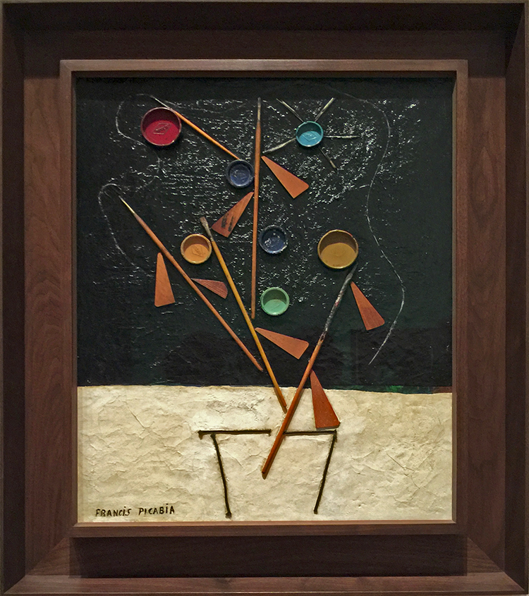
I loved his playful use of unusual materials in the next gallery -like matches and canvas wedges, brushes, coins. It’s been all done before – it is fun – it is humorous and amazing.
Flowerpot , Francis Picabia, 1924-25. Enamel paint, Ripolin paint-can lids, brushes, wooden stretcher wedges, string and quill toothpicks on canvas.

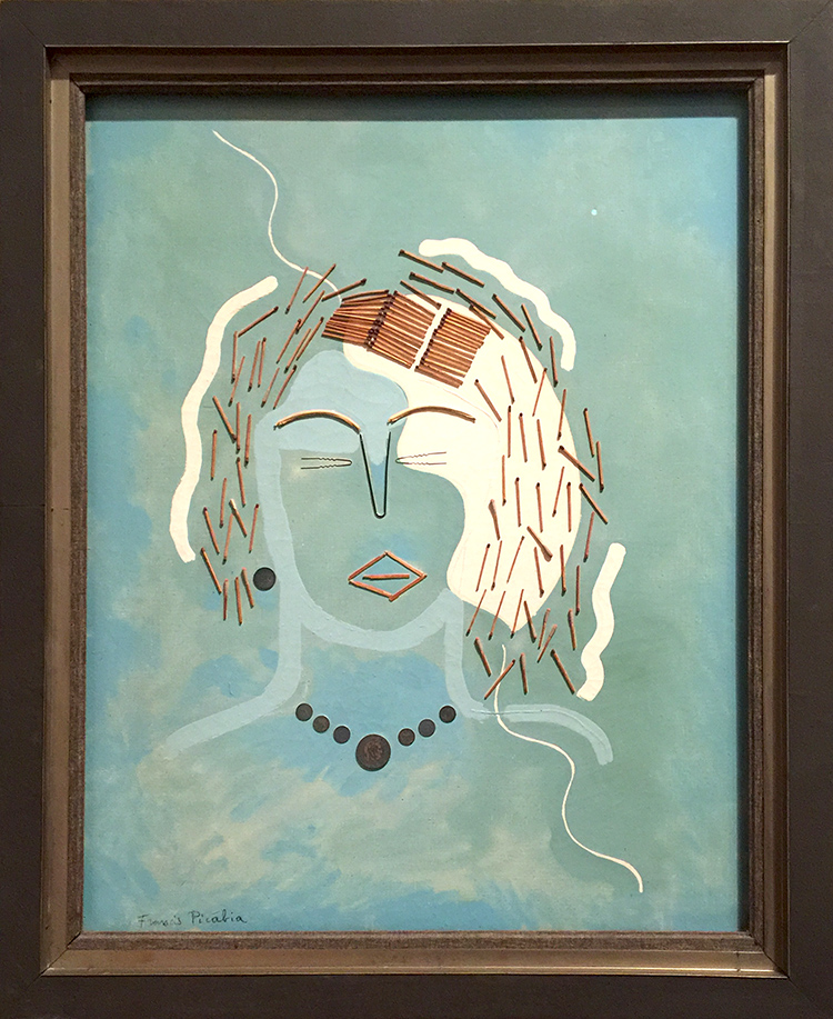
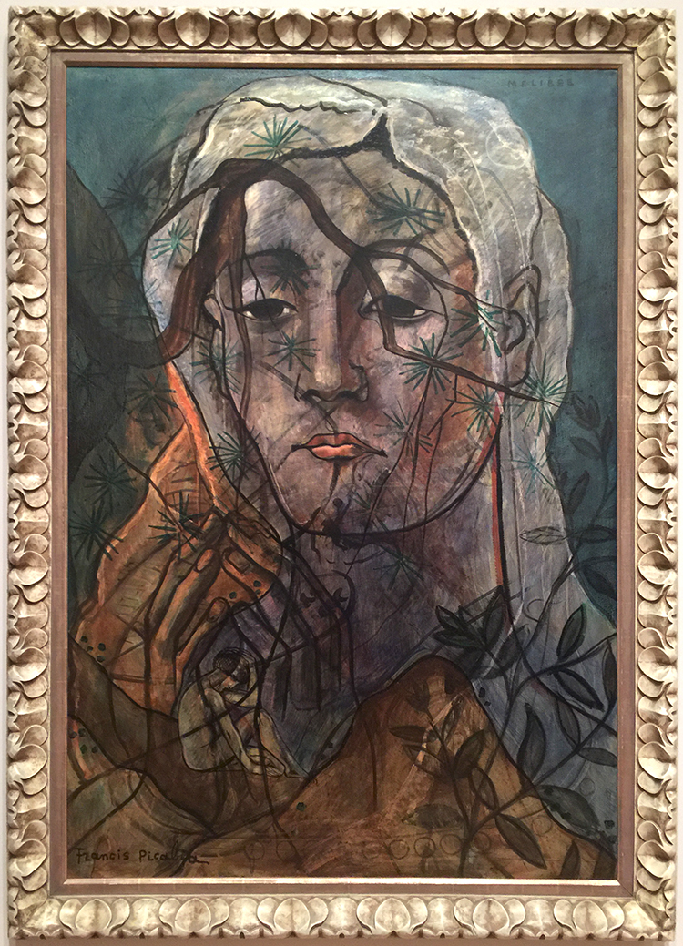
One gallery was dedicated to his Transparencies 1927 – 1930. I also loved all the different frames- a topic I have talked about in many other posts . They are probably still original because museums weren’t that interested in his artwork up and until the 50s – and so fortunately they did not get destroyed to go with the “museum style frames”

Working in his large new studio in Mougins, Picabia painted his Transparencies by alternating layers of paint with layers of resinous varnish. This process allowed him to lay linear motifs atop one another while keeping them distinct. These richly layered, multi referential compositions interweave an often dizzying array of con tour images drawn from such diverse sources s Renaissance painting, Catalan frescoes, and the popular culture of the day.


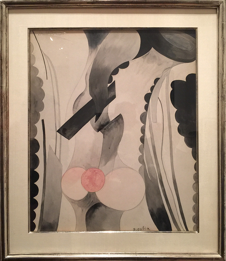
Mélibée

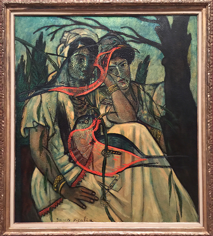
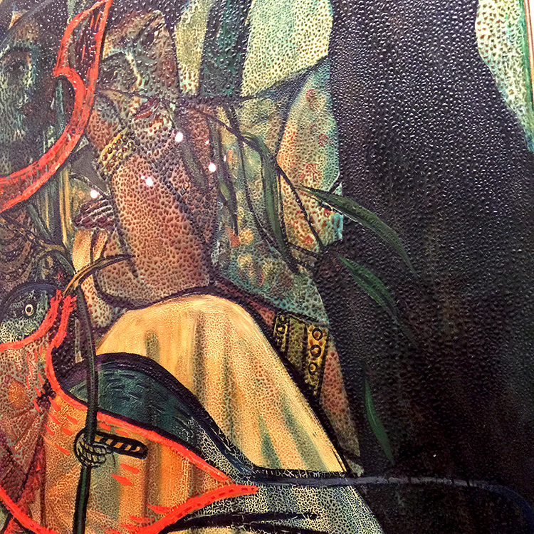
Picabia’s unorthodox application of unusual materials sometimes resulted in surfaces that could be interpreted as damaged or in need for restoration. In fact, these effects were often deliberately induced by him. In Portrait of a Woman- shown below, Picabia enhanced some of the bumps with dark paint, purposefully amplifying the paints’s already pronounced topography.

Portrait of a Woman, Francis Picabia, 1935-37 -Oil on Canvas

Isn’t that amazing? And then…it changes again

Spring, Francis Picabia, 1937-38/c.1943 . Oil on wood

And again

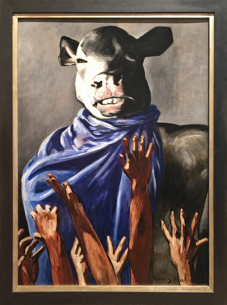
The Adoration of the Calf, Francis Picabia, 1941-42, oil on board.

Although Picabia was a resolutely apolitical artist, it is difficult not to read this painting and its cynical vision of the worship of false idols as an engagement with contemporary politics.

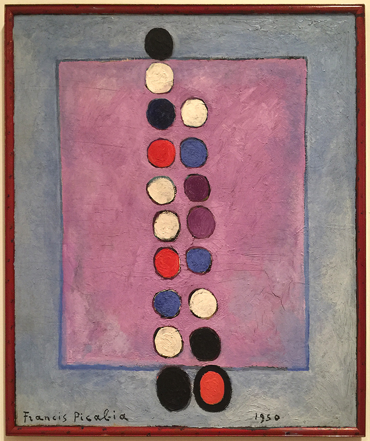
Symbol, Francis Picabia, 1950, Oil on canvas

“If you want to have clean ideas, change them as often as you change your shirts.” (Francis Picabia). Our life changes, in that I guess we are consistent and so was Francis Picabia in his art.

If you are in the area make sure to visit this exhibition before it closes in March. I will definitely be back to see it once more :) I hope you enjoyed this little Art Stroll.


Comments (2)

  • Linda Faber

    |

    Thanks, again, Nathalie, for a great tour of an intriguing exhibit. I love his abstract pieces! This artist is new to me and I wish I could get up to NYC (oh but it’s too cold for me now) to see it. And….last year you introduced me to Anselm Kiefer….whose name has been popping up in so many places, and is now on exhibit in Miami! As a retired teacher myself, I love getting these inspirations and knowledge from you….and I know it must be a kick for you as well.
    Linda

    Reply

    • nathalie-kalbach

      |

      thank you Linda, for joining me :) Ha- it is cold here right now …not my favorite thing about NYC ;) Ohhh I have to come to Miami for the Kiefer Show- he is one of my very very favorites!!! Have a gorgeous week, Nat

      Reply

Leave a comment

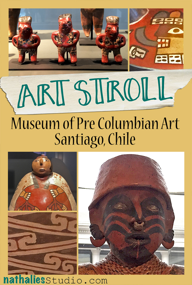
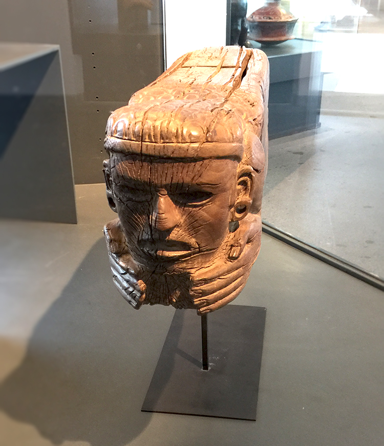
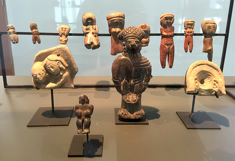
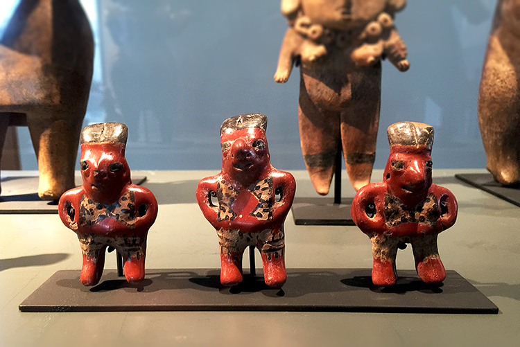
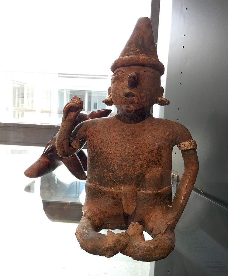
Art Stroll: Museum of Pre Columbian Art in Santiago, Chile

kalbachaspcasantiagocollage

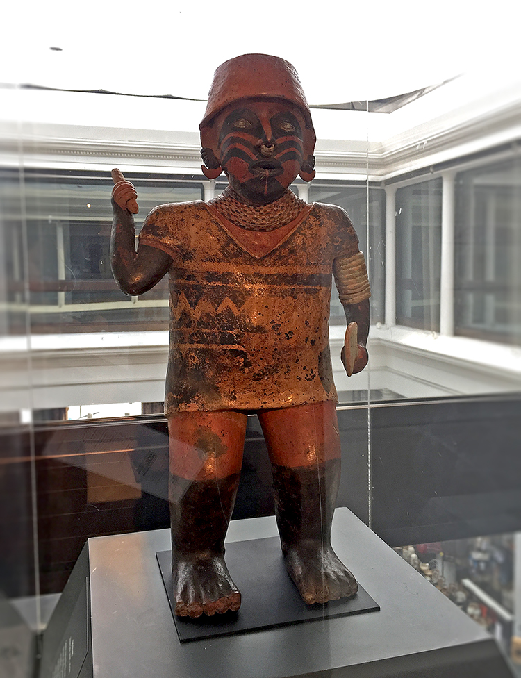
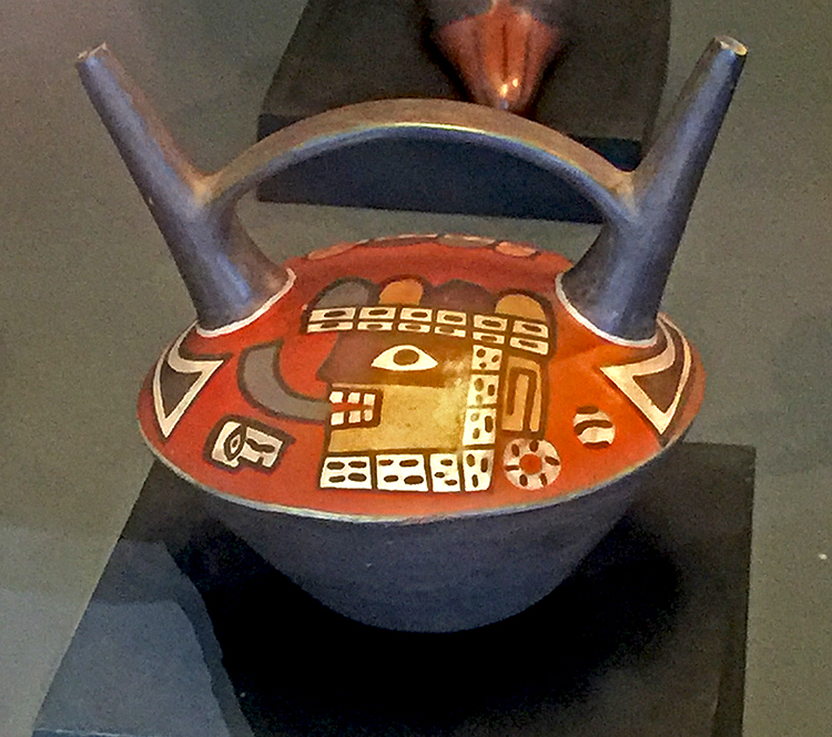
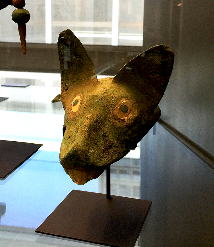
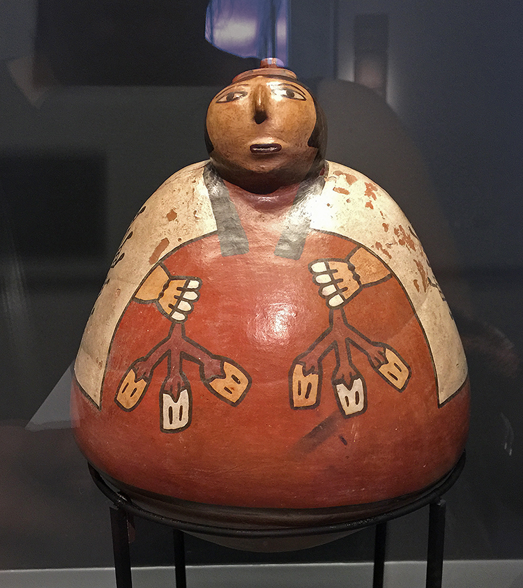
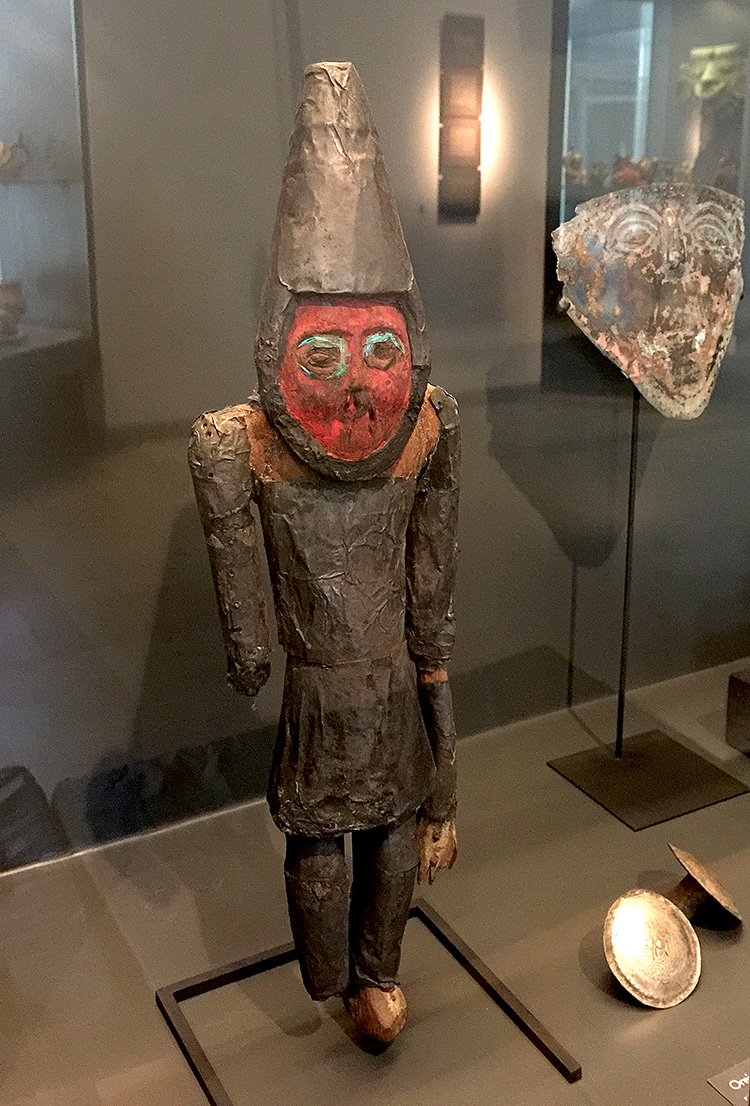
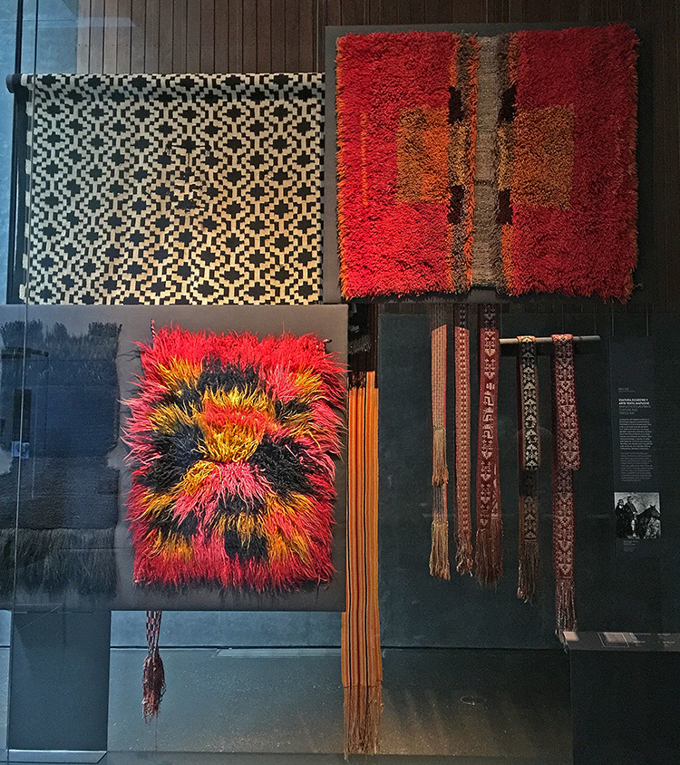
While I was in Santiago de Chile I went to the Museum of Pre Columbian Art, which is dedicated to the study and display of pre-Columbian artworks and artifacts from Central and South America. I was surprised and happy how inspiring this visit was. It reminded me that things that were done thousands of years ago have inspired art, fabrics and patterns over and over again …

kalbachaspcasantiago02

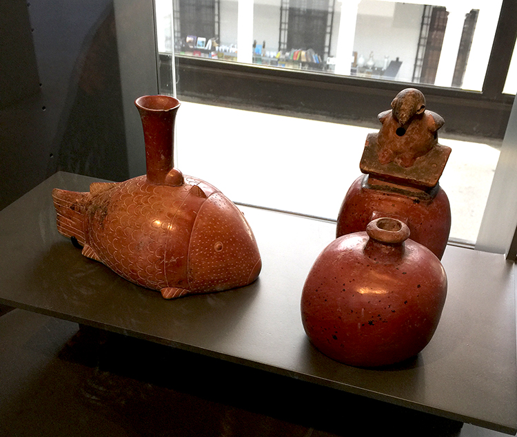
Cultura Chorrera 1800-300 AC. These bottles are very sophisticated and just amazing.  I will take the fish bottle – thank you :)

kalbachaspcasantiago03

I loved all the details and different materials used by different cultures.

kalbachaspcasantiago04

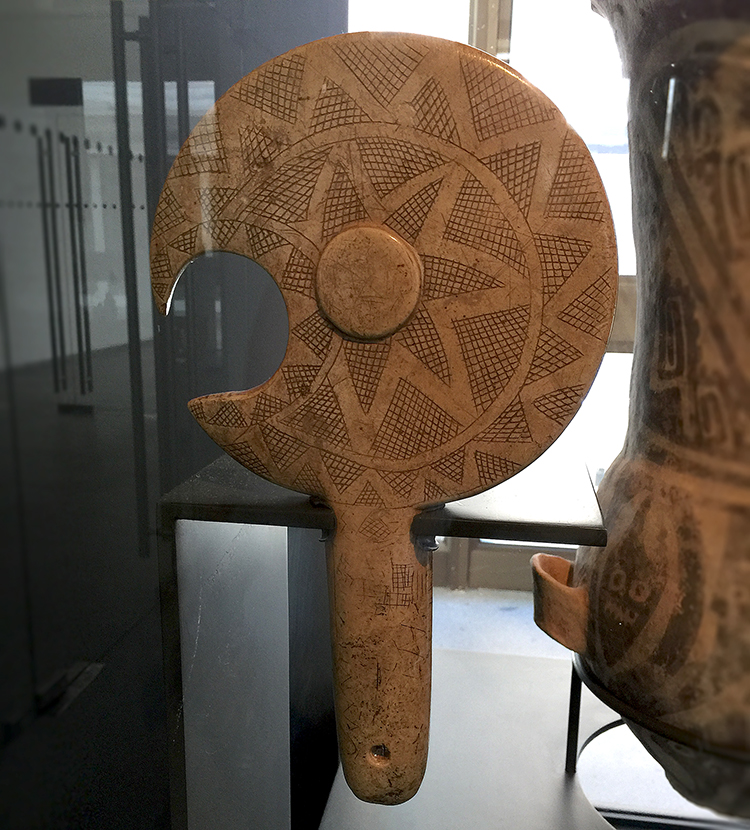
Cultura pre-mapuche ca. 1300-1500 DC. The first Spanish observers saw Mapuche chiefs holding beautiful stone pieces in the shape of axes as symbols of the power of the war leaders. Love how this simple hatch cross pattern makes such a beautiful piece.

kalbachaspcasantiago05

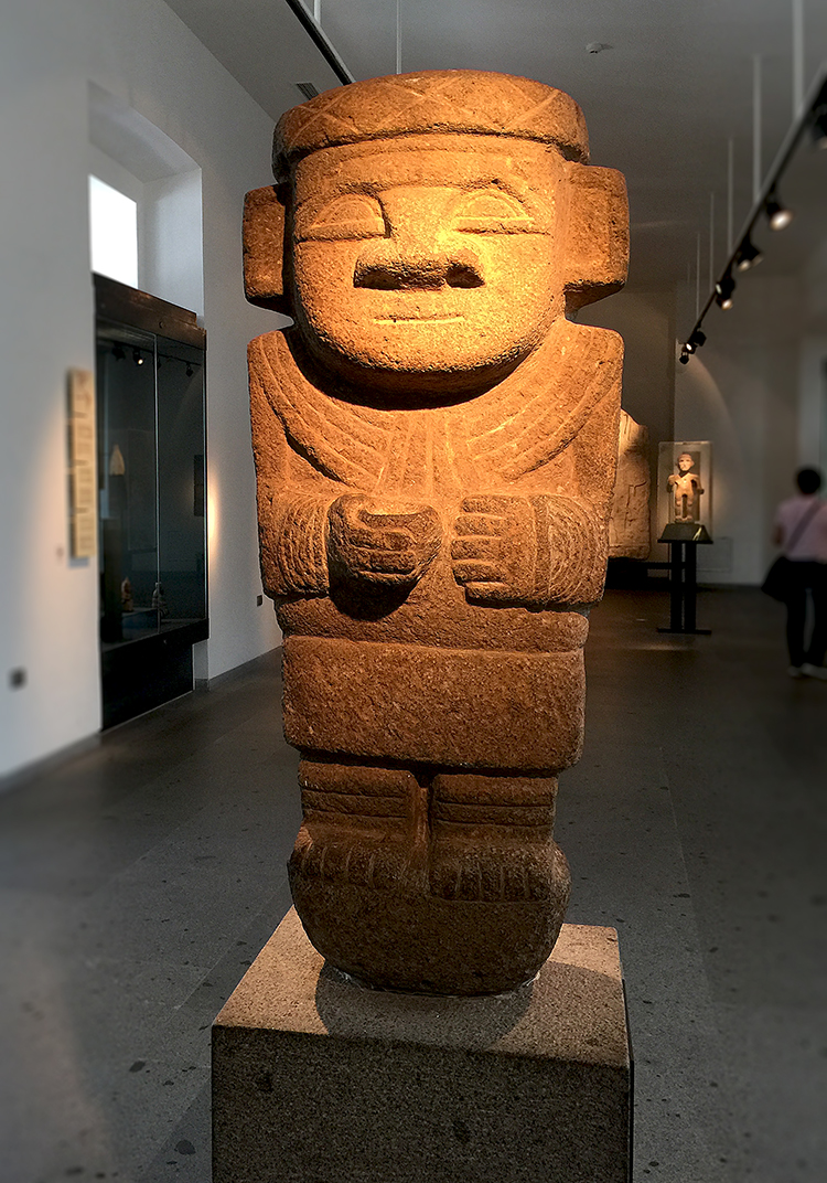
San Augustin Culture 1-1500 AD – Anthropomorphic Stone Sculpture

kalbachaspcasantiago06

such a gorgeous piece!

kalbachaspcasantiago07

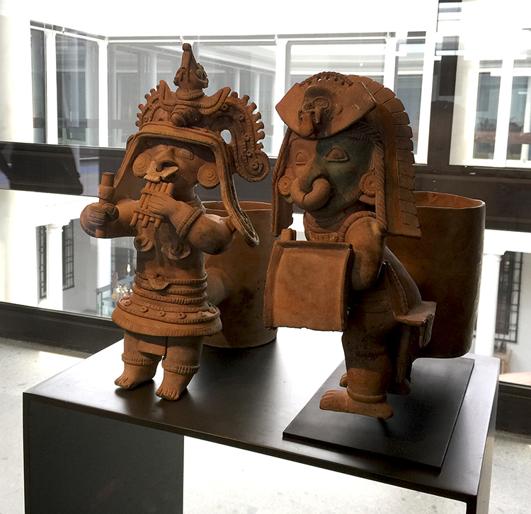
Figurines from ancient Ecuador. The production of clay figurines and small statues was a long pre-Columbian tradition that began 5thousand years ago on the coast of Ecuador.

kalbachaspcasantiago08

500 AC- 200 AC – those three figurines were funky cool!

kalbachaspcasantiago09

Musician, 500 AC – 500 DC – reminded me a little bit of Pinocchio

kalbachaspcasantiago10

And a lot of the artwork reminded me of the home decor of the 60s and also of course artists like Picasso come to mind.

kalbachaspcasantiago11

kalbachaspcasantiago12

1-700 DC – not sure if it was a mask or what it was used

kalbachaspcasantiago14

Bottle – 300-600DC – I love this so so much!!!!

kalbachaspcasantiago15

This one was eerie and beautiful at the same time. It had no real information – not even for the time it was made.

kalbachaspcasantiago16

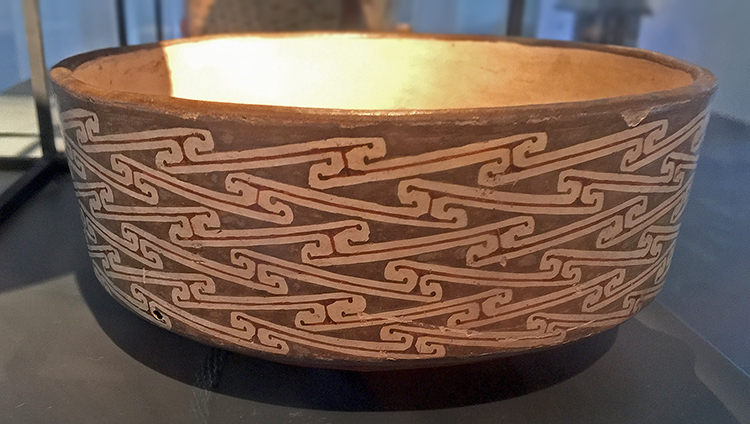
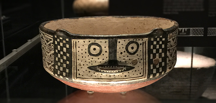
Diaguita Ceramics – characteristic is the minimalistic design. I love this pattern.

kalbachaspcasantiago22

kalbachaspcasantiago17

This was the room with the Exhibition called Chile before Chile.

kalbachaspcasantiago18

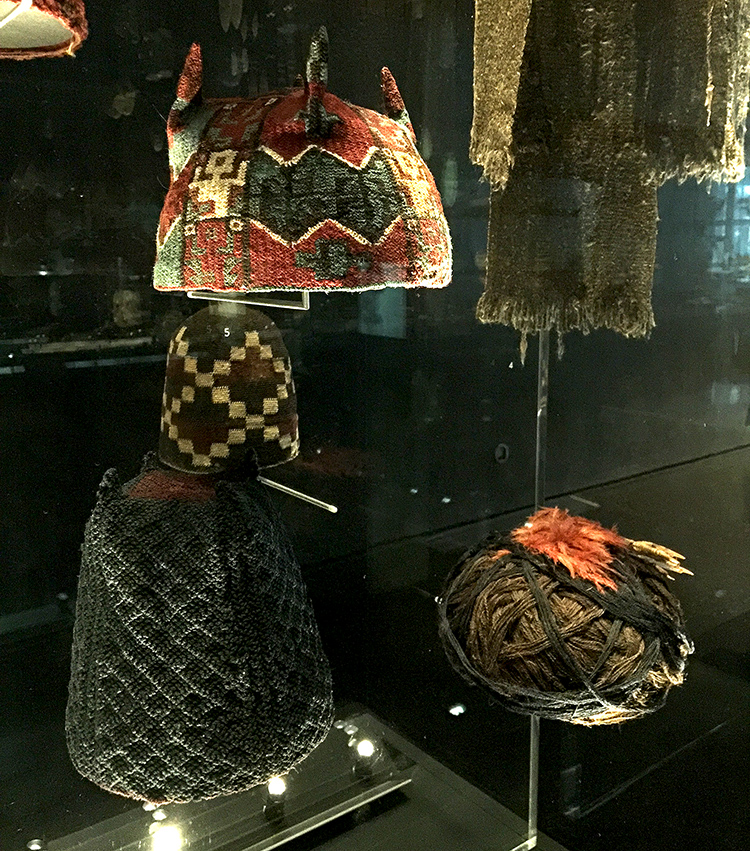
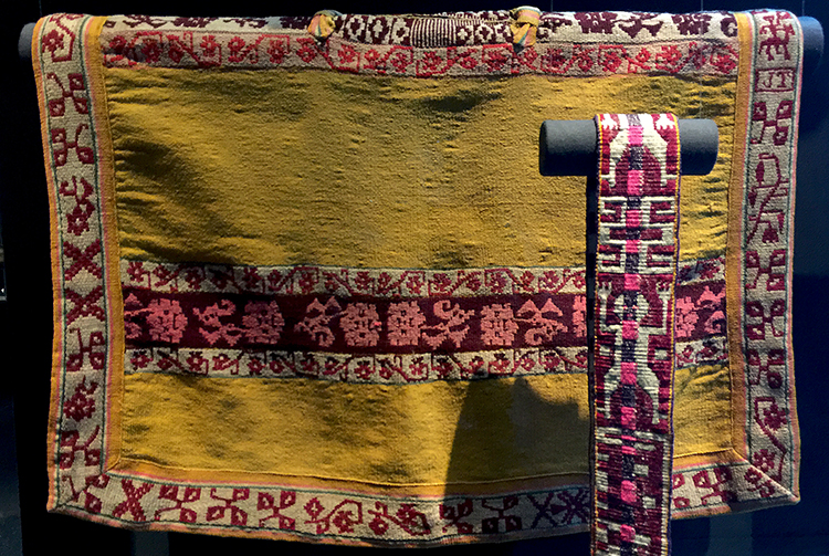
some headgear – the fabrics were just incredible and intricate – It was breath taking actually.

kalbachaspcasantiago19

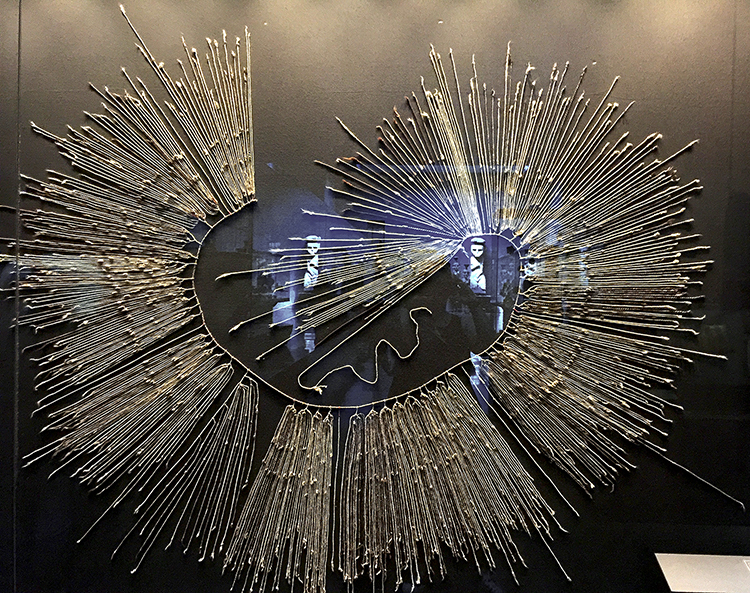
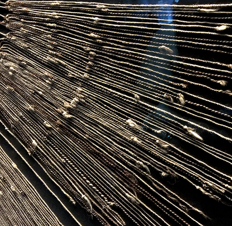
This is a Quipu also called talking knots. “Quipu were recording devices and for the Inca, the system aided in collecting data and keeping records, ranging from monitoring tax obligations, properly collecting census records, calendrical information, and military organization. The cords contained numeric and other values encoded by knots in a base ten positional system. A quipu could have only a few or up to 2,000 cords.

kalbachaspcasantiago20

Isn’t this amazing?

kalbachaspcasantiago21

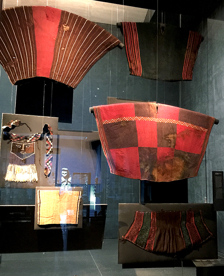
More fabric- gorgeous colors.

kalbachaspcasantiago24

kalbachaspcasantiago25

kalbachaspcasantiago23

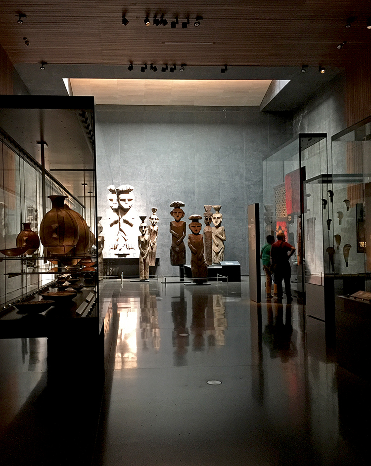
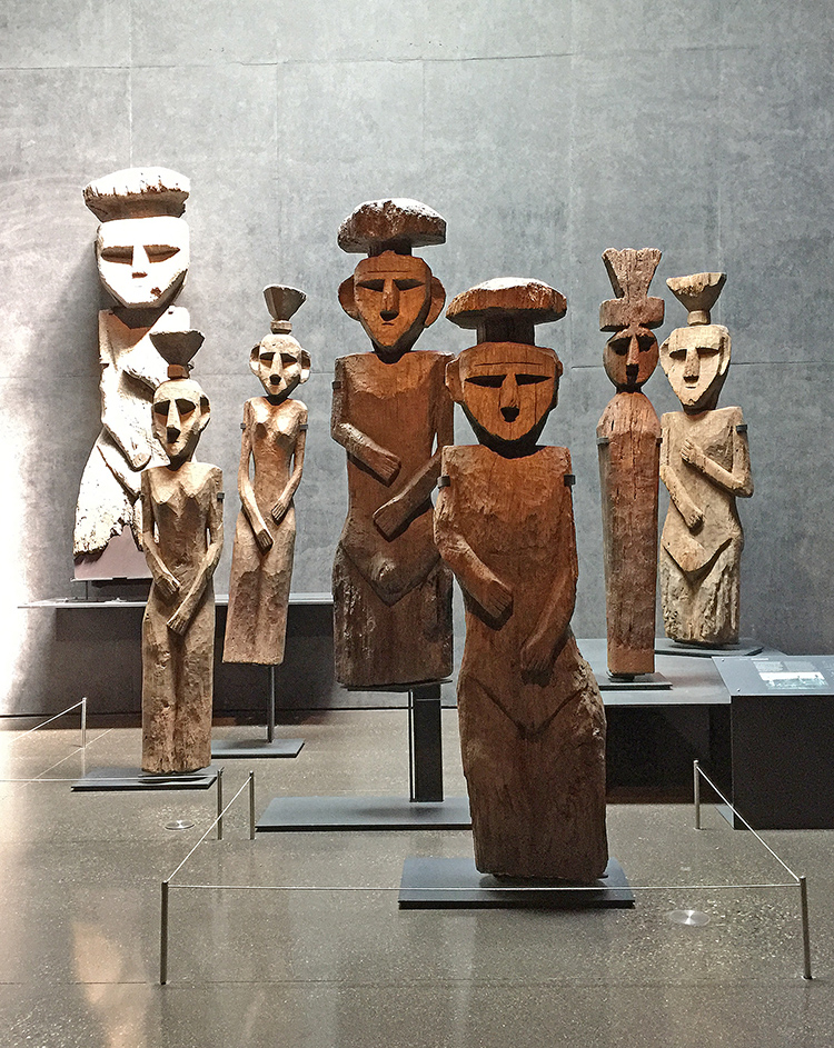
These wooden statues were placed on top of tombs in ancient Mapuche cemeteries. They reflect the spirit of those buried there and are to intended to assist them in their journey o the afterlife. Chiefs and great warriors were sent to the East after death to roam among the volcanoes of Kalfumapu, the “blue land” . All others went to the West, to eat bitter potatoes beyond the sea. mhhh- you sure wanted to be a great warrior- doesn’t sound like a fun outlook to have to eat bitter potatoes for afterlife to me ;)

Hope you enjoyed this pretty different art stroll ! Have a wonderful day

Comments (4)

  • Sassy

    |

    What fun! We visited Santiago two years ago and I took photos (not nearly as well done) as several of the items you did — great memories.

    Reply

    • nathalie-kalbach

      |

      How wonderful to hear you were there too – wasn’t it an amazing museum?! Have wonderful week!

      Reply

  • Linda Faber

    |

    Thanks for the gorgeous tour! What an inspiring exhibit! Those colors and designs. Loved it and guess you will add some stamps to your collection from those patterns. Yes?
    Thank you for posting your tour…I’m home recovering from a painful broken rib and have no energy to even create art…so this tour was uplifting for me. :)
    Linda

    Reply

    • nathalie-kalbach

      |

      Linda, I am so sorry to hear you broke a rib, I hope you are feeling better soon!!! Glad you enjoyed the tour – and maybe ;) there will be some inspiration for future stamps or stencils. Have a wonderful week and sending you big healing hugs! Nat

      Reply

Leave a comment

Art Stroll: Museo De La Solidaridad Salvador Allende, Santiago Chile

kalbachassolidcollage

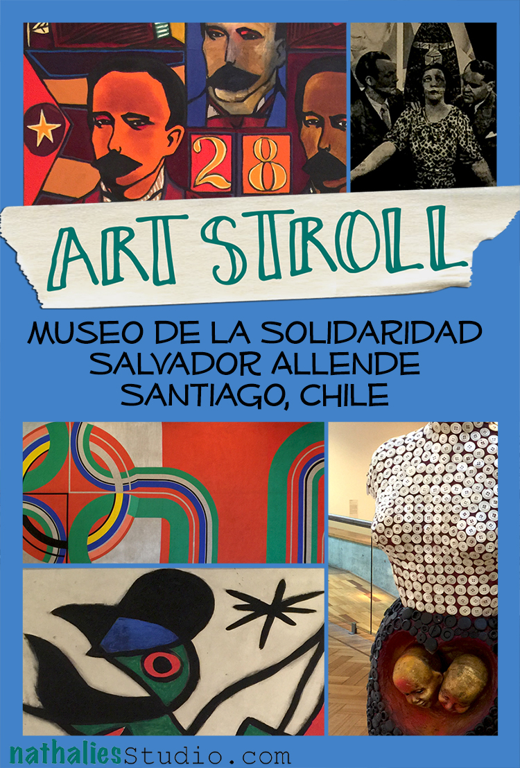
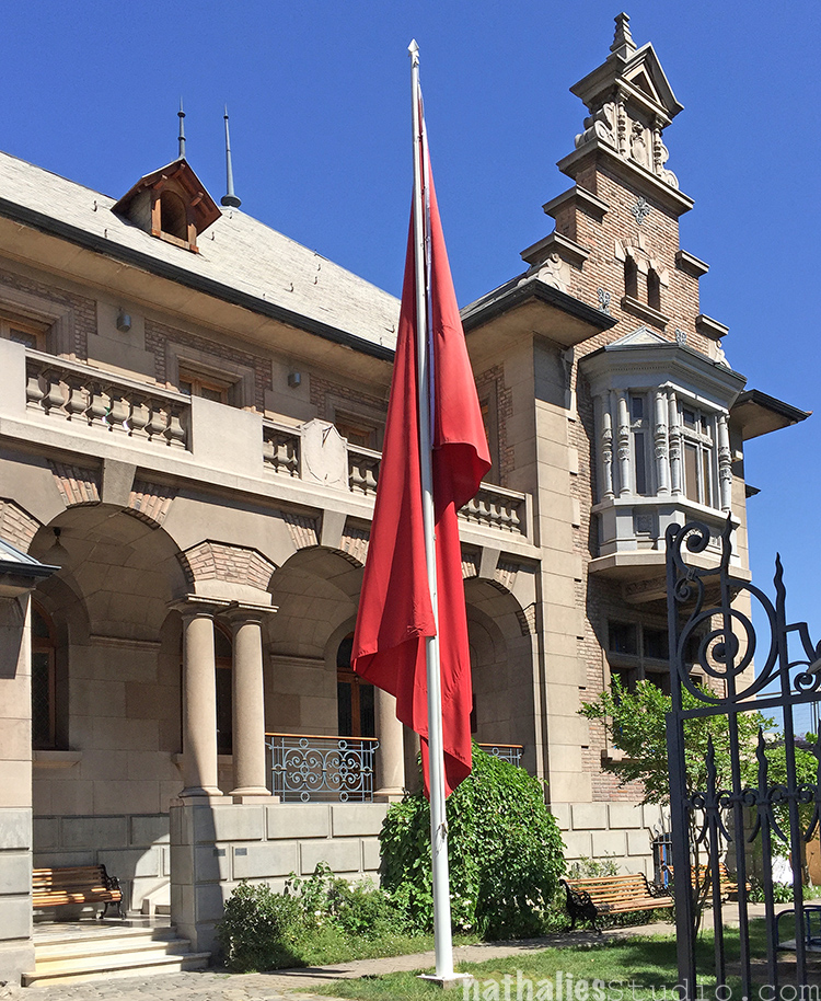
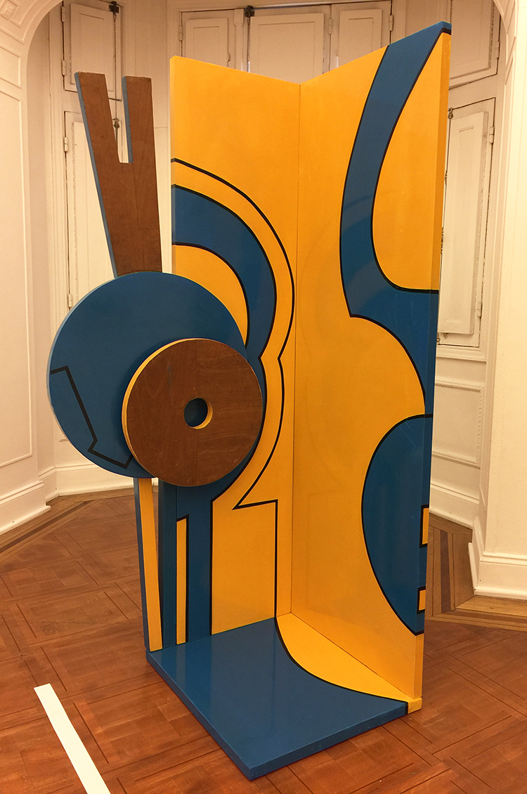
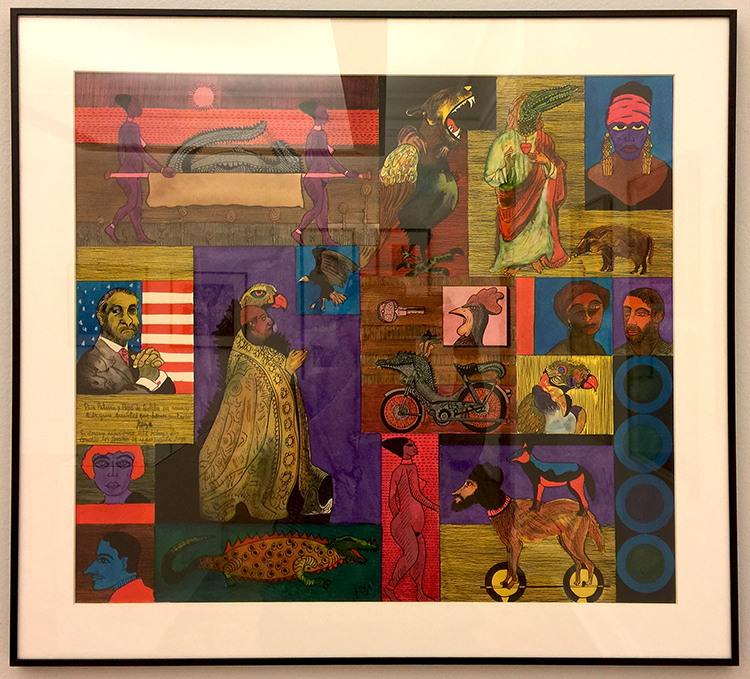
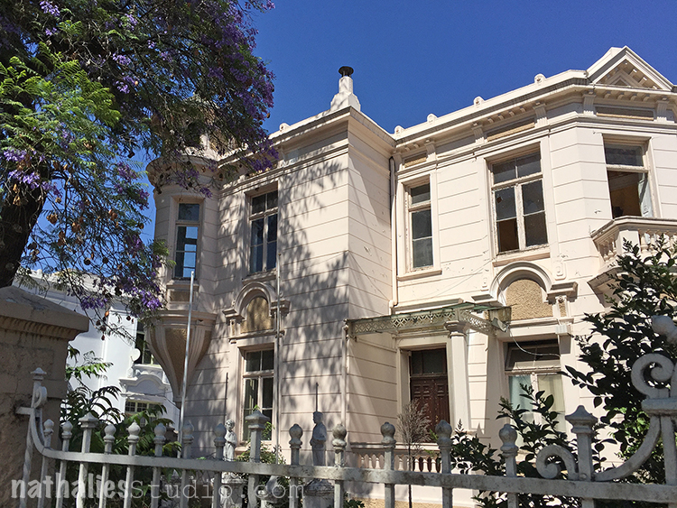
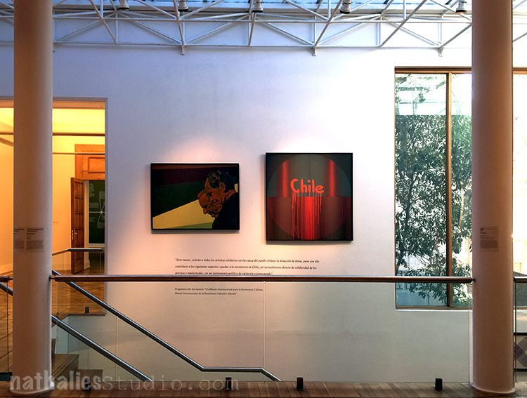
While in Santiago de Chile major strikes caused the public museums to be closed for most of my time there. But this fortunately lead me to go to this little gem of a museum a friend of my husband pointed out to me. The Museum of Solidarity for Salvador Allende. It wasn’t just the collection of the museum, it was the history of it, the history of the building, the street and the country that made it so special to learn about! Upon walking towards the museum which is located on a beautiful street with huge and beautiful villas I noticed many were abandoned and boarded up and only later in the museum did I learn the reason – but let’s start the stroll first.

kalbachassolid22

“The Museum of Solidarity was first envisioned in 1971. Mario Pedroza, a Brazilian artist exiled in Chile, and a small group of visiting European cultural leaders approached President Allende with a proposal to ask contemporary international painters and sculptors to donate works for a museum of modern art in Santiago to show support for Allende’s newly elected government.”

kalbachassolid05

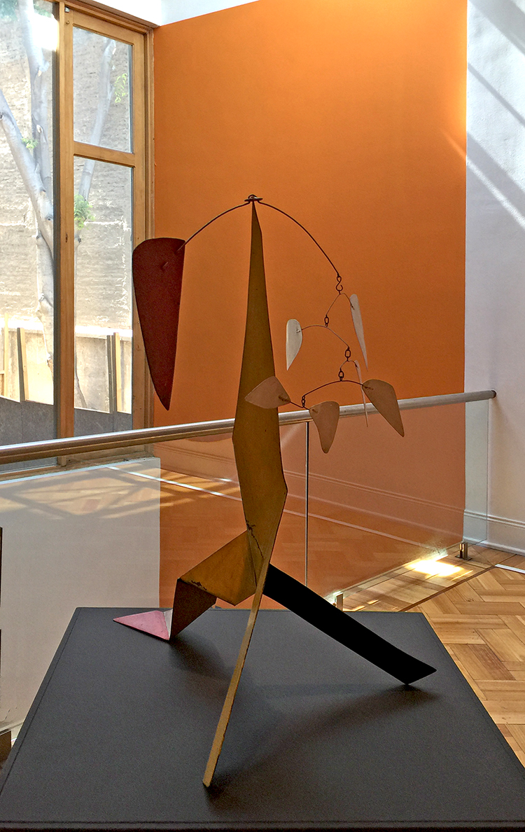
By mid-1973, 268 artists from all over the world, including Joan Miro, David Siqueros and Alexander Calder, had contributed paintings or sculptures.

kalbachassolid03

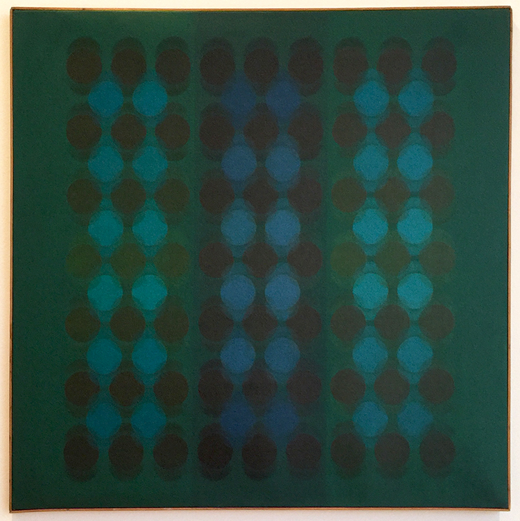
Manuel Espinosa, Blabakhlud, 1969, Oil on Canvas

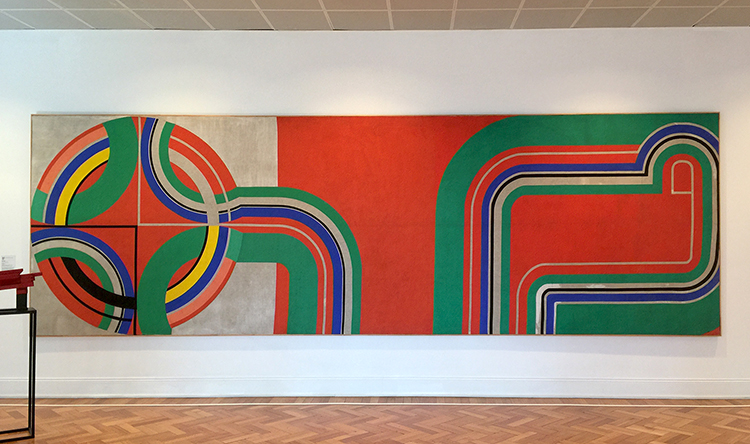
“But with the military coup of Sept. 11, 1973, works that were on exhibit in the Presidential Palace and many others still crated on the docks simply disappeared. The works that remained, including a 25-by-100-foot painting by Frank Stella, were wrapped and stored for 17 years in the basement of the Museum of Contemporary Art at the University of Chile. Even after the military coup in 1973, the works of art continued to arrive to the curators, now in political exile around Europe and the United States. Under the title of Museums of Resistance exhibitions of the donated artwork were held in cultural centers in Sweden, Spain and France, but eventually the works were all returned. At one point, four or five people were responsible for the care of 200 works. After the dictatorship of Pinochet ended, the artworks were restored, and re-collected and the museum finally opened in 2005. “

kalbachassolid04

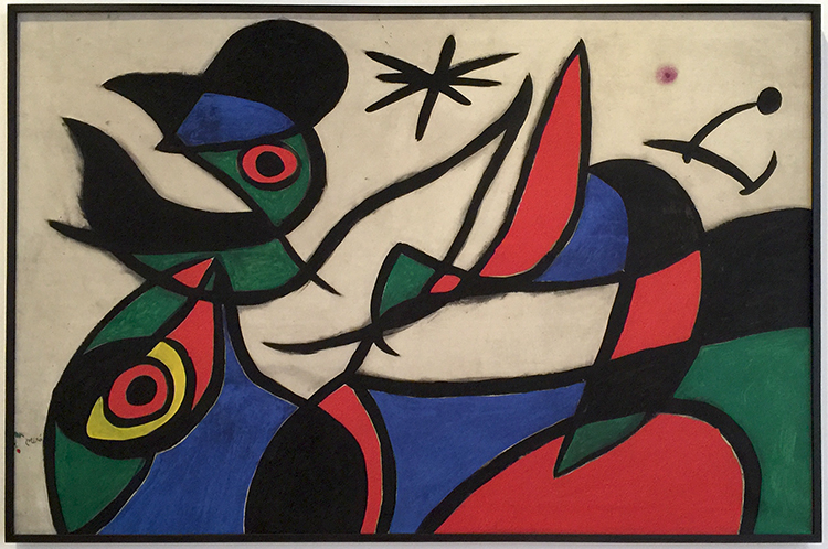
Joan Miro, without a title, 1972, oil on canvas

kalbachassolid06

Kazuya Sakai, without a title, ca. 1970-1972

kalbachassolid07

Alexander Calder, without title, 1972

kalbachassolid08

kalbachassolid09

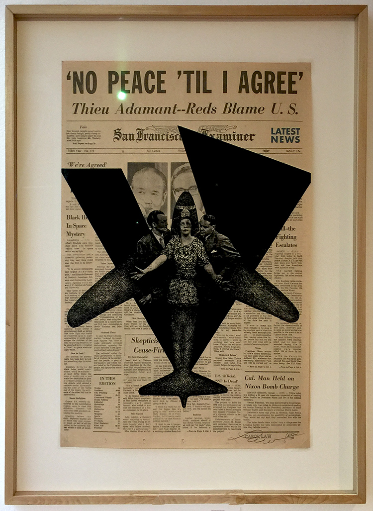
Carol Law, No peace ’til I agree, 1972

kalbachassolid10

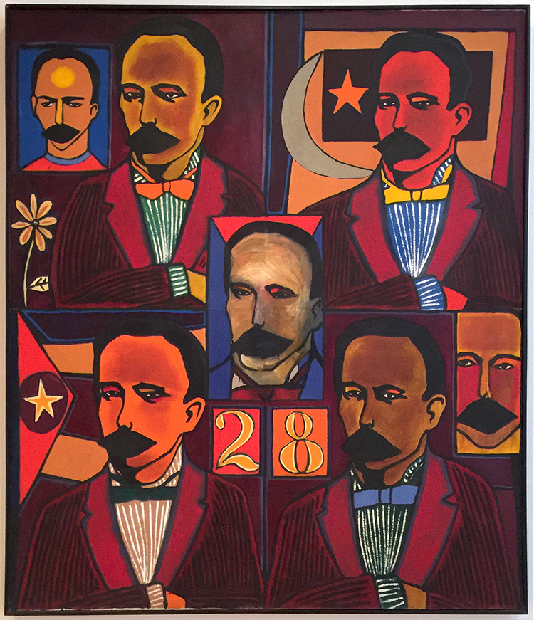
Raul Martinez, Repeticiones de Marti, 1068


kalbachassolid13

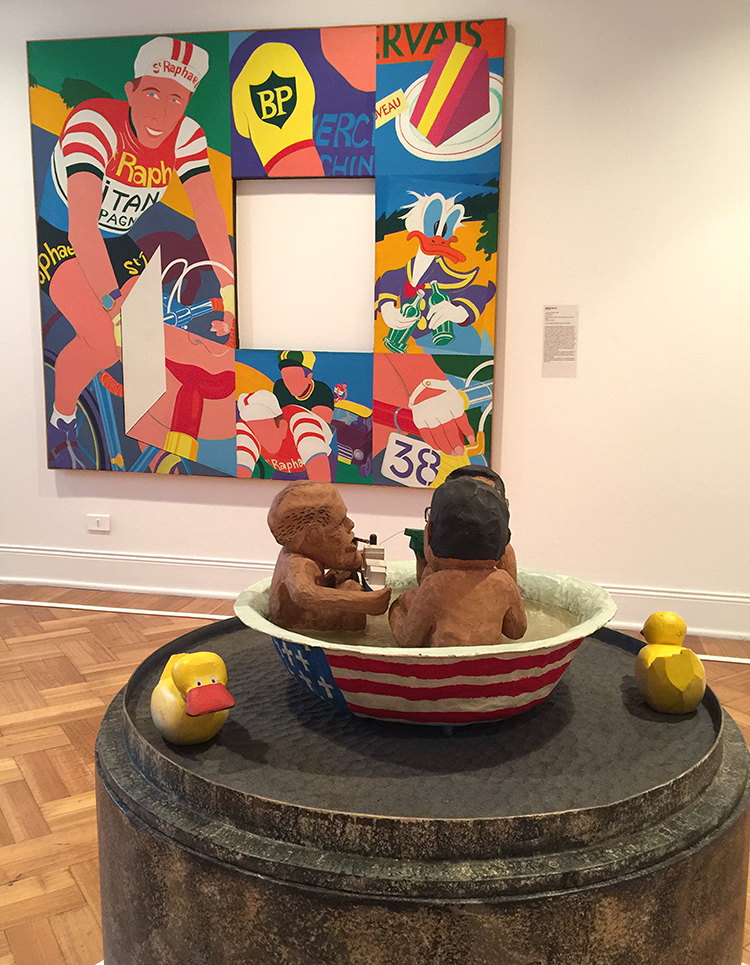
in the background: Bernard Rancillac, Tour de France, 1965

These artworks were displayed in a room title Pop Critic.

kalbachassolid14

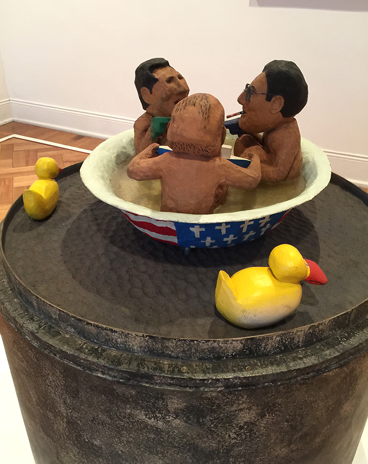
Hanns Karlewski, The Duckpond, 1975, paper mache.

kalbachassolid15

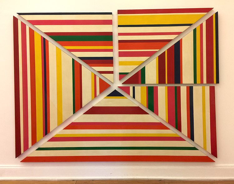
Eduardo Terrazas, 1972

kalbachassolid16

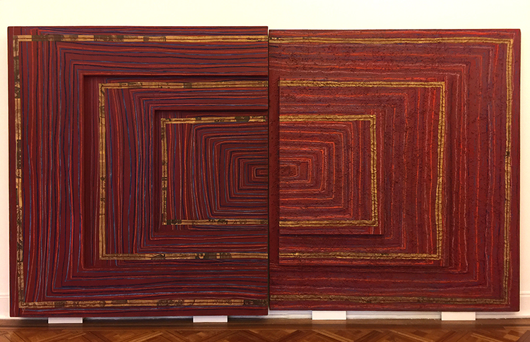
Myra Landau, Ritmo No7, 1970


kalbachassolid18

Helen Escoedo, Rincon para jazz, 1968


kalbachassolid21

Octavio Bajonero, Chalchiutif

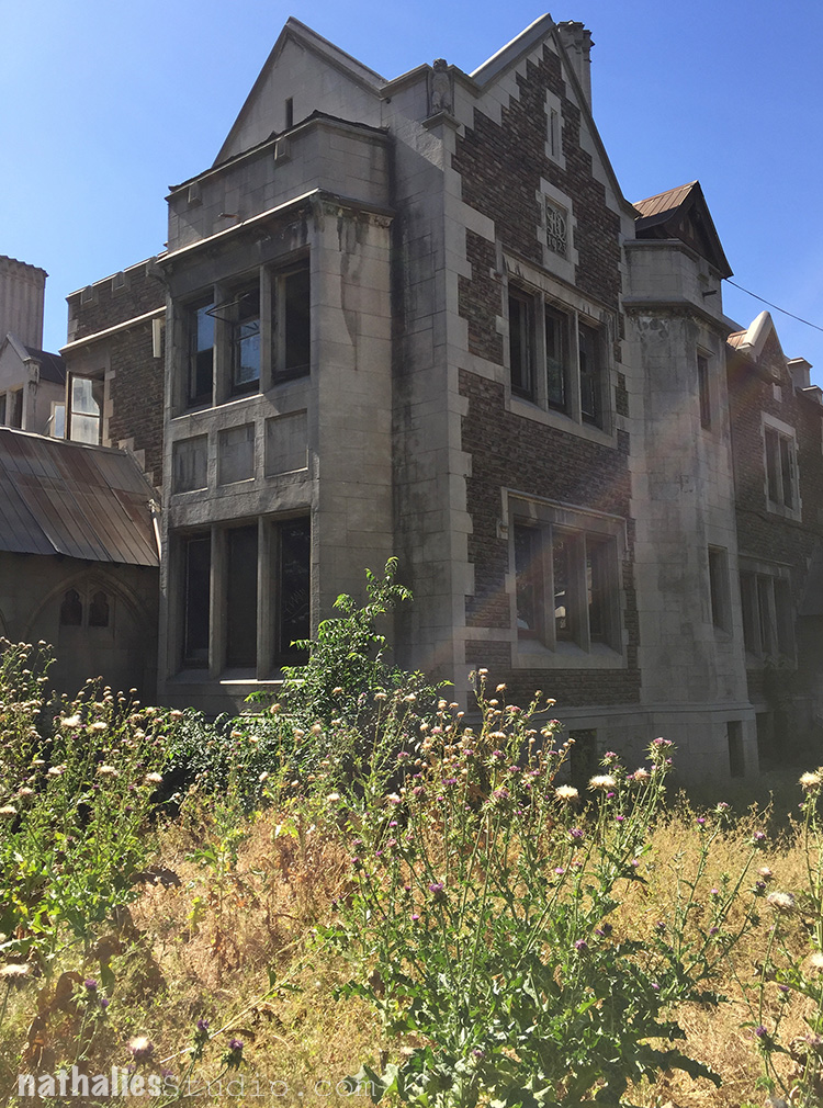
Before I left the museum which was set up in Spanish, I talked to the receptionists to find out more about the neighborhood and the museum itself. I was just baffled that many of the buildings next to the museum were boarded up – an area which in other cities, would count as main prime estate. It was at times eerie walking on the street, even though there were many universities sprinkled in between and a lot of young people on the street. I couldn’t shake off the feeling that something was off. I learned that the building housing the museum was one of the main communication centers to coordinate intelligence and secret police within the country and amongst South American dictatorships. It was used to detain and eliminate citizens beyond their own borders.

kalbachassolid01

The building across the street and many others had been used to torture people during the Pinochet regime and after democracy was established again those properties fell to the new government. They put some universities into the buildings, but a lot of those buildings are hard to keep up with and since they are “haunted” by the terrible things that happened in them it is hard to get people to want to move into them and to restore them. Below another building next to the museum which looks “normal” at first glance, but at second is also unoccupied and boarded up.

kalbachassolid25

The artwork itself in the museum was worth the visit, but the story of the collection made the artwork even more special to look at, the thought behind it, the contribution of so many artists around the world, the hiding of it for several decades, the building housing the museum and it’s context in the street where so many horrible things happened. It made the artwork so much more powerful to know all this and made me appreciate the collection even more. It reminded me that the context of how artwork was created or collected is equally important if not more than the piece itself, and that often artwork so valuable for our society.

I hope you enjoyed this little yet different kind of art stroll.

Comments (3)

  • Patrick Wagner

    |

    El Miró tenga un titulo : se llama “Ojos y Estrellas”.

    Reply

  • Madeline Rains

    |

    I too thought about our country and how important art is now even more than usual. And I thought about Isabel Allende, one of my favorite writers. She talks about this period of history in her book about her daughter, Paula.

    Reply

  • Jean Goza

    |

    Wow! A very powerful story. I couldn’t help but think about the things that are happening in our own country now. Artistic expression is so important.

    Reply

Leave a comment

Art Stroll: JCAST Flagship Gallery, New Jersey

kalbachjcastcollage

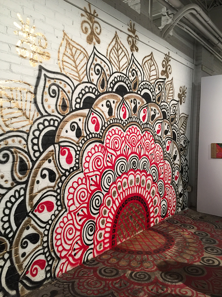
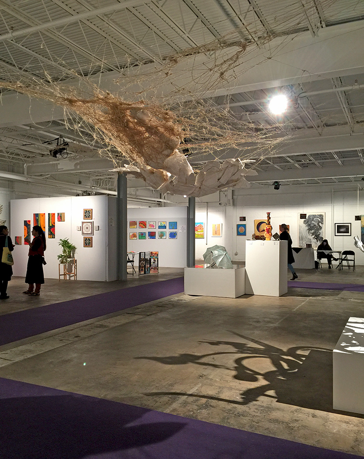
In October the Jersey City Art & Studio Tour 2016 – JCAST – took place and this was the third time I participated since I moved to the States. The flagship gallery in an old warehouse in JC was hopping and bopping with fun artwork and I was stoked to be part the group show.

kalbachjcast02

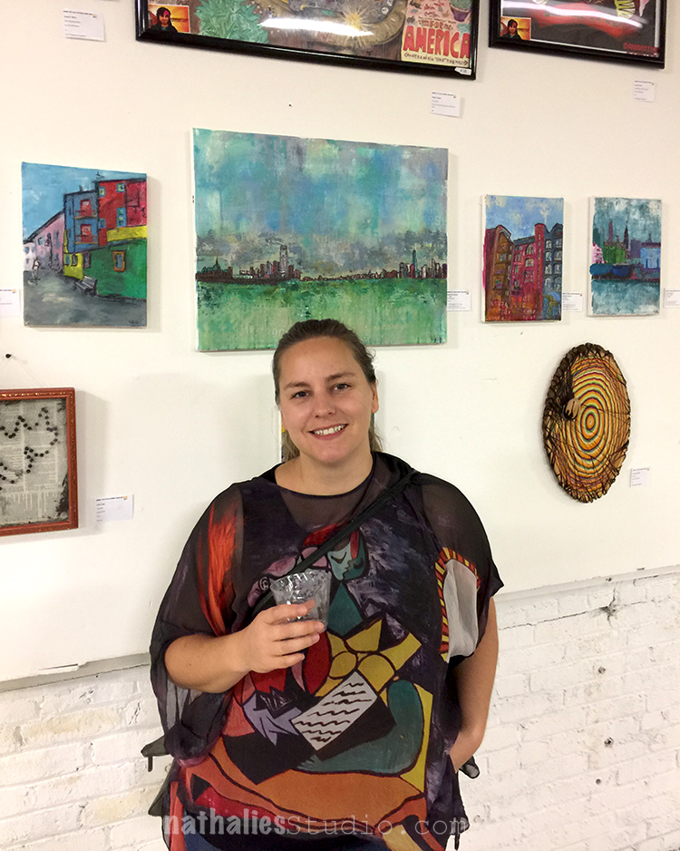
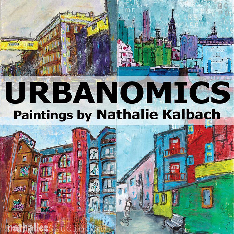
I had thirteen paintings displayed – a series called “Urbanomics” and it was fun to see my family and friends coming out for the show

kalbachjcast01

There was a lot of beautiful and inspiring artwork around – and I love getting to know more local artists and their work – there is so much talent here- it is mind blowing.

kalbachjcast03

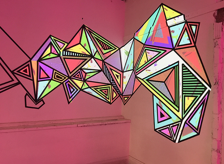
Unfortunately I forgot to jot down the name of the artist above. I loved it- the colors are actually different colored lights projected on the wall – the black lines of the geometric shapes are duct tape.

kalbachjcast04

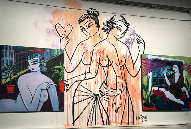
The paintings and the mural are by Blair Urban.

kalbachjcast05

Lot’s of beautiful artwork in every corner.

kalbachjcast06

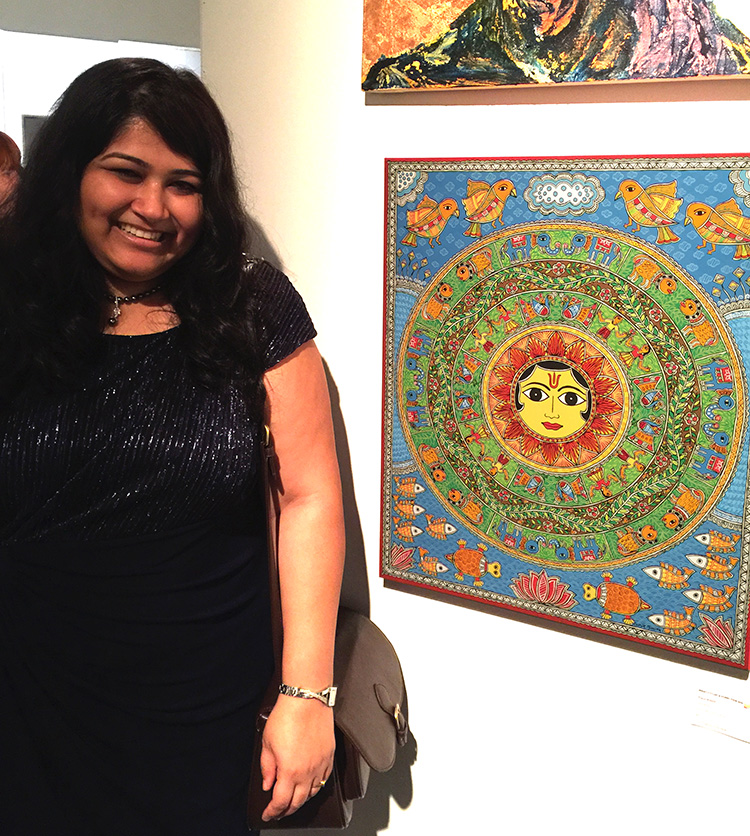
Nupur Nishith, Panchtatva, acrylic and ink on canvas . Loved how intricate and colorful this was and Nupur explained to me the different elements of the painting.

kalbachjcast07

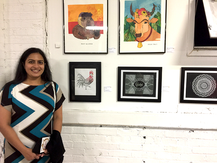
Susan George, Ink on paper. Susan is my neighbor and I love how she made those paintings with ink on paper- inspired by zentangle and traditional mandala – every detail of these paintings were so perfect- it was amazing.

kalbachjcast09

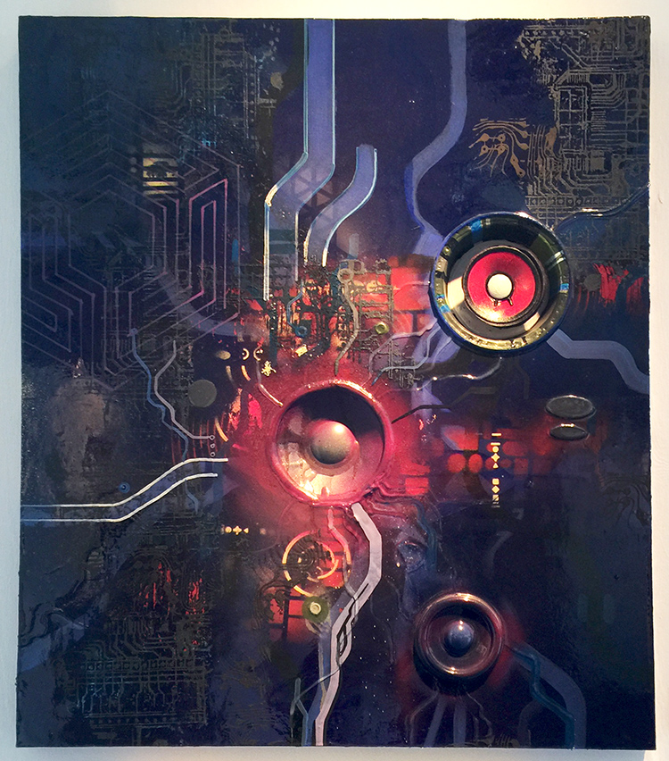
Tom Wilson, Blue Room, acrylic, enamel, speaker cones, epoxy – loved the use of material and lines and colors.


kalbachjcast11

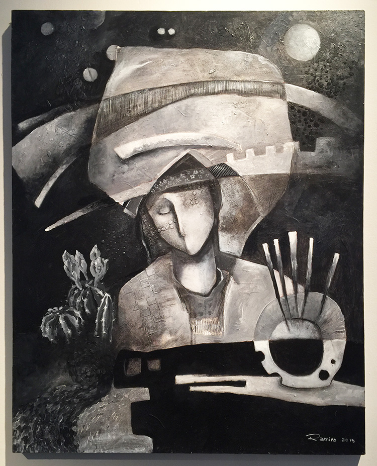
Juan-Ramiro Torres, Elan Vital, acrylic on canvas – I always love Juan’s paintings – the texture and forms – beautiful.

kalbachjcast12

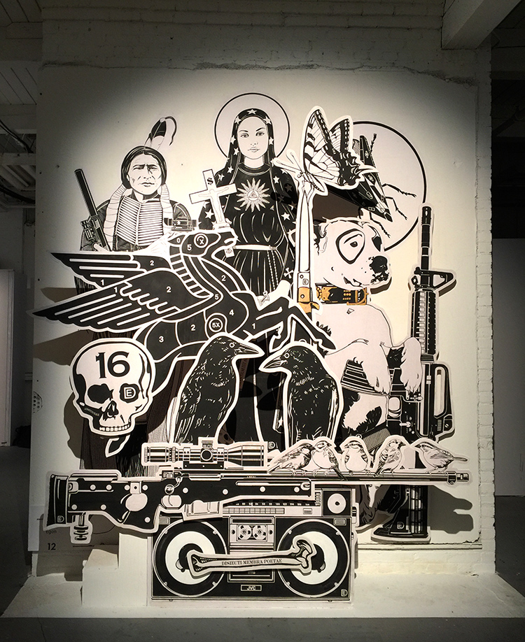
Dylan Egon with an installation of his iconic imagery.

kalbachjcast13

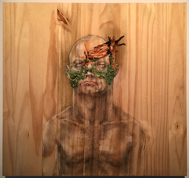
Lina Hsaio, Mutant 1, Mixed Media on Wood – I love Lina’s work- her mix of materials and play with visual and actual dimension is stunning.

kalbachjcast14

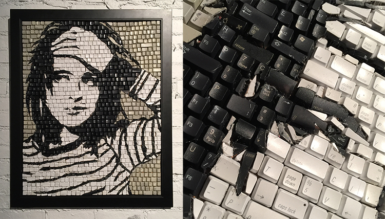
Monique Sarfity, Pushing Buttons, Keyboard Mosaic – this was really fun  !

kalbachjcast15

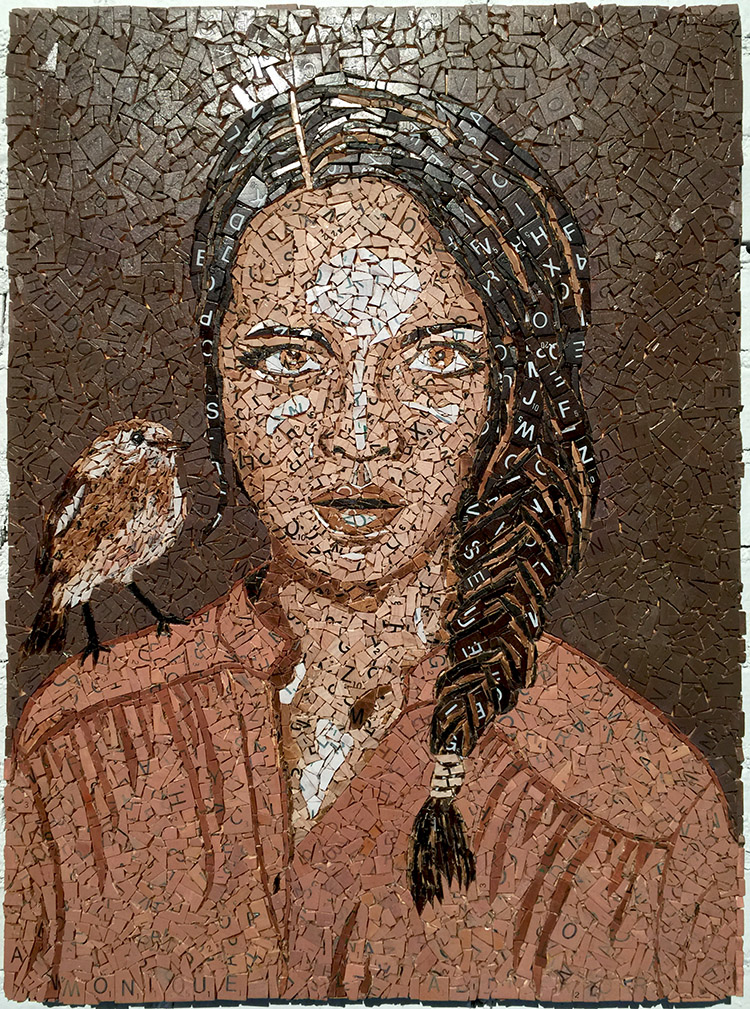
Monique Sarfity, Brown Bird on My Shoulder, Scrabble Mosaic – as well as that.

kalbachjcast16

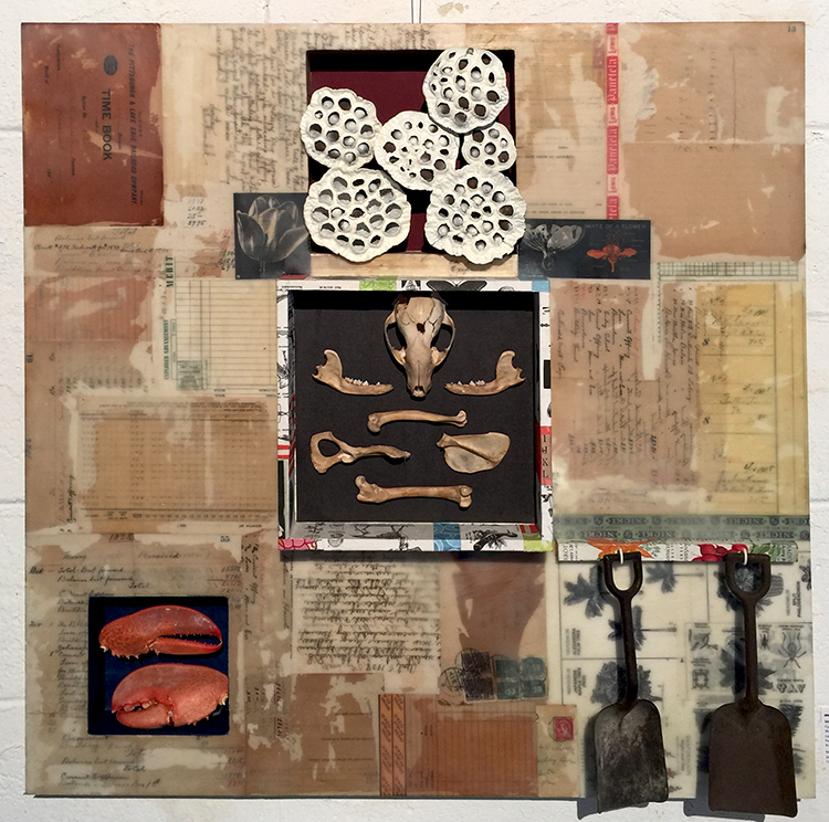
Meghan McKee – this encaustic piece was my absolute favorite of the show – I so want to own it. Meghan does beautiful artwork and I definitely will source her out more :)

kalbachjcast17

It was a great show and I am already looking forward to next year.

Do you have a local Art and Studio Tour where you live?

Comments (8)

  • Nupur Nishith

    |

    Hey Nathalie, I happened to see this post today. It was great meeting you at JCAST. You are very talented. i loved your site. Its really beautifully presented. Thanks for including me in your JCAST story. Hope to be in touch in future.
    Nupur

    Reply

    • nathalie-kalbach

      |

      Hi Nupur, it was wonderful meeting you! Hope to see you again in JC :) Love your work!!! Nat

      Reply

  • Peg Hewitt

    |

    Wow, what a fabulous art space! I love all the booths and the variety of art is so broad. Lots of ideas and inspiration there!

    Reply

    • nathalie-kalbach

      |

      So glad you enjoyed it Peg! good to hear from you too – hope all is well in Australia :) Nat

      Reply

  • Nancy Faulls

    |

    Hi Nat!
    Thanks for sharing. Maybe I will drive up from Delaware next year. I am in South Carolina for Thanksgiving so I missed the 22nd Southeastern Delaware art studio tour. It would have been so cool to see our local artists in their own creative spaces.
    Nancy

    Reply

    • nathalie-kalbach

      |

      That would be amazing Nancy! And yeah- hope you will see your local tour in 2017 – but hey- Thanksgiving in South Carolina sounds like a great place to be too :)hugs, nat

      Reply

  • Judith

    |

    Thanks Nathalie for this lovely little art exhibit — it cheered up my morning after 2 weeks of feeling sad about the election. Art does heal, in many ways! Please keep them coming, always a joy to experience the work of others and honor their efforts across cultures, styles, and materials!

    Reply

    • nathalie-kalbach

      |

      HI Judith, I am so glad I could cheer you up a little bit! Big hugs to you! Yes art does heal- I have been doing a lot o art the last couple weeks! Have a wonderful sunday!!! Nat

      Reply

Leave a comment

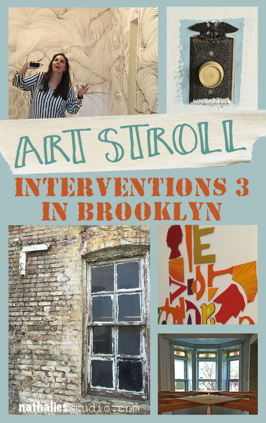
Art Stroll: Interventions 3 in Brooklyn

kalbachinterventionscollage

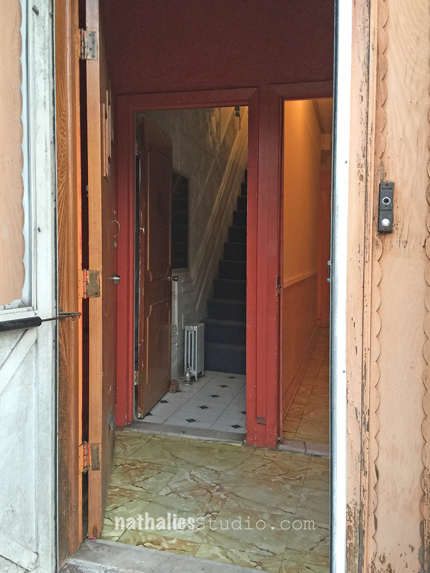
When two of your artist friends invite you to a group show they are participating in and you have to sign a waiver before you enter the house, you know it must be good :)

kalbachinterventions23

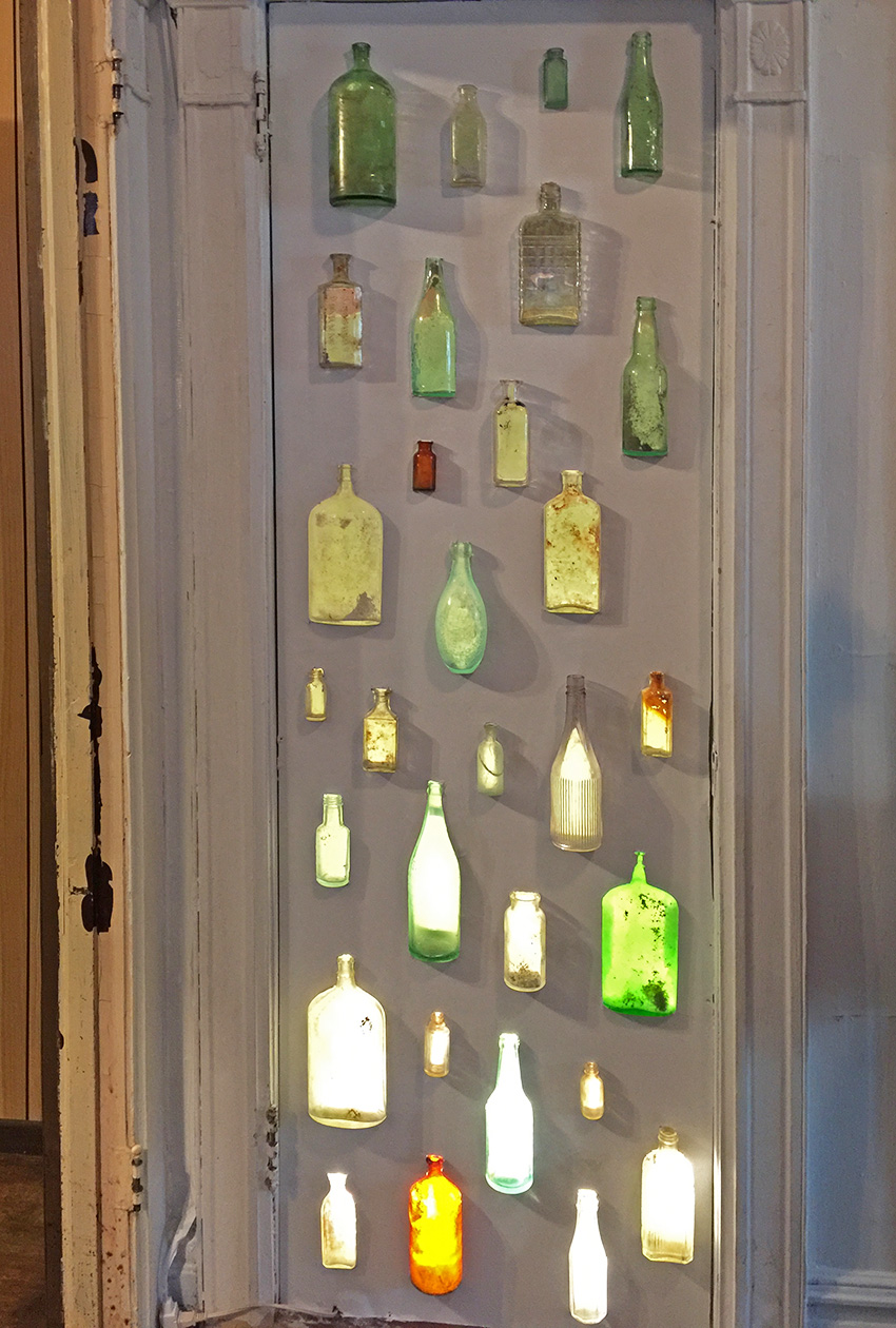
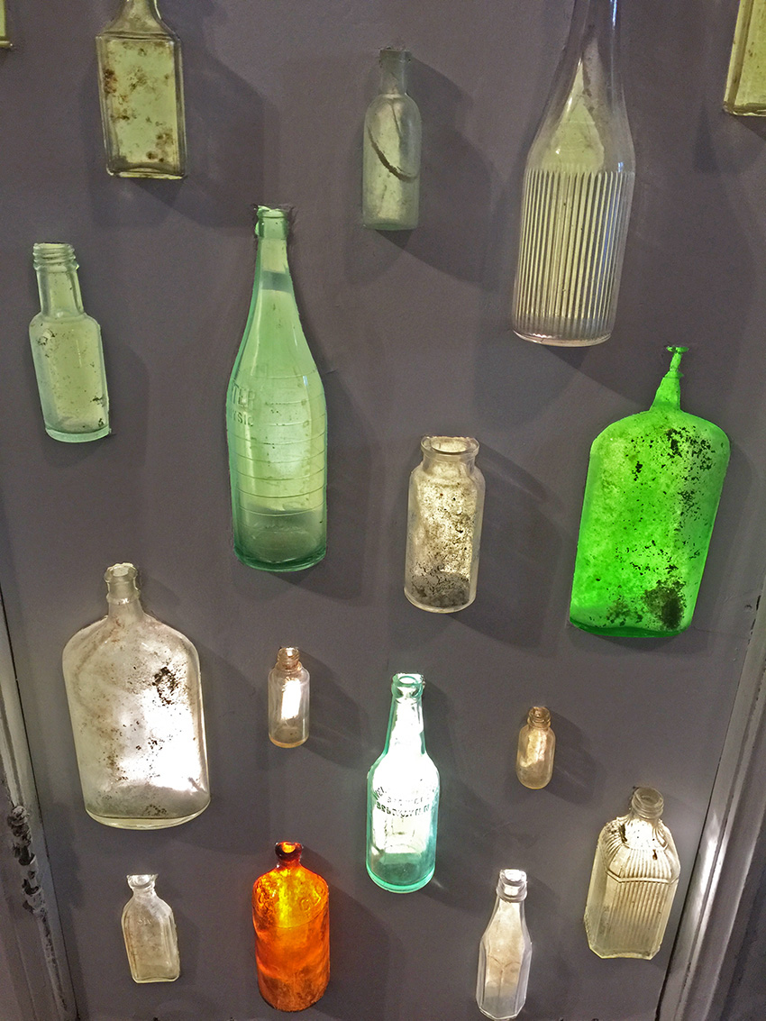
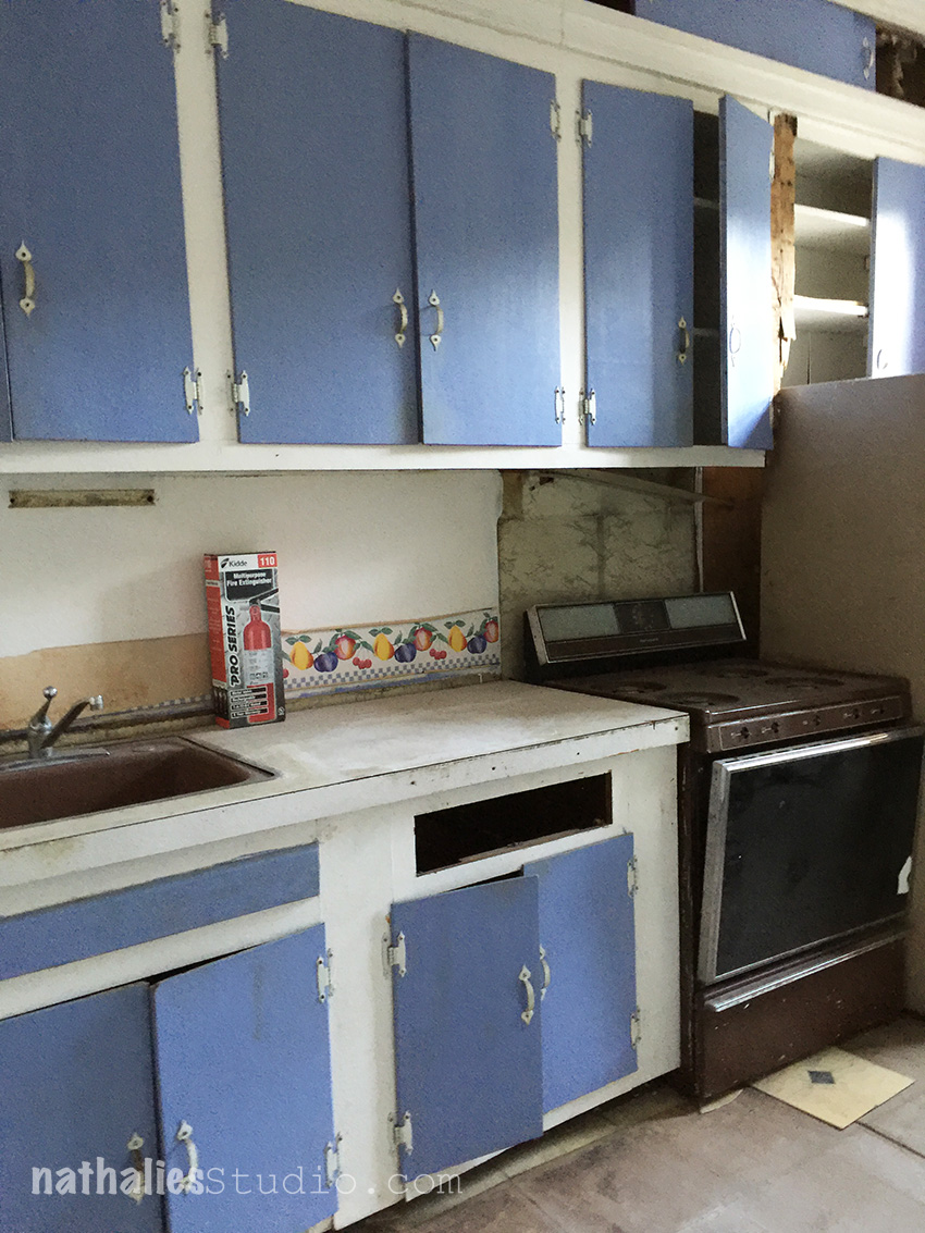
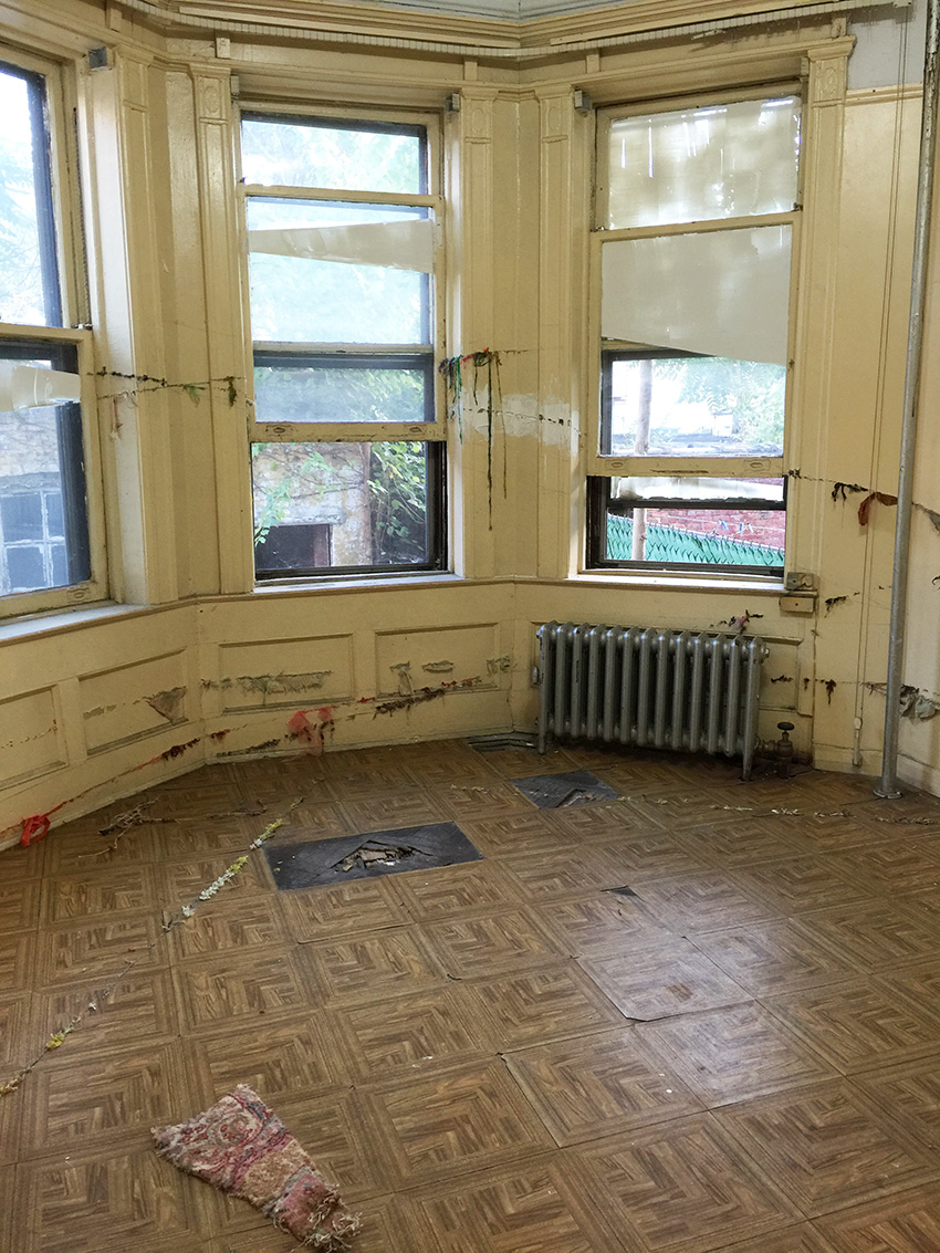
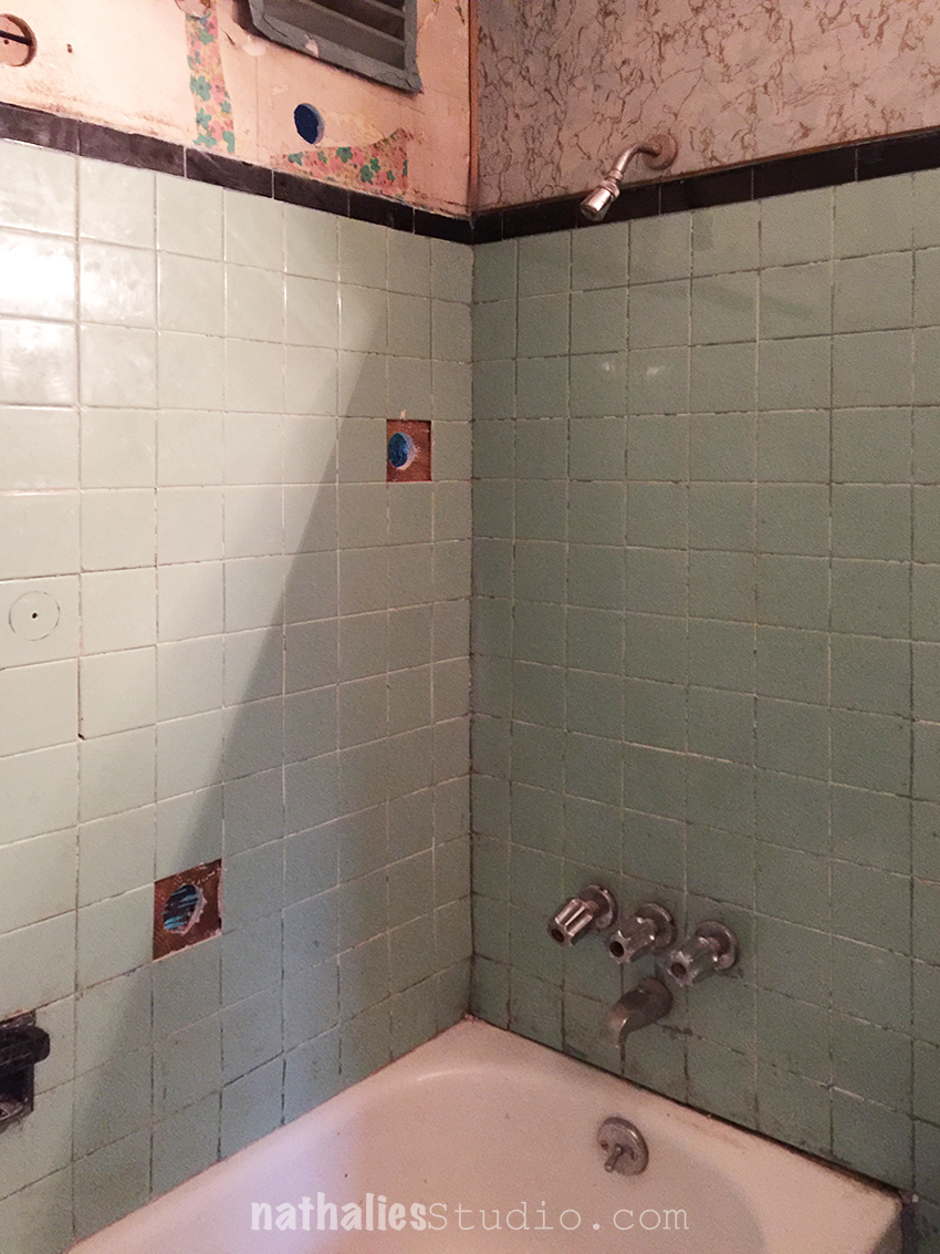
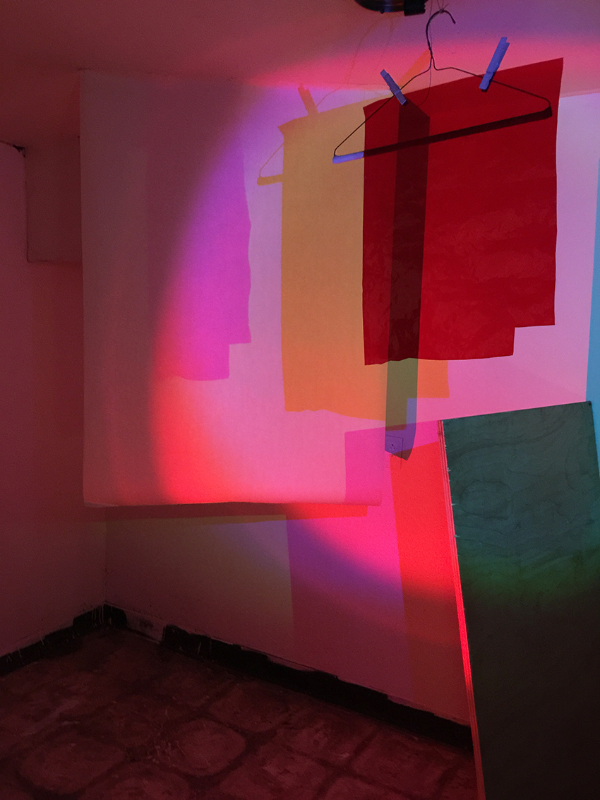
Artist Isidro Blasco purchased a home in pretty bad shape but with loads of potential in Brooklyn and invited 16 artists to apply their ideas and practices to the structure before he begins a renovation that will allow his family to reside in the townhouse. The artists were encouraged to intervene into the hard structure of the house, incorporating the structural elements and interior fixtures into their pieces that are all made on site.

kalbachinterventions01

This was such a unique experience. The photos cannot reflect the feeling of the artwork and the house. The installation incorporated in a door frame by my friend Julia Carbonetta was so amazing, I wish I could have taken the whole door with me.

kalbachinterventions02

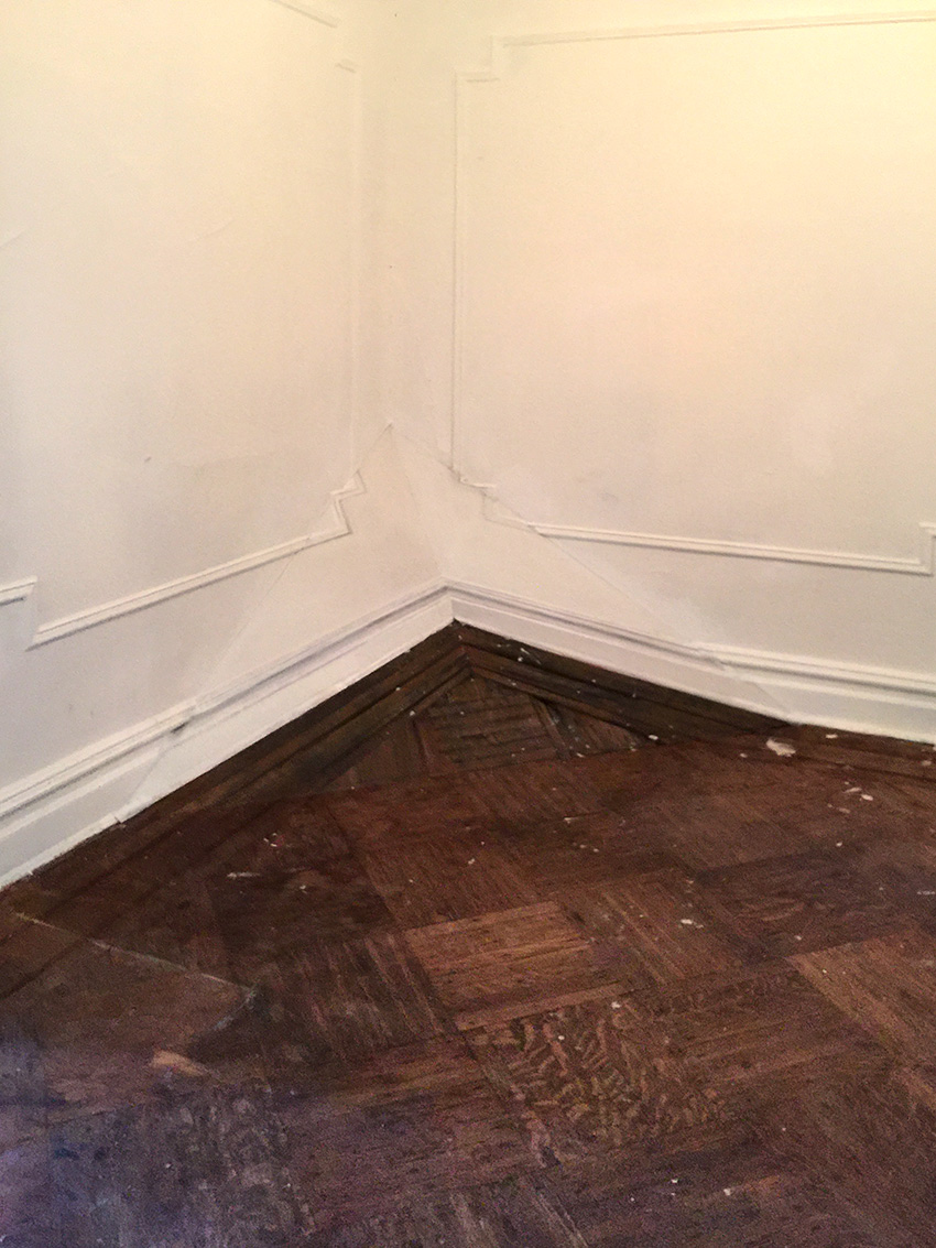
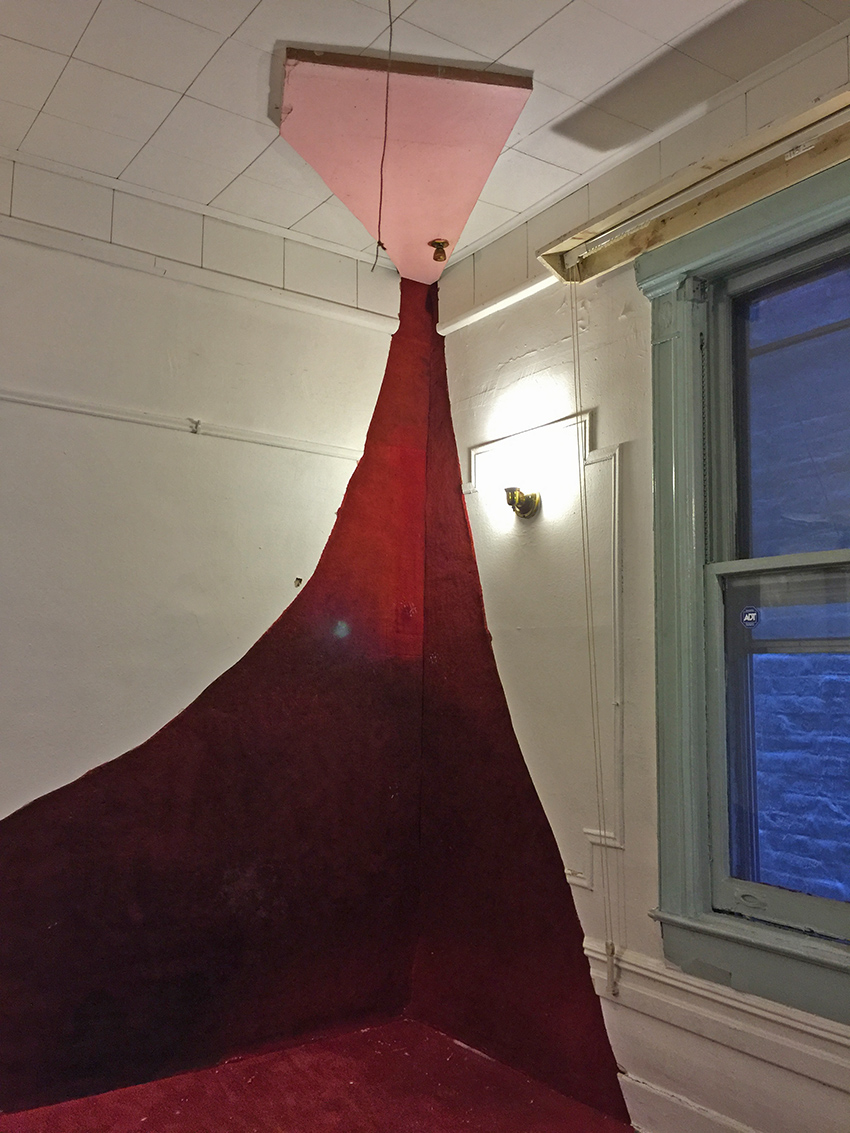
Adam Cvijanovic who some of you might remember from my Studio Stroll Post here, is a master of Trompe-l’œil and this upwards bent corner …which is actually painted – was so real it made everyone stop in the room and take a moment to get it.

kalbachinterventions03

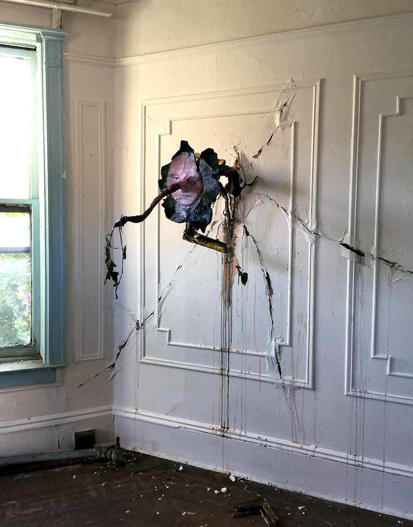
A tree branch growing through the wall and a framed painting. kalbachinterventions05

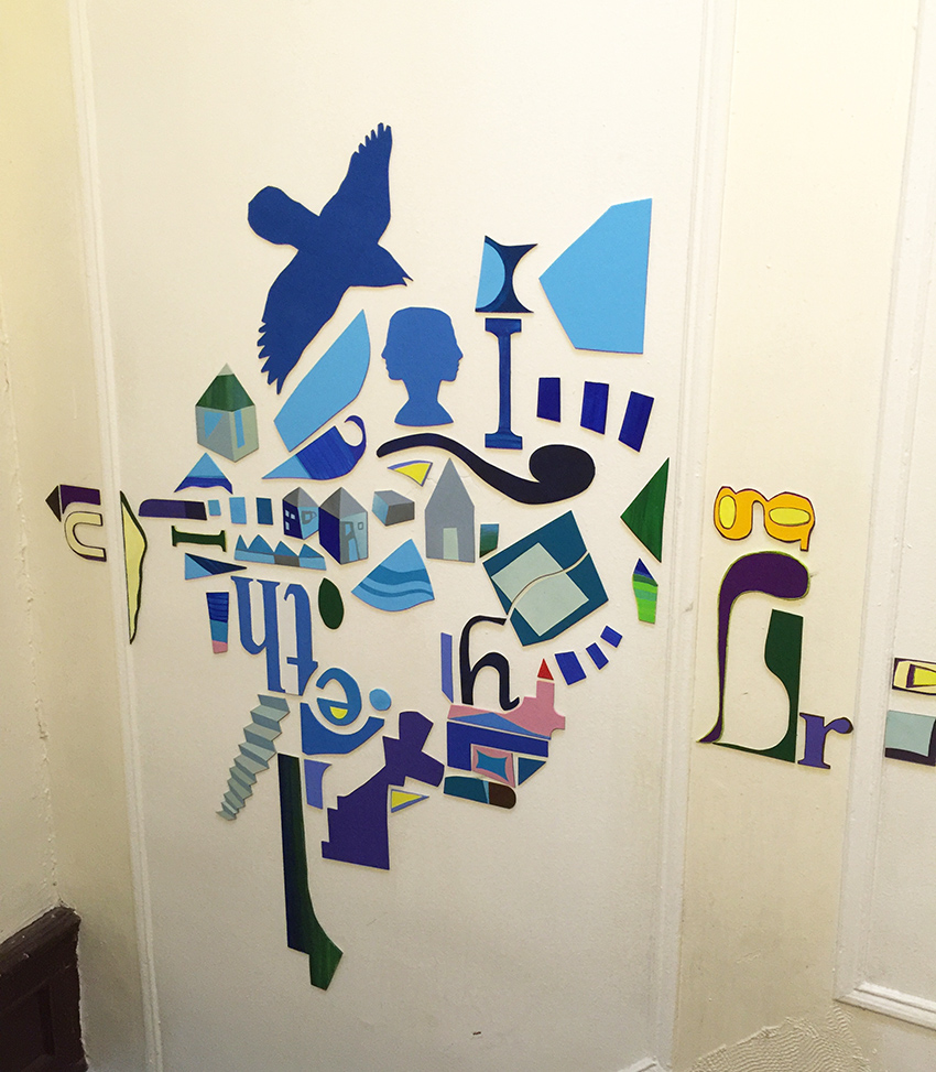
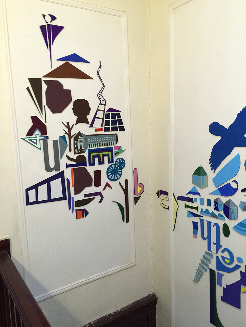
Colored Shapes – I am not sure – but I am assuming from material in the house.

kalbachinterventions06  kalbachinterventions08

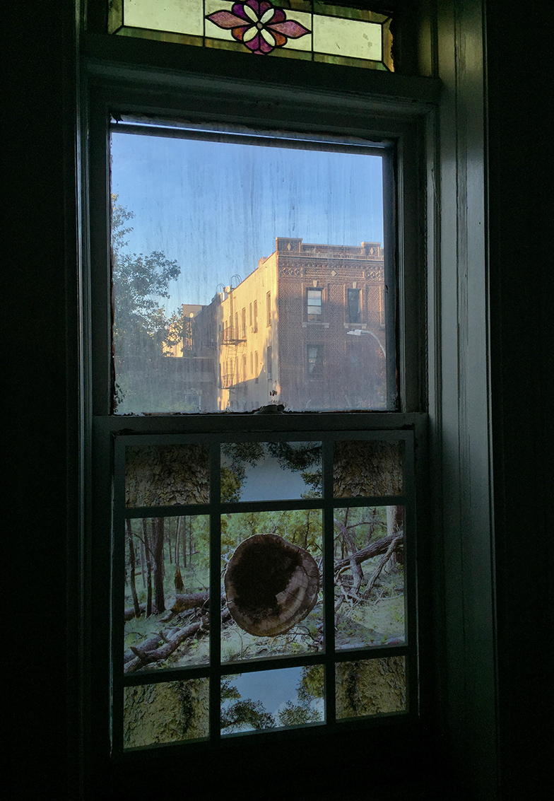
A beautiful window- with a new outlook on the bottom.

kalbachinterventions09

An eerie scene of a door of the house on the top …it had a bit of a Shining feeling to it.

kalbachinterventions10

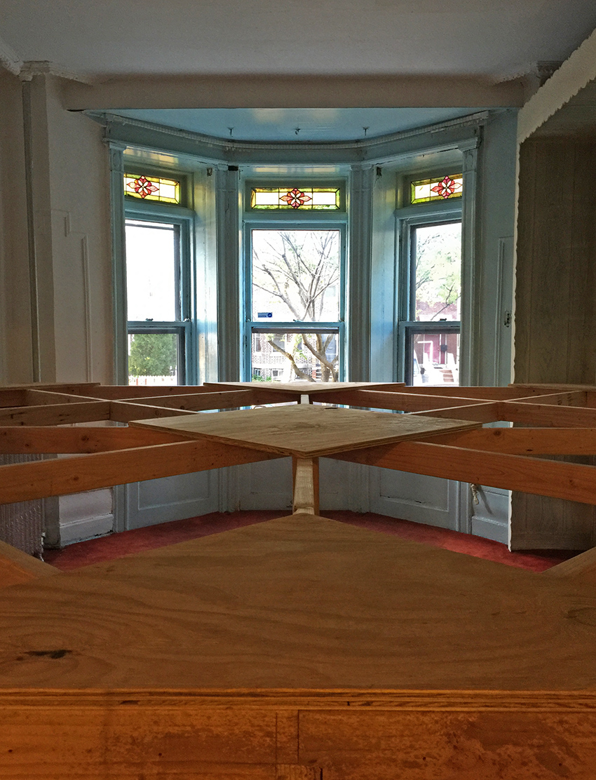
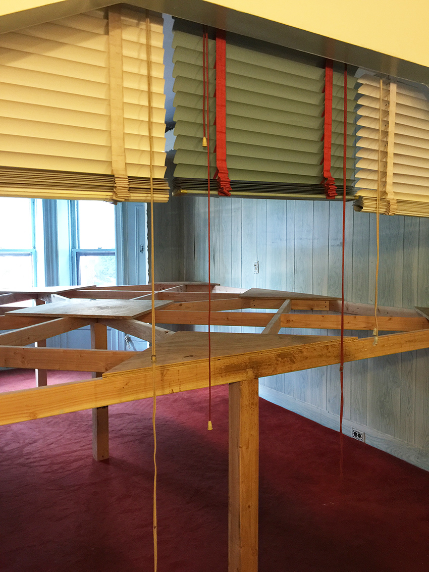
A bar in the living room for a performance piece where on outside later you could see the top of the bodies of the peoplekalbachinterventions12

and with the blinds closed – you could only see the legs of the people form the inside.

kalbachinterventions13

The house was beautiful in it’s state and made you wonder who lived here before and what stories were lived in this house. It looked as if it was a Jewish Boarding house. The upper floor had all pink doors and the kitchen was pink , while the bottom floor had all blue doors with a blue kitchen and a mezuzah was attached on every door frame.

kalbachinterventions20

kalbachinterventions14 kalbachinterventions21

A light installation downstairs

kalbachinterventions16

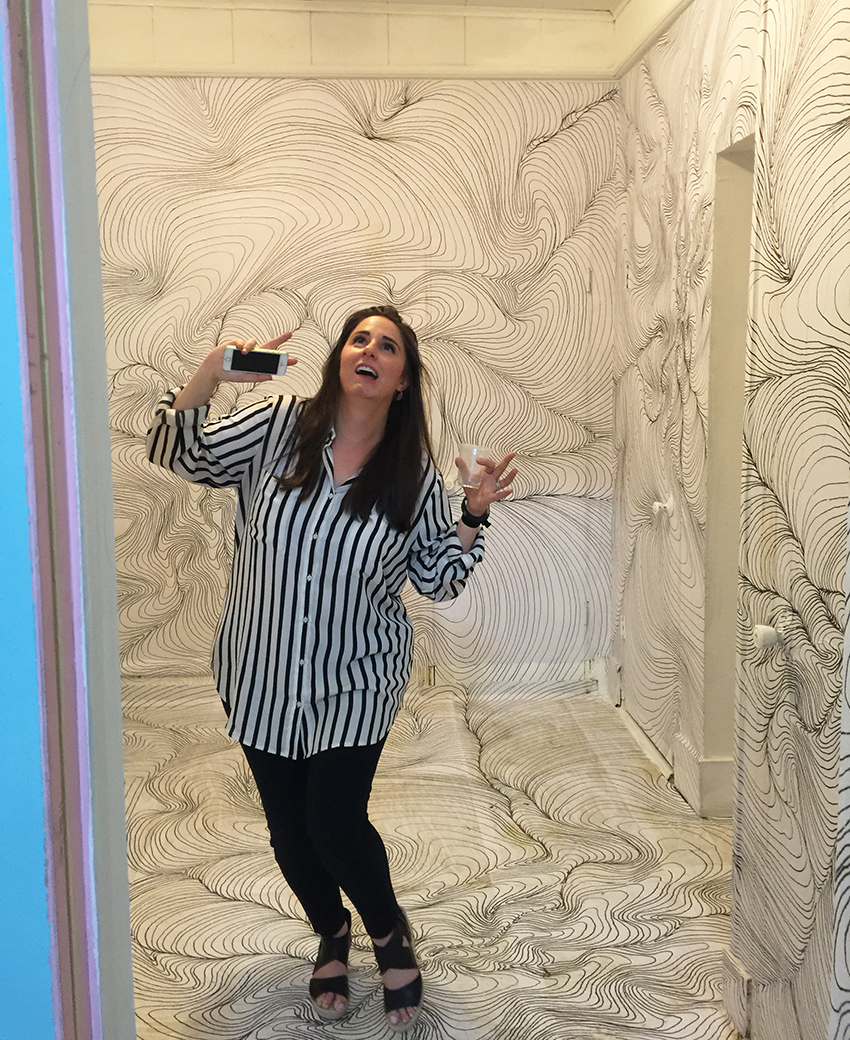
And my friend Lori going all stripey in the stripe room ;)kalbachinterventions18

Outside the house the most awesome shed – probably later art studio to be. kalbachinterventions24

I loved the concept of this show. Every room was a discovery, either of art, or the untold story of the room or of both.

I hope you enjoyed this Art Stroll and hey…you didn’t even had to sign a waiver ;)

Comments (1)

  • Joi@RR

    |

    For sure.. never have seen anything like this Nat. Well – old houses – yes… remade those myself!! But not artwork like this. I am blown away – almost in disbelief – so crazy unique and out of the box incredible. So glad you got to go view it all in person. What an experience. Thanks bunches for sharing. You always enlarge my universe and my artful thoughts! Xj.

    Reply

Leave a comment