Creative Squad

Creative Squad: Favorite Art – My Way – Riikka Kovasin

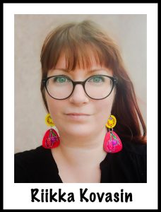
Hello from my Creative Squad! Today we have a post and video from Riikka Kovasin who is sharing an art journal page that takes an artwork and subject matter and makes them all her own with my Fairview Fan foam stamps, ATC Mixup stencil, and Mesa Verde stencil. Our theme: Favorite Art – My Way – Look at a favorite work of art and create something inspired by it, drawing from the colors, shapes, subject matter, feeling etc. that strikes you most when you look at it.


The Whole World is a Garden

Heippa! It’s Riikka Kovasin here today to share my take on the “Favourite art – my way” theme. Like I say in the video, I again struggled a bit in the beginning. This time the trouble was to narrow down the options!

Choosing a Finnish artist was a must for me. At first, I thought about a female artist, but didn’t want to go with Helene Schjerfbeck. For one, I wanted to highlight someone maybe not as known and secondly, I’ve already used her art to inspire me a couple of times (check out an example here). My second choice was a lady, who’s photo is always on my craft table, Ellen Thesleff. I love her work, but none of the pieces really jumped up to me this time and was like “me, redo me!”. The reason for this might also be that I’ve used her art before as well here. Back to the drawing board it was!

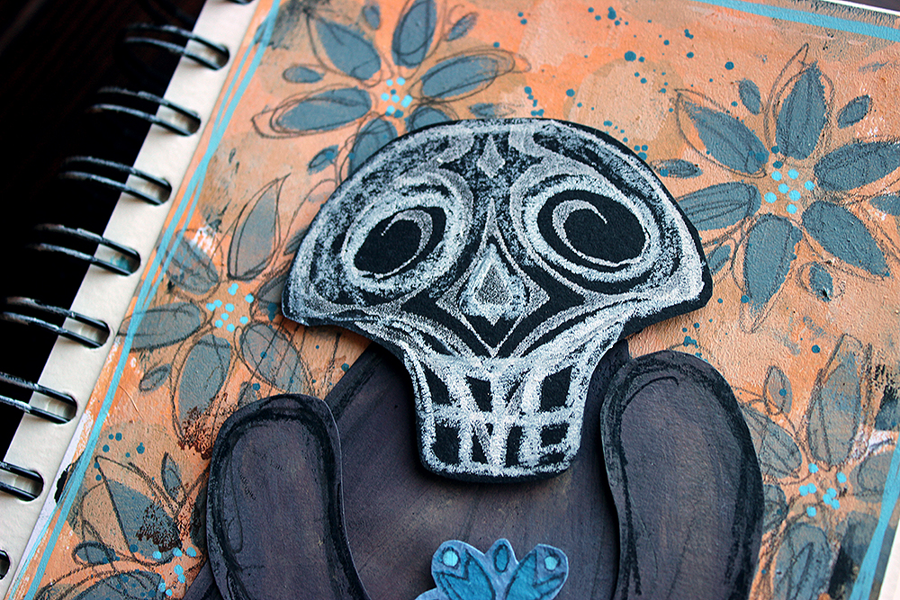
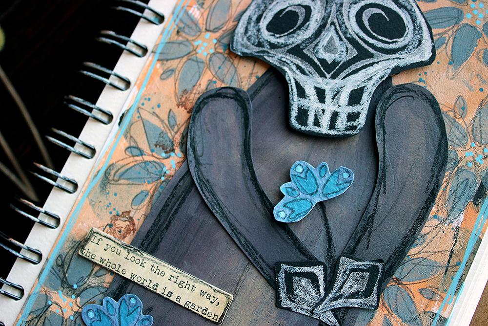
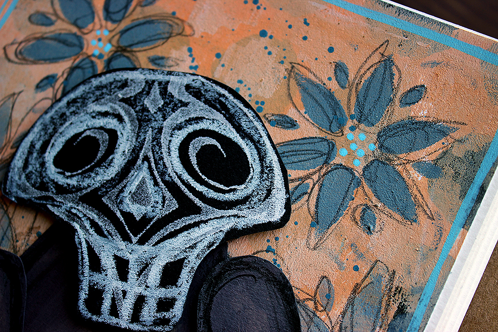
I then decided to take a totally different approach to the subject and let a tool do the deciding for me. Like I say in the video, since I got the “Fairview Fan” foam stamp set, I’ve seen the other stamp as a skull. I have been eyeing it before, thinking about a Halloween card, but had not yet jumped to the idea. So, now was the perfect time! After deciding on the skull, it was then easy to pick up the artist and artwork.

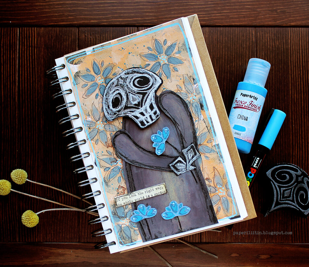
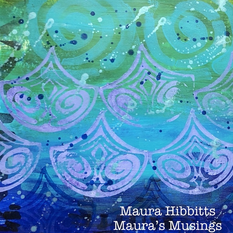
Death, as a personification, is a re-occurring character in the works of Hugo Simberg. He’s not a scary character but more a bit lost and an outsider. In some ways he reminds me of the Death in the Discworld series, not quite getting the ways of men. My favorite piece with Simberg’s death character is a painting called “Kuoleman puutarha”. The subject was so dear to the artist himself that he did several versions of the piece. What I used as my reference here, is made in 1896, a small gouache and watercolor work. You can read more about the piece here (link) and about the artist here (link).

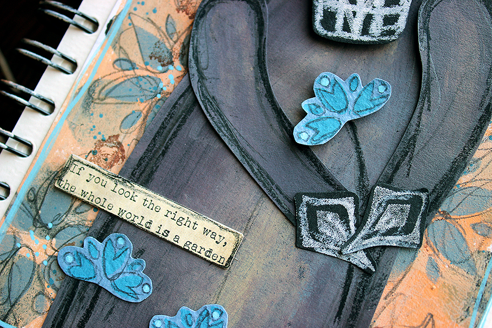
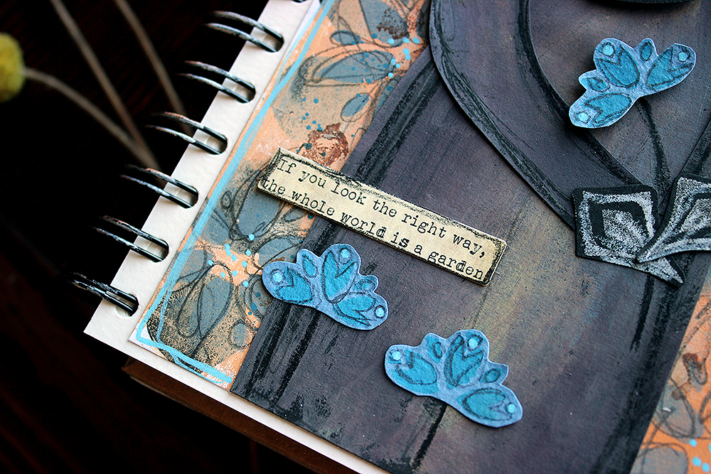
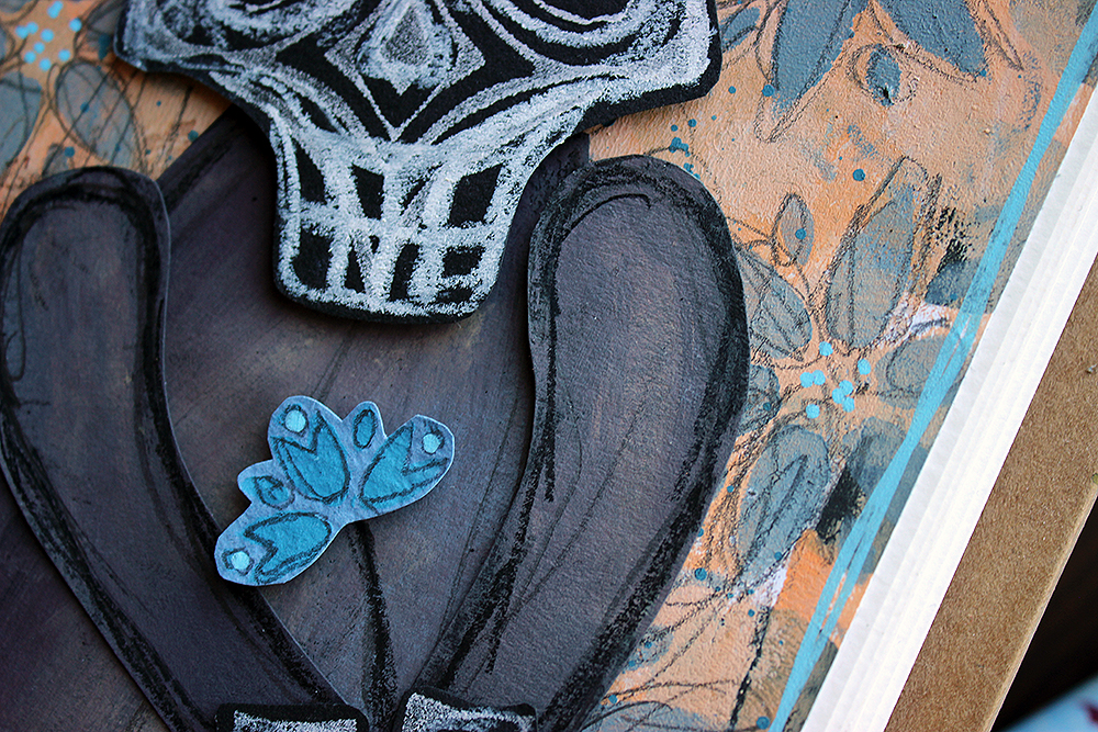
In the painting, there’s three death characters caring for the plants in their garden. While my favorite of the three is the one on the left, leaning on the workbench, watering the plants, I chose to make a version of the second character, the one in the center. He’s the one who usually gets pointed out as the posture of the character is so tender, almost fragile. My character doesn’t have the same fineness of the posture, but I hope the atmosphere still comes across!

If you’d like to see, how I made the page, please see the video below. If you want to jump directly to the making process and avoid the introduction, the process starts at 1:08.

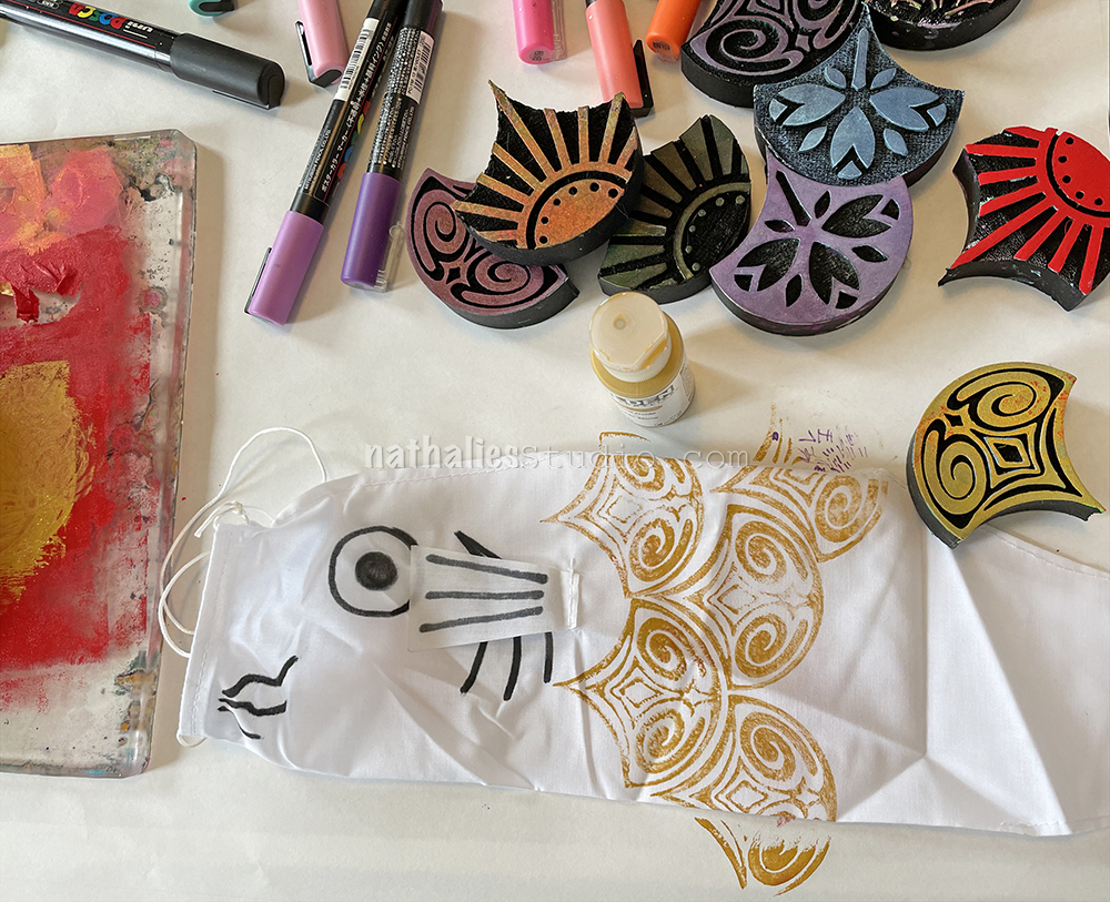
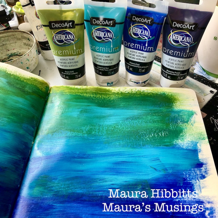
What I used in my piece, besides the obvious character, was the warm honey toned color scheme. Like I said earlier, Hugo Simberg did several versions of the subject, but as they are mostly black and white, they are missing the warmth of the watercolor piece that inspired me. Another colored version of the “Kuoleman puutarha” is at Tampere Cathedral. The colors are a bit different in it as well, as it’s a fresco, painted on the cathedral wall.

While the original artwork has an abundance of strange plants, I depicted those in my take more uniformly. The background flowers represent the other plants in the garden, while I highlighted the bluebell-styled flora as it’s the one the character is holding.

I hope you don’t get frightened by this character but rather find him endearing! Thank you for stopping by today!

Xoxo Riikka


Thank you Riikka for sharing your brainstorming process and also your beautiful take on a subject that is not often represented in such a tender way!

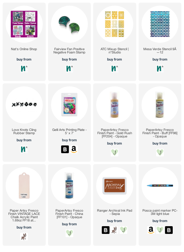
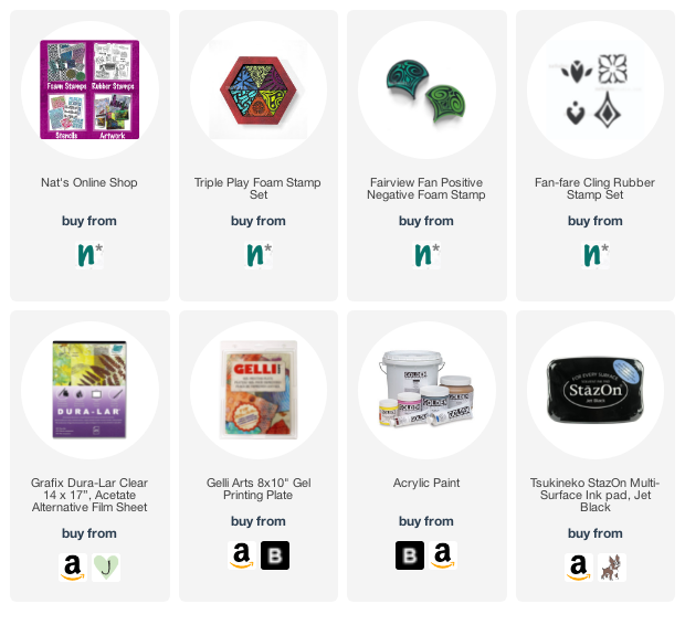
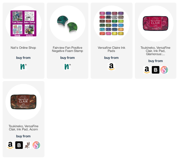
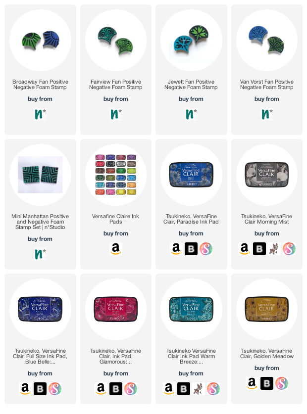
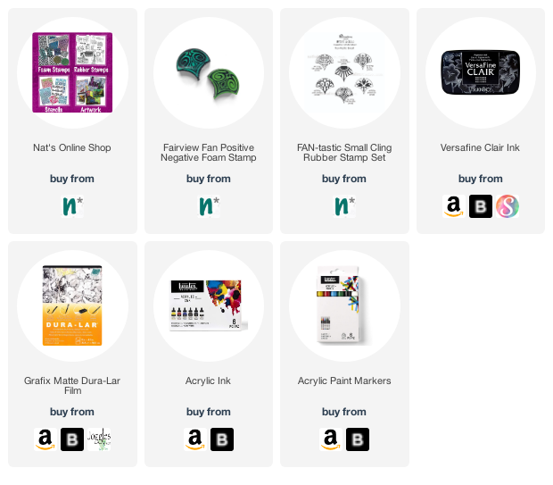
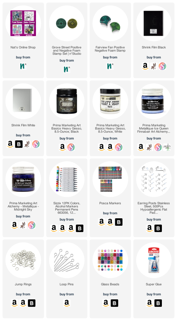
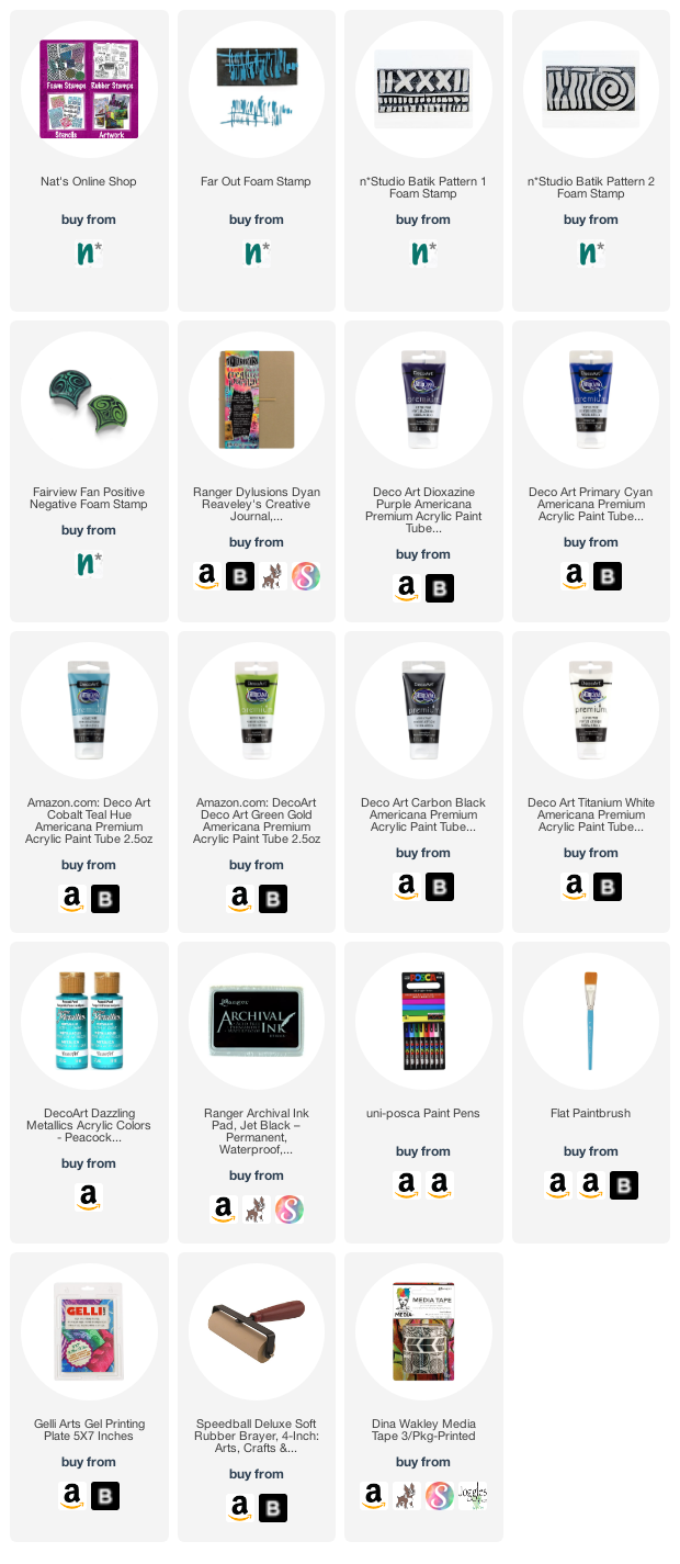
Give it a try: you can find all my Foam Stamps, Stencils and Rubber Stamps in my Online Shop and here are some of the supplies Riikka used:

Looking for more projects? Follow the Creative Squad on Instagram here.

Leave a comment

Fishy Fishy Koinobori Windsocks – DIY Playdate

After many months of keeping these fish windsocks in my closet, Kim and I finally got together last week for a playdate. Koinobori are a Japanese tradition – windsocks that are usually flown around the celebration of Children’s Day (read more about this tradition here). We love the shape of these and the possibilities for personalizing them and wanted to put our spin (and stamps LOL) on these festive fliers.

The supplies were easy to gather together: my fan shaped foam stamps (perfect for fish scales!!!), the Koinobori windsocks (link below for those), acrylic paint / acrylic gouache, Posca markers, a brayer, and gelli plate. There are traditional Koinobori colors to symbolize different members of your family, but we decided to go with some of our favorite colors.

We looked at lots of examples online and started with some of the details, using a black posca marker. Eyes, gills, whiskers (these are actually carp, so they have some whiskers)…

…and also the fins. Each set of windsocks came with 3 different sized fish and the larger two have more detail, shape, and fins. We found that the larger bullet nib Poscas worked best on the fabric.

For the smallest fish, my Mini Fan foam stamp set was the way to go – a perfect size and shape to create “scales”.

We rolled paint out on a Gelli plate and then either brayered it on the stamps or used the Gelli plate like a stamp pad.

Then just stamp on the fish. We found that the fabric was sturdy enough that it didn’t bleed through.

Just keep going with the pattern. This is the medium sized fish, so my larger fan stamps like the Fairview Fan set made quick work of the pattern.

On the larger fish you have to work around the fins but you can decide how fussy you’d like to be.

Here’s a little guy all stamped with one of the Mini Fans.

And here’s the medium fish – it comes together pretty fast with the foam stamps!

You can add other colors with Posca markers – trace the stamp shapes to highlight the pattern or to add more detail to the fish.

You can also trace the fan shapes to emphasize those scales.

The smallest fish has such little detail that you kinda have to fake it with fins and such. We also definitely used the small ones to test out what we liked best in terms of design.

And in the end, we created a beautiful school of fish!

Each one an individual and full of personality :)

When they’re all ready, it’s time to let these windsocks fly!

On a windy day this guy will be “swimming” through a local community garden :)

Hope you give this project a try. Here are some of the supplies we used:

Comments (2)

  • Sue Clarke

    |

    L-O-V-E these!!!!!!!!!!!!!

    Reply

  • jean marmo

    |

    These are so very cool!

    Reply

Leave a comment

Together – Art Journal

“We were together. I forget the rest.” – Walt Whitman

The collage elements in this page tell quite the story. The green paper strip in the background is from a scrapbooking paper line I did for a French company back in the day …it was called Emoticon and I thought I should use it up as I still have some sheets.

The Fairview stamped paper is from a technique and online class that I produced with Birgit Koopsen and Marsha Valk called Time Traveler. We each chose a stylistic era to draw artistic inspiration from in the course. In addition to showing a bunch of gelli printing and other mixed media techniques, we also each bound all our pages together in the end using a different bookmaking method. You can check it out here, sign up, and enjoy the class at your own pace :)

I forgot where I got the sheer adhesive backed strip from that I used to attach everything – they are strips that I think someone gave to me a while ago… They are great for journaling and stamping on (I stamped one of my Fan-fare stamps on this page) to make your own washi tape. Maybe someone knows what they are and can tell us in the comments below!

I was using my Triple Play foam stamps with stazon ink on Grafix Duralar for this element. It was part of a technique that I showed in another class with Birgit and Marsha called Beyond the Paper. As you can probably guess, the class looks at a bunch of different substrate alternatives to paper and still gets me thinking. You can check it out here and again, it’s available anytime ;)

In my move I found a lot of odds and ends and am excited about finally using them – stamp and stencil samples, tests, misc products, and collage papers from my online classes.

Here are some of the supplies I used in this page:

Comments (1)

  • Sue Clarke

    |

    That paper line was awesome and quite different for its time. I have a piece or two kicking around.
    Nice words and design. Have a great day Nat!

    Reply

Leave a comment

April ArtFoamies Challenge – Day 26

We’re recapping Nat and Sarah’s April ArtFoamies Challenge today with April 26 – are you playing along with us? Be sure to tag #artcollabChallengeAccepted – we’d love to see what you are making!

April 26 – Bird – Oh man …honestly not my favorite of all the prints- I was thinking the positive and negative Fairview Fan stamps that slightly look a bit like bird heads would be perfect for this in brown and red …kind of like red robin …but it really did not come out the way I wanted it to…the yellow “beak” printed with one of my rubber stamps made it slightly better but I would rather just put a bird on this one and move on ;)

And another look:

Follow along with the challenge on instagram  and post your artwork too with the hashtag #artcollabChallengeAccepted

Here are some of the supplies I used:

Leave a comment

April ArtFoamies Challenge – Day 22 & 23

Are you playing along with Nat and Sarah’s April ArtFoamies Challenge ? You can follow along on my Instagram feed daily with videos and photos, and I post updates here on the blog too. Today I’m recapping 22 and 23. Enjoy!

Day 22 – Fantastic –

Not a surprise here…since I have been creating a ton of fan shaped stamps for a while. The shape and possibility to add pattern to it just makes me super happy! So here is a bunch of fantastic stamps ;) including Broadway Fan, Fairview Fan, Jewett Fan, and Van Vorst Fan.


Here is a look at those Fantastic Fans!


April 23 – Grid – Had to be the Manhattan Positive and Negative Stamp set. Of course I screwed it up in the middle of the stamping – just like you get lost in Manhattan when you do not pay attention. The trick is to just pretend you wanted to go that route anyway… and then all is good and you are mastering the grid.


Here is a look at that April 23 Grid:


Follow along with the challenge on instagram  and post your artwork too with the hashtag #artcollabChallengeAccepted

Here are some of the supplies I used:

Leave a comment

April ArtFoamies Challenge – Day 02

We’re on Day 02 of Nat and Sarah’s April ArtFoamies Challenge today! You can follow along on my Instagram feed daily with videos and photos, and I will post updates here on the blog too from time to time throughout the month. 

Day 02 and our prompt is Punch – I love my Fairview Fan positive and negative stamps – doesn’t it look in the beginning as if there is a punch out?

Everyone approaches Challenges differently. This ArtFoamies Challenge that Sarah Matthews and I came up with has had me thinking about how I want to approach it. In the past my Foam Stamplifier Challenge #foamstamplifierchallenge I used all kinds of different media, so I didn’t want to repeat myself. I also thought about how Sarah usually uses ArtFoamies with ink pads, while I use acrylic paints and the first parameter became clear: I will only use ink pads for the challenge. The other challenge is that I purchased an old ledger journal and I want to turn it into a pattern book. I usually make my own pattern books by binding loose printed papers into a book. This method has the advantage that if a print doesn’t turn out too great it can be discarded. By printing directly into this 125 year old ledger I have no out. So using my foam stamp designs to create patterns into a ledger book with ink pads is my challenge for this month.

Here is a look at that page too:

Follow along with the challenge on instagram  and post your artwork too with the hashtag #artcollabChallengeAccepted

Here are some of the supplies I used:

Leave a comment

Be the Light – Art Journal

When day comes we step out of the shade,
aflame and unafraid
The new dawn blooms as we free it
For there is always light,
if only we’re brave enough to see it
If only we’re brave enough to be it

-Amanda Gorman

I was so inspired by Amanda Gorman’s poem from the presidential inauguration, and particularly the final lines.

For my background I used my Fairview Fan foam stamp and also the Fairview rubber stamp from my Fan-tastic Small set. I added little dots under some stamps to make them look like exclamation marks – words fly…

I sketched Amanda on Dur-a-lar matte with acrylic ink and paint markers.

Are we ready to be the light? I think so!

Here are some of the supplies I used:

Leave a comment

Shrink Plastic Earrings from Riikka Kovasin – Guest Post

Today we have a very special Guest Post from one of our Creative JumpStart 2021 teachers: Riikka Kovasin! She is bringing us 3 different shrink film earring ideas using my Grove Street and Fairview Fan foam stamp sets. Before we get into it though, let’s hear a bit about Riikka:

“Heippa! My name is Riikka Kovasin and I am a mixed media crafter from Finland. I live in Helsinki with my darling husband and our two sweet daughters. Creating is my passion and a way of self-care. Besides family and crafts, my weeks are filled with a full-time job.

I have been doing all sorts of crafts my whole life. I really got into papercrafts after I found scrapbooking when my older daughter was about 6 months old – that’s over 10 years ago. Since then my style has evolved to more and more mixed media direction and nowadays, I tend to go dimensional and do more altered and mixed media pieces than regular layouts.

I absolutely adore getting my hands into paints and mediums! To me the process of creating is equally as important as the finished project.”

We are so excited to share some projects with you from Riikka, and this is the first of a few that will be coming in the next few weeks so check back for more :)


Hi there! It’s Riikka Kovasin here today to share a guest project with you. I actually made a couple projects, so you’ll be seeing me a few times in the course of next weeks.

As my first go I made some jewelry pieces. I really love the patterns of the foam stamps and love how satisfying it is to stamp with them, but on their own they are maybe a touch too big to be used as jewelry. As a pendant, maybe, but as I’m more into earrings the images seemed a bit too big. But no worries, I can always use shrink plastic! That way I’m getting the pattern and the feel of the foam stamp, but the finished piece is half the size! So satisfying!

For these three pairs of earrings, I used both white and black shrink plastic. I used acrylic paint to stamp the images and then colored them using alcohol and paint markers. The first pair is made using both the Grove Street and Fairview Fan foam stamp set. The circular piece has an earring stud at the back. 

The dangly parts are made using both positive and negative version of the fan stamp set. To make the center fan a little bit longer than the other two I added a red glass bead between the circle and the fan.

The second pair has even more glass beads as there’s just the fans that are stamped. Again, there’s a stud piece at the back.

The last, but not least, is maybe my favorite. I made that using the Grove Street stamp, just alternated the color I was using on top of black shrink plastic. The first one is done with inky blue metallic acrylic paint, the second one pale blue metallic acrylic and the one nearest to the ear is then white acrylic paint. 

These dangle all the way as I added a stud earring with a little ring on top.

I’m not a jewelry maker but these were so easy to do even I managed them! Now the only trouble is to decide which pair to use!

Stay safe everyone! Xoxo Riikka


Thank you Riikka! Wow who is excited to try foam stamps with shrink film now? I love all three of these possibilities and I love how they could work for a variety of different fashion styles.

Want to give it a try? You can find all my Foam Stamps here in my Online Shop and here are some of the other supplies Riikka used:

Comments (8)

  • robinseiz

    |

    Great lesson. Thanks so much… Who even knew there was black shrink plastic?!!!! I really love the effect you get with that! I’m going to add it to the very long list of things I must try.

    Reply

    • Riikka Kovasin

      |

      Thank you Robin! In my craft store they had this selection of four different kinds of shrink plastic sheets in a pack – black, white, glossy transparent and mat transparent :) That was perfect as I didn’t have to choose which color to pick :D

      Reply

  • Kath

    |

    Awesome post. You read mind. I’ve been wanting to make earrings with shrink plastic for the past few weeks but was struggling with drawing a decent image and coloring so that it wasn’t smudged or looked good. Your stamps and the type of paint solved my roadblocks! Beautiful, beautiful earrings that I think I can actually make. One question, did you sand the plastic first?

    Kath

    Reply

    • Riikka Kovasin

      |

      Hi Kath! I didn’t sand the plastic first so the earrings are bound to get some wear and tear. Sanding helps the paint to grab the surface better. Or then just add more paint when it seems to wear off :D

      Reply

      • Kath

        |

        Thanks for that input. I just seem to smudge the colors. However, I noticed when I sanded, you could see the marks, which I do not like. I can’t remember what people use to glaze the plastics.
        I’ll have to check it out. I just love how the paint you used worked with the stamp and it didn’t look like it smudged at all.

        The stamps you used are sold out. I’m gonna wait for restock. That’s how much I liked your earrings!

        Thanks for inspiring me!

        Kath

        Reply

        • Riikka Kovasin

          |

          I’m so happy to hear that you liked these so much Kath!.

          As you are stamping on top of a sleek surface with a slippery paint, it may slip and smudge. If you look closely to the other of the white stamped circles (with gesso), it’s a bit thicker than the other. A slight slip or turn caused that.

          My tips would be to use a heavy body style paint, more gel-like, use just a little of it, and to use light pressure when you lay down the stamp. Another way is to actually put the stamp to the table, pattern side up with the paint added and carefully place the shrink plastic on top.

          Hopefully this helps when the stamps have been restocked and you get to make your jewelry pieces!

          Reply

  • Anne Lawver

    |

    Love this idea! Rikka…you are always so clever and original, combined with a dose of practical. Thank you both for this “bonus”! It was a nice surprise.

    Reply

Leave a comment

Under the Sea – Maura Hibbitts

Hello from my Creative Squad! Today we have Maura Hibbitts sharing with us an art journal spread that makes me want to go to the beach RIGHT NOW :) Maura is using my Far Out, Batik 1, Batik 2, and Fairview Fan foam stamps along with this month’s theme: Under the Sea – There is something so fascinating about water. We love being in it, floating on it, relaxing next to it, and it remains one of the last frontiers here on the planet. Create something that is an ode to the sea.


I love the sea! I look forward to journeys to the ocean, and the time to sit on the beach and just contemplate, listening to the sound of the waves ebb and flow. I am always curious about what life is like in the ocean for the amazing creatures who call it home.  What is under the sea, in the deep depths? And yes, my imagination runs to the likes of 20,000 Leagues Under the Sea by Jules Verne, the lost city of Atlantis, giant Kraken…to me the mysteries of the sea are definitely waiting.

I headed to my large Dylusions art journal, and swiped on paint across the pages, from purple to blues to green, working my way up from darker to lighter. I blended a bit between color layers, trying to recreate ocean layers from the depths to the surface.

I am using the Far Out stamp and black paint to add some texture to the deep waters. I like to use a gel plate to stamp off of when I am using paint. I can push the stamp onto the paint, or apply it directly with the brayer.

I decided to stamp a bit around the edges with the Batik 1 stamp and black ink.

Now it is time to create the waves in the upper waters. I started with the swirl on Batik 2, and using the Cobalt Teal, I made a series of swirls across the top of the pages. Then, I mixed some teal with the purple, and used the lower part of the stamp to add a bit of a wave pattern in the darker area. I feel like this gives the water a feel of flow.

I used the Fairview Fan stamp to continue with my wave theme. I mixed some white and purple to get this gorgeous lavender, and stamped this under the teal swirls. I stamped two rows horizontally, then did a row with the Cyan.

I mixed a bit of Cyan with water, and splattered some drops on the pages with a brush. Once that dried, I flicked a mix of Peacock Pearl (metallic paint) across the pages. I think they look like bubbles rising.

I edged the pages with washi tape to finish it off.

For the final step, I hand lettered a quote about the ocean with a paint pen.

When you are next at the ocean, will you just look out at the waves and the horizon, or will you stop and wonder at what is under the surface?

I know I will continue to be amazed at the diversity and complexity of ocean life and the many moods of the seas. I have a feeling, there is still so much of the deep ocean we have yet to discover, and maybe, just maybe, the ocean should be allowed to hold on to some of that mystery. Let’s continue to protect our oceans and the wonderful life it holds. – Maura


Thank you Maura! I love how you used the different stamps to capture the motion and beauty of the sea :)

Give it a try: you can find all my Foam Stamps in my Online Shop and here are some of the other supplies Maura used:

Feel inspired? Working on something yourself that you’d like to share?  I love to see how you interpret our monthly themes. Email me how you used my stencils and stamps with the theme and email me an image – I would love to share your projects in my next  “n*Spiration From Around the Globe“.

Comments (1)

  • Sue Clarke

    |

    Bravo Maura!
    Yes, I long for the sea this time of year especially.
    Love the layers and the ocean colors you used.

    Reply

Leave a comment