Blog: ATC Mixup

Creative Squad: Lost in a Book – Judi Kauffman

Hello from my Creative Squad! Today we have a post from Judi Kauffman who is sharing a nifty project for all you bookworms out there! She’s using my ATC Mixup stencil and kicking off our new theme for us: Lost in a Book – What is one of your favorite books (from childhood or as an adult) or a book that you recently read and really enjoyed? Create a project inspired by the characters, plot, or any element of the book that really stuck with you.


I’ve been getting lost in a book since I was 4 and started to read! To this day you can always find me with a stack of books spilling out of the night table by my side of the bed, and another pile next to the easy chair in the living room, right next to the jars with colored pencils and pens. I can remember reading HEIDI over and over and getting my first library card was like winning the lottery!

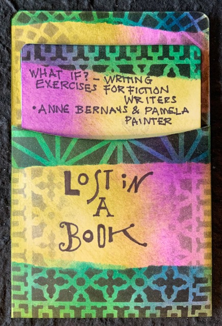
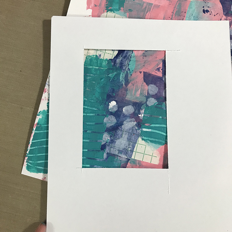
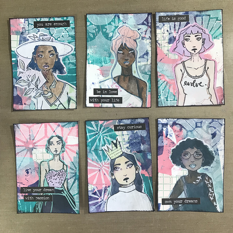
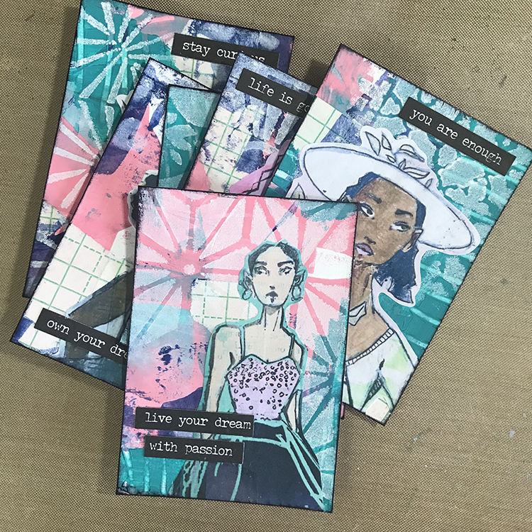
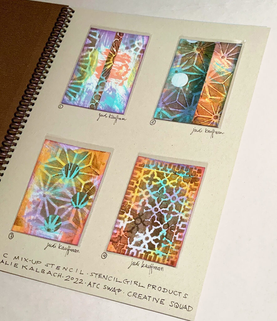
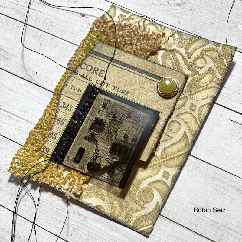
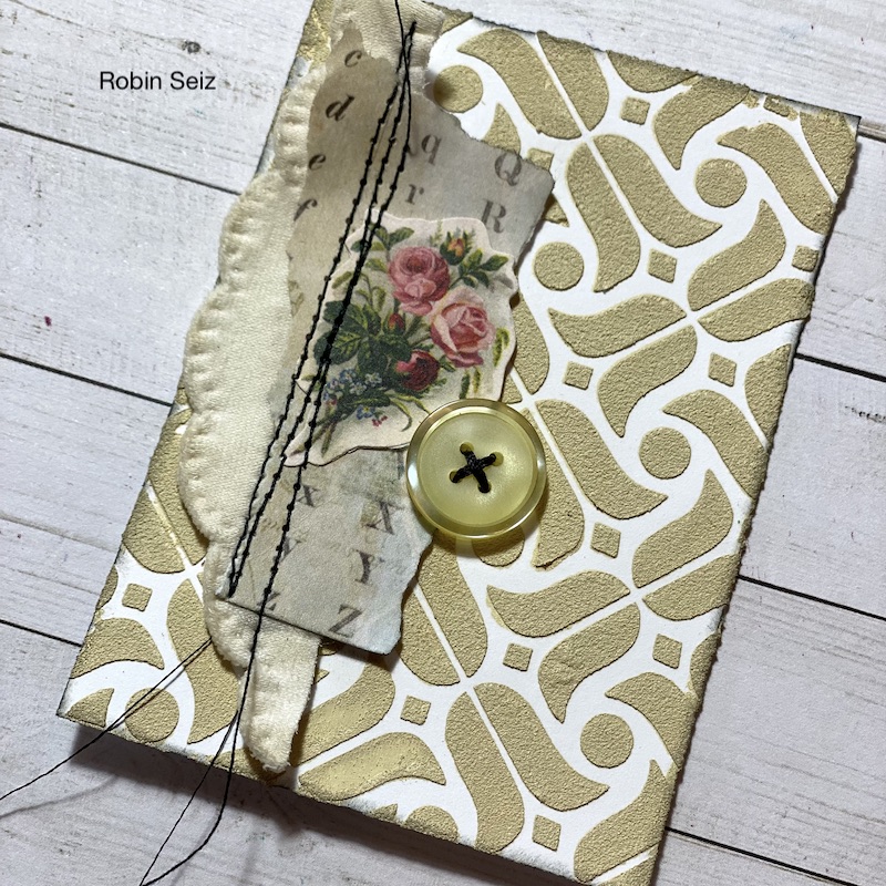
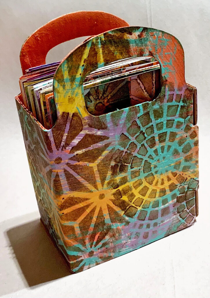
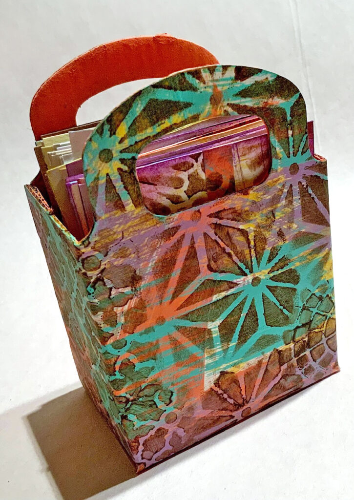
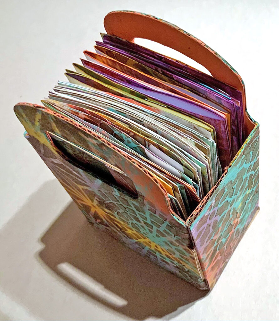
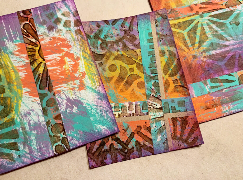
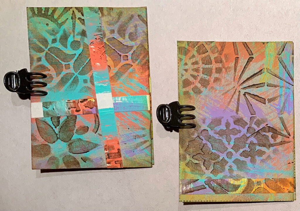
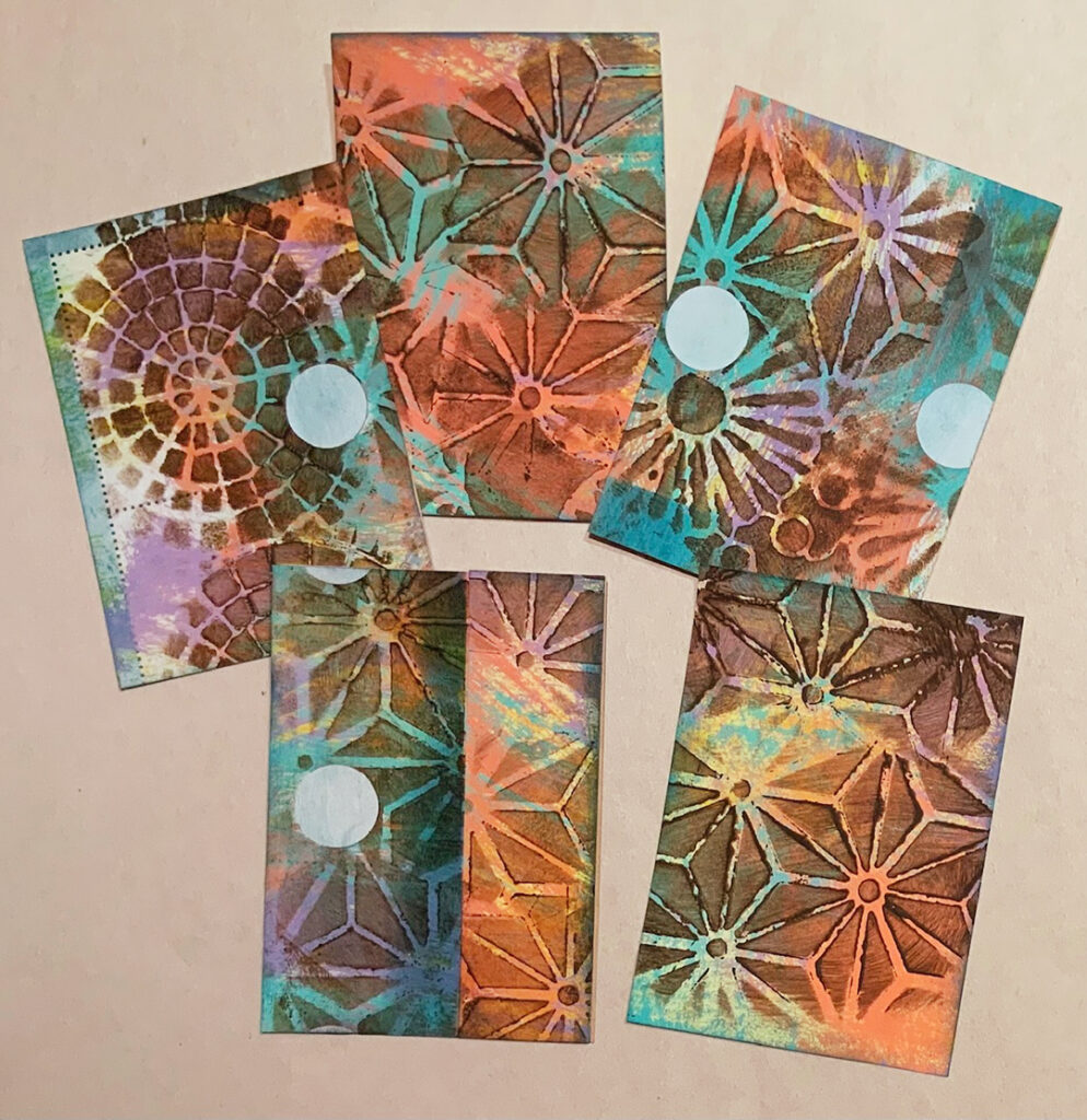
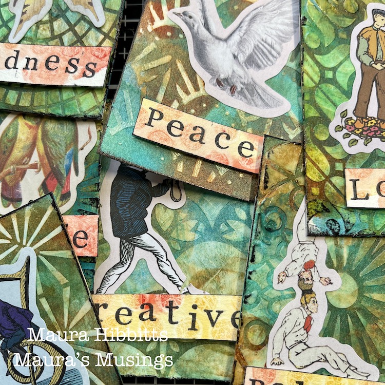
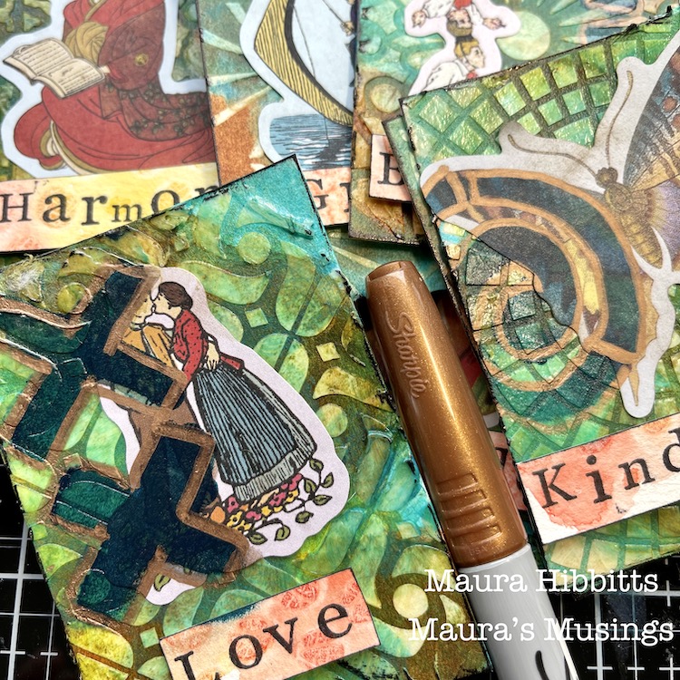
Instead of focusing on a single book for this month’s Lost in a Book theme, I decided to create some library pockets to put into my Traveler’s Notebook. I can record the title and author of each book I’ve been reading on the insert cards and add a few notes so that I can remember and recommend my favorites!

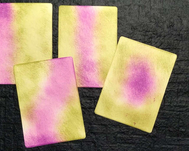
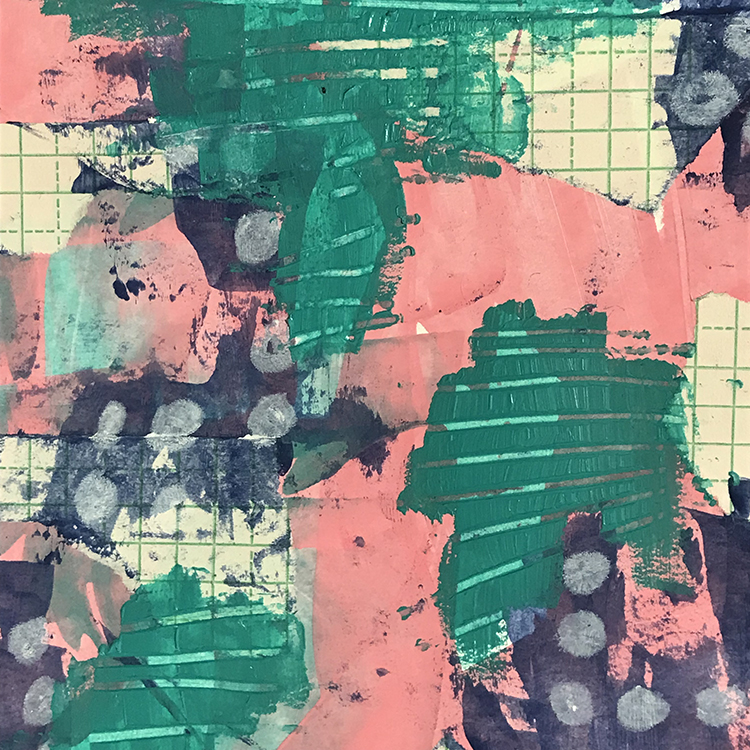
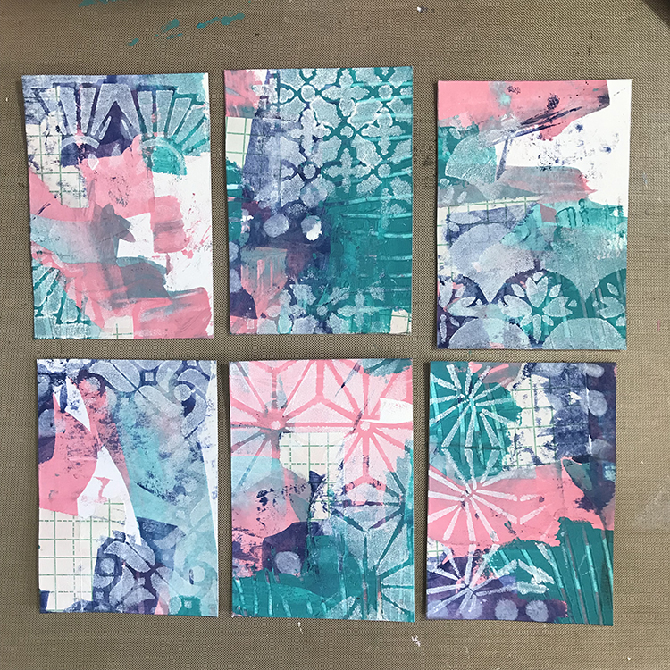
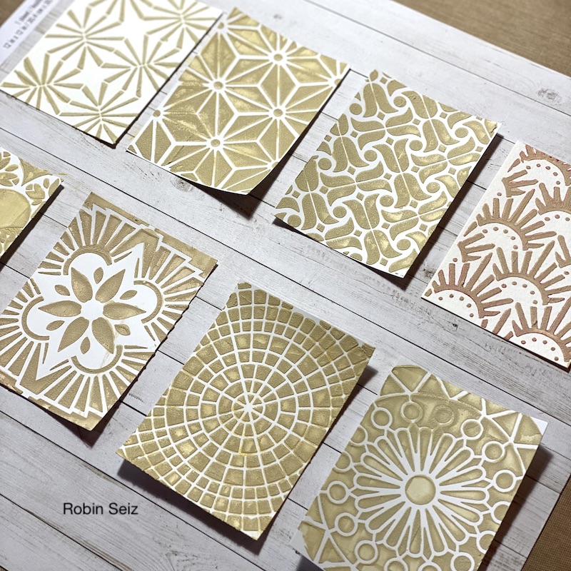
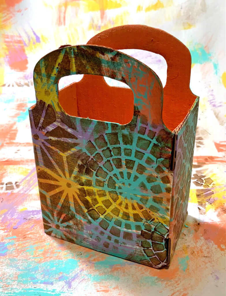
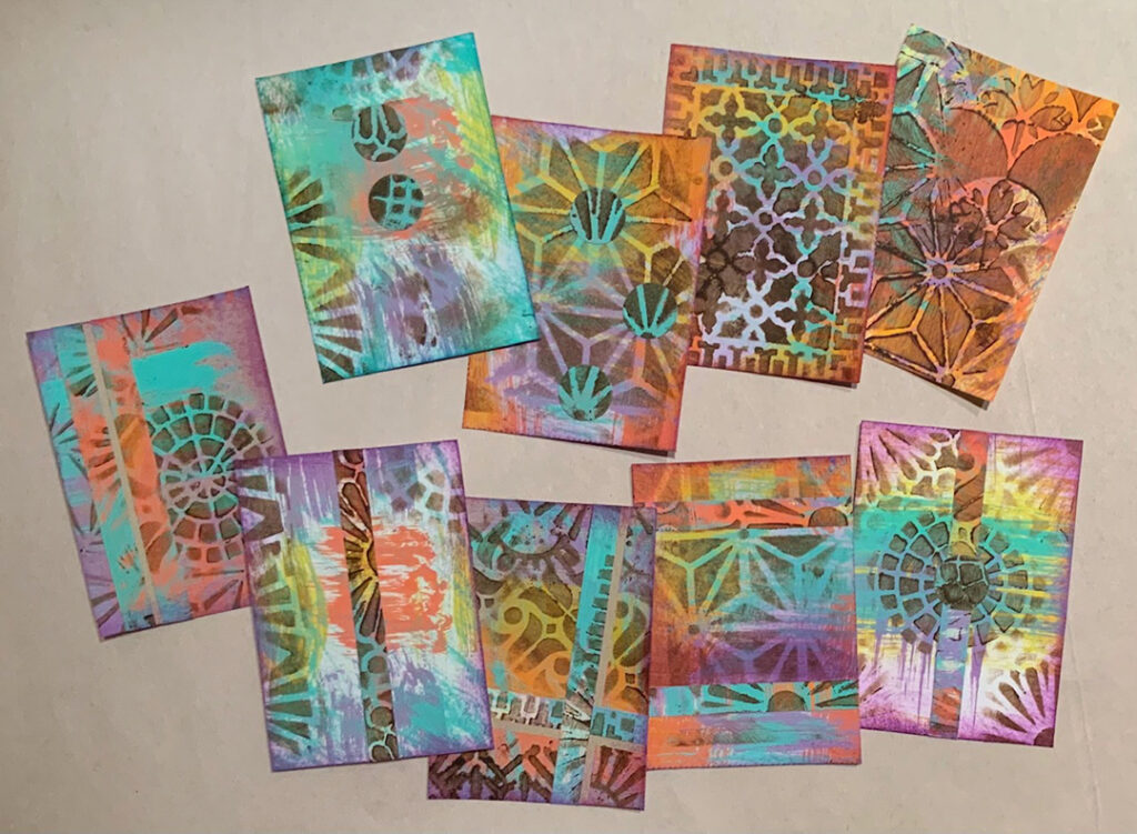
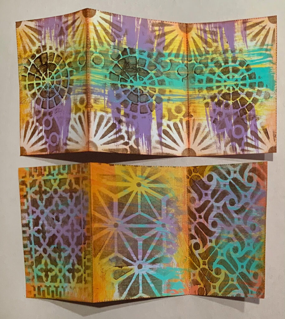
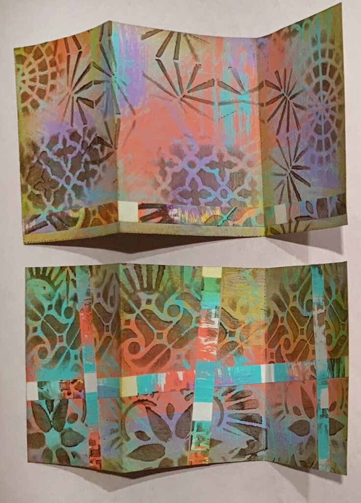
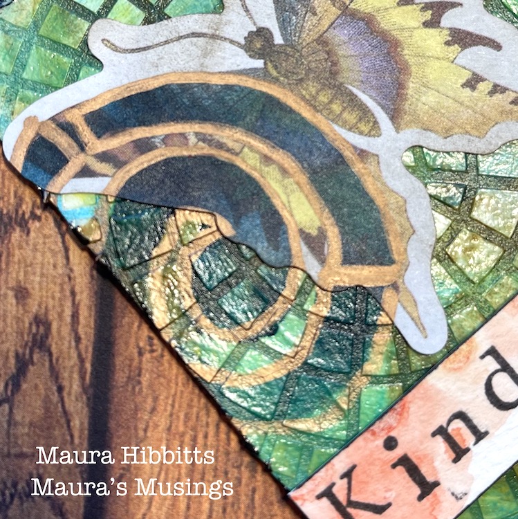
Instead of plain vanilla (or, more accurately, manila) I duded them up with inks and Nathalie’s ATC Mix-Up stencils!

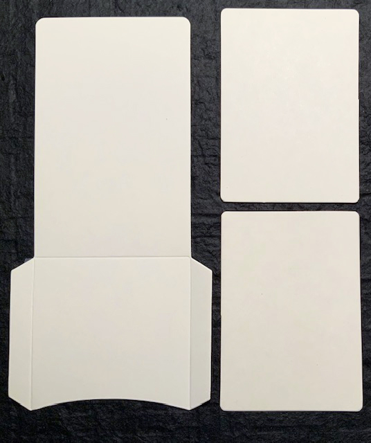
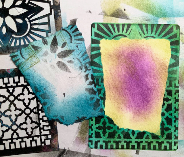
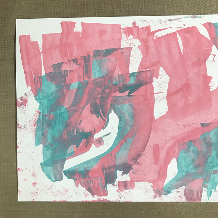
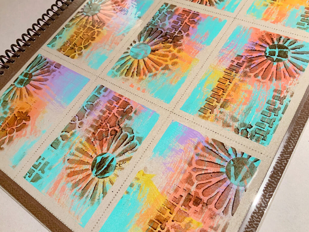
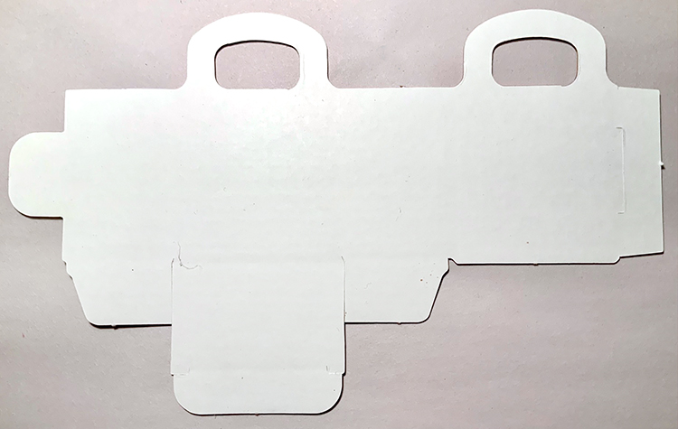
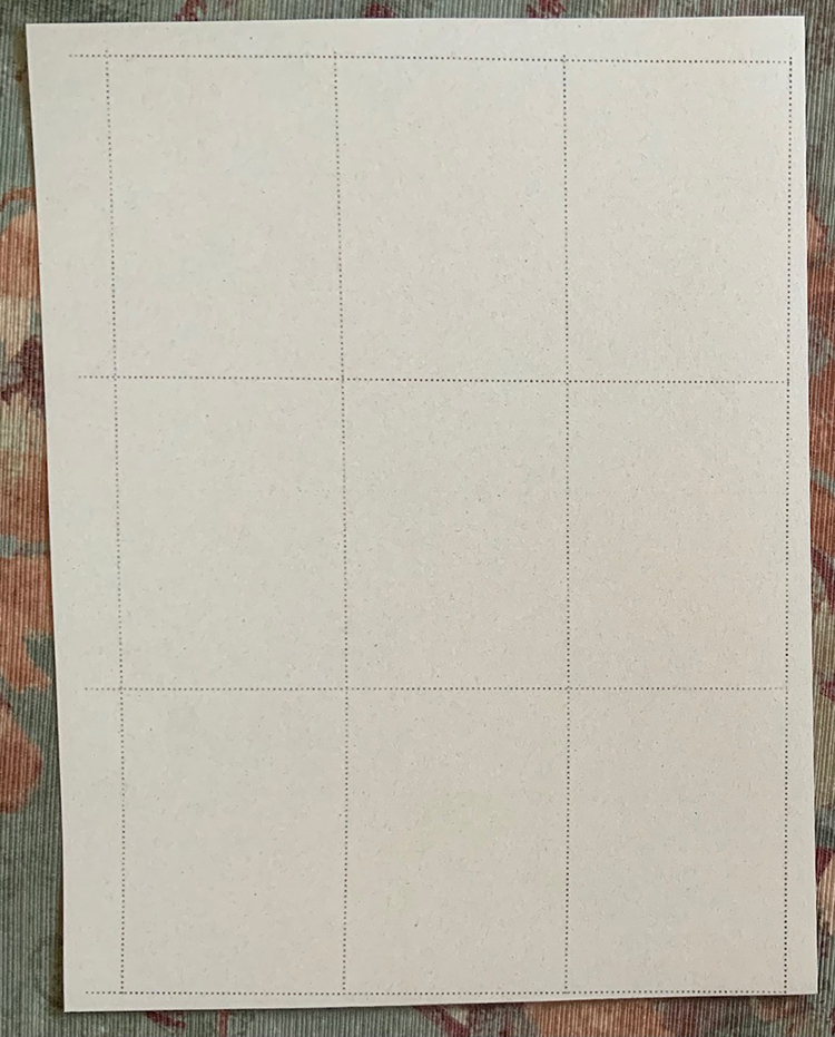
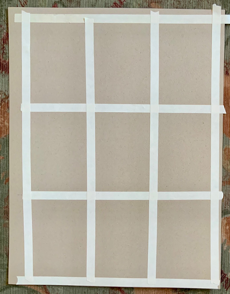
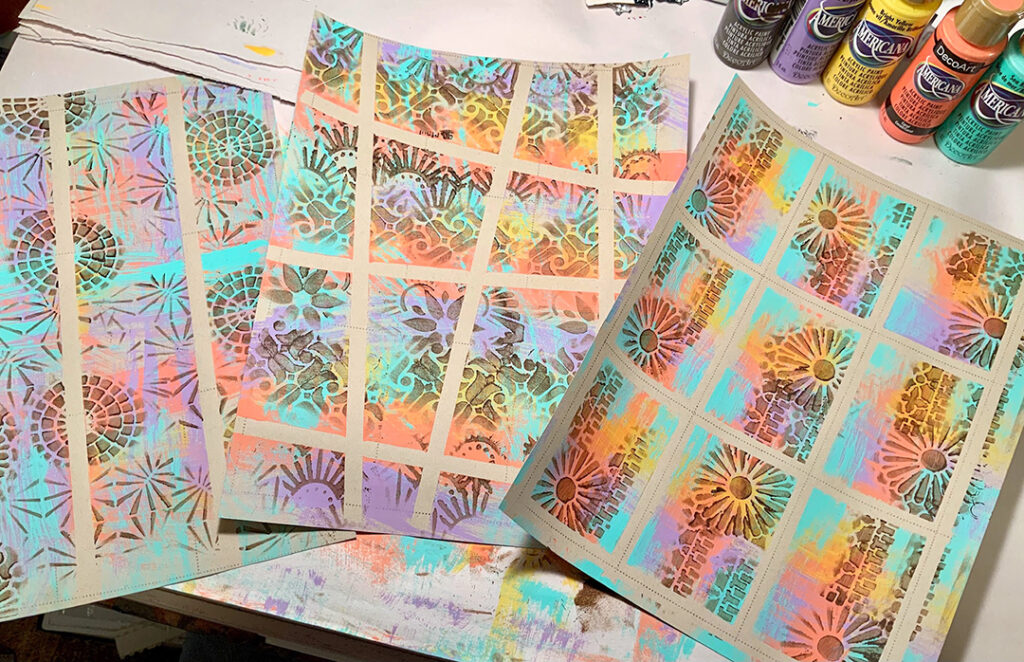
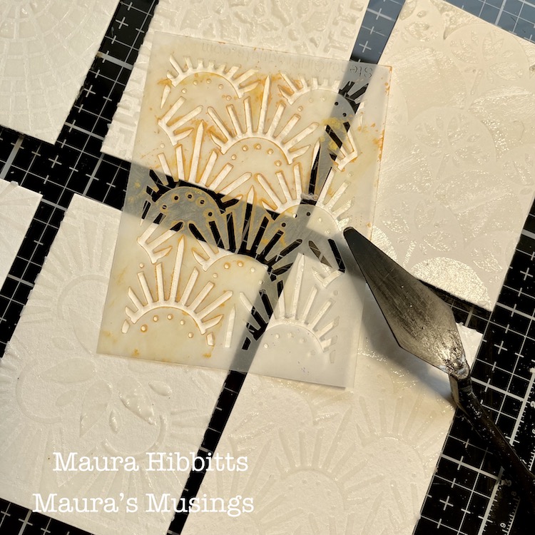
Cover work table with newsprint or other paper. Lay purchased, die-cut or hand-cut library pockets and insert cards on the table and sponge on two different inks as shown or as preferred.

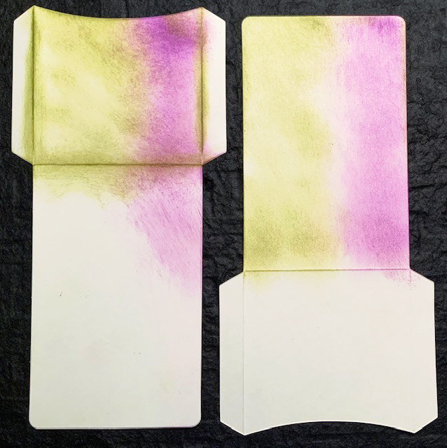
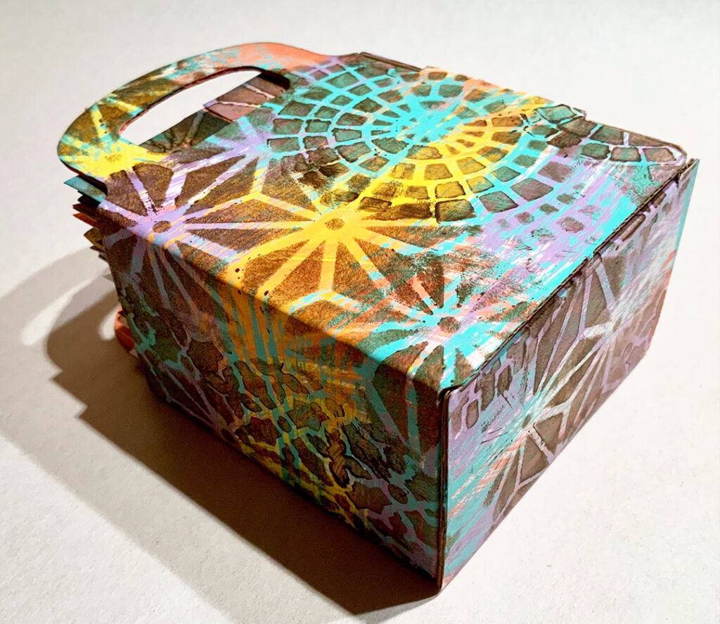
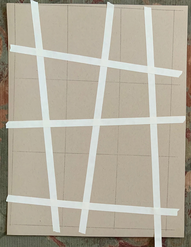
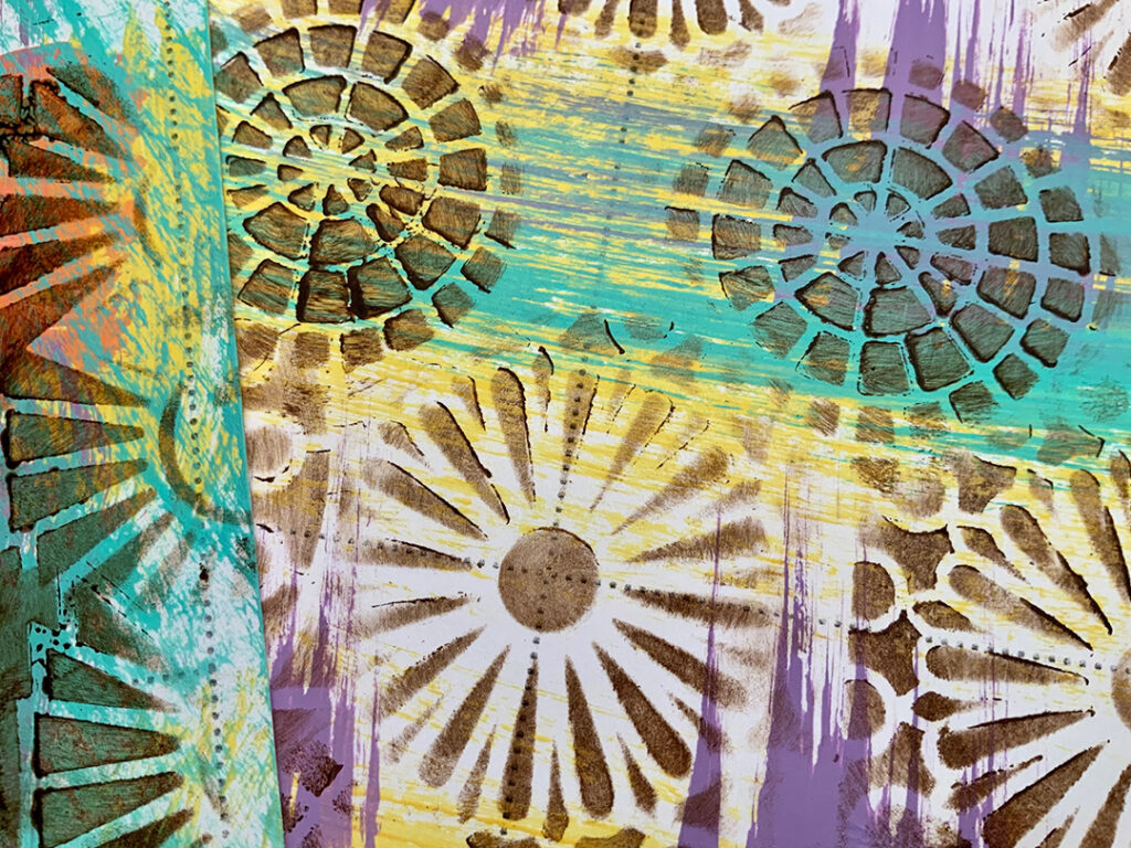
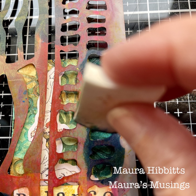
Tear newsprint into a variety of shapes and strips to act as masks. With masks in place on the front (bottom section) and inside of the pocket (top section only)…

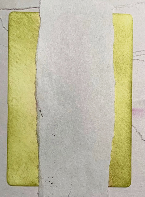
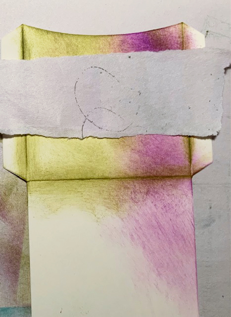
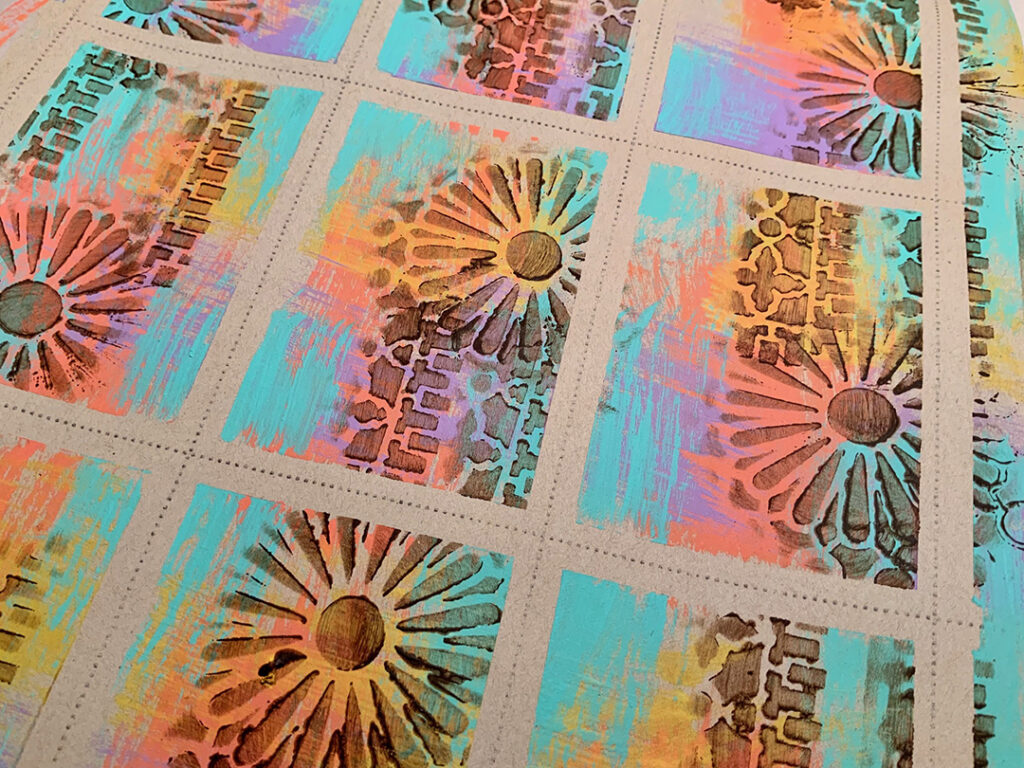
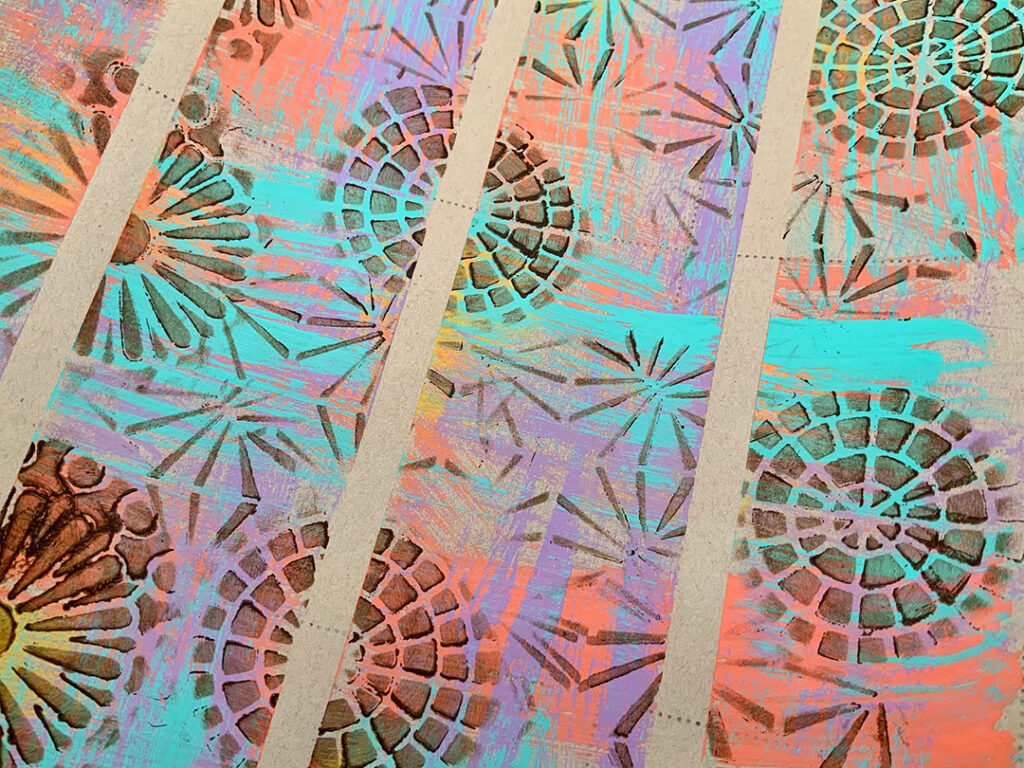
…sponge on the third ink.

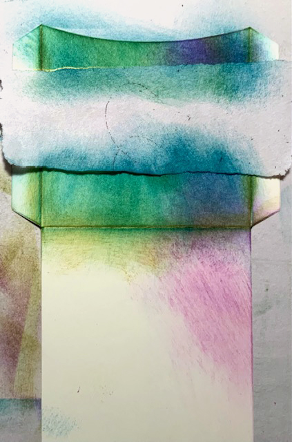
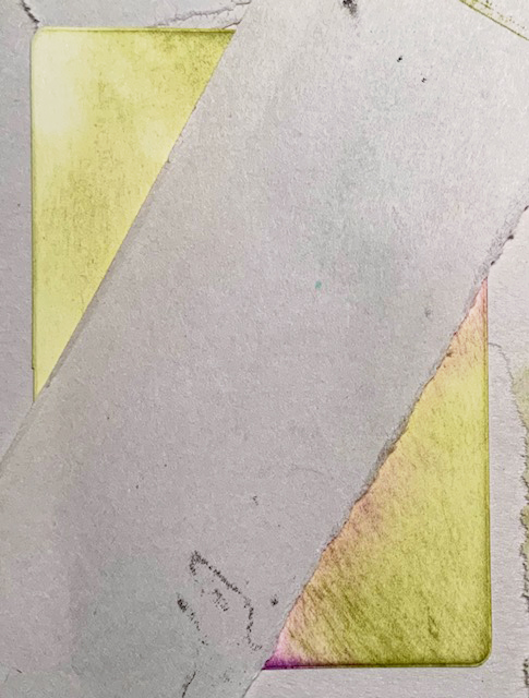
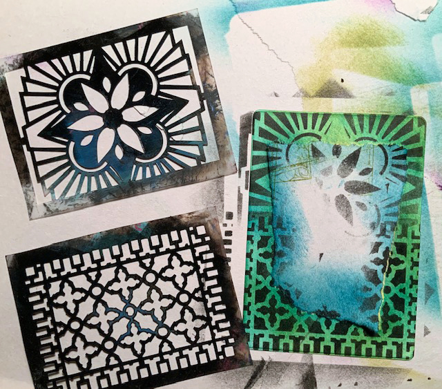
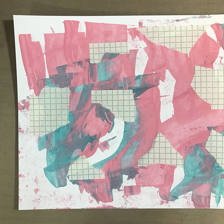
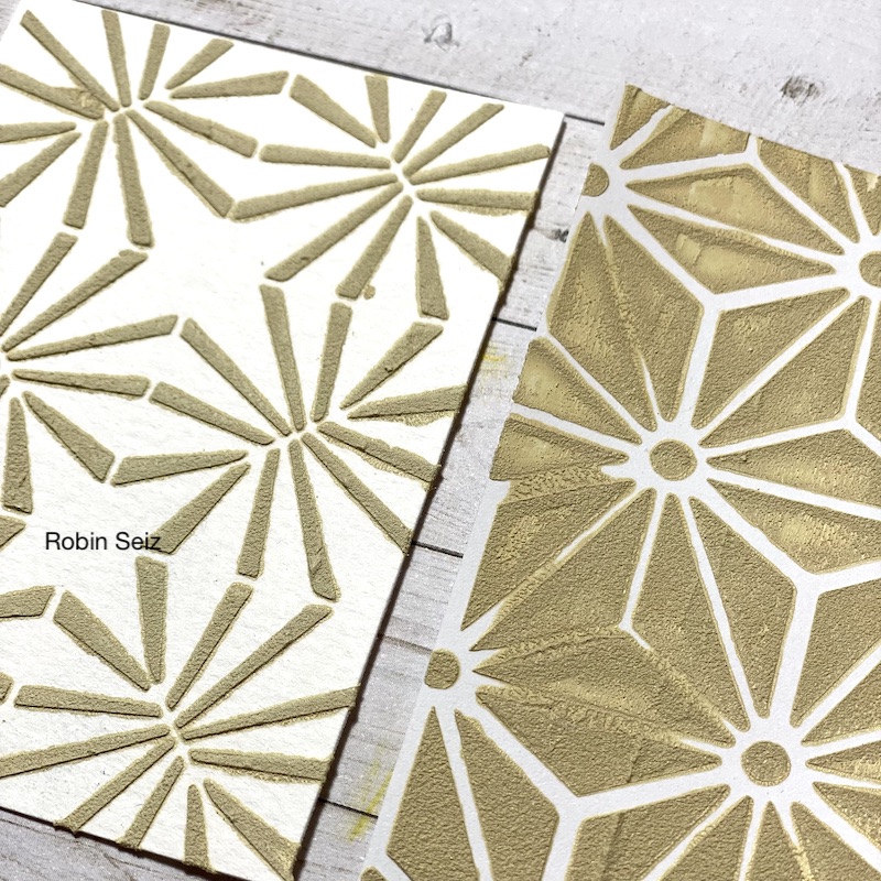
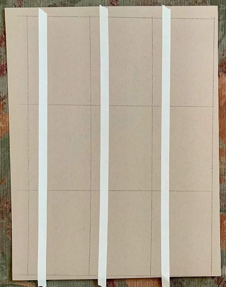
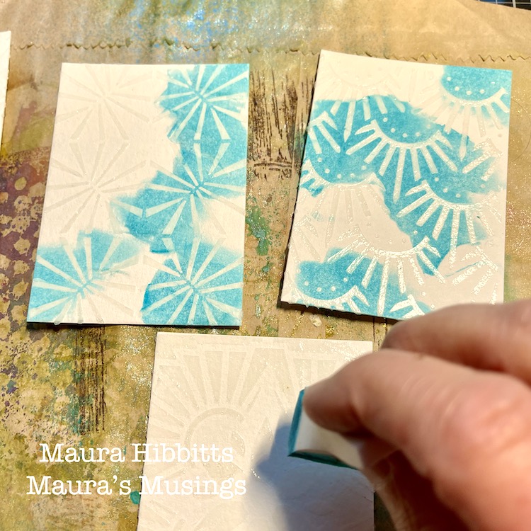
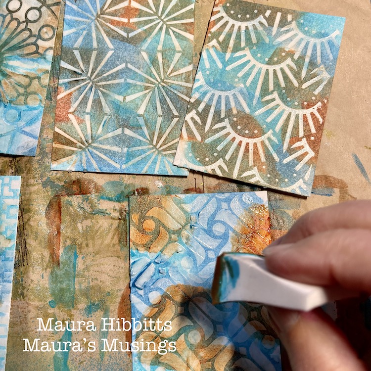
With masks still in place, stencil patterns onto the pocket and insert cards.

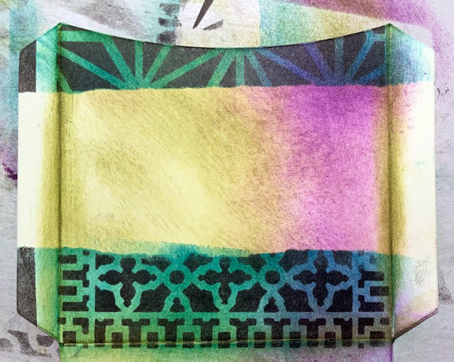
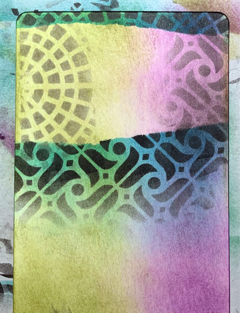
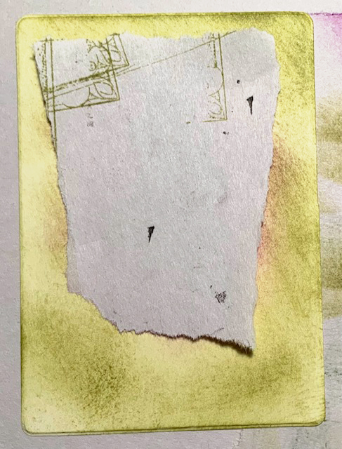
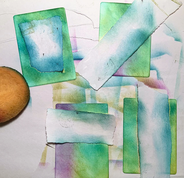
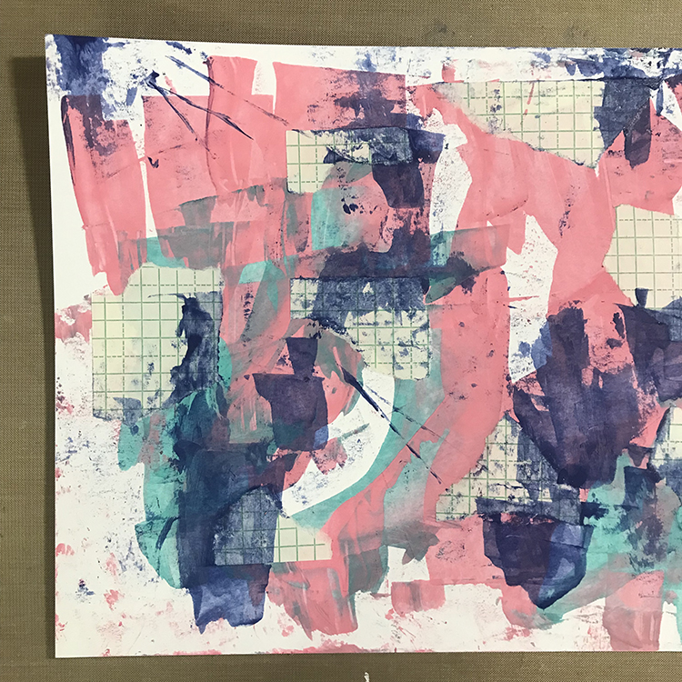
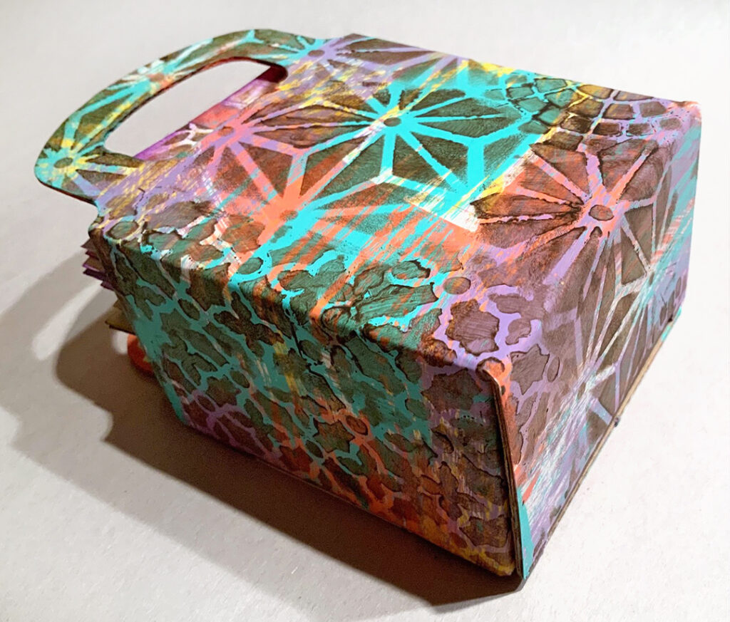
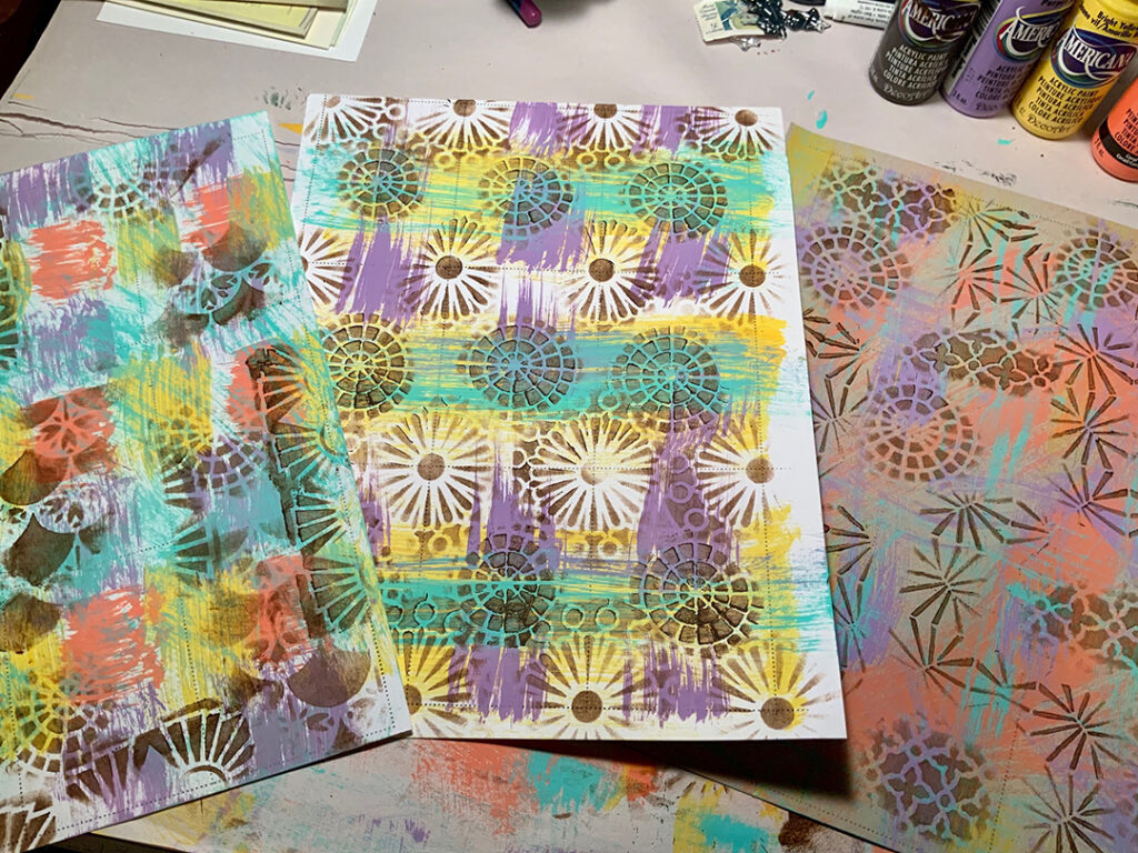
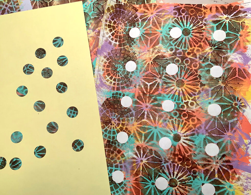
Remove masks. Fold and glue the sides of the pocket if a purchased pocket wasn’t used. Write on the front of the pocket and on the insert cards.


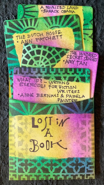
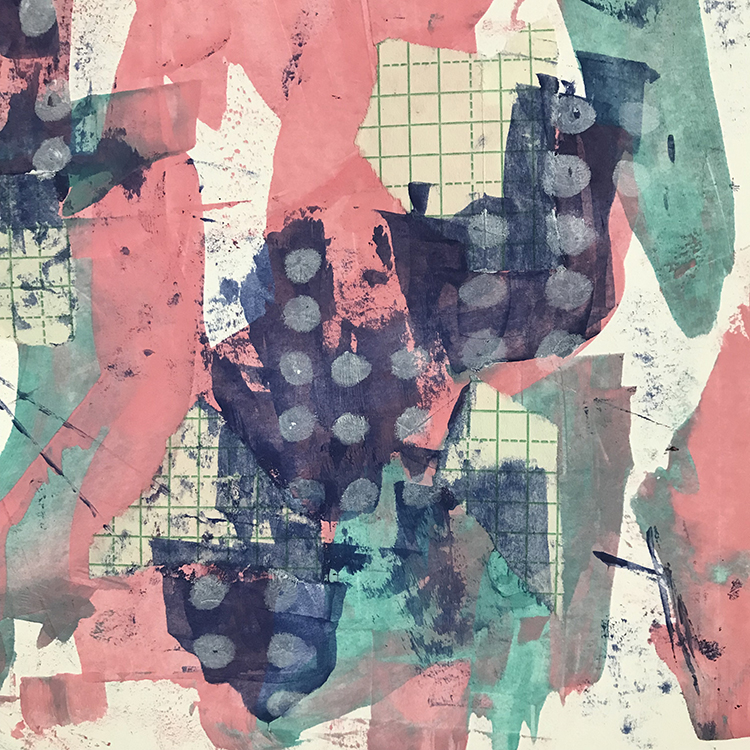
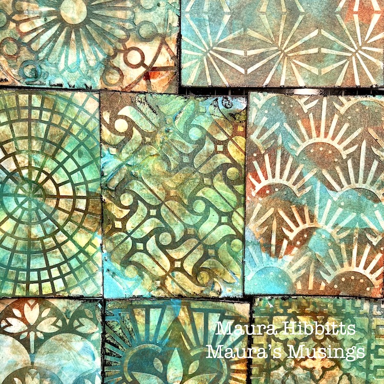
Thank you Judi – love this way to record what we’ve read and wow those colors look great together with the ATC stencil patterns!

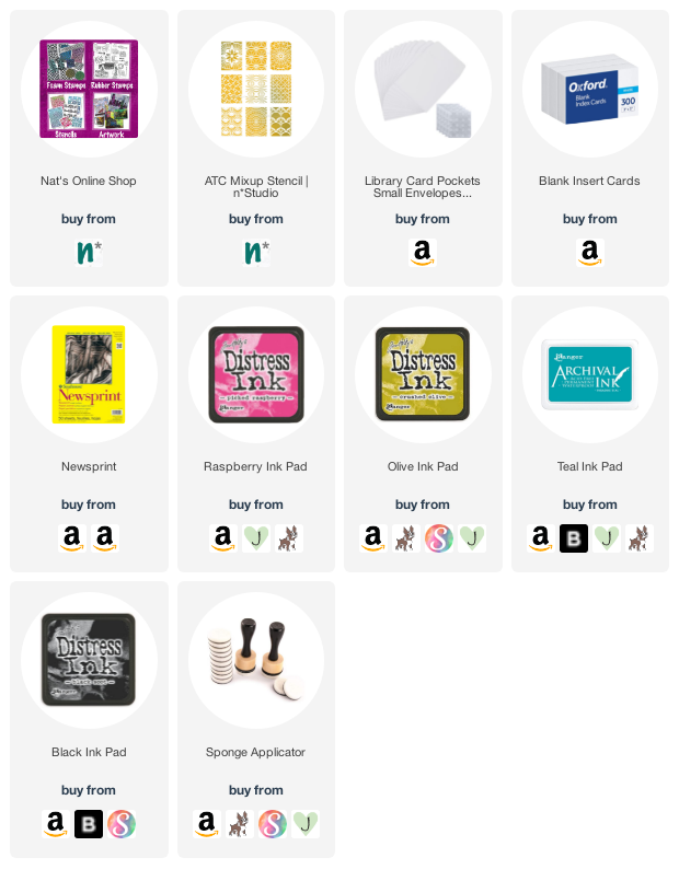
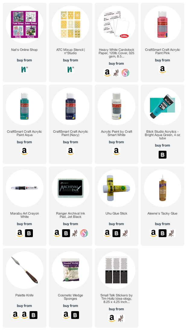
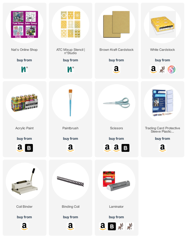
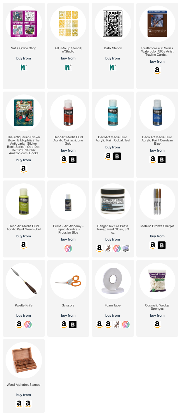
Give it a try: you can find all my Stencils in my Online Shop and here are some of the supplies Judi used:

Looking for more projects? Follow the Creative Squad on Instagram here.

Leave a comment

Chaos – Art Journal

“You need chaos in your soul to give birth to a dancing star” Nietzsche

During the move I realized that I haven’t used my acrylic inks in a long time and I really love them so time to pull those guys out again and play with them more. I used my new ATC Mixup Stencil and shifted it around while loosely painting with a brush through the stencil with the ink.

This doesn’t of course give a nice crisp image but I wanted a more loose, almost watercolor like effect with the same pattern that I later traced through the stencil with a stabilo pencil.

I added a calendar page from the sold old almanac calendar (sorry guys)- this one shows an older painting of mine (still available for sale here) and blended the page in by adding some of the ink in the same color family to the page as well to the background. That was a lot of fun!

Here are some of the supplies I used:

Comments (2)

  • Sue Clarke

    |

    I love everything about this! The quote, the colors, and the background design.
    The quote especially speaks to me during a week of family chaos.
    Happy Saint Patrick’s Day Nat!

    Reply

    • nathalie-kalbach

      |

      awee thank you Sue! Hope you had a gorgeous St. Paddy’s day and a very relaxing weekend ahead!

      Reply

Leave a comment

Creative Squad: Time for Texture – Jordan Hill

Hello from my Creative Squad! Today we have a post from Jordan Hill who is sharing a cool series of ATCs using my ATC Mixup stencil and our theme this month: Time for Texture – Visual texture or actual texture is an element that can give dimension, depth, and touchable interest to any piece of art. Let’s play with texture in a series of ATCs and see what emerges!


Hello everyone! I’m excited to be back with this month’s prompt of Time for Texture! I really enjoy playing with layers and textures in my work, so I had a lot of fun creating this little series of ATCs. I hope you enjoy following along with the process!

I’m starting off this week with a piece of thick white card stock as my base. I have chosen the type of card stock I use as the paper in many of my hand bound books, but you can use any thick paper that will hold up to mailing. I dropped a couple of different colored craft paints onto the card stock and used an old library card to scrape it across the surface.

Next, I wanted to add some paper bits, so I selected a piece of vintage graph paper that I liked, tore a few pieces off, and glued them down randomly to my page using an Uhu glue stick.

I then wanted to add another color of paint. This time I chose a dark blue for contrast, and added a few dots of it to my card stock. This time I scraped the paint around with a palette knife, since I wanted to play around with different types of texture. You can see the variation in the way the tools apply the paint to the page; this variation is what makes things interesting!

Using a Marabu Art Crayon in white, I then added a series of dots over the portions of the card stock where I had added the dark blue paint. This adds a bit more interest to these areas.

For my next layer, I really wanted to incorporate this month’s theme of Time for Texture a little more, by adding some actual texture as opposed to just visual texture. Though I primarily work with craft paints, for this layer I selected a heavier body paint (Blick Studio Acrylic in Bright Aqua Green) and applied it with a paint brush in thick layers. 

I tried to focus on portions of the card stock that were either still white, or that I didn’t really like. I then used the back end of my paintbrush to scratch into the wet paint in order to create some fun textured lines!

At this point, I was ready to cut down my card stock into ATC bases. You could simply use a paper trimmer to achieve this, but I chose to create a “viewfinder” by cutting an ATC sized hole (2.5″x3.5″) into a separate scrap of card stock. I then used this to find interesting bits of my painted paper, before tracing the outline with a pencil and cutting them out with scissors.

Now it was time to add Nathalie’s ATC Mixup Stencil! I chose a different part of the stencil to use on each card in order to get a good variety, and I applied it to my bases with white acrylic paint and a makeup sponge. I tried to focus the stenciling on portions of the cards that were a bit darker, so that the white paint would show up better.

Next up were the focal points! For my ATCs, I used a variety of different illustrations from some of my collage sheets, selecting ones that were on the smaller side so that they would fit. You could also use stamped images or die cuts to create focal images as well! Once I had determined which images I wanted on which cards, I again used my Uhu glue stick to adhere them to my ATCs.

Finally, to finish off my cards, I used some Tim Holtz Small Talk stickers to add words. I added extra adhesive to these stickers using Aleene’s Tacky Glue, as they don’t always like to stay in place. I also used an Archival black ink pad and rubbed it around the edges of my ATCs to make them feel more finished.

After signing and dating the backs of the cards, they are now ready to send off/trade! I hope you enjoyed seeing the process of creating these cards and that you give some of the ideas a try!


Thank you Jordan – love your color palette and the empowering sentiment of these!

Give it a try: you can find all my Stencils in my Online Shop and in addition to an old credit/gift card and collage material from her stash, here are some of the supplies Jordan used:

Looking for more projects? Follow the Creative Squad on Instagram here.

Comments (1)

  • Robin Seiz

    |

    Love your process for all the texture Jordan! They turned out great!

    Reply

Leave a comment

ATC Album – Creative Squad

How do you store your collection of ATCs? If you’re playing along with the Creative Squad this month and making ATCs (Artist Trading Cards) to exchange with friends, how about taking a cue from Creative Squad member Judi Kauffman. She created a beautiful ATC Album using my ATC Mixup stencil to store and show off her growing collection.


I liked the sheet of ATCs that looked a lot like faux postage so much that instead of cutting it apart I laminated it onto a sheet of 8.5×11 cardstock and coil-bound it with enough cardstock-weight pages for a swap that the Creative Squad has in the works. Each page holds 4 ATCs in baseball card pockets with plenty of space for writing the name of the maker(s), date, and other notes and info.


Thanks for sharing Judi – we hope you fill that album!

You can find all of my stencils in my Online Store. Here are some of the supplies that Judi used:

Comments (1)

  • Jean Marmo

    |

    Such a wonderful idea. Love those ATCs in a sheet.

    Reply

Leave a comment

Creative Squad: Time for Texture – Robin Seiz

Hello from my Creative Squad! Today we have a post from Robin Seiz who is sharing a beautiful bevy of ATCs using my ATC Mixup stencil and our theme this month: Time for Texture – Visual texture or actual texture is an element that can give dimension, depth, and touchable interest to any piece of art. Let’s play with texture in a series of ATCs and see what emerges!


Hello friends, The theme for this month, ATCs with texture, is something that really gets me excited. I LOVE texture, of all sorts, and I also love working small. ATCs are such fun because they can be a quick and easy project (or more complex if you want it to be) and they make great happy mail. ATCs are also easy to swap with your artist friends. 

For this project, I wanted to use some of the “bits and bobs” that I have stashed away and rarely use. You’ll see tiny stick-on pearls on one card, a piece of an old movie reel, an old stamp, and a few random jewelry pieces from my jewelry making days on others. I find it satisfying to incorporate what I have; it challenges me to think creatively about a project. 

I knew I wanted a vintage theme for my cards. With the wonders of mixed media, almost anything can be made to look vintage with a little distressed ink or unbleached titanium paint! 

There are days when I want to work on something in the studio, but just can’t get going. On those days, I sit down with my paper scraps, my fabric scraps, and old books, or music and my sewing machine and create little “collages” to use at some point in the future in a journal, on a card, or whatever calls me. I can get lost making these little pieces and before you know it there are 20 or so on my table. I keep all of these in a basket for future projects. When I thought about this project and creating texture, these little gems immediately came to mind. 

I started by cutting the ATCs (2 1/2 x 3 1/2, the standard size) out of card stock. Next I mixed Liquitex Unbleached Titanium paint and Golden light molding paste together to make a gritty textured paste. I laid Nathalie’s ATC Mixup stencils down on the blank ATC cards and using a pallet knife, I spread the paste through the stencil. I used the same background color for each ATC card. The texture is so yummy and gritty! One note of caution, make sure you wash your knife and the stencils right away; if the paste dries, it’s almost impossible to get off. 

Once the paste had a chance to dry, I began pulling all my elements together. This was an intuitive process. I started by choosing from the basket of scraps and began building a story on each ATC. When all the elements were chosen, I auditioned them for placement on the card. For the final vintage touch I used distressed inks to rub over the texture paste and around the edges of the card and on some of the elements. I suggest you just play and see what feels right to you. In some cases, I sewed the elements to the card, others I glued.

I hope these inspire you to have fun, use your imagination, and your supplies! – Robin


Thank you Robin – love hearing your process for getting started in your studio and seeing how the final creations came together. They are each so unique and beautiful but all tied together too.

Give it a try: you can find all my Stencils in my Online Shop and in addition to a selection of bits and bobs and collage material from her stash, here are some of the supplies Robin used:

Looking for more projects? Follow the Creative Squad on Instagram here.

Comments (1)

  • Sue Clarke

    |

    Robin, the texture and stitching is terrific. It makes me happy just to look at them…imagine how fun it would be to touch them!

    Reply

Leave a comment

ATC Storage Box – Creative Squad

Are you playing along with the Creative Squad this month and making ATCs (Artist Trading Cards)? We have a great solution for storing those cards from Creative Squad member Judi Kauffman to share with you today. She is using my ATC Mixup stencil to create a simple but stunning way to organize your growing collection.


The wedding and party aisle of many craft stores have small bags and boxes to hold favors. Paint and stencil one to use as a storage box for the ATCs you make and receive in swaps!


Thanks for sharing Judi – what a nice way to hold all those mini masterpieces!

You can find all of my stencils in my Online Store. Here are some of the supplies that Judi used:

Like what you see? Follow the Creative Squad on Instagram for weekly posts, artwork, and inspo.

Comments (1)

  • Jean Marmo

    |

    Such a cute storage container!

    Reply

Leave a comment

Creative Squad: Time for Texture – Riikka Kovasin

Hello from my Creative Squad! Today we have a post and video from Riikka Kovasin who has created a set of ATCs that will make you chuckle :) using my ATC Mixup stencil and our theme this month: Time for Texture – Visual texture or actual texture is an element that can give dimension, depth, and touchable interest to any piece of art. Let’s play with texture in a series of ATCs and see what emerges!


Snarky Kids

Moikka moi! It’s Riikka here today with some snarky ATCs! Boy, there might be some explaining to do. Not in the project itself, those cards are quite straight forward, but the focal points and the juxtaposition. Let’s get started!

First of all, I’m not sure you are familiar with these “glossy pictures” I’ve used here as focal points. The term is a direct translation of a Finnish word “kiiltokuva”. From what I gather, these items are not widely used or known. For example, Wikipedia article of the subject can be found in Finnish, German, Norwegian, Swedish, and Danish. Glossy pictures are thought to originate in Germany in mid-19th century. They are printed images with a glossy finish, cut in shaped sheets with little connecting bridges. The idea was to cut the individual images loose from the sheet. Nowadays collectors are looking for the uncut sheets rather than individual images. The pictures were used to decorate gifts, ornaments or put in little keepsake books.

My glossy pictures may look old, but in fact they are relatively new. They were bought from a local craft store. As a kid I had a huge collection of the pictures, some adhered in books with little poems. I chose these particular pictures because Valentine’s Day is not that far away. But I wanted to add something surprising to the otherwise sweet cards. There’s the candy colors, kids with flowers and then rather snarky comments! My idea was that when you glance the cards you may think they are sweet but when you take a closer look, you see the juxtaposition between the sweetness and the lines. The texts are from Tim Holtz’s “Snarky” sticker book.

Now that we have those explained, let’s go to the theme of the month – texture. I used both visual texture and touchable texture in these. Visual texture for me here is the background design – using acrylic paints to color the white cardstock and then using the ATC Mixup stencil on top to create different clusters of pattern there. Tactile texture is done using the stencil again, but this time with texture paste. To match the white paste to the candy colors better, I colored it using a pink acrylic paint. While the patterns underneath differ from card to card, I used the same doily like design to the raised layer. To see how I created the cards, please see the video below!

As you could see from the video, I started the cards by creating a master sheet. This is the way I tend to start ATCs nowadays. A master sheet allows making a number of backgrounds at once with similar color scheme and patterning but each individual card is still a bit different, each having its own personality. What allows the mix of different patterns here is the wonderful “ATC Mixup” stencil. I just love how this big stencil holds so many great patterns! And as you can move the stencil, you can still make big areas with the pattern easily.

Thank you for stopping by today! Wishing you all the best and happy Valentine’s Day to you all a bit early! 

Xoxo Riikka


Thank you Riikka – these made us laugh so hard!!! But we also appreciate the richly textured backgrounds you created :)

Give it a try: you can find all my Stencils in my Online Shop and in addition to her glossy pictures from her stash and old book pages, here are some of the supplies Riikka used:

Looking for more projects? Follow the Creative Squad on Instagram here.

Comments (2)

  • jjhere

    |

    These are so funny! Love how you paired the sweet Valentine kids with the snarky comments.

    Reply

  • Sue Clarke

    |

    Riikka, I love LOVE love these, especially the snarky comments!

    Reply

Leave a comment

Creative Squad: Time for Texture – Judi Kauffman

Hello from my Creative Squad! Today we have a post from Judi Kauffman who is sharing with us a whole bevy of ATCs (Artist Trading Cards). She’s using my ATC Mixup stencil and our theme this month: Time for Texture – Visual texture or actual texture is an element that can give dimension, depth, and touchable interest to any piece of art. Let’s play with texture in a series of ATCs and see what emerges!


Cut On The Dotted Line:

Nathalie’s ATC Mixup Stencil is my new best friend. I got a little carried away with the ATC project this month, even though I don’t have an official Tuesday Squad slot.

To create the feel of “faux postage” on my ATCs I printed dotted lines in black on my 8.5×11 cardstock, which means 9 ATCs per sheet (instead of 10 if the cardstock is cut in the traditional method). These lines also helped me do allover patterns that feel random but have just a tad of structure.

A radical departure for me: I used BROWN, a color I reach for maybe once every decade or so!

Using low-tack cover-up tape (an old staple from the days of typewriters), mask between the individual ATCs or add random strips at angles or as horizontal or vertical lines within the blocks. (I also printed a grid with smaller blocks and used low-tack circles as part of the first step.)

Dry brush three light colors over the pages; allow paint to dry. Then get out the ATC Mix-up stencil and use a dark contrasting color to add a variety of patterns. I stuck with just the brown, but mix colors as desired.

Remove tape and the circles, setting them aside to use as washi tape and decorative embellishments.

Cut the ATCs apart along the dotted lines. Keep some of the connected in rows of three for accordion-folded ATCs. Add minimal embellishments, as shown (just the tape and circles) or keep going: Draw, add collage, found poetry, layer with dimensional elements.


Thank you for sharing your process Judi – loved seeing how much variety you achieved and also how you repurposed the tape.

You can find all of my stencils in my Online Store. Here are some of the supplies that Judi used:

Like what you see? Follow the Creative Squad on Instagram for weekly posts, artwork, and inspiration.

Comments (5)

  • Jo

    |

    Always looking for ways to step up my ATC’s. This is wonderful and easy to do by all. Thank you for making this possible no matter what level of creativity we have.

    Reply

  • Jean Marmo

    |

    Judi-these are fabulous! I love how you taped them and used the stencils. Thank you for the wonderful inspiration.

    Reply

  • Sue Clarke

    |

    Great post Judi. I love how these came out!

    Reply

  • Julie S

    |

    ATCs are so fun to make and trade. These are fabulous. Masterboards are a great way to have loads of ATC bases ready to go for when inspiration strikes. I really like how you have the coordinating tape and circles to use as embellishments. Great idea!

    Reply

  • Robin Seiz

    |

    Fabulous! So many great ideas in this blog. Thank you Judi!!!!!

    Reply

Leave a comment

Creative Squad: Time for Texture – Maura Hibbitts

Hello from my Creative Squad! Today we have a collection of ATCs from Maura Hibbitts using my ATC Mixup stencil and our theme this month: Time for Texture – Visual texture or actual texture is an element that can give dimension, depth, and touchable interest to any piece of art. Let’s play with texture in a series of ATCs and see what emerges!


This month we are combining a couple of my favorite things: Artist Trading Cards and texture, and we get to create with Nathalie’s awesome ATC Mixup stencil! I wanted to begin with some favorite colors, add fun images with stickers (a Christmas gift), and find the perfect words for a new year. It’s funny when you search for words, how most of them jump out right away, but there are one or two reluctant ones you have to drag out.

Begin your project with your ATC base (I used watercolor paper), Nat’s ATC Mixup stencil, Transparent Texture Paste and a palette knife. Add a light layer of the paste through the stencil, and be sure to clean both immediately. Set aside to thoroughly dry.

Lightly dab paint onto your ATCs with a cosmetic sponge. I began with the Cobalt Teal Hue, Cerulean Blue and Quinacridone Gold. Then, I added some green gold to a few.

Play with the paint on the ATCs until you are happy with the result. Wipe back over the texture area to reveal the pattern. Let dry.

Next, pull out a background sheet from your stash. (I’m using a watercolor print with bubble wrap.) Use an alphabet stamp set for the words or your own handwriting, cut the word strips out, and edge with black ink.

Find stickers or images to represent your words. (I received a wonderful sticker book for Christmas that I am using here.) Attach them to the ATC, using glue if needed. Pop the word strips up with foam tape.

Add more texture with Nat’s Batik stencil (one of my all time favorites) and Prussian Blue paint. Apply the paint with a light touch using a cosmetic sponge.

Outline the new stenciled design once dry, using a bronze Sharpie. Edge the ATC using black ink if desired.

The ATCs are complete and filled with layers of texture and meaning. Some textures you can actually feel, and others are more visual, but both are so much fun to play with. As you add more layers of images and words, you build a tiny work of art.

Enjoy creating your own layers of texture and meaning. Find  positive words to use that will help you journey through this year and bring you joy. Maura


Thank you Maura – these are so beautifully layered! Love the subtle play of pattern and texture that you’ve built up on each one.

Give it a try: you can find all my Stencils in my Online Shop and in addition to gelli printed papers from her stash, here are some of the supplies Maura used:

Looking for more projects? Follow the Creative Squad on Instagram here.

Leave a comment