Creative Squad

Creative Squad: The Great Outdoors – Robin Seiz

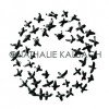
Hello from my Creative Squad! Today we have a post from Robin Seiz who is sharing a very thoughtful and poignant journal page with us. She’s using my Cross Circle and Grannies rubber stamps and our theme: Great Outdoors – The experts agree that getting outside for activity each day is a super healthy thing you can do for your mind and body. Let’s get outside and seek artistic inspiration out there. Find something that catches your eye and then when it’s time to come back in, use that inspo to create.


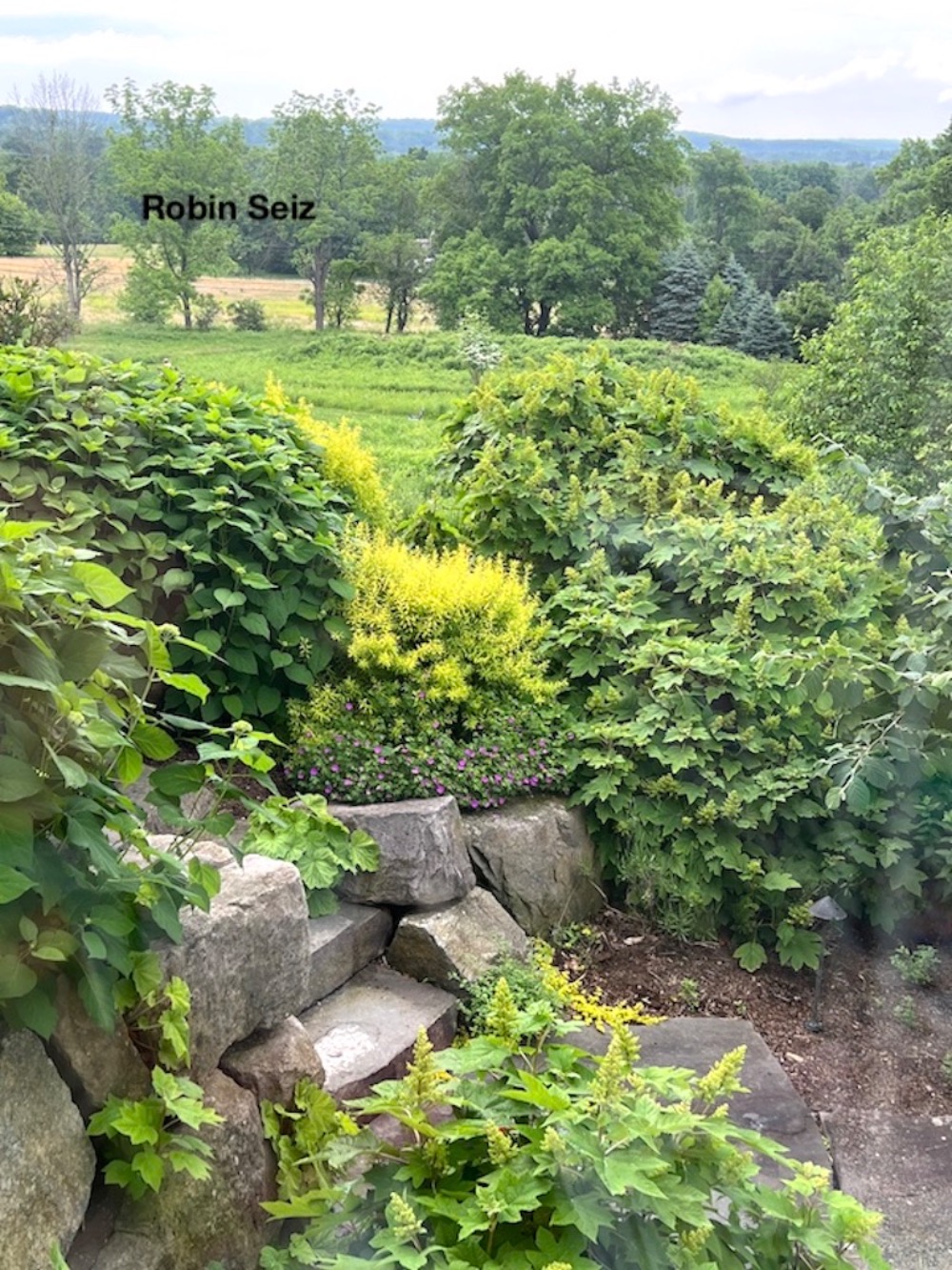
Hello friends, I hope you are enjoying the weather wherever you are. It’s spring here in Pennsylvania; one of my favorite times of the year. This months theme is about getting inspiration from nature; that’s an easy one for me. I LOVE being outside. The colors of spring are so enticing, green golds, dark greens, yellows, pinks, purples and so on. 

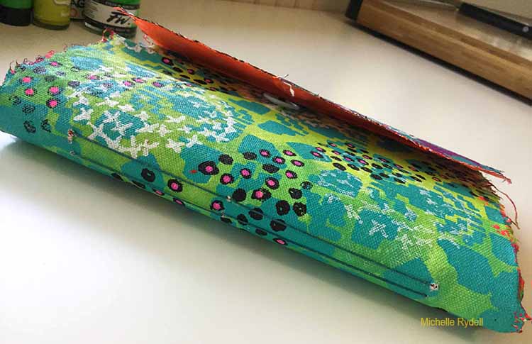
At my house we are in the middle of a sizable renovation.  I am so fortunate to be expanding my studio and even adding a sink!  The new studio space has 7 windows and, when complete, I’m quite sure I will never want to leave it. In the meantime, I am set up at a tiny little table in our open hearth room and most of my supplies are packed up in the basement. All that to say, this experience has made me realize that we don’t have to have the perfect place to create; sometimes just keeping it simple is good. Not every project we create has to be our best piece of art or gallery worthy.  Sometimes, it’s just enough to sit down, wherever you can, and put a few things on paper. 

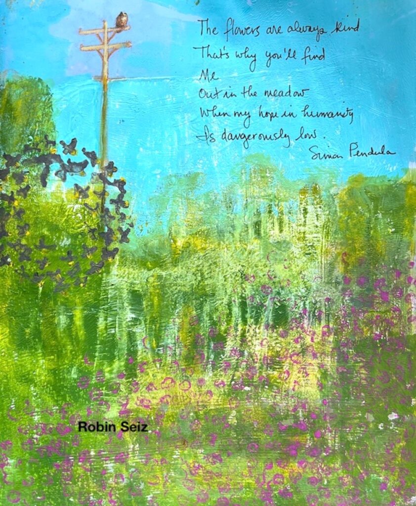
This journal page speaks to how I have felt this month. All the gun violence has really upset me. I feel so sad about it all and a bit helpless about what to do about it. 

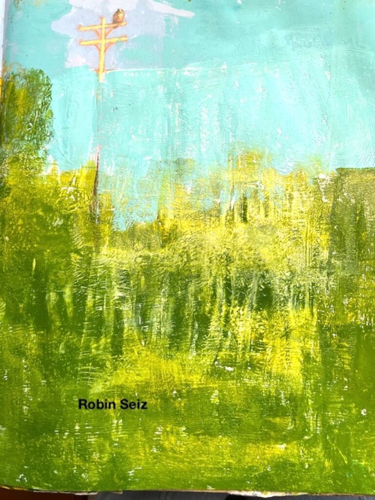
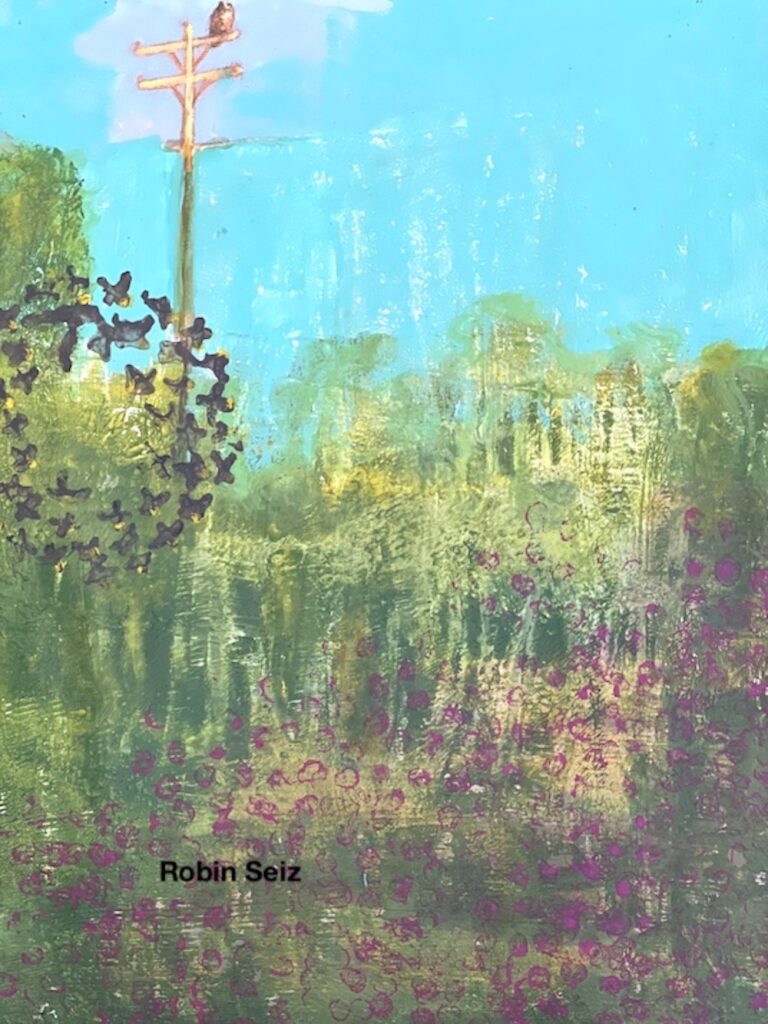
I began with a children’s book I often use which has fabulous illustrations in it. I frequently keep some part of the illustration and incorporate it into my page. As I sat down to create, I looked out the front window to our meadow; a peaceful pleasant place for me. While I wasn’t trying to create the exact picture, I did want to capture the different shades of green and place some “flowers” in the meadow. 

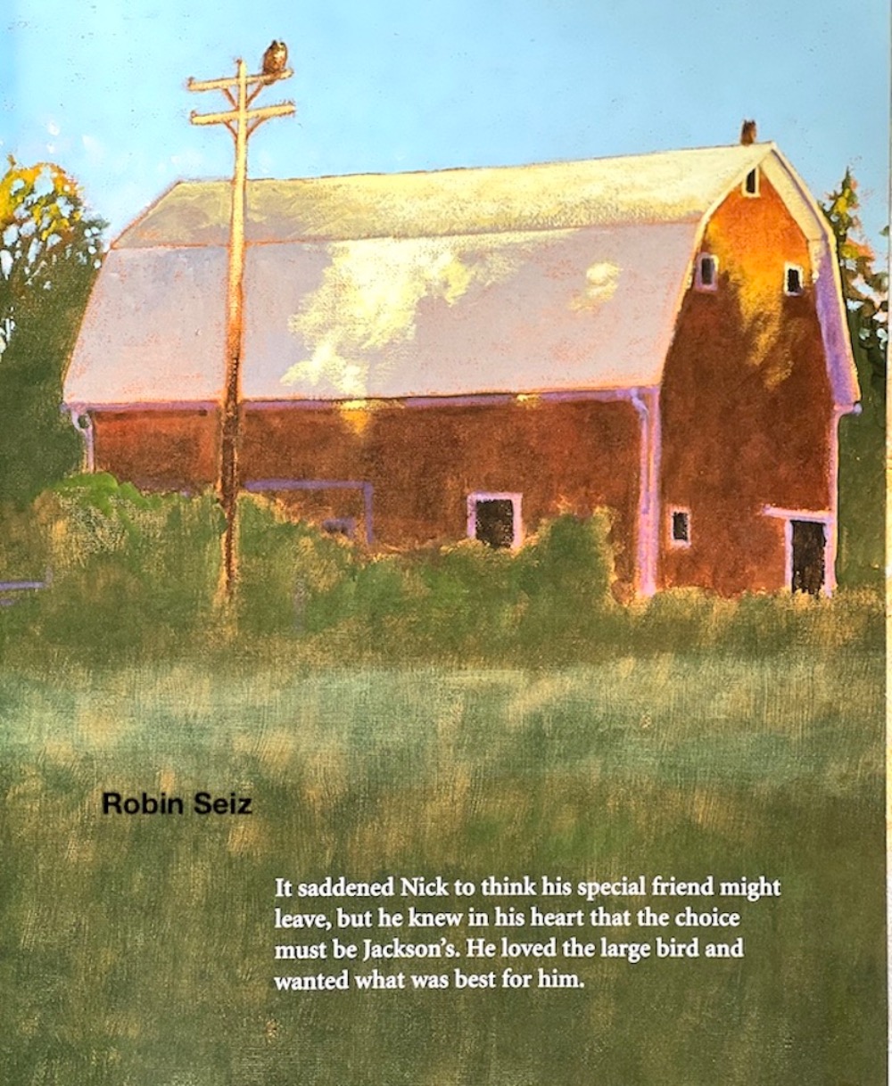
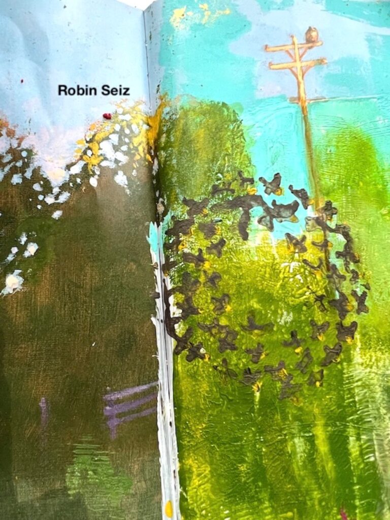
I started the page using Gesso to cover the bottom portion of the image, leaving the bird on the pole, a few trees on the side, and  the blue sky.  

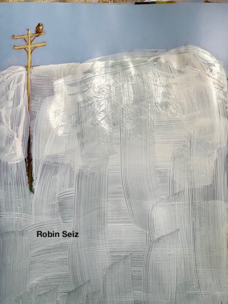
I wanted to add blue paint over the sky so it would feel consistent as I was going to place paint on the rest of the picture. I  loved the purple hue around the bird, so I knew I wanted to leave some of that color.  

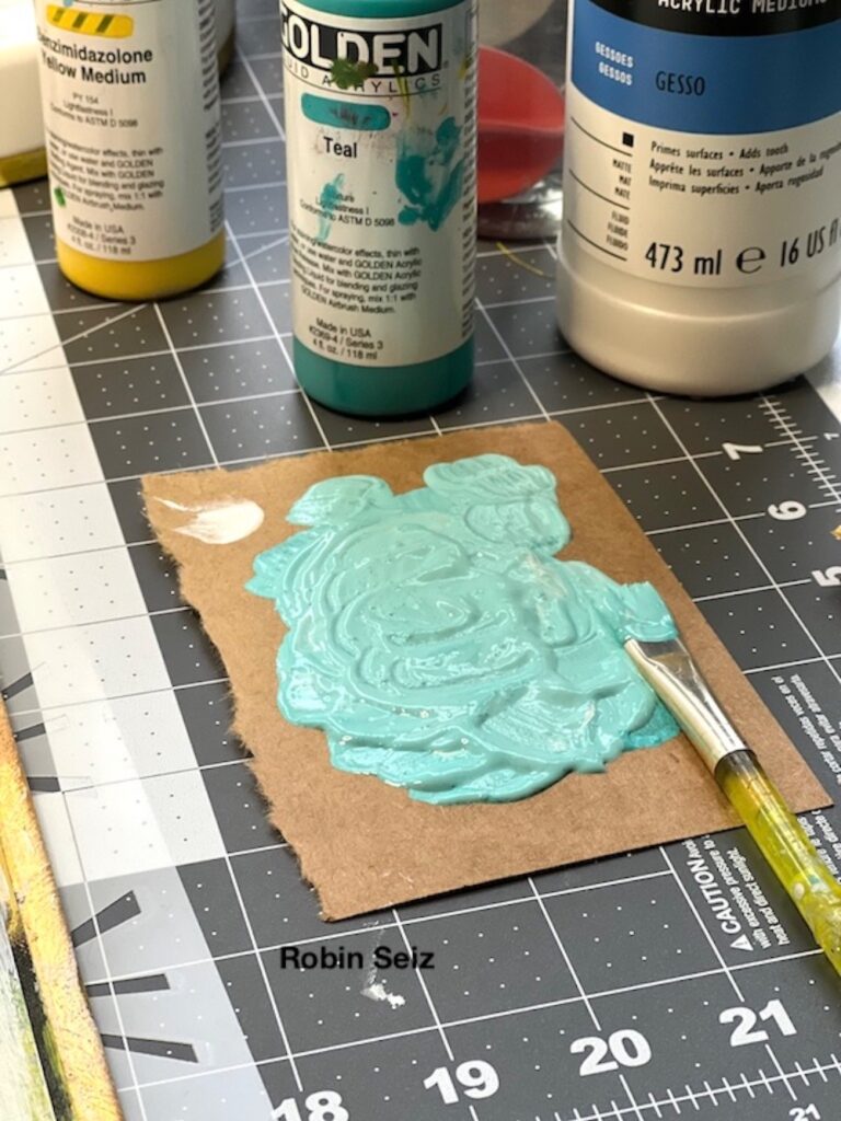
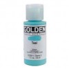
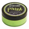
What I know about myself is that I’m not a painter. When I try to “paint” on a page, I’m typically unhappy with the result. Gel plates are how I adhere paint to a surface. I used my 5 x 7 Gel Plate and carefully planned where I wanted the colors to go on the page. I mixed up Golden Teal and White Gesso to get a color that was close to the sky in the picture. I used Golden green gold, Benzimidazolone Yellow Medium, and Golden Chromium Oxide Green, to show the colors of the meadow. I used both a paint brush and roller to adhere paint to the plate making sure I wasn’t going to cover the bird or most of the pole. I turned over the plate and laid it down on the page. Repeating this method until I got the intended texture and coverage I wanted. 

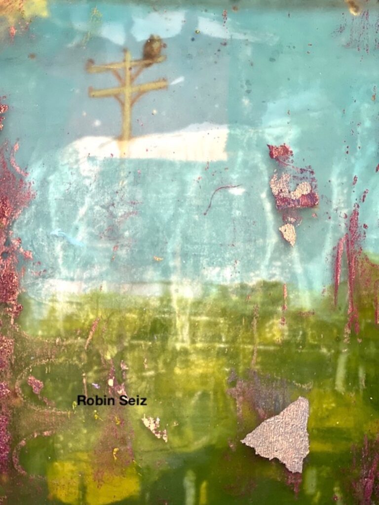
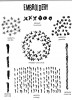
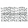
Once I had all the colors on the page, I used Nathalie’s Cross Circle rubber stamp and inked it up with a brown Derwent Intense Block to give the illusion of birds flying. This stamp, while part of the embroidery set, has always reminded me of birds. I added some yellow paint highlights to the birds to give them more depth.

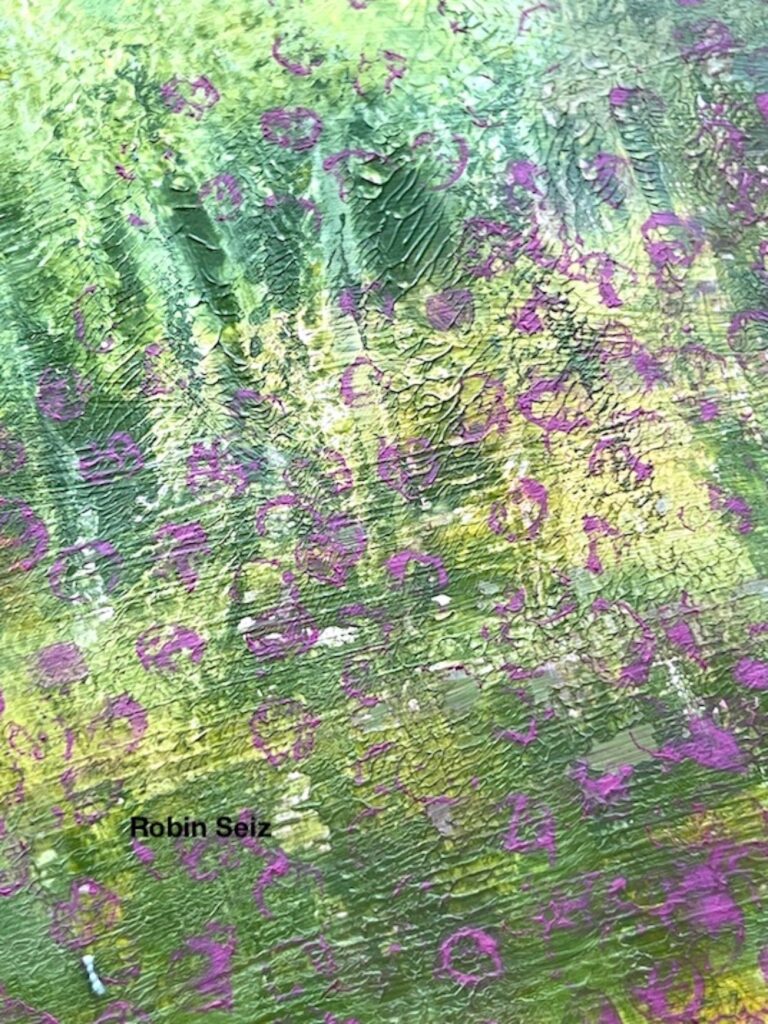
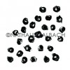
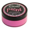
Next, I used a Red Violet Derwent intense block and really saturated the Grannies stamp. In my mind these were to represent flowers in the meadow. Once down, I used a  small brush to fill in each flower, but decided they were too bold. The wonderful thing about mixed media is that mistakes can always be fixed. I used a baby wipe and carefully wiped off all the pink. I had to go back with a little extra of the greens and yellows, but it all worked out fine. 

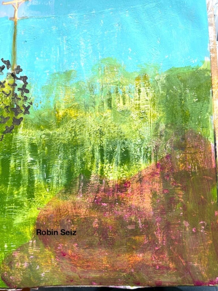
When the pink was off the page, I re-stamped  the  Grannies in a more subtle pattern because I wanted it to look like the flowers were fading into the meadow. Next I touched up the pole the bird was sitting on, as I wasn’t that careful with the gesso.

The final step was finding and writing the poem that so perfectly captured my feelings this month. 

I don’t often journal, but when I do, it’s to try a new technique or to get my feelings out on a page. This one felt right. So much emotion inside; lots of good and lots of sadness and anger! 
You can find and follow me on Instagram and Facebook. -Robin


Thank you Robin. We love when creating artwork steps in to help process and sort through complicated emotions and your page is such a beautiful example of that. Thank you for sharing!

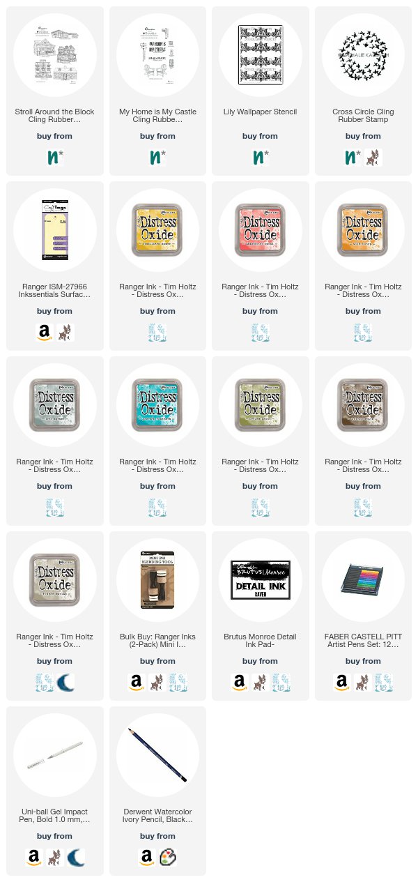
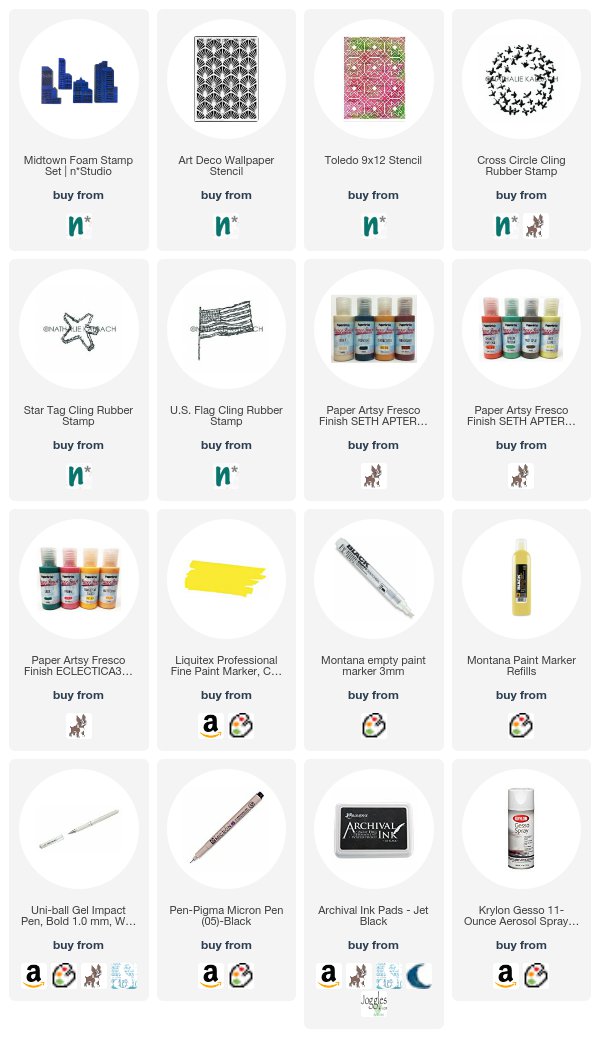
Give it a try: you can find all my Rubber Stamps in my Online Shop and in addition to a page from an old children’s book, here are some of the supplies Robin used:

Looking for more projects? Follow the Creative Squad on Instagram.

Leave a comment

My Home is My Castle – Josefine Fouarge


Hello my friends and welcome to a project from the Creative Squad! Today we have some fun tags created by Josefine Fourage using my new RubberMoon stamps from the Stroll Around the Block and My Home is My Castle sets: Craftsman, Queen Anne, and My Home is My Castle. This month’s theme is: My Home is My Castle – Home means many different things depending on who you ask and where you are in the world. This month we’re thankful to have a place to call home, a place where we can rule and be King – or Queen :) – of the castle!


Hi and welcome to 2018. In the new year we get to play with Nathalie’s new stamps. Have you seen them yet?

I was in the mood for some Distress Oxide fun, so I grabbed three tags and started coloring them in. My favorite technique is ink smooshing. For that I used three colors of Distress Oxide from the same color family and smooshed one after another onto my craft mat. Then I spritzed a little water on top and dragged the tag through the ink, one color at the time. Between every color I heat set the ink. This way I always get an interesting and random background.

I colored all three tags in different color combinations, one in shiny yellow and orange, one in different blue shades and the third in a grungy green/ brown.

The next layer is using Distress Oxide again. This time I blended them with the Blending Tool through Nat’s Lily Wallpaper stencil. I used the same colors that I used for the ink smooshing so the flowers stay in the background.

Next up, I stamped some marks with parts of Nat’s Cross Circle stamp, again using the same colors for every tag.

I picked three of the houses, but ended up using just two of them. They are wider than the tags, so I stamped them a little off. The Queen Anne house fit perfectly to the yellow/ orange tag and the Craftsman to the grungy green tag. I decided to use the sentiment stamp “My Home is my Castle” for the blue tag.

At the end, I colored some areas of the houses with Faber Castell Pitt Pens. Mainly some shadows, but also light behind the windows and red for the door of the Craftsman. To add a shadow underneath the house (for a little more dimension), I used a black water color pencil. I also added a few white gel pen outlines here and there and then tied all the tags together.

Here is the finished piece.

Thanks for stopping by! Don’t forget to check out the new stamps, they are so much fun to play with!


Thank you Josefine! I love how you worked into the stamps to really give them dimension. Here are the supplies that Josefine used (some are affiliate links):


Play along with us too: I love to see how you interpret our monthly themes. Email me how you used my stencils and stamps with the theme and email me an image – I would love to share your projects in my next  “n*Spiration From Around the Globe“.

Comments (1)

  • maura

    |

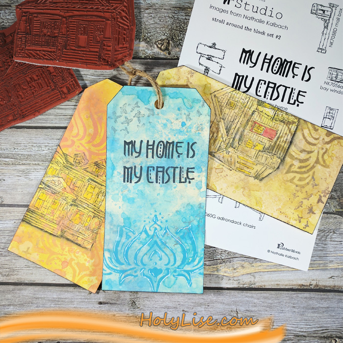
    Great tags, Josefine! I love your term ink smooshing – I do that, but now I have a new name for it :). The lily stencil looks awesome with the houses. Maura

    Reply

Leave a comment

My Fire Burns Bright – Josefine Fouarge


It’s Tuesday and time for a post from my Creative Squad.  Today we have a beautiful art journal page from Josefine Fouarge that shows how sometimes you just gotta go with your gut and create! Josefine is using my Midtown Foam Stamp Set, Toledo 9×12 stencil, Art Deco Wallpaper stencil, and a few of my cling rubber stamps along with this month’s theme: My Fire Burns Bright – Creativity is a passion that can come from deep within the heart and soul of the maker. Sometimes this fire gets ignited by an event or an influential person in our lives, and other times it can be ignited by a love for a material or just simply the enjoyment that comes from making. What makes your creative fire burn bright?


Welcome to the December Creative Squad topic “My fire burns bright”.

I don’t know why, but my first thought when I read this theme was sunrise. Instead of trying to analyze it, I decided to just go with it and create a scene using the Midtown foam stamps. I stamped three of them onto my art journal page. One of them is actually supposed to be standing up, but I think it works out pretty well laying down.

Next up I created some simple masks for the houses to cover them while I was working on the background. I used a yellow paint for the first layer. Then I added some texture using the Art Deco Wallpaper stencil. In order to blend the orange colors in, I used my brush in a dapping motion. I mixed the paint with water, so it was a little easier to blend them as well.

For the night sky I decided to use the Toledo stencil and a few darker shades of red and blue. After I was done, I felt that the background was too bright, so I sprayed gesso over it. That helped blend the two areas together a little more and made the skyline pop again.

Now on to the finishing touches. I started by stamping Nat’s Star Tag stamp and Cross Circle stamp all over the page. I added more dimension by “hiding” them behind the skyline. For that effect, I covered the house with my mask and stamped over it. When I removed the mask only the partially stamped image stayed on the page.

To make the sun even brighter, I outlined the skyline with two different shades of yellow using my Liquitex ink pens and blended the ink out with my finger. My scene was all set, it just missed a little extra – the U.S flag stamp on top of one of the skyscrapers.

At the end the page needed a frame and a sentiment. I started with adhering the “hello sunshine” acetate piece to the middle of the page. Then I drew in a scribbled border and some random text.

The fires are now burning bright on this page, introducing a new day for whomever lives in that city J


Thank you Josefine! In addition to her art journal, Josefine used the following (some are affiliate links):


Play along with us too: I love to see how you interpret our monthly themes. Email me how you used my stencils and stamps with the theme and email me an image – I would love to share your projects in my next  “n*Spiration From Around the Globe“.

SaveSave

Leave a comment

Pattern Lovers – Michelle Rydell


Today we have a project from the Creative Squad! Michelle Rydell is sharing a really happy and colorful journal cover using my Santa Fe stencil and my Embroidery stamp set. This month’s theme is: Pattern Lovers Love Patterns: We admit it – sometimes we go a little crazy over cool patterns. We see them everywhere and whether it’s in the human-made stuff all around us or in the designs by Mother Nature, we love them all. So this month we’re playing with pattern and giving it the attention it deserves!


One thing I love just as much as art journaling, is making the journals to journal in!  When I heard that the theme for this month was Pattern Lovers I thought it would be perfect to do a journal cover!

I started by folding some 9 x 12” paper in half to form a 6” x 9” journal. I cut/tore a long piece of unprimed canvas 9” high to match the height of the journal.  Then I wrapped it around the papers to decide how long to make it.  I wanted enough to create a flap.

I primed the canvas on both sides with some white gesso.

I wanted the outside of the cover to be a progression of cool colors, so I used a makeup sponge to rub on some acrylic paint in lime green, turquoise and purple.

Then I sponged some teal over the whole thing with the Santa Fe stencil. I love how the blue creates a different effect depending on what color it is combined with…

I used white gesso to stamp the Cross Circle stamp (from the Embroidery set) randomly.

Then, I added the Grannies stamp with black for contrast.

As a final touch, a little pink was added with a paint pen to fill in some of the circles.

Then I flipped the canvas over to paint the inside. For high contrast I used warm colors to create a similar progression as a base.

Then, used the Running stamp with white gesso to create an all-over pattern, and the cover was done!

Here are some photos of the completed journal.  I made a slit in the flap and sewed a button to create a closure. I used a simple pamphlet stitch to sew in the signatures.  I hope you enjoyed this tutorial!


Thank you Michelle for sharing your project with us! In addition to a button and some thread, Michelle used the following supplies (some are affiliate links):


Play along with us too! I love to see how you interpret our monthly themes. Email me how you used my stencils and stamps with the theme and email me an image – I would love to share your projects in my “n*Spiration From Around the Globe“.

Comments (10)

  • Rita Montgomery

    |

    I love this idea. I can see doing some raw edge appliqueing or free motion quilting to the cover as well. Fantastic job. ~~rita

    Reply

    • Michelle Rydell

      |

      Ohhh, free motion quilting would be awesome! Thank you Rita!

      Reply

  • Donnalee

    |

    fabuloso!!!!!!!

    Reply

  • Julie Tucker

    |

    Wow wow wow!!! This is gorgeous! LOVING the colors and the textures!!!!!!!!!!!

    Reply

  • Travis ArtJournalGuy

    |

    Very creative! I would never have thought to do something like this, but it seems easy to do. Thanks for sharing your process with us.

    Reply

  • Sherry Canino

    |

    How beautiful and I just love all the colors !!!❤️❤️❤️

    Reply

Leave a comment