Blog: layout

What’s The Point or…New Stencil with Stencil Girl Products

WhatsthepointKalbach

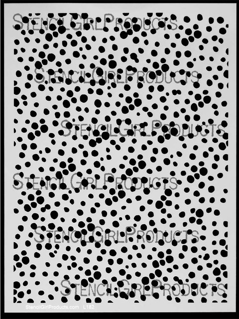
Ohhh I am so excited about this new What’s The Point stencil too because it has so many possibilities.

NathalieKalbach_WhatsThePoint01

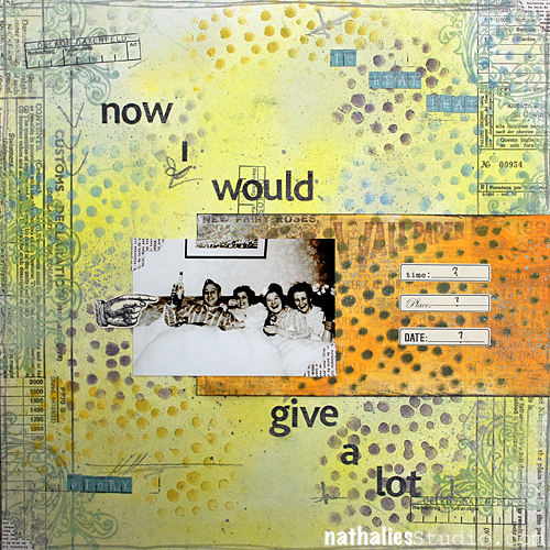
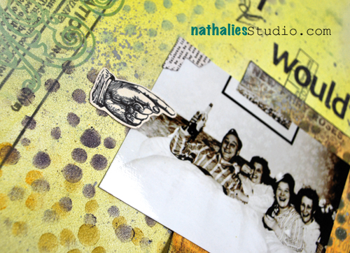
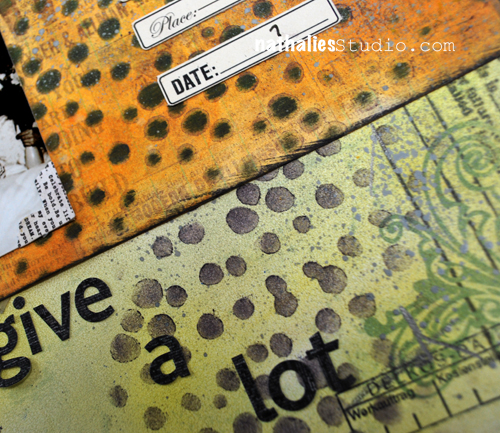
For this Scrapbooking layout I used my new What’s The Point Stencil with PanPastels. Beforehand I had also treated the paper with PanPastels, then laid the stencil on top and dabbed the paint through. I love how vibrant the dots become.

NathalieKalbach_WhatsThePoint02

The photo btw shows my grand-aunt with I think some friends…I found this photo when I was moving her apartment and it made me laugh hard. I hope I can trigger her memory on the story behind this :)

NathalieKalbach_WhatsThePoint03

It is a fun stencil to tie elements together :) and I hope you like it

nSupplies


have an amazing day

huge hugs

Nat

Comments (9)

  • Judy Shea

    |

    Oh now this is a cool stencil.. Can’t wait to try it out. Some of the simplest designs are the best one.

    Reply

  • Mary C. Nasser

    |

    LOVE your new stencil and what you created with it!!!

    Reply

  • SusanJane

    |

    I love wonky dots! This pattern is perfect! Random scatter and decidedly not round. On my list!!!

    Reply

  • Nurse Ratchet

    |

    Nat..this stencil is absolutely a must, no doubt about it , no questions asked ,have stencil…it is brilliant and sooooooooo versatile!! Gotta find a source for these beauties!!

    Reply

  • Kathy P

    |

    Great stencil, Nat! I like that the holes are bigger than dots and more irregular. I can see myself using this a Loy, Love what you did with it in your page
    ,

    Reply

  • Sue Clarke

    |

    What a fun LO and yes, the story is needed (or it might have to become a Whatevers) LOL…just kidding.
    That stencil is a simple design with so many possibilities.

    Reply

  • muriel

    |

    Oh, yes I too see possibilities in this stencil:patterns for clothes, blurred snowy backgrounds or foregrounds ! I love your colour combo too!

    Reply

Leave a comment

Layout: You Shine

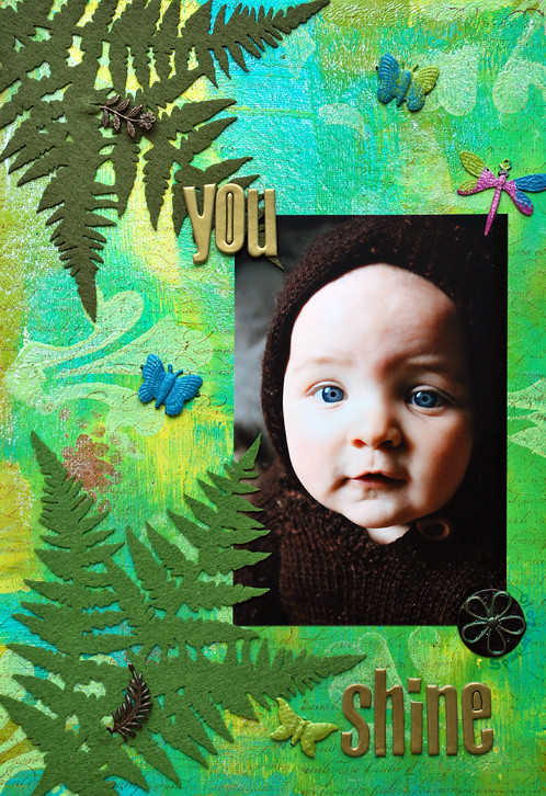
When I saw this beautiful picture of the baby of a scrappy friend of mine- I knew I had to use this :)

Als ich dieses wunderschöne Photo des Babys einer Scrap-Freundin sah, wußte ich, dass ich dieses verwenden mußte :)

*You Shine*

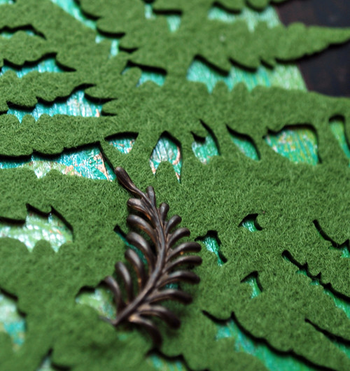
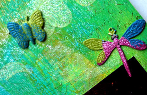
I painted Cardboard with Eco Green Crafts Acrylic Paints, as well as stamped it with Eco Green Crafts Dye Ink. Then I used Tattered Angels Glimmer Mist on top. For the beautiful Vintaj Arte Metal Butterflies and the Vintaj Dragon Fly I used Versamark on top and then dipped them into several colored Embossing Powder Pots by Ranger, then heat set them. The Vintaj Fern Valley Fastenables were attached on the Prima Ferns as an extra highlight. For the Vintaj Basic Altered Blank I used Tattered Angels Glimmer Glam and then attched the Beaded Flower that was also painted with Glimmer Glam on top.

Supplies: Cardboard, Eco Green Crafts: Acrylic Paints, Paris Trunk Dy Ink, Stampin’ Up Script Stamp, Imaginesence Foam Stamp, Vintaj Butterflies, dragonfly and leaves, Altered Blank and Flower, Prima Fern Felt, Ranger Embossing Powder
Tattered Angels Glimmer Mist, SCRAPBOOK-ADHESIVES by 3L™ Mounting Squares, heidi Swapp chipboard Letters

Have a good one :)

  • Michelle Clement

    |

    Oh, this is so beautiful, Nat!! :) What a gorgeous photo, too! Love your painted background – and the felt is lovely, too!!

    Reply

  • Conibaer

    |

    Absolut genial geworden!!!!

    Reply

  • Em

    |

    Now that is just one SUPERB layout! I love this :) The colours are divine, stunning photo….it’s all total eye-candy :D x

    Reply

  • Sue Clarke

    |

    I do like the ferns with that precious child. Isn’t it nice to have friends with sweet children to scrap? Since I have no daughters I’m forever “borrowing” my friends girls to scrap on LO’s. LOL

    Reply

  • sylvia

    |

    Oh Nat, it’s beaaaauuutiful! How well the backgroud with the Eco Green Craft goodness goes with the photo. He looks just like a little boy from the woods, like a little pixie amidst the green! LOVE it!

    Reply

  • JulieK

    |

    LOVE that photo, and the felt and background too!

    Reply

  • Katrina

    |

    Oh how artsy!!! I love it and that pic of the baby is so cute!!! Hugs, Katrina

    Reply

  • Kim Sonksen

    |

    That background is amazing (and that photo is adorable). I love how you used the embossing as well. FUN!

    Reply

Leave a comment

Studio DaphNat: Modeling Paste Technique Results

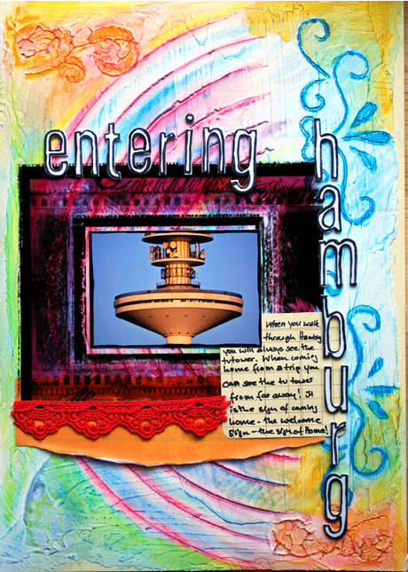
Letzte Woche habe Daphne und ich die Modeling Paste Technik gezeigt und natürlich wollen wir Euch auch unsere Endprodukte nicht vorenthalten ;-)

Last week Daphne and I showed you the Modeling Paste Technique and of course we want to show you our end results too ;)

*Entering Hamburg*

Journaling: When you walk through Hamburg you will always see the tv tower. When coming home from a trip you can see the tv tower from far away! It is the sign of coming home- the welcome sign the sign of HOME!

Supplies: Modeling Paste, Chalks, Neocolors II, Colors Conspiracy, Prima Lace, Heidi Swapp Journaling Tag, Fancy Pants Overlay, American Crafts Thickers, American Crafts Pens.

Vergesst nicht Daphnes Ergebnisse anzuschauen!

Don’t forget to check out Daphne’s result!

  • Charleen

    |

    wow, the texture is great again and the colors are wonderful!

    Reply

  • Eeva

    |

    This is sooo cool!!!!

    Reply

  • Kristina

    |

    That is so beautiful. Absolutely love that background. Haven’t seen anything like it.

    Have a great summer, Nat. :)

    Reply

  • Barbara

    |

    Holy Crap Batman!!!!!!!!!!

    Someday I’d love to just sit and watch you scrap! I’d learn so much from you.
    Congrats on being in the Somerset Memories aug/sep issue, just sitting there in the bookstore this afternoon looking threw it {yah, call me cheep} and how exciting to see some more of your craft! So Congrats!

    Hugs too!

    Reply

  • christiane

    |

    i MUST try it too!! what an amazing result!! wanna touch it tooo!! :D

    Reply

  • jana

    |

    hach, sooo schön !

    Reply

  • Melli

    |

    wow so cool … das sieht total genial aus … ich glaub ich muss diese Technik unbedingt mal probieren

    Reply

  • scrappermimi

    |

    I just want to touch this, there is so much texture and dimension! Fabulous!

    Reply

  • aimee

    |

    that is freakin’ awesome!

    Reply

  • Daphne

    |

    oooooooooh schatzie! I knew you were going to make something beautiful with this amazing coloured background!

    Love the journaling and your layouts about Hamburg; I can always feel your love for the city :-)

    Reply

  • KimmyS

    |

    Yay – das Layout schreit wirklich “zuhause”
    Unser heissgeliebter Turm.
    Klasse layout – die Technik ist echt genial

    Reply

  • milkcan

    |

    So cool! I’m going to check out the technique link!

    Reply

  • Linda Beeson

    |

    YUM! Just plain YUM! I have that stuff, ‘spose I should pull it out.

    Reply

  • merryheart2

    |

    Hi Nat
    awesome layout. i love it.
    i’m gonna go check out how to do this technique.
    Sandra

    Reply

Leave a comment

Layout: Be Proud

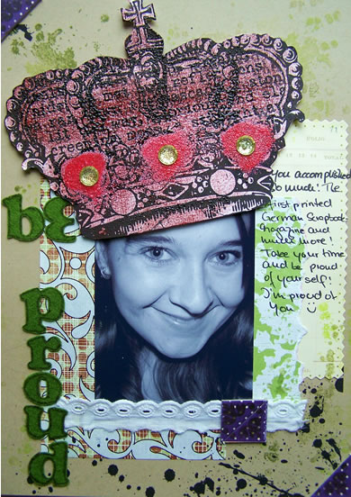
Eine lange fälliges Layout für meine liebe Andrea ;-) Ich hoffe es gefällt ihr. Eines meiner ersten intensiveren Hybrid Layout-Versuchen.

This is a layout I had in mind for long for my sweet Andrea ;-) I hope she likes it. It is one of my first more intense attempts to hybrid scrapbooking.

*Be Proud*

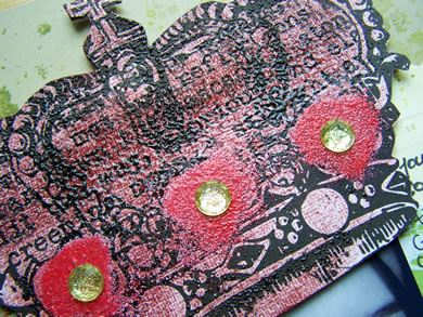
The crown was printed out, covered with distress ink, then embossing powder, heated, embossed with more glitter embossing powder and finished with three jewels. The look in real life is very textured and glass like.

Supplies:

Prima Hybrid IOD Gem Silhouette Baubles, Prima Hybrid Kim Christensen 2 Splatter Overlay, Kraft Cardstock, Danyeela Paper, Rangers Distressed Ink and Embossing Powder, Prima IOD Paper and Chipboard Photo Corners, Making Memories Journaling Spot, Vintage Lace, Jewels, American Crafts Felt letters, Stampers Anonymous Spills and Splatters Stamp.

  • christiane

    |

    yeah, ich bin ebenfalls für mehr hybrid-versuche!! soo klasse!!

    Reply

  • lisaannette

    |

    That layout is AWESOME! You are so creative… I enjoy your work very much :)

    Reply

  • Valerie

    |

    Wow Nat, the crown is absolutely stunning!

    Reply

  • Cat

    |

    This is so cool Nat…I love it and I”m sure she will to!

    Reply

  • Laura

    |

    How awesome!! Love that crown!

    Reply

  • Simone

    |

    Das hört sich nach ner Menge Arbeit an! WOW!!
    Da kann sich eine ja PRIMA freuen!

    Reply

  • Andrea

    |

    Awwwwww … *sob* … WOWZERS … this is so awesome – besides the fact that I love it for obvious reasons *lol* – wonderful Layout – esp. love the huuuge crown and the way you altered it :) Can’t wait to see it IRL … Hugzzz …

    Reply

  • Eeva

    |

    oooh wow wow wow!! It’s awesome!!!

    Reply

  • Birgit Koopsen

    |

    That crown looks fantastic, as the whole LO does!! I’m sure s’he’ll love it!

    Reply

  • Daphne

    |

    A succesful attempt it is!

    Reply

  • Aline

    |

    Sehr cool, da würde ich sagen, Test bestanden. ;))

    Reply

  • milkcan

    |

    I saw this on SIS and loved it! That crown is just sooooooooooo awesome! Rock on!

    Reply

Leave a comment