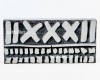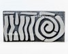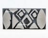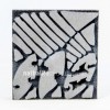
Creative Squad

Today is the Day – Michelle Rydell

cs-october-theme

This Tuesday, Michelle Rydell from my Creative Squad is happy to share with you a gorgeous art journal spread using my new Versailles ArtFoamies and inspired by this month’s theme: “Today is the Day.”  I invite you to join me and my Creative Squad to stop procrastinating and to make today the day you finally tackle that artsy thing you’ve been meaning to get to for so long.  Start that new project you’ve been planning for months.  Try out that new product you bought ages ago.  Experiment with that new technique you read about last year.  Try it!  Today is the Day!

michelle-october-headshot

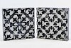
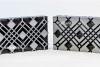
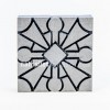
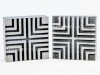
I have seen Art Foamies videos on youtube and always thought they looked like fun. I love their chunky look, and have been especially intrigued by the concept of the “stamp buddy” that comes with each foam stamp!  I was so excited to find out that Nat has a new line of gorgeous Art Foamies stamps! So finally, Today is the day I get to try them out!  I decided to use the Versailles set – I love how the intricate patterns of the two stamps fit together!  Here’s what I did to create my page…

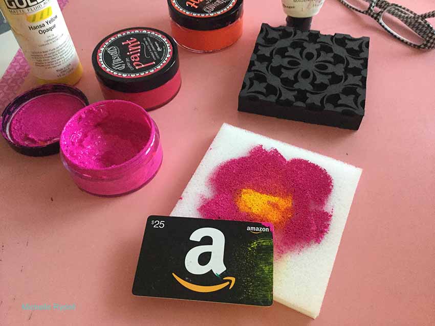
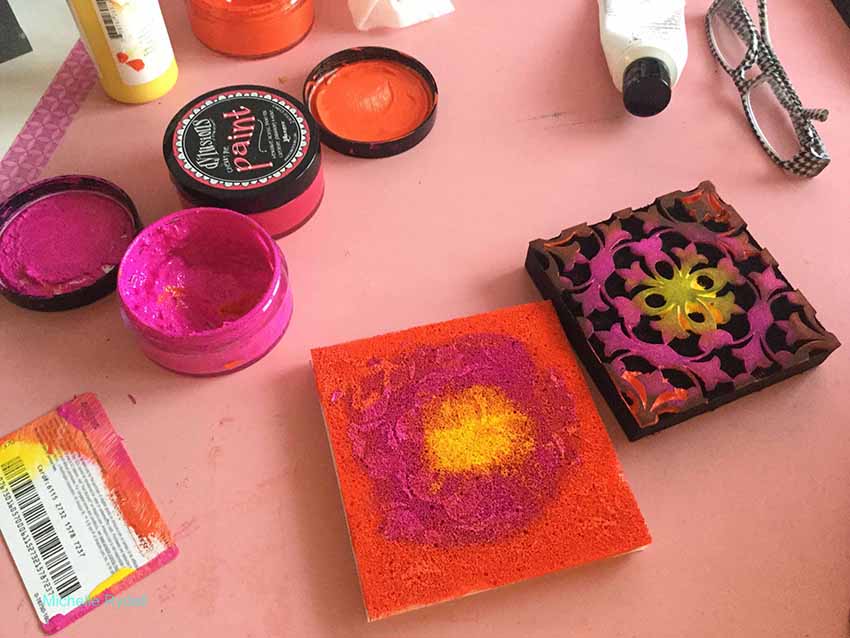
I got out some warm colors of acrylic paint – yellow, pink and orange; and scraped them onto the stamp buddy, with the lightest color in the middle and the darker colors radiating outward. At first I used a credit card, but then decided it would be more fun to use my fingers – ha…
rydell-today-1

rydell-today-2

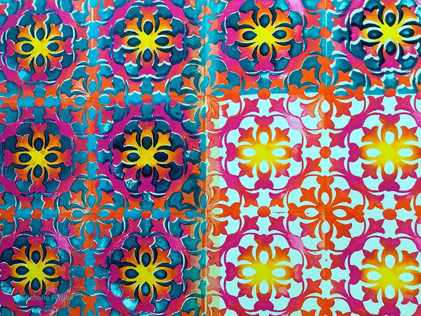
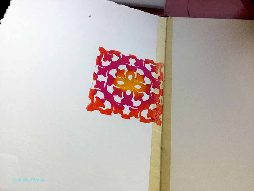
I pressed the stamp into the stamp buddy to distribute the paint, and stamped it onto my art journal spread. WOW it looked gorgeous!  I was so excited to see how the colors created an ombre effect!
rydell-today-3

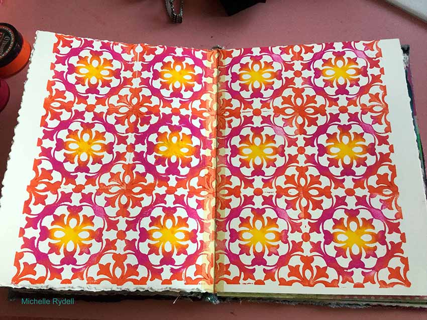
I decided to cover the whole page with this stamp, and I did not have to re-ink the stamp buddy at all!  That thing really holds a lot of paint!!! When I was done it reminded me of a tiled wall.  I almost didn’t want to do anything else to it!
rydell-today-4

I decided to repeat the ombre effect with the second stamp in the set; only this time use all cool colors, and instead of having the lightest color in the middle, I put the darkest.
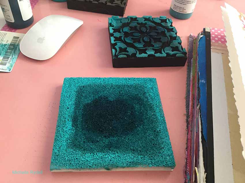
rydell-today-5

I stamped the second stamp onto my page and actually said EEK out loud – it looked so pretty!  I LOVE how the images fit so easily together.  This is truly a new experience in stamping!
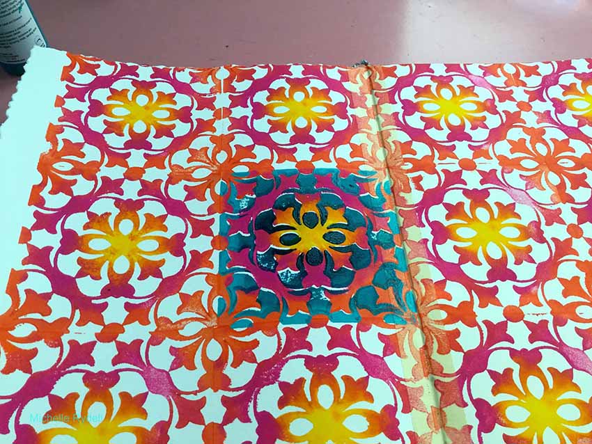
rydell-today-6

rydell-today-7

I wanted to cover up the blank edges of the page, so I decided to paint a black, cloud-like frame to make the colors pop even more.  At that point I just stared at the pattern for a minute, to see what I could see… and out came a flower!  I used part of the pattern for a colorful center, and drew and colored the petals and stem with paint pens. After that I realized that I needed to differentiate the flower from the background a little more, so I added a magenta glaze to the background.  You can just see the beginnings of that behind the bottom left few petals in this photo…
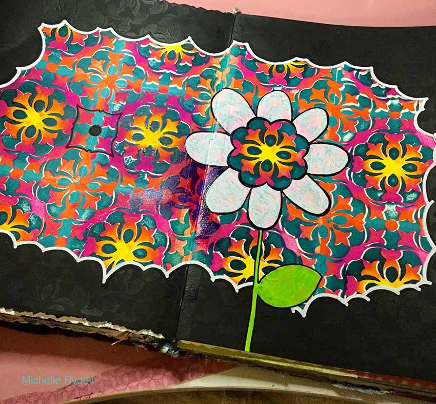
rydell-today-8

And here is my finished page.  I finished glazing the background, did some doodling in the black frame area, and added a quote with a white paint pen…
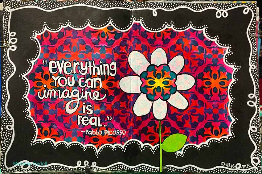
rydell-today-9-1


I love the super juicy background that Michelle created by using both the positive and negative Versailles stamps together!  And the whole thing really pops with that cute black and white frame around it.  Here are the supplies Michelle used – note that some of the links are affiliation links:
SuppliesCJS

Maybe you will even play along with us -I would love to see how you interpret our monthly themes. Email me how you used my stencils and stamps with the theme and email me an image – I would love to share your projects in my next “n*Spiration From Around the Globe“.

See you next Tuesday for another project from the Creative Squad!


Comments (10)

  • Dee Spillane

    |

    Wow! This is wonderful. Fantastic stamps with great color yay!

    Reply

  • Cindy

    |

    Always love your work, Michelle … so colorful and bold, and happy!

    Reply

  • Jessica Sporn

    |

    This is just beautiful. I love Nat’s foams and what you created with them. Gorgeous.

    Reply

  • Meg

    |

    Michelle, this is gorgeous!!! ❤️

    Reply

  • Kim

    |

    This is just a stunning page … big fan of Julie’s ArtFoamies, so the product is wonderful, but this takes it to a whole new level with the negative stamp included as a set, WOW. Always love seeing your work … thanks for sharing!

    Reply

  • Marit

    |

    I love how you explain every step and thought along the way from beginning to end… awesome post Michelle!

    Reply

  • Kandy Gordecki

    |

    So creative! You amaze me how your ideas just keep coming!

    Reply

  • Sue Clarke

    |

    I really enjoyed seeing how the pages progressed and ended up with such a colorful, full two pages of pattern. Delightful!

    Reply

  • Kathy P

    |

    Totally awsome—I love it!!!! So colorful, cool design!

    Reply

  • Julie Tucker

    |

    This is GORGEOUS! LOVING how you created that background!!!!!!!!!!!!

    Reply

Leave a comment

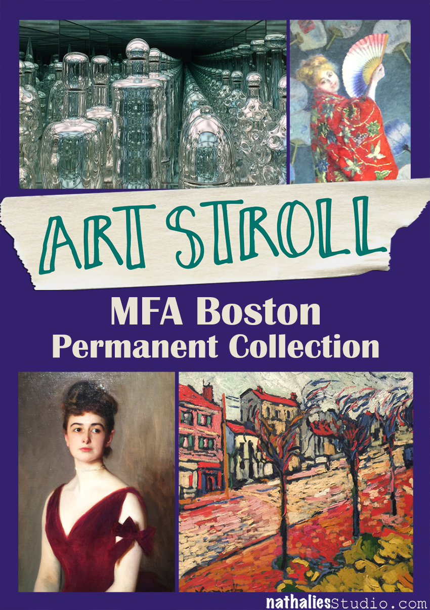
Art Stroll: MFA Boston Permanent Collection

kalbachmfapermcollage

At the end of August I visited my friend Julie Fei-Fan Balzer in Boston and of course we took some Art Strolls.

kalbachmfaperm01

I wanted to share with you some inspiring pieces from the permanent collection …

kalbachmfaperm02

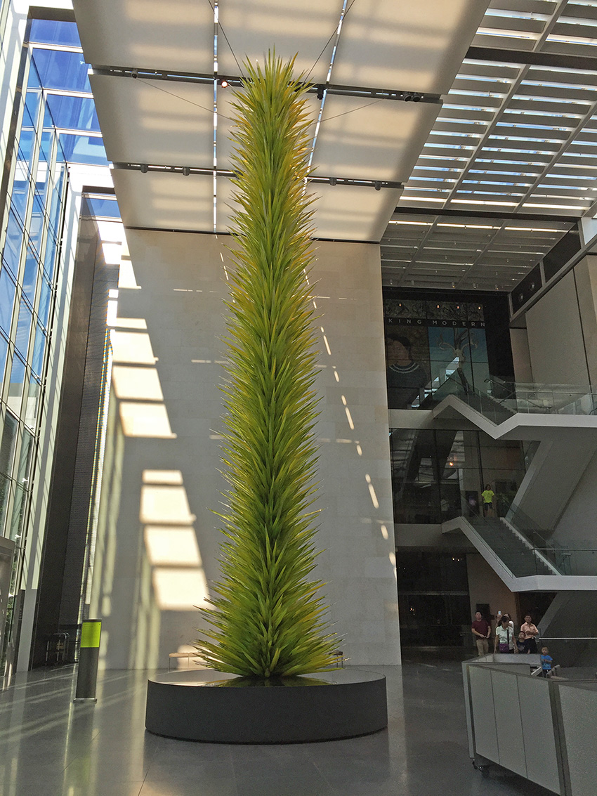
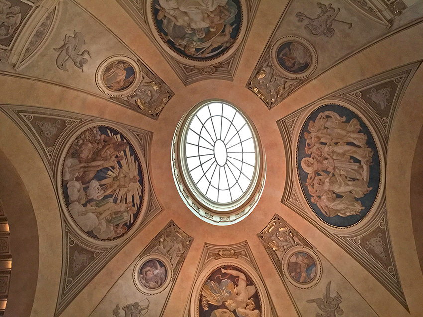
besides this amazing view up

kalbachmfaperm03

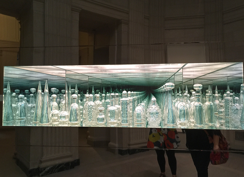
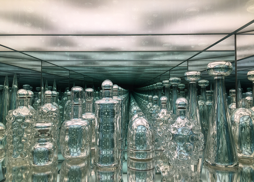
Endlessly Repeating Twentieth Century Modernism by Josiah McElheny

kalbachmfaperm04

It is a fascinating mirrored installation and McElheny hand-blew each glass vessel based on Italian, Austrian, Czech and Scandinavian designs from 1920-1990. I loved it so much and couldn’t stop looking at it. I wonder how I can incorporate the idea of endless elegance into a piece of my own art.

kalbachmfaperm05

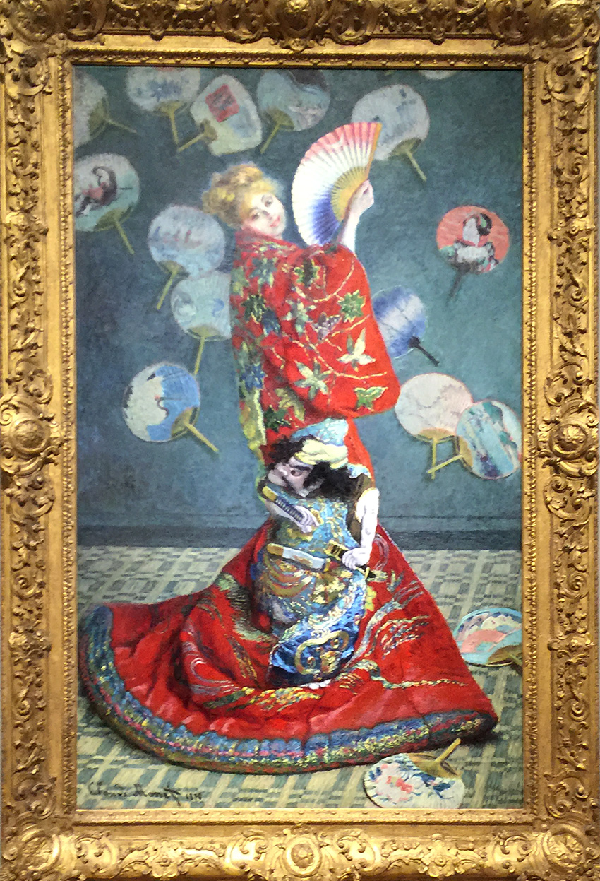
La Japonaise (Camille Monet in Japanese Costume), Claude Monet, 1876
The colors and details in this picture- from the Costume to the carpet are just mind blowing.  I did not like the frame around this painting- it is sooo pompous and takes away so much from the painting – I am sure it is not the original frame and one of those Museum’s early “let’s make sure all artwork gets the same frame” craziness, as I wrote about in my Art Strolls here.

kalbachmfaperm06

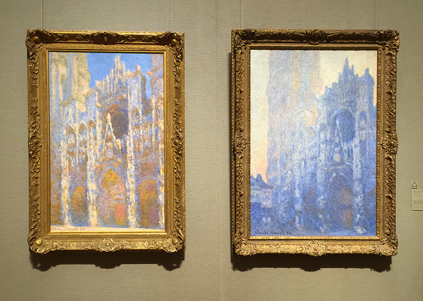
Rouen Cathedral Facade, 1894 and Rouen Cathedral Facade and Tour d’Albane (Morning Effect), 1894 by Claude Monet – Oil on Canvas

kalbachmfaperm07

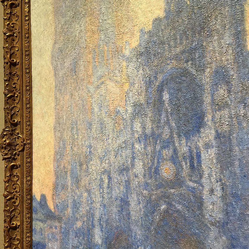
I love those paintings. They glow, atmosphere and the texture and impasto is just unreal. It makes me want to touch it.

kalbachmfaperm08

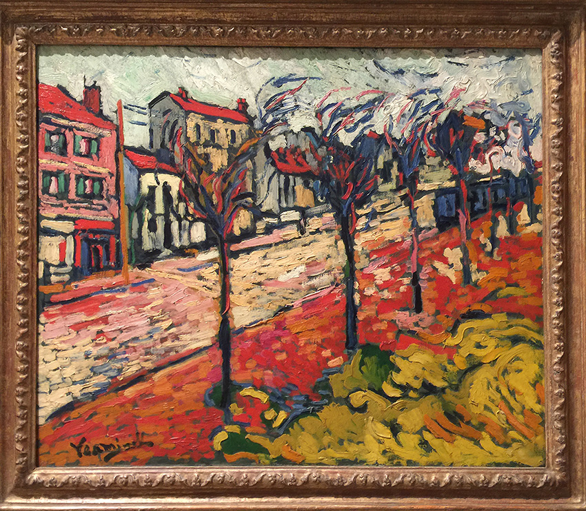
Paysage de Banlieue, 1905 by Maurice de Vlaminck. Students of my Art Rules class might remember that we talked about a couple of his paintings in the Fauvism part of the class. I always love how my students are as intrigued as I am by the marks and colors . It is truly inspiring to discover this style in your own art journal.

kalbachmfaperm09

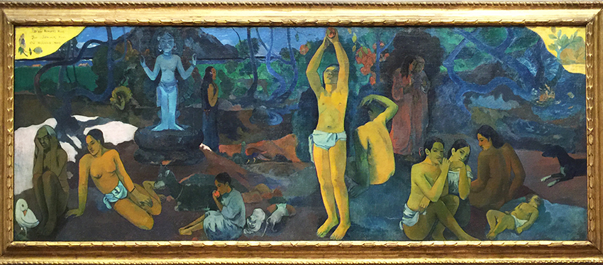
Where Do We Come From? What Are We? Where Are We Going?, 1897–98 by Paul Gauguin. “In 1891, Gauguin left France for Tahiti where he created paintings that express a highly personal mythology. He considered this work to be his masterpiece and the summation of his ideas. Gauguin’s letters suggest that the fresco-like painting should be read from right to left, beginning with the sleeping infant. He describes the various figures as pondering the questions of human existence given in the title; the blue idol represents “the Beyond.” The old woman at the far left, “close to death,” accepts her fate with resignation. ” (from MFA Website). It is a massive painting and keeps you with it’s Narrative and Symbolism.

kalbachmfaperm10

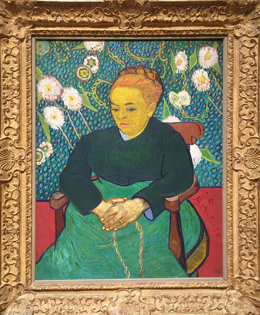
Lullaby: Madame Augustine Roulin Rocking a Cradle (La  Berceuse), 1889 by Vincent Van Gogh. I love the vividly colored patterned background! The texture of her hair – and the colors are just glowing.

kalbachmfaperm11

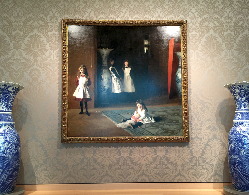
The Daughters of Edward Darley Boit, 1882 by John Singer Sargent.

kalbachmfaperm13

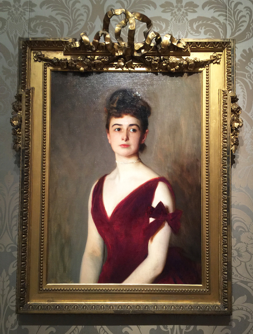
Mrs. Charles E. Inches (Louise Pomeroy), 1887 by John Singer Sargent.

kalbachmfaperm14

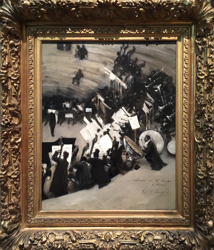
Rehearsal of the Pasdeloup Orchestra at the Cirque d’Hiver, about 1879–80 by John Singer Sargent. This last painting was actually my favorite of his paintings. I love the monochromatic color palette and that you can almost hear the music. Apparently John Singer Sargent was influenced by artwork by Edgar Degas he had seen in 1877 (check out my Art Stroll through the Degas Exhibition at MoMA recently) – and that makes total sense to me. Love how he took the inspiration and made his own piece.

Hope you enjoyed the Art Stroll through the Permanent Collection of the MFA in Boston. If I could I would go every week to a museum for a little art inspiration.

Comments (2)

  • Jean Goza

    |

    What an amazing collection you shared this morning. I am hard pressed to pick a favorite. Thanks for the “stroll”.
    Jean

    Reply

Leave a comment

Yes to all or … In my Art Journal today

natkalbach_yestoall_01

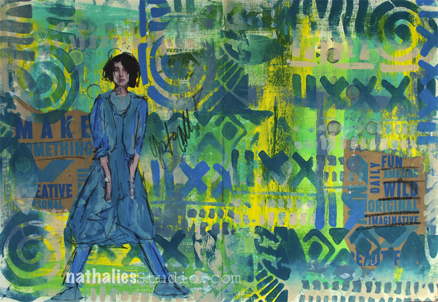
Make something, be creative, be fun, wild, original, imaginative….etc ….YES to all

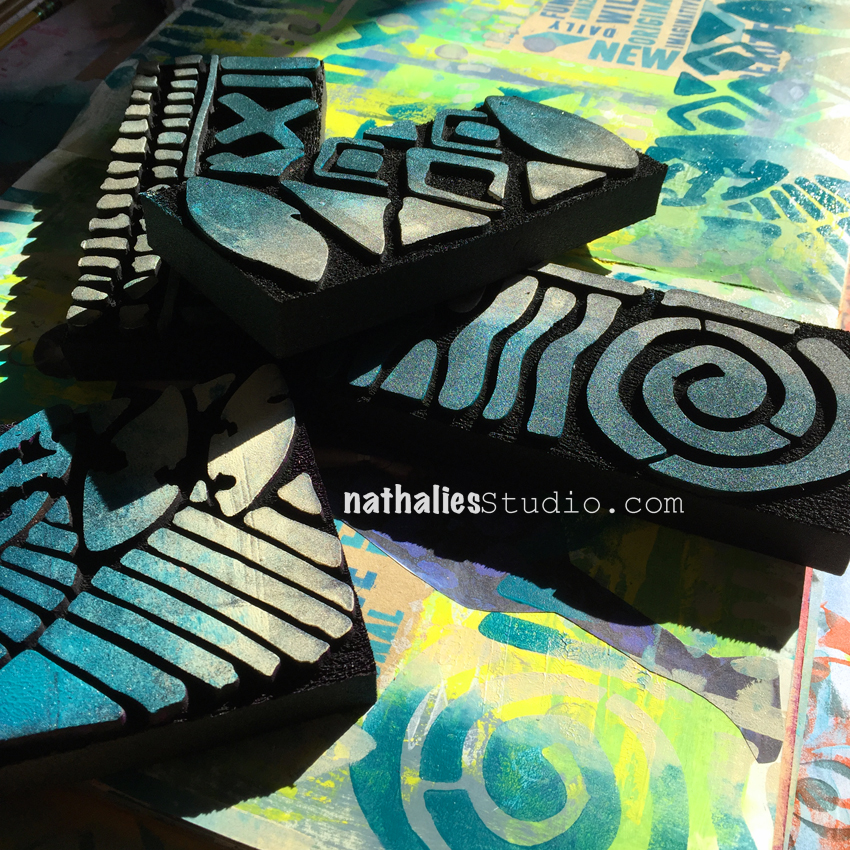
So much fun to play a bit in my art journal using the new ArtFoamies Batik Stamps 1, 2, 3 and 4

natkalbach_yestoall_02

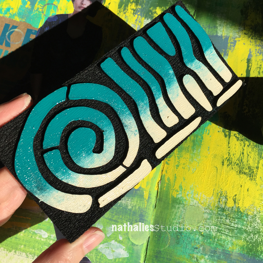
I painted the background and then rolled out two different color next to each other with a brayer- so half the brayer was covered in cobalt turquoise and the other half in unbleached titanium and applied the brayer to the stamps

natkalbach_yestoall_03

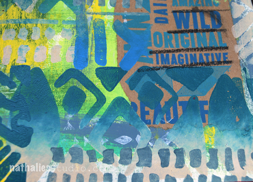
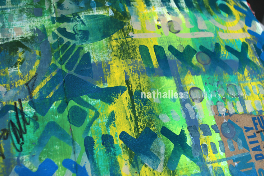
and just went with it. Loved the two colored patterns and the texture this created.

natkalbach_yestoall_04

It tied the background and collaged paper snippets together. The text on the kraft paper is actually from a paper bag.

natkalbach_yestoall_05

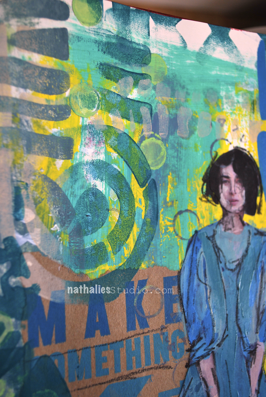
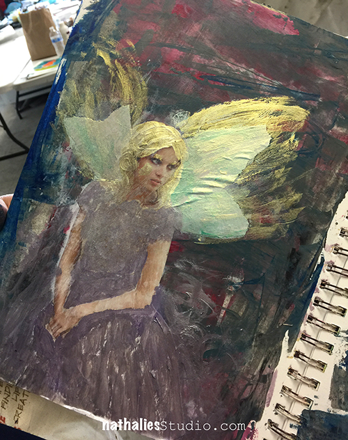
I overpainted a magazine image with the same colors using a small brush and then went over with a soft pencil.

natkalbach_yestoall_06

It was a quick and fun art journal page – a much needed creative time after a bit of a long stretch working on a computer.

Here are some of the supplies I used for this spread – note that some links are affiliate links

SuppliesCJS


Hope you have a wonderful day full of happy YES :)

Comments (2)

  • Sherri Scott

    |

    Dear Nathhalie
    I wanted to tell you I had the best weekend ever when you where at the Ink Pad. Thank you

    Reply

  • Kathy P

    |

    Awesome journal pages, Nat—& I love those bold new stamps!

    Reply

Leave a comment

ART JOURNAL YOUR ARCHETYPES by Gabrielle Javier-Cerulli—Book Giveaway

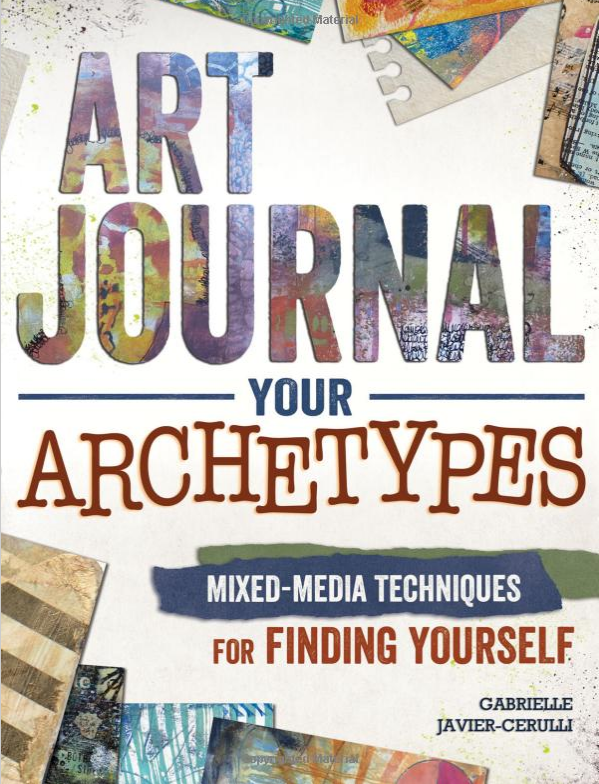
I just received two copies of this wonderful book by Gabrielle Javier-Cerulli

archetypes

ART JOURNAL YOUR ARCHETYPESMixed Media Techniques for Finding Yourself

“In this unique book, you will learn processes for discovering your core archetypes and using that knowledge to create highly personal visual expressions, all the while embracing the personal revelations and creative breakthroughs that result”. -Gabrielle

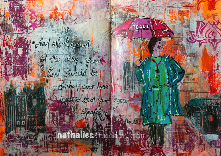
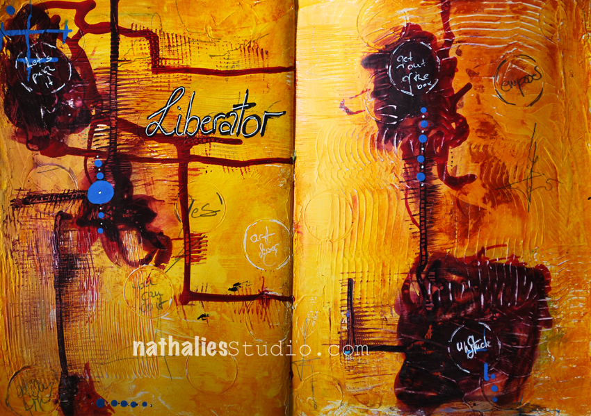
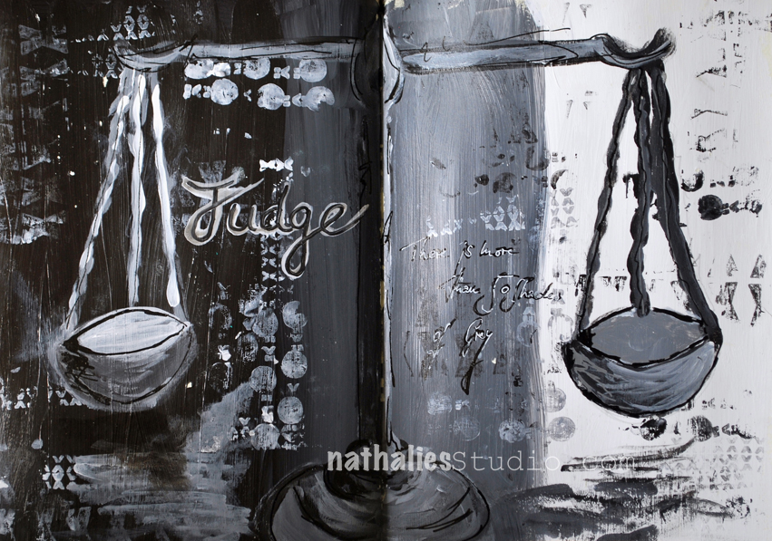
Gabrielle asked me along with a couple other wonderful artists if I’d contribute to her book. I was super honored and of course I said yes. Gabrielle had a long conversation with me to explore my archetypes which was very interesting to learn about. After the interview and after she told me my archetypes I created art journal pages based on those. It has been so much fun and I learned a lot about myself. Here are the pages I contributed:

rebel_01_aj_natkalbach judge_01_aj_natkalbach liberator_01_aj_natkalbach


Find out more about Archetypes, your own archetypes and how they can prompt your art journal pages in this book. Thank you so much Gabrielle for including me!

Get yourself a copy or leave a comment here for a chance to win one of the copies of the book I received. You can comment until October 26, 2016 midnight EST and I will pick one lucky winner randomly and announce the winner shortly after.

Comments (25)

  • Sandra L.

    |

    Gorgeous book and your pages are always so powerful. I am new to art journals and for months have sat and stared at the blank pages. Winning a copy of the book would hopefully spark what is needed to get me on the correct path. Thanks for the opportunity.

    Reply

  • Kim Johnny

    |

    Love your bold and bright pages! Fabulous! The book looks so wonderful and would love to learn from it. Thanks so much for sharing and a chance to win!~kim

    Reply

  • Crystal Korzep

    |

    Oh my goodness, I grabbed a bunch of books here in Barnes and Noble, looking at page 25 in Art Journal Your Archetypes, and came across your blog Nathalie. I am looking you up on my cell phone, and saw you are friends with Jennifer and were in Boston. I live 30 minutes out if Boston. I am in time for your deadline to win this awesome book. Oh boy, would I live to win. I am on a new journey iny art; going to try to paint, draw and do mixed media daily.

    Reply

  • elle

    |

    First I heard of this term! How fascinating. I’m intrigued.

    Reply

  • esther

    |

    looks really interesting! would love to win a copy!

    Reply

  • Julie B

    |

    What a cool experience for you! This is intriguing and looking forward to more revelations on your blog and can’t wait to you visit to California in January. Thank you!

    Reply

  • Martine M.

    |

    You always have great pages! Book seems a very interesting. Thanks for the chance to win!.

    Reply

  • susan debourguignon

    |

    wow, Nathalie! your pages are always so colorful — the black and white pages are so striking to me. glad you are included in your friends’ book. the whole archetype business is intriguing to me. if i don’t win it, i will likely buy it.

    Reply

  • Gill K

    |

    This sounds a fascinating book. Thank you for the opportunity to win a copy. Your pages are powerful and striking.

    Reply

    • nathalie-kalbach

      |

      Hi Gill, you won the Archetypes book! Congratulations! I send you an email directly- so please contact me until November 7th, so that I can send out the book to you -Nat

      Reply

      • Gill K

        |

        Hi Nathalie,
        Thank you so much for your generosity. I look forward to working from the book in due course. Gill

        Reply

  • Linda S Richards

    |

    Awesome giveaway & such a great book! Thank you for the opportunity!

    Reply

  • Suz

    |

    This looks like a lot of fun! I’d love to win this book and learn more about myself and my art. Thanks for the chance!

    Reply

  • April Lopez

    |

    This looks like an I tersting book to dig into. I love your pages.

    Reply

  • Sue Clarke

    |

    JUDGE really caught my eye. I think that black and white just makes it stand out more (as much as I love how you mix bright colors Nat).
    Thanks for the chance to win this very cool book.

    Reply

  • Lori B

    |

    Wow your work is beautiful. This book looks very interesting. Thank you for offering this.

    Reply

  • Bec Miller

    |

    How interesting!! Congrats!

    Reply

  • Bea Savellano

    |

    Looks like an inspiring book. Love your pages…

    Reply

  • Gwen L

    |

    I’m so intrigued by everything I’ve seen about this book – what an interesting concept! Love your contributions – gorgeous!

    Reply

  • Kathy P

    |

    As a relative newcomer to mixed media art, this is a new term to me. I’m intrigued! Will have to get a copy because it sounds like it will expand my knowledge of ‘self’, which I am discovering is so important to making art.
    And I love the pages you’ve included in it, Nat!

    Reply

  • Susan

    |

    I have always struggled with what I want to put on an art journal page and hopefully this book would help me to overcome that uncertantity.

    Reply

  • Melinda

    |

    Archtypes are so interesting to me — in some way they make me feel more connectd to the rest of the world,

    Reply

  • Nancy

    |

    So bold and colorful. There is always so much to learn and this looks like a wealth of information.

    Reply

Leave a comment

Teaching with Birgit Koopsen in NY, Syracuse in March 2017

color-crush-ver-2

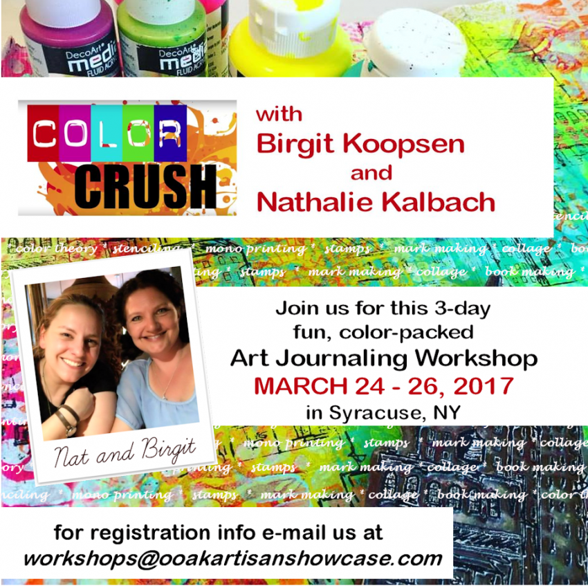
Super duper excited that my friend Birgit Koopsen and I will again teach a workshop together in the U.S. – March 24-26, 2017 a three day Art Journaling workshop in Syracuse, NY organized by OOAK Artisan Showcase.

Check out more details in this video:

Ready for some Color Crush? Check out more details and register here.

It is going to be super fun – come and join us !

Leave a comment

Stepping Up The Game or … In my Art Journal Today

gameup_natkalbach01

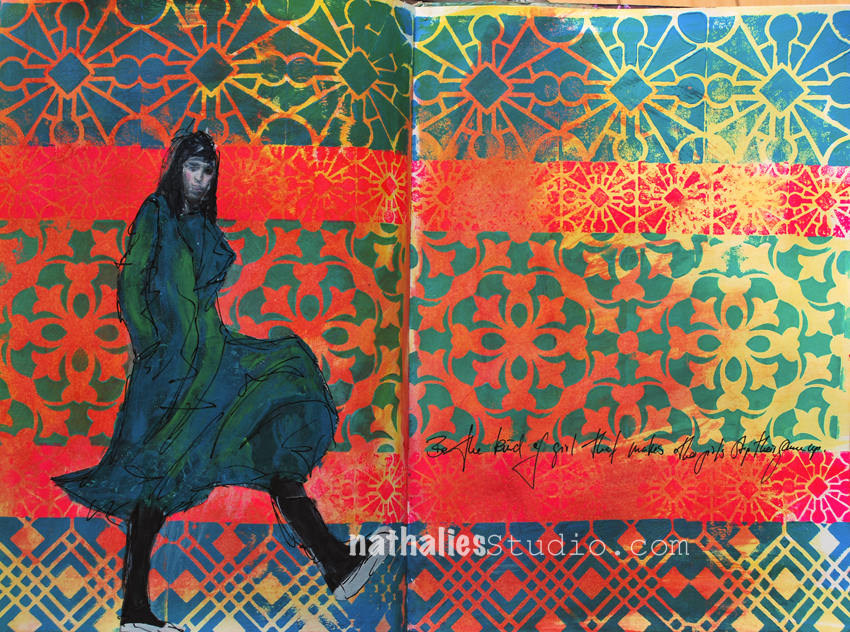
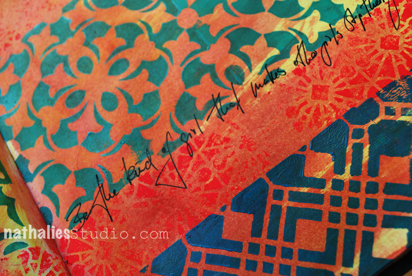
“Be the kind of girl that makes other girls step their game up”

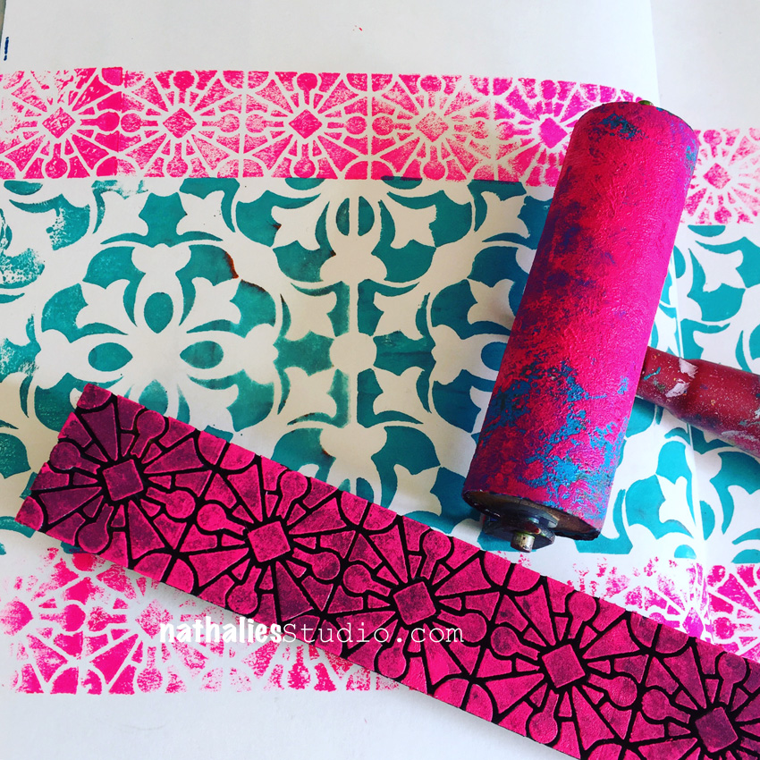
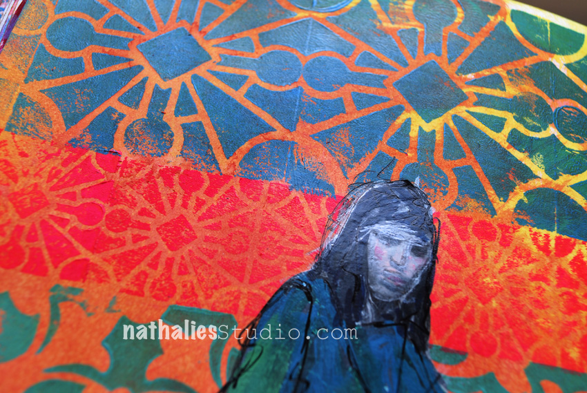
I started this page in one of my classes with the middle pattern showing one of the Versailles Foam Stamps stamped with acrylic paint.

gameup_natkalbach02

and then kept on going at home adding more patterns using the Buenos Aires Border Stamp and the Buenos Aires Tile Stamp on top.

gameup_natkalbach03

On the bottom I used one of the Chicago Stamps. To finish it up I layered some acrylic ink on top which was mostly resisted by the stamped images. This is a good way to add some color to the background after you stamped.

gameup_natkalbach04

But it looked also very good without the colored backgrounds – next time I guess *wink.

Here are some of the supplies I used for this journal spread – some links are affiliate links:

SuppliesCJS


Hope you are having a wonderful day

Leave a comment

Photos of the Workshop at The Ink Pad, NYC

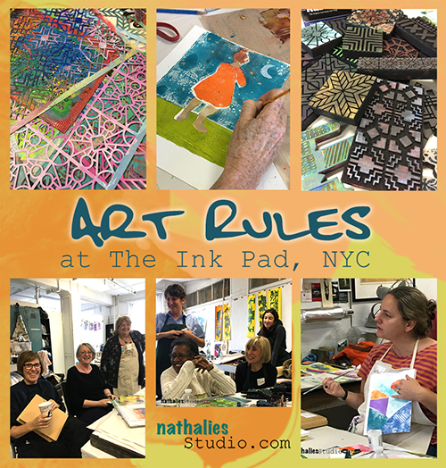
kalbachartrulescollage

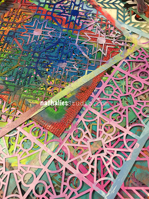
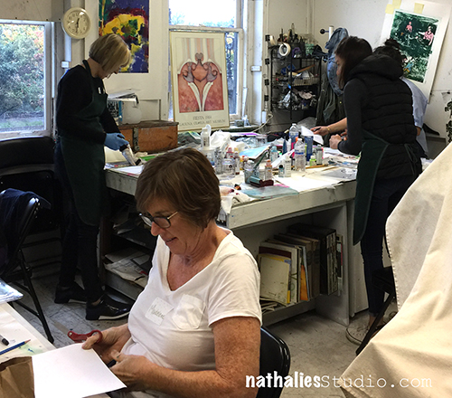
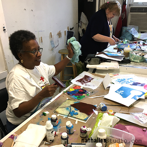
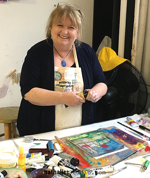
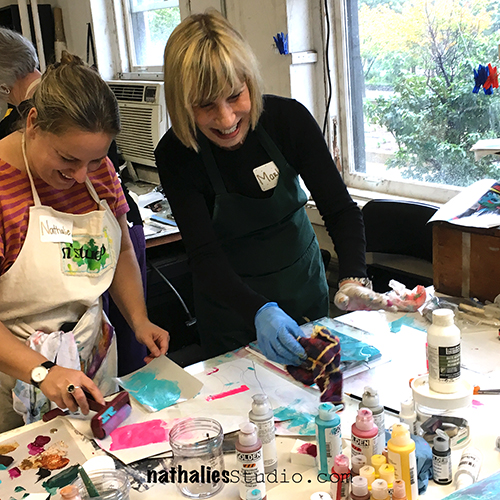
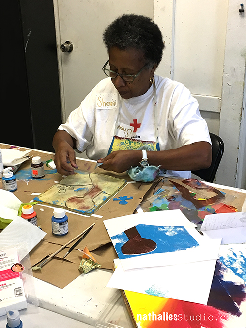
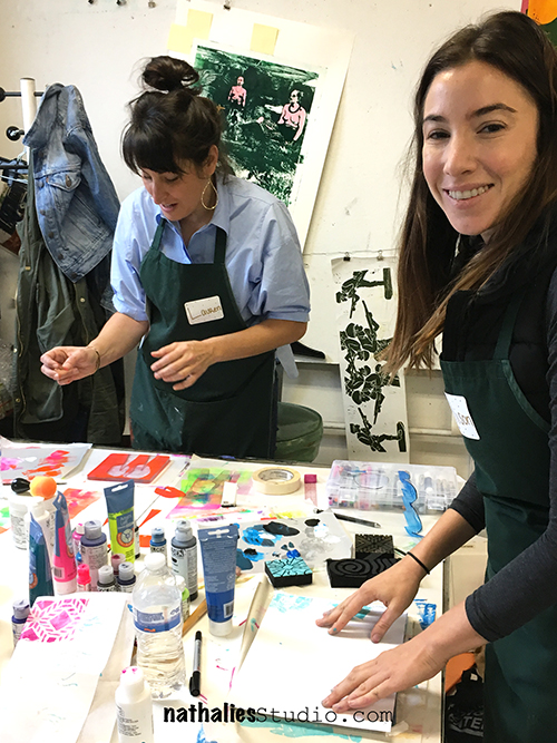
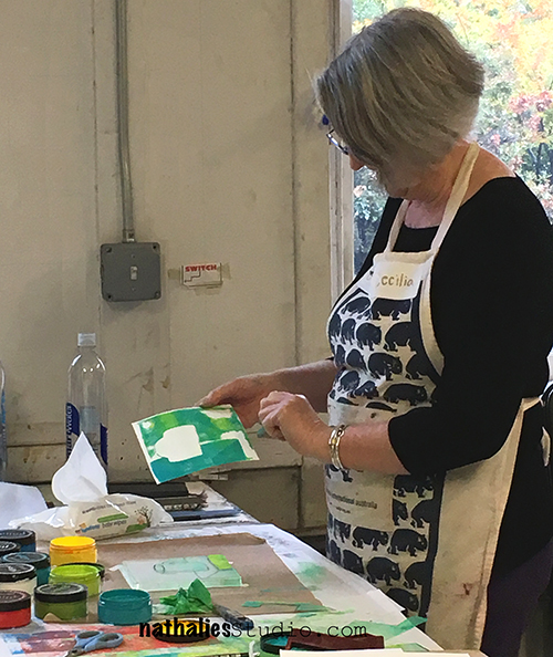
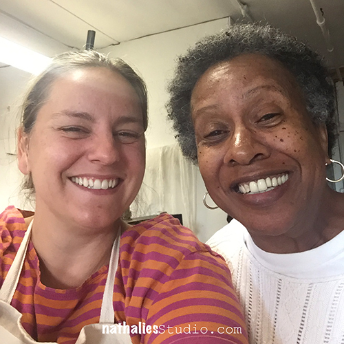
I had such a wonderful time teaching my Art Rules Workshop at The Ink Pad in NYC. It was a two day workshop and we explored lots of wonderful artists.

kalbachartrules01

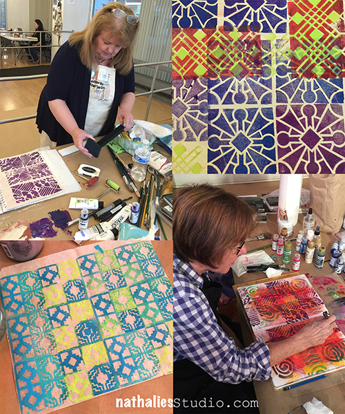
We created a huge amount of pattern using my new ArtFoamies designs which were …quite liked :)

kalbachartrules02

We played with color combinations

kalbachartrules03

and pushed and pulled layers in our art journals

kalbachartrules04

kalbachartrules05

and ….even played with some not yet released supplies …can you spy them ?

kalbachartrules06

The second day we had to move into a different class room due to a little mistake by Westbeth but due to the amazing organization skills of Anna from The Ink Pad and our wonderful and helpful students, that wasn’t a big deal and we actually liked our second home a lot – it was a real printmaking studio.

kalbachartrules07

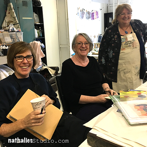
It was such a wonderful group of students,

kalbachartrules08

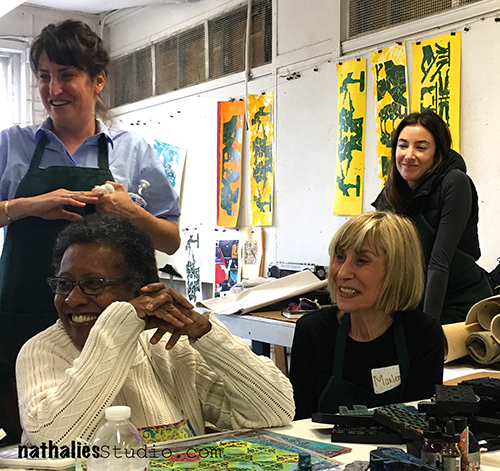
lots of laughter during the class

kalbachartrules10

and happy faces

kalbachartrules11

and beautiful artwork

kalbachartrules12

each student exploring their own style.

kalbachartrules13

Combining new and old techniques

kalbachartrules14

and getting out of the box to be rewarded with awesome results.

kalbachartrules15

Aren’t they the cutest?

kalbachartrules16

kalbachartrules17

kalbachartrules18

kalbachartrules19

kalbachartrules20

kalbachartrules21

Beautiful finished art journal pages  make me happy  …and I assume the students too :)

kalbachartrules22

kalbachartrules23

Thank you all so much for joining me, you rocked. And a huge thank you to Anna from The Ink Pad -it is always wonderful to teach for you!!! Cannot wait for the next time at The Ink Pad!

Would you like to come to one of my In-Person? Check out my next workshops at The Queen’s Ink in Maryland and more on my In-Person Workshop Page.

I would love to have you!

Comments (5)

  • Joi@RR

    |

    So love seeing you and your students at work Nat. And YES… beautiful outcomes. I know you were a great blessing to them all. Xj.

    Reply

  • Anne Lemay

    |

    These photos are a treasure – they truly capture the fun we had as well as our creative work. Your teaching – and your Art Foamies – rock!

    Reply

    • nathalie-kalbach

      |

      Anne, it was so wonderful to have you ! You guys were amazing and I had the best time- right back at you – Your rock !

      Reply

  • Michelle Ward

    |

    WOW! Looks like a super fun class! Look at all those happy faces and layers and layers of great pattern. I spy some amazing stencils and stamps!! Well done girl!

    Reply

    • nathalie-kalbach

      |

      thank you Michelle! We had a great time and you know those guys are always fun!

      Reply

Leave a comment

Today is the Day – Cheiron Brandon

cs-october-theme

This Tuesday, Cheiron Brandon from my Creative Squad is happy to share with you some amazing cards using my new Manhattan ArtFoamies and inspired by this month’s theme: “Today is the Day.”  I invite you to join me and my Creative Squad to stop procrastinating and be inspired to make today the day you finally tackle that artsy thing you’ve been meaning to get to for so long.  Start that new project you’ve been planning for months.  Try out that new product you bought ages ago.  Experiment with that new technique you read about last year.  Try it!  Today is the Day!


cheiron-october-headshot

Hi there! It’s Cheiron here with my monthly post for N*Studio. This month ‘Today is the day’ is our theme, and our mission was to tackle the artsy thing you’ve been meaning to get to. As a card maker, I make tons of cards…but I never seem to have one when I need to send for a birthday, thank you etc. I kept saying I would make a stack of cards, like at least a dozen to have on hand for occasions that come up. I also always say that I will take new products and spend some just for fun playtime with them, but that does not always work either. I set aside two hours the other day to play with Nat’s new art foamies and two things happened 1) I had a great time playing, and 2) I made a dozen cards! 
 
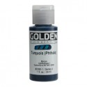
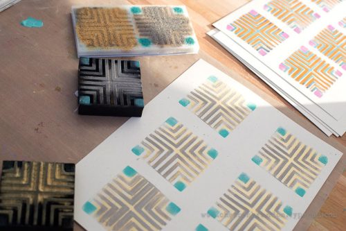
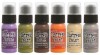
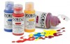
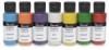
I started out just playing with the Manhattan foamies. The set includes a positive and a negative, so you can add two different layers of color to the stamped image. I tried them out with all different kinds of paints including Distress Paints, Golden Fluid Acrylics and Blick Matte Acrylics and got great results with all 3! 
 
n-studio-oct-photo-1
 
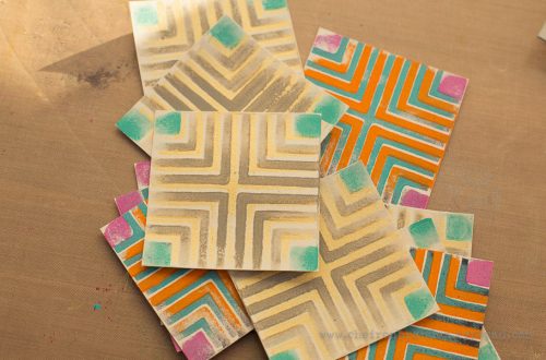
Once I was finished stamping, I cut all the images into squares.
 
n-studio-oct-photo-3
 
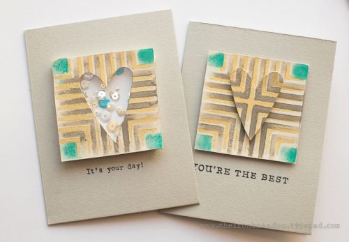
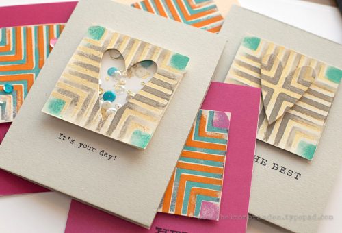
Then I turned them into cards. For some cards I used just the square and a simple sentiment. For a couple I turned them into a shaker card and used the cut out heart on the shaker card on another card. I think you can be real simple or fancy depending on the recipient. It sure feels good to know I have built up my card stash AND have managed to throw in some play time at the same time!
n-studio-oct-photo-4
n-studio-oct-photo-5
——————————————————————————————————————-
Aren’t these cards awesome! I colors Cheiron used and the shakerbox is just too cute!
Here are the supplies she used to make those cards – note that some of the links are affiliation links:
SuppliesCJS

Maybe you will even play along with us -I would love to see how you interpret our monthly themes. Email me how you used my stencils and stamps with the theme and email me an image – I would love to share your projects in my next “n*Spiration From Around the Globe“.

See you next Tuesday for another project from the Creative Squad!

Leave a comment

Workshops at The Queen’s Ink in Savage, Maryland Oct 21-22

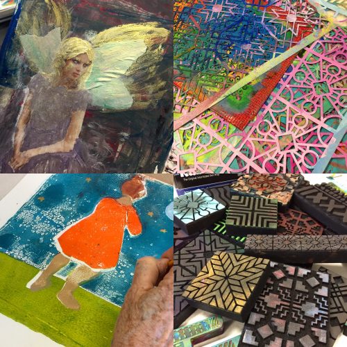
This year I have taken a big break from teaching due to the book, and I do have to say I really missed teaching. I had a fantastic time at The InkPad with a 2Day workshop on the weekend – here is a little peek of what we did and the new fun things we used. I will post more pix in a couple days. It was wonderful to spent time with super creative and fun students, see my new products in action and be equally inspired by my students and how they put their own spin on things!
img_3916

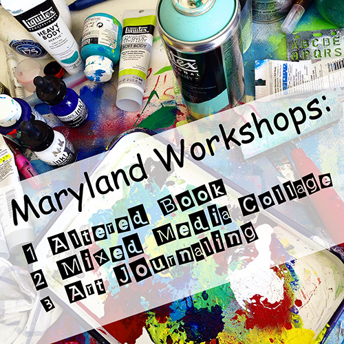
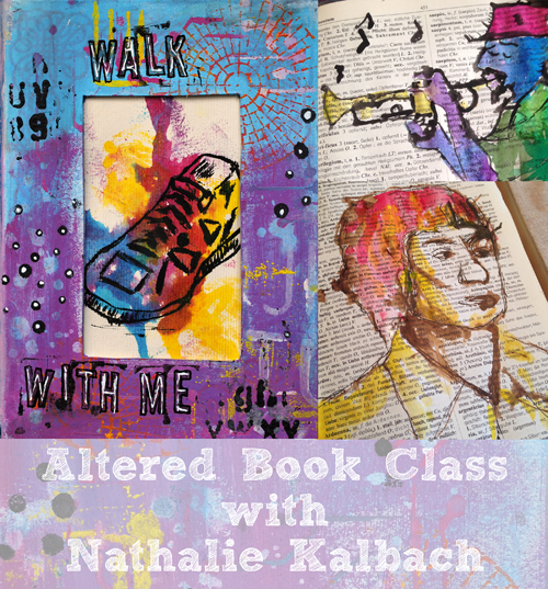
Now I am getting ready for my classes at The Queen’s Ink in Savage, Maryland in two weeks. I am bringing three super fun workshops with me, which I have taught before and were a big hit – I cannot wait to spice them up with some super duper cool ArtFoamies and …did you spy them? – new stencils. There are still a couple seats left – so join me if you are in the area!
QueensInkWS

Friday October 21, 2016 – 11am-3pm

Walk With Me – Altered Book Class

WalkWithMeAd2

Registration Open Now


Friday October 21, 2016 – 5pm-9pm

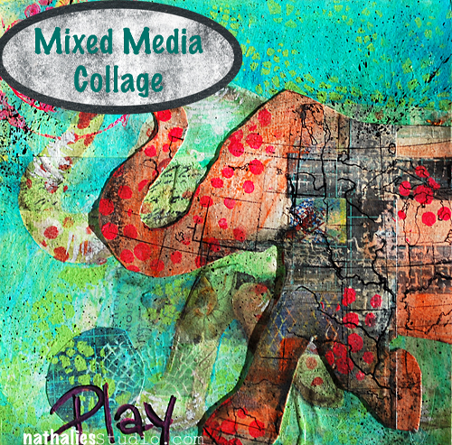
Play – Transform – Mixed Media Collage Class

MixedMediaCollage

Registration Open Now


Saturday October 22, 2016 – 10am – 6pm

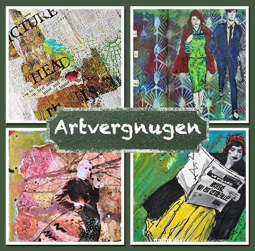
Artvergnugen – Art Journaling Class

ArtvergnugenAd

Registration Open Now

Have a gorgeous day!

Leave a comment