
Nat


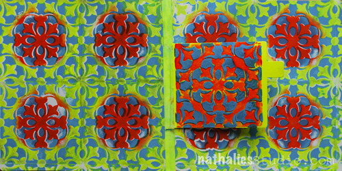
For this Art Journal Spread I played a bit with my new Versailles Positive and Negative Foam Stamp Set.
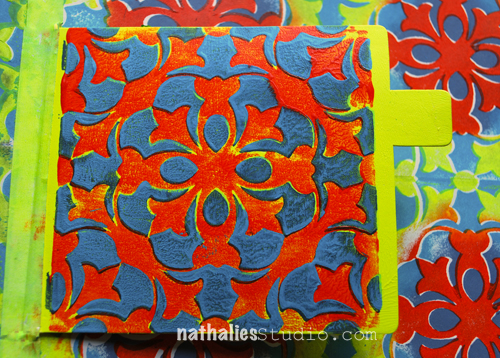
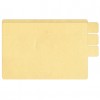
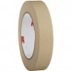
I created a flap for the journaling by using a shipping tag which I applied with artist masking tape to create a hinge.
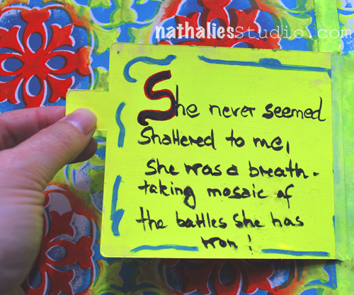
I love this quote: She never seemed shattered to me. She was a breathtaking mosaic of the battles she has won! (unknown source)

I used the Versailles Stamp Set which comes with two Foam Stamps – positive and negative pattern- and I also used two StampBuddies, one for each stamp. Now what can you do with the StampBuddy? Wellllllll…some seriously cool stuff. Instead of applying acrylic paint with a brayer onto the Stamp -like in this Rule of Three Video – 3Ways to “ink” up foam stamps – which also shows you two more application ways, you can also use the nifty StampBuddy the following way :)
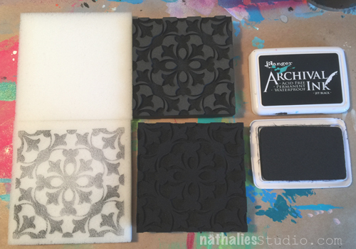
Using Archival Ink (any ink pad that is waterproof) I stamped each of the stamps on a StampBuddy.
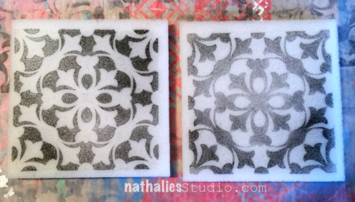
The picture above also shows you how the stamps look like when stamped with a solid color – pretty cool – huh?
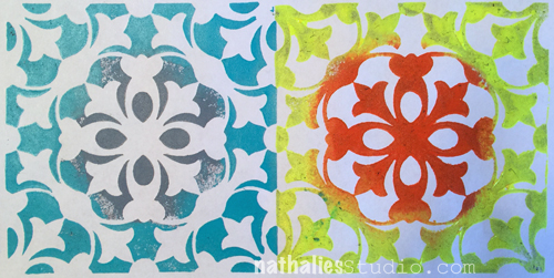
What I want to do though is coloring the stamps with different colors – like in the picture above.
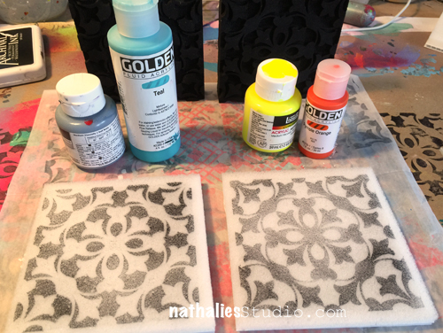
So I gathered the colors that I would want to have appear on the stamps
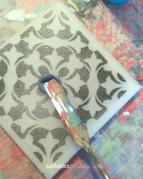
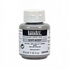
and started to apply grey acrylic paint using a palette knife into the middle section of the StampBuddy. This is never going to be a perfect circle but that is beyond the point in my view. Soft Body or Fluid Acrylic paint works best, and you have to work a bit fast to not use too much paint as it soaks quite quickly into the StampBuddy.
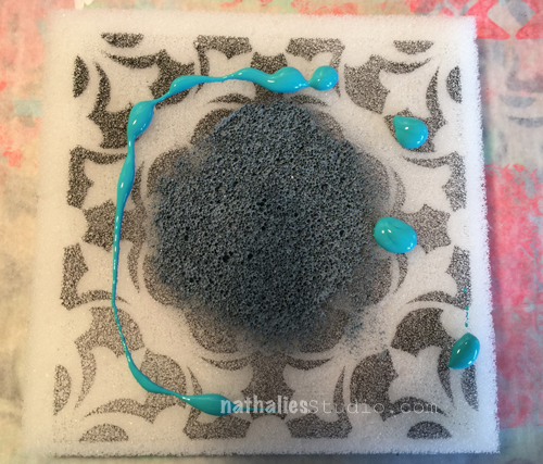
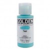
Next I massaged some teal acrylic paint into the remaining uncovered area.
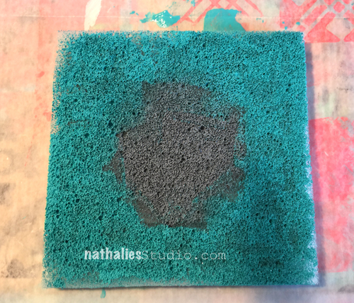
which results into this fuzzy guy – but don’t worry- since your StampBuddy is always approximately the size of your stamp – you will get the different colors at the areas where you want it.
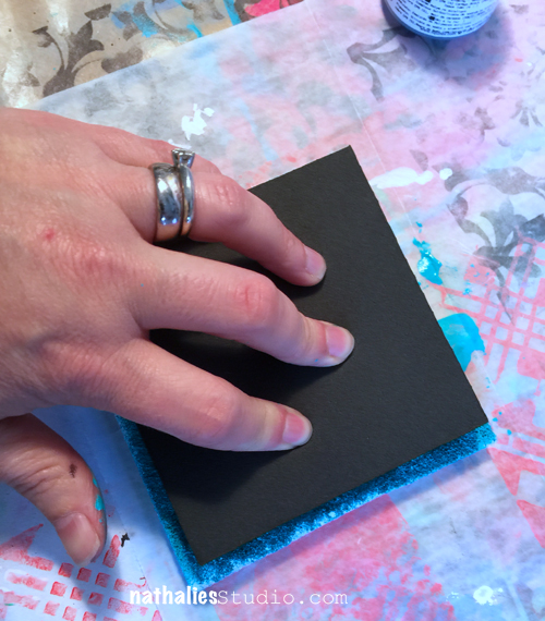
Your StampBuddy has now become your “Ink” Pad – filled with acrylic paint instead of ink.
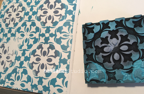
I stamped a tile background into my art journal by lining up the stamp in rows. You can easily see how to line up the stamp when you look from the side. LOOOOOVEEE!
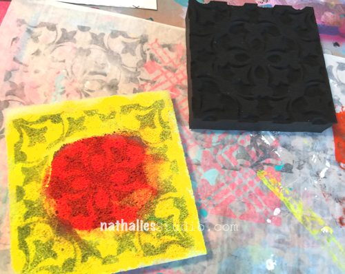
Now I did the same thing with different colors on the second StampBuddy. Since the yellow I used is not opaque you can still see the stamped image peeking through. I could have stamped different rows but HA – here is another cool thing you can do with those stamp sets :)
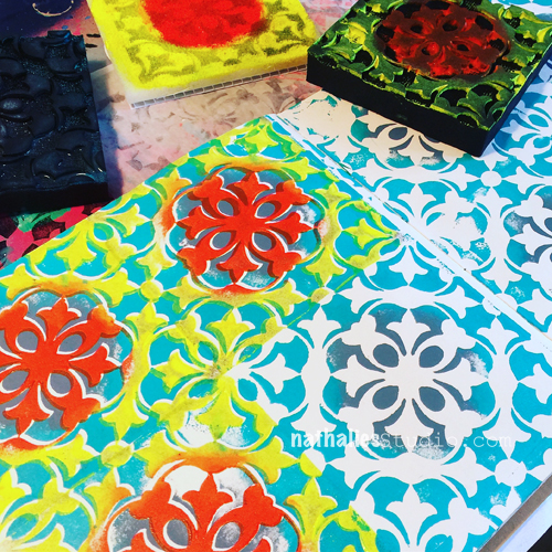
You can actually just line up the second stamp on top of the other stamped image – again you will see where it lines up from the side – and it will stamp perfectly into the white space filling it up with juicy yummie colors.
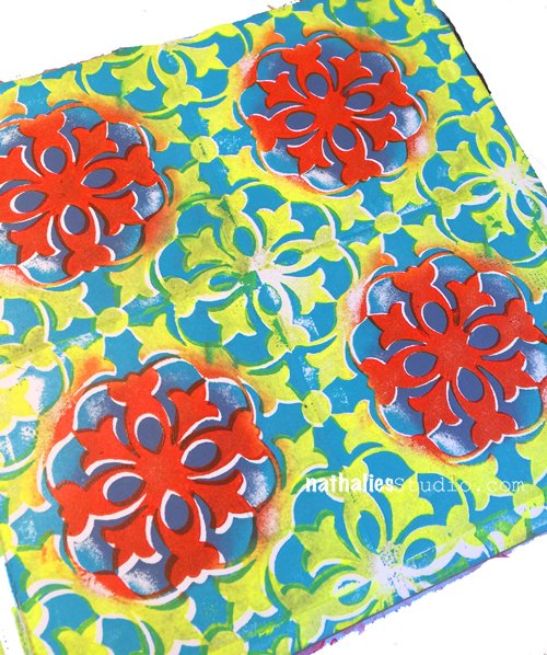
I love this – such a cool tile pattern, don’t you think???? Yes- I jumped up and down like a little kid when I did this because it was exactly how I envisioned my stamps to work *Wink.
Just a couple tips:
I cannot wait to show you more fun stuff and patterns with my new ArtFoamies Foam Stamps.
Here is what I used for the art journal – some links are affiliate links:
Hope you enjoyed this post and wishing you a wonderful day!
This Tuesday, Tina Walker from my Creative Squad is happy to share with you two super cool projects using Ultra Thick Embossing Enamel and inspired by this month’s theme: “Today is the Day.” I invite you to join me and my Creative Squad to stop procrastinating and be inspired to make today the day you finally tackle that artsy thing you’ve been meaning to get to for so long. Start that new project you’ve been planning for months. Try out that new product you bought ages ago. Experiment with that new technique you read about last year. Try it! Today is the Day!
—————————————————————————————————
Hi! Tina Walker here today to kick off the new month with a new Theme. This month, our theme is ‘Today is the Day’. As the old adage by Benjamin Franklin goes, ‘Don’t put off until tomorrow what you can do today.”
The Creative Squad was challenged to tackle an arsty thing that we’ve been meaning to do. It could be a new project or a new technique. I love trying new ideas and techniques so I was super excited to get started. Let’s get to it!
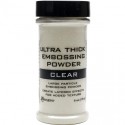
Have y’all heard about Ultra Thick Embossing Enamel (UTEE)? It’s been around f.o.r.e.v.e.r and it’s been sitting on my shelf for YEARS just begging to be used. I thought this month would be the perfect time to create with it! I’ve watched several videos on how to stamp into UTEE and wanted to try for myself, so the two projects I am sharing today are the result of this technique.
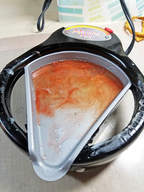
Step One: Melt UTEE per instructions. You can either add color with embossing powder or metallic powders or use clear.
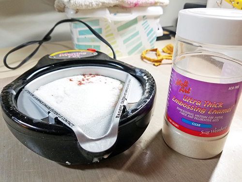
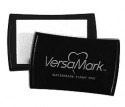
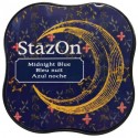
Step Two: Prep your stamp. (Only rubber stamps can be used. Acrylic will not work for this technique). To create a ‘resist’, apply Versmark ink to your stamp. You can either stamp without color or add color with Staz On Ink. I used a colored ink with Nat’s Urban Scribble cling stamp so it would show on the UTEE.
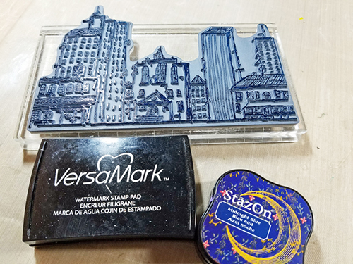
Step Three: Pour melted UTEE on heat resistant craft mat. Immediately stamp into the melted UTEE and let sit for approx. 15 min. Once cool, carefully remove your stamp from the UTEE.
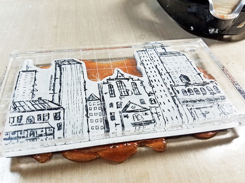
Special Note: UTEE is very fragile and I cracked several in the process. Using a thicker layer vs. a thin layer adds to the stability.
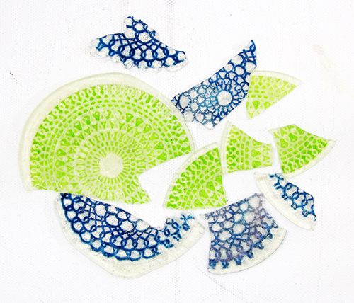
Step Four: You can use your piece *as-is* or add paint, spray, or other mediums.
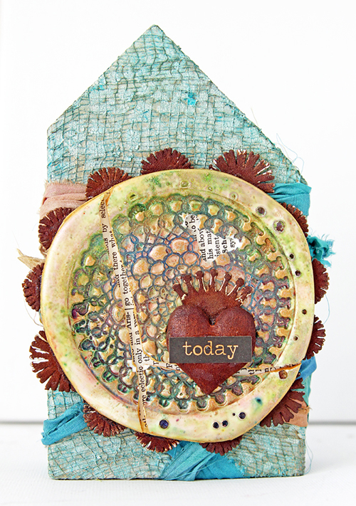
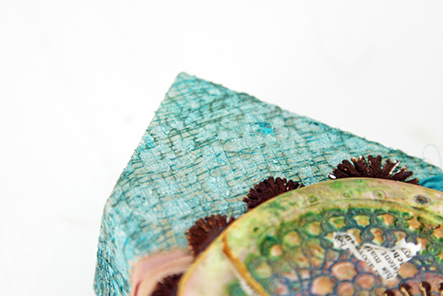
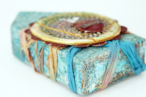
Project One – Today Wooden House
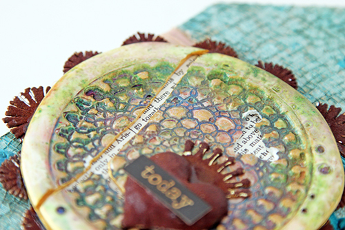
I added white embossing powder to the UTEE with Nat’s Kaffee Klatsch cling stamp. Once cool, I colored the piece with metallic powders. As I was ‘painting’ the piece it cracked. L But, instead of starting over, I continued to use the cracked piece, highlighting the cracks with dictionary paper.
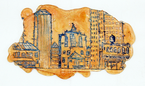
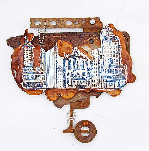
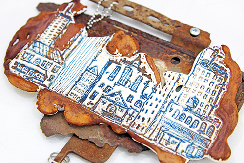
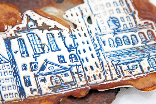
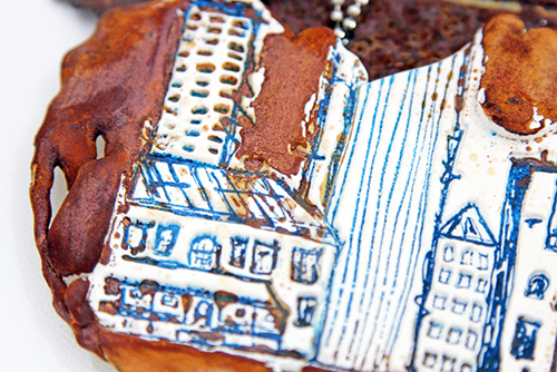
Project Two – Rusty Cityscape
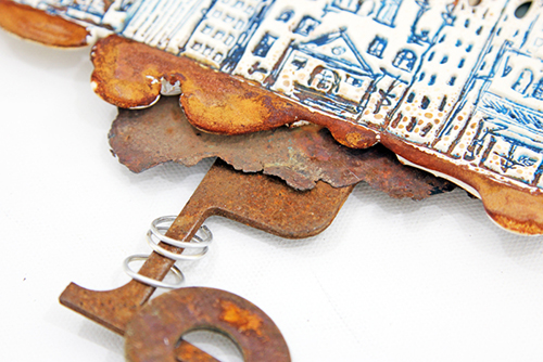
Using the same UTEE mixture, I stamped with another stamp. Once cool, I rusted the edges of the piece to blend with the other rusty elements in the project. Funky and unique!
What new technique or product are you dying to try/use? I’d love to hear about it! Thank you for taking time today to take a peek at projects. See you next month.
—————————————————————————————————
I love love love both of these projects and can’t wait to play around with the UTEE myself!
In addition to some wood, gauze, various rusty findings, Dusty Attic Rusting Powder, sari ribbon, and a sticker, Tina used the supplies listed below (some are affiliate links):
Maybe you will even play along with us -I would love to see how you interpret our monthly themes. Email me how you used my stencils and stamps with the theme and email me an image – I would love to share your projects in my next “n*Spiration From Around the Globe“.
See you next Tuesday for another project from the Creative Squad!

Tina, your projects are gorgeous!!!

Wow!!!!! That’s awesome Tina!
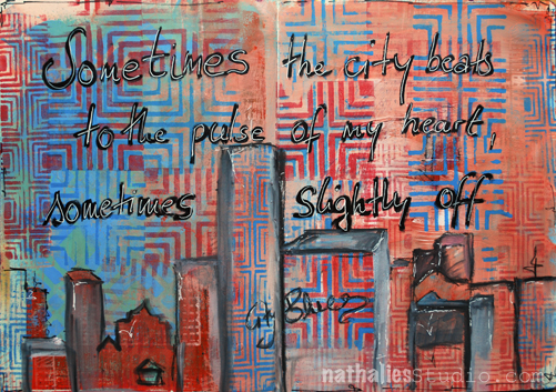
“Sometimes the city beats to the pulse of my heart, sometimes slightly off”
Last week the city was beating slight off my heart pulse, meaning I was grumpy at the city – yup that can happen – but playing with some of my brand new ArtFoamies Designs helped *wink. In case you have missed the big news- check them out – you can order them now in my store
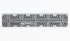
I used the Manhattan Border Stamp and the Manhattan Positive & Negative Stamp Set and went to town for some fun pattern play.
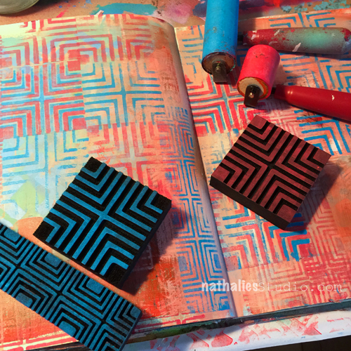
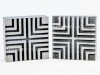
The Manhattan Positive and Negative Stamp Set comes with both stamps and you can use them either alone, together or …even cooler on top of each other – yeah!!!
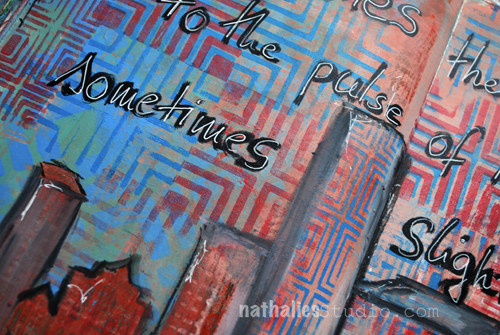
I played with all three variations and added the Manhattan here and there and then outlined some areas for a city scape.
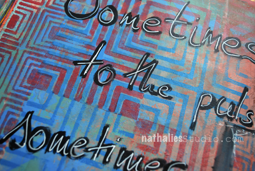
I added the journaling with a black marker and traced on top with a white signo pen. And…I felt way better about the city again – no more City Blues *Wink
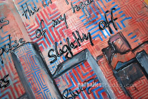
Here is what I used (some of the links are affiliate links):

Which of my new ArtFoamies Stamps do you like the best and would take away any Blues from you?
In case you are in the NYC- Area – there are still a couple seats open for my two day and super duper awesome Art Rules Workshop at The InkPad this coming weekend. Check it out- it is going to be amazing and we will use all the new stamps and even some other fun secret things *wink
October 8-9, 2016 in NYC at The Ink Pad in NYC, NY
Have a wonderful day!!!

Wow – awesome new stamps Nat. How exciting. And super fine journal pages created with a new one too!! Xj.
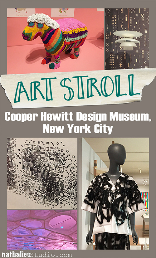
A couple weeks ago I went on an Art Stroll with my friend Andrew and he suggested we should visit the Cooper Hewitt Smithsonian Design Museum. Well – I haven’t been there yet- so of course I was up for it!
And boy was I glad went- it was so much fun and so worth it- btw- it almost right at the Guggenheim where we did another Art Stroll that day, so if you are ever in the area :)
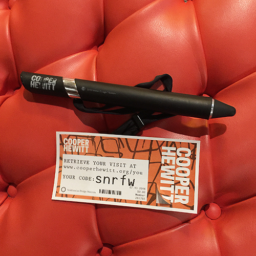
Upon our entry we received a big pen which, we were told has two functions.
Or as a very sweet guard said to me: “You can collect the whole museum and take it home with you!”
HOW COOL IS THAT . Big shout – I loved it. It definitely changed the way how people including us viewed the museum. You weren’t so focused on writing things down or photographing everything – and yes I know there are avid hater of the fact- but this is how information and things get consumed nowadays and I feel as this was the smartest most amazing way of a museum to embrace it, go with it and make it better for everyone! People do not feel they are missing out on taking home the memory ..they take the whole museum home *wink
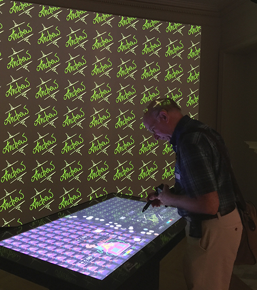
Here is Andrew in front of a wall paper creator – I made a simple one for him
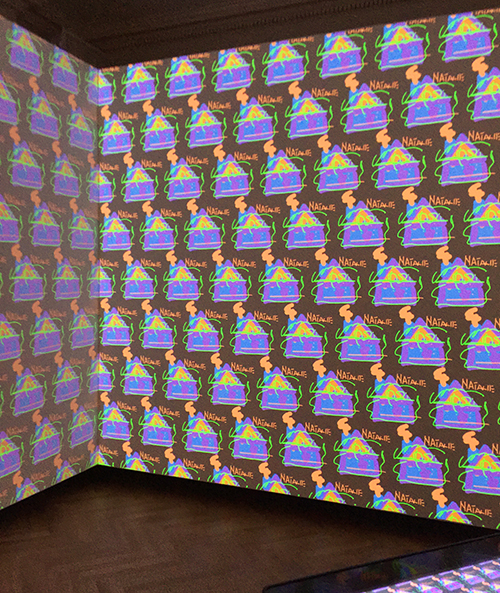
Here he made one for me. I like it ….maybe just one tiny section of a wall because I might get a bit 70s if I’d had this all over my walls- but it is fun !
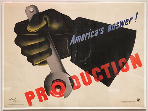
Love this poster *wink
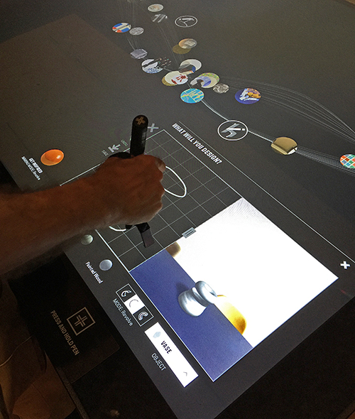
here is Andrew creating a vase.
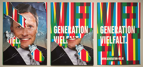
Poster Generation Vielfalt, Götz Gramlich 2014. I loved this- this is how our election posters look like during our election time in Germany – which lasts only a couple weeks- oh boy you wish *wink. Often times those posters change over the time either by weather or by protesters. So the design of Gramlich for an election was actually a play on that. Gramlich’s poster series Generation Vielfalt was designed for the progressive political party Generation Heidelberg. The posters were displayed over time to show a transformation. Here, the second poster in the series shows the image partially torn away to reveal a new message underneath. I love the idea of revealing a new message by tearing away a layer on the top.
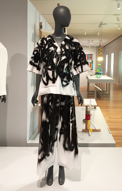
This is a Graffiti v-neck tee and pants. It was designed by Melitta Baumeister. I think it has my name written on it – how cool is that. If I’d longer legs I would take it home with me- but the tee would do *wink . Definitely a reminder for me to do some more wearable art!
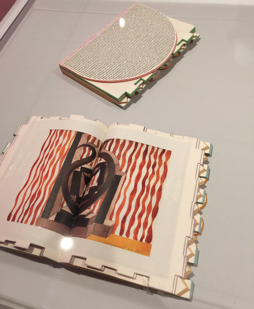
This is a magazine. It was designed by Theseus Chan and printed byAlsOdoMinie and made for WORK. Its medium is die-cut offset lithography over silver foil on paper. Andrew and I agreed it would make for a really cool siding for an art journal.
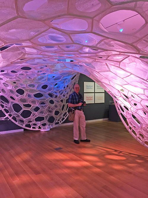
This is Andy standing in a PolyThread knitted textile pavilion. It was designed by Jenny E. Sabin. Its medium is 3d seamless whole garment digitally knit cone elements; photoluminescent, solar active and drake yarns; twill tape; aluminum tubing. Now that is a mouthful and pretty pretty amazing.
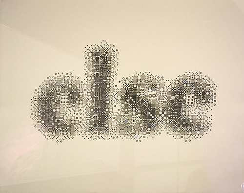
These are prints by Kyuha Shim.
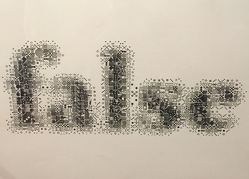
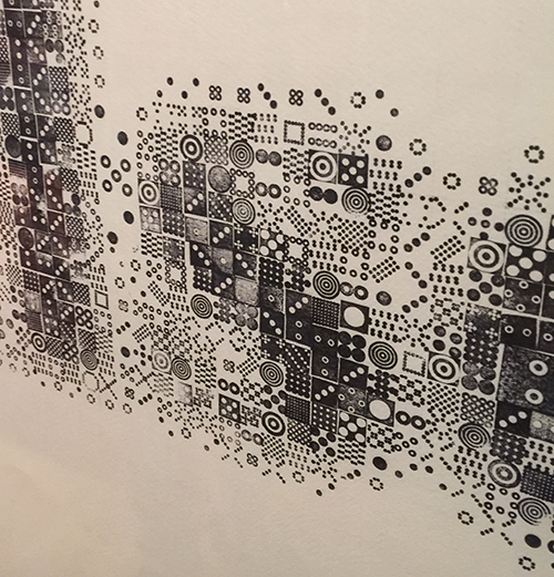
upon closer inspection you see that they are made with stamps- so so so cool!!!! I almost squealed.
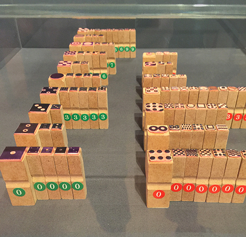
Shim created these ninety-two custom rubber stamps to produce his series of prints Seeing through Circles (2013) above. The stamps have with visual densities that roughly match the brightness or darkness of sixty corresponding pixels. Printing the stamps together creates a texture similar to digital printing.
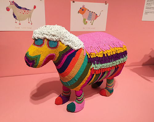
This sculpture was designed by The Haas Brothers, Nikolai Haas andSimon Haas and collaborator: The Haas Sisters of Monkeybiz andMonkeybiz.
glass beads, wire, wood, mixed fiber stuffing, and cast bronze
The colors made me happy and I would have loved this as a toy as a kid!
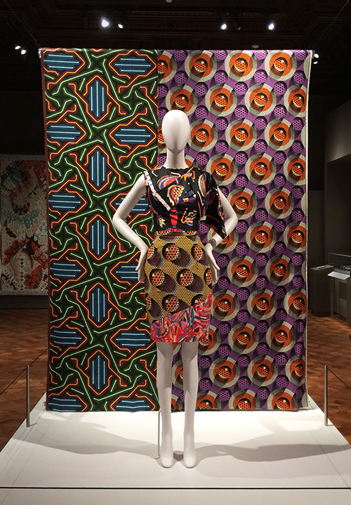
Some beautiful textile pattern design!
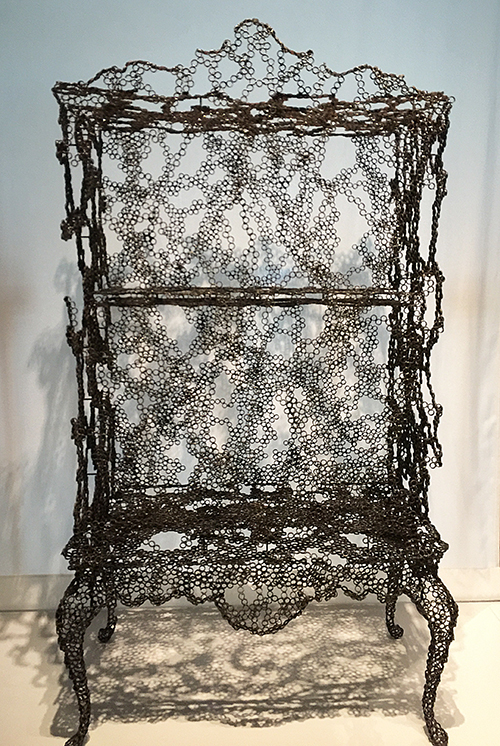
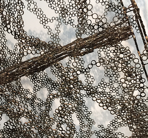
loved this airy piece …and forgot to use my pen on it – so ….unfortunately I have no information on who designed it but I thought it was really
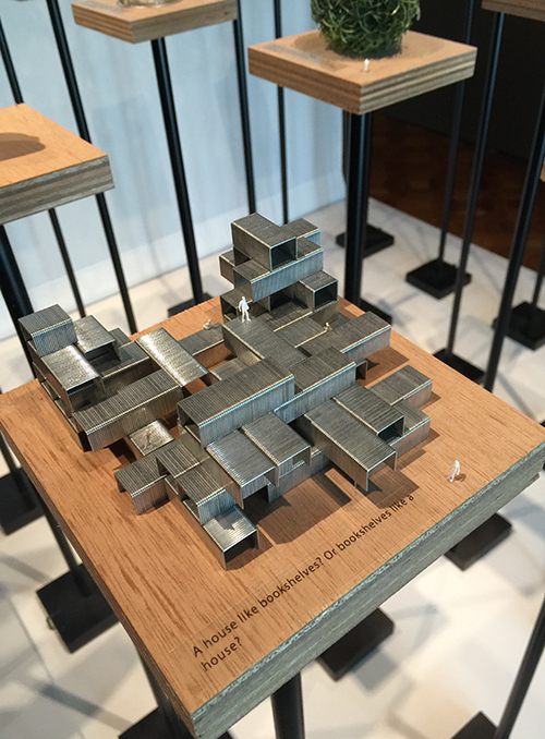
Sou Fujimoto Architects created this series of models for the 2015 Chicago Architecture Biennial. Called Architecture Is Everywhere, the project discovers architectural possibility in found objects and everyday materials. Simple artifacts such as a lottery ticket, an ashtray, or a ring of binder clips become intriguing structures when placed on pedestals with tiny human figures. In the words of Sou Fujimoto, “This is kind of a funny trial to expand our ideas of architecture beyond our usual understanding.”
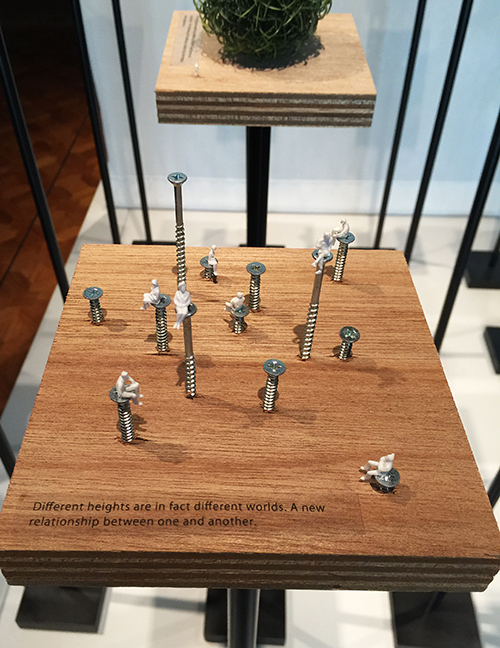
This looks way cooler in person -you have to see it. It mad me giggle !
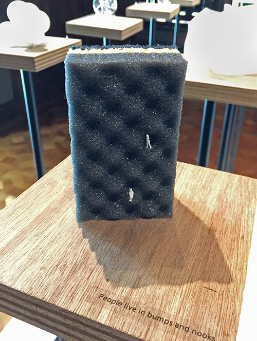
That a treasure of inspiration was found in this museum. I am getting all excited again while writing the post and looking at the photos again.
Hope you enjoyed this Art Stroll! There are more to come soon !

So cool to explore design in such a hands on way!

I love that museum! And I haven’t been there for a while, tis time…. Thank you for my virtual visit!!

First of all, how exceptionally cool is that pen to take the museum home with you?! Unfortunately I don’t get to museums as often as I would like to, but the last time I was in one it was in Washington, D.C. and the art of super cool and different. This one piece which was a series of TV’s stacked on top of each other (to show the Vietnam War and how America saw it on TV) really made me stop and think. Just a stack of TV’s used as art (and very well arranged I must say). In this post I especially liked the small humans arranged on the screws and such. Thanks, once again Nat, for bringing art straight to my computer for me to see. Love it!
Happy Tuesday! It’s time for my Creative Squad to share a project with you with this month’s theme: “From Small Beginnings”. Throughout the month of September, the team has been using my n*Studio Stamps to interpret the theme. The change in seasons and the childhood ritual of Back to School in September has me thinking about starting new things – new projects, learning new things, and meeting new people, and all the excitement and challenges that come with all of these “new”s. For this theme, From Small Beginnings, my Squad has thought about the process of starting something new and the very first steps they took. I asked them, how did you experience a Beginning?
So this week we have a very fun Fauxbonichi book cover from Michelle Rydell that definitely brings back those childhood memories!
—————————————————————————————————
Oh my gosh I had so much fun with this month’s project! September and “Small Beginnings” made me think of going back to school as a kid, and that made me think of one of my fave things about that – making covers for my textbooks out of paper bags! Did you do that too?
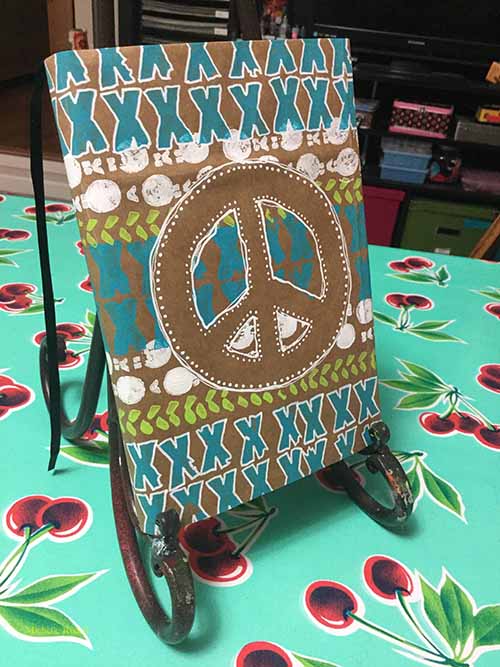
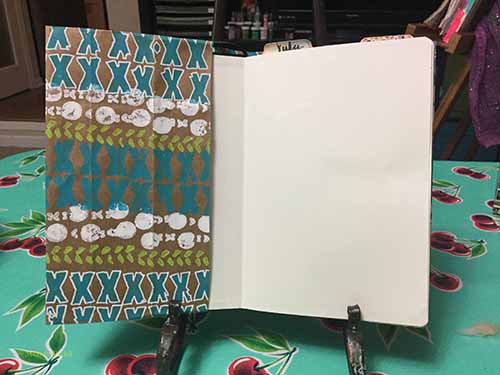
I decided to make a cover for my Fauxbonichi – and use the “Marks” stamp set to decorate it…
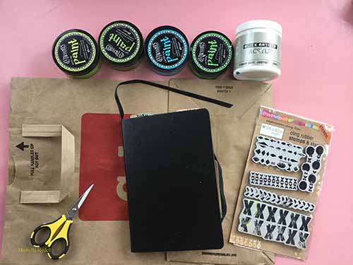
I gathered together the basic materials for the project…
I cut the grocery bag open so it would lay flat…
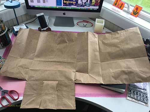
I placed my notebook on the grocery bag and figured out how wide I would need it to be, to cover the width of the book and folded flaps on the front and back covers, and then cut off the extra…
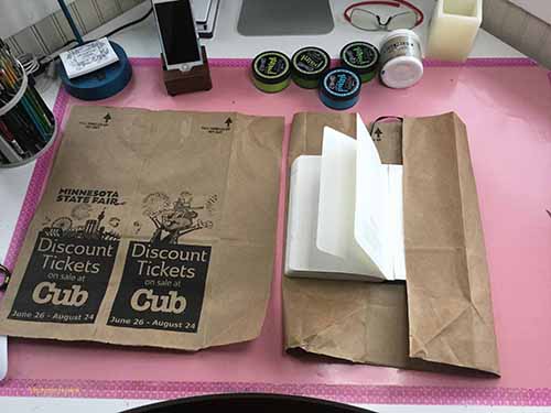
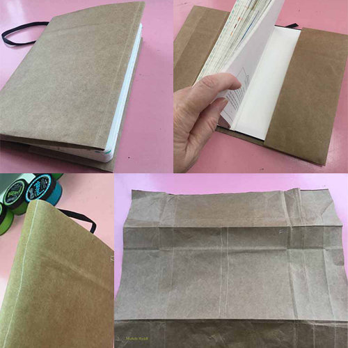
At this point, I had to do a youtube search, so I could remember how to fold it. (it’s been awhile – ha!). Once I got the folding done I took a white pastel pencil and lightly marked where the spine was and which part was the Front cover. Then I took the cover off the book, and got ready for the fun part – decorating!
Using a roll of masking tape as a template, I cut a peace sign out of the extra paper, and lightly taped it on the front cover to use as a mask. Then I started stamping horizontal stripes with the various stamps in the “Marks” set…
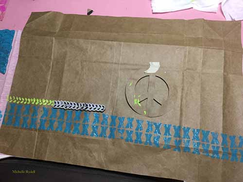
When I got to the peace sign, I stamped right over the top of it…
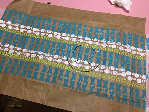
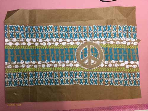
When the stamping was done, I removed the peace sign, and this is what it looked like…
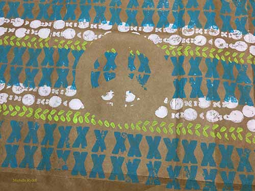
The last step was to put on some finishing touches with a fine point paint marker. I’m so happy with how it turned out!
—————————————————————————————————
I love Michelle’s book cover – it’s such a cool idea that I haven’t thought about in a very long time and what a great place to use the stamps to make a field of pattern.
In addition to a brown grocery bag and her Fauxbonichi, Michelle used the supplies listed below (some are affiliate links):
Maybe you will even play along with us -I would love to see how you interpret our monthly themes. Email me how you used my stencils and stamps with the theme and email me an image – I would love to share your projects in my next “n*Spiration From Around the Globe“.
See you next Tuesday for another project from the Creative Squad!

test
LOVE this cover Michelle and like Marit I used to cover my textbooks as well (so this post brought back some cool memories too)!

This is so fun, Michelle! I completely forgot about covering books in school. I wonder if I have any pictures of the covers I made back in the day. Love your project.

Oooh, I remember covering my schoolbooks (I also enjoyed it, years later, to help my son with this…!) It was the second-best thing at the beginning of the school year. (The best was ‘buying and initiating my new school-planner!)

Ohhhhhhhhhh this is just FABULOUS! LOVING that peace symbol!!!!!!!!!!!!!!
Time for a Stroll Through the Hood . Strolls through my hood get me out of my studio, they help me unstuck and often I get inspired by what I see and to get new ideas to create something.
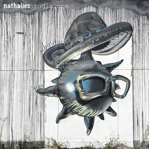
The area around the Holland Tunnel in Jersey City is not really the most beautiful area- in fact …it is really really ugly and unfortunately often all that people see when they drive to or from New Jersey. So I love that there is some street art popping up here and there on the walls of ugly concrete. The above has some cool drippings and I love the monochromatic color scheme.
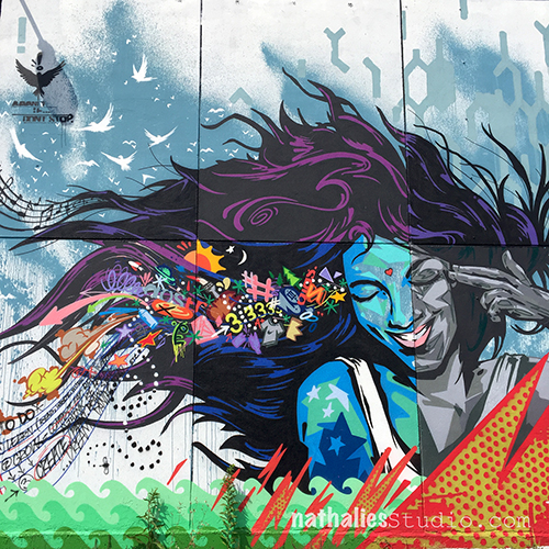
Love the stencil work in this one with all the different layering.
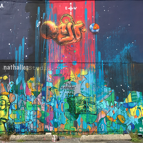
And this one just makes me happy because of the colors.
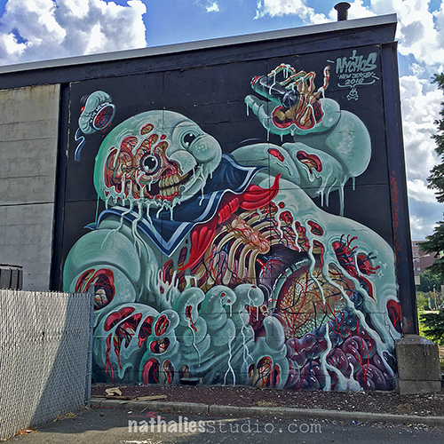
this one made me laugh – I think there was a time where we had cards that you could exchange with those- kind of like trading cards? Anyone remember – maybe only in Germany – I guess I am getting old I only have a vague idea of this.
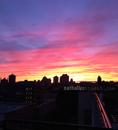
Oh my- nature is the best painter …or maybe air pollution but let’s not think about this right now *Wink .
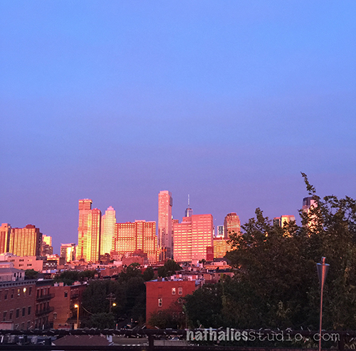
This time is truly amazing regarding sunsets viewed from our deck.
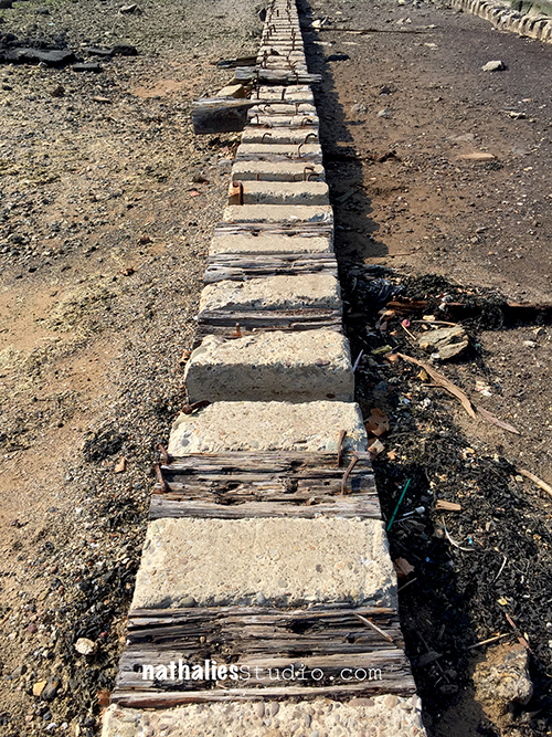
This one are the remains of a boardwalk at Liberty State Park – I assume it got destroyed in Hurricane Sandy. I love the texture and the pattern with the different materials- wouldn’t that be cool as a textured stamp?
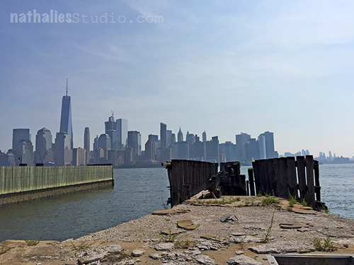
Here is a view of Manhattan from Liberty State Park – the historic landing pier here in the front of the picture was also heavily damaged in Sandy and has not been restored yet.
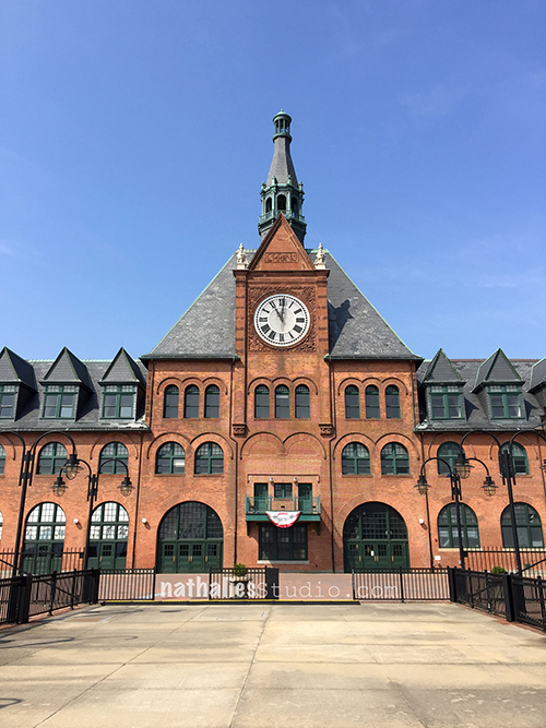
The beautiful historic Liberty State Park train station, where the immigrants that came through Ellis Island headed out to all over America to start a new live. I love the building. It is talking to me *Wink. I need to make a painting of it some time.
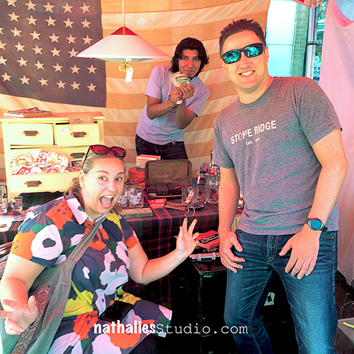
Last week some of our friends hung out at my wonderful friend’s from Beekman Lane – who had a booth with their awesome vintage and antique stuff at the Historic All About Downtown Market. As you can see we are amazing helpers and made sure people came in and bought things ;)
I had to get this hilarious Valentines Card- probably from the 40s – it made me laugh.
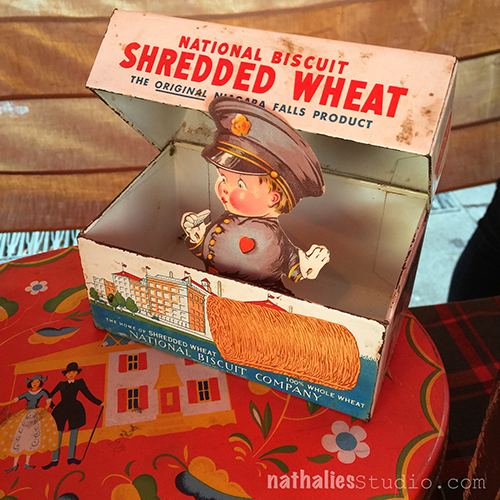
and you see …we helped placing things at the right places too …the policemen on this Valentine’s Card actually has no pants on ….so …we needed to make sure he was covered – LOL . but joking aside the graphics of the box and the cards, and the red lunch box you see peeking underneath are just beautiful.
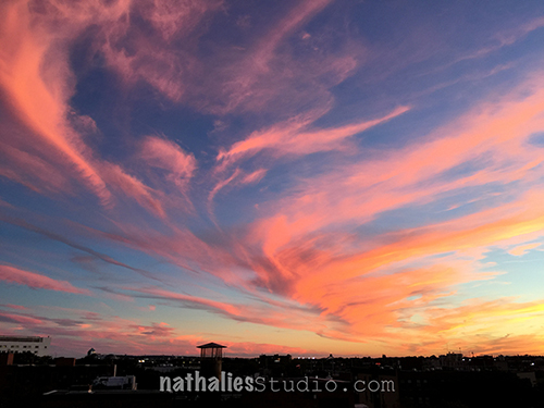
And last but not least …another sunset picture. I wish I could make such a nice color swirl into one of my paintings. Maybe by using Pouring Medium.
I hope you had fun with this stroll through my hood – take a walk next time you feel stuck when you are creating something or need a spark – it always helps me to get new ideas!

Beautiful sights. I didn’t realize you live in Jersey City. My husband and I both grew up in NJ, but moved to Arizona 28 years ago. Greg used to work for a bank (forget which one) in Jersey City, and would take the tubes over to the World Trade Center during his lunch break.

Love your strolls!
Thank you Jean for coming along! <3
Love the swirl of the clouds in that last sunset photo.
I always enjoy strolls through your various hoods Nat!
Thank you Sue – yeah that swirl was pretty cool ! Nature is really amazing!
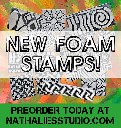
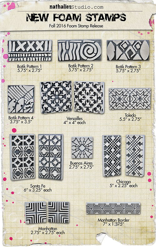
This is BIG NEWS!!! I am so stoked that ArtFoamies and I teamed up together for a stamp release. I had so much fun working on these brand new foam stamps – all of them inspired by my travels around the world. Here they are!
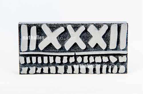
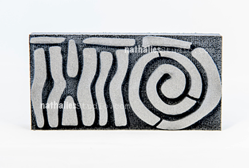
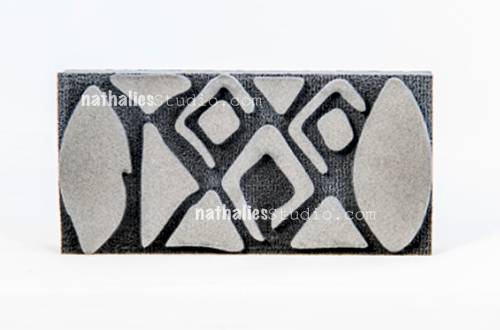
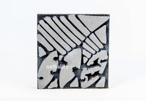
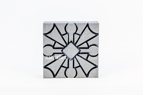
Chicago – comes with two stamps a positive and a negative pattern
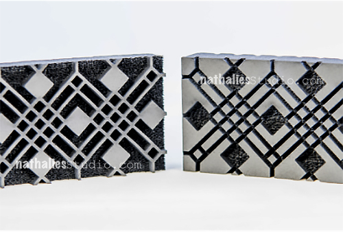
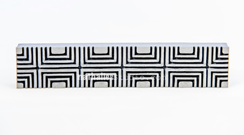
Manhattan comes with two stamps a positive and a negative pattern
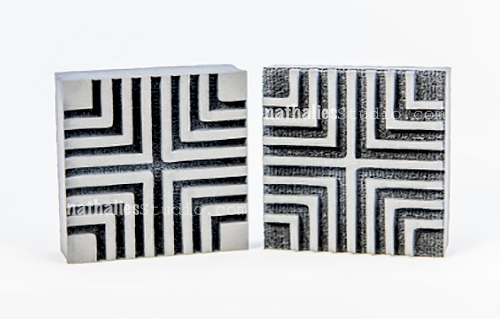
Santa Fe comes with two stamps a positive and a negative pattern
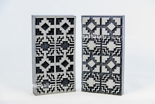
Toledo comes with two stamps a positive and a negative pattern
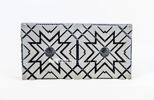
Versailles comes with two stamps a positive and a negative pattern

I cannot wait to show you loads of fun and creative projects with them! If you want to get your hands on these- you can PREORDER them in my store NOW – they will ship out at the latest the week of October 17th – but probably earlier though as I should get them next week!

Wow!wow!wow! Congrats Nat!!
I love foamies and all of these have to make it in my stash!!
HI Bec, yeah- so glad you like them :)))
Batik Pattern 4, 1, and 2 are my favs.
Congrats on the new line Nat!
thank you Sue – glad you like those – they are also a favorite for me!

Congrats Nat. These are very cool. Kind of like taking a trip around the world!
thank you so much Seth :) Yes they have been inspired by many wonderful places around the world.
Comments (2)
Dawn
| #
That’s a fact.
Reply
Sue Clarke
| #
What a delightful and truthful quote.
Reply