Art Stroll

Art Stroll: Creating a Modern Guggenheim, Guggenheim NYC

A couple weeks ago when my godson visited we went to the Guggenheim Museum. The exhibition Creating a Modern Guggenheim showed a collection of Modern Artwork by six major art patrons. I thought it was a great way to have a walk through Modern Art and major Modern Artists and see if my young visitor would enjoy it.

He totally enjoyed the building – which I love myself very much.

And what a wonderful environment for this beautiful Calder Mobile!

It was fun to see more Calder Mobiles after just having been to the Whitney Exhibition on Calder.

What I loved about the collection was that there was a lot of early works by famous modern artists displayed and it was wonderful to see how from those early works they developed their distinctive styles later or dabbled in different areas – for some it felt as if you saw a study of their later work.

Two Kandinsky’s – the top one from 1913 and the one below from 1936. I loved seeing those two and see how his artwork was still the same and yet changed.

Which one of the two do you like better?

Beautiful van Gogh – It makes me want to try this swirly impasto style with some of the landscapes I saw during my recent travels through the Southwest.

An early Gaugin

An early Henri Rousseau – so tamed and restricted- I love his later paintings so much more. check him out!

Picasso -my godson did not like this at all – I could tell he wasn’t that much into cubism in the first place but all the earth tone colors totally put him off.

an early Robert Delaunay – gosh I love this one – and wow so different from his circular colorful forms later

Fernand Leger – above and below also dabbling in the style of cubism of the time and then later finding his own cubism style.

Here is a later one below

A Chagall below- …the colors are so obviously him

but the subject and painting itself …interesting …

This one by him I love love love! I cannot stop looking at all the details!

An early Piet Mondrian – uniquely his style but not yet at the primary color grid.

It was a massive collection of paintings and while I enjoyed it I would have loved staying longer or listening to the audio explanations of some but …there is only that much time a 17 year old wants to spent at a museum ;)  He wanted to go and I wanted to make sure he would not regret that by being held hostage there for longer than he wanted – hahahah ;) Hope you enjoyed the little Art Stroll.

Leave a comment

Art Stroll: Max Pechstein in Brucerius Kunst Forum

When I visited my home city Hamburg in Germany my friends and I spent a couple hours in the Brucerius Kunst Forum to see the Max Pechstein exhibition. Max Pechstein was an expressionist German painter, who was part of the Art Group “Die Brücke”

He was highly influenced by the ideas and techniques of Van Gogh, Matisse and the Fauves. In the 30s Max Pechstein was vilified by the Nazis and most of his paintings were removed from German Museums and some of them displayed in the degenerate art exhibition of 1937. He was dismissed as an art professor by the Nazis and was only after World War II able again to teach art.

1912 – he dabbled a bit in cubism. I love how he painted the patterns and his usage of colors.

Pechstein was also a really good printmaker – and he seemed to have used any kind of paper he could find to do his prints.

I love the texture of the wood grain visible in his prints.

He loved painting his first wive Lotte- below in a painting which reminds a bit of Gaugin.

While his style seemed to change all the time – his use of color was very unique and consistent.

“Early Morning” – Oil on Canvas – he picked up the curves of his wife’s body in the landscape in the background.

Nidden Coastline with Fishing Boats – so very different yet again.

Fisher Boat – 1913

Monterosso el Mare, 1924

Amazing painting- it somehow reminded me a of painting by Max Beckmann of seals in a circus.


Sitting young man

Printed Christmas Cards showing him, his wife and his son – 1916

Sleeping Nude and Cat (1911) was one of my favorite paintings of his.

Kurenkähne am Deich, 1920 – watercolor and pencil – one of the few non-oil paintings.

Fischer Katen – 1932 – This shows the typical style of houses in the North of Germany .

And this one just glowed intensely and beautifully – a stunning piece. Sunset – 1921

and here are my friends Sandra and Liz who joined my this Art Stroll. Hope you enjoyed it :)

Leave a comment

Art Stroll: Murals in Jersey City Part 1

Lots of times my husband and I do a little bicycle tour in Jersey City, either through the neighborhood or Liberty State Park. Recently we set out on the hunt for some murals we haven’t seen yet.

I like this one by Sam Pullin aka Bed Bugs in Love. It shows the Golden Record aboard the Voyager. Sam is a JC local and I am always excited when I see work by him because I know him :)

Emilio Florentine created this mural called “Turnt Up” . On his website it says “His paintings are based on the belief that natural beauty is heightened during chaos. By using impressionist and surrealist techniques, he exploits, tortures, and then paints his subject – the flower – at its tipping point”

This mural was huge and impressive and also on a really amazing building. The Peach Tree War by Distort. While we were looking at the mural we met another couple also checking out the mural and we agreed that all those different murals in Jersey City are an amazing reason for a bike ride . It is so much fun to go on the hunt for them.

This cool lion is by Davel who is from Miami. Check out his cool prints!

Top and bottom are by Kaos & Klive

wow- the lettering and colors are so amazeballs!

Aqualand was created by Catherine Hart.

On the left by Jerkface and on the right by Zimer. Love those two together :)

It’s Your World by Chris Stain and Billy Mode. This is one of my favorites!

I hope you had fun on this Art Stroll to see some Murals in Jersey City. I hope to show you another part soon …but since my husband’s bike just got stolen, that will have to wait a little bit (sniff).

Comments (2)

  • Sue Clarke

    |

    Turnt Up is amazing and I could look at it for a long time!
    So sorry to hear about your hubby’s bike and I hope it somehow “finds” its way home.

    Reply

    • nathalie-kalbach

      |

      Sue – i love that one too! The bike did not find it’s way home …unfortunately it has been a big thing recently in our neighborhood. Hope you have a wonderful weekend

      Reply

Leave a comment

Art Stroll: Medrie MacPhee at the Tibor de Nagy Gallery

Natalya Aikens and I did a little gallery tour a couple weeks ago and we also stopped by to see Medrie MacPhee at the Tibor de Nagy Gallery in NYC.

Her artwork were Collages made out of pieces of clothes and oil paint.

I liked how the collages seemed like maps of some sort and how the flatness is interrupted with pieces of cloths which you start to diessect and try to read.


Buttons, pockets, seams and zippers.

Medrie McPhee also uses dried acrylic skins and applies them as elements into her work. She calls those acrylic transfers.

I find the collages intriguing, at first glance it feels as if they invite you to linger and to try to make sense of these maps.

And then I start to feel annoyed because there seems to be not enough to get a grip on it. I need the code:)

It was definitely great to go on an art stroll with Natalya again. It also reminded me that I should visit galleries more often :) Thanks Natalya – cannot wait for our next outing!

Comments (4)

  • Karen Bearse

    |

    Interesting my creative wheels started spinning right away!

    Reply

  • Jean Goza

    |

    Fascinating. As a sewist and fabric lover, I really enjoyed seeing the “components” of fashion broken down in a very simple form. With the addition of paint, it changed the form to collage. It did indeed look like a road map. For me, the map led me to bounce between what was and what is. I love the unique vision of this artist.

    Thanks Nat for another fun art stroll.

    Reply

    • nathalie-kalbach

      |

      So glad you liked this stroll Jean and I love how you described what you see and think then looking at the artwork. Thank you for sharing!

      Reply

Leave a comment

Art Stroll: Anselm Kiefer – Transition From Cool To Warm

A couple days ago my artist friend Natalya Aikens and I went into the city to go to the Gagosian Gallery to see Anselm Kiefer‘s work. If you participated in Creative Jumpstart 2016,  you know that Kiefer is one of my all time favorite artists. When Natalya told me about this exhibition I was crazy excited – and I wasn’t disappointed.

Kiefer is mostly known for his gigantic textured paintings, but he also paints with watercolor on a smaller scale and this exhibition at the Gagosian Gallery shows those two different bodies of works. It fits since Kiefer is interested in opposites.

Anselm Kiefer, For Segantini: die bösen Mütter (For Segantini: The Bad Mothers), 2011–12, oil, emulsion, acrylic, shellac, wood, metal, lead, and sediment of an electrolysis on canvas.

I love how Kiefer incorporates all kinds of materials and he doesn’t really care that a painting could change through aging, or natural alterations. In fact he welcomes this. He says he is more interested in the process – not only the process of making art but also the process of what happens to a painting naturally later – than in an absolute result. I think this is a totally freeing, interesting and open minded approach to art and life.

Anselm Kiefer aller Tage Abend, aller Abende Tag (The Evening of All Days, the Day of All Evenings), 2014 Watercolor on paper

Anselm Kiefer Ignis sacer, 2016 Oil, acrylic, and emulsion on canvas

Anselm Kiefer des Malers Atelier (The Painter’s Studio), 2016 Oil, emulsion, acrylic, and shellac on canvas

What I found interesting about his watercolor work was how freely he uses the colors, letting them do their thing – something I struggle with then using this paint medium.

Anselm Kiefer Des Meeres und der Liebe Wellen (The Waves of Sea and Love), 2017 Oil, emulsion, acrylic, and lead on canvas

Look at Natalya taking a picture of me taking picture of her in front of a picture …well – hey … little bit of fun is ok ;)

For this painting Kiefer poured liquid lead on top of a painting and then pealed it back to reveal the original painting again.

Kiefer also makes a huge amount of Artist Books. He is fascinated by books and stories, they have always played a huge role in his artwork.

In an interview he once told the interviewer that he starts his morning by going into his library and in a state of still being absence, he blindly grabs a book which usually turns out to be just the right book for the day and often inspires him for his artwork.

These books are quite big – which is hard to see in these photos  – they are more sculptural than books and you are tempted to touch them and flip the pages, although given how heavy they look that might be something you need more arm muscles …and you might never be able to set foot in this gallery again ;)

I love the marbling effects Kiefer created – with plaster – maybe gesso and watercolor.

Klingsor’s Garden was the room with all those books called. Klingsor is a magician in the opera Parsifal. He has a garden full of beautiful flower maids.

The way those books are set up is like a labyrinth and I guess it is no coincidence that you might get lost in looking at those books from all angles.

Fascinating!

Anselm Kiefer, Und Du bist doch Maler geworden (and you became a painter nethertheless)

I didn’t see it in the gallery as this is a huge painting but when I actually took a look at the photo of the painting at home I realized there is painter’s palette carved into the painting – a painting about painting.

Anselm Kiefer, Aurora, 2015–17, oil, emulsion, acrylic, shellac, and sediment of an electrolysis on canvas

The texture and dimension in his work is just unreal . You have to see his work in person.

Given that this painting is so new- I would bet that it is still changing, drying, and processing. Now …if that is what the artist likes and wants… who are we to preserve it and have conservators going nuts about up-keeping the status quo?

When I first looked at Kiefer’s watercolors I thought they were so different to his big paintings because of the missing texture but the closer I looked, the more I realized that he actually included a lot of texture with charcoal in some of them – and then there is also a lot of visual texture especially in the one above. But even the ones I showed earlier in this post have areas of texture quite unusual for watercolor painting.

In one of the videos I saw a while back about Kiefer’s work I saw him hacking with a machete into his thickly layered painting. Big pieces of paint chips fly off the canvas, revealing yet even still thick layers of paint underneath. There was something so liberating and yet shocking seeing his actions.

I love the beauty that get’s revealed by the act of slashing, scraping and peeling.

I also loved how some of the books had these raw edges – and as a viewer who always makes up their own story when looking at artwork for me Kiefer’s work is about human beings.

We are complicated, controversial, complex, layered, good and bad, we change, we can transform. Behind all the ugliness of human beings are always layers of beauty. There are no monsters and that is for me what explains why people can be horrible and cruel but then also be loving and like-able. That is what in my eyes his artwork represents.

This exhibition has inspired me to no end – lot’s of thoughts, ideas, craving to explore. If you are in NYC – check this exhibition out– it got extended and it is open until September 1st. Don’t be intimidated that it is a gallery – the people at the desk barely lift their head when you come in- they know you are not there to buy but it seemed utterly fine for them and I think Kiefer approves ;)

Comments (4)

  • Janis Loehr

    |

    Thank you Nathalie for sharing!

    Reply

  • stephanie

    |

    What an amazing exhibit!

    Reply

Leave a comment

Art Stroll: Where We Are – Whitney, NYC

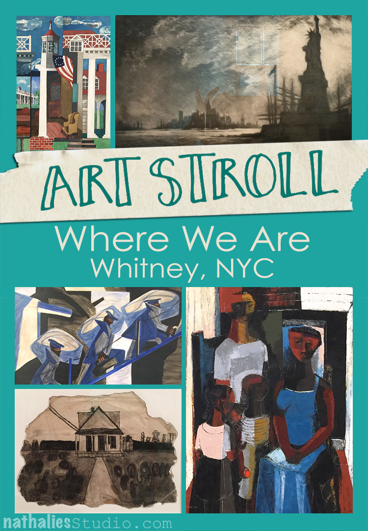
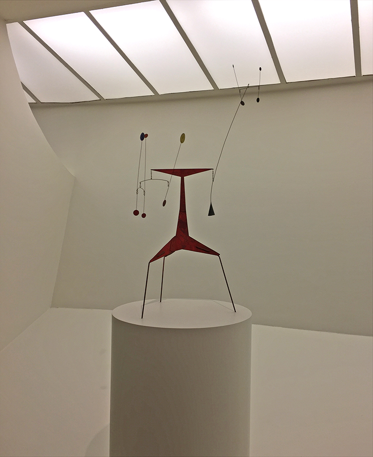
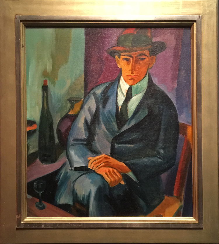
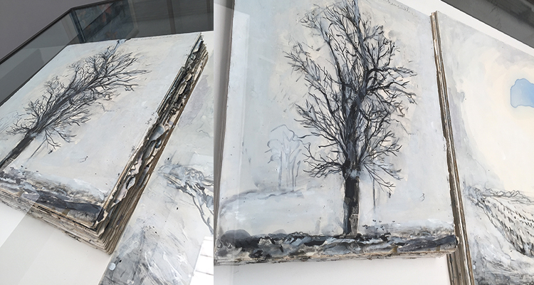
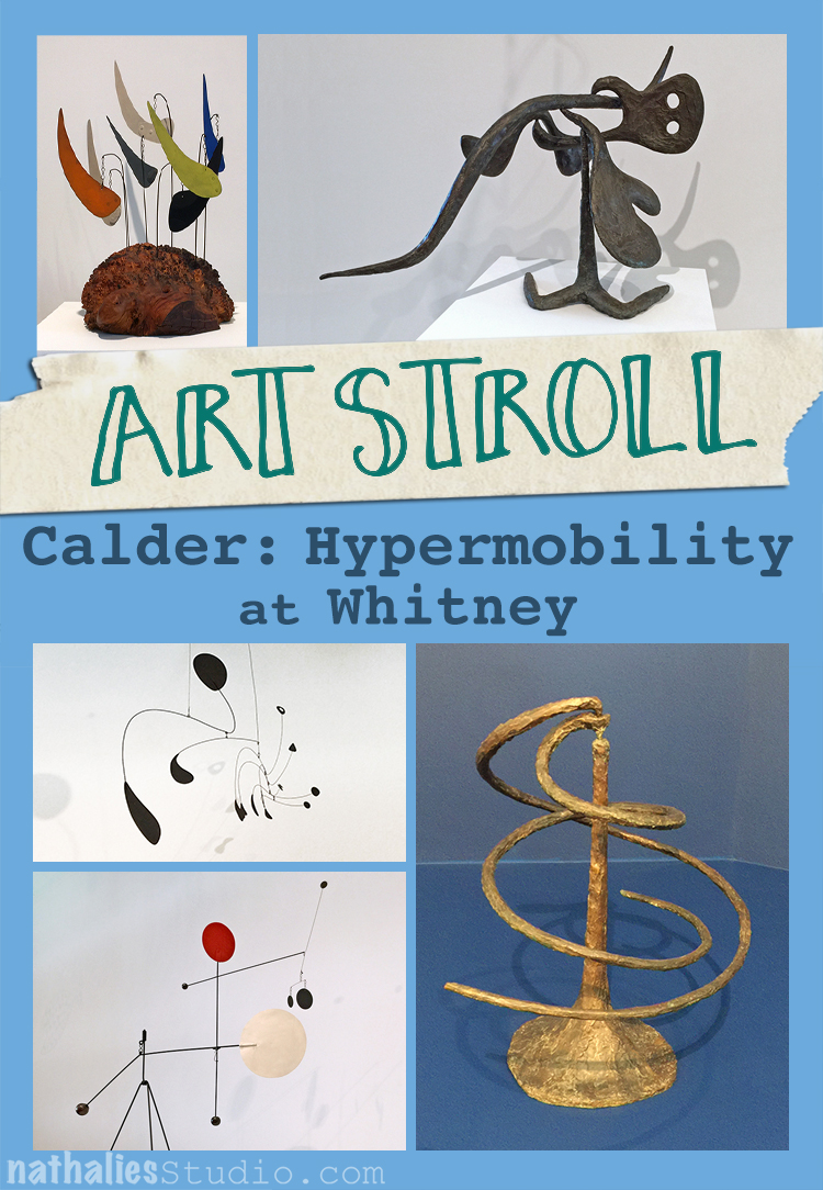
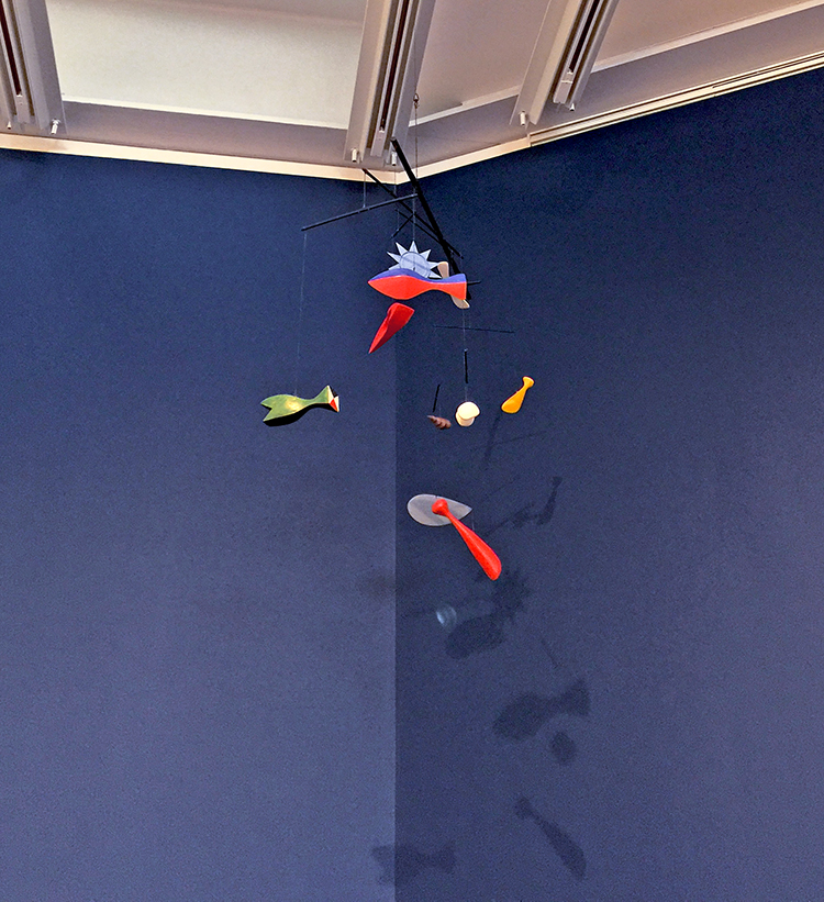
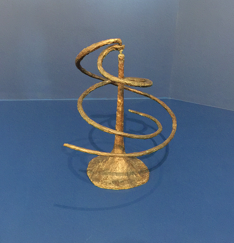
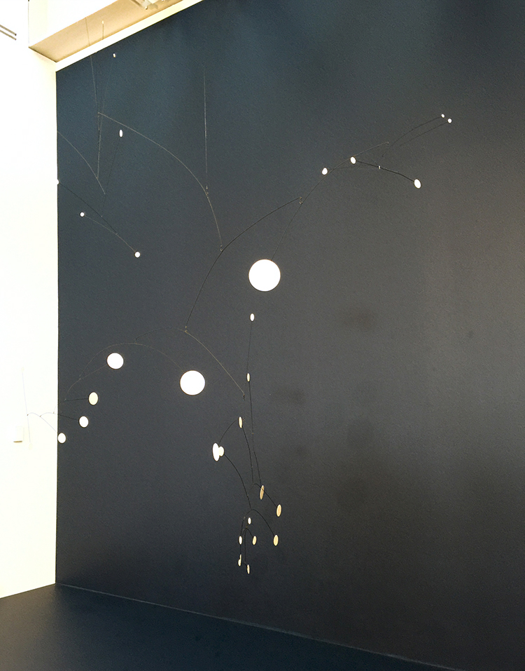
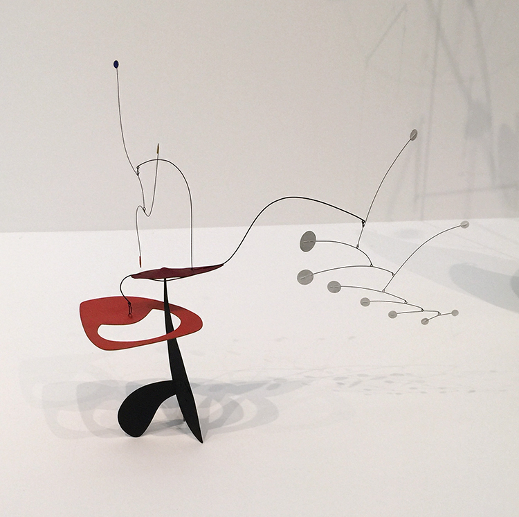
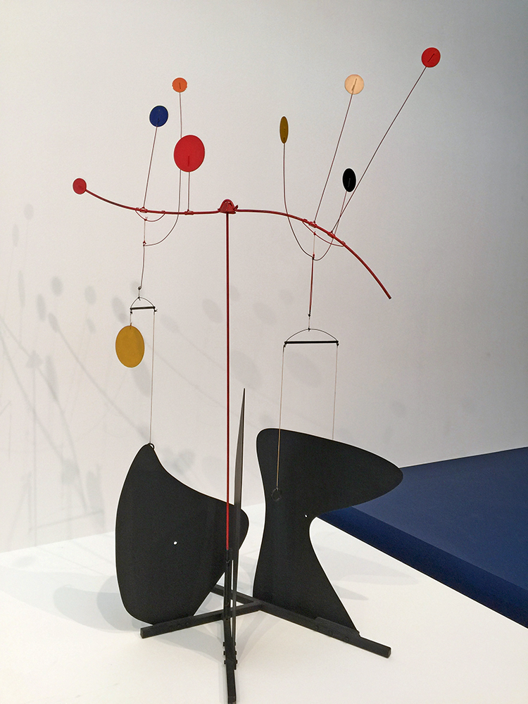
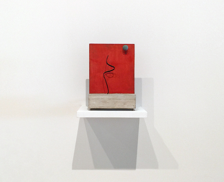
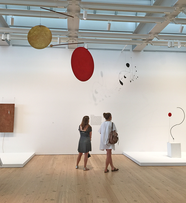
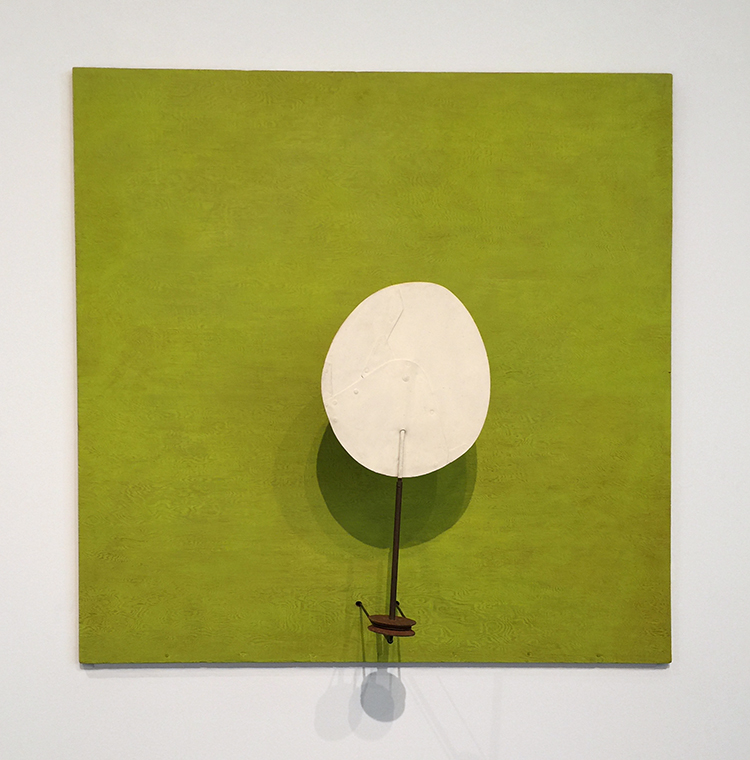
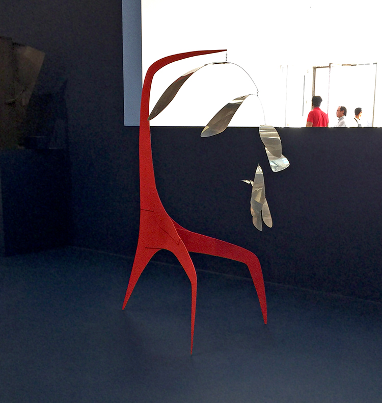
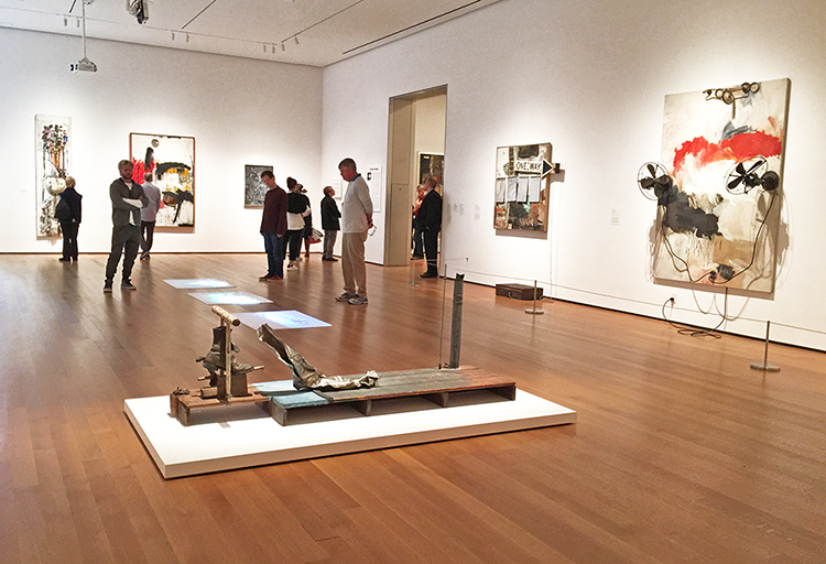
A couple of weeks ago I went to the Whitney to see the Calder exhibition – which was fantastic- but I also took some time for the Where We Are exhibition with selections from the Whitney’s collection 1900-1960.

“Where We Are traces how artists have approached the relationships, institutions and activities that shape our lives. The Exhibition is organized in five themes: family and community, work, home, the spiritual and the nation. During the six decades covered in the exhibition, the U.S. experiences war and peace, collapse and recovery, and social discord and progress. The artists and their works suggest that our sense of self is composed of our responsibilities, places and beliefs. Where We Are is titled after a phrase in W.H. Auden’s poem “September 1, 1939”. The title of the poem marks the date Germany invaded Poland. While it’s subject is the beginning of the war, Auden’s true theme is how the shadow of a global emergency reaches into the far corners of everyday life. Where we Are shares Auden’s guarded optimism, gathering a constellation of artists, whose light might lead us forward.”

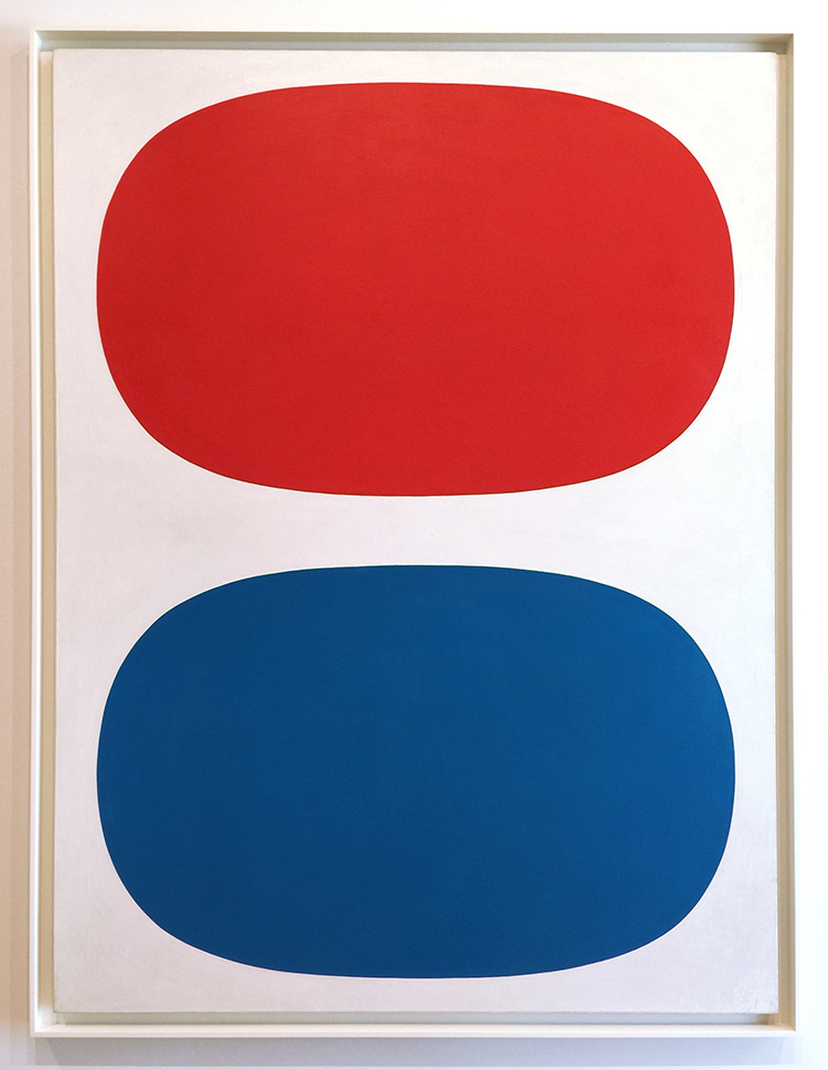
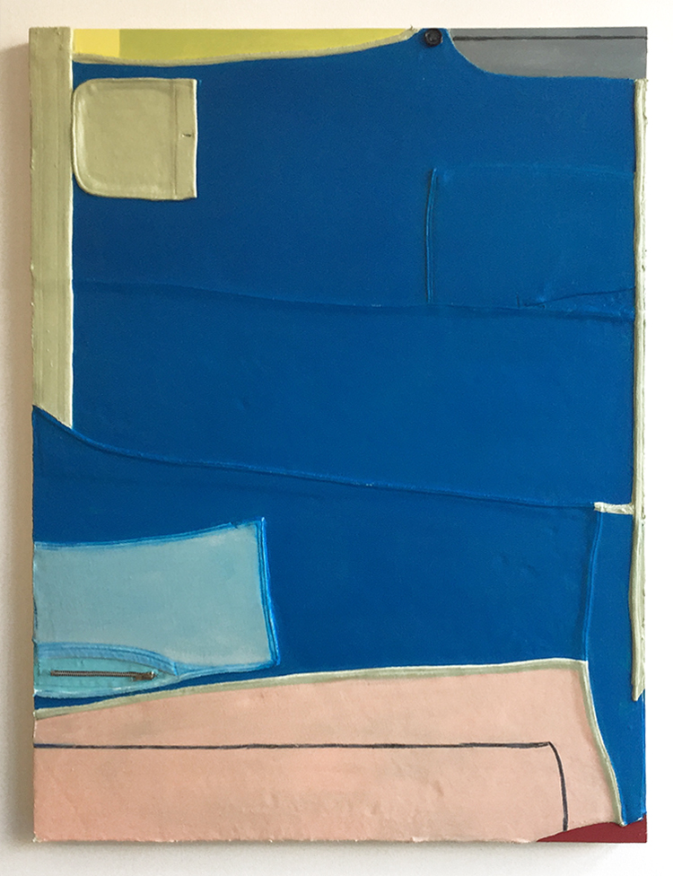
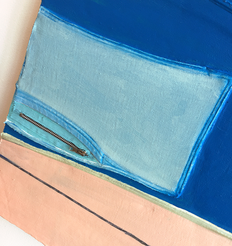
Ellsworth Kelly, 1961 – Red, White and blue – Oil on linen

Ellsworth Kelly’s earliest works of art were created in service to the United States, as part of a special camouflage unit in France during World War II. Kelly and his fellow artist-soldiers were tasked with fooling the Germans—using rubber and wood to construct fake tanks and trucks—into thinking the multitudes of Allied troops on the battlefield were much larger than reality. While this seems an unconventional early training for an artist, it proved a fitting one for Kelly. After his service, Kelly enrolled in the School of the Museum of Fine Arts in Boston. After knowing this – doesn’t the painting now feel like a camouflage flag? ;)

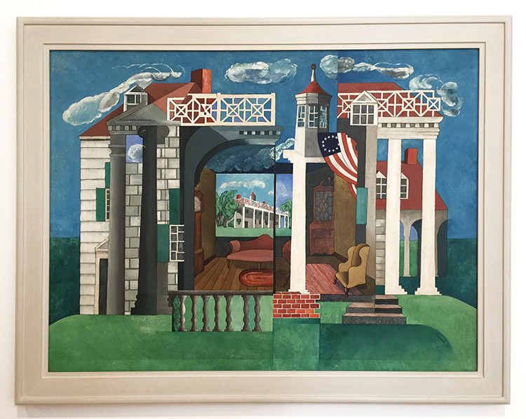
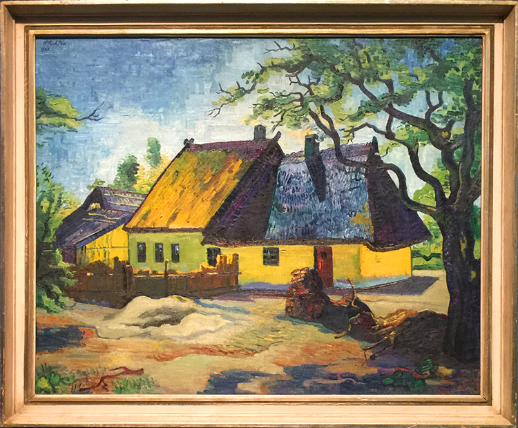
Herman Trunk, Jr., Mount Vernon, 1932.  Oil on canvas

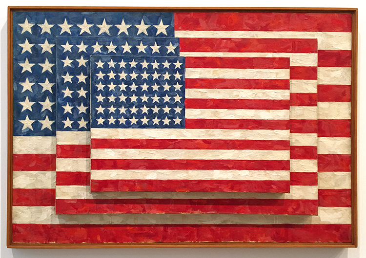
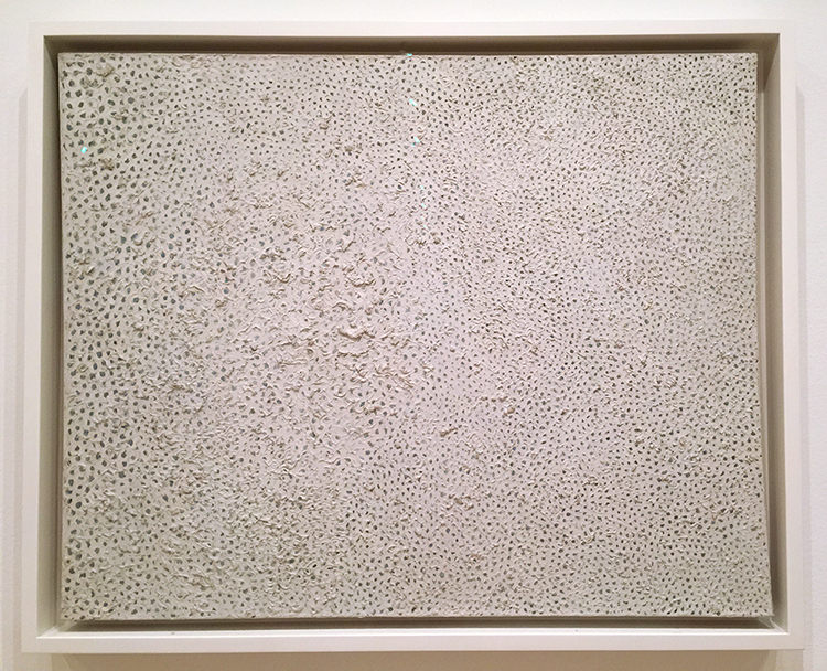
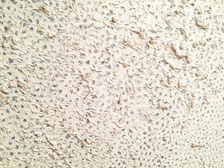
Jasper Johns, 1958 – three Flags, Encaustic on canvas

Johns saw the American flag as a symbol that is usually “seen and not looked at, not examined”. The execution and composition of Three Flags encourages close inspection. What do you think, is the middle panel actually fully painted with the flag or not? Apparently it is still a bit of a mystery although infrared hints it is incomplete.

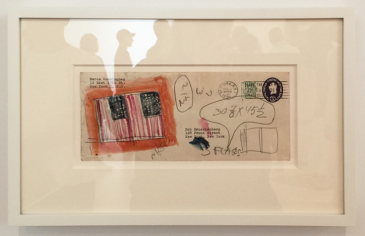
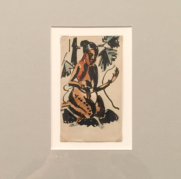
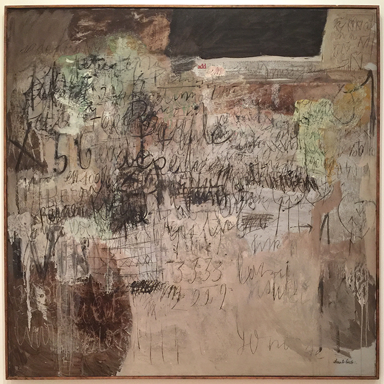
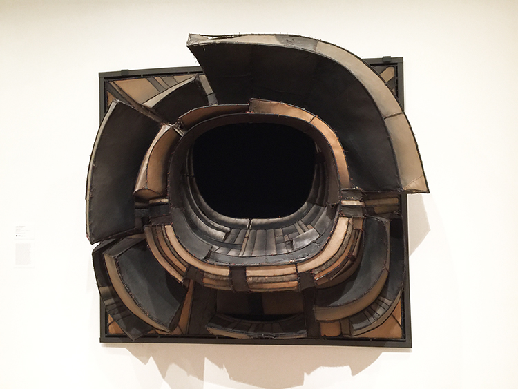
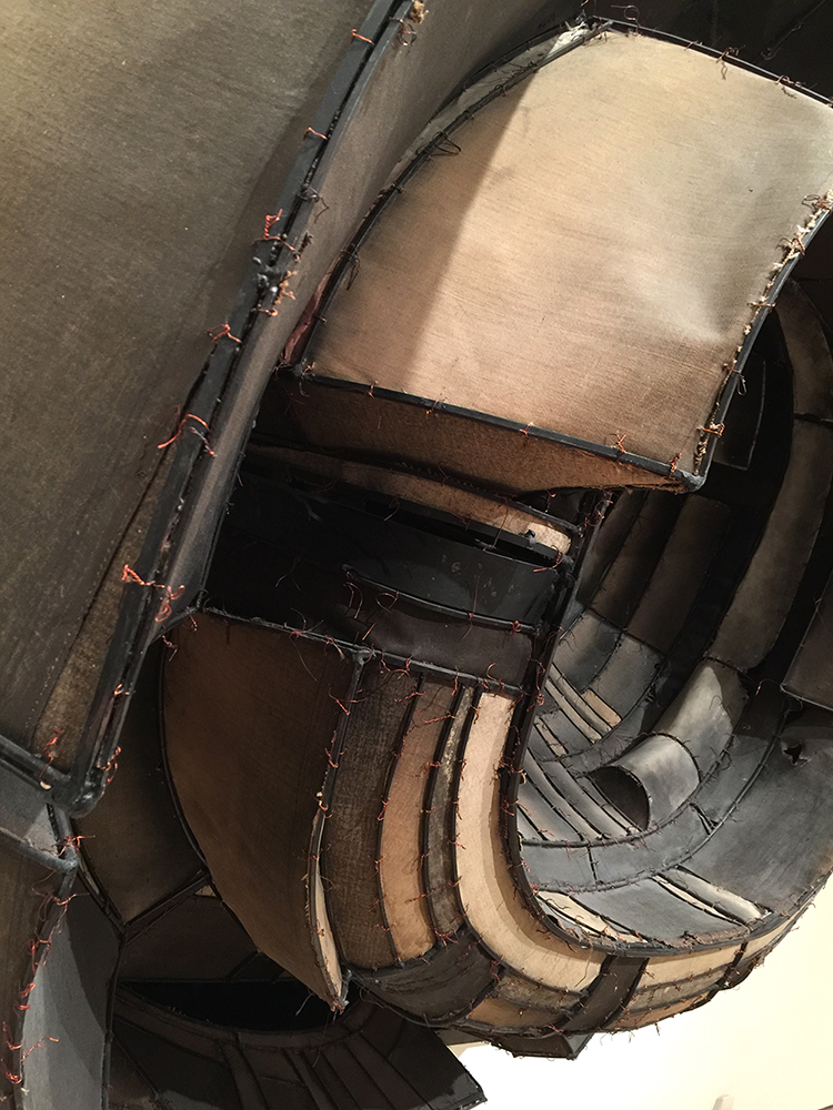
Jasper Johns, 1959, watercolor and graphite on fond paper

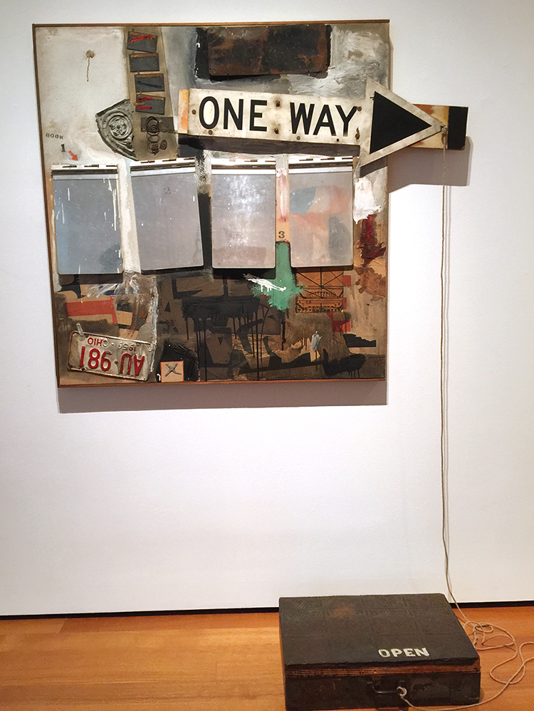
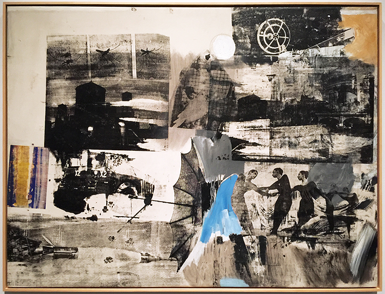
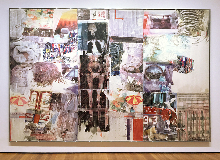
Having just seen the Rauschenberg exhibition at MoMA this made me excited – and I love the mail-art.

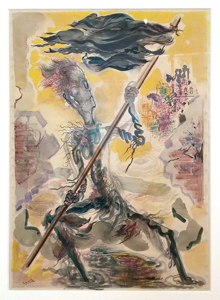
George Grosz, 1947-48, Waving the Flag, Watercolor on paper

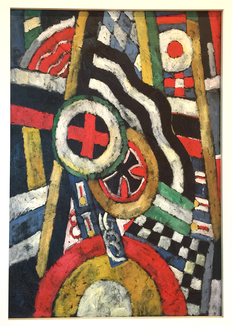
Marsden Hartley, 1914-15, Painting, Number 5, Oil on linen

Marsden Hartley began this work before the First World War, during an extended stay in Berlin. The painting is a memorial to Karl von Freyburg, a young German officer whom Hartley loved and who was killed in battle soon after the war began. The way he painted has the effect of a collage.

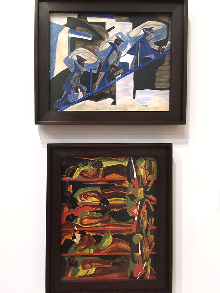
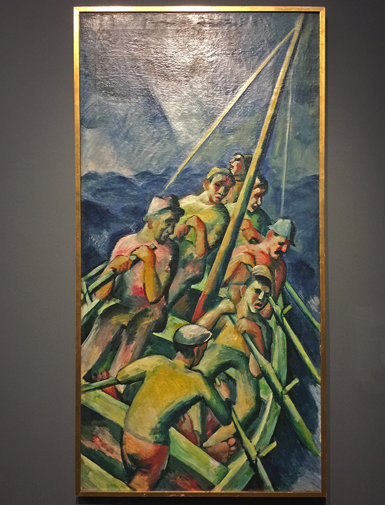
Jacob Lawrence, 1946 and 1947- War series – Tempura on composition board

I had never seen the war series by Lawrence before and it really grabbed me. He painted the series while serving during WWII. These paintings are timeless and the narrative is ingrained in our heads with wars we have experienced or know about.

I would like to go back and see the other paintings in the gallery in this series with more time- but it was quite full that day.

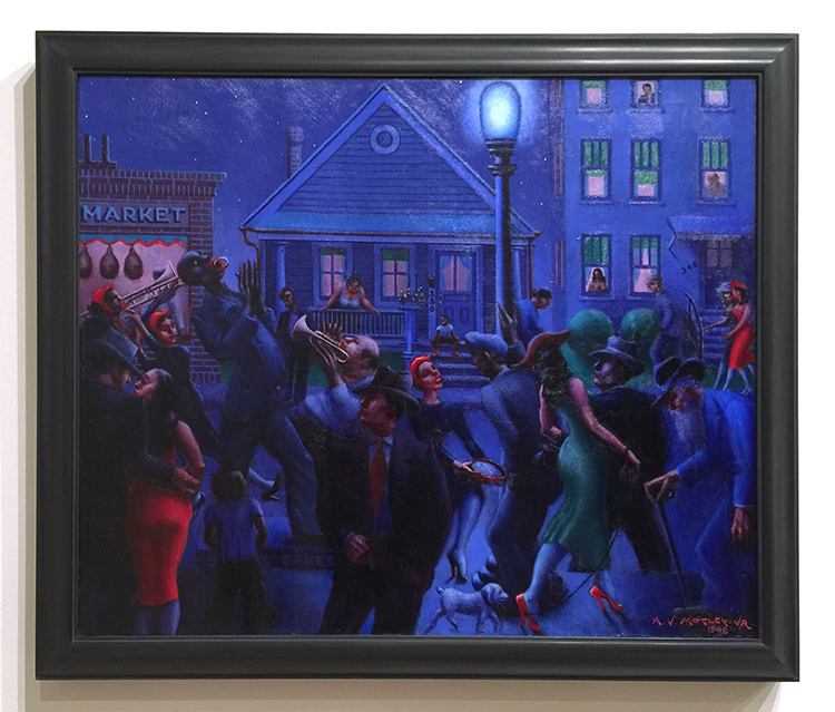
Archibald Motley Jr., 1948 – Gettin’ Religion, Oil on linen

Archibald Motley’s primary artistic inspiration were the inhabitants of Chicago’s South Side, a culturally thriving neighborhood at the time. In this night scene he captured the full spectrum of urban experiences.

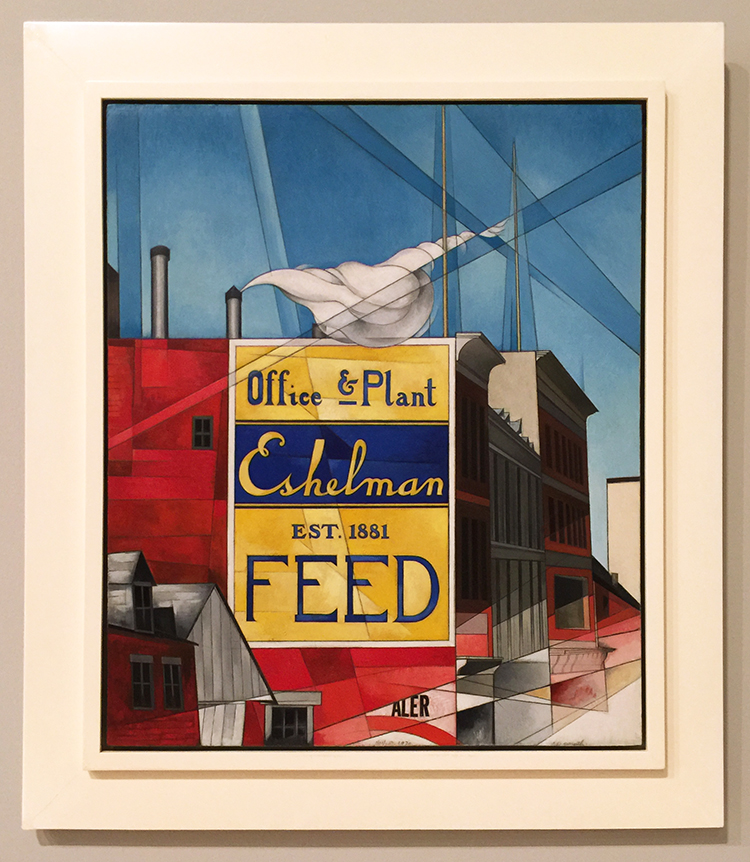
Charles Demuth, 1930- Buildings, Lancaster – Oil and graphite pencil on composition board

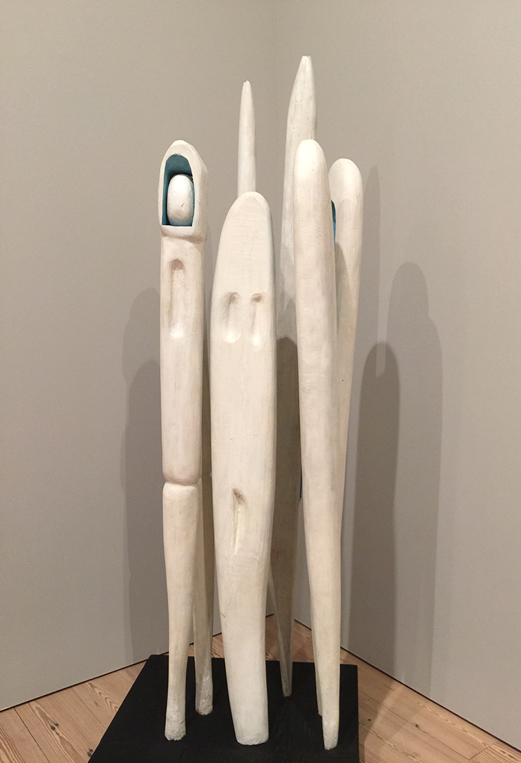
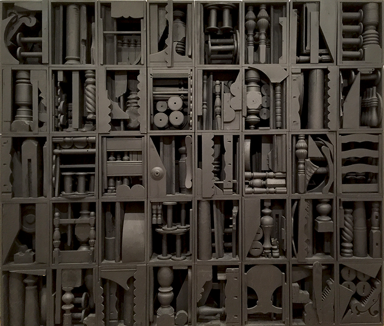
Louise Bourgeois, 1941 – Quarantania 1941 – painted wood

Soon after emigration from Paris to New York 1938 Louise Bourgeois made this sculpture. Quarantania resembles a group of standing figures huddled together and reimagines people she has left behind in her native France. Additionally the five elements might also evoke sewing needles or weaving shuttles, tools used in her family’s tapestry restoration trade.

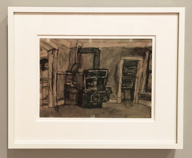
James Castle, Interior with Stove and below Shed, Soot and spit on found paper.

I had never heard before of James Castle who lived from 1899-1977, but boy did his story and his paintings touch me.  Castle was profoundly deaf from birth.

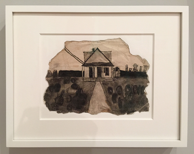
He never learned to speak, sing, read or write; largely unschooled and self-taught he developed his own techniques for creating works of art and used his art as a tool for communcation. To make his black-and-white-drawings, he combined salvia with soot from a wood-burning stove and used sharpened sticks, sometimes fruit pits,  to apply the mixture to his paper.

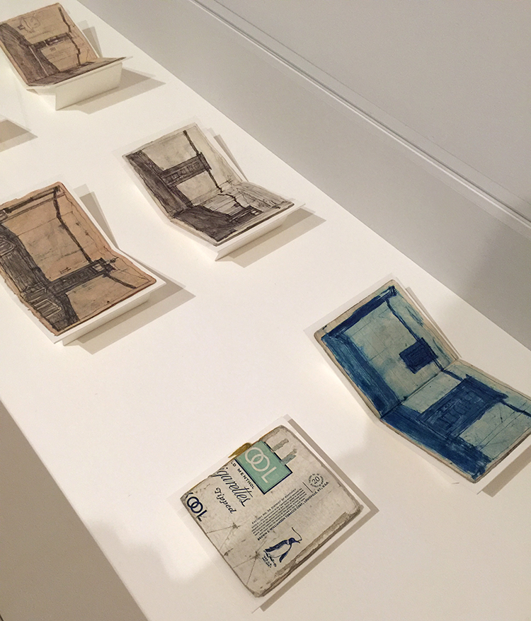
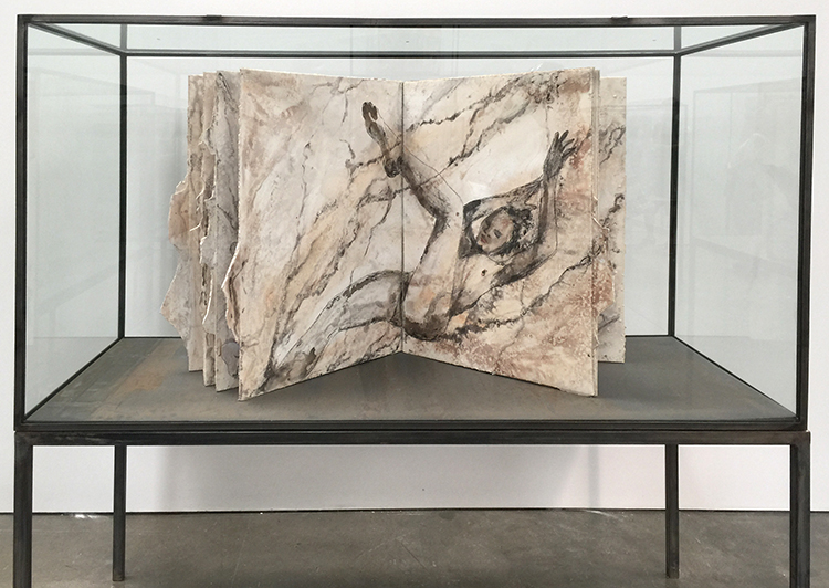
James Castle, 1910- 77 , artist’s books with sooth and spit on found paper

In addition to the numerous works on paper, James Castle produced hundreds if not thousands of handmade books. Using commercial food packaging or heavy paper as covers, he stitched together blank pages and filled them with drawings of letters, pictographic symbols, collections of mock photos and sketches based on advertisements.

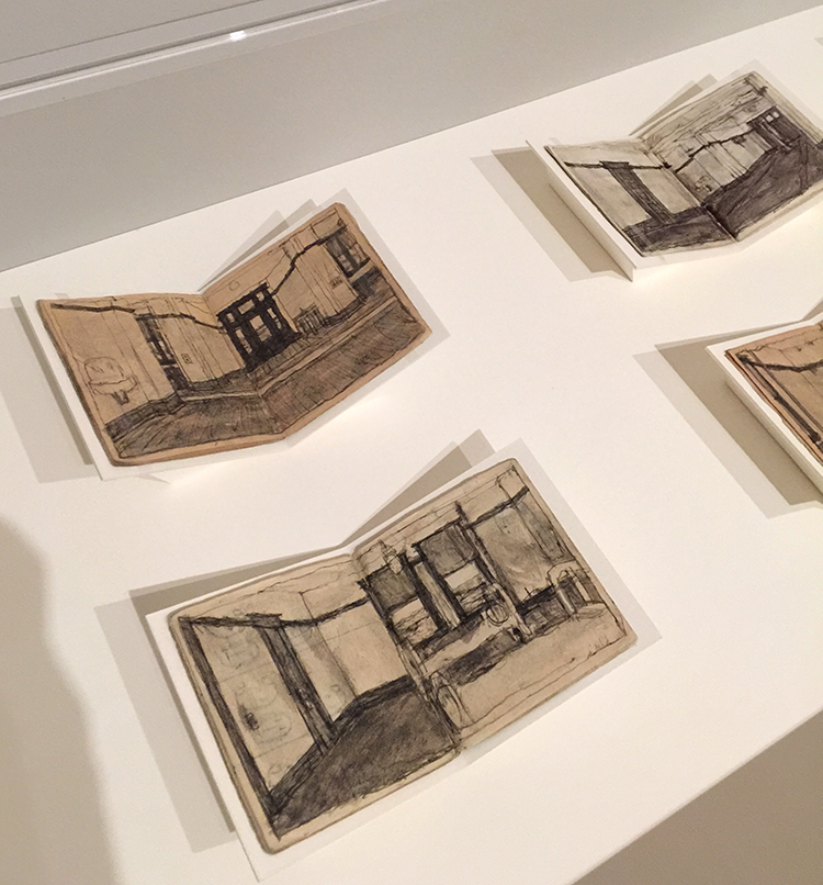
He frequently made use of both sides of papers he found around the house- flattened matchstick boxes, ice-cream carton lids, envelopes and even his niece’s old homework assignment. Amazing!


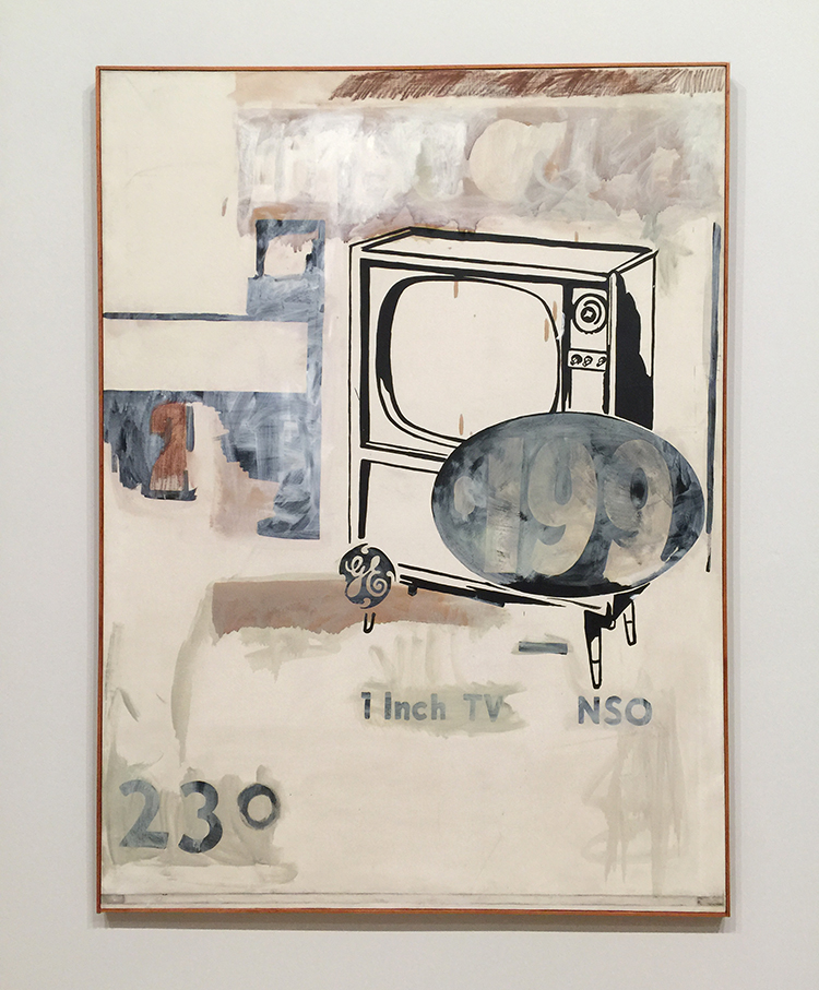
Andy Warhol, 1961 -$199 Television – acrylic and oil stick on canvas

I love this – it hints of things to come but still shows an artist hand – Warhol’s.

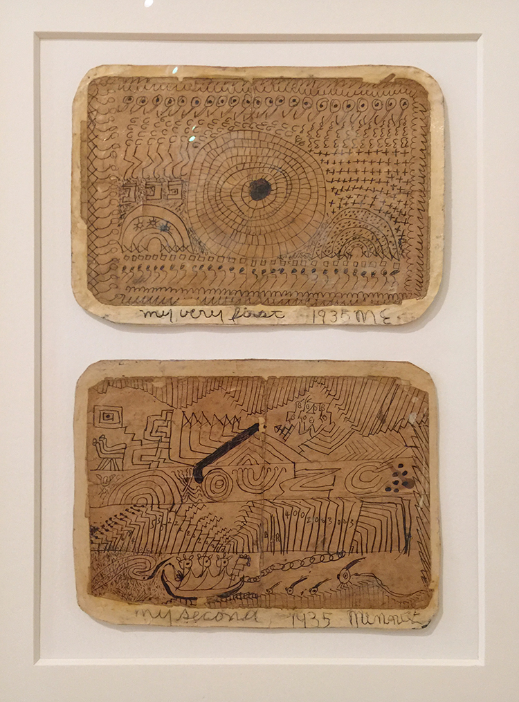
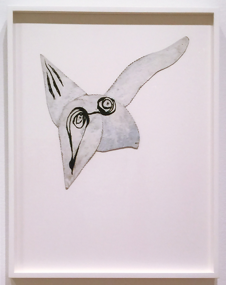
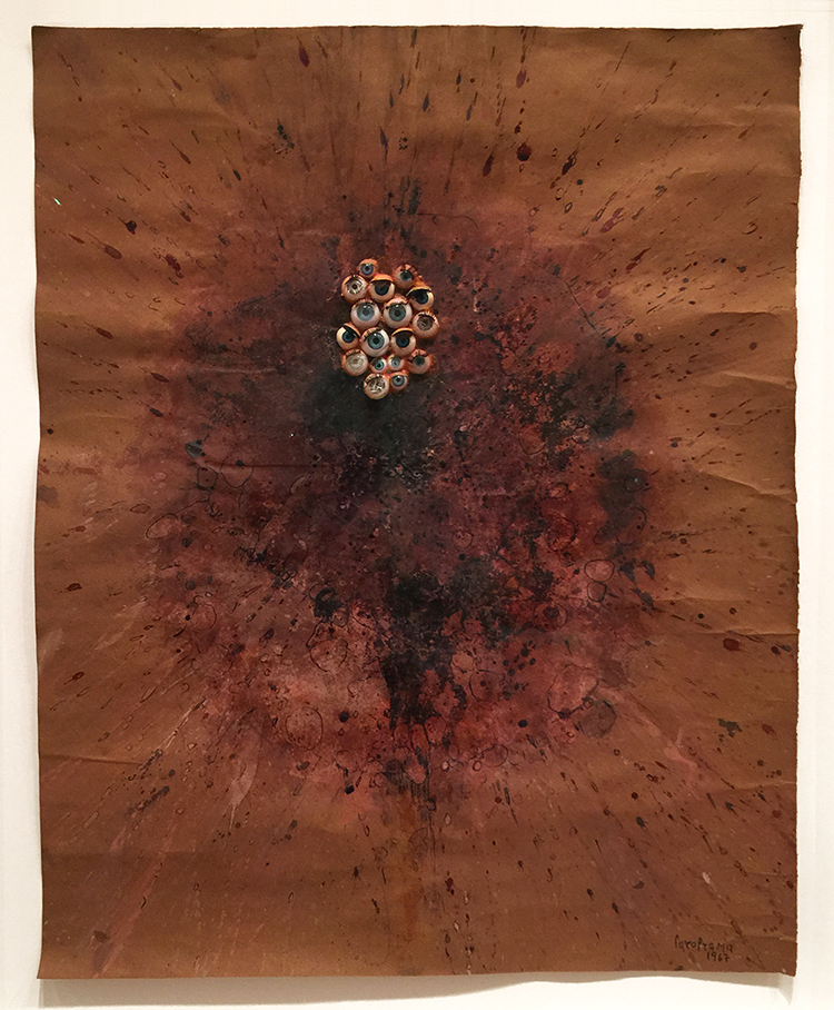
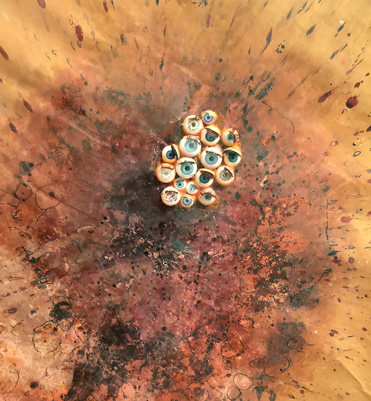
Minnie Evans, 1935 – My Very First and My Second

Minnie Evans crated both drawings on Good Friday when she was 43 years old. She said a spiritual force compelled her to begin drawing – these are her very first drawings hinting at the subjects of her later work – biblical imagery, plants and fantastical bests.

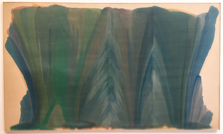
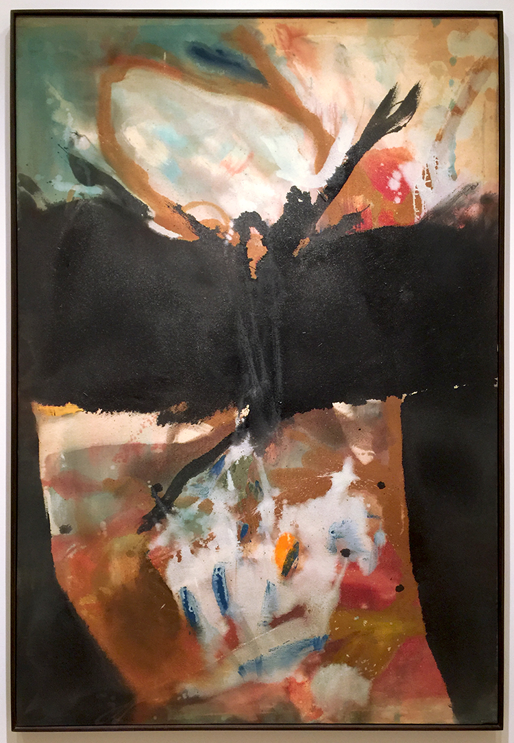
Morris Louis, 1958 -Tet – Acrylic on canvas

Morris Louis learned the method of staining unprimed canvas from fellow artist Helen Frankenthaler. He had a really small studio and this canvas is massive. For a long time no-one really could figure out how he made these big paintings. Conservators found out that he would roll the canvas in portions and pour, and then re-roll the canvas and dry and then continue. So he never saw the entirety of the painting while working on it.

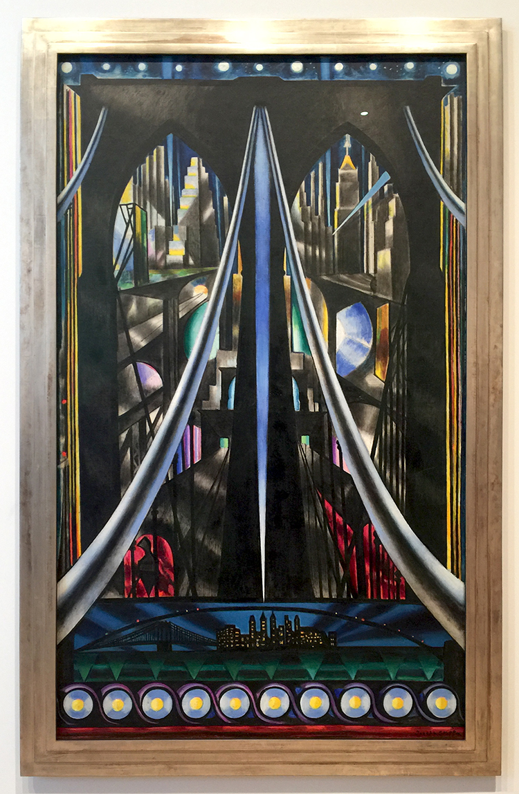
Joseph Stella, 1939, The Brooklyn Bridge

This looks so timeless again – I love this painting of the Brooklyn Bride.

It was a great exhibition, thought provoking and interesting. It is open now and does not have an end date yet. Check it out when you are at The Whitney!
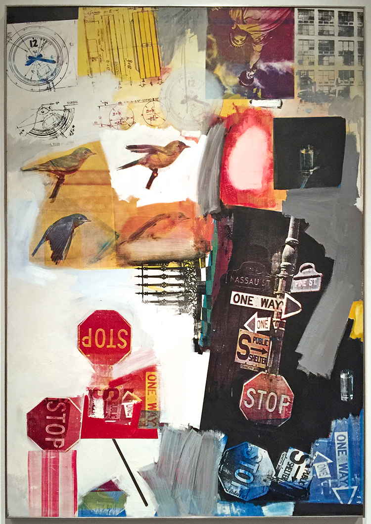
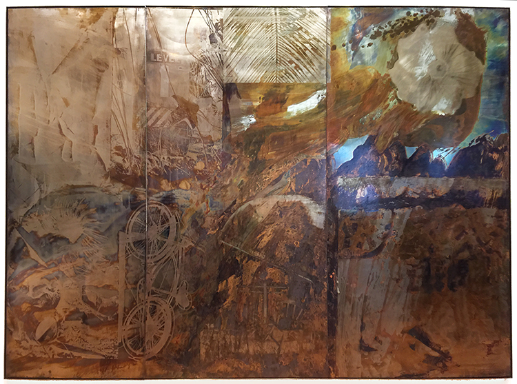
Comments (2)

  • kimnstudio

    |

    Wow! The technique used by Morris Louis was a surprise! How cool!

    Reply

  • Sue Clarke

    |

    The artist books by James Castle struck me the most. I can only imagine what it meant for him to be able to communicate through drawing.

    Reply

Leave a comment

Art Stroll: Calder: Hypermobility at Whitney

Last Saturday my husband and I went to the Whitney museum to see the Calder: Hypermobility exhibition. In the early 1930s, Alexander Calder invented an entirely new mode of art, the mobile—a kinetic form of sculpture in which carefully balanced components manifest their own unique systems of movement. The exhibition showcases major examples of Calder’s work including early motor-driven abstractions, sound-generating Gongs, and standing and hanging mobiles.

We arrived right on time for one of the activations of the artwork which the Whitney performs on certain times throughout each day

and it was really my favorite to see these pieces in motion – check out the short one minute video below to see the two pieces above being activated:

Calder: Hypermobility from Nathalie Kalbach on Vimeo.

I loved the exhibition – there was something so playful and happy about all the pieces

and I was equally fascinating by the way they were assembled

the forms, shapes and use of color

as well as the really intriguing shadows

I loved seeing all generations being equally fascinated by the work.

and the shadows in motion

I loved the sculptures

and his use of different materials. BTW Calder called his non moving sculptures “Stabiles” .

Some of the pieces were electrical and I wished they would have been working at the the time I was there – guess I have to come back.

How does the one below not fall ….LOL- crazy !

All the elements and principles of art can be found in his work- it is so fascinating.

I loved this gigantic mobile on the wall

For a number of his work- like the one above – Calder intentionally designed the components to collide and even make a sound- which in I couldn’t hear in this one but assume it did make one :)

Each piece which didn’t move just by the moving air in the museum made me wonder how it would look moving. It is weird to see the work not in the way it is intended to be seen, at least once you realize it is intended to be moving…I wish there was a way to just keep them moving but I assume that from a conservatory perspective that would be really hard on the pieces.

I found the fish surprising in regards to the other work on display – but still cool- look at the two shadows

It was a perfect and wonderful day in NYC

The exhibition is on display until October 23, 2017 – make sure to check out the Whitney Website for the activation times – it is well worth to go and see this!

Hope you enjoyed the Art Stroll today!

Comments (6)

  • Hillel

    |

    No doubt seeing the calders together is delightful. If on Sunday for the 3pm and 4pm activation of the mobiles was something that could be seen behind a gaggle of viewer 5 to 10 people deep following a lady in a white coat, blue surgical gloves and dust protectors on her shoes pushing the sculptures with a stick around the exhibition room is “seeing”. Maybe Calder is chuckling about the spectacle ; from my vantage point the tourists not the mobiles were being activated.

    Reply

  • Florence Turnour

    |

    Wow that looks like a fantastic exhibit. I love Calder’s work so much. There was (and maybe still is) a mobile having in the National Museum of Art in DC that I used to visit when I lived out there. Thanks for sharing these pictures. I wish I could go myself.

    Reply

    • nathalie-kalbach

      |

      It was really awesome Florence. Oh – I have to go the National Museum of Art in DC when I am around that area again :) Thanks for checking the post out :)

      Reply

  • goze

    |

    Another great Art Stroll. Have always been fascinated with the structure, balance and movement of mobiles. Thanks for sharing.

    Reply

Leave a comment

Art Stroll: Making Space at MoMA

A couple weeks ago Natalya Aikens and I visited Making Space: Women Artists and Postwar Abstraction is the title of a MoMA Exhibition open until August 2017. It features the work of female artists from 1945 to 1968 and shows artwork from MoMA’s collection from over 50 artists. Paintings, sculptures, photographs, drawings, prints, textiles and ceramics.

Helen Frankenthaler “Trojan Gates” (1955) Oil and Enamel on Canvas

Frankenthaler thinned her pigments with turpentine so that they would soak directly into the canvas and stain it.

Louise Bourgeois “Self Portrait as Bird” (1945) Oil and Ink on cut board with rivets

Louise Nevelson “Big Black” (1963), Painted Wood

To create this sculpture, Nevelson stacked boxes against a wall and filled each compartment with found wooden scraps. She then covered the entire assemblage with black paint.

Bela Kolarova “Five by Four” (1967) Wood, paint, and metal paper fasteners

I loved this piece!


Left- Elaine de Kooning “Bullfight” (1960) Acrylic on Paper

Yayoi Kusama “No F” (1959)

Look at the detail of the piece – makes you want to touch it.

Anni Albers “Tapestry” (1948) Handwoven linen and cotton

Sarah Grilo “Add” (1965) Oil on Canvas

First time on view at MoMA. It was one of my favorite pieces and it made me sad to think that this would vanish again after the show in a storage space.

Lee Bonticou “Untitled” (1961)

Lee Bonticou lived in NY above a laundry and found the conveyer belt there. I love the organic yet mechanical piece and you cannot help yourself but look into the dark void.

Amazing!

Carol Rama “Spurting Out ” (1967) – Ink, Gouache, shellac  and plastic doll eyes on paper

This was interesting …and eerie at the same time.

Several thoughts :

  • It was so prominent that a lot of the female artists were spouses of  “famous” and permanently displayed male artists – in a way it must have been an exciting time to be a female artist- but also so hard to break through and be heard.
  • Who inspired whom btw?
  • Mostly only one piece of artwork was displayed by the artists making it seem as that is all the space there is for their amazing work to be displayed
  • MoMA, why not making real space for those artists instead of just a temporary exhibition space. Just display more of this artwork in your permanent collection galleries.
  • More Female Solo Exhibitions would be great – a lot of those artists have quite some scope of work – “Where Are All the Women” by Jerry Saltz is still good and valid read.

I will definitely go back and see it more in depth but I had a great time with Natalya and enjoyed looking at some of the artwork with different eyes, given the different medium she works with .

Making Space: Women Artists and Postwar Abstraction is on show until August 13, 2017 at MoMA


Comments (8)

  • Sue Clarke

    |

    I just love “Add”…such a delightful piece. Maybe it can hang in my living room in between being out in the gallery?

    Reply

    • nathalie-kalbach

      |

      Wouldn’t that be awesome to have? It should rather hang in our living rooms when vanish in the museum storage again.

      Reply

  • Stephanie

    |

    I heard about the exhibit on NPR. Looks like it was fab!

    Reply

    • nathalie-kalbach

      |

      Oh I bet that was interesting -might have to see if I can still find it on NPR

      Reply

  • Seth

    |

    Thanks for taking us along on the ride!

    Reply

  • Diane

    |

    Thank you for this post. Most interesting. Also like your observations about women artists.

    Reply

Leave a comment

Art Stroll: Rauschenberg Among Friends Part 2

As promised Part 2 of my visit of the Rauschenberg Among Friends Exhibition – you can read about Part 1 here. When you are reading this I have been already back to the show and have scheduled another visit next week …I am obsessed- HELP – LOL

“Ace”(1962) , Oil, paper, cardboard, paint-can label, umbrella, doorknob, fabric, wood, nails, and metal on canvas – on five panels

I love how reading the signage becomes the start of a scavenger hunt trying to find all elements mentioned on the panels.

“Black Market” (1961), Oil, watercolor, pencil, paper, fabric, newspaper, printed paper, printed reproductions, wood, metal, tin, street sign, license plate and four metal clipboards on canvas with rope, chain and wood suitcase containing rubber stamps, ink pad and typed instructions regarding objects to be given and taken by viewers

Black Market was first on view in Amsterdam in 1961 and viewers were invited to take out an object from the suitcase and replace it with their own and then make a drawing of their contribution on one of the clipboards. Unfortunately people were mostly just stealing the objects in the suitcase and so Rauschenberg withdrew his invitation. – I just love the concept and thought -so sad it didn’t work out!

“Pilgrim” (1960), Oil, graphite, printed paper and fabric on canvas with painted wood chair.

If you look closely you can see that Rauschenberg actually used the chair as a painting tool to drag down the paint in the canvas and then attached the chair as an collage element. It looks as if you are invited to take a seat to be part of the painting- but Natalya and I refrained from doing so – LOL.

Marcel Duchamp “Bottle Rack” 1960

Rauschenberg purchased this work for three dollars after he saw it in an exhibition, and then asked Duchamp to sign the work. Duchamp agreed and signed and left an inscription saying “Impossible for me to recall the original phrase” . Jokesters- LOL- I wonder how much this readymade art piece is worth nowadays.

I loved how the exhibition was laid out – and of course early morning hours are the best to ensure a more empty space.

“scanning” (1963) Oil and silkscreen -ink print on canvas

the canvas includes a photo of the Merce Cunningham Dance Company with Steve Paxton how lived with Rauschenberg when the piece was made.

The paw prints here were added by Sweetie, Rauschenberg’s pet kinkajou who strolled across the canvas while Rauschenberg was making it on the floor of his studio. He simply embraced the accident as part of the work. HA YES!

“Overdrive” (1963) Oil and silkscreen -ink print on canvas

I am so in love with this piece and the one below

“Estate” (1963) Oil and silkscreen -ink print on canvas

Rauschenberg started in the early 60s to use more and more readymade images into his paintings and visited Andy Warhol in the studio in 1962 to get an intro into the silkscreen technique. He had a friend destroy his stock of screens to avoid the pressure of repeating himself in his artwork.

I could look at them forever- and as you can see below the paintings are actually quite big.

“Volon” (1971)

Come on- admit…this makes you look at your boxes in a whole different way, no?

Untitled (1972) – Tape and cardboard boxes with rubber hose.

and so something that some people call trash becomes a piece of artwork – I love it!

“Sor Aqua” (1973) Wood and metal suspended with rope over water-filled bathtub with glass jug.

Rauschenberg found the inspiration for this piece in Venice – where he gathered found materials for a series of assemblages. The water- filled bathtub evokes the Venetian canals, the suspended tangle of rusted metal refers to aging, deteriorated surfaces throughout the city.

“Mirthday Man” (1997) Water-soluble inkjet dye and pigment transfer on plylaminate

You can find an x-ray of Rauschenberg which he called “self-portrait of inner man” and surrounded it with photographs he had taken over the year. Rauschenberg created this piece in one day on his 72nd birthday.

“Bible Bike” (1991) Tarnishes on brass, bronze and copper

The imagery and coloration in the metal painting series, Borealis, was produced through chemical reactions (which Rauschenberg called “corrosions”), sometimes with the addition of acrylic paint. Tarnishing agents, such as acetic acid and ammonium salts, are brushed or silkscreened onto brass, copper, or bronze surfaces, resulting in a muted range of colors: green, brown, or black, depending on the type of metal support. By painting or drawing with a tarnish-resistant medium before applying the tarnishing agent, the artist could create coloristic variations by contrasting the tarnished and untarnished metal.

I hope you enjoyed the Art Stroll- you can find all Art Strolls here on my website. But seriously if you are in NYC visit this exhibition – it is open until September 17, 2017.

Comments (1)

  • Sue Clarke

    |

    I just love “scanning” and the pet paw prints!
    Thanks for all the photos.

    Reply

Leave a comment