Art Stroll

Art Stroll: Hakone Open Air Museum, Japan

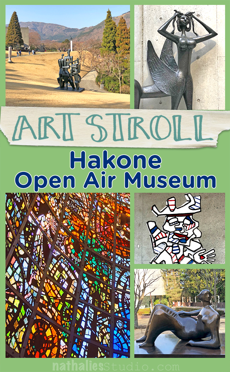
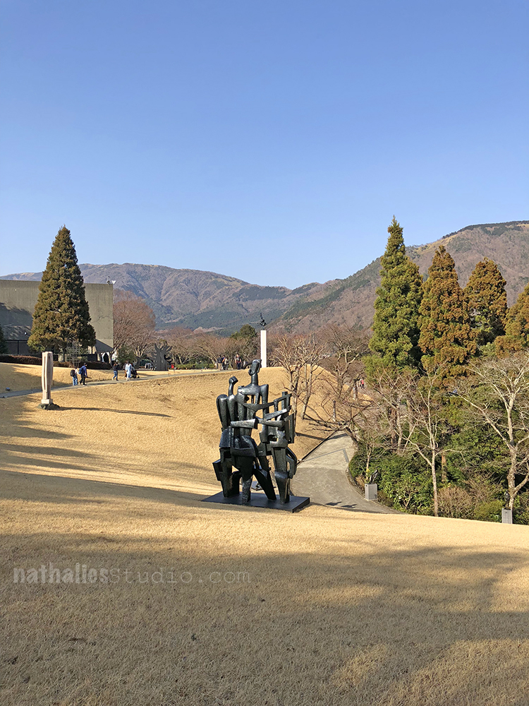
Strolling through the Hakone Open Air Museum in Japan was so amazing- especially- because I did not expect this crazy collection! We spent only a day in Hakone as we stayed in a traditional Ryokan (a traditional Japanese inn) and I had not really looked what was around there. But apparently my husband did and he had this planned as a little surprise for me :)

In this little resort town known for its hot springs you get to this museum by taking the slowest but most fun little train up the mountain.

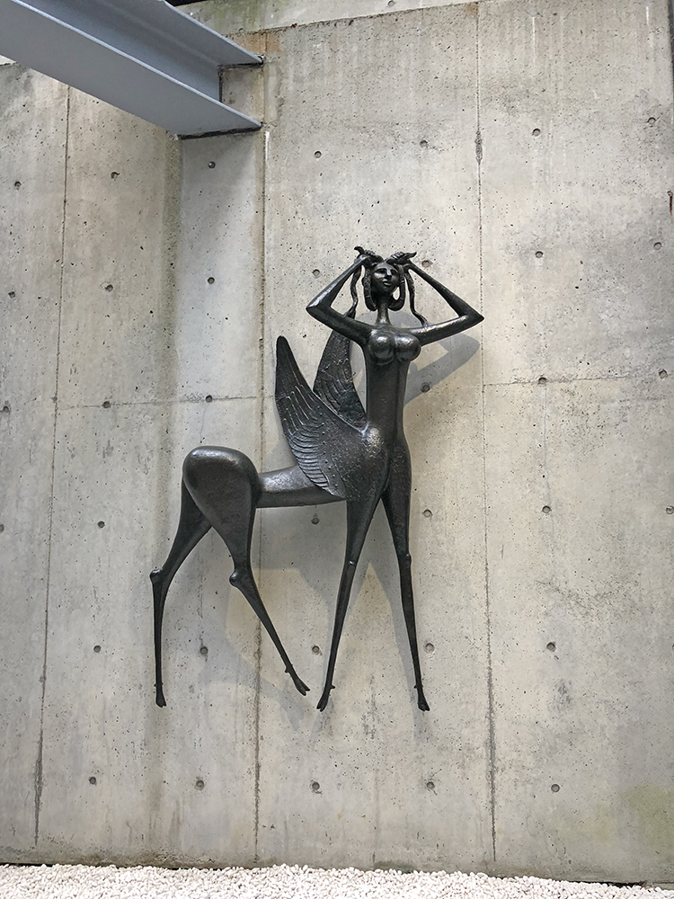
Marcello Mascherini – Chimera con Ali – 1963 – Bronze

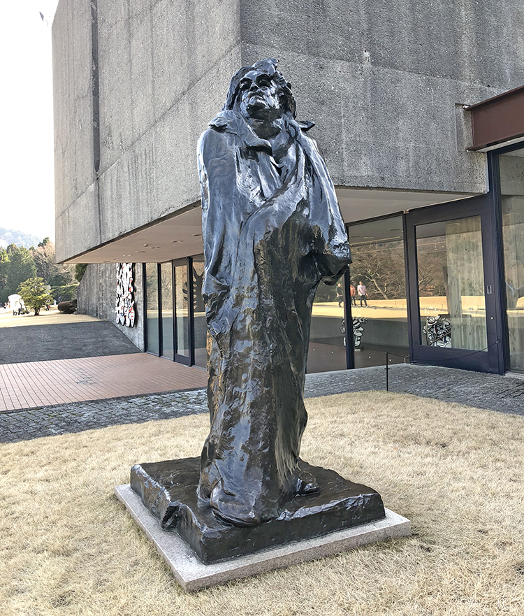
Auguste Rodin, Balzac 1891 – 98 – that is when I was like wowowowow- what is this Rodin doing here

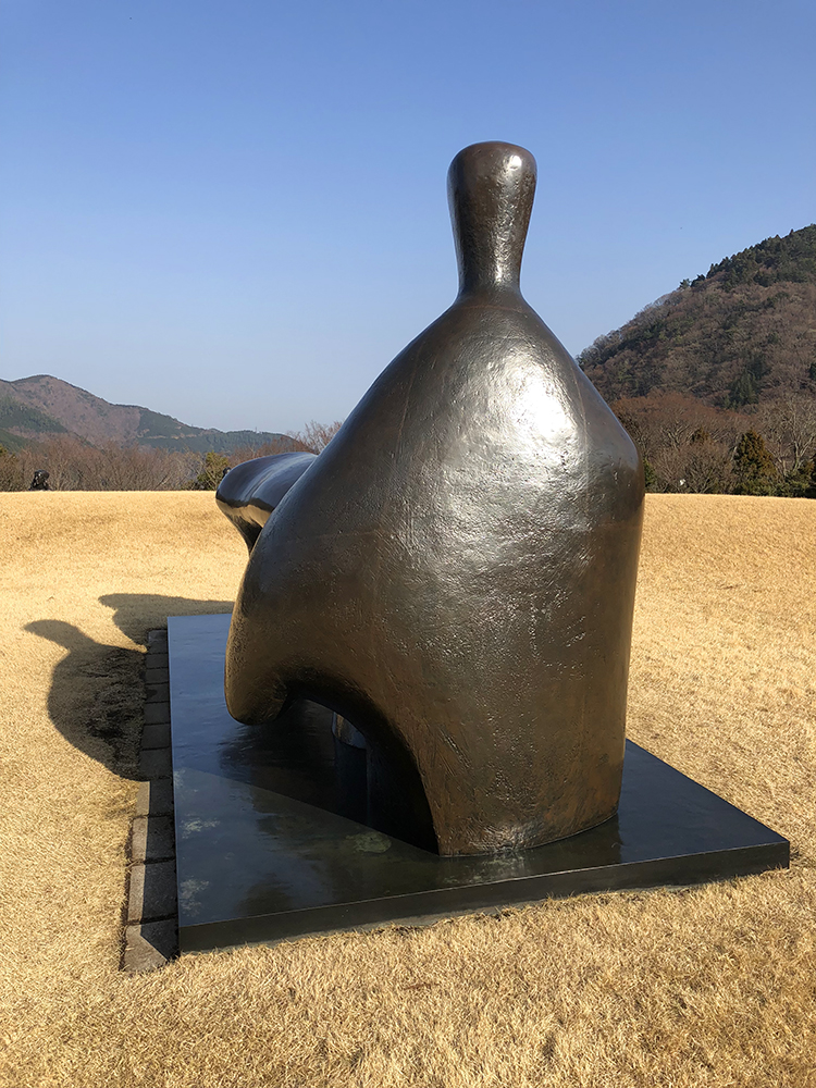
Henry Moore – Reclinging Figure: Arch Leg 1969-70

Many pieces of Henry Moore.

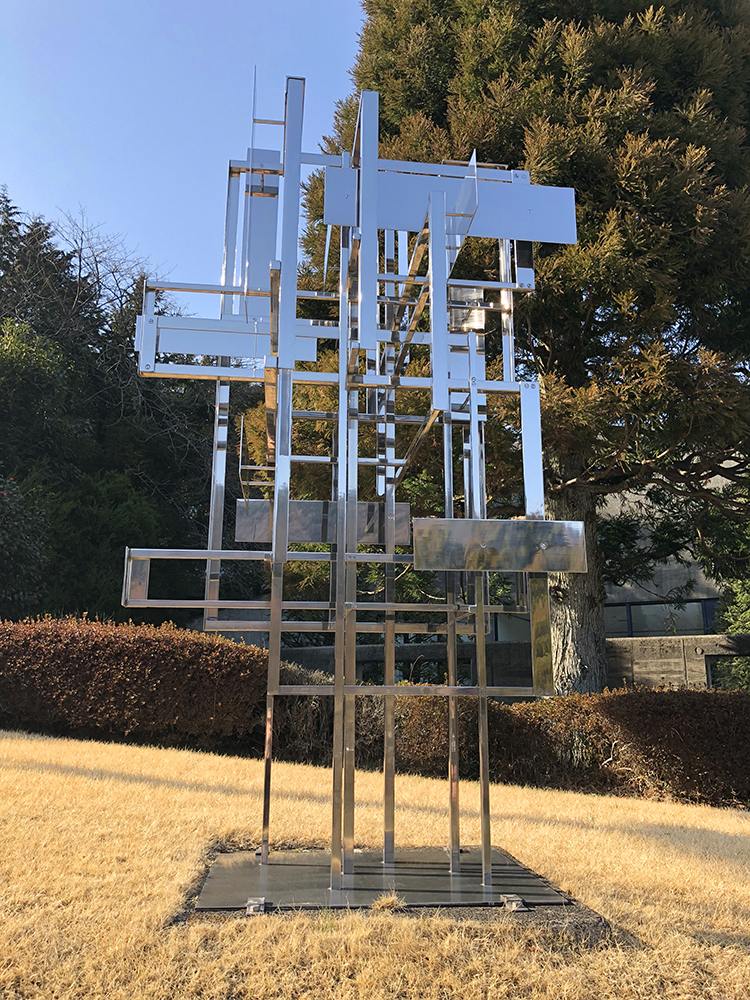
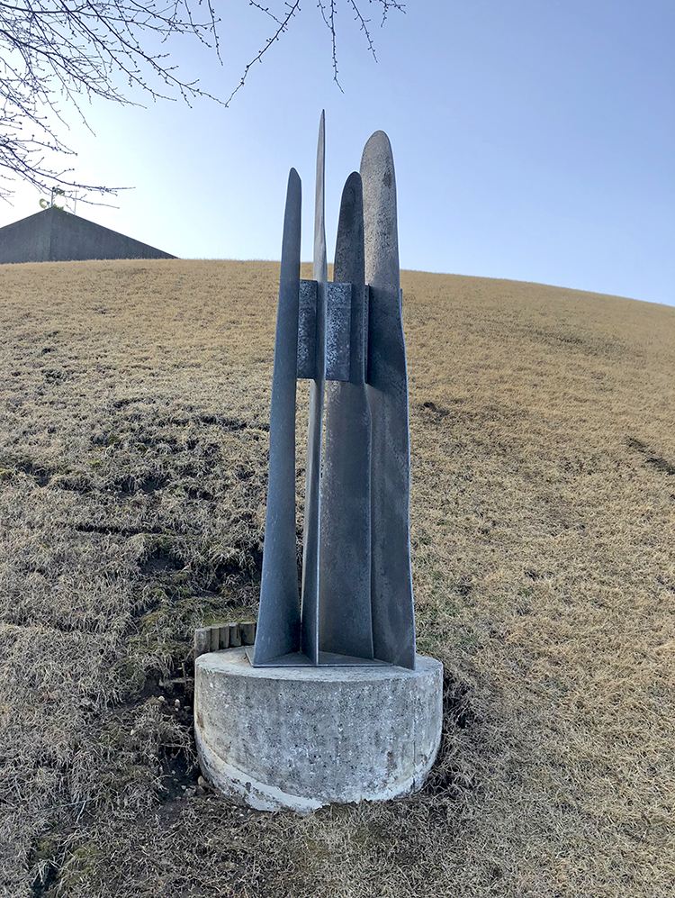
Nicolas Schöffer, Spatiodynamique No. 22 – 1954-80

The weather was wonderful and it was great walking around and get some fresh air but also look at art at the same time.

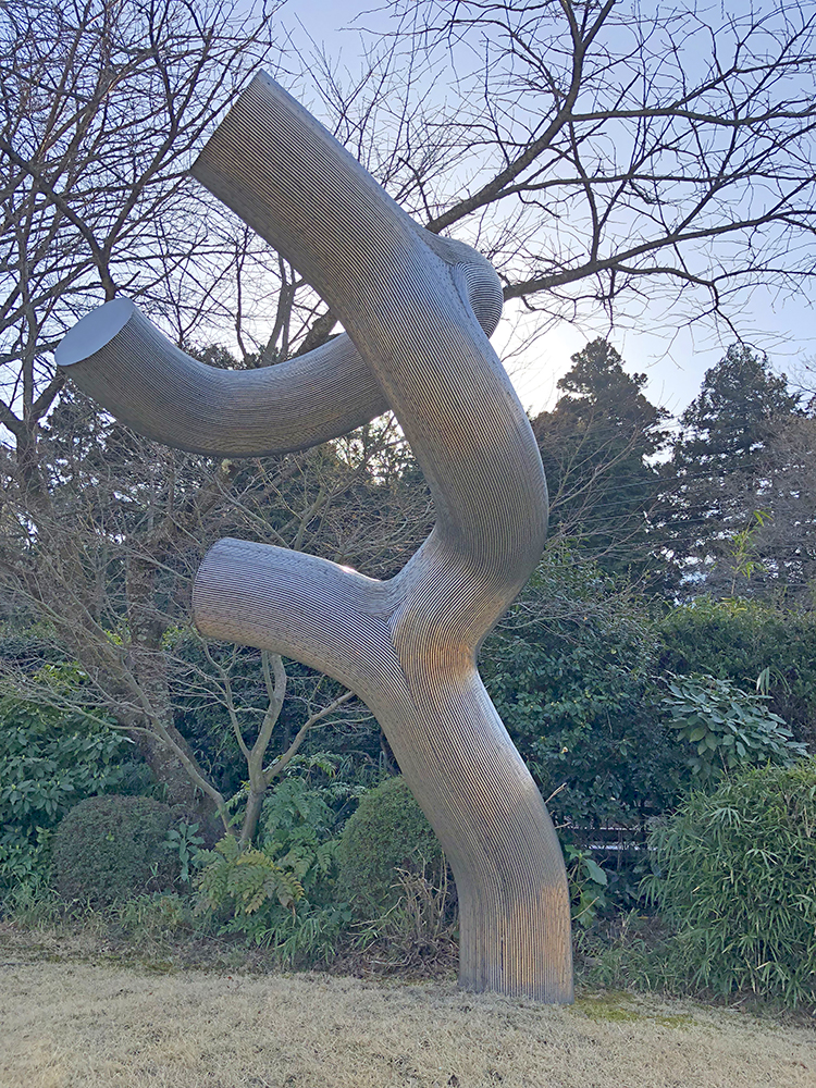
Susumu Shingu – Never Ending Dialogue 1978

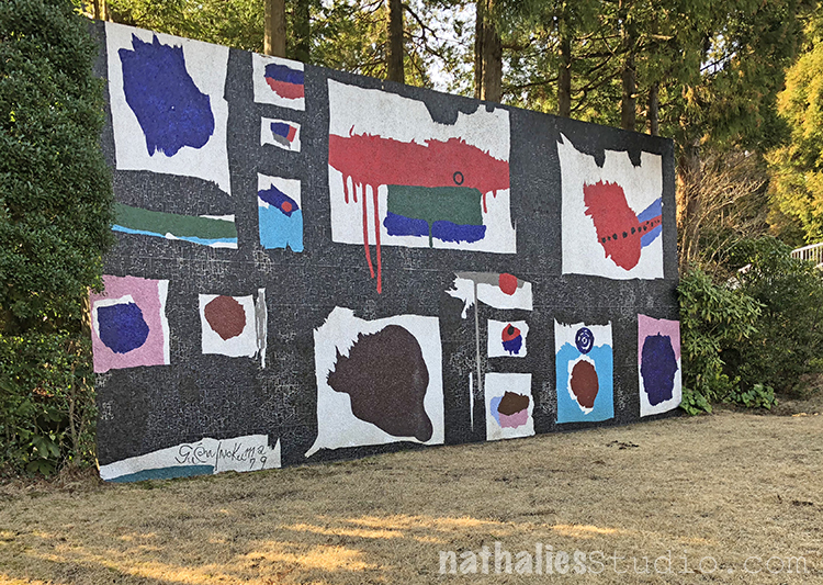
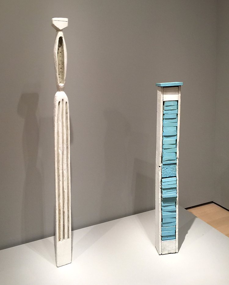
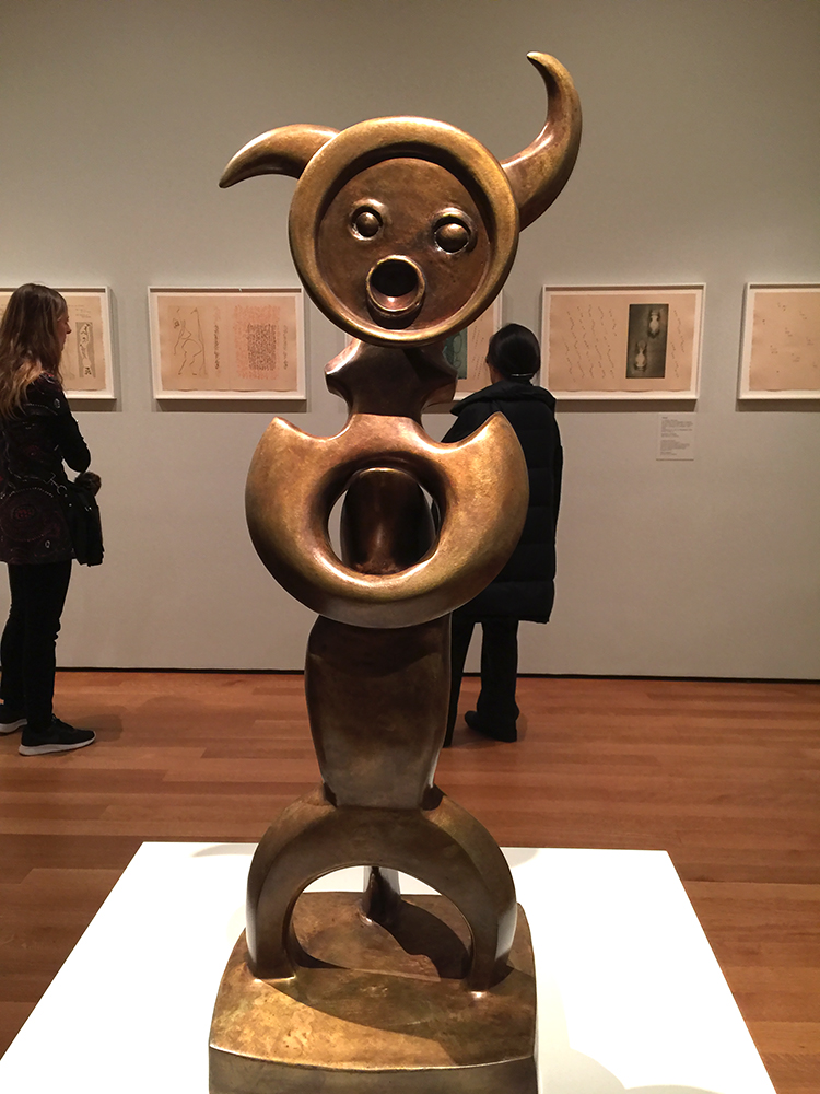
There are about 120 sculptures on permanent display across the huge park.

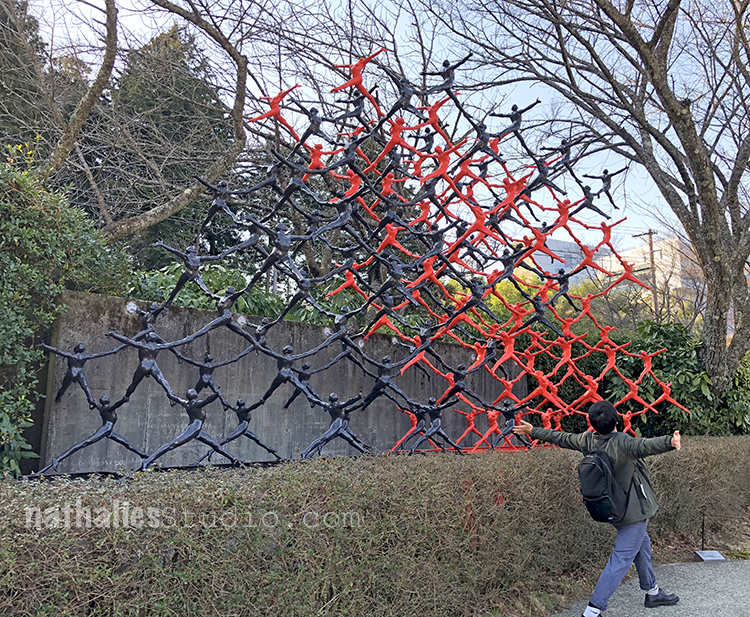
I love when people are interacting with art :)

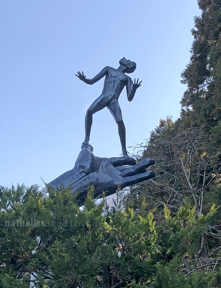
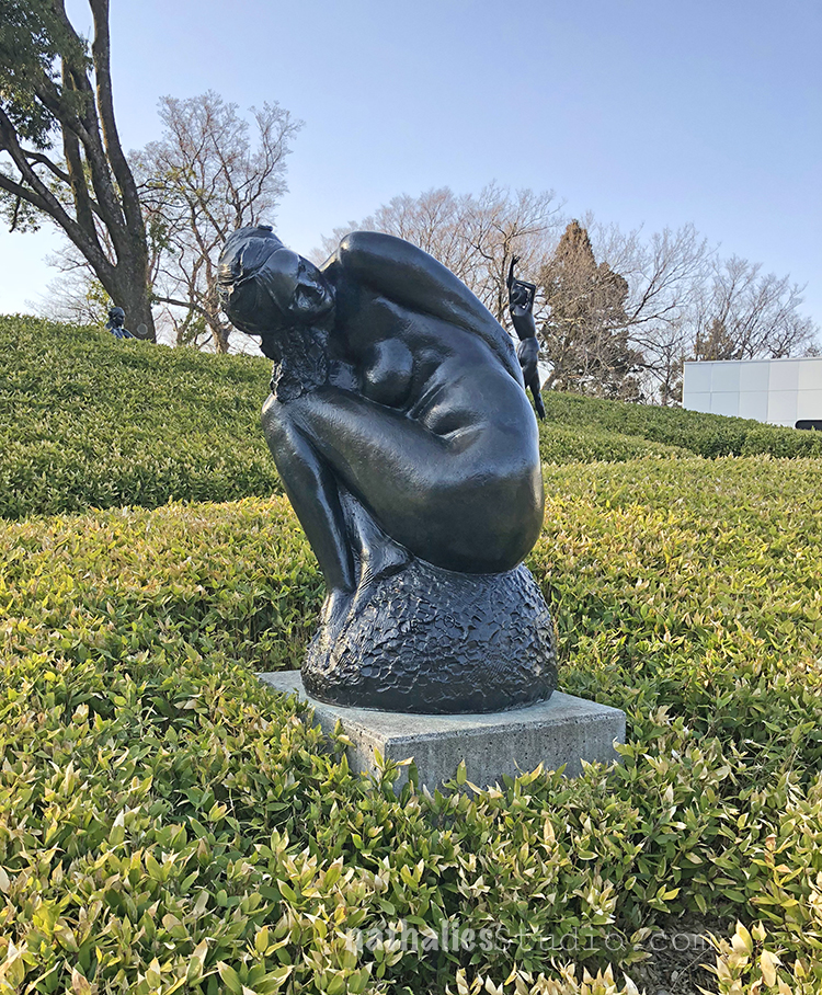
Carl Milles, The Hand of God  1954

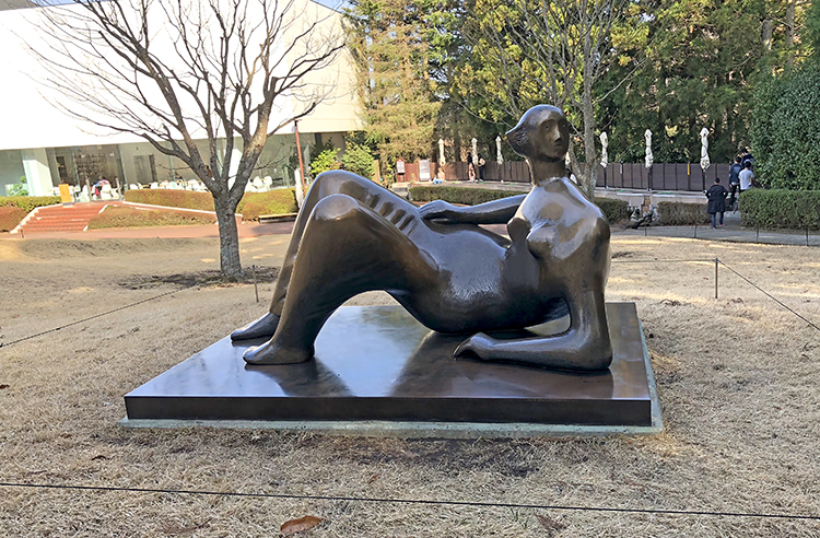
Henry Moore, Reclining Figure 1969-70

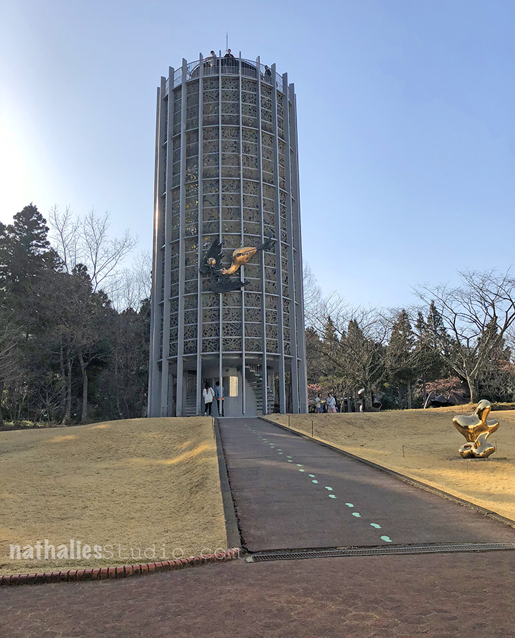
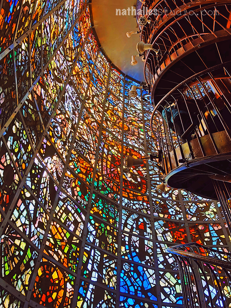
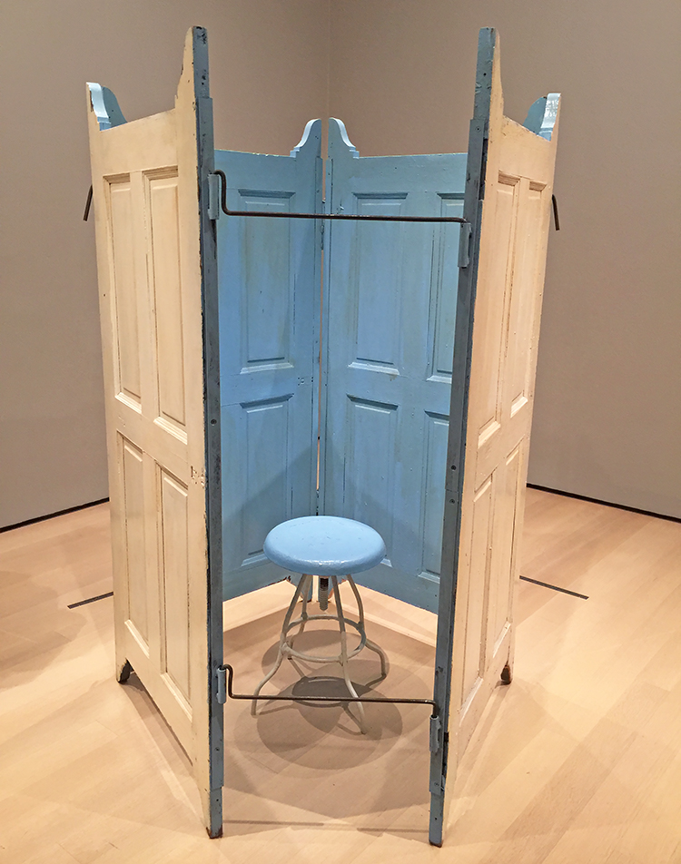
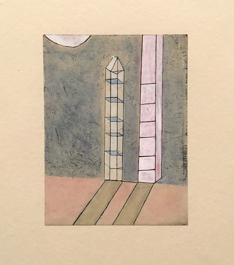
This tower was my absolute favorite- kind of unassuming but once you go inside the full beauty of the windows is revealed

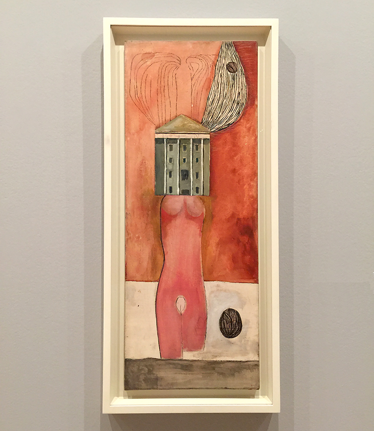
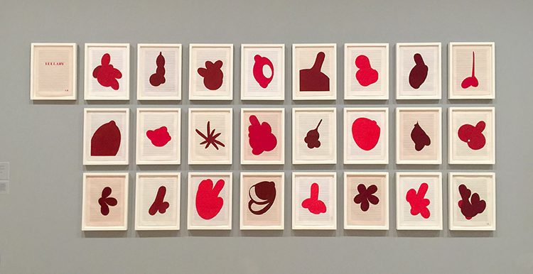
There are a couple buildings with collections of sculptures- including one dedicated to Pablo Picasso with about 300 pieces of his work (no photography allowed- so no photos of that part)


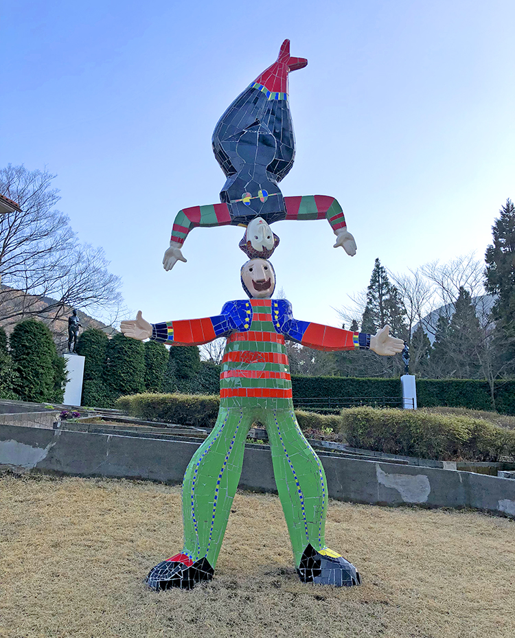
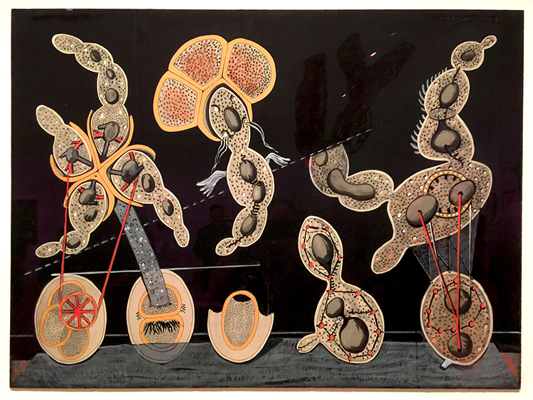
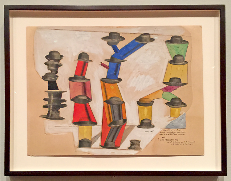
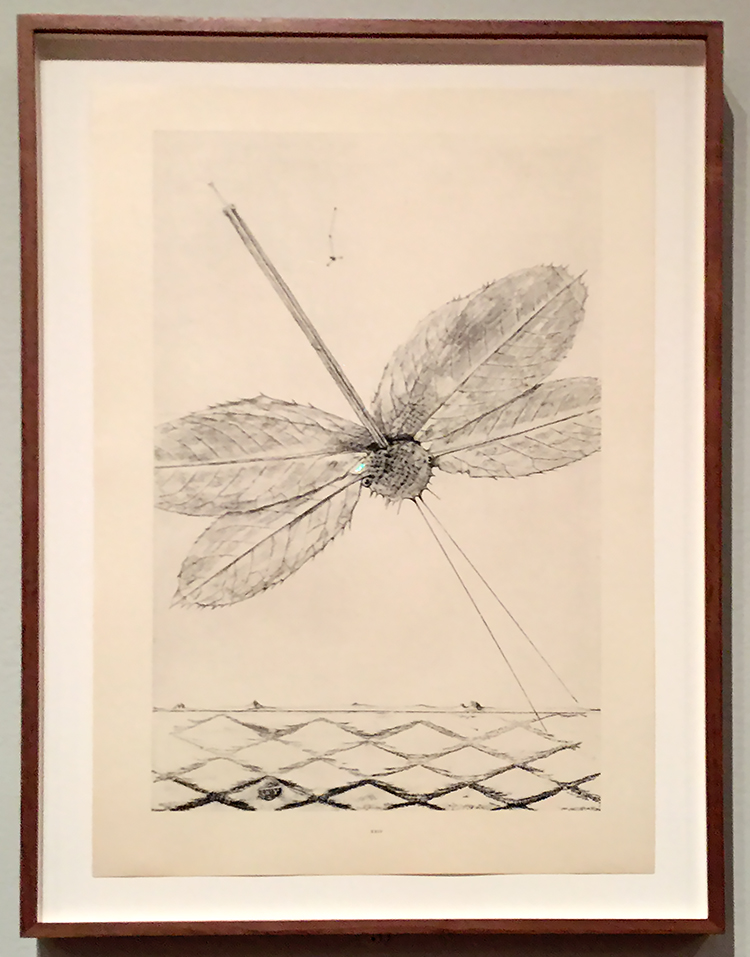
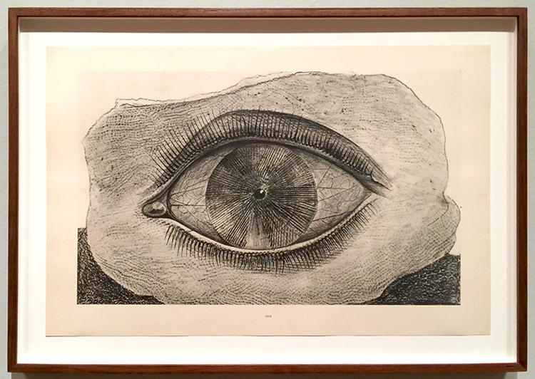
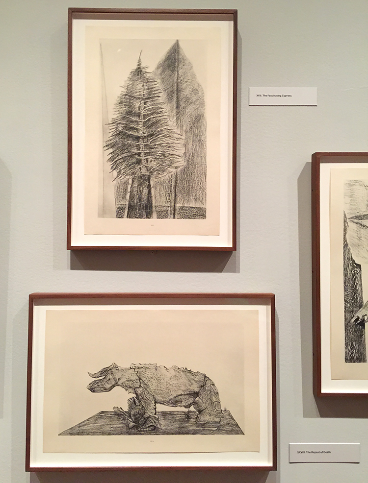
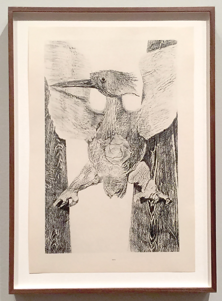
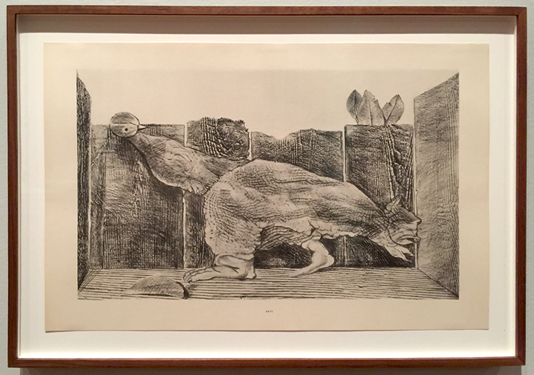
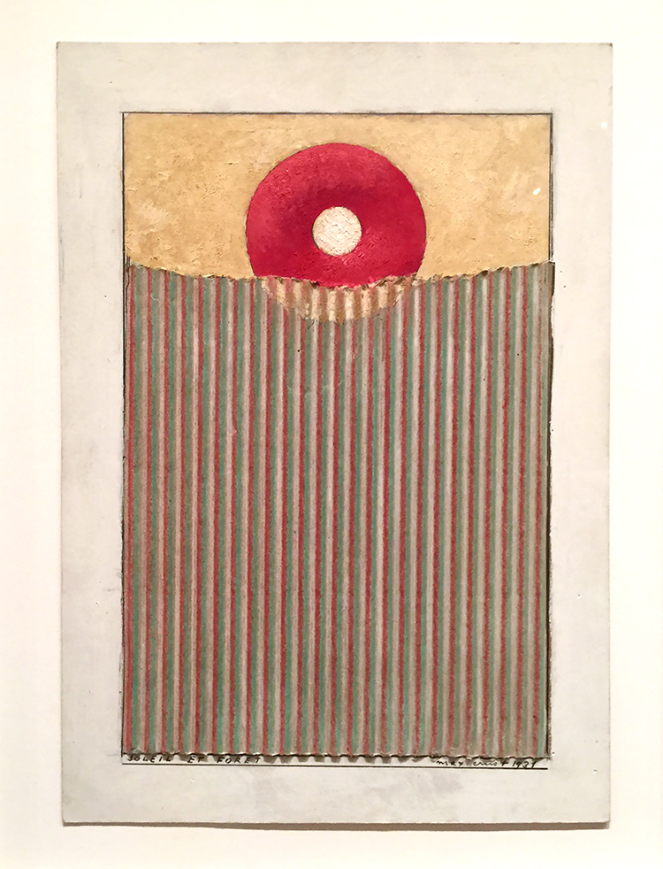
Oh Max Ernst you always make me laugh!

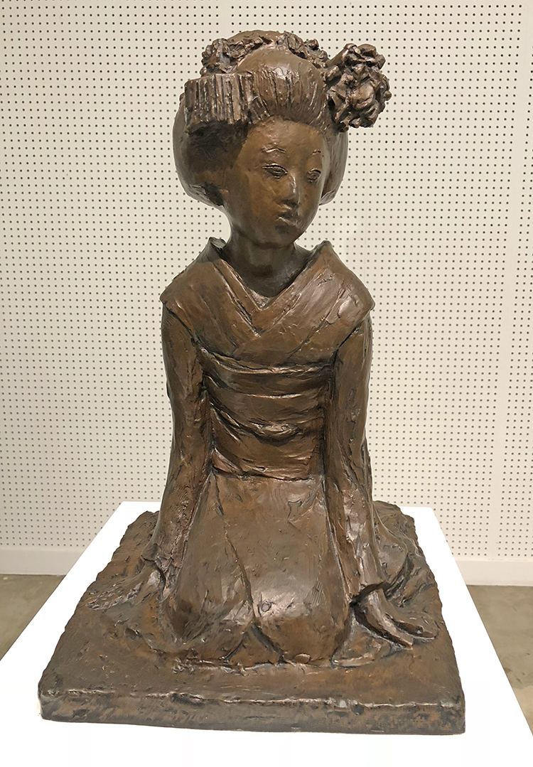
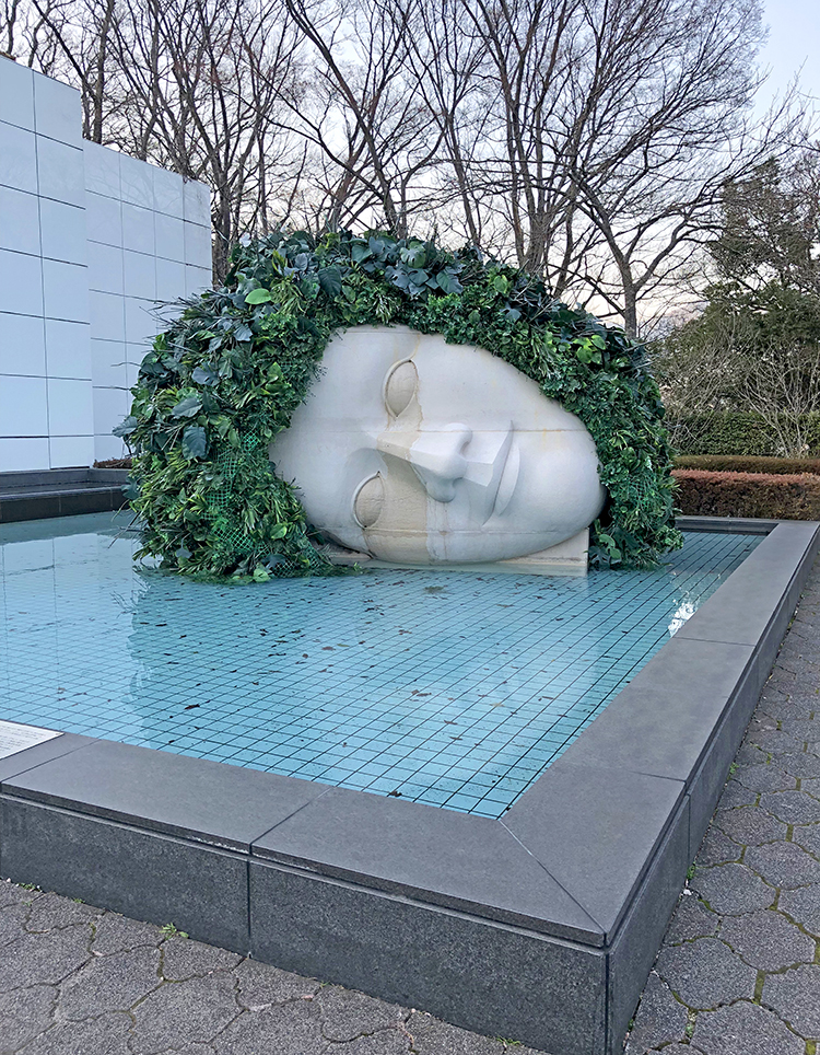
Seiko Sawada, Maiko (Dancing Girl) 1974
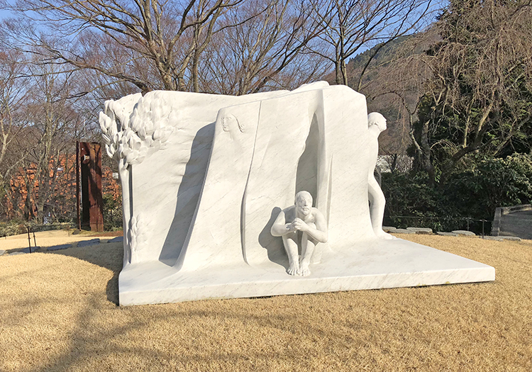
So beautiful!

Francois Morellet, Spere-Trames 1862-63

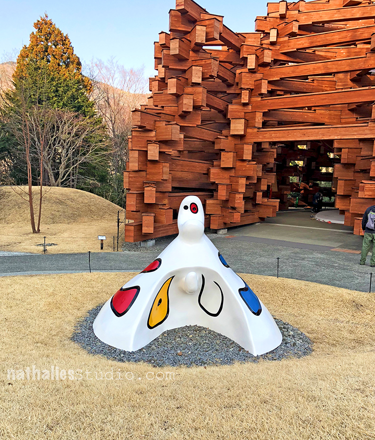
Joan Miro, Personnage 1972  in front of this wooden construction

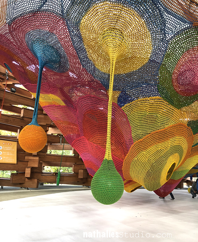
in which kids were playing in this colorful climbing thingi :)

Shin Yamamoto, Hey! 1992 – How can you not smile at this?

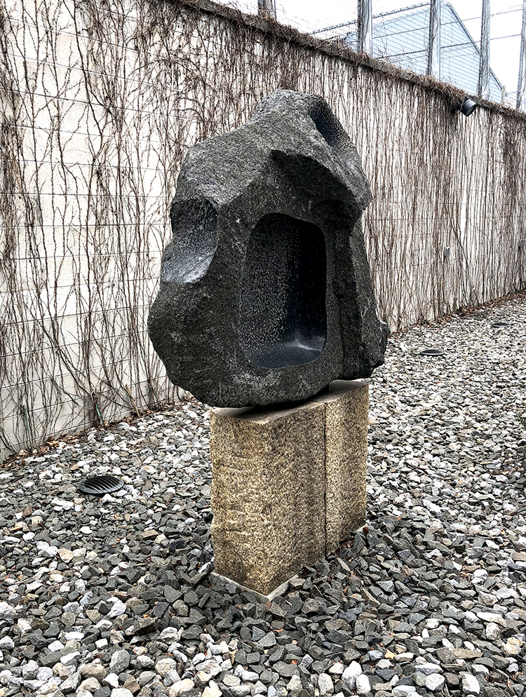
Isamu Noguchi – Rain Mountain 1982

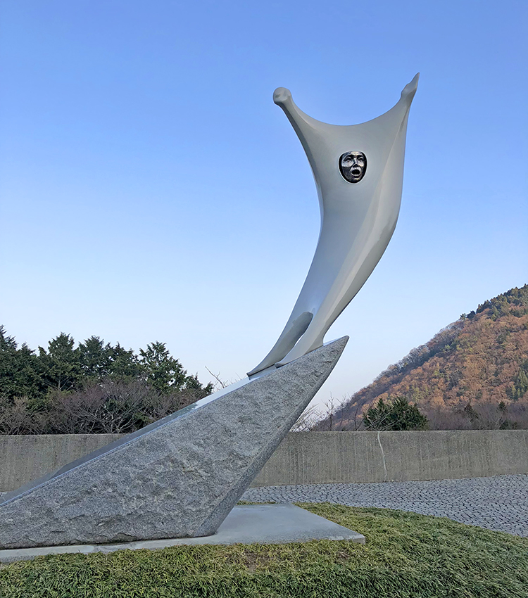
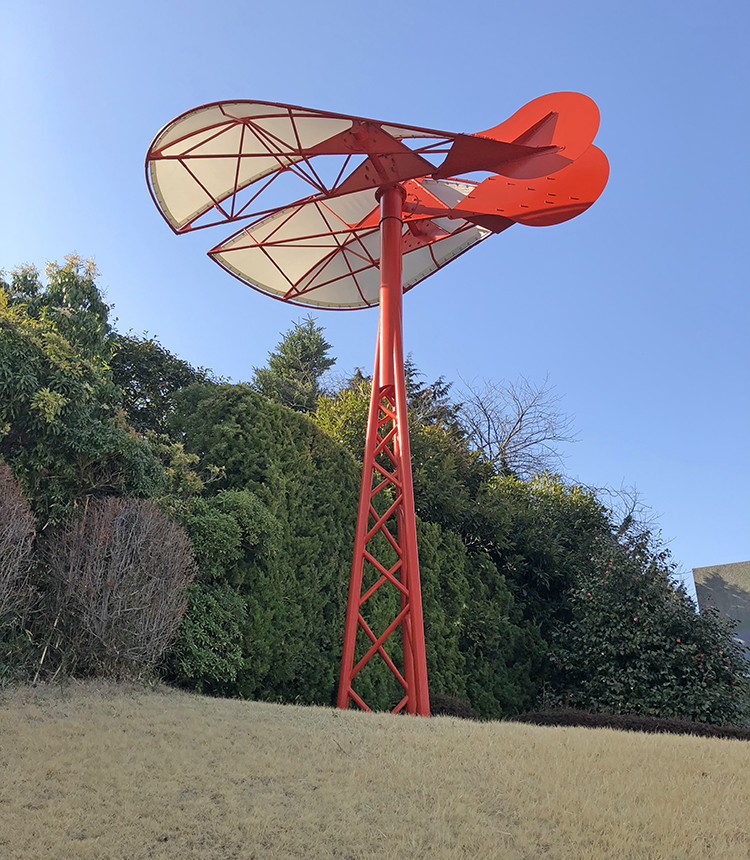
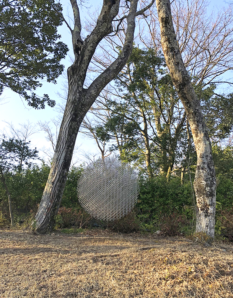
Takao Tsuchida, Sound of Wind 1988 – I loved this!!!

and this ….

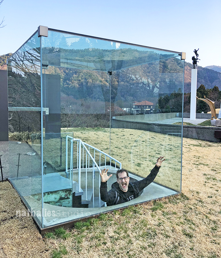
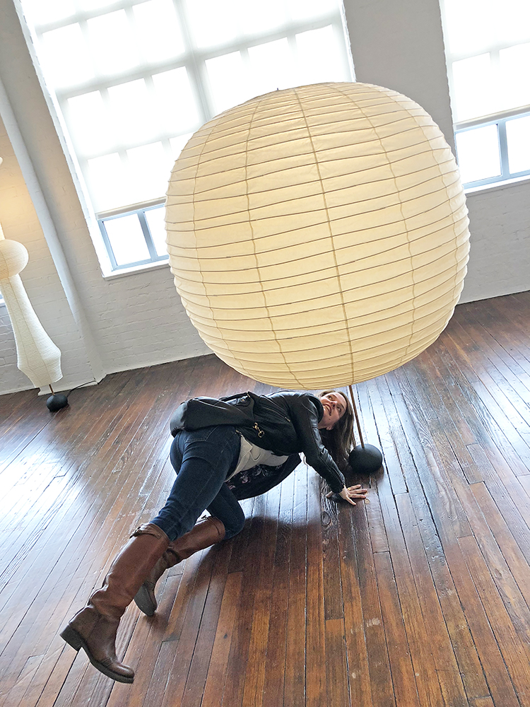
And …oh man …my husband…LOL – can’t bring him anywhere ;)
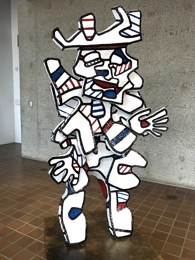
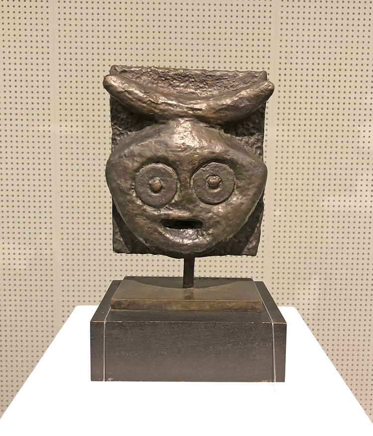
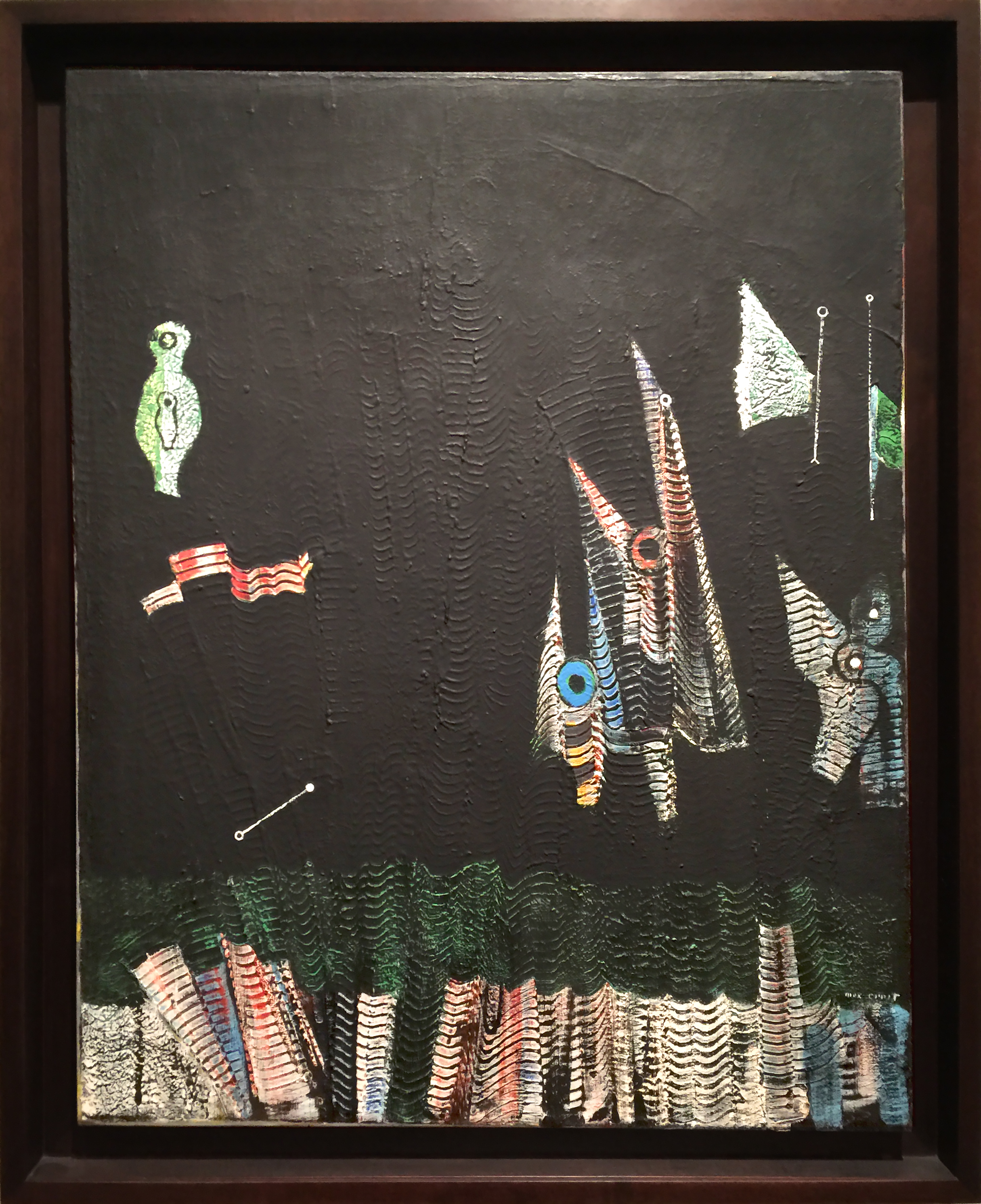
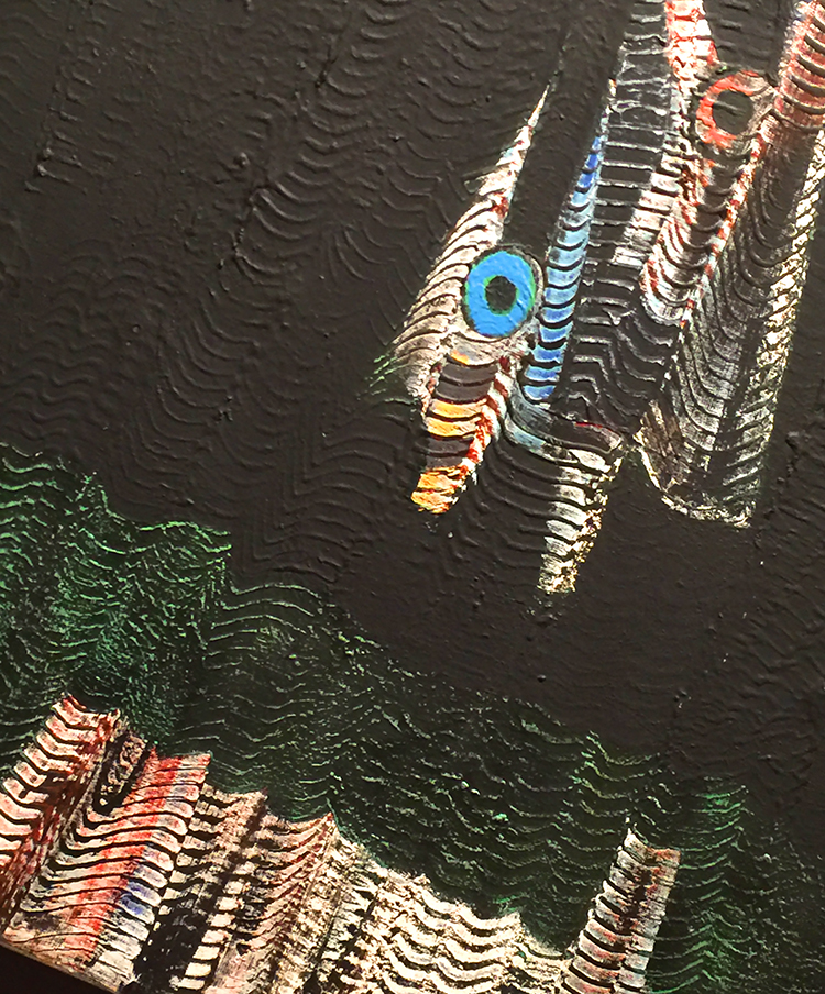
And a Dubuffet.

Hope you enjoyed this sculpture Art Stroll  in Japan. Which is your favorite sculpture I showed?

Comments (7)

  • Sue Clarke

    |

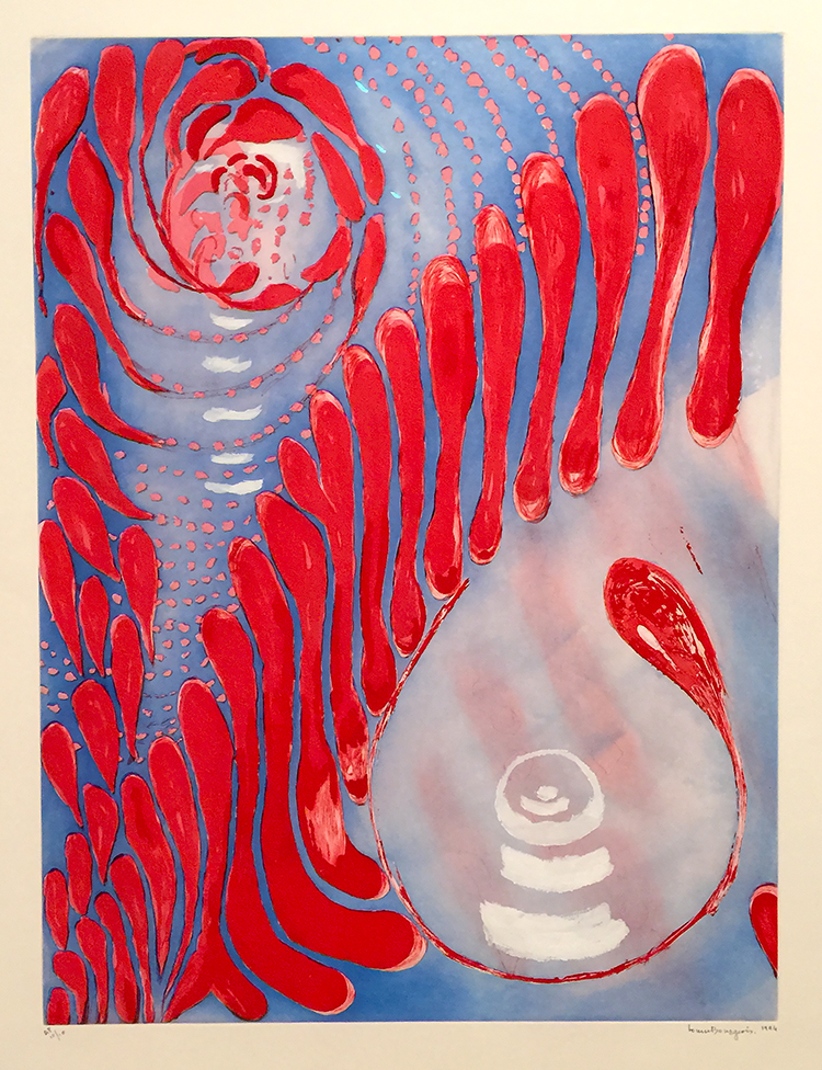
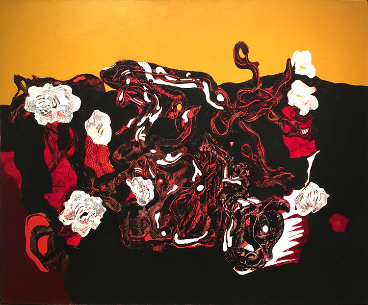
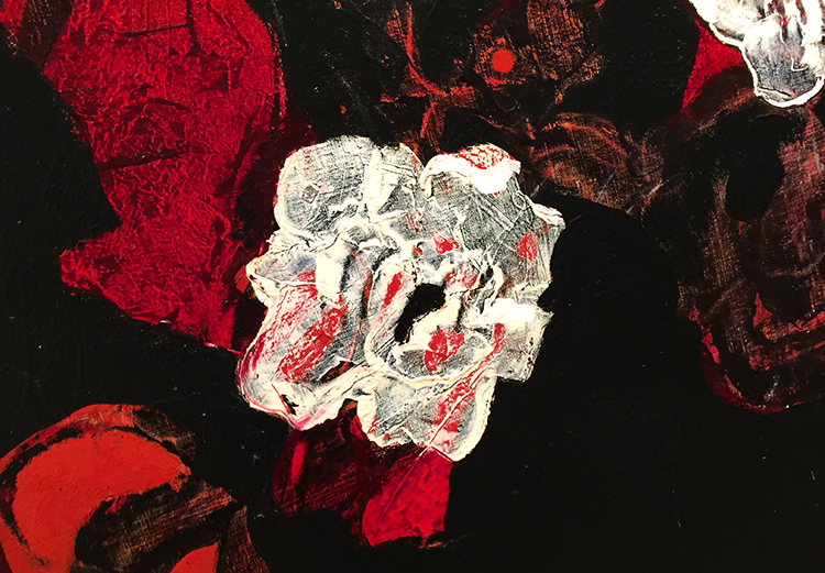
    The black and red one with a human interacting with it!
    I love the theme of so many of these…kinda like humans are just a small bit of the planet and yet we cover so much of it.

    Reply

    • nathalie-kalbach

      |

      I loved that one too – Art that brings out any reaction in people is fascinating but especially when it makes people doing something fun and mimick it.

      Reply

  • Jill McDowell

    |

    What an awsome experience. I’m so impressed that your husband set this little side trip up.

    Reply

    • nathalie-kalbach

      |

      Yeah …he is a keeper …guess I need to more jazz concerts to pay back – LOL

      Reply

Leave a comment

Art Stroll: Noguchi Museum, NYC

A couple weeks ago my friends and I went to the Noguchi Museum in NYC . Isamu Noguchi was an American Japanese artist (1904-1988) who is most known for his sculptures and later mass produced lamps.

Especially his lamp designs are known to many because of Ikea’s take on it – be assured though that his original lamps are so much more beautiful than Ikeas.

Loved this cloud of lamps above! the lamps are made of handmade paper on bamboo frames and they give a beautiful warm light.

.

It was wonderful to see his sketchbook of lamp designs

as well as some of his molds for his lamp -they are beautiful designs by itself.

Noguchi broke the mold for the lamp sculpture below so that only one would exist- it is stunning.

Here is a video on how those lamps are to this days are handmade:

Love it!

And here you see me actually in a lamp – that was such a cool feeling the light and the paper made you feel super cocooned. I want this as my reading area- wouldn’t that be something?


My friend Heather “needed” to see how the foot was attached

I loved Noguchi’s sculptures – some are amazingly textured- some are smooth.

I also loved the sculpture garden – I can only imagine how beautiful it will be in the summer.

While we were at the museum there was also an exhibition of the work of Gonzalo Fonseca (1922–97), an Uruguayan sculptor.

His work was so intriguing and I loved looking at the little niches and engravings.

A wonderful Art Stroll through a gem of a Museum – I highly recommend it. It is a bit of a hike from Manhattan since it is on Long Island – but if you are close by- check it out! Hope you enjoyed this Art Stroll!

Comments (2)

  • Donna B.

    |

    I also enjoyed watching the video! Thanks for sharing that!! It was amazing …

    Reply

  • Sue Clarke

    |

    Noguchi’s lights are so delicate. I really enjoyed watching the video and what patience he used.
    The sculptors made by Fonseca were fun to see and the details would make me want to study them for a while if seen in person.

    Reply

Leave a comment

Art Stroll: Modern Art at the Met, NYC

Loved strolling a bit around to see some of the Modern Art displayed at the Met a couple weeks ago while I was there. I just recently saw a documentary about one of my favorite illustrators Christoph Niemann – follow his instagram feed, it is brilliant and makes me laugh! – and he said that “experiencing art is the gateway drug”. I agree – and here is some of fine substance ;)

Henri Matisse, Seated Odalisque, 1926

I have said so much about my love for Matisse’s pattern play …there …once again …swoon

Rufino Tamayo, Children’s Games, 1959

Love looking at this and discovering the shapes and scene.

Kouros, Isamu Noguchi, 1945 – Marble

Marc Rothko, No 16, 1960

Color inspiration anyone? Love it!

Willem de Kooning, Easter Monday, 1955-56

Texture Galore and collage elements – swoon

Joan Mitchell, Sunflower, 1969

I love the texture rich and voluminous flower painting – so gorgeous!

Alma Thomas, Red Roses Sonata, 1972 – Acrylic on canvas

This was so intriguing ! Speaking of making colors sing!

Creative art is for all time and is therefore independent of time. It is of all ages, of every land, and if by this we mean the creative spirit in man which produces a picture or a statue is common to the whole civilized world, independent of age, race and nationality; the statement may stand unchallenged.
-Alma Thomas, 1970

Spectrum V, Ellsworth Kelly, 1969

LOVE!

Claes Oldenburg, Soft Calendar for the Month of August, 1962

Canvas filled with shredded foam rubber, painted with Liquitex and enamel – I thought that was interesting – painted with “Liquitex” . But then I remembered that Liquitex was the first water-based acrylic paint created in 1955 – the name deriving from liquid texture hence the name of the company later. I have never seen a painting stating the material instead of acrylic paint with Liquitex – I guess having worked with them made me stumble upon this.

Jim Dine, Two Palettes, 1963

Oil, acrylic, enamel and charcoal on primed canvas

Pablo Picasso, Guitar and Clarinet on a Mantelpiece, 1915

It was especially great to see this painting as I was reading Matisse and Picasso: The Story of their Rivalry and Friendship and this painting plays a little “story” in the book. The book is interesting btw but not extremely great.

I love the Met but it is just such a hike to get there and it is always so crowded. Strolling through the Modern Art Galleries at the end fo the visit was a wonderful way to catch some breath after an insanely crowded stroll through the Hockney and Cornell exhibition. The next art stroll will probably come from a Museum in Japan …we will see ;) I hope you will join me!

Leave a comment

Art Stroll: Joseph Cornell at the Met, NYC

A couple weeks ago I went to the Met and one of the exhibitions I enjoyed in this art mecca was a small exhibition “Birds of Feather” Joseph Cornell’s Homage to Juan Gris. I loved this exhibition because it is about an Art Stroll – which was inspirational and turned into some beautiful art!

In 1953 Joseph Cornell saw Juan Gris’s painting below at an exhibition

“The Man at the Cafe” , 1914 by Juan Gris – oil on canvas with newspaper collage.

This painting captured Cornell’s imagination and he created 18 glass fronted boxes, two collages and one sand tray over the following thirteen years in homage to Gris. Here are just a few of the boxes:


“Josette; Juan Gris #5” ca. 1959-60

This ox is named for Josette Herpin, Gris’s companion. In 1959 Cornell dreamed of a blue cockatoo and explained in his diary that “Josette came to life” . Cornell knew of her two portraits by Gris, where she sits in a black armchair the contour of which mimic the projected shadows of Cornell’s first cockatoos. He was likely inspired by the blue hues of her bust-length portrait. for the colored silhouette in this box.

Untitled (Juan Gris Series, Black Cockatoo Silhuette) ca. 1959-60

Cornell’s interest in cut-and-pasted paper was a direct response to Gris’s collages.

The artist lined his cockatoo boxes with pages from 19th century French texts, which he found in Manhattan book stalls. The photo below is actually the back of one of the boxes -I love this!


Other elements that characterize the Gris boxes are fragments of floral wallpaper, marbleized paper, and commercial labels.


I love Cornell’s boxes- makes me really want to do more assemblage again. I also loved seeing the original inspiration and then so many different versions on how he spun the inspiration. The first box shown here still has some traces of the inspiration  – but only if you know about the piece by Gris – but you would not know with the other ones without knowing about the story. Fascinating, don’t you think?

Hope you enjoyed this art stroll- see you soon for another one :)


Comments (2)

  • Sue Clarke

    |

    Pretty cool that Cornell was so inspired after seeing Gris’ art.
    I can see that they would be fun to view, but I have to say that it makes me ask the question:
    Why is that in a museum more than anything else that has been created?
    Interesting what is determined to be “worthy of a museum” art versus anything that someone around me might create.
    Just saying.
    I tend to enjoy art that makes me question it and evaluate just what the artist was trying to get across.
    Just my thoughts.
    Enjoy your weekend and thanks for sharing Nat.

    Reply

    • nathalie-kalbach

      |

      It is a good question- love it. I think you always have to see art also in context of art history. Joseph Cornell was a pioneer in using found objects to create 3D art and create assemblage pieces. Taking what once was used and beautiful and then regarded as garbage to create something new was still a pretty new concept and he was taking it a step further from Collage. He inspired many influential artists with his work like Robert Rauschenberg and Andy Warhol. What you see other artists doing today is what sprung from those roots. I think it is easy to forget how new and shocking some things were at certain times. But he who was a pioneer and inspired so many people after him, was also inspired of course by other artists- in this case by Gris who was part of the Cubism movement which again was CRAZY back then (and sometimes even for some people today) That is what fascinates me. I also think that those photos cannot convey the magic of his boxes – they are little wonder boxes. I love that you asked this question – I wonder myself with other art pieces a lot – but the greatest task is trying to find the answer or try to understand – wether it will be satisfying or not – it opens the world and makes us receptive to learn so much about so many things. That is what makes those Art Strolls besides the instant inspiration through color, texture, subject etc. so valuable for me.

      Reply

Leave a comment

Art Stroll: David Hockney at The Met, NYC

A couple weeks ago I went to the David Hockney exhibition at the Met. I was super excited about it because I have show some of his work in some of my classes as an inspiration to the students. His use of color is fascinating.

I loved seeing his early work- it was so different!

Loved the different materials he used. Lots of texture which is changing soon.

“The Cha-Cha That was danced in the Early Hours of 24th March” 1961

While at the Royal College of Art, Hockney went to a party where one of his fellow students danced the cha-cha for him.

“Rocky Mountains and tired Indians” 1965

What made me laugh out loud was that apparently the American Indians referenced in the title were “tired” because he needed to explain the presence of the chair, which he had only added as a compositional prop. That is hilarious, don’t you think? LOL

Already in the next paintings you can see his use of colors becoming more bold but also that he is tarting to paint more flat.

Love the different swimming pool paintings. His most famous painting “The Splash” was impossible to look at – there were sooo many people in front of it, it was insane.

Love this painting of Mount Fuji.

His people are always a bit weird to me- so lifeless and stiff …

I love the one below

It totally reminds me of a Matisse painting- the window, the iron work of the balcony…

And then below super fascinating

a photo collage – you could think it is a painting from afar, but nope-. He played with those photo collages for 4 years to do something else and exciting and this is his final one.

And then look at these colors and how bright and fun the next paintings are!

I love the details here and how he added texture here. The perspective is so cool!

And then again he changed …

“Colorado River” 1998 – Oil on canvas

I love how he painted this on different panels. The colors are so intense and it felt magnificent just as the view he depicted.

And then his recent work -paintings of his terrace view.

I love those so so much!!!

with the final one below which has this really cool shape !

This was a great exhibition. It was fascinating to see his work change so much throughout his live but I was mostly inspired by Hockney’s use of color. If you have a chance to see Hockney’s work in person – go and see it. You feel the color !

Comments (4)

  • stephanie

    |

    Hi Nat – how fab! I am still inspired by his work from my class with you last spring. I’d love to see it in person.

    Reply

    • nathalie-kalbach

      |

      awe- so glad you liked that! I hope you will have a chance to see his work in person- the colors are just incredible and my photos do not do them justice of course!

      Reply

  • Sue Clarke

    |

    I am usually a person who loves color and his is nice, but the first one is my favorite one (I think that it speaks to my past depressions).
    The people are flat, especially the woman in the pink bathrobe.
    Quite the change in style…thanks for sharing.

    Reply

    • nathalie-kalbach

      |

      Yeah the flatness of his work is interesting – the figures he painted in the sixties and seventies are so emotionless too I feel -it is a bit eerie :)

      Reply

Leave a comment

Art Stroll: Anselm Kiefer at Met Breuer, NYC

While at the Met Breuer I also strolled through the small Anselm Kiefer exhibition because as some of you might know I admire his work so much, the themes, the materials …. Some of the pieces I had just recently seen on an Art Stroll at the Gagosian Gallery , so I am not posting those again, but there were many other pieces that I loved to study.

Broken Flowers and Grass, 1980 – Gouache, acrylic, watercolor and shellac on photograph.

During the 80s Kiefer began reusing earlier self-portraits to create new works. Dressed in a crocheted gown, the artist presented himself as if asleep , but the broken flowers and grass cover his body as if he were dead and buried, the ultimate state of transformation.

The mixture of the photo and the crude painting on top fascinates me.

Aziluth, 2004 – painted photograph and collage on paper

Stunning- and guess how much I wanted to touch this piece. I just love the interplay of photo, collage and painting!

No touching of the one below:

Heavy Cloud, 1985 – Lead and shellac on photograph, mounted on cardboard

Kiefer has often used lead to represent something usually thought to be weightless. Here the title is a pun on “heavy Water” a synonym for radiation in nuclear reactors. Kiefer has pointed out that even though lead is used to “seal radiation” his Heavy Clout has “a radiation leak” symbolized by the yellow shellac streaks seeping form the bottom of the cloud in the direction of the bleak landscape.

Brünnhilde/Grane 1982/93 – Woodcut and acrylic on cut and pasted papers, mounted on canvas

Woodcut is a traditional medium in German art. Kiefer began to experiment with woodblock printing in the early 1970s and returned to it in the late 70s focusing on subjects related to German history and myth. Fo all theGermanic tradition evoked in his turn to the woodcut, his practice was nontraditional in his choice of a larger format and a visibly seamed composition. One of the artist favorite themes at this time was Grane, the sacred steed ridden by Brünnhilde, when she sacrificed herself on Siegfried’s funeral pyre at the close of Wagner’s opera Götterdämmerung.

The texture, the details, and then the size- just amazing!


His gigantic paintings are just breath taking- the texture – omg – I could sit in front of this forever. Unfortunately the hallway as the entrance to the exhibition where this was hung was so narrow that it was hard to take the painting in in total. Plus the museum was super crowded …even if not as crowded as in other galleries of the Met Breuer.

It was a very inspiring Art Stroll that let me think about more and different ways to integrate photos, collage and painting …printing …texture …all of it in my work. Hope you enjoyed the stroll as well :)

Comments (4)

  • Seth

    |

    What? Wait? Kiefer is at the Met Breuer? Who knew? Oh yeah – Nat did. Will have to get there too see this. Thanks!

    Reply

    • nathalie-kalbach

      |

      LOL maybe I will ping you next time and we go together ;) It is a small but fine little exhibition – combine it with the MET to make the day worthwhile ;)

      Reply

  • Kathryn Gallanis

    |

    I too love Anselm Kiefer. Many years ago there was an exhibit of Kiefer’s large works at the Art Institute of Chicago. I was in awe of the scale and texture. There was hay and dirt in one of the works! I had never seen anything like it. The principle that art maybe isn’t supposed to last was also new to me. I went back several times and loved it. Thank you for the great visit.

    Reply

    • nathalie-kalbach

      |

      I agree- I love how he is working so much with the concept of transforming art! It must be such an liberating feeling to do art with that concept- I wish I was there yet :) Thank you for joining me on the stroll Kathryn!

      Reply

Leave a comment

Art Stroll Edvard Munch at Met Breuer, NYC

We spend Super Bowl Sunday at the Met Breuer to see “Edvard Munch: Between the Clock and the Bed”. Munch  was a young boy when his mother died of tuberculosis; his beloved older sister, Sophie, succumbed to the same disease. He suffered from asthmatic bronchitis and other frequent illnesses, was haunted by depression, and drank and smoked too much. Even without knowing all this his paintings do tell the story.

Death in the Sick-Room, prob. 1893

“I paint not what I see, but what I saw,” Munch once said about his works.

Death Struggle, 1915

Model by the Wicker Chair, 1919 – 1921

Weeping Nude, 19413-14

Jealousy, ca. 1907, oil on canvas

In the doorway at the back of a green wallpapered room, a couple is seen in embrace. The man in the foreground with a whitened face appaears consumed with jealousy in response to the scene behind him. He is presumed to be the poet Stanislaw Przybyszewski and the woman in the background, his wife.


Despair, 1892


Despair, 1894

I loved seeing how in just one year his painting style of the same theme changed- look at the sky, the bridge!

On The Veranda Stairs, 1922 -1924

Veranda views and window views are a reoccurring theme as well .

Starry Night, 1893, oil on canvas

Starry Night, 1922 – 24, oil on canvas

this work belongs to a group of winter views from Munch’s veranda in Ekely. Light from the house creates shadows of the two figures who look out over the dark, snowy landscape.

By the way, both Starry Night paintings weren’t the only ones that left me thinking of Van Gogh, and when I did a little research I realized that wasn’t too far fetched.

“Researchers found, that van Gogh may never have been aware of the Norwegian artist, but that Munch was a great admirer of van Gogh’s work and often tried to emulate his approach.

Seen together, the works show that the artists took similar paths to developing their technical approaches to painting, and also indicate strong thematic affinities. It is also clear that each artist found his own distinct style.”

Sleepless Night, Self Portrait in Inner Turmoil, 1920

Self-Portrait: Between the Clock and the Bed” (1940-43).

Man with Bronchitis,1920

“Self Portrait With Bottles,” circa 1938.

By the Window, 1940

I liked this exhibition a lot. An emotional exhibition – you feel the pain conveyed by color and brushstrokes almost physically.

Thanks for joining me on this Art Stroll – I hope you enjoyed it. BTW- you can find all the past Art Strolls here.

Comments (2)

  • Yvonne B.

    |

    We saw this exhibition in San Francisco last summer–it was fascinating. Loved his self portrait with bottles. Glad you got to enjoy it, too!

    Reply

  • Sue Clarke

    |

    Sleepless Night is my favorite.
    Having suffered from depression in the past, I can say that he has nailed it in his paintings.

    Reply

Leave a comment

Art Stroll: Louise Bourgeois at MoMA

A couple of weeks ago Kim and I went to see Max Ernst at MoMA and while we were at it we also went to see the Louise Bourgeois exhibition. Louise Bourgeois was born in 1911 in France and died in 2010 in NYC.

“Spider” (1997), steel, tapestry, wood, glass, fabric, rubber, silver, gold, and bone

Now the reason why I say that in a kind of “well guess we have to”-manner is, that I mostly associated Louise Bourgeois so far with her spider sculptures and well…I am not a particularly big fan of spiders ;)

But I am happy to say I was pleasantly surprised and happy I went to the exhibition! I came to like her work a lot.

Soft Ground and Drypoint etching techniques were a big part of the exhibition.  – and I found her studies of lines very interesting

so did Kim ;)

These prints were actually made in her last two decades of her life and the end of the show in the atrium of MoMA but we started there and it pulled us in to go to the exhibition rooms.

Funny enough a day after we saw the exhibition I got an email from my friend Bruno Nadalin offering a Drypoint Etching Class and needless to say- I signed up – I cannot wait :)

I was fascinated by her organic shapes, the color choices and also the repetition of themes. But when I saw the first piece with fabric I was super intrigued.

Her wood sculptures are beautiful

she also incorporated a lot of architectural symbols in her work

this one is called the Happy House 2001-2003 Drypoint with selective wiping – on the bottom with added pencil and crayons

She also did a series of room- like sculptures called cells in 1991 – about sixty of them. Some are filled with a haunting mix of her personal belonging. She often used the color blue for its serene and calming effect.

Side by Side – Etching with watercolor and gouache addition

more drypoint etching

This is so beautiful until you really explore the shapes and then the Lullaby – as this work is called is starting to be scary!

“You can …remember your life by the shape, the weight, the color, the smell of clothes in your closet” Louise Bourgeois

Although Bourgeois was raised in a family of tapestry restorers, she introduced fabric in her art only when she reached her 80s.

She made prints on fabric napkins, hand towels and even shirt cuffs. She enjoyed the tactile qualities of the surfaces and the ways they absorbed ink.

She also created fabric books, filling the pages with abstract designs fashioned from bits of old garments, stains, scorches and cigarette burns testify to their histories.

Hours of the Day, 2006 – Fabric illustrated book with 25 digital prints

Bourgeois took advantage of digital printing for the ease fo printing on fabric. Every spread has it’s own text as the hour on the clock advances. She was already in her mid nineties when she made this book!

The patterns and colors are just so striking and soothing – I love this and thought of all the fabric pieces that I saved from me great aunt -(an apron, a dress, handkerchiefs) and I thought it would be really cool to make a book out of those pieces – I will chew on it – since my fabric- sewing- skills are …ahem….you know ;)

Stamp of Memories- 1993 – drypoint, with metal stamp additions –

Oh man- I love this so so so much- I cannot even begin to tell you – LOL

Arch of Hysteria, 1993

“My early work is the fear of falling. Later on, it became the art of falling. How to fall without hurting yourself. Later on, it is the art of hanging in there.”

Amazing – I am in awe and I am so glad we went in. It was a very inspiring exhibition making me want to learn more about Louise and her life! Have you been surprised lately by an artist you thought first to be not quite your taste and then starting to be inspired by her/him?

Comments (6)

  • pjayhansen

    |

    Thank you for sharing, it is delightful to see the exhibits and experience the artists works being shown. If it were not for your posts, I would miss the opportunity to see them. ❤️

    Reply

    • nathalie-kalbach

      |

      Wow that was interesting Elizabeth- thank you for sharing.

      Reply

  • friedaquikter

    |

    Thanks so much for posting this, Nathalie. I don’t often comment on your posts but always read them, specially the ones abour your museum trips. In this case you inspired me so much that I just had to get the book that accompanies this exhibit. Just wish MOMA was on my doorstep!

    Reply

    • nathalie-kalbach

      |

      Thank you so much Frieda! Oh I love that you got the book- I hope you get lots of inspiration out of it. My favorite was really how she used her own clothing to create fabric books- so amazing. Cannot wait to see your magic inspired by it :)

      Reply

Leave a comment

Art Stroll: Max Ernst at MoMA

The week after Christmas or as we Germans say “in the week in between the years” my friend Kim and I finally made it to the Max Ernst Beyond Painting exhibition at MoMA. It was on my bucket list ever since it opened and we just made it as it closed at the end of the year.

The Gramineous Bicycle Garnished with bells the Dappled Fire Damps and the Echinoderms Bending the Spine to Look for Caresses, 1921 – Gouache, ink, and pencil on printed paper

Max Ernst (1891-1976) is a huge inspiration – his art is funny (just read the title for the painting on the top)  and above all- a huge amount of Mixed Media techniques we know are coming from his genius experimentations. Ernst was a key member of the Surrealist movement

The Hat Makes the Man, 1920 – Gouache, pencil, oil and ink on cut-and-pasted printed paper

Here Ernst overpainted a page from a millinery catalogue showing women’s hats

Below are some of Max Ernst’s Frottages

These images are created by placing paper atop of various materials, e.g., wood floorboards, twine, leaves, wire mesh, crumpled paper, crusts of bread, and rubbing the surface with a pencil or crayon.

Inspired by the resulting textures, he added details to transform them into fantastical landscapes, objects and creatures.

Frottage is the french word for rubbing.

Can you see the leave rubbing in the eye?

What an amazing idea to create something new or just start from a blank page.

Max Ernst art work shows over and over again birds.

He also did sculptures- I loved this one so much:


Bird Head – 1934-1935  – Bronze


Birds above the Forest, 1929 – Oil on Canvas.

Ernst began this painting by scraping pigments across the surface with a toothed plasterer’s comb. This technique is also called Grattage.

There is a similar painting using this technique by Max Ernst in the Kunsthalle in Hamburg – showing flowers made with those grated heads- I just love it so much.

Sun and Forest, 1931 – cut-and-pasted cardboard with oil, gouache, and pencil on paper.

Kim and I called this one donut in a bag.

To the Rendezvous of Friends (The Friends become Flowers, Snakes, and Frogs), 1928 – oil

For this painting, Ernst built up paint in stages, then used grattage or scraping with hard-edged tools like spatulas and palette knives to expose the underlayers and create surface textures where exceptionally fluid paint is pushed to he tool’s edge.

I love this – it is something I sometimes do in my art as well but of course working with acrylic paints, limits the time and amount of layers due to the fast drying time of acrylic paint.

Mundus est Fabula (the world is a story), 1959 – oil on canvas

look at the amazing dimension and depth he created by using a squeege to scrape off the paint – soooo beautiful.

It made me so happy to see it!

Erst also did a lot of book illustrations and I was especially mesmerized by his self invented hieroglyphic script. Isn’t that the coolest?

Another wonderful bronze!

And last but not least those super tiny etchings (about ATC size) with watercolor and ink additions

A wonderful and inspiring Art Stroll for sure. I cannot wait to play with some of the ideas that popped up in my head while looking at his artwork. I hope you enjoyed it as well :)

Comments (2)

  • Sue Clarke

    |

    The World Is A Story…WOW!
    The “bagel in a bag”…LOL.
    I would love to have that last sculpture in my living room. 0000…so cute.

    Reply

    • nathalie-kalbach

      |

      I love that sculpture too – glad I made you smile Sue :)

      Reply

Leave a comment