Creative Squad

Creative Squad: A New Day – Robin Seiz

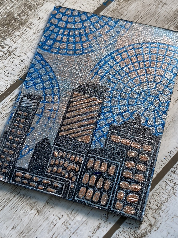
Hello from my Creative Squad! Today we have a post (and video!!!) from new member Robin Seiz – sharing her mixed media panel painting using my Midtown Minis and Central Ave foam stamps and this month’s theme: A New Day – Let’s try something new today :) Although these are tumultuous times and we never know what each new day will bring, it also seems like the perfect time to throw caution to the wind and just jump into something new with both feet. Try a new material or technique or approach. Why not? Today is a new day… and tomorrow is too!


I am very excited to be one the newest members of Nat’s Creative Squad. When I thought about the theme for the month, A New Day, I immediately thought about the morning. (even the song in my video is called “Morning Mood”), but as often happens in my artwork, as I worked on this little scene, I felt more of an evening mood. But really, don’t we each have the “promise of a new day” every evening as the sun sets? Whether out day was wonderful and we look forward to a repeat for the next day or our day wasn’t so good and we look forward to tomorrow —— that is promise of A New Day.

In this project, I worked with new paints (as my New Day theme) and I have to say that I absolutely love them. They are paints by Art Alchemy and they come in both a variety of finishes and a variety of yummy rich colors. I also hadn’t worked with Nat’s Central Ave Artfoamies and I see so many uses for them for the future.

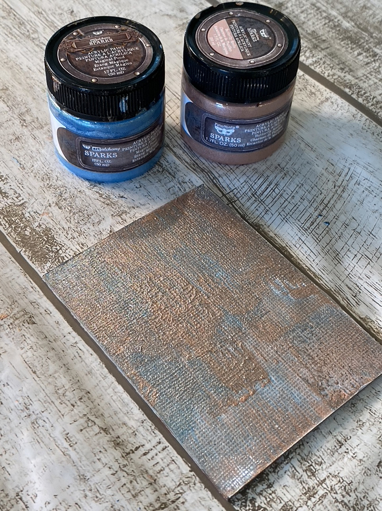
I started this project with my gel plate, the Art Alchemy Spark paints, (colors Butterfly Spells and Magical Pond) and a 3” x 4” Art Bite Panel. I often use my gel plate to put paint on a substrate whether it’s a piece of paper, canvas or something like what I used here, an Art Bite. I do this because I like the organic look which always includes lots of texture.
Once I was happy with the finish on the Art Bite, I used VersaFine Clair permanent Nocturne ink to stamp the Midtown Minis Artfoamies on the substrate.
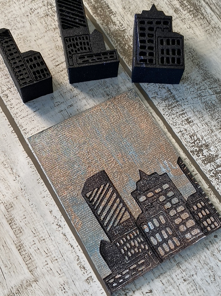
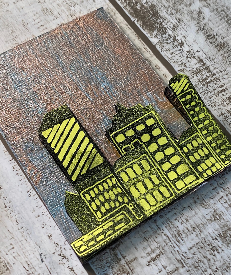
The next step was to stamp and cut out a mask of the Midtown Mini Artfoamie buildings so I could apply it to the buildings. This allows for the buildings to be in the foreground and the Central Avenue Artfoamie to be in the background.
To apply the Central Ave Artfoamie, I used Art Alchemy’s Metallique Paint in Deep Waters blue.
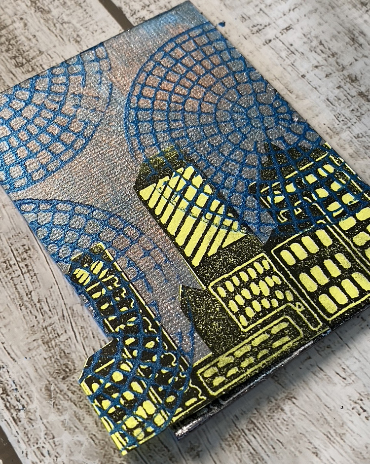
Since I was seeing more of a evening, sunset sky, I applied the Butterfly Spells paint I used in the background with a #2 rounded brush for the detail and a #6 flat brush for the larger windows and spaces giving the piece and evening glow.
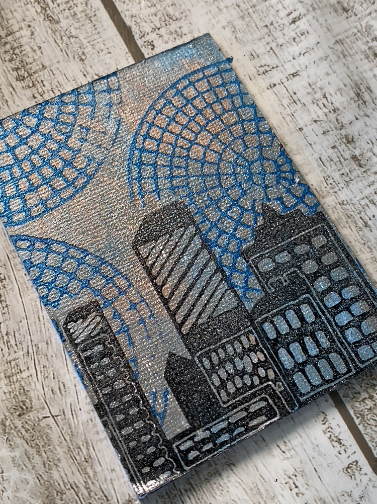
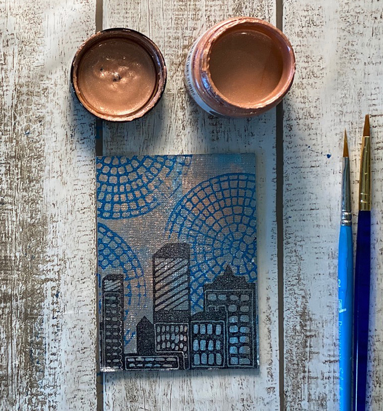
The finishing touch was to apply a Posca White Paint Pen .7mm to outline the piece.
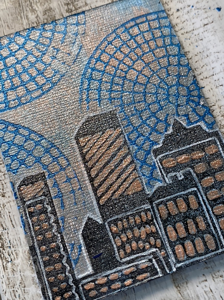
This piece could be framed or used as is to sit on a shelf.

It’s an easy project and, all told, it probably took me about 60 minutes to complete from start to finish.


Thank you Robin for this gorgeous panel – love the color palette and your making technique!

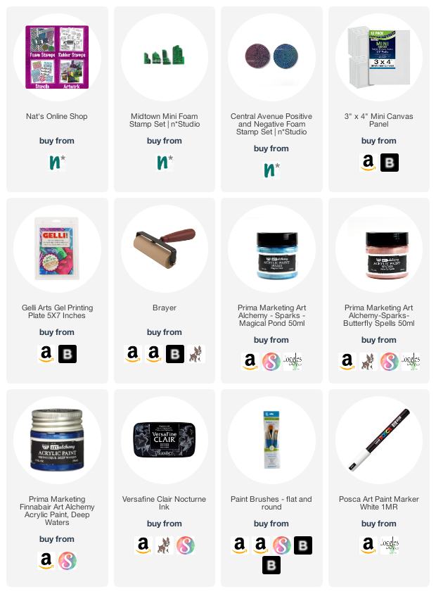
Give it a try: you can find all my Foam Stamps in my Online Shop and here are some of the other supplies Robin used:
Feel inspired? Working on something yourself that you’d like to share?  I love to see how you interpret our monthly themes. Email me how you used my stencils and stamps with the theme and email me an image – I would love to share your projects in my next  “n*Spiration From Around the Globe“.

Comments (2)

  • Mary Cheng

    |

    Love the demo. Must see if I can get the building stamps in Australia. I do miss going to the craft shows this year, but with COVID, no shows to go to. However, I may have missed out on an online show!

    Reply

  • Rebecca

    |

    Wonderfully done and the directions are great!

    Reply

Leave a comment

A New Day – Emilie Murphy

Hello from my Creative Squad! Today we have a project from Emilie Murphy that will transform the outside of your art journal. Emilie is using my Buenos Aires Border, Valley Road, Gnarly, and Signals foam stamps and this month’s theme: A New Day – Let’s try something new today :) Although these are tumultuous times and we never know what each new day will bring, it also seems like the perfect time to throw caution to the wind and just jump into something new with both feet. Try a new material or technique or approach. Why not? Today is a new day… and tomorrow is too!


Hi there! Hope you are doing well.

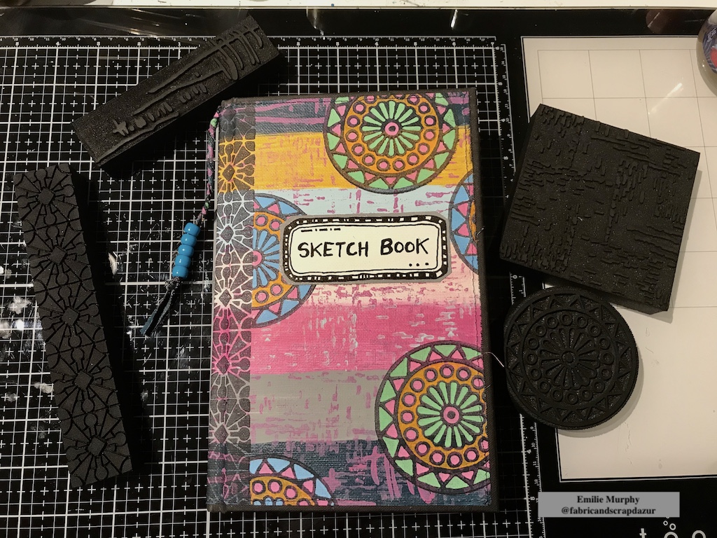
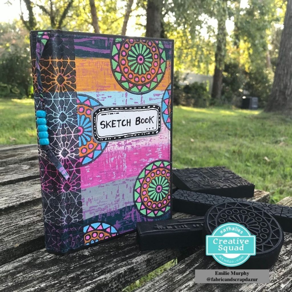
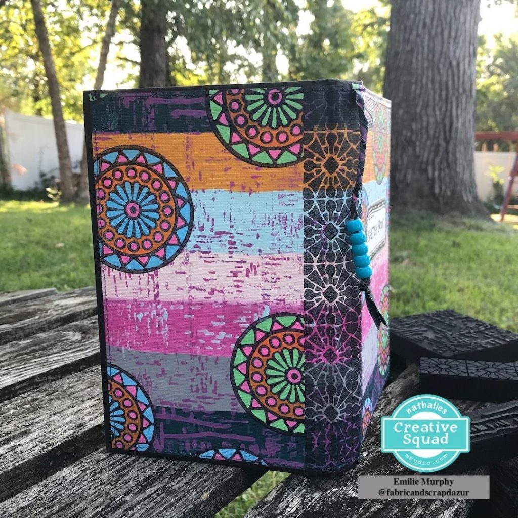
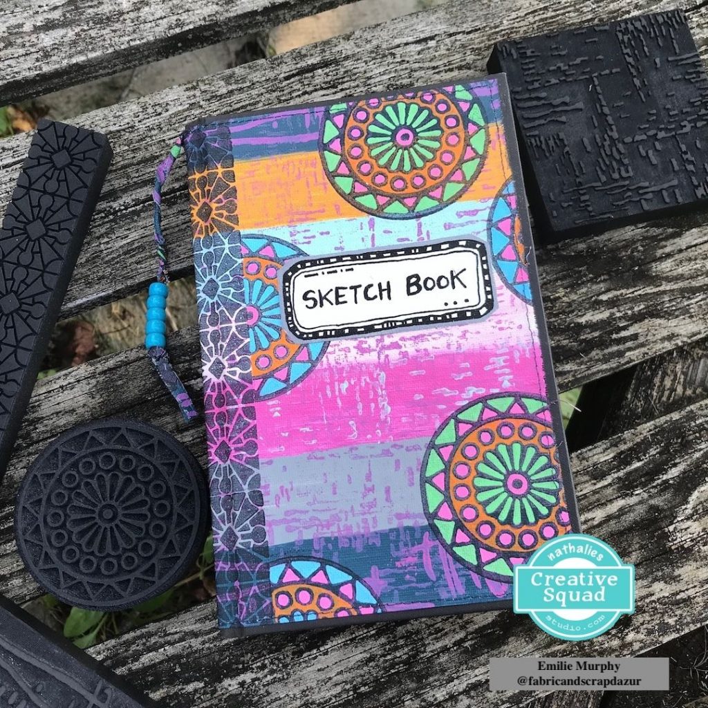
As we have to try something new this month, I decided to make a cover for my sketchbook with a sheet of Canvas. It’s not what I usually do when I make a cover for an art journal or embellish the cover of a notebook that I purchased. Therefore it’s a new technique for me, and I tried using only foam stamps and a single canvas sheet.

Let me show you how quick and easy this technique is. Foam stamps are such great tools for that purpose.

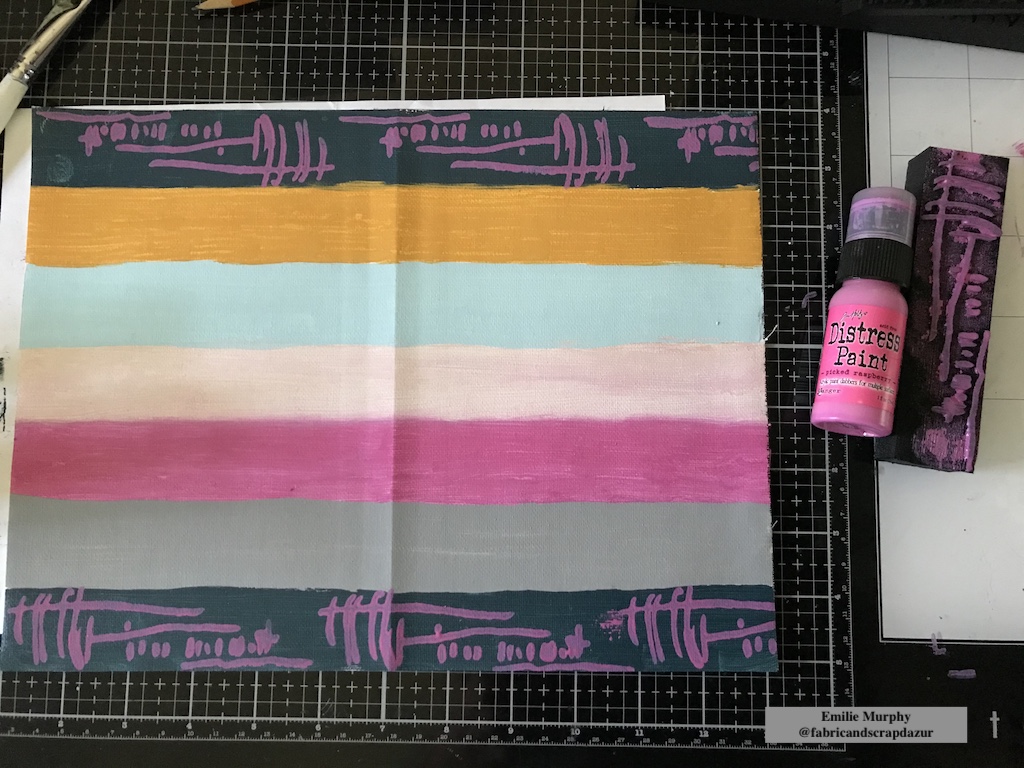
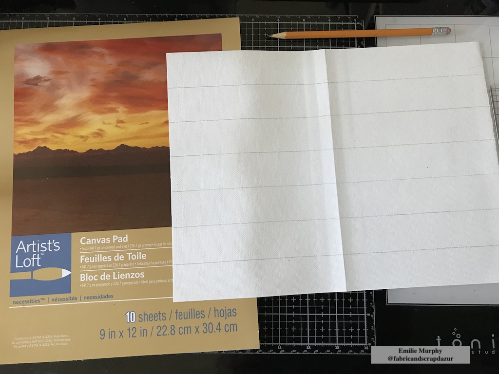
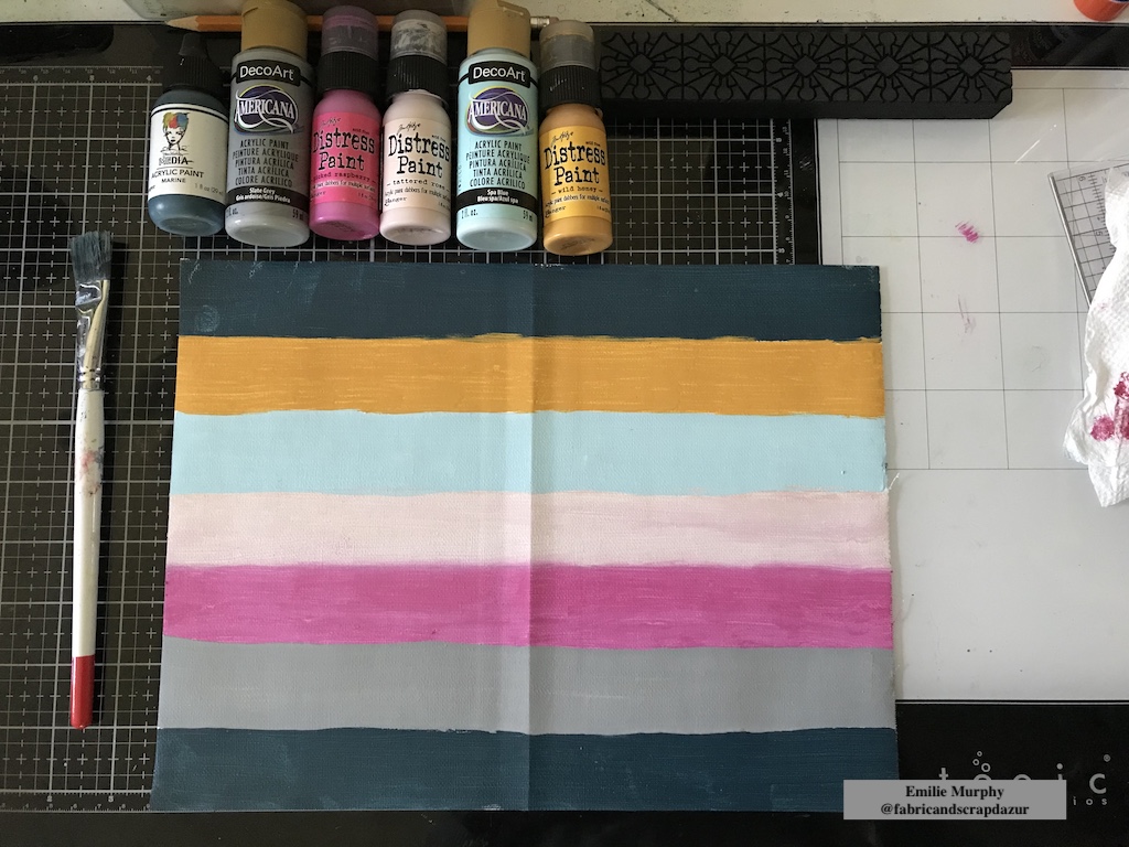
I started to trace lines to get equal strips on a 9×12 canvas sheet. I used the side pre-coated with gesso.

Then, I applied different acrylic paints I have in my stash to color the strips.

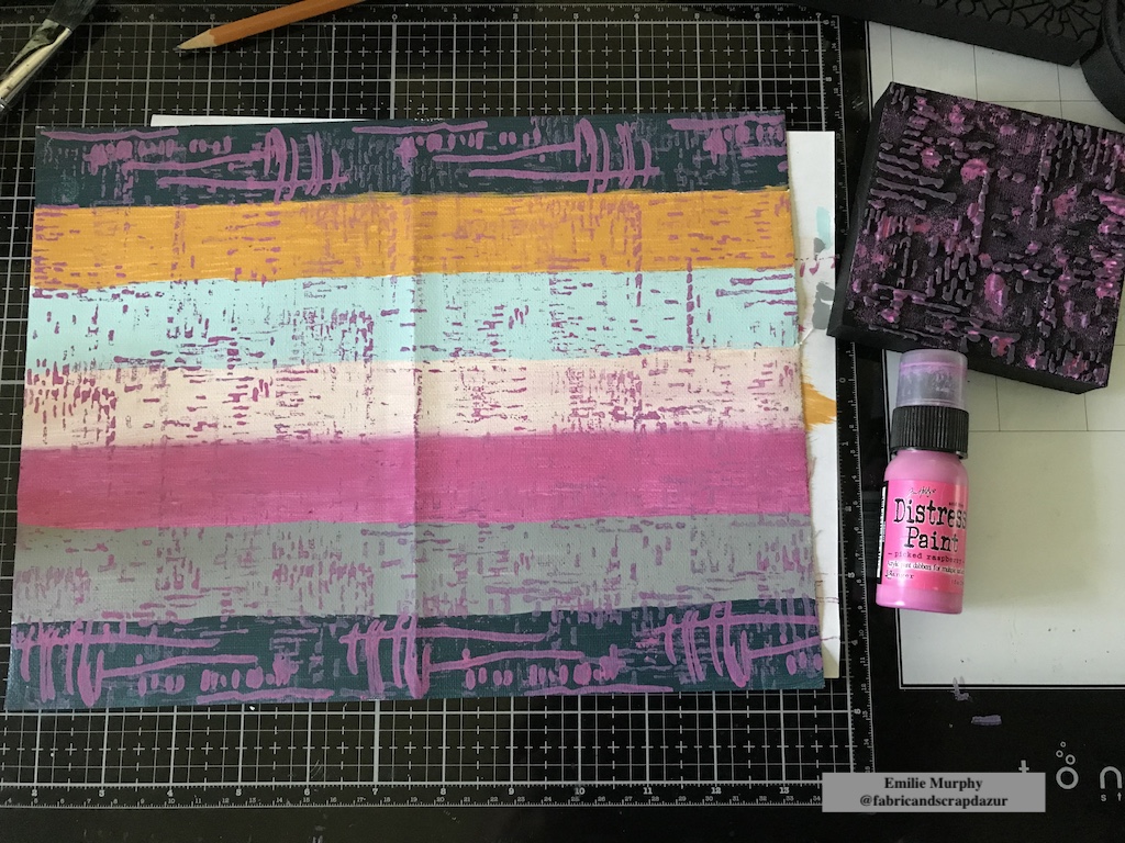
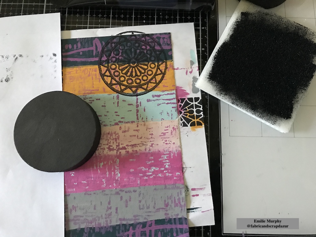
I added some texture with the Gnarly and Signals foam stamps on all the background to unify all the strips together.

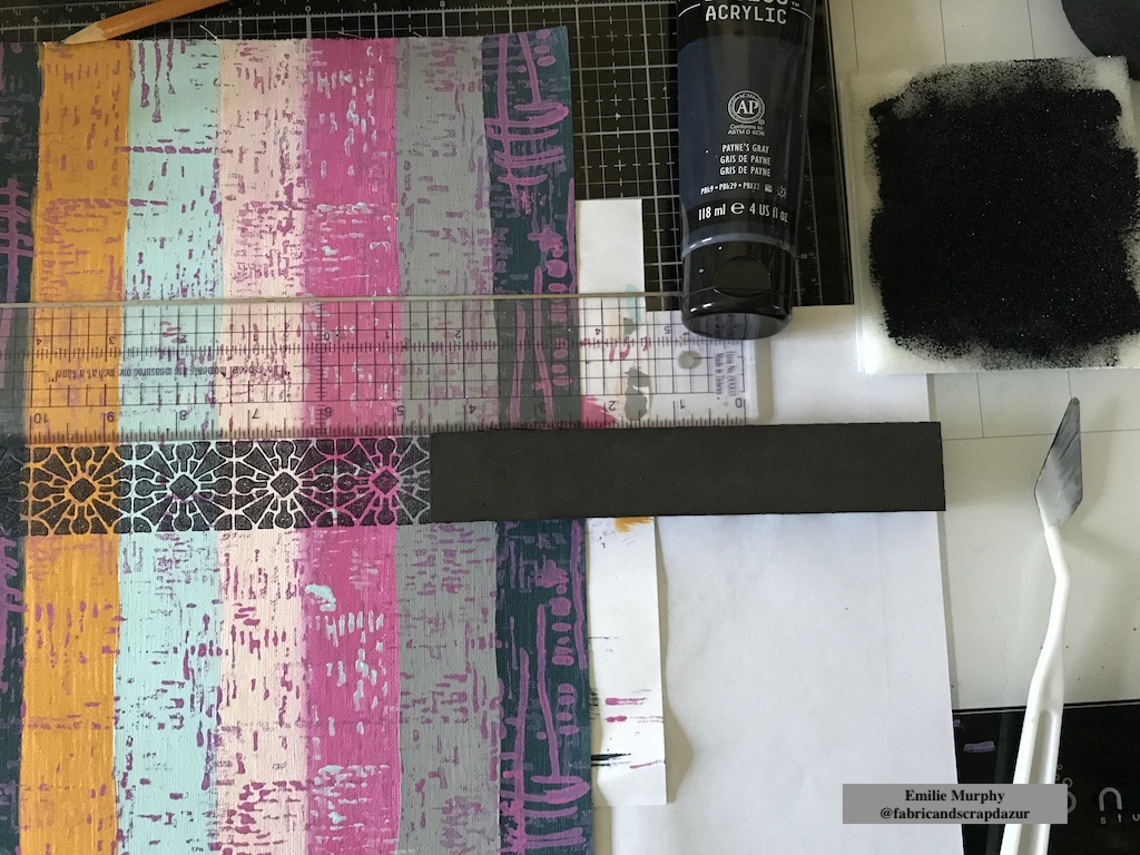
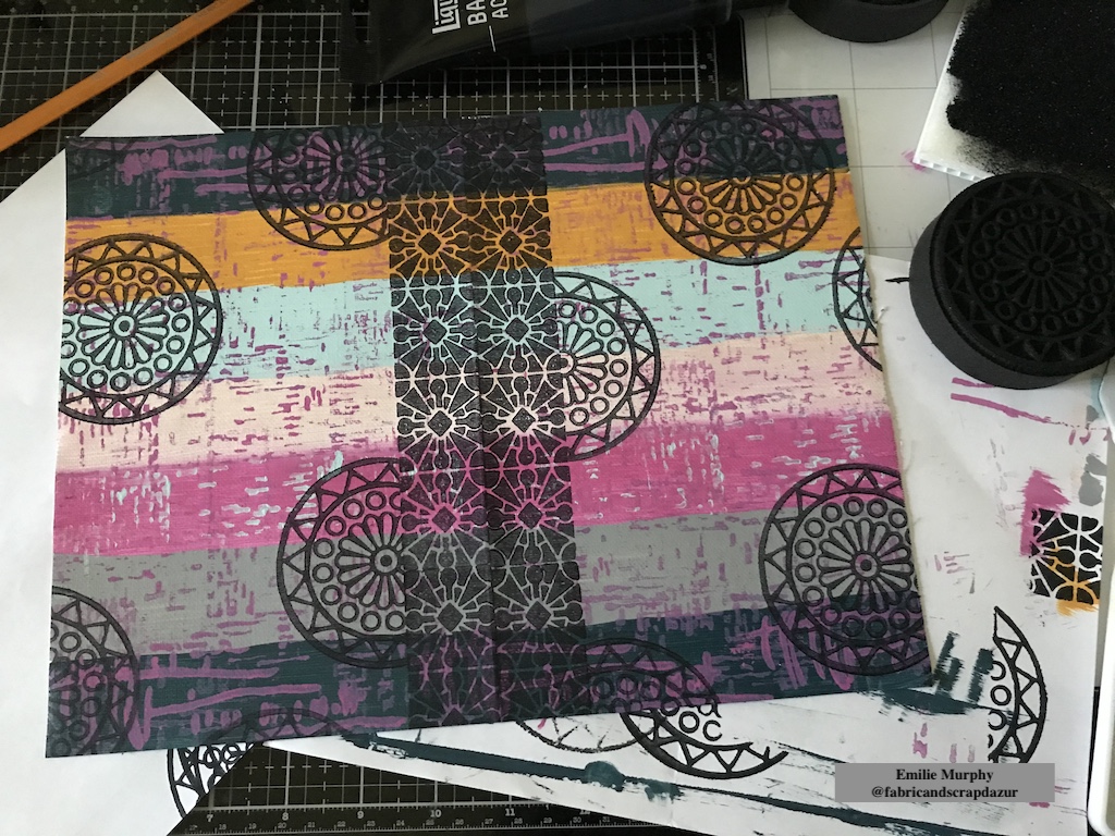
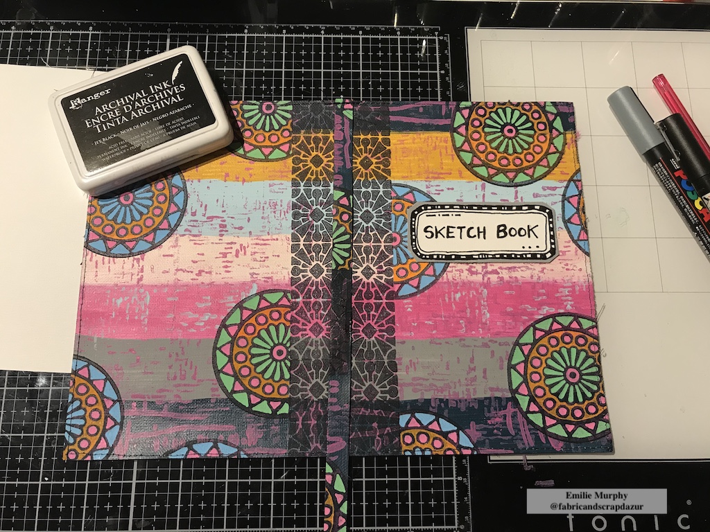
As I wanted to show up an hinge of my sketchbook, I stamped the middle part of the cover with the Buenos Aires Border foam stamp. First, I slightly folded my canvas sheet in half to mark the middle. Then, I used a ruler to be able to stamp straight. I didn’t mind to have an imperfect impression for the background texture but for the hinge part I wanted to get a crisp impression so I used a “stamp buddy” (that can be purchased on the ArtFoamies website) that allows you to apply paint uniformly and smoothly on the stamp.

I could have used a brayer instead but, as none of my brayers are brand new, it leaves some marks than I didn’t like for this purpose.

Next, I stamped repeatedly the Valley Road negative stamp to add more interest.  Once again, I used my “stamp buddy” because I wanted a crisp impression.

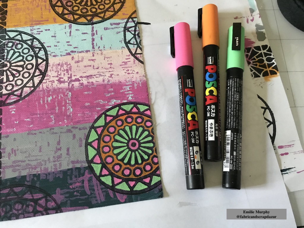
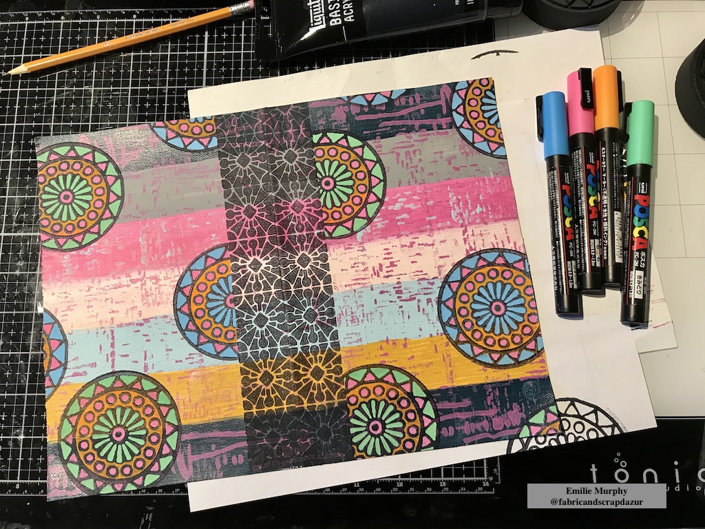
I colored my entire Valley Road motifs with some Posca pens. I just love the way that it allows the Valley Road design to pop out and create some dimension.

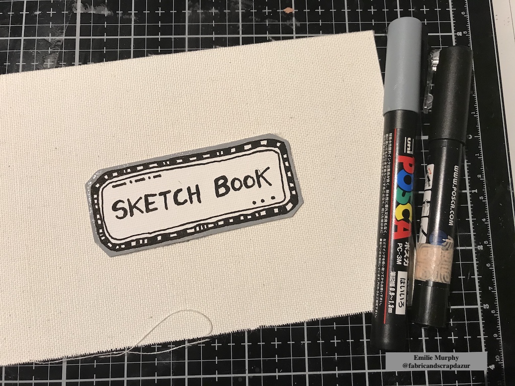
In order to complete my cover, I created a simple label with an extra piece of canvas sheet.

I finished up my cover by machine stitching all around the edges. This step is optional if you don’t like to sew or don’t have any sewing machine.

Tip: You can also simply create a false stitching line with a black maker.

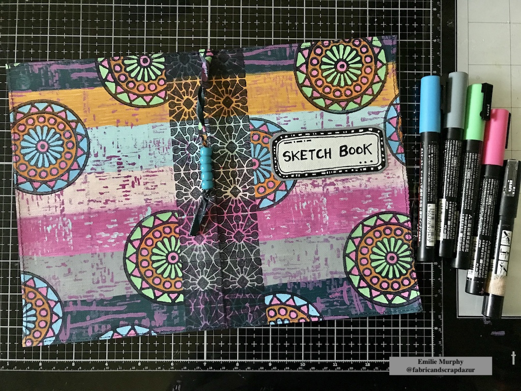
As you can see I also stitched in the middle the remained half-inch strip I got when I cut the canvas sheet to fit the height of my sketchbook.

I embellished the middle strip with some plastic beads. I first twisted the strip and added some dots of glue here and there to keep it in shape. Then I added the beads and tightened a knot to secure it. I think it’s a nice addition to the cover.

Finally I glued down my canvas sheet on my sketchbook. I used PVA glue that I applied uniformly with a brush. I think it is better to use wet glue for this type of project because it allows some time to make adjustments if needed. I first started to apply glue on a half of the cover and burnished it well with a bone folder. Then I glued down the second half. This way the canvas sheet will adhere well. It also removes potential air bubbles and won’t peel off with time.

Personally I enjoyed trying something new this month. Hope you will take the plunge and try something new as well. Foam stamps are so fun to use specially for this kind of project.

Have a great rest of the week!  See you next month!


Thank you Emilie – love how those colors make the foam stamp patterns really pop!

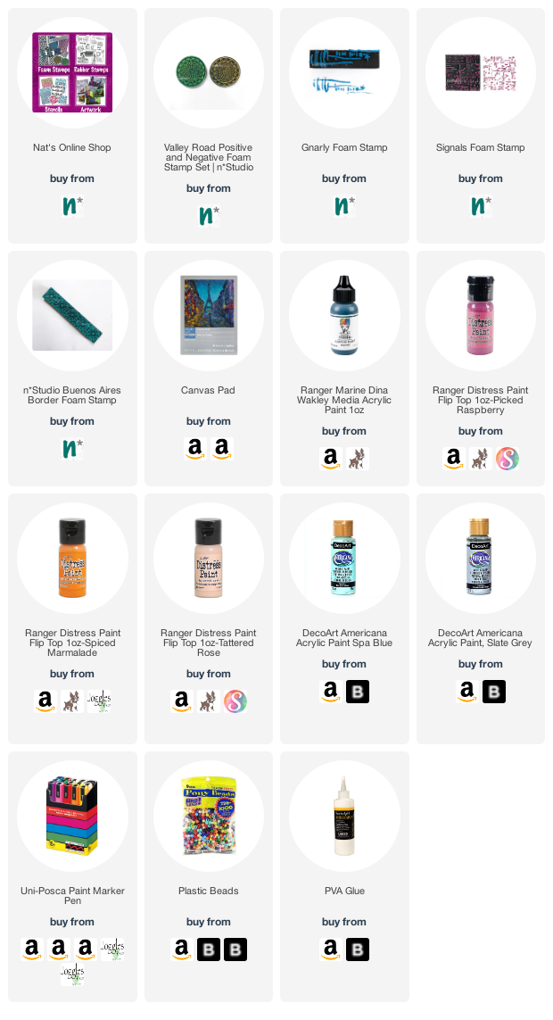
Give it a try: you can find all my Foam Stamps in my Online Shop and here are some of the other supplies Emilie used:

Feel inspired? Working on something yourself that you’d like to share?  I love to see how you interpret our monthly themes. Email me how you used my stencils and stamps with the theme and email me an image – I would love to share your projects in my next  “n*Spiration From Around the Globe“.

Comments (1)

  • Robin

    |

    So vibrant and pretty Emilie. I love this idea!

    Reply

Leave a comment

A New Day – Maura Hibbitts

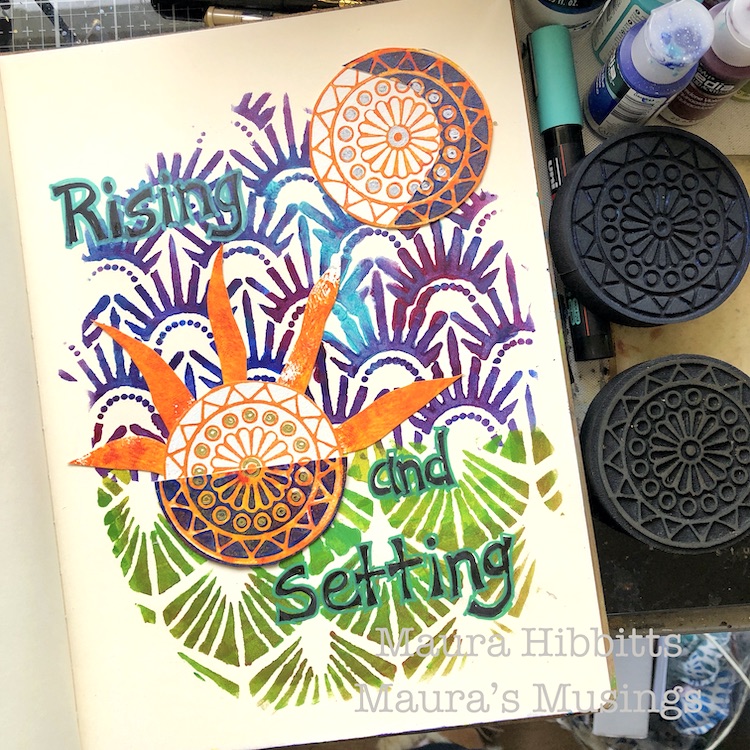
Hello from our Creative Squad! Today we are kicking a new monthly theme off with a project from Maura Hibbitts. Maura is creating an uplifting celestial inspired art journal page using my Valley Road foam stamps and my Art Deco Wallpaper and Art Deco Empire stencils. And bonus: you get a little science lesson too :) Our theme is: A New Day – Let’s try something new today :) Although these are tumultuous times and we never know what each new day will bring, it also seems like the perfect time to throw caution to the wind and just jump into something new with both feet. Try a new material or technique or approach. Why not? Today is a new day… and tomorrow is too!


I find myself rather fascinated with the cycles of the sun and moon…must be my Earth Science background. So, when I thought about a new day, the setting of the sun and rising of the moon came to mind. We’ve had some glorious sunsets over the summer, so I wanted to pull in that gorgeous orange with my sun, and carry a bit of it into the moon.  Since the moon rises 50 minutes later every day, sometimes the moon is rising as the sun is setting, and other days the moon is visible during the day. Just like the sun and moon, we each have the opportunity to make changes with each new day.

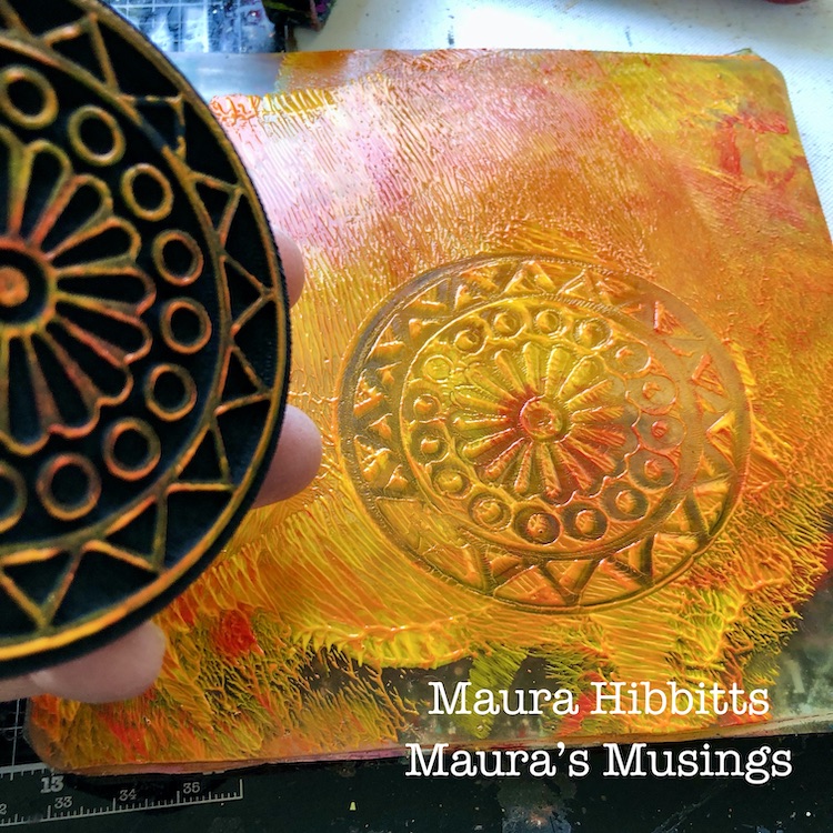
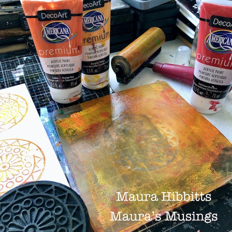
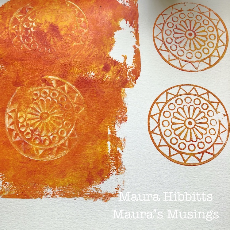
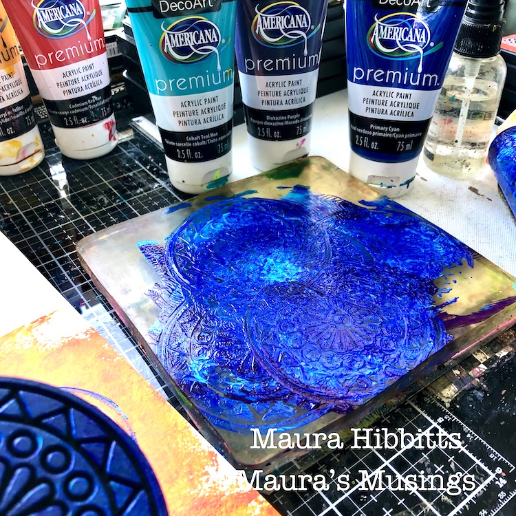
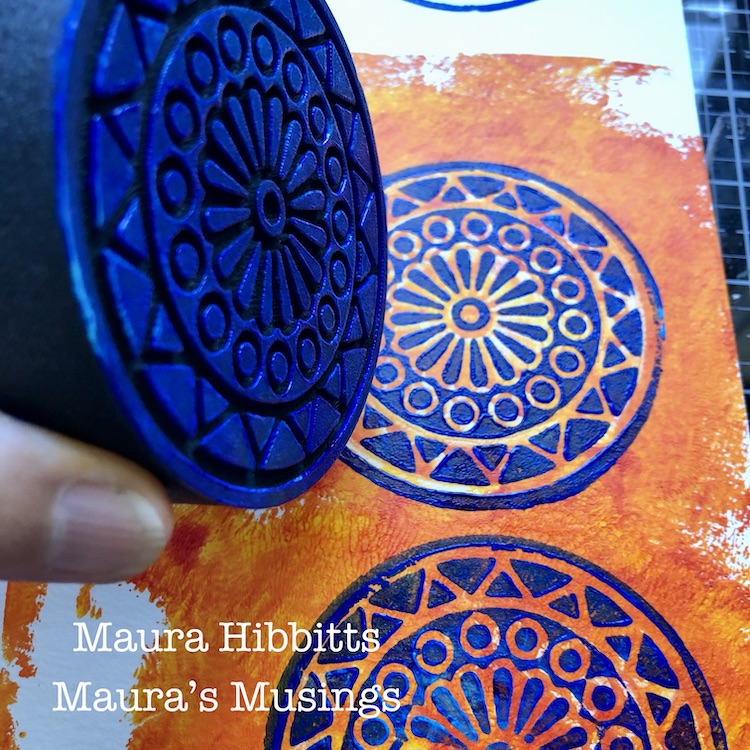
I decided to use my large art journal for more impact. I mixed orange, yellow and red on the gel plate and stamped out the Valley Road Positive ArtFoamie on watercolor paper. I stamped several, and also pressed the paper onto the gel plate for a different image. Sometimes when I work, I have an idea of where I am headed, but it’s fluid.

I repeated the first step with a mix of blues and purple with the Valley Road Negative Art Foamie. I stamped several images onto the watercolor paper, and also over the image on the orange print.

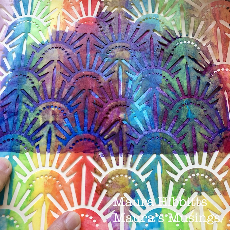
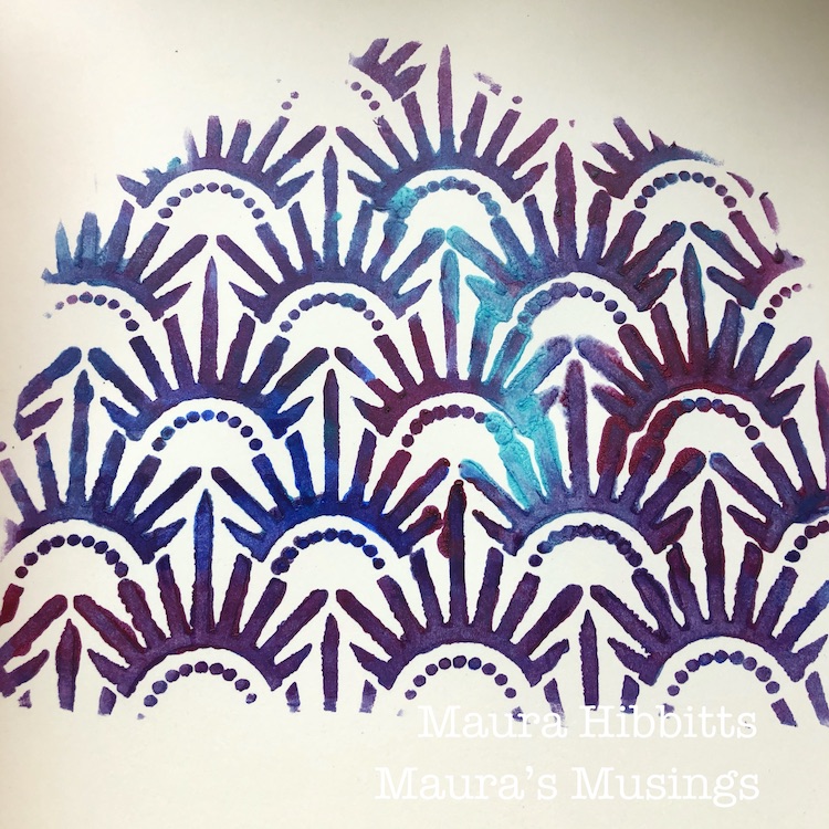
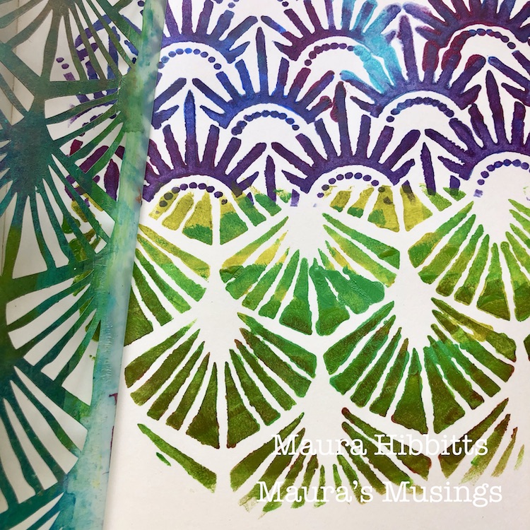
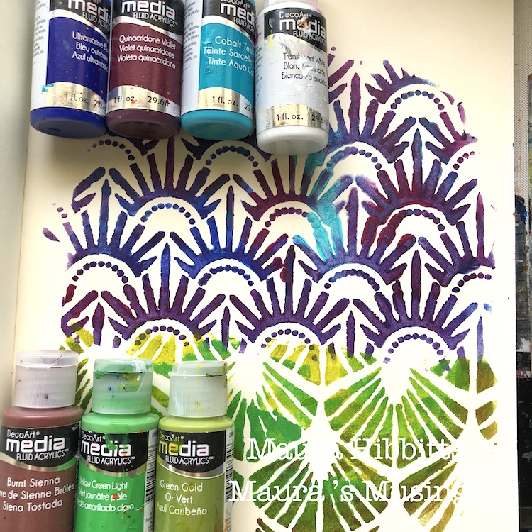
I wanted to create sky and earth with the stencils. I began with the sky and the Art Deco Empire stencil. I sponged in a mix of the blues, purple and a touch of white, with fluid acrylics and a cosmetic sponge.

To create the earth, I used a mix of greens and a touch of brown in fluid acrylics. I used the Art Deco Wallpaper stencil to represent the earth portion. I curved the sky and earth because after all the Earth is round, no matter what those “flat earthers” want to tell you, lol.

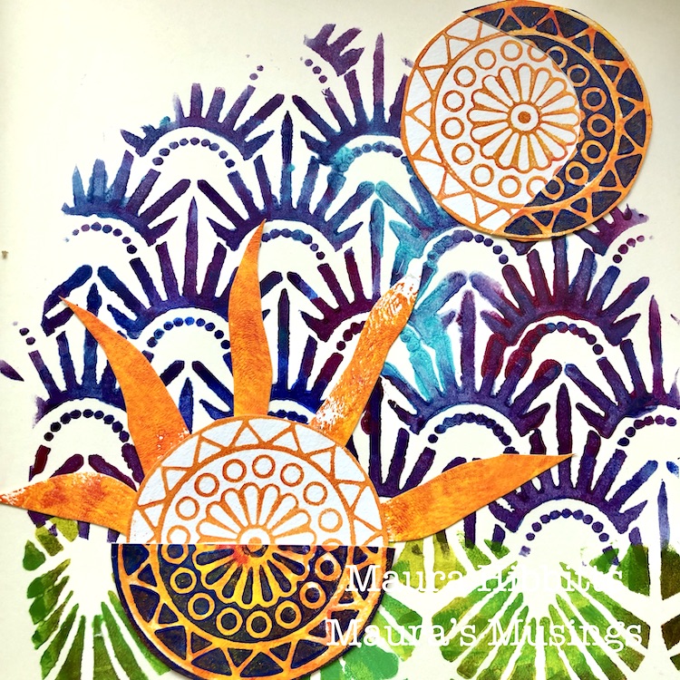
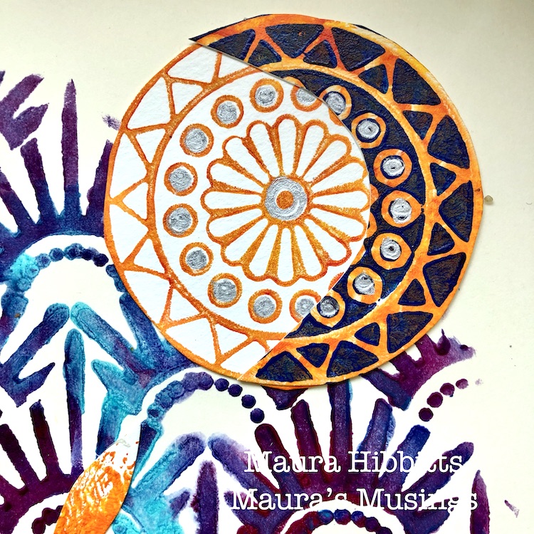
Next, I cut out some of the images and free cut some sun rays to assemble the sun and moon. I started out with the moon as just a crescent, but once I tried it on top of the full image, I liked that better.

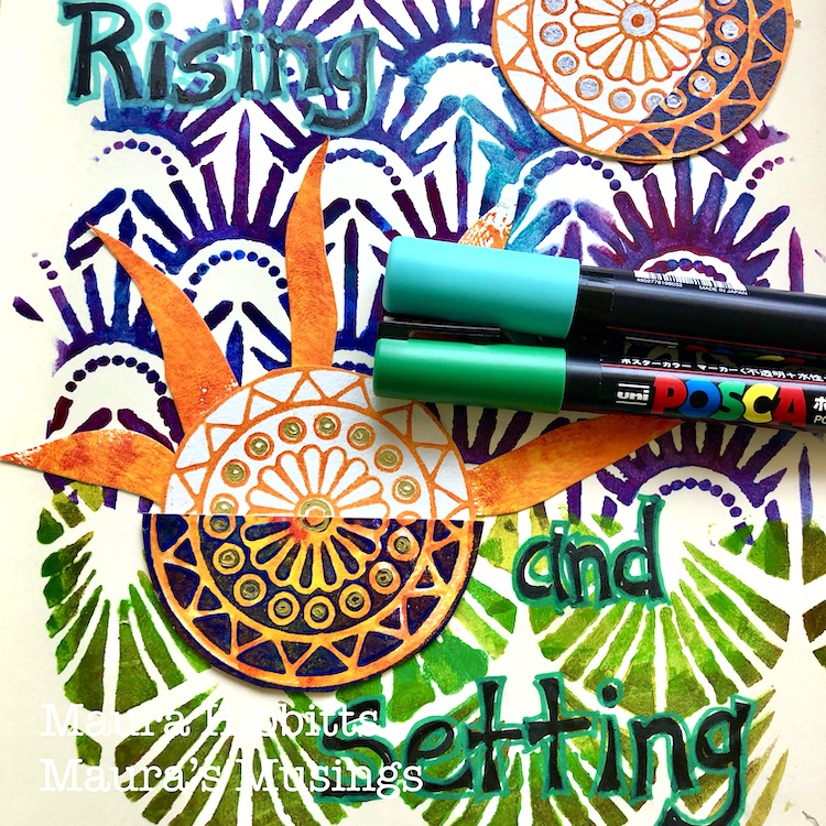
Final step is to do some pen work. I hand lettered “Rising and Setting” in black, then outlined the words with Posca paint pens. I also added some silver to the moon, and gold to the sun with pens.

To illustrate the idea of the sun setting below the horizon, I had the sun’s rays extending up into the “sky”, and added a half circle of the blue and orange image for the portion below the surface to show the sun sinking below the horizon.

My moon shows a waxing crescent, meaning it is on the path towards the full moon. The moon is always there, even though we only see a portion of it illuminated by the sun. I wanted to show that by placing the crescent over the circle.

Hmm, I guess you just got a bit of a science lesson today with the art. That is the way I often taught my classes, mixing in art and science, as well as a few other subjects. When you stop and think about it, you can see all the connections, like the sun and moon being connected to a new day. My wish for you is that each new day is a better one, filled with love, hope, health and joy. – Maura


Thank you Maura! Love this colorful page but also getting the science lesson too – we forget some of that stuff as time goes on!

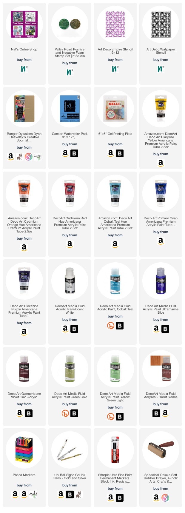
Give it a try: you can find all my Foam Stamps and Stencils in my Online Shop and here are some of the other supplies Maura used:

Feel inspired? Working on something yourself that you’d like to share?  I love to see how you interpret our monthly themes. Email me how you used my stencils and stamps with the theme and email me an image – I would love to share your projects in my next  “n*Spiration From Around the Globe“.
Comments (2)

  • Diane

    |

    Loved this post! Particularly loved the description of the thinking behind the process. Thank you.

    Reply

Leave a comment

Creative Squad Welcomes Robin and Jordan!!!

Hello my friends – today we have some very exciting news to share with you. We have been waiting anxiously to let you know and now is the time: We have 2 NEW Creative Squad members to welcome to the team and introduce today!!! Super huge WELCOME to Robin Seiz and Jordan Hill!

Do you know my Creative Squad? They are my amazing design team of artists who bring you their creations each month. I give them a theme as a way to get their creative juices flowing, and then they make a project using some of my stamp and stencil designs. You can check out their projects each week on Tuesdays, right HERE on the blog.  It is always inspiring to see what they come up with!

Let’s get to know our two newest members:

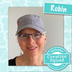
Robin Seiz is super talented with colors, patterns, and layering and is passionate about mixed media, gardening, and social activism. We are so happy to have her in our group and cannot wait to see her projects each month. Take a peek at her style here.

She writes “I am a self-taught Mixed Media Artist living in the wonderful little artist community of New Hope, Pennsylvania located on the Delaware River. I love the process of creating almost as much as the end result. It’s fun to work on a variety of substrates, use so many tools like gelli plates, stamps, stencils, foamies — you name it. And then to add color in endless mediums makes my heart sing. I gain lots of inspiration from nature; I’m often seen with my camera in a meadow or in my garden. I enjoy supporting other artists through social media, buying their art, taking their classes, or supporting them through Patreon — in short, I think community is important to help us all grow.”


Jordan Hill is amazing at drawing faces and figures in her incredible unique style, and incorporating them into richly layered compositions. She comes to us from St. Petersburg, FL where she enjoys art journaling, mixed media of all sorts, and thrifting. Be sure to check her out here.

She writes: “I am a Florida based mixed media artist and illustrator who specializes in art journaling. My draw to all things creative started when I was three or four, sitting in my grandmother’s lap and watching her crochet. Though my specialty is art journaling, I’m not a fan of limiting myself to any one medium or craft and I have been known to dabble in fiber arts, bookbinding, digital illustration, or whatever else appeals to me on any given day. Art journaling specifically became a part of my life in 2009, when I discovered it as an offshoot of scrapbooking. I am so honored to be a part of this Creative Squad!”

We are so happy to have both of these talents joining our team. Be sure to check into the blog on Tuesdays for their posts and also check out the Nat’s Creative Squad Instagram HERE.


Are you creating stuff with Nat’s stamps and stencils? Share them with us – via email or use the hashtag #natkalbach so we can check them out. We love to see what you are making too!

Comments (1)

  • Sue Clarke

    |

    Welcome to Robin and Jordan!
    Your use of patterns reminds me of some of Nat’s work (Robin).
    Your people are delightfully strange Jordan…I can’t wait to see more of them.

    Reply

Leave a comment

In My Dreams – Emilie Murphy

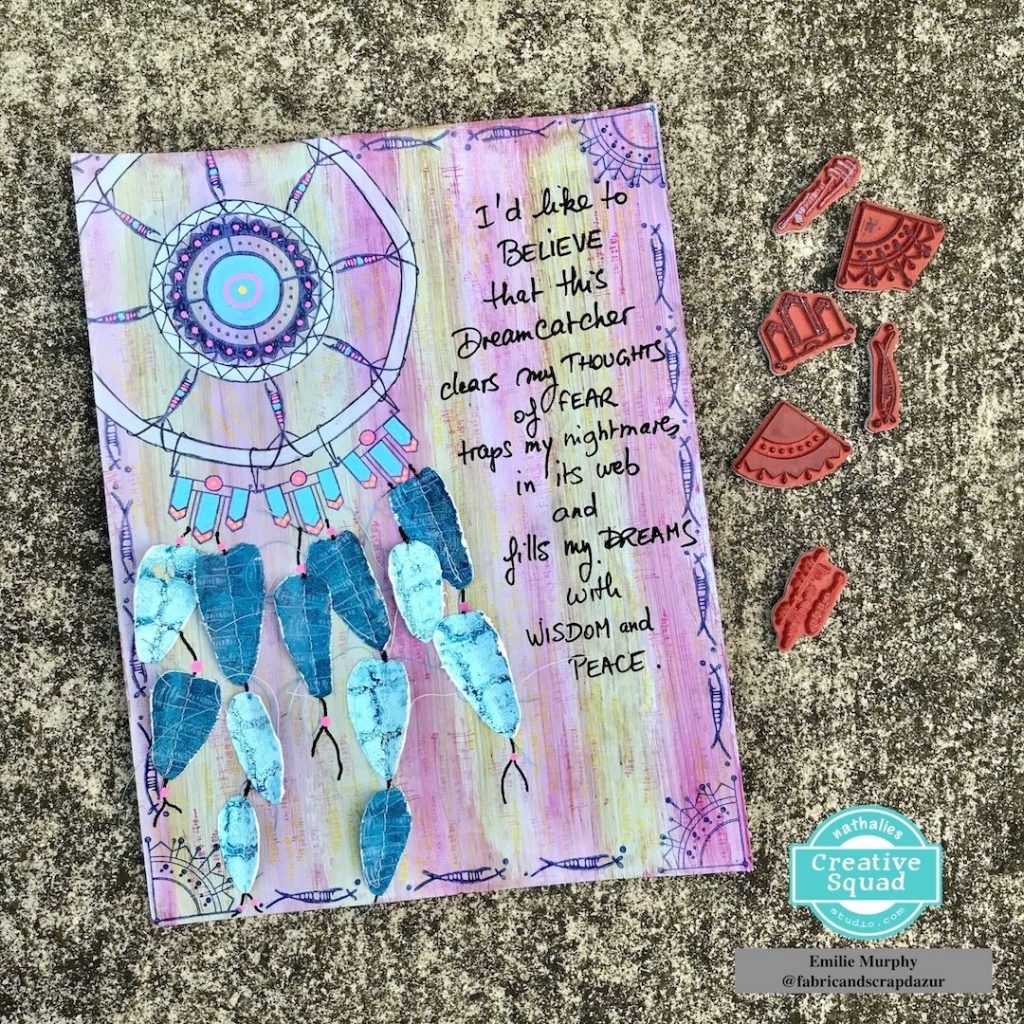
Hello from my Creative Squad! Today we are with Emilie Murphy and a page from her art journal, in hopes of ensuring sweet dreams. She is using my Mini Motifs and my Wabi Sabi stamp sets along with our theme: In My Dreams – A lot of folks are having crazy dreams these days. What visions do you see at night? Are you sleeping at all? Let us get a peek into your nocturnal adventures through your art.


Hi there! Hope you are doing well.

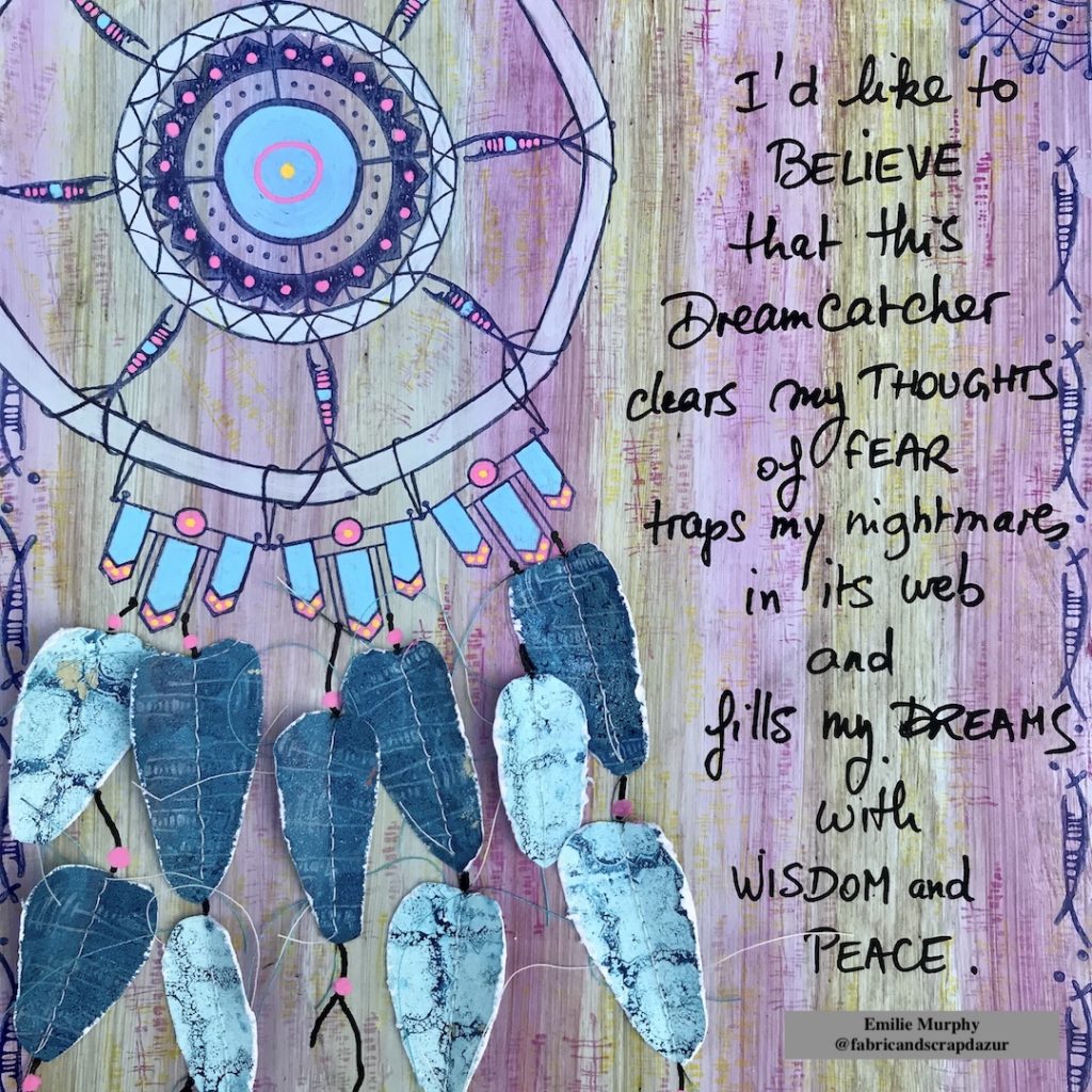
I was wondering how l could talk to you about what’s in my dreams. The first idea I had was to let you enter in to my dreams through a Dreamcatcher. In Native American culture, Dreamcatchers symbolize the entry point of dreams. It’s believed that they trap nightmares in their web. I just love this idea. I have few at my home where one is hanging on my bedroom door nob.

In this tumultuous time where we are currently living in, I think, that symbols and other culture referrals can ease our fear if we simply dare to get interested in them.

Let me guide you through my process about how I made this art journal page and let you in to my dreams. For this project, I decided to work on a piece of 8.5 x 11 inches cardboard (Kraft color). I like to reuse some material I get when I order art supplies. Since it’s a journal page, you can work on whatever surface you like.

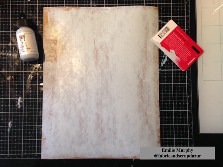
I first applied a coat of  “mineral” acrylic paint in order to get a non-porous surface. I chose an off-white color because I didn’t want something too bright. I also wanted more of a vintage look.  I let it dry completely.

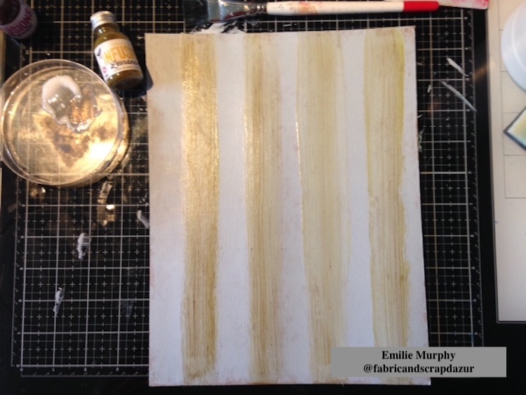
Then, I used some infusion pigment powders to color my background. I sprinkled a little powder on the top of my cardboard and brushed the powder from top to bottom with gel medium to make some strips. I started with “Lemoncello” infusion powder.

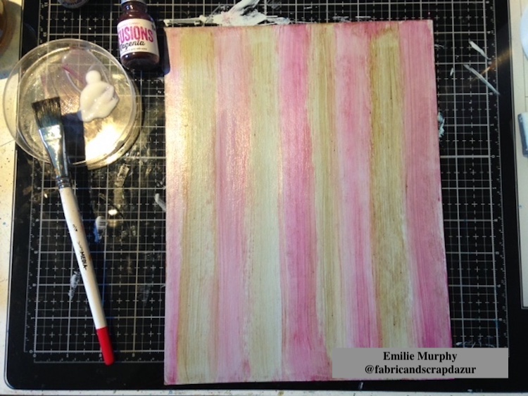
I did the same thing with “Magenta” infusion powder.

The reason why I used gel medium is because it avoids smearing the color or moving it again and makes this layer permanent.

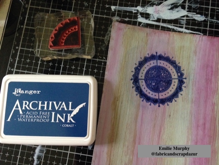
I started to build my Dreamcatcher by stamping the center with the Arts & Craft Mini Motif stamp with “cobalt blue”archival ink.

Tip: I used a gridded acrylic block to be able to stamp the motif and make an even circle. I first practiced on simple printer paper. If you are not satisfied with your stamping, you can wipe it off with some alcohol as I used gel medium that makes the surface non-porous and protects your layer background.

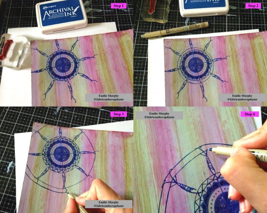
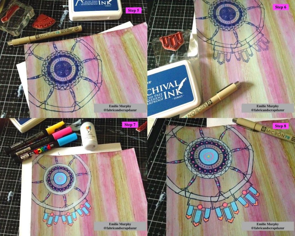
The next two pictures are showing you the step-by-step instructions on how I built my Dreamcatcher.

Step 1: I drew a circle and stamped it with Nat’s Neato stamp from the Wabi Sabi set around my circle.

Step 2: I drew another circle to join the Neato stamping and made an inner ring.

Step 3: I doodled a zigzag inside the inner ring and drew an outer ring joining the opposite side of the Neato stamping.

Step 4: I drew some loops to look like “thread or string.”

Step 5: I finished the web of the Dreamcatcher

Step 6: I had some outside embellishment stamping with the Craftsman Mini Motif stamp and drew some loops to attach them to the outer ring.

Step 7: I painted the inner and outer rings with some “minerals” acrylic paint (same I used for the background). I colored my dreamcatcher with some posca pens.

Step 8: I traced again the lines that faded away with my micron pen over the paint.

The structure of Dreamcatcher is now done.

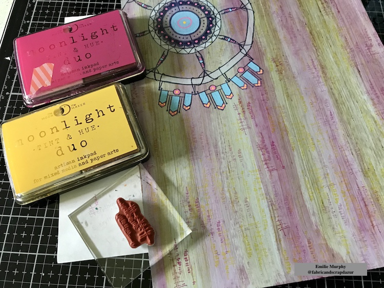
At that point, the background needed some texture. I stamped the Funky stamp from the Wabi Sabi set with “Sunshine Yellow” and “Milky Way Magenta” inks to match the colors of the infusions powders. As you can see, the stamping is not bright and crisp because I wanted a subtle effect. To achieve this, I first stamped on some scrap paper and then I stamped on the background with the rest of the ink remaining on my stamp.

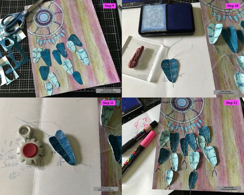
The next steps show you how I made the feathers.

Step 9: I used some pieces of scrap paper I had made for my cards project in June to cut some kind of “feather” shapes.

Step 10: I stitched the center of each feather with my sewing machine. This step is optional. You can also just draw a line with a marker. Then I stamped with the white portion ink of my Moonlight duo inkpad, the Gnarly stamp from the Wabi Sabi set, to add a design to my feathers.

Step 11: I used a Paper Distresser tool to give texture to the edges of the feathers.

Step 12: I drew some lines and dots between the feathers with a posca pen to represent strings and beads.

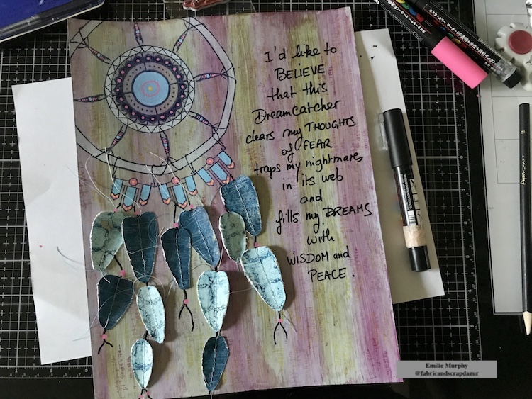
My Dreamcatcher is finally done!

Next, I wrote down my quote.

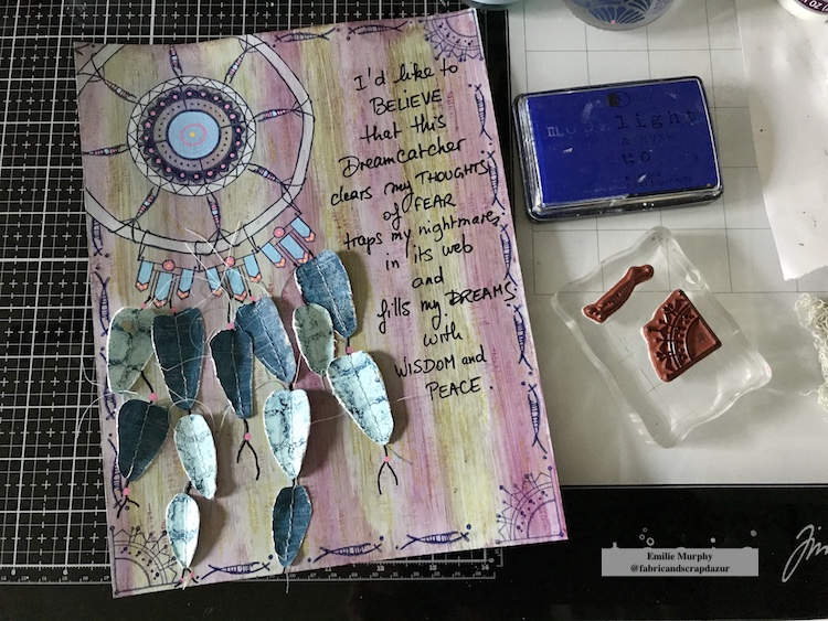
To finish up my page, I first stamped the corners with the Jugendstil Mini Motif stamp.  I then created a border by stamping all around the edges with the Neato stamp with “Deep Space Blue” Moonlight Duo Ink pad.

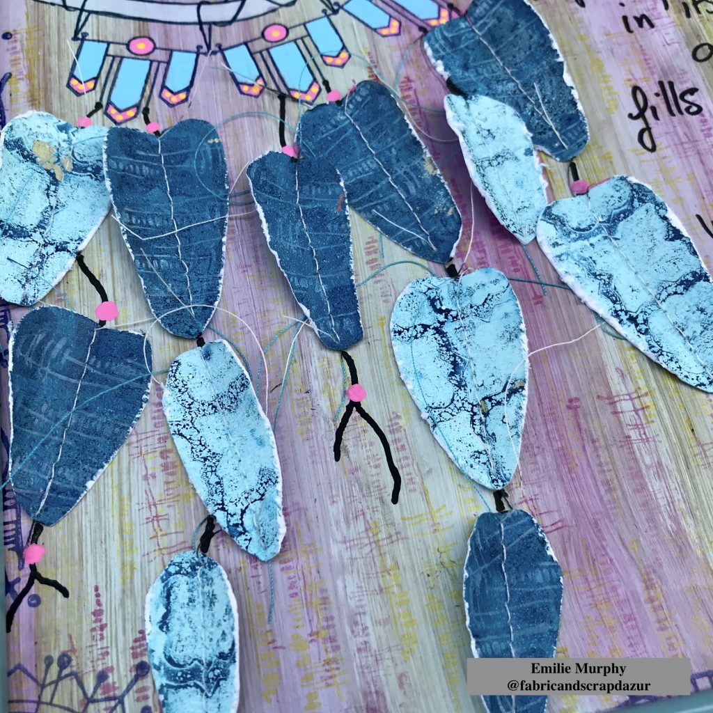
Below are some close up pictures.

I hope you have enjoyed this tutorial and got inspired to create your own Dreamcatcher.

Personally, I had a lot of fun playing with Nat’s Mini Motif and Wabi Sabi stamps sets. It shows you how versatile these stamps sets can be. Just let your imagination and creativity go!

Have a great rest of the week! See you next month! – Emilie


Thank you Emilie! I love the idea of dreamcatchers and what a great art journal page with so many subtle details in there. Beautiful!!!

Give it a try: you can find all my Rubber Stamps in my Online Shop and here are some of the other supplies Emilie used:

Play along with our monthly themes and weekly projects! Working on something yourself that you’d like to share?  Email or tag me #natkalbach how you used my stencils and stamps – I would love to share your projects in my next  “n*Spiration From Around the Globe“.

Comments (1)

  • Sue Clarke

    |

    LOVE love LOVE this Emilie!!!
    The colors you choose and the dreamcatcher design.
    I have several myself and they work (or at least look very pretty).

    Reply

Leave a comment

In My Dreams – Nicole Watson

Hello from my Creative Squad and one final post from the super talented Nicole Watson! Nicole has been with us for a year now, sharing her gorgeous painterly style of art journaling with us each month and usually including a beautiful video too. We’ve loved seeing her step by step artistry in action and we can’t wait to continue following her online now too in all her creative adventures. For her final post, Nicole is recreating a dream using my Wabi Sabi and Mini Motifs rubber stamps and this month’s theme: In My Dreams – A lot of folks are having crazy dreams these days. What visions do you see at night? Are you sleeping at all? Let us get a peek into your nocturnal adventures through your art.


Shortly after receiving our September assignment, I had a pretty crazy dream. I don’t often remember a lot of details of my dreams as they are layered with complications, but you’ll understand in a few sentences why I remembered this one!

I’m going on almost two years of being unsettled. From packing to move, moving into a new house, unpacking, and wanting nothing more than to finish unpacking so we can finally feel settled again! What stands in my way is waiting on warranty fixes on our new construction home. Then, I can finally hire painters to turn my walls from plain white to a lovely shade of gray with some crazy, fun accent walls. My husband and I painted 90% of our last home. We had to hire someone to paint the tall stairs area, but the accent walls and main walls were all painted by us. This allowed us to realize that picking “mushroom mist” for our bedroom was a huge mistake. For this reason, it’s making me super nervous to pick the right colors and release total painting control to someone else. (Not to mention being an artist and a bit picky about quality cut-ins and straight lines!)

These painters showed up in my dream recently. I can’t tell you all the events and play by play, but I can tell you that when the painting was completed, I was furious! They were so proud of their work as they opened the doors to show us their designs. Room upon room were full of crazy, painted designs. The only one I vividly remember was fish in the guest bath and lots of sparkly gold. I couldn’t understand where they had gotten all the colors until I saw my empty Golden paint bottles in my studio room.

Nightmare, right?

Since the only specifics I could remember were the fish, and I didn’t really want to paint fish, I chose to create a page reflecting the crazy nature of my dreams.

Here is a video I made:

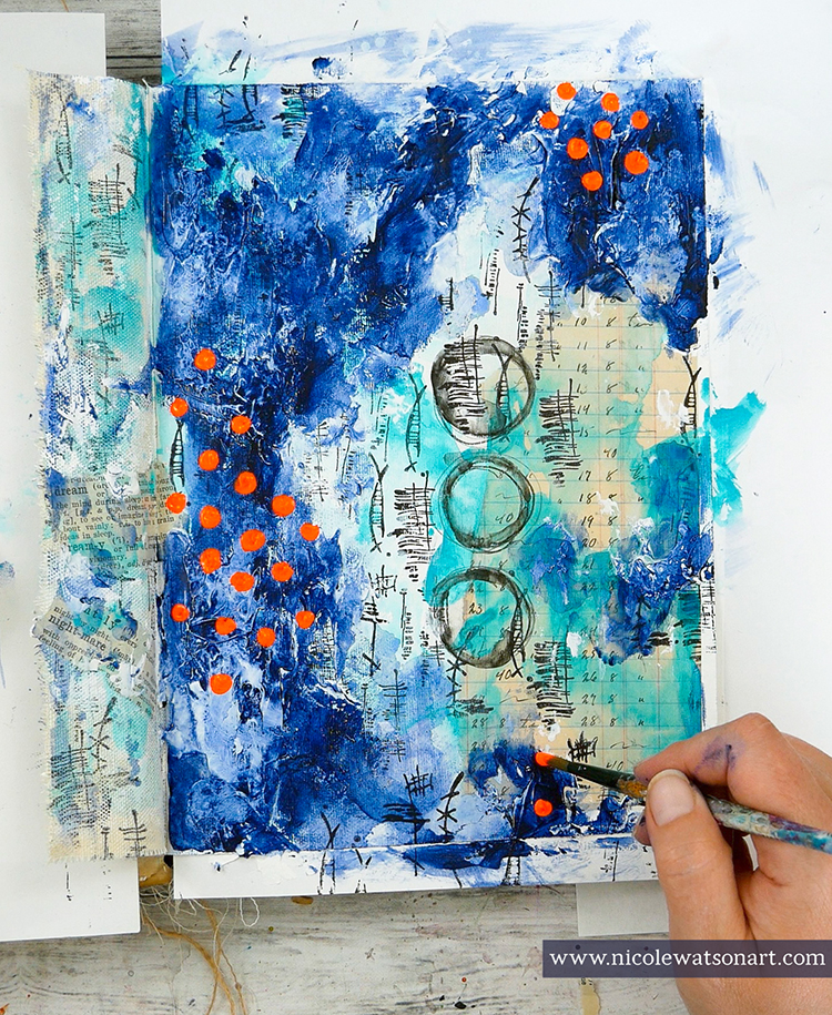
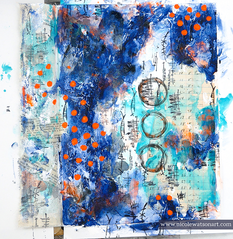
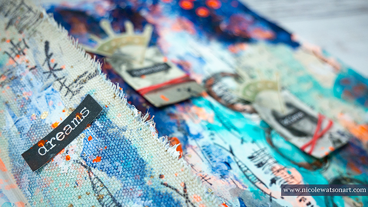
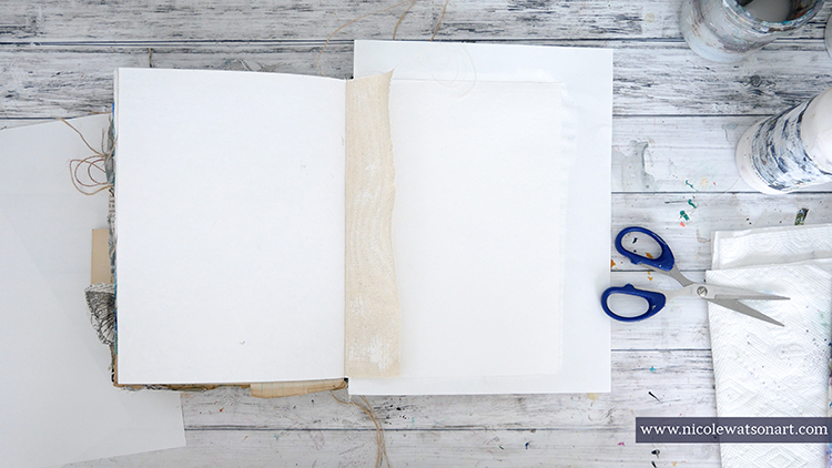
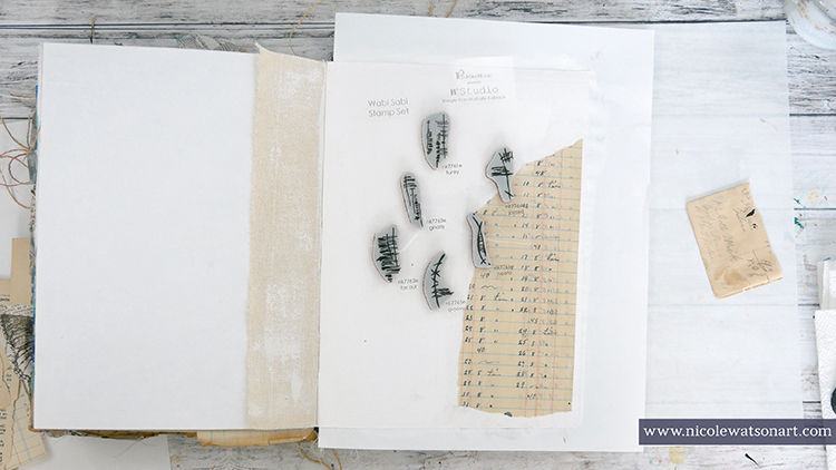
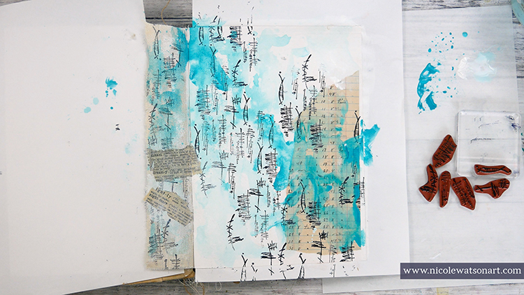
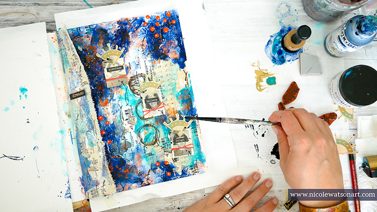
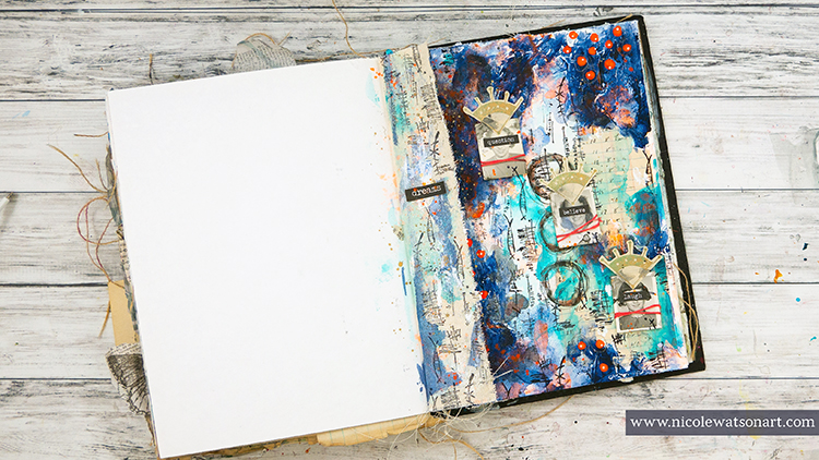
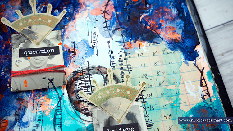
I grabbed my Dina Wakley Media journal and ripped part of a canvas page for a small cover flap. After gessoing the main page and wiping some on the canvas flap, I adhered a ripped ledger page. I was also going to add some dictionary pages, but was side tracked finding “dream” and “nightmare” in the dictionary (which I later adhere to the canvas flap).

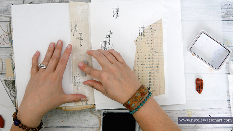
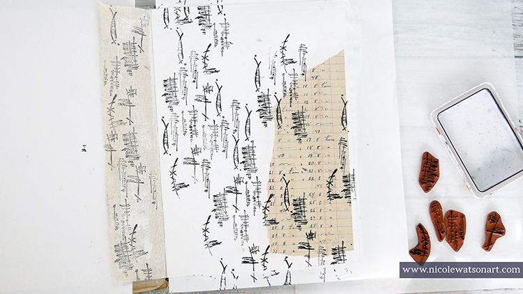
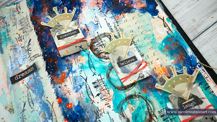
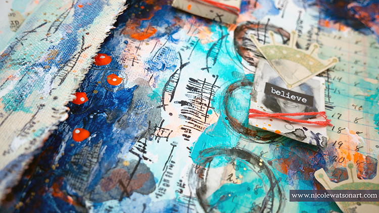
Next, I picked up Nat’s Wabi Sabi stamp set for another layer of my dreams. I liked the meaning of these symbols from funky to neato and far out… those sure describe dreams! I stamped these word symbols on the canvas flap and the journal page to create texture.

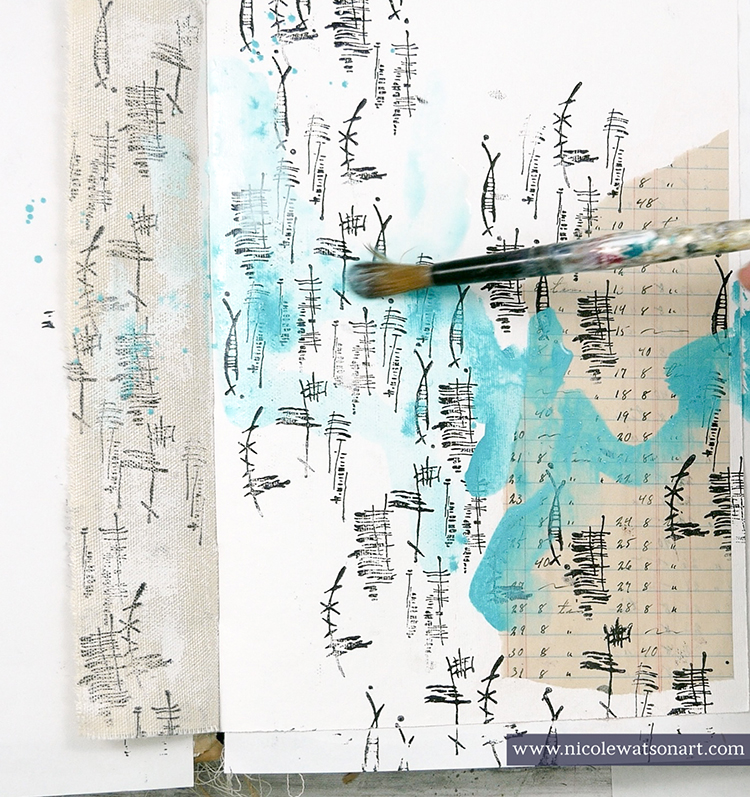
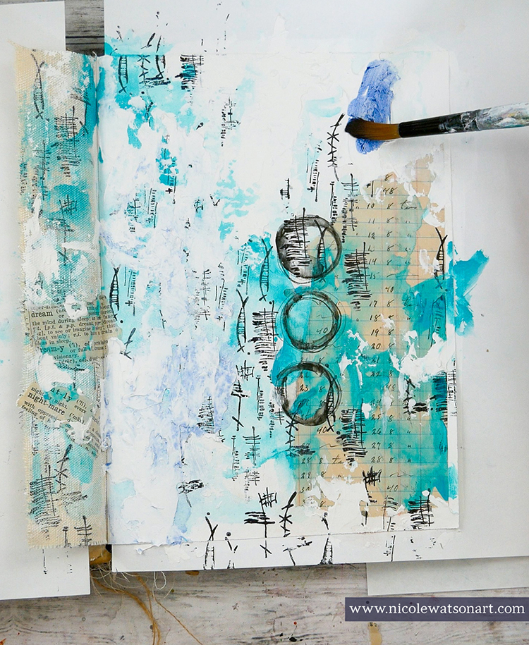
I added a layer of color with teal and gesso on the page and the canvas flap. To tie in the stamped images and the piece of ledger paper, I sketched three circles with stabilo all and then activated them with water.

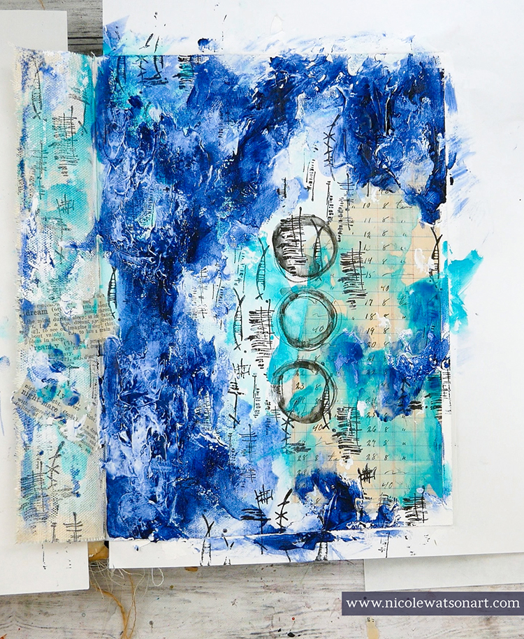
My next idea was to hide the symbols and color with a layer of dark, foggy color to obscure the dreams. I started this layer with super heavy gesso. After it dried, I added darkness to it with Paynes gray. I couldn’t figure out how to get the effect I wanted so I used a paint brush, foam applicator, baby wipes, and my fingers. It was a process!

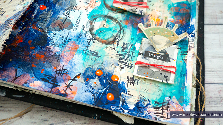
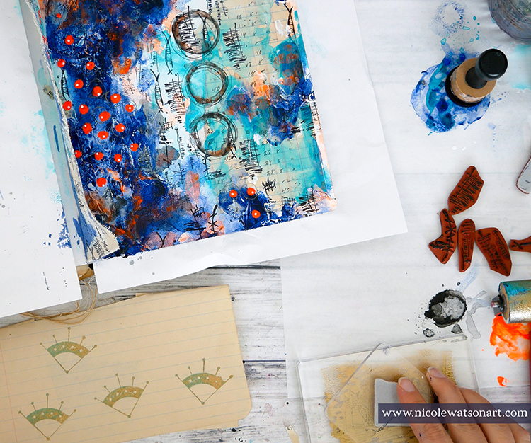
Because dreams don’t always make sense and to add contrast, I grabbed fluorescent orange to make some dots on the page. The Paynes gray wasn’t moody enough, so I made a stabilo all puddle (scribble stabilo on palette paper and activate with water) to shade the Paynes gray. I like the shadowy, grungy effect the stabilo puddle has. I also added some watered-down florescent orange to different areas. I especially concentrated the orange on the textured spots from that super heavy gesso. Then, I added some small white dots on the orange ones with my fineliner bottle.

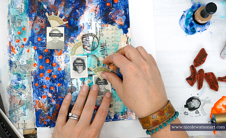
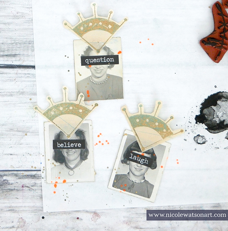
Five-hundred ideas were floating in my head of where to go next. I searched my pile of old photos for some interesting ones, and in the end decided on three old school pictures. I decorated these photos with crowns from Nat’s Mission Motif stamped in bronze paint on a gel plate, words, embroidery floss, a small stamp from the Wabi Sabi stamps, and some splatters of paint. I topped the canvas flap with the word “dream” and called it done after splattering some bronze paint on the page (to represent that gold, glittery paint).

A fun page to remember the crazy dream I had. Speaking of fun…it’s been an incredibly fun year as a member of Nathalie’s Creative Squad. The challenges each month caused me to think about how to apply them to the stamps and stencils she designed. Most importantly, they pushed me into my studio to create and inspire you. Thank you so much Nat!


Thank you Nicole for all of your contributions this year and for sharing this final peek into your dreams!

Give it a try: you can find all my Rubber Stamps in my Online Shop and in addition to ephemera, here are some of the other supplies Nicole used:

Feel inspired? Working on something yourself that you’d like to share?  I love to see how you interpret our monthly themes. Email me how you used my stencils and stamps with the theme and email me an image – I would love to share your projects in my next  “n*Spiration From Around the Globe“.
Leave a comment

In My Dreams – Maura Hibbitts

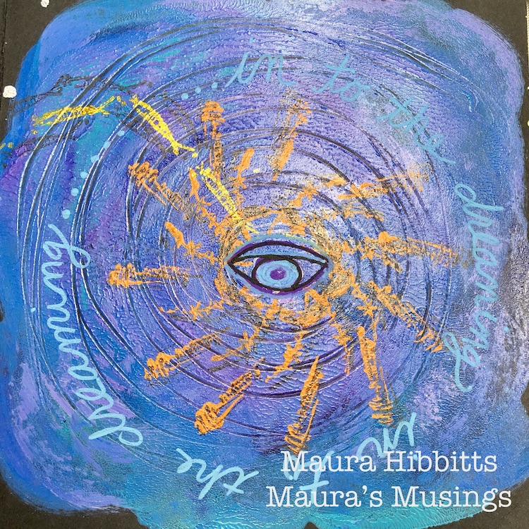
Hello from my Creative Squad! Today we have Maura Hibbitts sharing a mysterious dreamscape with us in her art journal. She is using my Wabi Sabi and my Mini Motifs rubber stamp sets for this and our theme: In My Dreams – A lot of folks are having crazy dreams these days. What visions do you see at night? Are you sleeping at all? Let us get a peek into your nocturnal adventures through your art.


I don’t know about you, but I have been having some very vivid and wild dreams these past few months. I had one dream that was so realistic, I could hear, see and feel what was occurring, and when I woke up I totally expected it to be real. I often see words and text in my dreams…maybe because I read before I go to sleep? And most of my dreaming is in blazing technicolor too. I have to say, my dream imagination is pretty darn vivid, and I think that helps guide my creative spirit.

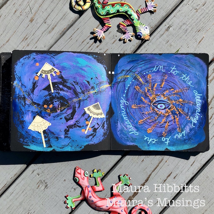
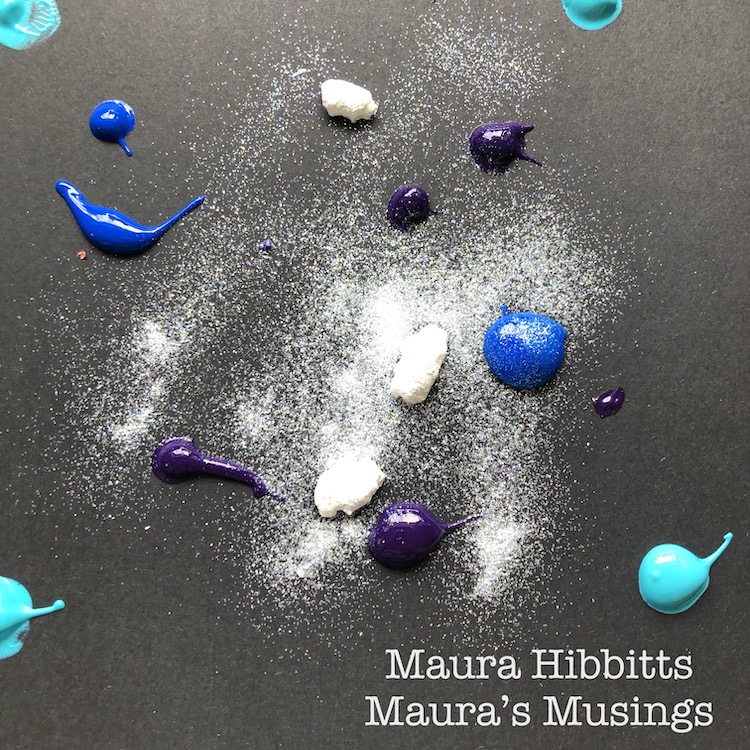
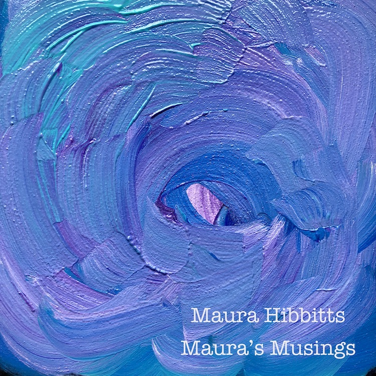
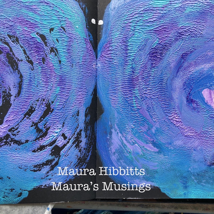
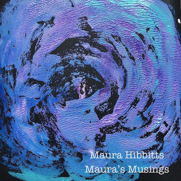
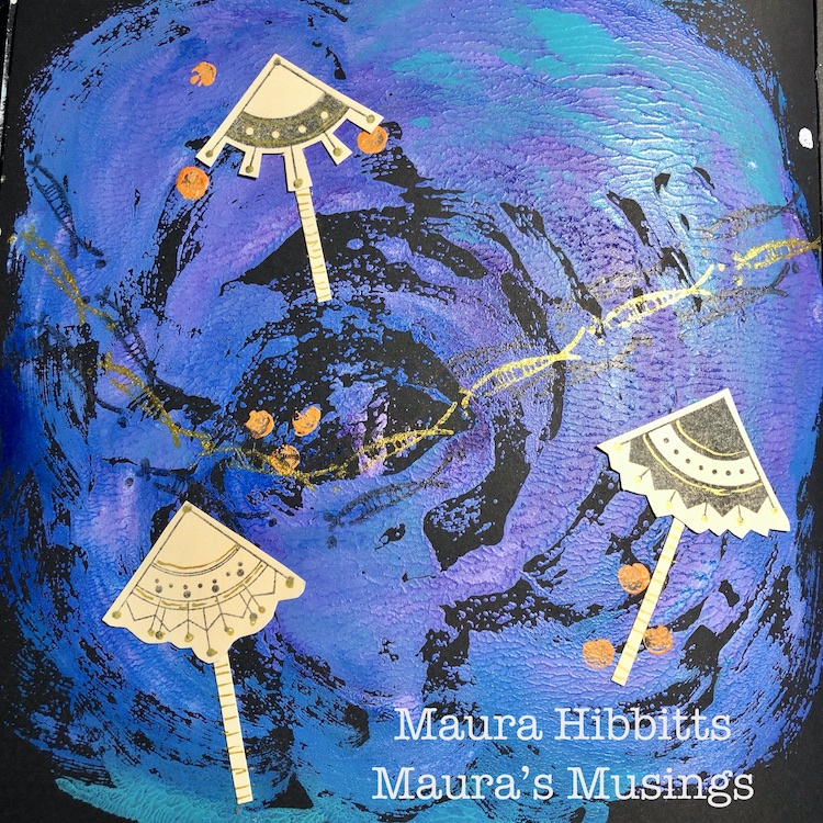
I had this idea of showing my dream imagination as a cosmic swirling mass. I started in my art journal on the black background with blobs of paint – Cobalt Teal Hue, Primary Cyan, and a blend of Titanium White with Dioxazine Purple. I also added in some Glamour Dust to blend with the paint for a sparkly appearance.  Then, I used the paintbrush to swirl and blend the paint around the center.

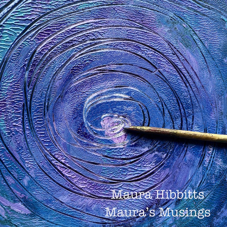
Since I had a rather thick layer of paint on the right hand side of the journal, I thought why not close it and see what happens? When I opened up the pages, I really loved the swirling on the left side. I went back to the right side, and scraped some circle marks into the paint with a dowel.

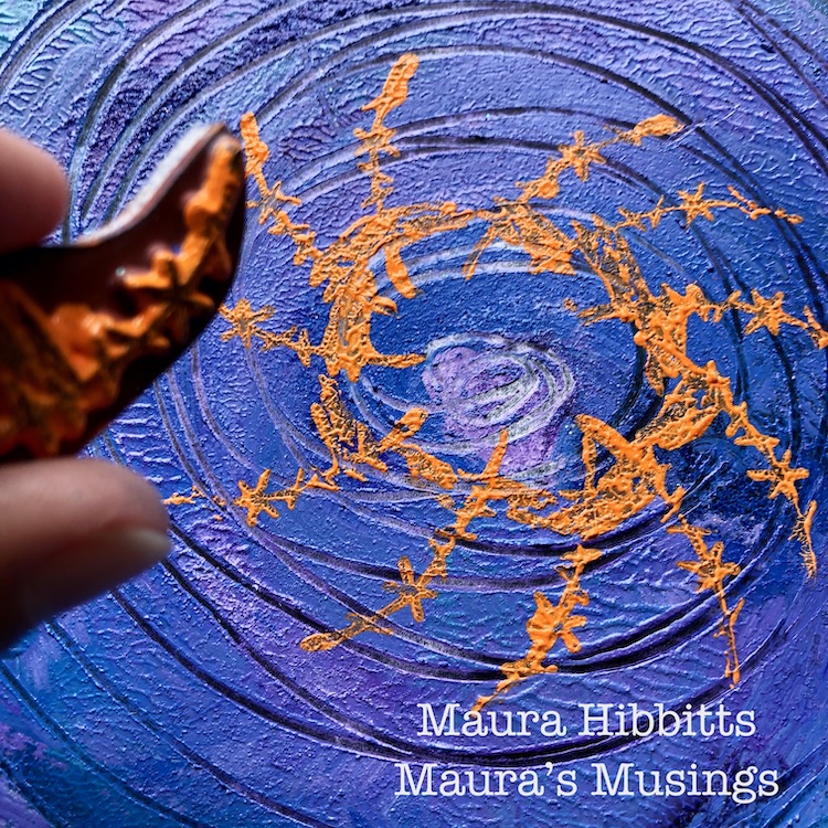
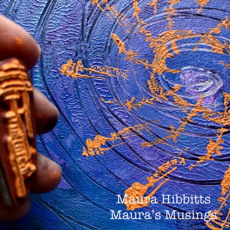
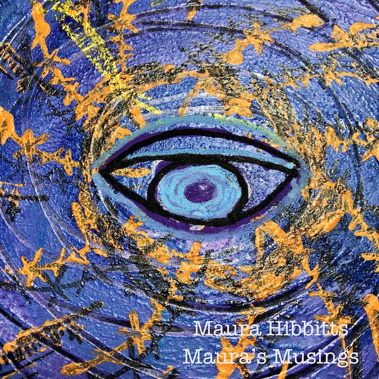
To create the feeling of a swirling cosmos, I stamped out from the center in a circle using the Groovy stamp and a mix of Titanium white and Cadmium Orange Hue for a contrasting color. I repeated another circle pattern using the Jazzed stamp with the paint. Note – when stamping with paint, be sure to clean your stamps right away. Since I had some orange paint left over, I used the end of the dowel and made a few paint dots on the opposite page.

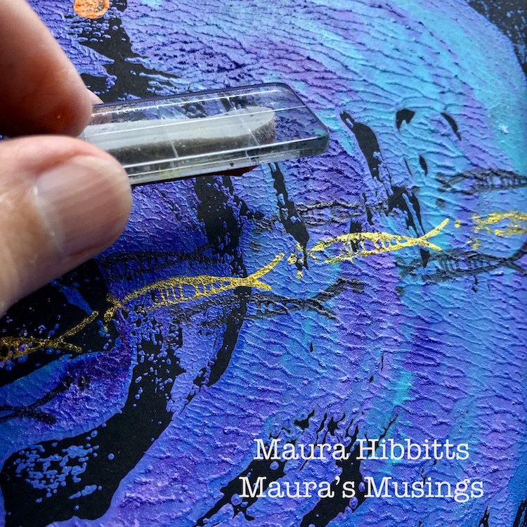
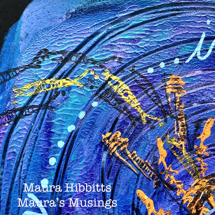
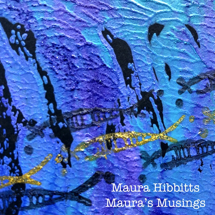
Next, I imagined a flowing school of fish coming out of the center of the cosmos and swimming across the other page. I used the Neato stamp (a favorite!) and stamped two lines of fish using black ink, then went back and stamped the fish using gold ink.

I went back to the galaxy, and stamped over the designs in the orange paint with black ink. I was trying to give them a bit more definition, as some of the painted stamping was not too clear. I also decided to draw an eye in the center of the galaxy with Posca pens.

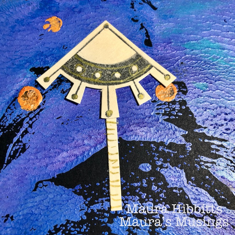
Sometimes we visualize our thoughts as bubbles or umbrellas, so I turned the Mini Motif stamps into umbrellas. I stamped the Arts and Crafts, Jugendstil and Mission Motifs onto manila tags using black ink, then cut them out into umbrella shapes. Also cut a strip of the tag to use as the umbrella handle. Doodle a bit on the designs with gold pen. Adhere three umbrellas onto the left page. (Good rule of thumb – use an odd number.)

Head back over to the dreaming eye/cosmos page, and add the lettering “ in to the dreaming” around the central design with a turquoise Posca pen.

There are many images and stories at play on these pages, and maybe they don’t seem to fit or make sense. But isn’t that what a lot of dreams are like?

How do you imagine your dreamscape? I thought of mine as a swirling cosmos with an all seeing eye, umbrella thoughts and a stream of fish flowing through (the fish might come from my desire to visit the ocean, which I haven’t been able to do this year). I think our dreams bring our subconscious to the surface of our thoughts, and help ignite our creativity. May you have some creative dreaming! – Maura


Thank you Maura! I loved hearing about your vivid nighttime adventures of the subconscious and how you translated that strangeness onto the page. Very cool!

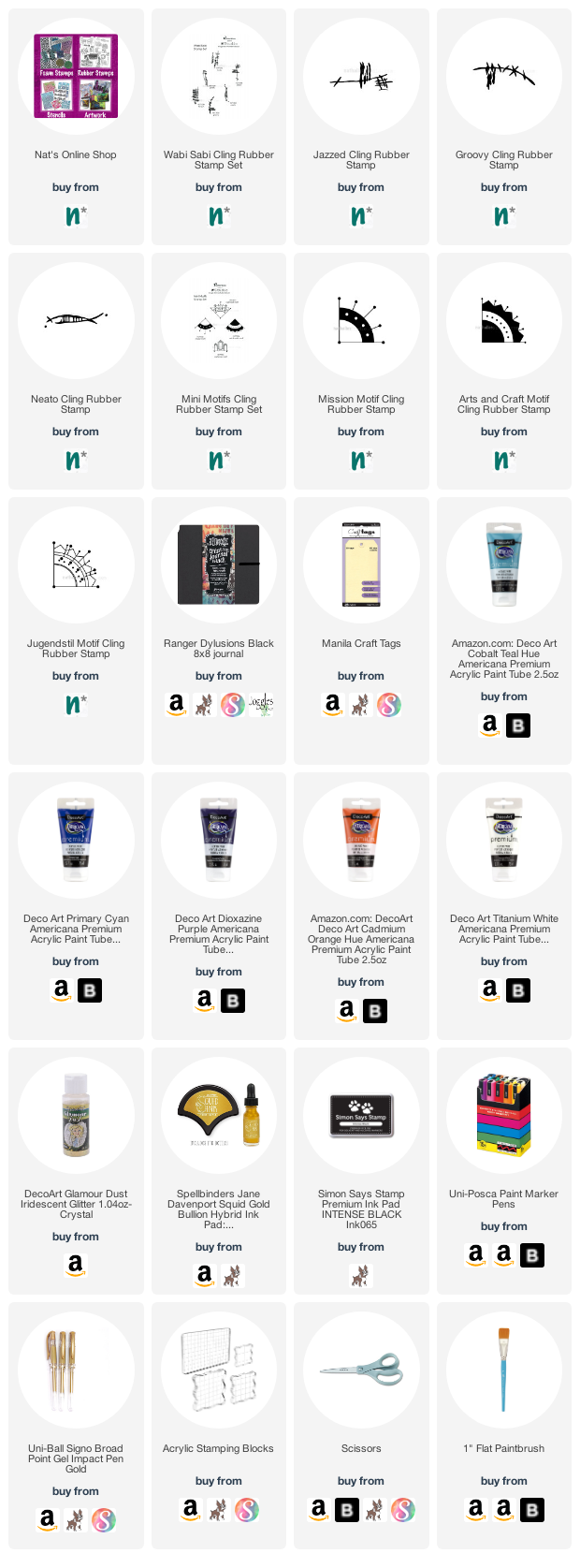
Give it a try: you can find all my Rubber Stamps in my Online Shop and in addition to a wooden dowel and some adhesive, here are some of the other supplies Maura used:

Feel inspired? Working on something yourself that you’d like to share?  I love to see how you interpret our monthly themes. Email me how you used my stencils and stamps with the theme and email me an image – I would love to share your projects in my next  “n*Spiration From Around the Globe“.
Comments (1)

  • Sue Clarke

    |

    Maura, I love this so much!!!

    Reply

Leave a comment

In My Dreams – Jennifer Gallagher

Hello from my Creative Squad! Today we have one last project and post from the amazing Jennifer Gallagher. We have loved having Jennifer on the Squad now for 2 years and have always enjoyed her colorful and fresh style. This month Jennifer says goodbye with an art journal page that is both personal and powerful. She is using my Hamburg stencil, my Mini Motifs rubber stamps, and my Wabi Sabi rubber stamps along with our new theme for this month: In My Dreams – A lot of folks are having crazy dreams these days. What visions do you see at night? Are you sleeping at all? Let us get a peek into your nocturnal adventures through your art.


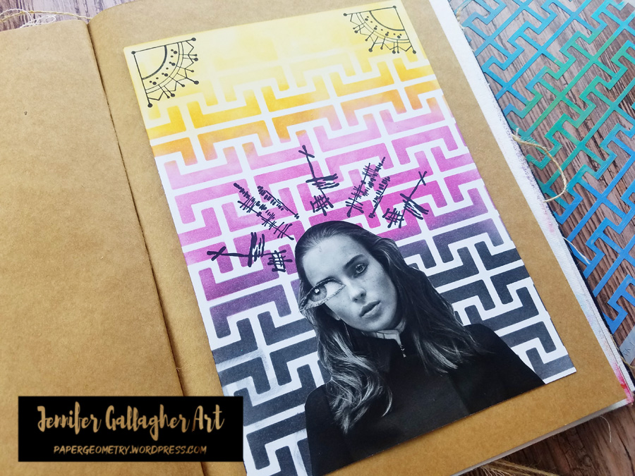
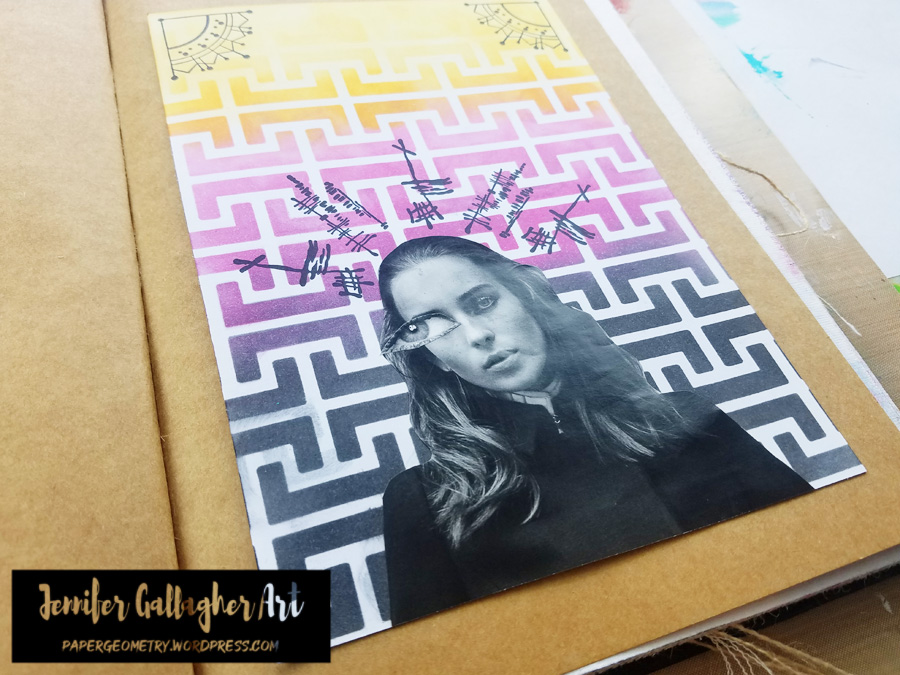
This month the Creative Squad is talking about dreams. With all the stress of the last several months, my dreams aren’t memorable so much for their content, but the way I wake up feeling – and that is tense. So, I’ve created this art journal spread to express that tension and chaos.

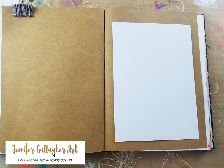
I decided I would attach a piece of A5 cardstock to my kraft page in a Dina Wakley Media journal. I will create my design on the cardstock and then attach it once it is complete.

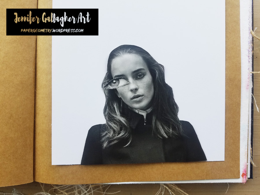
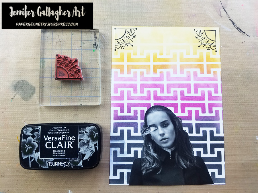
I have cut a face and an eye (larger than the eyes originally on the face) out of a magazine and picked a spot where it will go. I’m not attaching it yet so I can stencil the background.

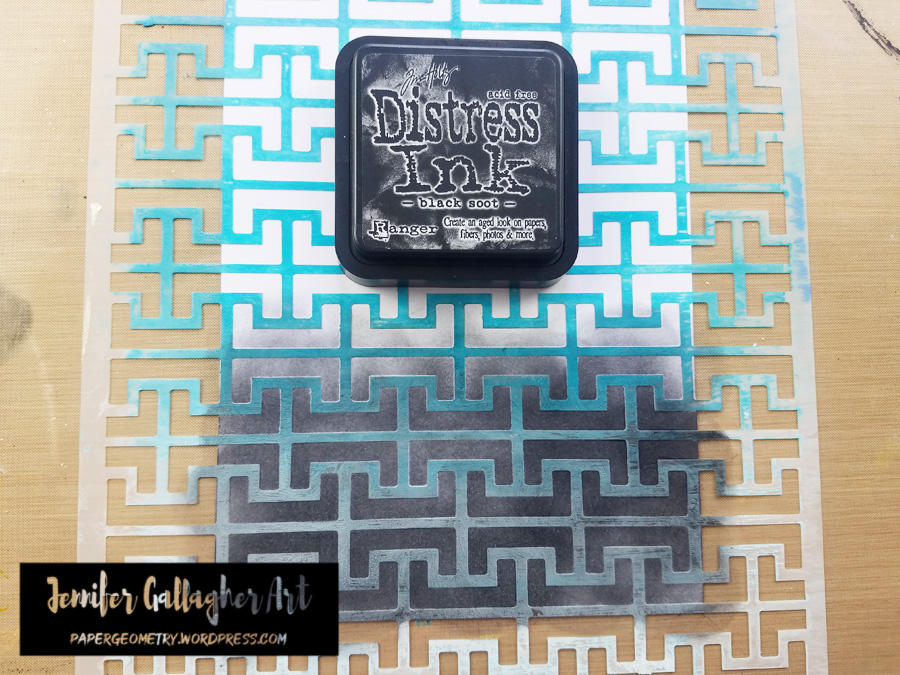
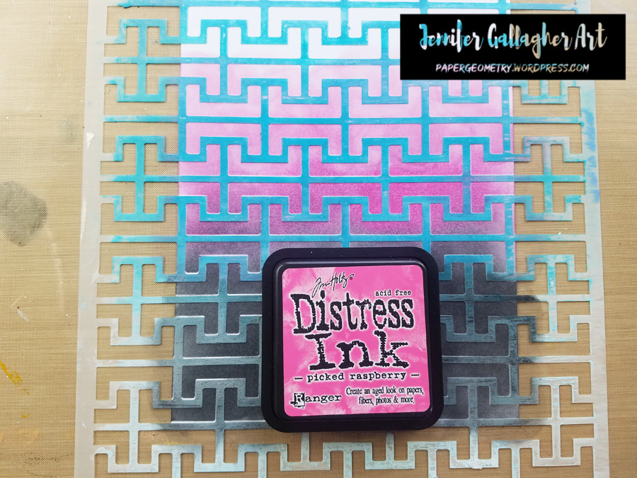
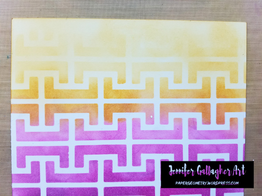
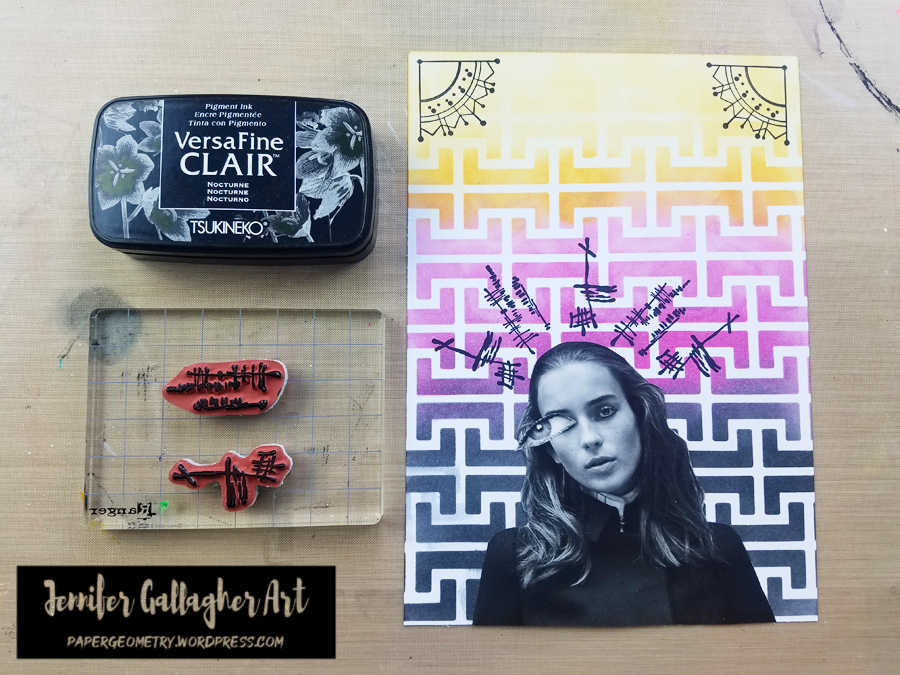
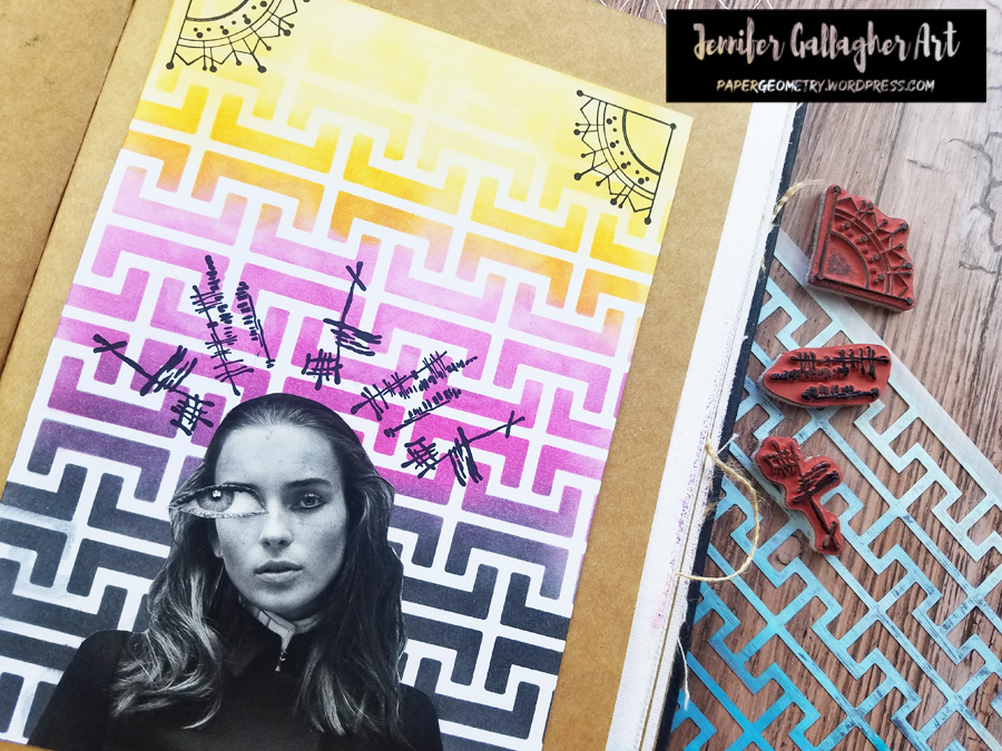
I laid Nat’s Hamburg stencil over the A5 piece of cardstock and starting at the bottom applied three colors of Distress Ink. First, I placed Black Soot, then Raspberry Preserves, and finally Wild Honey. Notice that at the top I blended a little wild honey over the white space to give a different look.

Next, I stamped Nat’s Jugendstil Motif stamp onto the top two corners using Versafine Clair in Nocturne.

I stamped Nat’s Jazzed and Funky stamps above the figure to represent tension and chaotic thoughts. These were also stamped in Versafine Clair in Nocturne.

I used a generic glue stick to attach the face and eye to the cardstock. Then I applied scor-tape to the back of the A5 sheet and attached it to a kraft page in my Dina Wakley Media journal.

I hope you have enjoyed this tutorial. I really loved creating this page. Also, this is my last tutorial as a member of Nat’s Creative Squad. I have loved sharing my art and creative projects with you these last two years. Happy Creating! xoxo – Jennifer


Thank you Jennifer! We will definitely be sad to see you go!!! But we of course will continue to follow you online to see what other creative magic you are up to :)

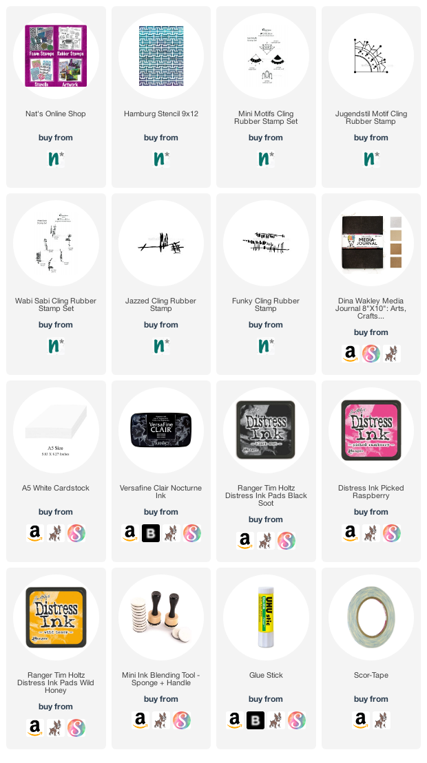
Give it a try: you can find all my Stencils and Rubber Stamps in my Online Shop and here are some of the other supplies Jennifer used:

Feel inspired? Working on something yourself that you’d like to share?  I love to see how you interpret our monthly themes. Email me how you used my stencils and stamps with the theme and email me an image – I would love to share your projects in my next  “n*Spiration From Around the Globe“.
Leave a comment

Wild and Free – Emilie Murphy

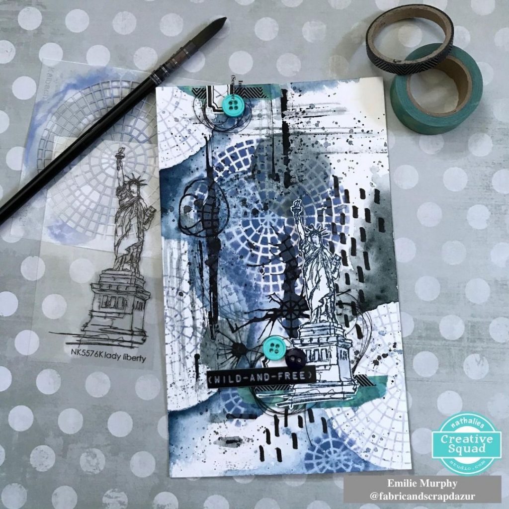
Hello from my Creative Squad! Today we have Emilie Murphy with us using my Lady Liberty stamp and my Central Ave 4×4 stencil and sharing her fresh and funky take on our theme: Wild and Free – After so many months of careful living, it’s time to go Wild and Free… In our Art! Go a little crazy in there and live it up with bright colors, exuberant mark making, bold colors – however you want to go a bit bananas. It’s time to let loose!


Hi there! Hope you are doing well and enjoying the summer so far.

My first thought of “Wild and Free” theme was to use Nathalie’s stamp “Lady Liberty“, well known symbol of Liberty and emblem of New York City. Lately, I got nostalgic about my trip there, already ten years ago. I had spent such a great week in this fantastic and energetic city.

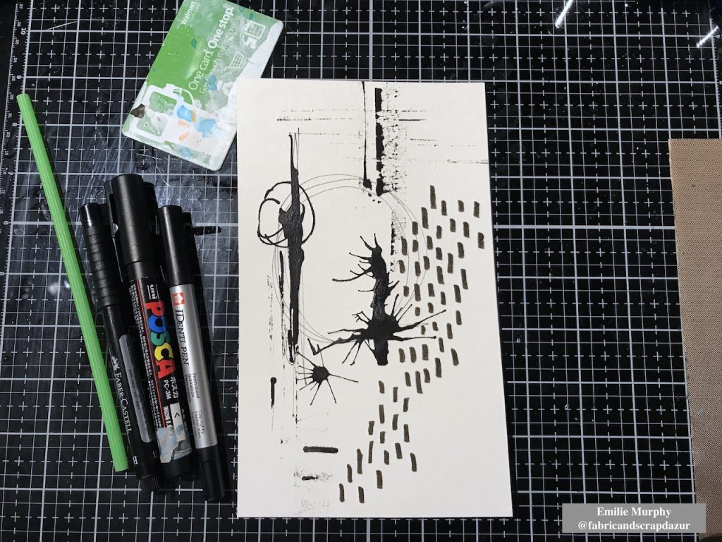
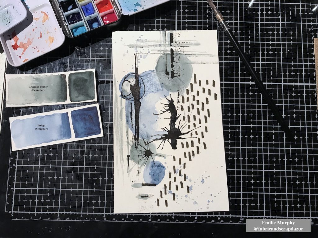
I started my page making some marks with permanent black pens on watercolor paper. I used a Posca pen to make blobs of black paint that I spread with a plastic card and straw.  I let it dry completely.

Then I applied some watercolor and limited my colors to two ones with kind of neutral tone. I slightly sprinkled a little bit of salt in some wet area because I love the effect when it dries.

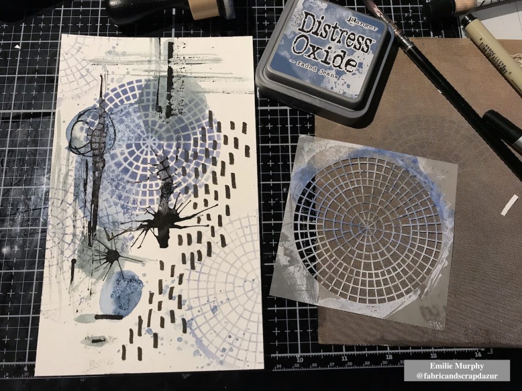
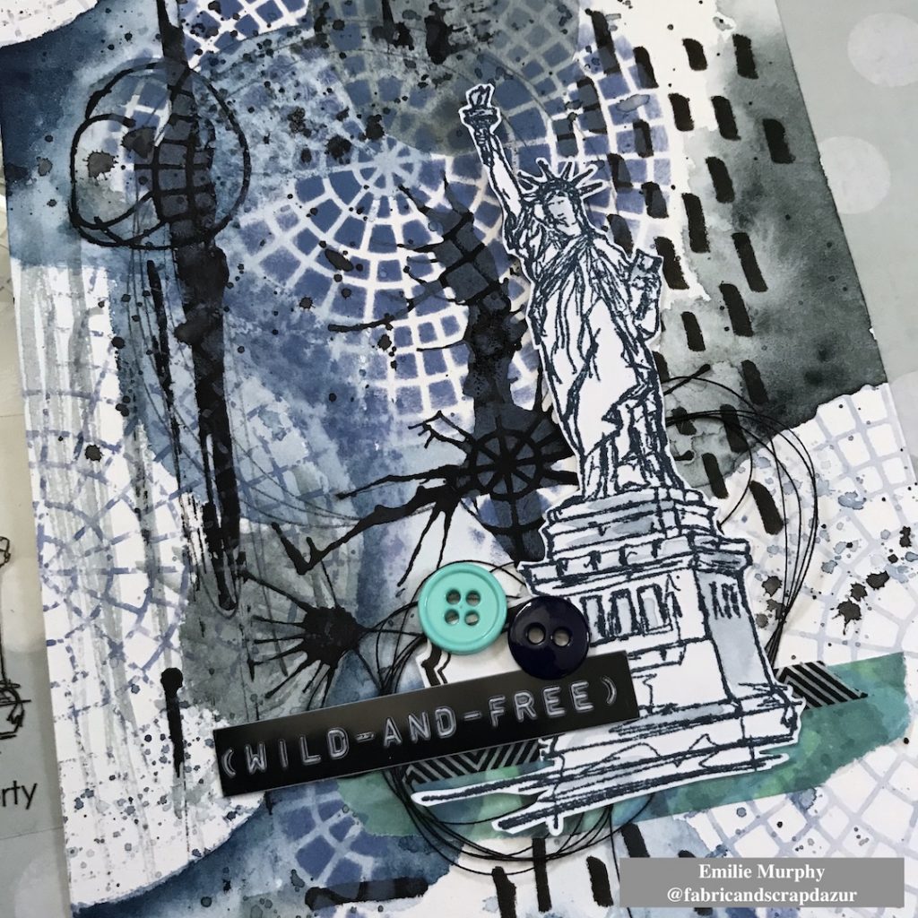
I decided to work on my background with the “Central Ave” 4×4 stencil. I first laid down my stencil and applied distress oxide ink directly through the stencil with a foam tool. Then, as I wanted to keep some blank less busy areas, I applied distress oxide ink on my stencil and spritzed a mist of water then laid down my stencil on the paper. I let the stencil down few seconds before removing it. As a result the paper absorbs the ink and you get a light negative print of your stencil. That is a cool effect giving a kind of ghost print.

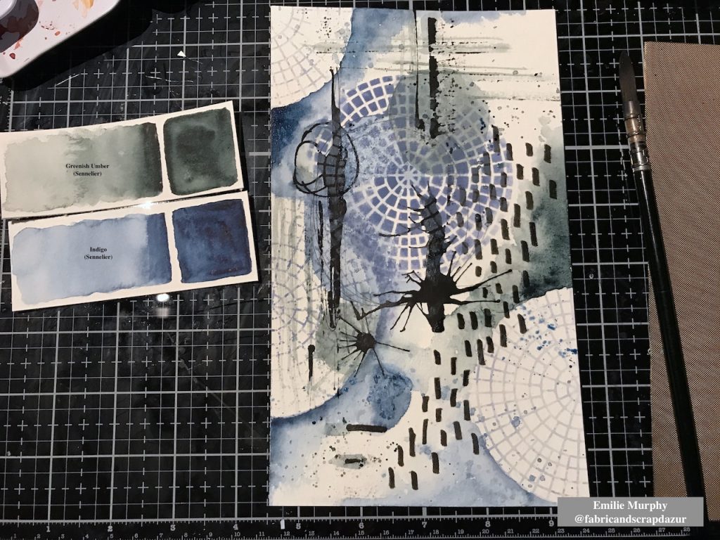
In order to unify all together the different areas of my background, I added more watercolor in order to make pop the stencil pattern out and get some circles.

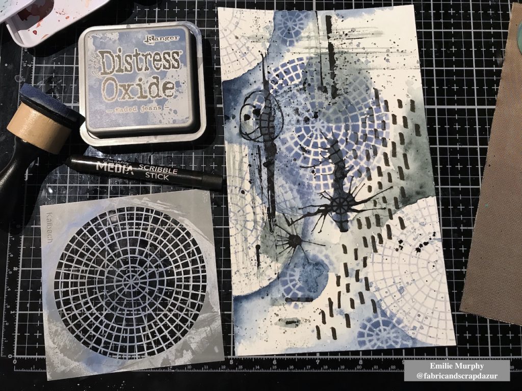
I introduced smaller circle shapes made only with the central part of the stencil. I think it brings an interesting dynamic to the background having different sizes of circles. It’s amazing what we can do with this simple stencil. I also added some black splatters with a water-soluble crayon. I can’t help myself… I love splatters!

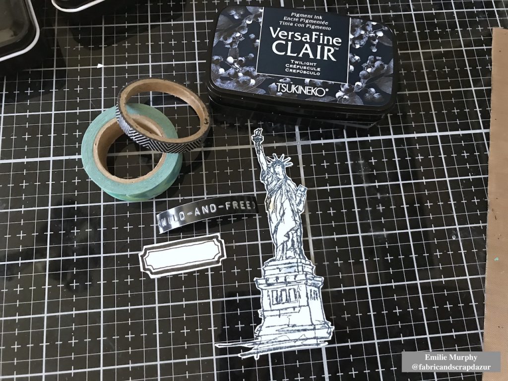
Then I prepared my focal image. I stamped the “Lady Liberty” stamp with VersaFine Clair ink. It is just a matter of preference. I could have used also archival ink. I gathered few other elements with coordinated colors that I wanted to add like a handmade label, a couple of Washi tapes, black thread and buttons. The “wild and free” sentiment has been made with a hand-label tool.

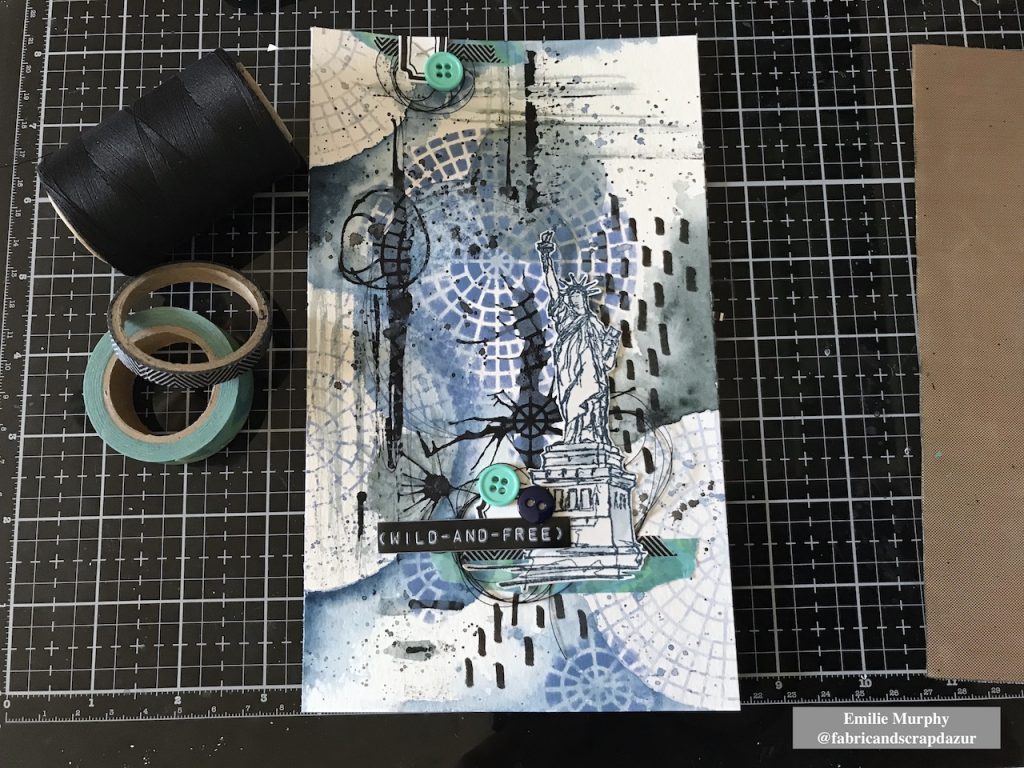
Finally, I assembled all the elements the way I wanted to finish my page.

Hope you have enjoyed this easy and pretty quick tutorial. I made the choice of doing a journal page but this could have been also great as a card.

Have a good rest of the week and see you next month!


Thank you Emilie – love how you tied everything together with the splatters, colors, and mark making!

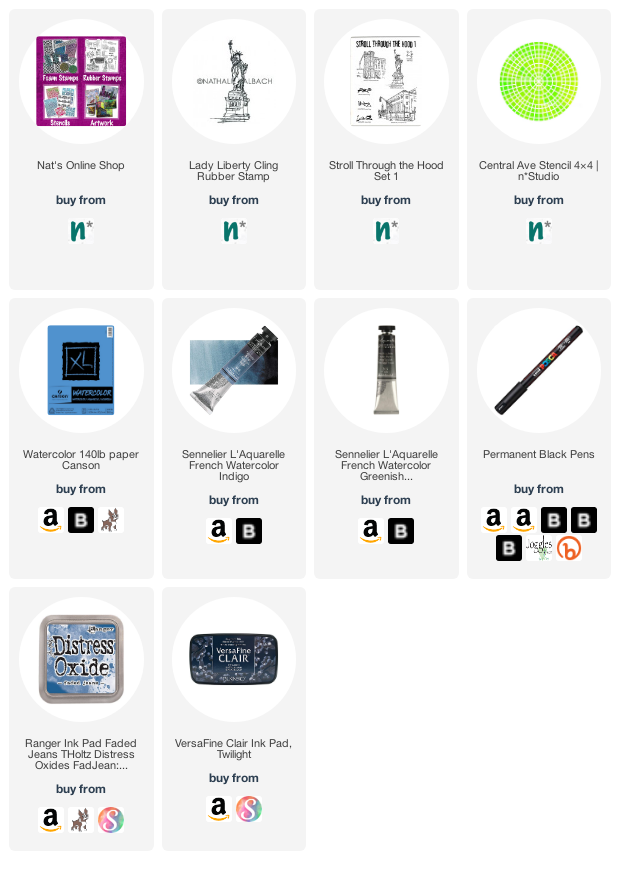
Give it a try: you can find all my Rubber Stamps and Stencils in my Online Shop and here are some of the other supplies Emilie used:

Play along with our monthly themes and weekly projects! Working on something yourself that you’d like to share?  Email me how you used my stencils and stamps with the theme and email me an image – I would love to share your projects in my next  “n*Spiration From Around the Globe“.
Leave a comment