Creative Squad

Creative Squad: Goodnight Art Journal – Maura Hibbitts

Hello from my Creative Squad! Today we have an art journal spread from Maura Hibbitts sharing her bedtime routine with us. She’s using my Batik, Art Deco Empire, and Art Deco Fairview stencils and our new monthly theme: Goodnight, Art Journal – Create an art journal page inspired by nighttime. Think about the colors, sounds, rituals of night – any aspect of it – and use that as your catalyst to create! 


So, I immediately thought of the book “Good Night Moon” when I saw this month’s theme, and books are part of my art journal spread too. Do you have certain routines you follow to help you get to sleep at night? I like to wind down by listening to Headspace focus music (usually jazz) and reading a book. Nowadays, my books are on my Kindle so I can enlarge the print to read it, but I love to read, no matter the format.

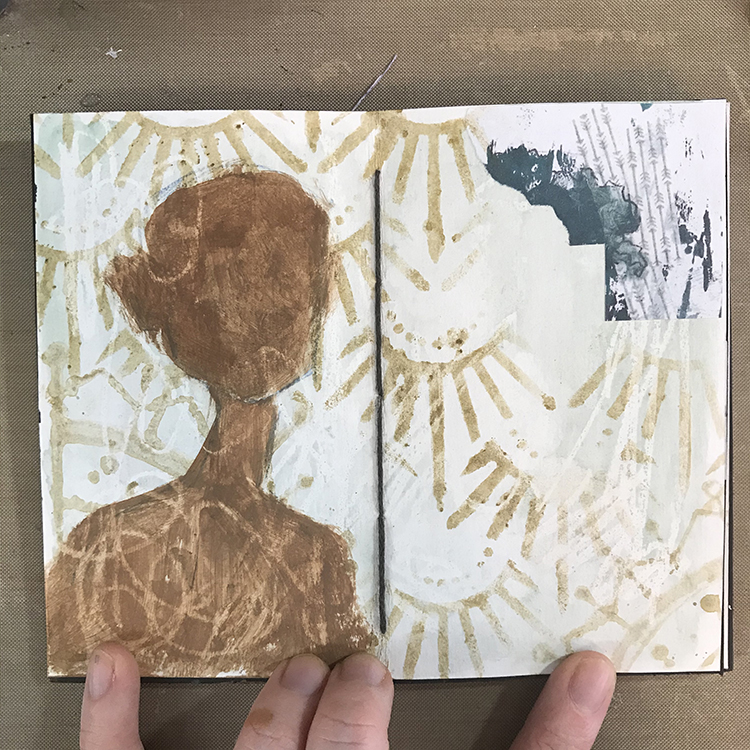
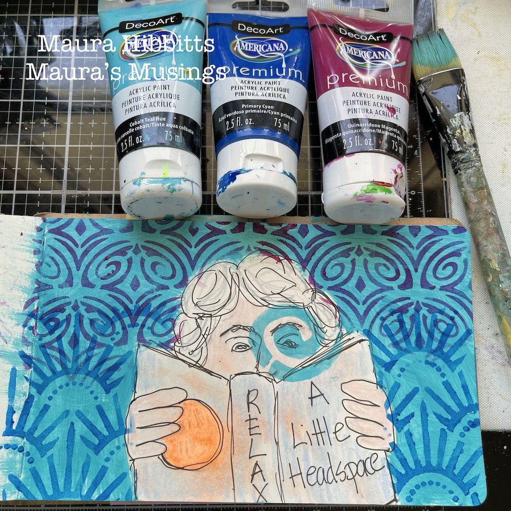
I began my project by sketching the image of myself reading with pencil.
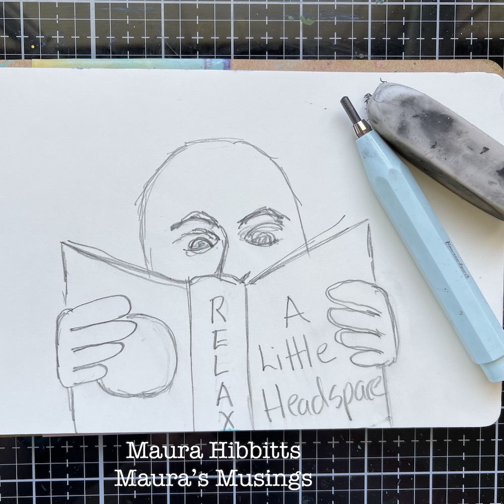
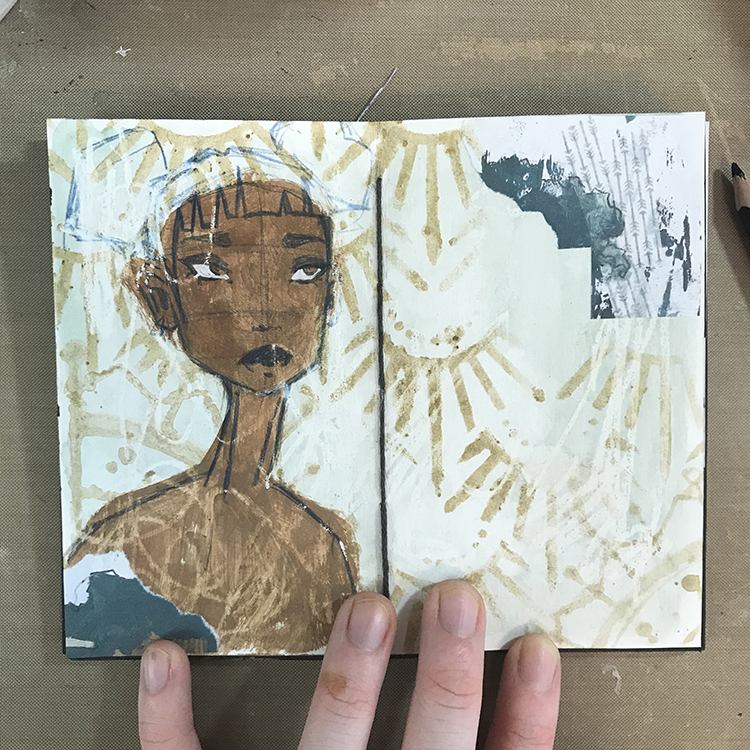
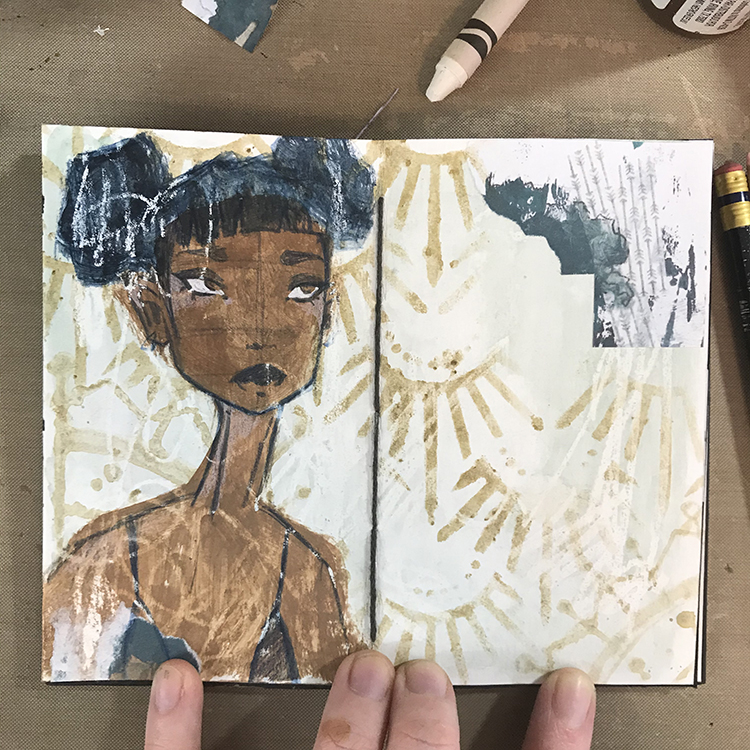
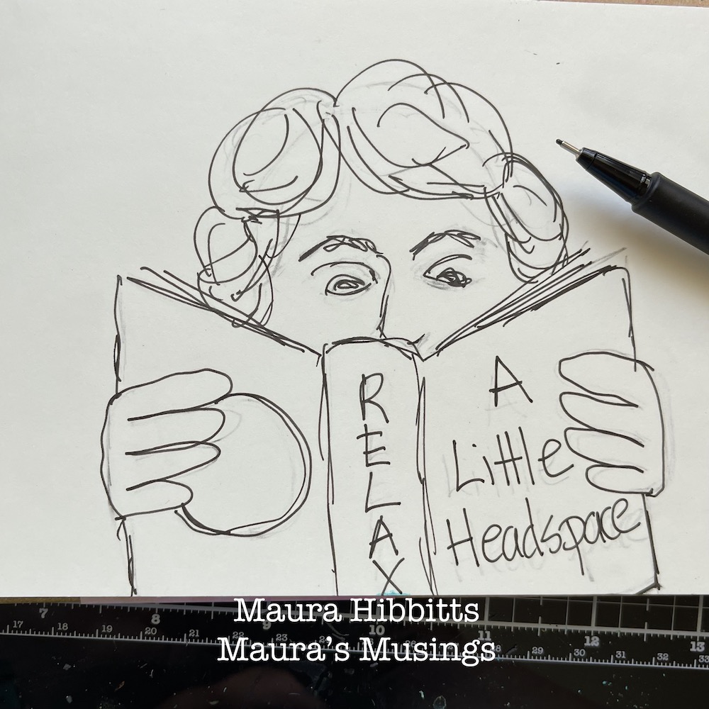
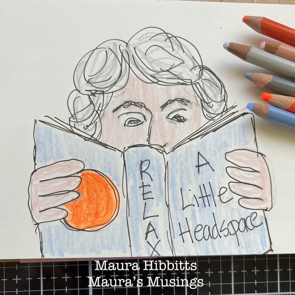
Next, I went over my sketch with an archival black pen, let it dry, then erased the pencil lines. I was thinking about all the mediums I could use, and decided on colored pencils, since I haven’t used these for awhile. It’s always good to pull out an old art supply to play with.
I painted a layer of cobalt teal around my image on the page. To add to my theme, I took Nathalie’s Batik stencil (a favorite of mine) and added a swirl of cobalt teal paint over one eye to emphasize my focus on reading and music as I unwind for sleep. I have to say, if I get too far off my nighttime routine for awhile, I get kind of grumpy.
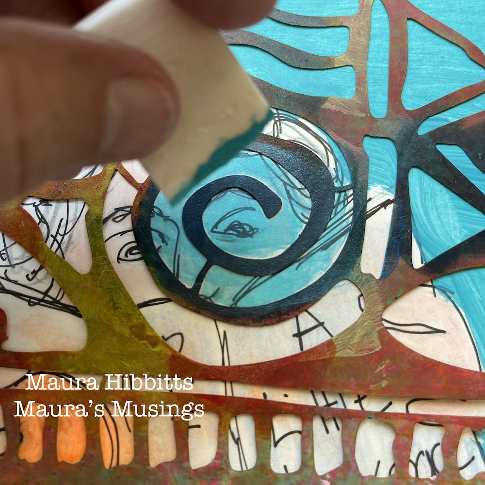
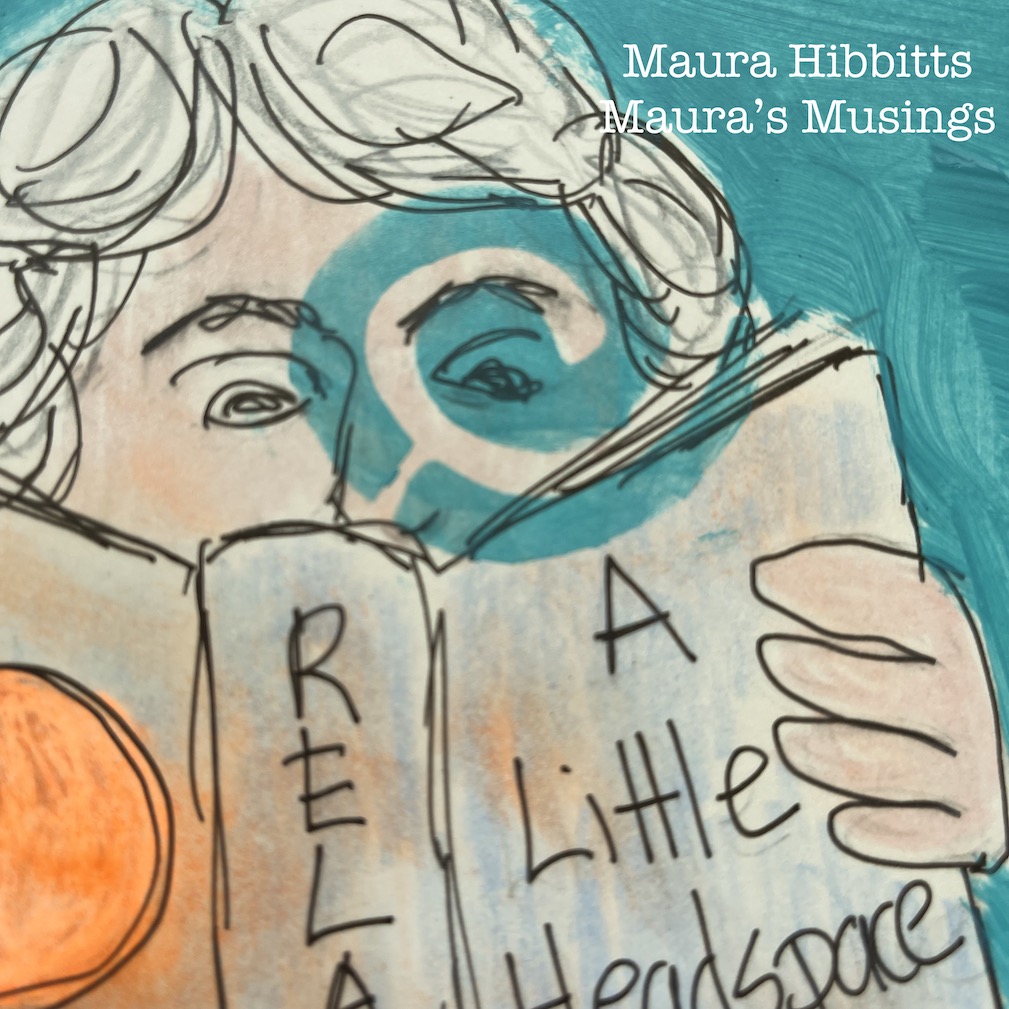
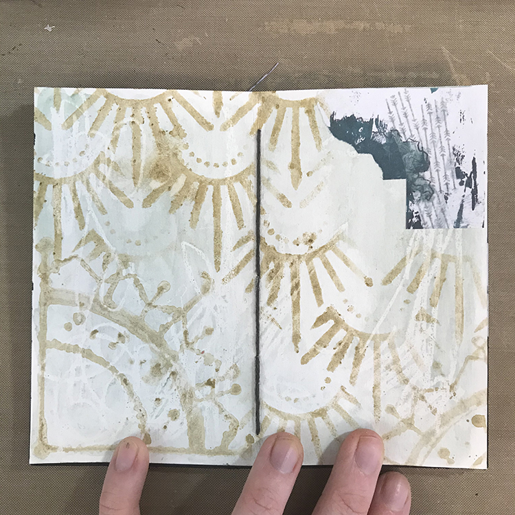
Now, it’s time for more stencil play. I chose Nathalie’s Art Deco Empire stencil for the lower portion of the page. I like to use cosmetic sponges to blend the paint into the stencil with a light touch, and here I used primary cyan. I decided to lay the used stencil on the opposite page and wipe the paint off onto the page with a baby wipe. It’s almost like getting a ghost image.
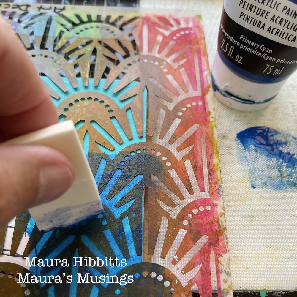
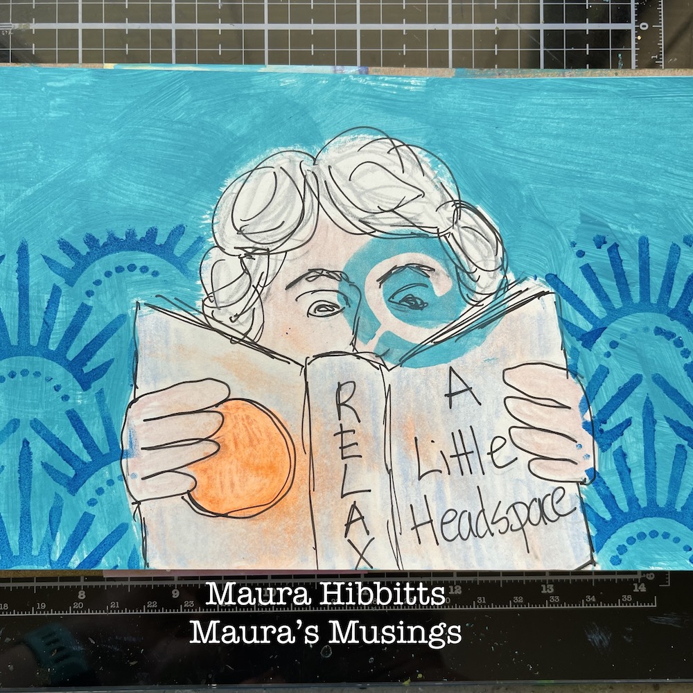
For the upper portion of the page, repeat the process using Nathalie’s Art Deco Fairview stencil and quinacridone magenta paint. Again, wipe the stencil off onto the opposite page.
Final step is to add some journaling. I used a Posca paint pen and hand lettered my words over the page where I wiped off the stencils. I like that bit of pattern in the background.
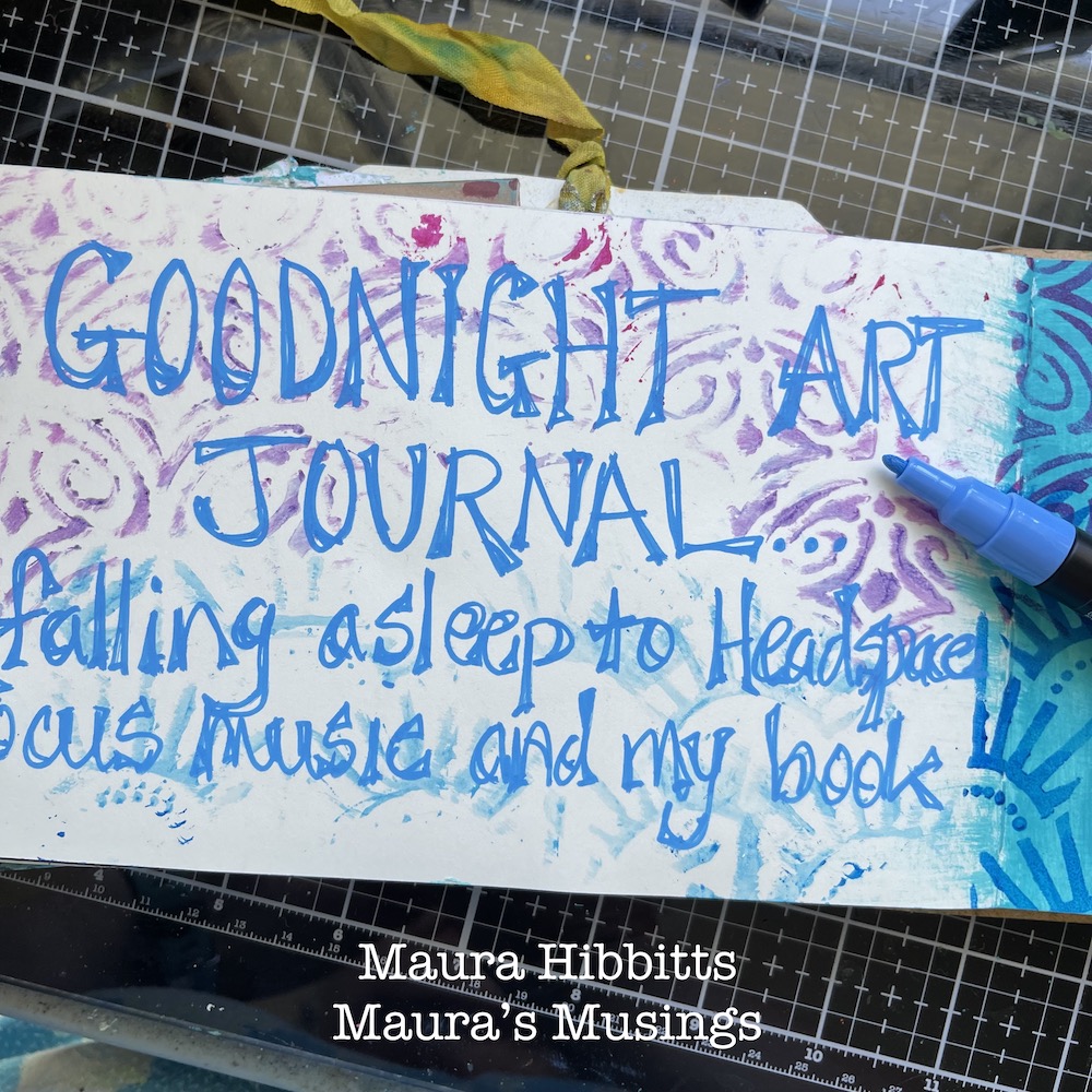
Music and reading relax me as I unwind for sleep. What are some of your favorite ways of winding down? I hope you have a good night!
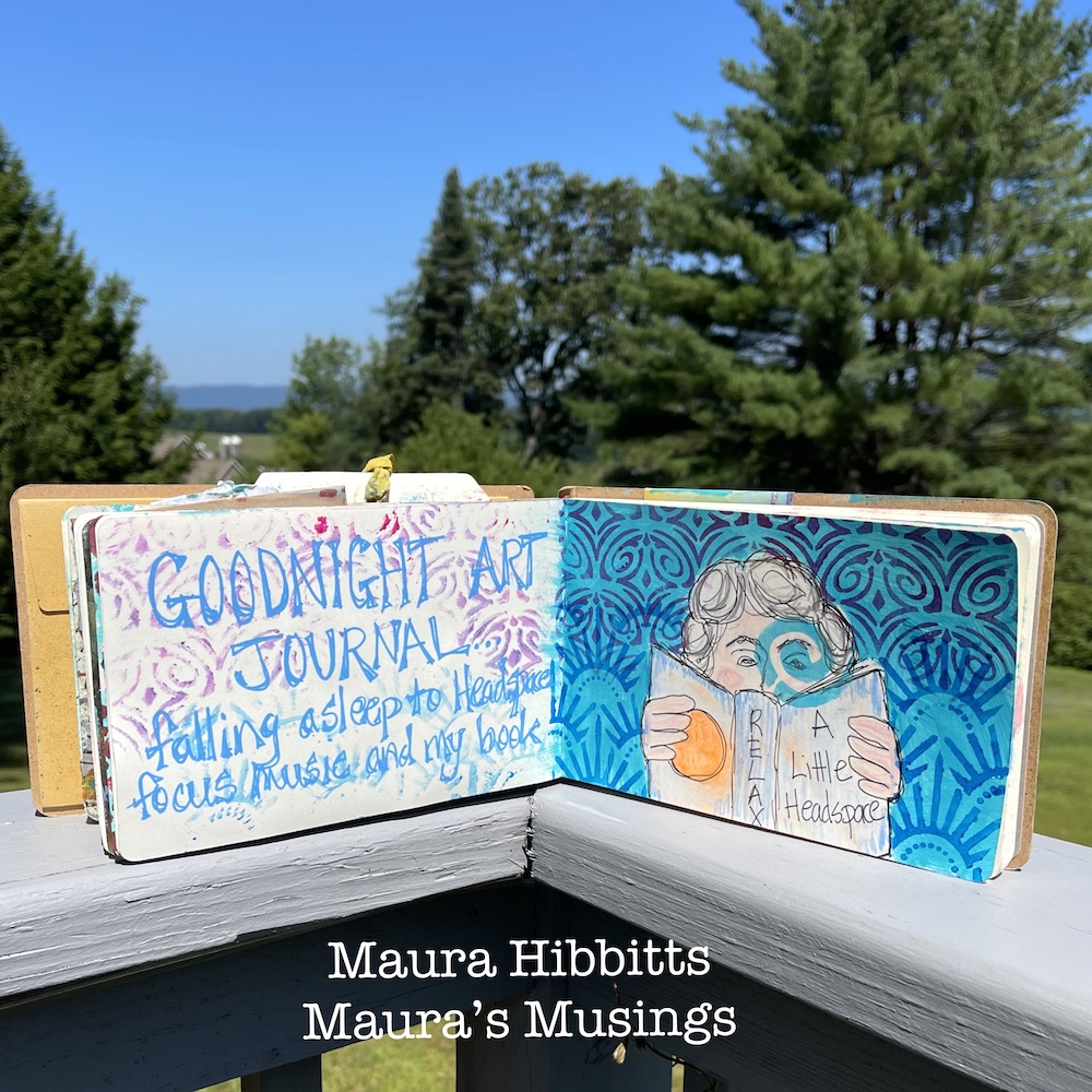
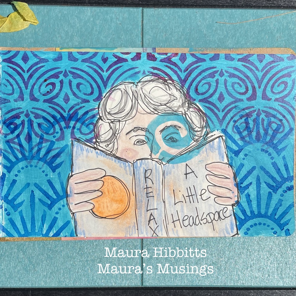
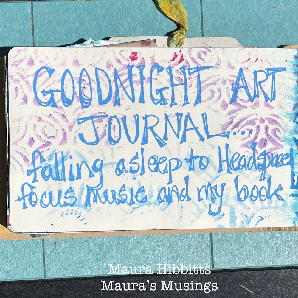
Thank you Maura! Love your cute drawing and how the stenciled background came together!

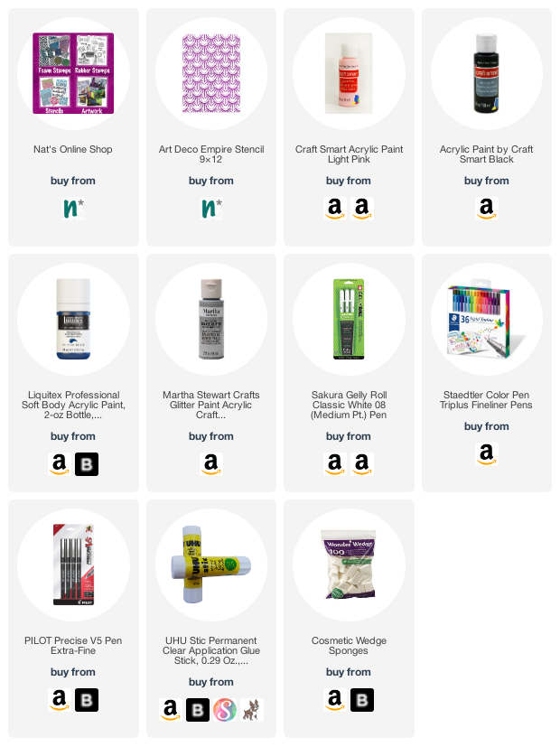
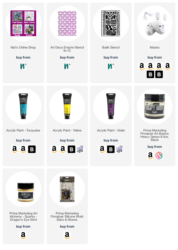
Give it a try: you can find all my Stencils in my Online Shop and here are some of the supplies Maura used:

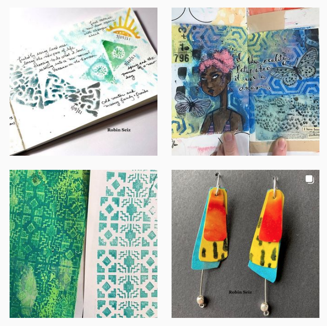
Looking for more projects? Follow the Creative Squad on Instagram here.

Comments (1)

  • Sue Clarke

    |

    What a fun play on Goodnight Moon!
    Nice creation Maura.

    Reply

Leave a comment

Pressing Questions – Art Journal

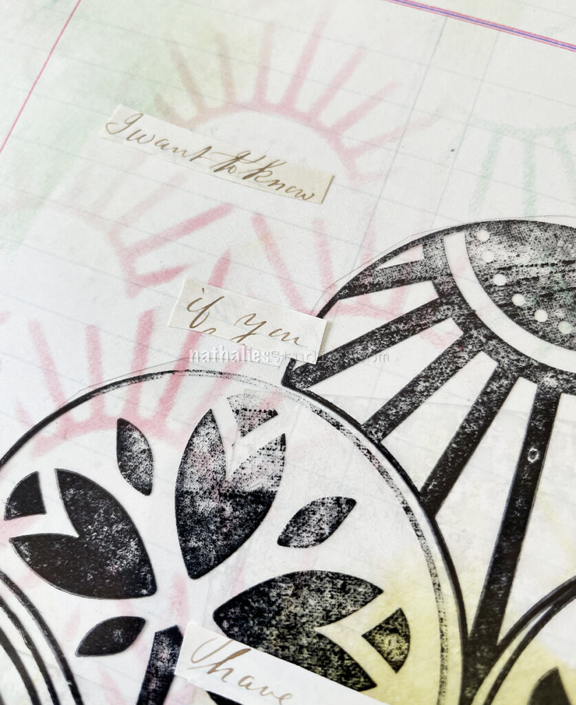
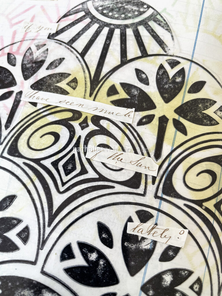
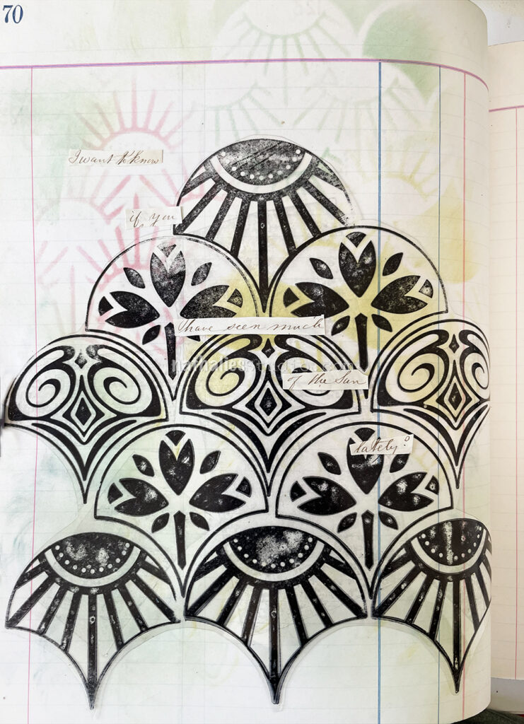
This is another art journal page with some inspiration from an old letter from the 1860s. This sentence said “I want to know if you have seen much of the sun lately?” It struck me as funny.

BTW reading all those letters and creating with them made me think about how much I loved to receive and send letters. I have a lot of letters that I kept from dear friends and family members and it is a funny thought that maybe in 100 years someone will make art with them hahaha.

I used my Art Deco Summit and Art Deco Empire stencils with Ranger distress oxide inks and a blending tool through the stencils.

On top I adhered a piece of Grafix acetate on which I had stamped with my Fan-tastic rubber stamps and Versafine ink. It was a leftover from a project and I thought it would be fun to use. I just added some double sided adhesive tape to the back and pressed it down.

For the letter I used my fav Coccoina glue stick.

Here are some of the supplies I used:

Comments (1)

  • Sue Clarke

    |

    Wouldn’t it be wonderful for someone to use one of your letters for art…absolutely a delightful thought!

    Reply

Leave a comment

Creative Squad: Masquerade Party – Jordan Hill

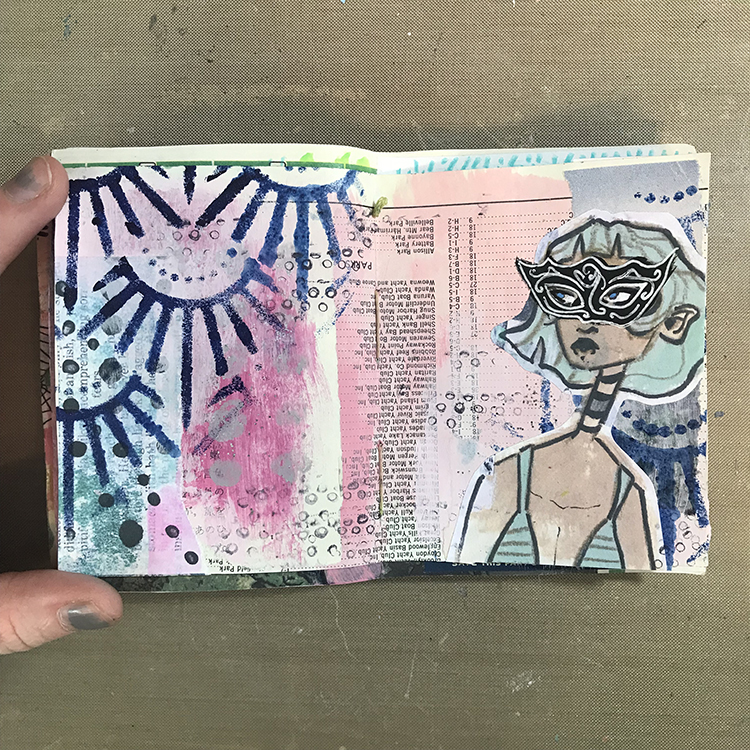
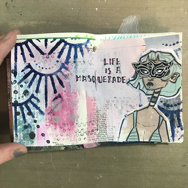
Hello from my Creative Squad! Today we have a post from Jordan Hill who is sharing with us an art journal page using my Art Deco Empire stencil and our October theme: Masquerade Party – Let’s play with disguises, the technique of masking, or maybe creating a bit of mystery this month. Not everything is what it seems, and it can be an interesting artistic trick to obscure or reveal in your artwork.


Hello everyone! When I first heard about this month’s theme of “Masquerade Party”, I was extremely excited! It’s the sort of theme that’s right up my alley, and I knew I would have a lot of fun with it. I hope you enjoy following along with me as I create this month’s project!

I started things off by flipping through one of my art journals to find a spread that I wanted to work on. This particular background consisted of a few pieces of collage, some pink acrylic paint and a bit of glitter paint. Something about this spread was calling to me, so I decided to go with it!

Next, using Nathalie’s Art Deco Empire Stencil, a foam makeup sponge, and some dark blue acrylic paint, I added some texture over different parts of my spread. I selected this dark blue color specifically because I knew it would contrast well with the soft pink of the background.

I then selected a collage image to use as my focal point for the page. For my example, I used a scan of my own artwork, but you could get a similar effect by using magazine images or photographs. It might be fun to play around with photos of yourself, or of family and friends!

Now it was time to introduce the “Masquerade Party” theme to this spread! I first sketched out the general shape of a mask over my figure’s eyes. Then, using black acrylic paint, I painted over top of my collage image in order to create a masquerade mask! Once the black acrylic paint was dry, I used a white gel pen to add some details to the mask; swirls and spirals are a great way to give a filigree effect without having to be too precise.

I also took this time to add some small circles over my page with a fine point pen. This added a bit of extra texture to the background, particularly in areas where I felt it was looking a bit plain.

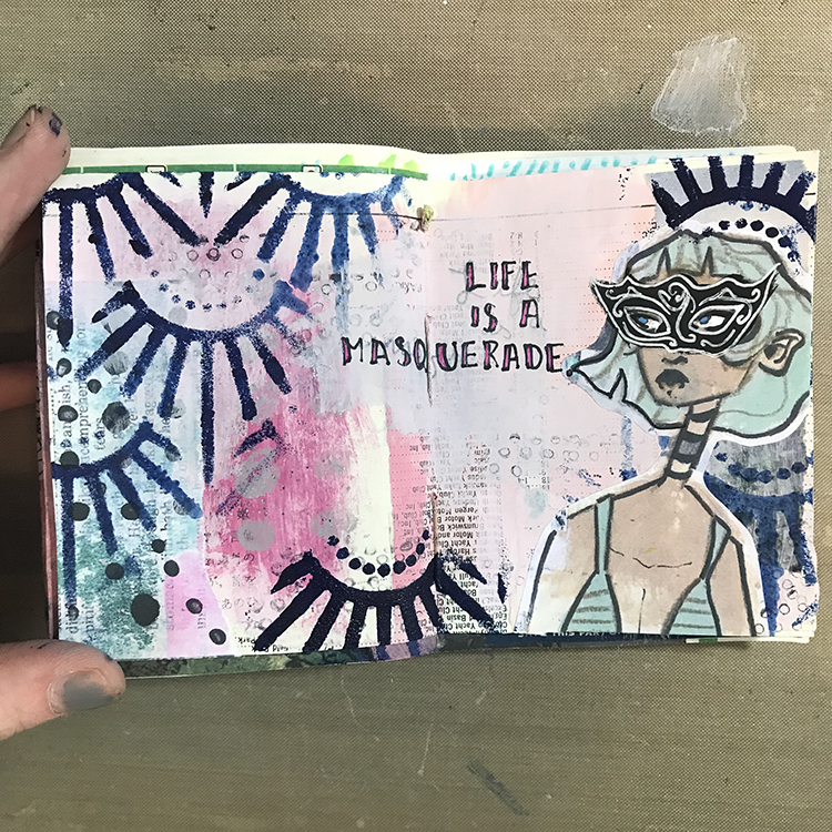
I was then ready to add words! At first, I tried to write directly over the preexisting background, but the numbers and letters from the collage paper were a bit overpowering. In order to fix this, I took some more pink acrylic paint and added a second layer to the area where I wanted to add my words. This second layer gave me a more opaque space to write. I also decided to supplement my typical black lettering with some magenta, in order to tie the words together with the spread a bit more.
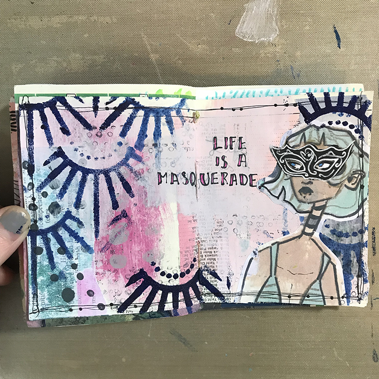
At this point, I was starting to feel as though I was losing a bit of the stencil design, so using the same dark blue paint, I re-added Nathalie’s Art Deco Empire Stencil to a few places around the spread. For the upper right element, I also flipped the stencil upside down and placed it so it would appear almost crown-like over the head of my figure!

To wrap everything up and tie it all together, the final step was to draw a scratchy border around the edges of my page. I added a few dots along these scratchy lines in an attempt to replicate the pearls and jewelry you might see at a Masquerade Party, and I was ready to call this spread done!
I hope you all enjoyed following along with my process this month and I hope you consider experimenting with some of the ideas yourself!


Thank you Jordan – so cool to see one of your characters donning a mask for the occasion! And look at that gorgeous background too :)

Give it a try: you can find all my Stencils in my Online Shop and in addition to collage papers here are some of the supplies Jordan used:

Follow the Creative Squad on Instagram for weekly posts, artwork, and inspiration.
Comments (1)

  • Robin

    |

    Jordan, I love this months journal page you created. The mask gives it such an expressive look. Loved reading your process too!

    Reply

Leave a comment

Creative Squad: Masquerade Party – Riikka Kovasin

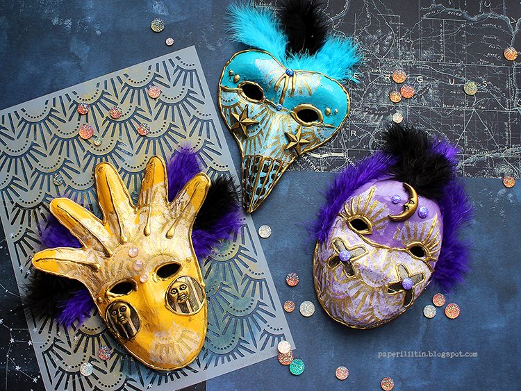
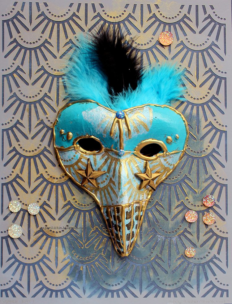
Hello from my Creative Squad! Today we have a post and video from Riikka Kovasin who is sharing a trio of festive masks using my Art Deco Empire and Batik stencils and our theme: Masquerade Party – Let’s play with disguises, the technique of masking, or maybe creating a bit of mystery this month. Not everything is what it seems, and it can be an interesting artistic trick to obscure or reveal in your artwork.


Sun, Moon and Stars 

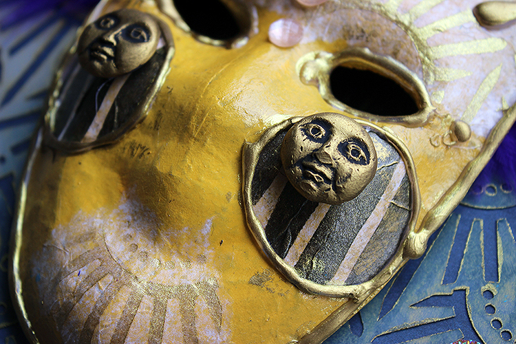
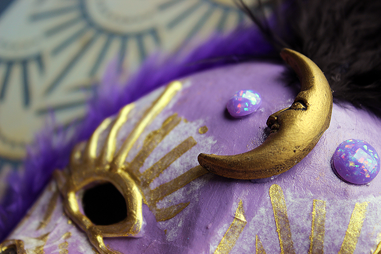
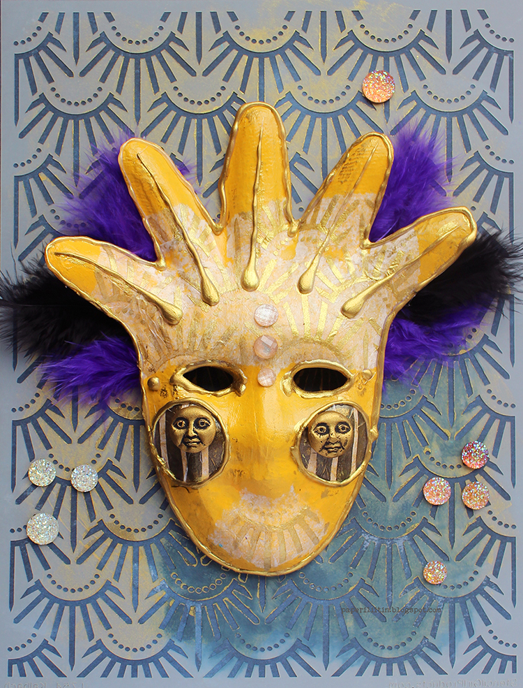
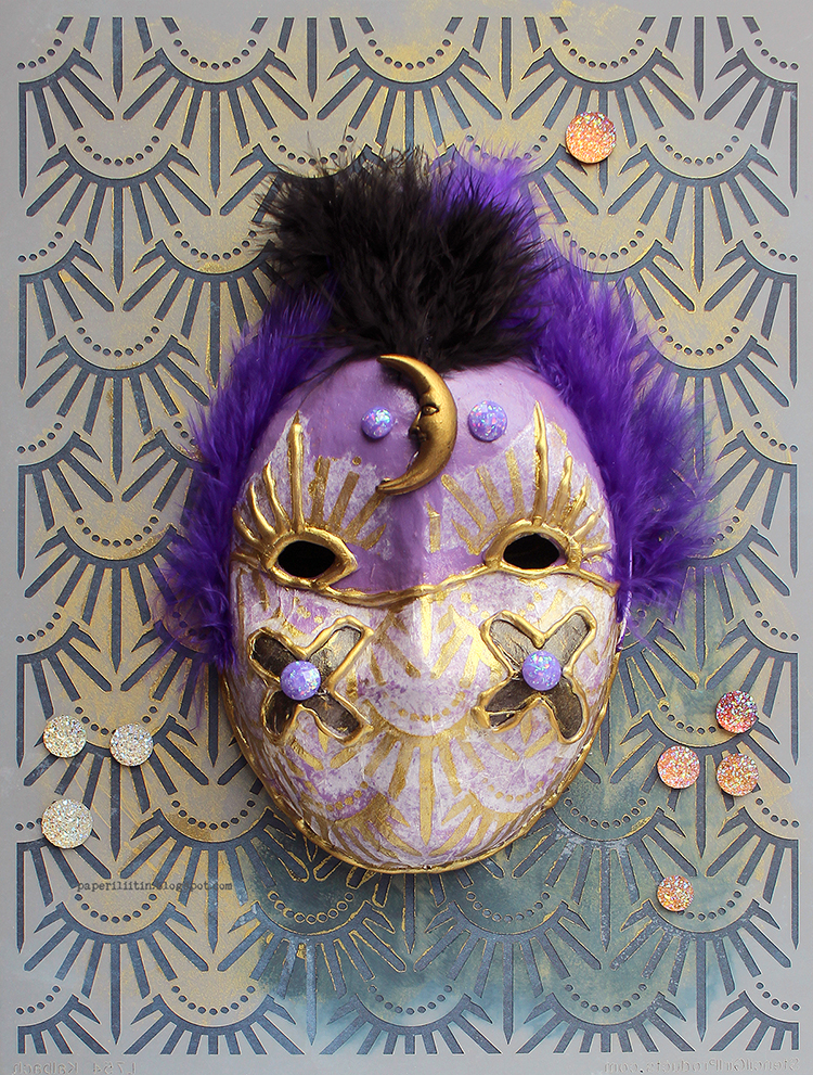
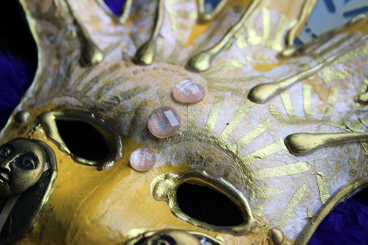
Hi there! It’s Riikka here today sharing my October project. As you can see, I took quite a literal approach to the “Masquerade Party” and decorated some small paper maché masks with acrylic paints and self-made decoupage paper.

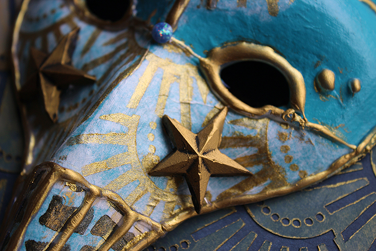
My inspiration for these masks were the Venetian carnival masks. Maybe it was the shape of the paper maché masks that led me there as they echo the shapes of the Venetian masks. The one I decided to make the sun has a little bit of harlequin in it whereas the one I decorated with stars has the “Dottore della Peste”, the plague doctor shape in it. With the carnival masks in mind I used bright colors and gold touches in the masks even though they are maybe a more modern addition to the whole thing. The traditional commedia del’arte masks where some of the masks have their origin were much simpler.

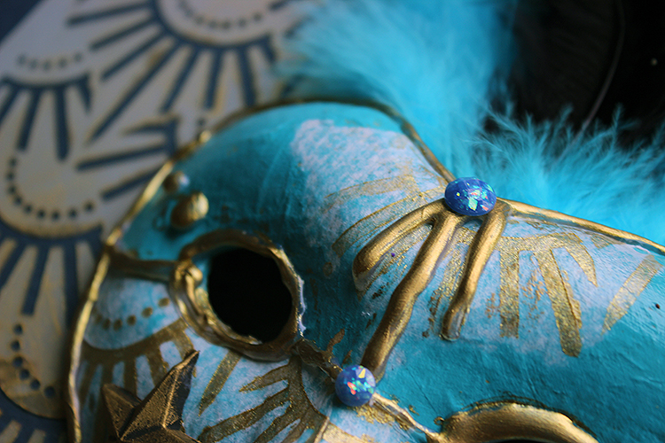
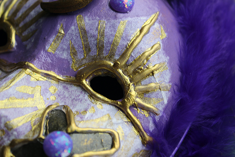
To get some pattern to my masks I used tissue paper as wrapping a stencil around such a dimensional shape can be quite challenging. Patterning tissue paper is an easier way to get pattern wrapped around the shape. Depending on the tissue paper, the color you’re laying it on top of, and the medium you use, you might get the paper to completely disappear. Here I used a soft body gel medium to adhere the pieces I first patterned using a golden acrylic paint and black gesso. For the patterns I used two Nathalie’s stencils – “Art Deco Empire” and “Batik”. I used golden acrylic with the “Art Deco Empire” as the pattern reminds me of a sunburst and black with the “Batik” to have some contrasting pieces for the masks. I used those just as accents, adding just a tiny detail to each mask.

As you can see, the tissue paper doesn’t completely disappear in my masks. On top of the lighter surfaces of yellow and turquoise it’s a bit more faded to the background than with the lilac. If you are trying to hide the tissue paper completely, one way to help is to have a frayed edge rather than a straight cut one. An easy way to do it is to use a wet brush. Trace the desired shape onto the tissue paper with a wet brush and then you can tear the piece loose. Paper is most brittle and soft when it’s wet and you’ll be able to get exactly the shape you want, to control the place where the paper tears.

To keep with the Venetian theme, I decorated my masks with some crystals and feathers. I chose to cut out the part with the feathers from the video as they were giving me a hard time. Or rather, I couldn’t decide how to put them on the mask. I added some several times to the Moon mask before getting the idea of attaching the feathers to the back of the masks, which worked nicely. I should have taken a peek at the modern-day Venetian masks for inspiration at that point!

As I had three masks, I wanted something to combine them into a series. Inspired by the sun like appearance of one, I decided to make a celestial triplet of the Sun, the Moon and stars. I made the focal embellishments for each using a silicone mould and casted the decoration using hot glue. There’s a quick Reels in my Instagram account showing that, if you wish to see HERE. But it’s really easy! You just need to remember that the embellishment is out of hot glue so it will melt for example in case you dry the project with a heat tool!

Thank you for stopping by today! I’ll be seeing you again next month!


Thank you Riikka – gorgeous, rich colors on these masks and I love the drama you create with them!

Give it a try: you can find all my Stencils in my Online Shop and here are some of the supplies Riikka used:

Follow the Creative Squad on Instagram for weekly posts, artwork, and inspiration.

Leave a comment

Creative Squad: Good Morning Good Evening – Riikka Kovasin

Hello from my Creative Squad! Today we have a post and video from Riikka Kovasin who is sharing an art journal page using my Row Houses foam stamp and Art Deco Empire stencil in response to our theme: Good Morning Good Evening – Are you a Morning Person or a Night Owl? Or maybe neither? Create a project inspired by your preferred time of day – when you are in good spirits, doing what you love, and enjoying life.


Dreamer and Doer Under the Stars 

Hi there! It’s Riikka here today with my take on the theme “Good Morning, Good Evening”. I did an art journal page and as always, recorded a little video while making it. 

I’m a would-be night owl. When I was younger and could get away with less sleep, I used to draw, sketch and get my best ideas during the nocturnal hours. But as I’m growing older, I need my eight hours and during work weeks can’t really be up too late. When I’m on vacation, though, and can self decide my daily rhythm, I tend to craft until morning hours and then sleep in. But unfortunately, in everyday life that rhythm doesn’t work. Thus the “would-be”. 

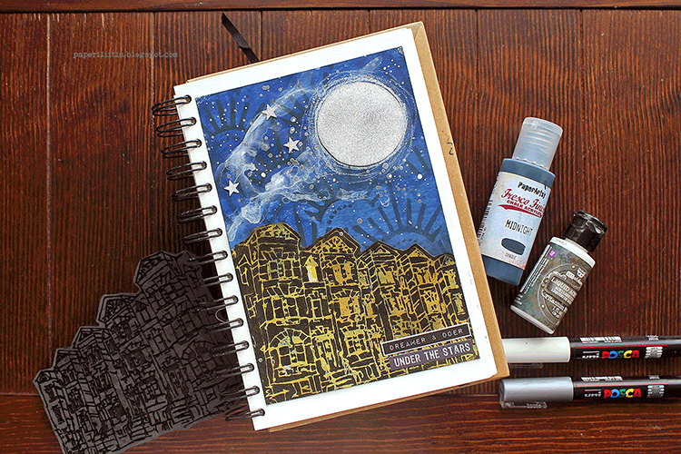
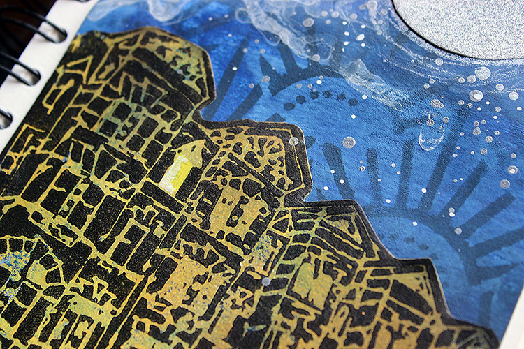
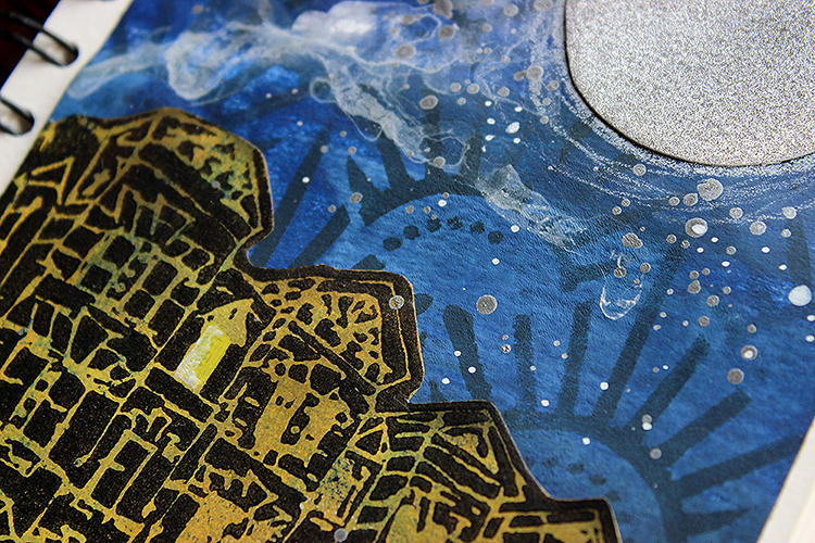
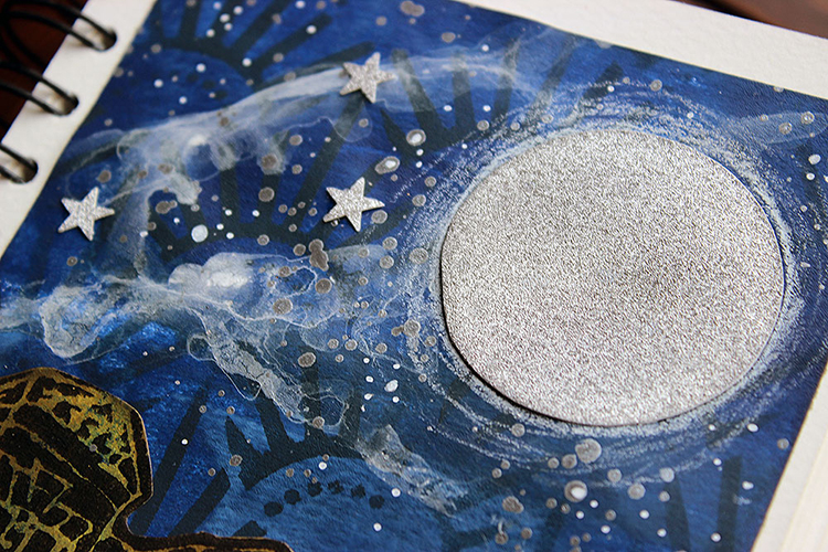
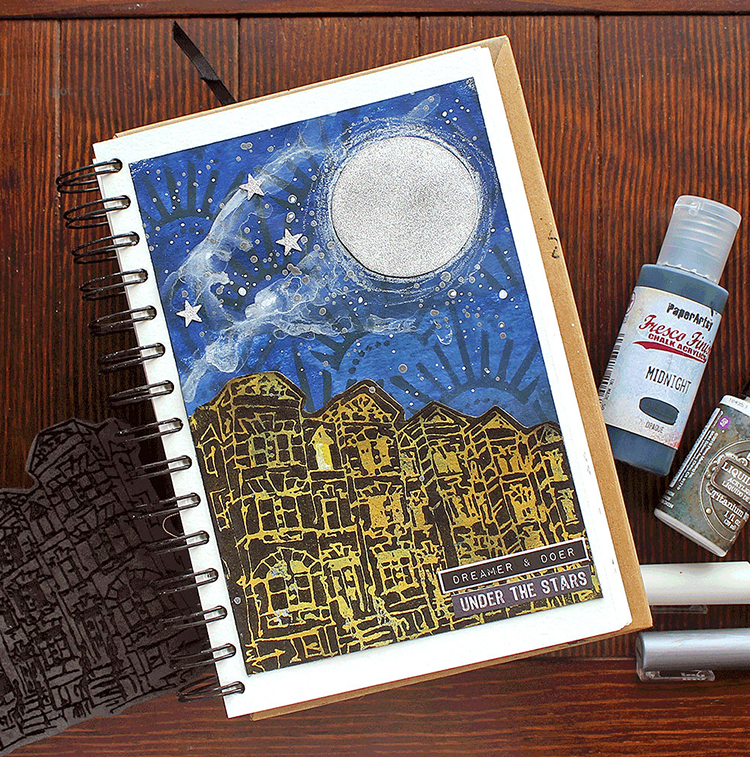
I knew immediately that I wanted to depict night, but the question was how and with what. The answer came when Nat’s great new stamps arrived. I stamped each of the motifs to a cardstock to try them out (and made a Reels out of it) and then used that cardstock to create two projects. The other of those was an art journal page. I really loved how that turned out and thought to re-create it with some alterations – most of all the color scheme. The other inspiration for the page was a stunning evening scenery through our living room window one night. An inky blue sky with white smoke-like clouds and stars just emerging and underneath it the black and golden apartment buildings with some lights on. I used that image to compose my color palette and even added that airy cloud to the sky. What the scenery was missing, was the big silver moon I added to the page.

I used gel printing plate to create the colored pieces. A gradient blue for the background and a mix of two yellows for the building. As I mimicked the golden tones I saw during the evening, I needed a yellow background for my black building silhouette. That created the effect of a lit building. I colored one of the windows of the “Row Houses” with yellow to show that someone is awake. I kind of thought that would be me, crafting, when the city is otherwise asleep. The “Row Houses” was an obvious choice for the scenery as we live in an apartment building and all the other buildings around are also with several stories.

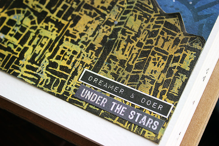
I was looking for “a night owl” text sticker to finish the page, but fortunately couldn’t find one. That forced me to think other versions, and I combined two texts to compose a story. It sounds a bit poetic – dreamer and doer under the stars. Dreamer I thought in this case to mean both actual dreaming, sleeping, but also hopes and dreams. Doer on the other hand is the crafting part. Are you also a “under the stars” style crafter or rather the opposite?

Thank you for stopping by today! Have a great week!


Thank you Riikka – I love that window and thinking about who may be in there, working away under the moonlight!

Give it a try: you can find all my Foam Stamps and Stencils in my Online Shop and here are some of the supplies Riikka used:

Like what you see? Follow the Creative Squad on Instagram for weekly posts, artwork, and inspiration.

Comments (1)

  • Sue Clarke

    |

    Riikka, this is stunning. I love the golden colors around the buildings and the moon dust!

    Reply

Leave a comment

Another Woman’s Crown – Art Journal

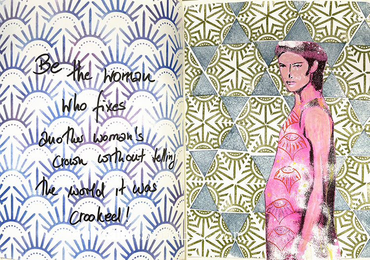
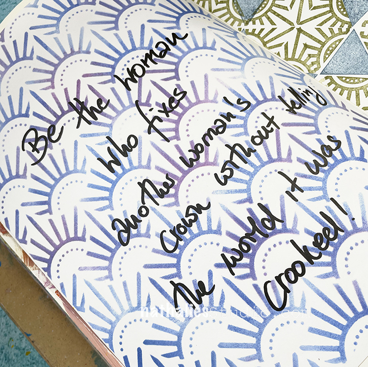
“Be the woman who fixes another woman’s crown without telling the world it was crooked!”

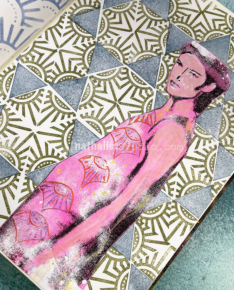
To create my background here I used Moonlight duo ink pads with my Triangle Love rubber stamp set. The figure is a pulled magazine gel print.

On this side I used my Art Deco Empire stencil with Moonlight duo ink pads and then added in my quote.

Here are some of the supplies I used:

Leave a comment

Stencil Spotlight – Art Deco Empire

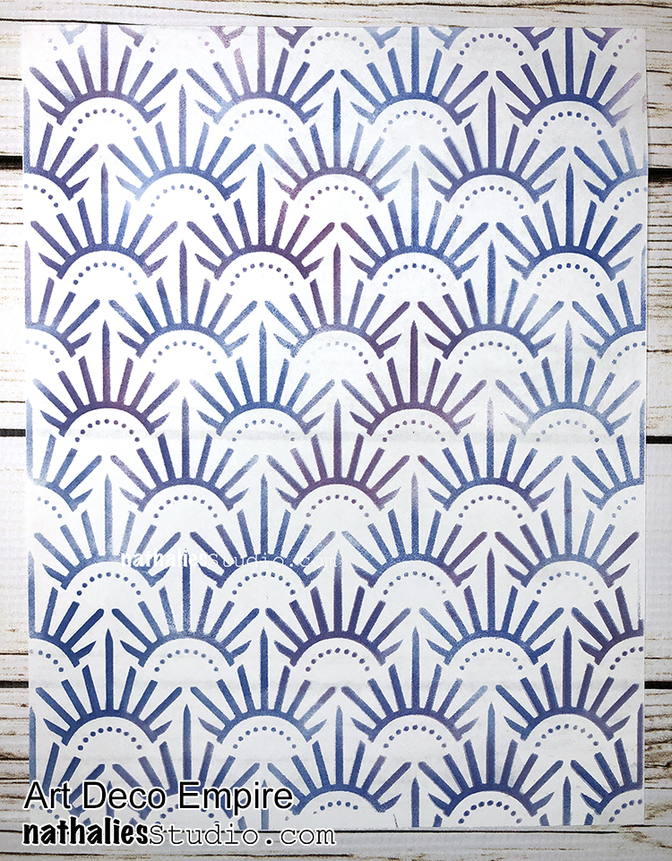
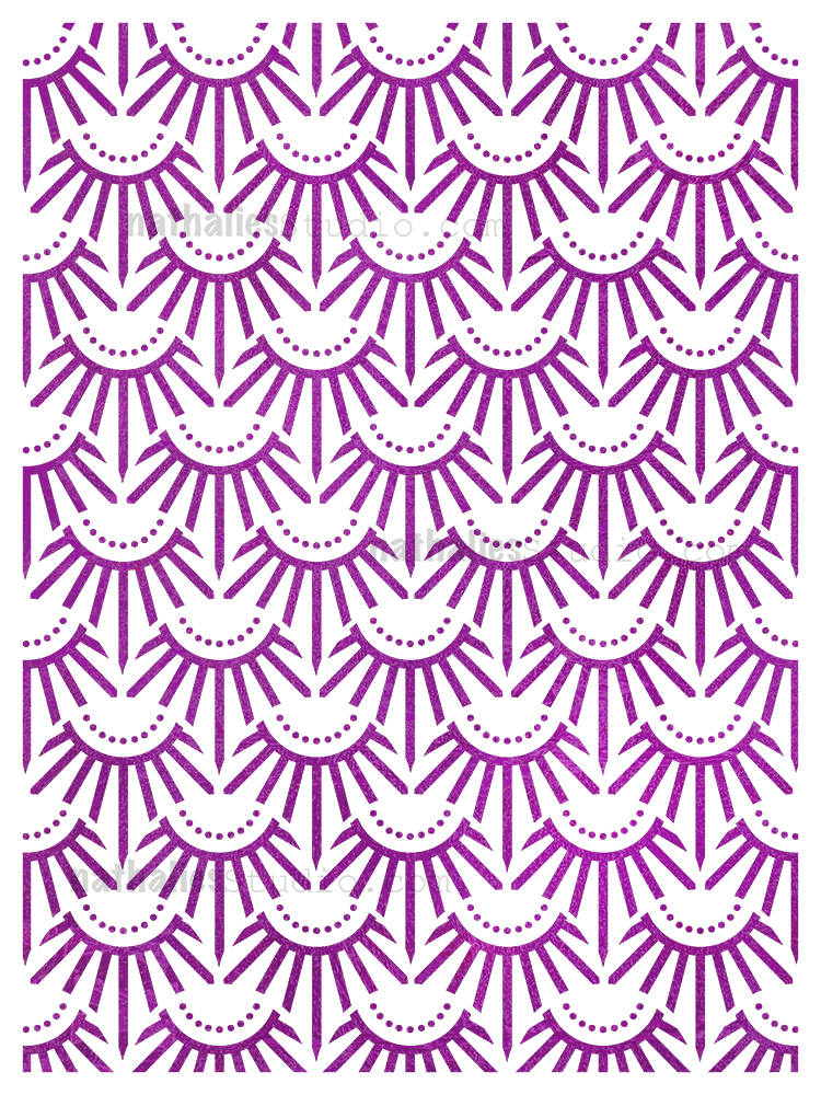
I love getting to turn some of my design ideas into stamps and stencils and sometimes, I crush hard on one or the other. Lately I’ve been feelin’ some serious love for Art Deco Empire – a stencil who’s story began with some photos of manholes and grates around NYC and Jersey City, evolved into a circular foam stamp set, then a fan shaped foam stamp set, and finally morphed into the Art Deco Empire stencil. I love how a design or pattern can flow through so many forms and in the end it becomes a suite of tools for me to use in my artwork. But today I am giving you an ode to Art Deco Empire :)

I think what I love most about the design is the classic art deco feel and how it reminds me of some of those building and architectural motifs from that era. I am a big fan of that time period when it comes to art and design.

But enough of my love letter lol – let’s just look at this guy in action:

Here are a couple pieces I made for Creative JumpStart 2020 using Art Deco Empire as my background with acrylic paint on cardboard. I oriented it two different ways and I think it gives a different feel for each.


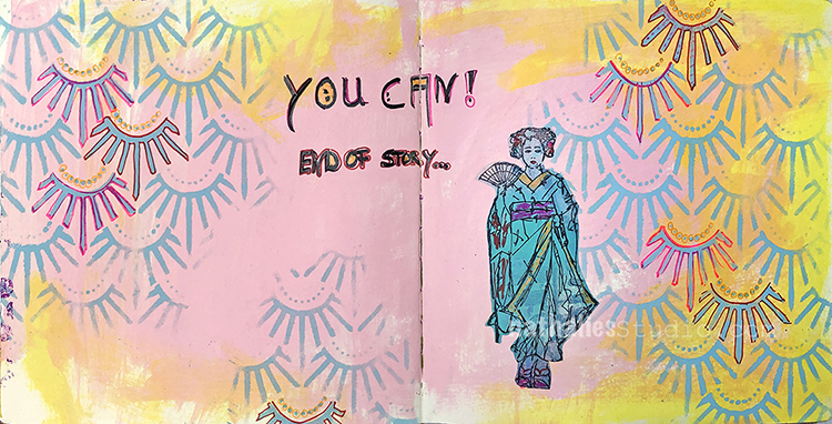
Acrylic ink and gouache also work great for creating a background with Art Deco Empire as you can see in my art journal page from this post. The pattern can stand on its own for sure.

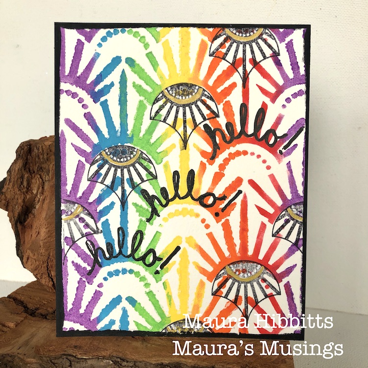
My Creative Squad has also showed just what it can do:

Maura Hibbitts created a series of super happy cards in this post using a rainbow of acrylic paint.

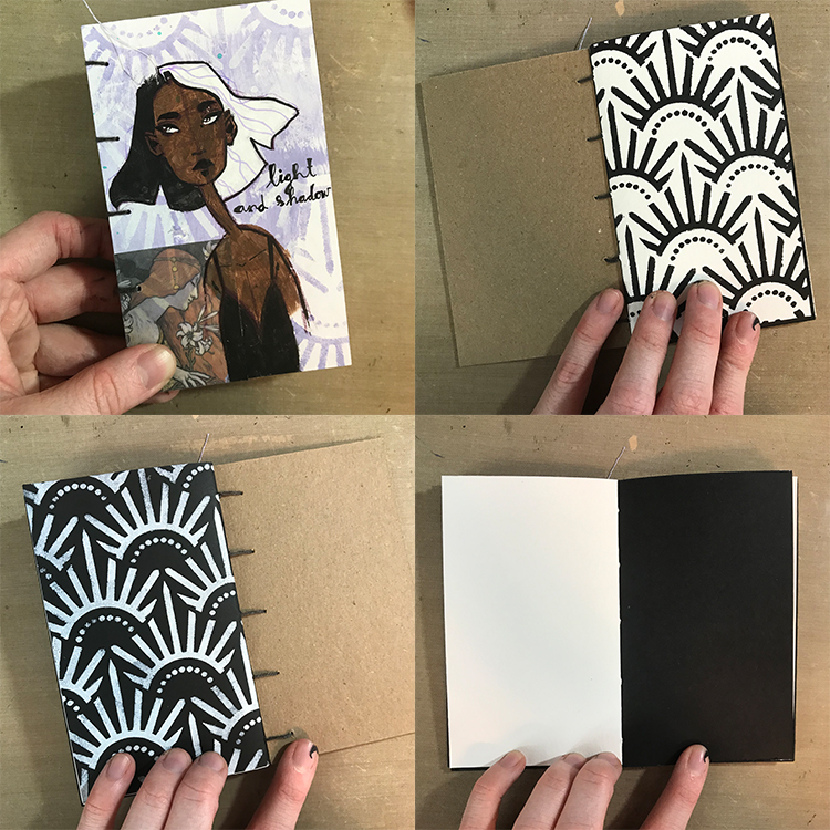
And here is a mini book and the start of an art journal page too:


Creative Squad member Jordan Hill also reaches for Art Deco Empire for backgrounds and pattern elements too:

In this mini book she chose it for the inside covers as well as a more subtle element on the front.


In this post by Jordan, she uses the Art Deco Empire stencil both for her background and a really cool top for her character – love it!!! Can I have a sweater like that? LOL

Thank you for hearing about my current stencil crush with Art Deco Empire – I hope it gets you in the creative mood! Here is one last look ;)

Leave a comment

Creative Squad: Life in Bloom – Jordan Hill

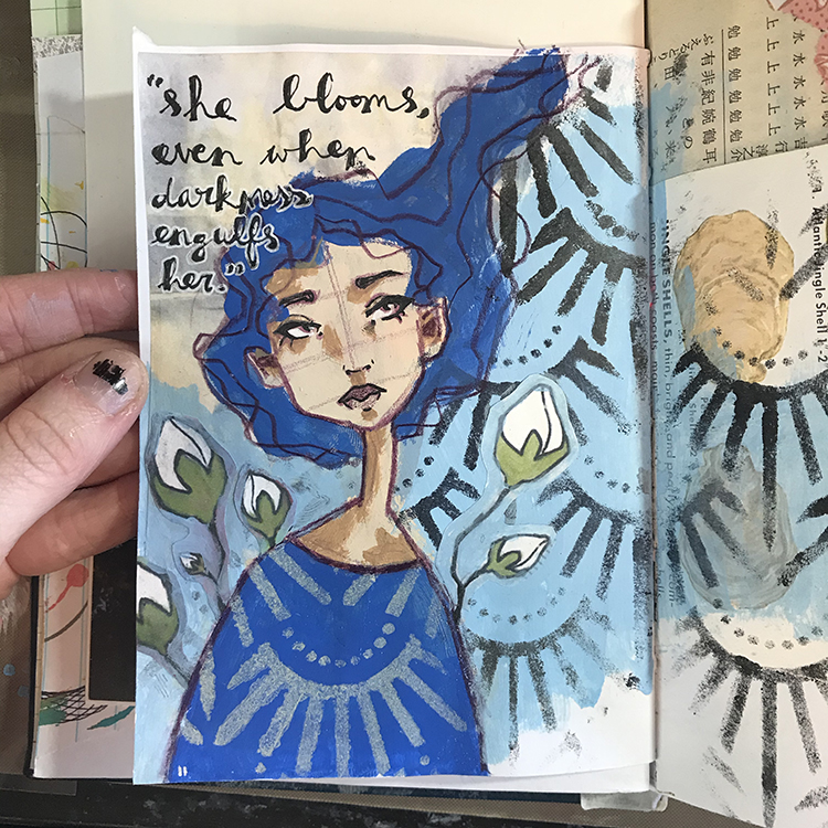
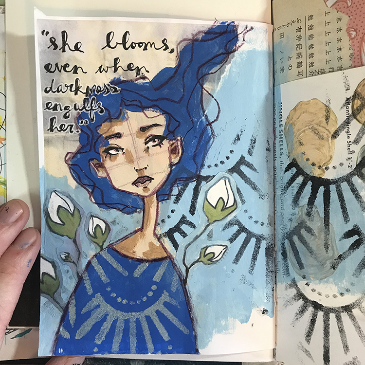
Hello from my Creative Squad! Today we have a post from Jordan Hill, who is sharing an art journal page that is uplifting and so appropriate. Jordan is using my Art Deco Empire stencil and this month’s theme: Life in Bloom – It’s been a long winter where we are and I’m dreaming of flowers and gardens and spring. Indulge us all in a project that focuses on one of Mother Nature’s most exuberant symbols of life: flowers flowers flowers!


Hello everyone, I hope you’re all doing well! For this month’s theme of Life in Bloom, I knew I wanted to try incorporating it in several different ways. In the end, I’m quite happy with the way it turned out and I hope you enjoy following the process!

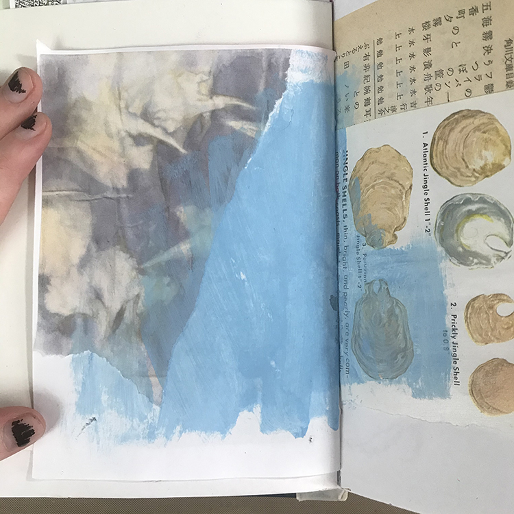
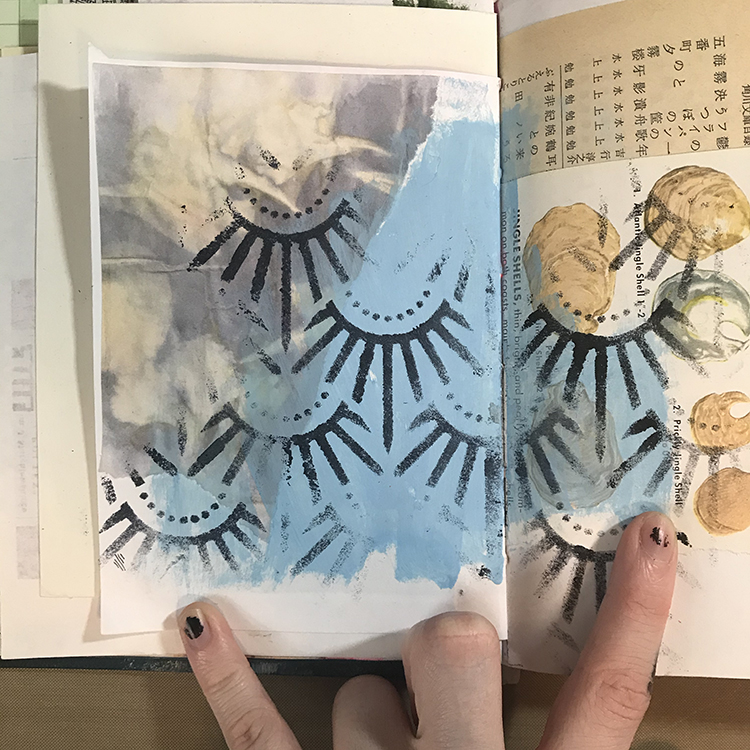
The first step in creating this month’s page was gluing down a piece of collage. I then blended it into the background with a light blue acrylic paint by slightly overlapping the paper with the paint. I chose a piece of paper that I felt fit in with this month’s theme of Life in Bloom; this particular paper is a scan of an eco dyed paper I did a while back.

Next it was time to add some pattern! I used Nathalie’s Art Deco Empire Stencil, some black acrylic paint and a makeup sponge to fill the background with interest. For this particular spread, I knew that I wanted the stencil to stand out. Since my background was such a light blue, black seemed like the natural choice!

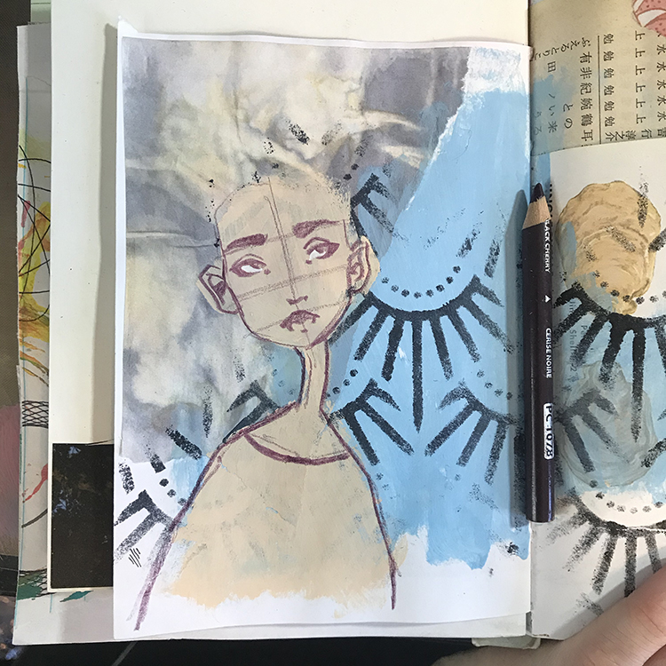
This is where I decided it was time to add a face. Using some acrylic paint in a vague face shape as a base, I started sketching over the top with my trusty Prismacolor colored pencil in the color Black Cherry. This is one of my favorites for sketching, as it isn’t as basic as a black or gray, but is still dark enough for the lines to be clearly defined.

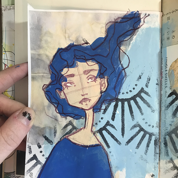
Next, I chose a supporting color of acrylic paint (I decided to go with primary blue for this spread) and started blocking in the shapes of the hair and shirt. I find that using the same color for these two elements is a good way to make your page (and character) feel cohesive. After I had blocked in the color, I then went back in with my colored pencil and reinforced the lines that I had lost when I added the paint. At this point, I also added a few extra lines in the hair to represent flowing strands.

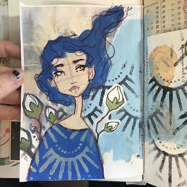
Around this time, I was starting to feel as though the Life in Bloom theme wasn’t strong enough. In order to resolve this, I decided to use a piece of collage (another scan of some previous artwork of mine) to add various blooms around this character’s shoulders. I wanted the buds to look like they were growing from behind her, so I cut up the collage piece (which used to be one large stem) and added them in a way that was more fitting.

During this step I also used Nathalie’s Art Deco Empire Stencil again, this time with a cream colored paint, in order to add some patterning to this character’s shirt.

Then it was time to detail! This is one of my favorite parts of creating journal pages; it’s where everything seems to come together and starts looking a bit more finished. For the details on this particular spread, there were a few things I did. First of all, I added some shadows to the figure’s face using a slightly darker tone of paint, then I added some black line work to the facial features using an ink pen.

I also used the same color of blue I had used for the background to paint around my floral elements, further cementing them into the spread. Additionally, I added a quote in the upper left hand corner that I felt related to the theme of Life in Bloom.

Finally, for the last step, I reached for the Art Deco Empire Stencil one more time in order to add to the stenciling in the background. After adding the figure I felt as though I had lost a lot of the patterning, so I simply lined it up and filled in the rest of the background.

In the end, I think this spread fits the theme of Life in Bloom in the way that I hoped that it would, and I had a lot of fun playing around with the stencil in particular. I hope you enjoyed following the process!


Thank you Jordan – I love that quote and how you pulled your page together. Your character’s style – blue hair and how you used the Art Deco Empire stencil for her top is so cool!

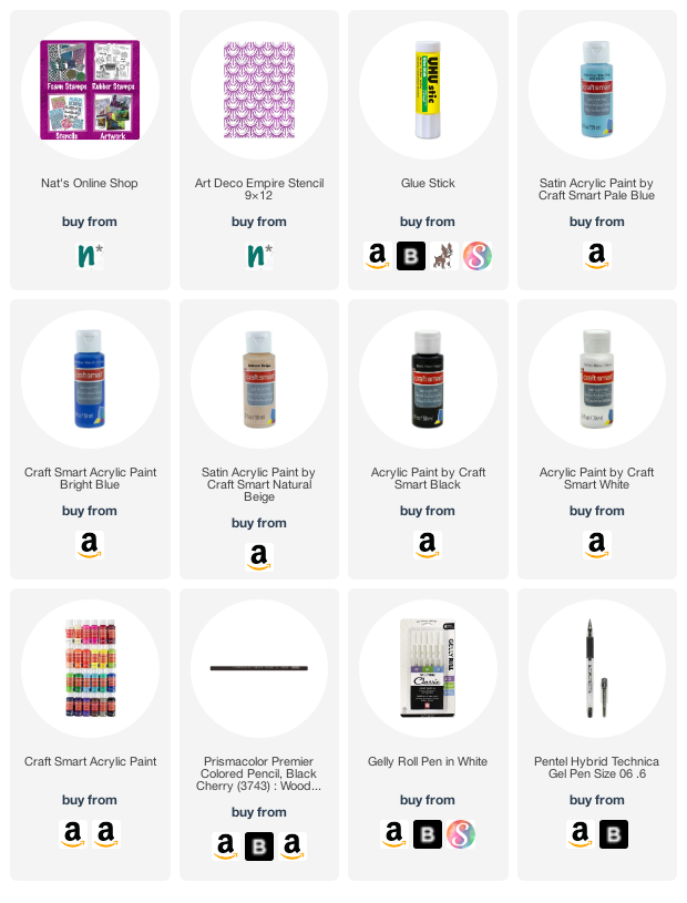
Give it a try: you can find all my Stencils in my Online Shop and in addition to some collage pieces, here are some of the supplies Jordan used:

Don’t forget to check out Nat’s Creative Squad on Instagram too: Each week we post projects, ideas, and inspiration for mixed media art.

Comments (1)

  • Sue Clarke

    |

    I love this page Jordan! Thanks for sharing your process.

    Reply

Leave a comment

Creative Squad: My Creative Playlist – Jordan Hill

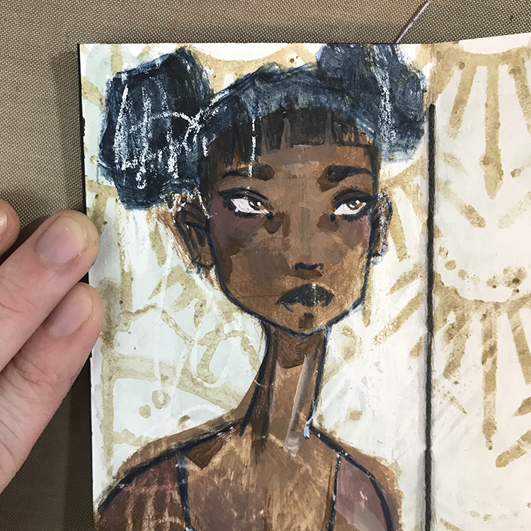
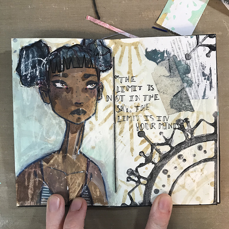
Hello from my Creative Squad! Today we have Jordan Hill sharing with us a guilt free art journal spread using her favorite supplies, my Mini Motifs foam stamps, my Art Deco Empire stencil, and our theme: My Creative Playlist – Your favorite mixed media supplies are like your favorite songs: they lift you up, inspire you and just feel good to groove to. What are your favorite supplies? Use them in a project – YOUR Creative Playlist that always gets you going.


Hey everyone! I’m excited to be back with a new post for this month’s theme of “My Creative Playlist”. I tend to reach for a lot of the same supplies in most of my art journal spreads anyways, so this was a great excuse to not feel guilty about it! With that being said, let’s get into it!

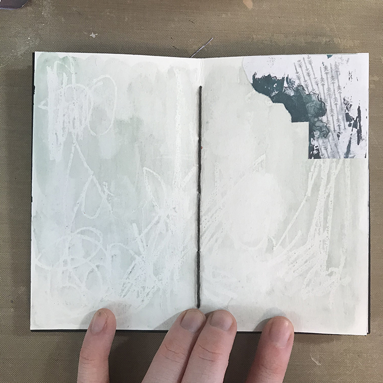
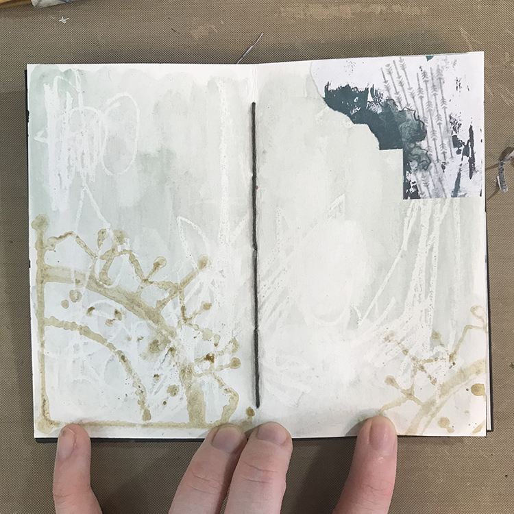
I started off today’s page by scribbling randomly with a white crayon. I then reached for some of my handmade watercolors and did a wash over the entire spread. I used to be more of an acrylic paint person, but recently watercolors have really been speaking to me. Thus, for the theme of “My Creative Playlist”, I thought I would take the time to really combine the two types of paint! Collage is also something that I really love using in my work, so I glued a piece down.

Next up, I wanted to play with Nathalie’s Mini Motifs foam stamp set to continue building the background I had already begun. I decided to use another of my handmade watercolors in order to add these stamps to my spread. I was looking for a bit of a softer effect than what I often get from using acrylics, so using a slightly darker color of watercolor did the trick! In order to do this, I used a large, wide brush, loaded it up with paint, and painted directly onto the surface of the foam stamps.

Using the same watercolor on a makeup sponge, I then used Nathalie’s Art Deco Empire stencil to fill in the rest of the background space!

Next, I started blocking in the face I knew I wanted to add the page. For this particular page, I wanted to draw a new one from scratch, so I started by sketching in a basic face shape. Then I used some matte acrylic paints (another favorite supply of mine!) to block in the base skin tone.

Following the theme of My Creative Playlist, I decided to use a Prismacolor colored pencil in the color Indigo to sketch in the details of my face. This is one of my very favorite colored pencils for sketching faces, and I’m at the point where I’ve used it so much that I’m going to need a new one very soon! I also added another piece of collage in the lower left hand corner to match the one in the upper right.

Using a dark teal acrylic that I mixed from Aqua and Black CraftSmart craft paint, I then blocked in the general shape of the hair. At this point, I also sketched in the general shape I wanted to use for the shirt. Things were still lacking a bit of cohesiveness at this point, but I love how the white crayon I used in my first layer acted as a resist through all the layers and helped tie things together.

For this particular portrait, I knew that I wanted to spend a bit more time developing the details of the face, so using my trusty acrylic paints, I added some shadows, highlights, and general depth to the portrait. Once those details had been added in acrylic, I went back to my Prismacolor pencil in Indigo to reintroduce any lines that may have been lost by painting over top of them.

Finally, I added some finishing touches to the page. I decided that the Mini Motifs stamp in the background wasn’t nearly pronounced enough, so I used the same teal paint I had mixed for this girl’s hair to stamp the design in the upper and lower right of my spread. I also added a scrap of masking tape with a bit of paint on it, and added some additional details in pen to the hair, shirt, and in the form of a short phrase. With that, I was ready to call things done!

I had a lot of fun putting together the spread for this month’s theme and I hope you enjoyed following me along for this process!


Thank you Jordan – absolutely love to see how you create your figures through different favorite media!

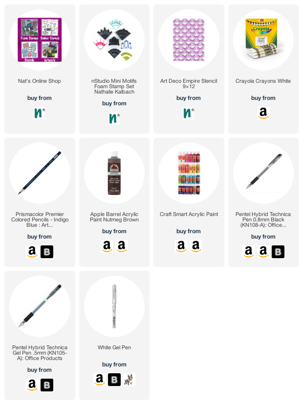
Give it a try: you can find all my Foam Stamps and Stencils in my Online Shop and in addition to her handmade watercolors and some collage pieces, here are some of the supplies Jordan used:

Don’t forget to check out Nat’s Creative Squad on Instagram too: Each week we post projects, ideas, and inspiration for mixed media art.

Comments (1)

  • Robin

    |

    Jordon thanks for sharing how you created this spread. I love the combination of paints and your drawings are always so expressive!!! Thanks!

    Reply

Leave a comment