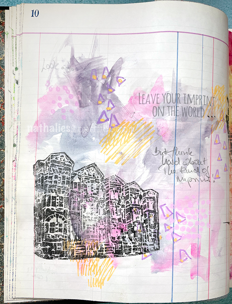
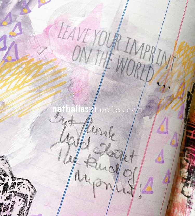
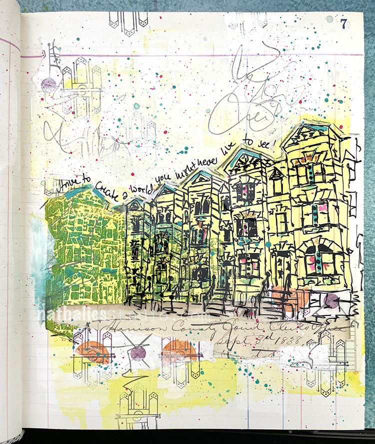
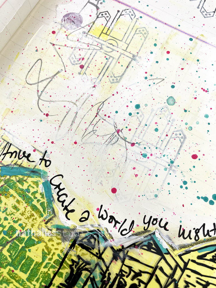
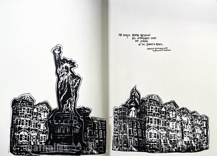
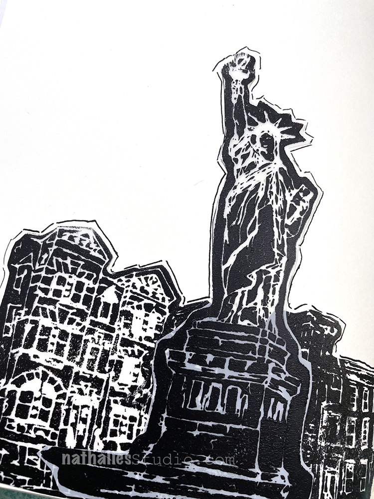
“Leave your imprint on the world… but think hard about the kind of imprint!”
We can make so many… the environment, our loved ones, society, etc.
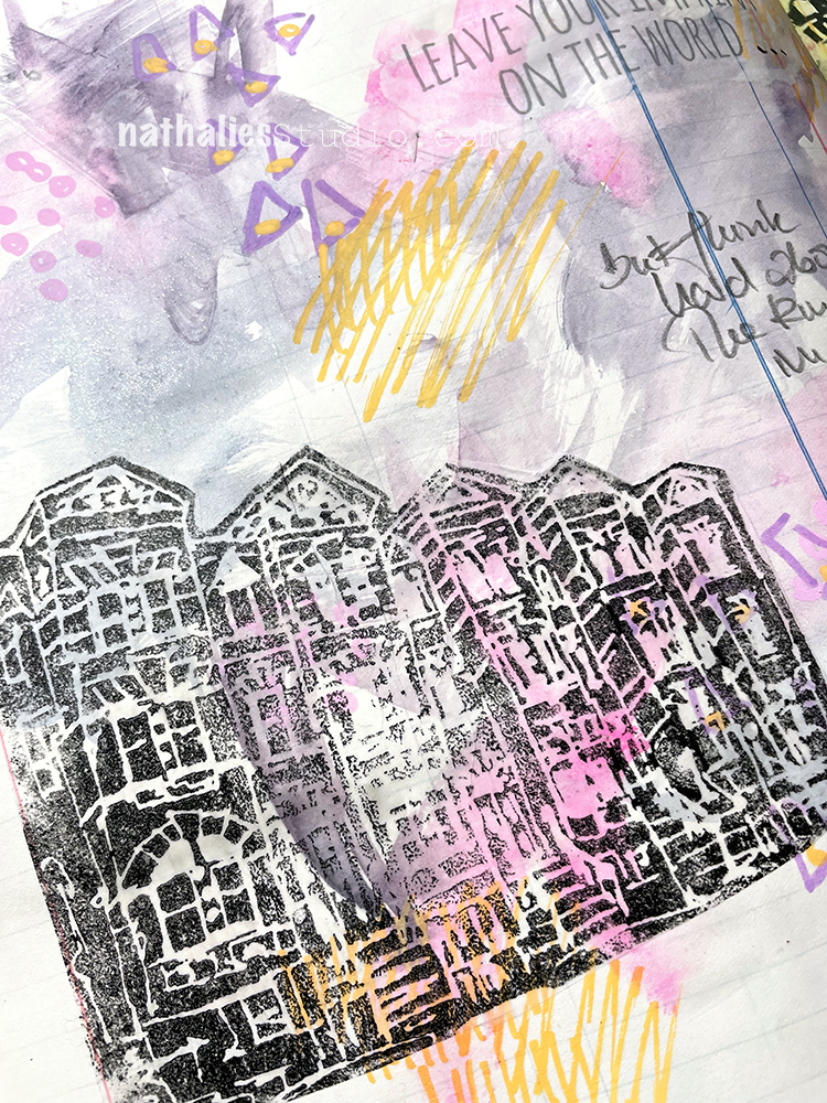
For my background I used Daniel Smith tube watercolors – they were dried up on a palette and I wanted to use them up before they went bad. Then I made some marks – triangles, dots etc. – with Posca markers. I was really just playing around and it felt good.
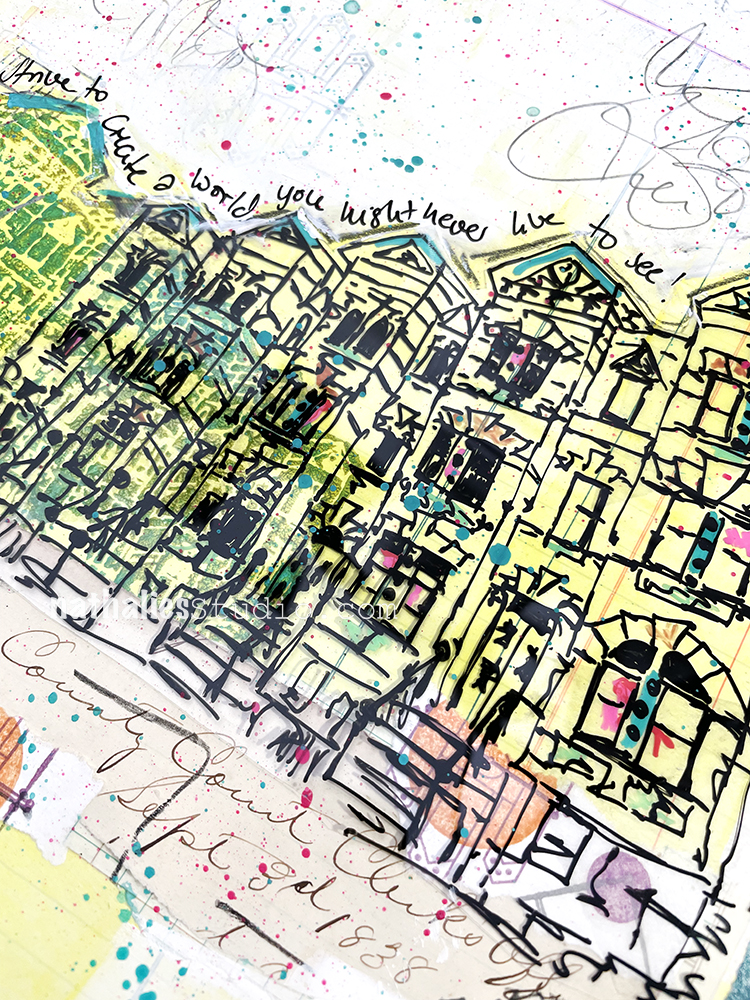
For a focal point I stamped my Row Houses foam stamp with acrylic paint.
The printed portion of the quote is from tissue paper that was part of the packaging of some shoes I bought and I liked it… but then thought a bit deeper about the implication of the quote and wanted to add that too.
“Strive to create a world you might never live to see!”
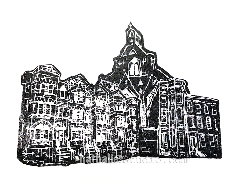
I stamped my Row Houses foam stamp with acrylic paint onto the ledger and then added a sketch of the row houses on top. I also used some collage paper – an old letter and old prints of mine.
I had initially painted a lot of the background with yellow paint but I didn’t like it going over the top of the building so I toned it down a bit with a Gesso wash.
Then I added some stamping with my Mini Motifs rubber stamps and speckled some paint.
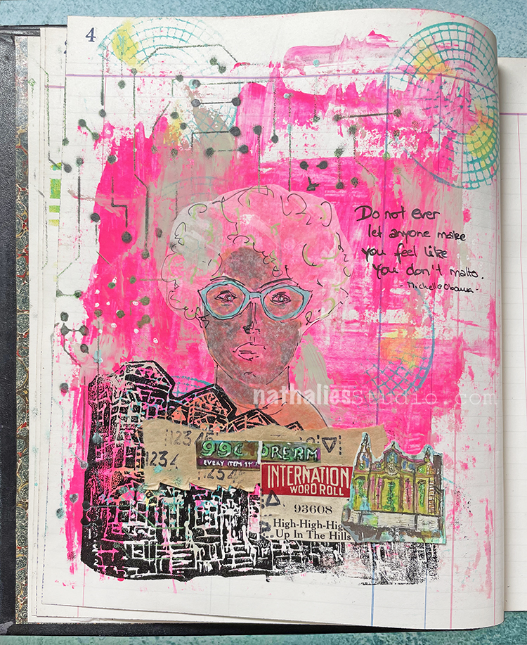
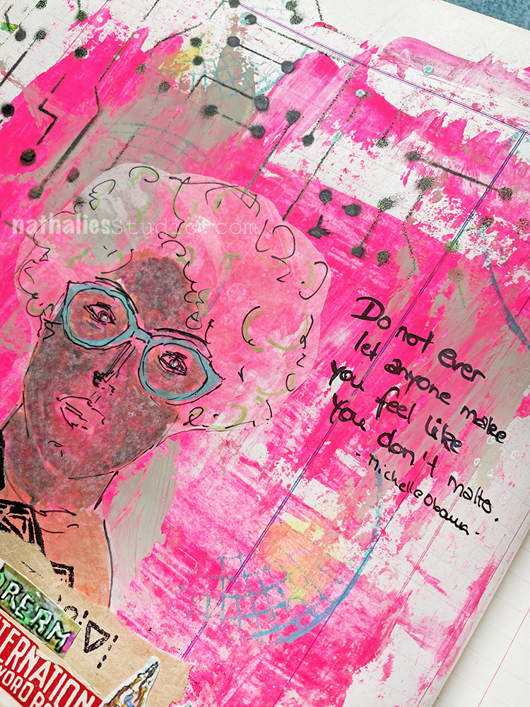
“Do not ever let anyone make you feel like you don’t matter.” – Michelle Obama
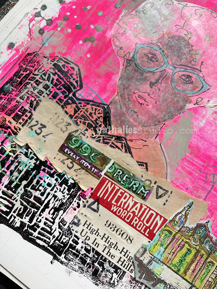
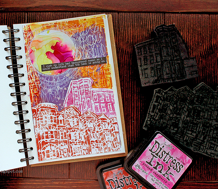
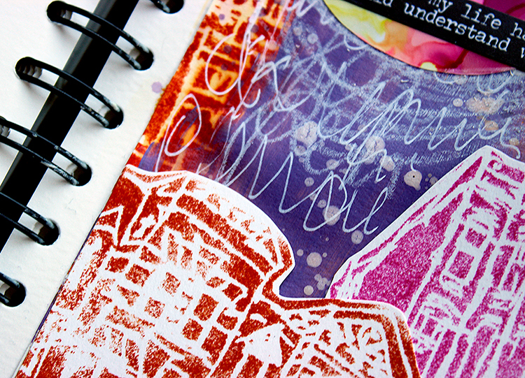
First I used a credit card to disperse some left over pink acrylic paint for the start of my background. I also stamped with my Central Ave Foam stamp and sprayed grey spray paint over my Circuit stencil.
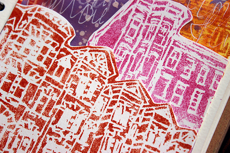
I stamped my Row Houses foam stamp with black acrylic paint and also added some collage pieces and an old calendar of mine with paintings that I had cut up.
I sketched my figure on deli paper and added my journaling with a fude pen.
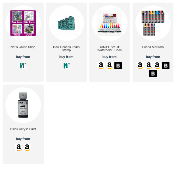
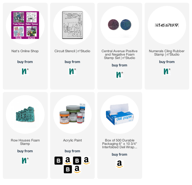
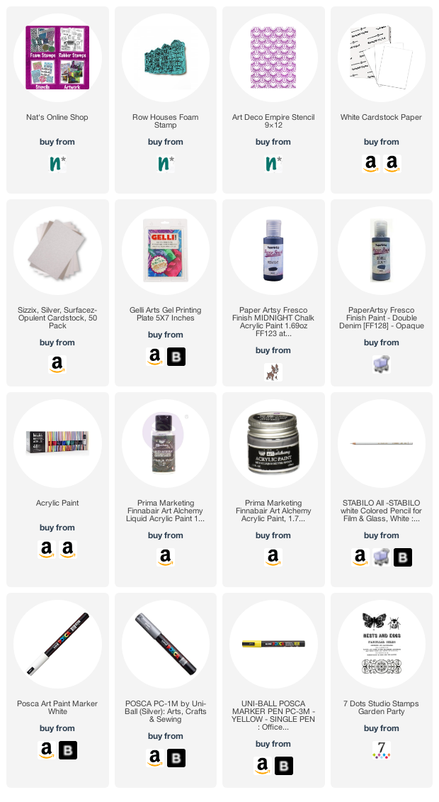
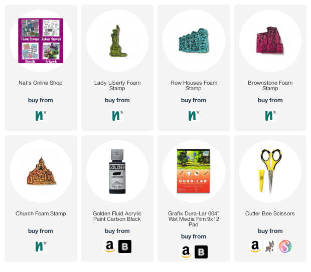
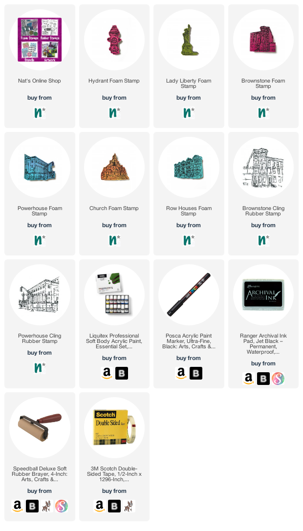
In addition to my collage elements, here are some of the supplies I used.
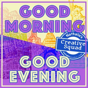
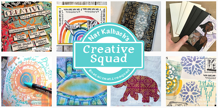
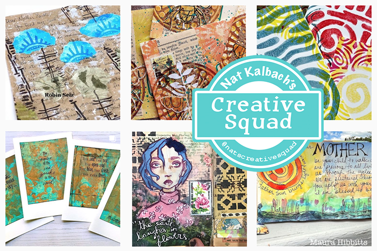
Hello from my Creative Squad! Today we have a post and video from Riikka Kovasin who is sharing an art journal page using my Row Houses foam stamp and Art Deco Empire stencil in response to our theme: Good Morning Good Evening – Are you a Morning Person or a Night Owl? Or maybe neither? Create a project inspired by your preferred time of day – when you are in good spirits, doing what you love, and enjoying life.
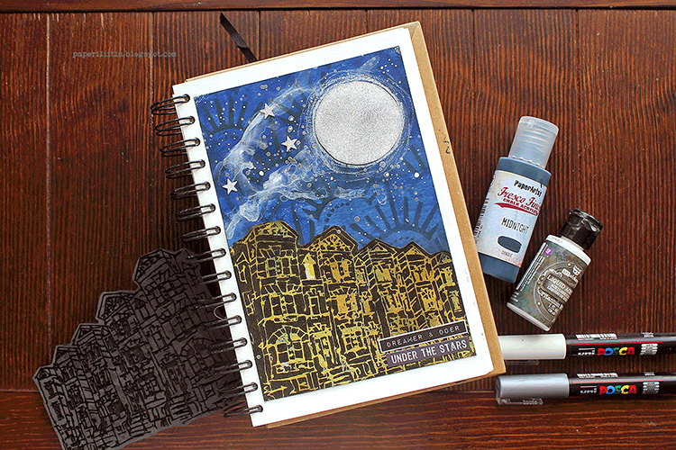
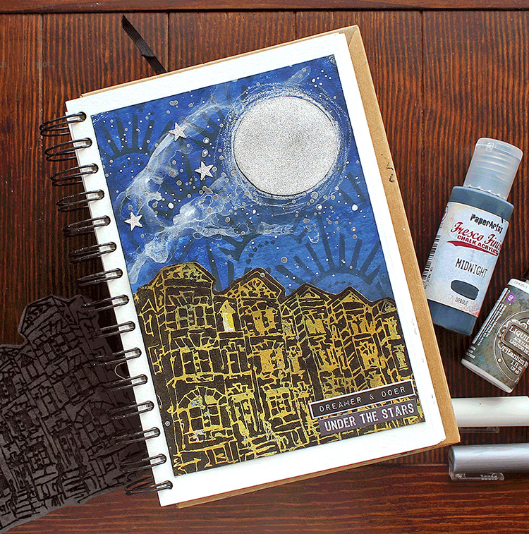
Dreamer and Doer Under the Stars
Hi there! It’s Riikka here today with my take on the theme “Good Morning, Good Evening”. I did an art journal page and as always, recorded a little video while making it.
I’m a would-be night owl. When I was younger and could get away with less sleep, I used to draw, sketch and get my best ideas during the nocturnal hours. But as I’m growing older, I need my eight hours and during work weeks can’t really be up too late. When I’m on vacation, though, and can self decide my daily rhythm, I tend to craft until morning hours and then sleep in. But unfortunately, in everyday life that rhythm doesn’t work. Thus the “would-be”.
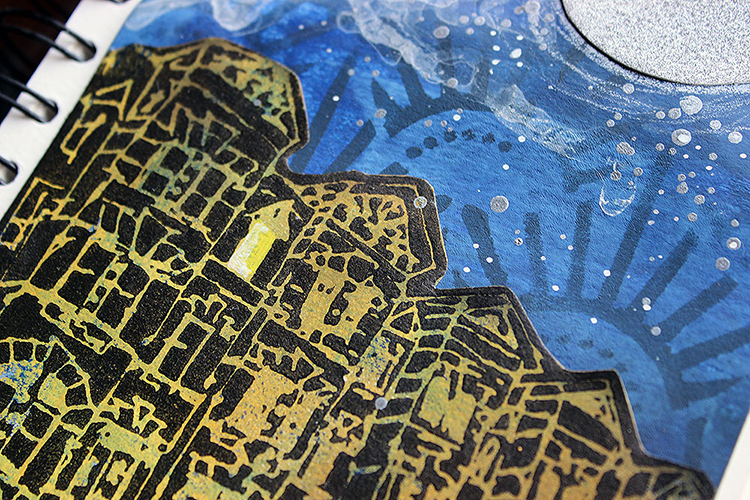
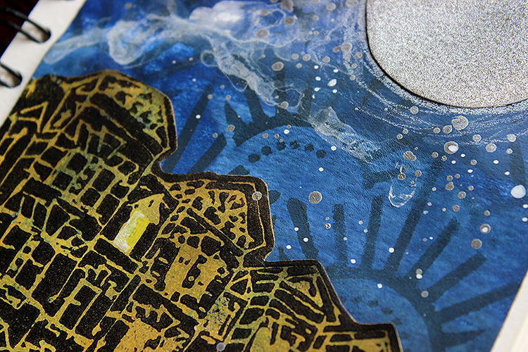
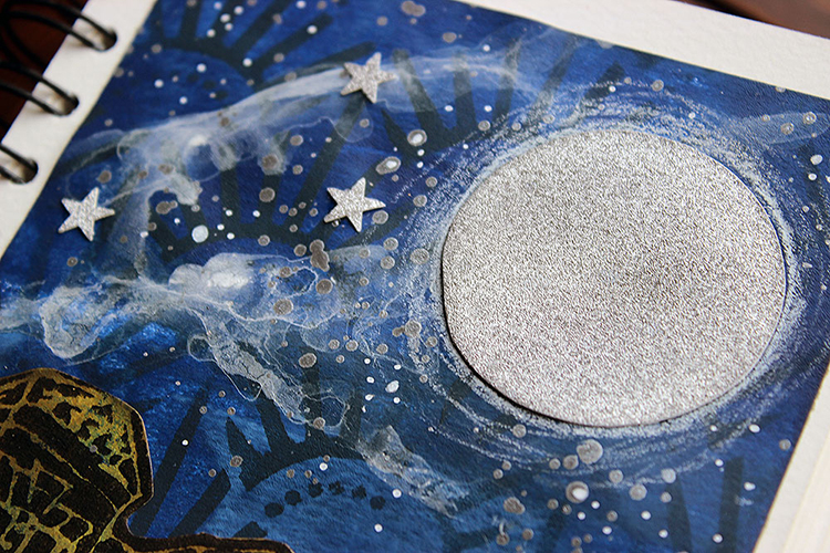
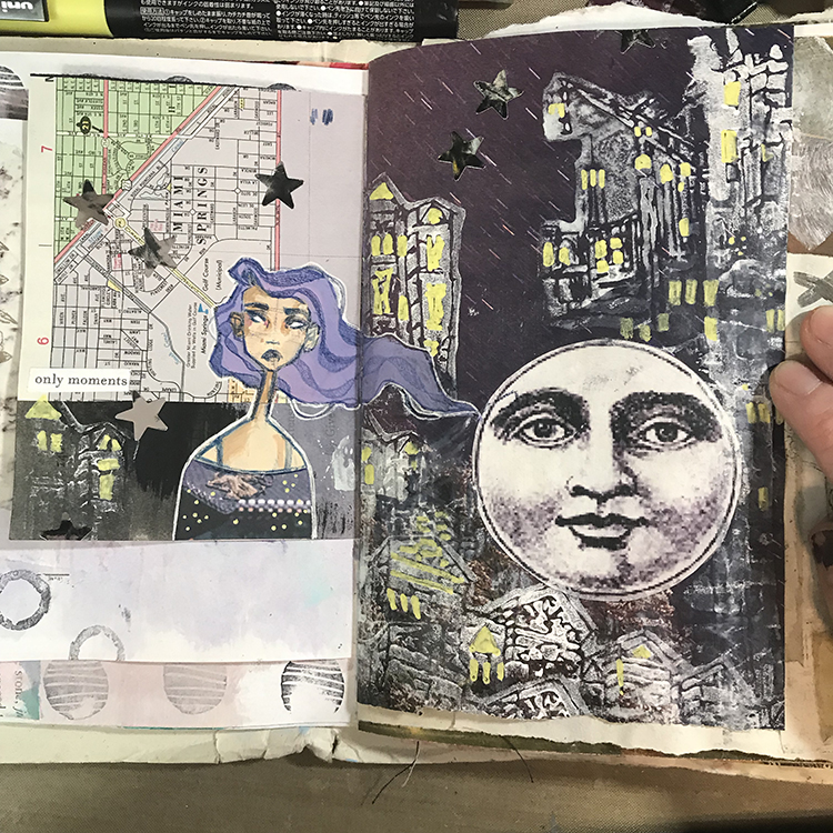
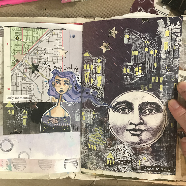
I knew immediately that I wanted to depict night, but the question was how and with what. The answer came when Nat’s great new stamps arrived. I stamped each of the motifs to a cardstock to try them out (and made a Reels out of it) and then used that cardstock to create two projects. The other of those was an art journal page. I really loved how that turned out and thought to re-create it with some alterations – most of all the color scheme. The other inspiration for the page was a stunning evening scenery through our living room window one night. An inky blue sky with white smoke-like clouds and stars just emerging and underneath it the black and golden apartment buildings with some lights on. I used that image to compose my color palette and even added that airy cloud to the sky. What the scenery was missing, was the big silver moon I added to the page.
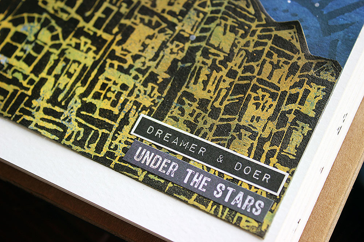
I used gel printing plate to create the colored pieces. A gradient blue for the background and a mix of two yellows for the building. As I mimicked the golden tones I saw during the evening, I needed a yellow background for my black building silhouette. That created the effect of a lit building. I colored one of the windows of the “Row Houses” with yellow to show that someone is awake. I kind of thought that would be me, crafting, when the city is otherwise asleep. The “Row Houses” was an obvious choice for the scenery as we live in an apartment building and all the other buildings around are also with several stories.
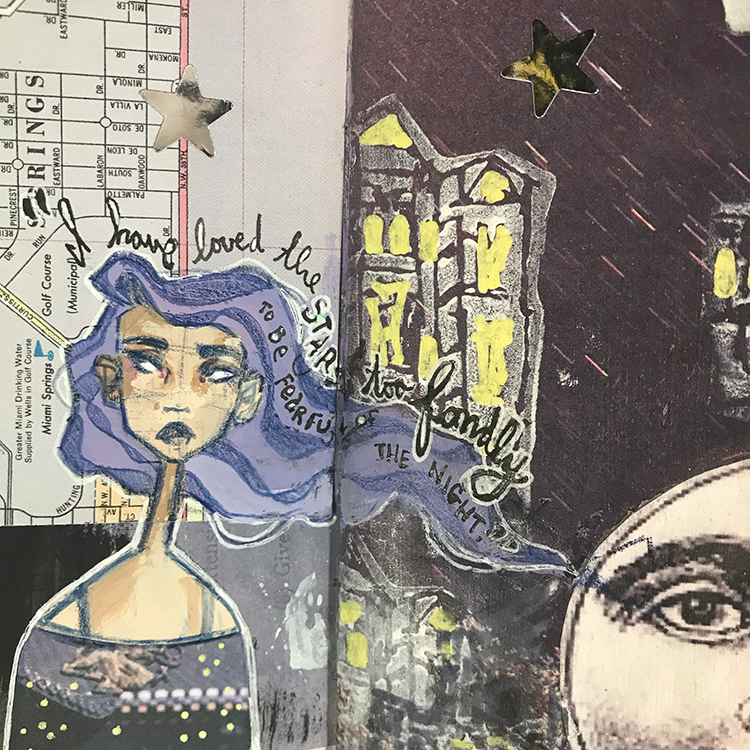
I was looking for “a night owl” text sticker to finish the page, but fortunately couldn’t find one. That forced me to think other versions, and I combined two texts to compose a story. It sounds a bit poetic – dreamer and doer under the stars. Dreamer I thought in this case to mean both actual dreaming, sleeping, but also hopes and dreams. Doer on the other hand is the crafting part. Are you also a “under the stars” style crafter or rather the opposite?
Thank you for stopping by today! Have a great week!
Thank you Riikka – I love that window and thinking about who may be in there, working away under the moonlight!
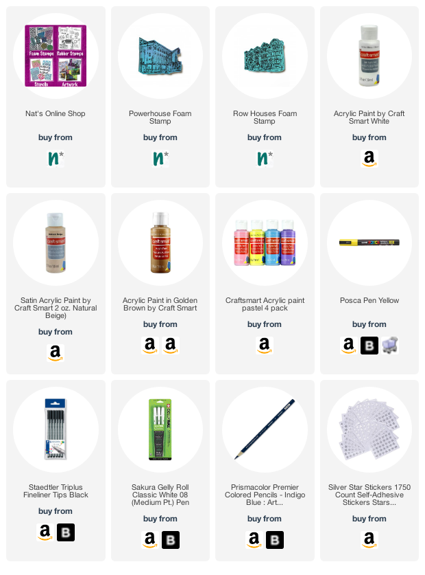
Give it a try: you can find all my Foam Stamps and Stencils in my Online Shop and here are some of the supplies Riikka used:
I liked the raised look of the Grafix Wet Medium sheet with the acrylic paint and didn’t want to add anything to the background besides the journaling.
Hello from my Creative Squad! Today we have a journal spread from Jordan Hill who creates a moody night scene using my Powerhouse and Row Houses foam stamps and our theme: Good Morning Good Evening – Are you a Morning Person or a Night Owl? Or maybe neither? Create a project inspired by your preferred time of day – when you are in good spirits, doing what you love, and enjoying life.
Hello, everyone! I’m very excited to be back with a new project! When I first started to consider August’s theme of ‘Good Morning Good Evening’, I’ll admit I was a little stumped. I do not consider myself either a morning person or a night person; I’m more of a middle of the day kind of person. With that being said, I ended up creating my project based on the idea of night; I quite like the nighttime aesthetics, and I’ve been known to incorporate a good night skyline into my artwork. With all that being said, let’s get into it!
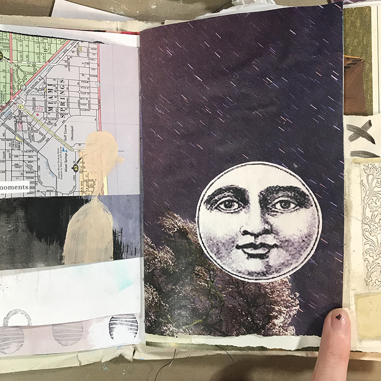
The first thing I did was select a spread in my journal to work on. As soon as I decided to work with the idea of night, I knew these were the pages I wanted to use. Months ago I glued this moon collage piece onto a magazine background, and it’s been sitting around waiting for me to create something with it ever since! You can also see that the left hand page already has the beginnings of a face ready for me to draw on top of!
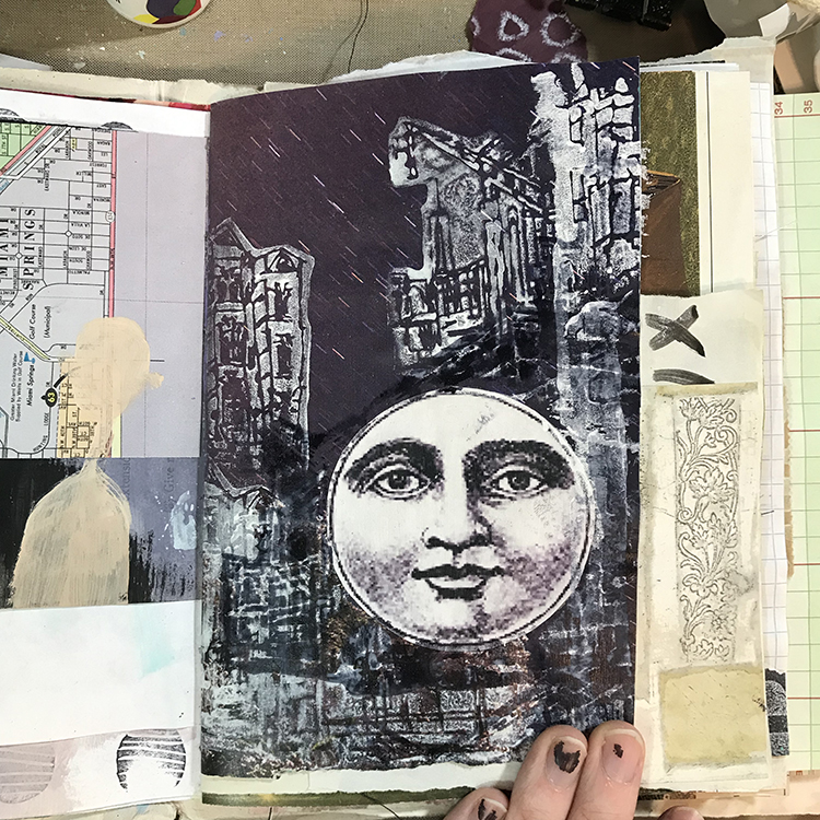
Next, I cut out a piece of paper approximately the size of the moon to use as a mask. I placed this circle on top of the moon collage piece. Then, using a combination of Nathalie’s Powerhouse Foam Stamp and Row Houses Foam Stamp, along with some white acrylic paint, I started to layer up some buildings to create a skyline! I mainly used the Powerhouse Foam Stamp near the bottom of my page, while the Row Houses Foam Stamp helped to create some of the buildings up the sides! The stamps made creating a skyline very easy, where it would usually take a while to draw something like this!
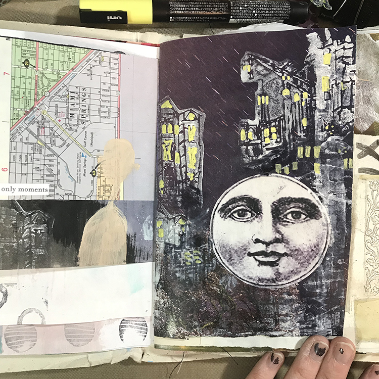
After the paint had dried, I wanted to add a little more definition to the buildings, so I used a yellow Posca Pen to color in some of the windows! This was an extremely relaxing process; I simply followed some of the lines in the stamped images to emphasize them.
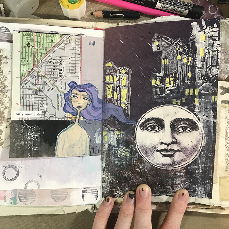
The next step was to add the figure. In order to do this, I simply started sketching over top of the pre-existing shape of a face with my trusty Indigo Prismacolor Premier colored pencil. I also added some long flowing hair. When I was drawing the hair, I purposefully made sure that it continued onto the right side in order to tie these two pages together a bit more.
Now we’re getting into the finishing touches of the spread! I finished up my figure by giving them a shirt made out of a piece of collage paper, adding some shading to the face, and outlining the entire thing with white pen. I then added a handful of silver star stickers across both pages, and repeated the same process of stamping with Nathalie’s Row Houses Foam Stamp and adding yellow Posca pen along the bottom of the right hand side of the spread.
As a last detail, I added a quote along the edge of the figure’s hair that I felt was fitting. I decided not to outline the entire quote in white, but instead left that for the parts of the quote that were over darker parts of the page, where it was harder to read what was written.
And with that, we have my finished project for August! I’m quite happy with the way this month’s spread turned out and I definitely think I will be using these stamps again in the future to create skylines in my journals! I can already imagine it in neon! I hope you enjoyed following the process of this journal spread and that you are inspired to try something similar in your own journals!
Thank you Jordan – love how the skyline glows with those yellow details!
Give it a try: you can find all my Foam Stamps in my Online Shop and in addition to some collage elements, here are some of the supplies Jordan used:
Love love love this journal spread by Jordan Hill! This spread is A wonderful collaboration of ideas and creativity. Your blog brings a smile and a break form this busy crazy planet. Peace to you.
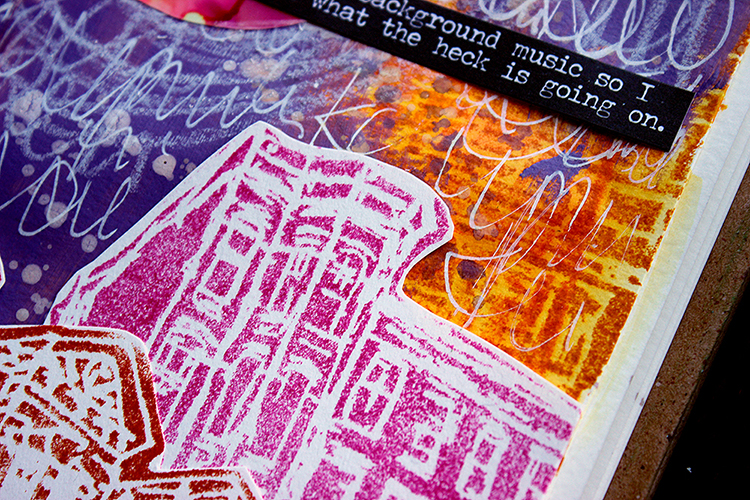
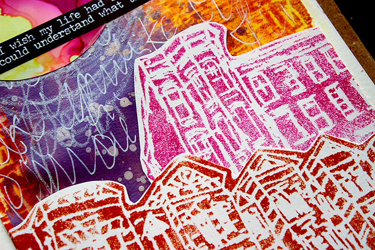
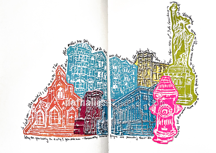
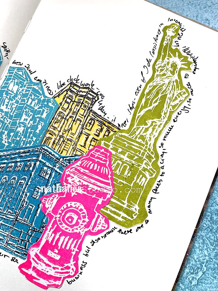
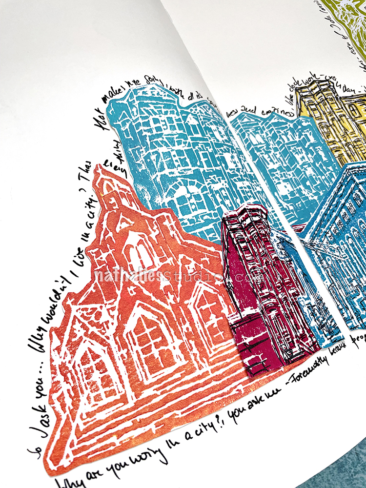
Riikka Kovasin from my Creative Squad shared this beautiful and bright art journal page last week and we are in love with the colors and composition. She used my new Row Houses and Brownstone foam stamps front and center.
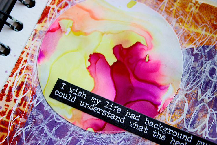
As Distress Ink is activated with water, I first cut the try out sheet into smaller piece, fitting inside my journal. I then used a wet brush to color the whole cardstock using the stamped images. On top I then layered some Izink ICE and then some acrylic paint covering parts of the buildings in the background. I cut the two buildings loose and added them to the page. There’s also some white scribbles, splashes and a sun/moon done using another try-out – a piece of synthetic paper with alcohol inks. “
Thank you Riikka for sharing this page!
Give it a try: you can find all my Foam Stamps in my Online Shop and here are some of the supplies Riikka used:
For this spread I used my new foam stamps and acrylic paints. These were actually all kinds of test stamp sheets for our product photos but I loved the vibrant colors and thought it would be fun to layer them up.
I was journaling just random thoughts on why I love living in a city.
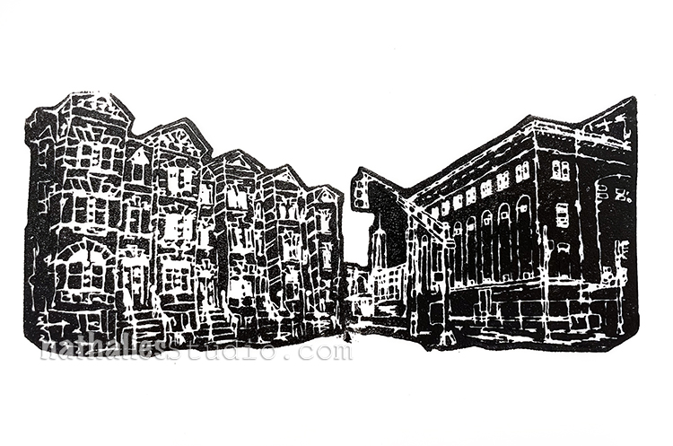
Here is Church and Row Houses too. I just layered them as I wanted and then added a double sided adhesive to the back and cut where the journal fold is so it would be easy to open and close.
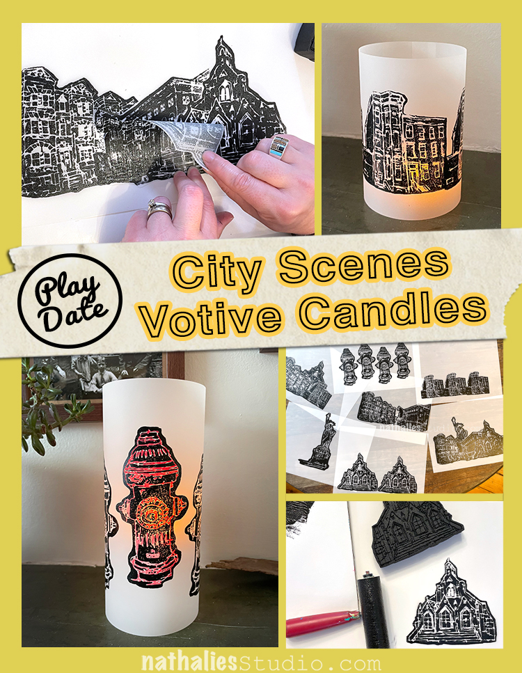
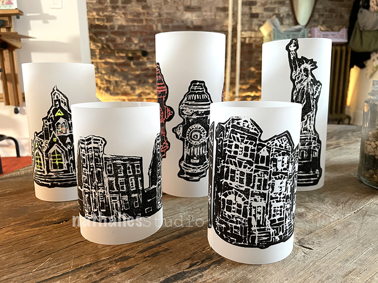
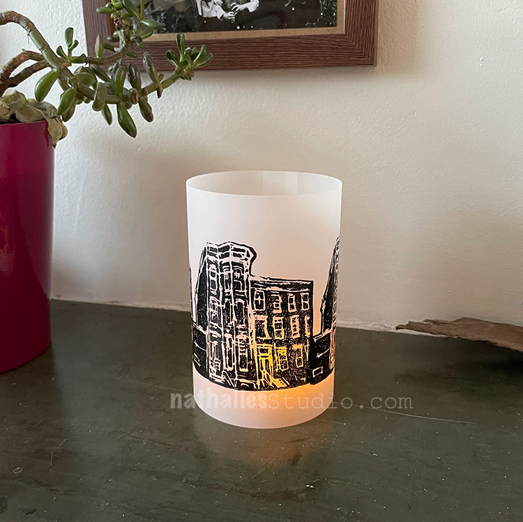
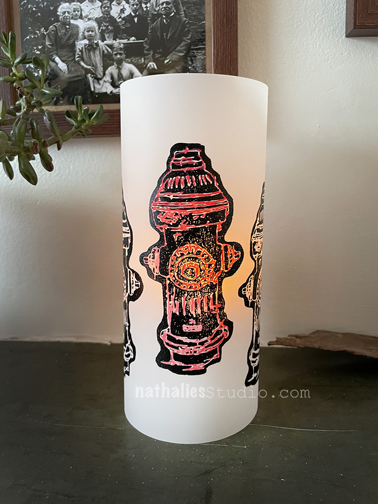
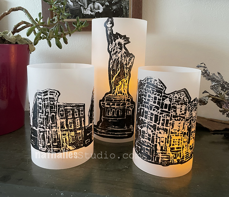
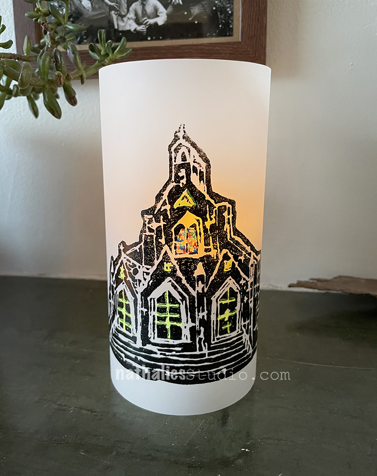
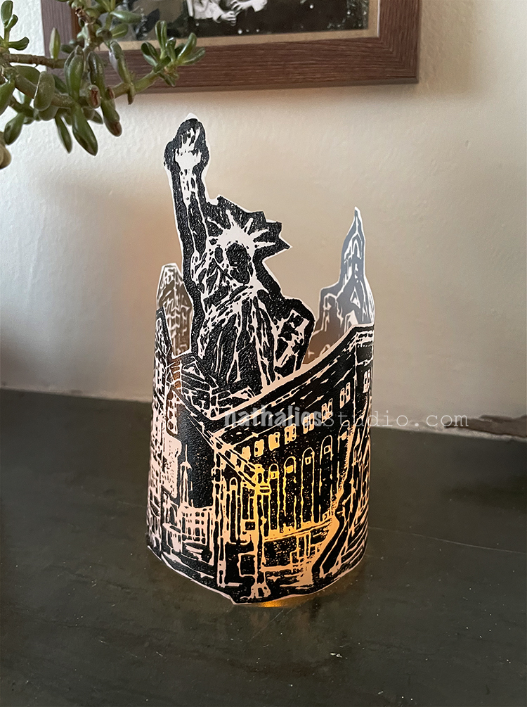
Last week Kim and I got together for the first time since 2019 for one of our epic Play Dates!!! We had such a nice time gabbing and making art and just enjoying the experience of creating together. Our project? Votive candles using my NEW foam stamp designs! It was an easy peasy project to get us back in the groove and the results are very nice. Here’s how we did it:
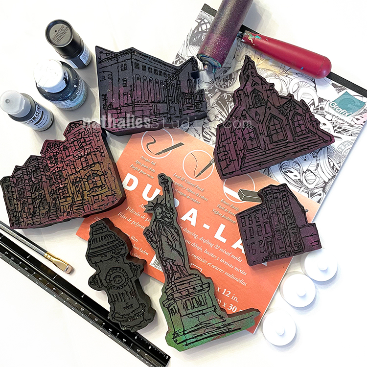
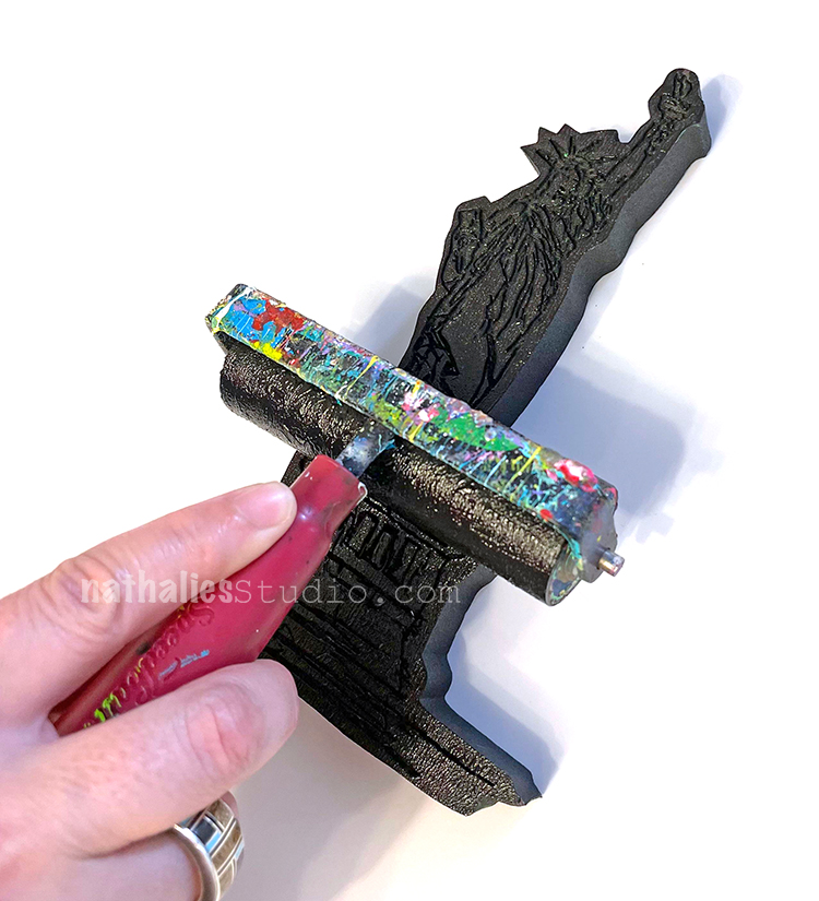
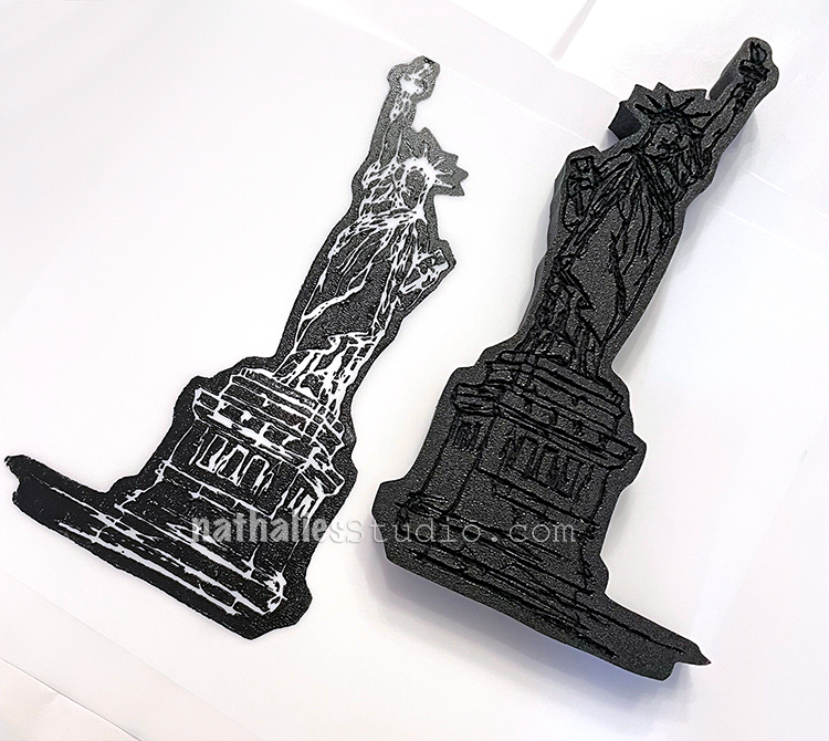
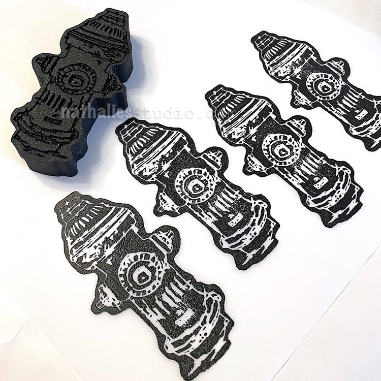
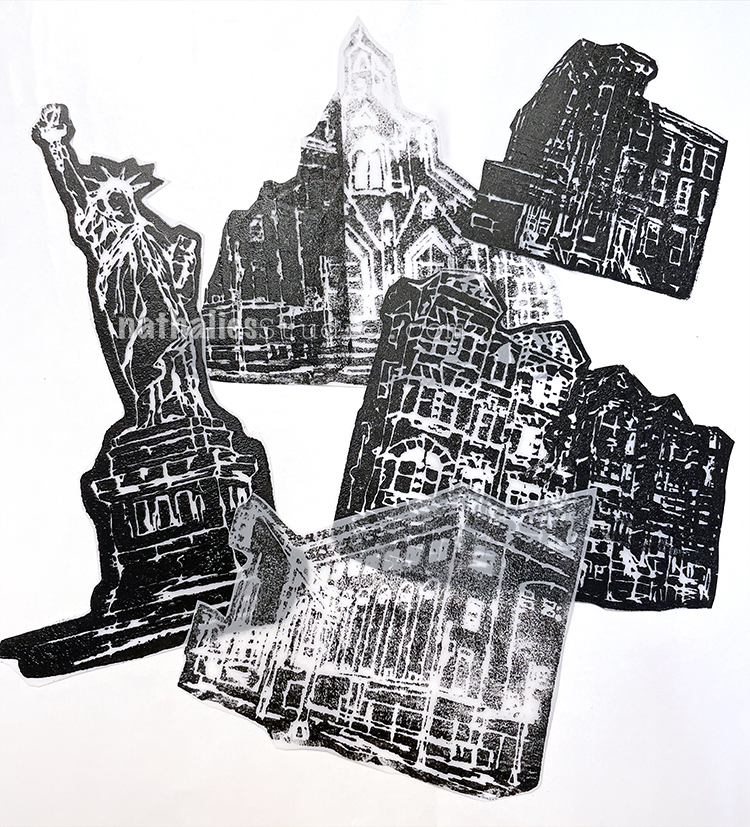
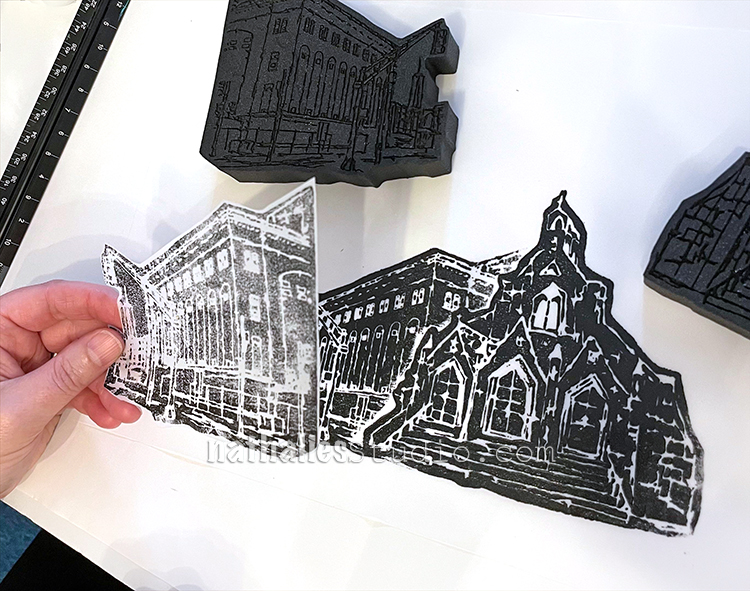
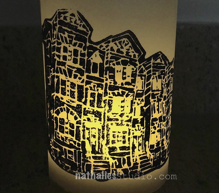
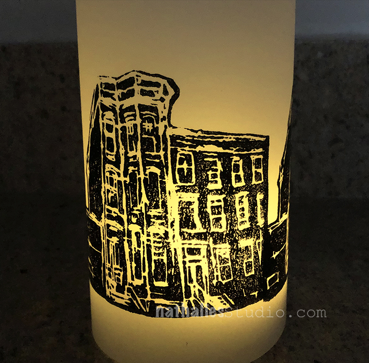
The supplies are simple: my new foam stamps (Clockwise from the top they are Powerhouse, Church, Brownstone, Lady Liberty, Hydrant, and Row Houses), Grafix Dura-Lar matte film, black acrylic paint, brayer, double stick tape, LED votives, and scissors or a paper trimmer. We also dressed some up with Posca markers, but more on that in a bit ;) The whole idea was to have the buildings and such silhouetted so that the light shines through all the details. Read on!
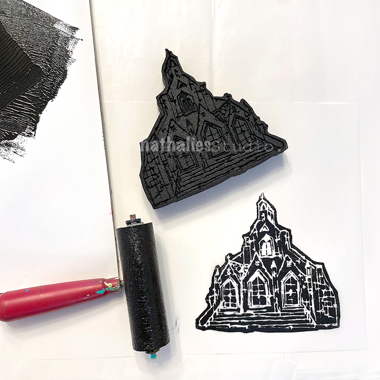
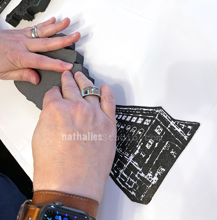
We started out by rolling black acrylic paint out on palette paper with a brayer. We both liked Carbon Black Golden Fluid Acrylic paint for this – a nice opaque black. Then we rolled it on the stamp (in this case, the Church stamp) and stamped it on the Grafix Dura-Lar matte plastic sheet – a matte white plastic that is kinda translucent with light behind it. You could also use a StampBuddy here too to ink up your stamps.
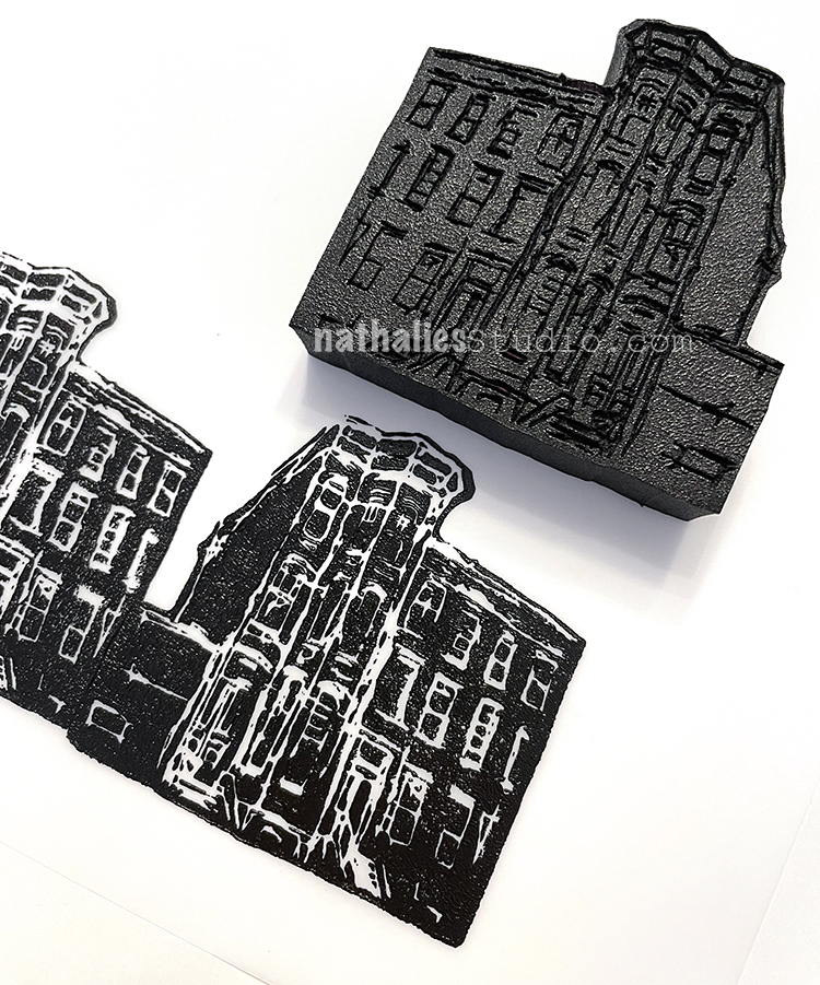
We left some room at the bottom of the film and stamped across the width, leaving room on either side to eventually tape the ends together. In this one I am stamping the Brownstone foam stamp.
Keep in mind that when stamping on plastic film the surface is slick and the stamps can slide if you aren’t careful.
The Row Houses on the left turned out fine but I slipped a bit with Powerhouse on the right. We each had a couple misfires so plan on having some extra sheets of plastic just in case.
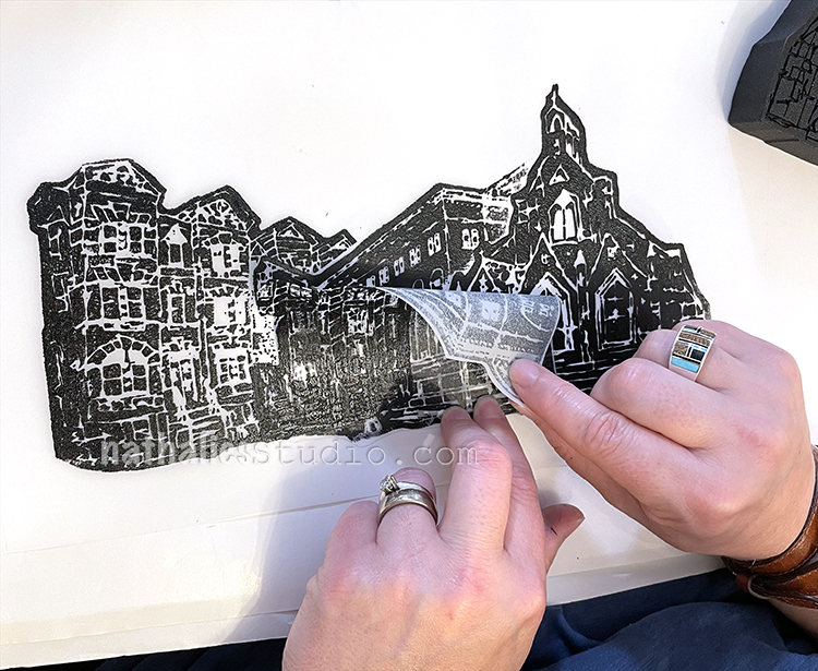
With some of the mistakes, we created masks to use in building up more complex, layered scenes – a great way to use those.
Kim stamped Row Houses and Brownstone and then used the masks to add Church to the background for a little streetscape.
Looks pretty neat all together like that.
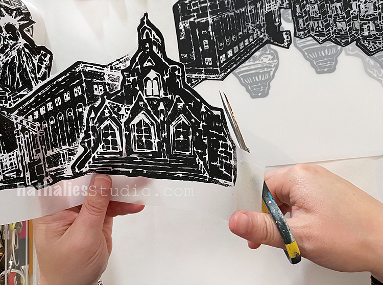
I first stamped Church, then added Powerhouse, and then…
…I added Row Houses to the left…
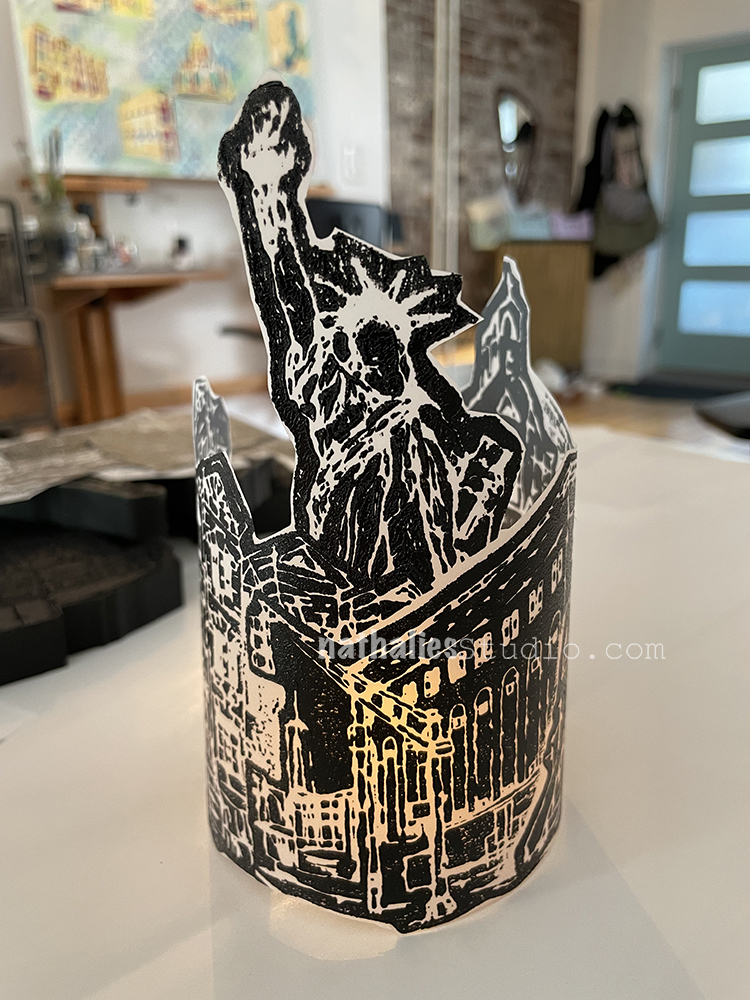
And then I finished with Lady Liberty!
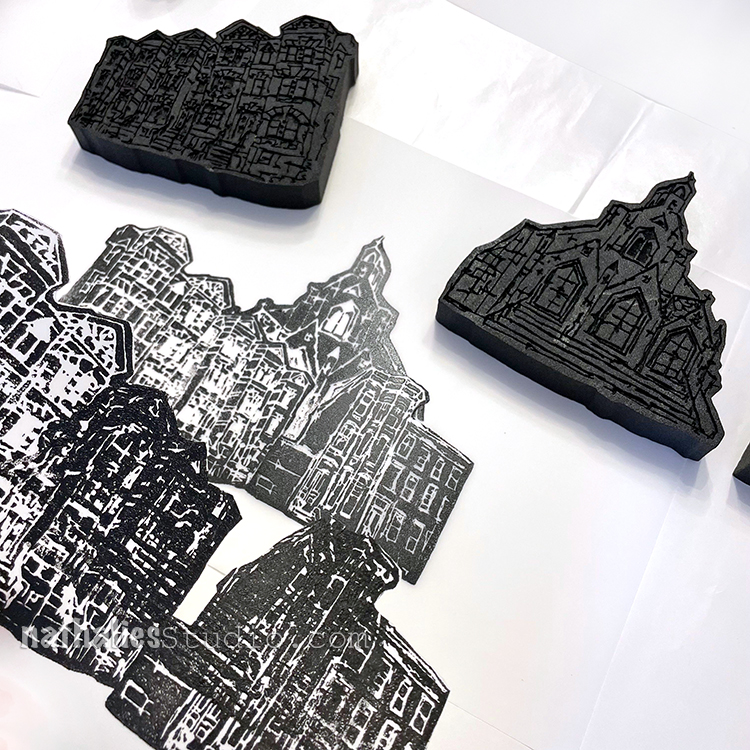
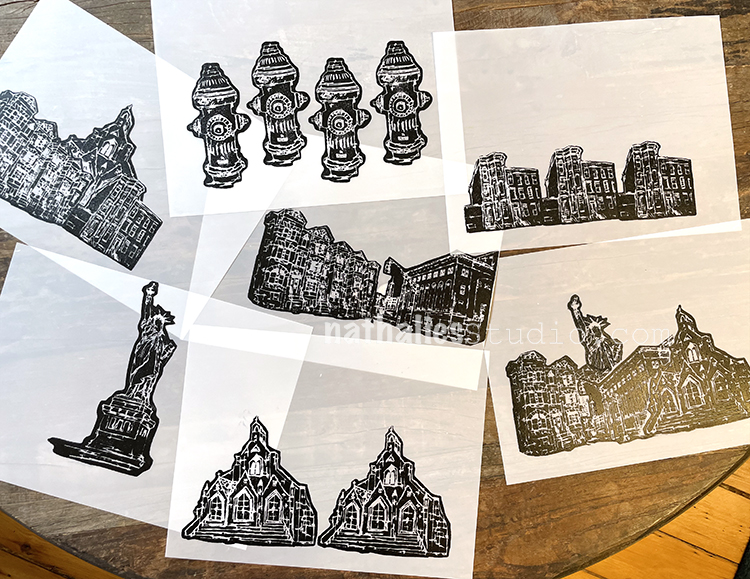
We created a variety of sheets to move on to the next step:
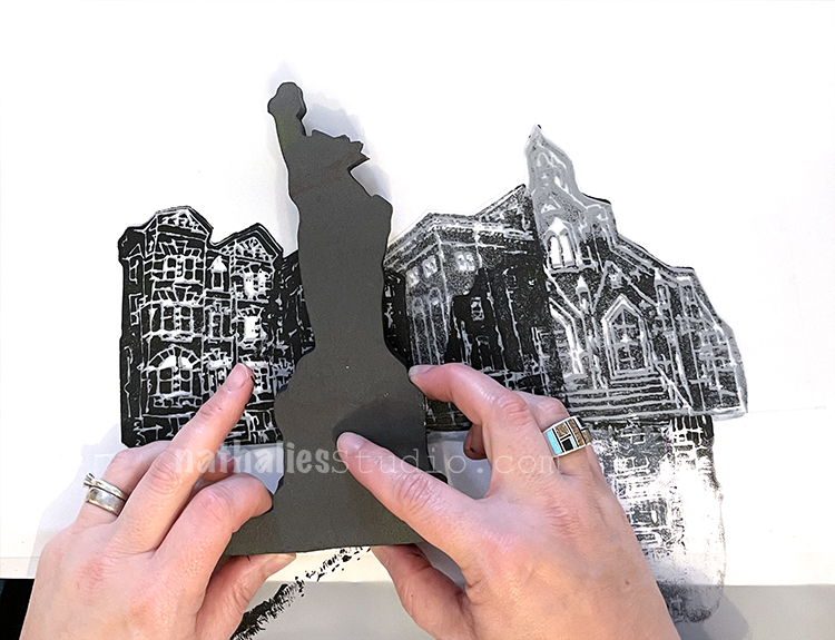
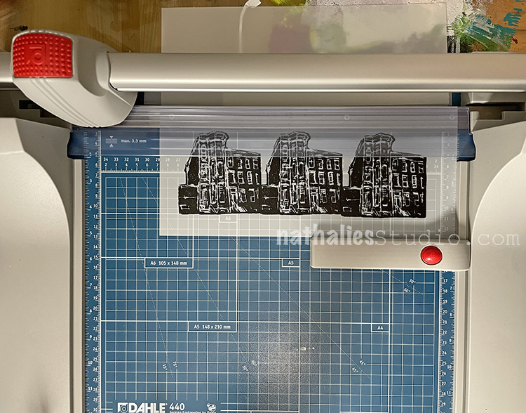
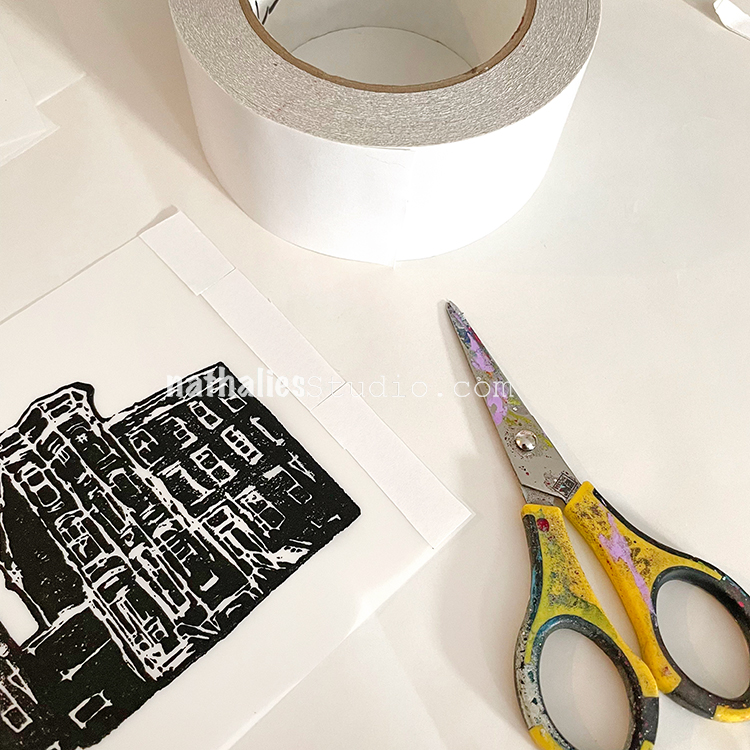
I broke out my new Dahle trimmer and we cut things down to size. We experimented with trimming some with a margin around the image – room for tape and a little lift off the ground.
We also fussy cut some for a different effect!
Looking pretty good there Lady Liberty! The choice is yours on how you want to trim them.
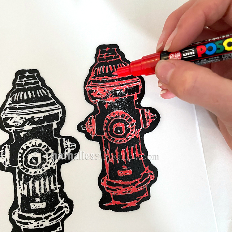
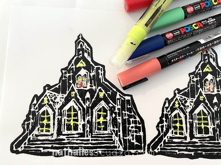
We also tried coloring some in with acrylic markers.
Here are some details in those stained glass windows.
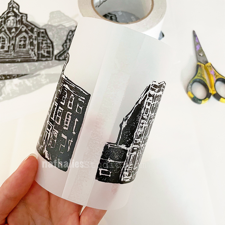
Using double sided clear tape we got ready for the final assembly.
Coming together and holding tight with permanent tape.
Here are our City Scenes votives ready for illumination – LED lights must be used with these to be safe.
Let’s light them up!!!
For the taller ones you may want to use a taller LED votive or stack the votive on something inside the sheath.
Love this one that I fussy cut!!!
And now after dark…
I hope you enjoyed this little tutorial and maybe you’re feeling inspired to make some foam stamped votives of your own. Please do!!! And I hope you join us back here for our next Play Date :)


Love this quote. I believe that it’s the only way the world will improve!
Reply