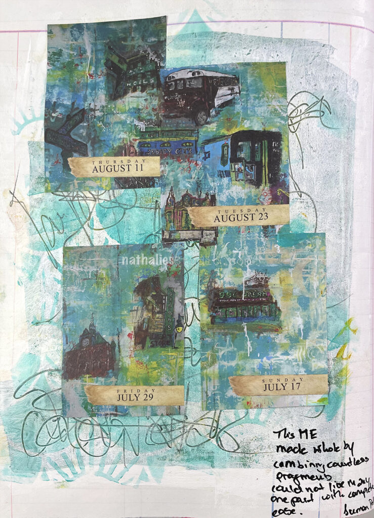
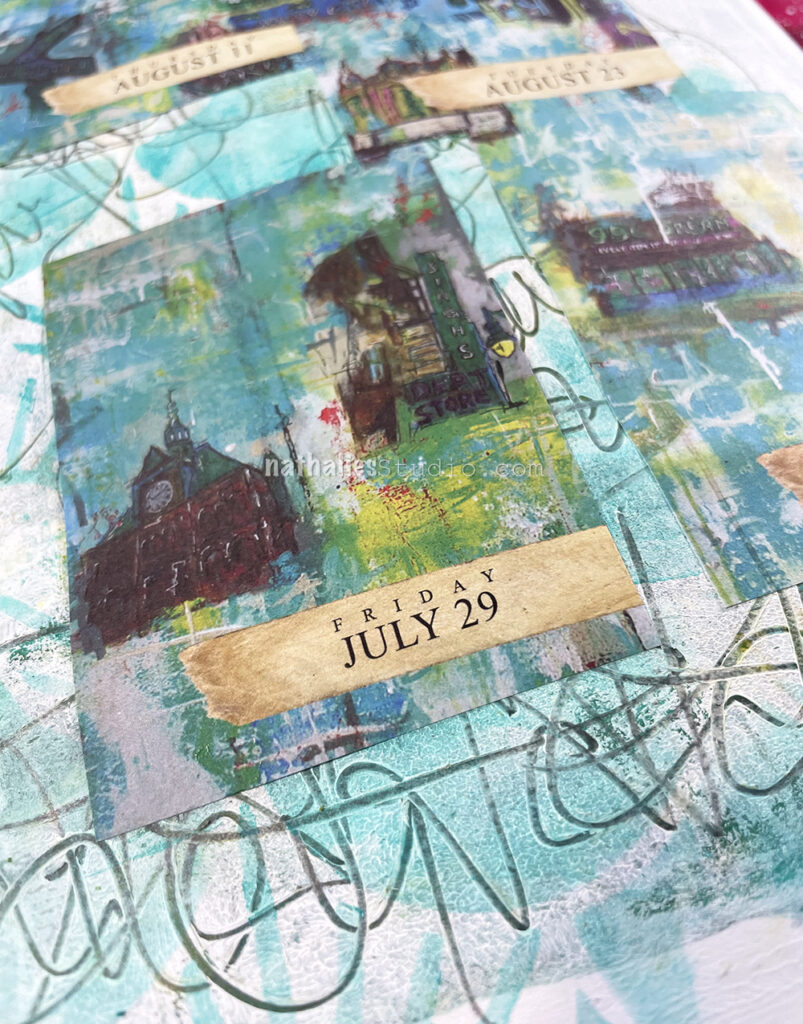
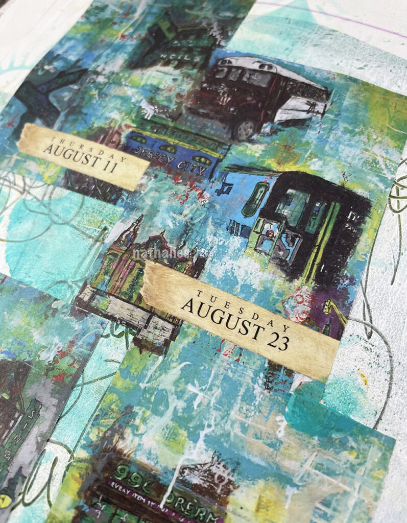
could not live in any one part with complete ease.”
– Suman Pokhrel
I added some leftover greens and yellow acrylic paints to the background, then brayered white acrylic paint over it. I used a pencil to scribble some neighborhood names into the still wet paint, layered my Art Deco Summit stencil over and used a cosmetic sponge and teal acrylic paint over it. The scribbles are still showing and I love the texture.
I added the different almanac pieces (from the sold out 2022 Artist Almanac Calendar) which were taken from a big painting I once made about Jersey City. Some of the images are of buildings or sights that either do not exist anymore or have changed significantly over the last couple of years since I painted the original painting, titled 99 Cent Dream.
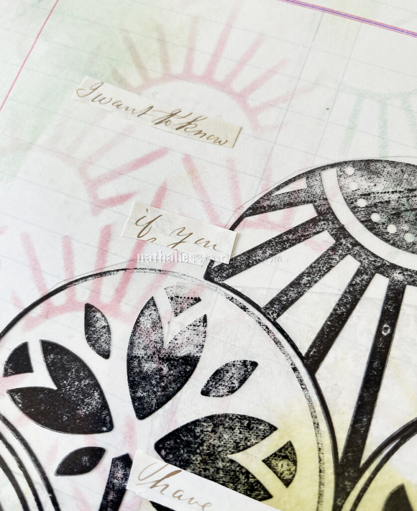
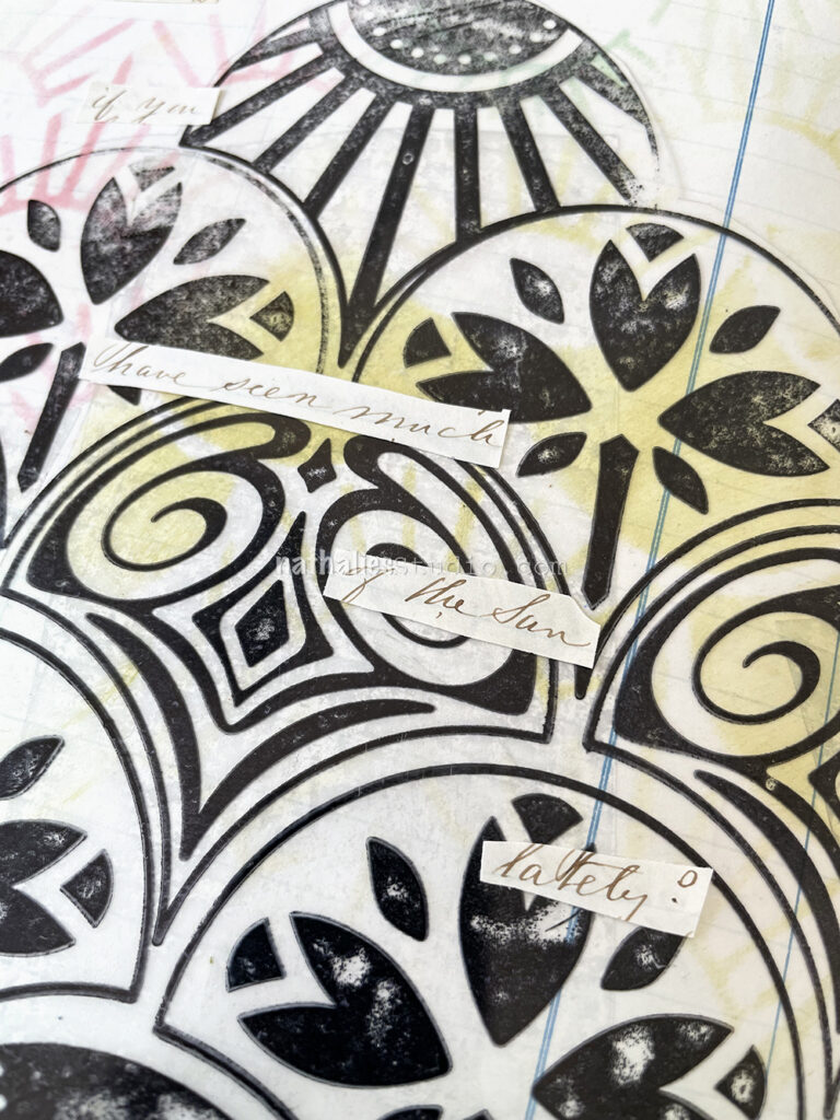
This is another art journal page with some inspiration from an old letter from the 1860s. This sentence said “I want to know if you have seen much of the sun lately?” It struck me as funny.
BTW reading all those letters and creating with them made me think about how much I loved to receive and send letters. I have a lot of letters that I kept from dear friends and family members and it is a funny thought that maybe in 100 years someone will make art with them hahaha.
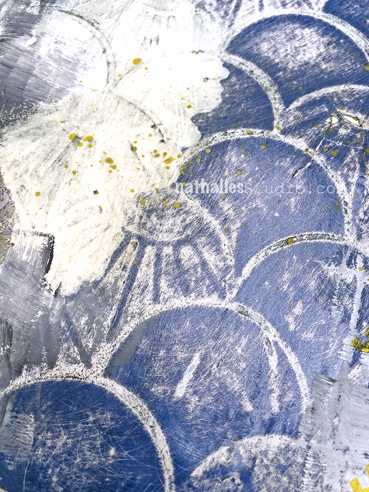
I used my Art Deco Summit and Art Deco Empire stencils with Ranger distress oxide inks and a blending tool through the stencils.
On top I adhered a piece of Grafix acetate on which I had stamped with my Fan-tastic rubber stamps and Versafine ink. It was a leftover from a project and I thought it would be fun to use. I just added some double sided adhesive tape to the back and pressed it down.
I used Ranger Distress Ink with a cosmetic sponge over the Art Deco Summit stencil for my background. It was from back when I first got my prototype and tested the stencil and then kept it in my collage stash.
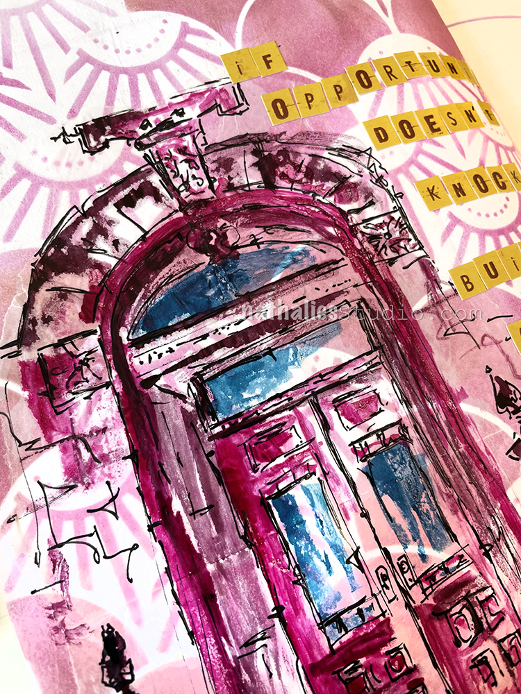
Then I sketched with a Posca fine marker on deli paper, and used acrylic ink by Liquitex with a brush to color some areas in. This is actually the entrance to our home and it is just one of many sketches as I am intrigued by all the details.
As the background stencil design was made with Distress Ink, I thought it would be better to use a glue stick (my fav almond scented one) to adhere the deli paper – Distress Ink easily reactivates and smears with matte medium. I personally really do not like the look of the deli paper on the background here though. I usually love sketching on deli paper because a) it takes the stress away of messing up a nice background and b) it also give a fun effect with it’s kinda semi transparent look… but I always strive for a very smooth transition without hard edges when applying it and the glue stick did not work the same way as matte medium would have in this case to make that transition. Oh well… LOL. Don’t switch a winning horse…
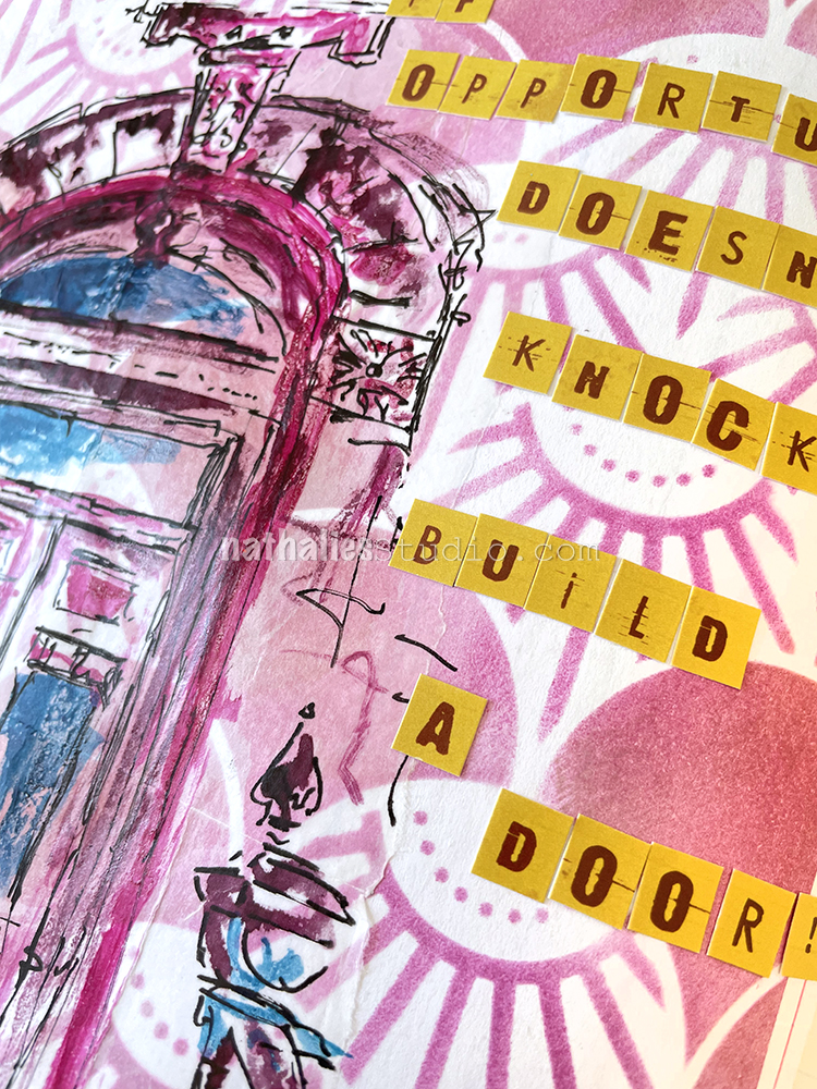
The letter stickers are still left overs from a company I used to work with but doesn’t exist anymore. I still love them but it is time to use them up.
Hello from my Creative Squad! Today we have a beautiful final post from Emilie Murphy who will be moving on from the Squad at the end of March. We have loved having her on and sharing her gorgeous style and talent for illustration with you. This month Emilie is using my Art Deco Summit, Art Deco Wallpaper and New Orleans stencils and our theme: Life in Bloom – It’s been a long winter where we are and I’m dreaming of flowers and gardens and spring. Indulge us all in a project that focuses on one of Mother Nature’s most exuberant symbols of life: flowers flowers flowers!
Hi there!
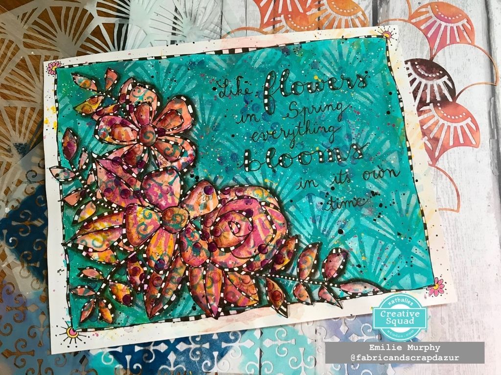
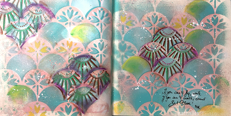
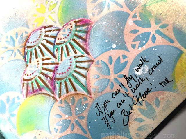
Can’t believe that we are already in March. Time flies, for sure, despite the long and pretty cold winter we had this year. I can’t wait to see the first flowers blooming. Let me show you, today, how I made my art journal page to illustrate the “Life in bloom” theme of this month.
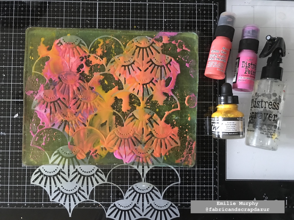
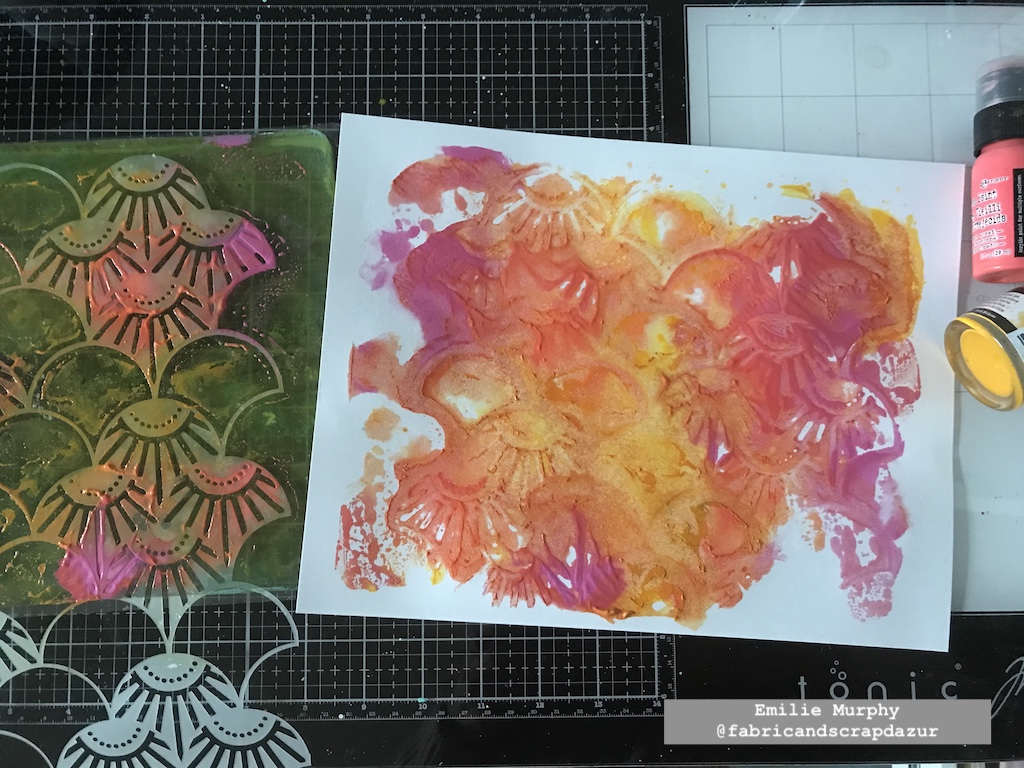
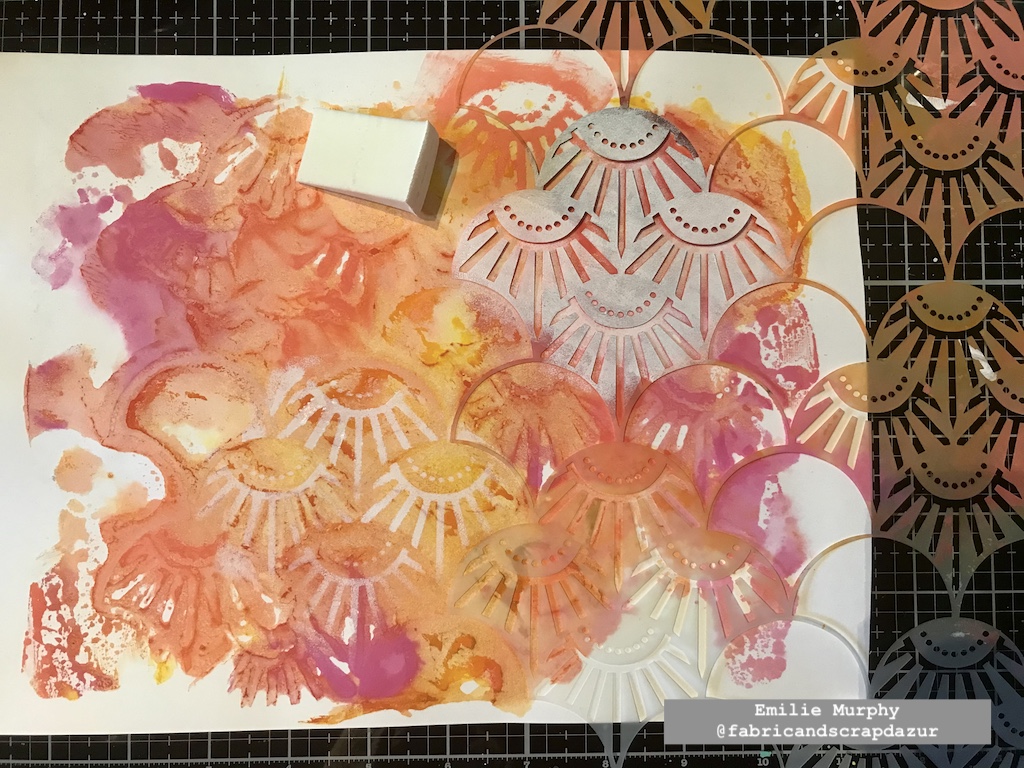
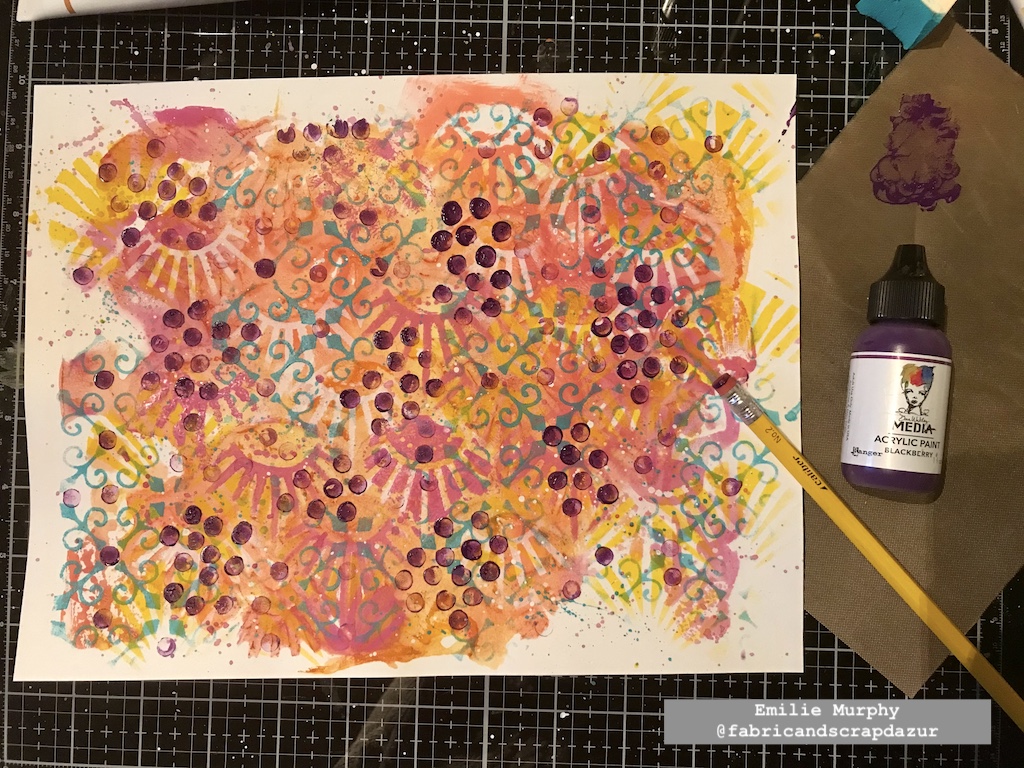
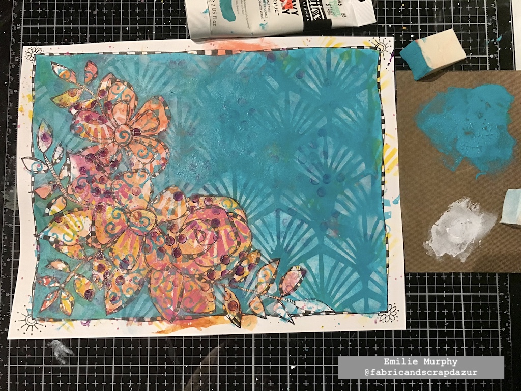
To start my project, I used my Gelli plate with my favorite warm colors using a sheet of 8.5×11 white cardstock. I first applied the paints by mixing them a little bit with each other, I then laid down the Art Deco Summit stencil and pulled the print. I mixed acrylic paint and ink to get a kind of washy look.
Next, I started to build my background by applying white paint through the Art Deco Summit stencil again.
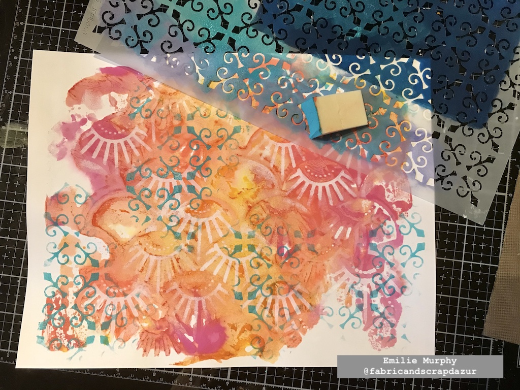
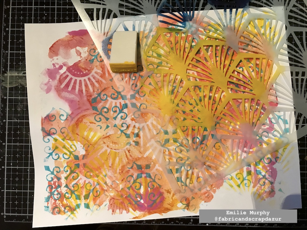
I kept adding layers with my warm colors, alternating between the pattern stencils.
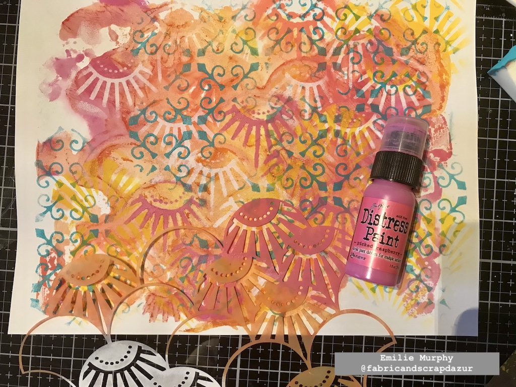
I added some dots with the rubber tip of my pencil.
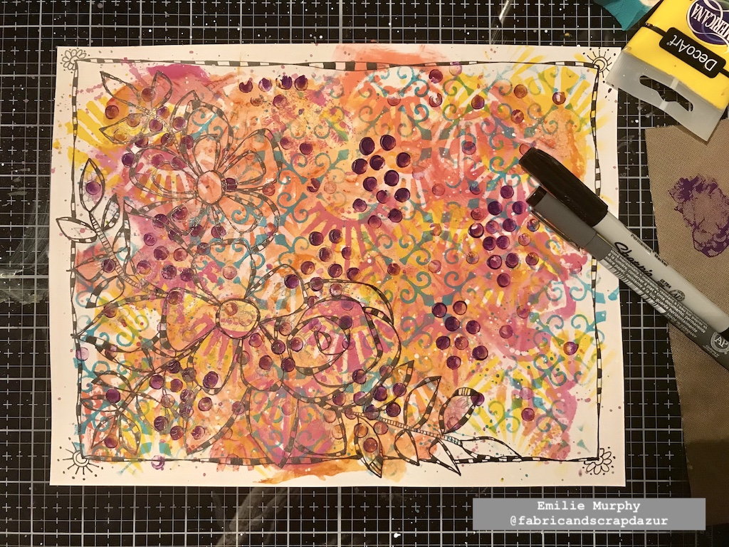
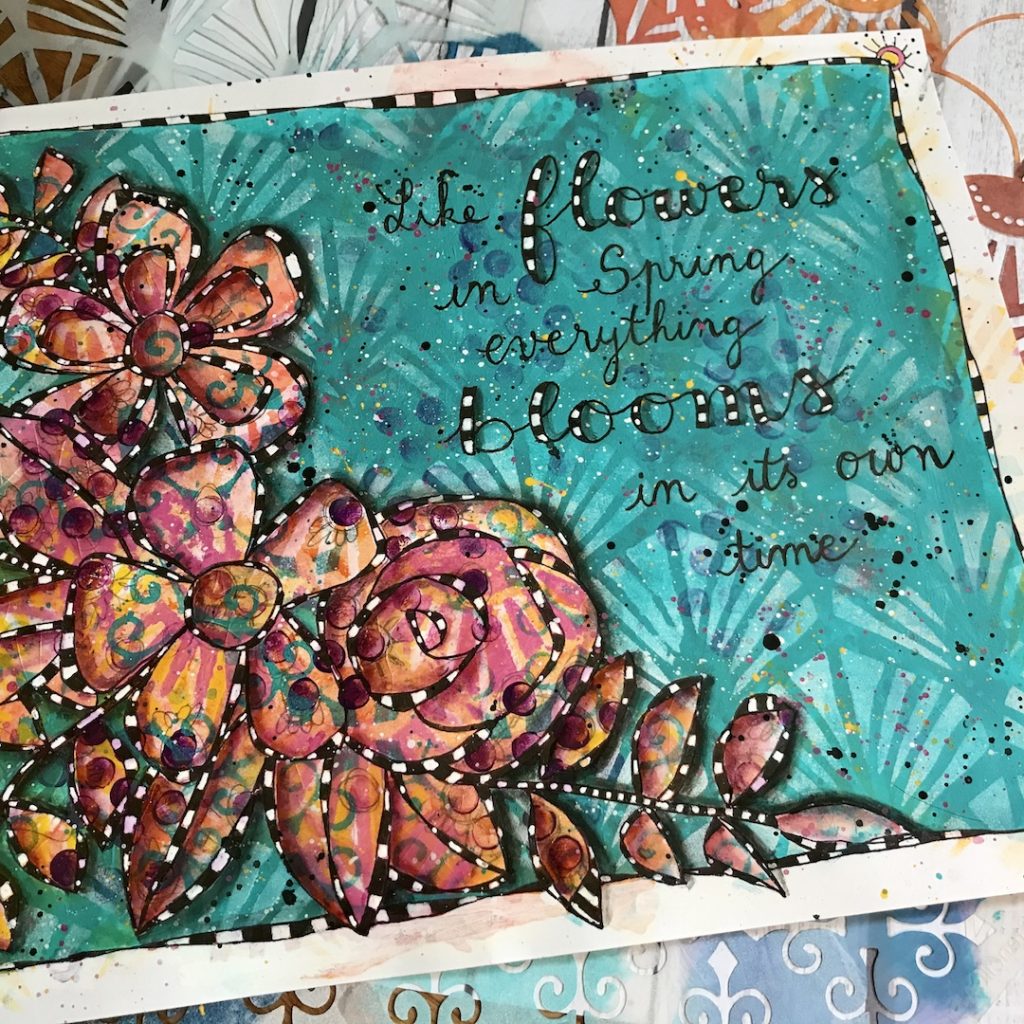
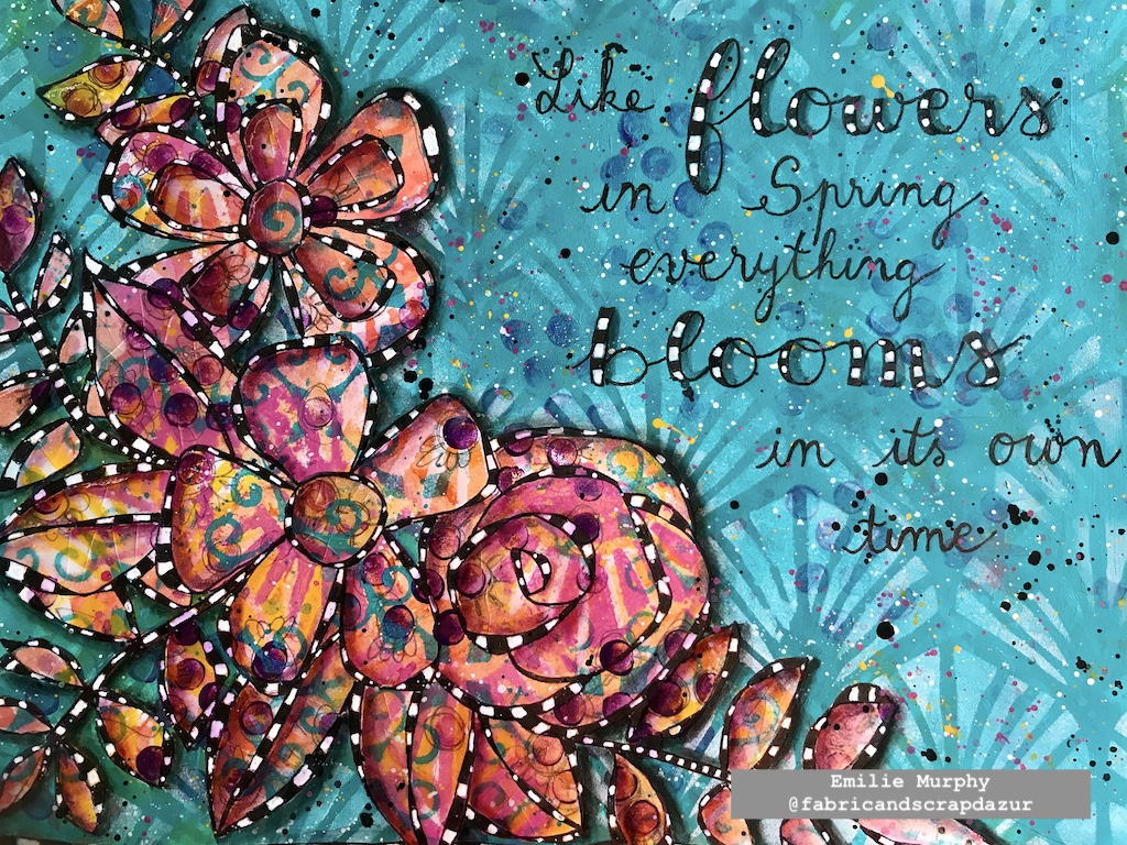
Once I was happy with the look of my background, I doodled some flowers and foliage.
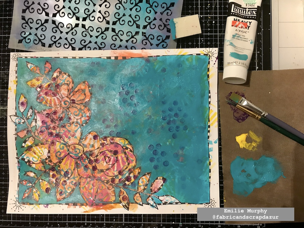
I covered all my background except the floral pattern with a cool color to make it pop out. I absolutely love this technique. It allows seeing through the different layers of the background, making it more interesting.
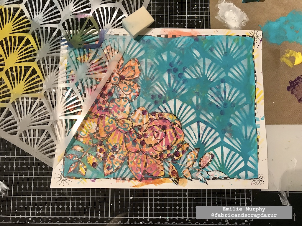
I once again used the Art Deco Wallpaper stencil and applied some white paint through it in order to add some texture to this plain background. I just love this pattern.
I toned down a little the white paint to embed the pattern to the background.
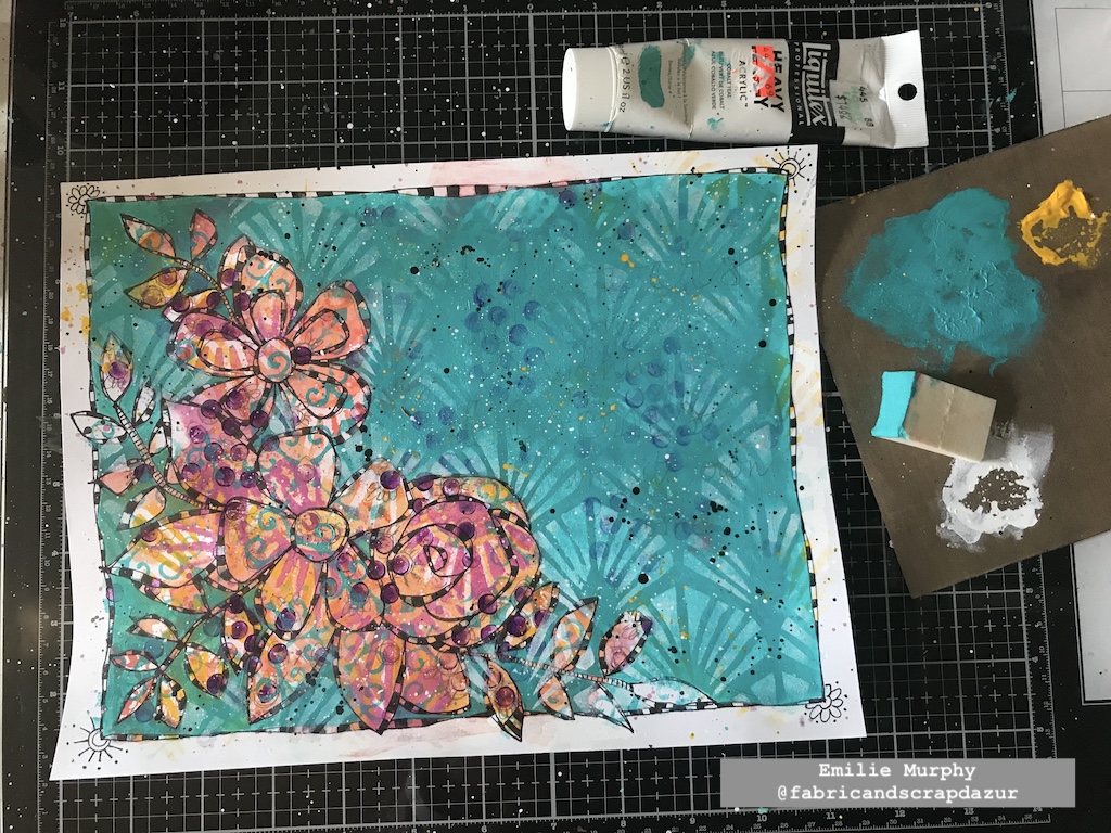
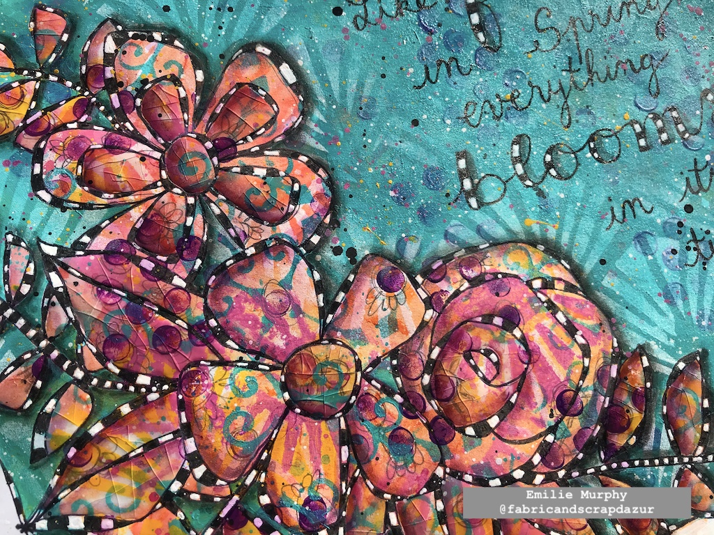
I added some splatters with yellow, black, and white paints. It’s not really visible on the picture but I also traced my quote with a pencil.
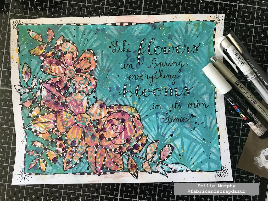
I outlined my quote with a permanent black pen and I finished coloring the checkerboard pattern with white gel pen. I reinforced the whites with a white posca pen when the white was not opaque enough.
I added some depth and shadow to my floral pattern and to the letters of my quote with a PITT pen marker. I also added some extra pink splatters.
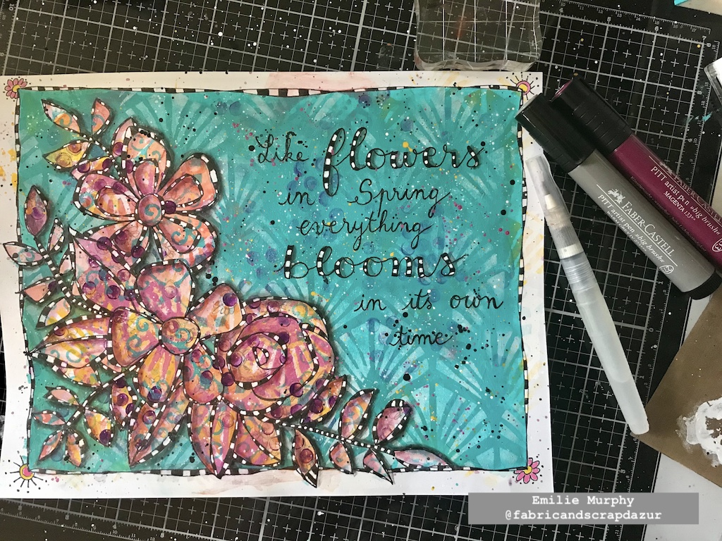
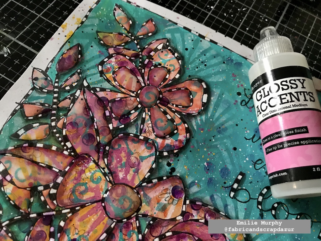
I could have stopped there but I found my art journal page too flat, so I decided to use some Glossy accent to give some dimension to my floral design. I didn’t put it everywhere. I just applied some on the center and inside petals of one of my flowers and on the leaves. I let the glossy accent dry completely.
I finally finished my art journal page by bending and folding the paper in different directions, where I applied the glossy accent in order to create some cracks. Isn’t it cool? I think it gives an interesting look. Be sure to apply a generous layer of glossy accent to get some nice cracks.
Hope you enjoyed this project, which ends my collaboration as a Creative Squad member. I just can’t thank Nathalie enough for giving me this opportunity to be a part of her team. It has been such a wonderful and pleasant experience in my creative journey. I really enjoyed working on every project I made using Nathalie’s wonderful products. The possibilities playing with them are endless. Of course, I will still be around on social media for the next coming of team member’s projects. Hope you will do, too!
Have a good rest of the week!
Thank you Emilie for this beautiful reminder to be a bit more patient! And, thank you for all your posts over the past year. We have loved seeing you style and learning more about you as an artist :)
Give it a try: you can find all my Stencils in my Online Shop and here are some of the supplies Emilie used:
Follow Nat’s Creative Squad on Instagram too: Each week we post projects, ideas, and inspiration for mixed media art.
Emilie. Another gorgeous spread! I love all the layers you used in this project. We are sorry to see you go, but we’ll stay connected through social media for sure.
I designed these stencils with just this layering possibility in mind – they share the same fan design and scale and can be used together nicely. They also both include open areas for adding more of your own personal style through stamping, colors, or hand drawn elements.
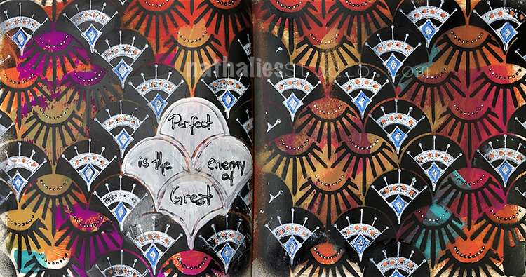
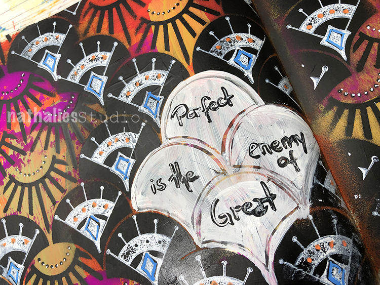
Perfect is the enemy of Great …something to keep in mind when you are struggling to get something just right. Maybe it doesn’t need to be perfect…
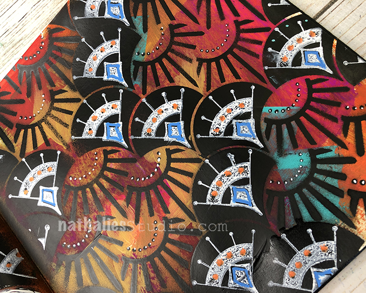
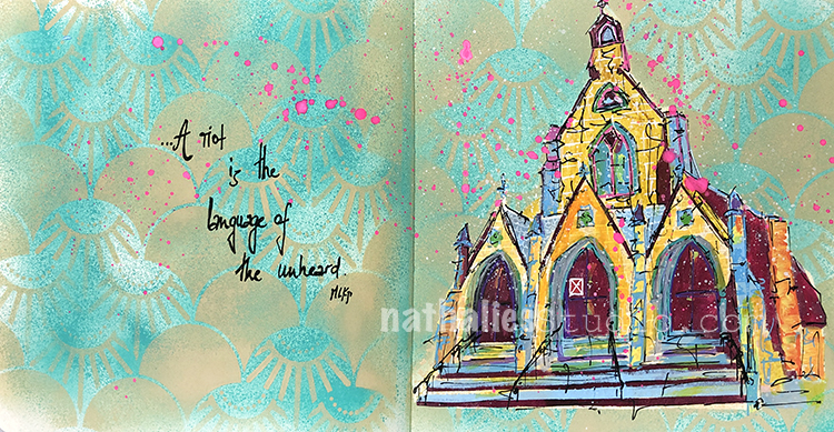
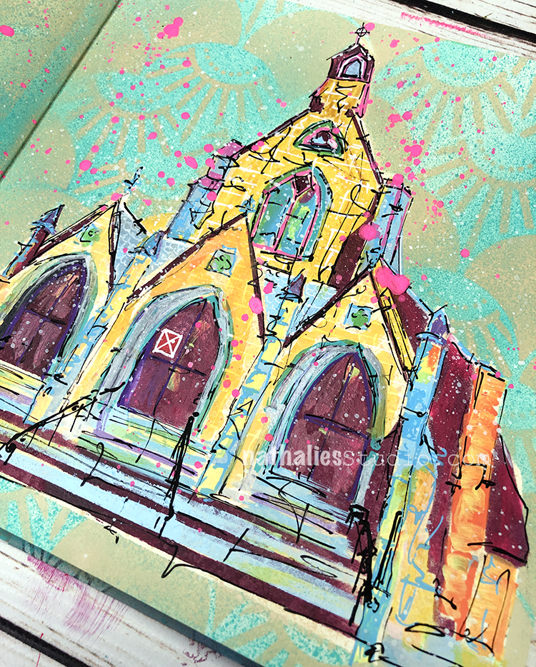
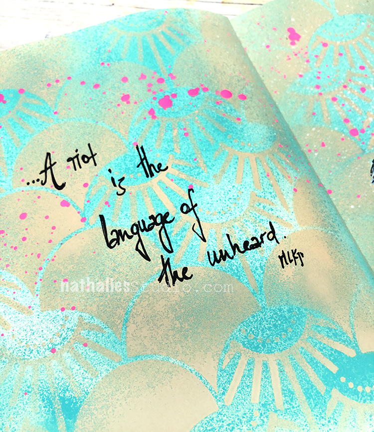
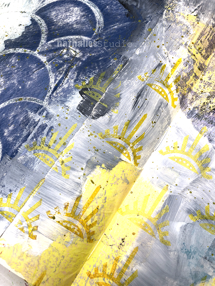
My background was a bit of a struggle on this one. I had added leftover acrylic paint from another project to my art journal since I do not like wasting paint and in the process the background just became a bit wild and dull. In order to push the background back – well where it belongs :) I then added my Art Deco Summit stencil and that began to bring it together. Next I stamped one of my Mini Motifs stamps with the white side of a Moonlight Duo pad – it fits nicely in the stencil pattern – and then one of my Fan-Fare stamps. I finished off the pattern with some new Posca markers I am loving – you can see the link for those below.
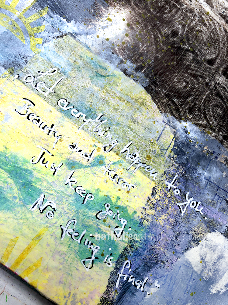
It’s a pretty wild background! I added gesso in the quote area and finished it off with a signo and fude pen.
St. John’s church has played a pivotal role in the civil rights movement here in Jersey City and is a historic landmark boarded up and falling apart. I couldn’t think of a better symbol to paint in my art journal while thinking about the events of the last week and present.
I know that some of my readers will criticize the usage of Martin Luther King jun. quote because they will point out, that the destroying of property has to stop. To those I would like to answer in anticipation of this reaction, that yes, it is sad and horrible that property is being destroyed – it is not right, but the killing of innocent black men and the systematic racism in the U.S. and the world has to stop. Let’s set the priorities right.
I am – as hopefully a lot of you – still trying to listen and learn. I want to hear the voices …and this much is clear for me: I want change!
I’m so glad you are speaking up/standing up for what is the ethical, moral, human thing to do. Thank you for amplifying our voices for justice, compassion and change!
Nice page and quote. Seems hard for folks to hear that the rioting may be wrong, but the protesting is so right.
I don’t have any easy answers, just hoping for some change.
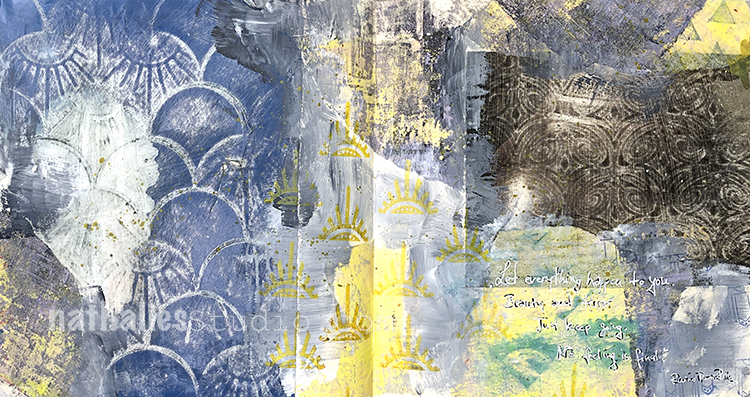
“Let everything happen to you. Beauty and terror. Just keep going. No feeling is final.” – Rainer Maria Rilke. This quote really lifted me up the other day when I needed some lifting.
I used some collage paper in this one – deli paper and magazine paper which I layed over my Art Deco Summit and Art Deco Fairview stencils and then rubbed with sanding paper to reveal texture and pattern.
Along with acrylic paint, gesso, the collage paper, and gel medium, for my background I also stamped with my Triangle Love rubber stamps.
I added the quote in black and white to help give it some dimension.
Here are some of the supplies I used:
Join me today, May 1st, at 12noon EST for a Kaffeeklatsch LIVE chat from my studio. Tune in to my Facebook page for the broadcast and say Hello. I would love to hear what is going on with you these days :) See you soon!
Hello from my Creative Squad! Today we have a tag and envelope project from Judi Kauffman using my Art Deco Summit stencil and this month’s theme: Motivated in March – What keeps you motivated to create? Is it a certain material? Your favorite colors that you can’t get enough of? Maybe you get motivated when you see artwork in a museum or out and about? Share with us your creative motivation and then create something inspired by it.
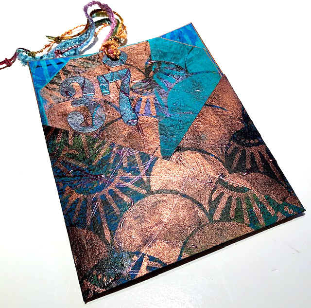
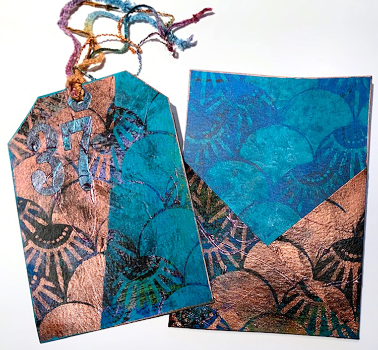
I love this month’s theme; “Motivated in March” really resonated. I thought a lot about what motivates me as well as parts of my life where more motivation is needed. To that end, I picked what I’m calling a “Magic Number” for the month: 37! And I designed a tag in a pocket to help me remember and focus on the number.
I’m going to spend 37 minutes a day on the treadmill. I’m going to help my neighbor register 37 new voters! I’m going to do 37 different creative projects during the month and will document them on the back of the tag and in my Traveler’s Notebook. …And I’m going to imagine that I’m only 37 to keep myself feeling younger.
YOUR TURN – A CHALLENGE
Before we get into the how-to portion of this tutorial I’m issuing a challenge: Pick your own “Magic Number”! Write down at least 3 things that it represents. Make a tag with a pocket like mine or start with an envelope, folder or box. Add the number to the tag, envelope, folder or box. Document your intentions for the number and then chronicle how the month plays out!
INSTRUCTIONS
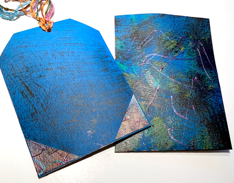
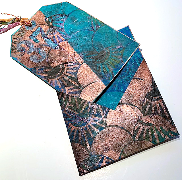
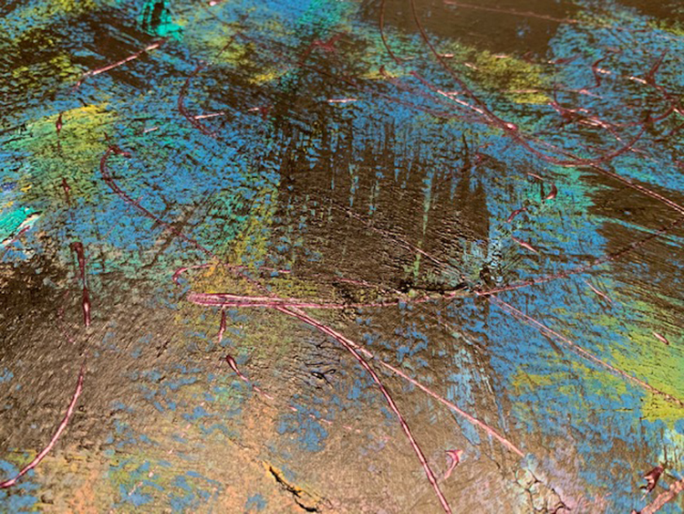
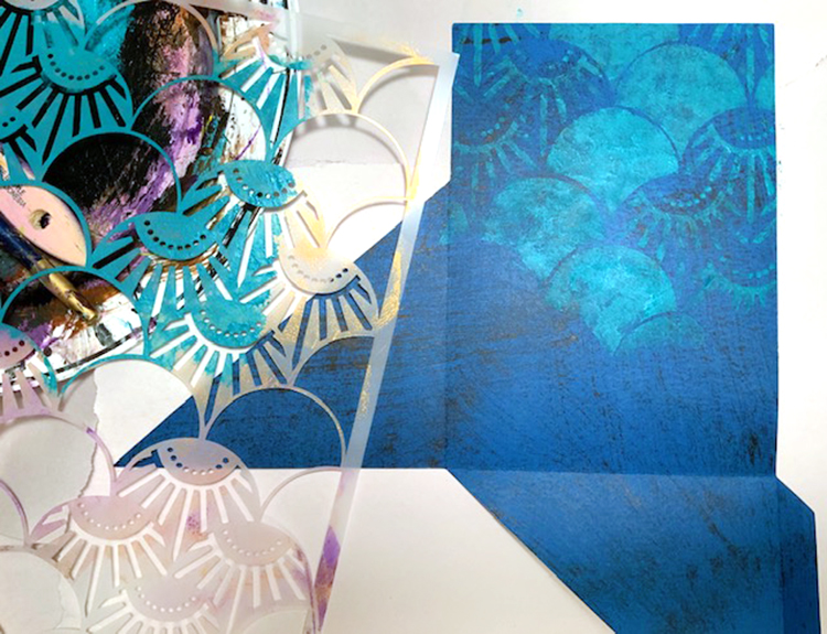
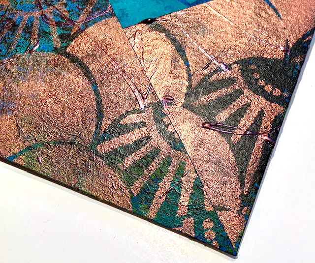
1. Dry-brush a sheet of royal blue cardstock (or a color of your choice) with two or more acrylic paints. Shown: Black, teal, medium blue. When dry, randomly scribble with dimensional paint in one or more coordinating, equally dark colors. Allow to dry.
2. Dry-brush the reverse side of the cardstock with black.
3. Die cut the pocket shape.
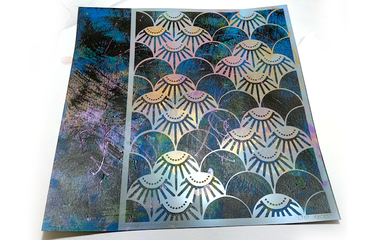
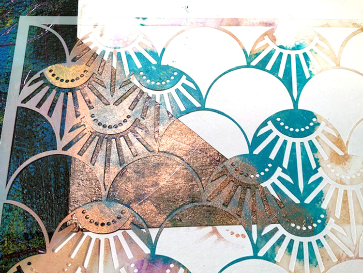
4. Using teal paint, stencil Art Deco Summit pattern on the portion of the inside of the pocket that will show when it’s folded. Allow to dry.
5. On the right side of the pocket use copper metallic paint to stencil Art Deco Summit pattern on the two angled sections. Use newsprint to mask the areas where you don’t want any stenciling.
6. Fold on score lines, assemble the pocket.
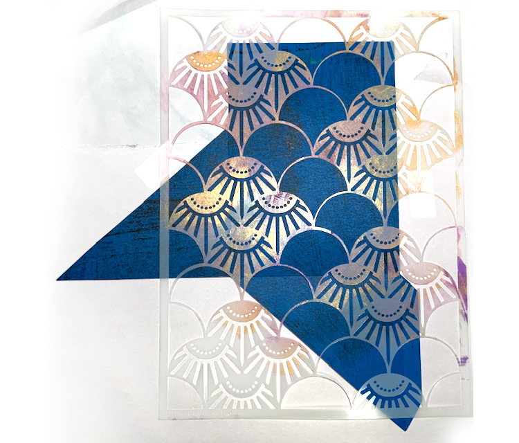
7. Cut a 4.75” x 6.75” rectangle from scrap portion of 12×12 cardstock. Stencil Art Deco Summit pattern in two colors at an angle, masking between colors – copper metallic on one side, teal on the other. Trim corners and punch a hole to make a tag.
8. Edge the pocket and the tag with paint.
9. Hand- or die-cut the “Magic Number” and a hole reinforcement from another scrap portion of the 12×12 cardstock. Adhere to the tag. Add fibers in coordinating colors.
Thank you Judi – what a nice idea of activities that we can do now that we are all spending more time at home.
Want to give Judi’s project a try? You can find all my Stencils in my Online Shop and here are some of the other supplies she used:
Feel inspired? Working on something yourself that you’d like to share? I love to see how you interpret our monthly themes. Email me how you used my stencils and stamps with the theme and email me an image – I would love to share your projects in my next “n*Spiration From Around the Globe“.

Wouldn’t it be wonderful for someone to use one of your letters for art…absolutely a delightful thought!
Reply