Creative Squad

In My Dreams – Maura Hibbitts

Hello from my Creative Squad! Today we have Maura Hibbitts sharing a mysterious dreamscape with us in her art journal. She is using my Wabi Sabi and my Mini Motifs rubber stamp sets for this and our theme: In My Dreams – A lot of folks are having crazy dreams these days. What visions do you see at night? Are you sleeping at all? Let us get a peek into your nocturnal adventures through your art.
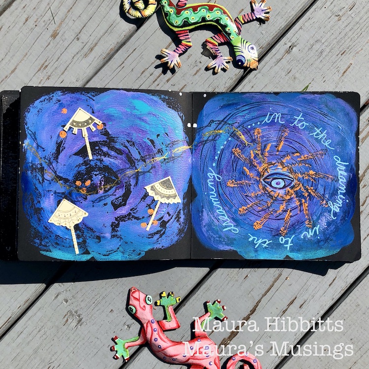

I don’t know about you, but I have been having some very vivid and wild dreams these past few months. I had one dream that was so realistic, I could hear, see and feel what was occurring, and when I woke up I totally expected it to be real. I often see words and text in my dreams…maybe because I read before I go to sleep? And most of my dreaming is in blazing technicolor too. I have to say, my dream imagination is pretty darn vivid, and I think that helps guide my creative spirit.

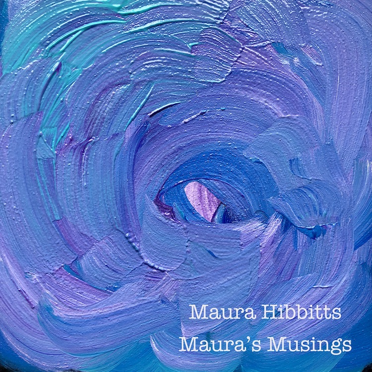
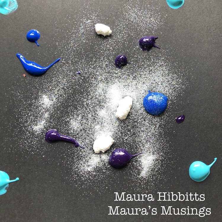
I had this idea of showing my dream imagination as a cosmic swirling mass. I started in my art journal on the black background with blobs of paint – Cobalt Teal Hue, Primary Cyan, and a blend of Titanium White with Dioxazine Purple. I also added in some Glamour Dust to blend with the paint for a sparkly appearance.  Then, I used the paintbrush to swirl and blend the paint around the center.
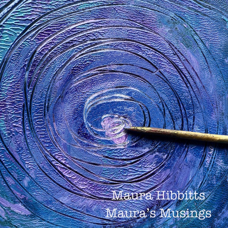
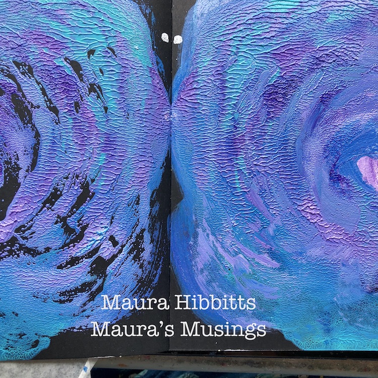
Since I had a rather thick layer of paint on the right hand side of the journal, I thought why not close it and see what happens? When I opened up the pages, I really loved the swirling on the left side. I went back to the right side, and scraped some circle marks into the paint with a dowel.
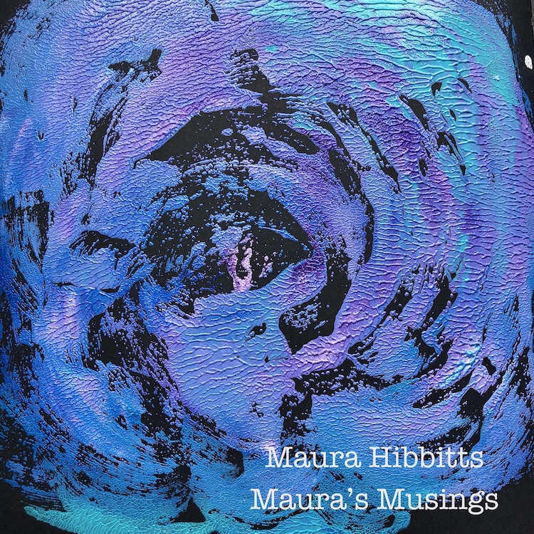
To create the feeling of a swirling cosmos, I stamped out from the center in a circle using the Groovy stamp and a mix of Titanium white and Cadmium Orange Hue for a contrasting color. I repeated another circle pattern using the Jazzed stamp with the paint. Note – when stamping with paint, be sure to clean your stamps right away. Since I had some orange paint left over, I used the end of the dowel and made a few paint dots on the opposite page.
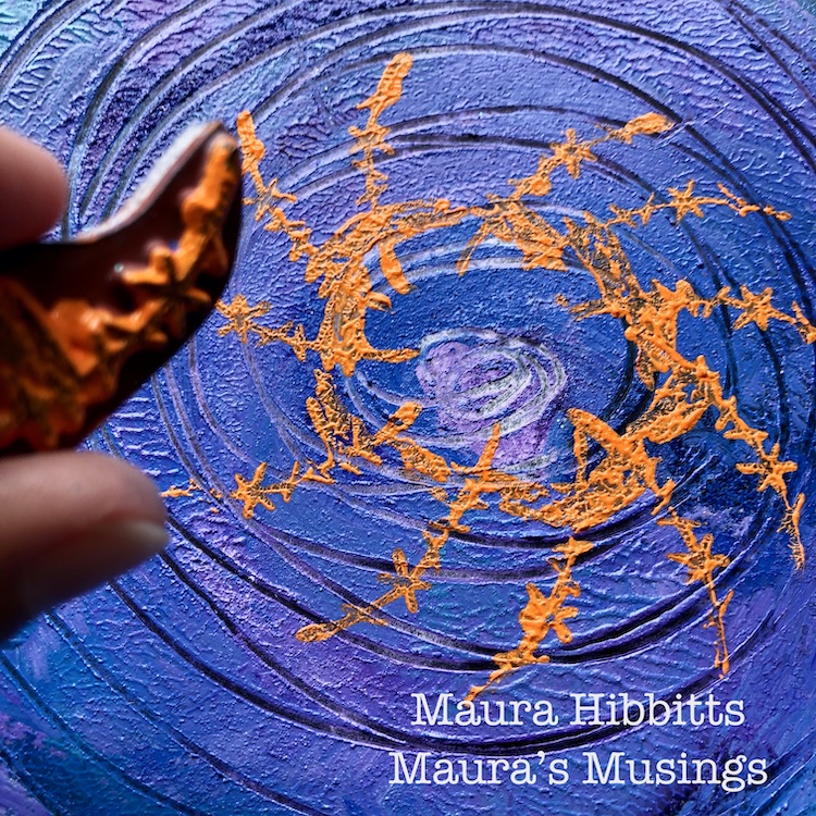
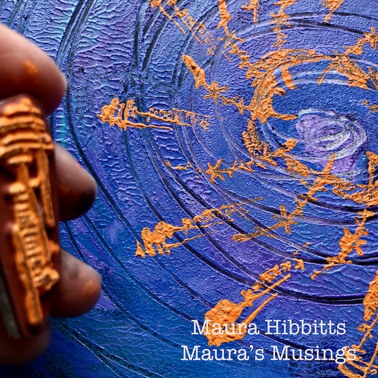
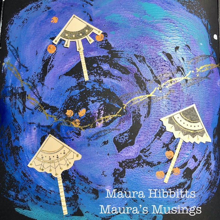
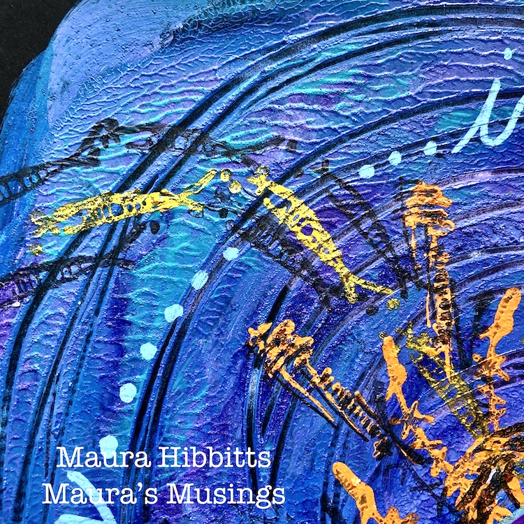
Next, I imagined a flowing school of fish coming out of the center of the cosmos and swimming across the other page. I used the Neato stamp (a favorite!) and stamped two lines of fish using black ink, then went back and stamped the fish using gold ink.
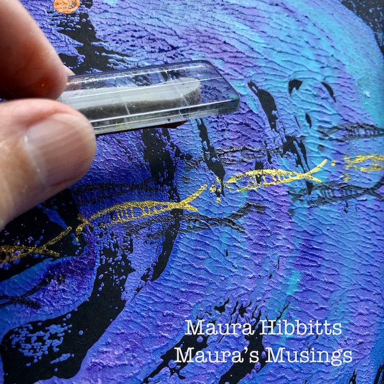
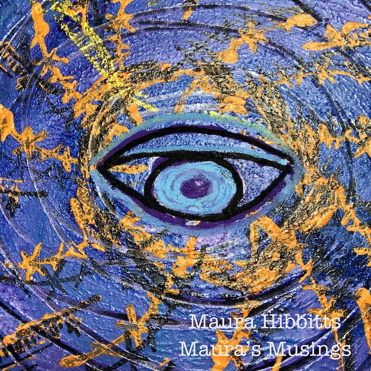
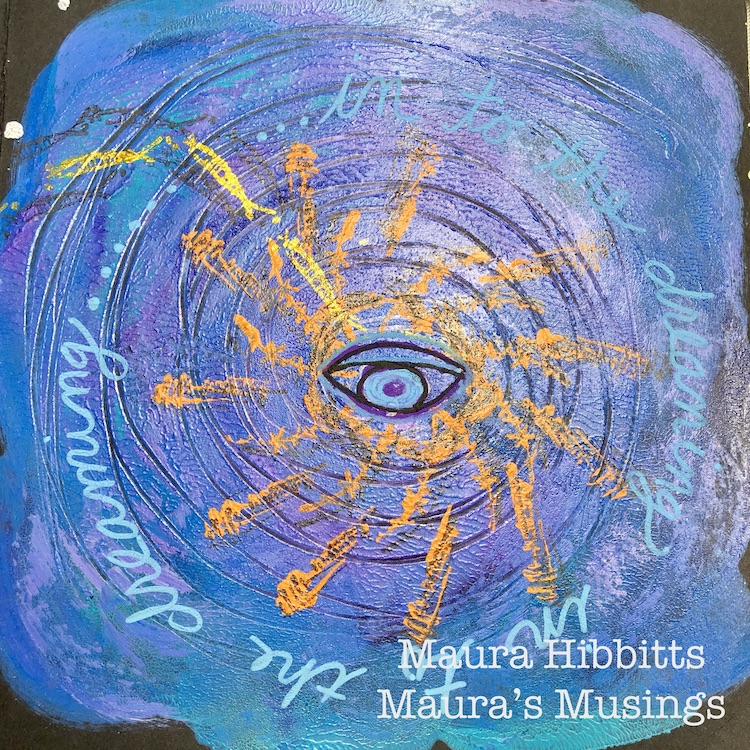
I went back to the galaxy, and stamped over the designs in the orange paint with black ink. I was trying to give them a bit more definition, as some of the painted stamping was not too clear. I also decided to draw an eye in the center of the galaxy with Posca pens.
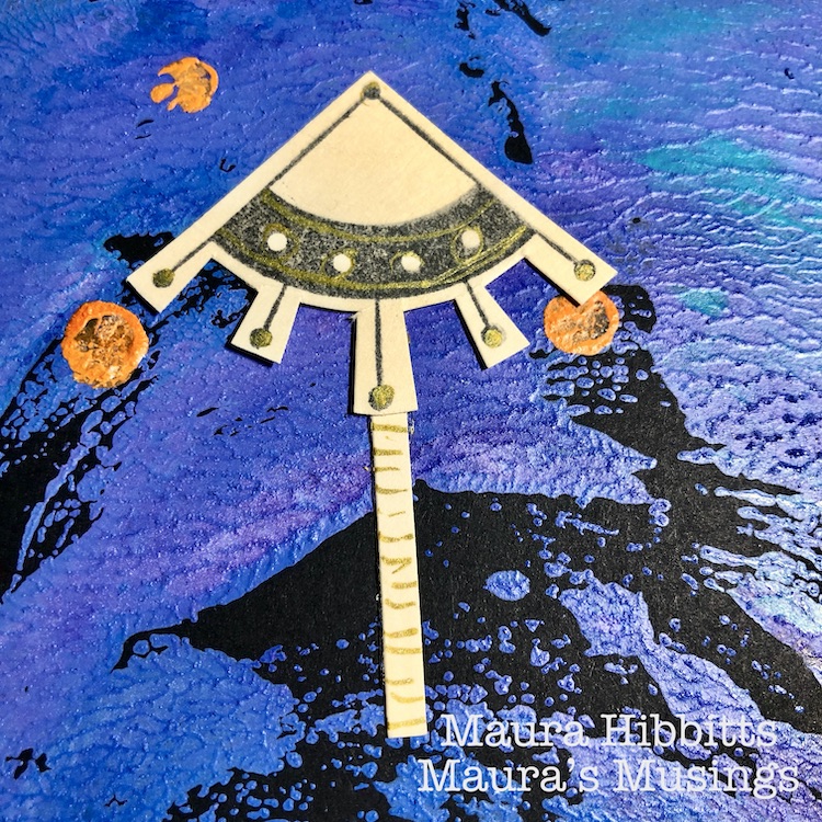
Sometimes we visualize our thoughts as bubbles or umbrellas, so I turned the Mini Motif stamps into umbrellas. I stamped the Arts and Crafts, Jugendstil and Mission Motifs onto manila tags using black ink, then cut them out into umbrella shapes. Also cut a strip of the tag to use as the umbrella handle. Doodle a bit on the designs with gold pen. Adhere three umbrellas onto the left page. (Good rule of thumb – use an odd number.)
Head back over to the dreaming eye/cosmos page, and add the lettering “ in to the dreaming” around the central design with a turquoise Posca pen.
There are many images and stories at play on these pages, and maybe they don’t seem to fit or make sense. But isn’t that what a lot of dreams are like?
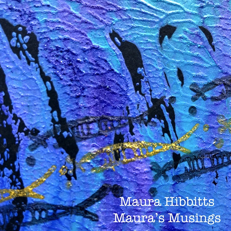
How do you imagine your dreamscape? I thought of mine as a swirling cosmos with an all seeing eye, umbrella thoughts and a stream of fish flowing through (the fish might come from my desire to visit the ocean, which I haven’t been able to do this year). I think our dreams bring our subconscious to the surface of our thoughts, and help ignite our creativity. May you have some creative dreaming! – Maura


Thank you Maura! I loved hearing about your vivid nighttime adventures of the subconscious and how you translated that strangeness onto the page. Very cool!

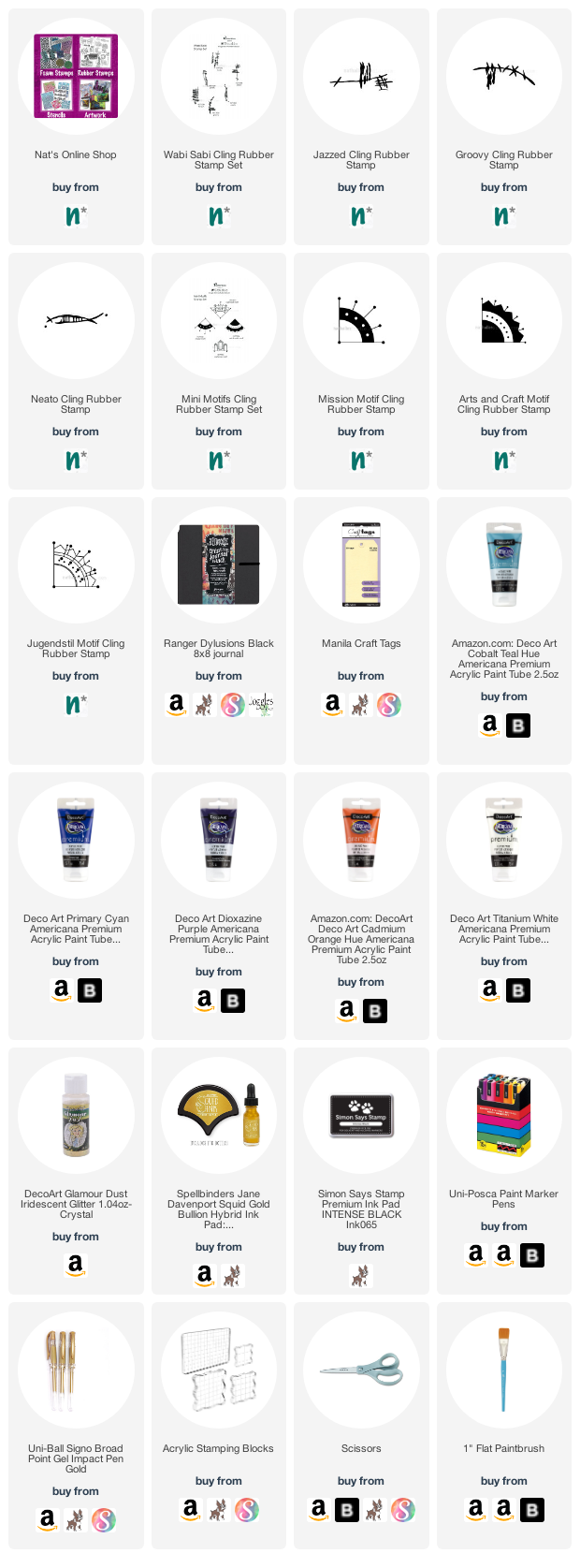
Give it a try: you can find all my Rubber Stamps in my Online Shop and in addition to a wooden dowel and some adhesive, here are some of the other supplies Maura used:
Feel inspired? Working on something yourself that you’d like to share?  I love to see how you interpret our monthly themes. Email me how you used my stencils and stamps with the theme and email me an image – I would love to share your projects in my next  “n*Spiration From Around the Globe“.

Comments (1)

  • Sue Clarke

    |

    Maura, I love this so much!!!

    Reply

Leave a comment

In My Dreams – Jennifer Gallagher

Hello from my Creative Squad! Today we have one last project and post from the amazing Jennifer Gallagher. We have loved having Jennifer on the Squad now for 2 years and have always enjoyed her colorful and fresh style. This month Jennifer says goodbye with an art journal page that is both personal and powerful. She is using my Hamburg stencil, my Mini Motifs rubber stamps, and my Wabi Sabi rubber stamps along with our new theme for this month: In My Dreams – A lot of folks are having crazy dreams these days. What visions do you see at night? Are you sleeping at all? Let us get a peek into your nocturnal adventures through your art.


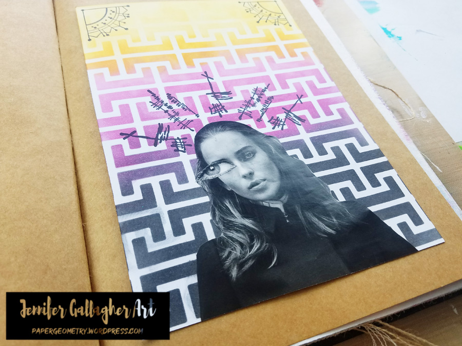
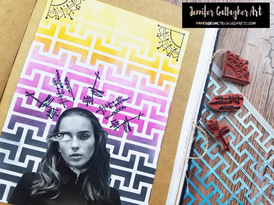
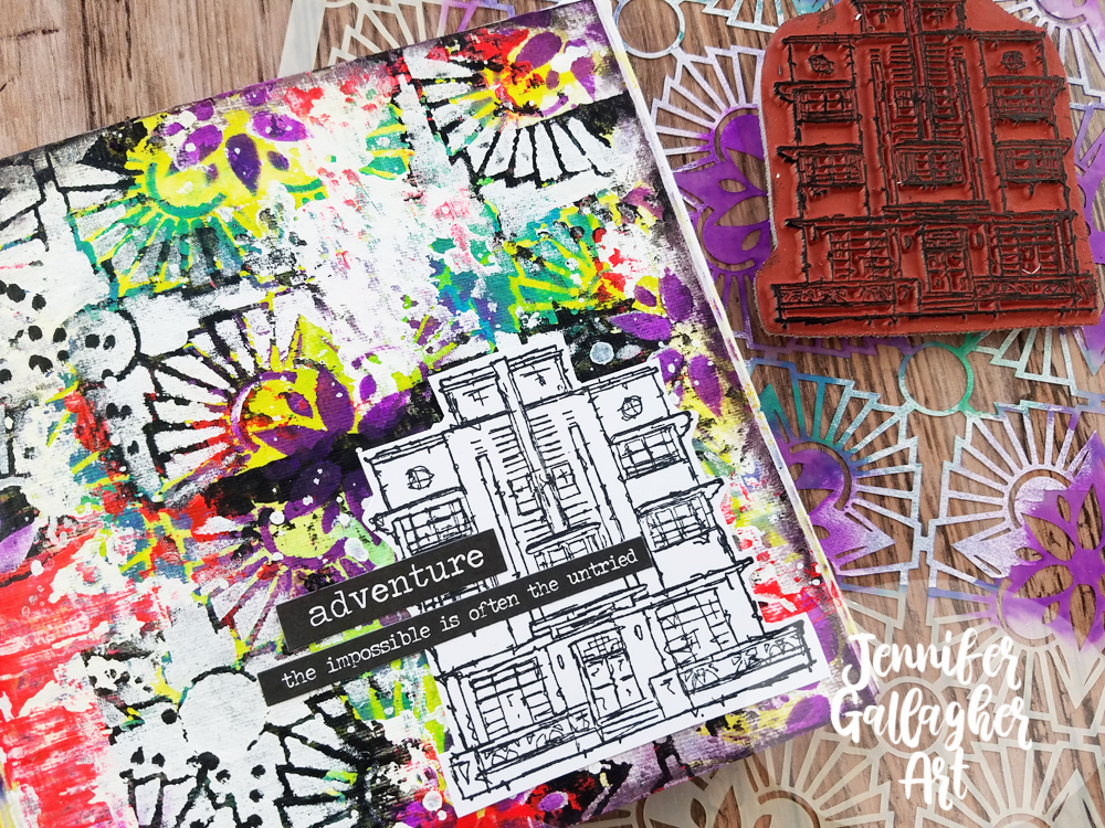
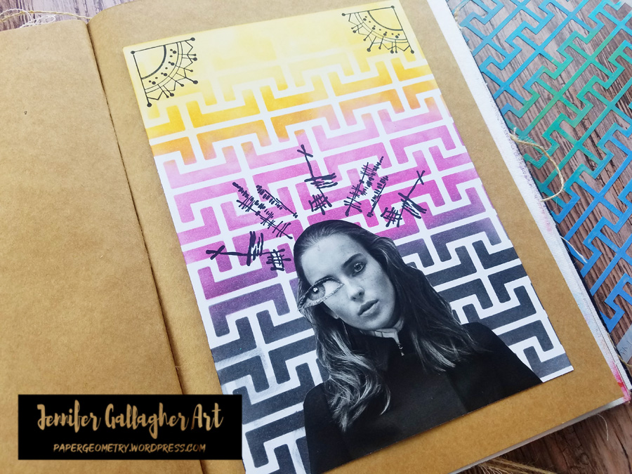
This month the Creative Squad is talking about dreams. With all the stress of the last several months, my dreams aren’t memorable so much for their content, but the way I wake up feeling – and that is tense. So, I’ve created this art journal spread to express that tension and chaos.

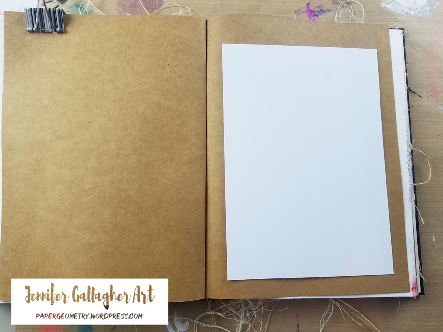
I decided I would attach a piece of A5 cardstock to my kraft page in a Dina Wakley Media journal. I will create my design on the cardstock and then attach it once it is complete.

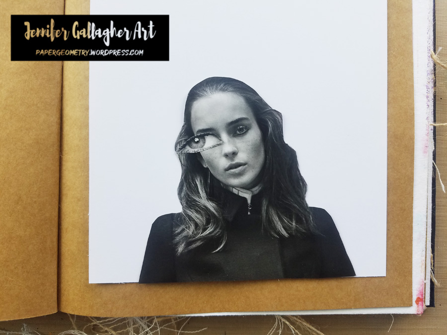
I have cut a face and an eye (larger than the eyes originally on the face) out of a magazine and picked a spot where it will go. I’m not attaching it yet so I can stencil the background.

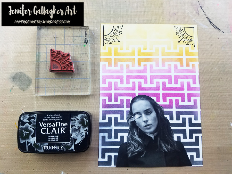
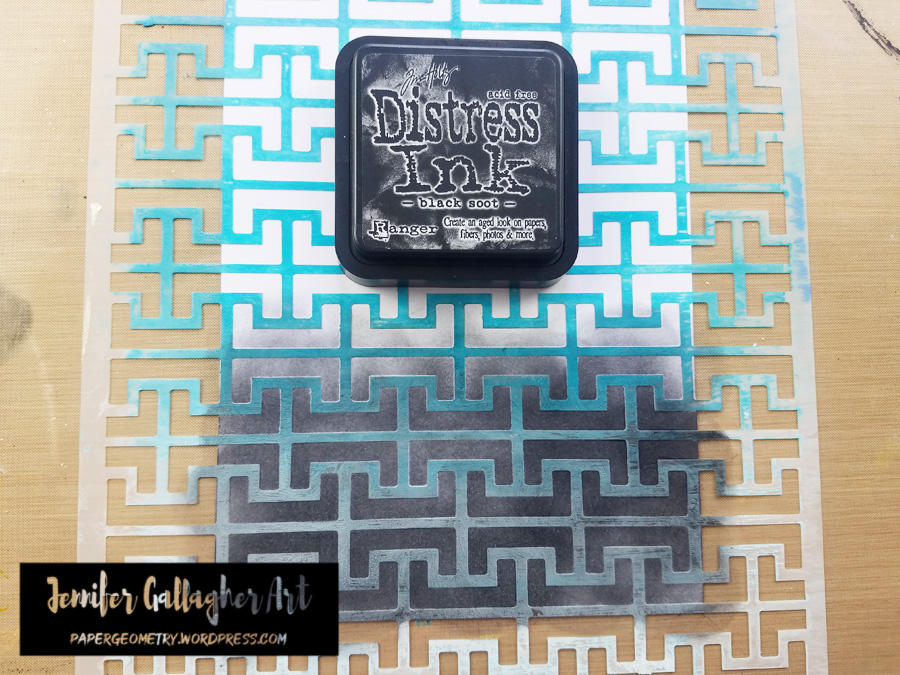
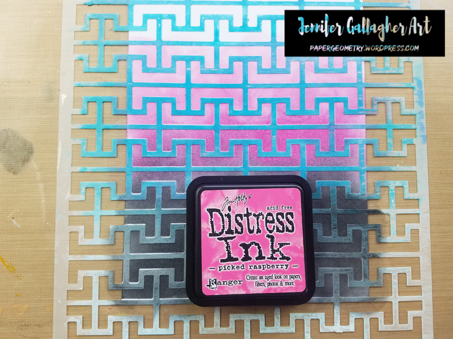
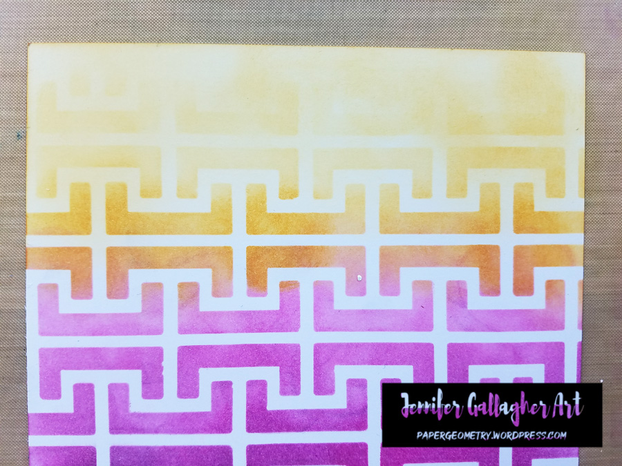
I laid Nat’s Hamburg stencil over the A5 piece of cardstock and starting at the bottom applied three colors of Distress Ink. First, I placed Black Soot, then Raspberry Preserves, and finally Wild Honey. Notice that at the top I blended a little wild honey over the white space to give a different look.

Next, I stamped Nat’s Jugendstil Motif stamp onto the top two corners using Versafine Clair in Nocturne.

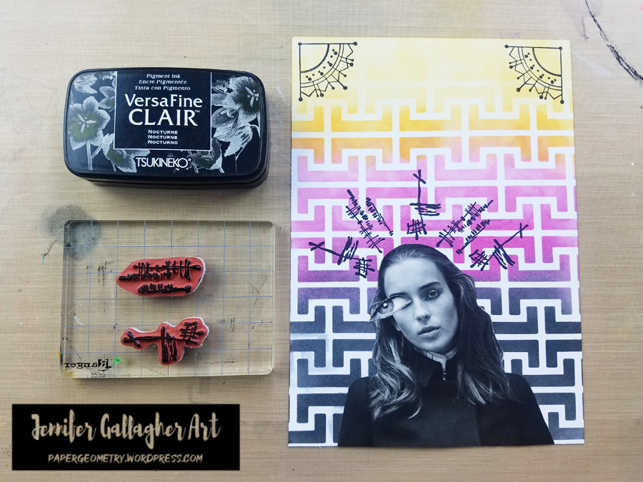
I stamped Nat’s Jazzed and Funky stamps above the figure to represent tension and chaotic thoughts. These were also stamped in Versafine Clair in Nocturne.

I used a generic glue stick to attach the face and eye to the cardstock. Then I applied scor-tape to the back of the A5 sheet and attached it to a kraft page in my Dina Wakley Media journal.

I hope you have enjoyed this tutorial. I really loved creating this page. Also, this is my last tutorial as a member of Nat’s Creative Squad. I have loved sharing my art and creative projects with you these last two years. Happy Creating! xoxo – Jennifer


Thank you Jennifer! We will definitely be sad to see you go!!! But we of course will continue to follow you online to see what other creative magic you are up to :)

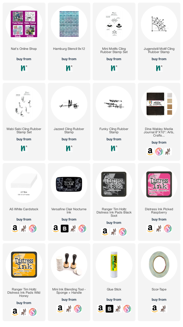
Give it a try: you can find all my Stencils and Rubber Stamps in my Online Shop and here are some of the other supplies Jennifer used:

Feel inspired? Working on something yourself that you’d like to share?  I love to see how you interpret our monthly themes. Email me how you used my stencils and stamps with the theme and email me an image – I would love to share your projects in my next  “n*Spiration From Around the Globe“.
Leave a comment

Wild and Free – Emilie Murphy

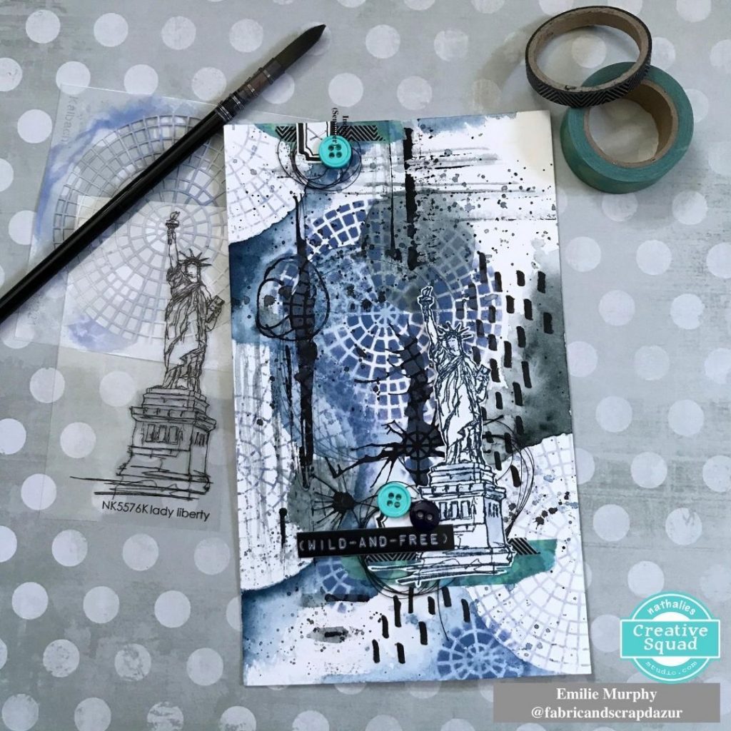
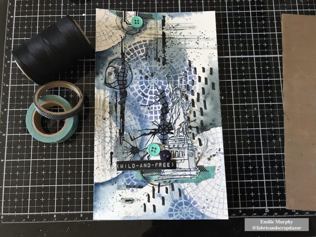
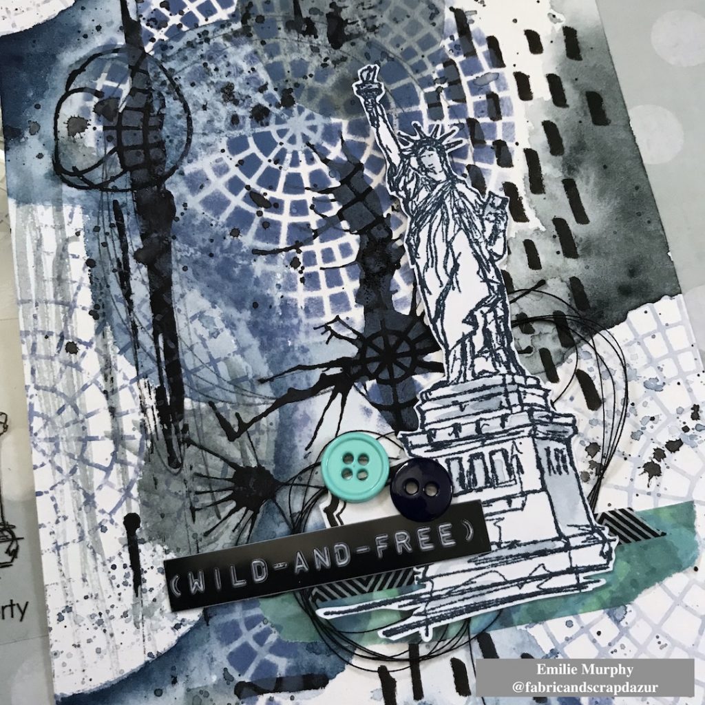
Hello from my Creative Squad! Today we have Emilie Murphy with us using my Lady Liberty stamp and my Central Ave 4×4 stencil and sharing her fresh and funky take on our theme: Wild and Free – After so many months of careful living, it’s time to go Wild and Free… In our Art! Go a little crazy in there and live it up with bright colors, exuberant mark making, bold colors – however you want to go a bit bananas. It’s time to let loose!


Hi there! Hope you are doing well and enjoying the summer so far.

My first thought of “Wild and Free” theme was to use Nathalie’s stamp “Lady Liberty“, well known symbol of Liberty and emblem of New York City. Lately, I got nostalgic about my trip there, already ten years ago. I had spent such a great week in this fantastic and energetic city.

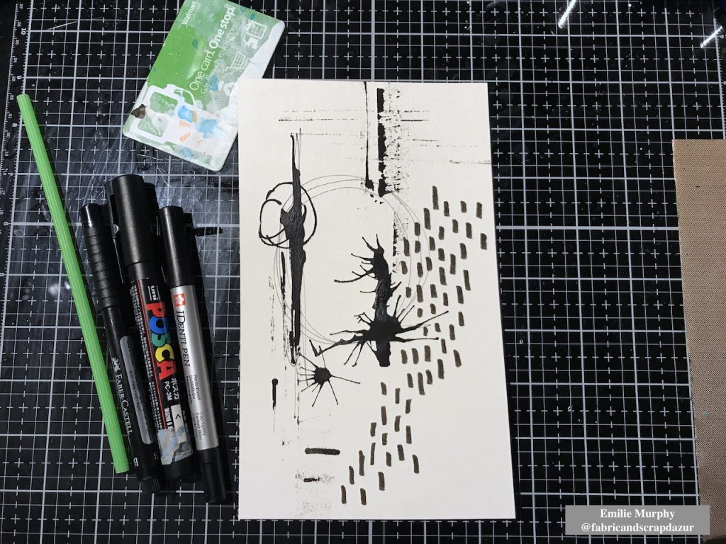
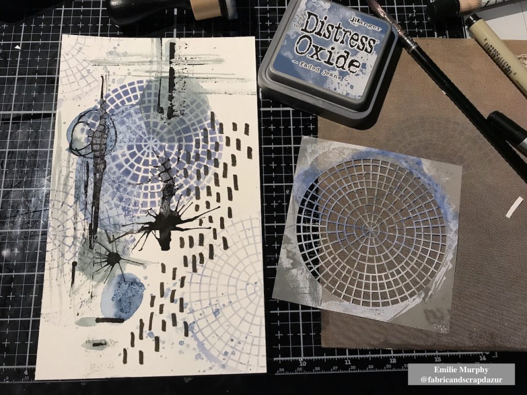
I started my page making some marks with permanent black pens on watercolor paper. I used a Posca pen to make blobs of black paint that I spread with a plastic card and straw.  I let it dry completely.

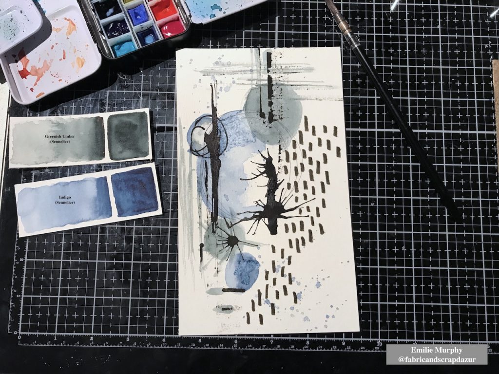
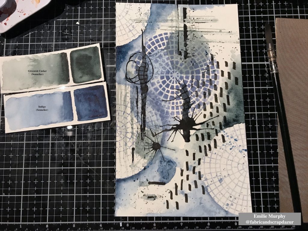
Then I applied some watercolor and limited my colors to two ones with kind of neutral tone. I slightly sprinkled a little bit of salt in some wet area because I love the effect when it dries.

I decided to work on my background with the “Central Ave” 4×4 stencil. I first laid down my stencil and applied distress oxide ink directly through the stencil with a foam tool. Then, as I wanted to keep some blank less busy areas, I applied distress oxide ink on my stencil and spritzed a mist of water then laid down my stencil on the paper. I let the stencil down few seconds before removing it. As a result the paper absorbs the ink and you get a light negative print of your stencil. That is a cool effect giving a kind of ghost print.

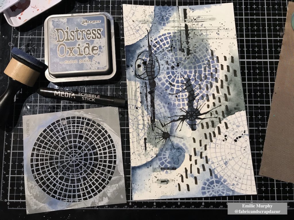
In order to unify all together the different areas of my background, I added more watercolor in order to make pop the stencil pattern out and get some circles.

I introduced smaller circle shapes made only with the central part of the stencil. I think it brings an interesting dynamic to the background having different sizes of circles. It’s amazing what we can do with this simple stencil. I also added some black splatters with a water-soluble crayon. I can’t help myself… I love splatters!

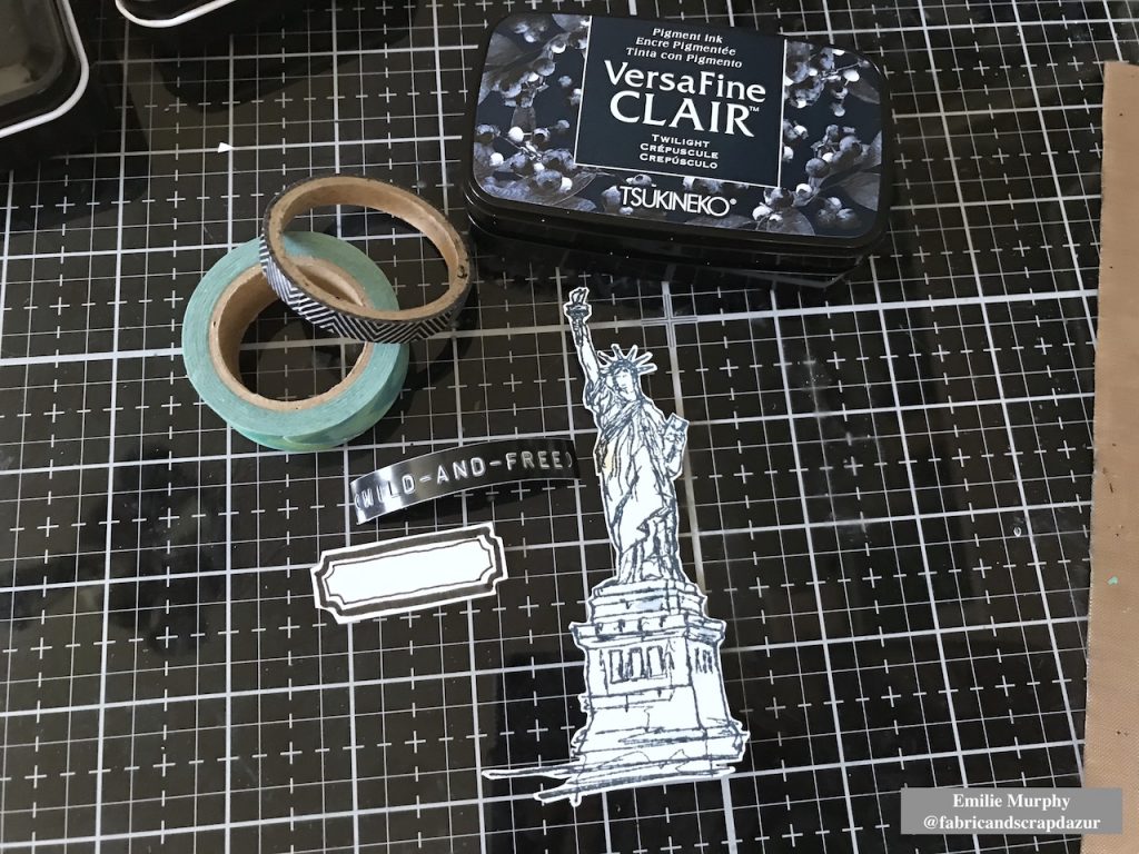
Then I prepared my focal image. I stamped the “Lady Liberty” stamp with VersaFine Clair ink. It is just a matter of preference. I could have used also archival ink. I gathered few other elements with coordinated colors that I wanted to add like a handmade label, a couple of Washi tapes, black thread and buttons. The “wild and free” sentiment has been made with a hand-label tool.

Finally, I assembled all the elements the way I wanted to finish my page.

Hope you have enjoyed this easy and pretty quick tutorial. I made the choice of doing a journal page but this could have been also great as a card.

Have a good rest of the week and see you next month!


Thank you Emilie – love how you tied everything together with the splatters, colors, and mark making!

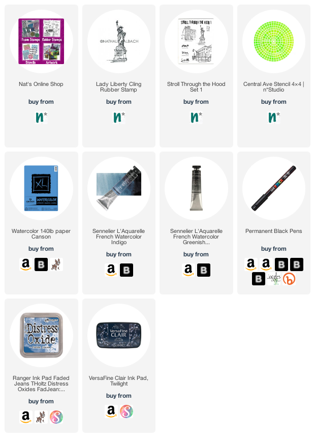
Give it a try: you can find all my Rubber Stamps and Stencils in my Online Shop and here are some of the other supplies Emilie used:

Play along with our monthly themes and weekly projects! Working on something yourself that you’d like to share?  Email me how you used my stencils and stamps with the theme and email me an image – I would love to share your projects in my next  “n*Spiration From Around the Globe“.
Leave a comment

Call for NEW Creative Squad Members!

Creative Squad Call!

Our current Creative Squad is in search of NEW members. Read on and let us know if we should be looking at you!

PLEASE NOTE: Due to COVID restrictions, at this time we are only accepting applications from US residents

Do YOU fit the bill???

+ Are you a Mixed Media Artist, Art Journaler, or Card Maker with a unique style and a passion for creativity?
+ Do you love to use stamps and stencils in your work and love to try new techniques and media?
+ Do you love to share your projects on social media and engage with other artists?

If the answer is yes, yes, yes, we are looking to fill some spots on our n*Studio Creative Squad and would love to hear from you! 

How to Apply*:

Email nat(at)nathaliesstudio.com with “Creative Squad Call” as the subject. Please include:

1. Full name, email address, links to social media sites/blog/website where we can see your work
2. A couple sentence bio or description of your work
3. 4-5 low res images of your work that best represent your style

*Enter by August 25, 2020, US Applicants only at this time  :)

What exactly does a Creative Squad member do?

As a Creative Squad member for Nathalie’s Studio you will serve a 6-month term beginning 10/1/2020. As part of the Creative Squad, you will receive a variety of Nathalie’s Studio products. You will create one project per month, using specified products or groups of products and inspired by a monthly theme. You will be featured once a month on the nStudio blog, Facebook page, and Nat’s Creative Squad Instagram page, and you will be part of an amazing team of artists with a legacy of awesomeness!

Don’t be shy, apply today – we would love to see how you are rocking your creativity!

Leave a comment

Wild and Free – Nicole Watson

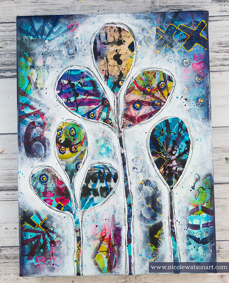
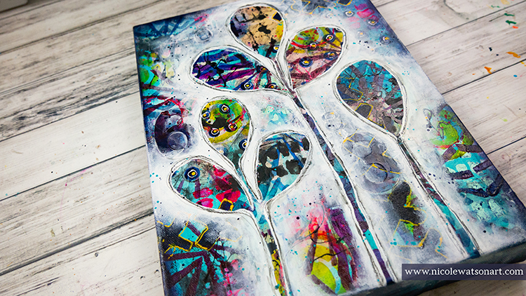
Hello from my Creative Squad! Today we are going a bit wild with Nicole Watson and her reductive style painting using my Batik and Beacon stencils. Check out her video below, inspired by this month’s theme: Wild and Free – After so many months of careful living, it’s time to go Wild and Free… In our Art! Go a little crazy in there and live it up with bright colors, exuberant mark making, bold colors – however you want to go a bit bananas. It’s time to let loose!


Warning! Before you begin this project, know that it might get a little ugly, and you might want to give up and gesso over the entire canvas.

I thought I had the perfect idea for this month’s challenge of wild and crazy using only two of Nathalie’s products. So, confidently, I prepped a canvas, added some ephemera, and well… it got a little messy and the ephemera bubbled, so I threw it down to grab another canvas. The next canvas started a little better, but after all my crazy layers of ephemera, stencils, stickers, drips and scribbles, I went to bed extremely worried that I would not be able to recover. My canvas was looking like bad ‘80s fabric.

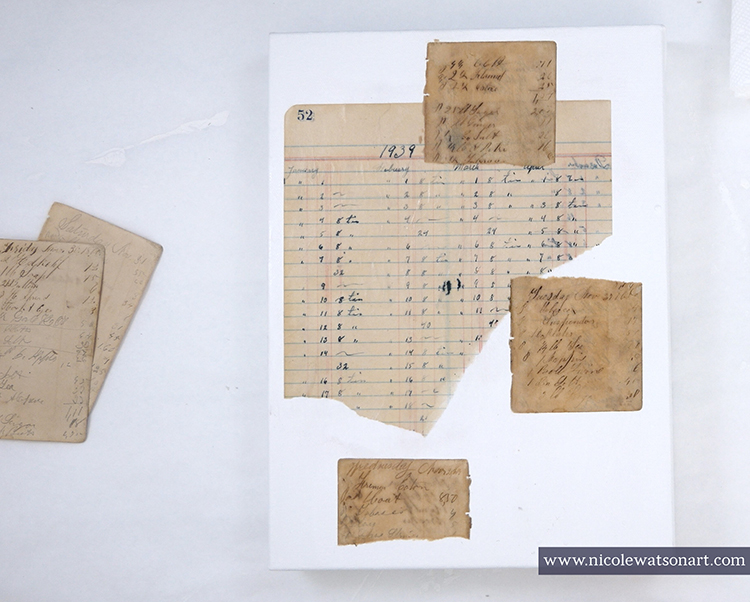
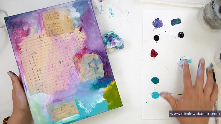
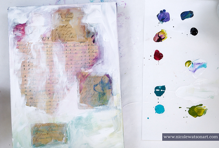
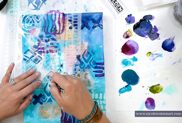
Spoiler: I recovered, barely! My project began by picking up a 9×12 canvas and gessoing it. This is total personal preference here. Even though the canvas is pre-gessoed, I still like to add a layer or two to prep it. Then, I stuck a ledger page and a couple handwritten note pages on with matte medium. Bravely, I broke the white blank canvas with color.

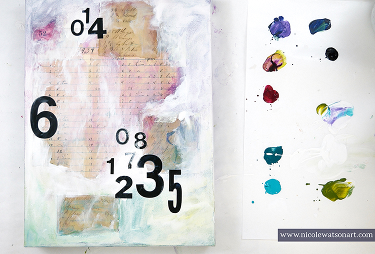
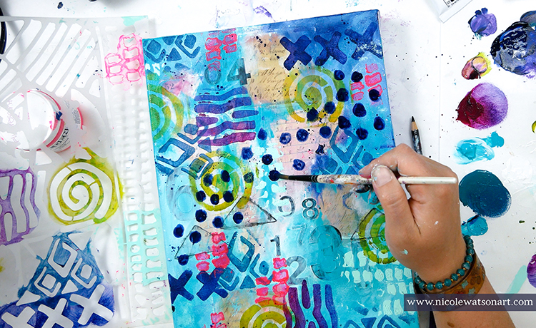
My next steps were to create layer upon layer upon layer. First with some number stickers and more paint.

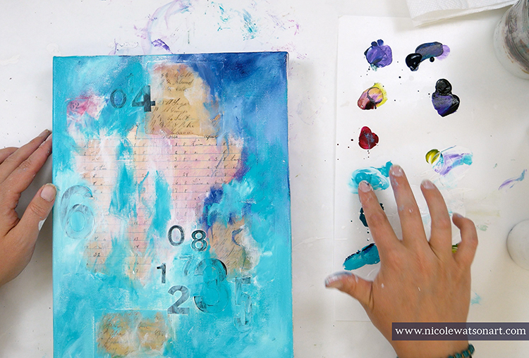
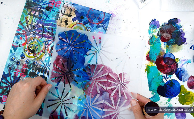
Then, I used Nathalie’s Batik stencil as it was perfect for this task. I was able to isolate parts to use each design separately with different colors and techniques from a sponge applicator, palette knife, tracing, spray, and even my fingers! All these layers created chaos in the background.

Besides the stencil, I also made some circles that I doodled around, splatters, ink drops, and scribbled some words.

This is where the canvas started looking a bit concerning. I left it to dry hoping to rescue it the next day with fresh eyes.

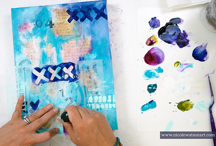
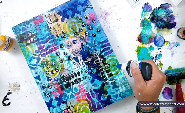
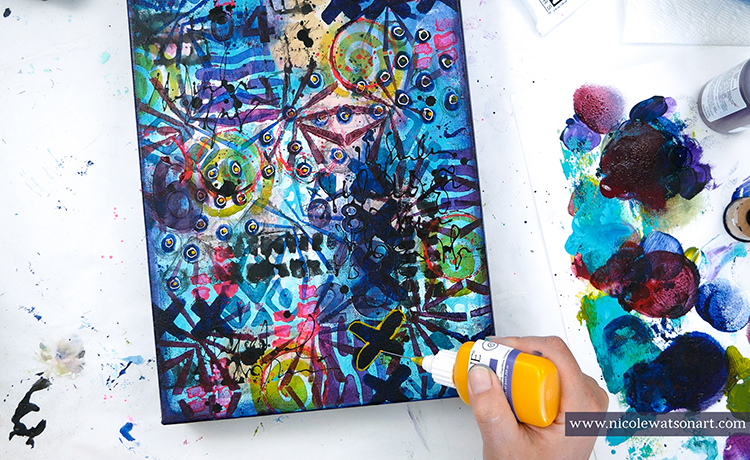
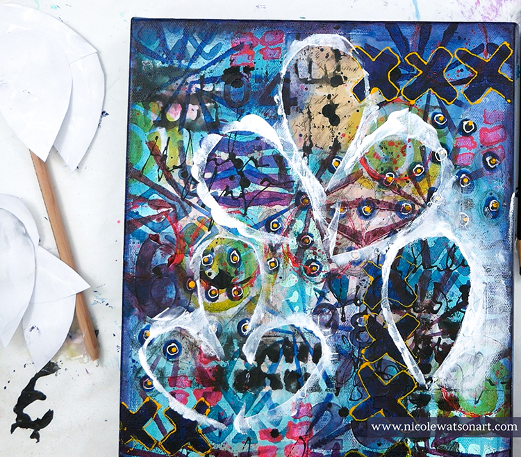
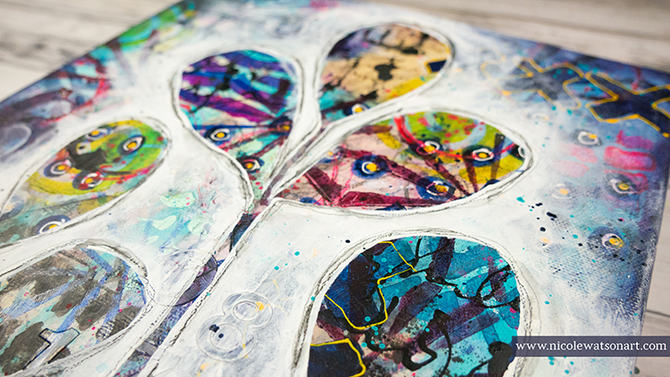
After my morning walk and coffee, I returned to my studio. I picked up Nat’s Beacon stencil as my second item. The piece needed some more delicate shapes between the larger ones. Using a foam applicator, I randomly placed blues and reds in the stencil around the canvas. This stencil helped to unite the other shapes. Finally, I grabbed a fineline bottle that had yellow inside from another project and outlined the X shapes for added dimension.

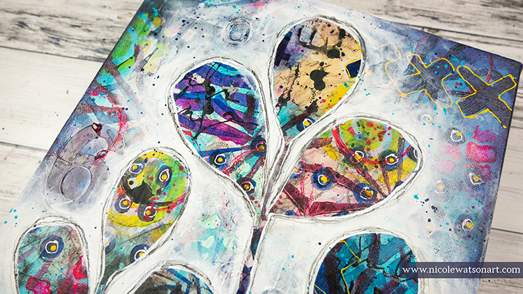
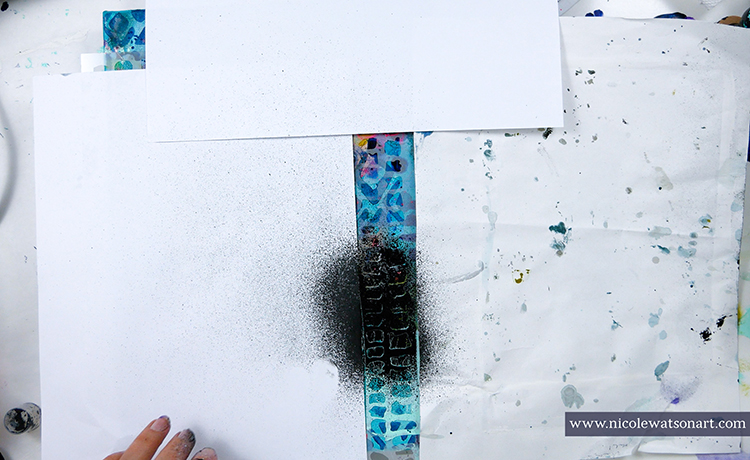
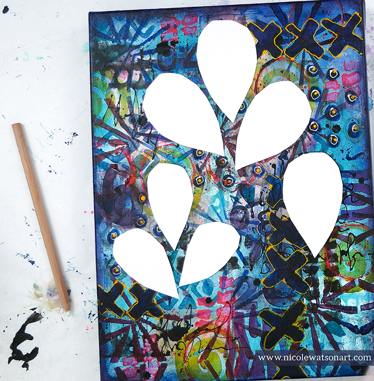
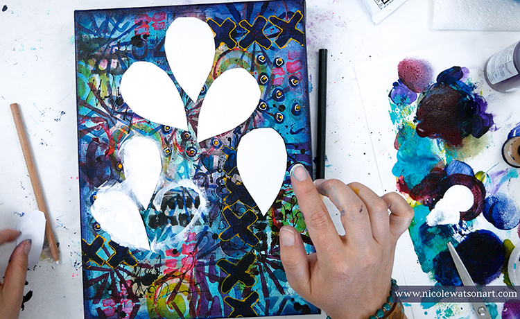
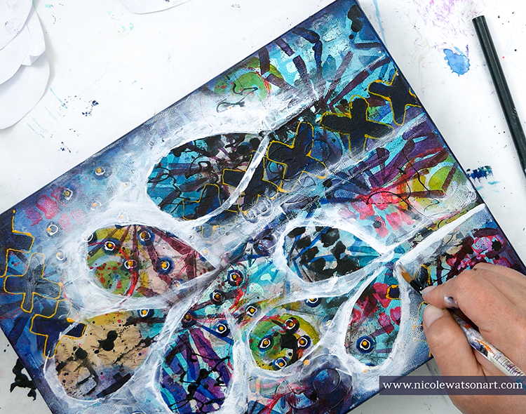
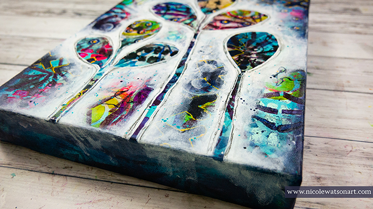
With the crazy canvas ready, I began my last step. I wanted to draw the leaf shapes I use a lot in my artwork and isolate them with some gesso. Usually I am able to do this with charcoal pencil. I like to use charcoal because it wipes off so easily. I tried with black and white charcoal, but it just wasn’t working enough to tame the chaos. So, I cut out leaf shapes form paper and used those as a mask to begin the gesso. 

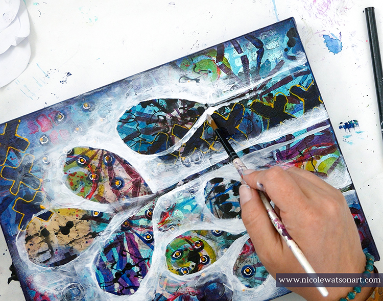
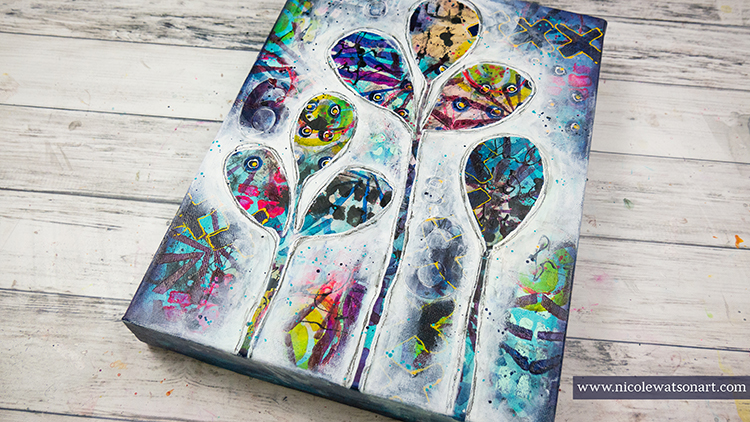
Using a paintbrush and my fingers, I spread gesso around my leaves and stems to isolate them from the crazy background. The process of watching the leaves pop and come to life was so enjoyable!

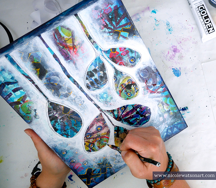
When they were finished, I spattered some paint on the white and outlined the leaves with my stabilo pencils.

This was such a fun canvas to make….even if it was a little stressful! Beginning with the ephemera layer and ending with adding the leaf, there were over 25 different layers to bring my leaf shapes to life.


Thank you Nicole for sharing your process! It can sometimes be hard to know what to do when a piece gets a bit out of control and you have given us some great ideas on how to resolve that.

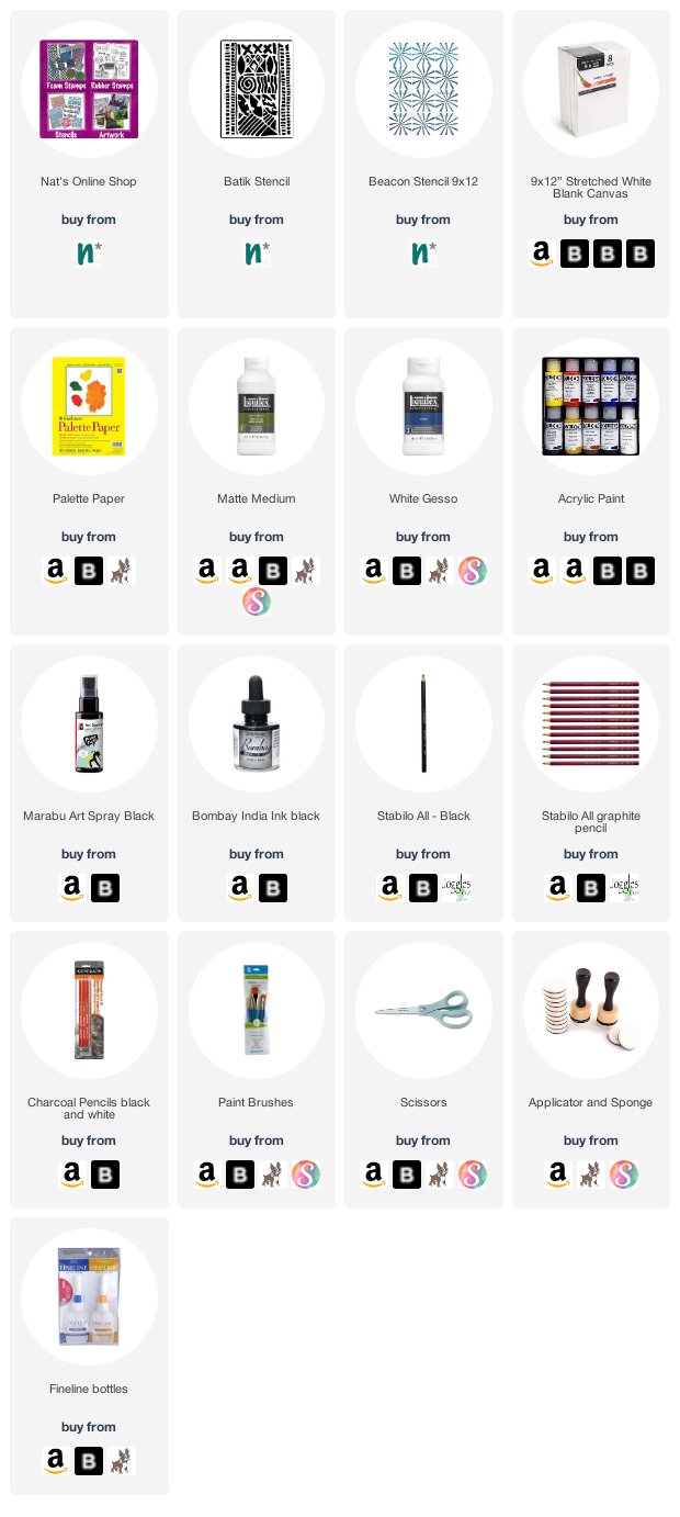
Give it a try: you can find all my Stencils in my Online Shop and in addition to some ephemera and printer paper, here are some of the other supplies Nicole used:

Play along with our monthly themes and weekly projects! Working on something yourself that you’d like to share?  Email me how you used my stencils and stamps with the theme and email me an image – I would love to share your projects in my next  “n*Spiration From Around the Globe“.
Leave a comment

Wild and Free – Maura Hibbitts

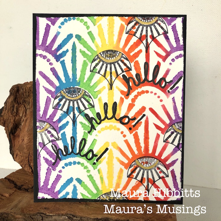
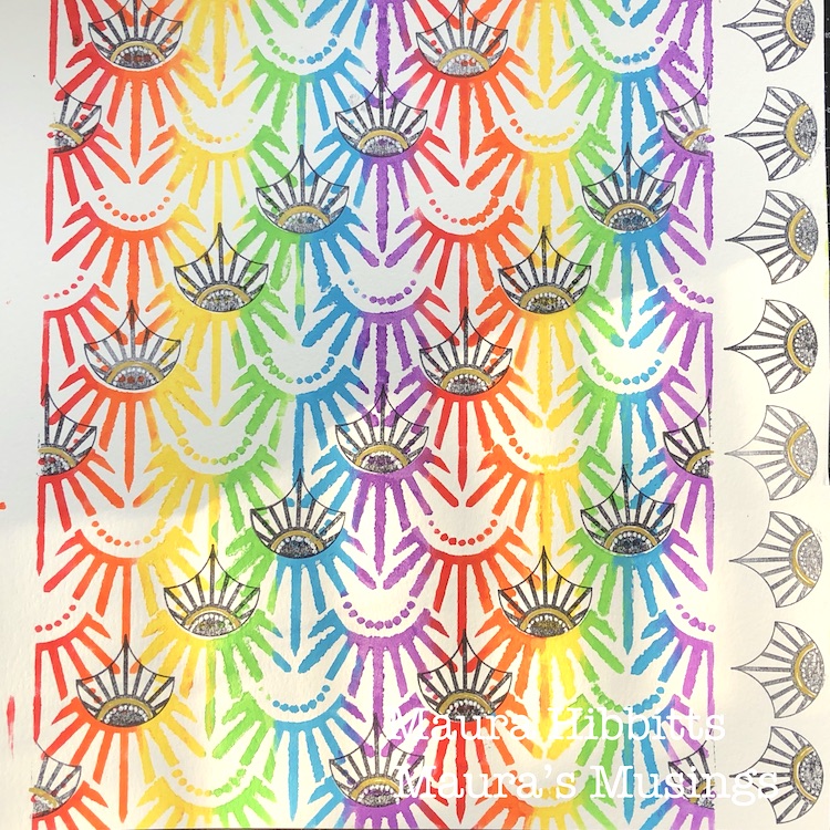
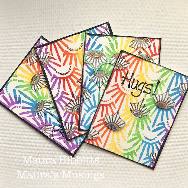
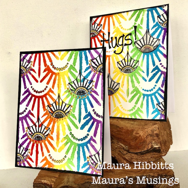
Hello from my Creative Squad! Today we have some super colorful and happy cards from Maura Hibbitts that are sure to lift anyone’s mood. She is using my Art Deco Empire stencil and my Fan-tastic Small rubber stamps for this project and our theme: Wild and Free – After so many months of careful living, it’s time to go Wild and Free… In our Art Journals! Go a little crazy in there and live it up with bright colors, exuberant mark making, bold colors – however you want to go a bit bananas. It’s time to let loose! 


There is something liberating in keeping your choices simple, and just letting your creative muse go wild and free. I was drawn to the colors of the rainbow, a symbol of hope for many of us, and decided to make a set of cards that I can mail out. 

I’ve definitely had my wild and free moments in the wilderness, and some youthful follies. I can remember a rafting adventure on the Salmon River in New York in February, and no, I was not wearing a wetsuit. Crazy right, when I think about how cold that water was, and the thick ice lining the shoreline. Oh, I could share a lot more!  Heck, I still have a few of those moments even now that I am much older, and apparently not much wiser.

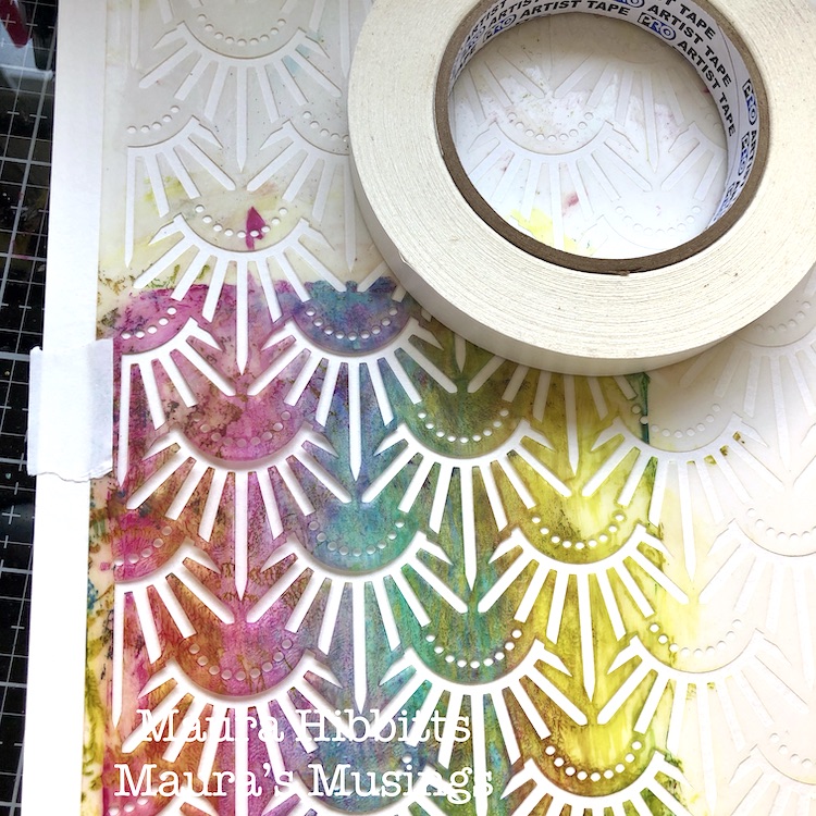
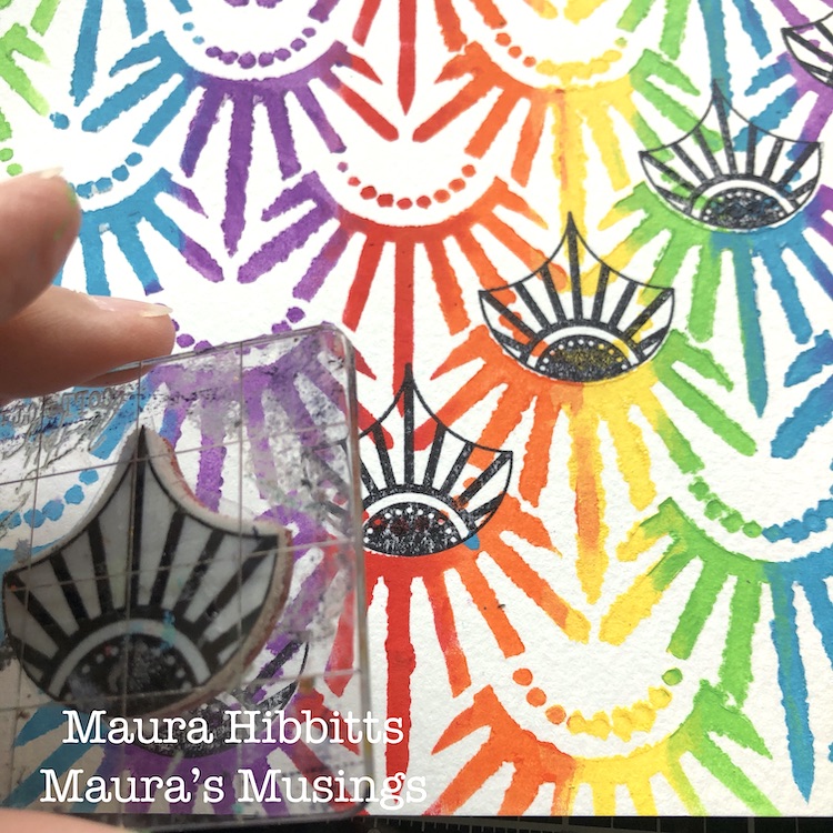
So, back to the project…I started by taping the Art Deco Empire stencil down over my watercolor paper. I don’t usually do this, but because I was adding multiple colors, I didn’t want it to move.

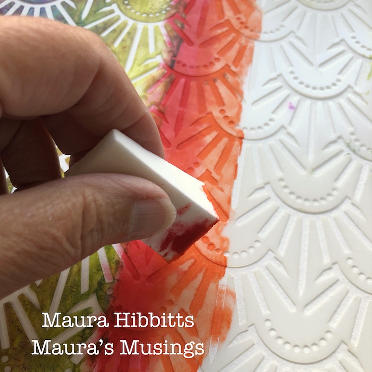
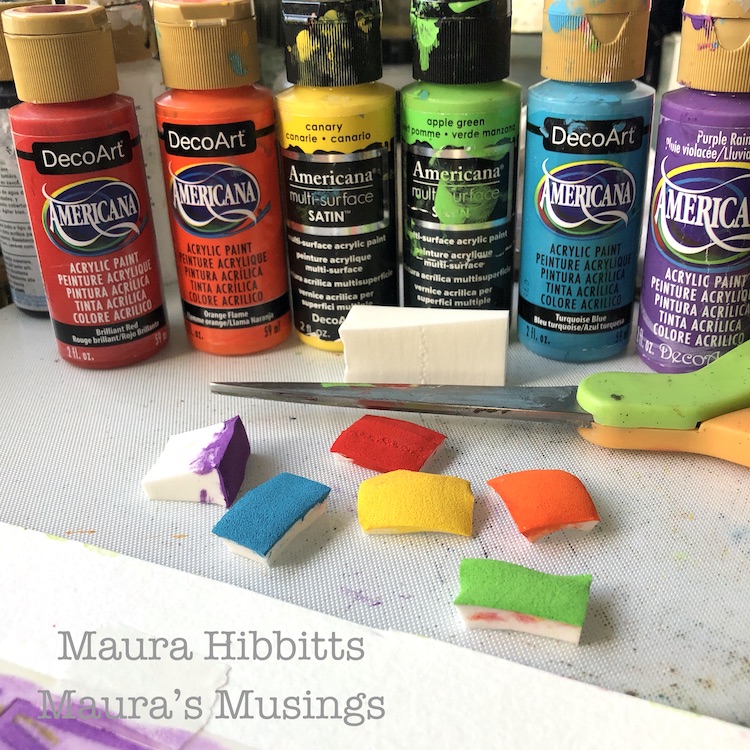
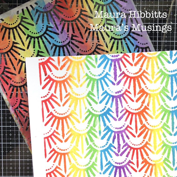
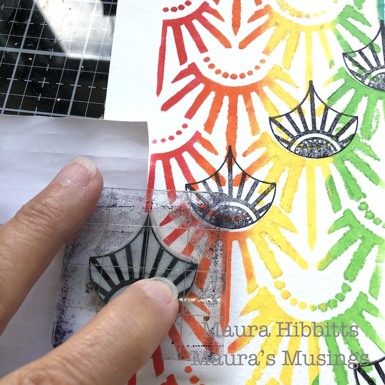
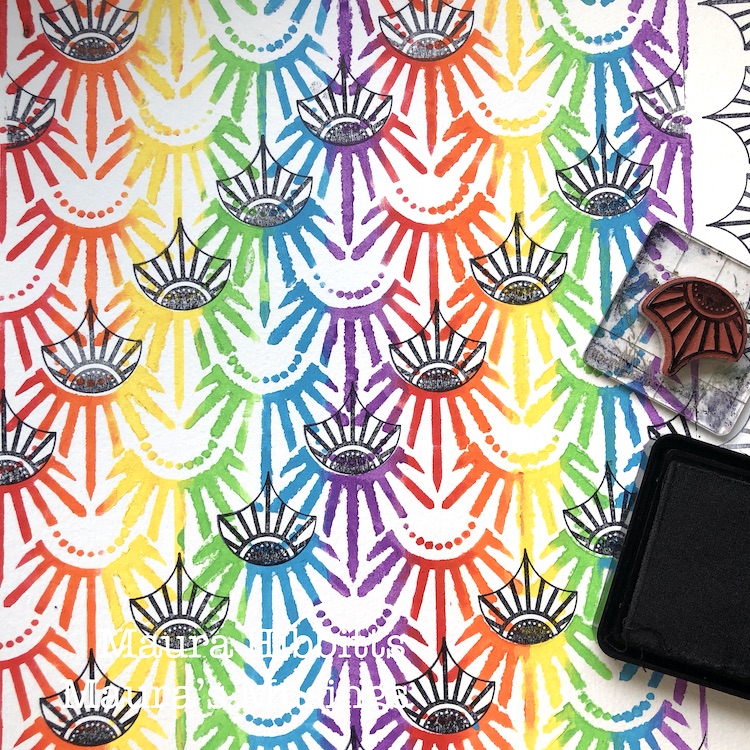
To create a rainbow effect with the stencil, I used a cosmetic sponge with a light amount of paint. I started with the red, and dabbed two columns down the paper leaving space in-between for all the other colors. Repeat this with orange, yellow, green, blue and violet. Here’s a thrifty tip for you: when changing colors, don’t use a new sponge, instead just cut off the top layer. I managed to use one sponge for all six colors this way.

Next, stamp diagonal rows into the stenciled design using Nat’s small Broadway Fan stamp and black ink. Along the edges, place a piece of paper as a mask for the partial images before you stamp.

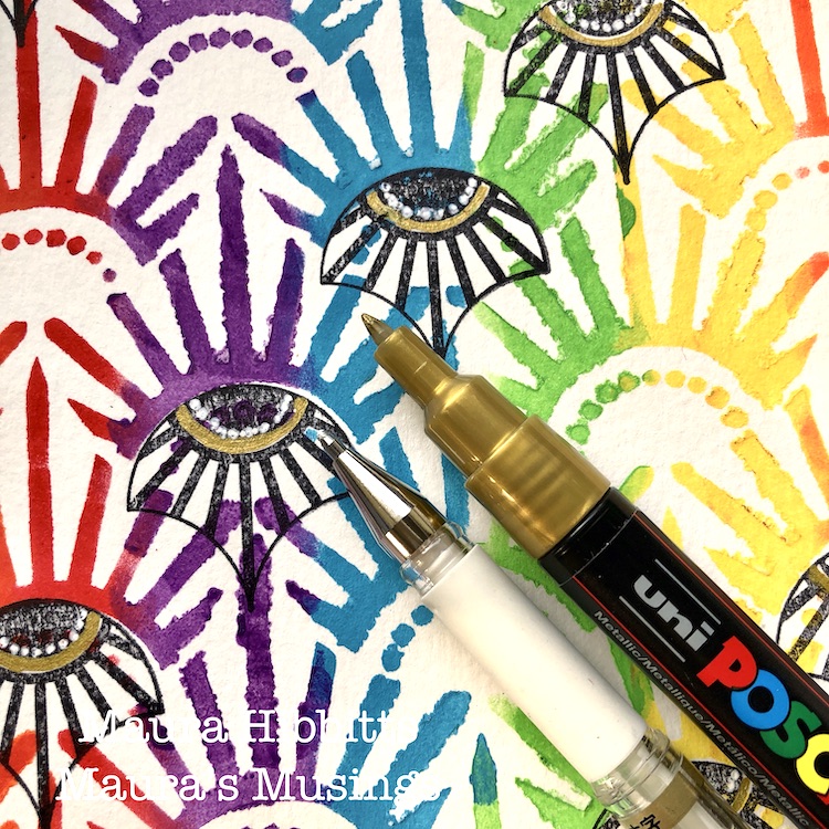
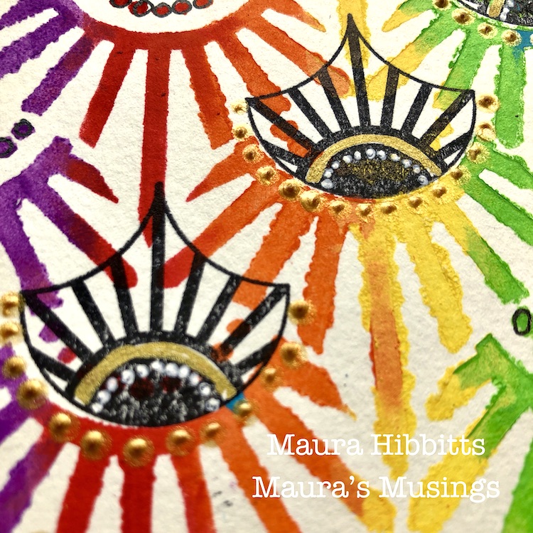
Add some detail to the stamped images with white and gold pens. I love adding a bit of gold in to colorful projects. Cut the large stenciled sheet into four smaller pieces (4.25×5.5”) and cut the white card stock for the card base.

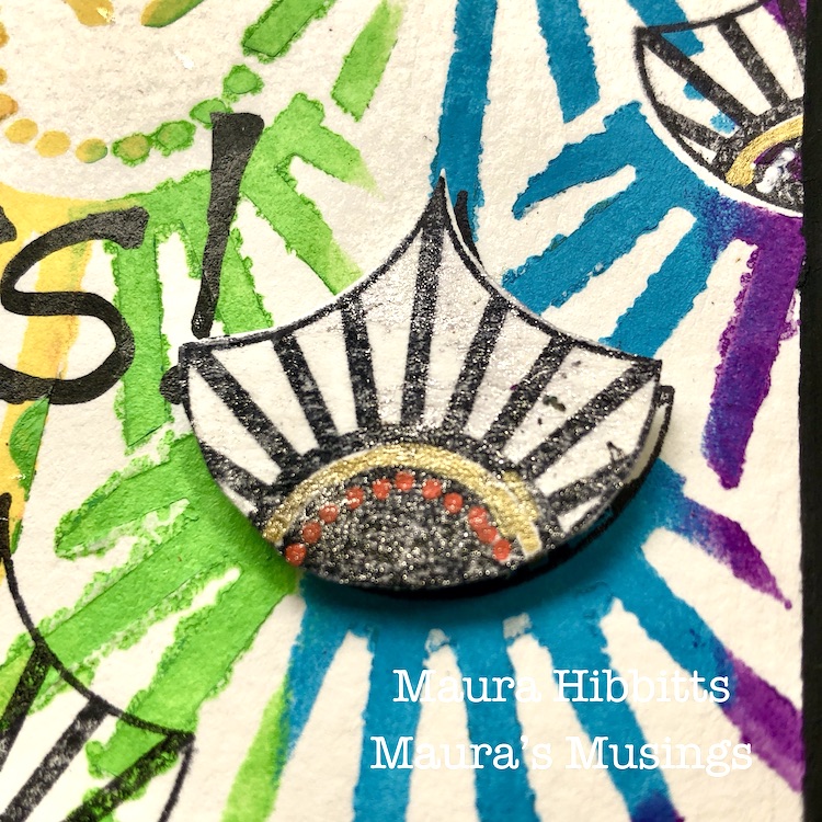
Add more detail with gold relief paste and some sparkle with Wink of Stella. Cut out a few fans and pop them up on some of the bases.

Finally, using black paint and a cosmetic sponge, edge the stenciled card bases. Let dry, then adhere these to the card front. Hand letter greetings like Hugs, Hello, and some doodling with a black pen. I wanted to make each card unique for some variety, so you may notice some have the designs going up and others going down. I’ve also left some without words so I can add them in as needed. You could also stamp a greeting.

Four bright and colorful cards are ready to mail out and bring cheer to someone who needs it. I am definitely a fan of bright colors, so it was fun pulling in all the colors of the rainbow into my project. You could use any palette for your own cards…I think an ombre effect would look awesome too! Have a creative August, Maura


Thank you Maura! Wow that Art Deco Empire stencil in rainbow looks just amazing! Some lucky people are going to be so happy when they open their mailboxes :)

Give it a try: you can find all my Stencils and Rubber Stamps in my Online Shop and here are some of the other supplies Maura used:

Feel inspired? Working on something yourself that you’d like to share?  I love to see how you interpret our monthly themes. Email me how you used my stencils and stamps with the theme and email me an image – I would love to share your projects in my next  “n*Spiration From Around the Globe“.
Leave a comment

Wild and Free – Jennifer Gallagher

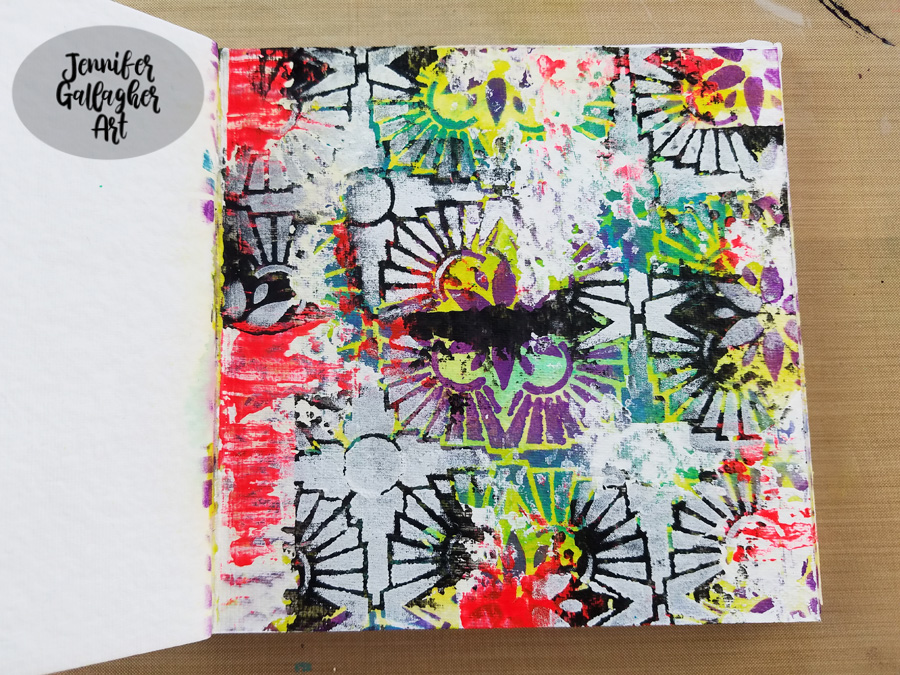
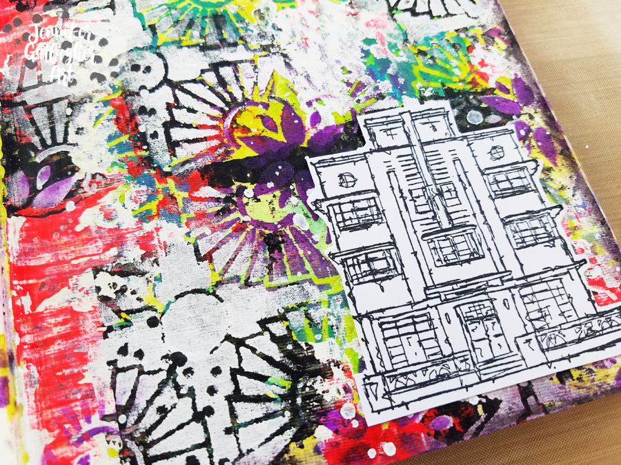
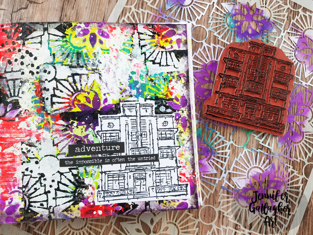
Hello from my Creative Squad! Today we are starting a new theme for the Squad for August and we have Jennifer Gallagher kicking it off in her art journal with my Hamilton Stencil and my Art Deco stamp. This month’s theme is: Wild and Free – After so many months of careful living, it’s time to go Wild and Free… In our Art Journals! Go a little crazy in there and live it up with bright colors, exuberant mark making, bold colors – however you want to go a bit bananas. It’s time to let loose! 


This month we are going wild in our art journals using some of our favorite n*Studio products. I threw caution to the wind and layered lots of bold color and pattern along with mark making and a fun stamped focal image. It’s super easy so let’s get started.

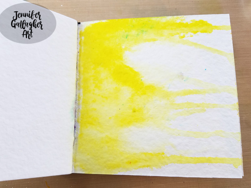
I started by applying a layer of clear gesso onto a page in my square Dina Wakley Media journal. I applied a little Distress Stain in Mustard Seed on the left hand side of the page and then spritzed some water over it. I held the journal up so the color would run down the page.

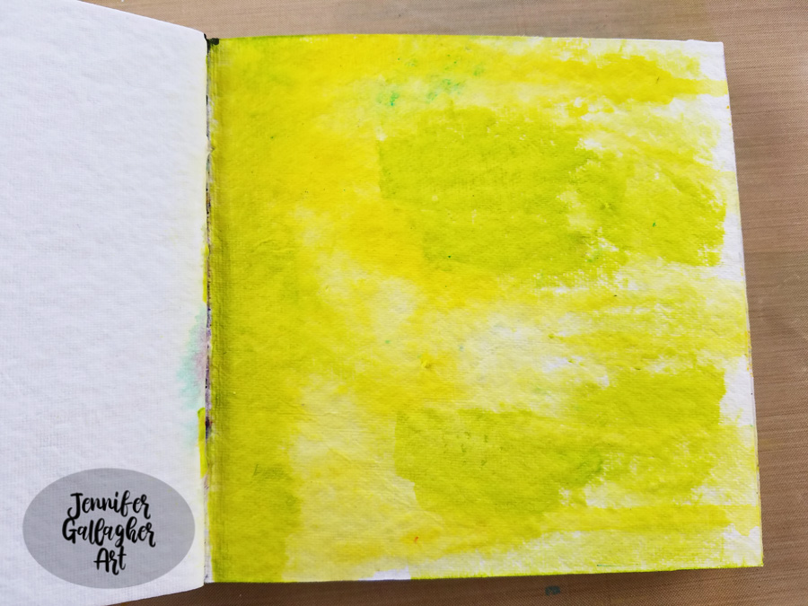
After that dried,I applied some olive green acrylic paint in some of the open spaces with a cosmetic sponge.

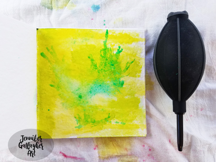
Next, I spritzed on some Aquamarine Marabu Art Spray and added a small spritz of water. I blew the color around with an air puffer.

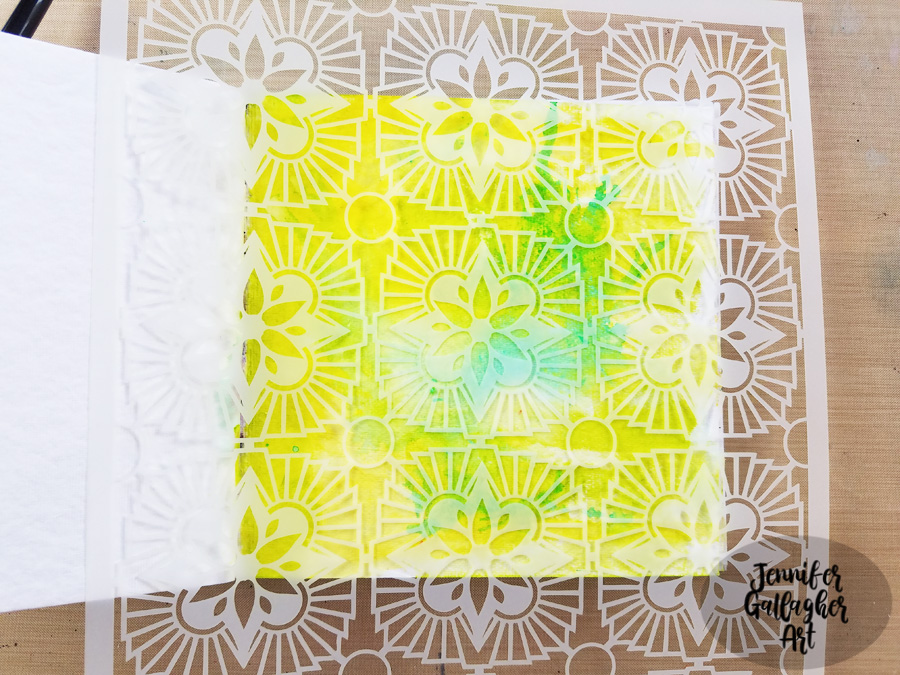
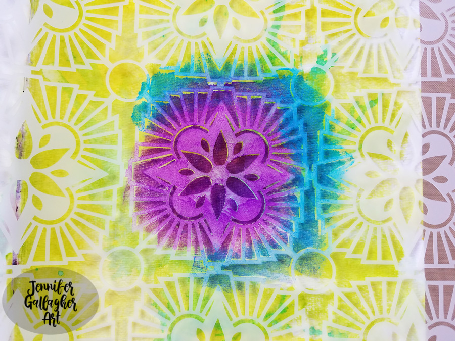
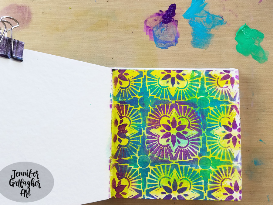
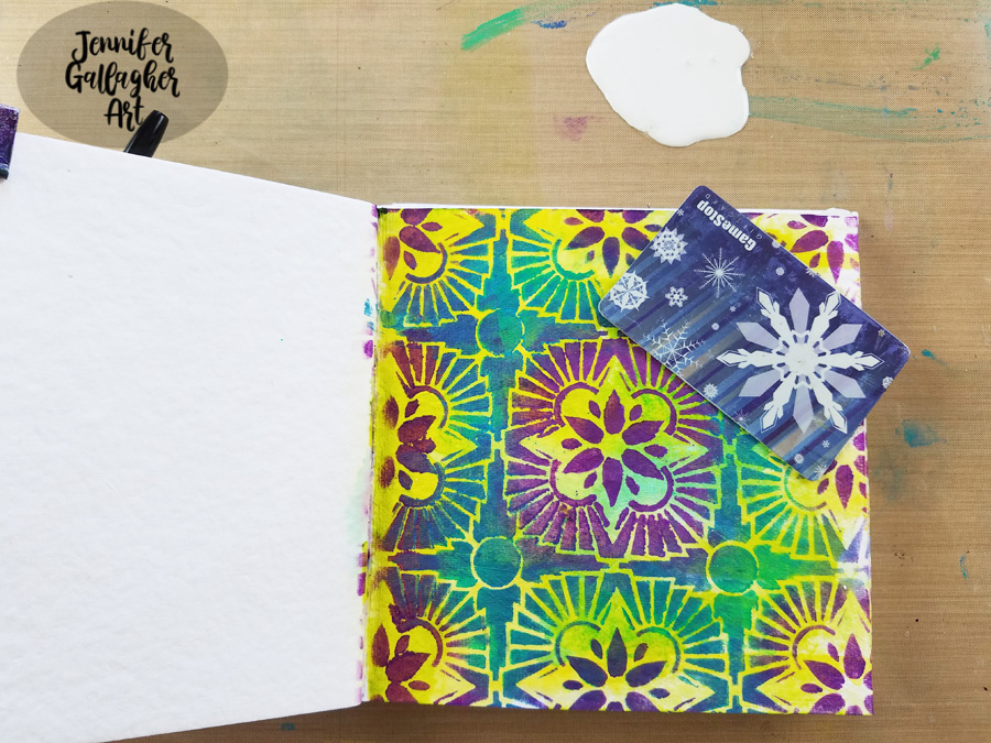
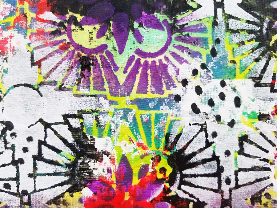
I chose Nat’s Hamilton Stencil and placed it down on the page, working to center the design from the inside of the page. Then I applied Blackberry, Cobalt Teal Hue, and Emerald Green acrylic paint with cosmetic sponges. 

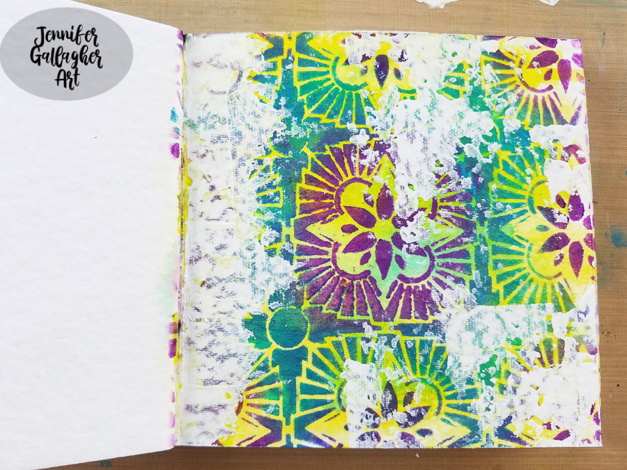
Using an old gift card and some white acrylic paint, I scraped white in various areas of the page.

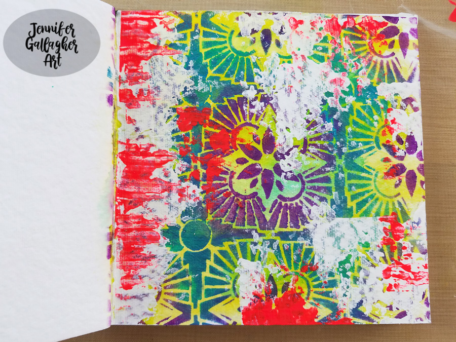
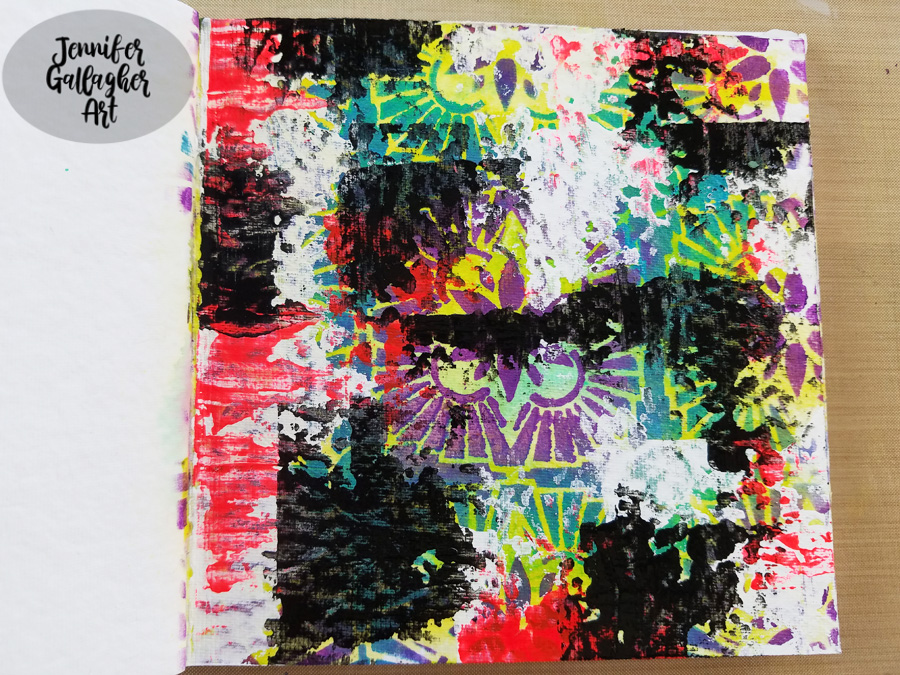
I repeated the process with fluorescent pink and black.

To bring back some of the design, I laid the stencil back over the page, exactly where it was before. Any place that had black paint was painted white through the stencil.

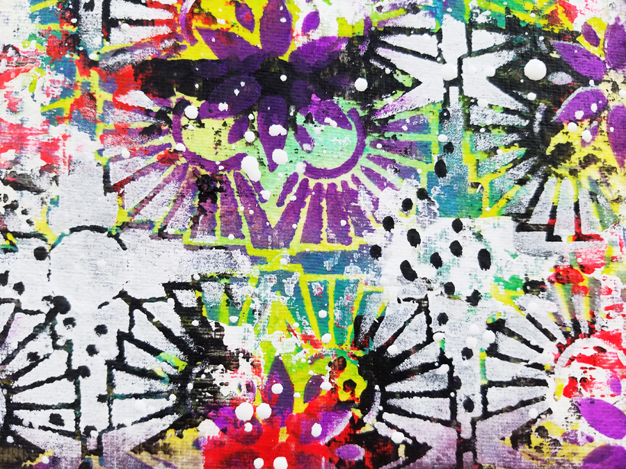
Using a black posca pen, I added some dots in a few of the white areas.

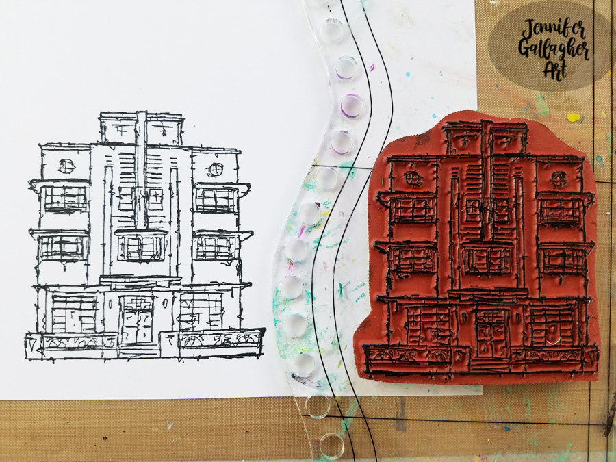
Using the Art Deco stamp from Nat’s Stroll Around the Block Set, I stamped a focal image onto multifarious card with Versafine Clair ink ink Nocturne. Before applying the image, I splattered some Distress Spray in Picket Fence around the page. Once dry, I fussy cut the image out and applied it to my page with 1/8 inch scor-tape.

The final touch was to add a few stickers from Tim Holtz idea-ology Big Chat and Small Talk sticker sets. I hope you have enjoyed this art journal page. I really went wild with the layers, colors, and pattern. Be sure to play along with us this month and create something bold in your art journal.


Thank you Jennifer! Loved watching this wild background come together with all those yummy layers :)

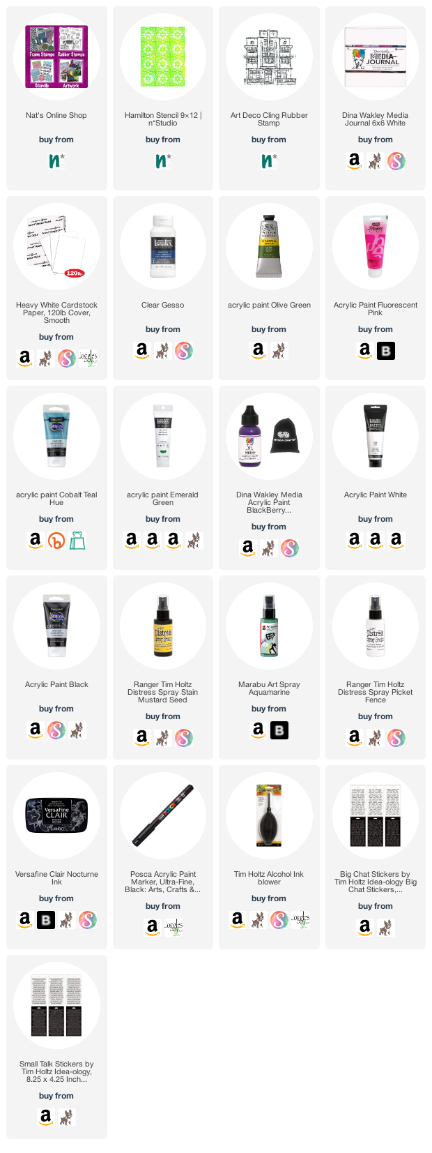
Give it a try: you can find all my Stencils and Rubber Stamps in my Online Shop and here are some of the other supplies Jennifer used:

Feel inspired? Working on something yourself that you’d like to share?  I love to see how you interpret our monthly themes. Email me how you used my stencils and stamps with the theme and email me an image – I would love to share your projects in my next  “n*Spiration From Around the Globe“.
Leave a comment

Under the Sea – Emilie Murphy

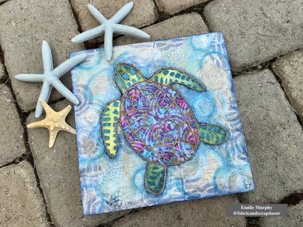
Hello from my Creative Squad! Today we have a wonderful wood panel piece by Emilie Murphy demonstrating some cool techniques and using my Fairview Fan, Mini Batik 1 and Mini Batik 2 foam stamps. The theme this month is: Under the Sea – There is something so fascinating about water. We love being in it, floating on it, relaxing next to it, and it remains one of the last frontiers here on the planet. Create something that is an ode to the sea.


Hi there! Hope you are doing well.

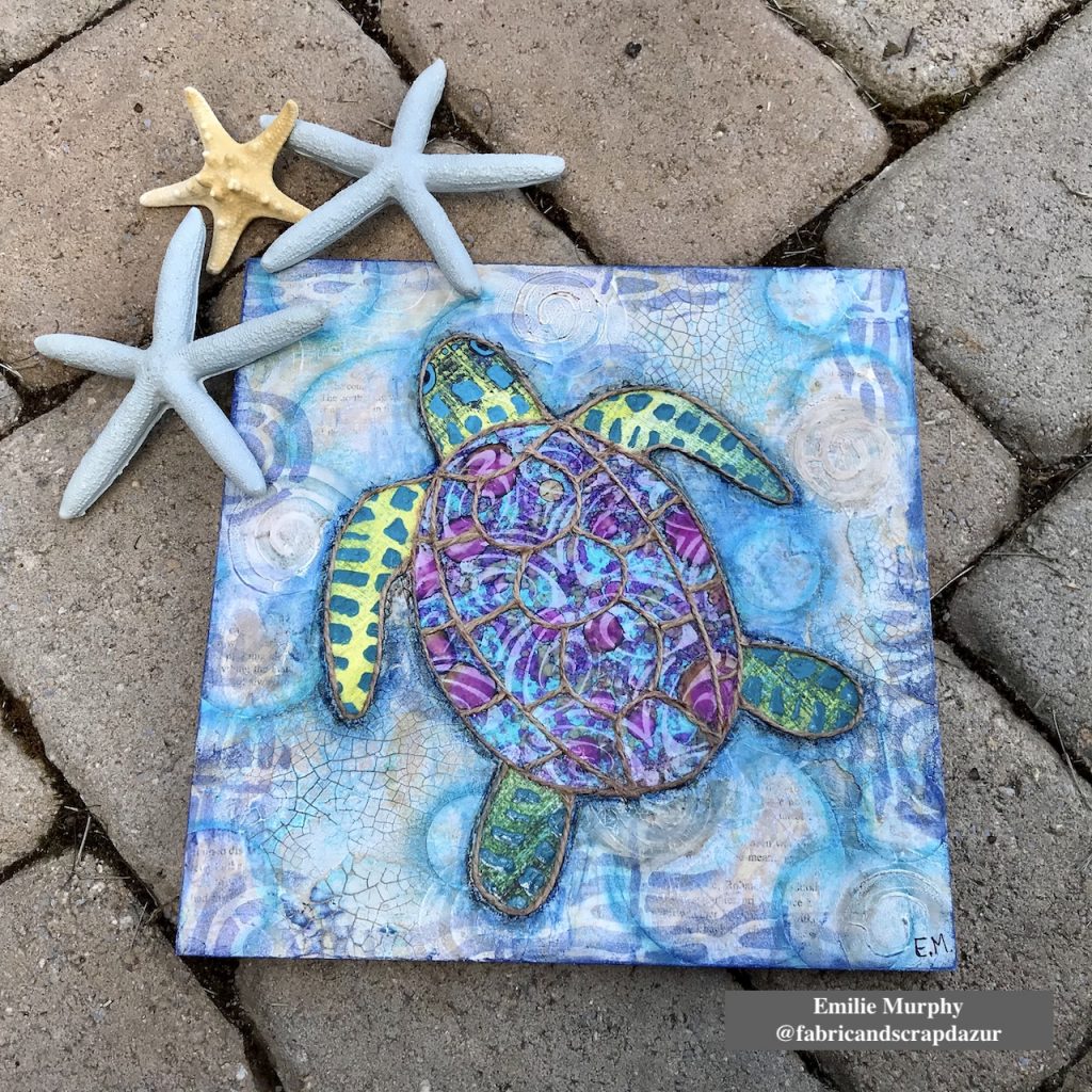
The Sea theme always inspires me. The first thing that came to my mind was “fish”, of course! Meanwhile I was thinking of what project to make, I went to visit my in-laws and saw this pillow with a beautiful sea turtle on it that my mother-in-law had just got. So that’s how I got the idea to make a sea turtle on a cradled wood panel.

Let me guide you how I made it.

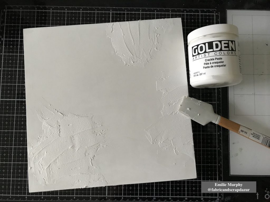
I started to apply some crackle paste on a 10×10 wood panel coated with white gesso. I let it dry overnight.

Tip: The coat of crackle paste has to be thick enough to be able to get some significant crackles.

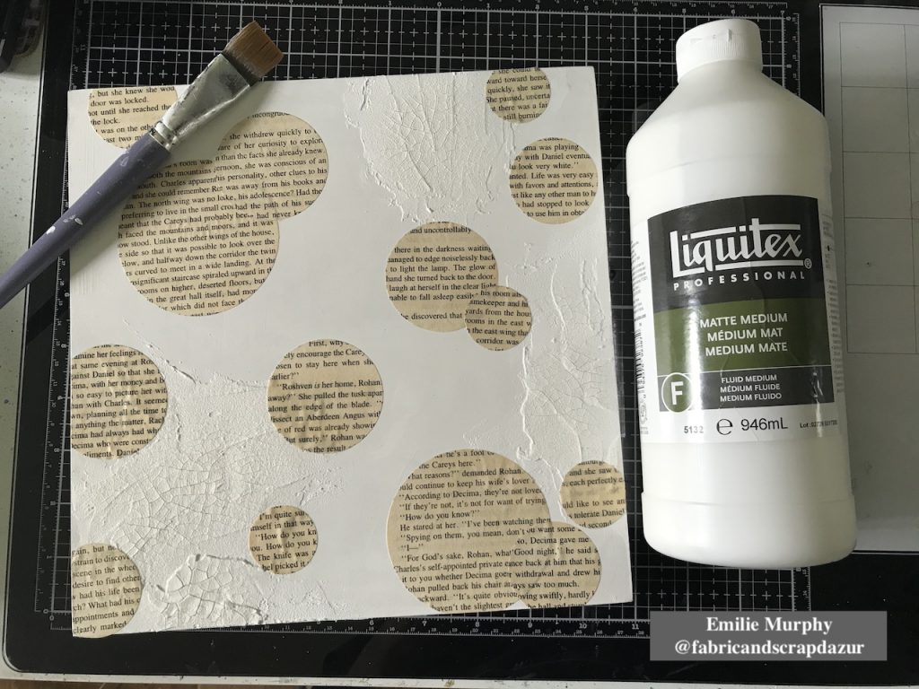
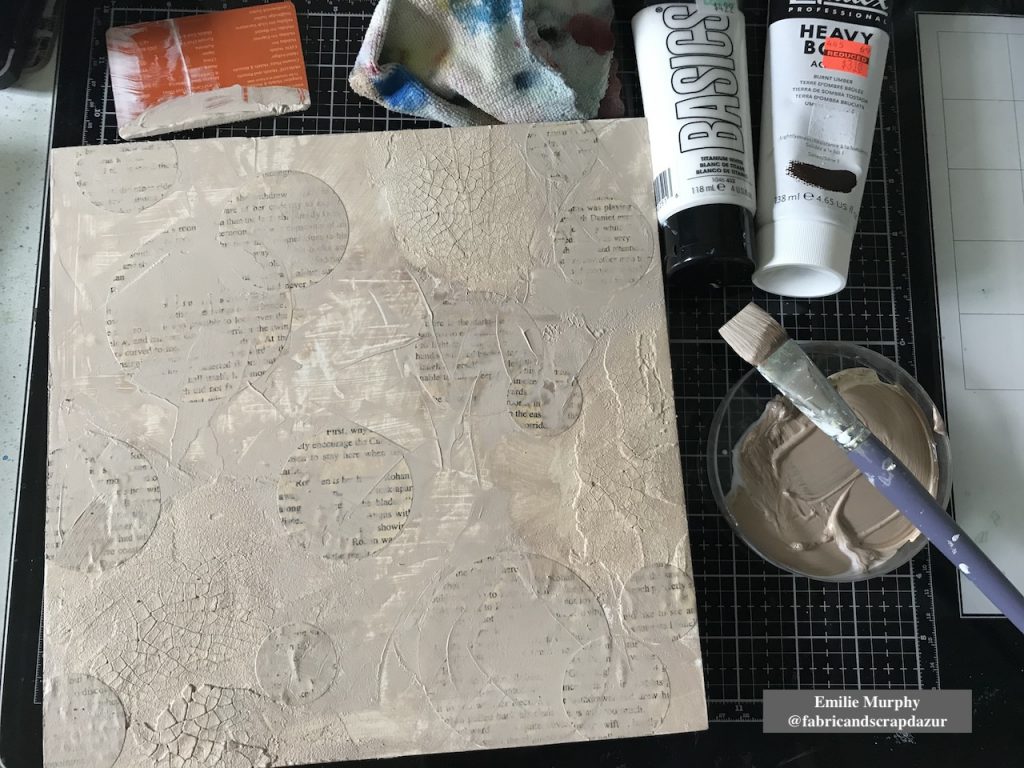
Then I glued down with matte medium some circles cut from old book paper to bring some interest to the background.

As I didn’t have any “sand” color acrylic paint ready to use, I mixed some “Burnt Umber” acrylic paint with some white that I applied on my panel with a brush and plastic card.

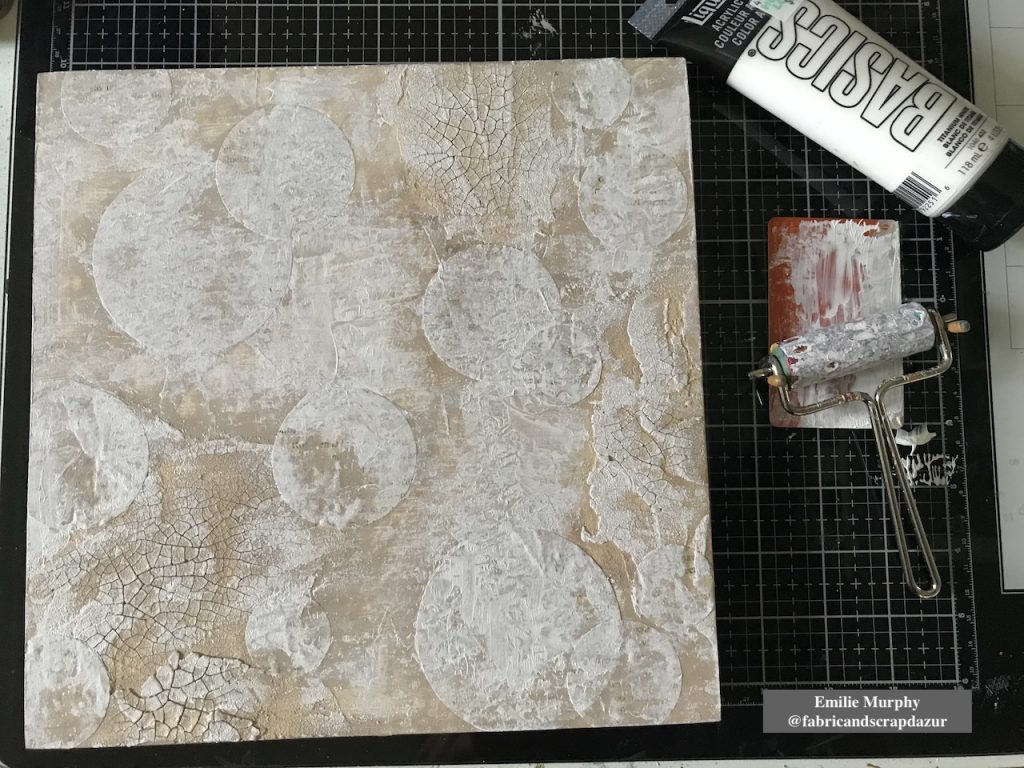
I toned down the color I mixed with some white acrylic paint because it was a little too dark than expected. I applied it with a brayer. The purpose of the brayer is just a preference to add texture.

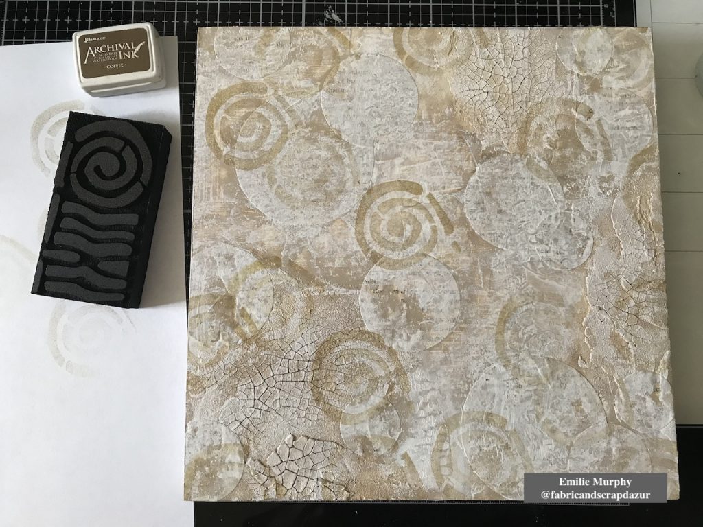
Then I stamped the circular part of “Mini Batik Pattern 2” foam stamp with “coffee” archival ink to evoke shells. I wanted here a tone-on-tone effect.

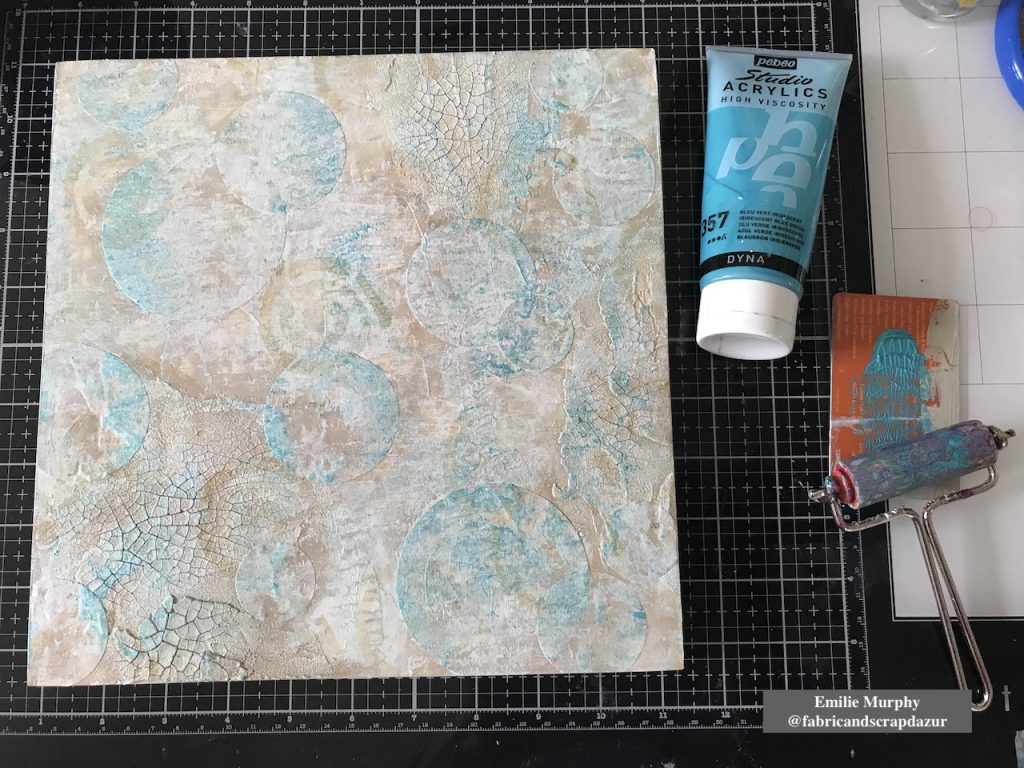
To add some brightness and not have something too uniform, I applied some iridescent blue acrylic paint again with my brayer.

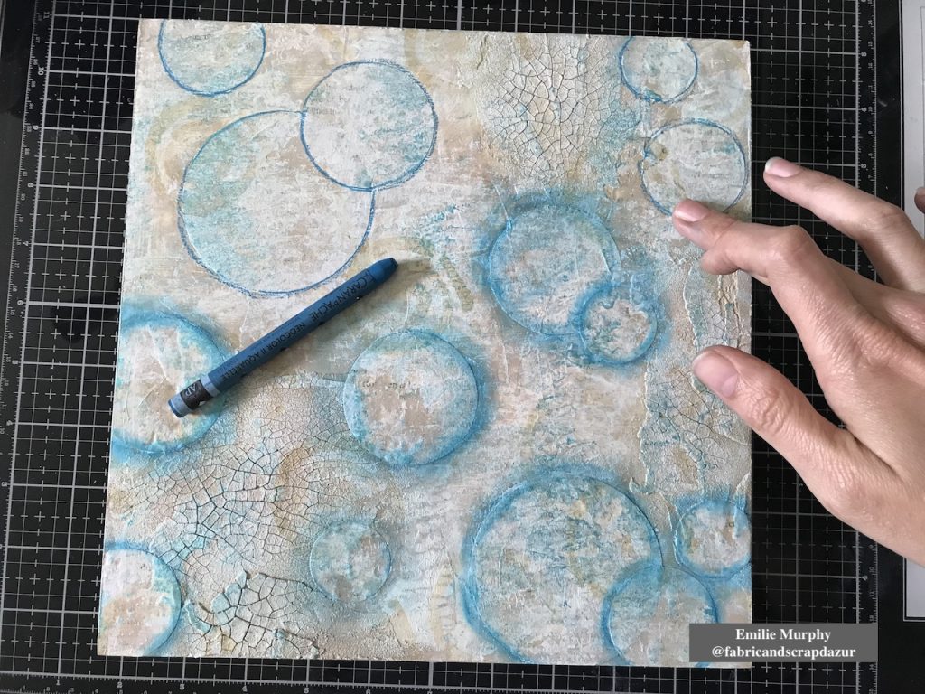
In order to build layers, I darkened the edges of my circles with a Neocolor II crayon “Blue Cobalt”. I think it gives the illusion of bubbles.

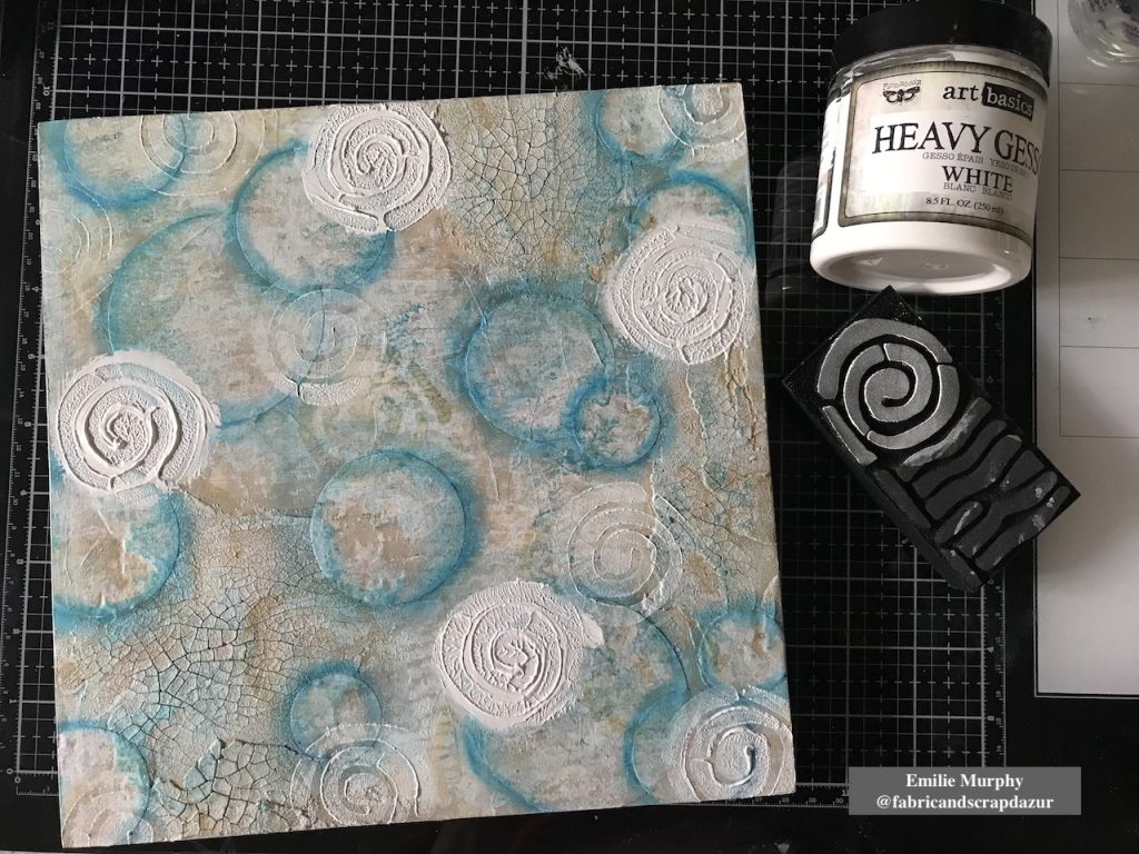
For the next layer, my intention was to add some dimension. Therefore I applied with my finger some pretty thick “puddles” of heavy gesso and stamped on it using again the “Mini Batik Pattern 2” foam stamp. Isn’t it cool! This is such an easy way to add dimension. I kept stamping around here and there to clean up the gesso left on my stamp.

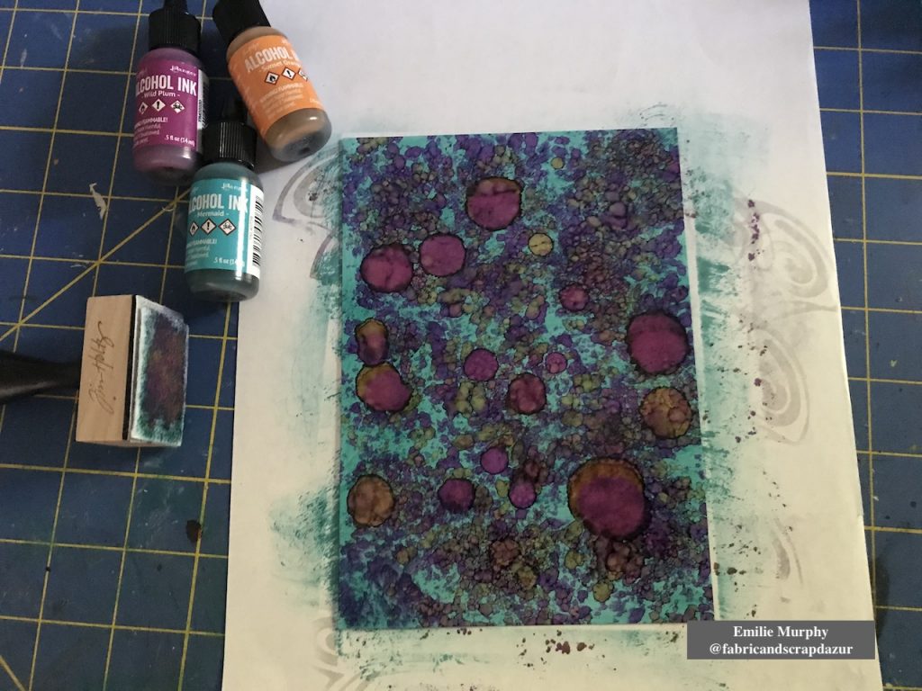
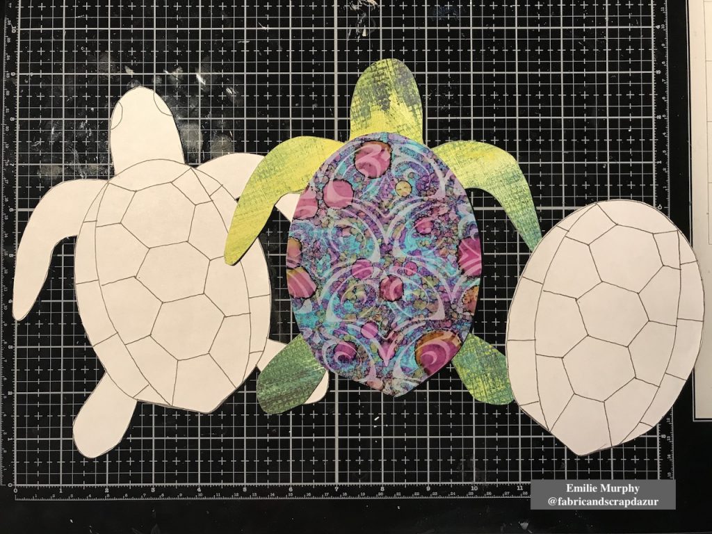
Next, I played with some alcohol inks on yupo paper to use for the turtle shell. I wanted something bright and vivid.

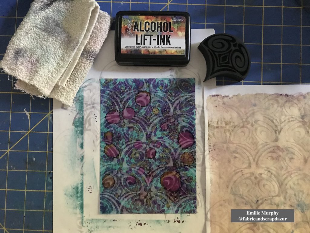
Using the “Fairview Fan” (positive) foam stamp, I lifted off some alcohol inks and got this beautiful pattern.

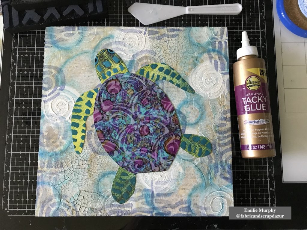
Then I drew a turtle on printer paper to use as template. I made two copies; one copy for making the turtle body and the second one for the turtle shell. I used the Yupo paper, previously made, for cutting out the turtle shell and I choose a scrapbook paper for the turtle body.

Let me tell you why I choose this particular scrapbook paper.

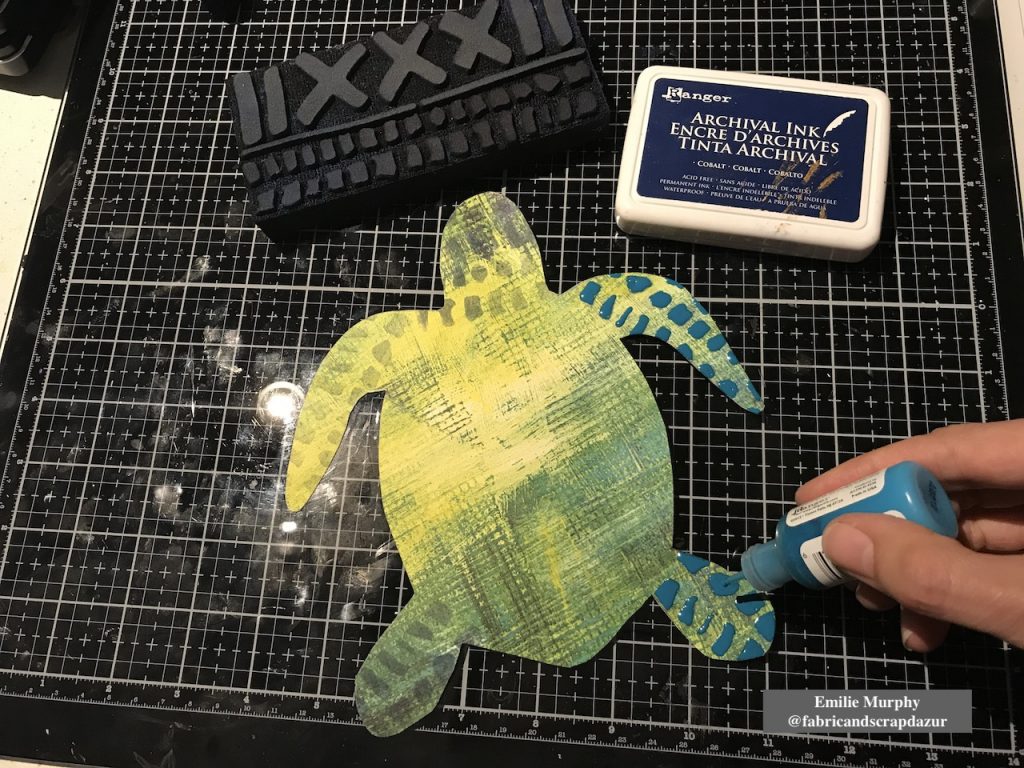
Few weeks ago, I received my stencils order from Nathalie. She had wrapped the stencils with this scrapbook paper sheet. When I look at it, I saw that she designed this paper few years ago. Yes!!! Isn’t it awesome! So it was a perfect opportunity to use it for my turtle body.

Then, to embellish my turtle, I used the “Mini Batik Pattern 1” foam stamp for the head and legs and covered the stamped pattern with enamel accents to create the skin.

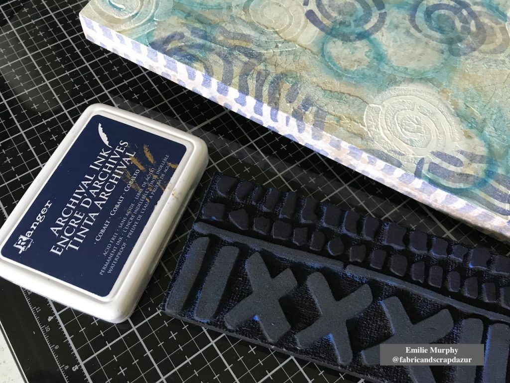
With the same foam stamp, I stamped the edges of my cradled wood panel.

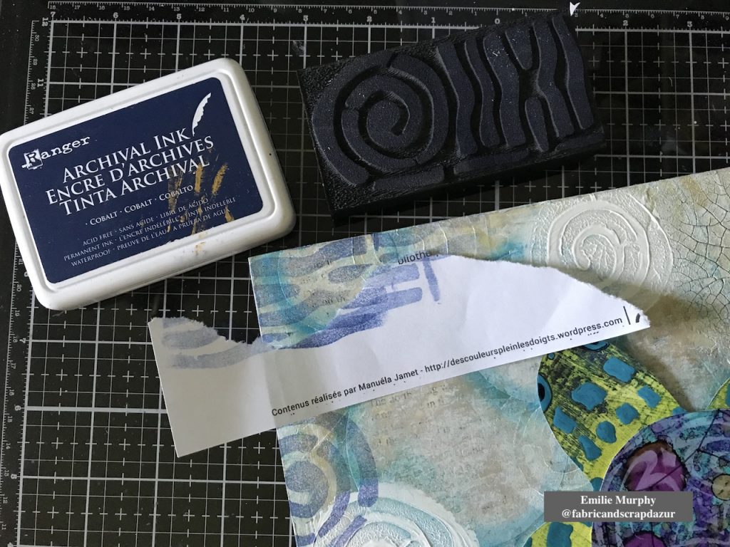
Before gluing down my turtle, I used again the “Batik Pattern 2” foam stamp to stamp only the “strips” part of the stamp, just to add more interest and introduce a different pattern than having just circles on my background.

I finally glued down my sea turtle with tacky glue and traced the pattern of the turtle shell. At that point, something was missing and I was not satisfied with my turtle shell like it was.

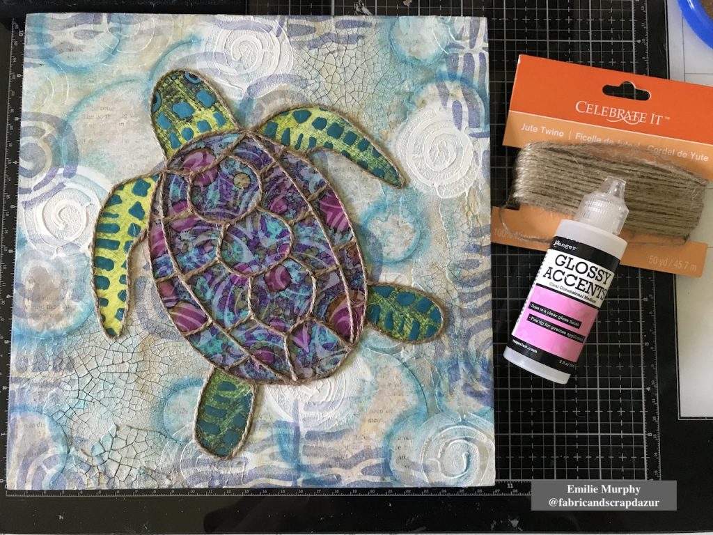
After reflection, I had the idea to glue some jute twine on the turtle shell and all around the turtle. I used some Glossy Accent as preference because it dries clear and shiny. I really love the look of it and think it was the perfect thing to do to make my turtle as the centered piece.

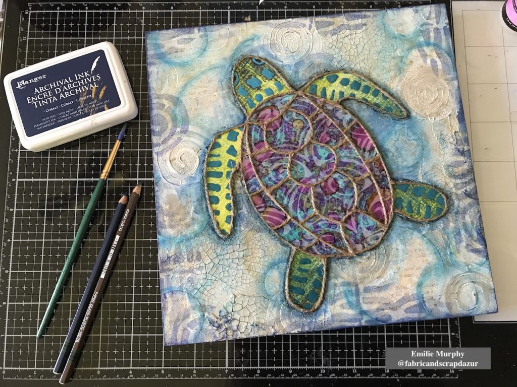
At last, I used some blue and brown Stabilo pencils to darken the edges of my turtle. And I finished off the edges of my cradled wood panel rubbing my “cobalt” archival ink pad all around.

Hope I got you inspired. Personally, I have so much fun doing this project that I’m thinking of making a series of smaller panels with other shapes like fishes and shells.  This project can easily be made also on canvas or even in your art journal…

Have a good rest of the week and see you next month!


Thank you Emilie! I love how this turned out and that yummy texture is great!

Give it a try: you can find all my Foam Stamps in my Online Shop and in addition to some yupo and old book paper, here are some of the other supplies Emilie used:

Feel inspired? Working on something yourself that you’d like to share?  I love to see how you interpret our monthly themes. Email me how you used my stencils and stamps with the theme and email me an image – I would love to share your projects in my next  “n*Spiration From Around the Globe“.
Comments (1)

  • Sue Clarke

    |

    Emilie, delightful colors and TEXTURE!

    Reply

Leave a comment

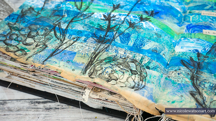
Under the Sea – Nicole Watson

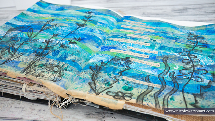
Hello from my Creative Squad! Today Nicole Watson is sharing her longing for the sea with us, with a beautiful art journal spread using a bunch of my foam stamps and this month’s theme: Under the Sea – There is something so fascinating about water. We love being in it, floating on it, relaxing next to it, and it remains one of the last frontiers here on the planet. Create something that is an ode to the sea.


Traditionally, my husband and I have taken a fall vacation to the beach in Florida. It’s one of our favorite vacation spots, right on the panhandle with white sands and emerald green water. I love to spend hours watching the ocean and its waves, walking the shore, hunting for shells while spotting a dolphin or two. I spend afternoons water coloring in my beach chair and exploring all the neat shops full of beach art. Unless something changes, this will be the third year in a row that we are not going to make it to Florida. A hurricane, moving, and now the pandemic.

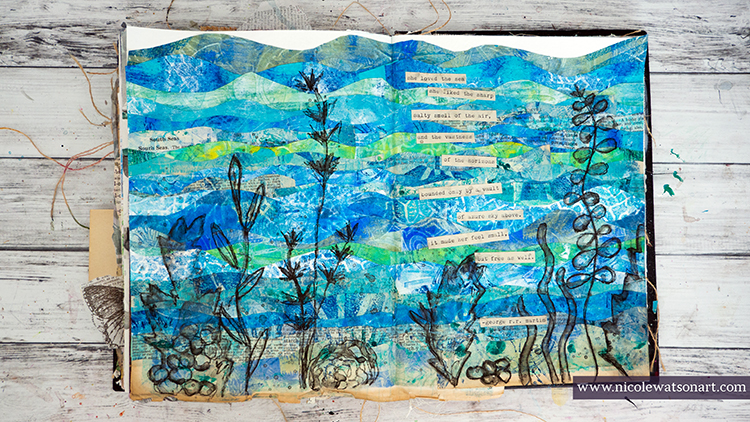
I am so longing for our beach vacation, and these journal pages play homage to my love for the sea.

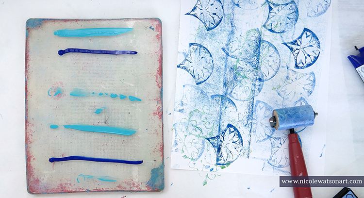
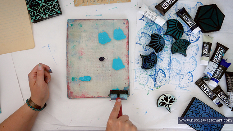
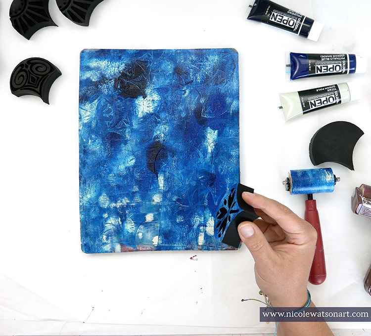
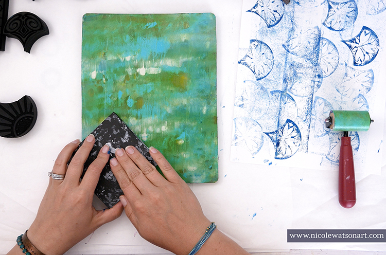
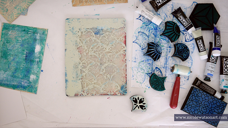
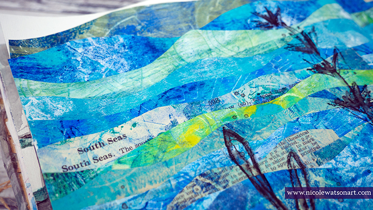
First, I spent an hour gel printing papers using Nat’s ArtFoamies. I layered ocean colored paint on my plate, stamped the foamies, and pulled prints. The magic happened when I added layers to each pull creating depth in the prints.

One simple recipe I used a lot: Layer paint on the gel plate, stamp with art foamies, pull a print and a ghost print or two. 

Then, once dry, create a small puddle of contrasting paint in the corner of the gel plate as a palette and stamp another foamie all over. Use the original prints to add this second layer of interest. You can see in the video how I layered the texture of different ArtFoamies with contrasting paint to create beautiful, gel printed pages.

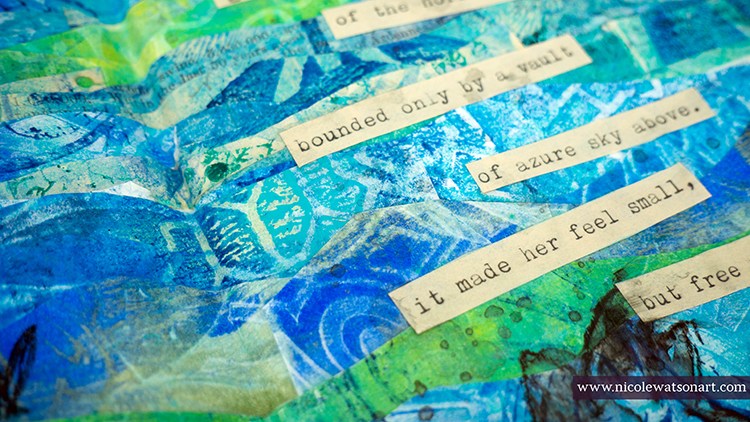
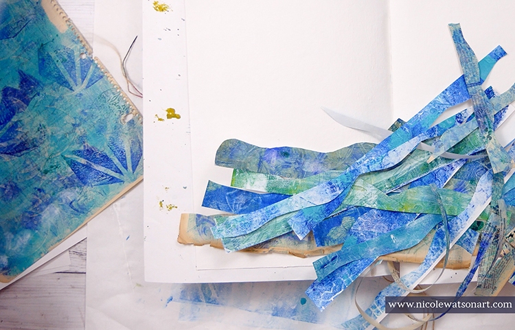
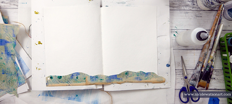
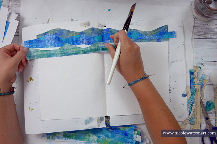
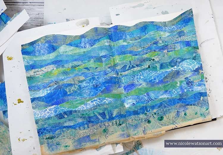
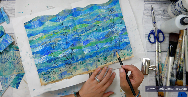
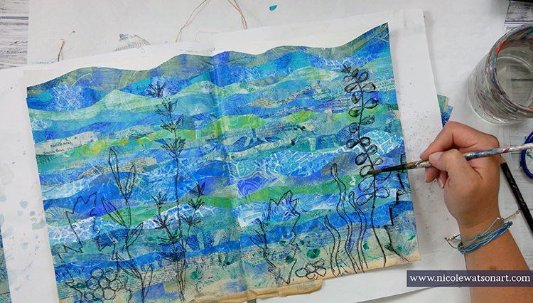
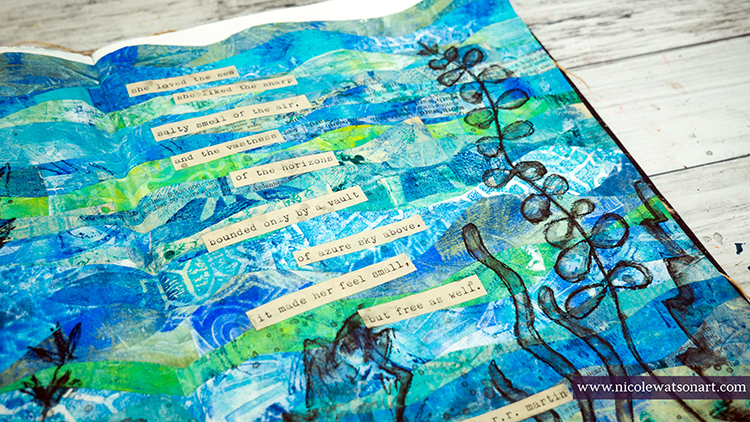
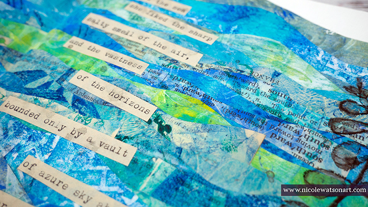
Next, I needed to decide what I was going to do with these prints! I had in mind that I wanted to create an ocean, so I just went with it. I cut strips of paper in wavy lines from the gel prints, then I layered them on my journal pages with matte medium.

I picked a specific page that looked more like the ocean floor or beach shore for the bottom layer and kept in mind to vary the colors as I layered the papers. I let my ocean dry overnight, which was also my excuse to think about what to do next.

I honestly had no idea on what the next layer should be. I wanted to keep the pages simple and just add a quote or poem until my husband inspired me. The screen saver was playing on the TV and he suggested I look at it to get an idea for my journal pages. On the screen were layers of seaweed in the ocean. 

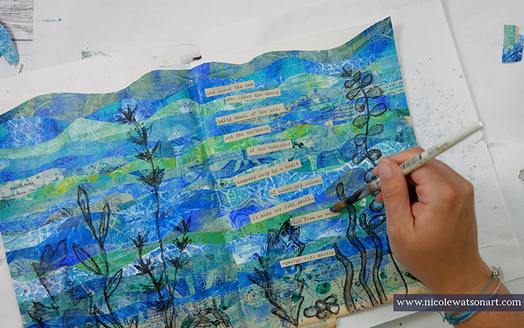
The next day I trimmed the edges of my pages and then sketched some seaweed (I looked online for some seaweed pictures as inspiration.) with a charcoal pencil and then with a stabilo-all pencil. I wanted it to not stand out too much and have a watercolor feel, so I activated the stabilo with water. Then, I flicked some of the stabilo to look like water bubbles.

I topped my pages off with the perfect quote that touches on my love for the sea. I typed it out on some aged paper, cut it apart, and adhered it with matte medium.

I love how my faux ocean turned out with the ArtFoamie prints, and now I have several beautiful pages of prints to use in other projects as well. In fact, I already have one in mind. You’ll have to watch my Instagram to see what I create next.


Thank you Nicole! Love hearing how this project came together even though you didn’t necessarily have a clear plan at first… What beautiful results in the end!

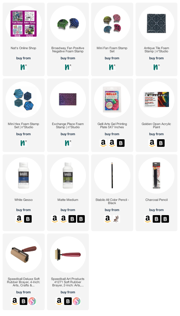
Give it a try: you can find all my Foam Stamps in my Online Shop and in addition to her typewriter and a selection of printer, book, and scrap paper, here are some of the other supplies Nicole used:

Feel inspired? Working on something yourself that you’d like to share?  I love to see how you interpret our monthly themes. Email me how you used my stencils and stamps with the theme and email me an image – I would love to share your projects in my next  “n*Spiration From Around the Globe“.
Comments (1)

  • Sue Clarke

    |

    Gorgeous Nicole!
    I just love the colors and the waves as it seems like I can feel the water wash over me.
    Delightful on this hot day!

    Reply

Leave a comment