Creative Squad

ATC Album – Creative Squad

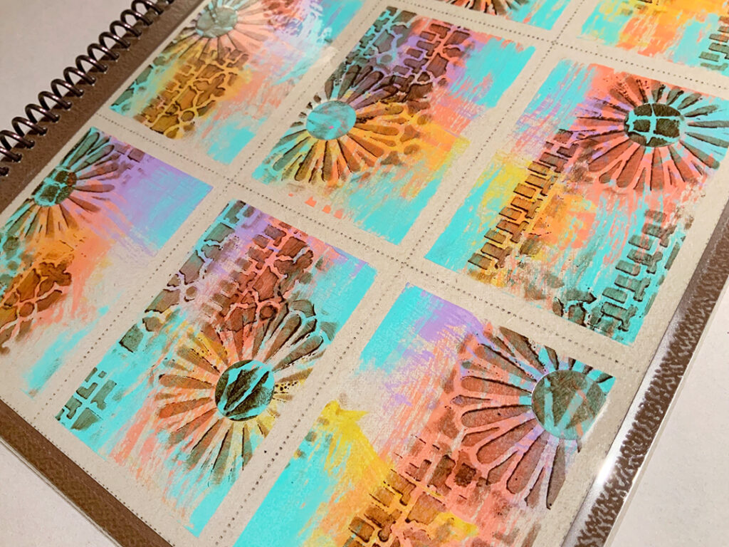
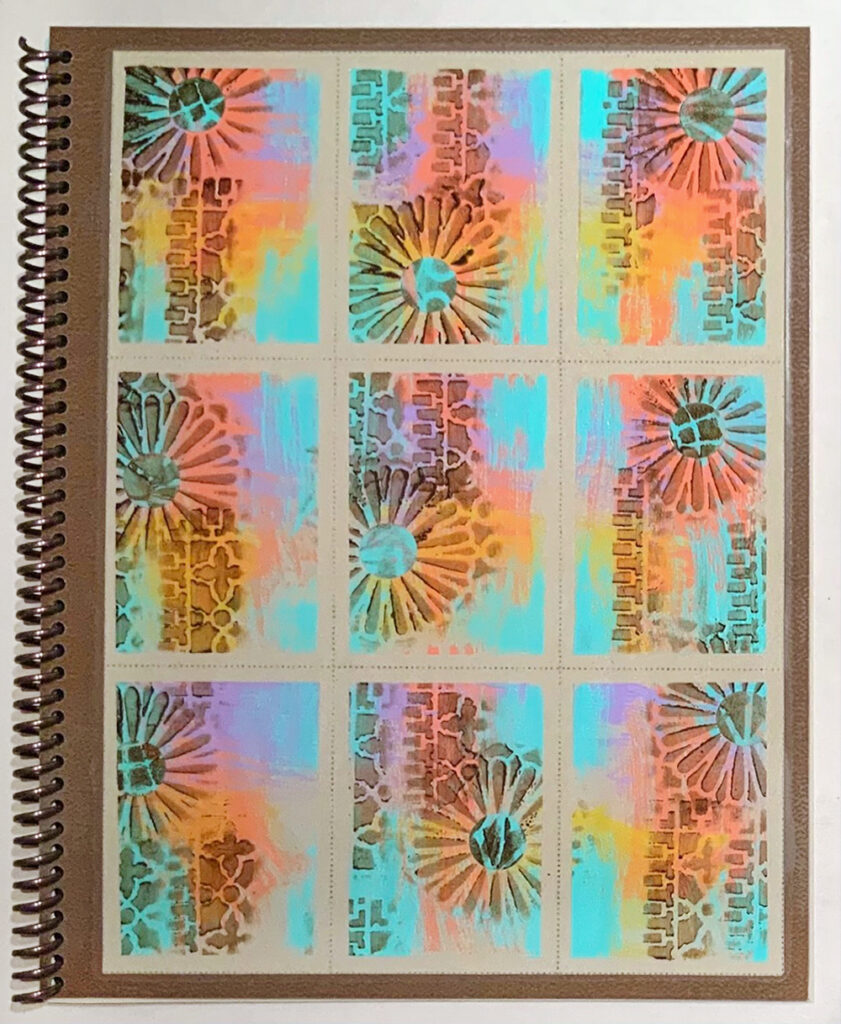
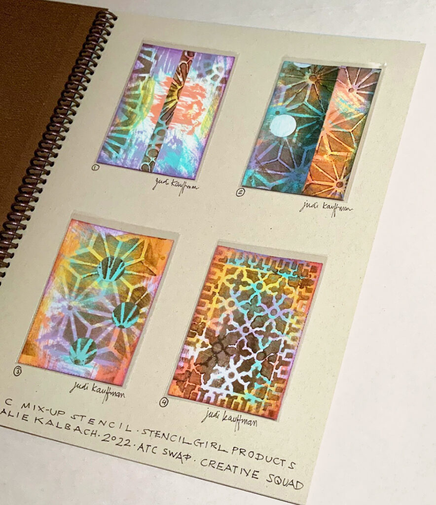
How do you store your collection of ATCs? If you’re playing along with the Creative Squad this month and making ATCs (Artist Trading Cards) to exchange with friends, how about taking a cue from Creative Squad member Judi Kauffman. She created a beautiful ATC Album using my ATC Mixup stencil to store and show off her growing collection.


I liked the sheet of ATCs that looked a lot like faux postage so much that instead of cutting it apart I laminated it onto a sheet of 8.5×11 cardstock and coil-bound it with enough cardstock-weight pages for a swap that the Creative Squad has in the works. Each page holds 4 ATCs in baseball card pockets with plenty of space for writing the name of the maker(s), date, and other notes and info.


Thanks for sharing Judi – we hope you fill that album!

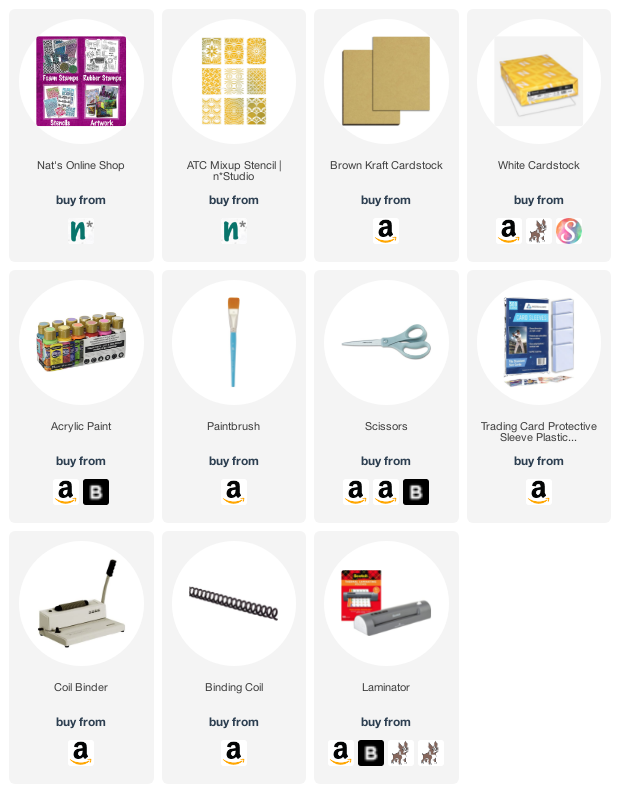
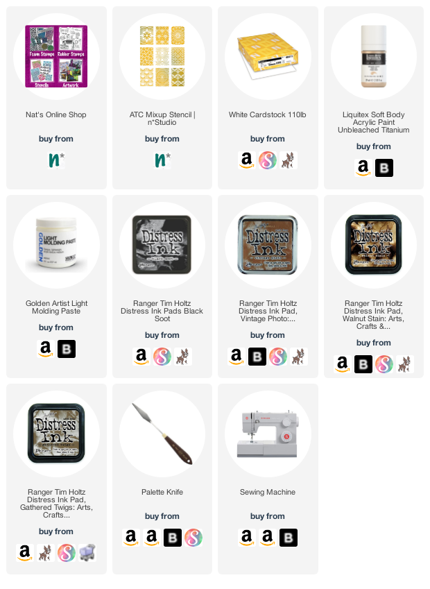
You can find all of my stencils in my Online Store. Here are some of the supplies that Judi used:

Comments (1)

  • Jean Marmo

    |

    Such a wonderful idea. Love those ATCs in a sheet.

    Reply

Leave a comment

The Ink Pad in NYC – Thank you!

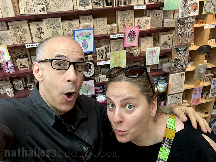
I wanted to take a moment to say Thank You to The Ink Pad in NYC – a unique and independent shop in NYC who will sadly be closing their brick and mortar shop after 23 amazing years of serving the community and beyond. This shop and its lovely owner Anna have always supported my own growing business through the years and I can’t thank them enough for carrying my stamps and stencils, having me there for product demos, hosting my book signing, and allowing me to realize my dreams by providing a teaching venue. The Ink Pad has been one of the most important NYC home bases for me and will be missed!

They will be continuing their online business here and I definitely encourage you to check that out and shop all the sales they have going on now. The shop on West 19th St in NYC will be closing Saturday, Feb 19 so if you are in the metro area, head over there and shop one last time. As a customer of The Ink Pad I was always impressed with the selection at the shop – all my fav mixed media supplies and new stuff to get excited about too. Today they are even selling store fixtures and storage items that could be really useful in a home studio too. Here is some useful info about what the deal is.

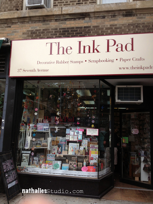
But I wanted to do a little trip down Memory Lane and show you my experience with this wonderful shop, beginning in 2013 when I came from Germany to NYC for a visit. Here was the old shop on 7th Ave:

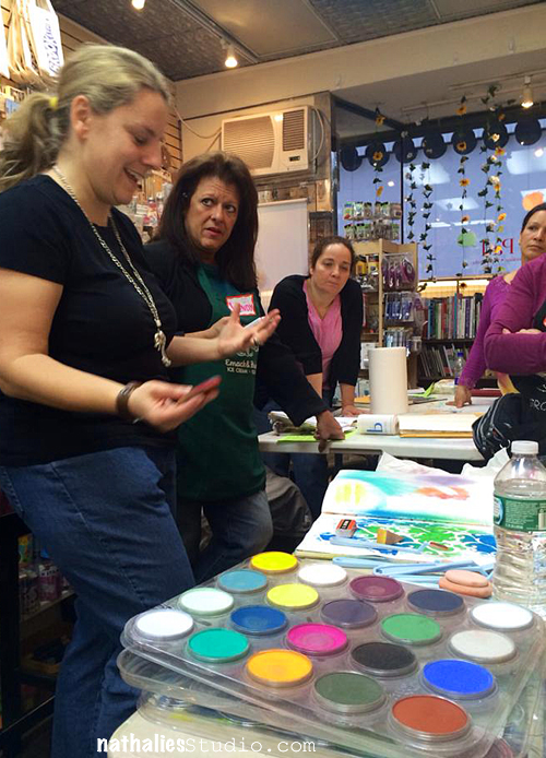
After moving here I would often find myself in The Ink Pad hood and just stop in to say hi and shop for new goodies. Then I began teaching there – both in the shop and also in a larger space that Anna arranged for my growing number of students. It was truly the culmination of a dream and soooo much fun too.

When new stamps or stencils were released I often would do demos in the shop. It was a cozy space and allowed me to meet customers and make connections with so many people.

Sometimes I would pop in and run into other people in the mixed media industry. One time I bumped into Seth Apter there – and that is just the kind of thing that was so special about the shop :)

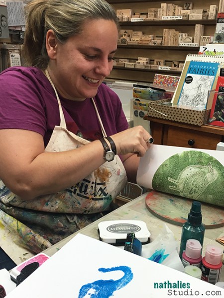
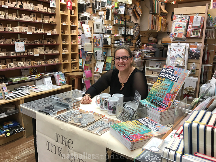
When it came time to release my book, I was invited to do a book signing there. Completing the book was something that I had set as a goal for myself for a long time, and being able to do a signing in The Ink Pad was the icing on the cake! Can you see I am feeling pretty happy?

So I will absolutely miss this little treasure trove of a shop. But, times are changing and I wish them all the best as they switch gears and continue on by serving the community online and hopefully reaching people from all over.

Thank you to The Ink Pad!!!

Leave a comment

Creative Squad: Time for Texture – Robin Seiz

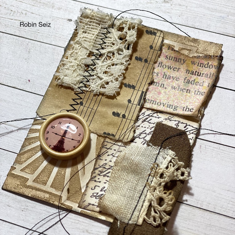
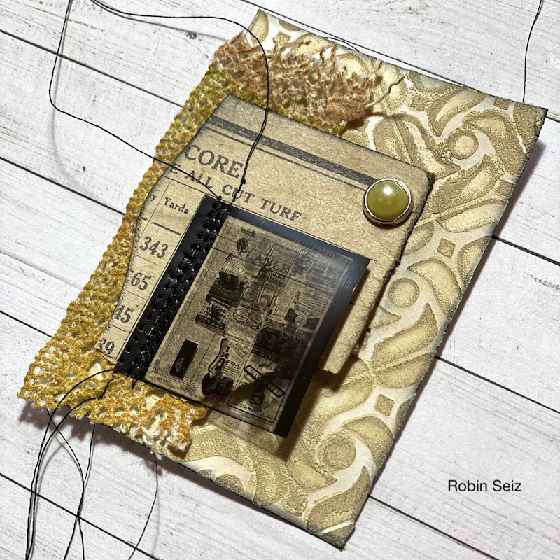
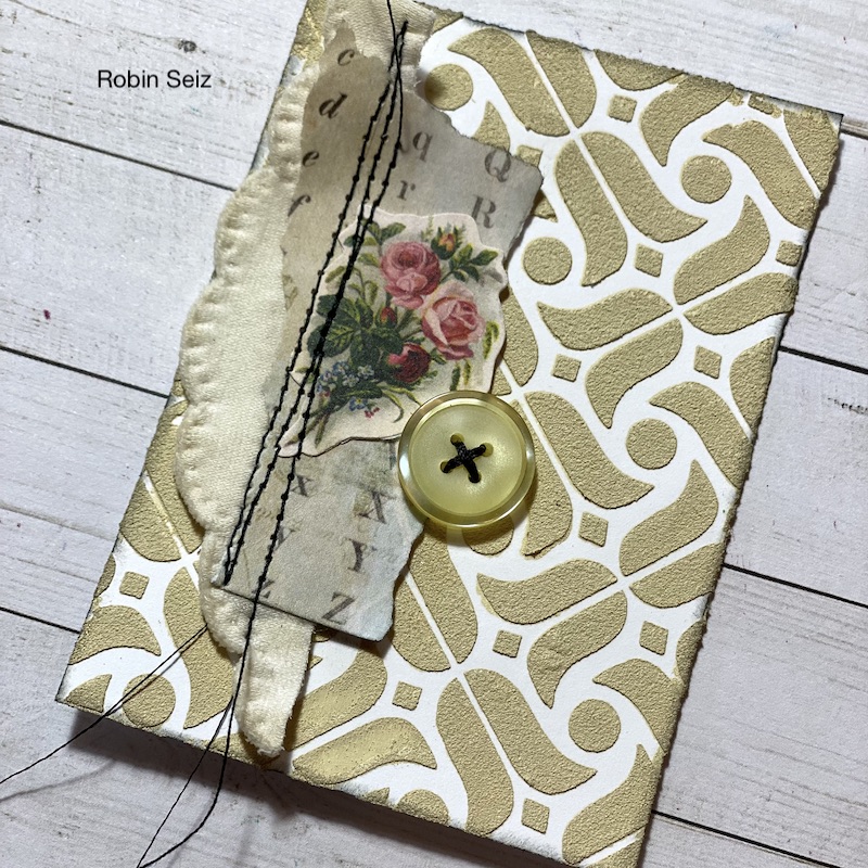
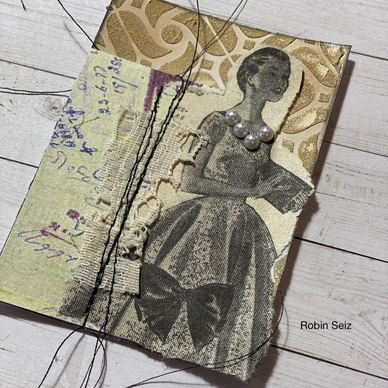
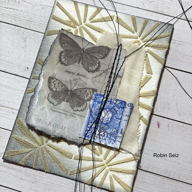
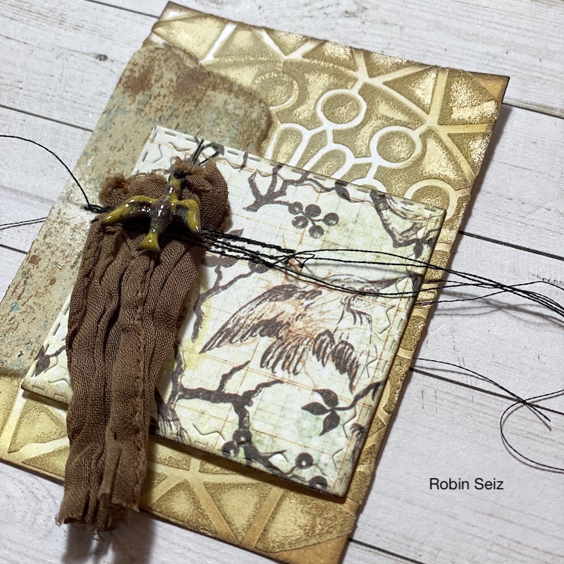
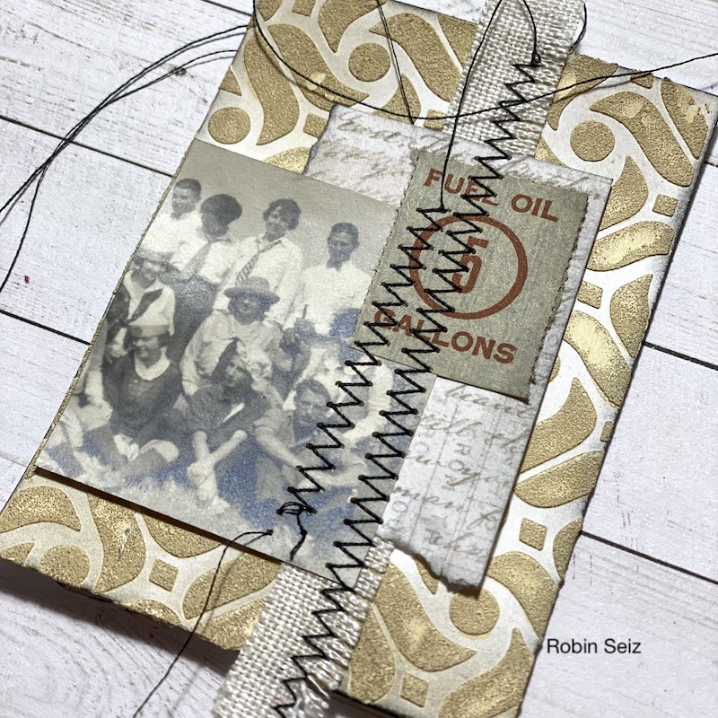
Hello from my Creative Squad! Today we have a post from Robin Seiz who is sharing a beautiful bevy of ATCs using my ATC Mixup stencil and our theme this month: Time for Texture – Visual texture or actual texture is an element that can give dimension, depth, and touchable interest to any piece of art. Let’s play with texture in a series of ATCs and see what emerges!


Hello friends, The theme for this month, ATCs with texture, is something that really gets me excited. I LOVE texture, of all sorts, and I also love working small. ATCs are such fun because they can be a quick and easy project (or more complex if you want it to be) and they make great happy mail. ATCs are also easy to swap with your artist friends. 

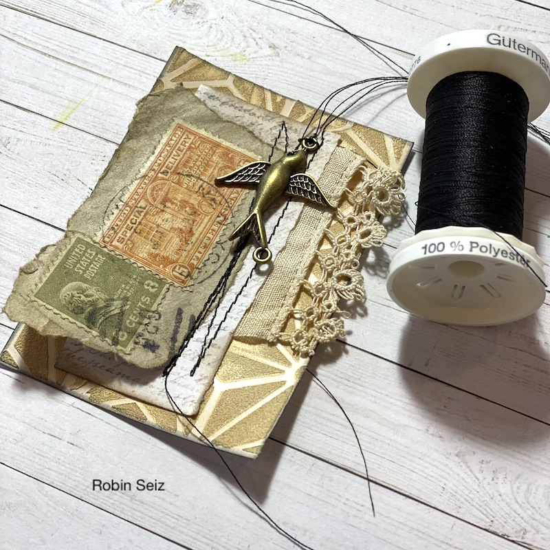
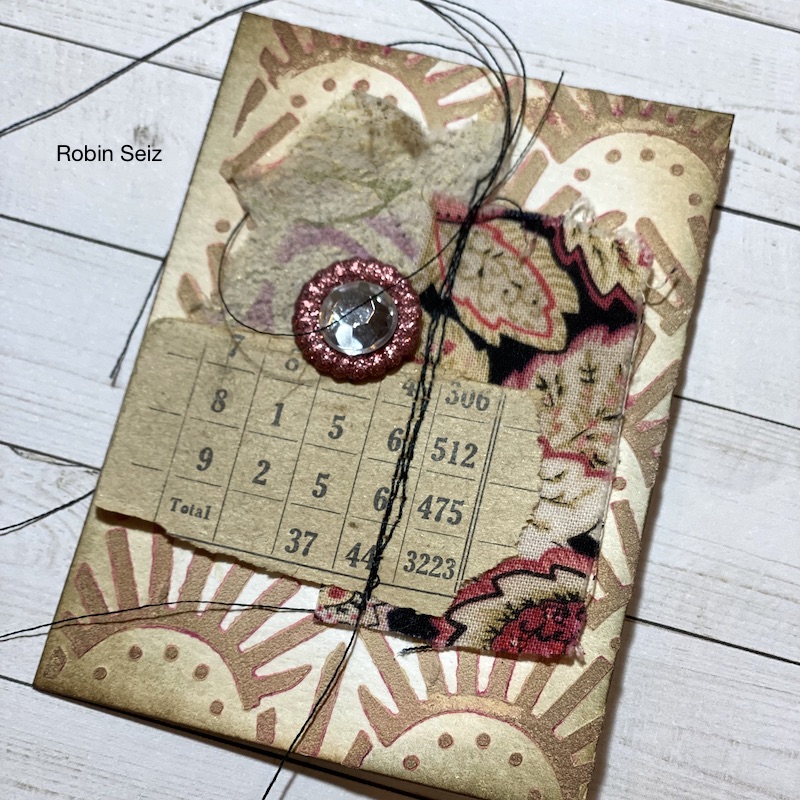
For this project, I wanted to use some of the “bits and bobs” that I have stashed away and rarely use. You’ll see tiny stick-on pearls on one card, a piece of an old movie reel, an old stamp, and a few random jewelry pieces from my jewelry making days on others. I find it satisfying to incorporate what I have; it challenges me to think creatively about a project. 

I knew I wanted a vintage theme for my cards. With the wonders of mixed media, almost anything can be made to look vintage with a little distressed ink or unbleached titanium paint! 

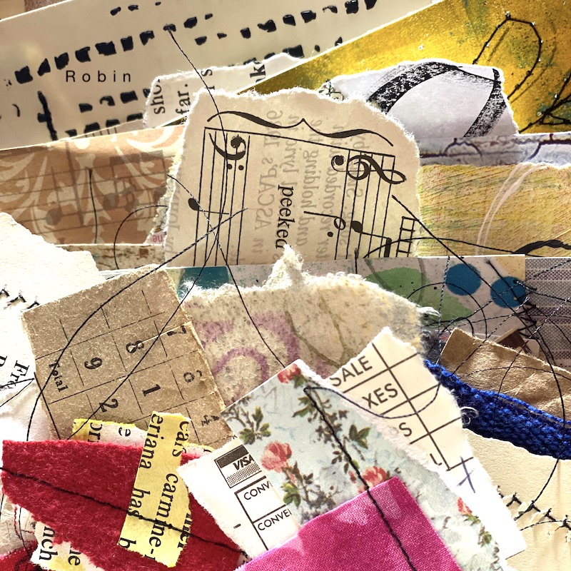
There are days when I want to work on something in the studio, but just can’t get going. On those days, I sit down with my paper scraps, my fabric scraps, and old books, or music and my sewing machine and create little “collages” to use at some point in the future in a journal, on a card, or whatever calls me. I can get lost making these little pieces and before you know it there are 20 or so on my table. I keep all of these in a basket for future projects. When I thought about this project and creating texture, these little gems immediately came to mind. 

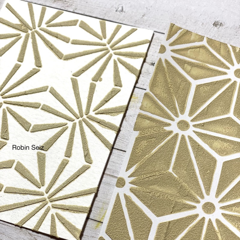
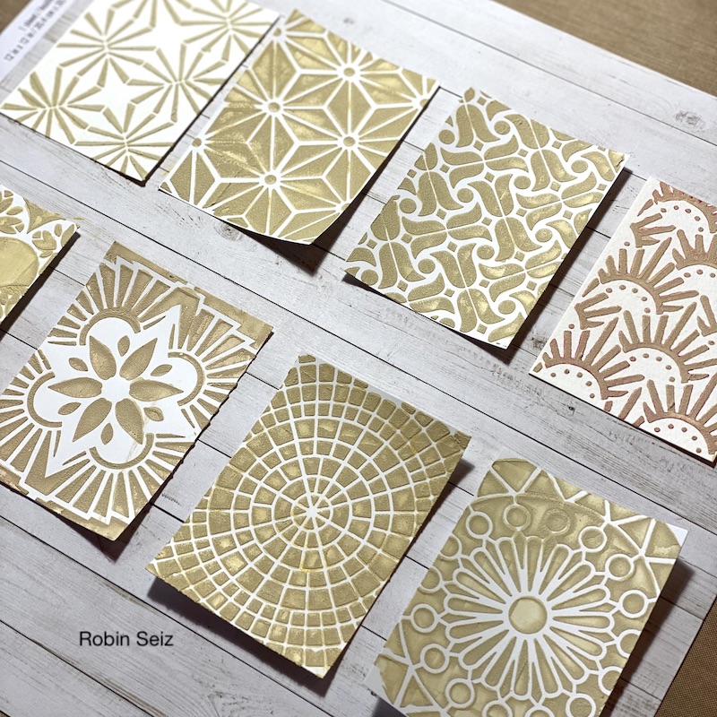
I started by cutting the ATCs (2 1/2 x 3 1/2, the standard size) out of card stock. Next I mixed Liquitex Unbleached Titanium paint and Golden light molding paste together to make a gritty textured paste. I laid Nathalie’s ATC Mixup stencils down on the blank ATC cards and using a pallet knife, I spread the paste through the stencil. I used the same background color for each ATC card. The texture is so yummy and gritty! One note of caution, make sure you wash your knife and the stencils right away; if the paste dries, it’s almost impossible to get off. 

Once the paste had a chance to dry, I began pulling all my elements together. This was an intuitive process. I started by choosing from the basket of scraps and began building a story on each ATC. When all the elements were chosen, I auditioned them for placement on the card. For the final vintage touch I used distressed inks to rub over the texture paste and around the edges of the card and on some of the elements. I suggest you just play and see what feels right to you. In some cases, I sewed the elements to the card, others I glued.

I hope these inspire you to have fun, use your imagination, and your supplies! – Robin


Thank you Robin – love hearing your process for getting started in your studio and seeing how the final creations came together. They are each so unique and beautiful but all tied together too.

Give it a try: you can find all my Stencils in my Online Shop and in addition to a selection of bits and bobs and collage material from her stash, here are some of the supplies Robin used:

Looking for more projects? Follow the Creative Squad on Instagram here.

Comments (1)

  • Sue Clarke

    |

    Robin, the texture and stitching is terrific. It makes me happy just to look at them…imagine how fun it would be to touch them!

    Reply

Leave a comment

Opinions – Art Journal

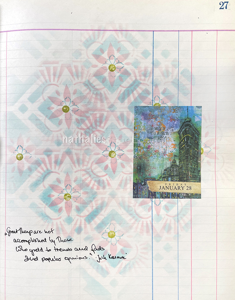
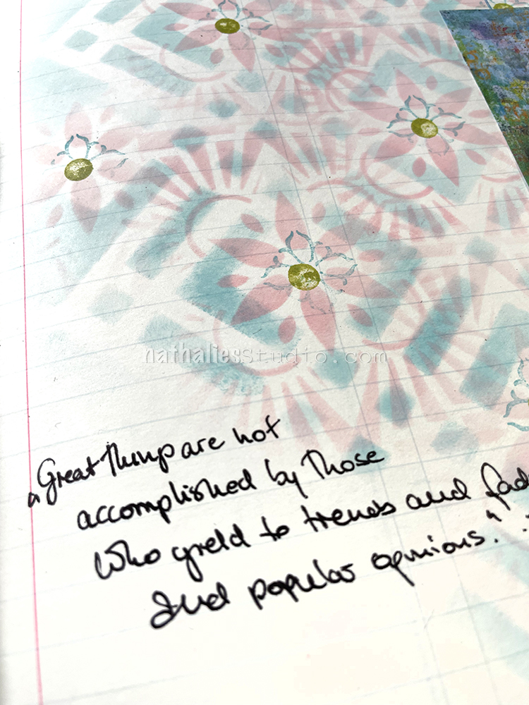
“Great things are not accomplished by those who yield to trends and fads and popular opinions.” Jack Kerouac

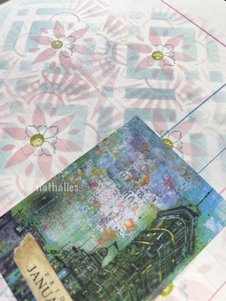
I used the Artist Almanac calendar page with my artwork of the Flat Iron building (so sorry the calendar is long since sold out but you can get prints of my work and original paintings too still here in my shop.) The building always reminds me of how much it was made fun of and disliked in the beginning and became one of the most iconic and beloved buildings in the city.

For the background I used my Chicago stencil with a blending tool and Broken China Distress Ink applied over the stencil. Then I layered a pattern from my ATC Mixup Stencil on top using Tattered Rose Distress Ink, moving it around and making it work in the openings. Then I stamped with the back of a pencil in green and finally the Fan-fare rubber stamp.

I did my journaling with a black Signo pen and attached the calendar page with my favorite Coccoina glue stick.

Here are some of the supplies I used:

Comments (1)

  • Sue Clarke

    |

    I really like the combo of the pastels with the darker colors of the building piece.

    Reply

Leave a comment

ATC Storage Box – Creative Squad

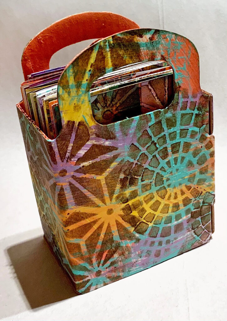
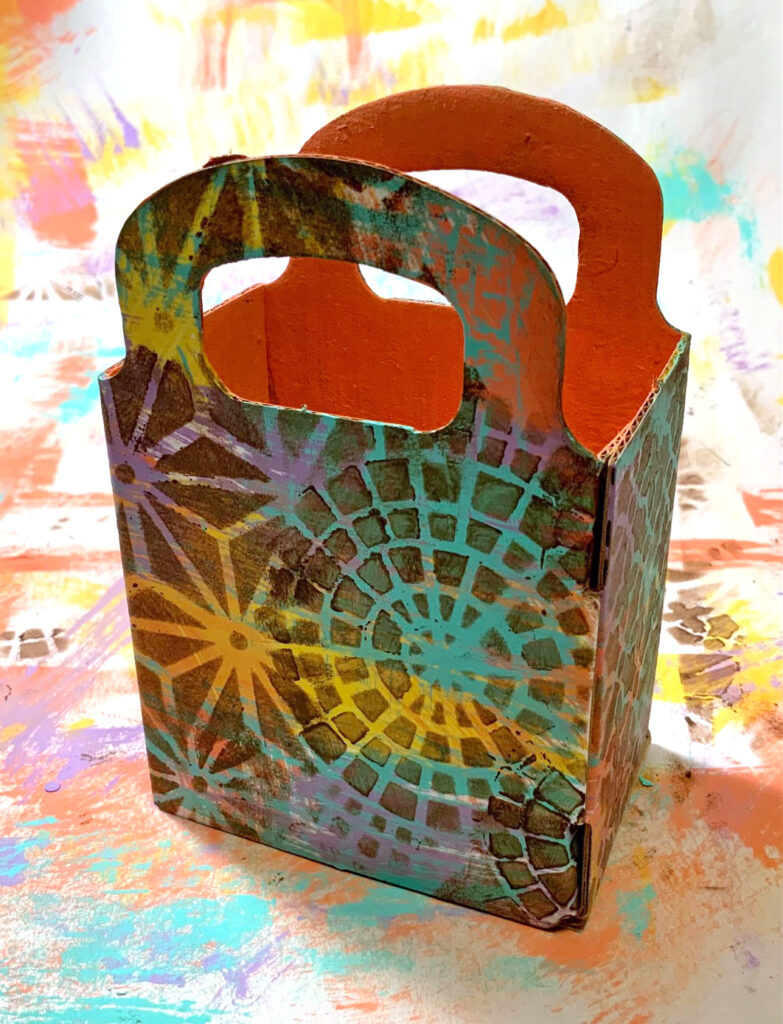
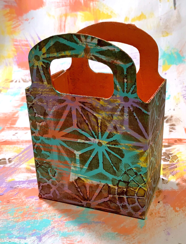
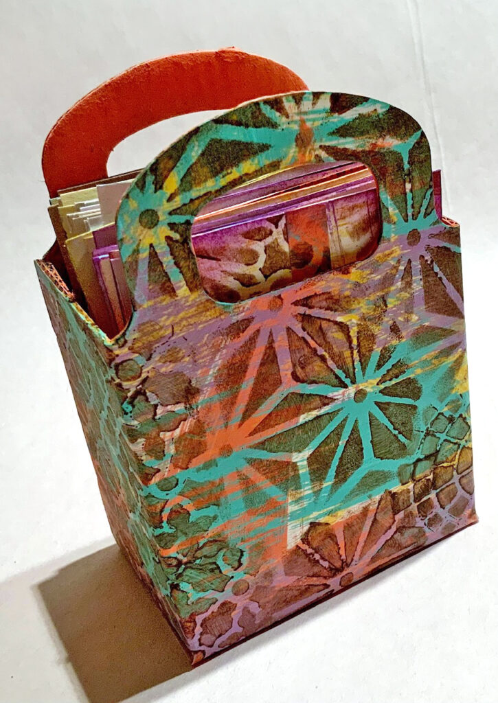
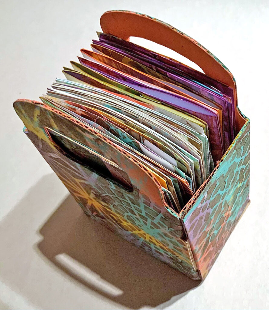
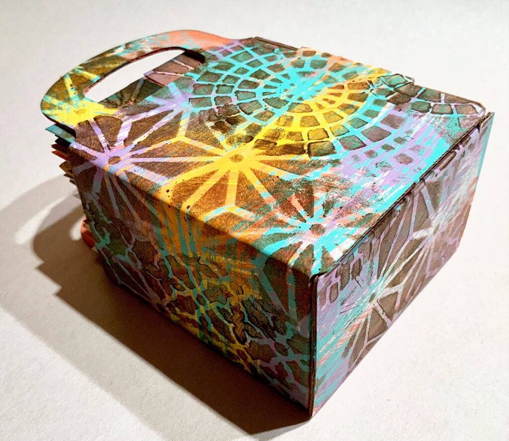
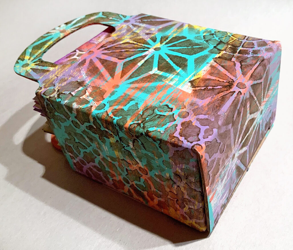
Are you playing along with the Creative Squad this month and making ATCs (Artist Trading Cards)? We have a great solution for storing those cards from Creative Squad member Judi Kauffman to share with you today. She is using my ATC Mixup stencil to create a simple but stunning way to organize your growing collection.


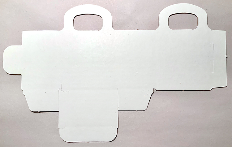
The wedding and party aisle of many craft stores have small bags and boxes to hold favors. Paint and stencil one to use as a storage box for the ATCs you make and receive in swaps!


Thanks for sharing Judi – what a nice way to hold all those mini masterpieces!

You can find all of my stencils in my Online Store. Here are some of the supplies that Judi used:

Like what you see? Follow the Creative Squad on Instagram for weekly posts, artwork, and inspo.

Comments (1)

  • Jean Marmo

    |

    Such a cute storage container!

    Reply

Leave a comment

A Look Back – Lady in Red (in my Art Journal)

A Look Back – As I was looking through my blog archives I started to notice a reoccurring fashion trend happening right there in my art journal. There were a lot of girls wearing red. I don’t know why. I usually gravitate towards black or something a bit more neutral. But in the world of my art journal, the girls are rocking this strong hue. It didn’t take me long to find five of them, and I bet if you go back and look at my posts you can find even more. So I thought it would be fun to dedicate this Look Back to the Lady in Red in my art journal :)

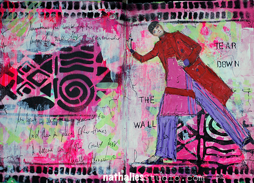
This first one is from way back in 2014 when I came out with my Batik Stencil. This cool chick is standing strong in a red trench that means business. And I like how I used the Batik pattern on the left and then printed the reverse on the right using the painted back side of the stencil. You can check out the original post here.

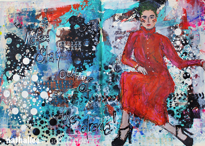
At the start of 2015 my art journal gal is in a red dress AND some fierce makeup too. Don’t mess with her. But maybe you want to borrow something from her wardrobe :) You can see the original post for this page here. It’s all about that layered background – symbolic of the drama that can surround us and overwhelm us if we’re not careful.
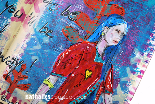
Later in 2015 I had my girl in a fun red top and blue hair – she is definitely not afraid of color! Check out the original post here to see the full background and a quote from Eleanor Roosevelt that works perfectly for artists.

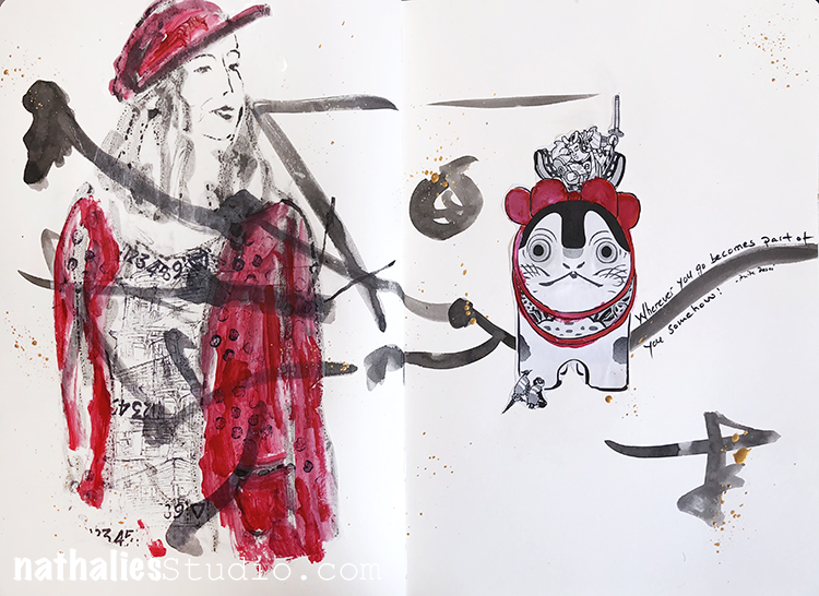
In 2018 I traveled to Japan and brought back, among other things, collage material and loads of artistic inspo of course! I created this art journal page with a woman in a red jacket and hat, using inksticks and an inkstone – materials used for writing and calligraphy. I made quite a few art journal pages after this trip that were really pared down and only using a color or two. Pretty cool how travel can influence you like that.

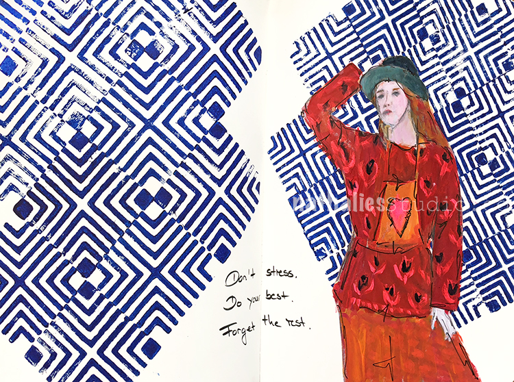
Along those same lines, this spread is from just a few weeks later in 2018 and the white page still plays an important role …and my girl is still in red! Although in this page she is sporting a fun red print! I love how she is completely popping off the blue Manhattan stamped background. You can see the original post here.

I hope you enjoyed this. A Look Back is a blog series to show you some projects and posts that you may have missed – sometimes going WAY back in the archive. I think it’s fun to revisit a few ideas that we haven’t seen for a while. I’m excited to see how a little look back might inspire something new in the future :)
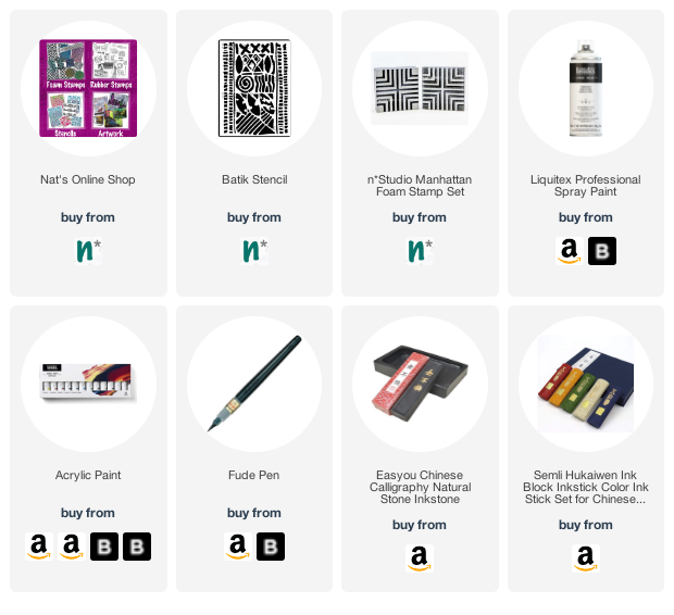
Here are some of the supplies I used in these projects:

Leave a comment

Unsolved – Art Journal

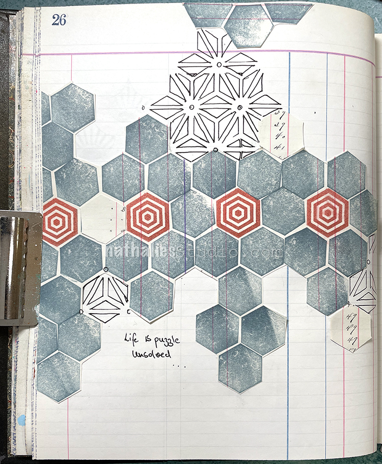
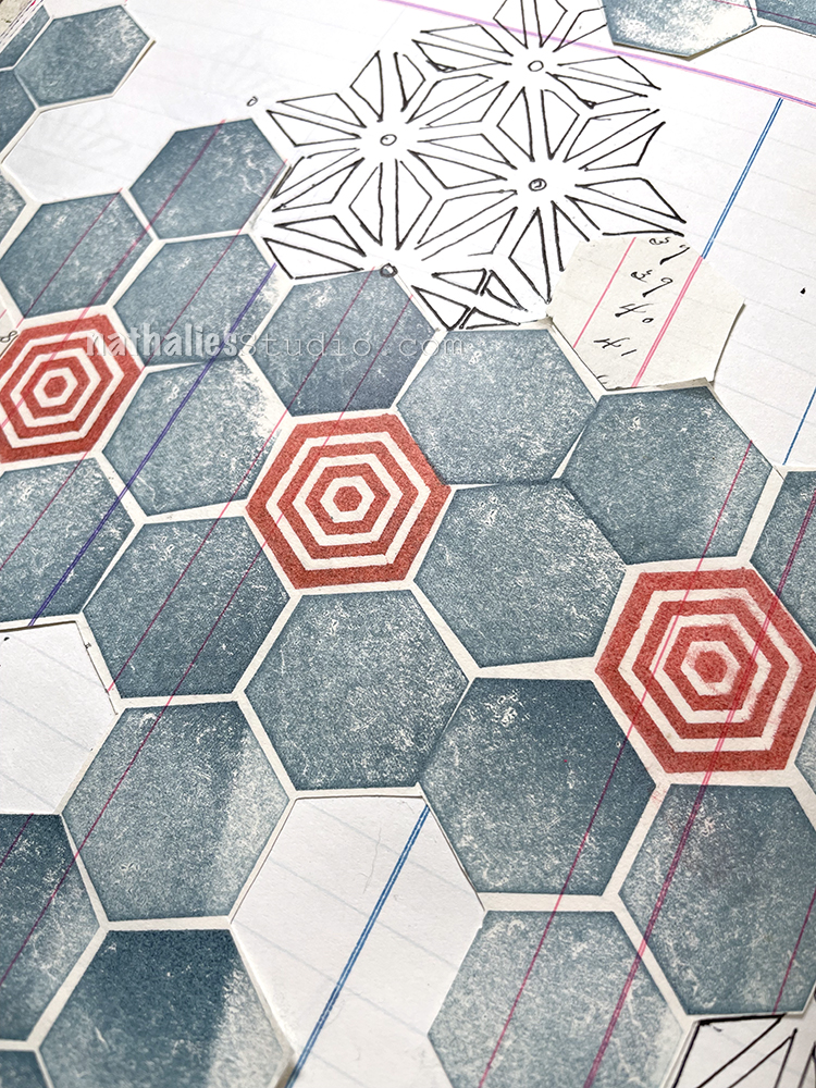
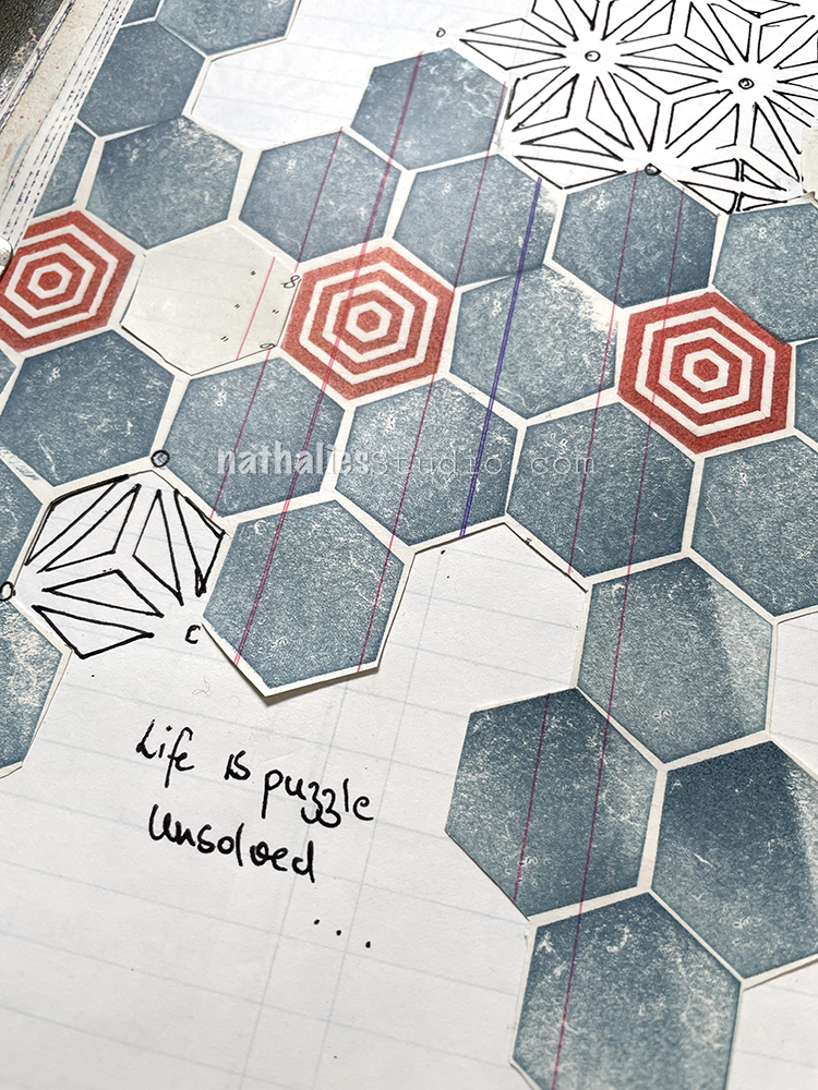
I had the Hex Set Small and Solid Hex Small rubber stamps printed on a different piece of old ledger paper and I cut it out to paste into this one, turning around some pieces to show the writing on the other side.

I used the ATC Mixup stencil to trace some patterns with a Signo Gel Pen and realized that the pattern fit perfectly into the hexagon openings so there you have it! LOL

Here are some of the supplies I used:

Comments (1)

  • jjhere

    |

    I love the simplicity of the geometric look to this. Beautiful and life IS a puzzle!

    Reply

Leave a comment

Creative Squad: Time for Texture – Riikka Kovasin

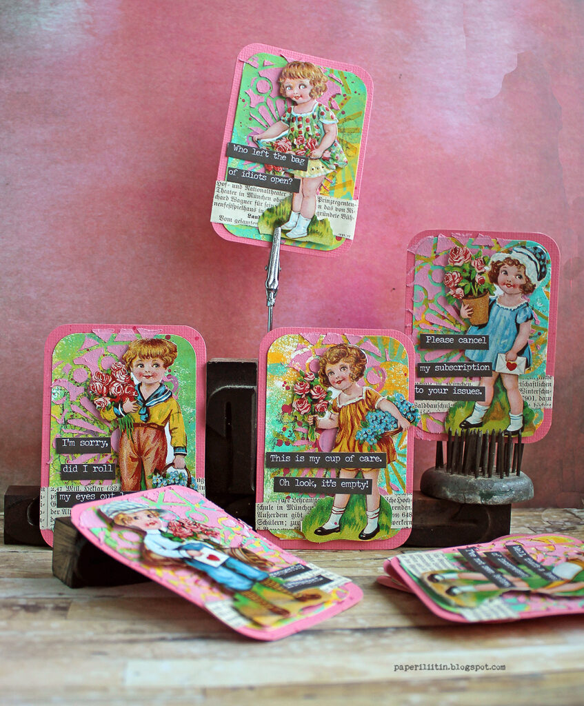
Hello from my Creative Squad! Today we have a post and video from Riikka Kovasin who has created a set of ATCs that will make you chuckle :) using my ATC Mixup stencil and our theme this month: Time for Texture – Visual texture or actual texture is an element that can give dimension, depth, and touchable interest to any piece of art. Let’s play with texture in a series of ATCs and see what emerges!

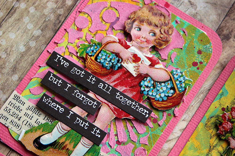
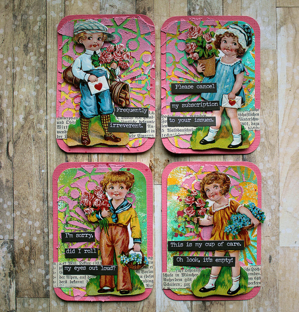
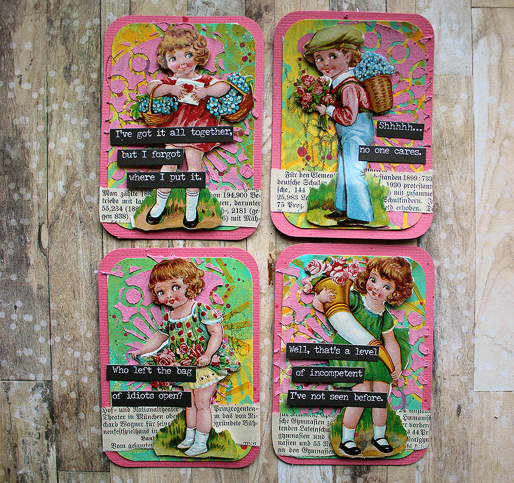
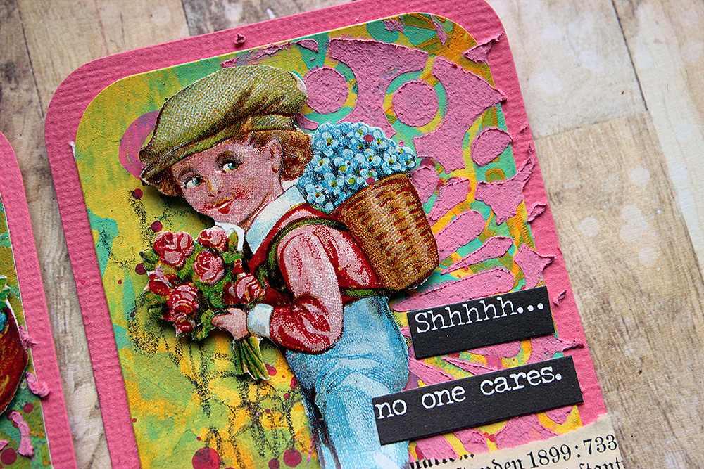
Snarky Kids

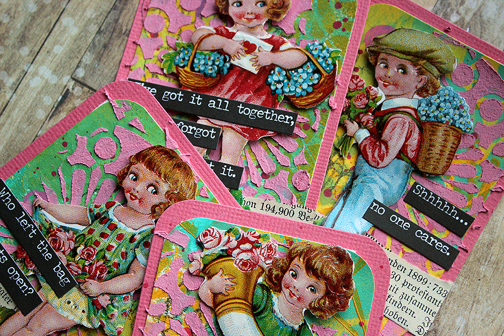
Moikka moi! It’s Riikka here today with some snarky ATCs! Boy, there might be some explaining to do. Not in the project itself, those cards are quite straight forward, but the focal points and the juxtaposition. Let’s get started!

First of all, I’m not sure you are familiar with these “glossy pictures” I’ve used here as focal points. The term is a direct translation of a Finnish word “kiiltokuva”. From what I gather, these items are not widely used or known. For example, Wikipedia article of the subject can be found in Finnish, German, Norwegian, Swedish, and Danish. Glossy pictures are thought to originate in Germany in mid-19th century. They are printed images with a glossy finish, cut in shaped sheets with little connecting bridges. The idea was to cut the individual images loose from the sheet. Nowadays collectors are looking for the uncut sheets rather than individual images. The pictures were used to decorate gifts, ornaments or put in little keepsake books.

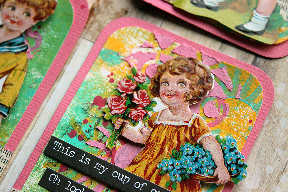
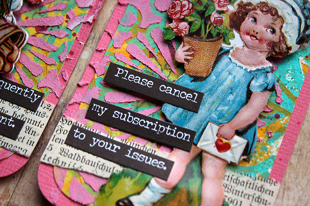
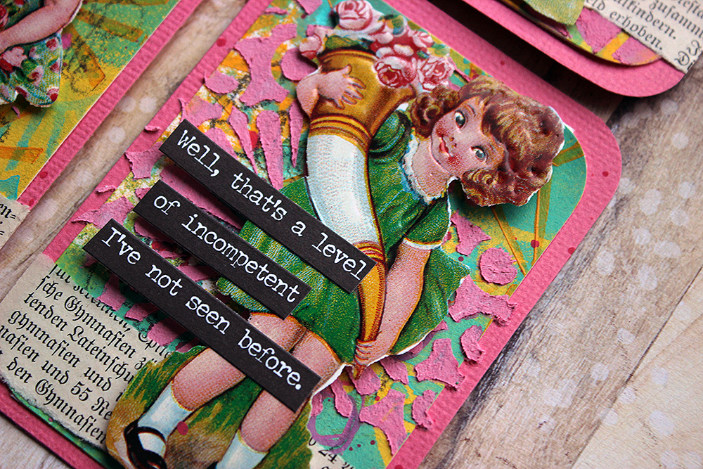
My glossy pictures may look old, but in fact they are relatively new. They were bought from a local craft store. As a kid I had a huge collection of the pictures, some adhered in books with little poems. I chose these particular pictures because Valentine’s Day is not that far away. But I wanted to add something surprising to the otherwise sweet cards. There’s the candy colors, kids with flowers and then rather snarky comments! My idea was that when you glance the cards you may think they are sweet but when you take a closer look, you see the juxtaposition between the sweetness and the lines. The texts are from Tim Holtz’s “Snarky” sticker book.

Now that we have those explained, let’s go to the theme of the month – texture. I used both visual texture and touchable texture in these. Visual texture for me here is the background design – using acrylic paints to color the white cardstock and then using the ATC Mixup stencil on top to create different clusters of pattern there. Tactile texture is done using the stencil again, but this time with texture paste. To match the white paste to the candy colors better, I colored it using a pink acrylic paint. While the patterns underneath differ from card to card, I used the same doily like design to the raised layer. To see how I created the cards, please see the video below!

As you could see from the video, I started the cards by creating a master sheet. This is the way I tend to start ATCs nowadays. A master sheet allows making a number of backgrounds at once with similar color scheme and patterning but each individual card is still a bit different, each having its own personality. What allows the mix of different patterns here is the wonderful “ATC Mixup” stencil. I just love how this big stencil holds so many great patterns! And as you can move the stencil, you can still make big areas with the pattern easily.

Thank you for stopping by today! Wishing you all the best and happy Valentine’s Day to you all a bit early! 

Xoxo Riikka


Thank you Riikka – these made us laugh so hard!!! But we also appreciate the richly textured backgrounds you created :)
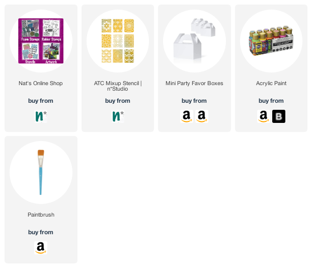
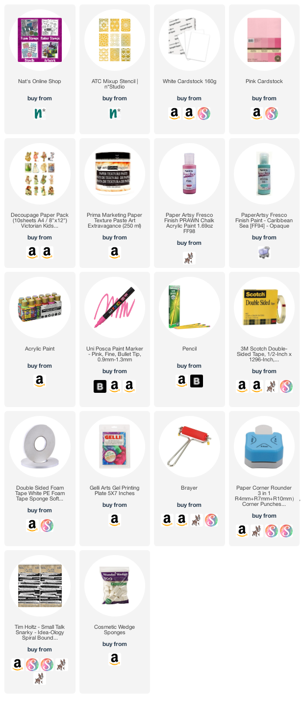
Give it a try: you can find all my Stencils in my Online Shop and in addition to her glossy pictures from her stash and old book pages, here are some of the supplies Riikka used:

Looking for more projects? Follow the Creative Squad on Instagram here.

Comments (2)

  • jjhere

    |

    These are so funny! Love how you paired the sweet Valentine kids with the snarky comments.

    Reply

  • Sue Clarke

    |

    Riikka, I love LOVE love these, especially the snarky comments!

    Reply

Leave a comment

Longing – Art Journal

While packing up some stuff I found this photo from our old apartment in Hamburg, Germany and I got a little melancholic. I had a great time in Hamburg and miss it a lot – I cannot wait to hop on a plane once things ease up more (I am not ready yet for a long haul flight and the uncertainties that go with international travel and a pandemic and regulations).

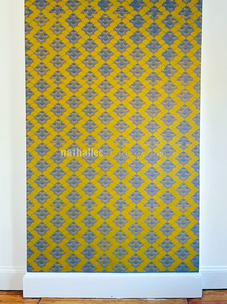
I used a piece of wallpaper I had designed for my studio bathroom a while ago as well as some collage paper I had created with distress ink pads and my Funky and Far Out ArtFoamies. I also used the small Broadway Fan stamp – the leaves of our Maple tree on the roof terrace reminded me of the shapes in the Broadway stamp …shapes are a funny thing :)

Here are some of the supplies I used:

Leave a comment