Art Stroll

Art Stroll: Modern Art at the Rijksmuseum, Amsterdam

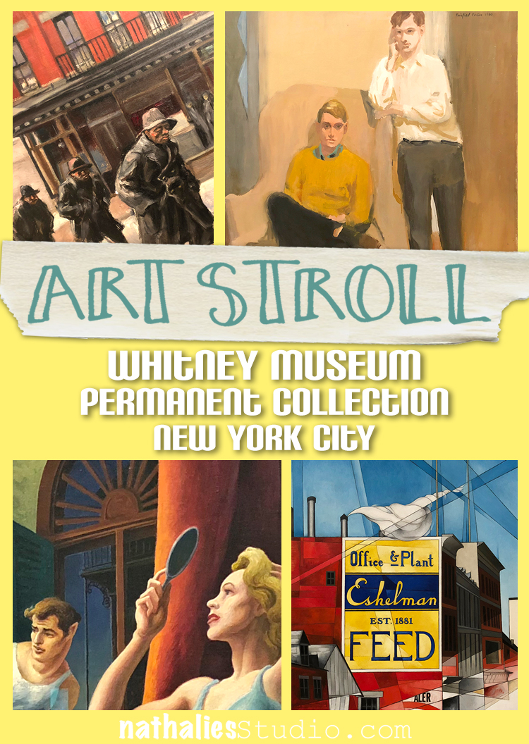
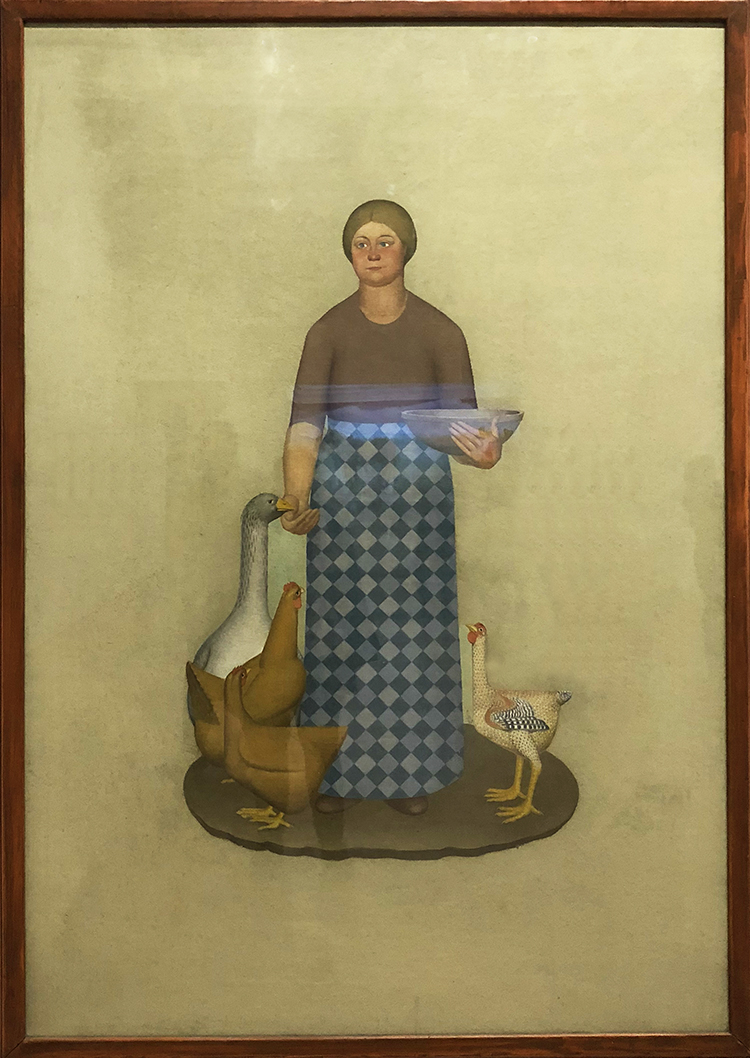
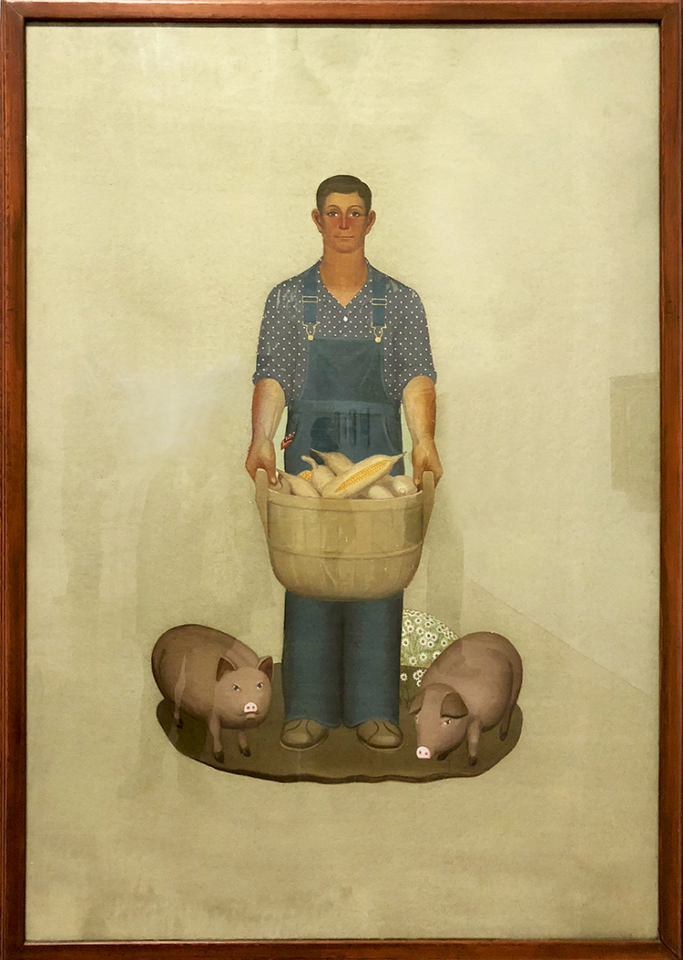
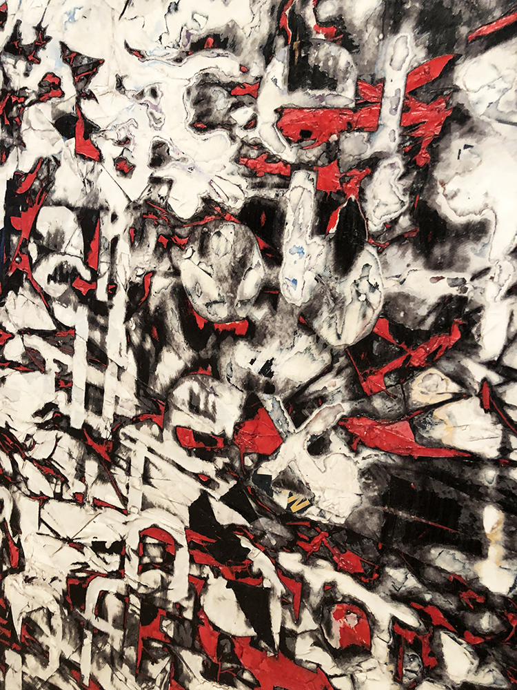
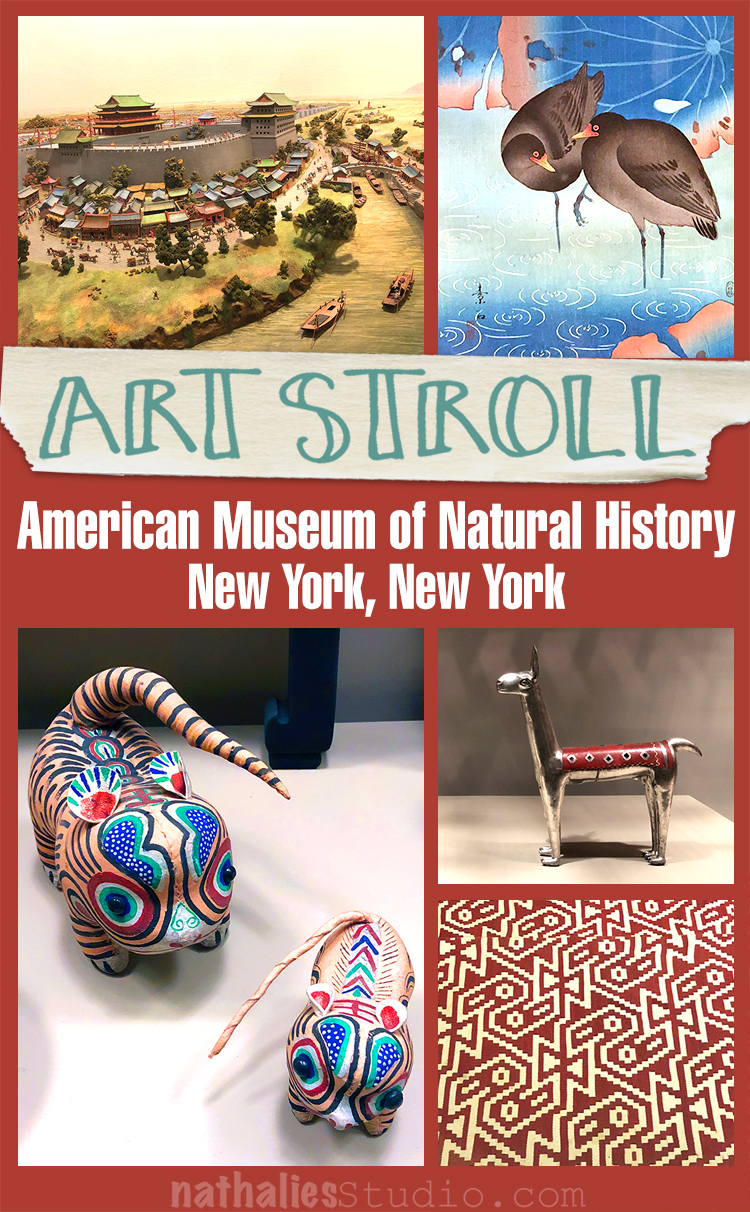
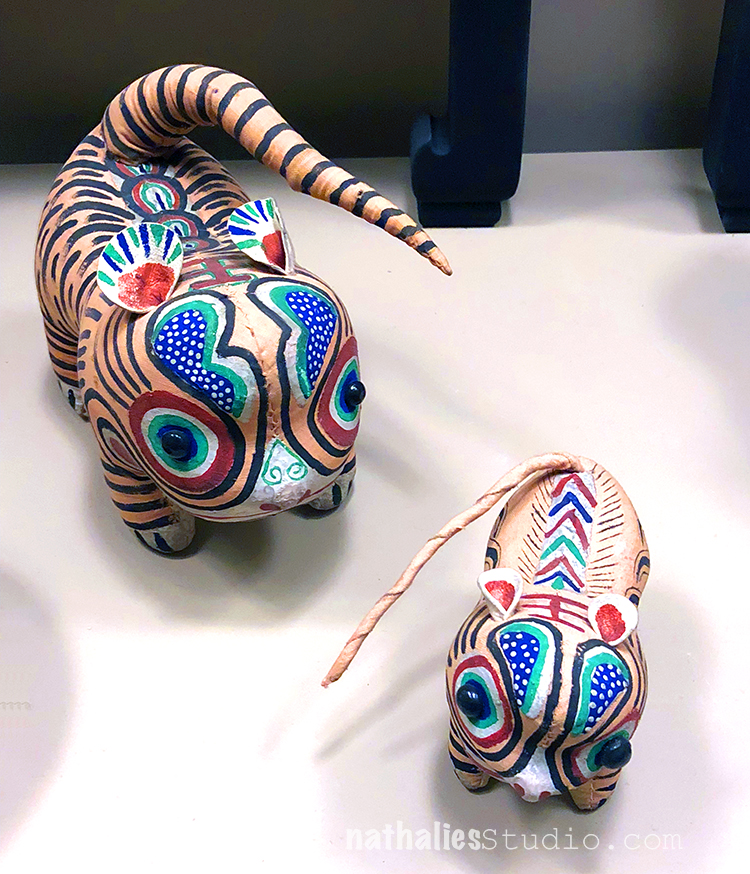
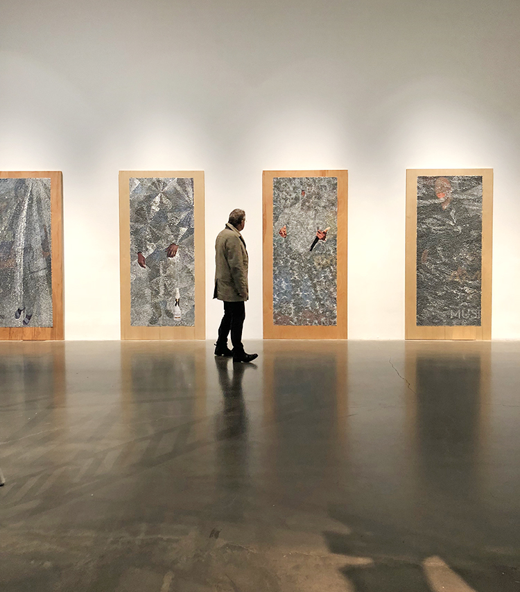
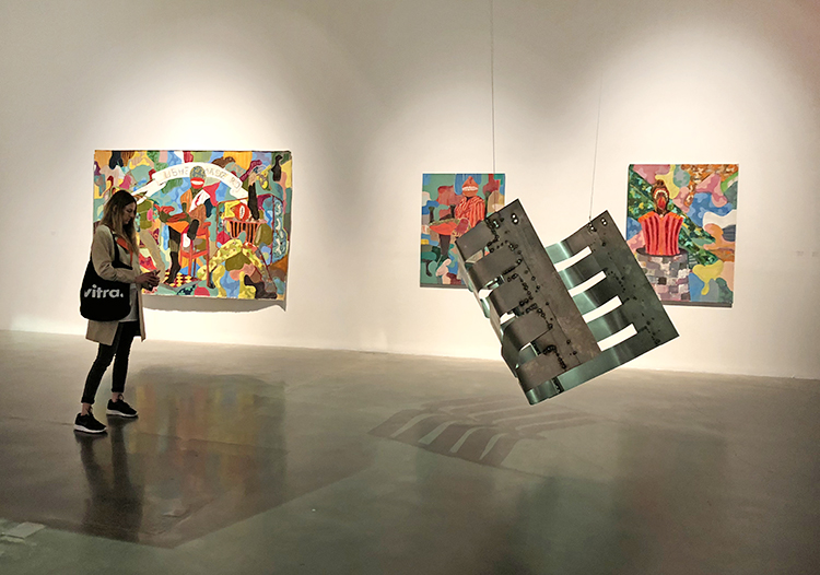
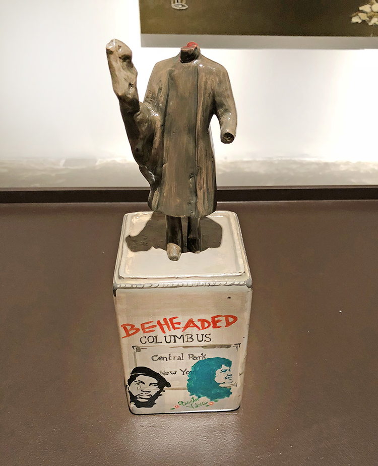
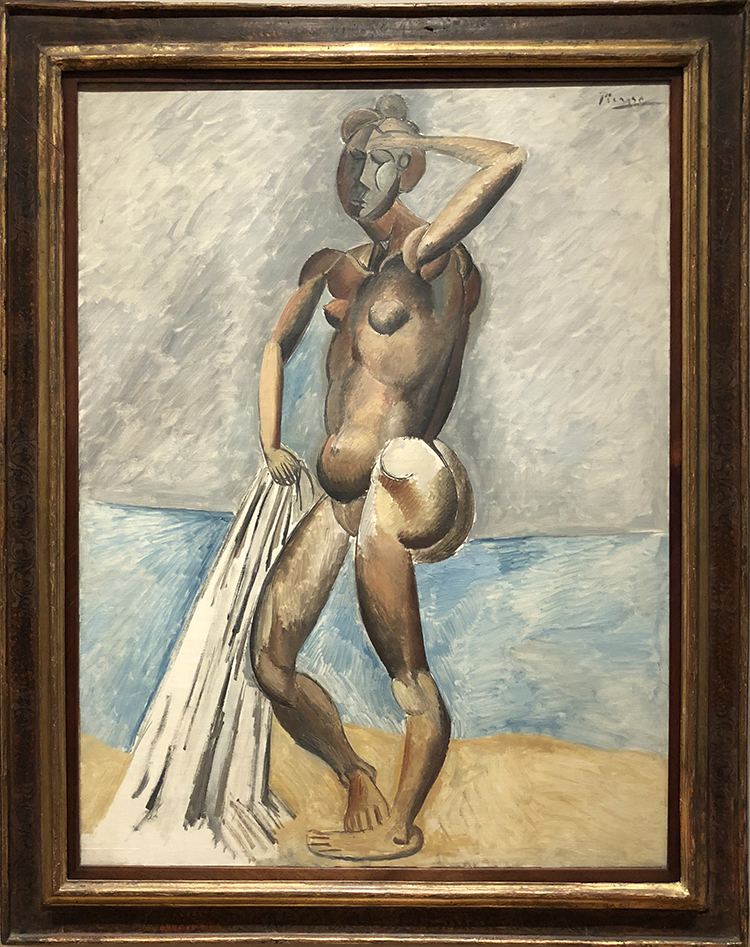
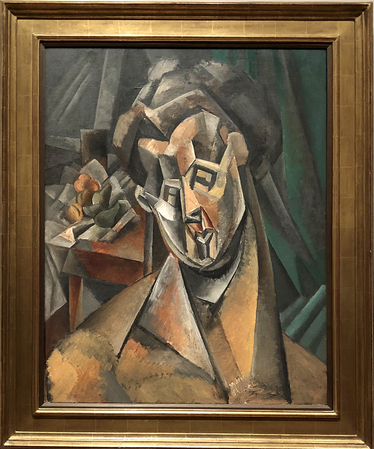
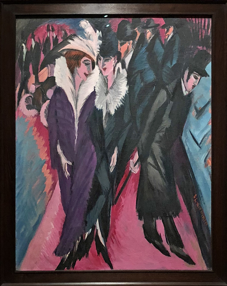
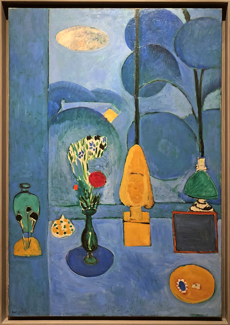
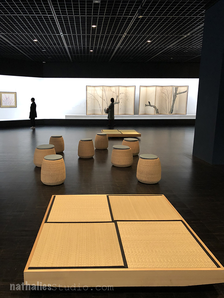
Last month I spend a lovely weekend in Amsterdam and since we haven’t been at the Rijksmuseum for a while we decided to go :) Now usually the Rijksmuseum is not really what you connect with Modern Art …the more the reason for us to check out the small collection a kind of hidden floor :)

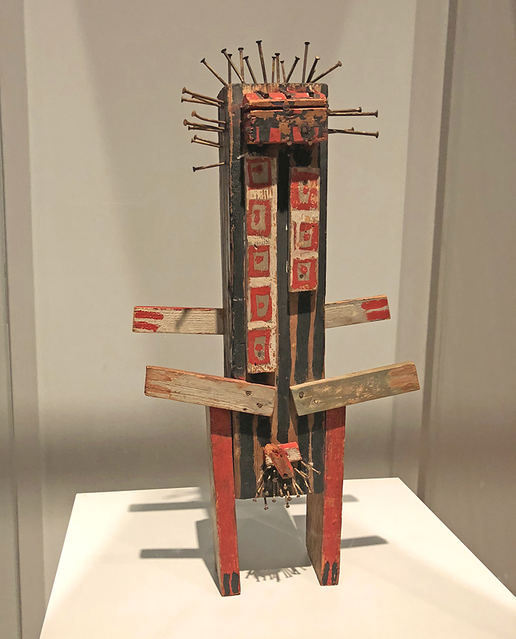
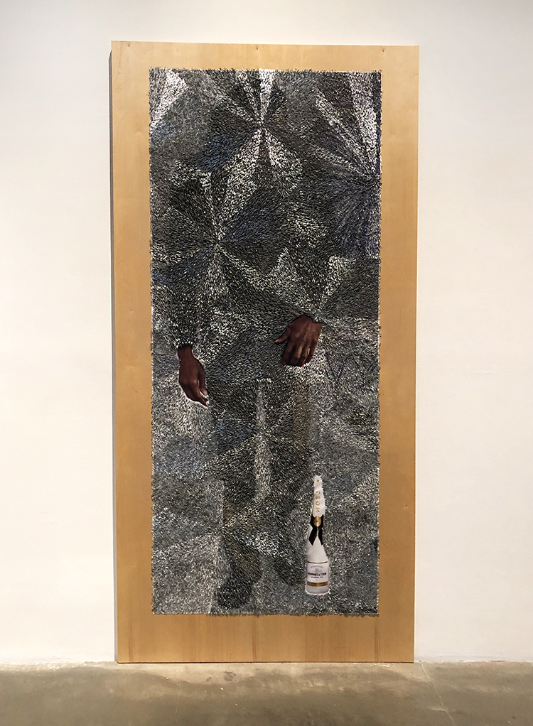
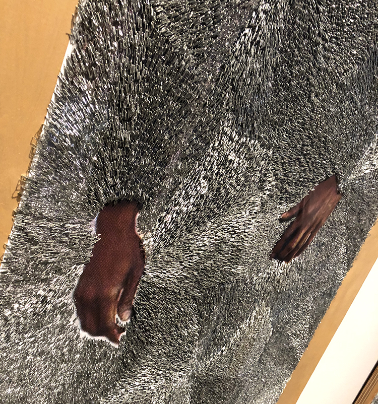
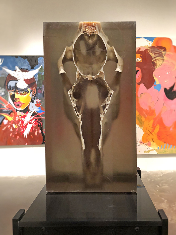
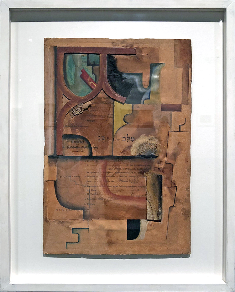
Standing Figure, Karel Appel, 1949 – wood, paint, metal

Shortly after the Second World War a new generation of young artists stepped into the limelight. With their unpolished and improvised painting  and sculptures they celebrated their regained freedom after years of German occupation. Karel Appel looked at artifacts from Africa and Oceania. He thought they were exemplary models of the unspoiled creativity and drive that should form the basis fo art in a free society.

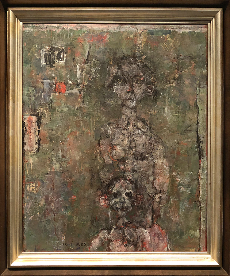
Below two paintings by Karel Appel

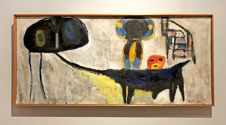
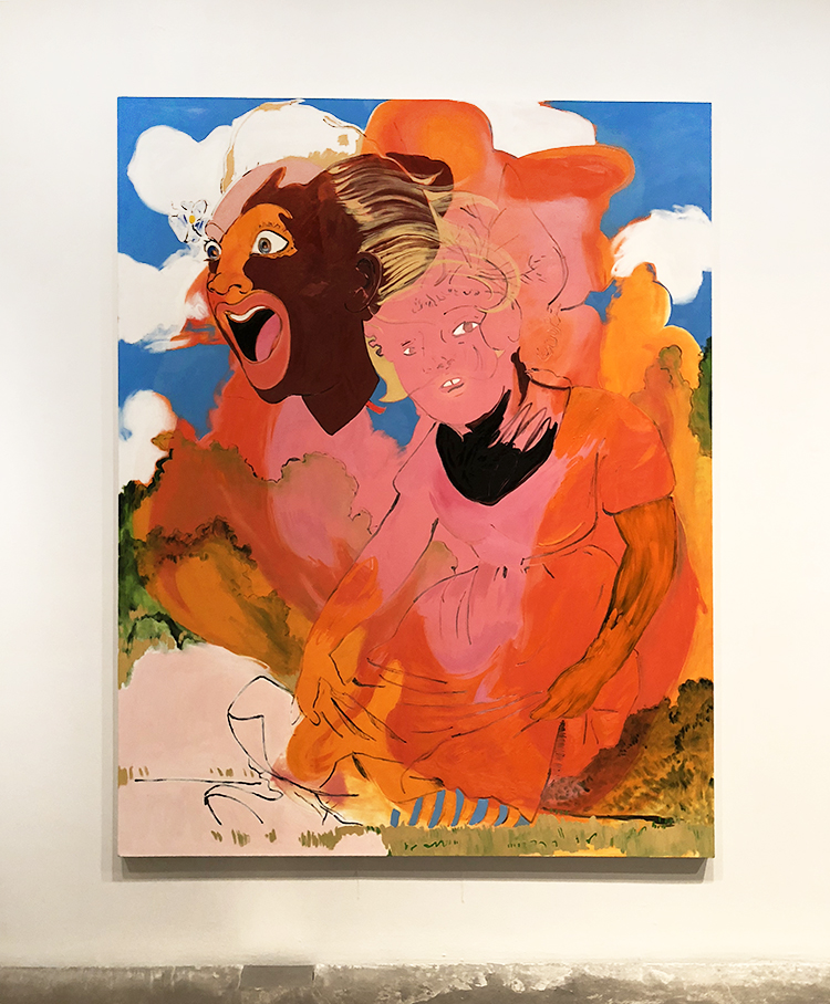
Child with Donkey (Kind met ezel), Karel Appel, 1949 – oil on canvas

In 1949 the smoldering eyes of Appel’s figures of children caused a great deal of discomfort among the public, The silent reproach of their gazes even led to his wall painting Questioning Children in the Amsterdam city hall being covered over. Appel began painting children after a  trip through post-war Germany. The misery of the often orphaned, hungry, and begging war children made indelible impression on him.

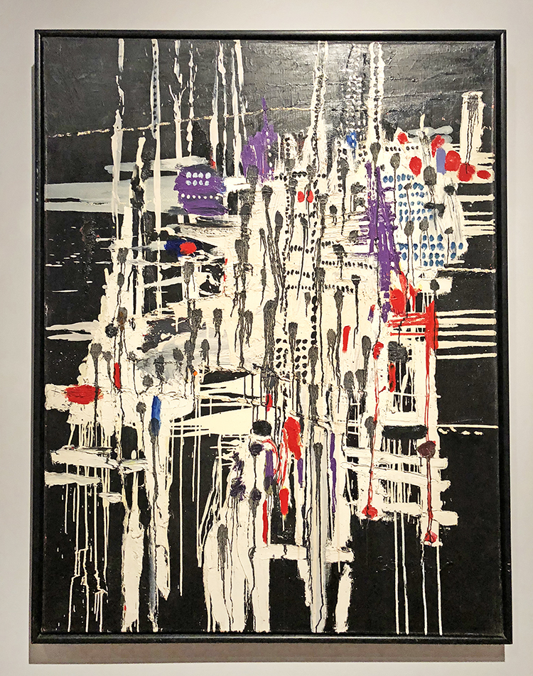
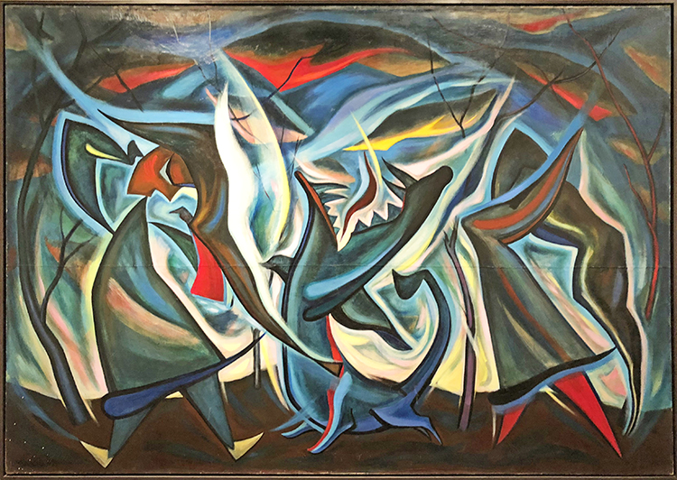
La Ville Noyèe (The Sunken City), Constant, 1956, oil on canvas

the title of this painting may refer to Atlantis, a beautiful and prosperous legendary island that was engulfed by the sea, according to Greek mythology. When Constant made this painting he was devising his own imaginary society: a city for the people of the future that he christened New Babylon.

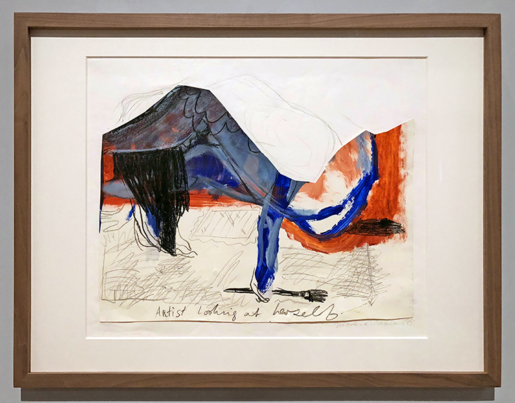
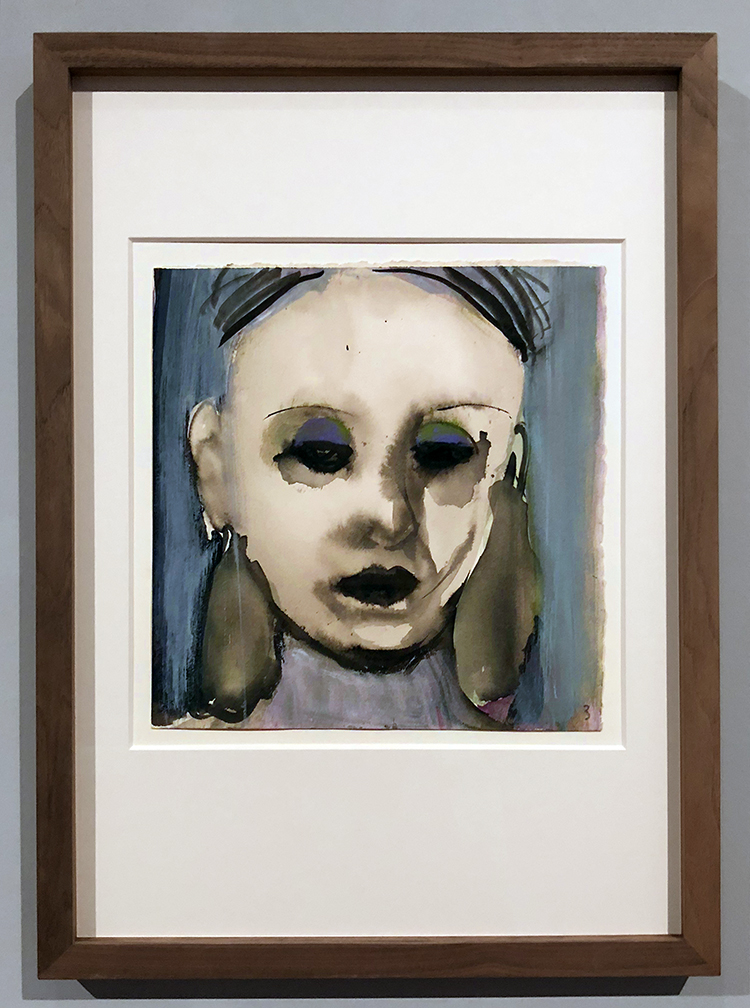
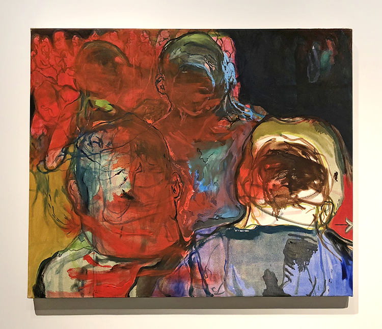
Artist Looking at Herself, Marlene Dumas 1983, gouache, acrylic paint, chalk, on paper

Eroticism and her role as a female artist are recurring themes in Dumas’ work. This portrait presents a paintress but whether it is Dumas herself is not clear. We see a women looking through spread legs into  mirror under her. She olds a paintbrush in her left hand, as though she is painting the pictures at this very moment.

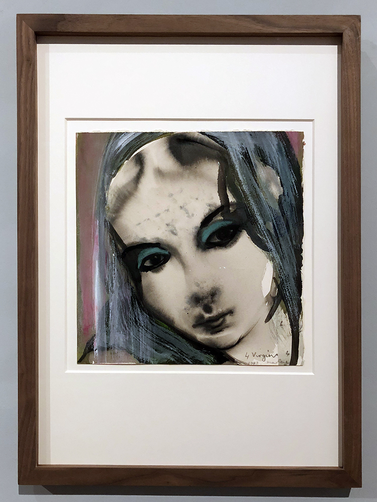
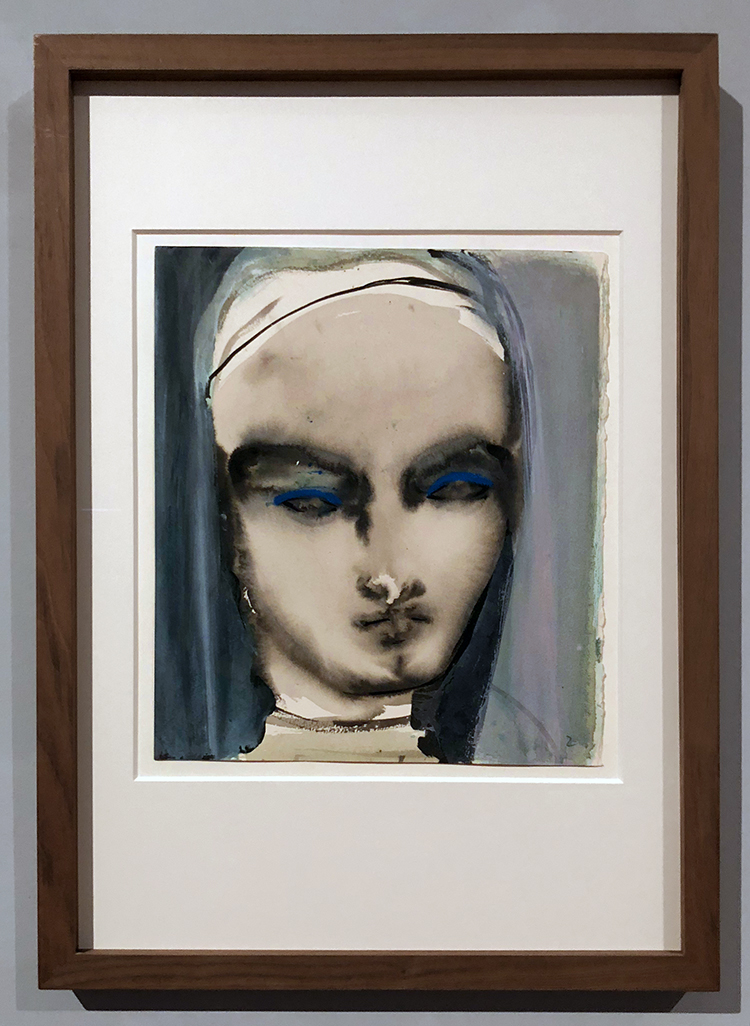
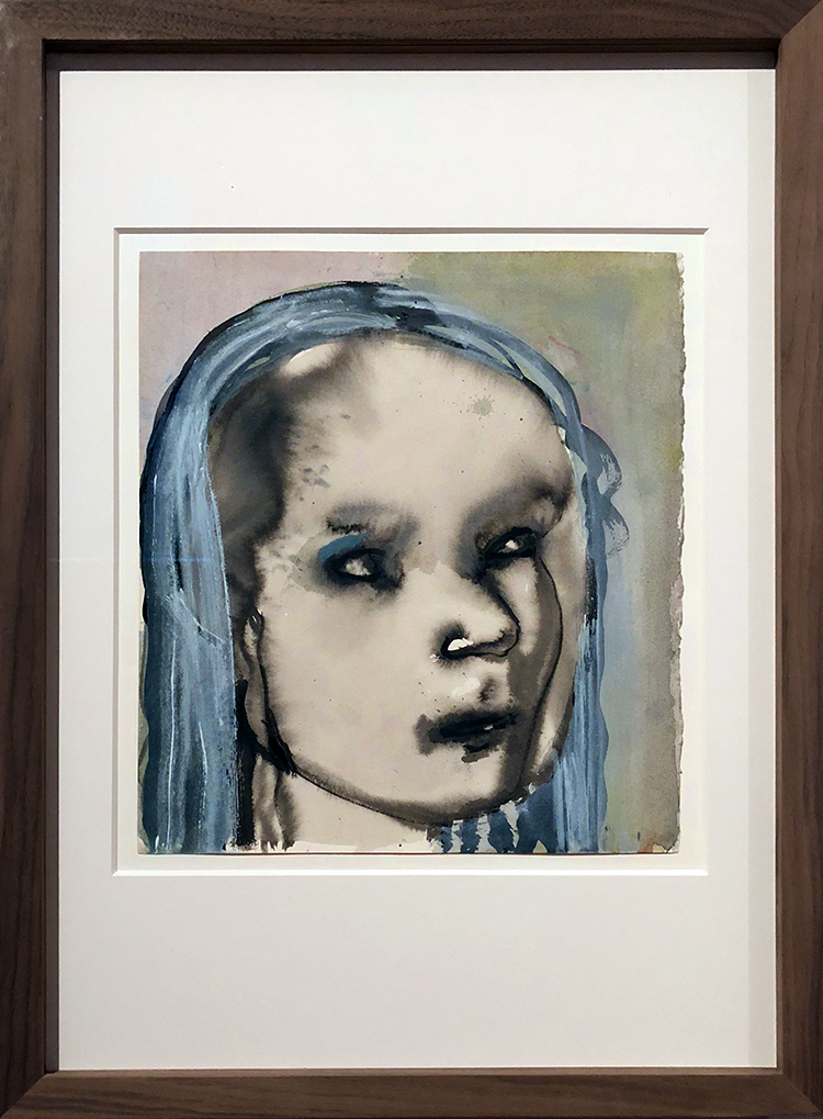
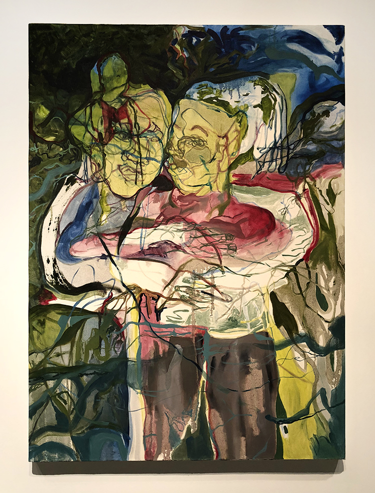
Four Virigitns (1-4), Marlene Dumas, 1993- gouache, indian ink

No identification is given for the four women portrayed here by Marlene Dumas. Can they be recognized as famous models, or are the randomly photographed women? That they are virgins is emphatically indicated in the title. Whether this definition applies solely to the women’s virginal stat or refers to their virtuousness is left up to the beholder by Dumas.

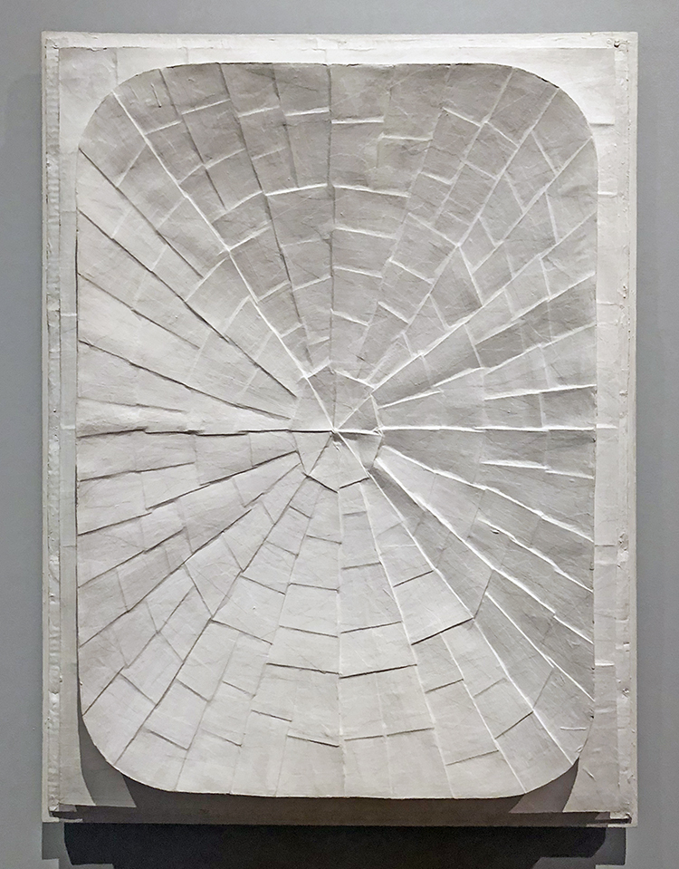
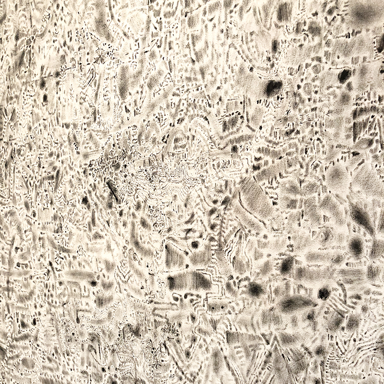
Dish Relief, Jan Schoonhooven, paper, cardboard, paint, wood

Like his 17th-century predecessor and fellow Delft artist Johannes Vermeer, Jan Schoonhoven was fascinated by light. His brilliant white reliefs are composed of a few basic forms, whose irregular surfaces make light visible. Here Schoonhoven pasted pieces of cardboard on top of each other to create a design of light and dark lines, which resembles light playing through a cobweb.

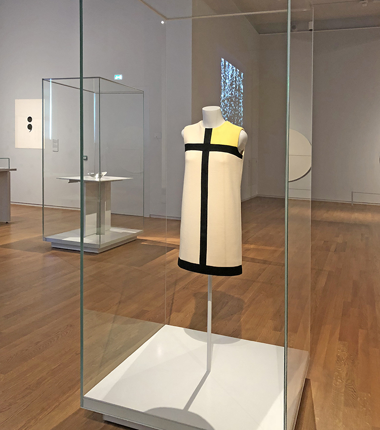
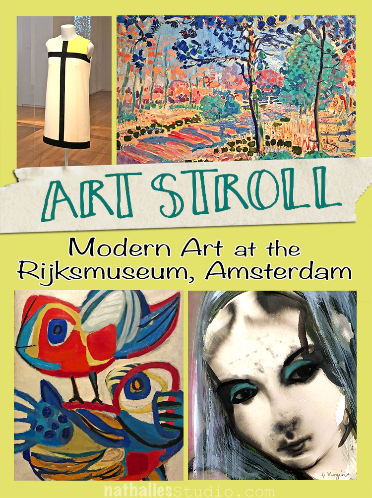
Mondrian Dress, Yves Saint Laurent, 1963, wool, silk lining

The abstract geometric visual language of De Stijl in the 1920s inspired a new generation of artists forty years later. The French couturier Yves Saint Laurent won international success with dresses inspired by the paintings of Piet Mondrian. This is the most elementary model of the six variants presented by Yves Saint Laurent in 1965.

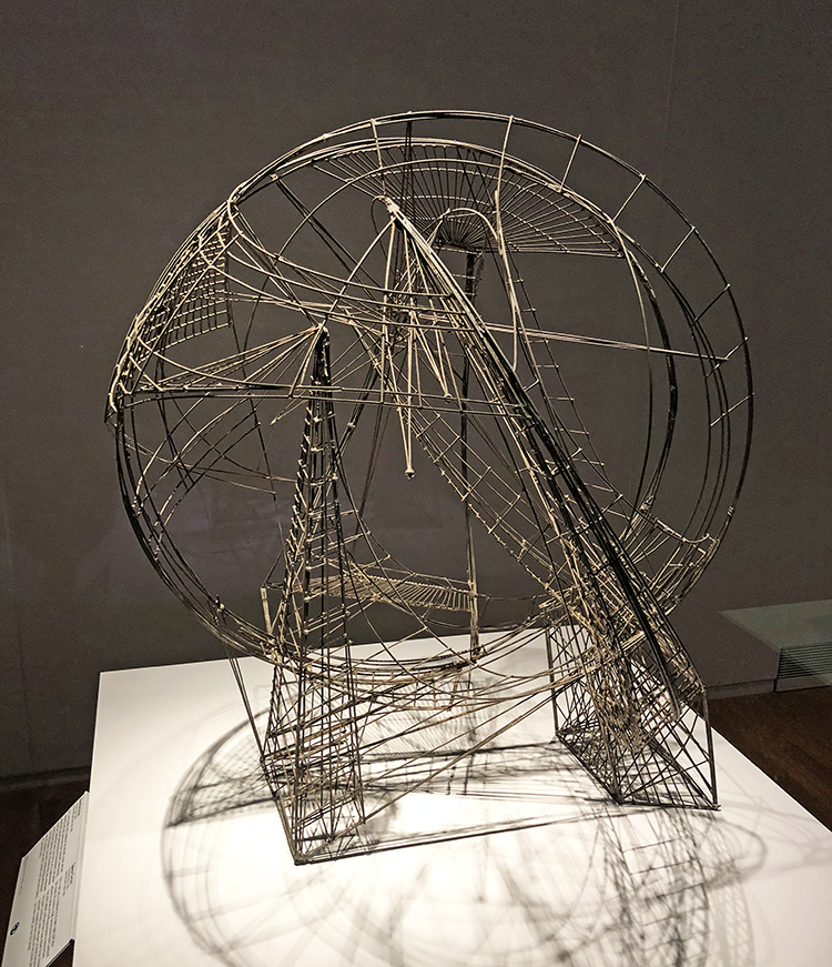
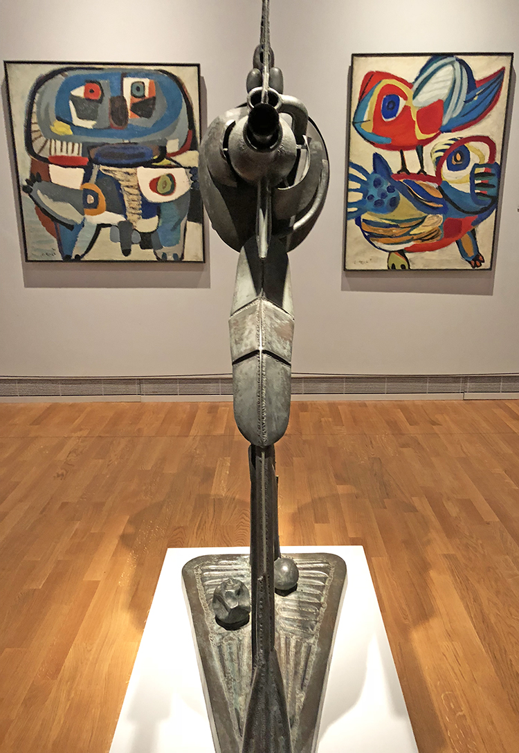
Space Circus, Constant, 1956 – 1961, soldred wire

This is not just a sculpture in its own right, but also the model of a meters-high construction that Constant wished to install on the Museumplein in Amsterdam. The small ladders indicate that it was meant to be climbed. This giant climbing frame was part of New Babylon, Constant’s imaginary metropolis of the future populated by homo ludens, or man the player.

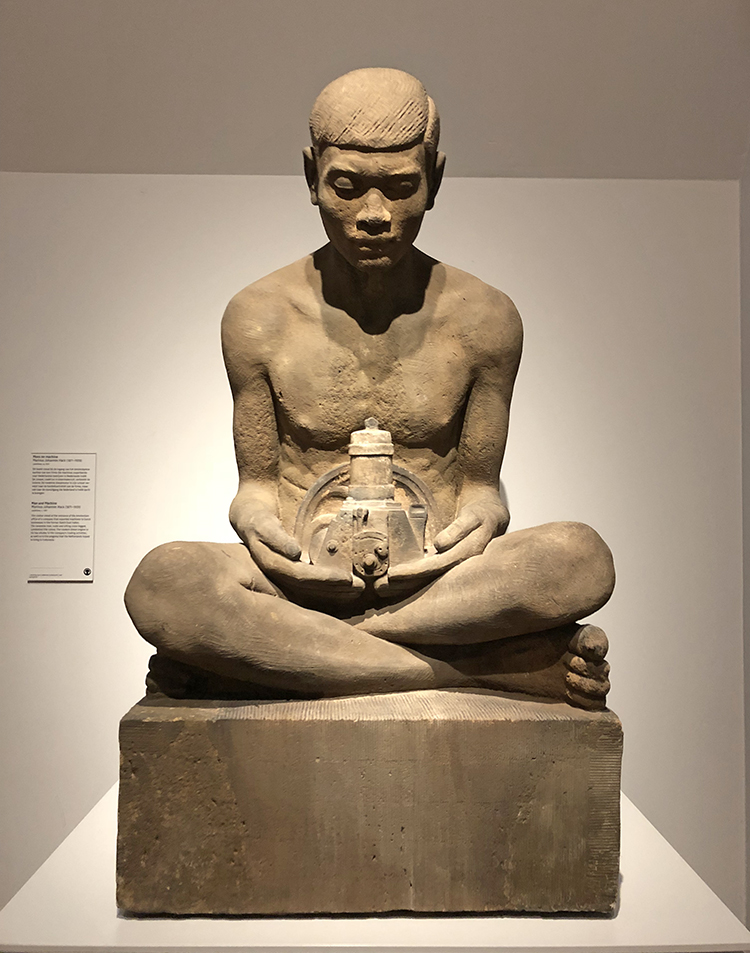
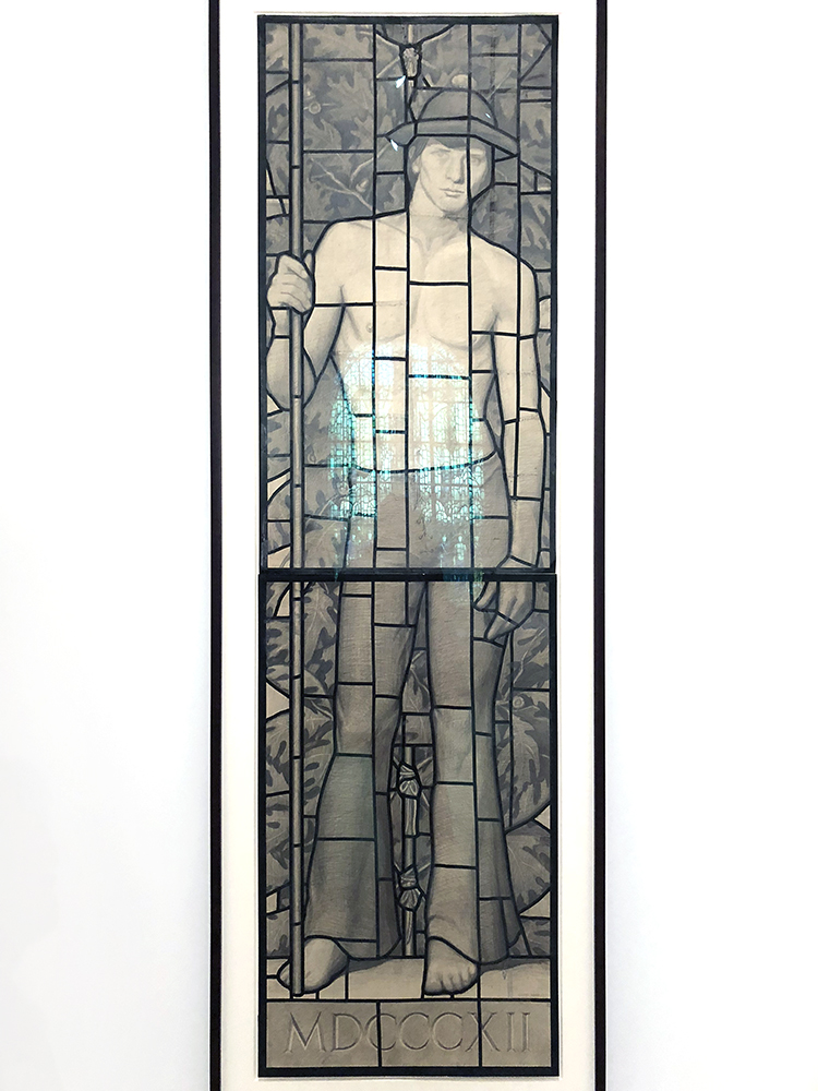
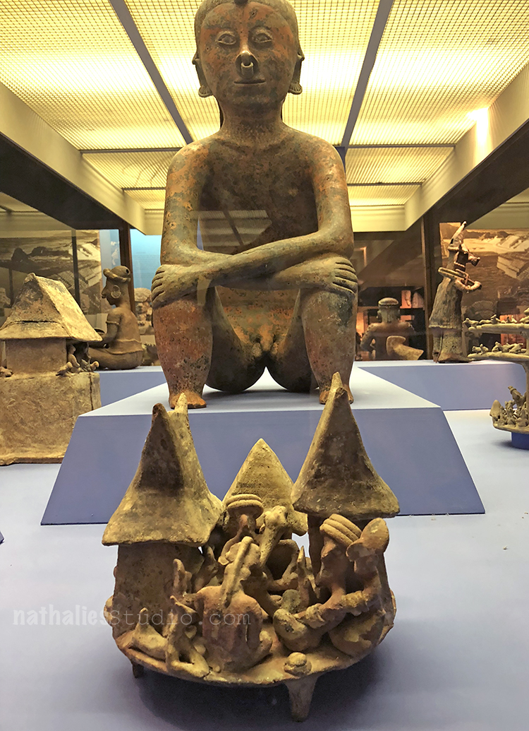
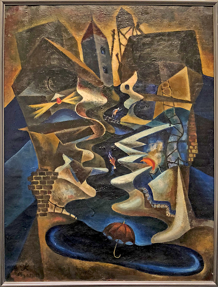
Man and Machine, Marinus Johannes Hack, c. 1913, sandstone

This statue stood at the entrance of the Amsterdam office of a company that exported machines to Dutch businesses in the former Dutch East Indies. The Javanese man, nude and sitting cross-legged, symbolizes the colony. The modern diesel engine in his lap alludes to the company’s trading activities, as well as to the progress that the Netherlands hoped to bring to Indonesia.

….mhhhh….

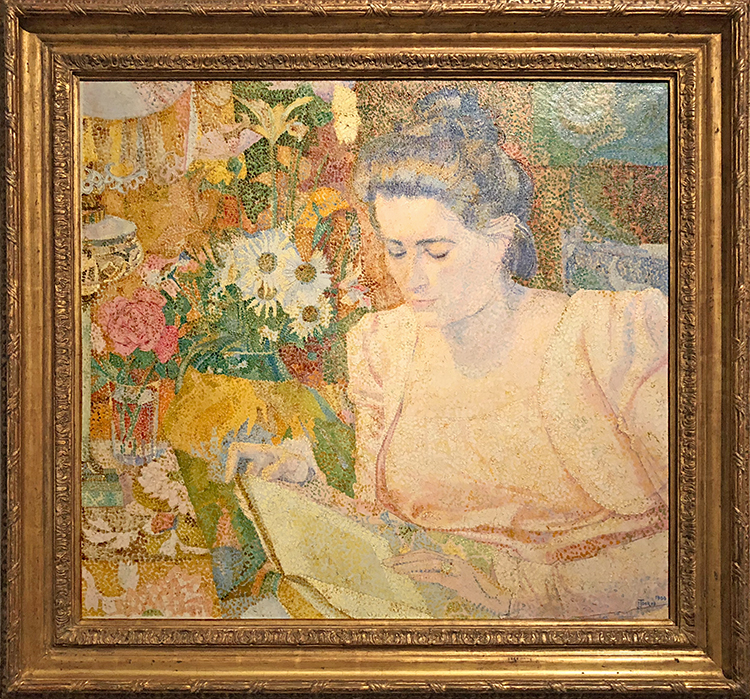
Portrait of Marie Jeanette de Lange, Jan Toorop, 1900, oil on canvas

Marie Jeanette de Lange chaired the Vereeniging voor Verbetering van Vrouwenkleding (Association for the Improvement of Women’s Clothing), which championed hygienic, loose-fitting, natural clothing that allowed women greater freedom of movement. In February 1900 she posed at home, dressed comfortably, for Jan Toorop. Using tiny dots of colourful paint, he created a sparkling portrait of a modern woman on the threshold of a new century.

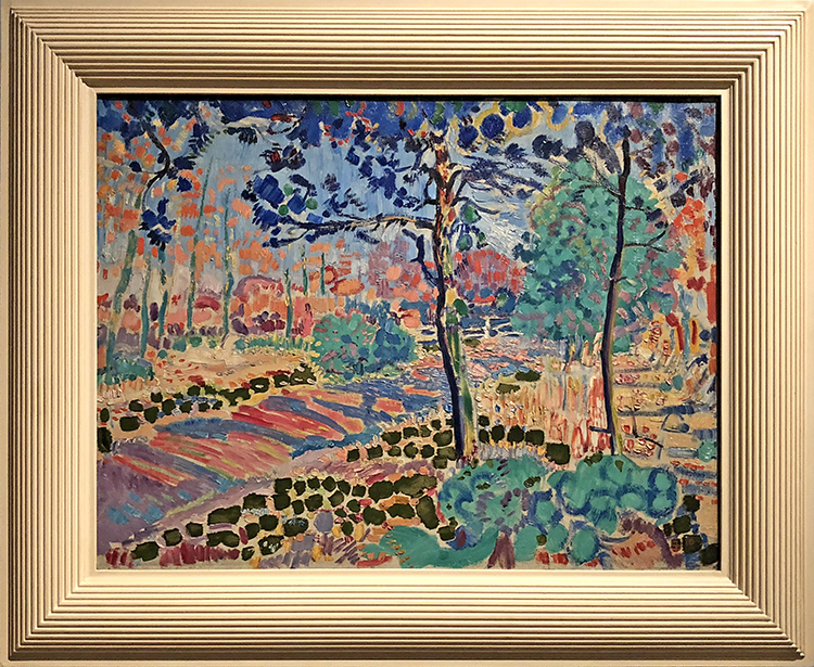
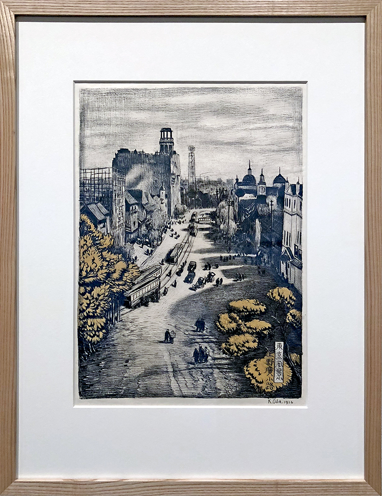
Road through the Woods, Jan Sluijters, 1910, oil on canvas

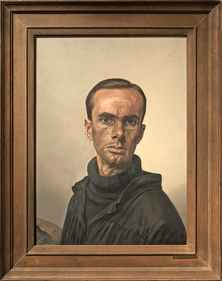
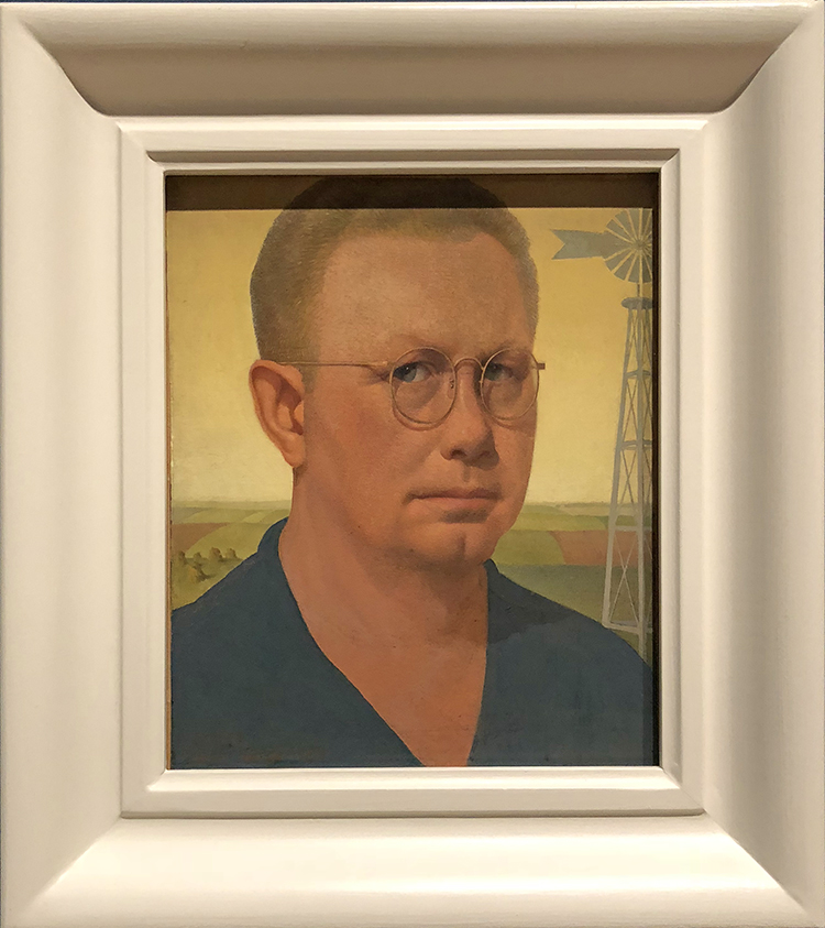
Self Portrait, Edgar Fernhout, 1945, oil on canvas

Edgar Fernhout often painted himself by way of practice, coolly and objectively as though he  were an object. However this is not the case of this self portrait done in the last year of the Second world War; Five years of German occupation and a famine, the so called Hunger Winter 44-45, show in his gaze and gaunt face. After the war he abandoned realism and painted mostly abstract landscapes.

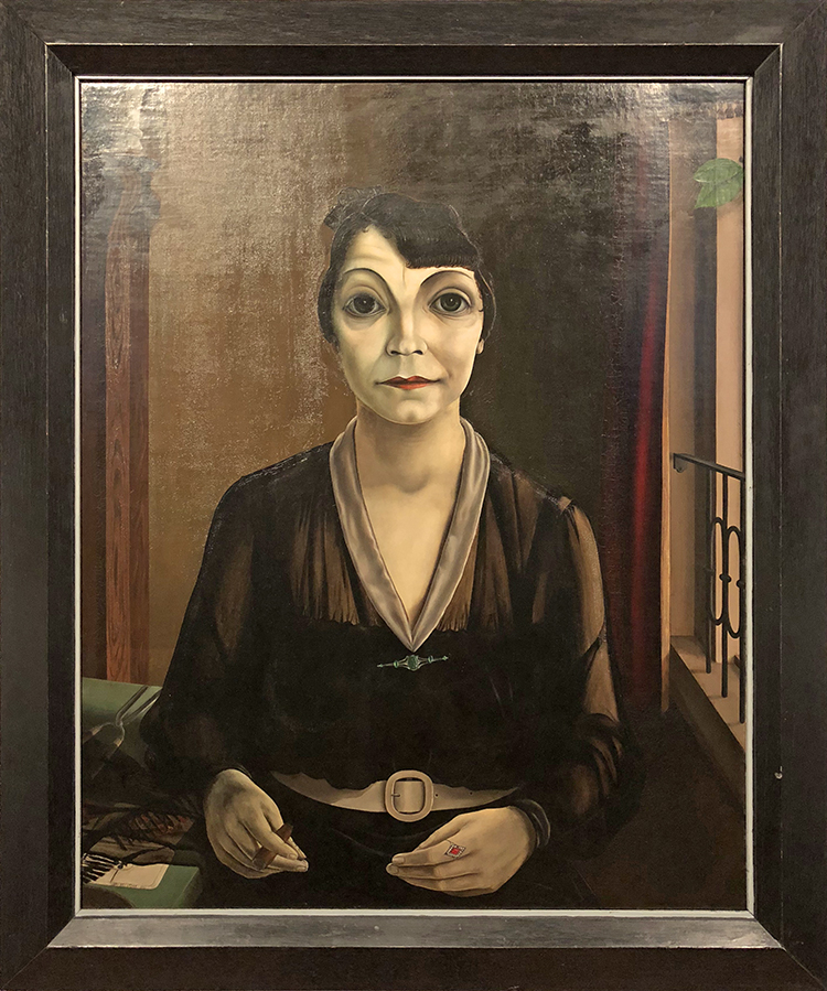
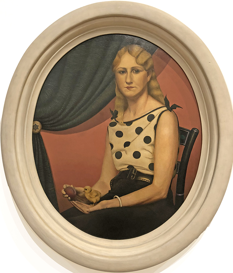
Mercedes de Barcelona, Pyke Koch, 1930, oil on canvas

the playing cards in this picture suggest that this woman is a fortune teller. Her large unreal eyes, too, seem to suggest some mysterious fate. In 1930-31 Koch painted three women of “questionable virtue”; in addition to the fortune teller, he portrayed a street girl and a fairground woman. He gave all three the facial features of the Danish film star Asta Nielsen, whom he so admired, with a broad mouth and high arched eyebrows.

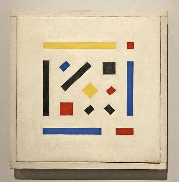
Composition, Bart van der Leck, 1918, oil on canvas

Bart van der Leck, one of the first artists to become involved with De Stijl magazine, limited his palette to primary colours – red, yellow and blue – along with neutral white, black and grey. He always took a recognisable design as his starting point, reducing this to a Composition of pure, geometrical forms. He described what he tried to achieve as ‘monumental clarity

Composition, Jozef Peeters, 1921, oil on canvas

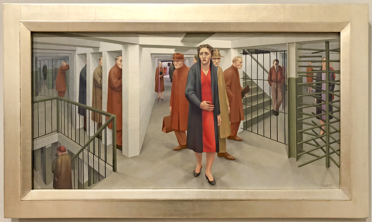
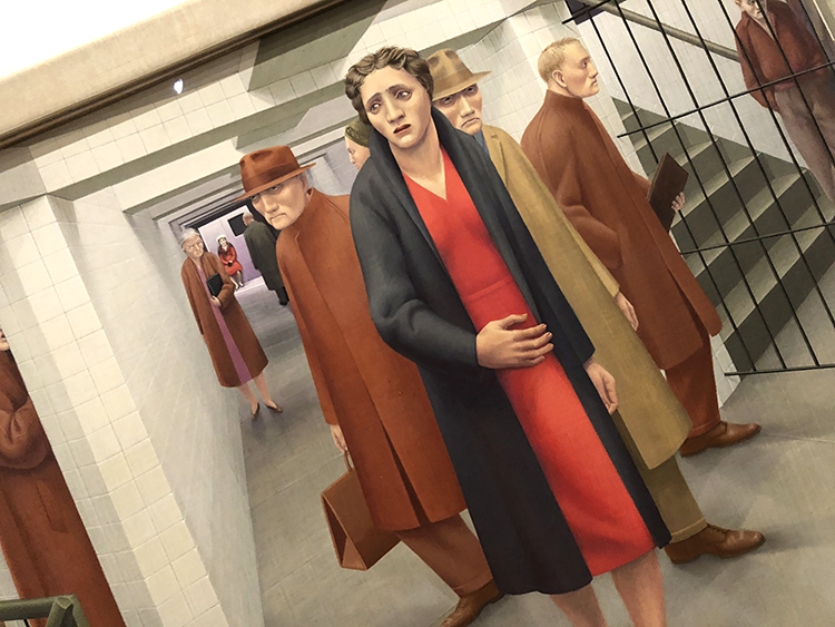
As editor of the cultural magazine Het Overzicht Jozef Peters maintained  close contact with other pioneers of Abstract art, such as the Dutch artists affiliated with De Stijl journal as well as up-and-coming talents including Carel Willink. Although Peeters championed pure Abstract art divorced from reality, his daughter later wrote that the Paris Underground was the inspiration for this Composition

Composition Liebe (Love) Carel Willink, 1923, oil on canvas

In Berlin of the 1920s the disillusionment of a lost war (1914-1918) was drowned in drink, lust, and love. However, art and culture also flourished as never before. In this melting pot the young art student Carel Willink soaked up the influences of Italian Futurists, Russian Constructivists, French Cubists and German Dadaists like a sponge. All of these styles reverberate in this painting, in which figures merge in the lamplight of the metropolis.

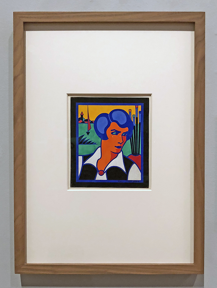
Self Portrait , Elly Tamminga, ca. 1920-55

Elly Tamminga peers at the subject she is painting outside the picture plane. The paintbrushes in the vase are her tools. The sailing boat of the silhouetted village with a church tower on the embankment behind her are small and therefore farther away in the distance. Atmospheric perspective is avoided, however and volume is suggested only by the two shades of red in her face and blue in her hair.

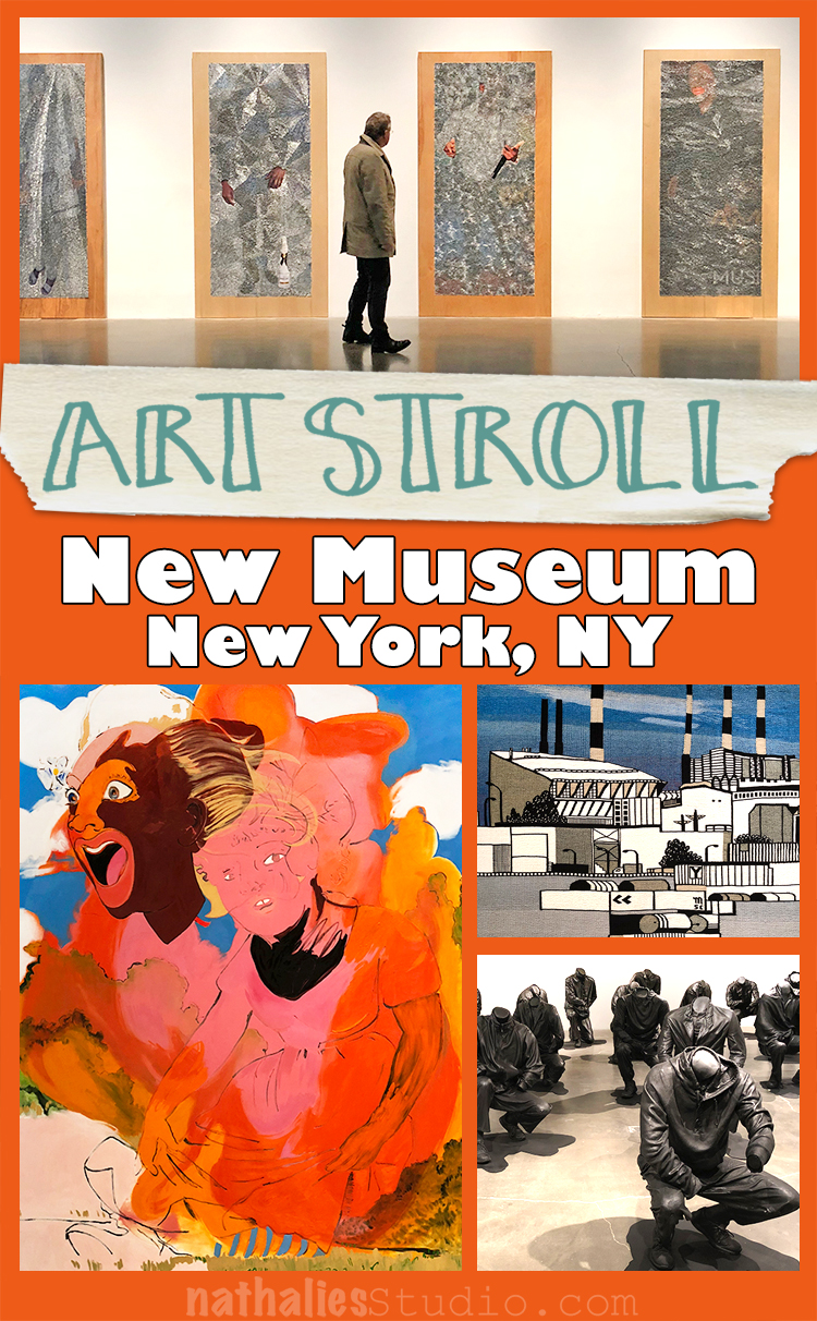
It was a really interesting art stroll through Modern Art – and I loved getting introduced to some new to me but well known Dutch Artists as well. Hope you enjoyed this Art Stroll as well :)


And if you missed my Summer Sizzler sale, don’t worry you can still save $$ on my stencils over at the big Mary Beth Birthday sale at StencilGirl! Use the coupon code MBS14 to save 14% off, now through July 8th at 11:59pm CST.

Receive 14% OFF all my StencilGirl stencil designs HERE!
Use code:  MBS14
$100+ orders** CHOOSE 1 FREE Large STENCIL***
***You MUST put the L### in the comment box at checkout. Sorry, no exceptions.
**6 of the same size 10% discount is applied first! $100+ orders post-discount.
*Sale does not apply to wholesale accounts or StencilClub membership.
The stencil sale begins July 6th and ends July 8th at 11:59 p.m. CST

SaveSave

Comments (1)

  • Janene

    |

    There are so many things to comment on:

    The Yves St. Laurent dress: I wish it was hanging in my closet. It’s still classically beautiful even though it’s 55 years old.
    The Elly Tamminga work: love the colors and the strength she exudes.
    The “Portrait of Marie Jeanette de Lange” by Jan Toorop: all those tiny dots! I wonder if there’s an underpainting to help guide the color placement. I’m in awe.
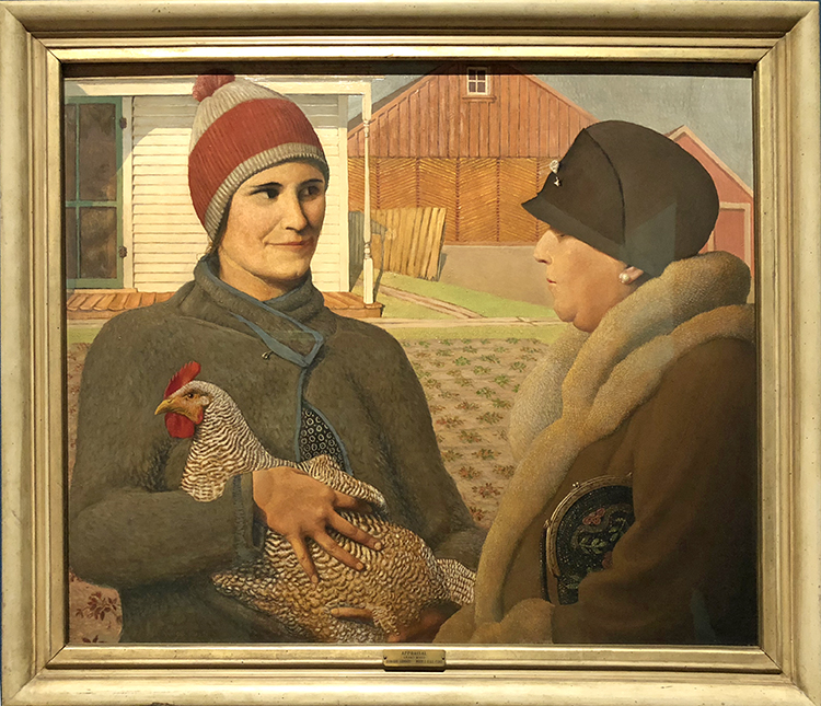
    The “Man and Machine” sculpture: I’m not sure I would interpret it as “modern diesel engine in his lap alludes to the company’s trading activities”. I think it says something else entirely.
    And there are no words for the brilliant placement of the nails in “Standing Figure” by Karel Appel.

    Thanks for the amazing virtual visit to the Rijksmuseum.

    Reply

Leave a comment

Art Stroll: Whitney Museum – Permanent Collection

I always enjoy time at the Whitney – it is a short 15 minutes PATH ride from here and every time I am there I also enjoy seeing changes in the permanent collection.

Florine Stettheimer, New York, Oil on Canvas – 1918

I love this painting – how Stettheimer worked the folds of Lady Liberty’s toga, the view , the frame!

Japer Johns, Two Maps, 1965,Encaustic, oil, found paper and cotton on canvas

just look at the details – swoon!

Louis Lozowick, Strike Scene, 1935 – Lithograph

What an impressive print – it also kind of blew my mind how much work went into into creating the plate and the print showing a split of a second moment – being so used to photography nowadays.

Reginald Marsh, Death Avenue, 1927, Oil, charcoal, fabricated chalk, and ink on canvas

This painting shows the “Death Avenue” as it was called before the 1930s – and before the elevated train tracks were built – nowadays more known as the High Line. The freight line would frequently cause the death of a pedestrian. Marsh chronicled everyday urban life in his paintings.

When asked for his advice to young painters, Marsh replied, “How to draw? Go out into the street, stare at the people. Stare, stare, keep on staring. Go to your studio, stare at your pictures, yourself, everything.”

Charles Demuth, Buildings, Lancaster, 1930, Oil and graphite pencil on composition board

Thomas Hart Benton, Poker Night, 1948, Tempera and oil on linen

This is a scene from the theatre play A Street Car Named Desire. The story is that the painting was a commission and the female actor on the right looking into this mirror was totally offended by her portrayal since she was not wearing anything like the neglige in the painting.

Fairfield Porter, Portrait of Ted Carey and Andy Warhol, 1960, Oil on linen

In 1960, Warhol and Carey commissioned Fairfield Porter to paint their portraits. They thought they could save money by requesting a double portrait which they planned to cut in two, each taking his half. But Porter foiled their scheme by posing them so closely together that they could not divide the forty-inch-square of painting without ruining it. Warhol ended up buying Carey’s share and ultimately giving the portrait to the Whitney Museum of American art in New York.

Good on you Fairfield- well played :)

George Tooker, The Subway, 1950, Tempera on composition board

I always feel haunted by this painting and cannot stop looking at it.

The people look trapped, the woman seems anxious. Where is she going? What are the guys doing in the cubicles? Is it modern live anxiety …or the anxiety of living in an Mc Carthy era? I always think about the later.

Rockwell Kent, Moonlight, Winter, c. 1940, oil on linen

Agnes Pelton, Untitled, 1931, Oil on canvas

I hope you enjoyed the little Art Stroll through the Whitney – see you soon again with a different stroll.

Comments (4)

  • Sue Clarke

    |

    Well played indeed Fairfield Porter!
    I always enjoy your strolls although The Subway is just bizarre enough to make me uneasy. LOL

    Reply

  • Pam Hansen

    |

    I really enjoyed this, thank you for sharing your stroll. ❤️

    Reply

Leave a comment

Art Stroll: Bodys Isek Kingelez at MoMA

A couple weeks ago my friends and I went to the opening of Bodys Isek Kingelez – City Dreams at MoMA.

Bodys Isek Kingelez (1948 – March 14, 2015) was a sculptor and artist from the Democratic Republic of Congo, mostly known for his models of fantastic cities made of cardboard and packaging.

This exhibition is the first solo retrospective the institution has ever organized for a black African artist. Wow …hey MoMA what took you so long?

Kingelez started to build his city sculptures in the beginning of the 80s.

To make a living he worked as a restorer at the Institut des Musées Nationaux du Zaïre. He got the job after he took one of his maquettes to the museum. The staff there found the sculpture so sophisticated that they accused him of stealing it and demanded that he’d create another one in front of them, so they could proof he was lying. Kingelez created a piece in front of them and the institution offered him a position.

Though the cities and buildings he created were fictional, they were built as an optimistic view of architecture’s power to change a city’s circumstance.

The curator Sarah Suzuki said ” He saw himself as able to help people understand how to live in a more harmonious, peaceful, beautiful, lively, world, one with candy-colored, translucent structures that constitute a proposal for how to live better.”

He once said, “A building without color is like a naked person.”

there is a lot to take in with this show

First the details as you zoom in

then all the different materials used

then the recognition of known or unknown architectural structures

and lastly more complex the search for meaning.

Going with my friends was as always wonderful – it is always fun to see what your friends point out and see.

The exhibition runs until the end of January and I will for sure come back.

It just spoke to me in a joyful way- exploring and figuring out what he used and how it works.

I wouldn’t want to live in a city like this in real live- thinking of it in a real way actually seems oppressive.

I hope you enjoyed this little art stroll :) What did you think about it?


Comments (3)

  • Curtis

    |

    Lovely article Nat. I appreciate your take on this exhibit, and your insightful detail photos. I especially appreciate the shot of the twin-cone building.

    Reply

  • Sue Clarke

    |

    Funny, the first thing that I thought of while looking at your photos was when I went to Legoland in FLA and saw the cities that took years to create. So much detail!

    Reply

Leave a comment

Art Stroll: Grant Wood at Whitney

A couple weeks ago I went to see Grant Wood: American Gothic and Other Fables at the Whitney Museum.

To be honest besides American Gothic I wasn’t very familiar with his work and I was curious about the show.

Sunlit Studio, ca. 1925-26, oil on composition board

The exhibition started with his earlier work and then went to the first portraits.

Victorian Survival, 1931 – Oil on composition board

With it’s rounded edges, elaborate frame, and sepia tones, Victorian Survial purposely resembles the late 19th century tintype of Wood’s great aunt on which this work is modeled. With her stiff upright pose and tightly combed hair, the sitter’s old fashioned demeanor contrasts sharply with the modern technology of the rotary dial phone. Wood’s ambiguous symbolism inspires many interpretations. To some the contrast between the figure and the telephone is a humorous commentary on the trope of the gossipy spinster, while to others it has been interpreted as a clash between Victorian insularity and modernity.

Whatever it means…it made me smile

Plaid Sweater, 1931. Oil on composition board

Woman with Plants, 1929 – Oil on composition board

Wood used his mother as the model for this portrait. Taking his cue form the practice in Northern Renaissance art of depicting portrait subjects against a landscape background with symbolic objects, Wood presented his figure holding a sansevieria plant, known for its ability to survive under the most inhospitable growing conditions, in front of a backdrop of rolling Iowa hills.

American Gothic- we all know that one :)

The American Golfer, 1940 – Oil on board

Daughter’s of Revolution, 1932, Oil on composition board

In this painting Wood aimed to ridicule the Daughters of the American Revolution for their claims of nobility based on ancestry, which  he saw as antithetical in their celebration of democracy. The artist painted three of the group members in front of a reproduction of Emanuel Leutze’s painting of General George Washington crossing the Delaware River, contrasting the future president’s dynamism and bravery with the Daughter’s stiff poses, contemptuous expressions, and the inconsequential action of raising a teacup. New York critics celebrated the painting’s biting satire when it premiered at the Whitney Biennial in 1932, with one calling it “as delicious as it is wicked”  but it was met by protests from various DAR chapters that deemed it un-American.

mhh- why a chicken and a peach (?) – see I did not read up on this …what is your interpretation?

Self-Portrait- 1932

Appraisal, 1931 – Oil on Composition Board

I love this painting the difference between the rich lady and the lady from the farm, the look – the clothing – with little hints- a security pin on the jacket on the left, a brooch pin on the hat of the lady on the right. One holding a hen, one holding a handbag.

The Midnight Ride of Paul Revere, 1931 – Oil on composition board


Boy Milking Cow, 1932 – Oil on canvas, cut out and mounted on fiberboard

Very iconic yet so different form this portraits in the beginning

Grant Wood’s Farmer With Pigs and Corn (1932)

on the top and button are Studies for “Dinner with Threshers”, 1933 – Graphite pencil, opaque watercolor, and colored pencil on paper

Arbor Day, 1932 – Oil on composition board

January, 1940-41 – Oil on composition board

I actually really love this painting. It is one of the last paintings Wood created before his untimely death from liver cancer, January has a decidedly nostalgic cast. According to the artist, the painting was “deeply rooted in the memories of my early childhood on an Iowa farm. . . . it is a land of plenty here which seems to rest, rather than suffer, under the cold.”

It was an interesting exhibitions, and good to learn that Grant Wood was much more than just American Gothic. Some of the portrait paintings where truly fun and interesting it makes you wonder how to decipher the symbolism in them. Hope you enjoyed this Art Stroll.

Comments (4)

  • Sue Clarke

    |

    I could look at Sunlit Studio for a while…such detail and shadowing.
    I was not familiar with any of these except American Gothic and it’s nice to see some different and fun symbols used.
    Thanks for the stroll Nat.

    Reply

    • nathalie-kalbach

      |

      so glady you enjoyed his work especially Sunlit Studio. It was awesome for me as well to learn more about his work. thank you for joining the stroll!

      Reply

  • Bea

    |

    Yes, I enjoyed it. Would love to see it in person. Thanks…

    Reply

Leave a comment

Art Stroll: Whitney Museum – An Incomplete History of Protest

In April my friend Thomas and I visited the Whitney and the exhibition

It was interesting, thought provoking, strengthening, powerful, emotional and…incomplete…So many different ways to protest, so many different topics to protest, so important to think about this today.

Detail of what covered the whole entrance wall

Jaune Quick-to-See Smith – Celebrate 40,000 Years of American Art, 1995 – Collagraph.

Quick-to-See Smith baded the standing rabbits in the collagraph on ancient North American petroglyphs. She has noted that dominant narratives of American history typically beging with the arrival of Eurpeans in the “New World”. Her work counters this notion.

Mark Bradford, Constitution III, 2013  Found and cut paper and acrylic on canvas

While initially resembling a purely abstract painting, Mark Bradford’s piece contains excerpts from the United States Constitution. His embedding of this language within an aggressively worked surface suggests that the founding document is also a living one, subject to modication and debate.

Above and below – Kara Walker -Photolitograph and screenprints.

Jeffrey Gibson, I Know You Have a Lot of Strength Left, 2017 Rawhide, acrylic , graphite, metal tacks and canvas on panel.

M

General Idea – active 1969-1994 – Toronto, Canada – AIDS, 1988

The collaborative General Idea altered Robert Indiana’s well known “LOVE” icon from the 60s and changed it to read AIDS. The images appeared on the streets in different cities, in the NY subway system, in art galleries, and in mass media. The concept behind the works was akin to advertising: spread awareness about AIDS by making art so ubiquitous that it would become part of the social unconscious. Six years later, in 1994 the two of the three members of the collaboration, Felix Partz and Jorge Zontal died within month of another from AIDS related complications.

Guerrilla Girls is an anonymous group of feminist, female artists devoted to fighting sexism and racism within the art world

Anti Vietnam War Posters

Faith Ringgold (b. 1930), Hate Is a Sin Flag, 2007. Acrylic, graphite, and ink on paper

Ad Reinhardt, Abstract Painting 1960-66 – Oil on linen

“From 1953 until his death in 1967, Ad Reinhard focused exclusively on a series of untitled works that came to be known as the “black paintings”. The paintings are pared down to a predetermined arrangement of elements with little sign of the artist’s hand  immediately evident. In the 1950s and 1960s Reinhardt contributed his time, art and money to civil rights causes and he vocally opposed the war in Vietnam. ”

I am always intrigued by the way how artists create artwork that are political statements, it is a powerful. I am not a political artist but I am a political person and I welcome art that makes me think, provokes feelings, or consider maybe even other views. I hope you found this little art stroll interesting, it made me think a lot about the past and the now and the future, about symbols, and words, and most of all, about the power of art.

Comments (2)

  • Sue Clarke

    |

    Wow. Mark Bradford’s piece really makes me think.
    Hate Is A Sin is hard to read and so powerful.

    Reply

Leave a comment

Art Stroll: American Museum of Natural History, NYC

A couple weeks a friend and I went to the American Museum of Natural History. It was the first time in 17 years I was back there and I really enjoyed it. Now …I know that is going to be a question for some … “Wait…an Art Stroll there? But is it Art?” …Welllllllll….let’s think about it LOL

I loved the subway art when you get out of the subway station at the museum – lot’s of mosaics of different animals- here a beautiful bird.

Love the gorgeous windows …that would be a really cool stencil, don’t you think?

“The dioramas at the American Natural History Museum, when they were first built, were an opportunity for people to see a world that most didn’t get to travel to,”

I also think they are beautiful artistic interpretations of landscape painting.


The explanation about Japanese woodblock printing was amazing  – I really enjoyed all the little displays about crafts and arts in different countries.

In Japanese tradition there is a recognition of a spiritual quality in all materials, which must not be negated. Therefore each wood block for the printing process is used from both sides for each stage in a progression of the print. The use of only one side would deny the wood its total efficacy.

I loved seeing the different stages of the print- for this art form. …or is it a craft form ….well…what do you think?

gorgeous pieces of hand made containers and dishes

kids toys

and even drawings as explanations of certain pieces in the museum as well

Gorgeous sculptures – some of them actually not the real deal but remakes- but I would only know when reading the signs


and beautiful patterns

gorgeous pottery …anyone thinking of Picasso here? Why is his pottery art ..but this is craft?

gorgeous earrings …well ….maybe a bit tough to wear for me …but look at the inlay!

These two llamas were some of my favorites!

It was different and fascinating …and I know it is for some a far fetch to call some of the pieces art …but hey …it is an interesting ongoing question and if it is inspiring to me – then there you go…it is an art stroll. That’s all that counts…for me on my blog anyway – LOL  – but what do you think?


Comments (6)

  • Sue Clarke

    |

    Yes, those windows would make a terrific stencil!
    The blue block painting with the birds caught my eye right away.
    It’s all art to me.

    Reply

  • ARHuelsenbeck

    |

    Thanks, Nathalie! I love going to the museum with you.

    Reply

  • Janis Loehr

    |

    Thanks Nathalie… very much enjoyed this stroll and your comments. Art isn’t just on paper of course. Three dimensional art. The word “craft” doesn’t get the respect it deserves. Thanks again!

    Reply

    • nathalie-kalbach

      |

      I agree Janis – craft has this weird connotation of being less worthy …It is so interesting why that is.

      Reply

Leave a comment

Art Stroll: New Museum, NYC

A couple weeks ago my friend Thomas visited us from Germany and we spent a wonderful day with Kim and went to the New Museum in NYC for the Songs of Sabotage: New Museum Triennial 2018. This major exhibition, held once every three years, looks to highlight young, international artists working in a variety of media. .

Wilmer Wilson IV – staples and pigment print on wood.

Wilmer Wilson IV enlarges photos of people, most of them African-American, that he finds on fliers for parties and church events in his West Philadelphia neighborhood. He attaches the the prints to wood with thousands of staples so that the photograph is almost entirely covered, leaving just small sections clear.

Amazing from afar but upon coming closer eerie!


Gresham Tapiwa Nyaude – The New Zimbabwe (2018


Chemu Ng’ok’s paintings consider individual and collective identities and the role protest plays in their formation. Ng’ok was a student at Rhodes University in Grahamstown, South Africa, during the Rhodes Must Fall student protests, a social justice movement across universities in South Africa calling for the decolonization of education.

“Senzenina” (2018), an installation by the South African artist Haroon Gunn-Salie, memorializes the 2012 police massacre of striking miners in his homeland.

Cian Dayrit’s uses tapestry-like mappings, part fact, part fiction, of Philippine colonial history.

Zhenya Machneva, CHP-14 (2016)

Zhenya Machneva reflects on the collapse of the Soviet Union in a series of tapestries depicting scenes of industrial factories. Her use of traditional weaving methods mirrors the demise of traditional manufacturing in the wake of technological advances.

Janiva Ellis’s “Thrill Issues” (2017). Her vivacious paintings incorporate religious and racial stereotypes.

Daniela Ortiz, who is based in Barcelona, brings a selection of tabletop-size ceramic prototypes for anti-colonialist monuments, including a beheaded alternative to a Christopher Columbus statue in New York City. Ms. Ortiz has proposed replacements for monuments to Christopher Columbus in Madrid; Lima, Peru; and New York

Tomm El-Saieh, a Haitian-born painter based in Miami. His works are made up of tiny, obsessively applied marks

I really loved his work- I could get lost in it!

Tomm El-Saieh, Walking Razor (2017–18)

Claudia Martínez Garay, Cannon Fodder/Cheering Crowds (2018)

Claudia Martínez Garay deconstructs visual imagery in propaganda as a way of understanding worldwide labor and social movements. For the triennial, she scoured the International Institute of Social History in Amsterdam for posters and leaflets across the political spectrum, focusing on repetitive imagery of fighting warriors and animals. She is interested in how the same types of images have been used by right and left ideologies to manipulate the viewer. She reproduced the figures as painted wood cutouts and juxtaposed them attacking each other in this mural-size work.

It was an interesting and for sure thought provoking exhibition. It was interesting how different the three of us would “read” the artwork. This is the best part of an Art Stroll -going with different friends and then discuss. Highly recommended :)

Hope you enjoyed this Art Stroll to the New Museum.

Comments (6)

  • Sue Clarke

    |

    Wow…I’m totally loving the work of Wilmer Wilson IV!
    The detail in the staples…when just the hands show through…very powerful.
    TFS again…I look forward to your posts every day Nat.

    Reply

    • nathalie-kalbach

      |

      So happy to have you Sue!!! Hope you are having a wonderful weekend. Yes- the work of Wilmer Wilson IV was super powerful !

      Reply

  • Janene

    |

    So grateful to you for posting these diverse and amazing pieces. I keep going back to “Walking Razor” – the colors and tiny little texture-strokes are really intense, and very inspiring. I also really loved the Russian woven textile pieces. It’s not a medium I’ve ever worked in, so I appreciate seeing it up-close. Thank you again, dear Nathalie!

    Reply

    • nathalie-kalbach

      |

      Janene- yeah the Walking Razor was super intriguing and I kept trying to figure out how it was done. Just like for you the woven pieces are super interesting to me – painting with yarn :)

      Reply

  • Deb

    |

    Natalie,
    Thank you so much for continuing to share your Art Strolls. We get to see exhibits that we otherwise would not. Your last comment in this post about seeing how differently we each “read” the various pieces is so true. Good to have friends to discuss it with. The “debriefing” of the stroll.

    Love the variety of your blog posts. Have enjoyed your posts from your Japan trip and the subsequently inspired journal pages. I look forward to your daily posts. Thanks for all the effort you put into them.

    Happy Friday!
    Deb

    Reply

    • nathalie-kalbach

      |

      Happy weekend Deb-!!! so happy to have you and that you enjoy the blog!
      I love going with friends and talk with them about art. Our different backgrounds and experiences as well as different knowledge makes up for interesting “readings” and conversations. My friend Thomas is much older and so it was really interesting what his perspective was – plus his knowledge of Latin for some of the tapestry was unbeatable- LOL. Have a wonderful sunday!

      Reply

Leave a comment

Art Stroll: MoMA NYC

A couple weeks ago I went on an Art Stroll at MoMA – I love how there are always pieces exchanged in the permanent collection

James Ensor, Masks Confronting Death – 1988 – Oil on Canvas

I love the visual texture in this painting …yet the death masks are a bit disconcerting.

Pablo Picasso Woman Plaiting Her Hair – 1906

I love those three Picasso’s – it shows the development into cubism so well.

Pablo Picasso Bather 1908-09

Pablo Picasso Woman with Pears 1909

Ernst Ludwig Kirchner Street, Berlin 1913

Kirchner’s colors are always make my heart swoon!

Henri Matisse The Blue Window 1913 

so beautiful !

Henri Matisse The Morrocans 195-16

Matisse developed this painting of what he described as “the terrace of the little cafe of the casbah” in the years following two visits to Morocco in 1912 and 1913.

Paul Klee, Mask of Fear, 1932 Oil on Burlap

Jackson Pollock, Echo 25 – 1951

Jackson Pollock Easter and the Totem 1953

After 1952 dripping and pouring paint were no longer the primary means of expression for Pollock. The bright colors and expansive spaces anchored by large swaths of black suggest the influence of Henri Matisse, who was the subject of a large retrospective that Pollock would have seen at MoMA the previous year.

Robert Gober, Intaglio Print 2001

The Long Run was an exhibition I found very interesting. Innovation in art is often characterized as a singular event- a bolt of lightning that strikes once and forever changes the course of what follows. But artists are continual experimenting  longer after their breakthrough moments. Invention results from sustained critical thinking, persistent observation and countless hours in the studio. The exhibition shows artworks from the later years of certain well known artists.

Philip Guston – Edge of Town – 1969

“When the 1960s came along I was feeling split, schizophrenic, the war that was happening in America, the brutality of the world. What kind of a man am I, sitting at home, reading magazines, going into a frustrated fury about everything – and then going into my studio to adjust a red to a blue.” In 1968 Gaston emphatically embraced figuration and his new paintings were scathing and satirical, often implicitly addressing current events.

Willem de Kooning, Untitled III 1982

I could not believe how different this painting by Kooning was from everything I knew from him.

Elizabeth Murray, Do the Dance 2005 – Oil on canvas on Wood

A very interesting part of this exhibition was how many women were included in this exhibition …it makes you wonder why there are not more artwork of the exact same artists from earlier years are included in the permanent collection ..hey MoMA …you could step your game up a bit and then it would make this exhibition round !

Ed Clark – Untitled 2009

Cy Twombly always makes me swoon


Cy Twombly – the four seasons – 1993 -1994

swoon

Roy Lichtenstein – Study for Interior with Mobile – 1992 –

I was really sure how this was really different from the former work of Lichtenstein.

Andy Warhol – The last Supper –

James Rosenquist – Lady Dog Lizard – 1985


Frank Stella, Giufa, la luna, i ladri e le guardie 1984 – synthetic polymer paint, oil, urethane, enamel, fluorescent alkyd and printing ink on canvas and etched magnesium, aluminum and fiberglass

I love how Stella how was so minimalistic and colorless in the past embraced color late in his life.

Geta Brătescu Medea’s Hypostases VI – 1980

Geta Brătescu Medea’s Hypostases III – 1980

Geta Brătescu Medea’s Hypostases II – 1980

Again a women that I do not know much about ..but I do love those fabric pieces.

Lee Bontecou Untitled 1980-98

It was a fun and inspiring visit – it reminded me that you always have to keep going, exploring and being curious.

Hope you enjoyed the Art Stroll :)

Leave a comment

Art Stroll: National Museum of Modern Art- Tokyo, Japan

I spent a day in the National Museum of Modern Art in Tokyo and it was such a wonderful visit. It was refreshing to see Modern Art not from the usual suspects in Western Museums! The world …including the art world is so much bigger than what we think …it als always good to branch out and see things outside of the edge of our plates (probably a very German expression ;) )

Portrait of Chin-Jung,Sataro Yasui – 1934 – oil on canvas.

Yasui always sketched his portraits in a variety of angles and then intentionally combining different body parts from sketches with various viewpoints in an unbalanced way to create the impression the figure might begin moving at any moment.

The Five-Storied Pagoda of the Hokanji Temple, Kyoto by Kunitaro Suda, 1932 – oil on canvas

The area in the foreground of the pagoda is packed with utility poles and houses showing a striking contrast of changing times.

Wonderful views out …it was a gorgeous day

Junikai, a Twelve Story Building in Asakusa from Views of Tokyo by Kazuma Oda – 1916 – litography

Oda had a keen interest in the cities, especially in buildings that were undergoing a dramatic transformation during this period. The building depicted which was completed in 1890 was equipped with Japan’s first elevator. The tower was actually partly destroyed by the Great Knot Earthquake in 1923 and then demolished. Oda wrote immediately after the earthquake “Now, when I point to a tattered ukiyo-e print as a more durable thing than buildings constructed with reinforced concrete, you might laugh it off. But when we look at what the great earthquake has done, it becomes even more clear that I was not speaking thoughtlessly”.

Hirokoji Boulevard, Ueno from Views of Tokyo, Kazuma, Oda – 1916 – lithograph

Road to the Tank, Toshiyuki Hasekawa 1930 – oil on canvas

This gas tank was located in Senju and a unique Tokyo landmark. The color were just unreal!

Design for the Frontispiecie of Kodomo no Kuni, Harue Koga, 1932 – pencil and ink on paper

I loved this little dude!

Portrait of a Jewish Girl, Tomoyoshi Murayama, 1922 – oil, paper, wood and collage

Murayama dropped out of the university in Tokyo and went to Berlin in 1922, where he encountered various new Western art movements. The title of this work refere to a Jewish girl who lived downstairs in the rooming house where he stayed in Berlin. Such a beautiful piece!

Down, Taro Okamoto – 1948 oil on canvas


Flooded Town, Hiroshi Katsuragawa – 1950 – Oil on canvas

Illustration no. 12 ot the Novel The Wall by Abe Kobo, Hiroshi Katsuragawa 1951 – sumi, color on paper

another adorable dude!

Figure on the Back, Saburo Aso – 1961 – oil on canvas

The texture on this and the one below were incredible!

Mother and Child, Saburo Aso, 1959 – oil on canvas

Young of Grey Mullet, Seison Maeda, 1944 – Sumi on Paper

The title refers tot he young offspring of a fish called the gray mullet. the work makes it seem as though we are peering through the glass of a fish tank. It is a beautiful piece, unbelievable that it is not a photograph but a painting with sumi!

Girl, Gakuryo Nakamura, 1948 – Color on silk

Silk – so sheer and fragile and beautiful!

The whole museum was beautiful. Here are some tatami mats and some chairs to rest, the frames weren’t pompous but made sense with the artwork, everything was so tasteful and I noticed how orderly, quiet and thoughtful everyone was looking at the artwork – even at the most crowded special exhibition areas.

An Amazing Landscape, Gen’ichiro Inokuma – 1968 – oil on canvas

Purple Violet, Natsuyuki Nakansishi, 1983 – oil on canvas

a stunning piece with a 3D tactile effect.

Work, Toeko Tatsuno – oil on canvas

I love the pattern and colors on this piece!!!

It was such a great Art Stroll and I loved writing this post too because it made me look more into each of the artist’s work. What caught your eyes on this particular Art Stroll in Tokyo?

Comments (2)

  • julie b

    |

    Ok, sign me up for your new stencils and stamps based on the last stunning piece! Donna will take a set too.

    Reply

    • nathalie-kalbach

      |

      Awe- LOL- it is a beautiful pattern indeed! I hope to see you two in the summer when I am back in San Jose <3

      Reply

Leave a comment