Creative Squad

Creative Squad: Dear Mother Earth – Jordan Hill

Hello from my Creative Squad! Today we have a journal spread from Jordan Hill working in a junk journal and using my Mini Santa Fe Foam Stamp and our theme: Dear Mother Earth – Our planet Earth is an amazing and beautiful gift to all of us. Let’s write her a letter, telling her just how we feel. This could be an actual letter/mail art, an art journal page, or some other mixed media project.


Hello, everyone! I’m very excited to be back with my project for July! This month’s theme of “Dear Mother Earth” resonated with me quite strongly, since I tend to draw a lot of inspiration from nature for my artwork. I hope you enjoy following the process!
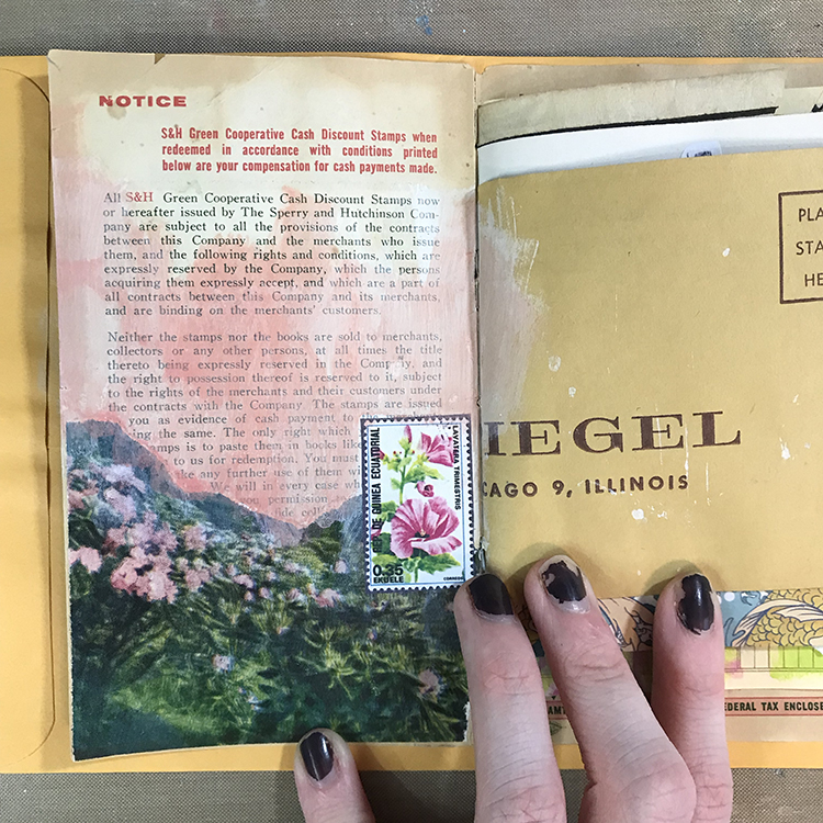
For this month’s project, I decided to work in a new little journal I made semi-recently; this is actually the first official finished spread.

I started things off by prepping my background. I selected a photograph from an old book, consisting of some beautiful pink flowers, which reminded me of this month’s theme of “Dear Mother Earth”. After tearing that photograph to size and gluing it down, I added some CraftSmart acrylic paint in Coral Pink and White (to create a color reminiscent of the flowers) and a printed image of a postage stamp that also featured pink flowers.
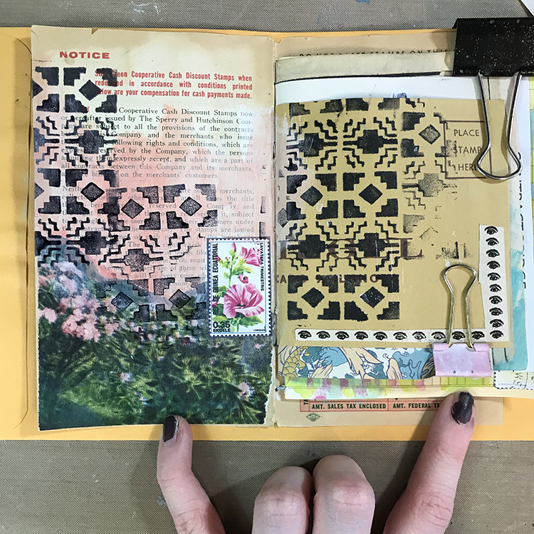
Next, I reached for Nathalie’s Mini Santa Fe Foam Stamp and some black ink, adding it over most of my spread. I’ve tried several different methods of applying ink and paint to these foam stamps in the past, but for this project I wanted to experiment with a stamp pad re-inker. I wasn’t sure if this would work or not, but the roll-on nature of the re-inker actually made it quite simple to cover most of the stamp and get a good, solid impression. I also found that the effect of using this type of ink was different than if I had simply used an ink pad.
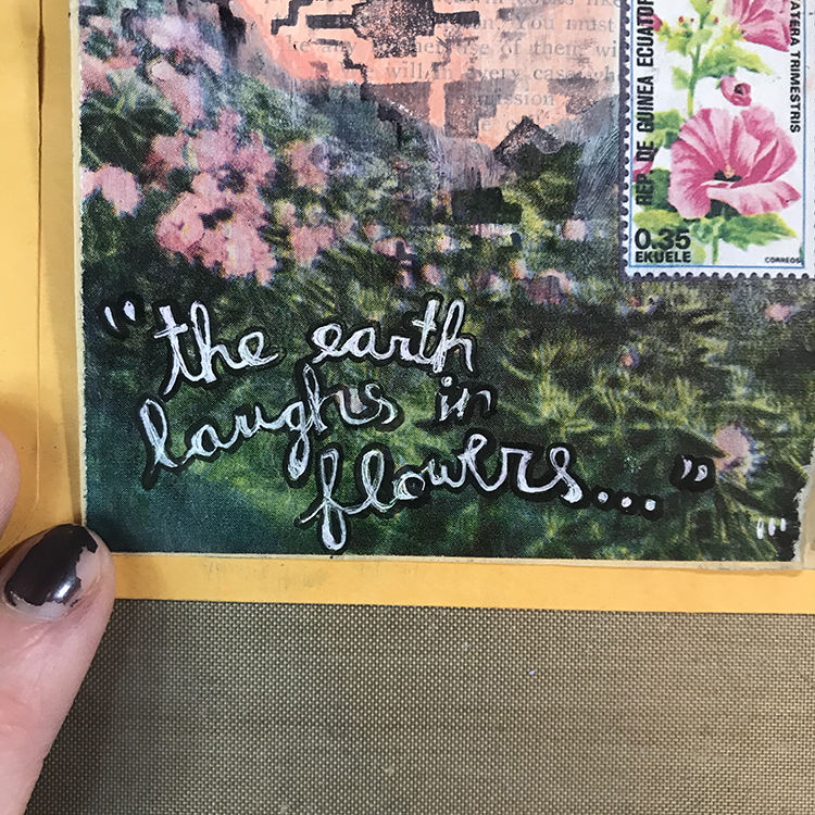
Usually, words are the last thing that I add to my art journal spreads, but for this month’s project, I got the urge to add them in earlier. I wanted to incorporate this quote (which again, reminded me of this month’s theme) in white gel pen over the photograph. However, because of the glossy finish of the photograph, the pen didn’t really want to adhere. In order to mend this issue, I used some clear gesso to paint over the photograph. The pen was a lot more willing to cooperate with me after that.

In addition to the white gel pen, I also outlined the words with some black ink to help it stand out that extra little bit.
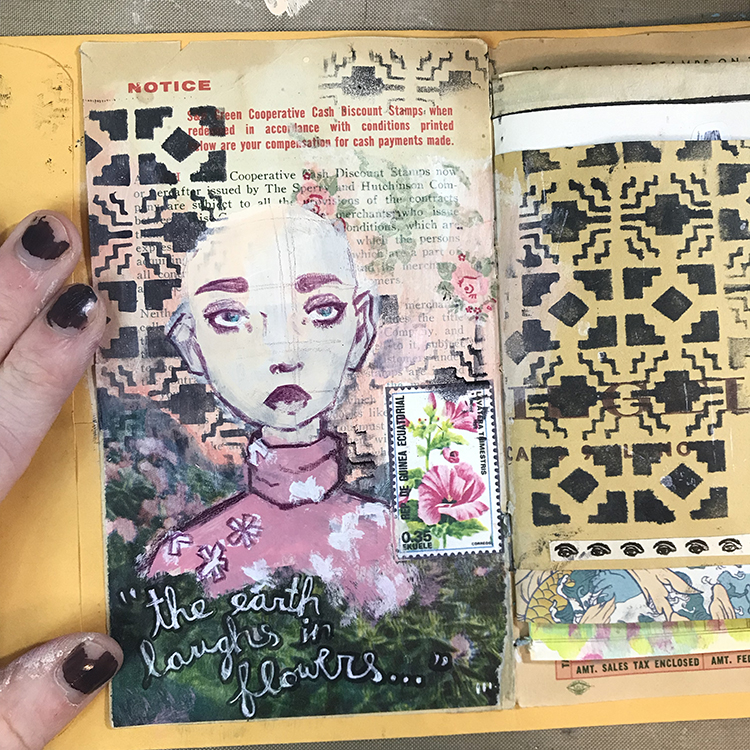
At this point, I was ready to add my focal point. I started out drawing a face, but I found myself wanting to spice up the clothing a bit. Instead of the tank top style shirts I typically dress my figures in, I used a turtleneck style for this character. After painting the top pink, I then added some little patches of white, which I later drew petals on top of, in order to give the shirt a pattern!

I also used a small piece of a paper napkin and some Mod Podge to collage another little interesting element into the background.
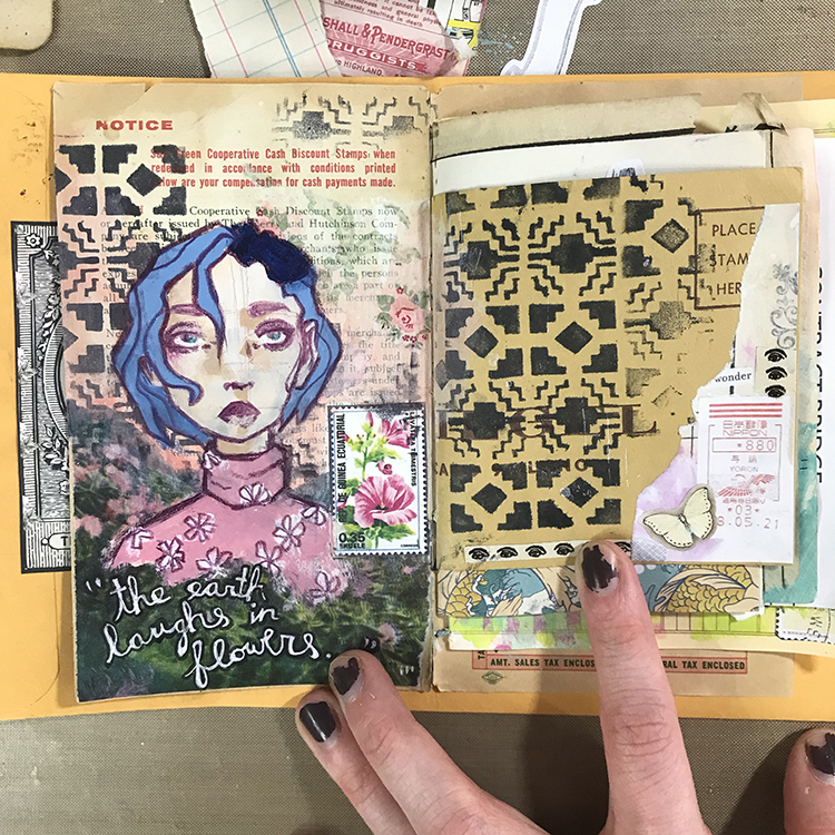
In order to finish off this spread, I gave the character some hair (which I’m actually quite fond of, and would love to have myself) using Liquitex Soft Body Acrylic in Prussian Blue Hue mixed with white, and added a small little collage cluster in the lower right hand corner of the page. When creating this collage cluster, I took care to choose colors and imagery that I felt fit with the left hand page, in order to tie the two together.

Overall, I’m very happy with the way this spread turned out, and I definitely think I’m going to be reaching for my stamp pad re-inker for use with my foam stamps again in the future!


Thank you Jordan – love that you worked in a junk journal for this one – great way to repurpose scrap papers!!!

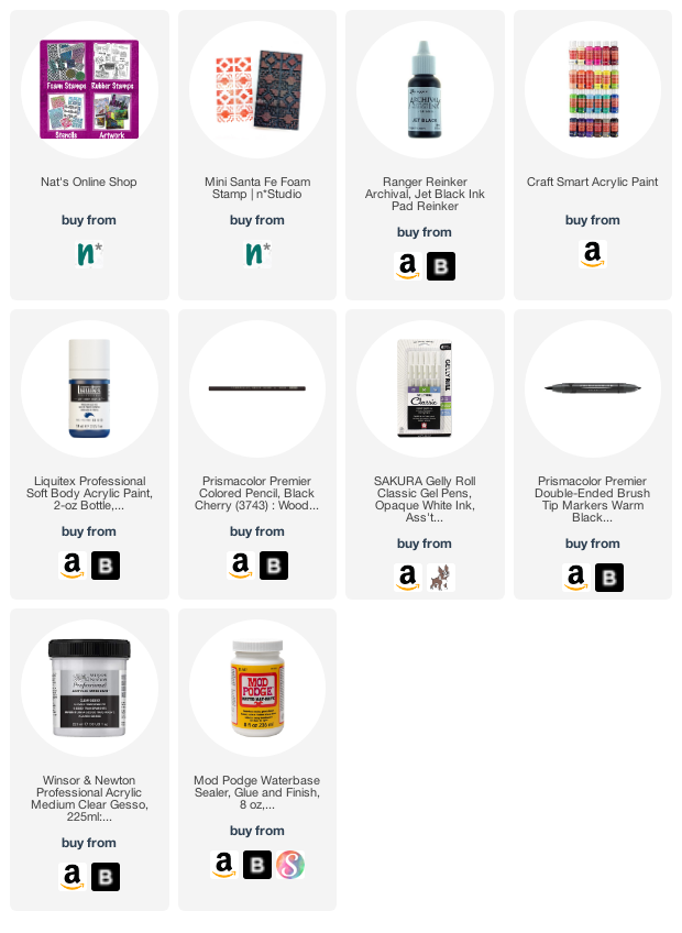
Give it a try: you can find all my Foam Stamps in my Online Shop and in addition to some collage elements, here are some of the supplies Jordan used:
For more from the Creative Squad check out Nat’s Creative Squad on Instagram too: Each week we post projects, ideas, and inspiration for mixed media art.
Leave a comment

Creative Squad: Dear Mother Earth – Robin Seiz

Hello from my Creative Squad! Today we have a lovely letter to Mother Earth from Robin Seiz using my Triple Play and Funky foam stamps and our theme: Dear Mother Earth – Our planet Earth is an amazing and beautiful gift to all of us. Let’s write her a letter, telling her just how we feel. This could be an actual letter/mail art, an art journal page, or some other mixed media project.


The theme this month is Mother Earth; she has a strong pull on me. From an early age, I was happiest swimming in streams, looking for tadpoles, and exploring the woods. Now my appreciation for Mother Earth is more about spending time doing things that bring quiet and peace. Vegetable gardening, pulling weeds, hiking, strolls on the beach, all feed my soul.

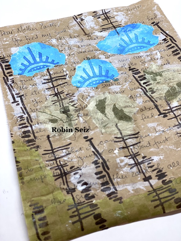
For my project this month, I have written a letter to Mother Earth to tell her what she means to me and to thank her for all that she provides. The last few months have been difficult caring for my sick mom; I have been reminded how much being in nature is important to my well-being.I have written this letter to document this time in my life and my refections. I plan to put my letter in an envelope, seal it and put it away for a later time. It wasn’t important that it be legible in the end, I’ll remember this time.

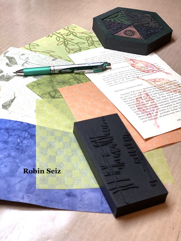
Using recycled material was important to me; after all, taking care of Mother Earth is important. I knew I want to use some collage elements so I chose papers I had in my stash which reminded me of the elements of nature. I didn’t use it all, but it gave me a place to start. I also used brown recycled package wrapping as the base for the project. I cut it to an 8” x 11 sheet.

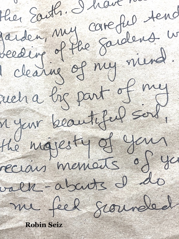
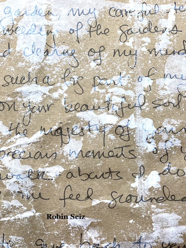
Next, I wrote my letter in black pen; the words flowed easily.

I wanted the writing to fade into the background. After I put my feelings down, it was no longer important for them to be legible. I used gesso to cover some of the writing. I applied it carefully so  that some words would show. 

Next I used diluted PVA to apply the collage elements. I chose green textured paper, blue gelli printed paper that was in my scrap box, and a natural tan paper with fibers that reminded me of leaves. I wanted the elements of Mother Earth to be represented.

After the collage elements were adhered to the paper, I used Nathalie’s Funky Foam Stamp which reminded me of twigs and Versa Fine Clair Ink. This stamp is so versatile. I also used one of the foam stamps from the Triple Play foam stamp set. Both of these were perfect for this project.

Having this prompt of Mother Earth came at the perfect time for me. I felt compelled to write a letter and express my sincere thanks for the peace and soulfulness that she has given me throughout my life. If you do art journaling, this would make a great journal page idea. I love the idea of writing a letter, sealing it, and putting it away for someday in the future. 


Thank you for sharing your story and inspiration behind this beautiful piece Robin. I love the idea of putting it in an envelope to revisit in the future too!

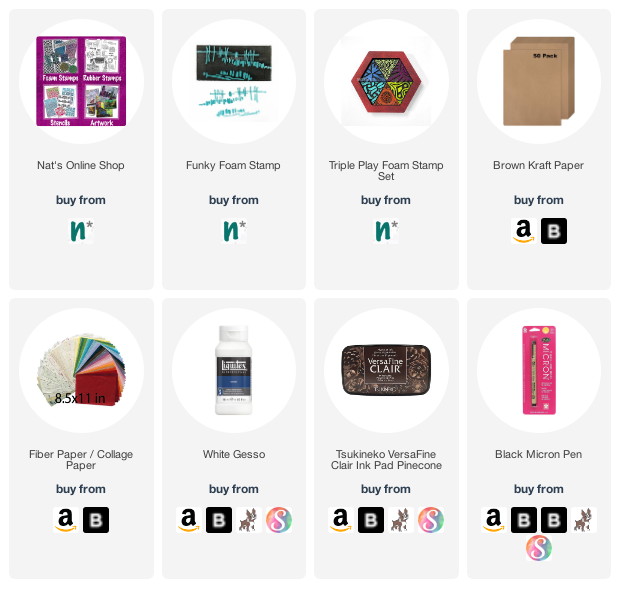
Give it a try: you can find all my Foam Stamps in my Online Shop and in addition to various collage papers, here are some of the supplies Robin used:


Like what you see? Follow the Creative Squad on Instagram for weekly posts, artwork, and inspiration.

Leave a comment

Envelope Transformation from my Creative Squad

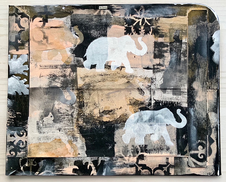
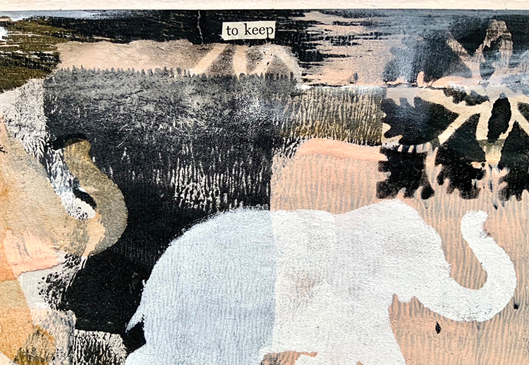
I’m sharing a gorgeous envelope transformation from Creative Squad member Judi Kauffman today. Instead of just recycling the shipping envelope her new stencils arrived in, Judi decided to give it new life and we love the results!

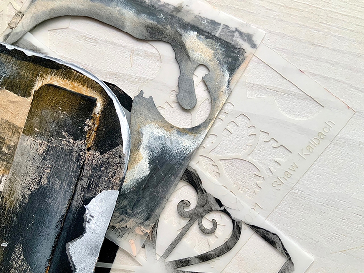
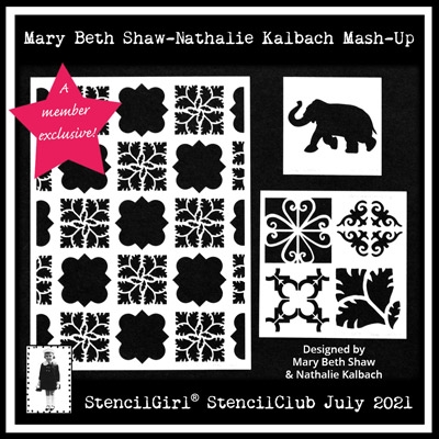
Judi received my new StencilClub mash-up stencils in the mail -the stencils are exclusive for StencilClub members, and you can learn more about that here and get the new 3 stencil set.

She shared her process with us:

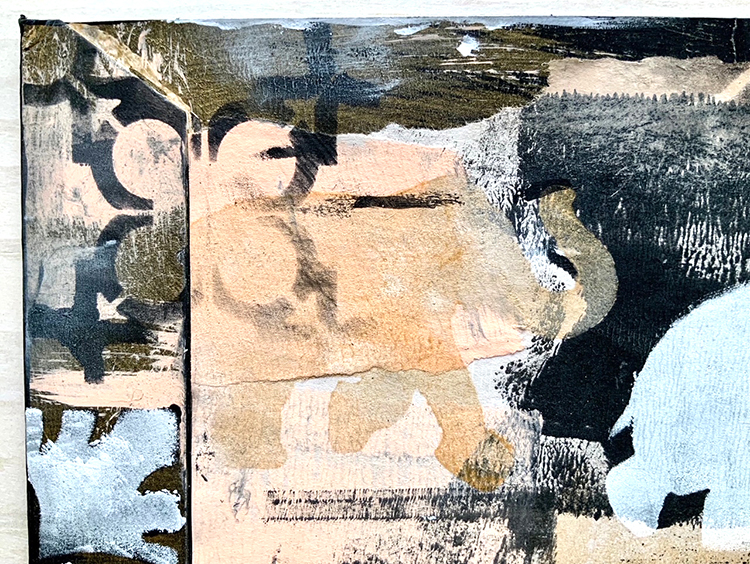
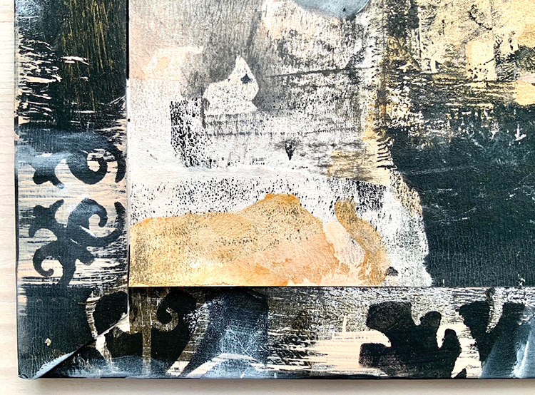
“I cut the shipping envelope from the stencils along two sides and rounded one corner to turn it into a storage folder for the new release. I painted the edges and trimmed down a piece of gift wrap  to fit between the two raised strips at the sides (cut edges at left, right and bottom but left it torn across the top). Then more stenciling with the pattens (but no more elephants…). I had the words “to keep” among my found poetry snippets and that seemed like the right text to add at the top edge.”

“I always keep the StencilGirl shipping envelopes to use as storage folders for my stencils, just hadn’t decorated any of them till now. I like being able to see the contents without digging inside.”

Fantastic idea Judi! Thank you for sharing.

Here is a link to the StencilClub so you can get a hold of these exclusive July 2021 stencils and begin decorating your own StencilGirl envelopes too :) 

Leave a comment

Seaside Inspiration from my Creative Squad

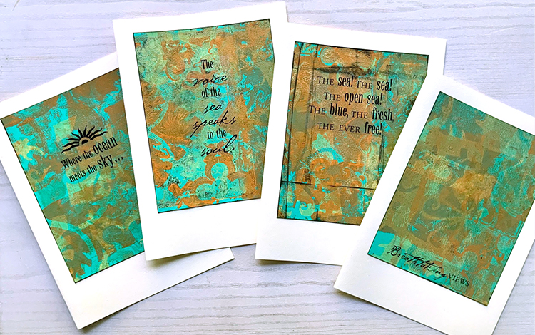
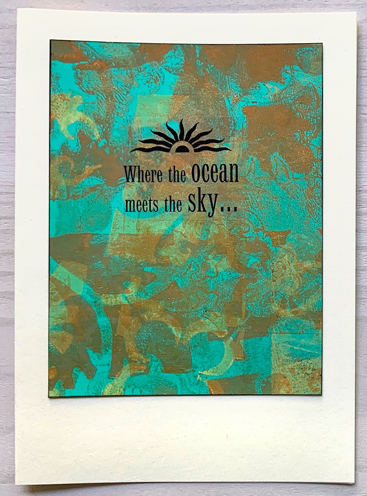
Today we have a series of cards from Creative Squad member Judi Kauffman. Is anyone else out there dreaming of the sea???

Judi is mixing up a lovely palette of colors and using a gelli plate along with my new StencilClub mash-up stencils for these cards and I’m really digging the subtle layers of pattern and color that she’s created. The stencils are exclusive for StencilClub members, and you can learn more about that here and get the new 3 stencil set.

In the meantime, let’s look at some of these cards:

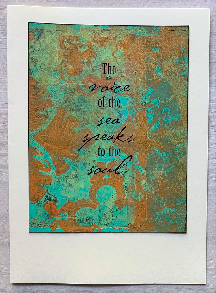
Judi used clear stickers for the words and phrases and it creates a seamless unity between the card’s sentiment and background.

She did her gelli prints on navy blue cardstock – giving them a nice depth of color.

One last look:

Here is a link to the StencilClub so you can find those exclusive July 2021 stencils. 

Comments (1)

  • Denise M. Krueger

    |

    Judi, these cards are stunning and speak to me of a beach visit!! Love the color combos too!

    Reply

Leave a comment

Creative Squad: Dear Mother Earth – Riikka Kovasin

Hello from my Creative Squad! Today we have a post and video from Riikka Kovasin who is sharing her mail art project and guess what??? You have a chance to receive one of these lovely envelopes from Riikka herself – read on to find out how :) They are a fantastic bunch, using my Grove Street foam stamp set and our theme this month: Dear Mother Earth – Our planet Earth is an amazing and beautiful gift to all of us. Let’s write her a letter, telling her just how we feel. This could be an actual letter/mail art, an art journal page, or some other mixed media project.


Bee Nice to Mother Earth

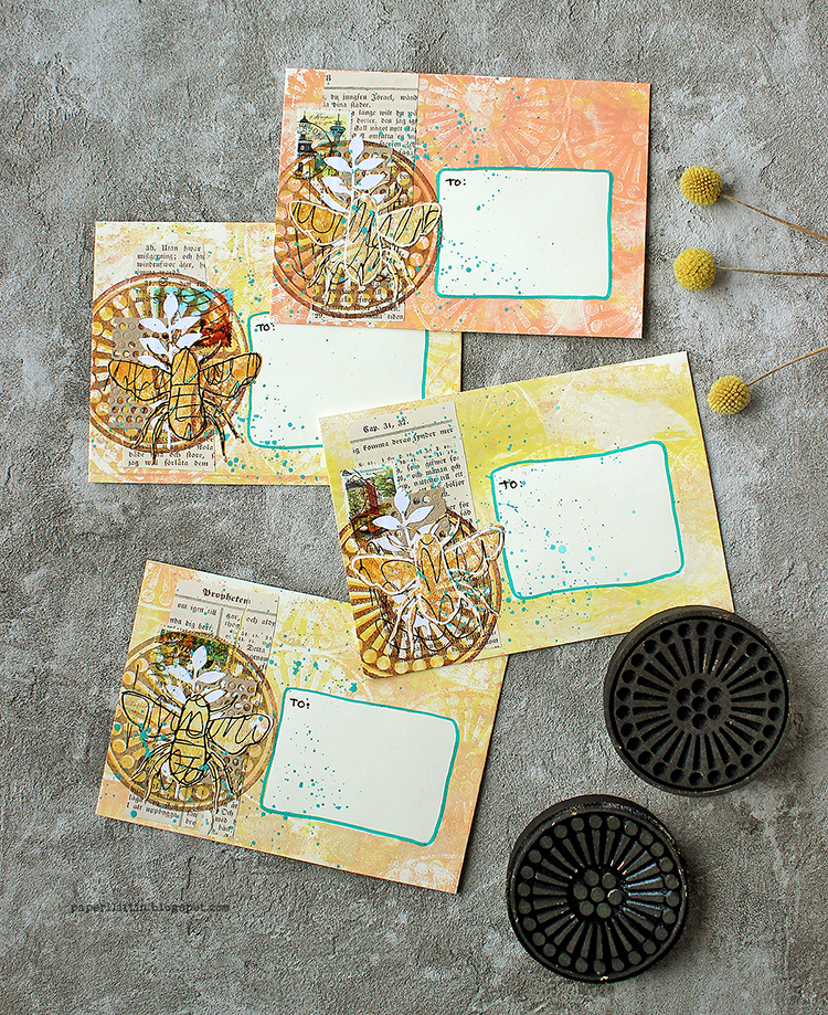
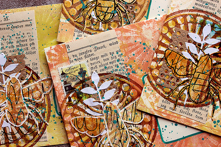
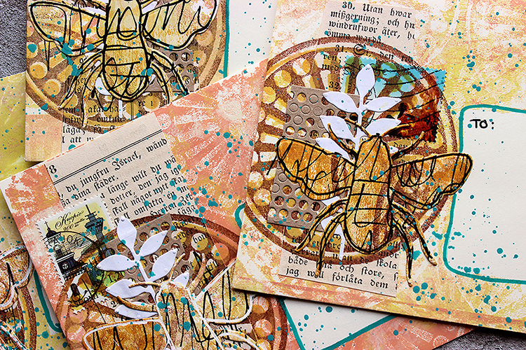
Heippa! It’s Riikka here with my project for this month’s theme of “Dear Mother Earth”. The theme mentions mail art so I jumped to this idea and decided to do a set of decorated envelopes to be sent out.

Mail art is an art movement with the idea of sending small works of art through postal services. The movement started in the 1950s and 60s. Mail art can take various forms such as postcards, envelopes or parcels. Some artists concentrate more on the envelope than the piece inside. Artists also can create their own postal stamps, called artistamps. 

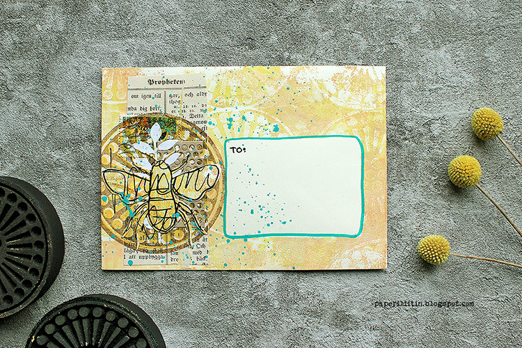
As I plan to send the envelopes out, I needed to create flat layers. I’m usually drawn to dimensional pieces and assemblages, but that kind of work wouldn’t hold through the mailing process without the protection of a parcel. According to some, mail art becomes mail art only after it is dispatched. Even though I actually am looking forward to seeing how the envelopes change in the mailing process, what kind of wear and tear they get, totally losing the added elements isn’t the thing. So, I made small, flat collages on the envelopes with the help of last month’s goodie – Grafix Double Tack Mounting Film.

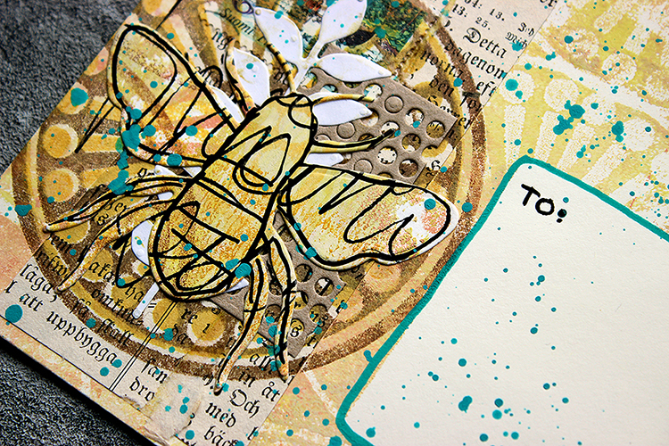
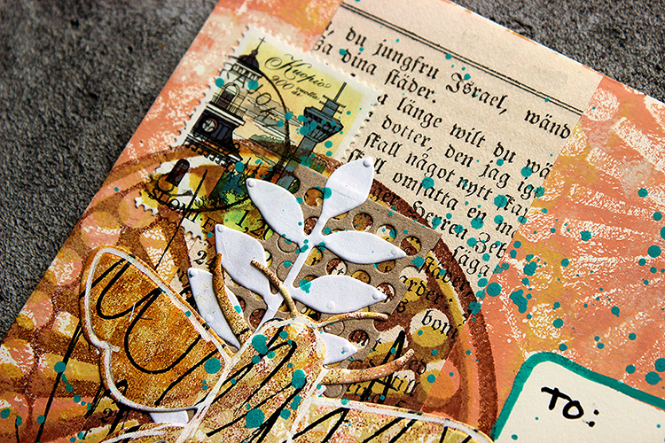
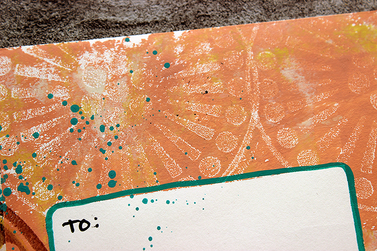
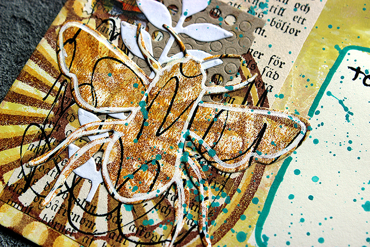
I first added a paint layer to the envelopes, masking off the placement of the address. I also made a separate collage sheet which I die cut to bees. I also die cut some leafy stems and a piece looking like dry wall tape. I collaged a piece of book paper underneath the die cut elements and added some stamping in there, too. If you wish to see how the envelopes came into being, please see the video underneath.

When thinking about the theme of Mother Earth, I had no option but to choose the “Grove Street” stamp set. I really like the pattern, but more important, the stamp was round and thus reminded me of Earth. As there’s been a lot of talk about the declining numbers of bees and insects, I felt that a honey bee would be a nice focal point in the layering. It somehow resonated with the nurturing Mother Earth theme, maybe partly because of the importance to the ecosystem as pollinators, but also through the Finnish national epic, Kalevala. There a honey bee flies to the heavens to bring a drop of golden honey to mother of Lemminkäinen so she can heal her son. I recently made an assemblage piece with that theme, you can see it here if you like.

And now comes the fun part! I’m sending these envelopes out and you could receive one. It’s first come, first served styled thing so if you wish to receive an envelope from me, please send me your mail address in an email. My email is rkovasin (a) gmail (dot) com. There’s a catch though – you need to send me a photo of the envelope when it has reached you as I want to see how it traveled! To make it worthwhile, I’ll pop something inside the envelope, too – a little note from me on a postcard picturing Finnish nature.

Thank you for stopping by today! Have a beautiful July!  Xoxo Riikka


Thank you Riikka – these are such lovely little artworks and I love that you will send them out into the world!

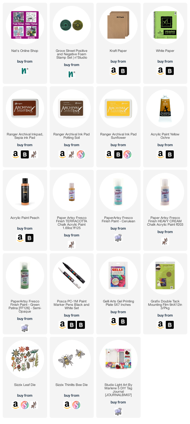
Give it a try: you can find all my Foam Stamps in my Online Shop and in addition to vintage book paper and postage stamps, here are some of the supplies Riikka used:

Follow Nat’s Creative Squad on Instagram too: Each week we post projects, ideas, and inspiration for mixed media art.
Comments (1)

  • Riikka Kovasin

    |

    Thank you for your emails! All the envelopes are now called for. :)

    Reply

Leave a comment

Stencil Inspiration from my Creative Squad

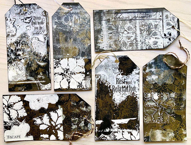
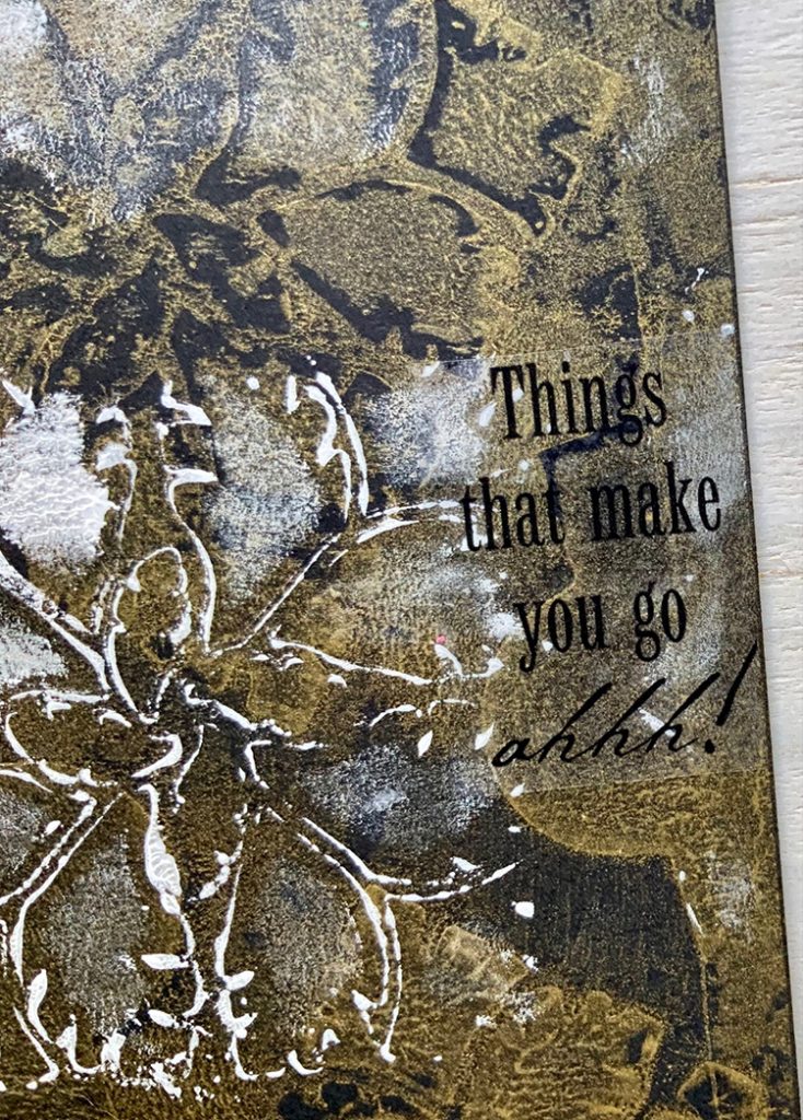
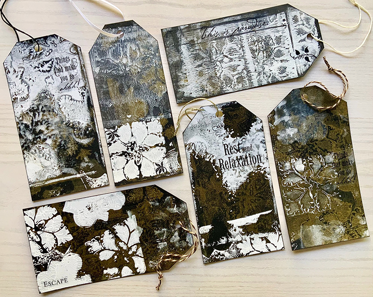
I’m sharing a suite of tags made by Creative Squad member Judi Kauffman today. With some stencils and just a few other supplies, Judi mixes big juicy texture, delicate layering, and bold pattern in these beauties.

She is using my StencilClub mash-up stencils that I designed with Mary Beth Shaw at StencilGirl Products. The 3 piece mash-up set is available exclusively to StencilClub members through this link.

Here are some of Judi’s tags using acrylic paint, a gelli plate, the stencils, and some word and phrase stickers:

I love how the patterns and colors blend and wash over each other. Here’s a closeup:

Judi is using black, vanilla, and bronze metallic paint.

Thank you Judi for sharing this grouping and for showing us how just a few stencils and colors of paint can yield so many lovely results.

Here is a link to the StencilClub so you can find those exclusive July 2021 stencils. 

Leave a comment

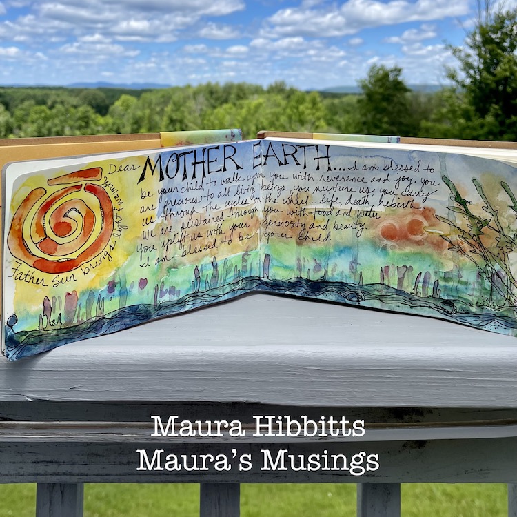
Creative Squad: Dear Mother Earth – Maura Hibbitts

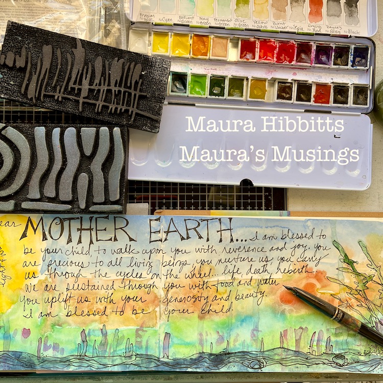
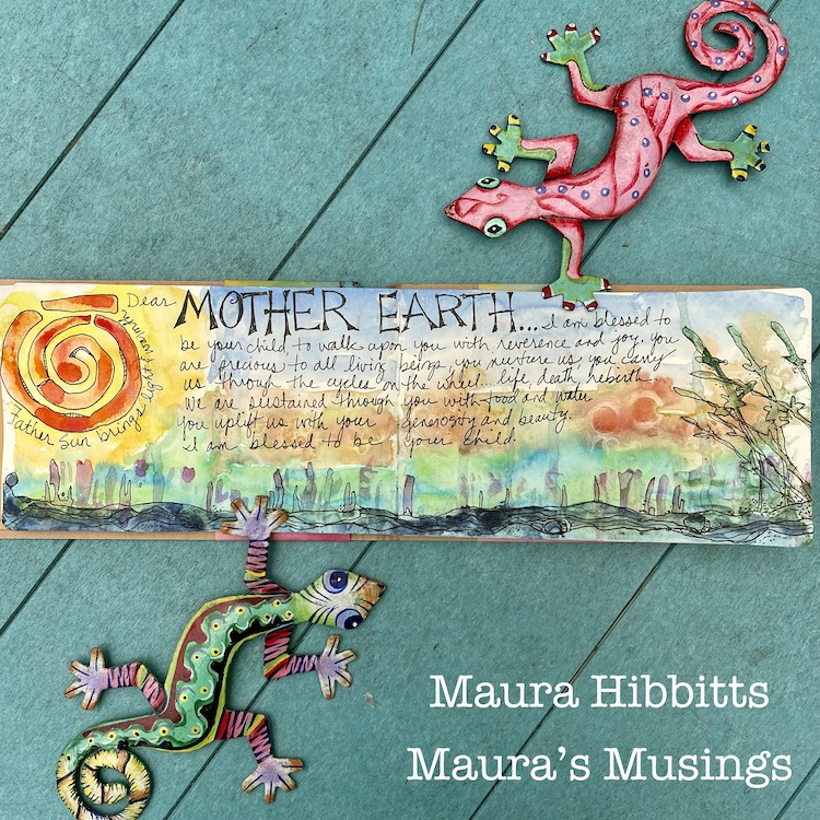
Hello from my Creative Squad! Today we have a really beautiful art journal spread from Maura Hibbitts that shares her thoughts on our planet using my Far Out, Groovy, and Batik Pattern 2  foam stamps and our theme: Dear Mother Earth – Our planet Earth is an amazing and beautiful gift to all of us. Let’s write her a letter, telling her just how we feel. This could be an actual letter/mail art, an art journal page, or some other mixed media project.


I feel like I have always been a child of nature. I grew up playing outside, roaming the woods, climbing trees, making art creations with whatever was at hand, leaves, twigs, nuts, and even making my own “ink” from charcoal and berries. Earth Day 1970 (yes, I know you are getting an idea about my age, lol) was a pivotal event in my life. I remember being in high school, and marching through the village in support of the earth. I had many arguments with my father, me being on the side of the environment, while he was on the side of industry. I don’t know that we ever resolved it, but one thing we had in common was gardening and growing our own food.

I came out of high school at the very beginning of the environmental movement. I studied forestry and worked in the field for a while, but quickly realized I enjoyed teaching about the environment more, so went back to school to teach science, earth sciences being my main focus. The paths in my life have curved and varied from those early days, but I still hold the earth close to my heart, and believe I have passed that love on to my sons.

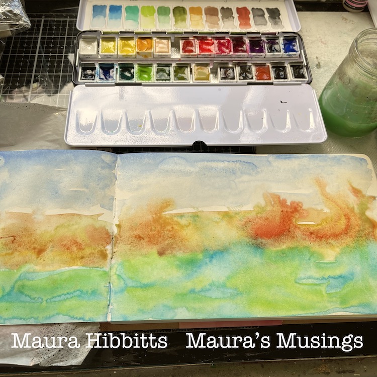
I decided to work in watercolor for this month’s project, the earth is covered in lots of water after all. I started by misting water onto the pages of the art journal, then blending layers of color across the pages, letting them bleed into each other.

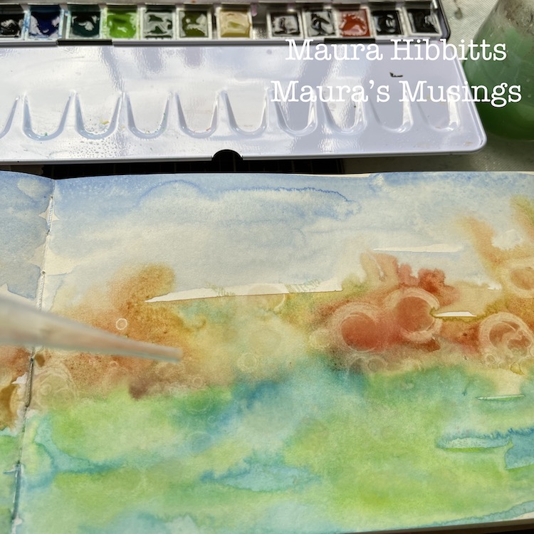
While the watercolor was still wet, I used a pipette and rubbing alcohol (over 90%) and dripped it onto the wet paint. It is really neat to watch it move the paint out like a resist. Let dry completely. Tip: you can speed it up with a heat tool if you want. When I do that, I heat both sides of the paper to remove the moisture.

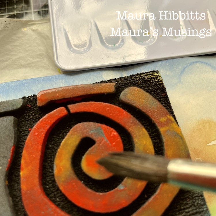
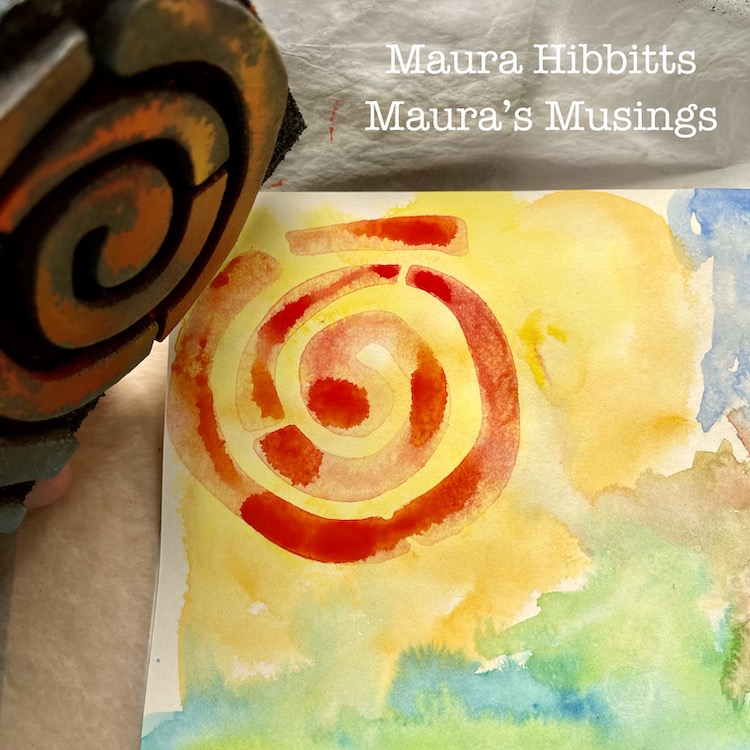
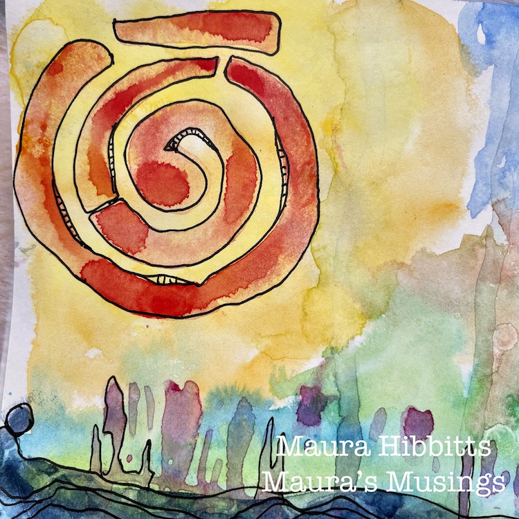
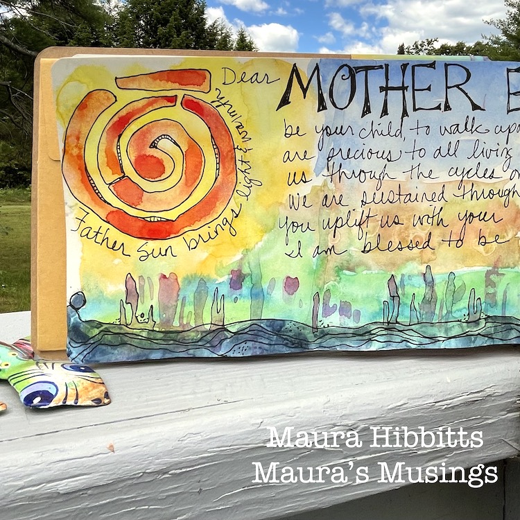
I played around with adding inks, but decided to continue with watercolor, so brushed on some orange and red to the Batik 2 circle area of the ArtFoamie. I stamped this into the yellow area of the page.

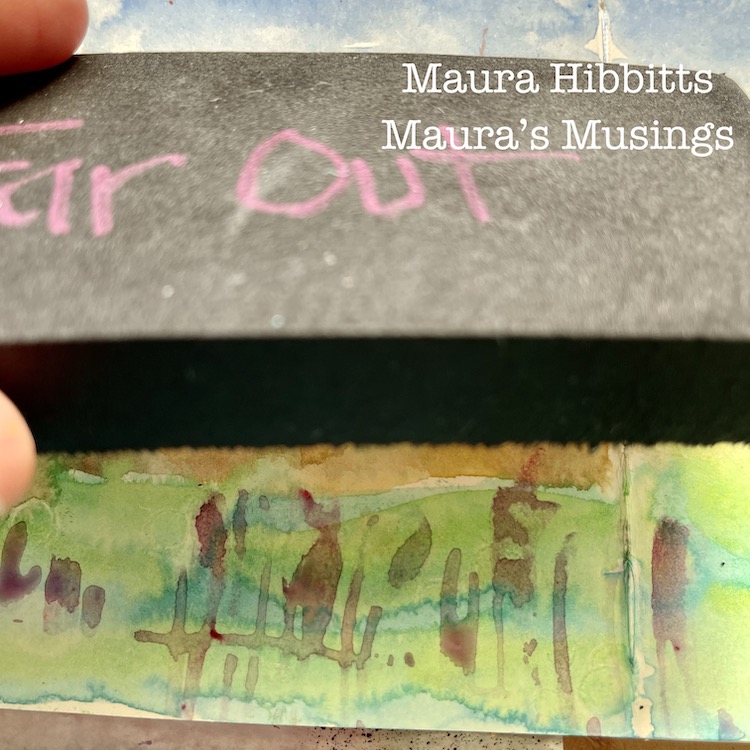
I added visual texture across the bottom of the page with the Far Out ArtFoamie and purple watercolor. Watercolor works very well with the ArtFoamies.

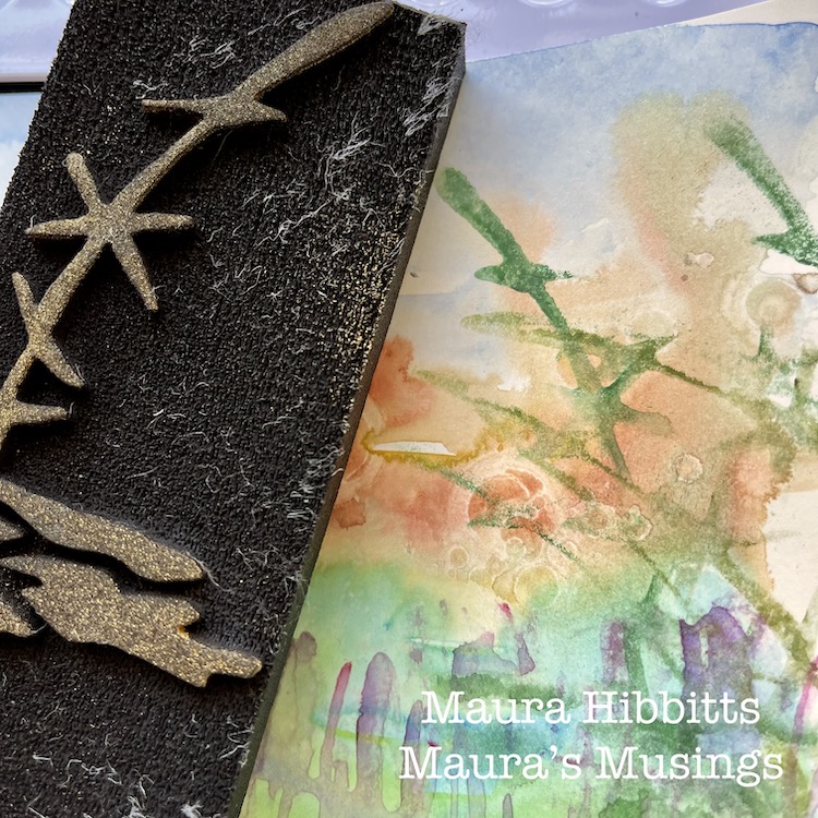
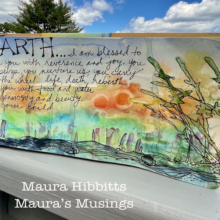
On the far right, I wanted to create the illusion of plants, so I use the Groovy ArtFoamie and a mix of green watercolors. The first stamping is boldest, then the second and third are lighter, which gives a bit of depth.

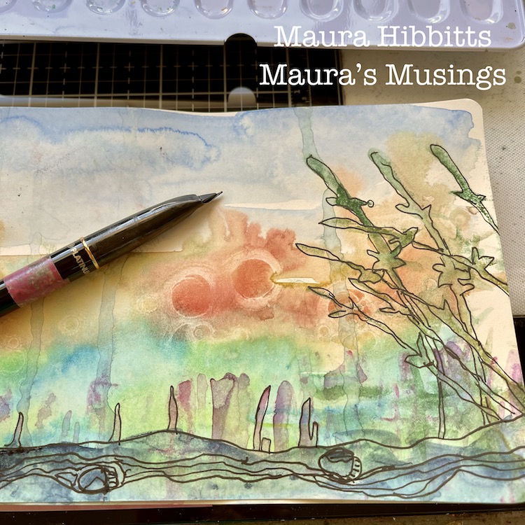
I love to doodle over watercolor. Be sure everything is completely dry, or you can mess up your pens. I like to use a carbon ink pen for a nice bold black.

My final step was to journal ideas I have about Mother Earth. I went with whatever came into my mind and just wrote them in my own handwriting. Don’t be afraid to use your own handwriting in your work, it adds such a personal element, unlike typed or stamped words. It’s not perfect, but neither are we, and that’s ok.

Step back from your work, and you begin to see things in it that were unplanned, for example, on the very left at the bottom, a figure seems to be emerging from the base. Maybe my mind was thinking about life emerging from the Earth’s oceans so long ago. Our Earth is precious and deserves our respect, it is after all, our only home. Happy Earth Day, everyday! – Maura


Thank you Maura! The beauty of this page is a real testament to your passion for the Earth – love how you handled the materials and incorporated the stamp designs in such a naturalistic way.

Give it a try: you can find all my Foam Stamps in my Online Shop and here are some of the supplies Maura used:

Comments (3)

  • Jo - Let's Art Journal

    |

    Wow, such stunning pages! Your painting looks amazing, so beautifully executed and I loved seeing how it came together too ?. Happy August and creative wishes! Hugs, Jo x

    Reply

  • Sue Clarke

    |

    What a fun page and what a delightful story about your first Earth Day Maura!
    I remember mine as well. I was in elementary school at the time, but I must say that you look much younger than I do.
    My son has always enjoyed his earth sciences and is headed to college to study environmental sustainability.

    Reply

    • Maura Hibbitts

      |

      Sue, so nice to hear your thoughts! Thank you! Sounds like Earth Day had an impact on you and your family. I am glad we can pass that along to our children. hugs, Maura

      Reply

Leave a comment

Creative Squad: Primary Colors – Judi Kauffman

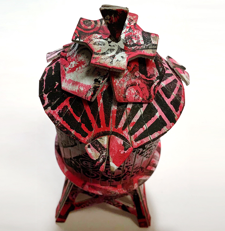
Hello from my Creative Squad! Today we have a clever post from Judi Kauffman using my Triple Play foam stamps, Broadway stencil, and a mini water tower model (including its envelope AND scrap pieces) and our theme: Primary Colors: Red, Blue, and Yellow it’s your time to shine. Let’s get back to the basics of color and light and play with primary colors. It’s elementary my friend! 


When I heard that this month’s theme is all about primary colors I knew I was going to want to head in a different direction. Instead of using all three, I’d focus on just one – RED, my favorite color, plus basic black and pure white.

Or perhaps it was because I was thinking of the old children’s riddle: What is black and white and red all over? A newspaper! (Red…Read…) Sorry! I couldn’t help myself.

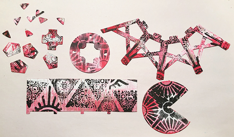
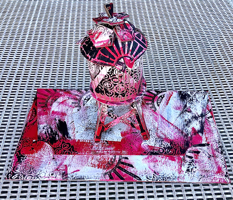
I thought it would be fun to use not only the pieces from the Water Tower Model kit I received but the negative shapes AND the sturdy envelope in which they were packed. Double the fun.

***TIP: If you are going to decorate the envelope be sure to take a photo of the assembly instructions BEFORE starting to paint and stencil!

Randomly paint the model pieces, envelope, and negative shapes with white paint. It’s okay that some of the original board remains visible.

Randomly add red paint to the model pieces, envelope, and negative shapes.

Center the Broadway stencil on the roof piece and use black paint to stencil the pattern. Use black paint and your choice of triangle stamps from ArtFoamies Triple Play to randomly stamp all remaining pieces of the tower, the negative shapes, plus the envelope.

Assemble the tower per instructions. Add the negative shapes to the roof of the tower.

Option: Instead of securing the roof, don’t use the criss-cross piece of board that acts as a structure to hold it in place; just perch it on top so you can hide candies or jewelry inside the tower!


Thank you Judi – love the idea of using the packaging and leftovers too!!! And look at that great use of pattern and layering!

Give it a try: you can find all my favorite cardboard models, Foam Stamps, and Stencils in my Online Shop and here are some of the supplies Judi used:

For more from the Creative Squad check out Nat’s Creative Squad on Instagram too: Each week we post projects, ideas, and inspiration for mixed media art.
Comments (3)

  • Marilyn C. Lojek

    |

    Judi:
    Hard to believe you only used one of the primary colors! It’s really cool and a great way to give a gift to that someone special. Thanks for sharing your creativity and how to use every piece provided.
    Marilyn

    Reply

  • jean marmo

    |

    Wow – this is so cool! Love the details and using the extra pieces!!

    Reply

    • jean marmo

      |

      Judi – I was going to email you but couldn’t find your email address. Do you still have mine? Was hoping to catch up!

      Reply

Leave a comment

Creative Squad: Primary Colors – Jordan Hill

Hello from my Creative Squad! Today we have a funky art journal spread from Jordan Hill using my Mini Hex foam stamps and my Mini Motifs rubber stamps along with our theme: This month’s theme is: Primary Colors: Red, Blue, and Yellow it’s your time to shine. Let’s get back to the basics of color and light and play with primary colors. It’s elementary my friend! This month we are also pleased to be partnering with Grafix who supplied the squad with some cool products to try out. Read on:


Hello everyone! I’m super excited to be back with a new project for June; this month was interesting considering I was working with new mediums (Computer Grafix and Grafix Double Tack!) and a color palette that is a bit outside my comfort zone, but I had a lot of fun with it regardless! I hope you enjoy following along with me as I create this month’s art journal spread!

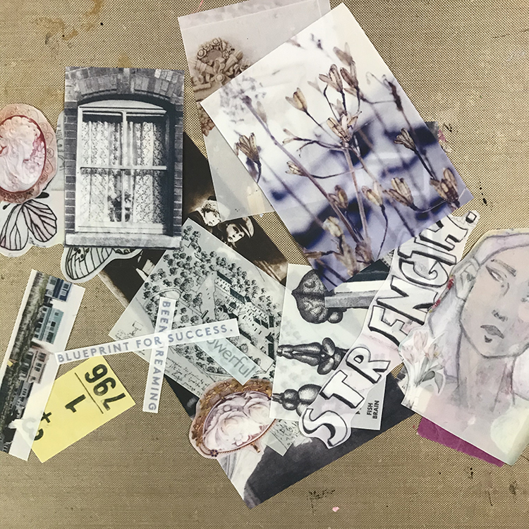
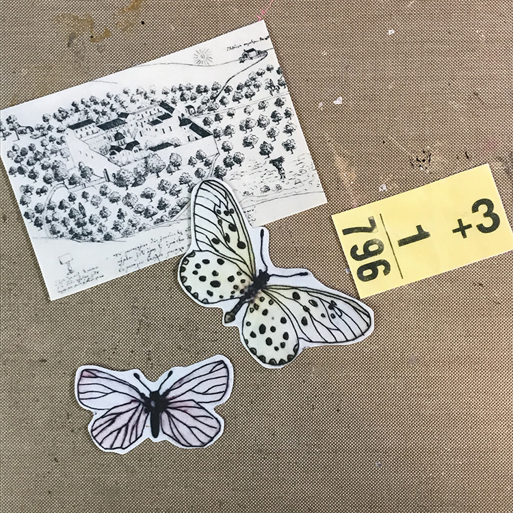
The first thing I did to start off this month’s project was prep my Computer Grafix. Using my inkjet printer and this matte film, I printed off a collage sheet. Then I cut out the pieces. I didn’t end up using all of the elements from this collage sheet in my project, which just means I have interesting pieces ready to add to future pages!

Next, I selected the elements I wanted to use on this particular project. I cut a few pieces of Grafix Double Tack that were approximately the size of my Computer Grafix pieces, then removed one side of the double sided adhesive. I then adhered my Computer Grafix to the Double Tack, and trimmed around the edges, so that I had a selection of collage pieces ready to go.

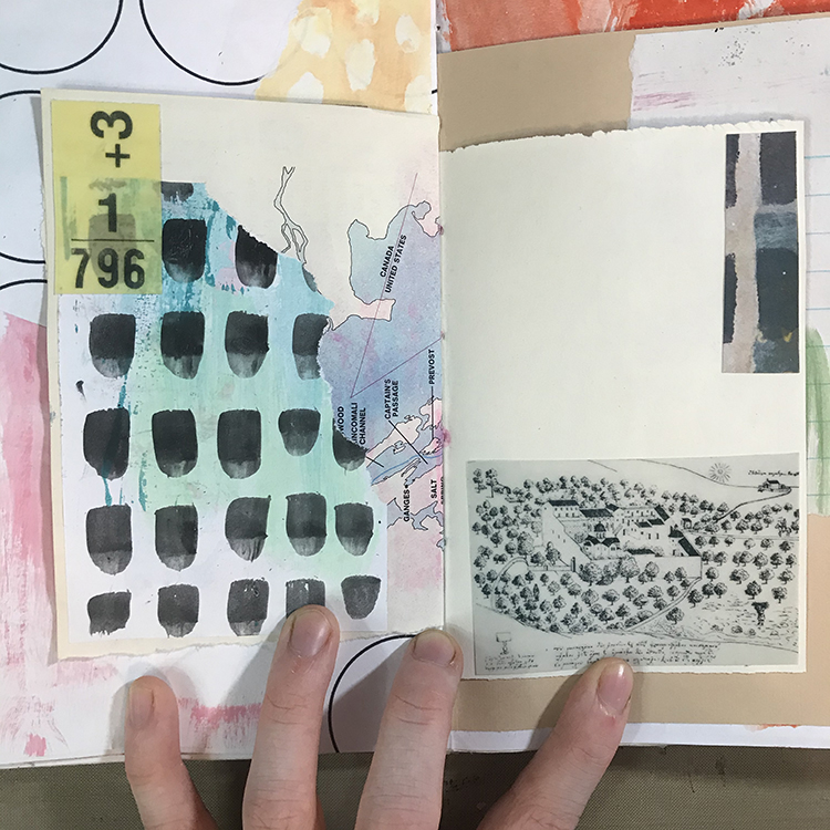
I then chose a spread in one of my journals to work on; this particular spread already had a few pieces of collage adhered to it, and I added a couple pieces of the Computer Grafix by removing the second side of the Grafix Double Tack and pressing them down firmly.

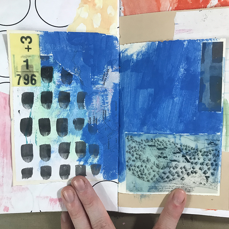
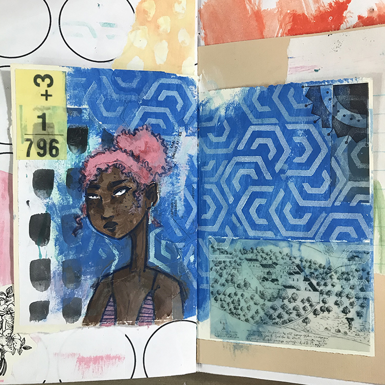
Next, it was time to start blending! I chose this primary blue color (to fit with this month’s theme of Red, Blue and Yellow) and using a brush, added it over almost the entire background. I also decided to play around with painting on top of the Computer Grafix. In order to tint the collage piece in the lower right, I watered down my acrylic paint, painted over top of the Grafix, then removed some of the excess paint with a paper towel.

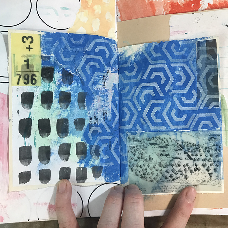
After the previous layer was dry, I used one of the stamps from Nathalie’s Mini Hex Foam Stamp Set in combination with some white acrylic paint to completely cover the blue areas of the page in pattern. I made sure to stamp all the way to the edges of the page, as well as slightly over top of some of the collage pieces in order to continue blending everything together.

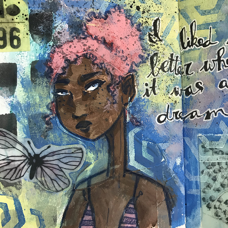
The next step was to add a figure; this particular face was created by painting over top of the black and white line art of a face I had drawn previously. I chose a dark pink as the hair color to act as the red in my primary color scheme. I also used Nathalie’s Arts & Crafts Motif from the Mini Motifs Cling Rubber Stamp Set and a black ink pad to add an extra element to the upper right hand corner of the spread.

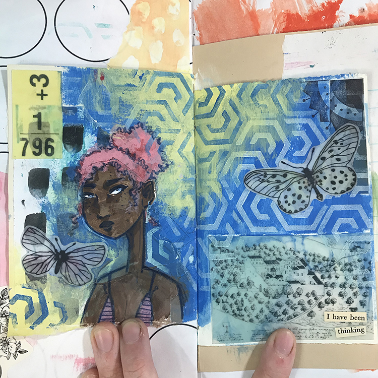
At this point, I felt as though the blue was overpowering the page in a way that I wasn’t necessarily a fan of. In order to solve this problem, I used a light yellow acrylic paint and applied it to several areas around the spread. I then used the Mini Hex Foam Stamp Set once more, but this time with blue acrylic paint. This allowed the pattern to continue through the yellow parts of the page while still looking natural. At this point I also added a few more pieces of Computer Grafix to the spread in the form of some small butterflies.

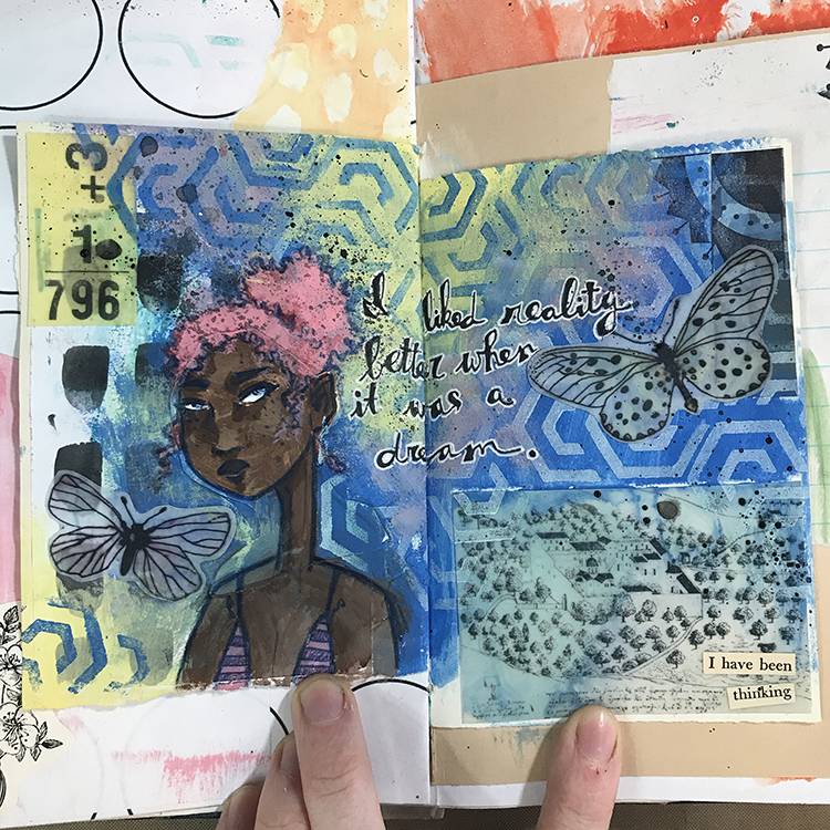
Then it was time for the finishing touches! I sponged on a bit of pink between the yellow and blue sections of the page to blend them together a little better, added some words to the center, and splattered some black ink with a paintbrush before I was ready to call this spread complete!

These colors were a surprising challenge for me, but in the end, I am happy with the way the spread turned out. I hope you all enjoyed following along with the process and that you give some of these ideas a try yourself!


Thank you Jordan – loved seeing how you toned down one color and then carried the Mini Hex foam stamp pattern through to the other side!

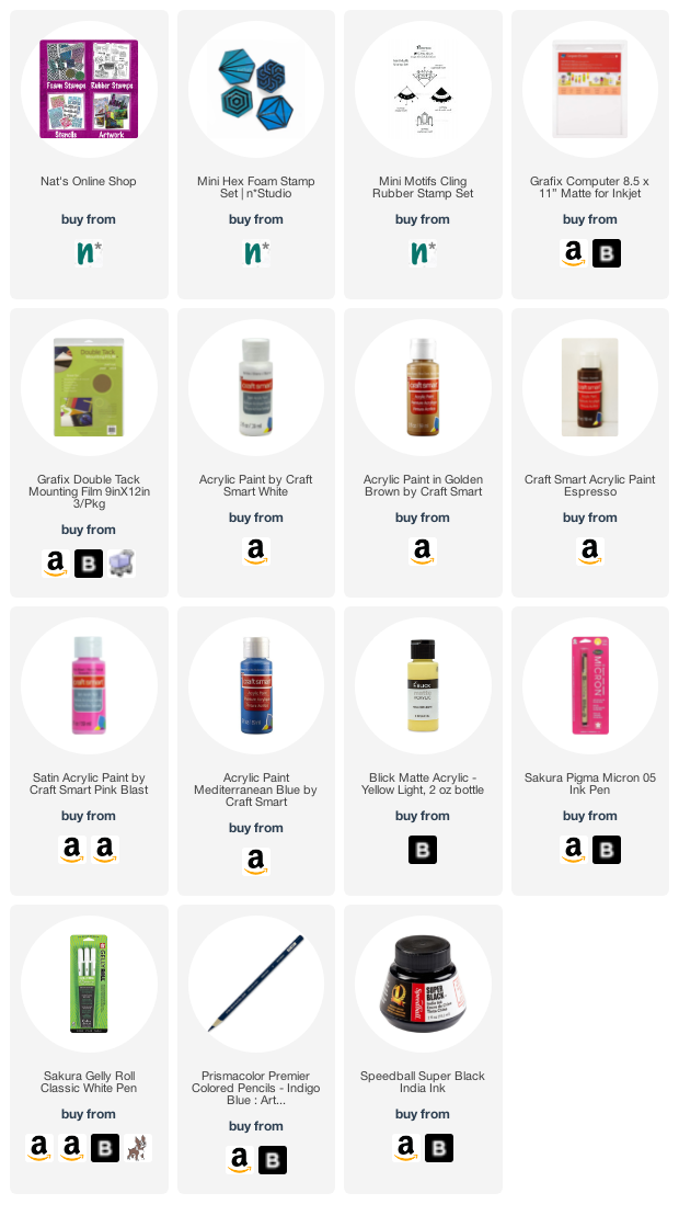
Give it a try: you can find all my Rubber Stamps and my Foam Stamps in my Online Shop and in addition to some collage elements, here are some of the supplies Jordan used:

For more from the Creative Squad check out Nat’s Creative Squad on Instagram too: Each week we post projects, ideas, and inspiration for mixed media art.
Leave a comment