Creative Squad

Creative Squad: Primary Colors – Robin Seiz

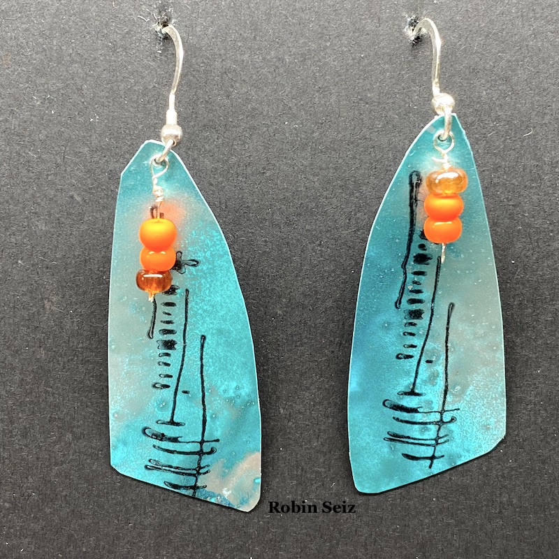
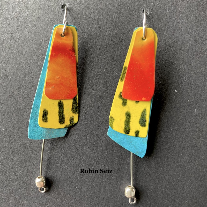
Hello from my Creative Squad! Today we have some seriously awesome earrings from Robin Seiz using my Central Ave 4×4 and Signals stencils and my Wabi Sabi rubber stamps. This month’s theme is: Primary Colors: Red, Blue, and Yellow it’s your time to shine. Let’s get back to the basics of color and light and play with primary colors. It’s elementary my friend! This month we are also pleased to be partnering with Grafix who supplied the squad with some cool products to try out. Read on:

Hi Friends,

This month was about using primary colors, Grafix Products and of course, incorporating Nathalie’s wonderful products. Primary colors are so happy; they remind me of summer, but I must admit that I don’t use them often. It was good for me to reflect on why they aren’t my “go to” colors. The reason I suspected was amplified in this project. I’m a messy multi-media artist. What I mean by that is, I’m always mixing colors. Primary colors by their nature make a host of other colors, so once I put them down on paper, I always end up with something else; they rarely end up in their pure form. For example, the “red” in the earrings I created is really orange, because once the yellow and red mixed…. well, it’s no longer red and yellow. :)

I hadn’t been introduced to Grafix products prior to this month, but I loved working with the opaque craft plastic. I’m excited to work with some of the other products as well. This opaque craft plastic works really well with alcohol inks. It seems to hold the ink in place a little better than Yupo, for example. This produces even more vibrancy than you normally get with alcohol inks.

My mixed media journey started with scrapbooking and then went to jewelry and then exploded to all kinds of other mediums and substrates. As result of my early days, I still have a lot of jewelry making supplies. Sometimes, I get the urge to combine my mixed media work with making jewelry. For this month, that meant earrings.

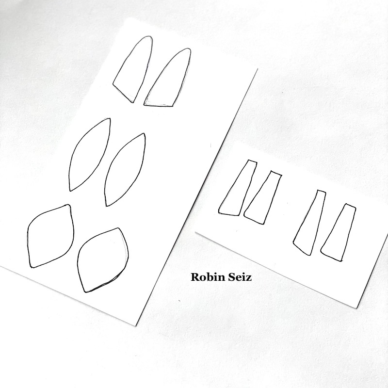
I started the project by drawing the shapes for the earrings on card stock. I chose shapes I like. If you try this project, you could use any shape you like. Next, I cut out the shapes and put them aside.
Step 2 was the most fun! I tested various alcohol ink colors on the opaque craft plastic. I could have done this all day; just watching alcohol ink flow is so relaxing and organic. The results are always a surprise. This is the part where the colors often run into each other and make a different color than is intended, but I just go with it.
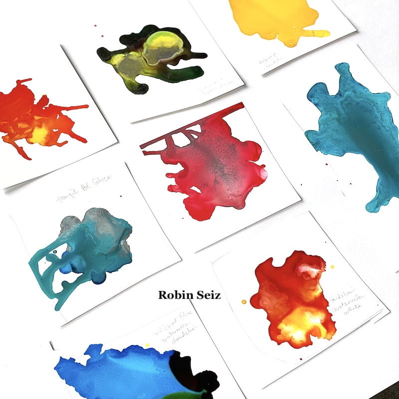
I chose color patches  I liked the most, and the ones which were in the primary color family (at least kind of). I laid out the blank cut out shapes on the opaque craft plastic. This can be a tricky process if you are someone who wants both earrings to look exactly the same. I don’t really care about that; I like to know they were made by hand rather than manufactured to be identical, but if it bothers you to have them slightly different, then you can take that into account when you lay them out. Additionally, you may want to use solids rather than several colors on a sheet to get more a more consistent look. 
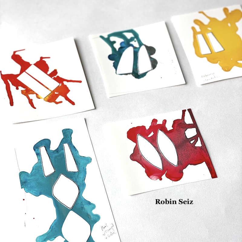
Once they were laid out, I carefully cut them out with a small pair of scissors. The craft plastic is easy to cut. If you are comfortable with a craft knife, you could also use that.

Once cut out, I applied Nathalie’s Wabi Sabi rubber stamps and Central Ave and Signals stencils to the earrings with a permanent black ink. This added so much dimension and interest to each piece.
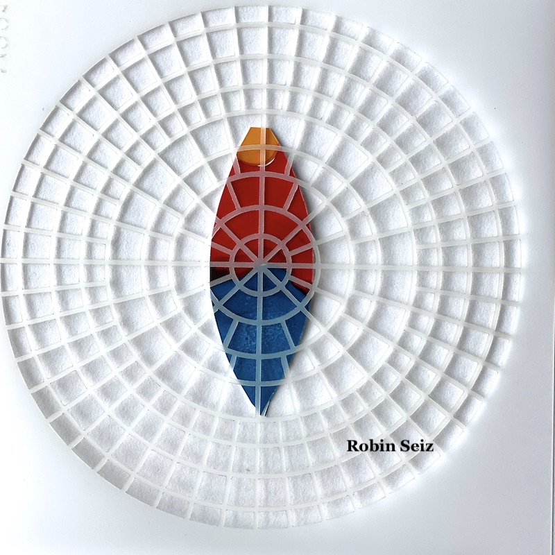
I took some of my jewelry components, small beads and wire, nothing really fancy, and added it to the earrings. Again, it added more dimension and interest.
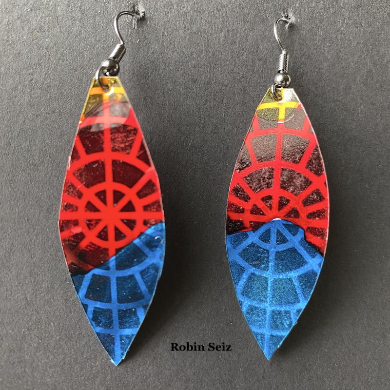
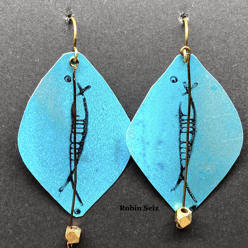
The final process, which is important especially if you are going to sell your earrings or want them to last for a long time, is to spray Krylon Varnish and UV protection to them. Alcohol inks dull quickly and this will protect both the color and the inks from smearing. Make sure to do this in a well ventilated area and hold the can pretty far away from the earrings, otherwise, they will smear.

Summer is here, it’s always fun to have a new pair of earrings! I hope you try out this project.


Thank you Robin! I absolutely love these and could totally imagine donning them to liven up an outfit with some artsy style!

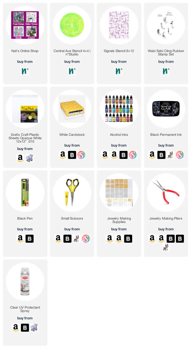
Give it a try: you can find all my Rubber Stamps and my Stencils in my Online Shop and here are some of the supplies Robin used:
 

Like what you see? Follow the Creative Squad on Instagram for weekly posts, artwork, and inspiration.
Leave a comment

Creative Squad: Primary Colors – Riikka Kovasin

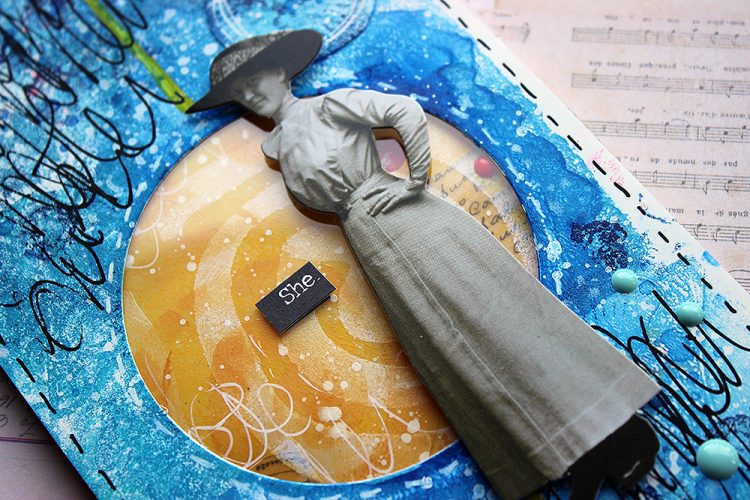
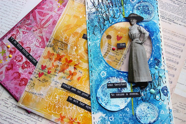
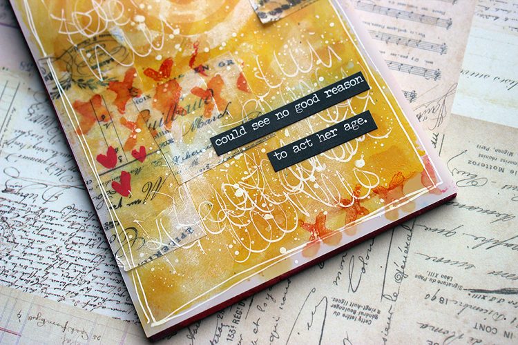
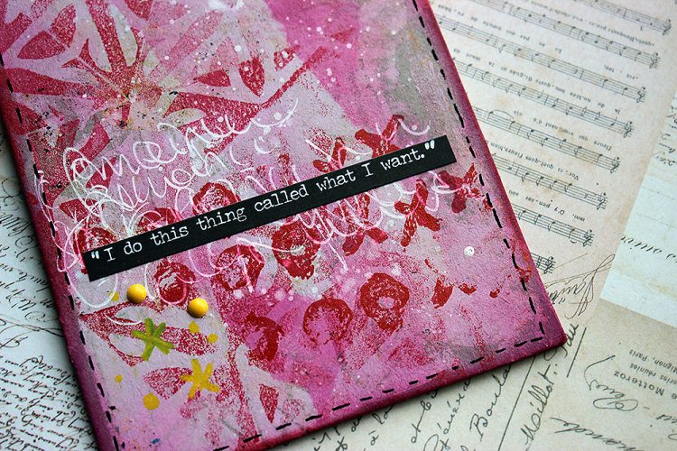
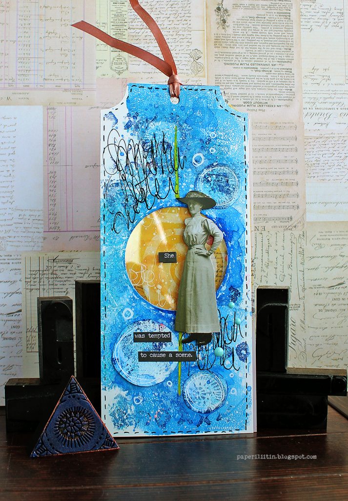
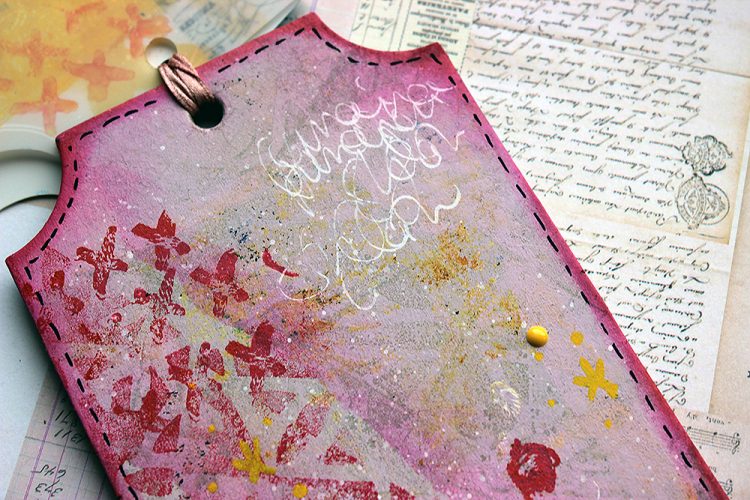
Hello from my Creative Squad! Today we have a post and video from Riikka Kovasin who is sharing a trio of cheeky tags using my Batik stencil, Triple Play foam stamps, and Love Knots rubber stamp along with our theme this month: Primary Colors: Red, Blue, and Yellow it’s your time to shine. Let’s get back to the basics of color and light and play with primary colors. It’s elementary my friend! This month we are also pleased to be partnering with Grafix who supplied the squad with some cool products to try out. Read on:


Maverick

Hi there all! It’s Riikka here today to share my take on the monthly theme of Primaries! This month we also got some lovely products to play with from Grafix. I used all three we were given and threw in one more from my own stash!

I feel like I must be honest with you. After seeing all the cool stuff you can do with Grafix products, especially by Tania Ahmed, I sourced some supplies through internet and ordered them. But then when they arrived, I had some deadlines closing in and I just put them aside with the thought “Need to play soon”. Then that pile moved to another place in my craft room and finally they went up on a shelf. So, while I have had some craft plastic in my craft room for months now, I’m so grateful for this theme and collaboration as it finally pushed me to take the stuff from the shelf and use it and fall in love all over again!

As before, I recorded a little process video while working with the Grafix products and primaries. As you can see from the pictures already, the project has blue and yellow and there’s red, too but not the same way as the other two. It’s because somehow I feel intimidated by red, especially in large surfaces. It’s such a vibrant, energetic color that I feel I can’t cope with it, I can’t harness it. So, instead of doing a red base and patterns, I started with a pink base and added red on top! More manageable!

I was amazed how well the craft plastic handled all the mediums I threw at it. Especially I loved using watercolor on top of the acrylic layer, it felt so soothing and rewarding. Another discovery was that I couldn’t rip the Double Tack Mounting Film. I was planning on ripping the vellum apart for the collage layer on the yellow tag, but it proved to be impossible. The Mounting Film was so sturdy that it wouldn’t rip! But still it’s so thin that it doesn’t add any bulk.

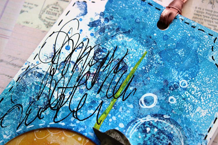
I kept the embellishments in the tags quite minimal. This shows the background better and also gives the whole thing a story book feel as all the texts connect. I guess this idea came to me while cutting the openings to reveal the layers underneath. The holes get smaller between the layers and that reminded me of a children’s book by Tove Jansson. It’s called “The book about Moomin, Mymble and Little My”. It’s the first picture book drawn and written by Tove Jansson, published in the 50s. The original title was “Hur gick det sen?” as Tove was a Swedish speaking Finn. Throughout the book there’s holes where you can have a sneak peek to the following spread. The holes get smaller and smaller in the course of the story and the last hole is so small that Moomins can’t fit through it and are thus captured in the book. The book has vibrant illustrations in Tove’s unique style. If you haven’t seen it, I recommend taking a look! Perfect inspiration for solid color surfaces and primaries! Here’s a link to Moomin site to get you going.

Thank you so much for stopping by today! I really enjoyed my first go with the Grafix products and can’t wait to play some more!


Thank you Riikka – just love the gorgeous layers you were able to build and learning the inspiration behind the project!

Give it a try: you can find all my Rubber Stamps , Foam Stamps, and my Stencils in my Online Shop and here are some of the supplies Riikka used:

Follow Nat’s Creative Squad on Instagram too: Each week we post projects, ideas, and inspiration for mixed media art.

Comments (1)

  • Sue Clarke

    |

    Riikka, awesome texture, colors and the expression about the woman shown are so delightful!

    Reply

Leave a comment

Creative Squad: Primary Colors – Maura Hibbitts

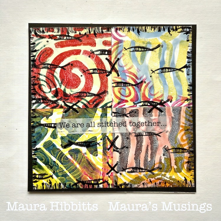
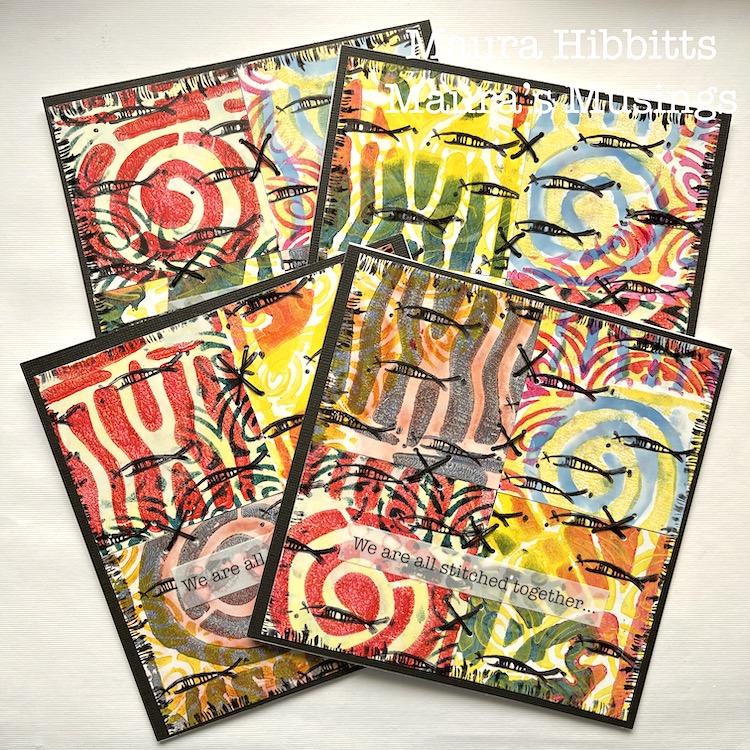
Hello from my Creative Squad! Today we have a really thoughtful card project from Maura Hibbitts that explores some pretty important ideas along with our theme this month: Primary Colors: Red, Blue, and Yellow it’s your time to shine. Let’s get back to the basics of color and light and play with primary colors. It’s elementary my friend! This month we are also pleased to be partnering with Grafix who supplied the squad with some cool products to try out. Read on:


Oddly enough, I don’t reach for just primary colors that often, I think I must like them better blended together to make green, purple, orange, and the myriad of colors they create. So, I find it a bit of a challenge to just focus on primary colors, but I did…with just a touch of blending (I couldn’t help myself, lol). I’m also using Grafix products for the first time, and they are wonderful! I tried out a number of mediums and they worked beautifully.

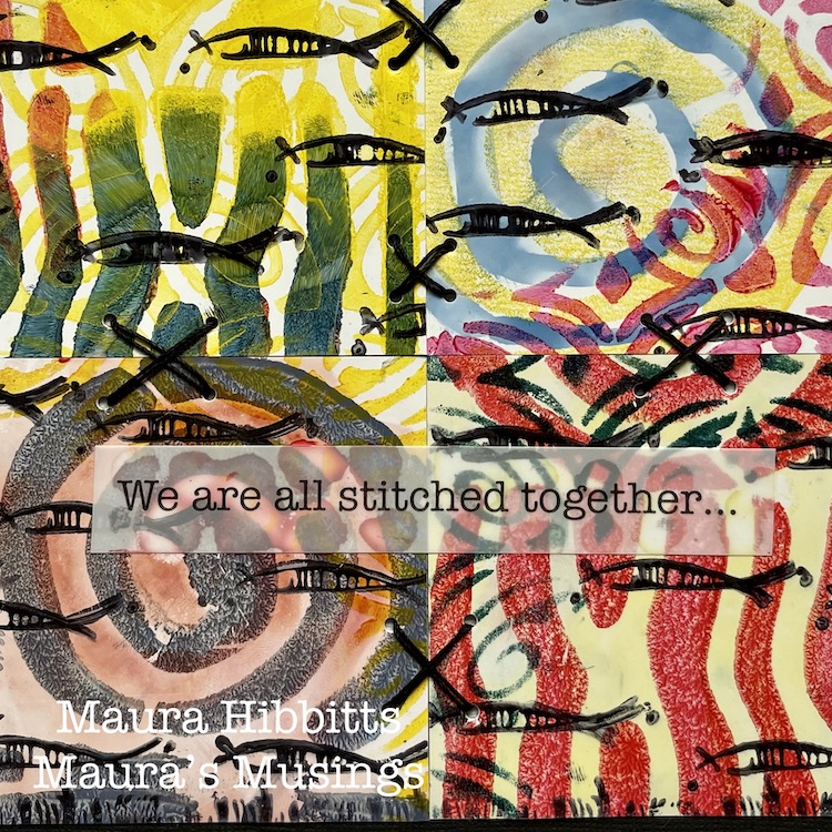
I started creating, thinking of the ocean and my longing to go there again. I was also thinking about my friends in education and the upcoming end to a very challenging year. Somehow this translated into the schools of fish I stamped on the cards. But then, I thought about how everything is interconnected on our planet, from the fish in different oceans, to the people of different lands, and I added some stitches. It’s inter-esting how our creative process can begin with a simple thought, yet end up very complex by the time we finish.

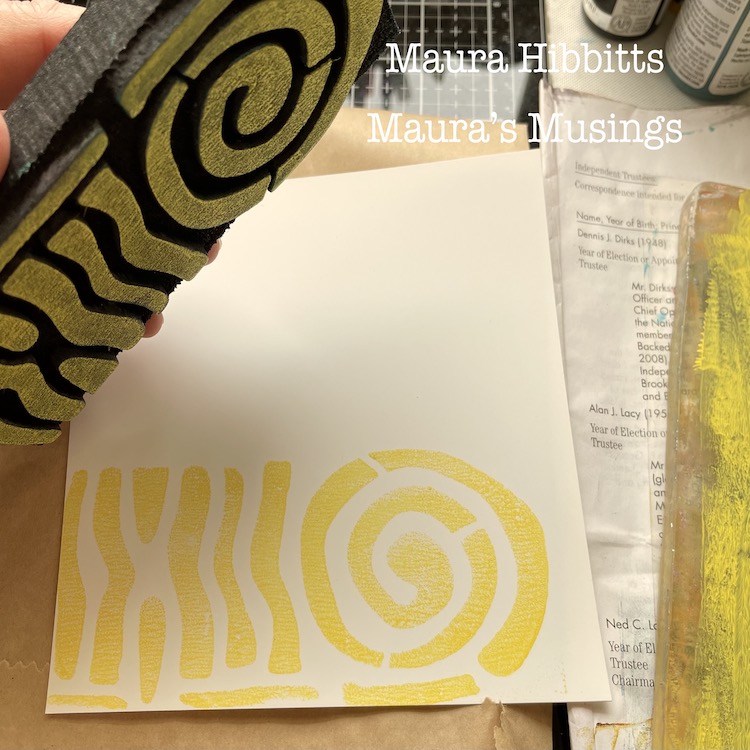
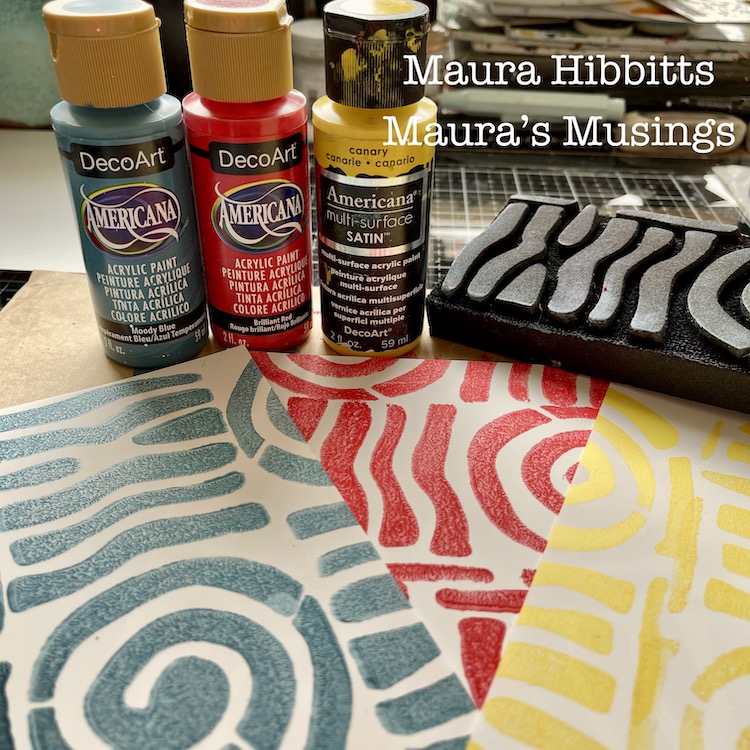
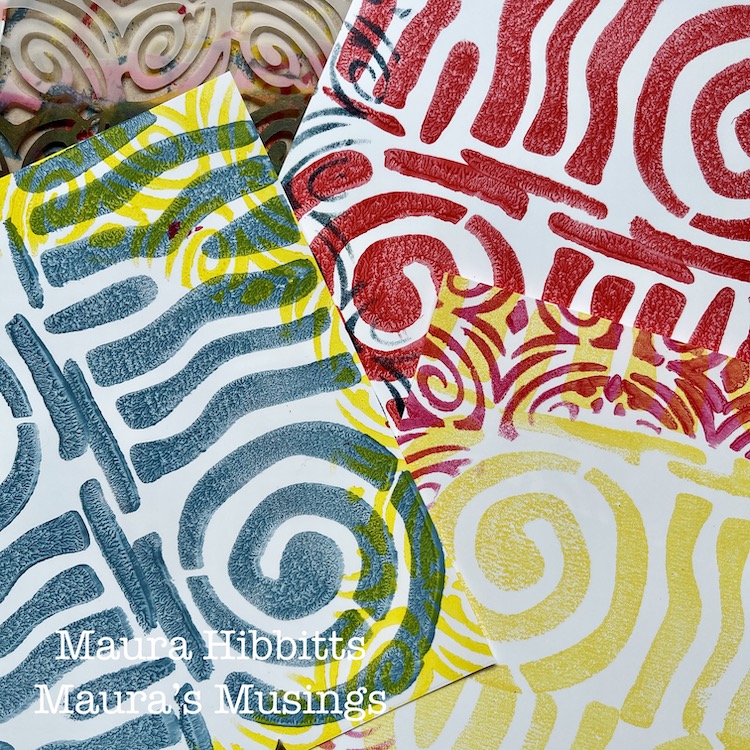
I started my project by cutting the 12 x 12 sheet of Grafix Craft Plastic into four sec-tions. (6 x 6), then stamped three of them with a single paint color of yellow, red, or blue with Nat’s ArtFoamie Batik 2 stamp. I find it easy to roll out some paint on a gel plate, and press the ArtFoamie into that, to get a clean image.

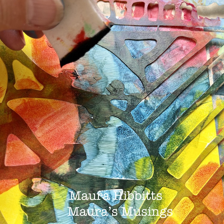
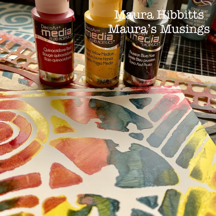
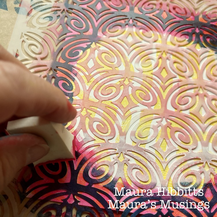
For the fourth section, I decided to use the Batik stencil (a favorite!), fluid acrylics in red, yellow, and blue, and dab in the color with a cosmetic sponge. I couldn’t resist a bit of blending here.

Next, I decided to go around each stamped piece with a contrasting color, using the Art Deco Fairview stencil. I just added the design around the edges, and left a circular open area on the plastic.

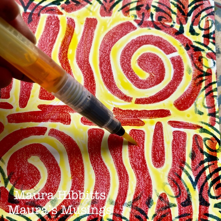
I found that acrylic paint works beautifully with the Grafix plastic, so I thought, why not try watercolor next? I painted watercolor onto each section with blue, red or yellow.

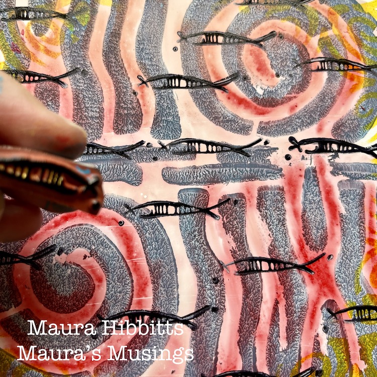
To create my “schools of fish”, I used the Neato rubber stamp with black archival ink, and repeatedly stamped the image across the pages.

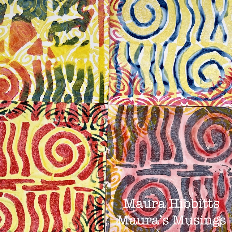
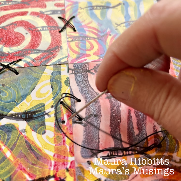
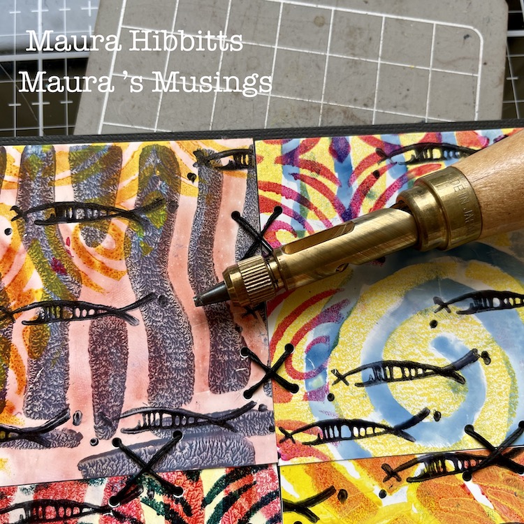
Then, I cut each section into fourths, just slightly smaller than 3” squares. I adhered four different squares to a backing. I cut a 12 x 12 black card stock into fourths for this base. Next, I punched holes to do some stitching, using a Japanese screw punch (or you could use an awl). I stitched X’s with heavy black thread onto the cards, tucking the ends onto the back and holding them in place with scotch tape.

To finish the card design, I framed it using the edge of the Far Out rubber stamp and black ink. I stamped the partial image around all edges.

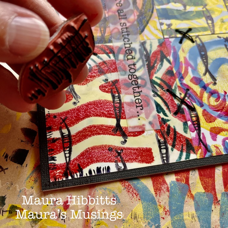
As I was working, I started thinking of how we are all connected, and came up with the quote to put on my cards “We are all stitched together…” I typed up my words, and printed them onto the Grafix Computer Matte film using an inkjet printer. I adhered these to the card fronts using a clear adhesive, so the design underneath would be visible.

Then, the final step was to adhere my card tops. I cut 12 x 12 card stock in half, scored it and folded it into a 6 x 6 card. One reason I decided to not work directly on the card itself was the stitching. It shows through the back, and by doing it separately, I end up with a nice, neat card. Hint: remember, if you mail square cards, the postage is a bit higher…or you can put it into a kraft mailer.

It’s the common threads that pull us all together, like color – yes, primary colors too, which are connected to all colors. Other threads that bind us are music, art, words, friendships, family, and so many more. Remember, we are all stitched together…

I wish you joy in searching for the stitches and threads in your life, Maura


Thank you Maura – loved how you shared your thought process along with such clear step by step instructions. These cards are so meaningful AND beautiful!!!

Give it a try: you can find all my Rubber Stamps , Foam Stamps, and my Stencils in my Online Shop and here are some of the supplies Maura used:

Leave a comment

Creative Squad: In the City – Jordan Hill

Hello from my Creative Squad! Today we have a super cool project from Jordan Hill using a mini billboard model and my Triangle Love rubber stamps. Our theme is: In the City – Although we aren’t traveling much these days, let’s reminisce about a time we traveled to another town or city. Think about the flavor of the place and let that guide your color and design choices.


Hello, everyone! I’m very excited to be back with my project for May 2021. This month I was working with the Billboard Model Kit, which I found to be a lot of fun and an interesting change of pace from the style of work that I usually do.

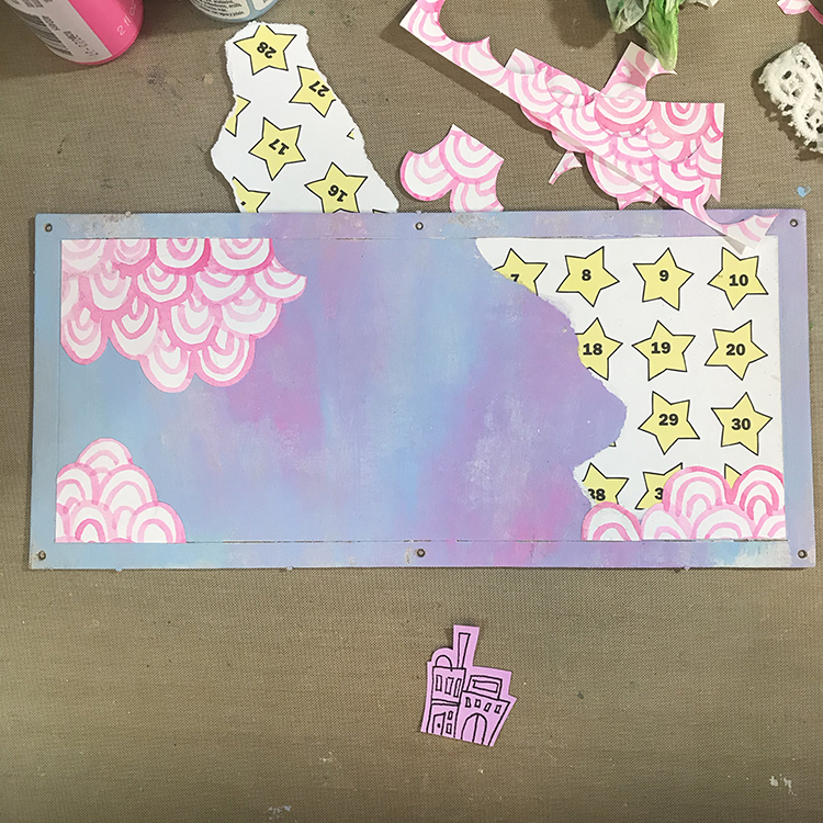
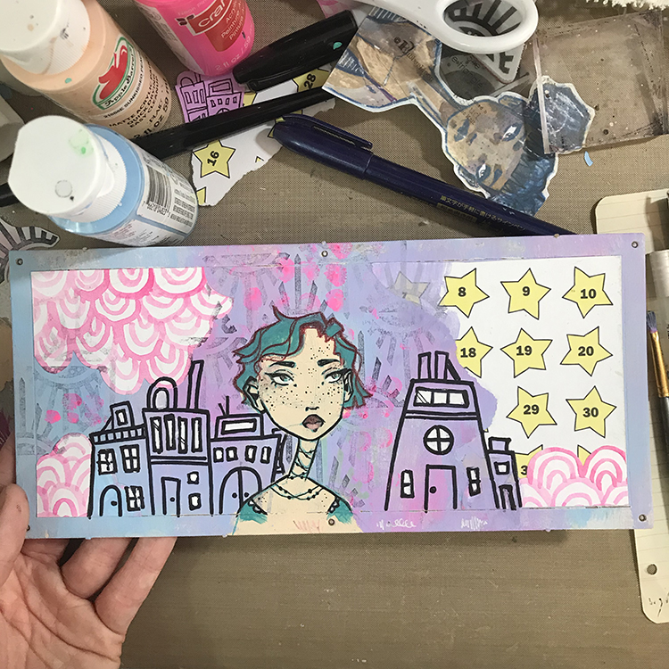
I decided to begin my project by decorating the flat billboard part of the model. In order to do this, I used some white gesso to prep the chipboard surface, then used CraftSmart craft paints in Pale Blue and Neon Pink to create a background that reminds me of some of the colors of lights you might see in the city at night.

In order to create this particular background, I tried to work quickly and allowed the paint colors to blend together as I applied them to the chipboard. The two colors I chose created a pretty soft purple when mixed, which added a bit more depth to the background colors. After the acrylic paint had dried, I then added a few pieces of collage (some star paper I found at a thrift store and some hand painted neon pink arcs) that reminded me of graffiti.

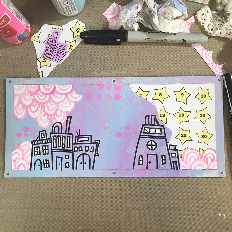
Next, I knew I wanted to incorporate the theme of “In the City” in the form of some freeform building doodles. Using a Sharpie, I drew squares, rectangles and arches to represent the shapes of houses, windows and doors. I then used some leftover neon pink paint I had on my palette and the tip of my finger to add some dots to the background. I also added some white to the windows of the houses to help them stand out a bit more.

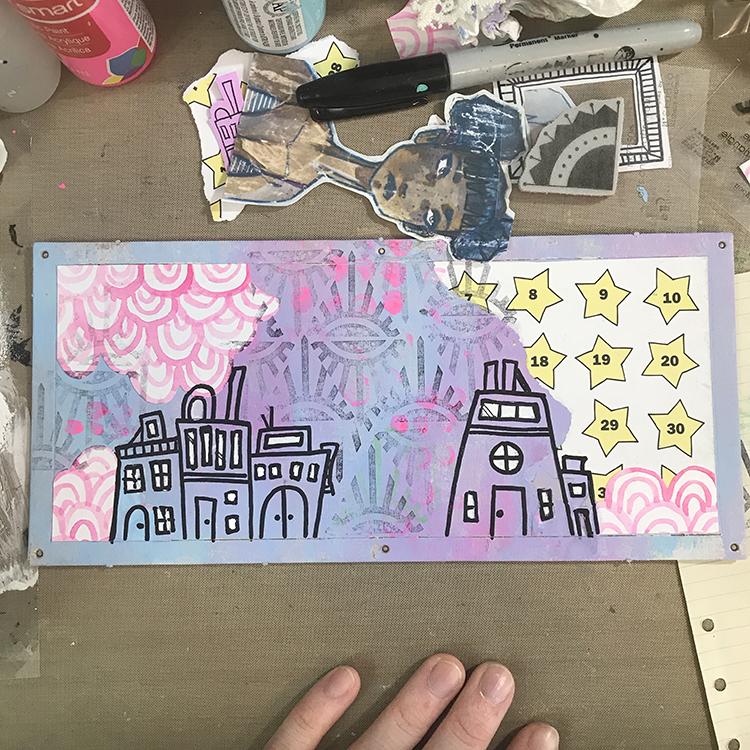
After I had my buildings in place, I knew I wanted to add some more pattern and texture to the background. In order to do this, I chose Nathalie’s “Empire Triangle” rubber stamp to stamp over the entire background. Since there was already a lot going on, after inking up my stamp, I stamped once on a separate scrap of paper before applying it to my background. This gave me a much more muted effect, which I quite like.

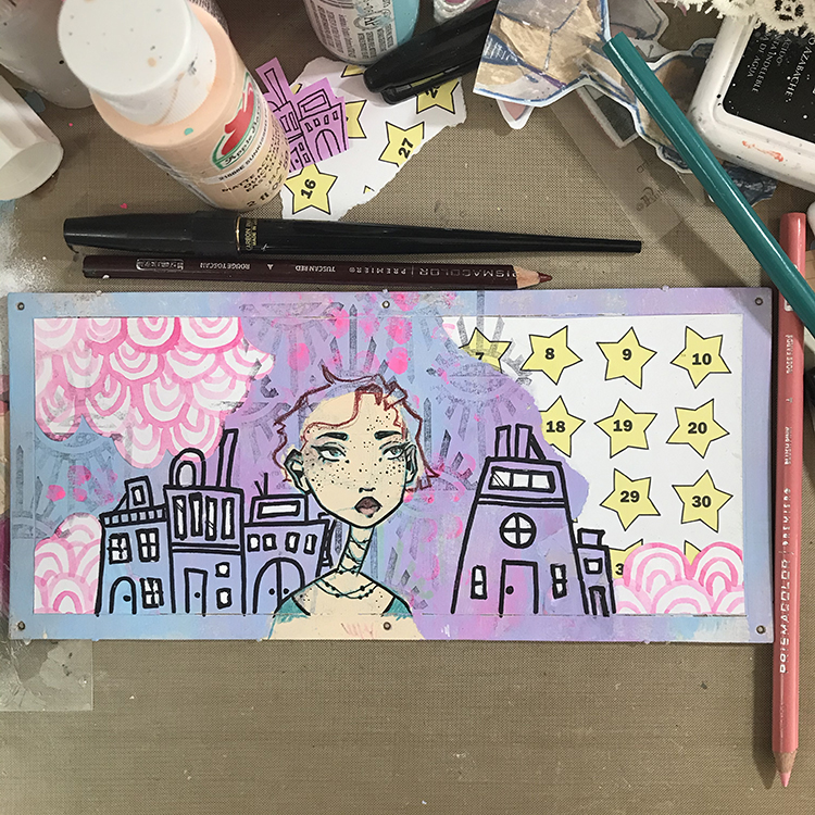
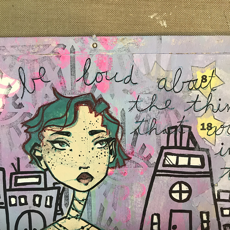
Next it was time to add the figure. I played around with the idea of collaging a face onto this piece, but ultimately decided to draw a new one from scratch. I did this in much the same way as I typically do, by first blocking in the shape of a face with acrylic paint, then sketching over the top in colored pencil. This time however, I did opt to use an Aquamarine Prismacolor pencil for my sketching as opposed to my typical navy or deep purple. I then inked the illustration and sketched in some hair.

The next step was to add color to the hair I sketched in previously. I chose to go with CraftSmart Aqua for this step; I recently discovered I have three bottles of this paint in my possession, and I wanted to use some of it up! It also just so happened to coordinate with the colored pencil I had already used to draw the face and it had a nice contrast with the pre-existing colors of the background.

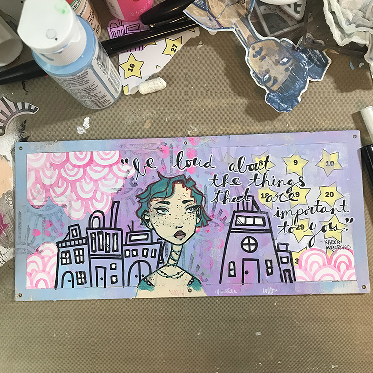
As I reached this point in the project, I knew I wanted to add a quote. This particular model feels very much like a display piece, so I felt that some motivational words would work well. In order to add the words to the piece, I chose a thin ink pen and wrote my quote in a large cursive font. This is the first part of the typical style of lettering that I recreate frequently in my artwork.

The second part of this lettering style is to simply thicken one edge of the cursive writing. You can use the same thin ink pen to do do this, or you can choose to go for a brush pen in order to fill more space more quickly (this is what I chose to do on this particular project). Once I was happy with the lettering, I then used a white gel pen to outline the text in order to make sure it stood out from the background enough to be legible.

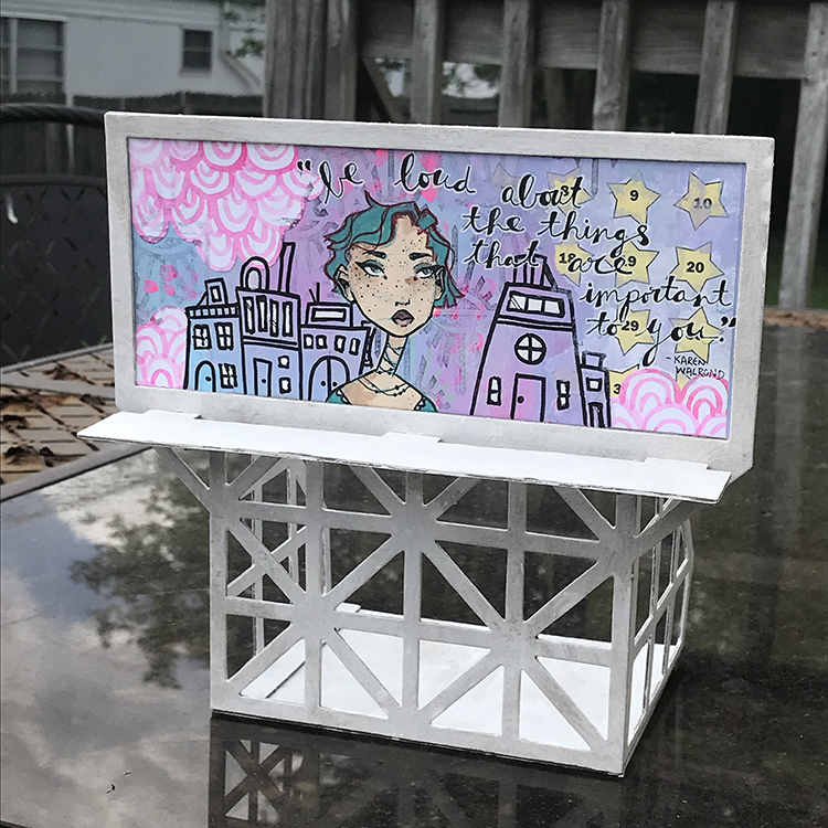
Finally, it was time to actually put the model together! I painted all of my chipboard pieces white before I started assembly, since I felt that the color would fit my project better. Then, I simply followed the instructions to create this fun display piece that I’m definitely going to enjoy using as a part of my studio decor!

I hope you all enjoyed following the process of creating this project!


Thank you Jordan! I just love your color palette on this and watching you build your composition – it works great for the billboard!

Give it a try: you can find all my Rubber Stamps and those cool Cardboard Models in my Online Shop and in addition to some collage papers, here are some of the supplies Jordan used:

For more from the Creative Squad check out Nat’s Creative Squad on Instagram too: Each week we post projects, ideas, and inspiration for mixed media art.

Comments (1)

  • Sue Clarke

    |

    I really like this Jordan and how you explained what you did…simple enough for me to be inspired by them.

    Reply

Leave a comment

Creative Squad: In the City – Robin Seiz

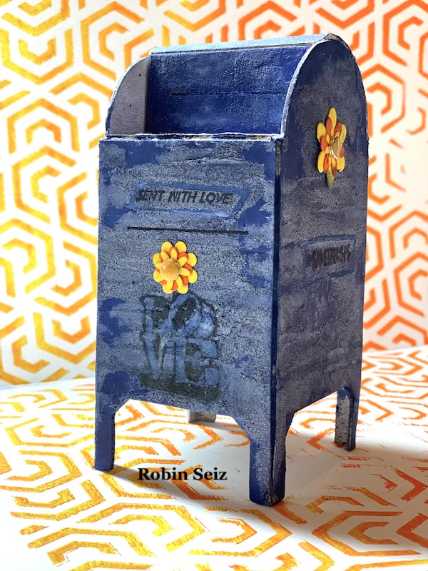
Hello from my Creative Squad! Today we have a charming little project from Robin Seiz using the mini mailbox model, my #keepyouposted stamps, my Flower Maze stencil and our theme: In the City – Although we aren’t traveling much these days, let’s reminisce about a time we traveled to another town or city. Think about the flavor of the place and let that guide your color and design choices.


This month’s theme is In The City, and although we haven’t been traveling much, I have been sending a lot of “happy mail”. This little miniature model mailbox was perfect for me. Before I started this project, I did a little research about the history of the mailbox. Did you know that mailboxes first appeared in the United States in the 1850’s. They were originally attached to buildings and lampposts. In the 1890’s, larger, free-standing “package boxes” were introduced nationwide; known today as Collection Boxes.

At first this project was a little intimidating for me; I only had one model so I had to do more planning than is typically in my process. I’m a “get in there and see what emerges” kind of artist! Even with the planning, I still ran into a challenge with the images, but that’s the wonderful thing about mixed media, you just keep trying, editing, or adding layers until it all works out.

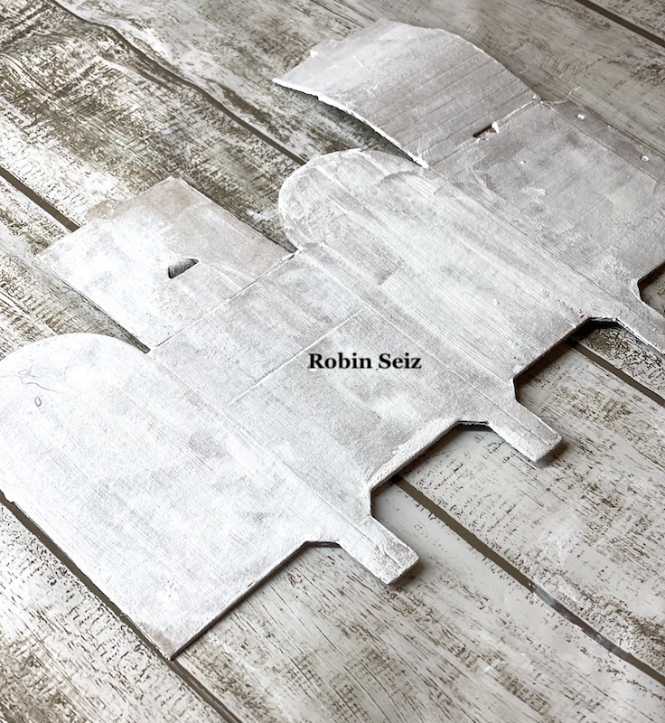
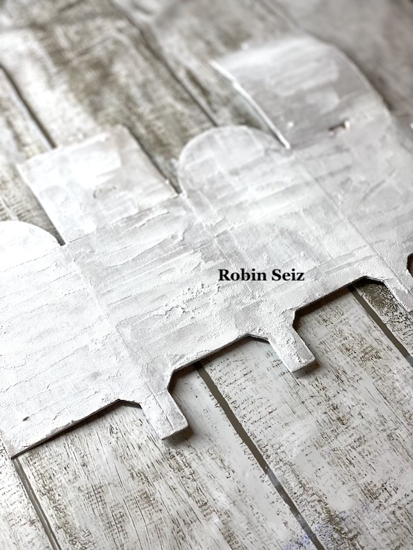
The mailbox model comes as a heavy weight cardboard miniature. Because I knew I wanted the mailbox to have an old metal look, I decided to cover it with white gesso so the paint would adhere well. (I’m honestly not sure this was necessary, but it’s what I chose to do).

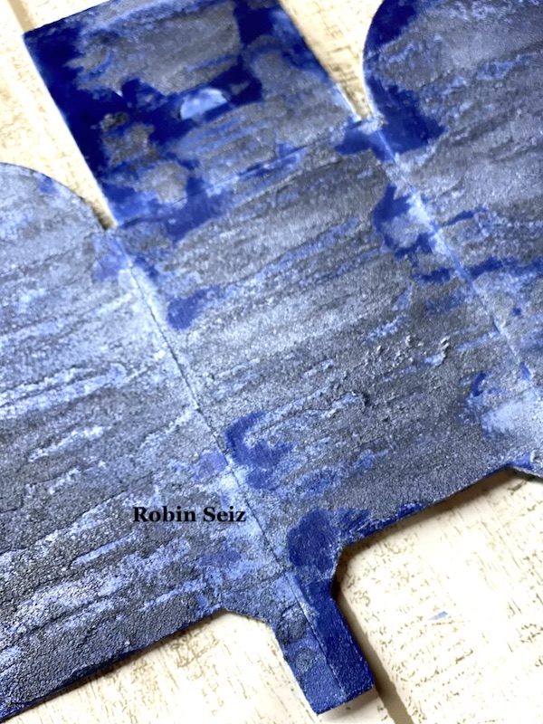
I pictured my mailbox like the one at my post office; a dull looking blue mailbox. I wanted it to have a textured look, but rather than apply texture directly to the model, I tested it on another piece of cardboard first. I also wanted to try out a few different colors and see the result before I applied it to the model. I used Golden Crackle Paste to apply the texture. It takes a while to dry so I used the heat gun from a distance. Waiting for things to dry naturally is not in my vocabulary! Next I sprayed Distress Spray Stain in chipped sapphire and blueprint sketch. I liked the darker color, chipped sapphire, the best.

Once those decisions were made, I applied the paste and the spray stain to the model.

I knew Nat’s stamp collection #keepyouposted would be perfect for this project!

This part of the project was the most difficult. It turns out that it’s not so easy to stamp over the stained Crackle Paste. I tried, everything, colored inks, acrylic paint, a clear label, packing tape, you name it and I tried it. Thank goodness all of this trial and error was on my sample stained cardboard. The only medium that I could get to adhere and be legible, was black ink. I used my stamp platform so I could stamp the image several times.

Once I had the images in place, I folded the model, as per the directions. It’s so easy to assemble!!!

The mailbox needed a little pizzaz, and since happy mail is where this project initiated, I attached some ephemera flowers that I had in my stash. (I made mine sometime ago, but I know you can buy them as well.)

I also used Nat’s Flower Maze stencil on the gel plate, in the same bright colors as the flowers, to display the mailbox.

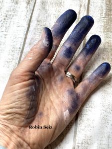
One last note about this project, the Distressed Stains, are true to their name — I highly recommend gloves, which I didn’t use, as shown here by my hand!

I hope you enjoyed this project. While I chose a similar color palette of the collection boxes we see today, the opportunities to embellish are endless. I hope you give it a try! 


Thank you Robin! Loved hearing about your tests to get the texture and color right – and the end result is so darling!

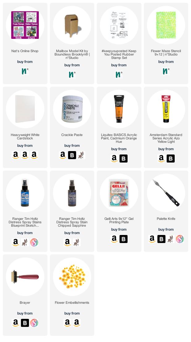
Give it a try: you can find all my Rubber Stamps and those cool Cardboard Models in my Online Shop and here are some of the supplies Robin used:

Don’t forget to check out Nat’s Creative Squad on Instagram too: Each week we post projects, ideas, and inspiration for mixed media art.

Leave a comment

Creative Squad: In the City – Riikka Kovasin

Hello from my Creative Squad! Today we have a really lovely post and video from Riikka Kovasin who is sharing some of her travel memories with us in her mini billboard project, using my Fan-tastic Small stamps and our theme: In the City – Although we aren’t traveling much these days, let’s reminisce about a time we traveled to another town or city. Think about the flavor of the place and let that guide your color and design choices.


Moikka! It’s Riikka here today sharing my May project with you! I was excited to get this Billboard Model Kit to play with. I drew inspiration from a couple of different cities or travels.

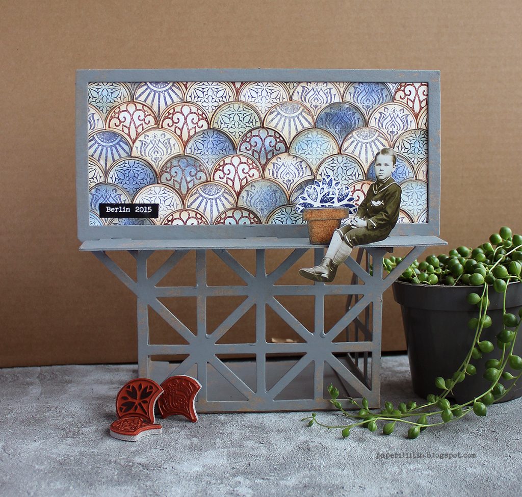
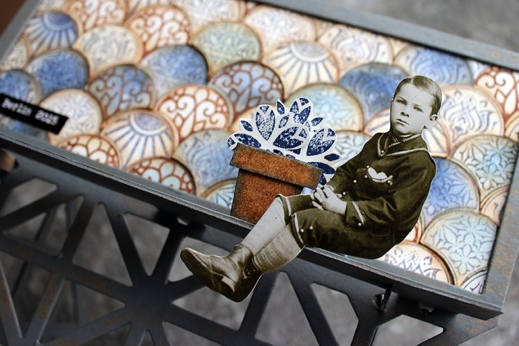
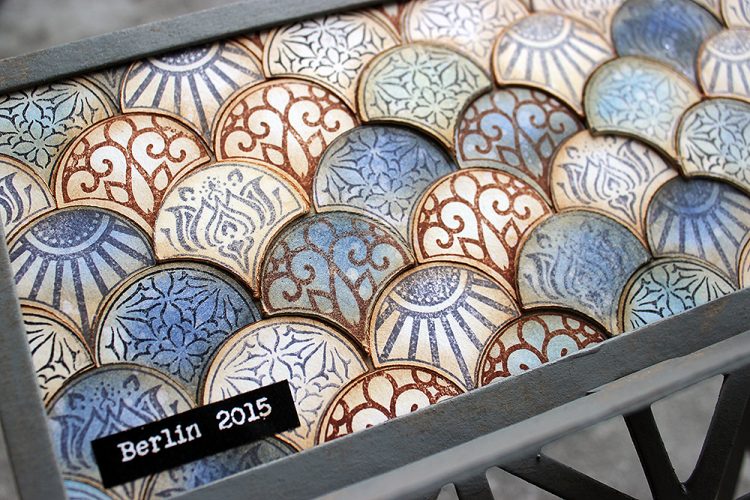
The biggest influence was Berlin where we traveled for a family vacation back in 2015. There was a lot to take in but somehow the most vibrant mental images are of grungy surfaces and tiles. We had a room in a hotel/hostel that was built inside an old apartment building. The staircase of the place was just amazing – it screamed history with the polished wooden handrail, ironwork columns for the handrail, painted walls with decorative motifs and a tile laid floor just behind of the massive front door. I can’t remember the actual patterns of the tiles, but I remember feeling a little sad each morning when we left to go about the town as a couple of the tiles were missing and there were gaps in the beautifully decorated floor.

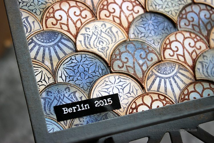
I chose the Fan-tastic Small stamp set to represent the tiles and their patterns. I used three different stamp inks to stamp the patterns and colored some of the tiles blue in a later stage of creating. I’m pretty sure the Berlin tile floor was in the colors of browns and cream, but still I went with blue as the accent. Even though I brought a lot of the brown to the piece by inking the edges of the tiles, I guess the blue has its origin on another trip and city. The blue takes me to 2013, to Amsterdam, Utrecht and especially Amersfoort. The blue is related to a tile Marsha Valk showed me when visiting her beautiful home.

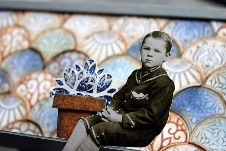
But besides Berlin and Amersfoort, there’s still one more city that inspired a detail to this piece. That’s Ischia. The colors are all wrong for that but coming off the ferry from mainland Italy to the island, there was a flowerpot with vibrant red geranium on a windowsill of one bright white building. Sunny day made the colors so vibrant, it felt like saturation was up by 100. The window with the flower was the only window on that side of the house and the flowerpot got etched into my brain vividly. So, while my piece has tulips and they are blue, the idea of this detail came from that mental image.

I recorded a little video while working with the billboard. The camera angle is a bit off in the end as I assembled the piece before adding the finishing details, but I hope you can still see my process.

Thank you for stopping by today! Wishing you a lovely week and great travels though the different memories!


Thank you Riikka – was so nice to hear the travel inspiration behind the color and pattern choices that you made and to see how you incorporated that into the piece.

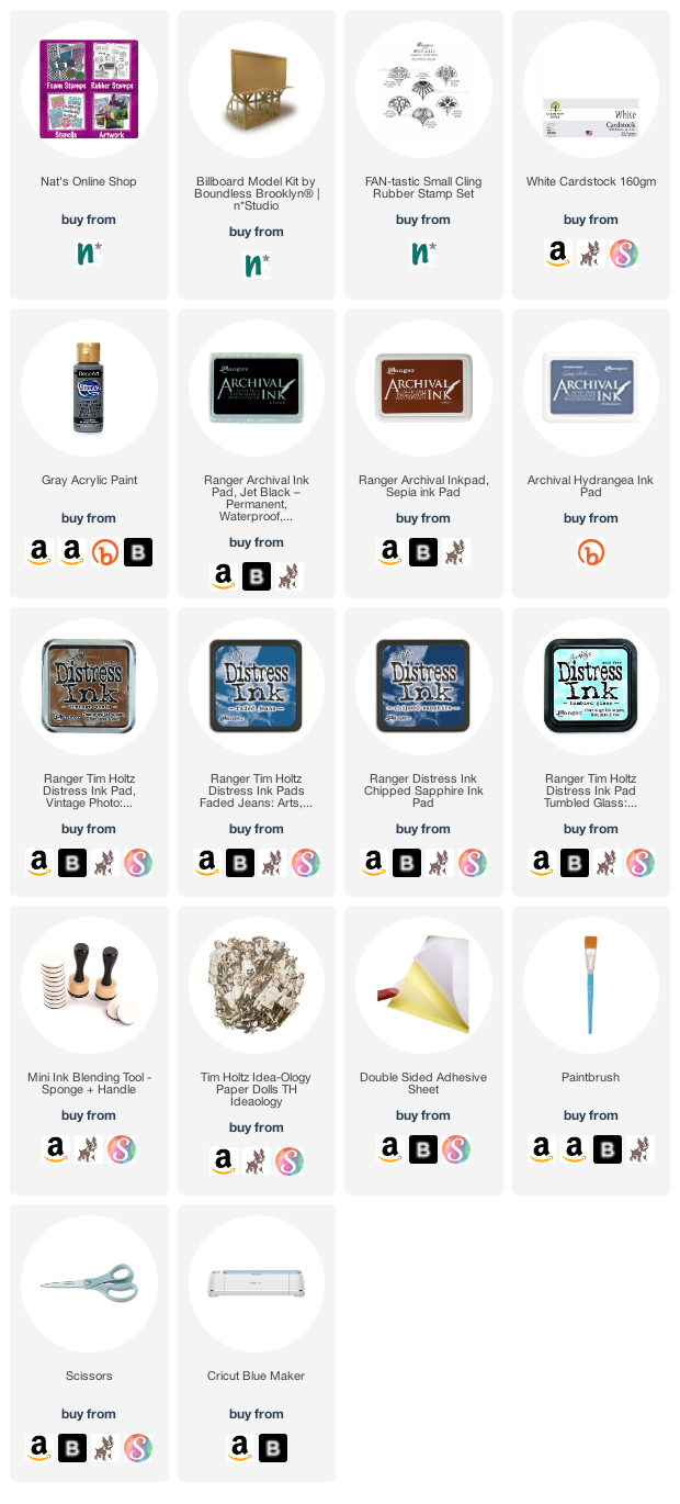
Give it a try: you can find all my Rubber Stamps and those cool Cardboard Models in my Online Shop and here are some of the supplies Riikka used:

Follow Nat’s Creative Squad on Instagram too: Each week we post projects, ideas, and inspiration for mixed media art.

Comments (1)

  • Sue Clarke

    |

    I absolutely love the colors that you used and the cute bill board display.

    Reply

Leave a comment

Creative Squad: In the City – Maura Hibbitts

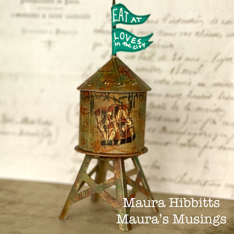
Hello from my Creative Squad! Today we have a really fun project from Maura Hibbitts using some of my rubber stamps and the Water Tower mini cardboard model. This month’s theme is: In the City – Although we aren’t traveling much these days, let’s reminisce about a time we traveled to another town or city. Think about the flavor of the place and let that guide your color and design choices.


I will admit, I am a country girl…I love the mountains and forests and wide open spaces…but every once in awhile I head to the city. I may have an appointment, or go to a museum or a show, but it seems there is always something that draws me there from time to time. I live in an area with small cities, and these have a lot to offer too, that’s where I go to the Asian and Indian markets, to Trader Joe’s, the art store, to the co-op to get the roasted coffee beans I love, to photograph buildings and people and rusty structures. I am a train ride and a few hours away from New York City, and have taken 150 middle school students to explore the city (yep, a few gray hairs from those trips), met my sister for a few days on her business trip and explored Central Park, attended and presented at conferences for education, enjoyed a wonderful high tea with my sisters at a ritzy hotel…truly memories that will be with me forever. No matter if the city near you is small, or a metropolis, go out and explore and see what it has to offer.

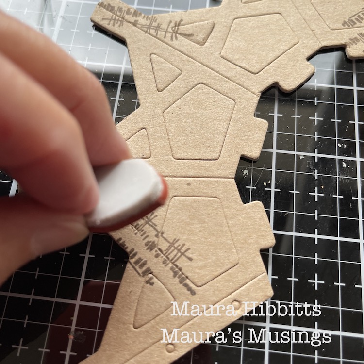
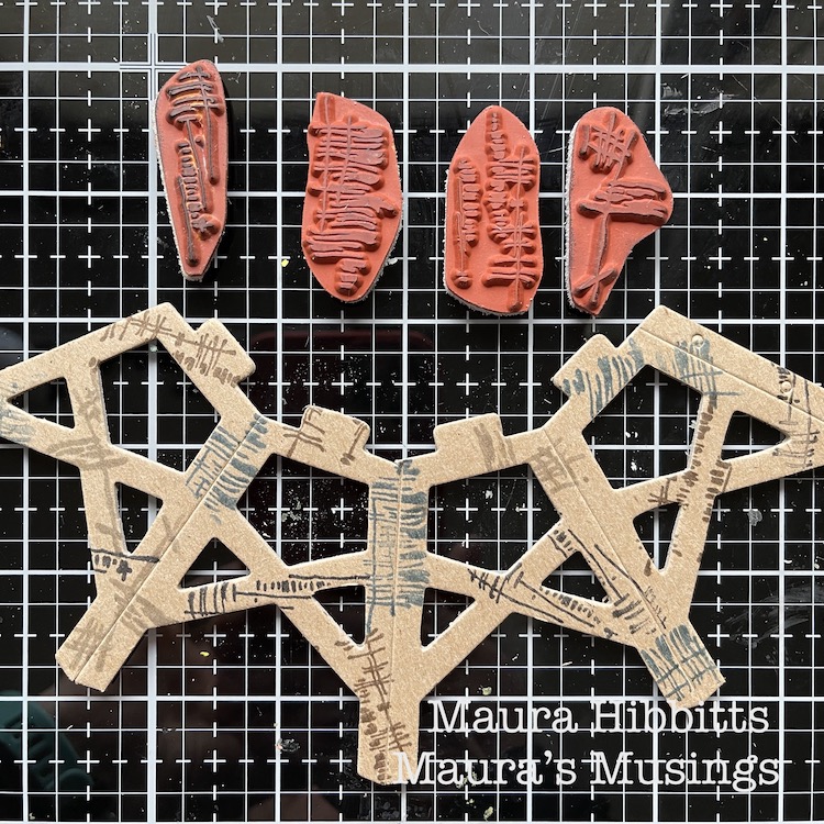
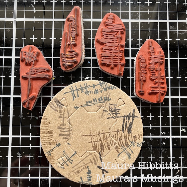
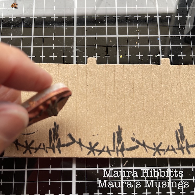
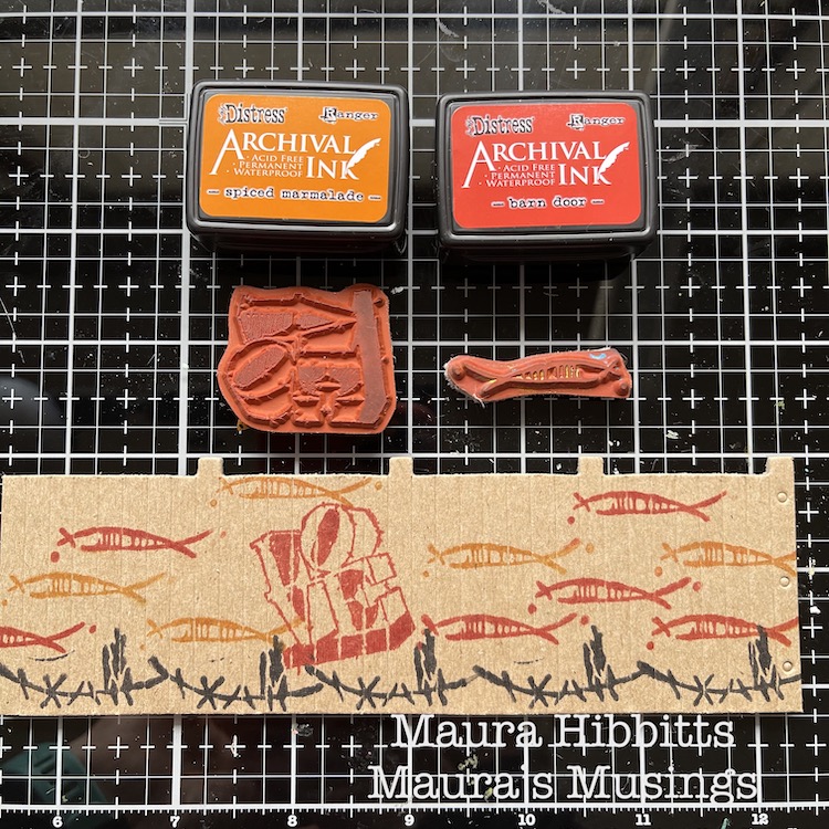
We received these cool models from Nat for this month’s project from a company called Boundless Brooklyn, and mine is a replica of real water tower in the city…I may just have to visit and try to find it. I took everything out of the folder, laid it out, and thought of ideas. I wanted a grungy look, so I started by stamping the bases with the Wabi Sabi stamps – gnarly, funky, jazzed, and far out, and a variety of archival inks in brown, black, grey and blue. I kept the pieces flat for the stamping.

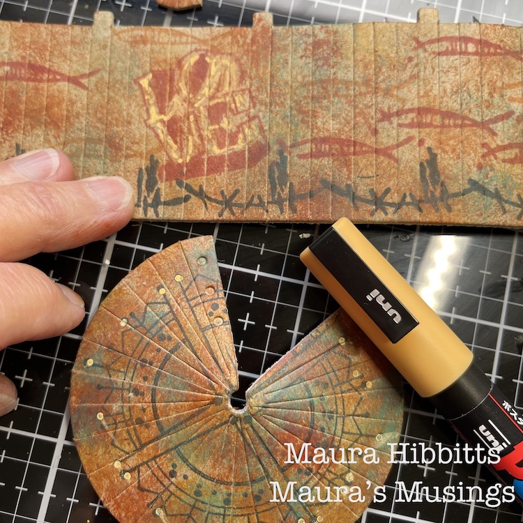
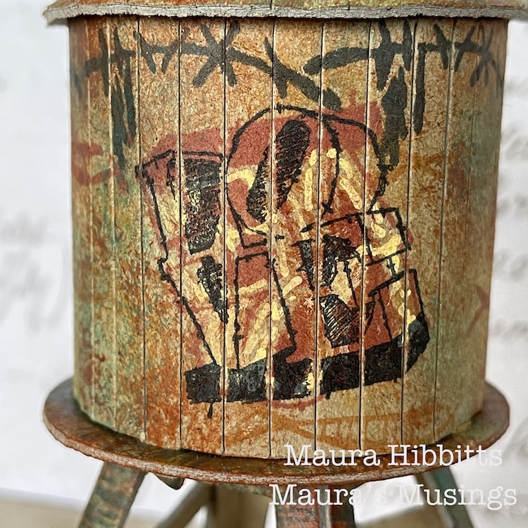
I stamped the walls using the Wabi Sabi stamps, groovy and neato, using archival red, black and orange inks. I also wanted to add a graffiti-like image, so added the Love stamp. I was happy with my design, it looked like fish swimming around the tank. 

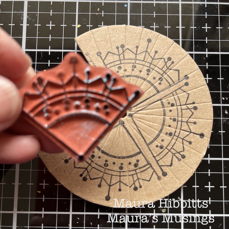
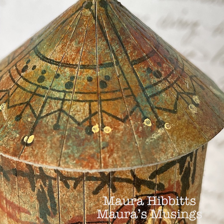
I decided to pretty up the roof too, after all if you were looking down from a higher building, it would be nice to see. I stamped around the piece using the Jugendstil stamp from the Mini Motifs set and black ink.

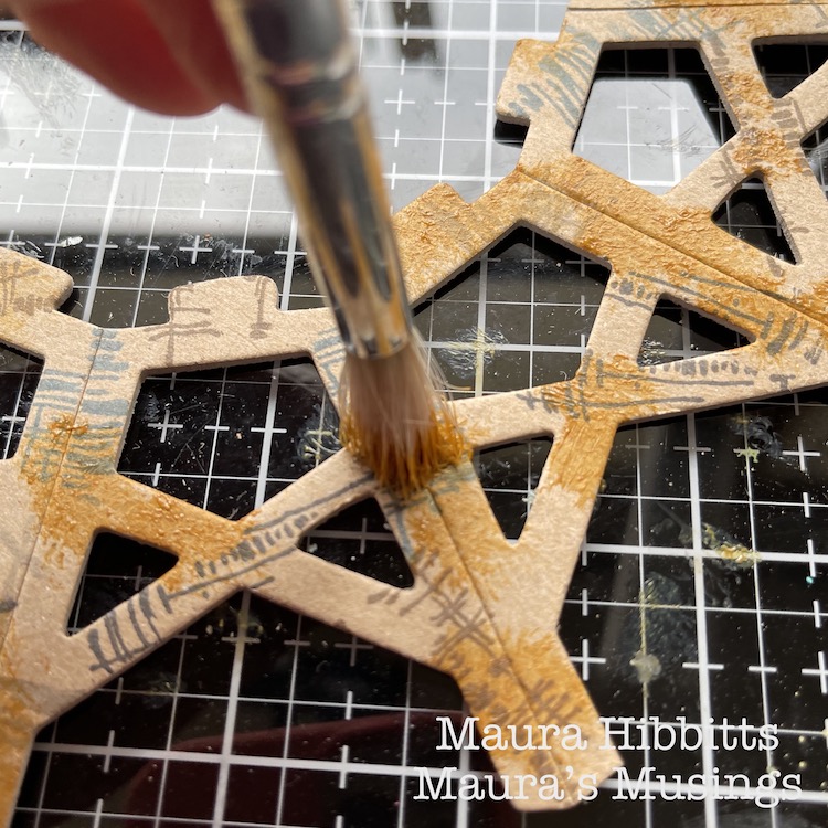
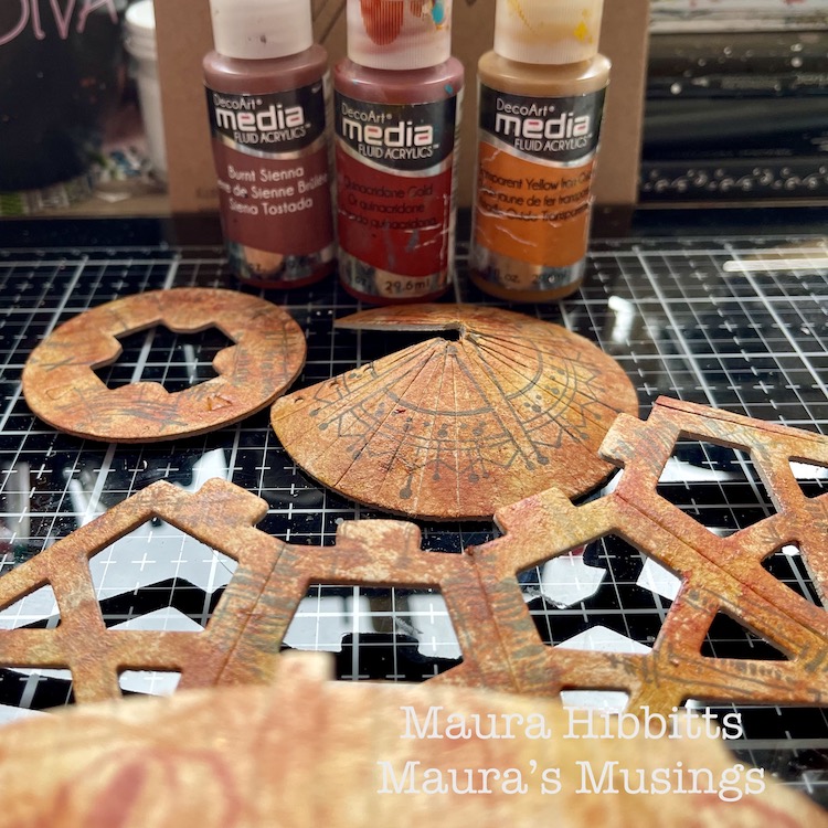
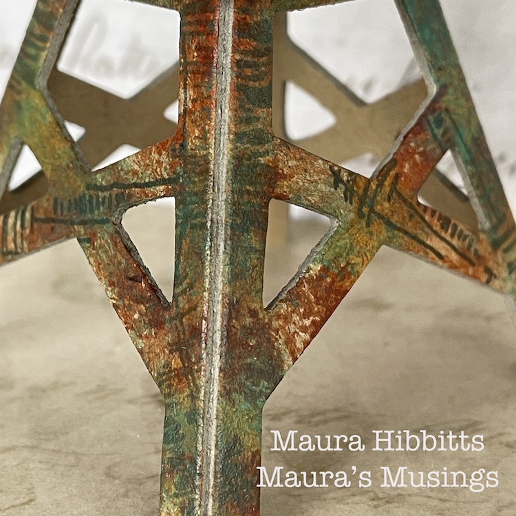
Now, it’s time to add the paint. I used fluid acrylics so that my stamped images would show through. I started with Transparent Yellow Ochre and an old brush, and pounced the paint randomly onto the pieces. I repeated this step with Burnt Sienna and Quinacridone Gold. It created a rusty appearance to age the water tower.

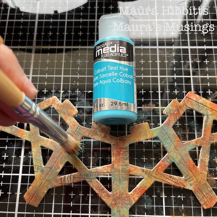
To add more depth to the painting of the tower and a patina effect, I went in and pounced on Cobalt Teal Hue. I felt this would allude to the water tower being constructed of metal.

I added a bit of detail to the Love stamp and roof with a light orange Posca pen.

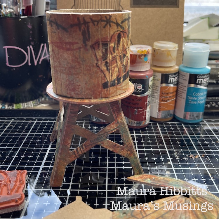
Then I just followed the kit’s directions to assemble the water tower…and that is when I discovered I had stamped the walls upside down…darn it! I thought I was being so careful in laying out all the pieces before I began. So, in order to save my idea, I stamped Love again, upside-down over the first one. Luckily, I had stamped the first one in red, so the second one in black took over.

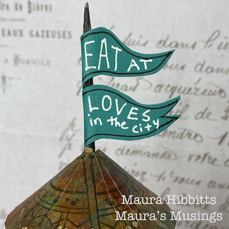
I thought about how structures in the city often advertise businesses in the area, so I made a flag using a skewer and teal paper and added “Eat at Loves in the city”.

What a great little model, and so fun to alter and assemble! You can create a lot of texture and age with stamped images and the right paint colors. I admit, I do love finding rusty structures and photographing them, and the city is a great place to find them.

Find out what makes the city near you unique and different, and go explore. I learned the small cities in my area are known historically for glove making, horse racing, and carpets. I found a small local railway line, which is now a bike path. I’ve learned about the role the Erie Canal played in developing my region. Discover who first settled the city and learn about them, like I found out how many areas near me were settled by the Dutch, and when you look closely, you can find the clues in place names and architecture. Enjoy learning about your city! – Maura

Thanks Maura – love the feeling of age and patina that you were able to create with rubber stamps and paint – this really looks like you could find it in real life. Now… I wonder how the menu is at Love’s :)

Give it a try: you can find all my Rubber Stamps and those cool Cardboard Models in my Online Shop and here are some of the supplies Maura used:

Follow Nat’s Creative Squad on Instagram too: Each week we post projects, ideas, and inspiration for mixed media art.

Comments (1)

  • Sue Clarke

    |

    Maura, I love the color that you created. It looks so real.

    Reply

Leave a comment

Creative Squad: Another Door Opens – Jordan Hill

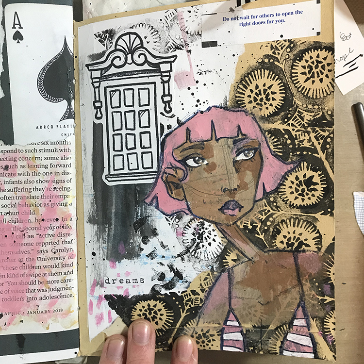
Hello from my Creative Squad! Today we have an art journal page with a bonus mini page from Jordan Hill. She is using my Triple Play stamps and our theme: Another Door Opens – There is this saying, “when one door closes, another door opens” that basically is an optimistic way of looking at change in your life. Create an art journal page with this in mind, however you’d like to express it, however the idea inspires you to create!


Hello everyone! I’m super excited to be back with my project for April 2021; I had a lot of fun with this month’s products and theme, so I hope you all enjoy following the process as much as I enjoyed creating this page!

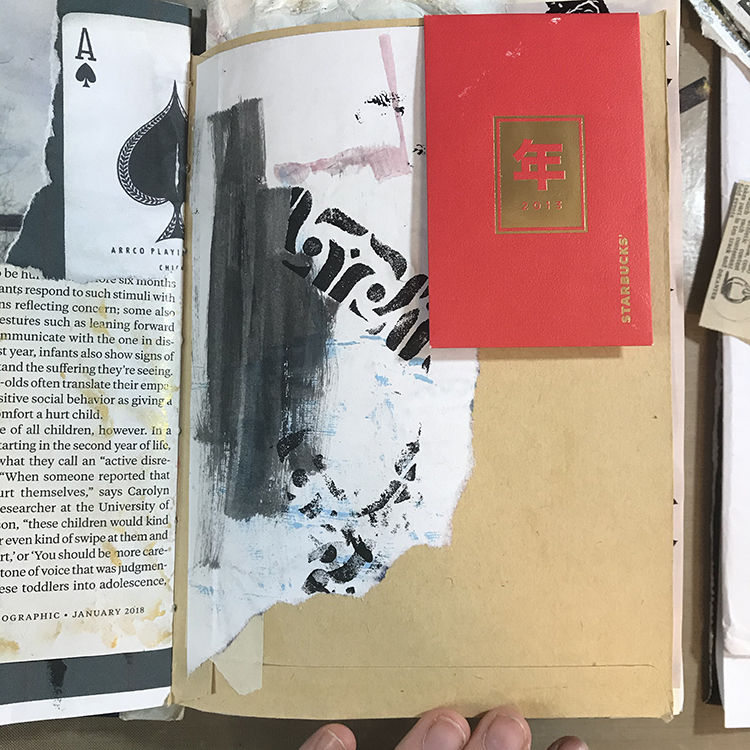
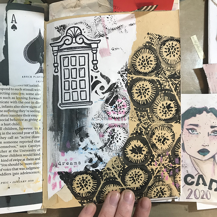
I decided to begin this month’s page with a piece of collage. When I create journal pages, I tend to end up with a lot of excess paint, either on my palette or my paintbrushes. In order to make sure none of this excess paint goes to waste, I use scraps of paper to clean it up.

In addition, I had been playing around with one of the stamps from the Triple Play Foam Stamp Set on another page in my journal. The excess from that page had ended up on this scrap of paper, so it seemed like the perfect start point! I tore off a chunk and glued it down. I also glued a coin envelope to the upper right hand corner of the page, as I felt that the idea of a pocket was in line with this month’s theme of “Another Door Opens”.

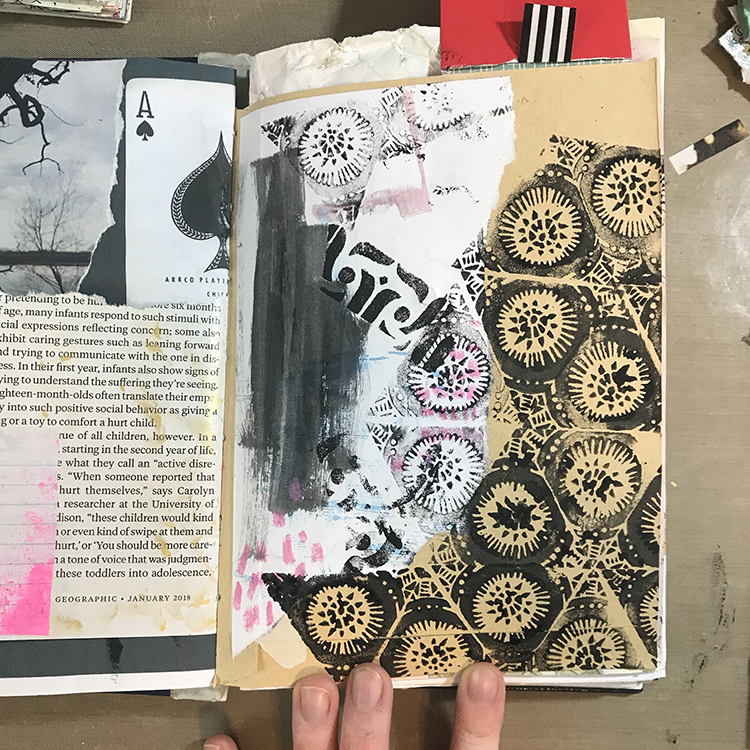
Next up, I used a second stamp from the Triple Play Foam Stamp Set along with some slightly watered down black acrylic paint to almost completely cover the lower right hand corner of my page. I made sure to overlap my background stamping with the collage piece in order to incorporate it into the page. I also used this same stamp in the upper left corner.

Since there was already some pink on my collage piece, I decided to push that a bit further and used a pink oil pastel to do a bit of mark-making in a few different places on my page.

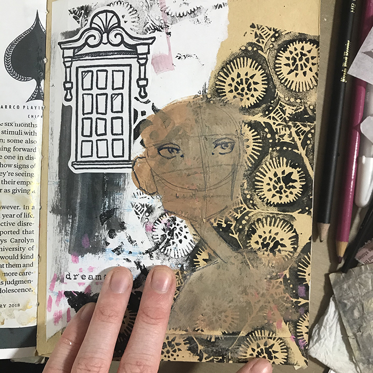
I then incorporated a few more pieces of collage. A while back, I drew a bunch of windows with the intention of using them as collage material for my journals. I felt as though this tied into the April theme, so I glued one in. I also glued down a tiny found word clipping in the lower left hand corner of the page.

It was then time to start working on the focal point! As usual, I knew I wanted to incorporate a face, so I started things out by using some acrylic paint to block in the basic shapes. Then, using an indigo colored pencil, I started to sketch in the facial features.

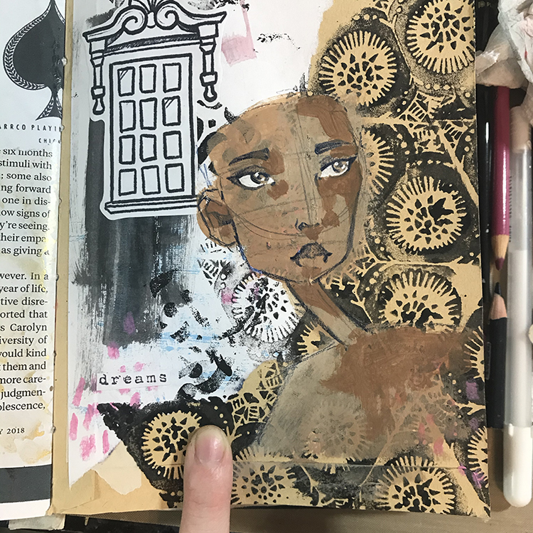
When it comes to shading faces in my journals, I don’t always add shadows. Often it depends on the size of the face that I’m drawing. Because this particular face was on the larger side (and seemed a bit flat), I decided I did want to add shadows. I used a slightly darker color of paint than the base skin tone and started blocking in my shadows.

I don’t usually overthink it when it comes to adding shadows to my faces, but a good tip for knowing where to put them is to have an imaginary light source. For this particular face, my ‘light source’ was in the upper left, so I added shading to the right side of the face.

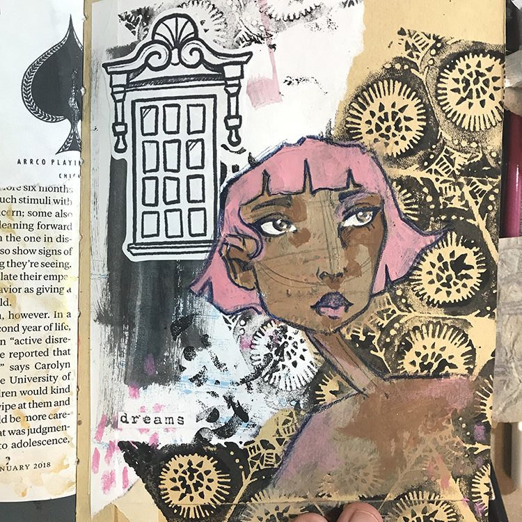
Next it was time to add the hair. Since the majority of the color that already existed in this page was pink, I decided to go with that as the hair color! I sketched out the basic shape of the hair with my colored pencil, before using acrylic paint to add the color.

I also used this same pink in the lips, cheeks and shoulders to warm up the skin tone and tie the face together with the hair.

It was then time for the finishing touches! I added a shirt, used some watered down black acrylic paint to flick some splatters across the page, and found a fortune from a fortune cookie laying on my desk that was perfectly in line with the theme!

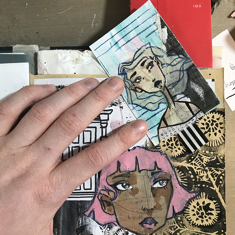
As one last little bonus element for this page, I also slipped a card inside of the coin envelope I glued down in step one, and created a little mini page on top of it. To me, the idea of this hidden page is yet another nod to the theme of “Another Door Opens”.

I hope you enjoyed following this process and possibly try some of the ideas for yourself!


Thank you Jordan, I just love the intriguing backgound you created with the stamps and collage!

Give it a try: you can find all my Foam Stamps in my Online Shop and in addition to collage papers, here are some of the supplies Jordan used:

For more projects and ideas, check out Nat’s Creative Squad on Instagram too: Each week we post projects, ideas, and inspiration for mixed media art.

Comments (1)

  • Diane Tignor

    |

    Love the message of this art journal page. Striking w the imagery.

    Reply

Leave a comment

Creative Squad: Another Door Opens – Robin Seiz

Hello from my Creative Squad! Today we have a beautiful little journal from Robin Seiz, sharing with us her experiences over the past year, and using my Triple Play stamp set and our theme: Another Door Opens – There is this saying, “when one door closes, another door opens” that basically is an optimistic way of looking at change in your life. Create an art journal page with this in mind, however you’d like to express it, however the idea inspires you to create!


This month’s theme was about emerging. When one door closes, another one opens. I am a strong believer in this saying.

I haven’t journaled or written much about the pandemic, yet I feel like I have “processed it” in the daily moments as the days and months have unfolded. It’s been a year of ups and downs for me. It felt really scary in March, 2020; it was a dark time. I really missed seeing family and friends, especially my children and grandchildren. As the months went on, I got into a rhythm; a pandemic pace, if you will. I spent enormous amounts of time in my studio creating. One day rolled into another; I wasn’t sure how a week had flown by. We developed our pandemic pod and learned how to see a very few friends in a socially distanced way.

By June, I was feeling better. We had learned how to get what we needed, we had our systems down, we were zooming with friends and family with the warmer weather, we could get outside.

By the fall when we were moving indoors, it felt disheartening. I really couldn’t fathom the thought that our long standing Christmas traditions had to be put on hold. We managed to quarantine and test and could at least have my children and grandchildren in for a gathering. We did everything we could to mitigate the risks. My partner and I made our own new traditions, which we have decided we will keep. A silver lining!

By January, I was feeling like this pandemic would never end. I was still enjoying the studio and vowed to get out everyday for a walk, even in the cold. And then the spring came, vaccines were on the horizon and it seemed like there was a glimmer of hope.

If I think about the doors closing — for me that included an over-scheduled life; all wonderful things, but just too many of them. I have come to really appreciate the “pandemic pace” and it’s opened the doors for a different way to think about family gatherings, what I add to my plate, and how I spend my time post-pandemic in a way that brings me joy everyday.

I used Nathalie’s new Triple Play Foam Stamp to illustrate what I just verbalized.

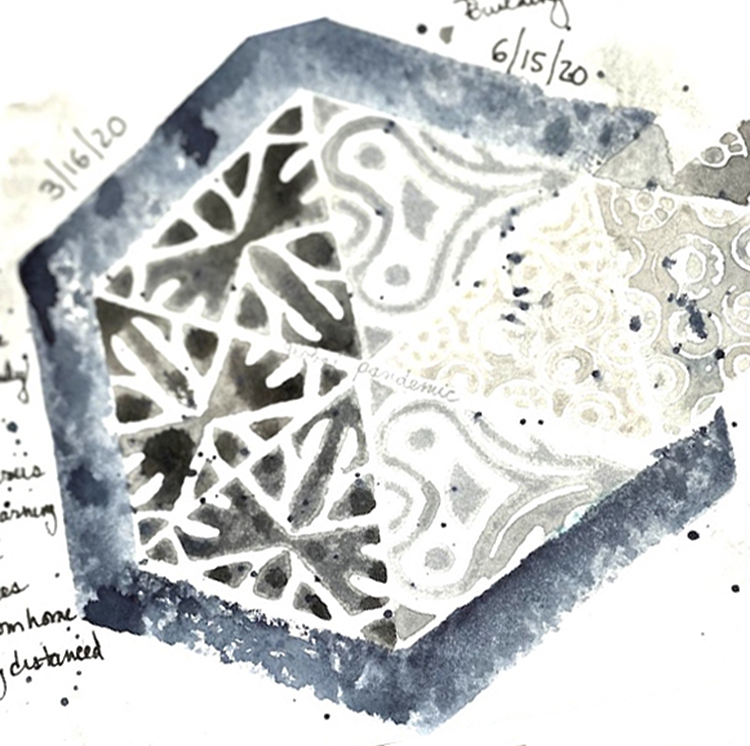
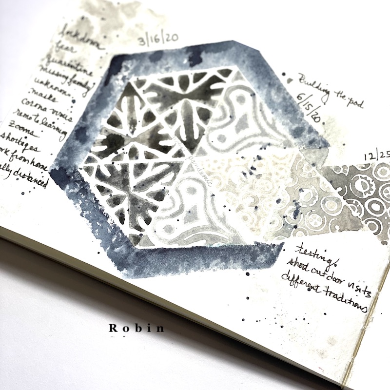
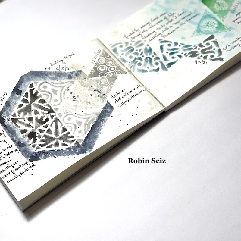
I started with an 8 x 5 Strathmore watercolor journal. I spritz it with water and lightly added some Quor watercolors to the pages, just so I wouldn’t have a blank page. I used grays and blues. Then I splattered black paint on the left page to represent this dark time. Next, I put black water color on all but one side of the hexagon. I wanted the one side open so the triangles could emerge from the opening.
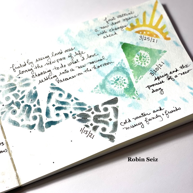
On the left page, I stamped the same triangle in black signifying those first few dark months. and how I felt. Then I used more grays and a different triangle to show how I settled into a routine of sorts. By Christmas, the triangles are emerging, but it’s a little scary.

On the right side, the page becomes more hopeful, but as January arrives, it’s sad again and it seems like it will be a long winter. As the months go on and spring arrives, the news of vaccines is better, my colors are more hopeful. The last stamp, the sun, ends with the day I received my first vaccine. We can do so much with color to select feelings. It can tell a story on its’ own. I was also selective about which triangles I used to tell my story. The tulips and other spring looking triangles were used at the end. And finally, the sun, always a symbol of a new beginning to me. 
The message for me in all of this is to hold on to the things that have given me joy during the pandemic, to cherish every moment of being with those we love, and to honor this time as a a moment when the world slowed down. 


Thank you Robin for sharing such a thoughtful page – there are so many familiar emotions and ideas here that I know will ring true for almost all of us. What a beautiful representation of them!

Give it a try: you can find all my Foam Stamps in my Online Shop and here are some of the supplies Robin used:

Don’t forget to check out Nat’s Creative Squad on Instagram too: Each week we post projects, ideas, and inspiration for mixed media art.

Leave a comment