Pattern and texture are two elements of artwork that always catch my attention. If you know me, I am pretty big on using both in my own work too. I think they add so much – movement, complexity, and that little something that makes you want to look more closely. They invite the viewer in and hey, that’s a good thing.
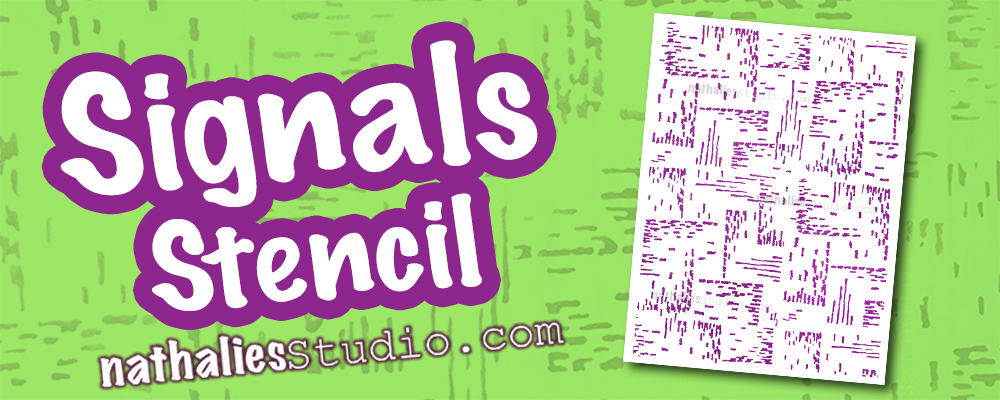
One way I add pattern and texture is through stencils and a favorite is my Signals stencil. It is definitely abstract and a little bit random too. The pattern was inspired by a vintage German roller stamp and it is just the thing for instant mark-making.
When I want pattern in a background of an art journal page to balance with some heavy duty journaling, Signals really works. I think it’s so successful because of its smaller scale and also it’s not super perfect with harsh edges. It isn’t geometric – it has a hand drawn feel to it that is very human.
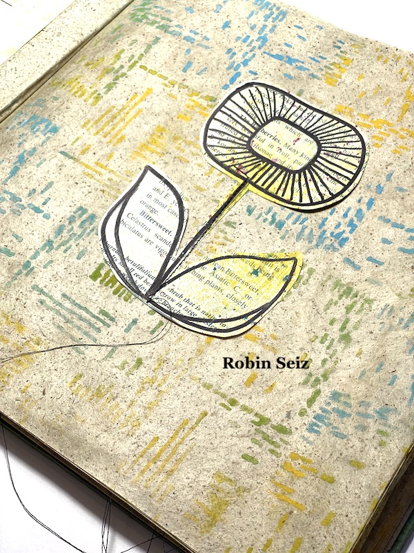
Here my Creative Squad team member Robin uses it in muted tones over book pages for a quiet background that still has interest.
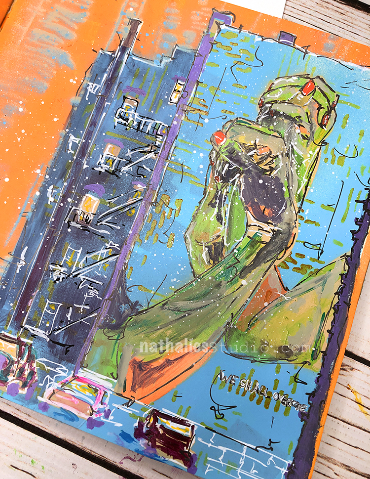
Besides backgrounds, Signals was my solution in this art journal page to give my building a little visual texture. Is it masonry showing through the mural or maybe just a little gritty urban texture? You can decide :) I think it works.
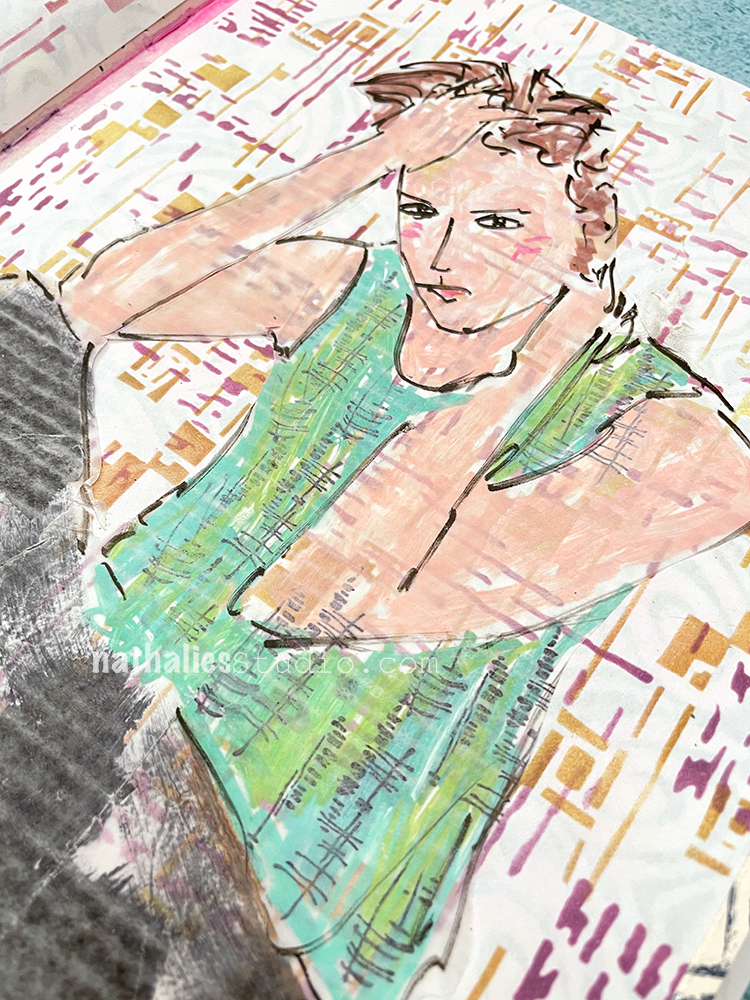
Signals plays nicely with other stencils too for layering, probably because it is more about texture and marks. Here it’s layered with my Space Age Modern stencil in pink and orange Distress Ink for a more complex look. Kinda gives an agitated vibe to the art journal page and fits the pose of the figure.
If you need a bold pattern though, Signals can work in that way too. I love layering it in black over bright colors. It has serious energy here.
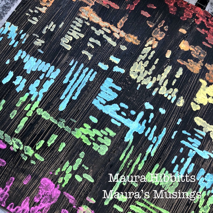
Or do the opposite like my Creative Squad team member Maura does here – use the Signals stencil in bold colors over a black acrylic background. I love it!
Hope you enjoyed seeing how you can use the Signals stencil to add pattern, texture, and interesting details to your mixed media artwork. Give it a try! Here are some of the supplies used in these examples:
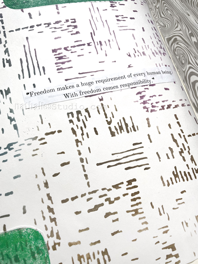
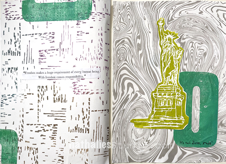
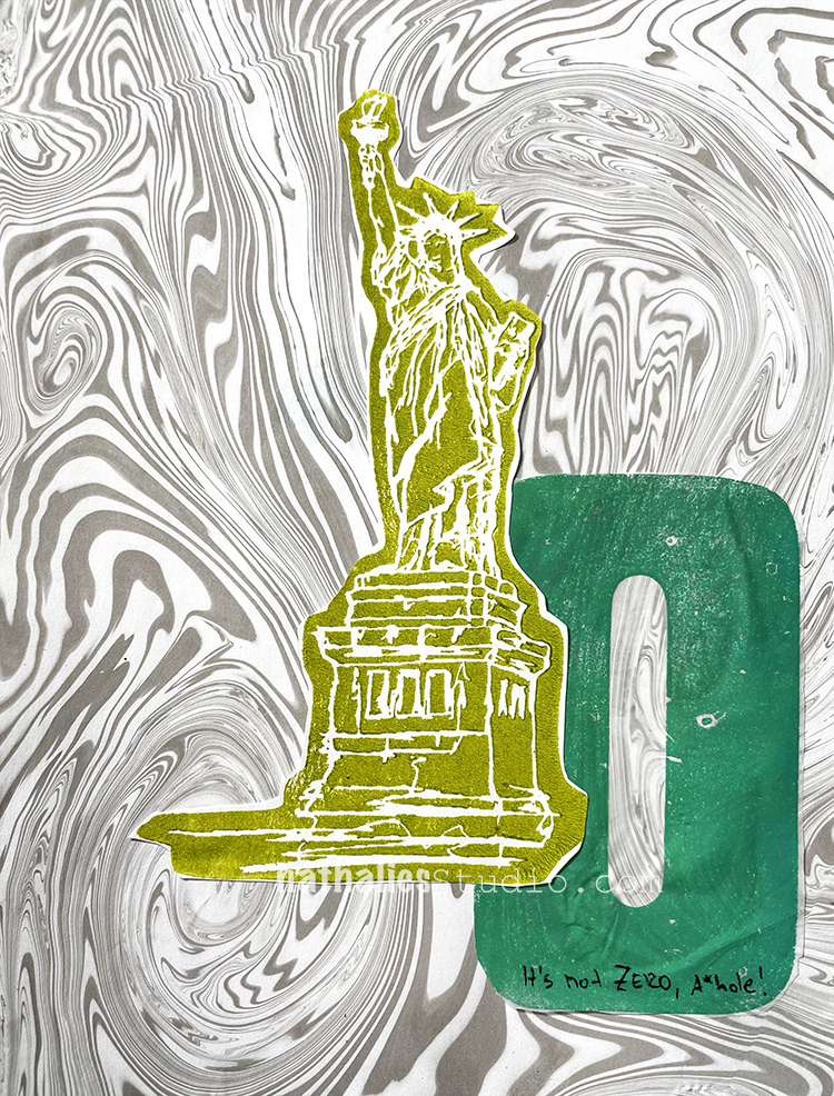
“Freedom makes a huge requirement of every human being. With freedom comes responsibility.” – Eleanor Roosevelt
And I am using a bit of profanity in here too because I am annoyed with all these “but my freedom” people.
I used two collage papers from my stash for this one including the suminagashi paper above. There is also my Lady Liberty foam stamp and the zero is a block print from my wooden letter press numbers printed on deli paper using Speedball Fabric Ink and a Speedball press.
The other collage paper is my Signals stencil which I though worked nicely with the suminagashi print.
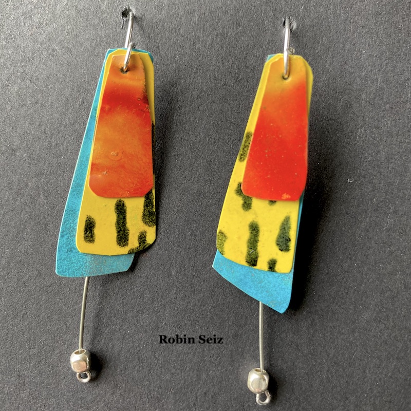
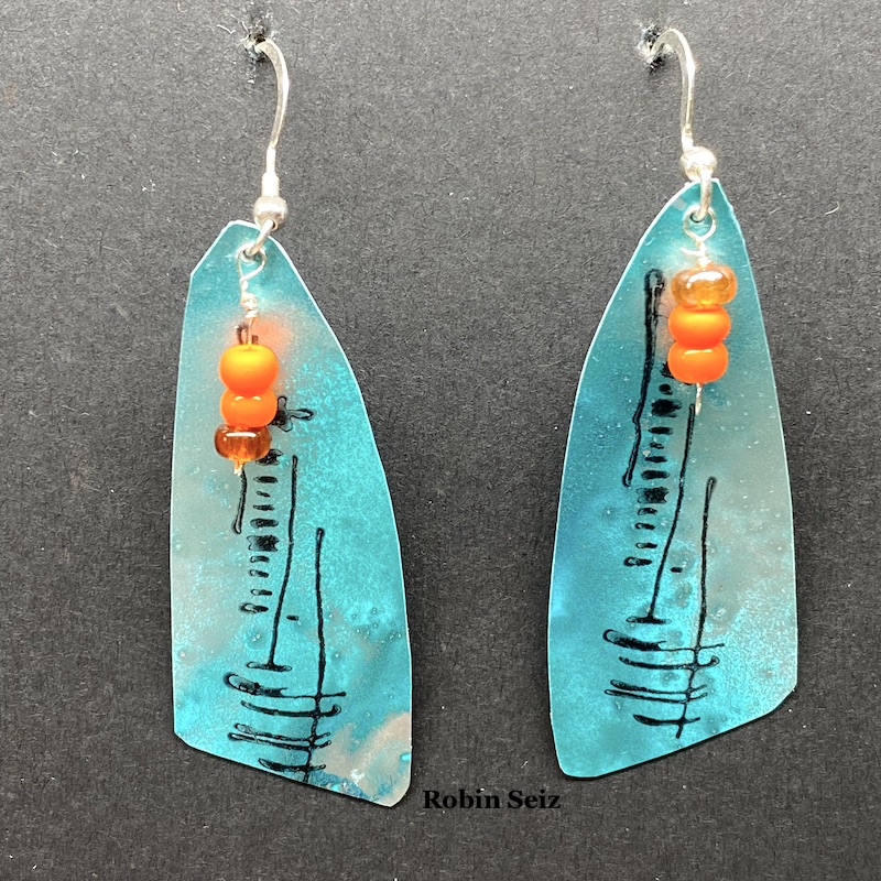
Hello from my Creative Squad! Today we have some seriously awesome earrings from Robin Seiz using my Central Ave 4×4 and Signals stencils and my Wabi Sabi rubber stamps. This month’s theme is: PrimaryColors: Red, Blue, and Yellow it’s your time to shine. Let’s get back to the basics of color and light and play with primarycolors. It’s elementary my friend! This month we are also pleased to be partnering with Grafix who supplied the squad with some cool products to try out. Read on:
Hi Friends,
This month was about using primary colors, Grafix Products and of course, incorporating Nathalie’s wonderful products. Primary colors are so happy; they remind me of summer, but I must admit that I don’t use them often. It was good for me to reflect on why they aren’t my “go to” colors. The reason I suspected was amplified in this project. I’m a messy multi-media artist. What I mean by that is, I’m always mixing colors. Primary colors by their nature make a host of other colors, so once I put them down on paper, I always end up with something else; they rarely end up in their pure form. For example, the “red” in the earrings I created is really orange, because once the yellow and red mixed…. well, it’s no longer red and yellow. :)
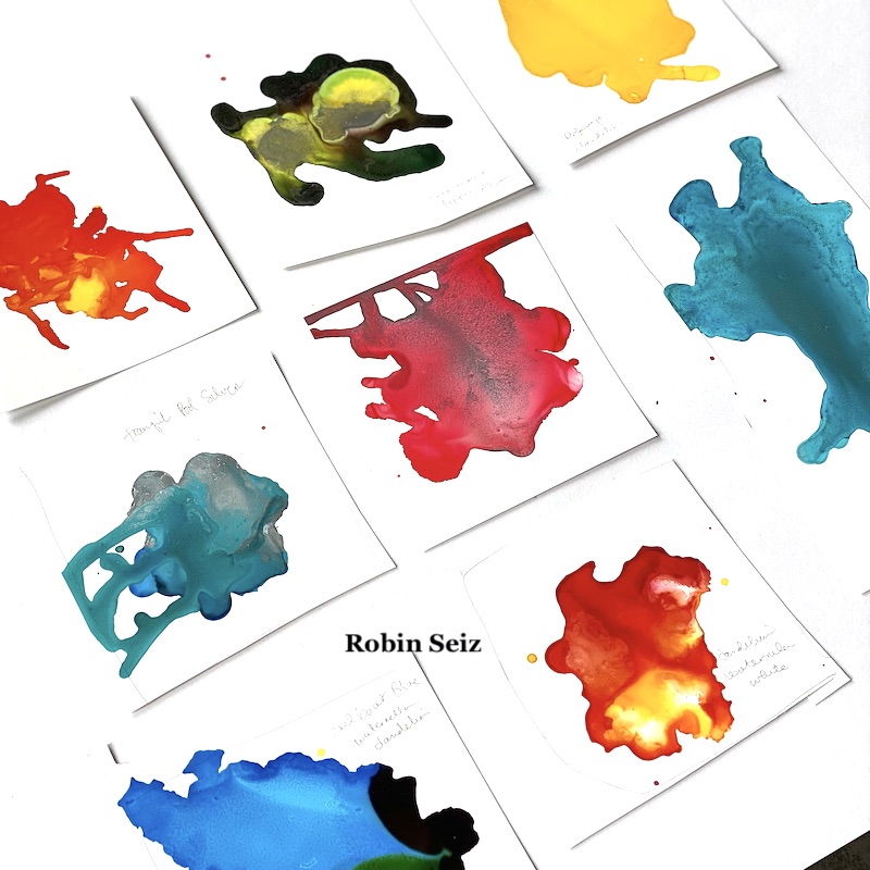
I hadn’t been introduced to Grafix products prior to this month, but I loved working with the opaque craft plastic. I’m excited to work with some of the other products as well. This opaque craft plastic works really well with alcohol inks. It seems to hold the ink in place a little better than Yupo, for example. This produces even more vibrancy than you normally get with alcohol inks.
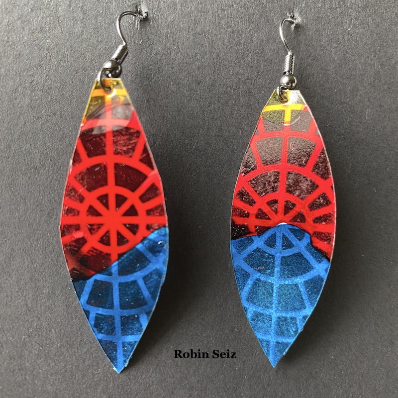
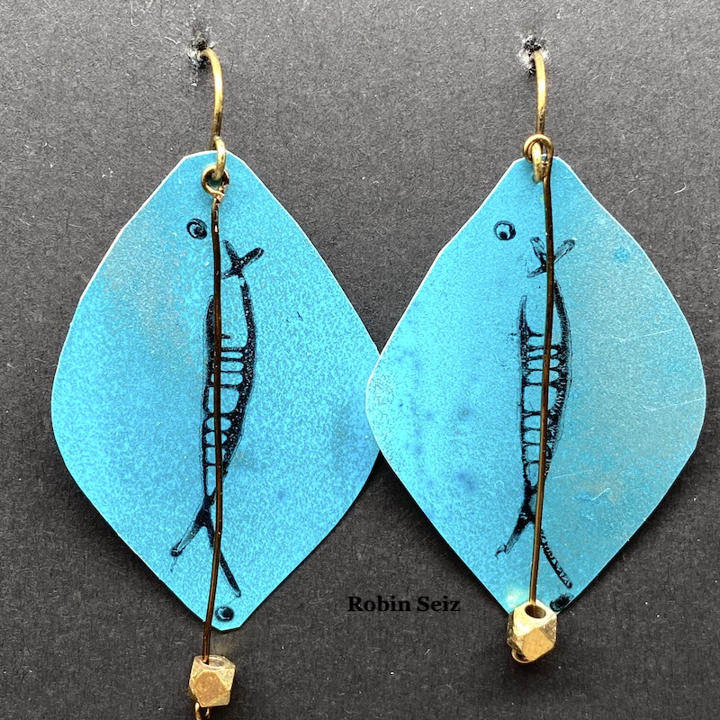
My mixed media journey started with scrapbooking and then went to jewelry and then exploded to all kinds of other mediums and substrates. As result of my early days, I still have a lot of jewelry making supplies. Sometimes, I get the urge to combine my mixed media work with making jewelry. For this month, that meant earrings.
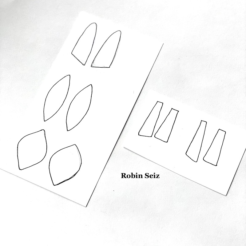
I started the project by drawing the shapes for the earrings on card stock. I chose shapes I like. If you try this project, you could use any shape you like. Next, I cut out the shapes and put them aside.
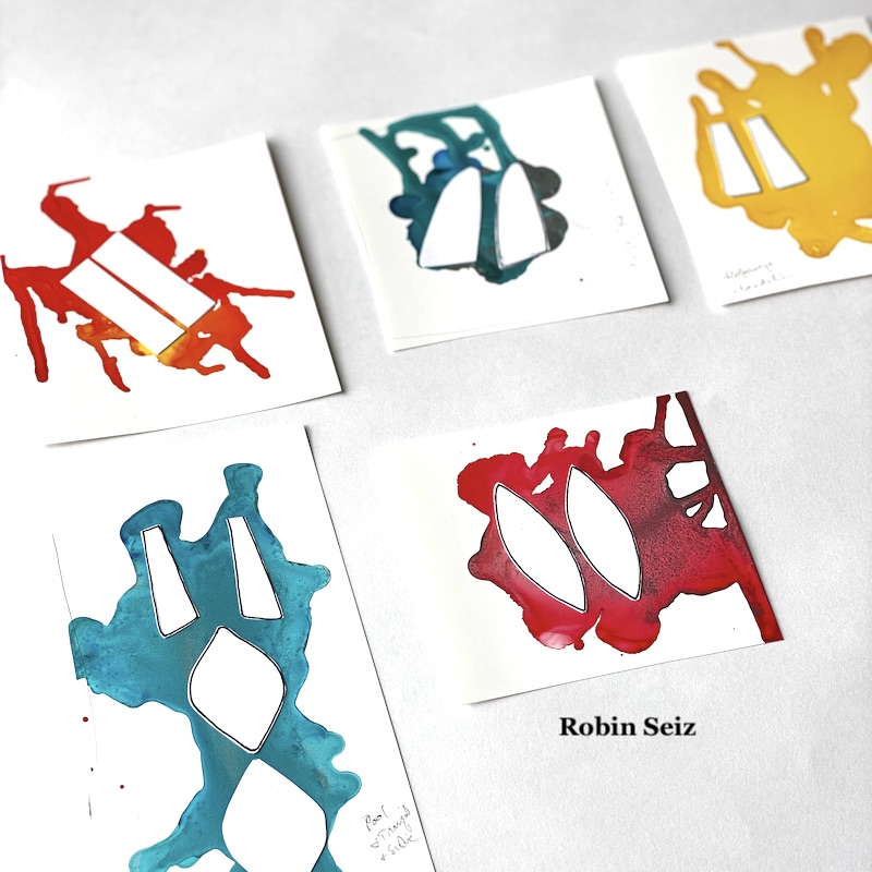
Step 2 was the most fun! I tested various alcohol ink colors on the opaque craft plastic. I could have done this all day; just watching alcohol ink flow is so relaxing and organic. The results are always a surprise. This is the part where the colors often run into each other and make a different color than is intended, but I just go with it.
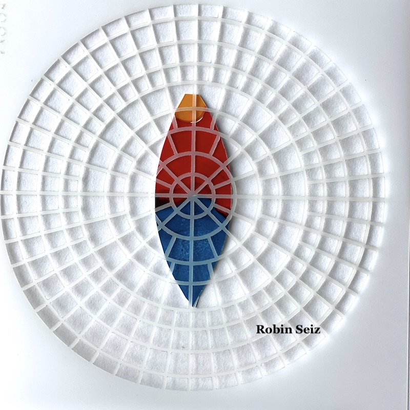
I chose color patches I liked the most, and the ones which were in the primary color family (at least kind of). I laid out the blank cut out shapes on the opaque craft plastic. This can be a tricky process if you are someone who wants both earrings to look exactlythe same. I don’t really care about that; I like to know they were made by hand rather than manufactured to be identical, but if it bothers you to have them slightly different, then you can take that into account when you lay them out. Additionally, you may want to use solids rather than several colors on a sheet to get more a more consistent look.
Once they were laid out, I carefully cut them out with a small pair of scissors. The craft plastic is easy to cut. If you are comfortable with a craft knife, you could also use that.
Once cut out, I applied Nathalie’s Wabi Sabi rubber stamps and Central Ave and Signals stencils to the earrings with a permanent black ink. This added so much dimension and interest to each piece.
I took some of my jewelry components, small beads and wire, nothing really fancy, and added it to the earrings. Again, it added more dimension and interest.
The final process, which is important especially if you are going to sell your earrings or want them to last for a long time, is to spray Krylon Varnish and UV protection to them. Alcohol inks dull quickly and this will protect both the color and the inks from smearing. Make sure to do this in a well ventilated area and hold the can pretty far away from the earrings, otherwise, they will smear.
Summer is here, it’s always fun to have a new pair of earrings! I hope you try out this project.
Thank you Robin! I absolutely love these and could totally imagine donning them to liven up an outfit with some artsy style!
Give it a try: you can find all my Rubber Stamps and my Stencils in my Online Shop and here are some of the supplies Robin used:
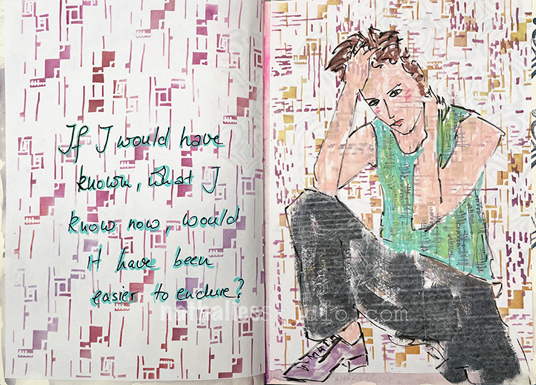
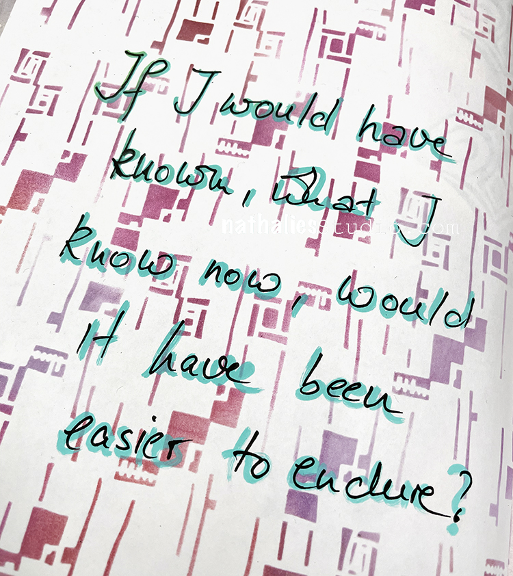
“If I would have known what I know now, would it have been easier to endure?”
Again for the backgrounds on this one I was using papers that I had previously stenciled using my Signals and Space Age Modern stencils, RubberMoon ink pads, and a blender tool. I just pasted them into my art journal and then used deli paper to sketch out the figure. I was working on the back of the deli paper, layering my Wabi Sabi stamps with black archival ink and then painting over it. I cut it out and adhered with a glue stick.
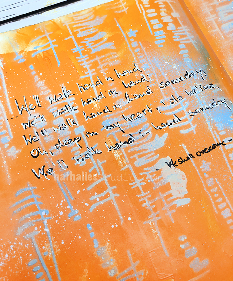
We’ll walk hand in hand, we’ll walk hand in hand, We’ll walk hand in hand someday; Oh, deep in my heart, I do believe, We’ll walk hand in hand someday.
– “We Shall Overcome”
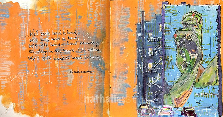
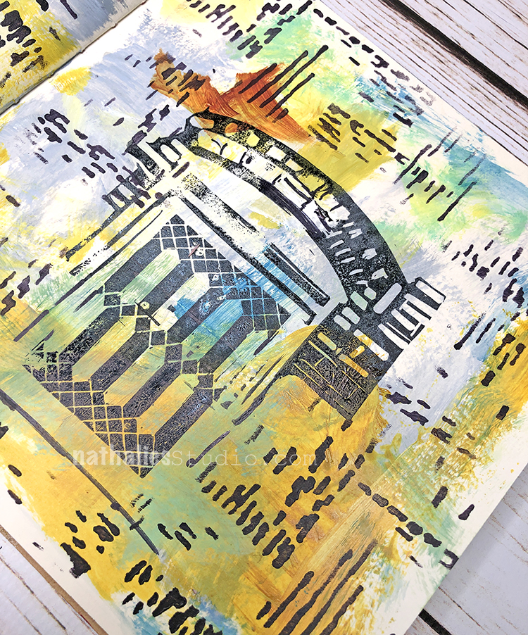
This art journal page is a study for a painting – one that is very of-the-moment you could say. I used acrylic paint, spray paints, gouache and markers and decided to go really bold with colors. I used my Signals stencil for added texture on the building.
I used my Tokyo stencil for the pattern in the background.
I have sung this song so many times in the past.
For/with battered women and to fight that stigma of mental illness…it’s such a great way to unite people around an “issue”.
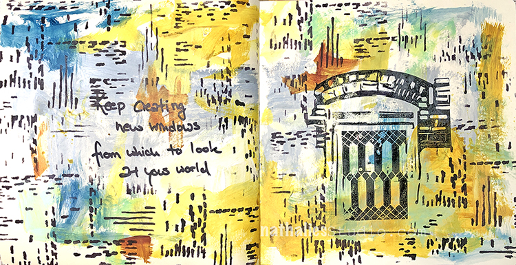
“Keep creating new windows from which to look at your world.”
This was a fun page to make – I used acrylic paints and my new Signals stencil for the background and then I carved stamps for the window and architectural elements.

Love it! Especially the marble-type background paper and your quote.
Reply