Creative Squad

Whole Lotta Love – Jennifer Gallagher

Hello from the Creative Squad! Today we have a post from Jennifer Gallagher that is definitely from the heart :) She is using my Large Hex rubber stamp set and this month’s theme: Whole Lotta Love – Who or what sets your heart aflutter this time of year? Let’s pay tribute this month to those warm fuzzy feelings of love and create something that celebrates that universal emotion.


This month we are feelin’ the love with a “Whole Lotta Love.” As soon as I read the prompt for this month, I got super sappy with an art journal page dedicated to my sweet husband. It is the time of year where we celebrate those that we love and show our appreciation for them. This page does just that. Let’s get started.
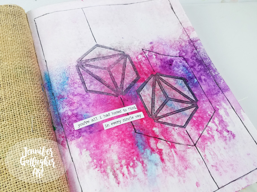
I am working in my Dina Wakley Media journal on one of the cotton rag pages. Before starting, I applied two coats of clear gesso to this page to prepare the surface. Once the gesso was dry, I chose a few colors of Marabu Art Spray and got to work. First I applied Cherry Red and then Aubergine. I protected the top and bottom of the page with some scrap paper to concentrate the color through the center of the page.
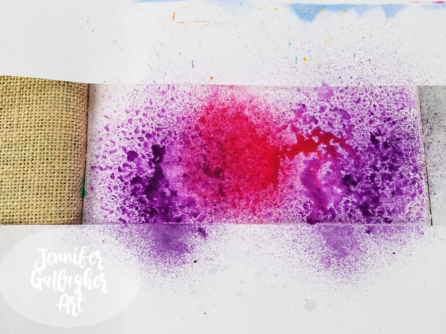
To encourage mixing and movement, I applied a small sprtiz of water into the art sprays.
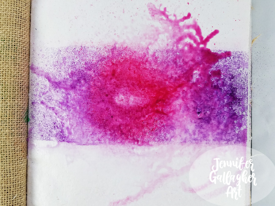
I dabbed up any excess moisture and then applied Marabu Art spray in silver.
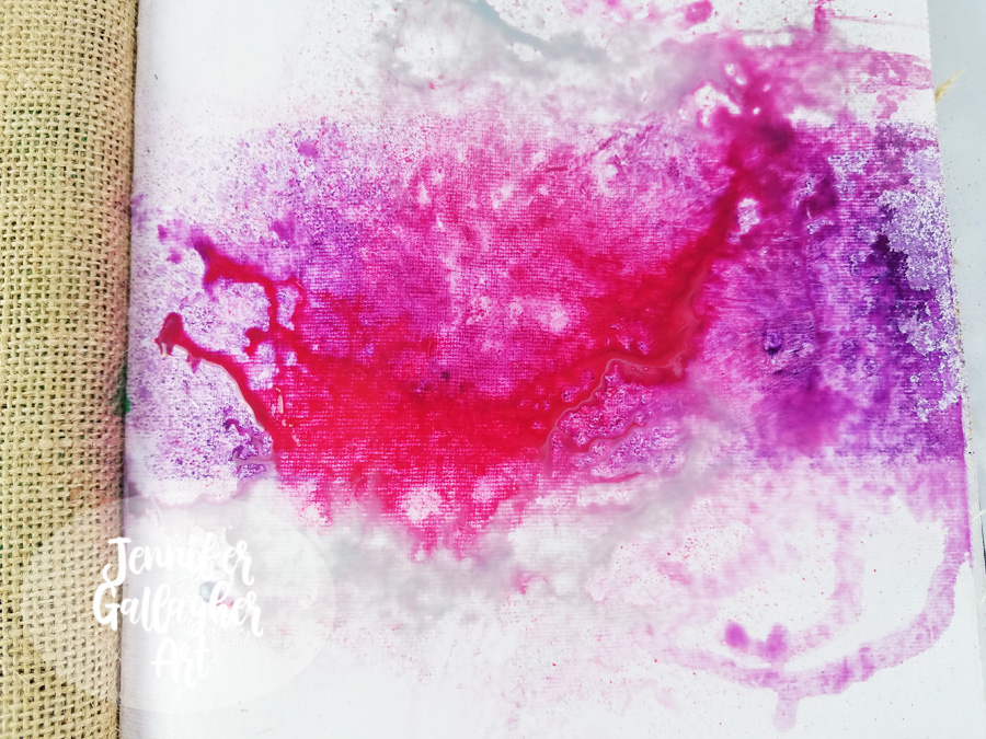
Then, over a towel I keep for art project clean-up, I tipped the book up and let the art spray trickle down the page until a good bit of the moisture was on the towel. Then I tipped the book the opposite direction to allow drips at the top of the page.
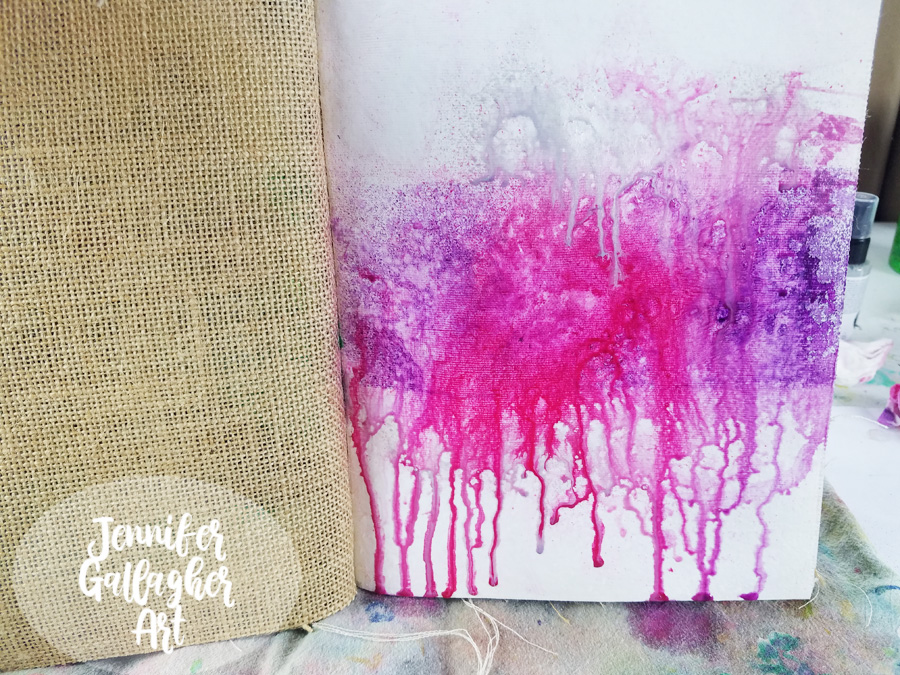
As soon as I finished letting it drip, I took a baby wipe and wiped the top and bottom of the page until it was pretty close to white again. I am not scrubbing hard or looking for perfectly white background areas. I just want to get a lot of the color off the top and bottom section. We are left with a far more organic looking page.
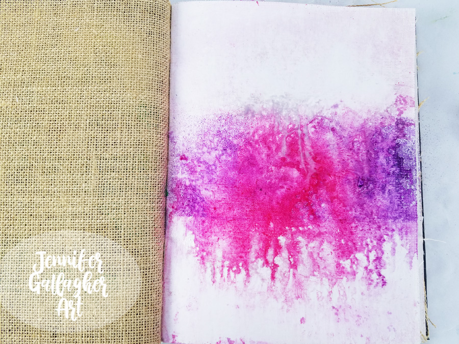
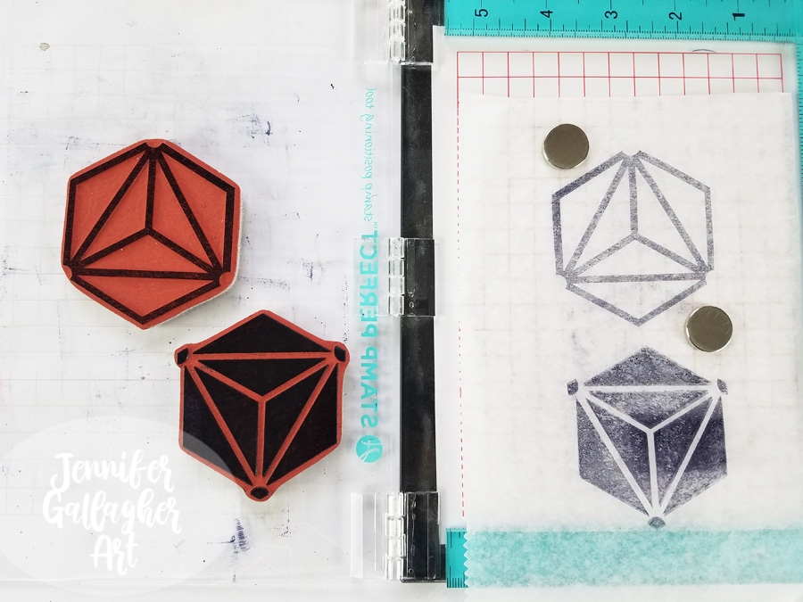
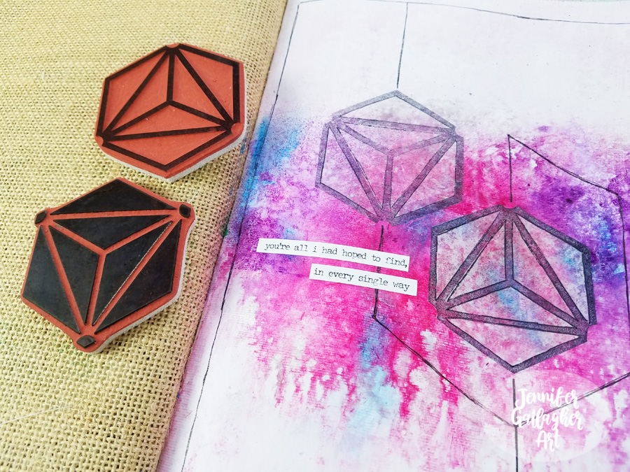
Using a stamp platform, I stamped Nat’s large Diamond Hex Positive and Negative stamps onto deli paper with black archival ink. I ended up only using the positive images.
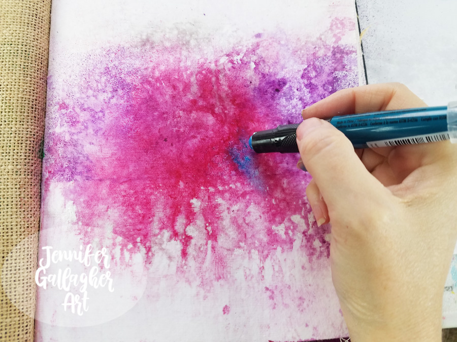
Next, I went back to the completely dry background with a Marabu Art Crayon in Aqua Green and applied a little color here and there. Art crayons are soft enough to spread with your finger.
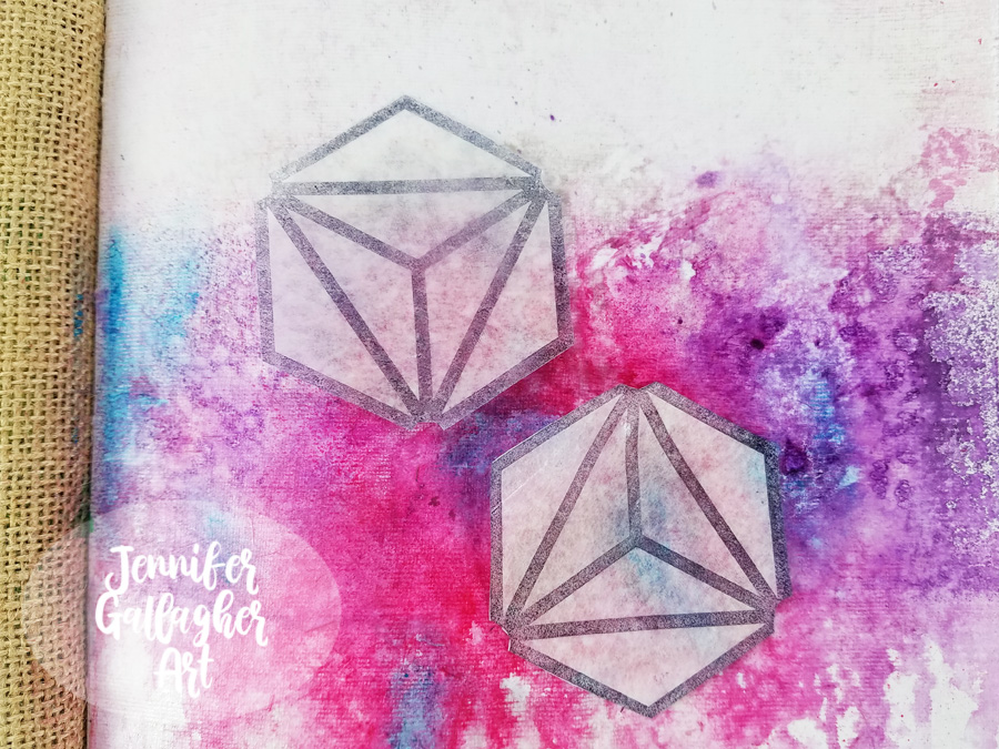
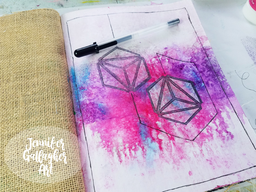
I cut out two of the positive stamped images and figured out where I wanted to place them. These images represent my husband and I.
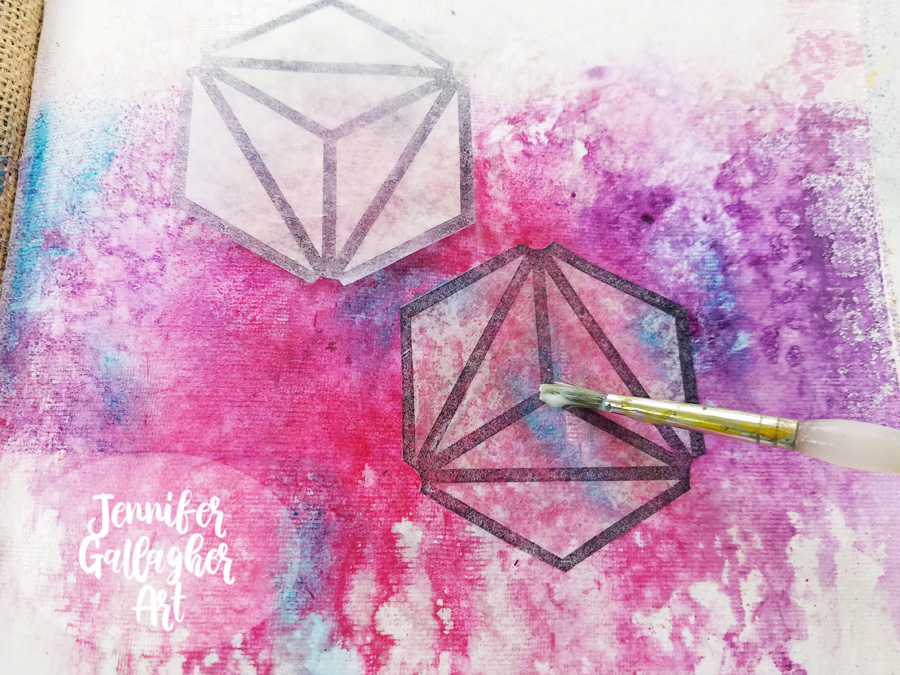
Once I settled on the placement, I applied them to the background with matte medium.
Using a Sakura Black Gelly Roll pen, I connected the shapes with lines and carried it around the page.
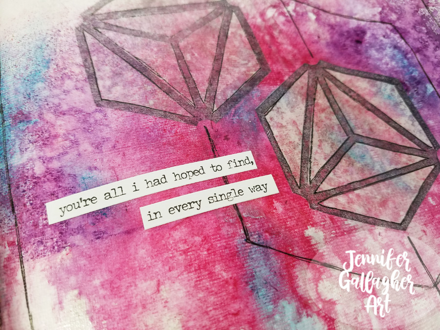
I chose a sentiment from a set of Tim Holtz Small Talk stickers and applied it to the page.
I hope you enjoyed this tutorial and found it a source of inspiration for your own art journal. Stamping on deli paper is a fun technique that you should try at home. Being inspired by love has reminded me how much I love sharing my ideas and processes with all of you. Thank you for stopping by.

Thank you Jennifer! Awww that definitely warms our hearts and makes us want to do our own little tributes in our art journals :)

Give it a try: you can find all my Rubber Stamps in my Online Shop and here are some of the other supplies Jennifer used:
Feel inspired? Working on something yourself that you’d like to share?  I love to see how you interpret our monthly themes. Email me how you used my stencils and stamps with the theme and email me an image – I would love to share your projects in my next  “n*Spiration From Around the Globe“.

Leave a comment

Creative JumpStart with the Creative Squad – Linda Edkins Wyatt

Hello from my Creative Squad! Today we have a post from Linda Edkins Wyatt sharing her super power – recycling! That’s something we could all do more of :) Linda is using my Art Nouveau Wallpaper and Tokyo stencils and this month’s theme: Super Power – this month we are joining Creative JumpStart 2020 and exploring our Artistic Super Powers. It could be your unique technique or style, the way you like to use a medium or tool, or maybe your way of approaching artmaking. What is yours and show us how you use it.


What’s My Superpower? Recycling!

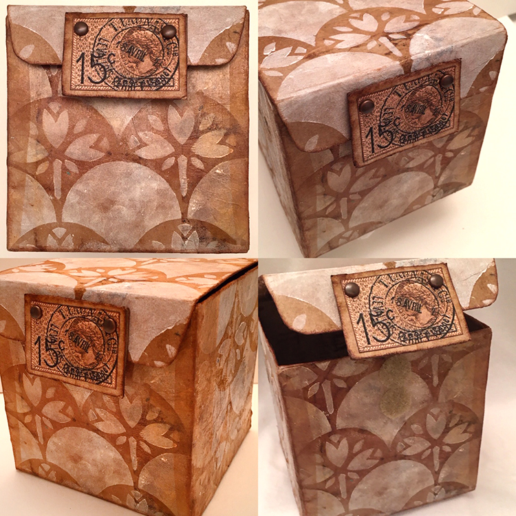
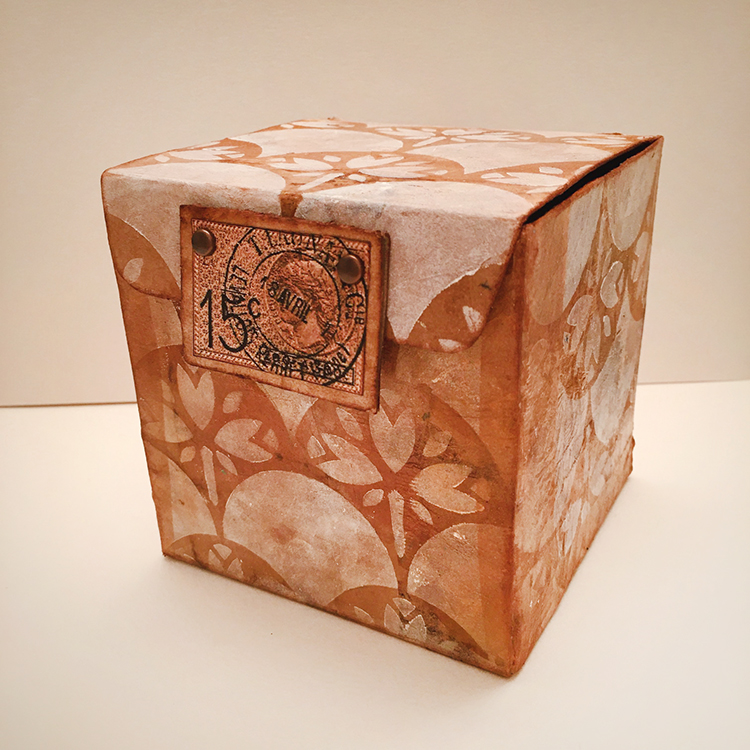
For the New Year and new decade, Nat had us thinking about what our art superpower is. As a mixed media artist, I think of myself as a “jack of all trades, master of none” since I dabble in any and all art forms. So, choosing an art superpower was hard. I paint, draw, make jewelry, stencil, stamp, design fabrics, build stuff, putter in PhotoShop®, take photos and pretty much try all kinds of art. None of my art skills are quite at a superpower level so I was stumped. In both my daily life and my art life, I love to recycle and often repurpose bags, boxes, packaging and other materials into my artwork. With that in mind, I decided to embrace recycling as my superpower and use recycling to showcase Nat’s new stencils from StencilGirl®.

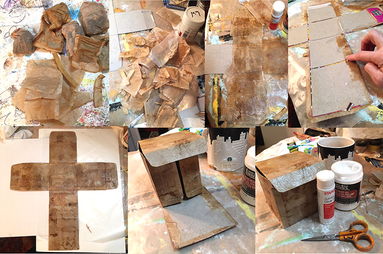
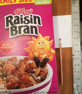
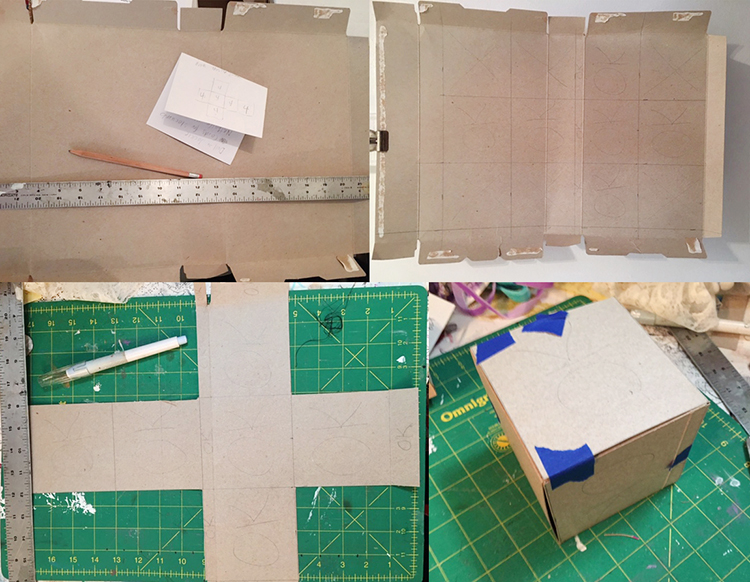
I save wrapping paper, newspapers, magazines, ribbons, teabags, strings, packaging materials, and all kinds of boxes, especially cereal boxes, which I often use to make journals, tags and ATCs. This time, I pulled a family-size empty Raisin Bran box out of my recycling stash and started thinking about making a gift box or Artist Trading Cube.

I decided to make a small sketch of a cube on paper to figure out how the six sides would fit together and where the folds, tabs, and cuts should go. Once that was done, I drew it to scale on the inside of the opened Raisin Bran box, designing a 4” cube. In pencil, I marked the areas that I would keep with “OK” and put an X through the sections I would cut away. I left some tabs to tuck in at the sides and top.

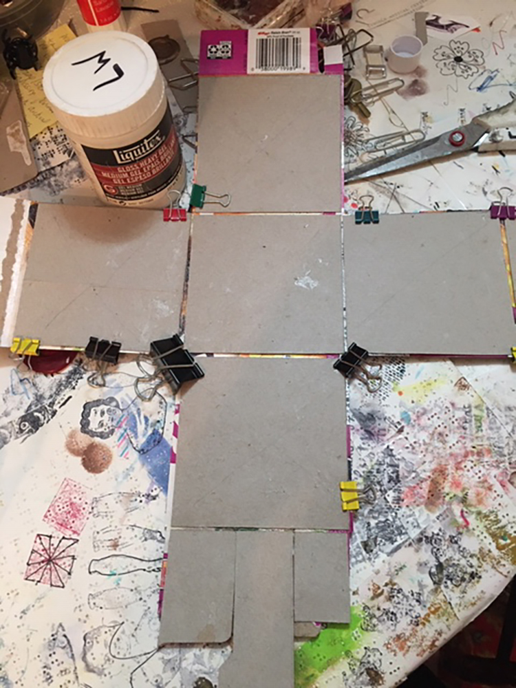
Using a Cricut exacto knife and my green cutting mat, I very carefully sliced the cereal box according to my plan. The 4” square box that emerged, once I cut and folded it, was a little flimsy, so I made a duplicate, then glued the colorful sides together. I also cut the interior pieces just a little smaller (about 1/16” smaller on all sides) so that there would be less bulk when I folded the sides and flaps. Once the piece was dry, I folded the box up carefully to be sure it was designed properly. (I kept thinking of those Iowa IQ tests we took in elementary school where they gave you a flat shape made of dotted and solid lines and ask you what it would be as a 3-dimensional object. My art brain was kind of exploding but I pushed on ahead.)

Structurally, it worked out well: the angles were 90 degree and it all fit together even better than I expected. No wonky edges or crooked sides!

Now for the fun part…decorating my little Raisin Bran box! I decided to double the recycling fun and glued recycled (dry and empty) teabags over the gray box shape. For this project, I used bags from black tea, but I often use turmeric tea or black cherry for color variety.

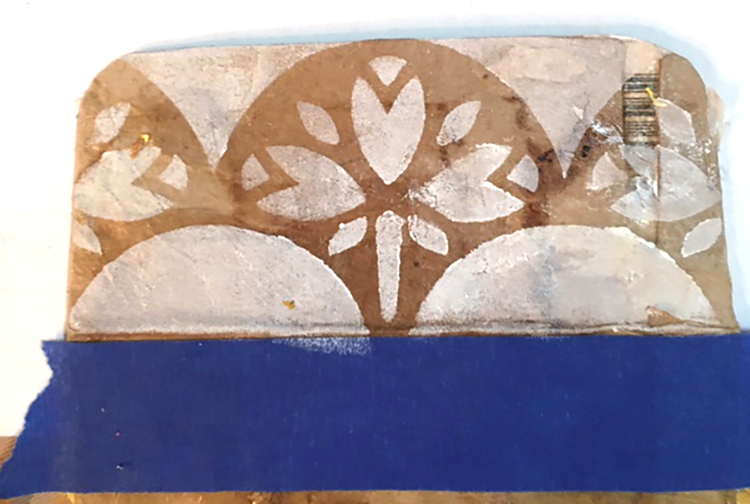
Next, I tested the new stencils. On an interior flap, I used Titanium White Liquitex Basics white acrylic and sponged it through the Art Nouveau Wallpaper stencil. I loved the effect, and decided to use that technique and stencil all over the exterior sides of the box.

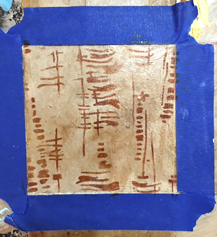
I also wanted to test the new Tokyo stencil, so I taped off the section that would be the interior bottom and tested the Tokyo design with sepia Archival ink on a fingertip dauber. That looked great too, so I decided to use the Tokyo design throughout the inside.

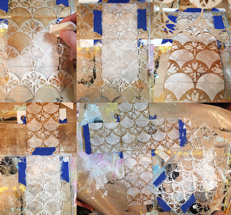
I had a little “oops” sad moment when I realized that I had stenciled the Art Nouveau Wallpaper stencil going the wrong direction on some of the exterior panels. I didn’t mind that the left and right sides were upside down (it added a little visual interest) but the very front was also upside down!

Rather than giving up, I decided to cover the upside-down area of the front with sepia Archival ink. It matched the teabag color perfectly and covered the imperfectly stenciled section perfectly! Later, I carefully positioned the stencil (facing the correct direction this time!) and again used white paint with a cosmetic wedge to reapply the Art Nouveau Wallpaper stencil.

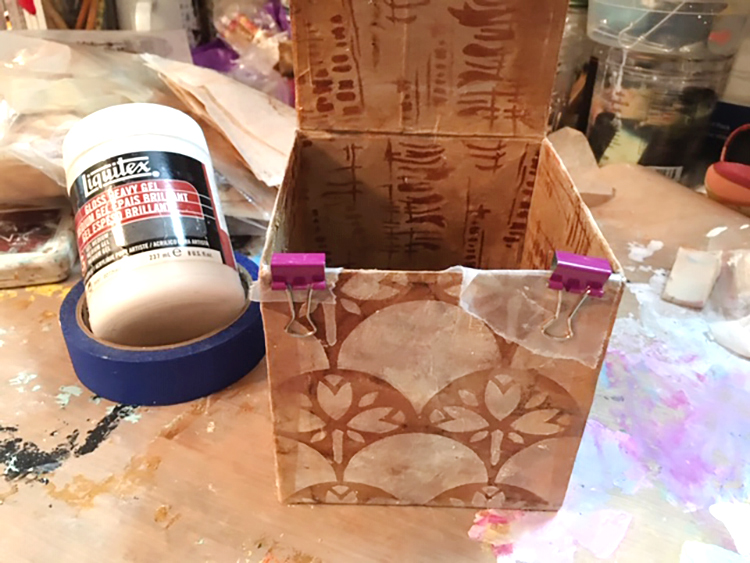
I glued the box and tabs together with Liquitex gloss heavy gel, used small clips and little pieces of waxed paper to keep the clips from sticking to the box, and left it overnight to dry. I also added some extra strips of teabag on the untabbed sides to reinforce the box.

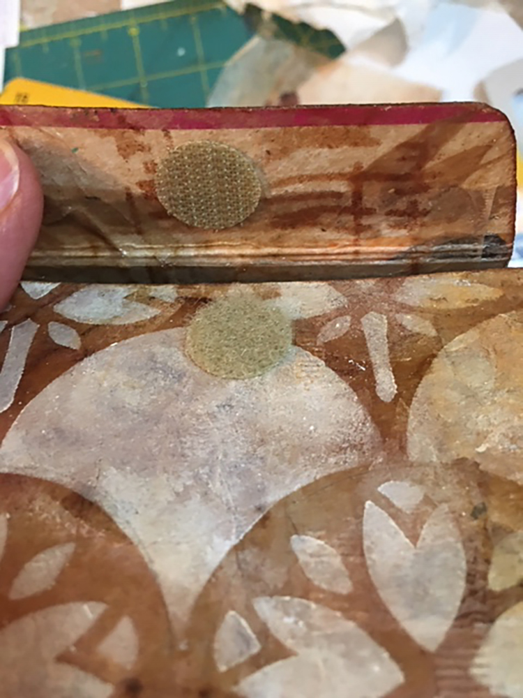
It needed a closure and I thought about what style to use. I could have simply tucked the top front tab inside the box and called it done…but I didn’t.  Since the box is cardboard, I also didn’t want to use something that would wear out, shred or rip over time. The perfect solution was sticky-backed Velcro. I chose some round pieces of tan Velcro from my stash, which matched quite well. I aligned each piece of Velcro carefully, removed the backing, and pressed it in place. It worked perfectly, but I still felt it needed a little more visual interest for the closure.

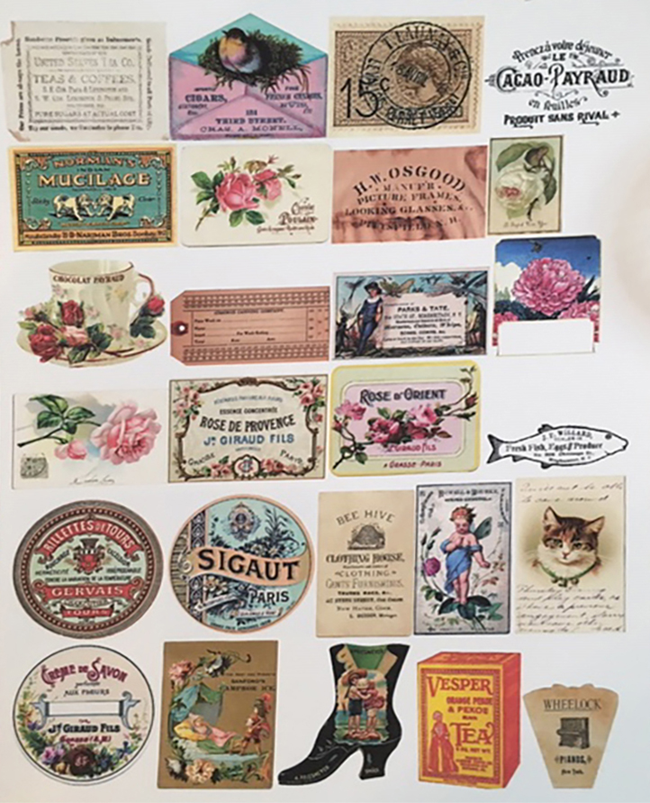
One of my textile design teachers often shouted, “More is More!” to the class, and thinking of her, I decided to embellish the box further. I wanted the closure to be pretty, easy to open, but still hold securely. There was something old-fashioned about the combination of teabags with the Art Nouveau Wallpaper stencil, so I went through my electronic file of vintage images from The Graphics Fairy, printed a sheet of images sized to a 2” scale, then “auditioned” them to see which would go best with the little box.

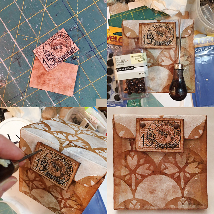
I settled on an image of a French postage stamp and postmark—it was the right color, shape and, I think, actually from the Art Nouveau era. I wanted the closure to have some depth and durability, so I used a small piece of corrugated cardboard cut about ½” larger than the postmark design, covered it with a teabag, edged it with sepia ink, then glued the stamped postmark to the center. I attached the rectangular vintage stamp with the heavy gel at the edge of the front tab, but also added two brads for extra strength and visual interest. Finally, I darkened all of the edges of the box with sepia ink applied using a fingertip dauber.

Would you ever guess that this adorable little Art Nouveau-inspired treasure box was once a family-sized box of Raisin Bran?


Thanks Linda! Love the idea of giving a cereal box a second life! 

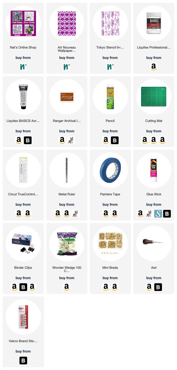
Want to give Linda’s project a try? You can find all my Stencils in my Online Shop and in addition to a discarded box, some cardboard, and a used and dry teabag, here are some of the other supplies she used:

Comments (1)

  • Jill McDowell

    |

    Bravo Linda! Brilliantly designed. I love this project, cereal boxes, tea bags, NATS’s steciks and that stamp! I’m swooning.

    Reply

Leave a comment

Creative JumpStart with the Creative Squad – Nicole Watson

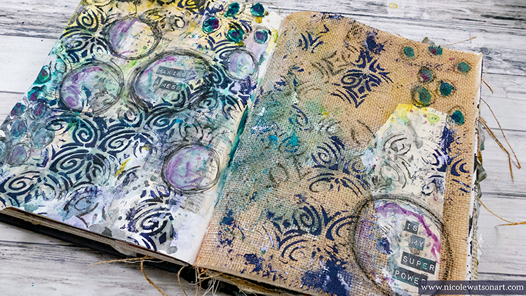
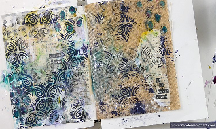
Hello again from my Creative Squad! Today we have Nicole Watson sharing her artist super power with us: making messes! Well we are truly gaga over this scrumptious mess that she’s created in her art journal, using my Art Deco Fairview stencil and this month’s theme: Super Power – this month we are joining Creative JumpStart 2020 and exploring our Artistic Super Powers. It could be your unique technique or style, the way you like to use a medium or tool, or maybe your way of approaching artmaking. What is yours and show us how you use it.


I love the idea that artists have super powers! When walking through a museum, one can usually spot a Monet, van Gogh, Mondrian, Cassatt, O’Keeffe, Rothko, etc. without even looking at the information card. The same is true today. When scrolling through Instagram, I can often tell who the artist is before looking at the user name. How cool is it that we all have unique talents!

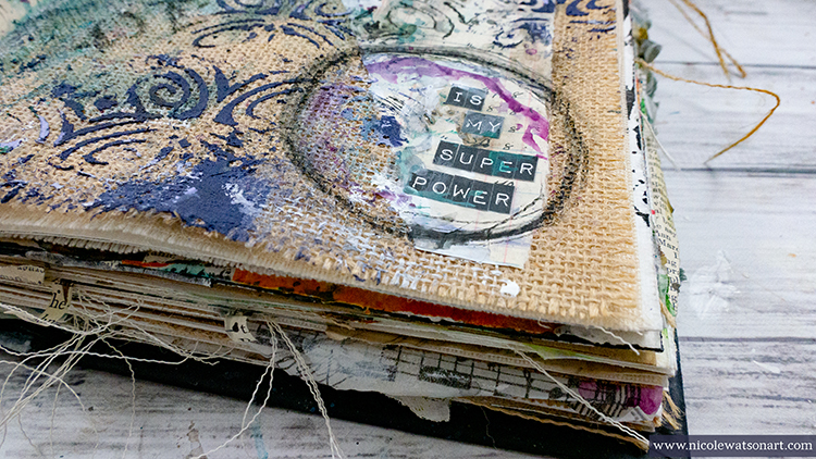
When thinking about my super power, honestly, I struggled. Circles, dripping paint, color mingling, layers, my favorite weapon the stabilo all, gesso, and book text often fill my pages. All of these supplies and techniques come together to create a mess… a mess that often I over-think, want to gesso over, and struggle with where to take it next. This part you don’t see in my pretty pictures and edited videos. This week as I played in my journal using my “super powers,” the struggle was there. The mess appeared. Thoughts of defeat and wanting to start over filled my head. I’m sure you can identify! However, the thing about an art journal that we often forget is that it’s for exploring, journaling, playing with ideas… and creating messes! Not everything has to be a masterpiece. Often, it’s in taming the mess, that new ideas are formed and discoveries are made. Don’t let that mess stop you from creating. Use it as a way to learn and grow as an artist. I like the idea of turning something negative, into something positive. (Remind me that when I make my next mess!)

This week I decided that though there are several techniques and tools that I might be known for, making messes is my super power! And, here’s how I made this one. Check out my video and then read my how to below:

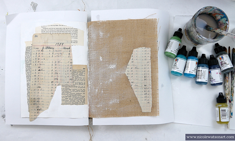
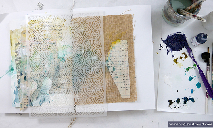
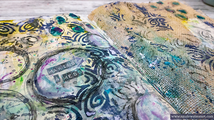
I used a journal spread where a white (watercolor) paper and a burlap page came together in my Dina Wakley Media journal. Before collaging the book pages, I gessoed the white page and spread a bit of the gesso on the burlap for fun. Then, I began to add some book text with matte medium and used a heavier gel medium to add a piece onto the burlap side.

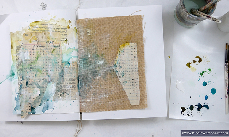
Next, I chose a cool color palette to play with. I really enjoy the process of playing with color and letting it mingle on my pages. I also added gesso at times. When I was finished layering color on the pages, I pulled out Nathalie’s new Art Deco Fairview stencil.

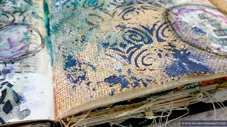
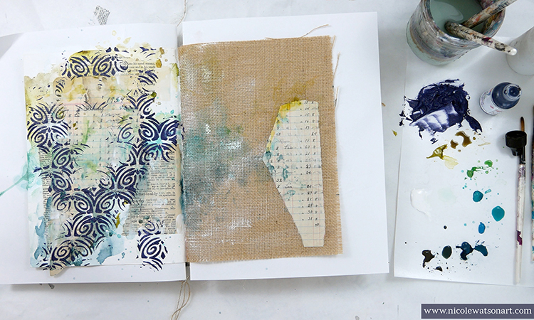
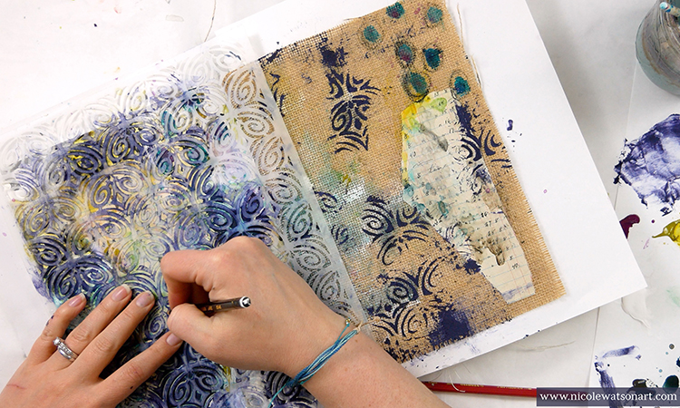
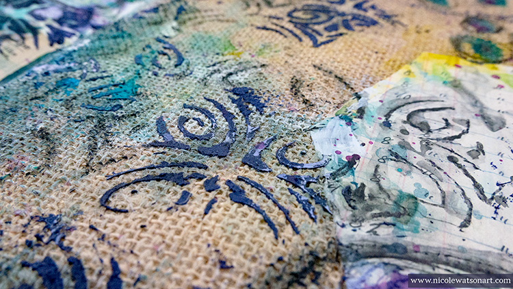
I wanted to add some texture and dimension with the pattern, so I used light molding paste through the stencil. I decided to color the paste with paint so it would pop even more. I spread a thin layer with my palette knife randomly on both pages. Since the molding paste is white and not clear, my dark blue paint ended up looking more purple (first mess accomplished).

To make the random stencil look a little more intentional and perhaps like it was crackling or breaking off the page, I scraped it here and there with my palette knife and smoothed some out with a baby wipe. I also added extra paste in places outside the stencil.

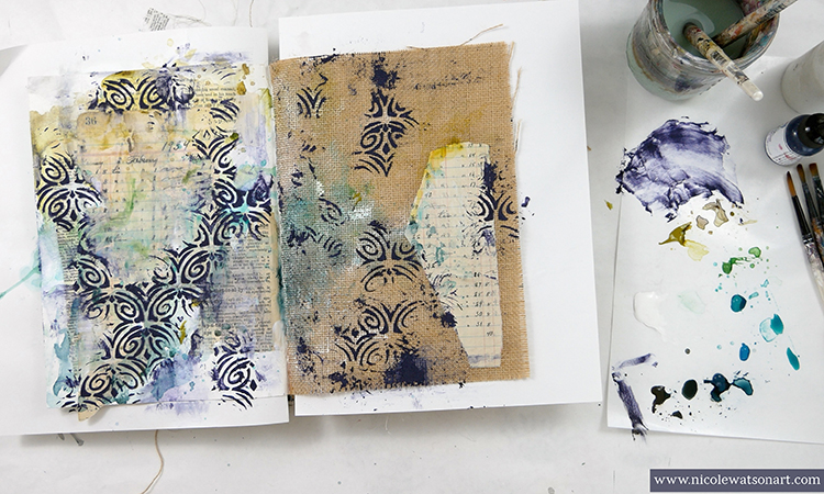
Then, I needed to think. So, I made some marks with paint and my stabilo all (mess number two). In the process of activating the stabilo, I decided to use one of my favorite techniques that I call the “stabilo puddle.” I scribbled some stabilo on my palette paper and activated it to make a puddle. I used this to shade around the stenciled areas to make it look a bit grungier. Ah-ha! This grunge helped darken the purple molding paste.

Since I liked the direction this stabilo was heading, I grabbed the stencil again and used the stabilo to trace the design. It was easy to put the stencil back on the pages since the paste fit right back into the empty spaces. I randomly chose areas to trace in to add to that worn, peeling look. Then, I activated the stabilo with water.

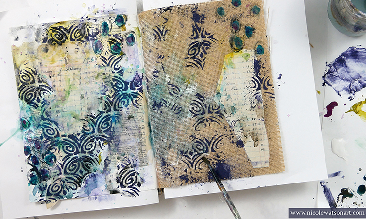
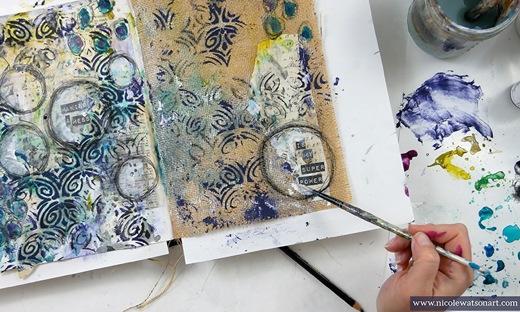
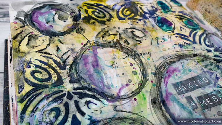
Several messes later, after adding some more paint, flicking color, gesso and stabilo, I decided to label the pages with my official super power. After sticking the letters down, I used the stabilo to draw circles, shaded them with gesso and then again with a contrasting warm color to make them pop.

Mess accomplished!


Thank you Nicole – we LOVE what you do with messes :) 

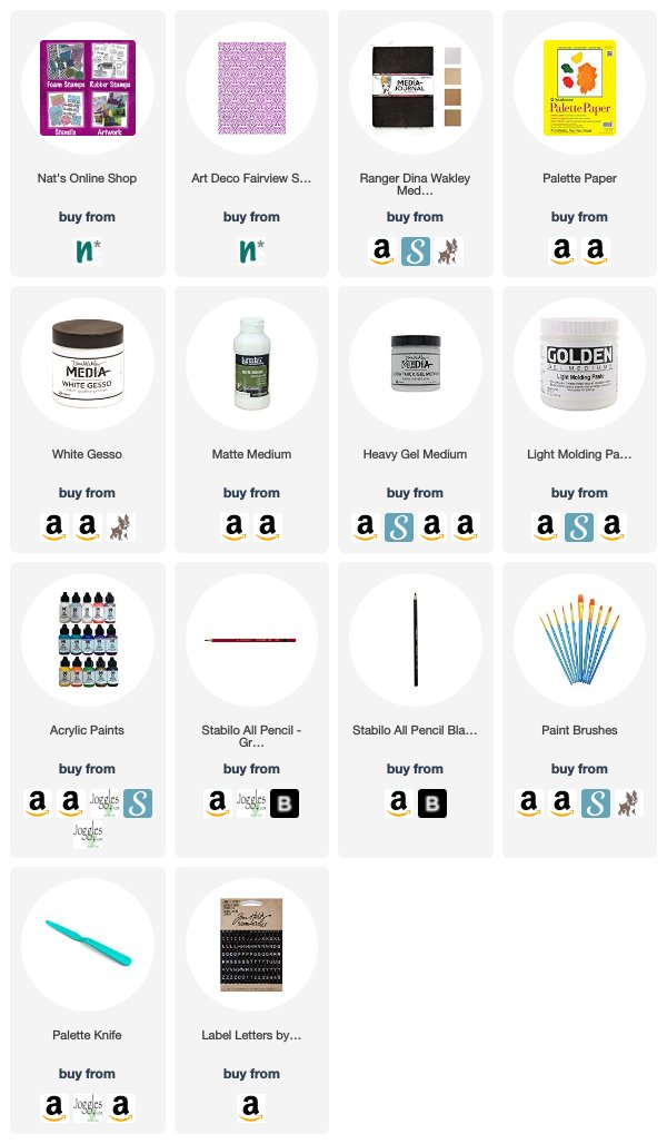
Want to give Nicole’s project a try? You can find all my Stencils in my Online Shop and in addition to book page/ephemera, here are some of the other supplies Nicole used:

Feel inspired? Playing along with Creative JumpStart and the Creative Squad? Working on something yourself that you’d like to share?  I love to see how you interpret our monthly themes. Email me how you used my stencils and stamps with the theme and email me an image – I would love to share your projects in my next  “n*Spiration From Around the Globe“.
Leave a comment

Creative JumpStart with the Creative Squad – Maura Hibbitts

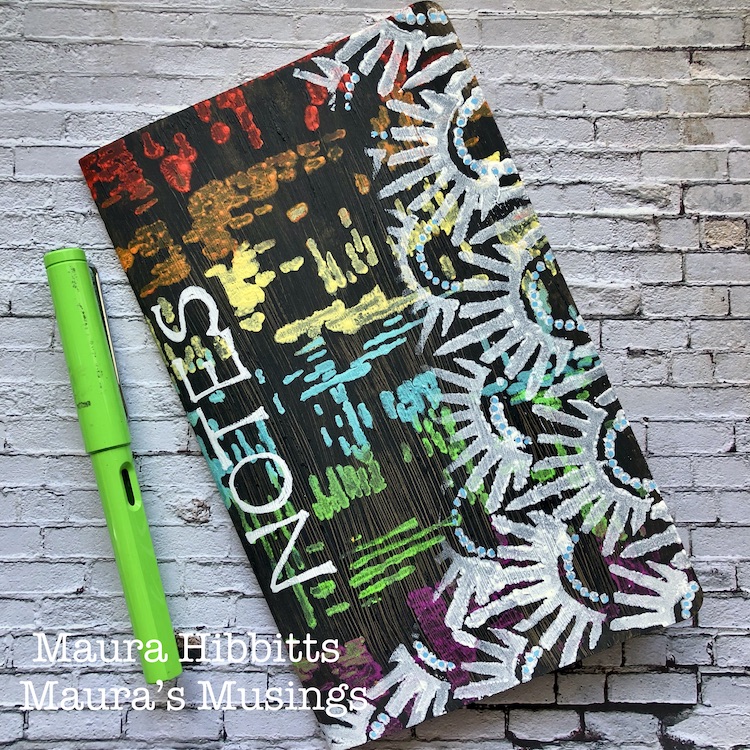
Hello from my Creative Squad! This month the squad is playing along with Creative JumpStart 2020 and sharing their Artistic Super Power with you. Here we have Maura Hibbitts sharing hers: Colorful Imagination. Her fun little notebook uses my Signals and Art Deco Empire stencils and our theme: Super Power – this month we are joining Creative JumpStart 2020 and exploring our Artistic Super Powers. It could be your unique technique or style, the way you like to use a medium or tool, or maybe your way of approaching artmaking. What is yours and show us how you use it.


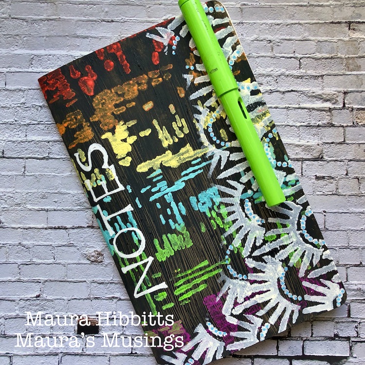
Many wishes for good health, peace, joy and creativity in the new year! Can you believe it’s already 2020? Wow, the time does fly! I’ve been so inspired by all the amazing artists at Creative Jumpstart. I think it just gets better and better every year…now to find the time to play. So, when I started thinking about what my creative super power was, I thought of how much I love color, and that it is often something people comment on when they see my work. I also thought about how much I like to use my imagination, where ideas can come from books, movies, dreams, nature, and the everyday world around me. So, I am calling my superpower “Colorful Imagination.” The outside of my notebook is super colorful, and the blank pages inside are just waiting for my imagination.

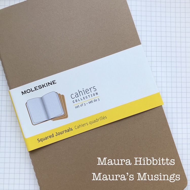
I’m using one of my favorite little notebooks by Moleskine (any blank notebook will do).

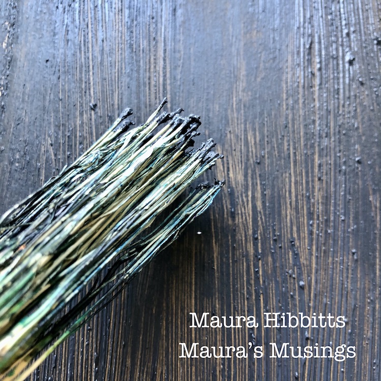
First step in transforming the cover is to paint a layer of black gesso, and run a Hakeme brush over it to create texture. (An alternative to a Hakeme brush would be to use a small broom.)

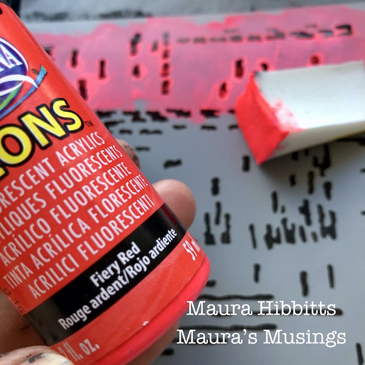
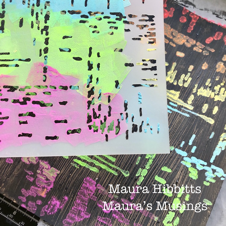
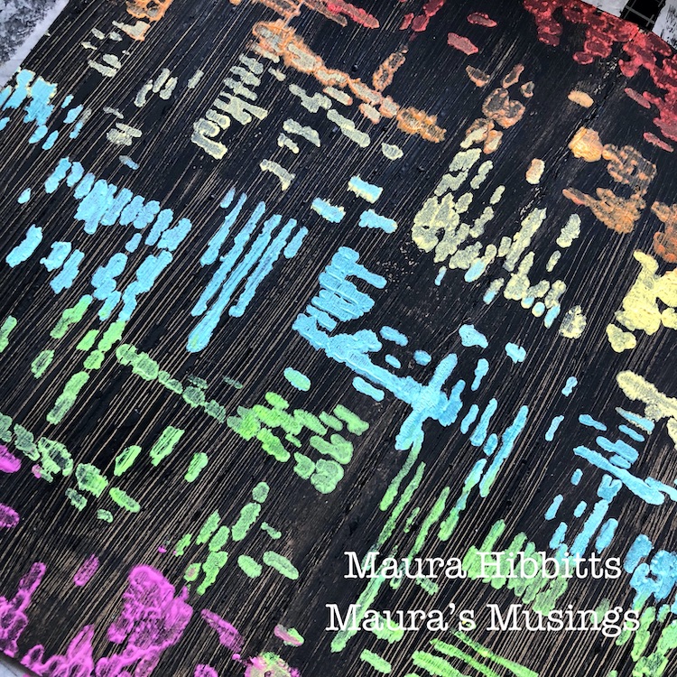
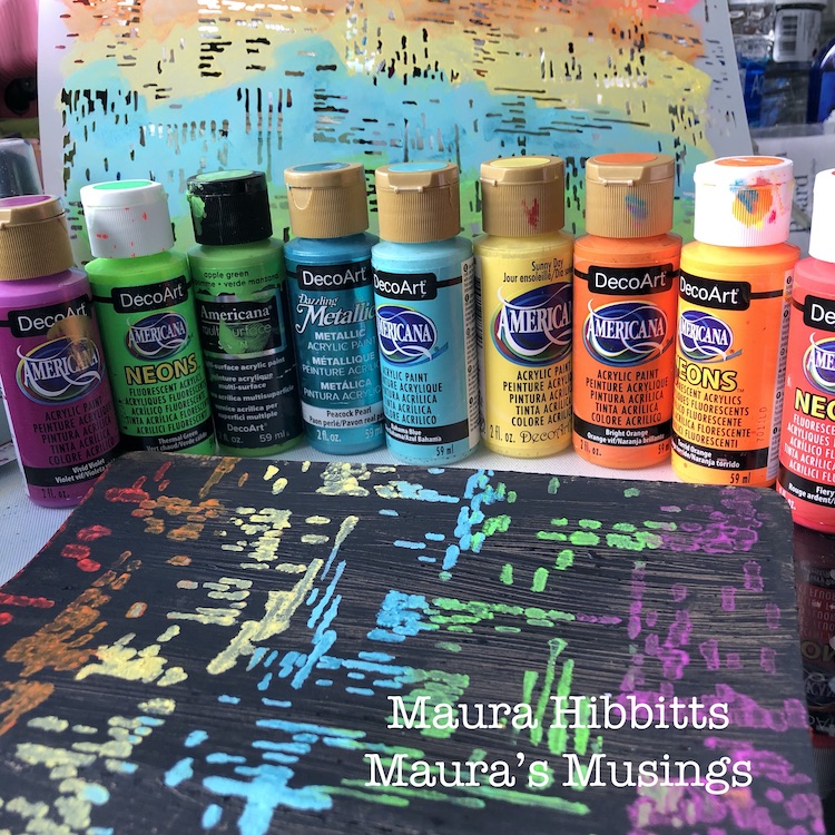
The Signals stencil and an array of rainbow colors goes over the dry gesso, starting with red. I really like using cosmetic sponges to apply acrylic paint through a stencil. When I need to change color, I just snip off the end, and have a “new” one to use.

I continued stenciling the colors of the rainbow down the notebook…red, orange, yellow, blue, green, violet…Oops! There goes that rebel green jumping out of order again!

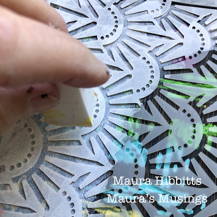
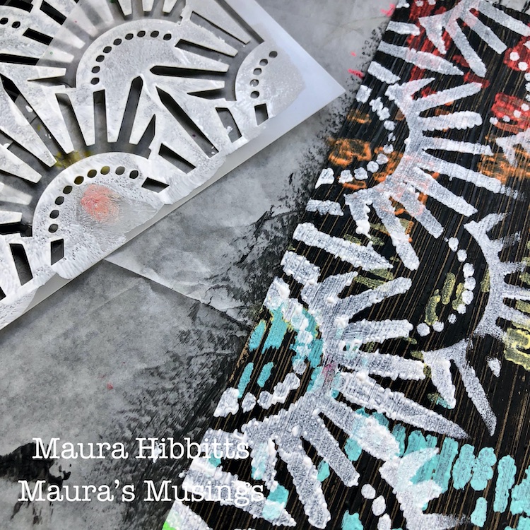
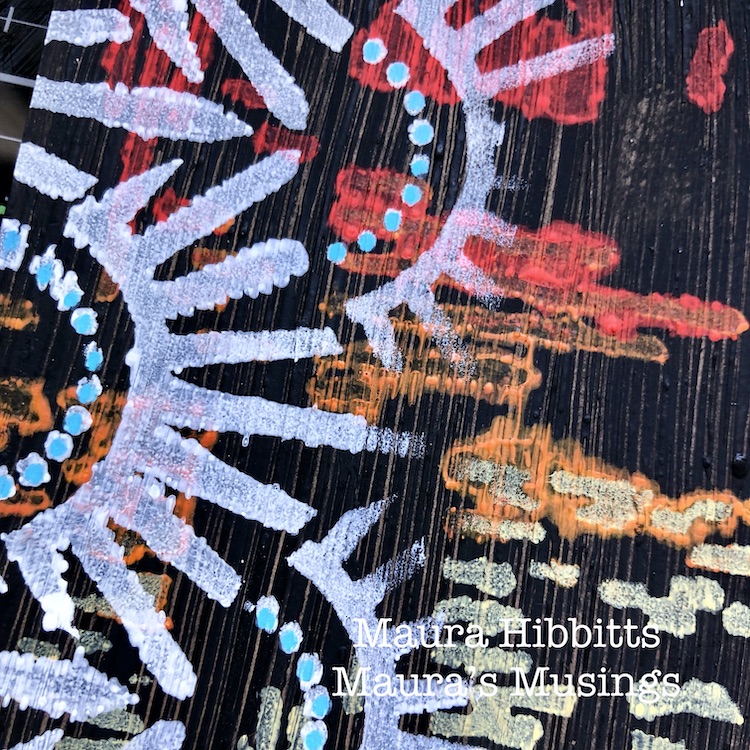
Nathalie’s new stencil designs are awesome, and I had to use the Art Deco Empire too, how could I not? I decided to use white paint and stencil around the sides and bottom.

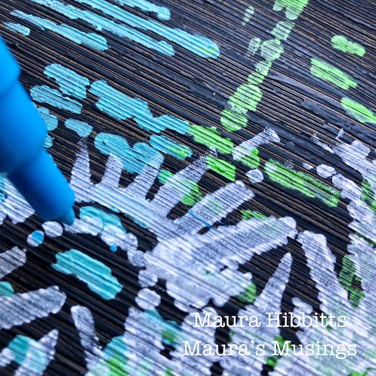
Final touch is a bit of work with Posca paint pens. I went over the dots with turquoise blue, and hand lettered NOTES along the side with white.

Here’s a look at the array of supplies I used to make my notebook. How about clipping a fountain pen onto the notebook in a matching color…oh yes, in that rebellious green, I see.

I called upon my Creative Jumpstart Super Power – Colorful Imagination – to make my notebook. Every color of the rainbow (yes I know, not in order…that must have been my imagination playing with me) is dancing across the cover with the Signals stencil. Those blank graph papers are calling to my imagination to fill this with ideas and sketches…I can’t wait! Why not find your own creative super power by checking out this year’s Creative Jumpstart 2020? Wishing you a creative and imaginative year! – Maura


Love your colorful notebook Maura and how you mixed up the patterns – very cool!! And definitely a super power of yours! Thank you so much !!!

Want to give Maura’s project a try? You can find all my Stencils in my Online Shop and here are some of the other supplies Maura used:

Feel inspired? Playing along with Creative JumpStart and the Creative Squad? Working on something yourself that you’d like to share?  I love to see how you interpret our monthly themes. Email me how you used my stencils and stamps with the theme and email me an image – I would love to share your projects in my next  “n*Spiration From Around the Globe“.
Leave a comment

Jumping with… Jen Crossley – A CJS Interview Series

So happy to share with you today a special video interview I did with one of our Creative JumpStart 2020 teachers: Jen Crossley. I have known Jen for a few years now and have had the pleasure of teaching with her in the past. This is her 3rd time teaching with CJS and I am happy to have you get to know her a bit better now. In this interview Jen talks about loving to create from a very young age, then a professional start with paper arts, and finally moving to metal and found objects. She describes how art making helps her get a release from the pressures of life. She also talks about using vintage items and the stories and history that those items may or may not bring to a project.

Thank you Jen!

You can learn more about Jen on her website.

And now it is your turn to make a commitment to creative play this year: Sign up TODAY for Creative JumpStart 2020 and get 31 different mixed media lessons from 31 Super Hero Artists like Jen.  Hope to see you in the CJS classroom soon :)

Leave a comment

Creative JumpStart with the Creative Squad – Jennifer Gallagher

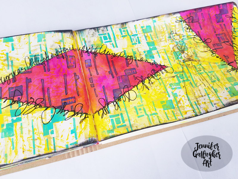
Hello from my Creative Squad and today we are happy to have a post from Jennifer Gallagher to start us off this month. Jennifer is using her artistic Super Power – Layering, along with my new Space Age Modern stencil and this month’s theme: Super Power – this month we are joining Creative JumpStart 2020 and exploring our Artistic Super Powers. It could be your unique technique or style, the way you like to use a medium or tool, or maybe your way of approaching artmaking. What is yours and show us how you use it.


I  am so honored to kick off a new year of Creative Squad posts with this month’s theme, in honor of Creative JumpStart,with my artistic superpower – Layering! Understanding how to layer your paints, inks and sprays will help you create delicious texture and design that can be used in your art journals, card-making, and other mixed media projects. A lot of people are intimidated by layering and think there must be some magic formula, but I promise you it’s super easy. This tutorial will lead you through creating an art journal page with many layers of acrylic paint and art spray perfect for learning the basics of layering. Let’s get started.

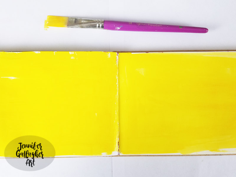
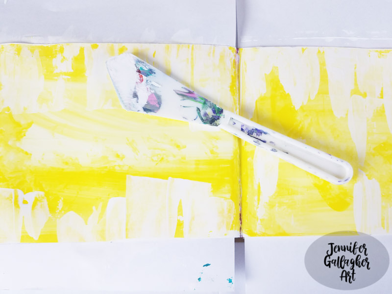
In my small dylusions journal I started by laying down a thin layer of white gesso. You can work in your dylusions journal without this step, but I find that it adds a little bit of tooth and texture that I like. Once dry, I dipped a good size paint brush into water and dropped a very small drop of fluid acrylic paint in Diarylide Yellow onto the pages. Spread the paint around with your wet brush. 

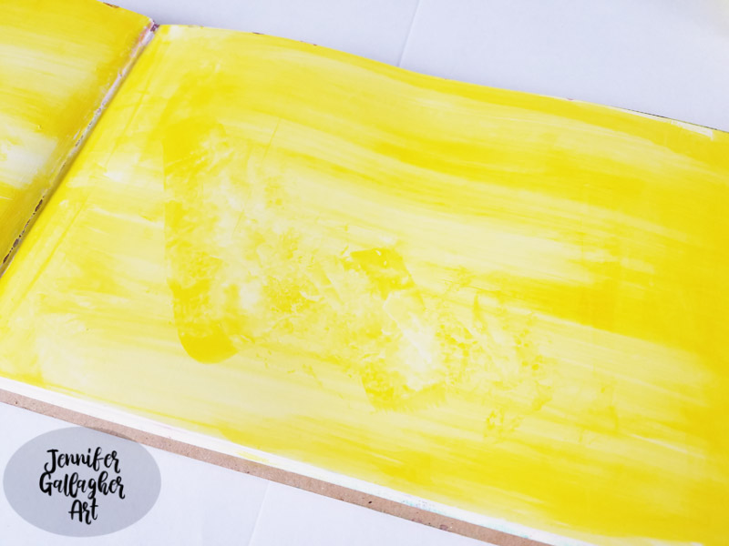
While the paint was still wet, I gently rubbed a baby wipe across the surface to remove some of the depth of color.

Next, I dipped a large palette knife into white acrylic paint and scraped it across the pages. This step beats back some of the depth of color and gives us some of our white space back.

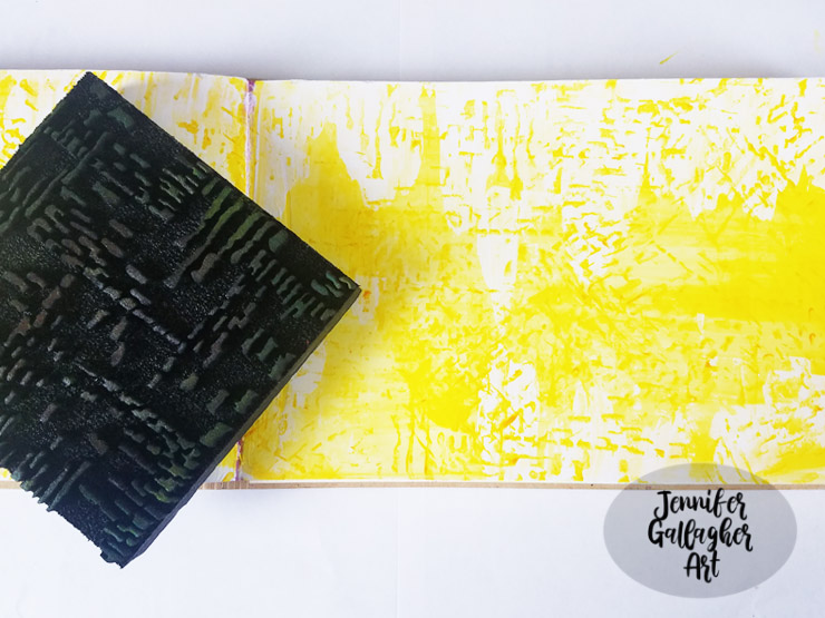
Another great way to add texture with layering is foam stamps. Here I’ve used Nat’s foam stamp Signals with Diarylide Yellow to add the dashed lines across the pages.

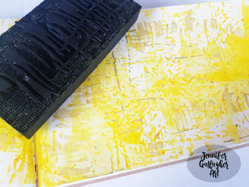
Next, I stepped up the size of the foam stamp design to a larger pattern. Using Nat’s foam stamp Far Out, I applied a darker yellow being sure to vary the pattern by turning the foam stamp in different directions.

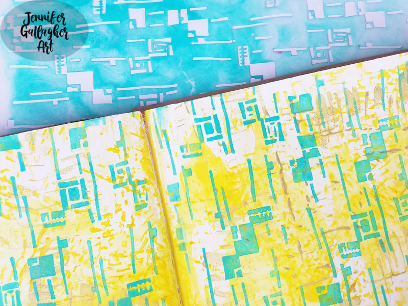
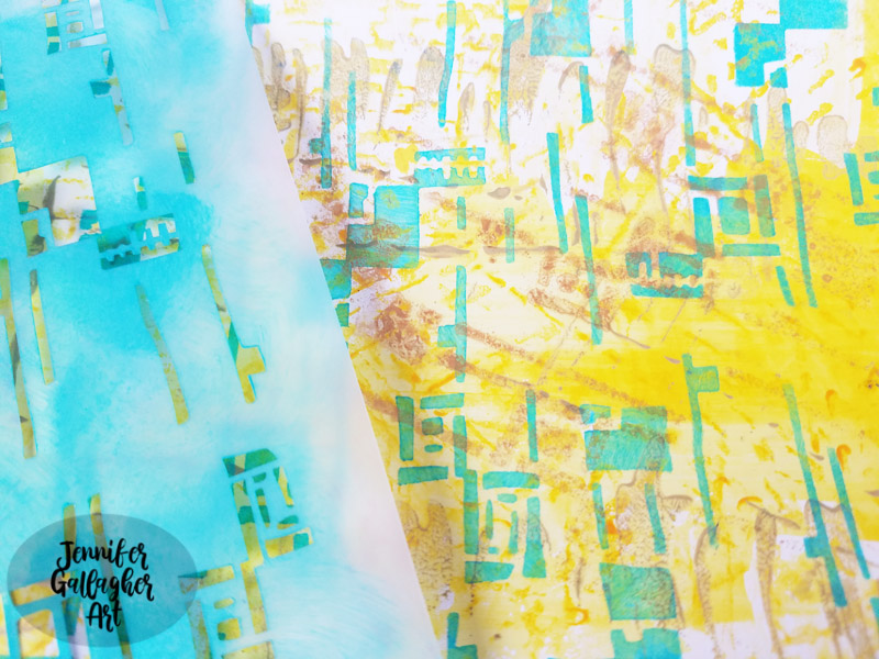
So far we have a great textured background. This is when I add my main background design with a stencil. I’ve picked Nat’s new stencil release, Space Age Modern. Using a small blending tool, I applied LIquitex Basics Acrylic in Bright Aqua Green through the stencil. This color is the perfect compliment for our background. 

Looking at the page I decided that I should apply a light metallic to the page to push the green into the background a little more. I laid the Space Age Modern stencil back down and sprayed Marabu mixed media art spray in gold here and there.

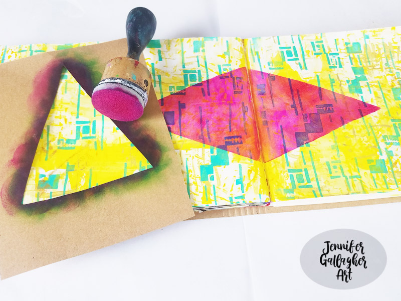
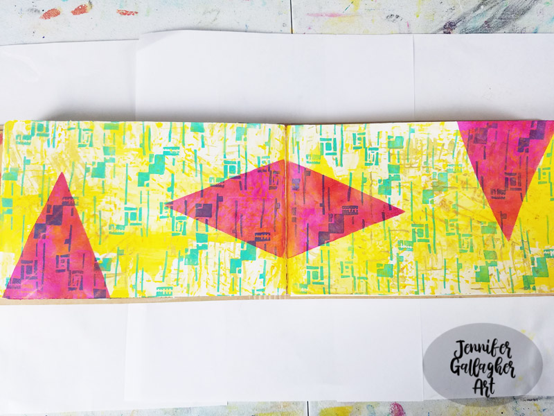
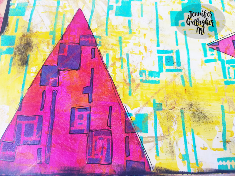
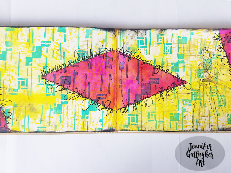
I still had the hand made triangle stencil I used for last month’s Christmas card tutorial lying on my desk and decided it would be fun to integrate it into this art journal page. With a small blending tool I applied Liquitex Basics quinacridone magenta through the triangle stencil. I used a small amount of paint. I was not trying to totally cover the background but apply a thin coat of paint and allow the background to shine through.

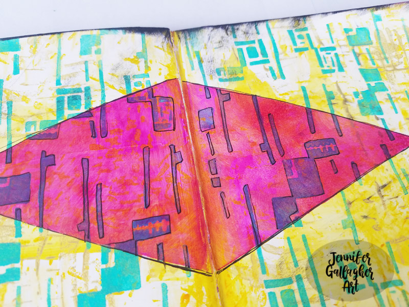
I applied a black edge all around the art journal spread pages with black acrylic and then added some doodling around with a black gelly roll pen.

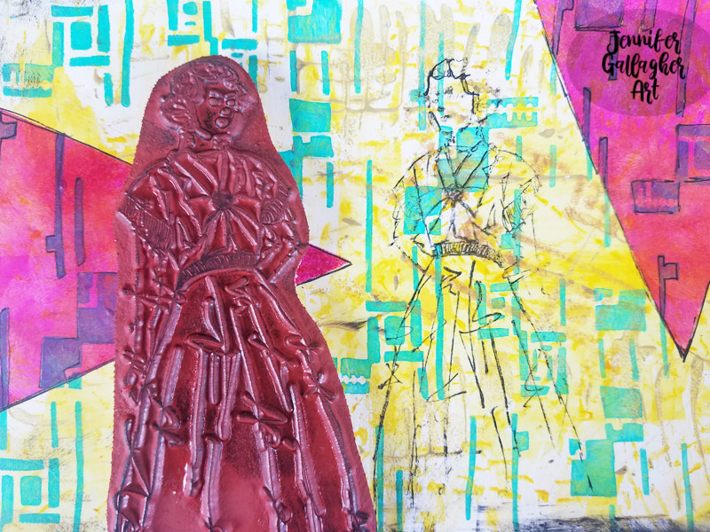
I stamped Nat’s Millie stamp on the right hand page in black ink.

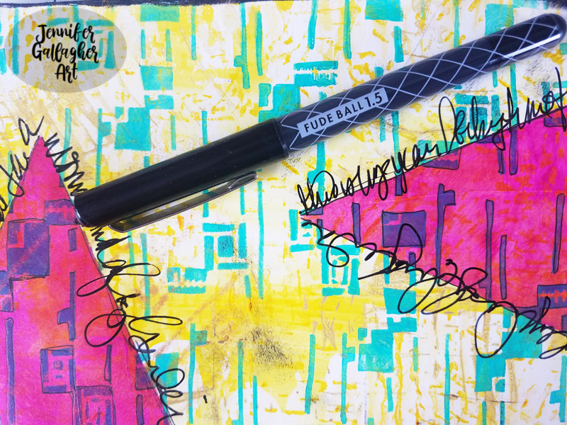
Using a black fudeball pen I did some journaling around the triangles.

I hope you have enjoyed this tutorial. It’s a new year that will be filled with tons of creative inspiraton from the Creative Squad so be sure to follow along and share what you create.


Thank you Jennifer – just love how the magenta is transparent and changes the colors underneath. Gorgeous page that really shows off your Super Power :)

Give it a try: you can find all my Stencils, Foam Stamps, and Rubber Stamps in my Online Shop and here are some of the other supplies Jennifer used:

Feel inspired? Playing along with Creative JumpStart and the Creative Squad? Working on something yourself that you’d like to share?  I love to see how you interpret our monthly themes. Email me how you used my stencils and stamps with the theme and email me an image – I would love to share your projects in my next  “n*Spiration From Around the Globe“.
Leave a comment

Happy Holidays – Judi Kauffman

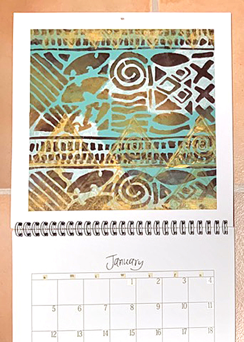
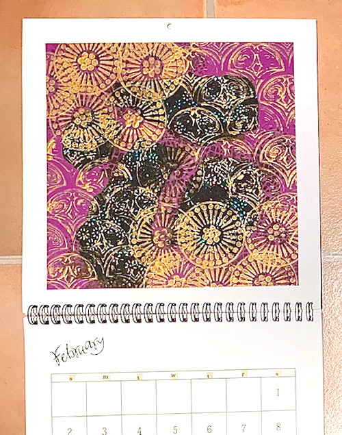
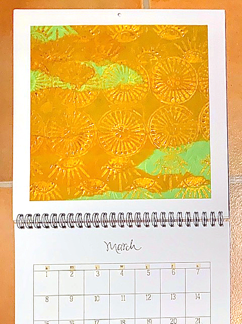
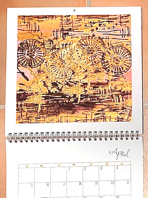
We have one final Happy Holidays post from my Creative Squad. Our talented Judi Kauffman (learn more about her here) has a calendar project for us today to help usher in 2020 :) Our theme is: Happy Holidays – It is a time of year where we are celebrating and coming together and enjoying some merriment. Create something holiday related (whatever holiday you may be celebrating) and enjoy the season!


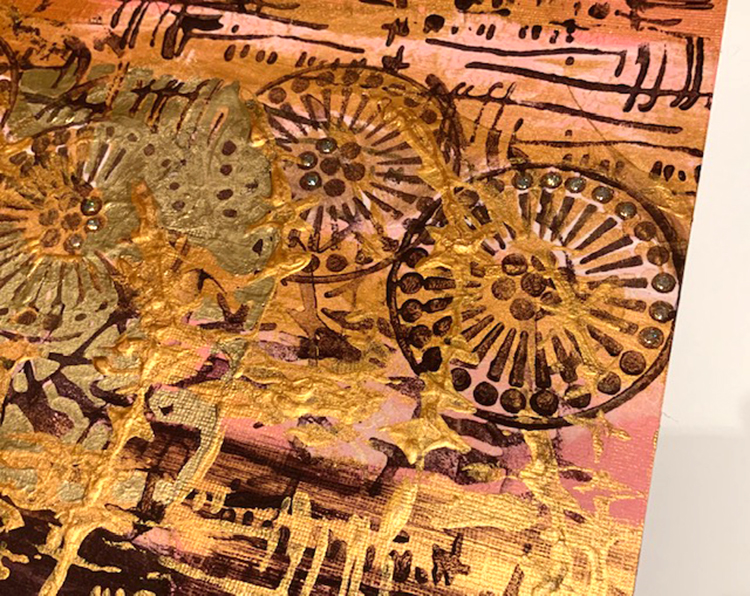
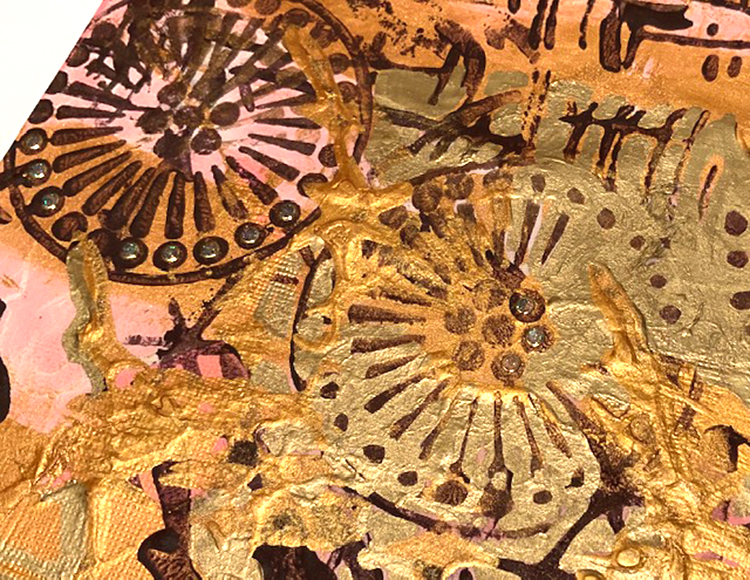
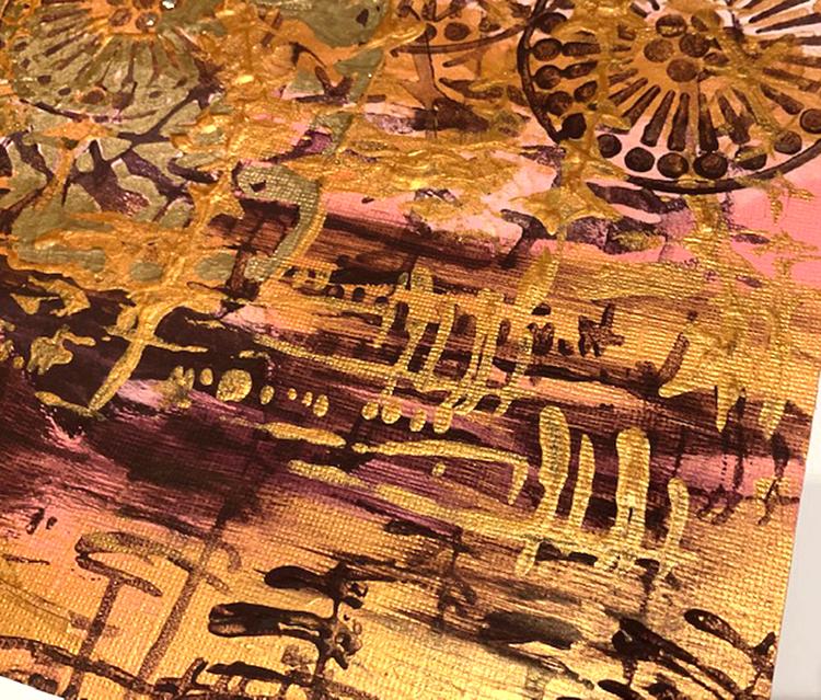
Happy New Year, everybody! My day for a Creative Squad project with a holiday theme falls late in the month so instead of cards and gifts I decided a calendar would be fun. And it’s a good way start the year off in a creative way. You can make all of the months at one time, or work on the calendar over the course of the year.

DESIGN STRATEGY

I chose to make the artwork for each month on a separate sheet of cardstock and then adhered them with low-tack tape. That way, as the months pass (or at the end of the year) the pieces can be easily removed and cut up for cards, bookmarks, tags, envelopes, die cuts and such. Or you can put them into an art journal or display in a frame.

In addition, by working this way instead of directly onto the pages the calendar doesn’t get messy and the pages won’t ripple if you use sprays, heavy applications of paint or many layers of collage. And you can much more easily use a gel plate. (I’m a Virgo; I really like the pristine white borders. No need to follow my strategy if you prefer another way of working.)

TIPS

Pick a theme that relates to the season, a holiday or other event, or simply work with stencils and stamps that make you happy. 

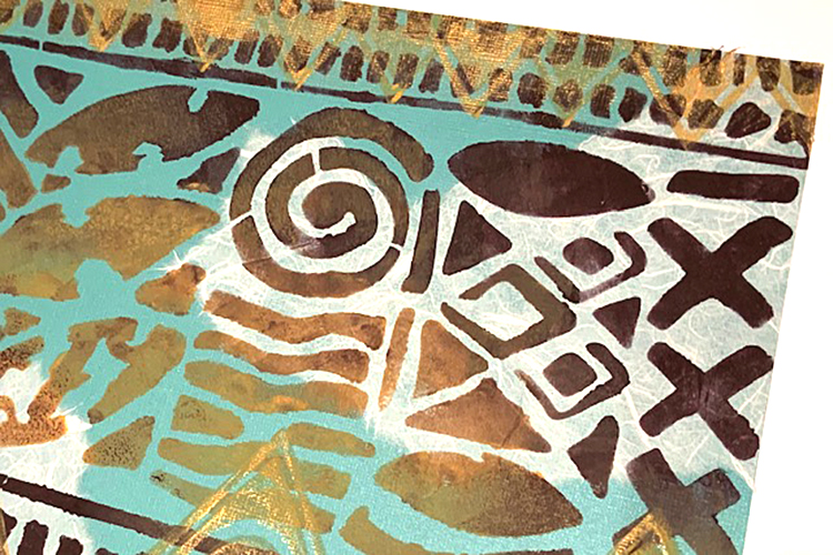
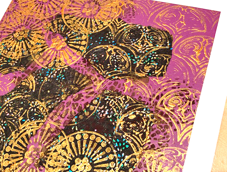
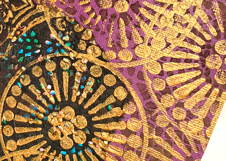
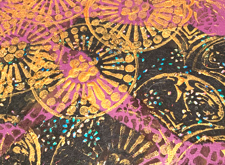
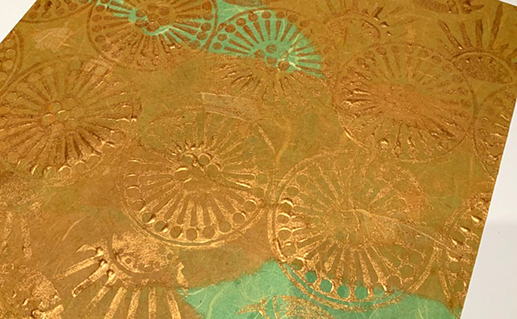
Use a limited palette if you like that approach. I worked with only three paint colors – Black Plum, Copper Metallic, Mustard Yellow.

Pick different stencils and stamps for each month or unify the calendar by repeating your favorites. I kept going with some of the stamps for several of the pages.

THE RECIPE

Ingredients:

Blank calendar, the bigger the better! (purchased or make your own)
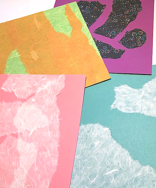
Cardstock in assorted solid colors (one sheet per month)
Lightweight mulberry paper and/or other handmade collage papers
Your favorite stamps and/or stencils by Nathalie Kalbach
  (StencilGirl, RubberMoon, ArtFoamies)
Acrylic paint in assorted colors
Brushes (stencil, flat paintbrush)
Gold paint pen (Pen-touch from Sakura of America)
Low-tack double-sided adhesive tape
Glue stick
Optional – Gel plate; Glitter dots (peel-offs)

How-to:

1. Cut a square or rectangle from solid color cardstock for each calendar page. (Size: 1” smaller than the page on all sides. Shown: 11” squares for 13” calendar.)

2. Alter each piece of cardstock with torn pieces of lightweight mulberry paper or other handmade papers. (Use a glue stick to adhere the pieces.)

3. Paint, stencil, stamp onto the cardstock. Make gel prints to add to the pages or print straight onto the cardstock. Allow paint and/or inks to dry. Use peel-offs, pens, markers, pencils or more paint to accent and embellish the pages. 

4. Adhere the finished pieces to the calendar. Enjoy!


Thank you Judi – we hadn’t thought of making our own calendars but what a cool project idea! Want to give Judi’s project a try? You can find all my Stencils, Rubber Stamps, and Foam Stamps in my Online Shop and here are some of the other supplies she used:

Feel inspired? Working on something yourself that you’d like to share?  I love to see how you interpret our monthly themes. Email me or tag me #natkalbach how you used my stencils and stamps – I would love to share your projects in my next  “n*Spiration From Around the Globe“.
Leave a comment

Happy Holidays -Linda Edkins Wyatt

Hello from my Creative Squad and a post from Linda Edkins Wyatt today! Linda is sharing a unique project with a special New Year message. She’s using my Manhattan and Broadway stencils and my Versailles foam stamps, and this month’s theme: Happy Holidays – It is a time of year where we are celebrating and coming together and enjoying some merriment. Create something holiday related (whatever holiday you may be celebrating) and enjoy the season!


This month’s theme for Nat’s Creative Squad is Happy Holidays, and we’re honoring the time of year where we not only reunite with friends and family, but also hope and plan for the coming year. One of the traditions in the art community is choosing a “word of the year” to represent the artist’s hopes and dreams for the year ahead. In my online Facebook Paper Doll Trading group, we are exchanging flat paper dolls with New Year’s wishes. I decided to go a step further and make a 3-D paintbrush doll to usher in the New Year.

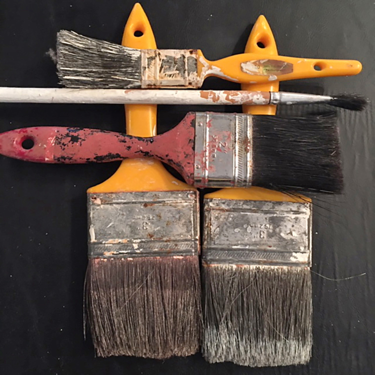
My fascination with paintbrush dolls really started a few years ago when I began seeing them on Instagram and Facebook and in art and craft magazines. I finally broke down and ordered a kit from Retro Café Arts, and I’m sure glad I did. I have made two so far, and they adorn my studio storage space and paintbrush caddy. I recently rifled through our toolboxes and found an assortment of deliciously grungy used paintbrushes.

Naturally I wanted to use Nat Kalbach’s stamps and stencils for my New Year’s Paintbrush Doll. The trouble was deciding…which of her stamps and stencils should I use? And in what colors and textures?

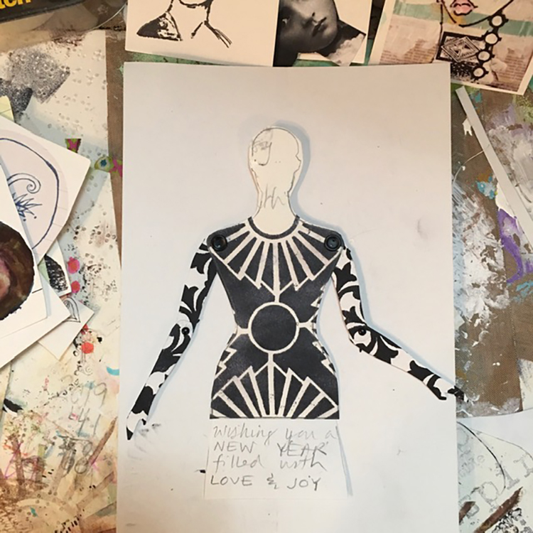
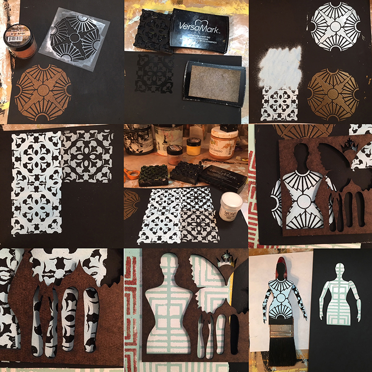
I started by doing a quick test of my paintbrush doll idea using an assortment of Nat’s stamps and stencils with black ink on white cardstock and created a working model of what I had in mind with her Broadway stencil.

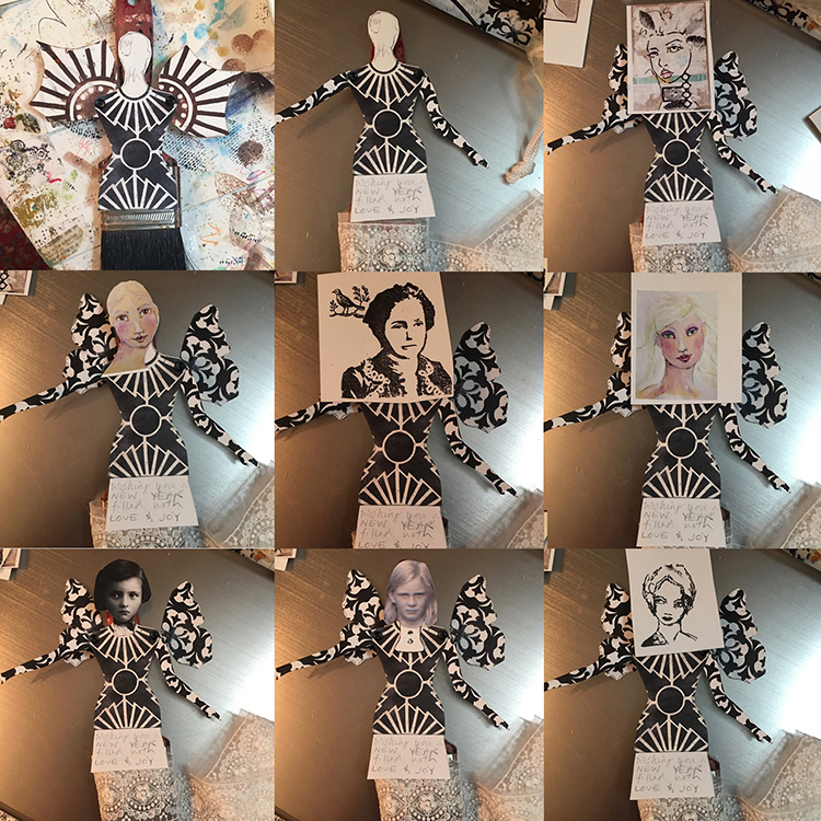
Next, I tested faces. Since I make a lot of paper dolls, I keep a box of parts handy.  I rifled through it looking for just the right face. I had trouble deciding as you can see in the “audition” photo.

I snapped photos of each, then put the faces aside for later and concentrated on the body. I mixed up my favorite paint colors, got out my favorite embossing powders, and got to work. I placed the Retro Café Arts template over the finished papers to decide what I liked best.

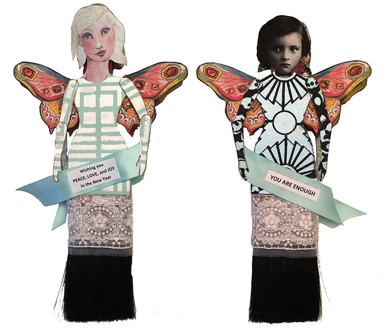
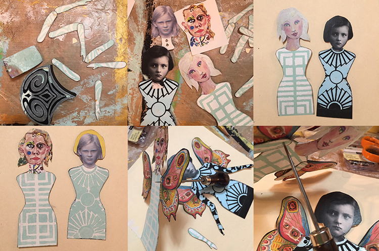
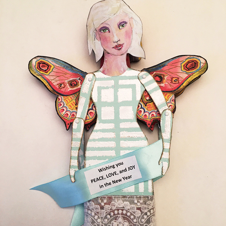
It turned out that I had two favorites (the Manhattan stencil done in white embossing powder on pale green painted paper, and the Broadway stencil done with ice-blue embossing powder on black cardstock), so I decided to try something I had never done before: making a two-sided doll!  I also decided to use printouts of butterflies from The Graphics Fairy for wings rather than the wings that came with the kit.

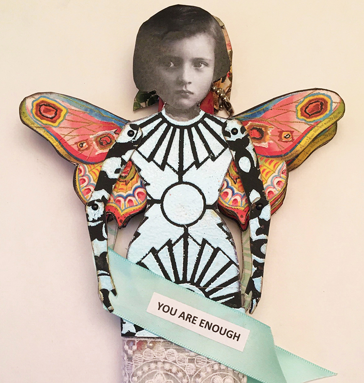
For the black and ice-blue Broadway stenciled body, I cut arms from the mini Versailles art foamie, also printed in blue embossing powder on black paper. I added a strip of the mini Versailles print under the body.

Due to the width of the paintbrush, there would be about a ¾” gap between the two sides of the paintbrush doll. The backsides were a bit messy, so I decided to use some of the extra stenciled paper and extra faces to “line” the back of both dolls. (The reverse side is mostly hidden, but the extra elements add a little mystery to the finished piece.) You can see the interior section on the bottom left photo.

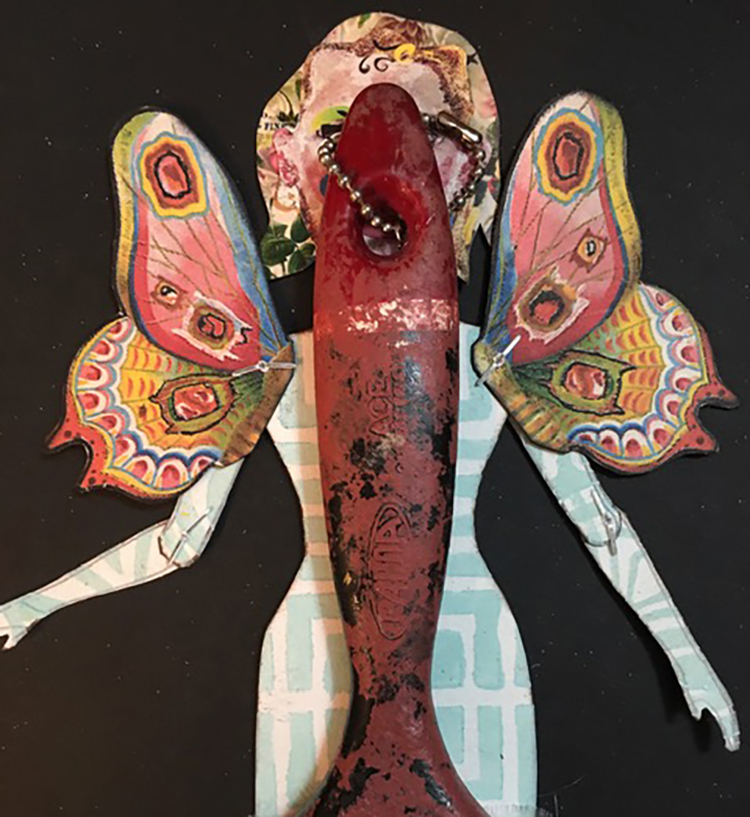
Once I selected the face, cut the bodies, and attached the arms and wings with mini brads (so they could be moveable and posable), I used E6000 glue to attach the doll bodies to the paintbrush handle. So that the doll could be hung, a short length of ball chain was threaded through the hole in the paintbrush handle; a tiny metal connector was used as a closure.

Once both sides were glued on, I added some beautiful sheer 2” lace and wrapped it around both sides, then carefully glued it in place.

The final touch was the New Year’s words of encouragement. Side one, which has a doll-sized printout of a face I painted using Jane Davenport’s beautiful faces method, holds a satin ribbon banner that says: “Wishing you PEACE, LOVE, and JOY in the New Year.” Side two, which has a sweet vintage child’s face from the Graphics Fairy, has a satin ribbon banner with the words “YOU ARE ENOUGH.”

This two-sided paintbrush doll can be used on a tree, doorknob or mantle as a seasonal ornament, or displayed throughout the year as a little angel of encouragement.


Thank you Linda! This is such a cool project and what a great way to give a paintbrush a new life :)

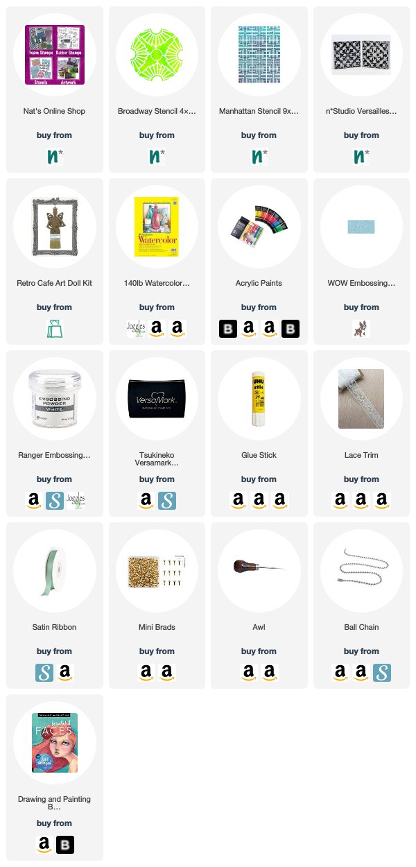
Want to give Linda’s project a try? You can find all my Stencils and Foam Stamps in my Online Shop and in addition to some old, well loved paintbrushes, here are some of the other supplies she used:

Feel inspired? Working on something yourself that you’d like to share?  I love to see how you interpret our monthly themes. Email me or tag me #natkalbach how you used my stencils and stamps – I would love to share your projects in my next  “n*Spiration From Around the Globe“.
Leave a comment

Happy Holidays – Nicole Watson

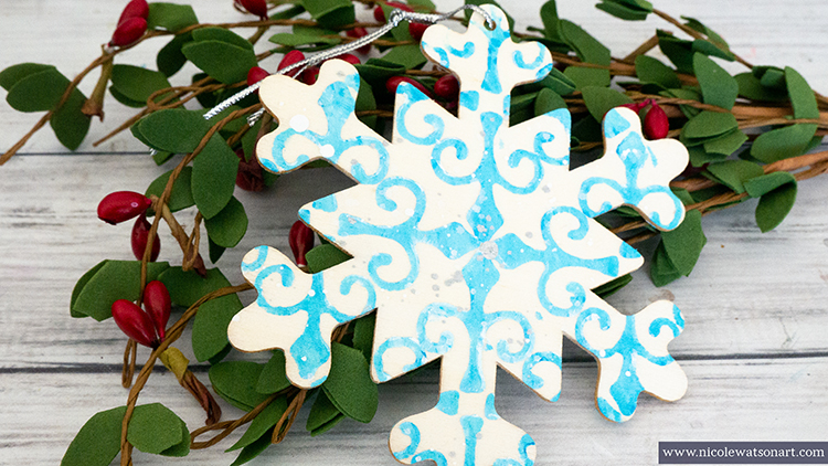
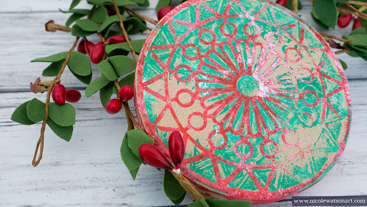
Welcome to a Happy Holidays post from my Creative Squad. Today we have two tree ornament ideas from Nicole Watson to get you in the spirit. Nicole is using my Valley Road stencil and my Antique Tile foam stamp along with this month’s theme: Happy Holidays – It is a time of year where we are celebrating and coming together and enjoying some merriment. Create something holiday related (whatever holiday you may be celebrating) and enjoy the season!


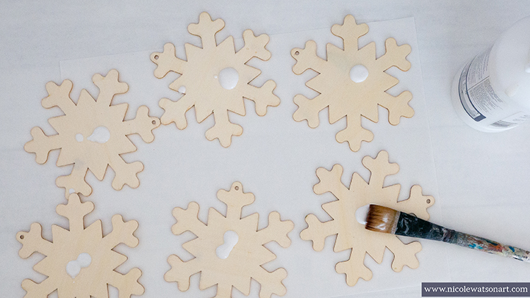
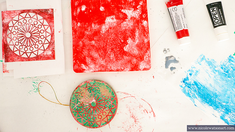
Recently, I wandered around several craft stores to see what was new for the holidays and find some inspiration. There I found several blank wood and paper mache ornaments that I knew would make perfect canvasses to stamp or print on. I had the exact stamp and stencil in mind when I grabbed the round paper mache and wood snowflakes.

When I returned home, I grabbed my paint and gelli plate and began playing. First, I coated all of the ornaments with clear gesso and let it dry. Then I began to get my hands a bit messy.

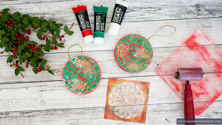
To make the round ornament:

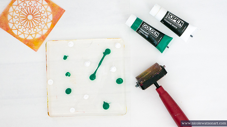
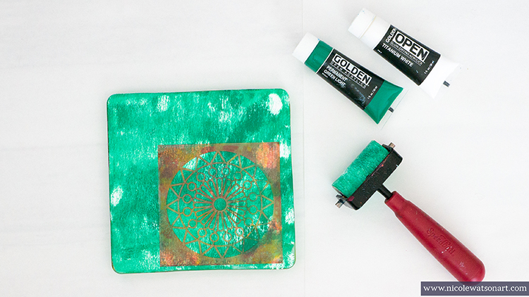
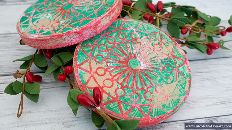
Brayer green and white paint on your gelli plate. 

Place the stencil on your plate in a spot where you like how the paint brayered. I used Nat’s Valley Road stencil, however all of her other small circles would also work!

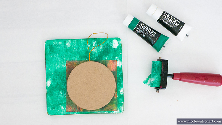
Then, place the ornament on top the stencil and press down. Make sure you use a good amount of pressure since the ornament is hollow. 

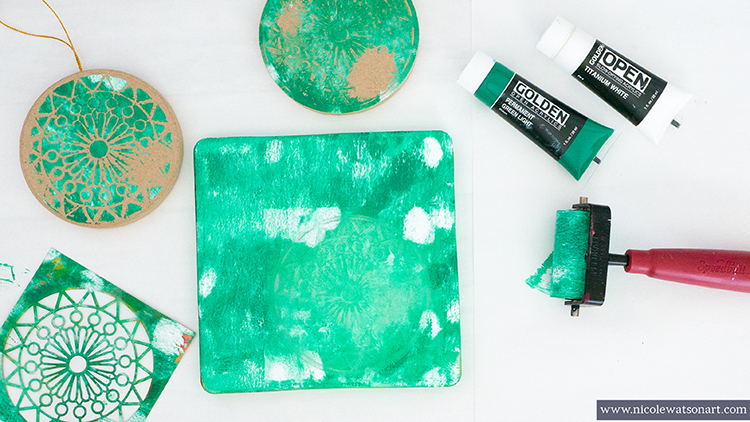
Lift the ornament and allow to dry.  I didn’t mind that the print on the ornament wasn’t perfect as I think it adds to the rustic nature of the ornaments.

Carefully lift the stencil from the plate and grab another ornament. Place this ornament in the spot where you lifted the stencil, apply pressure, and allow to dry.

Repeat this process for the ornaments you have. Once they are dry, repeat again to print on the other sides, but use the opposite opposite. The ones that you put on the stencil first, put those on the plate. This way each side of the ornament is unique.

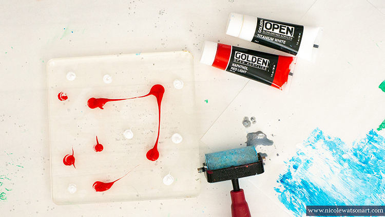
Use your gelli plate as a stamp pad for the stencil, which is your stamp. This part is a little messy so have some baby wipes ready for your hands! Spread the red and white paint on your gelli plate with a brayer. 

Place your stencil down to pick up ink (you can brayer over it for better coverage). Then, place the stencil on your ornament. Use a scrap piece of paper on top the stencil to add pressure for the print. Continue this process for each side of the ornament.

Before I cleaned the red paint off the gelli plate, I also rolled the edges of the ornaments in it a bit to add paint to the edges.

To make the snowflake ornament:

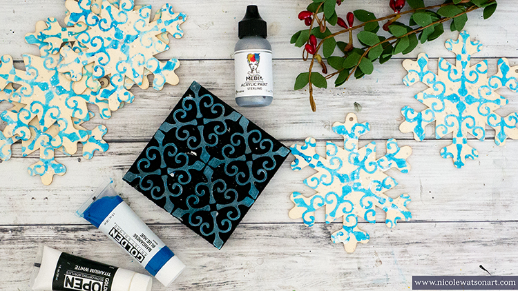
In between the round ornament drying time, I worked on the snowflake ornaments, and vice versa! It works really well to create both of these at the same time.

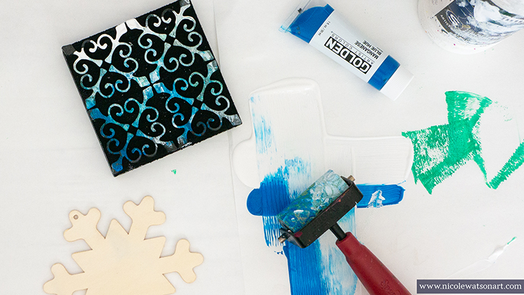
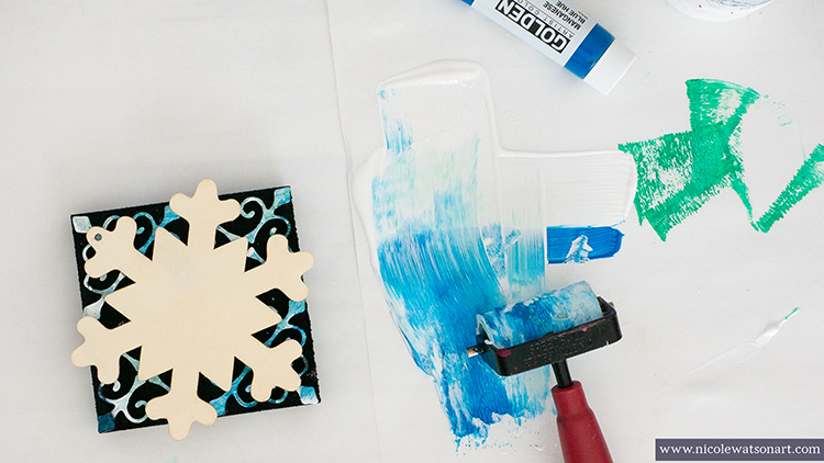
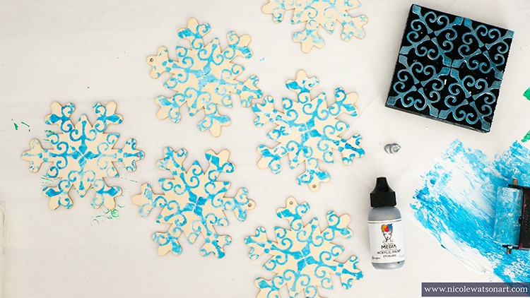
Add some blue paint and white gesso to your palette paper. You can use white paint instead; however, I like how gesso is less opaque. Brayer a mix of the paint and gesso on your Antique Tile foam stamp. 

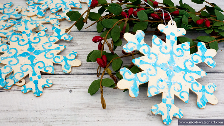
Then, place your snowflake on top of the stamp and press down. Repeat this process with all your snowflakes and allow side one to dry. Then, repeat for side two!

After both sides are stamped, spatter with silver paint and white gesso on each side. I also added a larger silver dot in the center of each flake by dipping the end of my paintbrush in the silver paint and using that to make a round circle on the ornament.

I absolutely love how both of these ornaments turned out, however instead of ornaments I’m going to use them for gift tags/package decorations. I added a snowflake to a package for our house sitter this week, and it was the perfect touch!

Nat’s Antique Tile stamp is a fun stamp to use in other ways as well. I’m also going to stamp it on my Christmas card envelopes, and last year I made wrapping paper with it!

I hope you are able to take some time to create this holiday season!


Thank you Nicole – what a great idea to use them as either ornaments or a gift tag. Want to give Nicole’s project a try? You can find all my Stencils and Foam Stamps in my Online Shop and here are some of the other supplies she used:

Feel inspired? Working on something yourself that you’d like to share?  I love to see how you interpret our monthly themes. Email me or tag me #natkalbach how you used my stencils and stamps – I would love to share your projects in my next  “n*Spiration From Around the Globe“.
Leave a comment