Art Stroll

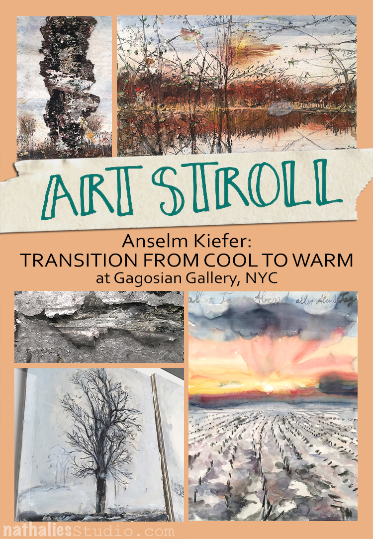
Art Stroll: Anselm Kiefer – Transition From Cool To Warm

A couple days ago my artist friend Natalya Aikens and I went into the city to go to the Gagosian Gallery to see Anselm Kiefer‘s work. If you participated in Creative Jumpstart 2016,  you know that Kiefer is one of my all time favorite artists. When Natalya told me about this exhibition I was crazy excited – and I wasn’t disappointed.

Kiefer is mostly known for his gigantic textured paintings, but he also paints with watercolor on a smaller scale and this exhibition at the Gagosian Gallery shows those two different bodies of works. It fits since Kiefer is interested in opposites.
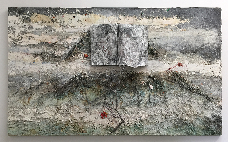
Anselm Kiefer, For Segantini: die bösen Mütter (For Segantini: The Bad Mothers), 2011–12, oil, emulsion, acrylic, shellac, wood, metal, lead, and sediment of an electrolysis on canvas.
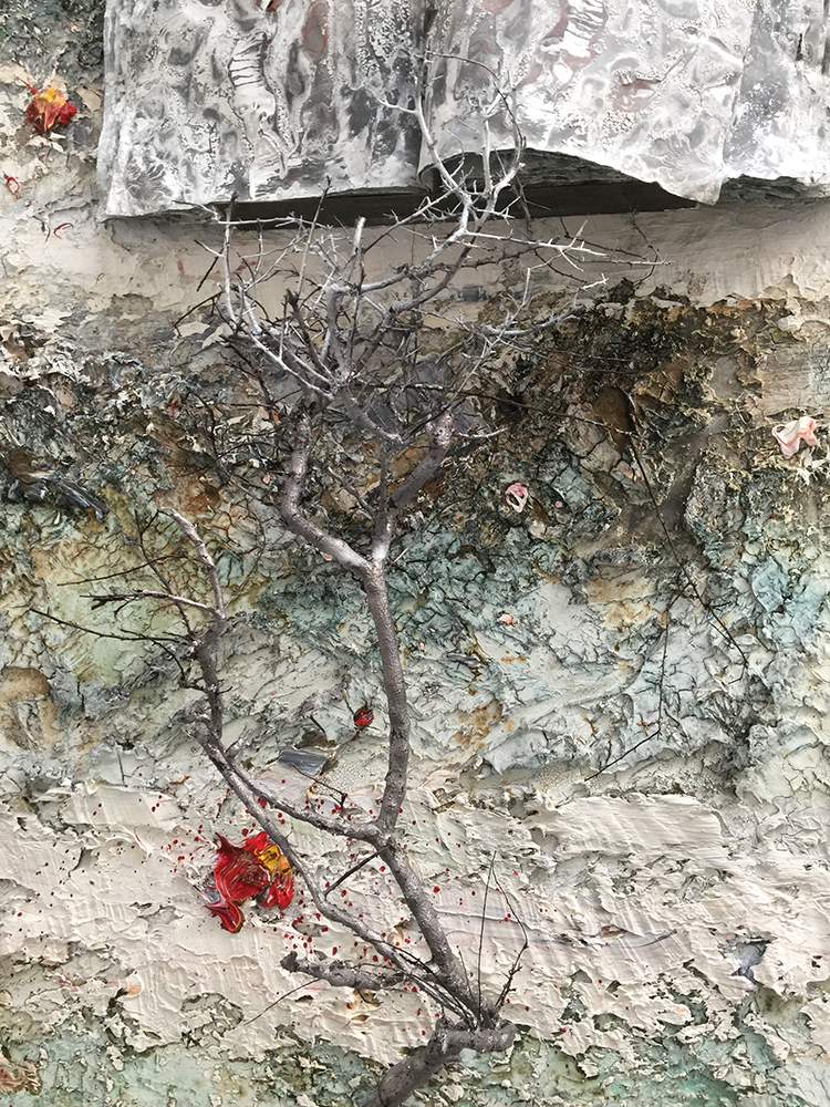
I love how Kiefer incorporates all kinds of materials and he doesn’t really care that a painting could change through aging, or natural alterations. In fact he welcomes this. He says he is more interested in the process – not only the process of making art but also the process of what happens to a painting naturally later – than in an absolute result. I think this is a totally freeing, interesting and open minded approach to art and life.
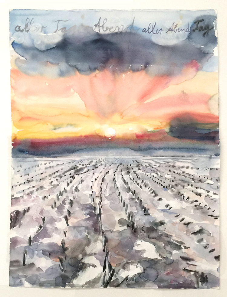
Anselm Kiefer aller Tage Abend, aller Abende Tag (The Evening of All Days, the Day of All Evenings), 2014 Watercolor on paper
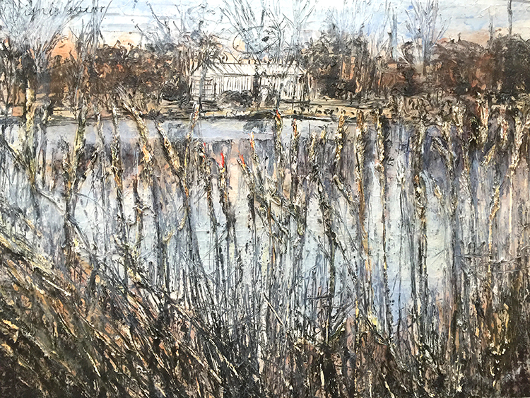
Anselm Kiefer Ignis sacer, 2016 Oil, acrylic, and emulsion on canvas
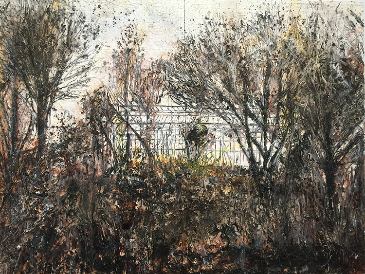
Anselm Kiefer des Malers Atelier (The Painter’s Studio), 2016 Oil, emulsion, acrylic, and shellac on canvas
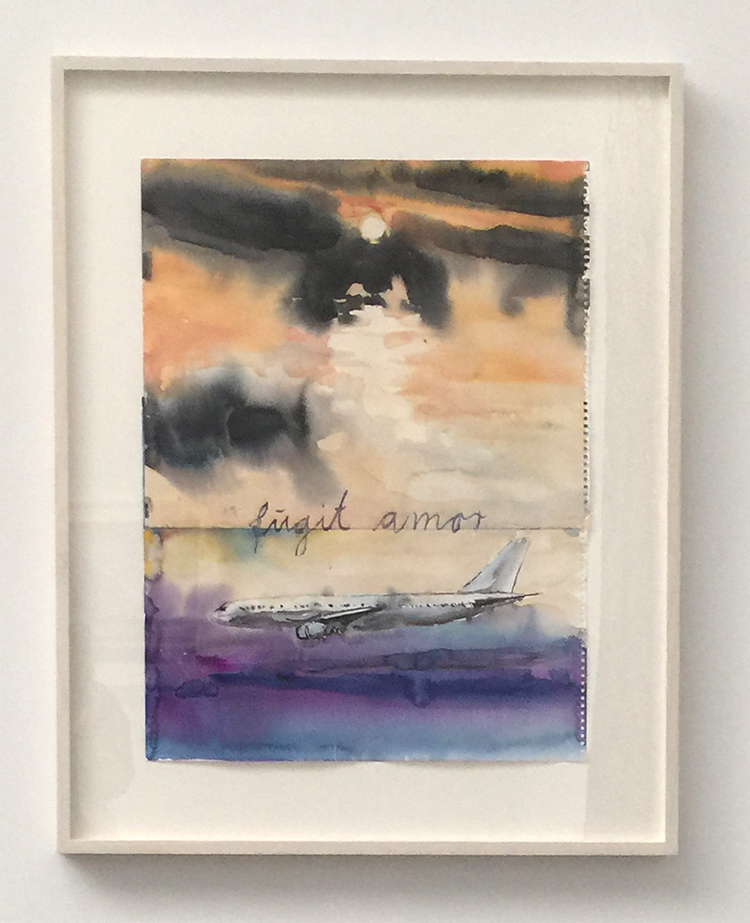
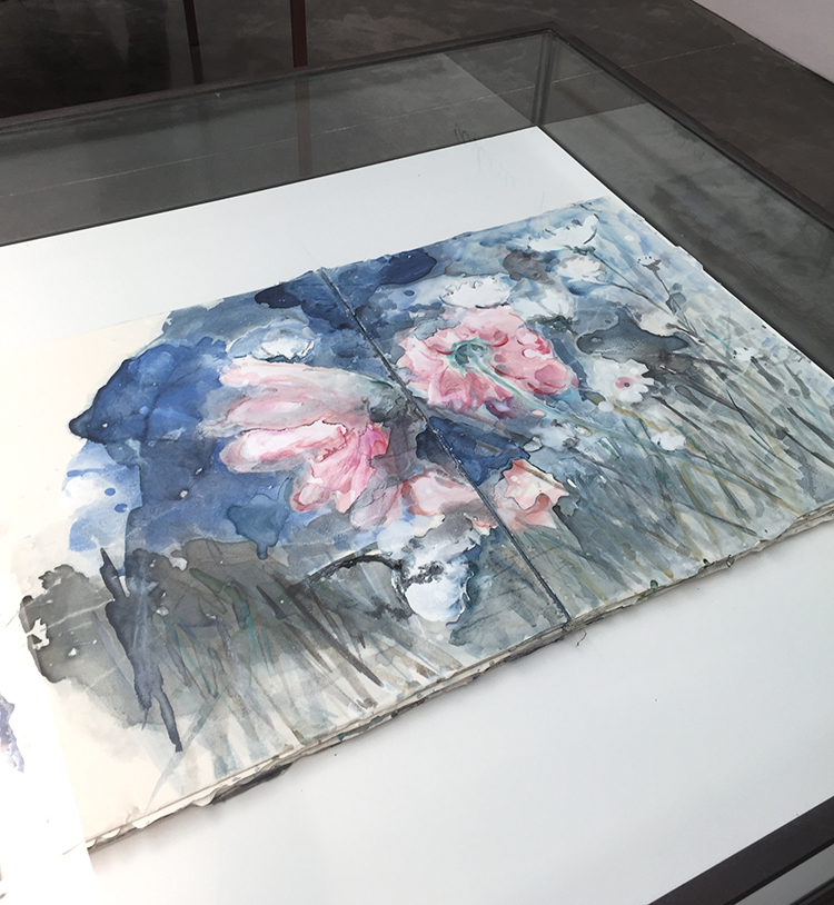
What I found interesting about his watercolor work was how freely he uses the colors, letting them do their thing – something I struggle with then using this paint medium.
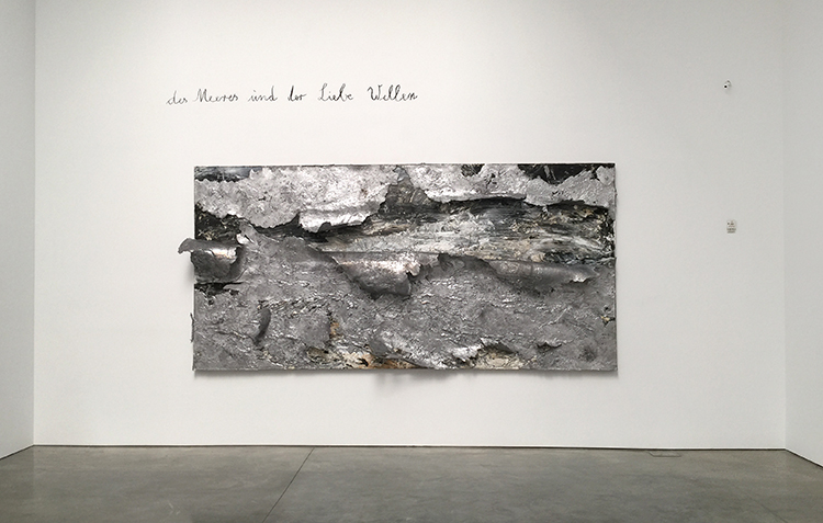
Anselm Kiefer Des Meeres und der Liebe Wellen (The Waves of Sea and Love), 2017 Oil, emulsion, acrylic, and lead on canvas
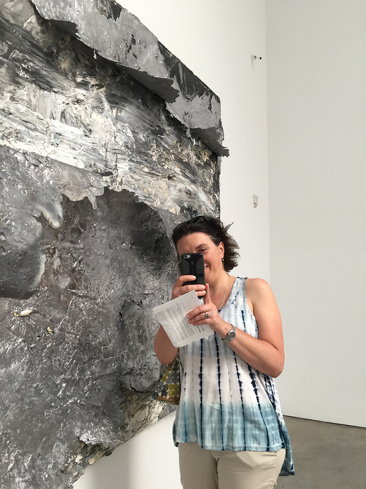
Look at Natalya taking a picture of me taking picture of her in front of a picture …well – hey … little bit of fun is ok ;)
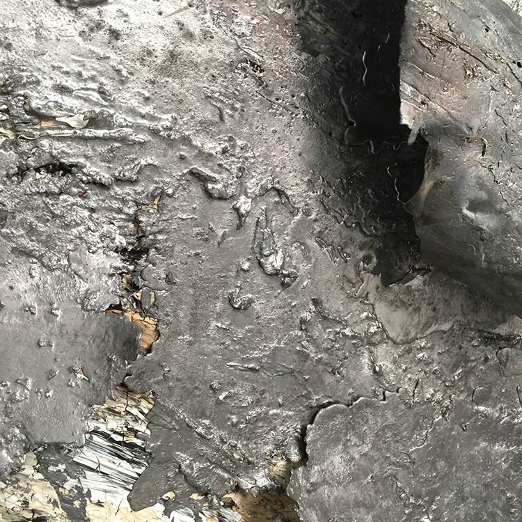
For this painting Kiefer poured liquid lead on top of a painting and then pealed it back to reveal the original painting again.

Kiefer also makes a huge amount of Artist Books. He is fascinated by books and stories, they have always played a huge role in his artwork.
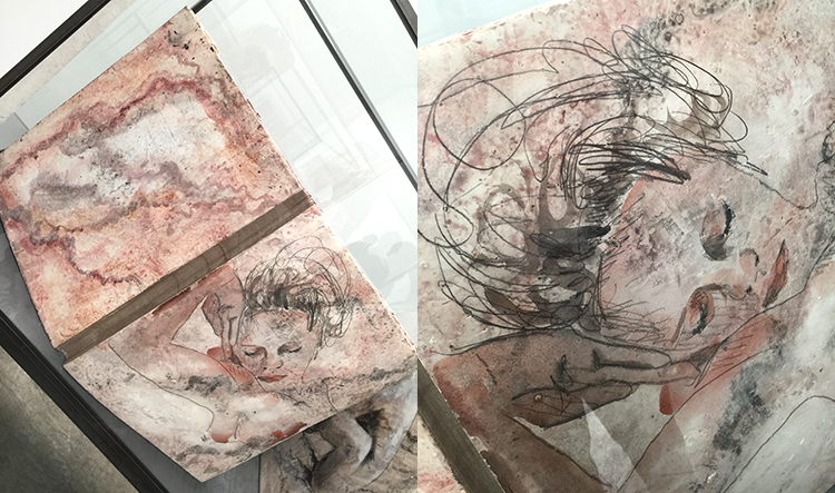
In an interview he once told the interviewer that he starts his morning by going into his library and in a state of still being absence, he blindly grabs a book which usually turns out to be just the right book for the day and often inspires him for his artwork.
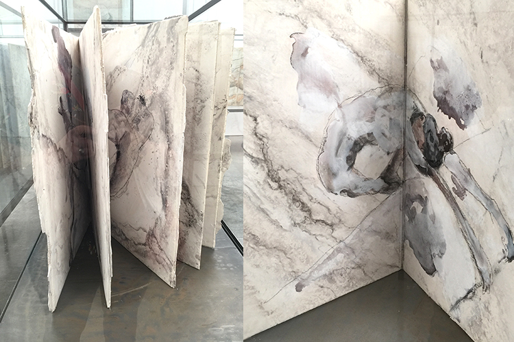
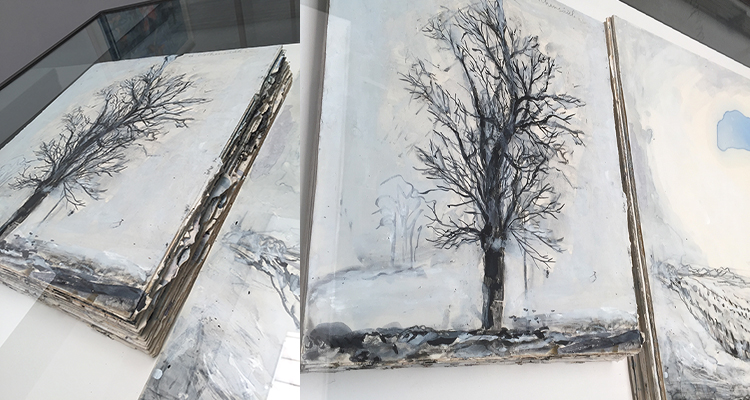
These books are quite big – which is hard to see in these photos  – they are more sculptural than books and you are tempted to touch them and flip the pages, although given how heavy they look that might be something you need more arm muscles …and you might never be able to set foot in this gallery again ;)
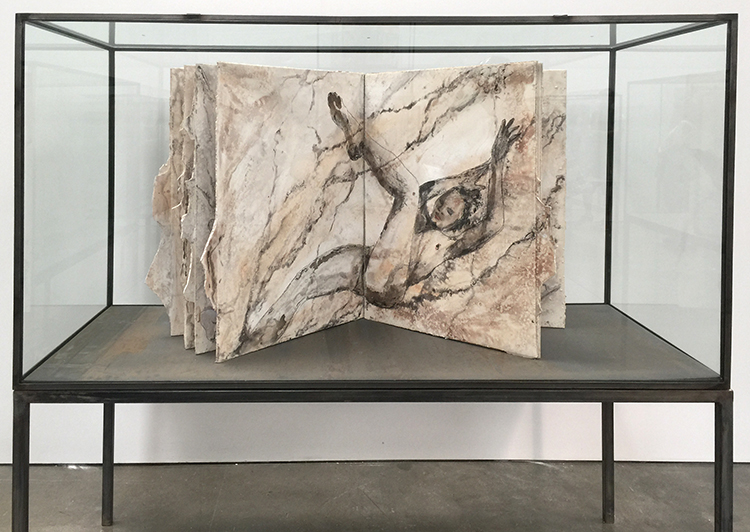
I love the marbling effects Kiefer created – with plaster – maybe gesso and watercolor.
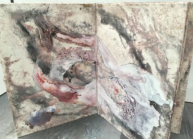
Klingsor’s Garden was the room with all those books called. Klingsor is a magician in the opera Parsifal. He has a garden full of beautiful flower maids.
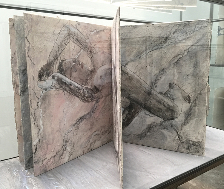
The way those books are set up is like a labyrinth and I guess it is no coincidence that you might get lost in looking at those books from all angles.
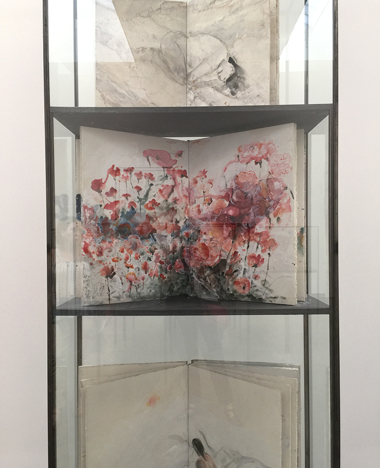
Fascinating!
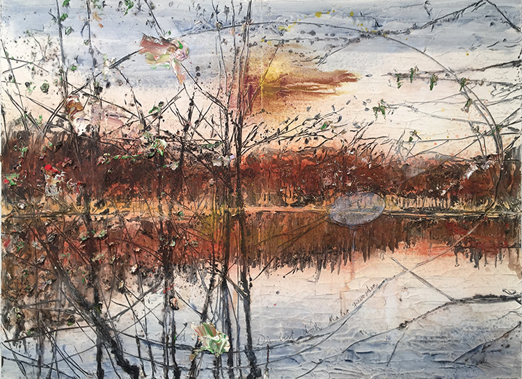
Anselm Kiefer, Und Du bist doch Maler geworden (and you became a painter nethertheless)

I didn’t see it in the gallery as this is a huge painting but when I actually took a look at the photo of the painting at home I realized there is painter’s palette carved into the painting – a painting about painting.
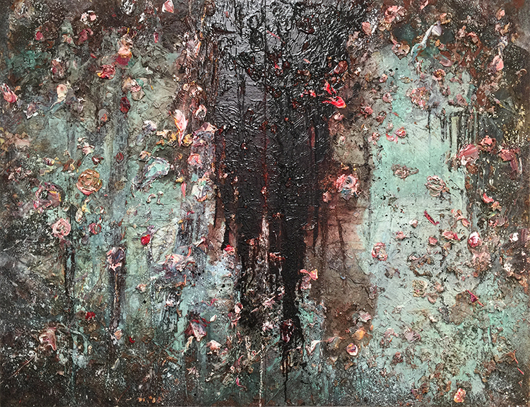
Anselm Kiefer, Aurora, 2015–17, oil, emulsion, acrylic, shellac, and sediment of an electrolysis on canvas
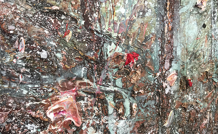
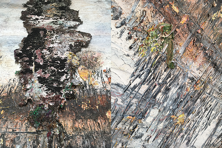
The texture and dimension in his work is just unreal . You have to see his work in person.
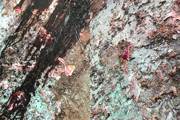
Given that this painting is so new- I would bet that it is still changing, drying, and processing. Now …if that is what the artist likes and wants… who are we to preserve it and have conservators going nuts about up-keeping the status quo?
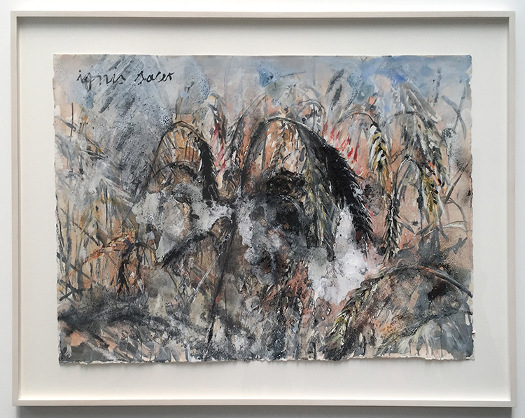
When I first looked at Kiefer’s watercolors I thought they were so different to his big paintings because of the missing texture but the closer I looked, the more I realized that he actually included a lot of texture with charcoal in some of them – and then there is also a lot of visual texture especially in the one above. But even the ones I showed earlier in this post have areas of texture quite unusual for watercolor painting.
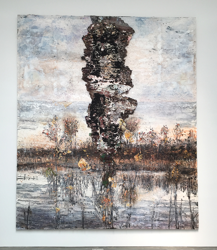
In one of the videos I saw a while back about Kiefer’s work I saw him hacking with a machete into his thickly layered painting. Big pieces of paint chips fly off the canvas, revealing yet even still thick layers of paint underneath. There was something so liberating and yet shocking seeing his actions.

I love the beauty that get’s revealed by the act of slashing, scraping and peeling.
I also loved how some of the books had these raw edges – and as a viewer who always makes up their own story when looking at artwork for me Kiefer’s work is about human beings.
We are complicated, controversial, complex, layered, good and bad, we change, we can transform. Behind all the ugliness of human beings are always layers of beauty. There are no monsters and that is for me what explains why people can be horrible and cruel but then also be loving and like-able. That is what in my eyes his artwork represents.
This exhibition has inspired me to no end – lot’s of thoughts, ideas, craving to explore. If you are in NYC – check this exhibition out– it got extended and it is open until September 1st. Don’t be intimidated that it is a gallery – the people at the desk barely lift their head when you come in- they know you are not there to buy but it seemed utterly fine for them and I think Kiefer approves ;)

Comments (4)

  • Janis Loehr

    |

    Thank you Nathalie for sharing!

    Reply

  • stephanie

    |

    What an amazing exhibit!

    Reply

Leave a comment

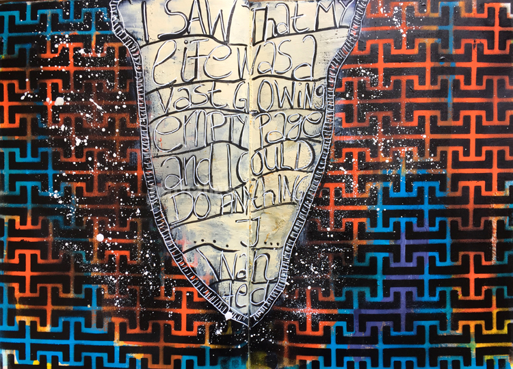
Glowing Empty Page – Art Journal Spread

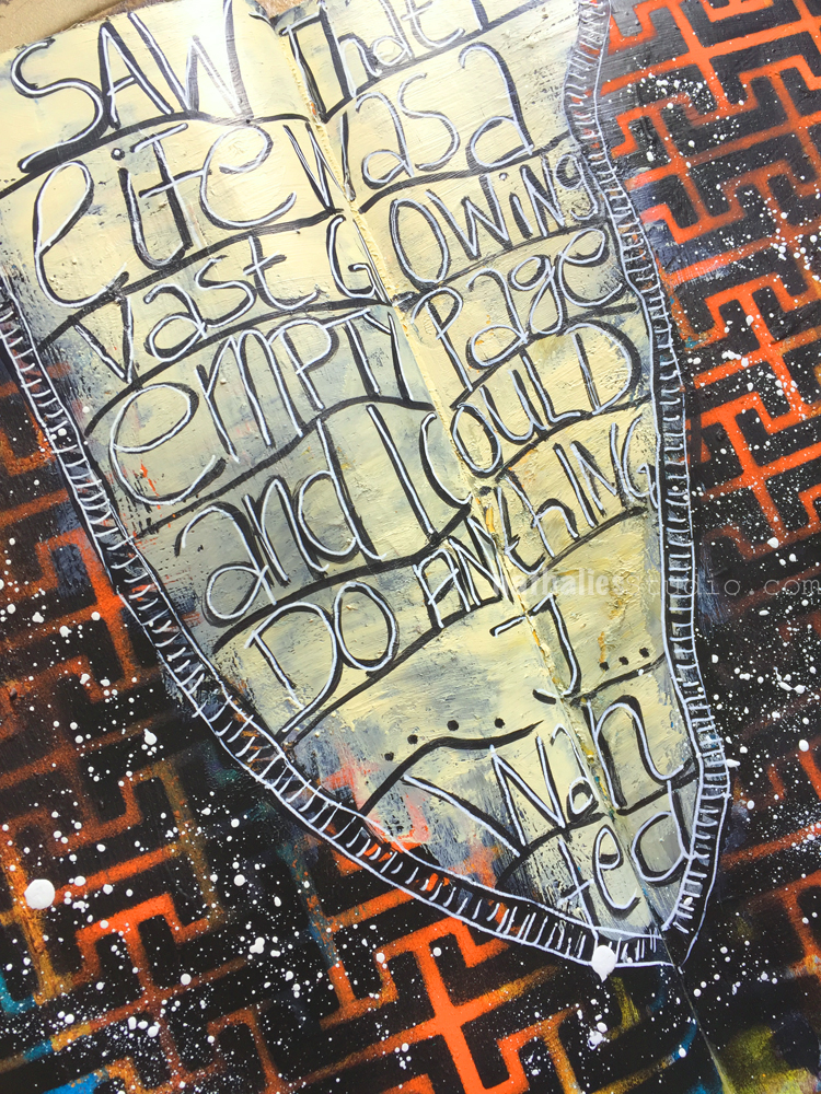
“I saw that my life was a vast glowing empty page and could do anything I wanted”

That is how I feel what happened to me while I was living in Hamburg.

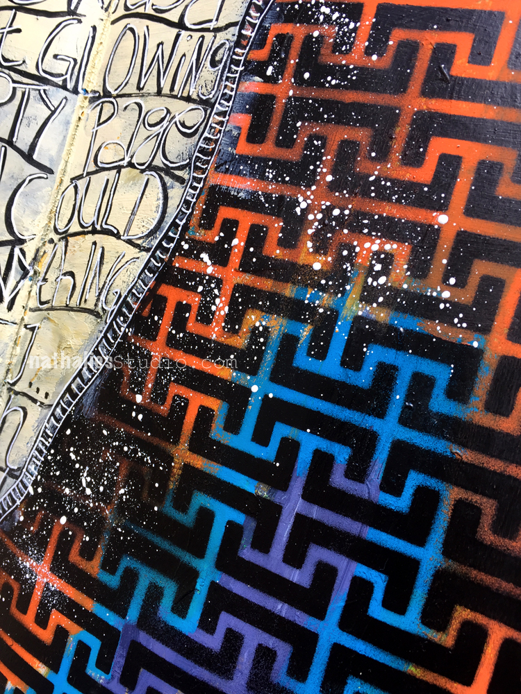
and so I used my Hamburg Stencil and sprayed in black over the colored background. I added some off white in the middle to add my journaling.


I like how the background pops vibrantly up through the stenciled area. I added some white splatters to get an even more vibrant effect.

Here are the supplies I used for this spread – some links are affiliate links:


Wishing you a gorgeous day!

Comments (1)

  • stephanie

    |

    What an awesome quote! I love the composition on this page.

    Reply

Leave a comment

Stroll Through the Hood – July 2017

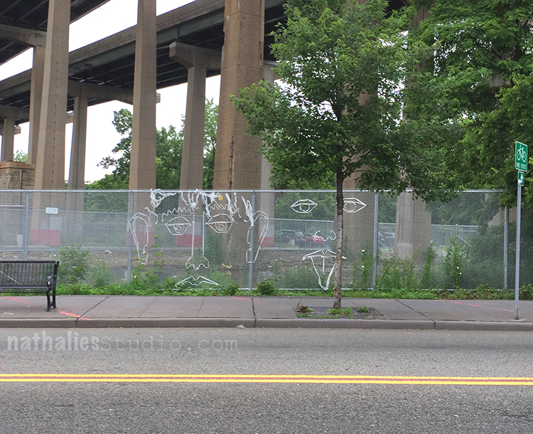
Time for a Stroll Through the Hood . Strolls through my hood get me out of my studio, they help me unstuck and often I get inspired by what I see and to get new ideas to create something. It is part of my philosophy about Artful Adventures in Mixed Media – which is the subject of my book. Here are some photos that I gathered in the last couple weeks.

When I had to go to get an MRI after hurting my shoulder playing table tennis (yes…you heard right) – I had to walk underneath the turnpike – ugly ugly- but there was a bit of Norman Kirby Fence Art to make the feel better. The funniest thing – the tongue on the right moved in the wind :)

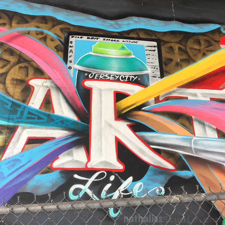
I love how the color bands come out of the R and the movement in this mural.

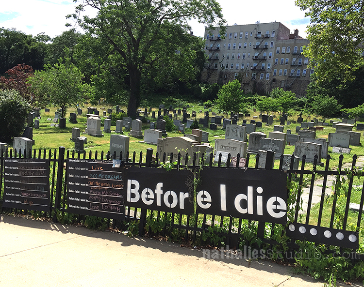
This is the Historic Jersey City and Harsimus Cemetery again – they had an Oddity Market there one weekend and ha- that is a great location for this. I loved seeing the Before I die… Wall there. I thought it was so clever to have it at a cemetery what a fitting place for this public art project. I did a painting a long time ago called “Before I die, I want to become the person that I am ” – but I think it is time to do this again in my art journal and think about it :)

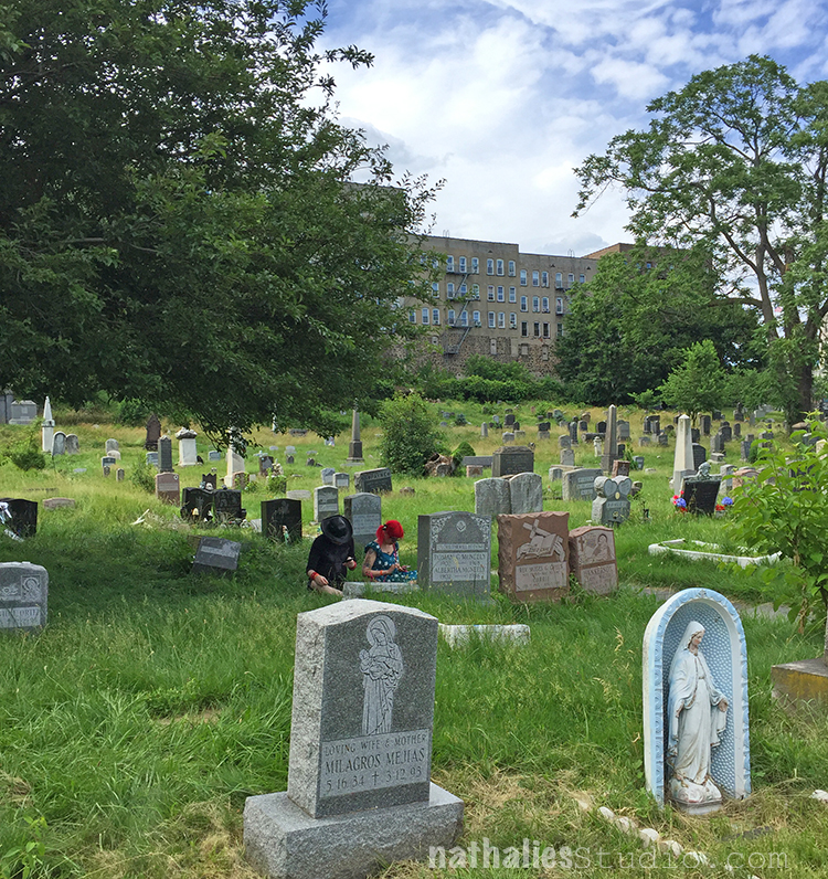
I also found humor in seeing those to guys in sitting in the grass in between the headstones typing on their cellphones ;)
Ok – this one is a bit cheated- as it wasn’t in my walkable hood – but close enough – I went to a U2 concert and our General Admission spot was spot on ;) Well…it pays when you go with friends who are die-hard U2 fans and know the ins and outs of where to stand at the tour- LOL. Love the swirls- the whole concert was a feast for the eyes.
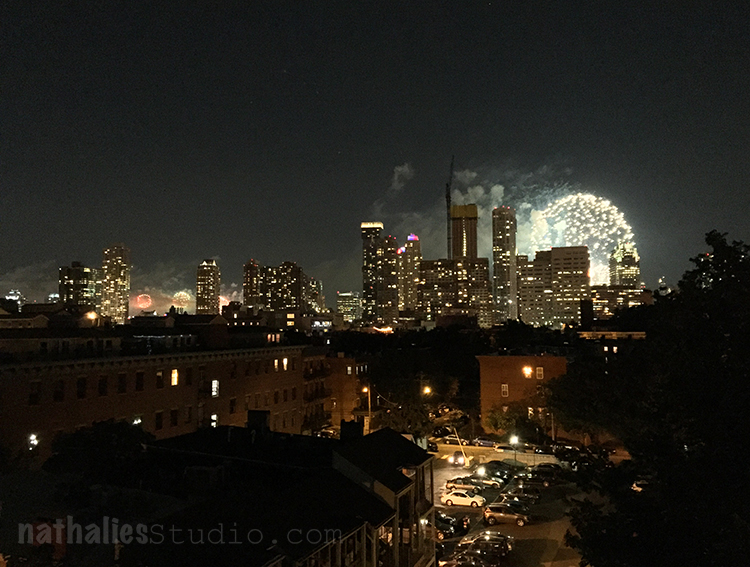
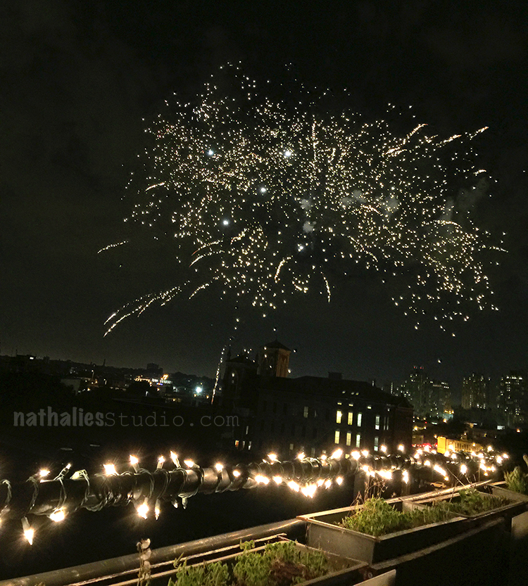
Of course there was 4th July celebration – we had a small party on our deck and saw several fireworks at the same time -here to the left the NYC Macy’s firework on and on the right at the same time the Jersey City firework.

And this one was apparently a “personal” one  – in the neighborhood – but I take it-as the next day was my birthday- so basically I get free fireworks for my birthday- not too shabby, right? This reminded me of ink/paint splatters.

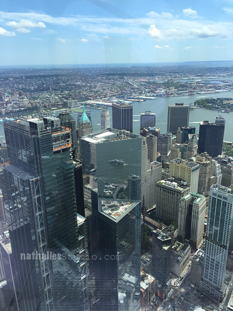
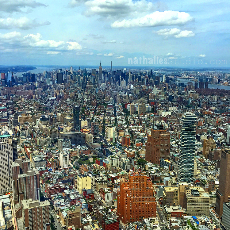
And those here are also a bit cheated- but hey- I am the boss of my hood- LOL- and this month Manhattan belonged to it too- I mean…I can basically just spit over the river from my hood. We went to the Freedom Tower with family as part of a family day. What a view. Look at the reflection in the skyscraper – I love that- I want to do something with this in one of my paintings.

And oh man ….amazing. It never ceases to amaze me to look at Manhattan from that perspective – it looks all so unreal and orderly and cool. It made me really itch to continue my big Manhattan painting, I am working on for a while now.

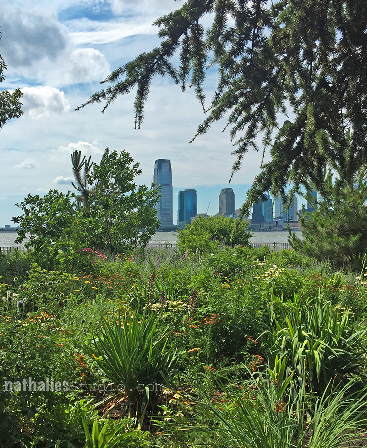
And – just because- Jersey City from the Manhattan side- HA  – at Battery Park. I love the juxtaposition between plants and garden and skyscrapers.

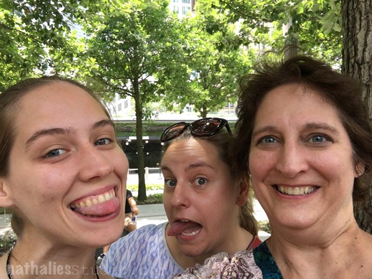
And just for fun – I am sure my sister in law at a different idea when she wanted a photo of the girls- but here we are, my niece and I being goofy and my sis in law being her awesome self ;)
Hope you enjoyed this stroll through the hood – until next time!

Comments (6)
  • Jackie P Neal

    |

    Great stroll Nathalie!
    And happy birthday to you and America! This is your first 4th of July being an actual citizen of the US -right? I hope it was special for you! Congrats!
    hugs,Jackie

    Reply

  • Robin S.

    |

    I truly enjoy your strolls through the ‘hood. I may have made a comment like this before, but I am a country girl through and through and am amazed by how much beauty there is to be found if a person is willing to look for it with an open mind; you are a constant source of inspiration to me. LOVE that reflection in the skyscraper!! Keep up your creativity, imagination, and free spirit!

    Reply

    • nathalie-kalbach

      |

      Awe – thank you so much Robin! Have a wonderful and creative week!

      Reply

  • Sue Clarke

    |

    Love the reflection in the side of the building and what a view of the city!
    I totally enjoy strolls through your hood especially since they are so different from mine.
    I see wildlife and no street art (bummer).
    Happy belated birthday and keep that inspiration coming.

    Reply

    • nathalie-kalbach

      |

      Thank you sue! Yeah – wildlife is pretty cool too – that is what I am missing here ;)

      Reply

Leave a comment

Call for NEW Creative Squad Members!


Creative Squad Call!

Are you a Mixed Media Artist, Scrapbooker or Card Maker with a unique style and a passion for creativity?
Do you love to use stamps and stencils in your work and love to try new techniques and media?
Do you love to share your projects on social media and engage with other artists?

If the answer is yes, yes, yes, we are looking to fill some spots on our n*Studio Creative Squad and would love to hear from you! Here is what we need from you:

1. Full name, email address, links to social media sites/blog/website where we can see your work
2. A couple sentence bio or description of your work
3. 4-5 low res images of your work that best represent your style

Email your submission to nat(at)nathaliesstudio.com with “Creative Squad Submission” as the subject.
Enter by August 11, 2017  :)

As a Creative Squad member for Nathalie’s Studio you will serve a 6-month term beginning 10/1/2017. As part of the Creative Squad, you will receive a variety of Nathalie’s Studio products. You will create one project per month, using specified products or groups of products and inspired by a monthly theme. You will be featured once a month on the nStudio blog, Facebook page, and Instagram, and you will be part of an amazing team of artists with a legacy of awesomeness!

Apply today!

Comments (3)

  • Karen Bearse

    |

    So tempting! I love your stamps and stencils… would love to be on your team just a bit overwhelmed right now. Hummm what to do…

    Reply

  • Irma

    |

    Really? Just 1 entry a month? Is a video or photo tutorial required? – Irma

    Reply

    • nathalie-kalbach

      |

      Irma, yes a, photos to go along with your post would be required- doesn’t have to be super long. If you look at the Creative Squad posts so far, you get a good grip for what is asked for :)

      Reply

Leave a comment

Living with Changes – Art Journal

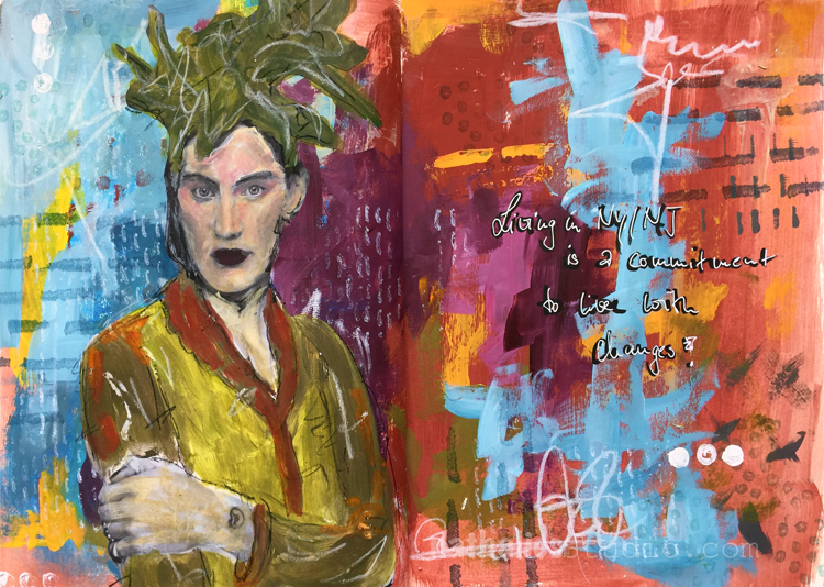
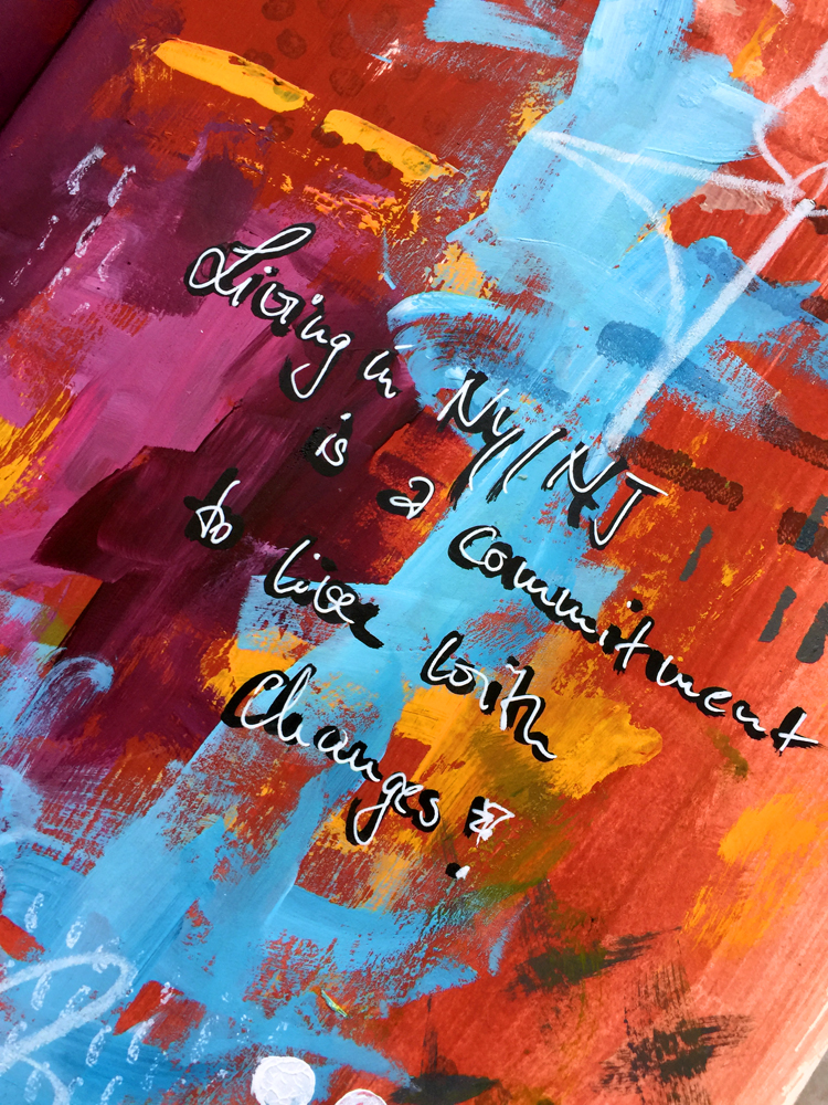
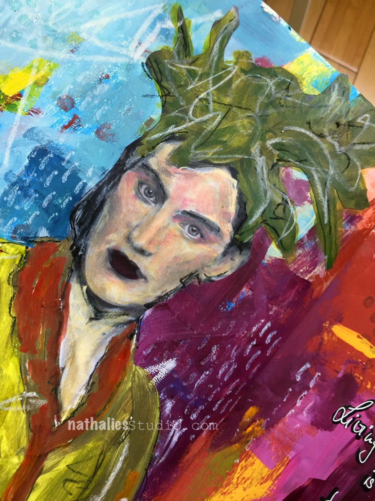
I truly believe that living in the NYC metropolitan area is a commitment to live with changes! It is energizing and inspiring and sometimes also tiring. But that is what you signed up for – nothing for granted :)

I used this spread to play with the new acrylic paints I made in the Kremer Pigments Hands-On Acrylic class I wrote about yesterday. I really love how they turned out and how vibrant they are. I added some stamping with my Embroidery Stamps and marks with China Markers.

Here is a supply list –  – some links are affiliate links:


Wishing you a gorgeous day!

Comments (4)

Leave a comment

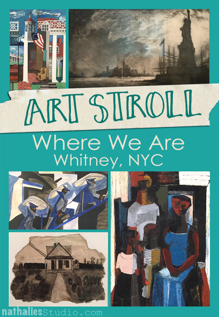
Art Stroll: Where We Are – Whitney, NYC

A couple of weeks ago I went to the Whitney to see the Calder exhibition – which was fantastic- but I also took some time for the Where We Are exhibition with selections from the Whitney’s collection 1900-1960.

“Where We Are traces how artists have approached the relationships, institutions and activities that shape our lives. The Exhibition is organized in five themes: family and community, work, home, the spiritual and the nation. During the six decades covered in the exhibition, the U.S. experiences war and peace, collapse and recovery, and social discord and progress. The artists and their works suggest that our sense of self is composed of our responsibilities, places and beliefs. Where We Are is titled after a phrase in W.H. Auden’s poem “September 1, 1939”. The title of the poem marks the date Germany invaded Poland. While it’s subject is the beginning of the war, Auden’s true theme is how the shadow of a global emergency reaches into the far corners of everyday life. Where we Are shares Auden’s guarded optimism, gathering a constellation of artists, whose light might lead us forward.”

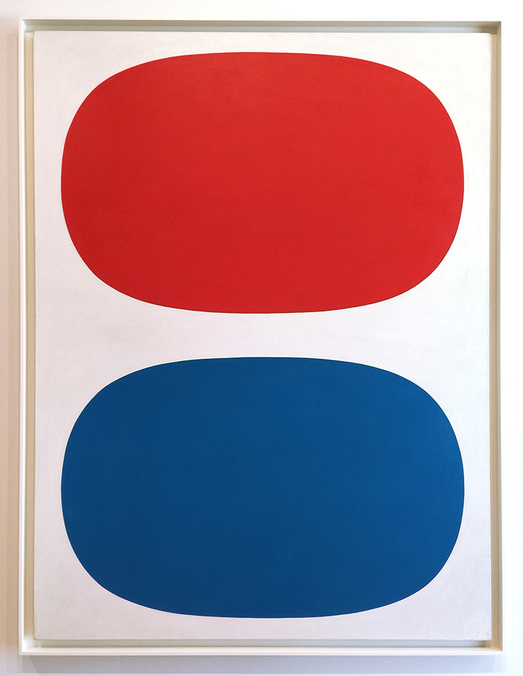
Ellsworth Kelly, 1961 – Red, White and blue – Oil on linen

Ellsworth Kelly’s earliest works of art were created in service to the United States, as part of a special camouflage unit in France during World War II. Kelly and his fellow artist-soldiers were tasked with fooling the Germans—using rubber and wood to construct fake tanks and trucks—into thinking the multitudes of Allied troops on the battlefield were much larger than reality. While this seems an unconventional early training for an artist, it proved a fitting one for Kelly. After his service, Kelly enrolled in the School of the Museum of Fine Arts in Boston. After knowing this – doesn’t the painting now feel like a camouflage flag? ;)

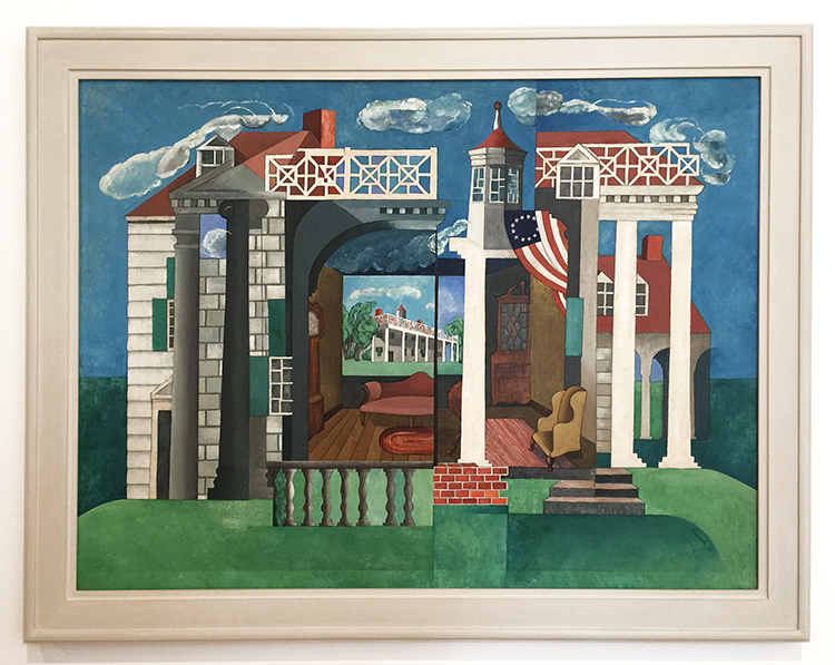
Herman Trunk, Jr., Mount Vernon, 1932.  Oil on canvas

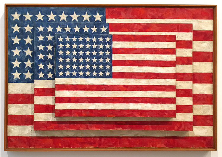
Jasper Johns, 1958 – three Flags, Encaustic on canvas

Johns saw the American flag as a symbol that is usually “seen and not looked at, not examined”. The execution and composition of Three Flags encourages close inspection. What do you think, is the middle panel actually fully painted with the flag or not? Apparently it is still a bit of a mystery although infrared hints it is incomplete.

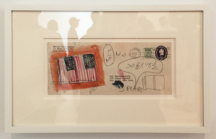
Jasper Johns, 1959, watercolor and graphite on fond paper

Having just seen the Rauschenberg exhibition at MoMA this made me excited – and I love the mail-art.

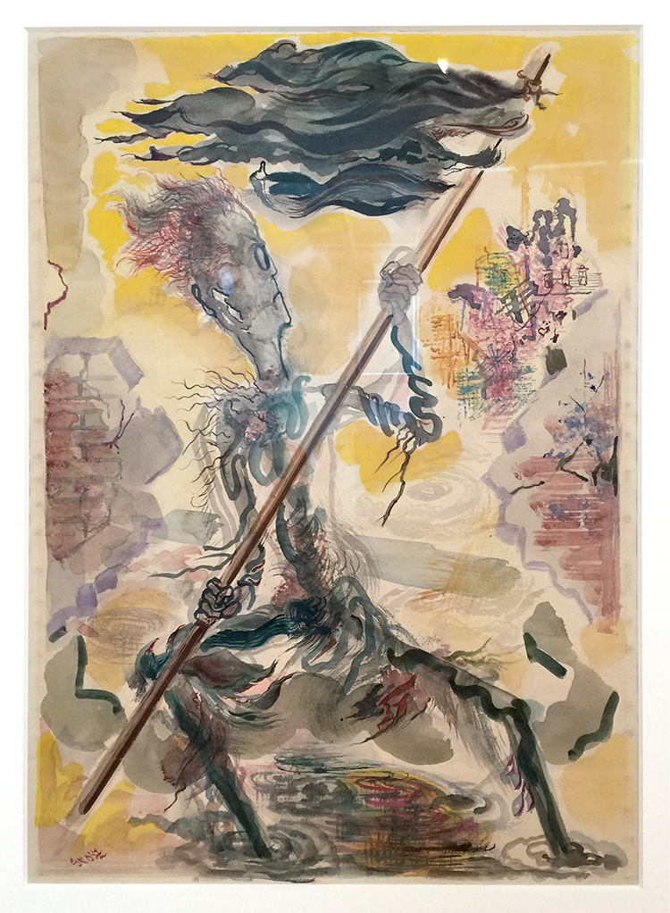
George Grosz, 1947-48, Waving the Flag, Watercolor on paper

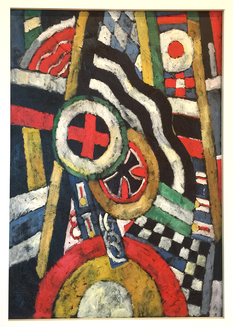
Marsden Hartley, 1914-15, Painting, Number 5, Oil on linen

Marsden Hartley began this work before the First World War, during an extended stay in Berlin. The painting is a memorial to Karl von Freyburg, a young German officer whom Hartley loved and who was killed in battle soon after the war began. The way he painted has the effect of a collage.

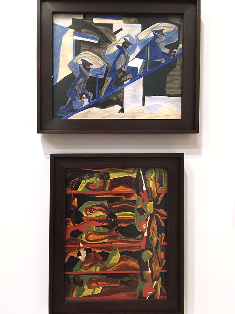
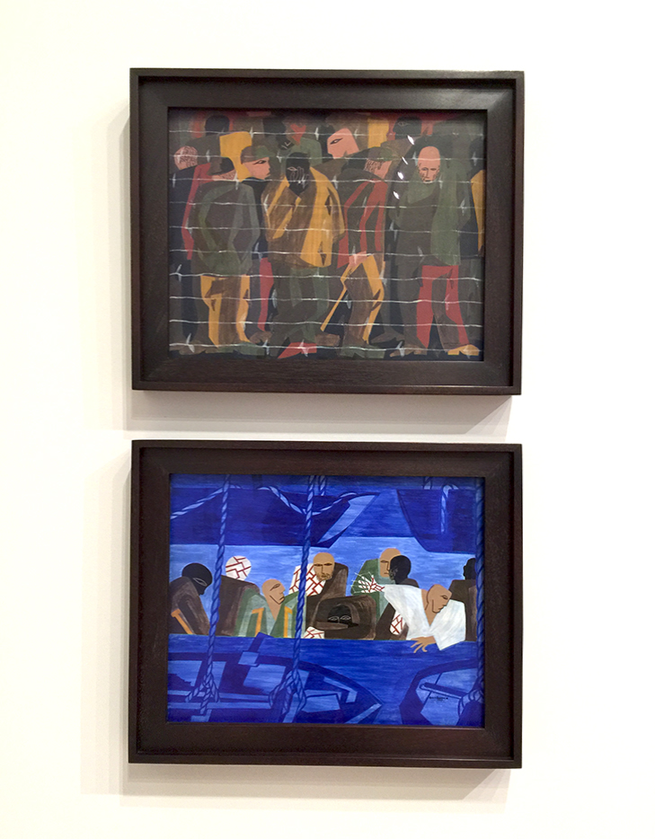
Jacob Lawrence, 1946 and 1947- War series – Tempura on composition board

I had never seen the war series by Lawrence before and it really grabbed me. He painted the series while serving during WWII. These paintings are timeless and the narrative is ingrained in our heads with wars we have experienced or know about.

I would like to go back and see the other paintings in the gallery in this series with more time- but it was quite full that day.

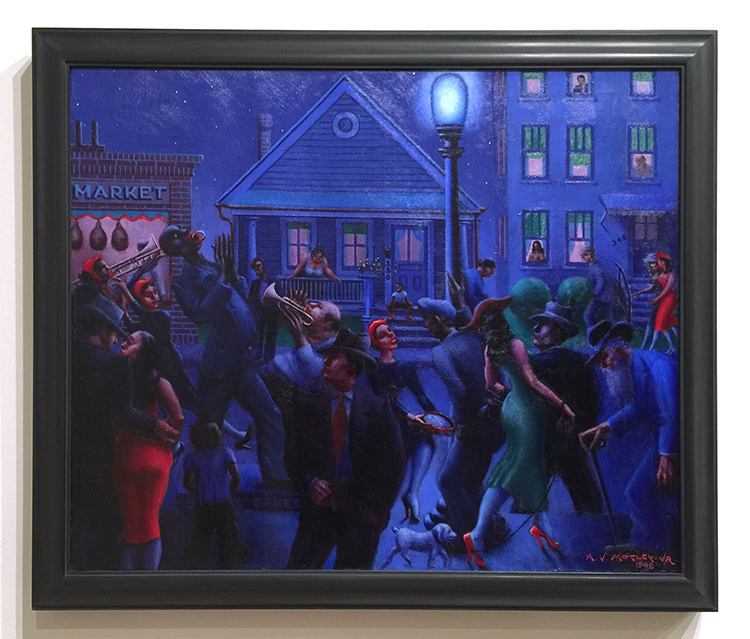
Archibald Motley Jr., 1948 – Gettin’ Religion, Oil on linen

Archibald Motley’s primary artistic inspiration were the inhabitants of Chicago’s South Side, a culturally thriving neighborhood at the time. In this night scene he captured the full spectrum of urban experiences.

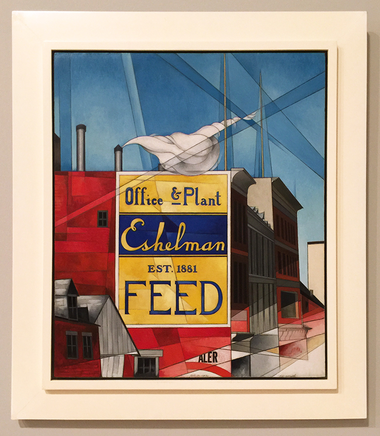
Charles Demuth, 1930- Buildings, Lancaster – Oil and graphite pencil on composition board

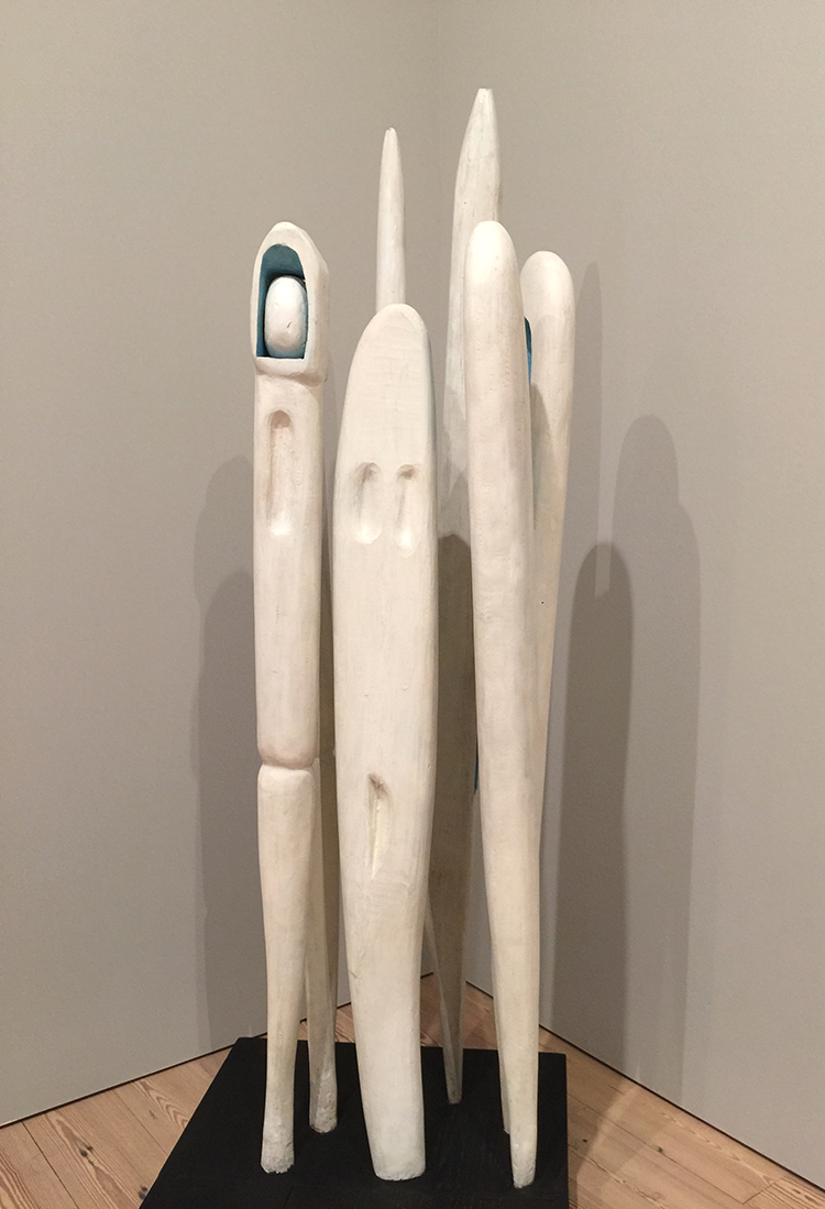
Louise Bourgeois, 1941 – Quarantania 1941 – painted wood

Soon after emigration from Paris to New York 1938 Louise Bourgeois made this sculpture. Quarantania resembles a group of standing figures huddled together and reimagines people she has left behind in her native France. Additionally the five elements might also evoke sewing needles or weaving shuttles, tools used in her family’s tapestry restoration trade.

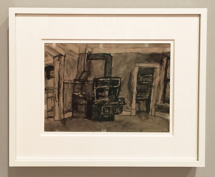
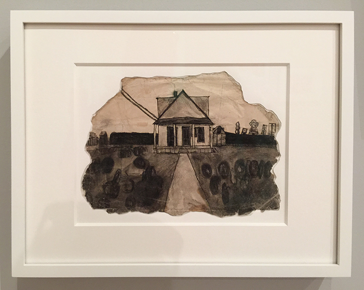
James Castle, Interior with Stove and below Shed, Soot and spit on found paper.

I had never heard before of James Castle who lived from 1899-1977, but boy did his story and his paintings touch me.  Castle was profoundly deaf from birth.

He never learned to speak, sing, read or write; largely unschooled and self-taught he developed his own techniques for creating works of art and used his art as a tool for communcation. To make his black-and-white-drawings, he combined salvia with soot from a wood-burning stove and used sharpened sticks, sometimes fruit pits,  to apply the mixture to his paper.

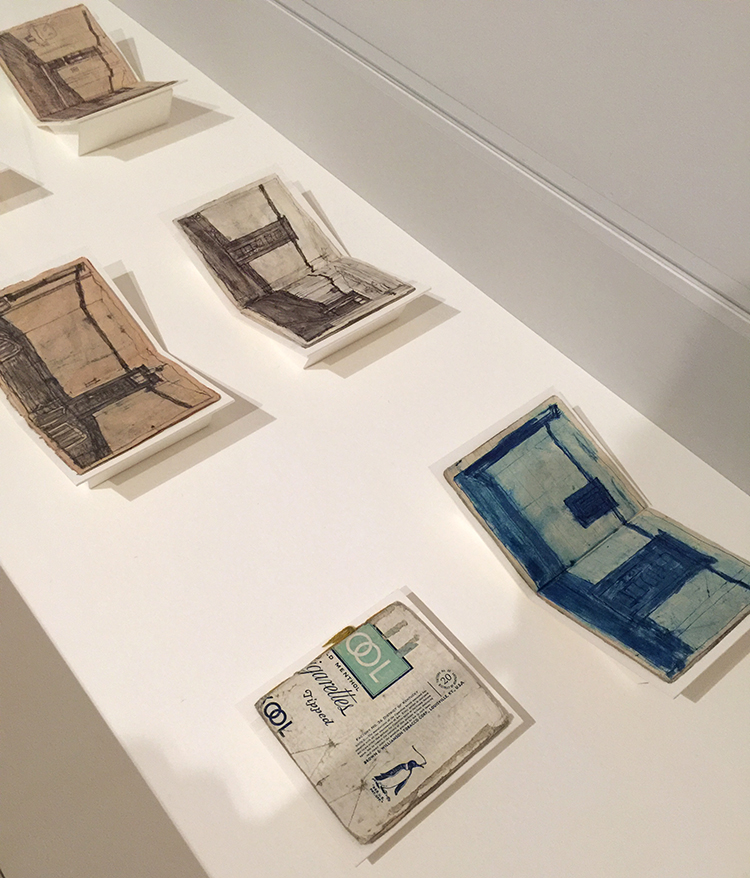
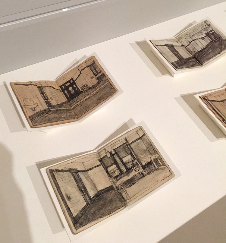
James Castle, 1910- 77 , artist’s books with sooth and spit on found paper

In addition to the numerous works on paper, James Castle produced hundreds if not thousands of handmade books. Using commercial food packaging or heavy paper as covers, he stitched together blank pages and filled them with drawings of letters, pictographic symbols, collections of mock photos and sketches based on advertisements.

He frequently made use of both sides of papers he found around the house- flattened matchstick boxes, ice-cream carton lids, envelopes and even his niece’s old homework assignment. Amazing!


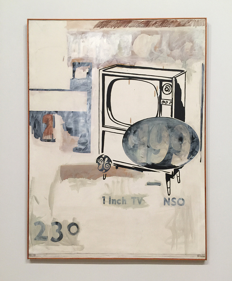
Andy Warhol, 1961 -$199 Television – acrylic and oil stick on canvas

I love this – it hints of things to come but still shows an artist hand – Warhol’s.

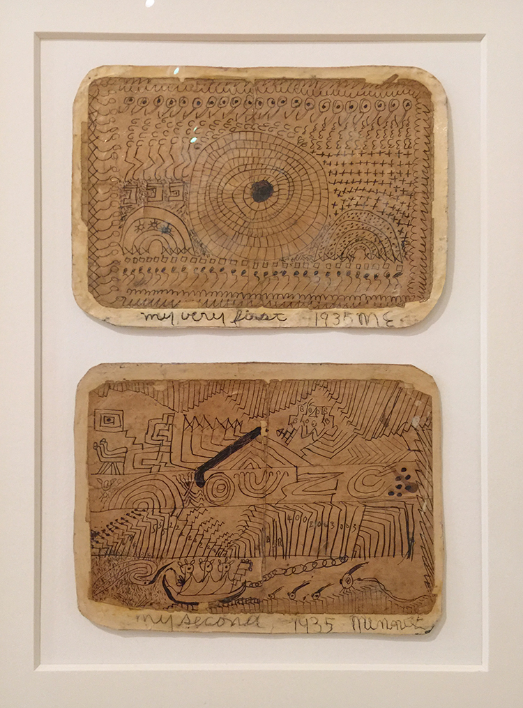
Minnie Evans, 1935 – My Very First and My Second

Minnie Evans crated both drawings on Good Friday when she was 43 years old. She said a spiritual force compelled her to begin drawing – these are her very first drawings hinting at the subjects of her later work – biblical imagery, plants and fantastical bests.

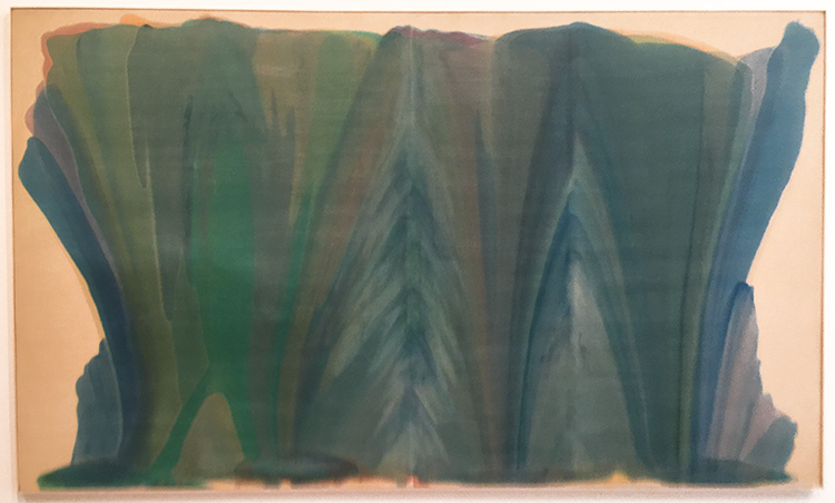
Morris Louis, 1958 -Tet – Acrylic on canvas

Morris Louis learned the method of staining unprimed canvas from fellow artist Helen Frankenthaler. He had a really small studio and this canvas is massive. For a long time no-one really could figure out how he made these big paintings. Conservators found out that he would roll the canvas in portions and pour, and then re-roll the canvas and dry and then continue. So he never saw the entirety of the painting while working on it.

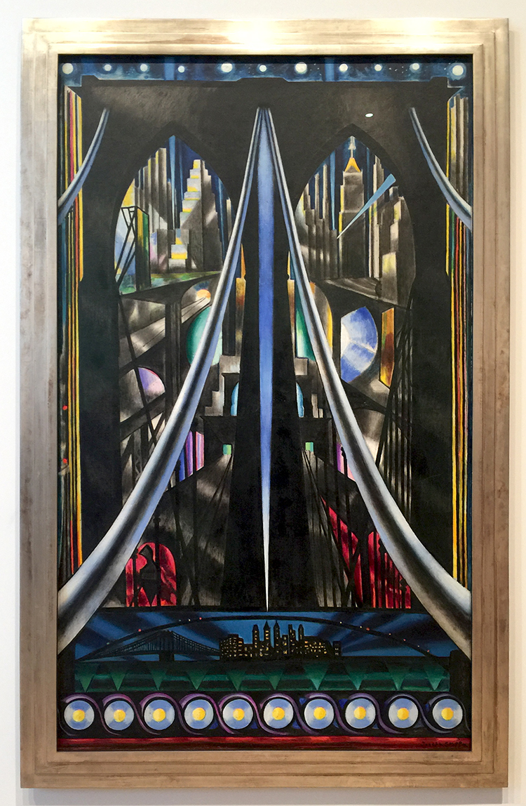
Joseph Stella, 1939, The Brooklyn Bridge

This looks so timeless again – I love this painting of the Brooklyn Bride.

It was a great exhibition, thought provoking and interesting. It is open now and does not have an end date yet. Check it out when you are at The Whitney!

Comments (2)

  • kimnstudio

    |

    Wow! The technique used by Morris Louis was a surprise! How cool!

    Reply

  • Sue Clarke

    |

    The artist books by James Castle struck me the most. I can only imagine what it meant for him to be able to communicate through drawing.

    Reply

Leave a comment

Stenciled Storage Pouches For All Your Bits and Bobs!

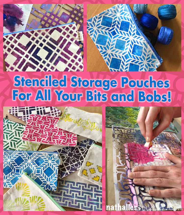
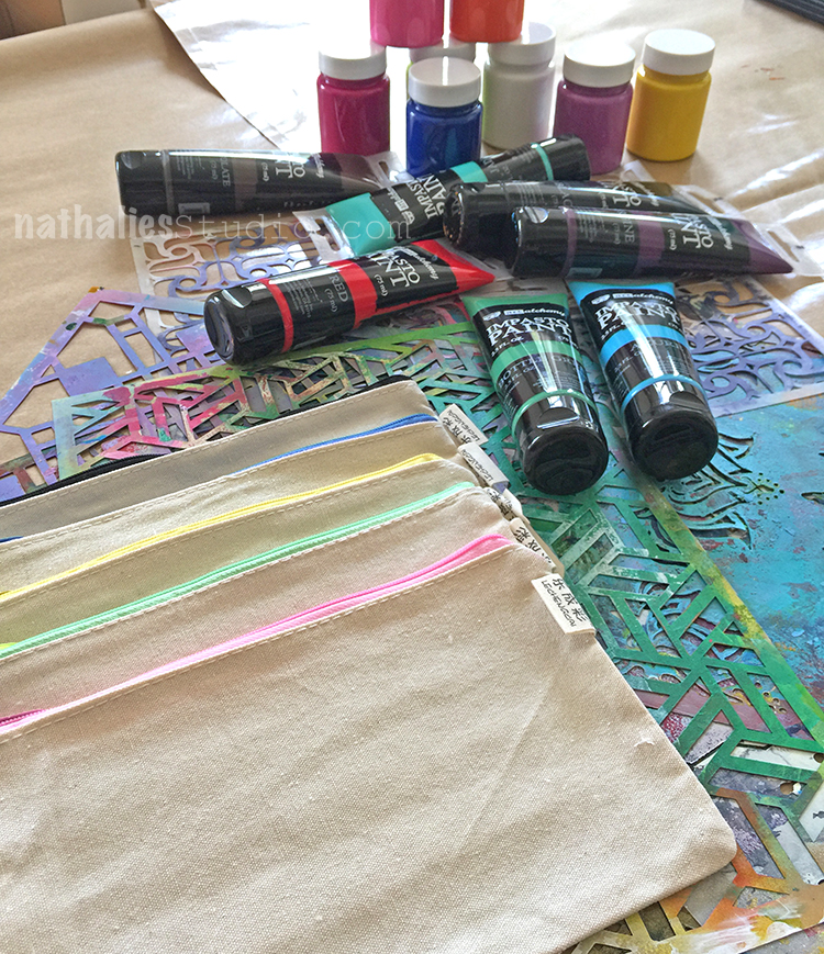
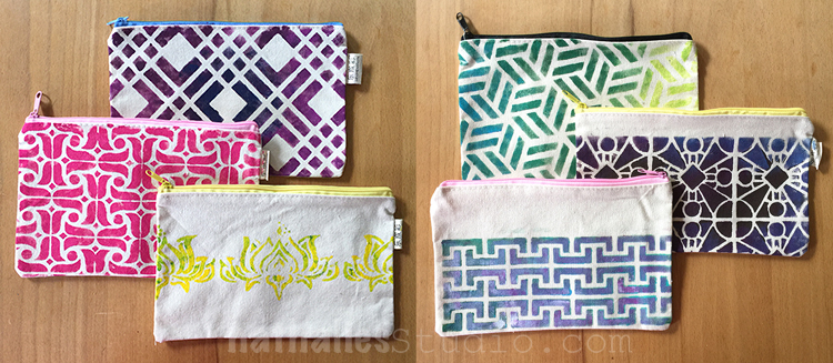
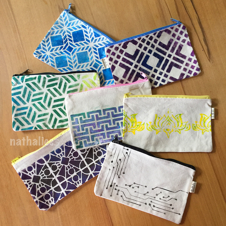
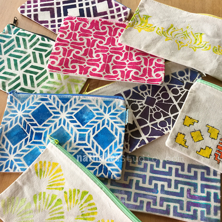
This week my friend Kim and I had a DIY morning again. I love our monthly creative time and this time we decided to stencil canvas pouches.

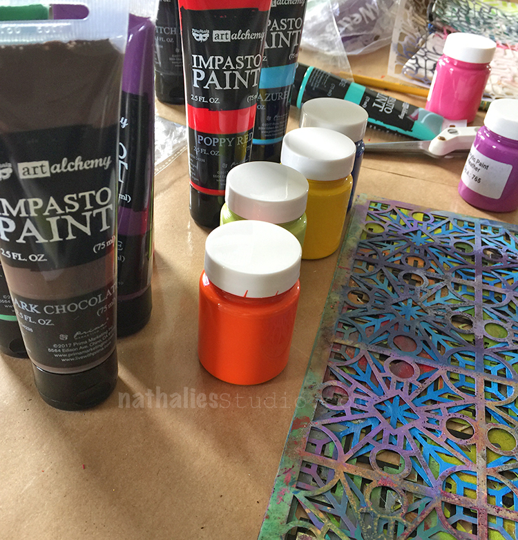
We each had five pouches and my friend Anna Dabrowska aka finnabair had just sent me a box with her new acrylic paints to play with and so we used those.

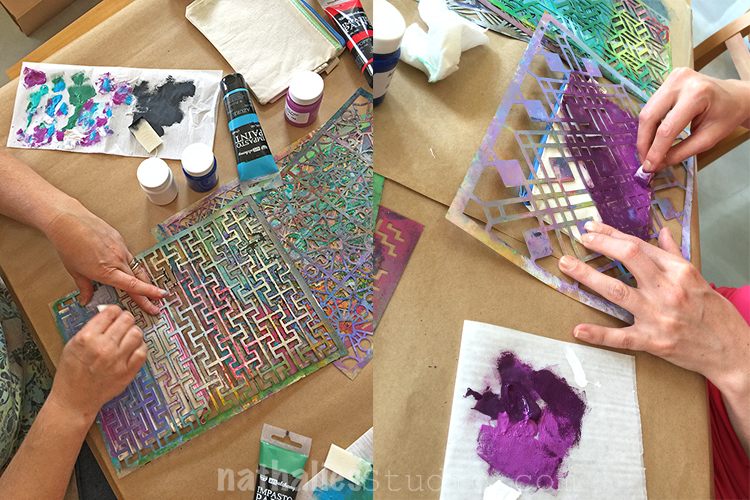
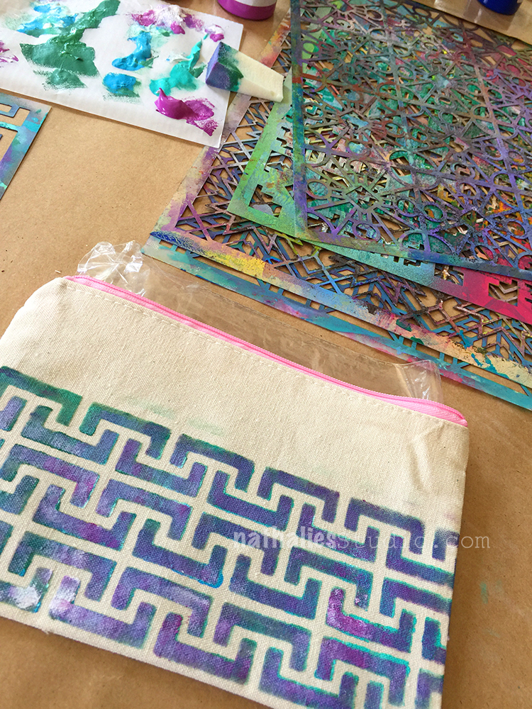
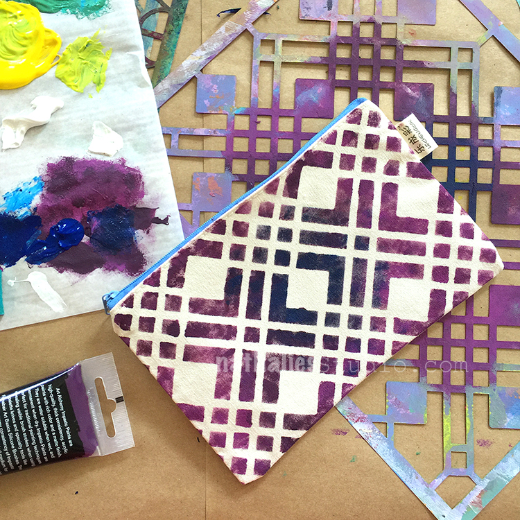
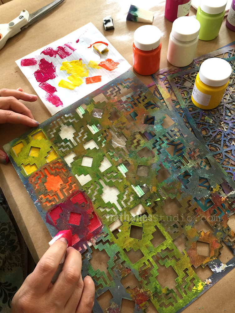
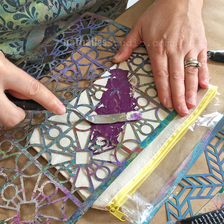
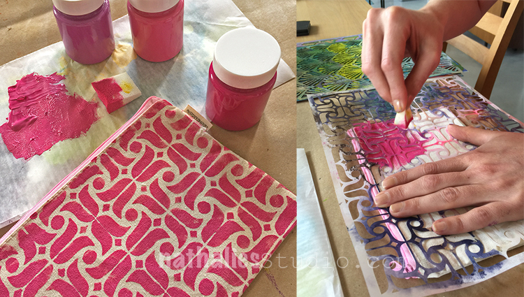
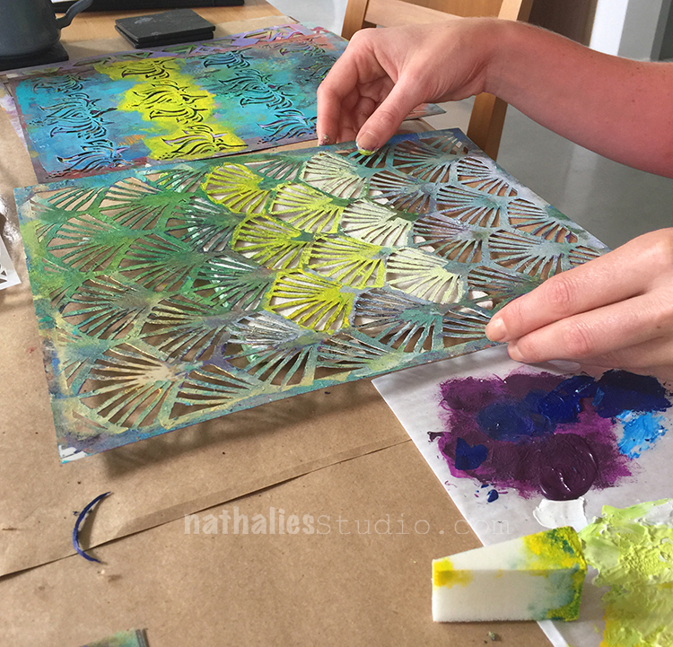
We both grabbed our favorite stencils and started dabbing through the stencils with cosmetic sponges. We added some plastic to the inside of the pouches to ensure that no paint seeped through the fabric.

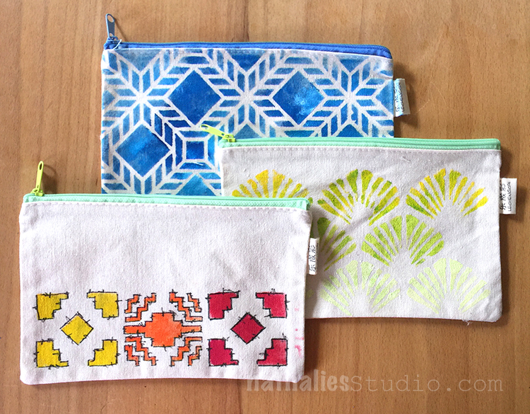
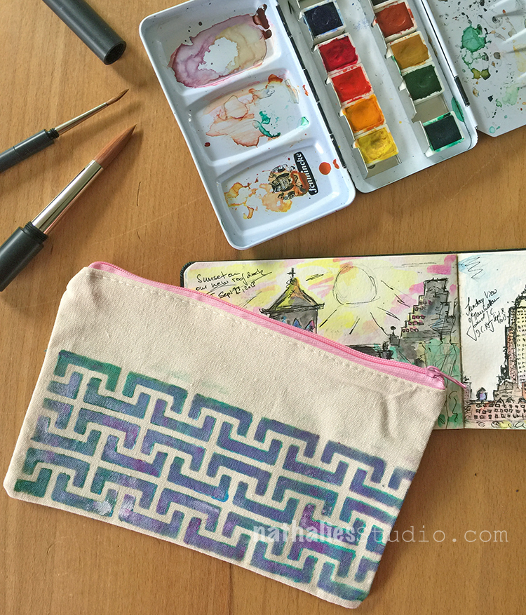
For this pouch I had first stenciled with green and teal through the Hamburg Stencil and then after it dried went over again with purple and white color – it leaves some of the initial color peeking out which I really like.

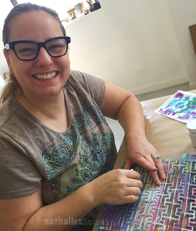
Ok…Kim…if you have to take a picture of me ;)

Kim used the Chicago Stencil  with Blue and purple and I love how she created a darker middle area with the dark blue and then went to purple.

I used different colors through the Santa Fe Stencil – stenciling just one row of three squares of the pattern.

I also added some of the thicker paint with a palette knife through the stencil – here with the purple and Buenos Aires Stencil, which worked extremely well and was fast . After the thicker paint had tried, I made sure to place the stencil back on top in the same spot and used a cosmetic sponge to stencil the sides and make it all look nice.

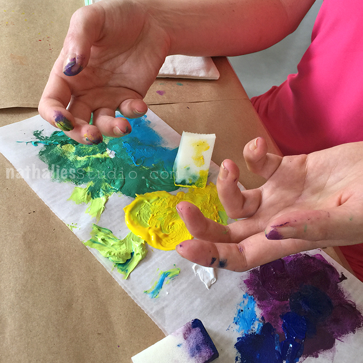
Yessss- Kim has paint all over her fingers- SUCCESS ;)

Kim using the Amsterdam Stencil 

and then the Art Deco and Lily Stencil – I liked the yellow and green mix she used with both designs.

It was a nice morning project and easy and fun – and here you go

So many things that can be stored away

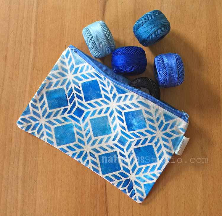
my new embroidery thread ….ohhhh- I should embroider on top of the pouch …bingo …just had this idea while looking at the photo :)

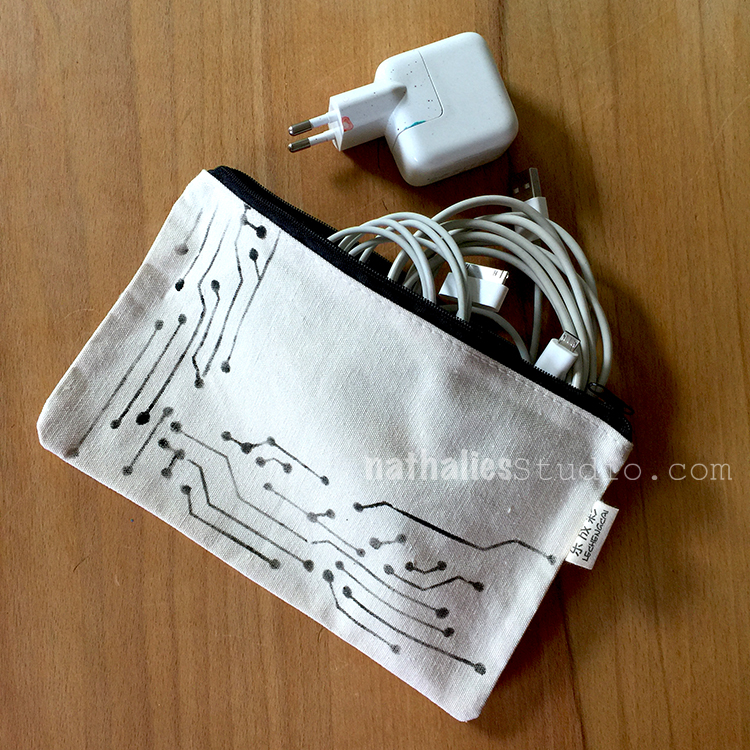
Hubs got a new pouch for his cable salad …although of course the German plug on top is mine as you can see as the paint specks give it away ;)

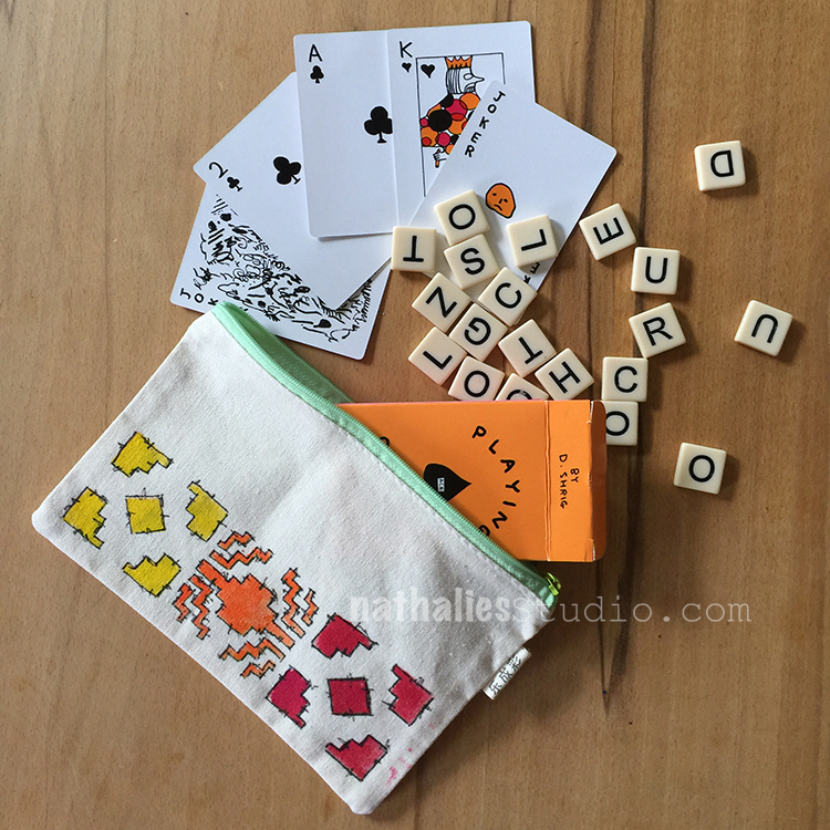
Travel pouch for games….

Mini Art-on-The-Go Kit

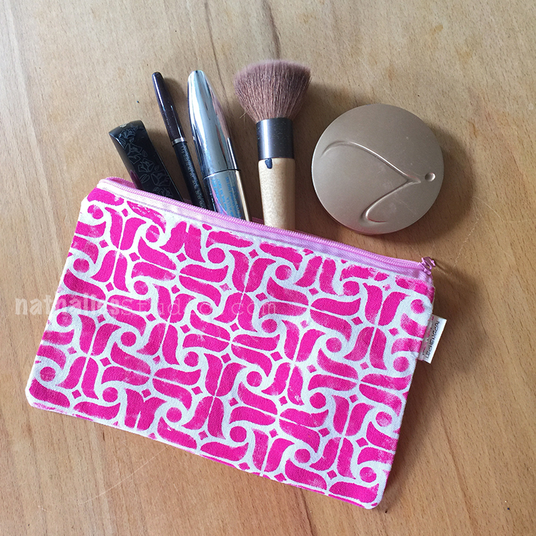
And hey a make up pouch…

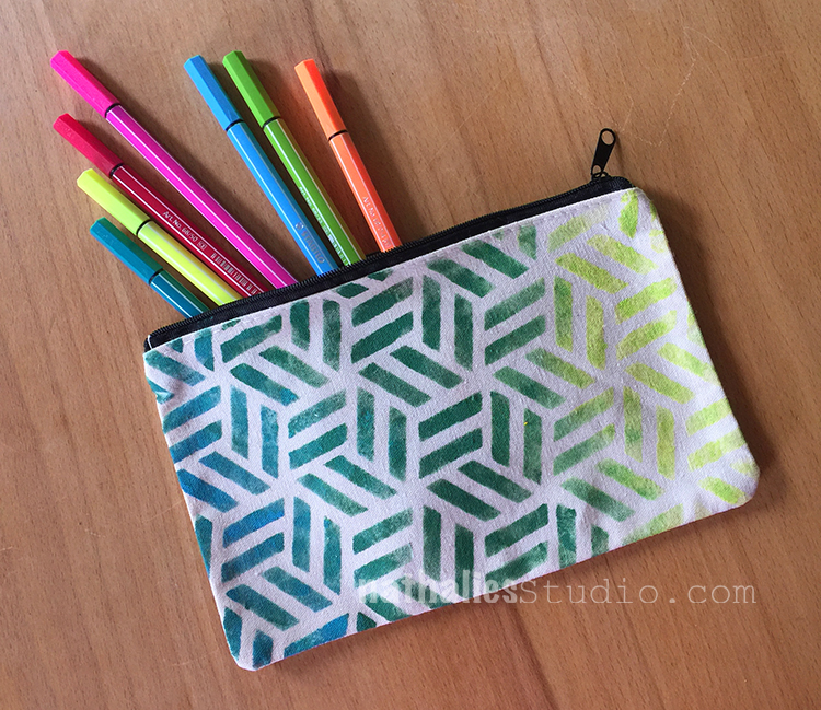
or a good old pencil case

We will be so organized with our Bits and Bobs- HA

Hope you liked our litte fun DIY-project and don’t forget, if you are eyeing the stencils we used and that are listed below – the n*Studio SALE is still going in the n*Store where you can get 20% off Stamps, Stencils, Mugs, Cards, and DVDs now through Sunday 7/16/2017. Just use the coupon code JULY20 when you check out to save. Start shopping here :)

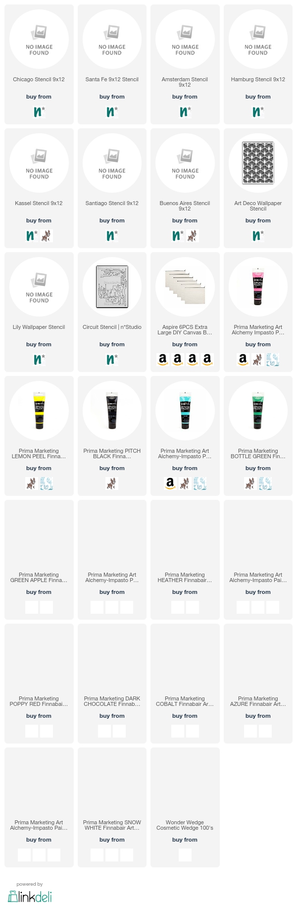
Here are the supplies we used for the pouches – some of the links are affiliate links:


have a wonderful day!

Comments (4)

  • Ally

    |

    As soon as I saw the email, I thought of embroidering on top of the stencilled paint, I already have a pack of pouches ready to play with! Time to get inky! Thanks Nat xxx

    Reply

  • Sue Clarke

    |

    Yes, please put some stitching on that gorgeous blue one.
    How perfect for gifts since you can personalize the designs and colors.

    Reply

  • Maura

    |

    Nat and Kim, I love these! What a great idea, and they turned out beautifully! I think I may have to try the canvas ones (I’ve done plastic before) and thanks for the tip about putting plastic inside. I see some gift making in my future! Maura

    Reply

  • Delores

    |

    What a fun idea! Thanks!

    Reply

Leave a comment