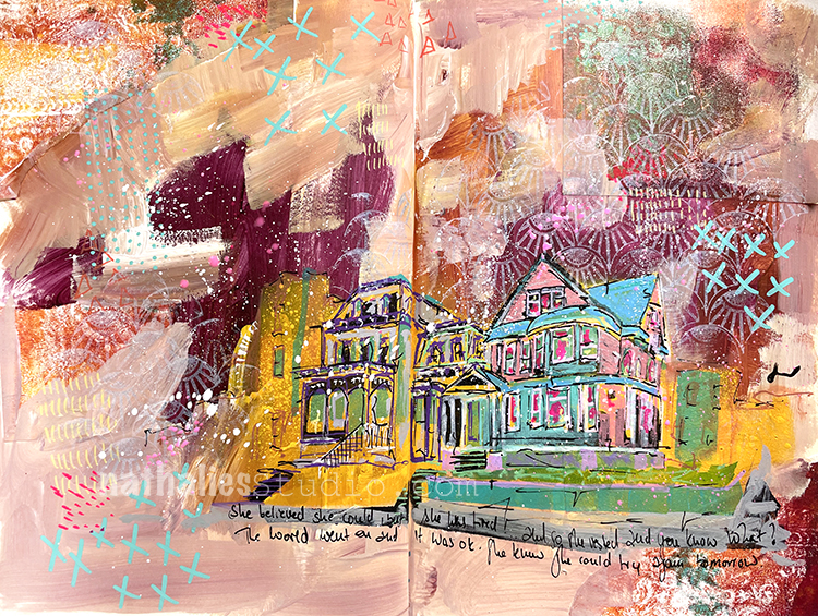
“She believed she could but she was tired…so she rested and you know what? The world went on and it was ok. She knew she could try again tomorrow.”
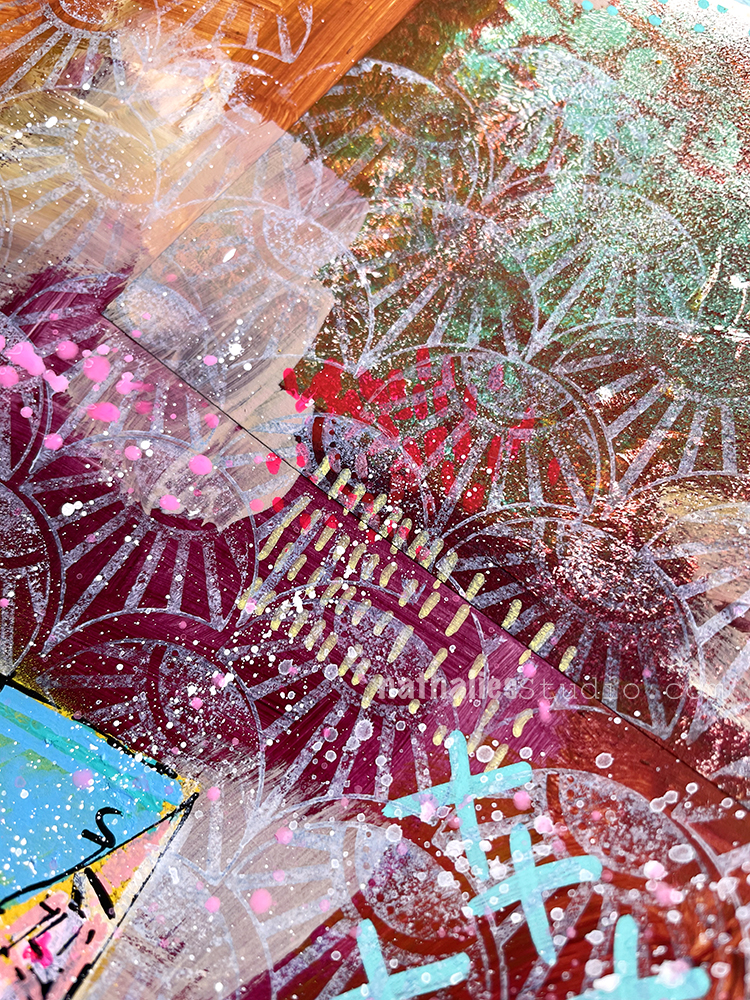
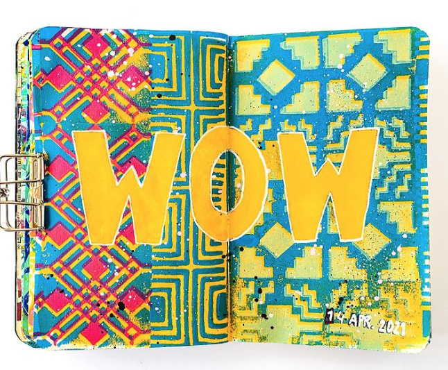
I created my page using gelli printed collage paper (actually from the bag from Sarah in ArtCollab Episode 2 – I used it as a texture tool with a gelli plate), Posca and Liquitex markers, gesso, my Fan-Tastic rubber stamps and the new white Moonlight ink pad. I am really happy with how the layers and color palette came together.
After tuning into Marsha Valk’s 100 day vlog on her instagram, I was so stoked to see her take the project one step further with this awesome gelli printed zine she shared on StencilGirl Talk here this week. She creates a charming little book of prints that is like one of her daily vlog posts, but in print form with tons of stencils, gelli plate printing techniques, and of course her cool signature style. Check out the video:
The outcome is a nifty permanent record of daily life these days – something tangible as an archive. I loved seeing the different subjects that have become so familiar in Marsha’s vlog, finding a place in the prints: that cup of hot deliciousness, her feet out on a walk, her workspace and so on. And watching her build her backgrounds with different stencils – including some of my own like Signals and New Orleans – is a nice zen moment that I hope you enjoy too :)
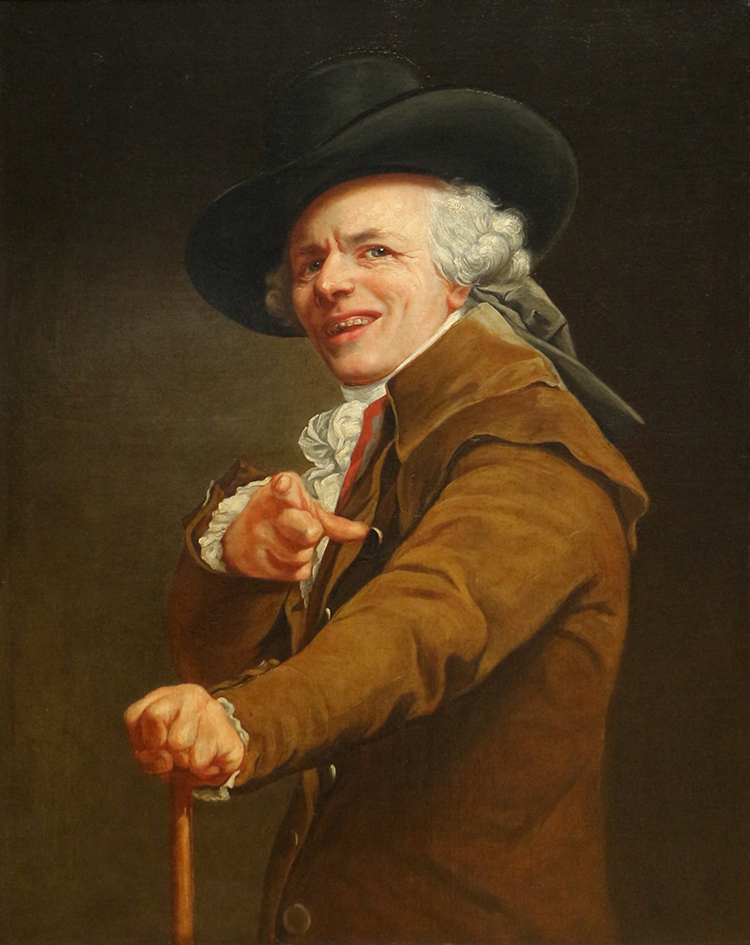
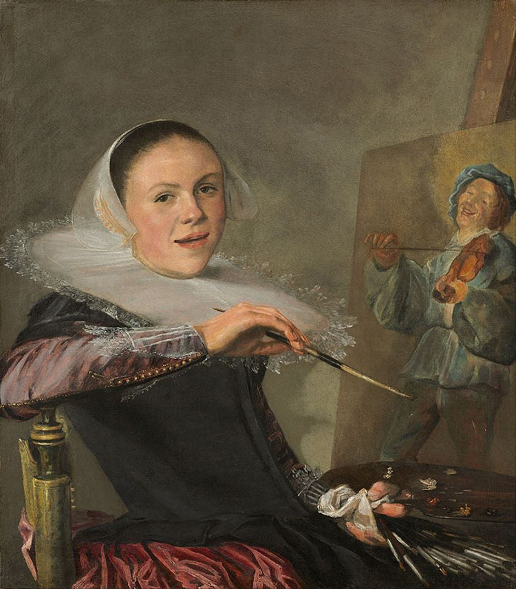
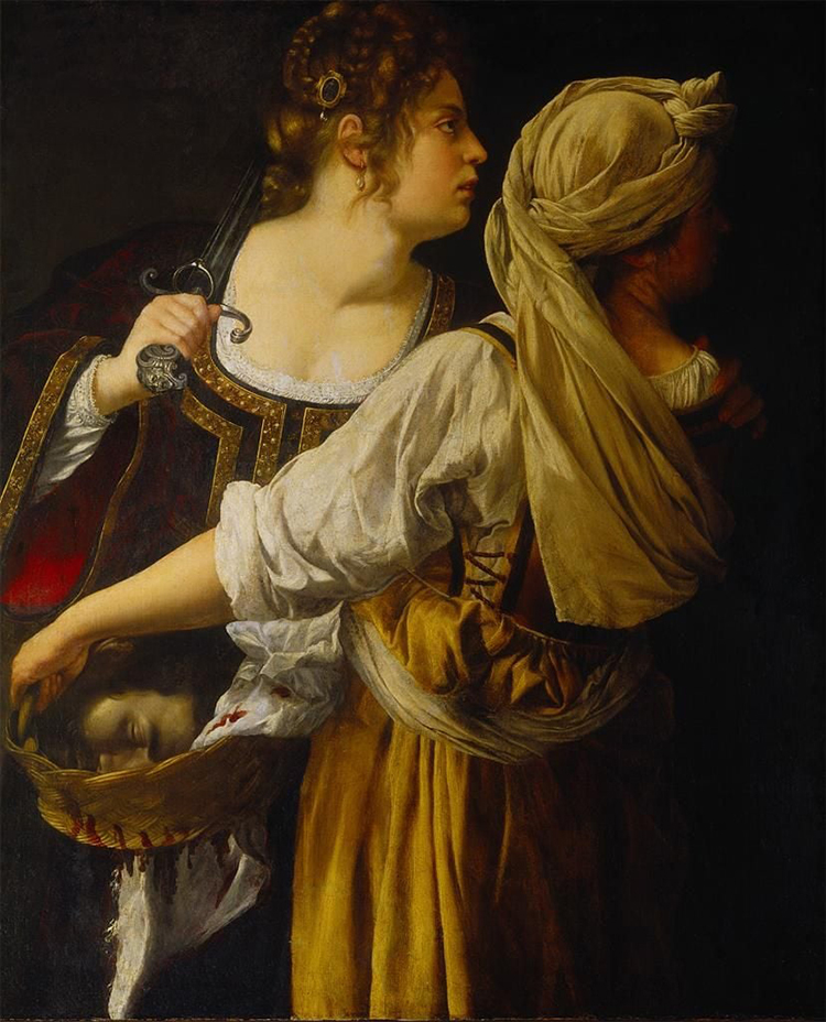
Do you love a good chuckle? How about strange and unusual old paintings? Every Wednesday on Nat’s Creative Hood we make classical art memes with sometimes weird, sometimes unexpected, sometimes just plain goofy paintings from the depths of art history. We post the picture, you post the caption in the comments, and EVERYBODY gets a good laugh out of it. It is definitely a highlight of my week reading those – you always get me laughing!
“Try wearing your palette around your neck. It is always right at your finger tips that way!” – Pat
“Dude, this is EXACTLY how I see you!” – Nat
“This may not be what they meant by “biting his head off” when he complained about the cooking.” – Sue
“Who? No, we haven’t seen him.” – Anne
We have so much fun with this and even if you don’t want to add a caption, just reading what everyone has come up with is a pretty great way to get through the mid-week doldrums :) Here is how to join Nat’s Creative Hood.
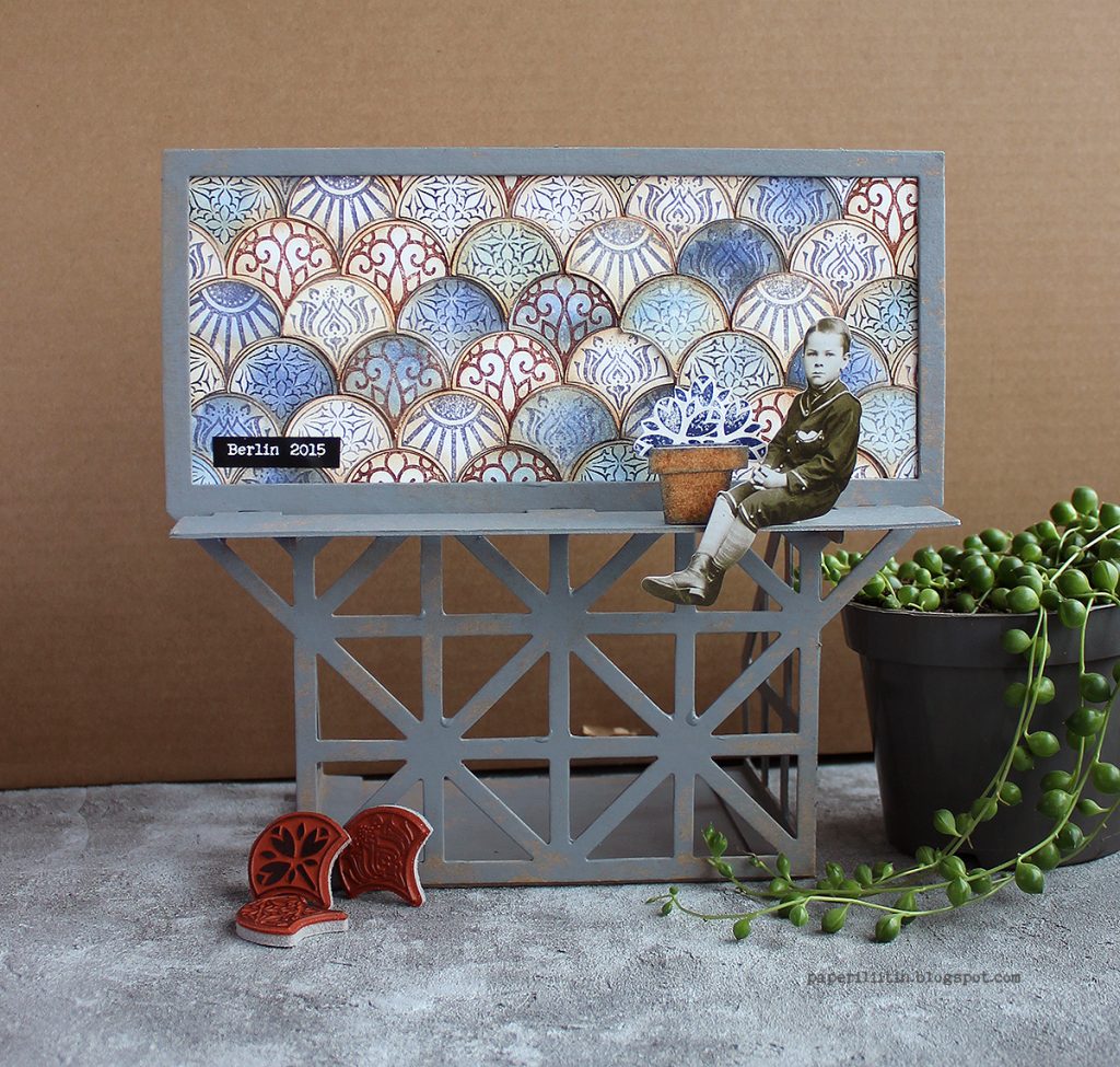
Hello from my Creative Squad! Today we have a really lovely post and video from Riikka Kovasin who is sharing some of her travel memories with us in her mini billboard project, using my Fan-tastic Small stamps and our theme: In the City – Although we aren’t traveling much these days, let’s reminisce about a time we traveled to another town or city. Think about the flavor of the place and let that guide your color and design choices.
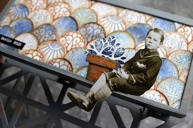
Moikka! It’s Riikka here today sharing my May project with you! I was excited to get this Billboard Model Kit to play with. I drew inspiration from a couple of different cities or travels.
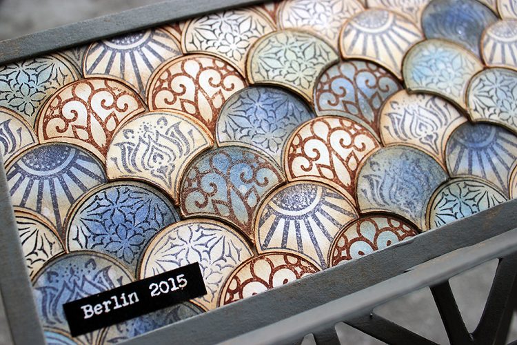
The biggest influence was Berlin where we traveled for a family vacation back in 2015. There was a lot to take in but somehow the most vibrant mental images are of grungy surfaces and tiles. We had a room in a hotel/hostel that was built inside an old apartment building. The staircase of the place was just amazing – it screamed history with the polished wooden handrail, ironwork columns for the handrail, painted walls with decorative motifs and a tile laid floor just behind of the massive front door. I can’t remember the actual patterns of the tiles, but I remember feeling a little sad each morning when we left to go about the town as a couple of the tiles were missing and there were gaps in the beautifully decorated floor.
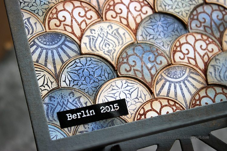
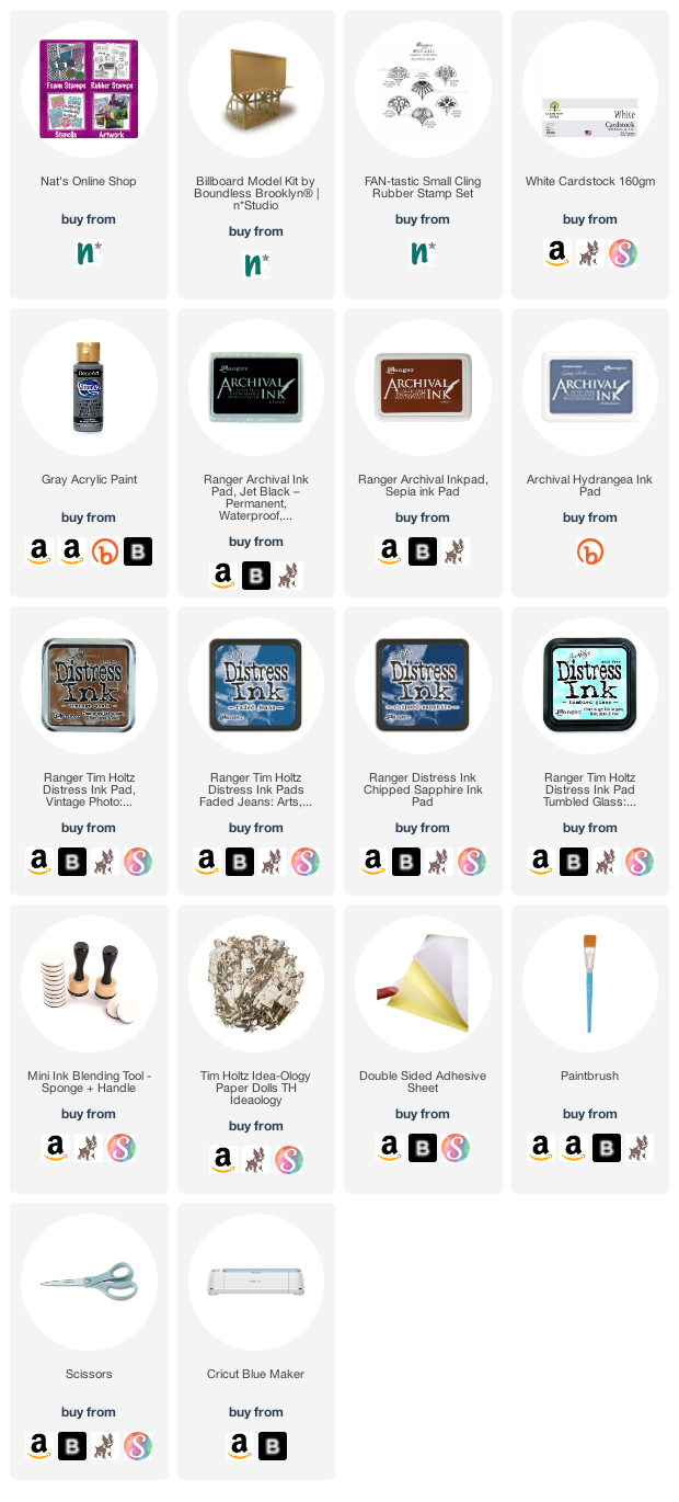
I chose the Fan-tastic Small stamp set to represent the tiles and their patterns. I used three different stamp inks to stamp the patterns and colored some of the tiles blue in a later stage of creating. I’m pretty sure the Berlin tile floor was in the colors of browns and cream, but still I went with blue as the accent. Even though I brought a lot of the brown to the piece by inking the edges of the tiles, I guess the blue has its origin on another trip and city. The blue takes me to 2013, to Amsterdam, Utrecht and especially Amersfoort. The blue is related to a tile Marsha Valk showed me when visiting her beautiful home.
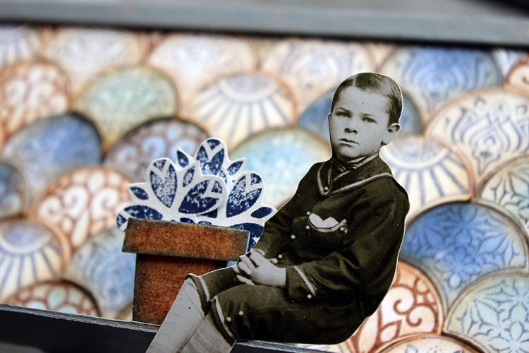
But besides Berlin and Amersfoort, there’s still one more city that inspired a detail to this piece. That’s Ischia. The colors are all wrong for that but coming off the ferry from mainland Italy to the island, there was a flowerpot with vibrant red geranium on a windowsill of one bright white building. Sunny day made the colors so vibrant, it felt like saturation was up by 100. The window with the flower was the only window on that side of the house and the flowerpot got etched into my brain vividly. So, while my piece has tulips and they are blue, the idea of this detail came from that mental image.
I recorded a little video while working with the billboard. The camera angle is a bit off in the end as I assembled the piece before adding the finishing details, but I hope you can still see my process.
Thank you for stopping by today! Wishing you a lovely week and great travels though the different memories!
Thank you Riikka – was so nice to hear the travel inspiration behind the color and pattern choices that you made and to see how you incorporated that into the piece.
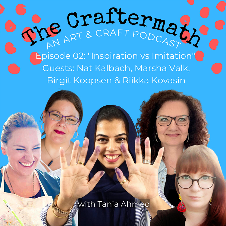
My dear friend Tania Ahmed has a new podcast out there called The Craftermath and I was honored to be a guest on Episode 2 the other day. Along with Marsha Valk, Birgit Koopsen, Riikka Kovasin, I joined Tania Ahmed to discuss the topic “Inspiration vs Imitation.” Check it out HERE.
Here is what Tania’s wonderful podcast series is all about:
“Are you a crafter and artist that loves to hear what makes other creatives tick? Do you want to learn ways to boost your creativity? Like to learn insider tips on taking your creative practice to the next level? Then this is the podcast for you!
My name is Tania Ahmed and welcome to The Craftermath, a podcast about creativity, art and craft – which is basically my excuse to talk about the things I love with the people I admire!
…This is the podcast that I wish was around 10 years ago when I was starting out and didn’t have a clue on where to start in the art and craft industry. I had so many questions and this podcast is my way of sharing my insights, and experiences with you!”
I hope you tune in – I loved chatting with them on a topic so near and dear to all of us and I can’t wait to listen to what Tania has cooked up for the next episodes :)
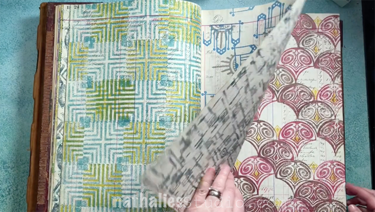
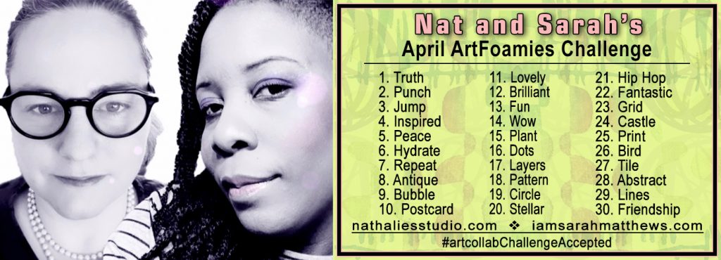
April is over so time to reveal all those patterns I did for Nat and Sarah’s April ArtFoamies Challenge in my vintage ledger with my ArtFoamies stamps:
Thank you to all who played along! You can check it out on Instagram with #artcollabChallengeAccepted and it was awesome to see so many playing along with us and accepting the challenge. We will be doing it again next year so stay tuned.
Here are just a few posts that caught our eye – love to see you posting!!!
You can still give it a try – get your foam stamps out and try out some of the prompts from the list below. We’d love to see how you interpret them :)
Be sure to follow along with all of Sarah and my ArtCollab adventures here on the website.
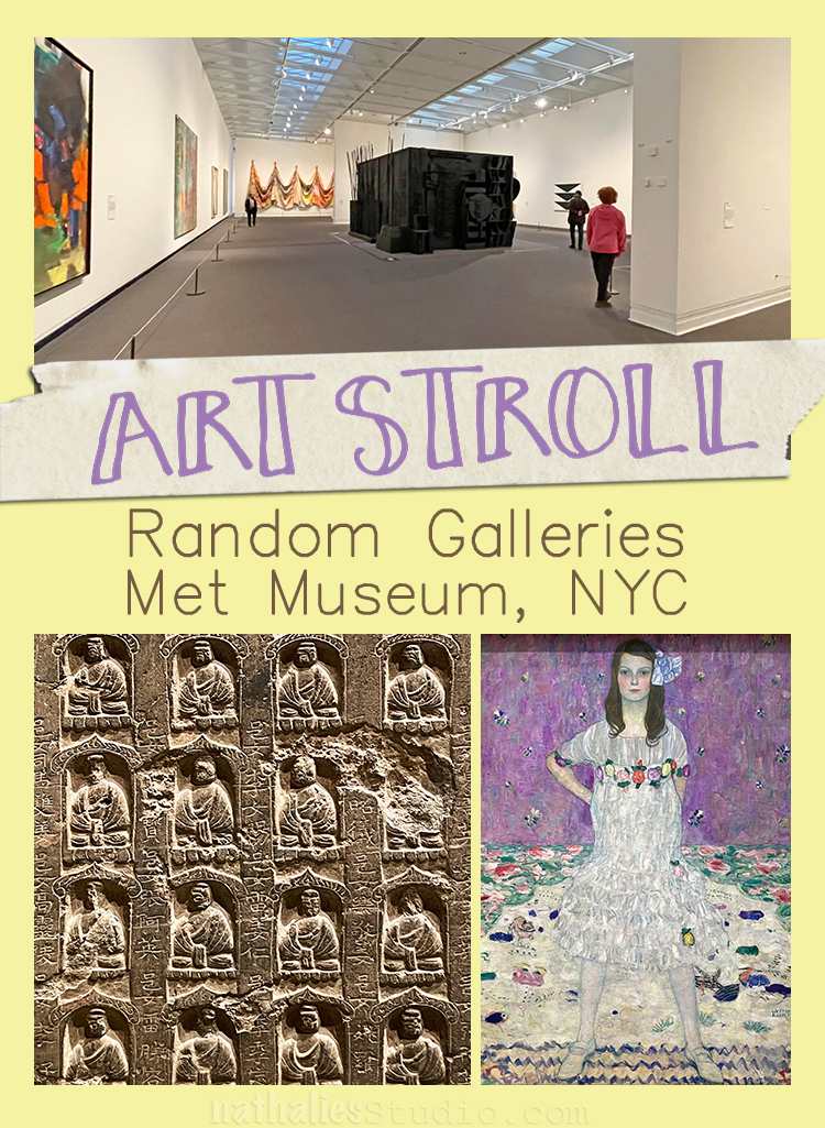
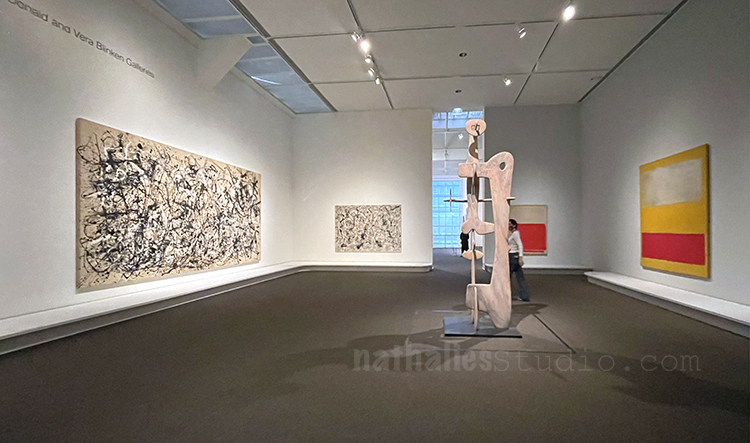
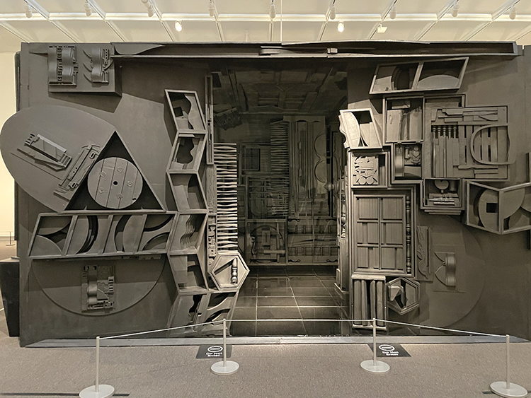
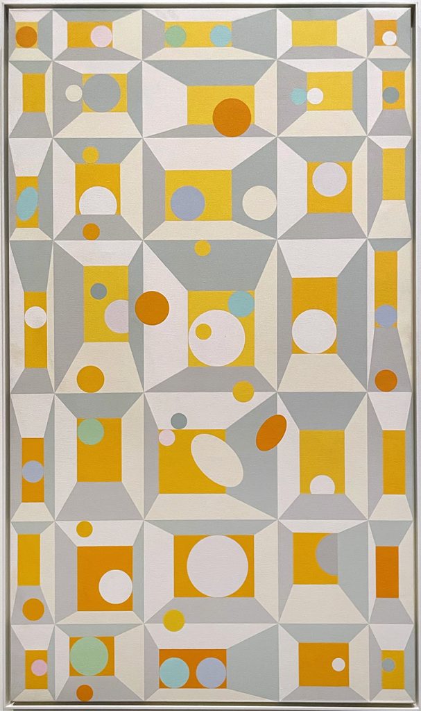
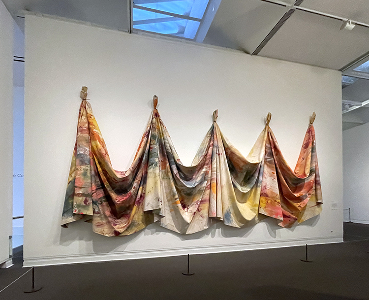
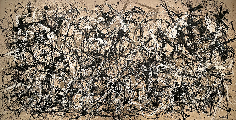
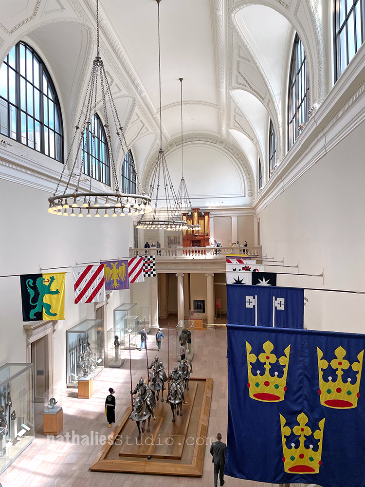
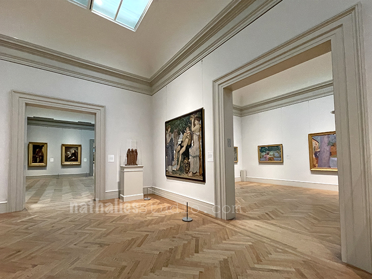
Last month we went to see the Alice Neel exhibition at the Met and were incredibly lucky to be in an almost empty museum – so I thought I would share some more random gallery pictures with you.
To be honest the Modern Art gallery is never super crowded at the Met but never this empty and nonetheless it was a treat to be for several minutes absolutely alone with the artwork. My heart was so full after not being in any museum for over a year.
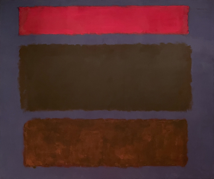
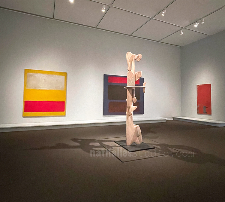
Rothko was singing…
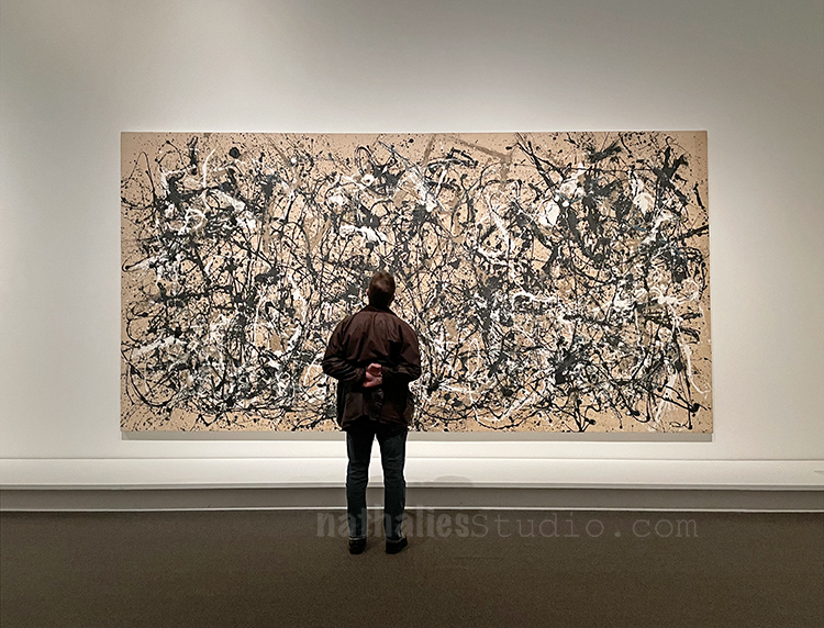
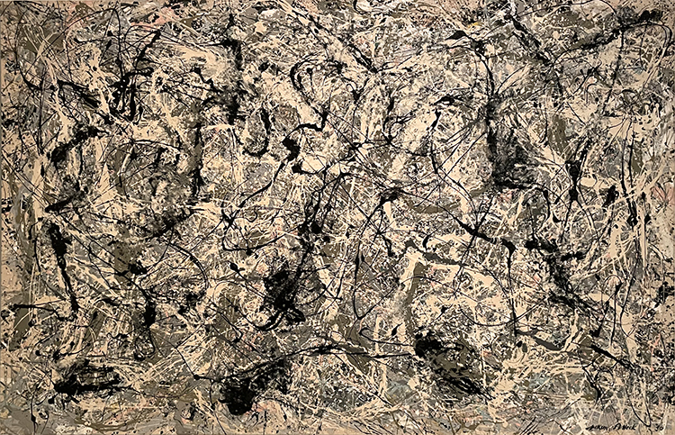
Pollock was moving…
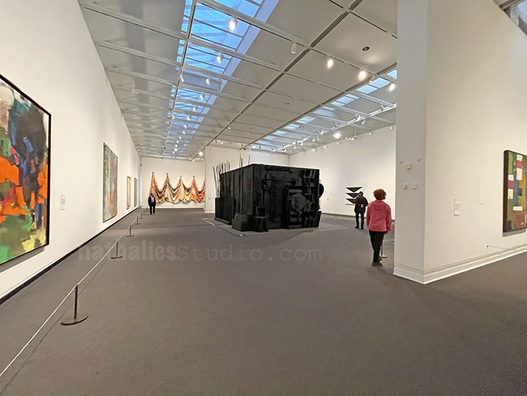
Nevelson was inviting us to Mrs. N’s Palace …
but then still decided to socially distance from the viewer.
Edna Andrade invited us for a “Summer Game” – which made me very happy
Sam Gilliam made me think rebellious thoughts on how to use canvas cloth …
And boy, Pollock was just super demanding… such an ego …but …
Can you blame him???
There I stood and just thought “wow …what a wonderful day this is”
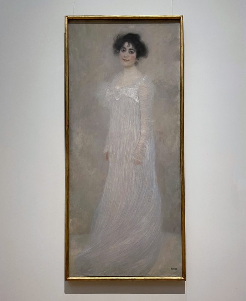
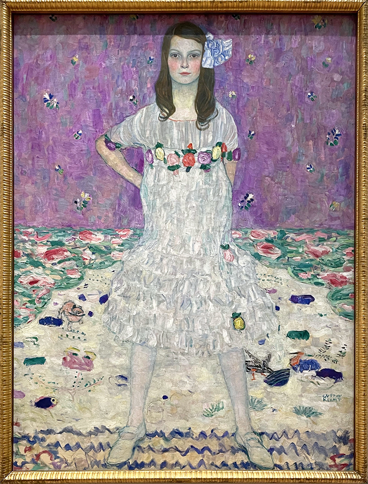
Klimt’s Mäda Primavesi looked rather inquisitive as if to say “where have you been, it was really boring here!”
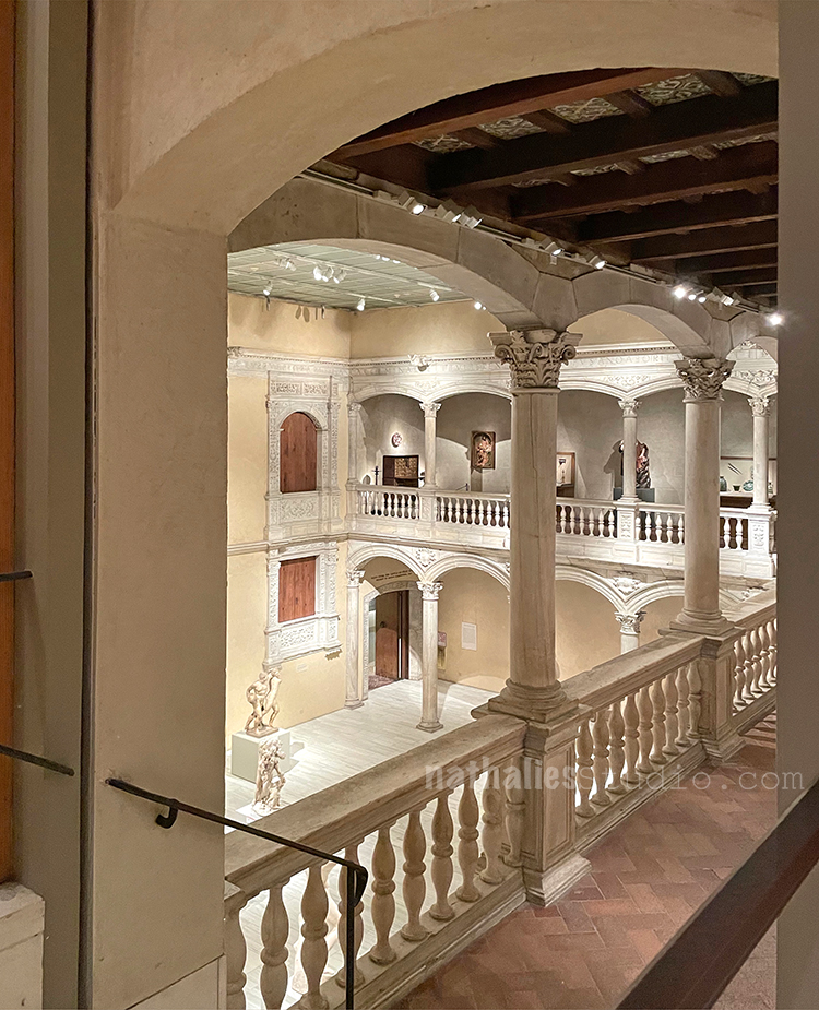
it was tempting to dance through the empty hall, and I think…
Serena knew that too – she gave me a little smile but asked to contain myself
And so I moved on …
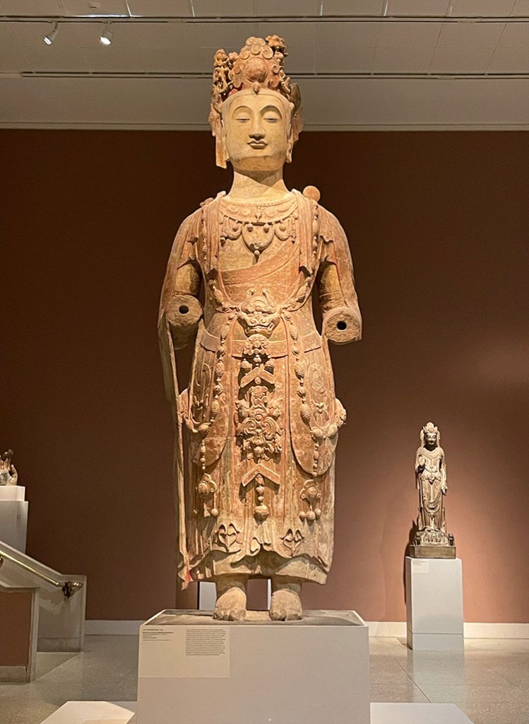
And said hello to this magnificent statue
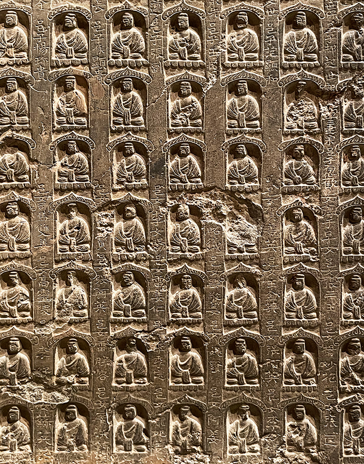
and details in stone…
And then it was time to leave …as there is only so much you can take in and Alice Neel’s exhibition was also already behind us. What a wonderful day this was. Weeks later I remain on a high, how much I missed this. I hope you enjoyed the Artstroll – cannot wait for the next one.
Your STROLLS are so FULL!! Your experience ‘feeds’ me in so many ways.
You make me chuckle with your choice of words, you make me think abut the way you looked
at something, you made me feel (dance) (boring), and you always inspire me.
I ALWAYS want your strolls to go on! MORE, More, more
THANKS
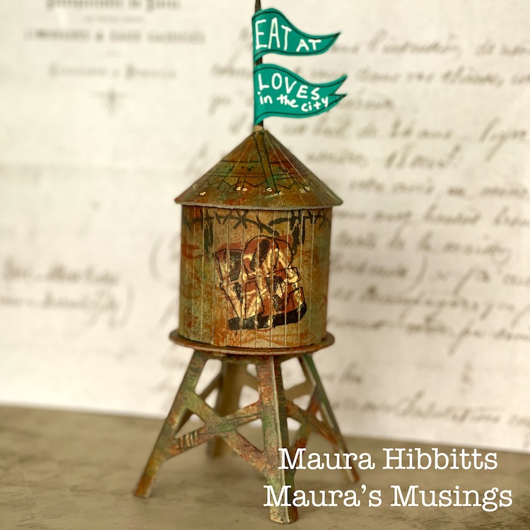
Hello from my Creative Squad! Today we have a really fun project from Maura Hibbitts using some of my rubber stamps and the Water Tower mini cardboard model. This month’s theme is: In the City – Although we aren’t traveling much these days, let’s reminisce about a time we traveled to another town or city. Think about the flavor of the place and let that guide your color and design choices.
I will admit, I am a country girl…I love the mountains and forests and wide open spaces…but every once in awhile I head to the city. I may have an appointment, or go to a museum or a show, but it seems there is always something that draws me there from time to time. I live in an area with small cities, and these have a lot to offer too, that’s where I go to the Asian and Indian markets, to Trader Joe’s, the art store, to the co-op to get the roasted coffee beans I love, to photograph buildings and people and rusty structures. I am a train ride and a few hours away from New York City, and have taken 150 middle school students to explore the city (yep, a few gray hairs from those trips), met my sister for a few days on her business trip and explored Central Park, attended and presented at conferences for education, enjoyed a wonderful high tea with my sisters at a ritzy hotel…truly memories that will be with me forever. No matter if the city near you is small, or a metropolis, go out and explore and see what it has to offer.
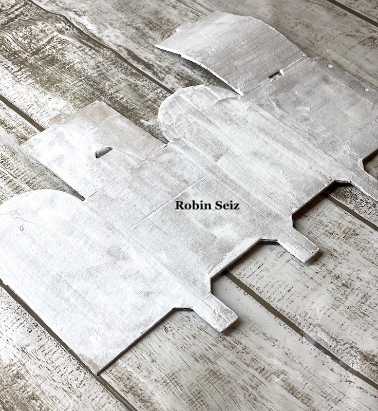
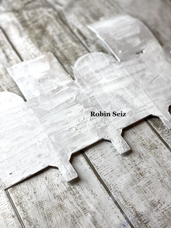
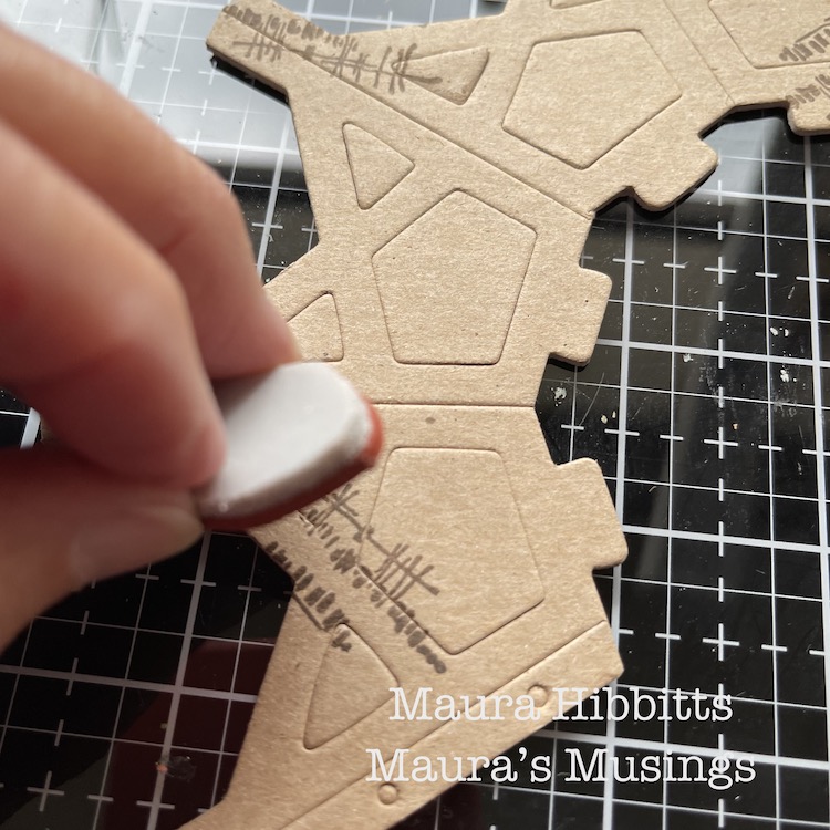
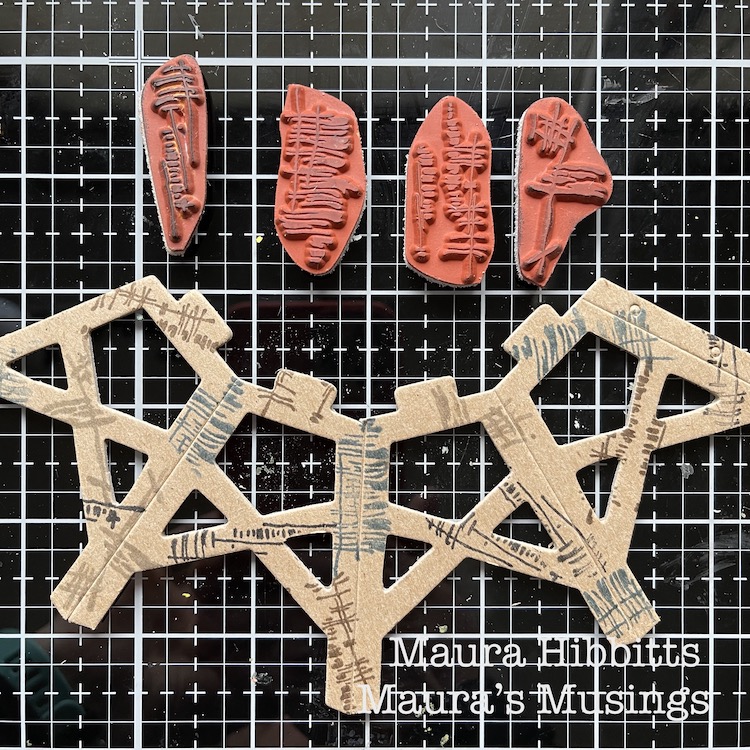
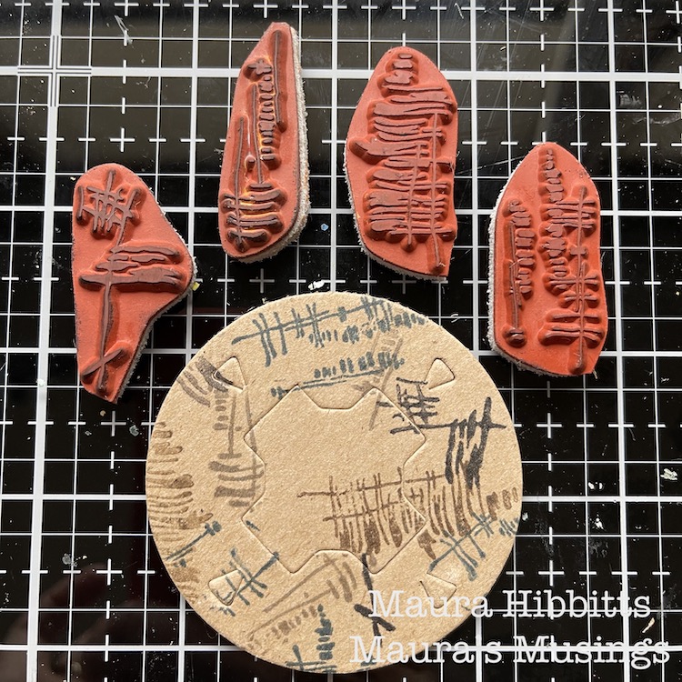
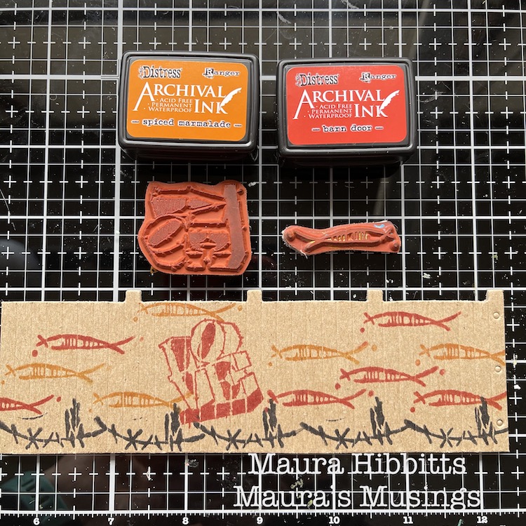
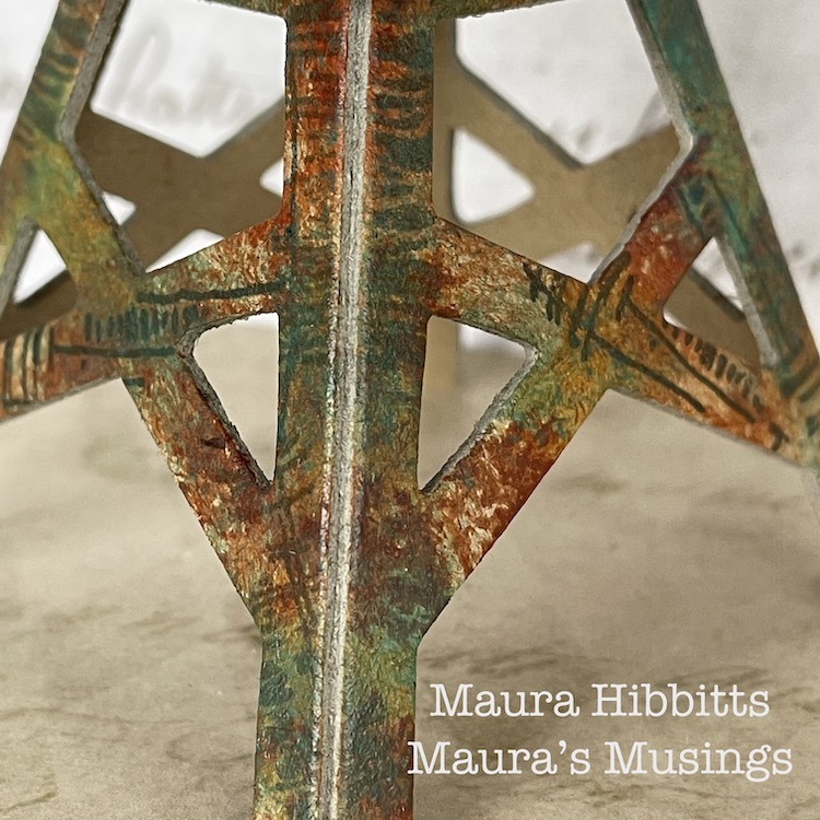
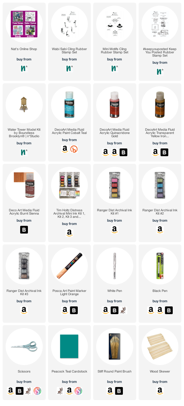
We received these cool models from Nat for this month’s project from a company called Boundless Brooklyn, and mine is a replica of real water tower in the city…I may just have to visit and try to find it. I took everything out of the folder, laid it out, and thought of ideas. I wanted a grungy look, so I started by stamping the bases with the Wabi Sabi stamps – gnarly, funky, jazzed, and far out, and a variety of archival inks in brown, black, grey and blue. I kept the pieces flat for the stamping.
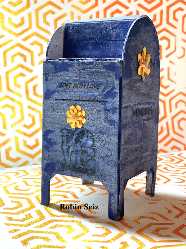
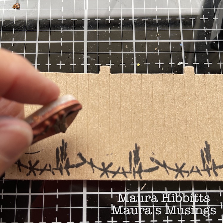
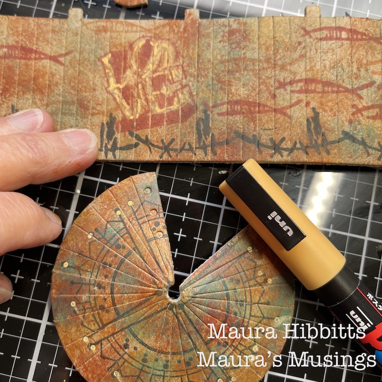
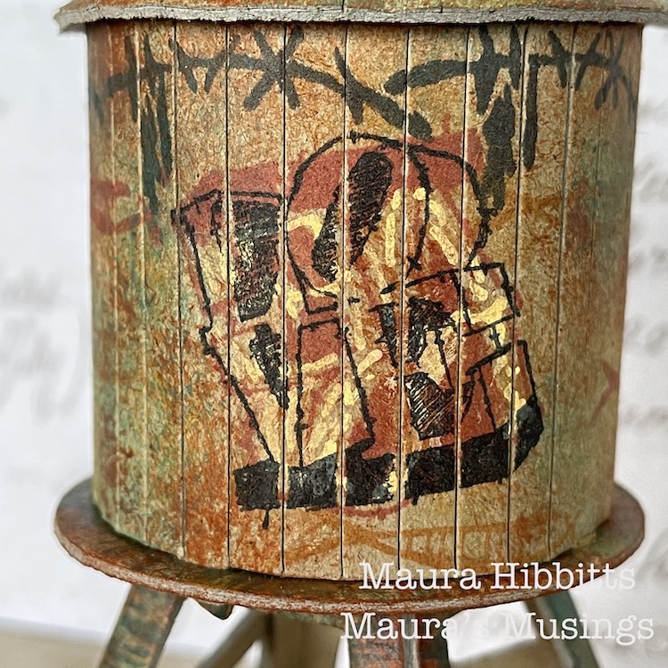
I stamped the walls using the Wabi Sabi stamps, groovy and neato, using archival red, black and orange inks. I also wanted to add a graffiti-like image, so added the Love stamp. I was happy with my design, it looked like fish swimming around the tank.
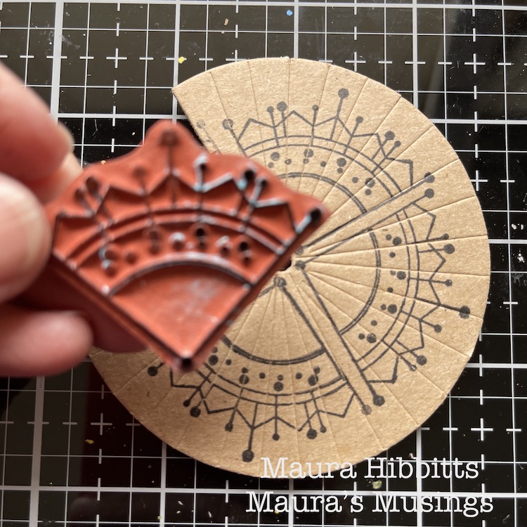
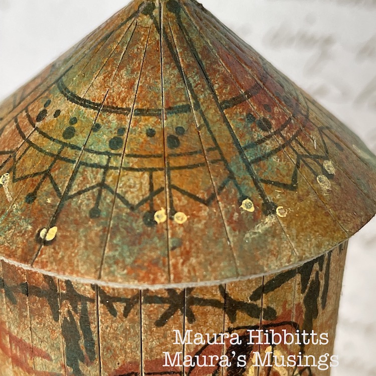
I decided to pretty up the roof too, after all if you were looking down from a higher building, it would be nice to see. I stamped around the piece using the Jugendstil stamp from the Mini Motifs set and black ink.
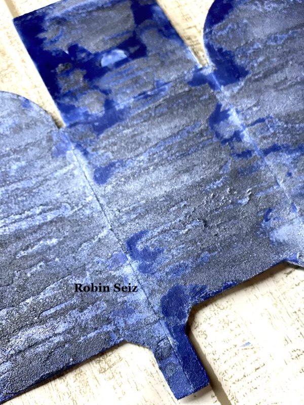
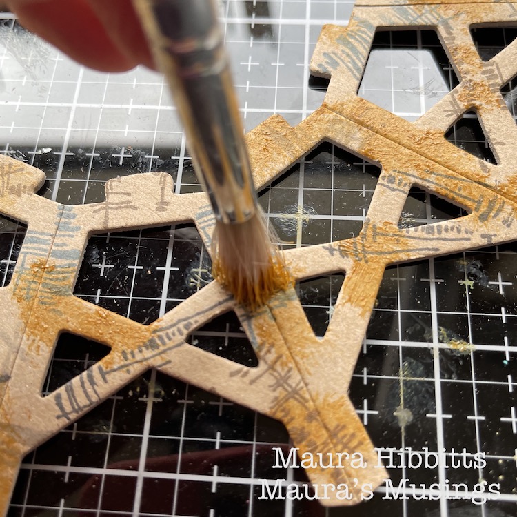
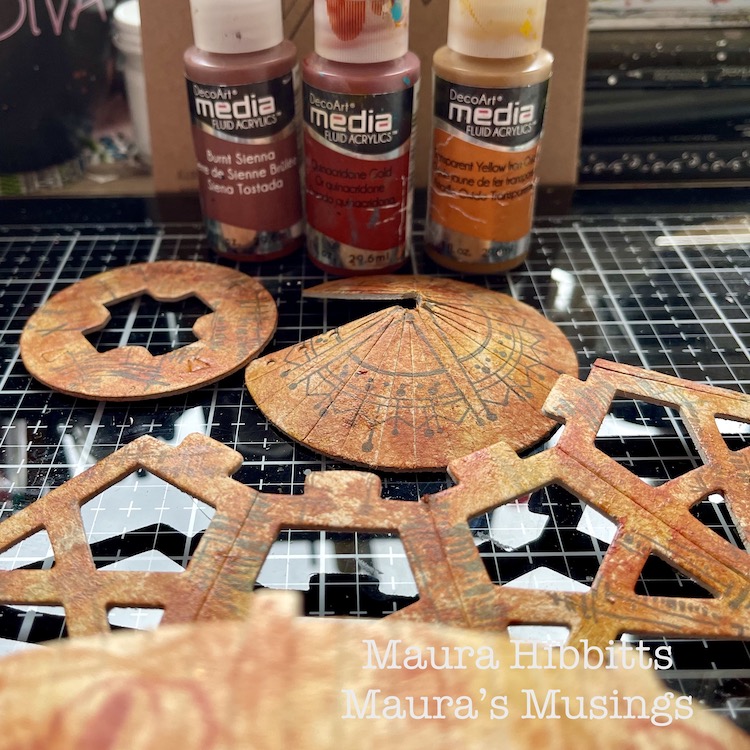
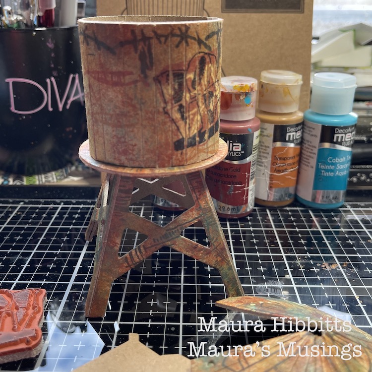
Now, it’s time to add the paint. I used fluid acrylics so that my stamped images would show through. I started with Transparent Yellow Ochre and an old brush, and pounced the paint randomly onto the pieces. I repeated this step with Burnt Sienna and Quinacridone Gold. It created a rusty appearance to age the water tower.
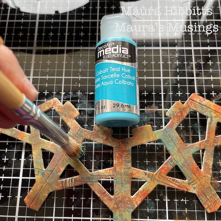
To add more depth to the painting of the tower and a patina effect, I went in and pounced on Cobalt Teal Hue. I felt this would allude to the water tower being constructed of metal.
I added a bit of detail to the Love stamp and roof with a light orange Posca pen.
Then I just followed the kit’s directions to assemble the water tower…and that is when I discovered I had stamped the walls upside down…darn it! I thought I was being so careful in laying out all the pieces before I began. So, in order to save my idea, I stamped Love again, upside-down over the first one. Luckily, I had stamped the first one in red, so the second one in black took over.
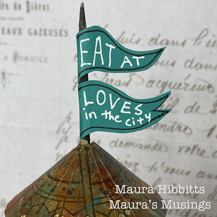
I thought about how structures in the city often advertise businesses in the area, so I made a flag using a skewer and teal paper and added “Eat at Loves in the city”.
What a great little model, and so fun to alter and assemble! You can create a lot of texture and age with stamped images and the right paint colors. I admit, I do love finding rusty structures and photographing them, and the city is a great place to find them.
Find out what makes the city near you unique and different, and go explore. I learned the small cities in my area are known historically for glove making, horse racing, and carpets. I found a small local railway line, which is now a bike path. I’ve learned about the role the Erie Canal played in developing my region. Discover who first settled the city and learn about them, like I found out how many areas near me were settled by the Dutch, and when you look closely, you can find the clues in place names and architecture. Enjoy learning about your city! – Maura
Thanks Maura – love the feeling of age and patina that you were able to create with rubber stamps and paint – this really looks like you could find it in real life. Now… I wonder how the menu is at Love’s :)
Strolls through my hood get me out of my studio, they help me get unstuck and often I get inspired by what I see and get new ideas to create something. It is part of my philosophy about Artful Adventures in Mixed Media – which is the subject of my book. Here are some photos that I gathered in the last couple weeks.
Loved seeing this church with the gorgeous terra cotta tiles and took a double take when I realized the writing was in German. I know that this neighborhood in Jersey City had a bigger amount of Germans around 1850 – 1900 but it was the first time I actually noticed traces of that.
Loe the two different hand painted signs on the brick – very cool.
I love those flowers in my garden – they remind me of my childhood as those were some of my mother’s favorite flowers as well. Nature is so cool!
I am not sure you realized how hard it is for me to work on the computer because that is what I see everyday on my desk next to my key board …so much cuteness!
Someone working on some serious curb appeal …fun though.
I didn’t see who made this -bad me – but loved the colors and swirls – fun stencil work.
Karate Kitty – makes me happy :)
And Dance Bears – same artist as the Karate Kitty – Sean 9 Lugo
Such a cool church window- I wonder how this church looks like inside.
Boarded up house- look at this magnificent Eastlake Door and all the wood details. Hopefully it will find a loving owner some day.
I am so happy now that the weather is so much nicer that we can stroll around the hood more again. We actually have a plan of walking all of Jersey City …let’s see- hahaha- We have to redo some of the many areas we walked already over the years- so it is like starting from zero …but it is the best way to get to know your city and it is quite fun. I will let you know about our progress and if we fail…well ….we won’t hahah ;)
Comments (1)
Sue Clarke
| #
Love the colors and the quote. So often we think the world will stop if we take a break, but it will go on just fine.
Reply