Creative Squad

Motivated in March – Maura Hibbitts

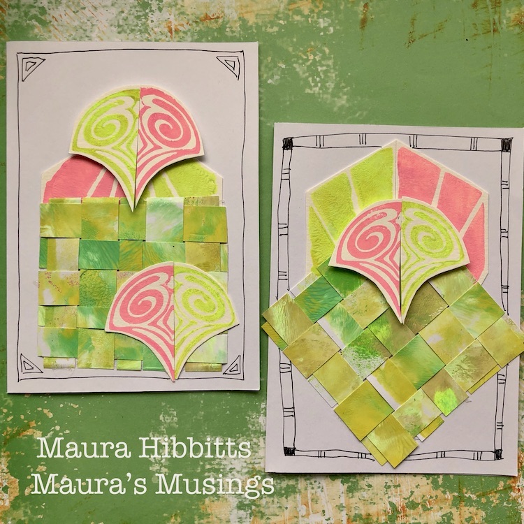
Hello from my Creative Squad! Today we have a post from Maura Hibbitts sharing with us a suite of cards inspired by St. Patrick’s Day and all those lovely shades of green. Maura is using my Fairview Fan and Clam Hex foam stamps and our theme: Motivated in March – What keeps you motivated to create? Is it a certain material? Your favorite colors that you can’t get enough of? Maybe you get motivated when you see artwork in a museum or out and about? Share with us your creative motivation and then create something inspired by it.
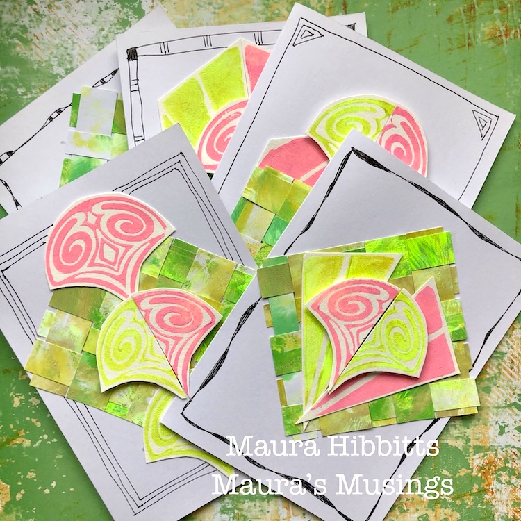

March is known for many things…the Ides of March, March Madness, St. Patrick’s Day, Spring Equinox, and so much more, that there is a lot to motivate us! I chose to use my favorite holiday, St. Patrick’s Day as my motivation, and to use those glorious greens that Ireland and this holiday are all about. When I was just a little girl, my mother and the lady next door always had a competition to see who would get their St. Patrick’s Day decorations up first and have the most. Then I learned that her husband was not Irish (he was German), so I told him he could be Irish on St. Patrick’s Day. So, this month, I have filled my project with many shades of green, and a bit of pink like some of the shamrock plants. This month, it’s all about being motivated by color, inspired by a holiday!

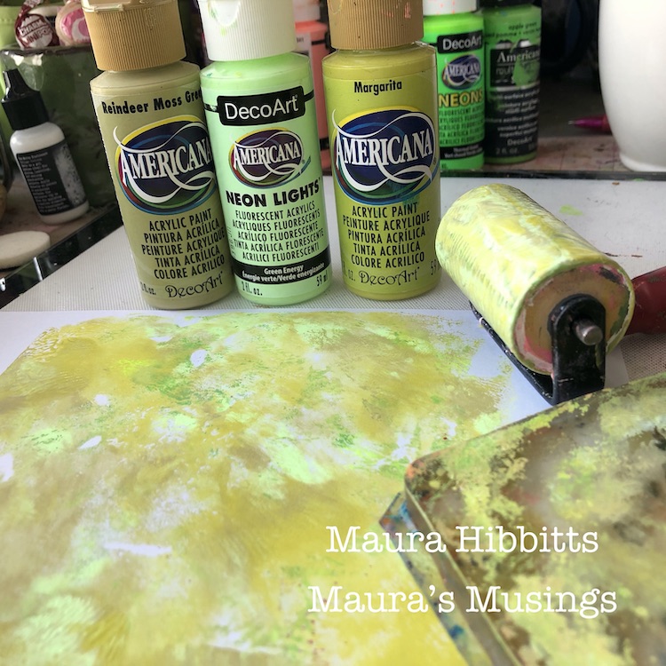
I started by printing several sheets of card stock with a blend of greens. I mixed a bit of three greens on my gel plate and blended it with a brayer, then I pulled two prints to have some variety, and set these aside to dry.
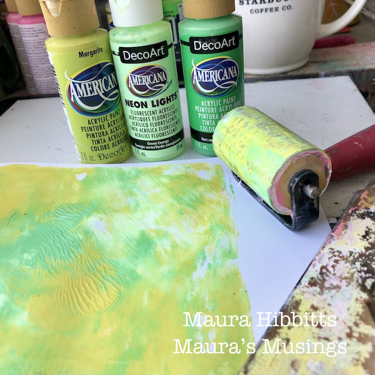
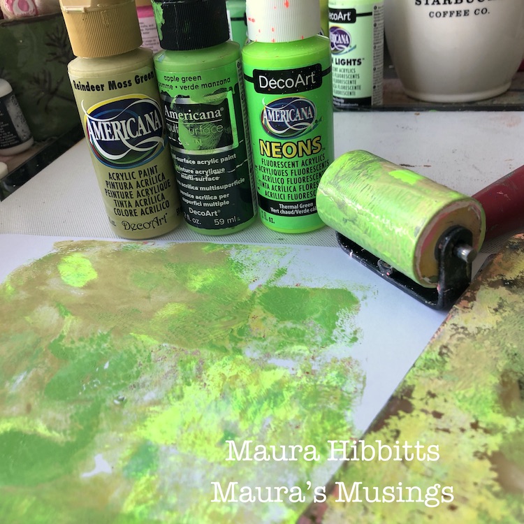
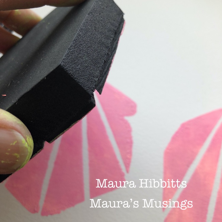
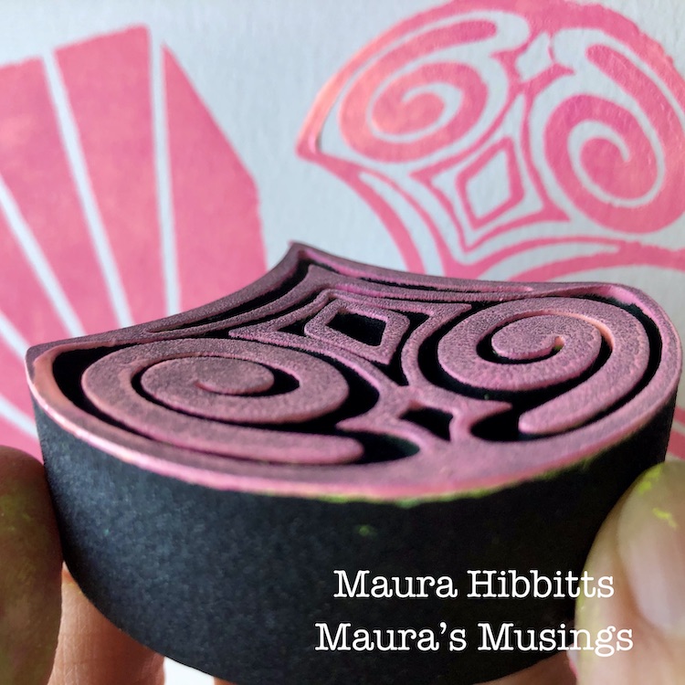
I continued working with the green on my gel plate, adding in some more of the neon colors to get a very bright green. I stamped into this with the Clam Hex ArtFoamie and stamped off on watercolor paper several times.
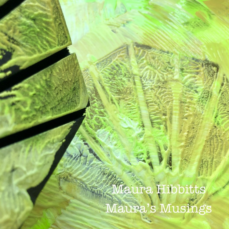
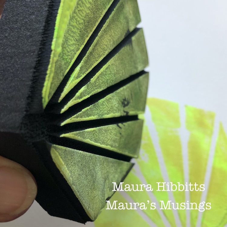
More greens! This time, I used the blended greens on the gel plate with the Fairview Fan ArtFoamie, and stamped several images onto watercolor paper.
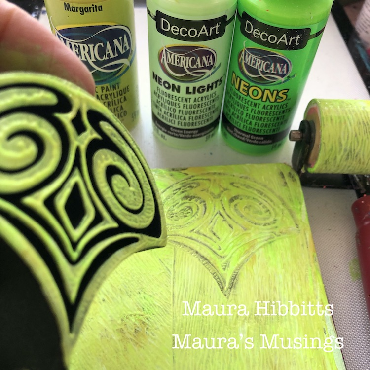
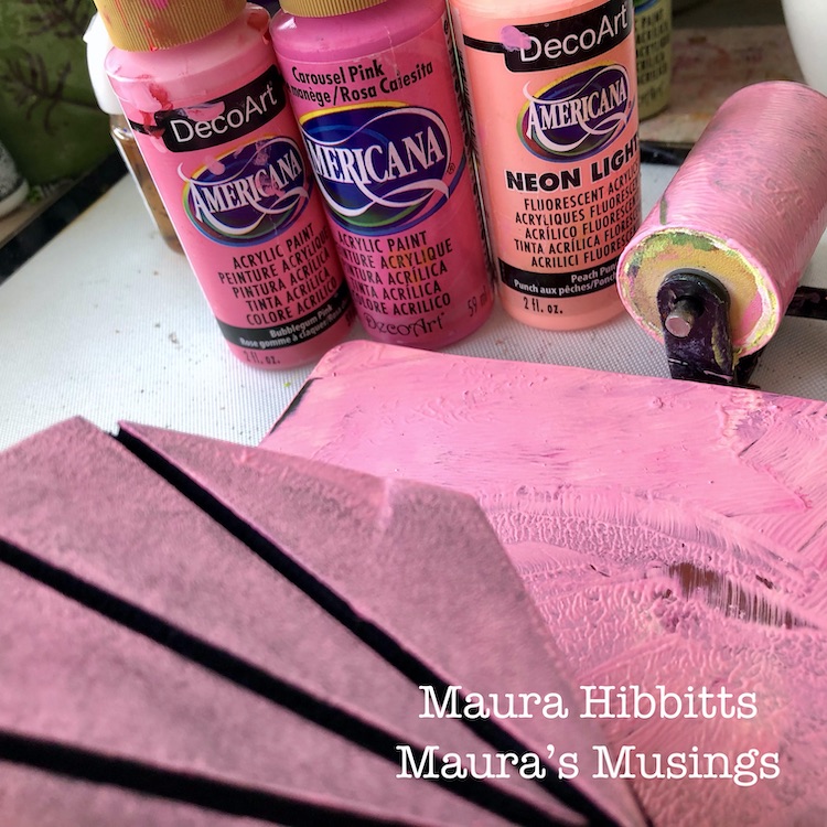
Now it’s time for a blend of pinks – once again, I squirted a small amount of each of three colors and lightly blended it on the plate with the brayer. I stamped into this with the Clam Hex and Fairview Fan stamps to pick up the paint, and stamped onto watercolor paper.
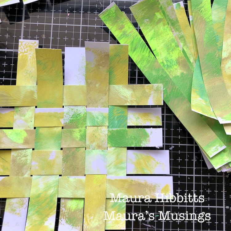
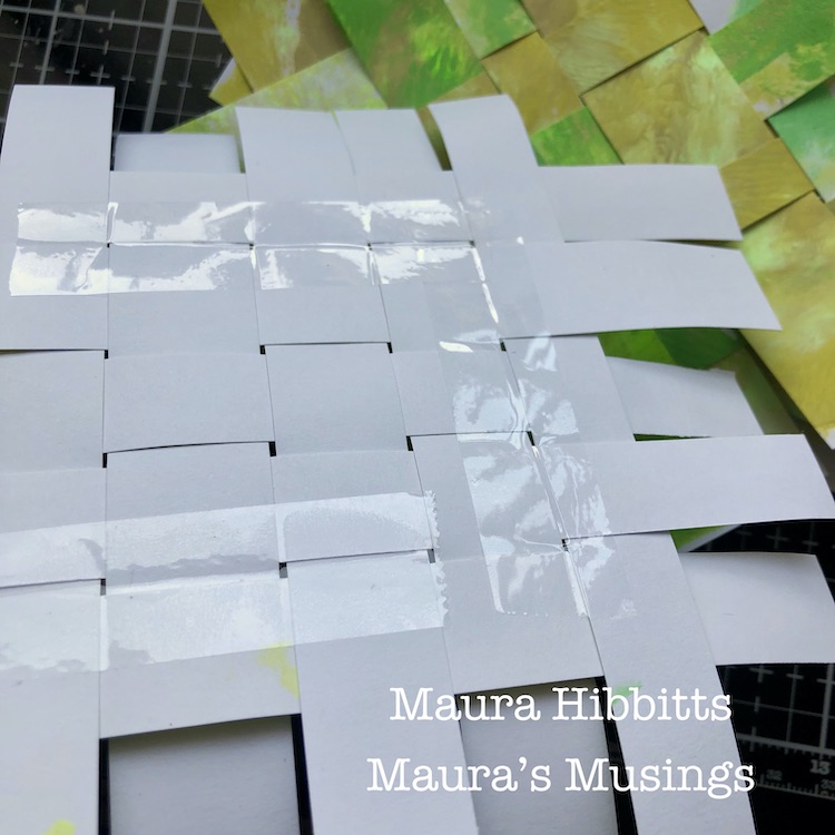
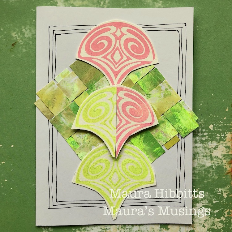
Meanwhile, now that the first set of papers is dry, I cut them into strips with a paper trimmer. I laid five strips down, and wove five strips into them. I pushed them close together, then turned it over and taped it in place with clear tape. Once that was done, I trimmed off the edges.
I cut out my stamped images and cut each in half, so that I could put a green and a pink image together.
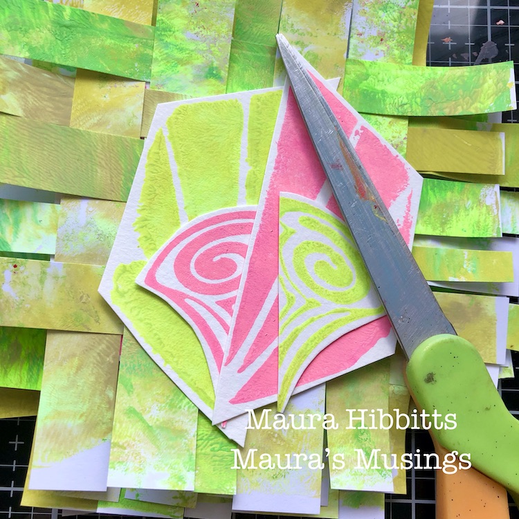
Once I laid out each card with the woven layer and stamped images and adhered them in place with adhesive tape and pop dots, I doodled frames around them with my carbon ink pen.
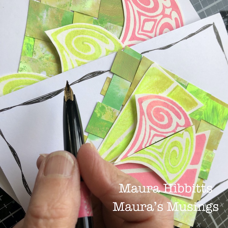
I now have a set of five cards in very bright spring colors. Next, I need to get motivated to write a letter in them and mail them out! It was fun mixing in neon paint to get a very vibrant image. I also liked how I mirrored the images in both the pink and green, which got me to thinking about watermelon colors. Wouldn’t you know it, my husband just brought home a watermelon from the grocery store! LOL!
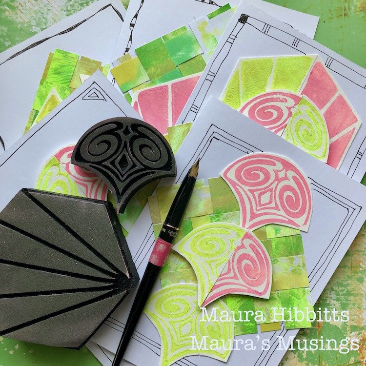
Motivated by bright and cheerful colors, my favorite holiday, and the plan to write some letters to friends, I’ve created my set of notecards. Happy March! – Maura
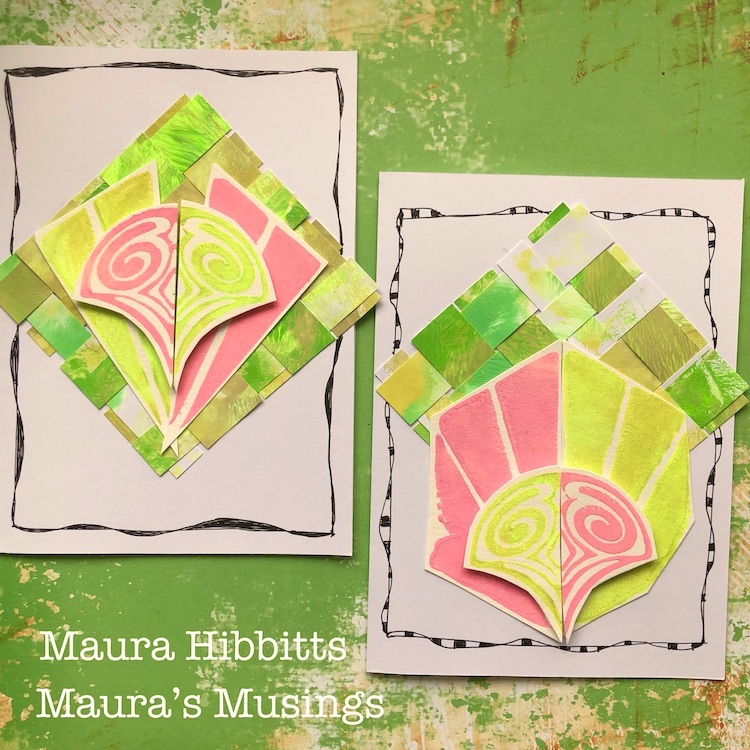
Thank you Maura – I love these happy spring colors this time of year :)

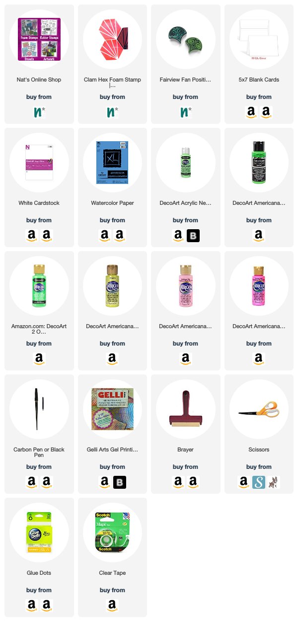
Want to give Maura’s project a try? You can find all my Foam Stamps in my Online Shop. Here are some of the other supplies Maura used:
Feel inspired? Working on something yourself that you’d like to share?  I love to see how you interpret our monthly themes. Email me how you used my stencils and stamps with the theme and email me an image – I would love to share your projects in my next  “n*Spiration From Around the Globe“.

Leave a comment

Motivated in March – Jennifer Gallagher

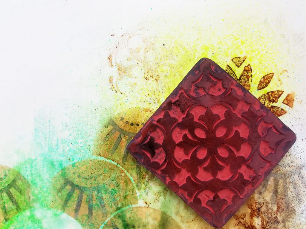
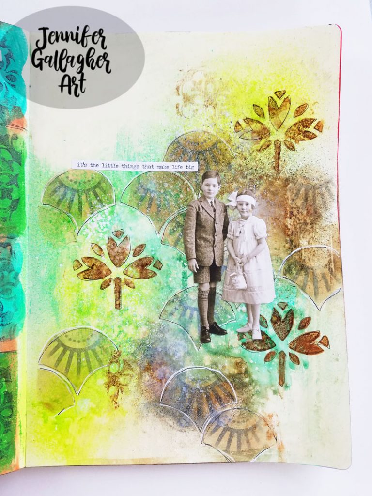
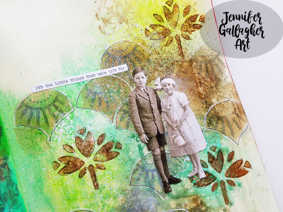
Hello from my Creative Squad! Today we are kicking off a new monthly theme with Jennifer Gallagher in her art journal. She is using my Art Deco Summit stencil, my Jewett foam stamp set and my Floral Tile Large rubber stamps and our theme: Motivated in March – What keeps you motivated to create? Is it a certain material? Your favorite colors that you can’t get enough of? Maybe you get motivated when you see artwork in a museum or out and about? Share with us your creative motivation and then create something inspired by it.


This month we are discussing our creative motivations. It’s Motivation March! I get motivated by experimenting with new products and seeing what I can make them do. A fun product that is pretty new to me is acrylic paint sprays. I have had so much fun learning how to use them that I am motivated to continue to try new color combinations and techniques. This month I am sharing a vintage inspired art journal page using some of my newest n*Studio favorites. Let’s get started.

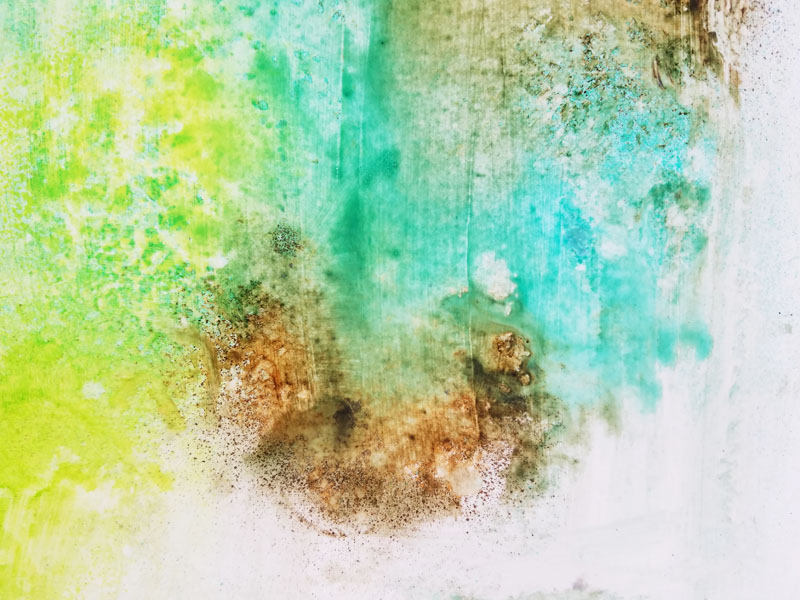
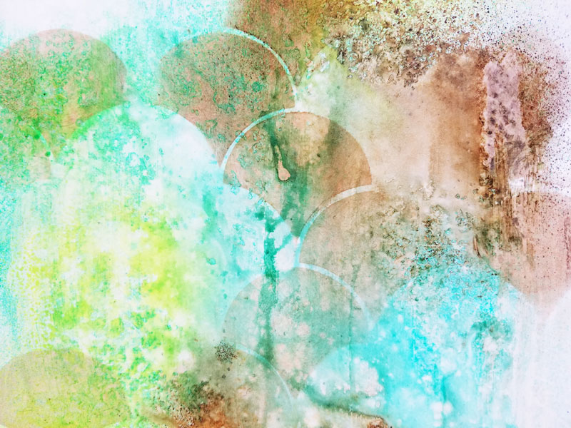
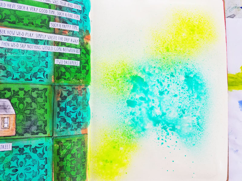
In my large dylusions journal, I prepped the surface by applying a thick coat of clear gesso. Then I sprayed Aquamarine and Reseda Marabu Art Sprays. 

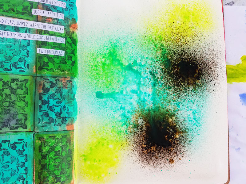
Moving quickly, I sprayed some Marabu Art Spray in Sienna. Then I spritzed the page with a fine mist of water.

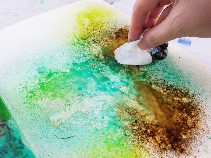
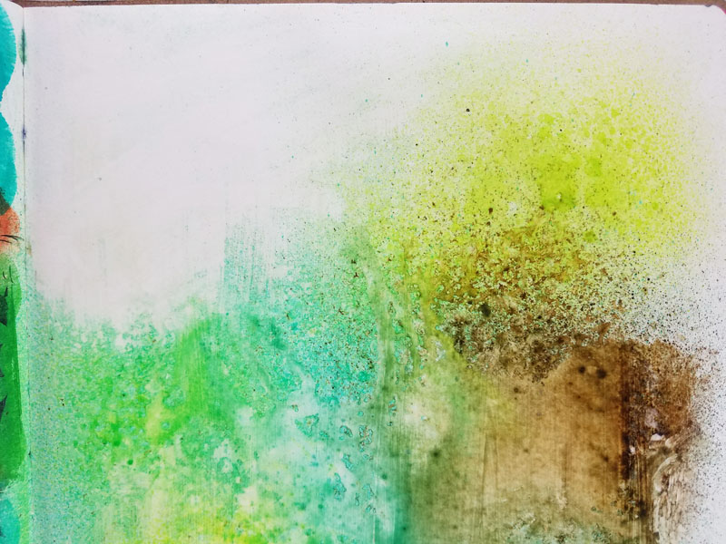
Using a baby wipe, I dabbed up the excess moisture and color.

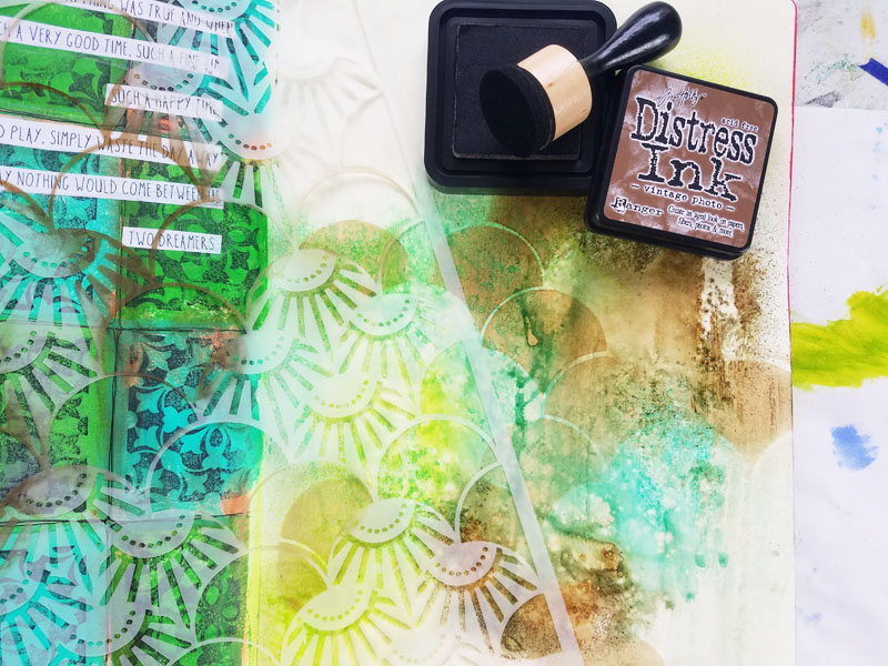
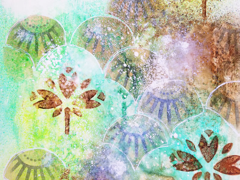
Using Nat’s Art Deco Summit stencil, I applied vintage photo distress ink through the open sections of the shell designs.

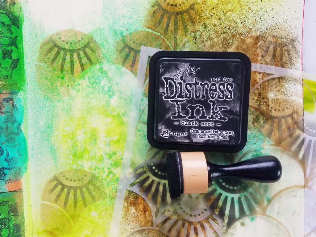
Next, I overlaid the design portions of the stencil back over the previous shell layer. I applied black soot distress ink.

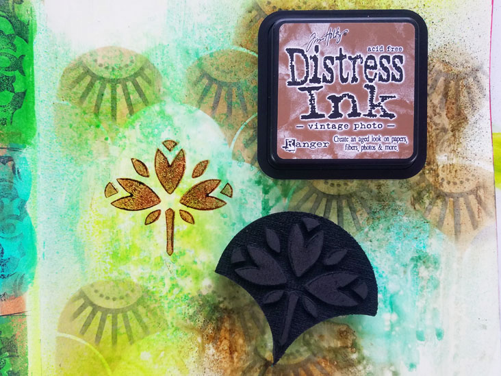
For a vintage design element, I loaded up vintage photo distress ink onto Nat’s Jewett foam stamp and pressed it onto the page. Adding design elements in odd numbers is pleasing to the eye.

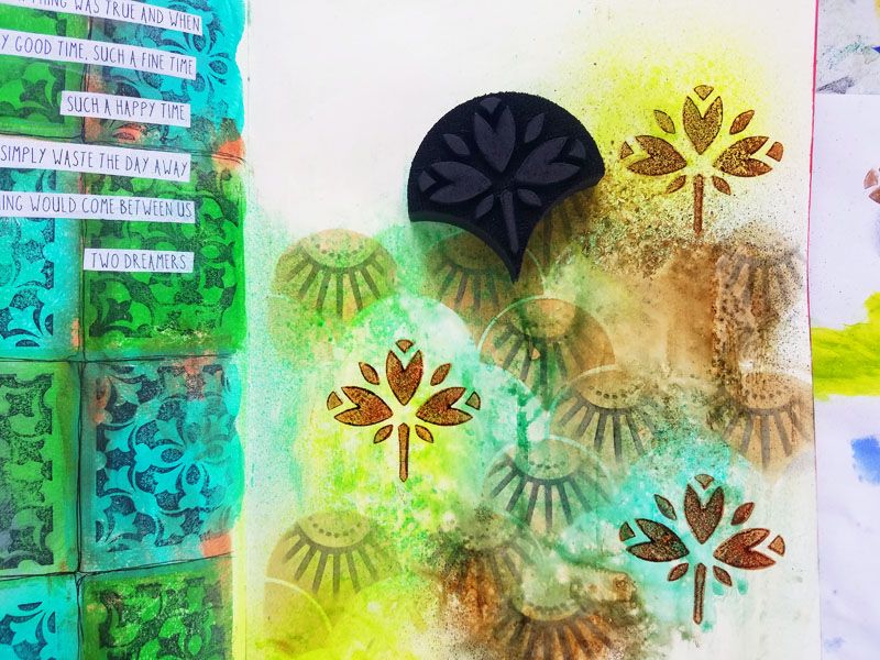
To make the right hand page feel more harmonious with the left hand page, also a n*Studio project, I am mirroring the stamped design from that page onto this one. I applied a very thin amount of vintage photo distress ink onto the Versailles positive rubber stamp and pressed it into a few places on my page.

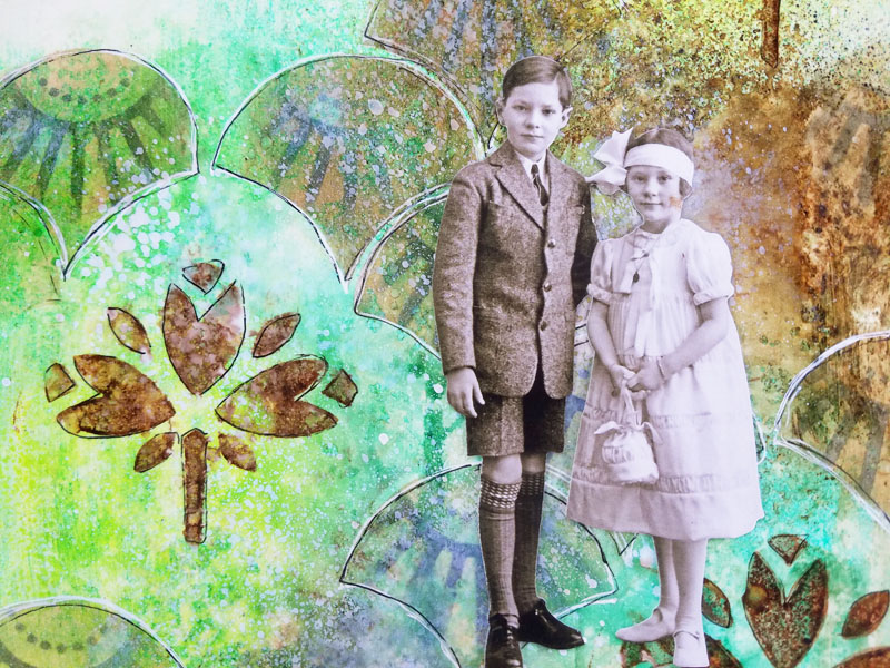
To add to the vintage look, I sprayed Distress Spray Stain in picket fence onto the page. Once dry, I doodled around the shapes with a white gel pen.(Later, I also doodle around them with a black gel pen.)

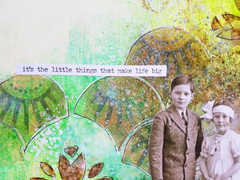
Using double sided tape, I added a paper doll cut out from Tim Holtz Idea-ology.  Then I finished it off with a sticker from Tim Holtz Small Talk sticker package.

I hope you have enjoyed this tutorial. I hope you have found it – motivational! 


Thank you Jennifer – I love the beautiful colors and blending for the spread!

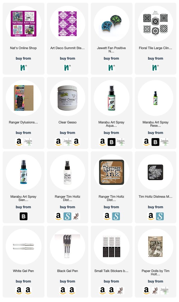
Give it a try: you can find all my Stencils, Foam Stamps, and Rubber Stamps in my Online Shop and here are some of the other supplies Jennifer used:

Feel inspired? Working on something yourself that you’d like to share?  I love to see how you interpret our monthly themes. Email me how you used my stencils and stamps with the theme and email me an image – I would love to share your projects in my next  “n*Spiration From Around the Globe“.

Leave a comment

Inspired by my Creative Squad

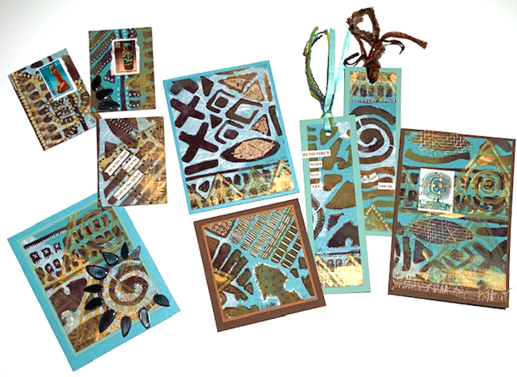
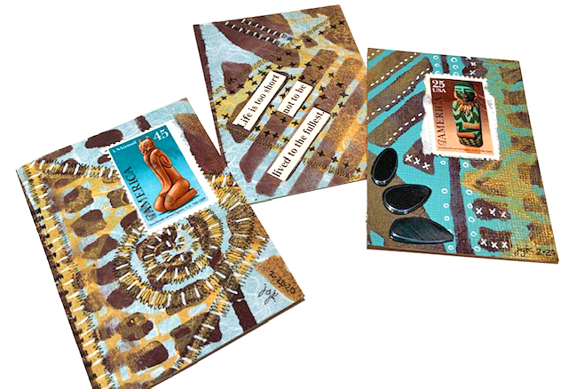
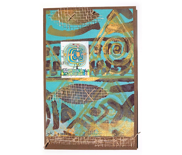
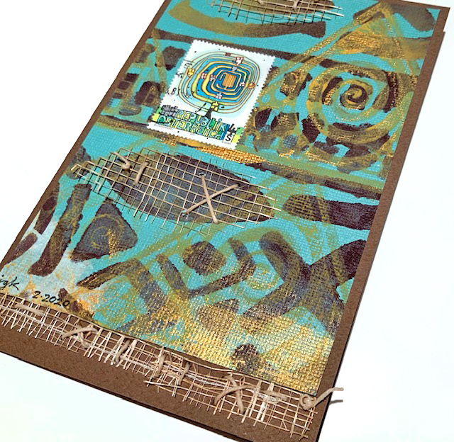
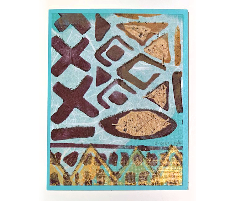
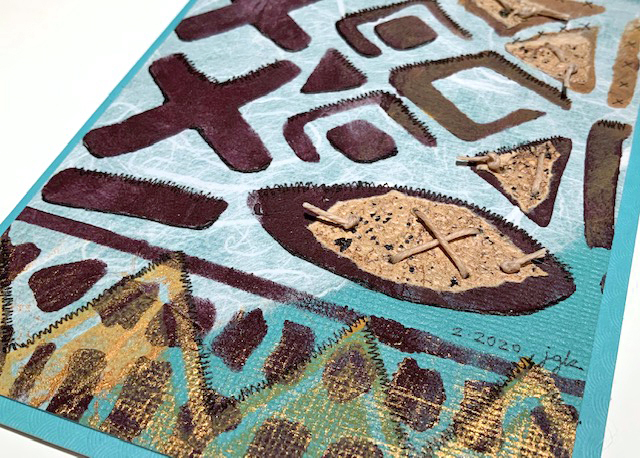
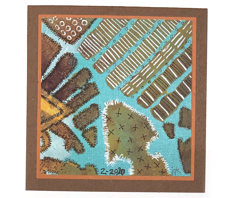
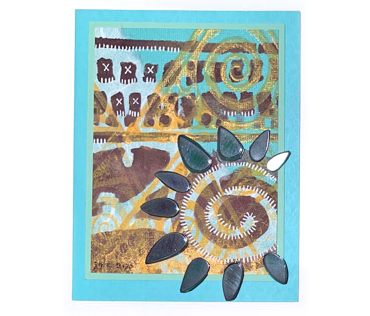
We have some very yummy creations from Creative Squad member Judi Kauffman to share with you today: cards, ATCs, and bookmarks! You know I love the brown and teal color combination – makes me happy. And there are so many other touches in these that catch my eye too: the handmade paper for texture and visual interest underneath the stenciling (so cool), the mesh she put in there (again- soo cool!), and the white mark making. 

Where did these projects originate? When Judi planned her 2020 calendar project her goal was to use each month’s page for other projects. What you see above was made with the January page!

So here we go from Judi: 2 bookmarks, 3 ATCs, and 4 cards for you today.

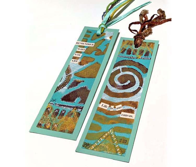
Bookmarks with stitching and some of my artfoamies stamps.

ATCs with postal stamps, my batik design, and lots of excellent markmaking.

More Batik pattern, mesh fabric, and postage stamps on a card…

Batik pattern, stitched elements, and handmade paper on this card…

A square card with lots of wonderful stitching…

And a card with some embellishments that makes me think of sunshine :)

Thank you so much for sharing Judi!!! 

Here are some of the supplies that Judi used:

Leave a comment

Whole Lotta Love – Linda Edkins Wyatt

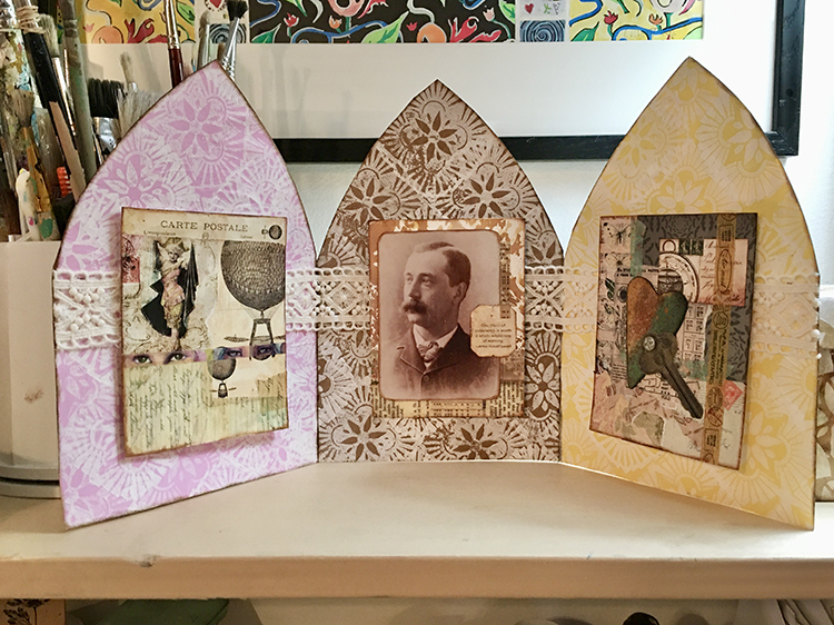
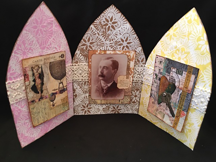
Hello from my Creative Squad! Today we have a unique project from Linda Edkins Wyatt – a triptych that holds 3 cards on display. Check out the video below to watch it come together. Linda uses my Floral Tile Large rubber stamps and this month’s theme: Whole Lotta Love – Who or what sets your heart aflutter this time of year? Let’s pay tribute this month to those warm fuzzy feelings of love and create something that celebrates that universal emotion.


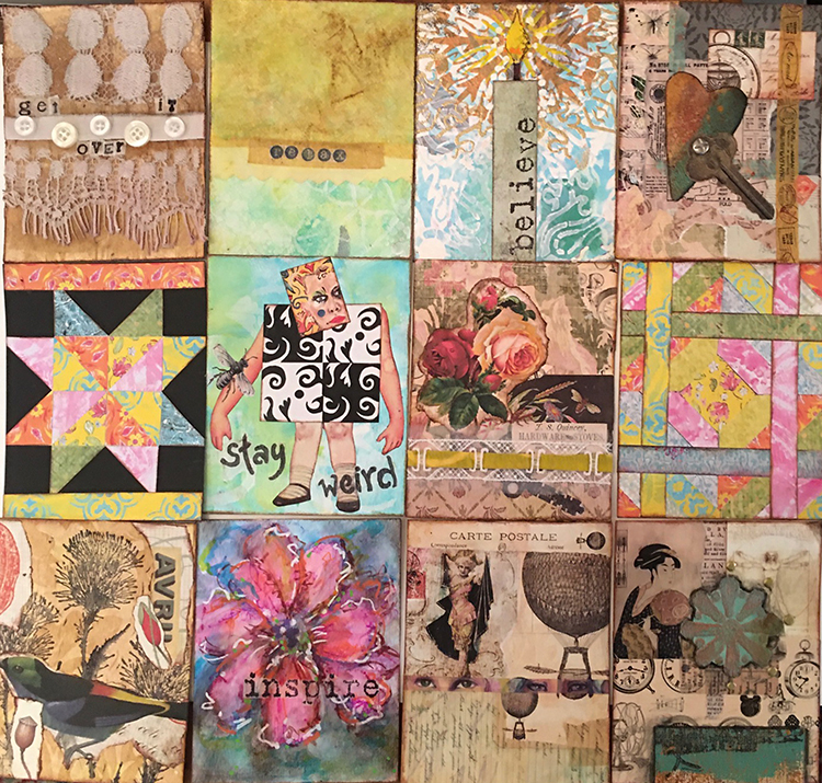
In November 2019, I participated in Nat’s “Deck of Cards” challenge. By the end of the month, I had 30 pretty cool pieces of artwork that were just the right size for greeting cards. I felt a little too attached to some of them to actually use as cards and send off in the mail to friends and family, so I bundled them up and propped them up on my display shelf. Here’s a few of them:

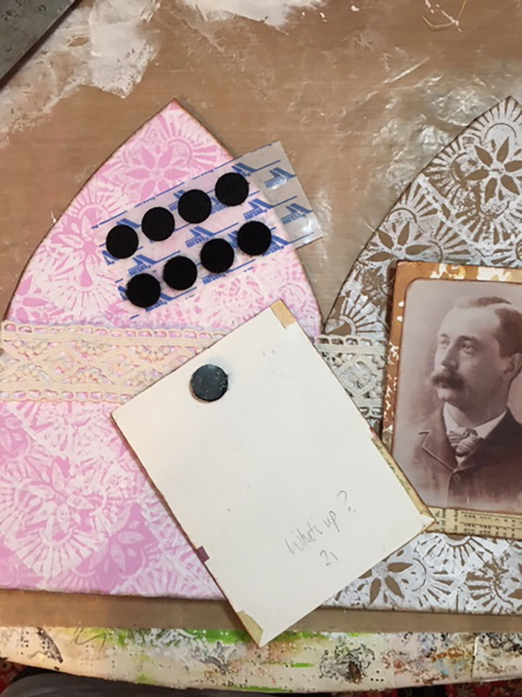
But…I wanted a prettier way to display the cards, so I hit on the idea of creating a free-standing triptych to showcase them. I had too many to display all at once, so I decided to attach little pieces of Velcro to my favorites so the display could easily be changed.

Here’s my video of the process:

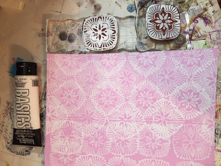
I started by mixing up my favorite shades of pink and yellow and painting some 140 lb. watercolor paper. In addition to the painted paper, I also used a piece of recycled brown paper bag. Next, I spread white acrylic onto my geli plate and picked up paint with Nat’s positive/negative Hamilton rubber stamps, then stamped all over the three surfaces. (Once the geli plate was full of marks, I also pulled prints off it with deli paper.)

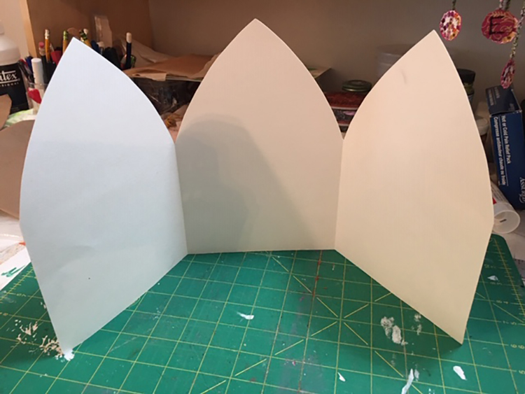
Once I had plenty of printed paper, I auditioned different cards and lace to see what would work best for my triptych. I folded and cut a fresh piece of watercolor paper to the triptych shape.

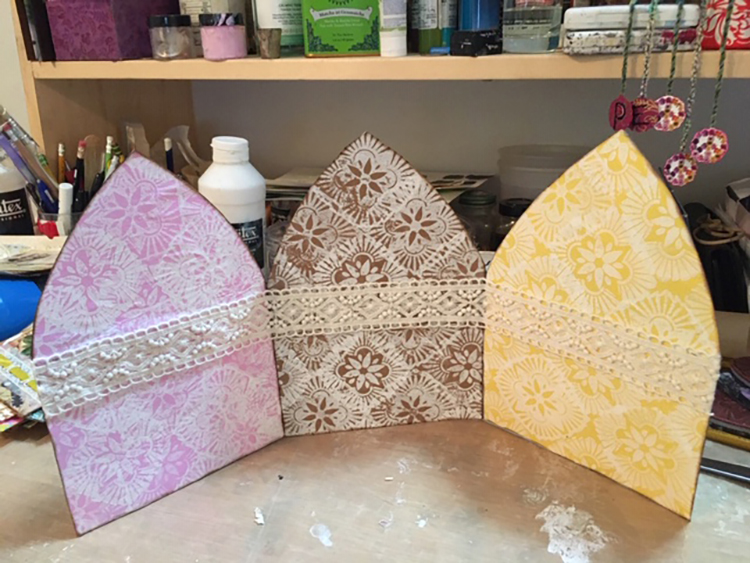
Next, I glued the printed papers on and cut them to size. With a glue stick, I added some gorgeous thick lace.

The final step was attaching the Velcro dots to both the triptych and the cards.

The hardest part was finding a space in my small apartment to display my new creation!


Thank you Linda! This is such a cool way to display any number of small works on paper! Great idea :)

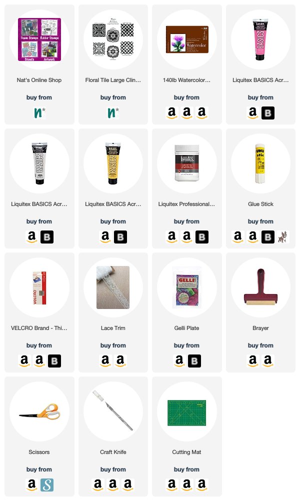
Want to give Linda’s project a try? You can find all my Rubber Stamps in my Online Shop and in addition to her cards and a brown paper bag, here are some of the other supplies Linda used:

Feel inspired? Working on something yourself that you’d like to share?  I love to see how you interpret our monthly themes. Email me how you used my stencils and stamps with the theme and email me an image – I would love to share your projects in my next  “n*Spiration From Around the Globe“.
Leave a comment

Whole Lotta Love – Nicole Watson

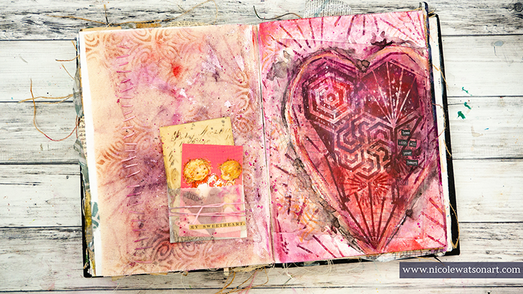
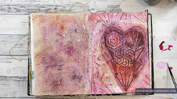
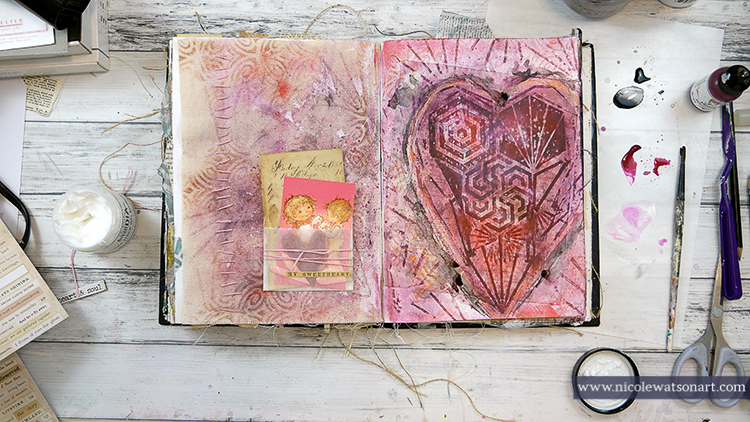
Hello from my Creative Squad! Today we have a lovely post and video from Nicole Watson, who brings us back to those early school days and the Valentine’s Day tradition of exchanging small paper cards. She is using my Hex Large rubber stamps and my Art Deco Fairview stencil and this month’s theme: Whole Lotta Love – Who or what sets your heart aflutter this time of year? Let’s pay tribute this month to those warm fuzzy feelings of love and create something that celebrates that universal emotion.


When I thought about this month’s theme along with Valentine’s day and love, I remembered back to elementary school and how much I loved (for lack of better word!) our classroom Valentine’s Day celebrations. I think most of my classmates liked that day for the candy, who wouldn’t?? However, my favorite part was opening all the envelopes in anticipation of the paper card that was inside. This must have been a hint of my future love for ephemera!

I wasn’t exactly sure where I wanted to go with that on my journal pages, until I ran across some old Valentines in a package of vintage cards I had in a drawer. With one of those in hand, I decided to pay homage to that memory on my pages.

Check out my video to see how it came together and read on below for a complete step out.

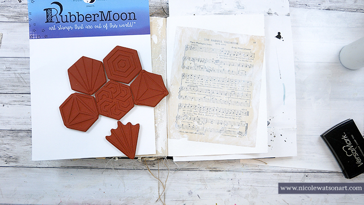
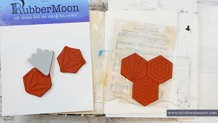
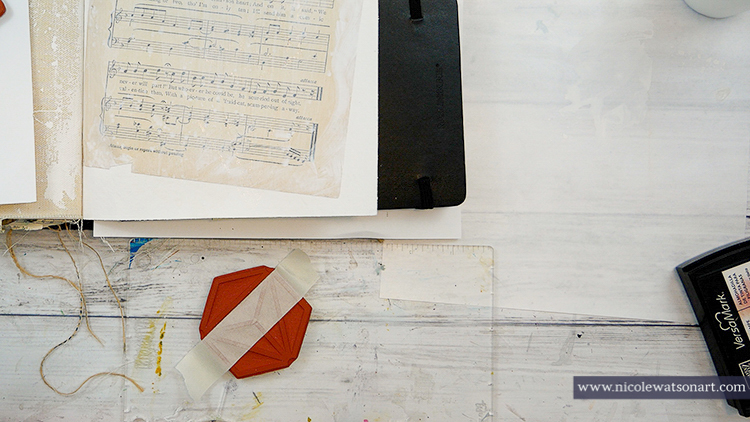
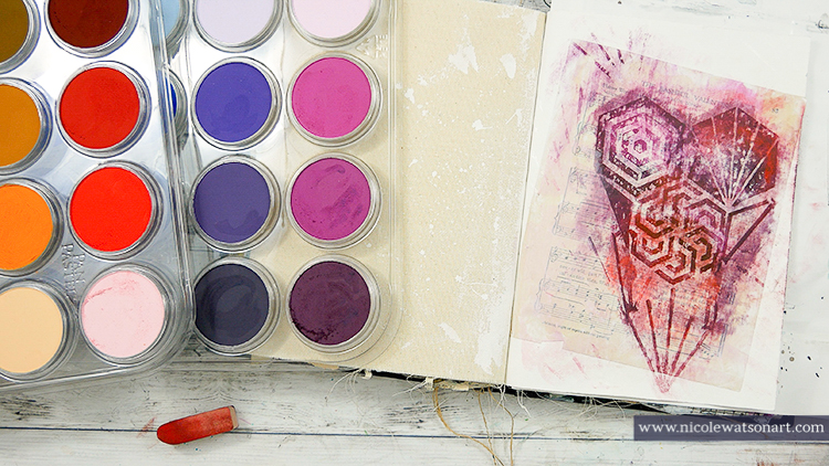
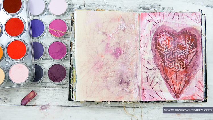
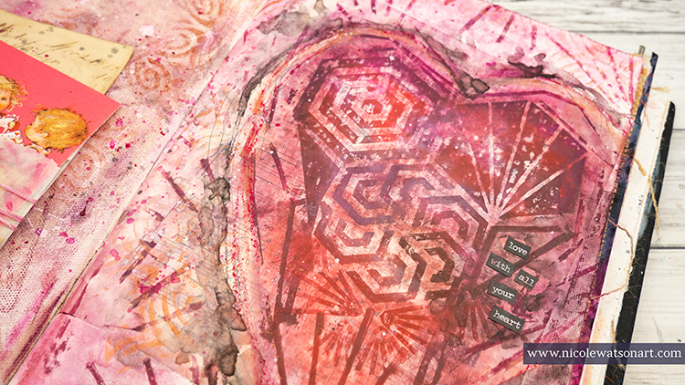
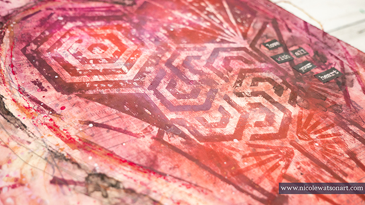
I played around with Nat’s Large Hex stamps hoping I could make a heart out of them. I stamped the hex shapes with versamark onto my journal page that I had already gessoed and layered with a page from a song book that just happened to be about a valentine! This process was a little tricky as I masked some of the stamps with tape to make some of the smaller areas of the heart. I also stamped some outside the heart on the page and also the canvas page to the left. I didn’t know if it would work on the canvas at the time. (spoiler: it did!)

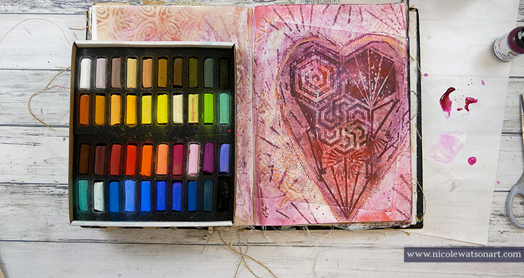
To add color to the page, I grabbed my pan pastels and layered different reds and purples over the heard area. The versamark grabs the pastels and makes that area darker than the others, allowing the heart to pop off the page. I sponged the pan pastel all over both pages. At this point I realized I needed some more versamark lines and designs in the heart and could also use some outside of it, so I experimented by stamping additional versamark and going over it again with pan pastel. Thankfully, this worked!

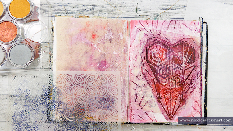
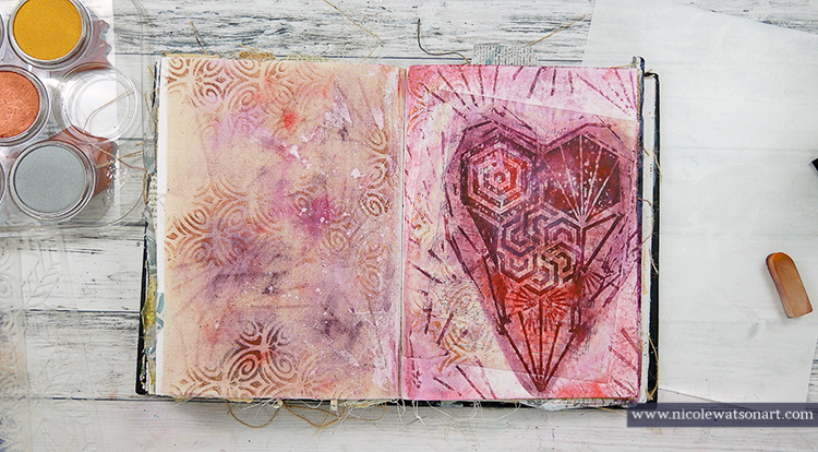
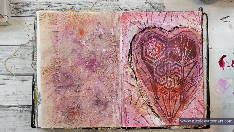
When I was happy with the pastel and versamark, I sprayed my pages twice with fixative. I felt the pages need a little bit more, so I grabbed Nat’s Art Deco Fairview stencil and sponged some bronze pastel through it in several places. I also added some of the bronze around the edge of the heart. When I was finished, I sprayed another coat of fixative.

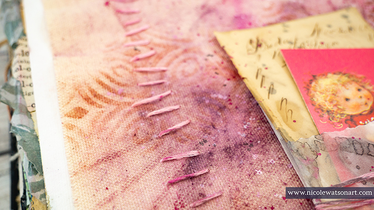
While it was drying, I played with the valentine ephemera and happened to see some pink embroidery floss on my desk, so I stitched the floss onto the canvas page for some more texture. After this, I added some spatters of fuchsia acrylic paint around the heart and on the canvas page along with some gesso and tinted gesso.

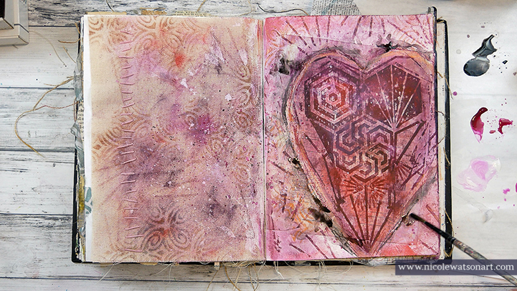
At this point, I felt like the heart still needed some definition, so I grabbed my hard-pastel sticks to trace around the heart along with my stabilo pencils. I used the stabilo to create some shadowing.

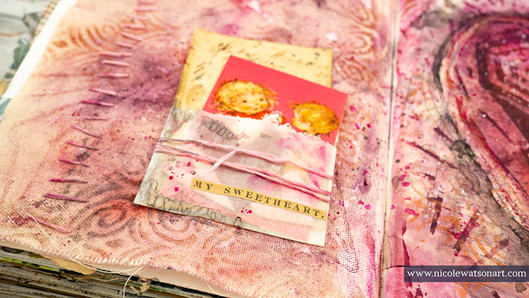
Finally, it was time to add my little valentine bundle to the canvas page and some word stickers. After these were added, I spattered some stabilo and paint on them so they would feel a little more cohesive to the rest of the pages.


Wow! Thank you Nicole – so many gorgeous layers and what a thoughtful reminder when it comes to love too :)

Want to give Nicole’s project a try? You can find all my Stencils and Rubber Stamps in my Online Shop and in addition to book page/ephemera, here are some of the other supplies Nicole used:

Feel inspired? Working on something yourself that you’d like to share?  I love to see how you interpret our monthly themes. Email me how you used my stencils and stamps with the theme and email me an image – I would love to share your projects in my next  “n*Spiration From Around the Globe“.
Comments (1)

  • Debbie Gaetz

    |

    Your journal art is totally inspiring!

    Reply

Leave a comment

Whole Lotta Love – Maura Hibbitts

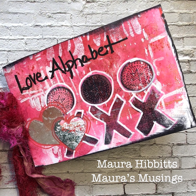
Hello from the Creative Squad. Today we have a super cool project from Maura Hibbitts – a Love Alphabet – Wow! Read on to see how Maura pulls it together with my Small Circle Jumble rubber stamps, my Batik 1 & 2 foam stamps, my Far Out foam stamp, my Batik stencil and my New Orleans stencil. This month’s theme is: Whole Lotta Love – Who or what sets your heart aflutter this time of year? Let’s pay tribute this month to those warm fuzzy feelings of love and create something that celebrates that universal emotion.


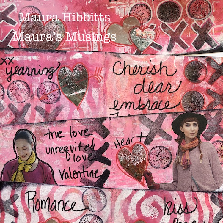
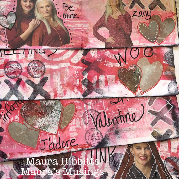
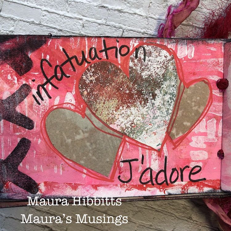
Happy February – the month for love of course, with Valentine’s Day smack dab in the middle! I pulled out lots of red, pink and white paint to play with, in traditional holiday colors. Originally when I started working, I was going to make cards, then that morphed into the idea of a mini album, and finally as I was putting the final touches on it, it became a Love Alphabet. Yes, you can find words from A to Z in it, all about Love and Valentines.

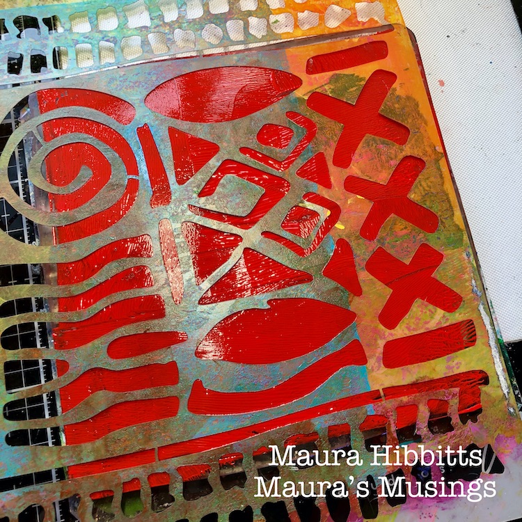
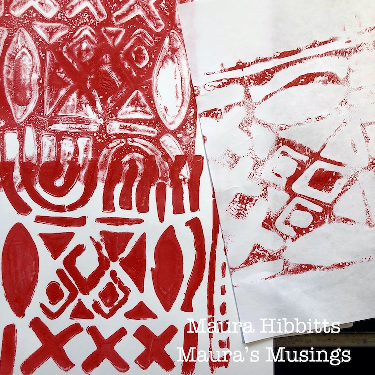
I started my first layer with Pyrrole Red and the Batik stencil on the gelli plate. I love stenciling in different ways – laying the stencil down and pressing the paper over it, pulling the painty stencil up and putting it down on paper, and pressing a piece of paper into the gel plate. This gives a wide variety of backgrounds to work with. I printed on both cardstock and copy paper, which later on turned out to work beautifully.

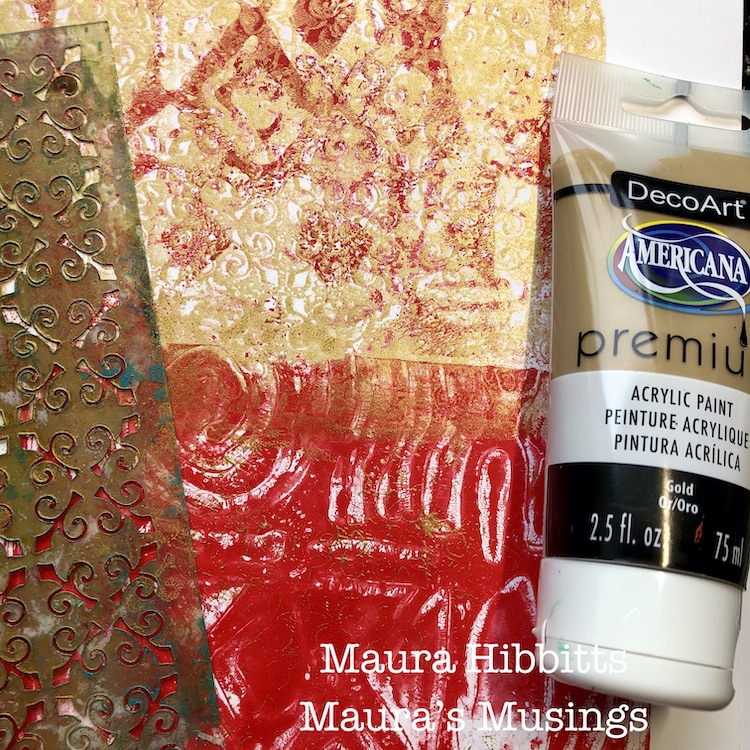
A little gold was needed as the second layer, so on some papers, I added it with the New Orleans stencil, and on others, I used the brayer.

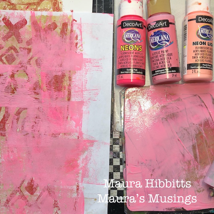
Time for the pink layer! I added a mix of pinks over the printed papers with paint and a brayer.

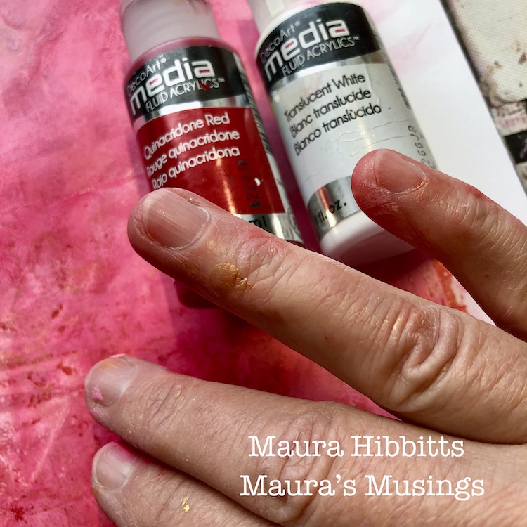
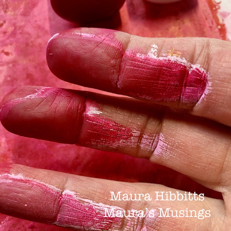
I added a final translucent layer on top with the fluid acrylics. For this layer, I just smudged the paint in with my fingers, which are great tools for blending, even if you get a bit dirty, it all comes out eventually. (Or use gloves)

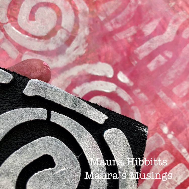
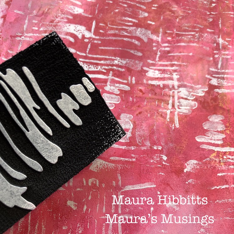
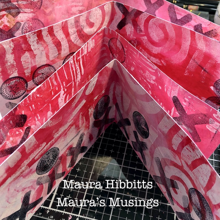
Now that the background is done, it’s time for some stamping. But first, I used matte medium to glue a piece of cardstock and a piece of copy paper together. Then, I used the Batik 2 and Far Out art foamies with white paint and repeated the pattern several times to cover the page. Once dry, I trimmed off the edges, and cut them approximately 3 1/2 x 10 1/2 inches to make my book.

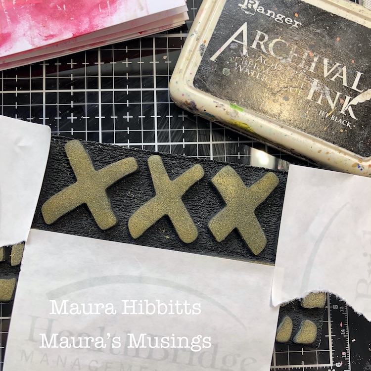
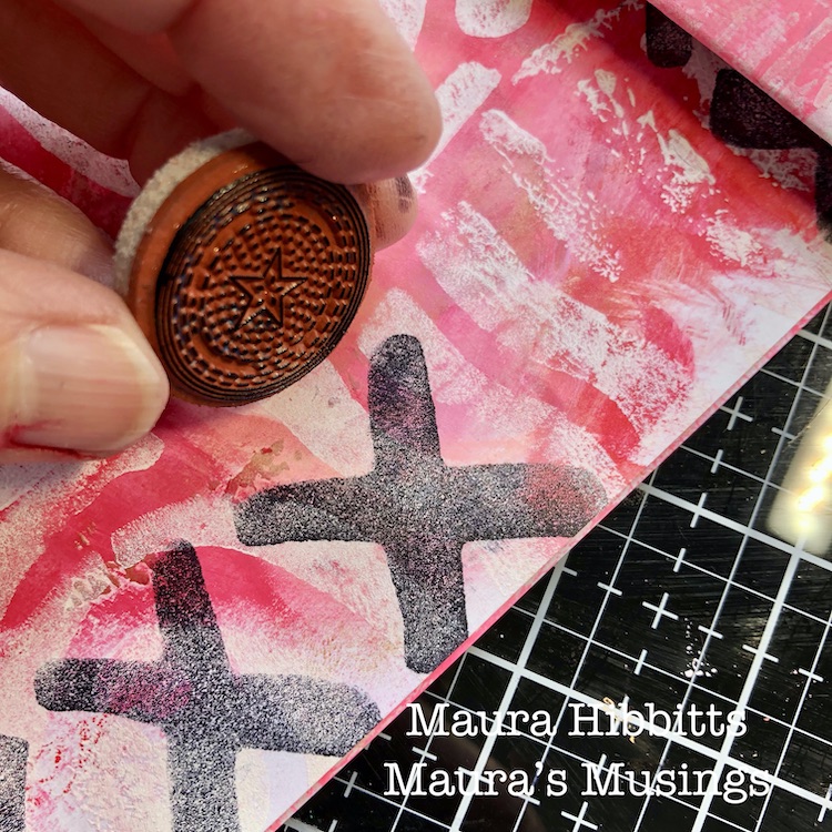
Now, to make things pop, I’m stamping with black ink using X’s and O’s (remember those XXXOOO’s? – hugs and kisses). I only want the X portion of the Batik 1 stamp, so I’ve masked off the rest with sticky notes. I’m stamping these with black archival ink and then the Circle Drive rubber stamps from the Small Circle Jumble set.

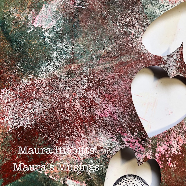
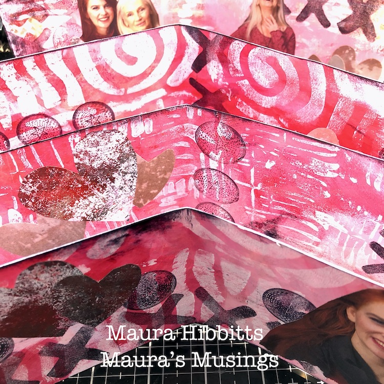
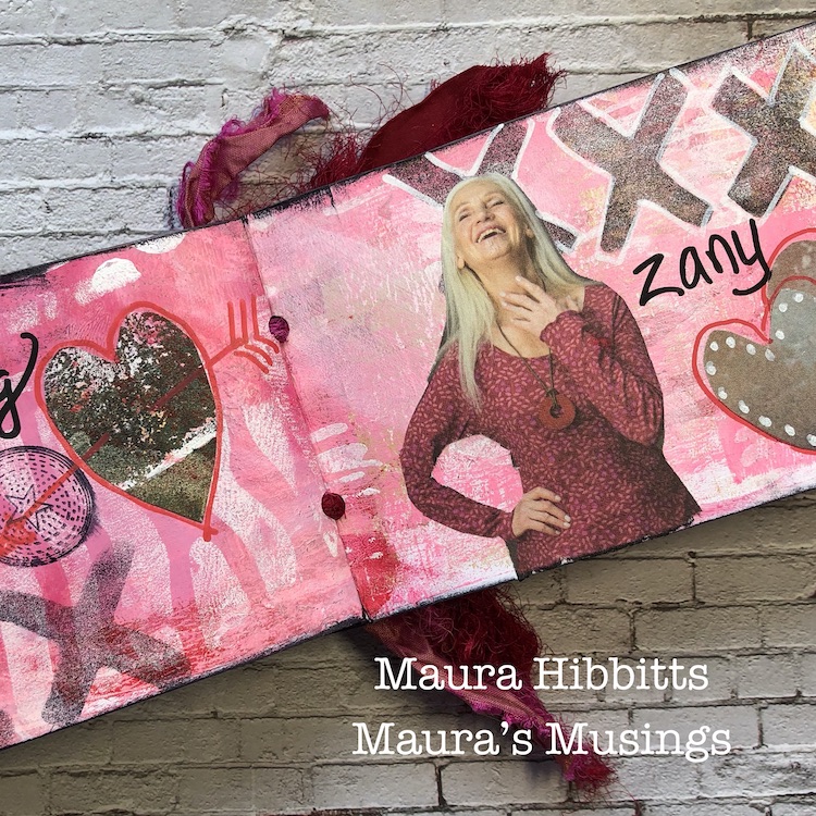
I cut out images from a Gudrun Sjoden catalog (now, I love these because they aren’t glossy, plus they are interesting) but you can use any magazine. I also found pages with neutral backgrounds and cut hearts. Then, I looked at my junk paper I use to wipe off extra paint from the brayer, and used it to cut more hearts to glue in.

Final steps are to edge the pages with the black ink, add details with the Posca Paint pens, and write in my words. Then, I punched two holes in the center and tied it together with Sari ribbon. (I found it handy to mark the holes through all pages with an awl, then use the hole punch on each page.)

You too can make your own fun little alphabet book of love to give to that special someone. Or, it could be fun to fill it with snarky words instead!

Sometimes I think Valentines Day is in the perfect place…all that love, giving and pinks and reds certainly brighten up the long winter around here. Happy Valentine’s Day to you all! Maura


Thank you Maura! We just love this project from A-Z!

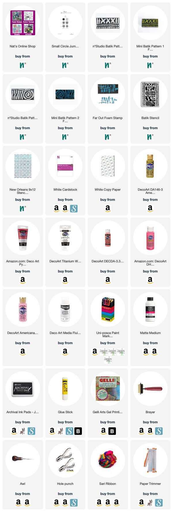
Want to give Maura’s project a try? You can find all my Stencils, Foam Stamps and Rubber Stamps in my Online Shop. In addition to magazine images, here are some of the other supplies Maura used:

Feel inspired? Working on something yourself that you’d like to share?  I love to see how you interpret our monthly themes. Email me how you used my stencils and stamps with the theme and email me an image – I would love to share your projects in my next  “n*Spiration From Around the Globe“.
Comments (2)

  • Catherine Lenoci

    |

    What a beautiful little book! I love the colors and the images!

    Reply

    • Maura Hibbitts

      |

      Thanks so much Catherine! It was fun to make.

      Reply

Leave a comment

Whole Lotta Love – Jennifer Gallagher

Hello from the Creative Squad! Today we have a post from Jennifer Gallagher that is definitely from the heart :) She is using my Large Hex rubber stamp set and this month’s theme: Whole Lotta Love – Who or what sets your heart aflutter this time of year? Let’s pay tribute this month to those warm fuzzy feelings of love and create something that celebrates that universal emotion.


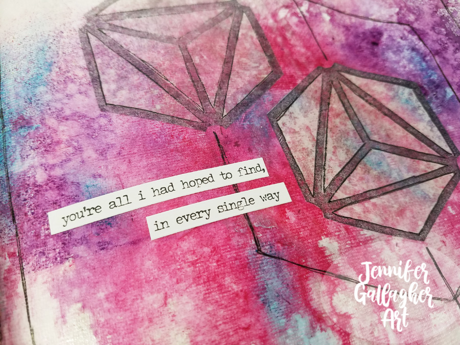
This month we are feelin’ the love with a “Whole Lotta Love.” As soon as I read the prompt for this month, I got super sappy with an art journal page dedicated to my sweet husband. It is the time of year where we celebrate those that we love and show our appreciation for them. This page does just that. Let’s get started.

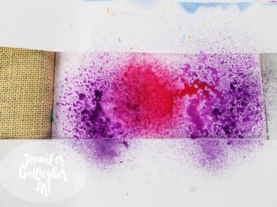
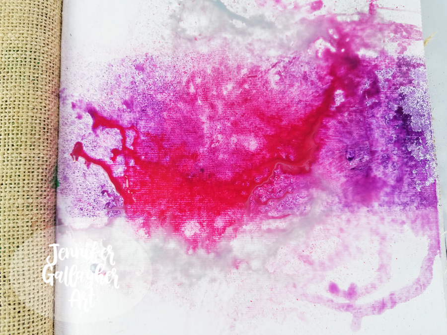
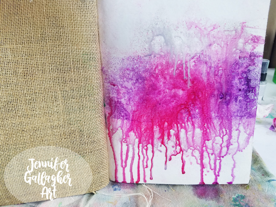
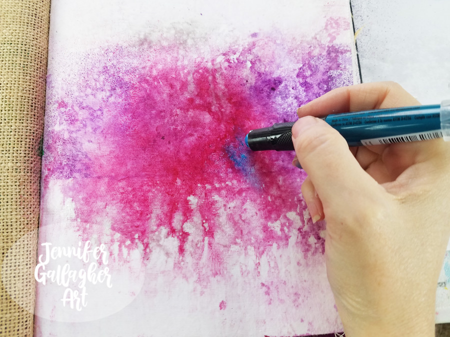
I am working in my Dina Wakley Media journal on one of the cotton rag pages. Before starting, I applied two coats of clear gesso to this page to prepare the surface. Once the gesso was dry, I chose a few colors of Marabu Art Spray and got to work. First I applied Cherry Red and then Aubergine. I protected the top and bottom of the page with some scrap paper to concentrate the color through the center of the page.

To encourage mixing and movement, I applied a small sprtiz of water into the art sprays.

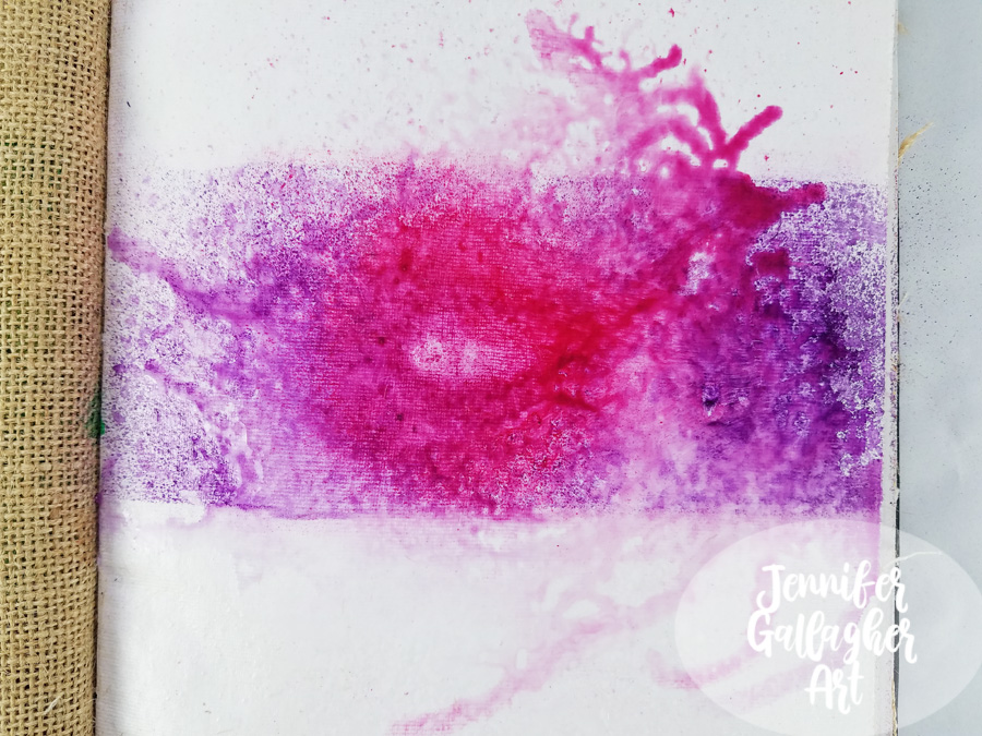
I dabbed up any excess moisture and then applied Marabu Art spray in silver.

Then, over a towel I keep for art project clean-up, I tipped the book up and let the art spray trickle down the page until a good bit of the moisture was on the towel. Then I tipped the book the opposite direction to allow drips at the top of the page.

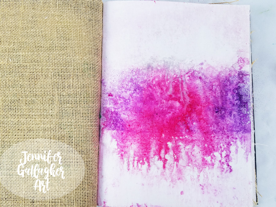
As soon as I finished letting it drip, I took a baby wipe and wiped the top and bottom of the page until it was pretty close to white again. I am not scrubbing hard or looking for perfectly white background areas. I just want to get a lot of the color off the top and bottom section. We are left with a far more organic looking page.

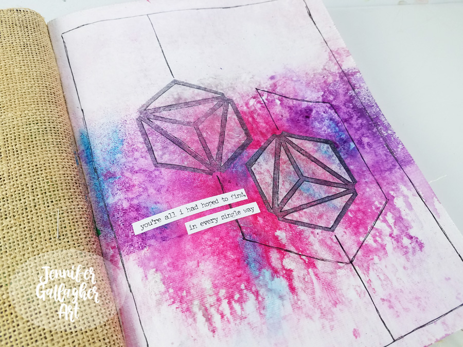
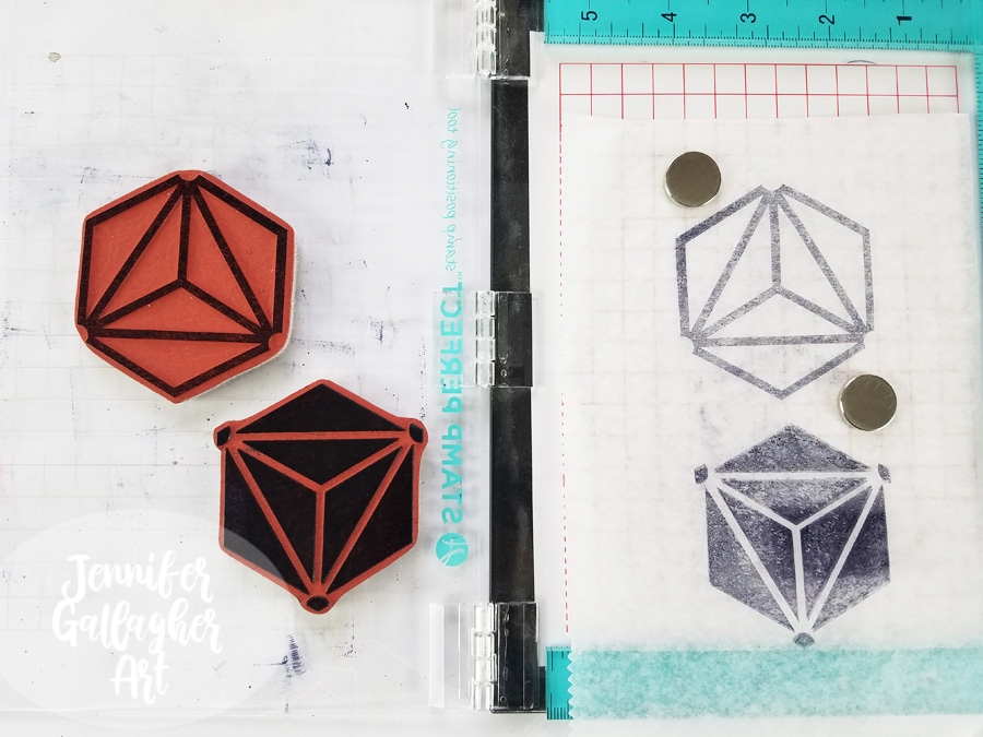
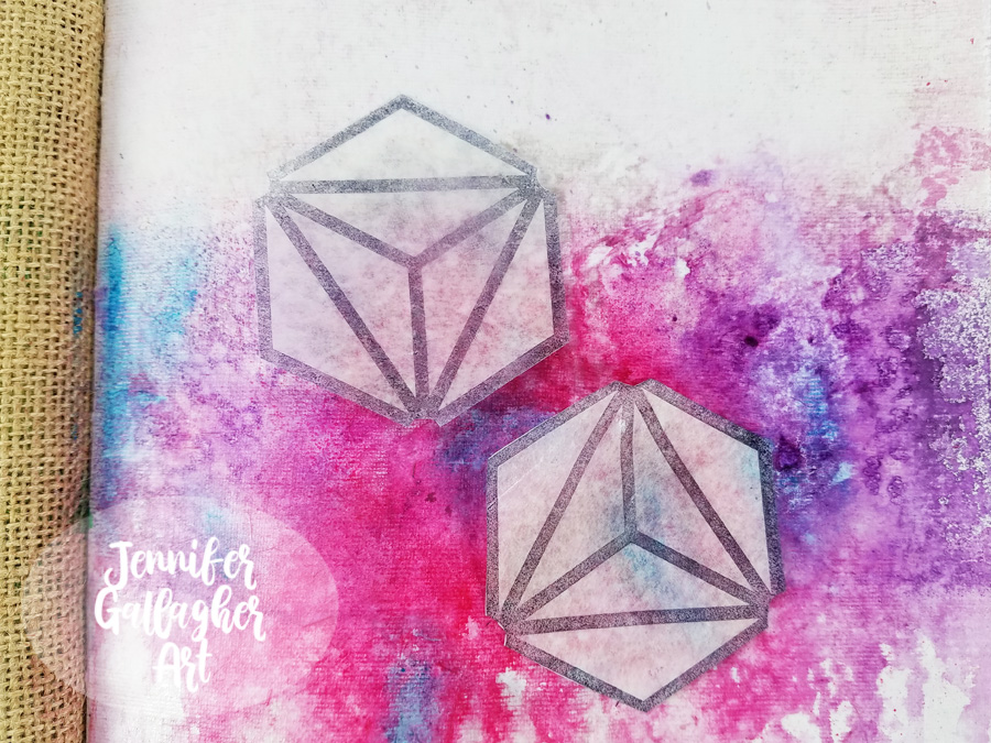
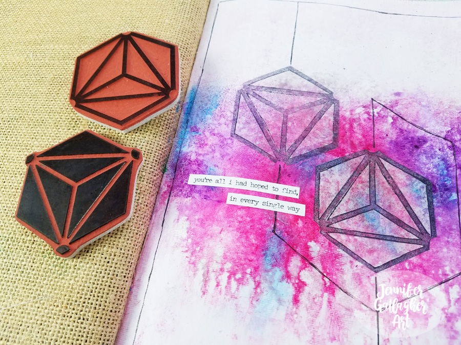
Using a stamp platform, I stamped Nat’s large Diamond Hex Positive and Negative stamps onto deli paper with black archival ink. I ended up only using the positive images.

Next, I went back to the completely dry background with a Marabu Art Crayon in Aqua Green and applied a little color here and there. Art crayons are soft enough to spread with your finger.

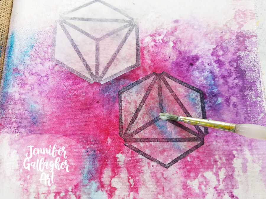
I cut out two of the positive stamped images and figured out where I wanted to place them. These images represent my husband and I.

Once I settled on the placement, I applied them to the background with matte medium.

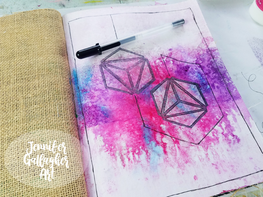
Using a Sakura Black Gelly Roll pen, I connected the shapes with lines and carried it around the page.

I chose a sentiment from a set of Tim Holtz Small Talk stickers and applied it to the page.

I hope you enjoyed this tutorial and found it a source of inspiration for your own art journal. Stamping on deli paper is a fun technique that you should try at home. Being inspired by love has reminded me how much I love sharing my ideas and processes with all of you. Thank you for stopping by.


Thank you Jennifer! Awww that definitely warms our hearts and makes us want to do our own little tributes in our art journals :)

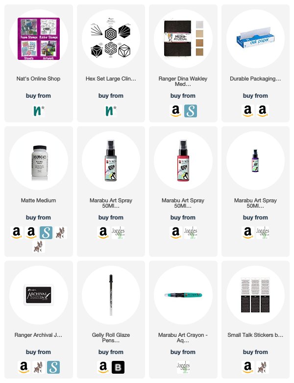
Give it a try: you can find all my Rubber Stamps in my Online Shop and here are some of the other supplies Jennifer used:

Feel inspired? Working on something yourself that you’d like to share?  I love to see how you interpret our monthly themes. Email me how you used my stencils and stamps with the theme and email me an image – I would love to share your projects in my next  “n*Spiration From Around the Globe“.
Leave a comment

Creative JumpStart with the Creative Squad – Linda Edkins Wyatt

Hello from my Creative Squad! Today we have a post from Linda Edkins Wyatt sharing her super power – recycling! That’s something we could all do more of :) Linda is using my Art Nouveau Wallpaper and Tokyo stencils and this month’s theme: Super Power – this month we are joining Creative JumpStart 2020 and exploring our Artistic Super Powers. It could be your unique technique or style, the way you like to use a medium or tool, or maybe your way of approaching artmaking. What is yours and show us how you use it.


What’s My Superpower? Recycling!

For the New Year and new decade, Nat had us thinking about what our art superpower is. As a mixed media artist, I think of myself as a “jack of all trades, master of none” since I dabble in any and all art forms. So, choosing an art superpower was hard. I paint, draw, make jewelry, stencil, stamp, design fabrics, build stuff, putter in PhotoShop®, take photos and pretty much try all kinds of art. None of my art skills are quite at a superpower level so I was stumped. In both my daily life and my art life, I love to recycle and often repurpose bags, boxes, packaging and other materials into my artwork. With that in mind, I decided to embrace recycling as my superpower and use recycling to showcase Nat’s new stencils from StencilGirl®.

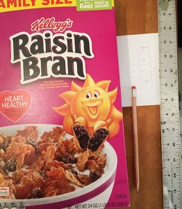
I save wrapping paper, newspapers, magazines, ribbons, teabags, strings, packaging materials, and all kinds of boxes, especially cereal boxes, which I often use to make journals, tags and ATCs. This time, I pulled a family-size empty Raisin Bran box out of my recycling stash and started thinking about making a gift box or Artist Trading Cube.

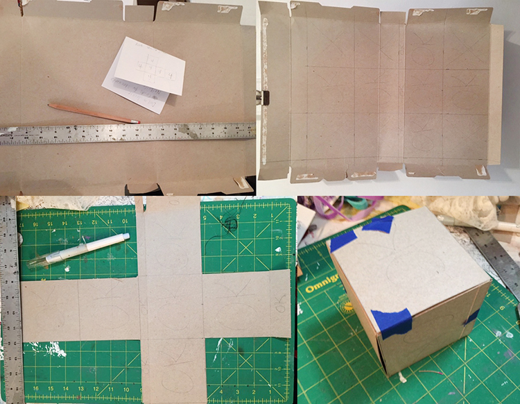
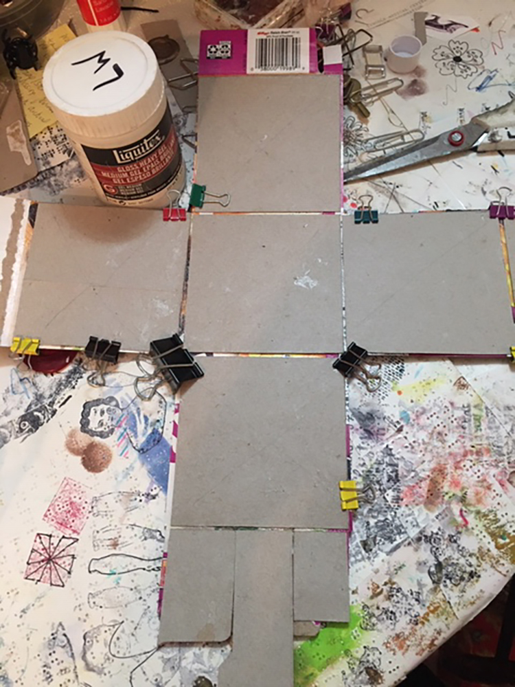
I decided to make a small sketch of a cube on paper to figure out how the six sides would fit together and where the folds, tabs, and cuts should go. Once that was done, I drew it to scale on the inside of the opened Raisin Bran box, designing a 4” cube. In pencil, I marked the areas that I would keep with “OK” and put an X through the sections I would cut away. I left some tabs to tuck in at the sides and top.

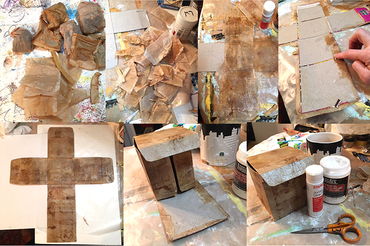
Using a Cricut exacto knife and my green cutting mat, I very carefully sliced the cereal box according to my plan. The 4” square box that emerged, once I cut and folded it, was a little flimsy, so I made a duplicate, then glued the colorful sides together. I also cut the interior pieces just a little smaller (about 1/16” smaller on all sides) so that there would be less bulk when I folded the sides and flaps. Once the piece was dry, I folded the box up carefully to be sure it was designed properly. (I kept thinking of those Iowa IQ tests we took in elementary school where they gave you a flat shape made of dotted and solid lines and ask you what it would be as a 3-dimensional object. My art brain was kind of exploding but I pushed on ahead.)

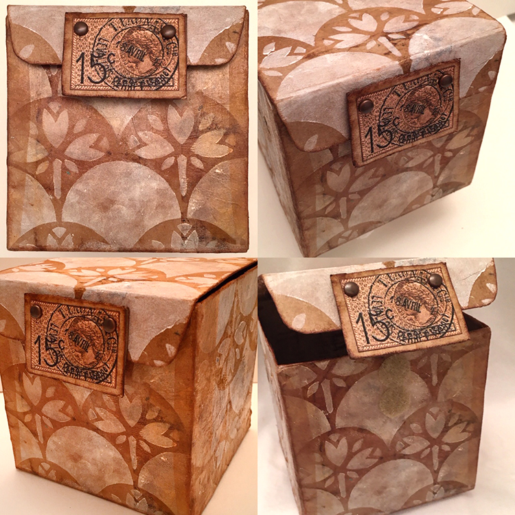
Structurally, it worked out well: the angles were 90 degree and it all fit together even better than I expected. No wonky edges or crooked sides!

Now for the fun part…decorating my little Raisin Bran box! I decided to double the recycling fun and glued recycled (dry and empty) teabags over the gray box shape. For this project, I used bags from black tea, but I often use turmeric tea or black cherry for color variety.

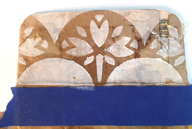
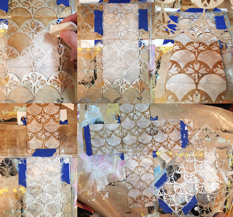
Next, I tested the new stencils. On an interior flap, I used Titanium White Liquitex Basics white acrylic and sponged it through the Art Nouveau Wallpaper stencil. I loved the effect, and decided to use that technique and stencil all over the exterior sides of the box.

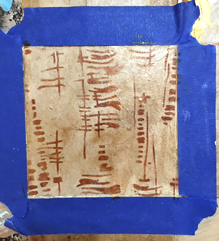
I also wanted to test the new Tokyo stencil, so I taped off the section that would be the interior bottom and tested the Tokyo design with sepia Archival ink on a fingertip dauber. That looked great too, so I decided to use the Tokyo design throughout the inside.

I had a little “oops” sad moment when I realized that I had stenciled the Art Nouveau Wallpaper stencil going the wrong direction on some of the exterior panels. I didn’t mind that the left and right sides were upside down (it added a little visual interest) but the very front was also upside down!

Rather than giving up, I decided to cover the upside-down area of the front with sepia Archival ink. It matched the teabag color perfectly and covered the imperfectly stenciled section perfectly! Later, I carefully positioned the stencil (facing the correct direction this time!) and again used white paint with a cosmetic wedge to reapply the Art Nouveau Wallpaper stencil.

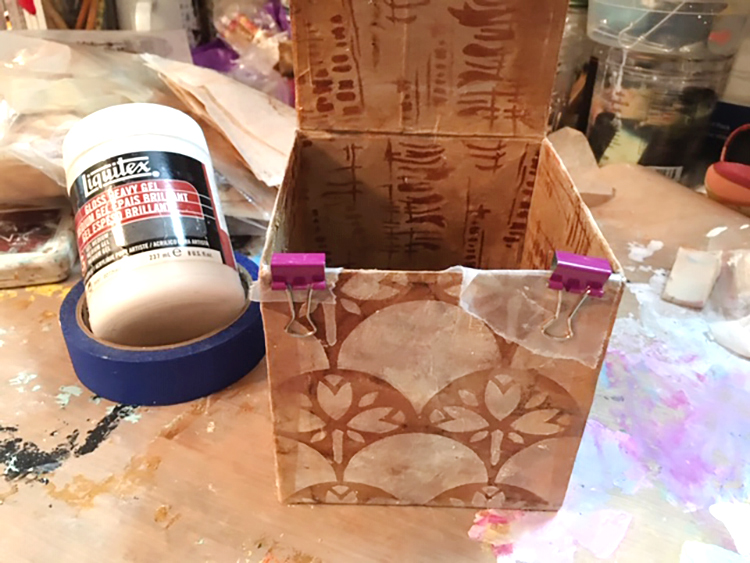
I glued the box and tabs together with Liquitex gloss heavy gel, used small clips and little pieces of waxed paper to keep the clips from sticking to the box, and left it overnight to dry. I also added some extra strips of teabag on the untabbed sides to reinforce the box.

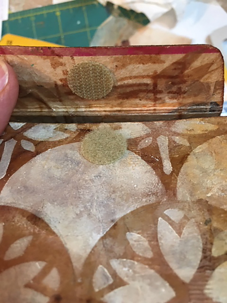
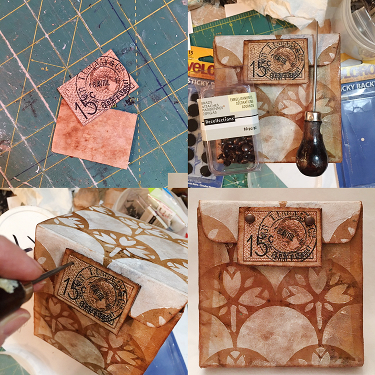
It needed a closure and I thought about what style to use. I could have simply tucked the top front tab inside the box and called it done…but I didn’t.  Since the box is cardboard, I also didn’t want to use something that would wear out, shred or rip over time. The perfect solution was sticky-backed Velcro. I chose some round pieces of tan Velcro from my stash, which matched quite well. I aligned each piece of Velcro carefully, removed the backing, and pressed it in place. It worked perfectly, but I still felt it needed a little more visual interest for the closure.

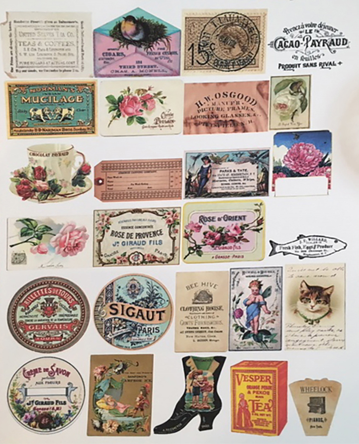
One of my textile design teachers often shouted, “More is More!” to the class, and thinking of her, I decided to embellish the box further. I wanted the closure to be pretty, easy to open, but still hold securely. There was something old-fashioned about the combination of teabags with the Art Nouveau Wallpaper stencil, so I went through my electronic file of vintage images from The Graphics Fairy, printed a sheet of images sized to a 2” scale, then “auditioned” them to see which would go best with the little box.

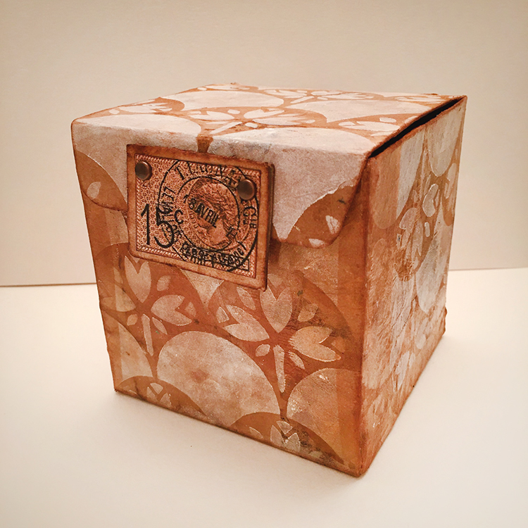
I settled on an image of a French postage stamp and postmark—it was the right color, shape and, I think, actually from the Art Nouveau era. I wanted the closure to have some depth and durability, so I used a small piece of corrugated cardboard cut about ½” larger than the postmark design, covered it with a teabag, edged it with sepia ink, then glued the stamped postmark to the center. I attached the rectangular vintage stamp with the heavy gel at the edge of the front tab, but also added two brads for extra strength and visual interest. Finally, I darkened all of the edges of the box with sepia ink applied using a fingertip dauber.

Would you ever guess that this adorable little Art Nouveau-inspired treasure box was once a family-sized box of Raisin Bran?


Thanks Linda! Love the idea of giving a cereal box a second life! 

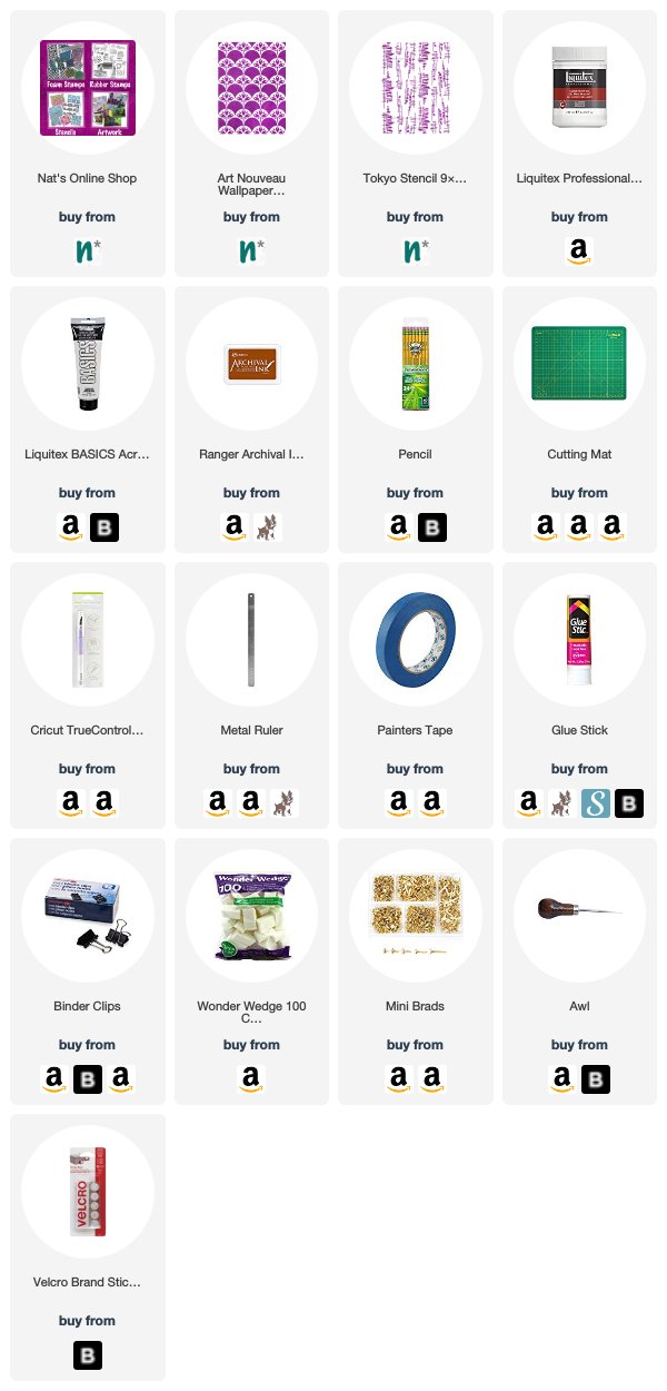
Want to give Linda’s project a try? You can find all my Stencils in my Online Shop and in addition to a discarded box, some cardboard, and a used and dry teabag, here are some of the other supplies she used:

Comments (1)

  • Jill McDowell

    |

    Bravo Linda! Brilliantly designed. I love this project, cereal boxes, tea bags, NATS’s steciks and that stamp! I’m swooning.

    Reply

Leave a comment

Creative JumpStart with the Creative Squad – Nicole Watson

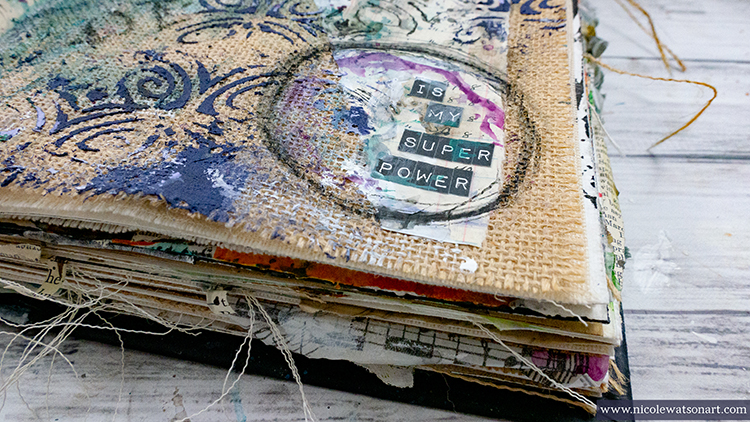
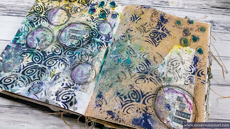
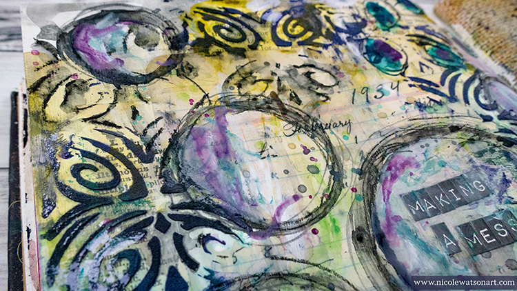
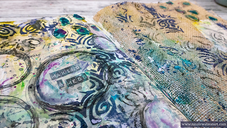
Hello again from my Creative Squad! Today we have Nicole Watson sharing her artist super power with us: making messes! Well we are truly gaga over this scrumptious mess that she’s created in her art journal, using my Art Deco Fairview stencil and this month’s theme: Super Power – this month we are joining Creative JumpStart 2020 and exploring our Artistic Super Powers. It could be your unique technique or style, the way you like to use a medium or tool, or maybe your way of approaching artmaking. What is yours and show us how you use it.


I love the idea that artists have super powers! When walking through a museum, one can usually spot a Monet, van Gogh, Mondrian, Cassatt, O’Keeffe, Rothko, etc. without even looking at the information card. The same is true today. When scrolling through Instagram, I can often tell who the artist is before looking at the user name. How cool is it that we all have unique talents!

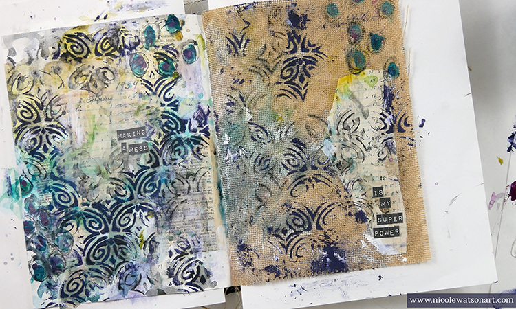
When thinking about my super power, honestly, I struggled. Circles, dripping paint, color mingling, layers, my favorite weapon the stabilo all, gesso, and book text often fill my pages. All of these supplies and techniques come together to create a mess… a mess that often I over-think, want to gesso over, and struggle with where to take it next. This part you don’t see in my pretty pictures and edited videos. This week as I played in my journal using my “super powers,” the struggle was there. The mess appeared. Thoughts of defeat and wanting to start over filled my head. I’m sure you can identify! However, the thing about an art journal that we often forget is that it’s for exploring, journaling, playing with ideas… and creating messes! Not everything has to be a masterpiece. Often, it’s in taming the mess, that new ideas are formed and discoveries are made. Don’t let that mess stop you from creating. Use it as a way to learn and grow as an artist. I like the idea of turning something negative, into something positive. (Remind me that when I make my next mess!)

This week I decided that though there are several techniques and tools that I might be known for, making messes is my super power! And, here’s how I made this one. Check out my video and then read my how to below:

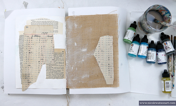
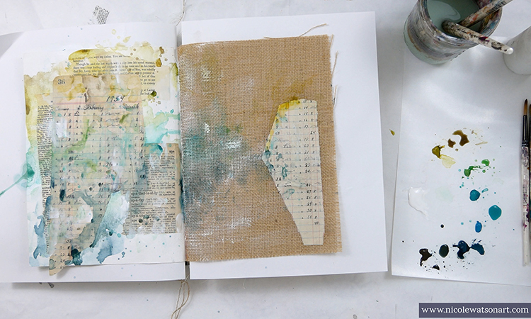
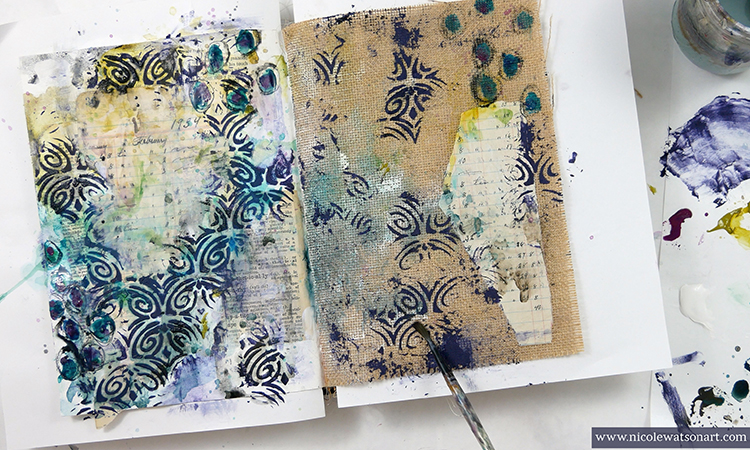
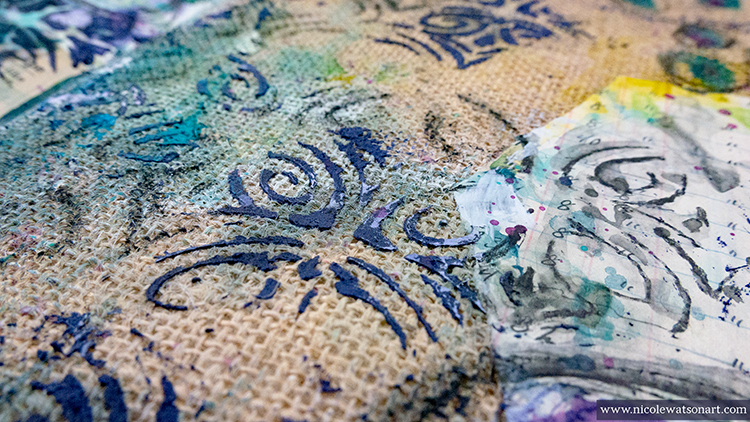
I used a journal spread where a white (watercolor) paper and a burlap page came together in my Dina Wakley Media journal. Before collaging the book pages, I gessoed the white page and spread a bit of the gesso on the burlap for fun. Then, I began to add some book text with matte medium and used a heavier gel medium to add a piece onto the burlap side.

Next, I chose a cool color palette to play with. I really enjoy the process of playing with color and letting it mingle on my pages. I also added gesso at times. When I was finished layering color on the pages, I pulled out Nathalie’s new Art Deco Fairview stencil.

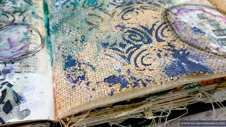
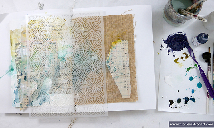
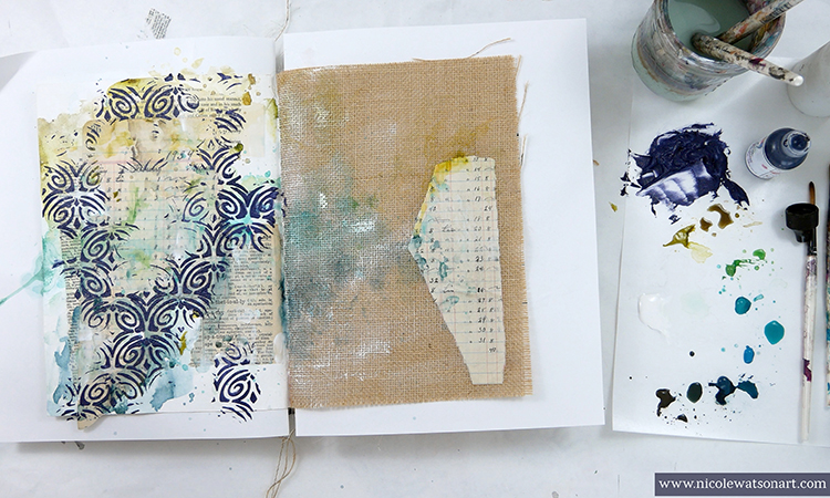
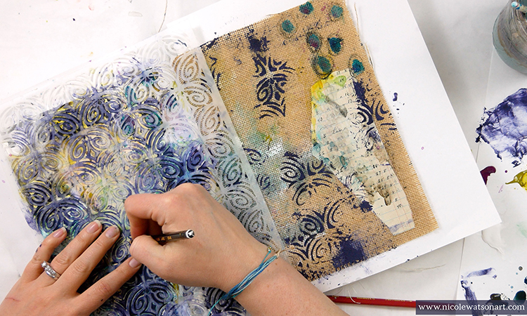
I wanted to add some texture and dimension with the pattern, so I used light molding paste through the stencil. I decided to color the paste with paint so it would pop even more. I spread a thin layer with my palette knife randomly on both pages. Since the molding paste is white and not clear, my dark blue paint ended up looking more purple (first mess accomplished).

To make the random stencil look a little more intentional and perhaps like it was crackling or breaking off the page, I scraped it here and there with my palette knife and smoothed some out with a baby wipe. I also added extra paste in places outside the stencil.

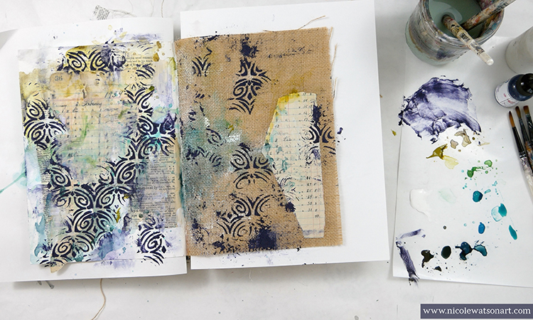
Then, I needed to think. So, I made some marks with paint and my stabilo all (mess number two). In the process of activating the stabilo, I decided to use one of my favorite techniques that I call the “stabilo puddle.” I scribbled some stabilo on my palette paper and activated it to make a puddle. I used this to shade around the stenciled areas to make it look a bit grungier. Ah-ha! This grunge helped darken the purple molding paste.

Since I liked the direction this stabilo was heading, I grabbed the stencil again and used the stabilo to trace the design. It was easy to put the stencil back on the pages since the paste fit right back into the empty spaces. I randomly chose areas to trace in to add to that worn, peeling look. Then, I activated the stabilo with water.

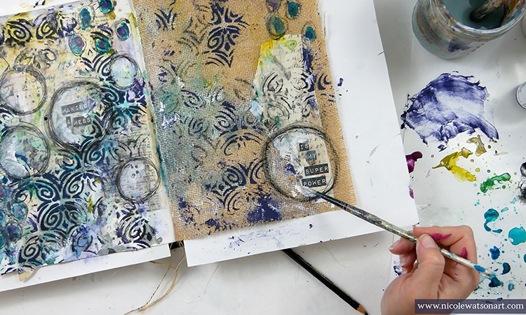
Several messes later, after adding some more paint, flicking color, gesso and stabilo, I decided to label the pages with my official super power. After sticking the letters down, I used the stabilo to draw circles, shaded them with gesso and then again with a contrasting warm color to make them pop.

Mess accomplished!


Thank you Nicole – we LOVE what you do with messes :) 

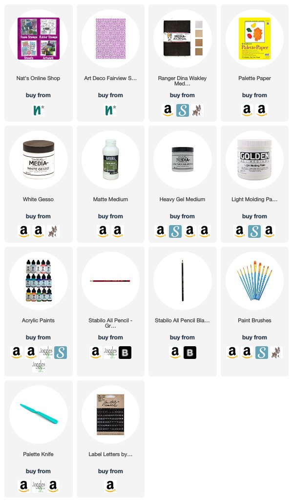
Want to give Nicole’s project a try? You can find all my Stencils in my Online Shop and in addition to book page/ephemera, here are some of the other supplies Nicole used:

Feel inspired? Playing along with Creative JumpStart and the Creative Squad? Working on something yourself that you’d like to share?  I love to see how you interpret our monthly themes. Email me how you used my stencils and stamps with the theme and email me an image – I would love to share your projects in my next  “n*Spiration From Around the Globe“.
Leave a comment