
Creative Squad

Colors Are My Friends – Josefine Fouarge


Hello my friends and welcome to a post from new Creative Squad member Josefine Fouarge! Josefine brings us a gorgeous art journal page that shows off how well complimentary colors play together. She also rocks my new Central Avenue Positive Negative foam stamp set and this month’s theme: Colors Are My Friends – Let’s kick off the new Creative Squad with a celebration of color! What are your favorite, go-to signature hues? Let’s go bold and bright this month and  use color to ring in a new season of inspiring projects!


Colors are my friends, definitely! My favorite one depends on my mood, but usually I tend to pick orange or green tones. Today I wanted to use my favorite color combination though, which is orange and blue. These are complimentary colors, which means they naturally work well together.

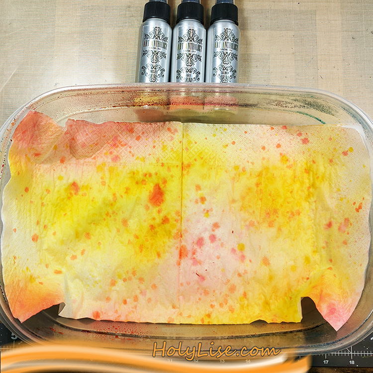
Since today I have something with flowers in my head, I wanted to use the new circle foam stamps to create a flower in my art journal. I started by spraying some color onto a few napkins and letting them dry for a few minutes.
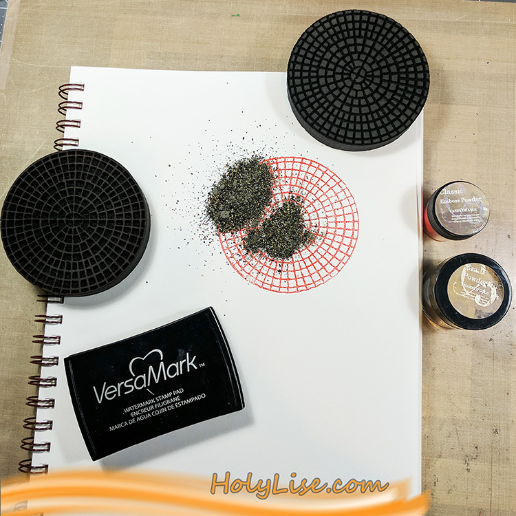
While I was waiting for the napkins to dry, I worked on the background of my art journal page. I started with the focal point, so I stamped the outline of the Central Avenue stamp using Versamark ink and heat embossed it using bright orange embossing powder. Then I stamped the inside of the stamp also with Versamark ink and heat embossed it with a gold embossing powder.

This stamp is rather easy to align, even though it’s a round shape. You can see where the main line goes through the middle and you just need to ensure that the little squares of the negative stamp match the squares on the paper. If you look at the stamp from the side while trying to position it on the paper, you’ll know what I mean.
After heat setting the focal point, I chose a turquoise acrylic paint and mixed it with some white to make it even lighter. After adding the paint to the foam stamp using a brayer, I stamped the outline to the left and right of my focal point. Next, I stamped the inside in a row below and above the first row and switched again for the next row – and so on till the paper was full of circles.

Now I outlined the page with a black acrylic pen and scribbled following poem around it, as messy as I could:

To see the world in a grain of sand

and heaven in a wildflower,

hold infinity in the palm of your hand

and eternity in an hour.

-William Blake-
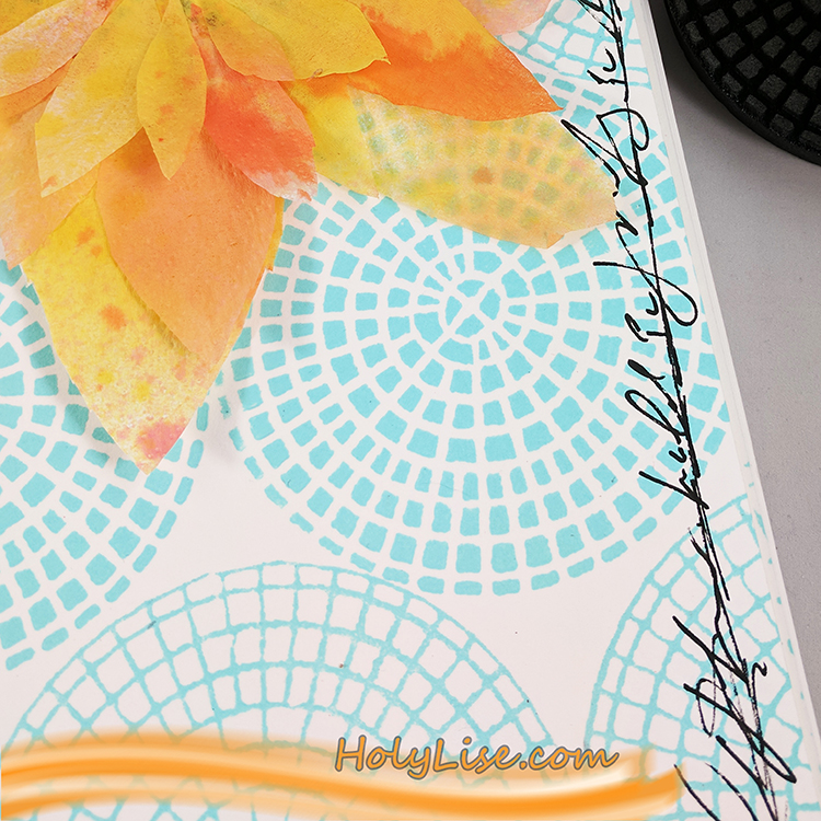
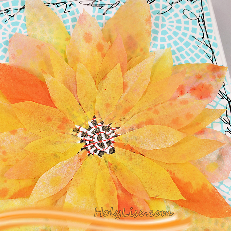
To finish up my flower, I cut several petals from my napkin and adhered them carefully around the focal point circle.

If you look closely, you’ll see that I adhered just one layer of the napkin to the page, so the embossing powder shimmers through the paper.
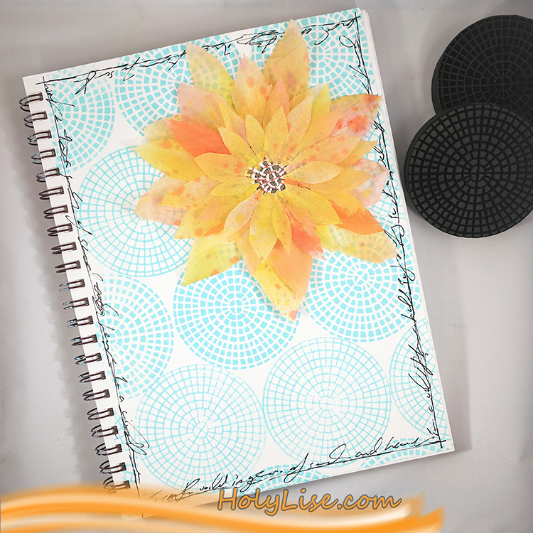
Here is the entire page. I just love the contrast of orange and blue and can’t get enough of it! Yummy!

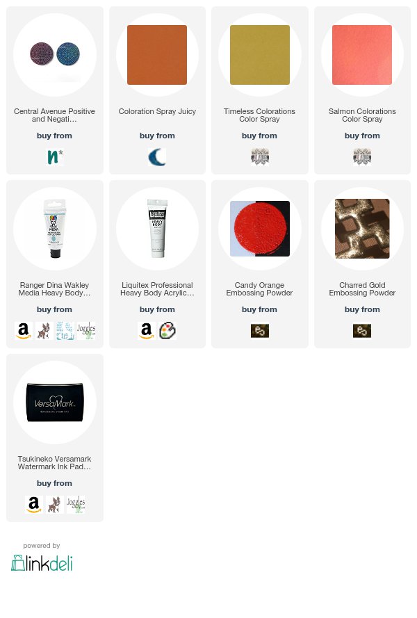
Thank you Josefine for such a lovely page and for sharing the poem too! In addition to her art journal and some paper napkins and glue, Josefine used the following supplies (some are affiliate links):


Play along with us too: I love to see how you interpret our monthly themes. Email me how you used my stencils and stamps with the theme and email me an image – I would love to share your projects in my next  “n*Spiration From Around the Globe“.

Comments (2)

Leave a comment

Best Adventure EVER – Art Journal

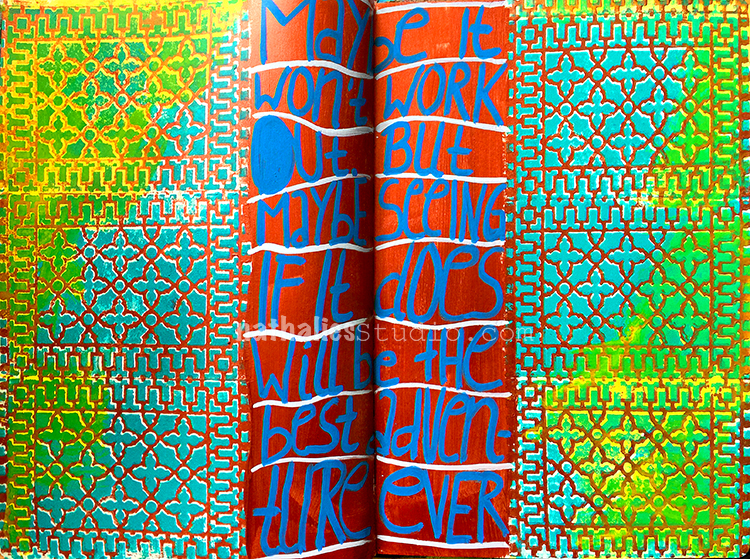
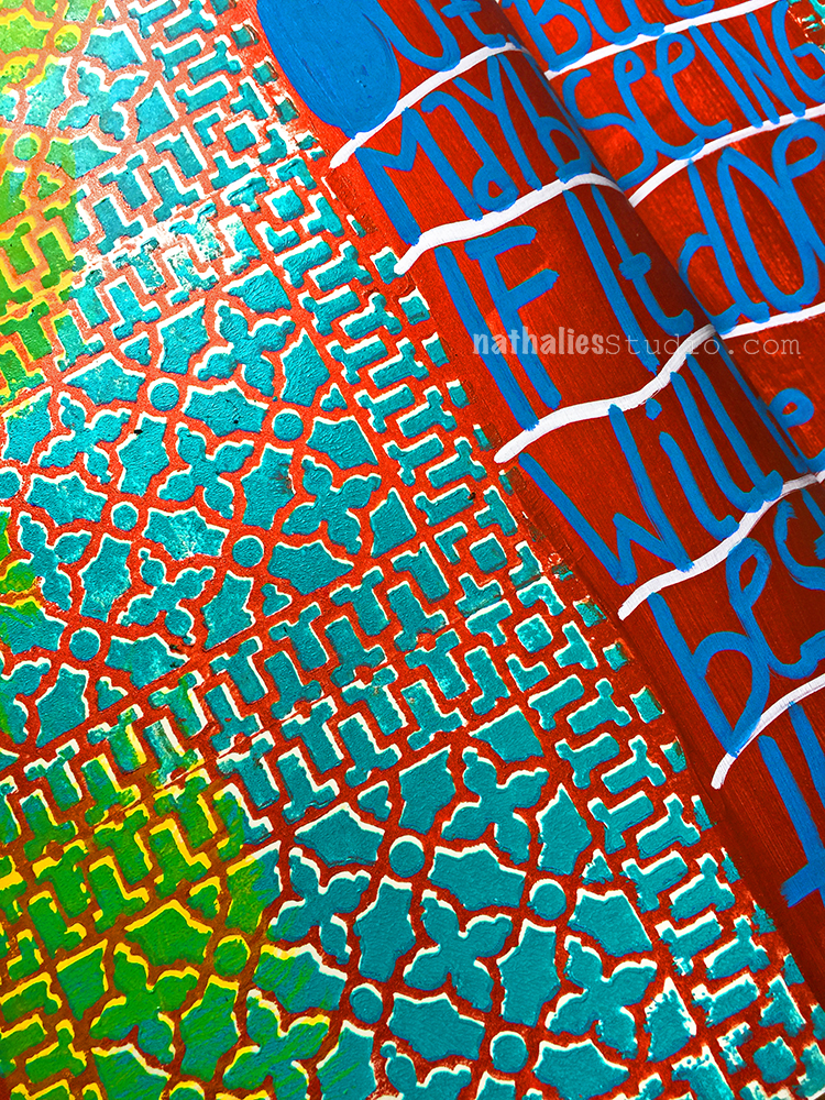
“Maybe it won’t work out. But maybe seeing if it does will be the best adventure ever.”
Love this – I think that sums up a lot of things that I have done in my life so far …love my artful adventures and believe me…many didn’t quite work out- LOL

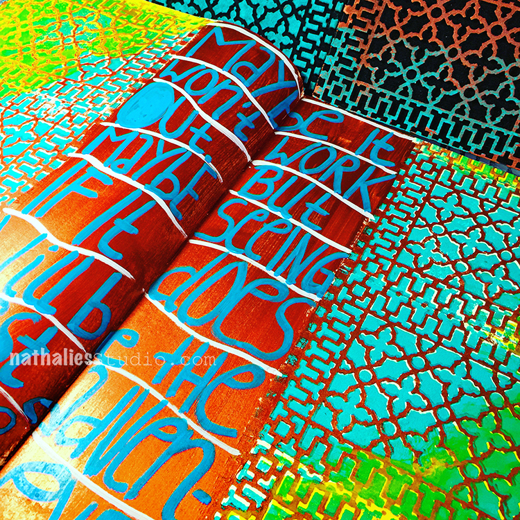
I am totally in pattern heaven using my brand new Downtown Positive and Negative Foam Stamp Set. I love how the two stamps stamped on top of each other in copper and teal make up for such a beautiful intricate pattern.

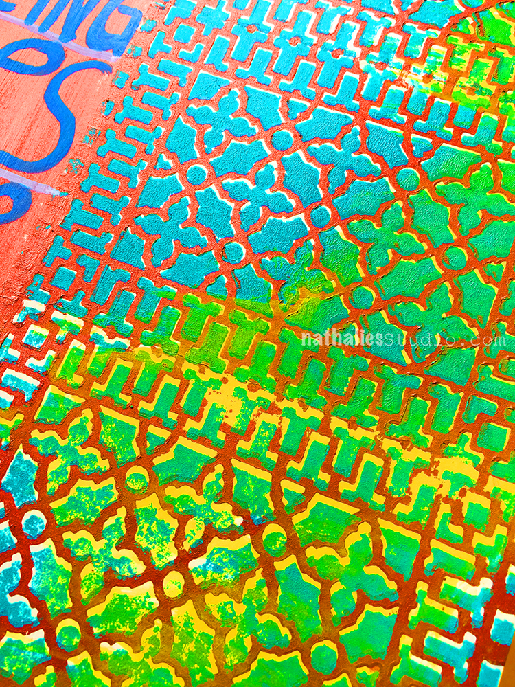
I added some yellow ink here and there after the stamped areas dired and I love how it added another color and interest.

Stamping it a bit offset and given the fact that a foam stamp reveals texture I love how the effect is so dimensional and looks almost as if the image is raised and jumps off the page. One happy Nat on this one.

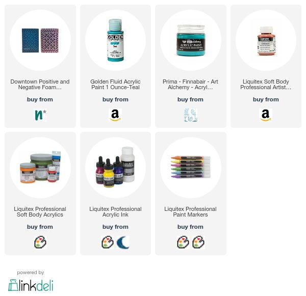
Here are some of the supplies I used for this spread:


Have an adventurous day!

Comments (6)

  • stephanie

    |

    LOVE the hand written words.

    Reply

  • Sue Clarke

    |

    Love the words and the color mix!!!

    Reply

    • nathalie-kalbach

      |

      That color mix totally got me- LOL- cannot stop using it :) Thanks Sue!

      Reply

  • Nancy G.

    |

    Great page for the sentiment, colors and patterns!

    Reply

Leave a comment

Art Journal Page – Game Changer

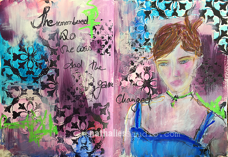
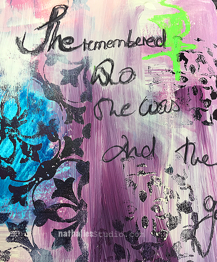
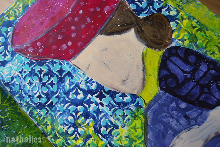
“She remembered who she was and the game changed”

This pages started out from a demo page showing my Versailles Stamp Set and when I got I further painted on the spread.

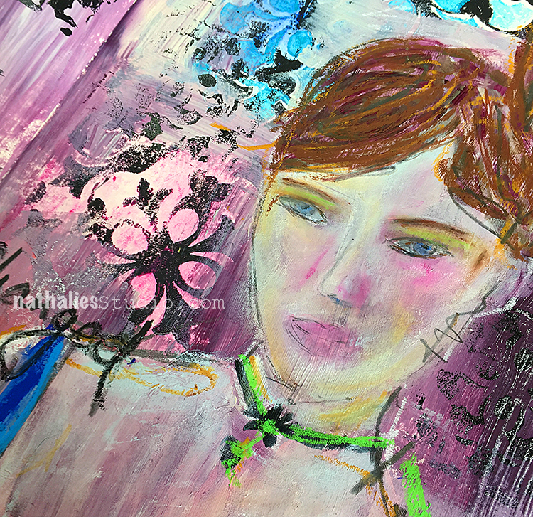
I panted with acrylic paint but also used my new Caran D’Ache Watercolor Pencils to color in some between some of the stamped areas.

I painted the girl using acrylic paint and some oil pastels- I think I refound my love for them :)

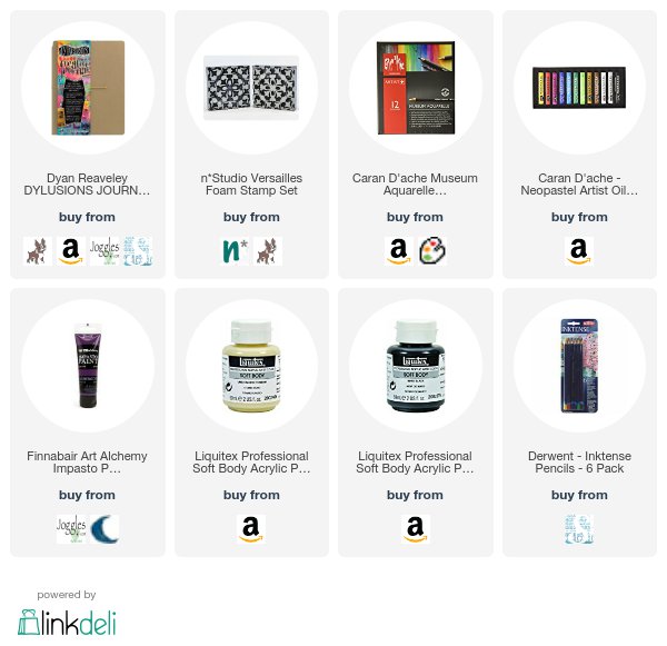
Here are some of the supplies I used


Wishing you a fantastic day!!!

Leave a comment

NEW ArtFoamies Stamps – City Streets


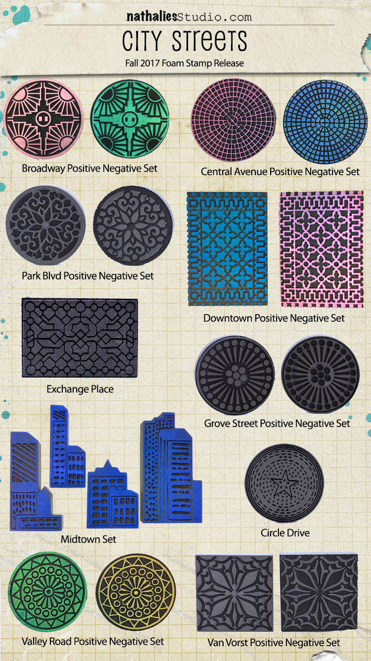
They’re here! My latest foam stamp designs with ArtFoamies are in stock and ready to ship.

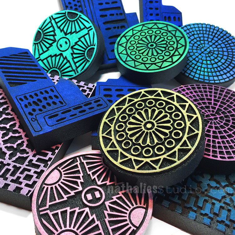
Get the City Streets stamps here.  These stamps are all based on manhole covers and grates that I’ve photographed over the years on my Stroll Through the Hood excursions. Many of them are sets of positive and negative designs so you can layer them up in cool ways. All of them are really nifty versatile patterns that could be focal points, backgrounds, you name it. The Midtown Mini Set is 4 stamps that you can arrange any way you like to create a cityscape of your design. Most of the names come from places and streets right around my own Hood.

And… I’ll be introducing the stamps and showing them on my Kaffeeklatsch Facebook Live event this Wednesday, September 20th at 4pm EST. Join me for a chat – it’s been a while!

I’ll also be talking about my inspiring road trip that I took recently in the American Southwest, my upcoming Workshop at Nat’s (Yes, I’m hosting a workshop at my place!), and a couple other things. Drop in, say hello, I’d love to see you there :)

Wednesday, September 20th at 4pm EST.

Comments (4)

Leave a comment

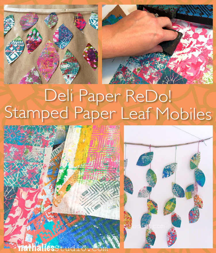
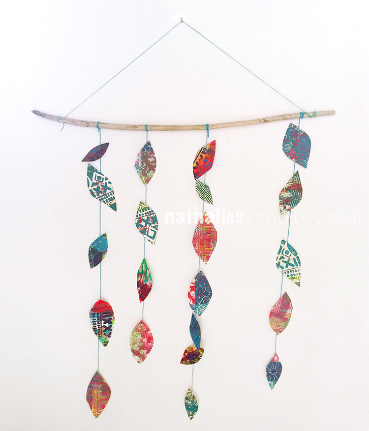
Deli Paper ReDo! Stamped Paper Leaf Mobiles

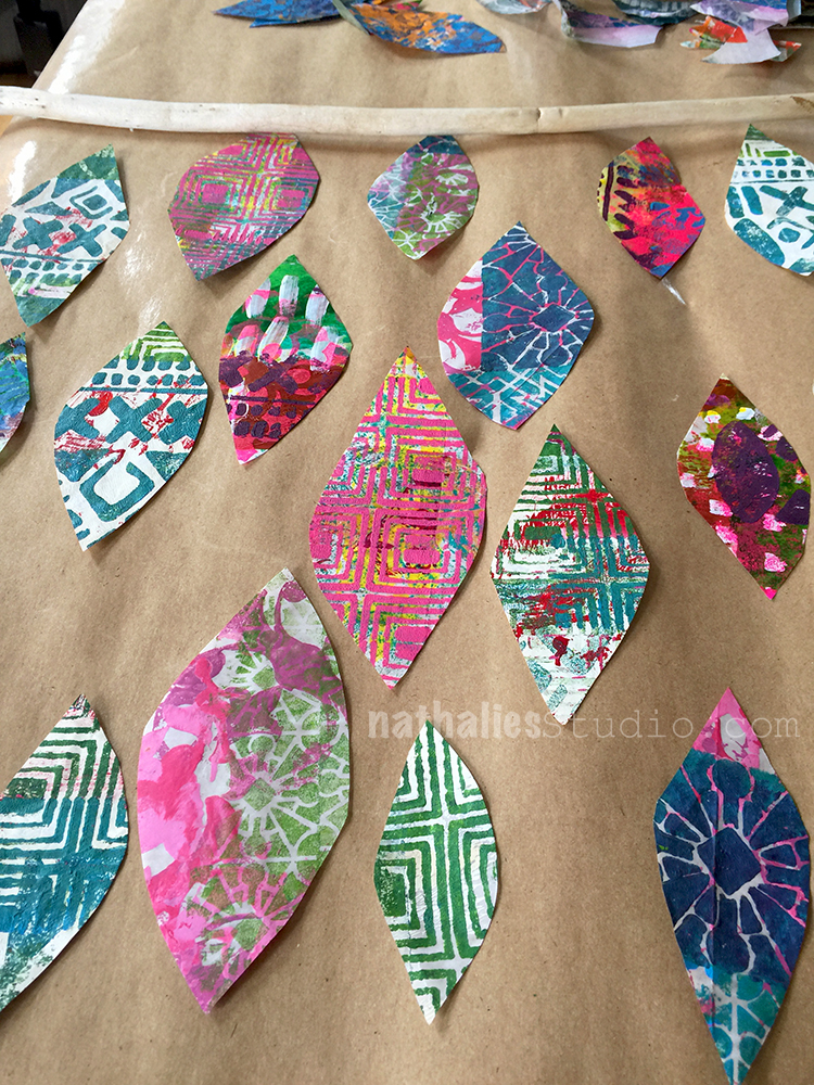
A couple weeks ago Kim and I had yet another play date and we decided to use up some of left over painted deli paper and make stamped paper leaf mobiles.

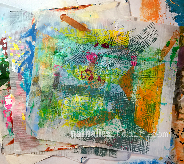
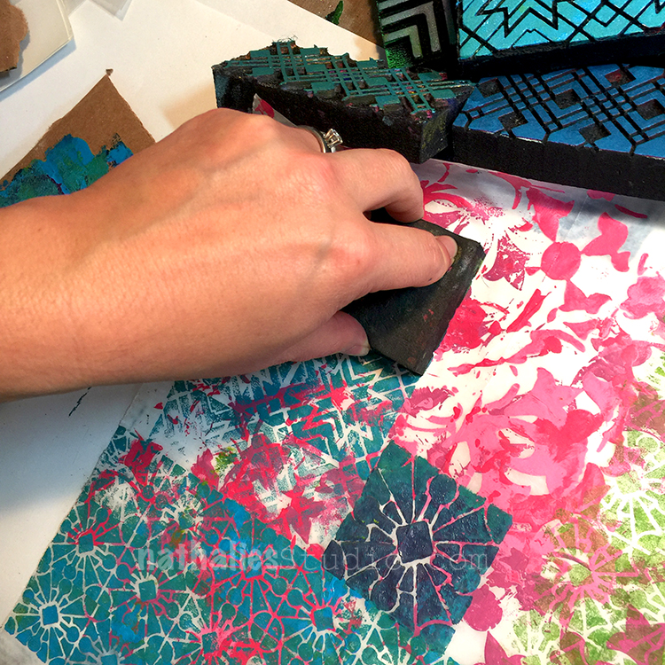
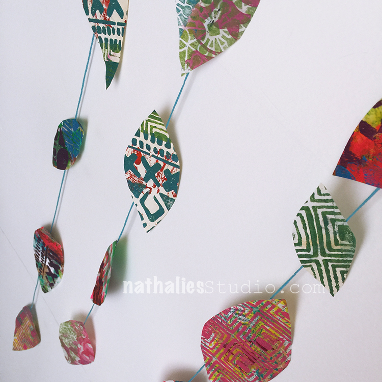
Often when creating I clean off left over paint or inked stamps on top of deli paper and those were the perfect pieces to enhance further by stamping with my foam stamps.

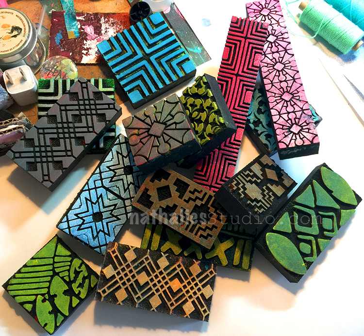
we grabbed all my Art Foamies Mini Foam Stamps and the border Foam Stamps.


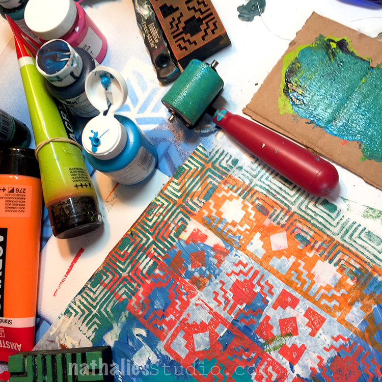
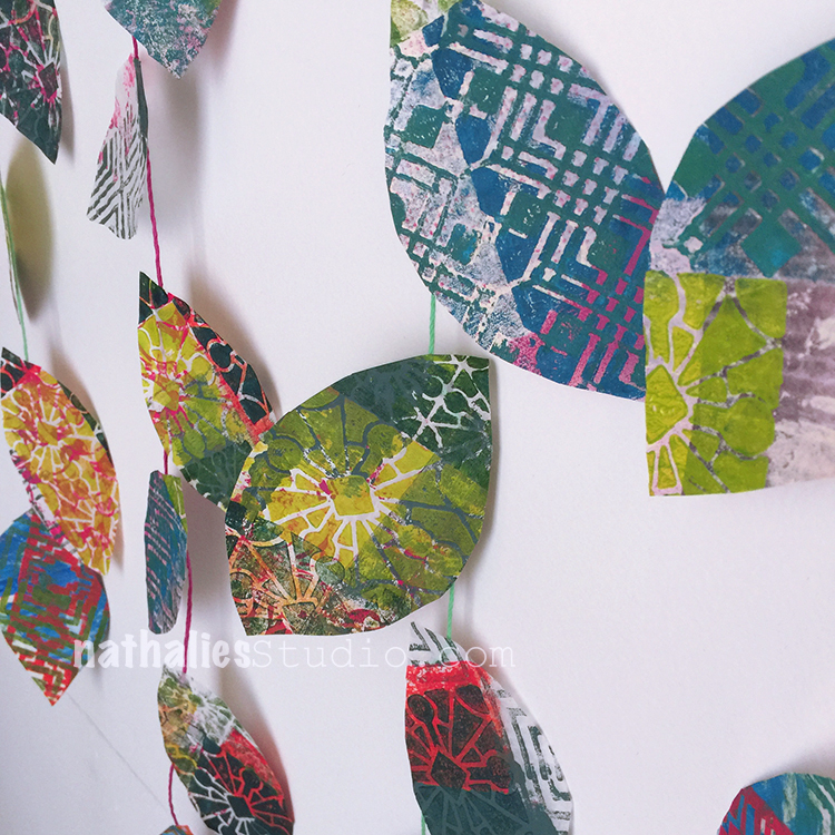
and stamped with them with acrylic paint on top of the deli paper.

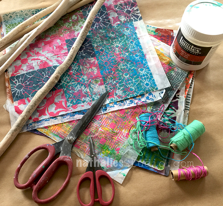
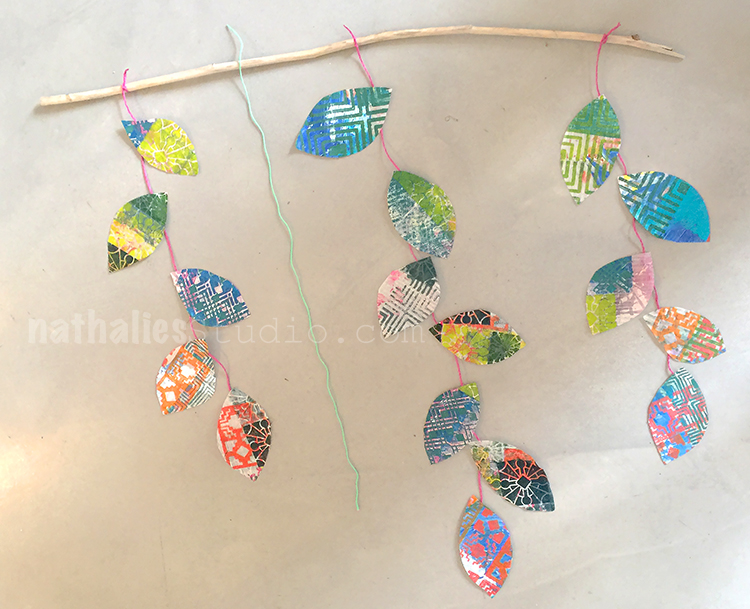
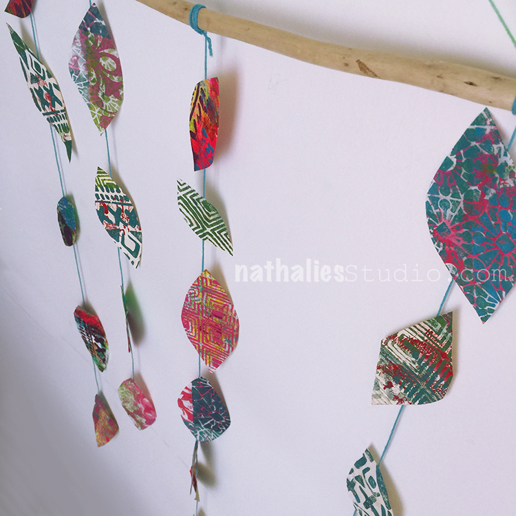
Kim had found some really beautiful drift wood branches at the beach and also gathered some thread, matte gel, scissors and tape.

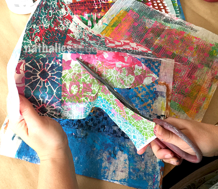
We freehand cut out leaves

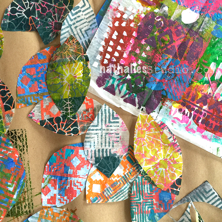
We sorted them a bit by color and pattern to see which ones would look best together

And then arranged them loosely to see how they would best look like when hanged.

We added string to the branches making loose knots and then added the leaves with tape to the strings.

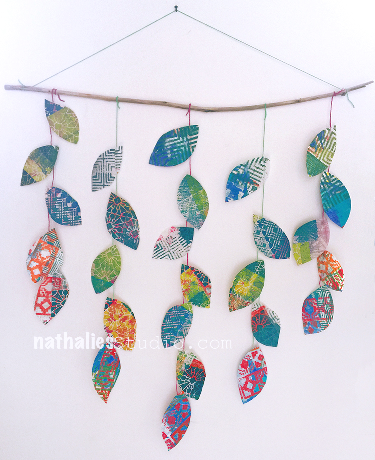
Once we were happy with the result we secured the strings with gel medium to be held in place and hung up the mobiles.

Love the little colorful home decor as a transition piece from summer to fall decor

It was a fun and super easy project.

A great way to use some left over deli paper and also to do with kids.

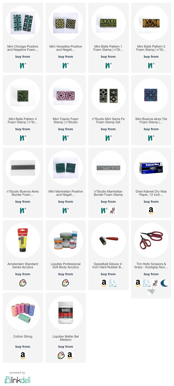
Hope you enjoyed our little play date as much as we did. Here are some of the supplies we used.


Comments (4)

Leave a comment

I just want … – Art Journal Spread

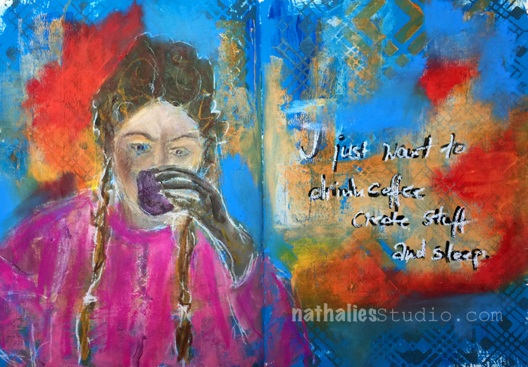
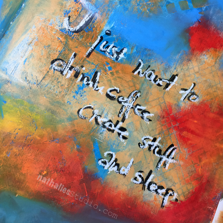
I just want to drink coffee, create stuff and sleep – oh yes ;) I loved creating this spread.

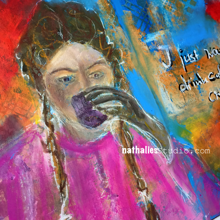
I started off with a simple blue background painted with acrylic paint and then added some orange and stamped and stenciled with my Chicago Foam Stamps and Stencil. Then I painted the girl (yes stop your horses, I painted a face- LOL) …and added some of my brand new Caran D’Ache NeoPastel Oil Pastels- OMG – I am in love – the colors are so amazing and they are like buttttahhh!

I seriously had to tell myself to stop adding more and more. I added some marks and scribbles with a white China Marker – I love that General China Markers are made right here in Jersey City.

Here are some of the supplies I used:


Comments (4)

  • Karen Bearse

    |

    The colors are really interesting and vibrant. Great job on the face and love the quote cause me too!

    Reply

    • nathalie-kalbach

      |

      Thank you so much Karen! Right? Who doesn’t want to drink coffee, sleep and create all day ;)

      Reply

  • Sue Clarke

    |

    Love the face and the colors you used!

    Reply

    • nathalie-kalbach

      |

      Thank you so much Sue! Hope you had a wonderful weekend!

      Reply

Leave a comment

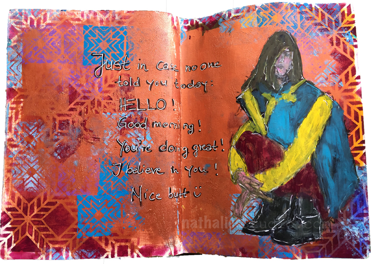
Just in Case or In My Art Journal Today

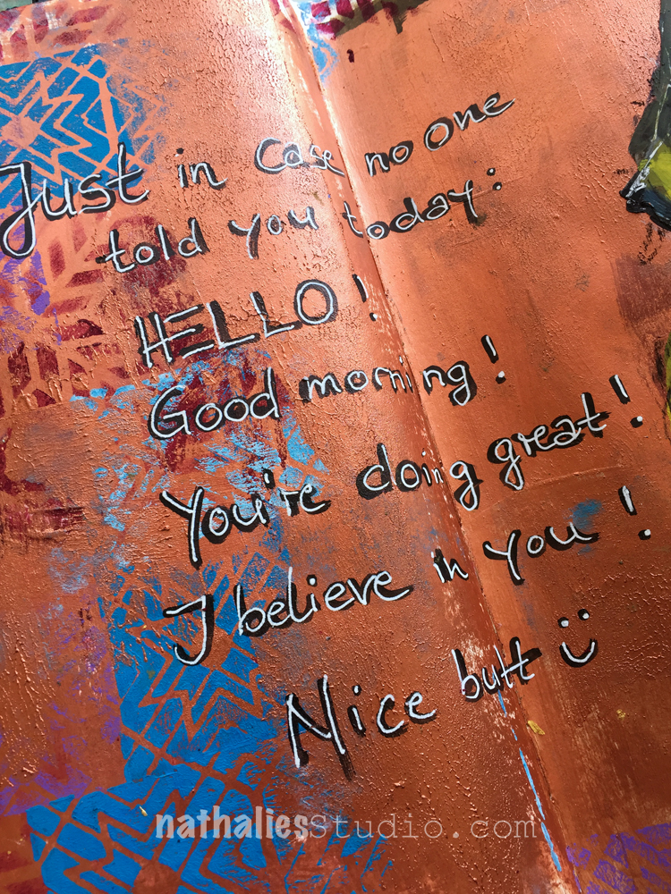
“Just in case no one told you today: Hello! Good Morning! You are doing great! I believe in you ! Nice butt :) ”

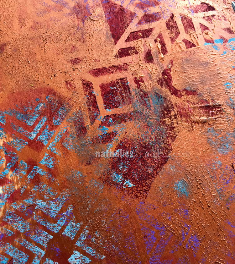
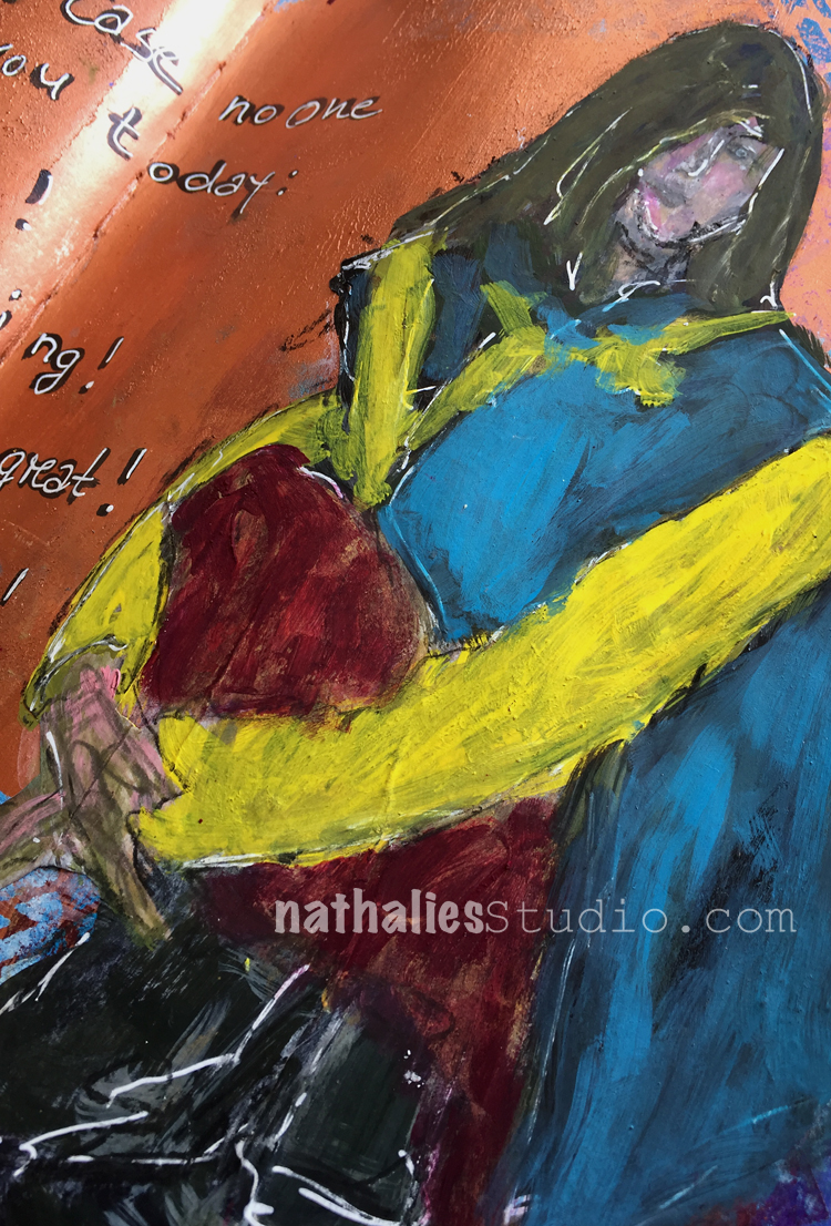
Played with paint, which I applied partly with a cosmetic sponge to create some texture and then also stenciled and stamped with acrylic paint.

I wanted to see how certain colors look with my metallic paint which I had made in my Acrylic Paint workshop recently. I like the blue and purple the deep red not so much …but it was fun  trying :)

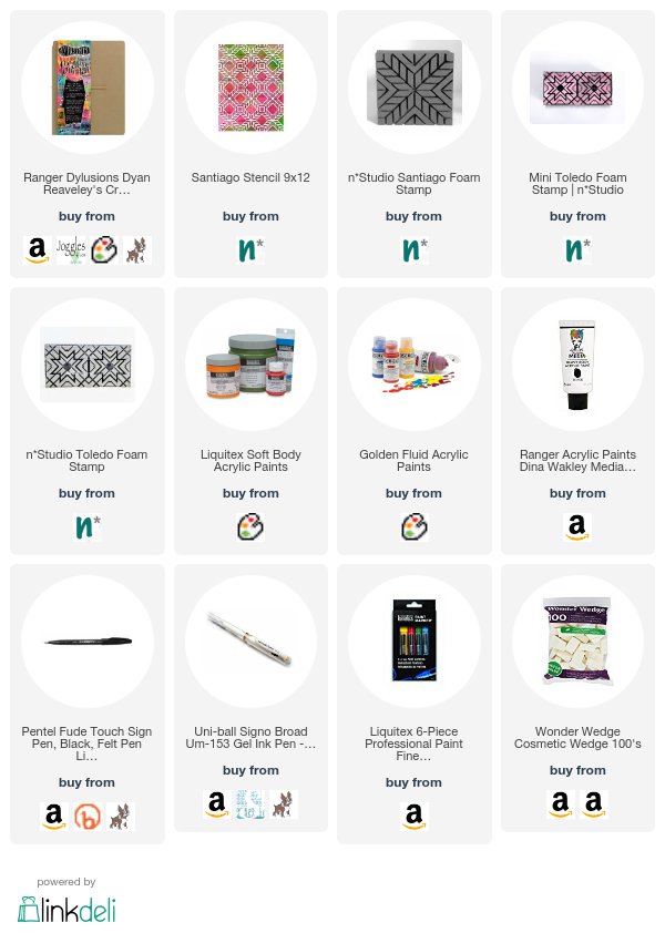
Here are some of the supplies I used – some links are affiliate links:


Hope you have a gorgeous day :)

Comments (4)

  • Jackie P Neal

    |

    I laughed so hard when I saw this page! haahaa Thank you- yours is not bad as well! heeheee “)

    Reply

  • Faigie

    |

    NatalieI just wanted to make you aware of a funny spelling error in you post so you can fix it. I know English is not your first language so you wouldn’t realize it. You wrote nice butt. When it should be nice but. A butt is a rear end ??

    Reply

    • nathalie-kalbach

      |

      Faige, thank you for your concern. If you look closely again though, you will realize that there is a smiley face behind the “BUTT”- which should indicate that I indeed meant the rear end …Happy weekend, Nathalie

      Reply

Leave a comment

Stamping Up a Storm – DIY Napkins and Kitchen Towels

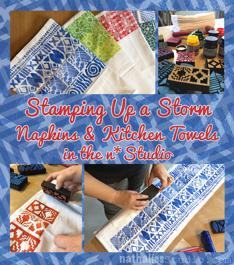
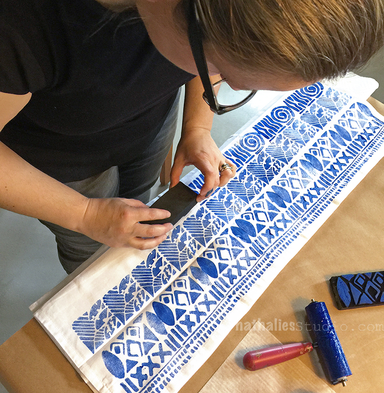
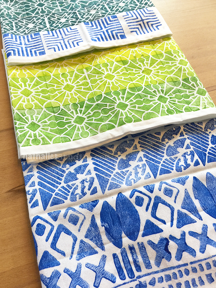
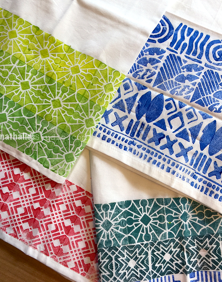
By now my friend Kim and I made it a habit to meet every couple weeks for a fun project and I love this so much. This time we decided to make some napkins and kitchen towels.

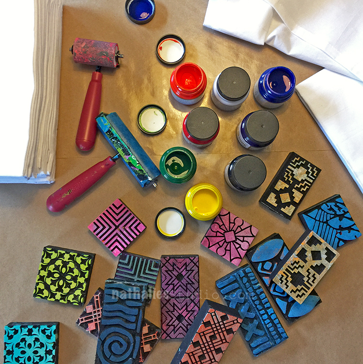
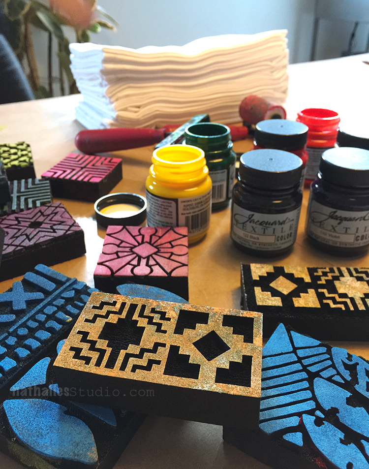
We got some fabric paint and nice white kitchen towels which can also serve as nice big napkins and started playing.

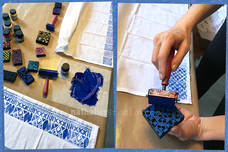
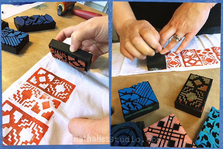
Using my ArtFoamies Minis on those were the perfect pick. Foam Stamps work so well on fabric!

The size is great and it was a quick and fun way to enhance the fabric.

The fabric paint we used was a little bit too fluid for our taste but it actually worked well – after brayering the paint on top of the stamp we went sometimes with a cotton swap over the stamp to even out some areas or even to take off some paint if it seemed too much. At the end of the day this is a handmade result- so hey- let go of perfectionism :)

Because the paint is a bit thin it tends to seep through the fabric- so putting something for protection underneath the area you stamp when you layer up your fabric is a good idea. We just used paper towels.

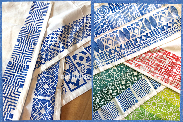
We both especially liked the blue.

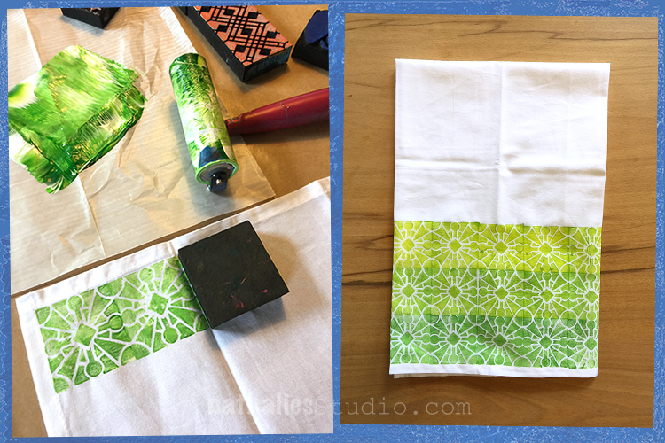
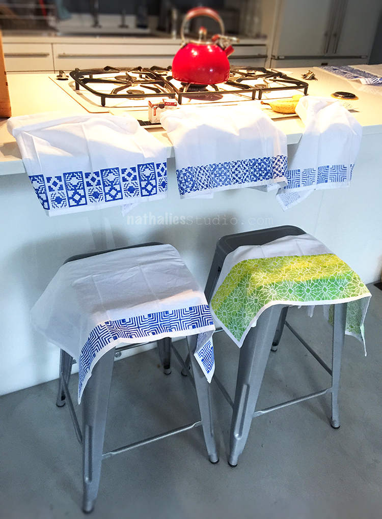
But also adding more and more white and yellow to the dark green after each row was fun for getting a kind of ombre effect. I love this.

It didn’t take long for the paint to dry and after following the directions on the paint jars to iron the back side of the printed fabric, and then washing them- they are ready to be used.


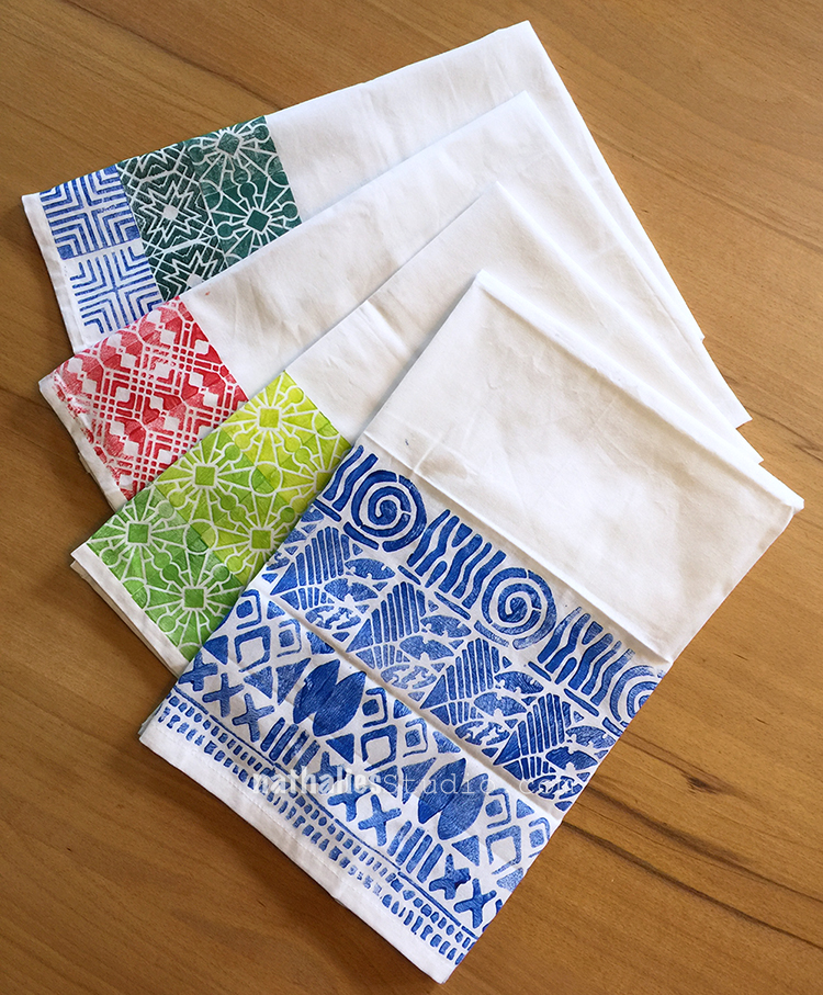
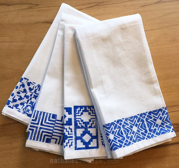
Here are some napkins- I love the set -even though the patterns are different they belong together due to the same color. For the napkins we mostly only printed one row.

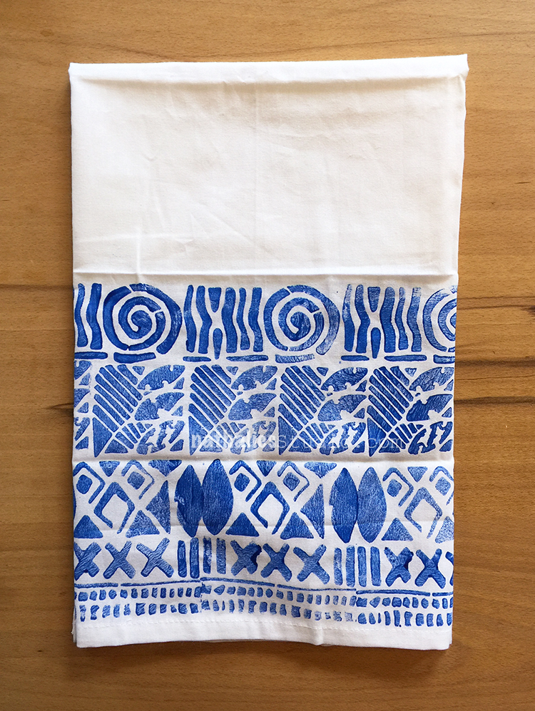
For the kitchen towels we added a bit more

Aren’t they fun?

I will definitely make more of those- they make a really good  and personalized gift too. Hope you like Kim and my little project – we already scheduled the next one :)

Here are the supplies I used:


Comments (6)

  • Ally

    |

    Pure awesomeness!!!

    Reply

  • Klara

    |

    I love these so much! Green set and blue set are my favorites! What a fantastic idea!

    Reply

  • Stephanie

    |

    What a great idea! Thanks Nat

    Reply

  • margaret griffiths

    |

    OK I love your stamps!!! I guess its time to go buy them…
    Thanks, for the wonderful website and ideas

    Reply

Leave a comment

No Reason to Avoid Influence – Art Journal Spread

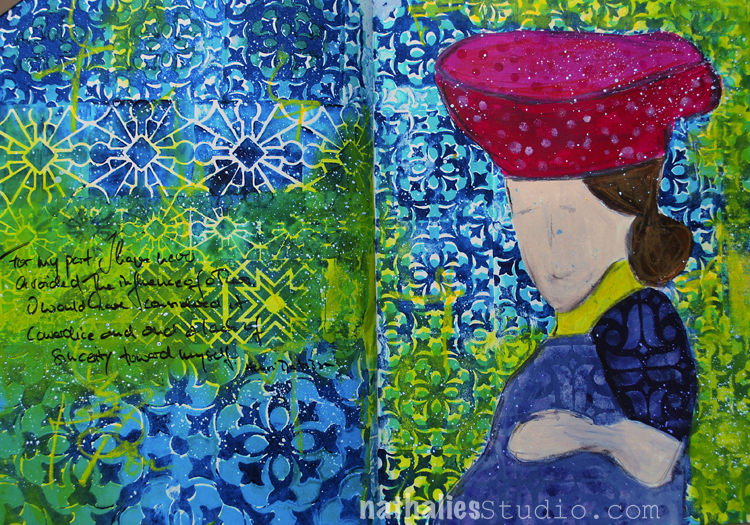
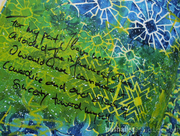
“For my part I have never avoided the influence of others. I would have considered it cowardice and a lack of sincerity toward myself” Henri Matisse

Some stamping with several of my ArtFoamies Stamps including my new super cute Versailles Positive and Negative Mini Stamps. I used only two colors of the stamping and once I filled up both pages, I painted with some yellow acrylic ink over part, which turned green over the blue and stayed yellow in the white off -set stamped areas.

I like how this spread turned out- it was fun. Here are some of the supplies I used – some of the links are affiliate links:


Have a wonderful creative day!

Comments (2)

  • Julie B

    |

    Love the mix/matching of the various sizes of Versailles stamp with a little Buenos Aires for interest. Thank you again for the inspiration.

    Reply

Leave a comment