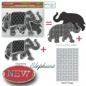
Creative Squad

Say Yes to New Adventures – Gwen Lafleur

CS August Say Yes

It’s Tuesday and time for my Creative Squad to share a project with you with this month’s theme: “Say Yes to New Adventures”. Throughout the month of August, the team will use any of my n*Studio Stamps and Stencils they would like to use to interpret the theme. Here in the northern hemisphere, summer is coming to a close and it’s about time to seize the days and go on a little adventure before hibernation! With this in mind, the team will create something that celebrates the spirit of adventure.  Maybe they took a trip recently that included some unexpected twists and turns, maybe they like to live the adventurous life every day, or maybe their idea of adventure is as simple as trying a new brand of tea. Whatever they do to “live on the edge” is appropriate fodder for this one.

This week we bring you Gwen Lafleur‘s gorgeous art journal spread that might inspire you to journey to far-off places!

—————————————————————————————————

Gwen August Headshot

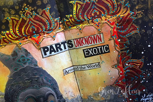
This month’s theme around new adventures might as well have been tailor made for me! For most of my life I’ve never really considered myself an adventurous person… I’m not interested in thrill seeking or eating really bizarre foods, but in the last few years I’ve realized that I’m much more adventurous than I ever thought; I love to travel and see new places, try new food, and explore new cultures. I try and take a trip every year, and pretty soon I’m taking a really big, slightly off the beaten path kind of trip that’s been in the works for about two years! Thinking about that, I really wanted to make an art journal page that would demonstrate my love of travel adventures.

Adventure Art Journal Spread - Close-up 1 - Gwen Lafleur

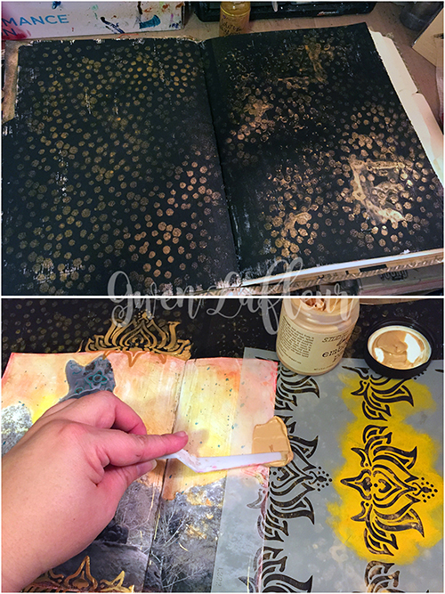
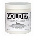
To start, I gesso’d the pages of my 9×12 handmade journal with black gesso and when that was dry, I took Nat’s What’s the Point? stencil and some gold spray ink and added lots of gold dots all over the background.
Adventure Art Journal Spread - Steps 1-2 - Gwen Lafleur
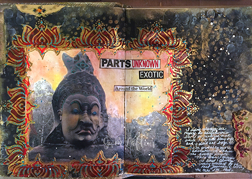
I had already chosen my photo for this spread – I used a picture I took in Cambodia two years ago that I altered and tinted in a class with Seth Apter. I used matte medium to adhere that firmly to the page. When that was dry, I used the Lily Wallpaper stencil along with some gold embossing paste to create a frame all around my photo. I did this in two shifts so that I didn’t mess things up trying to stencil with wet paste on the page. I love the effect I got from that! I also glued in some travel and adventure words and phrases I’d cut from a magazine to really reinforce the theme.
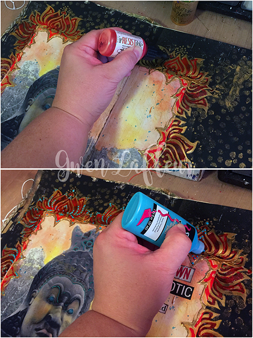
Adventure Art Journal Spread - Steps 3-4 - Gwen Lafleur
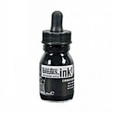
When all of the embossing paste was dry, I used an irRESISTible Pico Embellisher in Morocco to color in the open areas in the stenciled frame. This was a fun way to pull another color out of my photo and add some visual interest. Of course, that was followed up with dots made with dimensional fabric paint (I can’t resist the dots!) Just a side note, when I use dimensional paints (or really anything glossy,) I lightly wax the finished spread so the pages don’t stick together.
Adventure Art Journal Spread - Steps 5-6 - Gwen Lafleur
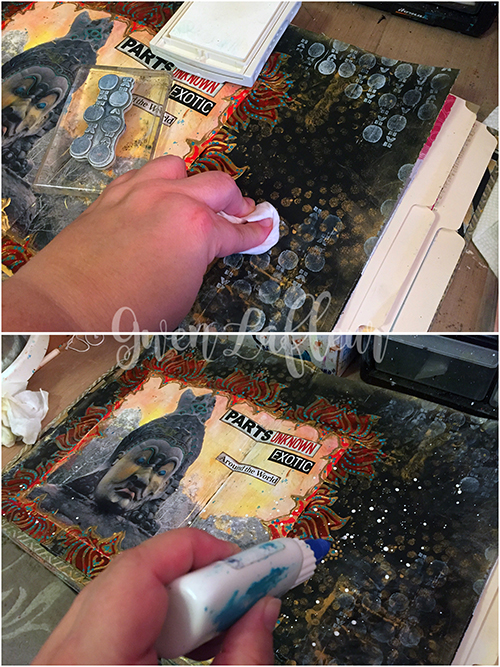
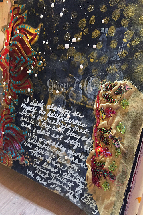
I wanted to add a few more finishing touches before doing my journaling. I used some white ink with an image from Nathalie’s Marks rubber stamp set and stamped in a few places around the page. Then I took a baby wipe and knocked the ink back a bit so that it wasn’t quite so strong and competing with the photo. I threw some clear embossing powder over it and heated since I still wanted to work on top (you need to heat set or emboss pigment inks on top of acrylic, otherwise they’ll wipe off with mediums, baby wipes, etc…) Finally, some splatters of white paint to kind of unify the whole thing. Then I just added my journaling with a white pen, glued on a few scraps of sequined fabric, and edged the page with gold ink. Voila! Finished art journal spread!
Adventure Art Journal Spread - Close-up 2 - Gwen Lafleur
I hope you enjoyed today’s project… I know I did! Now I’m off to begin my countdown for my next adventure!
Adventure Art Journal Spread - Gwen Lafleur
—————————————————————————————————

Gwen’s art journal spread is so dreamy and exotic – it really reminds me why I love traveling to new places and seeing different cultures.

Gwen used the supplies listed below (some are affiliate links) as well as a Stampin’ Up white craft ink pad:

SuppliesCJS

Maybe you will even play along with us -I would love to see how you interpret our monthly themes. Email me how you used my stencils and stamps with the theme and email me an image – I would love to share your projects in my next “n*Spiration From Around the Globe“.

See you next Tuesday for another project from the Creative Squad!

Comments (3)

  • Anna Friesen

    |

    Gwen, amazing techniques!! You amp everything up to a new level! Does this gold embossing paste keep its sheen? I find many gold mediums are lackluster once dry.

    Reply

  • Denise Spillane

    |

    Oh Gwen, this is so wonderful. I am so enamoured with your style, so exotic and lovely! I love these stencils by Nathalie too! I bought them the mini ute I saw them in a class with Nat.

    Reply

    • gwenlafleur

      |

      Thanks Denise – I really appreciate that! Nathalie definitely has some awesome stencils, doesn’t she?

      Reply

Leave a comment

My Own Drum – Gwen Lafleur

CS June My Own Drum

Happy Tuesday! It’s time for my Creative Squad to share a project with you with this month’s new theme: “My Own Drum”. Throughout the month of June, the team will use my new Fashion Dame Rubber Stamp Set to interpret the theme. This theme is all about inspiration, creativity, and personal expression. I asked my squad to create something that celebrates the power of individuality. March to the beat of your own Mixed Media drum this month!

We are kicking off with an art journal page from Gwen Lafleur. This is a super inspiring reminder to us all to do what we love, even if it means covering stuff up :)

—————————————————————————————————

Gwen June Headshot

This month’s theme, “my own drum” was perfect for me, and lots of fun to work with! I tend to be a bit of a loner – I’ll go off on my own or join up with tour groups where I don’t know anyone else and go on crazy, exotic adventures. I’m also usually one that follows what I like rather than what’s trendy in clothes (even as an 80s child in elementary school, I knew parachute pants weren’t a good idea for me. LOL.) I’m the same with music, food, and especially with my art! Don’t get me wrong… I love to see what new things other people are doing and what tools and techniques are cool. That’s how we learn, right? But more and more, it’s important for me to take whatever I learn and go in my own direction as much as possible; to be true to myself in my work, even if no one else likes it.

My-Own-Drum-Art-Journal-Page---Final---Gwen-Lafleur

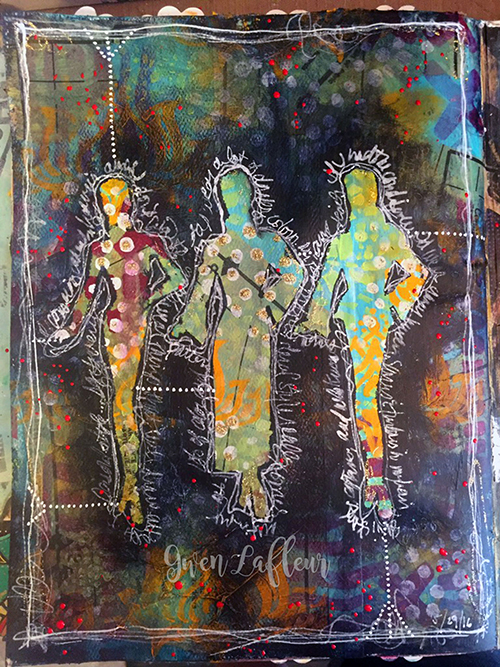
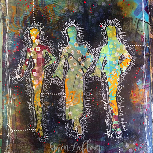
For this month’s project I took those thoughts and used them to create this art journal page. I used the Fashion Dame stamp set and created three silhouettes as my focal point – in my mind, they’re three different aspects of me. There’s a bit of a double meaning to the color and pattern on this page… first, something I like to do a lot in my work that really bothers some people is to cover things up. Second, I love the idea of the inside of the silhouettes being full of pattern and bright colors while the outside is extremely subdued. I think that speaks a lot to my own personality (and the rich inner life of an introvert. Ha!)

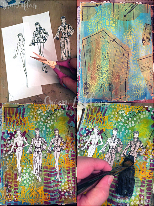
My-Own-Drum-Art-Journal-Page---Steps-1-4---Gwen-Lafleur

To make this page, I started out by stamping with the Fashion Dame stamp set – I did different combinations of the body and clothes to get the three silhouettes. I just stamped them on copy paper and then cut them out. Next, I prepared my background. I gesso’d and painted, then I collaged on pieces from a sewing pattern (I couldn’t resist the tie to fashion!) I did some stenciling on top with some of Nathalie’s StencilGirl stencils. Once I had a nice hot mess of color and pattern, I took my three silhouettes and adhered them securely with repositionable adhesive. Next is the part that upsets some people… I took some Payne’s Gray paint and mixed it with satin glazing medium, then proceeded to paint over the entire page.

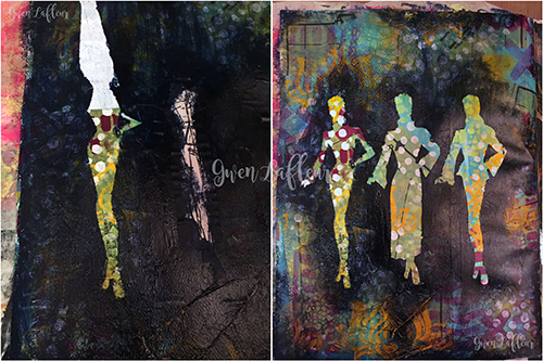
My-Own-Drum-Art-Journal-Page---Steps-5-6---Gwen-Lafleur

For the next step, I use baby wipes to push back a little of the wet paint. I wanted most of the page to be at least somewhat veiled with the darker color, especially near the silhouettes. Then I peeled off the masks / silhouettes (do this while the paint is still wet so it doesn’t seal down the edges of the mask.) I love the contrast of the areas that were masked off versus the dark background with just hints of pattern and color showing through.

My Own Drum Art Journal Page - Final 800x800 - Gwen Lafleur

To finish it off, I took a fine line painting pen and filled the well with white acrylic ink. I used this to add the journaling around the silhouettes and to put a border on the page. I added the dots with a white paint pen, then used red fluid acrylic paint mixed with airbrush medium in a fine line applicator to sprinkle some dots around the page. Voila! A finished art journal page that shows how I like to march to my own drum both in my art and in life.

—————————————————————————————————

I think it is so cool that Gwen followed her instincts with the dark overlay – this is what the  theme is all about and the results are gorgeous.

Besides the supplies listed below (some are affiliate links), Gwen also used a vintage sewing pattern and Hermafix temporary dot adhesive:

SuppliesCJS

Maybe you will even play along with us -I would love to see how you interpret our monthly themes. Email me how you used my stencils and stamps with the theme and email me an image – I would love to share your projects in my next “n*Spiration From Around the Globe“!

See you next Tuesday for another project from the Creative Squad!

Comments (10)

  • Sarah P.

    |

    Love your unique style. Coloring outside the lines is awesome.

    Reply

    • gwenlafleur

      |

      Thanks Sarah! It’s good to color outside the lines once and a while, isn’t it? :D

      Reply

  • Joi @RR

    |

    LOVE that you are so unique and your own person with quirks Gwen. That’s the kind of art I love. Today – your art reminds me of something Nat would create and I love that too. You are both so FREE and FUN – completely BODACIOUS in your creativity – LOVE that so much. Your creativity today is just so SUPER. Your ladies are all splendid – the same – yet so different. Such a great message! Thanks bunches for sharing such fab inspiration. j.

    Reply

    • gwenlafleur

      |

      Aw, thanks! Isn’t it wonderful how we can all be so different? I really love that. Also love that you used the word bodacious in your comment :D Thanks so much!

      Reply

  • stephanie

    |

    I love the contrast of the dark and the bright patterns showing! Stunning

    Reply

  • Michelle Rydell

    |

    Gwen, your page is beautiful! I love the way the bright colors peek out from the dark background! What an awesome way to use the stamp set!

    Reply

    • gwenlafleur

      |

      Thanks so much! It took me a while to figure out how to interpret this month’s theme, but once it hit me I really had a lot of fun :)

      Reply

  • Gayle

    |

    Loved this demo! I was stuck on a mixed media piece and after reading Gwen’s process, I decided that covering it up and wiping off a few areas is exactly what it needs because I too am an introvert – Thank you both for this “eureka” moment!

    Reply

    • gwenlafleur

      |

      Thanks Gayle – so glad it inspired you! I don’t know if my love of covering things up is directly linked to being an introvert, but it’s certainly symbolic… lol.

      Reply

Leave a comment

My City Speaks to Me – Gwen Lafleur

CS April My City Speaks to Me Blue

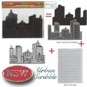
It’s Tuesday so it’s once again time for my Creative Squad to show you a fun project, and we are at the start of April now, so we have a new theme too!  The theme for April is “My City Speaks to Me” and throughout the month, the team will be using my new Urban Scribble Foam Stamp, Rubber Stamp and Stencil Set. This month’s theme is all about expressing what your hometown or city is all about.  What makes it special, vibrant, and important to you?  This month, our Creative Squad will take us on a trip to their city!

So without further ado, here is the uber creative Gwen Lafleur with her gorgeous interpretation of the theme!

—————————————————————————————————–
Gwen April Headshot

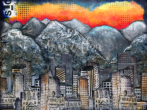
I live in a suburb of Salt Lake City, Utah, but I work downtown and one of my favorite views is when I’m driving in and the city comes into view up against the mountains. I especially love it when the sun is coming up in the background (or the sunset behind the mountains on the other side of the valley when I’m driving home at night!) There are frequently spectacular colors and I never get tired of the view; the contrast of the man-made city with the rugged mountains really draws me. It also influences a lot of the culture here – my office mates are frequently off doing morning ski tours before work and lunchtime discussion usually centers around outdoor activities. I’m not particularly outdoorsy, but I love the views and the openness of this area, and after recently moving back here from Chicago, I’m especially loving the more laid back and less crowded lifestyle!
500 Salt Lake City Mixed Media Painting - Gwen Lafleur - WM

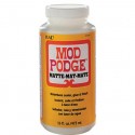
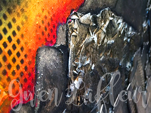
With those thoughts in mind, when I got this month’s challenge I immediately knew that I needed to use the Urban Scribble stamps backed by mountains of some kind. I started by taking an 11″x14″ sheet of heavy weight mixed media paper and I sketched out where I wanted the mountains to be. I used pages torn from a telephone book along with Mod Podge mixed with water and put crumpled paper within the outline of the mountains in the foreground.
detail Salt Lake City Mixed Media Painting Close-up 2 - Gwen Lafleur - WM

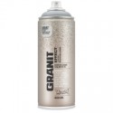
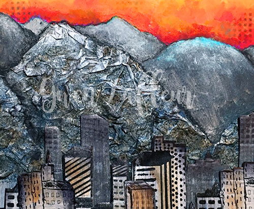
Once they were dry, I used Montana Granit Effect spray paint and gave them a good coat – it really helps them look like rock! I used a few washes of acrylic paint on top to add a little shading and dry brushed some white on the tops (since the mountains still have their snow caps right now.)
detail Salt Lake City Mixed Media Painting - Gwen Lafleur - WM

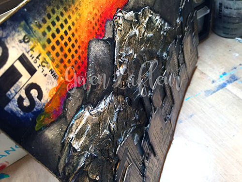
Next, I gesso’d the area above my mountains and painted in some more in the background, then I added a sunrise with lots of fluorescent paints. For the city, I took a few sheets of drawing paper and gesso’d them, then painted them with different shades of gray and silver. When they were dry, I stamped on them twice with both the detailed side of the foam stamp and the rubber stamp. I also stamped in gray with the solid side of the foam stamp. I cut out each individual stamped image and mounted them all on a thin sheet of cardboard, then cut them out again. I lined them up in front of the mountains on my piece and started adhering them in layers, using stacked cardboard on the back of each piece to add dimension. I cut some of the cityscapes into smaller pieces so I could arrange them the way I wanted.
500 Salt Lake City Mixed Media Painting Close-up 2 - Gwen Lafleur - WM

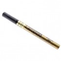
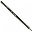
Once that was done, I added a wash of color here and there. I used a black Stabilo All pencil to add some definition to the mountains, then I finished the piece by using the stencil that comes in this set in the sky and in the bottom corners and on some of the buildings and outlined the whole piece with a gold paint marker.

I really love the contrast of the texture from the mountains with the stamped buildings, as well as the colorless early morning city against the beautiful colors of the sunrise. I think it even looks a bit like Salt Lake!

———————————————————————————————————-
I hope you enjoyed Gwen’s project! I think we’re all wishing we had a scenic commute like hers :) I love how she created really dimensional texture with layers upon layers of stamped cityscape and the crumbled paper mountains in the background.  And that orange sunrise!  It literally glows.
Besides the supplies listed below, Gwen also used cardboard, phone book pages, and pieces from a luggage tag with SLC on it:
SuppliesCJS


And maybe you will even play along -we would love to see how you interpret the theme – email me how you used my stencils and stamps with the theme and email me an image – I would love to share what you did at the beginning of next month!

See you next Tuesday for the another project with the theme ‘My City Speaks to Me’.
Comments (18)

  • Dee Ann O'Brien

    |

    Amazing mountains that really enhance the city!

    Reply

    • gwenlafleur

      |

      Thanks so much! I just wish I could capture a fraction of how beautiful it is in real life, but it’s sure fun to try!

      Reply

  • Karen Petitt

    |

    I have no words to express how wonderful this is. I get it completely because we lived in central London for a long time and the one thing I love about coming home was the city behind and the country ahead. Its beautiful, gorgeous, wonderful, awesome – not enough words to express how great it is. Thank you for sharing some of your process too. As I recent convert to mixed media I would not have had a clue how you created those mountains – it’s genius! Many thanks for the fabulous inspiration and for sharing your art with us Karen x

    Reply

    • gwenlafleur

      |

      Thank you Karen! There’s just something about the contrast of city and nature that really speaks to you, isn’t there? You’re also making me want to go back and visit London again :D

      Reply

  • Joi@RR

    |

    Oh my gracious – THIS is a FABULOUS creation Gwen. I am just blown away by the dimension and texture of this piece. YOU – dear girl – totally GLORIFIED Nat’s Urban Scribble. And since it’s my very fav one – I am just THRILLED to see this. HIGH FIVE!!!! Your entire piece is SPLENDID – your mountains are beyond GORGEOUS. LOVE love love this. j.

    Reply

    • gwenlafleur

      |

      Aw, thank you so very much! I really love this set too and it was so much fun to use. So glad you liked it!

      Reply

  • cheiron

    |

    This is one amazing page Gwen! I love the texture…what a beautiful city.

    Reply

    • gwenlafleur

      |

      Thanks Cherion! The texture is definitely my favorite part :)

      Reply

  • Karenliz Henderson

    |

    WOW amazing piece. Just gorgeous! I love the way you created the mountains plus the sky is gorgeous.

    Reply

    • gwenlafleur

      |

      Thank you so much! It was lots of fun to put together :)

      Reply

  • Lynn Reed

    |

    Wonderful artwork! Love the buildings and the mountains and the bright accent color of the sky.

    Reply

  • Sue Clarke

    |

    I LOVE the texture in the mountains Gwen. Nice piece for sure!

    Reply

    • gwenlafleur

      |

      Thanks Sue! The mountains are my favorite part as well… it was a bit of an experiment, but I love how it came out!

      Reply

  • Michelle LaPoint Rydell

    |

    Wow! Gwen, your page is StUNNING!!! The dimension is fabulous, and that sunrise is breathtaking!

    Reply

    • gwenlafleur

      |

      Thanks so much Michelle! I had a lot of fun putting this one together :)

      Reply

  • Laurie Hunt

    |

    Gwen this is beautiful! I totally get how you feel about those mountains. I recently moved from Detroit to Phoenix and I love every time I go out seeing those mountains over the valley — and our mountains are nothing compared to yours! I tell my husband all the time I hope I never lose that awe inspiring feeling as I look around this beautiful southwest. Great work. Loved the step outs and the commentary.

    Reply

    • gwenlafleur

      |

      Thanks so much Laurie! Yeah, I can imagine that going from Detroit to Arizona would be very similar… that’s a beautiful area too :) I’m with you… I never want to lose that sense of awe!

      Reply

Leave a comment

The Only One or … In My Art Journal Today

AJOnlyOne01

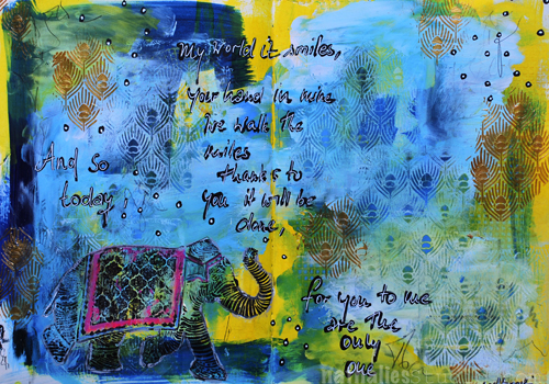
“And so today, my world it smiles, your hand in mine we walk the miles,

Thanks to you it will be done, for you to me are the only one.” Led Zeppelin

AJOnlyOne04

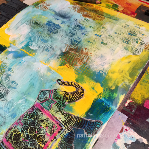
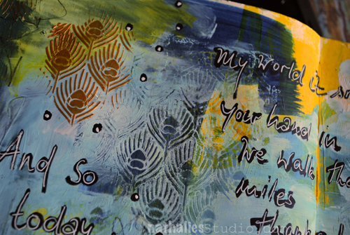
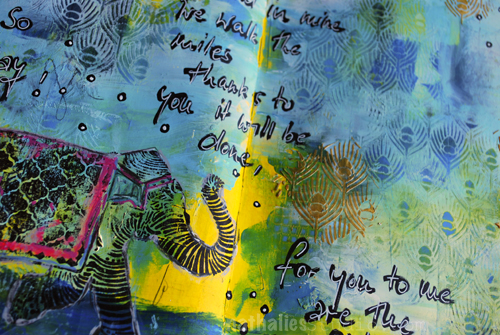
Over a painted background I added a mix of blue paint and gesso and while the mix was still wet, I layered the Peacock Background Stencil on top and using a babywipe removed parts of the paint again. This revealed the underlying paint once again. I layered the stencil on top again and spread some embossing paste through it.

AJOnlyOne03

I stamped the Elephant rubber stamp with archival ink on top of the background and enhanced some areas of the elephant design with markers and pencils.

AJOnlyOne02

For the journaling I used a black acrylic marker and then overwrote it with a white signo pen.

Here are all supplies I used:

SuppliesCJS


Hope you have a wonderful day!!!

Comments (5)

  • Darcy Shannon

    |

    I love the colors and the texture of this journal page. Just beautiful!

    Reply

  • Theresa De Shon

    |

    Just getting into Journaling at the cancer center, learning a LOT from this blog…look forward to all the posts and pics. Thank you!

    Reply

  • Joi@RR

    |

    The peacock stencil reminds me of an India type tapestry – perfect for accenting your wonderful elephant. This is just gorgeous Nat. You colors are so unique – I would never have thought to put them together but you – are so good at making colors look unique. They truly look wonderful on your pages. And that pop of pink on your elephant is just perfect too. How I adore your work. Have a super fine weekend sweetie. Hugs. j.

    Reply

Leave a comment

Opposites Attract – Cheiron Brandon

CS Opposites Attract logo

It is another Tuesday and therefore time for my Creative Squad to show you a fun project. The theme for March is Opposites Attract and the team will use my new Bird Foam Stamp, Rubber Stamp and Stencil Set. Just as opposite colors on a color wheel highlight one another, or yin and yang fit together so comfortably, sometimes the best is brought out when we celebrate extreme differences!

So here is the gorgeous Cheiron Brandon with her beautiful interpretation of the theme in form of an art journal page

—————————————————————————————————–

Cheiron March Headshot

I had all kinds of thoughts when I heard the theme “opposites attract”.  I decided that since I love bright rainbow colors so much, I would try to mix up some paints that were a bit of a different palette this month for my art journal page. So for me my opposite was to start out with colors I would not normally use.  I mixed up a bunch of pastel greens, yellows and pink and just went with it!
cheiron thoughts fly by page
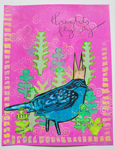
I created the pink background with a brayer, then used a stamp from the Kaffee Klatsch stamp set along with some yellow paint to create some texture on the background. I gave my page a border using the Batik stencil.
cheiron thoughts fly by 1_
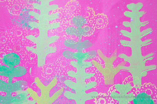
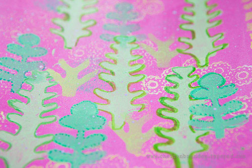
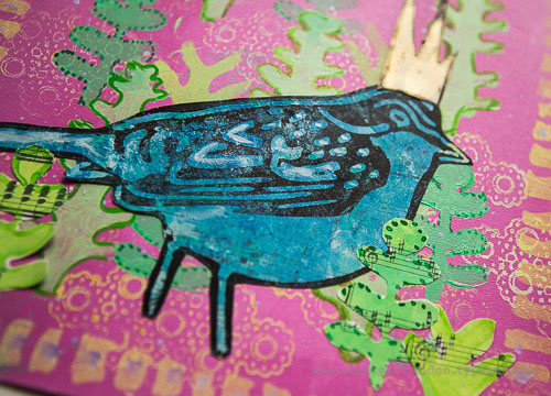
I wanted to create a scene for my bird so I used the stencil included in the Bird Foam stamp set to create a little garden. I layered the “trees” in different greens and then painted around them with acrylic ink to make them pop a bit. To create the bird I painted some blues onto a separate piece of paper and once it was dry, I stamped over it with the outline bird from the Bird Foam stamp set that I “inked” up with black paint using a foam tool.
cheiron thoughts fly by 2
Once I created my bird, I added some more trees to ground him to the page. Once he was all done, I added a tiny crown, some lavender splatter and a few words to complete the page.
Not my normal color palette, but in the end I love how the colors look!  It’s always great to try something new :)
cheiron thoughts fly by 3
———————————————————————————————————
 I hope you enjoy Cheiron’s project as much as I do. I love how she stamped the patterned bird side of the foam stamp on a pre-painted piece of paper and then cut it out, as well as her layering of the stencil shapes in the background and in the foreground. And the crown…too cute!
Besides the supplies listed below, Cheiron also used acrylic paints, music sheet paper and a pencil to create this art journal page:
SuppliesCJS


Maybe you will even play along -we would love to see how you interpret the theme – email me how you used my stencils and stamps with the theme and email me an image – I would love to share what you did at the beginning of next month!

See you next Tuesday for the another project with the theme ‘Opposites Attact’.
Comments (6)

  • Karen Petitt

    |

    I love how you have used this new bird, in fact checking back through the posts I have been completely and utterly inspired by all of the DT! The way you have used colour and the paints really works for me because it feels like it’s something I too could achieve! Many thanks for the blog hop, the fabulous inspiration and for sharing your art with us Karen x

    Reply

  • Joi@RR

    |

    Bright, springish, and fun Cheiron. You made a lovely world for Nat darling bird! j.
    Reply

  • Gwen L.

    |

    Great page Cheiron! I love the way you used the stencils to create a scene… and the little crown on the bird! Great idea to use colors that are the opposite of your usual palette – I love that idea!

    Reply

  • Michelle LaPoint Rydell

    |

    This is such a beautiful page Cheiron! I LOVE the colors you used, and the way you created a scene with the stamps and stencils – the stamps in the background make awesome clouds! Cute crown too!

    Reply

  • Miriam Prantner

    |

    Wonderful page! I love the bright pink with the greens and how that cool blue of the bird contrasts.

    Reply

Leave a comment

Opposites Attract – Gwen Lafleur

CS Opposites Attract logo

I am so excited as this is the first Tuesday for my Creative Squad to show you a fun project. The theme for March is Opposites Attract and the team will use my new Bird Foam Stamp, Rubber Stamp and Stencil Set. Just as opposite colors on a color wheel highlight one another, or yin and yang fit together so comfortably, sometimes the best is brought out when we celebrate extreme differences!

So here is the wonderful Gwen Lafleur with her amazing and stunning interpretation of the theme in form of an art journal page

—————————————————————————————————–

Gwen March Headshot

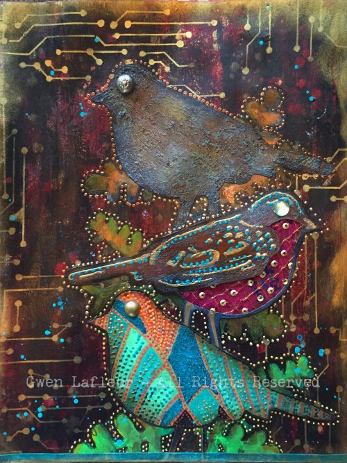
For the this month’s theme of “opposites attract,” I decided to interpret it in two ways. You can see lots of complementary colors used throughout the piece, but the main way I created “opposites” was by contrasting bright / shiny / new with old / rusty / brown. I tend to use this type of contrast in a lot in my work, so I thought it would be fun to really emphasize it for this piece.

Opposites - Bird Stamp Art Journal Page - Gwen Lafleur

To make the page, I created a background with black gesso and layered some color on top to create a kind of distressed look, but using a mix of bright and dark colors. To add more old / new contrast, I used the Circuit stencil with gold ink. For the birds, I stamped each side of the foam stamp plus the rubber stamp on cardstock, then decorated each of them separately.
 Opposites-Bird-Stamp-Art-Journal-Page-Close-ups2-Gwen-Lafleur-e1456529458962
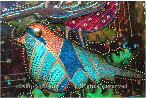
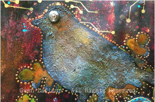
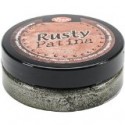
The bottom bird used the rubber stamp, and he’s all about bright colors, beads, gloss and shine. The middle bird used the detailed side of the foam stamp and he’s a fun little hybrid. I made the top look rusty, but layered shiny dimensional paints on top. I cut out a section from the bottom following the lines of the stamp and added some fabric – it’s vintage sari fabric, but it has shiny sequins on it. The top bird is from the solid side of the foam stamp and is all old and rusty with no shine or bright colors. I used acrylic paints, texture paste, and Viva Rusty paint and patina to make it look like a piece of rusted metal, then added a vintage metal button for his eye.
Opposites-Bird-Stamp-Art-Journal-Page-Close-ups1-Gwen-Lafleur-e1456529458962
To finish, I positioned each of the birds on the page and then used the leaf stencil that comes with the stamps and stenciled the base of the leaves where I wanted them. I kept the same pattern as I added the leaves – brighter green at the bottom moving to brown and dark leaves at the top.
It was so much fun to work with these stamps and stencils – they’re so versatile! Plus, this month’s theme was challenging yet enjoyable, and I really love how it turned out!
———————————————————————————————————-
Wow – I hope you enjoyed Gwen’s project as much as I did. I love how she used all three bird stamp surfaces and created them differently yet cohesive and the texture and detail in this page is stunning!
Besides the supplies listed below, Gwen also used several dimensional paints, misc fabric, jewel and metal buttons to create this art journal page:

SuppliesCJS


And maybe you will even play along -we would love to see how you interpret the theme – email me how you used my stencils and stamps with the theme and email me an image – I would love to share what you did at the beginning of next month!

See you next Tuesday for the another project with the theme ‘Opposites Attact’.
Comments (16)

  • Dee Ann O'Brien

    |

    Wonderful birds- inspiring. Great technique directions!

    Reply

    • gwenlafleur

      |

      Thank you so much! So glad you liked it :)

      Reply

  • Karen Petitt

    |

    Oh no and dang! I now have to change what new stamps and stencils I had planned to purchase in May. This is just dang! For me it was an OMGee when I hopped over, I love the rich deep colour which is so perfectly opposite yet matches the rusted layer. I own one of Natalie’s stamp and stencils sets and I knew when I could I was going to purchase more of her tools. Today’s post has reminded me not to plan ahead so much because I need these new stamps and stencils so very much! Just as I thought it couldn’t get better this month you guys release these beautiful products.
    Thank you so much for the blog hop, the awesome inspiration and for sharing your gorgeous art with us Karen x

    Reply

    • gwenlafleur

      |

      Thanks so much Karen! I have to admit, this is a pretty fun stamp set… plus it’s 3 stamps and one stencil in one! You really kind of have to have it ;)

      Reply

  • VikiB

    |

    That is an awesome piece! I love the contrast and the addition of the circuit looks so cool.

    Reply

    • gwenlafleur

      |

      Thank you so much! I couldn’t resist adding the circuit stencil as part of the opposites theme – so glad you like it!

      Reply

  • alisa

    |

    Love the creative team! Great ideas

    Reply

    • gwenlafleur

      |

      Thanks Alisa! I’m thrilled to be included in such fantastic company :)

      Reply

  • cheiron

    |

    Amazing page Gwen. I am loving the colors and texture!

    Reply

    • gwenlafleur

      |

      Thanks Cheiron! I can’t wait to see what you did for this challenge :D

      Reply

  • Martha Richardson

    |

    I’m so glad to see a Creative Squad! Love the project and tutorial ;)

    Reply

    • gwenlafleur

      |

      Me too Martha! And thank you! It was fun to work with this month’s stamp set :)

      Reply

  • Michelle LaPoint Rydell

    |

    Gorgeous page Gwen! I love how you combined the rusty elements with the bright colors – it really pops!

    Reply

    • gwenlafleur

      |

      Thanks Michelle! I really like the contrast of old and new… glad I’m not the only one!

      Reply

  • Sue Clarke

    |

    I love how you used the Circuit stencil Gwen!
    Makes it seem like branches. Nice job.

    Reply

    • Gwen L.

      |

      Thanks Sue! I thought that was a fun stencil to use for this – it felt like it fit, but still added some cool (to me!) contrast :)

      Reply

Leave a comment

More hours or …. In My Art Journal Today

AJ_MoreTime_NatKalbach01

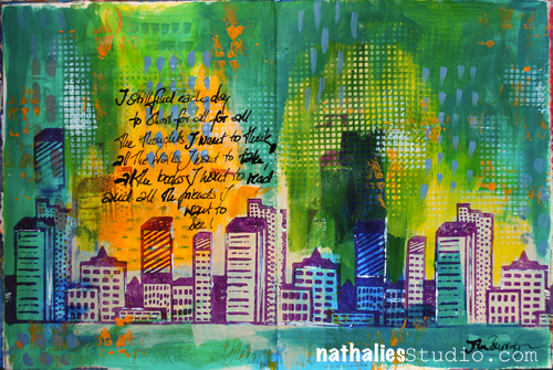
“I still find each day too short for all the thoughts I want to think, all the walks I want to take, all the books I want to read and all the friends I want to see!” John Burroghs

Apparently I didn’t find the day too short to repeat myself but was at the same time not concentrated enough to write everything grammatically right in my art journal spread -LOL – can you spy it? Oh man, embarrassing but …oh well… here you go … the real deal;)

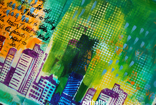
I played with different greens and yellow and orange acrylic paint and stamped the city shape using the pattern art of my Urban Scribble foam stamp with purple as a nice contrast to the orange. I applied the paint with a brayer to the foam stamp- goes quick and easy.

AJ_MoreTime_NatKalbach03

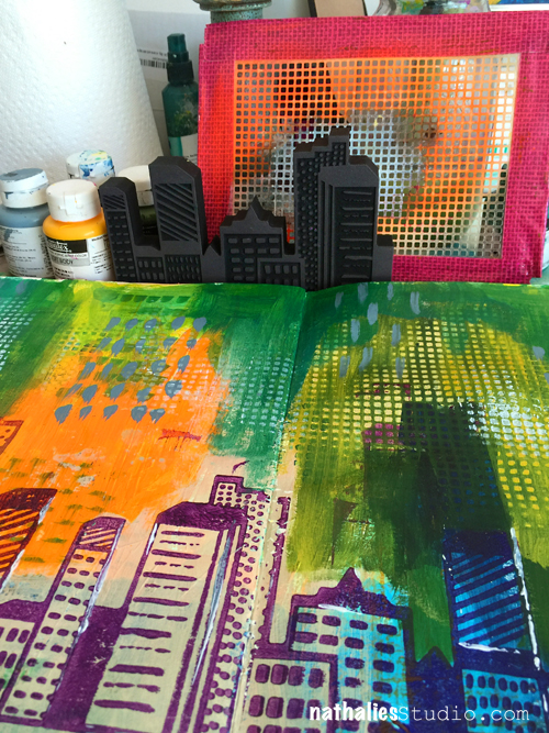
As you can see in the WIP (Work In Progress) Picture above I added a little border to my stencil in the set with duct tape as to prevent over spraying when using the stencil with spray paint. Here I just added paint to the surface, then placed the stencil on top and rubbed areas of paint off with a baby wipe – at other spots I stenciled through the stencil.

Urban Scribble Stamp Set

For the Journaling I used a bamboo sketching pen and black acrylic ink- I love to write with the pen …so much, that I like to double my words ;)

AJ_MoreTime_NatKalbach02

What would you do if you had more hours in the day?

Here is a list of the supplies, I used for the art journal spread above.

SuppliesCJS


Comments (2)

  • Joi@RR

    |

    No one can make a skyline look like you Nat. This is just INCREDIBLE. The background is sooo YUMMY and the colors so BRILLIANTLY FABULOUS. I LOVE LOVE LOVE this and your urban scribble. No – can’t see any mistakes at all. GORGEOUS to me. HAPPY VALENTINE’S DAY sweet Nathalie. You are dear to me. ❤❤j

    Reply

  • Kim Collister

    |

    Loved your post and your journal pages! Great Color!
    XO

    Reply

Leave a comment

Urban Scribble Card AND The Shop is Open!

NKCFS03_SSC1238_STF082_JS_800_wm

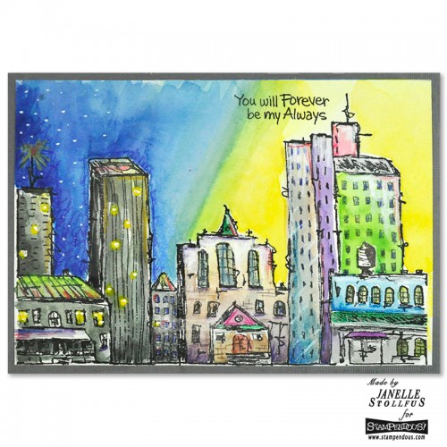
Isn’t this Card by Janelle Stollfus using my new Urban Scribble Stamp Set –  just super cool! I love the gorgeous vibrant colors. Janelle used watercolors, and pencils and acrylic markers to create the background and color in the rubber stamp image included in the set! Thank you so much Janelle for sharing !

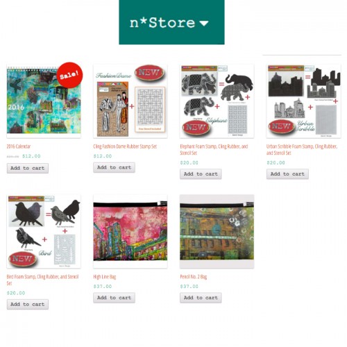
And – I have news – as so many people asked, where to get my stamps and other products – well hopefully your local craft and art store carries them…but if you do not have one close by or if they do not carry them…I just opened my own web store for you too and you can get my new stamp sets and some other items there :)

nStoreNat

If you live in the United States, you can order directly and immediately from this site. If you order several items the shipping rate is calculated automatically per item. Unfortunately I wasn’t able to set it up differently in the store. But if I can ship your total order for a cheaper price than the automatically calculated price (which is most of the time the case with several items), I will refund you the difference.

If you require international shipping, please email me in advance of your order at orders@nathaliesstudio to discuss shipping options as international shipping can be variable and expensive. I can look into the best option as soon as I know what you would like to order and give you a quote.

I hope you visit my new n*Store and if you use any of my stamps or stencils- please share with me – I love to see what you create with them!

Have a beautiful day!!!!

Comments (2)

  • Sue Clarke

    |

    Let’s hear it for your own store online!!! Woot.

    Reply

Leave a comment

Don’t Tear Down This Wall or…Viva Las Vegas Stamps

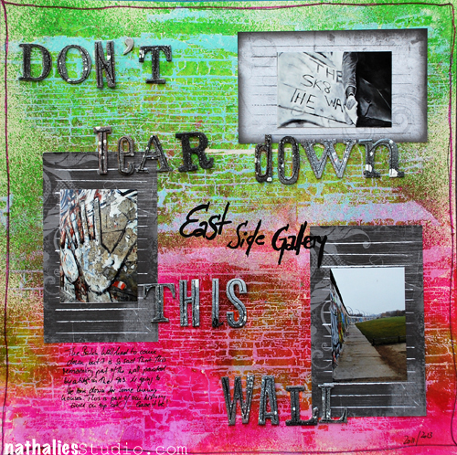
Pretty stoked to be the guest designer for Viva Las Vegas Stamps this month. This layout was posted last week and there is another one on next week :)

Wall01_NatKalbach

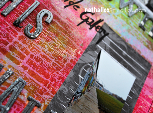
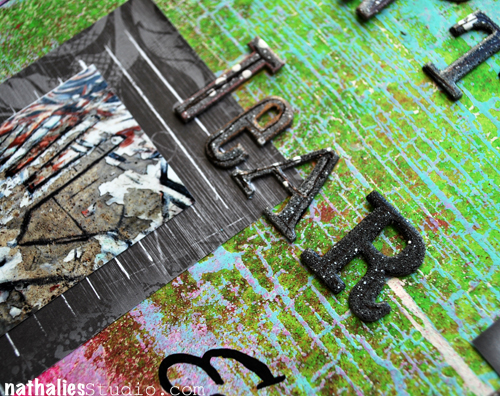
I used the Charred Wood Back Ground Stamp to create my own background for a grungy layout. The layout is about the East Side Gallery – a tiny remaining bit of the Berlin Wall that was painted by different artists in 1990 and now unfortunately is supposed to be torn down to make room for some luxury flats. Some of you might remember some of my photos from this blog post here- where I had visited Berlin with my friend Julie.
Wall02_NatKalbach
I love to create my own backgrounds using stamps to emphasize photos or the feelings and emotions that go along with photos. For this background I had stamped the background with the awesome Charred Wood Back Ground Stamp and embossing powder and then used Wow Bonding Powder and Foil on top. This created a kind of resist. So when I sprayed some Dylusion spray inks over the stamp image and texture of it got fully revealed.
Wall03_NatKalbach
Other Suppliess used: White Cardstock, WOW Bonding Powder, WOW Foil, Versamark, Ranger’s Dylusions Spray Inks, Liquitex Professional Spray Paints, Heidi Swapp Chipboard Letters, Rose Moka Journaling Cards, Posca Marker, Zig Journaling Pen

Have a wonderful day

nat

Comments (6)

  • Cindi

    |

    Congrats on designing for Viva Las Vegas! Nice layout. I love the background and also the way you framed your photos.

    Reply

  • Nurse Ratchet

    |

    Great work, Nat..that stamp is awesome too. Hmmmm red and green together……it can work!!

    Reply

  • Jean Marmo

    |

    Oh my – this hits so close to home. I lived in Berlin as an exchange student my last year in high school. It was 1970 -1971. The wall was very much there as was check point charlie. I have vivid memories of the wall, museums, etc. I did manage to take a few trips into East Berlin which was so very different from West Berlin. I actually still have a small piece of the wall that I took from the ground. I hope they do not take this down!

    Reply

  • Sue Clarke

    |

    I had to go back and study the LO to see that the stamp was the background!
    Love the look…kinda like making your own pp. BTW, anything in the works for another paper line designed by you? You know that I would buy it!

    Reply

  • Jackie

    |

    Hi Nat- Cool layouts! The background is totally awesome, and as always, I love your color selections!
    okay on the wall,you mean to tell me that “they” can’t find some way to build around or incorporate the wall into their new “Luxury” plan? The wall is such an important part of history- and the way the art has grown on it makes it even more special !
    Society today- not just in your country but ours- Make way – we’re coming through: tearing down, clearing out,wiping out what was, expanding and ever expanding-
    well, guess you know how I feel about that! LOL sorry for the rant-
    have a great creative weekend!

    Reply

Leave a comment