Creative Squad

Letter to My Future Self – Cheiron Brandon

CS July Letter

It’s Tuesday again and time for my Creative Squad to share a project with you with this month’s theme: “Letter to my Future Self”. Throughout the month of July, the team will use any of my n*Studio Stamps and Stencils they would like to use to interpret the theme. This month’s theme is in honor of my recent 10 year (!) blog anniversary- which we will celebrate later this month!  I asked the team to create something that they’d like to tell themselves in 10 years. Like a mixed media time capsule. This theme flips the “If only I knew then what I know now” sentiment up-side-down.

This week Cheiron Brandon shows you her amazing and colorful layered art journal page with a pretty good advice :)

—————————————————————————————————
Cheiron June Headshot

Hi everyone, Cheiron here with my monthly post. When I got the theme for this month “Letter to My Future Self” I got nervous. Was I going to have to write an actual letter? What AM I going to write that will be important to know in the next 10 years. Will this have to go in my journal for everyone to see it? Writing in a journal is not for me, I don’t like to share my thoughts in writing. For me my art journal represents a place to play and experiment with color, texture, new stamps and stencils.
cheiron- 10 years art journal 2

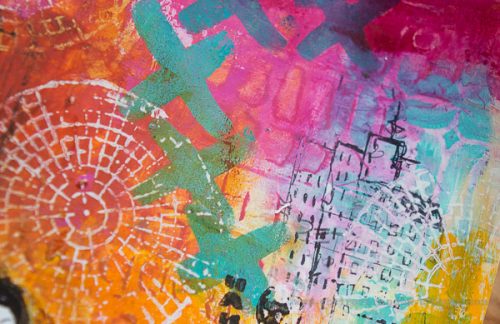
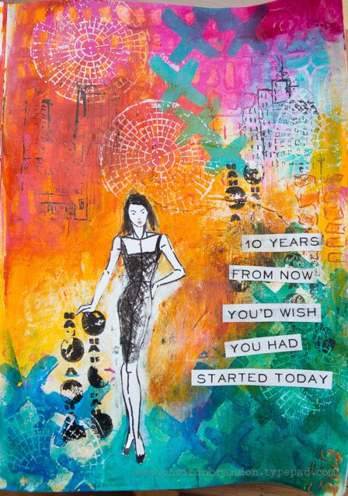
When I started out on this page, I decided instead to not get nervous about writing a letter and just play with some new paint colors and layers. I did think about some personal plans for the next 10 years, and what I would like to tell myself whether I achieve these things or not. I have included some imagery that represents some of the things in my plan, including starting off my page with a piece of a house blueprint. When I do think of plans for the long term like health, finances and career there is no better advice I can give myself than to get started now. So I added the quote “10 YEARS FROM NOW YOU’D WISH YOU HAD STARTED TODAY”. I think that advice rings true at any point in our lives, and I am sure it will be just as relevant if I pull this journal out again in 10 years.
cheiron- 10 years art journal_

—————————————————————————————————

I love love love the color combination in Cheiron’s art journal spread and the way how she layered and combined all stamps and stencils!

Cheiron used the supplies listed below (some are affiliate links):

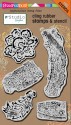
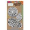
SuppliesCJS


Maybe you will even play along with us -I would love to see how you interpret our monthly themes. Email me how you used my stencils and stamps with the theme and email me an image – I would love to share your projects in my next “n*Spiration From Around the Globe“.

See you next Tuesday for another project from the Creative Squad!

Comments (2)

  • Joi@RR

    |

    Oh sooo vivid and splendid Cheiron. What a great idea to use part of a house plan in the background. Your work is so INTRICATELY STUNNING and my eyes loved roaming over it to see all the different ‘Nat toys’ you incorporated! Perfect sentiment. Thank you for the inspiration. j.

    Reply

  • Michelle Rydell

    |

    Those layers and colors are gorgeous Cheiron! I love your page!

    Reply

Leave a comment

Scenes from the n*Studio and Demo at The InkPad

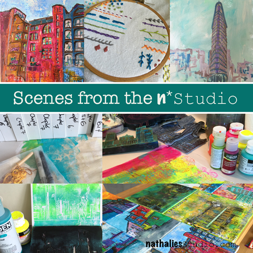
ScenesNatStudioJuly

A little peek into my studio

top row: Berlin Tacheles Painting, Embroidery Sampler, Beginning of a new Flatiron Building Painting

middle row: gathering and sorting the supplies for my book photo shoot, playing with paint and stamps and deli paper

bottom row: 4th July card with a hand carved stamp, packing up my artwork for my book for the photoshoot


And I hope you will join us either in person or on facebook !

Inkpaddemo

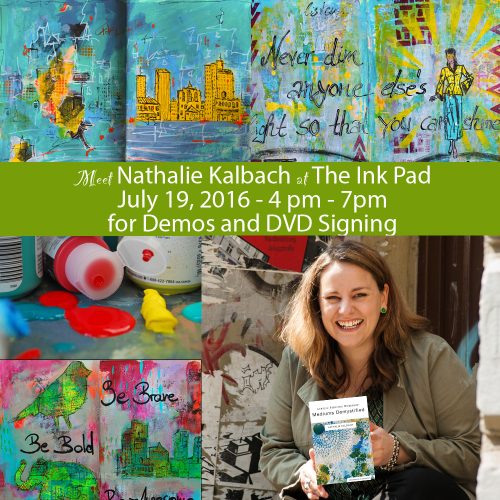
Come on down to The Ink Pad in New York City to meet me on
Tuesday July 19, 2016 from 4pm – 7 pm
I will do a free demo with my Rubber & Foam “Stamp and Stencil Sets” from Stampendous!. And I will sign my new DVD’s with ArtistsNetwork.com. And …if you cannot make it to the shop, join us for a Live Facebook Peek into the fun around 5pm from my Nathalie Kalbach n*Studio facebook page !

Have a wonderful day

Comments (2)

  • Joi@RR

    |

    Loved seeing the ‘scenes’ from your studio Nat. The paintings look wonderful – love your city paintings – always! Congratulations on the fun things you are doing ie: book, dvd etc. Sooooo excited for you and so enjoy watching you climbing towards your dreams. XXj.

    Reply

    • nathalie-kalbach

      |

      Awe- thank you Joi – you always write the sweetest and encouraging comments. Thank you for your support <3

      Reply

Leave a comment

Creative Ice Breaker – Morning Art Journal Play Video #3

In the mornings I play in my art journal to get myself into the creative groove and break the ice – so to speak- and get ready to paint. I recorded and fast forwarded my morning ritual for this video ��� and hope you enjoy it. Take it as what it is – a morning art journal play- not a tutorial ?

Creative Ice Breaker III July 9 2016 from Nathalie Kalbach on Vimeo.

And here is the page you see in the video:

Newdirection_01_NatKalbach

Newdirection_02_NatKalbach

Here are the supplies I have used in my Creative Ice Breaker video above – some links are affiliate links.

SuppliesCJS


I hope you enjoyed the video ? Have a wonderful and creative day

Comments (8)

  • Debbie

    |

    Nat, I love these little videos and I hope you’ll keep them coming! Makes me want to play in my journal right now!

    Reply

  • Jean Goza

    |

    Just the motivation I needed this morning. Thanks for sharing.
    Jean

    Reply

    • nathalie-kalbach

      |

      YEahh – so glad it got you motivated- hope you had a fun day!!

      Reply

  • Joi @RR

    |

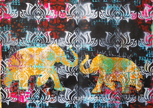
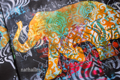
    Almost looks like your little elphant is smiling – SUNSHINE family!!! Wonderful as always Nat. Thanks bunches for making my day! Xj.

    Reply

  • Susan Schultheis

    |

    Had so much fun watching your vid today. Music fit perfect.LOL
    I just have to get the elephant set now. Thanks.

    Reply

    • nathalie-kalbach

      |

      :) thank you Susan – glad you enjoyed the music and video and the elephants :)

      Reply

  • ruthie

    |

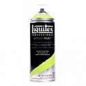
    how do you contain the spray on the Liquitex sprays? I must be doing something wrong. I love your use of the layered stencils and stamps….I’ve really grown to love the elephant set and use it a lot of the time.

    Reply

    • nathalie-kalbach

      |

      Hi Ruthie, I shake the bottle at least a minute before using it and make sure that the nozzle is free of spray. I usually have no problem with it, unless there is some dried in areas around the nozzle. Do you have that problem with all sprayers and caps? I also find that it is easier to control if you are a further away. If you are spraying very close you are spraying very forcefully to one spot but it will result in a big blot rather than a fine mist. I hope this helps a bit :) Glad you hear you love the elephant set- share with me some time what you did with it :)

      Reply

Leave a comment

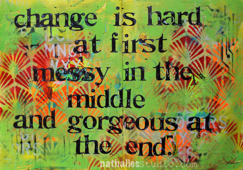
The 3 Stages of Change or … In My Art Journal Today

Change_01_NatKalbach

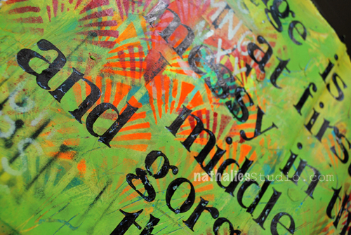
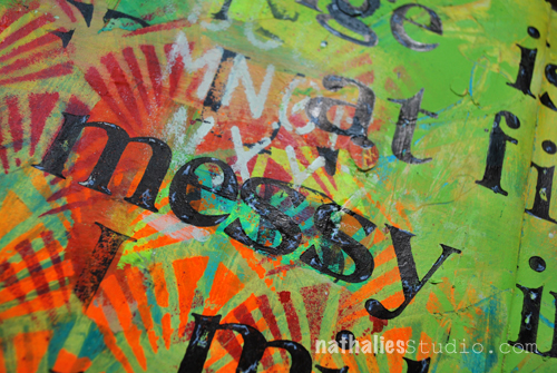
Change is hard at first, messy in the middle and gorgeous at the end.

Lots of changes in my life and lots of changes this year …all of the old ones turned out gorgeous in the end and so I am confident this will be the same for the new changes – I am confident :)

Change_02_NatKalbach

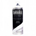
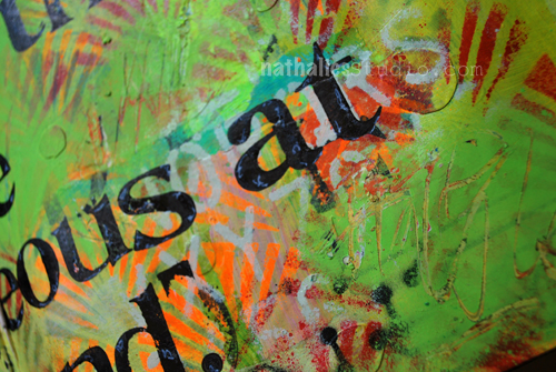
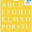
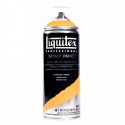
For this art journal spread I broke out my acrylic spray paints again – I so love them. The Liquitex Spray Paints I used, are low odor, but you still have to work in a very well ventilated area and I usually wear a mask if I spray a lot. I had a background from an old paint-scrape-off paint, which I totally covered with spray paint, and layered over with the Art Deco, Circuit and some Alphabet Stencils.

Change_03_NatKalbach

While the Spray Paint was still wet I used the back of a brush and added some word scribbles. I used my old vintage sign maker stamp set to try out the lower case letters in there (oh man I love it) and added some white marks with a white signo pen and filled in some of the irregularities in the letters with black marker.

Change_04_NatKalbach

Are you good in dealing with Changes?

Here are the supplies I used for this art journal spread- some of the links are affiliate links:

SuppliesCJS


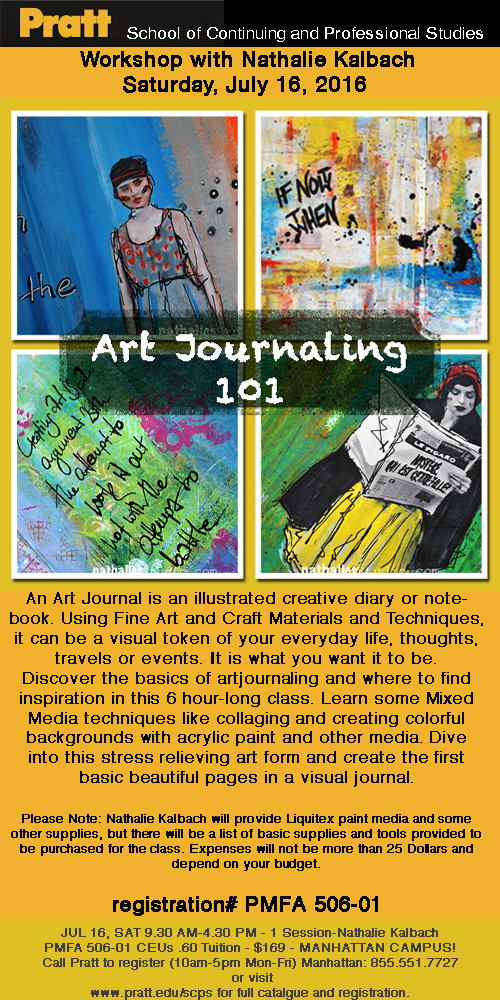
P.S. If you are in the New York City Area – I am teaching an Art Journaling 101 Class at the Manhattan Campus at Pratt on July 16th! It is a very fun and great place to come for a class – here are the details:

Comments (4)

Leave a comment

Letter to My Future Self – Gwen Lafleur

CS July Letter

It’s Tuesday again and time for my Creative Squad to share a project with you with this month’s theme: “Letter to my Future Self”. Throughout the month of July, the team will use any of my n*Studio Stamps and Stencils they would like to use to interpret the theme. This month’s theme is in honor of my recent 10 year (!) blog anniversary- which we will celebrate later this month!  I asked the team to create something that they’d like to tell themselves in 10 years. Like a mixed media time capsule. This theme flips the “If only I knew then what I know now” sentiment up-side-down.

This week we show you Gwen Lafleur‘s amazing mini book and the advice she would hope she will have followed in the next ten years !

—————————————————————————————————

Gwen July Headshot

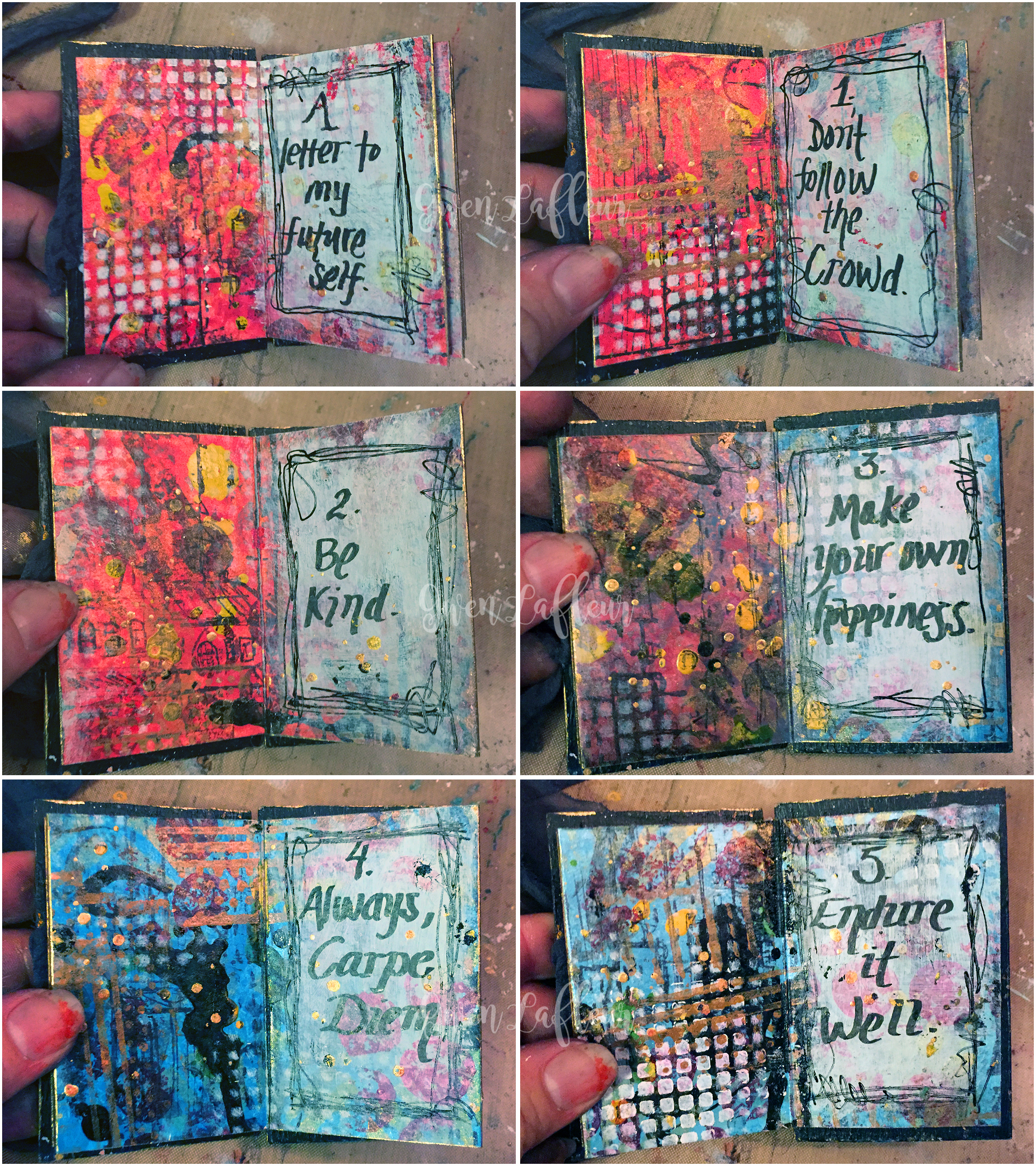
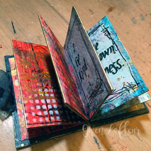
For this month’s theme, I thought it would be fun to get creative with the “letter” part of the letter to my future self theme. I love to make books, so I decided that instead of writing a traditional letter and including it in my art journal (or regular journal,) that I would make a mini journal that would be the actual letter. I took a little time to think of my top five pieces of advice that I would hope that 10 years from now, my future self will have followed, and then created this book around them.
Letter to Future Self - Mini Art Journal Inside Pages - Gwen Lafleur
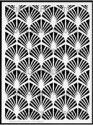
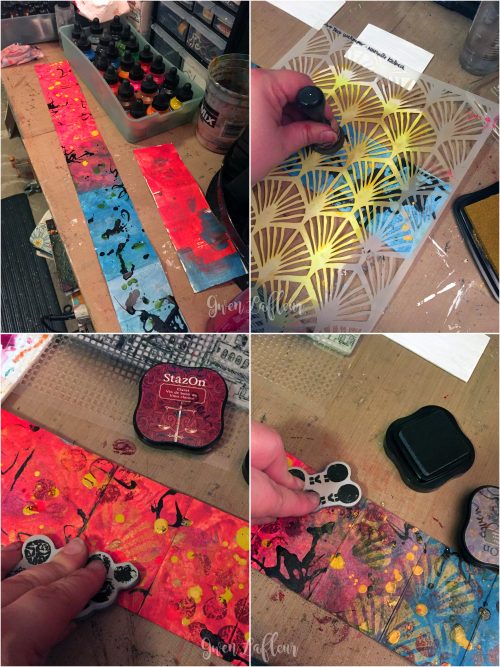
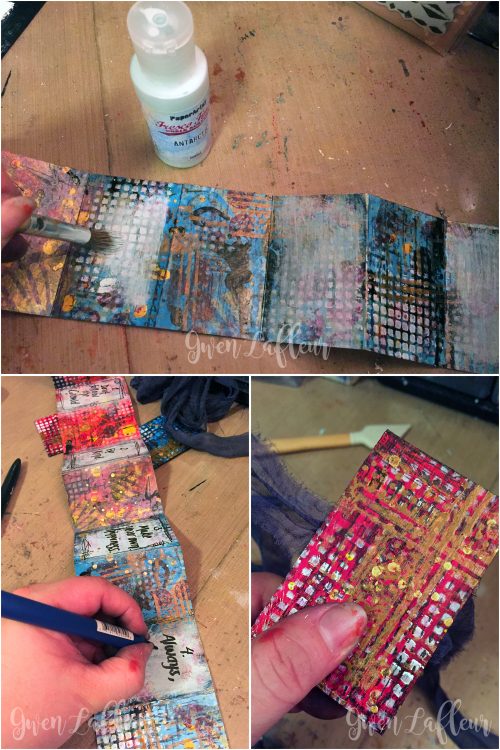
To start, I took watercolor paper and cut enough that after it was all attached, I’d have a strip that was 3″ tall by 24″ wide. I scored the paper every 2″ so that when it was done, I’d have a 2″x3″ book with 6 spreads. I pulled out some acrylic inks and just painted the background. (I did the whole thing at once instead of making each spread individually; I like the effect when you take a larger piece of art and break it down into pieces and I thought that would work well here.) I started with reds and oranges on one end and blues on the other and let them blend in the middle. Then I used more inks to add lots of blobs and splatters. I let that dry, then I used Nathalie’s Art Deco Wallpaper stencil and some gold pigment ink to start adding layers of color and pattern.
I followed that up with some stamping using designs from the Grunge and Marks stamp sets with burgundy and gray StazOn inks. I just used parts of each stamp to get some texture onto the page since I was going for an abstract look.
Letter to Future Self - Mini Art Journal Steps 1-4 - Gwen Lafleur
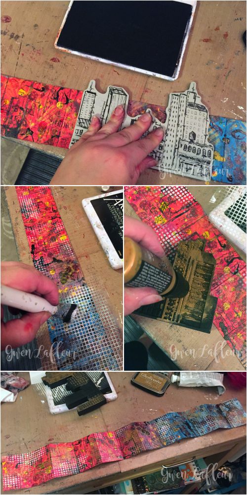
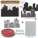
Next up, I grabbed the rubber stamp from the Urban Scribble set and used it with black ink. I moved it around as I went so that parts of the buildings would stamp. I liked this stamp set for this project because even though I wasn’t trying to add buildings into my design, the stamps have lots of great lines and pattern that are perfect for building up layers of texture. In the end you won’t even be able to tell what the original stamp was!
I followed that up by stippling some white paint through stencil that comes with the Urban Scribble set, then I used copper paint on the detailed side of the foam stamp – I only painted and stamped part of it because once again, I just wanted the lines. I stamped it in different directions to get some really cool effects!
Letter to Future Self - Mini Art Journal Steps 5-8 - Gwen Lafleur
Once that was done and dry, all of my background layering was done – next it was time to add the text. Since the backgrounds were so busy, I took some matte finish paint in a very light and fairly opaque color (matte makes it much easier to write on) and dry-brushed the center section on what would become the right-hand side of every spread. Once that was dry, I wrote out the advice to myself and added a scribbly frame around each section of text.
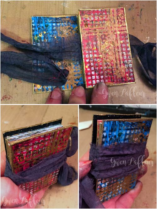
Last but not least, I made the covers. I basically followed the exact same process on these as I did to make the backgrounds – the only difference was that since I was using chipboard, I gesso’d them first. I also only added layering on one side of each cover; I painted the other sides with Payne’s Gray since they’d be covered up when I assembled the book.
Letter to Future Self - Mini Art Journal Steps 9-11 - Gwen Lafleur
I took a strip of sari yarn and laid it across the back of the front cover and glued it in place, then assembled the book. I just took my long strip (the text block) and accordion folded it and used the first and last flaps as the end papers – those got adhered to the inside of each cover. You could actually make this a 2-sided book and do each side of the paper strip, but instead I glued the back sides together so that it would function like a book with pages that turn. The sari yarn just wraps around the book when it’s closed so I can keep it secret and tucked away until future me is ready to read it.
Letter to Future Self - Mini Art Journal Covers - Gwen Lafleur
So that’s it! I hope you enjoyed today’s project and that you’re feeling inspired to find a creative way to write your own letter to your future self!

Letter-to-Future-Self---Mini-Art-Journal---Gwen-Lafleur

—————————————————————————————————

Gwen’s book is so adorable and amazing – I love this idea and I love how she used elements of all the stamps and stencils to make it create some great design elements!

Gwen used the supplies listed below (some are affiliate links) as well as aStrathmore 400 Series cold-pressed watercolor paper (6″x18″ pad), Copper Distress Paint,scrap chipboard, calligraphy pen, sari yarn (from Darn Good Yarn.):

SuppliesCJS


Maybe you will even play along with us -I would love to see how you interpret our monthly themes. Email me how you used my stencils and stamps with the theme and email me an image – I would love to share your projects in my next “n*Spiration From Around the Globe“.

See you next Tuesday for another project from the Creative Squad!

Comments (4)

  • Joi @RR

    |

    Precious and creative! j.

    Reply

  • Michelle Rydell

    |

    Wow! What a creative take on the theme! I LOVE this! So beautiful and textured! What a cute size for a journal too!

    Reply

    • gwenlafleur

      |

      Thanks… I have to admit, I had a lot of fun with this one :D I’ve been wanting to make a journal this size for a while – perfect opportunity!

      Reply

Leave a comment

Art Stroll: Museum of Contemporary Art in Sydney, Australia

Art Stroll MCA Sydney

A couple of months ago, I was in Australia and visited a couple museums but I wanted to spread out the posts for you a bit- so finally I would like to take you on an art stroll through the Museum of Contemporary Art in Sydney, Australia.

KalbachMOCAA01

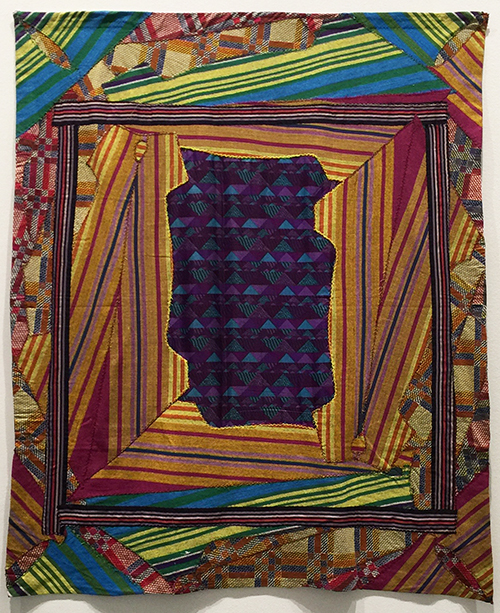
Isn’t this an amazing piece? It was quite big – Noah Eshkol, Window to the Sea, 1975, Cotton, pique, satin

KalbachMOCAA02

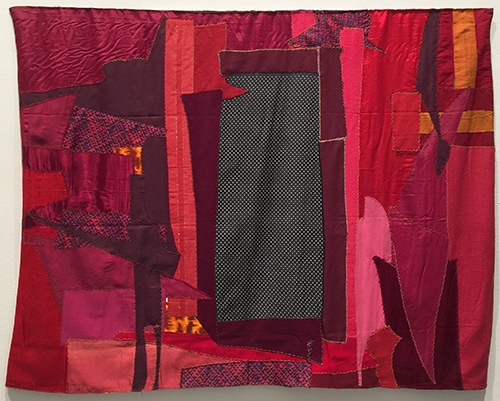
Noa Eshkol, Window to the Night, 1981 – cotton, cotton lawn, flannelette, twill, cretonne, jersey, percale, pique, poplin, satin, taffeta, repp with lurex threads, crepe fabric.

The material list reads like a “Who is Who of Fabric”, don’t you think? These pieces made me wish I was a sewer …I am not, but I would like to include more fabric and sewing into my work.

KalbachMOCAA03

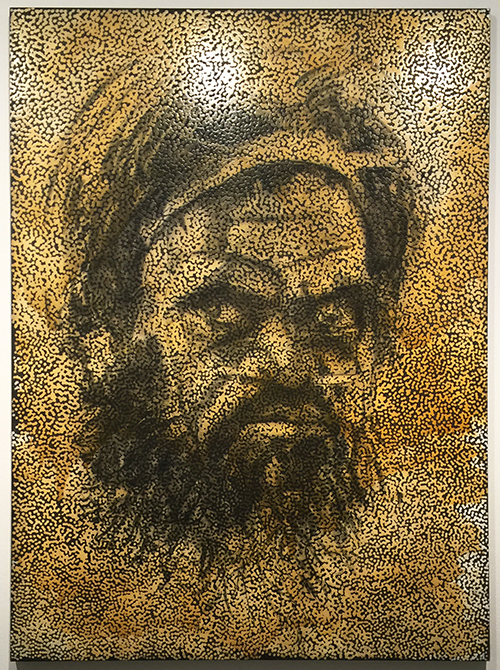
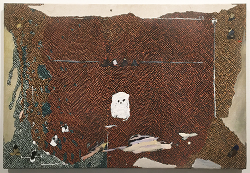
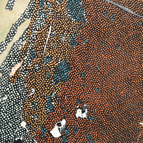
Daniel Boyd, Untitled, 2016 – oil, charcoal and archival glue on linen.

The details are just so amazing and I love the combination of classic charcoal drawing on top of aboriginal art.

KalbachMOCAA04

Daniel Boyd, Untitled, 2016, oil, digital print and archival glue on canvas

Mesmerizing!

KalbachMOCAA05

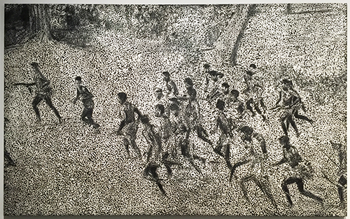
Daniel Boyd, Untitled, 2016, oil, charcoal and archival glue on linen

Boyd translates and re-contextualizes historical images and explores ideas of strength, spirit and aboriginal resistance while at the same time commenting on science, evolution and Darwinism.

“He uses dots as a veil to create scenes that appear incomplete, leaving space for the viewer to complete the story, and mirroring how history is partial and completed through memory and myth.” – Signage at MCAA

KalbachMOCAA06

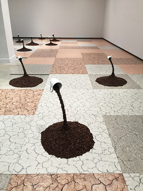
Nina Beier, Allegory of Charity, 2015 – ceramic cups, coffee beens, resin, wood, metal

Look at the crackle texture!!!

KalbachMOCAA07

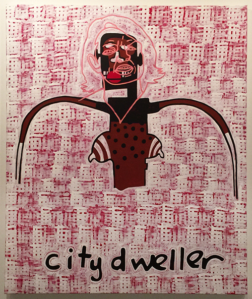
Gordon Bennett, Abstraction (City dweller), 2013, acrylic on linen

KalbachMOCAA08

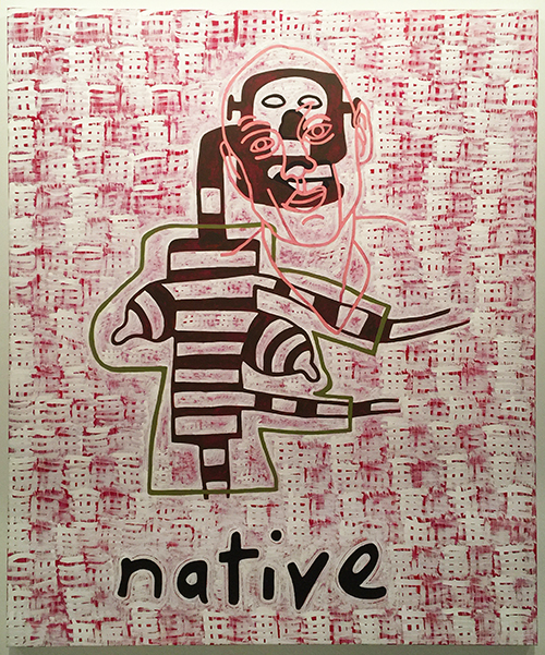
Gordon Bennett, Abstraction (Ntive), 2013, acrylic on linen

“These two paintings are part of a larger series that superimpose the faces of contemporary Australians over earth-toned figures bearing similarities to representations of primitivist figures in the paintings of late American Artist Jean-Michel Basquiat”.  What a wonderful example on how an artist got inspired by a different artist, and translated the inspiration into his own cultural background and style – into something entirely new that only a little hint off the inspiration is left. I love this!!!!


KalbachMOCAA09

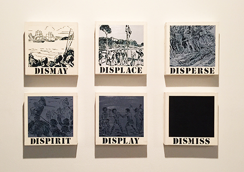
Gordon Bennett, Untitled (dismay, displace, disperse, dispirit, display, dismiss), 1989, oil and synthetic polymer paint on canvas

Bennett is interested in the power of language and the way it shapes culture and identity.

KalbachMOCAA10

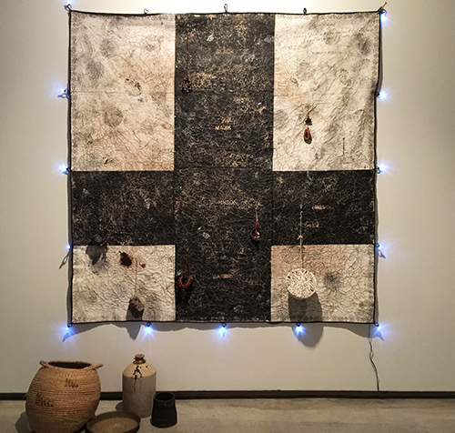
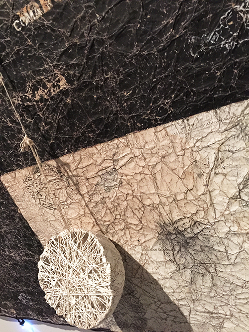
Newell Harry, As Veneral Theists Rest/The Natives Are Restless, 2008, letraset, black and white gesso and ink on craft paper backed with interfacing, lights, beads, rubber, wool, wood, ceramic, plant fibres, metal, string, cotton, shell, transformer

This was such an amazing piece to explore visually – I did restrain from touching it- but it was very very tempting. BTW- this was the first museum where I actually saw two different people touching paintings and being told off by the guard. I had never seen this before but heard that this happens quite often from one of the Conservators at MoMA and I am just astonished. Tempting – yes – but big no no!

KalbachMOCAA11


KalbachMOCAA14

Tim Johnson Four elders, 1986, oil on canvas.

KalbachMOCAA15

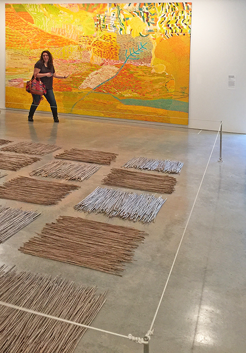
again so amazing to see the painting from further away and from a very close distance.


KalbachMOCAA18

Wait…who is this goof ball in my pic? Awe- my sweet friend Julie- LOL. We had such a good time :)

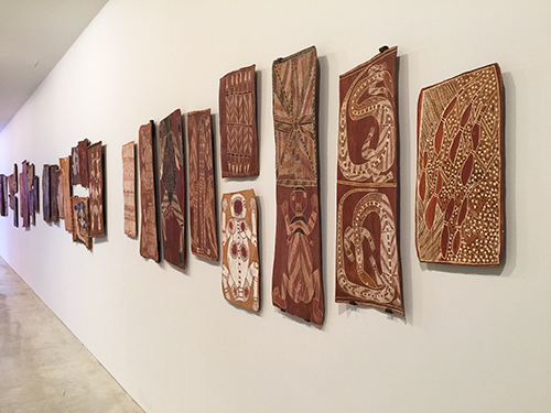
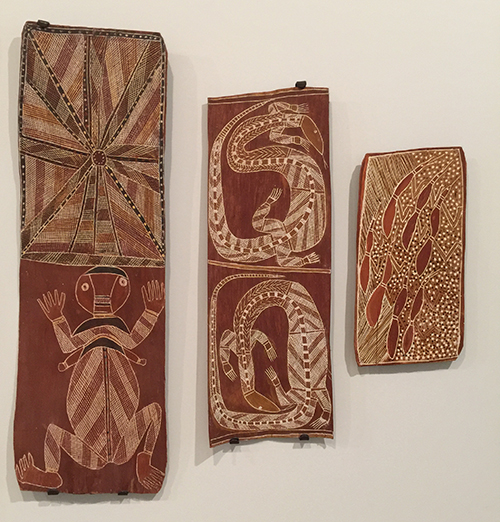
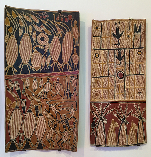
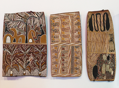
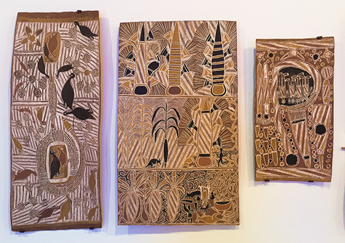
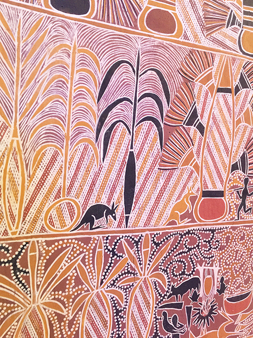
These pieces on bark were just so amazing- I would love to have some of those hanging in my living room!

KalbachMOCAA19

KalbachMOCAA20

KalbachMOCAA21

KalbachMOCAA22

KalbachMOCAA23

KalbachMOCAA24

I hope you enjoyed the stroll and those images and materials inspired you :) have a wonderful creative day!

Comments (4)

  • Gayle Kush

    |

    I am a fiber artist and work almost exclusively in fabric and sewing. I follow your blog because very much of what you do on paper transfers over onto fabric wonderfully! I find a lot of the tips and ideas you have to be useful in my work. Especially your stamps and stencils!!! I paint on fabric all the time. You should try your techniques on fabric (with fabric paints if you plan on sewing anything) once. You just might like it!!!!

    Reply

    • nathalie-kalbach

      |

      Gayle- how wonderful to hear that you are actually work with fabric and sewing! You made me totally tempted to try out some new things with fabric- thank you :)

      Reply

  • Sue Clarke

    |

    Hello Nat,
    Yes, I did enjoy the stroll.
    I would love to be around when you and Julie hang out…I can just tell that you’re both having some crazy fun!
    The dot painting are my favorites.
    Peace,
    Sue

    Reply

    • nathalie-kalbach

      |

      We would love to have you :) Have a wonderful 4th July weekend, Sue! big hugs,nat

      Reply

Leave a comment

Find Your Tribe or … In My Art Journal Today

NatKalbachFindYourTribe_01

Find your Tribe. Love them Hard.

I truly believe in this :) There are so many amazing people out there and they just get you, or your art or your passion and when you find them…love them, lift them up and be with them.

NatKalbachFindYourTribe_02

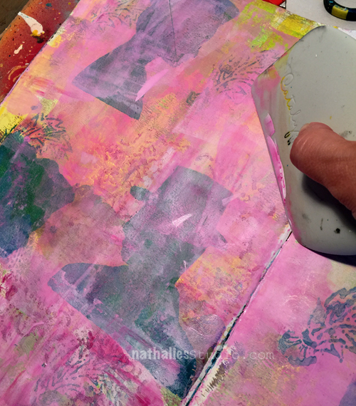
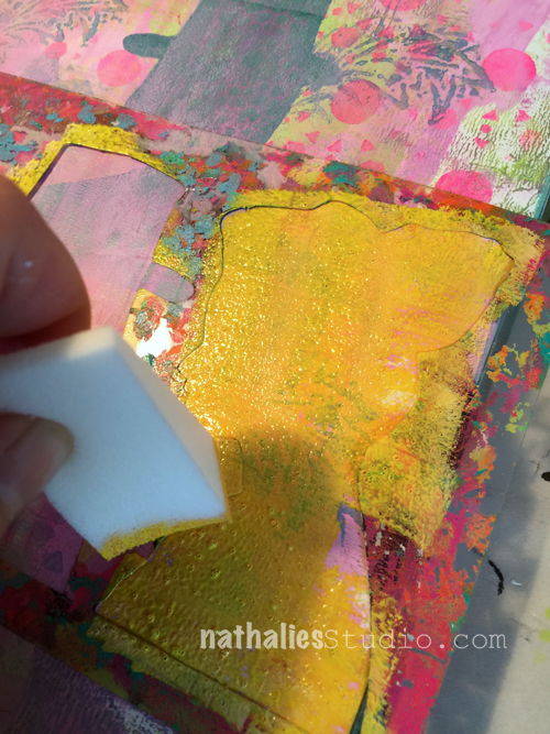
For this art journal spread I used mostly my stamps and the stencil with the man and woman silhouette in my Fiesta Stencil. I stamped and stenciled with a dark and light acrylic paint green.  Once it was dried I mixed some gesso with magenta acrylic paint and scraped it in a thin layer using the Catalyst tool over most of the spread to achieve a glaze and change the color. This also creates some texture.

NatKalbachFindYourTribe_03

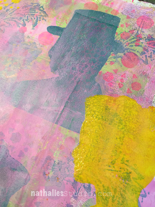
Next I used some yellow which I also mixed with a tiny bit of gesso to make it more opaque and stenciled again with the Stencil in the Fiesta set. I love the lady and the gent – they are so versatile :)

NatKalbachFindYourTribe_04

I wanted the under layer peak a bit through but cover most of it- hence the gesso in the yellow.

NatKalbachFindYourTribe_05

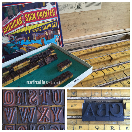
Next I used this stamp set- which I scored a couple weeks ago at a Jazz festival. Yes, you heard right. I went to a jazz festival and there was a tent with some antique stuff for sale and of course I was instantly drawn to these old sign marker sets. The smaller one with the colorful box is from the 50s and other one is a big set with lower case and upper case letters in a huge wooden box and is from the 20s – I am so over the moon – and I tried it out for the first time on the spread.

NatKalbachFindYourTribe_06

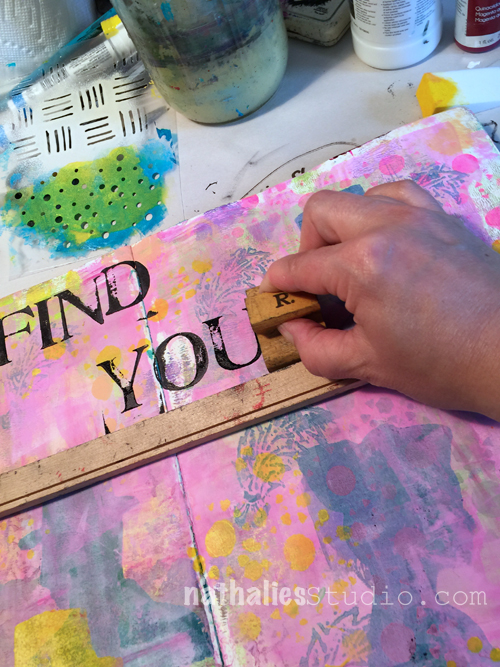
The set has a little wooden stick which is meant to be used as a guide to stamp evenly- as you can see…that only works when you do not move the stick (note to self: don’t move the stick ! ;) )

NatKalbachFindYourTribe_07

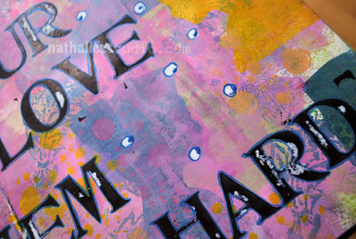
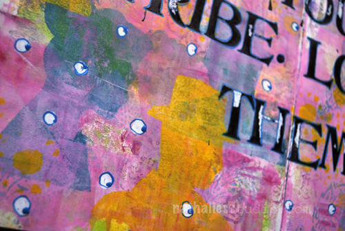
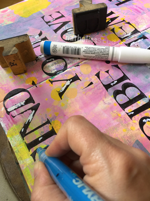
I added some white sharpie marks into the letters and outlined them with a fine acrylic markers. Added some dots- and voila …done :)

NatKalbachFindYourTribe_08

It was a great morning session which didn’t take too long but made me instantly happy as I played with paint, stamps, stencils and even new treasures.

NatKalbachFindYourTribe_09

Did you find your tribe yet? 

Here are the links to the supplies I used for the art journal spread -(some are affiliate links):

SuppliesCJS


Have a gorgeous day!!!

Comments (6)

  • Tracy Welham

    |

    Wow, I love this! Great sentiment, fab colours and layout. Creative Blessings, Tracy x

    Reply

  • Stampendous Stamps

    |

    Gorgeous page, Nathalie! Just love that stencil/template, those gorgeous, versatile, flippable heads are so perfect for so many projects! And the lace is just wonderful. Thanks for sharing!

    Reply

  • stephanie

    |

    I’ve got a small tribe. Working to nurture it. That type is SOO awesome.

    Reply

    • nathalie-kalbach

      |

      YEah- glad to hear. and yes the type is pretty cool – I am not sure how often one can find those sets, but I think they are not super rare, so maybe you score one too :)

      Reply

  • Sue Clarke

    |

    YES, I have found my tribe (or two) and I just love those words.
    I think that they’ll be perfect for a canvas that I’m working on right now.

    Reply

    • nathalie-kalbach

      |

      yeah for finding your tribe and I love the idea to put this on canvas!!!

      Reply

Leave a comment

My Own Drum – Michelle Rydell

CS June My Own Drum

It’s Tuesday again and time for my Creative Squad to share a project with you with this month’s theme: “My Own Drum”. Throughout the month of June, the team will use my new Fashion Dame Rubber Stamp Set to interpret the theme. This theme is all about inspiration, creativity, and personal expression. I asked my squad to create something that celebrates the power of individuality. March to the beat of your own Mixed Media drum this month!

This week we bring you an art journal spread by Michelle Rydell . Michelle created a super fun outfit for her Fashion Dame and she colorfully marches to her own drum !


—————————————————————————————————

Michelle June Headshot

When I saw Nat’s Fashion Dame stamp and stencil set, it reminded me of the happy hours I spent making paper dolls when I was a kid. I used to love to cut women out of the Penneys catalog, and make outfits for them. Did any of you do that, or was it just me?

Anyhoo, the theme for this month – “Marching to my own Drum,” gave me a chance to do that again! Here’s what I did…

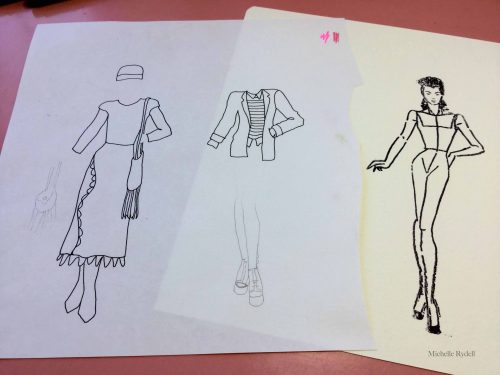
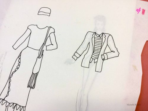
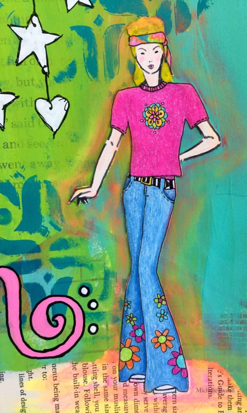
  1. My goal was to create an outfit for the fashion dame that was a style that fits my personality. I stamped her onto white cardstock. Then I got out my lightbox, placed typing paper over the top, and started drawing outfits to fit. I drew three so I would have options. (I used my pinterest style board for inspiration). I sketched with pencil first, and then went over the designs with a superfine pitt pen. This could get addicting! You can see two of the three designs in the first two pictures…

RydellMarching1

RydellMarching2

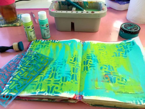
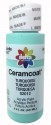
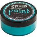
2. Then I started on the background. I first painted a quick layer of blue and green (ceramcoat craft acrylics), then stenciled a darker turquoise (dylusions) over the top, with the stencil that comes with the fashion dame kit.

RydellMarching3

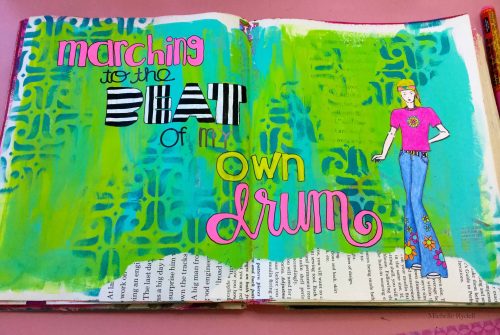
3. At that point, I wanted to bring the background and dame together. First step was to create a ground for her to stand on, so I tore some text paper and pasted it on.

4. Then I wrote out the title with paint pens in a variety of colors.

RydellMarching4

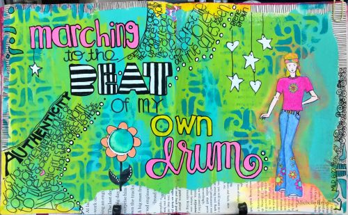
5. To finish it up, I added a quote by Brene Brown, and a bunch of doodles. Her outfit is colored with Prismacolor Pencils, and I made her blonde (since I’m blonde) with a paint marker. Here’s the finished page…

RydellMarching5

RydellMarching6

—————————————————————————————————

Michelle’s page makes me so happy- the awesome outfit and the colors- and my oh my her lettering- yum!

Michelle used the supplies listed below (some are affiliate links):
SuppliesCJS


Maybe you will even play along with us -I would love to see how you interpret our monthly themes. Email me how you used my stencils and stamps with the theme and email me an image – I would love to share your projects in my next “n*Spiration From Around the Globe“.

See you next Tuesday for another project from the Creative Squad!

 

Comments (4)

  • Tracy Welham

    |

    Fabulous! Love the colours. Creative Blessings, Tracy x
    Reply

  • Stampendous Stamps

    |

    WOW!! Oh, my, Michelle! This is absolutely fantastic!! And what a great idea! Love how your page came out and the super creative solution you came up with! This has to be one of the most versatile stamp sets ever! Gorgeous page!
    Reply

  • Sue Clarke

    |

    LOVE the way you did the BEAT!!!
    What a fun and colorful page.

    Reply

  • Julie Tucker

    |

    Love love love this! LOVING the colors and her outfit!!!!!!!!!!!!!!!

    Reply

Leave a comment

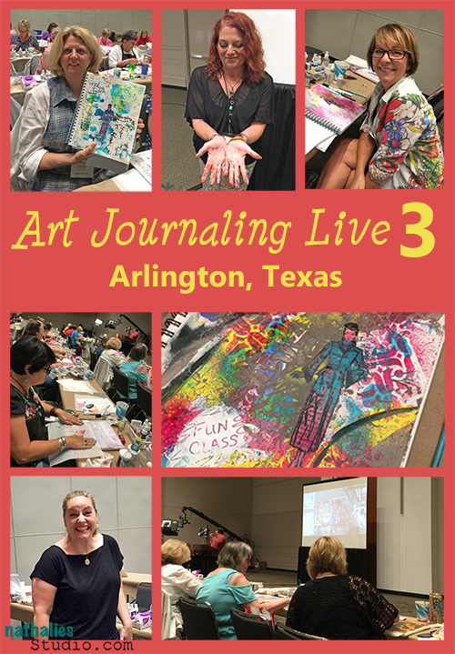
Photos of Art Journaling Live 3

KalbachArtJournalingLive3collage

Last week I went to Arlington, Texas to teach together with MaryBeth Shaw, Jodi Ohl and Gina Rossi Armfield an Art Journaling Live Class which was recorded and will be available as DVDs and Video Download at the end of November this year.

NatKalbachAJL3_05

I started with some Creative Icebreaker techniques and lot’s of visual and actual texture.

NatKalbachAJL3_06

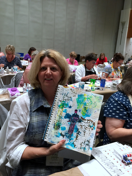
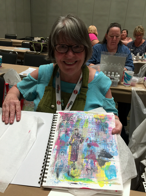
And it was fun to see what the amazing students created in this 1 1/2 hour with me.

NatKalbachAJL3_07

All the while Aaron was being serious and filming everyone and everything ;)

NatKalbachAJL3_08

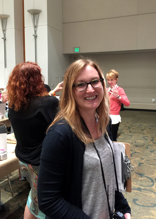
Here is Amy Jones, our wonderful producer and you can see Jeannine Stein the editor of Cloth Paper Scissors doing fun stuff with Jodi in the background.

NatKalbachAJL3_09

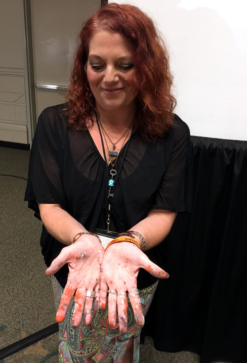
And here is Jodi showing off her hands to proof she painted

NatKalbachAJL3_10

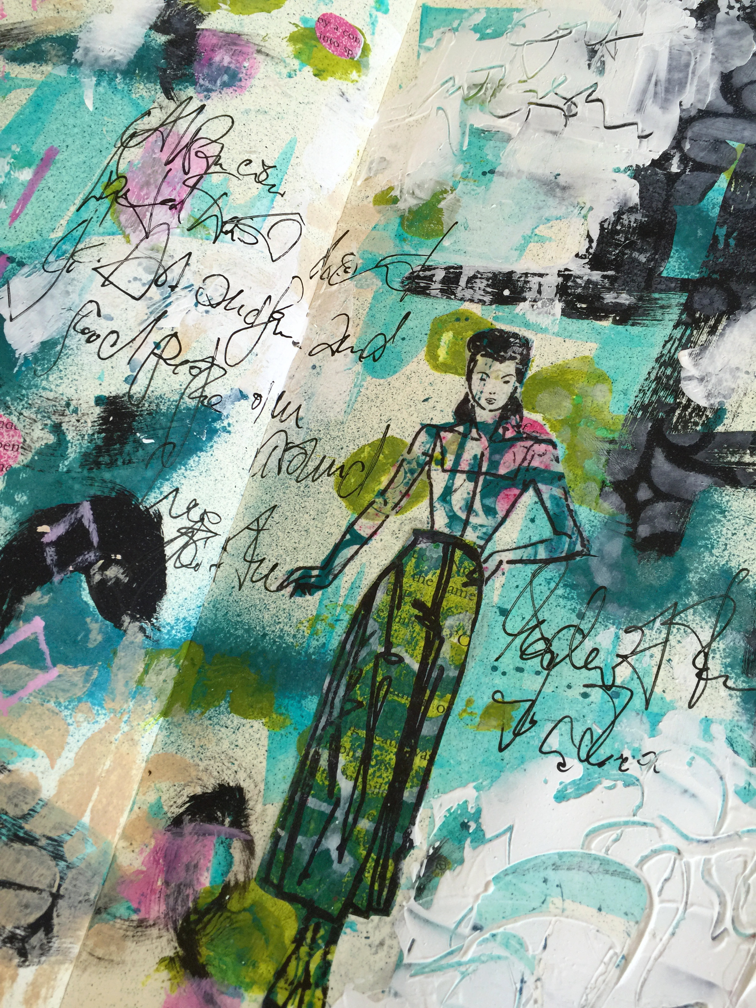
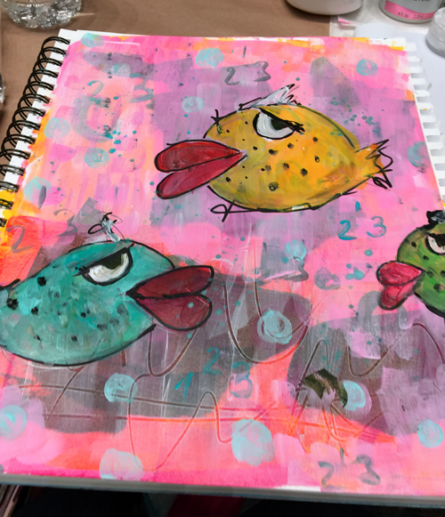
My favorite part of the day was that after I was done with my teaching, I got to play along in all the other classes and below you see what I did in Jodi’s fantastic class …I changed her awesome whimsical birds and fish up a bit and out came: Botox fish – I love them- they crack me up :)

NatKalbachAJL3_11

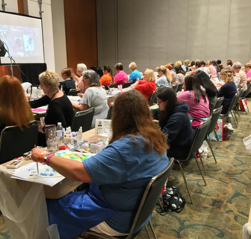
Here is a view of the classroom.

NatKalbachAJL3_12

And the amazing MaryBeth Shaw – so good to spend time with her too

NatKalbachAJL3_13

and take her amazing layering and stencil class

NatKalbachAJL3_14

I realize, I do not have a photo of Gina- grrr- but she was sitting right next to me

NatKalbachAJL3_15

and she taught a really really wonderful watercolor class which makes me want to do more with watercolors!!!

NatKalbachAJL3_16

And here we are – all four of us – relieved and happy that we made it- and super thankful for all the wonderful and talented students we spent time with on that day.

NatKalbachAJL3_17

I will keep you updated on the DVD and Video Download but meanwhile you can check out the ones from last year and some others I did


Comments (6)

  • stephanie

    |

    looks like it was fab!

    Reply

  • Joi @RR

    |

    ADORE your botox fish Nat. Hehehhehehe – made my day!!!!

    And what a wonderful array of FABULOUS photos. I loved seeing EVERY one of them. And the last one of the four of you together is so perfect. How fun that you not only got to teach but had some fun learning time too!

    Thank you sooo much for sharing your journey. XXj.

    Reply

  • Denise Spillane

    |

    Hi, it was such a fun day and wonderful seeing you. It’s fun to see the pictures. Would it be okay to “borrow” the first and last pictures for my blog. I will include a link to yours.

    Reply

    • nathalie-kalbach

      |

      Hi Denise- so good to see you again- and of course you can use the pix !!!! have a wonderful weekend!!!!

      Reply

      • Denise

        |

        Thank you Nathalie. You are the best.

        Reply

  • Sue Clarke

    |

    Botox fish…LOL.
    Great pic of the 4 of you at the end of the post!

    Reply

Leave a comment