Stroll Through The Hood

Stroll Through the Hood – April 2022

Strolls through my hood get me out of my studio, they help me get unstuck and often I get inspired by what I see and get new ideas to create something. It is part of my philosophy about Artful Adventures in Mixed Media – which is the subject of my book. Here are some photos that I gathered in the last couple weeks.
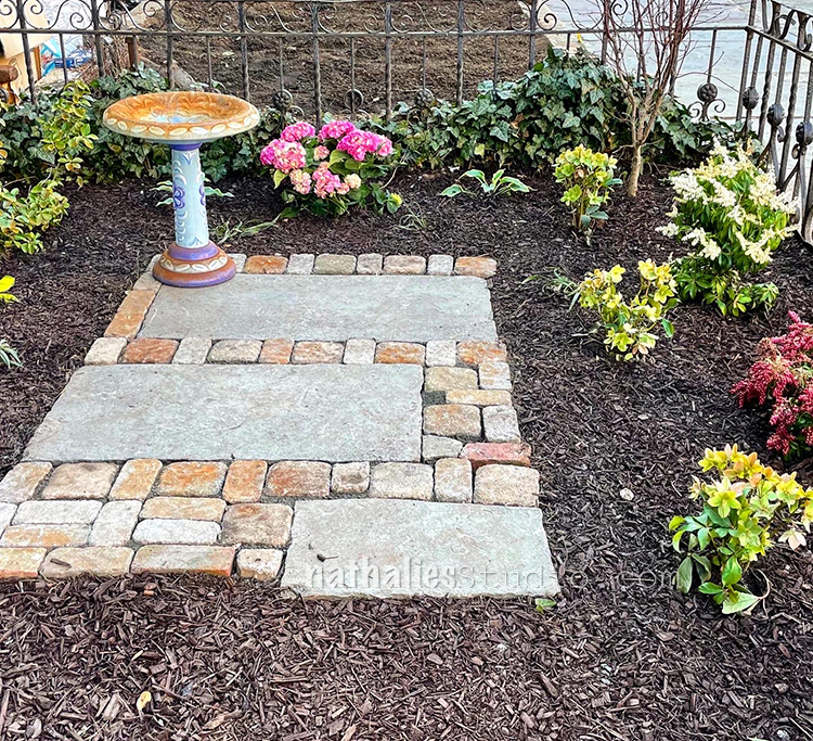
The front yard got spruced up… it was a bit of a mess with a ripped tarp all over, roots and garbage and some prickly sad plants. We planted our Maple tree PJ2 which hopefully will thank us for getting out of the pot after two years and we left some space for the plants to spread out …The birdbath was left from the previous renters and is plastic…I am on the hunt for a nice new one…but one step at a time.
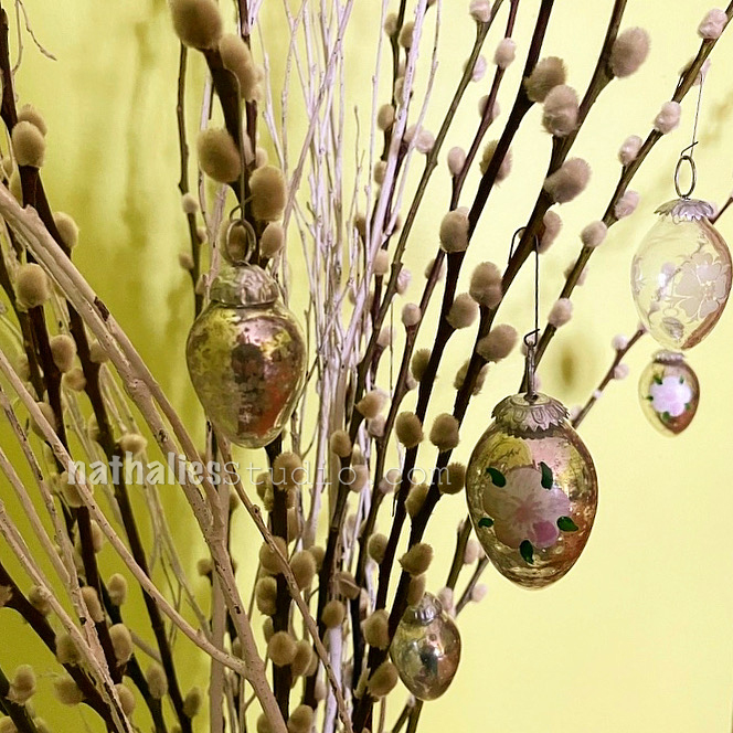
Also happy to hang those vintage treasures for the Easter Holiday. In Germany it is tradition to Easter eggs form branches…those are fake pussy willows I have to admit though …I find it hard to find them here in the city …I guess because it is not such a big tradition to have them in your vases around spring.

I am so excited that this poor house is being restored and it is getting a new beautiful fence …I will def. walk by often to check on the progress.
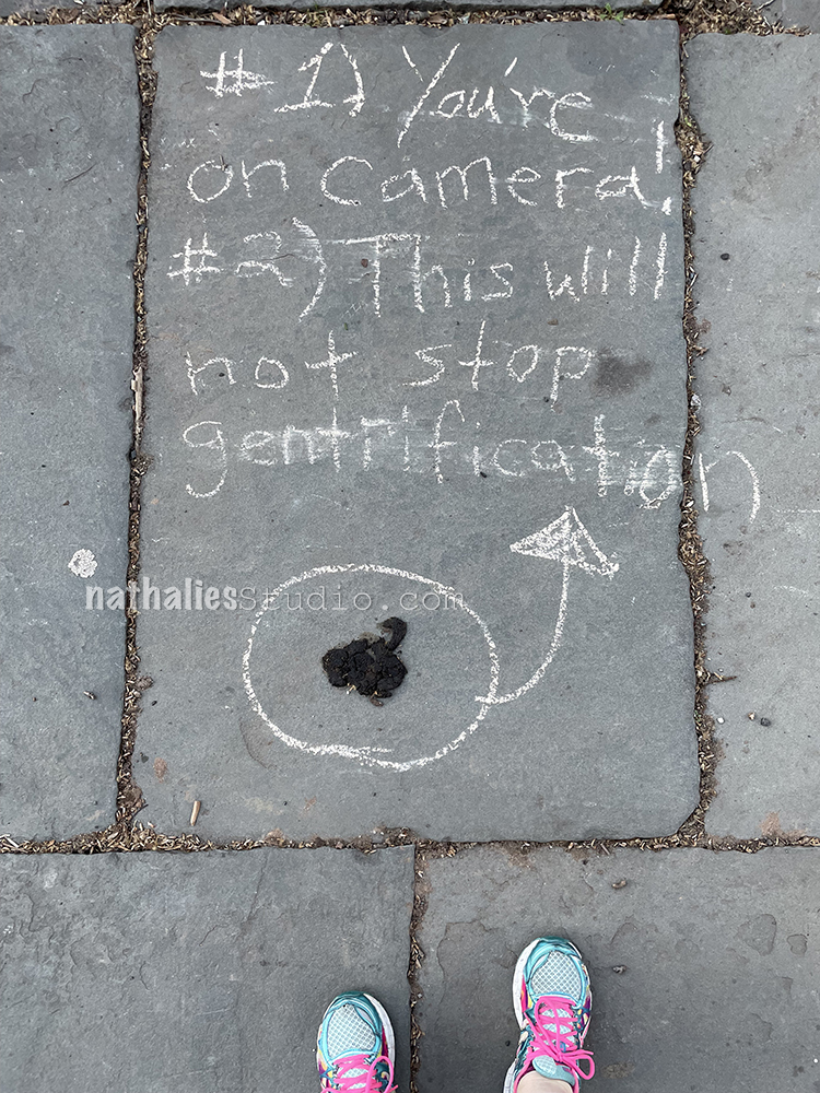
Not my poop – in case you were really wondering hahaha. I am curious about the story here …so much to unpack I think LOL. I also need to walk by again to see if that is a continuing story …
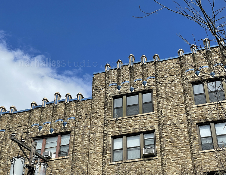
I love these simple art deco apartment buildings with this really beautiful blue decoration on top.
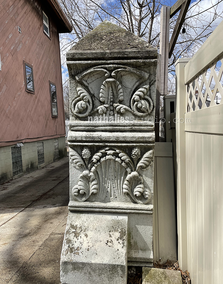
Left over gate part from a long gone house I guess…I love that someone decided to leave it at least ..it is like a little nudge to find out what came before right there.

Another interesting renovation project- this old house facade is nice but in a really bad shape, it made me wonder that someone would tear down the hole house behind but go to lengths to keep the facade …and then I learned that you get a renovation loan if you just keep the facade in the front …it is not a new building …go figure…well…at least it will have a beautiful restored facade I assume alas the rest of the house is probably another box without any charm.

And if you do not know it by now…I am in Jersey City …aka Jersey City Tough …aka Peacock Nation. For my international readers- sorry – it was March Madness which is a time in March when Collages are playing Basketball single eliminating against each other in a short period of time . Our tiny St. Peter’s University team which was given no hope or chance beat some pretty tough teams and went further than any team ranked that badly before. The University itself is a Jesuit University with about 3000 students, here in my neighborhood and it was a huge deal for them and a huge deal for our city. I have never seen our city so united and happy about something.

The guys got a parade and all the neighboring schools participated. It was wonderful to see all the school kids being so happy …we needed this after the pandemic. It was a great afternoon.
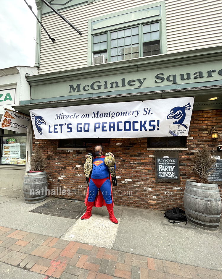
This guy was super sweet- his siblings both went to St. Peter’s and I forgot how the Wrestling was connected to his siblings but he want all out and asked us very nicely if we could take a picture of him in his gear in front of the Sign and well known Student Pub. Not all heroes wear capes but some do.
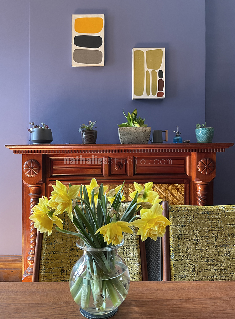
Spring in the dining room. I really love how this room turned out- it is an eclectic mix of time periods and colors and had fun putting it together.
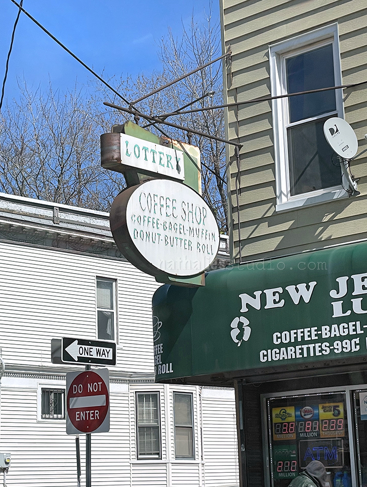
Love this sign and the font – I wonder how old this is. In any event …it is a sign that this has been a corner store for a long long time.

Hope you enjoyed the little stroll, see you next month for a new neighborhood walk :)

Comments (9)

  • Sue Clarke

    |

    I love the color of your dining room walls!

    Reply

  • Barbara

    |

    Loving your stroll once again. These are timeless photos to be revisited years from now to compare with the changes of time. I have snaps in my head of where I lived as a child, few actual photos. The ones that exists are viewed by my sisters and I and help us remember our neighbor. Thank you for letting us see your world.

    Reply

    • nathalie-kalbach

      |

      I know what you mean- I wish I had more photos of my old neighborhood as a child as well – I have some vivid memories but some seem weird when I look at google street view for example of my street I grew up in. LOL- I guess I will never know :)
      Reply

  • Diane T

    |

    Just love your eye for details. The block walk is always so special. And Love the way your new/old house is turning out. Thank you too for the history lessons. Enjoy the spring season.

    Reply

  • Robin

    |

    I love your strolls. The last sign is so cool! You MUST, after all, have butter with rolls!

    I have a picture of a sign that I took in CA a long time ago. It says,

    Apple butter
    Rabbits
    Wedding cake

    We thought was quite the combination!

    Reply

    • nathalie-kalbach

      |

      hahah that is indeed an amazing sign Robin …LOL- what a great sign!

      Reply

  • Bonnie Kurz

    |

    You probably think I am stalking you. Absolutely adore your around the hood pieces. Having grown up in Jersey city I see a lot of the old neighborhoods and buildings.. Many of my friends went to St. Peters Collage so I was so happy to see them get to go to the playoffs. I love your new house and of course your kitties.
    Keep up the good work!, Bonnie (also known as Evelyn)
    Reply

    • nathalie-kalbach

      |

      Awee- I am so happy that this brings back some memories and yeahhh go peacocks!!!

      Reply

Leave a comment

Making Memories – Art Journal

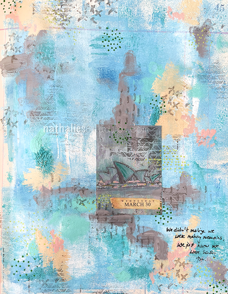
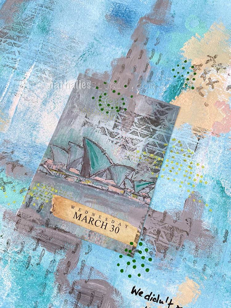
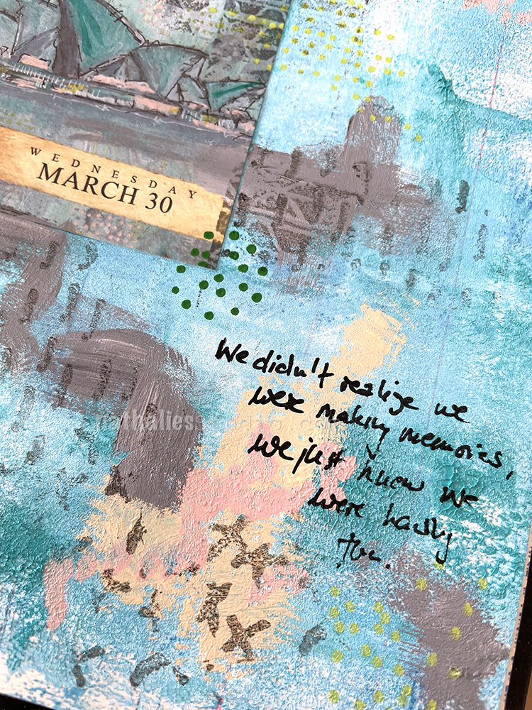
“We didn’t know we were making memories, we just knew we were having fun.”

This is using another page from the sold out Artist Almanac Calendar (the original painting is still available here though). It was fun getting inspired by this older artwork of mine, depicting the Sydney Opera. It made me not only revisit the way I created the background, but also the visit to Sydney itself.

In fact I was there twice and I remember how much I loved strolling through the Botanical Garden right there as well as seeing Herbie Hancock in the Opera. Pretty cool btw, sitting in the nose bleed seat wayyyyyy up high, last row with my back to the wall, and Herbie so tiny down on stage. And yet it didn’t matter – the sound being so phenomenal in this building. I digress though LOL!

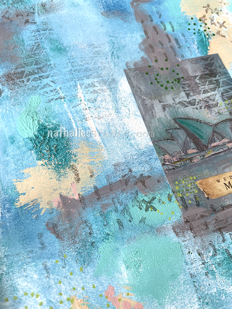
I used some heavy bodied and soft bodied acrylic paints right out of the tube on the page, and then blended the colors with a brayer. It is one of my favorite ways to create texture on canvas, but since this is in my ledger, I took a piece of paper and carefully dabbed it on the background to flatten the peaks of paint out a little bit.

I used some acrylic markers to add marks and also my Embroidery stamp set for added mark making. I love the mixture of a repetitive stamp as well as a hand made mark.

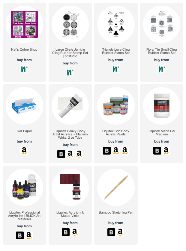
Here are some of the supplies I used:

Comments (2)

  • Sue Clarke

    |

    Nat, I just love that background! I find it funny when people say we’re making memories as they are doing an activity…of course you will look back on them…but it IS just fun! Much later one will realize just how much the activity was enjoyed=wonderful memories. I don’t know if I made any sense, but I agree with your sentiment.

    Reply

    • nathalie-kalbach

      |

      I totally get it! we do not set out with that premise from the beginning, it just turns out that way.

      Reply

Leave a comment

Summer Dreams – Art Journal

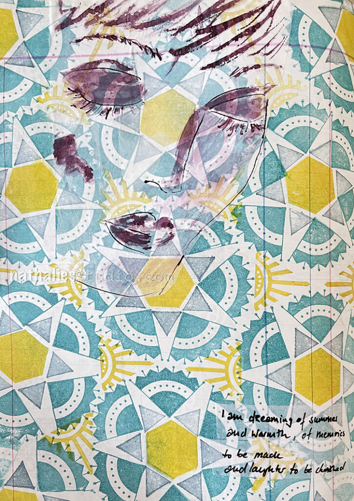
I was really dreaming of summer while I played with this page in my art journal, right as we had another cold spell here.

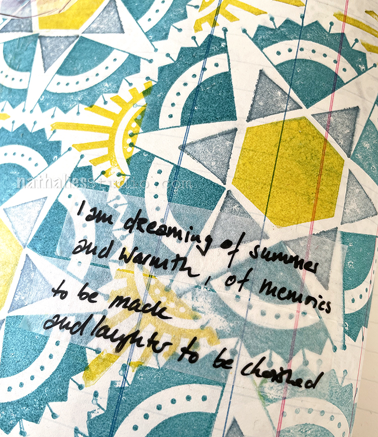
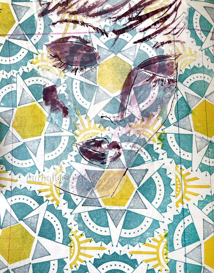
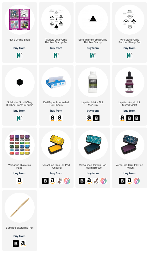
I enjoyed having a little pattern play with some stamps from my Triangle Love set, my Mini Motifs set, and the Solid Hex Small rubber stamp too. Isn’t it fun to see how they all fit together? I used Versafine ink pads for the stamping.

My journaling was done on some blank, transparent washi tape that I just love – but still don’t remember where I got it.

I drew the face with a bamboo sketching pen (a favorite drawing tool of mine) and acrylic ink on deli paper. I adhered the sketch with fluid matte medium and really let the pattern shine through.

Here are some of the supplies I used:

Leave a comment

Doesn’t Hurt You – Art Journal

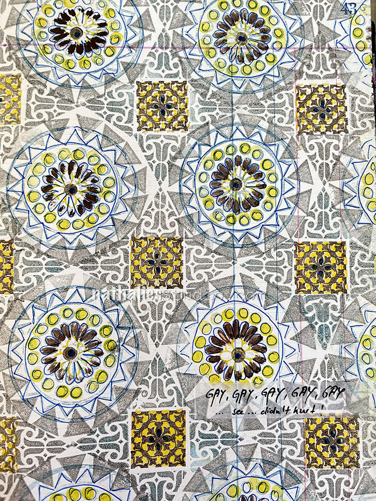
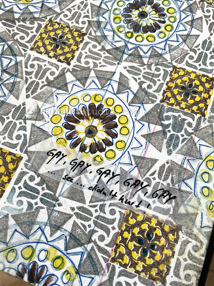
This one would have probably turned out a bit better if I had used different colors for the different stamps – maybe rainbow colors – but it was fun to explore and I really love some of the elements.

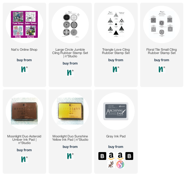
I used the Versailles stamps in the Floral Tile Small set with yellow and brown inks, the Solid Triangle Small stamp and the Amsterdam Triangle from the Triangle Love set, as well as the Valley Road stamp from the Large Circle Jumble set. I do think a different circle stamp would have worked better with the Versailles and Amsterdam stamps but I am glad I tried – I had lots of fun making this page. And even though you might not like it… it doesn’t hurt you! LOL

Here are some of the supplies I used:

Leave a comment

Creative Squad: Lost in a Book – Riikka Kovasin

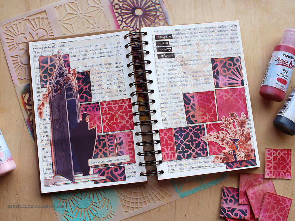
Hello from my Creative Squad! Today we have a post and video from Riikka Kovasin who is sharing an art journal page that is an ode to a favorite book from childhood. She is using my ATC Mixup Stencil and our theme: Lost in a Book – What is one of your favorite books (from childhood or as an adult) or a book that you recently read and really enjoyed? Create a project inspired by the characters, plot, or any element of the book that really stuck with you.


The Muse of Poetry 

Hi there everyone! It’s Riikka here today with an art journal spread with the month’s theme “Lost in a Book”. I had a number of possibilities here – like “The Blind Assassin” by Margaret Atwood, the only book I’ve been reading when a complete stranger walks up to me and says: “That’s a really good book” to start a conversation. Or Agatha Christie’s “Big Four”, a really neglected looking volume in the school library that I ended up picking for a reading assignment and it blew my mind so that I ended up reading everything the local library had from Christie.

But while these could have been the books to draw inspiration from, instead I chose perhaps the first book memory I have. I had this children’s story book called “Satuja” by Raul Roine, and I was leafing through it before I could read. When I then could read, I did like the stories, but I especially loved the illustration. The pictures were done by Rudolf Koivu, a beloved Finnish illustrator and artist. I was captivated by the beautiful pictures, the ornate details but also about the fact that none of the pieces had any yellow! 

I still have the book, but I wasn’t going to cut into it. Instead, I found a copy of the same book in poor shape in a second-hand bookstore. It had water damage but I didn’t mind as most of the illustrations were still intact. I bought the book just for art journaling. You can see me leaf through the book in the beginning of the video.

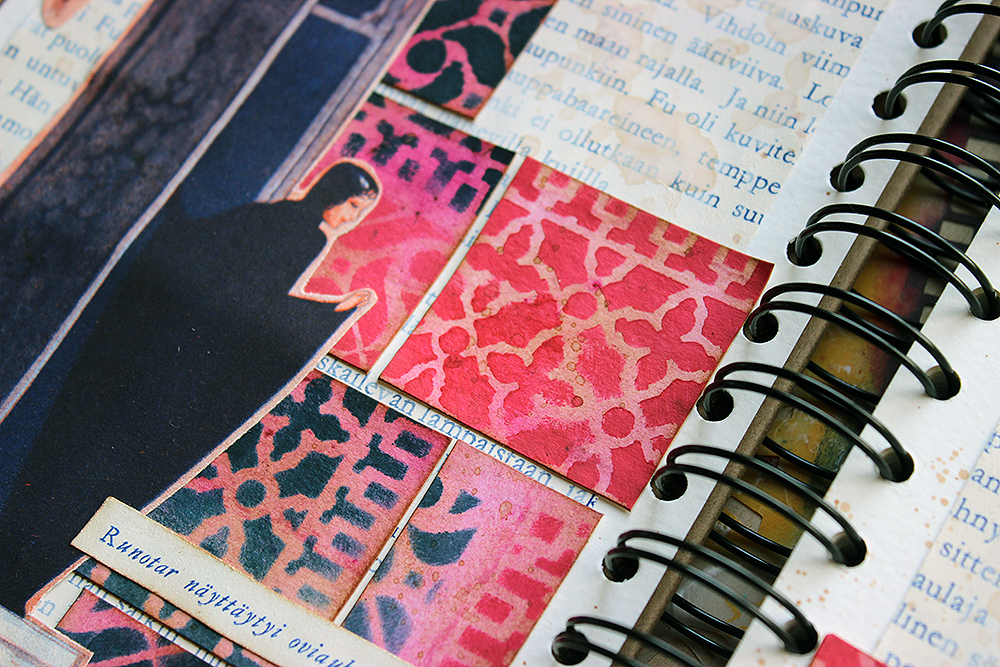
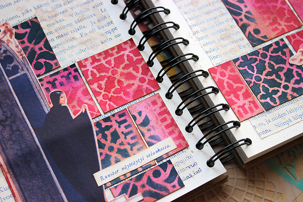
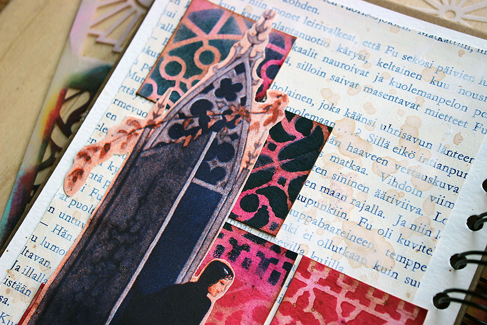
My next task was to decide which one of the beautiful illustrations to use. I again took a trip down memory lane and tried to remember which illustrations I was most drawn to. There were three, that I remember. An Asian princess with a big fan and a graceful stance, a princess with blue garments flowing in the wind while she hurried away from the palace, and a muse of poetry opening a beautifully decorated door, all dressed in black. As you can see from the photos, I went with the one mentioned last. There was a couple of reasons, but one was the name of the character – “Runotar”. It’s somehow such a beautiful word, the beginning meaning a poem (runo) and then the female suffix (-tar), corresponding to English “-ress”. Although poemress sounds a bit daft, the Finnish version is really beautiful to my ear. As the topic was connected to books essentially, I thought that following the words would be the thing.

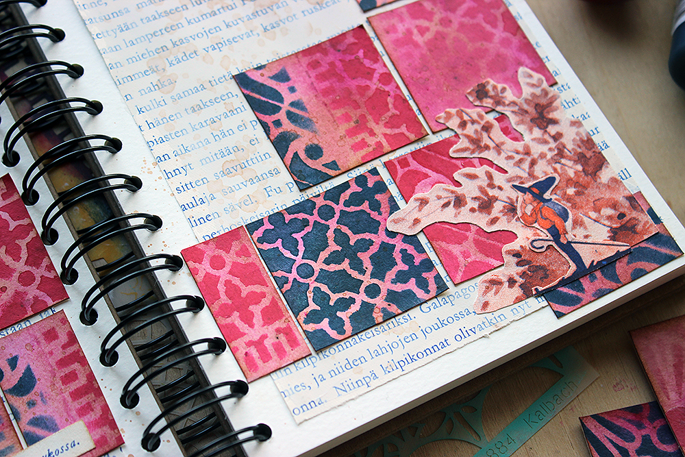
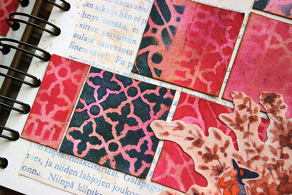
I used the thing that used to make me ponder as a child, to my advantage in the art journal page. That is the lack of yellow. I went with just red and dark blue. I first dyed the paper with a pink dye and then layered the patterns on top using Nat’s “ATC Mixup” stencil. I just love that stencil! It’s so handy with different patterns so you have plenty to choose from! If you want to see how I made the spread, please see the video below.

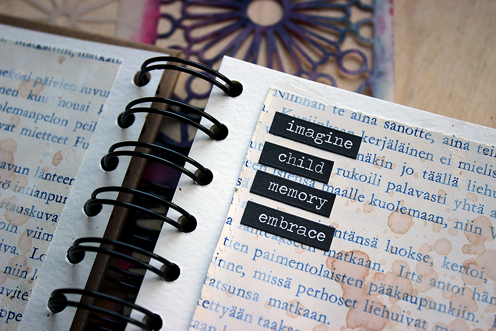
As you could see from the video, I used two book pages as my background for the whole thing. Like I say in the video, they are printed with blue, not black. As a child I also found that really intriguing, too, as all the other books had black text! Using the pages was another way to add the words, the text to the project. The final addition of text was the text stickers and the image caption I added to the spread. The black word stickers make up a recent story, a journaling for the present, while the caption adds another reference to the past, the story which the illustration belongs. The story is that of Peukaloinen, Little Thumbling, by the way. In it he decides that he wants to be a poet and needs to find his way.

Thank you for stopping by today! Wishing you a wonderful day!


Thank you Riikka – loved hearing about what drew you to this book as a child and then seeing how you incorporated these unique style and color elements in your own artwork.

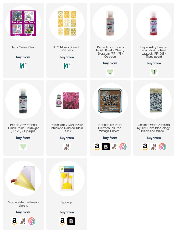
Give it a try: you can find all my Stencils in my Online Shop and here are some of the supplies Riikka used:

Looking for more projects? Follow the Creative Squad on Instagram here.

Leave a comment

Judgement Day – Art Journal

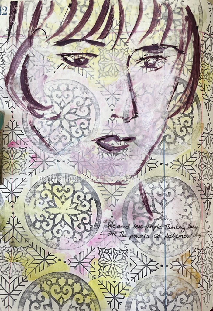
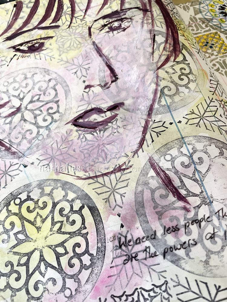
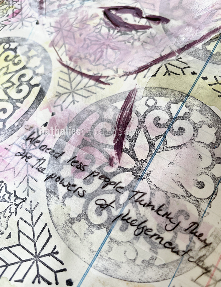
“We need less people thinking they are the powers on Judgement Day”

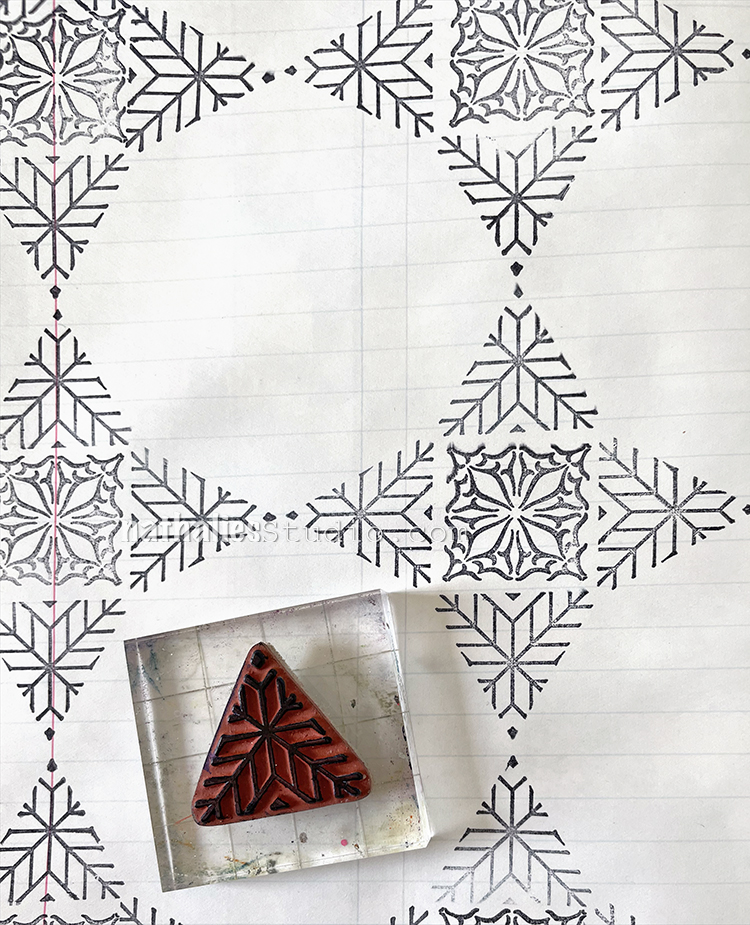
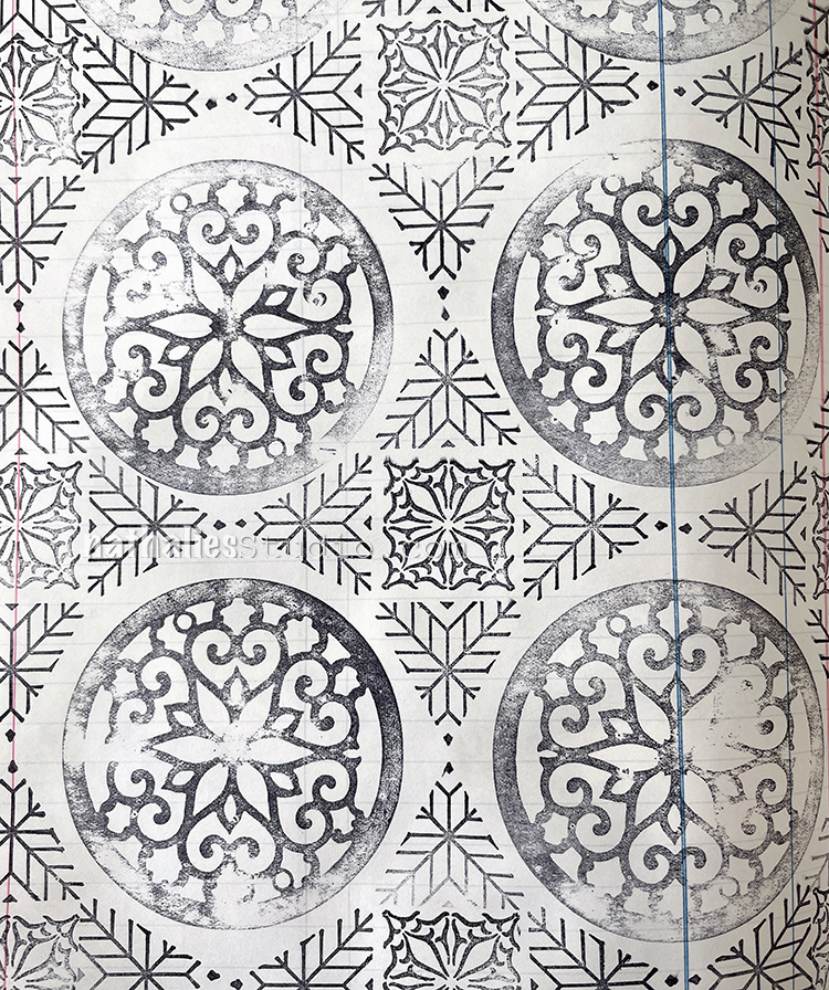
I wanted to pick up the way I created the pattern for the Hypocrites art journal page, but this time I chose different patterns out of each stamp set – my Large Circle JumbleTriangle Love, and Floral Tile Small rubber stamp sets.

I stamped right onto the background with black archival ink and then used Daniel Smith watercolors on top. This works because the archival ink is waterproof.

Then like the Hypocrite page I did a sketch with muted violet ink on deli paper, added some white acrylic paint into the ink to add to the face and make the background less prominent, after I added the deli paper to the background with liquid matte medium.

For the journaling I used the tissue paper-like strips with adhesive backing that I found recently. I still don’t remember where they came from and what they are. I wish I did as I am growing found of them LOL

Here are some of the supplies I used:

Leave a comment

Happy Easter! Happy Spring!

Happy Easter! Happy Spring! This time of year always gives me a little boost – the air is warming, the parks are greening up, the farmer’s markets will be opening up soon, and flowers are in bloom. I usually also feel more inspired and I am in the mood to create. Are you feeling some new creative energy too? How about a roundup of Spring and Easter themed projects to give you some ideas?

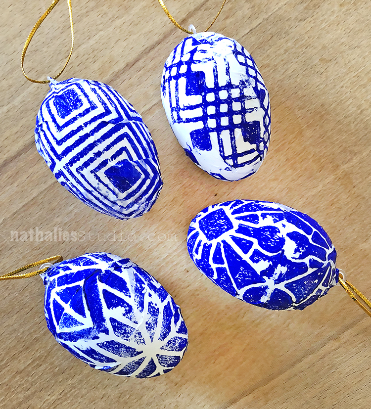
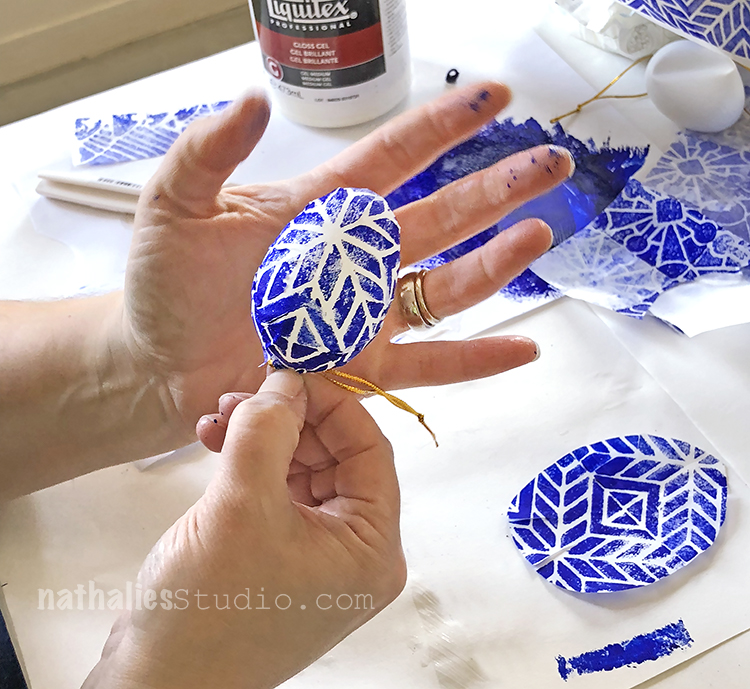
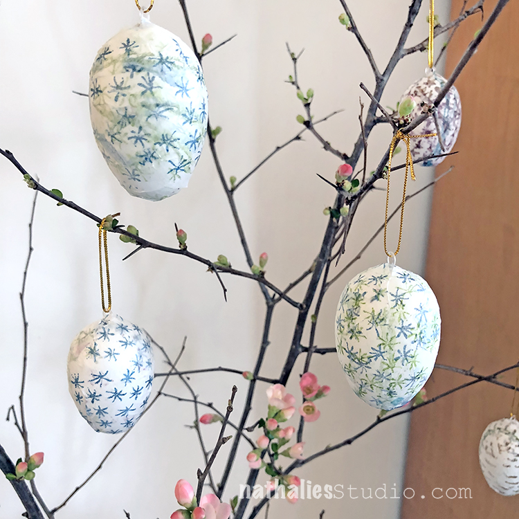
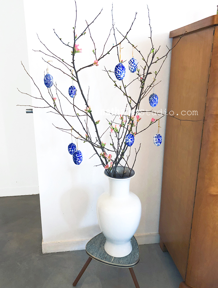
Creating these classic Easter decorations is one way to celebrate the season. In this project we covered hanging eggs with collage papers that we made using my Buenos Aires and Santiago foam stamps and my Embroidery rubber stamps. Store bought hanging plastic eggs can easily be personalized with stamps using color and pattern to suit your style.

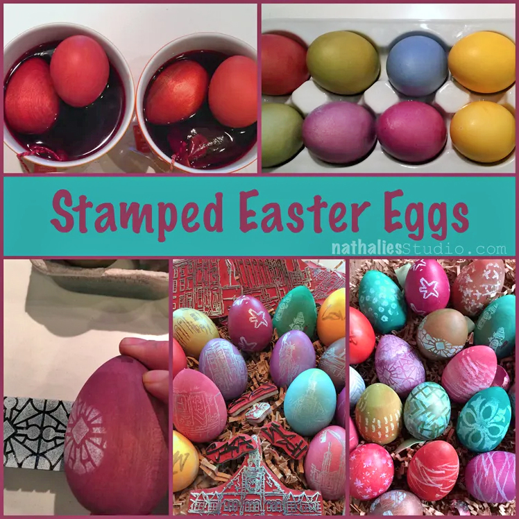
Do you and your family love dyeing Easter Eggs? Take your tradition to the next level and possibly even create future heirlooms with my tips in this post. I show how to decorate wooden eggs, blown out eggs, and hardboiled eggs in beautiful deep colors and contrasting stamped patterns and designs.

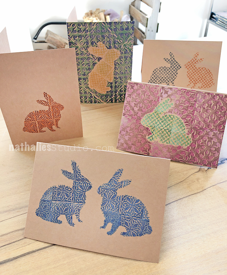
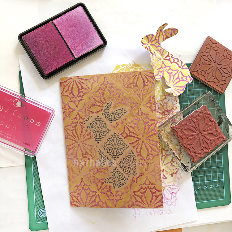
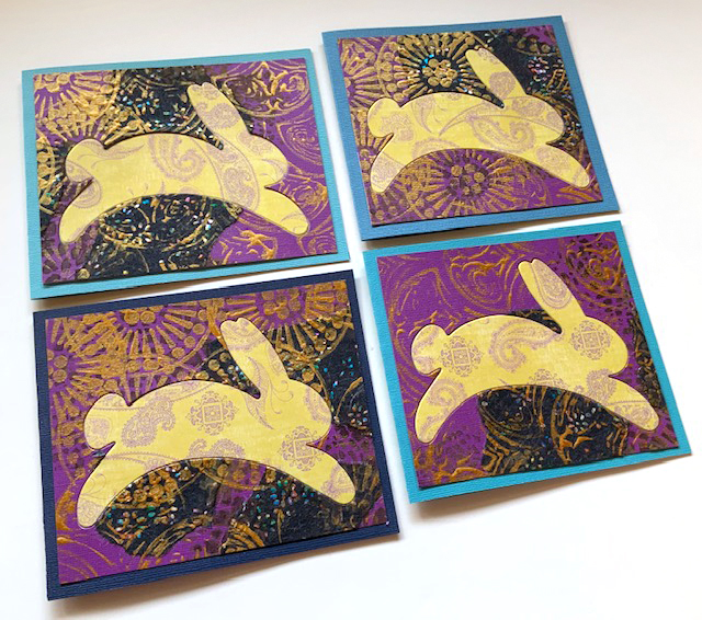
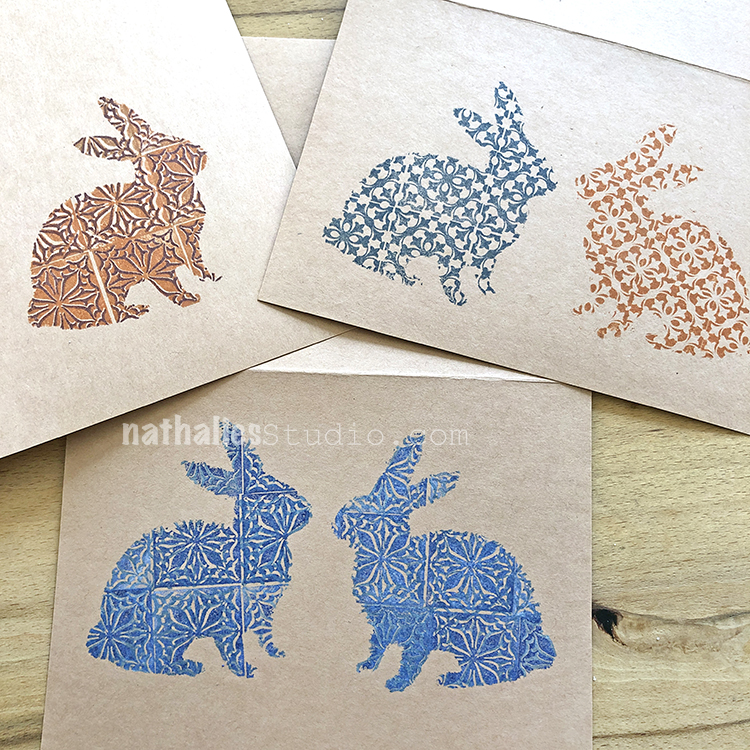
Cards are another way to get creative this time of year. We created bunny silhouettes and turned them into stencils and masks for this stamping project using my Floral Tile Small and Large stamp sets. You need just a few colors of ink and some pattern stamps to fill in the bunny shape.

Our Creative Squad member Judi Kauffman used a bunny die to turn out a whole bunch of stamped Easter cards. See her technique here for stamping with my Grove St foam stamp and using scrapbook papers in seasonal colors.

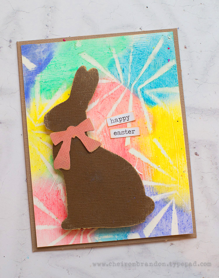
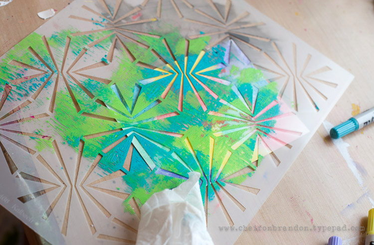
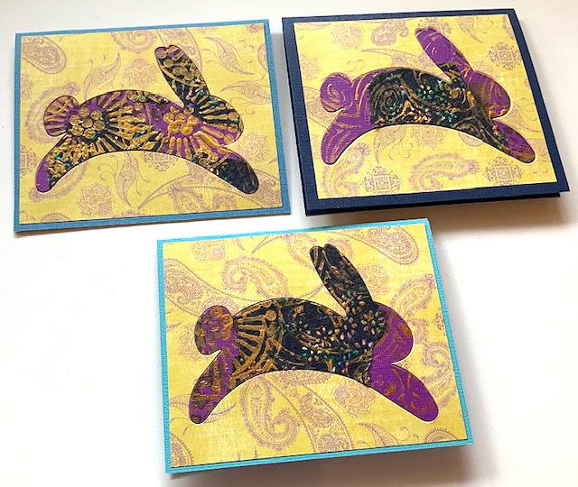
Another Creative Squad member Cheiron Brandon shared this project with us using my Beacon stencil, happy spring colors, and a bunny die cut for her Easter card creation.

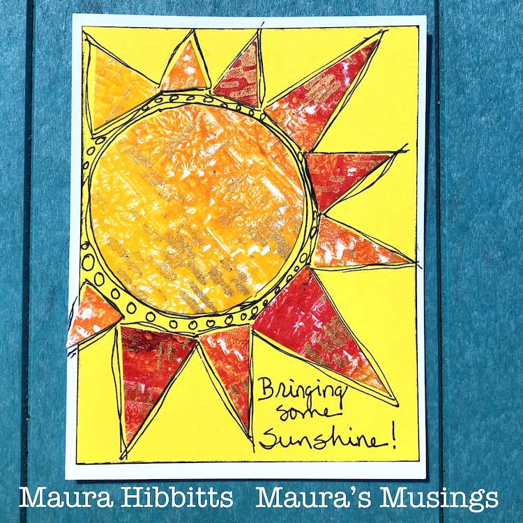
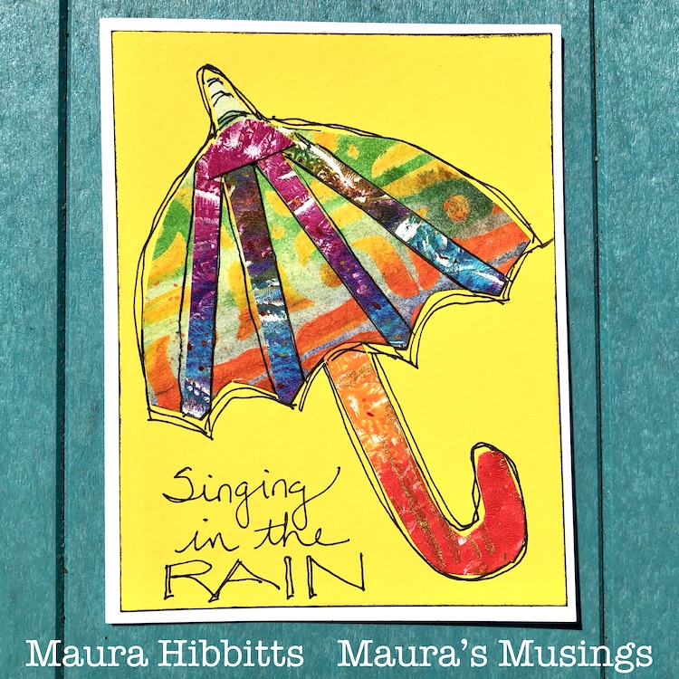
Even if you don’t celebrate Easter, there is plenty to be happy about when it’s Spring. More sunshine and even a rain shower or two mean more flowers, so bring them on as Creative Squad member Maura Hibbitts has in these fun seasonal cards. She’s using my Signals and Amsterdam stencils for all that texture and pattern.

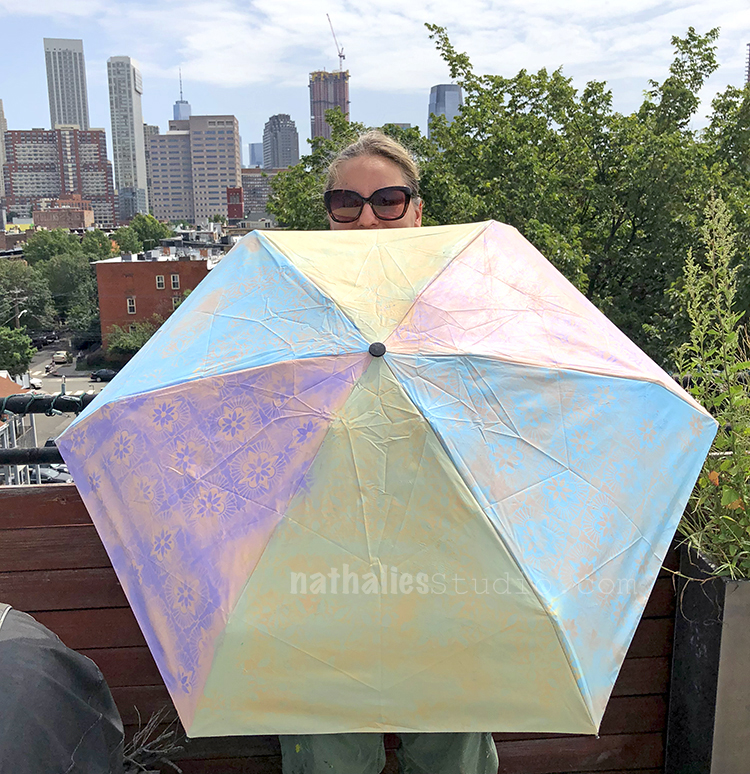
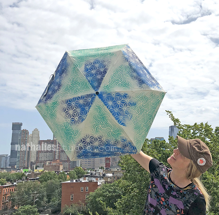
Did someone call for rain? Just another excuse to grab a stenciled umbrella like I made here in this play date with Kim. You can buy plain white umbrellas, or start with any color, and use spray paint and stencils like my Hamilton, Star Struck, and Flower Maze.

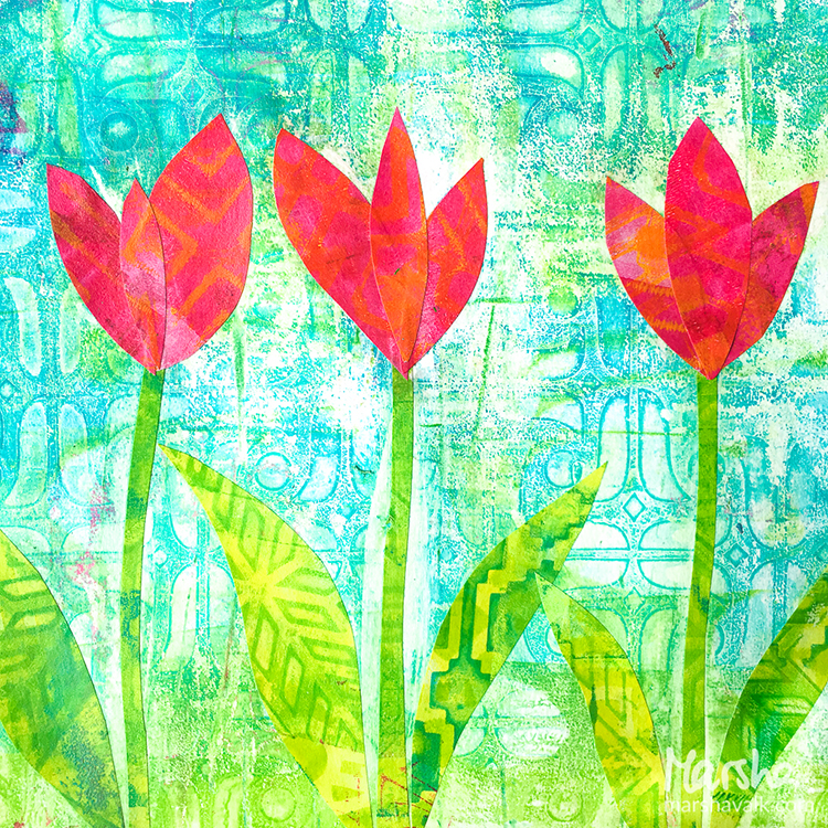
When the sun returns it’s time to head back outside and admire all the blooms out there. Creative Squad alum Marsha Valk created this mixed media piece by collaging some stenciled papers using my Amsterdam, Santiago, and Mesa Verde stencils. There is nothing like brilliantly colored tulips to lift your spirits this time of year.

I hope you enjoyed some of these Easter and Springtime projects and that you feel excited to try a few of the ideas. Happy Easter! Happy Spring!

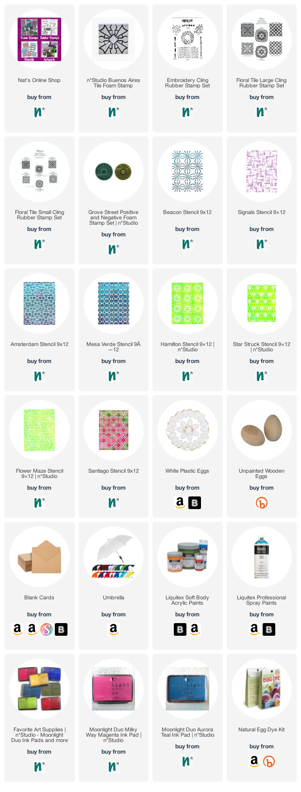
Here are some of the supplies I used for these projects:

Comments (1)

  • Sue Clarke

    |

    I just love the shapes of the bunnies on those cards Nat.
    I used to have cards (purchased) that had the sentiment:
    Happy Easter! Happy Spring! Happy Happy Everything!
    Yes! This time of year promises new hope…and my mood reflects it.

    Reply

Leave a comment

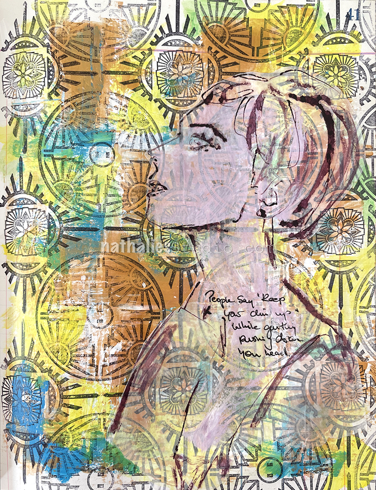
Hypocrites – Art Journal

“People say ‘Keep your chin up’ while gently pushing down your head.”

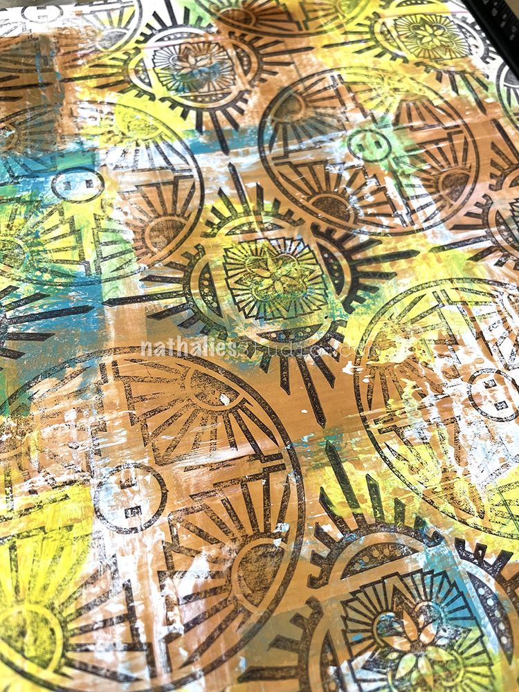
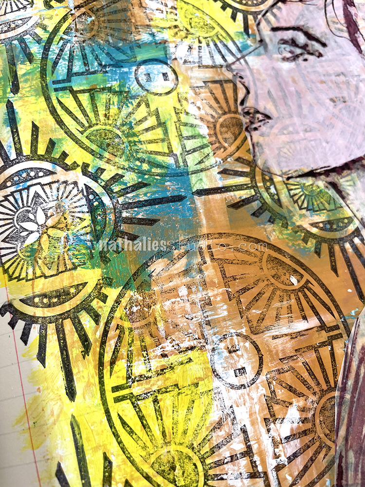
Using a credit card, I put down some colors with different viscosities – heavy body Liquitex white acrylic paint, soft body gold and blue acrylic paint, as well as some yellow acrylic ink, picking it up with the card and scraping the colors partly into each other. The white heavy body paint stayed wet and pliable for a longer time making for some really nice grungy marks.

After the paints dried I added different stamps, my Large Circle Jumble, Triangle Love, and Floral Tile Small rubber stamps, to create a pattern.

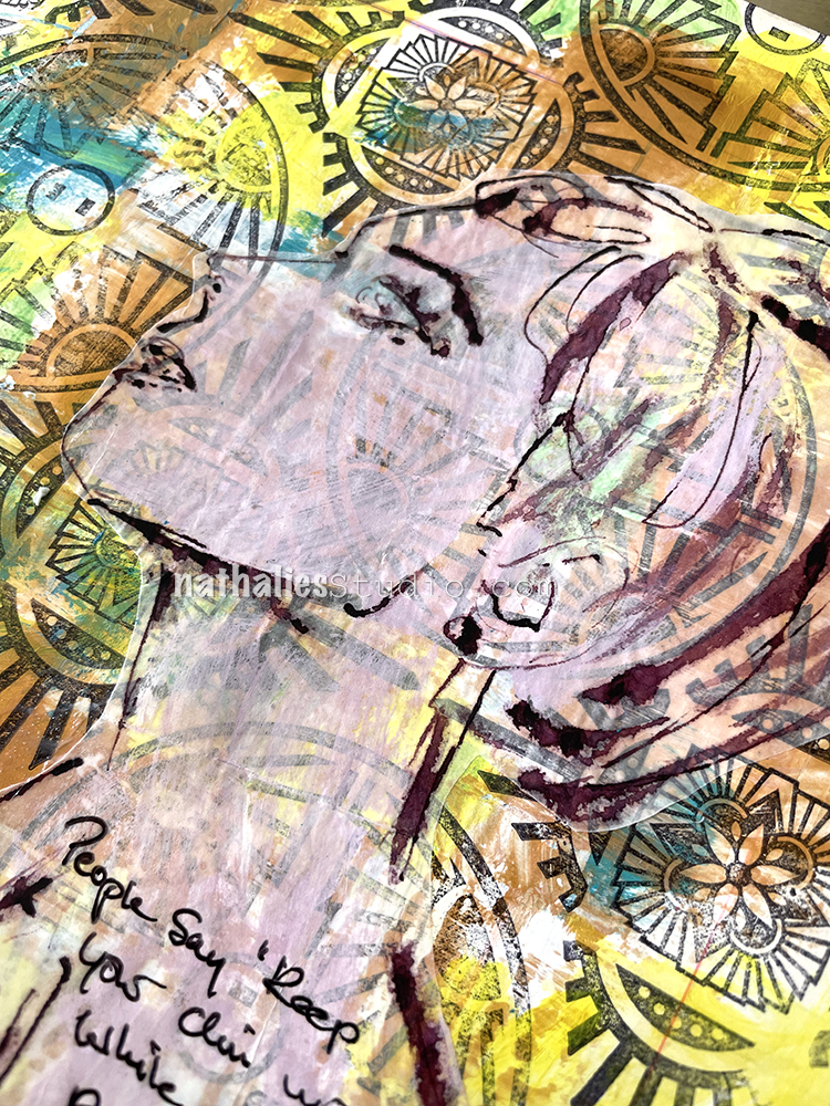
Then I sketched with a bamboo sketching pen and muted violet ink on deli paper.

As the background was very dark and prominent – unlike in the Things Change art journal page – I added some white acrylic paint mixed into the violet ink in a thin manner so that the background would still look through but not take over and “hide” the sketch. I adhered it with gel fluid medium.

Here are some of the supplies that I used:

Leave a comment

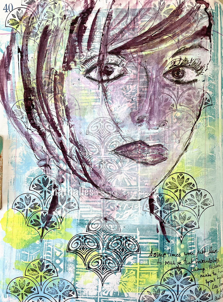
Things Change – Art Journal

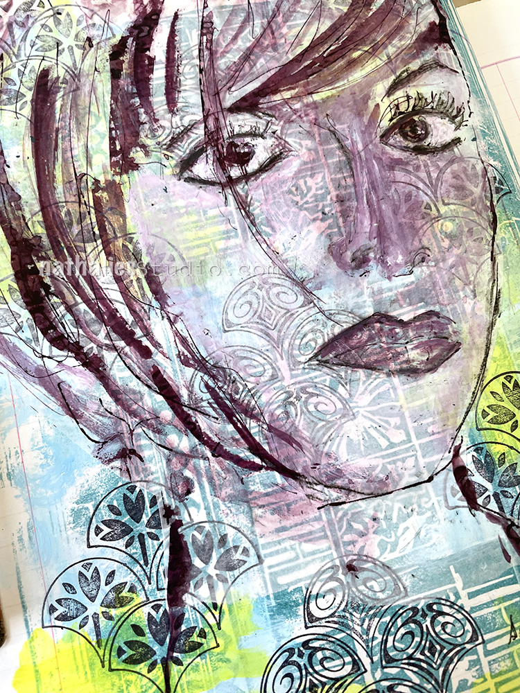
In this page I was just reminiscing that sometimes friendships change throughout the years and that is ok, it doesn’t lessen the good times, it is just a different path.

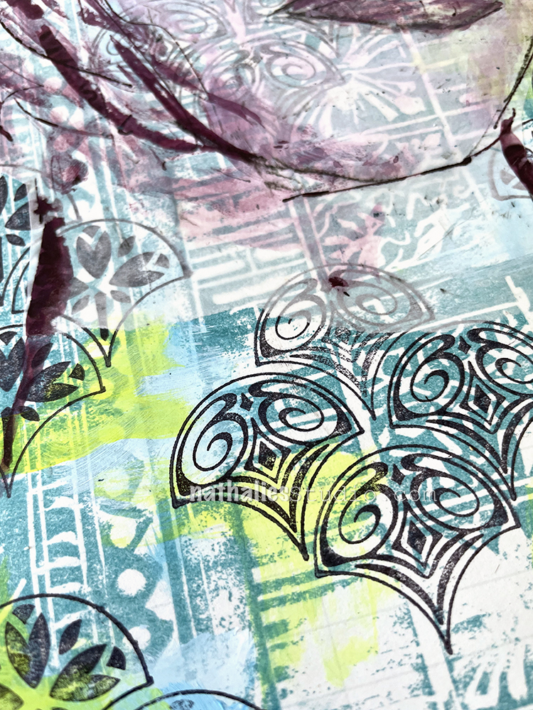
I started out the background with layering some of the architectural stamps I had carved a long time ago, using versa fine ink to stamp with them. Then I added a bit of yellow and light blue acrylic paint in some of the gaps to brighten it up. Next I stamped a pattern with my Fan-tastic Small rubber stamps and archival ink in black and added a sketch in ink done on deli paper. As you can see, I had a bit of a nose job struggle …but I am cool with it LOL. You just have to let go sometimes.

I adhered the deli paper with Liquitex matte fluid medium. I love when the background fades a little bit behind the deli paper but still comes through.

Here are some of the supplies I used:

Leave a comment