Creative Squad

Let’s Go Somewhere – Michelle Rydell


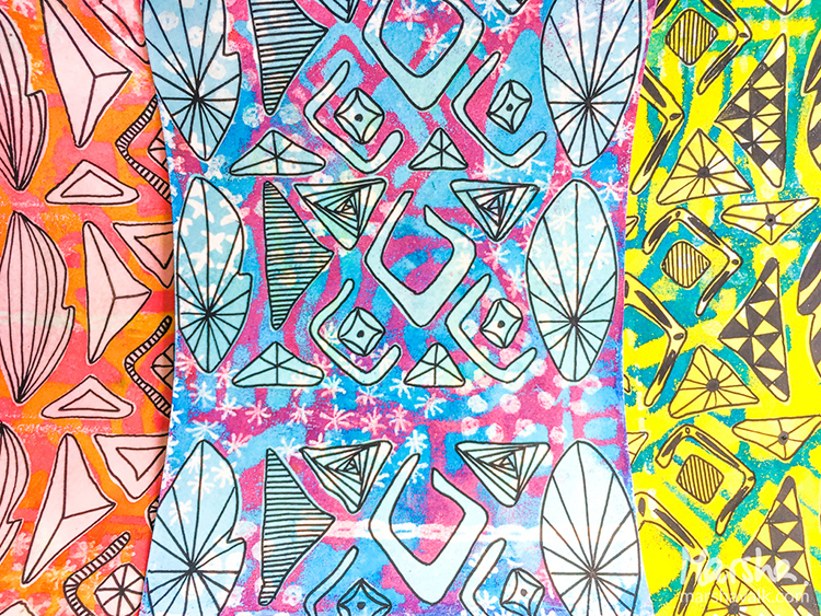
Happy Tuesday my friends! Today Michelle Rydell from my Creative Squad is sharing a happy and bright journal cover using the Batik Pattern 2 foam stamp, the Batik Pattern 4 foam stamp, and this month’s theme: Let’s Go Somewhere. We’re in the depths of winter here in the Northern Hemisphere and looking for an escape! This month let’s reminisce about past vacations and plan future adventures to help us get through these gray days.


I decided it would be fun to bring this month’s theme to the project of decorating my journal cover – which is the place where I document the biggest adventure of all – life! Here’s how I went about doing it…

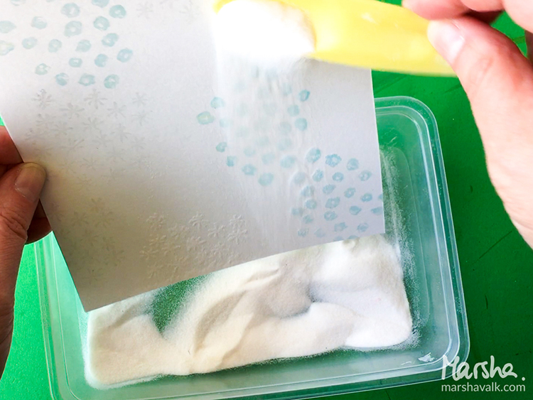
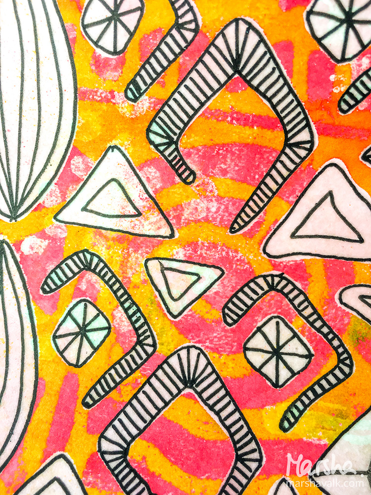
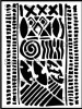
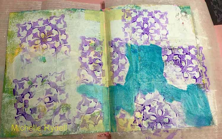
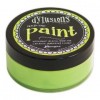
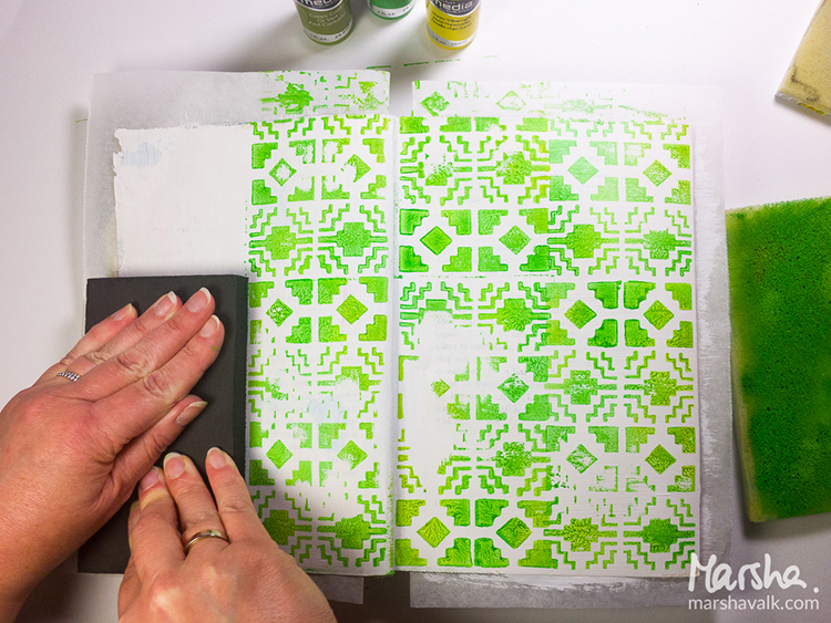
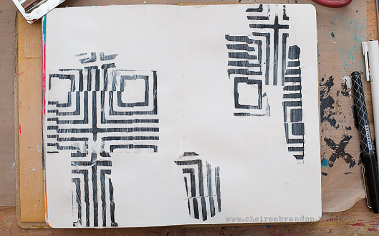
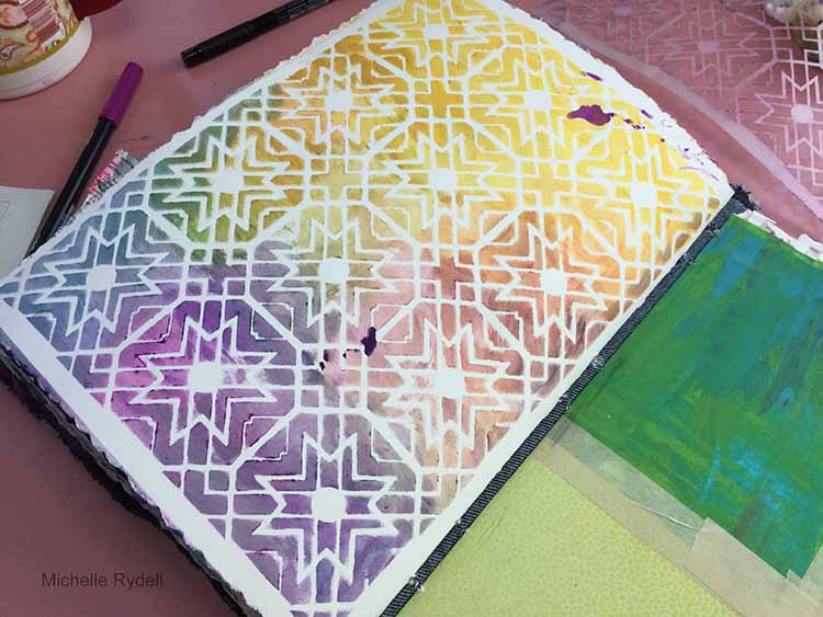
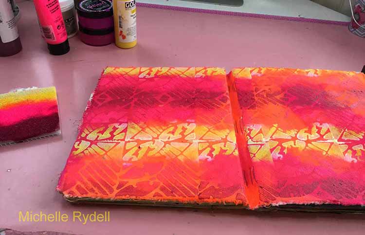
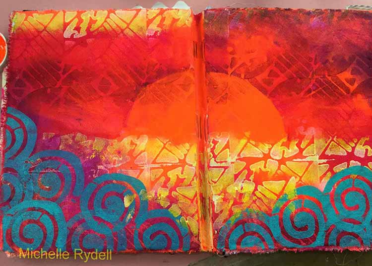
I already had painted a base coat of orange and pink paint on my journal cover. I busted out the Batik 4 stamp, the stamp buddy, and some pink, white, yellow and Quin Magenta paints to get started…

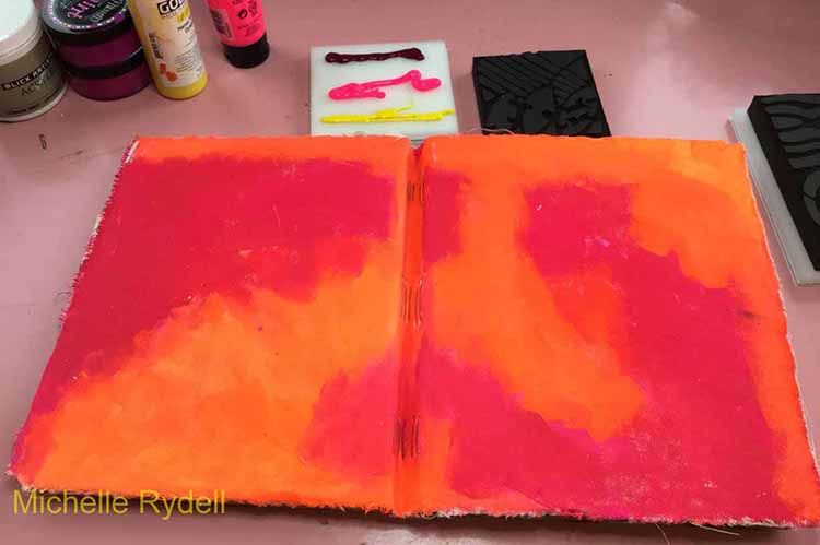
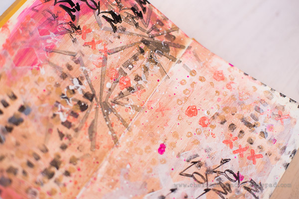
I applied the paint to the stamp buddy in a stripey pattern, and covered the whole cover with the Batik 4 stamp, in a tile fashion…

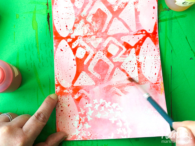
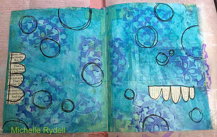
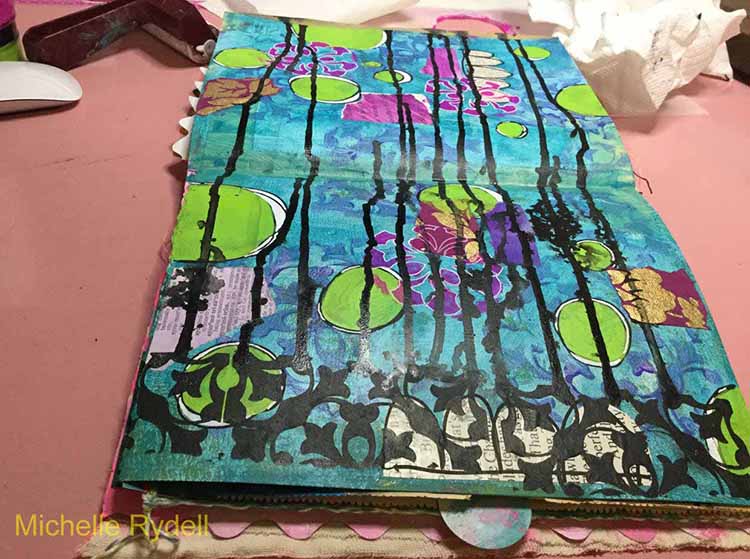
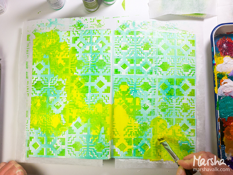
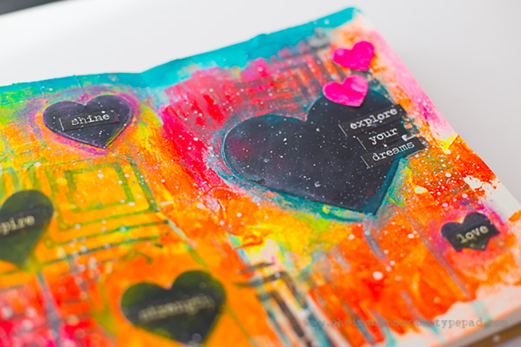
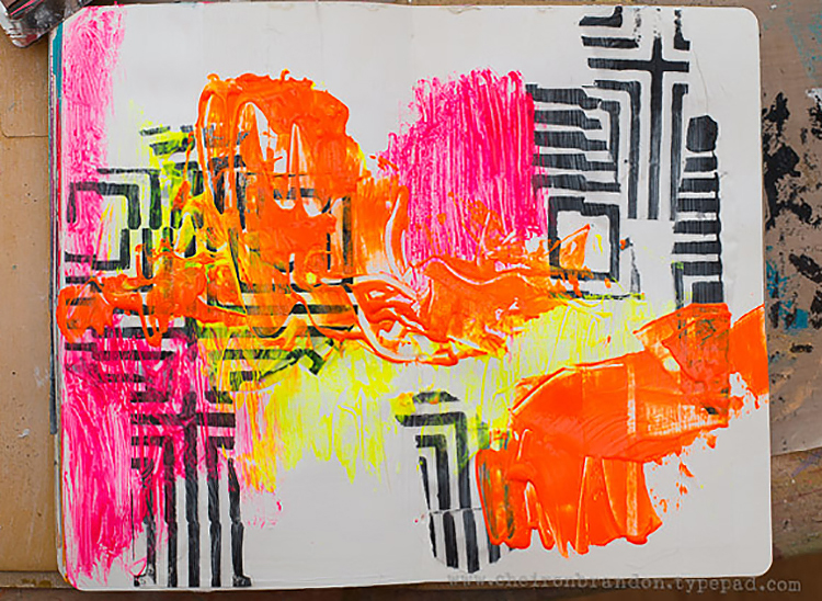
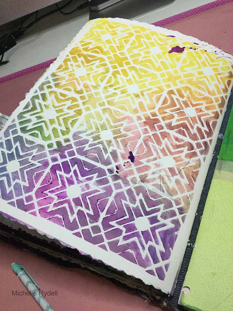
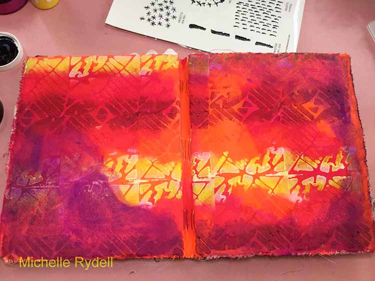
Next, I applied some fuschia and payne’s grey paint in random patches to knock back the busyness just a bit…

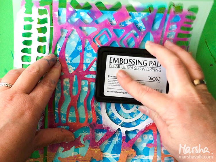
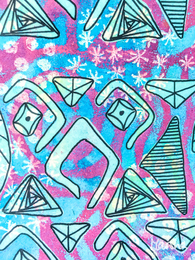
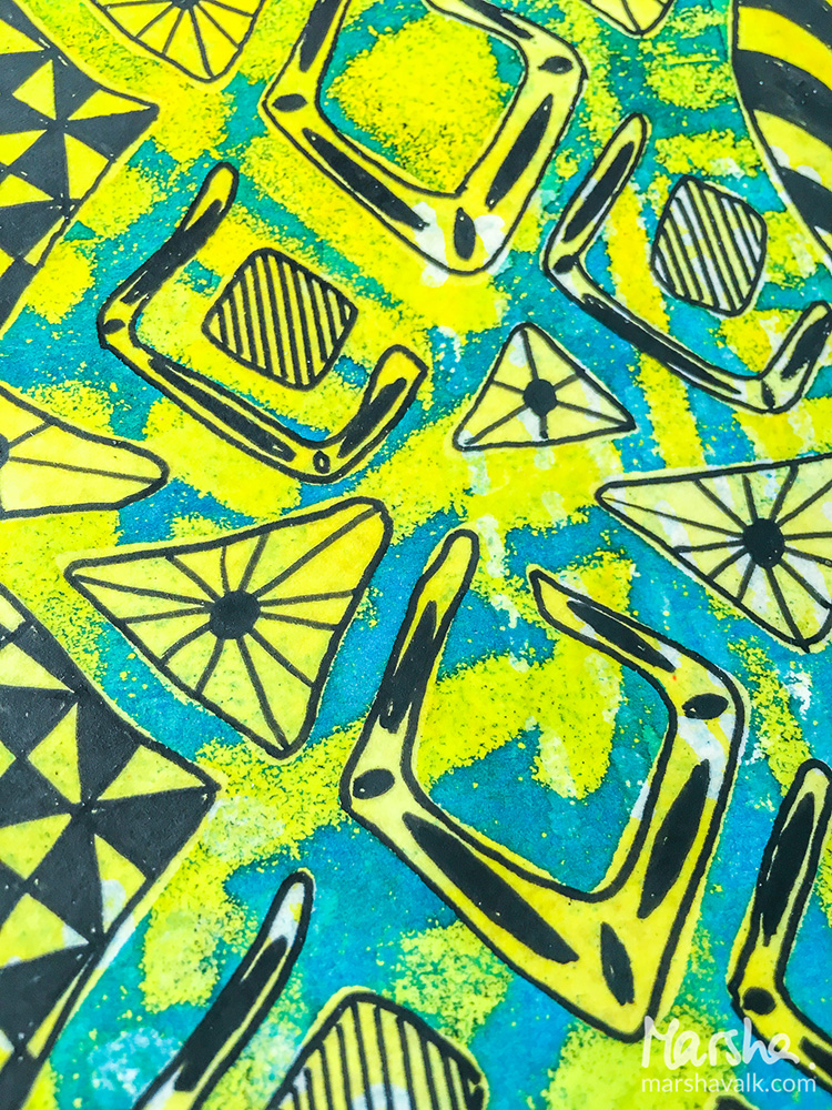
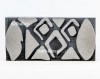
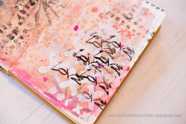
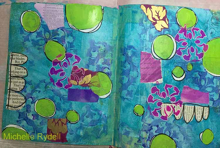
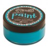
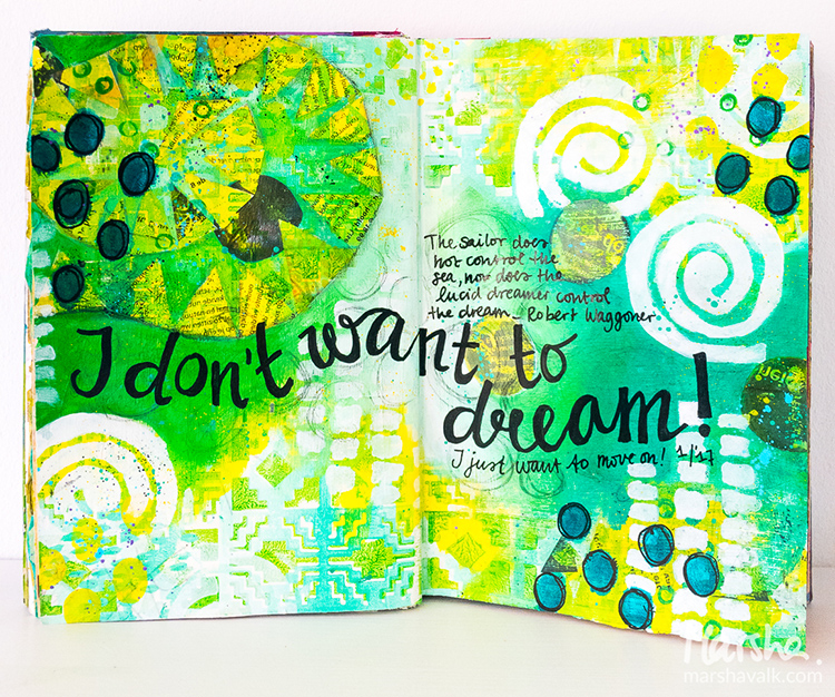
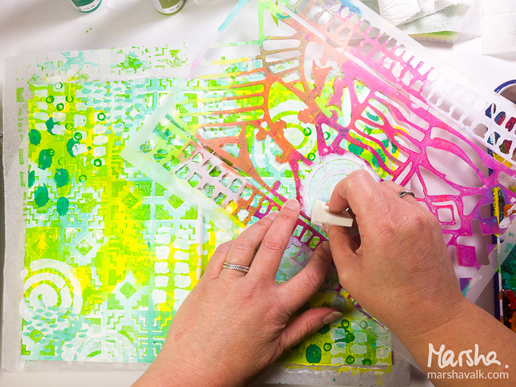
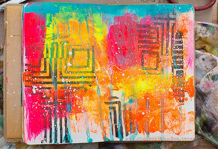
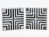
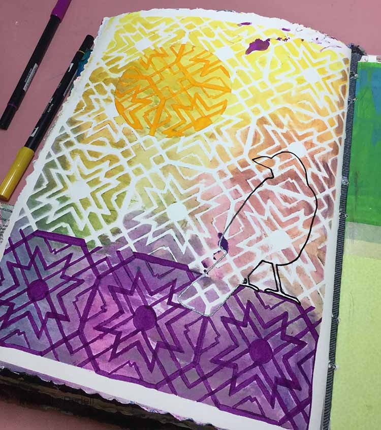
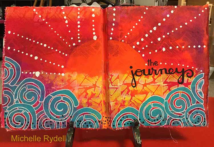
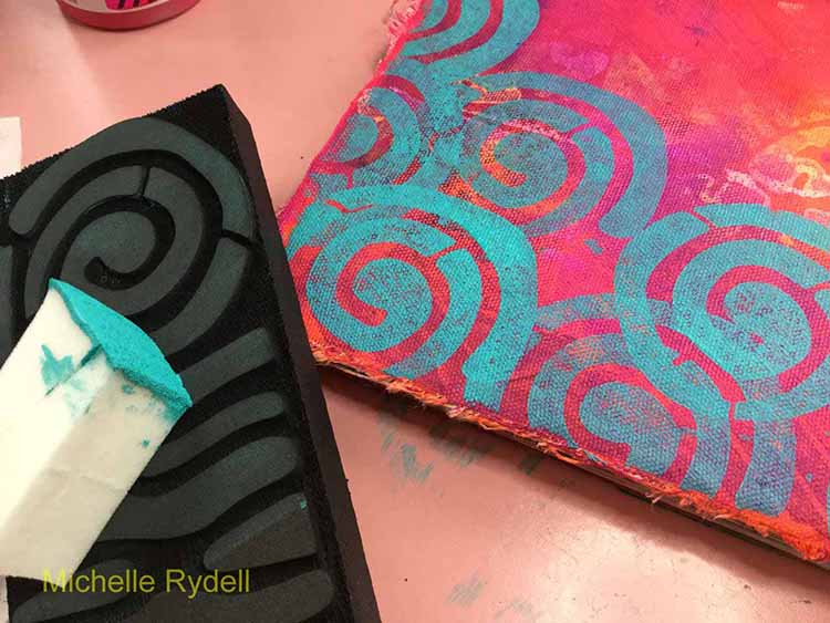
For the third layer I used the swirl from the Batik 2 stamp and turquoise paint applied with a sponge, to add a border along the bottom. After that was finished I could see the beginings of a sunrise peeking through. Do you see it?

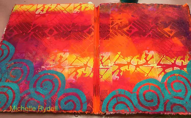
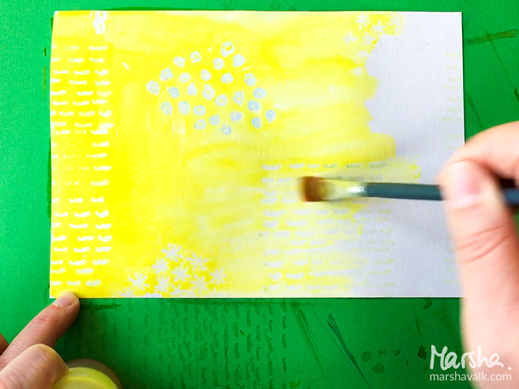
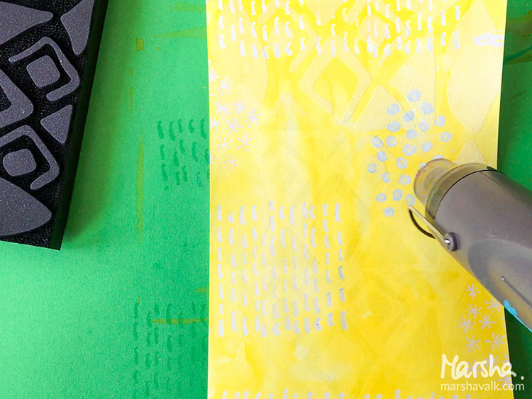
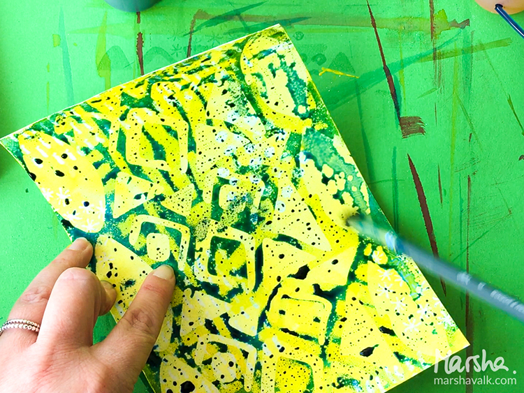
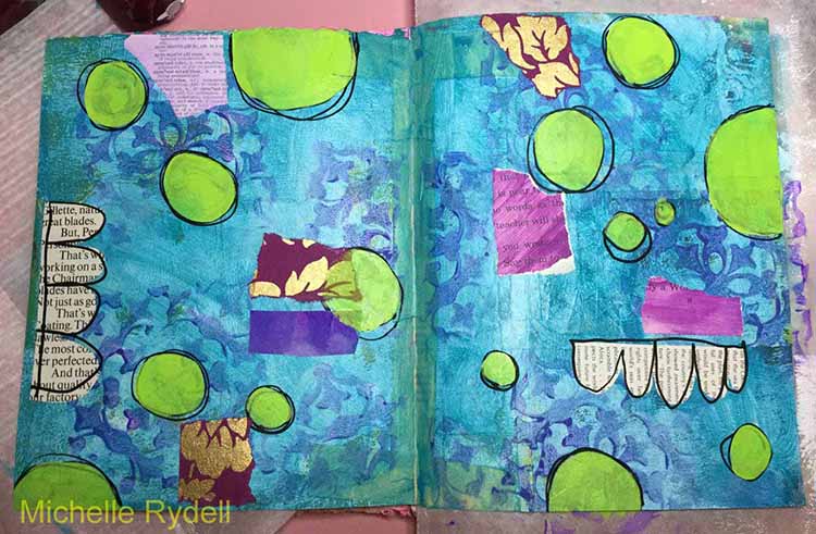
I decided to bring the sunrise out with some fluorescent orange paint; and filled in the rest of the foreground with more of the yellow and white Batik 2 stamping…

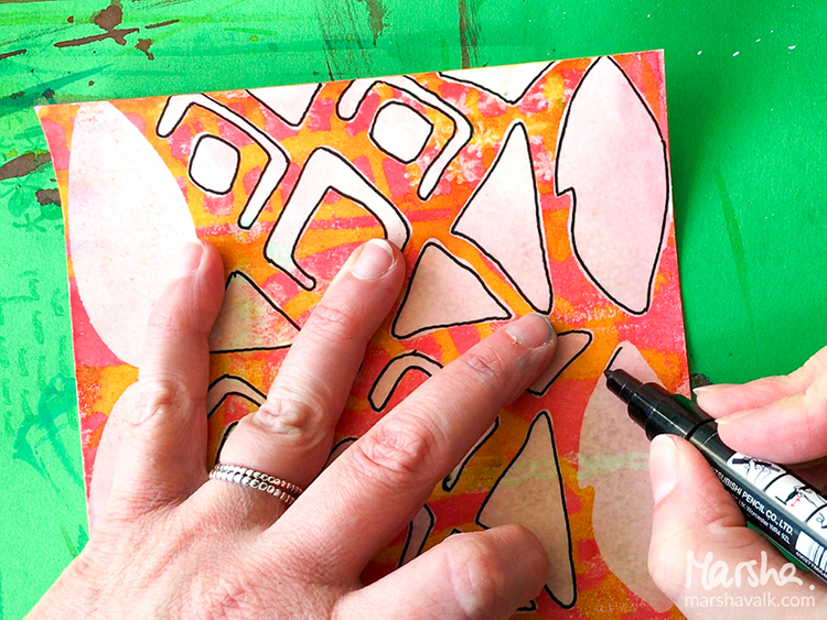
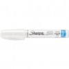
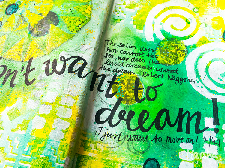
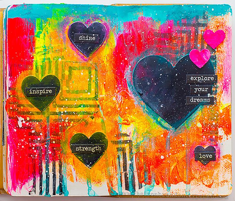
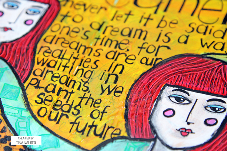
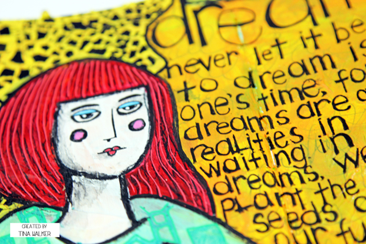
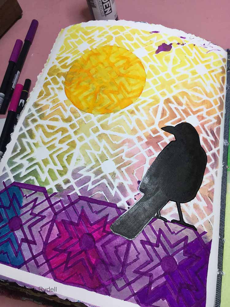
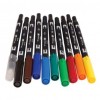
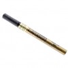
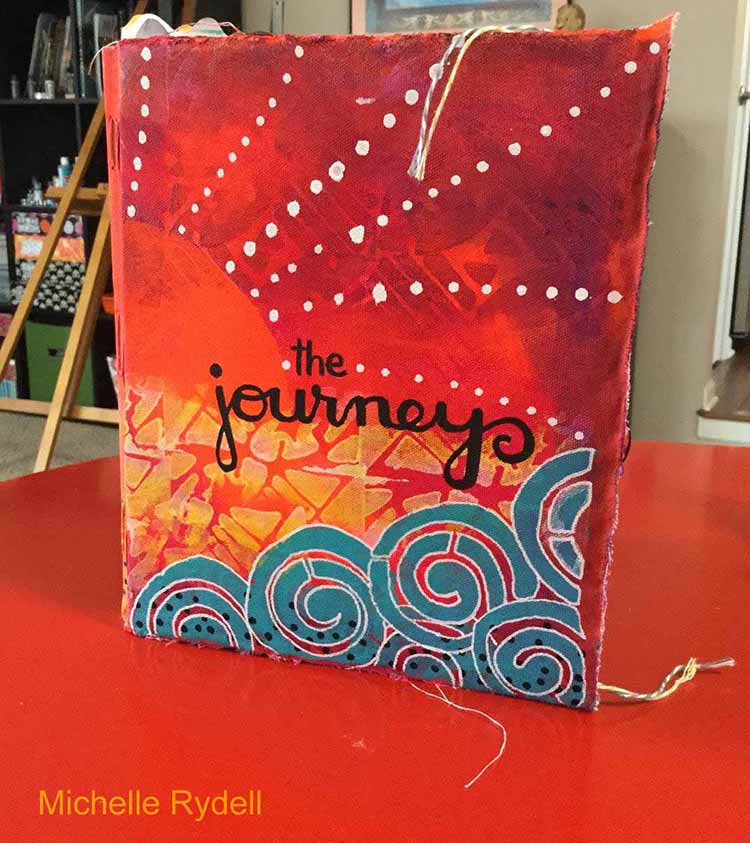
Final details were added with white and black sharpie poster paint pens. I’m so happy with my new journal cover – I’m all set to document the journey of life!


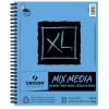
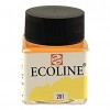
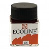
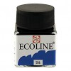
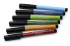
I love these colors!!! Thank you Michelle for such a vibrant project and for showing how you can use just parts of the Batik stamps to create new designs. Here are the supplies Michelle used in her post- some links are affiliate links:


Play along with us! I love to see how you interpret our monthly themes. Email me how you used my stencils and stamps with the theme and email me an image – I would love to share your projects in my “n*Spiration From Around the Globe“.

+ Expand this article
4comments

Comments (4)

  • Diane Baker-Williams

    |

    Love the colors you used. They make the white truly pop. Appreciate you sharing the steps you took to create.

    Reply

  • Sherry Canino

    |

    What a gorgeous art journal spread !! Absolutely love the colors too ❤❤❤

    Reply

  • Gerrie Johnnic

    |

    Love love love this! Wowza, what colors…….amazing project!

    Reply

  • Sue Clarke

    |

    Such vibrant colors Michelle! I feel like I took a few minutes on a warm island while sipping my chai this morning.

    Reply

Leave a comment

Let’s Go Somewhere – Marsha Valk


Today is Tuesday and that means it’s time for a post by my Creative Squad! Marsha Valk is sharing a fun and creative way to use the Batik Pattern 3 Foam Stamp, as well as the Batik Stencil, the Embroidery Stamp Set, and this month’s theme: Let’s Go Somewhere. We’re in the depths of winter here in the Northern Hemisphere and looking for an escape! This month let’s reminisce about past vacations and plan future adventures to help us get through these gray days.


Let’s Go Somewhere… Somewhere exotic… somewhere where there are palm trees… cocktails… and where the women wear beautiful patterned summer dresses in vivid colours!


The assignment was to use the Batik Art Foamies and batik only means one thing to me: fabric. So I decided to create patterned designs using embossing powder instead of wax in an attempt to make my paper look like batiked fabric. I’m not sure I succeeded, but it was a fun experiment!

Here are the steps I took. There are a lot of repeat steps, to create a multilayered look!

Step 1

Use embossing ink to stamp small patterns (like these stamps from the Embroidery Stamp Set) onto sheets of white (mixed media) paper. Sprinkle clear embossing powder on top and heat emboss.

Step 2

Cover your paper with watercolor. Let it sink into the paper, wipe off any watercolour that beads up on top of the embossed areas and let the paper dry.

Step 3

Take some papertowels, place your paper on it face down and iron with a hot iron. The embossing powder will melt and absorbed into the paper towel.

Step 4

Use embossing ink and stamp the Batik Pattern 3 Foam Stamp onto your paper. Sprinkle clear embossing powder on top and heat emboss.

Step 5

Cover your paper with another coat of watercolor. Use a slightly darker shade of the same colour or choose one that mixes well with the colour that is already on there. Wipe the excess watercolour off the embossed areas and let the paper dry.

Step 6

Apply embossing ink through the Batik Stencil onto your paper. Sprinkle clear embossing powder on top and heat emboss.

Step 7

Cover your paper with a last coat of watercolor. Use an even darker shade of the same colour or now choose one that mixes well with the colour that is already on there. Again: wipe off the excess watercolour from the embossed areas and let the paper dry.

Step 8

Take some papertowels, place your paper on it face down and iron with a hot iron to remove the embossing powder.

Step 9

Use the paper as a background for art journaling, use it as collage paper or… doodle on top to really make it look like patterned fabric!


Wowowwwoww! Thanks Marsha! The results are awesome and I definitely want to try this. Here are the supplies Marsha used in her post- some links are affiliate links:


Play along with us! I love to see how you interpret our monthly themes. Email me how you used my stencils and stamps with the theme and email me an image – I would love to share your projects in my “n*Spiration From Around the Globe“.

+ Expand this article
5comments

Comments (5)

  • nathalie-kalbach

    |

    Marsha, you amaze me ! I love the technique and the way you layered all the different tools and patterns on top of each other- and your video is super fun! Love it!!!! Thank You!

    Reply

    • marsha.

      |

      Well… Thank YOU for designing such wonderful Batik stencil and stamps!! This was fun!!

      Reply

  • Michelle Rydell

    |

    What a cool technique! I want to try this too! Thanks for sharing Marsha!

    Reply

    • Anna Friesen

      |

      Hi Shelley!! I agree!!! Now I wanna play!! Loved the techniques. (annarummagingthroughherout-of-cotrolartstash) ??

      Reply

    • marsha.

      |

      Thanks Michelle! Have fun playing!

      Reply

Leave a comment

Let’s Go Somewhere – Cheiron Brandon

Happy Valentine’s Day Everyone! Today is Tuesday and time for a post by my Creative Squad . Cheiron Brandon is sharing a beautiful Art Journal spread using the Batik 1 and Batik 2 Foam Stamps as well as the Embroidery and Stroll Through the Hood #1 Stamp Sets and this month’s theme: Let’s Go Somewhere. We’re in the depths of winter here in the Northern Hemisphere and looking for an escape! This month let’s reminisce about past vacations and plan future adventures to help us get through these gray days.


Hi there! Cheiron here with my monthly post. This month’s theme is Let’s Go Somewhere! I always love warm weather, but I am not opposed to snow an winter either. As we are approaching Valentine’s day my thoughts for my journal page drifted to Paris and the romantic pinks and blacks. I wouldn’t mind wandering through Paris in the snow and stopping to warm up every so often with some warm food and wine…

I created this page by laying down a foundation of gesso, then stamping with paint  to create lots of layers using the Batik Pattern 1 and 2 ArtFoamies and stenciled using the Beacon Stencil. I partially applied paint to the shapes I wanted by using a foam blending tool. I used lots of stamps from the new Mixed Media Stamps Embroidery Set and the awesome graffiti style love from the Stroll Through The Hood #1 Set.

To finish off the page, I added some splatter in coordinating colors. I can tell that these new stamps are going to be a staple in my art journal. I hope you are having a great day, whether its warm or cold where you are, and if you are planning a vacation or just dreaming of one!


Thank you so much Cheiron! I love how she used bits and pieces of the Foam Stamps instead of using them as a whole image and I also love the grungy feel of this page and the wonderful colors. Now I want to go to Paris too :)

Here are the supplies Cheiron used in her post- some links are affiliate links:


Play along with us! I love to see how you interpret our monthly themes. Email me how you used my stencils and stamps with the theme and email me an image – I would love to share your projects in my “n*Spiration From Around the Globe“.

Comments (3)

  • Michelle Rydell

    |

    Cheiron your page is beautiful! I love how you used the stamps, and those colors are yummy!

    Reply

  • Sherri Scott

    |

    Hey Nat! Of course you would have a Creative Squad. I’m glad Cheiron is a member. I have always enjoyed her work, it’s light, colorful and nice to look at.

    Reply

    • nathalie-kalbach

      |

      Sherri – so good to see you here :) Yes- I love Cheiron and her work! I hope I see you soon again my friend!!!! have a great rest of the week, Nat

      Reply

Leave a comment

Let’s Go Somewhere – Tina Walker


Hello Everyone! Today my Creative Squad is starting February with a new theme and some great new ideas for you. Tina Walker is sharing a really fun stamped fabric pillow using my Batik Pattern 4 foam stamp, some embroidery stitches, and this month’s theme: Let’s Go Somewhere. We’re in the depths of winter here in the Northern Hemisphere and looking for an escape! This month let’s reminisce about past vacations and plan future adventures to help us get through these gray days.


Hi! Tina Walker here today with my take on this month’s theme, ‘Let’s Go Somewhere’. What a perfect theme for the winter doldrums! During the guts of a cold, dark winter, I often dream of sitting on a warm beach, breathing in the salt air. When dreaming of ocean vacations my thoughts take me to faraway places full of color, vibrancy, and energy. Using these as inspiration for my project this month, I created a hand-made pillow using colors that remind me of beach blankets, fruity drinks, and the bright colors that are everywhere.

The base for my pillow is a rust-dyed piece of muslin. What a perfect way to represent the salt air and how it seems to oxidize everything it touches. The process of rust-dying is simple; place rusty metal pieces on-top of a piece of natural fiber fabric, spray with vinegar water and let the magic happen.

To create the bright, colorful feature of the pillow, stamp (using fabric paint) with your favorite Nathalie Kalbach ArtFoamies stamp. I used Batik Pattern 4, rotating the stamped image each time. Heat set per manufacturers directions.

For added dimension, hand-stitch over the stamped image in coordinating colors of embroidery floss. The more random, the better.

Machine stitch to ‘frame’ the stamped image. This also adds more dimension and a bit of texture.

Continuing the bright and colorful look, I made a ribbon flower for the center of the image. The ribbon flower pulls the four images together and finishes the pillow off.

Now let’s construct the pillow. Cut a piece of coordinating patterned fabric for the back of the pillow and place the front and back together, right sides facing each other. Machine stitch the entire outer edge except for a section on one side. Keep this section unstitched.

Turn the pillow right side out, using the unstitched section to pull the pillow through. Once you have the pillow right side out, iron the edges to create a crisp seam.

Stuff the pillow using your favorite stuffing. Hand stitch the open section using a blind stitch.

What vacation dreams do you have for 2017? Do they include the ocean? the mountains? or everything in between?

Thank you for taking time today to visit us today. See you next month.


Thank you Tina! I love how she combined the stamped images with embroidered touches. I am now officially dreaming of beach life! In addition to muslin fabric, patterned fabric, vintage ribbon, a vintage button, and a sewing machine, Tina used these supplies – some links are affiliate links:


Play along with us! I love to see how you interpret our monthly themes. Email me how you used my stencils and stamps with the theme and email me an image – I would love to share your projects in my “n*Spiration From Around the Globe“.

Comments (1)

  • Michelle Rydell

    |

    Tina – this is awesome! Such a creative and beautiful use of the stamps! The embroidery really makes it pop!

    Reply

Leave a comment

Dream a New Dream – Michelle Rydell


Hello! Today Michelle Rydell from my Creative Squad is sharing a super happy art journal spread using my Versailles Positive and Negative Foam Stamp set, my new Star Tag Cling Rubber Stamp, and her take on this month’s theme: Dream a New Dream. This January, let’s focus on all the possibilities of a fresh start.  What are your dreams for this year?  Whether it’s art-making, family, travel, or work related, January is a great time to dream about what the future could hold.


This month’s theme is sooo perfect for me, because New Year’s Eve/Day is my favorite holiday!  I adore the fresh start and the time to “Dream a New Dream!”

I had a quote that I wanted to document in my journal, and this was the perfect opportunity…

I’m creating this spread in my 8” x 10” junque journal. For reference, here’s what the pages looked like before I started…

I started building the background with a coat of gesso, some random stamping of one of the Versailles stamps (the negative), and a thin coat of turquoise paint.

The second layer was done with paint pen doodles and a couple of paper bits.

Third layer includes more scraps of paper – purple to bring out the underlying stamped images, and lime green for contrast…

One of the cool things about the Versailles stamps, is that, when I look at them I see designs within designs! Here, I wanted to bring out the circular part of the stamp, so I cut a circle in some deli paper – just the size of the part of the stamp I wanted to capture; then painted up the positive stamp and stamped thru the hole in the deli paper.  (You could actually do this without the deli paper, if you were a little more careful than I was with the paint application)…

I outlined the circle patterns with a white paint pen…

Then I turned the spread sideways, stamped the negative stamp with black paint along the left edge, and added some flow paint along the bottom. Lifted the page so it dripped randomly down the page.  These drips would work as journaling lines for my quote…

To finish the page, I filled in the spaces on the border and added the quote with a paint pen, used a Faber Castell Pitt Brush Pen to darken the background in places, and added some embossed white stars, using Nat’s new Star Tag stamp.


Thank you Michelle! I love Michelle’s uplifting quote and how she used the drips as journaling lines! In addition to some collage paper, Michelle used these supplies – some links are affiliate links:


Play along with us! I love to see how you interpret our monthly themes. Email me how you used my stencils and stamps with the theme and email me an image – I would love to share your projects in my “n*Spiration From Around the Globe“.

Comments (3)

  • Sharon Fritchman

    |

    Michelle, your style is absolutely amazing. I love everything about your art journal spread and your take on the theme.

    Reply

  • Jessica Sporn

    |

    What a gorgeous page and a great tutorial. I love that quote, the stamps, and Michelle’s exuberant style!

    Reply

Leave a comment

Dream a New Dream – Marsha Valk


Happy Creative Squad Tuesday! Today Marsha Valk is sharing a beautiful and bright art journal spread using my Santa Fe Positive and Negative Foam Stamp set, my Batik Stencil, and her unique take on this month’s theme: Dream a New Dream. This January, let’s focus on all the possibilities of a fresh start.  What are your dreams for this year?  Whether it’s art-making, family, travel, or work related, January is a great time to dream about what the future could hold.


I am not a dreamer. I mean: I definitely am a dreamer… but the zone-out, lost-in-thoughts kind, not a big-plans-for-the-future one!


I do plan for the year ahead, but I do that at the end of December and I’m usually all set and ready to go in January. This year I’m not quite that organised, but… January is already well on the way now and whilst I was creating my journal page, I kept thinking ‘dream’, but… my gut kept saying ‘no’. So even though I wanted the page to be about dreaming, it ended up about ‘not dreaming’.


I am excited about what the new year holds though and I chose to work with greens, because I’m super stoked about the Pantone colour for 2017: Greenery!


Thank you Marsha! I love Marsha’s honest take on our theme and wow those are some great colors! Marsha used these supplies – some links are affiliate links:


Play along with us! I love to see how you interpret our monthly themes. Email me how you used my stencils and stamps with the theme and email me an image – I would love to share your projects in my “n*Spiration From Around the Globe“.


Comments (4)

  • susan debourguignon

    |

    Marsha,
    i, too, am a daydreamer as opposed to a goal setter. the future is too much for my head to wrap itself around. i am not a fan of green, but your page really speaks to me. thank you for sharing!!!

    Reply

    • marshavalk

      |

      Thanks so much Susan! Glad to hear I’m not the only one! ;-)

      Reply

  • nathalie-kalbach

    |

    Such a wonderful take on the theme Marsha, and I love how you mixed the patterns of the Batik Stencil with the Santa Fe Foam Stamp – so gorgeous. Now I just want to move on to Spring ;)

    Reply

Leave a comment

Dream a New Dream – Cheiron Brandon


Hello friends! Today Cheiron Brandon from my Creative Squad is sharing a very happy art journal spread using my Manhattan Positive and Negative Foam Stamp set and this month’s theme: Dream a New Dream. This January, let’s focus on all the possibilities of a fresh start.  What are your dreams for this year?  Whether it’s art-making, family, travel, or work related, January is a great time to dream about what the future could hold.


Hi there! It’s Cheiron here with my January post, and this month is all about Dreaming a New Dream. I always love the start of a new year and the chance to set goals and recharge.

For my project today, I created an art journal page with some of my dreams and goals for the coming year. I used Nathalie’s Manhattan Positive and Negative ArtFoamies stamps to create some printed deli papers to use as part of my journal page. I love making black and white papers to use with really bright paints.

I then layered on some paints in bright fluorescent colors…don’t they make you happy?

I finished up my layers by adding more paints, some dripped fluid paints and some splatter.

I topped off the page with cut out hearts in black and added some word stickers to the hearts. I applies Distress crayons in various colors around the hearts and blended them in with my fingers, then added another layer of white splatter to the whole page using a splatter brush. Fun, easy page and a great way to think about what I want to accomplish for 2017!

Here’s a closer look at all the yummy color:


Thank you Cheiron! I always love the fun colors she uses and this one really makes me feel happy! In addition to a die cutting machine, Cheiron used these supplies – some links are affiliate links:


Play along with us! I love to see how you interpret our monthly themes. Email me how you used my stencils and stamps with the theme and email me an image – I would love to share your projects in my “n*Spiration From Around the Globe“.

Leave a comment

Dream a New Dream – Tina Walker

Happy first Tuesday of 2017! My Creative Squad is starting the New Year with a new theme and a fresh batch of inspiring projects. Today Tina Walker is sharing 2 uplifting art journal spreads using my Chicago Positive and Negative Foam Stamp set and this month’s theme: Dream a New Dream. Let’s start the New Year with a focus on all the possibilities of a fresh start.  What are your dreams for this year?  Whether it’s art-making, family, travel, or work related, January is a great time to dream about what the future could hold.


Hi! Tina Walker here today with my take on this month’s theme, ‘Dream a New Dream’. There is something about the freshness of each new year that kicks my mind into overdrive. I think of all of the possibilities, dreams, and wishes for the next 365 days and what I can/will accomplish. 2016 left us with uncertainty and sadness, so my dream for 2017 is for everyone to live a healthy, happy, and joyous year. May all your wishes and dreams come true and that you plant the seeds of kindness and hope for many years to come.

I created two art journal spreads that includes words to remember for 2017.

For spread #1, I used ‘Chicago’, positive/negative Art Foamies for a fun and colorful background. This is about as simple as it gets as a starting point. I alternated the color for more interest.

I hand-drew three body silhouettes and painted around the shapes so that they were highlighted on the page. Yes, I painted over the super cool background I stamped, but it’s all about layers. Layers make art journal pages special.

I painted each shape with white paint then added my journaling inside. Done! How’s that for quick?

For my second spread, I randomly painted blocks of color. Over the blocks of color, I painted 2 girls who would be the highlight of my page. I embellished the girls with a quick stamp of the ‘Chicago’ stamp. In addition, I wanted to ‘frame’ the girls and journaling, so I stenciled over the color blocks, using the ‘Crackle’ stencil. It adds the perfect punch of black.

Do you have creative dreams for 2017? If yes, I wish that all your dreams come true!

Thank you for taking time today to visit us today. See you next month.


Thank you Tina! I love the subtlety of the backgrounds she created and the figures! In addition to semigloss Art-C paints in Blue, Bright Red, Yellow, Lime, Orange, and Black, Tina used these supplies – some links are affiliate links:


Play along with us! I love to see how you interpret our monthly themes. Email me how you used my stencils and stamps with the theme and email me an image – I would love to share your projects in my “n*Spiration From Around the Globe“.

Leave a comment

Return to the Light – Michelle Rydell

Today, Michelle Rydell from my Creative Squad is sharing an uplifting art journal page using my Toledo stencil for this month’s theme: “Return to the Light.” As we pass through the Winter Solstice here in the Northern Hemisphere, the ever lengthening nights turn to ever lengthening days. This ancient marker in the calendar has always been a celebration of light and the promise of a new day. Let’s Return to the Light with some bright and luminous mixed media projects!


There’s something very magical about the winter solstice for me.  It’s our darkest day, but it’s also a time of hope – a time where we acknowledge our slow return to the lightness of spring.
 
I decided I wanted to play with the Toledo stencil for this project…
 
First, I sprayed a myriad of colored ink thru the Toledo stencil …


Then, so as to not waste any of that beautiful spray, I turned the stencil over onto a blank page, and cleaned it with a baby wipe…


I looked at the result, and it reminded me of a sunset! I envisioned a raven looking up to the sun, acknowledging the returning light. So I went about making that happen.
 
First, I sketched a basic raven shape with pencil.


I went over the raven with a Sakura Glaze pen. I then filled in the design on the bottom part of the page with tombow markers, to differentiate the ground from the sky. I used a lid from some gesso as a template to draw a circle in the sky; and colored in the white areas with a gold marker to represent the sun.


The raven got a coat of black paint, and the ground got some turquoise, magenta and purple marker added.


I blended the ground area with water. When dry, a thin coat of matte medium was added to make it waterproof.  I knew I wanted to add a white title, and the matte medium barrier would allow the white to stay white.


And here is the finished page. The black words around the sun were added with Pitt Pen, and the white on the bottom with a Sharpie Poster Paint Marker.


I love how Michelle always creates a scene and story in her work!  This one is a beautiful reminder that Spring will return. Michelle used these supplies – some links are affiliate links:


Play along with us! I love to see how you interpret our monthly themes. Email me how you used my stencils and stamps with the theme and email me an image – I would love to share your projects in my “n*Spiration From Around the Globe“.

Comments (2)

  • Rosie Grey

    |

    This is amazing!

    Reply

Leave a comment