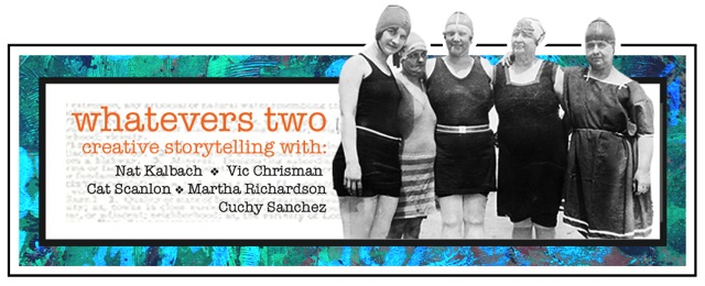
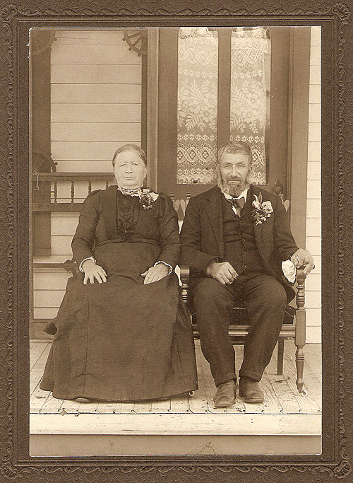
Are you ready for the next photo of the Second Round of Whatevers? If you missed what the Whatevers is all about (basically they are photos that my friends and I found on flea markets etc. and that we give a new life and story) or want to see all the past photos and takes…check it out here.
Click here to see what Cat, Vicki, Martha and Cuchy made out of the photo and which story they tell.
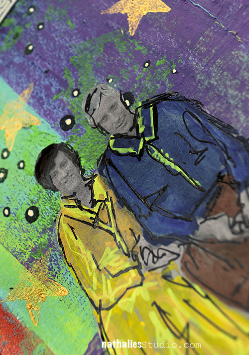
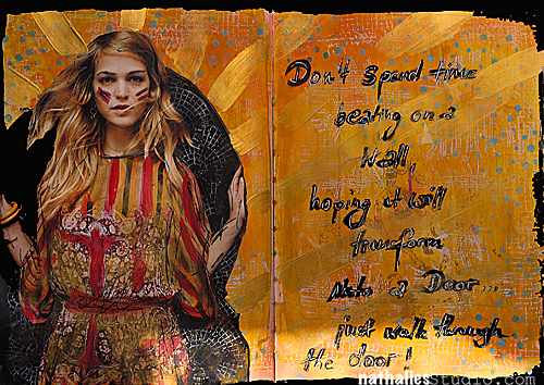
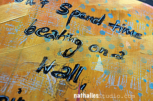
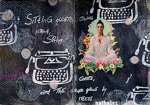
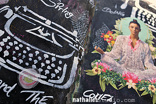
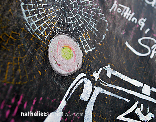
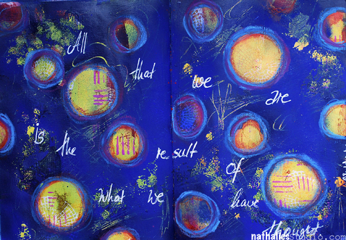
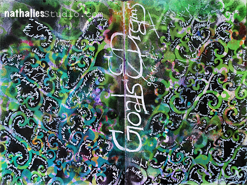
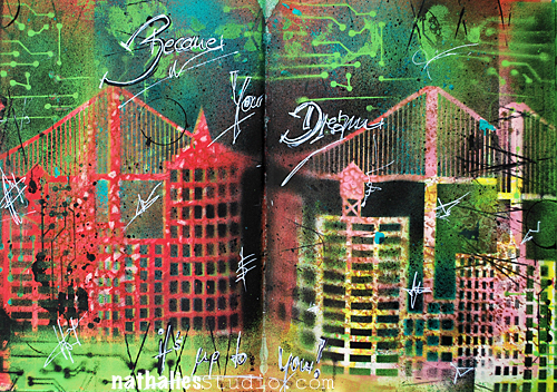
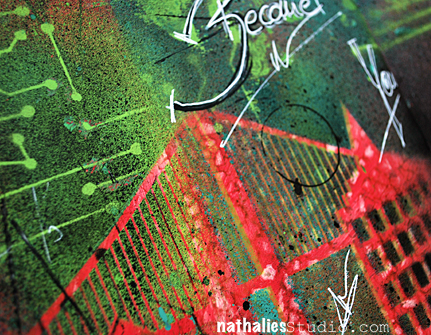
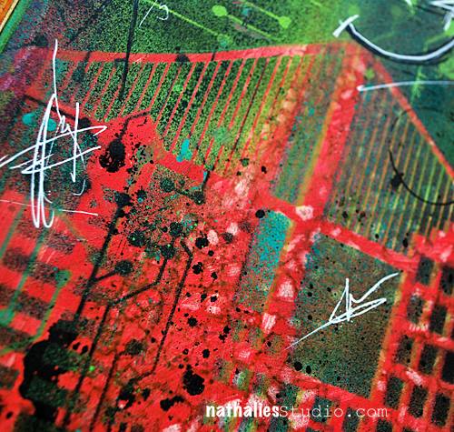
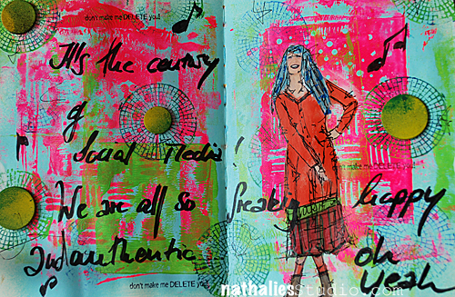
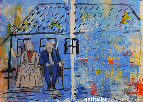
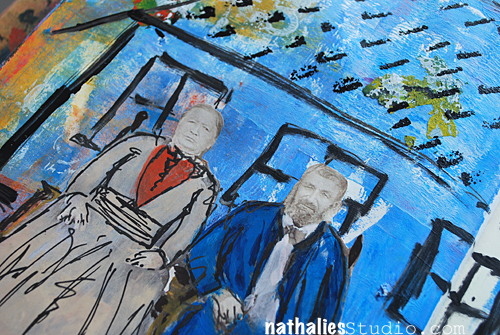
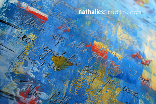
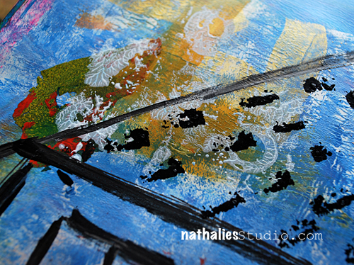
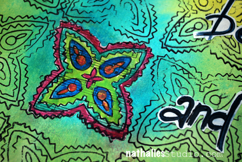
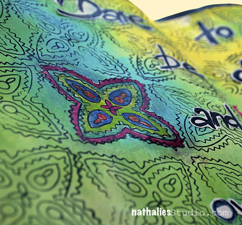
Here is my take on this month’s photo:
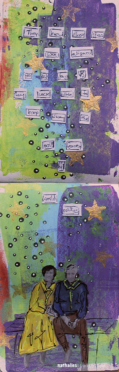
“They knew their stars were aligned as long as they were able to keep away the evil forces of world politics”. 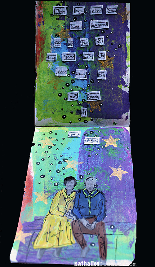
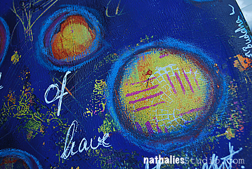
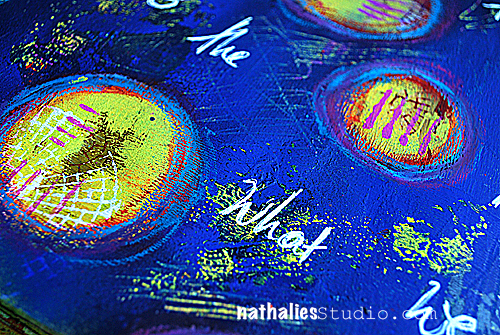
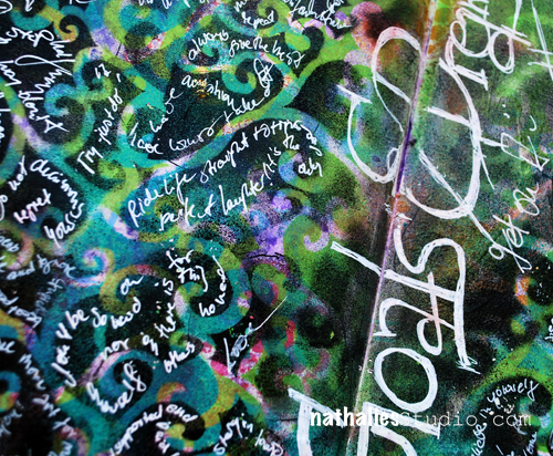
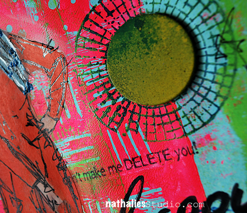
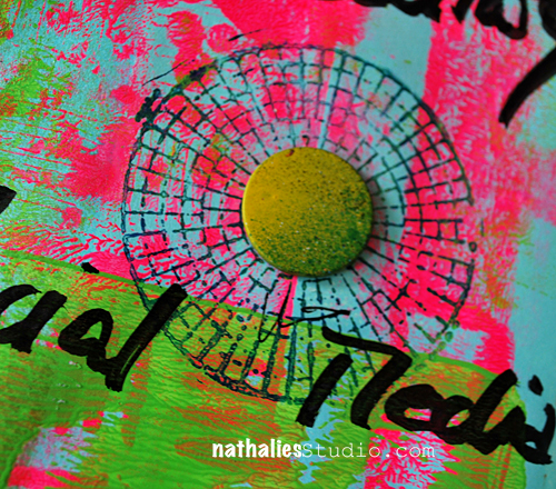
I worked in a smaller art journal this time and also changed the format. I wanted to see how I like it. 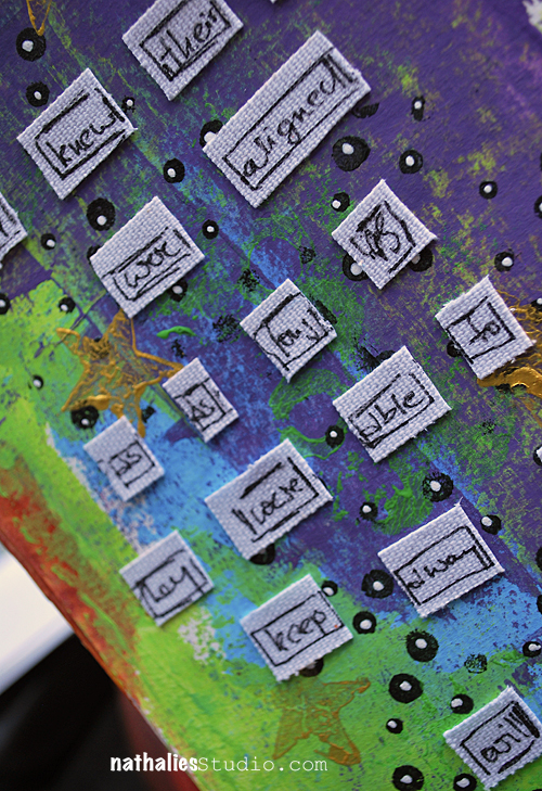 It was fun – I think it is a different way on approaching an art journal page.
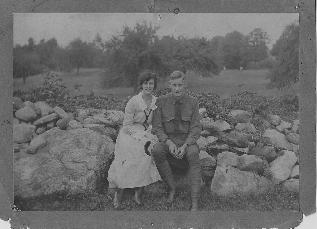
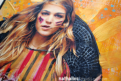
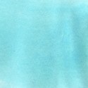
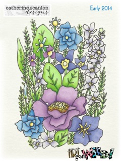
And here is the photo of this month’s Whatever for you :
You can play along with us and share your story with the Whatevers- just link it up so we can see it ![]()
 Loading InLinkz ...
Here is how it works
- Vicki, Cat, Cuchy (Carmen), Martha and I and I have made a one-year commitment to each other and picked twelve photos with Whatevers whom we will give a story.
- Every month – if possible always on the 15th – each of us will do a post with an individual story that goes along for us with the same photo.
- If you want you can play along and we will have the photo for you to download and show us your version of The Whatevers. The photo will be posted at the end of our blogposts- not on Facebook!
- There is no rules to the story itself- it can be funny, sad, uplifting, breathtaking- WHATEVER
- There is no rules on the length or the form of the story– it can be a short sentence, an essay, a poem or a soap opera – WHATEVER
- There is no rules on the artform you choose – it can be a scrapbook layout, an altered art project, an artjournal page – WHATEVER
- Here is a rule though: if you take the photo you have to link back to us and show us your story.
- These pictures are from our personal stash and are for personal use for you only! If you want to use them for a publication whether a book or magazine in print or digital form please ask for permission!
- If you want to participate we’ll have a linky list for each Whatever Post.
- You can also join our The Whatevers -Facebook Page
 Have a gorgeous day! Nat
 ![]()


Comments (4)
Sue Clarke
| #
I love reading the stories that go along with the Whatevers creations.
Especially that they are all so different. TFS
Reply
Catherine Scanlon
| #
I love the Hand Journals — though sometimes find the one I have a bit on the small side. Your colors in the background are great — looks like Winston and your Man coordinated their outfits this month, LOL.
Love your colors!
Reply
Martha Richardson
| #
Love how you used the new journal…is this story about anyone we might know???
Reply
Cuchy
| #
the stars and the planets should be aligned for them :)
powerful colors. I love it!
Reply