Creative Squad

Vacation Mode – Marsha Valk


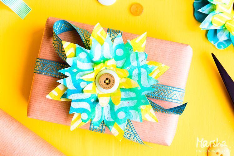
Hello from the Creative Squad and a big farewell hug to stellar squad member Marsha Valk! This will be her last post with us and we thank her so much for all the inspiring, creative, and amazing projects that she has made for us. She has been on the Creative Squad since the very beginning and has always gone above and beyond with her posts and her unique way of using my stamps and stencils. We wish her all the best as her Artful Adventure continues :) So for her last post, Marsha brings us a suite of prints celebrating patterns with my Downtown foam stamp set and my Mini Chicago foam stamp set and inspired by our theme: Vacation Mode – Here in the Northern Hemisphere, we are slogging through winter with only one thing on our minds – vacation! Whether it’s Spring Break, a weekend getaway, or an hour with a good book, everyone needs an escape to Vacation Mode now and again.


Vacation Mode to me means: Slowing down. Reading a lot. Perhaps doing some sketching (but only if I feel like it). Eating yummy food. Seeing the sights and visiting at least one museum. Enjoying the sun! It has been a while since my last vacation abroad.

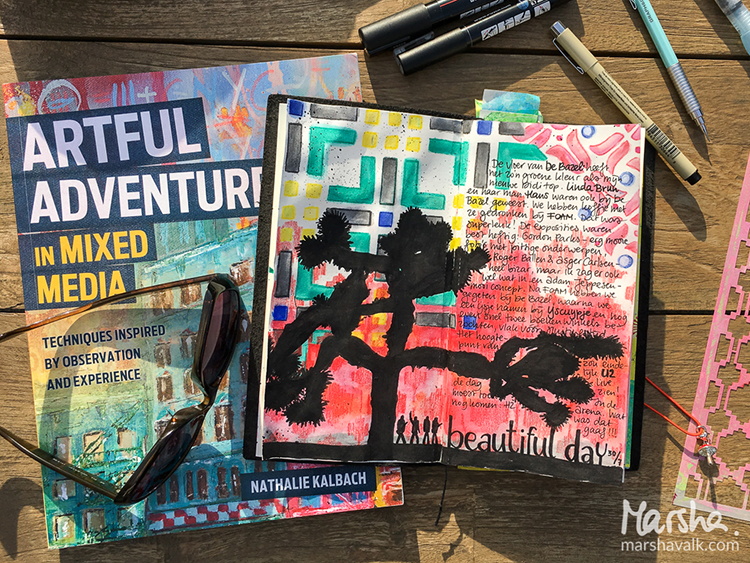
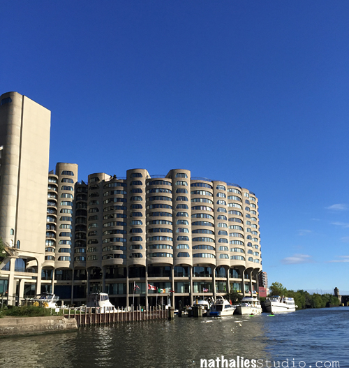
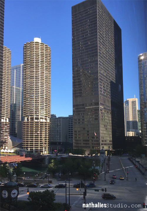
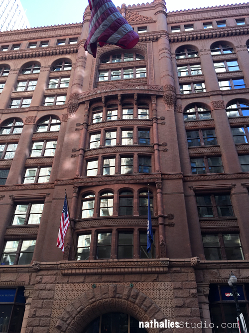
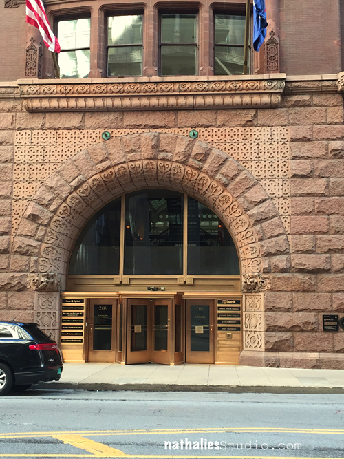
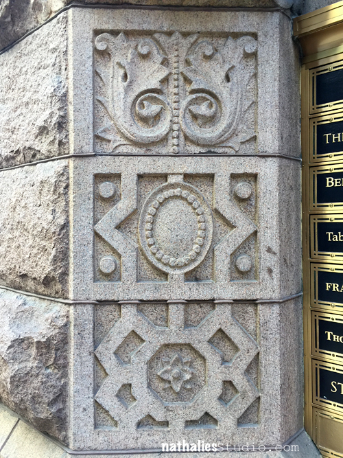
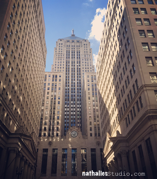
Much like Nat does on her travels, when I’m on vacation I observe and photograph lots. And because many of Nat’s ArtFoamies are inspired by her travels, I thought about my last vacation and had a look at the photos I took.

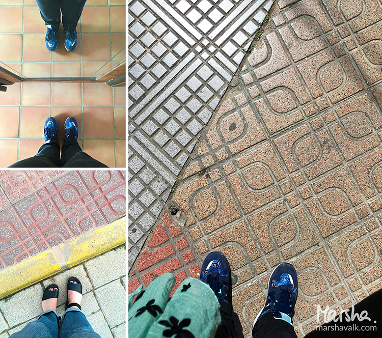
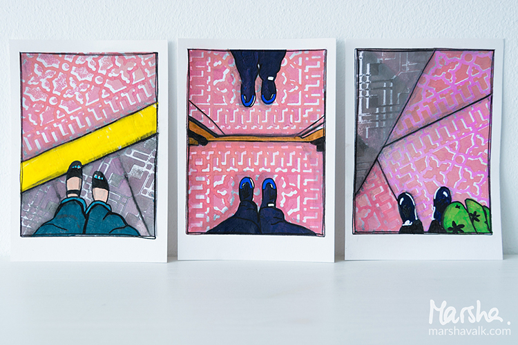
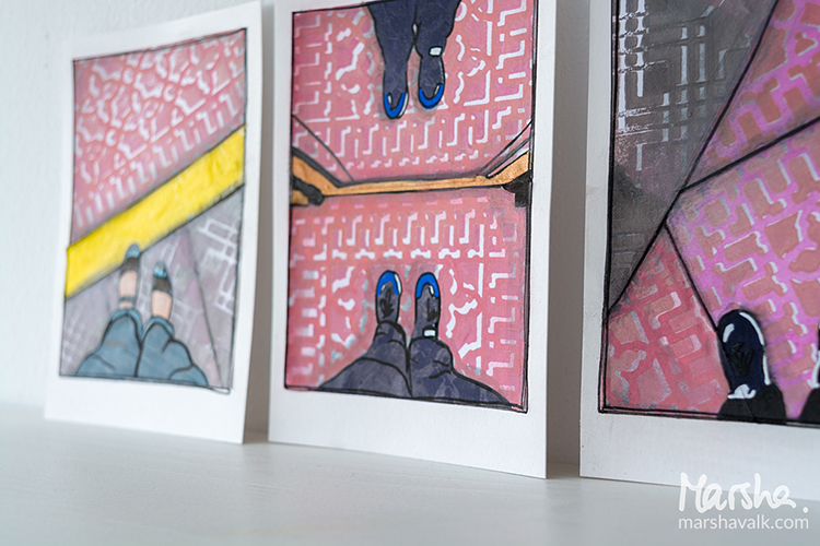
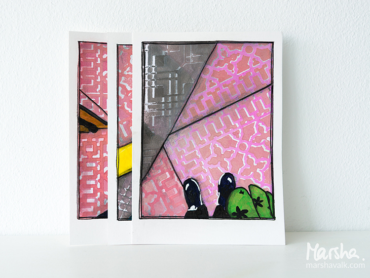
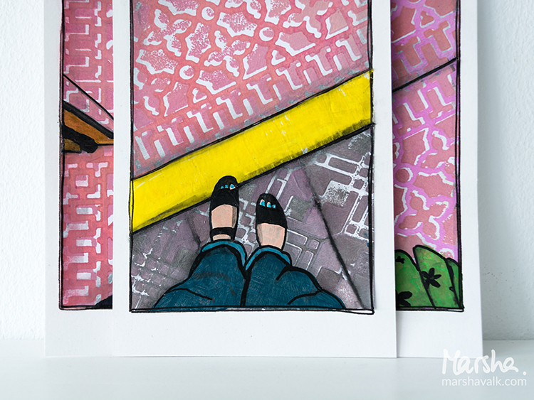
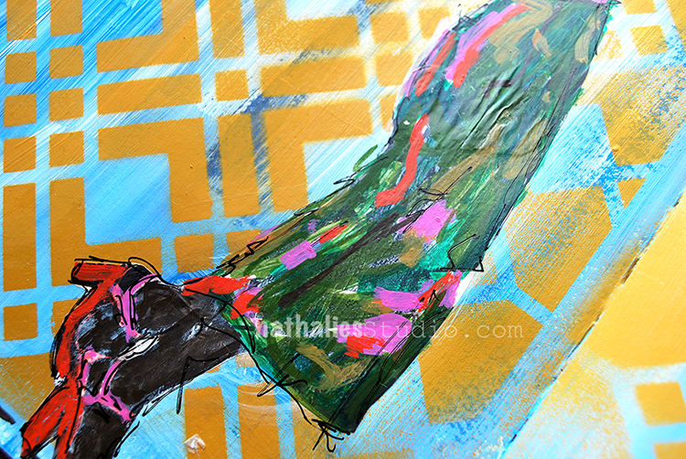
Among them I found three of my feet. I always take ‘fromwhereIstand’ / ‘Ihavethisthingwithfloors’ type photos wherever I go. In fact, I remember taking pictures of my feet in foreign places well before hashtags and even before digital photography!

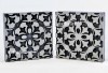
Nat’s positive/negative ArtFoamies always remind me of pavement and flooring, so that’s how I came up with the idea of recreating my #fwis pictures with collage.

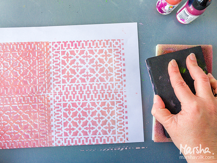
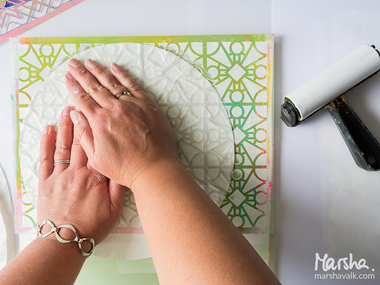
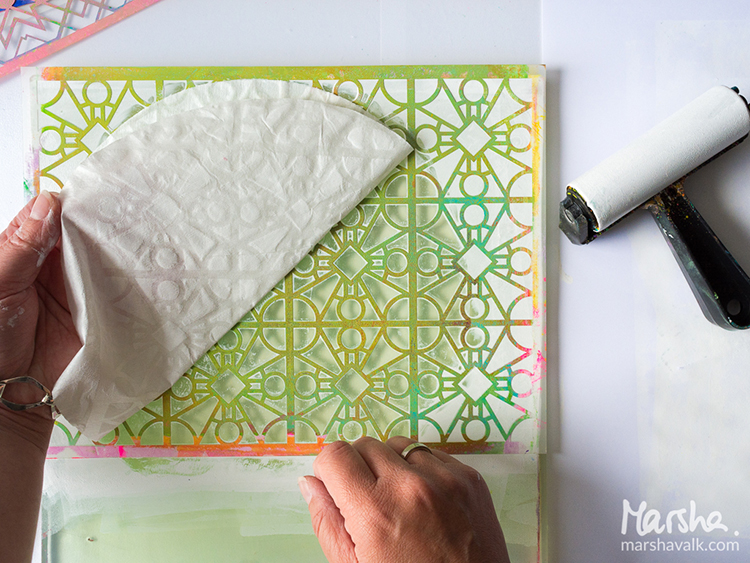
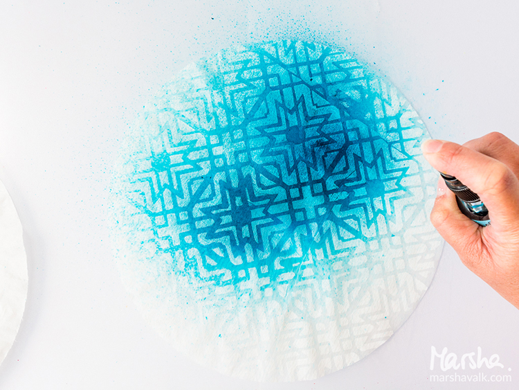
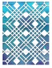
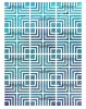
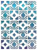
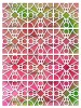
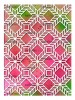
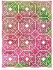
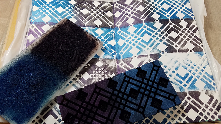
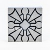
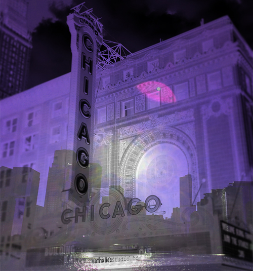
I started creating the pavement with the Downtown Positive and Negative Foam Stamp and the Mini Chicago Positive and Negative Foam Stamp Set.

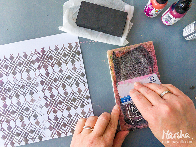
Because I’m not very fond of cleaning, I only used one Stamp Buddy and mixed my paint colours directly on there using an old plastic card.

For a lighter shade I added more white, and when I switched stamps, I added more grey. I stamped on regular printer paper because it’s nice and thin for collage.

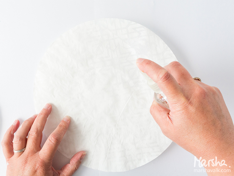
I cleaned the ArtFoamies with a baby wipe in between stamping, and I rinsed them with water once I was done stamping altogether.

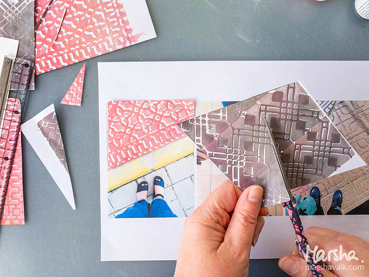
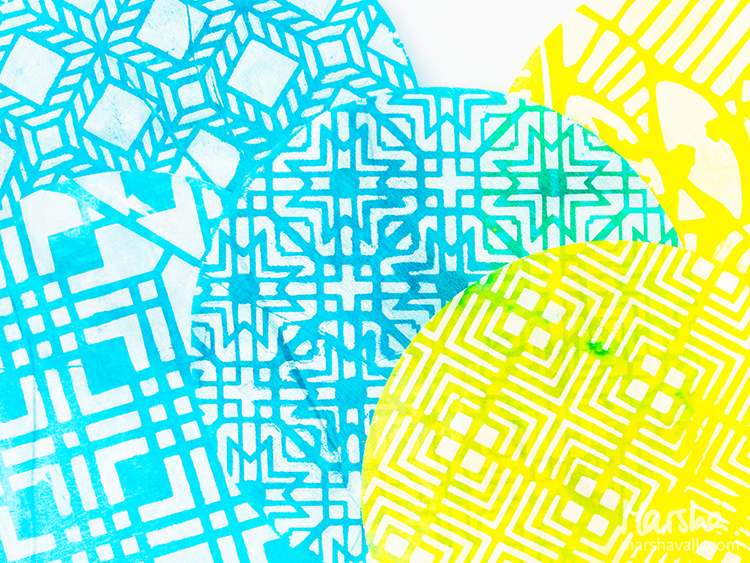
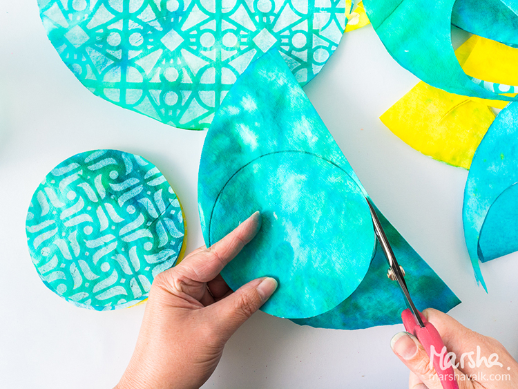
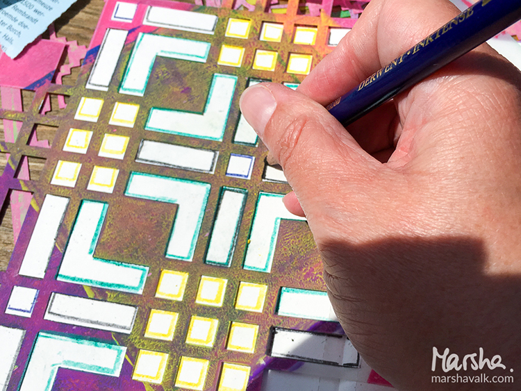
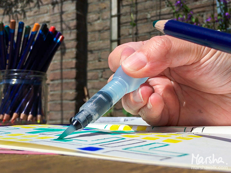
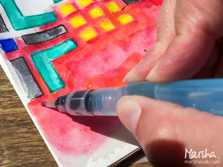
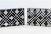
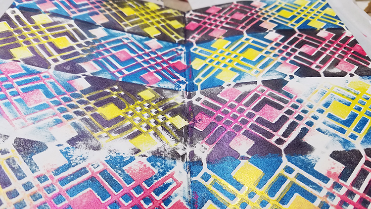
Once the prints were dry, I cut them into the shapes of the pavement in the photos, using the pictures as my guide. I adhered the shapes to heavyweight cardstock cut to 4.1” x 5.8” (A6) sized pieces.

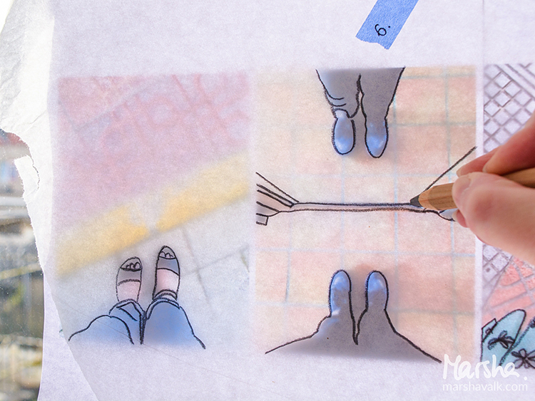
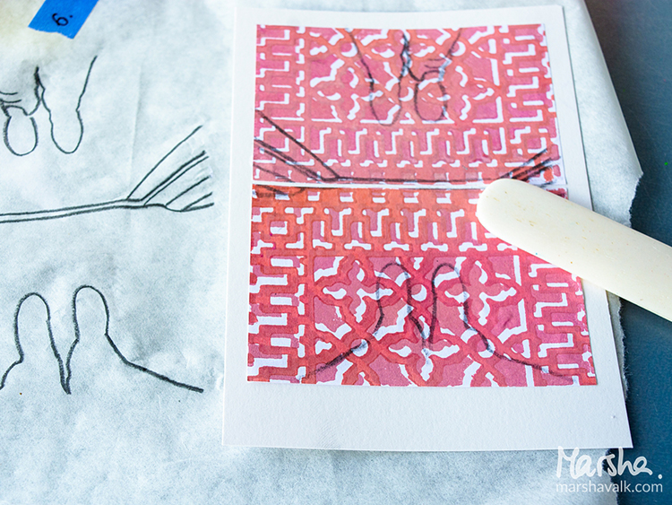
I traced my feet and any relevant details in the photographs onto tissue paper to transfer them onto the collaged pieces.

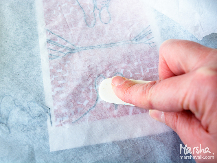
I placed the tissue paper pencil side down on top of the collage and then burnished the pencil lines with a bone folder.

Then I used acrylic paint and paint markers to colour inside of the pencil lines and pastel pencils, Stabilo All pencil and a brush pen to add some shadows and depth.


Thank you Marsha!!! These are just so cool – almost like the drawings from a comic book :) Here are some of the supplies that Marsha used:


Feel inspired? Working on something yourself that you’d like to share?  I love to see how you interpret our monthly themes. Email me how you used my stencils and stamps with the theme and email me an image – I would love to share your projects in my next  “n*Spiration From Around the Globe“.

Leave a comment

Reduce, Reuse, Recycle with Marsha Valk


Hello again from the Creative Squad! Today we have a gorgeous gift wrapping project from Marsha Valk that is sure to send you running to your kitchen for some coffee filters :) Marsha used a whole slew of my stencils on this one (so be sure to check the materials list at the bottom) to rock the theme: Reduce, Reuse, Recycle – Let’s do Mother Earth a favor this month and use what we already have.  Maybe we’ll dip into our stash of leftovers from other creative projects or maybe we’ll repurpose something unexpected.  This month we’re thinking about how artmaking can impact the environment and we’re trying to make our footprint just a little bit smaller.


Reduce, Reuse, Recycle – that’s a topic that has been on my mind a lot lately. I have a lot of different craft supplies. I like to donate any excess supplies I have, but I still have plenty left that I’m reluctant to get rid of because I don’t want to waste it and it may come in handy someday…

The upside to this is that I’m never short on stuff when it comes to gift wrapping!

Paper flowers make fun and easy gift toppers, so I for this month’s prompt I decided to make coffee filter flowers.

I’ve shared how to create similar flowers on the Gelli Arts® blog before:

Using brand new (bleached) coffee filters for a craft project probably isn’t the greenest choice you can make. If you are looking for an environmentally friendlier option, you can recycle used coffee filters.

Unfortunately I don’t have access to a coffee maker that uses filters like these, so I haven’t tested it for you, but I believe you can rinse and dry them. They will be stained, but that will actually add interest to the paper (and the flowers).

Step 1: Monoprint a couple of coffee filters with your Gelli Arts® printing plate using stencils and (white) acrylic paint. Here I’m using Nat’s Buenos Aires stencil.

Step 2: Stain the monoprinted coffee filters with spray inks.

Wet the coffee filter with a spray bottle of water before you spray on the spray ink. The water will help the spray ink spread across the coffee filter, this one has Nat’s Toledo stencil pattern on it.

You can stack the coffee filters you want to have the same colour while spraying. Each new filter will absorb the excess ink from the already sprayed ones!

Leave the coffee filters to dry completely.

Step 3: Cut two smaller circles out of each coffee filter. I folded each coffee filter in half and used a jar to trace a circle shape onto them to get a uniform size.

Step 4: Fold the circles into eighths (or more) and cut leaf shapes. Make sure to cut some larger and some smaller.

Step 5: Unfold the coffee filter flowers and stack two or three on top of each other. Secure them by sewing one or two buttons in the middle of each stacked flower.

Fluff the petals until you are happy with the result.

Step 6: Use a glue dot or double-sided tape to adhere the flowers to your gifts!


I love this Marsha – such a great way to dress up a gift! In addition to buttons and ribbon, Marsha used the following supplies (some are affiliate links):


Play along with us too: I love to see how you interpret our monthly themes. Email me how you used my stencils and stamps with the theme and email me an image – I would love to share your projects in my next  “n*Spiration From Around the Globe“.

Leave a comment

Artful Adventures – Marsha Valk


Hello my friends! Today we have a post from Marsha Valk from the Creative Squad. She is sharing an art journal page from a journal that she created just for taking Artful Adventures :)  She uses my Amsterdam, Chicago, and Mesa Verde stencils, and this month’s theme: Artful Adventures. Are you planning an Artful Adventure this summer? Whether it’s a day at the beach or a full blown International Vacation, don’t forget to take the time to soak up the uniqueness of your new surroundings and gather some inspiration for future artmaking. This month we’re turning to Nat’s new book Artful Adventures in Mixed Media, to help us find inspiration as we travel. We’ll be noticing color, shape, texture and more and then we’ll be taking that to the studio to help inspire some mixed media projects. Join us in the adventure!


I’m not going away on vacation this Summer. We were planning to, but it just didn’t happen. And that’s OK because when you read Nat’s new book ‘Artful Adventures in Mixed Media’, you quickly realize that you don’t have to go far to experience an artful adventure!

I was set on taking inspiration from the city I live in, and the photos I had taken during the Artful Adventures Stroll Through The Hood Challenge leading up to the release of the book. You can see the photos I took during the challenge here.

But when it came down to creating I took one look at my Wanderlust stencils and changed my mind!

The Chicago stencil reminded me of the floor of the place in Amsterdam we had lunch recently. And the Amsterdam stencil reminded me of the logo of the ice cream place we went to after that. And the Mesa Verde stencil…

All these stencils combined told another story: the story of a beautiful day in Amsterdam. Not Amersfoort. Amsterdam!

So I took my art-on-the-go kit into the yard and explored what this day in Amsterdam would have looked like in a travel journal (a regular Midori sketchbook), had I been on vacation.

I even did the Observation exercise from the book to remind myself of what I saw and felt that day. I also went online to collect images of things I hadn’t photographed or wasn’t allowed to take photos of at the time (museum).

My art-on-the-go kit doesn’t include Inktense watercolour pencils, but I decided to use these with the stencils instead of my regular watercolours.

Watercolour pencils are a great addition to an art-on-the-go kit though, because you can use them as a regular coloured pencil as well as activate them with a waterbrush: I used a warm red Inktense pencil without water to colour in the openings of the Mesa Verde stencil.

The Chicago and Amsterdam stencil designs were first traced with the pencils before I used a waterbrush to pick up the pigment from the same pencil and coloured inside the lines.

The red watercolour background is created with regular watercolours, and I used Posca markers to draw and colour the black tree.

It was super relaxing to create like this, with limited supplies, having to pause to wait until the watercolour was dry. And I especially love that I have this particular day recorded in a journal now!


Thank you Marsha for sharing your vision of an Artful Adventure in Amsterdam! In addition to her sketchbook, Marsha used the following supplies (some are affiliate links):


Play along with us too: I love to see how you interpret our monthly themes. Email me how you used my stencils and stamps with the theme and email me an image – I would love to share your projects in my “n*Spiration From Around the Globe“.

Leave a comment

Inspiration from Around the Globe


This Tuesday we’re taking a break from our Creative Squad (they will be back next week with a new theme to play with!) to bring you some super fun projects from around the world. As you may know, my stamps and stencil designs are available for purchase online and maybe even in your local craft store, so crafters and mixed media artists and art journalers from around the world are using them. I am always excited to see how YOU use my products in your own projects. I am even more excited to share some of the beautiful and creative examples of these projects with you today. Enjoy this inspiration from around the globe!

First we have a super fun idea from one of our Creative Squad members, Marsha Valk from the Netherlands, for an Easter-themed table runner. Although Easter was last month, this is still a fantastic way to use my stencils on a project that can dress up your table for any occasion. Marsha uses a whole slew of my stencils, including Buenos Aires, Santiago, Mesa Verde, Manhattan, Amsterdam, Toledo, and Chicago for a variety of cool patterns.

In honor of Spring, we have a gorgeous stenciled flower pot from Jean Dunning of Connecticut using my Santa Fe stencil. If you like this idea, stay tuned – we coincidentally have a similar project planned here at nStudio later this month ;)

Here’s an art journal page from Angie Winkler in Oklahoma using my Urban Scribble stamp set and my Chicago Positive Negative foam stamp set to create a beautiful urban sunset. I love the contrast and colors on this one, and the creative use of the Chicago stamps for the sky!

From the Netherlands, Jacqueline van Zuiden brings us a really cute gift for her new great nephew that all started with my Elephant foam stamp. It’s super happy and I love the message :)

Join us again next Tuesday for another great project from one of our Creative Squad members!  They will be working with a new theme for May.  And in the meantime, share with me what you’ve been working on with my stamps and stencils.  I would love to feature your project in an upcoming post!


Leave a comment

Go ahead, underestimate me! – sassy Art Journal Spread ;)

I thought it was funny :) And I love Lupita Nyong’o and I wanted to use her image from a magazine.

I used my new Chicago Stencil and sprayed over it with acrylic spray paint.

I used different markers to paint over the magazine image. When I applied the magazine image, it crinkled up a bit, which I add to “oops, oh – good now it has some wrinkles and texture- good”

I added the journaling with a red and pink marker and traced the outside of the letters in black. I like the page- even though it is a pretty simple one in terms of layering

Here are the supplies I used – some links are affiliate links:


Wishing you a gorgeous day!!!!

Comments (6)

  • Julie B

    |

    Love this (and even better in person)……can’t wait for the stencil; love how clean the image from this stencil is with spray paint and the quote cracks me up. Thank you!

    Reply

    • nathalie-kalbach

      |

      Thank you Julie! HA and now that you played with spray paint in my class…maybe you are on it yourself ;)

      Reply

  • LauraB

    |

    yaaaassss, Queen, yaaaaasssss!

    Reply

  • Barb Charlotte, NC

    |

    Very creative. Thanks for sharing.

    Reply

Leave a comment

Dream a New Dream – Tina Walker

Happy first Tuesday of 2017! My Creative Squad is starting the New Year with a new theme and a fresh batch of inspiring projects. Today Tina Walker is sharing 2 uplifting art journal spreads using my Chicago Positive and Negative Foam Stamp set and this month’s theme: Dream a New Dream. Let’s start the New Year with a focus on all the possibilities of a fresh start.  What are your dreams for this year?  Whether it’s art-making, family, travel, or work related, January is a great time to dream about what the future could hold.


Hi! Tina Walker here today with my take on this month’s theme, ‘Dream a New Dream’. There is something about the freshness of each new year that kicks my mind into overdrive. I think of all of the possibilities, dreams, and wishes for the next 365 days and what I can/will accomplish. 2016 left us with uncertainty and sadness, so my dream for 2017 is for everyone to live a healthy, happy, and joyous year. May all your wishes and dreams come true and that you plant the seeds of kindness and hope for many years to come.

I created two art journal spreads that includes words to remember for 2017.

For spread #1, I used ‘Chicago’, positive/negative Art Foamies for a fun and colorful background. This is about as simple as it gets as a starting point. I alternated the color for more interest.

I hand-drew three body silhouettes and painted around the shapes so that they were highlighted on the page. Yes, I painted over the super cool background I stamped, but it’s all about layers. Layers make art journal pages special.

I painted each shape with white paint then added my journaling inside. Done! How’s that for quick?

For my second spread, I randomly painted blocks of color. Over the blocks of color, I painted 2 girls who would be the highlight of my page. I embellished the girls with a quick stamp of the ‘Chicago’ stamp. In addition, I wanted to ‘frame’ the girls and journaling, so I stenciled over the color blocks, using the ‘Crackle’ stencil. It adds the perfect punch of black.

Do you have creative dreams for 2017? If yes, I wish that all your dreams come true!

Thank you for taking time today to visit us today. See you next month.


Thank you Tina! I love the subtlety of the backgrounds she created and the figures! In addition to semigloss Art-C paints in Blue, Bright Red, Yellow, Lime, Orange, and Black, Tina used these supplies – some links are affiliate links:


Play along with us! I love to see how you interpret our monthly themes. Email me how you used my stencils and stamps with the theme and email me an image – I would love to share your projects in my “n*Spiration From Around the Globe“.

Leave a comment

Stepping Up The Game or … In my Art Journal Today

gameup_natkalbach01

“Be the kind of girl that makes other girls step their game up”

I started this page in one of my classes with the middle pattern showing one of the Versailles Foam Stamps stamped with acrylic paint.

gameup_natkalbach02

and then kept on going at home adding more patterns using the Buenos Aires Border Stamp and the Buenos Aires Tile Stamp on top.

gameup_natkalbach03

On the bottom I used one of the Chicago Stamps. To finish it up I layered some acrylic ink on top which was mostly resisted by the stamped images. This is a good way to add some color to the background after you stamped.

gameup_natkalbach04

But it looked also very good without the colored backgrounds – next time I guess *wink.

Here are some of the supplies I used for this journal spread – some links are affiliate links:

SuppliesCJS


Hope you are having a wonderful day

Leave a comment

Inspired by Chicago Architecture

NatKalbachChiArch

As you might know, a couple of weeks ago, I meet some dear old friends in Chicago and we had a fun weekend. One of the repeated recommendations to do in Chicago had been the Architecture River Cruise and since this is one of the few “touristy” things that even my friend A. who lives in Chicago loves – we were in!

NatKalbach_ChiArch01

It was pretty pretty awesome! I am interested in architecture but there is a lot of mid century and more modern building where I am a bit at loss as to the initial appeal. Hearing a lot of background motivations and ideas for buildings was a total eyeopener. It started with this building which was in my “love it without much explanation” range. The Wrigley Building built in 1924 shining in it’s white terra cotta facade inspired by Seville’s Cathedral.

NatKalbach_ChiArch02

333 West Wacker built in 1983 – I love the reflection and the fact that the curved facade is mimicking the curve of the river as well as it’s color. That I can see and it made me kind of like it more :)


NatKalbach_ChiArch04

Chicago Avenue Bridge Tender House- can I have my art studio in there? Love this!!!

NatKalbach_ChiArch05

One of the many draw bridges

NatKalbach_ChiArch06

Lake Point Tower – 1968 – by John Heinrich and George Schipporeit, two students of Mies van der Rohe. It looks elegant with it’s curves. It probably has the most stunning views in all directions -but I still wouldn’t wanna live there, I think.

NatKalbach_ChiArch07

Marina City 1967 – by Goldberg (another Mies van der Rohe student) who believed since no right angles exist in nature, none should exist in architecture. I looked at some floor plans of those corncobs and found them super intriguing. Think living in flower petals.

NatKalbach_ChiArch08

Finished in the 80s is this River City building also by Goldberg. While I found the windows fascinating and they reminded me of some Gaudi buildings in Barcelona – this one looked like a nightmare to live in especially upon coming closer with the boat. I don’t know – but the shapes – intriguing again and inspiring.

NatKalbach_ChiArch09

Gorgeous reflection – I would love to paint this!

NatKalbach_ChiArch10

And more gorgeous reflections- the reflection that changes everyday is making the building interesting for me.

NatKalbach_ChiArch11

This was actually the view from our hotel room.

NatKalbach_ChiArch12

After the river tour we walked to The Rookery 1888/1907  – Frank Lloyd Wright – which was unfortunately closed already -but boy did I love all the details on the facade. It contains decorative elements reminiscent of late Roman, Venetian, Moorish and medieval-European architecture

NatKalbach_ChiArch13

Stunning!

NatKalbach_ChiArch14

I see border stamps ….

NatKalbach_ChiArch15

This building is the Chicago Board of Trade – 1930 – a breathtaking art deco building which makes me think of old Chicago Gangster Movies and Gotham City :)

NatKalbach_ChiArch16

My favorite door – can I take this home, please?

NatKalbach_ChiArch17


NatKalbach_ChiArch18

And the famous Chicago Theatre built in 1921.

All in all I felt pretty inspired by the architecture of Chicago – the shapes, patterns, reflections and I am sure some of them will move into future artwork :) Time to get into the studio. I hope you enjoyed the little tour. Have a gorgeous day!


P.S.

My friend Julie Fei Fan Balzer and her Mom and I had a conversation about

At the Museum With a Friend

tune in and listen to the podcast –

I hope you enjoy it. Do you like going to a museum with a friend?

Leave a comment

Art Stroll: The Art Institute of Chicago

ArtStrollAIChicago

Disclaimer: This post includes artwork with abstract or not so abstract nudity – it is not called Sodom and Gomorrah – it is called ART . If you have a problem with art, all I can say ” so sorry for you!” . Don’t email me to complain, don’t visit my blog anymore because I might post things like this again and, farewell!

A couple of weeks ago I met two of my old friends in Chicago for a girl’s weekend. It was wonderful and a long due time together. And not only did I get to spend time with good friends …we also sneaked an Art Stroll in and went to the Art Institute of Chicago. I had visited the Art Institute a couple years ago but somehow forgot that the museum is mooohasive. So here is just a couple of the things that I was able to see and that caught my eyes :)

Artstroll_NK01

Roy Lichtenstein, George Washington- 1962 – an early Lichtenstein  – I love seeing how he developed from there.

Artstroll_NK02

Jasper Johns, Numbers – 2005 – the texture makes me swoon – and I love that Jasper Johns repeated his known design in white bronze. He says “I like to repeat an image in another medium to observe the play between the two”

Artstroll_NK03

Another Jasper Johns – False Start – 1959 – which I have only seen in books so far – stunning!

Artstroll_NK06

Joan Miró, The Kerosine Lamp – 1924 – love the lines and the little clues and marks

Artstroll_NK07

This Miró – Two Personages in Love with a Woman – 1936 – made me smile !

Artstroll_NK15

And another Miró – Portrait of Juanita Obrador – 1918 – all three paintings not in chronological order here- are so different and it is interesting to see how Miró changed his style throughout the years.

Artstroll_NK08

Ohhh Jean Dubuffet – you make me happy! It is as if his visual idea of “Supervielle, Large Banner Portrait” – 1945 – was processed through his body and then came unrefined through his hands onto this canvas !

Artstroll_NK09

Georges Braque, Ajax – 1949-1954 – I love the int of color, the line work and the figure. It is a painting I would have not associated with him.

Artstroll_NK11

I am always excited when I see a Max Ernst Painting- his texture work is just unreal ! This appears 3 dimensional but is all painted – The Blue Forest , 1925.

Artstroll_NK12

And this painting by Max Ernst made me smile  – well more the title actually – Human Figure with Two Birds – 1925 and 1929 .

Artstroll_NK13

Max Beckmann – Self Portrait – 1937 – I am always fascinated by Max Beckmann’s hands.

Artstroll_NK14

Pablo Picasso – The Red Armchair – 1931 – Love the colors and it totally reminded me of his “Girl before a Mirror” painting at MoMA – alas – no wonder – it is the same mistress Marie Therese in both paintings.

I also took a peak at the Hiratsuka Un’ichi Print Exhibition

HiratsukuUnichi01_natKalbach

Girl with Calico Patterned Background -1948 – Woodblock Print. The details-the patterns – swoon!

HiratsukuUnichi02_natKalbach

Angel Dreaming Room – 1971 – Woodblock Print.

HiratsukuUnichi03_natKalbach

Kingfisher – 1928 – Woodcut Print

HiratsukuUnichi04_natKalbach

I did not take note of the name of this one -but I love it so much – I had to include it.

HiratsukuUnichi05_natKalbach

Mount Aso in Kyushu, 1935 – Color woodblock print – amazing – look a the cloud- it has texture and all those different colors – beautiful!

That was it from the Art Institute in Chicago Art Stroll. I really enjoyed being there – I saw so much more but it was such an overload – I hope to come back soon and revisit some areas more leisurely. Hope you enjoyed the stroll! More coming soon :)

Comments (4)

  • Barb J

    |

    Thanks for sharing these priceless pieces of art.

    Reply

  • Gayle

    |

    I absolutely love your disclaimer!

    Reply

    • nathalie-kalbach

      |

      :) Thanks Gayle- unfortunately it has become necessary due to emails or comments regarding showing art containing nudity or swear words

      Reply

Leave a comment