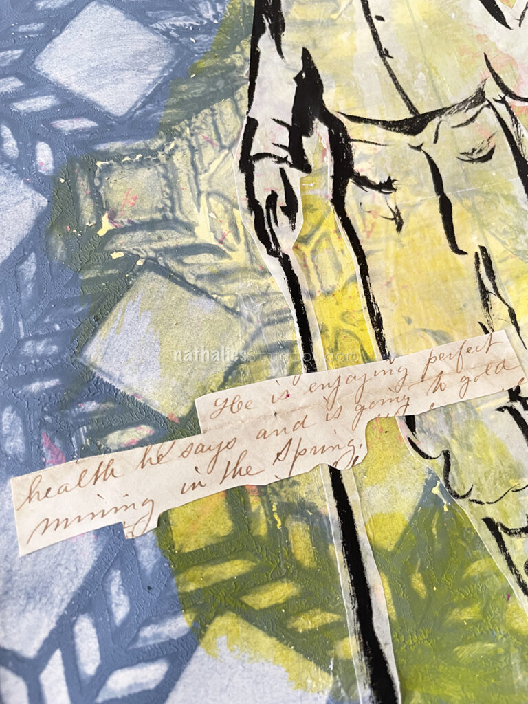
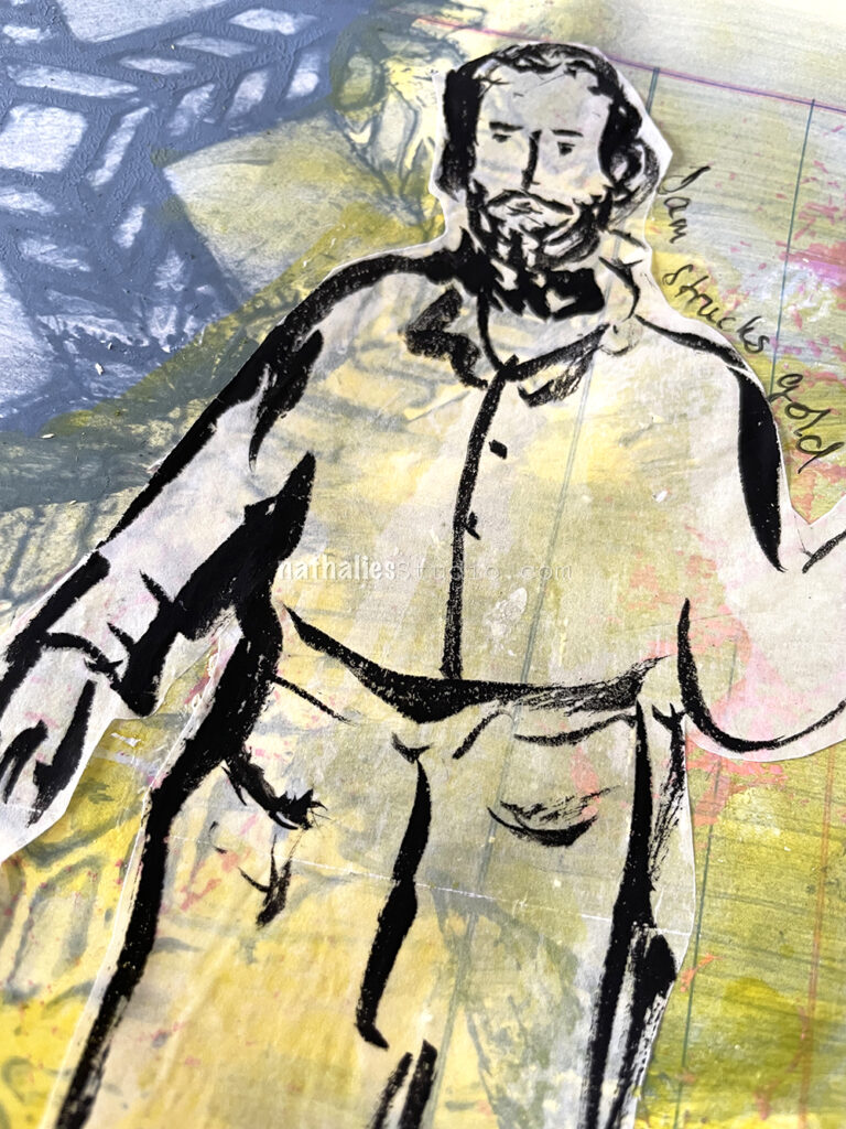
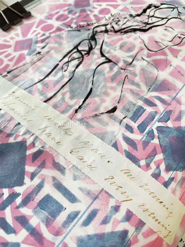
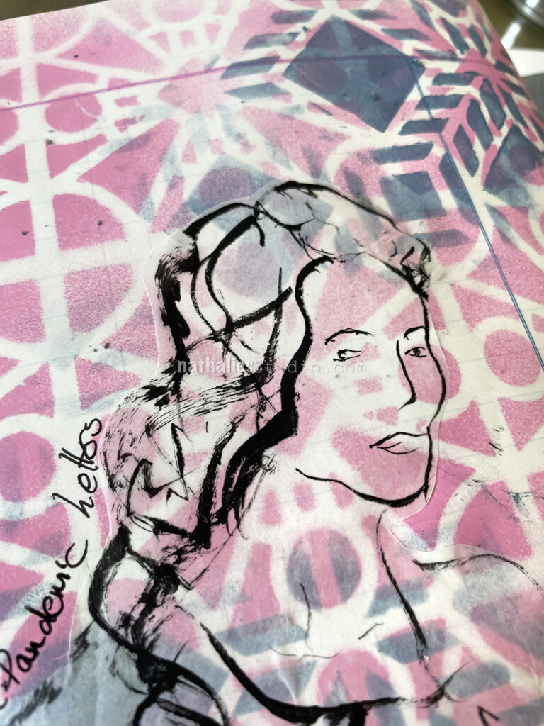
This is another art journal page – like Pre-Pandemic Letters – that sprung from a sentence in an old letter from 1867 where Amanda writes about Uncle Sam “He is engaging perfect health he says and is going to gold mining in the spring.” I like to think that Sam struck gold – lol
This background was rather mucky as I stared out with a lot of left over blue grey acrylic paint on my palette – I wanted to use it up instead of wasting it – but when I added it to the page it was still too much. So I put the Santiago stencil on top and took some of the paint off with a moist rag and then spread it over to other areas of the page. It was way too much paint in any event so the stencils is not nice and crisp but that is ok. I added some yellow acrylic ink here and there and then sketched with black ink “Uncle Sam” on Deli paper and adhered it with a glue stick to the background.
Cutting out the letter sentences like that seems a bit crude but I did not want to cut this further up. If I find more fun letters I might actually just scan in the parts I like and then manipulate them… although… do I really need more collage material? Probably not, and the look of the old letter paper with ink does look cool to me.
I like the color of the Santiago stencil section, it reminds me of an old quilt, the blue is like water, and the grid pattern someone might use when cordoning off a section to pan.
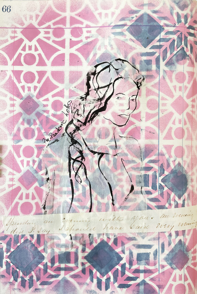
I love old letters. When I find them at a flea market I pick them up and use them for collage or background purposes later. It is always a spark in the moment when I pick them up and find a word or sentence jumping out to me. I had used some other parts of this letter before but had not read the whole letter and when I was cleaning up my workspace this jumped out to me: “Spending an evening with you. An evening did I say. I should have said every evening.” And while Oscar was really romantic my first giggle thought was “well that was a pre-pandemic letter”.
I am almost tempted to find more sentences in old letters and make a series hahaha- we shall see if I find more.
For my art journal page I sprayed with MTN acrylic spray paint over the Buenos Aires Stencil, then layered the Santiago stencil on top and added some acrylic paint over it here and there.
I also tested a new liner brush I recently purchased (Princeton Aspen Acrylic brush part of a set) and used Holbein black acrylic ink on deli paper for the sketch.
I cut the sketch out and pasted it along with the letter part with Liquitex Matte Medium.
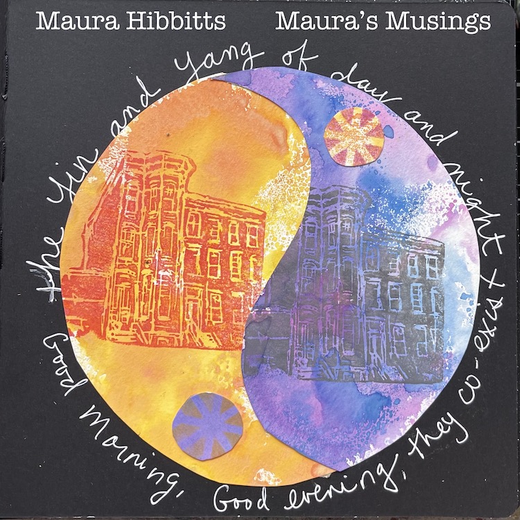
Hello from my Creative Squad! Today we have a super thoughtful art journal spread from Maura Hibbitts using my new Brownstone foam stamp and my Santiago and her thoughts on our latest theme: Good Morning Good Evening – Are you a Morning Person or a Night Owl? Or maybe neither? Create a project inspired by your preferred time of day – when you are in good spirits, doing what you love, and enjoying life.
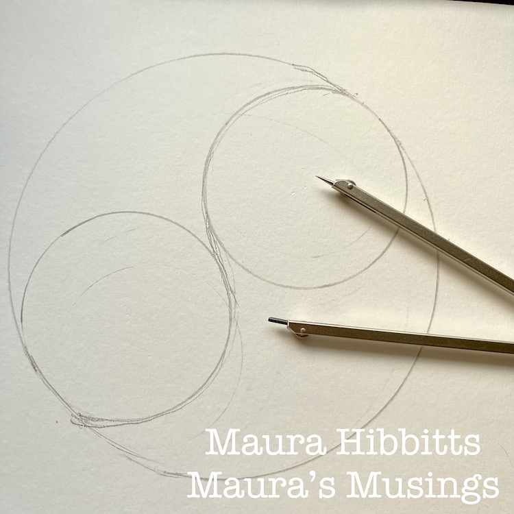
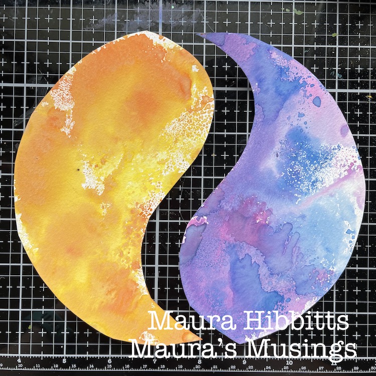
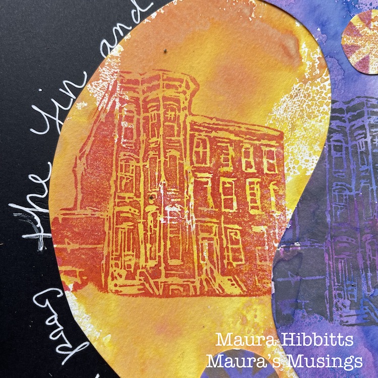
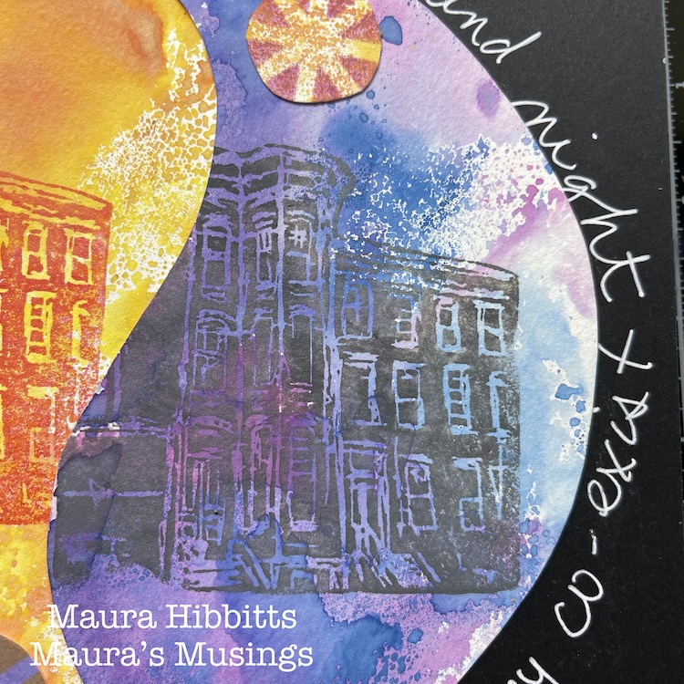
Good morning, good evening! Do you ever think about what your favorite time of the day is? Well, I still have to think about it and I realized I don’t really have a favorite time. I like to do certain things in the morning and other things in the evening. This got me to thinking about Yin and Yang and how there’s a duality in the world between light and dark, night and day. When you stop to think about it, there’s no day without night, and there’s no night without day. When it’s daytime on one side of the world, it’s nighttime on the opposite side of the world, so somewhere it’s always day and night. So rather than choosing morning or evening, I decided to work in my art journal to show the idea of the duality of day and night.
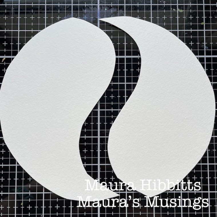
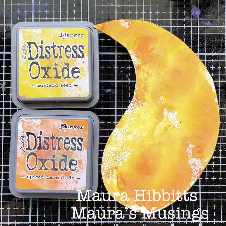
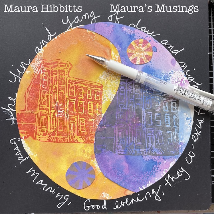
First step to create the page is to draw a large circle on a sheet of watercolor paper, and two smaller circles within it. Then draw a line that comes down in between the two, to create the shape of Yin and Yang. Cut these out.
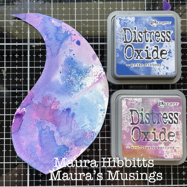
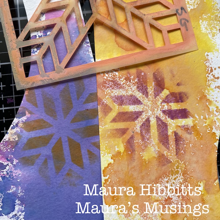
Next step is to add some color to the shapes using inks. Swipe the inks onto a craft sheet, and mist them with a little bit of water. Press the paper into the ink and repeat as necessary. Let dry completely. Repeat the same process on a piece of scrap paper.
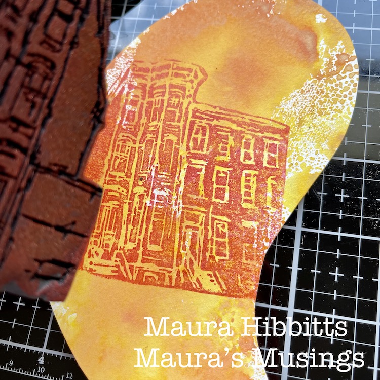
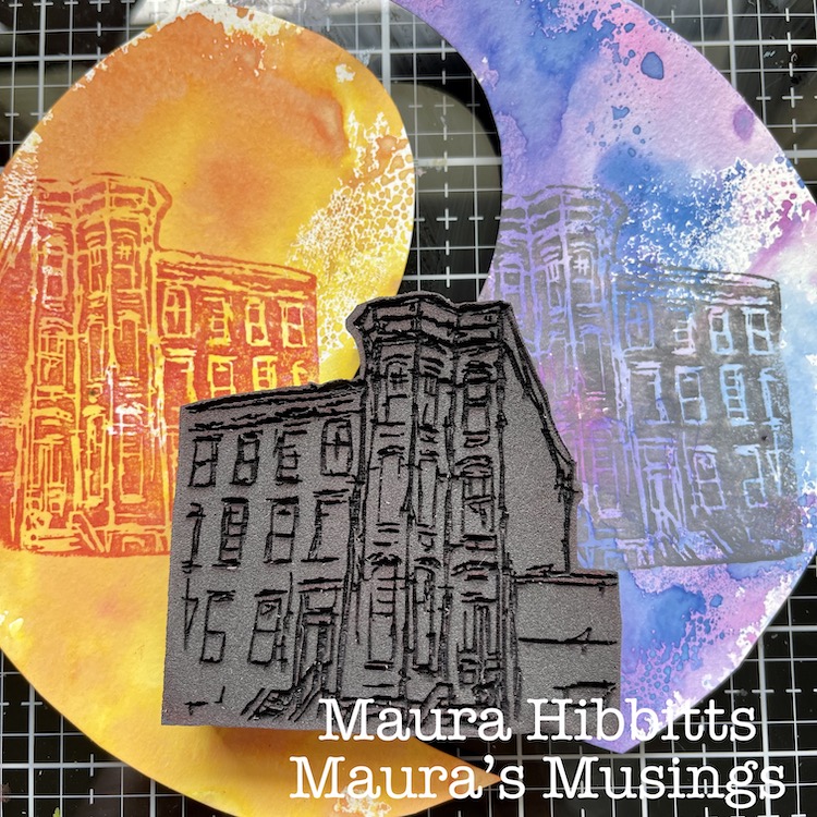
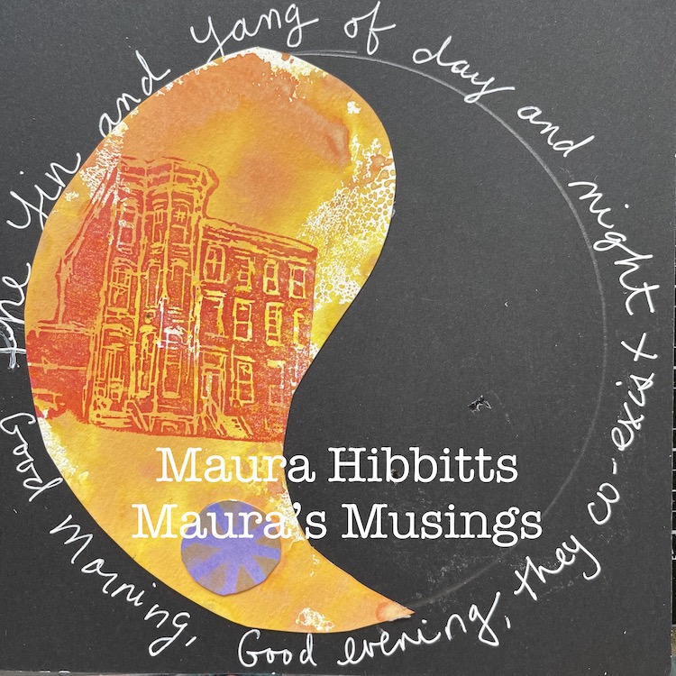
Using the ArtFoamies Brownstone stamp and several paints, stamp the image of the brownstone onto each of the shapes. I like to use a gel plate and a brayer to spread the paint out on and then stamp on this to pick up the paint. I used red and copper for the daytime brownstone, and a couple of greys for the nighttime brownstone.
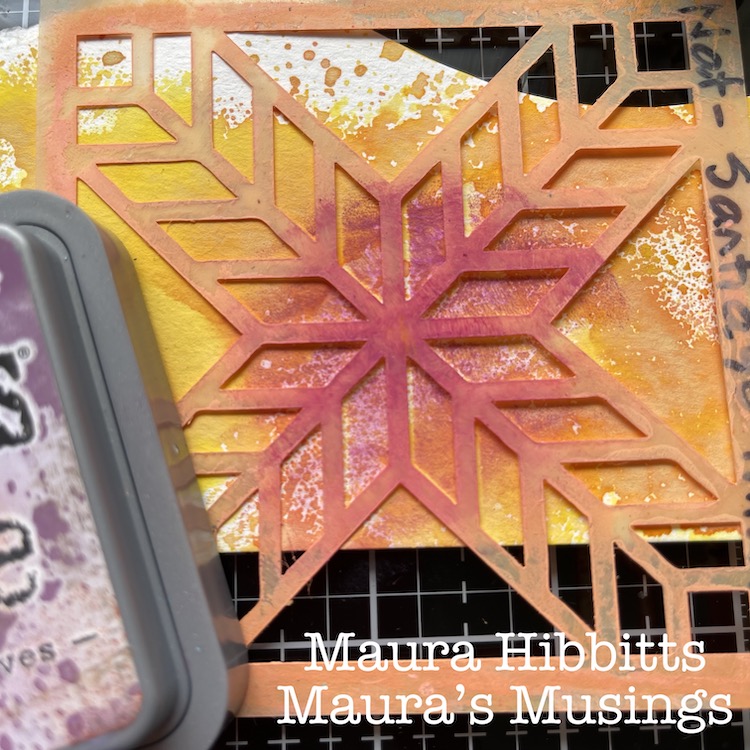
Using the scrap paper that you made, along with the Santiago stencil, stencil in a bit of color with a contrasting ink.
In the black art journal, use a compass and draw a large circle that the Yin Yang symbols will fit within. Around the edges of this add your journaling with a white pen. Cut out small circles from your stenciled pieces, and add those above and below the brownstones. Fit the pieces together and adhere to the journal.
Yin and Yang symbols are used in many dualities, from male to female, and bright to dark. Just think about mythology and the Sun god and Moon goddess and these ideas begin to merge. I also use it to symbolize that I need both morning and evening in my day. For example, I enjoy meditating in the morning, doing a little reading, enjoying a cup of coffee, and then I get to my creative work. In the evenings, I love to watch the sunset and maybe take some photos of it, do some reading or perhaps watch a show, and wind down with some music. Since I enjoy both these times of the day, I could not decide on just a morning or evening as my favorite.
Have you thought about a favorite time of the day, or are you like me and you enjoy both the morning in the evening? Whatever time of day you love, enjoy the remaining mornings and evenings of summer and take care!
– Maura
Thank you Maura! I always love to learn more about our artists as they share their thoughts with these posts and the resulting art journal page here is simply lovely.
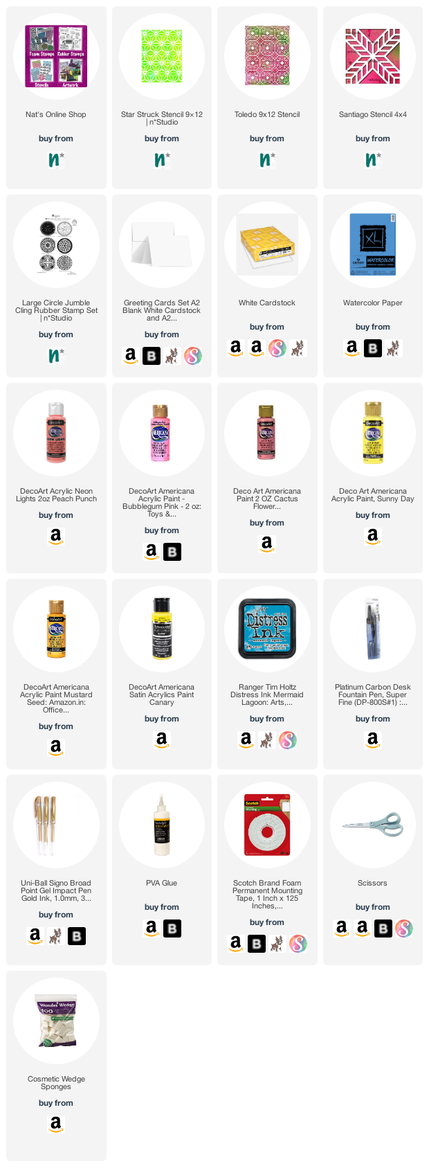
Give it a try: you can find all my Foam Stamps and Stencils in my Online Shop and here are some of the supplies Maura used:
Looking for more inspiration from the Creative Squad? Follow them on Instagram here.
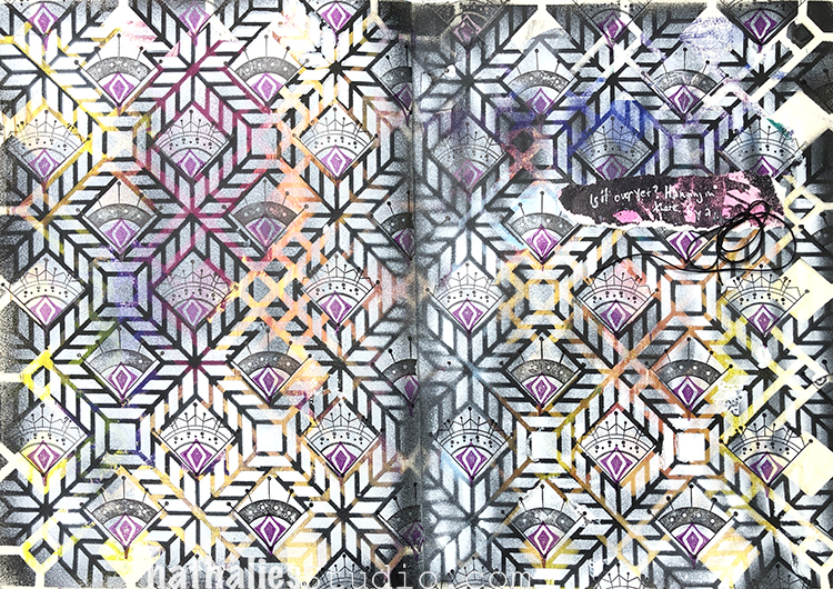
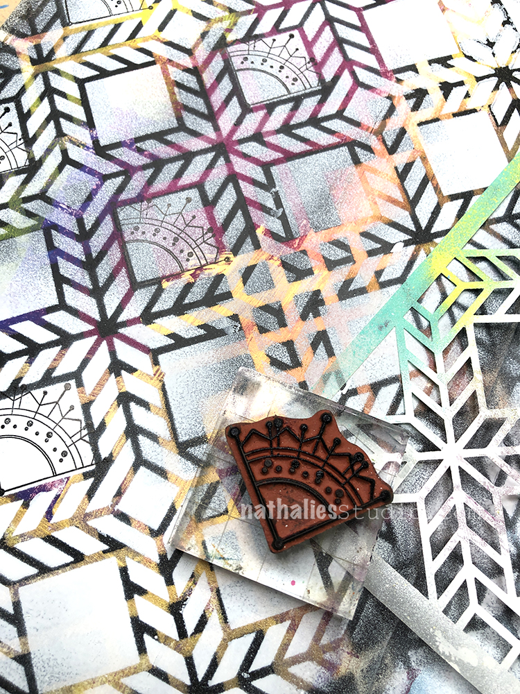
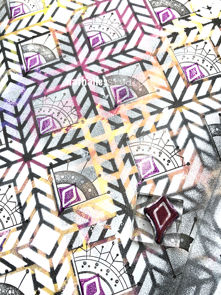
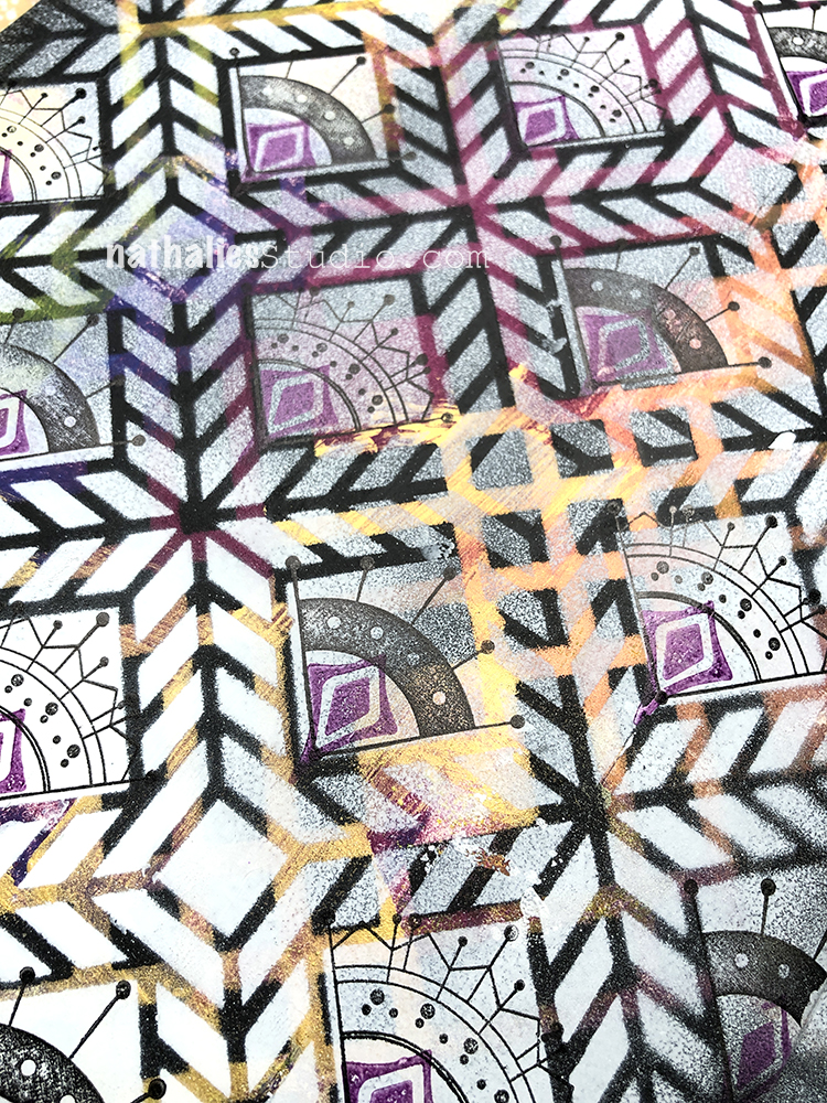
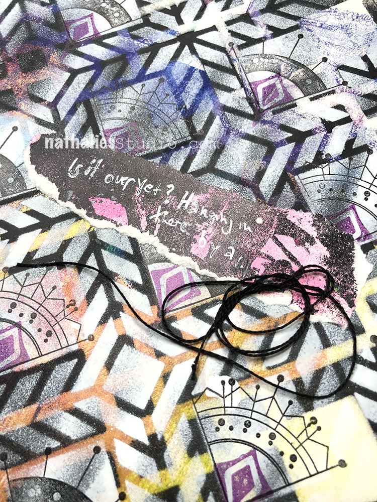
Is it over yet? Hanging on a thread… I created this art journal page at the end of December.
I began with a background that was from cleaning off different colors. I used black spray paint over my Chicago stencil first, then layered up my Santiago stencil and sprayed with white. My Mini Motifs rubber stamps fit perfectly in the stencil design (smile!).
And I added one last detail to my pattern with one of my Fan-Fare rubber stamps.
I added a bit of coordinating collage paper and my journaling with a white Signo pen. Hang in there everyone!
Hello from my Creative Squad! Today we are kicking off a new monthly theme with Maura Hibbitts. She is bringing us some lovely holiday cards in some perhaps untraditional colors, shaking things up to finish up 2020 with my Star Struck, Toledo, and Santiago 4×4 stencils, my Small Circle Jumble rubber stamps, and our theme: Light & Shadow – In art and maybe also in life, the balance between light and shadow is an important consideration. Play with this equilibrium in your art and show us how the two sides work together.
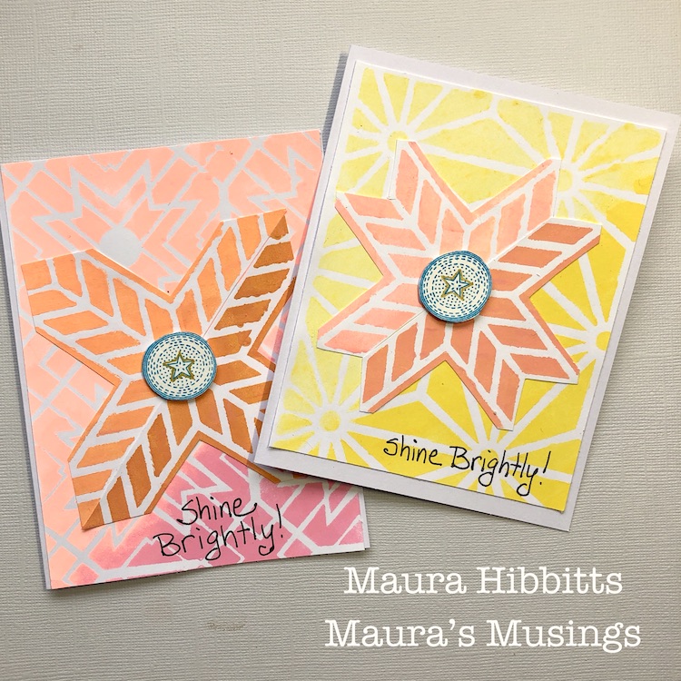
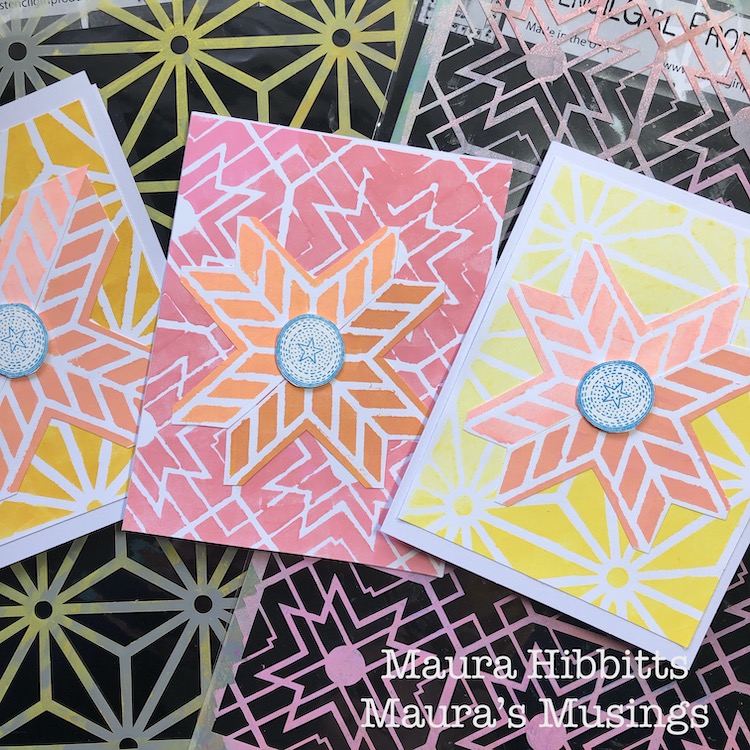
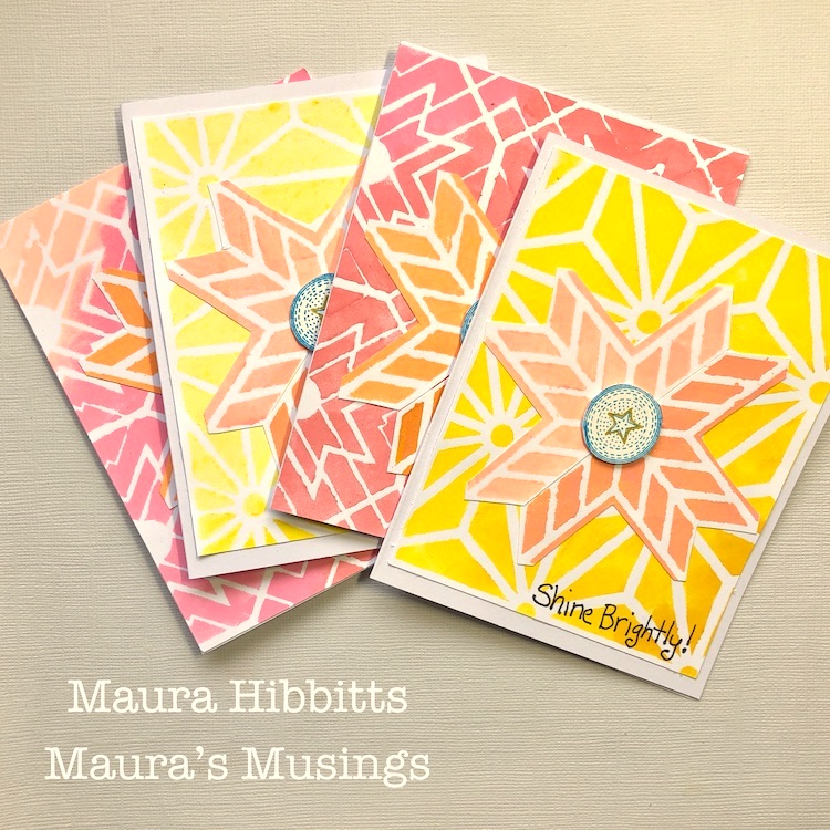
Light and Shadow, dark and light…as the days get shorter and the shadows longer I’m feeling the need for more light in my life. I watch the strip of sunlight on my deck railing in the morning outside of my work window (It was all lit in the summer), and then the shadows as they expand across the yard during the day. Each day will get shorter until the Winter Solstice on December 21. This year, more than ever, I am looking forward to our shift again to more daylight. These thoughts also prompted me to challenge myself to work with bright colors that I would not normally choose – yellow and pink. So, I’ve ended up making eight holiday cards in very non-traditional colors, check it out.
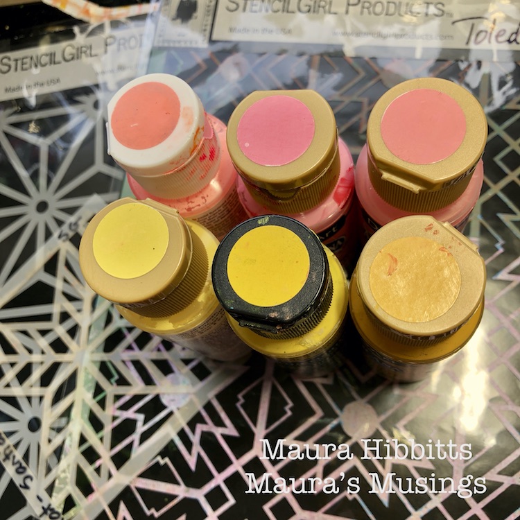
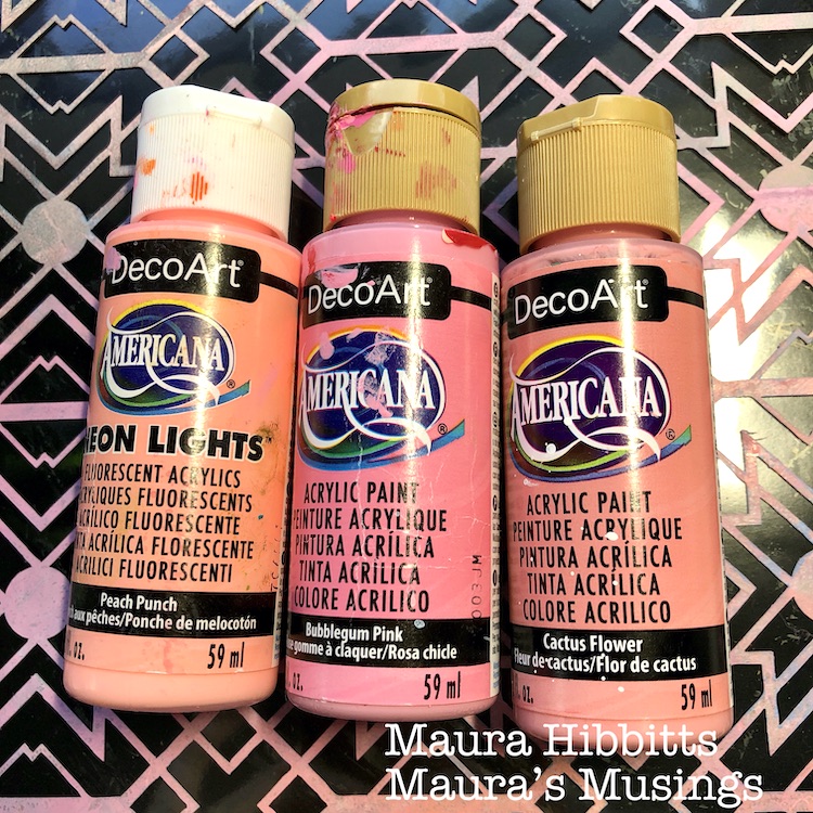
I started by going through my stash and pulling out paints in varying shades of pink and yellow, so I would have a blend from dark to light.
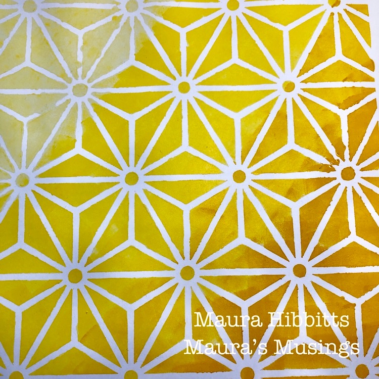
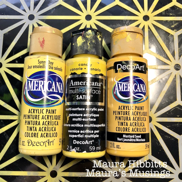
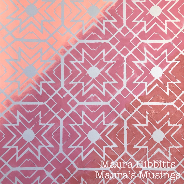
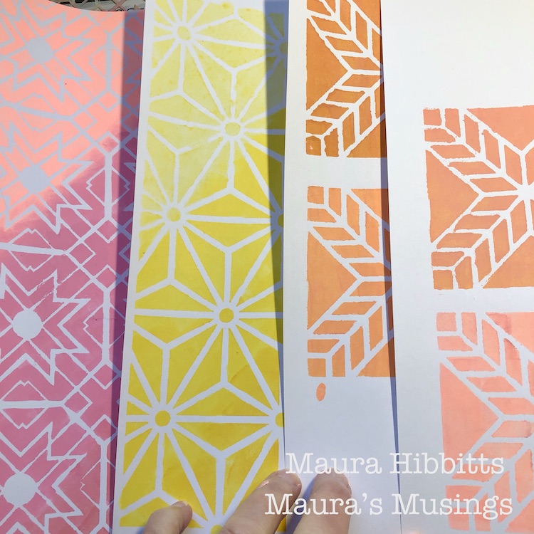
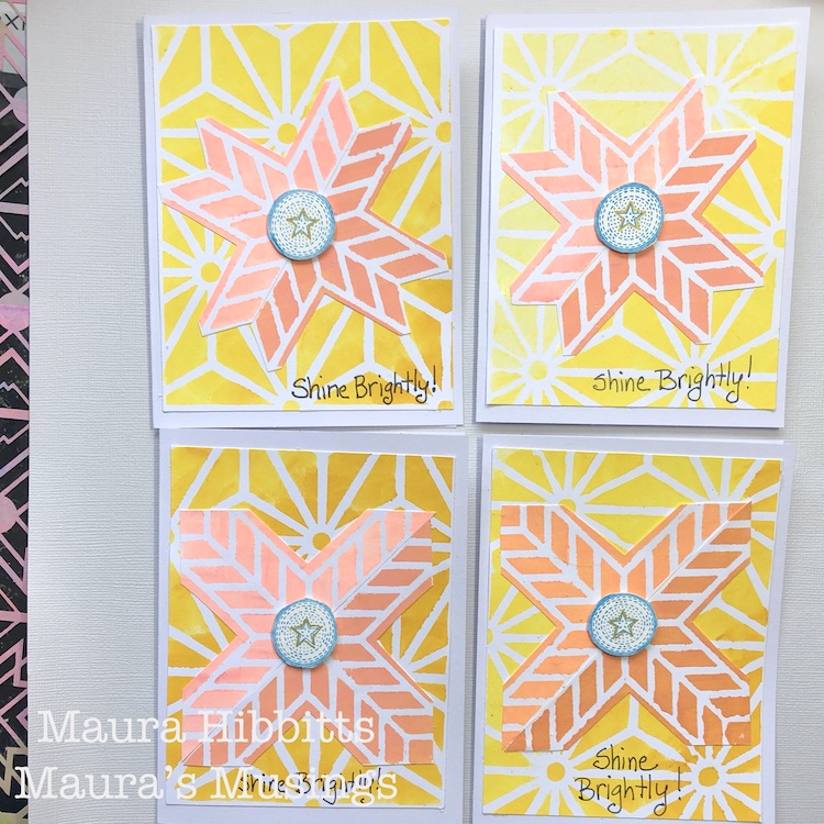
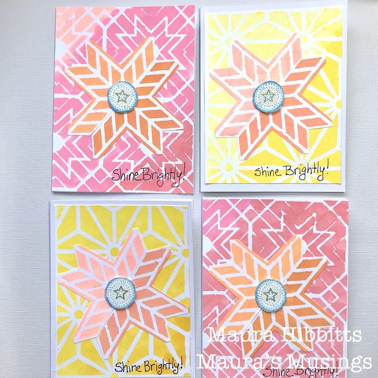
Nat’s Star Struck stencil seemed to call for the yellows, so I dabbed the colors in with a cosmetic sponge onto white cardstock, starting with the lightest in the top left, and working my way to the darkest in the lower right. Light and shadow, along with a bit of ombre.
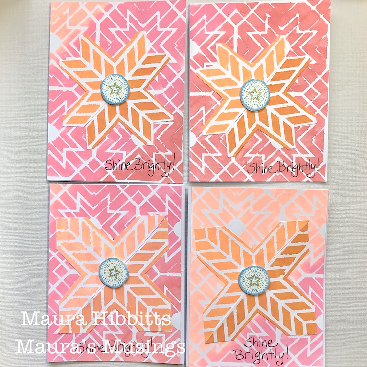
Next up are the pinks. where I repeated the previous step, only this time I used Nat’s Toledo stencil.
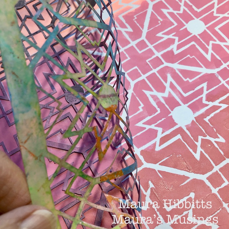
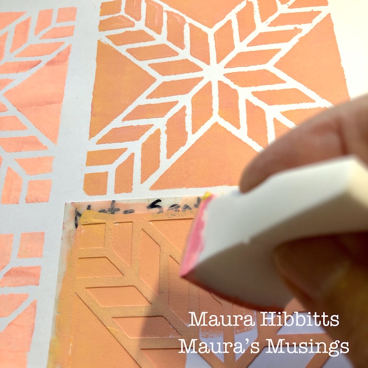
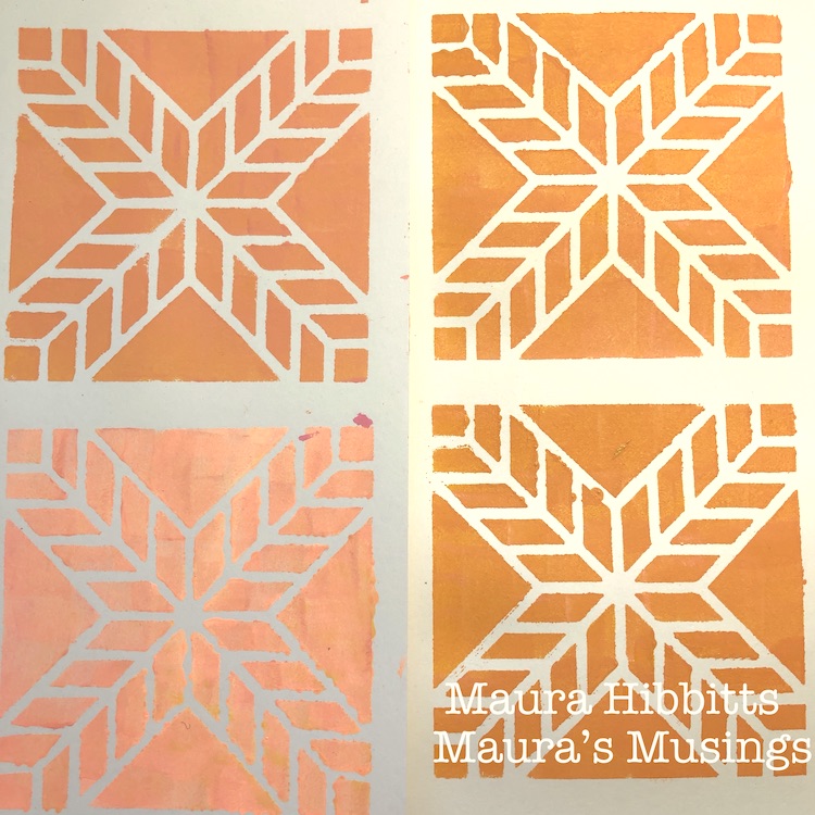
I decided I wanted to create a focal point, so I mixed varying shades of peach and orange, by blending the yellows and pinks, and used Nat’s Santiago 4×4 stencil. My goal was to have a mix of light and dark (shadow) shades.
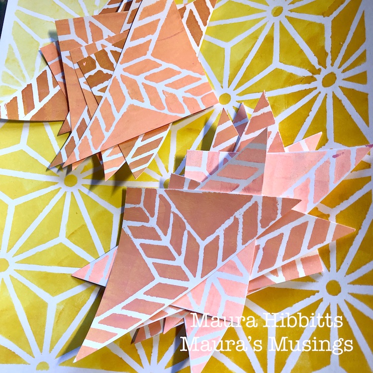
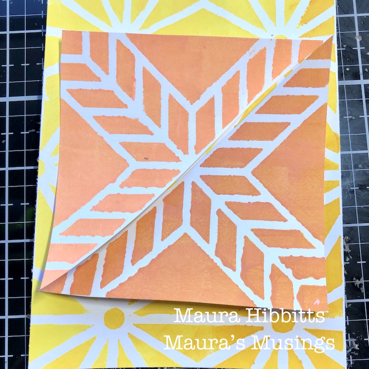
Now that everything is painted and stenciled, it’s time to start building the cards. I cut the large sheets of stenciled yellows and pinks into fourths to use as the card background. Next, I cut out the Santiago mini squares, and cut them diagonally in half. I laid the two parts together, decided I wanted more of the background to show, so cut out parts of the smaller stenciled papers. I glued the papers onto the cards using a PVA glue.
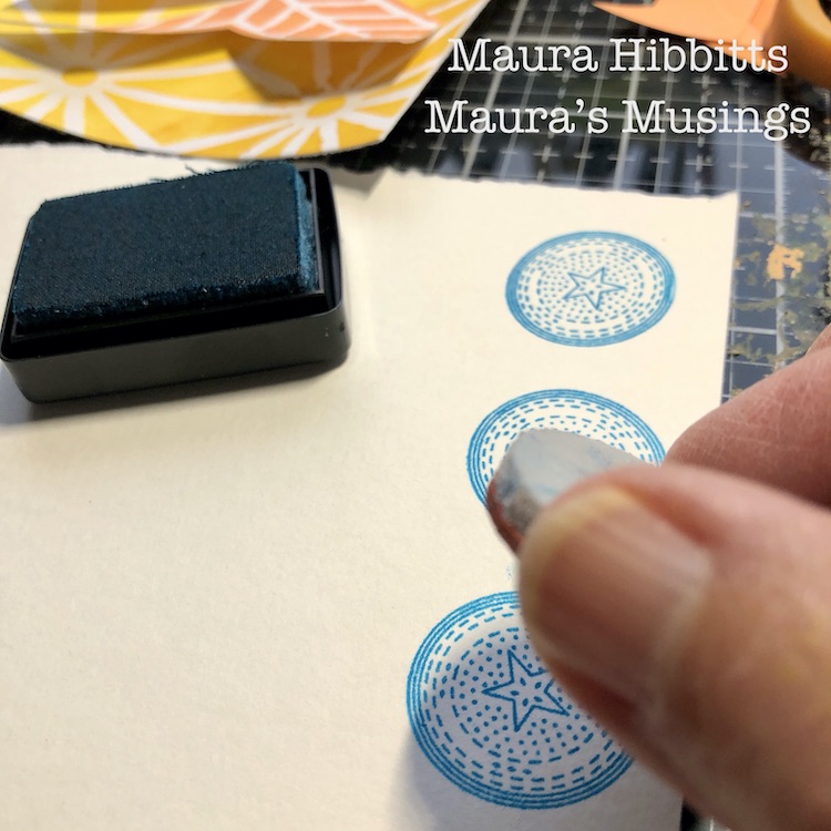
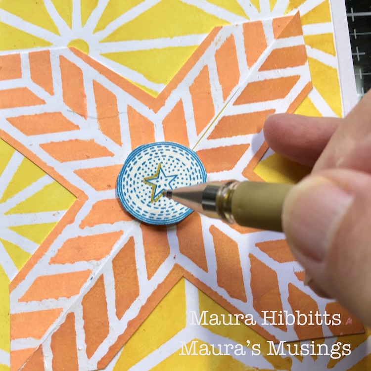
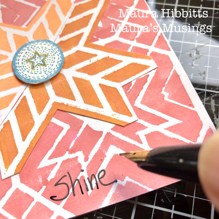
I felt that I needed one more pop of color, so I stamped Nat’s Circle Drive Positive small stamp onto watercolor paper with blue ink. I cut these out and popped them up on the center.
Now for the final touches – a bit of sparkle with a gold pen, where I outlined the star shape, and hand lettered words “Shine Brightly!” I love to use a Platinum Carbon ink pen over dry paint, but any permanent black pen will work.
I aimed to use the colors to give a feel of light and shadow, so I worked both the background and focal piece from lightest on the top left, to darkest on the bottom right. What do you think, did it work?
And there you have it, a set of eight cards in a bright array of yellows and pinks. These might be very non-traditional Christmas cards, or maybe Solstice cards. Another thought is to save them, and randomly send them out in the dark days of winter to bring a ray of light to someone. I hope this inspires you to observe the light and shadow in your life and let it guide your creative endeavors. Wishing you health, joy, and light this holiday season! – Maura
Thank you Maura! We love how your colors make these patterns pop. And nontraditional holiday colors seem perfect for this crazy year :)
Give it a try: you can find all my Rubber Stamps and Stencils in my Online Shop and here are some of the other supplies Maura used:
Don’t forget to check out Nat’s Creative Squad on Instagram too: Each week we post projects, ideas, and inspiration for mixed media art.
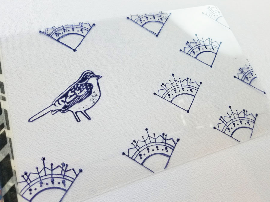
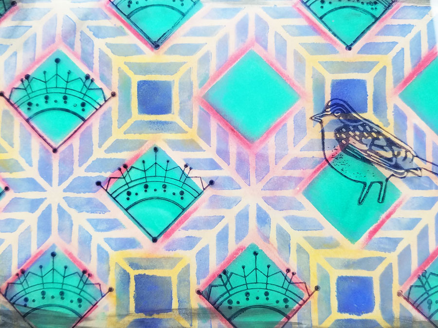
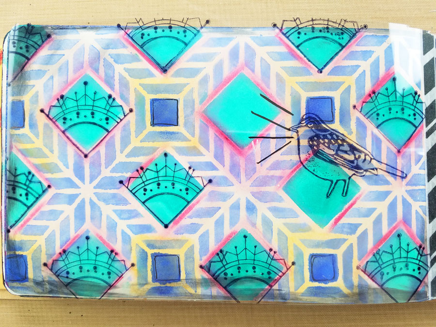
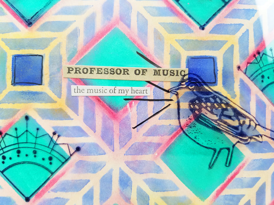
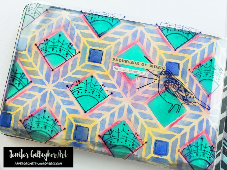
Hello from my Creative Squad! We are kicking off a new theme this month with a fun secret and clever little art journal page from Jennifer Gallagher. She is using my Santiago stencil, my Early Bird stamp, and my Jugendstil stamp. The theme is: Sing Your Song – Everybody has their own voice, their own groove, their own one-of-a-kind personality. What is something unique about YOU that you are proud of? Don’t be shy, Sing YOUR Song!
This month the Creative Squad is singing a song about what makes each of us uniquely us! We all have our own voice and talents. Not many people know it, but I love to sing. I can’t work on an art project or even wash a load of dishes without singing along to my favorite playlists. Don’t tell anyone, but I’m not half bad. It’s our secret. So this month, I’m literally singing my song in this fun art journal page. Let’s get started.
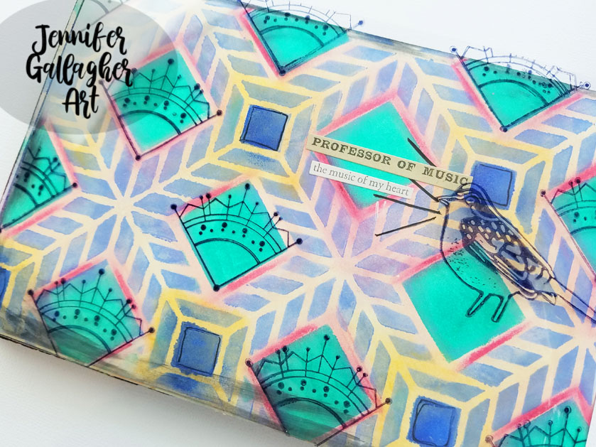
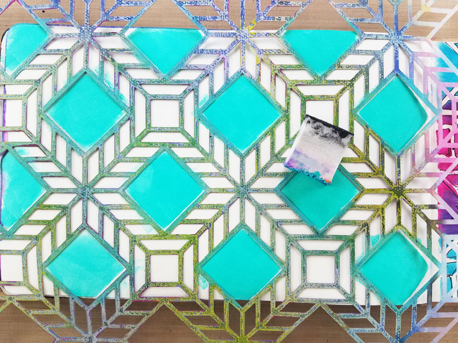
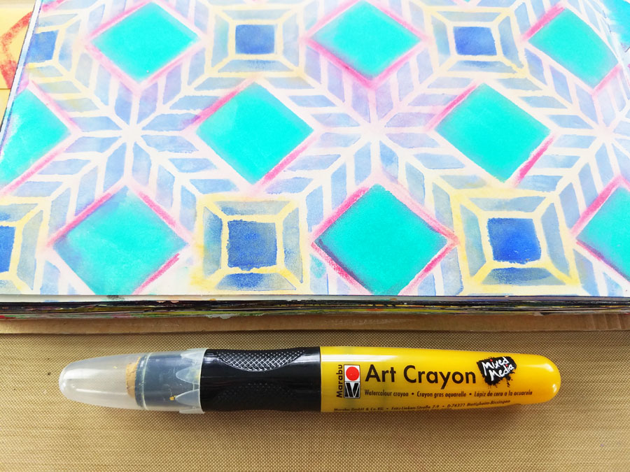
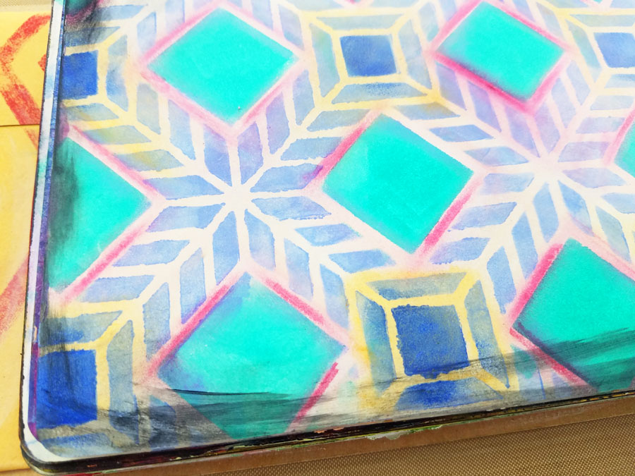
I’m working in my small dylusions journal. I placed Nat’s Santiago stencil down and put Bright Aqua Green acrylic paint through the square designs in the stencil with a makeup sponge. Next, I painted Light Blue Violet acrylic paint through the rest of the stencil design.
Using a cosmetic sponge I dab a little Ultramarine Blue fluid acrylic paint onto the small squares in the design.
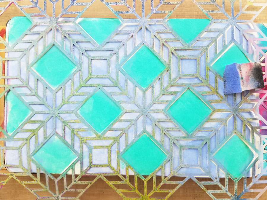
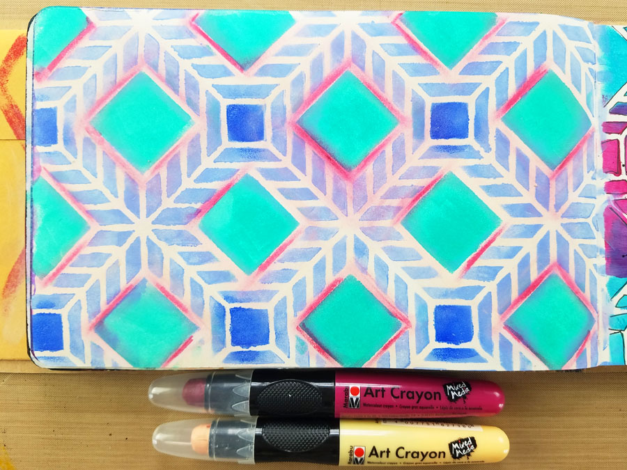
I drew directly onto the page with Marabu Art Crayons in Flesh and Pomegranate and rubbed the color with my finger.
Using a Marabu Art Crayon in caramel, I highlighted the areas around the dark blue square and spread the color with my finger.
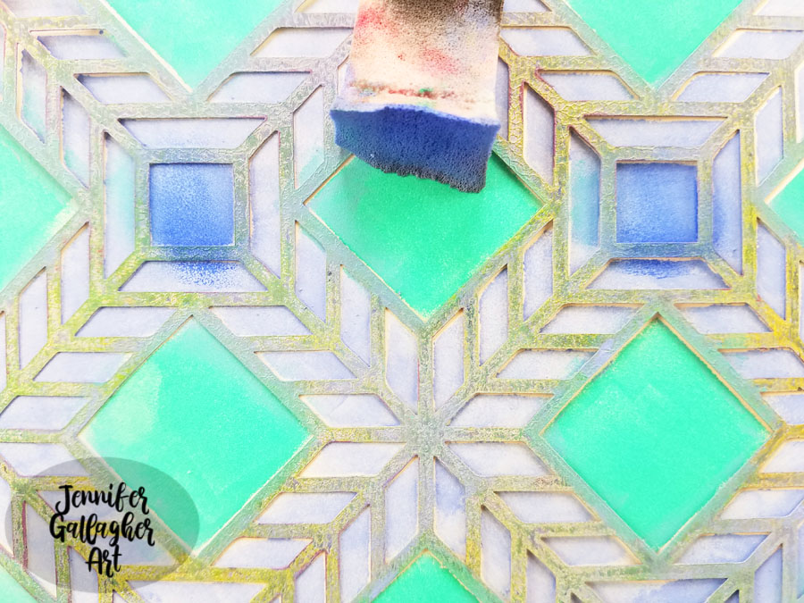
I edged my page with a little Payne’s Grey on a cosmetic sponge.
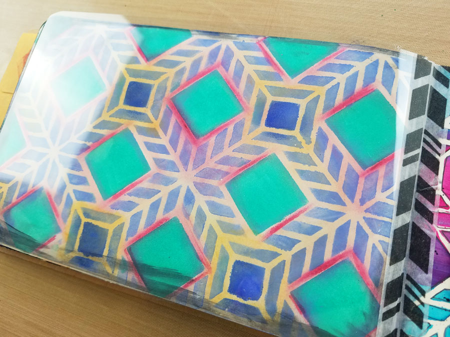
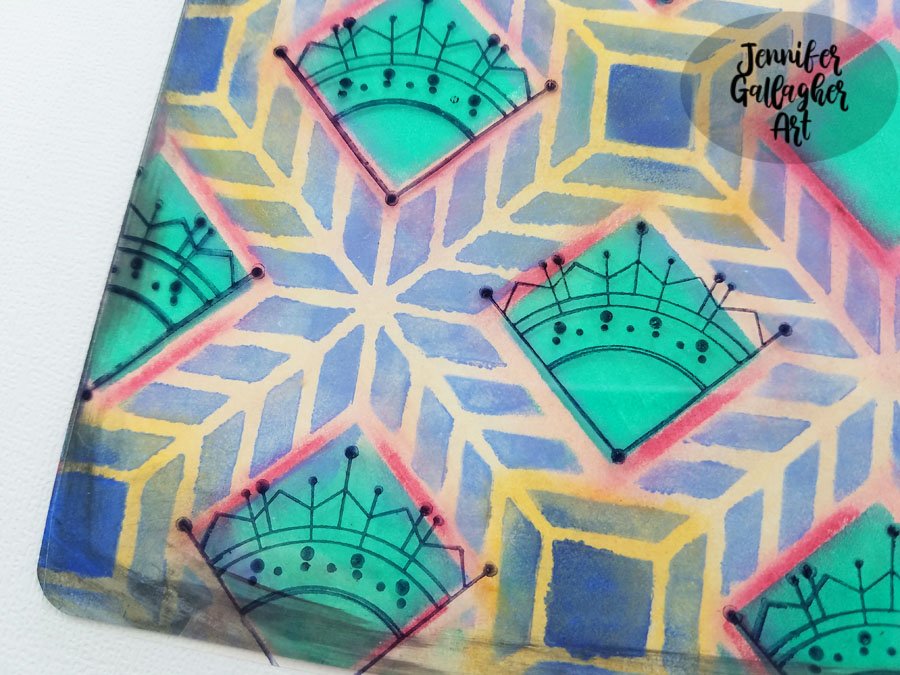
I cut a piece of Grafix Clear Craft Plastic and cut a sheet the same size as my journal page, eight inches by five inches.I attached it to the journal with Dina Wakley Media washi tape.
Using black archival ink, I stamped Nat’s Jugendstil stamp over the green squares. The stamp will slide easily on this material so stamp with care. Also, keep in mind it will take a few minutes for the ink to dry on the plastic so be sure not to smear it.
I wanted to stamp Nat’s Early Bird stamp on the page but the orientation was going the opposite direction that I wanted. So, I stamped the bird onto the “wrong” side of the craft plastic. This causes the image to face the direction that I wanted.
Next, I drew lines from the birds beak and around each dark blue square with a black fine-point acrylic paint marker. The finishing touch is a few stickers from Tim Holtz clippings sticker set.
Well that is it for this art journal page. Stamping with Nat’s stamps onto the craft plastic really gives the page some extra pizzazz. It is also a great way to change the orientation of some of your stamps. I hope you have enjoyed this tutorial. Crack open that art journal and sing your song.
Thank you Jennifer – love the Grafix trick and loved learning your secret love of singing :)
Give it a try: you can find all my Stencils and Rubber Stamps in my Online Shop and here are some of the other supplies Jennifer used:
Feel inspired? Working on something yourself that you’d like to share? I love to see how you interpret our monthly themes. Email me how you used my stencils and stamps with the theme and email me an image – I would love to share your projects in my next “n*Spiration From Around the Globe“.
Hello from my Creative Squad! Today we have an art journal page (and how-to video so you can watch it come together) from Nicole Watson that is a really lovely celebration of spring :) She is using my Santiago 9×12 and Kyoto stencils with this month’s theme: Weather Report – Let’s talk about the weather! Do you love thunderstorms? The crisp air of Autumn? A good snowstorm? Are you a fan of endless sunshine? Create something inspired by that go-to topic of small talk – the weather!
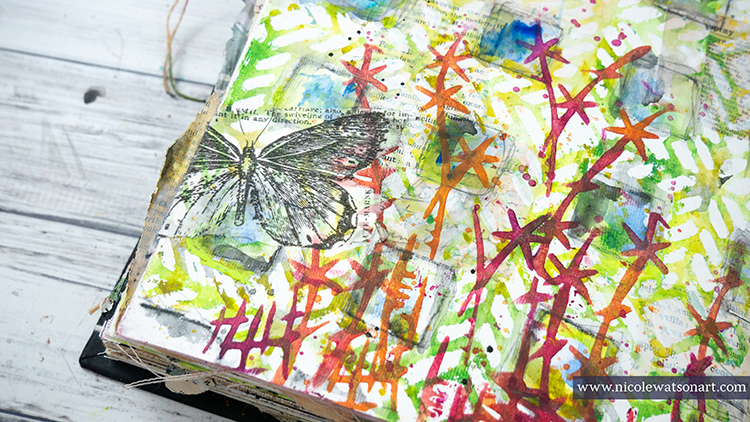
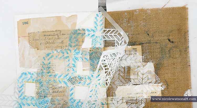
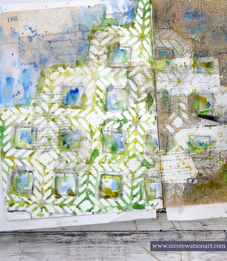
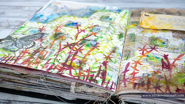
Spring in Texas is probably my favorite season. The weather is beautiful, the sun is warm but not too hot, and the wildflowers are blooming everywhere! I’m almost afraid to admit that I have spent more time outside working in my garden and photographing nature than in my studio. So, I decided to bring that weather and nature inside to my studio with these journal pages.
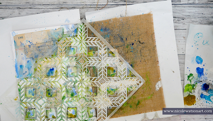
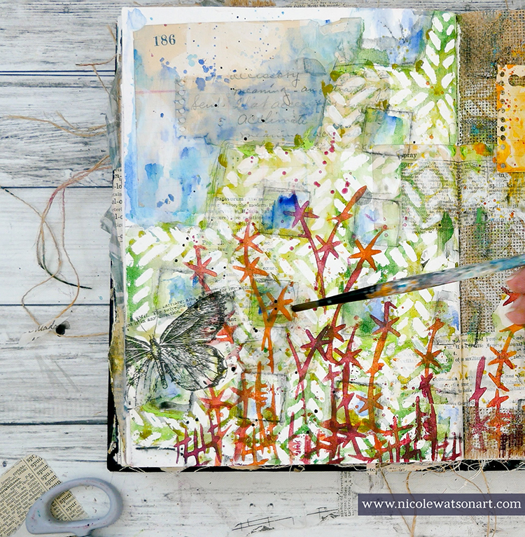
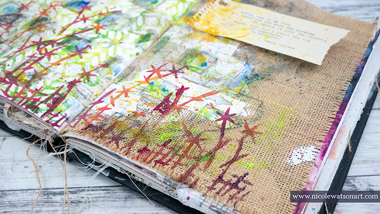
Nat challenged us this month to use only her stencils. I love challenges like this as it forces me to think outside the box and use supplies in a new way. Looking over my stencils, I decided that her Santiago stencil reminded me of garden lattice or a trellis and that I could potentially turn the images from her Kyoto stencil into flowers.
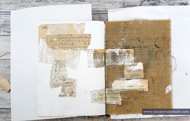
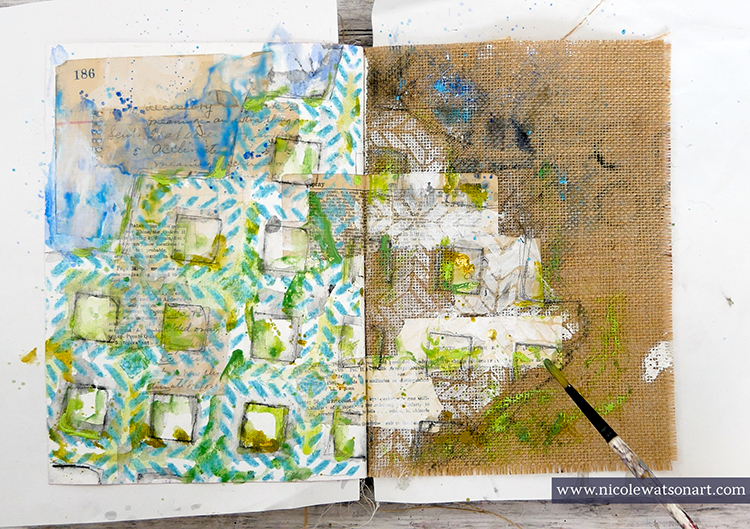
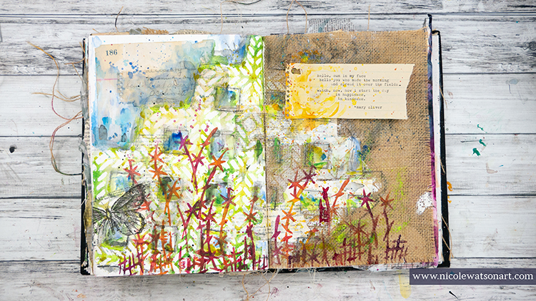
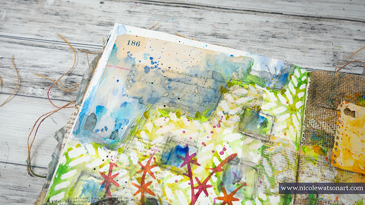
First, I gessoed my page and stuck down some ephemera with matte medium. I put the ephemera on the gessoed page and also the burlap page. Then, I added some bits of gesso on top the ephemera.
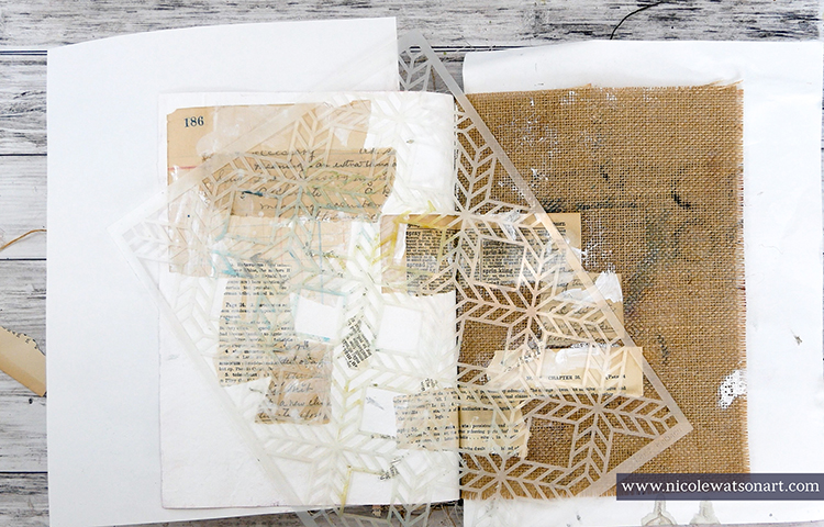
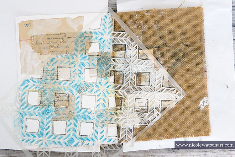
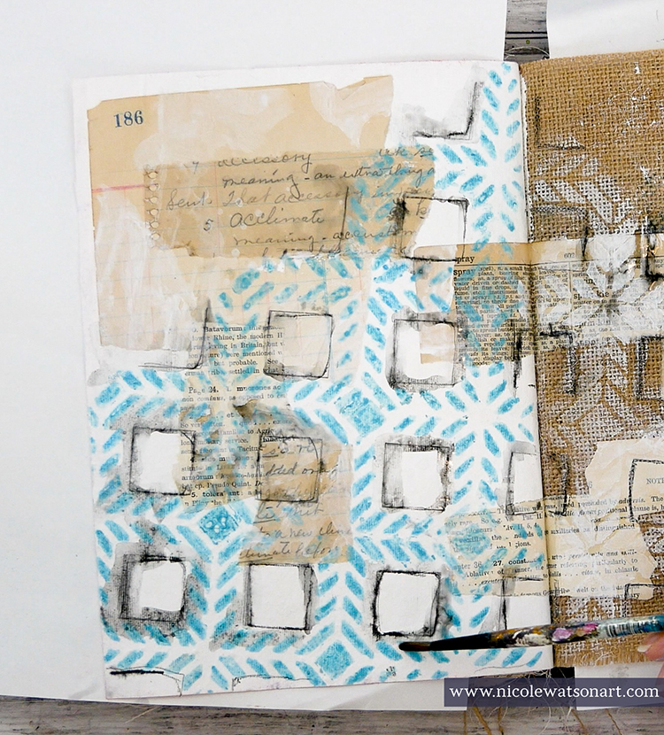
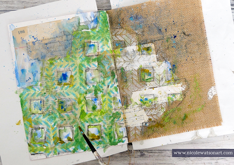
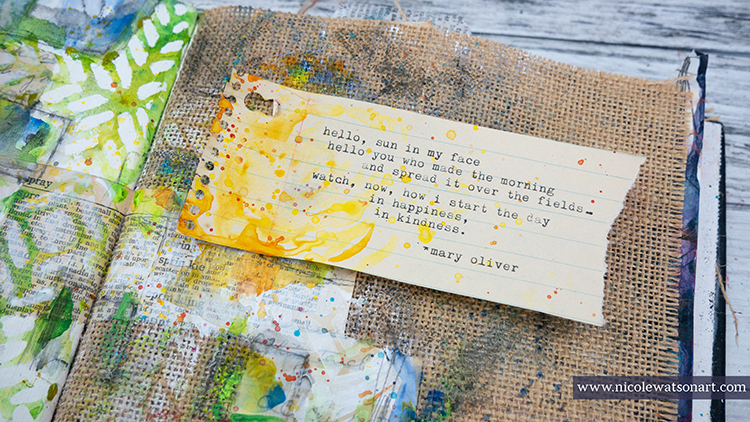
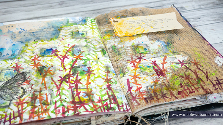
I wanted the lattice to remain white and have a watercolor effect so I decided to use a masking fluid pen inside the stencil shapes. I didn’t necessarily want it to be perfect, so I didn’t trace the insides perfectly. On the burlap side, I sponged some gesso through the stencil. Several times throughout the process of creating the pages, I touched up the masking fluid to make it thicker or define places a bit more.
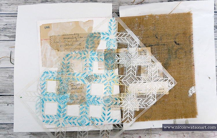
Next, I wanted to add some shadowing around my lattice and grabbed my stabilo all pencils to trace around the entire image and inside the squares that I didn’t use the masking fluid. I placed the stencil back on my pages to make it easier to trace. After activating the stabilo with water, I began the process of adding color.
Loosely painting with watered-down acrylic, I added blues on top the stenciled area and inside the large squares (for sky) and greens in the stencil. I did this process in a couple layers to build the color. I wanted the areas to be free, loose, and “watercolory” looking. I also added color to the burlap side.
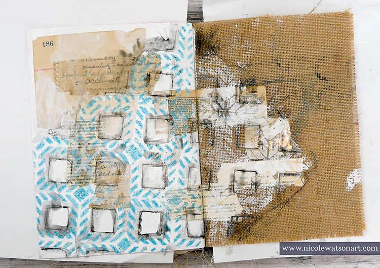
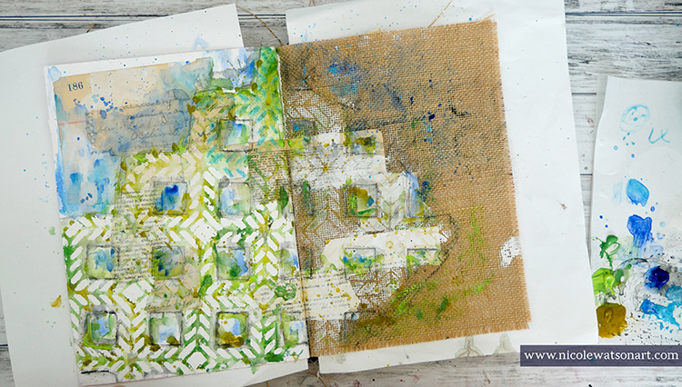
When I was done adding layers and the paint was completely dry, I began removing the masking fluid. You can use your fingers to do this, but a rubber cement eraser makes the process so much easier!
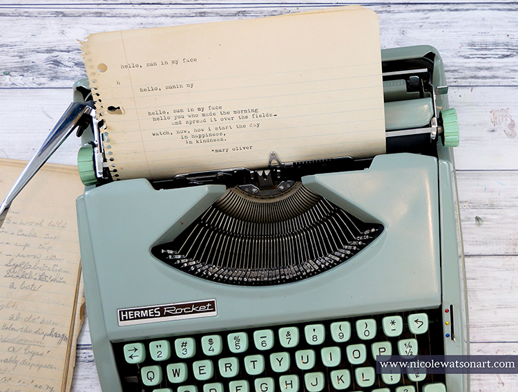
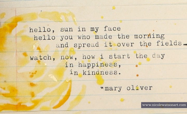
I noticed that the places where I had ephemera under the masking fluid didn’t really stand out, so I placed the Santiago stencil back in the original position and painted in some of these areas with watery gesso. I also touched up the burlap gesso a bit as well. While I waited for the gesso to dry, I typed up a little poem by Mary Oliver to put on the pages.
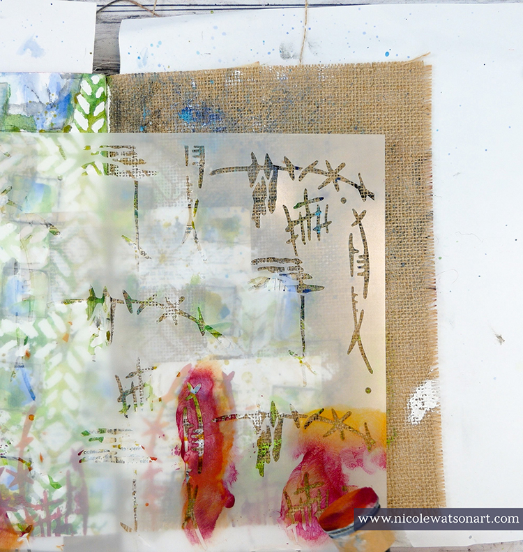
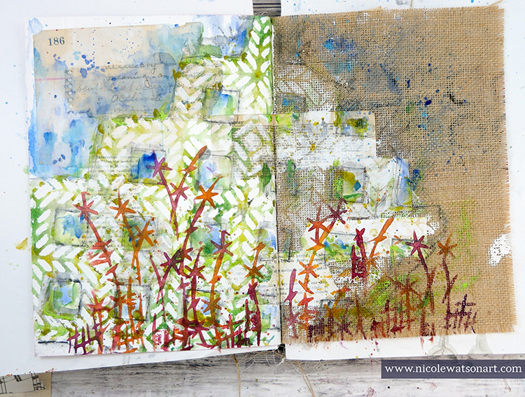
Finally, it was time to add some flowers to my page. I used my sponge applicator through the Kyoto stencil to create whimsical flowers in shades of red, orange, and purple.
To finish the page, I added a butterfly, a little sunshine on my poem, and a bit of shading with some stabilo.
Life is definitely not what we expected it to be right now! Spending time outside in the sunshine, in my studio, going on walks, taking photos, and enjoying the weather help bring focus to what is important. They, like Mary Oliver’s poem, bring happiness and kindness to my days.
Thank you Nicole – I love how you interpreted the Kyoto stencil as a floral element! Thank you so much for bringing some sunshine to our day!!!
Want to give Nicole’s project a try? You can find all my Stencils in my Online Shop. In addition to her cool vintage typewriter, here are some of the other supplies Nicole used:
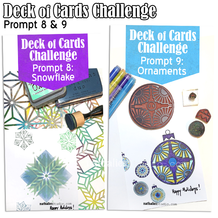
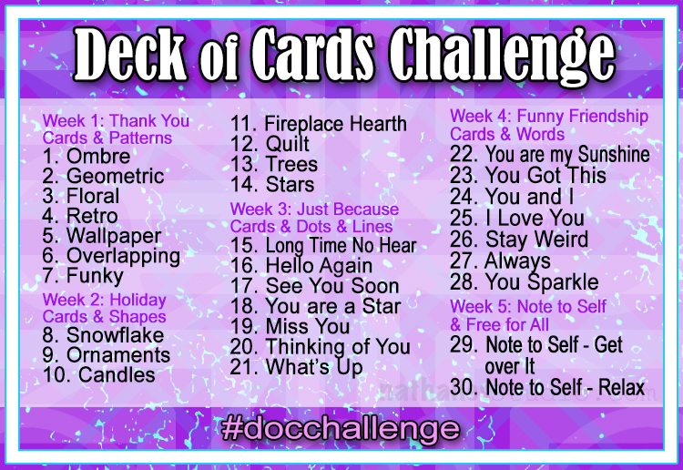
Today I am recapping Day 8 and 9 of my Deck of Cards Challenge that is running this month on Instagram. This week we are making holiday cards with a focus on shapes.
Here is a recap of days 8 and 9:
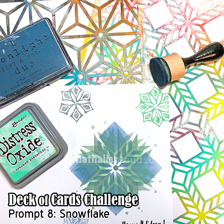
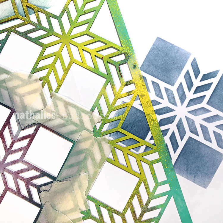
Day 08 – Snowflake
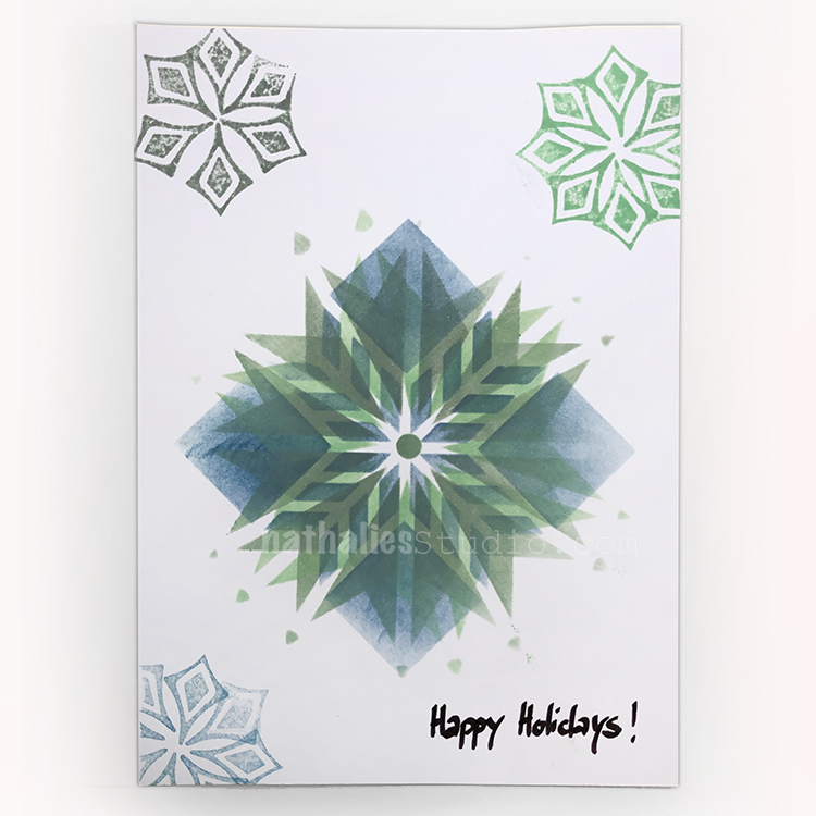
For week 2 of the challenge we are making holiday cards so I thought I’d start off with a classic winter motif – the snowflake.
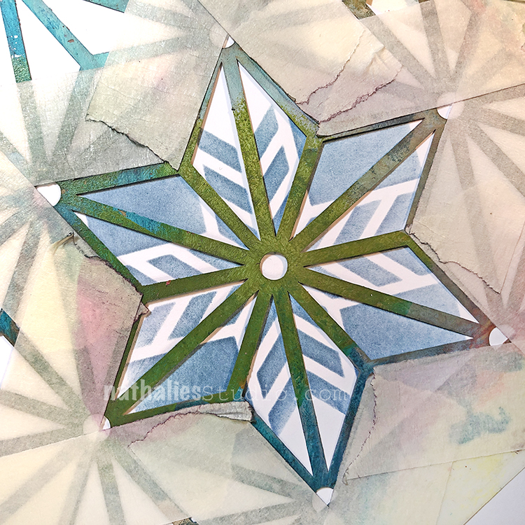
Using an ink blending tool and masking off a shape in my Santiago stencil…
and then Star Struck stencil, I layered up a very nice snowflake. Because no two snowflakes are the same, I added a few more with my Fanfare stamps. This is one snow storm that will brighten anyone’s day :)
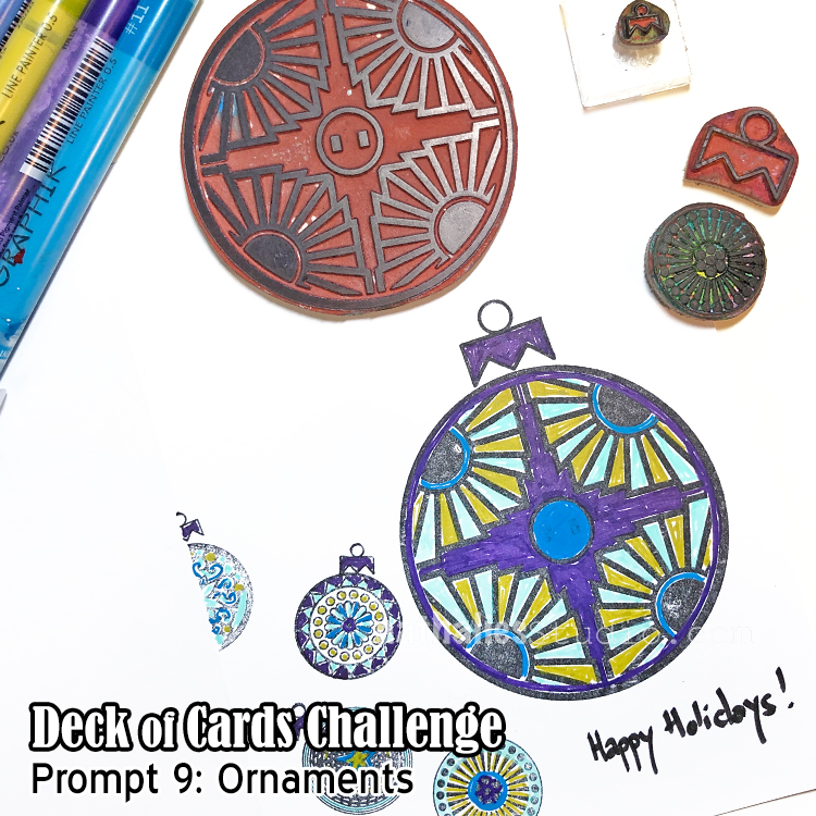
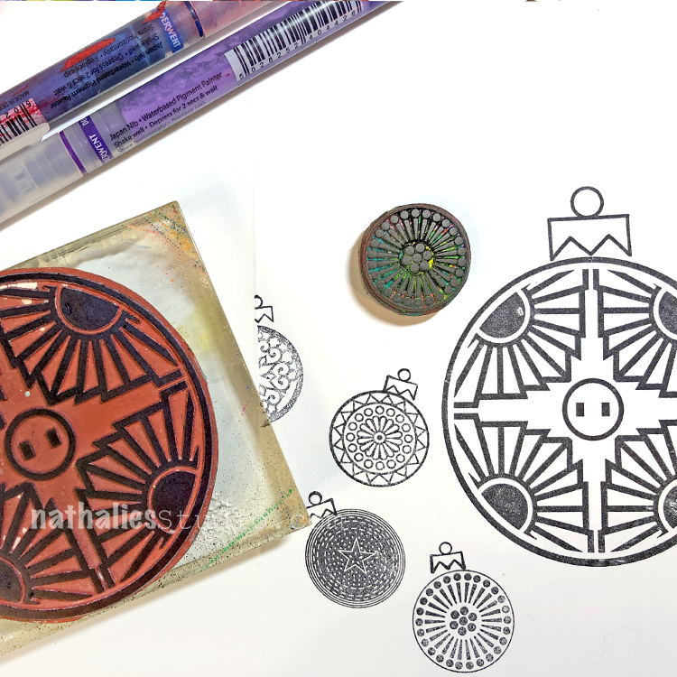
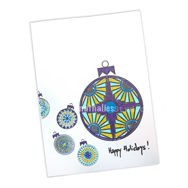
Day 09 – Ornaments
Today we are making a holiday card with Ornaments on it.
My Small and Large Circle Jumble stamp sets actually include an ornament topper stamp in them – so it couldn’t be easier. You could fill these in with lots of different colors – I’ve chosen to use Graphik Line Painter markers in some merry and bright colors.
Keep following us and I hope you share what you are working on using #docchallenge
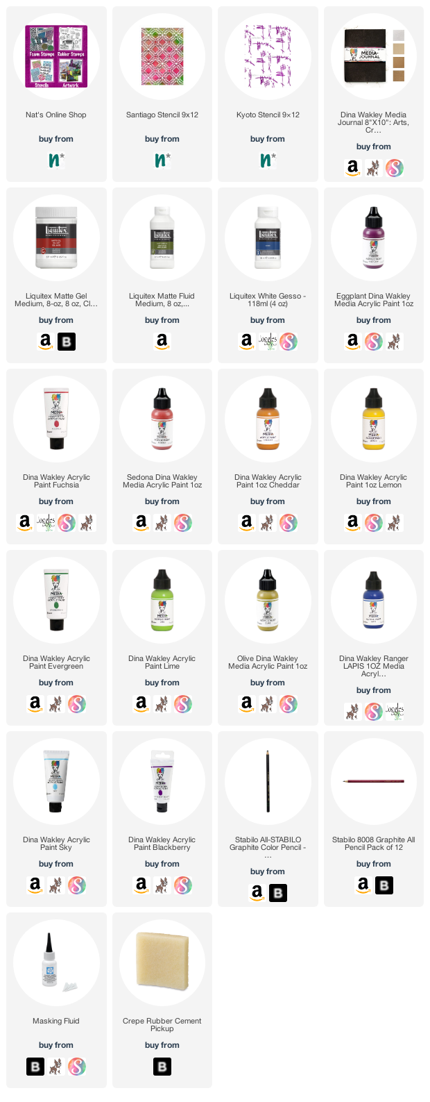
Here are some of the supplies that I used in these prompts:
Here is the prompt list so you can play along too! Follow the daily prompts on Instagram and tag your creations with #docchallenge
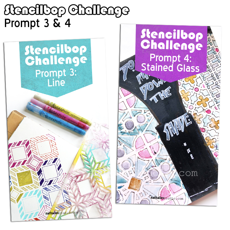
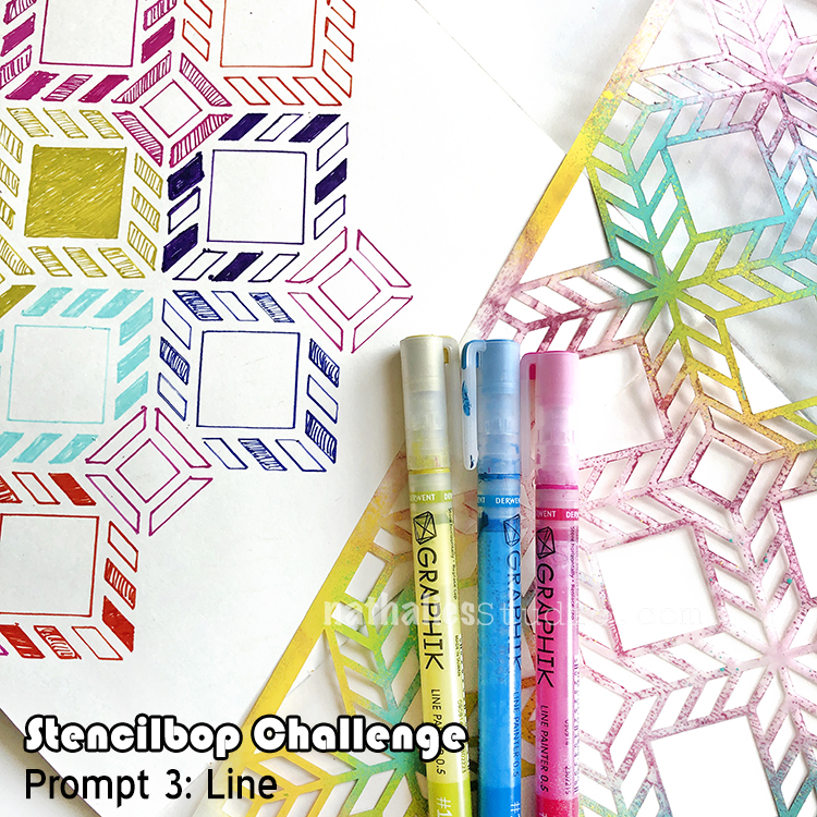
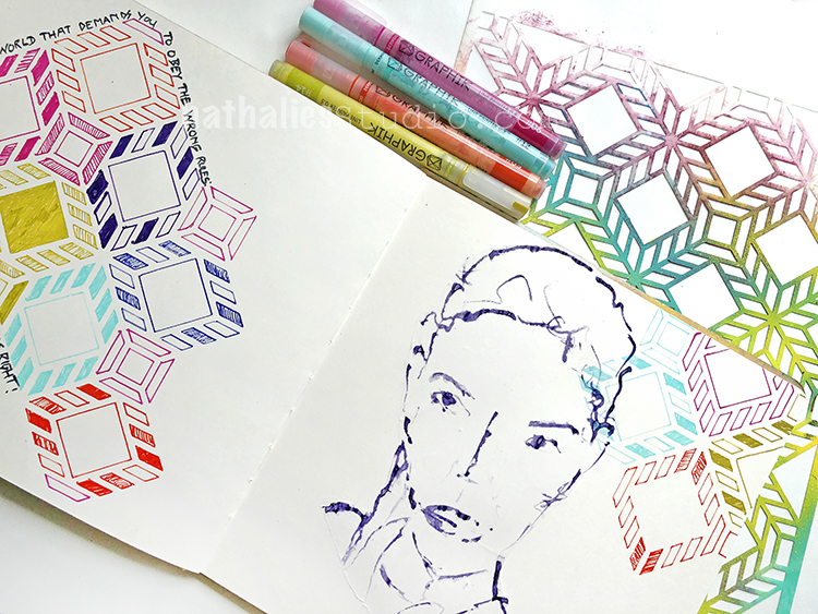
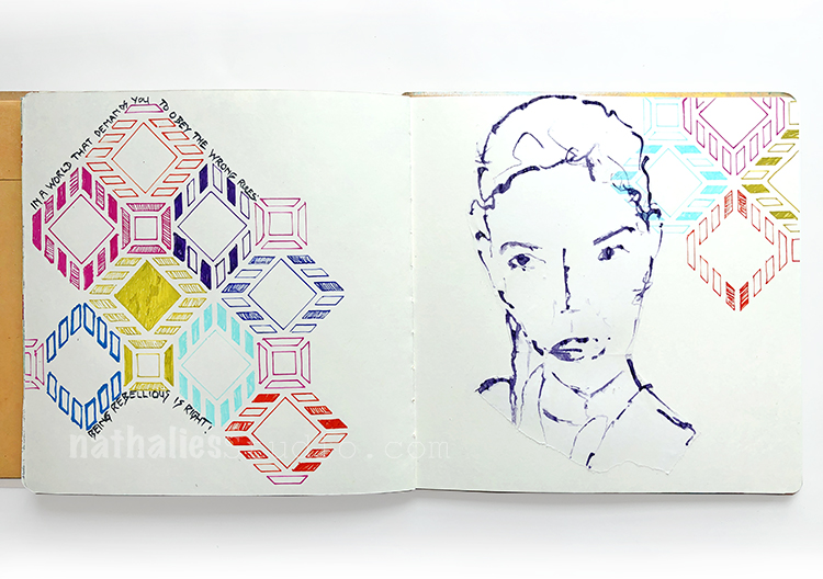
I love using my stencils with markers and create different variations of lines- it is a total zen approach – better than a coloring book in my opinion ;)
Here I used my Santiago Stencil and some Derwent Graphik Liners and just lined up some colors – pun intended ;)
Easy peasy but don’t be fooled …this takes a while.
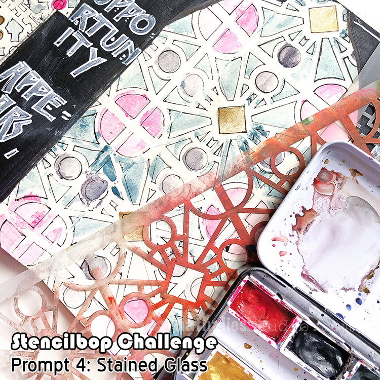
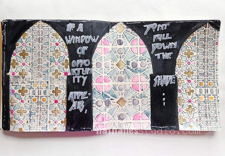
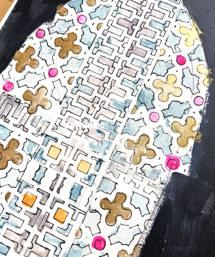
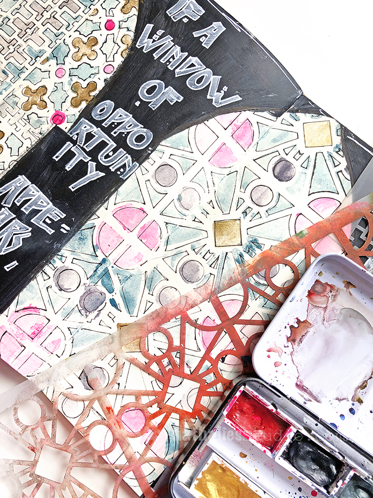
August 4 – Stained Glass
Watercolor might not be the first medium to use with stencils that comes to mind but I do love the stained glass effect.
For this journal spread I added some watercolor very loosely through the Downtown and through my Buenos Aires Stencil – I didn’t care too much about crisp lines but always started spreading the paint out from the middle of the opening towards the edges of the stencil.
Later I defined the stencil pattern by using a thin black micron pen.
Here are some of the supplies I used in these prompts:

Comments (1)
Rebeccab
| #
I like the color of the Santiago stencil section, it reminds me of an old quilt, the blue is like water, and the grid pattern someone might use when cordoning off a section to pan.
Reply