Creative Squad

Creative Squad: Life in Bloom – Emilie Murphy

Hello from my Creative Squad! Today we have a beautiful final post from Emilie Murphy who will be moving on from the Squad at the end of March. We have loved having her on and sharing her gorgeous style and talent for illustration with you. This month Emilie is using my Art Deco Summit, Art Deco Wallpaper and New Orleans stencils and our theme: Life in Bloom – It’s been a long winter where we are and I’m dreaming of flowers and gardens and spring. Indulge us all in a project that focuses on one of Mother Nature’s most exuberant symbols of life: flowers flowers flowers!


Hi there!

Can’t believe that we are already in March. Time flies, for sure, despite the long and pretty cold winter we had this year. I can’t wait to see the first flowers blooming. Let me show you, today, how I made my art journal page to illustrate the “Life in bloom” theme of this month.
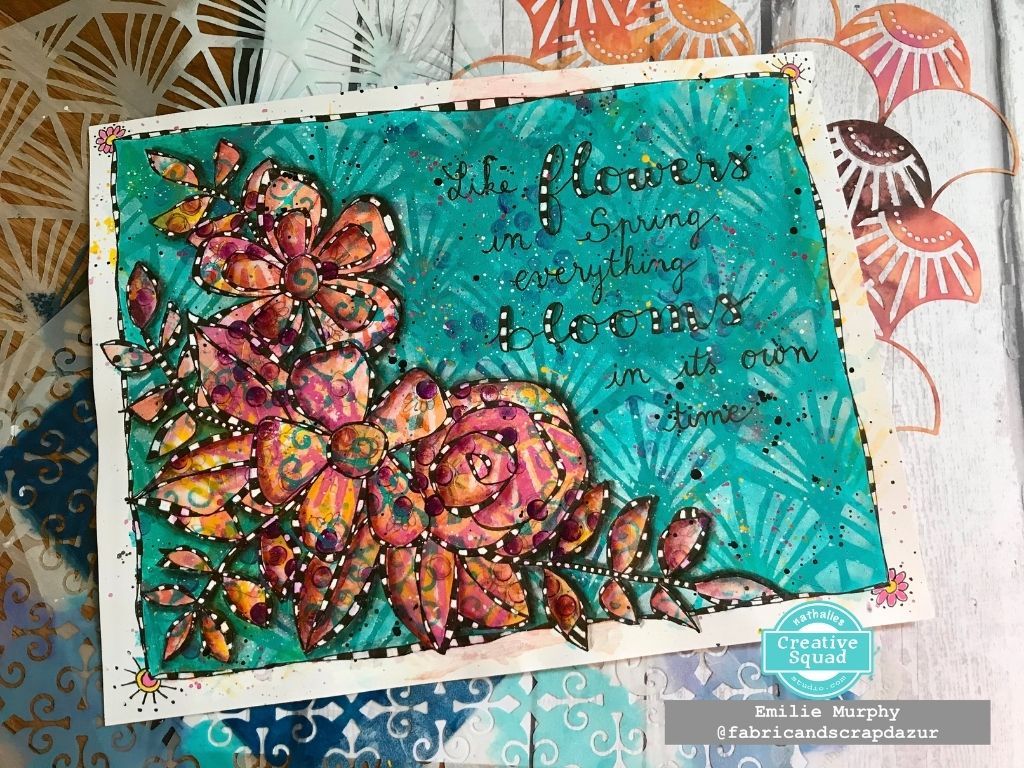
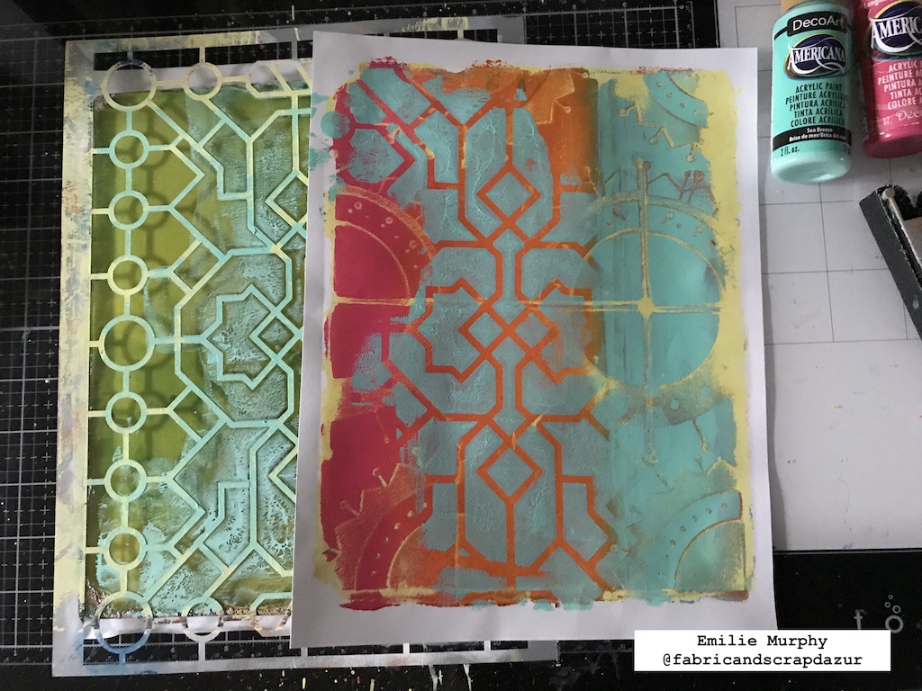
To start my project, I used my Gelli plate with my favorite warm colors using a sheet of 8.5×11 white cardstock. I first applied the paints by mixing them a little bit with each other, I then laid down the Art Deco Summit stencil and pulled the print. I mixed acrylic paint and ink to get a kind of washy look.
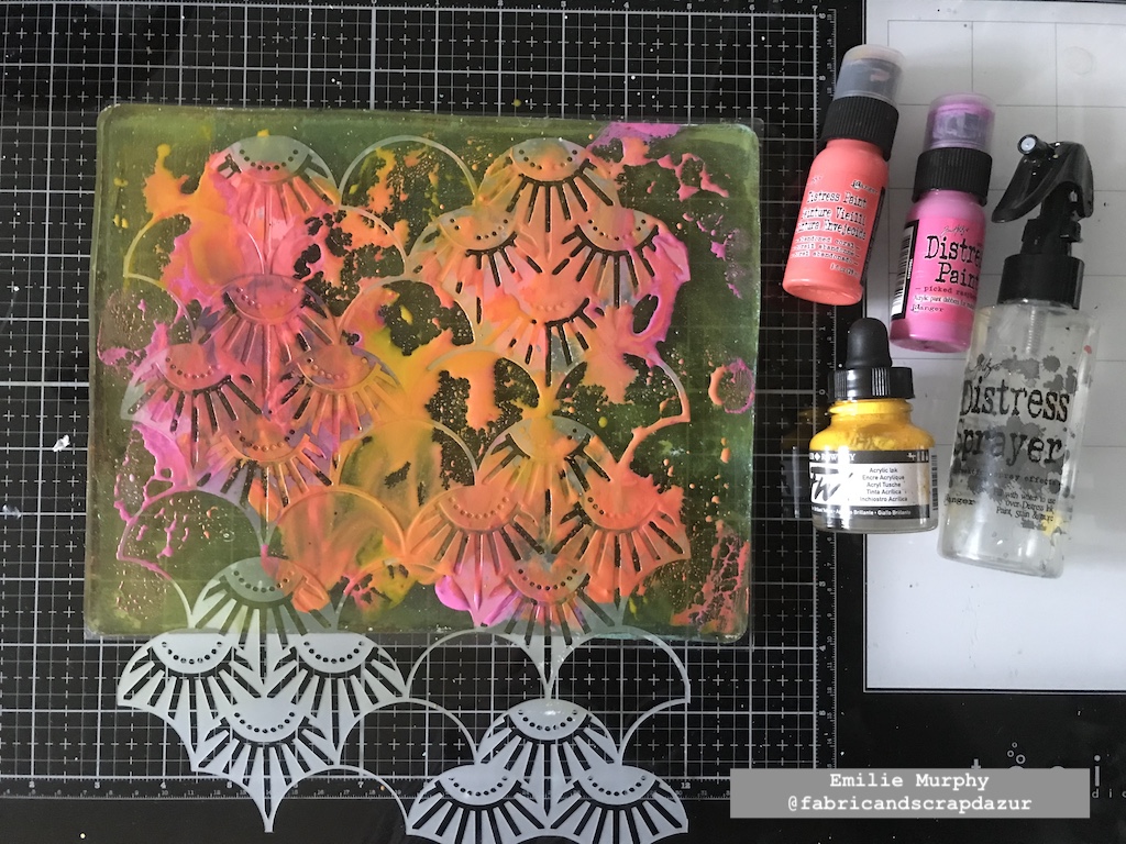
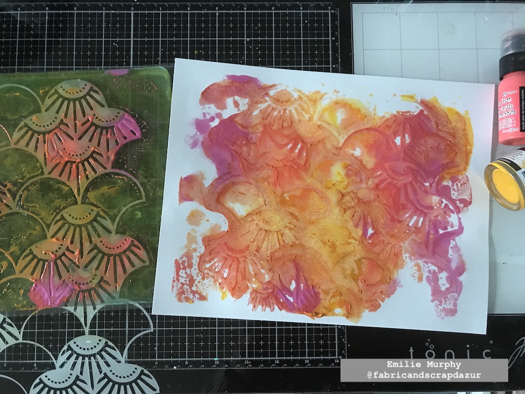
Next, I started to build my background by applying white paint through the Art Deco Summit stencil again.
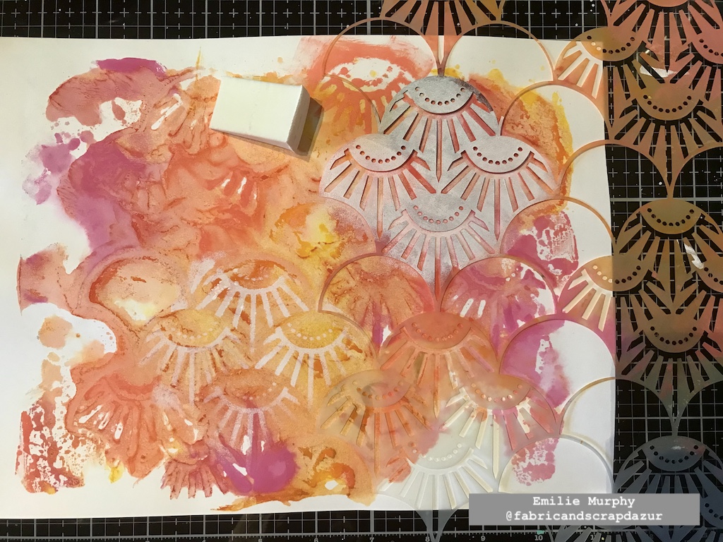
Then I did the same thing with the New Orleans and Art Deco Wallpaper stencils.
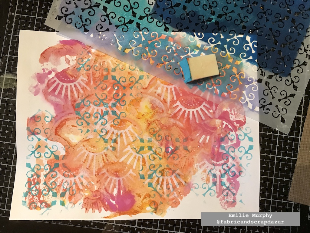
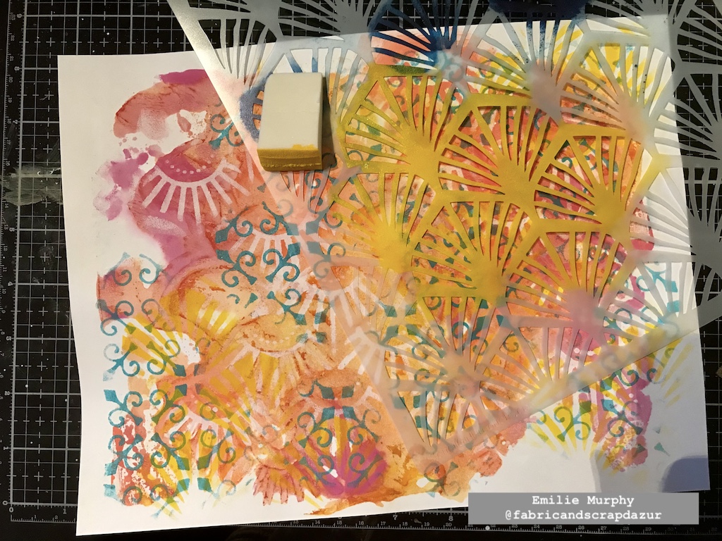
I kept adding layers with my warm colors, alternating between the pattern stencils.
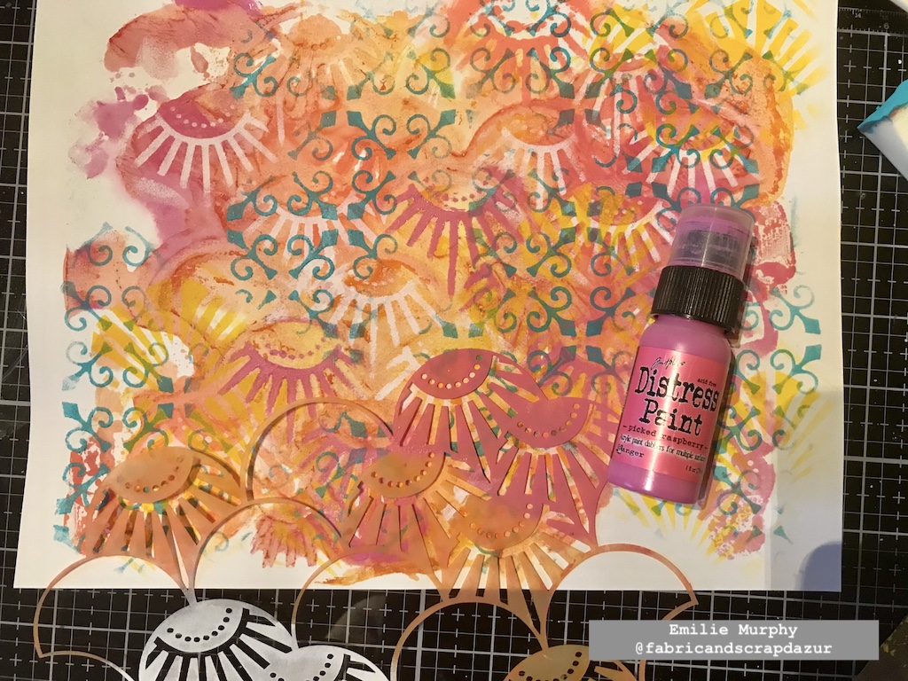
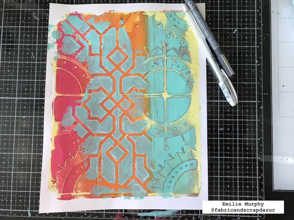
I added some dots with the rubber tip of my pencil.
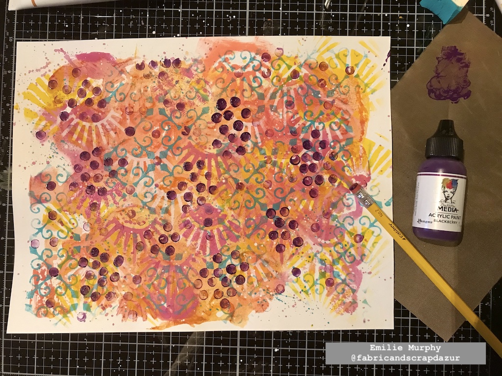
Once I was happy with the look of my background, I doodled some flowers and foliage.
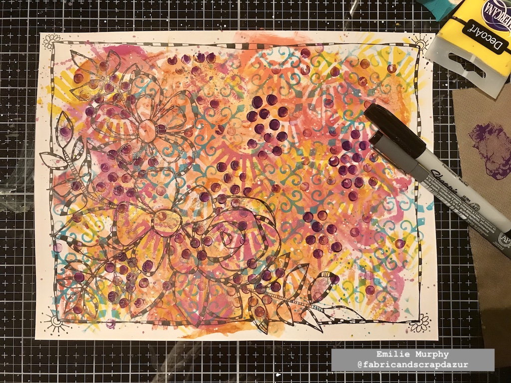
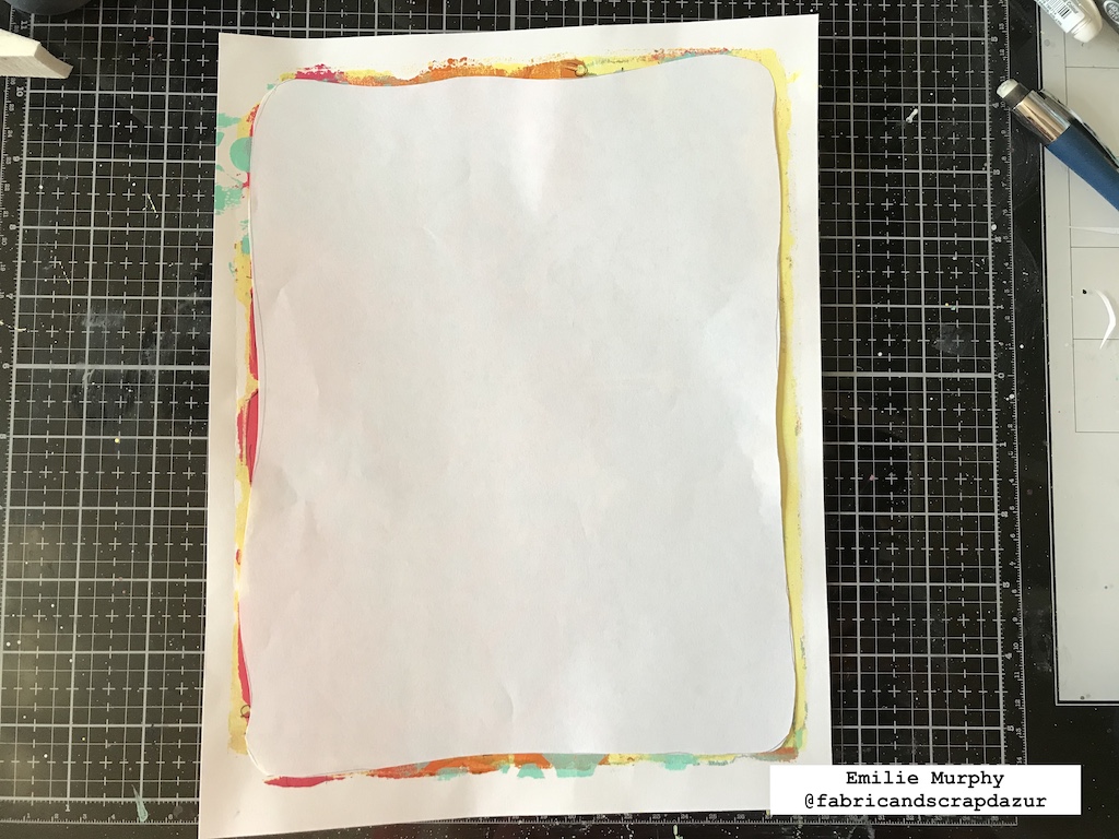
I covered all my background except the floral pattern with a cool color to make it pop out. I absolutely love this technique. It allows seeing through the different layers of the background, making it more interesting.
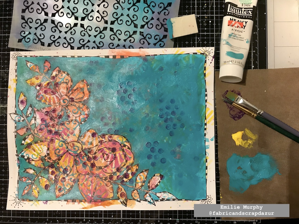
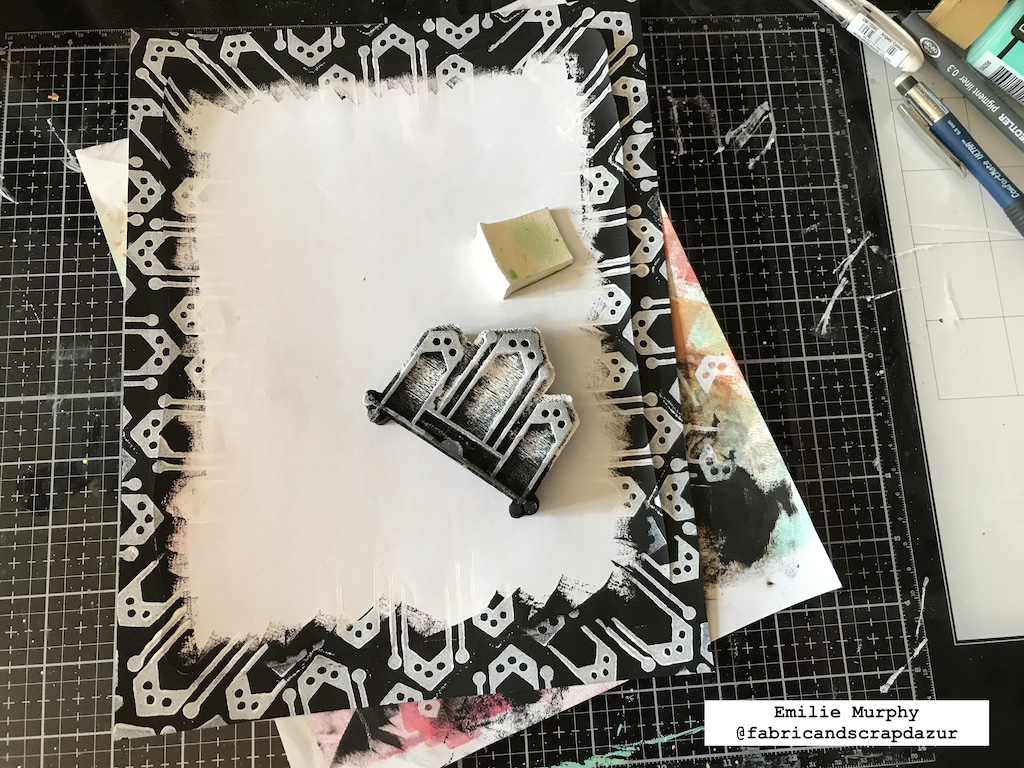
I once again used the Art Deco Wallpaper stencil and applied some white paint through it in order to add some texture to this plain background. I just love this pattern.
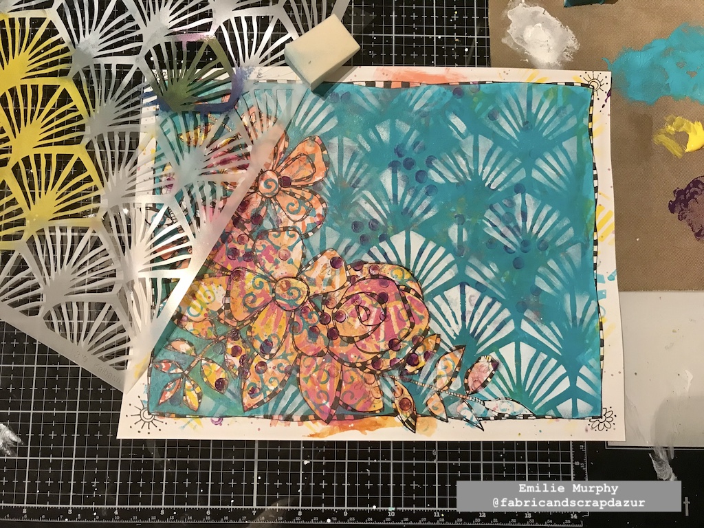
I toned down a little the white paint to embed the pattern to the background.
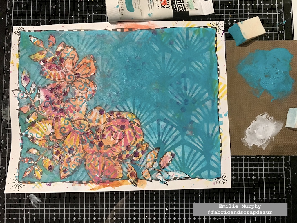
I added some splatters with yellow, black, and white paints. It’s not really visible on the picture but I also traced my quote with a pencil.
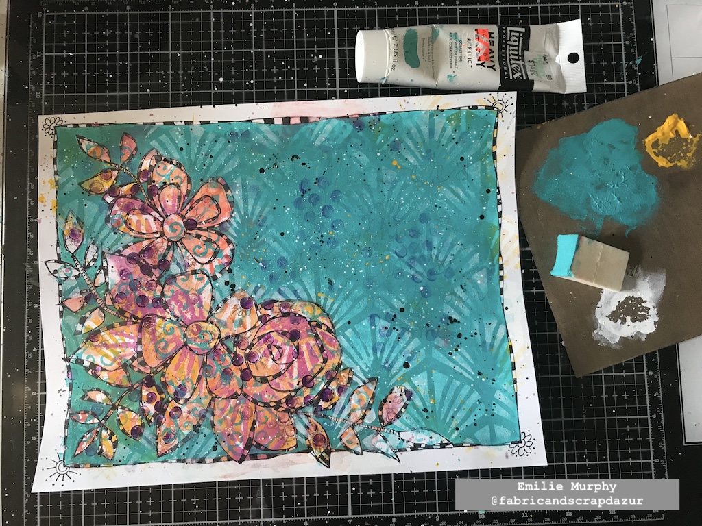
I outlined my quote with a permanent black pen and I finished coloring the checkerboard pattern with white gel pen. I reinforced the whites with a white posca pen when the white was not opaque enough.
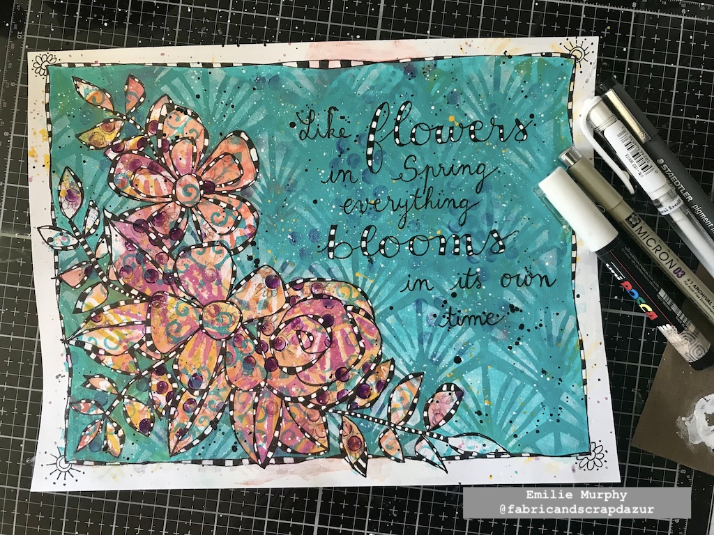
I added some depth and shadow to my floral pattern and to the letters of my quote with a PITT pen marker.  I also added some extra pink splatters.
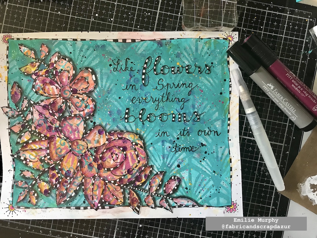
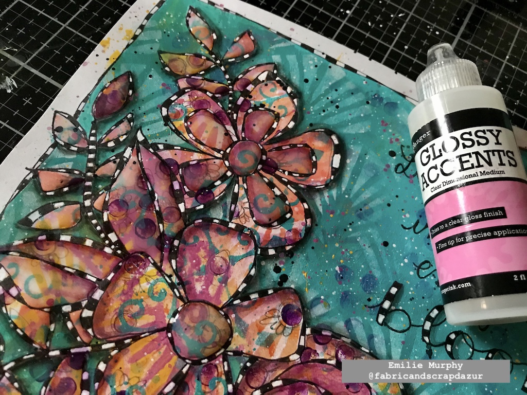
I could have stopped there but I found my art journal page too flat, so I decided to use some Glossy accent to give some dimension to my floral design. I didn’t put it everywhere. I just applied some on the center and inside petals of one of my flowers and on the leaves. I let the glossy accent dry completely.
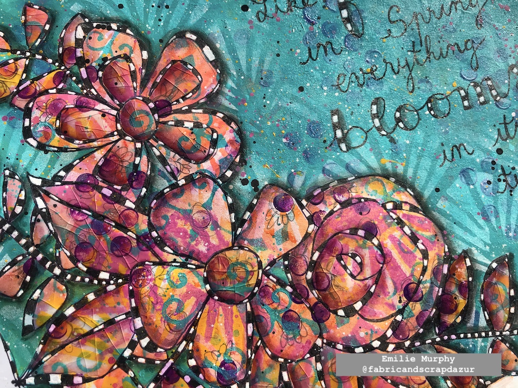
I finally finished my art journal page by bending and folding the paper in different directions, where I applied the glossy accent in order to create some cracks. Isn’t it cool? I think it gives an interesting look. Be sure to apply a generous layer of glossy accent to get some nice cracks.
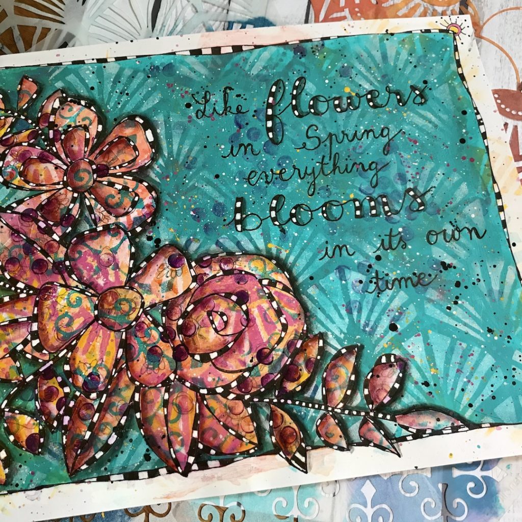
Hope you enjoyed this project, which ends my collaboration as a Creative Squad member. I just can’t thank Nathalie enough for giving me this opportunity to be a part of her team. It has been such a wonderful and pleasant experience in my creative journey. I really enjoyed working on every project I made using Nathalie’s wonderful products. The possibilities playing with them are endless. Of course, I will still be around on social media for the next coming of team member’s projects. Hope you will do, too!

Have a good rest of the week!
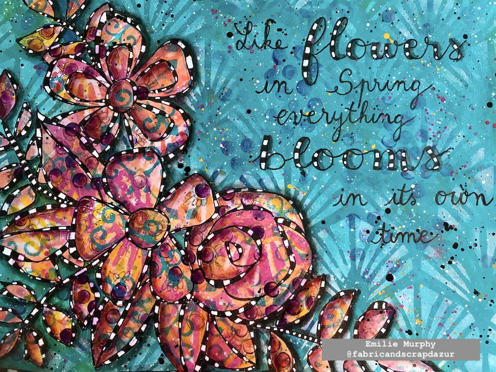

Thank you Emilie for this beautiful reminder to be a bit more patient! And, thank you for all your posts over the past year. We have loved seeing you style and learning more about you as an artist :)

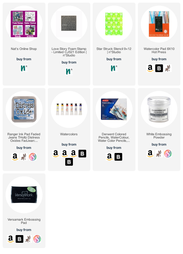
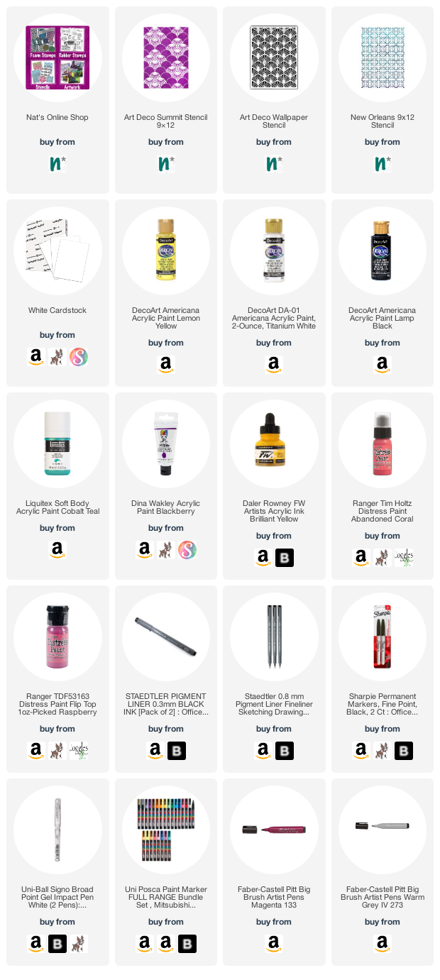
Give it a try: you can find all my Stencils in my Online Shop and here are some of the supplies Emilie used:
Follow Nat’s Creative Squad on Instagram too: Each week we post projects, ideas, and inspiration for mixed media art.

Comments (1)

  • Robin

    |

    Emilie. Another gorgeous spread! I love all the layers you used in this project. We are sorry to see you go, but we’ll stay connected through social media for sure.

    Reply

Leave a comment

Creative Squad: Life in Bloom – Maura Hibbitts

Hello from my Creative Squad! Today we have a lovely and uplifting art journal page from Maura Hibbitts that just might get you thinking about spring :)  Maura is using my Amsterdam, Art Nouveau Wallpaper, Art Deco Fairview, Versailles, Batik, and Tokyo stencils and our new theme: Life in Bloom – It’s been a long winter where we are and I’m dreaming of flowers and gardens and spring. Indulge us all in a project that focuses on one of Mother Nature’s most exuberant symbols of life: flowers flowers flowers!


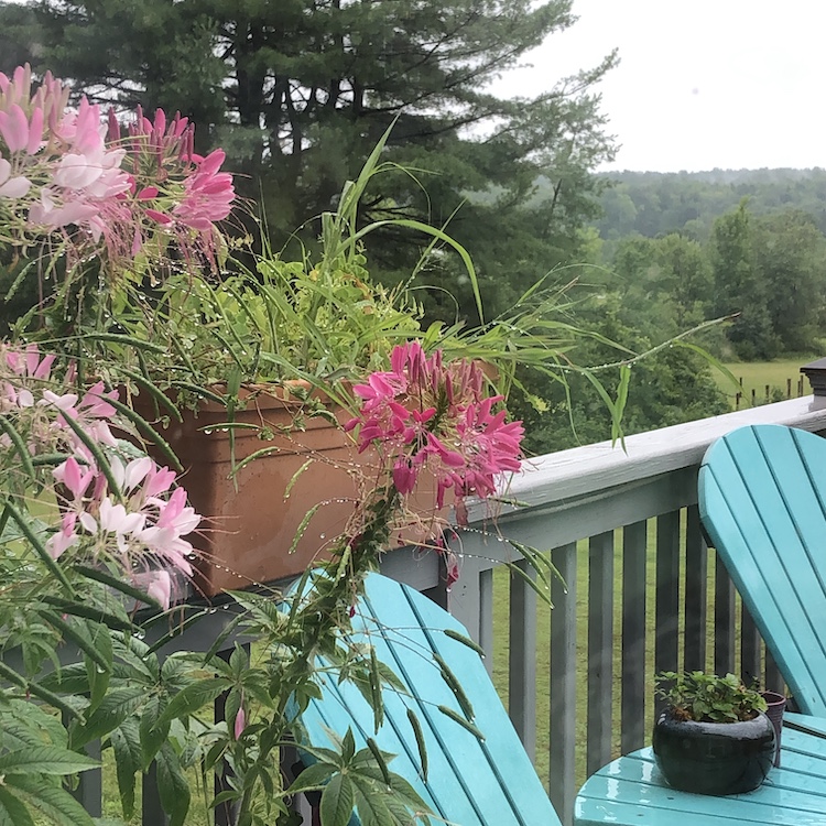
This is the time of year my son and I start pulling out the seed and gardening catalogs and making our lists and getting our orders out. Luckily this year, we have quite a few seeds left from last year’s gardening. During the pandemic, we along with many other people, added to our gardens to grow more of our own food, and it was well worth it. I did not neglect the flowers though, because I so enjoy their beautiful shapes, colors and aromas. We filled the deck with plants and are looking forward to doing that this year. As I worked on my project and looked out, the snow kept falling all day long, so it was fun to make wonky flowers and dream of Spring!

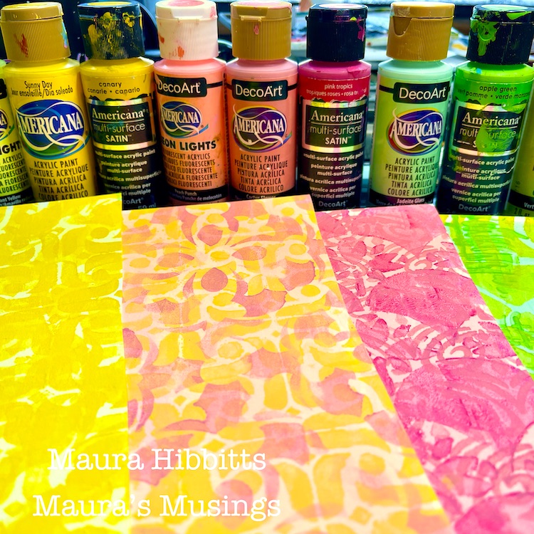
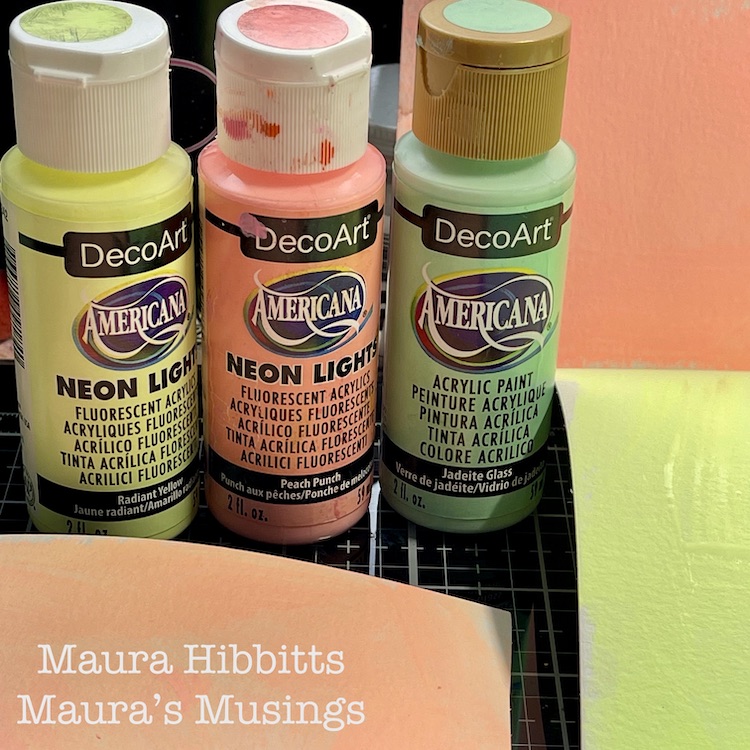
I started my Life in Bloom project by creating papers to use with paints and stencils. First step was to brush the lightest layer of each color onto watercolor paper – Radiant Yellow, Jadeite Glass, Peach Punch, and a blend of yellow and pink.

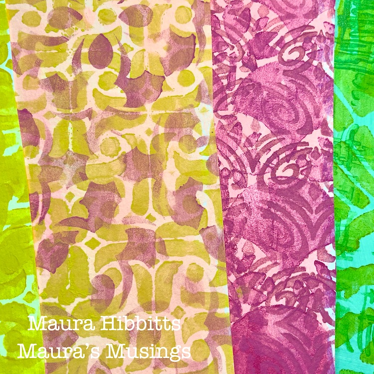
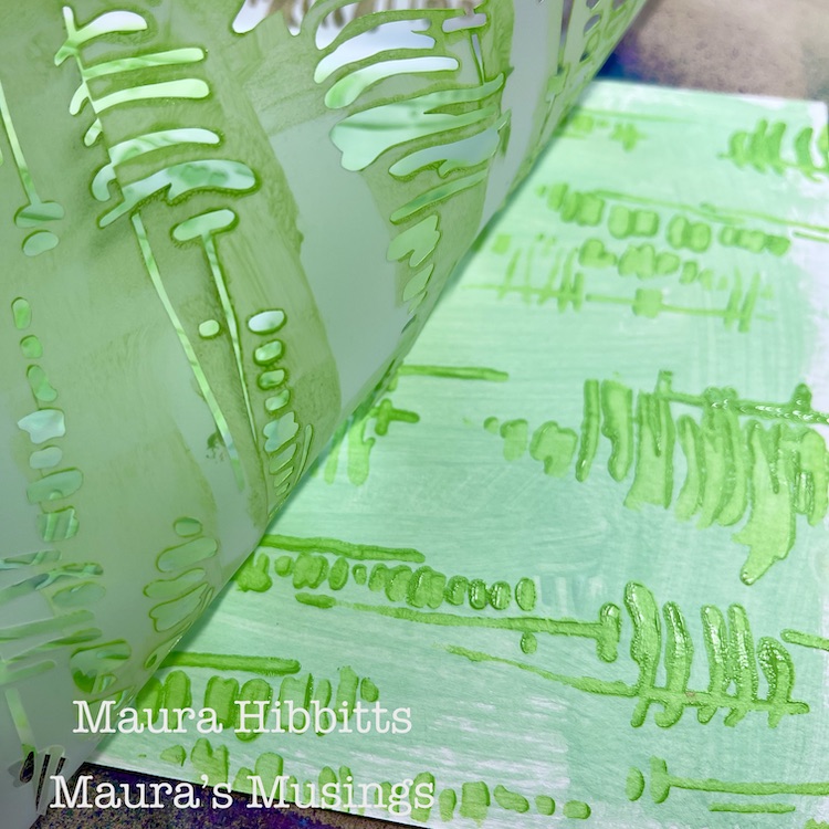
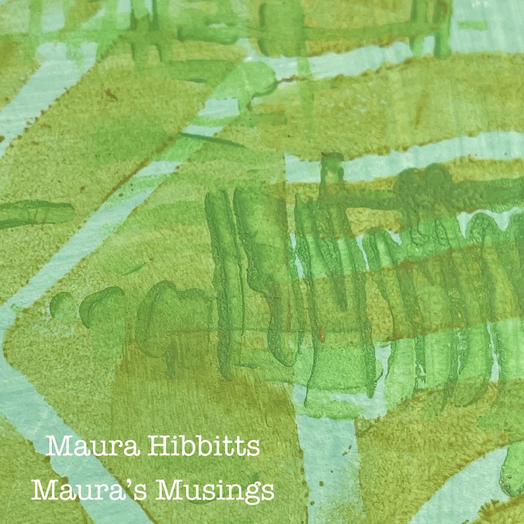
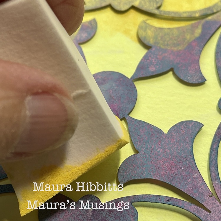
Green paper first – I stenciled the background green with the Tokyo stencil and darkest shade of green (apple green), and dried it with the heat tool. Then I added another stencil layer with the Batik stencil and Matcha Green. Tip:  My favorite tool for stenciling with paint is a cosmetic sponge, you can buy them in bulk and they are not expensive. I make them go even further by cutting off the end and reusing them multiple times until they become too small. Just remember when stenciling, to dab most of the paint off of the sponge before applying, otherwise you can lose the design.

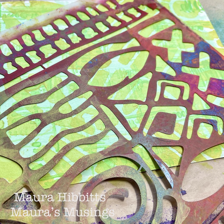
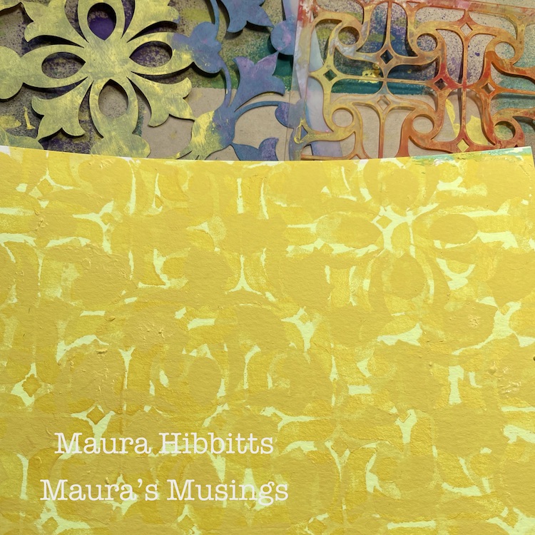
Yellow paper next – I started with the Versailles stencil and Sunny Day ( I meant to use the darker color first, but reached for the wrong one, so the stencil designs don’t stand apart as much here.) Next layer once dry, is using the Amsterdam stencil and Canary.

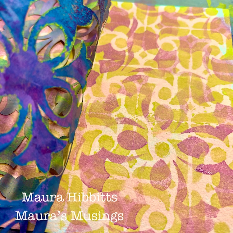
I added a blended paper with both yellow and pink, and stenciled this one with the Amsterdam stencil (yellow) and the Versailles stencil with pink.

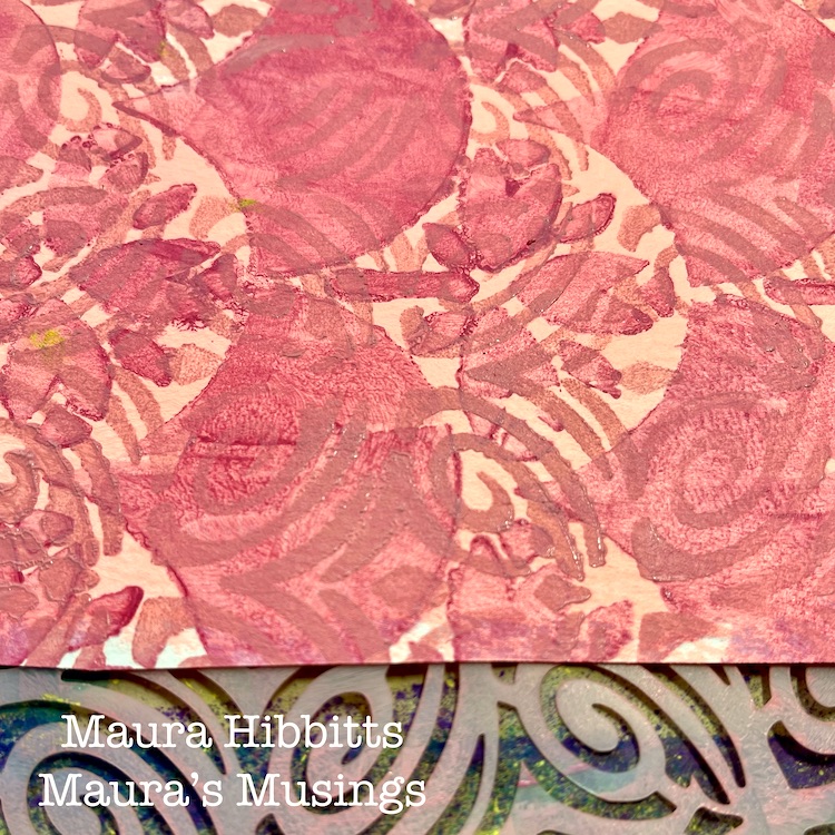
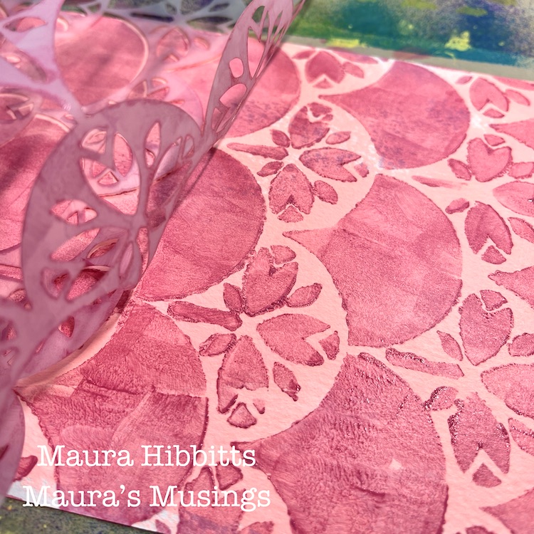
Now, it’s time for the pinks. My first stencil layer is with the Art Nouveau wallpaper and Pink Tropic. Once dry, I added the Art Deco Fairview stencil with Cactus Flower.

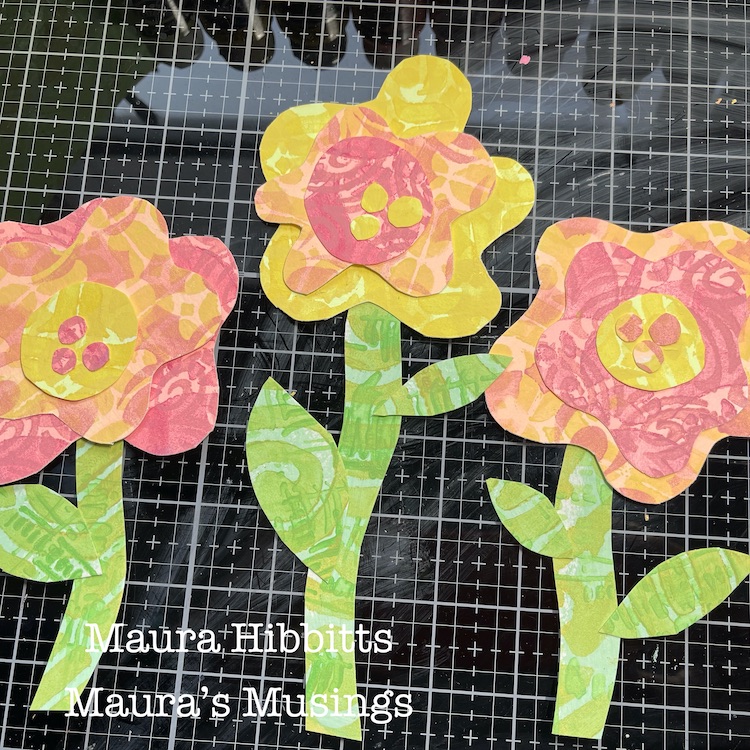
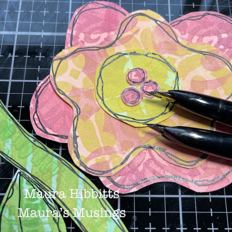
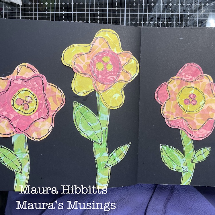
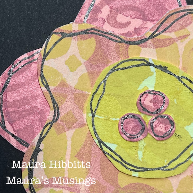
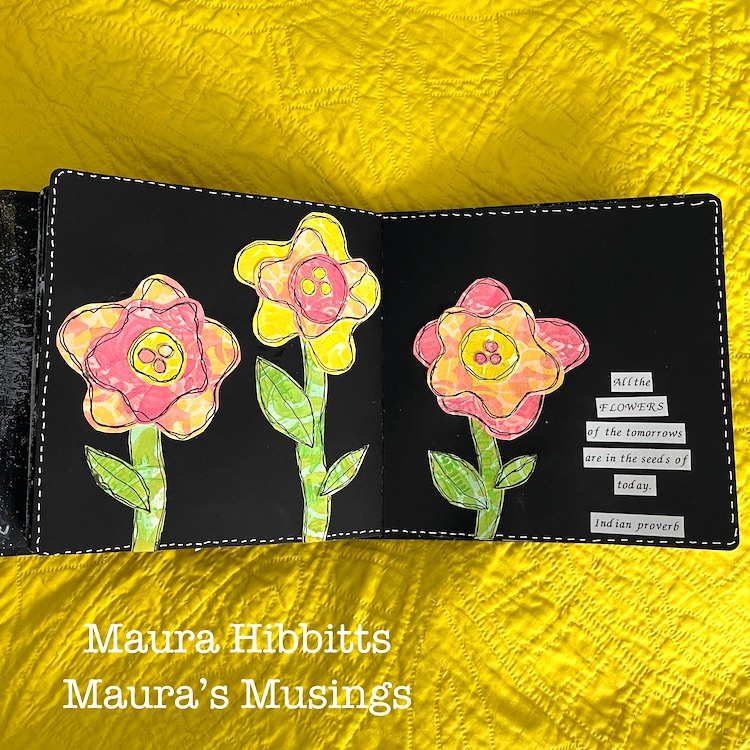
Now that I have my paper variety, I can create my flowers. I just cut out wonky shapes for the flowers and layered them, and cut out stems and flowers from the green paper.

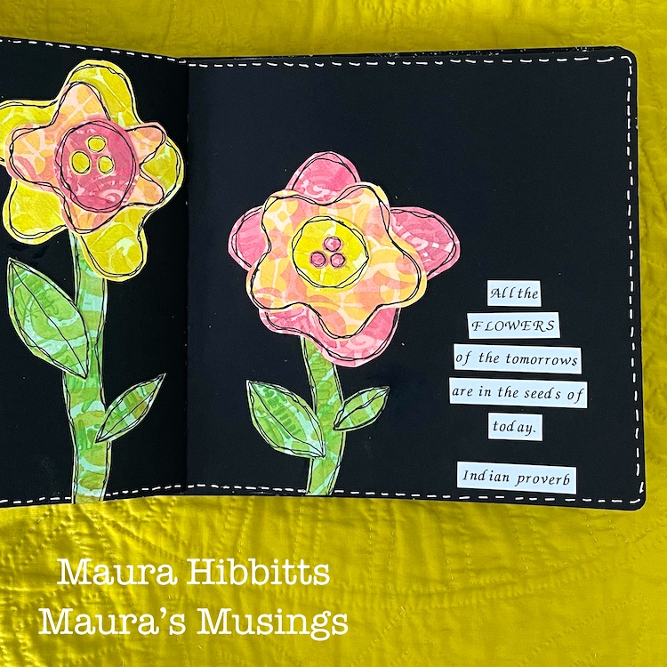
I like edging my pieces with black pen, it brings more drama to them, and my favorite pen for this is a Carbon Ink pen. Of course, any black archival pen will work. I draw two lines around each piece and don’t worry about being precise. Next, I assemble the pieces of each flower and glue them into my journal with tacky glue. I chose the black background, so the bright colors would pop.

I printed out the quote “All the flowers of the tomorrows are in the seeds of today” (an old proverb), using my label maker. Hand lettering it would work beautifully too. Then, my final step to pull it all together was to add faux white stitching around the pages. One of the flowers from my deck last summer inspired me to use the pinks. We saved seeds from this beautiful plant to grow more this year.

It’s fun to think that life is in bloom in other parts of the world, even when mine is covered in snow. I can tell you, I am really looking forward to spring and this year, that includes being able to get together with family and friends outdoors, a few at a time. The seeds are saved and ready for planting new flowers and gardens come spring. Let’s look forward to a new season together, Maura


Thanks Maura – so fun that this spread came together during a snowstorm!

Give it a try: you can find all my Stencils in my Online Shop and here are some of the supplies Maura used:

Don’t forget to check out Nat’s Creative Squad on Instagram too: Each week we post projects, ideas, and inspiration for mixed media art.
Comments (1)

  • Robin

    |

    Maura, I too, can’t wait to garden and see the flowers again. I love the idea of making the florets from Nats stamps. Fun! Such a bright and lovely page!

    Reply

Leave a comment

Creative Squad: My Creative Playlist – Jordan Hill

Hello from my Creative Squad! Today we have Jordan Hill sharing with us a guilt free art journal spread using her favorite supplies, my Mini Motifs foam stamps, my Art Deco Empire stencil, and our theme: My Creative Playlist – Your favorite mixed media supplies are like your favorite songs: they lift you up, inspire you and just feel good to groove to. What are your favorite supplies? Use them in a project – YOUR Creative Playlist that always gets you going.


Hey everyone! I’m excited to be back with a new post for this month’s theme of “My Creative Playlist”. I tend to reach for a lot of the same supplies in most of my art journal spreads anyways, so this was a great excuse to not feel guilty about it! With that being said, let’s get into it!

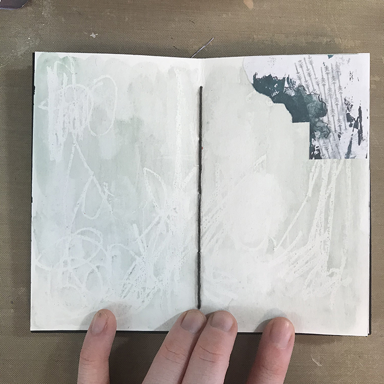
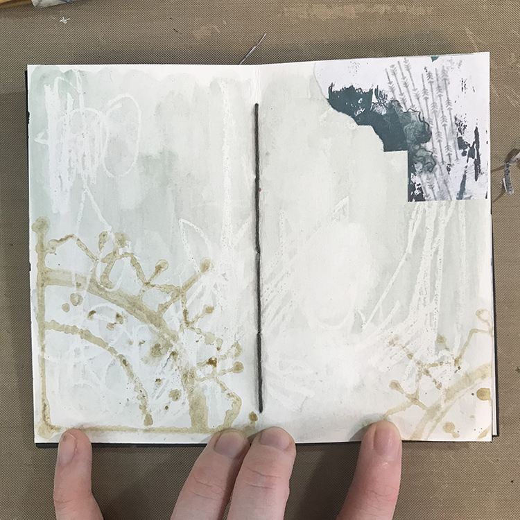
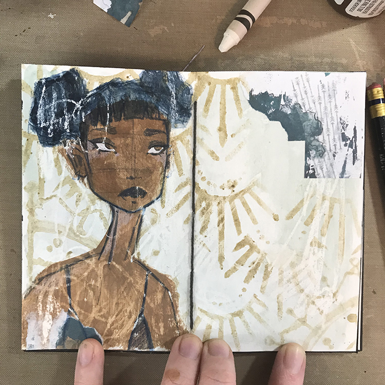
I started off today’s page by scribbling randomly with a white crayon. I then reached for some of my handmade watercolors and did a wash over the entire spread. I used to be more of an acrylic paint person, but recently watercolors have really been speaking to me. Thus, for the theme of “My Creative Playlist”, I thought I would take the time to really combine the two types of paint! Collage is also something that I really love using in my work, so I glued a piece down.

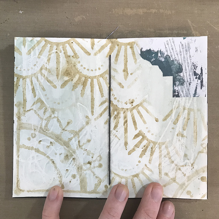
Next up, I wanted to play with Nathalie’s Mini Motifs foam stamp set to continue building the background I had already begun. I decided to use another of my handmade watercolors in order to add these stamps to my spread. I was looking for a bit of a softer effect than what I often get from using acrylics, so using a slightly darker color of watercolor did the trick! In order to do this, I used a large, wide brush, loaded it up with paint, and painted directly onto the surface of the foam stamps.

Using the same watercolor on a makeup sponge, I then used Nathalie’s Art Deco Empire stencil to fill in the rest of the background space!

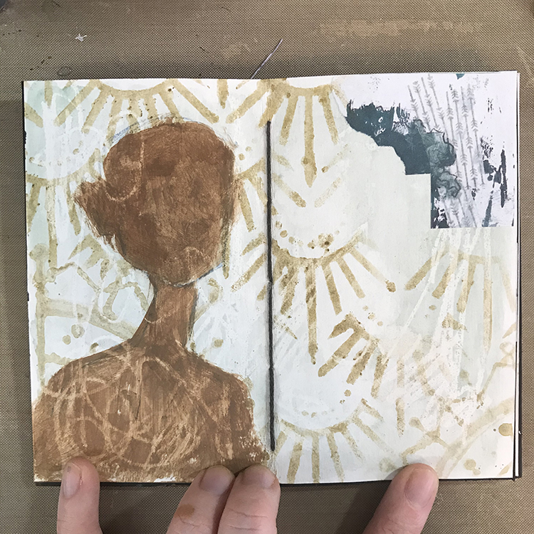
Next, I started blocking in the face I knew I wanted to add the page. For this particular page, I wanted to draw a new one from scratch, so I started by sketching in a basic face shape. Then I used some matte acrylic paints (another favorite supply of mine!) to block in the base skin tone.

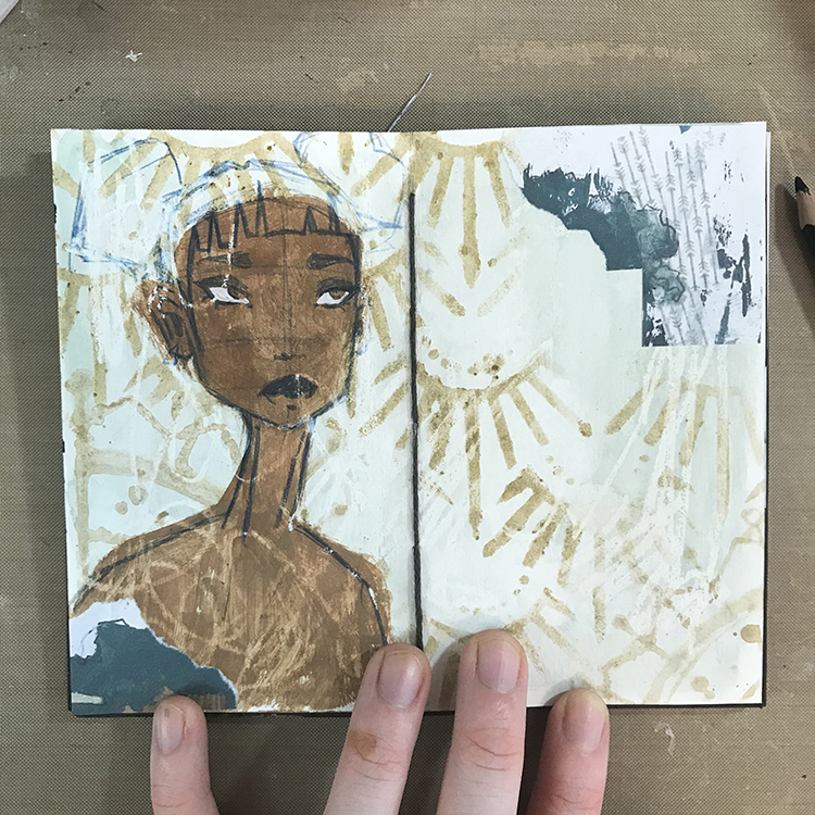
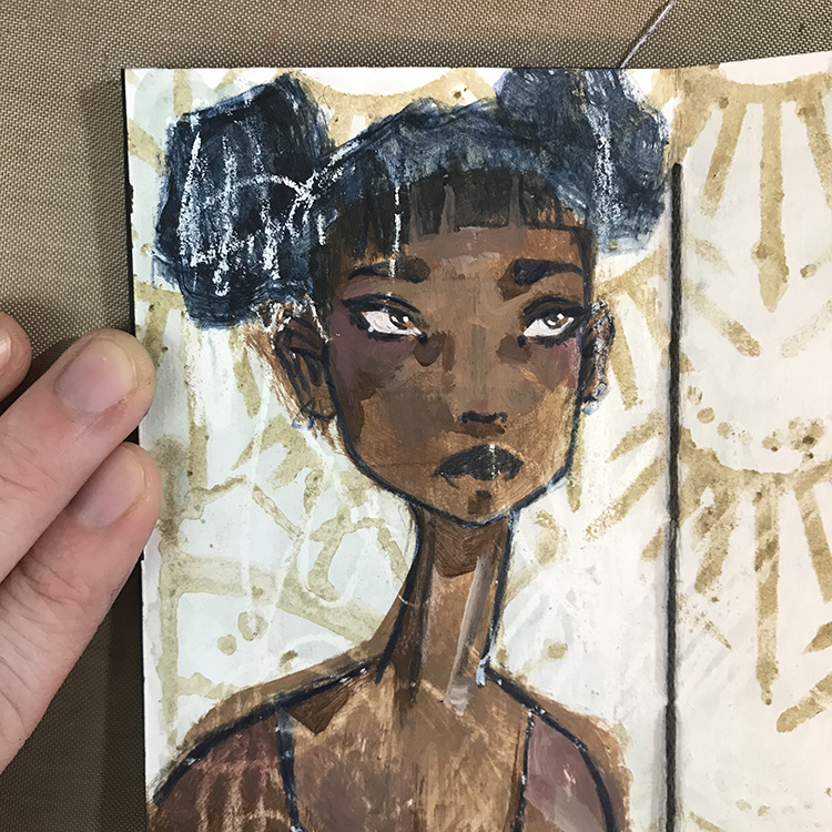
Following the theme of My Creative Playlist, I decided to use a Prismacolor colored pencil in the color Indigo to sketch in the details of my face. This is one of my very favorite colored pencils for sketching faces, and I’m at the point where I’ve used it so much that I’m going to need a new one very soon! I also added another piece of collage in the lower left hand corner to match the one in the upper right.

Using a dark teal acrylic that I mixed from Aqua and Black CraftSmart craft paint, I then blocked in the general shape of the hair. At this point, I also sketched in the general shape I wanted to use for the shirt. Things were still lacking a bit of cohesiveness at this point, but I love how the white crayon I used in my first layer acted as a resist through all the layers and helped tie things together.

For this particular portrait, I knew that I wanted to spend a bit more time developing the details of the face, so using my trusty acrylic paints, I added some shadows, highlights, and general depth to the portrait. Once those details had been added in acrylic, I went back to my Prismacolor pencil in Indigo to reintroduce any lines that may have been lost by painting over top of them.

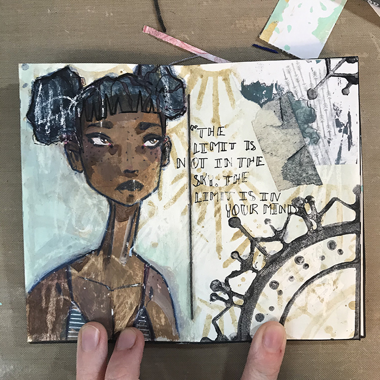
Finally, I added some finishing touches to the page. I decided that the Mini Motifs stamp in the background wasn’t nearly pronounced enough, so I used the same teal paint I had mixed for this girl’s hair to stamp the design in the upper and lower right of my spread. I also added a scrap of masking tape with a bit of paint on it, and added some additional details in pen to the hair, shirt, and in the form of a short phrase. With that, I was ready to call things done!

I had a lot of fun putting together the spread for this month’s theme and I hope you enjoyed following me along for this process!


Thank you Jordan – absolutely love to see how you create your figures through different favorite media!

Give it a try: you can find all my Foam Stamps and Stencils in my Online Shop and in addition to her handmade watercolors and some collage pieces, here are some of the supplies Jordan used:

Don’t forget to check out Nat’s Creative Squad on Instagram too: Each week we post projects, ideas, and inspiration for mixed media art.
Comments (1)

  • Robin

    |

    Jordon thanks for sharing how you created this spread. I love the combination of paints and your drawings are always so expressive!!! Thanks!

    Reply

Leave a comment

Creative Squad: My Creative Playlist – Robin Seiz

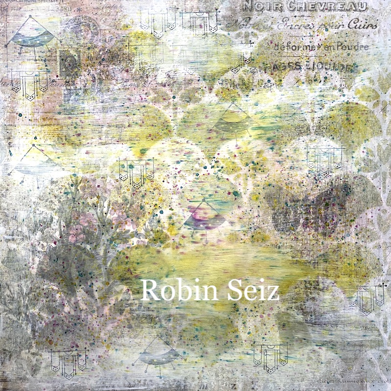
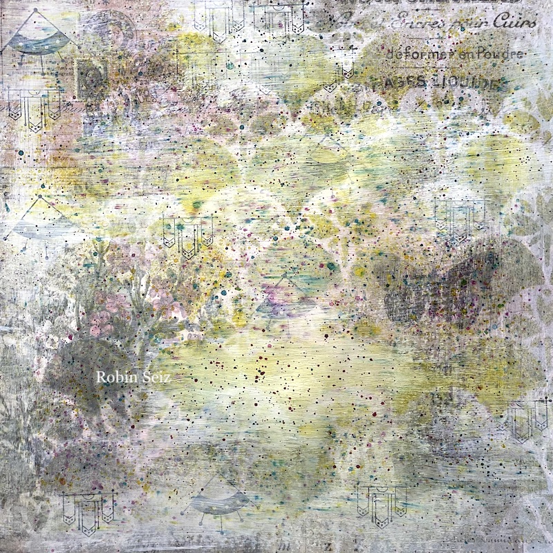
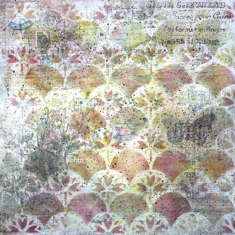
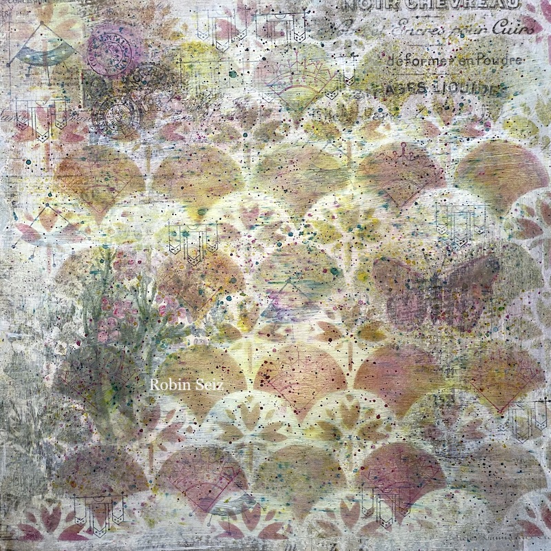
Hello from my Creative Squad! Today we have Robin Seiz sharing her love of layers with us and creating a dreamy background paper who’s destiny is TBD :) She’s using my Mini Motifs rubber stamps and my Art Nouveau Wallpaper stencil and our theme: My Creative Playlist – Your favorite mixed media supplies are like your favorite songs: they lift you up, inspire you and just feel good to groove to. What are your favorite supplies? Use them in a project – YOUR Creative Playlist that always gets you going.


Layers and Layers and Layers

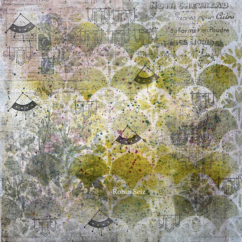
Hi Friends, Happy February — the month of LOVE! I don’t know about you, but I LOVE putting down layers; all that yummy texture and color! It’s so fun see what peeks through in the end.

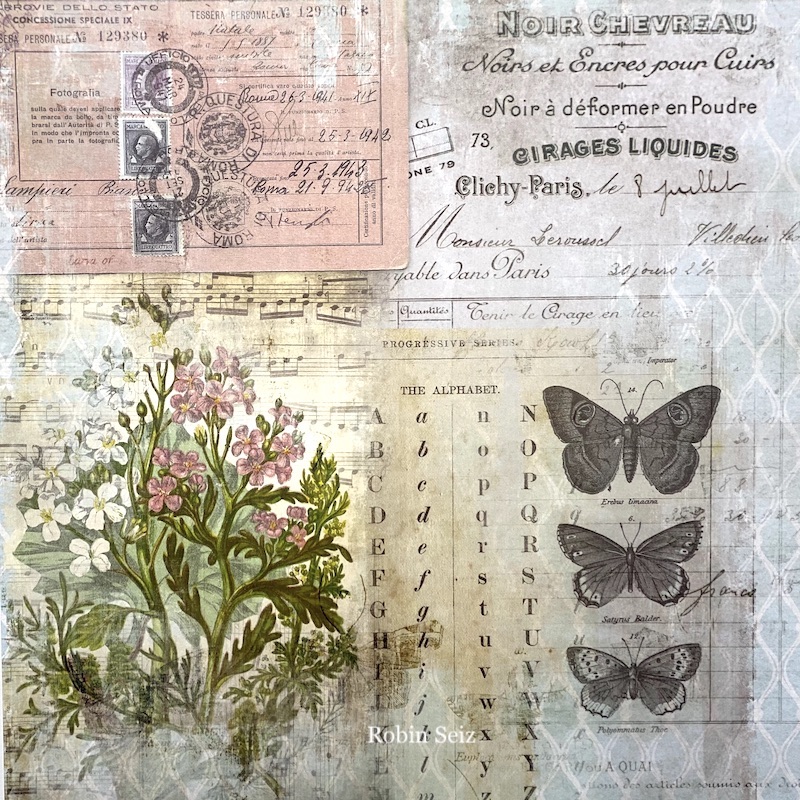
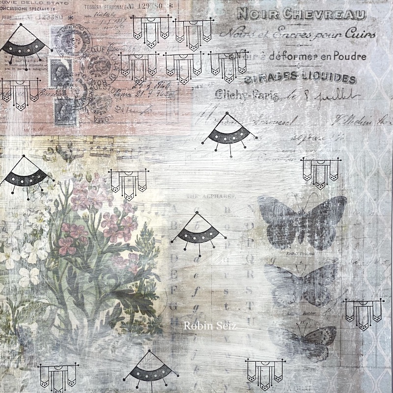
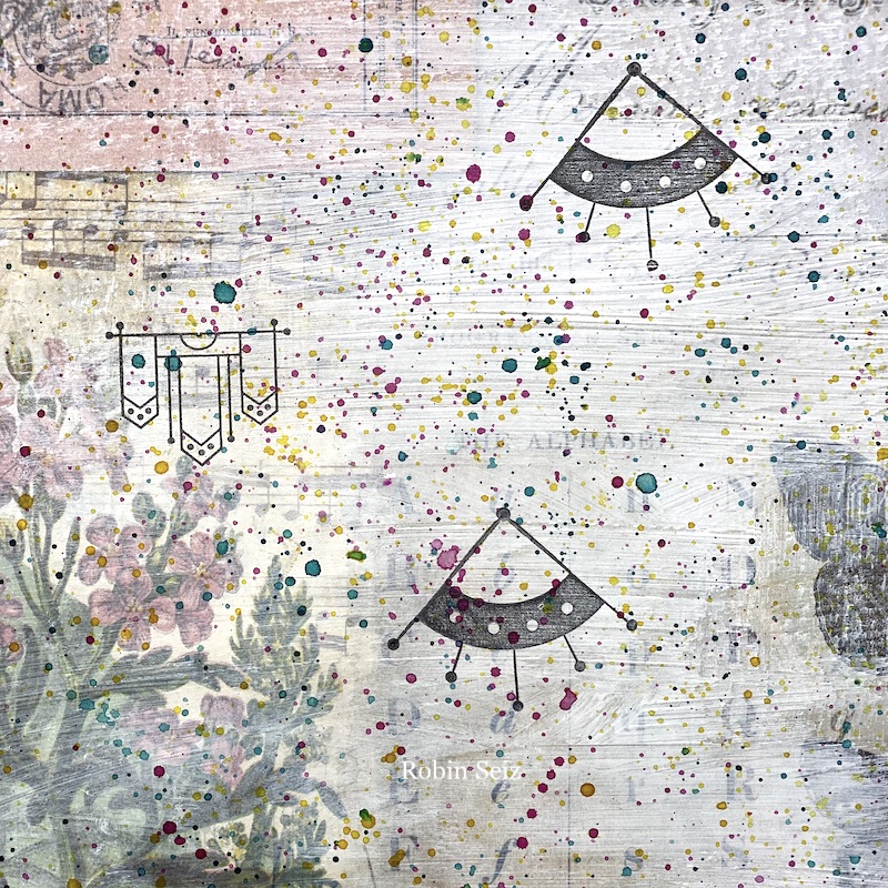
My studio is overflowing with materials so I wanted to use what I had right down to some heavy 12×12 paper from a beautiful paper pad sitting on my shelf. When I first started out in mixed media, I used my paper pads a lot to make card backgrounds, but now, I tend to make my own papers so all those beautiful paper pads are not being unused. We can’t have that! Pull out the old stuff and infuse new life into it! I started with this sheet of paper:

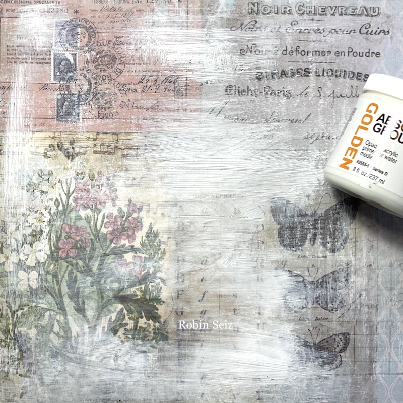
I put a light coat of Golden Absorbent Grounds on the page because I wanted to mute the background and I knew that I would be using acrylic stains; I wanted the page to have both texture and “tooth”. There were some patterns that I knew I wanted to peek through in the end, so I applied an extra light coat to those areas. 

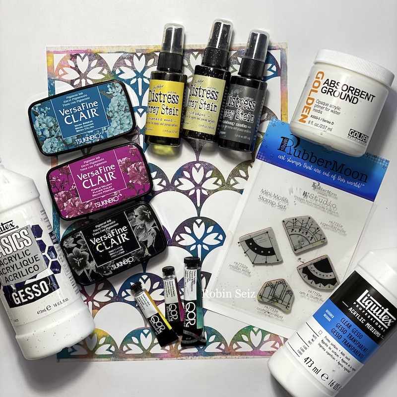
Most of the materials I used are shown in this picture. I did end up adding a few more materials (who doesn’t when you get going!) I’ll mention those when we get to those steps.

Once the Absorbent Grounds were dry, I randomly stamped Nathalie’s Mini Motifs rubber stamps on the background. I used both the Mission Motif and the Craftsman Motif. I knew that I wanted just a “hint” (or you might say a “kiss” for February) of these to be shown in the background in my final piece.

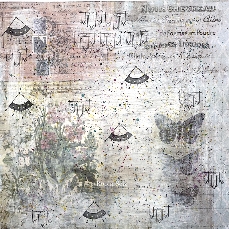
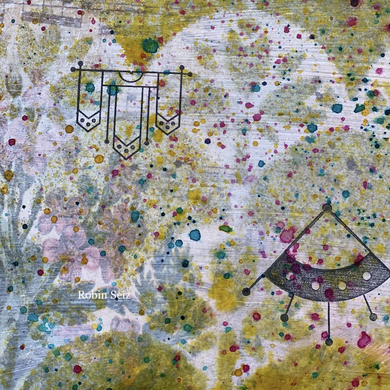
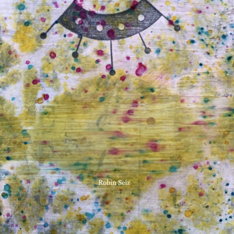
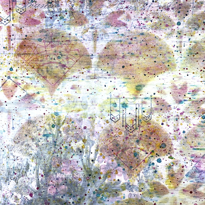
I love the look of splatters on a page. I think it adds so much and is easy and fun! I used watercolors, (Phthalo Turquoise, Nickel Azo Yellow, and Quinacridone Magenta) although I could have just as easily used acrylic paints. Use what you have in your stash and just tap your brush against your finger to create the splatter.

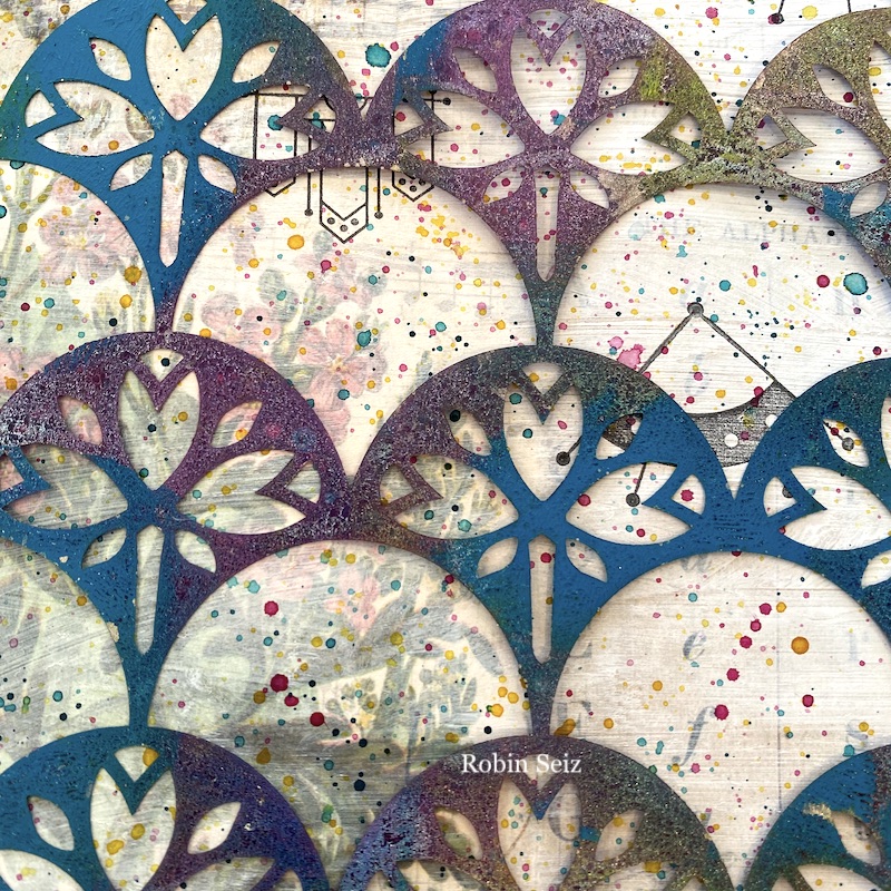
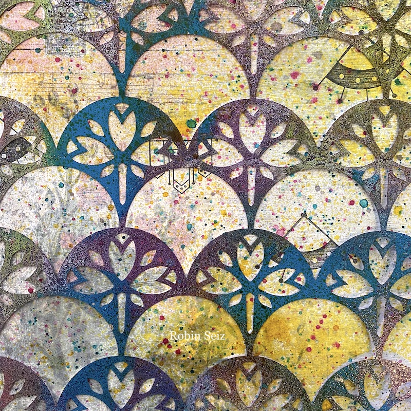
To create even more interest, next I applied Nathalie’s Art Nouveau Wallpaper Stencil and sprayed Distress Spray Stain by Ranger. I used stains (Old Paper, Mustard Seed, Hickory Smoke) that would pick up the background and would give the page a vintage look. 

Once the Ink Stain was down, I wanted to pull everything back just a little. Gesso is the perfect medium to do that, however, I’m notorious for not letting things dry long enough; that’s exactly what happened. OOPS! But that’s why I said, this project was about layers and layers and layers. I applied a second coat of gesso to the areas that I smeared, and chalked it up to just another layer! I’m not a perfectionist and really like the process of creating as much as the outcome. My motto is, “When all else fails, just add another layer and begin again!”

Now that the gesso was down, I wanted those splatters to show through more — again another layer of splatters! There is something so satisfying about these, so I never mind giving it another go! 

Next, I’m sure you can guess, I applied another layer of the stencils with the spray stain. This time I also used Spun Sugar because I wanted more pink to show up on the page. 

As you can see, Nathalie’s original motif stamps are peeking through the background as I had planned, but I also wanted to use the Jugendstil Motif, giving it more prominence. I used Versa Fine Clair Charming Pink and stamped it on top of the stencil pattern. (I was going to use Purple Delight and Warm Breeze as shown in my materials picture but changed my mind at the last minute. Again, I wanted to pick up more pink.)

And finally, I pulled out my watercolor pencils and a few pastels and went over the butterfly and the flowers where I wanted to bring out the pink. I also used some 100 Proof Press postage stamps at the top, to stamp over what was already there.

I will most likely use this as a journal cover, but it could certainly be used for a background page or journal page. Of course, every time you try this process, you will get a completely different result! Isn’t that the beauty of mixed media! No matter what — have fun putting down layers and layers and layers. Remember, it’s not done until you are satisfied with it… you could go on and on!


Thank you Robin – love all the subtle layering and love that you were able to share your oops moment with us too :)

Give it a try: you can find all my Stencils and Rubber Stamps in my Online Shop and here are some of the supplies Robin used:

Don’t forget to check out Nat’s Creative Squad on Instagram too: Each week we post projects, ideas, and inspiration for mixed media art.
Leave a comment

Creative Squad: My Creative Playlist – Emilie Murphy

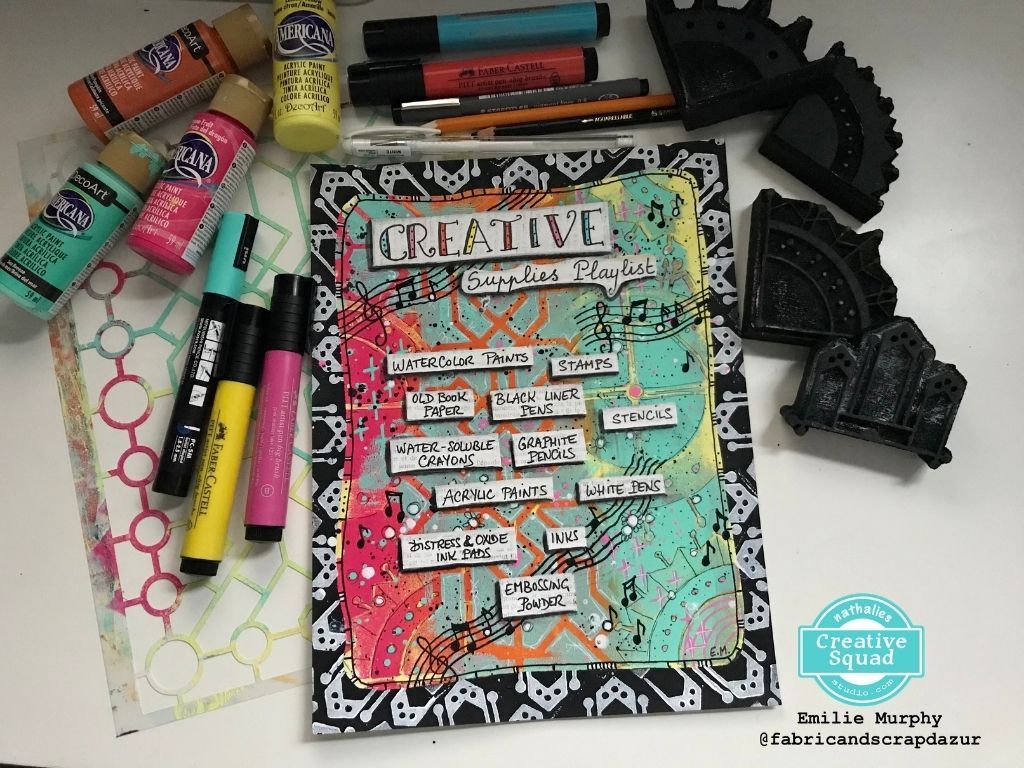
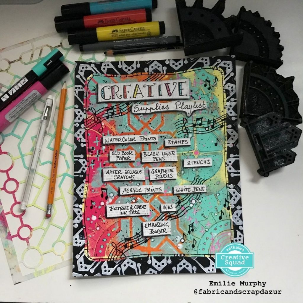
Hello from my Creative Squad! Today we have Emilie Murphy sharing a nifty art journal page with a list of her favorite mixed media supplies. She is using my Mini Motifs foam stamp and my Exchange Place stencil and our theme: My Creative Playlist – Your favorite mixed media supplies are like your favorite songs: they lift you up, inspire you and just feel good to groove to. What are your favorite supplies? Use them in a project – YOUR Creative Playlist that always gets you going.


Hi there! Today I’m presenting you my take of the theme of the month that is “My Creative Playlist”. I chose to make an art journal page listing some of my favorite art supplies. It was tons of fun making it. Let me guide you how I made it!

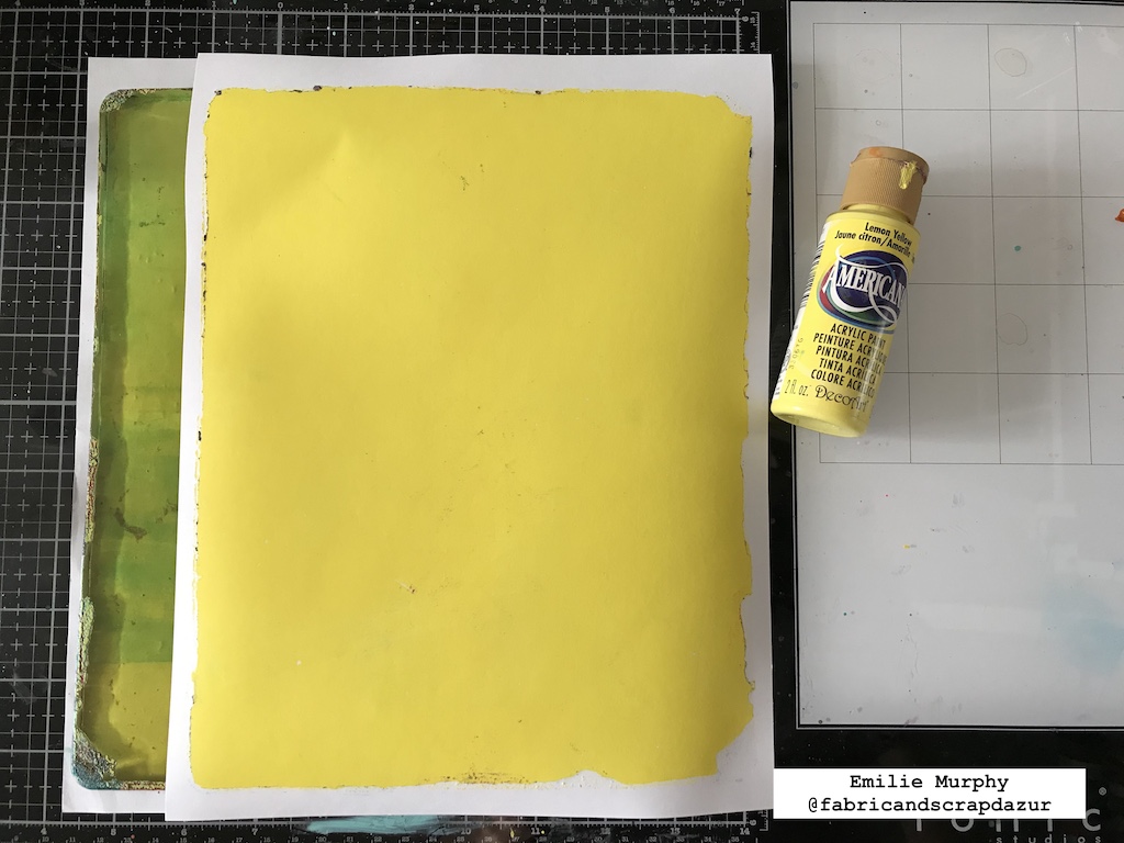
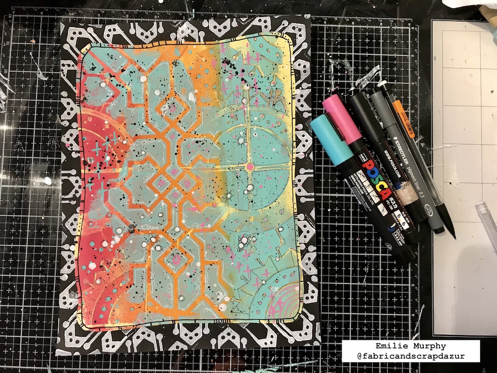
To start my project, I used my Gelli plate and a sheet of 8.5×11 white cardstock to make the background. I first applied only a layer of yellow paint and pulled the print.

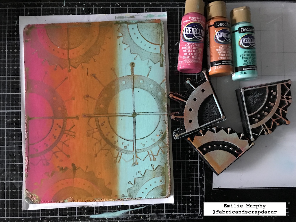
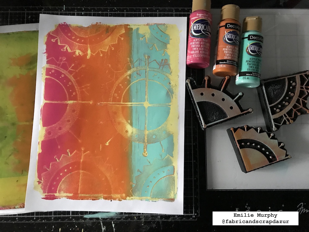
Next, I chose three colors and applied the paints in strips using my brayer. I stamped on it using the Mini Motifs foam stamps, one at the time, in line. My intention here was to remove some paint to be able to see the previous yellow layer, so that I rubbed my foam stamp on scrap paper after each stamping.

Next I pulled a print.

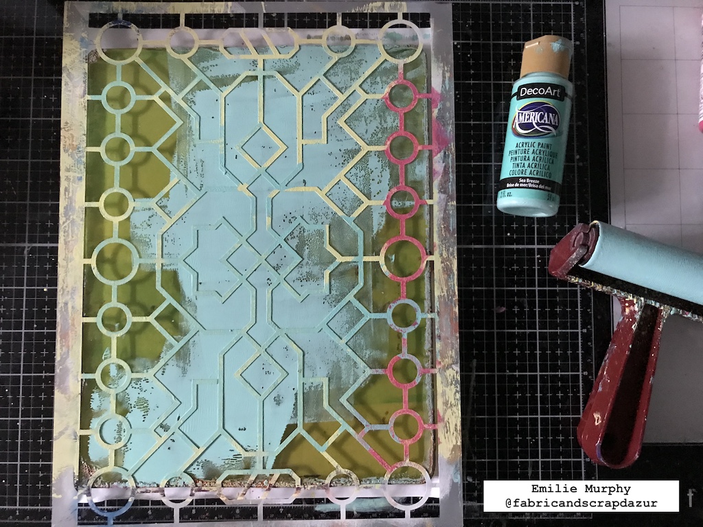
To add a little more texture and interest to my background, I used Nathalie’s Exchange Place stencil. This time, I applied a partial layer of paint, laid down my stencil and pulled the print.

And Voila! Isn’t awesome? That’s why, I think, it is so fun to play with a Gelli plate. At that point, I was satisfied how my background looked like.

Next, I gave to my background some highlights getting over the different patterns with black and white pens.

Then I created a border around the edges. I cut a mask and secured it with removable tape to prevent from moving.

I applied black paint and let it dry. Then, I applied some white paint on the foam stamp with a sponge and stamped repetitively on top of my black layer.

I removed the mask and doodled a little more adding some marks, lines and splatters using some Posca pens.

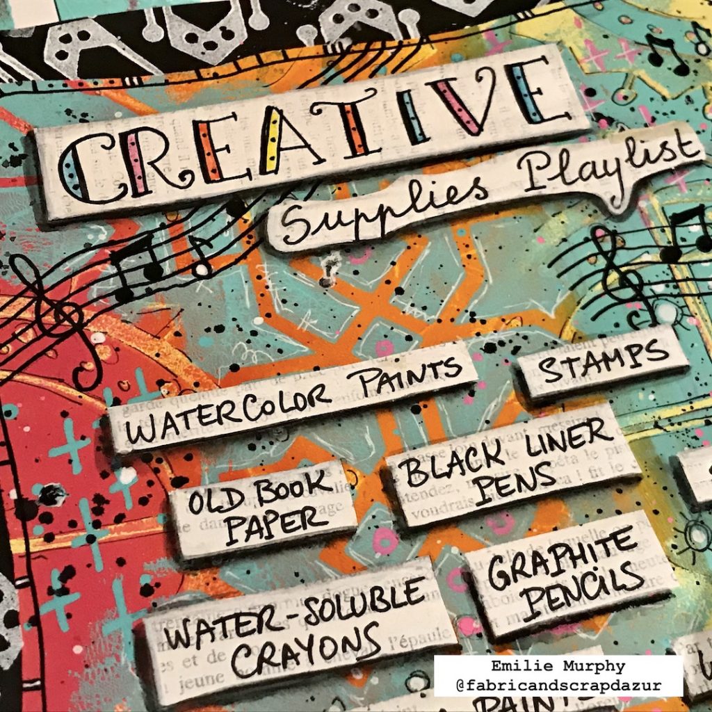
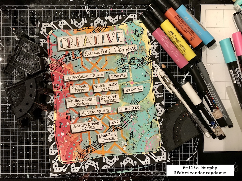
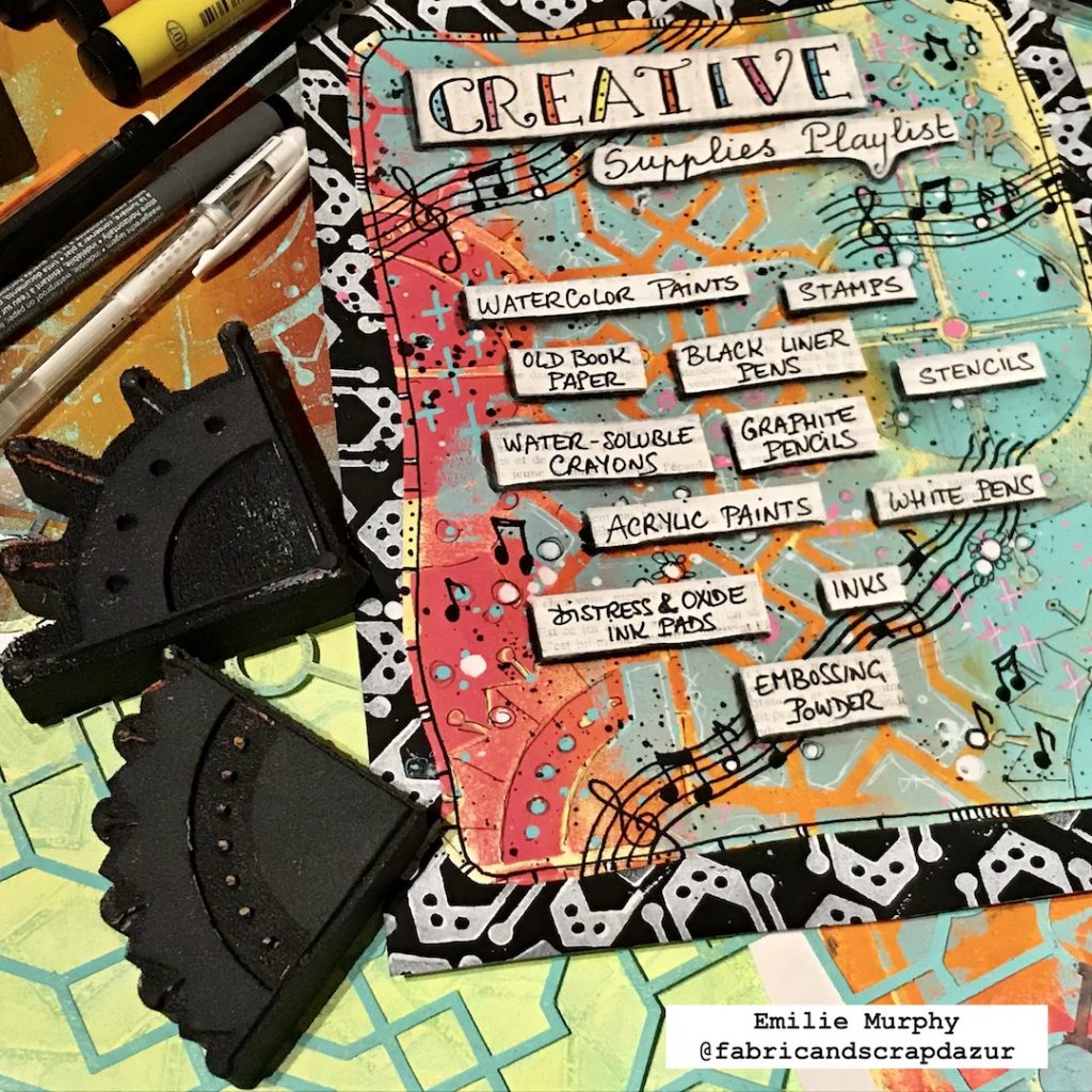
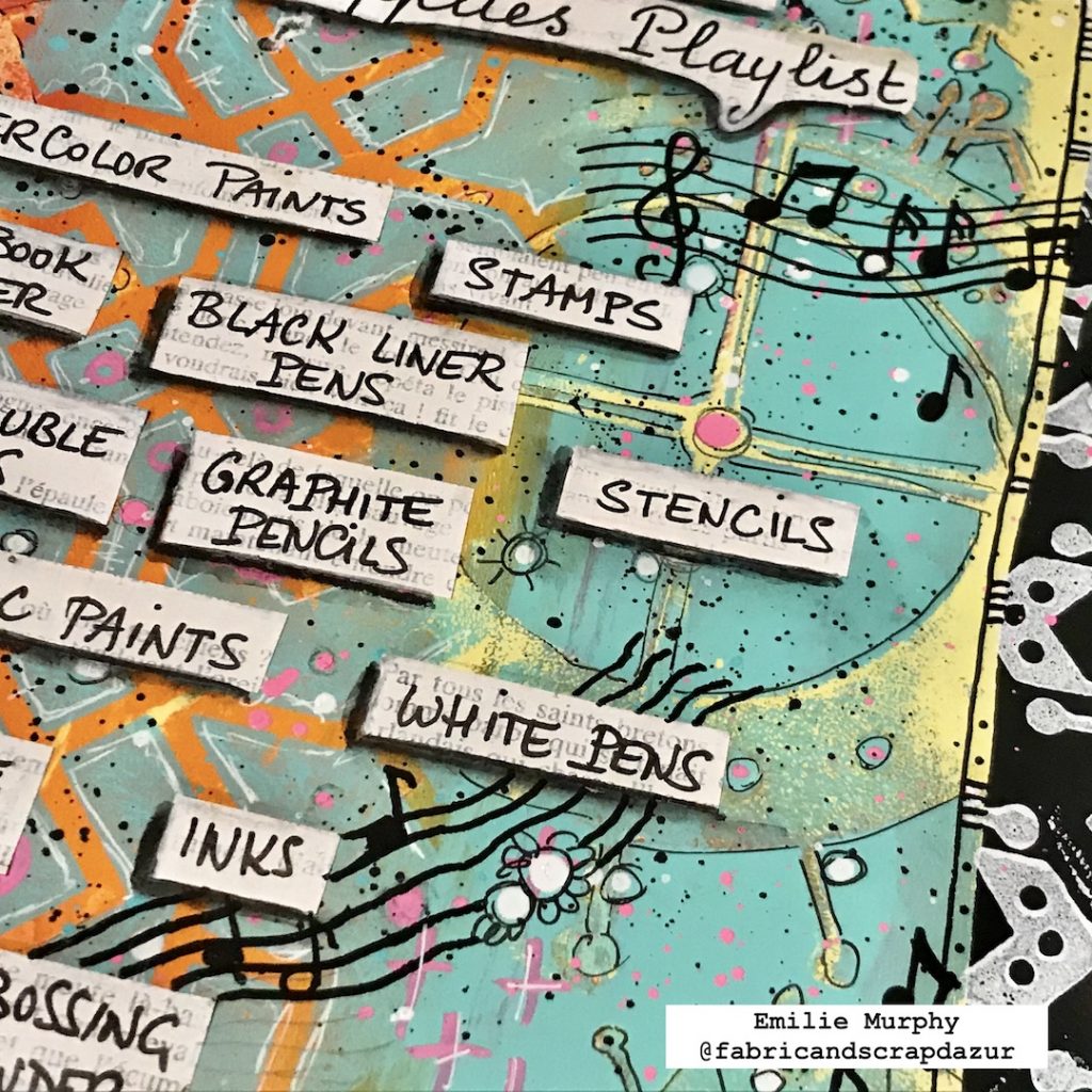
I created some labels with a page of old book coated with a thin layer of white paint. I let my page dry completely before writing down my favorite supplies with a permanent black pen to avoid the ink to smear.

After I cut and glued down all my labels with a glue stick, I gave them a dimensional effect drawing around, only on the left and bottom edges, with a black Stabilo pencil. I stayed closed to the edges and wiped my brush off from time to time when I applied the water on the black Stabilo to avoid spreading it too much. I added a little tint around the others edges of the labels in order to make them embed in the background.

To finish off my page, I added some music keys with black and white Posca pens.

Voila! I really love to the way it my page turned out and the fact I can still see the mini motifs and the beautiful pattern of Nathalie’s “Exchange Place” stencil on the background.

Hope you enjoyed my February project and it gets you inspired to make your own creative playlist. Have some fun playing with your favorites art supplies!

Have a good rest of the week and see you next month!


Thank you Emilie! I love this idea for an art journal page!

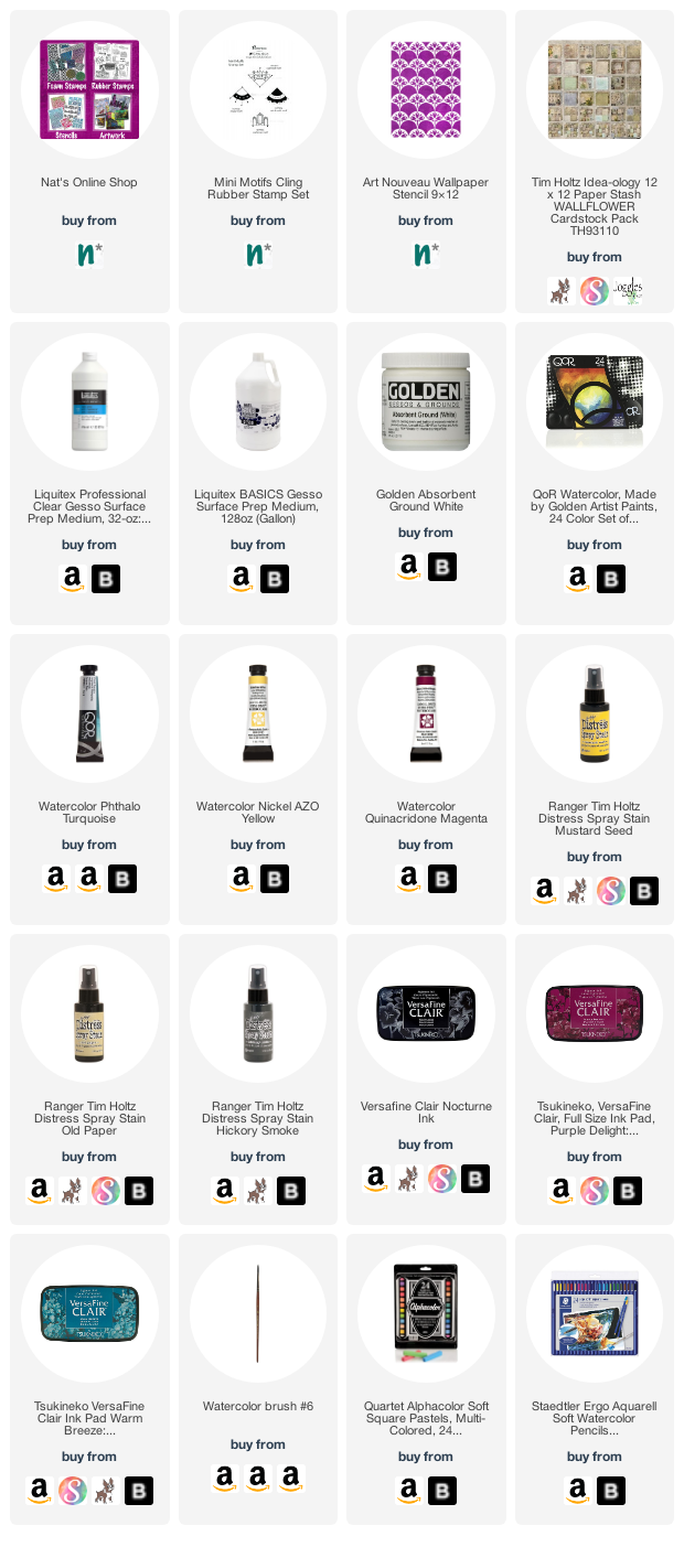
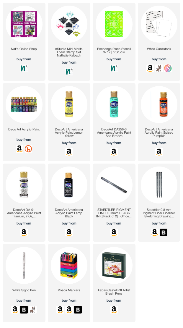
Give it a try: you can find all my Foam Stamps and Stencils in my Online Shop and here are some of the supplies Maura used:

Don’t forget to check out Nat’s Creative Squad on Instagram too: Each week we post projects, ideas, and inspiration for mixed media art.
Comments (2)

  • Sue Clarke

    |

    So many wonderful layers!

    Reply

  • Pat

    |

    Great lesson! Love it!

    Reply

Leave a comment

Creative Squad: My Creative Playlist – Maura Hibbitts

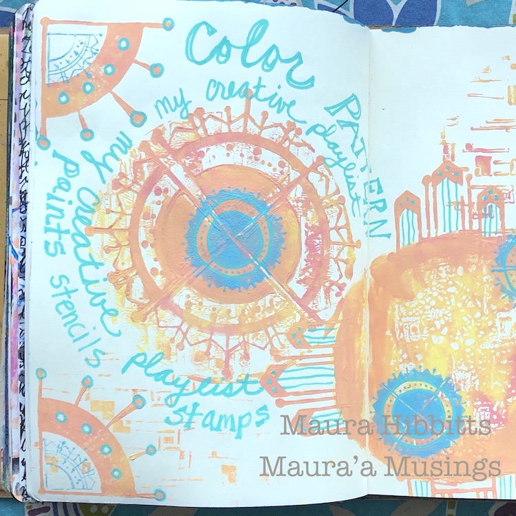
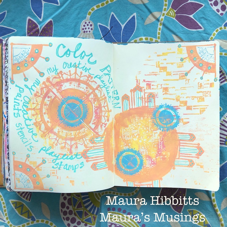
Hello from my Creative Squad! Today we have Maura Hibbitts sharing an art journal page with us that shows off some of her favorite art making tools – both supplies and ideas that get her creativity flowing. She is using my Mini Motifs foam stamps, Mini Motifs rubber stamps, Space Age Modern stencil, and our new monthly theme: My Creative Playlist – Your favorite mixed media supplies are like your favorite songs: they lift you up, inspire you and just feel good to groove to. What are your favorite supplies? Use them in a project – YOUR Creative Playlist that always gets you going.


We are creating a list this month of our favorite creative supplies, and I realized that not all of mine are physical items. Some of the things that really super charge my creativity are color and pattern, as well as nature, books, and my ever present imagination. In all honesty, there are a LOT of supplies that I love to work with, but some of my favorites are paint, ink, stamps and stencils…anything that I can layer up and get messy with. Oh yes, I am a messy artist!

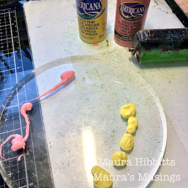
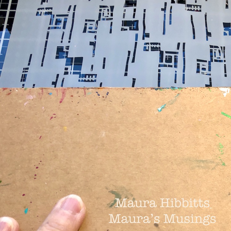
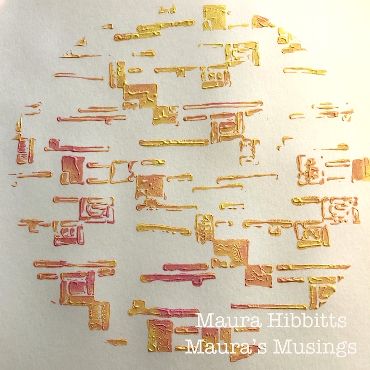
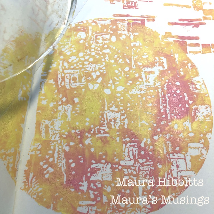
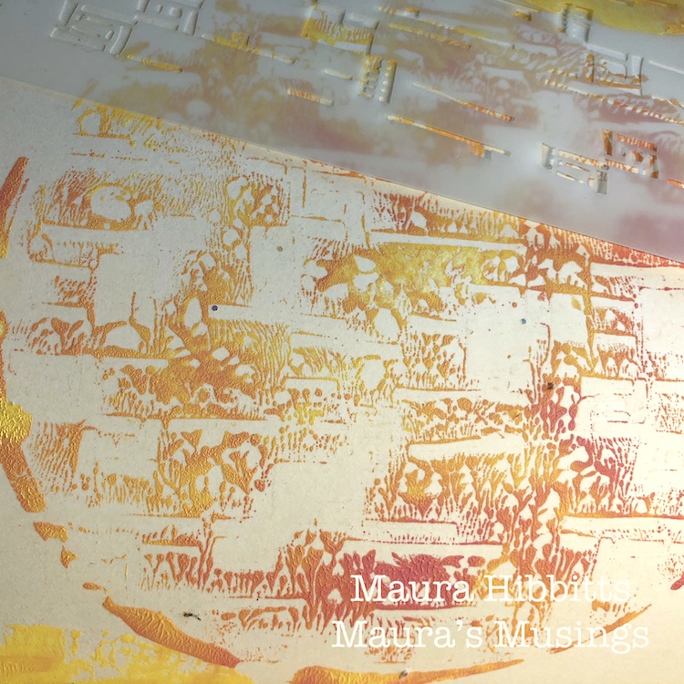
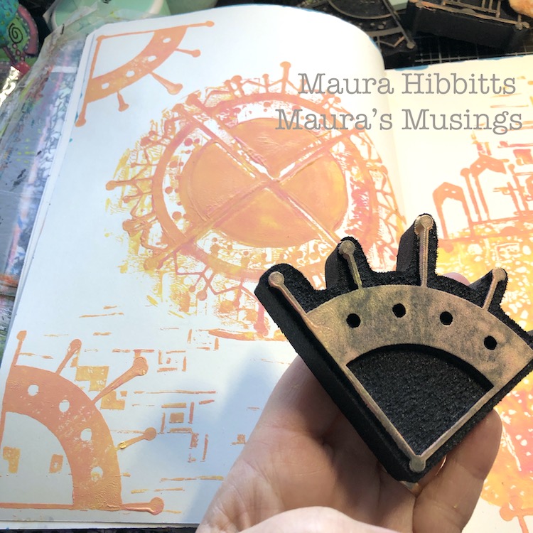
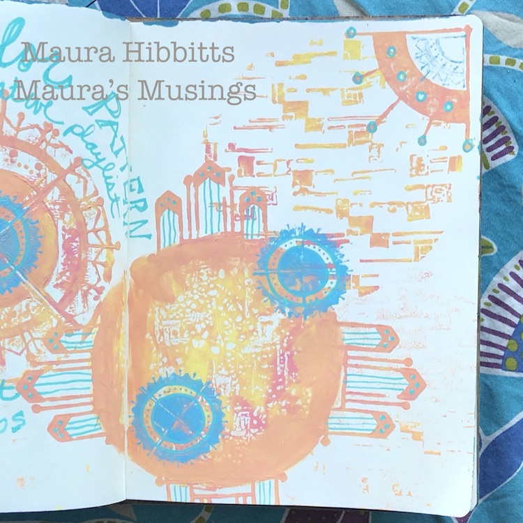
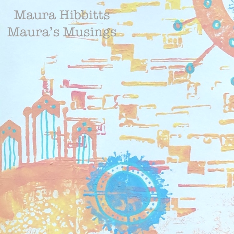
I headed to one of my large journals to start working on my creative playlist. I started with a round gel plate and yellow and pink paint. (Not my usual colors, but I have to play with other colors nicely too.) I blended them a bit on the gel plate with the brayer, then laid the Space Age Modern stencil onto the plate. I pressed the journal directly onto the plate to get my first impression.

To get the second impression from the gel plate, I took the plate with the stenciled image on it and pressed it onto the book. For the third impression, I pressed the stencil with the paint on it, into the journal. Now I have three unique impressions from one use of the the gel plate.

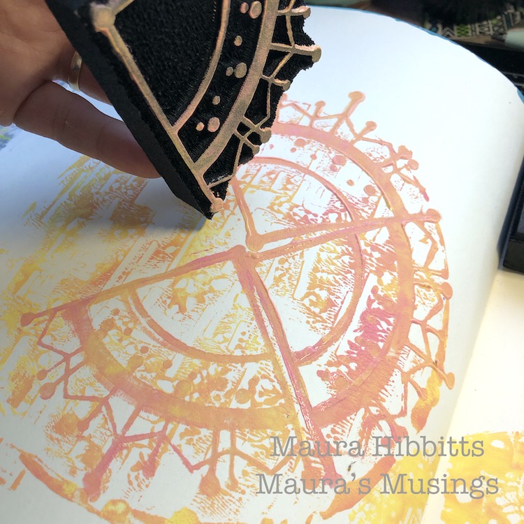
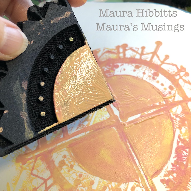
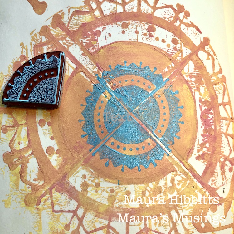
Once again, I blended some pink and yellow paint, and pressed the Mini Motif ArtFoamie into it, then began stamping the image in the center of one circle. I took a second stamp and applied paint to only a portion of it with the brayer, and stamped that over the first images.

Use the previous method with the Craftsman Mini Motif stamp and apply to the four sides of another circle.

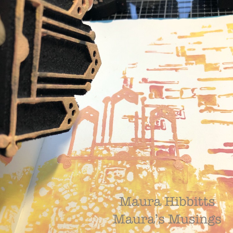
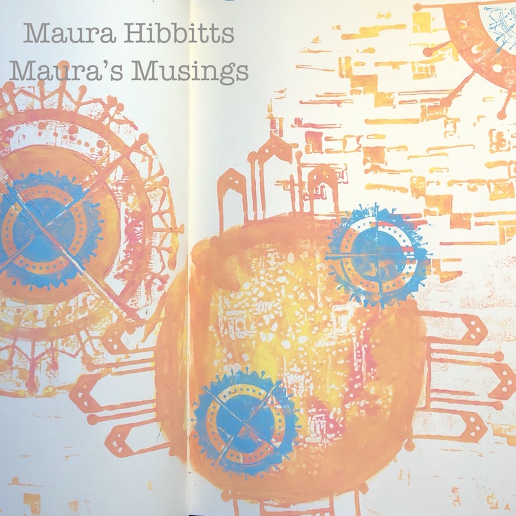
Next stamp the Mission Motif into three corners of the pages with the paint blend.

Apply turquoise paint for contrast, to the gel plate and brayer. Take the rubber Arts and Crafts Motif stamp, apply the paint, and stamp four times to create a circular pattern. Repeat two more times across the pages.

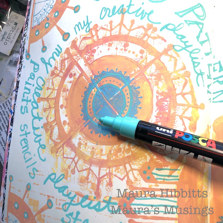
Hand letter your words around one circle with the turquoise paint pen, and also use it to embellish the stamped designs.

My creative playlist is filled with color, pattern, paint, stamps and stencils.

need to be creative and express myself through color and design, it brings me joy and fulfillment. Our art is an expression of who we are, our thoughts, and our emotions. I think these pages are full of light and a sense of coming together. What do you see? 

Be well and have a lovely February, Maura


Thank you Maura – we definitely see light and optimism in this beautiful page!

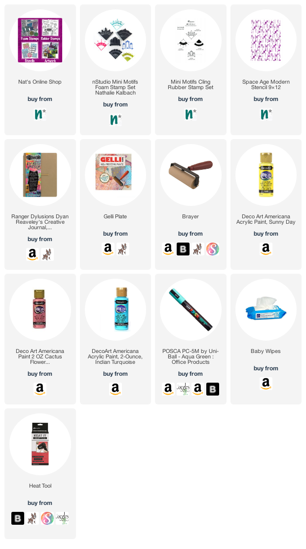
Give it a try: you can find all my Foam Stamps, Rubber Stamps, and Stencils in my Online Shop and here are some of the supplies Maura used:

Don’t forget to check out Nat’s Creative Squad on Instagram too: Each week we post projects, ideas, and inspiration for mixed media art.
Leave a comment

Creative Squad: Jumping with Jordan Hill CJS21

Hello from my Creative Squad! Today we are jumping with Jordan Hill, who is using my Love Story foam stamp and Art Deco Empire stencil to tell a story in her art journal. This month’s theme is: Storyteller – This month we’re playing along with Creative JumpStart 2021 and the theme Storyteller. We’re using our artwork, our color and material choices, and our personal style to tell a Love Story.


Hello everyone, I’m super excited to be back with my project for this month’s theme of storyteller!

For this particular prompt, I did quite a lot of reflection before I actually got to work. The word ‘storyteller’ is so incredibly complex and can mean so many different things, I wanted to make sure I was accurately portraying what it means to me. When I think of the word ‘storyteller’, the main theme that comes to mind is the idea of a journey.

My work is a collection of a variety of things that are important and have meaning to me, many of which I have collected over my own journey as a creative person. This collection of ideas is a representation of my story as an artist, and that’s what I wanted to try to express in this month’s project. Let’s get into it!

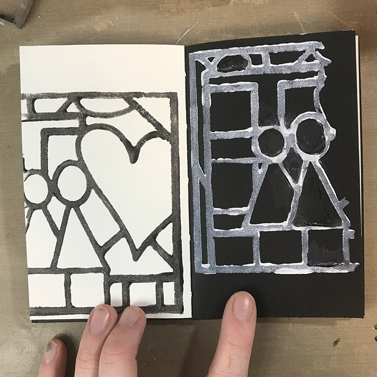
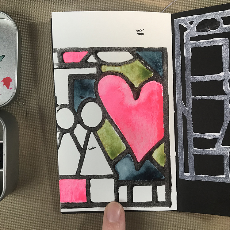
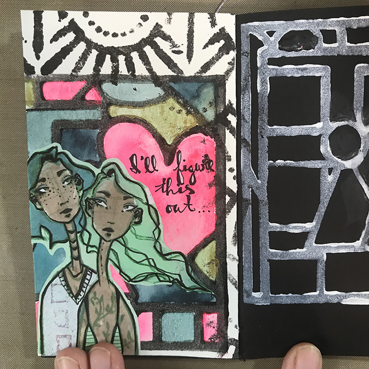
The first thing I did in order to get this page started was pick out a fresh spread in one of my art journals (I chose the journal I created for last month’s project – one of the many parts of my creative journey). Then, using Nathalie’s “Love Story” Foam Stamp, I stamped the design twice, once on each page. On the white page, I used black acrylic paint, and on the black page I used white. This gave me a fun starting point!

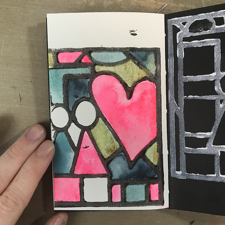
Next up, I knew that I wanted to fill in some of the different spaces with watercolor. The colors I used for this spread were primarily handmade watercolors that I made myself, which is another step in my story that I wanted to document.

I didn’t fill in all of the sections, since I knew I was going to add a piece of collage on top. As I was filling in the spaces, I tried to incorporate the same colors in several different areas in order to keep everything cohesive and lead your eye around the page.

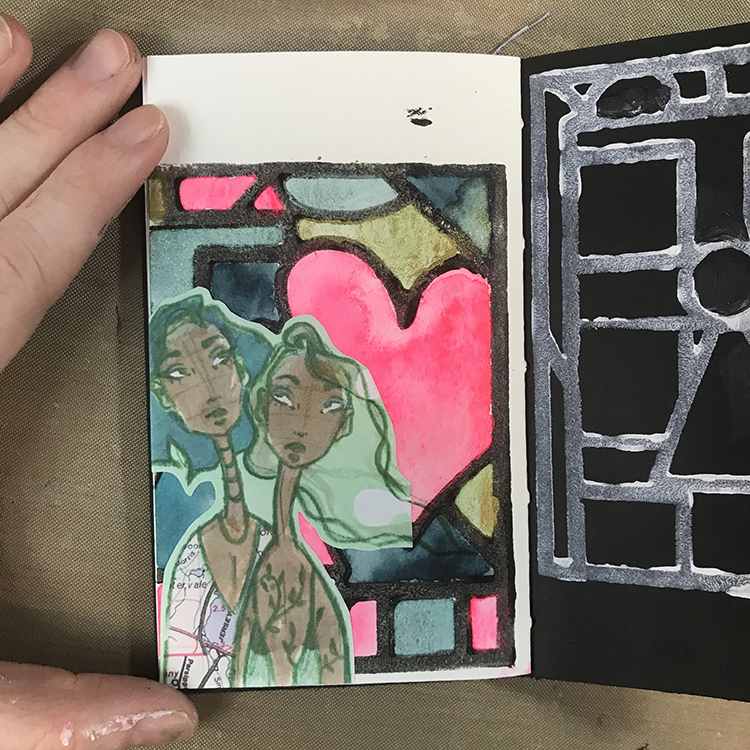
After the watercolor was completely dry, I glued down a piece of collage that was yet another part of my story. This particular image was a previous mixed media piece that I scanned in and printed out to reuse in future work.

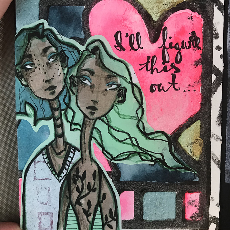
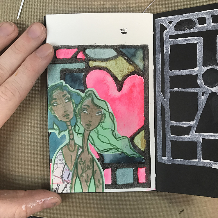
Once the collage piece was glued down, I wanted to incorporate it a bit better into the page. The first thing I did in order to achieve this was extend the shape of the hair. When I was cutting out my image, the figure on the right had hair that ended in a straight line. Using the same color of acrylic paint, I extended the lines of the girl’s hair. I also added some of the same acrylic paint to that girl’s shirt. I then used a colored pencil to redefine some of the lines that I had lost through adding paint.

Once I was happy with the hair, I then got to work on the details. First, I used Nathalie’s “Art Deco Empire” stencil to add some additional interest to the areas of the background (primarily the top and side) that hadn’t received a lot of love yet. I really like the way this stencil ended up looking like an extension of the original stamped image.

Next, I cut a piece of gelli printed paper to use for the shirt for the girl on the left. The map piece I had used for the original illustration wasn’t working for me anymore and I felt this choice was a lot more neutral. Then, using an ink pen, I started adding details. I traced over almost all of the original line work I had done in pencil and added some stripes and a collar to the shirts. I also gave the girl on the left freckles where she didn’t have them before.

This is also the stage where I added words; these ones are words I pulled from a journal where I simply dump my thoughts. As I wanted to continue the idea of the “storyteller” theme, I scanned through and latched onto this particular group of words. It just felt fitting.

For the final details, I added some colored pencil to the shadowed areas of the faces and traced over the (originally green) vine tattoos of the figure on the right with an ink pen. This gave the figures the final amount of depth I felt they needed in order to call them done!

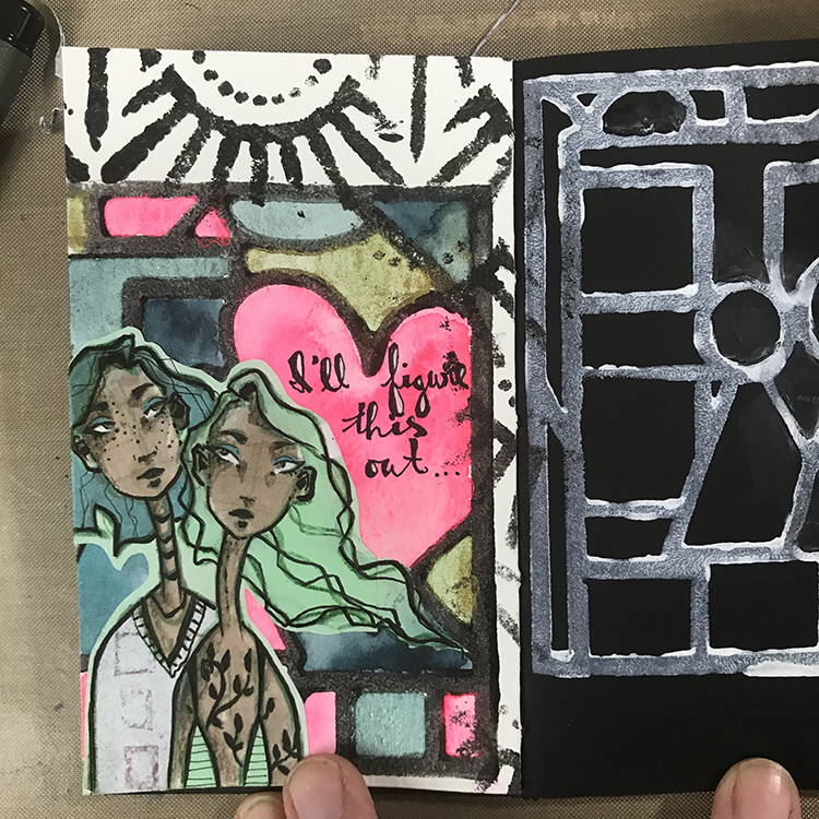
In the end, I think that the combination of the stamped image and the watercolors as a background is very interesting and it reminds me of stained glass, which I like. I hope you enjoyed my project for this month and consider giving it a try yourself!


Thank you Jordan – love the combination of the bold stamped background with your detailed collage element figures!

Give it a try: you can find all my Foam Stamps and Stencils in my Online Shop and in addition to her collage element, here are some of the supplies Jordan used:

Don’t forget to check out Nat’s Creative Squad on Instagram too: Each week we post projects, ideas, and inspiration for mixed media art.
Comments (1)

  • Robin seiz

    |

    Jordon, thanks for sharing your post and your story. I love how you used the collage element with Nat’s stamp. The figures have so much personality with the detail you added!

    Reply

Leave a comment

Creative Squad: Jumping with Robin Seiz CJS21

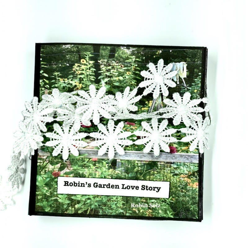
Hello from my Creative Squad! Today we have Robin Seiz sharing a mini book project with us that tells her Love Story about gardening. Robin is using my Love Story foam stamp as well as my Signals, Downtown, and Manhattan stencils and my Running rubber stamp. Our theme is: Storyteller – This month we’re playing along with Creative JumpStart 2021 and the theme Storyteller. We’re using our artwork, our color and material choices, and our personal style to tell a Love Story.


Happy New Year Friends!

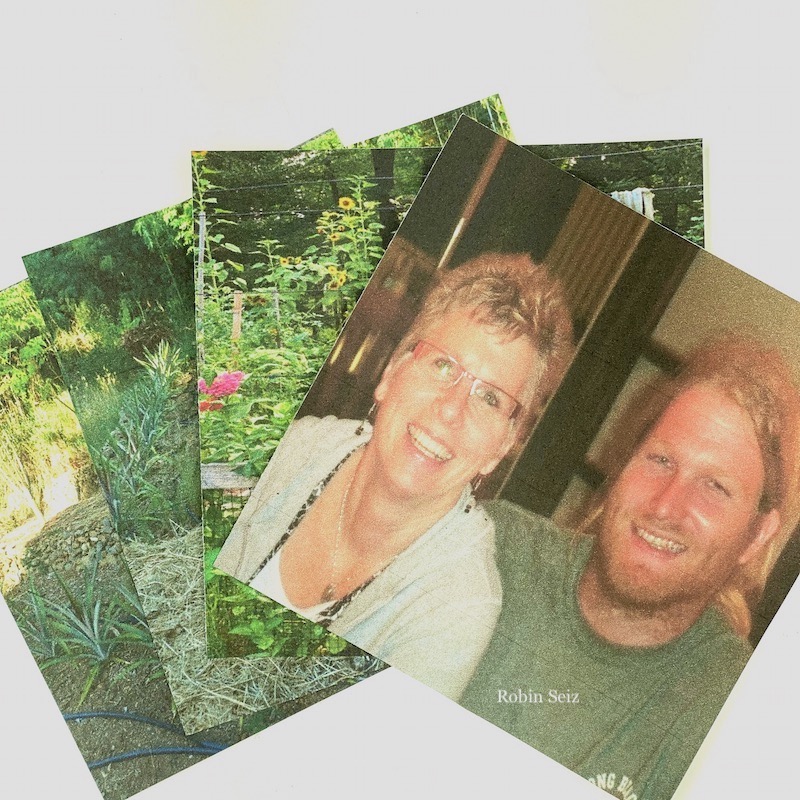
I hope you are having as much fun as I am playing along with Creative Jump Start 2021. I must admit, I often come into my studio without a purpose. I choose materials that move me in the moment and I create. I have to be honest that I don’t often think about the story that I am telling. It’s something that I have struggled with through the years and wanted to learn how to do. This themed project — Tell Your Love Story — gave me the breakthrough that I was looking for and a way to tell a story through my art. I thought for weeks about what story I wanted to tell and as I looked at the beautiful Love Story artfoamie that Nathalie created, I saw two women looking out a window and I immediately knew the Love Story I wanted to tell. It’s about my love for gardening and how it came to be.

I have created this video which tells my story and includes a flip through of my final mini-book project.

Below, I’ll take you through the tutorial so you can create your own mini-book.

I began with scouring my pictures for just the right ones. I printed them on regular copy paper and cut them to 4” x 4”; the size of Nat’s Love Story foam stamp.

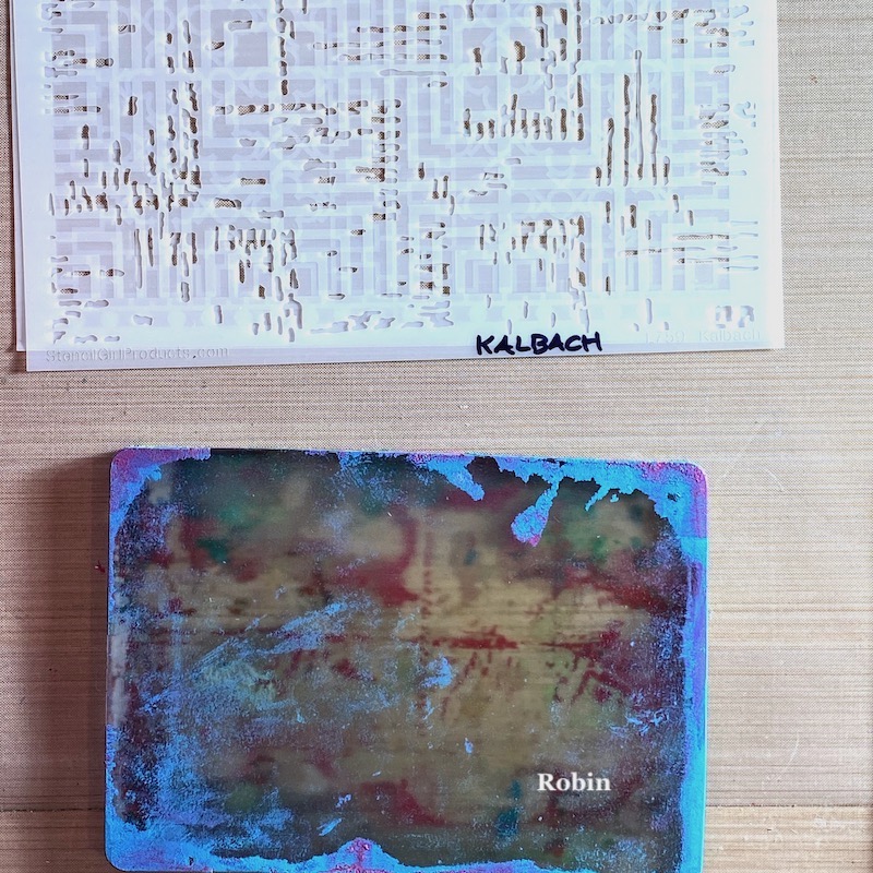
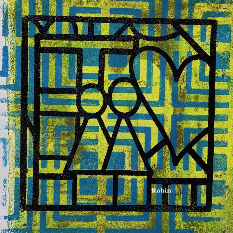
My Gelli plate is by far the tool I love the most in my studio. Whenever I can, I include it as part of my work. I printed a bunch of papers using a bold base layer and then a contrasting layer using 3 of Nathalie’s stencils, (Signals, Downtown, and Manhattan) which all looked to me like the layout of a garden with rows. 

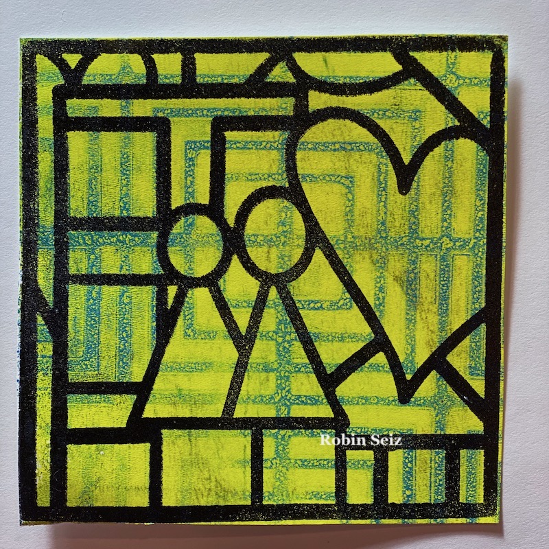
I stamped the Love Story artfoamie on each Gelli print with a black permanent ink.

I trimmed the paper to the same 4”4” size of the artfoamie.

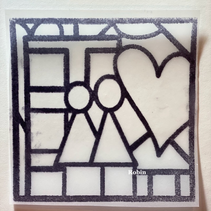
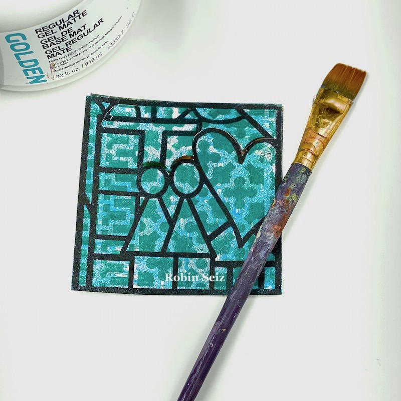
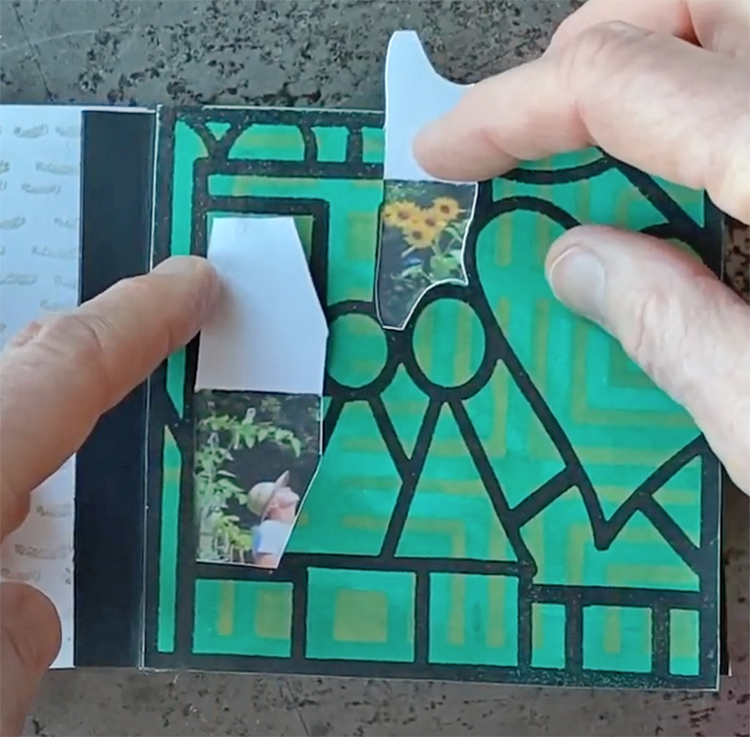
Since I wanted you to be able to peek inside my garden, I had to plan what I wanted you to see. In order to do that, I stamped the Love Story artfoamie onto a piece of tracing paper and cut it to 4”x4”. 

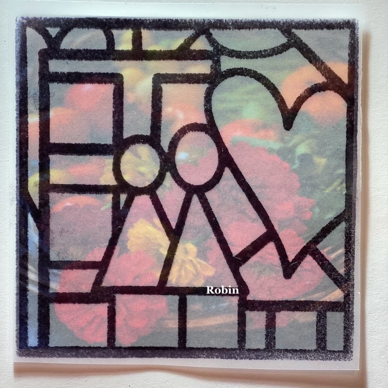
I lined up the tracing paper over each picture and  planned what area should be cut out, remembering this would be a like looking through a window.

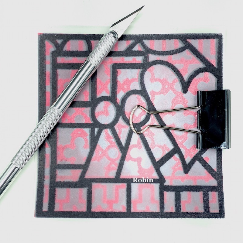
Next I used an Exacto knife to make the cuts through the Gelli prints. Let me just say, the Exacto Knife is a bit intimidating to me, so I went slowly making sure my fingers were out of the way and I was moving the paper around the curves as much as I could. I used a cutting mat for this step. This step was the most time consuming; or at least it felt that way.  In the picture below, I have the tracing paper lined up over the gelli print with the picture underneath, but I had to remove both the tracing paper and the picture and ONLY cut on the Gelli print. If truth be told, I did forget this once or twice and had to reprint a few pictures. :o)

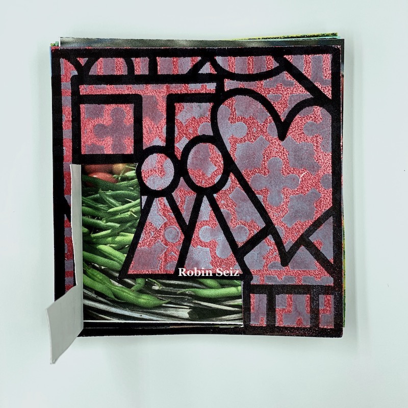
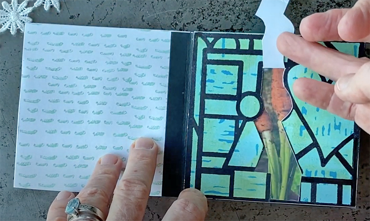
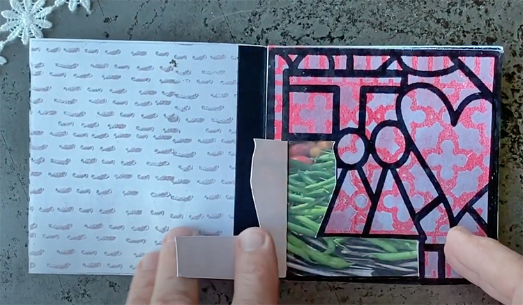
This left me with exactly what I was hoping for — a peek into the garden through the window.

Next I glued the cut Gelli Print to the corresponding picture so the window would come to life.

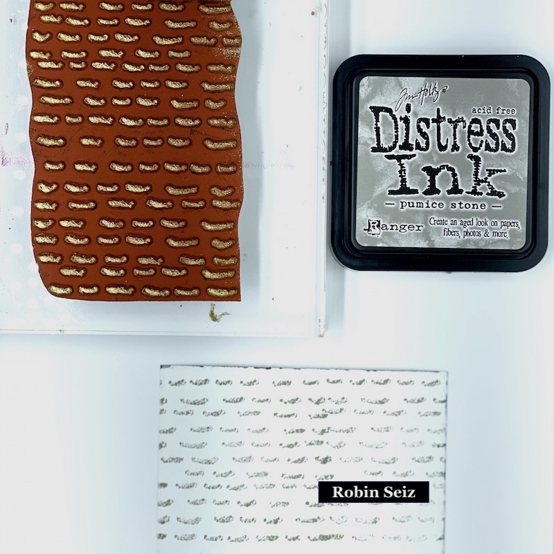
Once all the pages were complete, I wanted the backsides to have some kind of interesting design, but nothing that would compete with the Gelli prints. I used the Running stamp from Nathalie’s Embroidery set. This stamp reminded me of rows in a garden.

Now it was time to put it all together. Bindings can be a challenge and this mini-book wasn’t created on sturdy paper. I wanted a simple way to put it together that wasn’t going to be too bulky. I cut 4”x1” strips from black construction paper and folded them in half. They were glued to each page to make a signature. These signatures where then glued together. To keep all the signatures together, keep it strong, and finish it off, I cut a piece of black duct tape and adhered it to the front, around the signatures and to the back of the book. To finish it off, I tied some pretty ribbon around the outside to keep it closed and bring the garden to life.

I hope you enjoy this project as much as I enjoyed doing it. I loved telling you my Love Story.


Thank you Robin – what a beautiful way to represent one of your passions and I love the element of discovery that the book has with those interactive windows.

Give it a try: you can find all my Foam Stamps, Stencils and Rubber Stamps in my Online Shop and here are some of the supplies Robin used:

Don’t forget to check out Nat’s Creative Squad on Instagram too: Each week we post projects, ideas, and inspiration for mixed media art.
Leave a comment

Creative Squad: Jumping with Emilie Murphy CJS21

Hello from my Creative Squad! We have a fantastic mixed media painting from Emilie Murphy who is using my CJS21 limited edition foam stamp Love Story, my Star Struck stencil, and our theme: Storyteller – This month we’re playing along with Creative JumpStart 2021 and the theme Storyteller. We’re using our artwork, our color and material choices, and our personal style to tell a Love Story.


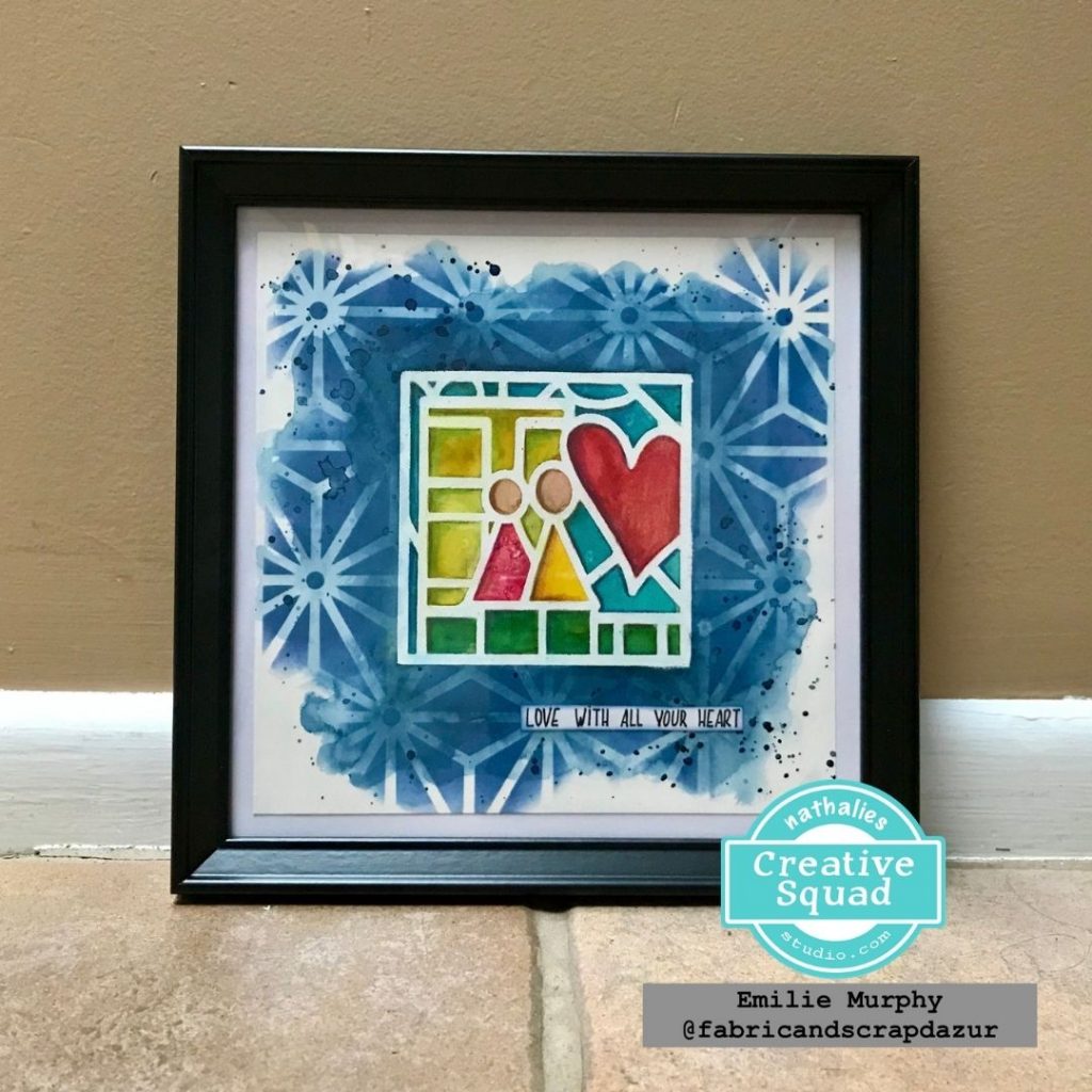
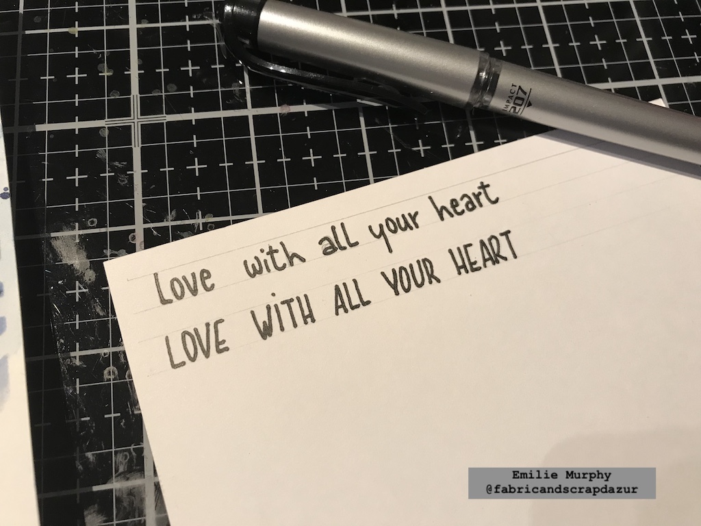
“Love with all your heart”

Hi there! And Happy New Year everyone!

Let’s start the year off by playing along with Creative JumpStart 2021 using the limited edition “Love Story” foam stamp. I decided to paint a simple illustration with watercolors. So let’s jump!

I worked on an 8×8 piece of Hot Press watercolor paper, because I wanted to have a smooth surface but it will also work great on cold press watercolor paper as well.

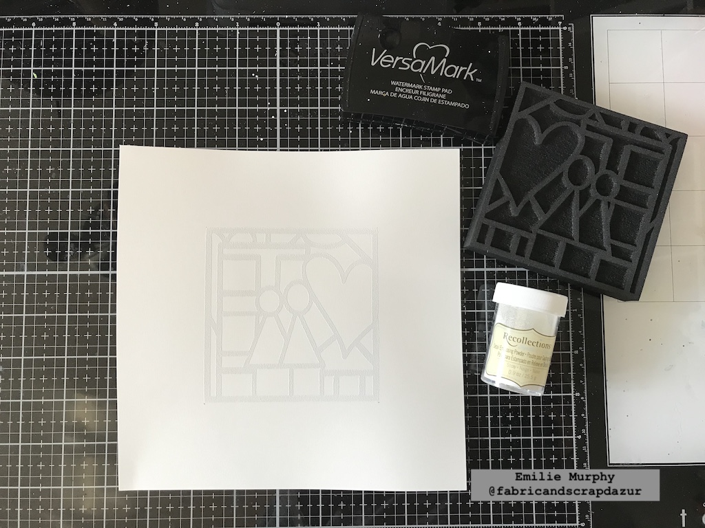
The first thing I did was to apply VersaMark ink on my Love Story foam stamp to emboss it with white embossing powder. That’s a great technique of “resist” when using watercolors.

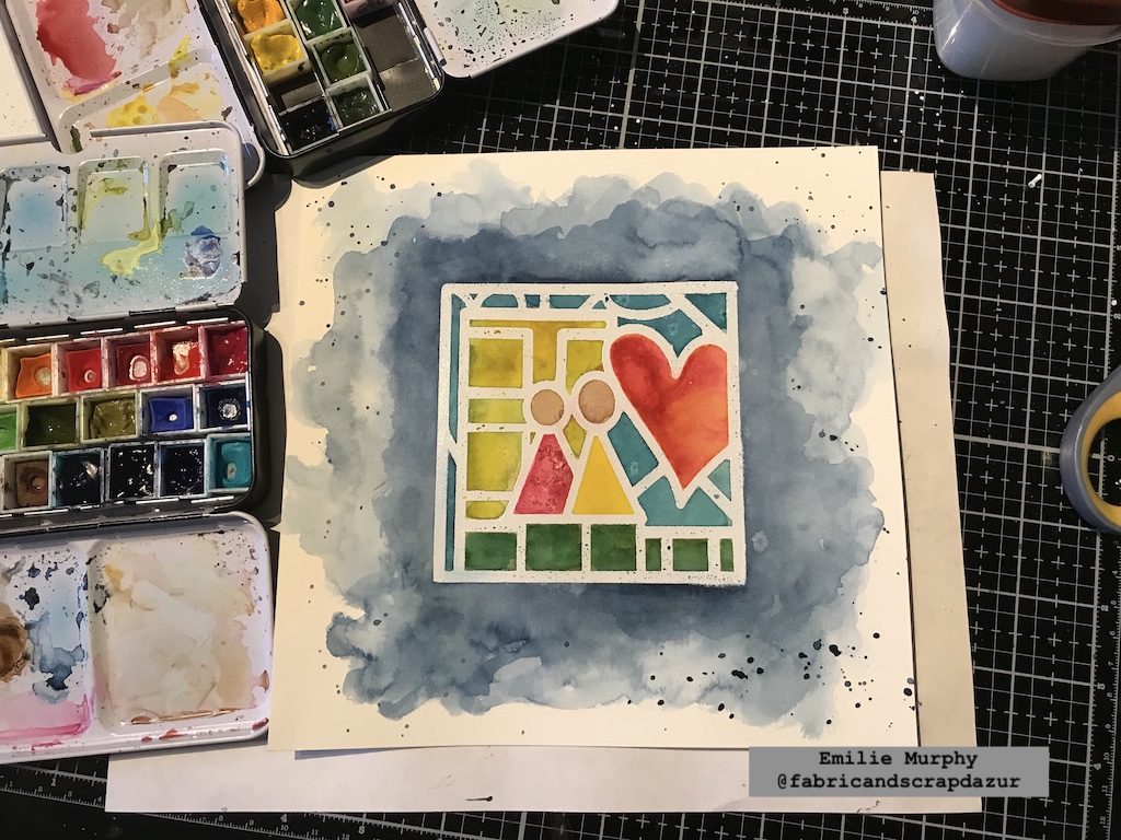
Next, I painted the interior of the stamp with bright watercolors. Don’t hesitate to apply enough watercolor pigment because the watercolors get lighter when it dries. I sprinkled some salt on the pink triangle shape to add some texture. I did the same thing on the heart but it didn’t show up when it dried. Probably because my surface was too wet and/or I didn’t put enough salt on it. Just so you know.

Salt is a nice way to add texture, which adds a little bit of interest when using with watercolors.

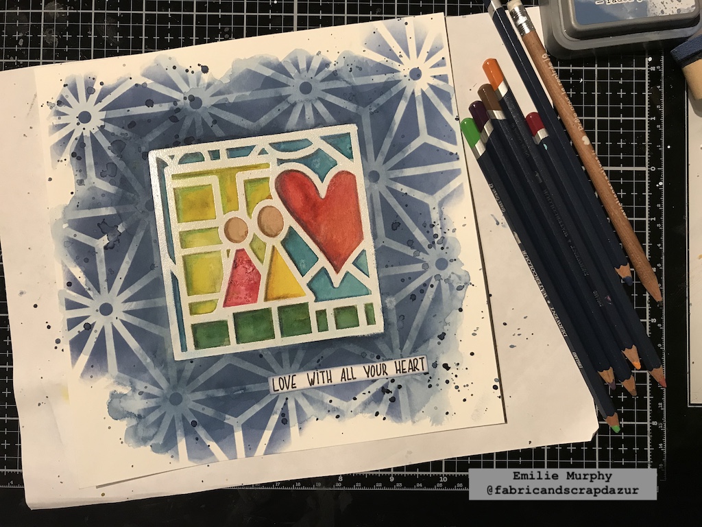
I let dry, then, I applied some indigo watercolor to the exterior. I left some white space on purpose and added more watercolor pigment along the exterior edges of the stamp.

What I recommend is to work in layers.  First, apply a layer of watercolor, let it dry slightly, then add some more and so on.

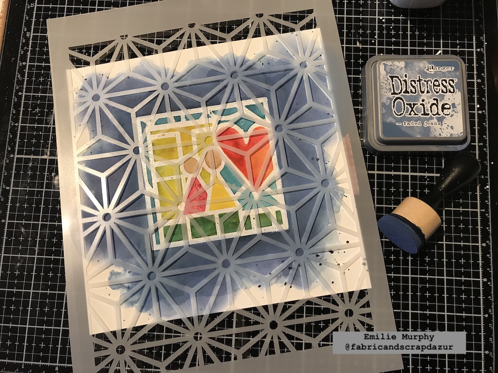
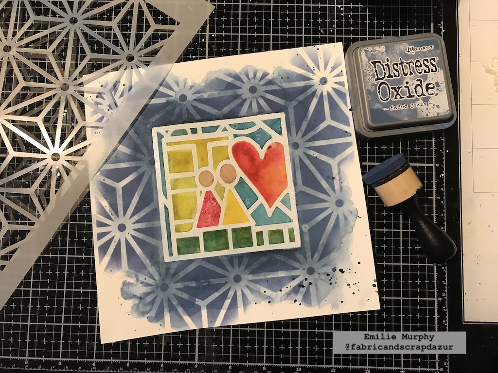
To add some interest to the background, I laid down the “Star Struck” stencil and applied some “Faded Jeans” Oxide ink with a foam applicator, only over the layer of watercolor. I slightly went over the top right corner and bottom just to give an irregular look while still leaving white space.

I really love the result. The distress or oxide inks work beautifully with watercolors.

At that point, my painting needed a title. I simply wrote down by hand the sentiment on a piece of white cardstock. I chose the uppercase style by preference.

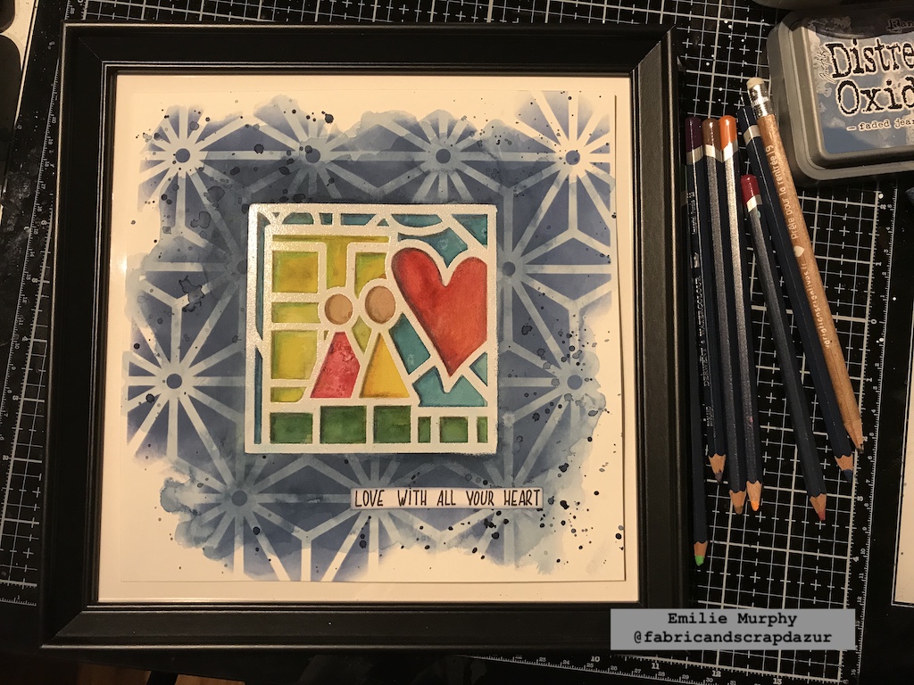
I slightly inked the edges of my sentiment with some oxide ink. Before gluing it down, I applied some splatters with indigo watercolor hiding my stamp image.

Finally I used some watercolor pencils to add some depth to the image and get a dimensional effect. I first applied a similar color inside each shape to get more depth. Then, I used a brown color to enhance the left and top edges of each shape to get the dimensional effect.

And voila!

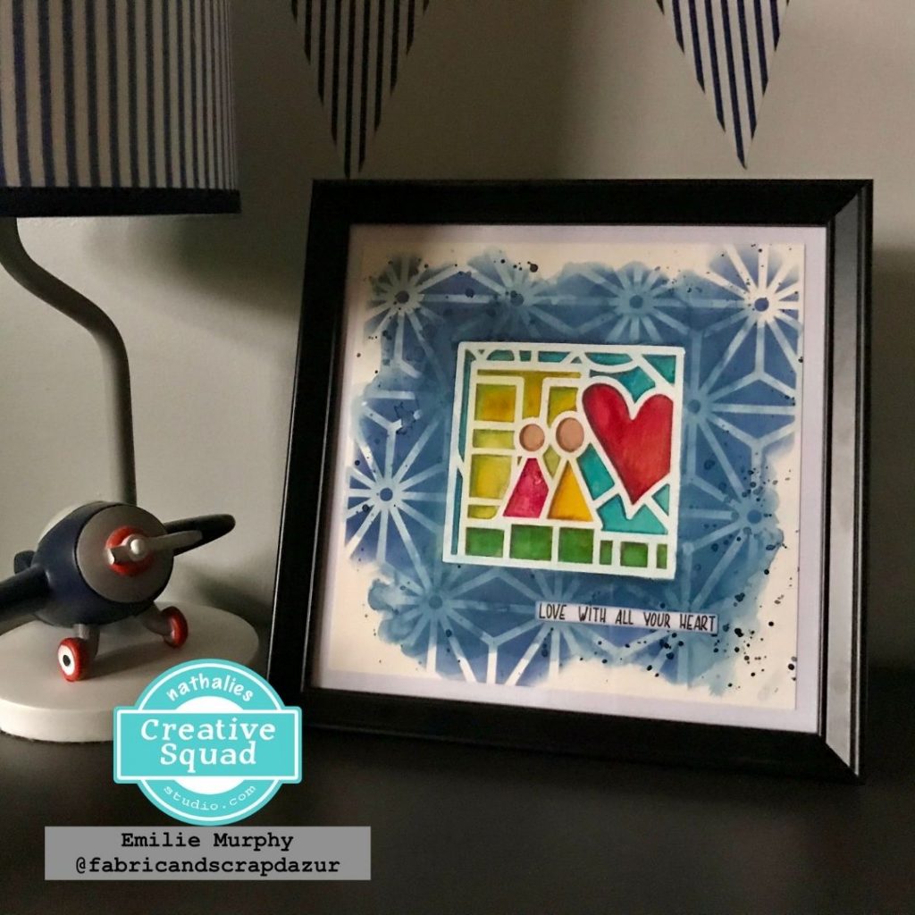
I decided to frame this painting and put it in my son’s bedroom. This painting can make a great gift for someone you love.

It would make a nice greeting card or art journal page as well or whatever you’d like to try and make.

Hope it gets you inspired. What about starting the year of 2021 with some fun and creativity!

Have a good rest of the week and see you next month!


Thank you Emilie – absolutely love this piece and that it now has a place in your son’s room – lovely!

Give it a try: you can find all my Foam Stamps and Stencils in my Online Shop and here are some of the supplies Emilie used:

Don’t forget to check out Nat’s Creative Squad on Instagram too: Each week we post projects, ideas, and inspiration for mixed media art.
Comments (1)

  • Robin

    |

    Emilie. As always, your piece is beautiful! I love the colors and how you used the stencil in the background. It’s so fun that it’s framed and in your sons room!!!
    Reply

Leave a comment