Creative Squad

Creative Squad: Gratitude is my Attitude – Riikka Kovasin

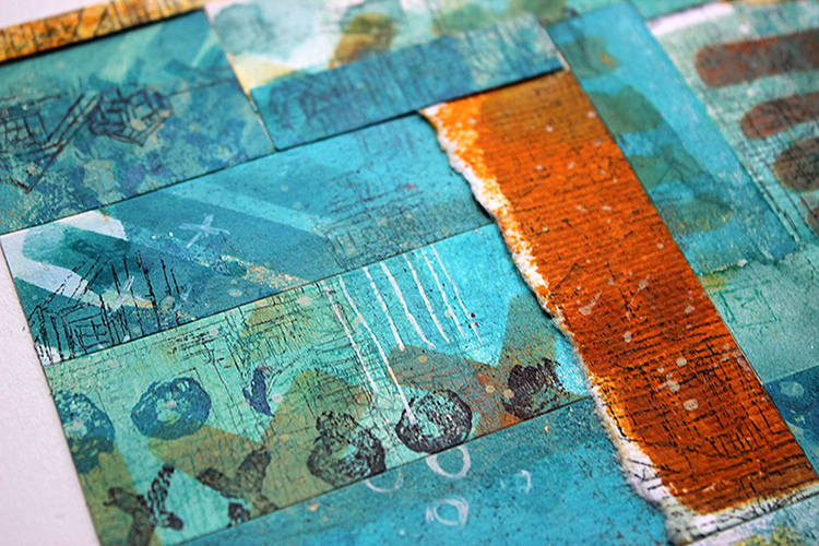
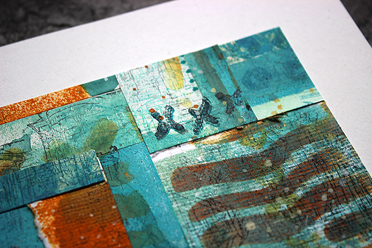
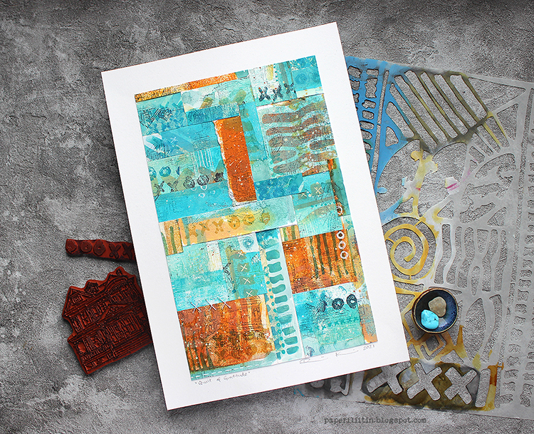
Hello from my Creative Squad! Today we have a post and video from Riikka Kovasin who is sharing her take on our new monthly theme for November and it’s all about being thankful and showing gratitude: Gratitude is my Attitude – This month we are playing along with the November ArtCollab: Showing Gratitude – and specifically giving thanks to those who have helped us along the way in our artistic journey. Who was crucial in helping you become the artist you are today? Let’s give these amazing souls a shout out! Riikka shares her gratitude with a paper quilt using my Batik stencil, Queen Anne rubber stamp and Love Knots rubber stamp.
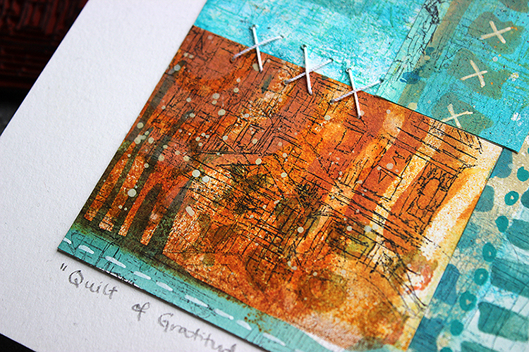

Quilt of gratitude 

Hello, it’s Riikka here today to share my monthly project. This time the theme was appropriately gratitude as Thanksgiving is just some weeks away.
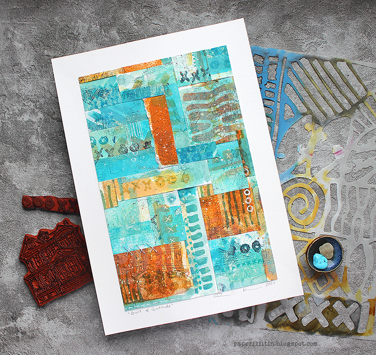
Gratitude is something that might be easily forgot with all the hustle going on in the world. Gratitude is something I try to show each day, but a reminder to count my blessings made me happy. For this project I was thinking about those who have led me to this place artistically. As I couldn’t possibly name just one, I started thinking about how to honor a bunch of people but still keep the piece cohesive. That made me think about networks, trees, grids and then quilts. My first idea was to dedicate a patch to each person I’m feeling grateful for, but in the end the quilt is more metaphorical than actually consisting of patches dedicated to different people. It’s meant to show that there’s many people I’m feeling grateful for and that the entity is bigger than the sum of its parts.
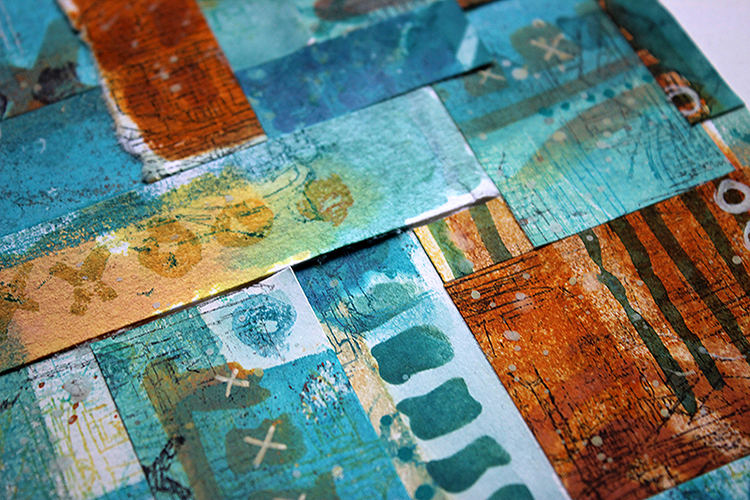
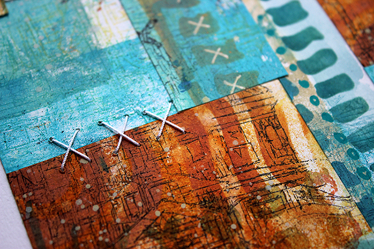
This piece is surprisingly flat to be my project. I usually strive for dimensional things, but this time a more restricted expression seemed to be in order. I did add something raising from the picture plane, though. There’s a couple of stitches added to the quilt. They play homage to the actual hand sewn quilts but also repeat the X pattern that can be found on the “Batik” stencil and “Love Knots” stamp I used. Some may see an X as a prohibiting sign, but to me it’s usually a combining element. The two lines gather the sides together, make a bridge, combine things. Maybe that stems from my schooling as a seamstress, where for example hemming is done using an X like stitch. 
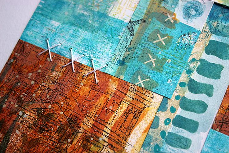
To have some texture and variation, not just that of color and pattern, I used two different papers in my make. I made the collage paper on top of regular 160g cardstock, which I often use as my starting point, but also on top of hand made paper. The soft handmade paper absorbed the colors differently and also had an uneven surface, so there’s a little variation in the piece. If you want to see how I made this project, please see the video below.

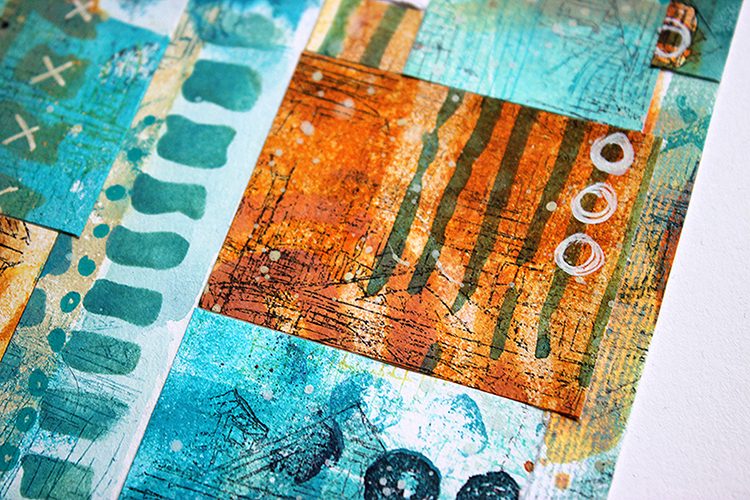
For the color palette I chose to go with my current favorite. The piece could have been almost any color, really, but I feel most at home when I’m working with teal and blue tones. But gratitude needed something more than just cool and aloof blues, it needed warmth, earthiness. For that I combined the teals and turquoises with rusty, amber tones. The contrast between the two colors makes each segment pop and keeps the piece interesting. At least I hope that it does that!
I’m grateful that you stopped by today. Thank you!

Xoxo Riikka

Thank you Riikka – such a thoughtful way to express your gratitude – in a quilt inspired project.

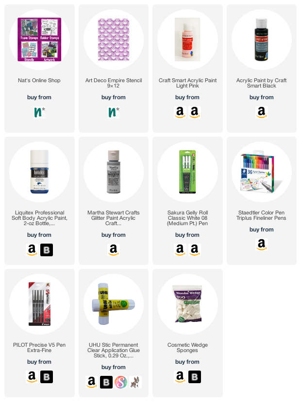
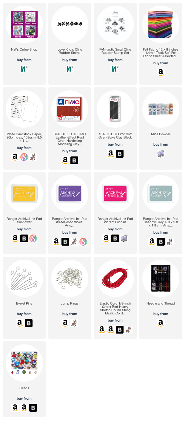
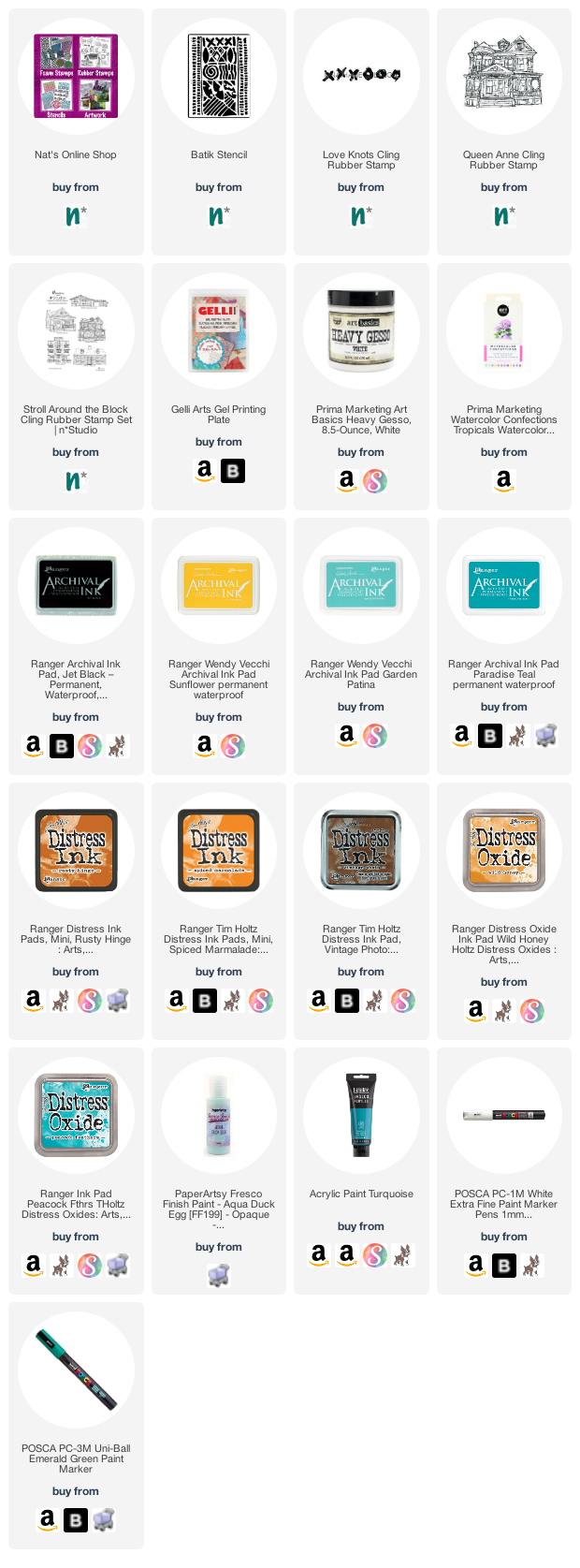
Give it a try: you can find all my Rubber Stamps and Stencils in my Online Shop and here are some of the supplies Riikka used:
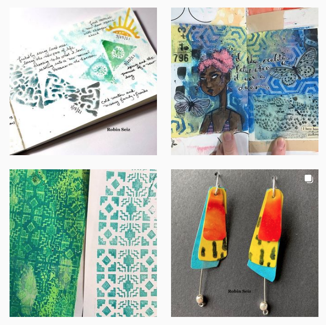
Follow the Creative Squad on Instagram here.

Comments (1)

  • Robin

    |

    What a wonderful metaphor and project. Thanks so much for sharing it!

    Reply

Leave a comment

Creative Squad: Extracurricular Activities

Hello from my Creative Squad! Today we have a special roundup of Creative Squad Extracurricular Activities that I’d like to highlight for you. My Squad is awesome as you know – so much talent and creativity, and on top of all that they are just really, really good peeps :) And they often post extra stuff they are working on on their social media and It stops me in my tracks because it just shows how much they all love what they do. They can’t stop creating lovely things!

Let’s have a looksie at some of the projects that caught my eye.

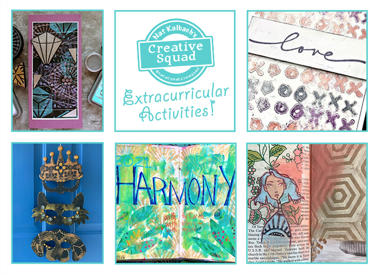
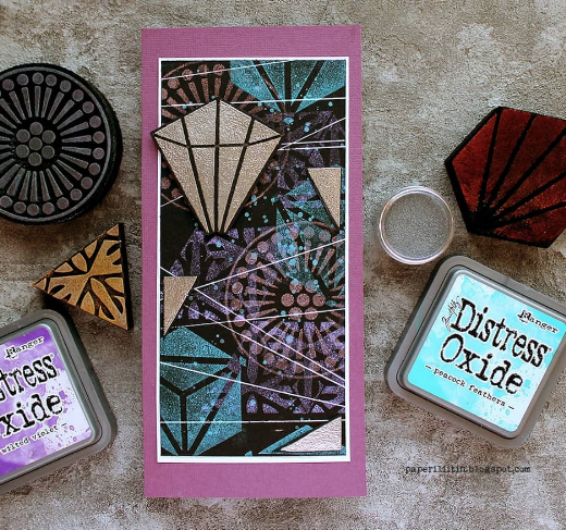
Riikka Kovasin posted this beauty and I love the magical layering she creates on the dark background with my Grove Street, Triple Play, and Mini Hex Set foam stamps. It looks very space age and cosmic – sooooo cool!

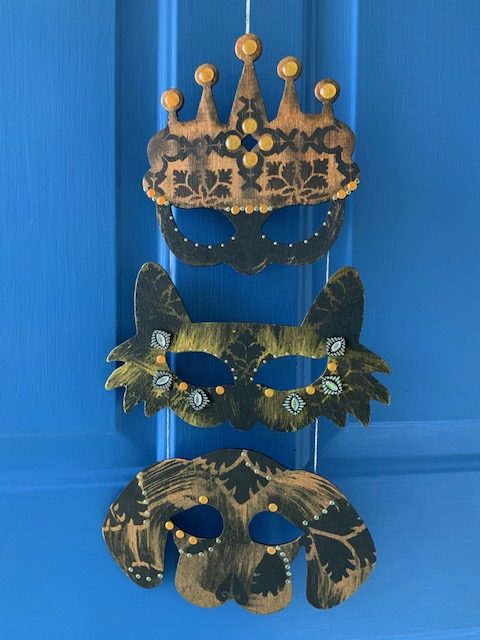
What did you do with your leftover Halloween masks? Judi Kauffman connected her trio of Masquerade masks from last month’s project into this nifty hanging decoration that she can bring out for Mardi Gras too!

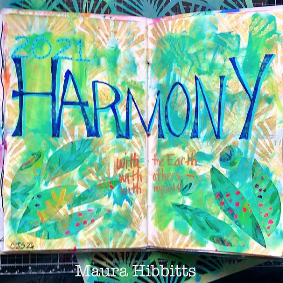
At the start of this year while Maura Hibbitts was playing along with Creative JumpStart 2021, she created this art journal page with her word for the year, Harmony. Love the botanical background she created using my Art Deco Wallpaper stencil and leaf motifs, a reminder to live in harmony with the Earth, others, and herself :)

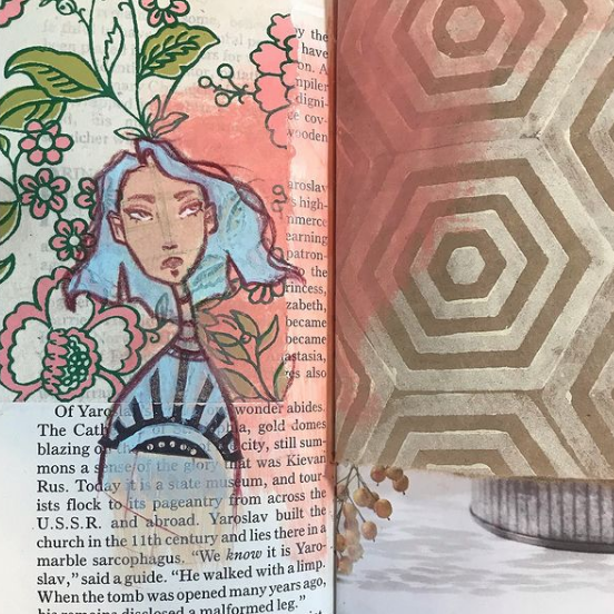
Jordan Hill posted this art journal page featuring collage elements, one of her distinctive character drawings, my Space Oddity foam stamp, and a beautiful peachy color to tie everything together. The mix of floral with geometric is really interesting in this spread!

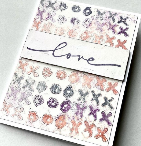
Let’s end with some love and this card from Robin Seiz. I think the muted colors and bit of grunge make this a pretty sophisticated design. She is using a gelli plate and my Love Knots rubber stamp to get her message across.

I hope you enjoyed this roundup of Creative Squad Extracurricular Activities! Please follow our team (their links are above) and also be sure to follow Nat’s Creative Squad on Instagram for weekly content from this stellar group of artists!

Here are the supplies they used:

Comments (1)

  • Robin

    |

    Thanks for featuring this Nat! Your stencils and stamps are a pleasure to work with; such great designs!

    Reply

Leave a comment

Creative Squad: Masquerade Party – Jordan Hill

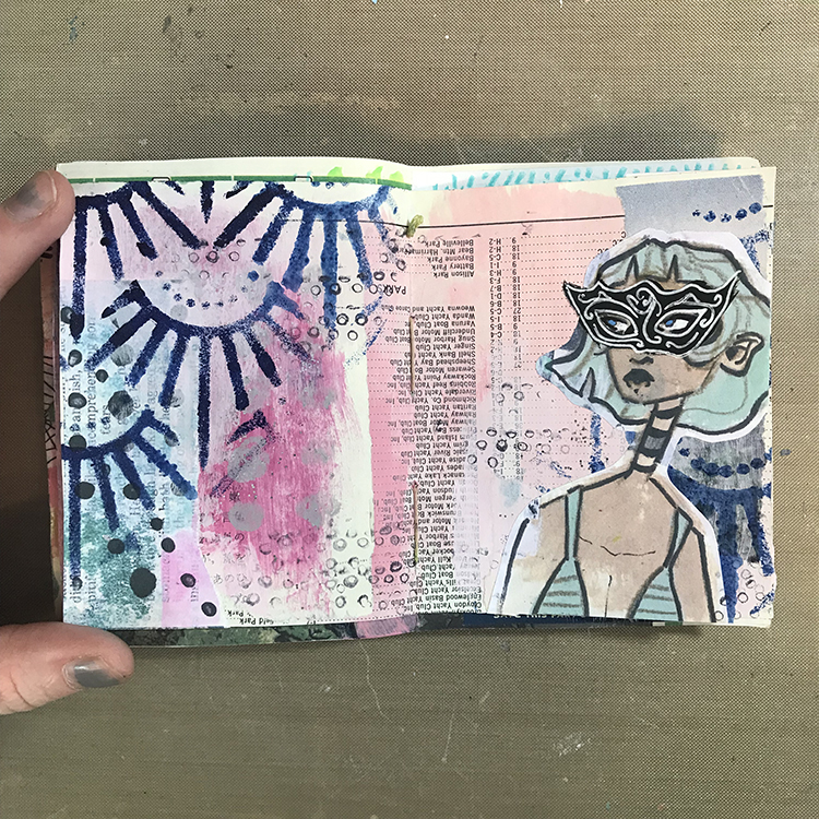
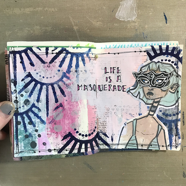
Hello from my Creative Squad! Today we have a post from Jordan Hill who is sharing with us an art journal page using my Art Deco Empire stencil and our October theme: Masquerade Party – Let’s play with disguises, the technique of masking, or maybe creating a bit of mystery this month. Not everything is what it seems, and it can be an interesting artistic trick to obscure or reveal in your artwork.


Hello everyone! When I first heard about this month’s theme of “Masquerade Party”, I was extremely excited! It’s the sort of theme that’s right up my alley, and I knew I would have a lot of fun with it. I hope you enjoy following along with me as I create this month’s project!

I started things off by flipping through one of my art journals to find a spread that I wanted to work on. This particular background consisted of a few pieces of collage, some pink acrylic paint and a bit of glitter paint. Something about this spread was calling to me, so I decided to go with it!

Next, using Nathalie’s Art Deco Empire Stencil, a foam makeup sponge, and some dark blue acrylic paint, I added some texture over different parts of my spread. I selected this dark blue color specifically because I knew it would contrast well with the soft pink of the background.

I then selected a collage image to use as my focal point for the page. For my example, I used a scan of my own artwork, but you could get a similar effect by using magazine images or photographs. It might be fun to play around with photos of yourself, or of family and friends!

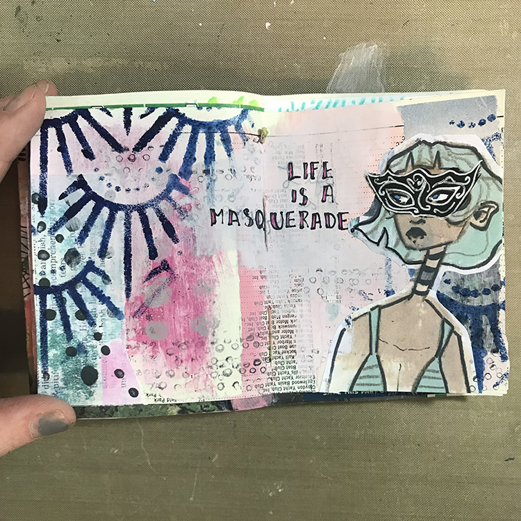
Now it was time to introduce the “Masquerade Party” theme to this spread! I first sketched out the general shape of a mask over my figure’s eyes. Then, using black acrylic paint, I painted over top of my collage image in order to create a masquerade mask! Once the black acrylic paint was dry, I used a white gel pen to add some details to the mask; swirls and spirals are a great way to give a filigree effect without having to be too precise.

I also took this time to add some small circles over my page with a fine point pen. This added a bit of extra texture to the background, particularly in areas where I felt it was looking a bit plain.

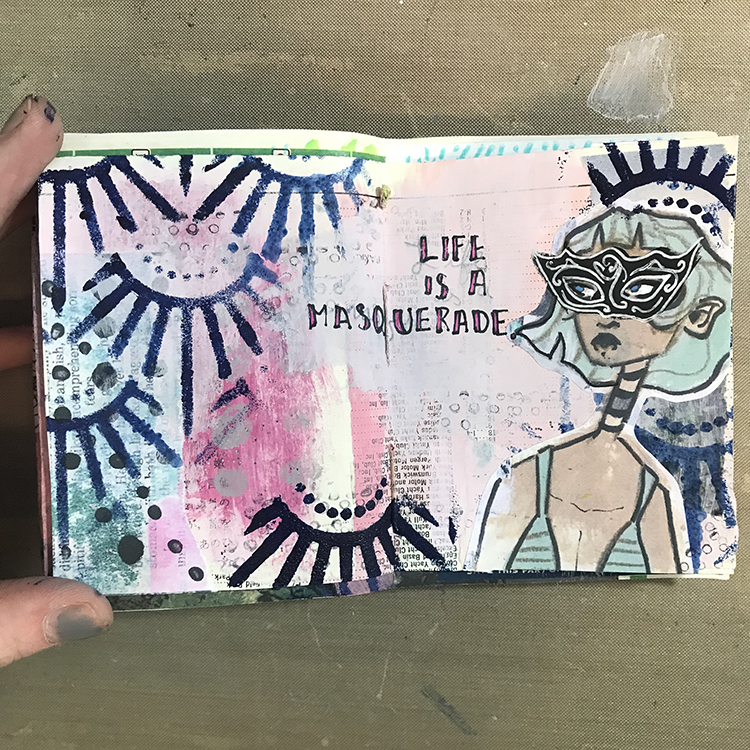
I was then ready to add words! At first, I tried to write directly over the preexisting background, but the numbers and letters from the collage paper were a bit overpowering. In order to fix this, I took some more pink acrylic paint and added a second layer to the area where I wanted to add my words. This second layer gave me a more opaque space to write. I also decided to supplement my typical black lettering with some magenta, in order to tie the words together with the spread a bit more.

At this point, I was starting to feel as though I was losing a bit of the stencil design, so using the same dark blue paint, I re-added Nathalie’s Art Deco Empire Stencil to a few places around the spread. For the upper right element, I also flipped the stencil upside down and placed it so it would appear almost crown-like over the head of my figure!

To wrap everything up and tie it all together, the final step was to draw a scratchy border around the edges of my page. I added a few dots along these scratchy lines in an attempt to replicate the pearls and jewelry you might see at a Masquerade Party, and I was ready to call this spread done!

I hope you all enjoyed following along with my process this month and I hope you consider experimenting with some of the ideas yourself!


Thank you Jordan – so cool to see one of your characters donning a mask for the occasion! And look at that gorgeous background too :)

Give it a try: you can find all my Stencils in my Online Shop and in addition to collage papers here are some of the supplies Jordan used:

Follow the Creative Squad on Instagram for weekly posts, artwork, and inspiration.

Comments (1)

  • Robin

    |

    Jordan, I love this months journal page you created. The mask gives it such an expressive look. Loved reading your process too!

    Reply

Leave a comment

Creative Squad: Masquerade Party – Robin Seiz

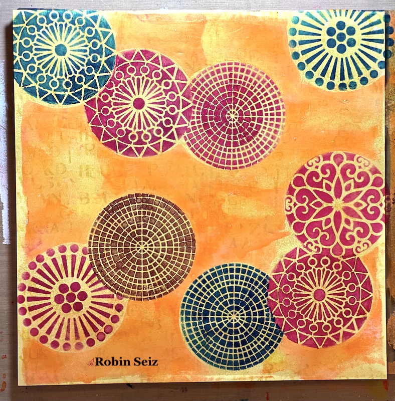
Hello from my Creative Squad! Today we have some fantastic cards from Robin Seiz who is using my Grove Street, Central Avenue, Valley Road, and Park Blvd stencils and our theme: Masquerade Party – Let’s play with disguises, the technique of masking, or maybe creating a bit of mystery this month. Not everything is what it seems, and it can be an interesting artistic trick to obscure or reveal in your artwork.


Hi friends, This month’s theme is Masquerade Party. I’m not a big fan of Halloween (I know I must be the only person in the US) LOL So I decided to interpret this theme in the broadest sense of the word. (One of the many great things about being on this Creative Squad is that we have license to do this! )  I thought about what the word Masquerade means — to conceal something  — and I decided to use the mixed media “masking” technique for my project. 

I find “masking” a bit challenging, both in terms of the layers of paint and really thinking through and planning in advance the results that I want. I am more of a “put it down and see what happens” artist typically, but that doesn’t really work with masking. How about you? Do you find masking easy or challenging?

I am committed to working with supplies that I have in my studio rather than buying new things. As a result, I decided to use the paper from a 12×12 paper pad that I had on my shelf. I love using patterned paper for Gelli printing. The paper I chose dictated the size of the Gelli plate — 12×14. 

If you have read my recent blogs for the Creative Squad, you know that I have been loving Gold Gesso. I believe gold adds so much to a piece of art. I began this project by putting gold gesso down on the Gelli Plate and pulling a print. I wanted enough paint to have good coverage, but I also wanted the pattern to show through.

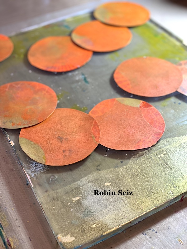
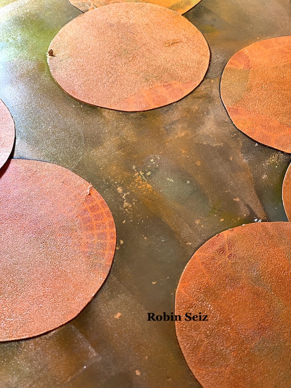
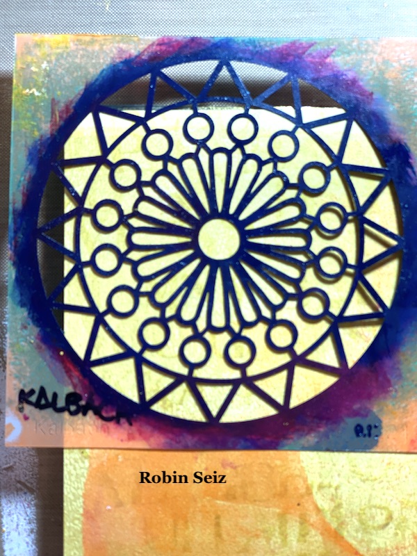
I cut out nine circles the same size as the patterns of the 4×4 stencils I planned to use (Grove Street, Central Avenue, Valley Road, and Park Blvd) These became my masks. Next I placed them down on the Gelli Plate, remembering that the pattern would be reversed when I printed it. Sometimes taking a “practice print” at this point is good. You can rearrange the masks if you don’t like how they turn out when printed. Once I was satisfied with the arrangement, I spread orange and yellow paint with a brayer over the masks. 

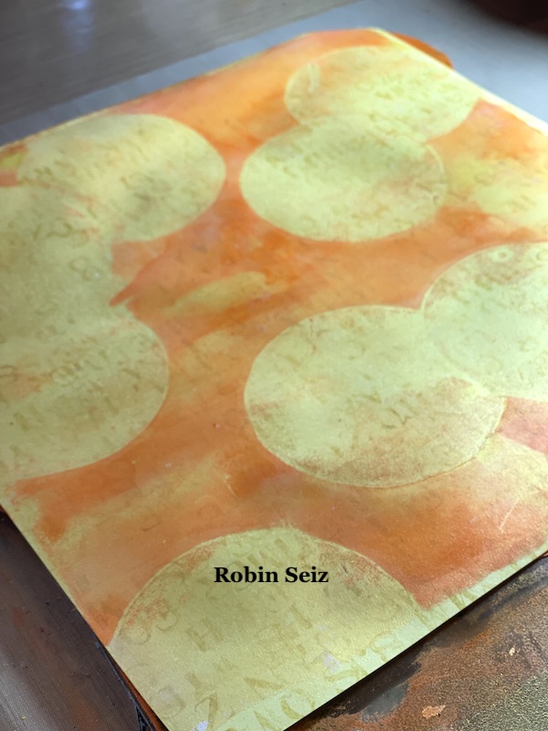
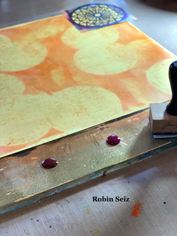
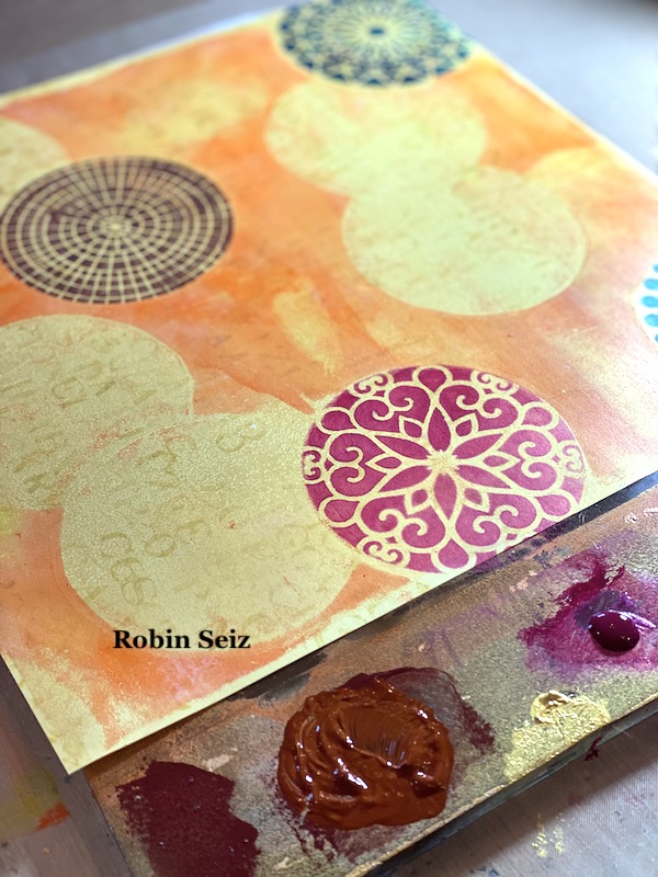
Next I removed the masks and now gold circles were visible where the masks had been. These circles were my guide to where I wanted the stencils and provided a lovely gold background for each stencil. 

The next step is the one I find most challenging — determining which stencils to put down first. The rule of thumb in masking is to complete all the pieces in the foreground first. Once you do that, and your stencil is dry, you can then place the mask back over what you just stenciled to move on to the next piece that will be concealed. On my page, I started in the upper left hand corner with the blue Valley Road stencil.

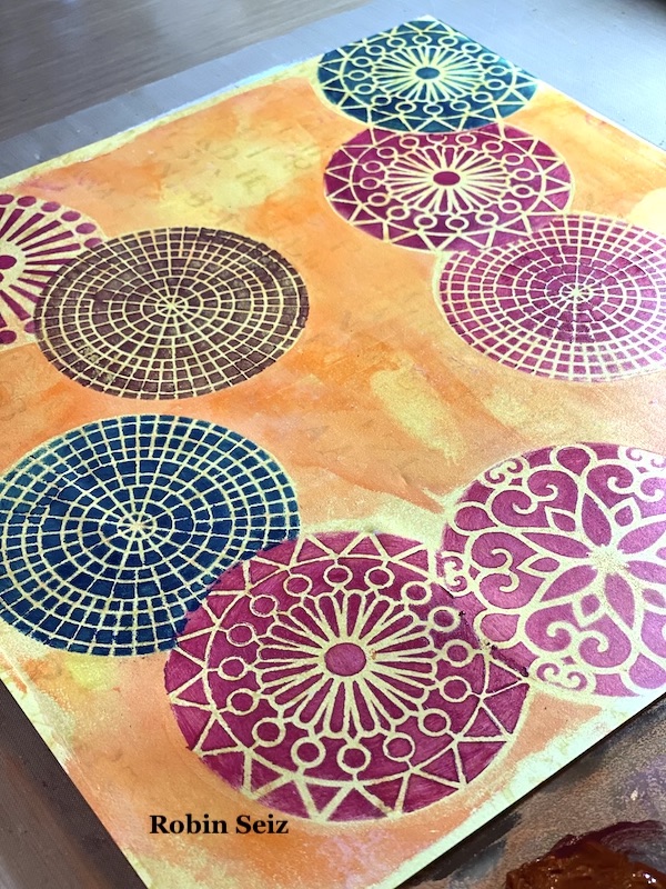
Then I did the Magenta Park Blvd stencil on the right middle and then the brown Central Ave stencil on in the lower left hand corner because all of these were going to be in the foreground. Once these were dry, I could move on to masking each one and stenciling the ones next to them that would be concealed. (In this case the two Quinacridone Magenta Grove Street circles on the right middle and upper left and the Quinacridone Magenta Valley Road Stencil in the lower left).

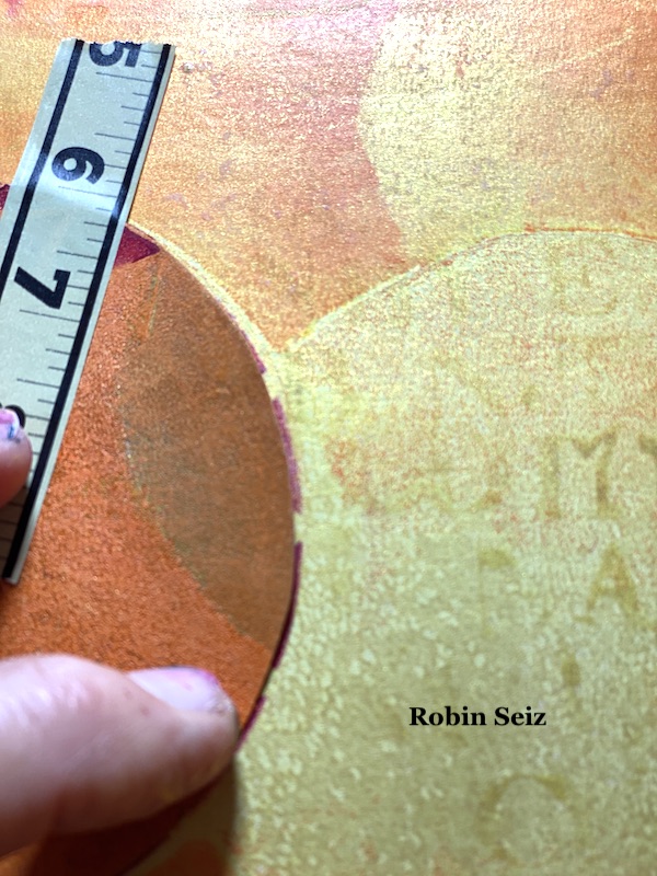
The most important thing to remember when you move to your second piece (or the piece that will be concealed) is to place the mask about 1/8” inside the first stencil — so 1/8” of the masked stencil  is showing outside the mask. If you don’t do this, you will get a gap and the conceal won’t look natural. You will have white space (or in this case gold space) between the two pieces. I used washi tape to place the mask on the page. 

Just a note about applying paint to the stencils. I first tried a makeup sponge, but found that I am too heavy handed and the paint tended  to glob up. I used one of my Tim Holtz applicators that are made for distressed inks or alcohol inks. I found rubbing the paint over the stencil worked best for me and gave me a clearer image. You may be skilled at the make up sponge, but I’m a heavy paint user!!!! LOL

I repeated this technique, masking the second stencil so that the third would be concealed. (see the middle center three.) 

I’m realizing this is a hard process to describe in words. I hope it’s clear. Just send me a note if you have questions.

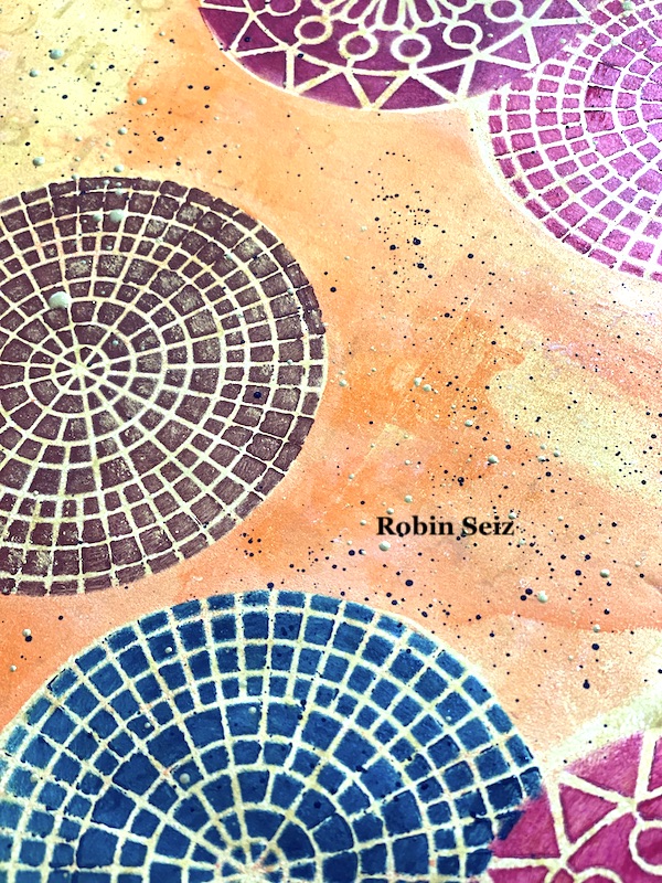
When I was finished with all the masking, the page looked like it needed a little something else. I laid down some black and gold splatter on the  page. This always gives a piece a finished look.

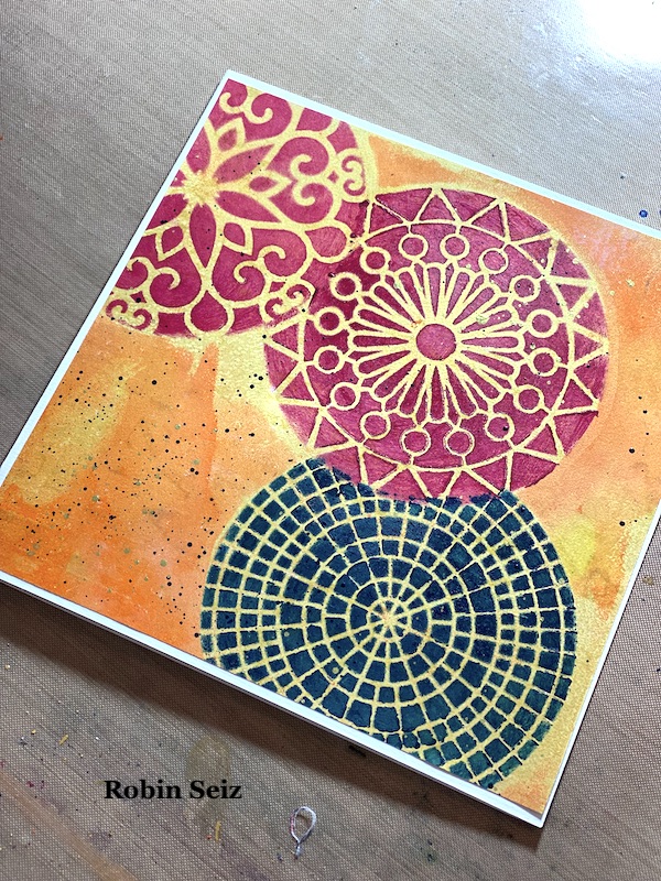
This page, since it’s large, could be used as a journal page, gift wrap, emphemera (if you cut out the stenciled pieces), or greeting cards. I chose to cut the paper into 4 sections and make  6×6 greeting cards. I love the size and how vibrant they turned out. I sometimes like my work more when I cut it into smaller pieces. Don’t be afraid to try this! You might be surprised at the results. 

I hope you try this Masquerading project. Please post your projects. I can’t wait to see them! 


Thank you Robin and I love that you chose the more abstract interpretation of this theme and showed us a masking technique!

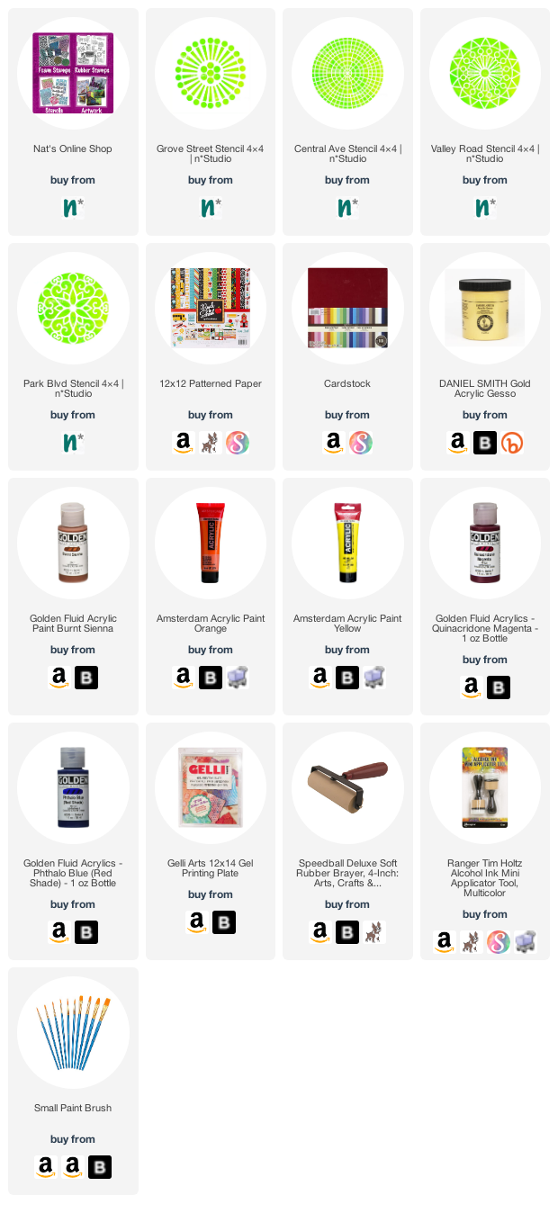
Give it a try: you can find all my Stencils in my Online Shop and here are some of the supplies Robin used:

Follow the Creative Squad on Instagram for weekly posts, artwork, and inspiration.

Leave a comment

Creative Squad: Masquerade Party – Riikka Kovasin

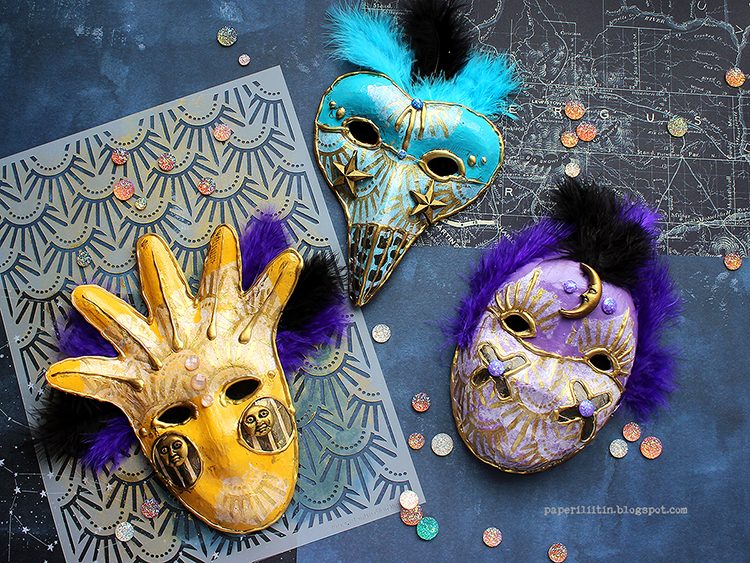
Hello from my Creative Squad! Today we have a post and video from Riikka Kovasin who is sharing a trio of festive masks using my Art Deco Empire and Batik stencils and our theme: Masquerade Party – Let’s play with disguises, the technique of masking, or maybe creating a bit of mystery this month. Not everything is what it seems, and it can be an interesting artistic trick to obscure or reveal in your artwork.


Sun, Moon and Stars 

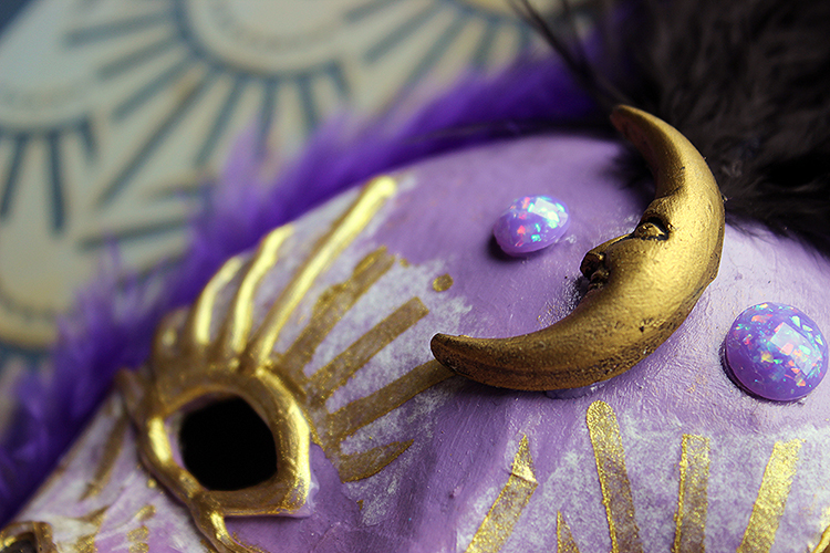
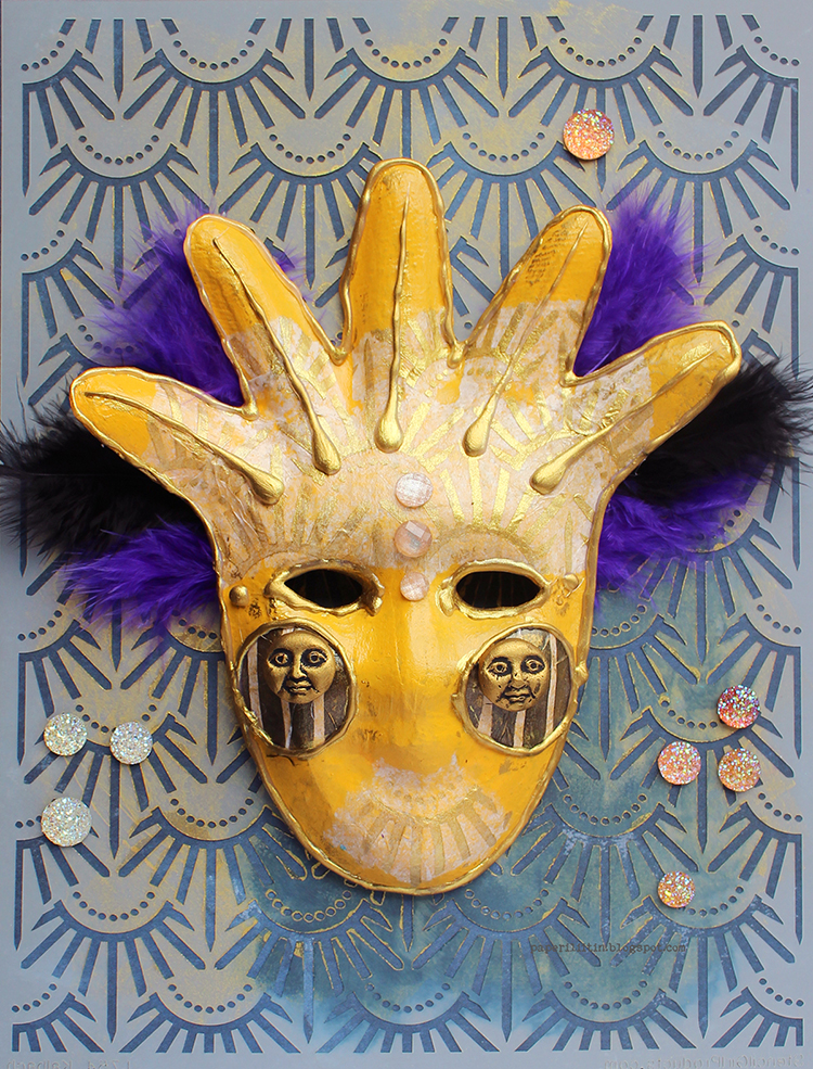
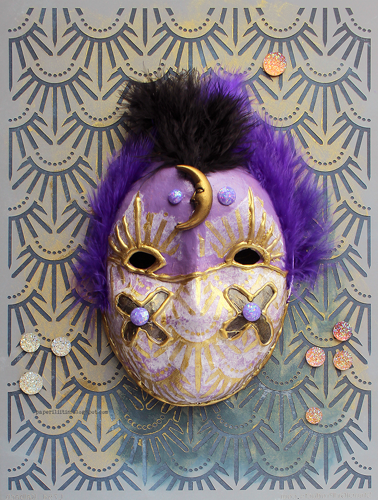
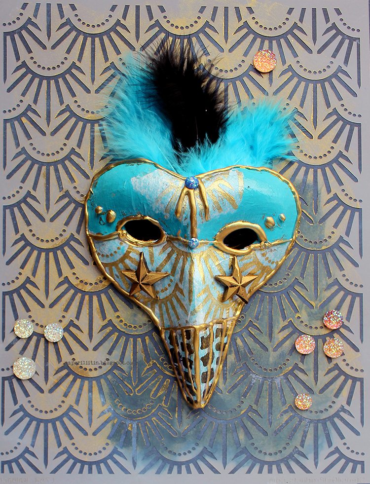
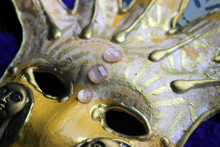
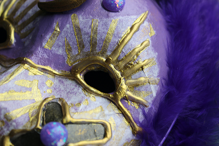
Hi there! It’s Riikka here today sharing my October project. As you can see, I took quite a literal approach to the “Masquerade Party” and decorated some small paper maché masks with acrylic paints and self-made decoupage paper.

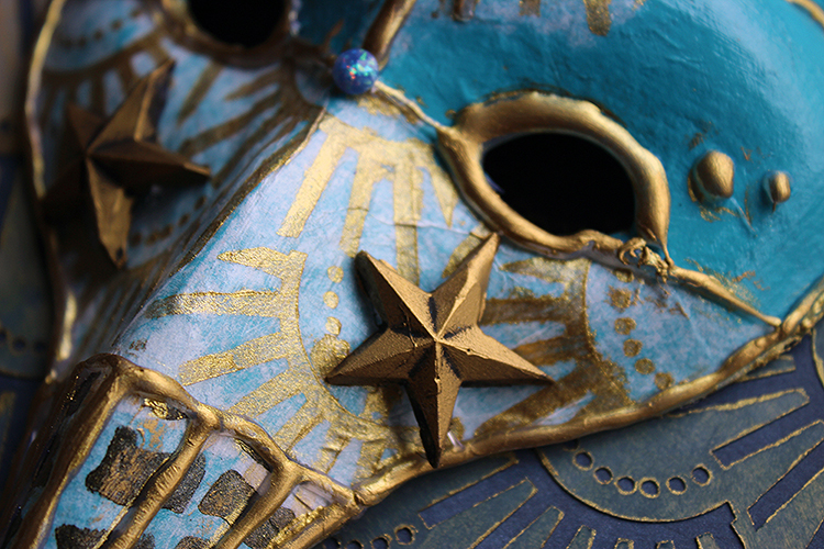
My inspiration for these masks were the Venetian carnival masks. Maybe it was the shape of the paper maché masks that led me there as they echo the shapes of the Venetian masks. The one I decided to make the sun has a little bit of harlequin in it whereas the one I decorated with stars has the “Dottore della Peste”, the plague doctor shape in it. With the carnival masks in mind I used bright colors and gold touches in the masks even though they are maybe a more modern addition to the whole thing. The traditional commedia del’arte masks where some of the masks have their origin were much simpler.

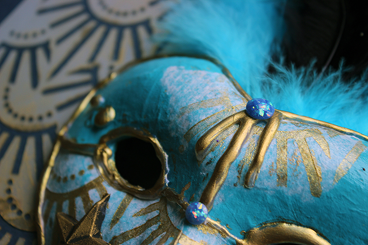
To get some pattern to my masks I used tissue paper as wrapping a stencil around such a dimensional shape can be quite challenging. Patterning tissue paper is an easier way to get pattern wrapped around the shape. Depending on the tissue paper, the color you’re laying it on top of, and the medium you use, you might get the paper to completely disappear. Here I used a soft body gel medium to adhere the pieces I first patterned using a golden acrylic paint and black gesso. For the patterns I used two Nathalie’s stencils – “Art Deco Empire” and “Batik”. I used golden acrylic with the “Art Deco Empire” as the pattern reminds me of a sunburst and black with the “Batik” to have some contrasting pieces for the masks. I used those just as accents, adding just a tiny detail to each mask.

As you can see, the tissue paper doesn’t completely disappear in my masks. On top of the lighter surfaces of yellow and turquoise it’s a bit more faded to the background than with the lilac. If you are trying to hide the tissue paper completely, one way to help is to have a frayed edge rather than a straight cut one. An easy way to do it is to use a wet brush. Trace the desired shape onto the tissue paper with a wet brush and then you can tear the piece loose. Paper is most brittle and soft when it’s wet and you’ll be able to get exactly the shape you want, to control the place where the paper tears.

To keep with the Venetian theme, I decorated my masks with some crystals and feathers. I chose to cut out the part with the feathers from the video as they were giving me a hard time. Or rather, I couldn’t decide how to put them on the mask. I added some several times to the Moon mask before getting the idea of attaching the feathers to the back of the masks, which worked nicely. I should have taken a peek at the modern-day Venetian masks for inspiration at that point!

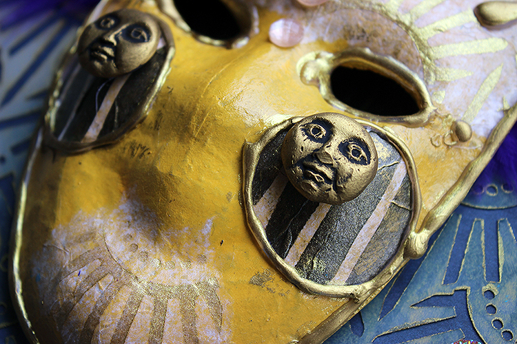
As I had three masks, I wanted something to combine them into a series. Inspired by the sun like appearance of one, I decided to make a celestial triplet of the Sun, the Moon and stars. I made the focal embellishments for each using a silicone mould and casted the decoration using hot glue. There’s a quick Reels in my Instagram account showing that, if you wish to see HERE. But it’s really easy! You just need to remember that the embellishment is out of hot glue so it will melt for example in case you dry the project with a heat tool!

Thank you for stopping by today! I’ll be seeing you again next month!


Thank you Riikka – gorgeous, rich colors on these masks and I love the drama you create with them!

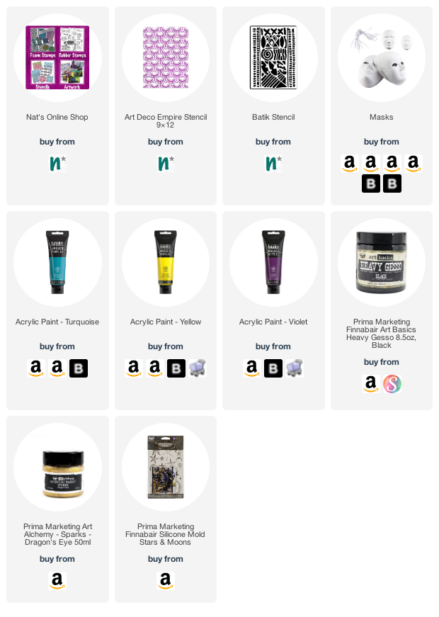
Give it a try: you can find all my Stencils in my Online Shop and here are some of the supplies Riikka used:

Follow the Creative Squad on Instagram for weekly posts, artwork, and inspiration.

Leave a comment

Creative Squad: Masquerade Party – Judi Kauffman

Hello from my Creative Squad! Today we have a post from Judi Kauffman who is kicking off our new monthly theme for us: Masquerade Party – Let’s play with disguises, the technique of masking, or maybe creating a bit of mystery this month. Not everything is what it seems, and it can be an interesting artistic trick to obscure or reveal in your artwork.


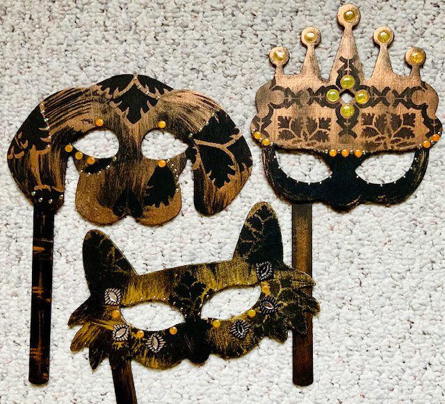
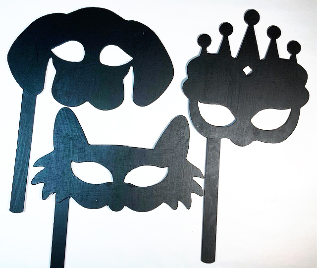
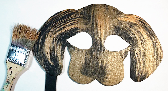
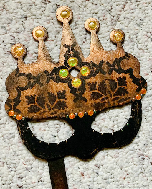
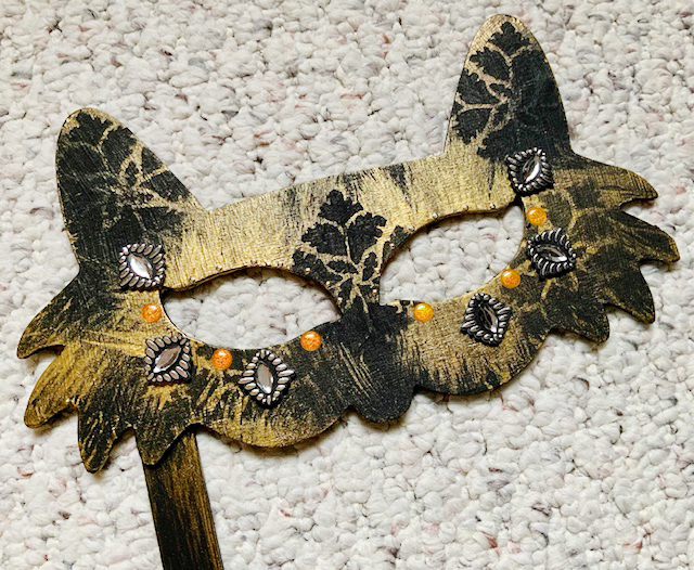
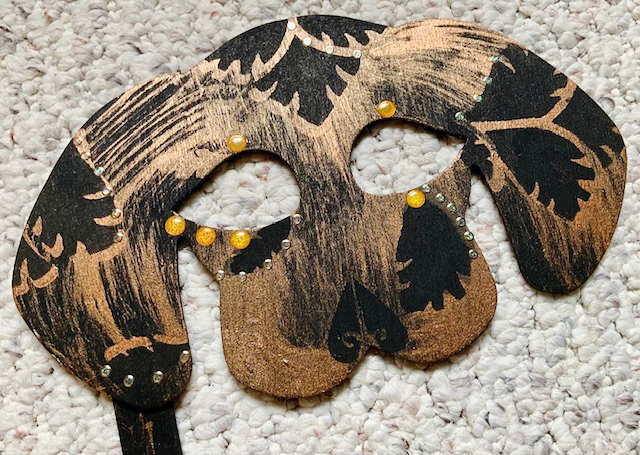
I love Halloween! How could anyone NOT embrace a holiday that’s all about costumes, cards and candy? When I heard about the theme for this month’s Creative Squad projects – Masquerade Party – I knew right away what I wanted to do: stenciled masks! I dug into my craft stash, found some cheap wooden masks that I’d purchased ages ago, picked a pair of stencils, got out the paints and I was off and running…

If you can’t find masks like these, hand- or die-cut your own from mat board or chipboard. There are many free mask templates available online.

Let’s get started:

Paint masks with black gesso.

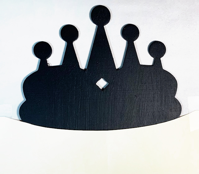
For the crown: Mask a curved area above the eyes.

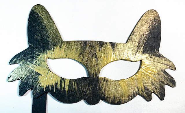
Brush the masks with a metallic paint in a color of your choice. 

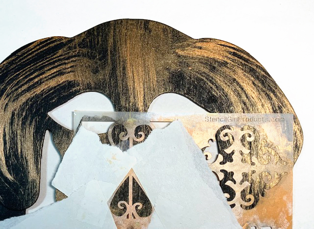
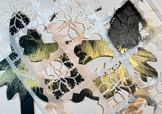
Position stencils as shown or as you prefer and use a stencil brush with metallic and black paints to add patterns.

TIPS: 
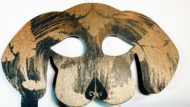
*Look for portions of the stencils that please your eye, like the section forming the dog’s nose!
*Layer the paints: Stencil in black on black (like the lower section of the crown mask), stencil in black over previously stenciled bronze (like on the dog’s face).
* Add smudged-on black paint to the crown to tone it down and give it an antique look.

Embellish masks with adhesive-backed gems and glitter dot stickers.

Other options:
Remove the sticks and hang or frame the masks as wall art. 
Stencil lightweight paper masks and adhere into an art journal.
Stencil small scale masks onto card fronts.


Thank you Judi – I love the opulence of these masks and also how carefully you chose the placement of the stencils.

Give it a try: you can find all my Stencils in my Online Shop and here are some of the supplies Judi used:

Like what you see? Follow the Creative Squad on Instagram for weekly posts, artwork, and inspiration.

Comments (1)

  • jean marmo

    |

    Oh Judi – these are such fun!! Love the inspiration!

    Reply

Leave a comment

Creative Squad: Wish You Were Here – Jordan Hill

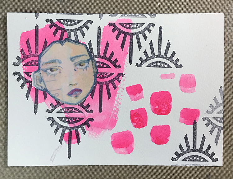
Hello from my Creative Squad! Today we have a post from Jordan Hill who is sharing with us a bit of mail art using my Triangle Love and Birds stamp sets, “The World’s Pinkest Pink” powdered paint, and our theme: Wish You Were Here – This time let’s think about those old travel postcards, or someone you are missing or haven’t seen in a while, or maybe a place that you are missing. The message is loud and clear: Wish you were here!


Hello everyone! I’m very excited to be back with my project for September; I thought a fun way to interpret this month’s theme of “Wish You Were Here” would be to create a postcard! I love working in a smaller size, so the 4″x6″ base was perfect for me. I hope you enjoy following along with this process!

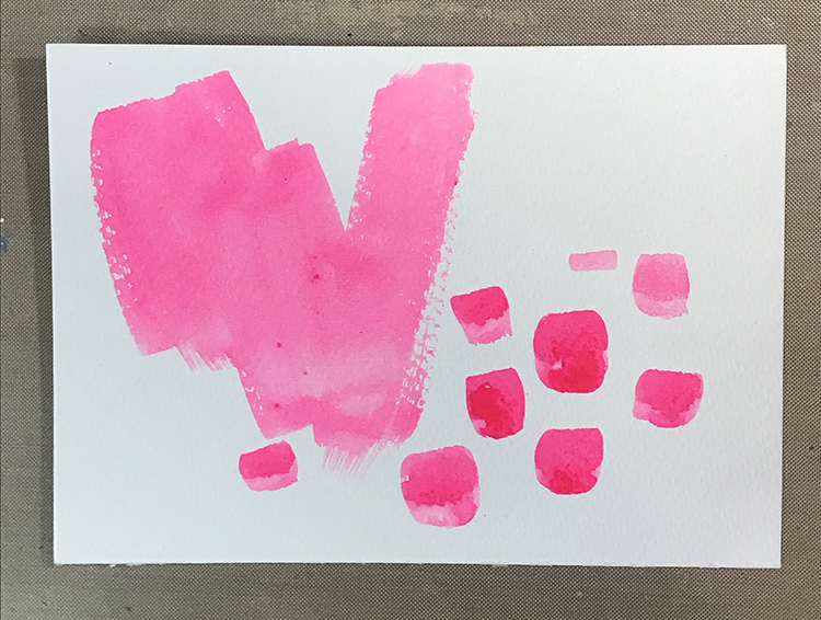
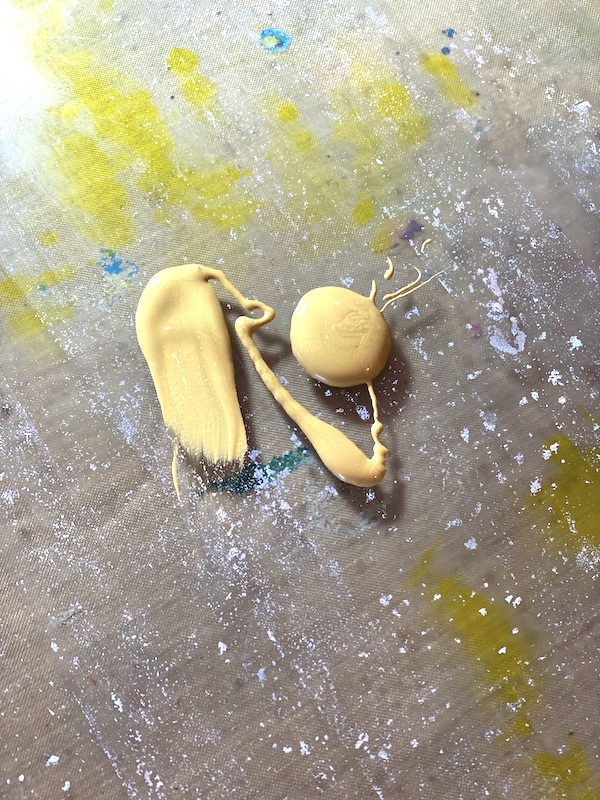
A friend recently sent me a powder pigment that is marketed as “The World’s Pinkest Pink”, and I really wanted to experiment with it. I mixed some of the pigment up with water, then painted it over my background in a very haphazard kind of way. The brightness of this particular pigment is so intense that I cannot show it accurately in photos, but just know that it is very bright!

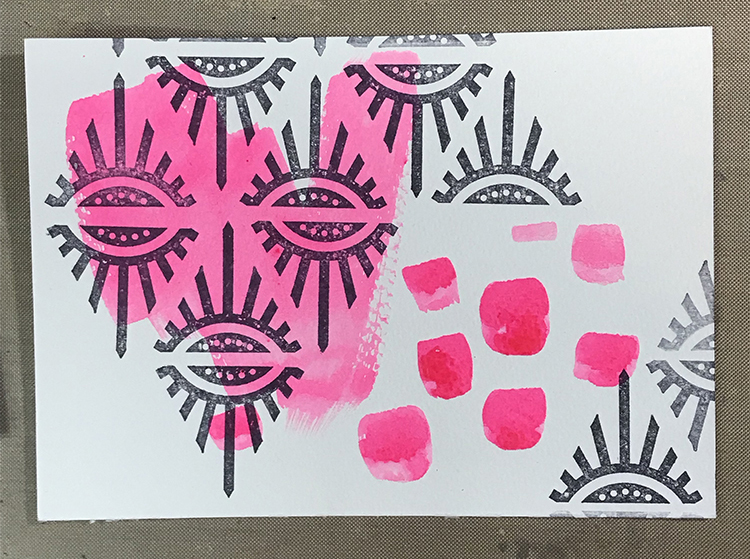
Once the pink background was dry, I used Nathalie’s “Empire Triangle” rubber stamp with some Black Archival Ink to create a repeating pattern over my background. These small motif stamps are perfect for creating patterns!

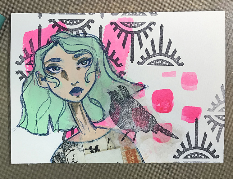
Next, I started to create a figure with a piece of collage. This particular piece started out as a full illustration, but I cut the body and hair away from the face of this particular scanned image, then glued it down. Sometimes partial images can be a great way to give yourself a jumping off point without committing to anything too intensely. 

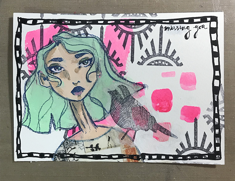
I then followed my typical illustration process to give the face a body and hair. Once that had been completed, I then used another of Nathalie’s stamps, this time the “Nightingale” stamp, to stamp onto white tissue paper. I then glued that image to my postcard using Mod Podge and a paintbrush, to make it look like my figure had a bird on their shoulder!

To finish up this postcard, I used a dip pen and some Speedball Calligraphy Ink in Super Black to add a border around the edges of my postcard, as well as to write the words “missing you” in the upper right hand corner of the card. I thought that particular sentiment matched the theme for this month, and it was a nice final addition to the postcard!

Though this month’s project is more on the simple side (for me), I quite like the way this card turned out, and I’m excited to get it in the mail! I hope you enjoyed following the process of creating this postcard and that you try creating one of your own!


Thank you Jordan – love how you used the Bird on her shoulder!

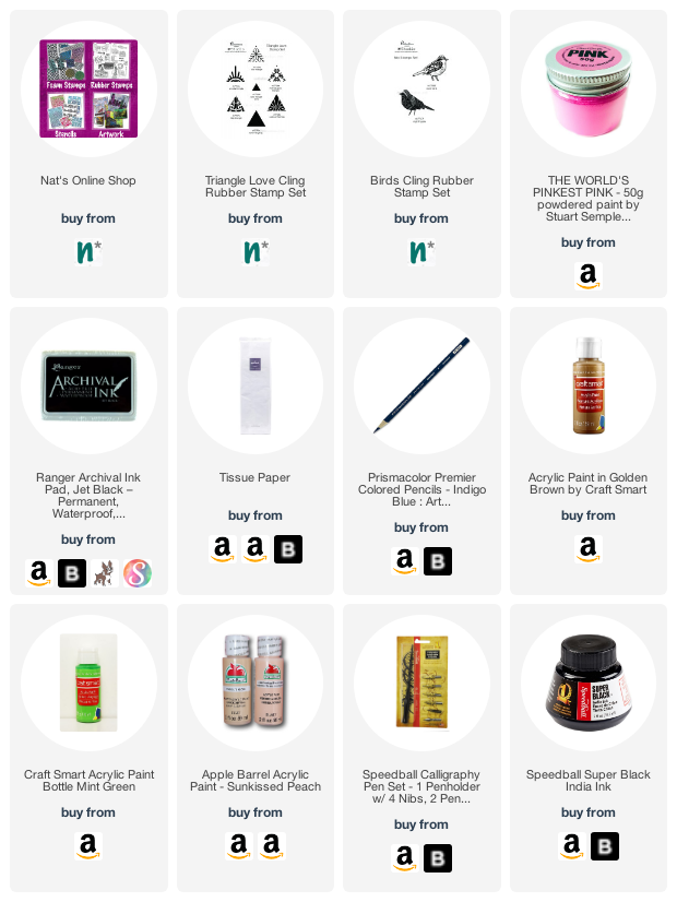
Give it a try: you can find all my Rubber Stamps in my Online Shop and in addition to her collage bits, here are some of the supplies Jordan used:

Looking for more inspiration from the Creative Squad? Follow them on Instagram here.
Leave a comment

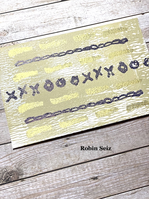
Creative Squad: Wish You Were Here – Robin Seiz

Hello from my Creative Squad! Today we have some gorgeous cards from Robin Seiz who is using my Embroidery stamp set and our theme: Wish You Were Here – This time let’s think about those old travel postcards, or someone you are missing or haven’t seen in a while, or maybe a place that you are missing. The message is loud and clear: Wish you were here!


Our theme for the month, “Wish you were here” really struck a chord with me. There are people who I love and still haven’t seen because of COVID and my own comfort with traveling, especially to areas with higher transmission rates. (Which is where some of these “peeps” live.) I miss them and really wish they were here or I was there! 

For my project I pulled out some Strathmore Mixed Media Postcards which I had in my stash. Don’t you love it when you can use what you have! If you don’t have these postcards, any mixed media paper, or really any paper cut to size, would work. The ones I used were 4X6; the standard postcard size. I also wanted a muted pallet; perhaps it was the gloomy day when I was creating or the feeling of longing to see my friends, I’m not sure, but I like the subtleness of the color pallet I chose. 

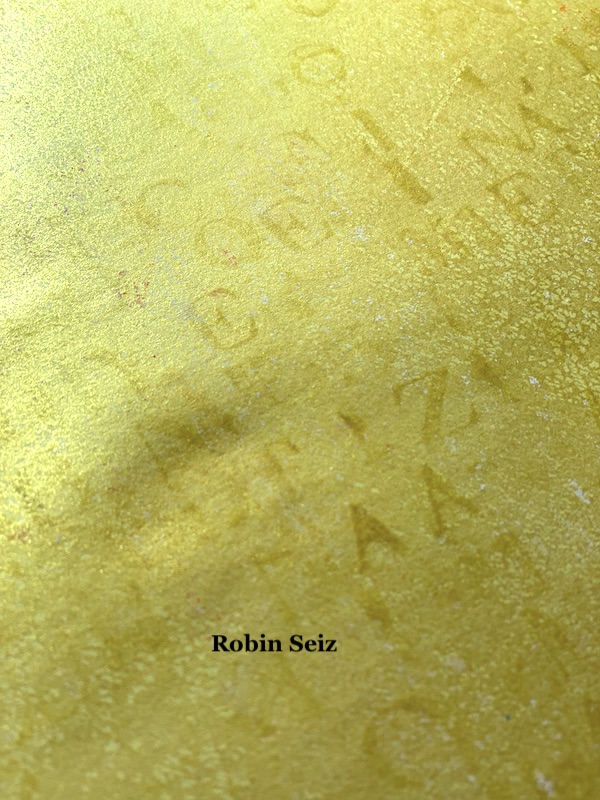
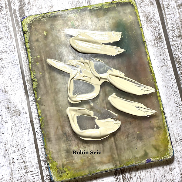
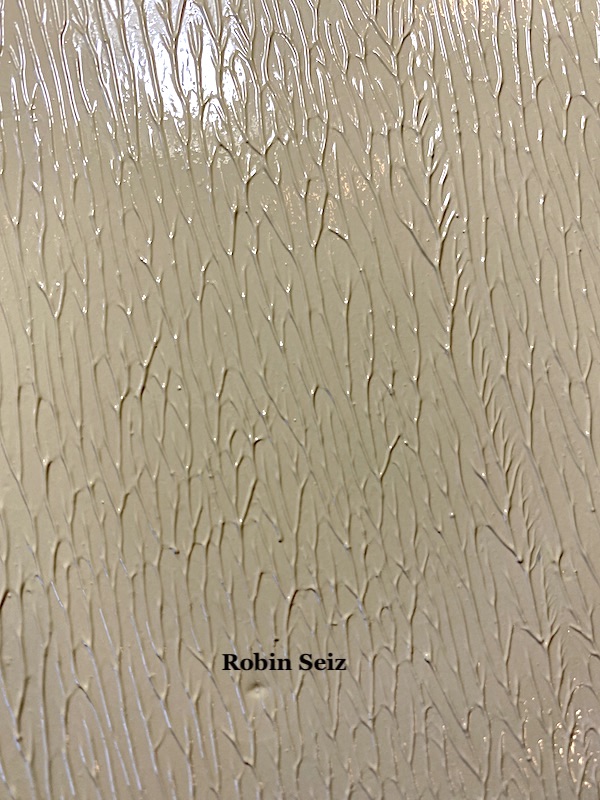
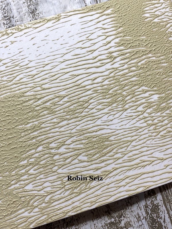
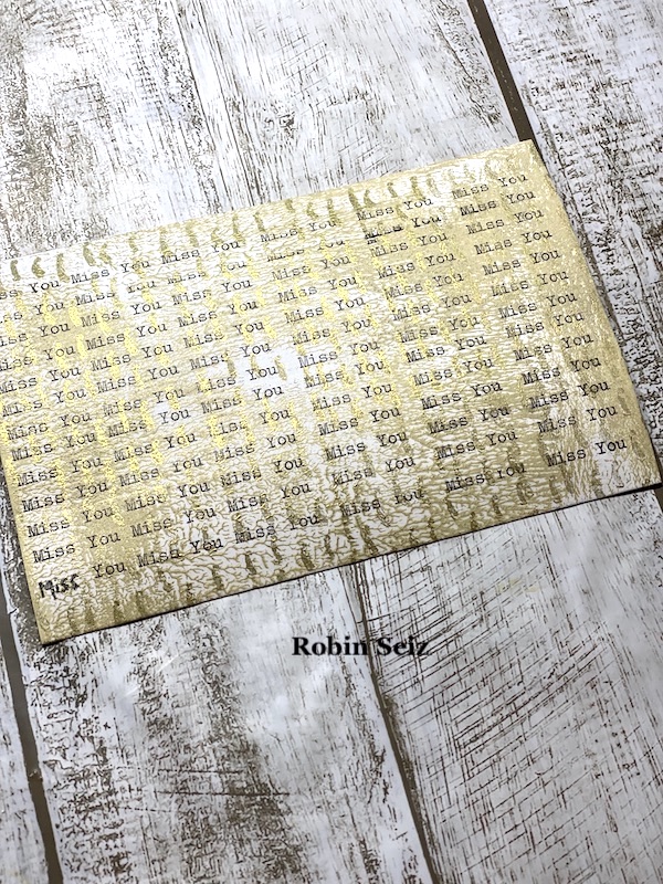
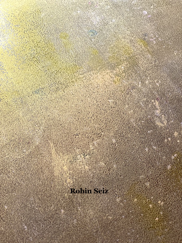
You all know I LOVE my Gelliplate; I pulled out  my 5 x 7 plate and lathered it with Liquitex Basic Acrylic Unbleached Titanium. It’s highly opaque and has both a creamy color and consistency to it. It’s great to use as a base on a piece of paper; I use it a lot! When I say I lathered it on, I mean that I used a thick coat of paint. I do this when I want a lot of texture on a piece.  Because this paint is so thick to start with, it performs really well to make texture. Picture #3 shows you the paint on the paper once I pulled the print. 

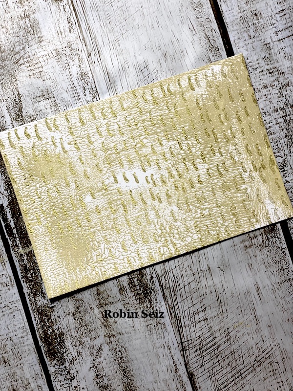
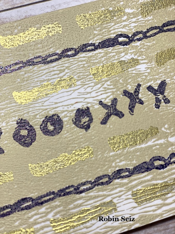
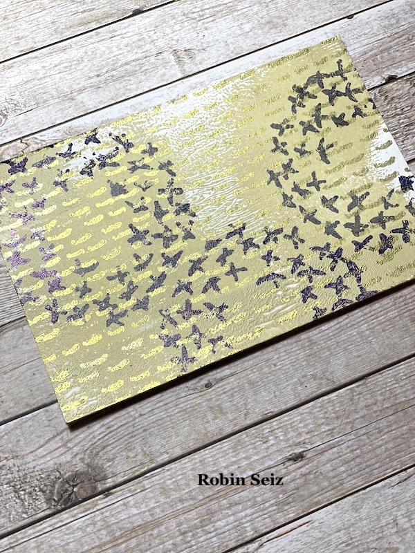
I decided to use Nat’s Embroidery Set for this month and I wanted to challenge myself to use every rubber stamp in this collection — and I did! It’s such a versatile set. If you like mark making, it’s the perfect set for you! I’m loving gold right now, it seems to bring a little “pop” to any piece. I stamped the card with the “Running” stamp and a gold pigment ink. (It takes forever to dry, but has a great feel to it when it does.) 

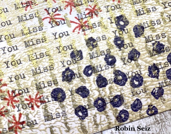
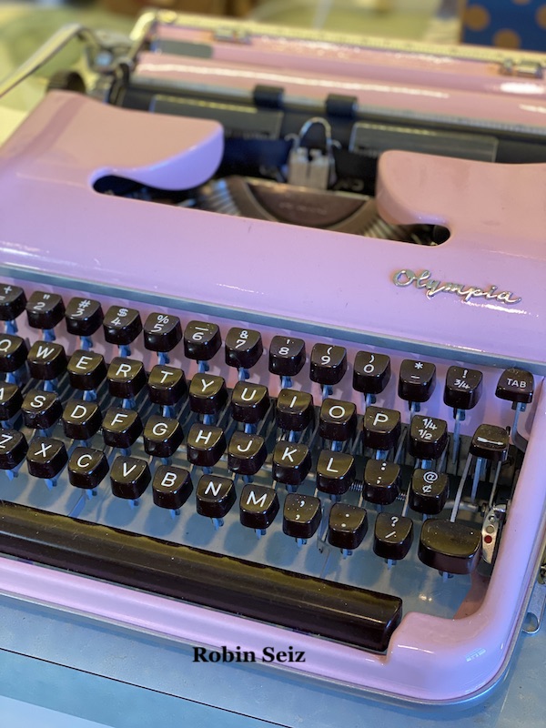
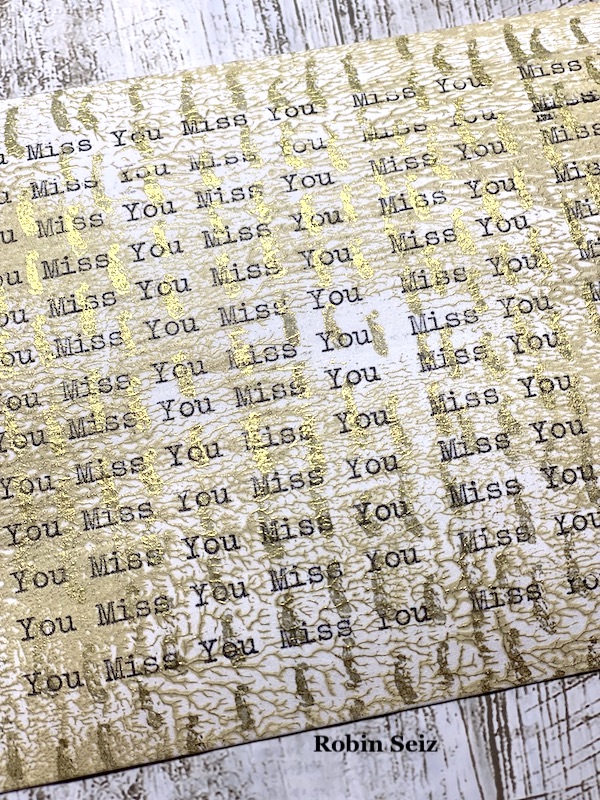
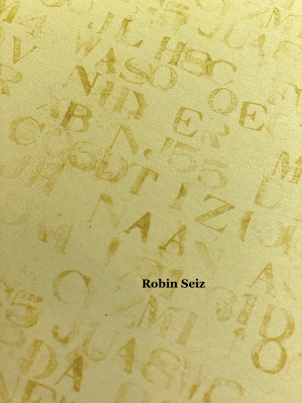
Next, I took the postcard to my typewriter and typed, “Miss You” continuously on the entire card. If you don’t have a typewriter, you can certainly use a stamp or hand write the sentiment which would also be lovely.

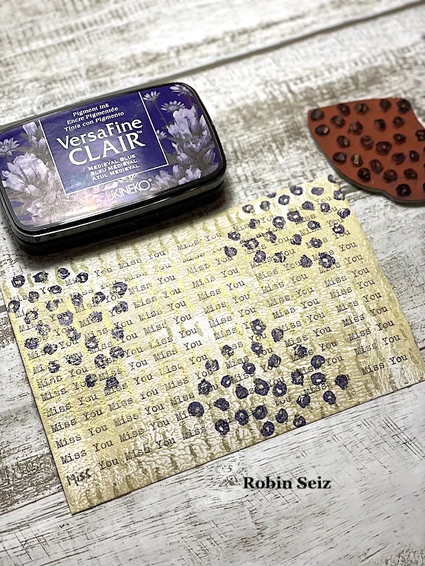
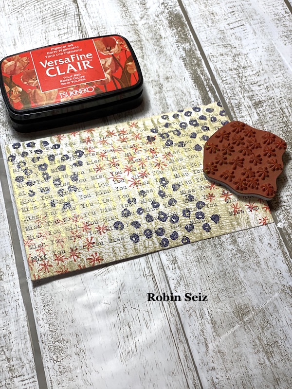
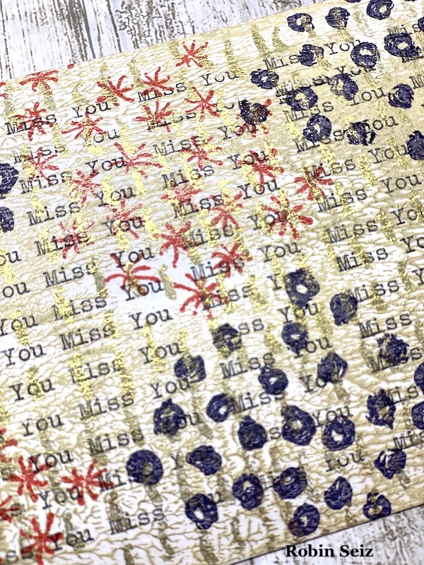
Next, I stamped with the “Grannies” and the “Star Fish.” It turned out a little busy, but I like how the stamps muted the typewritten message. It can still be read, but the print moves to the background.  It’s just as easy as that! 

This is a great afternoon project if you just want to send something out to say, “I miss you” or “I wish you were here.”  As a matter of fact, I couldn’t stop making these little postcards. I made two more using the rest of the stamps as I committed to do!  (Cross Circle, Chain Link, Satin Doll, and Love Knots.)

I hope you will give this a try. The possibilities are infinite! And it’s always great to have a few postcards on hand for when you need them!  Peace, Robin


Thank you Robin – we love your color palette too and how you layered the juicy paint with the stamp designs.

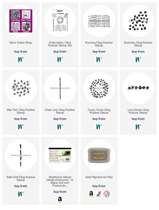
Give it a try: you can find all my Rubber Stamps in my Online Shop and here are some of the supplies Robin used:

Looking for more inspiration from the Creative Squad? Follow them on Instagram here.
Leave a comment

Creative Squad: Wish You Were Here – Riikka Kovasin

Hello from my Creative Squad! Today we have a post and video from Riikka Kovasin who is sharing a touching tribute to her Grandmother. Her beautiful book project uses my Love Knots and Fan-tastic Small rubber stamps and our theme: Wish You Were Here – This time let’s think about those old travel postcards, or someone you are missing or haven’t seen in a while, or maybe a place that you are missing. The message is loud and clear: Wish you were here!


Layers of Reminiscece 

Moikka! It’s Riikka here today to share my project with this month’s theme “Wish you were here”. While one of the ideas was to make greeting cards from faraway places, I went a bit more personal. Around the time I was making this project was my maternal grandfather’s burial so that effected the way I interpret the theme.

My maternal grandmother passed away when I had just turned 13. While we were close, memories seem to fade, and I can’t remember all the little things anymore. And I really wish she had been here to see her great grandkids, my two daughters, and see me get married. I can remember when I was studying at a polytechnic, I would have wanted to share something with her, or phone when I met my husband-to-be. She was a family person so those things would have been meaningful for her, too. The passing of my grandfather made me realize this even more as he was at my graduation, kept a speech at our wedding, and he adored his great granddaughters. 

As I, and my girls, have fond memories of him, I wanted to do something dedicated to my grandmother. I remember doing funeral candy in the colors of black and purple and I can recall a dress she was wearing sometimes, which looked warm grey further away but when you were close, you could see a multitude of different colored threads making up the pattern. She also had a gorgeous ruby colored ring, which I inherited, and which was turned into a necklace as I couldn’t ever imagine wearing such a ring. So, these little snippets and some more in mind, I decided to make a minialbum or a booklet.

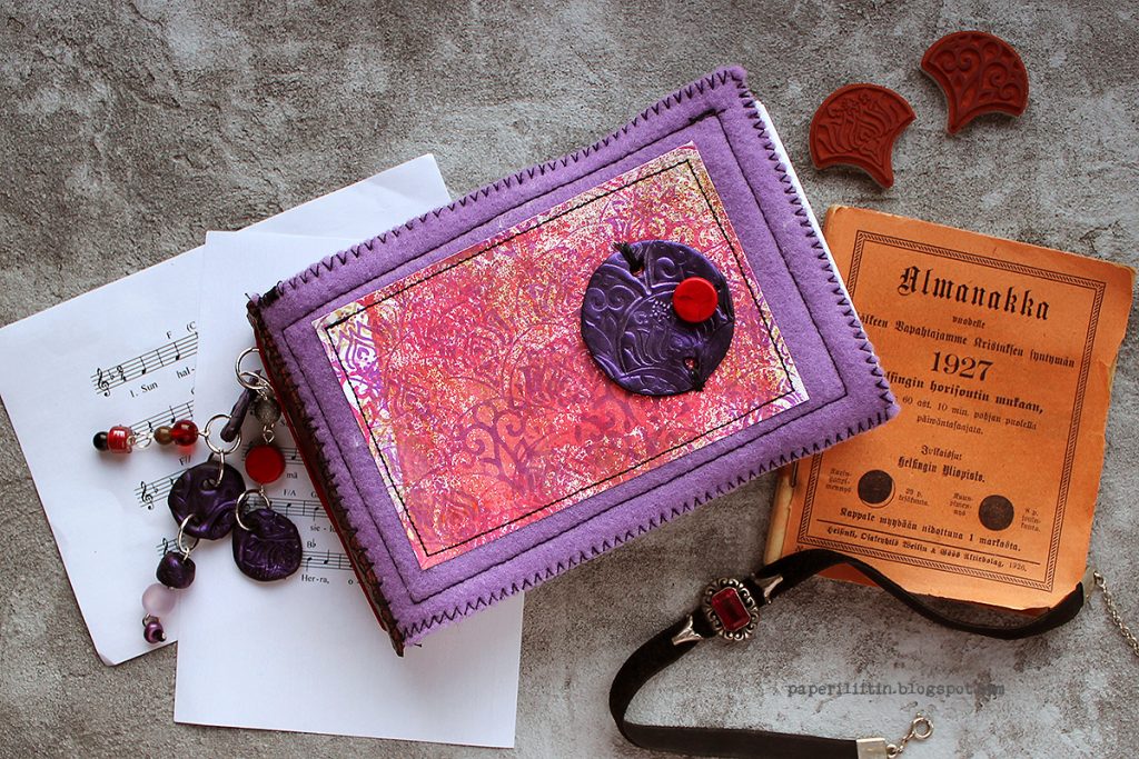
I didn’t want to decorate any existing piece this time but built the booklet from ground up. I love combining fabrics and textiles to paper so I chose my “go to” textile material, felt, for the covers. As I was working with soft craft felt, I used a double layer of the material to make it sturdier. I didn’t want to use an extra layer of the material to avoid the cover being too sturdy. It needed to be huggable. 

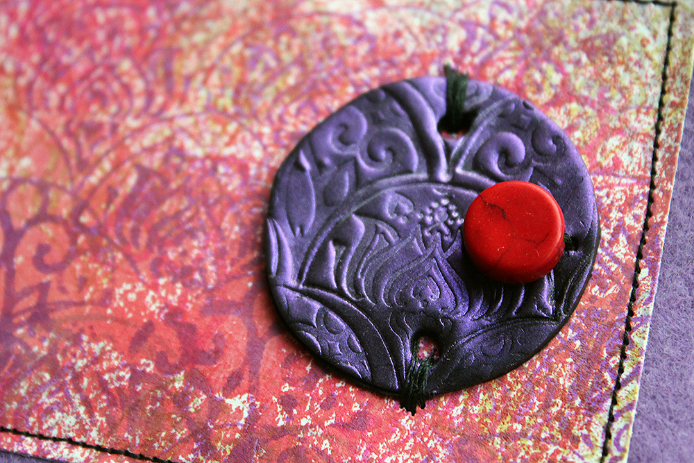
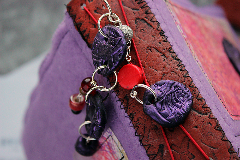
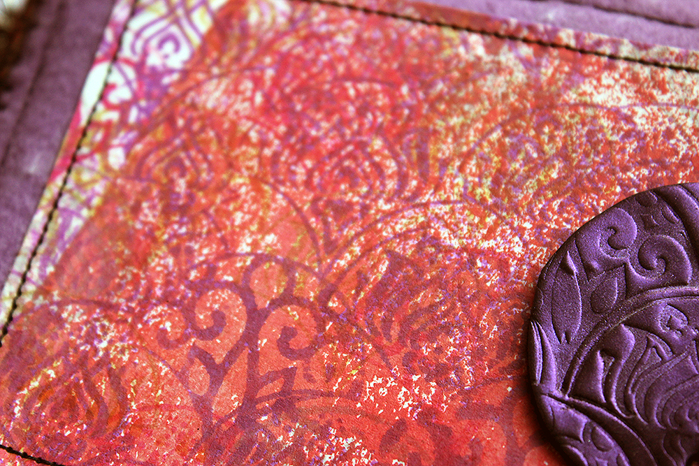
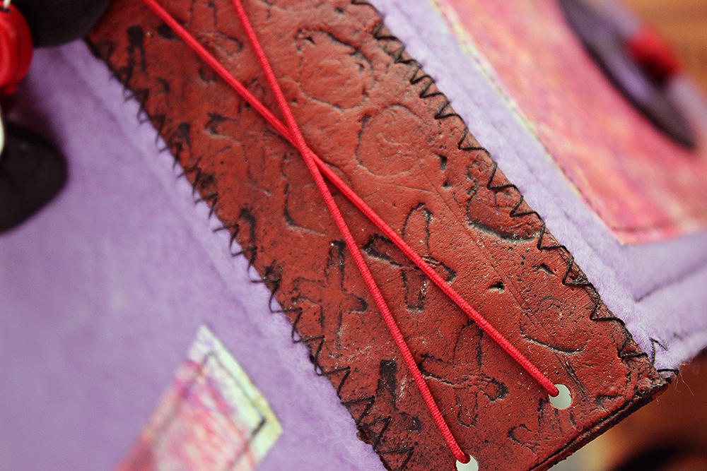
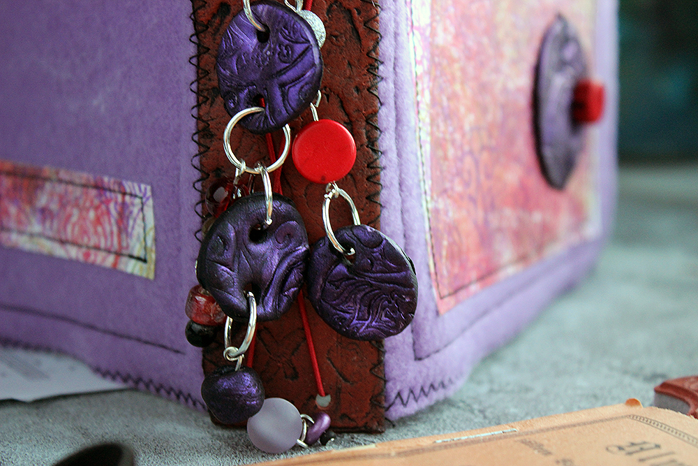
While I have one ink stamped piece in the make, I also wanted to use stamps in a bit different way than usual. Instead, I stamped texture to polymer clay. The spine is decorated with “Love Knots”, quite appropriately and I used the “FANtastic Small” set for the embellishments as well as to the paper. As you can see from the video, I used FIMO Leather Effect for the spine as it stays bendable after the bake but choose more clay-like FIMO Soft for the embellishments. I used a black clay and then brushed opalescent purple Mica on top to have a great shine and more dimension to the color.

As I say in the video, the one piece made out of paper was inspired by the dress. So, while I didn’t go as far as the piece looking grey from afar, I did try to capture the overlapping colors and patterns. From further away the piece looks busy and fuzzy, but in closer inspection you can make out the different colors and patterns. Almost like the dress I remember from my childhood. 

I’m still not quite sure how I will use this journal, how I will fill it, but as memories are fading, I’m thinking of jotting down the ones I still have. Like needing to throw away a belt from her dress as the end had slipped outside a car door when we were starting our journey and the belt was unrecognizable after the drive through mud, rain and dirt roads. What better place to store those little things than in a self-made album, inspired by her.

Thank you for stopping by today! I’ll see you again next month.


Thank you for sharing Riikka – I love the idea of creating something so special to honor the legacy of a dearly loved one!

Give it a try: you can find all my Rubber Stamps in my Online Shop and here are some of the supplies Riikka used:

Looking for more inspiration from the Creative Squad? Follow them on Instagram here.
Comments (1)

  • Sue Clarke

    |

    This is gorgeous Riikka, especially the dangling pieces. What a nice way to remember a loved one.
    Reply

Leave a comment