Creative Squad

Creative Squad: Masquerade Party – Robin Seiz

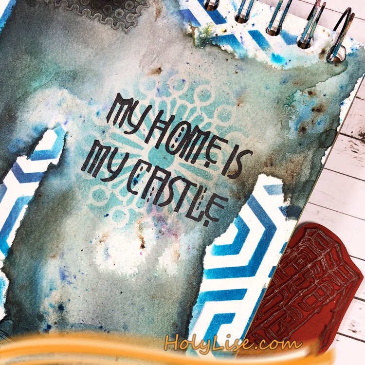
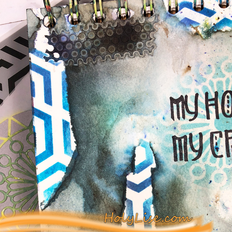
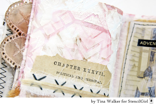
Hello from my Creative Squad! Today we have some fantastic cards from Robin Seiz who is using my Grove Street, Central Avenue, Valley Road, and Park Blvd stencils and our theme: Masquerade Party – Let’s play with disguises, the technique of masking, or maybe creating a bit of mystery this month. Not everything is what it seems, and it can be an interesting artistic trick to obscure or reveal in your artwork.


Hi friends, This month’s theme is Masquerade Party. I’m not a big fan of Halloween (I know I must be the only person in the US) LOL So I decided to interpret this theme in the broadest sense of the word. (One of the many great things about being on this Creative Squad is that we have license to do this! )  I thought about what the word Masquerade means — to conceal something  — and I decided to use the mixed media “masking” technique for my project. 

I find “masking” a bit challenging, both in terms of the layers of paint and really thinking through and planning in advance the results that I want. I am more of a “put it down and see what happens” artist typically, but that doesn’t really work with masking. How about you? Do you find masking easy or challenging?

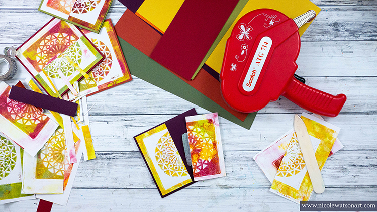
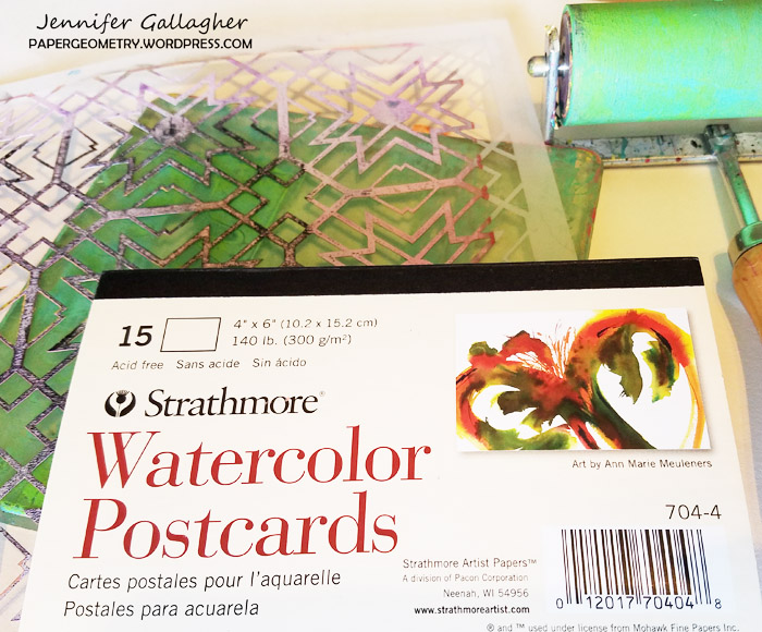
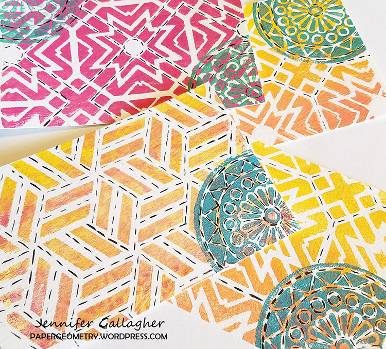
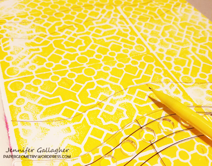
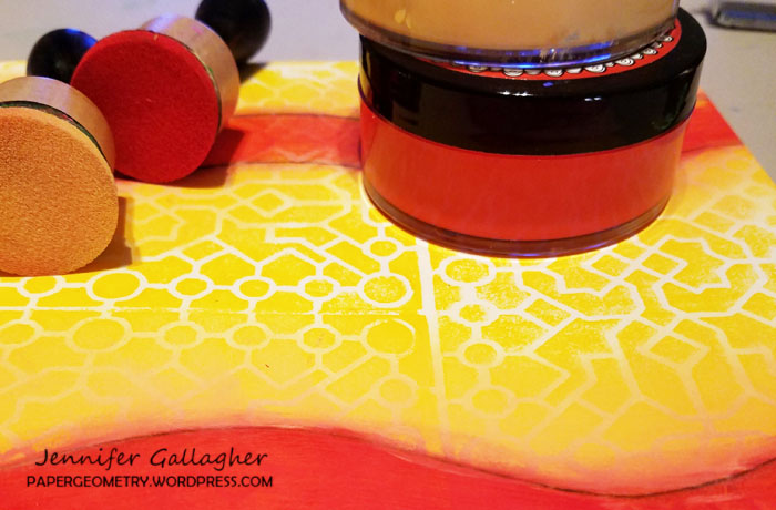
I am committed to working with supplies that I have in my studio rather than buying new things. As a result, I decided to use the paper from a 12×12 paper pad that I had on my shelf. I love using patterned paper for Gelli printing. The paper I chose dictated the size of the Gelli plate — 12×14. 

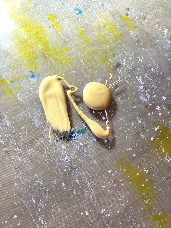
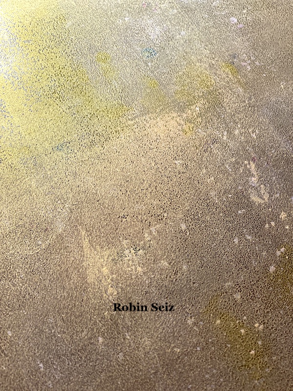
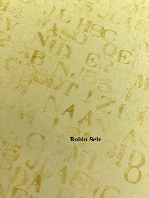
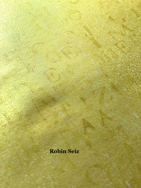
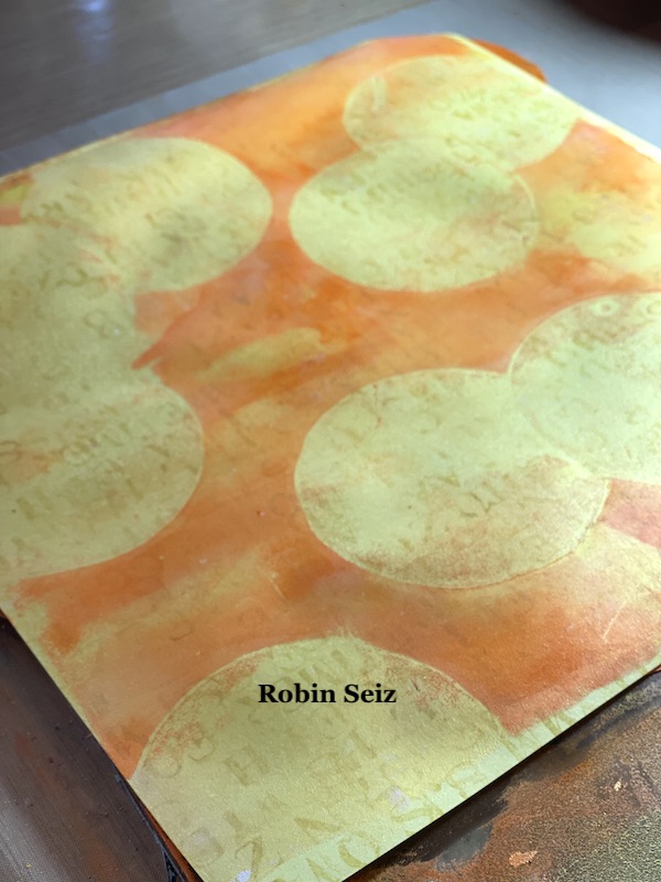
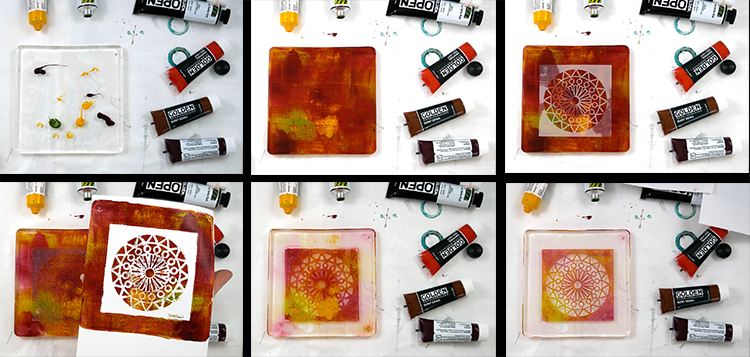
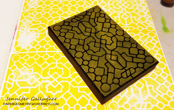
If you have read my recent blogs for the Creative Squad, you know that I have been loving Gold Gesso. I believe gold adds so much to a piece of art. I began this project by putting gold gesso down on the Gelli Plate and pulling a print. I wanted enough paint to have good coverage, but I also wanted the pattern to show through.

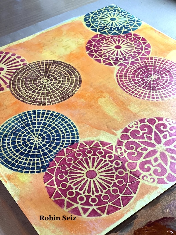
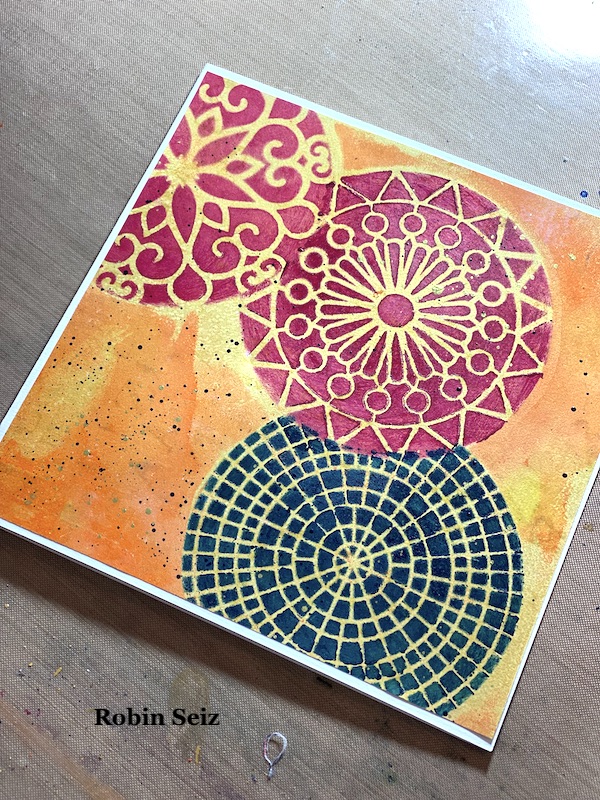
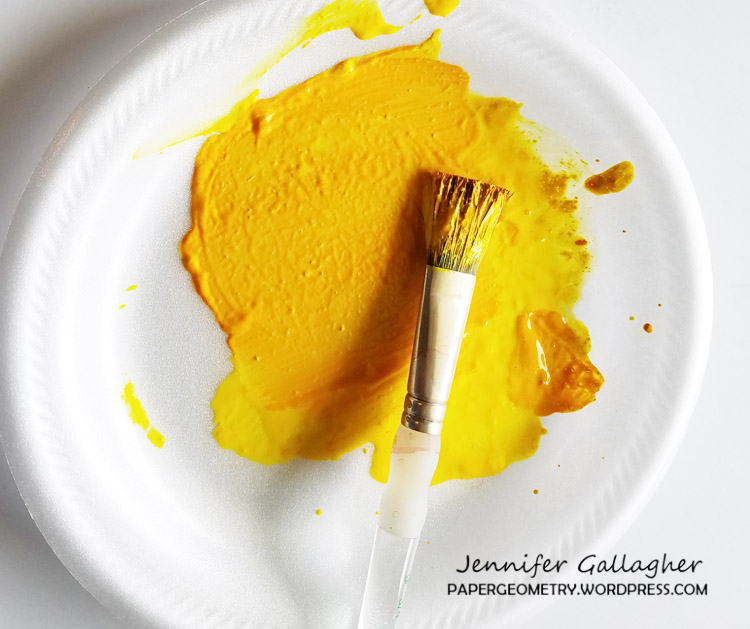
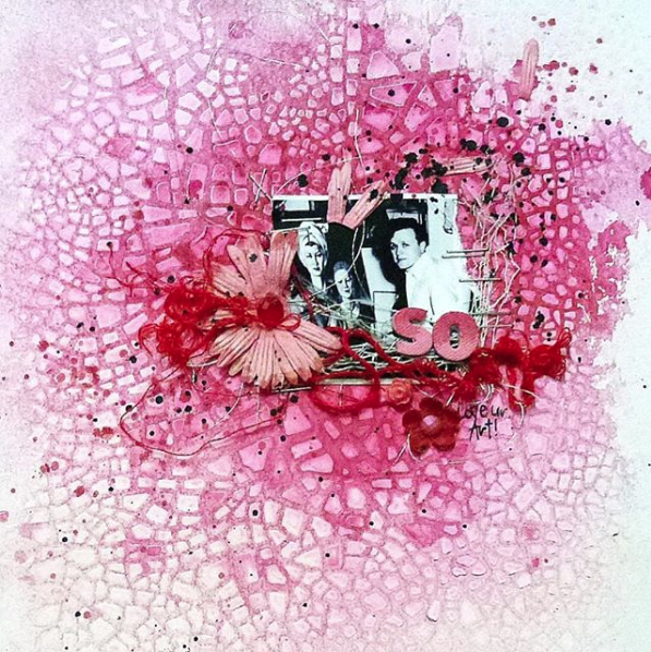
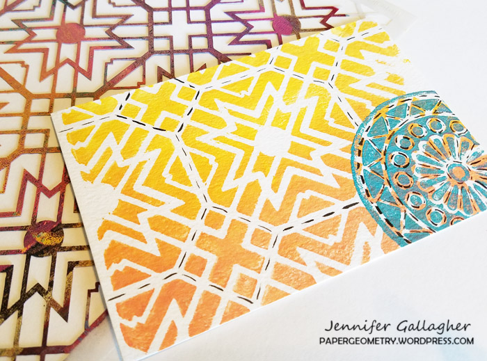
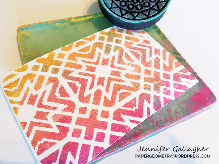
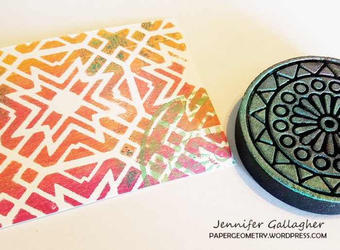
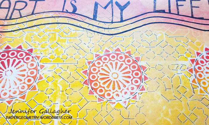
I cut out nine circles the same size as the patterns of the 4×4 stencils I planned to use (Grove Street, Central Avenue, Valley Road, and Park Blvd) These became my masks. Next I placed them down on the Gelli Plate, remembering that the pattern would be reversed when I printed it. Sometimes taking a “practice print” at this point is good. You can rearrange the masks if you don’t like how they turn out when printed. Once I was satisfied with the arrangement, I spread orange and yellow paint with a brayer over the masks. 

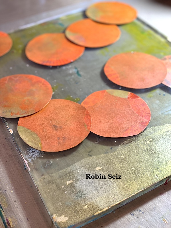
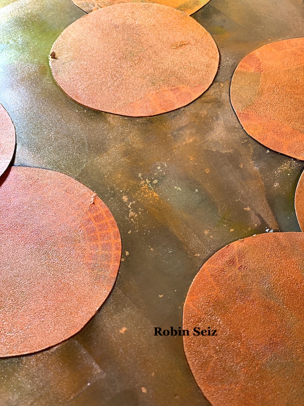
Next I removed the masks and now gold circles were visible where the masks had been. These circles were my guide to where I wanted the stencils and provided a lovely gold background for each stencil. 

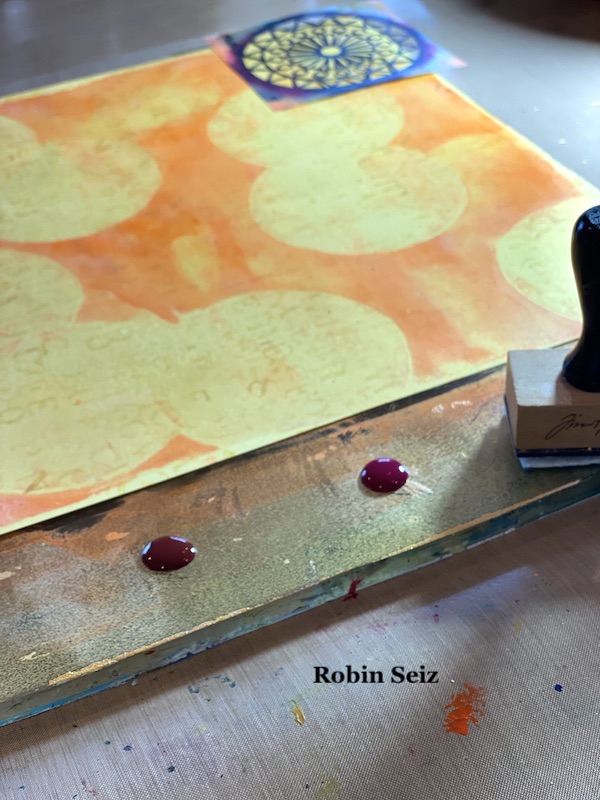
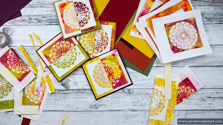
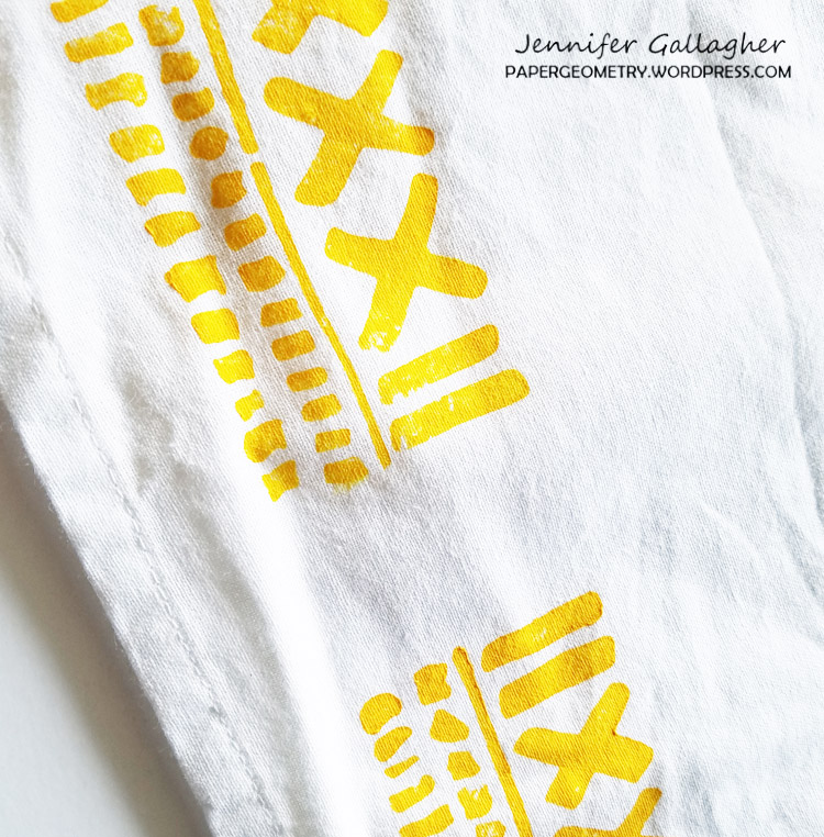
The next step is the one I find most challenging — determining which stencils to put down first. The rule of thumb in masking is to complete all the pieces in the foreground first. Once you do that, and your stencil is dry, you can then place the mask back over what you just stenciled to move on to the next piece that will be concealed. On my page, I started in the upper left hand corner with the blue Valley Road stencil.

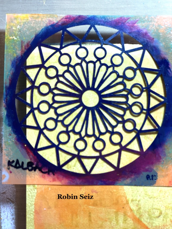
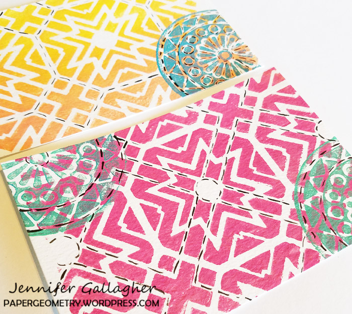
Then I did the Magenta Park Blvd stencil on the right middle and then the brown Central Ave stencil on in the lower left hand corner because all of these were going to be in the foreground. Once these were dry, I could move on to masking each one and stenciling the ones next to them that would be concealed. (In this case the two Quinacridone Magenta Grove Street circles on the right middle and upper left and the Quinacridone Magenta Valley Road Stencil in the lower left).

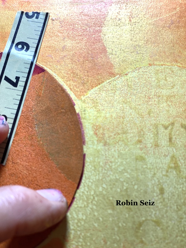
The most important thing to remember when you move to your second piece (or the piece that will be concealed) is to place the mask about 1/8” inside the first stencil — so 1/8” of the masked stencil  is showing outside the mask. If you don’t do this, you will get a gap and the conceal won’t look natural. You will have white space (or in this case gold space) between the two pieces. I used washi tape to place the mask on the page. 

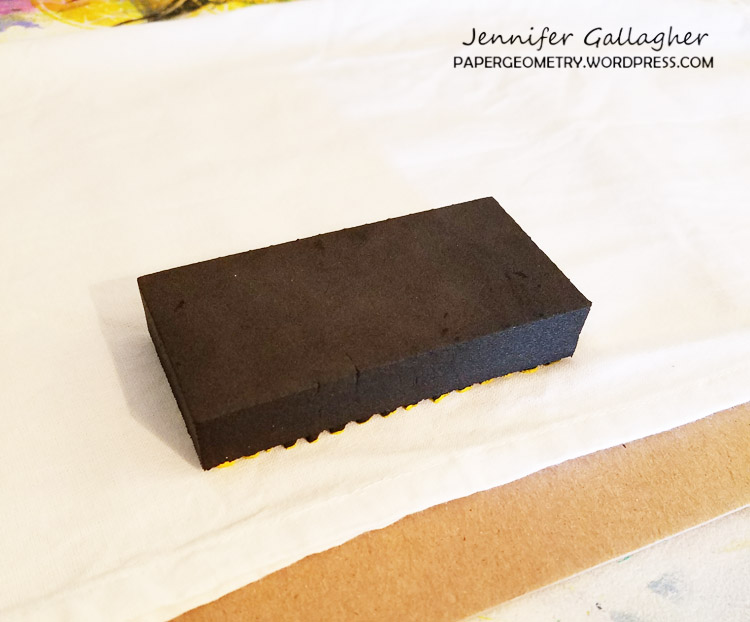
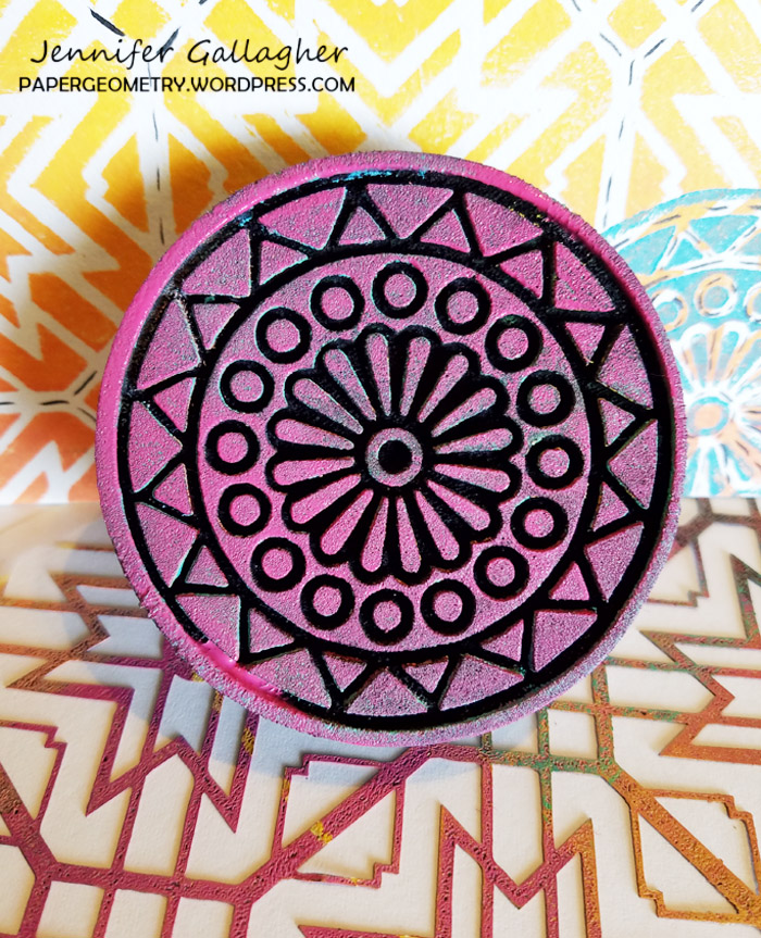
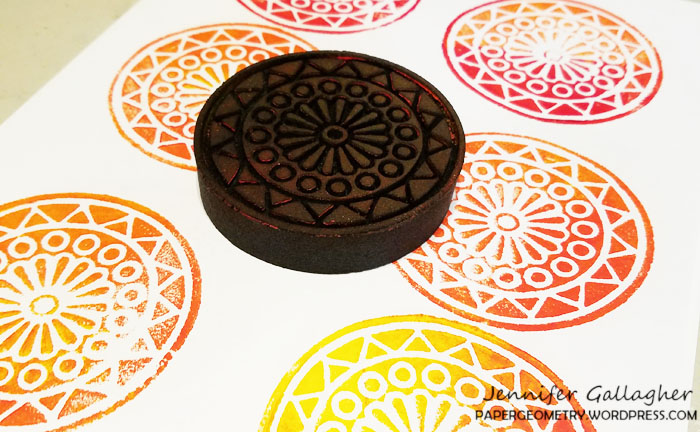
Just a note about applying paint to the stencils. I first tried a makeup sponge, but found that I am too heavy handed and the paint tended  to glob up. I used one of my Tim Holtz applicators that are made for distressed inks or alcohol inks. I found rubbing the paint over the stencil worked best for me and gave me a clearer image. You may be skilled at the make up sponge, but I’m a heavy paint user!!!! LOL

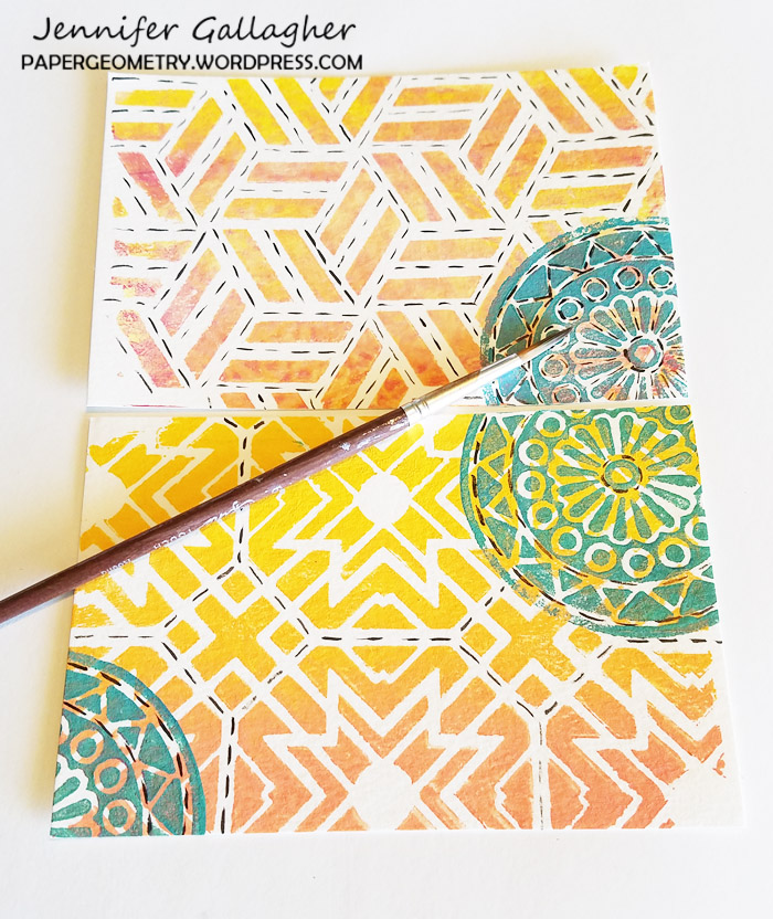
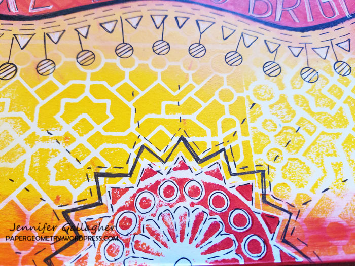
I repeated this technique, masking the second stencil so that the third would be concealed. (see the middle center three.) 

I’m realizing this is a hard process to describe in words. I hope it’s clear. Just send me a note if you have questions.

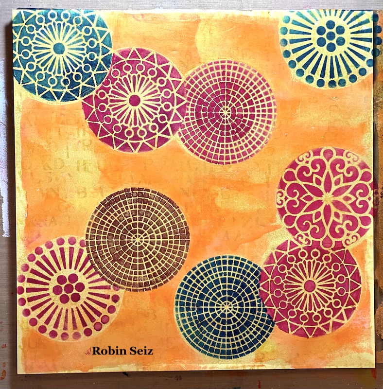
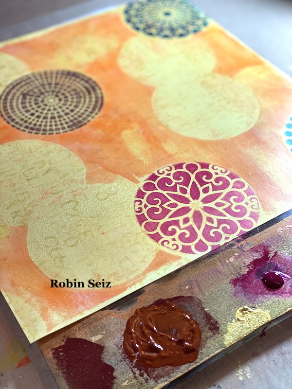
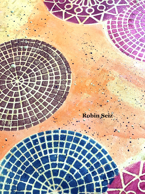
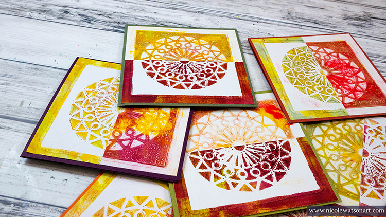
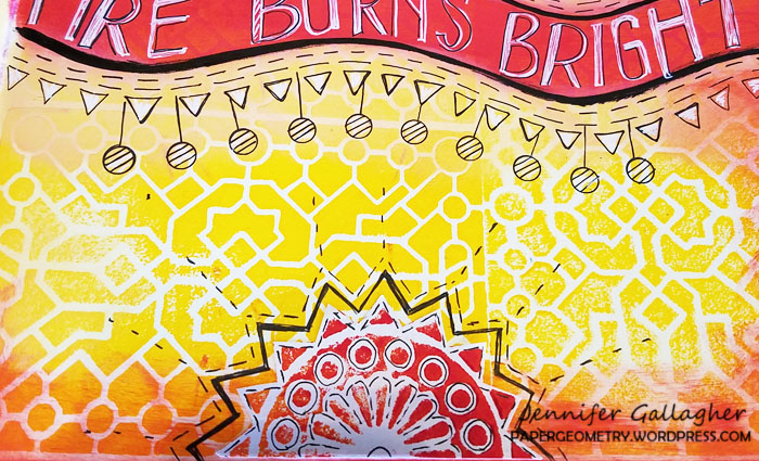
When I was finished with all the masking, the page looked like it needed a little something else. I laid down some black and gold splatter on the  page. This always gives a piece a finished look.

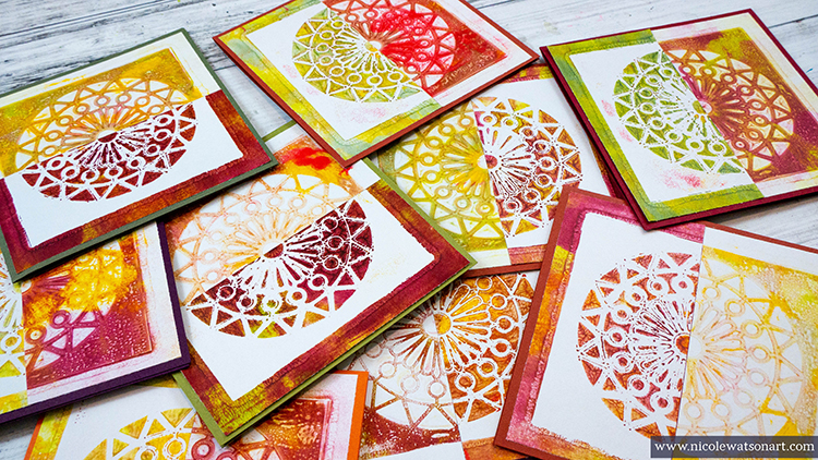
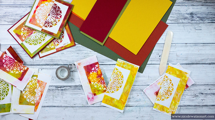
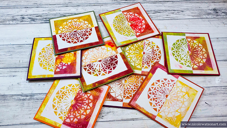
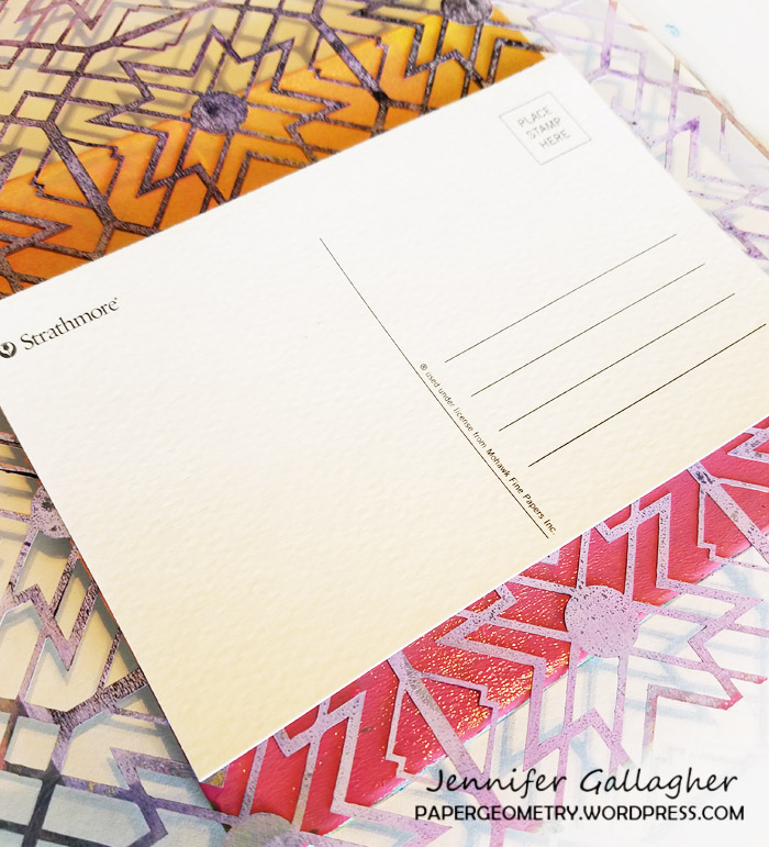
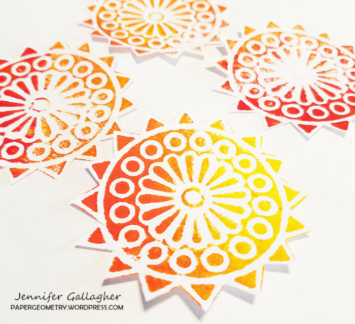
This page, since it’s large, could be used as a journal page, gift wrap, emphemera (if you cut out the stenciled pieces), or greeting cards. I chose to cut the paper into 4 sections and make  6×6 greeting cards. I love the size and how vibrant they turned out. I sometimes like my work more when I cut it into smaller pieces. Don’t be afraid to try this! You might be surprised at the results. 

I hope you try this Masquerading project. Please post your projects. I can’t wait to see them! 


Thank you Robin and I love that you chose the more abstract interpretation of this theme and showed us a masking technique!

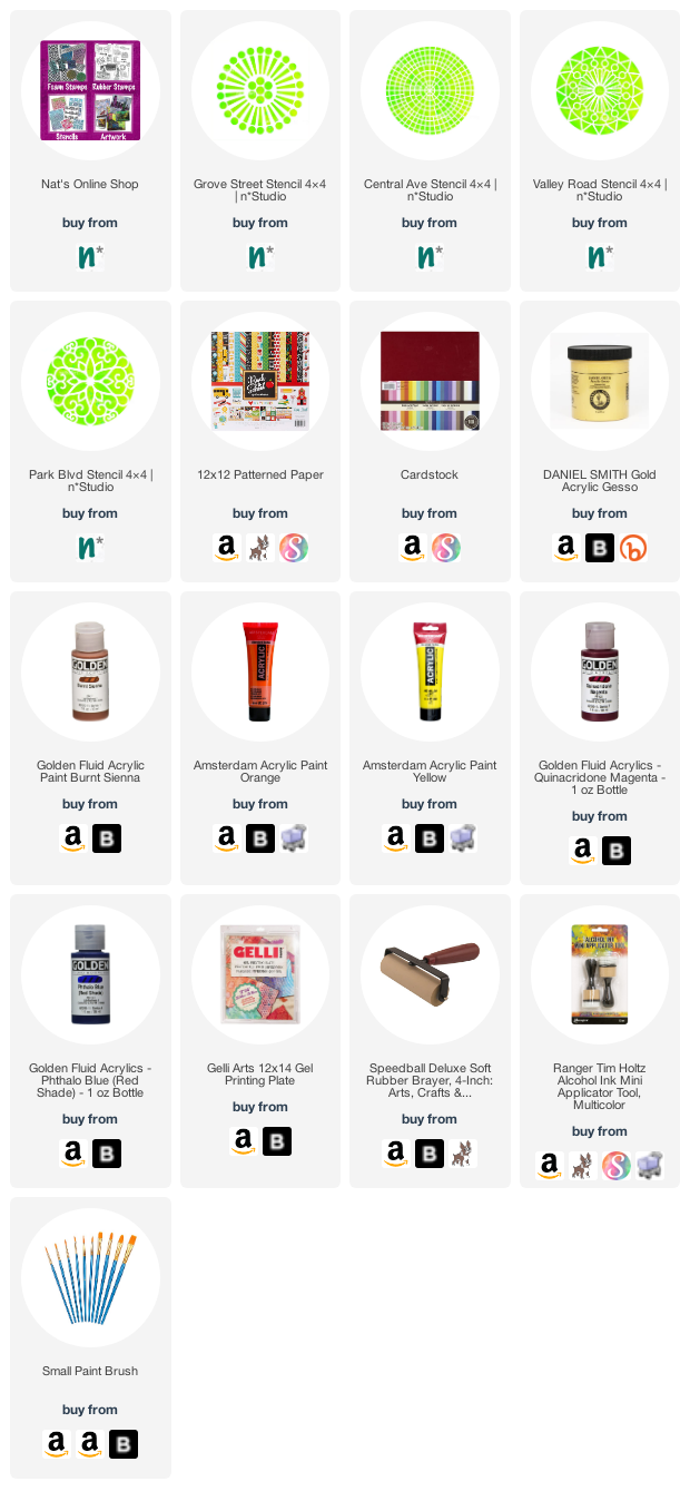
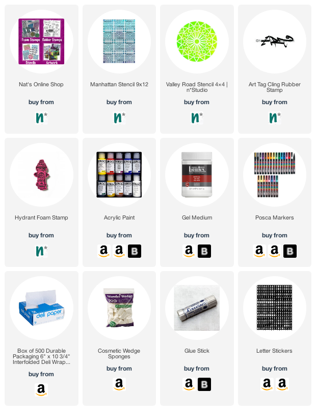
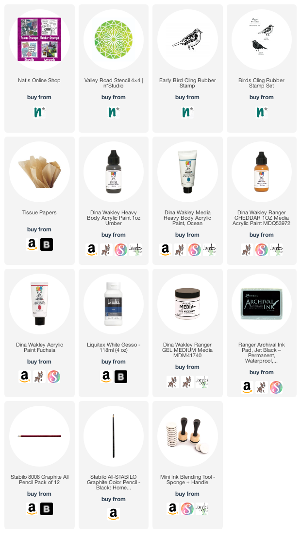
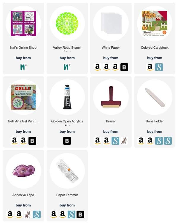
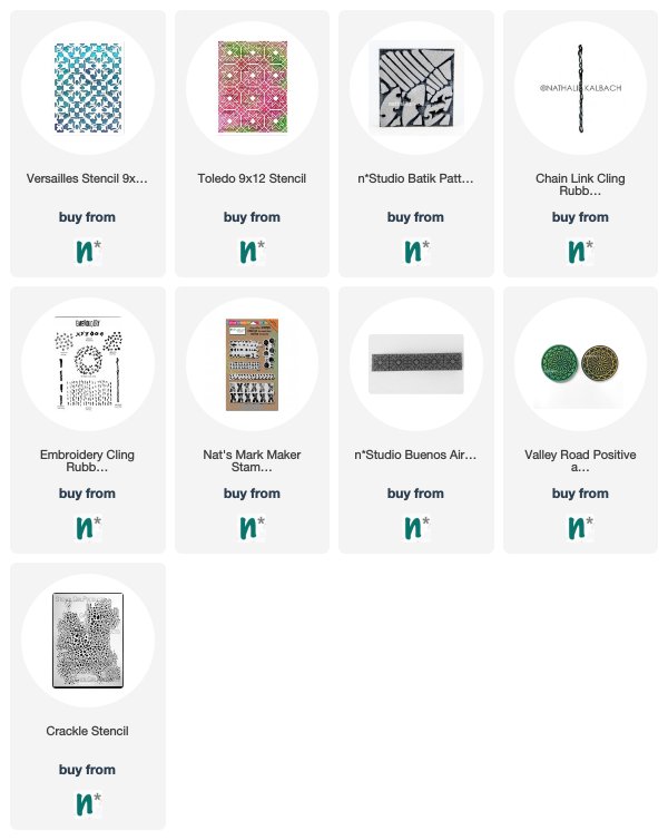
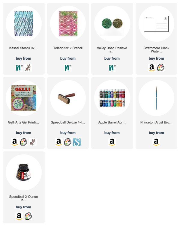
Give it a try: you can find all my Stencils in my Online Shop and here are some of the supplies Robin used:

Follow the Creative Squad on Instagram for weekly posts, artwork, and inspiration.

Leave a comment

Keep Pushing – Art Journal

Keep pushing your luck!

I am challenging myself to use up the collage pile I have collected in my one of my letterpress drawers over the years – it is fun to go through the bits and pieces and finally use them for some art journal pages.

I stenciled with acrylic paints through my Manhattan stencil and I also cut a triangle from black paper where I had used my Valley Road stencil. I added a magazine image (the green and black fencing behind the lady) and used some leftover deli paper with yellow and black paint as I loved the texture on it.

I sketched my figure and even gave her jacket a little pattern using my Art Tag rubber stamp. Then I used my Hydrant foam stamp which I had previously stamped with acrylic paint on paper.

Here are some of the supplies I used:

Leave a comment

Sing Your Song – Nicole Watson

Hello from my Creative Squad! Today we have a gorgeous art journal spread from Nicole Watson that will have you singing your song too! In addition to my Early Bird rubber stamp, my Valley Road stencil, a seminal poem by Maya Angelou, and an array of ephemera, Nicole was inspired by this month’s theme: Sing Your Song – Everybody has their own voice, their own groove, their own one-of-a-kind personality. What is something unique about YOU that you are proud of? Don’t be shy, Sing YOUR Song!


Layers or ephemera grunge, handwriting/text, stabilo pencils and gesso often fill my journal pages. These are just some of the tools that I use to sing my song. When Nat introduced this month’s theme to us, I didn’t know what song I would sing with these tools. However, as the events of the world have unfolded in these past few weeks, I haven’t been able to get the words of Maya Angelou’s poem “Caged Bird” out of my head so, I used this poem as inspiration for my page.

Here is a video showing my process:

After gessoing my pages, I layered them with ephemera from music books and handwritten notebooks using matte medium. Then, I scrunched up some pattern tissue and added it to my pages as well. I really like how effortlessly pattern tissue adds texture to pages. To push back some of the strong black lines on the tissue and unite all the elements, I spread some watered-down gesso different placed on the ephemera.

Next, I grabbed a charcoal pencil to sketch in a bird cage. Using a charcoal pencil allows me to easily erase sketchy marks I don’t like (as you’ll see in the video!) and the charcoal also adds to the grunge on the page. When I was finished with the sketch, I grabbed my stabilo all to trace the lines and then activated it with water. I also used my graphite stabilo to add sketchy lines to the cage and the other page.

Then, I added some color using acrylic paint with my paintbrush and with Nat’s Valley Road stencil. 

Since I didn’t want the stenciled images to stand out as the top layer, I used paint, stabilo, and gesso to push them back a bit. I added a few more touches here and there with splatters and some additional blue paint to the bird cage.

I knew I wanted to add part of the poem to my page, so I typed an excerpt from it with my typewriter. 

I also wanted a large focal point word and thought about stickers, but wanted a more vintage look. I hunted around my studio and dug in boxes for a “sing” flashcard I just knew I had…which I couldn’t find! So, I dug through all my flashcards and found “fly” instead. If you don’t have old flashcards, you can use large letter stickers or type something on your computer in a larger font and use paint to grunge up. After adding some paint spatters to the flashcard, I layered the text on the flashcard and felt something needed to draw more attention to that area, so I sketched some circles down the page.

To add the bird, I stamped Nat’s Early Bird stamp on a loose sheet of watercolor paper and also an old notebook page sheet (the same one I typed on). I didn’t know which one would look better, so I painted them both. I decided I liked how the white watercolor paper helped the bird pop a bit more. After securing the bird to the page, I also added some flicks of the fuchsia and orange paint to the pages to carry the bird color across them.

Often my art journal pages capture memories and moments in time. Before I began this spread, I paged through my journal a bit reminiscing about where I was in life when I created some of the pages. They are how I sing my song not only with technique, but allow me to process and journal about life.


Thank you Nicole! Love your beautiful sombre palette and the powerful message here! 

Give it a try: you can find all my Stencils and Rubber Stamps in my Online Shop and in addition to various pieces of ephemera, here are some of the other supplies Nicole used:

Feel inspired? Working on something yourself that you’d like to share?  I love to see how you interpret our monthly themes. Email me how you used my stencils and stamps with the theme and email me an image – I would love to share your projects in my next  “n*Spiration From Around the Globe“.

Leave a comment

Mirror Mirror – Nicole Watson

Hello and welcome to a post from my Creative Squad! Today we have Nicole Watson sharing with us a nice and easy card project – just perfect to go along with my Deck of Cards Challenge this month on Instagram :) She is using my Valley Road stencil and this month’s theme: Mirror Mirror – A mirror can be a reflection of many things. We look into them every day and can see who we are outside and in. But they can also just be a fun visual tool to play with as we flip and reverse images and patterns. Play with reflection this month.


Since Nathalie is doing a card-making challenge this month, I decided to make cards for this tutorial! These mirrored cards are quick, easy, and require minimal supplies.

Here is a video of my process and below the video you can find the step by steps with photos


First, grab some fall colored paint. I used Golden’s Open Acrylic paint since it has a longer drying time, and I wanted to pull multiple prints before the paint dried. Begin by squirting several colors of paint on your gel plate and spreading it around with your brayer. I like to brayer off my excess paint in a book. Then, place your stencil in the middle of your plate. Now it’s time to pull some prints!

If you’ve never gel printed before, don’t worry. This is very simple printing and a good place to begin. Simply place your white paper on top your plate and stencil and smooth over it several times with your hand. I like to concentrate on the stencil (I’m using Nat’s Valley Road stencil here) with more pressure to make sure the paper contacts the paint inside the stencil holes. The more detailed your stencil is, the harder it is to ensure this happens. Gently pull your paper from the plate and admire your print! Repeat this process about two more times. You should be able to get three really nice pulls before the paint runs out.

Now it’s time to create the mirrored image. Carefully pull your stencil off the plate to not disturb the paint that was masked by the stencil. Place your stencil paint side up (We’ll use it in a minute!). Grab your white paper and you should be able to get two nice pulls. You will also be able to get one nice pull from the stencil itself. Place the stencil paint side up on your gel plate and use a white paper to pull the paint off the stencil. This will clean it for the next colors, and give you one more print.

Continue this process until you have a bunch of prints. Be creative and use different color combinations so when you put the mirrored images together, they are different.

Once your prints are dry, pair them together: one negative and one positive print that you think work well together. Then, cut these prints in half. This is where you can be a precise measurer or just eye-ball it like me. Use some washi tape to gently tape each half together to make a whole print and trim your squares down for card fronts. I made cards that are 5 inches by 5 inches, so I trimmed by stenciled fronts down to 4.75×4.75. Carefully remove the washi tape and adhere your prints to the front of your folded card base.

That’s it! Super simple but beautiful fall cards. You can take them further by stamping a sentiment or writing one on the front. These would make great cards to send as a thank you this month or even tie a bunch together with a ribbon to give away. They would also make super-cute place cards at your Thanksgiving table. And, your extra prints are perfect for using in your art journal or other projects.


Thank you Nicole and love that you were inspired by my card making challenge – what gorgeous results :)

Want to give Nicole’s project a try? You can find all my Stencils in my Online Shop and here are some of the other supplies she used:

Feel inspired? Working on something yourself that you’d like to share?  I love to see how you interpret our monthly themes. Email me or tag me #natkalbach how you used my stencils and stamps – I would love to share your projects in my next  “n*Spiration From Around the Globe“.

Leave a comment

True Blue – Josefine Fouarge


Hello my friends! Today is Tuesday so that means one of my Creative Squad posts! Here we have Josefine Fouarge sharing with us an art journal page that is a wonderful combination of colors and stamped and stenciled elements. Josefine uses my new Flower Maze and Valley Road stencils, and my Brownstone and My Home is My Castle stamps in this lovely composition. This month’s theme is: True Blue – Blue is the color of honesty and serenity. It’s calming and has even been shown to promote healing. It reminds us of the water and the sky. Let’s slow things down this month and bask in the tranquility of the color blue.


I could use some calmness this month. Life is catching up and finding those quiet moments is becoming a challenge. So, I’m looking forward to those healing effects from using the color blue (it’s probably more the process of creating itself that will do that for me ;) ).

I started by adding different pieces of tape to my journal page to create some texture for the background. I was hoping for more blue from the watercolor powders, but it turned out that there were a lot of green and purple pigments in there as well.

But that just made it more interesting, so I added powders and water in different layers, till I had the look that I liked. What I didn’t like was the tape that I used for the background, so I removed those, at least the majority of it.

To decorate those now white areas, I grabbed the new Flower Maze stencil and blended a mix of Mermaid Lagoon Distress Ink and Blueprint Sketch Distress Oxide through them.

I made sure to blend the ink only in those white areas.

I already knew that I wanted to add the sentiment “My Home is my Castle” and I wanted it to pop a little against the background. A lighter blue blended through the Valley Road stencil helped me with that.

My home really is my castle and the place where I regenerate and calm down. In order to see the Brownstone stamp house in the background, I decided to stamp it onto a piece of tissue paper that had some clean up spots from a different project on it. Thankfully, they are mainly blue.

Just a few finishing touches everywhere and I was done with my grungy, blue art journal page.

I really like the look of the Flower Maze stencil in the white areas.

Here is the close up of the Brownstone. A few of the neighbors were home.

Thanks for stopping by and don’t forget to come back every Tuesday for more inspiration from the Creative Squad.


Thank you Josefine – I also love how that Flower Maze stencil pops! You can find all my stencils and stamps in my Online Shop. Here are some of the other supplies that Josefine used:


Feel inspired? Working on something yourself that you’d like to share?  I love to see how you interpret our monthly themes. Email me how you used my stencils and stamps with the theme and email me an image – I would love to share your projects in my next  “n*Spiration From Around the Globe“.

Leave a comment

All Shapes and Sizes – Jennifer Gallagher


Happy Tuesday from the Creative Squad! Today we have a post from Jennifer Gallagher that will definitely inspire you to up your summer entertaining game! Jennifer brings us some awesome stamped and embroidered napkins using my Valley Road and Mini Batik Pattern 1 foam stamps, and inspired by this month’s theme: All Shapes and Sizes – Circles and squares, big and small, let’s mix it up and play with different shapes and sizes this month. Just because things are different doesn’t mean they can’t look great together!


This month we are celebrating all shapes and sizes. I am a firm believer that mixing shapes and patterns leads us to the most interesting design. With that in mind, I am making a fun set of stamped and embroidered napkins that mix some of my favorite n*Studio ArtFoamies. Although I am using different shapes and designs, you will find they compliment each other quite well.

I started with a package of four white 100% cotton dinner napkins designed for embroidery. Make sure to prewash these types of items to remove the sizing. After washing and drying them, I gave them a quick steam to knock out the majority of the wrinkles. I then laid a large piece of cardboard under the area I would be stamping to prevent the paint from soaking through to the layers underneath.

I didn’t have any textile paint on hand, but I did have some textile medium. I mixed up my paint with the medium according to the directions. This product turns your regular acrylic paint into fabric paint. I settled on a bright and cheerful yellow.

Next, I dipped my ArtFoamie onto the paint. It is important not to overload your stamp with too much paint. ArtFoamies are very high quality stamps and will hold the paint and leave a wonderful impression. There is no need to load too much paint as it will seep into the negative spaces of your stamp and leak out once pressed down. I am stamping with Nat’s Mini Batik Pattern 1 stamp and the Valley Road stamps.

Once the paint dried, I placed my napkin into a four inch embroidery hoop. After choosing a handful of colors to embroider with, I began some basic stitching. You don’t need to be an embroidery whiz to add some basic stitches to your napkins. There is a wealth of free information online about embroidery. If you have never tried it before just do a quick google search.

Each napkin has a variety of stitches and colors used. You can customize your own set by varying the n*studio artfoamies you use and the colors you coordinate.

These fun napkins are perfect for a summer picnic. I hope I have inspired you to stamp and embroider your own items. Be sure to share with us what you create! Enjoy.


Thank you Jennifer – these napkins made me so happy. What a cheery and fun project! Here are some of the supplies that Jennifer used:


And if you feel inspired to share some of your own projects with my stamps and stencils, please send them my way. I post projects almost every month in my Inspiration From Around the Globe posts!

Leave a comment

Inspiration from Around the Globe – May 2018

Ready for some inspiration? Today we have some projects from around the globe. It’s always fun to see how you’re using my stamps and stencils and I am so happy to share some examples today. So let me know if you’re doing something cool with my products, and you might see yours on the next Inspiration from Around the Globe!


First from the US we have a gorgeous little book for Earth Day by Tina Walker (who was a member of our Creative Squad and you can check out some of her other projects HERE). On this page she is using my Versailles stencil for the background.

Here she uses my Toledo stencil as a background pattern for another page.

Next is an art journal spread from Mary Thoma in the US also. I love this portrait and the use of my Batik Pattern 4 foam stamp for the bold background and that little chain border is my Chain Link rubber stamp from the Embroidery set. What a beautiful page!

Loving all these patterns from Kate Crane in the UK! She’s using my Marks stamp set for those red and black xxx marks and hash marks.

Here is a beautiful page from Ellen Captijn from the Netherlands, inspired by this year’s Creative JumpStart online workshop. Be sure to visit her Instagram page to see the full art journal spread. I love how she’s incorporated by Buenos Aires Border foam stamp along the bottom in blue and my Valley Road foam stamps along the right side.

And finally we have an “oldie but a goodie” from Louise Nelson in Australia. She reposted this layout from 2013 so we thought we’d give it some love too :)  That awesome texture in the background is none other than my Crackle stencil – one of my first stencil designs and always a fan favorite after all these years! Thank you Louise!


Thank you to all the talented artists!  If you’d like to give some of these ideas a try, here are the stamps and stencils that they used:


Don’t forget to tag me when you post your projects! I’d love to include your work in my next Inspiration From Around the Globe post!

Comments (1)

  • Sue Clarke

    |

    Love love love Ellen’s page and the way she used your supplies for the border!

    Reply

Leave a comment

Vacation Mode – Jennifer Gallagher


Hello from the Creative Squad! Today we have Jennifer Gallagher and her set of absolutely lovely postcards to send from your vacation destination. She is using my Toledo and Kassel stencils and my Valley Road foam stamp, along with our theme: Vacation Mode – Here in the Northern Hemisphere, we are slogging through winter with only one thing on our minds – vacation! Whether it’s Spring Break, a weekend getaway, or an hour with a good book, everyone needs an escape to Vacation Mode now and again.


This month we are in Vacation Mode here at the Nstudio Creative Squad. What better time to beat my current winter blues than looking ahead to Summer and family vacations. I love the warm Summer sun, sand between my toes, and the salty ocean breeze. So, today I will walk you through making some adorable beach-inspired postcards to send to family and friends from any destination.

These fun postcards are quick and easy to make and you can use your favorite Nstudio stencils, stamps, and artfoamies to make them uniquely you. I used my six by six inch gelli plate, brayer, watercolor postcards, and inexpensive acrylic craft paints. To make some really standout postcards I used Nat’s Toledo stencil, Kassel stencil, and Valley Road Artfoamies.

I layered my paint onto my gelli plate from light to dark in coordinating colors with my brayer. I put down my stencil and pressed my watercolor postcard down. Press firmly!

I chose complimentary colors, in this case turquoise and teal, and applied the paint to my artfoamies. I applied the design in interesting places on my postcards.

After the paint dried, I decided to add some interest with black India ink. Following the spaces between the stencil gives an interesting line for the eye to follow.

Now all that is left is to send them out. Thanks for stopping by and be sure to visit every Tuesday for the latest Creative Squad post. Enjoy!


Thank you Jennifer! Those colors are sure to brighten any gloomy winter day :)  Here are some of the supplies that Jennifer used:


Feel inspired? Working on something yourself that you’d like to share?  I love to see how you interpret our monthly themes. Email me how you used my stencils and stamps with the theme and email me an image – I would love to share your projects in my next  “n*Spiration From Around the Globe“.


Join us on Thursday March 22nd at 4pm EST for my latest Kaffeeklatsch on Facebook! I’ll be chatting about all the latest and greatest here at Nathalie’s Studio. Special this time is a GIVEAWAY you will not want to miss, tales from my trip to Japan, and lots of news about exciting upcoming in-person workshops! Join us and say hi!

SaveSave

SaveSaveSaveSave

Comments (1)

  • maura

    |

    Love how you made your own postcards with the stencils and stamps, Jennifer! Cool idea and colors! Maura

    Reply

Leave a comment

My Fire Burns Bright – Jennifer Gallagher


Happy Tuesday and Happy Holiday Season from the Creative Squad! Today we have a beautiful art journal spread from Jennifer Gallagher to lift us up and brighten our day. Jennifer is using my Exchange Place and Valley Road foam stamps and this month’s theme: My Fire Burns Bright – Creativity is a passion that can come from deep within the heart and soul of the maker. Sometimes this fire gets ignited by an event or an influential person in our lives, and other times it can be ignited by a love for a material or just simply the enjoyment that comes from making. What makes your creative fire burn bright?


Creativity is one of those things that can burn brightly or die down occasionally. We all need to be inspired and recharge our artistic batteries now and again. New ideas and a fresh perspective can be all it takes to start a really exciting artful adventure. So this month our creative squad members are all taking a look at what keeps their creative fires burning. For me, it really is multiple things. First, I find that creating just for the fun of it is key. As a working artist, I often lose track of this. But finding time in my schedule to make things for myself, or just for the heck of it, really keeps me balanced. One way I do this is through art journaling. My art journal is a place for artistic experimentation and self-expression. Second, I find that seeking out new ideas and inspiration from my fellow artists is what really keeps me going. One artist in particular, for me, brings both of these ideas together. Recently I have been very inspired by Tina Walker. Tina’s art journal spreads are bright, bold, and fearless. I really admire her work. I had her in mind when I created this journal page.

I do not journal per se, but I do use quotes and phrases to express myself. I find it hard to find the words to add to my pages so quotes or lyrics really tend to fit the bill. On this spread, I used our creative squad theme to literally say it for me. Just between us, I struggle with hand-lettering. I tend to avoid it at all costs! However, one of my goals this year has been to write in my journal and be at peace with the quality, or lack thereof, in the hand-lettering. On this page, I just went for it!

I started by brayering out the yellow paint on my gelly plate to use it as a stamp buddy for my artfoamies. I used Nat’s Exchange Place Artfoamie, pressed it into the paint, and applied it onto my art journal pages for a cool background.

After the paint dried I used my Dylusions large journal block to pencil in a few places that I would later add my text.

I used my mini-blending tools to apply my red dylusions paint to those penciled in spaces. I then did the same with the vanilla custard around the edges to get a nice blurred edge look to the red sections.

While that paint was drying, I used Nat’s Valley Road ArtFoamies to stamp out what will become several suns I will place on my journal pages. I stamped several of them onto a large sheet of white paper. I then cut around the edges of the shapes, revealing a sun shape.

I applied the cut paper suns, did a lot of doodling, and wrote in my saying.

I love this journal spread. I hope you will find it as a source of inspiration for your own creativity.


Thank you Jennifer – I love your thoughts on inspiration and sometimes just letting loose and having fun with artmaking. So true! Jennifer used the following supplies:


Play along with us too: I love to see how you interpret our monthly themes. Email me how you used my stencils and stamps with the theme and email me an image – I would love to share your projects in my next  “n*Spiration From Around the Globe“.

Comments (1)

  • Sue Clarke

    |

    Jennifer, the perfect colors for an inspiring message!
    Happy Holidays,
    Sue

    Reply

Leave a comment