Creative Squad

Creative Squad: Goodnight Art Journal – Judi Kauffman

Hello from my Creative Squad! Today we have a post from Judi Kauffman who is sharing a creative way to personalize a notebook cover using my ATC Mixup, Crackle, Hamilton, and What’s the Point stencils and inspired by our theme: Goodnight, Art Journal – Think about the colors, sounds, rituals of night – any aspect of it – and use that as your catalyst to create! 
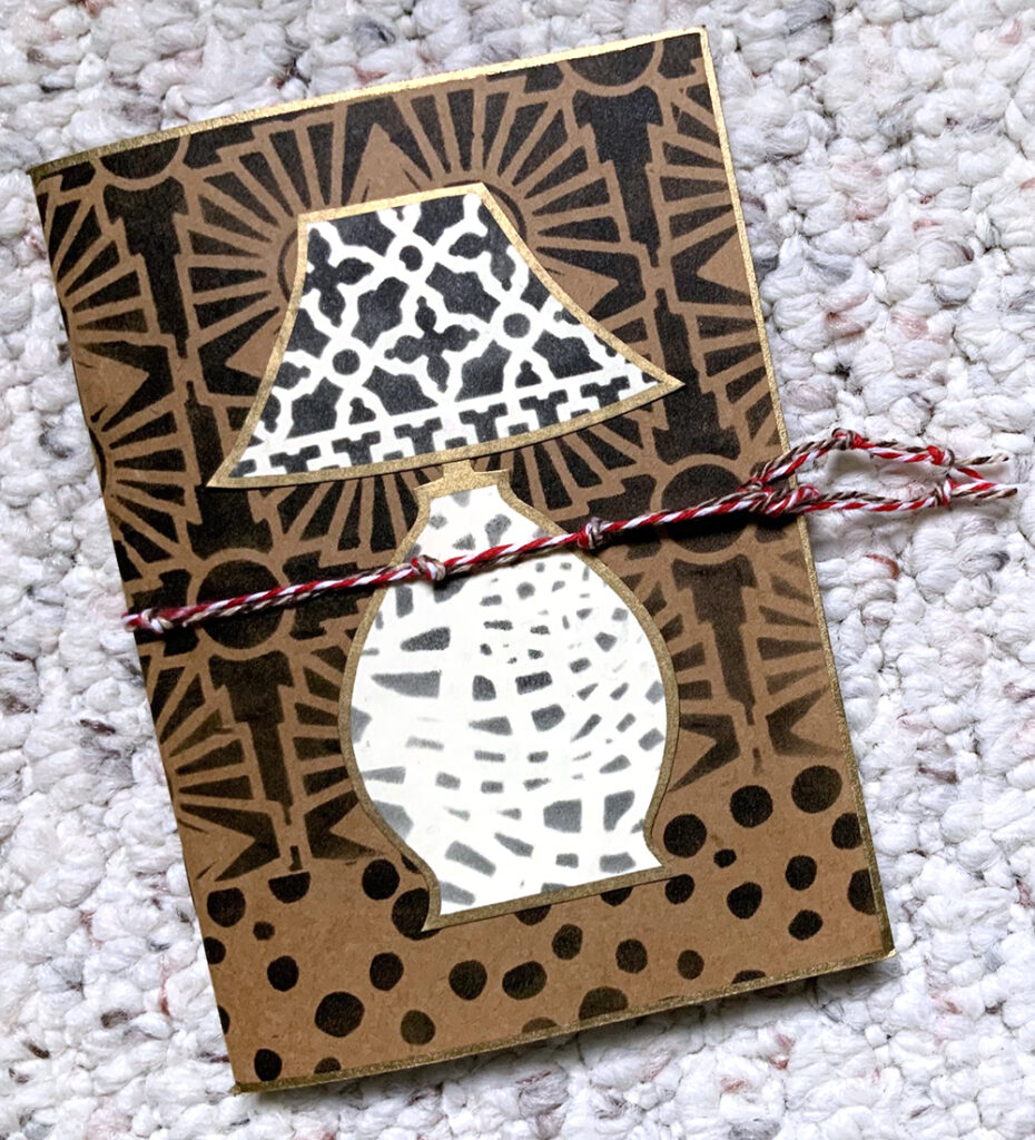

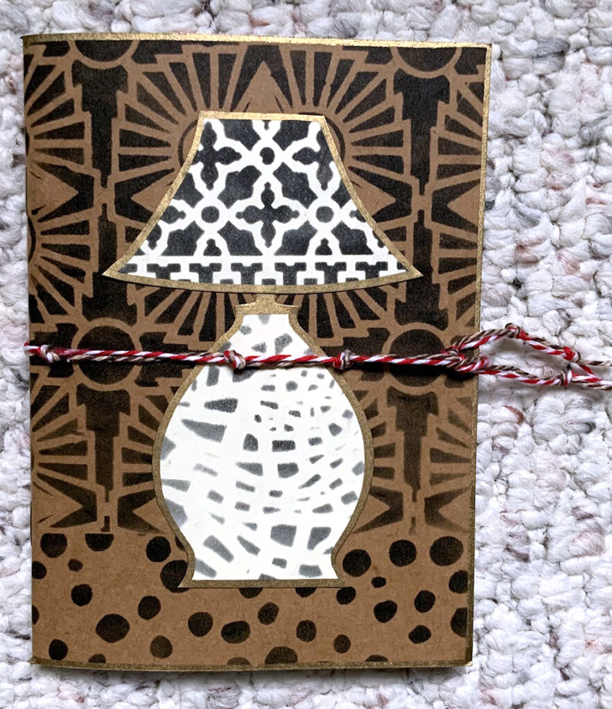
LAMP LIGHT by Judi Kauffman

I don’t keep an art journal – just an over-stuffed Traveler’s Notebook – so my project deviates from this month’s assignment. We’re tasked with using Nathalie’s stencils to create an art journal page inspired by night time. I took a more literal approach to nighttime, the wonderful, lazy part of my day when I am most often in a comfy chair reading by lamp light.

The project itself started with a 4” x 6” blank book with a Kraft brown cover, small enough to sit next to the chair or tuck into a tote. I can record what I’m reading, make shopping lists for books I want to buy or pick up at the library, jot down recommendations from friends. I plan to glue in book reviews from newspapers and magazines, and – of course – I’ll doodle.
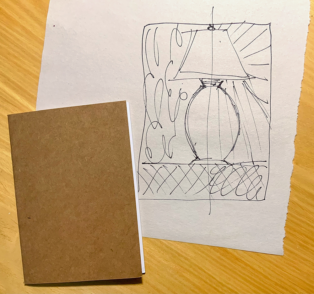
My original idea, shown in the sketch above, was a lamp on a table, divided so that one half was daytime and the other was nighttime – rays at the right showing the nighttime illumination. I knew I wanted a very graphic design with very simple shapes so the stencils would take the starring role.

When I spread out Nathalie’s stencils I took a slightly different approach, a simple lamp sitting on a table with one stencil pattern for the tabletop and another stencil for the wallpaper behind the lamp, a third stencil for the lamp shade and a fourth for the base. A nice bonus: the stencil I chose for the wallpaper (Hamilton) also looks like rays of light in a subtle way! Feel free to use this sketch if you prefer that approach to the one I ended up using.
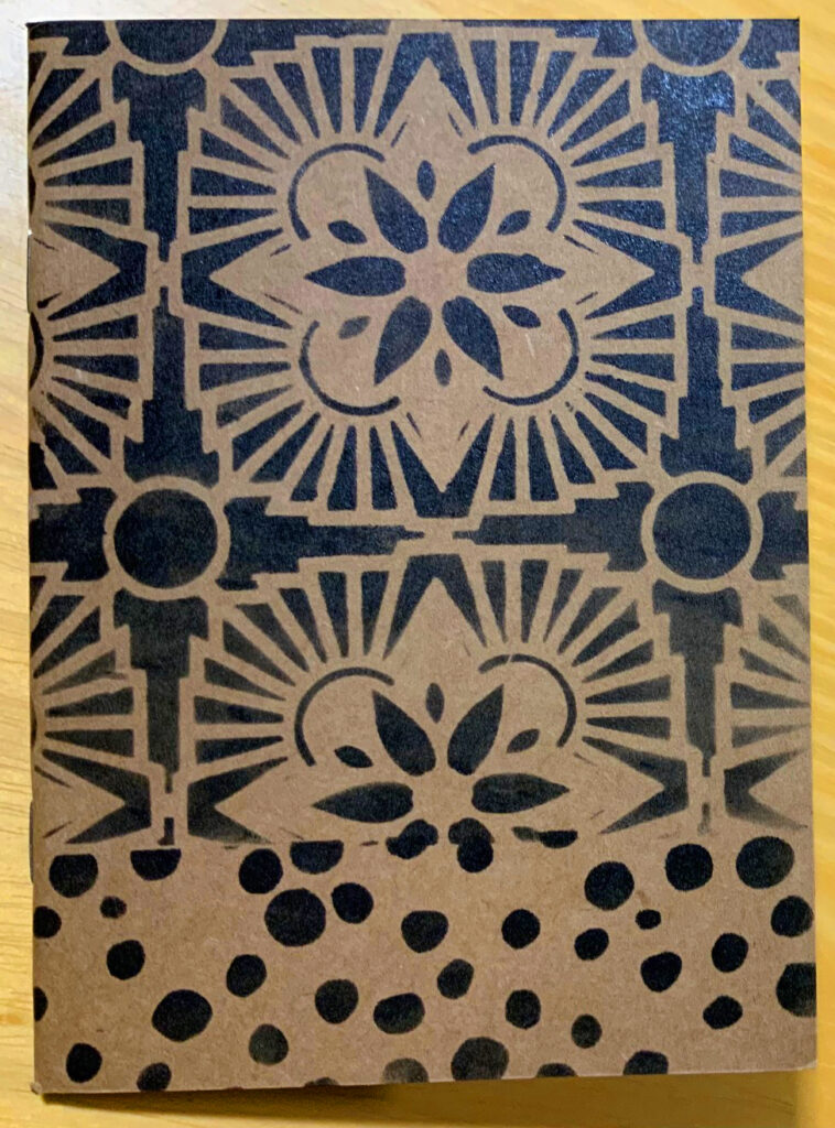
Using black ink or paint or color(s) of choice: Stencil the designs for the wallpaper (here I used Hamilton) and table top (here I used What’s the Point) onto the book cover. Stencil designs for the lamp shade and base onto ivory cardstock (I used the Crackle and ATC Mixup stencils). You’ll only need a few inches of stenciled cardstock for the shade and base.
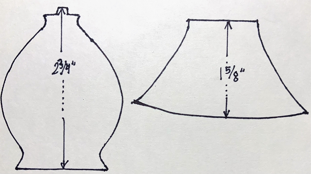
Create cutting patterns for the lamp shade and base by using my drawings or your own preferred lamp as inspiration. Lots of options for free designs on the internet. Cut out the patterns.

Position the cutting patterns onto the stenciled ivory cardstock. Draw around the patterns; cut out the shapes. Design strategy to note: I picked a portion of the crackle pattern for the lamp base that has a rounded look to add dimension to the otherwise flat shape. I carefully centered the pattern on the lamp shade.
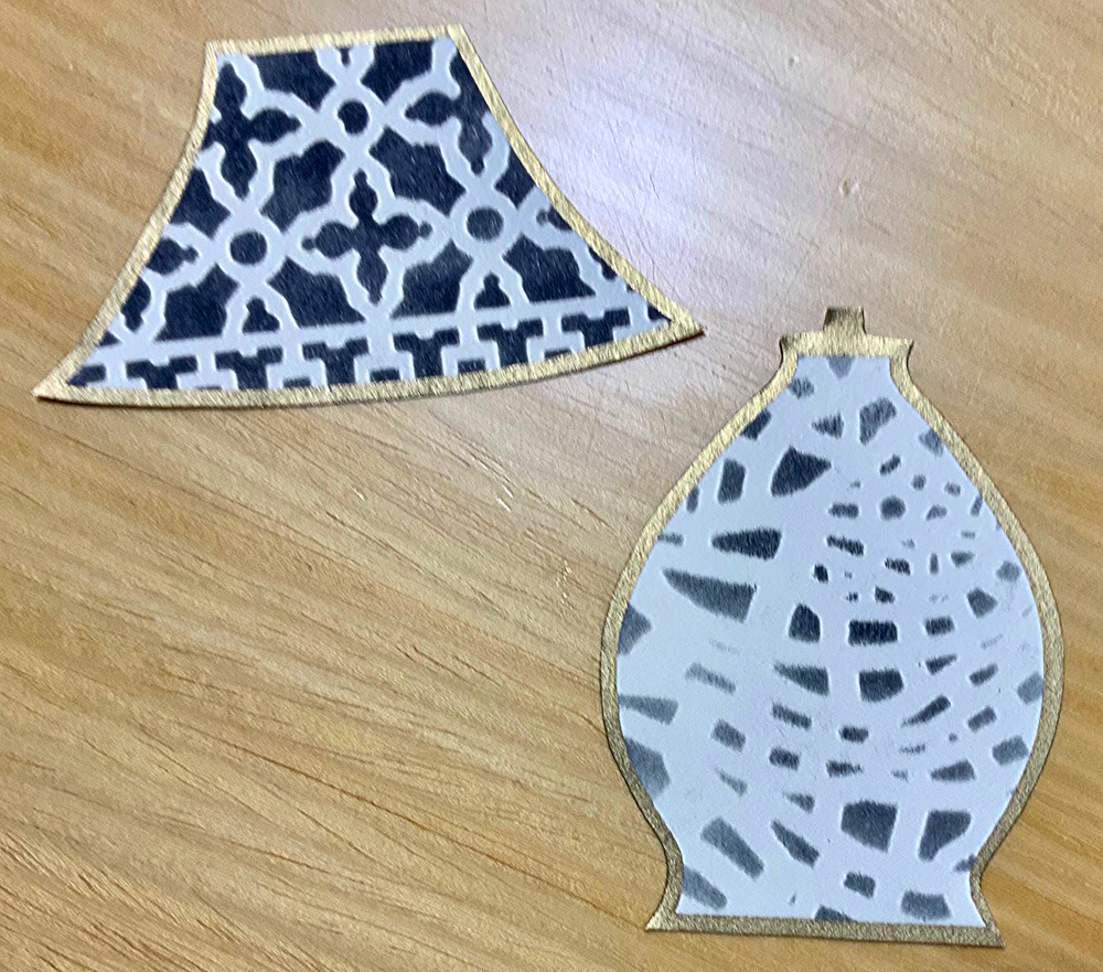
Edge the book cover, lamp shade and base with gold paint pen. Glue the shade and base to the cover.
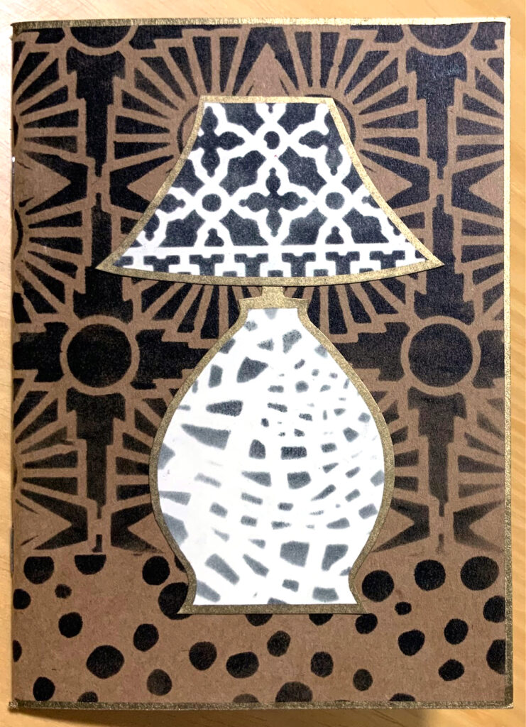
Optional: For a pop of color create a belly band with knotted baker’s twine, ribbon, elastic, or yarn. Make sure the band is loose enough to easily slip on and off or easy to untie and re-tie. (Baker’s twine is tedious so my belly band will remain knotted.)
More Options:
*Start with a photo of your own lamp as the source for the cutting patterns.
*Use a mix of colors instead of only black.
*Make a batch of stenciled cards – this is a very fast and easy project to do ‘assembly line’ style since the shapes are so simple.
*Stencil onto patterned paper instead of solid colors.
*If the finished look is too minimalist for your taste, embellish with pen doodling; add collage or develop dimension with colored pencils.


Thank you Judi! Love the thoughtful positioning of the stencils to suggest light and form!

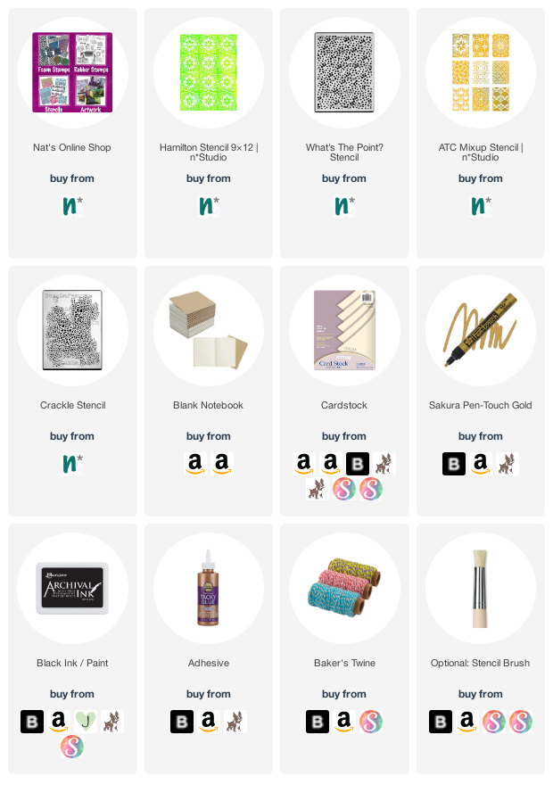
Give it a try: you can find all my Stencils in my Online Shop and here are some of the supplies Judi used:
Looking for more projects? Follow the Creative Squad on Instagram here.
Leave a comment

Stenciled Garden Plant Tags – DIY Play Date

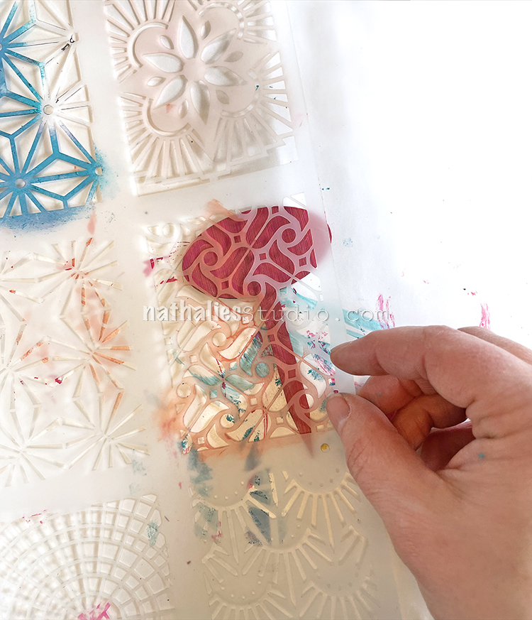
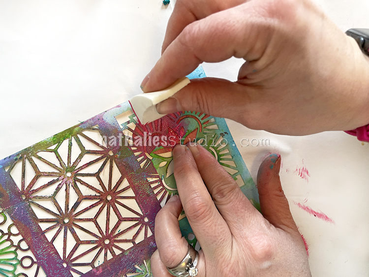
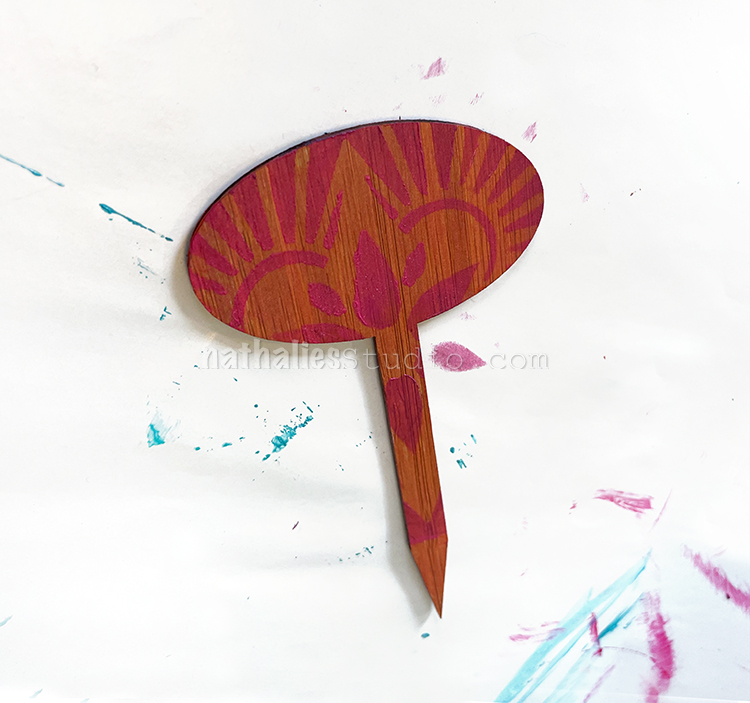
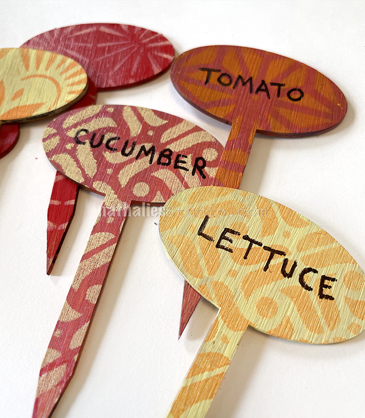
After a long hiatus, Kim and I are finally getting back together for some regular Play Dates at my new place. We really missed this time together to gab and create and it was so nice to come together for a spring themed project: Stenciled Plant Tags. If you have a garden or grow things inside, these are a sweet way to personalize bamboo plant tags and keep track of what is what.

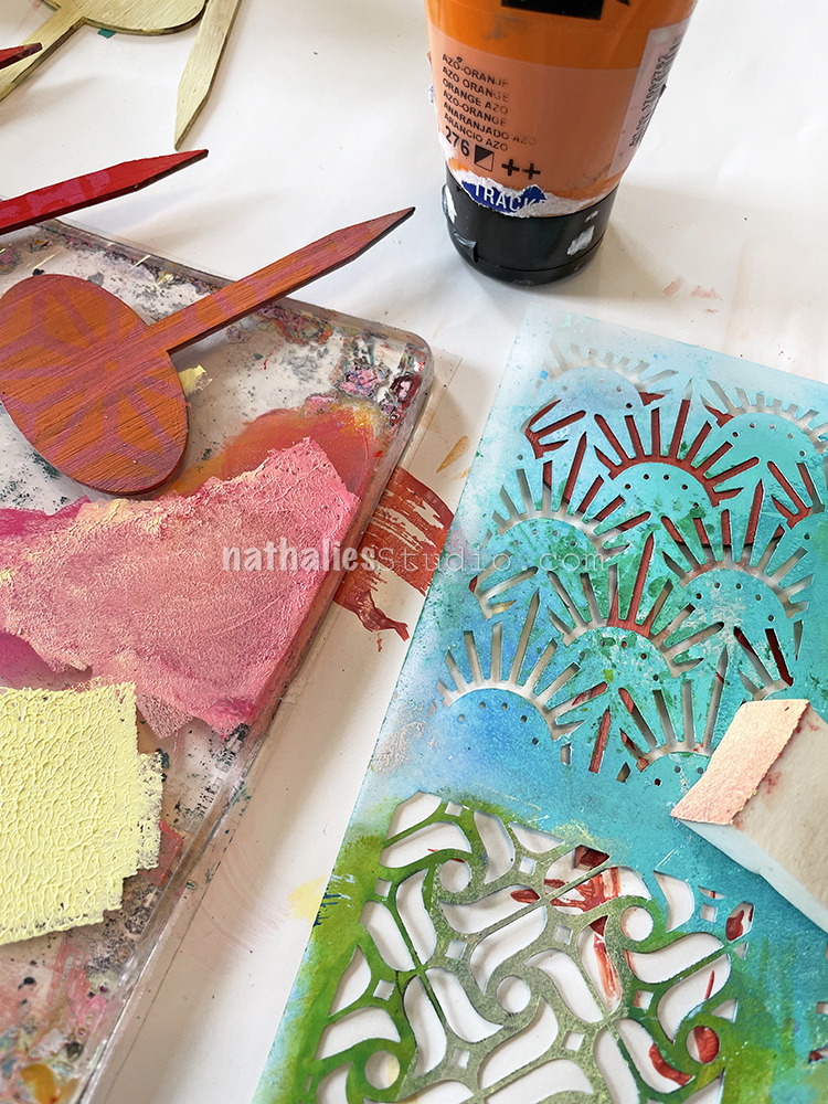
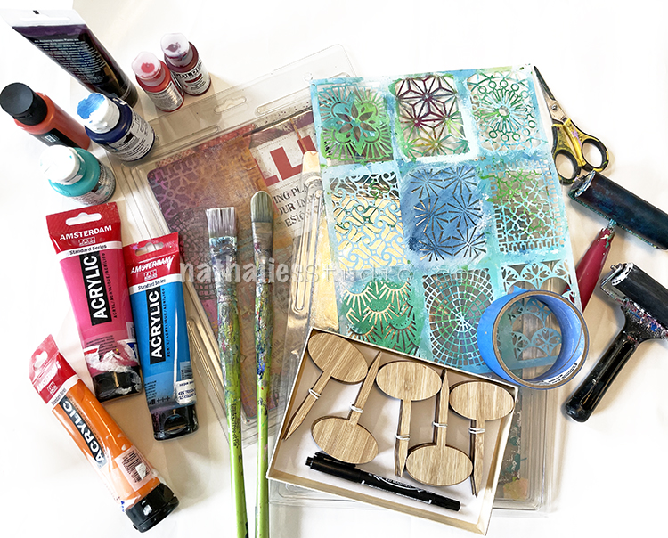
The supplies for this were very simple and can be found at the end of the post too, but basically you’ll need: bamboo plant tags, small pattern stencils like my ATC Mixup, acrylic paint, brushes, makeup sponges, and an acrylic marker or Sharpie.

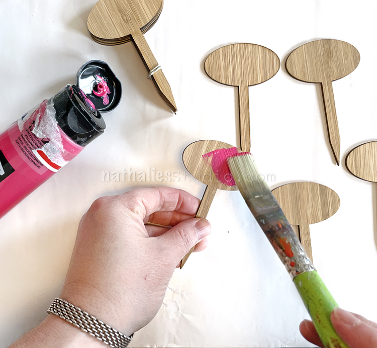
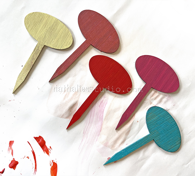
Paint your tags with acrylic paint. A flat brush makes this a breeze and you could even start with gesso if you want to minimize the woodgrain more. We liked the natural wood peeking through so just went straight for the paint.

Bright and pastel colors are a great choice, but go with what makes you happy and just keep in mind what color marker you will use at the end to label with.

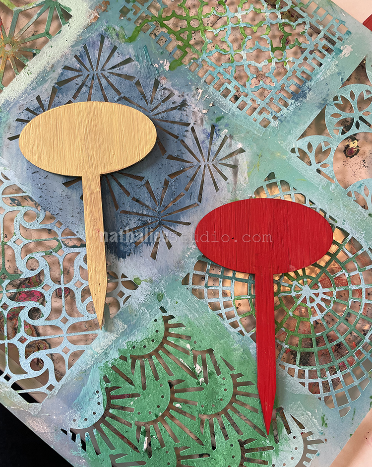
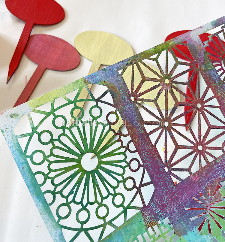
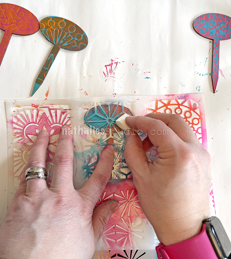
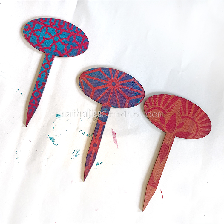
Stencils with small patterns will fit on these petite tags. My ATC Mixup has 9 different patterns and we used almost all of them!

Auditioning the patterns :)

A makeup wedge sponge works perfectly for this of course.

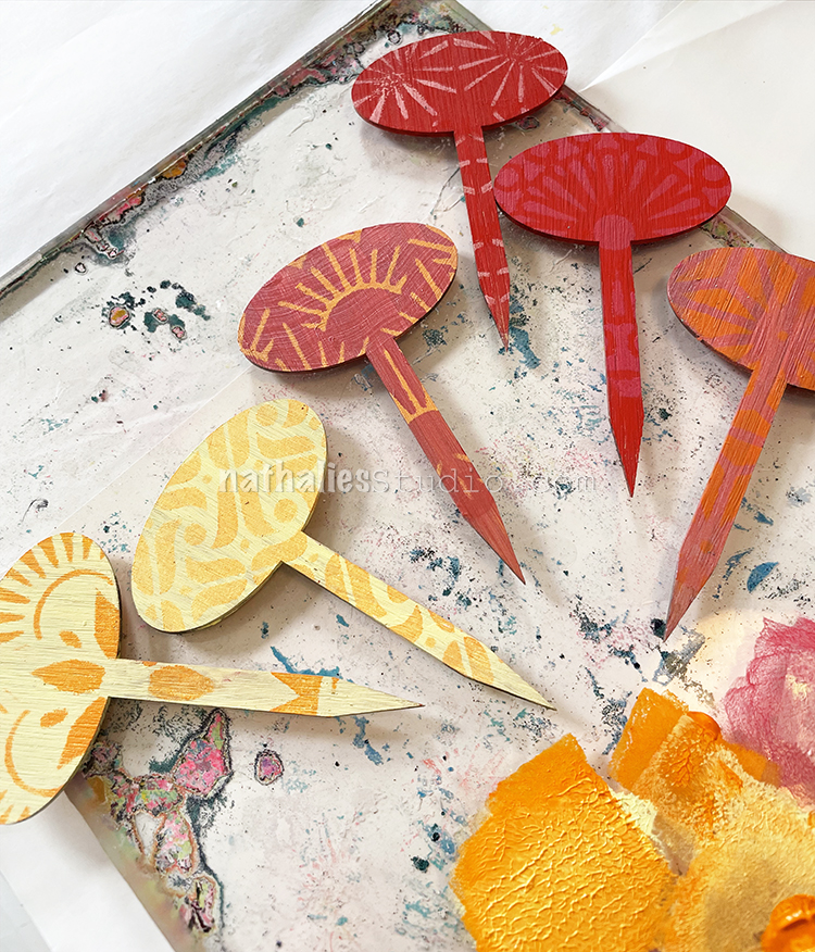
A subtle color palette looks pretty cool and won’t compete too much with the labeling, but high contrast is good too. There are sooo many ways to go with this. Our set of labels came with 20+ to play around with.

If one of the colors didn’t look quite right, we redid the stenciling on some of them to oomph things up or even get a subtle shadowing effect.

A gelli plate is always a nice surface to blend some colors and then print with that later ;)

Plant tags looking good!!!

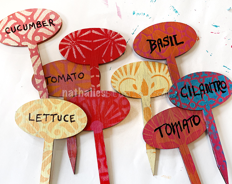
If you’re planting veggie seeds, you might need a bunch of these!

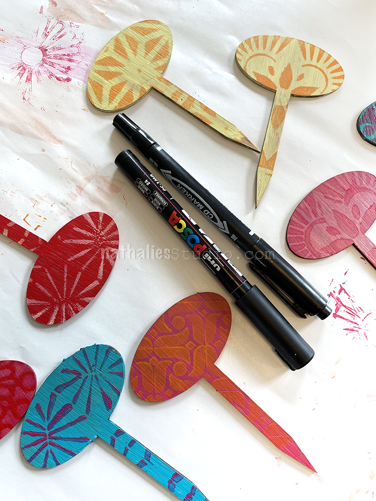
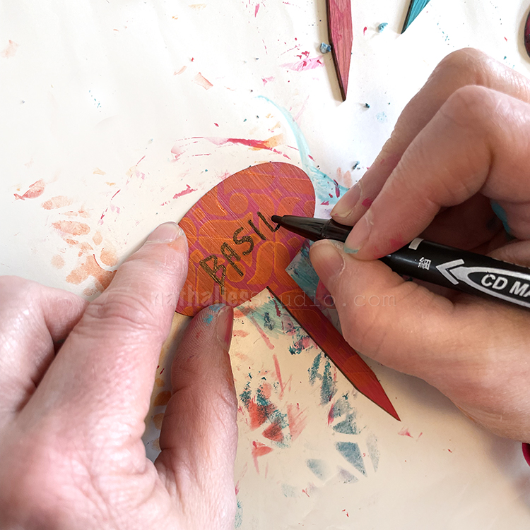
When everything is dry, it’s time to label. An acrylic marker or even a Sharpie will do for this.

You can go fancy with the type!

But leave some blank – you never know what you might plant later.

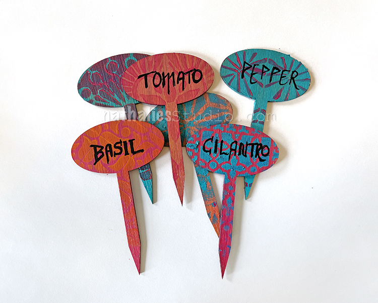
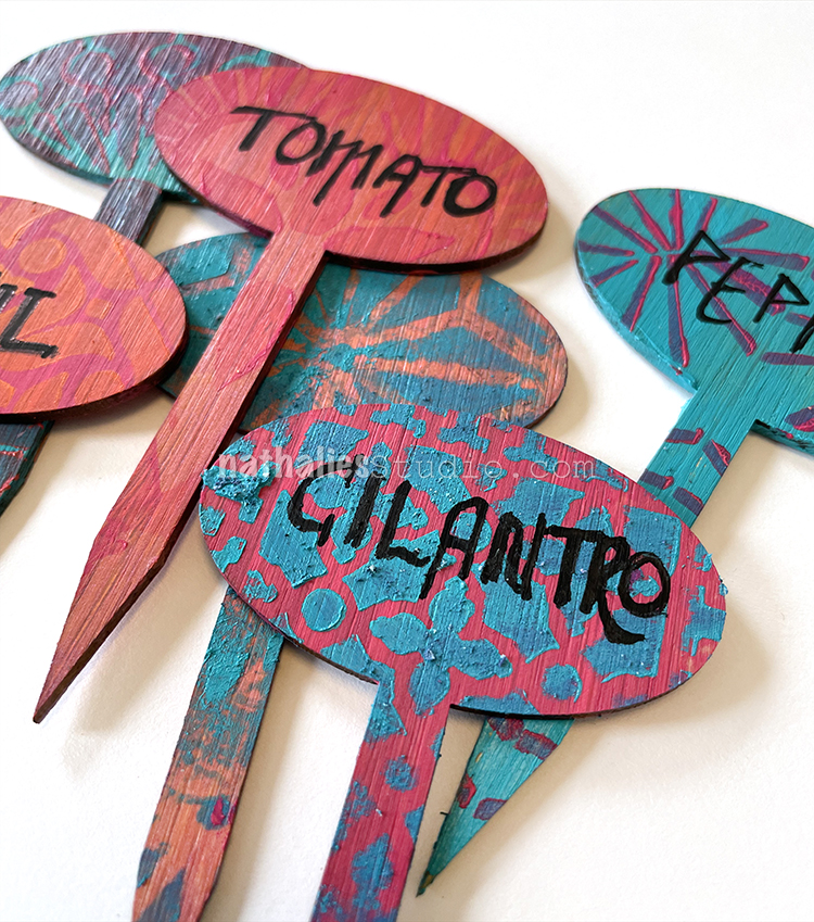
They look great with those small stenciled patterns and happy paint colors.

What are you planting this year? Flowers? Herbs? Vegetables?

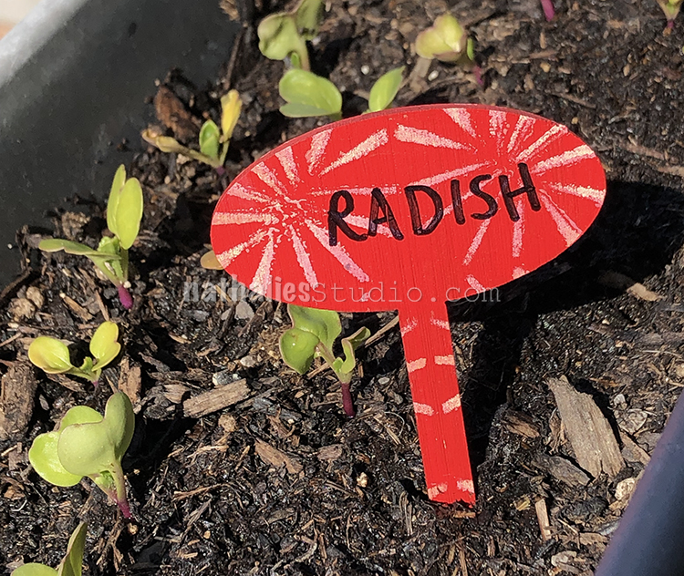
There’s no question what these little sprouts are.

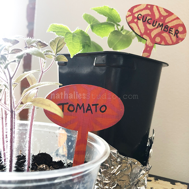
And these can go into the garden when the time is right.

Hope this inspired you to get your stencils and think about the garden and how you can get creative there too. Although my garden is a work in progress this year, I will get a few potted herbs to tag soon so that we can have a bit of fresh greenery to enjoy. Happy stenciling and happy gardening!

Here are some of the supplies we used:

Comments (1)

  • jean marmo

    |

    These are so much fuN!

    Reply

Leave a comment

Common Sense – Art Journal

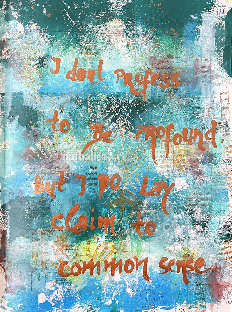
“I don’t profess to be profound; but I do lay claim to common sense.” — Emily Dickinson

For this one I used the same colors and the negative print of the Art Deco Wallpaper stencil from the Hope art journal page – I just didn’t mix the colors for the background when I brayered them on.

Then I stamped on top with some of my Cardboard rubber stamps and Ranger Archival Sepia ink.

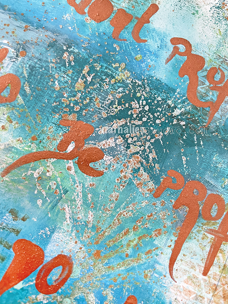
Using a bamboo sketching pen I wrote the Emily Dickinson quote with copper Liquitex acrylic ink – the metallic inks have a lot of particles in them which makes the journaling slightly raised.

Here are some of the supplies I used:

Leave a comment

Hope – Art Journal

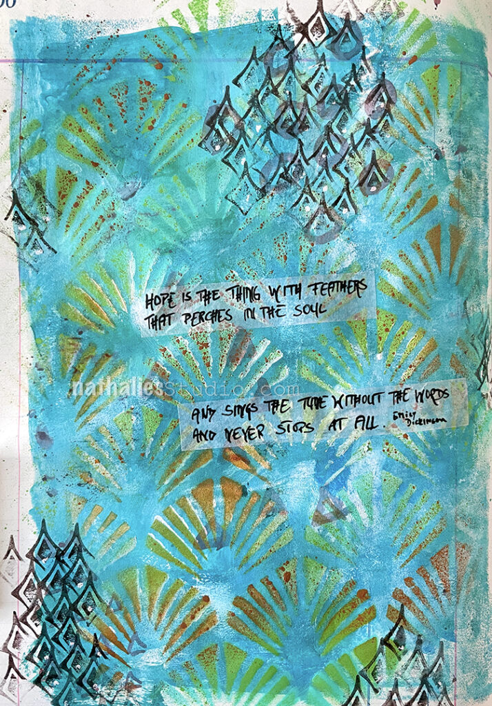
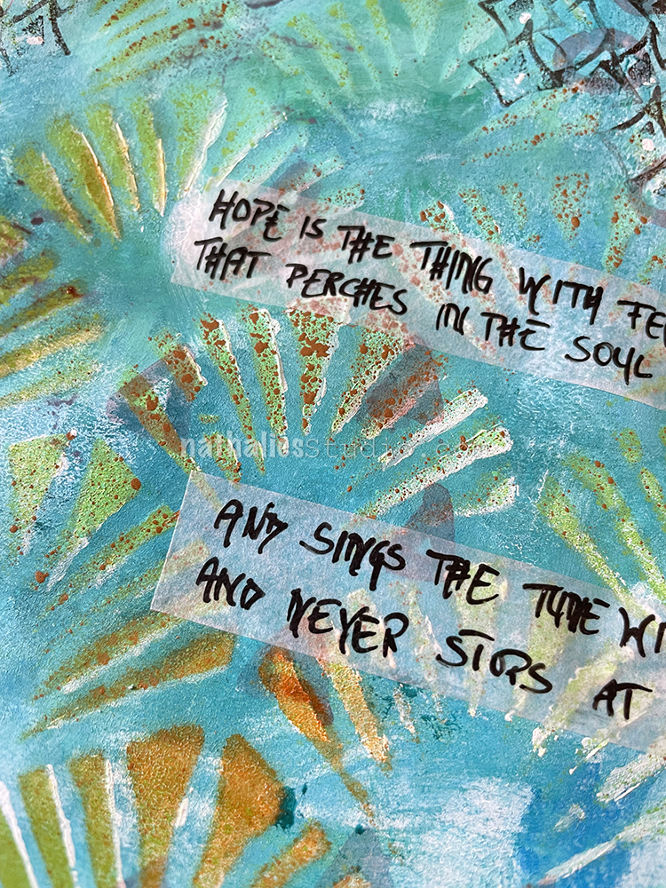
“Hope” is the thing with feathers –
That perches in the soul –
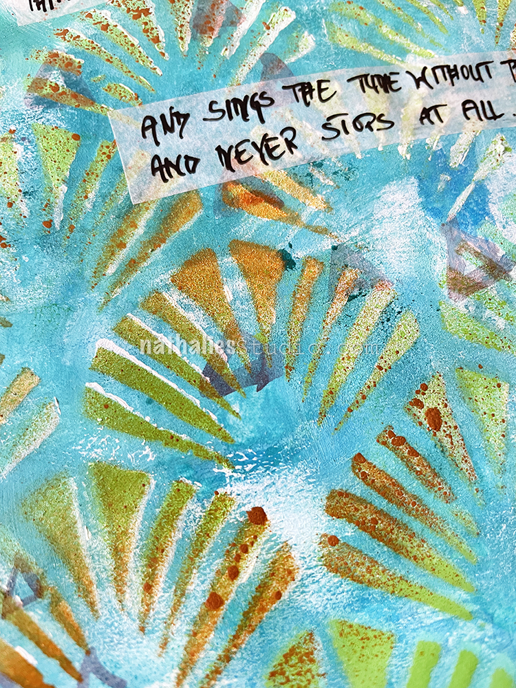
And sings the tune without the words –
And never stops – at all –

-Emily Dickinson

I painted the background with acrylic paint and a big flat brush. Then I layered the Art Deco Wallpaper stencil on top and sprayed with MTN Acrylic spray paints – using lime green, brown and white colors.

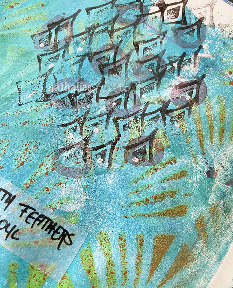
I added some marks with a thin brush and sepia acrylic ink and then used one of my Fan-fare stamps and brown Versafine ink to add some more marks. I layered the stamp up without going for a full image each time and I really like how it looks. I’m definitely using this stamp again for mark making.

It was simple to put together but I like it – simple is ok – not every page has to take ages 🙂

Here are some of the supplies I used:

Leave a comment

Sometimes the Monsters Win – Art Journal

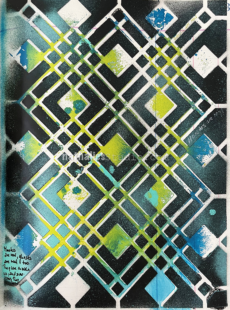
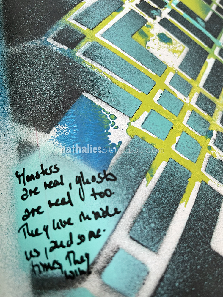
This art journal page came after an interesting conversation with friends about old houses and ghosts. We all agreed that the monsters and ghosts in our heads are worse, and I guess that is why Stephen King is doing so well with his books – LOL The quote is from him – “The Shining” …you are welcome.

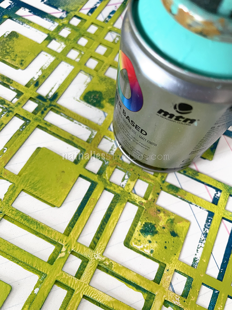
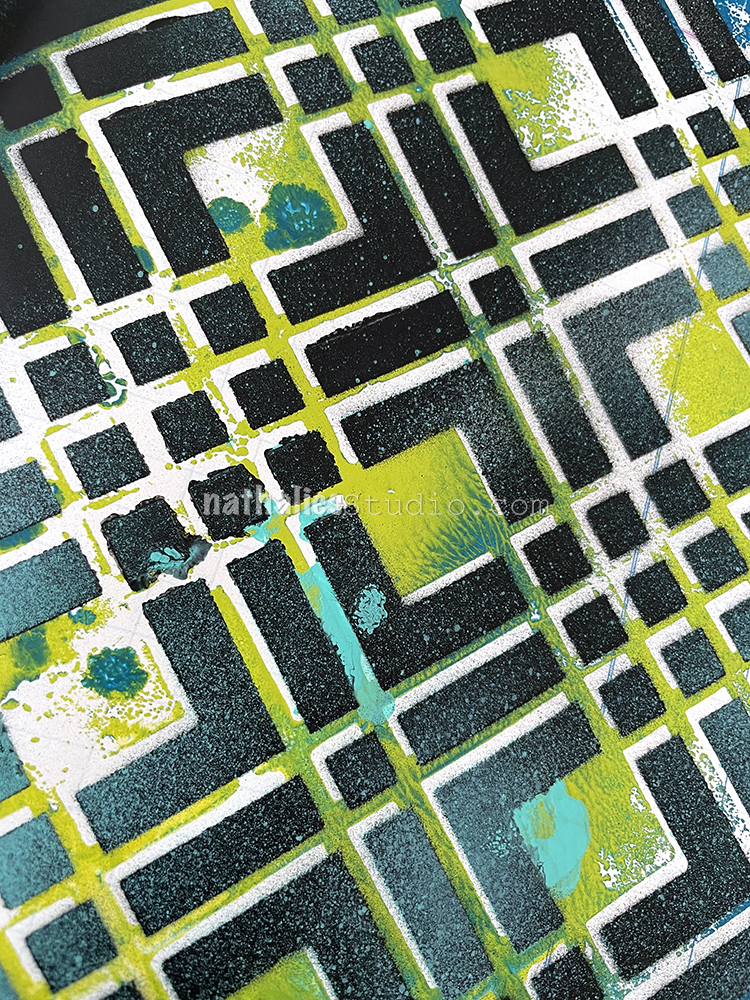
I started this page with a leftover negative imprint from my “So Much Energy” page where I had just flipped the Chicago stencil over.

I realigned the stencil on top of the print, a bit offset, and sprayed over it yet again with black and teal.

Then I just added the journaling with a Posca marker.

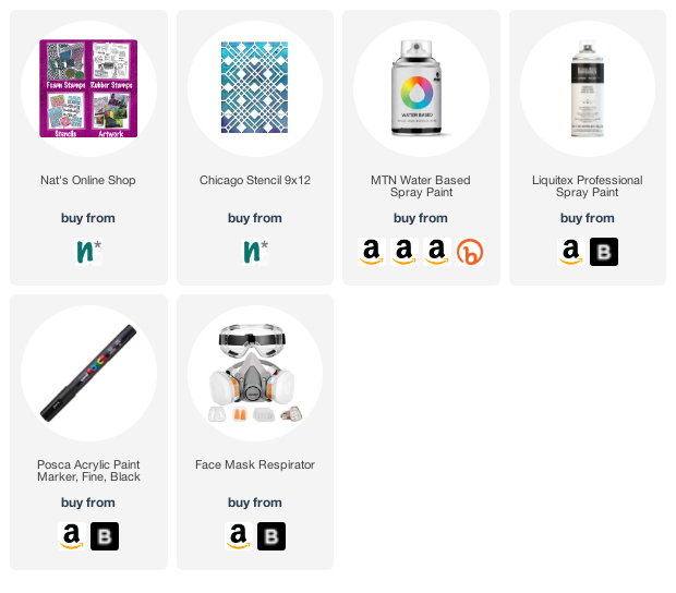
Here are some of the supplies I used:

Leave a comment

So Much Energy – Art Journal

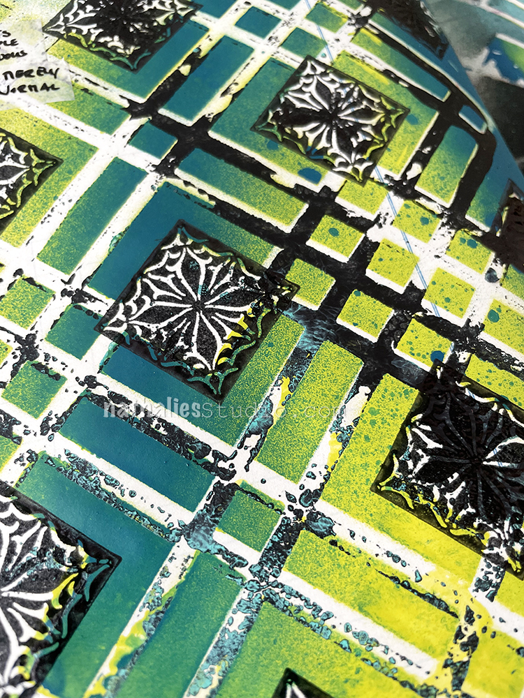
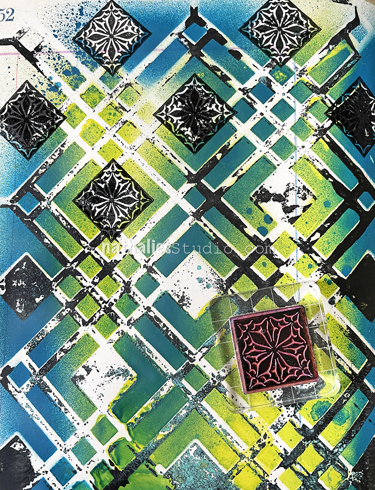
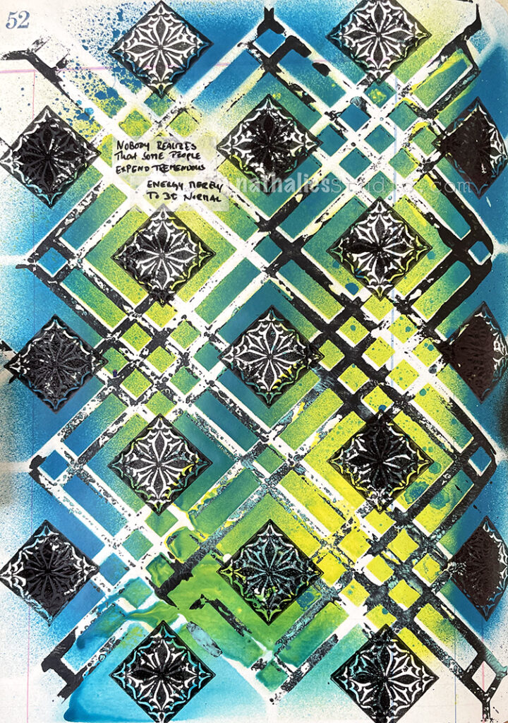
I’m still on a total spray paint high – kidding – wear your mask if spraying even low odor spray paint inside. For this art journal page I used different MTN and Liquitex acrylic spray paints over my Chicago stencil.

For a later art journal page I flipped the stencil over to print with the extra paint on it, and then printed with excess paint on the stencil from spraying onto another page, back onto this one.

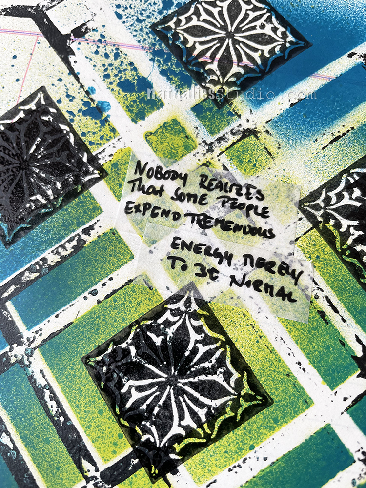
I used black Versafine and one of the Floral Tile Small stamps to stamp into the squares. I liked the juxtaposition of the floral image with the very orderly structure of the stencil.

To finish my page I used a Posca marker on that label stuff (I have no clue where it comes from) for the journaling.

Here are some of the supplies I used:

Leave a comment

Creative Squad: Lost in a Book – Jordan Hill

Hello from my Creative Squad! Today we have a post from Jordan Hill who is sharing an art journal spread inspired by one of her favorite books and using my ATC Mixup stencil and our monthly theme: Lost in a Book.


Hello everyone, I’m excited to be back with you for April! Initially, I wasn’t sure how I wanted to approach this month’s theme of “Lost in a Book”. However, after much thought, I decided to base my project on the manga series Haikyuu!!, which is my favorite series of all time. At its core, Haikyuu!! is a story about a high school volleyball team, but it is steeped in symbolism and contains some of the best character writing I’ve ever seen. Let’s get started!

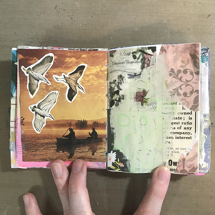
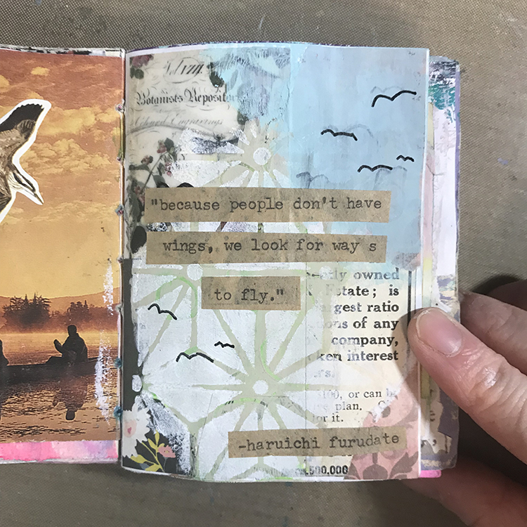
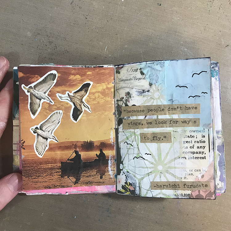
First things first, I selected a page to work on. I liked the birds on the left side of this spread, since birds (especially crows) are a reoccurring visual theme in Haikyuu!! On the right side of the spread, I had previously glued down a number of scraps of paper. To attempt to blend some of these scraps together, I used CraftSmart acrylic paint in the color Suede and painted over the edges of the pieces. I then used the back end of my paintbrush to scrape through the paint and create some subtle circles.

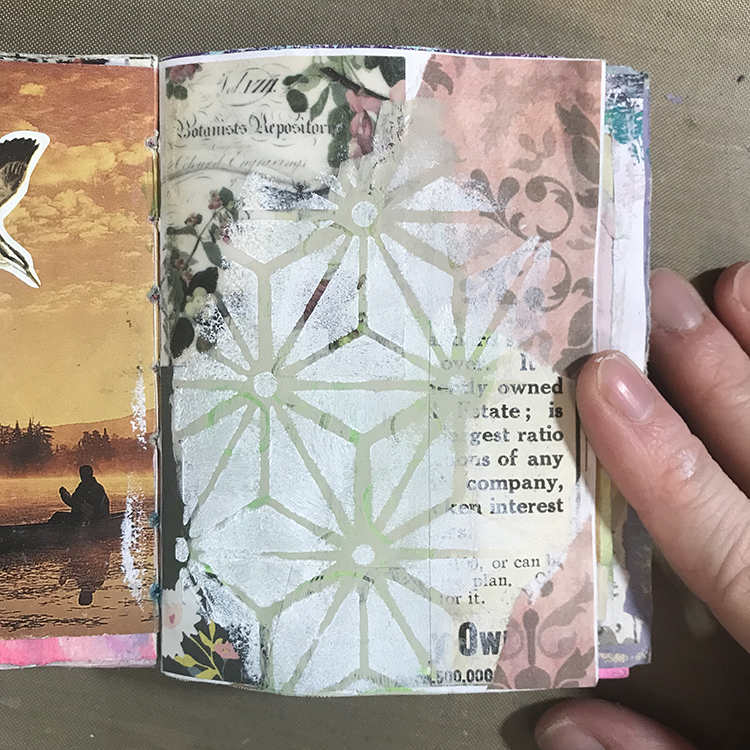
Next, I used Nathalie’s ATC Mixup Stencil with some white acrylic paint and a makeup sponge to add patterning to the painted sections of the page. Though it’s not exact, these shapes did vaguely remind me of the segments of a volleyball.

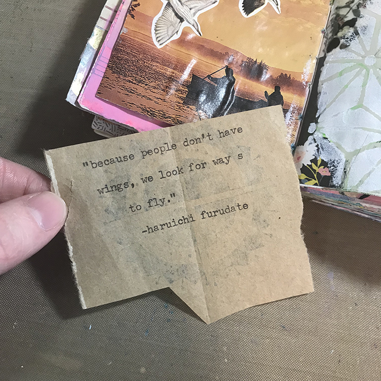
I knew that I wanted a quote to be the main focal point of my page, so I used my typewriter to type one out onto a scrap of brown paper bag. This is one of my favorite quotes from the series; I find it very beautiful, and it has stuck with me for many years. It only made sense to incorporate it into one of my journals.

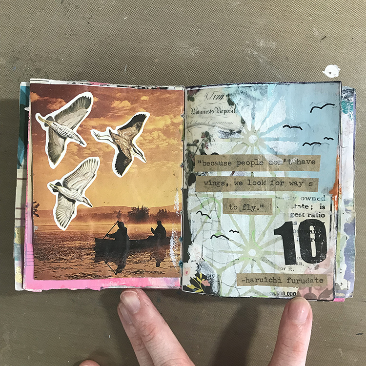
At this point, I decided that I wanted some blue paint in the upper right hand corner of the page in order to represent the sky. I selected the color “Cloudless” by the brand Apple Barrel, and used a paintbrush to apply it to my page. I then cut out the quote from the last step and glued it down. Then, using a black pen, I added a few “bird” shapes to some areas of the page I thought could use a bit of interest. I specifically chose to do seven birds in order to represent the number of starting players on a volleyball team.

Next, I wanted a border of sorts, so I used an Archival Ink Pad in Black to brush along the edges of the page. I then used a graphite pencil to make some light marks along the left side. I have been experimenting with similar marks in some of my recent work, and I felt as though it could be interpreted as a volleyball net.

To add some finishing touches to the page, I used an orange oil pastel to add a hint of color, since the jerseys in Haikyuu!! are orange and black. Next, I added a Mod Podge image transfer of the number 10, to represent the number of the main character’s jersey. I also used Nathalie’s ATC Mixup Stencil once more to apply the paint ever so slightly over top of the blue section in order to blend it in a little better. I was then ready to call this page done!

I hope you enjoyed following along with the process of this little spread in my journal and that you are able to find something in it to inspire your own work!


Thank you Jordan – I loved how you used various visual elements to symbolize important aspects of the book. The finished page is really interesting with the different layers of media and meaning.

Give it a try: you can find all my Stencils in my Online Shop and in addition to collage elements from her stash, here are some of the supplies Jordan used:

Looking for more projects? Follow the Creative Squad on Instagram here.
Leave a comment

Creative Squad: Lost in a Book – Robin Seiz

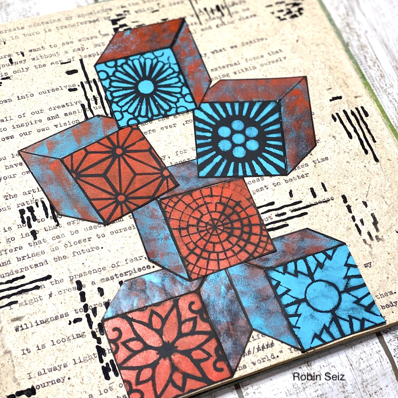
Hello from my Creative Squad! Today we have a post from Robin Seiz who is sharing an art journal page inspired by a book that has helped her on her artistic journey and may be something you will want to pick up too, so read on! Robin is using a bunch of my stencils (Grove Street, Central Ave, Park Blvd, Broadway, Valley Road, ATC Mixup, and Signals) and our theme: Lost in a Book.


Hello friends, This months theme, “Lost in a Book” was such fun. The hardest part of this project was choosing the book. I love to read and there are so many books I have enjoyed. I chose a book that is on my studio table right now, Marry Your Muse. – Making a lasting commitment to your creativity, by Jan Phillips. This book was one of the first books I read when I started my journey into mixed media. It’s easy to read and has suggested exercises at the end of each chapter. I admit that I didn’t do all of them, but I did choose a few. I know that I have enjoyed a book when I find myself writing in the margins and highlighting as I go along! This book offered a significant number of nuggets. 

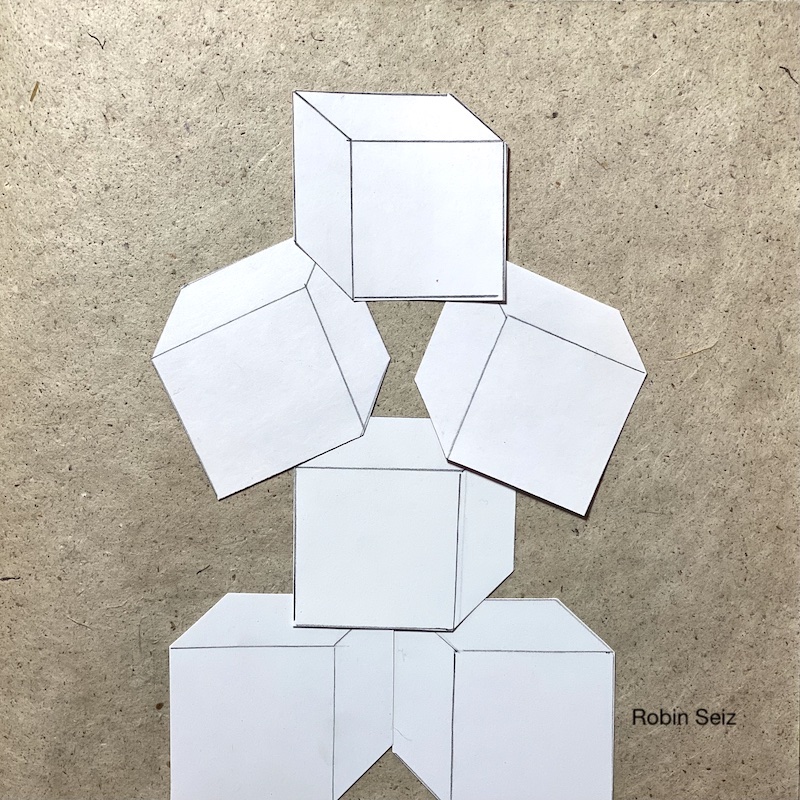
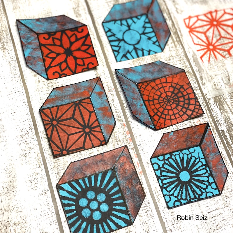
Although I’m not much of an artjournaler, it seemed an appropriate substrate for this project. I chose to represent the book through building blocks. There were considerable amounts of useful information which helped inform my mixed media practice, each piece building on one another.

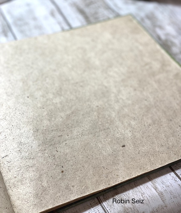
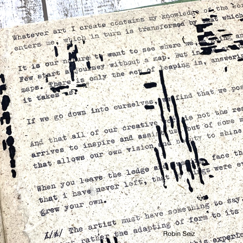
To begin my project, I went through the book and chose the nuggets that were most meaningful to me. I ripped a piece of paper from the journal and loaded it into my old fashioned, pink, Olympia typewriter. I typed many of the key learnings I had highlighted when I first read the book. The paper is heavily textured and the black old fashion type was perfect for this paper.

Next I drew the blocks on white construction paper and cut them out. I laid them out to make sure the size would fit on the page and to play around with the composition.

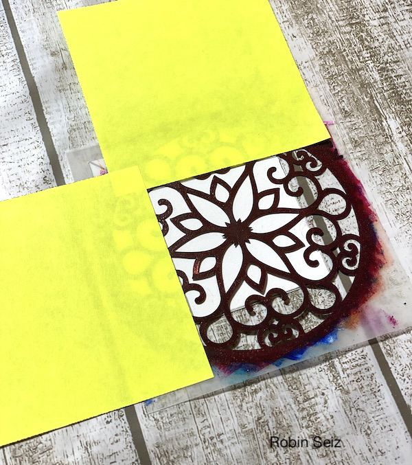
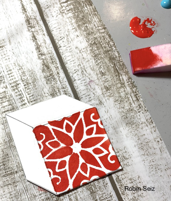
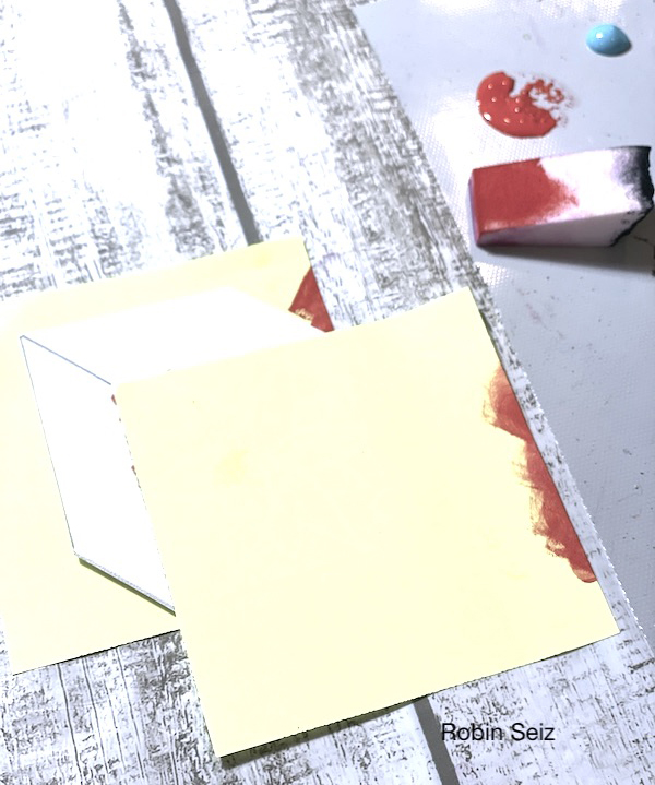
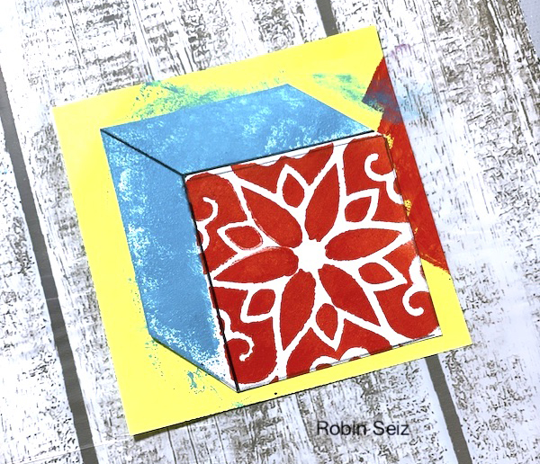
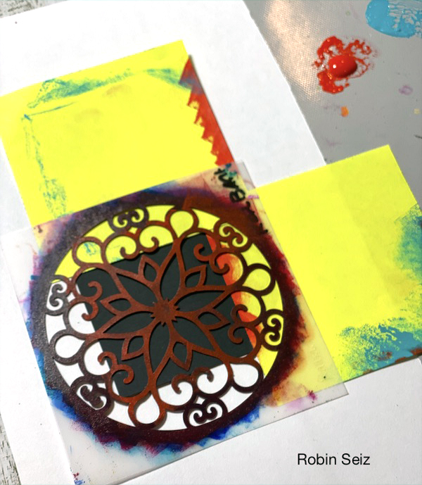
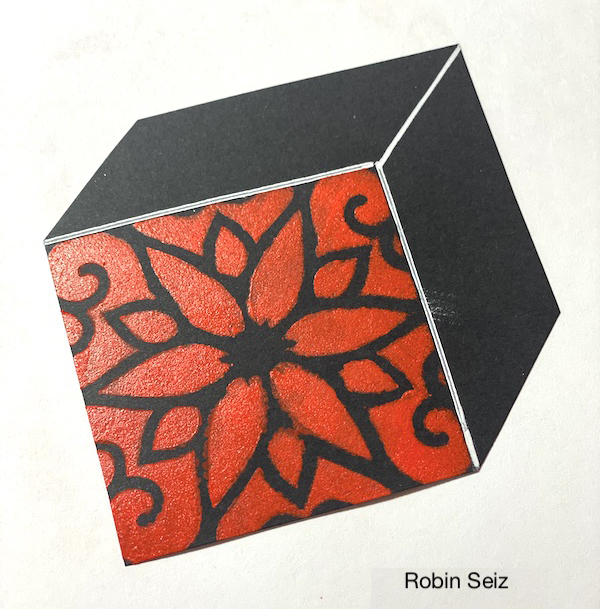
I wanted each block to have a primary face (like you see on children’s blocks) so I used Nathalie’s 4×4 stencils, her ATC Mixup stencil, a makeup sponge, and post-its to mask the sides of the block. This created the face I was looking for on the block.  I used Teal and Pyrrole Red Light — these colors are my go to colors right now. I love how they stand out! On the sides and top of the block, I again, used post-its to mask and sponged on both colors. 

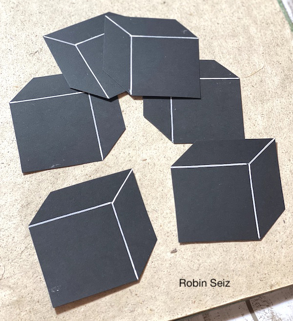
Once I completed the first block with the print on the front and coordinating colors on the sides, I realized I didn’t  like the white blocks. The stencil print didn’t pop, so I started again and created black blocks from black card stock. The two colors I chose really stand out on the black and I was much happier with the result. TIP: Don’t be afraid to change mid-stream on a project. Part of what I learned in this book is to just follow your muse, she will take you to the right places if you listen.

Once the blocks were painted, I used a black Posca Marker and ruler to outline the outer edges of each block. This created more dimension, making the blocks look 3-D.

Next I blended some light moulding paste and Liquitex Black acrylic paint. With a soft spatula, I applied it through Nathalie’s Signals Stencil to break up all the lettering and add more texture.

For the final step, I stacked the blocks and adhered them to the page with my adhesive gun. 

I hope you think about your favorite book (childhood or adult) and give this project a try. Please tag me with what you create. I can’t wait to see it! 


Thank you Robin! Love this suggestion for our reading list and seeing you change it up despite the work you already put in is a great suggestion when you realize it needs to go in a different direction.

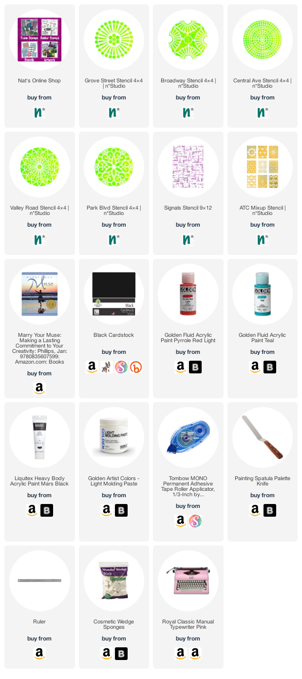
Give it a try: you can find all my Stencils in my Online Shop and here are some of the supplies Robin used:

Looking for more projects? Follow the Creative Squad on Instagram here.
Leave a comment

Wearable Art from Judi Kauffman – Creative Squad

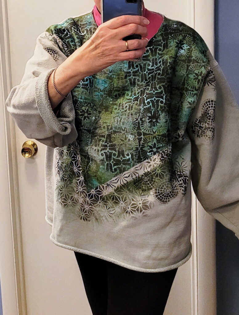
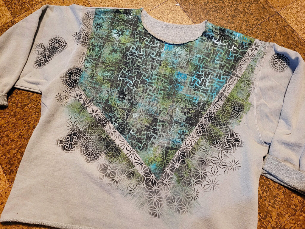
So excited to share this project with you today because, well, I definitely want to give it a try too! We’ve got a sweatshirt re-do from Creative Squad member Judi Kauffman who is using my ATC Mixup, Amsterdam, and Hamilton stencils to completely give new life to an old sweatshirt. Check it out and then time to dig through your own closets for some contenders :)


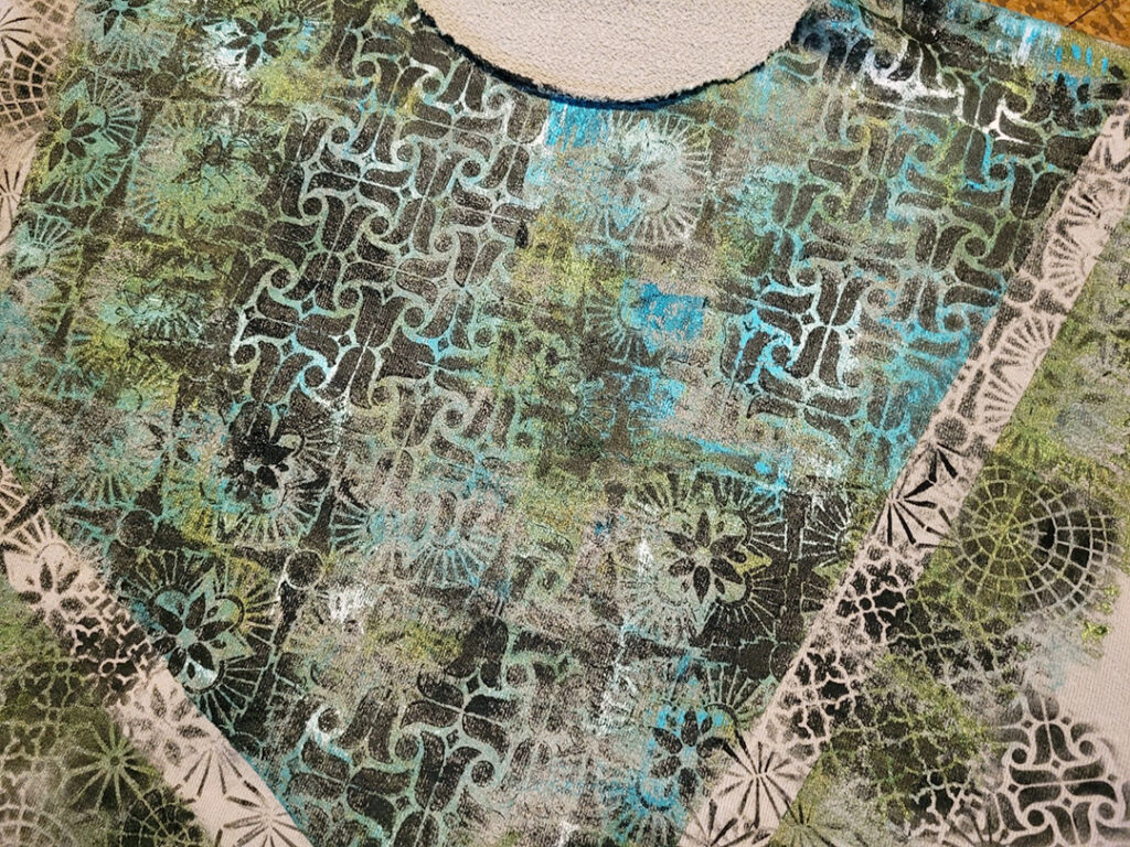
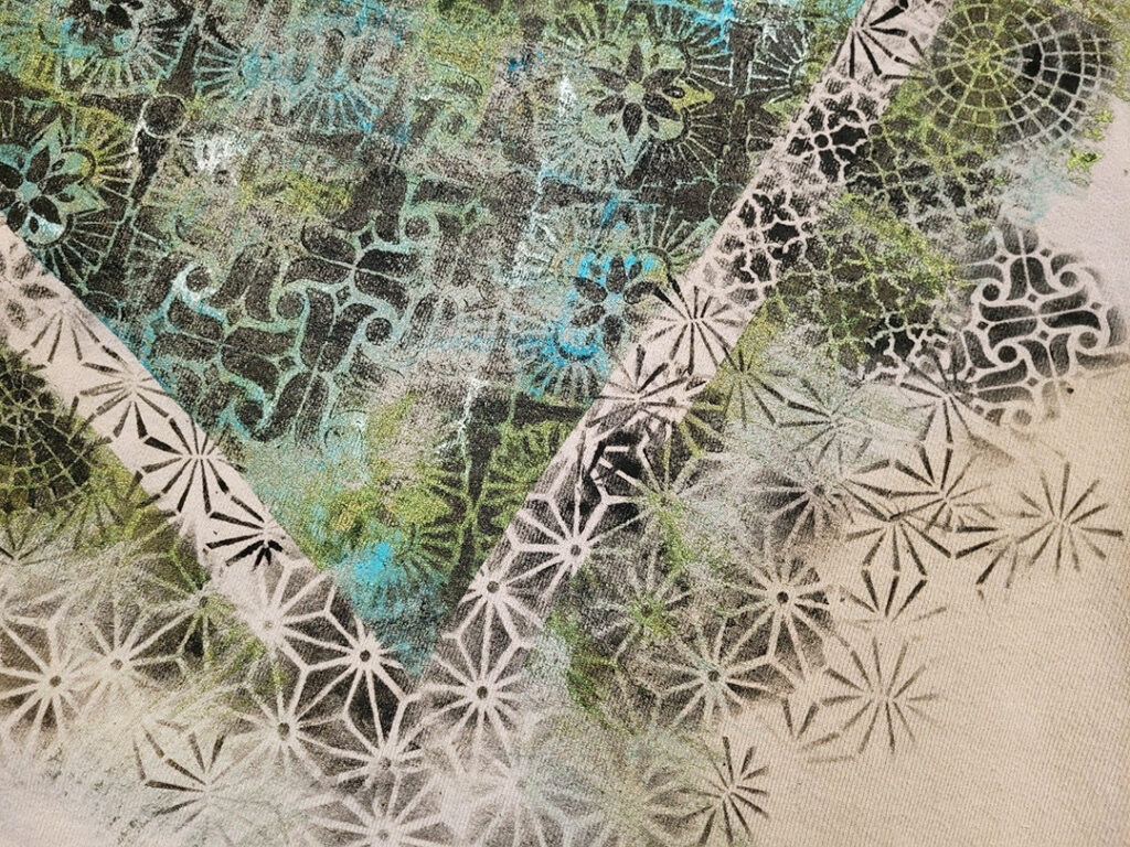
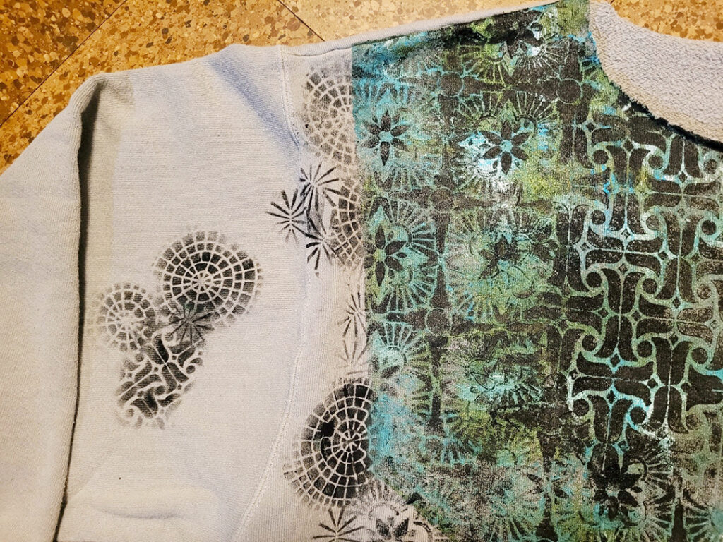
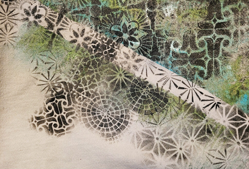
Nothing beats a comfy baggy sweatshirt, but when it gets a few stains it’s time for the rag bag OR my preferred option: a facelift! I cut off the ribbing at neck, sleeves and hem, delineated an asymmetrical section of the front with masking tape and used green and turquoise metallic paint to fill the section, and green paint to create ‘fringe’ around the edges of the tape. 

Then I stenciled with black paint within the center section using two 9×12 stencils before I removed the tape and continued. I used Nathalie’s ATC Mixup to create smaller patterns. I extended onto the sleeves a bit, too. If it were the 80s I’d now be adding beads and dimensional paint. (I’m mighty tempted…maybe I could revive the trend!)


Thanks for sharing Judi! I love this transformation and what a fantastic idea for updating some clothing that maybe hasn’t been worn in a while.

You can find all of my stencils in my Online Store. In addition to a comfy old sweatshirt, here are some of the supplies that Judi used:
Looking for more projects and inspiration from the Creative Squad? Check them out HERE on Instagram.
Comments (1)

  • Denise M. Krueger

    |

    Judi Kauffman this sweatshirt is amazing!!! Love, love, love what you did with it.

    Denise Krueger

    Reply

Leave a comment