Art Stroll

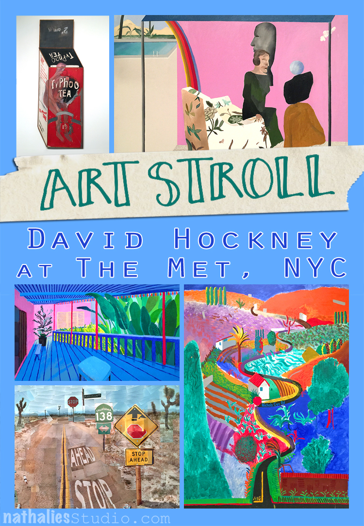
Art Stroll: David Hockney at The Met, NYC

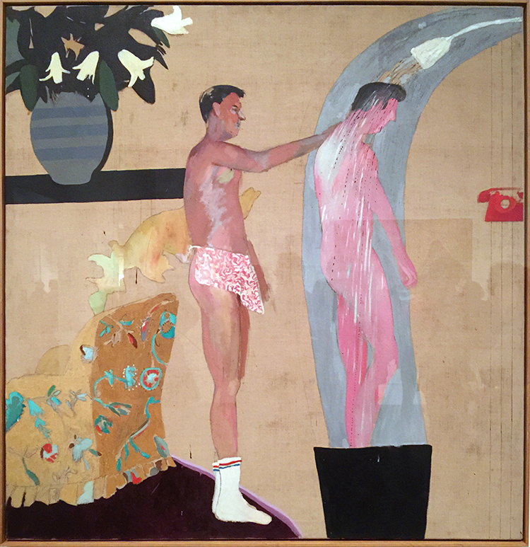
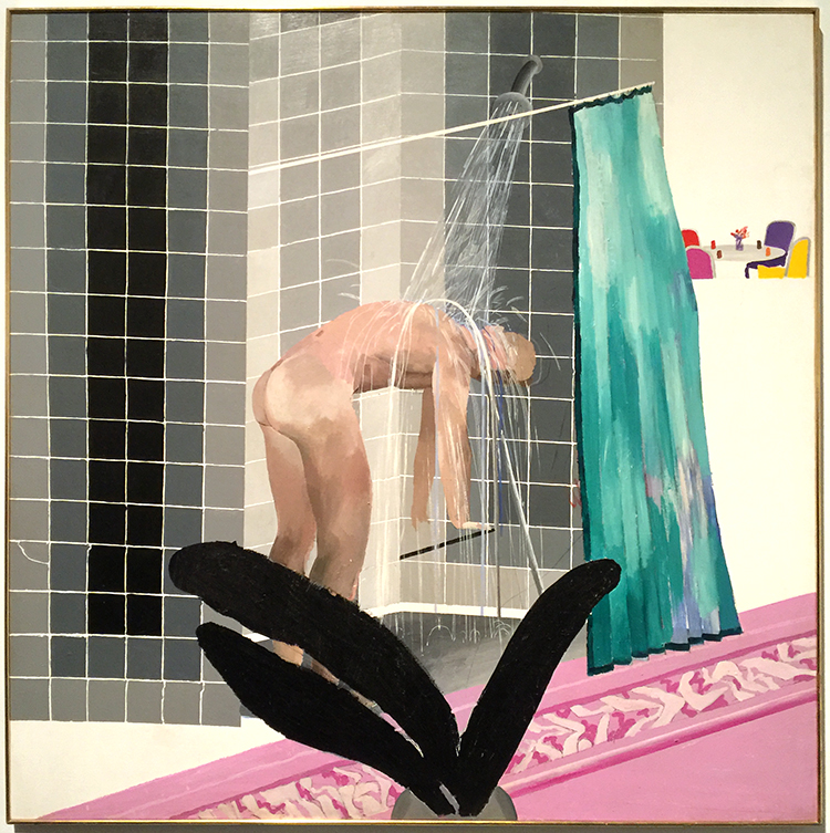
A couple weeks ago I went to the David Hockney exhibition at the Met. I was super excited about it because I have show some of his work in some of my classes as an inspiration to the students. His use of color is fascinating.

I loved seeing his early work- it was so different!

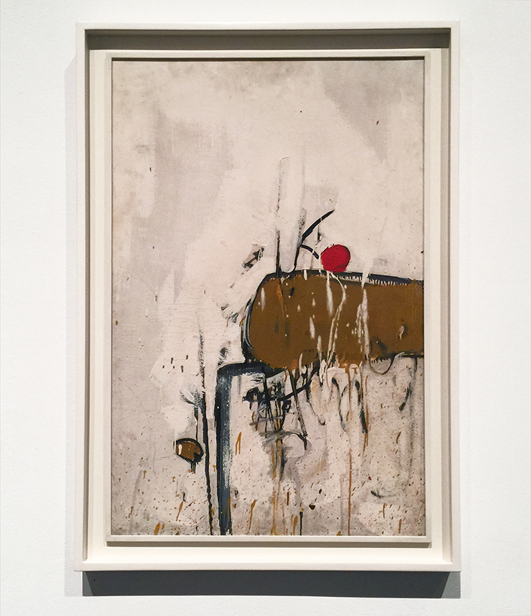
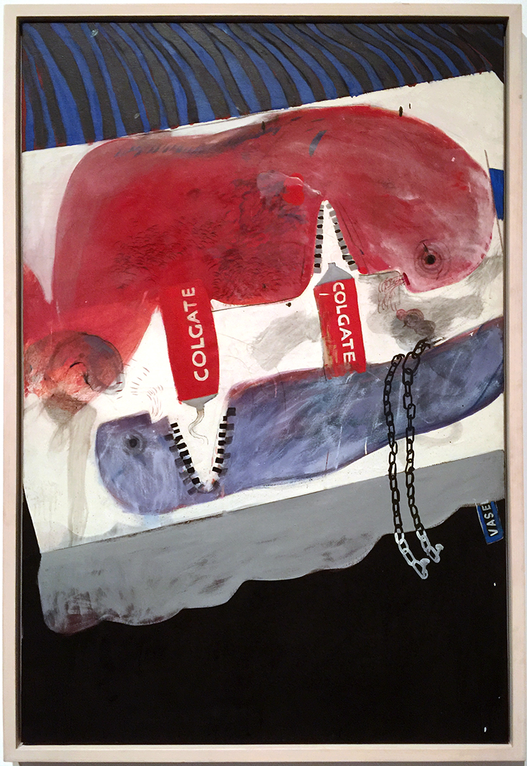
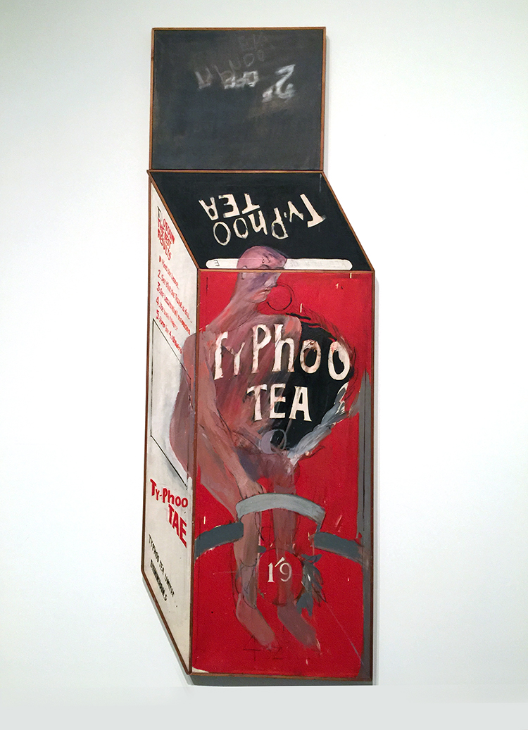
Loved the different materials he used. Lots of texture which is changing soon.

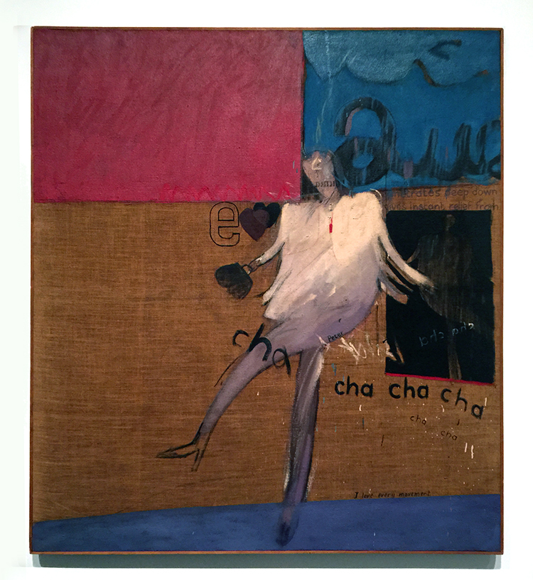
“The Cha-Cha That was danced in the Early Hours of 24th March” 1961

While at the Royal College of Art, Hockney went to a party where one of his fellow students danced the cha-cha for him.

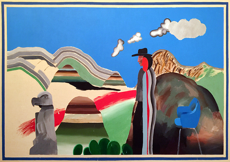
“Rocky Mountains and tired Indians” 1965

What made me laugh out loud was that apparently the American Indians referenced in the title were “tired” because he needed to explain the presence of the chair, which he had only added as a compositional prop. That is hilarious, don’t you think? LOL

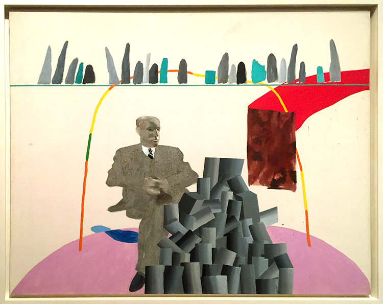
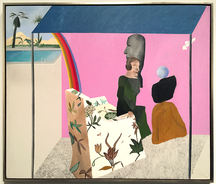
Already in the next paintings you can see his use of colors becoming more bold but also that he is tarting to paint more flat.

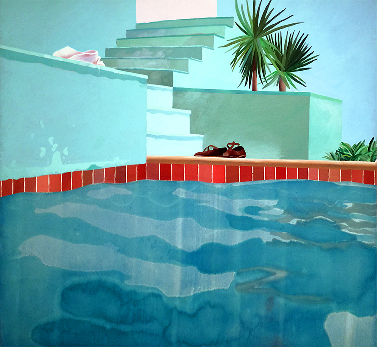
Love the different swimming pool paintings. His most famous painting “The Splash” was impossible to look at – there were sooo many people in front of it, it was insane.

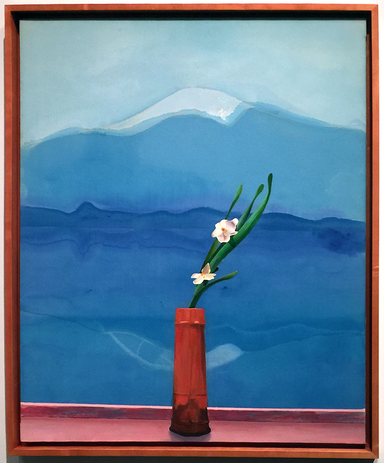
Love this painting of Mount Fuji.

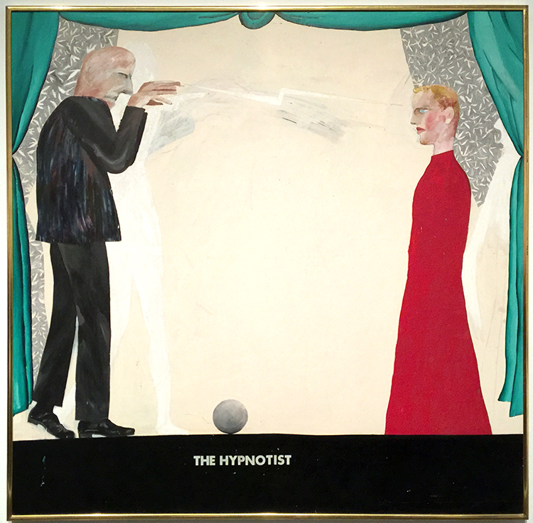
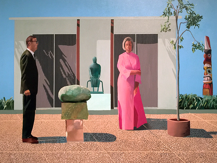
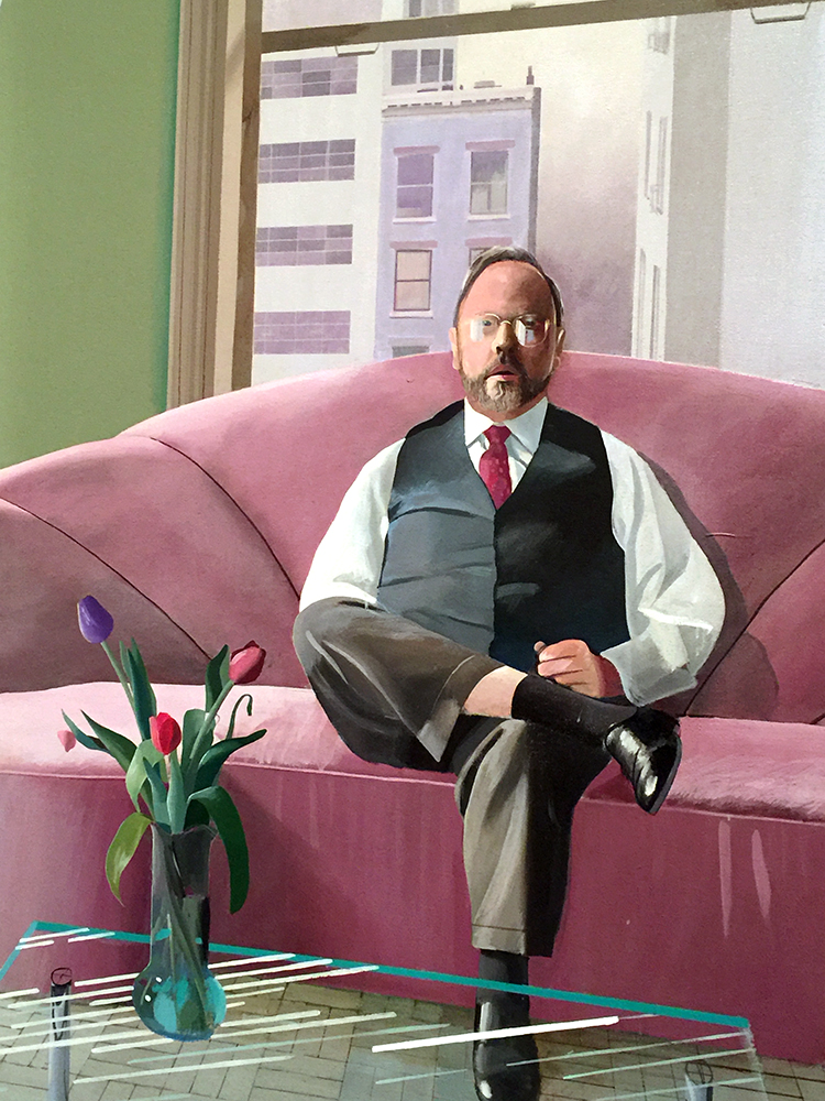
His people are always a bit weird to me- so lifeless and stiff …

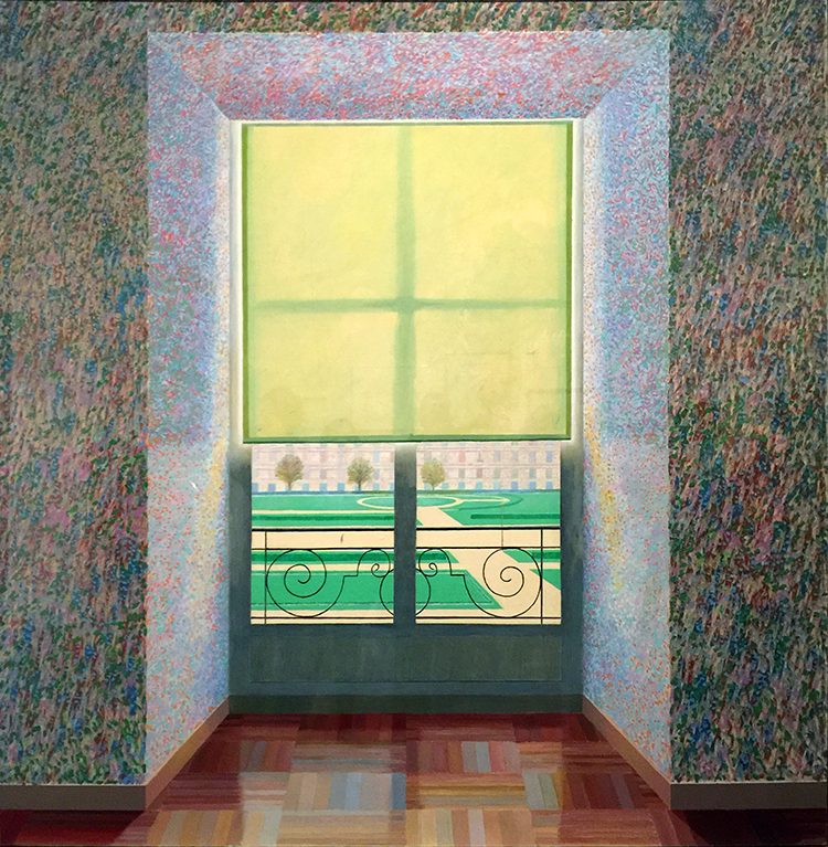
I love the one below

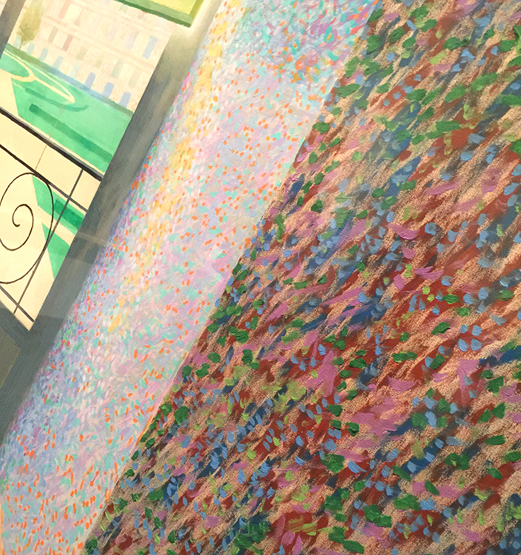
It totally reminds me of a Matisse painting- the window, the iron work of the balcony…

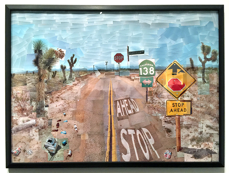
And then below super fascinating

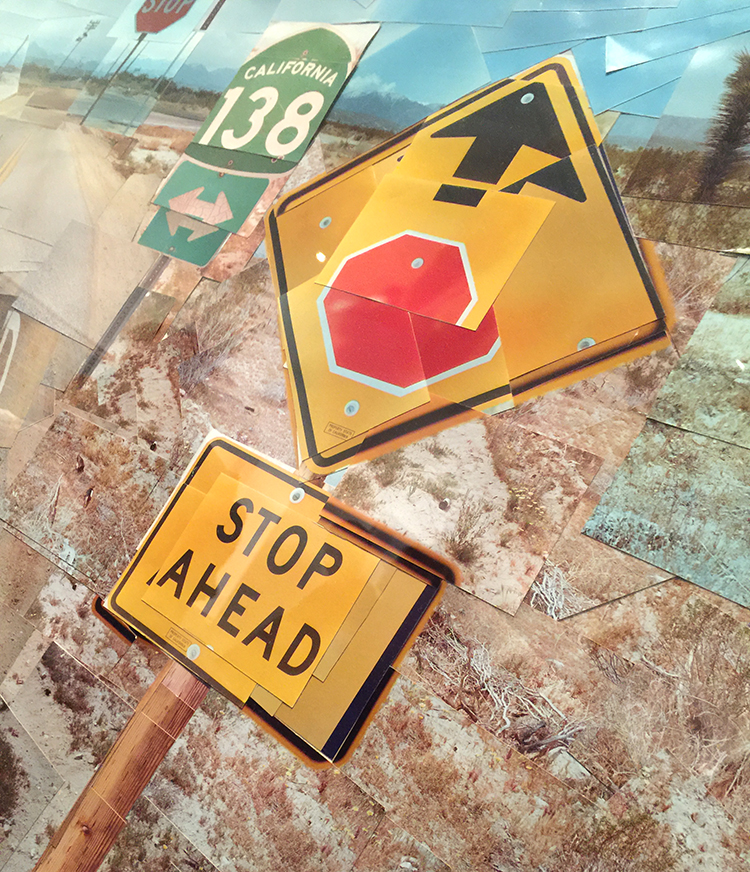
a photo collage – you could think it is a painting from afar, but nope-. He played with those photo collages for 4 years to do something else and exciting and this is his final one.

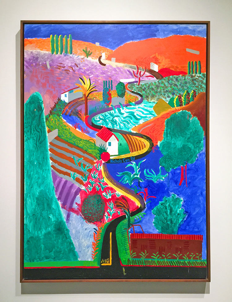
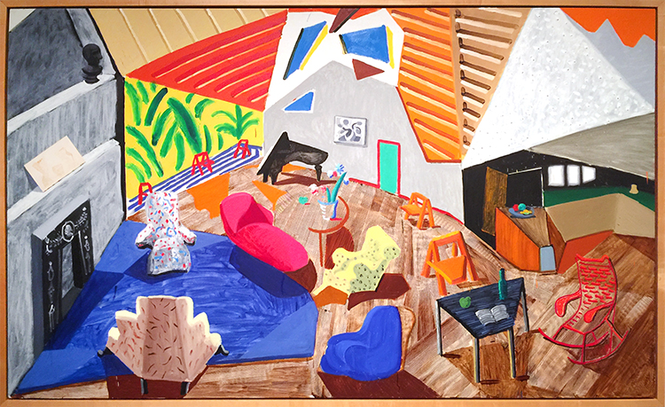
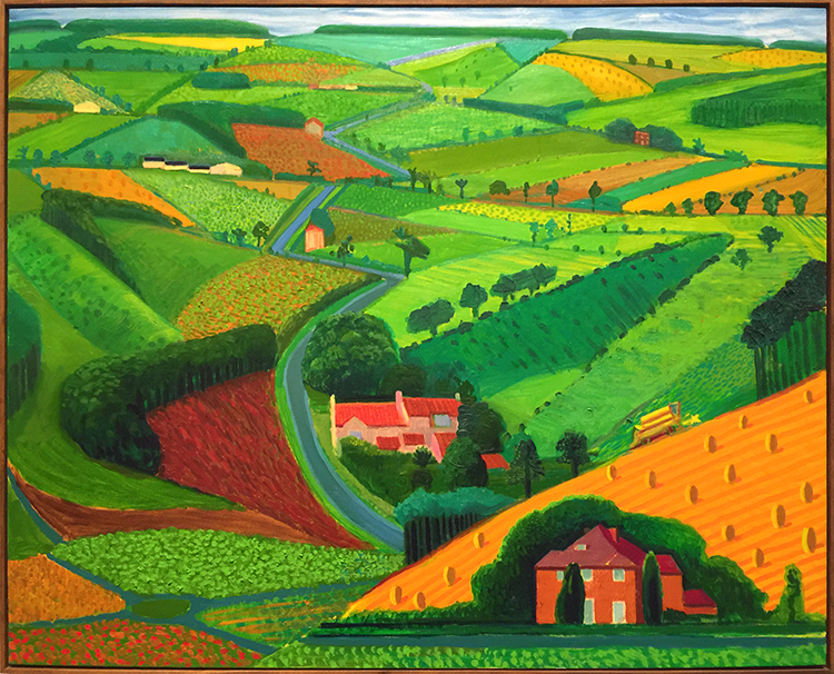
And then look at these colors and how bright and fun the next paintings are!

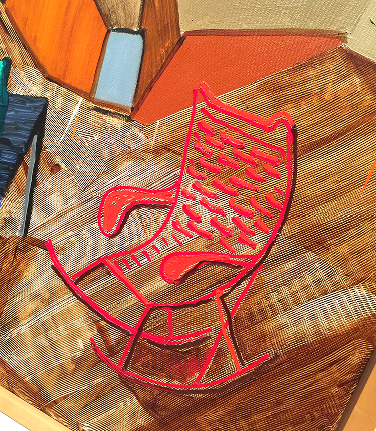
I love the details here and how he added texture here. The perspective is so cool!

And then again he changed …

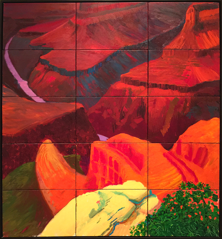
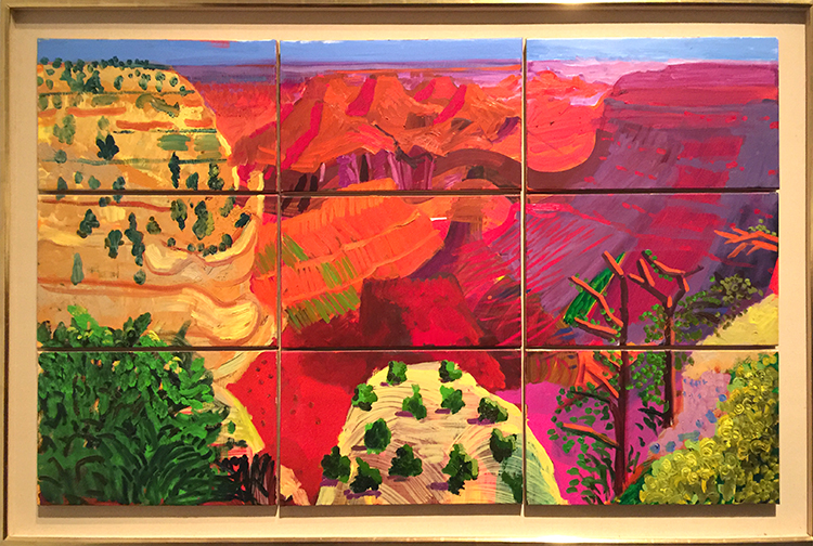
“Colorado River” 1998 – Oil on canvas

I love how he painted this on different panels. The colors are so intense and it felt magnificent just as the view he depicted.

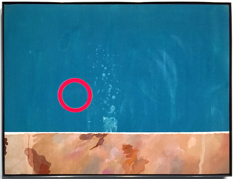
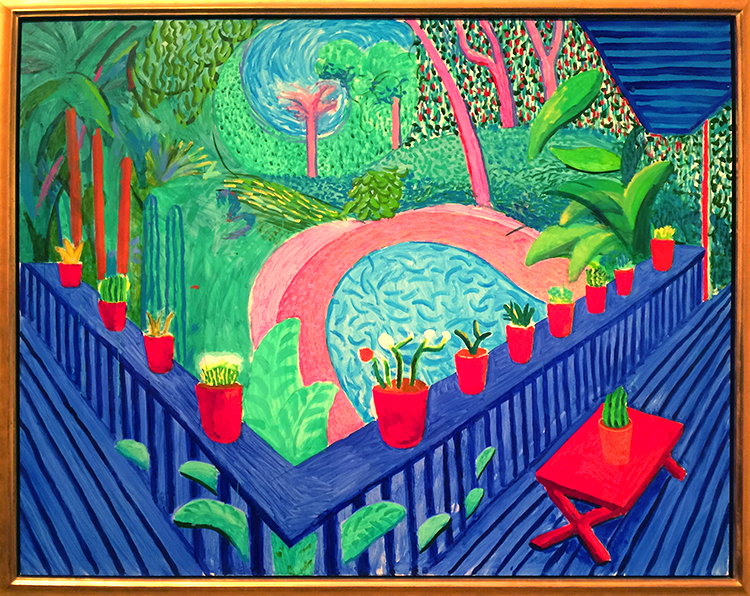
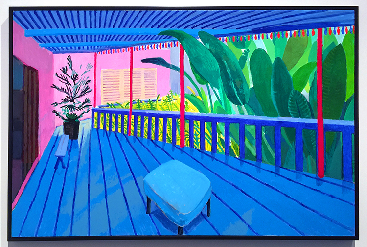
And then his recent work -paintings of his terrace view.

I love those so so much!!!

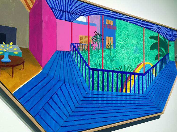
with the final one below which has this really cool shape !

This was a great exhibition. It was fascinating to see his work change so much throughout his live but I was mostly inspired by Hockney’s use of color. If you have a chance to see Hockney’s work in person – go and see it. You feel the color !

Comments (4)

  • stephanie

    |

    Hi Nat – how fab! I am still inspired by his work from my class with you last spring. I’d love to see it in person.

    Reply

    • nathalie-kalbach

      |

      awe- so glad you liked that! I hope you will have a chance to see his work in person- the colors are just incredible and my photos do not do them justice of course!

      Reply

  • Sue Clarke

    |

    I am usually a person who loves color and his is nice, but the first one is my favorite one (I think that it speaks to my past depressions).
    The people are flat, especially the woman in the pink bathrobe.
    Quite the change in style…thanks for sharing.

    Reply

    • nathalie-kalbach

      |

      Yeah the flatness of his work is interesting – the figures he painted in the sixties and seventies are so emotionless too I feel -it is a bit eerie :)

      Reply

Leave a comment

If you Stumble… Art Journal

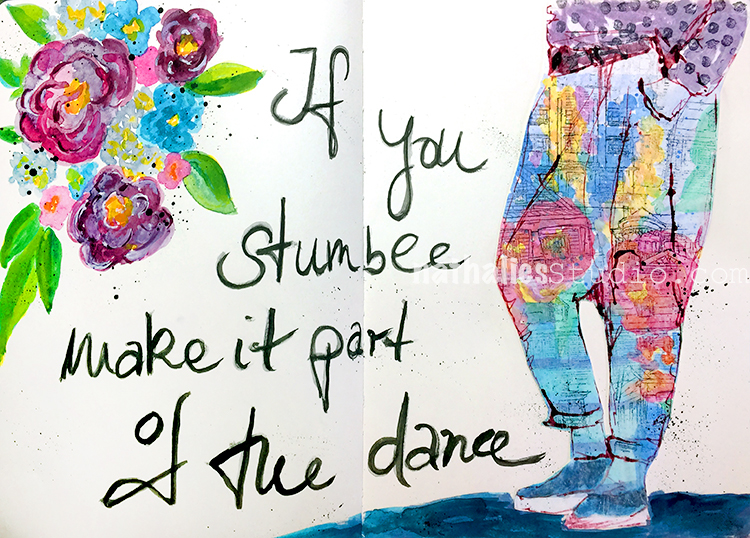
“If you stumble, make it part of the dance”. I feel I do this a lot, especially when I create – it is freeing ;)

I had so much fun with this spread. For an assignment I had to paint a floral watercolor painting and I had tons of drafts and I felt it would be a good idea to use them up.

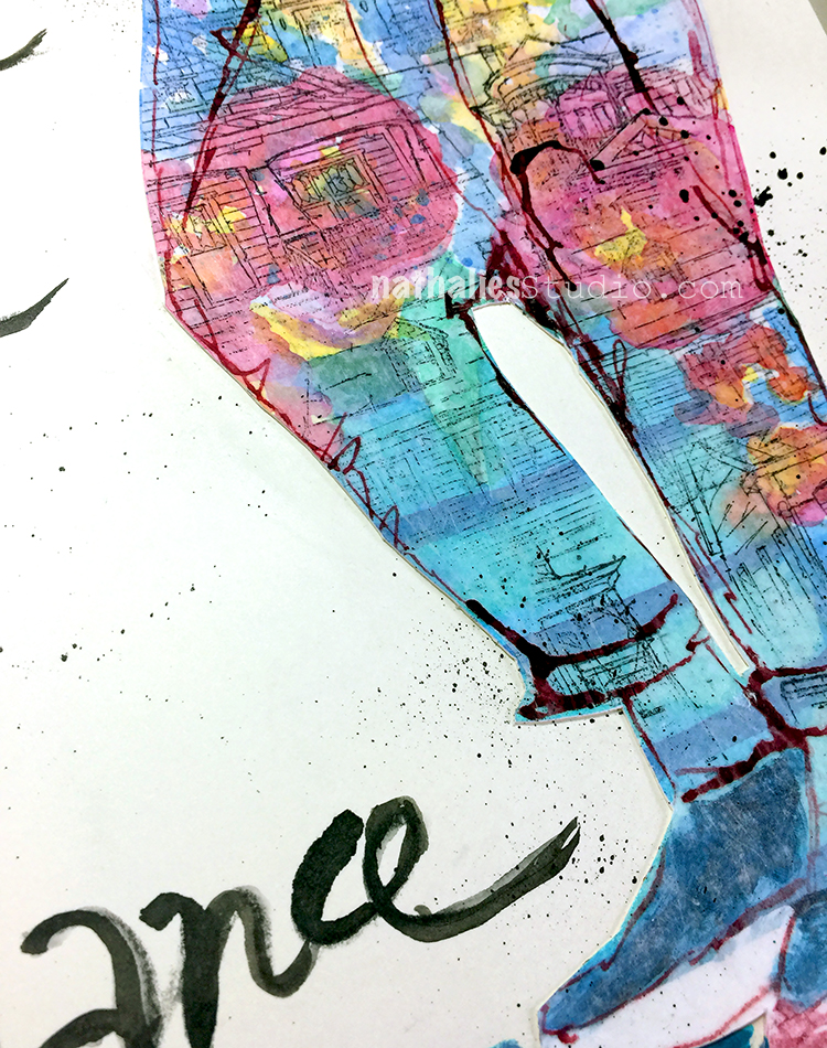
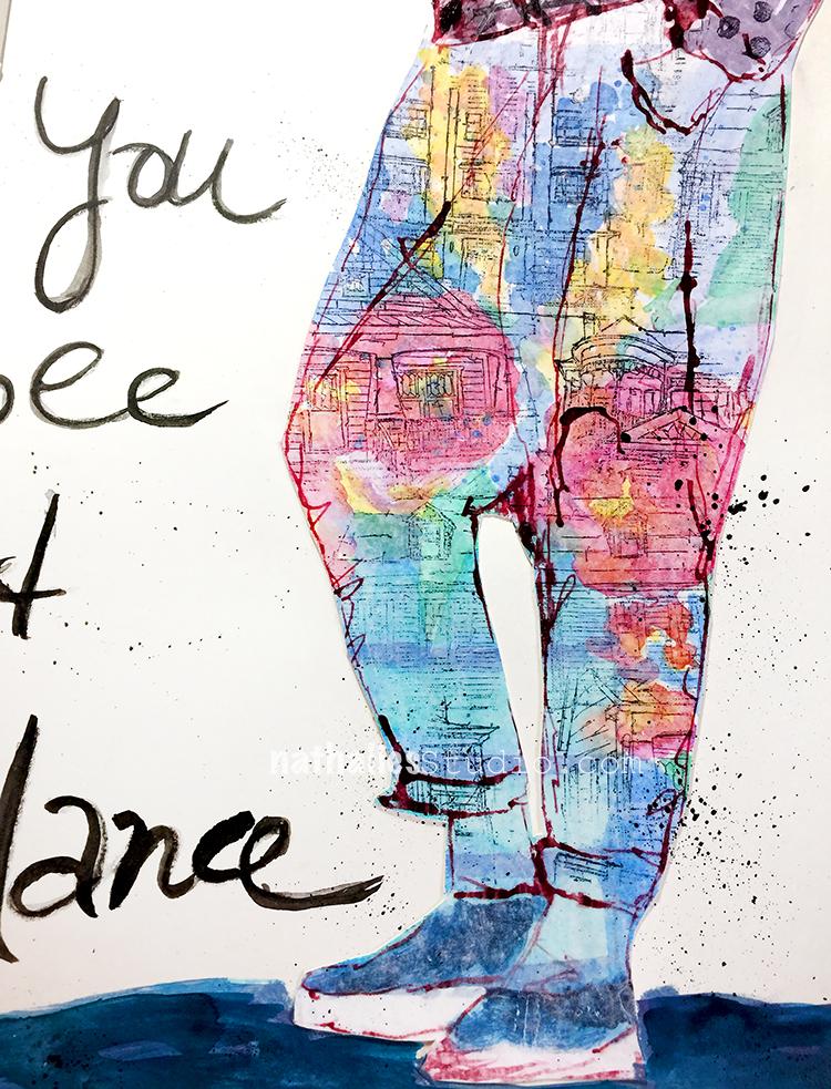
So I made the watercolor paper part of a collage for my art journal. I  sketched the lower part of a body with some ink and stamped over with some of my Stroll Through the Hood and Stroll around the Block stamps. I actually like those pants- LOL. In the 80s you would have not gotten into such pants but now I might reconsider ;) Would you wear them?

The watercolor paper collage is a bit too sturdy for the journal but I can live with that. It felt good to use those drafts up elsewhere instead of just throwing them into the bin.

I also painted some flowers directly onto the paper using acrylic paints and inks and Flow Aid to give it a watercolor effect.

For the journaling I started out writing with graphite and then went over it with a small brush and black ink. It is a great way to do brush lettering even though it is cheated – I can live with that ;) I really liked this- need to repeat, maybe a dress?


Comments (2)

  • Deb

    |

    Really liked this journal layout. Such a different style and different color palette for you. Liked the open white space on this particular layout. Overall a fun and refreshing layout. I like the pants too! Who knows maybe it will be all the rage. Natalie K clothes.

    Reply

    • nathalie-kalbach

      |

      thank you so much Deb! Ha that would be fun to have a fashion line :)

      Reply

Leave a comment

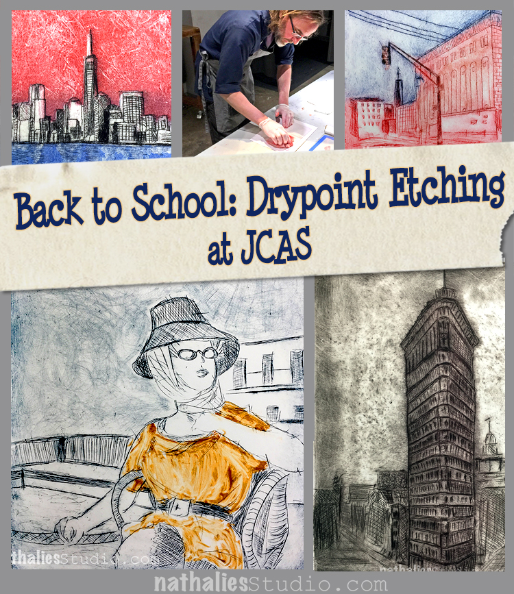
Back to School: Drypoint Etching at JCAS

This winter I took a drypoint etching class with Bruno Nadalin, a fellow Jersey City artist at the Jersey City Art School. I have taken a Linocut Class with him before and he is an amazing teacher, so I knew it would be good. And I wasn’t disappointed. The class with 6 x 3hour lessons  was AWESOME.
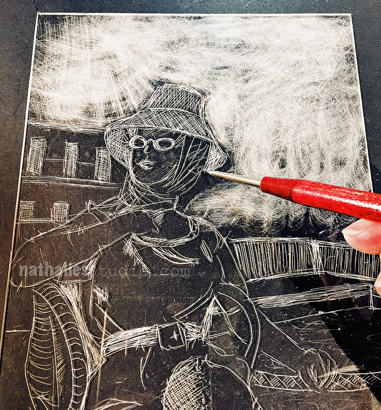
In this class we did drypoint on acetate/plexi plates. Using a sharp needle and/or other tools you scratch an image into the plate. The plate above is the one I did in the first lesson after we practiced with some different applications and tools
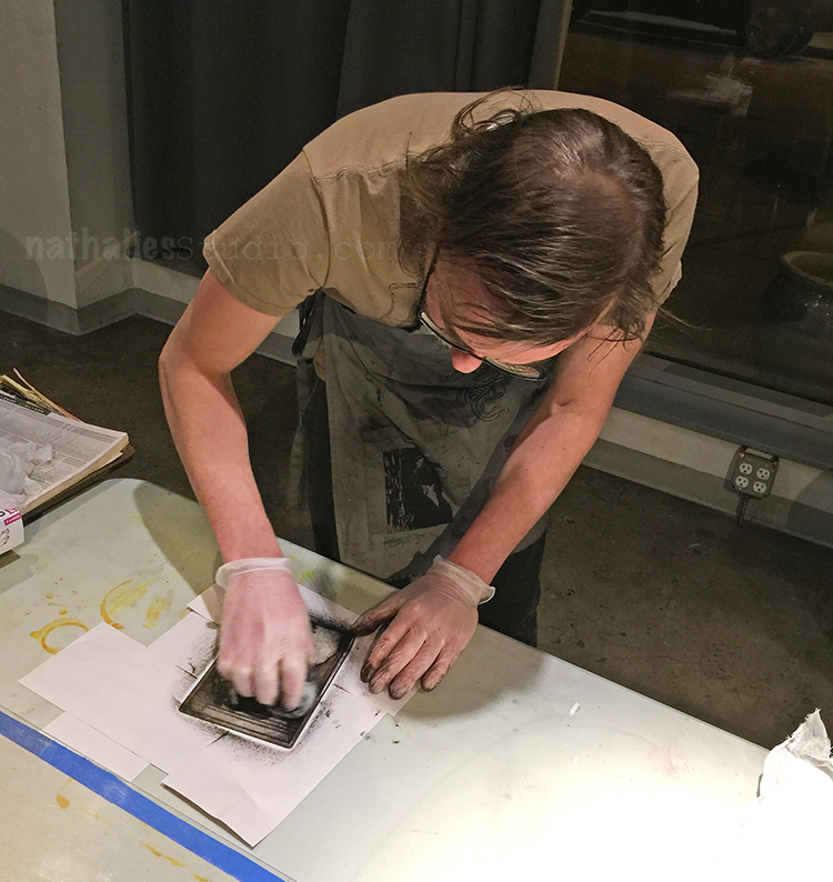
The plate then is getting inked up and then the ink is wiped off again – the ink remains in the creases of your etching and that is where the magic happens.
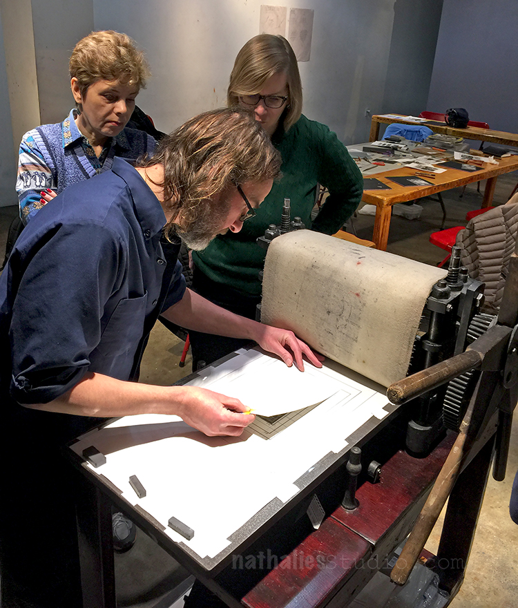
Here is Bruno putting a sample onto the printing press at the JCAS.
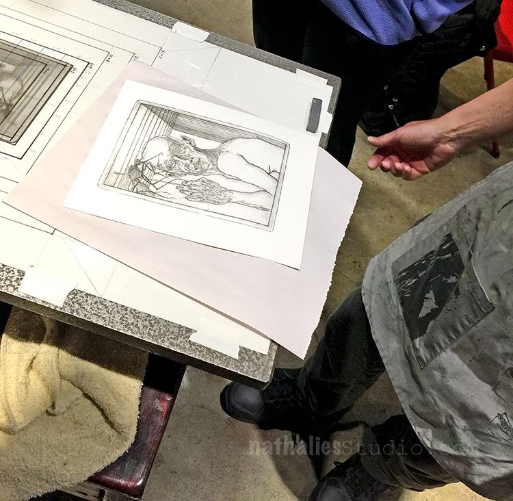
and here is his amazing sample coming out of the press!
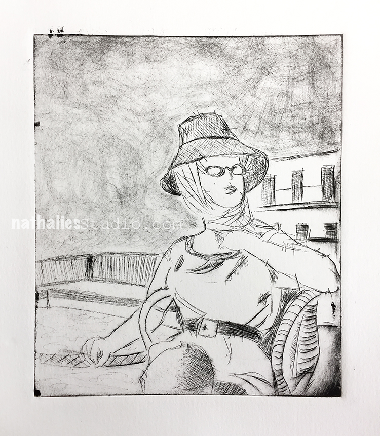
Above is the very first print I did with that plate.
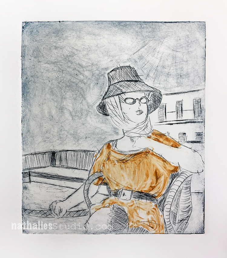
For the second one I applied a bit of color to the jumper.

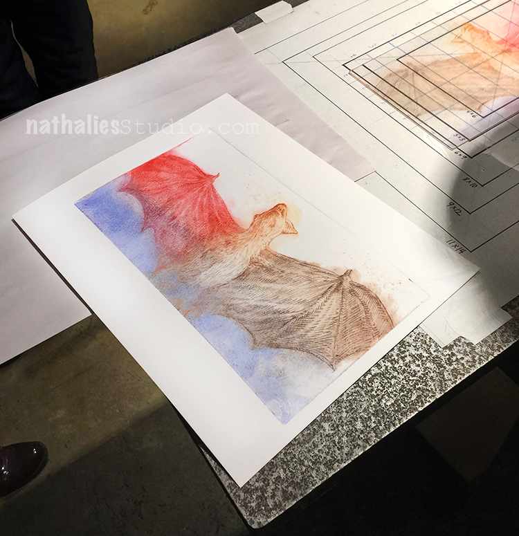
In the second lesson, Bruno showed us how to make multicolor prints with the technique called a la poupee.
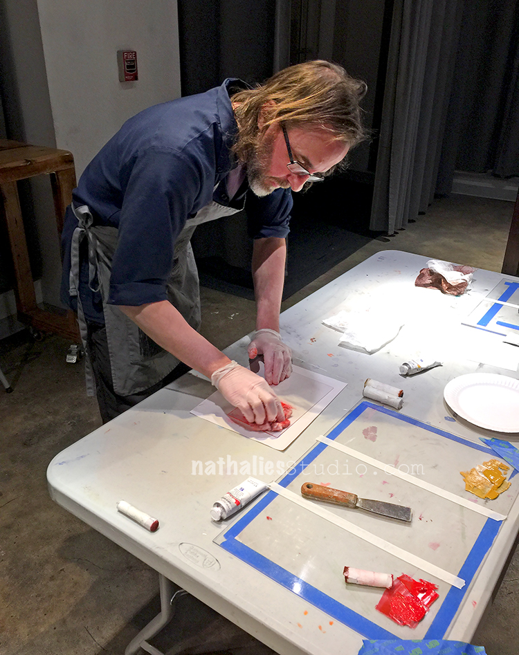
And below is his sample
I started with a new plate which I had prepared at home- see I just couldn’t stop scratching at home- LOL
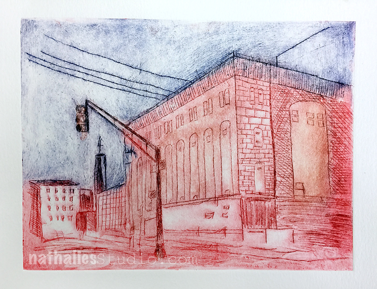
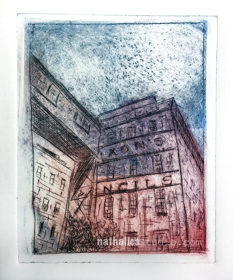
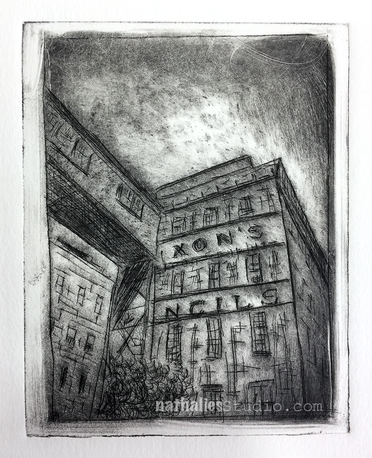
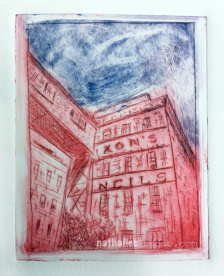
And here is the second one with the powerhouse – some of you might recognize this building :)
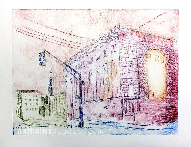
The third print came out the way I envisioned – I really love it. As Bruno says it is all in the wiping. Making the plates is actually not the work load, it is inking those plates up and then wiping them down again that makes up most of the technique and time.
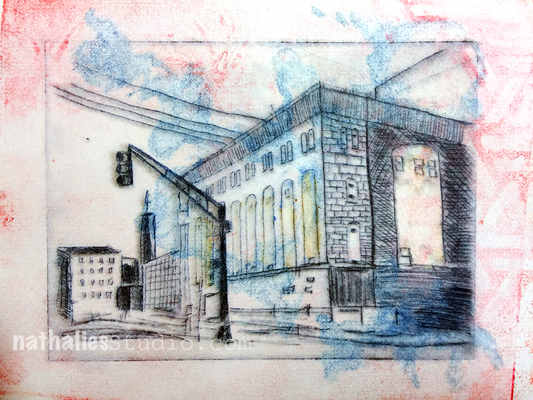
The print above was an experiment. I did some mono prints at home with Akua Inks which I always wanted to try out on a gel plate and I used this interesting paper which I had gotten at a convention many years ago. It is made out of plastic but feels like cloth. I printed on top of the mono print and I really like the outcome.

Here is a another plate I made in different stages – a part of the factory building I live in.
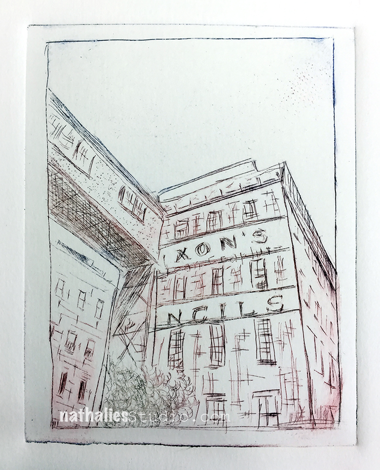
Isn’t it cool how different the images look and the mood they convey based on the inking? So cool to experiment with that.
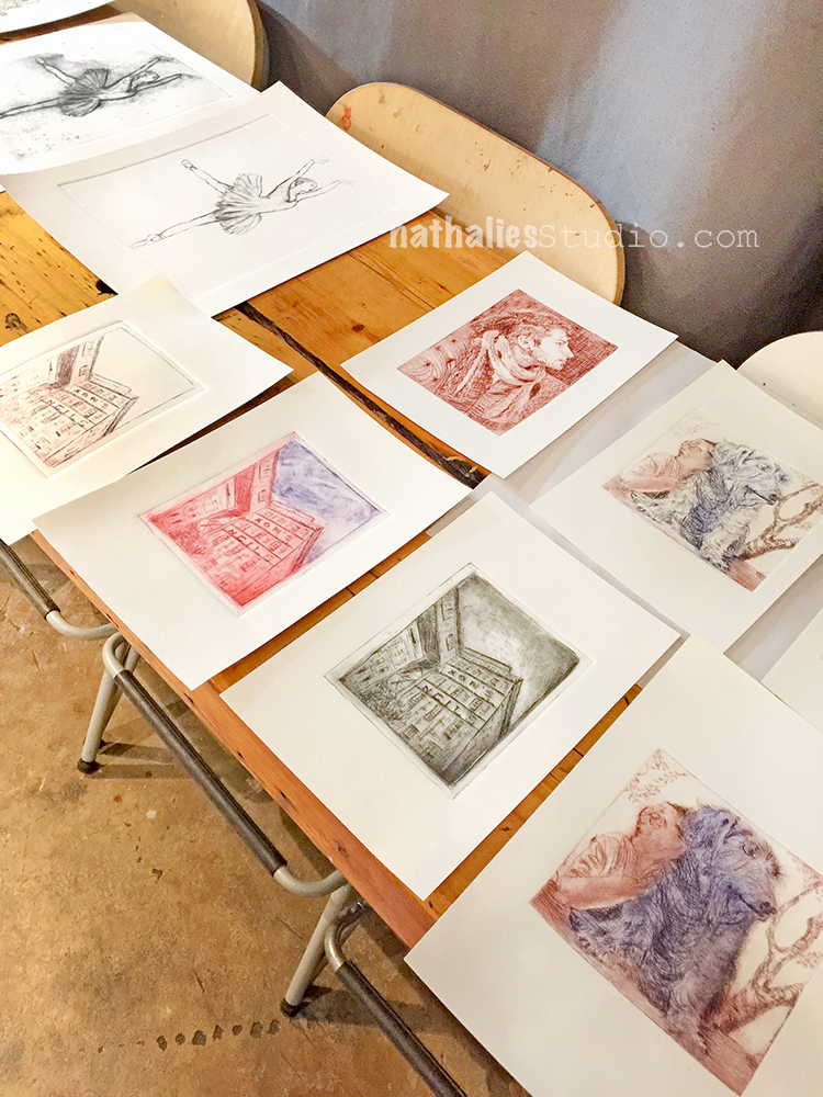
Here are a couple prints from the students in the class.

I don’t want to bore you , but here are a couple more- the Flatiron Building – as you know it is a reoccurring image in my work, so of course I had to make a plate with it as well.
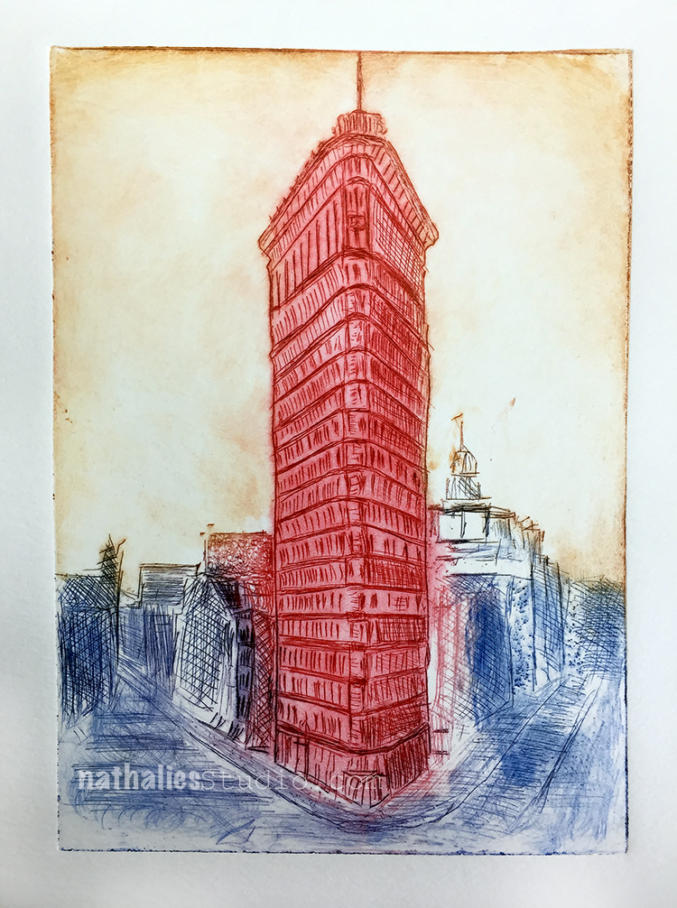
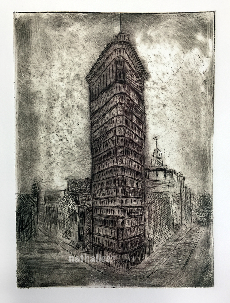
And then some prints from the last lesson where we did some two plate printing. Basically you create a mono type and then print on top of it – there are different ways to approach this of course.
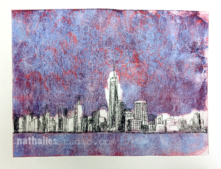
First one above as you can see I didn’t wipe that well – but I still love how the colors came out
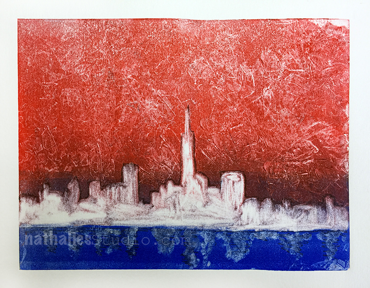
Here I had way too much ink on the first plate so I didn’t print the second plate on top, but I actually love it as it is. I kept it and might do something else to it later – I will see.
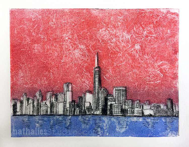
Here is the second try – less ink now- basically the ghost print of plate one and now with the second plate printed on top.
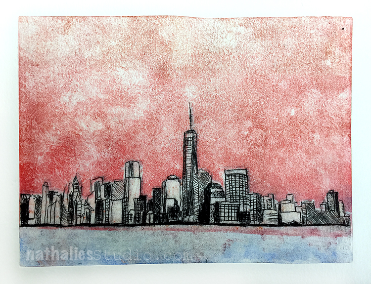
Another one – I like that one a lot.
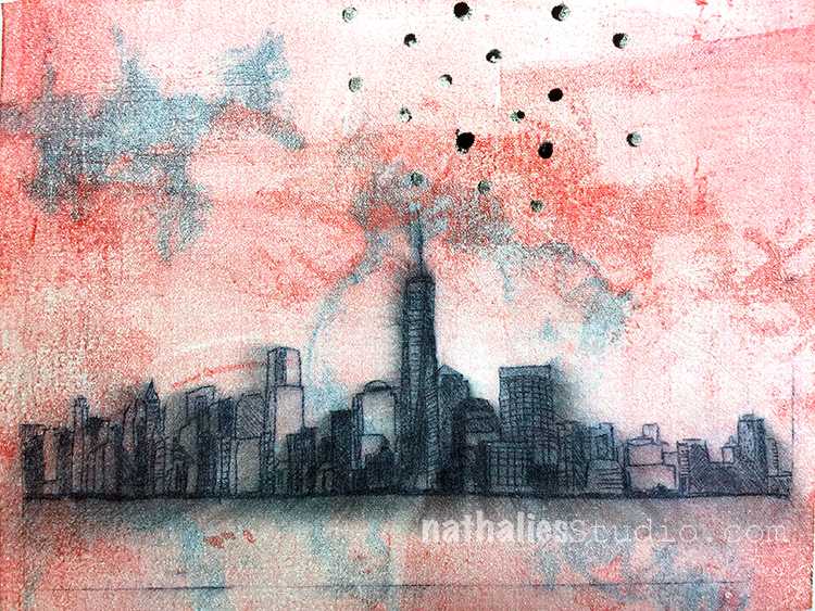
And last but not least one where I used once again one of those mono prints I did at home – the cloth-like paper had the ink of the skyline bleed a bit – I love this.

What I learned in this class:

  • It was first a bit hard for me to think I would not be able to do this all the time at home without a printing press but then that made me more focused and prepared for the lessons
  • The application of the ink and the wiping was a technique and whole process on it’s own and what a fascinating one it is
  • I loved the different ways one plate could be treated for different prints
  • I love the little time span where you just don’t know what is coming out of your press – when you lift up your print and see what happened. It reminded me of going to the photolab to finally get the vacation photos and seeing them for the first time.
  • There are art forms you just cannot get away with not being clean and organized …clean your space, clean your hands, clean the plates, clean the press …so much cleaning. LOL
  • I loved combining mono types with this class
  • There is only a certain amount of prints you can use the plates, and then that is it forever

What I take away for the future:

  • JCAS has print parties where you can use the printing press for a small fee- I def. will make up some new plates and join in the future to make some more prints
  • A way to take some of the mono prints on the gelli plate further – I want to explore this more
  • I enjoyed taking a class even though it was sometimes tough to go for 3 hours after a whole day of work- I need to do this more often again
  • I loved the pace of the class, I think I sometimes pack too much in my own classes and forget that it is also great for the students to just explore what they learned for a bit. Of course that is easier to do when you have a class that spans over several weeks but I def. look for a way to think about this in my multi-day-classes.


If you are in the area, I highly recommend taking a class with Bruno Nadalin or a class at the Jersey City Art School– it is a great place and they offer a lot of fun and different workshops and art events.

 

Comments (5)

  • Jill McDowell

    |

    Nat, love seeing your class and your prints. They look awesome. I know what you mean about wiping the plates. It takes a long time to get to know them. And keeping clean is definitely an issue. But it’s so worth it when you pick up the felts, see that lovely embossing on the back, and then reveal the print. Glad you had a good time. I’ve signed up for the spring Printmaking class at Creative Arts Workshop in New Haven. It’s addictive. ?

    Reply

  • Bruno

    |

    I’m so happy you enjoyed the class, Nathalie! It was great having you as a student again :)
    I really like reading your thoughts on your work. I find I often move so fast through things I don’t take the time to reflect on what I’ve done, so it’s good to be reminded about how important that is. I also like your 4th observation about the time span when you’re waiting for the print to be revealed. That little surprise is what makes it fun!

    Reply

    • nathalie-kalbach

      |

      It was fantastic- you are really an amazing artist and teacher! It is always a huge booster in inspiration for me to take a class with you and I learn so much – plus you are the most patient person even when we are super messy and can’t stop giggling about a la poupee ;) Cannot wait for a new class with you in the future.

      Reply

  • Clavell

    |

    These are incredible!…fascinating! I hope some of these find themselves FRAMED and HUNG on your walls! They are wonderful pieces of art! ♥

    Reply

    • nathalie-kalbach

      |

      Awe thank you Clavell! Yeah- I started matting some of them and some of my friends are already in line for some- so I am super stoked that they are finding some nice homes :)

      Reply

Leave a comment

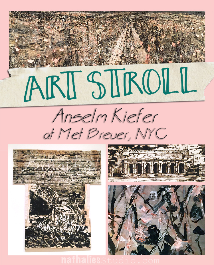
Art Stroll: Anselm Kiefer at Met Breuer, NYC

While at the Met Breuer I also strolled through the small Anselm Kiefer exhibition because as some of you might know I admire his work so much, the themes, the materials …. Some of the pieces I had just recently seen on an Art Stroll at the Gagosian Gallery , so I am not posting those again, but there were many other pieces that I loved to study.

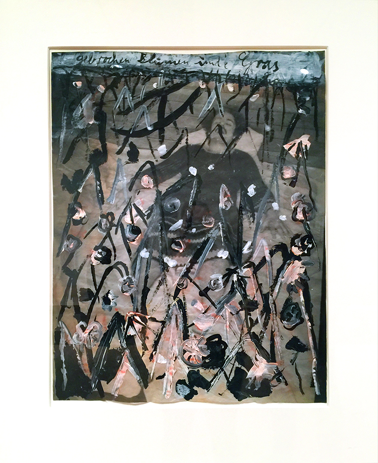
Broken Flowers and Grass, 1980 – Gouache, acrylic, watercolor and shellac on photograph.

During the 80s Kiefer began reusing earlier self-portraits to create new works. Dressed in a crocheted gown, the artist presented himself as if asleep , but the broken flowers and grass cover his body as if he were dead and buried, the ultimate state of transformation.

The mixture of the photo and the crude painting on top fascinates me.

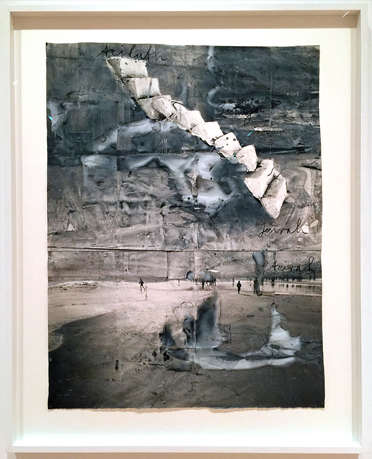
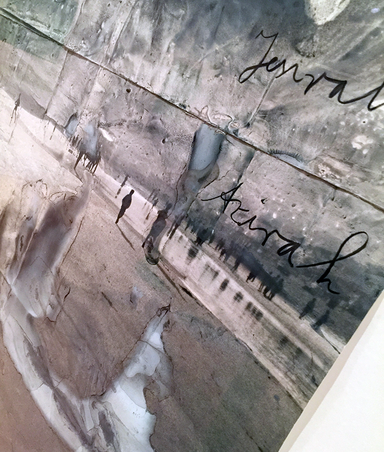
Aziluth, 2004 – painted photograph and collage on paper

Stunning- and guess how much I wanted to touch this piece. I just love the interplay of photo, collage and painting!

No touching of the one below:

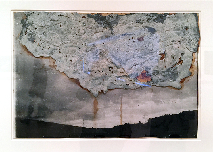
Heavy Cloud, 1985 – Lead and shellac on photograph, mounted on cardboard

Kiefer has often used lead to represent something usually thought to be weightless. Here the title is a pun on “heavy Water” a synonym for radiation in nuclear reactors. Kiefer has pointed out that even though lead is used to “seal radiation” his Heavy Clout has “a radiation leak” symbolized by the yellow shellac streaks seeping form the bottom of the cloud in the direction of the bleak landscape.

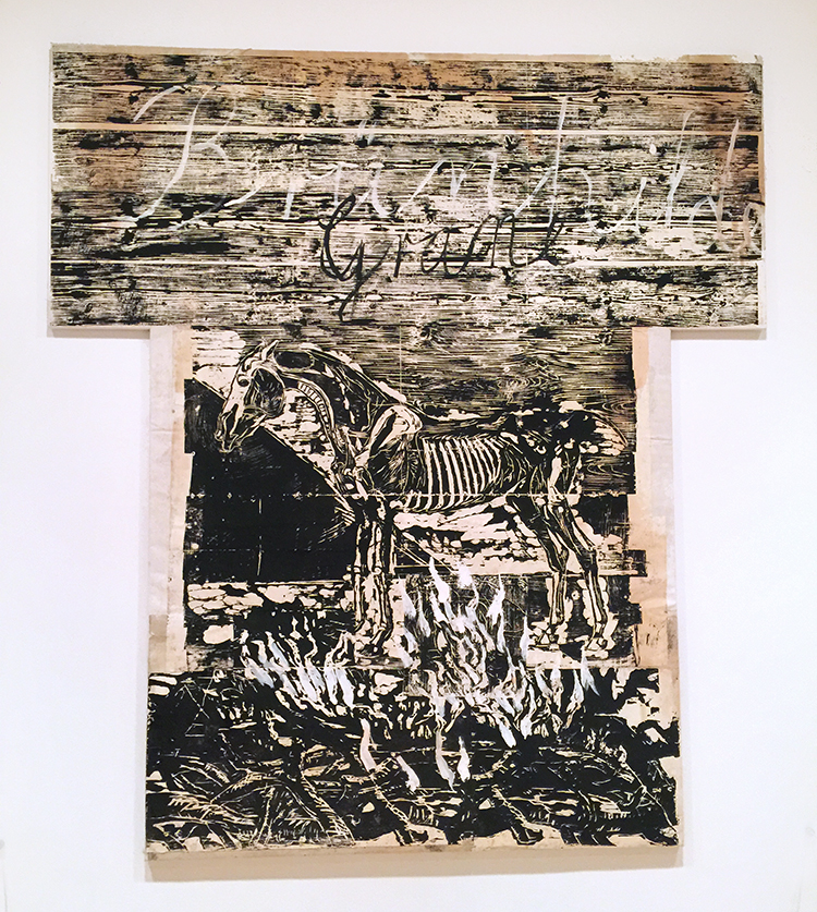
Brünnhilde/Grane 1982/93 – Woodcut and acrylic on cut and pasted papers, mounted on canvas

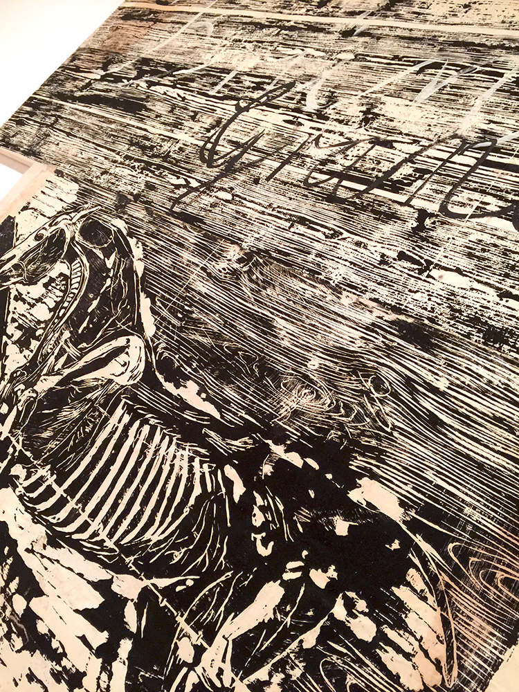
Woodcut is a traditional medium in German art. Kiefer began to experiment with woodblock printing in the early 1970s and returned to it in the late 70s focusing on subjects related to German history and myth. Fo all theGermanic tradition evoked in his turn to the woodcut, his practice was nontraditional in his choice of a larger format and a visibly seamed composition. One of the artist favorite themes at this time was Grane, the sacred steed ridden by Brünnhilde, when she sacrificed herself on Siegfried’s funeral pyre at the close of Wagner’s opera Götterdämmerung.

The texture, the details, and then the size- just amazing!


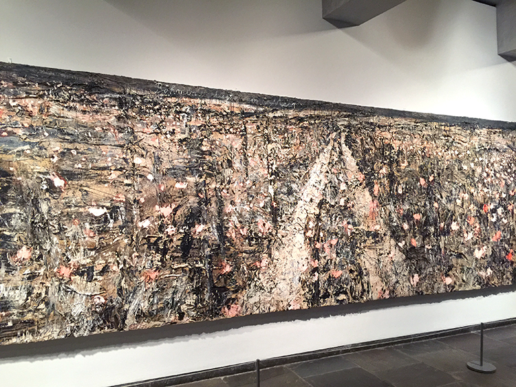
His gigantic paintings are just breath taking- the texture – omg – I could sit in front of this forever. Unfortunately the hallway as the entrance to the exhibition where this was hung was so narrow that it was hard to take the painting in in total. Plus the museum was super crowded …even if not as crowded as in other galleries of the Met Breuer.

It was a very inspiring Art Stroll that let me think about more and different ways to integrate photos, collage and painting …printing …texture …all of it in my work. Hope you enjoyed the stroll as well :)

Comments (4)

  • Seth

    |

    What? Wait? Kiefer is at the Met Breuer? Who knew? Oh yeah – Nat did. Will have to get there too see this. Thanks!

    Reply

    • nathalie-kalbach

      |

      LOL maybe I will ping you next time and we go together ;) It is a small but fine little exhibition – combine it with the MET to make the day worthwhile ;)

      Reply

  • Kathryn Gallanis

    |

    I too love Anselm Kiefer. Many years ago there was an exhibit of Kiefer’s large works at the Art Institute of Chicago. I was in awe of the scale and texture. There was hay and dirt in one of the works! I had never seen anything like it. The principle that art maybe isn’t supposed to last was also new to me. I went back several times and loved it. Thank you for the great visit.

    Reply

    • nathalie-kalbach

      |

      I agree- I love how he is working so much with the concept of transforming art! It must be such an liberating feeling to do art with that concept- I wish I was there yet :) Thank you for joining me on the stroll Kathryn!

      Reply

Leave a comment

Not in this Century – Art Journal

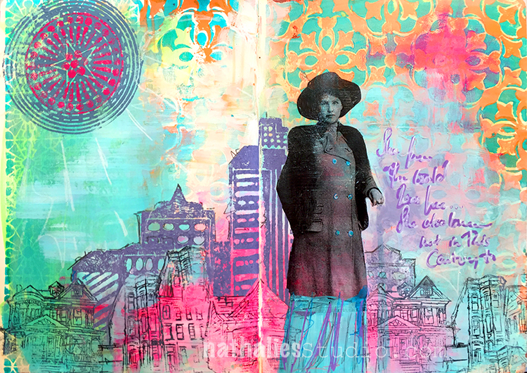
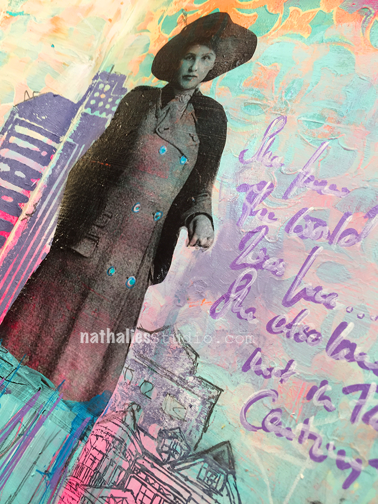
“She knew the world was hers….She also knew not in this century”

My great-grandmother as a cut out image transfer. She was a city girl all her life hence the city background.

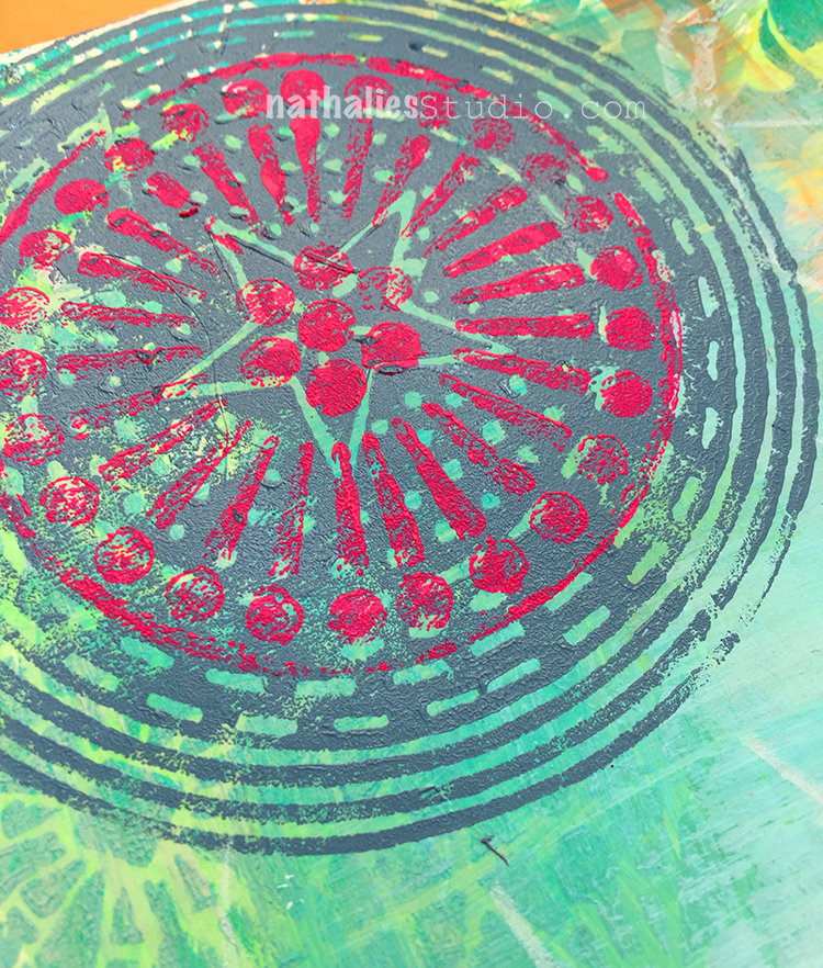
I layered my Grove Street Stamp in pink over the Circle Drive Stamp – – I like the outcome- I need to play a bit more with layering the different circle designs on top of each other and will make sure to share.

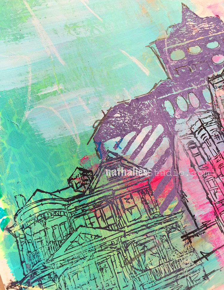
I masked her off with post its to stamp the buildings around her and I like the look of combining the bold Midtown Foam stamps with the finer building stamps with my rubber stamps.

Do you use vintage photos in your art journals?

Here are some of the supplies I used:


Leave a comment

Love is in the Air – Art Journal Page

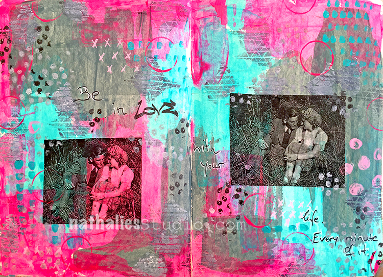
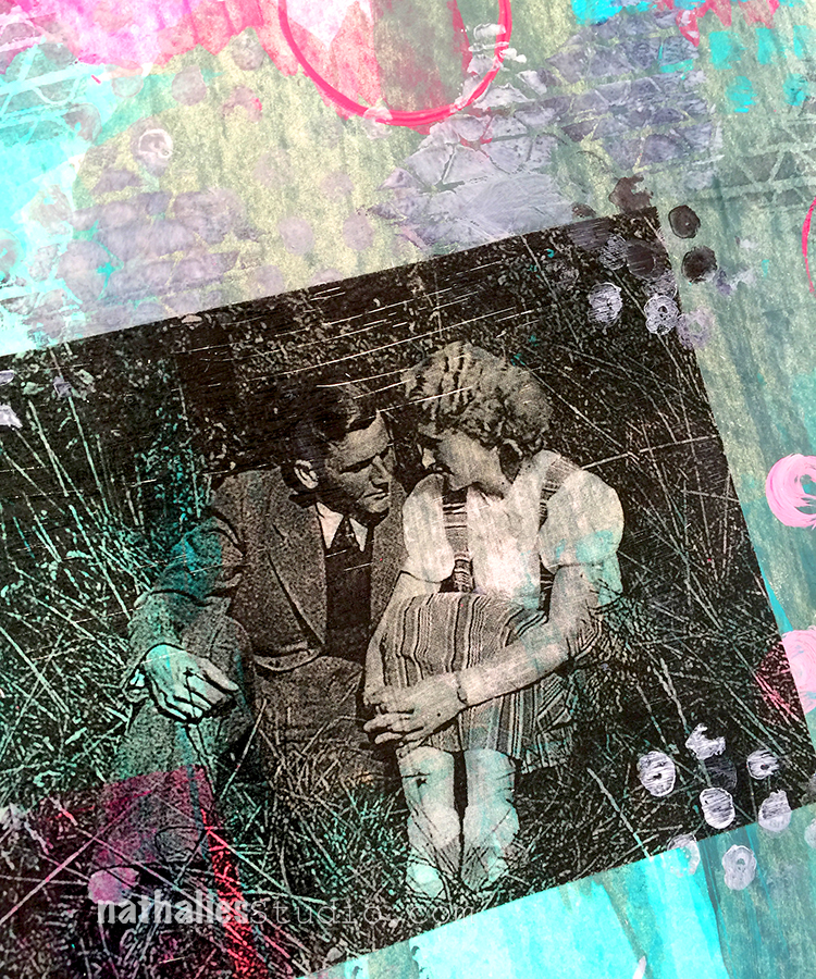
I was playing with some transfers and used the engagement photo of my great-aunt Margot and my great-uncle Hans. I love this photo.

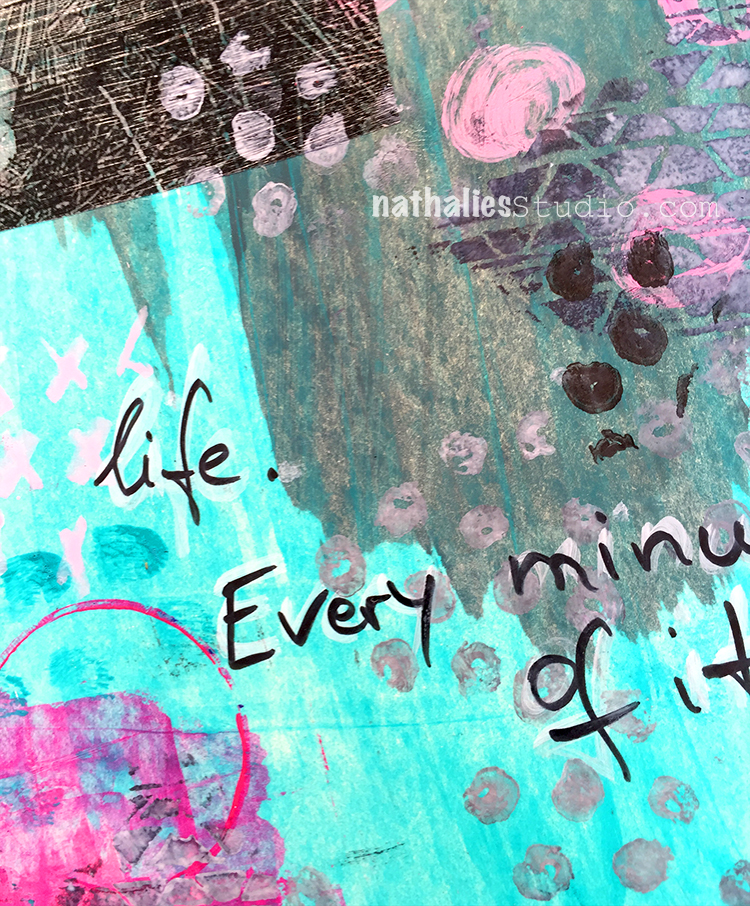
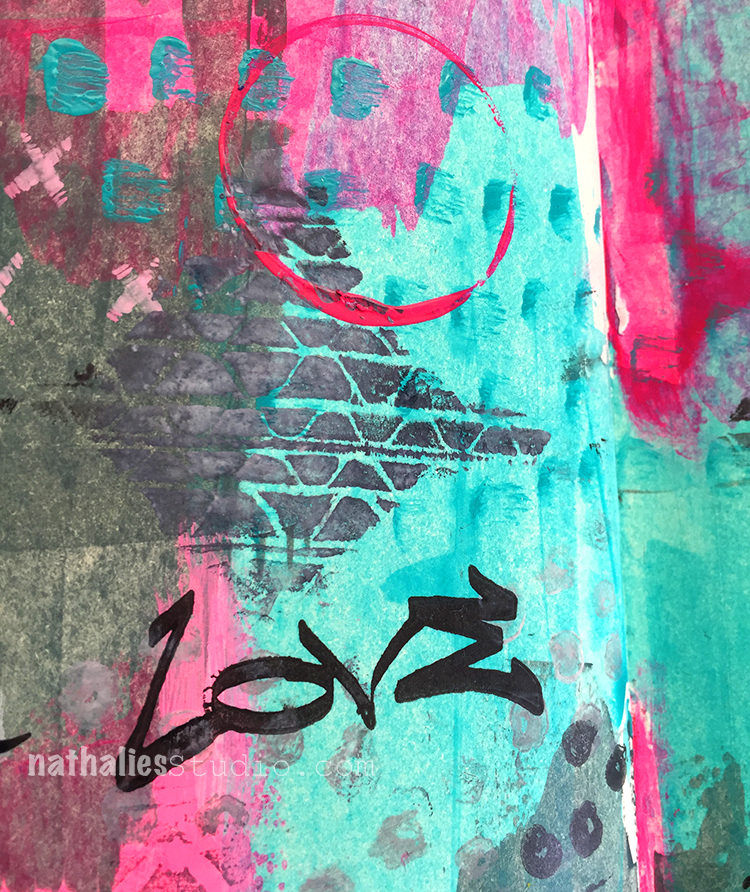
She turned all pink layered over this ares :) All in all a bit too pink for me- so you can see I needed to grunge this all up a bit with some stamping but it was fun!

Love stamping with manufactured stamps but also with lids and other bits and pieces I find on my work bench to break it up a bit.

It was fun to try some different colors – and go crazy pink- LOL . Valentine’s Day is not a huge thing in Germany to be honest so the whole concept around this is kind of fascinating for me, but of course I do enjoy the wonderful flowers and gifts from my US-born husband ;)

Hope your day is filled with Love!

Here are some of the supplies I used for this spread


Comments (2)

  • pam hansen

    |

    ❤️❤️?

    Reply

  • Sue Clarke

    |

    Always nice to see Margot on a layout or art journal page.
    My favorite items to use on paint are lids from plastic jars I have at home.

    Reply

Leave a comment

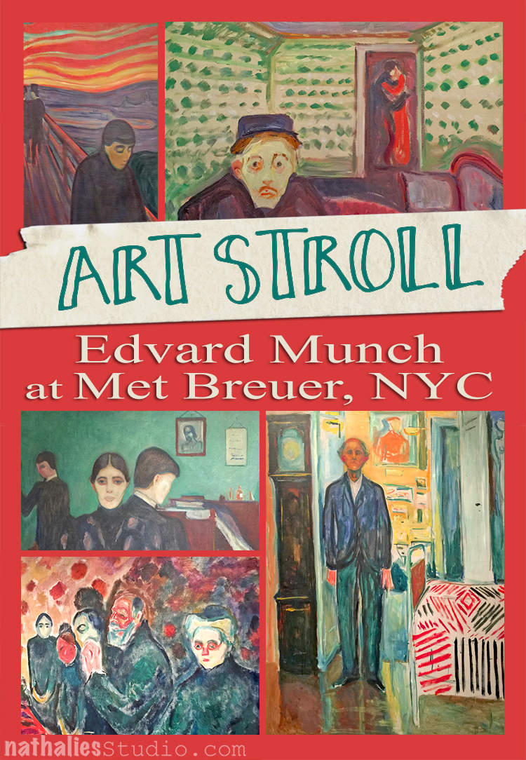
Art Stroll Edvard Munch at Met Breuer, NYC

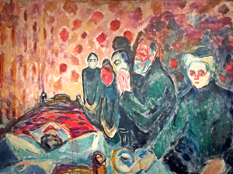
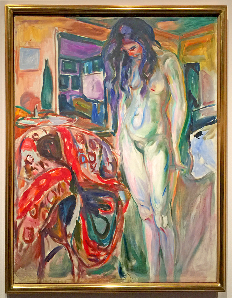
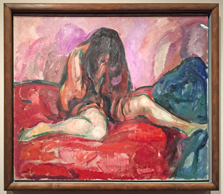
We spend Super Bowl Sunday at the Met Breuer to see “Edvard Munch: Between the Clock and the Bed”. Munch  was a young boy when his mother died of tuberculosis; his beloved older sister, Sophie, succumbed to the same disease. He suffered from asthmatic bronchitis and other frequent illnesses, was haunted by depression, and drank and smoked too much. Even without knowing all this his paintings do tell the story.

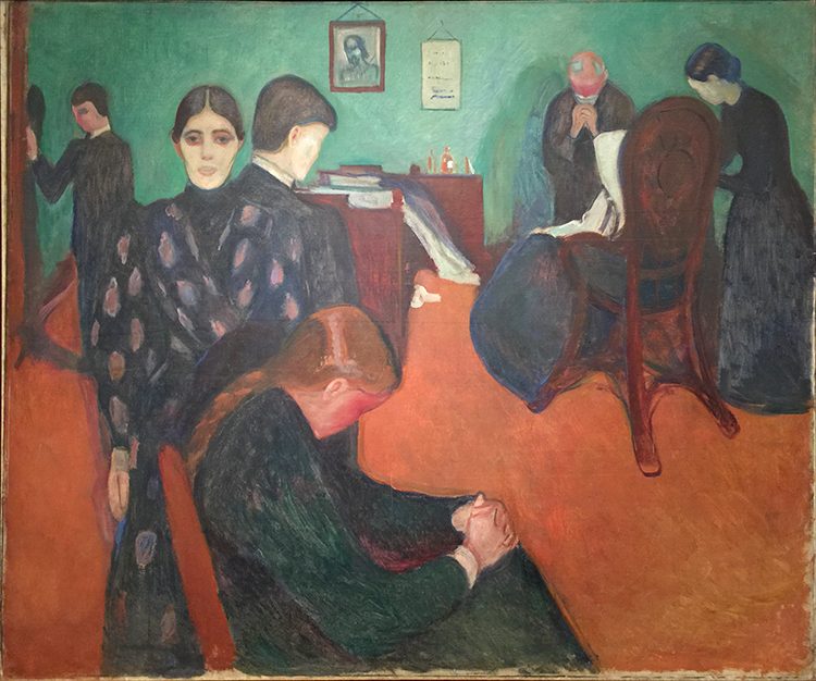
Death in the Sick-Room, prob. 1893

“I paint not what I see, but what I saw,” Munch once said about his works.

Death Struggle, 1915

Model by the Wicker Chair, 1919 – 1921

Weeping Nude, 19413-14

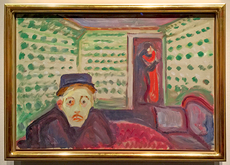
Jealousy, ca. 1907, oil on canvas

In the doorway at the back of a green wallpapered room, a couple is seen in embrace. The man in the foreground with a whitened face appaears consumed with jealousy in response to the scene behind him. He is presumed to be the poet Stanislaw Przybyszewski and the woman in the background, his wife.


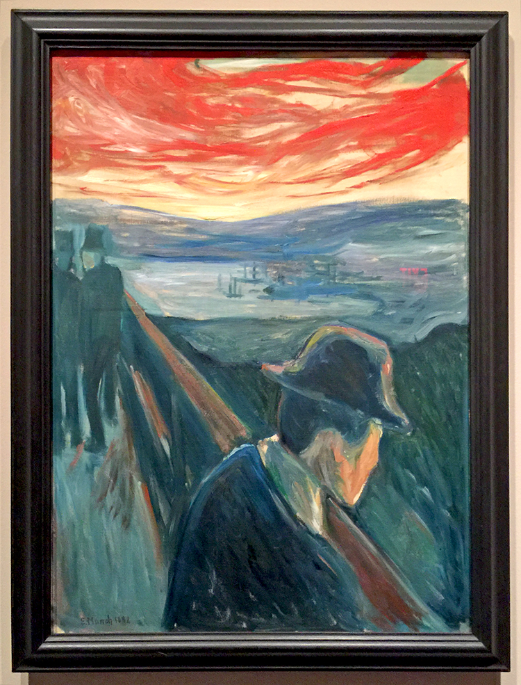
Despair, 1892


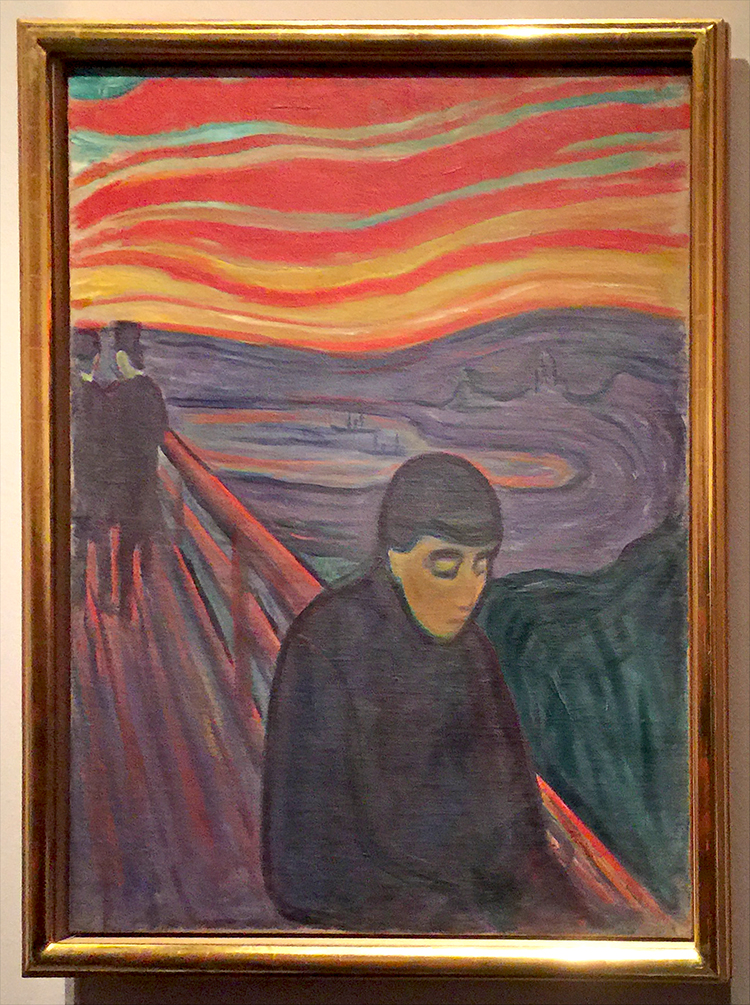
Despair, 1894

I loved seeing how in just one year his painting style of the same theme changed- look at the sky, the bridge!

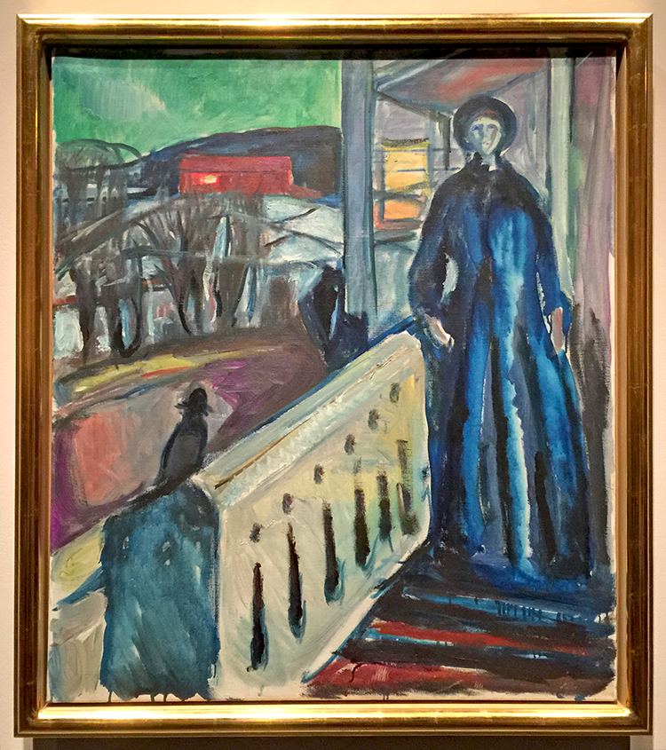
On The Veranda Stairs, 1922 -1924

Veranda views and window views are a reoccurring theme as well .

Starry Night, 1893, oil on canvas

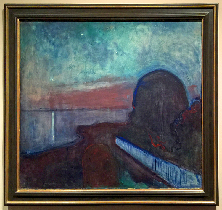
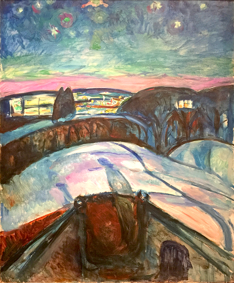
Starry Night, 1922 – 24, oil on canvas

this work belongs to a group of winter views from Munch’s veranda in Ekely. Light from the house creates shadows of the two figures who look out over the dark, snowy landscape.

By the way, both Starry Night paintings weren’t the only ones that left me thinking of Van Gogh, and when I did a little research I realized that wasn’t too far fetched.

“Researchers found, that van Gogh may never have been aware of the Norwegian artist, but that Munch was a great admirer of van Gogh’s work and often tried to emulate his approach.

Seen together, the works show that the artists took similar paths to developing their technical approaches to painting, and also indicate strong thematic affinities. It is also clear that each artist found his own distinct style.”

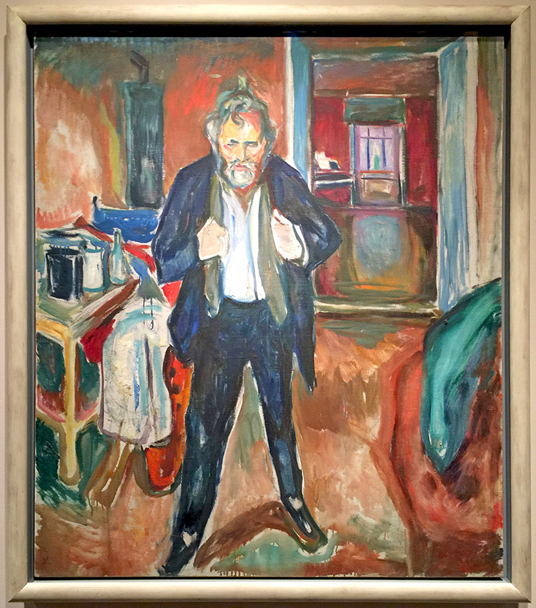
Sleepless Night, Self Portrait in Inner Turmoil, 1920

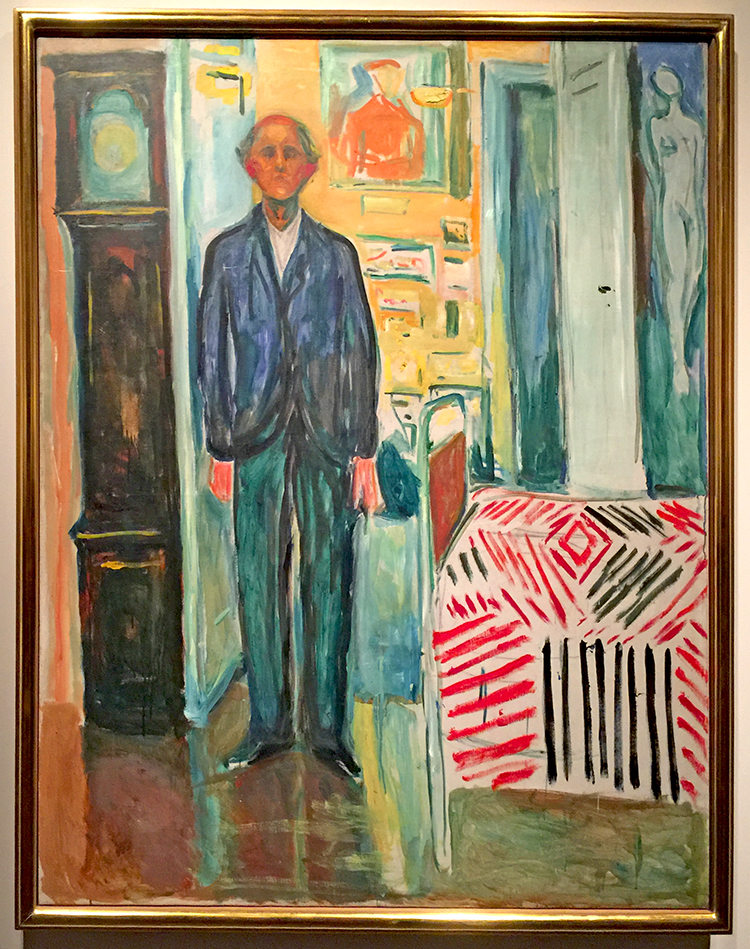
Self-Portrait: Between the Clock and the Bed” (1940-43).

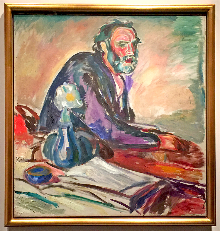
Man with Bronchitis,1920

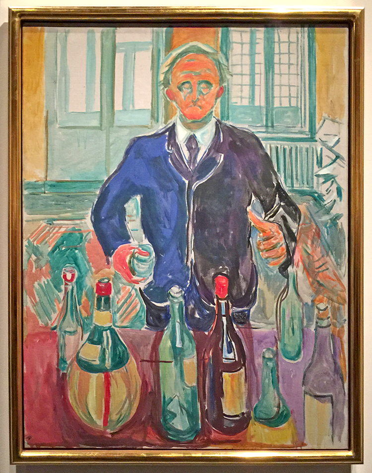
“Self Portrait With Bottles,” circa 1938.

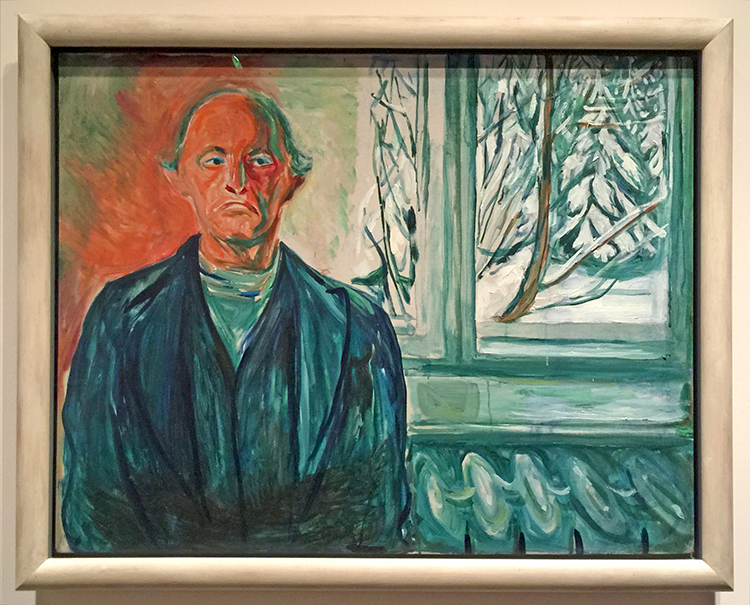
By the Window, 1940

I liked this exhibition a lot. An emotional exhibition – you feel the pain conveyed by color and brushstrokes almost physically.

Thanks for joining me on this Art Stroll – I hope you enjoyed it. BTW- you can find all the past Art Strolls here.

Comments (2)

  • Yvonne B.

    |

    We saw this exhibition in San Francisco last summer–it was fascinating. Loved his self portrait with bottles. Glad you got to enjoy it, too!

    Reply

  • Sue Clarke

    |

    Sleepless Night is my favorite.
    Having suffered from depression in the past, I can say that he has nailed it in his paintings.

    Reply

Leave a comment