Creative Squad

Pastel Dreams – Jennifer Gallagher

Hello from my Creative Squad! Today we have an art journal page from Jennifer Gallagher using my Floral Tile Large rubber stamps and my Van Vorst stencil, celebrating this month’s theme: Pastel Dreams – This month we are focusing on the softer, gentler side of things and going pastel with our color palettes. These dreamy pale colors are undeniably appealing and just as powerful as their bolder cousins on the color wheel.
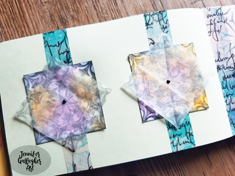

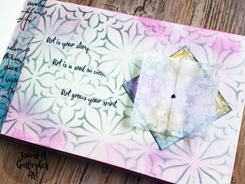
When I think of pastels, I think of softness and they evoke a certain delicate nature. I decided to create a two-page art journal spread that perfectly displays my idea of what pastels are all about.
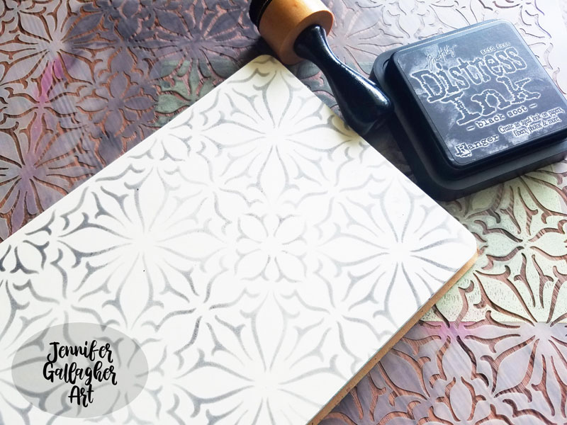
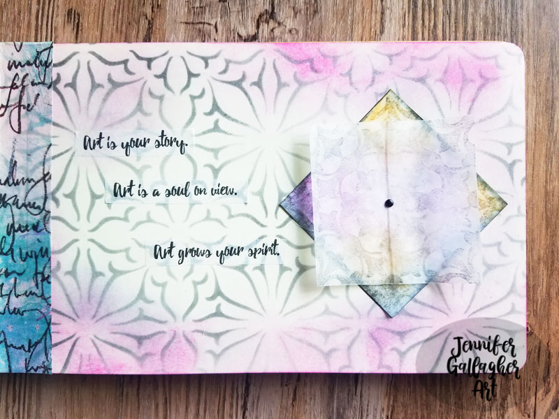
First, I began on the right page of a two page spread in my small dylusions journal. Using Nat’s Van Vorst stencil, I applied a light amount of black soot distress ink with the mini blending tool.
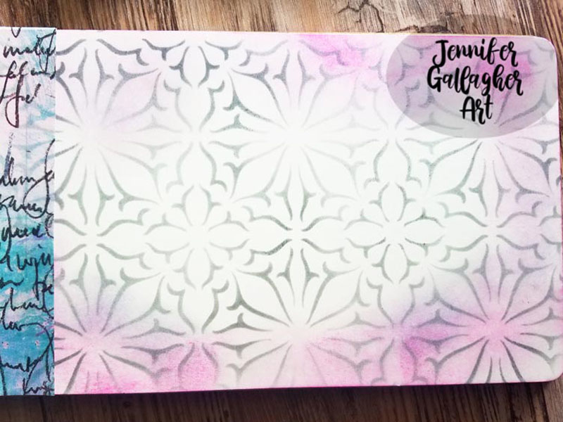
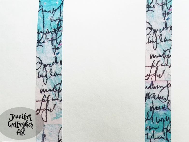
Next, I applied a little picked raspberry and shaded lilac distress ink around the edges of the same page. Then I placed some Dina Wakley Media washi tape in coordinating tones on both the right and left journal pages.
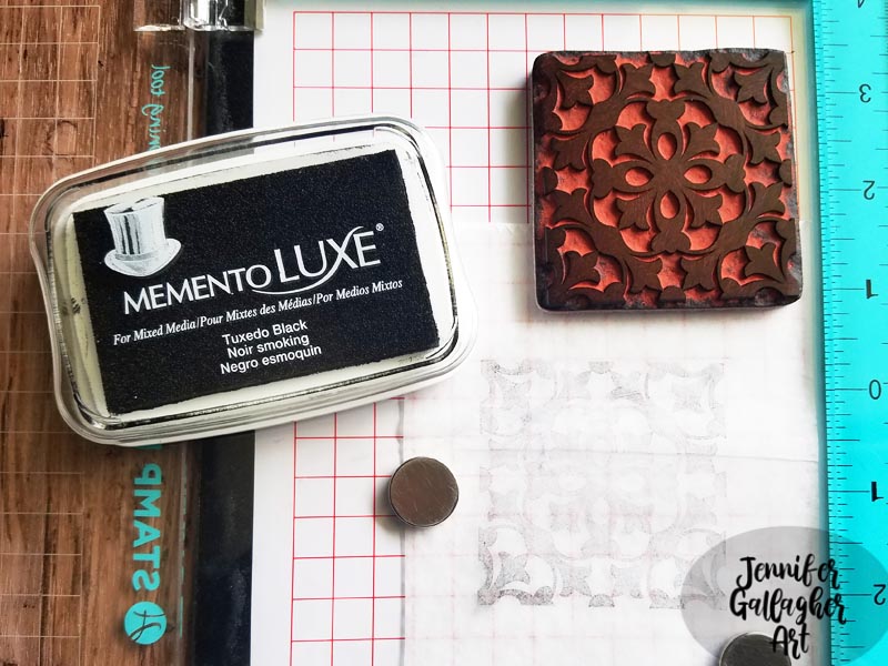
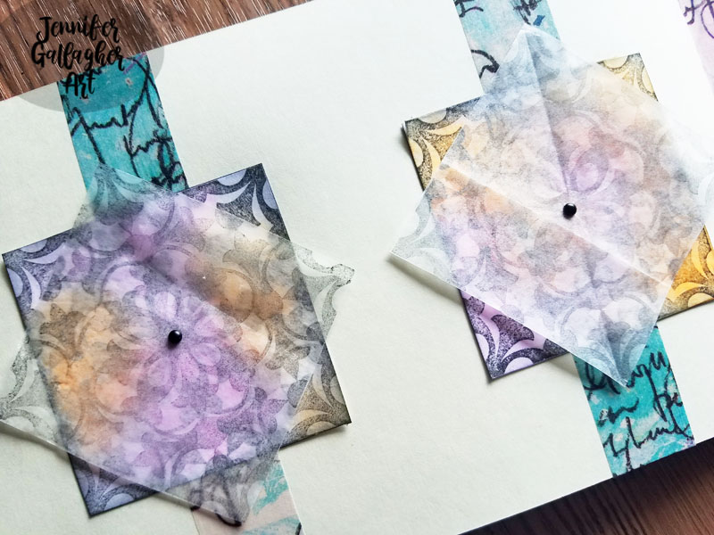
Using my stamp perfect platform, I stamped Nat’s Versailles positive stamp from the Large Floral Tile Set onto deli paper using Momento Luxe Tuxedo Black ink pad. This ink is perfect for stamping on deli paper! I stamped two images for each medallion I created for my page, stamping a total of six.
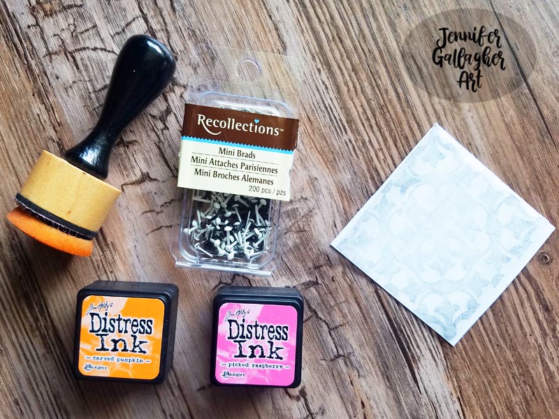
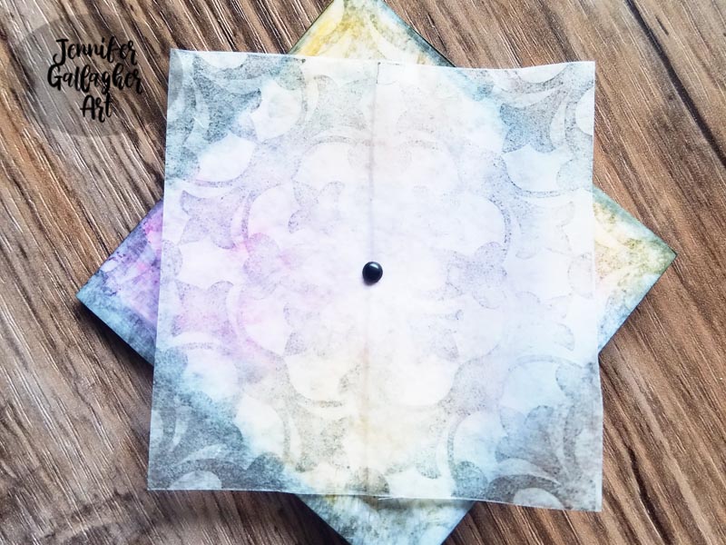
After cutting my stamped deli paper along the design, I cut out three coordinating squares from white copy paper. I glued one deli paper square onto each white square with a basic glue stick. I added a little color to each medallion with distress ink. Then I placed an extra deli paper square on top of that and attached it with a mini black brad. In all I made three of these two-piece medallions.
I attached two of the medallions on the center of the washi tape stripes I created earlier on the left page. The third medallion went on the opposite page. Each medallion was adhered with a basic craft glue stick. I also added a few tissue paper sentiments from Dina Wakley Media collage words.
These cute little medallions would also be a wonderful accent for your hand-crafted cards. Be sure to play along each month with the creative squad and share your creations. Happy creating!

Thank you Jennifer – what a beautiful page! You can find all of my rubber stamps and my stencils in my online shop. Here are some of the other supplies Jennifer used:


Feel inspired? Working on something yourself that you’d like to share?  I love to see how you interpret our monthly themes. Email me how you used my stencils and stamps with the theme and email me an image – I would love to share your projects in my next  “n*Spiration From Around the Globe“.

Leave a comment

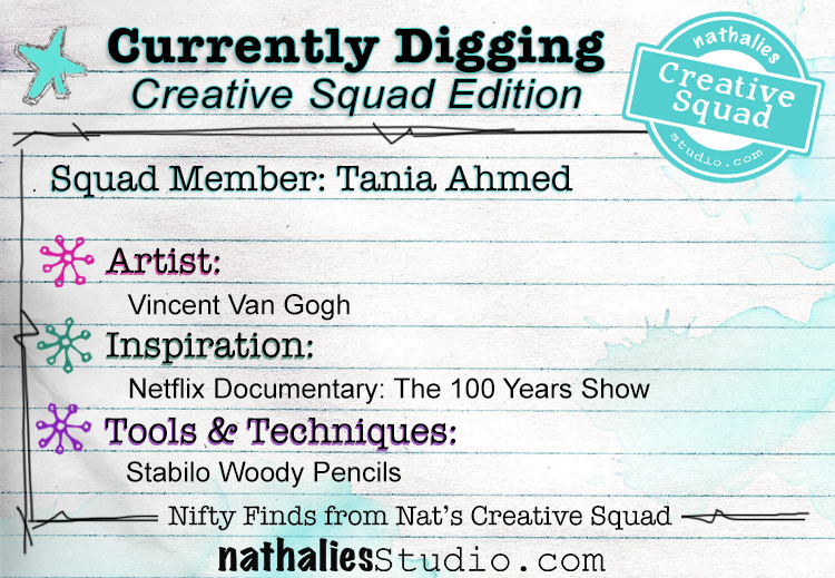
Currently Digging – Creative Squad Edition with Tania Ahmed

It’s time for a special edition of Currently Digging – with my Creative Squad! Once in a while I like to share with you some nifty finds – like an Artist whose work caught my eye…, some Inspiration that got my creative juices flowing, and Tools & Techniques I am currently digging. Today I asked Tania Ahmed from my Creative Squad what SHE is Currently Digging :) Hope you enjoy this.


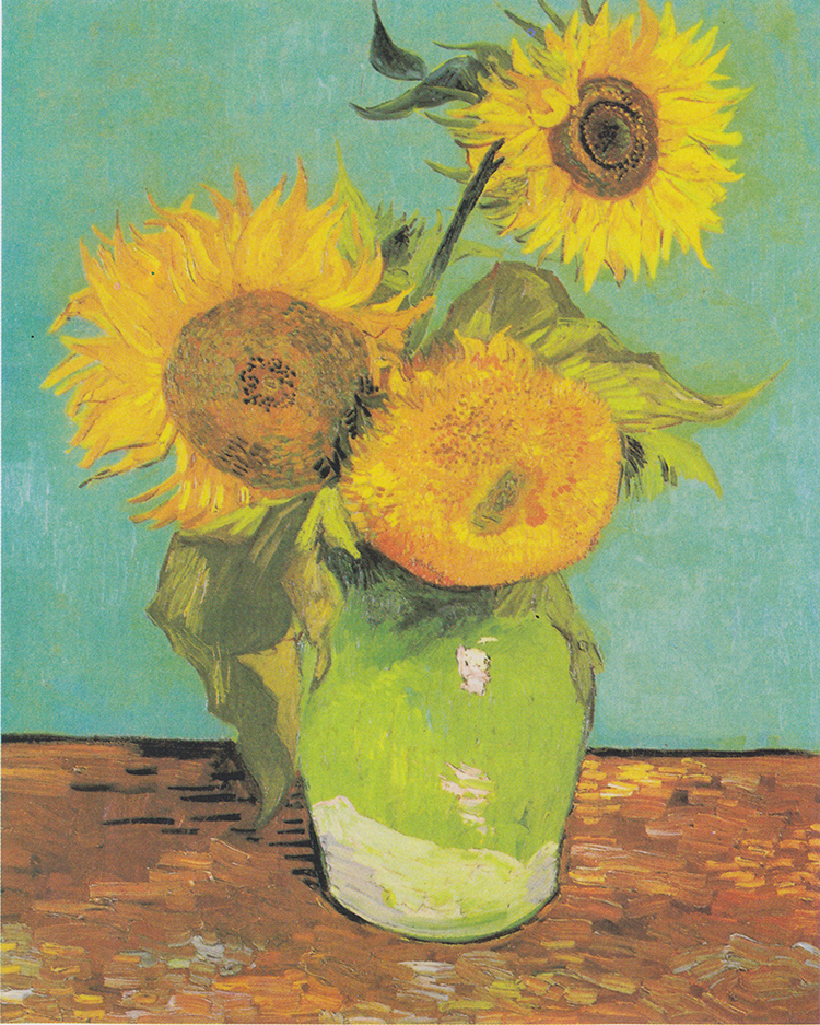
Vincent Van Gogh – I am practising drawing and sketching more these days, I have had a mental block for a very long time where a voice in my head said “I can’t draw” … now I am telling that voice, “But I can try!” :) So I have been making sketches, taking classes and filling many many notebooks with paintings and scribbles. At the moment I am practising abstract flowers and I particularly fascinated especially by Van Gogh’s sunflowers. I love sunflowers as they are unabashedly flamboyant and I can’t help but be cheered up by them. I now grow them every year in my garden because they are so easy to take care of!  

Netflix Documentary: The 100 Years Show
“You cannot talk about art. You have to art about art.”
On the other side of the spectrum I have been fascinated by the works of Carmen Herrera who is described to be a “minimalist visual artist.” A trained architect, her work is a vision of bright colours and bold geometric shapes who was finally recognised by the art world at the age of 89. As much as I love the chaos of sketching and drawing, there is a part of me that is drawn to stark geometry and order in art. The documentary is very short, only 30 minutes and well worth a watch. 

Artist Carmen Herrera in front of some of her paintings. Credit: Matthew Carasella

(image credit: https://www.ft.com/content/60dbd808-8499-11e6-8897-2359a58ac7a5)

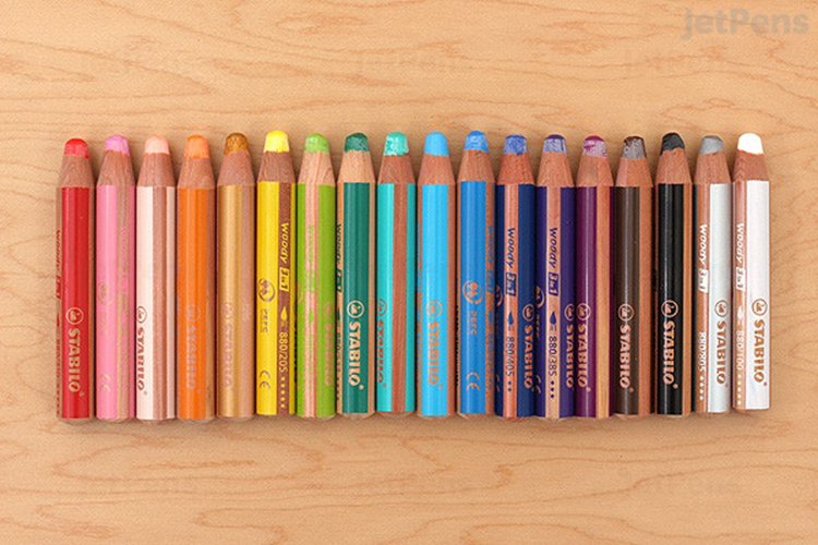
Stabilo Woody Pencils – In my quest to sketch and draw more, I am exploring new mediums too! I have been eyeing the Woody Pencils over the years and always wondered if I really needed them considering I have a myriad of other amazing supplies at my disposal. Recently to treat myself, I got them and have not stopped using them! I now keep a few supplies as we travel a lot during weekends in my “entertainment bag” as my husband calls it, haha! These will definitely go traveling with me as they are watersoluble and the surprisingly quite pigmented. Perfect for quick sketches and art journal pages. 


Thank you Tania! Stay tuned for the next Currently Digging Creative Squad edition for more from our other members :)

Leave a comment

Pastel Dreams – Marsha Valk

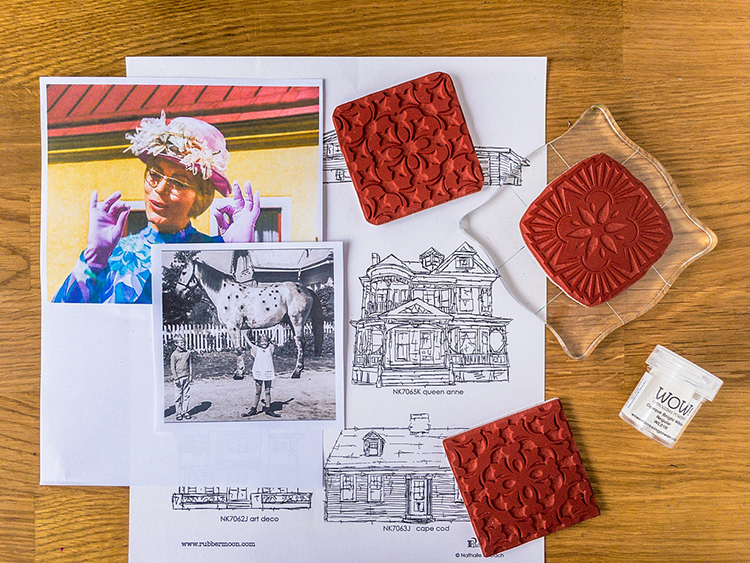
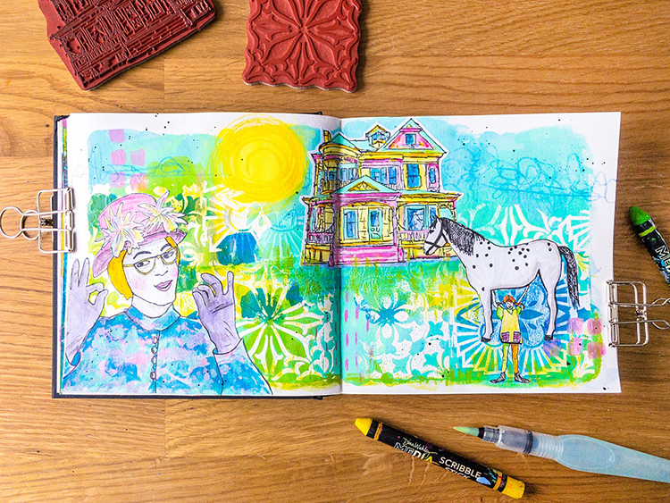
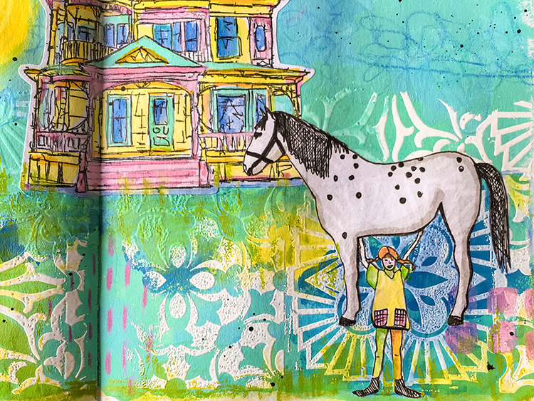
Happy Tuesday from my Creative Squad! Today we have a fun art journal video post from Marsha Valk. She used my Floral Tile Large rubber stamp set and my Queen Anne stamp from the Stroll Around the Block stamp set. She was inspired by this month’s theme: Pastel Dreams – This month we are focusing on the softer, gentler side of things and going pastel with our color palettes. These dreamy pale colors are undeniably appealing and just as powerful as their bolder cousins on the color wheel.


This month’s theme reminded me of Pippi Longstocking. Looking at my art journal spread you may think that Villa Villekula and Nat’s Queen Anne Cling Rubber Stamp are what prompted that thought, but it actually was Mrs. Prysselius. Or, rather, Aunt Pastellia, as that is her name in the Dutch translation of the Astrid Lindgren books.

In my ‘Pastellia Dream’  she loves and approves of everything Pippi does ;-). Watch me create the art journal spread step-by-step in the video!

Happy pastel dreams!- Marsha.


Thank you Marsha! You can find all of my rubber stamps in my online shop. Here are some of the other supplies Marsha used:


Feel inspired? Working on something yourself that you’d like to share?  I love to see how you interpret our monthly themes. Email me how you used my stencils and stamps with the theme and email me an image – I would love to share your projects in my next  “n*Spiration From Around the Globe“.
Leave a comment

Pastel Dreams – Tania Ahmed

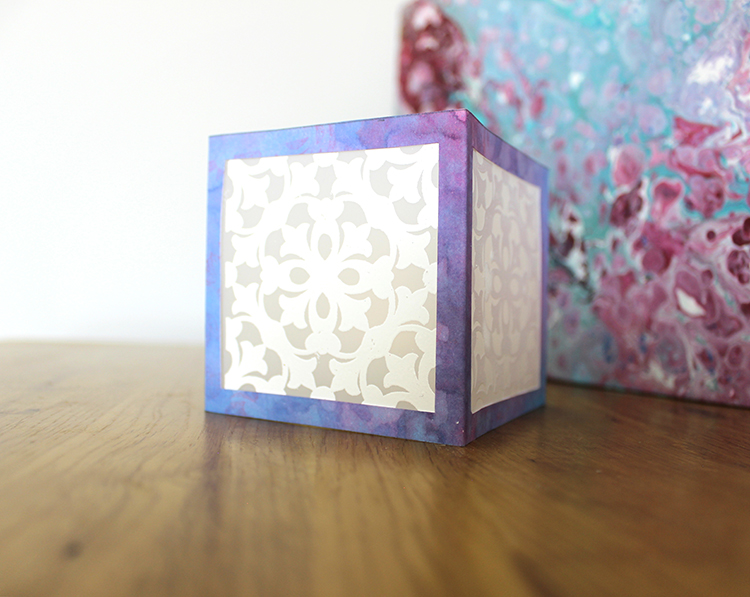
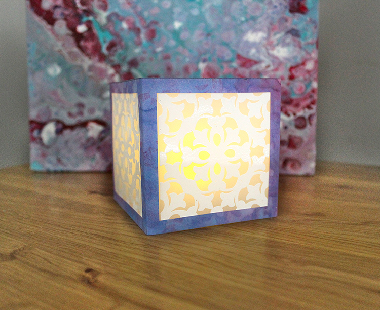
Hello from my Creative Squad! Today we have a beautiful paper lantern from Tania Ahmed that is sure to set the mood. She used my Versailles stamp from the Floral Tile Large rubber stamp set and this month’s theme: Pastel Dreams – This month we are focusing on the softer, gentler side of things and going pastel with our color palettes. These dreamy pale colors are undeniably appealing and just as powerful as their bolder cousins on the color wheel.


We love subtle mood lighting around the house and I love making little pieces like this paper lantern to use around the house as purposeful décor! I love the ornate filigree style pattern of the Versailles stamp so I knew that it would make a striking pattern for my paper lantern.

Steps:

1 Stamp and heat emboss 4 times on Duralar with Versailles Positive 

2 Spray a 3” x 12.25” piece of sturdy cardstock with Distress Oxides Sprays. Mist liberally with water and lift ink with kitchen towel. Dry thoroughly

3 Stamp Versailles Negative with water to get ink to react. Lift with kitchen towel. 

4 Stamp Versailles Negative with Distress Oxide in Picked Raspberry. Dry thoroughly.

5 Score cardstock panel at 3” intervals. You will be left with a ¼” flap. Cut out 2.5” square from centre of each panel with craft knife.

6 Cute out heat embossed Duralar and attach to square panel aperture. Fold and securely glue flap to assemble lantern. 

7 Add battery operated tea light and enjoy!


Thank you Tania! You can find all of my rubber stamps in my online shop. Here are some of the other supplies Tania used:


Feel inspired? Working on something yourself that you’d like to share?  I love to see how you interpret our monthly themes. Email me how you used my stencils and stamps with the theme and email me an image – I would love to share your projects in my next  “n*Spiration From Around the Globe“.
Leave a comment

Feel the Rhythm – Judi Kauffman

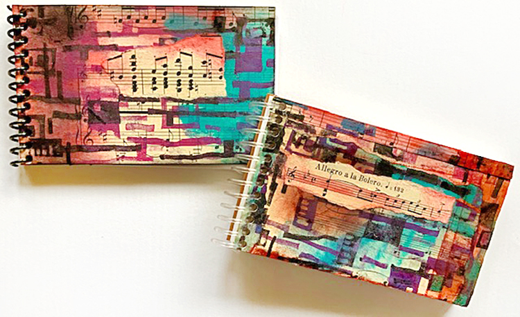
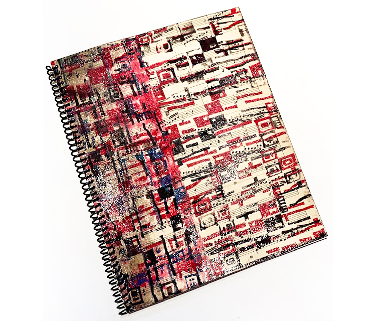
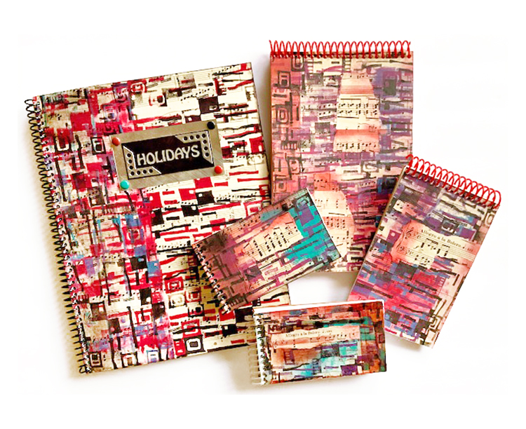
Hello from my Creative Squad! Today we have a post from Judi Kauffman. You can learn more about Judi from our Nice to Meet You blog post featuring her creative story and artwork. This time Judi is sharing some funky notebooks with us that use my Mid Century Squared ArtFoamie and discarded sheet music. She was inspired by this month’s theme: Feel the Rhythm – We’re thinking about patterns this month and using stamps to create a rhythm of marks. Show us your sense of rhythm!


Aretha Franklin Meets Mid-Century Squared

I have close to zero musical abilities. My singing voice can clear the room and my dancing isn’t exactly top notch, so when we were given Feel the Rhythm as this month’s theme I panicked and went into denial. Rhythm? Not so much.

Then two friends sent me some damaged sheet music – it seemed like a reasonable starting point. And I went to see Amazing Grace, the documentary about Aretha Franklin! I was so moved by her voice and way it mixed with the choir behind her and the congregation in front of her – a visual feast as well as magic to hear – and I knew just what I would do for my project:

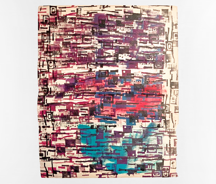
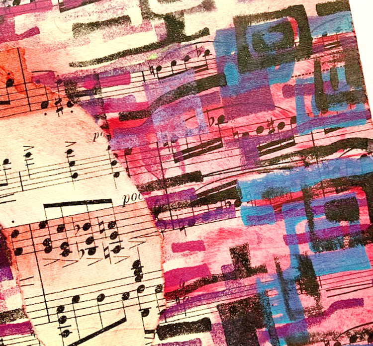
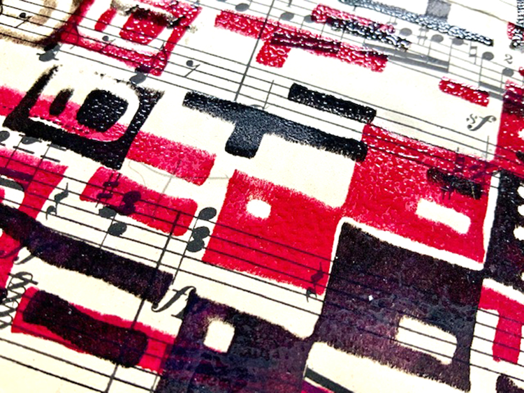
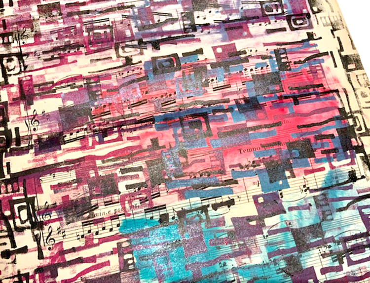
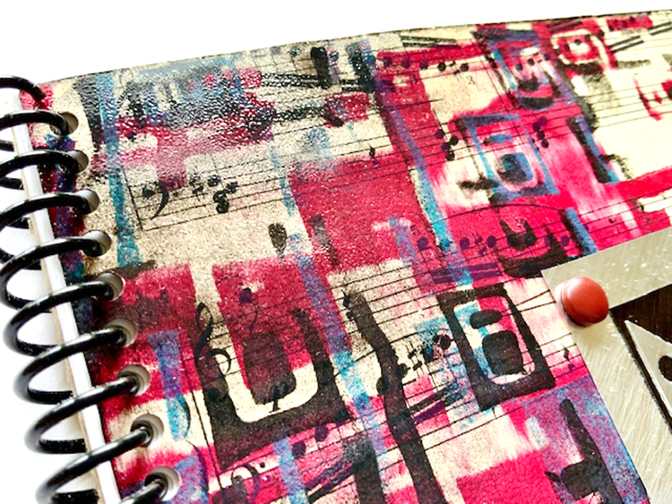
Instead of lining up the stamp and going for a precise regular repeat pattern, my first impulse, I channeled my inner Aretha (helped along by a couple of CDs and a handful of M&Ms) and was off and running. I stamped, smudged and smeared onto the sheet music, did a bit of heat embossing with clear powder, dancing around the studio between colors and humming to the beat. I cut and tore and combined the pieces, layering onto chipboard. A quick visit to the coil binding punch, a bit of embellishment for the holiday keeper, and my notebooks were done!

Your turn:

1. Using 3 or more inks, including black, stamp Mid-Century Squared repeatedly on sheet music or pages from a damaged book. Optional: Align the design horizontally for most of the stamping, combine with vertical alignment down the sides. Smudge 

2. If heat embossing is desired, use pigment inks and clear embossing powder to add shine and texture.

3. Cut covers for journals and notebooks from chipboard. Glue cut and torn stamped papers to the covers; trim at the edges as needed. Smudge on more inks to enhance the collage.

4. Use a coil binding punch or other binding system to complete the projects.


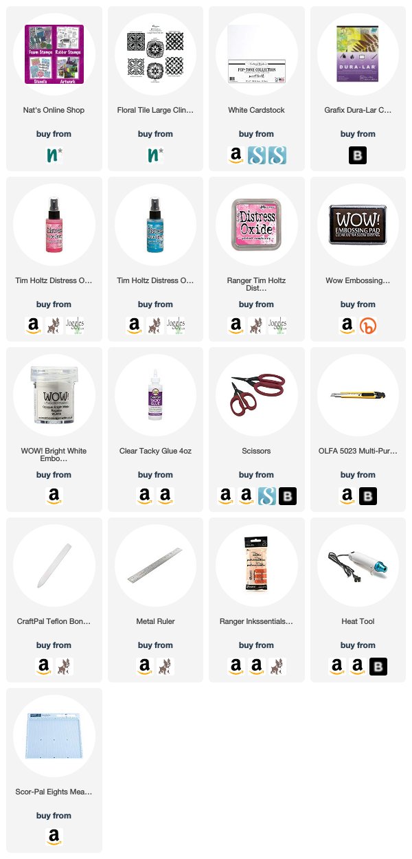
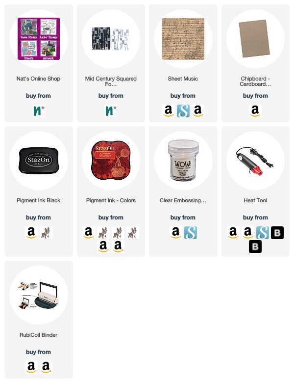
Thank you Judi! I love all the variation in the rhythm of the patterns! Want to give Judi’s project a try? You can find my Foam Stamps in my Online Shop. Here are some of the supplies that Judi used:


Feel inspired? Working on something yourself that you’d like to share?  I love to see how you interpret our monthly themes. Email me how you used my stencils and stamps with the theme and email me an image – I would love to share your projects in my next  “n*Spiration From Around the Globe“.

Leave a comment

Feel the Rhythm – Maura Hibbitts

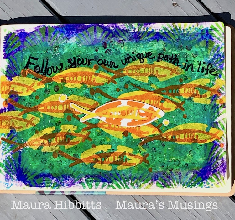
Hello from my Creative Squad! Today we have a post from Maura Hibbitts with a gorgeously layered art journal page using my New Orleans, Crackle, Art Deco, and Batik stencils and my Neato foam stamp. This month’s theme is Feel the Rhythm – We’re thinking about patterns this month and using stamps to create a rhythm of marks. Show us your sense of rhythm!


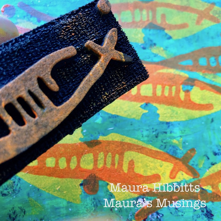
When you stop and look around in the natural world, there’s a lot of rhythm and flow going on, from the rhythm of the seasons, to the flow of the water and air. When I first saw Nathalie’s Neato Art Foamie stamp, I saw a fish, and knew I wanted to create a water scene. A school of fish is just perfect for a repeating pattern, I think.

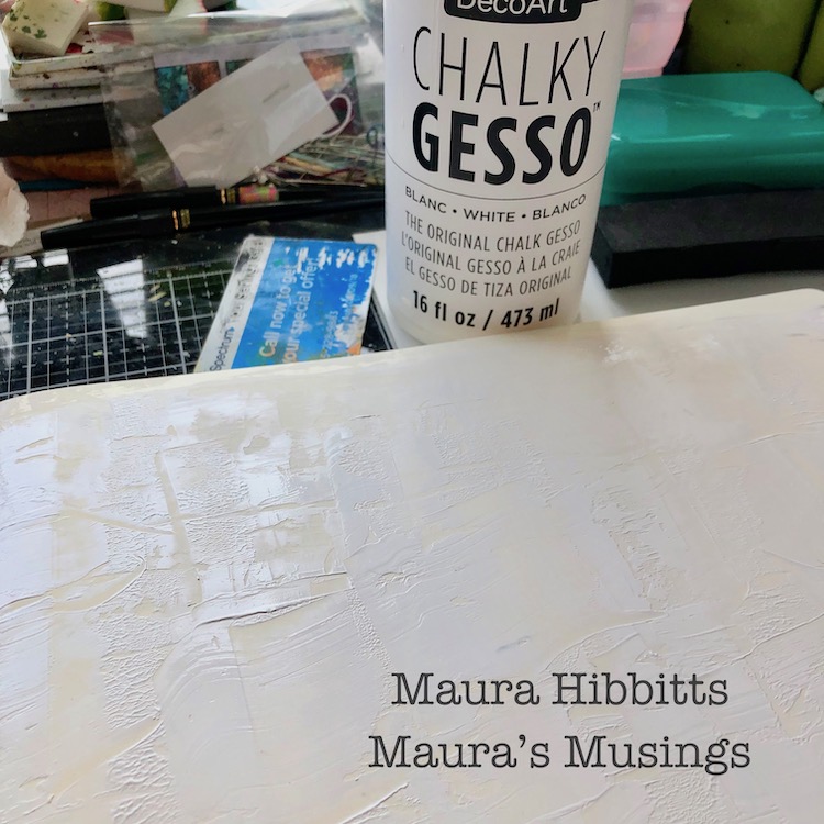
I pulled out one of my big journals with a landscape format, so my fish school could swim across the page. First step was to scrape on some chalky gesso with a key card and let it dry. 

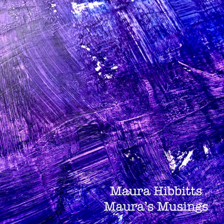
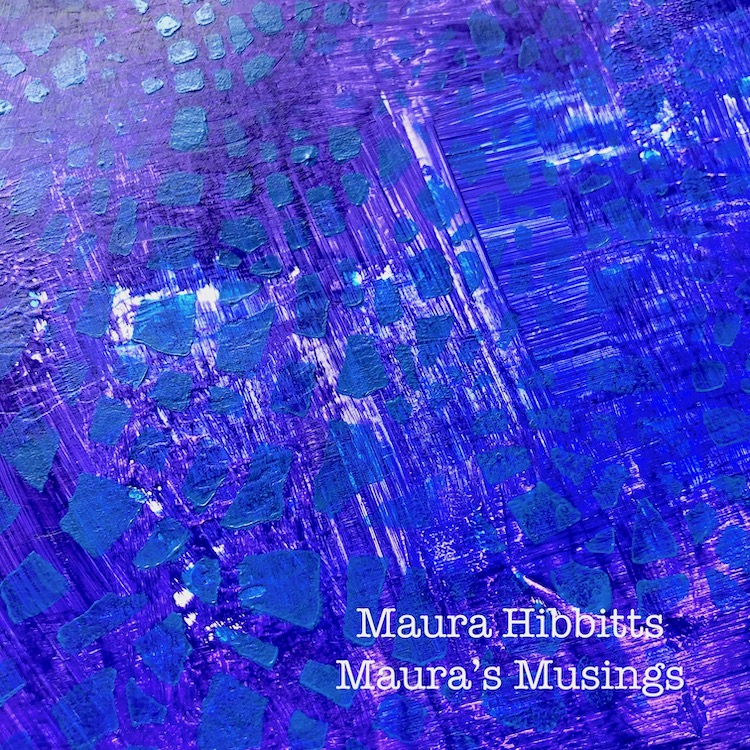
To create a dark underwater background, I painted on a mixture of Dioxazine Purple and Ultramarine Blue. Before the paint dried, I “scratched’ into it with my brush strokes. 

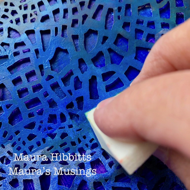
Time to begin the stenciling. First up is the Crackle stencil, sponged in with Cerulean Blue. This layer is very understated. 


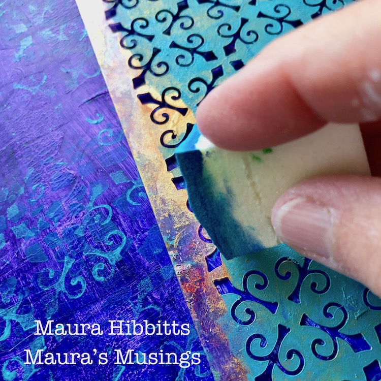
I used the New Orleans stencil with Cobalt Teal Hue and worked across the page, sponging in the design. 

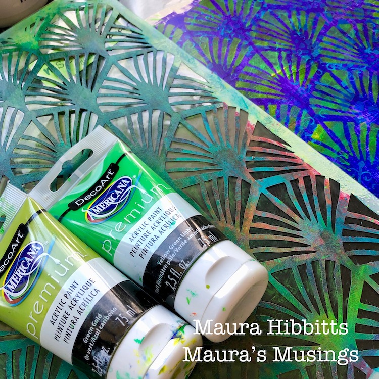
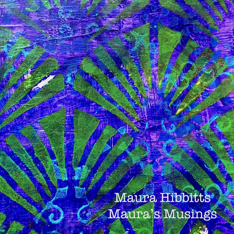
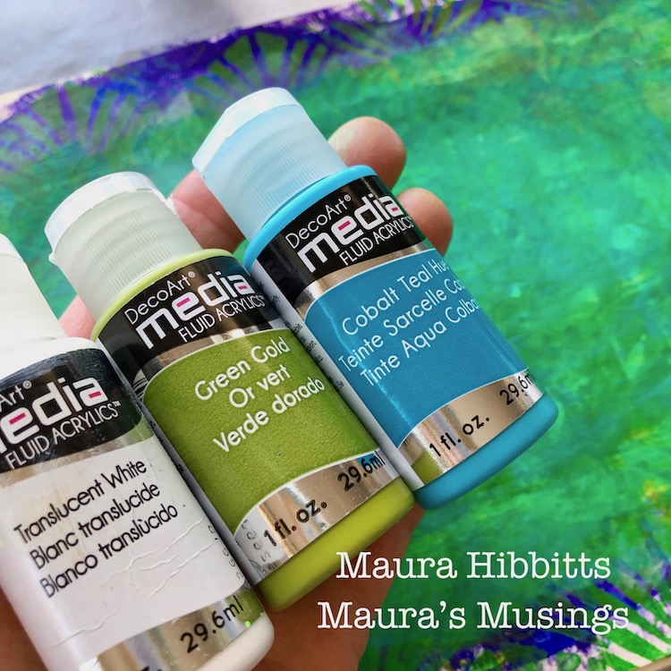
The Art Deco Wallpaper stencil with the Green Gold and Yellow Green Light paints is used in the next layer to give a hint of plants in the water. 

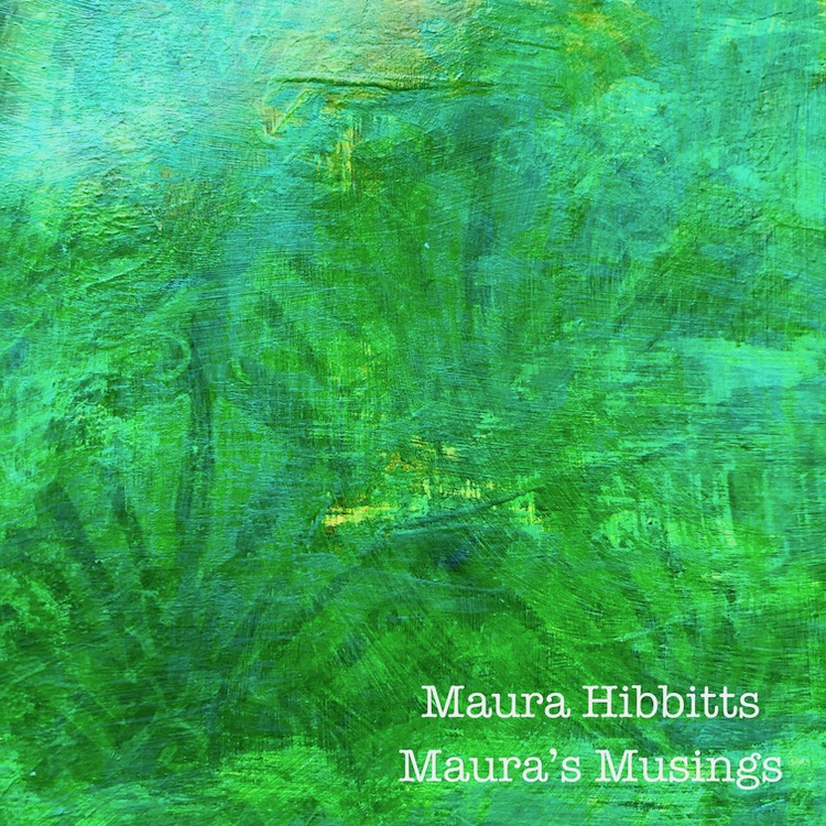
Now that my page is covered in a variety of blue, purple and green paints and designs, I decided to fade out the central area. I started by brushing on the Translucent White, then wiping that back with a baby wipe. I repeated this step with the Green Gold, and ended with the Cobalt Teal Hue. 

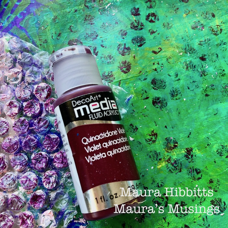
I couldn’t resist adding some bubbles into this area with some bubble wrap and Quinacridone Violet. Some of the old paint came off too which just added some fun spots. 

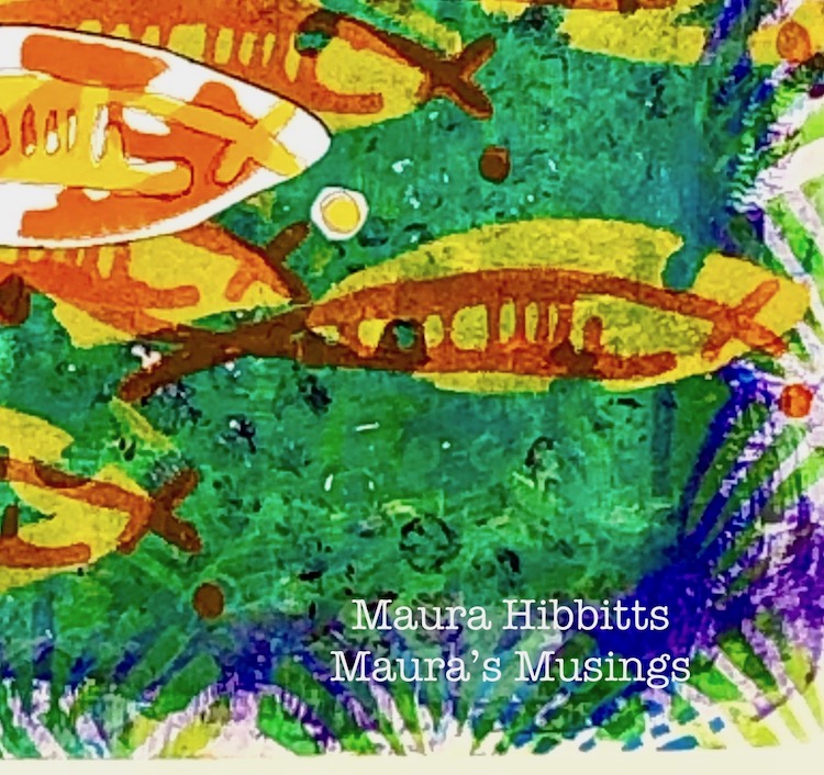
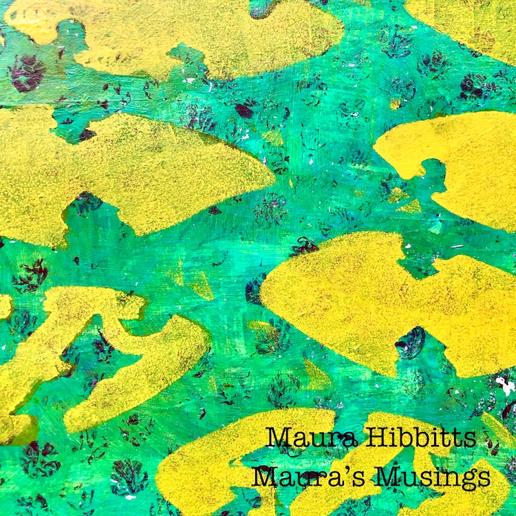
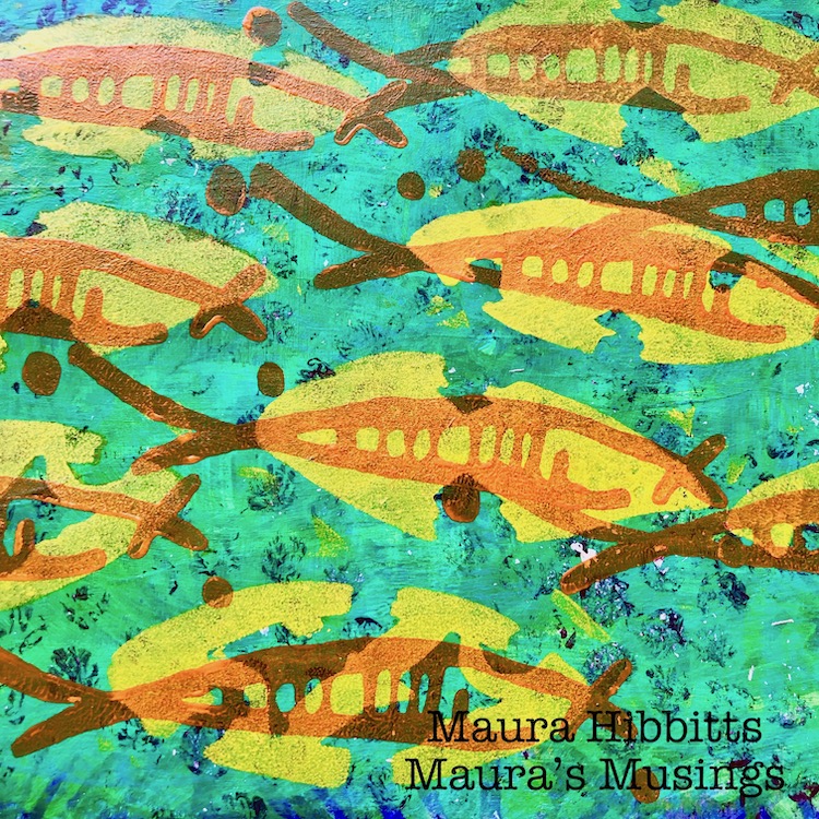
Now comes the fun part – creating the school of fish! Certain shapes in the Batik stencil just seemed to work really well as fish bodies, so I stenciled a school of them across the page with the Cadmium Yellow Hue. 

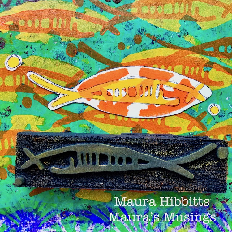
I finished up my fish by stamping the Neato Art Foamie design in Cadmium Orange over the yellow bodies. I just used my cosmetic sponge to apply the paint to the stamp.  

Then, because I wanted one fish to be unique and stand out, I stenciled the body in orange and stamped the Neato design in yellow onto watercolor paper. Once it was dry, I cut it out and edged it with a black sharpie, then glued it onto my page. My final step was to doodle around the Neato design with my carbon ink pen, and hand letter my thoughts across the top of the page with the Sharpie – “ Follow your own unique path in life”. 

So many fun layers of color and design on my art journal page. 

Feel the rhythm as the school of fish moves and flows through the water. It truly is fascinating to watch as a school of individual fish move and act as one body. I guess it could be a bit dangerous to be that fish that stands out in the crowd, but in my own life, I have always liked being unique. So, follow your own unique path in life! 


Thank you Maura! I love the feeling of underwater that you created with all those layers! You can find my Stencils and my Foam Stamps in my Online Shop. Here are some of the supplies that Maura used:


Feel inspired? Working on something yourself that you’d like to share?  I love to see how you interpret our monthly themes. Email me how you used my stencils and stamps with the theme and email me an image – I would love to share your projects in my next  “n*Spiration From Around the Globe“.

Leave a comment

Feel the Rhythm – Jennifer Gallagher

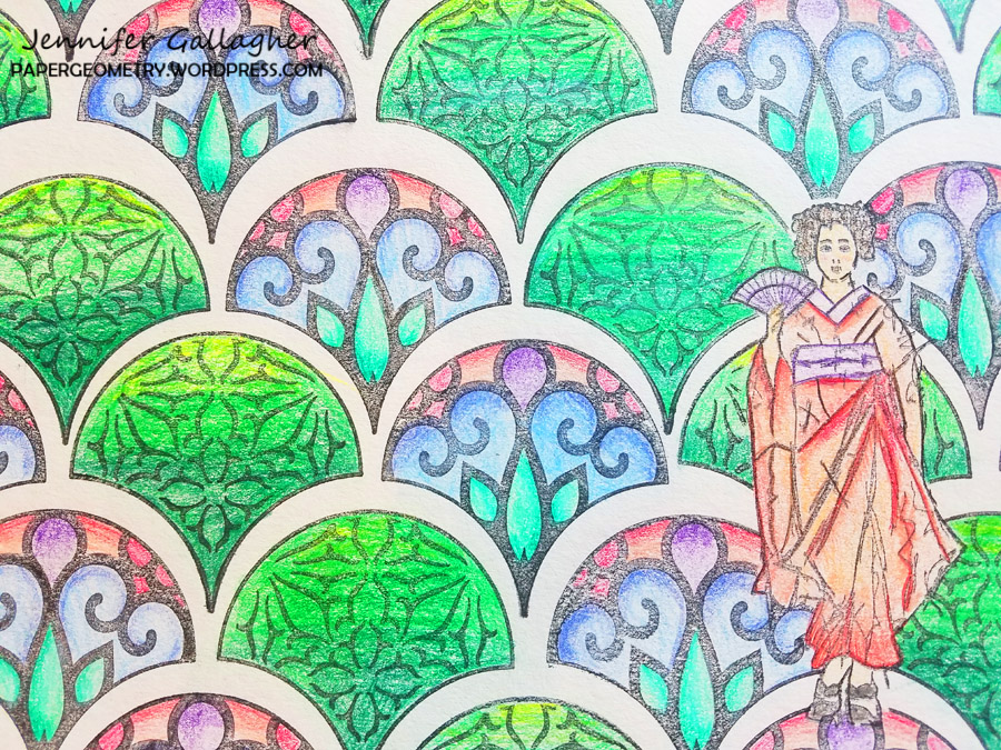
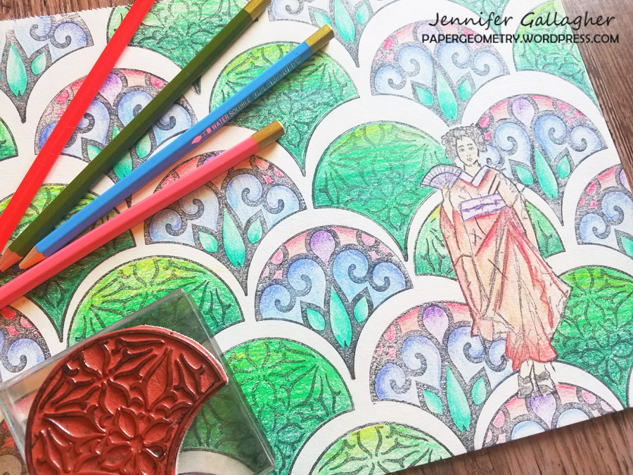
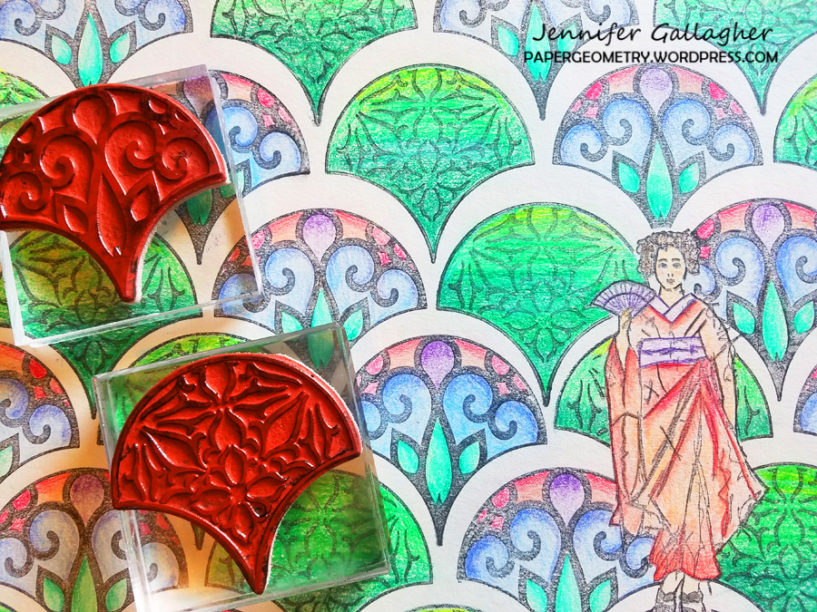
Happy Tuesday from my Creative Squad! Today we have Jennifer Gallagher sharing her method for making a custom coloring sheet using my Maiko stamp and my Fan-tastic Large stamp set. Her inspo was this month’s theme: Feel the Rhythm – We’re thinking about patterns this month and using stamps to create a rhythm of marks. Show us your sense of rhythm!


When contemplating creating patterns for this month’s creative squad post, it occurred to me how much I enjoy coloring in patterns. Long story short, I decided to create my own customized coloring sheet with Nat’s stamps. Coloring is very popular now and I totally understand why. It is a very fun and relaxing way to pass the time. Follow along with me and create your own unique coloring pages. It’s quick and easy.

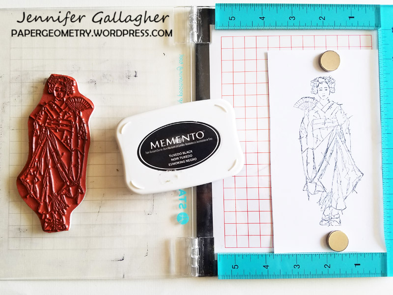
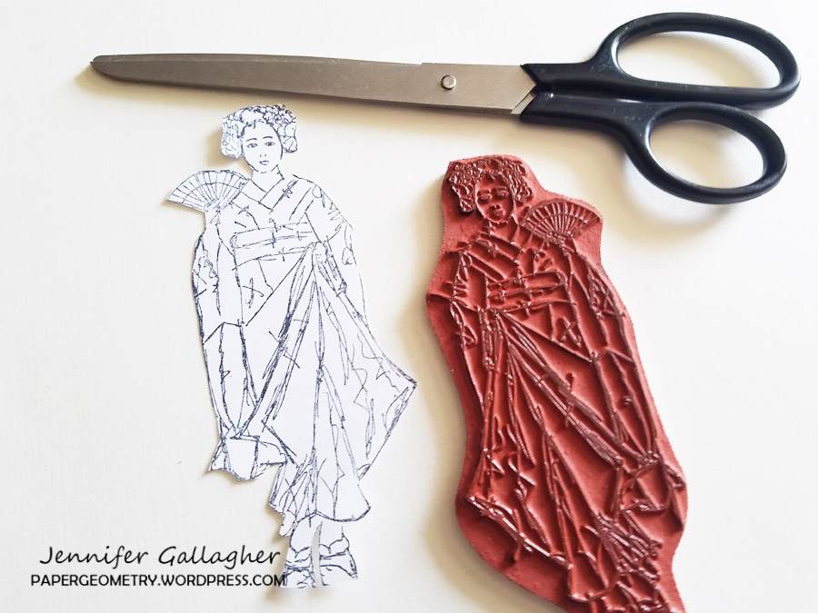
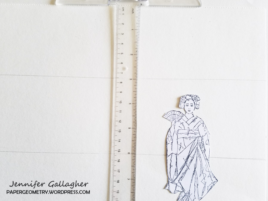
1. We are going to need a mask of Nat’s Maiko stamp. Begin by stamping the image onto a piece of white copy paper.

2. Cut the stamped image out.

3. Using low tack tape, place your Maiko mask down onto a 9×12 piece of drawing paper. Then using a ruler create a grid-line every three inches across the paper. This step is optional but I find it helpful.

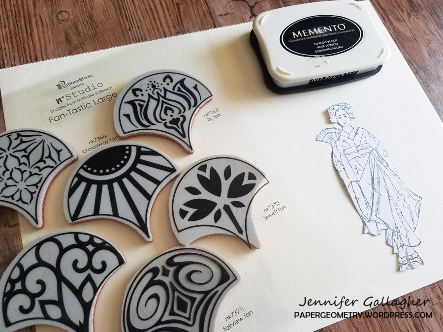
4. Choose a few stamps from Nat’s Fan-tastic Large stamp set to create a pattern.

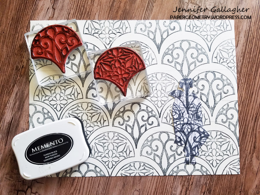
5.Stamp your pattern with a black ink like Momento Tuxedo black. 

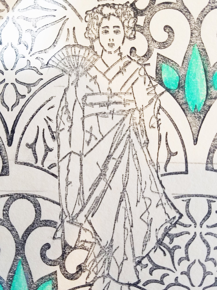
6. Lift the Maiko mask off the paper and stamp the image down in the negative space left behind.

7. Now is the fun part – color your design in with your favorite colored pencils.

I had a blast coloring in my hand-made coloring page. I don’t know why it didn’t occur to me to make some before now. Be sure to play along each month with the creative squad and share your creations online. 


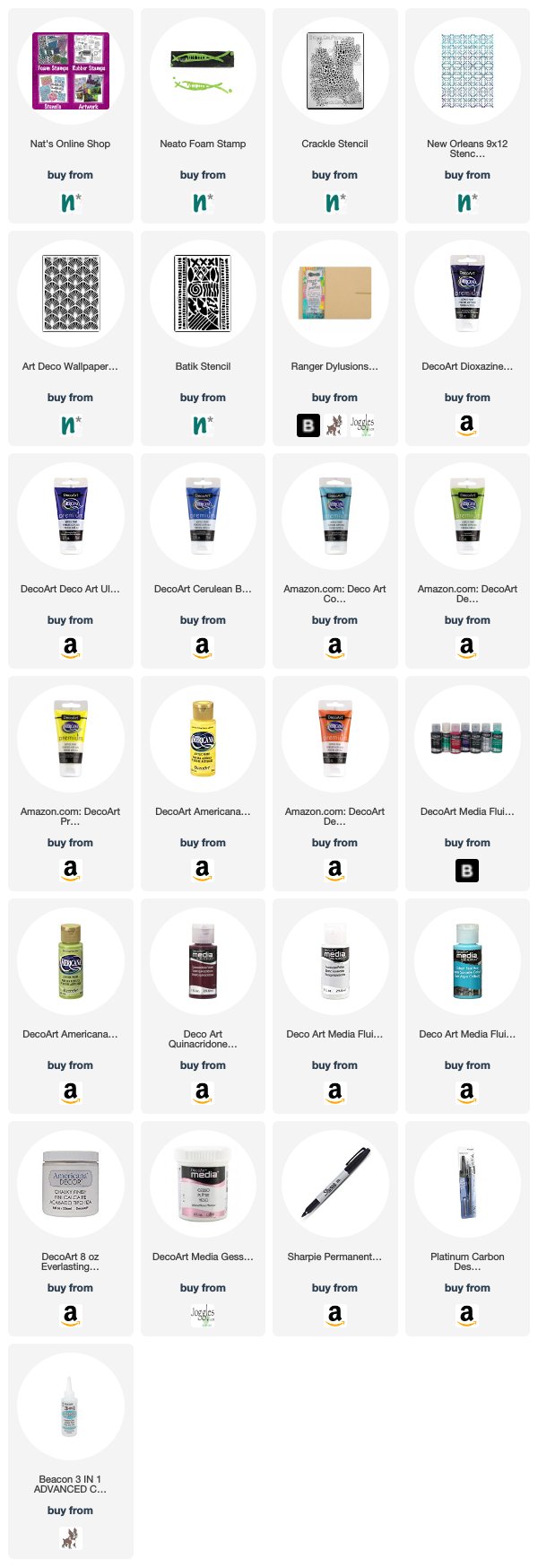
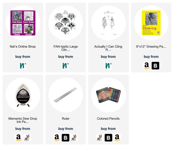
Thank you Jennifer – I love how Maiko looks on that gorgeous background! You can find my rubber stamps in my online shop. Here are some of the other supplies that Jennifer used:


Feel inspired? Working on something yourself that you’d like to share?  I love to see how you interpret our monthly themes. Email me how you used my stencils and stamps with the theme and email me an image – I would love to share your projects in my next  “n*Spiration From Around the Globe“.
Leave a comment

Feel the Rhythm – Marsha Valk

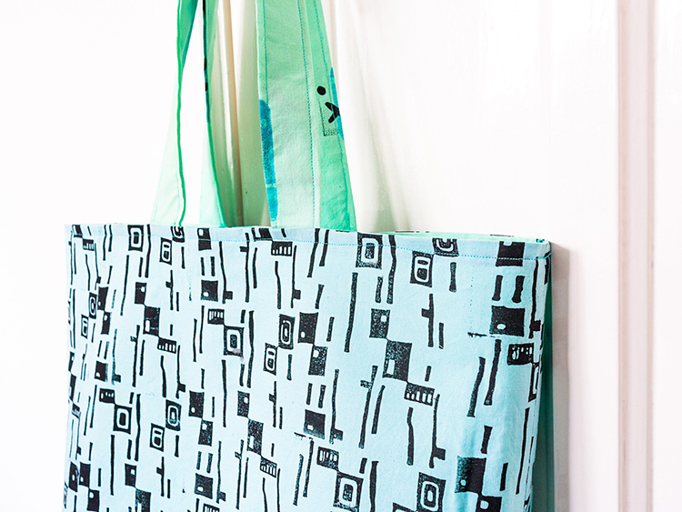
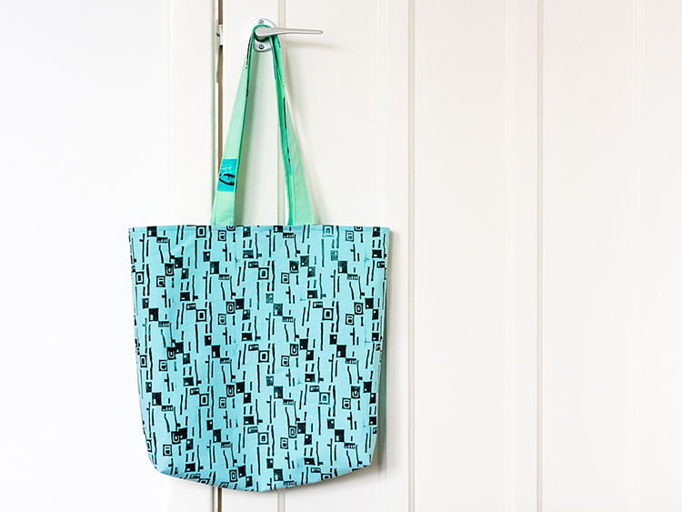
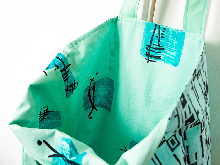
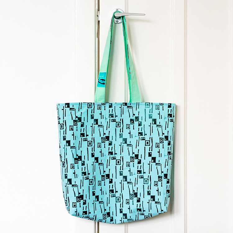
Here’s a post from my Creative Squad! Today we have Marsha Valk back with us again for another round of fun. Welcome back! Marsha is using my Mid Century Squared, Neato, Funky, Gnarly, Groovy, Jazzed and Far Out foam stamps for this awesome tote… and our theme for April: Feel the Rhythm – We’re thinking about patterns this month and using stamps to create a rhythm of marks. Show us your sense of rhythm!


I remember that when I saw Nat’s new stamp designs for ArtFoamies I immediately thought of stamping them on fabric. So that’s what I did!

When it comes to stamping fabric designs, I always like to think about what I want to do with the fabric. This time I thought it would be cool to try and sew a simple tote bag.

You can find tons and tons of great sewing tutorials on YouTube these days. So what I tend to do is to look for a tutorial that matches my sewing skills, gather all the materials and then go from there.

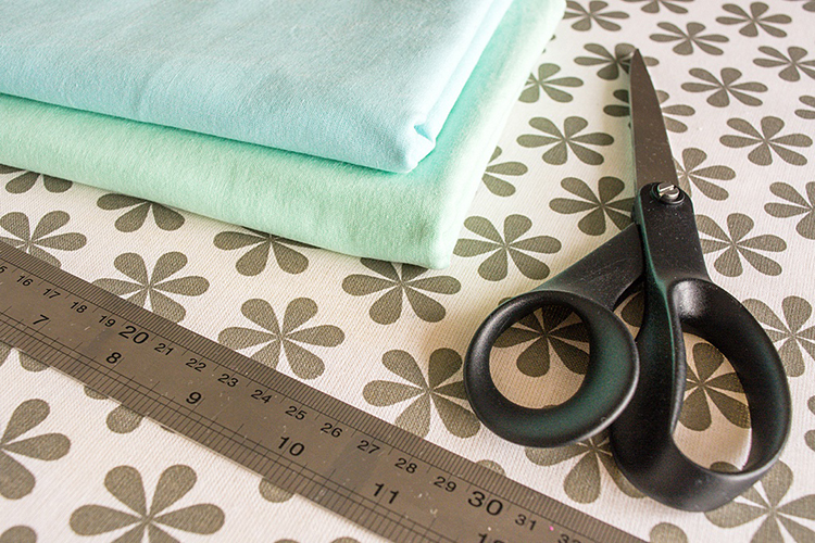
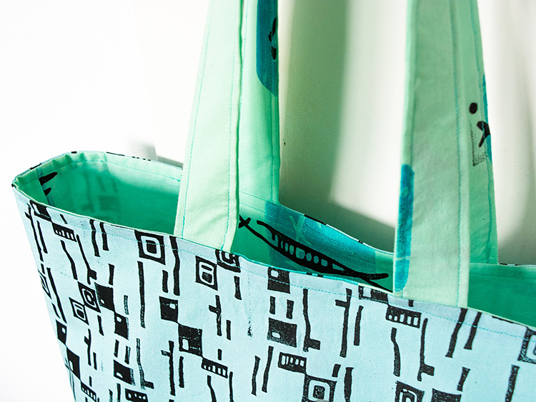
For the tote bag pattern I chose, I needed two different fabric designs, so I bought two slightly different colours of cotton fabric.

Step 1 Pre-wash and iron the fabric before printing. The paint will grab the cotton fibres a lot better when all the sizing is washed out.   

If you already know what you are going to make with the fabric once it’s printed, you can cut it to the sizes needed for your project at this point. 

Step 2  Set up your printing station. Protect your work surface if needed. The paint usually seeps through the fabric onto the underlying surface, so make sure you can easily wipe it clean.

Choose the paint colours you want to use. Limit your colour palette to a maximum of two colours plus a neutral. 

You can use regular acrylic paint to print on fabric, but if you want it to be washable, you’ll need to use fabric paint or acrylic paint mixed with a fabric medium.  

Follow the instructions on the packaging to make sure you are mixing the correct amount of paint/medium for the best result. 

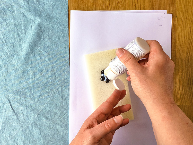
I’m using acrylic paint mixed with a fabric medium. You can mix it on an inking palette and use a brayer to apply the paint to your foam stamps or you can create a custom stamp pad using an ArtFoamies StampBuddy. 

Step 3 Start stamping!

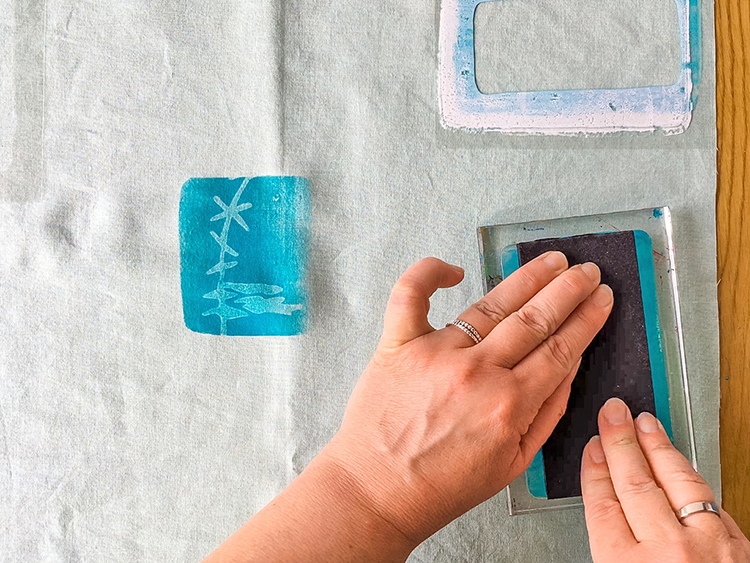
Step 4 For my second fabric design I also used one of my smaller gel printing plates to print with.

First I handcut three stencils from transparencies slightly larger than the gel printing plate and I placed the stencils on my fabric to help me determine the pattern I wanted to print.

Cover the brayer with paint and then roll the paint out over the gel printing plate. 

Take a foam stamp and stamp it into the paint. Here I am using Nat’s Groovy stamp.

Press the gel printing plate paint-side down onto the fabric on top of the stencil. Lift up the gel printing plate. 

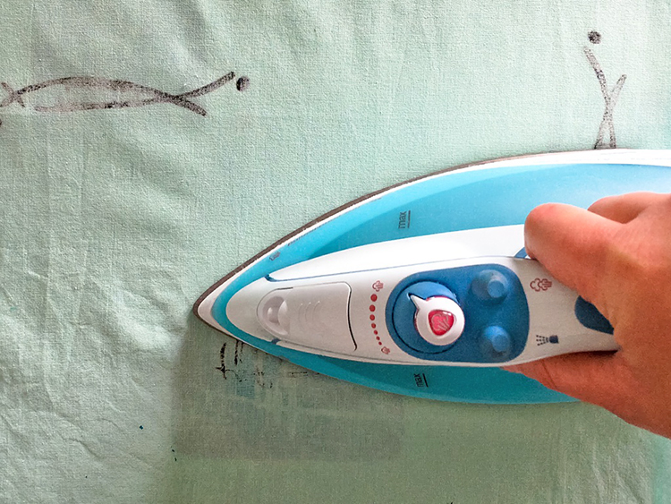
Step 5 Leave your gel printed fabric to dry entirely before heat setting the paint with an iron. Consult the label of your fabric paint or fabric medium for the exact instructions. 

Be sure to protect your ironing board cover with a cloth or parchment paper before ironing printed fabric. This will prevent the paint from accidentally staining the cover. 

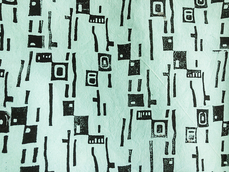
Step 6 Now your fabric is ready for the sewing project of your choice! This one I printed with Nat’s Mid Century Squared stamp.

Happy foam stamping!


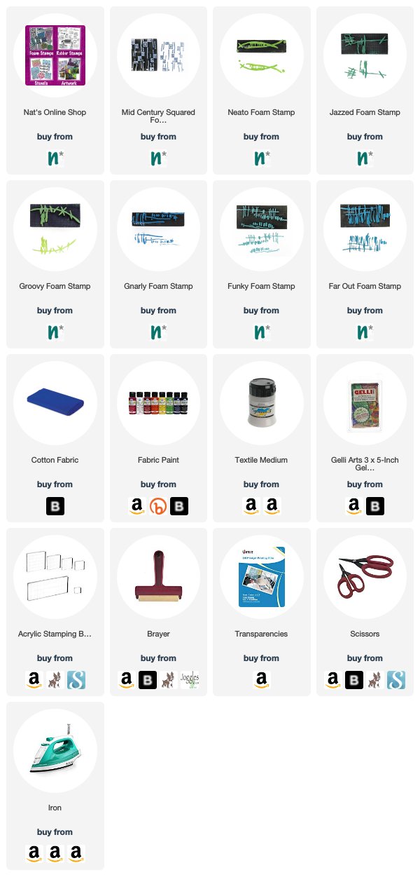
Thank you Marsha for inspiring us to create some of our own printed fabrics for sewing projects! You can find my foam stamps in my online shop if you’d like to create the patterns that Marsha shows. In addition to sewing equipment, here are some of the other supplies that she used:


Feel inspired? Working on something yourself that you’d like to share?  I love to see how you interpret our monthly themes. Email me how you used my stencils and stamps with the theme and email me an image – I would love to share your projects in my next  “n*Spiration From Around the Globe“.

Comments (2)

  • Sue Clarke

    |

    Marsha…LOVE love LOVE this bag!!!

    Reply

  • Janene

    |

    Fabulous and one-of-a-kind! I love the stamp patterns and the colors used. I might have to get out my sewing machine and give it a try. It’s been awhile since I’ve sewn anything, but I think I can manage the straight lines of a tote bag. :-)

    Reply

Leave a comment

Feel the Rhythm – Tania Ahmed

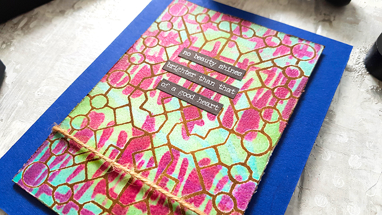
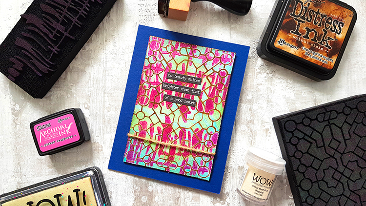
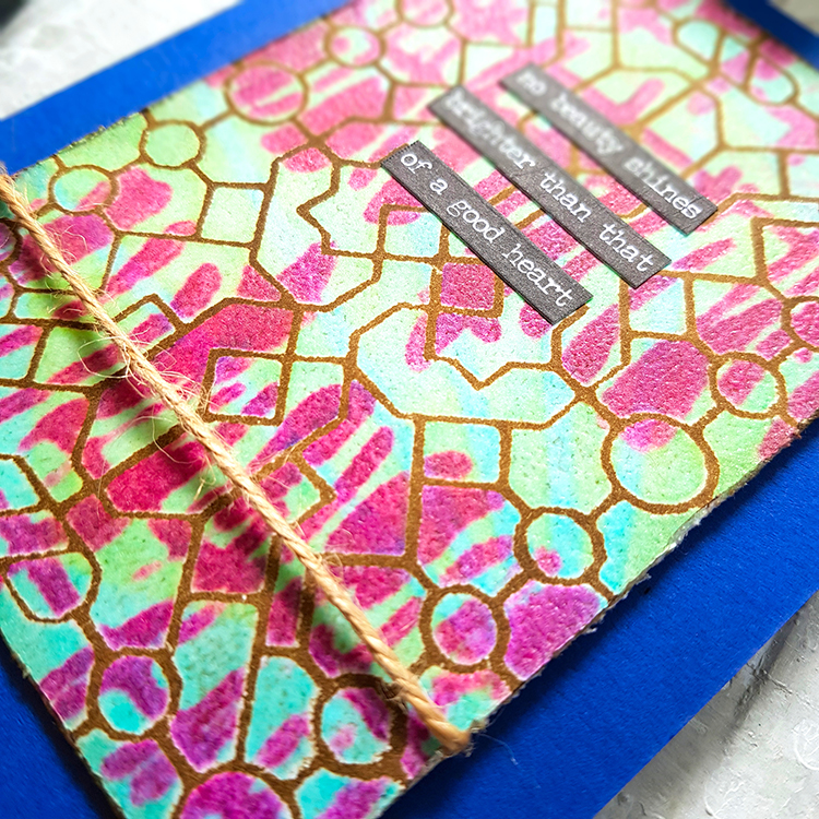
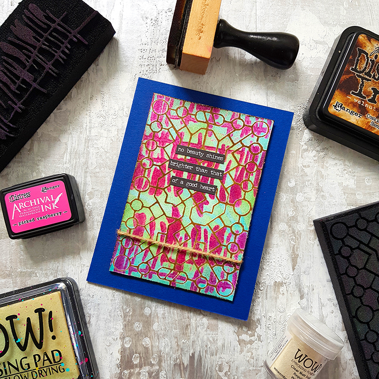
Welcome to a post from my Creative Squad! Today we have Tania Ahmed with a wonderful card and a video to show exactly how she puts it together. She is using my Exchange Place and Far Out foam stamps for this one and our theme for April: Feel the Rhythm – We’re thinking about patterns this month and using stamps to create a rhythm of marks. Show us your sense of rhythm!


It’s funny how mistakes can turn into happy accidents :) I had one such moment when I was filming this video and realized that my Art Foamie was not clean!!! As always I simply said an “oh dear” and thought let’s just go with it, haha!

My Exchange Place Art Foamie had been previously inked with Aquamarine Archival Ink and Fossilised Amber Distress Archival Ink which is what the Embossing Ink picked up when I stamped it. In the end I loved the effect and I hope you enjoy the video!

Nat’s latest Art Foamies release are so much fun to work with if you enjoy mark making with stamps and of course they all are a joy to work with as the impression is always gorgeous. 

Please do let me know if you have any questions and I will answer them as best as I can!

Steps:

1 Ink Exchange Place Art Foamie with Embossing Ink

2 Ink Far Out Art Foamie with Picked Raspberry Distress Archival Ink and stamp this on to the Exchange Place Art Foamie. 

3 Stamp the ink Exchange Place Art Foamie on to white cardstock and heat emboss with Clear Matt Embossing Powder. Heat set the embossing powder 

4 Apply Walnut Stain Distress Ink to white spaces and wipe off excess ink with damp kitchen towel

5 Trim cardstock Panel and distress edges and apply ink if desired

6 Assemble card!


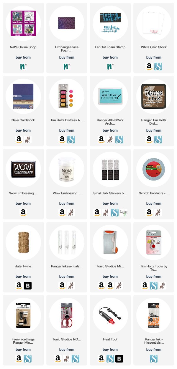
Thank you Tania! I love how you “kissed” the stamp with clear embossing ink with a colored inkpad! Want to give it a try too? You can find all my Foam Stamps in my Online Shop. Here are some of the supplies that Tania used:


Feel inspired? Working on something yourself that you’d like to share?  I love to see how you interpret our monthly themes. Email me how you used my stencils and stamps with the theme and email me an image – I would love to share your projects in my next  “n*Spiration From Around the Globe“.

Leave a comment