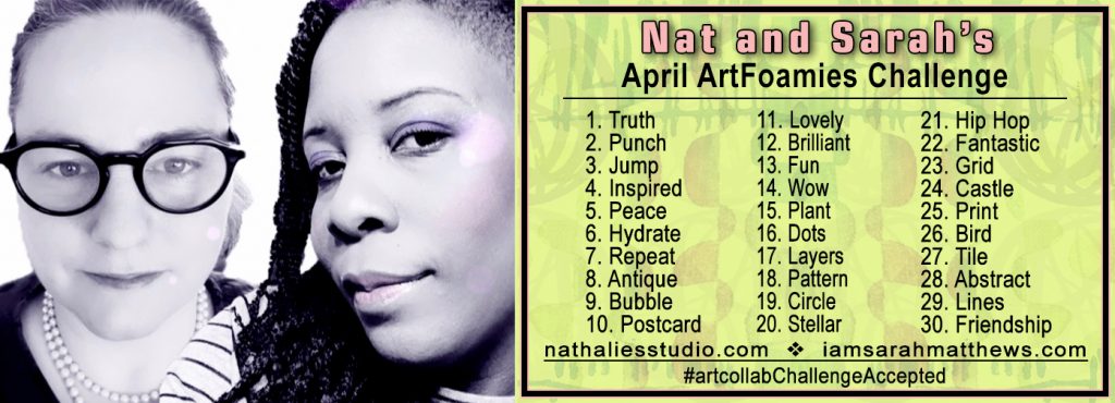
We’re in the home stretch of Nat and Sarah’s April ArtFoamies Challenge and today I’m recapping April 27 and 28.
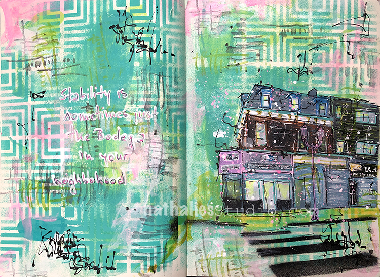
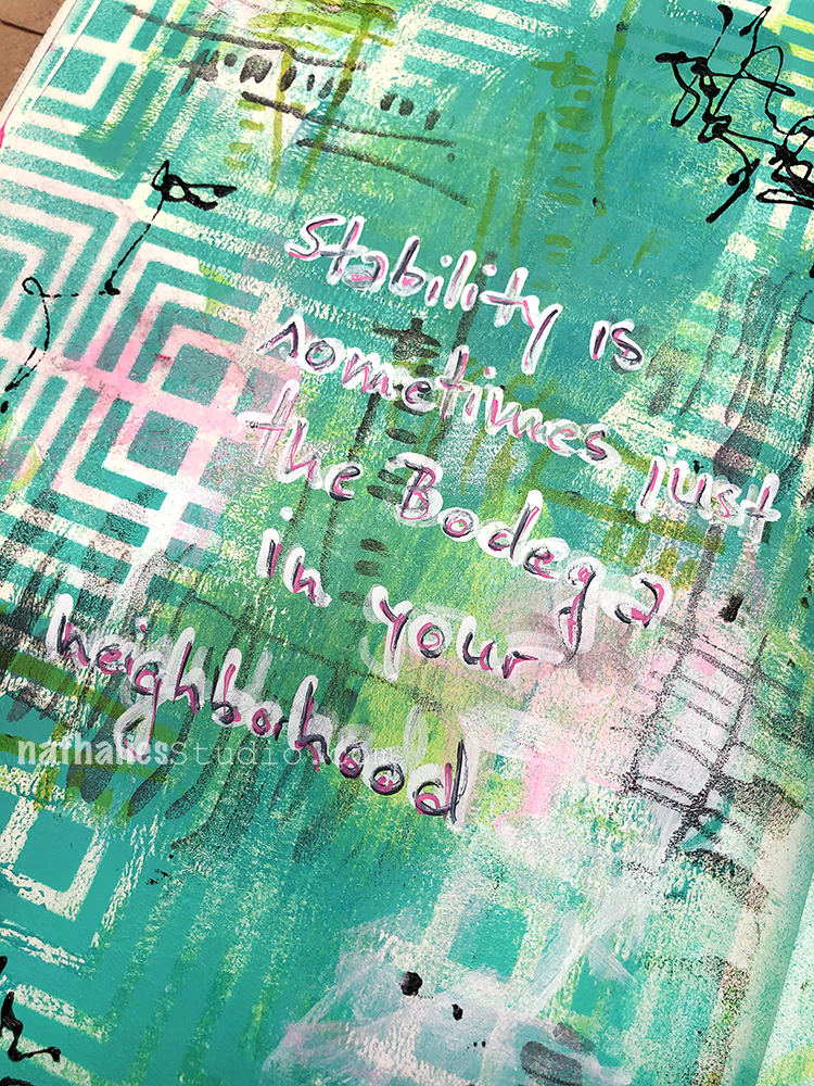
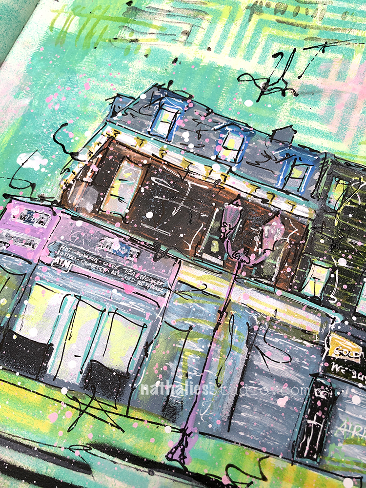
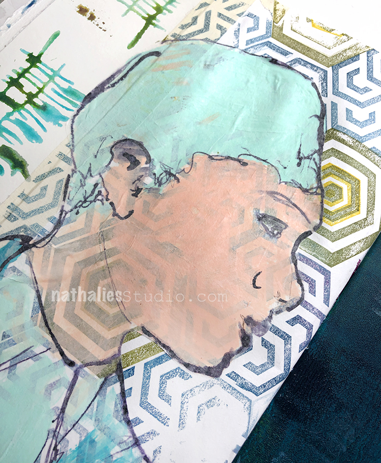
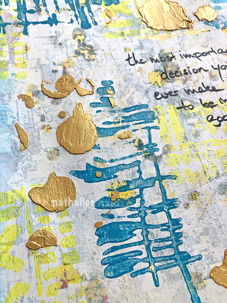
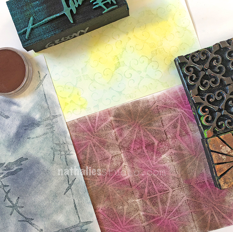
Day 27 – Tile – Blue tiles …they make me think of Lisboa and make me long for a nice long vacation there. I do miss traveling but until that works for me again… I will just live through my visual cues provided by my foam stamps that were often inspired by my travels. Here I used my Van Vorst pos neg set.
Here is a look:


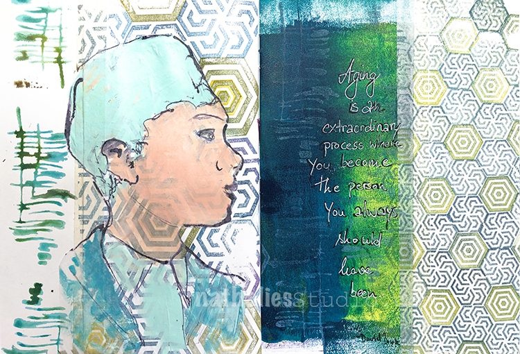
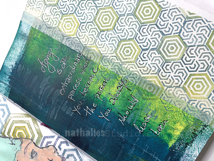
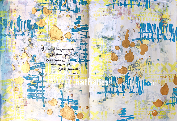
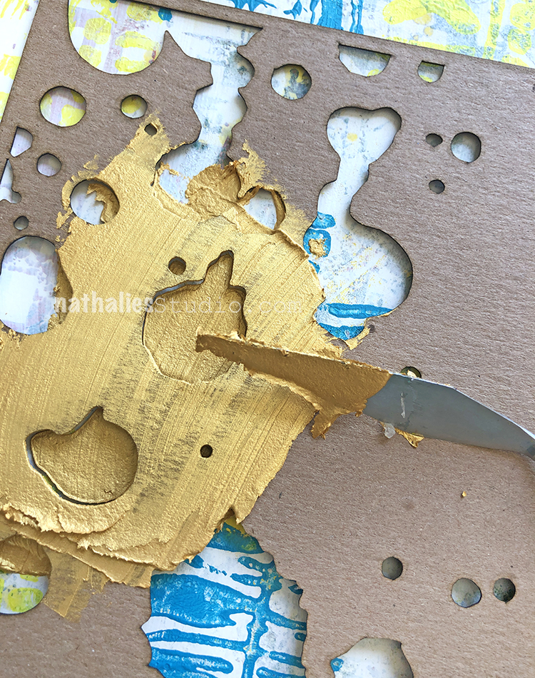
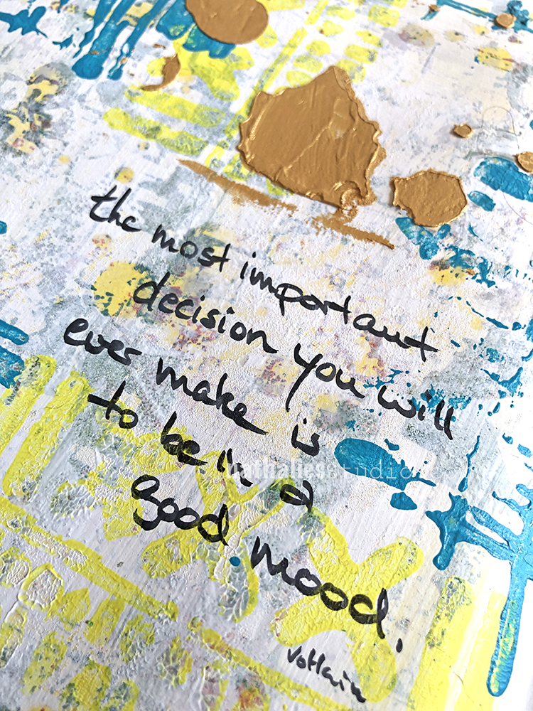
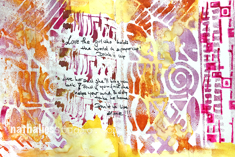
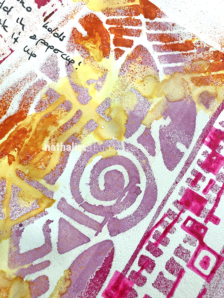
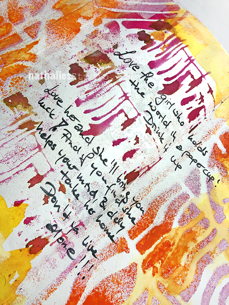
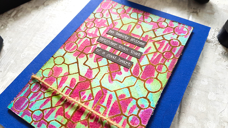
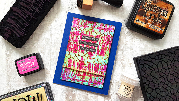
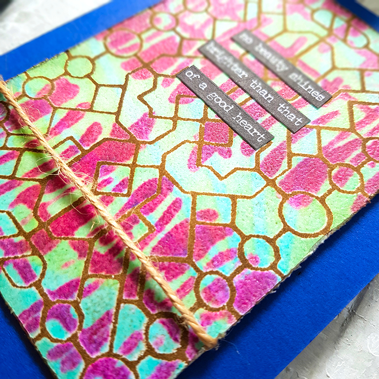
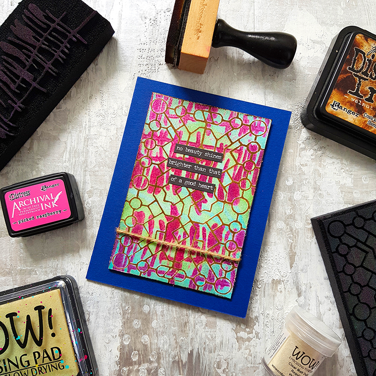
April 28 – Abstract – I used the hexagon shape as a solid stamp and then added some Wabi Sabi on top with Neato and Far Out. I am a bit sad that this challenge is coming to an end – I haven’t really gotten to the end of making patterns… Oh well, I still have another million pages in my ledger to go and I’m working on some new designs so I think they will move in here with some patterns as well ;)
And a look at that page:


Follow along with the challenge on instagram and post your artwork too with the hashtag #artcollabChallengeAccepted
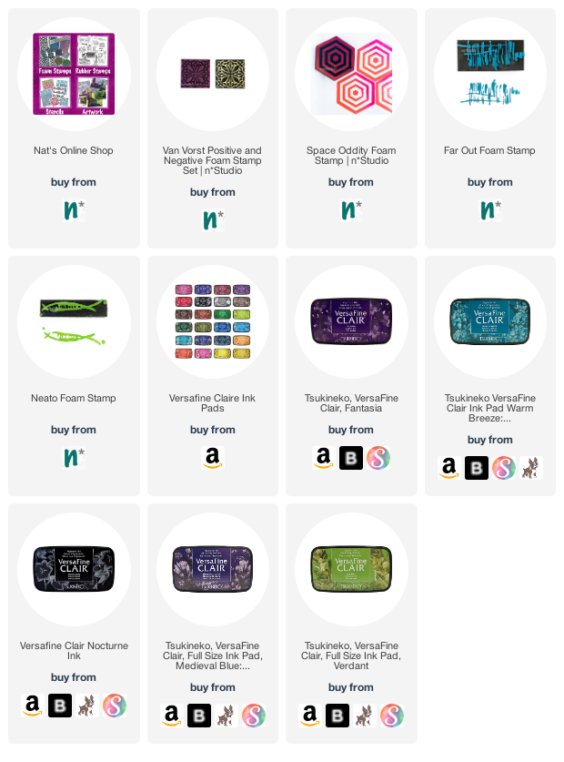
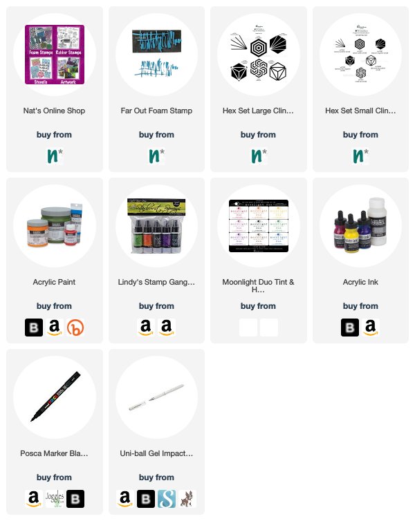
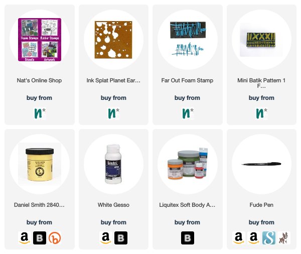
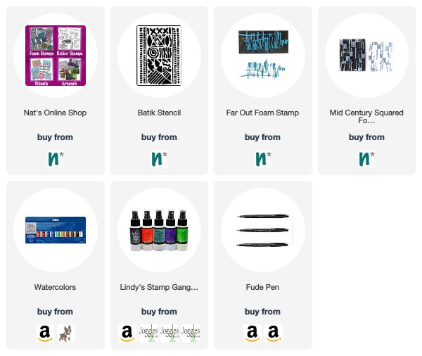
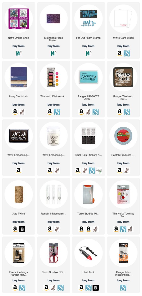
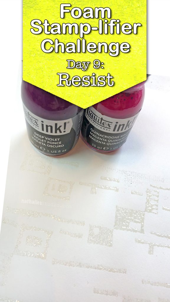
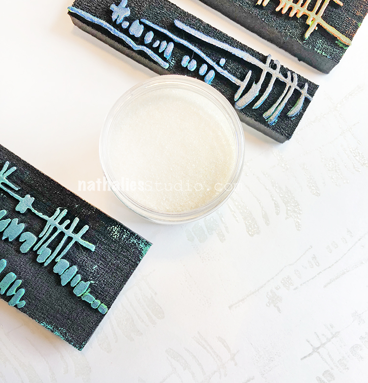
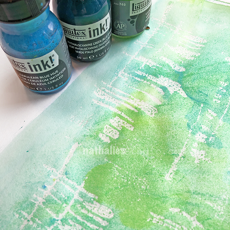
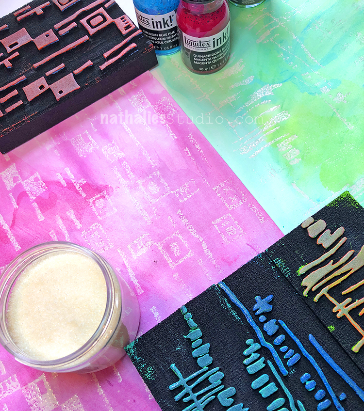
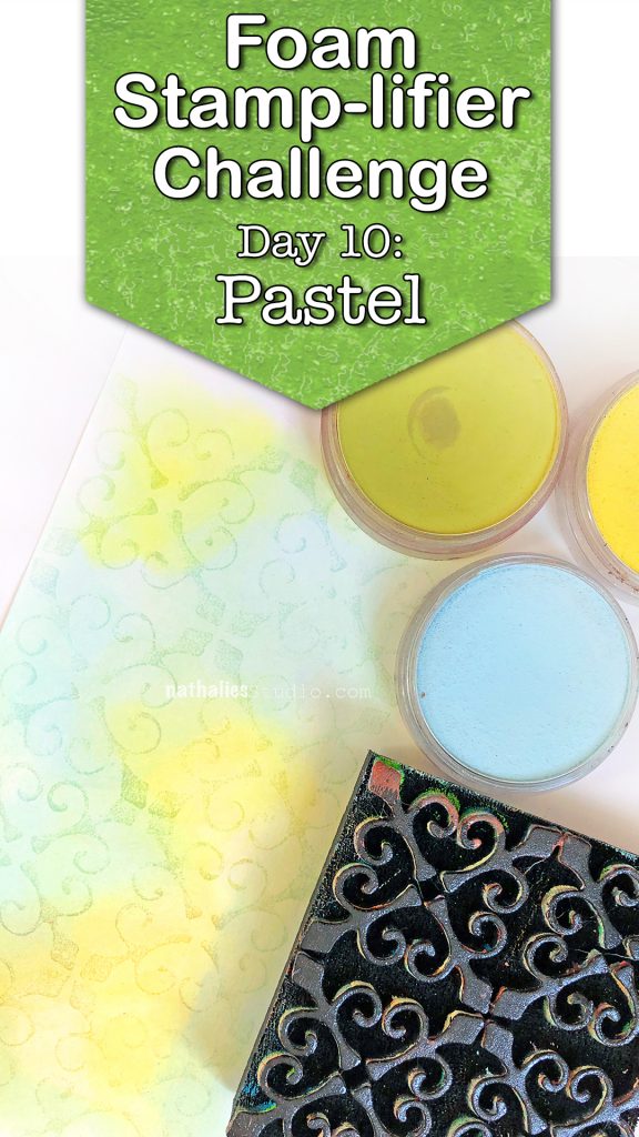
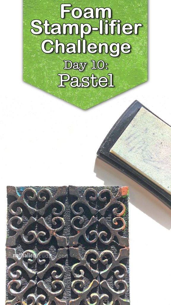
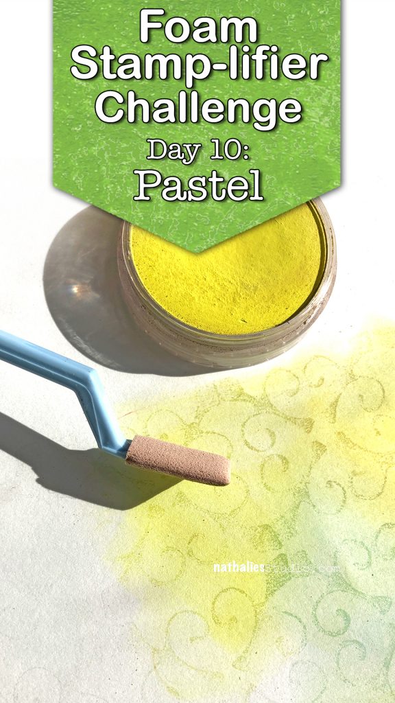
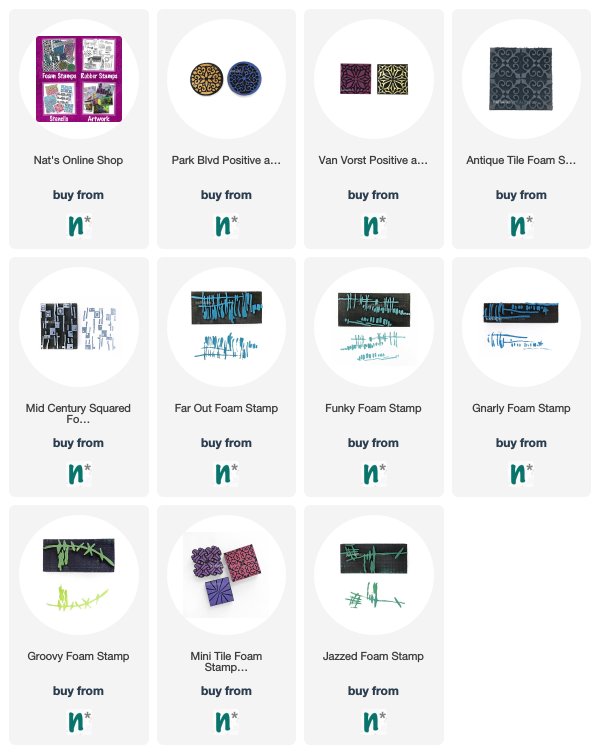
Here are some of the supplies I used:

As Barry Neil Kaufman says, happiness is a choice.
I LOVE these colors together Nat.
The textured gold “dots” are delightful!
Reply