Creative Squad

My City Speaks to Me – Cheiron Brandon

CS April My City Speaks to Me Blue

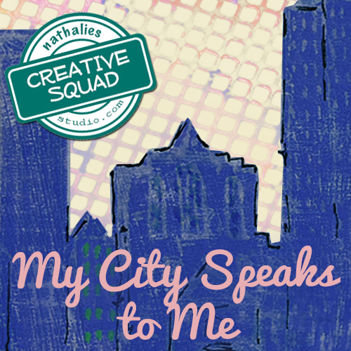
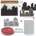
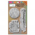
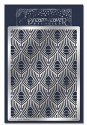
It’s Tuesday so it’s time for my Creative Squad to share a project with you! The theme for this month is “My City Speaks to Me” and throughout the month, the team will be using my new Urban Scribble Foam Stamp, Rubber Stamp and Stencil Set. This month’s theme is all about expressing what your hometown or city is all about.  What makes it special, vibrant, and important to you?  This month, our Creative Squad will take us on a trip to their city!

Here is Cheiron Brandon and her super colorful interpretation of the theme, which happens to feature a city that’s my neighbor too!

—————————————————————————————————–

Cheiron April Headshot

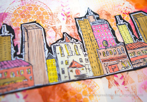
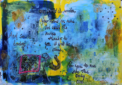
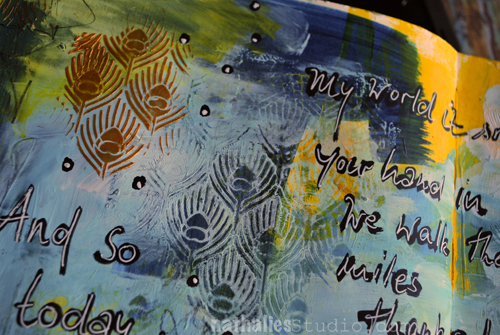
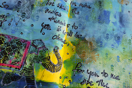
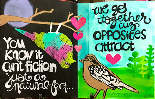
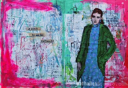
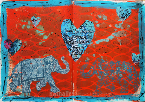
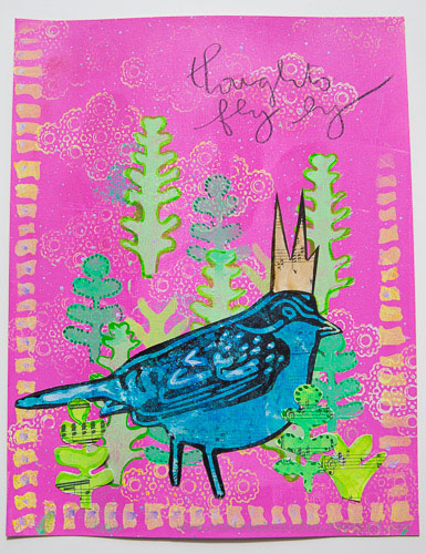
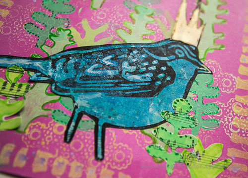
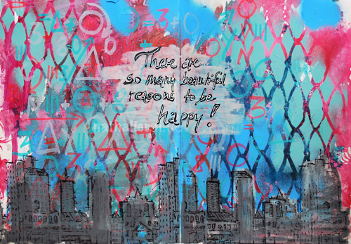
Even though I am a Jersey girl, New York City has always been my city. I live about 8 miles from NYC and get a beautiful view of the skyline on my drive to work each morning and most times, I see the sun coming up. It is like the city is saying hello to me each morning.

cheiron_urbscribble1_

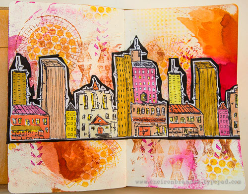
For my project this month, I created a journal page with all the colors of the morning sunrise using the Urban Scribble stamp as the main focal point.

cheiron_urbscribble3

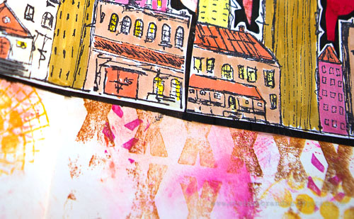
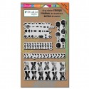
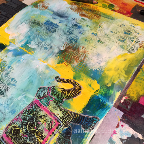
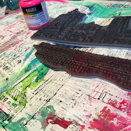
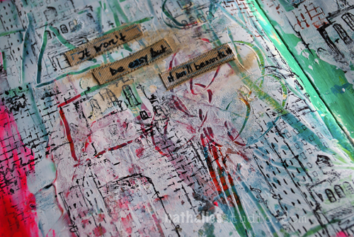
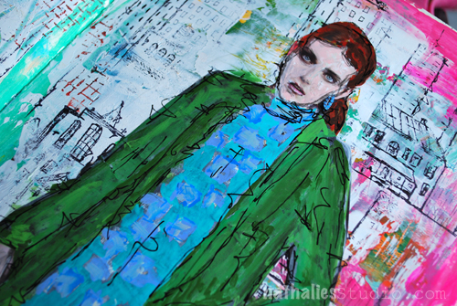
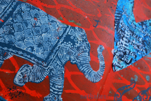
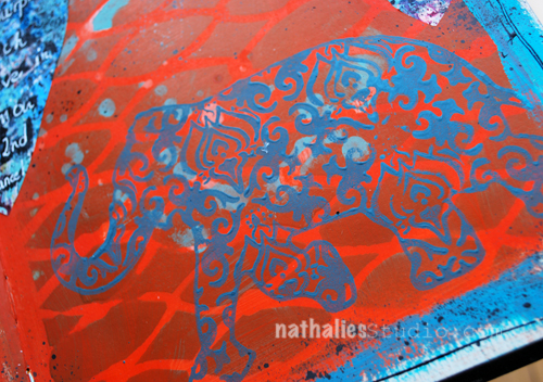
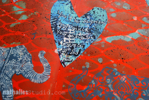
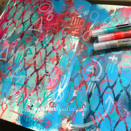
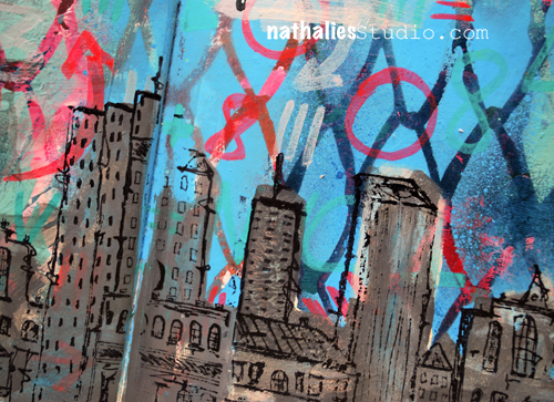
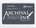
To start I used a page where I had wiped up some Distress stains from another creative adventure. I stamped the page using stamps from the Marks, Wired, and Mish Mesh stamp sets along with various Archival Inks to create a background. Then I stamped the skyline twice and colored it in with Faber Castell PITT artist pens. This stamp was so fun to color! I fussy cut around the stamp and adhered it to some crinkled black tissue paper to use as my focal piece. Once my piece was done, I adhered it to the background with matte medium.

cheiron_urbscribble2

———————————————————————————————————-
I hope you enjoyed Cheiron’s gorgeous art journal page! We are both Jersey Girls so I totally understand her love of the NYC skyline – it inspires me all the time. I love her choices of color too and the way she layered several stamps in the background to capture the energy of the city.
Besides the supplies listed below, Cheiron also used black tissue paper and Tim Holtz Distress Stains in Picked Raspberry and Wild Honey:
SuppliesCJS


And maybe you will even play along -we would love to see how you interpret the theme – email me how you used my stencils and stamps with the theme and email me an image – I would love to share what you did at the beginning of next month!

See you next Tuesday for the another project with the theme ‘My City Speaks to Me’.

Comments (5)

  • Dee Ann O'Brien

    |

    What a beautiffully happy city -so warm and inviting1

    Reply

  • gwenlafleur

    |

    Beautiful pages! Really love your colors and how you filled in the city stamp. Lovely!

    Reply

  • Joi@RR

    |

    Sooo vibrant and fun Cheiron. I love orange so you had me captured immediately!!! Love that background and you definitely put a whole new pizzazz into Nat’s Urban Scribble city scape. BRILLIANT!!! j.

    Reply

  • Miriam Prantner

    |

    What a fantastic page! I love those sketchy buildings, a wonderful cityscape!!!

    Reply

  • Brenda

    |

    I love the colors of the morning sunrise too! Love how you applied them here on your page.

    Reply

Leave a comment

The Only One or … In My Art Journal Today

AJOnlyOne01

“And so today, my world it smiles, your hand in mine we walk the miles,

Thanks to you it will be done, for you to me are the only one.” Led Zeppelin

AJOnlyOne04

Over a painted background I added a mix of blue paint and gesso and while the mix was still wet, I layered the Peacock Background Stencil on top and using a babywipe removed parts of the paint again. This revealed the underlying paint once again. I layered the stencil on top again and spread some embossing paste through it.

AJOnlyOne03

I stamped the Elephant rubber stamp with archival ink on top of the background and enhanced some areas of the elephant design with markers and pencils.

AJOnlyOne02

For the journaling I used a black acrylic marker and then overwrote it with a white signo pen.

Here are all supplies I used:

SuppliesCJS


Hope you have a wonderful day!!!

Comments (5)

  • Darcy Shannon

    |

    I love the colors and the texture of this journal page. Just beautiful!

    Reply

  • Theresa De Shon

    |

    Just getting into Journaling at the cancer center, learning a LOT from this blog…look forward to all the posts and pics. Thank you!

    Reply

  • Joi@RR

    |

    The peacock stencil reminds me of an India type tapestry – perfect for accenting your wonderful elephant. This is just gorgeous Nat. You colors are so unique – I would never have thought to put them together but you – are so good at making colors look unique. They truly look wonderful on your pages. And that pop of pink on your elephant is just perfect too. How I adore your work. Have a super fine weekend sweetie. Hugs. j.

    Reply

Leave a comment

Opposites Attract – Michelle Rydell

CS Opposites Attract logo

It is Tuesday and that means it is time for my Creative Squad to show you a fun project. The theme for March is Opposites Attract and the team will use my new Bird Foam Stamp, Rubber Stamp and Stencil Set. Just as opposite colors on a color wheel highlight one another, or yin and yang fit together so comfortably, sometimes the best is brought out when we celebrate extreme differences!

This week we’re happy to show you an art journal page by Michelle Rydell, which has us singing along with her! Take a look at her musically inspired interpretation of our theme.

—————————————————————————————————–

Michelle March Headshot

The first thing I thought of when I heard this month’s theme, was the song “Opposites Attract,” by Paula Abdul. I thought it would be fun to use that as inspiration for my journal spread!

Michelle Rydell Opposites Attract 04

Here’s how I made the spread (the song running thru my head the whole time)…

I used the cling stamp bird first, and stamped her with versamark ink, so I could emboss her in a variety of bright colors. I poured each color of embossing powder on separately, so that I could shake the extra off and back into the jar, without the colors getting mixed up.

Rydell Opposites Attract 1

When I was done, this is how my bird looked. The stray bits of color don’t matter because I will be cutting her out.

Michelle Rydell Opposites Attract 2

Next I used the foam stamp bird. For my vision to come to life, I needed this guy to be facing left, instead of right. In order to accomplish this, I stamped him onto my gelli plate, and then pressed my kraft paper onto the plate, and voila, a left facing bird! (Just a note: If you don’t have a gelli plate, you could probably accomplish the same thing by substituting any non-porous surface, such as a piece of acetate or a plastic placemat.)

Michelle Rydell Opposites Attract 3

Once I had my two birds cut out, the rest of the page came together quickly. I painted a simple nighttime background on the left, with a paper-pieced tree branch. On the right side of the spread, I used the stencil that comes with the set to create some bushes in the background for my daytime bird. The hearts were cut from some underpaper on my desk that had pink paints and sprays on it. The lyric from the song was written with markers for a finishing touch.

Michelle Rydell Opposites Attract 04

I just loved working with this fun set! The birds are adorable and I love how you can mix and match them to create all kinds of different looks!

———————————————————————————————————
I love how Michelle showed us step-by-step her process for creating this fun page.  Her placement of the bird up-side-down on the tree really made me smile and her lettering is just gorgeous too!
Besides the supplies listed below, Michelle also used kraft paper and underpaper to create this art journal page.
SuppliesCJS

And maybe you will even play along -we would love to see how you interpret the theme – email me how you used my stencils and stamps with the theme and email me an image – I would love to share what you did at the beginning of next month!

See you next Tuesday for project inspiration from around the globe.

Comments (17)

  • Dee Ann O'Brien

    |

    Fun use of the birds to cleverly send a message!

    Reply

  • Karen Petitt

    |

    I have to play in my journal tomorrow now! All these gorgeous journal pages have made me want to get covered in paint or ink and play with my stamps and stencils. Just awesome inspiration and awesome art! Many thanks for the blog hop, the fabulous inspiration and for sharing your art with us Karen x

    Reply

  • gwenlafleur

    |

    Really beautiful page! Love the colors and lettering, really love the way that you used the different colors of embossing powder. So cool!

    Reply

  • Joi@RR

    |

    Ahhh so darling Michelle – and so true – opposites attract!!! Love your upside down bird – eheheheheh!! And all the bright colors on black and on white – you thought of everything!! SUCH a fun page. Nat’s stamps look FABULOUS once again!!! Happy Easter! j.

    Reply

  • Sharon Fritchman

    |

    I LOVED this song so much and Michelle’s creativity really shines here! Awesome!!!!!

    Reply

  • Jenny Petricek

    |

    Wonderful spread! (And a great old song from my 1990’s childhood!)

    Reply

  • Sue Clarke

    |

    LOVE it. The phrase, the colors and the birds being opposite each other (plus day and night). Nice job!

    Reply

  • marsha.

    |

    Love it Michelle! Love the colours, the night and day contrast, the bird upside down and your lettering <3! And the lyrics… I had totally forgotten about that song!!

    Reply

    • Michelle LaPoint Rydell

      |

      Thanks Marsha! It was such a fun set to work with! I love what you did with it too!

      Reply

  • Gayle

    |

    Exquisite! What a clever interpretation of the theme!

    Reply

  • phinner

    |

    This is super Michelle!!! Its all very cool, I especially like how you formatted the lyrics with the cursive and block lettering! Now I’m off to find my Paula Abdul cassette, LOL!

    Reply

    • Michelle LaPoint Rydell

      |

      thank you Phin! I appreciate you noticing that about the lettering! Have fun looking thru your cassettes!

      Reply

  • Julie Tucker

    |

    Love love love this! LOVING what you did with the bird .. and now I have that song in my head! LOL!!!!

    Reply

Leave a comment

Won’t Be Easy or … In My Art Journal Today

AJKalbachWorthIt01

“It won’t be easy, but it’ll be worth it”

I have to remind myself ;) This page started actually out as a demo page in class and I had shown my students how to apply gesso over a pre-painted page and then scratch into the still wet gesso to reveal the under layer. This is a technique called sgraffito.

AJKalbachWorthIt034

Once the gesso was dry, I stamped loosely parts of the Urban Scribble rubber stamp and parts of the Mish Mesh stamp onto the background.

AJKalbachWorthIt02

I cut some self adhesive canvas sheet for journaling, fringed the edges and added some titanium white before journaling because i didn’t like the stark white of the canvas pieces.

AJKalbachWorthIt03

It was a fun page ….actually easy and still worth it ;)

Here is a list of the supplies I used:

SuppliesCJS


I wish you a wonderful day !!!


Comments (1)

  • Joi@RR

    |

    What an art journal treat this is Nat. I have never tried scratching thru paint like that but… I”m ready now!!! Might just try it today!! It looks wonderful and so do the stamps. Perfect background for your very chic gal. Love her outfit and face. You always inspire me girl. Thanks bunches! Have a happy Sunday and a super fine week. Hugs. j

    Reply

Leave a comment

At 2nd Glance or … In My Art Journal Today

2ndGlance01_NatKalbach

“You’d be surprised how much you have in common at 2nd glance!”

On this page I used teal acrylic spray paint over a stencil and then covered the spread with translucent orange acrylic paint taking off some of the paint while still wet to reveal the color underneath.

2ndGlance02_NatKalbach

I stamped the silhouette side and the pattern side of the Elephant Foam Stamp with baltic blue acrylic paint onto the art journal spread. For the elephant rubber stamp, also in the set, I applied paint through a dauber bottle and then stamped on top of the elephant silhouette created with the foam stamp. I had mixed the paint in the dauber using 1/2 of Unbleached Titanium White Soft Body Acrylic Paint and 1/2 Titanium White Acrylic Ink. I love the texture the dauber creates but also the easy application method.

2ndGlance03_NatKalbach

Then I painted a turquoise border -actually only to try out the new paint I had just received ;)  Next I cut heart shapes out of a sheet of deli paper which I had used to run off paint and stamps while demoing and applied them with some Matte Gel Medium.

I flicked some black ink with a brush to tie the hearts into the background and added some black lines with a fine liner to the border. The fineliner is filled with a mix of 1/2 Black Carbon Acrylic Ink and Mars Black Soft Body Acrylic Paint.

The journaling was added with a black acrylic marker overwritten with a white Signo pen – my go to pen when it comes to white journaling pens.

2ndGlance04_NatKalbach

Here is a list of the supplies I used:

SuppliesCJS

Can you tell I am still obsessed with elephants? What animal do you like to use in your art?

Comments (3)

  • lorenagm07

    |

    I just picked up the elephant stamp set @ My Hearts Fancy. Can’t wait to use it. I love the color combination!
    That is a good question, I didn’t realize that I don’t use very many animals in my art but the one that I seen always go for are bees. Thanks for the inspiration!

    Reply

  • Joi@RR

    |

    GREAT COLORS – wow. What a fun page. So vibrant and unique. Love the sentiment too – hehehehe – so true!!! I’d be obsessed with elephants too if I created LUSCIOUS ones like you do Nat!!! I have used a bunch of animals in my art but strangely enough – my favorite animal, I have never used – a rooster. One of these days I am going to have to remedy that!!! I recently did a painting with Puffins in it – now THAT was a trip – they are funny creatures!!! Have a super fine week sweet girl. XX j.

    Reply

  • Delores Azary

    |

    I love elephants too! Thanks for feeding my obsession with your stencils and new stamp set! Love these pages ❤️

    Reply

Leave a comment

Opposites Attract – Cheiron Brandon

CS Opposites Attract logo

It is another Tuesday and therefore time for my Creative Squad to show you a fun project. The theme for March is Opposites Attract and the team will use my new Bird Foam Stamp, Rubber Stamp and Stencil Set. Just as opposite colors on a color wheel highlight one another, or yin and yang fit together so comfortably, sometimes the best is brought out when we celebrate extreme differences!

So here is the gorgeous Cheiron Brandon with her beautiful interpretation of the theme in form of an art journal page

—————————————————————————————————–

Cheiron March Headshot

I had all kinds of thoughts when I heard the theme “opposites attract”.  I decided that since I love bright rainbow colors so much, I would try to mix up some paints that were a bit of a different palette this month for my art journal page. So for me my opposite was to start out with colors I would not normally use.  I mixed up a bunch of pastel greens, yellows and pink and just went with it!
cheiron thoughts fly by page
I created the pink background with a brayer, then used a stamp from the Kaffee Klatsch stamp set along with some yellow paint to create some texture on the background. I gave my page a border using the Batik stencil.
cheiron thoughts fly by 1_
I wanted to create a scene for my bird so I used the stencil included in the Bird Foam stamp set to create a little garden. I layered the “trees” in different greens and then painted around them with acrylic ink to make them pop a bit. To create the bird I painted some blues onto a separate piece of paper and once it was dry, I stamped over it with the outline bird from the Bird Foam stamp set that I “inked” up with black paint using a foam tool.
cheiron thoughts fly by 2
Once I created my bird, I added some more trees to ground him to the page. Once he was all done, I added a tiny crown, some lavender splatter and a few words to complete the page.
Not my normal color palette, but in the end I love how the colors look!  It’s always great to try something new :)
cheiron thoughts fly by 3
———————————————————————————————————
 I hope you enjoy Cheiron’s project as much as I do. I love how she stamped the patterned bird side of the foam stamp on a pre-painted piece of paper and then cut it out, as well as her layering of the stencil shapes in the background and in the foreground. And the crown…too cute!
Besides the supplies listed below, Cheiron also used acrylic paints, music sheet paper and a pencil to create this art journal page:
SuppliesCJS


Maybe you will even play along -we would love to see how you interpret the theme – email me how you used my stencils and stamps with the theme and email me an image – I would love to share what you did at the beginning of next month!

See you next Tuesday for the another project with the theme ‘Opposites Attact’.

Comments (6)

  • Karen Petitt

    |

    I love how you have used this new bird, in fact checking back through the posts I have been completely and utterly inspired by all of the DT! The way you have used colour and the paints really works for me because it feels like it’s something I too could achieve! Many thanks for the blog hop, the fabulous inspiration and for sharing your art with us Karen x

    Reply

  • Joi@RR

    |

    Bright, springish, and fun Cheiron. You made a lovely world for Nat darling bird! j.

    Reply

  • Gwen L.

    |

    Great page Cheiron! I love the way you used the stencils to create a scene… and the little crown on the bird! Great idea to use colors that are the opposite of your usual palette – I love that idea!

    Reply

  • Michelle LaPoint Rydell

    |

    This is such a beautiful page Cheiron! I LOVE the colors you used, and the way you created a scene with the stamps and stencils – the stamps in the background make awesome clouds! Cute crown too!

    Reply

  • Miriam Prantner

    |

    Wonderful page! I love the bright pink with the greens and how that cool blue of the bird contrasts.

    Reply

Leave a comment

What’s Right or … In My Art Journal Today

WhatsRight01

“Stand for what is right even if it means standing alone!”

For this art journal spread I used my new DecoArt Media Acrylic Paints which the wonderful people of DecoArt sent me to try out. They are fluid and most of the colors in this range are transparent or translucent which makes for some nice and interesting layering effects as you can see where I played with a hand cut diamond stencil in the background.


WhatsRight02

I used my new Fashion Dame Stamp Set

Fashion Dame Stamp Set

and layered the three included stamps – the dame, her skirt and her jacket on top of each other – stamping with archival ink and then painted it in with  DecoArt Media Acrylic Paint and some Derwent ArtBars.

WhatsRight04

I also used the stencil in the stamp set and mixed white DecoArt Crackle Paste with some Primary Yellow Acrylic Paint and scraped it with a palette knife over through the stencil. I might have squealed a little bit …after a short drying time these tiny little perfect cracks started to appear and oh boy…I think this Crackle Paste and I just became buddies!

WhatsRight03

It was fun playing with new paints and a new medium! Not knowing a art medium a hundred percent frees you up to experiment and give new things a shot, it made for a great journey for this spread :)

What was the last new art medium you tried out?


SuppliesCJS


Comments (2)

  • Joi@RR

    |

    I too am playing with various DecoArt products!

    You are right – there is so much dimension on this page – just from the paints – it’s amazing. The crackle looks super too. So glad you got some time to experiment and play Nat. It’s a lovey page – especially that great looking gal you created!!! XX j.

    Reply

  • Sue Clarke

    |

    I really like how the stamp and stencil go together with such style.
    Reminds me of the dresses that you’ve shared with us over the years (that you’ve worn). I’ve actually re-discovered fine magic markers again.

    Reply

Leave a comment

Opposites Attract – Gwen Lafleur

CS Opposites Attract logo

I am so excited as this is the first Tuesday for my Creative Squad to show you a fun project. The theme for March is Opposites Attract and the team will use my new Bird Foam Stamp, Rubber Stamp and Stencil Set. Just as opposite colors on a color wheel highlight one another, or yin and yang fit together so comfortably, sometimes the best is brought out when we celebrate extreme differences!

So here is the wonderful Gwen Lafleur with her amazing and stunning interpretation of the theme in form of an art journal page

—————————————————————————————————–

Gwen March Headshot

For the this month’s theme of “opposites attract,” I decided to interpret it in two ways. You can see lots of complementary colors used throughout the piece, but the main way I created “opposites” was by contrasting bright / shiny / new with old / rusty / brown. I tend to use this type of contrast in a lot in my work, so I thought it would be fun to really emphasize it for this piece.

Opposites - Bird Stamp Art Journal Page - Gwen Lafleur

To make the page, I created a background with black gesso and layered some color on top to create a kind of distressed look, but using a mix of bright and dark colors. To add more old / new contrast, I used the Circuit stencil with gold ink. For the birds, I stamped each side of the foam stamp plus the rubber stamp on cardstock, then decorated each of them separately.
 Opposites-Bird-Stamp-Art-Journal-Page-Close-ups2-Gwen-Lafleur-e1456529458962
The bottom bird used the rubber stamp, and he’s all about bright colors, beads, gloss and shine. The middle bird used the detailed side of the foam stamp and he’s a fun little hybrid. I made the top look rusty, but layered shiny dimensional paints on top. I cut out a section from the bottom following the lines of the stamp and added some fabric – it’s vintage sari fabric, but it has shiny sequins on it. The top bird is from the solid side of the foam stamp and is all old and rusty with no shine or bright colors. I used acrylic paints, texture paste, and Viva Rusty paint and patina to make it look like a piece of rusted metal, then added a vintage metal button for his eye.
Opposites-Bird-Stamp-Art-Journal-Page-Close-ups1-Gwen-Lafleur-e1456529458962
To finish, I positioned each of the birds on the page and then used the leaf stencil that comes with the stamps and stenciled the base of the leaves where I wanted them. I kept the same pattern as I added the leaves – brighter green at the bottom moving to brown and dark leaves at the top.
It was so much fun to work with these stamps and stencils – they’re so versatile! Plus, this month’s theme was challenging yet enjoyable, and I really love how it turned out!
———————————————————————————————————-
Wow – I hope you enjoyed Gwen’s project as much as I did. I love how she used all three bird stamp surfaces and created them differently yet cohesive and the texture and detail in this page is stunning!
Besides the supplies listed below, Gwen also used several dimensional paints, misc fabric, jewel and metal buttons to create this art journal page:

SuppliesCJS


And maybe you will even play along -we would love to see how you interpret the theme – email me how you used my stencils and stamps with the theme and email me an image – I would love to share what you did at the beginning of next month!

See you next Tuesday for the another project with the theme ‘Opposites Attact’.

Comments (16)

  • Dee Ann O'Brien

    |

    Wonderful birds- inspiring. Great technique directions!

    Reply

    • gwenlafleur

      |

      Thank you so much! So glad you liked it :)

      Reply

  • Karen Petitt

    |

    Oh no and dang! I now have to change what new stamps and stencils I had planned to purchase in May. This is just dang! For me it was an OMGee when I hopped over, I love the rich deep colour which is so perfectly opposite yet matches the rusted layer. I own one of Natalie’s stamp and stencils sets and I knew when I could I was going to purchase more of her tools. Today’s post has reminded me not to plan ahead so much because I need these new stamps and stencils so very much! Just as I thought it couldn’t get better this month you guys release these beautiful products.
    Thank you so much for the blog hop, the awesome inspiration and for sharing your gorgeous art with us Karen x

    Reply

    • gwenlafleur

      |

      Thanks so much Karen! I have to admit, this is a pretty fun stamp set… plus it’s 3 stamps and one stencil in one! You really kind of have to have it ;)

      Reply

  • VikiB

    |

    That is an awesome piece! I love the contrast and the addition of the circuit looks so cool.

    Reply

    • gwenlafleur

      |

      Thank you so much! I couldn’t resist adding the circuit stencil as part of the opposites theme – so glad you like it!

      Reply

  • alisa

    |

    Love the creative team! Great ideas

    Reply

    • gwenlafleur

      |

      Thanks Alisa! I’m thrilled to be included in such fantastic company :)

      Reply

  • cheiron

    |

    Amazing page Gwen. I am loving the colors and texture!

    Reply

    • gwenlafleur

      |

      Thanks Cheiron! I can’t wait to see what you did for this challenge :D

      Reply

  • Martha Richardson

    |

    I’m so glad to see a Creative Squad! Love the project and tutorial ;)

    Reply

    • gwenlafleur

      |

      Me too Martha! And thank you! It was fun to work with this month’s stamp set :)

      Reply

  • Michelle LaPoint Rydell

    |

    Gorgeous page Gwen! I love how you combined the rusty elements with the bright colors – it really pops!

    Reply

    • gwenlafleur

      |

      Thanks Michelle! I really like the contrast of old and new… glad I’m not the only one!

      Reply

  • Sue Clarke

    |

    I love how you used the Circuit stencil Gwen!
    Makes it seem like branches. Nice job.

    Reply

    • Gwen L.

      |

      Thanks Sue! I thought that was a fun stencil to use for this – it felt like it fit, but still added some cool (to me!) contrast :)

      Reply

Leave a comment

Many Beautiful Reasons or … In My Art Journal Today

AJ_HappyReasons_NatKalbach_01

“There are many beautiful reasons to be happy!”

Like ….playing in your art journal :) I had a good time creating a funky grungy background and layering it up with some marker marks.

AJ_HappyReasons_NatKalbach_05

I re-explored the Stampendous Dauber Applicator which comes empty and can be filled with whatever liquid you want. They have a little foam dauber on top. I filled the bottle with part black soft body paint and some white acrylic ink to get a grey and also a more fluid paint and used the dauber to apply paint onto the Urban Scribble Foam Stamp. I love how quick this works and especially with generic colors it is an easy way to keep on hand for working with foam stamps. When done with the dauber, simply wipe off access paint from the felt and close up to prevent the felt to dry up with acrylic paint. So far this worked well :)

AJ_HappyReasons_NatKalbach_03

I stamped with the Urban Scribble rubber stamp and archival ink on top.

What made you happy today?

Here is a list of the supplies, I used for the art journal spread above.

SuppliesCJS


Comments (4)

  • Joi@RR

    |

    What a great project Nat. Love the unique background and of course…. your amazing city scape. Here is what this brought to my mind…. Your city is protected by a very sturdy, unbreakable chicken wire type fence. So it is safe – in every way. Even safe to wonder the streets – day or night. There is never anything to fear in this city because all of are like mind. There are so many reasons to be happy. It’s my version of a CREATIVE KALBACH CONCEPTION of KINDRED URBAN CONNECTIONS. Heheheheheh!!! I KNOW… I’m a silly girl but that’s what I thought!!! Hugs. j.

    Reply

    • nathalie-kalbach

      |

      Joi, you always see the coolest things- I love it!!!! loves, nat

      Reply

Leave a comment